Categories
Forex Course

147. How To Detect A Fakeout like a professional Forex trader?

Introduction

It is a general perception among Forex traders that the fakeouts are caused by the banks and large institutional players to stop retail traders players from moving the market in their desired directions. Although there is no evidence to prove this theory, we believe it is true. The manipulation is done by the big players. A fakeout is simply a failed breakout, and most of the time, they occur at significant areas like support, resistance, trend lines, Fibonacci retracement levels, and chart patterns, etc.

Typically, fakeouts are the result of a battle between both the parties on the price chart. So if you are witnessing a range and if we see both the parties printing aggressive candles, we can expect more fakeouts. The same applies to the trending markets as well. The aggressive battle between the buyers and sellers for domination leads to frequent fakeouts.

Trading Fakeouts

It is a common perception that it is impossible to trade these fakeouts, but that is not true. We can trade fakeouts, but a lot of market understanding is required to do so.

#1 Strategy 

The image below indicates a fakeout followed by an actual breakout in the EUR/GBP Forex pair.

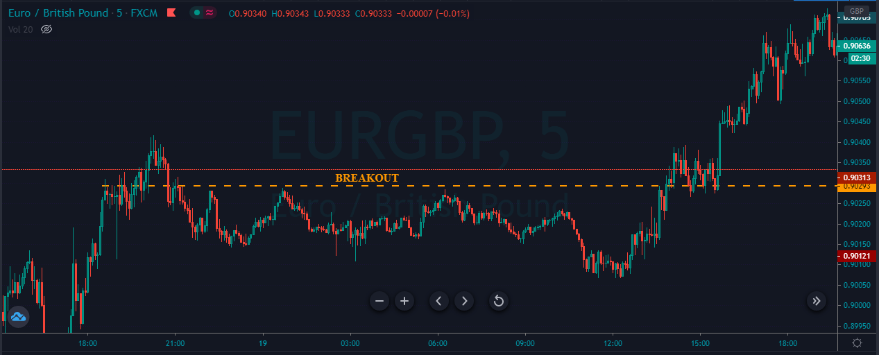
As we can see below, when the price breaks above the breakout line, it started to hold there. If it didn’t hold, it means that the price goes above and came back into the range. So in our case, hold above the breakout line confirms that the price is not going to fake out, and riding the buy trade from here will be a good idea.

#2 Strategy 
Buy Example

The image below indicates a false breakout in this Forex pair.

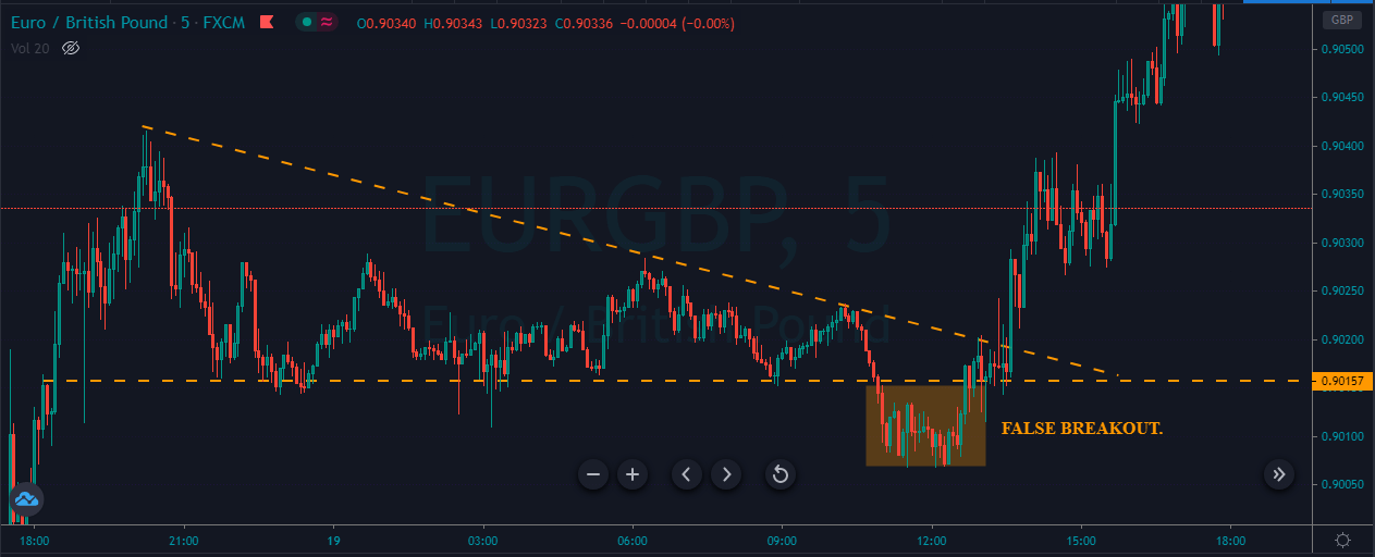
As you can see below, we choose to enter a buy trade after the price action fakes below the major support area. We can see that it is eventually coming back and holding at the support area. This holding support clarifies that the sellers failed to move the market.

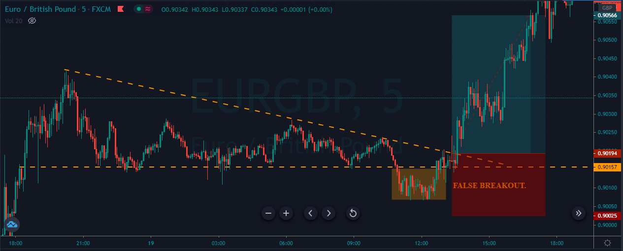
Now buyers are coming back and holding the market to go for a brand new higher high. We can see that price action respecting the trendline for a while, but then it breaks above the line, printing a brand new higher high.
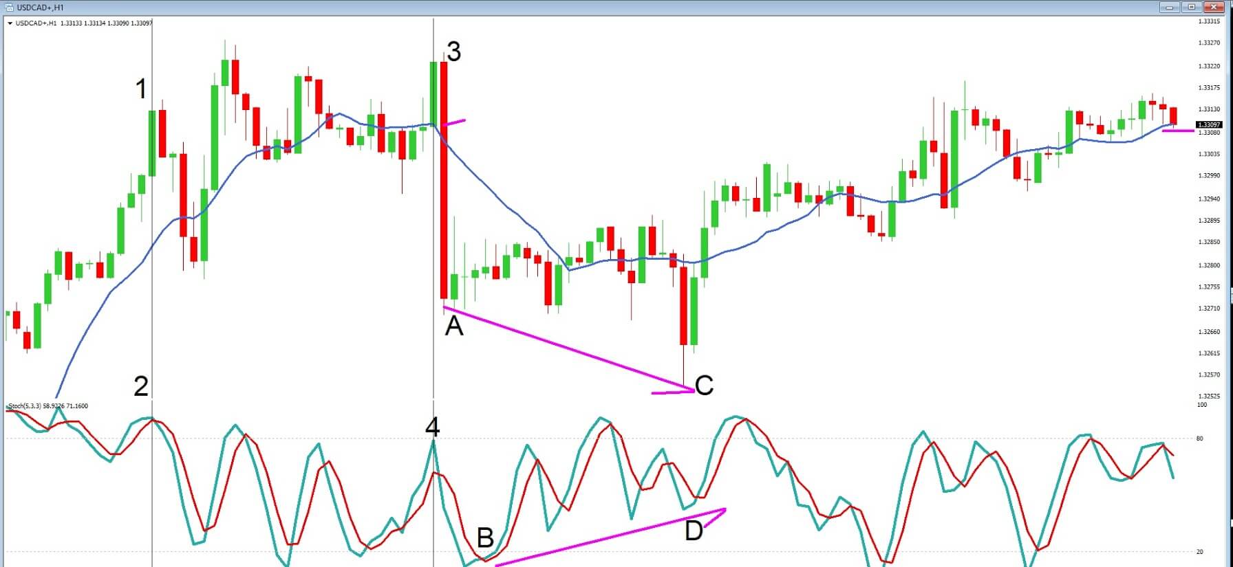
Sell Example

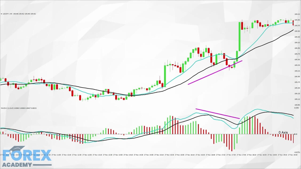
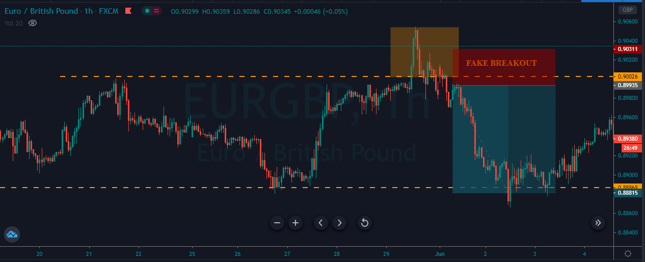
The image below indicates the appearance of a faker on the EURGBP sixty-minute chart.

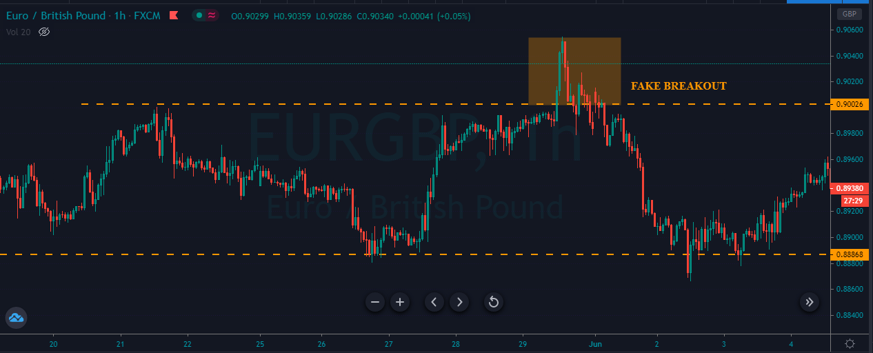
The image below represents our entry, exit, and stop-loss in this Forex pair. The pair was in an uptrend, and as it tries to go above the resistance line, it immediately came back and stated holding below the resistance line. This confirms the faker, and after our entry, prices go back to the most recent lower low.

That’s about identifying Fakeouts and how to trade them. Please be sure to trade these fakeouts only when you are absolutely sure about them. All the best.

Categories
Forex Course

130. How to Effectively Trade Regular Divergence?

Introduction

The occurrence of divergence is considered by all types of traders, including traders who do not analyze charts without indicators. This is because divergence gives an edge to their trading strategy. In the previous lessons, we interpreted the meaning of divergence and also its different types. In this lesson, we shall put this knowledge into action, where an effective strategy will be discussed.

Trading a regular divergence

To recap a real quick, regular divergence is a type of divergence which indicates a reversal in the market. If it indicates a reversal to the upside, it is referred to as bullish divergence and bearish divergence for a reversal to the downside.

Spotting regular divergence

  1. Find the overall trend of the market.
  2. Mark the lower lows for a downtrend and higher highs for an uptrend on the price charts.
  3. Draw the corresponding movement on your choice of oscillator indicator.
  4. Determine if both prices and indicators are making the same sequences. If they are moving apart from each other, then we conclude that divergence has occurred.

Trade Example

Consider the below chart of AUD/JPY on the 15mins time frame. We can see that the market is in a downtrend making lower lows. For the first lower low in the price, the MACD had a lower low as well. But, for the second lower low in price, the indicator made a higher low. Thus, showing divergence in the market.

Since this is a regular bullish divergence, it indicates a reversal in the market. But, note that divergence does not give a trading signal to buy the security. An indication of a reversal must be based on the strategy. Here are some compelling points to confirm the legitimacy of a divergence.

When divergence occurs in a pair, the first factor is to measure the length and momentum of the down pushes. Comparing the first down push to the second, it is observed that the latter is smaller in length and also took a greater number of candlesticks than the former. This is a considerable indication that the downtrend is weakening.

Secondly, observe what the price does when it reaches the Support & Resistance level (purple ray). We can see that the price touched the purple ray, tried to go below the recent low, but failed to do so. This is another indication of the sellers’ weakening.

Now that the sellers are losing strength, we wait for the other party (buyers) to kick in. In the below chart, we can see the entry of the buyers with one massive bullish candlestick. This becomes our first confirmation that the big buyers are in the market.

However, it is not ideal to buy right when the buyers show up because, at times, the sellers could take over and continue to make lower lows. Thus, to confirm the reversal, the buyers must hold above the S&R level (purple ray). In the below chart, we see that the price came down, tried to go lower the S&R, didn’t succeed, and held above it. Hence, this confirms that the market has prepared for a reversal, and we can go long when the candlestick closes above the purple ray, as shown by the black arrow.

As a result, we see that the market successfully reversed its direction and began to make higher highs.

[wp_quiz id=”77943″]
Categories
Forex Course Guides

Forex Course 3.0 – Complete Guide

Hello everyone,

Firstly, we want to thank you guys for following us throughout the course so well. We feel privileged that we are helping you guys in becoming better traders. Especially in Course 3.0, we have discussed some of the most crucial aspects of technical trading, which are essential for every aspiring technical trader to know. We have seen the quiz results for all the course articles that you guys have taken, and that gave us a gist of how well you’ll be following the topics discussed.

However, for the people who want to revisit a few topics, we would like to make their lives easier. So we are putting up a list of topics that we have discussed in this course. Also, this article will act as a quick revision guide for all the basics involved in Technical Analysis.

In this course, we have started by discussing the concept of Candlesticks and its fundamentals. Then we learned how to trade various candlestick patterns along with their importance. Introduction to Fibonacci trading has been done, and we also have paired the Fib levels with various indicators to generate accurate trading signals. We extended that discussion to Moving Averages and its types. Finally, we have learned the principles of indicator-based trading, where at least 10 of the most popular indicators have been discussed.

Below are the corresponding links for each of the topics that we have discussed in this course.

Candlestick Charts

Concept of CandlesticksIntroduction | Anatomy | Fundamentals

Trading Candlestick PatternsSingle Continuous | Single Reversal | Dual Continuous                                                   Dual Reversal | Triple Continuous | Triple Reversal

Deeper InsightCandlestick Patterns Cheat Sheet | Candlestick + S&R

Fibonacci Trading

Introduction | Entry Using Fib Levels | Challenges of using Fib levels | Fib + S&R Candlestick Patterns + Fib Levels | Fib + Trendlines | Fib for TP & Fib for SL | Summary

Moving Averages

Introduction | SMA | EMA | SMA vs. EMA | MAs to identify the trend | MA Crossover Strategy | MA + S&R | Summary 

Indicator-Based Trading

Introduction | Pros & Cons | Bollinger Bands | RSI | MACD | Donchain Channel | RVI | TSI | Stochastic | Ichimoku Cloud | Parabolic SAR | ADX | ATR 

With this, we have ended our Course 3.0, and soon we will be starting our Course 4.0, where we will be discussing some of the advanced topics in Technical Trading. So stay tuned and watch this space for more interesting and informative content. Cheers!

Categories
Forex Videos

Free Forex Course Part 3 of 3 – Into The Hardcore Of Technical Analysis

Into the Hardcore of Technical Analysis – Session three

In this session, we will continue with the moving average, convergence, divergence, or MACD indicator, as seen in example ‘A,’ this time we are looking at a USDJPY chart with a 5-minute time frame.

Example A

We have color-coded our MACD, which consists of a histogram, as denoted by the green and red stripes, which move above and below the 0-axis, which is also known as the centerline. And also two moving averages, which also move above and below 0-axis. Some MACD indicators do not support two MA’s, preferring a single MA, but they are supported in our version. The basic idea is that when the histogram has formed a peak and then moves towards the 0-axis, followed by the two moving averages crossing over and also moving towards the 0-axis, this gives a trader an indication that a pair is about to reserve direction. Traders also use this to gauge convergence and divergence, which also helps them to establish if the market is running out of steam and about to reverse.
In positions 1, 2, and 3, we can see that the moving averages of the MACD mimic, or converge with the 13 and 26 period moving averages around the price action. This is a clear indication that the MACD is in sync and, therefore, reliable at this stage.

Example B


In example ‘B’ of the same chart, we will take a look at divergence in closer detail. At position 1, the price action is moving lower at area ‘a,’ and the MACD histogram is keeping in pace with it at area ‘b.’ Price action then continues to move lower under both sets of moving averages; in itself, an indication of a bearish continuation, and again we see a low at area ‘c’ which coincides with a lower peak on the histogram at area ‘d.’ Everything is working in unison at this stage. However, at position 2, price action begins to flatten out at area ‘e,’ and although this coincides with area ‘f’ on the MACD histogram, the second push lower in price action at area ‘g’ is not matched at area ‘h’ on the histogram. This is now an area of divergence, where the indicators are moving away from one another, and tells traders that the push lower is fading and may be about to reverse. And which it clearly does, subsequently.

Example C


Traders also look for divergence in the moving averages of the price action chart and in MACD, as per example ‘c,’ because they also constantly throw up areas of divergence which traders need to constantly monitor for clues as to trend continuation and slowdowns and reversals.

Example D


Example ‘d’ is another area of divergence that traders keep an eye out for, as we can see in positions 1 and 2, where price action remains above its own set of moving averages, but where the histogram falls below its own moving averages. This can often signal that price action may be about to pull back.

Example E


In example e, we can see that the overall activity of the MACD is above the 0 axis, and this is When studying your charts, keep a keen eye open for areas when the histogram and its MA’s cross above or below the 0-axis, as many traders often use this as a signal to enter the market The MACD is also useful in telling traders about momentum. It does this by depicting how far the histogram and moving averages are away from the 0-axis. The further the distance, the greater the momentum.

Example F


In example ‘f,’ we return to our daily time frame chart of the EURUSD pair. And where we look at another favorite indicator, the Bollinger bands. This indicator is placed over the price chart and consists of a moving average, together with an upper and lower band. These bands are based on a statistical two standard deviations from the mean price. As standard deviations are a measurement of volatility, the bands adjust themselves to volatility in the markets, depending on the current volume.
When markets become more volatile, the bands widen, and when the markets are consolidating or less volatile, the bands begin to contract and move closer to the average price.
It is estimated that over 90% of price action will remain within the Bollinger bands. Therefore traders look for opportunities to go short or long in order to bring the price action back within the Bollinger bands. They are also trying to gauge when price action will begin to pick up, and thus force the bands open and this will result in extra volatility.

Tools that can help a trader to depict reversals in price action to coincide with the Bollinger bands would be momentum indicators, and stochastics, which shows when the market is overbought and oversold. When these tools combine together, they can be very powerful in a trader’s armory,
supportive of the overall trend, which is bullish.

Categories
Forex Videos

Free Forex Course Part 2 of 3 – Into The Hardcore Of Technical Analysis

Into the Hardcore of Technical Analysis – Session two

In session one, we spoke about one of the most common mistakes new traders make, which is to overload their screens with technical indicators. It is advisable that traders do not clog up the screens with indicators. In the last session, we also looked at the importance of price action as a leading indicator, moving averages, trendlines, the momentum oscillator, the stochastic oscillator, and the significance of divergence to help ascertain when a Forex pair might be running out of steam and looking to reverse a trend.

Example A


In this session, we will be looking at some more indicators that professional traders favor.
Example ‘A’ is a daily chart of the EURUSD pair with three sets of moving averages applied. The moving average is a lagging indicator, which means it plots a line on a chart based on the historical price action based over a set amount of time frames. In the charts, we are using a 200-period moving average, a 50 MA, and a 14 MA. These are fairly typically used by professional traders on a daily chart. Traders can choose a simple moving average, which plots a constant line of the average of the highs and lows or weighted and also exponential moving averages, which have slightly different computations in order to help smooth the average price indicator.

Example B

Let’s take a more in-depth look at our chart with example ‘B’ and with just the three moving averages added to it and try to establish the price action story. At position 1, price action moves below the 200 moving average, some traders see this as an important technical moving average, and indeed we see a large bearish candlestick which punches through the 200 MA, and where the total amount of pips in this single move was 92.
The shock of this move causes consolidation and uncertainty at position ‘2’, and where an area of support is formed, as defined by the line, we drew in at position ‘A.’
Traders then pick up the downward momentum and where position ‘A’ now forms an area of resistance and where line ‘B’ acts as an area of support. After a period of consolidation and sideways trading, the support line ‘B’ is breached at position ‘4’, and our trend continues lower to the candlestick at position ‘5’, which is a reverse hammer. This is where we see price reverse and continue up to the 50 period MA, which acts as an area of resistance at position ‘6’, and where price action subsequently continues to fall, and where the 13 period MA acts as an area of resistance. Although there is some indecision at point ‘7’, each of the three moving averages is moving lower on the chart, and traders continue to look for selling opportunities in order to push the pair lower.

At position ‘8’ we see a reversal candlestick formation and our trend begins to the upside where price action finds our 13 and 50 MA’s acting as an area of support and after two attempts to push the pair higher at position ‘10’ price action fails to breach the 200 moving average which then acts as an area of resistance, and we see further decline in price action.

Example C

Another example of a commonly used indicator is the moving average convergence divergence or MACD, as seen in example ‘C.’ The indicator consists of a histogram, as denoted by the green and red stripes, which move above and below a 0-axis. And also two moving averages, which also move above and below the 0-axis. The basic idea is that when the histogram has formed a peak and then moves towards the 0-axis, followed by the two moving averages crossing over and also moving towards the 0-axis, this gives a trader an indication that a pair is about to reserve direction. Traders also use this to gauge divergence, which also helps them to establish if the market is running out of steam and about to reverse.

Example D


Let’s return to our chart and example ‘D,’ where we have added some vertical lines to help us ascertain where the MACD has been useful in identifying trade setups. Firstly, at position 1, our histogram has fallen away and moves towards the 0-axis, with the moving averages crossing over and also moving lower. This follows our bearish candlestick punching through the 200 MA. This is a clear signal to traders that a possible downtrend has formed and will continue.
However, at position 2, our point of reference line cuts through the middle of two low points in the price action, but when we look at our histogram the two low peaks, the second low is not lower than the first respective to the downward move. The second peak is higher than the first. This is a divergence between the MACD and price action and warns traders that the market may be running out of steam. Indeed we see a pullback in the pair to the 50 MA. The 50 MA then acts as an area of resistance, with the peak of the histogram forming an arch and where the moving averages are below the 0-axis. This tells traders the price action is still bearish. At position ‘4’, the moving averages have crossed over and are moving higher, and the histogram is moving upwards too and above the 0-axis, and price action climbs above the 13 and 50 period moving averages.

Categories
Forex Videos

Free Forex Course Part 1 of 3 – Into The Hardcore Of Technical Analysis


Into the Hardcore of Technical Analysis

One of the most common mistakes new traders make is to overload their screens with technical indicators. And where they were looking for signals, they end up clogging up the screens with indicators. The problem with having too many is that they often send conflicting messages. This means that they cannot see the wood for the trees!.

There are literally dozens of technical indicators available to traders nowadays, including leading and lagging indicators. An example of a lagging indicator would be a moving average, and an example of a leading one would be price action itself. Some indicators tend to identify opportunities in range-bound markets; others identify opportunities in trending markets.

Leading indicators, including price action, work especially well during periods of sideways market movements.

In a sideways moving market, lagging indicators are almost useless because the market has no clear direction. They can often provide random indications. None of these indicators can make valid predictions about future market movements. Because some indicators are lagging – which is to say they show where the market’s historical price action – the higher the time frame, the more laggy the indicator.
When developing a successful trading strategy, it is wise to use a combination of price action and technical analysis. This is because technical analysis does outline some very good statistical observations in the market. As such, price action will often trade very uniquely around technical areas of interest and can reveal indications of future price movements.


Example A


In example A, which is a 1-hour time frame of the USDCAD pair, we have a host of information already on the chart as provided by price action in the form of our favored Japanese candlesticks, the blue moving average indicator, and some comments and lines we have drawn onto our chart.
We can see that on the left of the chart, that price action attempted to break above our area of resistance on three occasions. Where we see the ‘triple top’ failed attempt to break above the area of resistance, and where subsequently bulls threw the towel in, and bears gained the stronghold, as denoted by our engulfing bearish candle.
The moving average offered very little guidance during this period of sideways trading activity. However, when price action fails to break through and remain below the support level after a few occasions, price action then starts to trend upwards, and this is where the moving average becomes more useful.
In this chart alone, we have areas of support and resistance, increases in volume, and trend lines, which are all critical components of technical analysis.

Example B


In example B, we return to our chart; however, this time, we have added a momentum indicator which shows the location of the close relative to the high-low range over a set period of time. In this case, the last 14 candles which are displayed on the chart as an average line.

Example C


In example C, we can see that momentum was falling lower when price action hit our triple top area of resistance at position 1. Therefore, the momentum indicator was a red flag for buyers and an opportunity for sellers at this point. When an indicator fails to keep up with price action, such as in this setup, it is known as divergence.

Example D


Example D shows another very widely used indicator: the stochastic oscillator. The basic premise is that when the two moving averages move above the key 80 level, an asset is said to be overbought, and when they move below the key 20 level, an asset is said to be oversold.

Example E


We return to these charts, in example E, where we have cleared away some of the clutter. If we draw a line from position 1 to position 2, we can see that our stochastic has breached the 80-line, showing that price action is overbought, and we see a pullback in price action. At position 3, where our momentum indicator was running out of steam at this point, we also see our stochastic is overbought at position 4, and subsequently, we see price action retreat lower in the form of our engulfing candlestick.

Divergence is also commonly observed when using the stochastic oscillator. We can see that position A to position B is an area of being oversold, and while price action moves higher, it is followed by a sharp move lower at position C. But the overall movement of our stochastics at point D is higher than our low at point B, showing divergence between the indicator and price action and warning traders that bearish price action is running out of steam, and where the subsequent move is higher.
Not every trade is exactly the same, and therefore no matter how many times you use a successful setup, it will not produce winning trades 100% of the time.