Into the Hardcore of Technical Analysis – Session two
In session one, we spoke about one of the most common mistakes new traders make, which is to overload their screens with technical indicators. It is advisable that traders do not clog up the screens with indicators. In the last session, we also looked at the importance of price action as a leading indicator, moving averages, trendlines, the momentum oscillator, the stochastic oscillator, and the significance of divergence to help ascertain when a Forex pair might be running out of steam and looking to reverse a trend.
Example A
In this session, we will be looking at some more indicators that professional traders favor.
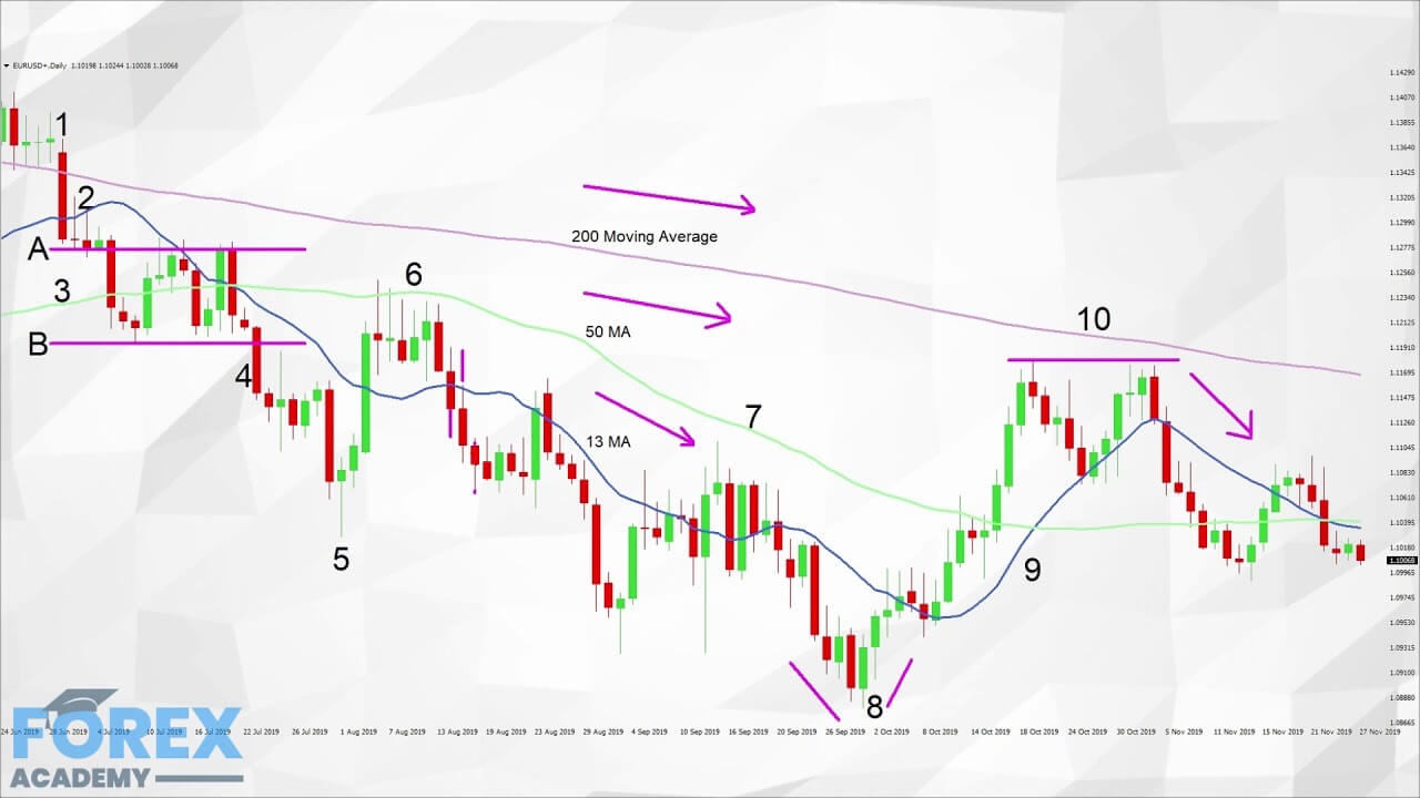
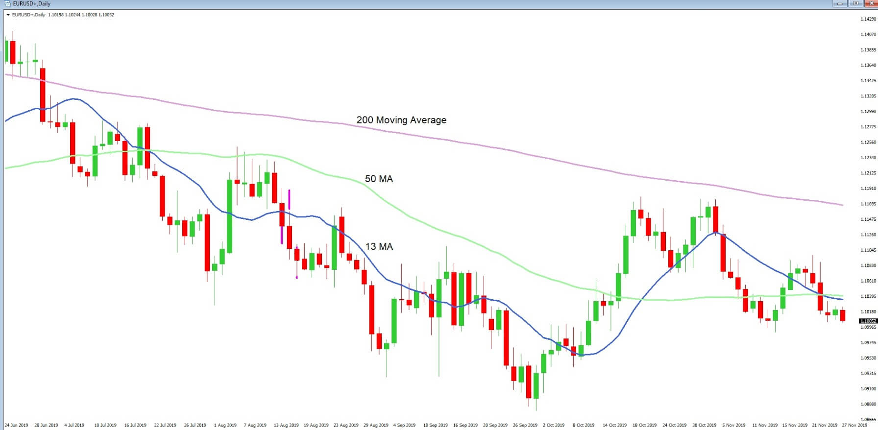
Example ‘A’ is a daily chart of the EURUSD pair with three sets of moving averages applied. The moving average is a lagging indicator, which means it plots a line on a chart based on the historical price action based over a set amount of time frames. In the charts, we are using a 200-period moving average, a 50 MA, and a 14 MA. These are fairly typically used by professional traders on a daily chart. Traders can choose a simple moving average, which plots a constant line of the average of the highs and lows or weighted and also exponential moving averages, which have slightly different computations in order to help smooth the average price indicator.
Example B
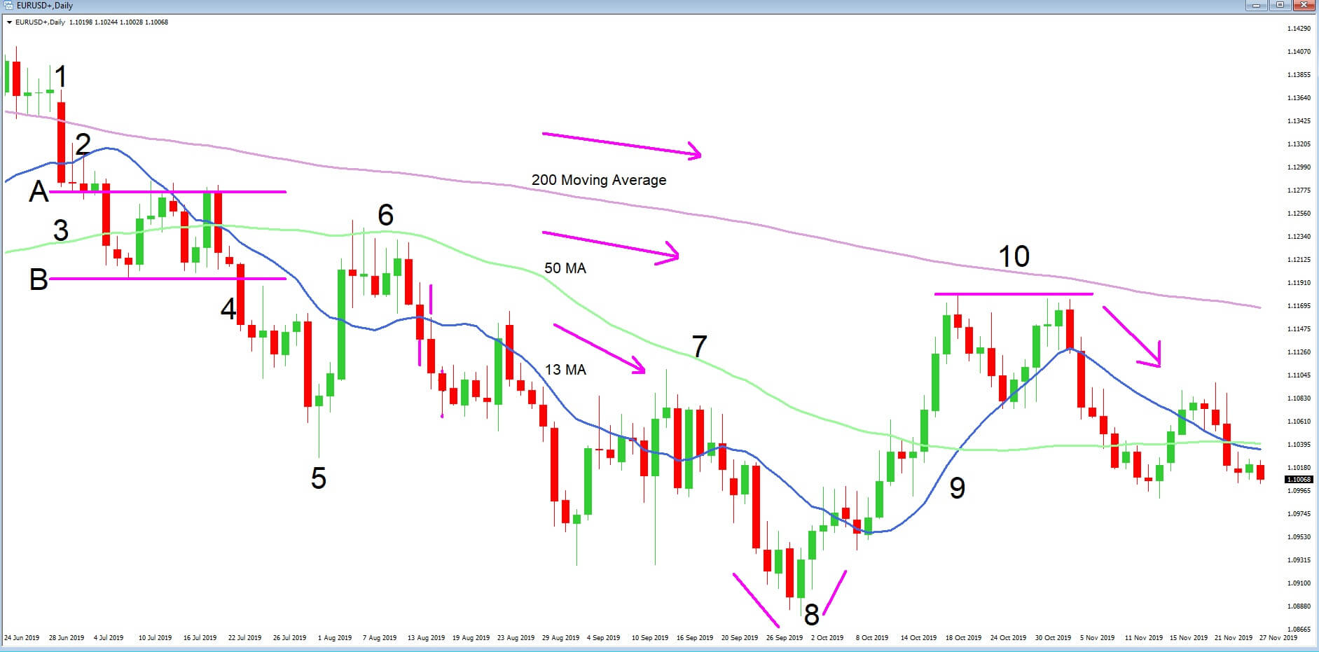
Let’s take a more in-depth look at our chart with example ‘B’ and with just the three moving averages added to it and try to establish the price action story. At position 1, price action moves below the 200 moving average, some traders see this as an important technical moving average, and indeed we see a large bearish candlestick which punches through the 200 MA, and where the total amount of pips in this single move was 92.
The shock of this move causes consolidation and uncertainty at position ‘2’, and where an area of support is formed, as defined by the line, we drew in at position ‘A.’
Traders then pick up the downward momentum and where position ‘A’ now forms an area of resistance and where line ‘B’ acts as an area of support. After a period of consolidation and sideways trading, the support line ‘B’ is breached at position ‘4’, and our trend continues lower to the candlestick at position ‘5’, which is a reverse hammer. This is where we see price reverse and continue up to the 50 period MA, which acts as an area of resistance at position ‘6’, and where price action subsequently continues to fall, and where the 13 period MA acts as an area of resistance. Although there is some indecision at point ‘7’, each of the three moving averages is moving lower on the chart, and traders continue to look for selling opportunities in order to push the pair lower.
At position ‘8’ we see a reversal candlestick formation and our trend begins to the upside where price action finds our 13 and 50 MA’s acting as an area of support and after two attempts to push the pair higher at position ‘10’ price action fails to breach the 200 moving average which then acts as an area of resistance, and we see further decline in price action.
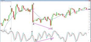
Example C
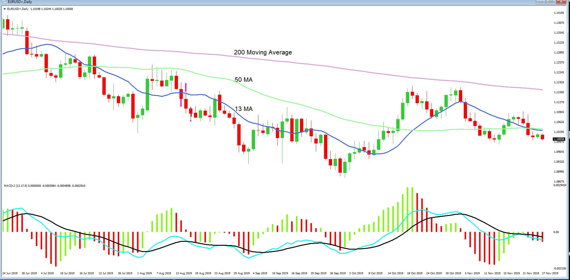
Another example of a commonly used indicator is the moving average convergence divergence or MACD, as seen in example ‘C.’ The indicator consists of a histogram, as denoted by the green and red stripes, which move above and below a 0-axis. And also two moving averages, which also move above and below the 0-axis. The basic idea is that when the histogram has formed a peak and then moves towards the 0-axis, followed by the two moving averages crossing over and also moving towards the 0-axis, this gives a trader an indication that a pair is about to reserve direction. Traders also use this to gauge divergence, which also helps them to establish if the market is running out of steam and about to reverse.
Example D
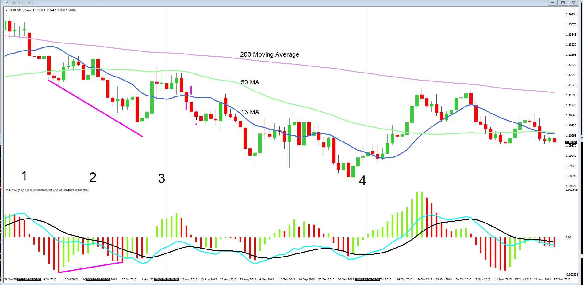
Let’s return to our chart and example ‘D,’ where we have added some vertical lines to help us ascertain where the MACD has been useful in identifying trade setups. Firstly, at position 1, our histogram has fallen away and moves towards the 0-axis, with the moving averages crossing over and also moving lower. This follows our bearish candlestick punching through the 200 MA. This is a clear signal to traders that a possible downtrend has formed and will continue.
However, at position 2, our point of reference line cuts through the middle of two low points in the price action, but when we look at our histogram the two low peaks, the second low is not lower than the first respective to the downward move. The second peak is higher than the first. This is a divergence between the MACD and price action and warns traders that the market may be running out of steam. Indeed we see a pullback in the pair to the 50 MA. The 50 MA then acts as an area of resistance, with the peak of the histogram forming an arch and where the moving averages are below the 0-axis. This tells traders the price action is still bearish. At position ‘4’, the moving averages have crossed over and are moving higher, and the histogram is moving upwards too and above the 0-axis, and price action climbs above the 13 and 50 period moving averages.