Into the Hardcore of Technical Analysis – Session three
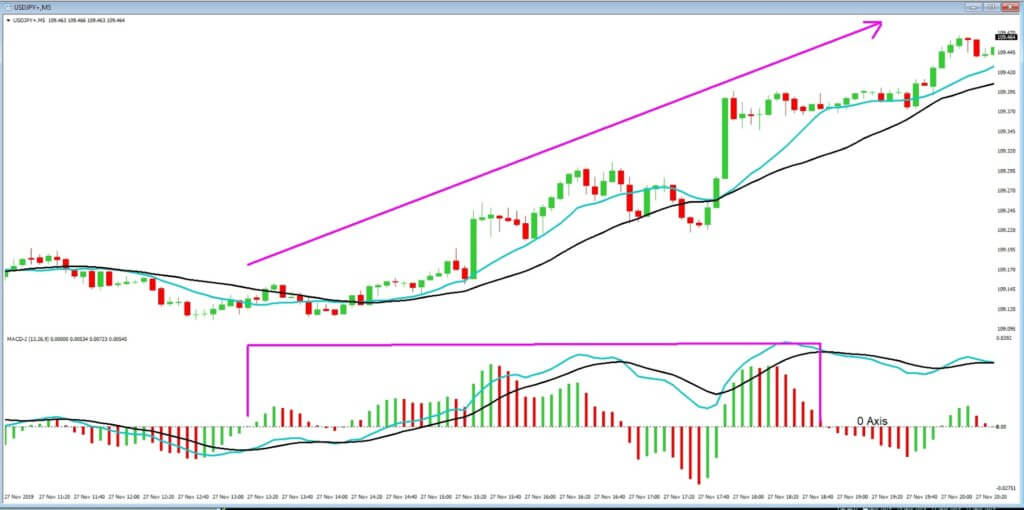
In this session, we will continue with the moving average, convergence, divergence, or MACD indicator, as seen in example ‘A,’ this time we are looking at a USDJPY chart with a 5-minute time frame.
Example A
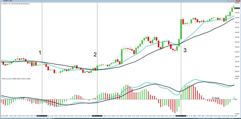
We have color-coded our MACD, which consists of a histogram, as denoted by the green and red stripes, which move above and below the 0-axis, which is also known as the centerline. And also two moving averages, which also move above and below 0-axis. Some MACD indicators do not support two MA’s, preferring a single MA, but they are supported in our version. The basic idea is that when the histogram has formed a peak and then moves towards the 0-axis, followed by the two moving averages crossing over and also moving towards the 0-axis, this gives a trader an indication that a pair is about to reserve direction. Traders also use this to gauge convergence and divergence, which also helps them to establish if the market is running out of steam and about to reverse.
In positions 1, 2, and 3, we can see that the moving averages of the MACD mimic, or converge with the 13 and 26 period moving averages around the price action. This is a clear indication that the MACD is in sync and, therefore, reliable at this stage.
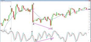
Example B
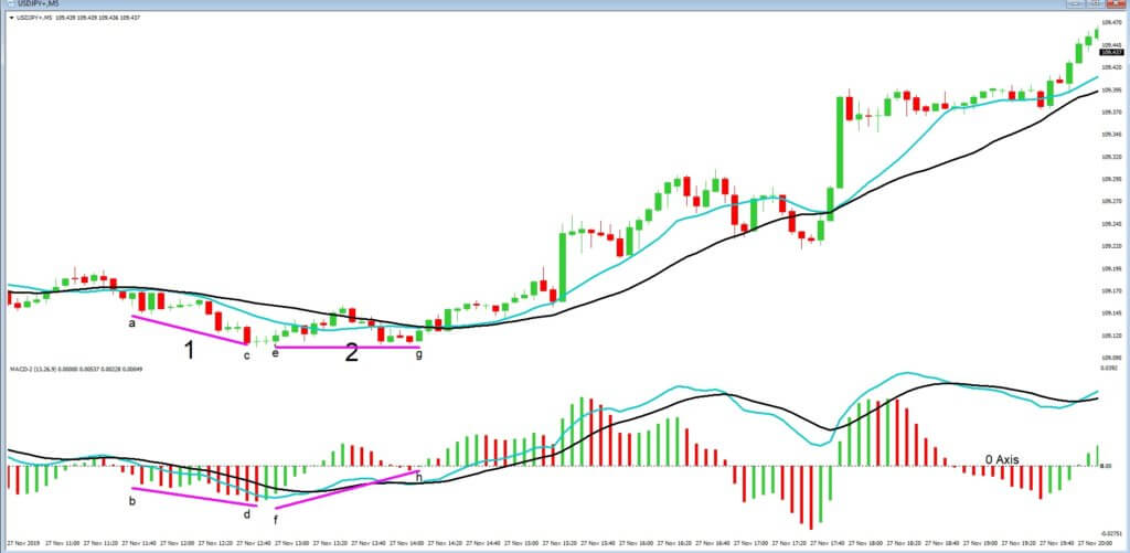
In example ‘B’ of the same chart, we will take a look at divergence in closer detail. At position 1, the price action is moving lower at area ‘a,’ and the MACD histogram is keeping in pace with it at area ‘b.’ Price action then continues to move lower under both sets of moving averages; in itself, an indication of a bearish continuation, and again we see a low at area ‘c’ which coincides with a lower peak on the histogram at area ‘d.’ Everything is working in unison at this stage. However, at position 2, price action begins to flatten out at area ‘e,’ and although this coincides with area ‘f’ on the MACD histogram, the second push lower in price action at area ‘g’ is not matched at area ‘h’ on the histogram. This is now an area of divergence, where the indicators are moving away from one another, and tells traders that the push lower is fading and may be about to reverse. And which it clearly does, subsequently.
Example C
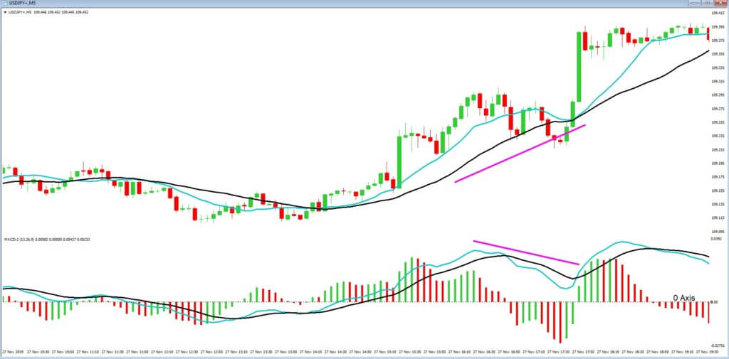
Traders also look for divergence in the moving averages of the price action chart and in MACD, as per example ‘c,’ because they also constantly throw up areas of divergence which traders need to constantly monitor for clues as to trend continuation and slowdowns and reversals.
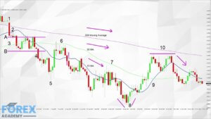
Example D
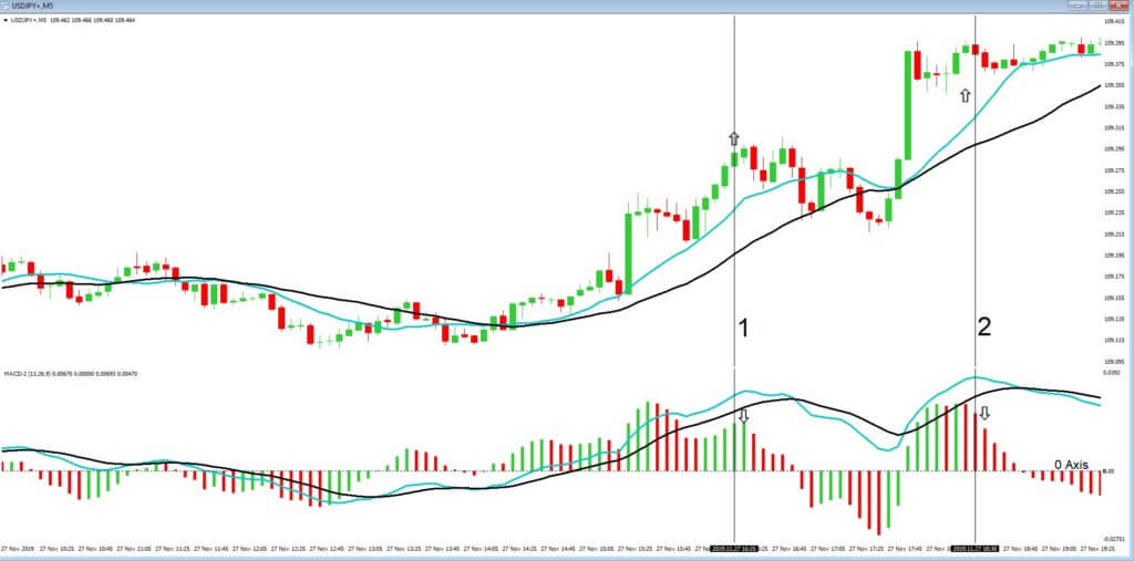
Example ‘d’ is another area of divergence that traders keep an eye out for, as we can see in positions 1 and 2, where price action remains above its own set of moving averages, but where the histogram falls below its own moving averages. This can often signal that price action may be about to pull back.
Example E
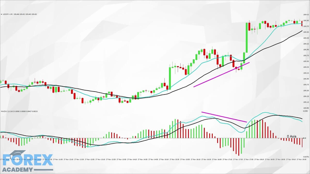
In example e, we can see that the overall activity of the MACD is above the 0 axis, and this is When studying your charts, keep a keen eye open for areas when the histogram and its MA’s cross above or below the 0-axis, as many traders often use this as a signal to enter the market The MACD is also useful in telling traders about momentum. It does this by depicting how far the histogram and moving averages are away from the 0-axis. The further the distance, the greater the momentum.
Example F
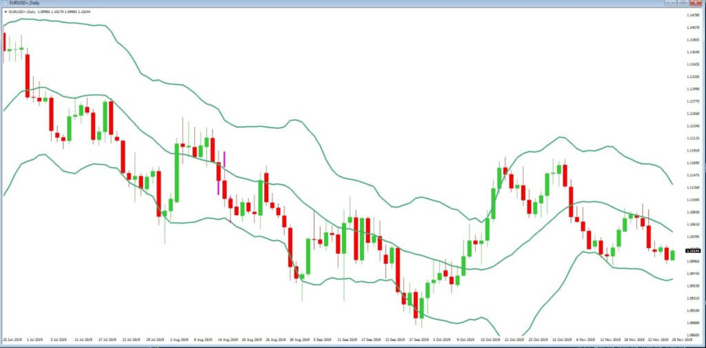
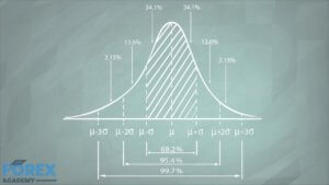
In example ‘f,’ we return to our daily time frame chart of the EURUSD pair. And where we look at another favorite indicator, the Bollinger bands. This indicator is placed over the price chart and consists of a moving average, together with an upper and lower band. These bands are based on a statistical two standard deviations from the mean price. As standard deviations are a measurement of volatility, the bands adjust themselves to volatility in the markets, depending on the current volume.
When markets become more volatile, the bands widen, and when the markets are consolidating or less volatile, the bands begin to contract and move closer to the average price.
It is estimated that over 90% of price action will remain within the Bollinger bands. Therefore traders look for opportunities to go short or long in order to bring the price action back within the Bollinger bands. They are also trying to gauge when price action will begin to pick up, and thus force the bands open and this will result in extra volatility.
Tools that can help a trader to depict reversals in price action to coincide with the Bollinger bands would be momentum indicators, and stochastics, which shows when the market is overbought and oversold. When these tools combine together, they can be very powerful in a trader’s armory,
supportive of the overall trend, which is bullish.