Categories
Forex Course

49. Quick History & Introduction To Japanese Candlesticks

What are Candlestick Charts?

A candlestick chart is simply a way of depicting the price moment’s information. Since these chats are very famous, they are available on almost every trading platform. Candlestick charts were first developed by a Japanese rice trader Sokyu Honma in the late 17th century. He is known as the father of candlesticks. Yes, it has been more than 250 years since this chart has been devised and yet they are so relevant even today.

Sokyu Honma – Father of Candlesticks

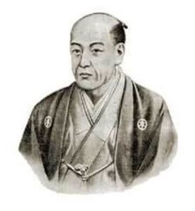
(Photo Credits – Alchetron)

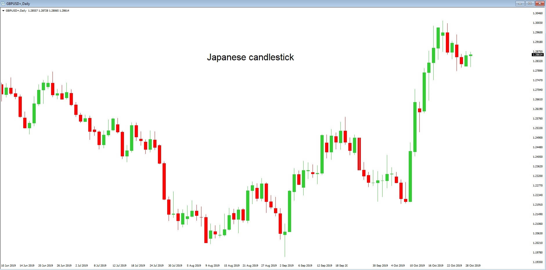
Japanese are huge technical traders. They use a combination of candlestick techniques & western charts to analyze the market. The primary advantage of a candlestick chart is that it identifies the underlying psychology of traders in the market. This feature differentiates candlesticks from the other chart types we know today.

Have you come across terminologies like ‘hanging-man,’ ‘dark-cloud,’ and ‘evening-star’ but not sure what they are? Good. In the first part of this course lessons, we will be discussing everything about candlesticks and its patterns. We will also discuss how to use these charts & patterns to make profitable trades, as it will open a new way of analysis for you and show how Japanese candlesticks can enhance your trading performance.

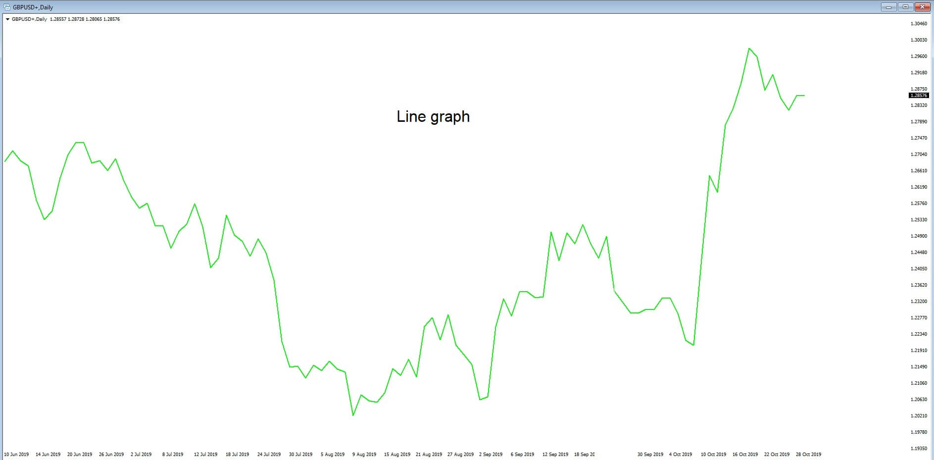
Why do most of the traders use candlestick charts? 

There is a great interest in candlesticks by top traders. There are many reasons for that, and few of them are listed below:

🕯️ Candlestick charts are flexible. This is because they can be used as standalone or in combination with other technical indicators. These charts provide an extra dimension to the analysis.

🕯️ This technical approach is an age-old tradition of analysis, which has evolved from centuries of trial and error.

🕯️ Japanese are quite visual on the terms used to describe the patterns. A term like ‘hanging-man’ will spark interest among traders. There are hundreds of such names. Once a trader gets an understanding of what that pattern is, they will not be able to trade without using them.

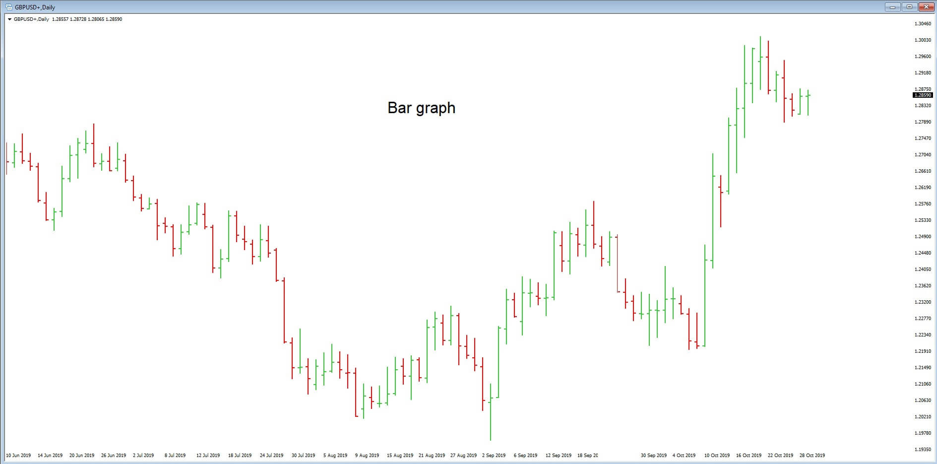
🕯️ Another important reason for using the candlestick chart is that it can be paired along with the bar charts for people who see bar charts alone.

🕯️ All the usual technical analysis tools can be easily used with candlestick chartings, such as moving averages, trend lines, Elliot waves, retracements, and more. These charts provide a unique way of analysis, which is not provided by any other charting tool.

Limitations of using the Candlestick charts

🕯️ As with all other charting methods, candlestick pattern depends on the interpretation of the trader. This could be one of their limitations. As a trader gain experience, they discover which candlestick pattern suits them the best.

🕯️ Every candlestick has a close. Therefore, traders will have to wait for the close to get a valid trading signal. However, a trader might try and anticipate what the close would be a few minutes before the actual close.

🕯️ The opening price is vital in candlestick. Traders with no access to live market data might not be able to get the opening price of a security.

That’s about the introduction to Candlestick charts, its pros & cons. In the next article, we will learn the anatomy of a single candlestick chart so that you can read the chart better. Make sure to take the quiz below before moving on. Cheers!

[wp_quiz id=”59568″]
Categories
Forex Videos

Predicting The Future Of The Forex Market With These Candlestick Formations

Candlestick formations – The display of price information

There are many different ways that a trader can have access to the price of an asset. In the Forex market, the most common ways that traders monitor the movements of exchange rates are by using line graphs, bar charts, Renko charts, tick or ticker tape charts. And one of the most popular ways of deciphering price movements is the Japanese candlestick.

Let’s look at some examples of exchange rate price action via three commonly used technical analysis tools.

Example ‘A’ is a basic line graph of the daily time frame of the GBPUSD pair, as denoted in the top left-hand corner of our chart. Time frames are shown here too. At the bottom of the chart along a horizontal axis, we can see time and the date, and the exchange rate of this pair is shown in the vertical axis on the right-hand side of the chart.

The line graph converts the price action of a currency pair onto a continuous line on a chart. As you would expect, the line goes up and down and sideways. However, just by looking at the line graph alone, it would appear to be almost impossible to try and ascertain future movements by this tool.

Example ‘B’ is the same daily time frame of the GBPUSD pair, but this time we are looking at a bar chart. Each bar opens at the beginning of the given timeframe, and in this case, opens and closes every 24 hours. Each bar consists of three lines: A vertical line to the left of the horizontal line, which denotes the opening of the bar; the vertical line which tells the trader the up-and-down movement of price action during this time frame; and another horizontal line to the right of the vertical which tells the trader where price action finished.

Let’s now turn our attention to example ‘C’: The Japanese candlestick. Each candlestick opens and closes along a vertical line. Again, this is the daily time frame of the GBPUSD pair. The candlestick offers a much greater visual representation of the exchange rate and therefore presents many opportunities to a trader with regard to potential future trends. The Japanese candlestick is the most widely used technical tool used by traders across the globe.

Japanese candlesticks were invented in the early 15th century by the Japanese government of the time. They were used to record price movements on Japan’s rice exchange. At this time, rice was not only the primary dietary staple, but it was also a unit of exchange.

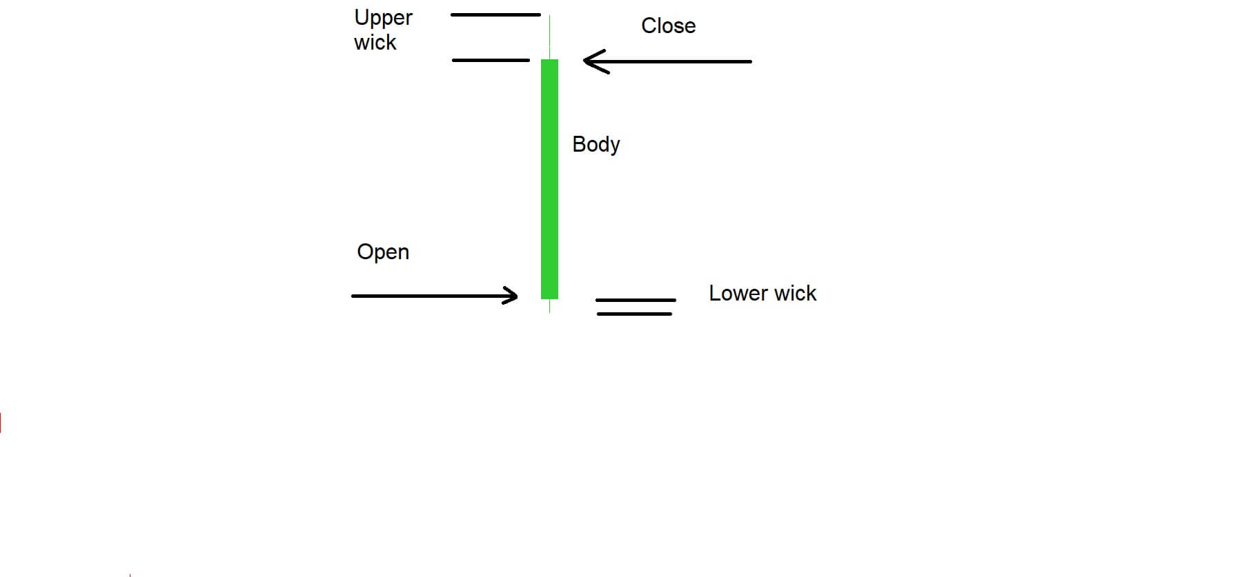
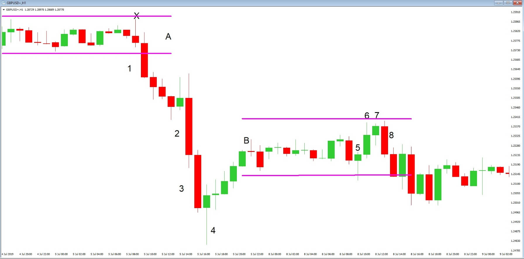
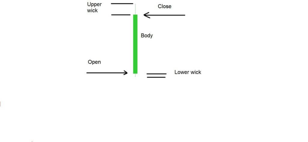
Example ‘D’ is a typical candlestick shape that traders see regularly on their charts. We have marked the points where the candlestick opened and closed. If the candlestick closes above the exchange rate at the point of which it opened, it is considered to be a bullish candlestick. If it closes below the exchange rate at the point of opening, it is considered to be bearish. Candlesticks can also open and close at the same exchange rate.

However, in this example of a bullish candlestick, we can see a wick at the top of the candlestick and also one at the bottom. Therefore, a trader can determine that after opening, price action initially falls before reversing and rising to the top of the time frame, before falling again back to the close. In this case, we have two wicks, one at the top and one at the bottom. A trader can tell the total exchange rate covered by the candlestick by measuring between the low and the high points and also see pullbacks and reversals. The same principle applies to a bearish candlestick where price action is measured over the whole length of the candlestick, but where traders easily identify the opening and closing of price action for each time frame.

Each candlestick will have a different sized body and wicks dependent on the amount of volume going through at any given time. The basic principle is that the longer the body and the shorter the wicks, the stronger the volume. Traders are able to read the many different types of candlesticks, which are all given names, in order to depict the strength of a trend and volume in the market at any given time, and these will help them to predict trend formations, reversals, and consolidation of the exchange rate of any particular pair.

Diagram ‘E’ provides us with a snap-shot of a 1-hour chart of the GBPUSD pair, where candlesticks are used to show price action. In section ‘A’ of the diagram, we can see that the price action is fairly flat and trading in a sideways motion. However, candlestick number 1 pushes below the trend line and forms the basis of a downward move. The candlestick is also bigger than those preceding it, and the wick at the bottom is small, denoting strong volume to the downside.

After a period of uncertainty, price action becomes stronger to the downside, as denoted by the large candlesticks numbered 2 and 3. Price action continues the downward trend, however buyers push up price action at number 4, which is called a reversal hammer, and where indeed price action reverses to section ‘B.’ We now have a series of smaller candlesticks which denotes a thinning in volume, and where we can see some candlesticks open and close at the same exchange rate, telling traders that neither the buyers or sellers are in control at this particular moment in time.

Candlestick number 5 tries to push the trend to the downside, but reverses and forms a reversal hammer shape, and where we subsequently see price action move to the upside as per candlestick number 6 and 7. But we then see a trend reversal in candlestick number 8, which becomes an engulfing candlestick because it is larger than both 6 and 7. The strength of this candlestick denotes a potential increase in price action to the downside by taking out the previous two candlesticks, and we see further movement to the downside before price rises again. Incidentally, we have another price reversal hammer in section A where we have placed an X.

Here at Forex.Academy, we strongly recommend that you learn as many candlestick formations as possible because they are very commonly used within the trading community, and therefore this will give you an edge in your trading.