
Hello, and welcome to the latest installment on-demand course, brought to you by Forex.Academy. In this particular course, we will be unveiling the mysteries behind technical charting patterns and outlining how their use can supplement the trading decisions of the most technical trader. Before we begin, please take a moment to read through the disclaimer and note there is financial risk involved in trading the financial markets. The outline of this course will aid to develop the technical skills needed to assess charting patterns, whilst combining both theory and practice for a deeper understanding of how to apply these skills in the marketplace. Throughout this course, we’ll be first and foremost looking at the origins of technical charting, and deciphering where exactly those price depictions came from. We will be answering the question as to why technical charting is so important for us as technical traders, then we’ll delve into both candlestick formations and technical charting patterns, before moving on to technical recognition.
So, where do we actually look for these candlestick formations or these technical charting patterns in the markets? What do they actually tell us? Do they tell us a story about where the market is moving in this short, medium, or long term? This brings us all nicely to market phases, looking at those price movements both in the short, medium, and long term and trying to build an idea of actual trade identification. Where is the market more likely to move to as a result of these technical charting patterns? We will obviously be looking at practical application, looking in-depth at the MT4 trading platform, and finishing off the course, we will be looking into the MT4 platform with some practical application, looking at both the charting patterns and using some technical identification to look for these very promising trade opportunities within the markets.
First and foremost, let’s have a look at the origins of technical charting. Where did it all arise from? The earliest sign of the Japanese candlestick, we can look back to the 18th century, between rice traders in Japan. Inevitably, we can say that this led to a ‘grassroots’ commodity market in the product, in the commodity rice itself. This meant that prices were actually dictated in a form structure of a candlestick that was actually built from the rice itself. We can just look at a quick picture here, of one, two, maybe six or seven grains of rice actually depict the early candlestick that takes the very form and shape of our candlesticks on our MT4 platform trading the markets online today.
Moving on from that early origin, we see communication and international trade really begin to develop throughout the 19th century. A price quotation was transformed to tailor for a universal appetite. What do we mean when we say to tailor for a universal appetite? Given the increase in interest in financial trading and financial markets and how disposable income, or investment income changed, where the ordinary investor could look at a daily newspaper, look at a price quotation and look to invest, or to speculate in the financial markets. We’ve seen the birth of, over the 1920s and 1930s, trading via price quotation in daily newspapers, something that was done each and every day. The ordinary investor could look at those newspapers, trying to get a technical idea of where the markets are in their own head, but obviously, as time moves on, that was quickly outdated by the birth of telegraphy. If you’re aware of the Telegraph machine, that formulated on to the ‘ticker tape,’ where traders can look at printing of ticker tape for instant price action on the commodity or asset they’re looking to trade.
Even though it was more primitive, those early thoughts of trend analysis were developed between both investors and commodity traders. These were known as the ‘ticker’ traders. Looking at a roll of paper, they could see prices gradually tick-tick-tick, gradually perhaps increase, which really revolutionized and coined the phrase ‘Don’t fight the tape.’ So, don’t fight the trend. Really, today we say as technical analysts that the trend is our friend. Very similar in terms of technical charting and trying to define an origin of price movement.
If you have read any financial literature, or would like to read some financial literature on trading, I would very much recommend Reminiscences of a Stock Operator, by Edwin LeFevre, which tells the story of some stock traders and commodity traders in the 1920s and 30s. Big bullish traders would take huge positions in the marketplaces by merely reading the tape. Such a fantastic read, and it shows you the development of price charting and technical charting through tick trading.
We have obviously seen the rise of computer technology. Everything is traded online at the moment, but with the rise of the machines, I suppose that’s really led to the recording of price history from the 1970s and 1980s onwards. What that did, is it actually changed how traders discover and dictate prices. Obviously, if we are students with technical analysis, we know that how we judge many of our decisions is by looking at previous price history that can give us an idea, or an inclination, as to where future prices may move to. The fact that we look at recorded price history over time has really changed the origin on the movement in time, from more technical charting specifically, from a primitive Japanese candlestick.
Why is technical charting so important to us? Well, given the huge liquidity in today’s market, and what I mean by that, is that there is a large amount of market participation between small traders, big banks, and international organizations. A huge amount of participation, a huge amount of liquidity in the markets today, allows us to assume the technical charting is the most efficient method of assessing prices. Why would that be? Why could we look at a technical chart today, at a specific price in time, and say that price is efficient? Well, because we take for granted now that all information available to the markets is embodied in the price of a Japanese candlestick at the moment. Otherwise, all unavailable prices that were traded on would be insider trading. We assess that the markets have been totally efficient, given all circumstances are embodied in the price. That leads us on to assume that market participants, ourselves as traders, are, as a result, efficient in trading practice.
Price discovery nowadays is completely Universal in factors that change it. To take, for example, historical price action, a trading volume on technical indication. These technical attributes to the trader have just as much an effect on price change and traditional fundamentals. So, if we take a commodity, perhaps like the oil market, there is the supply and demand function to that market that certainly drastically changed its prices, but we know that oil is quite technical with many support levels and trading volume. The historical price action of things like this provides a technical indication, so that a large minority of traders decide to particularly only trade-off that price, and therefore create price change as a result. So, it is technically very important for the technical trader.
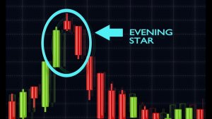
As we move forward to candlestick formation and technical charting, a quick prelude to really understand the Japanese candlestick itself, not just as one particular candlestick, but how we chose the common state range as traders. In our study of financial markets as technical traders, we must understand that each Japanese candlestick tells us a story. The story can be either timid in nature, or could be an epic battle of price between buyers and sellers. Yes, in candlestick observation, we are often provided with a clue to a decision on future price discovery. So, in each and every different candlestick, we see a story, a battle between buyers and sellers. It could be a very large trading day, or it could be quite a timid, small trading day, but there is a story to be told. Is that enough information to base trading decisions off? Not quite sure. However, there is much more information to analyze in technical charting patterns than simply looking at the individual candles. Accepting this will allow us to become price action specialists. That’s really what we’re trying to do here as technical traders, become price action specialists, by both looking at technical indication, looking at candlestick formations, and looking at technical charting patterns to give us some insight into market structure and future price movement. Again, in assessing the formation of the Japanese candlestick, we must identify exactly how important the price action is, first of all, but that there is a story to be told, and what that story is exactly trying to tell us.
Let’s have a look at a few examples here to decipher and see if we can figure out a story in terms of price action for each candlestick formation. For our first confirmation, we have a bearish engulfing continuation. Again, I posed the question, what story does the bearish engulfing continuation structure tell? Let’s observe the market trade for just a moment. In the previous view we just witnessed the market trading from left to right over a period of five trading periods, let’s say five days, and we’re starting from one and finishing with an engulfing bearish candle. What story does that tell us if we actually look from left to right? After a small sell-off at one, the market actually took three trading candlesticks to retrace its prices and return to previous levels on two. So, we could say that we actually had a bit of weakness after period one, but the market really had to work hard to retrace that weakness, and actually took three full trading periods to retrace price back up to previous levels before the sell-off. What is massively significant is the final candlestick. Again, given that we’ve seen some limited strength in the previous three days, it seemed to be very hard work for the Bulls to push the market back up. We see all of that effort totally and utterly erased in the final candlestick of trading. That final candlestick actually completely outweighs the first sell-off account. That’s structurally significant for us, and it tells us a story. The market was weak, it really worked hard to try and retrace the weakness, and then the Bears came in, and weakness prevailed. This is a strong signal that this market is weak.
Moving on to our second candlestick formation structure. We call this a lead-up to rejection. What story does the lead-up to rejection structure tell? Let’s observe the candlesticks trade. Looking at the previous price section, we see some early relative weakness and then a reversal at one. With the final two candlesticks finishing bullish, we can see the final structure creates a V in the market. Particularly, each candle is significantly important. In reverse, we see some early weakness. We see at level one, a hammer candlestick, and the close of the hammer candlestick at one is just above this level of support created by the early structure from the previous candlestick. The fact that it closes above that level tells us that it is a strong hammer, a bullish hammer. And that candlestick alone, the story is telling us that there could be a possible reversal. However, as we follow the price continuation to the upside with two, we see that the market opened and actually traded down within the trading period a little below the resistance level, was rejected instantly, and finished on a high for the day. That tells us that we have much more confirmation, that we have seen the lead up to rejection confirmed, and that expectations are certainly for prices to increase, which we see with the final comments, like a continuation to the upside. So, the structural support is very significant at the V structure. The price section tells us that the market is rejecting a potential sell-off and is potentially very strong.
In observing our third candlestick formation, we can look at what we know as the Three Bullish Soldiers. Again, we can pose the question, what story does the Three Bullish Soldiers structure tell? We see that the market has experienced a downtrend, and by looking and observing the price action trade, the bullish candlesticks almost signify a rejection of the low. Again, the question, what structure has been created, and what story is it telling us about the market equation? Well, after a long mature downtrend, bulls are technical investors, very frequently looking for clues for a change in sentiment. You do get that specifically, as sentimental traders look for value. If a market is particularly stock trading, if it is a strong asset, but has experienced a period of weakness. Or a foreign exchange, which is relatively strong over a long period but has seen a short-term downtrend. Investors often look for periods to get long that market, or to buy the market, and the Three Bullish Soldiers do provide this sign. Three consecutive trading periods of bullish activity, with the market closing with three consecutive new highs at one, two, and three. That indicates to us that the market has possibly shifted and is now potentially stronger.
Now, as we look to candlestick formations and technical charting, combining them both together, we must assess the short-term story of the market in question. We can then build with technical analysis, in aiming to identify technical charting patterns. The first of our technical charting patterns is the Head and Shoulders, on the reverse Inverted Head and Shoulder pattern. Let’s observe how the market trades. With the Head and Shoulders, the market is trading from the upside, trading in a bullish trend, and we see some resistance on a continuation for a further boost of the trend to the upside. We then see our first Shoulder created, and as the market reverses, we see a higher high creating the head of the market. We then see a level created in the market, where the market bounces, creating our second Shoulder and trading to the downside. This is technically very significant, as we see price expectation then results to the downside, given we almost see this man here presenting our Head and Shoulders in the market. So, there is a real rejection to the upside, given that we are feeling to reach higher highs. A rejection to the second Shoulder confirms us on the market breaks, or resistance to continue to the downside. The same technical setup is in the Inverted Head and Shoulders. Only it is to the upside, where the market creates a low, then a further low rejects the low, where the points of resistance price expectation breaks the resistance to continue to the upside.
As we move on to Double Top on Double bottom technical charting patterns, we can see they are very similar, but instead contrast two directions with the market. With the Double Top, the market trades from below and rejects a new high. That creates a structure, both to the open downside, with a further rejection to the downside, and creates some price consolidation within this period. We then get a further rejection to the upside on a bunch from that level trading down and breaching through its earlier level of support. The market expectation is for the market to trade. Continue to the downside. We can see clearly that the Double Top has been created almost in this fashion, and the market reverses from the Double Top peak. Again, the Double Bottom is very similar and will take the W shape where parallel resistance has been created on both sides of the consolidation. Where the market breaks to the upside, we do get price expectation in preferring a break to the upside potential. When observing these Double Top and Double Bottom situations in the markets, the main question we would ask ourselves is, how does it affect the trend in the medium or long term? Is it just going to be a short burst or price consolidation breakdown, or is it going to delve into something deeper? It very much depends on how the market is trading, and the higher the breakout stems from the break from Double Top or Double Bottom. Within this same Double Top, we can use this example to the right here, where the market trades in an almost unassured bullish fashion before creating our Double Top. We see it’s well defined. The market breaks to the downside, and at that time, sentiment shifts to a bearish activity. So, the trade there would certainly be to look for places or areas to short the market, given the Double Top rejection.
Similar to the Double Top on Double Bottom, we have a Triple Top and Triple Bottom. The only difference being that you often see stronger areas of price consolidation creating three tops or three bottoms, and as a result, we do see significant breakout opportunity as a result from the lack of continuation in the price consolidation. That would be a general rule of thumb as a technical trader, the more price consolidation you see in the market, and for a longer period of time, the greater expectancy you can have of a stronger breakout in the opposite direction. Or, when the final market structure breaks down, we can often see very strong shifts. So, generally speaking, if we are looking at these two previous price technical charting patterns with the Double Top on Triple Top, for example, we would see a stronger burst to the downside in the Triple Top than we would see in the Double Top and vice-versa. With the Triple Bottom on the Double Bottom, we would see a larger increase in bullish activity, with the break to the upside with the Triple Bottom on the Double Bottom.
In looking for price structures in the markets, very prominent price structures tend to be particularly in the Forex markets, the technical charting pattern of the Ascending and Descending Triangles. That’s indicative of the volatility that are in the Forex markets. As we look at the Ascending Descending Triangles, we can see that there is a level of price consolidation, a squeeze in the markets, creating this Triangle structure, and the Triangle structure is to the upside, as seen as such. We then get the market break creating an expected surge of volume and once the market structure fails, or breaks down to the upside. With the Descending Triangle, it’s no different. Only that price does create consolidation in the same zig-zag fashion. Finally, when we get confirmed triangle formation, we see a breakout to the downside, given that price consolidation is squeezing more prevalently to the downside.
Moving on to our Wedge Continuation and Wedge Reversal, we see these two Wedge formations are very acute in the markets they form with price consolidation. It can give us very close hints to where price is likely to break from in very short periods of time. The reason being particularly, if we look at the Wedge Continuation to the left here, the market trades down with a period of consolidation within this Wedge, fashioned actually looks to consolidate up to the upside a little, before actually breaking down to the downside. That would be quite significant, as traders expect the market consolidation pushing to the upside. Alternatively, the break to the downside would cause that greater burst, if you will, in rejection to the downside with the continuation. The reversal is slightly different, where we see the wedge to the downside. You see trade income from the Bear is down, creating the price structure through the right-hand side and then, instead of breaking down through with a continuation of the trend, actually reversing the overall trend on trading and pointing to the upside.
Let’s look here at our Bull Flags and Bear Flags. Again, quite prominent in the Forex markets. Taking a similar structure to Wedge Formations, the Bull Flag trades up with the direction or preferred bullish trend. It does create a price consolidation that almost looks like a Wedge to the downside. The only difference is that it creates this very well-defined Flag and actually trades to the upside and with the continuation. The Bear Flag would be in the opposite direction, where it trades to the downside. We see the market trade creating a Wedge structure, and then we get continuation to the downside in the direction of the trend, unfulfilling our Bear Flag structure.
Perhaps one of the most common uses of technical analysis lends itself to identifying channels within the market. Certainly, one of the most common practical technical charting patterns that you can identify is simply done by the use of two diagonal lines, either to the upside or downside, confirming or disconfirming bullish trend channels or bearish trend channels. As we follow the price action, we can see that it doesn’t always have to correspond to both highs and lows of the channel itself. As long as it conforms to trading within the channel trend line, we can say that is a confirmed channel that we can trade with the direction of that trend, given we can find trading opportunities within. Here we have a bullish channel, which is well confirmed, given the sheer amount of trading range that we have in the channel. The question I suppose that would pose would be whether to actually buy the market at this price, given that it is traded down to our trend line. We’ve seen the price punch from it before, and in terms of following the trend, that could certainly be a good method of trade identification in terms of following the trend for this market.
As technical analysts, it’s very important that we learn to combine what we learn and actually implement in the markets together. Just like observing one particular candlestick at a time, as opposed to looking at a larger, broader range of candlesticks. We look for more information within our technical analysis within price charting, or technical charting, and within our candlestick formations. Here, we’re going to ask the question, how can we apply technical analysis on charting patterns?
What I’m going to do is actually use my epic pen highlighter to try and identify some of the price patterns, some of the technical chartings, and some of the candlesticks that are very unique to us in actually trying to identify how to trade the market. Towards the bottom of the candlestick chart here, we’re looking at the EURUSD. We can identify this column here, this Doji comes to here, which tells us that the market is certainly unsure that we’ll see any explosive trading to the upside. It does quickly reject it with the bearish candle afterwards, and we get some price consolidation after, to show us that we have real indecision. In terms of an overall trend, what we’re looking for is perhaps an explosive move, or a bit of trading volume to give us that signal, and we certainly see it with this large candlestick here. We see this is a bullish engulfing candle, and we see the market shoot a trend to the upside from there. That starts to form this channel to the upside. Over a long price period here, we see this channel, and we know that it’s the bullish trend starting to form. We’re looking for opportunities to buy this market and unfollow the trend. We do see a level of support and resistance here, just creating a little floor in the market. We’re unsure. So again, we need a sign of where exactly to enter to relook to follow the trend. We’ve seen rejections from these levels at one, two, three, four, five, six, several points there, and we’re looking for a confirmed break to let us know that we’re still in this trend and that the trend may continue to the upside. We do get the movement with another bullish engulfing, that confirms to us that there’s a potential movement to the upside. However, again, with the Doji candlesticks here, we can see that this is short-lived. The bullish activity is short-lived, and perhaps we are creating a bit of resistance to the upside here, and we should, should the market not want to continue. Overall, if you can see, this doji sends the trend down. There’s a real rejection from these highs, back down to our already resistance level here. As you can see, I’m going to use a different color pen. We have exactly what we’ve been looking for. We have our Head & Shoulders here, there’s our first Shoulder, then we go up to our Head and then we’re starting to form down to this new Shoulder here. So where is the market more likely to move to at this instance here? We’re simply looking for a sign. We get the same with our bearish engulfing candle here. A huge candle, which does signify that we have a rejection of these highs and that the previous uptrend is short-lived. We’re expecting the price to actually resolve itself to the downside here. We do get more of a price structure here with these Doji candles, outlining the fact that the market has some uncertainty, and we follow this price consolidation here within this period. Again, we look, and we have a further break to the upside, with another engulfing candle wiping out the price action of the consolidation in its entirety and moving towards the upside again.
If we were to delete those illustrations and actually look and pinpoint some of the most unique candlestick structures, actually recognizing our technical analysis with charting patterns, we can find that we were assessing some of the main features within this pricing chart here. So, we have a bullish engulfing to the left, and many hammers there dictating the rejection of price to the downside. An Inverted Hammer, Double Inverted Hammer, they’re creating our Head and Shoulders early and rejecting price to the upside dojis as well, to describe some uncertainty in the market, and then we get some bullish engulfing candlesticks, which further continued the trend to the upside. As technical analysts, we know that markets do not trade in a linear fashion. Very rarely do we see something trade in a linear fashion to the up or downside. Perhaps, we could look at Bitcoin over the last three months before Christmas, trading in a very linear fashion, but these situations do not come about very often. So, we do need to use our technical analysis in terms of spotting good identification trades, in terms of following trades and finding those areas of price consolidation and breaks. Even with clear, well-defined trends, the markets will pull back on experienced short-term reversals. Trends are often interrupted by periods of consolidations, and of course, we are never 100% sure that a technical pullback will only be a short-term reversal. That is very true. We never over commit in a trade because we’re never sure that the market, even though a small term pullback and with the most well-defined trend or channel or technical price charting setup, we’re never 100% sure that it may only be a short-term reversal.
Let’s look at these market phases in more detail. What are market phases visible here in the gold market? What I’m going to do is just highlight some possible phases that are very visible in the gold market, so that we can notify before we delve into the practical application side of the course, where these market phases are in the marketplace and how they would affect our trading. First and foremost, we have bullish and bearish phases. We can see quite clearly where the bullish phases are. We have many large trends to the upside with these bullish phases. Some very significant ones showing us that there’s significant price change and that within these periods, we should be bulls, as opposed to bears. To the downside, again in the gold market, it does not trade in linear. Perhaps the most significant market phase that we can see in this gold market is the appearance of a well-established trend from low to high here. This is over a long-dated period, and you can see it is the most well-established trend in the whole price action chart of the gold market. Now, the fact that it breaks this resistant level here tells us that there is an opportunity in actually continuing the trade here. From this engulfing candle here, this portion is engulfing, and in terms of the overall trend, it is the longest trend here. We also have a very well-established trend here to the upside that provides us with a very extensive bullish channel that would provide us with certainly a fantastic opportunity. We know that this is a well-defined market phase before reversing from these highs and trading back down with a small bullish reversal channel. When considering to enter the financial markets, particularly with this gold market in front of us, we can see that there are numerous amounts of different market phases. In understanding which market phase is actually currently trading, that will allow us to enter the market based on our technical analysis, hopefully on a much better price.
As we look towards charting and pattern identifications on technical indicators, we know that there are many technical indicators available to retail traders to assist them with proper identification of charting patterns. Let’s use our knowledge of candlestick formation, price charting, and technical indication to identify some existing charting patterns in the markets. I will move on towards our MT4 trading platform to assess the markets, look for charting patterns in duplication and technical indicators in real-time. The first tool we’re going to look at is the Fibonacci retracement level. It’s a very useful tool, and it works very well for some particular asset classes. Gold would be one certainly, and oil would be another. The foreign exchange markets would, of course, conform to a lot of Fibonacci retracement levels, given the technical side to the foreign exchange markets.
How do we actually use Fibonacci retracement levels, and what are they? Basically, they work off a series of numbers, based on the Fibonacci sequence. Those numbers give a percentage from high to low in terms of their actual use. What traders look for in the markets, is a period of trading, to assess a high low and to depict trading levels within a certain range. So, we’ll use a few here to assess the markets as they were from the 12th of December to a period up to this new high. We will place our Fibonacci retracement level from low to high at this current time. Our Fibonacci retracement level, which allows us to make trades as such, given that we know of the market’s volatility, that they’ll trade up and down in a zigzag or nonlinear fashion, and we can make trading opportunities based on these. So, as we place our Fibonacci from low to high here, we’ll look for areas of retracement to either trade between the levels, or look for breakout opportunities from those levels. We can see that it already has conformed here and has traded up to this new high, but this is our level from high to low, so what we would be expecting is for something significant to happen around these areas here to our levels.
One very important note to make with Fibonacci retracements is that they do not work all the time. Just like any other technical indicator looking for price patterns, they are never 100% reliable. However, they are quite popular commonplace in terms of the retail trading environment. Also, institutional traders will often use them for their analysis over the long term, given that many traders are observing these levels.
In doing some analysis from this Double-M from high to low 12th of December to roughly the middle of April, we can see that we have made a high, and we’re looking to trade around these levels. We can see that the market did pull back significantly here, and we get an exact bounce from our zero percent back to our main level of resistance from the Fibonacci level, up towards new highs. We have placed our Fibonacci retracement from low to our new high, and are expecting to make trades from these retracement levels. We know our highs here, and we are observing all of the retracement levels. If the market trends to the downside, we are either looking to break through them, or we’re looking for serious support levels to buy the market, or levels of support to make those trades from.
One thing to really consider is that this is one form of technical indication to look at price patterns. It is not 100% reliable, nor does it work all the time across asset classes. Because of its use and its significance and acceptance in retail, both retail and professional trading world traders across the world are quite frequently looking and observing these levels. It almost becomes a self-fulfilling prophecy that the markets bounce or retrace from such levels.
Just looking at these levels, we can see that there are several retracements, one from its new high, created from the bounce from a linear downward trend reversal. We get the trend trading down as well, some price confusion around this area, we get a break in here, and then back up to the upside, continuing to bounce from that level to get some real trend continuation to the downside. Again, almost directly at our 50% retracement level, we get a continued break on the trend bounce reversal to the upside, and it lasts for quite a well-structured trend up to new highs here. Looking at some broader price action, we can see that the market does reverse off this and retracement level again several times, as it almost creates a price structure here, reverting down to new lows. It does so here as well, where we get some price consolidation in an Ascending Triangle, but rejected from the Fibonacci, and straight down to new lows again. Given the markets have continued their trading since this last Fibonacci retracement level has been implemented, traders will often update their new Fibonacci retracement level to reflect the latest price action. That’s exactly what we’ll do here, and we’ll see if it conforms to the rules and regulations that traders are trying to optimize when using Fibonacci retracement levels. We’ll move to look to implement a new Fibonacci retracement level, perhaps off a new high to low, and look for possible trading opportunities within.
This time we’ll go high to low from more relative price action and see if it corresponds or provides us with some support levels that we can make trades off, and look for price charting action. If we were to zoom in on this price action here, we can see that it certainly conforms, in an essence, to many of the same levels that were presented before. In looking at the high of this Fibonacci retracement, we will annotate this high from high to low and look at our several retracement levels. Straightaway, I can notice and point out that we have the same level as before previously. We see at the 50% on a retracement level, the market certainly retraces and does not want to pierce, or break up with some continuation of a bullish trend to the upside. We get continuation again to the downside from our 50% retrace level. Here as well, at the 23.6 retracement level, we have extensive support and resistance given to us at this level here. We can see the period of consolidation trades between these levels for a consolidated period of time before breaking to the downside. Our resistance level bounces straight off the low, and then a very strong strand breaks up through the continuation with our channel to the upside. Again, as we get the strong break, the bullish behavior takes the market through our 63.8 level. We do get some consolidation here, but again it’s actually the retracement level itself that provides some support over several periods and keeps the retracement within our support levels of 100% and 61.8%. We have price consolidation between these periods, and the market seems to be conforming to our Fibonacci retracement levels.
Moving on to our euro dollar Head & Shoulders Double Top, it’s very well defined indeed. This is one that we outlined throughout this slide show presentation, but I wanted to outline it again. We have some very good sell ups here within the eurodollar, a currency pair, and you can see how it conforms quite well to the sell ups indeed. Looking across the eurodollar, we see a strong bullish trend to the upside. We do see prices conform to our first Shoulder, then our Head as the Doji candles reject the highest not one, not two, not three, but four times. We get price continuation with a little uncertainty, creating our second Shoulder, and then we finally get the burst to the downside. It is short-lived, however, and we do get continuation in with the trend overall to the upside. There are plenty of trading decisions to be made given this resistance level here. It’s well defined through our Head & Shoulders price charting, and when we get this engulfing combo, it is quite a strong signal that there will be a continued movement to the downside. Again, we can reassess the market at this period here with the price consolidation breaking. We do get the retracement on this candle here, which is quite significant, this bullish engulfing candle, to let us know that it actually has rejected the Head & Shoulders pricing chart. That’s quite significant to know as well, that yes we have used our analysis to look at the Head & Shoulders, but given the price action almost immediately after, it is telling us that it is rejecting the candlestick structure, the pricing pattern as well, and that the market actually prefers continuation to the upside.
As you move further up the market, we can see a very well-defined Double Top. The market trades to the upside and continues to push on, creating a Double Top, moving down to the downside, creating our structure here, before bouncing back up from our level, and creating our second Top before reversing. So, now that we’re looking at this, we’re asking ourselves where does the market wants to trade now? If we get a break to the downside, certainly the expectation, just like in the previous slide-show presentation within the course. The market certainly prefers a continuation or an expectation of continuation to the downside should the market trade and close below that level.
Now we move on to a Head & Shoulders formation and looking at the charting pattern here with the NZDUSD. It’s well-defined. We can clearly see over a longer time period that we have a Head & Shoulders here, with the Head being here. We have a very strong trend to the upside, creating this Shoulder, then we get a movement to the topside, creating this Head. Then we get very well defined, almost other same level here, but breaking our same level of support and resistance here, and a very well-defined Head & Shoulders formation. The question is, what do we do? We have seen false breakers to the downside and around this area, but certainly looking at the Head & Shoulders formation, given the volatility of the markets, we can see that price expectation does favor the downside. Certainly, we get continuation trading to the downside quite strongly after a period of volatility.
Moving on to the cable markets, otherwise known as the GBPUSD, we can see some very well-formed Ascending Triangle formations. If we actually squeeze the price action in a little better, it’s probably a little more well-defined over the long to medium term. What we’ll do is actually use our Descending Triangle to define this. Here, we have quite a long period of bullish activity. Looking from the channel here, we can see a very strong channel to the upside. Now there is a lot of movement in this price, we certainly know that, but if we’re ever looking for our breakout opportunity in the currency pair, surely, we can look at this as a sort of short-term, medium-term Ascending Triangle forming. What we’ll do is just zoom in on the price action here a little and analyze this recent price action here. You see, the Triangle is well-defined here, price consolidation is moving towards the upside. We do get trading within this channel quite extensively, but if we’re looking for any sign that there’s consolidation, not just within the period from 9th of June to the 9th of January, but over the longer run, certainly this candle is the clue that price action is going to break from a level. We see a very well-defined Ascending Triangle coming up from lower lows and higher highs here, consolidating within this period here, we see a shift and a break to the upside. We then see the trend really start to push away to the upside, and that really gives us the confirmation that we’ve made a good decision here. Breaking from the Ascending Triangle formation to a long position here would certainly be the trade of the day.
Moving on to our final chart, we’re going to look at the Canadian dollar, and specifically, we’re going to look at candlestick charting patterns. We know that looking at one particular Japanese candlestick doesn’t provide us with all the information. The actual charting patterns themselves can provide us with a little more information. However, that doesn’t mean that you’re always going to be correct in decision making. I’d like to highlight that as well, with a few points. I’ll use my blue pen again here. We have some very bullish channels here, and that tells us that this previous price action that is led here is totally outweighed, totally obliterated by this large bullish move to the upside. In terms of stacking the odds in your favor, a buy position here would certainly be of a higher probability than a sell position. That’s what we do as technical traders, try and stack the odds in our favour. We do get the candle, given that one particular, then with the following two candles here, we get the confirmation to the upside. So, that lends itself to try and identify early signals of a trend, albeit in a very short space of time. The trend moves up quickly and provides with decent risk on a trade of that size. If we look at some candlesticks here, we can also see our Inverted Hammer here. This would be a very clear signal that after a long bullish period, the market has rejected any further notion of trading to the upside. The market is more likely to actually reverse that signal, but what we need to do, is to actually take the price structure itself into greater value. Particularly, this combo, one, two, three, four, five, these five panels here. We get continued rejection to the upside. Even with the bullish candle, we get the market trading down on closing, with the following day reversing again. The fact that this candle here closes just below the level lets us know that this continuation to the upside has been rejected, and is no more likely to continue with an upward trend. We think of the market obviously trading down, with a little more uncertainty to lower levels. At the moment exactly, we see a little reverse to more bullish behavior, indicative of our Doji candle, and we see a further continuation to the upside.
What is significant about this price action next, is that we can see in one, two, three, four candlesticks we see some quite strong bullish price action. Inevitably, it doesn’t actually lead to anything. The bearish engulfing candle here totally outweighs the recent price action, which should also send us a signal that the market is rejecting a bullish sentiment, and that there should be some continuation to the downside. However, we can see once we have the full story if we take this full story into play from this, maybe two-week period. Actually, it’s just volatility. These two candlesticks certainly tell us the story that there is indecision in the markets, that there’s no real push to the downside. Given the engulfing candle should tell us that the market has rejected bullish activity and it trades back up within a sort of two-day period after that. So, it’s good to really look at a period like this of two weeks, to look for an overall trend story that actually defines in its sense this whole.
I’ll just use a different color of my pen here; this actually defines this entire period of consolidation. I’ll just highlight that circle, I apologize it’s a little messy, and really what we’re looking for is actually a structural failure or something to tell us that this period of consolidation is over. That’s kind of what happens in the most recent price action after this, so I’ll just delete this price section for now. I’m going back to my blue pen. We see this structure here, and we see the area that we had our price consolidation in. We’re looking for a close, and we actually get the close of this candle just below the resistance level here. We’ll call the resistance level R. Again, a confirmed, I wouldn’t say engulfing candle, but certainly, a candle down to the bottom, closing on the low here. That tells us that we have a confirmed breakout to the downside stacking the odds in our favor. We are looking for a continuation to move to the downside, and certainly, we get the trend, albeit for this sort of short to medium term, to new lows here around February time of 2018. Again, straight away from the new lows, we get a bounce with a bullish engulfing candle. This time, we get continuation, so this candle, candle number two, we will call it, perhaps gives us just as much information as candle number one, in the fact that the trance seems to want to continue from the bullish engulfing. We do get movement to the upside, so that’s where we’re at now. We see a bit of rejection to the upside with this candlestick here in the reversal. However, with the structural failure reversing down and getting a little indecision in this candle, we see the trend start to continue with a bit of uncertainty. In the middle, we could almost see this as a Three Bullish Soldier formation, and that could give us an indication that the longer-term trend is to the upside.
That will conclude the practical application side of candlestick charting patterns and technical identifications. Thank you for joining us here at Forex Academy, and we’ll see you next time.