Bank Lending Rate serves as a useful metric to assess the liquidity of the banking sector and the overall economy. Bank Lending Rate helps us to understand the ‘cost of money’ or how expensive the money is in the economy.
The Lending environment within the economy determines whether the consumer and business sentiment is bearish (save more spend less) or bullish (spend more save less), which will have a multitude of impacts in various sectors. Investors, Traders, Economists use these rates to assess the current ease of flow of money within the economy and its corresponding consequences.
What is Bank Lending Rate?
Bank Lending Rate, also called the Prime Rate, is the interest rate at which the commercial banks are willing to lend money to their most creditworthy customers. The most creditworthy customers would usually be the corporate companies that have an outstanding past credit record.
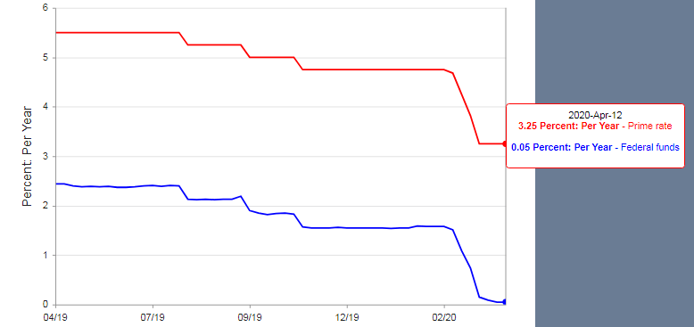
At the top of the lending, chain sits the Central Bank, which determines the rate at which banks lend each other money in the interbank market. In the United States, the Central Bank is the Federal Reserve, and it influences the interbank rate, also called the Fed Funds Rate, by purchasing or selling government securities.
When the Federal Reserve purchases bonds, it results in the injection of money into the system, thereby increasing the liquidity of the bank market, and correspondingly the overall economy. When the Banks have more money to lend, the banks will lend this newly injected money at a lower rate, as a result of competition, and excess reserves.
On the other hand, when the Federal Reserve sells the bonds, it takes money out of the system, where banks become less liquid and thereby increasing their interest rates to get the best price for their remaining funds.
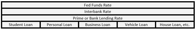
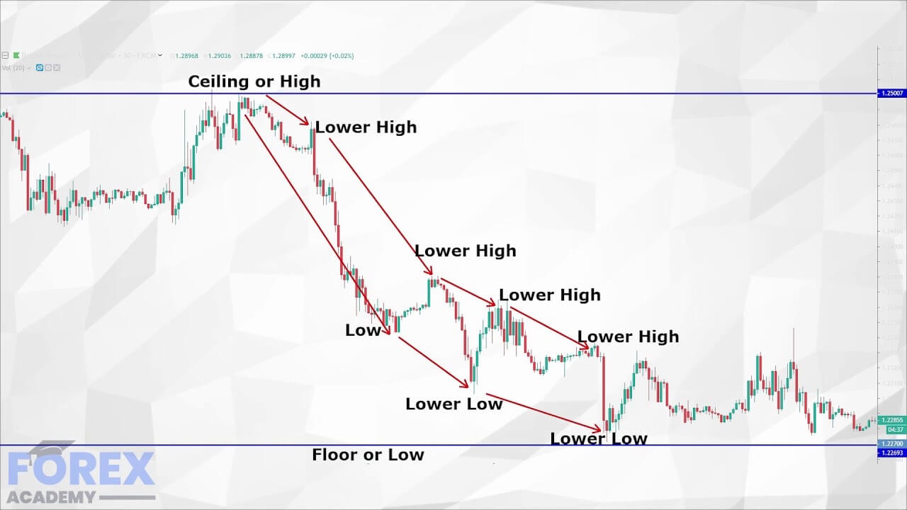
Hence, the Fed Funds rate serves as the base for the Prime Rate or Bank Lending Rate. This Prime Rate serves as the basis for all other subsequent forms of loans like a personal, business, student, or even Mortgage loans. The below diagram is illustrative of the above points.
The below diagram summarizes the hierarchy of the rates. The lower cell type of interest rate derives its value from its upper cell interest rate.
How can the Bank Lending Rate numbers be used for analysis?
The Prime Rates change based on the Fed Funds Rate, which is decided by the Central Bank based on economic factors.
The remaining forms of loans are derived from the Prime Rate and a percentage spread that is charged by banks for lending the money. The spread (or profit) varies from bank to bank and also on the customer’s credit score. Hence, there is no single Prime Rate as the best customers of the banks vary, and hence, usually, the quoted Prime Rate is the rate published daily in the Wall Stree Journal.
The Prime Rate is seen as a benchmark for commercial loans. In most cases, that would be the lowest rate available to the general public and business corporations, and it is not a mandatory minimum. In the end, banks can tweak their rules in their favor. A decrease in Fed Funds rate does not necessarily guarantee that a subsequent drop in the Prime Rates, but due to competition amongst banks, the general trend is that the Prime Rate follows the Fed Funds Rate.
We must understand that a Bank’s primary motive is to make money out of money. They make their profit on the difference between the Lending Rate and the Deposit Rate, also called the Net Interest Margin. A variety of factors come into play before a loan is sanctioned. The risk associated with the borrower (credit score, income source, assets, and existing liabilities), fluctuating market and economy, general consumer and business sentiment, etc. all add to the decision-making process of setting the Prime Rate, or other loan forms derived from it.
The ease at which loans are available to the public determines the type of monetary policy. In a loose lending environment, the Bank Lending Rates are typically low, which encourages consumers to borrow more and spend more into the economy. On the contrary, when the Rates are high, it discourages consumers from borrowing and encourages saving more.
The Central Bank regulates money flow through its interbank operations to manage inflation and deflation. In developed economies, a loose lending environment promotes growth & avoids possible deflationary threats. The tight lending environment is a strategy to slow down or cool down an overinflating economy.
The affordability of loans determines how much money is in people’s hands to spend. Low Prime Rates ensure high spending environments that are good for businesses and promote growth and higher GDP prints and vice-versa.
The effectiveness of the Prime Rate changes is not immediate, as the changes in the Fed Funds Rates, Prime Rates take time to come into effect. There is generally a 4-12 months time lag before the intended changes start to play out, and yet there is no guarantee that these levers will work.
Impact on Currency
Higher Bank Lending Rates is deflationary for the economy, and currency appreciates. On the other hand, Low Bank Lending Rates are inflationary for the economy, and the currency depreciates in the short-run.
Although, the low rates are typically set to boost the economy, which will cancel out the depreciation effect on a longer time frame, the immediate effect is as stated above.
Economic Reports
For the United States, the Federal Reserve publishes daily Selected Interest Rates, which includes the Prime Rate figures also. Weekly average and monthly Prime Rate figures are also available. In general, weekly and monthly data are monitored by the market.
The data is posted from Monday to Friday at 4:15 PM every day for the Daily Selected Interest Rates.
The St. Louis FRED also keeps track of Prime Rates, and it is available here
Bank Lending Rates for various countries are summarized together and available here
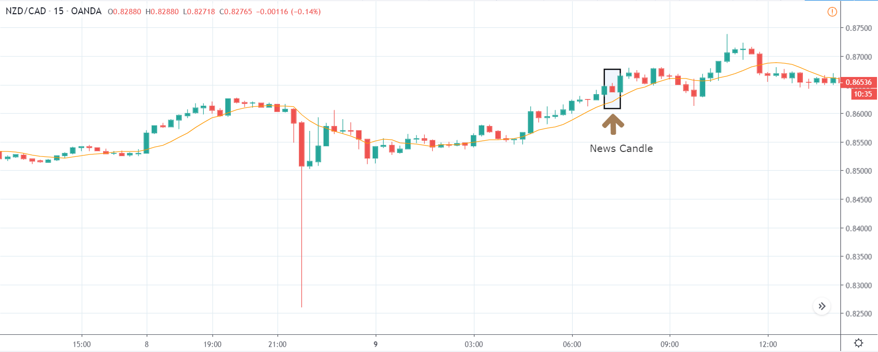
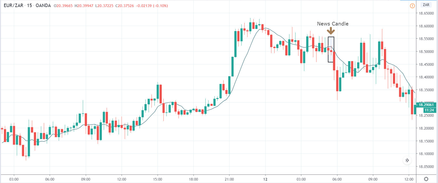
Impact of the ‘Bank Lending Rate’ news release on the price charts
In the previous section of the article, we learned about the ‘Banks Lending Rate’ fundamental indicator, which talks about the change in the total value of outstanding bank loans issued to customers and businesses. A country that lends more to people and companies is said to encourage economic growth by giving more money in the hands of people. This directly stimulates consumer spending and promotes the overall development of the country. This is one of the key parameters, if not very important, which investors look at before taking a position in the currency.
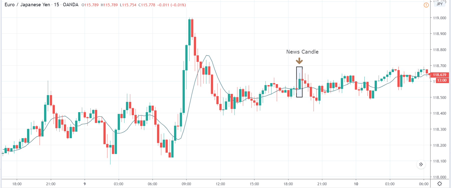
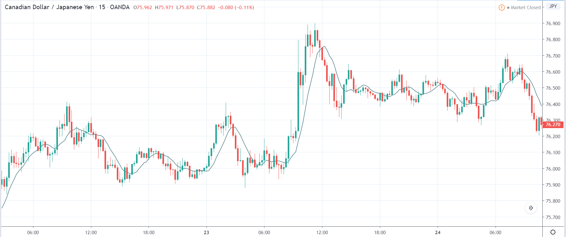
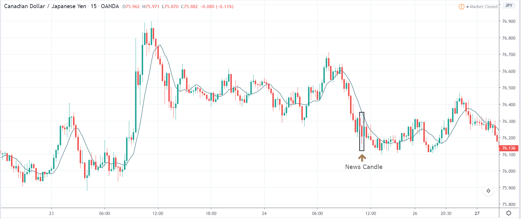
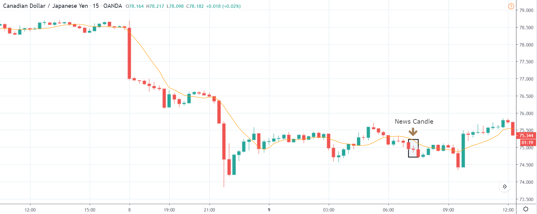
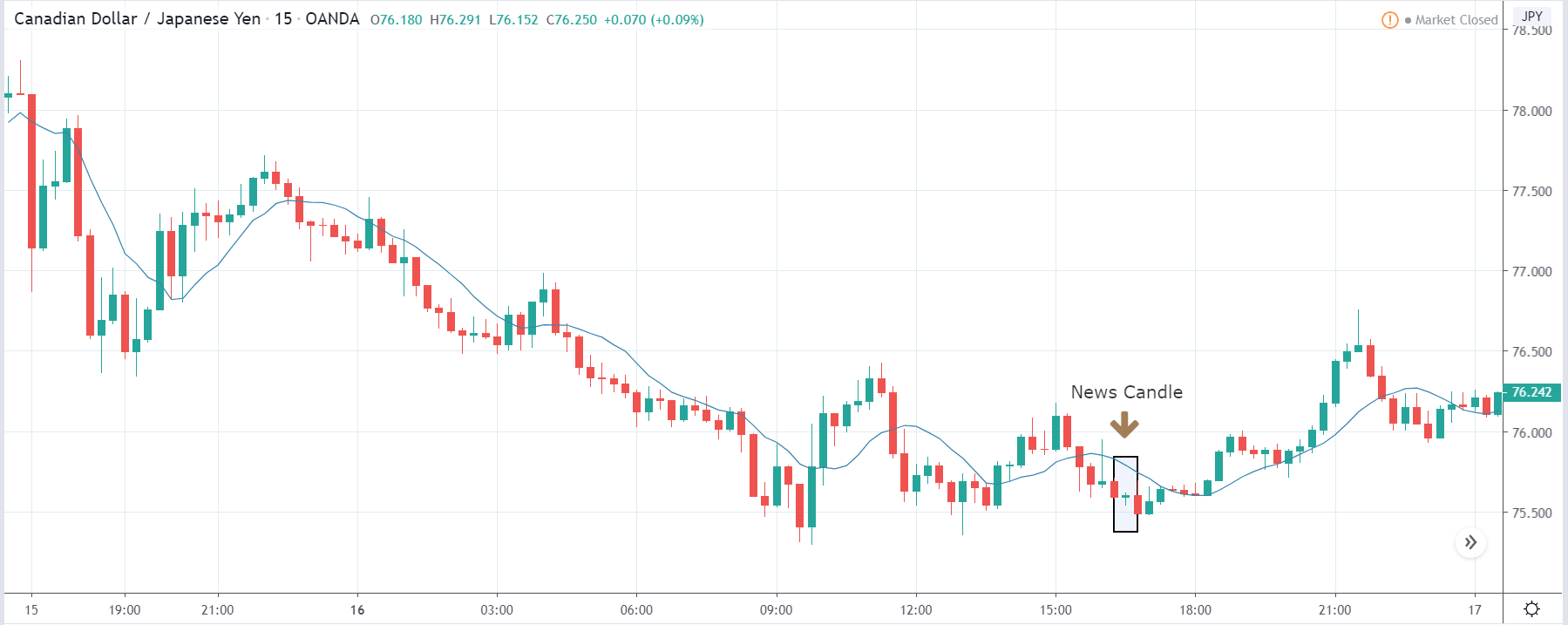
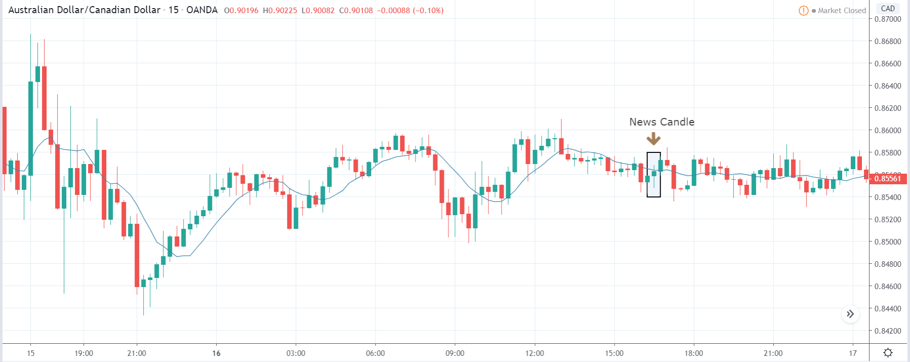
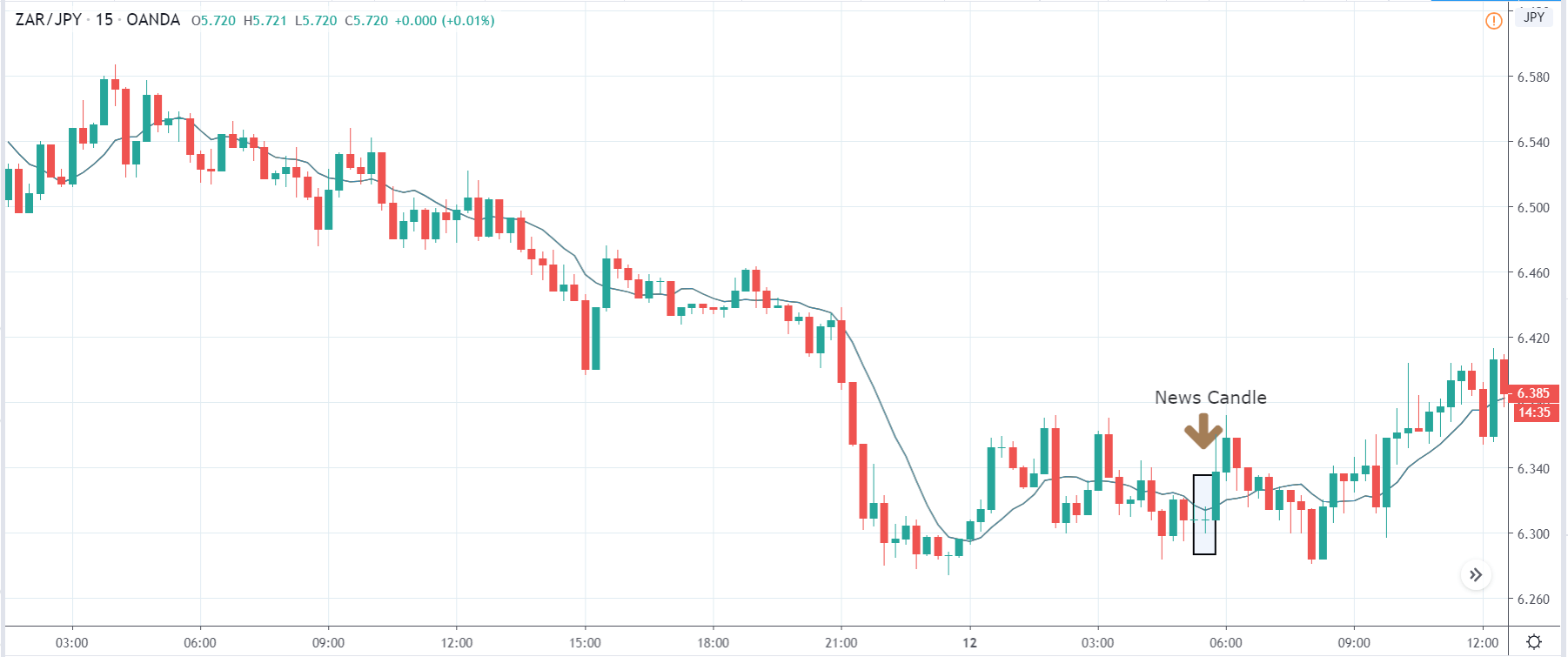
In the following section of the article, we shall look at the impact of the Bank Lending Rate announcement on various currency pairs and examine the change in volatility due to the announcement. The below image shows the previous and latest data of Japan, where the rate was reduced from the previous month. Let us analyze the impact of the same on some major Japanese Yen pairs.
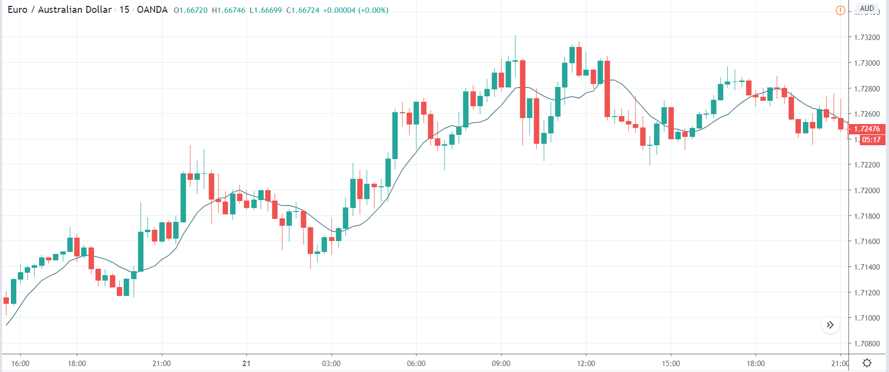
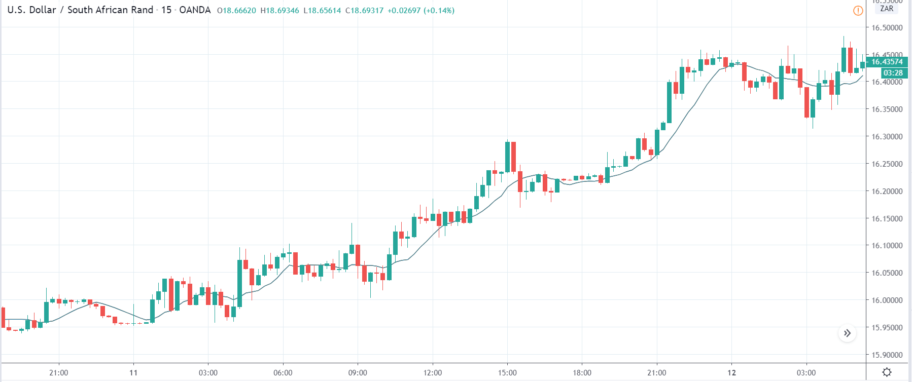
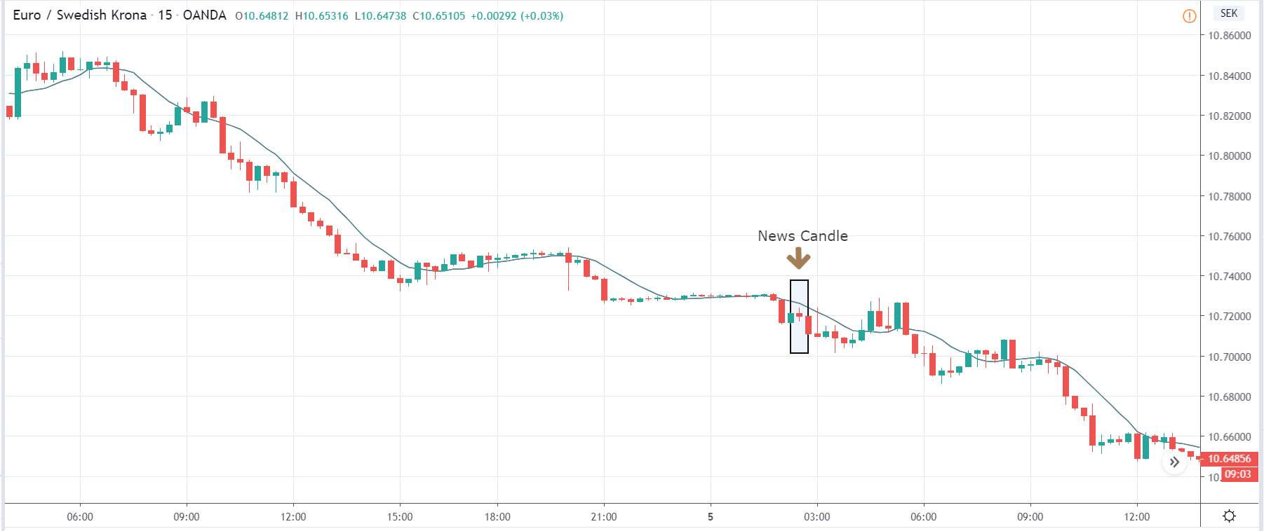
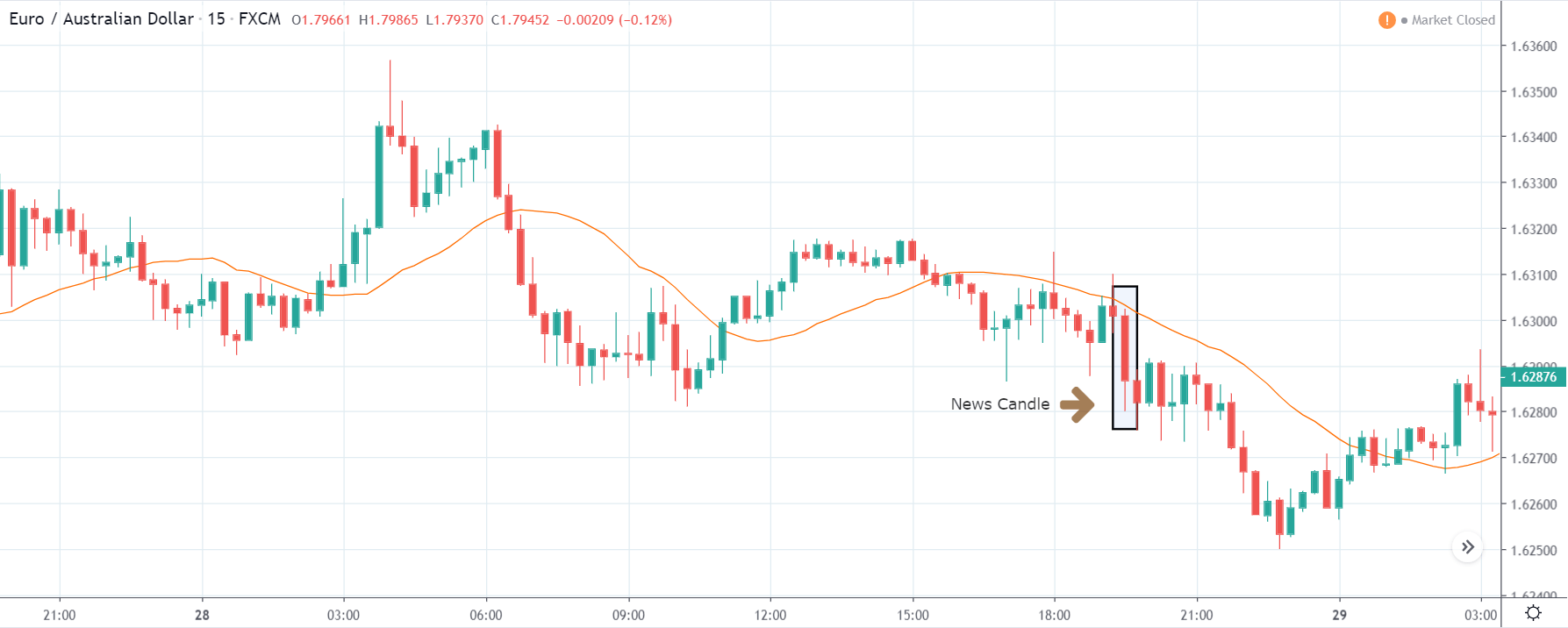
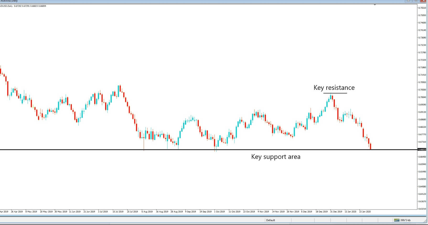
EUR/JPY | Before The Announcement
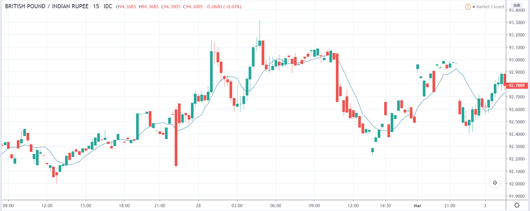
We shall start with the EUR/JPY currency pair for discovering the impact of the Bank Lending Rate on the currency. The above image shows the characteristics of the chart before the announcement was made, and we see that after a high volatile move, the price has developed a small ‘range.’ Currently, the price is at the ‘support’ where we can expect to pop up any time. Thus, the bias is on the ‘long’ side.
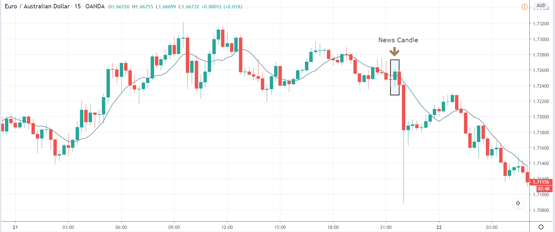
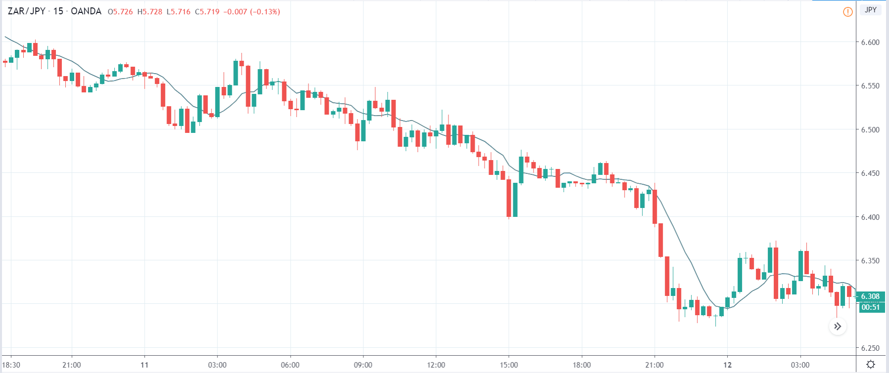
EUR/JPY | After The Announcement
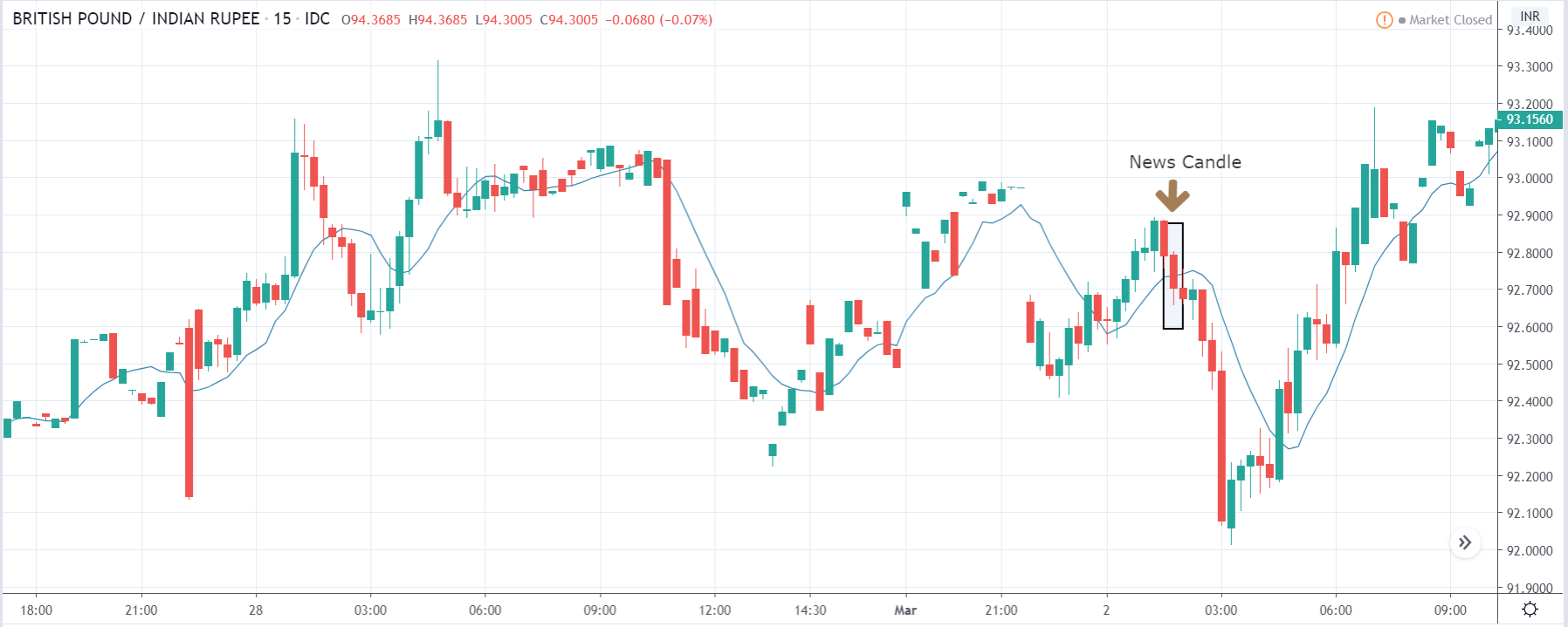
After the news announcement, the price suddenly goes higher and closes as a bullish candle. The spike in volatility to the upside was a result of the negative Bank Lending Rate, which was slightly reduced as compared to the previous month. As the rate was not increased, traders bought the currency and sold the Japanese Yen. But since the data was largely poor, the ‘news candle’ was immediately retraced fully, and volatility increased on the downside. Thus, we need to wait for the volatility to subside in order to make a trade.
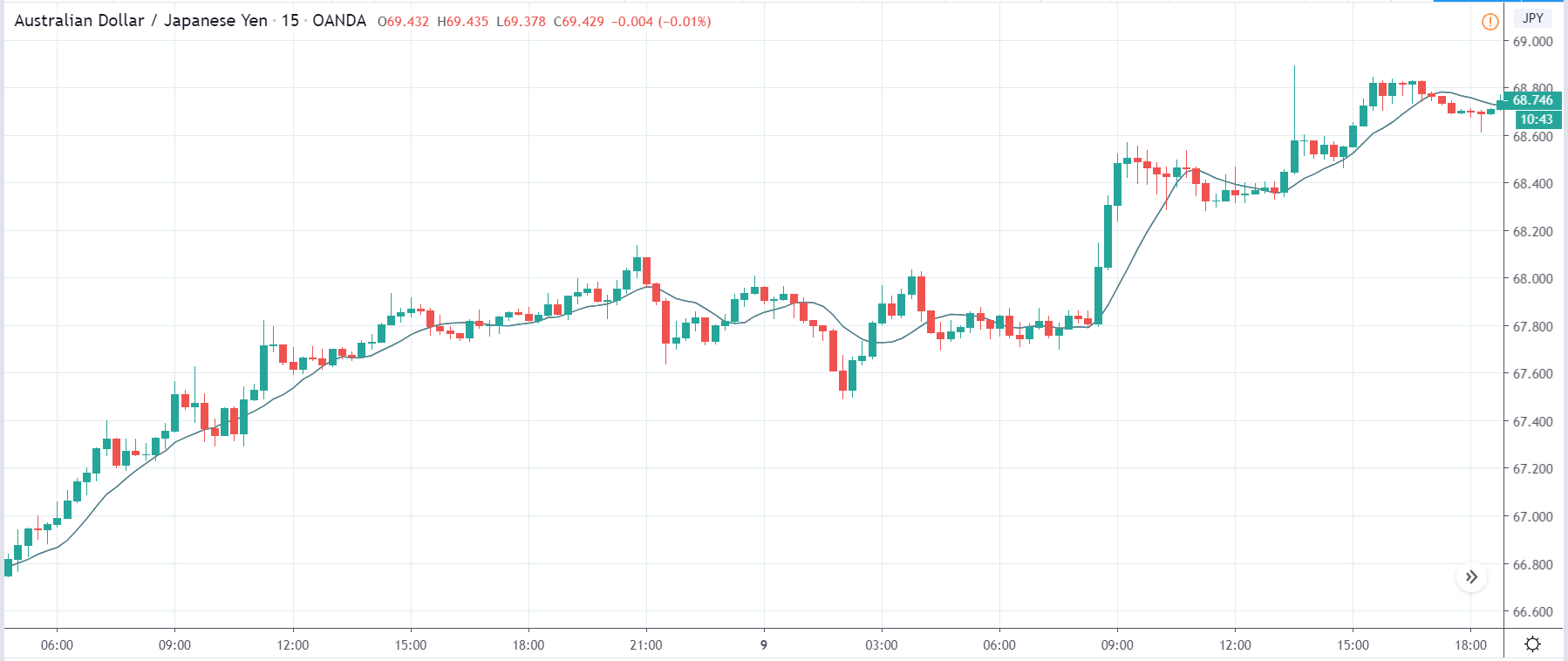
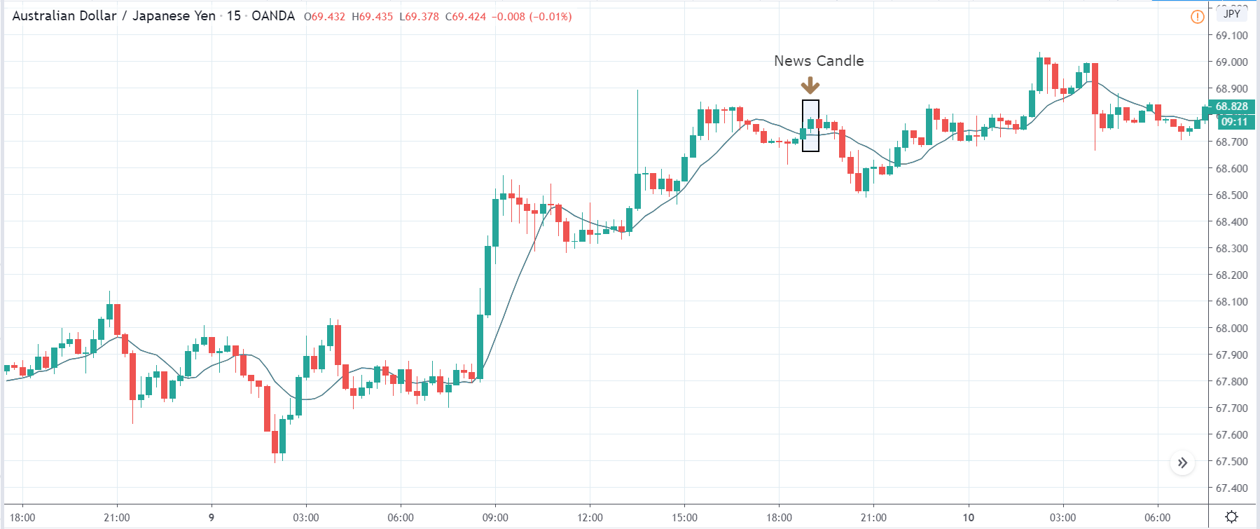
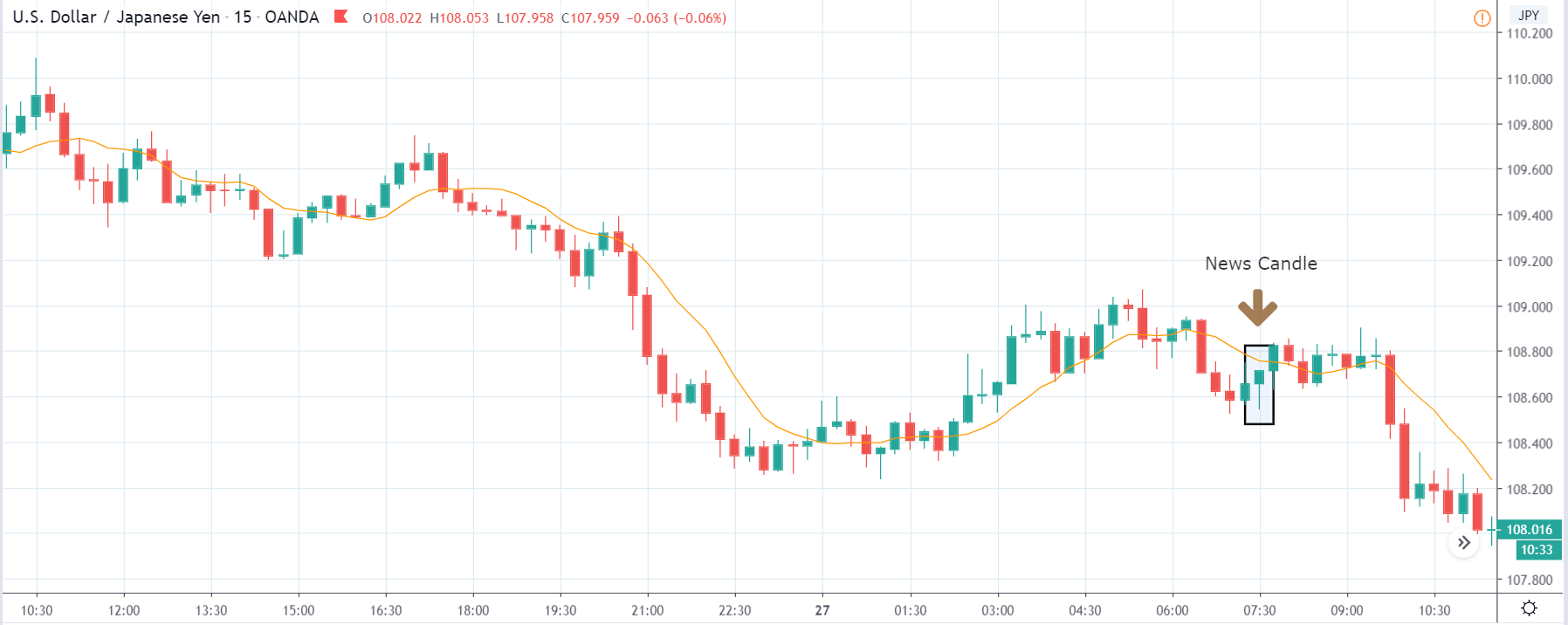
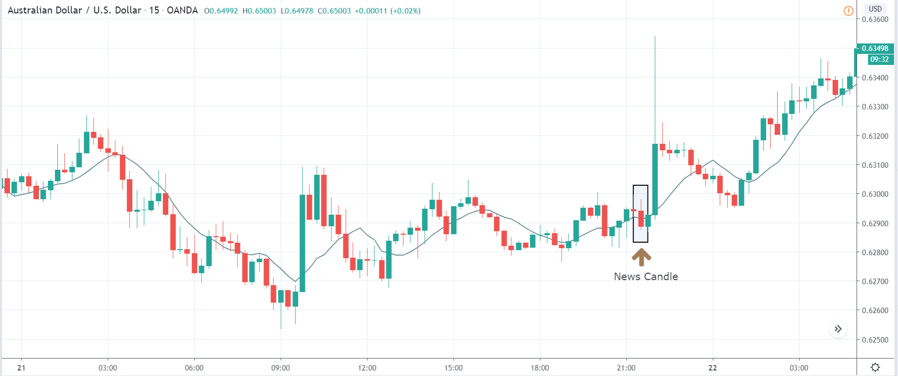
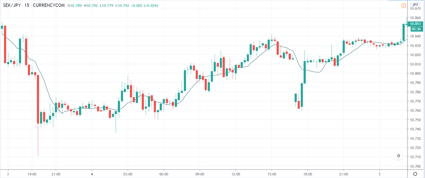
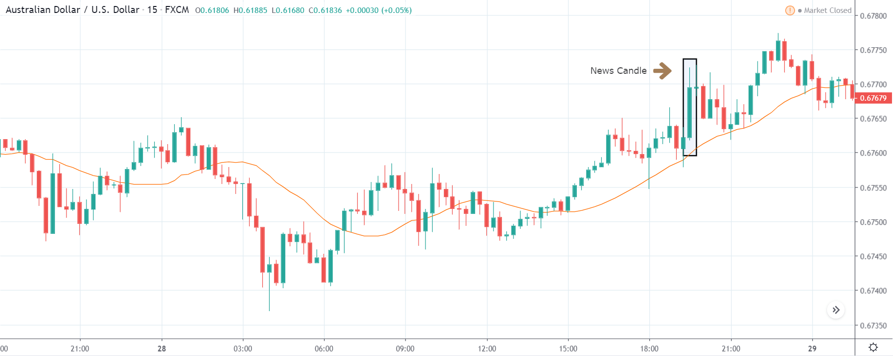
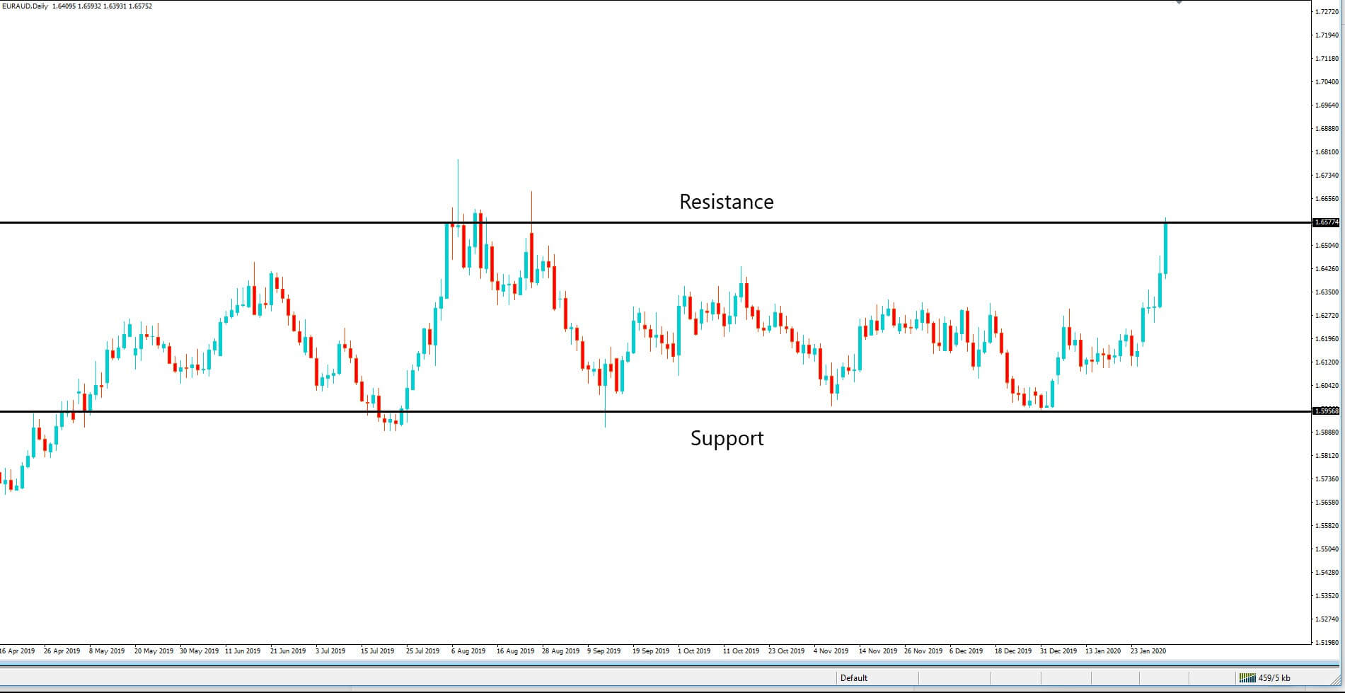
AUD/JPY | Before The Announcement
AUD/JPY | After The Announcement
The above images are that of the AUD/JPY currency pair, where we see that before the news announcement, the pair in a strong uptrend with nearly no retracement of any sort. This means the Japnese Yen is extremely weak, and irrespective of the news data, a ‘short’ trade is not recommended whatsoever.
After the news announcement, the price initially moves higher, but later volatility increases to the downside and goes below the moving average. This shows that the Bank Lending Rate news was not bad for the Japanese Yen, which is why traders bought the currency later on. We need to be careful by not taking a ‘short’ trade as the overall trend is up and that the impact is not long-lasting.
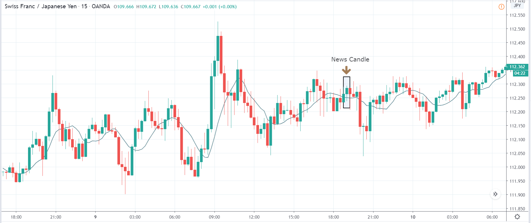
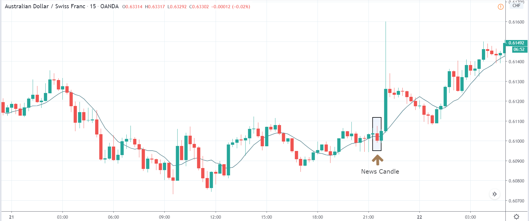
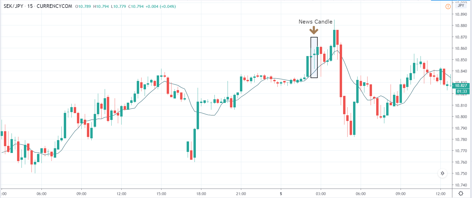
CHF/JPY | Before The Announcement
CHF/JPY | After The Announcement
The above images represent the CHF/JPY currency pair, where we see in the first image that the market is clearly ‘range’ bound and is not trending in any direction. Just before the announcement, the price is near the top of ‘range,’ which means we can expect sellers to get active any moment from now. We shall wait and see what the news release does to the currency pair and then take a suitable position in the market based on the data.
After the news announcement, the price moves higher, similarly as in the above currency pairs, but gets instantly retraced. The currency pair forms a ‘Rail-Road Track’ candlestick pattern, which indicates that the pair is going to continue its downward move. Hence traders can take ‘short’ after noticing such a pattern after a news announcement. Technically also the place is supportive of a ‘sell.’
That’s about ‘Bank Lending Rate’ and its impact on the Forex market after its news release. If you have any questions, please let us know in the comments below. Good luck!
Cement is a commodity that is likely to never run out of demand any time soon. As buildings get kept on renovated in the developed economies, and significant infrastructures like apartments, independent single-family houses, and corporate company buildings continue to be constructed in the developing economies, Cement is required. Increasing Cement Production figures are suitable for the economy, and if the increase is due to international demand, then it is good for the global economy.
Few commodities like Crude Oil, Iron, Steel, and Cement are very required in the modern economy, and countries that are ahead in the production of these goods have experienced substantial growth. Concrete stands behind water in second place as the most widely consumed resource on the planet. Hence, understanding of Cement Production and its impact on economies can help us understand the macroeconomic picture for better fundamental analysis.
What is Cement Production?
The Cement that we generally refer to is the Portland Cement. Cement is the primary ingredient of concrete used in construction. Cement combines with water, sand, and rock to harden to form a concrete structure that has high strength and durability.
Cement is manufactured through a tightly regulated chemical combination of Calcium, Aluminum, Silicon, Iron, and other ingredients. Cement is made using limestone, shells, and chalk or marl combined with shale, clay, slate, blast furnace slag, silica sand, and iron ore. These together, when heated at high temperatures, form a rock-like substance that is ground into the fine powder that we generally refer to as Cement.
How can the Cement Production numbers be used for analysis?
Cement is an essential ingredient in today’s urban infrastructure. It is used in the construction of homes, buildings, apartments, etc. Hence, every physical structure that we can set our eyes on around us is probably made out of Cement. It is for this very reason Cement stands second after water as the planet’s most consumed resource.
Hence, the demand is virtually inexhaustible, not for the near future, at least. As the emerging economies continue to develop at a pace higher than that of the mature economies, there will be a large section of the global population coming into the middle-class, where invariably demand for housing, expansion of businesses are set to increase.
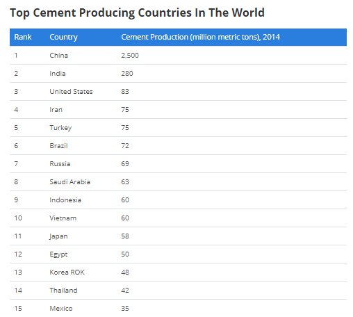
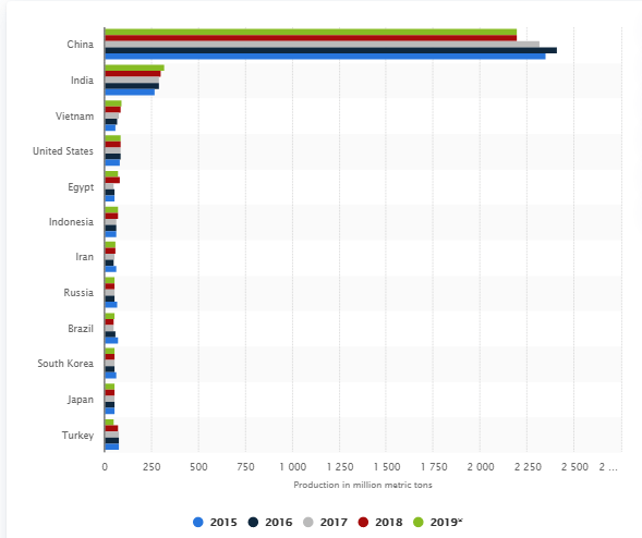
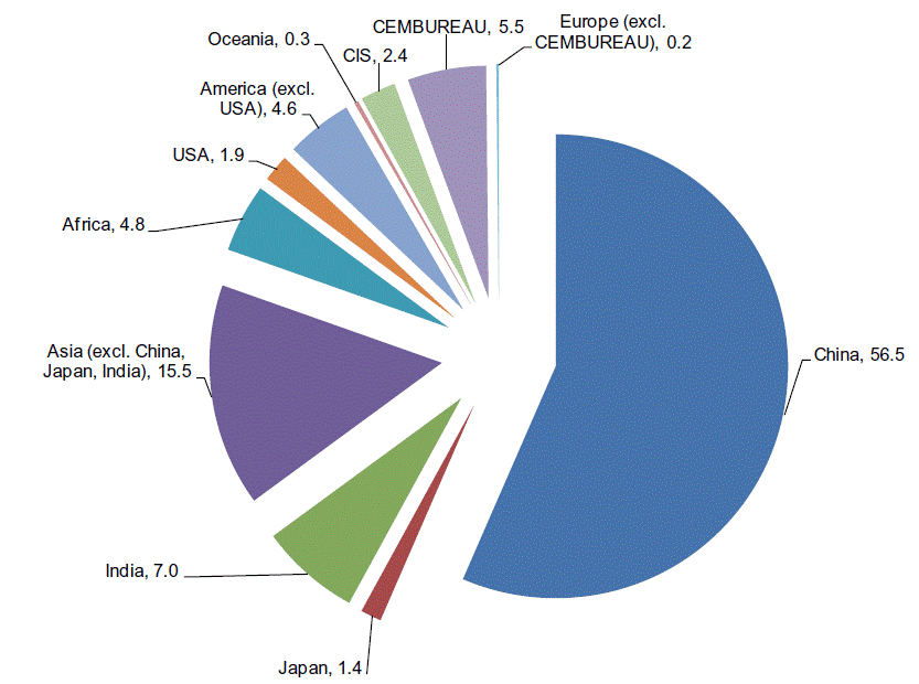
In the world of Cement Production, China is miles ahead of any other country, exporting 2,500 million metric tons of Cement in 2014. China has the largest cement industry. China uses this Cement for its construction as well as exporting to other countries. Cheaply available Cement has mostly helped China in its infrastructure improvement.
In the second place, far lies India with about 280 million metric tons output in 2014. Even further lies the United States, with about only 83 million metric tons in 2014.
Although the United States remains the largest economy in the world, that is going to change, as China and India continue to grow at a pace higher than the USA. The growth rate of India is the highest, while China is close to the United States in GDP terms.
As of 2019, the USA GDP is 21.5 trillion dollars, while China stands second with 14.2 trillion dollars. But it is important to note that China’s growth rate is higher than that of the USA, and if this continues, China will beat the United States. Most emerging economies are achieving their economic growth through exports, and dominating such essential commodities, like Cement, gives the economy an upper hand.
The availability of Cement at low prices helps the erection of commercial infrastructure easy that promotes the ease-of-doing-business factor in the country. As many companies like Apple develop their products in the United States but manufacture them in China, this promotes growth. The availability of infrastructure helps boost the economy to a great extent.
An increase in Cement Production helps developing economies to tap into the global market demand to compete against China for a more significant portion of the world market. For example, Indonesia is improving its share in the global market by providing Cement for as low as just 20 dollars compared to the 34 dollars price tag of China.
Hence, developing economies that can produce Cement commercially can boost their economy through international trade exports. Once a system is established that is efficient, upscaling it to unprecedented levels can boost the economy significantly.
Note: Cement Production, although important, comes at the cost of air pollution. Cement Industry is one of the primary sources of Carbon Dioxide (Greenhouse gas) in the atmosphere, which is responsible for global warming. It is also responsible for soil erosion that destroys the top layer of land, which is necessary for agriculture.
An alternative called Green Cement is to replace Cement. It has better functionality, uses fewer resources, and is less damaging for the environment. With environmental issues being a significant concern, a potential shift may occur in the market towards green Cement as the go-to product for construction. Countries that will come up with an efficient way of mass-producing this green Cement at affordable prices can beat the current Cement industries. The only challenges are pricing and lack of availability in large quantities.
Impact on Currency
Cement Production is an economic indicator in our analysis solely based on its importance and demand. It is a proportional indicator, meaning an increase or decrease in its numbers can grow or contract the economy, thereby appreciating or depreciating domestic currency, respectively.
It is a micro-economic indicator, as it does not cover the entire economy’s production and can be closely monitored for countries whose dependency on Cement Production is high, which is more useful for regional level assessment.
In the currency markets, Cement Production values are not macroeconomic indicators and are only useful in microeconomic analysis within the country to predict construction-related growth, as an increase in labor force employment, wage growth, which are generally seasonal.
Economic Reports
The National Bureau of Statistical of China publishes monthly data of its Cement Production on its official website.
We can find global Cement Production data on globalcement.com given in the sources.
Cement Production statistics for various countries can be found here
Updates on Cement Industry, in general, can be obtained here
Impact of the ‘Cement Production’ news release on the price charts
In the previous section of the article, we understood the Cement Production fundamental indicator and saw how it could be used for analyzing a currency. We shall extend this part of the discussion and see the impact it makes on a currency pair when the data is released. We would like to mention that Cement Production is not an important economic indicator when it comes to the fundamental analysis of a currency. Investors don’t consider it to a significant driver of the currency, but it surely impacts the construction segment, as building construction is largely dependent on Cement production and supply. This, in turn, affects the economy.
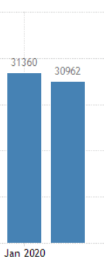
In today’s example, we will examine the impact of Cement Production on the Indian Rupee and look at the change in volatility to the news release. A higher production rate than before is considered to be positive for the currency, while a lower than the previous production is considered to be negative. The below image shows the graphical representation of Cement Production in India for the last two months. We see that there has been a reduction in total production for the month of February. Let us find out the market reaction.
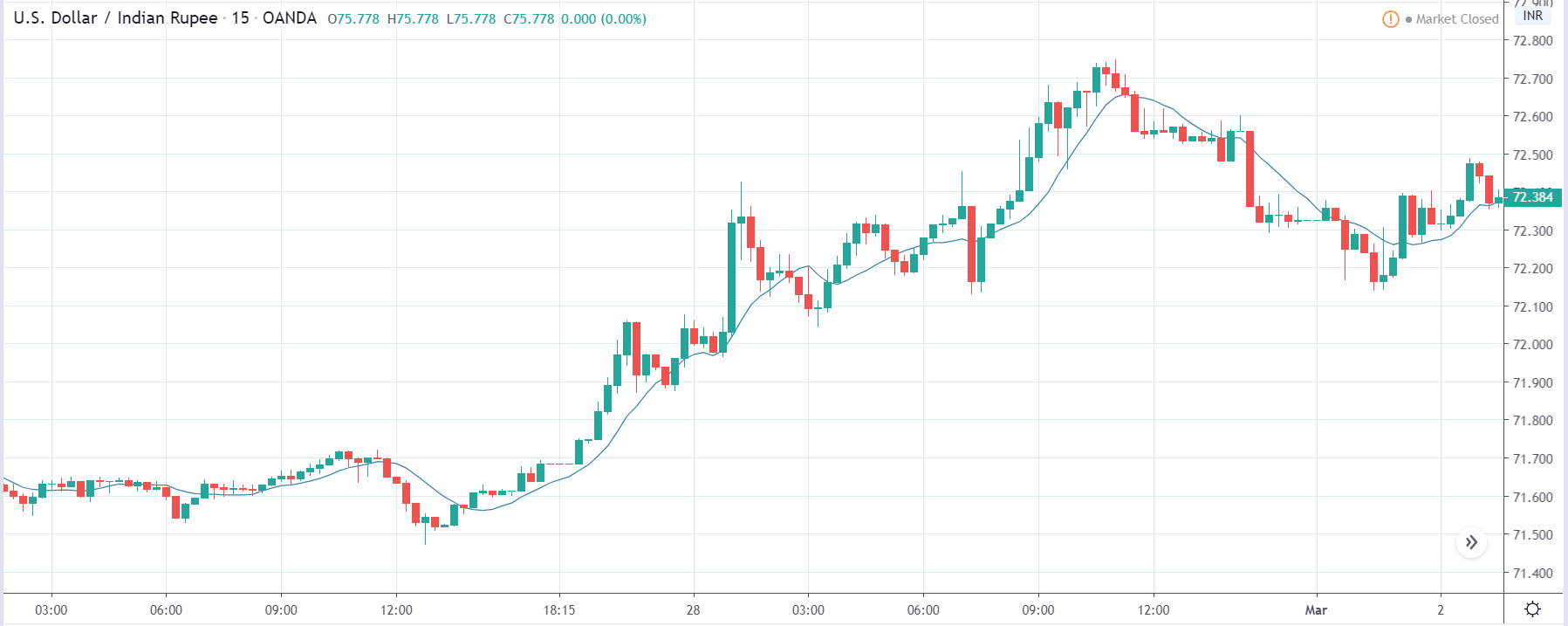
USD/INR | Before the announcement:
We will first analyze the impact on the USD/INR currency pair. The above image shows the state of the chart before the news announcement, where we see that the overall trend is up, and recently there has been a price retracement to a ‘demand’ area. The buyers have already reacted from the demand area, and the price is on the verge of continuing the uptrend. Since the Cement Production indicator does not a major impact on the currency, traders can take ‘long’ positions and trade with the trend.
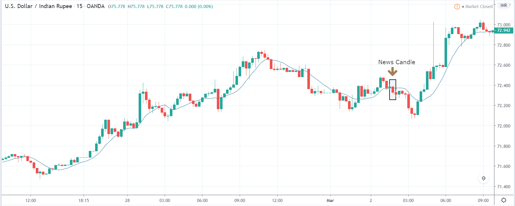
USD/INR | After the announcement:
After the news announcement, the price falls and goes below the moving average line. The ‘news candle’ closes with bearishness, indicating the Cement Production data was not lower by a large margin for that month as compared to the previous month. There is little change in volatility due to the news release, which explains the importance of the indicator among traders. Thus, traders should analyze the chart technically and trade based on that.
GBP/INR | Before the announcement:
GBP/INR | After the announcement:
The above images represent the GBP/INR currency pair, where, in the first image, we see that the market is moving within a range and currently is near the top of the range. At this point, one can expect sellers to activate and sell the currency. Since the ‘news announcement’ is a less impactful event, traders can take a ‘short’ position with a stop-loss above ‘resistance.’
After the news announcement, the market reacts positively to the data, and traders take the price lower. The impact of Cement Production was similar to the above pair as we see that traders bought Indian Rupee and strengthened the currency. Thus, it is clear that the market reacted technically (price fall from ‘resistance’) and not much to the news data.
EUR/INR | Before the announcement:
EUR/INR | Before the announcement:
The above images are that of EUR/INR currency pair where we see that before the news announcement, the market is in a strong uptrend, and recently the price has retraced to a ‘support’ area. This is a desirable market condition for going ‘long’ in the market after price action confirmation from the market. As the news data does not have a major impact on the currency, traders should not be worried about high volatility, which is typically observed after news announcements.
After the news announcement, the market moves lower by the bare minimum, and there is hardly any volatility witnessed. The Cement Production data did not create any major impact on the currency pair, where the market remains around the same price even after the news release. Once the market continues to move higher, one can join the trend by taking a ‘buy’ position.
That’s about ‘Cement Production’ and its impact on the Forex market after its news release. If you have any questions, please let us know in the comments below. Good luck!
Disposable Personal Income, also called DPI, is an economic indicator that can help investors understand the spending and saving patterns of the general population. It is from this data other forms of expenditures and savings are derived. Hence, understanding the changes in the relative disposable income numbers from time to time can help us understand the economic conditions better as part of our fundamental analysis.
What is Disposable Personal Income?
Disposable Personal Income, also called After-Tax Income, is what’s left of an individual’s income after all federal tax write-offs. Consequently, It is the amount people can spend, save, or invest. For example, An employee making 100,000 dollars a year, paying 25% of his income as tax would have to pay 25,000 dollars as tax payment, which leaves him with 75,000 dollars for that year. This 75,000 dollars would be his DPI, or more aptly the After-Tax Income.
Hence, the calculation of DPI is simple; it is just the difference between personal income and income taxes.
Note: The federal government may use the disposable income for further mandatory deductions like defaulted student loans, delinquent child support, or payment of back taxes. Hence, in the broader sense, the DPI would be the amount that is left after tax and other mandatory payments.
DPI is often confused with Discretionary Income, which is the amount that is left when the living expenses are deducted from the DPI. Living expenses are all the necessary expenditures incurred to conduct one’s lifestyle and would typically include rent, water bill, electricity bill, transportation costs, and groceries, etc.
For Example, A video gamer’s discretionary income would go to typically spending on purchasing new games, whereas a music-loving person would spend his discretionary income attending concerts perhaps. During times of recession or high deflationary conditions, the discretionary income takes the hit as it is miscellaneous spending and does not precede importance over taxes and necessary expenditures. Businesses that sell discretionary goods and services take the worst hit and hence are closely watched by investors for signs of recession and recovery.
Economic Reports
The U.S. Department of Commerce: Bureau of Economic Analysis (BEA) releases the DPI numbers every month in the last week for the previous month titled “Personal Income and Outlays” release. The month-on-month numbers are expressed in percentage changes with respect to last month’s figures.
The BEA also releases the other derived metrics from the DPI, like the REAL DPI, which takes inflation into account, and hence it is the inflation-adjusted version of DPI, PCE (Personal Consumption Expenditure) and REAL PCE reports.
How can the Disposable Personal Income numbers be used for analysis?
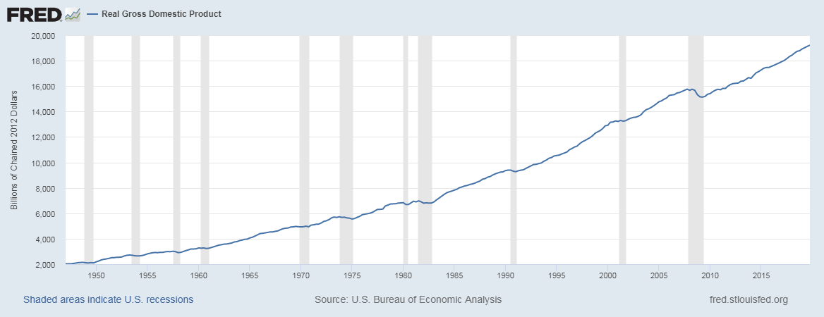
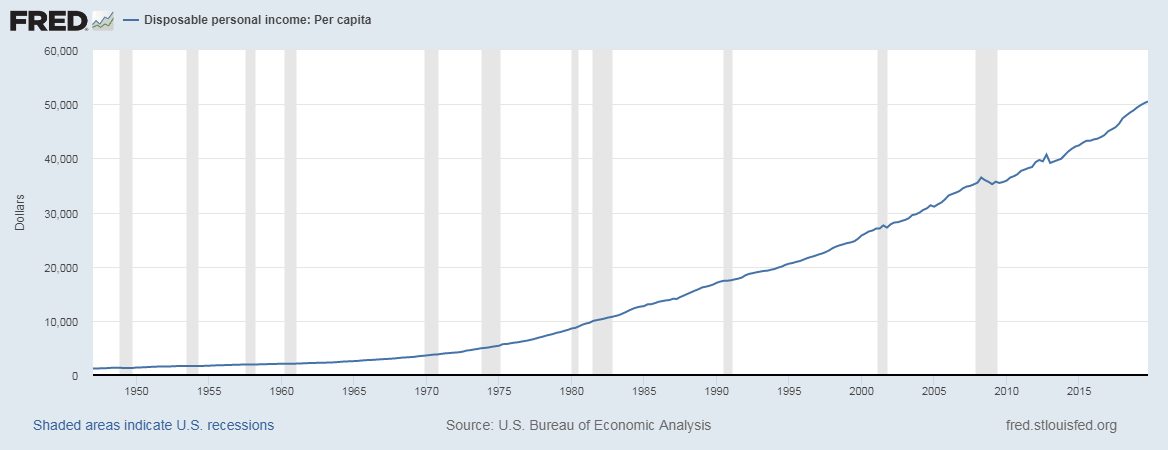
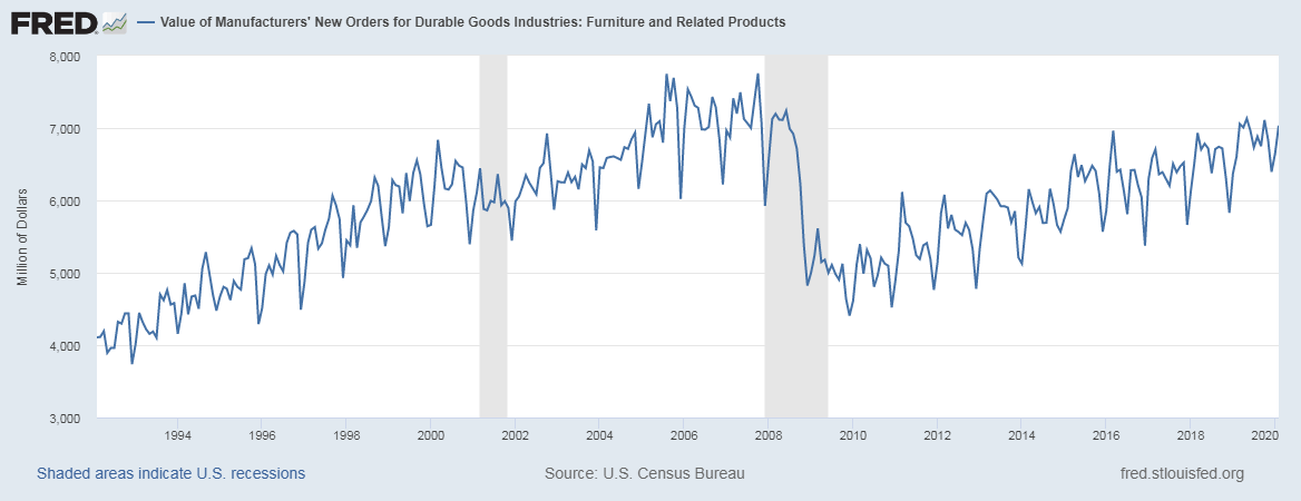
The DPI data set goes back to as far as 1929. With such a long-range, the confidence in the numbers is high amongst economists with regards to its reliability. When compared against GDP growth, there is a good correlation between both.
As we can see below, the graphs have a similar trend, the first one is the Real GDP, and the second graph corresponds to the DPI, which are taken from the St. Louis FRED website for reference and illustration here. The shaded region indicates periods of recessions.
We can also see that during recessions, the GDP and DPI flat out from their usual trend and trend sideways or downwards (during more extended recessionary periods).
As DPI shows what the amount left with the individual after deductions are, the numbers can be used to derive other metrics. Economic indicators like Discretionary income, savings rates, Marginal Propensity to Consume (MPC), and Marginal Propensity to Save (MPS).
All these indicators are useful in speculating the direction of money flow, whether it ends up in banks in the form of savings or other people’s hands as part of the expenditure.
A healthy and growing economy would be reflected in the DPI numbers as the people make up the economy. It is important to remember that DPI is a reflection of the present financial situations of employees and hence only shows what the current economic status of the nation is. It is a coincident indicator in this sense and is dependent on macroeconomic factors like the government’s policies, Quantitative Easing, inflation, etc. which direct the money flow. Hence, it is the effect in the cause-and-effect equation. It reflects the results of an action rather than the act itself.
Impact on Currency
A steady increase in the DPI is always good for the economy and, therefore, the currency. It is a proportional indicator. Low numbers are depreciating, and high numbers are appreciating for the currency.
A strong economy or most developed nation’s populations are expected to have higher DPI numbers relative to other economies, thereby enjoying a higher standard of living as they can spend on goods and services, beyond meeting their necessities.
An oncoming recessionary period would result in stagnant or dip in DPI numbers as people tend to save more when they are uncertain of their financial future.
Sources of Disposable Personal Income Reports
The monthly DPI numbers releases can be found on the official website of the Bureau of Economic Analysis as given below for reference:
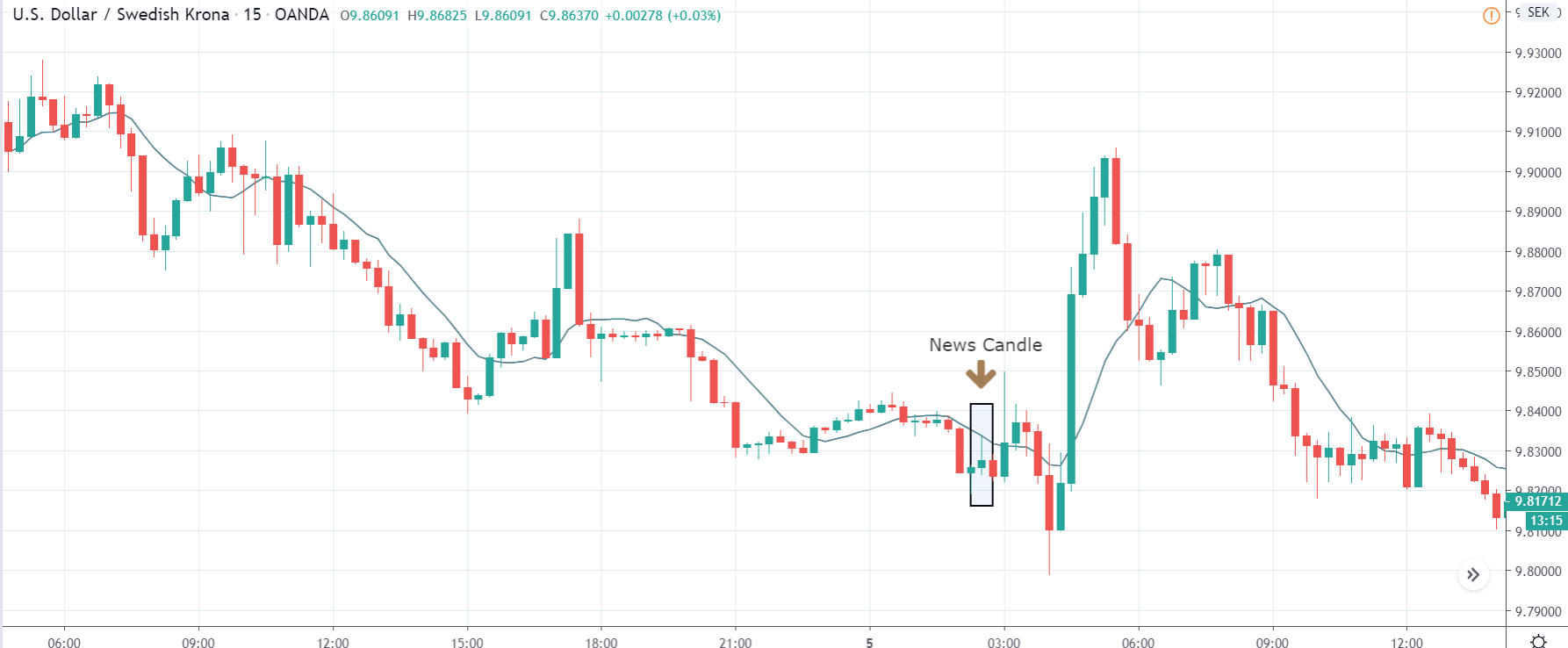
Impact of the ‘Disposable Personal Income’ news release on the price charts
By now, we have understood the definition and significance of the Disposable Personal Income economic indicator. In this section, let’s analyze the impact of this economic indicator on currency and observe the change in volatility.
Personal Income, Disposable Personal Income, and Personal Consumption are announced together, and data of each of them is released along with the Personal Income. This is why we have collected the date and time of the announcement of Personal Income. As we can see below (yellow mark), traders do not give a lot of importance to the Personal Income data, and therefore one should expect moderate to less volatility during the announcement.
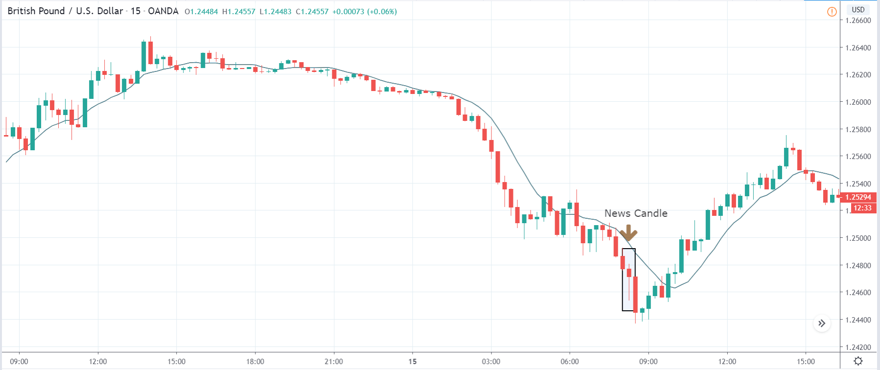
For illustrating the impact, we have used the latest Disposable Personal Income data of the United States. It is published by the Bureau of Economic Analysis of the U.S. The release said that Personal Income was increased by $106.8 billion in February, and the Disposable Personal Income (DPI) was increased by $88.7 billion which was 0.5% higher from the previous month. Let us look at the impact of this data on currency pairs.
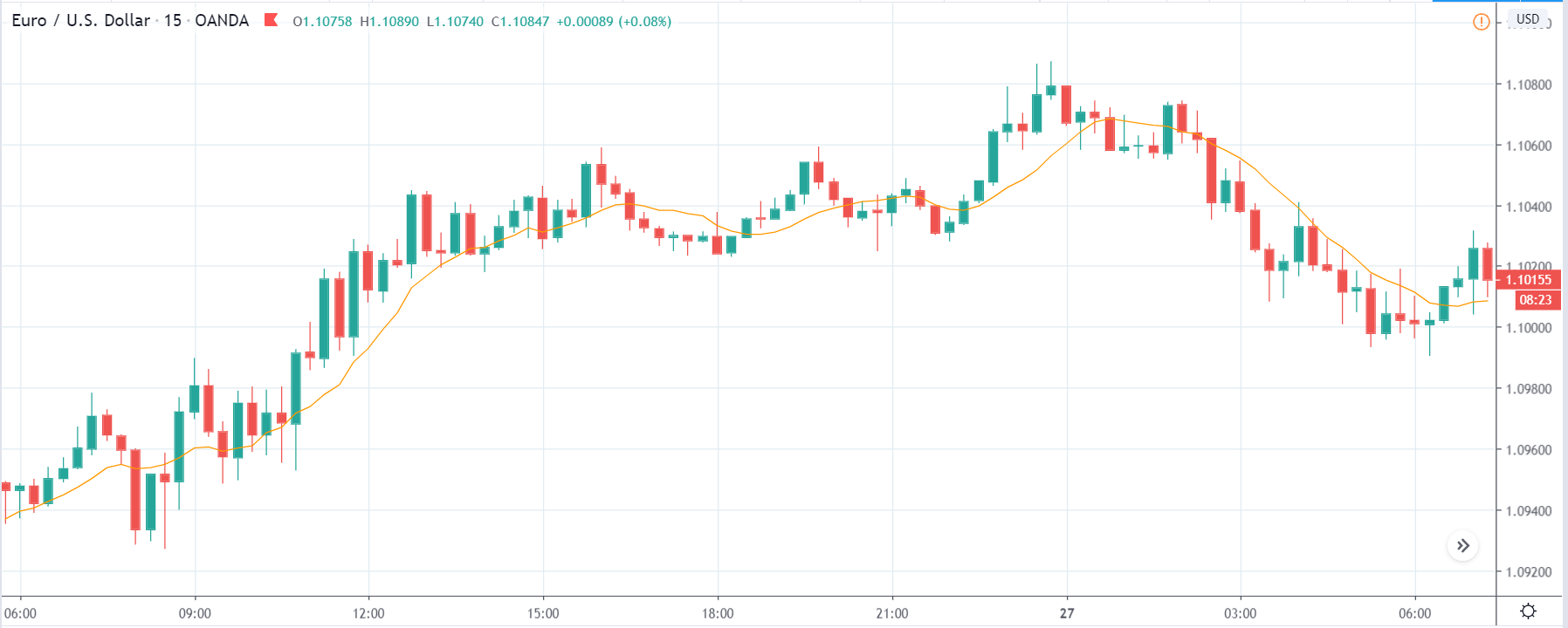
EUR/USD | Before the announcement:
The above image shows the state of the chart before the DPI data is announced, and we can see that the market is in a downtrend, and recently it has given a retracement. Technically, this is the ideal condition for going ‘short’ in the market, but as the volatility is high, it is better to wait for the actual data rather than trading based on the market expectations. Taking a ‘buy’ in this pair can be risky even if the DPI data is positive for the U.S. economy as the down move is quite strong, and the reversal will not last (DPI is not a high impact event).
EUR/USD | After the announcement:
The DPI announcement induced a fair amount of volatility in the pair, and the ‘news candle’ leaves a long wick on the top indicating high selling pressure. From the reaction, we can conclude that the DPI for the month of February was very positive for the U.S. economy, which made traders buy more U.S. dollars. This sudden increase in volatility to the downside is a confirmation sign that the market will go much lower. Thus, as the price goes below the 20-period moving average, one can take a ‘short’ trade with a stop-loss just above the news candle.
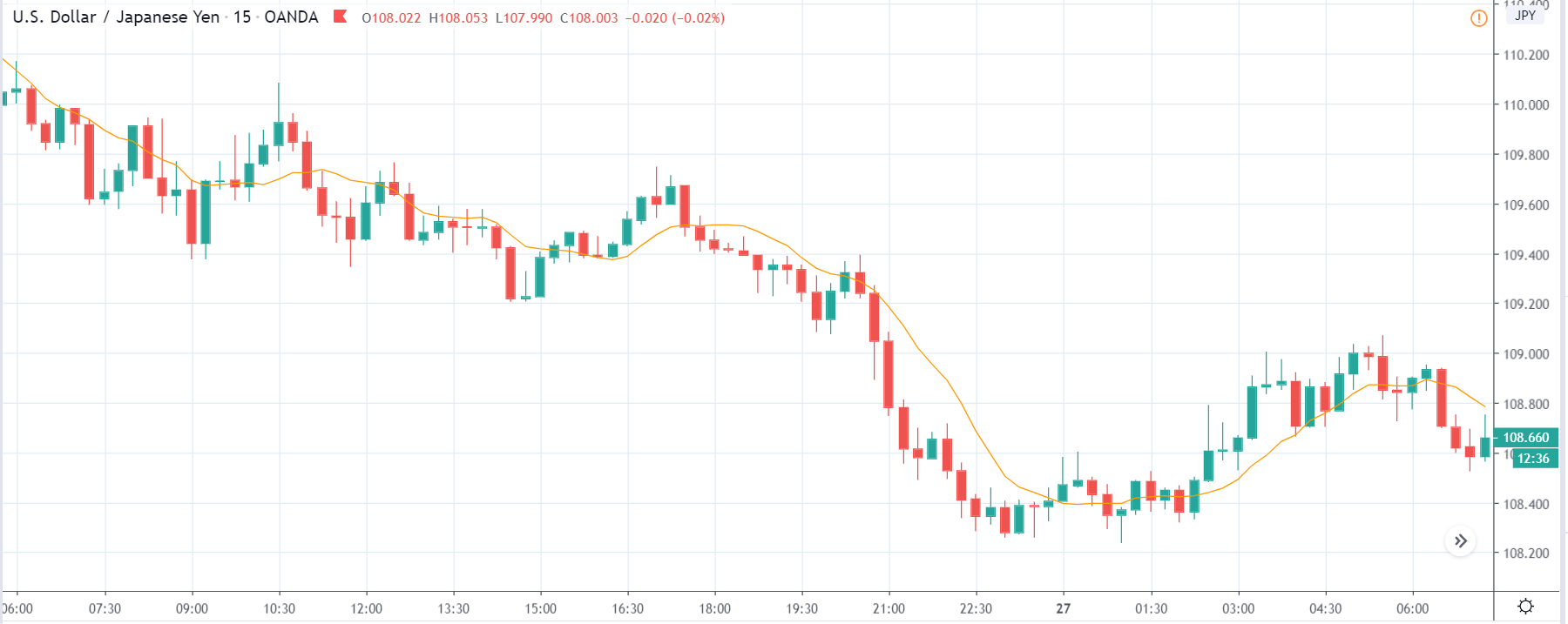
USD/JPY | Before the announcement:
USD/JPY | After the announcement:
Next, we discuss the USD/JPY currency pair, where the behavior of the chart is different from the EUR/USD pair. Even though the chart is in a downtrend, the U.S. dollar is on the left-hand side. Hence, a downtrend indicates weakness in the currency. Just before the announcement, price is at the lowest point from where the market had retraced earlier. This means, irrespective of the news announcement, we can expect some buying strength from here. We cannot position ourselves on any side of the market at this point as technically, there is no supporting reason.
After the DPI data is announced, the market moves higher as a result of good DPI numbers, and the price makes a ‘bullish hammer’ candlestick pattern. But the data was not very upbeat to increase the volatility too much on the upside. As the market does not give clear signs of reversal, we cannot go ‘long’ in the market based on the data.
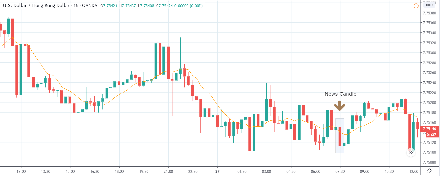
USD/HKD | Before the announcement:
USD/HKD | After the announcement:
The above images represent the USD/HKD currency pair where the price appears to be moving in a range, and predominantly the trend is down. Just before the announcement, the price is in the middle of the range, and we cannot predict at this point as to where the price will go. We need to wait to see the shift in volatility due to the news release and then have a view on the market.
After the DPI numbers are out, price falls to the bottom of the range, and we see a strong bearish candle. The DPI data proved to be positive for the currency in the above two pairs, but here the market reacted negatively. This could be due to the strength in the Hong Kong dollar or extreme weakness in the U.S. dollar. As the impact of DPI on currency is less, one can ‘buy’ USD/HKD near the ‘support’ with a target near to the ‘resistance.’
That’s about ‘Disposable Personal Income’ and its impact on the Forex market after its news release. If you have any queries, let us know in the comments below. Cheers!
Government Budget is one of the annual reports that moves the market volatility significantly. The Government of a country or a state is responsible for managing the economic activity of that region. Hence the Budget will primarily determine the pace of economic activity for that fiscal year. Government Budget figures are incredibly crucial for traders and investors as it can impact everything from taxes to Sovereign risks.
What is Government Budget?
Government Budget is a detailed annual plan for public spending by the Government. The Budget, in general, applies to individuals, corporations, and Governments. An individual planning his finances for the year determining what portion of his monthly/annual income he is going to allocate for his expenses would be his Budget. For corporations, annual budgets would detail what amount of revenue would be spent on different departments like R&D, marketing, infrastructure, etc.
The Government Budget is the same as the above, but the list of expenses is related to public welfare. The Government is responsible for a multitude of operations like salary payments to Government employees, financing agricultural subsidies, providing financial support to specific industries. It may also include paying for military equipment, payout pension funds to the applicable people, and other Government running operations expenses, etc.
The Government Budget is calculated on an annual basis, and for the United States, this fiscal year begins on the 1st of October to the next year’s 30th of September.
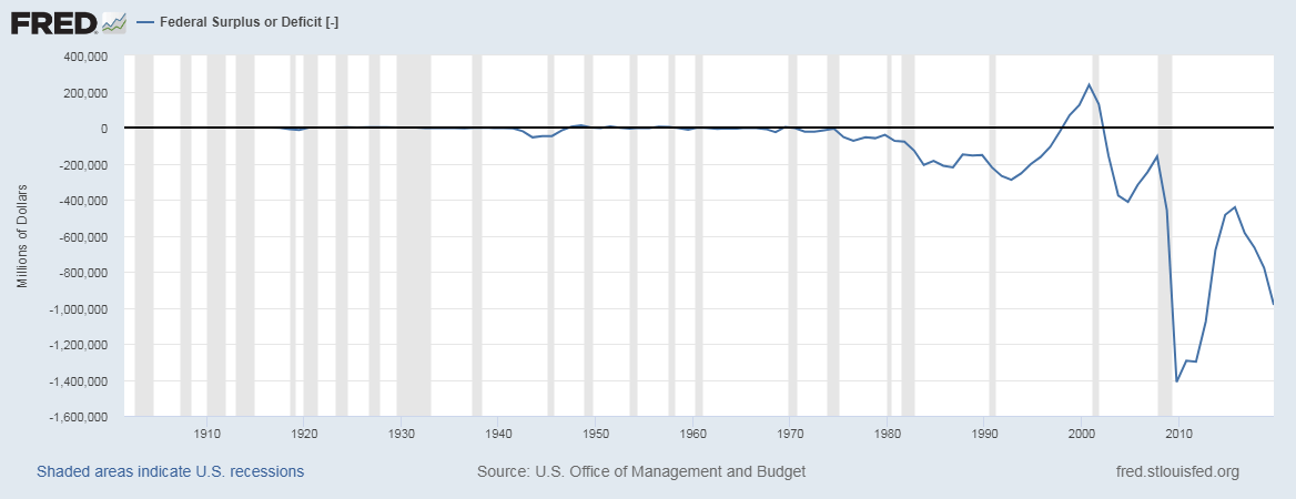
What a Government earns through taxes is called revenue, and what it spends on is categorized under Government Spending. When the spending exceeds its revenue, then we call it as a Budget Deficit or Fiscal Deficit. On the other hand, when the revenue exceeds spending, we have what is called a Budget Surplus or Fiscal Surplus. The United States has been running a budget deficit most of the time throughout history, as shown below:
Budget money spent is usually categorized into two categories:
Mandatory Spending: These are the spending that the Government has no choice to cut back on as these are stipulated by law, which the Government cannot fault on. For the United States, Social Security is one such program that was brought into the United States law by President Roosevelt in 1935, under the Social Security Act. Medicare and Medicaid are also typical examples of Mandatory Spending, which are fixed and must be paid out by the Government.
Discretionary Spending: This part can make or break an economy. It is the part of Budget that the Government decides to spend on other programs that are not mandatory but essential for growth. There is certain flexibility on how much can be spent on which part of the economy.
How can the Government Budget numbers be used for analysis?
The Government’s Fiscal Deficit is financed through borrowing money from investors in the form of bonds for which the Government promises to pay interest. Deficit each year adds to the debt. The United States and many other developed economies have spent most of their time maintaining a Budget Deficit as the spending has been failing to stimulate the economy year after year.
If the Government decides to cut back on spending to service debt and interest payments, then the economy may slow down due to a lack of funding stimulus. On the other hand, if the Government continues to spend beyond its revenues to stimulate the economy, then it will keep piling up the previous debts.
The Budget has both short-term and long-term impacts on the economy. Based on which sectors the Government has chosen to allocate its spending, investors and traders can predict economic growth and slowdowns in different sectors.
The Budget’s portion that is being spent on servicing debt and interest payments also decides whether the country is in danger of Sovereign Credit Risk. The credit rating agencies like Standard & Poor’s, Fitch Group, and Moody’s, etc. credit rate the Government. If the credit rating falls, then investors quickly lose confidence in the Government’s ability to pay back.
Hence, investors demand higher interests for the risk associated and which further cuts a bigger pie out of the Budget, leaving less room for spending. The vicious cycle of debt is tough to get out of for the Government and hence, Budget figures and strategic allocation of funds is crucial.
Impact on Currency
Currency markets quickly lose faith in the Government that is unable to resolve National Debt and large Budget Deficits, and currency immediately depreciates. Increased confidence in the Government can appreciate the currency value.
Budget strategy tells the market the Government’s ability to maintain its debt and simultaneously invest its Spending on Growth. Only servicing debt slows the economy, and only spending on Growth piles up debt, which eats up tax revenue. Both are dangerous for the Government and the economy.
Hence, the Government Budget is a significant leading economic indicator for traders and investors alike.
Economic Reports
The Budget reports of all countries are available on their respective Federal Government’s website. On an international scale, the World Bank and International Monetary Fund maintain the budget data for most countries. For the United States, the Budget reports are available on the Treasury Department’s official website and Office of Management and Budget’s website.
Sources of Government Budget
A comprehensive summary of all Budget related statistics are available on the St. Louis FRED and some other credible websites that are given below:
Impact of the ‘Government Budget’ news release on the price charts
Till now, we have understood the importance of Government Budget in an economy and how it can be used for fundamental analysis of a currency. The Budget impacts the economy, interest rate, and stock markets. How the finance ministry spends and invests money affects the economy. The extent of the deficit influence the money supply and the interest rate in the economy. High-interest rates mean higher cost of capital for the industry, lower profits, and lower currency prices.
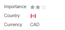
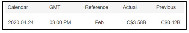
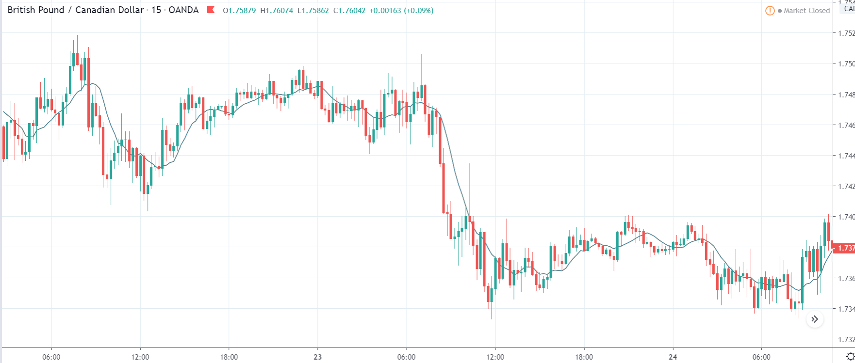
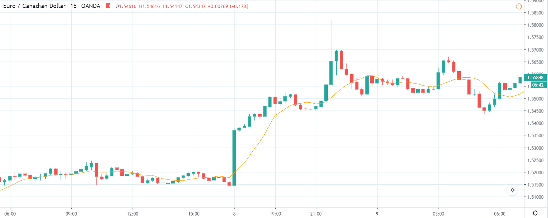
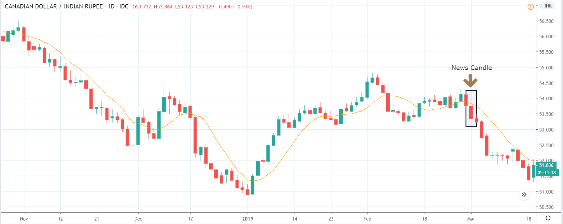
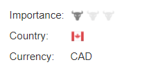
In this example, let’s analyze the impact of Government Budget on various currency pairs and examine the change in volatility due to the announcement of the same. For that, we have collected the data of Canada, where the below image shows the latest Budget that was fixed by the Canadian Government during the reference month. Let us find out the reaction of the market to this data.
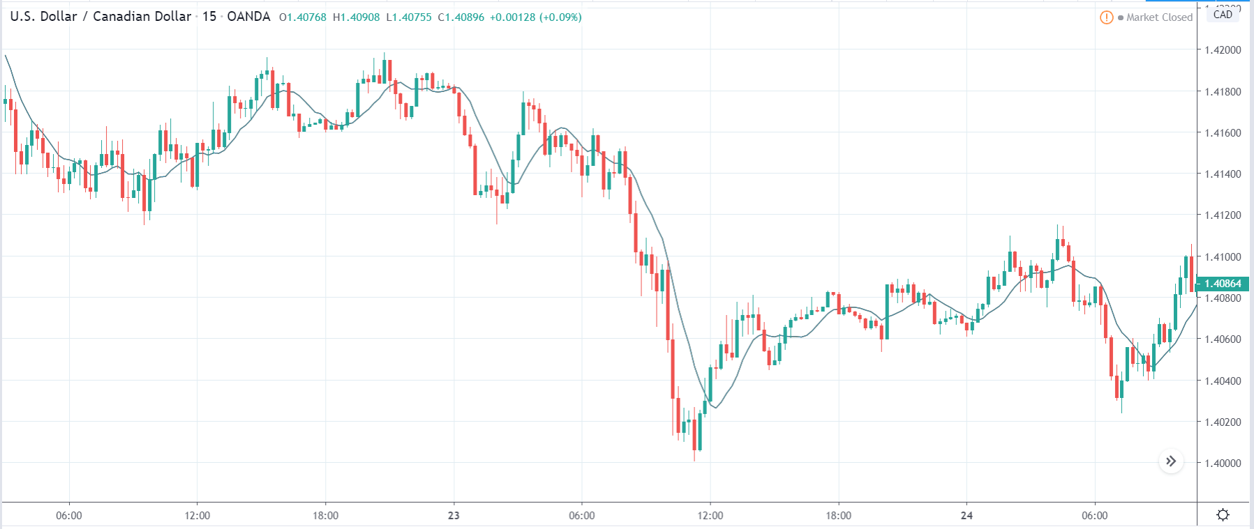
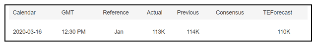
USD/CAD | Before the announcement:
The first currency pair which we will be discussing is USD/CAD. The above image shows the exact position of the currency before the news announcement. We see that the market is in a downtrend, and recently the price has pulled back to a ‘supply’ area, and some initial reactions (red candle) can also be seen. Since the impact of the news outcome is less, aggressive traders can take a ‘short’ position with a stop loss above the ‘supply’ area.
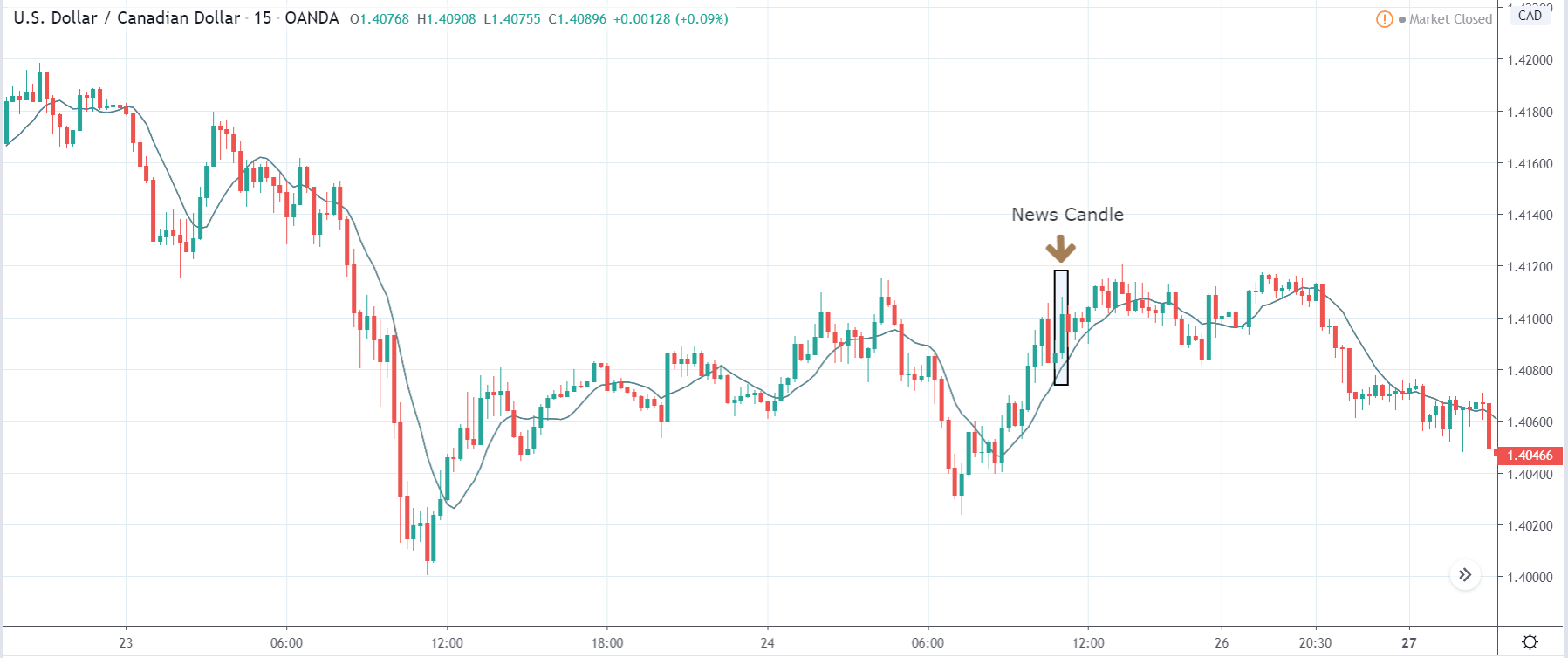
USD/CAD | After the announcement:
After the news announcement, we see that the market moves higher, and there is a sharp surge in the price. The volatility increases to the upside the price closes as a bullish ‘news candle.’ Even though the Government Budget was higher than before, it narrowed to 3.58 billion in February from 4.31 billion in the corresponding month of the previous year. This is negative for the economy when analyzing from a yearly perspective. Thus, traders went ‘long’ in the currency and weakened the Canadian dollar.
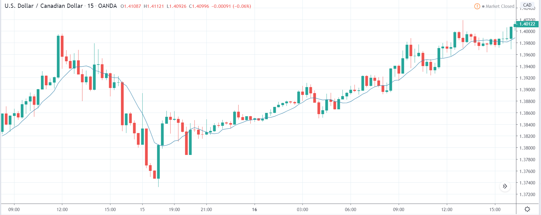
CAD/JPY | Before the announcement:
CAD/JPY | After the announcement:
The above images represent the CAD/JPY currency pair, where we see that in the first image, the market is in moving within a ‘range,’ and currently, the price seems to have broken below the ‘support,’ showing an increase in the selling pressure. Since the Canadian dollar is on the left hand of the pair, a strong down move indicates a weakening of the currency. Since the price has broken below, we will be looking to sell the currency pair after some consolidation in the market.
After the news announcement, the price crashes below, and volatility extends on the downside. The bearishness in the price is a consequence of the weak Government Budget data that saw a decrease in the value compared to the previous year. Therefore, traders went ‘short’ in the currency pair by selling Canadian dollars. One needs to be cautious before taking a ‘short’ trade as the price is approaching a ‘demand’ area, and buyers can pop up at any moment.
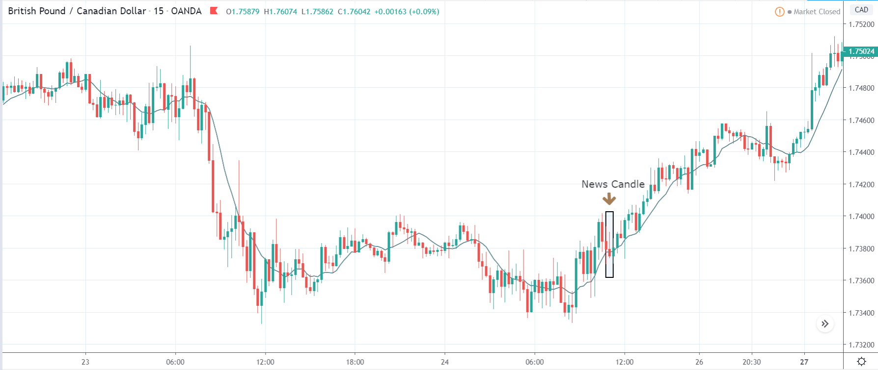
GBP/CAD | Before the announcement:
GBP/CAD | After the announcement:
The above images are that of GBP/CAD currency pair, where we see that the market is in a strong downtrend before the news announcement, signifying strength in the Canadian dollar. We also observe that the price has recently bounced back from its’ lows’ and has crossed the moving average. This could be a sign of trend reversal, which we shall validate based on the outcome of the news.
After the news announcement, the price initially moves higher, but later selling pressure is seen, and the candle closes in the red. Here the volatility is witnessed on both sides of the market, and the price manages to close above the moving average line. The market appears to be volatile even after the news announcement, and we do get a sense of the direction of the market. However, aggressive can go ‘long’ in the market on the basis that the price continues to remain above the moving average, after the news release.
That’s about ‘Government Budget’ and its impact on the Forex market after its news release. If you have any questions, please let us know in the comments below. Good luck!
‘Housing Starts’ Report is a widely used economic indicator by investors and traders to gauge the economic activity of a country. Construction of Houses affects many other dependent sectors like employment, raw material supplies, etc. Hence, we need to understand Housing Starts as part of our overall fundamental analysis.
What are Housing Starts?
Housing Starts refers to those properties whose housing construction activity has started on the foundations. It means only those are counted for which the building activity has crossed beyond the beginning foundation or footing laying stage. Houses for which only pillars and foundations are laid and stopped are not counted in.
This report follows the Building Permits reports, and after this stage, we have a Housing Completion report. Here each of the survey reports signifies different stages of the housing construction activity.
An increase is first observed in Building Permits, which then translates to an increase in Housing Starts and later translates to Housing Completion reports accordingly as the construction activity goes from start to completion. In this regard, understanding which report follows which one and what they mean from an economic viewpoint is crucial, as we will see later in the analysis section.
Housing Starts Report data is divided into the following three main categories:
Single-family homes: A single independent house constructed by a single-family is regarded as Single-family homes. This is the go-to type of home that people go for when they are financially secure and well off.
Townhomes and Condominiums (Condos): These are typically multi-storied or have multiple homes within a single structure that are independently owned. They differ from Apartments mainly in terms of ownership. Different owners own each independent unit.
Multi-family Structures: These would typically include Apartments or large townships which are owned by a single organization and made available on lease.
Economic Reports
The United States Census Bureau releases the Housing Starts reports under “New Residential Construction Survey Report” at 8:30 AM on the 12th working day of every month, which usually falls on 17-18 of every month, on their official website.
The survey is partially funded by The Department of Housing and Urban Development. The data is collected by Census field representatives using interviewing software through laptop computers.
In February, the annual estimates of New Residential Construction are finalized and released for the previous year. Initial estimates of single-family homes sold and for sale are also available every month in the New Residential Sales (NRS) press release as per the NRS Release Schedule. The housing numbers are seasonally adjusted to accommodate the weather dependency on the nature of the housing work to give more statistical accuracy.
How can the Housing Starts numbers be used for analysis?
The Housing Starts number is confused and misinterpreted with its sibling reports, i.e., Building Permits and Housing Completion reports, all signify different stages of economic activity effects. In that sense, Housing Starts numbers are current economic indicators, which means it tells what is going on in the economy right now. Building permits then in relativity is a leading or advanced indicator, and housing completion would be a lagging indicator.
When the government injects money into the economy, loans are available easily, and businesses are stimulated. There would be an increase in employment, which would have resulted in better wages for many. Such an activity would have prompted a rise in building permits, and when the money does reach people, housing starts numbers would see an increase. In this sense, an increase in housing starts tells investors that the economy is moving in a positive direction.
The type of Houses that have seen increase can also tell us the sentiment of people towards the financial future of the economy. An increase in single-family homes would suggest that more people are wealthy enough to afford one and are confident towards mortgage repayment. This also indicates that banks are also giving higher loans to more people, and the economy has more liquid money injected into the system.
An increase in condos or multi-family structures with respect to single-family homes would suggest that people are not comfortable enough to go for expensive homes and would rather save and settle into cheaper alternatives. This is usually prevalent during weaker economic periods, and a significant difference in the numbers can indicate an oncoming recessionary period.
Impact on Currency
An increase in the Housing Starts is reflective of the present current economic conditions. A strong economy would have higher numbers in the housing reports relative to a weaker economy where people would shy away from purchasing single-family homes.
An increase in housing starts reports also implies that demand for construction materials, hiring of labor forces, loans, and other construction-related activities has risen, and the economy is actively generating revenue than before, which is good for the nation and its currency.
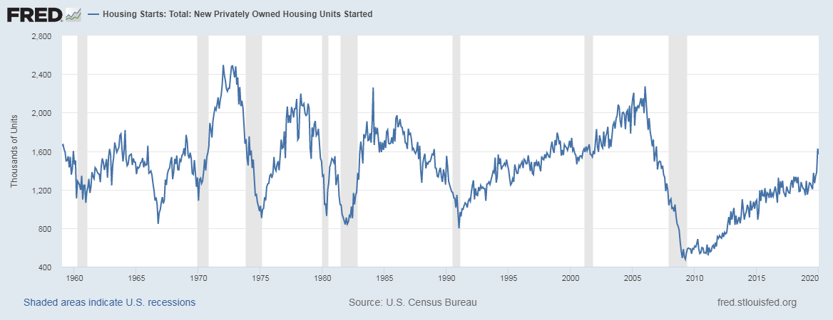
Below is a snapshot of the Housing Starts historical report taken from the FRED official website, which shows the economic indicator’s correlation with the national economy’s growth. During times of recession (shaded bars in the background), there have been significant plunges in the numbers and vice versa. The below graph proves the importance of Housing numbers as an indicator of the economy’s performance in our fundamental analysis.
Sources of Housing Starts Index
Given below is the latest Housing Starts report taken from the official website of the Census Bureau. Follow this link for reference. Here, you can find the data related to New Residential Constructions. The St. Louis FRED website has comprehensive data in graphical forms, which will be easier for our analysis. The Census Bureau also explores other related economic indicators related to Housing Activity within the United States.
Impact of the ‘Housing Starts’ news release on the price charts
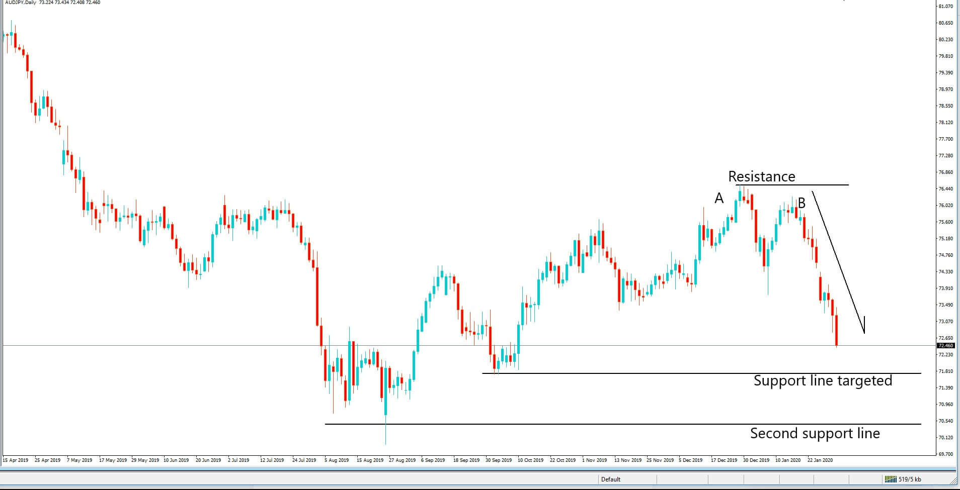
Housing Starts is one of the leading economic indicators which measures the strength of the housing sector. It shows the change in the number of new residential buildings that began construction during the reported month. The indicator, however, is not said to cause a major impact on the currency, and the volatility during news release will be ‘low.’ So, traders around the world do not pay much attention to this data. However, they do keep a watch on the trend to gauge the economy’s strength in the longer-term. Hence, based on the current data, they make some changes to their current position in the currency. Many of the countries release the housing starts data on a Monthly and Yearly basis, where today we will be analyzing the month-on-month numbers of Canada. The below image shows previous, forecasted, and actual Housing starts data of Canada, where we see an increase in the number of constructions in the month of February. The Canadian Mortgage and Housing Corporation release the housing starts data of Canada. A higher than forecasted reading is considered positive for the currency, while a lower than expected data is taken to be negative.
CAD/JPY | Before the announcement:
We start our analysis with CAD/JPY currency pair, and the above image shows the state of the pair before the news announcement. We see that the Canadian dollar is in a strong downtrend, and recently it has formed a range that has created areas of ‘support’ and ‘resistance.’ There is of pessimism in the market as the economists and institutional investors are expecting a lower ‘housing starts’ data than before, which is one of the reasons behind the price going lower. Since the market is at the ‘support’ area, it is risky to go ‘short’ in this pair, and thus we need some clarity of the ‘housing starts’ data before entering the market.
CAD/JPY | After the announcement:
After the ‘housing starts’ numbers are out, there is very little change in volatility, which was expected as it is not a highly impactful event. The price initially goes up, which is a result of better than forecasted ‘housing starts’ data, but it gets immediately sold, and the candle closes at the opening price. The selling pressure is seen because even though the data was better than expected, it was still lesser than previous data, and this is negative for the currency. As the volatility is less and the price is at the ‘support’ area, we do not recommend a ‘short’ trade as the risk-to-reward ratio is unhealthy.
EUR/CAD | Before the announcement:
CAD/JPY | After the announcement:
The above images represent the EUR/CAD currency pair, and since the Canadian dollar is on the right-hand side, weakness in the Canadian dollar should take the currency higher, which is why the market is going up in the above pair. The ‘range’ before the news announcement seems to be much more established and clearer than in the previously discussed pair. Since price is close to the ‘resistance’ point, a positive ‘housing starts’ data can be an opportunity to go ‘short’ in the currency pair.
After the news release, we see that the candle closes with a wick on the top indicating strength in the Canadian dollar. Since the data was positive for the economy, one can take a ‘short’ trade expecting the volatility to expand on the downside. We should not forget that since the data does not have much impact, our ‘take-profit‘ for the trade should be the recent ‘support’ area.
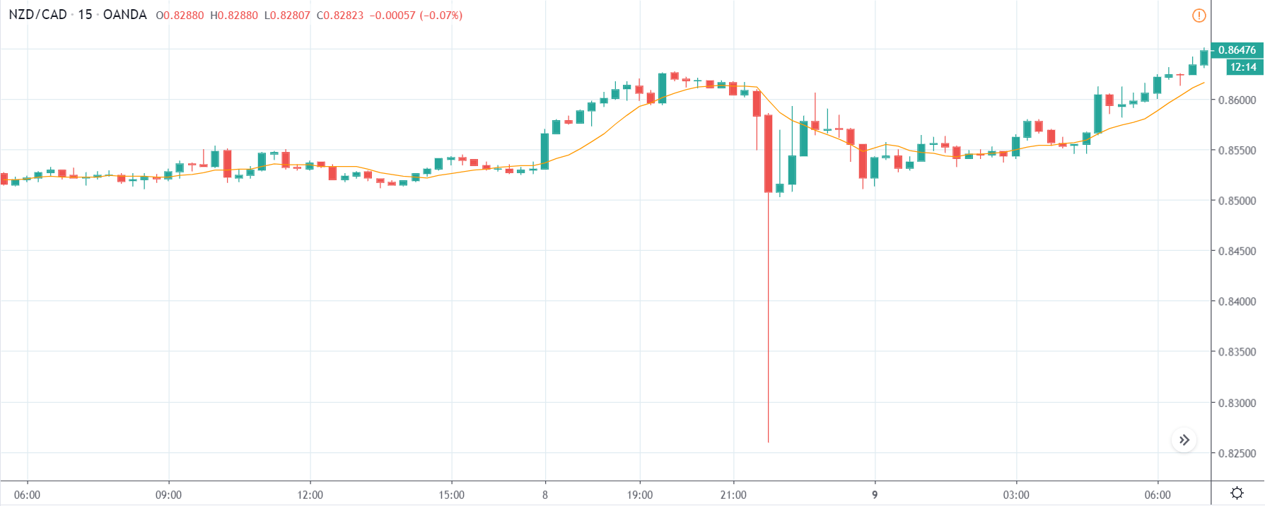
NZD/CAD | Before the announcement:
NZD/CAD | After the announcement:
The next currency pair which we will be discussing is NZD/CAD, and in the first image, we see that the market is in an uptrend trying to make a new ‘higher high.’ This shows the amount of weakness in the Canadian dollar and the strength of the New Zealand dollar. As we have explained that the event does not cause much volatility in the pair, taking any position against the trend would be very risky.
After the news announcement, the Canadian dollar shows some strength owing to positive ‘housing starts’ data but not enough to take the price lower. This minimum volatility is a sign that once cannot go ‘short’ in the pair and instead look to join the trend.
That’s about ‘Housing Starts’ and its impact on the Forex market after its news release. If you have any questions, please let us know in the comments below. Good luck!
Households Debt to GDP is an indicator of ascertaining the financial soundness of the economy. There is a certain amount of healthy correlation between the Households Debt and GDP, and by understanding this ratio correctly, we can predict major economic events with reasonable confidence. This metric has gained more attention around the time of the global financial crisis of 2008. Hence, understanding this metric is important in understanding long-term macroeconomic trends.
What is Households Debt to GDP?
Household Debt
It refers to the total debt incurred by households only. All the monthly debt payments people owning a home are taken into consideration. The debt can be of any type like mortgage loan, student loan, auto loan, personal loans, credit cards. Any form of credit for which you are paying back from your income is a debt in this context.
But, merely measuring household debt without any relative quantity to ascertain the burden of debt to an individual is not useful. For example, a country earning 100 billion dollars in a year having a debt of 70 billion dollars can be burdensome. While a nation making 200 billion dollars would be comfortable paying off this debt and still afford to invest in public spending and other activities. It is this relative context that appropriately paints the macroeconomic picture of a nation in front of us.
On the Macroeconomic level, GDP is equivalent to the income of the nation, and the portion of that income that goes into servicing debt payments determines what is left for other activities. The debt burden can also be measured in different forms, like by taking the ratio of the debt to disposable income or pre-tax income (gross income).
How can the Households Debt to GDP numbers be used for analysis?
The household debt impacts the Personal Spending (which is the amount left after deducting necessary expenditures from the Disposable Personal Income, DPI). High debt results in lower spending, which promotes saving and discourages spending. When spending is reduced, the demand falls in the market, and businesses enter a slowdown. Expansionary plans are rolled back, and employees are laid off, resulting in deflationary conditions overall.
The financial crisis of 2008 – From 1980 to 2007, the increase in debts due to the low-interest rate environments stimulated the economy beyond its sustainable levels, which resulted in extended spending by individuals buying houses all over the United States.
Once the individuals bought their homes, till then, the market and economy were seeing a boom, but soon reality hit when people started repaying the debt, which reduced the overall spending that resulted in a slowdown of the overall economy. What happened here is, the government tried to give an artificial boost to the economy, which although sped up the economy for some time, it later dragged the economy back to the extent that even today, the economy’s growth rate is lower than it should be.
The debt burden led to a global financial crisis in many countries where loan defaults were becoming increasingly common. Many people just abandoned their house and debt, due to which the real estate market fell, the investors lost money, the stock market crashed. All this resulted in an economic collapse in the United States. Similar patterns followed throughout the world in many countries.
Historically, when the Households Debt reached 100% of GDP, the economy took a severe downturn and went into recession. The years leading up to the financial crunch, i.e., 2007, many industrialized countries experienced a major spike in Households Debt. Countries that experienced 100 and above percentage figures in the Households Debt to GDP ratio experienced the Credit Crunch and entered a prolonged slowdown period. In the below plot, we can see during the recession (shaded region), the Households Debt to GDP reached around a hundred percentage.
Impact on Currency
The Households Debt to GDP percentage figure is an inverse indicator. The higher numbers are bad for the economy and the currency. Lower values mean that either the debt has reduced, or the GDP has increased, or both. It is suitable for the economy, and the currency appreciates.
Since GDP is a quarterly figure, and hence the ratio numbers are also released quarterly. Also, the Households Debt to GDP is a long-term number, in the sense that the numbers will not rise or fall overnight. It may take years to build-up or go down. Hence it is a low-impact indicator as it is indicative of the long term trend and does not reflect the current short term trends in the economy.
But, Households Debt to GDP can be used to analyze severe economic downturns like that of 2008’s financial crisis. In this sense, investors, economists can use this statistic to predict any shocks that may occur in the future.
Economic Reports
The International Monetary Fund ( IMF) releases the Financial Soundness Indicators (FSI) for many economies based on the data they receive from the individual countries. There are no fixed release dates of the report’s release, as they compile and publish once they receive information from the source countries. The FSI data goes back to 2008 for many countries, but for some, it goes back to 2005.
The IMF FSI reports contain different types of loans and their ratios to GDP and other metrics that are available on their official website.
For the United States, the Board of Governors of the Federal Reserve System releases the report titled “Financial Accounts of the United States – Z.1”, also called Z1 reports, quarterly on their official website. This report gives the Households Assets and Liabilities and Net Worth, the charts show the balance sheet of households and non-profit organizations to DPI.
United States Assets and Liabilities report can be found here.
The above-mentioned figures are available in the St. Louis FRED website.
Compilation of the Households Debt to GDP for all major economies is available here.
Impact of the ‘Households Debt to GDP’ news release on the price charts
After understanding the Household Debts to GDP economic indicator, we will now proceed and analyze the impact of the same on the country’s currency. The Household Debt to GDP is a metric that measures the country’s public debt to its Gross Domestic Product (GDP). From the definition, it is clear there exists an inverse correlation between the indicator and value of the currency. When there is an increase in the value of the indicator, it means people’s debts are increasing, and consumer spending is reducing. This negatively impacts the economy and, thus, the currency, whereas a decrease in Household Debts is positive for the currency.
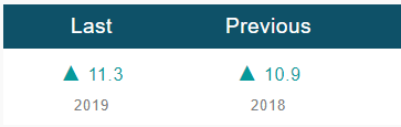
In today’s example, let’s analyze the Household Debts to GDP data of India and find out the impact of the same on Indian Rupee. As we can see, India’s Household Debt accounted for 11.3% of the country’s Nominal GDP in March 2019, compared to the ratio of 10.9% in the previous year. The year-on-year data is said to have a long term effect on the currency, and hence we are observing the impact on the ‘daily’ time frame chart.
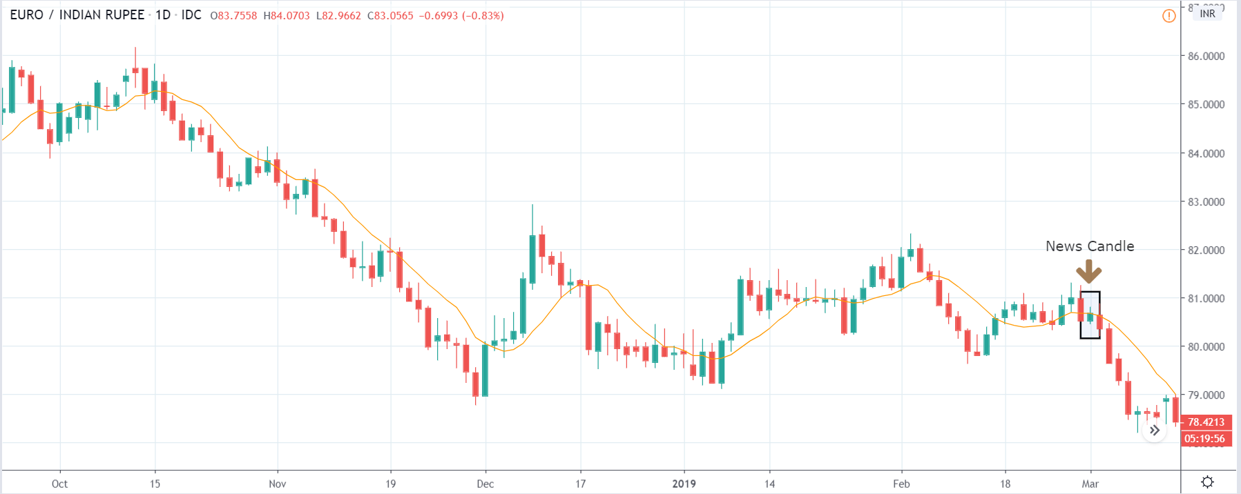
EUR/INR | Before the announcement:
We first look at the EUR/INR currency pair, where we see that the price is in a major downtrend and has been moving in a range from the past two months. Just a few days before the news announcement, the market has retraced the downtrend partially and is on the verge of continuation of the trend. Technically, it is judicious to go ‘short’ in this pair as it is the best way to trade the trend. Now we only need confirmation from the market in terms of the market going below the moving average after the news release.
EUR/INR | After the announcement:
After the news outcome, the market moves a little higher owing to weak Housing Debt to GDP data, and traders around the world sell Indian Rupee. There is an increase in volatility to the upside, but on the immediate next day, the market gets sold into. This means that even though the data was unhealthy for the Indian economy, it wasn’t as bad to take the price much higher and result in a reversal of the trend. Therefore, we enter the market for a ‘short’ trade only after the price slips below the moving average, and volatility increases on the downside.
GBP/INR | Before the announcement:
GBP/INR | After the announcement:
The above images represent the GBP/INR currency pair, and as we can see, the market has reversed the downtrend of 2018 and is currently in an uptrend. This up move started at the beginning of the year and has been new ‘highs. Before the announcement, the price seems to have made a top and might be going down to the ‘support’ area to resume the up move. Since we do not have the forecasted data of the indicator, we cannot take any position in the market. After the news announcement, the market does not fall much, nor does it go higher. This means the HOUSING DEBT TO GDP data was neutral for the economy and thus for the currency. As the change in HOUSING DEBT TO GDP was not drastic, we do not witness substantial volatility during the announcement. The ‘trade’ idea for this pair is similar to the above-discussed pair, where we go ‘short’ in the pair once the price goes below the moving average.
CAD/INR | Before the announcement:
CAD/INR | After the announcement:
In the CAD/INR currency pair, we see a retracement of the big downtrend of 2018 in the form of an uptrend, similar to the GBP/INR pair. One major difference is that the uptrend in this case not very strong and is unable to make new ‘highs. This means the down move is having more influence on the pair and that the up move might get sold into anytime. If the Housing Debt to GDP data were to be positive or neutral for the Indian economy, we could join the downtrend after suitable confirmation from the market. After the Housing Debt to GDP data is released, the price suddenly falls below the moving average, and volatility increases on the downside. A bearish ‘news candle’ shows the impact of the news on this pair, and we can conclude that Housing Debt to GDP data did not prove to be negative for this pair.
That’s about ‘Household Debts to GDP’ and how this economic indicator impacts the Forex market. For any queries, let us know in the comments below. Good luck!
Business people, Investors, and Politicians are often more interested in where the economy is heading than where it has been in the past or where it is right now. In this regard, the Leading Economic Index receives more attention than Coincident Index indicators or any individual economic indicators.
Leading Economic Index gives a more accurate snapshot of the future economic trend than any individual leading or coincident indicator. In this sense, the Leading Economic Index is essential to observe the economy’s ‘big picture’ better.
What is the Leading Economic Index?
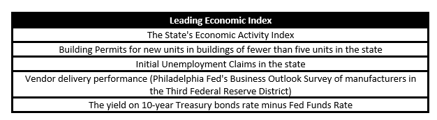
Leading Economic Index is an amalgamation of multiple leading economic indicators that give us a better snapshot of the economic prospects of the country.
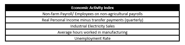
Economic Activity Index: The Economic Activity Index for the states presently includes five indicators, namely: non-farm employment, unemployment rate, average hours worked in manufacturing, industrial electricity sales, and real personal income minus transfer payments. It is a Coincident Economic Index that tells us the current economic situation in the broader sense. The below table summarizes the composition of the Economic Activity Index.
The Leading Economic Index uses the Economic Activity Index for each state as well as various state, regional, and national variables to predict the nine-month-ahead change in the state’s economic activity index. This estimate of the nine-month percentage change in the state’s current Economic Activity Index is the state’s Leading Index.
Hence, by using a mix of coincident indicators, leading indicators, and other variables, the Leading Economic Index is constructed. The below table summarizes the composition of the Leading Economic Index.
The Leading Economic Index has the base period 1992, i.e., the Leading Economic Index score for the year 1992 is 100. Based on this period, all subsequent index periods are scored.
A score below 100 is observed as contractionary. A score above 100 is seen as expansionary for the economy. The Leading Economic Index uses a time-series model (vector autoregression). The current and prior values of the forecast are combined to determine the future values of the index.
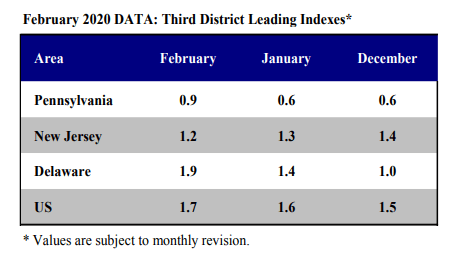
Below is a snapshot of the Leading Economic Index of the three districts and the USA:
How can the Leading Economic Index numbers be used for analysis?
Individual economic indicators like Initial Unemployment Claims, Purchasing Manager’s Index from the Institute of Supply Management, Employment rate can often give conflicting signals.
No one indicator can give us the broader economic outlook that we are seeking to have. It is often preferred to have an idea on different sectors (private, public, or manufacturing, services, or business, consumer) and different economic indicators to obtain a complete macroeconomic picture.
An economy consists of many moving parts, imports, exports, jobs, businesses, banks, money supply, etc. all these economic levers push or pull the economy. With so many levers in place, it is indeed difficult for the common man to know for sure the overall economic condition. The geography also plays a part, a slow down in one state does not necessarily translate to the overall economic slowdown, it might even be the case ten other states have improved above average.
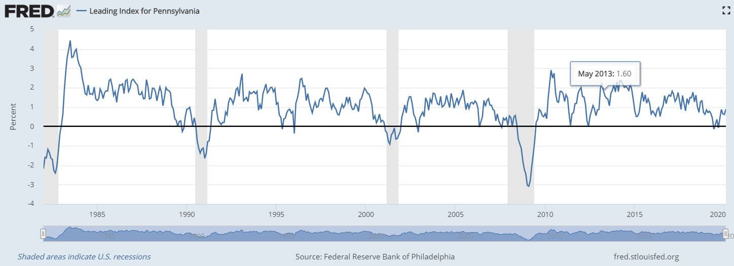
In this regard, the Leading Economic Index is useful to get the big picture more accurately. As shown in the below plot, for Pennsylvania, four recessions since 1970 have been preceded by a minimum of three negative readings. The Leading Economic Index is generally measured as a change in percentage concerning the previous month score.
Improvement in the Leading Economic Index figures signals an expansionary growth in the economy ahead, which is appreciating for the currency and vice-versa.
In this sense, the Leading Economic Index is a leading and proportional economic indicator, i.e., it forecasts growth and the increase or decrease in figures generally translate into improvement or deterioration of the economic growth.
The Leading Economic Index is a low impact indicator as the data from the individual indicators that make up the Leading Economic Index would have already been released a week before, and the corresponding market short-term moves would have already taken place. Although, the long-term trends and forecasting power of the Leading Economic Index makes it a suitable tool for investors and long-term traders to assess economic direction over a time horizon of 3-6 months better.
Economic Reports
The Federal Reserve Bank of Philadelphia releases the Leading Economic Index for all of the 50 states. The Indexes are released every month generally a week after the release of the composing coincident indicators. The release dates for the upcoming year’s Leading Economic Index reports are already posted on its website.
Sources of the Leading Economic Index
The State’s Leading Economic Index is available on the official website of the Federal Reserve Bank of Philadelphia:
The Leading Economic Index for various countries are available here in statistical and list form:
Impact of the ‘Leading Economic Index’ news release on the price charts
In the previous section, we described the Leading Economic Index fundamental indicator, where we said that it is a composite index that is based on nine economic indicators and is used to predict the direction of the economy. The data is gathered from economic indicators related to consumer confidence, housing, money supply, stock market prices, and interest rate spreads. The report tends to have a relatively muted impact on currency pairs because most of the indicators that are used in the calculation are released previously.
The below image shows the previous and latest data of Leading Economic Index indicator, where we see a decrease in 0.4% compared to the previous month. A higher than expected data should be taken to be positive for the currency and vice-versa. Let us observe the change in volatility due to the news release.
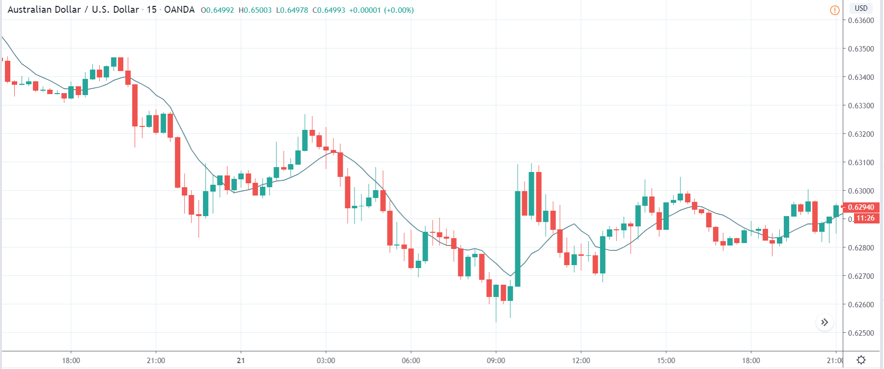
AUD/USD | Before the announcement:
The above image shows the chart of the AUD/USD currency pair before the news announcement. We see that the price is in a downtrend, and recently it has formed a ‘range.’ This looks like a retracement where the price may continue its downtrend after touching a key technical level. Depending on the news data, we shall take an appropriate position in the market.
AUD/USD | After the announcement:
After the news announcement, the price falls and goes below the moving average, indicating that the Leading Economic Index data was negative for the economy. As there was a decrease in the value, traders went ‘short’ in the currency pair and increased the volatility to the downside. This was accompanied by another news event that was positive for the Australian dollar, and hence we see the sharp rise in price. Nonetheless, the Leading Economic Index was bad for the economy due to which the currency weakened initially.
AUD/CHF | Before the announcement:
AUD/CHF | After the announcement:
The above images represent the AUD/CHF currency pair, where we see that the characteristics of the chart are similar to the above-discussed pair before the news announcement. Here too, the market is in a downtrend signifying weakness in the Australian dollar, and the price has pulled back from its ‘lows’ recently. There is a possibility that the downtrend might continue depending on the outcome of the news. After the news announcement, the market moves lower, and the price closes as a bearish ‘news candle.’ Since this announcement followed another news release, one needs to be cautious before taking any position in the market. If we are to analyze this data alone, we can expect an increase in volatility to the downside, leading to further weakening of the currency.
EUR/AUD | Before the announcement:
EUR/AUD | After the announcement:
The above images are that of the EUR/AUD currency pair, and here, the market is an uptrend before the news announcement. Since the Australian dollar is on the right- hand side of the pair, an up-trending market indicates weakness in the currency. The price is currently moving in a ‘range,’ and just before the news release, it is at the bottom of the range. Ideally, this is the ideal place for going ‘long’ in the market. Aggressive traders can take a ‘long’ position with a stop loss below the support. After the news announcement, we see that the market moves higher, and the bullish ‘news candle’ indicates weak ‘Leading Economic Index’ data where there was a reduction in the value for the current month. Compared to the other fundamental drivers, the Leading Economic Indices news release would have taken the currency higher, and high volatility would be witnessed on the upside. Therefore, we need to keep a watch on the economic calendar to be aware of all the news announcements.
That’s about the ‘Leading Economic Index’ and its impact on the Forex market after its news release. If you have any questions, please let us know in the comments below. Good luck!
Manufacturing Production statistics are a direct measure of current economic activity. It is instrumental for investors to get a correct estimate of current industrial activity. The Manufacturing Production Index also provides the capacity at which the industries are operating at which is useful for Government officials and business owners for planning and optimizing the performance of these industries. For economists, it helps to cut through media propaganda easily as the numbers reveal the real present situations of these industries and help analyze economic performance better.
What is Manufacturing Production?
Manufacturing Production, also called Industrial Production (IP) Index, measures the real or genuine output of the mining, manufacturing, and electric and gas utility industries. Hence, it covers some of the most important industrial sectors that play a significant role in economic growth and society’s sustenance.
Manufacturing Production Index is a measure of current industrial output. The Index’s reference period is 2012, which means that for the year 2012, the IP Index score is 100. All the scores that are published thereafter are in reference to this period. Hence, it is in a way it is a report card for the industrial sector’s final production output. The report also includes capacity utilization statistics that tell us at what percent of maximum capacity are different industrial sectors are operating at.
In the United States, the Manufacturing Production figures are taken from production data of all industries included in the North American Industry Classification System (NAICS) and industries like logging, newspaper, periodical, book, and directory publishing that have been traditionally considered to be Manufacturing.
The individual indices of Industrial Production (IP) are constructed through two sources:
Output measured in physical units.
The output is inferred from the data on inputs to the production process.
The IP index measures the output of individual industries taking their weightage derived from the proportional contribution of that industry to the combined output of all industries.
How can the Manufacturing Production numbers be used for analysis?
If we are to be very strict with our analysis, then Manufacturing Production figures are coincident or current indicators when compared against New Orders Figures of the Institute of Supply Management’s Purchasing Manager’s Index. It is more indicative of the current trend rather than a future trend. A decrease in New Orders is more indicative of future Production while Industrial Production (IP) Index is more current.
Although, since it is a monthly report, some use it as a leading indicator to oncoming economic turns as generally, these indices are indicative of ripple effects through employment, wages, and business activity.
Hence, it is more appropriate to take IP numbers as current economic indicators and use it to verify the fundamental trends that have been predicted by other leading indicators. We can use IP figures to identify whether our predicted trends have started to play out or not.
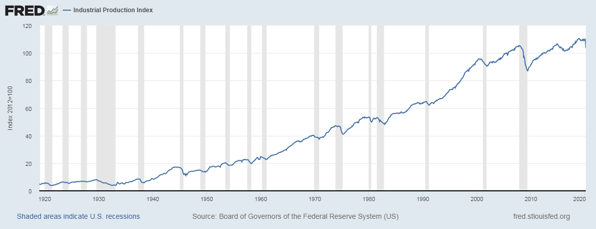
The data set for the IP index goes back to 1920, and hence it is a very reliable measure of economic activity, as shown above.
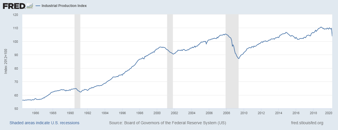
Below is the zoomed-in period of IP index, where we can see during the recession the IP index accurately depicts the economic conditions for that period. Through this, we can understand that the IP index is a double check for us to understand the current economic situation correctly. It is a one-for-one measure of economic activity.
Impact on Currency
The Manufacturing Production Index has a mild impact on the currency market as the ongoing trend in the economy would have been already depicted by other macroeconomic leading indicators.
On the other hand, it does influence investor’s confidence in the different manufacturing sectors that can affect the stock market and correspondingly, resulting in a mild impact on the currency too.
It is essential to keep in mind that the mild impact is because the United States is a mature and developed economy and has a diverse portfolio of exports and imports. It may not be the same case for all countries where individual developing or commodity-dependent economies may heavily depend on the performance of their manufacturing sector. It all comes down to what percentage of GDP does the Industrial Production Index industries make up. The higher the percentage, the higher the impact.
For the United States, the Manufacturing Sector makes up 20% of GDP while the Services Sector drives 80%. The Manufacturing Production Index is a proportional and coincident indicator. Higher production figures lead to increased economic activity and lead to currency appreciation and vice-versa.
Sources of Manufacturing Production
The monthly Manufacturing Production statistics are available on the Federal Reserve’s official website here. The St. Louis website offers a comprehensive list of Manufacturing Production reports, and they can be found here. We can also find global Manufacturing Production figures for various countries in statistical formats here.
Impact of the ‘Manufacturing Production’ news release on the price charts
After getting an understanding of the Industrial Production economic indicator, we will now find out the impact of the news announcement on different pairs and witness the change in volatility due to the release. The development of Industrial Production and machinery output are the main drivers of economic growth.
Economists believe that country’s development and enhanced standards of living are positively correlated with the nation’s industrial activity. The GDP is directly proportional to growth in the economy’s manufacturing sector. Although it is an important determinant of the economy, when it comes to the movement of the currency, traders do not make drastic changes to their positions in the currency based on the data.
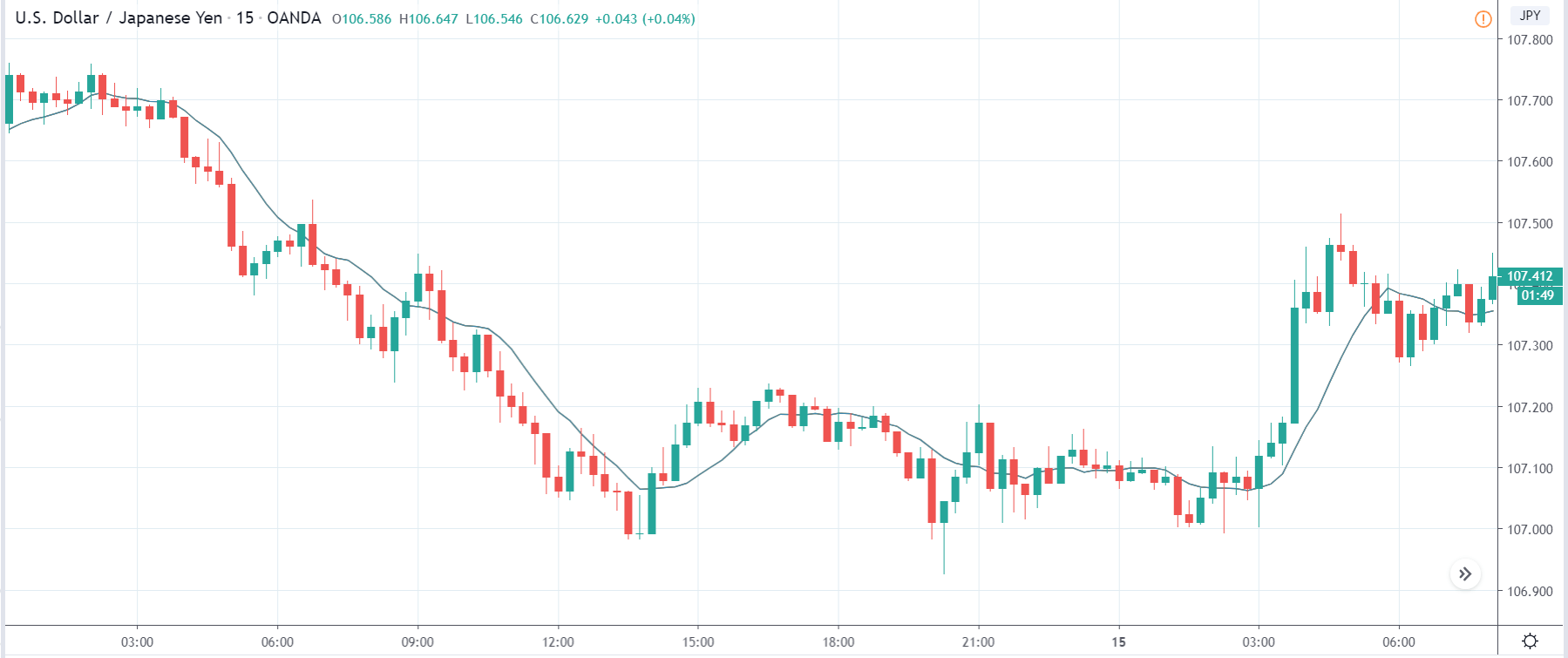
The below image shows the latest Industrial Production data of the U.S., where we see that there has been a decrease in production by a whopping 6.2% as compared to the previous month. A higher than expected value is considered as positive for the currency, while a lower than expected is considered negative. Let us look at the reaction of the market to this data.
USD/JPY | Before the announcement:
We will first look at the USD/JPY currency pair and analyze the impact of the Industrial Production data on this pair. In the above image, we see that the market was in a downtrend, and very recently, the price has shown a sign of reversal to the upside. The price action suggests that the market might move higher from here before going down. Since the economists have predicted a lower Industrial Production data, it is advised not to take any ‘short’ positions.
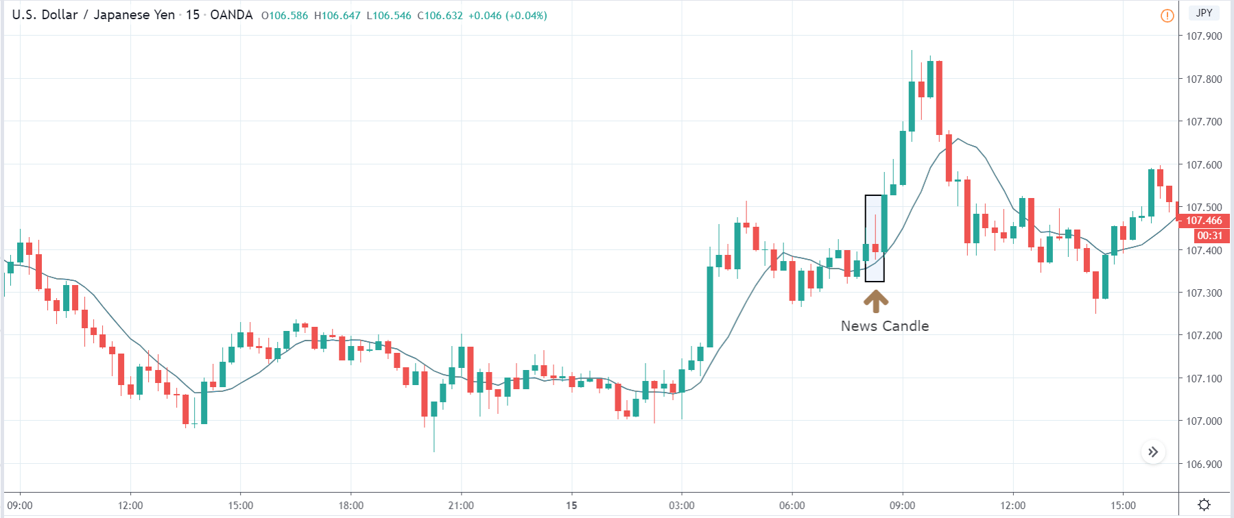
USD/JPY | After the announcement:
After the news announcement, the price initially moves higher due to increased volatility but later loses all the gains and closes in the red. Even though the Industrial Production data was very bad for the economy, the price did not react that bad as expected. We see a neutral response from the market where the ‘news candle’ closes near its opening price. Therefore, we can say that the impact of the news outcome was not great on the currency pair, and the volatility was average.
GBP/USD | Before the announcement:
GBP/USD | After the announcement:
The above images represent the GBP/USD currency pair, where we see that the market is violently going down before the news announcement. Currently, the price is its lowest point, and there has been no price retracement of any kind. As per the technical analysis, we cannot take any position at this moment, as this would mean chasing the market and, this carries a huge risk.
After the news announcement, we see that that the price goes lower in the beginning, but later buying pressure takes the price higher, and the candle closes with a wick on the bottom. Overall, the volatility increases to the downside after the news release but does not sustain for long. The price continues to move higher one candle after the ‘news candle,’ which implies that Industrial Production does not have a long-lasting effect on the currency.
USD/CAD | Before the announcement:
USD/CAD | After the announcement:
The above images are that of the USD/CAD currency pair where we see that before the news announcement, the market is in a strong uptrend, and here too, there is no price retracement of any sort. This shows that the U.S. dollar is extremely strong. At this point, we cannot take any position in the market as this is against the rules of risk management.
After the news announcement, volatility increases to the upside resulting in further strengthening of the U.S dollar. Despite the fact that the Industrial Production data was really weak, the market does not react negatively to the news data, but rather we see an increase in the price. This might be due to the fact that the news data is of least importance to traders.
That’s about ‘Manufacturing Production’ and its impact on the Forex market after its news release. If you have any questions, please let us know in the comments below. Good luck
Since the advent of mass production of Cars, by Henry Ford in 1913, the automobile industry has been booming. The consequent effects on the dependent industries are as significant as the study of Automobile Industries itself. Car Registration statistics are useful for policymakers, and many dependent industries of automobiles.
What is Car Registrations?
Vehicle Registration is the process of registering a newly purchased or resold vehicle with a government authority. The primary purpose is to link every car with a corresponding owner. It helps in identifying owners of lost vehicles and reckless driving caught on traffic cameras, etc.
How can the Car Registration numbers be used for analysis?
Car Registrations in our analysis is useful to the following sectors of people:
Policy Makers – Car Registration statistics are useful for policymakers to predict traffic volume, forecasting congestions in narrow road areas, and planning new highway construction projects to facilitate smoother transportation.
Oil Vendors – It is useful for the Oil vendors, who can use this data to forecast an increase or decrease in fuel demand and adjust their inventory or stock in advance to meet the demand.
Road Construction companies – Companies can track regional increases in car sales and identify traffic patterns, to put forward a proposal for road construction to government officials to get a construction contract.
Modification Jobs – Many companies in the modern world offer customization options. By monitoring what type of cars are more frequent and in which locations, can help such small scale businesses to set up their business, and offer suitable services.
Sales analysis by Car Manufacturers and Investors – Car Registration figures are the number of cars purchased by customers and are on-road as we speak. The Car Production figures show the picture from the manufacturer’s perspective, while Car Registrations show the actual demand from the customer’s viewpoint. It is the actual sale that counts, and Car manufacturing companies can analyze what type of cars are trending the market right now, which can help them build similar models of cars. Investors can analyze this data to know which company sales are growing in which sector, and where potential growth lies in different regions.
Environmental Analysts: Cars are one of the primary sources of Air pollution, by analyzing the trend in Car Registrations, environmental analysts can assess whether people are shifting to more eco-friendly options like electric cars. Thereby research the implications for submission of their reports on environmental impacts.
Of these factors, road construction, sales analysis is essential, and that is what most of the time data is mainly used for.
In the aspect of economic growth, Car Production and Car Registration statistics point in the same direction, where Car Registration is more accurate, as production does not equal equivalent purchase.
As more Cars are registered, it indicates more consumers can afford it. It indicates consumers have enough disposable income and are financially stable enough to either procure a loan or direct purchase. It also indicates, banks also have enough liquidity to disburse loans for such purposes.
Historically, during times of recession, there is a corresponding decrease of Car Registrations, as evident from the above graph, as Consumer Sentiment is low, and prefer to save more than spend to save for a future rainy day. Overall, Car is not a cheap commodity, and an increase in its registration indicates, increased Consumer Confidence, and tells us the economy is stable and faring well.
With more emerging economies like India, Japan, etc. improving their economic conditions by export-led growth in the global markets, the total number of people who are above the poverty level is increasing. This would ultimately translate into increasing Car Registration figures in the upcoming times. The below plot justifies this:
As the standard of living improves in the emerging economies, we are bound to see an increase in demand for automotive, in those countries. As people become wealthier and have extra income after accounting for the daily needs, people open up to the more non-essential or luxury goods, and first in that list comes a car and a home in most developing economies. Hence, increased car registration figures are a sign of an increase in the standard of living of that economy.
Impact on Currency
Car Registrations are a lagging indicator of economic health, as purchase happens only when the economic conditions have improved significantly and have continued to stay good for a while. In this sense, it is a lagging indicator, compared to other leading and coincident indicators like Disposable Income, Interest Rates, Personal Consumption Expenditure, etc. for traders.
Hence, it is a low impact indicator, as the change in numbers is backward-looking and not forward-looking. It is more useful for policymakers and investors interested in Automotive industries looking for investment ideas and opportunities.
It is a proportional indicator, and a decrease in registrations of new vehicles is just signaling weakening economy and corresponding currency devaluation, which has already been confirmed by other indicators. It will be just confirming our predictions from leading indicators.
Economic Reports
The Federal Highway Administration keeps track of the total vehicle registrations by type and builds on its official website.
The Organization for Economic Co-operation and Development maintains the data for all its member countries, which is available on the St. Louis Fred website that is easier to access.
The St. Louis FRED data also maintains data extracted from the OECD database about the vehicle registrations here and here. We can find the monthly data for the Car Registrations data in the statistical form here and here.
Impact of the ‘Car Registrations’ news release on the price charts
After getting a clear understanding of the Car Registration fundamental indicator, we will now try to comprehend the impact of the indicator on different currency pairs and observe the change in volatility due to the news announcement. The Car Registrations figure gives an estimate of the total number of purchased Cars and which is billed to the customer during that month. The indicator helps us to understand the growth in the purchasing power of people in a country. Even though the purchasing power is measured by many other parameters, Car Registration is one of the major factors. Thus, traders do not give much importance to this data while analyzing a currency.
In the following section of the article, we will analyze the impact of the Car Registration economic indicator on various currency pairs and try to interpret the data. The below image shows the Car Registrations data of Canada, where the data says there were 113K registrations in January. There is a decrease in the number of registrations as compared to the previous month. Let us find out the reaction of the market.
USD/CAD | Before the announcement:
We shall begin with the USD/CAD currency pair for analyzing the impact. The above image shows the position of the chart before the news announcement. We see that the currency pair is an uptrend making higher highs and higher lows and apparently has broken out above the ‘supply’ area. This means the uptrend is getting stronger, and the news will determine if it will continue further or not.
USD/CAD | After the announcement:
After the news announcement, the price moves in both directions but very little. The currency pair exhibits the least amount of volatility due to the news release, and the candle closes, forming a ‘Doji’ candlestick pattern. The lukewarm reaction of the market indicates that the data was not very disappointing, and thus traders do not make changes to their positions in the currency pair.
CAD/JPY | Before the announcement:
CAD/JPY | After the announcement:
The above images represent the CAD/JPY currency pair where before the announcement, we see that the pair is in a strong downtrend, and as the Canadian dollar is on the left-hand side, it shows extreme weakness in the base currency. Recently, the price seems to be moving in a range, and just before the news release, the price was at the bottom of the range. Thus, buying force can be seen at any time in the market from this point.
After the news announcement, the market falls slightly but gets immediately bought back. Due to a lower Car Registrations, market players initially sold the currency but later took the price higher as the data was not very bad. Technically, this is a ‘support’ area, and thus traders went ‘long’ in the market, which resulted in the price rally. Therefore, the impact due to the news announcement was least in the currency pair.
AUD/CAD | Before the announcement:
AUD/CAD | After the announcement:
Lastly, we discuss the AUD/CAD currency pair where, before the announcement, the market is range-bound, and there isn’t any clear direction of the price. The currency pair is seen to exhibit minimum volatility before the news release. It is necessary to have market activity in order to analyze a currency pair rightly. Trading in such currency pairs attract extra slippage and spread.
Therefore, it is advised not to trade in pairs where the volatility is less. After the news announcement, the price moves higher, and ‘news candle’ closes with a slight amount of bullishness owing to poor Car Registration data. But since the news data is not very important to traders, we cannot expect the market to start trending after the news release also. We need to wait until the volatility increases, to take a trade.
That’s about ‘Car Registration’ and its impact on the Forex market after its news release. If you have any questions, please let us know in the comments below. Good luck!
Mining Production is a key economic indicator as the final output of Mining Production is the primary input for many industries. Therefore, it is the core part of many industries’ business activity.
Fluctuations in the Mining Production figures are bound to translate to all the dependent industries that use the Mined resources as input in their production process. The knock-on effect can be many-fold, and hence it is a vital economic indicator for investors, economists, and government authorities.
What is Mining Production?
Mining Production refers to the entire process of searching for, extraction, beneficiation (purification), and processing of naturally occurring minerals from the Earth. Mining is the process of extracting useful minerals by excavating into the Earth as these minerals cannot be produced on the surface. Minerals are essential for running society to a large extent.
Minerals typically drilled can be Coal, metals like Copper, Iron, Zinc, or industrial minerals like limestone, potash, and other crushed rocks. Coal remains one of the most significant sources of energy throughout the world. Metals like Iron, Copper have a wide range of usage in industries, from small chips in computers to construction of giant buildings. Limestone, Sand, and other rocks have used in cement industries, which all contribute to the construction and housing industries.
In the United States, the Mining Production figures are released as part of the “Industrial Production and Capacity Utilization – G. 17” report by the Federal Reserve. This report is also called the Industrial Production Index (IP Index) or Factory Output.
The Mining Production numbers are expressed in index and percentage change formats. The base year for the reference index period is 2012, for which the score is 100. Every month the Mining Production numbers are published according to this index. For example, an index figure of 130 indicates that Mining Production has increased in contrast to 2012 statistics. The percentage change compares the figures to the previous month. It is a seasonally adjusted statistic. The figure below illustrates the Mining figures dating back to 1920.
How can the Mining Production numbers be used for analysis?
Hence, it is apparent that Mining lies at the heart of all industrial activities. A decrease in Mining production can adversely affect all the dependent industries, and correspondingly the effects will pass onto unemployment, layoffs, wages, economic slowdown, etc.
Since the end products of the Mining Industry act as the starting input for many industries, it serves as a leading indicator for the economy. It lies at the very start of the economic activity chain, and the ripple effect through fluctuations in Mining Production figures will effect dependent industries with 1-6 months’ time lag depending upon the nature of dependent business.
Investors, government authorities, and economists extensively use the IP Index report for their purposes. Mining is the extraction of minerals that are essential for the economy; the government monitors and provides the necessary support to improve Mining Production. In 2006, the mining industry alone produced shipments worth 78.65 billion dollars, and that is excluding oil and gas. Coal accounts for 50% of electric power generated in the United States.
Mining Production is susceptible to some of the following:
Resource Availability – Since minerals are non-renewable resources, which means they are exhaustible. Once a region is depleted of the particular resource, search for new mining areas, relocation, and Mining again is expensive to process.
Weather – Bad weather conditions can interrupt Mining Production as it typically involves explosions and heavy drilling equipment. Heavy rains can close down mines and access roads. Lightning can put the massive equipment operations, explosion handling personnel at risk. Strong winds disrupt blasting. High temperatures can affect Mining workers.
Technology – The amount of latest and advanced mining technologies that are available at the disposal of the country determines the Mining Production cost and total output.
Terrain – The type of terrain that needs to be mined can also affect Mining costs and Production levels. Mining Industries are the leading employers at the place of their operation. Mining supports more than 500,000 jobs directly and an additional 1.8 million jobs indirectly through its dependent industries. Hence, wages, employment, economic activity, revenue generation, exports, energy consumption are all affected by Mining Production.
Impact on Currency
The Mining Production figure is a proportional and leading economic indicator. An increase in Mining production figures translates to stimulated business activity in the dependent industries, higher employment, wages, and improvement in economic activity. It will also generate higher revenue for the nation through exports of Mining Produced goods like Coal, Iron, etc. All this has a positive effect on the currency, and the currency appreciates. The reverse also holds.
Economic Reports
The Mining Production report is a part of the IP report that is published by the Fed every month. This report is published in the form of estimates with subsequently revised estimates. The first version/estimate is released on the 15th day of every month, and this shows the Mining data of the previous month. This is the major report as it factors in about 75% of the data. The next four estimates account for 85%, 94%, 95% & 96% respectively as the source data becomes available after each passing month.
Sources of Mining Production
The monthly Mining Production statistics are available on the official website of the Federal Reserve for the United States. The St. Louis FRED provides a comprehensive list of Industry Production, and Capacity Utilization reports on its website with multiple graphical plots. You can find this information here and here. We can also find global Manufacturing Production figures for various countries in statistical formats here.
Impact of the ‘Mining Production’ news release on the price charts
In the previous section of the article, we learned the Mining Production economic indicator and understood it’s significance in an economy. The mining industry is critical to a nation’s economic well-being. It influences the country on a regional and individual level, with significant dependence on the resources under development as well as government policies. The mining industry is today is opening up new opportunities for foreign investments and technical assistance. Mining also impacts employment opportunities and income generation. Governments and mining companies are working together to achieve these goals.
In today’s example, we will analyze the impact of Mining Production South African Rand and witness the change in volatility because of the news announcement. The below image shows that the Mining Production in South Africa increased 7.5% year-on-year in January 2020, following a 0.1% gain in the previous month and beating market expectations by a huge percentage. Let us see find out how the market reacts to this data after the news release.
USD/ZAR | Before the announcement:
The first pair that will be discussed is the USD/ZAR currency pair. Here, we see that the market is in a strong uptrend before the news announcement, as shown in the above image. As the impact of Mining production is less on the value of a currency, we will wait for the price to retrace near a ‘support’ area and then take a ‘buy’ trade. Until then, we have to watch if the price crashes below or shows signs of reversal.
USD/ZAR | After the announcement:
After the news announcement, the market hardly reacts to the Mining Production data keeping the volatility at the bare minimum. Later we see that volatility increases to the downside, which causes the strengthening of South African Rand. The market shows positively to the news release after the close of the ‘news candle.’ As the Mining Production data was bullish, traders are seen going ‘short’ in the currency pair and strengthening the South African Rand, immediately after the ‘news candle.
ZAR/JPY | Before the announcement:
ZAR/JPY | After the announcement:
The above images represent the ZAR/JPY currency pair, where the first image shows the characteristics of the chart before the news announcement. We see that the market is a strong downtrend, and since the South African Rand is on the left-hand side of the pair, it signifies extreme weakness in the currency. Presently, the price seems to have formed a ‘range,’ and right now is at the bottom of the ‘range.’
Thus, we can expect buyers to get active at any moment. We cannot take any position in the market at this moment. After the news announcement, volatility remains at the same level as before, and the price does not respond to the news data as expected. The ‘news candle’ forms a ‘Doji’ candlestick pattern where the price closes almost at the opening price. Since the Mining Production data does not have a major impact on the currency, traders should analyze the currency pair from a technical perspective and take suitable positions.
EUR/ZAR | Before the announcement:
EUR/ZAR | After the announcement:
The above images are that of EUR/ZAR currency pair, where we see that the market is in an uptrend, and recently the price is within a ‘range.’ Here as well, the South African Rand is showing weakness with no signs of strength at all. Technically, we will be looking to buy the currency pair once the price ‘pullbacks’ to a key ‘support’ or ‘demand’ area.
After the news announcement, the price stays at the same level as before and closes, forming a ‘Doji’ pattern. A bullish reaction to the Mining Production data can be witnessed after the close of the ‘news candle,’ which showed an increase in volatility to the downside and thereby strengthening of the South African Rand.
That’s about ‘Mining Production’ and its impact on the Forex market after its news release. If you have any questions, please let us know in the comments below. Good luck!
New Orders are essential for economists, government officials, and investors alike. It is a direct indication of oncoming expansion or contraction in the economy. For investors, decisions regarding investment in different sectors are critical, and New Orders figures are perfect tools to gauge an increase or decrease in economic activities. Hence, understanding this economic indicator can help us predict economic prospects better in our Fundamental Analysis.
What is the “New Orders” number?
The New Orders is not in itself a separate report. Still, it is published as part of an overall report that details the performance of Manufacturing Industries in terms of the previous month’s and current business activity and prospective plans.
The New Orders form the part of the report titled: “Manufacturer’s Shipments, Inventories, and Orders,” which is generally referred to as Factory Orders, published by the United States Census Bureau. It is also called the M3 Survey, which constitutes the New Orders Report that we are interested in. The overall report measures the performance of the industrial sectors by factoring in the total Shipments, New Orders, Order Backlogs, Total Inventory, etc. Hence, M3 Survey is a broad measure of economic conditions in the domestic manufacturing sector.
New Orders are reported in the dollar value of goods and services that have been ordered in advance. In the manufacturing sector, generally, orders are made months ahead of supply so that production can be planned and delivered accordingly. Hence, a New Order is conveying an objective to buy for immediate or future delivery from clients. New Orders report of M3 Survey includes all the manufacturing companies in the United States with more than 500 million dollars of annual shipments and specific selected smaller firms overall.
Also, Orders data for industries that have almost immediate deliveries are not recorded. Only the Orders which are supported by legal binding documents like a letter of intent, or signed contracts detailing booking of orders are included. The New Orders report all the New Orders received, excluding the canceled Orders for the previous month.
Special Consideration:
The word “New Orders” is also a component of the Performance of Manufacturing Index (PMI) and Performance of Services Index (PSI), which are also used to gauge business activity through similar survey-based index development. The New Orders in these statistics are also similar to the one we are discussing in this section and differ slightly in methodology, participants of surveys, surveyors, seasonal adjustments, and specific calculations that are different for Service Industries. These New Orders are different from the ones reported by the Census Bureau. Hence, care must be taken not to confuse with similar terminologies in both surveys.
How can the New Orders numbers be used for analysis?
In the life cycle of production and consumption of goods and services, New Order is the earliest indicator in the manufacturing sector. In this sense, it is an advanced or leading indicator of an increase in economic activity.
The M3 survey is extensively used by government officials to develop economic, fiscal, and monetary policies. The New Orders serve as a warning sign for the officials to support the manufacturing sector as any significant downturns can lead to economic contractions and even employee layoffs. Politicians are motivated to keep employment rates high to ensure their chances of winning during elections.
As illustrated in the plot of the New Orders graph, the shaded areas indicate a recession period where we can observe a significant decline in the New Orders figures well before the actual recession, which confirms the importance of this economic indicator. It is also important to note that the year to year fluctuations are due to seasonally unadjusted figures.
Impact on Currency
Since New Orders are leading indicators of economic growth, the corresponding impact on the currency may be visible only after a certain period, which can vary from 1 month to 6 months. It is also important to note that the percentage change in New Orders from the previous month is not amplified by inflation and is only due to an increase in New Orders.
It is also essential to understand that the New Orders are seasonal for many industries, and it is vital to take the Seasonally Adjusted figures for a more accurate indication of economic growth.
An increase in New Orders indicates an increase in economic activity, which is good for the country and correspondingly to its currency. Hence, the New Orders figure is a proportional indicator, and a decrease in New Orders for previous months indicates a slowdown or contraction of economic activity.
The influence of investment markets on the economy is significant, and hence investors closely monitor for economic signals through New Orders. A positive change in New Orders translates to a positive change in equity markets too.
Economic Reports
The United States Census Bureau publishes the monthly M3 Survey reports on its official website. The Bureau releases two press releases every month.
The first one is “Advance Report on Durable Goods Manufacturers’ Shipments, Inventories, and Orders,” which is available about 18 working days after every month.
The second one is “Manufacturers’ Shipments, Inventories, and Orders,” which includes durable and non-durable manufacturing and is available about 23 working days after every month.
Sources of New Orders Reports
Census Bureau’s Factory Orders report is available here. For reference, you can find the latest advance report of the Census Bureau here. We can find the New Orders for different economies with statistical representation here. The graphical plot of New Orders is available on the St. Louis FRED official website.
Impact of the ‘New Orders’ news announcement on Forex
Till now, we have discussed the New Orders fundamental indicator and understood it’s significance in an economy. New Orders measures the value of orders received in a given period of time. They are legally binding contracts between a consumer and a producer for delivering goods and services. New Orders help in predicting future industrial output and production requirements. Investors feel that the data does not necessarily gauge the growth in the manufacturing and so they do not give a lot of importance to the data during the fundamental analysis of a currency.
Today, let’s analyze the impact of New Orders on different currency pairs and observe the change in volatility due to the news announcement. The below image shows the New Orders data of Sweden, where we see there has been a huge reduction in the percentage of New Orders compared to the previous month. A higher than expected reading is considered as bullish for the currency while a lower than expected reading is considered as negative. Let us see how the market reacts to this data.
USD/SEK | Before the announcement:
The first pair we will be discussing is the USD/SEK currency pair, where the above image shows the position of the price before the news announcement. It is clear from the chart that the market is in a strong downtrend, and the price is presently at its lowest point. Technically, we will be looking for a price retracement to a ‘resistance’ or ‘supply’ area so we can join the trend. At this moment, we cannot take any position.
USD/SEK | After the announcement:
After the news announcement, the market moves higher initially, but due to the selling pressure from the top, the candle closes almost near its opening price. As the New Orders data was extremely weak for the economy, traders go ‘long’ in the currency and sell Swedish Krona in the beginning. But since the trend is down, sellers push the price lower, and the ‘news candle’ leaves a wick on the top. We still cannot take any position after the news release.
EUR/SEK | Before the announcement:
EUR/SEK | After the announcement:
The above images represent the EUR/SEK currency pair, where the characteristics of the chart are similar to that of the above-discussed pair. The market here too is in a strong downtrend signifying the great amount of strength in the Swedish Krona, as the currency is on the right-hand side of the pair. We can see in the first image that the currency pair is not very volatile, which means there will be additional costs (Spreads & Slippage) when trading this currency pair.
Hence, we should trade this pair if the news announcement ignites volatility in the market. After the news announcement, the price hardly reacts to the news data where it stays at the same point as it was just one candle before. Therefore, the news release does not have any impact on this currency pair, and there is no alteration to the volatility.
SEK/JPY | Before the announcement:
SEK/JPY | After the announcement:
Lastly, we will look at SEK/JPY currency pair and see if there is any change in volatility due to the news announcement in this pair. Before the news announcement, the market is in a strong uptrend indicating strength in the Swedish Krona. In order to join the uptrend, we should wait for the price to pull back at a’ support’ area, as the price is at the highest point, and then take position accordingly.
After the news announcement, the price initially falls lower owing to poor New Orders data, but it bounces exactly from the moving average and closes with a wick on the bottom. Hence, we can say that the news release has some impact on this pair, causing a fair amount of volatility after the announcement.
That’s about ‘New Orders’ and its impact on the Forex market after its news release. If you have any questions, please let us know in the comments below. Good luck!
Consumer Price Index, in short, known as CPI, is one of the most closely watched Fundamental Indicators. It is the most direct measure of the current inflation in the economy that a citizen can look at and find out. Hence, Understanding the Consumer Price Index, its history, and the resultant effect it has on the market is very important to build an understanding of the macroeconomics of a nation.
What is the Consumer Price Index?
As the name suggests, the calculation of this index is from the viewpoint of the end consumer, i.e., a regular citizen who buys his/her daily needs from a local grocery store or market. Consumer Price Index, in the simplest sense, is the average of the most commonly purchased household goods and services like toothpaste, milk, grocery, petrol, etc. But instead of a simple average here, each good and service is assigned a certain weightage based on their importance or usage degree amongst the population.
For example, milk, which is a daily need for many consumers, will have a higher weightage in the mean price calculation than that of furniture, which we do not purchase daily or frequently. Also, when we say most commonly purchased goods and services, it covers a wide range of goods and services (over 80,000 items) and does not include rarely purchased items like stocks, bonds, foreign investments, or real estate.
How is the Consumer Price Index CPI calculated?
The Bureau of Labor Statistics (BLS) surveys the prices of 80,000 consumer items to create the index and publishes it monthly. The Consumer Price Index has two subcategories; one is CPI-W, which stands for Consumer Price Index for Urban Wage Earners and Clerical Workers. CPI-W statistics are published first, and later the CPI-U (Consumer Price Index for Urban Consumers) values are released. CPI-U is a broader statistic in terms of population and goods & services coverage.
CPI-U is the more accurate and complete statistic relatively as it takes the urban population, which represents about 93% of the United States population into account. While the CPI-W covers only about 29% of the population. Hence, It is the measure of an aggregate weighed in the price level of most commonly bought goods and services. The list includes items like food, clothing, shelter, fuel, transportation fares, service fees (water and sewer service), etc.
Consumer Price Index, whenever released, is given out as a percentage change, and here the change is concerning the previous number, which can be monthly, quarterly, or yearly.
Note: Here, the base year cost amounts to 100, and this base year is in the year 1982 to 1984, where the average amounted to 100. But the data released monthly is shown as a percentage increase or decrease concerning the previous period (usually the previous month).
Why is the Consumer Price Index important?
The importance of the Consumer Price Index is many-fold. First are the range and history of the data. With such a huge data set, the reliability is pretty high, and it usually depicts the macroeconomic picture of a country. For example, the history of CPIAUCSL (Consumer Price Index for All Urban Consumers: All Items in U.S. City Average) goes all the way back to 1947. Second is the frequency & direct ground-level nature of the statistic meaning this data brings out. CPI is a real-time reflection of the current economic situation faced by the end customer or citizens.
Thirdly, the change in CPI is useful to ascertain the retail-price changes associated with the country’s cost of living. Hence it is used widely to assess inflation in the United States. In this Index, there are many subcategories, wherein certain goods and services get included or excluded from the basket to give a more accurate picture of inflation in absolute or relative terms. For example, Core CPI strips away food, gas, and oil prices from the equation as the prices of these items are relatively volatile.
How can the Consumer Price Index be Used for Analysis?
Due to the diversity in the statistics, different sectors of economists can isolate and use the Consumer Price Index for their purpose. For example, the United States Bureau Of Labor Statistics provides indexes based on various geographic areas also. Moreover, they even release average price data for select utility, automotive fuel, and food items, which gives this Index the status of a key indicator in gauging multiple economic indicators.
Consumer Price Index is a widely used indicator for inflation measure. For other economic indicators like hourly wages and currency worth within the nation (dollar’s purchasing capacity to procure goods and services), CPI can be considered as a regulator. On average, for a developed nation like the United States, 0.2-0.5% of Consumer Price Index increase is common, and any number beyond these figures usually indicates volatility in the growth of the economy in either direction.
Sources of Consumer Price Index
The U.S. Bureau of Labor Statistics releases all the indexes that are mentioned above. This data can be found here – Consumer Price Index
You can also find the same indexes along with many others with a comprehensive summary and statistics on the St. Louis Fed website as given below.
CPIAUCSL (CPI for All Urban Consumers: All items in U.S. City Average)
This is a broadly used statistic for measuring the overall inflation. It includes Food and Energy prices, unlike CPIFESL. The information related to this index can be found here.
CPIFESL (CPI for All Urban Consumers: All items minus the Food and Energy in U.S. City)
It excludes volatile components like Food and Energy (Oil Prices) and gives more of a Core CPI change within the United States. The information related to this index can be found here.
Impact due to news release
In this section of the article, we will analyze the impact of the Consumer Price Index (CPI) on a currency right when the announcement is being made and see where the market finally gets to. The image below shows that the CPI data has a huge impact (Red box indicates high impact) on the currency, which means it might cause a drastic change in the volatility after the news announcement. Ideally, if the actual CPI numbers are greater than the forecasted numbers, it is good for the currency and vice versa.
We have taken the recent CPI data of Australia, which is quarter-on-quarter. The quarterly data is more important and impactful than the monthly numbers. The below image gives the 4th quarter data of CPI that was measured in January, and the next quarter data will be released in April. We see below that the CPI data for the 4th quarter was 0.7%, which is 0.2% greater than the previous reading. It is also 0.1% greater than the forecasted number. But, let us see how the market reacted to the data.
AUD/USD | Before The Announcement
The above image represents the chart of AUD/USD, where we see that the market is in an uptrend showing the strength of the Australian dollar. One of the reasons behind the uptrend is that traders and investors forecast the CPI data where they are expecting a 0.1% increase in the same. If the CPI numbers are increased more than expected by the ‘Australian Bureau of Statistics,’ it could be the best-case scenario for going ‘long’ in the market. However, if the numbers are below expectations, volatility could increase on the downside.
AUD/USD | After The Announcement
Here, we see a sudden surge in volatility on the upside that after the news announcement is made. The reason for this is that the CPI got increased by 0.2%, where the market was expecting a 0.1% rise. The large green candle shows how impactful the CPI data is on the currency. From a trading point of view, one should not be chasing the market but instead, wait for a pullback at the nearest support and resistance area and then take suitable positions. The CPI data was so positive for the Australian dollar that the price does not even come below the moving average. Take Profit‘ for the trade can be at the new ‘high’ with a stop-loss below the opening of the news candle.
AUD/CAD | Before The Announcement
AUD/CAD | After The Announcement
The AUD/CAD currency pair appears to be in a ‘range’ just before the news announcement and is at the bottom of the range. An interesting way of positioning ourselves in the pair is by having small ‘buy’ positions before the news announcement. Because the forecasted CPI data is greater than the previous reading, and we are at a technically important level that is supporting our ‘buy’ positions. The news outcome makes the ‘support’ area work beautifully as the market shoots up to the resistance area. Here too, the data proved to be very positive for the Australian dollar as a higher CPI data drives the currency higher. We can hold on to our trades even if the price is at ‘resistance’ since the news data is very good for the currency, and it has the potential to break the ‘resistance’ and move further.
In this currency pair, the Australian dollar is on the right-hand side, which means a positive CPI data should take the currency lower. We can see that the Australian dollar already strong as the market is in a downtrend, and the market participants are optimistic about the CPI data of Australia. After the CPI announcement, the volatility increases on the downside, taking the price to a new ‘low.’ Again, when we witness better than expected data of any economic indicator, we should not be chasing the market but wait for a retracement to key levels. In this case, since we don’t see a retracement after the red ‘news candle,’ only aggressive traders can take ‘short’ positions with the confidence that the CPI numbers were exceedingly better than before and that it will take the currency lower.
That’s about CPI and its impact on the Forex market. We hope you find this information useful and if you have any questions, shoot them in the comments below. Cheers.
USDRON is the abbreviation for the US Dollar against the Romanian Leu. This pair comes under the roof of emerging currency pairs. The volume in this pair is pretty low, and the volatility is high. Here, the US Dollar is referred to as the base currency and the RON the quote currency.
Understanding USD/RON
The fluctuating price in the exchange market specifies the value of RON equivalent to one USD. It is quoted as 1 USD per X RON. For instance, if the market price of this pair is 4.4723, then about 4½ RON is required to buy one US Dollar.
Spread
Spread is the difference between the bid and the ask prices set by the broker. It is not the same with all brokers. It also varies from the type of execution model used by the broker.
ECN: 19 pips | STP: 21 pips
Fees
The fee is the commission that is paid to the broker on each position you take. This, too, varies from the type of execution model. Typically, there is no fee on STP accounts. However, there are a few pips of fee on ECN accounts.
Slippage
Slippage is the difference between the price requested by the client and the price he actually got from the broker. This happens only on market orders. The primary reasons for its occurrence are,
Market’s volatility
Broker’s execution speed
Trading Range in USD/RON
A trading range is the representation of the pip movement in a currency pair for different timeframes. With these values, we can determine the gain or loss in a trade for a specified time frame. All that must be done is, multiply the required value from the below table with the pip value. This will yield the profit/loss for one standard lot.
Shrink the chart so you can assess a large time period
Select your desired timeframe
Measure the floor level and set this value as the min
Measure the level of the 200-period SMA and set this as the average
Measure the peak levels and set this as Max.
USD/RON Cost as a Percent of the Trading Range
Apart from assessing the profit or loss on a trade, we can also determine how the cost varies as the volatility changes. Below is a tabular representation of the same.
Trading emerging currency pairs is different from trading major and e pairs. This pair’s high volatility and low trading volume make it infeasible to trade any time during the day. So let’s take some info out from the above tables and try finding the ideal times to enter this pair.
From the table, it can be ascertained that the percentage values are high in the min column and pretty low in the max column. This means that the total costs on the trade increases as the volatility decreases. So, to have equilibrium between the two, it is perfect to enter during those times when the volatility is around the average values. This will ensure both sufficient volatility and affordable costs.
Another simple technique to reduce total costs is by trading using limit and stop orders instead of market orders. In doing so, the total costs will reduce significantly as the slippage will not be considered for limit/stop orders. The reduction in the costs is represented in the below table as follows.
We have completed learning most of the basics related to candlesticks and its patters in the previous lessons. In the upcoming articles, let’s upgrade our technical trading skills by learning Fibonacci Trading. This field of study deals with trading the price charts using Fibonacci levels and ratios. In this article, we will briefly talk about what this Fibonacci trading is all about.
Fibonacci levels and ratios were devised by a famous Italian mathematician, ‘Leonardo Fibonacci.’ This Italian number theorist introduced various mathematical concepts that we use in the modern world, such as square roots, math word problems, and number sequencing.
He found out a series of numbers that created ratios. The ratios described the natural proportion of things in the universe. The ratios are derived from the following number series: 0, 1, 1, 2, 3, 5, 8, 13, 21, 34, 55, 89, 144. This number series always starts at 0 and then adding 0+1 to get 1, which is the third number. Then, adding, the second and third numbers to get 2, which is the fourth number and so on.
The Fibonacci ratios are generated by dividing a Fibonacci number to its succeeding Fibonacci number. For instance, both 34 & 55 are Fibonacci numbers, and when we divide 34 with 55, we get 0.618, which is a Fibonacci Ratio. We also call them as Fibonacci Retracements. If we calculate the ratios between two alternative numbers, we get Fibonacci Extensions. For example, when we divide 34 by 89, it will be equal to 0.382, which is a Fibonacci Extension. Below, we have mentioned a few Fibonacci Retracement and Extention values for your reference.
Fibonacci Retracements - 0.236, 0.382, 0.500, 0.618, 0.764 etc.

Fibonacci Extensions - 0, 0.382, 0.618, 1.000, 1.382, 1.618 etc.
Many theories say that once the market makes a big move in one direction, the price will retrace or return partly to the previous Fibonacci retracement levels before resuming in the original direction. Hence traders use Fibonacci retracement points as potential support and resistance levels.
Many traders watch for these levels and place buy and sell orders at these prices to enter or place stops. Traders also use Fibonacci extension levels as profit-taking zones. In order to apply Fibonacci levels on the charts, we need to identify Swing highs and Swing low points, which will be discussed in the upcoming articles.
Fibonacci trading is one of the major branches of Technical Analysis. So it becomes compulsory for every trader to learn what this is all about. In the 21st century, almost all of the brokers provide charting software where we can find Fibonacci tools like indicators and Fibonacci calculators, which makes this aspect of trading very simple and easy.
The Australian Dollar is one of the six major currencies traded against the USD and is also popular with cross pairs, such as against the British pound, Euro and Yen.
So far this year, the Australian Dollar has been one of the worst-performing assets among major currencies. A combination of domestic weakness and other external factors such as, more recently, the Coronavirus in China has heavily impacted on this currency.
While Australia’s gross domestic product growth has been recovering since and a low point in 2018, the only expanded very moderately in 2019, the international monetary fund has lowered its forecast in 2020 from 2.8% to 2.3. This may be further impacted the longer the coronavirus goes on because Australia’s gross domestic product is heavily influenced by its commodities exports to China: its largest trading partner with 29.2% of total exports in 2018.
If the virus is contained quickly, Australia can fall back on its low unemployment rate, which has been steady around 5% and it’s housing market which has been turning around since a drop in 2018, and where the more recent upturn is supported by rising house prices.
The Royal Bank of Australia has been doubled in its stance and hinted at depot rate cuts growth remain subdued. It is possible that the Central Bank could roll out extraordinary policies including negative interest rates and large-scale quantitative easing in order to stimulate the economy.
Therefore, the overall sentiment against the Australian Dollar should be considered dovish.
Let’s look at a couple of charts to try and determine the short to the medium-term direction for this currency.
Example A
Example A is the daily chart for the AUSUSD pair. After a rally to the key resistance line of 0.70 in December, the pair has been on the back foot and has declined to a key area of support at 0.6880 at the time of writing. We predict that because there does not seem to be any improvements with the Coronavirus situation and where 50 million people are in lockdown in China. And with no vaccine in sight, we see short to medium term problems for the Australian Dollar continuing. Especially where this major pair is concerned, we expect major stop losses to be breached at its current level and a continuation to the downside due to weakness in the Australian Dollar and strength in the US dollar.
Example B
Example B is a daily chart of a popular cross pair: the Euro against the Australian Dollar.
This pair has been fluctuating from two areas of support and resistance in this time frame at 1.5955 and its current position at 1.6577 since May 2019. The rather sharp uplift in this pair over the last two days from the 1.6227 level, confirms general weakness in the Australian Dollar. Again this is an area where we would predict stop losses to be triggered should it move above the 1.66 key level. In the short term, we believe that traders will recognize this is a major level of resistance and where we might expect a pullback in the short term. And whereby Fibonacci technical analysis may help to determine if the pair will continue moving higher. Remember that the euro area has its own problems in terms of growth slow down, which may curtail this move much higher.
Example C
In example C, we get even further clarification of a general weakness in the Australian Dollar with a daily chart of the Australian Dollar against the Japanese yen. After rejecting the resistance line at position A around the 76.50 level, traders failed to reach it again again at position B, and where we have seen an acceleration to the downside. Traders will now be targeting the support line at around 71.80 level, and if
this is breached, stops will be triggered and price action will drive the pair lower to their next target which is around the 70:50 level. The hypothesis is based again on the weakening Australian Dollar and the fact that the market is buying Yen as a safe haven currency, and therefore the emphasis and sentiment is that this pair is due to declining further.
In the previous course, we started off by understanding what Forex Market is actually about and went on until the concepts related to margin trading. Thank you for the fantastic response to the Course 1.0. Now, its time to step up our learning a bit and move to the next level.
In the previous course, we started off by understanding what Forex Market is actually about and went on until the concepts related to margin trading. Thank you for the fantastic response to the Course 1.0. Now, its time to step up our learning a bit and move to the next level.
In the previous course, we started off by understanding what Forex Market is actually about and went on until the concepts related to margin trading. Thank you for the fantastic response to the Course 1.0. Now, its time to step up our learning a bit and move to the next level.
In this course, we shall be discussing two of the most important topics. They are
If we see back in the ’90s, it was pretty difficult to participate in the retail Forex market due to its high transaction costs. Also, there were many restrictions put up by the government to the people who wanted to participate in the Forex market. However, as time passed, the CFTC (Commodities Futures Trade Commission), a U.S. regulatory agency, decided to bring an end to these complications. So, they passed a couple of bills – the ‘Commodity Exchange Act’ and the ‘Commodity Futures Modernization Act,’ which opened doors for online Forex brokers to ease the process for retail traders.
Then, with the introduction to the world wide web, it became extremely easy for small retail traders to open a forex trading account. Moreover, with an exceptional demand, thousands of Forex brokers came up to benefit from the booming Forex industry as well.
Coming to the present day, we learned about the Margin trading facility provided by the brokers. Now it is time to understand the different types of Brokers in the foreign exchange market. Hence, in this course, we shall go over everything you need to know about Forex Brokers.
Types of Analysis
In the second installment of the course, we will understand a very vital topic, which is on Types of Market analysis. Broadly speaking, there are three ways to analyze the market.
✔︎ Technical Analysis – This analysis is the study of price movement using trading tools like charts and indicators.
✔︎ Fundamental Analysis – It is the analysis of currency by considering its social, political, and economic factors.
✔︎ Sentiment Analysis – Are you under the impression that Forex market analysis is all about numbers and math? That is true to a great extent. But, on top of all those complex numbers, Forex has a close relation with human psychology too. In this type of analysis, traders understand the sentiment of other traders and try predicting the future of the market.
In this course, we will present all the types of analyses mentioned above. By the end of this course, you will also be able to understand how to combine all of these analyses and make your trades more holistic. The format will be similar to that of Course 1.0. A concept will be explained clearly in less than 500 words, and at the end of the course, you can check your learnings by taking a quick 4 – 5 question quiz.
We will start Course 2.0 by understanding the types of Brokers existing in the Forex Market. Are you excited to learn more? Stay tuned for the most amazing, simple, and informative content. Cheers!
Buying & Selling The Forex Market – The Path To Financial Freedom
There is an old adage in the financial markets: buy at the bottom and sell at the
Buying & Selling The Forex Market – The Path To Financial Freedom
There is an old adage in the financial markets: buy at the bottom and sell at the
Buying & Selling The Forex Market – The Path To Financial Freedom
There is an old adage in the financial markets: buy at the bottom and sell at the top.
This might be better applied to the second-hand car or housing markets than the financial markets. In truth, it is meaningless in the Forex market, but it has strong connotations.
Within the Forex market, a currency pair, in theory, has no top and no bottom! Rather one currency can be valued against another currency as having an intrinsic value that fluctuates either below, above, or at parity with the counter currency within the pair being traded.
Therefore within the Forex market, we have a multitude of various levels that can be broken down into floors and ceilings, which are also known as areas of support and resistance. And so as traders, we look to buy and sell currency pairs from areas of support up to areas of resistance, or to sell them from areas of resistance to areas of support. We then look for continuations or signs that we should exit our trades.
The absolute best way to ascertain where these areas of floors and ceilings are is by way of technical analysis. Traders then use trend lines and other technical tools on their charts in order to highlight where the price action of a pair will bottom or top out and reverse. Of course, traders would love to execute a trade and have it roll on in their favor for a couple of hundred pips every trade. In reality, it hardly ever happens like this. Even the most reliable technical analysis, set-ups will not work 100-percent of the time. What really matters most is that a trader’s methodology or style means that they consistently win more trades than they lose and that each winning trade is greater than each losing trade. And therefore, traders must incorporate tight stop losses while utilizing their tried and tested trading criteria.
Now let’s break down a buy trade to its bare bones. But before we do so, let’s just go back to our adage for one moment: buy at the top and sell at the bottom. As traders in the Forex market, we have to establish where the multitude of tops and bottoms are in order to give us an advantage in our trading. When you break trading down into its base elements, traders simply like to push an asset as far as it will go. In other words, in Forex, they buy a currency pair until it runs out of steam and stalls at a ceiling, and then after a period of consolidation, they will either continue buying it, or they will reverse the process and start selling it far as they can.
Example A
Let’s turn our attention to example ‘A.’ This is a 4-hour chart of the EURUSD pair. Always read a chart from left to right because it tells a story. Here we can see that price action was unable to go rise above the ceiling or resistance level at position 1. Traders then pushed the pair down by selling it to the area of support at position 2. Price action then goes up to the previous ceiling, and this time punches through at position 3. Price action moves a little bit higher before falling back at position 4 and where our previous ceiling has now become an area of support. Traders now start buying the pair all the way up to another area of resistance labeled 5. When they could not push it any higher price action moves down to the previous area of support at position 6 and this time punches through. We then find a continuation trend to the downside.
Example B
Let’s take a look at the example ‘B,’ which is the same as our previous chart of the EURUSD pair, but where we have Incorporated some potential buy and sell levels. Again, using our levels of support and resistance, we are looking for opportunities when the market pulls away from these levels. At position ‘A,’ we find that the market is moving below the area of resistance, which presents a selling opportunity and where a stop loss marked ‘X’ is placed just a few pips above the resistance line.
When price stalls to the downside, we are presented with a buying opportunity at position ‘B,’ and where our stop loss should be placed a few pips underneath the lowest candlestick at the support area.
At position ‘C’ price action fails back to the support area, we get a second buy opportunity as marked by the arrow and where traders would typically place a stop loss just under the previous resistance level and which has now become a support level. Now it could be that traders are still long having bought the pair at position ‘B.’ But later in the chart, when buyers lose momentum we see price action fall below the support line we have a sell opportunity at position ‘D’ and where our stop loss should be placed a few pips above this level of resistance.
So when it comes to buying and selling a currency pair, we look for defined areas of support and resistance and, more importantly, areas where traders push through these levels, which is typically when we might see a continuation in price action in either direction.
https://youtu.be/eLaFiGWCs3U
Assessing Market Conditions
No matter which markets you trade, but in particular the Forex market, trading conditions change constantly depending on a number of factors, including the time
https://youtu.be/eLaFiGWCs3U
Assessing Market Conditions
No matter which markets you trade, but in particular the Forex market, trading conditions change constantly depending on a number of factors, including the time
Assessing Market Conditions
No matter which markets you trade, but in particular the Forex market, trading conditions change constantly depending on a number of factors, including the time of day the time, the time of the month, and even on an hour by hour basis. This is dependant on both fundamental, technical, and conditions based on sentiment.
Example: on an hour by hour basis because the Forex market has peak trading ours during the European, London and US session – where most volume is going through the market – daily; due to fundamental news release and a change in market sentiment, monthly, because hedge funds typically like to rebalance their portfolios at this time and also on a quarterly basis.
When these factors are taken into consideration, they transfer onto a trading chart as range-bound, which are also known as consolidating markets; breakouts, where markets begin trading outside of a consolidation zone, and we’re these breakouts typically turn into trends. All of these conditions present trading opportunities.
Example ‘A’ is a diagram of a range-bound market, with support and resistance (highs and lows). These areas are also sometimes called; floors and ceilings and where price action will typically move up and down within these ranges. Sometimes traders refer to this as sideways trading.
Example ‘B’ shows a breakout of a previously ranging market, and where a floor or ceiling has been breached and where price action advances outside of the range. We have added a trend line A, B, C. D, where price action to the upside has begun to fade, and wher moves have been limited to this new are of resistance. Incidentally, the line continues to be a support move for the breakout at area D, which again proves to be a barrier for the bulls!
Example ‘C’ shows a trending market. In this type of market, traders look for repeated signs, such as in a bull market (ascending) market and where each high is higher than the previous high, and where each low point (pullback/retracement) is higher than the previous low. The correct terminology is: higher highs and higher lows.
Example ‘D’ in a bear trend (descending) market, the reverse applies, and now traders look for lower highs and lower lows.
So, we know what we are looking for: range-bound, breakouts, and trends, in which case, when is the best time to be looking to trade them?
Let’s consider that you live in the United Kingdom and you want to trade the pound against the US dollar, AKA Cable, trading this pair at 11 PM (Sun-Fri) would not be a particularly good idea, because the European, London, and US markets will be closed at this hour, and the Asian region traders will be coming to market. This could mean that Asian traders have a different view than the other regions, regarding the value of the pound against the US dollar, or and which could be the start of a trend reversal. This could go against technical analysis as inherited
from the aforementioned markets.
Another reason could be that typically Asian markets at this time might be more focused on their own domestic currencies, such as the Yen, Australian and New Zealand dollar, for example. This would, therefore, have the effect of potentially leaving cable with little volume and, therefore, flat. Therefore, for the best time to trade the Cable would be during the European session, including London.
Another thing to be mindful of is the immediate, or near-term financial, economic calendar, especially when it comes to interest rate decisions, gross domestic product GDP releases, and on a more topical note event surrounding Brexit.
However, because currencies are traded in pairs, it is also highly advisable to observe the financial calendar releases for the counter currency, in this case, the US dollar.
We would also recommend caution when trading any of the major currency pairs when an unrelated pair is about to have an economic-related news release as this could impact the counter currency, and which may have a knock-on effect and impact on your trade.
Her is an example: let’s say that you are buying Cable, and the European Union announces an unexpected ten basis point interest rate reduction. This could cause the value of the Euro to fall and cause the US dollar to rise sharply. Thus potentially resulting in a knock-on, or adverse effect on your trade, where you need a weaker dollar and stronger pound.
Please also note that range-bound markets, breakouts, and trends will have a completely different complexion depending on the time frame that a trader chooses to trade with. For example, a 1-minute time frame, which is typically used by scalpers, or intraday traders, tends to be more frantic than a 1-hour time frame, and will also typically offer less movement in terms of pips. Hedge funds, institutions, and governments tend to hold longer views and therefore use longer time frames such as daily, weekly, and monthly set-ups.
Hello, and welcome to the latest installment on-demand course, brought to you by Forex.Academy. In this particular course, we will be unveiling the mysteries behind
[embed]https://youtu.be/VnNdK8HDSNs[/embed]
Hello, and welcome to the latest installment on-demand course, brought to you by Forex.Academy. In this particular course, we will be unveiling the mysteries behind
Hello, and welcome to the latest installment on-demand course, brought to you by Forex.Academy. In this particular course, we will be unveiling the mysteries behind technical charting patterns and outlining how their use can supplement the trading decisions of the most technical trader. Before we begin, please take a moment to read through the disclaimer and note there is financial risk involved in trading the financial markets. The outline of this course will aid to develop the technical skills needed to assess charting patterns, whilst combining both theory and practice for a deeper understanding of how to apply these skills in the marketplace. Throughout this course, we’ll be first and foremost looking at the origins of technical charting, and deciphering where exactly those price depictions came from. We will be answering the question as to why technical charting is so important for us as technical traders, then we’ll delve into both candlestick formations and technical charting patterns, before moving on to technical recognition.
So, where do we actually look for these candlestick formations or these technical charting patterns in the markets? What do they actually tell us? Do they tell us a story about where the market is moving in this short, medium, or long term? This brings us all nicely to market phases, looking at those price movements both in the short, medium, and long term and trying to build an idea of actual trade identification. Where is the market more likely to move to as a result of these technical charting patterns? We will obviously be looking at practical application, looking in-depth at the MT4 trading platform, and finishing off the course, we will be looking into the MT4 platform with some practical application, looking at both the charting patterns and using some technical identification to look for these very promising trade opportunities within the markets.
First and foremost, let’s have a look at the origins of technical charting. Where did it all arise from? The earliest sign of the Japanese candlestick, we can look back to the 18th century, between rice traders in Japan. Inevitably, we can say that this led to a ‘grassroots’ commodity market in the product, in the commodity rice itself. This meant that prices were actually dictated in a form structure of a candlestick that was actually built from the rice itself. We can just look at a quick picture here, of one, two, maybe six or seven grains of rice actually depict the early candlestick that takes the very form and shape of our candlesticks on our MT4 platform trading the markets online today.
Moving on from that early origin, we see communication and international trade really begin to develop throughout the 19th century. A price quotation was transformed to tailor for a universal appetite. What do we mean when we say to tailor for a universal appetite? Given the increase in interest in financial trading and financial markets and how disposable income, or investment income changed, where the ordinary investor could look at a daily newspaper, look at a price quotation and look to invest, or to speculate in the financial markets. We’ve seen the birth of, over the 1920s and 1930s, trading via price quotation in daily newspapers, something that was done each and every day. The ordinary investor could look at those newspapers, trying to get a technical idea of where the markets are in their own head, but obviously, as time moves on, that was quickly outdated by the birth of telegraphy. If you’re aware of the Telegraph machine, that formulated on to the ‘ticker tape,’ where traders can look at printing of ticker tape for instant price action on the commodity or asset they’re looking to trade.
Even though it was more primitive, those early thoughts of trend analysis were developed between both investors and commodity traders. These were known as the ‘ticker’ traders. Looking at a roll of paper, they could see prices gradually tick-tick-tick, gradually perhaps increase, which really revolutionized and coined the phrase ‘Don’t fight the tape.’ So, don’t fight the trend. Really, today we say as technical analysts that the trend is our friend. Very similar in terms of technical charting and trying to define an origin of price movement.
If you have read any financial literature, or would like to read some financial literature on trading, I would very much recommend Reminiscences of a Stock Operator, by Edwin LeFevre, which tells the story of some stock traders and commodity traders in the 1920s and 30s. Big bullish traders would take huge positions in the marketplaces by merely reading the tape. Such a fantastic read, and it shows you the development of price charting and technical charting through tick trading.
We have obviously seen the rise of computer technology. Everything is traded online at the moment, but with the rise of the machines, I suppose that’s really led to the recording of price history from the 1970s and 1980s onwards. What that did, is it actually changed how traders discover and dictate prices. Obviously, if we are students with technical analysis, we know that how we judge many of our decisions is by looking at previous price history that can give us an idea, or an inclination, as to where future prices may move to. The fact that we look at recorded price history over time has really changed the origin on the movement in time, from more technical charting specifically, from a primitive Japanese candlestick.
Why is technical charting so important to us? Well, given the huge liquidity in today’s market, and what I mean by that, is that there is a large amount of market participation between small traders, big banks, and international organizations. A huge amount of participation, a huge amount of liquidity in the markets today, allows us to assume the technical charting is the most efficient method of assessing prices. Why would that be? Why could we look at a technical chart today, at a specific price in time, and say that price is efficient? Well, because we take for granted now that all information available to the markets is embodied in the price of a Japanese candlestick at the moment. Otherwise, all unavailable prices that were traded on would be insider trading. We assess that the markets have been totally efficient, given all circumstances are embodied in the price. That leads us on to assume that market participants, ourselves as traders, are, as a result, efficient in trading practice.
Price discovery nowadays is completely Universal in factors that change it. To take, for example, historical price action, a trading volume on technical indication. These technical attributes to the trader have just as much an effect on price change and traditional fundamentals. So, if we take a commodity, perhaps like the oil market, there is the supply and demand function to that market that certainly drastically changed its prices, but we know that oil is quite technical with many support levels and trading volume. The historical price action of things like this provides a technical indication, so that a large minority of traders decide to particularly only trade-off that price, and therefore create price change as a result. So, it is technically very important for the technical trader.
As we move forward to candlestick formation and technical charting, a quick prelude to really understand the Japanese candlestick itself, not just as one particular candlestick, but how we chose the common state range as traders. In our study of financial markets as technical traders, we must understand that each Japanese candlestick tells us a story. The story can be either timid in nature, or could be an epic battle of price between buyers and sellers. Yes, in candlestick observation, we are often provided with a clue to a decision on future price discovery. So, in each and every different candlestick, we see a story, a battle between buyers and sellers. It could be a very large trading day, or it could be quite a timid, small trading day, but there is a story to be told. Is that enough information to base trading decisions off? Not quite sure. However, there is much more information to analyze in technical charting patterns than simply looking at the individual candles. Accepting this will allow us to become price action specialists. That’s really what we’re trying to do here as technical traders, become price action specialists, by both looking at technical indication, looking at candlestick formations, and looking at technical charting patterns to give us some insight into market structure and future price movement. Again, in assessing the formation of the Japanese candlestick, we must identify exactly how important the price action is, first of all, but that there is a story to be told, and what that story is exactly trying to tell us.
Let’s have a look at a few examples here to decipher and see if we can figure out a story in terms of price action for each candlestick formation. For our first confirmation, we have a bearish engulfing continuation. Again, I posed the question, what story does the bearish engulfing continuation structure tell? Let’s observe the market trade for just a moment. In the previous view we just witnessed the market trading from left to right over a period of five trading periods, let’s say five days, and we’re starting from one and finishing with an engulfing bearish candle. What story does that tell us if we actually look from left to right? After a small sell-off at one, the market actually took three trading candlesticks to retrace its prices and return to previous levels on two. So, we could say that we actually had a bit of weakness after period one, but the market really had to work hard to retrace that weakness, and actually took three full trading periods to retrace price back up to previous levels before the sell-off. What is massively significant is the final candlestick. Again, given that we’ve seen some limited strength in the previous three days, it seemed to be very hard work for the Bulls to push the market back up. We see all of that effort totally and utterly erased in the final candlestick of trading. That final candlestick actually completely outweighs the first sell-off account. That’s structurally significant for us, and it tells us a story. The market was weak, it really worked hard to try and retrace the weakness, and then the Bears came in, and weakness prevailed. This is a strong signal that this market is weak.
Moving on to our second candlestick formation structure. We call this a lead-up to rejection. What story does the lead-up to rejection structure tell? Let’s observe the candlesticks trade. Looking at the previous price section, we see some early relative weakness and then a reversal at one. With the final two candlesticks finishing bullish, we can see the final structure creates a V in the market. Particularly, each candle is significantly important. In reverse, we see some early weakness. We see at level one, a hammer candlestick, and the close of the hammer candlestick at one is just above this level of support created by the early structure from the previous candlestick. The fact that it closes above that level tells us that it is a strong hammer, a bullish hammer. And that candlestick alone, the story is telling us that there could be a possible reversal. However, as we follow the price continuation to the upside with two, we see that the market opened and actually traded down within the trading period a little below the resistance level, was rejected instantly, and finished on a high for the day. That tells us that we have much more confirmation, that we have seen the lead up to rejection confirmed, and that expectations are certainly for prices to increase, which we see with the final comments, like a continuation to the upside. So, the structural support is very significant at the V structure. The price section tells us that the market is rejecting a potential sell-off and is potentially very strong.
In observing our third candlestick formation, we can look at what we know as the Three Bullish Soldiers. Again, we can pose the question, what story does the Three Bullish Soldiers structure tell? We see that the market has experienced a downtrend, and by looking and observing the price action trade, the bullish candlesticks almost signify a rejection of the low. Again, the question, what structure has been created, and what story is it telling us about the market equation? Well, after a long mature downtrend, bulls are technical investors, very frequently looking for clues for a change in sentiment. You do get that specifically, as sentimental traders look for value. If a market is particularly stock trading, if it is a strong asset, but has experienced a period of weakness. Or a foreign exchange, which is relatively strong over a long period but has seen a short-term downtrend. Investors often look for periods to get long that market, or to buy the market, and the Three Bullish Soldiers do provide this sign. Three consecutive trading periods of bullish activity, with the market closing with three consecutive new highs at one, two, and three. That indicates to us that the market has possibly shifted and is now potentially stronger.
Now, as we look to candlestick formations and technical charting, combining them both together, we must assess the short-term story of the market in question. We can then build with technical analysis, in aiming to identify technical charting patterns. The first of our technical charting patterns is the Head and Shoulders, on the reverse Inverted Head and Shoulder pattern. Let’s observe how the market trades. With the Head and Shoulders, the market is trading from the upside, trading in a bullish trend, and we see some resistance on a continuation for a further boost of the trend to the upside. We then see our first Shoulder created, and as the market reverses, we see a higher high creating the head of the market. We then see a level created in the market, where the market bounces, creating our second Shoulder and trading to the downside. This is technically very significant, as we see price expectation then results to the downside, given we almost see this man here presenting our Head and Shoulders in the market. So, there is a real rejection to the upside, given that we are feeling to reach higher highs. A rejection to the second Shoulder confirms us on the market breaks, or resistance to continue to the downside. The same technical setup is in the Inverted Head and Shoulders. Only it is to the upside, where the market creates a low, then a further low rejects the low, where the points of resistance price expectation breaks the resistance to continue to the upside.
As we move on to Double Top on Double bottom technical charting patterns, we can see they are very similar, but instead contrast two directions with the market. With the Double Top, the market trades from below and rejects a new high. That creates a structure, both to the open downside, with a further rejection to the downside, and creates some price consolidation within this period. We then get a further rejection to the upside on a bunch from that level trading down and breaching through its earlier level of support. The market expectation is for the market to trade. Continue to the downside. We can see clearly that the Double Top has been created almost in this fashion, and the market reverses from the Double Top peak. Again, the Double Bottom is very similar and will take the W shape where parallel resistance has been created on both sides of the consolidation. Where the market breaks to the upside, we do get price expectation in preferring a break to the upside potential. When observing these Double Top and Double Bottom situations in the markets, the main question we would ask ourselves is, how does it affect the trend in the medium or long term? Is it just going to be a short burst or price consolidation breakdown, or is it going to delve into something deeper? It very much depends on how the market is trading, and the higher the breakout stems from the break from Double Top or Double Bottom. Within this same Double Top, we can use this example to the right here, where the market trades in an almost unassured bullish fashion before creating our Double Top. We see it’s well defined. The market breaks to the downside, and at that time, sentiment shifts to a bearish activity. So, the trade there would certainly be to look for places or areas to short the market, given the Double Top rejection.
Similar to the Double Top on Double Bottom, we have a Triple Top and Triple Bottom. The only difference being that you often see stronger areas of price consolidation creating three tops or three bottoms, and as a result, we do see significant breakout opportunity as a result from the lack of continuation in the price consolidation. That would be a general rule of thumb as a technical trader, the more price consolidation you see in the market, and for a longer period of time, the greater expectancy you can have of a stronger breakout in the opposite direction. Or, when the final market structure breaks down, we can often see very strong shifts. So, generally speaking, if we are looking at these two previous price technical charting patterns with the Double Top on Triple Top, for example, we would see a stronger burst to the downside in the Triple Top than we would see in the Double Top and vice-versa. With the Triple Bottom on the Double Bottom, we would see a larger increase in bullish activity, with the break to the upside with the Triple Bottom on the Double Bottom.
In looking for price structures in the markets, very prominent price structures tend to be particularly in the Forex markets, the technical charting pattern of the Ascending and Descending Triangles. That’s indicative of the volatility that are in the Forex markets. As we look at the Ascending Descending Triangles, we can see that there is a level of price consolidation, a squeeze in the markets, creating this Triangle structure, and the Triangle structure is to the upside, as seen as such. We then get the market break creating an expected surge of volume and once the market structure fails, or breaks down to the upside. With the Descending Triangle, it’s no different. Only that price does create consolidation in the same zig-zag fashion. Finally, when we get confirmed triangle formation, we see a breakout to the downside, given that price consolidation is squeezing more prevalently to the downside.
Moving on to our Wedge Continuation and Wedge Reversal, we see these two Wedge formations are very acute in the markets they form with price consolidation. It can give us very close hints to where price is likely to break from in very short periods of time. The reason being particularly, if we look at the Wedge Continuation to the left here, the market trades down with a period of consolidation within this Wedge, fashioned actually looks to consolidate up to the upside a little, before actually breaking down to the downside. That would be quite significant, as traders expect the market consolidation pushing to the upside. Alternatively, the break to the downside would cause that greater burst, if you will, in rejection to the downside with the continuation. The reversal is slightly different, where we see the wedge to the downside. You see trade income from the Bear is down, creating the price structure through the right-hand side and then, instead of breaking down through with a continuation of the trend, actually reversing the overall trend on trading and pointing to the upside.
Let’s look here at our Bull Flags and Bear Flags. Again, quite prominent in the Forex markets. Taking a similar structure to Wedge Formations, the Bull Flag trades up with the direction or preferred bullish trend. It does create a price consolidation that almost looks like a Wedge to the downside. The only difference is that it creates this very well-defined Flag and actually trades to the upside and with the continuation. The Bear Flag would be in the opposite direction, where it trades to the downside. We see the market trade creating a Wedge structure, and then we get continuation to the downside in the direction of the trend, unfulfilling our Bear Flag structure.
Perhaps one of the most common uses of technical analysis lends itself to identifying channels within the market. Certainly, one of the most common practical technical charting patterns that you can identify is simply done by the use of two diagonal lines, either to the upside or downside, confirming or disconfirming bullish trend channels or bearish trend channels. As we follow the price action, we can see that it doesn’t always have to correspond to both highs and lows of the channel itself. As long as it conforms to trading within the channel trend line, we can say that is a confirmed channel that we can trade with the direction of that trend, given we can find trading opportunities within. Here we have a bullish channel, which is well confirmed, given the sheer amount of trading range that we have in the channel. The question I suppose that would pose would be whether to actually buy the market at this price, given that it is traded down to our trend line. We’ve seen the price punch from it before, and in terms of following the trend, that could certainly be a good method of trade identification in terms of following the trend for this market.
As technical analysts, it’s very important that we learn to combine what we learn and actually implement in the markets together. Just like observing one particular candlestick at a time, as opposed to looking at a larger, broader range of candlesticks. We look for more information within our technical analysis within price charting, or technical charting, and within our candlestick formations. Here, we’re going to ask the question, how can we apply technical analysis on charting patterns?
What I’m going to do is actually use my epic pen highlighter to try and identify some of the price patterns, some of the technical chartings, and some of the candlesticks that are very unique to us in actually trying to identify how to trade the market. Towards the bottom of the candlestick chart here, we’re looking at the EURUSD. We can identify this column here, this Doji comes to here, which tells us that the market is certainly unsure that we’ll see any explosive trading to the upside. It does quickly reject it with the bearish candle afterwards, and we get some price consolidation after, to show us that we have real indecision. In terms of an overall trend, what we’re looking for is perhaps an explosive move, or a bit of trading volume to give us that signal, and we certainly see it with this large candlestick here. We see this is a bullish engulfing candle, and we see the market shoot a trend to the upside from there. That starts to form this channel to the upside. Over a long price period here, we see this channel, and we know that it’s the bullish trend starting to form. We’re looking for opportunities to buy this market and unfollow the trend. We do see a level of support and resistance here, just creating a little floor in the market. We’re unsure. So again, we need a sign of where exactly to enter to relook to follow the trend. We’ve seen rejections from these levels at one, two, three, four, five, six, several points there, and we’re looking for a confirmed break to let us know that we’re still in this trend and that the trend may continue to the upside. We do get the movement with another bullish engulfing, that confirms to us that there’s a potential movement to the upside. However, again, with the Doji candlesticks here, we can see that this is short-lived. The bullish activity is short-lived, and perhaps we are creating a bit of resistance to the upside here, and we should, should the market not want to continue. Overall, if you can see, this doji sends the trend down. There’s a real rejection from these highs, back down to our already resistance level here. As you can see, I’m going to use a different color pen. We have exactly what we’ve been looking for. We have our Head & Shoulders here, there’s our first Shoulder, then we go up to our Head and then we’re starting to form down to this new Shoulder here. So where is the market more likely to move to at this instance here? We’re simply looking for a sign. We get the same with our bearish engulfing candle here. A huge candle, which does signify that we have a rejection of these highs and that the previous uptrend is short-lived. We’re expecting the price to actually resolve itself to the downside here. We do get more of a price structure here with these Doji candles, outlining the fact that the market has some uncertainty, and we follow this price consolidation here within this period. Again, we look, and we have a further break to the upside, with another engulfing candle wiping out the price action of the consolidation in its entirety and moving towards the upside again.
If we were to delete those illustrations and actually look and pinpoint some of the most unique candlestick structures, actually recognizing our technical analysis with charting patterns, we can find that we were assessing some of the main features within this pricing chart here. So, we have a bullish engulfing to the left, and many hammers there dictating the rejection of price to the downside. An Inverted Hammer, Double Inverted Hammer, they’re creating our Head and Shoulders early and rejecting price to the upside dojis as well, to describe some uncertainty in the market, and then we get some bullish engulfing candlesticks, which further continued the trend to the upside. As technical analysts, we know that markets do not trade in a linear fashion. Very rarely do we see something trade in a linear fashion to the up or downside. Perhaps, we could look at Bitcoin over the last three months before Christmas, trading in a very linear fashion, but these situations do not come about very often. So, we do need to use our technical analysis in terms of spotting good identification trades, in terms of following trades and finding those areas of price consolidation and breaks. Even with clear, well-defined trends, the markets will pull back on experienced short-term reversals. Trends are often interrupted by periods of consolidations, and of course, we are never 100% sure that a technical pullback will only be a short-term reversal. That is very true. We never over commit in a trade because we’re never sure that the market, even though a small term pullback and with the most well-defined trend or channel or technical price charting setup, we’re never 100% sure that it may only be a short-term reversal.
Let’s look at these market phases in more detail. What are market phases visible here in the gold market? What I’m going to do is just highlight some possible phases that are very visible in the gold market, so that we can notify before we delve into the practical application side of the course, where these market phases are in the marketplace and how they would affect our trading. First and foremost, we have bullish and bearish phases. We can see quite clearly where the bullish phases are. We have many large trends to the upside with these bullish phases. Some very significant ones showing us that there’s significant price change and that within these periods, we should be bulls, as opposed to bears. To the downside, again in the gold market, it does not trade in linear. Perhaps the most significant market phase that we can see in this gold market is the appearance of a well-established trend from low to high here. This is over a long-dated period, and you can see it is the most well-established trend in the whole price action chart of the gold market. Now, the fact that it breaks this resistant level here tells us that there is an opportunity in actually continuing the trade here. From this engulfing candle here, this portion is engulfing, and in terms of the overall trend, it is the longest trend here. We also have a very well-established trend here to the upside that provides us with a very extensive bullish channel that would provide us with certainly a fantastic opportunity. We know that this is a well-defined market phase before reversing from these highs and trading back down with a small bullish reversal channel. When considering to enter the financial markets, particularly with this gold market in front of us, we can see that there are numerous amounts of different market phases. In understanding which market phase is actually currently trading, that will allow us to enter the market based on our technical analysis, hopefully on a much better price.
As we look towards charting and pattern identifications on technical indicators, we know that there are many technical indicators available to retail traders to assist them with proper identification of charting patterns. Let’s use our knowledge of candlestick formation, price charting, and technical indication to identify some existing charting patterns in the markets. I will move on towards our MT4 trading platform to assess the markets, look for charting patterns in duplication and technical indicators in real-time. The first tool we’re going to look at is the Fibonacci retracement level. It’s a very useful tool, and it works very well for some particular asset classes. Gold would be one certainly, and oil would be another. The foreign exchange markets would, of course, conform to a lot of Fibonacci retracement levels, given the technical side to the foreign exchange markets.
How do we actually use Fibonacci retracement levels, and what are they? Basically, they work off a series of numbers, based on the Fibonacci sequence. Those numbers give a percentage from high to low in terms of their actual use. What traders look for in the markets, is a period of trading, to assess a high low and to depict trading levels within a certain range. So, we’ll use a few here to assess the markets as they were from the 12th of December to a period up to this new high. We will place our Fibonacci retracement level from low to high at this current time. Our Fibonacci retracement level, which allows us to make trades as such, given that we know of the market’s volatility, that they’ll trade up and down in a zigzag or nonlinear fashion, and we can make trading opportunities based on these. So, as we place our Fibonacci from low to high here, we’ll look for areas of retracement to either trade between the levels, or look for breakout opportunities from those levels. We can see that it already has conformed here and has traded up to this new high, but this is our level from high to low, so what we would be expecting is for something significant to happen around these areas here to our levels.
One very important note to make with Fibonacci retracements is that they do not work all the time. Just like any other technical indicator looking for price patterns, they are never 100% reliable. However, they are quite popular commonplace in terms of the retail trading environment. Also, institutional traders will often use them for their analysis over the long term, given that many traders are observing these levels.
In doing some analysis from this Double-M from high to low 12th of December to roughly the middle of April, we can see that we have made a high, and we’re looking to trade around these levels. We can see that the market did pull back significantly here, and we get an exact bounce from our zero percent back to our main level of resistance from the Fibonacci level, up towards new highs. We have placed our Fibonacci retracement from low to our new high, and are expecting to make trades from these retracement levels. We know our highs here, and we are observing all of the retracement levels. If the market trends to the downside, we are either looking to break through them, or we’re looking for serious support levels to buy the market, or levels of support to make those trades from.
One thing to really consider is that this is one form of technical indication to look at price patterns. It is not 100% reliable, nor does it work all the time across asset classes. Because of its use and its significance and acceptance in retail, both retail and professional trading world traders across the world are quite frequently looking and observing these levels. It almost becomes a self-fulfilling prophecy that the markets bounce or retrace from such levels.
Just looking at these levels, we can see that there are several retracements, one from its new high, created from the bounce from a linear downward trend reversal. We get the trend trading down as well, some price confusion around this area, we get a break in here, and then back up to the upside, continuing to bounce from that level to get some real trend continuation to the downside. Again, almost directly at our 50% retracement level, we get a continued break on the trend bounce reversal to the upside, and it lasts for quite a well-structured trend up to new highs here. Looking at some broader price action, we can see that the market does reverse off this and retracement level again several times, as it almost creates a price structure here, reverting down to new lows. It does so here as well, where we get some price consolidation in an Ascending Triangle, but rejected from the Fibonacci, and straight down to new lows again. Given the markets have continued their trading since this last Fibonacci retracement level has been implemented, traders will often update their new Fibonacci retracement level to reflect the latest price action. That’s exactly what we’ll do here, and we’ll see if it conforms to the rules and regulations that traders are trying to optimize when using Fibonacci retracement levels. We’ll move to look to implement a new Fibonacci retracement level, perhaps off a new high to low, and look for possible trading opportunities within.
This time we’ll go high to low from more relative price action and see if it corresponds or provides us with some support levels that we can make trades off, and look for price charting action. If we were to zoom in on this price action here, we can see that it certainly conforms, in an essence, to many of the same levels that were presented before. In looking at the high of this Fibonacci retracement, we will annotate this high from high to low and look at our several retracement levels. Straightaway, I can notice and point out that we have the same level as before previously. We see at the 50% on a retracement level, the market certainly retraces and does not want to pierce, or break up with some continuation of a bullish trend to the upside. We get continuation again to the downside from our 50% retrace level. Here as well, at the 23.6 retracement level, we have extensive support and resistance given to us at this level here. We can see the period of consolidation trades between these levels for a consolidated period of time before breaking to the downside. Our resistance level bounces straight off the low, and then a very strong strand breaks up through the continuation with our channel to the upside. Again, as we get the strong break, the bullish behavior takes the market through our 63.8 level. We do get some consolidation here, but again it’s actually the retracement level itself that provides some support over several periods and keeps the retracement within our support levels of 100% and 61.8%. We have price consolidation between these periods, and the market seems to be conforming to our Fibonacci retracement levels.
Moving on to our euro dollar Head & Shoulders Double Top, it’s very well defined indeed. This is one that we outlined throughout this slide show presentation, but I wanted to outline it again. We have some very good sell ups here within the eurodollar, a currency pair, and you can see how it conforms quite well to the sell ups indeed. Looking across the eurodollar, we see a strong bullish trend to the upside. We do see prices conform to our first Shoulder, then our Head as the Doji candles reject the highest not one, not two, not three, but four times. We get price continuation with a little uncertainty, creating our second Shoulder, and then we finally get the burst to the downside. It is short-lived, however, and we do get continuation in with the trend overall to the upside. There are plenty of trading decisions to be made given this resistance level here. It’s well defined through our Head & Shoulders price charting, and when we get this engulfing combo, it is quite a strong signal that there will be a continued movement to the downside. Again, we can reassess the market at this period here with the price consolidation breaking. We do get the retracement on this candle here, which is quite significant, this bullish engulfing candle, to let us know that it actually has rejected the Head & Shoulders pricing chart. That’s quite significant to know as well, that yes we have used our analysis to look at the Head & Shoulders, but given the price action almost immediately after, it is telling us that it is rejecting the candlestick structure, the pricing pattern as well, and that the market actually prefers continuation to the upside.
As you move further up the market, we can see a very well-defined Double Top. The market trades to the upside and continues to push on, creating a Double Top, moving down to the downside, creating our structure here, before bouncing back up from our level, and creating our second Top before reversing. So, now that we’re looking at this, we’re asking ourselves where does the market wants to trade now? If we get a break to the downside, certainly the expectation, just like in the previous slide-show presentation within the course. The market certainly prefers a continuation or an expectation of continuation to the downside should the market trade and close below that level.
Now we move on to a Head & Shoulders formation and looking at the charting pattern here with the NZDUSD. It’s well-defined. We can clearly see over a longer time period that we have a Head & Shoulders here, with the Head being here. We have a very strong trend to the upside, creating this Shoulder, then we get a movement to the topside, creating this Head. Then we get very well defined, almost other same level here, but breaking our same level of support and resistance here, and a very well-defined Head & Shoulders formation. The question is, what do we do? We have seen false breakers to the downside and around this area, but certainly looking at the Head & Shoulders formation, given the volatility of the markets, we can see that price expectation does favor the downside. Certainly, we get continuation trading to the downside quite strongly after a period of volatility.
Moving on to the cable markets, otherwise known as the GBPUSD, we can see some very well-formed Ascending Triangle formations. If we actually squeeze the price action in a little better, it’s probably a little more well-defined over the long to medium term. What we’ll do is actually use our Descending Triangle to define this. Here, we have quite a long period of bullish activity. Looking from the channel here, we can see a very strong channel to the upside. Now there is a lot of movement in this price, we certainly know that, but if we’re ever looking for our breakout opportunity in the currency pair, surely, we can look at this as a sort of short-term, medium-term Ascending Triangle forming. What we’ll do is just zoom in on the price action here a little and analyze this recent price action here. You see, the Triangle is well-defined here, price consolidation is moving towards the upside. We do get trading within this channel quite extensively, but if we’re looking for any sign that there’s consolidation, not just within the period from 9th of June to the 9th of January, but over the longer run, certainly this candle is the clue that price action is going to break from a level. We see a very well-defined Ascending Triangle coming up from lower lows and higher highs here, consolidating within this period here, we see a shift and a break to the upside. We then see the trend really start to push away to the upside, and that really gives us the confirmation that we’ve made a good decision here. Breaking from the Ascending Triangle formation to a long position here would certainly be the trade of the day.
Moving on to our final chart, we’re going to look at the Canadian dollar, and specifically, we’re going to look at candlestick charting patterns. We know that looking at one particular Japanese candlestick doesn’t provide us with all the information. The actual charting patterns themselves can provide us with a little more information. However, that doesn’t mean that you’re always going to be correct in decision making. I’d like to highlight that as well, with a few points. I’ll use my blue pen again here. We have some very bullish channels here, and that tells us that this previous price action that is led here is totally outweighed, totally obliterated by this large bullish move to the upside. In terms of stacking the odds in your favor, a buy position here would certainly be of a higher probability than a sell position. That’s what we do as technical traders, try and stack the odds in our favour. We do get the candle, given that one particular, then with the following two candles here, we get the confirmation to the upside. So, that lends itself to try and identify early signals of a trend, albeit in a very short space of time. The trend moves up quickly and provides with decent risk on a trade of that size. If we look at some candlesticks here, we can also see our Inverted Hammer here. This would be a very clear signal that after a long bullish period, the market has rejected any further notion of trading to the upside. The market is more likely to actually reverse that signal, but what we need to do, is to actually take the price structure itself into greater value. Particularly, this combo, one, two, three, four, five, these five panels here. We get continued rejection to the upside. Even with the bullish candle, we get the market trading down on closing, with the following day reversing again. The fact that this candle here closes just below the level lets us know that this continuation to the upside has been rejected, and is no more likely to continue with an upward trend. We think of the market obviously trading down, with a little more uncertainty to lower levels. At the moment exactly, we see a little reverse to more bullish behavior, indicative of our Doji candle, and we see a further continuation to the upside.
What is significant about this price action next, is that we can see in one, two, three, four candlesticks we see some quite strong bullish price action. Inevitably, it doesn’t actually lead to anything. The bearish engulfing candle here totally outweighs the recent price action, which should also send us a signal that the market is rejecting a bullish sentiment, and that there should be some continuation to the downside. However, we can see once we have the full story if we take this full story into play from this, maybe two-week period. Actually, it’s just volatility. These two candlesticks certainly tell us the story that there is indecision in the markets, that there’s no real push to the downside. Given the engulfing candle should tell us that the market has rejected bullish activity and it trades back up within a sort of two-day period after that. So, it’s good to really look at a period like this of two weeks, to look for an overall trend story that actually defines in its sense this whole.
I’ll just use a different color of my pen here; this actually defines this entire period of consolidation. I’ll just highlight that circle, I apologize it’s a little messy, and really what we’re looking for is actually a structural failure or something to tell us that this period of consolidation is over. That’s kind of what happens in the most recent price action after this, so I’ll just delete this price section for now. I’m going back to my blue pen. We see this structure here, and we see the area that we had our price consolidation in. We’re looking for a close, and we actually get the close of this candle just below the resistance level here. We’ll call the resistance level R. Again, a confirmed, I wouldn’t say engulfing candle, but certainly, a candle down to the bottom, closing on the low here. That tells us that we have a confirmed breakout to the downside stacking the odds in our favor. We are looking for a continuation to move to the downside, and certainly, we get the trend, albeit for this sort of short to medium term, to new lows here around February time of 2018. Again, straight away from the new lows, we get a bounce with a bullish engulfing candle. This time, we get continuation, so this candle, candle number two, we will call it, perhaps gives us just as much information as candle number one, in the fact that the trance seems to want to continue from the bullish engulfing. We do get movement to the upside, so that’s where we’re at now. We see a bit of rejection to the upside with this candlestick here in the reversal. However, with the structural failure reversing down and getting a little indecision in this candle, we see the trend start to continue with a bit of uncertainty. In the middle, we could almost see this as a Three Bullish Soldier formation, and that could give us an indication that the longer-term trend is to the upside.
That will conclude the practical application side of candlestick charting patterns and technical identifications. Thank you for joining us here at Forex Academy, and we’ll see you next time.