Categories
Forex Course

117. How to Trade the ‘Head and Shoulders’ Forex Chart Pattern?

Introduction

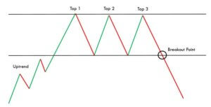
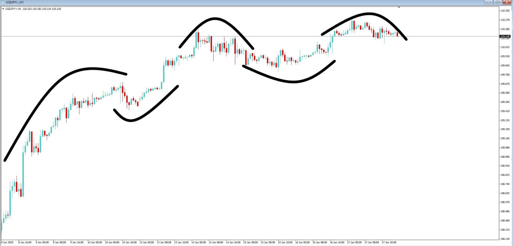
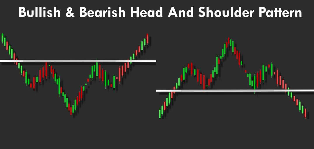
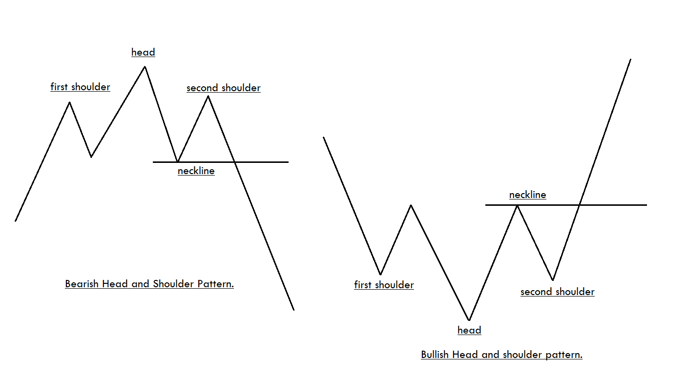
The Head and Shoulders formation is a popular Forex chart pattern, which is pretty easy to recognize on the price charts. There are both bullish and bearish Head and Shoulders patterns, and both indicate potential market reversals. This pattern consists of three peaks, which is developed after a strong bullish trend. The first and third peaks are of the same height, and they are classified as shoulders. The second peak of the pattern is the highest and hence classified as the head.

There are both bullish and bearish Head and Shoulder patterns. The appearance of bullish Head and Shoulder pattern on the price chart indicates that the momentum is transferring from the sellers to buyers. Likewise, the appearance of the Bearish Head and Shoulder pattern indicates the momentum is transferring from the buyers to sellers. While trading the Bearish Head and Shoulders pattern, it is advisable to go short when the price breaks below the neckline. Contrarily, go long when the price goes above the neckline while trading the Bullish pattern.

How To Trade The Head And Shoulders Pattern?

It is advisable not to wait for the perfect pattern instead look for the good entry/exits when you spot the pattern on the price chart. Sometimes the left shoulder will be bigger than the right shoulder and vice-versa. Please do not focus on minute details. Instead, our focus must be on deciding if the pattern looks reliable enough to trade or not. If the answer is yes, only then take entries.

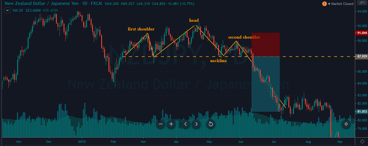
Trading The Bearish Head And Shoulders Pattern

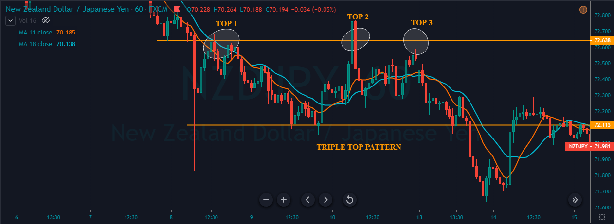
The below chart represents the formation of the Head and Shoulder pattern on the NZD/JPY forex pair.

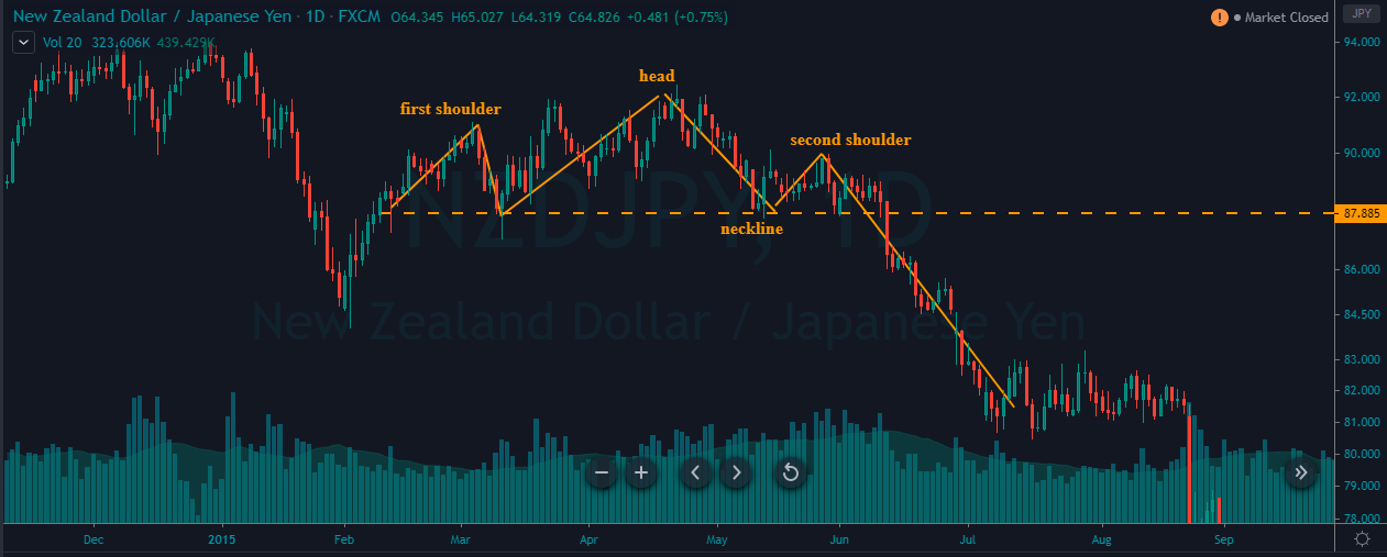
As you can see, in the below NZD/JPY chart, the formation of the pattern doesn’t look perfect, but the overall pattern looks reliable to trade. We went short as soon as the price action broke below the neckline. The stop-loss order was placed above the second shoulder. For TP, we went double the size of the pattern. We had exited the market when the price got consolidated, as it implies the opposite party is gaining strength.

Trading The Bullish Head And Shoulders Pattern

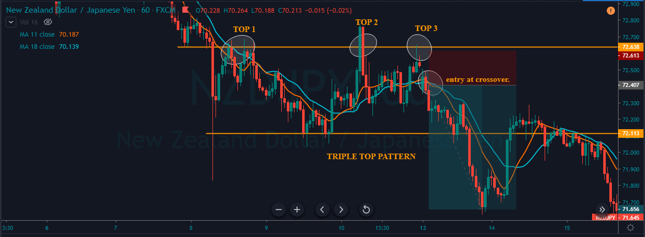
In the below chart, we have identified the Bullish Head and Shoulder pattern in the EUR/CHF Forex pair.

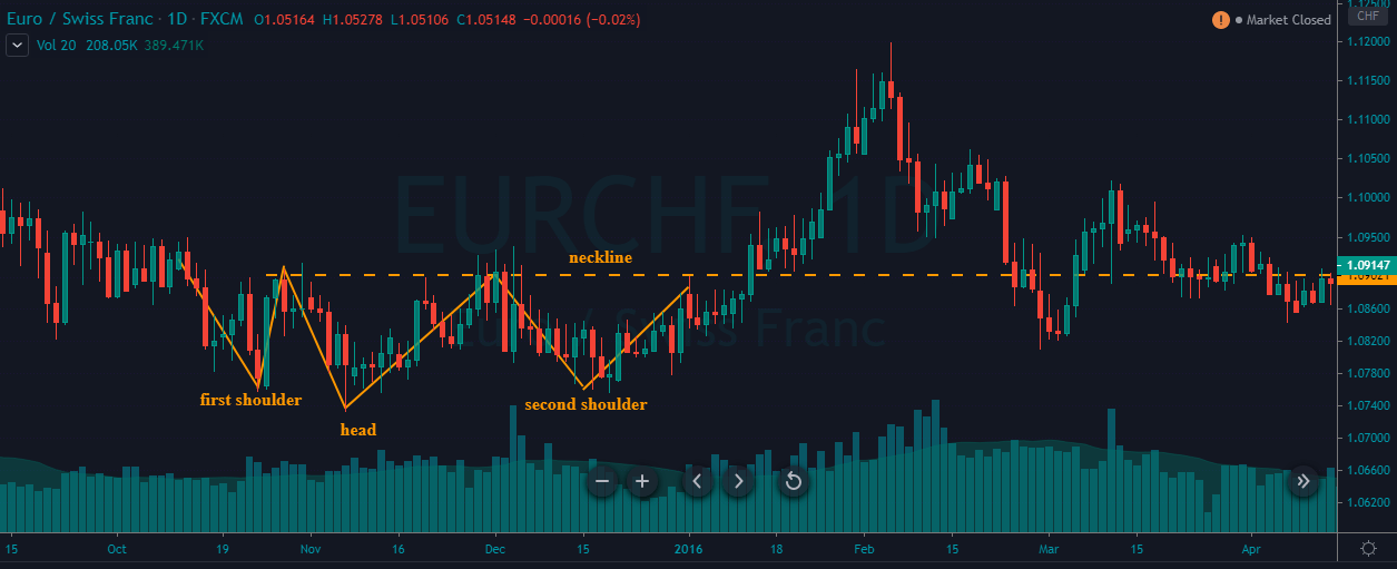
In a choppy downtrend, a bullish Head and Shoulder pattern is formed. When the price goes above the neckline, it is an indication for us to go long. The take-profit is again placed two times the size of the pattern, and the stop-loss is just below the second shoulder.

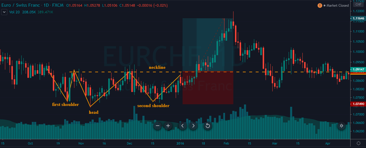
In the above chart, we can clearly see that the Bullish Head and Shoulder pattern is not perfect, like the ones we see in textbooks. But still, our trade worked beautifully. So it is crucial to bends our rules here and there; we will hardly find such kind of perfect patterns. If we just wait for them, we will hardly get to trade. Also, once you gain some experience in trading this pattern, you will automatically be able to decide which pattern works and which will not. Mastering any pattern requires tons of practice and patience.

That’s about identifying and trading the Head and Shoulders pattern. Advanced strategies related to this pattern can be found in our trading strategies section. Please feel free to explore. Cheers!

[wp_quiz id=”73064″]
Categories
Forex Basic Strategies

How To Trade The ‘Double Top’ Chart Pattern Like A Pro

Introduction

There are some patterns in the market that are widely used by traders across the world, and the Double Top is one of them. It is a simple and straightforward method of identifying the potential selling trades in any given Forex pair. Most of the novice traders who trade this pattern tend to face problems as they do not know how to use it correctly. Hence, for those types of traders, we are putting this piece together. By the time you finish reading this article, you will exactly know to identify and maximize gains using the Double Top chart pattern.

Double Top Pattern

The Double Top is a bearish reversal pattern that is usually formed at the end of a bullish trend. The two consecutive rounding tops complete this pattern with approximately the same highs. The first rounding top should be formed at a significant resistance area. Most of the time, the momentum of the second round top is quite weak, and this indicates the buyers are getting exhausted.

This eventually means that the sellers are now going to take control. Both the round tops retrace at a significant support area, which we call the neckline. The identification of this pattern can be comprehended as the professional traders and investors trying to obtain the profits from the bullish trend. And now, the markets are ready to publish a new selling trend.

Psychology Behind The Double Top Pattern

We know that the Double Top pattern occurs at the major resistance area. This pattern indicates when the price action reaches a significant resistance area, the buyers are now afraid to buy because of resistance. On the other hand, the sellers are hitting the sell orders at the same resistance area.

At this point, when the price action is pulled back to a significant support area, which we called the neckline, it shows that the buyers are now buying again at major support areas to print brand new higher high. However, when the price action reaches the resistance area again, buyers fail to print a brand new higher high. As a result, they start to book the orders, and now the sellers are gaining control. Hence the price action tends to move in the opposite direction.

Double Top Pattern – Trading Strategies 

There are several ways to trade the Double Top chart pattern. But the strategies we are going to share here are well-proven methods. Also, we have backtested these strategies time and again to make sure they are accurate.

Double Top Pattern + Bearish Candlestick Patterns

There are various bearish candlestick patterns that are widely used by the traders in the market. For this strategy, you can use any of the bearish candlestick patterns. Some of the most commonly used bearish candlestick patterns are Bearish Engulfing, Evening Star, Shooting Star, Hanging Man, Three Black Crows, etc.

The idea is to identify any of the above mentioned bearish candlestick patterns near the second peak. If you find any of these patterns, you can go short. Make sure to place the stop-loss above the resistance line. We can place two or more TP orders. First, take-profit must be at the neckline, whereas the second one can be placed two times above the size of the pattern formed.

Identifying the Pattern

In the below EUR/JPY chart, we have identified the formation of a Double Top pattern.

Entry

As we can see in the below chart, the price action prints a Bearish Engulfing candlestick pattern right after the second top. This indicates that the sellers have completely absorbed the buyers, and now it’s time to go short in this pair. We took a sell entry at the close of the Bearish Engulfing candle.

Stop-Loss & Take-Profit Placements

As we can see, we have entered the market at the closing of the Bearish Engulfing candle and placed the stop-loss just above the resistance line. This pattern has the highest odds of working in our favor; hence we can go with smaller stop-loss. Because, whenever this set-up is found, the price action has a very little chance to spike.

As discussed, the first take-profit was placed at the neckline of the pattern, and the second take-profit was placed double the size of the complete pattern. But, please decide the placement of TP according to your trading style. Remember that you can close your position wherever you want.

Double Top Pattern + RSI

In this strategy, we have paired the Double Top pattern with the RSI indicator to identify accurate shorting signals. As you might have probably known, RSI stands for the Relative Strength Index. It is a momentum indicator developed by the J. Welles Wilder Jr. in 1978. This indicator oscillates between the traditional levels of 70 and 30. When this indicator reaches the 70 level, it indicates that the market is in an overbought condition, and it indicates the market is oversold when the indicator reaches the 30 level.

Here, the strategy is simple. When the price action hits the second peak and starts to struggle, see if is the RSI is at the overbought market conditions. If it is, then it can be considered a potential sell signal.

Identifying the Pattern

We have identified a Double Top chart pattern in the below GBP/CHF Forex pair.

Entry

In the below chart, we can see the first peak and second peak of the pattern being quite strong. When the price action approached the second peak, it dropped immediately. This shows that the buyers are exhausted, and sellers took over the show. At the same time, we can also see the RSI giving a sharp reversal in the overbought area. Hence we can confidently go short in this pair.

Stop-Loss & Take-Profit

We went short when the criteria are fulfilled and placed the stop-loss just above the entry. Take-profit was placed at the higher timeframe’s support area. Overall, it was a 100+ pip trade. If there is no significant support area for you to exit your positions, you can close them when the RSI reaches the oversold area.

Conclusion

Pattern trading is the easiest way to make more profits in the market. Some patterns provide a great risk to reward trades, and some do not. The Double Top is one such pattern that offers some of the best risk-reward entries. This pattern works well on all the trading timeframes. Make sure to know the logic behind this pattern before trading so that any potential mistakes can be avoided. All the very best!

Categories
Forex Basic Strategies

Trading The ‘Symmetrical Triangle’ Chart Pattern Using SMA

Introduction

A Symmetrical Triangle is one of the most reliable chart patterns in the market. This pattern is characterized by converging two trend lines, which are drawn by connecting a series of peaks and troughs. The Symmetrical Triangle pattern is made up of price fluctuations where each swings high and swing low makes lower highs and higher lows. Essentially, the coiling movement of price action creates the structure of a Symmetrical Triangle. When the triangle is forming on the price chart, it indicates that neither the sellers nor the buyers are pushing the price far enough to create a clear uptrend or downtrend.

This pattern is also known as the ‘coil’ because, most of the time, it forms in a continuation phase. Symmetrical Triangle pattern consists of at least two lower highs and two lower lows. So when these points are connected, the lines converge, and the Symmetrical Triangle takes shape. A part of the trading community believes that if this pattern is formed in an uptrend, the price will break upward. Likewise, if the pattern forms in a downtrend, the price action will break downward. However, these are just assumptions and are not entirely true.

The reason for the formation of the Symmetrical Triangle on the price chart is because of the lack of volume and price movement in any underlying currency pair. This eventually results in the formation of a coiling pattern. Hence it is merely impossible to find out which side of the pattern will breakout.  The only way to trade this pattern is to let the breakout happen on any of the sides and take the trade only after confirmations.

Symmetrical Triangle Chart Pattern – Trading Strategies

Conventional Way – Buy Example

Step 1 - Identifying The Pattern

We can see the formation of a Symmetrical Triangle pattern in the below GBP/NZD Forex pair. We can observe the market coiling and not moving in any certain direction, which eventually resulted in this pattern.

Step 2 - Entry, Stop-Loss & Take-Profit

In the below chart, we had taken the entry when the price action broke the upper trend line. This pattern is pretty reliable but needs a lot of patience as the only way to trade is by stalking the charts. We can notice the market blasting to the north immediately after the breakout of the upper trend line. The stop-loss is placed just below the lower trend line, and the take-profit is placed at the higher timeframe’s resistance area.

Conventional Way – Sell Example

Step 1 - Identifying The Pattern

The formation of the Symmetrical Triangle pattern can be seen in the below AUD/JPY Forex pair. The market was in an overall downtrend, but from 28th – 30th January, it turned into a consolidation phase, which resulted in the formation of this pattern.

Step 2 - Entry, Stop-Loss & Take-Profit

However, on 30th Jan, the lower trend line was broken, indicating a sell signal in the AUD/JPY Forex pair. The entry can be right after the breakage of the lower trend line if you are an aggressive trader. But for conservative traders, it is recommended to watch for the bearish confirmation candles and then take the trade.

Here, we have gone for two targets. The first one was at the recent low, and the second target was a bit deeper, which is at the higher timeframe’s support area. If you are an intraday trader, then the TP1 is a good location for you to close your position. But if you are a swing trader, TP2 is the best match. Most of the time, the breakout trades do perform, and that is the reason for us to use the recent higher low as an appropriate stop-loss placement.

Symmetrical triangle + Simple Moving Average

In this strategy, we have paired the Symmetrical Triangle pattern with Simple Moving Average to identify accurate trading signals. SMA is a technical indicator used by almost every technical trader to identify the market trend. A smaller period average reacts more to the price action, whereas the larger period tends to respond less. If the SMA is below the price action, it means that the trend is up, and if it is above the price action, it indicates a bearish trend.

Step 1 - Identifying The Pattern & Plotting SMA On To The Price Chart

We can observe the formation of a Symmetrical triangle pattern on the EUR/NZD Forex chart.

Step 2 - Knowing What Not To Do

One of the most common ways of trading the Symmetrical Triangle and SMA is to let the price action go above or below the MA line to take an entry. But that approach is riskier, and let’s see why. In the below image, we have marked two circles where the MA generates both buy & sell signal. It is clear that the selling signal failed to perform, and the price action goes above the SMA. When the price broke the SMA, some traders might have taken buy entries, but that’s an immature way to trade this pattern. The reason for the formation of the Symmetrical Triangle is due to the lack of volume or price movement. So there is no way to know which side of this pattern will break.

Step 3 - Entry, Stop-Loss & Take-Profit

The correct way to trade the Symmetrical Triangle pattern is to use both of the trading tools in conjunction with each other. When the SMA goes below the price action, it confirms that the prices are more likely to break upside. When strong buyers break the Symmetrical Triangle with strong power, it’s a clear indication for us to go long. So we have entered the market right after the price broke above the upper trend line of the pattern.

If you are a confirmation trader, we recommend you wait for the price action to hold above the Symmetrical Triangle to take a ‘buy’ entry. For this particular strategy, we placed the stop-loss below the SMA, and take-profit was at the higher timeframe’s resistance area. After our entry, we can see the buyers blasting to the north, and we end up milking 100+ pips in this Forex pair.

Conclusion

The Symmetrical Triangle pattern is widely used among traders. The difficult part of trading this pattern is predicting the direction of the breakout. All we can do is to watch the charts until the breakout happens and anticipate the trade. The traditional way to book the profit is at the beginning of the triangle itself. However, we can use some other approaches such as higher timeframe’s S&R areas, supply-demand zones, or exiting the position when the market turns into a consolidation phase.

We hope you had a good read. Let us know if you have any questions in the comments below, and we would love to answer them. Happy Trading.

Categories
Forex Basic Strategies

Most Profitable Ways To Trade The Triple Top Chart Pattern

Introduction

The Triple Top is a bearish reversal pattern that helps traders in identifying the peak areas of the market. This pattern occurs when the market prints three consecutive tops nearly at the same price level of any underlying asset. The areas of the touchpoints are the resistance levels, and the pullback between these points is known as the swing lows. After the third high or third touchpoint, if the price breaks the support and goes below, the pattern is said to be complete.

Traders can then activate their positions on the sell-side. Most of the traders try to be extra conservative and wait for the exact pattern to occur. But it can be challenging to find the Triple Top Reversal pattern with all the three highs at the same in size. We should always remember that the technical analysis is more of art and less of science. So even if 80% of the pattern rules are met, we can take the trades by confirming those signals with other credible technical indicators.

The Psychology behind the Triple Top Pattern

The appearance of a Triple Top Pattern implies that the buyers are slowly losing momentum in the market. It might also mean that the buyers are not willing to push the price higher. At the same time, the sellers are interested in taking the price lower. The Triple Top pattern is a way more powerful pattern than most of the other credible patterns in the market. This is because the third failed attempt of the buyers implies that the sellers are way too aggressive than the buyers. Hence we can expect stronger downward moves.

Triple Top Pattern – Trading strategy

The Triple Top pattern occurs very rarely on the higher timeframe. Even if it occurs, this pattern often takes a lot of time to develop fully. However, on an intraday timeframe, this pattern can be observed quite often.
Step 1: Identifying the TTP on a price chart

In the below AUDCHF Forex chart, we can see the market printing a clear Triple Top chart pattern.

Step 2: Entry 

The strategy is to wait for the breakdown to happen so that we can activate our short positions. On the 27th of January, we can observe the breakdown that occurred in this pair, and that can be considered as a clear Sell Signal.

Step 3: Stop-loss & Take Profit

We can activate our sell positions as soon as we see a bearish confirmation candle. We can go for two different targets in this trade. Both are at the higher timeframe’s support area. Most of the traders believe that their target must be double as compared to the size of the Triple Top pattern, but it’s just a myth. Always book the profit according to the market circumstances.

If the trend is super strong, go for the deeper targets. Contrarily, if the market momentum is fading, book the profit at any significant area. Traders who are well versed with pattern trading can add positions when the market goes back to the entry point so that they can ride the whole show again. While trading the breakout or break down patterns, always place the stop-loss near the recent low.

Triple Top Pattern + Double Moving Average

In this strategy, we have paired the Triple Top pattern with the Double Moving Average to identify accurate sell signals. A moving average will help us in identifying significant trends, trading opportunities, and entry/exit levels. Many traders believe that if they find the magic number of the period, then they can easily beat the market, but it’s not true. There are infinite numbers of periods available, and traders should practice only 3 to 4 periods, to use this indicator effectively.

Step 1: Identifying the TTP on a price chart

In the below chart, we can observe the market printing the Triple Top pattern on the NZD/JPY 60-minute Forex pair. We have applied the double MAs on to the price chart.

The traditional way to trade this pattern is to wait for the break down to happen and then go for sell just like we did in the above example. But in this strategy, let’s tweak things a bit by adding the double moving average to the plot. In this strategy, we are using the 14 and 9-period average. This strategy is purely for the intraday traders only.

Step 2: Entry, Stop-loss & Take Profit

After price action printing the third top, if we observe an MA crossover happening, we can activate our sell positions even before the breakdown. By following this approach, we get to enter the trade ahead of time, while the breakdown traders wait for the break down to activate their position. Most of the professional traders use this approach to maximize their profits.

There are many ways to close our positions. We can book profit at a significant support area. The placement of stop-loss depends on the trader’s trading style. If you are an aggressive trader, the smaller stop-loss is good. But expect more hits before the trade performs. If you are a conservative trader, use an extra spacious stop-loss.

Bottom line

A pattern is said to be paramount when it offers the best risk-reward ratio trades. Also, the pattern must have a higher probability of occurring in intraday timeframes. The Triple Top is one such pattern that offers both of these demands to every trader. Also, remember that the Triple Top is a bearish reversal pattern, so only take short positions when you see this pattern on the price charts. Apart from the ones mentioned above, there are different other ways to activate our position in the appearance of this pattern. But the above ones are the safest and most profitable ways to trade.

Try identifying and trading this pattern on a demo account before trading on the live charts. We hope you find this article informative. If you have any questions, please let us know in the comments below. Happy Trading.

Categories
Forex Videos

Forex Hacks – Recurring Shapes & Patterns Part 2 of 2

Recurring shapes and patterns Part 2 of 2


Continuing with our theme of looking for recurring shapes and patterns in technical analysis, we now turn our attention to example A, which is a one-hour chart of the GBPUSD pair.

Example A


Here we can see price action without technical indicators, but where we have drawn on two wedge shapes on to our chart.
The wedge-shaped pattern on the left began when price action was fairly muted but began to become more volatile throughout the period, with the bottom of the wedge holding firm as an area of support. Only when the ascending area of resistance in the wedge shape is pierced at the top, as volatility increases, do we see the pair come back down and breach through the area of support, offering a pullback for the bears.
To the right of the screen, we have the opposite effect where, after a period of volatility within the wedge shape, price action becomes more muted as it falls down to the area of support — this time when price action becomes contracted due to consolidation within the market. Price action rejects the support line and exits the wedge shape and where the bulls traders have hold of the action.

Example B

Example B is a 15-minute chart of the USDJPY pair. This is a classic head and shoulders shape. After a period of consolidation, which forms the basis of the left shoulder, price action is followed by a spike higher, which becomes the head, and where subsequent price action will consolidate by the right shoulder before traders look for a sell-off, which indeed does happen in this case, and is the basis of the right shoulder. Traders are particularly fond of this particular shape and closely look out for it.

Example C


Example C is of the USDJPY 15 minute chart, where we have another chart which is called the butterfly. In these circumstances, we have a sell-off where the price action consolidates at a very narrow section before we see the bulls come in and drive price action back to similar levels as previously.

Example D

And finally, Example D, which is a one hour chart of the EURUSD pair. And just to re-emphasize from part 1, price action does not move in straight lines. When studied on a chart, it is clear to see that price action will regularly move in waves or half circles.

Keep a look out for the shapes and patterns we have identified in part 1 and part 2, because they are a regularly recurring feature of price action when trading the forex market. When viewed like this, it is much easier to pick out how price action is evolving on your charts.

Use drawing tools that may be available on your chart software and Identify chart patterns and then use them to calculate support and resistance lines and where price action might possibly break out, stall and consolidate, or reverse.

Categories
Forex

Forex Hacks – Recurring Shapes & Patterns Part 1 of 2

recurring shapes and patterns Part 1 of 2

When trading from charts, one often finds at certain shapes and patterns recurring time after time. This is because the forex market, just like other financial markets, tends to retrace price action. In fact, over 80% of the movement in price action, within the forex market, is price action retracing.

Some pattern formations in price action, such as price seemingly complying with moving averages, MACD, and stochastics, for example, are very self-evident. However, we know that price action does not move in a straight line, and therefore we need to be looking elsewhere for help in determining the possible future direction in price action movement. Some patterns and shapes are somewhat subjective, but, nonetheless, when a trader realizes that these other patterns and shapes, which recur time after time, exist, it will help add another dimension in the art of forex trading.

Example A


Let’s take a look at example A, which is a one-hour chart of the USDJPY pair. Picking up the price action from the left-hand side of the screen, we can see that after an initial push higher the volatility slows as the pair’s move takes on a more gradual move higher and where we can see the price appearing to arch through 90 degrees to the right. We then find a slight pullback lower where there seems to be a wave encompassing the price action as it moves higher. Other examples have been added and which, on a subjective basis, might show further waves and arches acting as makeshift support and resistance areas.

Example B


Now let’s take a look at example B, which is a 4-hour chance of the GBPUSD pair. This time the shapes are slightly less subjective, and we can see clear examples of triangular formations. They tend to form when there is a spike in the price action in either direction and where the price action fades back to the original levels of the spike and where the base of the triangle is often an area of support and resistance.

Example C


Example C is a 4-hour chart of the CADJPY pair. This is a sight that you may be more familiar with: the box or square. To conform there must be at least two similar exchange rate levels of support and two similar levels of exchange rate levels acting as areas of resistance. The longer that price action is contained in boxes, the more likely of a volatile breakout at some point.

Example D


An example D, we stick with the 4-hour chart of the CADJPY pair, and this time we have added tracks, which are simple moving averages, acting as areas of support and resistance to price action. Traders often draw these tracks on their charts and look for areas where price action breaks out of the tracks, to try and determine future price direction.

Look out for more shapes and patterns in Part 2.