In a few of the past course lessons, we have discussed some of the most crucial topics related to the Forex market environment. Starting from the ‘state of the market,’ we have understood what trending and ranging markets are. We also have differentiated the concepts of retracements and reversals, which are vital for identifying accurate entries and exits.
One of the most valuable things we have comprehended is to identify ways for spotting potential market reversals. Finally, we understood how professional traders read different market environments and states. The fundamental purpose of this summary article is this – There is a possibility of you understanding these concepts better once you finish all the course lessons in this section.
Hence, this article will focus on summarizing everything we have learned till now regarding the Market Environment.
The Market States
We have discussed the different ways in which the market moves. Essentially, the price action of a particular asset class moves in three different ways.
Trend | Range | Channel
With clear examples, we have discussed how this movement happens and what we should understand when the price moves in a particular direction. More info related to this can be found here.
Trading the Forex market when it is trending!
In this chapter, we have taken you through the concept of trending market. Uptrend and downtrend concepts have been clearly explained. We also have used Indicators like ADX and Moving Averages to trade the trending market accurately. Please go through this to recall those strategies.
What should we do when the market is ranging?
We have comprehended the various ways of identifying the ranging market. We also used the Support/Resistance strategy & ADX indicator to trade ranges effectively. Once you try trading a ranging market by yourself, the way you read this article will change, and it will all start making sense. Hence, going through it once again now is important.
Retracements & Reversals
In the next couple of articles, we have drawn down clear differences between Retracements and Reversals. Here, we understood what we must do in the situation of a reversal or a retracement. Then, we have moved on to learn how to trade a reversal in the most effective way possible. In this lesson, we have taken the help of Fibonacci Levels to identify potential market reversals and trade them accordingly.
Finally, we ended this course by understanding how most of the professional Forex traders read and trade different market states. We consider this one of the most useful and valuable articles in this course as we have shared some of the most simple yet effective trading techniques. We also used accurate risk management techniques to protect your capital while trading the market using these techniques. You can go through them again here.
We hope these techniques helped you in becoming a better trader. In our upcoming course lessons, we will be understanding Breakouts, Fakeouts, and everything related to these topics. Cheers!
In the previous course lessons, we understood the importance, types, and various pros and cons involved in indicator-based trading. From this lesson, let’s start learning some of the most widely used indicators in the market. We will be starting with Bollinger Bands, which is arguably considered as one of the most widely used indicators in the Forex Market.
What are the Bollinger Bands?
They are a technical analysis indicator, which was developed by one of the famous technical trader John Bollinger in the 1980s. This indicator consists of three lines, which are simple moving average (the middle band), an upper and a lower band. In a volatile market, the bands of the indicator expand, and it contracts in tight market conditions.
Most of the traders think that the Bollinger bands indicator is similar to the moving average envelope, but it’s not true, because the calculations of both of the indicators are different. For plotting the upper and lower bands of the Bollinger Bands indicator, the standard deviation is considered. On the other hand, for moving average envelopes, the lines are calculated by taking a fixed percentage.
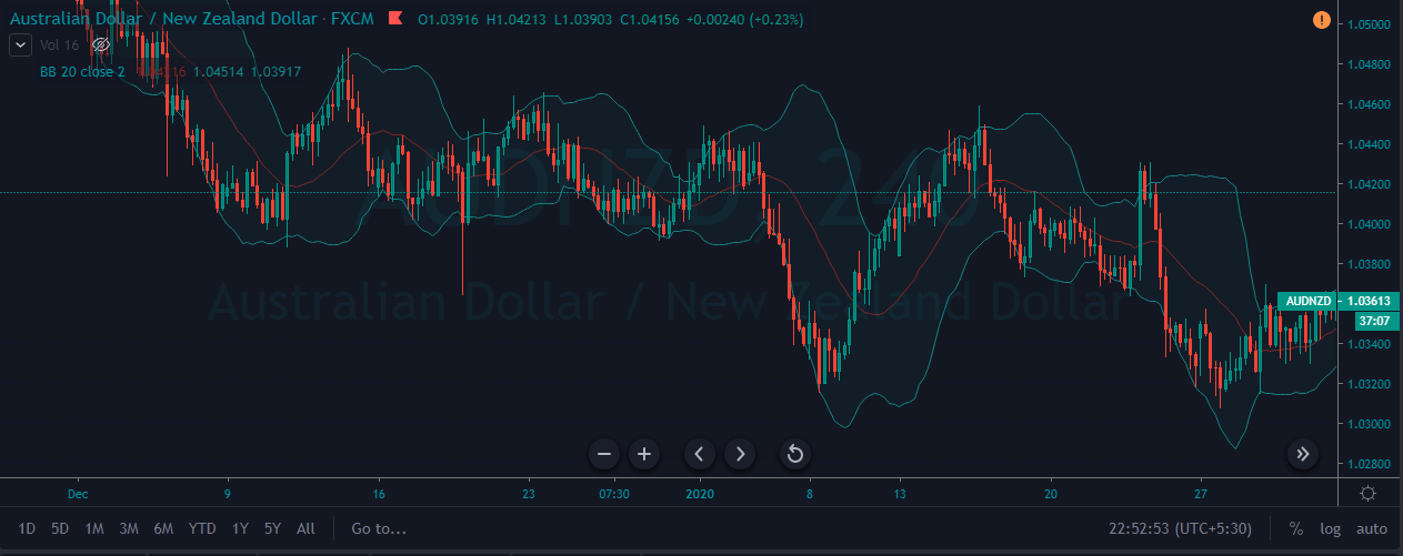
Bollinger Bands Indicator Plotted on a Forex Price chart
Using The Bollinger Bands Indicator To Take Trades
Most of the market experts and chartists believe that when the price action continuously touches the upper band, it means that the market is in an overbought condition, triggering a sell signal. Conversely, the closer the price action moves towards, the lower band, the more oversold the market is, triggering a buy signal.
This is the most common way to trade the markets using the Bollinger Bands. As much as this is true, we don’t suggest to use this approach to trade the markets where traders just blindly follow this one single rule. As we all know that the trend is our friend, we must first figure out the trend. Then it is advisable to trade only buy opportunities in an uptrend and sell opportunities in a downtrend. This is one of the most reliable ways to identify the trades on any trading timeframe.
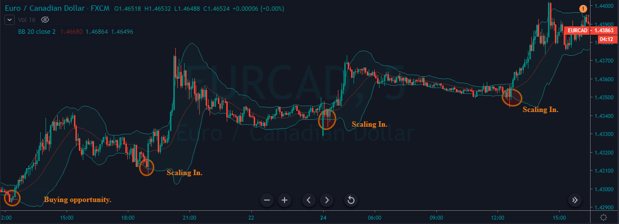
The below image represents the buying opportunities on the EUR/CAD 5 min Forex chart. As we can see, the market was in a strong uptrend. We have identified four buying opportunities in just a couple of hours. The chart clearly represents how many times the price action touched the upper band and didn’t drop instantly. This is the reason why most of the professionals use this indicator to trade the market.
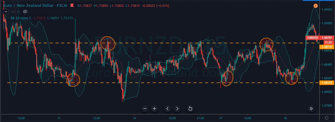
Trading Ranges Using The Bollinger Bands
One more crucial applications of the Bollinger Bands indicator is while trading ranges. This is because the bands of the indicator act like dynamic support and resistance levels to the price action. Higher the timeframe we use to trade the ranges, stronger are the bands will be. That is, price relatively respects these brands than the bands in the lower time frames. Many successful traders ace the market by using this strategy alone.
As we can see in the below chart, the market generated three buying and two selling opportunities when the market is ranging. Do not place the buy or sell orders blindly when prices reach the upper or lower level of the consolidation phase. Instead, wait for the prices to hold there for a couple of candles to activate your trades. In the below image, we have activated our trades only when we saw the confirmation candles. In this way, we can filter out whipsaws and false trading signals.
Conclusion
This lesson is an attempt to give you a basic idea of the working of this indicator. There are many more aspects to this, and you will be learning them once you start exploring Bollinger Bands on the price charts. You can refer to this and this articles to get advanced trading strategies using this indicator. Bollinger Bands can also be combined with technical tools like chart patterns and other reliable indicators to generate more accurate trading signals. One such example can be found here. Cheers!
Stats for Traders V – Assessing the Quality of the Forex Markets
In our previous video offering, we were presented with a way to assess the quality of a trading strategy or system. It was a modification of the T-
Test Called SQN. Essentially, the test is a measure of the signal-to-noise ratio of distribution. Being the mean of the distribution, m, the signal, and one-tenth of the standard deviation, the noise divisor. Therefore, the higher the SQN, the better the signal of the distribution. It means, also, its difference with a zero mean distribution (everything is noise) is larger.
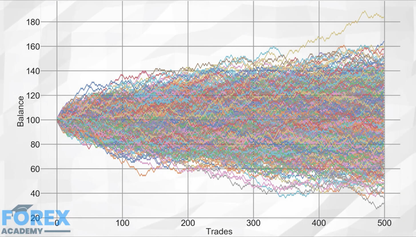
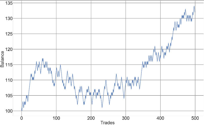
Random Walks
Market prices, although not entirely normal-distributed, short-term, prices approach a Bell curve very much. The picture we see is the composite image of one thousand different games of a coin toss in which the player wins 1 dollar if heads and loses one dollar if tails.
The paths are the history of wins and losses over 500 coin tosses for each game.
We can see that, even it is counterintuitive, not all games end with zero gains. Some paths are luckier, whereas other paths suffer from bad luck.
The figure we see on the image is representative of what is called a diffusion process, with no drift. It is essentially saying it is a complete stochastic or random process with no trend involved.
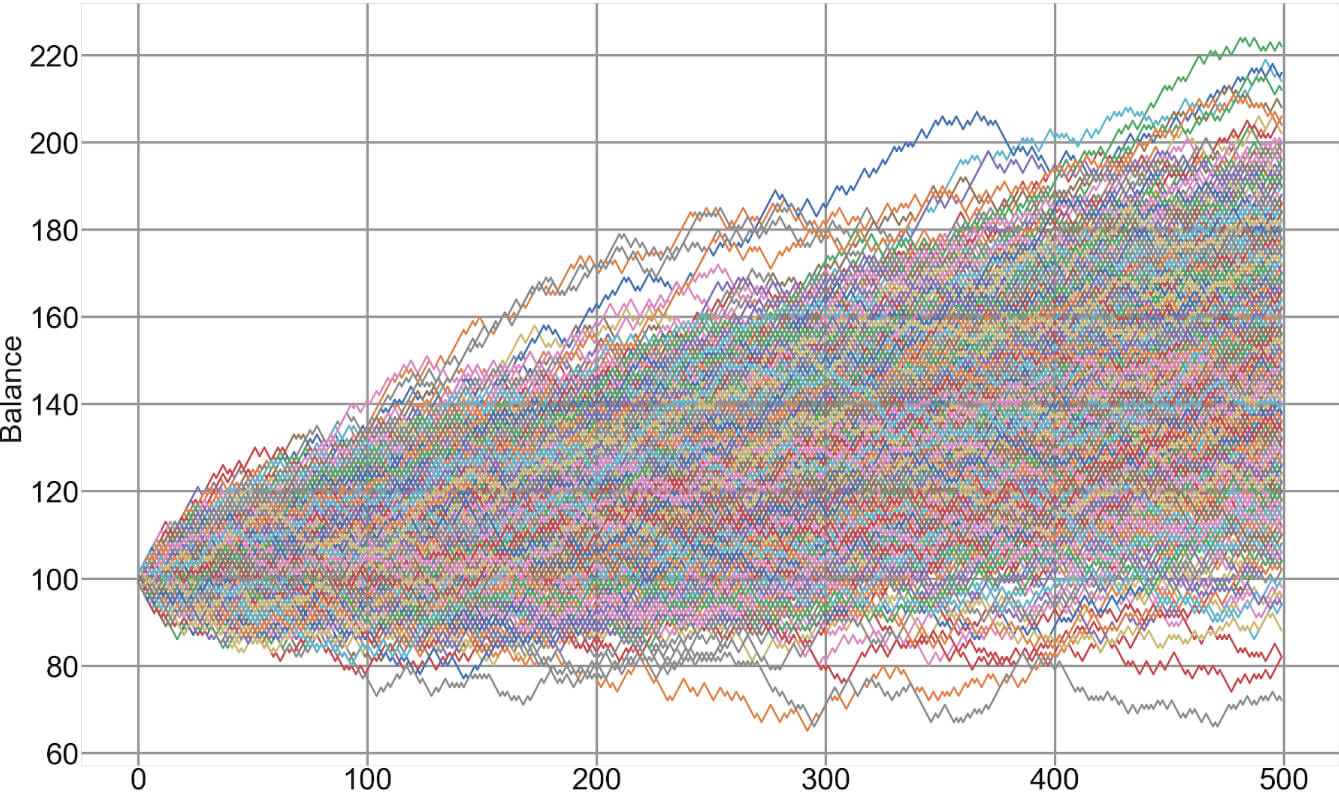
A market depicting a potentially profitable component, usually a slightly positive trend would look like this. In this image we see that although there are some paths luckier than others, the average direction is positive, which is why the smoke cloud points slightly upwards.
Market prices can be described by a signal component mixed with noise, or random fluctuations.
Sometimes, the market shows a relatively high signal, whereas, on other occasions, it is just noise. To traders, it is essential to distinguish both market states, as it is impossible to profit long-term on a market with just noise.
SQN as a measure of the trading quality of a market
We can rank the markets offered by our forex brokers by their quality or signal to noise ratio, using SQN or a T-Test with less than 100 sample periods. We could apply this measure to our usual timeframes, using from 30 to 60 samples to obtain a quality map of our usual markets. Then we rank them by quality. This measure, together with the volatility stats and the rest of statistical information we already explained in previous videos, allows a savvy trader to choose the current best markets and discard the ones not showing adequate signal-to-noise characteristics.
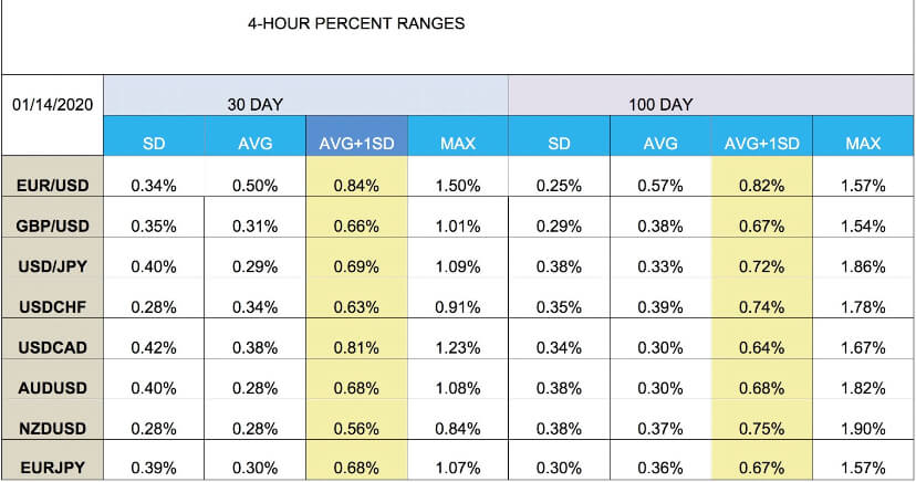
Range Stats
Another interesting measurement that could help us assess potential reward to risk factors and also trim our targets properly is the intraday range measurements. We could set a 30-day, and also a 100-day and yearly stats, of what is normal market ranges percentwise for each asset in our basket. To do this measurement, we first mark the swing highs and lows and register the price differences. Then we apply the statistical measures to get the average and the SD values. A table could tell us what we could expect from the next move and set potential targets at the mean and also at the mean plus one SD.
We can also refine the information by splitting the table into swing high and swing low tables. That kind of information will give us valuable insight into the potential quality of the next trade, including the available range, its likely continuation, the possible reward-risk ratio, and the distance to targets.
Do you know the difference between institutional traders and the average retail trader?
Well, there are many obvious differences, including the capital available to them. Still, the most significant factor is that you blindly believe in technical analysis, whereas they use other higher-level techniques to be ahead of them, ahead of you.
The mathematician is highly paid in the financial markets for a reason: They make the real difference. The marketplace is a battlefield, and quant analysis is analogous to smart drone attacks, whereas trading using TA is like fighting with spears and arrows.
But I don’t have that software!
Of course, pros use large databases and sophisticated analytical software, machine learning, and so forth. If you are serious about trading, you should consider creating your custom analytical software. The use of high-level languages such as Python in combination with Pandas, a terrific statistical package, and a bit of code, would put you into the next level. Still, with patience, dedication, and a spreadsheet, you could collect your own information. Excel also included quite a decent statistical package.
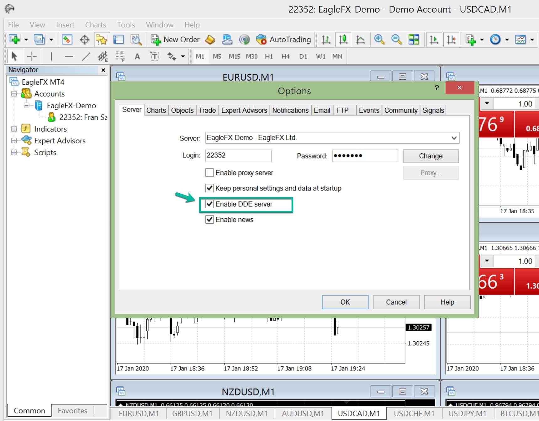
Metatrader 4 to Excel
It is possible to automate your data capture from your MetaTrader 4. MetaTrader 4 has a DDE Link. It is straightforward to get it done.
You simply need to enable the MT4 DDE server and place a simple code in the corresponding Excel cells.
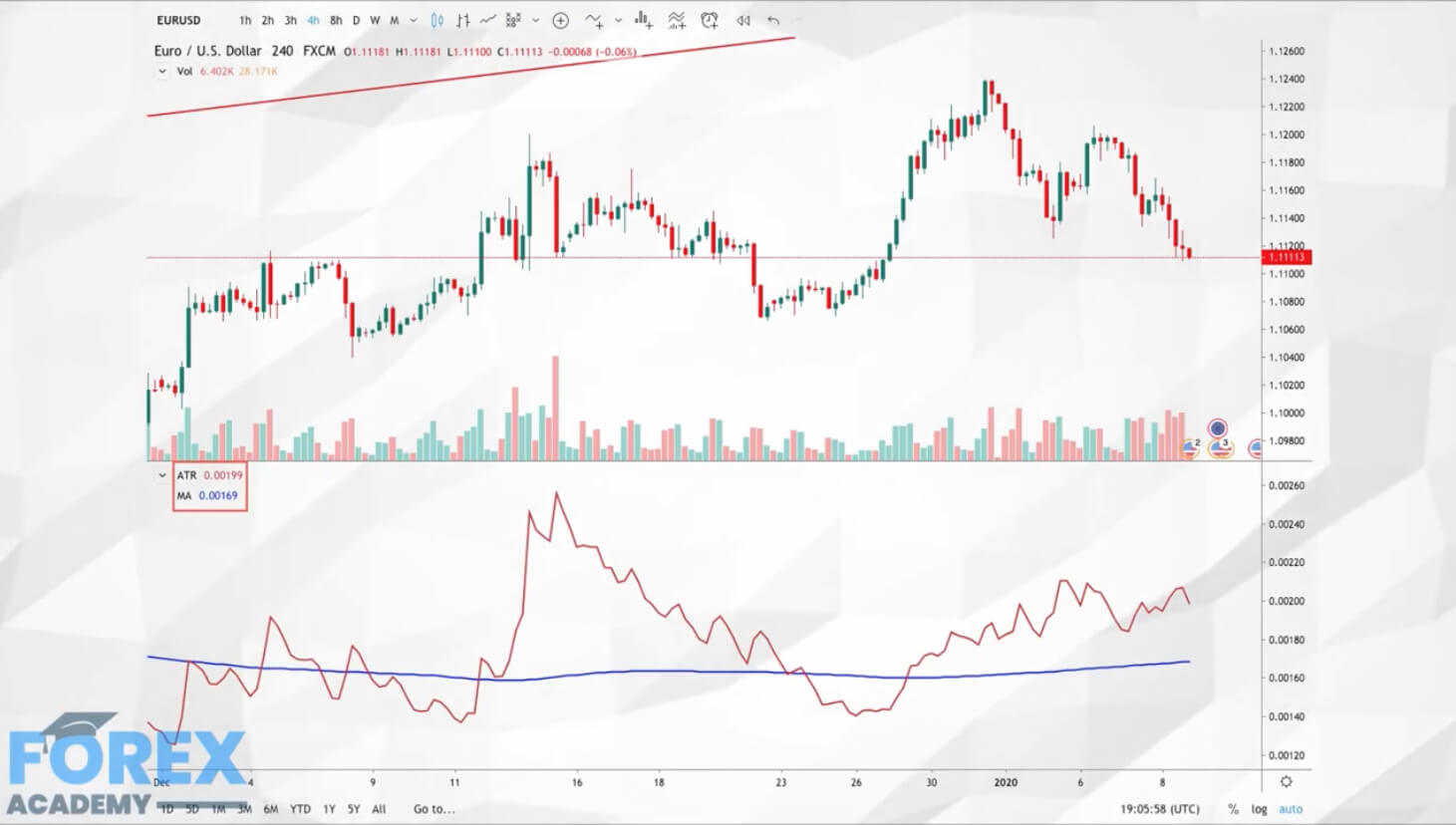
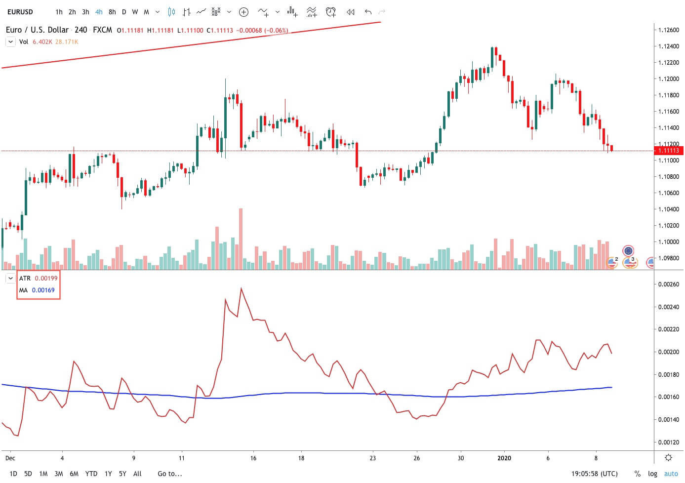
Determine trading ranges can be accomplished using the Average True Range Indicator (ATR). There is no need to collect data to use it, and it will provide you the basic information to know a lot of things. Using a short-term value such as a 10-period ATR will tell you of the Forex pair you intend to trade is experiencing a period of low or high volatility, or if its current range can be considered as normal. This knowledge will show you several interesting facts that may decide if it is worth trading or not.
1.- The ATR is the average range for the period. Therefore, it tells you the expected movement of the timeframe of your chart. So it is at the same time, your risk and your potential profit per timeframe. It tells you several pieces of information:
Your stop loss pip distance divided by the current ATR will say to you the average time it will take the market to reach your stop. For example, in a 4-Hour chart, if your stop-loss is 10 pips away and your STR is 16 pips, you know the average time a bad trade will take to reach your target is 10/16 x 4hours = 2.5 hours.
Your profit distance divided by the current ATR will tell you the average time it will take your trade to reach your target.
Your trading costs, Spread+ Fee+ Slippage multiplied by the profit to ATR ratio computed above, divided by the ATR and multiplied by 100 will tell you the percentage of the projected profits are needed to break-even.
That value will help you to decide the best timeframe for your needs. If you’re aware of the overall cost of the operation, you may realize your mostly working for your broker and that a better timeframe is needed or that the current market ranges are not suitable for trading.
Determining turning points and the concept of range_stats
Now, if we collect the averages of trading ranges, we can get a lot of more exciting insights about the market.
What if we could get a real edge over the market, statistically relevant and profitable long term?
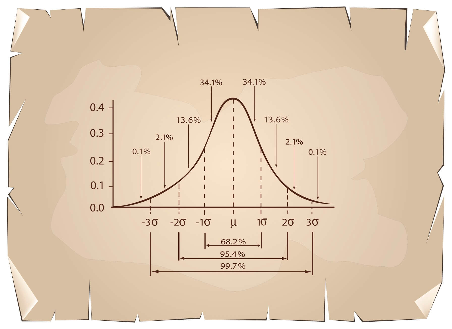
Going back to our previous video about the Normal Distribution, we talked about the Central Limit Theorem. This theorem says that the average value of a collection of samples will be normally distributed.
If we apply this concept to a collection of ranges, we will get a Bell-shaped curve, including its statistical properties.
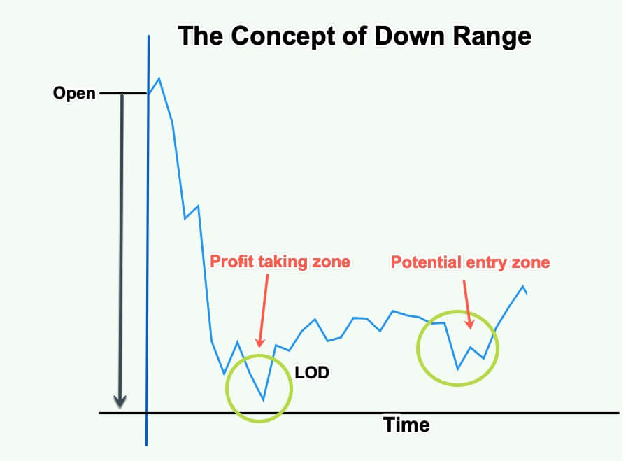
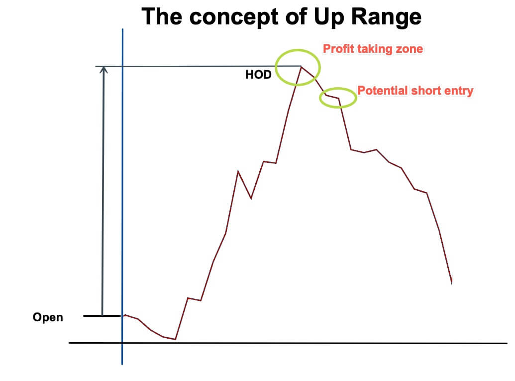
UP and Down Ranges
If we have our data collected, we could compute the average range from the opening of our session to the low of the session. Let’s call this piece of data the Down_Range.
We can do the same for the gain data. That is the range from the opening to the high of the session. That will be called the UP_Range.
If we store the UP__Range and the Down_Range measurements, we can compute the average of the last 30, 50, or 100 days and its standard deviation (SD) and apply some statistical thinking on it.
In our previous lesson about the Normal Distribution statistical properties, we’ve learned that 68.2% of the data points belonging to a Normal distribution are located in the region between the average plus and minus one SD. That means only 31.8% of the data points are beyond that area. And looking to the right side, only 15.9% of the ranges are higher than the average plus one SD.
On this fact lies our trading edge: Our data collection of Up and Down ranges tells us how far, on average, the asset moves before turning in the opposite direction.
Thus, our TA signals will be much more statistically significant when the UP or Down typical range has been exceeded by 1SD, there is a high likelihood the currency pair is reversing.
Taking profits can also be aided by this type of strategic information, as we could compute the typical range the asset moves after turning in the opposite direction and apply it to our trade setting.
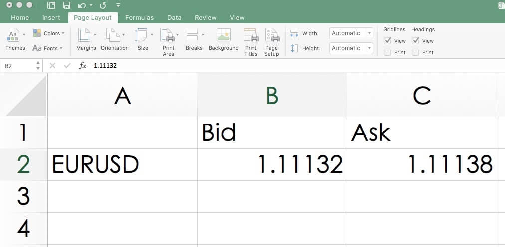
The EUR/USD pair tracks the exchange rate of the Euro against the US Dollar. Since this pair represents a combination of the two stronger economies in the world, it is
The EUR/USD pair tracks the exchange rate of the Euro against the US Dollar. Since this pair represents a combination of the two stronger economies in the world, it is
The EUR/USD pair tracks the exchange rate of the Euro against the US Dollar. Since this pair represents a combination of the two stronger economies in the world, it is the most traded asset in Forex, and, therefore, the one with higher liquidity and less spread and slippage.
The value assigned represents how many US dollars are needed to buy a single EUR. That is, the quote is presented as 1 euro per x US dollars. For example, the current value is 1.1079, which means a trader needs to use 1.1079 dollars for every Euro he is willing to buy.
The broker charges a fee per lot on ECN accounts, and usually, no fee on STP accounts The usual fee on an STP broker is from 6 to 10 pips per round trip and lot. Other
Slippage: Slippage is the difference between the trader’s intended price and the real price he received from the broker. It depends on the current volatility at the moment of the order. Slippage can be in favor of or against the trader.
Depending on the broker’s execution speed, slippage can be as low as 0.5pip or as high as 3 pips.
Note:Slippage happens twice: At the open and the close of a position.
Trading Ranges:
The following trading range tables measure the min, average, and max volatility of the asset at different timeframes. Range figures usually multiply by the square root of two for every doubling of the timframe. That is, if the hourly timeframe volatility is 1, its 2h timeframe will show 1.41 on the same date. Trading ranges are useful tools to assess the risk. If the hourly volatility of the EURUSD is 20 pips, it means a potential $200 gain or loss in an hourly time span ( 20 pips + $10 value per pip).
The values shown depict ranges occurring at the moment of the creation of this document. The trader should assess the actual values at the moment of his trading activity.
Shrink the chart so you can assess a large time period
Select your desired timeframe
Measure the floor level and set this value as the min
Measure the level of the 200-period SMA and set this as the average
Measure the peak levels and set this as Max.
EURUSD Cost as a percent of the Trading Range
To compute the costs, we add the trading fee, an average slippage value x 2 converted to pips, and we calculate what percent represents the min, average, and max of the ranges, assuming a range represents the amount of potential profit for one unit of time.
ECN MODEL ACCOUNT
ECN
MIN
AVERAGE
MAX
Total
3.3
1H
55.93%
31.73%
12.69%
Slippage
2
2H
38.82%
22.76%
8.92%
Spread
0.3
4H
25.38%
14.93%
6.73%
Trading_Fee
1
D
7.33%
5.16%
2.89%
W
2.77%
2.06%
1.57%
M
1.14%
0.61%
0.36%
STP MODEL ACCOUNT
STP
MIN
AVERAGE
MAX
Total
3.5
1H
59.32%
33.65%
13.46%
Slippage
2
2H
41.18%
24.14%
9.46%
Spread
1.5
4H
26.92%
15.84%
7.14%
Trading_Fee
0
D
7.78%
5.47%
3.07%
W
2.94%
2.19%
1.67%
M
1.21%
0.65%
0.38%
Best EUR/USD timeframe for trading
From the above charts, we see that hourly charts show a very high cost on entries with low volatility ( the Min column) therefore to trade these timeframes, traders need to spot the surges in volatility and be right most of the time to compensate for the 50%+ costs.
Intraday traders’ best timeframe is, definitively 4H, although the should optimize the costs using proper assessment of the volatility.
In both cases, strategies that take away slippage using limit orders would dramatically reduce costs and improve the results.
As an example, these are the results if we take away slippage using limit orders in entries and exits on an ECN account.
ECN
MIN
AVERAGE
MAX
Total
1.3
1H
22.03%
12.50%
5.00%
Slippage
0
2H
15.29%
8.97%
3.51%
Spread
0.3
4H
10.00%
5.88%
2.65%
Trading_Fee
1
D
2.89%
2.03%
1.14%
W
1.09%
0.81%
0.62%
M
0.45%
0.24%
0.14%
We can see a percentual reduction of over 50% in costs, compared to market orders with slippage.
Introduction
There are three states in the market – trend state, channel state, and range state. A trending market is the one where the market makes higher highs or lower
Introduction
There are three states in the market – trend state, channel state, and range state. A trending market is the one where the market makes higher highs or lower
Introduction
There are three states in the market – trend state, channel state, and range state. A trending market is the one where the market makes higher highs or lower lows, and a ranging market is a state where the price goes through a consolidation phase. The channels can be considered as a particular case of range as they work similarly to a range, but are tilted.
What is consolidation?
To understand this strategy, we must first understand the concept of consolidation. Consolidation is a technical term in trading where the market loses momentum and starts to move in the form of a range.
A common tendency of the market is that, when the price starts to move in a range and begins to consolidate, it prepares blast in one of the sides. So, people always keep an eye on currency pairs, which are in a consolidation phase.
N-Period Narrow Range
In the N-period narrow range, the period N takes two values –4 and 7. So, we have the 4-period narrow range and the 7-period narrow range. These two are also referred to as the NR4 (Narrow Range 4) and the NR7 (Narrow Range 7).
The NR4 and NR7 trading strategy
This strategy is basically a modified range breakout strategy where the market consolidates in the beginning and then blasts out of a narrow range.
In NR4, number 4 refers to the period under consideration. That is, for NR4, the last four days are taken into consideration, and for NR7, the last seven days are taken into account.
What is the NR4 and NR7 strategy?
It is a breakout trading technique where we consider the last four or sever days to apply this strategy. And in these four or seven days, we compare the range of all these days and determine if the current day is an NR4 or NR7 day. Once we obtain the NR4 or NR7 day, we gear up to go long or short.
Calculating the range
Firstly, to trade this strategy, consider the candlestick chart on the daily timeframe. The range of a particular day is calculated as the difference between the high price and the low price.
What is the NR4 day and the NR7 day?
NR4 day
In layman’s terms, the least fluctuated day (4th day) in the recent four days is called the NR4 day. Technically, it is the day whose range is the smallest out of the previous four trading days.
NR7 day
Similarly, when the 7th day in the last seven days moves the least number of pips, it is referred to as the NR7 day.
How to trade the NR4/NR7 strategy?
Following is a set by step procedure to trade this strategy:
Find the high and low of the last few days (seven for NR7 and four for NR4).
Calculate the range (high – low) for each day under consideration.
Compare these range values with the previous days.
Determine if the present day is an NR4 or NR7 day. If so, then wait for the price to break out of the high or low of the NR4/NR7 day.
If the market breaks above the high, then it is an indication for a buy, or if it breaks below the low, then it is an indication for a sell.
Illustration to trade the N-period Narrow Range
Trading the NR4/NR7 strategy is simple. But, as far as the consistency of this strategy is concerned, one can make more out of this strategy only when the NR4/NR7 day appears in the right location. Hence, understanding ‘where’ the NR4/NR7 occurs is very vital. So, let’s consider a few examples to support this statement.
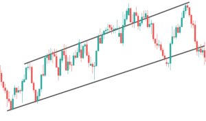
Below is the chart of USD/CAD on the Daily timeframe. We can clearly see that the market is moving in a channel state. Now, to trade this strategy, we blend it with the working of a channel.
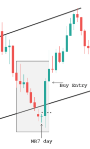
Trading a channel is pretty straightforward. When the price is at the bottom of the channel, we look for buying opportunities, and when it is at the top of the channel, we look for short-selling opportunities. With this mind, we try spotting the NR4/NR7 days in these regions.
Below is the magnified image of the chart where we’re going to analyze the market. Initially, the market came down rolling until the bottom of the channel and began to hold down there. And the candle which held at the bottom turned out to be the NR7 day as it has the smallest range compared to the previous six days. This is an indication that the market (sellers) is slowing down. Later, the market blasts up north and breaks the high of the NR7 day. Therefore, now we can prepare to go long.
And as we can see, the trade performs exceptionally well. This is because the location was in favor of the NR7 day.
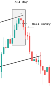
Continuing with the same chart, the market which was at the bottom of the channel now moves up to the top of the channel. During this up move, the market loses its momentum every step of the way and ends up giving us the NR4 day at the top of the Channel. Hence, once the price breaks below the low of the NR4 candle, we can go for the short sell. And as a result, the market does break through the NR4 day and heads down south.
Bottom line
Trading in the markets is not an easy task. There is no indicator, pattern, or strategy that can consistently work standalone. There are several other considerations that should be made before getting into a trade. For example, in the above trades, we saw how we combined the NR4/NR7 with the concept of channels and made a profit from them. Also, for any strategy, you trade, make sure that there is logical reasoning behind taking the trade. We hope you find this strategy informative. If you have any questions, please let us know in the comments below.
Hello and welcome to this latest edition of courses on demand, brought to you by Forex.Academy. In this course, we will be discussing how
[embed]https://youtu.be/JHf9964Cdr4[/embed]
Hello and welcome to this latest edition of courses on demand, brought to you by Forex.Academy. In this course, we will be discussing how
Hello and welcome to this latest edition of courses on demand, brought to you by Forex.Academy. In this course, we will be discussing how to assess market conditions. Just before we begin to explain what’s involved in this Webinar, please take a quick moment to familiarize yourself with our disclaimer. Moving on to our webinar outline, we’ll start with an introduction to market conditions. We’ll then progress on to looking at the three different types of market conditions. We’ll have a look at the role different time frames can play when it comes to identifying market conditions, which is quite important. We’ll have a look at techniques that can be used to objectify market conditions, of course, being objective in the market is a really important skill to have, so we look at that in some detail. We’ll then have a look at the principal of a price cycle and how it can impact market conditions. We’ll finish this Webinar by looking at how to incorporate market conditions into one’s personal training plan, so we’ll make it very relevant and very practical for you as well.
Let’s start with an introduction to market conditions. Before we define what market conditions mean, it is important firstly to note that it is impossible for a trading strategy to work all the time, which is also known as indifferent market conditions. The reality for profitable traders is that, unfortunately, losses are inevitable, and there is no getting away from that basic principle. Now, the reasons for this are often that every trading strategy approach will be built on specific characteristics, which can from time to time contrast with the conditions of a particular market. It’s a case of certain approaches, suitable for certain market conditions, and invariably you will experience times where there’s actually a clash between the market condition and the strategy that’s looking to be adopted. It’s important to take note of the fact that with a trading strategy, it is unrealistic to expect that strategy to work in every different type of muscle, market environment, and market condition. To give you a brief definition, this is the state in which a market trades. In simple terms, markets typically transition between states, or different market conditions, on a regular basis. It is important to note that each state, or market condition, possesses its own unique characteristics, which we will have a look at shortly.
Now, there are three different types of conditions which a market can experience, and I’m sure you’re probably quite familiar with some of these terms. They can be Range Bound, or also known as consolidating markets, but they can also become Break Out market conditions, which have very unique characteristics as well, and also Trending markets. What’s important to take away is that they all have specific characteristics when it comes to the best time to buy or sell, which we’ll be looking to discuss in some detail very shortly. To give you a very quick snapshot, looking at this first graph, we can identify what’s called support and resistance levels on this chart. With the blue lines, we can clearly see and identify that the market bounces off these levels, and it does so on a number of occasions. That presents those that are range-bound traders the opportunity actually to sell. When the price gets up to these levels up here, they look for opportunities and see if they can sell these markets and drive the price lower. They do so on numerous occasions, so that’s how a range-bound trader would look to capitalize; create a trading edge when they trade these markets. The same applies to buyers when they look to trade these market ranges when the price reaches a low. There are certain characteristics which can be used to define a trading opportunity, but in principle, and broadly speaking, they would be looking for opportunities to buy at the lower end of the range and looking to sell the market at the higher end of the range. So, that’s the approach a range-bound trader would like to take when trading a market like this.
Another type of market condition is referred to as a break-out of the market. This is when you receive, or you experience a certain confirmation – which suggests to you that this market is no longer looking to move and stay within a range. So what you find, you need certain confirmation to actually make this trading decision and a trading strategy. Just looking at this candlestick here, you can clearly see we break through with momentum, and we get a close beneath this level. That is a little bit of a game-changer for those that look to trade breakouts on this particular occasion. So, what you will experience is that it will provide an opportunity, in this example, to potentially look to sell this market to the downside.
Now, the third type of market condition. To sort of give you a very brief introduction to a trending market, and what’s important to sort of takeaway from a trending market. This just happens to be a bullish price trending market, meaning prices are pushing to the upside. When you look at a price chart, you will notice that for a trend to be bullish, what you’ll experience is often the price for the beginning of that particular trend to be very much towards the bottom left-hand corner of your trading screen. If the trend is to the upside, what you’ll often experience within that trend is higher prices on the right-hand corner of your trading screen. There are additional characteristics, which we look at in so much more detail very shortly.
To give you a brief introduction and a general overview, you’ve got three significant phases. You’ve got your range-bound market, i.e., a market that clearly moves within a range, you’ve got your breakout markets, and you’ve also got your trending markets. These different types of markets can present traders with some interesting and very profitable opportunities. Let’s take a look at these three types of market conditions in a little bit more detail.
First, we’ll look at range-bound market conditions and the fact that they do possess some very unique characteristics. For a range-bound market to exist, you will need to see the market respect both a clearly defined level of support resistance and see prices bounce off those levels on multiple occasions. I’m just looking at this price chart and using this as a first example. We can work with what’s called genuine levels of support resistance, and you can identify those levels fairly easily. What we can see is a clearly defined range-bound market, which moves from highs to lows and back to highs. It does this on many occasions and therein lies the opportunity for a range-bound trader to, like we’ve alluded to before, look for opportunities to sell the highs at this top edge, and look to buy the lows, which is the bottom edge of this particular range.
Another example to go through would be identifying the price action. Again, looking to determine the range, and there are some specific characteristics that would need to be seen and achieved. When we work with genuine levels of support resistance, we can identify these levels relatively easy. It’s never important to be incredibly precise with the positioning of these supports and resistance because what you can clearly see is the market respecting roughly that sort of level. That gives traders some incredible opportunities to trade.
The three conditions that need to be met for a potential for a range-bound market to actually be performed are as follows; first is with regards to the move. By this, we mean this market is clearly moving to the downside. It creates an initial low, and that low is actually the first important part of the formation of a range-bound market. The second characteristic we are now looking for is actually with regards to the recovery point, and we just refer to it as a point because it does create a high in the market. Initially, the move has been very aggressive and very bearish in this particular example, and it creates a low. Then, we normally get a bit of a recovery point, or a pullback on this market, which creates a recovery point. That’s what range-bound traders look for; they look for these points, wanting the market to behave accordingly in and around those levels. The third characteristic, which would be required to effectively look to establish a range-bound market, would actually be the range-bound trade. This is when your range-bound traders would look to effectively identify an opportunity to actually look to push prices higher, as far as this particular market is concerned.
Again, that gives us some very useful information. If we take it over to the next example, we can go through that same process again, except this time the move is coming from down to up. So, we’re now in a bit of a bullish market, up to this point it creates a high. We get the recovery point, which can be located at this level in here I located at number two. As you can see, the price continues to behave around this level for a reasonable period before, effectively, we get our range bound trade. This is where your range-bound traders would look for opportunities to sell this particular market. If they get an opportunity, they would look to exit around the lower band, whereas on the left-hand side example, a range-bound trader will be looking to buy this market, and they’ll be looking to exit at the top edge. In this particular example, we’ll be looking to a range-bound trade, looking to sell the market at this point and looking to exit roughly around the lower edge, so it obviously presents some very interesting opportunities for traders. That is effectively range-bound market conditions and how traders interpret them.
The next type of market condition we’re going to look at is our breakout market condition. Again, these possess unique characteristics. Firstly, for a breakout market to exist, you will need to see an initial break out of a range-bound market. All breakouts occur from range-bound markets, so straight away, hopefully, you can see the transition from one market condition to another. You will also need to see explosive momentum and volatility in favor of the direction of that particular breakout. To give you a little example, there’s your support resistance levels, and you can clearly see this market breaking above this level. We have the confirmation that we’re looking for, we get to confirm the break. It’s always nice to see the market come from a much lower position. It certainly gives lots of time to look to try and capture this move when we get that breakout trade above that level, looking to drive prices to the upside and that’s what we’ve seen in this particular example. It’s very important that we identified a potential for a breakout and we use our range-bound levels to do that. When we get a breakout of those levels, we can clearly see that we experienced explosive momentum and volatility in favor of the direction of the breakout. If we’re breaking to the outside, we want to see a nice explosive move and look to capture that as a breakout trader.
To give you another example, this time to the downside, we’ve got a slightly different formation in terms of our range. This is effectively a descending triangle, so it’s actually creating a little bit of downward price pressure looking to push prices lower when prices reach these levels and of course we get our breakout trade, which is what we’d be looking to do in this particular example.
The two conditions in this case that need to be met for the potential for a breakout market to be formed; the first one being the initial explosive move close are the momentum closure, should I say above or below the range. If this is our range to the upside, you know, do we get an initial explosive move to the upside? The answer is, we certainly do. In this case, it’s above the range. Do we get continuation with a series of new highs on this particular occasion, where we’re getting this constant sort of pushing or prices? The answer is yes, we do. This is a classical understanding of a breakout market, and it ticks those particular boxes. Now, with this trade to the downside, we’re seeing exactly the same thing, so we’re getting a confirmed close. On this occasion, beneath the range low, we ask ourselves if we get that initial explosive momentum close to the downside below the range. The answer is yes, we do. The continuation can take a variety of forms. As you can see, we’ve got a nice continuation with the following candlestick and a little bit of a pullback before the market starts edging lower. As long as it conforms with seeing an explosive move above or below the range, then it constitutes a great opportunity for breakout traders. Just looking at the final version would be looking at trending market conditions.
Again, they possess quite unique characteristics as well. First, for a trading market to exist, you will need to see an initial break out of a range-bound market, so you will also need to see continued momentum and volatility in favor of the direction of the trend. Most importantly, you will need to see a series of what are called higher highs and higher lows in an uptrend and lower highs and lower lows in a downtrend. To explain this in more detail, we’ll have a look at this particular example on the left-hand side. To identify the fact that this market moves from the bottom left to top right means that we are in a confirmed uptrend pushing prices higher; however, you will also need to see periods of momentum and volatility in the direction in which we’re wanting to trade. There are numerous opportunities where you get nice and green explosive candlesticks in this particular example, pushing prices higher. That should give you more confidence to know that the likeliest response for this market to keep pushing prices higher.
As you can see on the screen currently, there are numerous examples of being able to see and identify that momentum and volatility in the direction of the trend, which in this case is pushing prices higher. What you would also need to see is what’s called a series of higher highs. These are quite easy to identify, and we will refer to it as in this particular example h/h. As you can see, as the market moves it up in favor, we get to experience a higher high, and this happens on numerous occasions, so these highs are actually higher than the previous highs. This is the classical definition of a trend, where you constantly see a series of higher highs back-to-back.
In addition to higher highs, what you would also need to see is the market being supported from the downside. What we mean by that, is you will also need to see what are called higher lows. We call these HL, for higher lows, and as you can see, these higher lows will be printed in a similar fashion to the higher highs. As the market pushes higher, we get a classical understanding of an uptrend, which prints a series of higher highs followed by a series of higher lows. I’ll just finish off these last few, and this is a classical definition of an uptrend, so hopefully, that makes sense. Prices continue to push higher, so in addition to that, we’ll move it along.
We’ll have a look this time at a trending market to the downside in this particular example. Again, what we want to see is the momentum and volatility to the downside, which is overriding the buyers in this particular example, and that’s showing nice continued strength. Keep looking to flush prices lower, so we can physically see the momentum and the volatility in this market. That’s the first thing, and we can see this as this market continues to drop lower now. We can identify this as a downtrend because the price this time is moving from top left to bottom right. What we can see is this market moving in this direction fairly consistently.
Another important characteristic of a downtrend is the fact that we will see it’s the same as an uptrend, but just reversed. We will see a series of what are called lower lows. As the market moves, it’ll print a series of lower lows on numerous occasions as this price moves in favor. This again is a classic definition of a downtrend, but you’ll also get support preventing prices from pushing higher, and these are lower highs. As you can see there, the higher the market, but they’re lower than the previous levels. Again, you get a series of these printed. These are lower highs and lower lows as this market moves down, so this is a classical sort of definition of an uptrend and a downtrend. As you can see, it’s just the polar opposite of each other.
That’s a good overview of the three different types of market conditions, and we hope you can begin to identify and see the opportunities that this can present for different traders whether you’re range-bound, whether you’re a breakout, or whether you are a trader that looks to trade the trend.
Another important topic to look at when we’re looking to identify market conditions is the timeframe in which you are trading. It’s important to note that all market conditions are relevant to the time frame you are wanting to trade, meaning you might experience, for example, a range-bound market followed by a breakout and a trend potentially on a one-minute chart, which you may struggle to see, or you might struggle to identify with on a much higher timeframe. For example, on a four-hour chart now to explain this in a little bit more detail, and let’s share with you a live chart at the point of this recording. I’ll try and explain this in more detail for you. Just looking at this bit of price section, what we can clearly see on a one-minute time frame, and this just happens to be the eurodollar, but what we can see is prices trending to the upside. We’re getting this sort of pattern, where range-bound traders may be looking for opportunities to buy and sell within this framework. As you can see, there would be multiple opportunities potentially, until something happens. At this particular area, we get a little bit of a breakout to the downside, and for that, there’s a level of support resistance, sort of sitting in this level. You can see that the market clearly breaks through that level with a little bit of volatility coming into it, which could present opportunities for breakout traders to look to see if they can push this market lower. This is just an overview effectively of an approach that might be taken from a range-bound trader in a much smaller timeframe.
Look what happens when we increase the timeframe. A lot of that analysis can subside very quickly, indeed. Now, we’re looking at a market which is clearly moving to the downside. It can be argued that there are some clearly defined levels of support resistance sitting in this market, and this market is breaking out to the downside. We’ve got a little bit of a pullback inside that level, so it’s a slightly more convoluted picture. All we’re doing is straddling what we thought was a level of support resistance, which can clearly be defined as actually being relatively close to being a significant level of support resistance, but as you can clearly see, the price action is bouncing above and below it. Now, the view could very much be that this is a range-bound market. Those that look to trade range might look at this price action and identify some opportunities, but let’s increase the time frame again and see what other information it gives us. Again, we are actually able to see a market which has bounced off a low. It’s created a new high and all we’re seeing at the moment is a little bit of a pullback, with some consolidation. At this moment in time, price is moving sideways for a relatively short period of time. Taking that analysis, a range-bound trader might look at this price action and suggest there are opportunities to trade this range. That would be down to the trader’s methodology, as to whether that’s the case. As we go through the different time frames, you can suddenly start to see how choppy this price action really is and that can give you some really useful information. Not only are there identify opportunities and much higher risk opportunities, the lower timeframe you go, and they can be based on a different rationale.
Looking at this hourly chart, you can see that the market has been moving above and below this particular level of support resistance on an hourly timeframe for a significant period of time. Again, if we go up into timeframes once more, the picture begins to change. What we’re looking at here is a pullback of the previous high, and this is for an hourly chart. This is where your pullback traders or your trend traders might look to get involved in this market. The breakout has already occurred. We get a pullback, and they might be looking to buy the pullback in a situation like this. On a daily timeframe, you can see what’s beneath it, which is a significant bull market; however, it must be addressed that market conditions can shift from one market condition to the other. Clearly, on a daily timeframe, we are getting a bull market, but it has to be said that since we’re looking at sort of mid-January, we have moved from a bull market into currently a range-bound market. We’re getting prices that move above and below our levels of support resistance, so therein lies the potential for different types of traders. The necessity really is for any trader to be able to identify the market conditions, obviously, prior to trading them. Hopefully, you found that useful in terms of the importance of timeframes. It can really look to give you a completely different complexion and outlook, depending on the timeframe that you are looking at.
Moving on to techniques that objectify market conditions, this is really about a trader looking to remain objective as much as possible. To give you a brief definition, objectivity is the lack of bias judgment or prejudice, and that can facilitate some significant benefits to traders. Now the question we need to ask, is how can a trader remain objective when assessing market conditions? There are a couple of ways in which we can do this. This is when technical analysts can come into their own because they can use certain training related indicators to help them remain as objective as possible when identifying these market conditions. We’ll go through three of them now.
The first one is just identifying support and resistance. I didn’t find genuine support resistance normally on bigger timeframes, and this will allow you to assess the market conditions properly. So, when we look at price action like this, it’s very choppy. We can literally apply a technique. It’s something that we’ve used in previous slides, and we’ve discussed it a little bit now in detail, we’re simply looking to identify a top edge or a top edge range in this particular market and a lower edge or a bottom edge range. We’re getting this market moving from highs to lows, and doing so in a relatively consistent manner when we identify these genuine levels of support resistance because that’s what’s happening. They’re supporting prices at the lows, and they’re resisting the price from pushing higher at the highs, and that is what can give traders some significant opportunities. As you can see, we have price action, which is slight and obviously slightly bearish to the downside, but very much moving sideways. That’s really what you would need to take away from price action like this, that you are clearly in a range-bound market. You have your range-bound highs and lows, and the market is bouncing in between them. If you happen to be a trend trader, this is not really the market condition in which you would be looking to execute trades. That’s how support-resistance can be used to remain objective. All you would need to do when using support resistance is to basically acknowledge what you are seeing and not psychologically talk yourself out of what is actually happening. That is just a little bit about support resistance.
Another technique that could be used is a basic understanding of Japanese candlesticks, and of course, this works hand in hand with support resistance. An understanding of Japanese candlesticks and their respective support/resistance will help you with objectivity. Again, we’ll have a look at this same chart. We’ll identify those levels of support resistance, as in the previous chart, and we can see that price is slowly moving down, making lower lows and lower highs. There’s a gradual grinding to the downside where we can look at the Japanese candlesticks and the information they’re telling us, which is that we are rejecting prices from moving higher at these levels. It’s doing so on a number of occasions, so that can give those that understand Japanese candlesticks a good opportunity to look to try and sell these markets at these levels. As you can see in this particular example, they can do so on many occasions, and the same applies to the downside.
So, we can identify if we understand Japanese candlesticks and how they respect and react with levels of support resistance. All of a sudden, we can pin this is a range-bound market. For those range-bound traders, this can provide really interesting opportunities to push higher. The reasons why they can make these decisions is because they’ve got a comprehensive understanding of market conditions. Again, you can see the rejection to the downside on many occasions within these areas. You can see the same again just recently, so your range-bound trader would be looking for an opportunity to look to take this price back to the upside. They’ll continue to do so until this range, the market condition that we’re currently experiencing, transitions to a new market condition, so that’s another technique that can be used to object to find market conditions.
When you apply this moving average, you can still identify visually your support-resistance. You can have a comprehensive understanding of Japanese candlesticks, but if you apply a very straightforward simple moving average to the chart (you can do so on any MetaTrader 4 platform), you can generally sort of identify. Don’t forget this is the moving average of each candlestick over a certain period over a certain number of candlesticks. As you can see, you should derive at the same conclusion, which is that this market is ever so slowly drifting slightly to the downside and is very much range-bound because we’re getting prices breaking above the moving average, and below the moving average. This is happening on many occasions, and that’s why a simple moving average can assist you with being able to remain objective about what is truly happening with this market. We can see this moving average, that prices are trading through it on many occasions and that is obviously a good thing for range-bound traders. It can provide them potential opportunities to look to sell the highs and buy lows, and this is just another technique that can be used to assist you with market conditions.
Moving on to price cycles and market conditions, price cycles can also be used by technical traders to support the identification of market conditions. There is cycle theory, and it asserts that cyclical forces both long and short, without doubt, drive price movements in the financial markets and that price cycles can be used to anticipate turning points in a particular market. These turning points can often be identified as periods of consolidation, or clearly defined in indecision, effectively allowing the market to pull back. Do not expect psychoanalysis to pinpoint reaction highs or lows necessarily. Instead, psychoanalysis should be used in conjunction with other aspects of technical analysis and to try to anticipate these turning points to a greater degree. To explain this in a little bit more detail, price cycles can also be used by technical traders to assist with the identification of market conditions.
I want to share this chart with you, this happens to be an S&P 500 daily timeframe, and you can see that the timeframe along the bottom is over the last four years. You can use price cycles, and it’s a well-known price cycle with regards to the S&P. There are a couple of caveats to this because this is a more recent chart. There’s been a number of developments within markets like the S&P 500, which has changed what used to be a little bit more reliable price cycle. Nonetheless, if we roll this on that there’s just a MACD down the bottom of this particular chart, which you can reference as well, and what this particular chart shows is a typical price cycle that you may experience in the S&P 500. The principal of the price cycle in the S&P 500 is that normally between November and April you’re likely to see prices push higher, and from May through to October you’re likely to see a price cycle where prices are squeezed lower. These can move to varying extents, which is why it’s important to make sure if you’re conducting price cycle analysis, that you are combining it with other, more reliable forms of analysis. Nonetheless, in each of these sections of the year, you’re likely to experience prices pushing higher, and you can see that in three out of four out of these periods, even though this middle one here has experienced a significant pullback. It has spent a majority of time retracing that particular pullback. The same applies from the upside, so it has been historically expected for prices to look to move lower during this particular cycle. As you can see, it doesn’t always ring true, but it is important to know that price cycle analysis should be combined with other methods of technical analysis. So that’s just a little bit about price cycle in conjunction with market conditions.
Let’s move on to how to incorporate market conditions into one’s personal training plan. The first thing to do is for you to decide the type of trader that you are. Do you prefer to try ranges, breakouts, or trends? That’s the first thing, because obviously there’s multiple opportunities, depending on your time availability and things of that nature. More experienced traders can trade multiple market conditions as well. Then, it’s just a case of looking to get really good at identifying the unique characteristics of each particular trading style. Whatever approach you want to adopt, whatever fits your personality, your capital, and your time availability. Then focus on the key characteristics of that style and take it on board; obviously, the timeframe that you would like to trade, and of course your tolerance to risk as well. Finish with a personal trading plan, to identify market conditions before executing a trade, something most new and experienced traders really struggle with. Please make sure you first identify those market conditions before you execute a trade. Don’t just jump into the markets blindly.
A basic trading methodology should look to revolve around things like deciding what markets you would like to trade, which is trade selection. Then, identify the market conditions of that particular market, and once you’ve identified that, and this is how it fits into a personal trading plan, then you can focus on the trade setup characteristics.
Let’s say we are a range-bound market. We need to set up the characteristics of seeing those top edges and looking at the Japanese candlesticks on whatever indicator you may be using, or whatever form of technical analysis you may be looking at, to adopt those characteristics and see if that trade conforms with those characteristics. The more criteria that are reached, the more confidence you should have in that trade and the more consistent you should become trading those particular setups. Then, your approach needs to focus intently on trade entry, what price are you actually looking to get into that market, and of course trade exit as well. So, we’re talking about risk management and making sure that you always draw that line in the sand, in terms of making sure that you mitigate risk obviously as quickly, or as well as you possibly can, and really have a strong focus on protecting your capital. The final part is obviously the trade management side, which will hopefully lead to a successful outcome for you. Within trade management, you’re talking about how you can mitigate risk. Can you look at a book and profit in that particular trade? Should we be looking to cover the position, or take profit? Whatever the case may be, you’re managing that trade as effectively as you possibly can. This is just an example to show you how identifying market condition fits in with an overall trading approach.
That just about concludes this particular Webinar. To review, we’ve introduced market conditions, and we’ve looked at the three different types of market conditions. We’ve looked at the importance of looking at different time frames, we’ve looked for some techniques to objectify market conditions, we looked at price cycle, and market conditions as well. Finish there with how to incorporate market conditions into one’s personal trading plan. All that’s left for me to do is to thank you very much for joining us on this latest installment of courses on demand, which have been brought to you by Forex.Academy. We hope you enjoyed it and we hope to see you soon. Do take care and we’ll see you soon. Bye for now.