Introduction
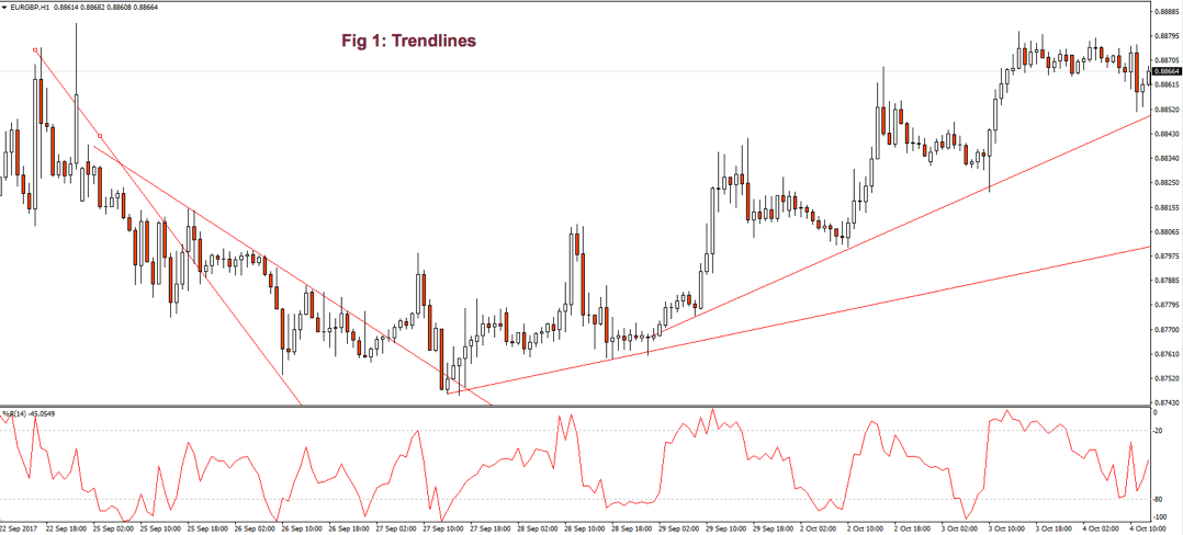
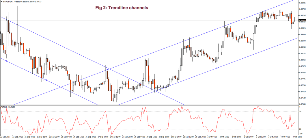
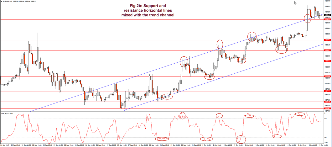
We have already dealt, briefly, with bands and channels. On this article, we will try to develop a bit more on bands and envelopes, as it is quite important in trading.
The history of trading bands is quite long. Let’s first define what we mean by a band. John Bollinger defines bands as bands constructed above and below some measure of central tendency, which need not be symmetrical.
We called it envelopes when they are related to the price structure, with a kind of symmetry, but not following or associated with a central point reference -for example, moving average envelopes of highs and lows.
A Brief History of Envelopes and Bands
The earliest mention, according to John Bollinger, comes from Wilfrid LeDoux in 1960, who copyrighted the Twin-Line Chart, that connected monthly highs and monthly lows. You may google “Wilfrid LeDoux Twin-line chart” to see this type of chart.
At about the same time, Chester W. Keltner published the Ten-Day Moving Average Rule in his 1960 book How to make money in commodities. Keltner computed what he called the typical price by the simple formula: (H+L+C)/3 for a given period as a center line, and a 10-day moving average plus and minus a 10-period average of the daily range.
In the 60’s Richard Donchian took another approach. He let the markets show its envelopes via his four-week rule. A buy signal happens if the price exceeds the 4-week high, and a sell signal if the price falls under the 4-week low. This 4-week rule was turned into envelopes connecting the 4-week highs and the 4-week lows.
Back in the 70’s, J.M Hurst published The Profit Magic of Stock Transactions. Mr. Husrt interest was in cycles, so in his book, he presented “constant width curvilinear channels” to emphasize the cyclic character of the stock price movements.
In the early 80’s William Smith, of Tiger Software presented a black-box system: The Peerless Stock Market Timing. The system used a percentage band based on moving averages.
Concurrently, in the early 80’s Marc Chaikin and Bob Brogan developed the first adaptive band system, called Bomar Bands. They were designed to contain 85% of the price action over the latest 12 months (250 periods). That was a significant improvement to the former bands, as the width of the band grew or shrunk depending upon the market action.
A mention should be made to Jim Yates that in the early 80’s developed a method, using the implied volatility from the options market. He determined whether the security was overbought or oversold concerning market expectations. Mr. Yates showed that implied volatility could be used as part of a framework to make rational investing decisions. The framework consisted of six zones (bands) based on the implied volatility, with a specific strategy to be followed in each band.
John Bollinger, who at that time was trading options and met Mr. Yates, took this idea in the late 80’s to find a method to automate the band’s width based on the current mean volatility. He realized that volatility was directly related to the standard deviation of prices and that this method would provide a superior way to draw its bands, which he named Bollinger bands.
Bands formed by moving averages
There are several envelope types in trading. The simplest is the moving average envelope with percentage bands, n% away from the central average (Fig 1.a), that shows a 10-bar EMA with 0.2% bands.
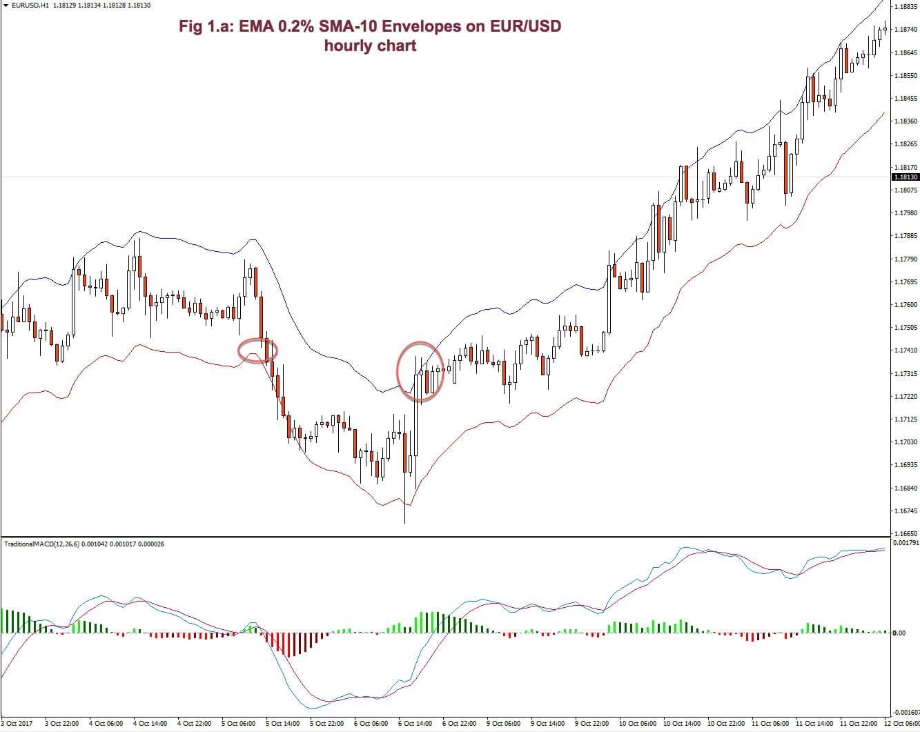
Usually, the beginning of a trend is pointed out by prices touching or breaking one of the bands that agrees with a new change in the slope of the moving average.
The variations on this theme are countless. We could favor the volatility in the direction of the trend by using asymmetric bands.
Envelopes on highs and lows
Another possibility is using envelopes on highs and lows (Fig 1.b). Bands will show prices contained within the band at sideway channel price movements and will indicate the beginning of a trend with a breakout or breakdown.
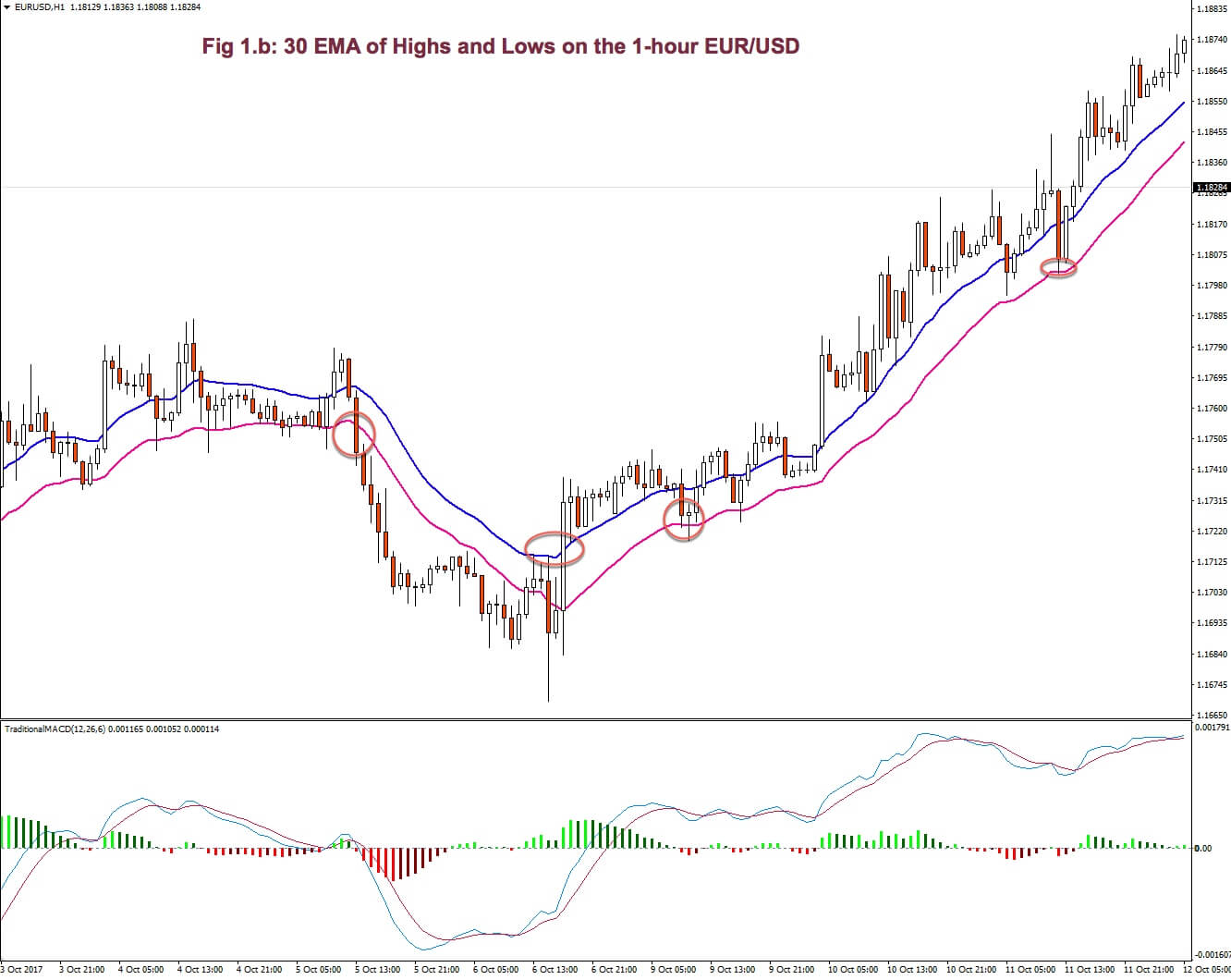

An uptrend is in place as long as the price doesn’t close below the channel. The reverse holds true on downtrends.
To assess if this method improves its results against entries on a usual moving average breakout, Perry J. Kaufman (see reference) did a study over a 10-year span, using both methods, in two very different markets: Eurodollar interest rates and the S&P 500.
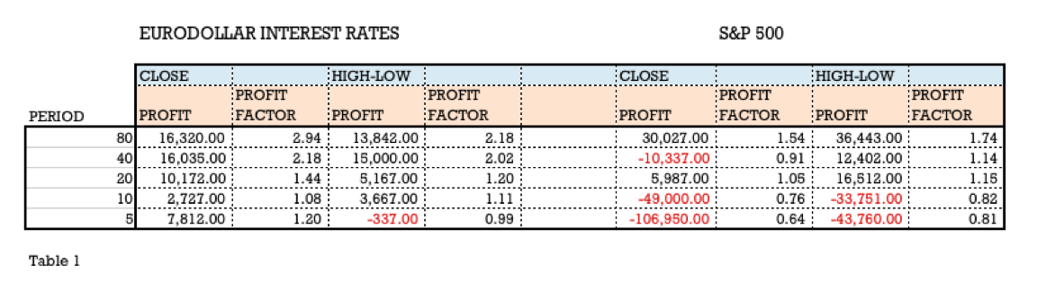
The results he presented on page 320 of his book is shown in table 1. We may observe that this method is slightly worse for the Eurodollar market, although the 40-period variant is quite similar. Just the opposite happened in the S&P 500, where, using a 40-period envelope MA turned a losing system into a winner, and the 20-period variant has improved a lot.
The conclusion is that bands might be a worthy entry method, but we need to find the right parameters for the market we try to trade.
Keltner Channels
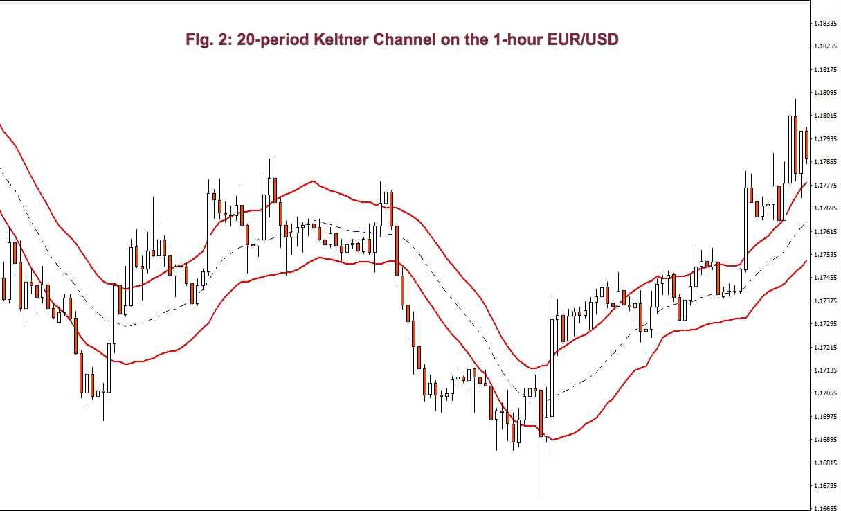
Chester Keltner, a famous technical trader at the time, presented his 10-day moving average rule in his 1960 book How to Make Money in Commodities. This was a simple system that used a channel whose width is defined by the 10-day range.


The algorithm to compute the channel, as is done today is:
- Set the MA period n. Usually 20.
- Set a period m to calculate the average range. Usually 10.
- Set a multiplier q.
- Compute the typical daily price: (high+low+close)/3
- Compute AR the n-day average of the typical daily price.
- Compute MA the m-day average of the daily range.
- Compute the upper and lower bands by performing:
Upper band = q x AR + MA
Lower Band = q x AR – MA
- Buy when the market crosses over the upper band and sell when it crosses under the lower band.
The original system was always in the market, but on actual computer testing, it doesn’t show any effectiveness. The system is buying on strength and selling on weakness, so it may happen that, at the time of entry, the price has already traveled too much and It’s close to saturation.
Today, traders have modified the concept to better cope with current markets.

- Instead of buying the upper band, they sell it, and vice versa. The reasoning is selling the strength and buying the weakness because markets are usually trading in ranges. The disadvantage is not being able to catch a significant trend.
- The number of days is modified. Some systems use a three-day average with bands around that average.
- Many systems are using a lower timeframe for entries. If the market hits an upper band, the system waits for the shorter timeframe to hit a lower band to act.

Fig 4 shows a Keltner channel system using a 3-period channel and a 10-period moving average.
The slope of the 10-period average defines if the trend is up or down.
A Sell takes place when the price hits the upper band, and the MA is pointing down (selling at resistance). A buy is open when the price hits the lower band, and the 10-period MA is pointing up (buy at support). As Fig. 3 shows, the system forbids trading against the trend, avoiding reactive legs.
A short exit occurs if price crosses over the 10-period MA; while a crossing below it is a sign to close a long position.
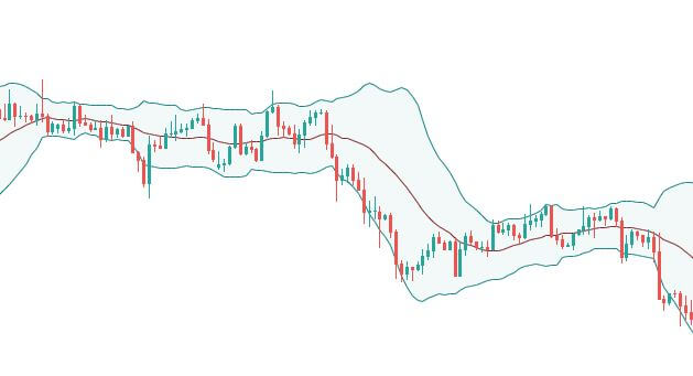
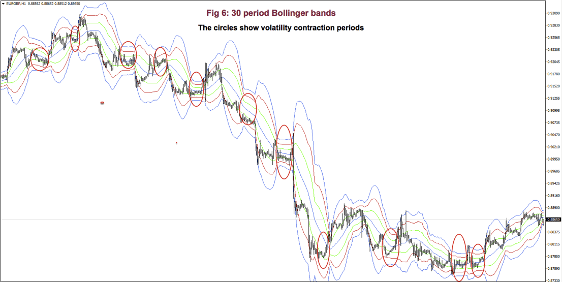
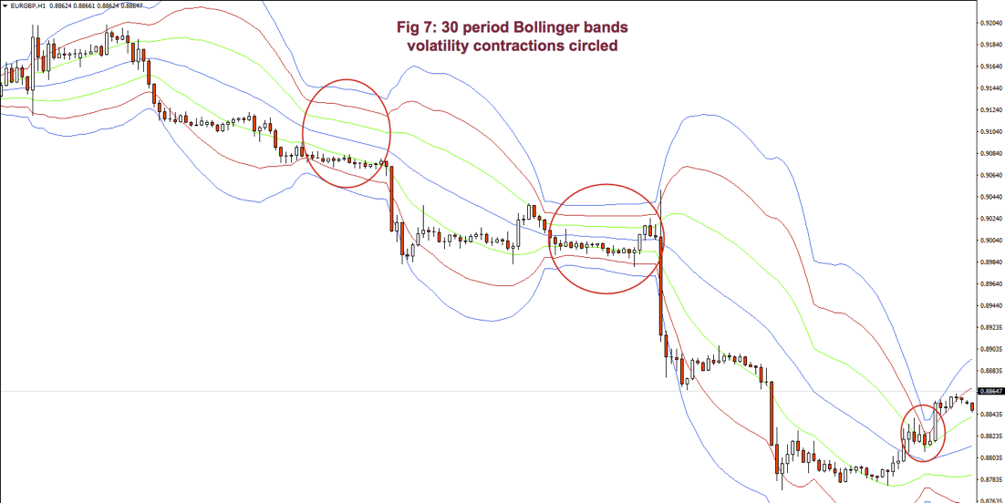
Bollinger Bands
Bollinger bands are another type of volatility band, as is the Keltner channel, but the measurement of the volatility isn’t the daily range, but the standard deviation of prices for the period in place.
John Bollinger used the 20-period standard deviation (STD), and the upper and lower bands separated 2 STD’s from a central 20-period SMA. He explains that two STD’s distance from the mean will contain 95% of t e price action and that the bands are very responsive, since the standard deviation calculation is computed using the squares of the deviations from the average, so the channel contracts and expands rapidly with volatility changes.
Bollinger bands are commonly used together with another technical study. Some people use it with RSI. But, I think there’s another technical study much better suited as its companion.
Bollinger bands with two moving regression line crossovers were introduced to me by Ken Long on a seminar that took place in Raleigh, NC, back in 2013. He calls his system the Regression Line Crossover (RLCO), but, many charting packages don’t have a native moving linear regression study, so, he presented, too, a very close alternative to it: The 30-10-5 MACD study.
Bollinger band framework
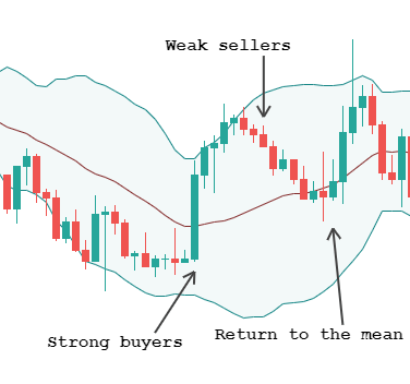
Ken Long called the ±1 bands the river. The stream of prices is represented by the dragon, a 10-period -0.2std width- Bollinger band, which he calls that way due to its shape resembling those Chinese moving dragons, so common in their celebrations. Ken uses 30-period BB, but I don’t see any gain using this period. In fact, it makes more difficult to spot sideways channels because a 30-period BB is less responsive to volatility changes, so I recommend using the standard 20-period.
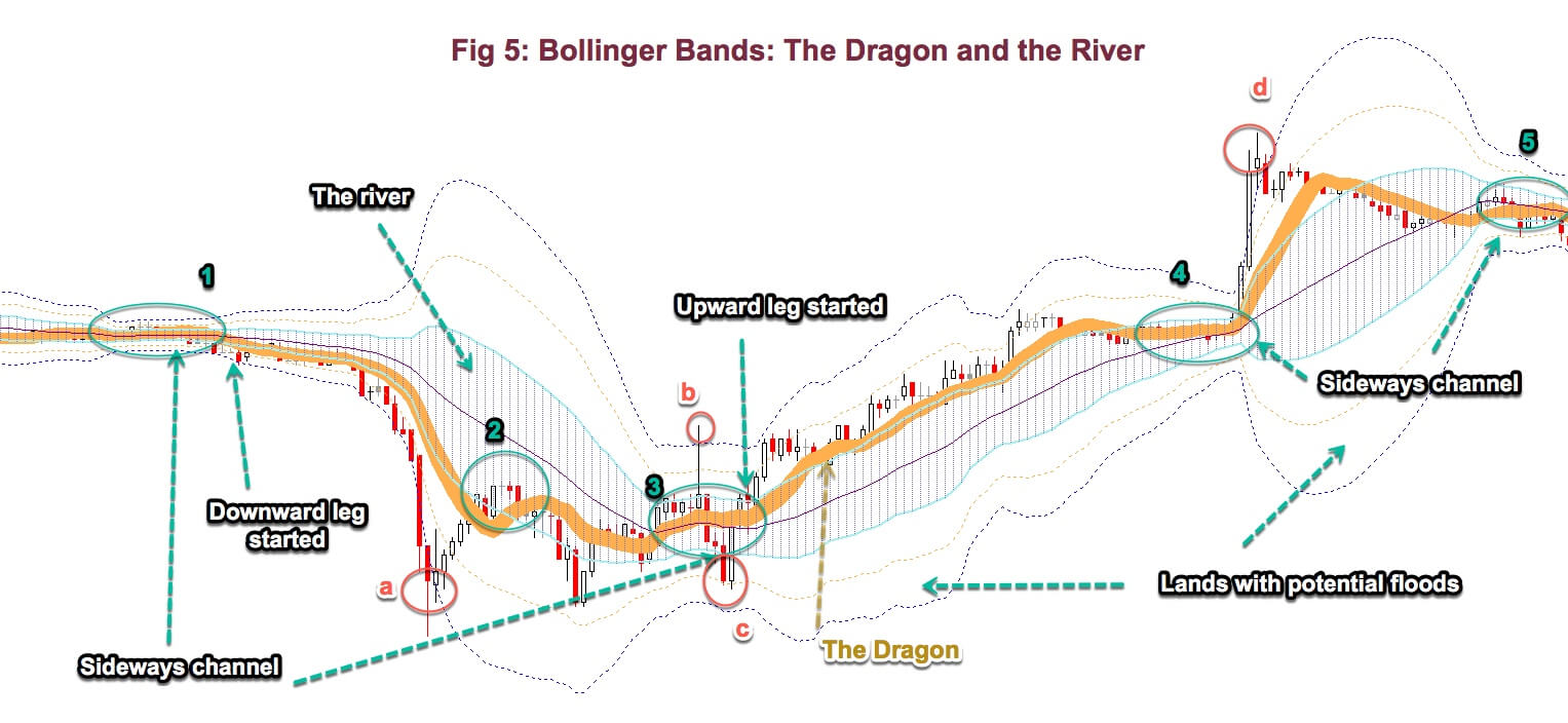 The dragon moves from side to side of the river, sometimes beyond. When it crosses it and travels along the upper side, the trend is up. If it moves to the lower side and keeps moving on that side, a downward leg has started.
Sideways channels are distinguished by a shrink in volatility that is clearly visible, particularly in ±1 bands, as Fig 5 shows (1, 3, 4, and 5). Those places are excellent entry points when the dragon breaks out (4), up or down, or if it starts moving next to a riverside, as in (1 and 3). You could be able to earn your monthly pay by just trading this formation.
We should be ready to close a failed breakout, as in b, and c; and willing to reverse direction when the candle, or the dragon, cross again the river because failure to continue is a clear indication to trade the other side, although, sometimes we got fooled twice. Twice is not that much. (read my essay “Trading, a different view”)
Trends are distinguished, also by an expansion of the river and its “wetlands”. And, if the price goes away from the dragon and travels to the 2nd and 3rd lands (a and d), then the price movement is well over-extended, and, for sure, it will travel back to the mean of the river. Anyway, an automatic stop and reverse trade isn’t advisable at these points. You should carefully assess the reward to risk situation, considering that the mean of the river also moves up or down with the flow.
This two-spike pattern, at the edge of ±3 bands (a and d), is quite important, as it’s a warning that we should take profits right away, it marks the peak of the trend, at least for a while.
As said earlier, Prices, after crossing bands 2 and 3, will move back searching the mean. Usually, this is a continuation pattern. Price goes to the vicinity of the river mean and resumes the trend, as in 2.
Trading this setup together with MACD crossovers is very revealing. When we use this framework, we know beforehand a lot about the actual state of the market. At 1 we know we cannot trade long unless the dragon shifts sides. We, know, also, that the price stream is heading to the downside and the bands are expanding. All this points to a short side entry.
At a, we knew that prices have gone crazy, and the second white candlestick confirms that the downward move has paused, at the minimum. At b, and c we got fooled twice, but, as somebody said, crocodiles live in great rivers!
We, also, know the price condition relative to a well established statistical framework that shows 98% of prices enclosed within ±3 STD bands, and 95% of them within ±2 STD bands. The framework is a visual indication of overbought and oversold, but within a framework that quantifies the concepts.
Finally, by just looking, we are able to assess the reward to risk situation anytime. If our risk is 1STD and we expect to get 2 STD’s out of a trade, based on its position on this framework, then we have a 2:1 Reward to risk situation. We don’t need to spend time calculating. It’s visual and fast. You’re able to jump faster into any trade situation!
A practical trade scalping-like exercise
Trading Bollinger bands using the MACD, this way is a beauty, as the MACD tells the direction of the trade and the Bollinger band tells where the price is, relative to its mean.
If we look at fig. 6, point 1, we observe that, on the previous bars, the price has made a bottom, by touching the -2 band four times and in the last one, a Doji was formed. Meanwhile, the MACD sang a buy, loud and clear, so it was a buying opportunity at the breakout of the highs.
Since we wanted fast and dirty profits we set our target at the piercing of the +2 band for an excellent 3:1 reward to risk trade.
The beauty of the Bollinger is that price when on a trend, tends to go back to its mean, touch it and back away from it, so at point 2 we’ll take a re-entry for a nice 2.5:1 Reward/risk trade. And this happened a third time at point 3. We were nimble, so we took no chance and close the trades, again, at the bar piercing the +2 band.

At point 4 we saw a sideways channel, that is quite observable with Bollinger bands, as noticeable shrinkage of the three bands. This is a good trade to take when a breakout occurs. So, we took it and the market fooled us for a small loss on the trade.
Anyhow, the MACD crossover and the price crossing was a sign to stop and reverse(5), and that we did! Usually, a failed breakout and, then, a breakdown with the slope of the Bollinger band turning south is an excellent entry point. This time it didn’t fail for a big trade with almost 4:1 reward/risk. We let profits run this time because the price had broken down from its support and MACD wasn’t in oversold territory. We exited when it showed signs of bottoming, as seen in the graph.
At (6) we observed another sideways channel, so we took its breakout. This time it didn’t fail, but the trend wasn’t strong enough to touch the +2 band and we sold on weakness, when MACD crossed under. We might have taken a re-entry there but the MACD wasn’t pretty, Overall, 5 winners and 1 small loser. Not bad!
Donchian Channels
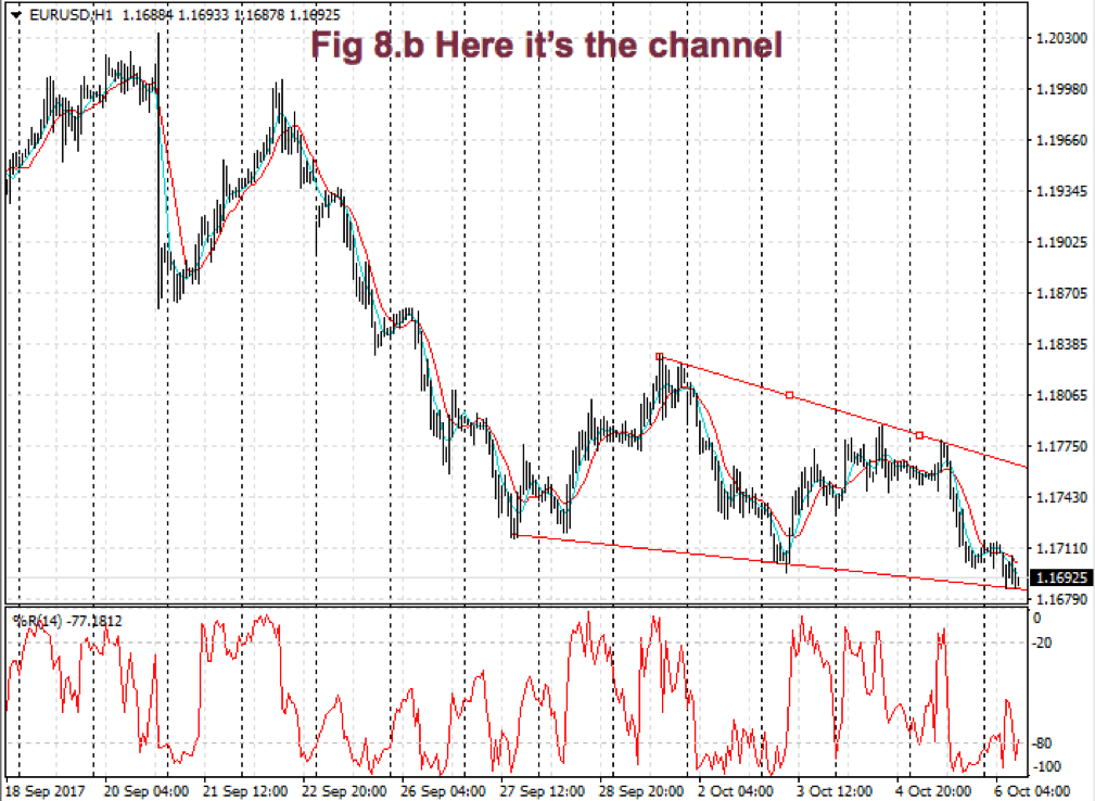
Richard Donchian was a pioneer of systematic trading. He was the author of one of the first channel breakout systems. When we draw lines connecting those breakouts – highest highs to highest highs and lowest lows to lowest lows- a channel is formed. Fig 7 shows a 20 bar Donchian breakout channel of the EUR/USD 1-hour chart.
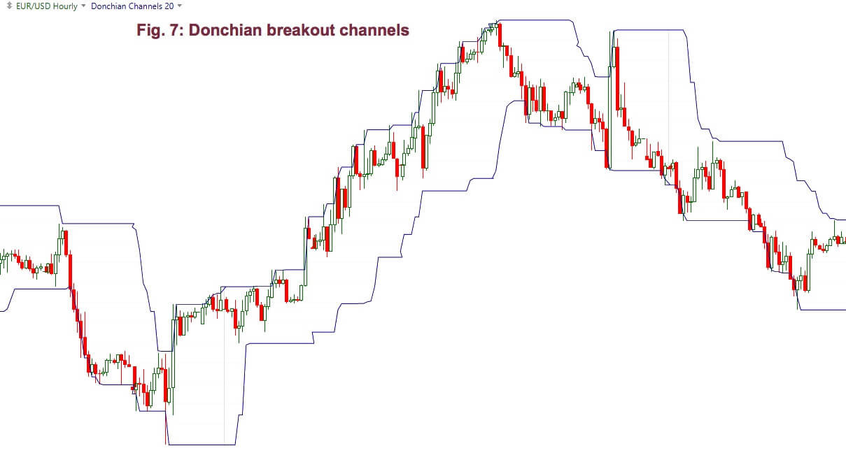

As a new high is made the upper band moves higher, while the lower band stays at the same level, until a new 20-day low comes out, creating the stairway pattern we observe in fig 5. Sometimes, the upper band goes up while the lower goes down. This is caused by a big outside bar.
According to Perry Kaufman, in 1971, Playboy’s Investment guide reviewed Donchian’s 4-week rule as a “childishly simple” way to invest.
The Donchian trading method was as follows:
- Go long (and cover short positions) when the current price is higher than the high of the latest 4 weeks
- Sell short (and close long positions) if the current price falls below the low of the latest 4 weeks.
This system is amazingly simple and effective, even today, after more than 50 years of it being public knowledge. The Donchian 4-week rule system complies with three basic rules of trading:
- Follow the trend
- Let profits run
- Limit losses
The third rule is just relatively accomplished. In high volatility markets, where the highest high is far away from its lowest low, there is a risk problem that the system doesn’t solve. In the early years trading with this system, most systems were focused on maximum returns, without regard to risk. Now the usual way is to adapt the trade size to the market risk.
Testing the N-BAR Rule
The widespread use of software platforms for trading, incorporating some kind of programming allows for simple back-testing and optimization of trading ideas.
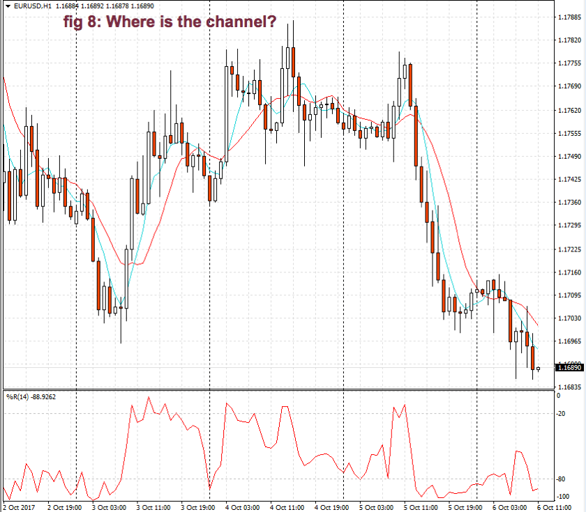
In the case of a Donchian system, we need just one input parameter: N, the number of bars that define a breakout. Fig 8, below, shows a naked N-day breakout system parameter optimization. In this case, we’ll use different N parameters for long trades and for the short ones.
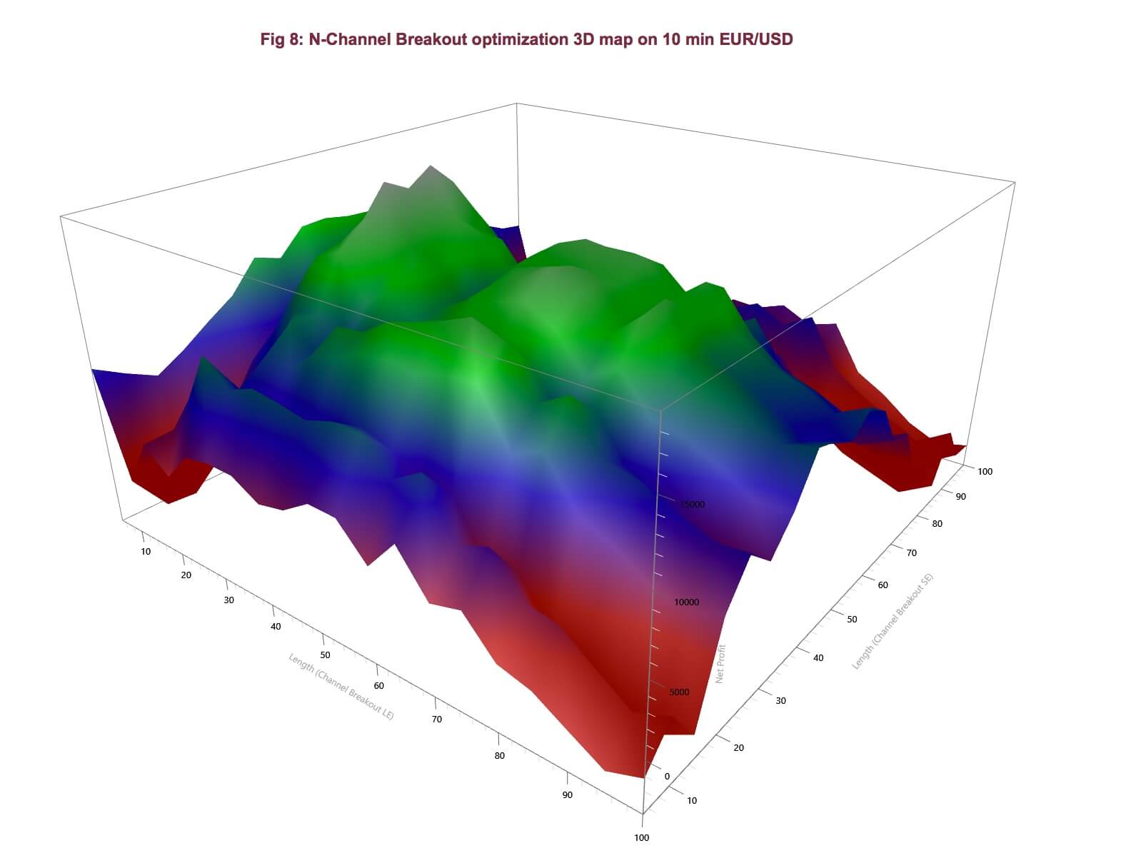

 The graph shows a relatively smooth hill, with three main tops, that graphs the Return on Account achieved by the strategy. The Return on Account is a measure that weights profits against max drawdowns, so it’s an excellent mix to choose for when optimizing our systems.
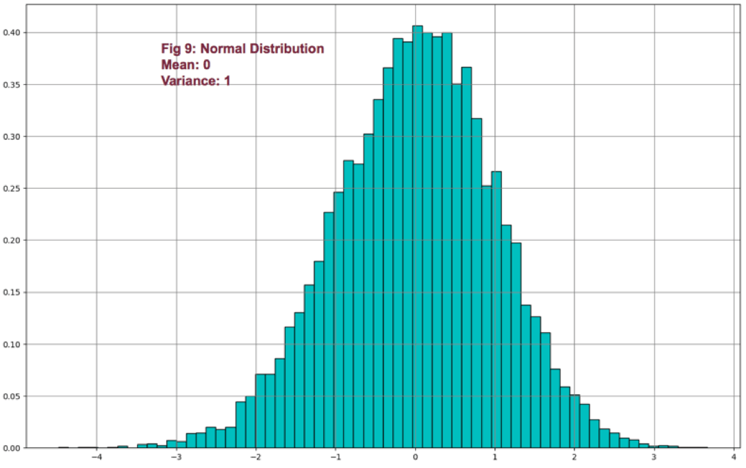
All tops seem the right places for our parameter settings, so we chose the widest one, which seems to be more stable with time. The best parameters using return-on-account as metric are Longs: 65, Shorts: 55, resulting in the following equity curve (Fig 9).

The curve is typical of breakout systems. The system is robust, but the equity curve isn’t pretty.
A Montecarlo simulation of the system (fig 10) shows its robustness, but its wild nature, as well.
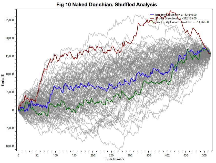
Fig 11 shows the Net profit distribution, which shows an orderly shape, being its mean about $14.000 on a single contract trade, for an average max-drawdown of $5.500.

My guess was that this entry system might improve a lot if we use MAE stops (from John Sweeney’s Maximum Adverse Execution concept). Let’s see what we get by adding them.
Fig 12 and 13 show the system behavior by adding MAE-type stops together with an appropriate trail stop. No targets added as this would spoil the spirit of the system.
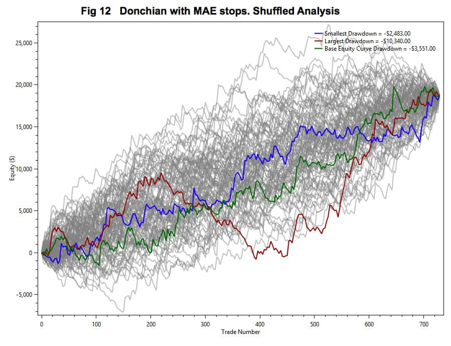
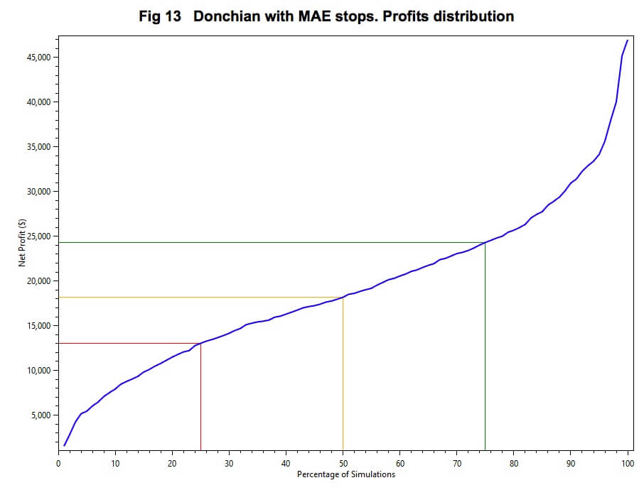

We observe a slightly better and tighter smoke cloud, and the distribution analysis of the profit shows a 30% increase in the mean profit.
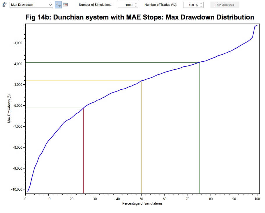
Below the distribution analysis of max drawdowns of the original and modified systems, showing that the MAE stops not only improved profits, but it lowered the system’s average max drawdown to about $4.800, a 13% improvement.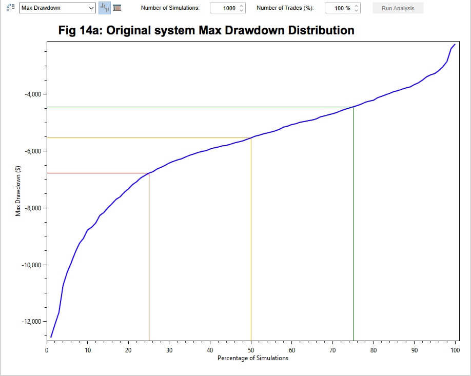
 To conclude we may assert that Donchian channel breakouts work. Its mean risk to reward is 2:1 and it depicts 38% profitable trades. It’s is a robust and reliable system, although very difficult to trade.
Diversification and risk
To overcome those long and deep drawdowns, there is just one solution: To trade a basket of uncorrelated markets with risk-adjusted position sizing, so no single market holds a significant portion of the total risk.
To show you how a basket of uncorrelated stock may reduce overall risk and smooth the equity curve, let´s discuss the concept of portfolio variance.
As a simple situation let’s consider the total variance on a 2-position portfolio, which can be calculated using the following equation:
𝜎2 = w1 𝜎12 + w2 𝜎22 + 2 w1 w2 𝜎1𝜎2*cov12
Where w1 and w2 are the weights for each market, and cov12 is a quantity proportional to the correlation (ρ) between those assets.
In fact, cov12 = ρ1,2 * σ1 * σ2
Then, if the covariance is zero, then the variance of a portfolio with n assets is:
𝜎2 = w1 𝜎12 + w2 𝜎22 + … + wn 𝜎n2
To observe the effect of diversification, let’s assume that we have equal weights on five uncorrelated markets with an equal risk of $10, compared to investing just one of the markets with its full $10 risk.
Thus, to spread our risk we divide our position by five on each market, therefore, now we are exposed to a $2 risk in each market. Then, the total risk would be, again, 10, if the markets were perfectly correlated with each other, as is the case of a single asset. But, if they were totally uncorrelated, the expected combined risk would be computed using the above equation:
Risk =√ (5 x 22) = √20 = 4.47
So, for the same total market exposure, we’ve lowered our risk by more than half. Of course, there are no totally uncorrelated positions in the markets, and, sometimes, all markets move in sync with each other, but this is the way to reduce risk and smooth our equity curve as much as we can: By diversifying and making sure the correlation between our assets is as low as it may possibly be.
The Turtles
The Donchian breakout system is part of the history of systems trading, and it’s the subject of an amazing story worth a Hollywood movie.
“We’re going to raise traders like they raise turtles in Singapore”, said Richard Dennis to his friend Will Eckhardt. They wanted to end a long debate about whether a trader should be borne or could be raised.
Richard Dennis believed that anyone with the proper training and coaching could become a successful trader, while Eckhardt thought a trader needed to be born with special traits. So, the Turtles were born!
The full story at the link, below:
(https://www.huffingtonpost.com/zaheer-anwari/the-turtle-traders_b_1807500.html )
Turtle soup
As Newton found out, an action carries its reaction. To profit from those foreseeable turtle breakouts the market found a solution: Turtle soup.
Larry Connors and Linda Bradford Raschke wrote a beautiful book called Street Smarts, filled with a lot of ideas to swing trade.
Two of the ideas explained in their book trade against the Turtle pattern: The main concept is: If the 20-day Donchian breakout commonly used by the Turtles is just 38% profitable, trading against it should be about 62% profitable, by detecting and profiting from failed breakouts.
The method that Connors and Rashcke propose, looks to identify those times when a breakout fails and jump aboard to catch a reversal. By the way, this strategy can be traded in all markets and time frames.
The Turtle Soup rules for long positions (the inverse goes for short positions):
- The market must make a 20-period low. The lower the better
- The previous low must have happened four periods earlier
- After the market fell below the 20-period low, we place an entry buy stop 5 ticks above the previous day low.
- If the buy stop is filled, buy a stop-loss some tics under the current period low.
- Use trailing stops, as the current position is moving profitably.
- Re-entry rule: if you’re stopped out, you may re-enter at your original entry price if this happens in the next two bars.
Turtle soup plus one
This strategy is identical to the Turtle Soup, except it happens one day or bar later.
This strategy is more conservative, as it waits for the current bar to end, and sets the buy stop at the same place, but one bar later.
To show that two radically different ways to trade are both valid, I’ve tested this strategy. Let’s see how it behaves.
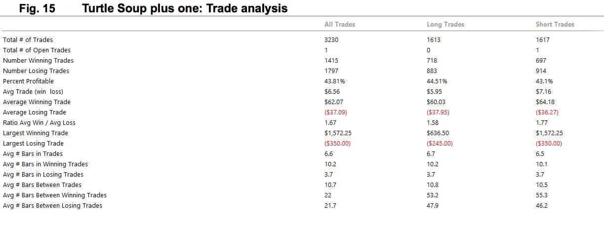

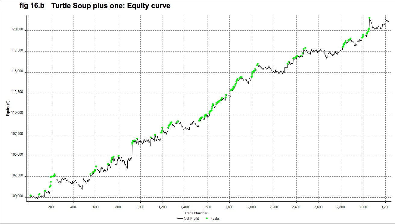
As we observe in Fig 15, the strategy is about 44% percent profitable, higher than a Donchian breakout, but far away from the theoretical 62%. Anyway, this strategy is very good, its equity curve( fig 16.b) nicer than the Turtles, and its Montecarlo cloud (fig 16.a) much thinner than the one shown in the original Turtle strategy, a sign that the variance of results is much better and more adapted to swing and day-trading.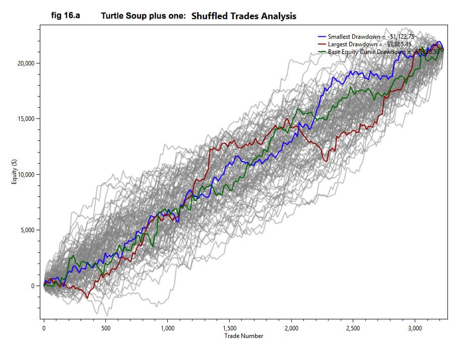
 This is in agreement with its drawdown, which is more than 50% smaller than that on the Turtle strategy.
But a word of caution here. The red Montecarlo line in fig 16.a is an equity path with a segment depicting a large drawdown. The corollary here is, even using a smoother strategy, we need to have the psychological strength to accept such drawdown. This also proves that diversification is key in reducing market risk.
References:
John Bollinger on Bollinger Bands, John Bollinger
Ken Long Seminar on RLCO framework
Trading Systems and Methods. Fifth Edition, PERRY J. KAUFMAN
The Ultimate trading guide, John R. Hill, and George Pruitt
Quantitative trading strategies, Lars Kestner
Street Smarts, Larry Connors, Linda Raschke
Parameter testing and graphs, including Montecarlo analysis, was done in a Multicharts 11 Trading Platform.
©Forex.Academy


 The main issue with the SMA is its sudden change in value if a significant price movement is dropped off, especially if a short period has been chosen.
 Weighted moving average
 Since we divide by the sum of weights, they don’t need to add up to 1.
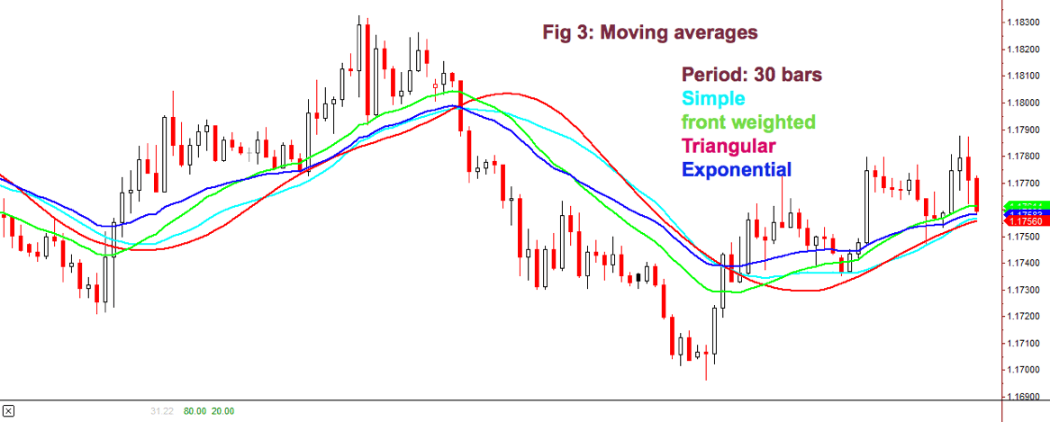


 According to Elder’s classification, any trade that takes 30% or more of a channel is credited with an A. If you make between 20 and 30%, your grade will be B. Between 10 and 20% you’re given a C and a D if you make less than 10%. So, in this case, your grade is C.