Categories
Forex Price Action

Price Action Trading: Factors that you should Remember

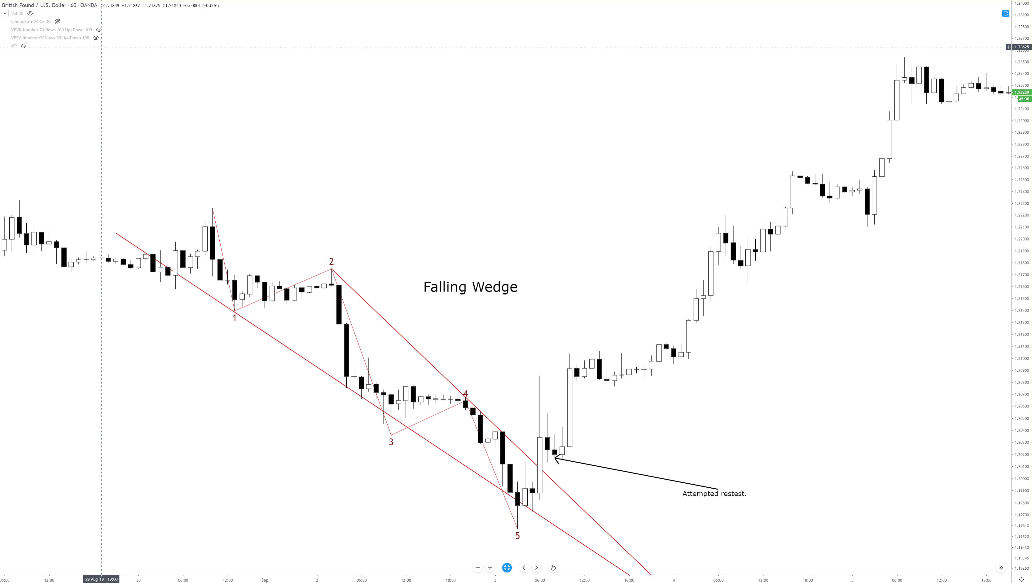
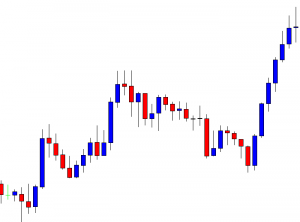
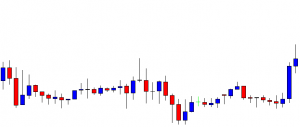
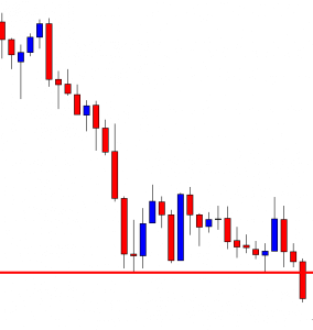
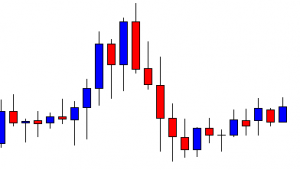
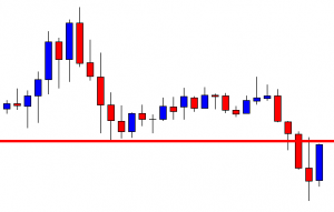
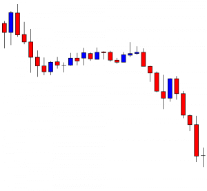
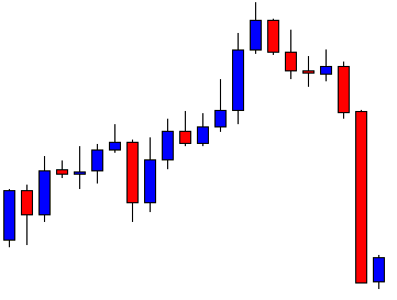
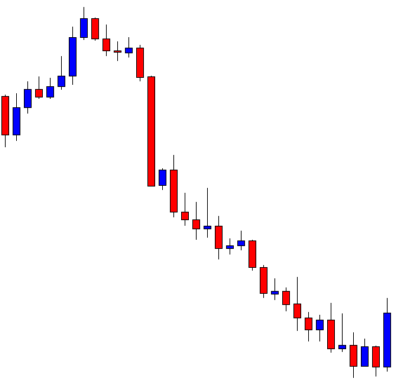
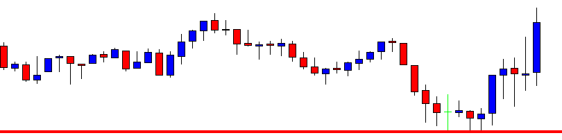
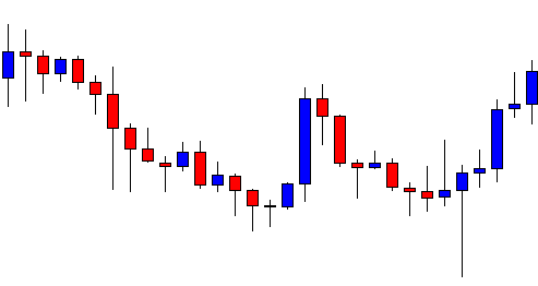
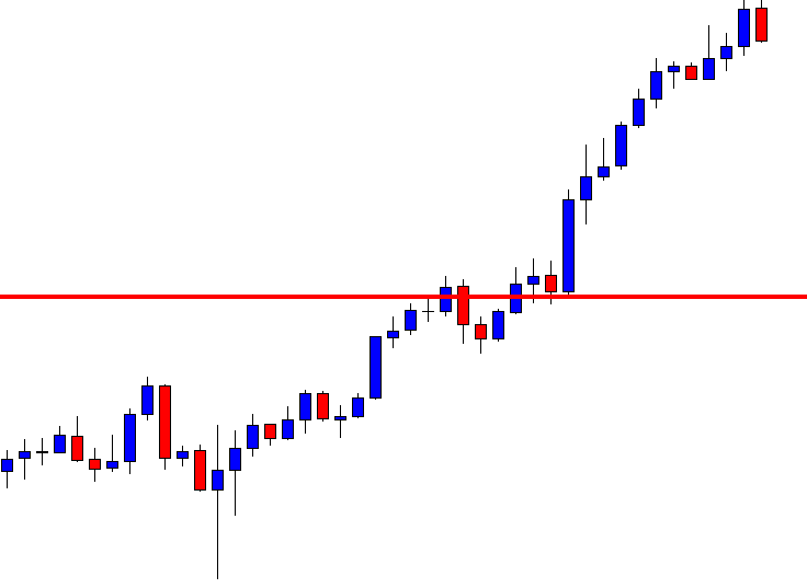
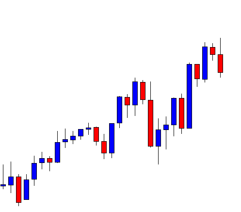
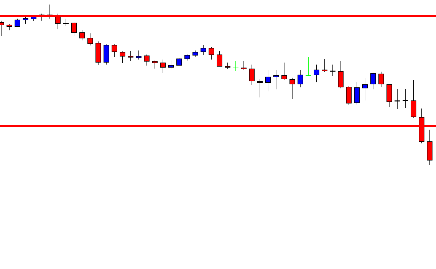
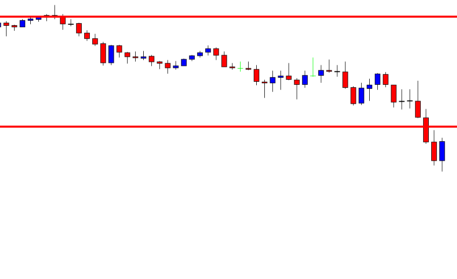
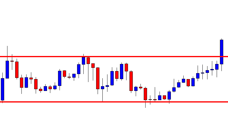
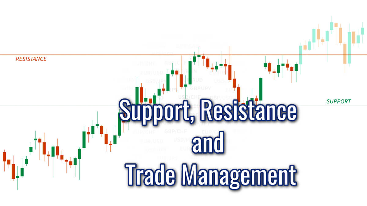
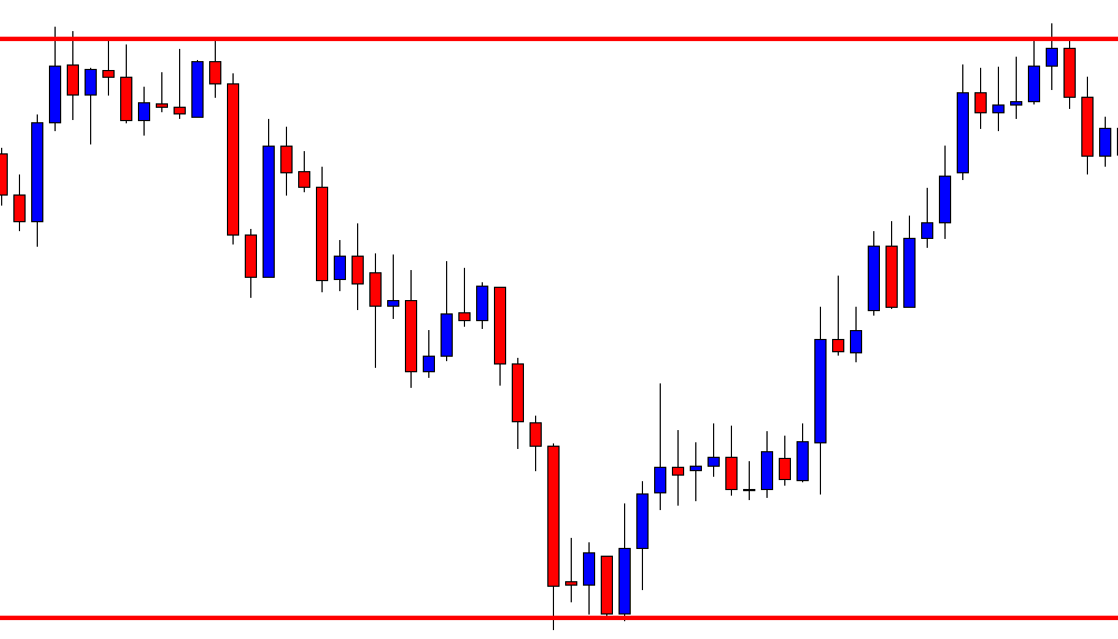
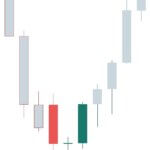
In today’s lesson, we are going to demonstrate an example of a chart offering an entry upon producing a bullish reversal candle followed by a breakout. The chart produces a bullish reversal candle earlier too, but that did not make the price move towards the North. We’ll try to find out why it does not head towards the North at its first attempt. Let us get started.

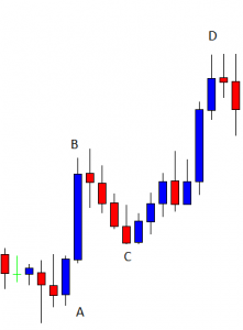
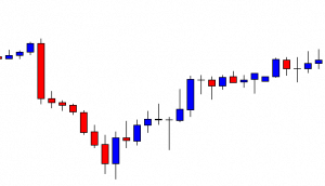
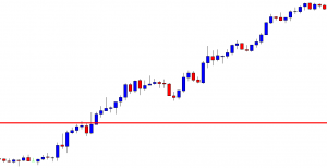
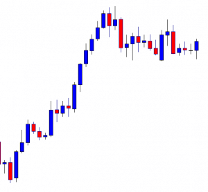
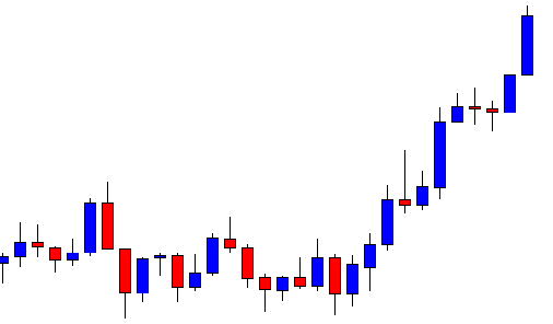
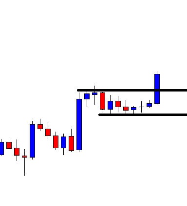
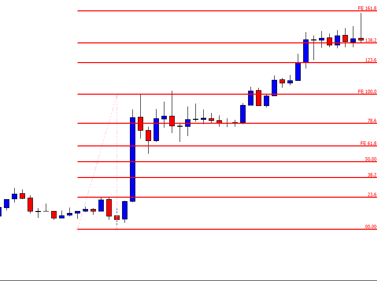
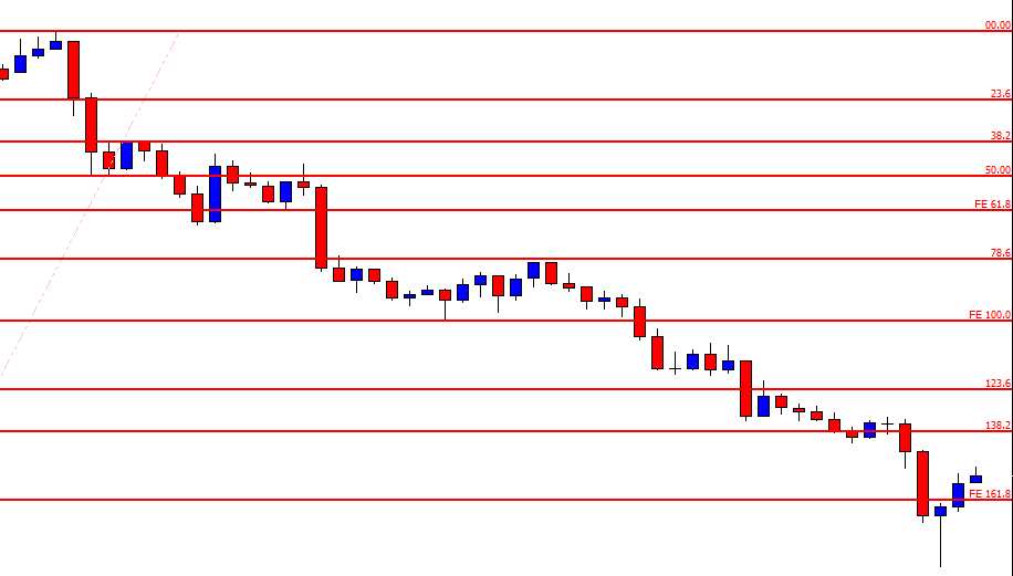
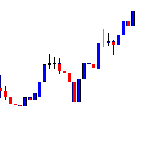
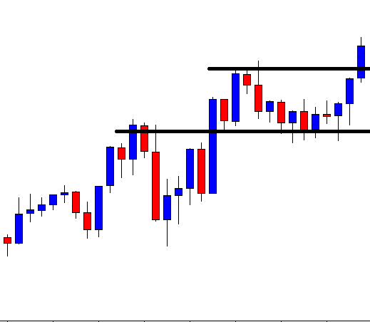
The chart shows that the price heads towards the North upon producing an ABC pattern. We may notice that we have four significant points here, such A, B, C, and D. The price most likely reacts at these levels again. Let us proceed to the next chart.

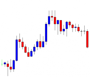
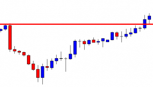
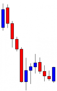
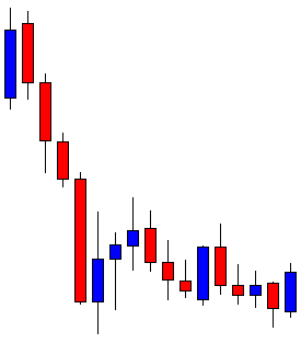
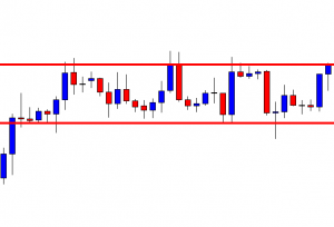
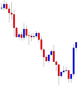
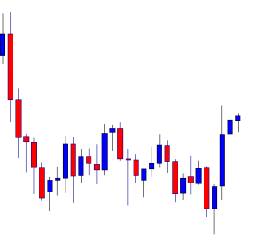
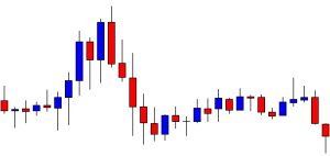
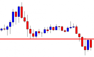
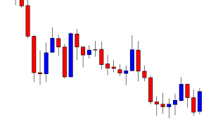
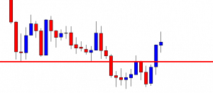
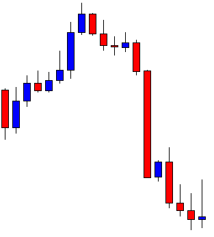
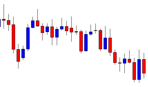
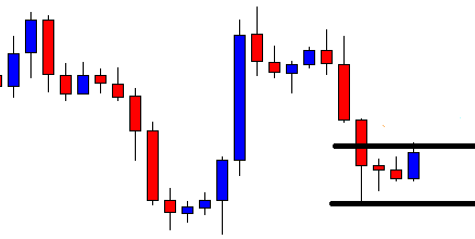
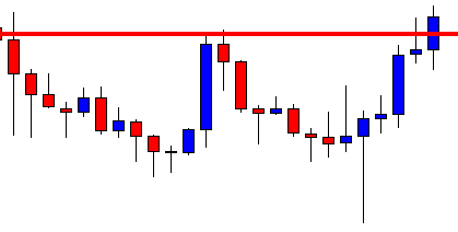
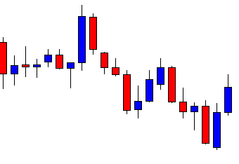
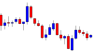
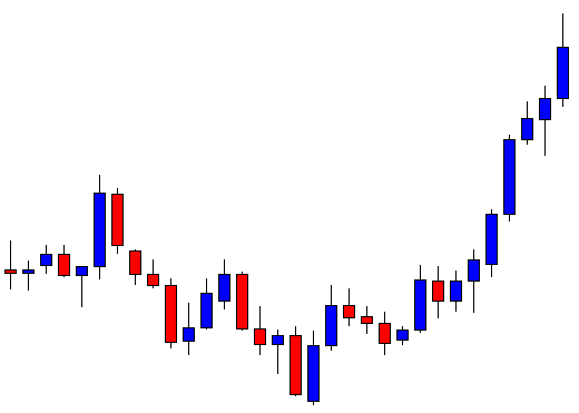
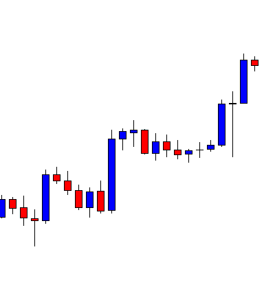
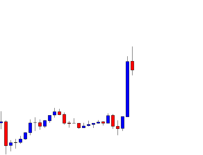
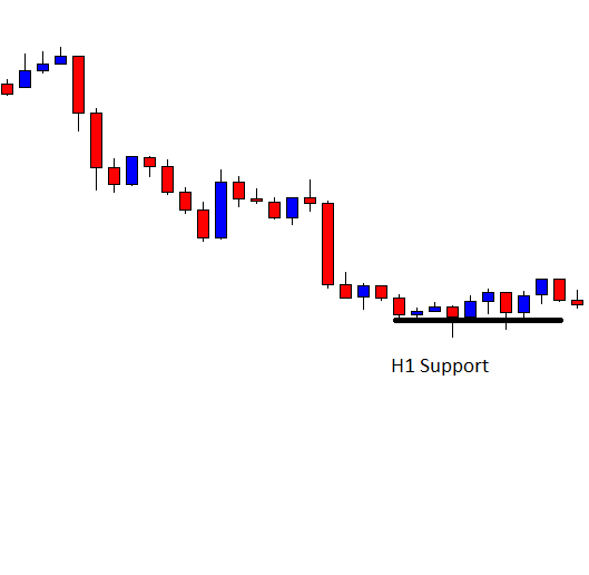
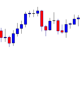
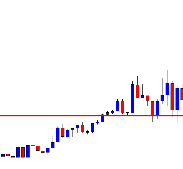
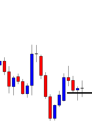
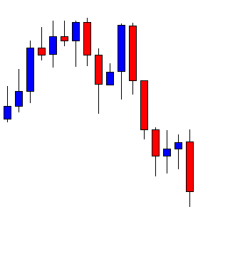
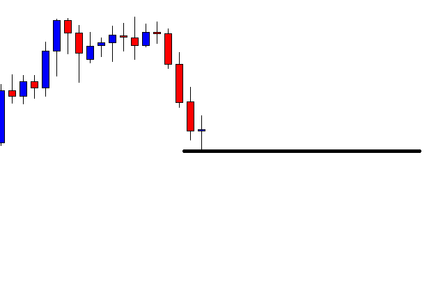
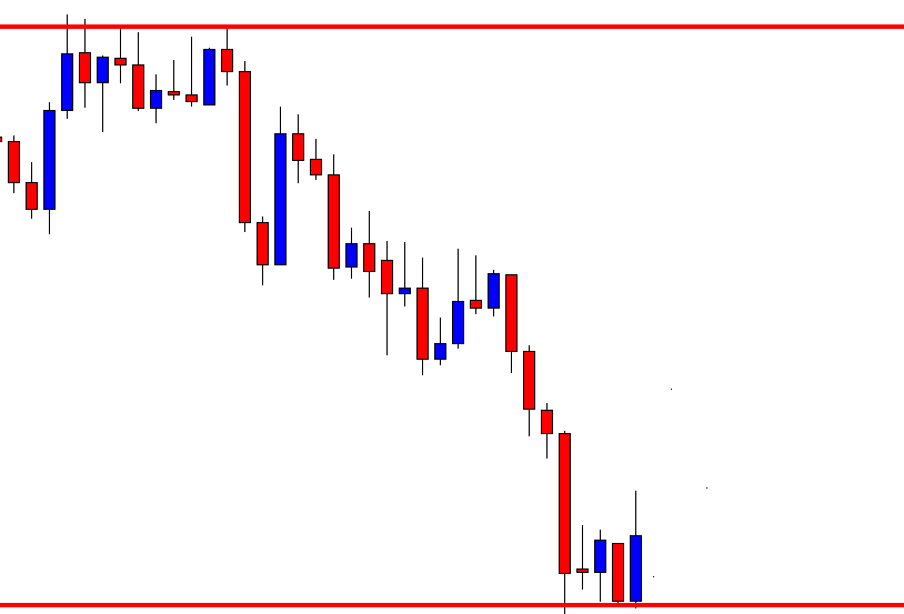
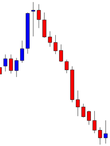
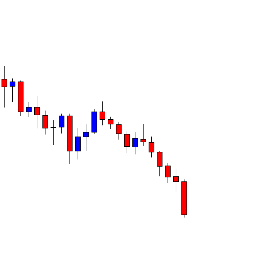
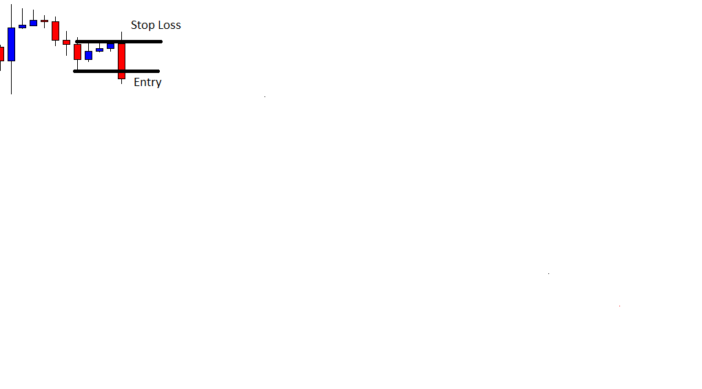
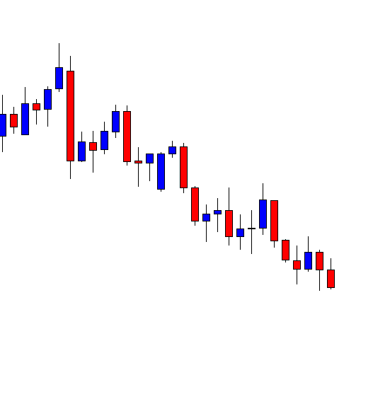
The price heads towards the South at a moderate pace. The last candle comes out as a bearish Marubozu candle. It seems that the price may remain bearish for a while. Let us proceed to the next chart to find out what happens next.

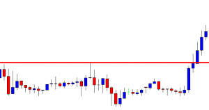
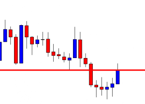
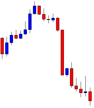
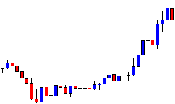
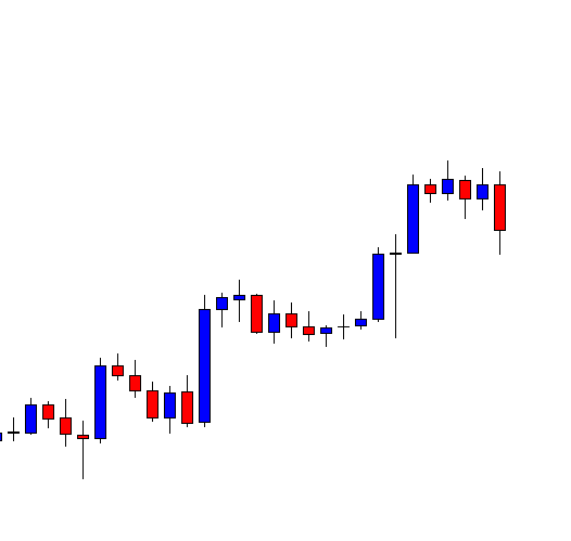
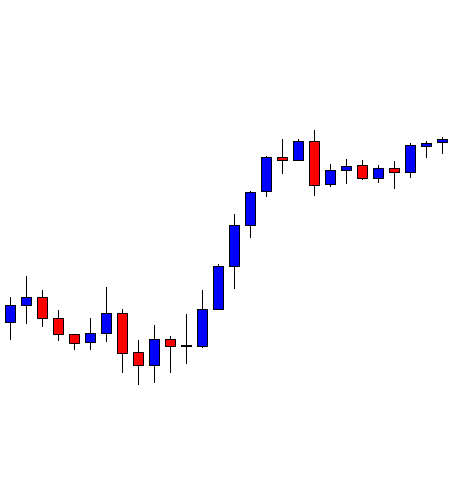
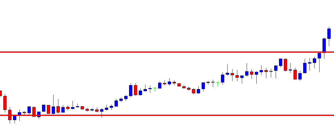
The chart produces an inverted hammer. It is a sign of a bullish reversal. However, considering point B, the price makes a bearish breakout at the level. Thus, the pair may continue its bearish move. The sellers may look for short opportunities in the minor chart.

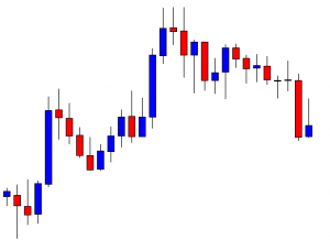
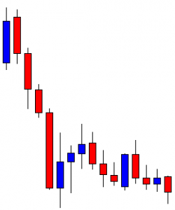
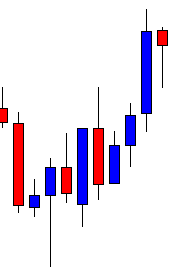
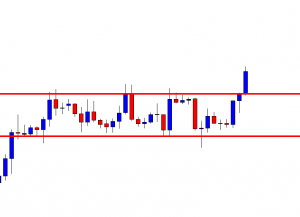
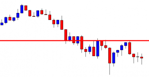
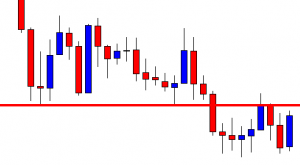
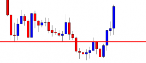
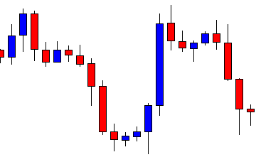
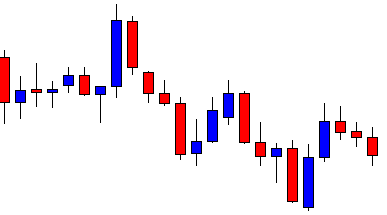
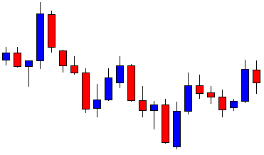
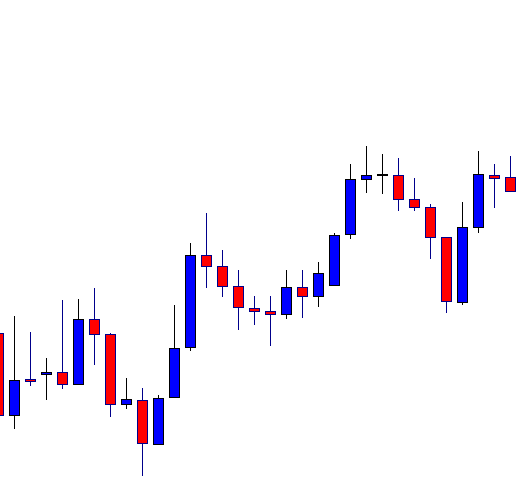
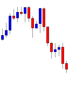
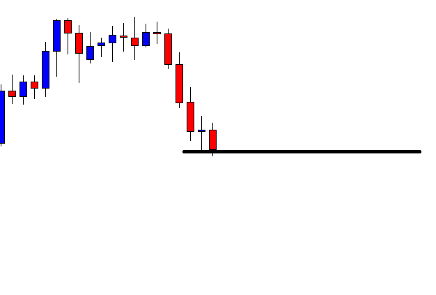
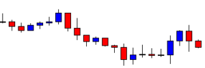
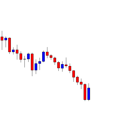
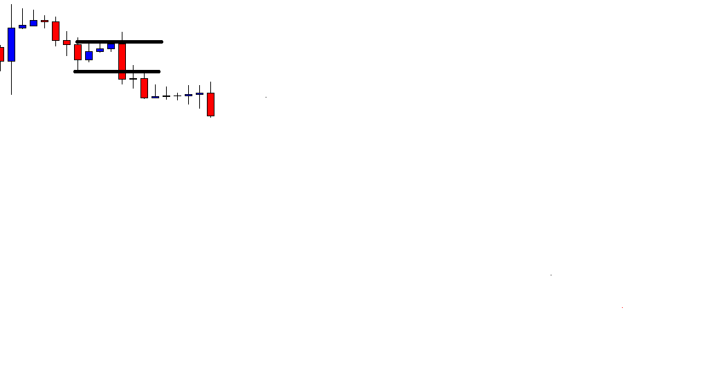
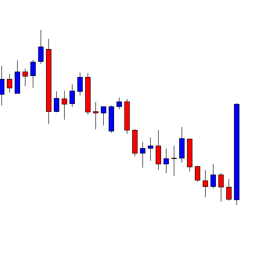
The next candle does not make a bearish breakout. It comes out as a bullish candle. The last candle comes out as a Doji candle. Ideally, neither the bull nor the bear dominates in the pair. The sellers are to wait for the price to make a breakout at the last swing low. The buyers are to wait for the price to make a bullish reversal candle closing above consolidation resistance. Let us see what the price does.

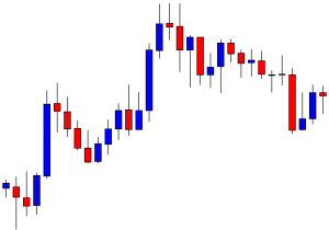
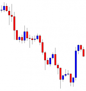
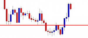
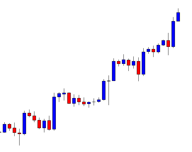
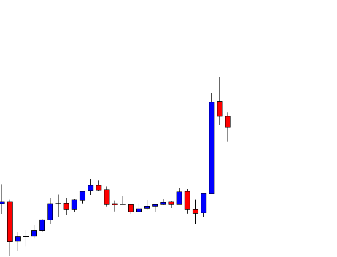
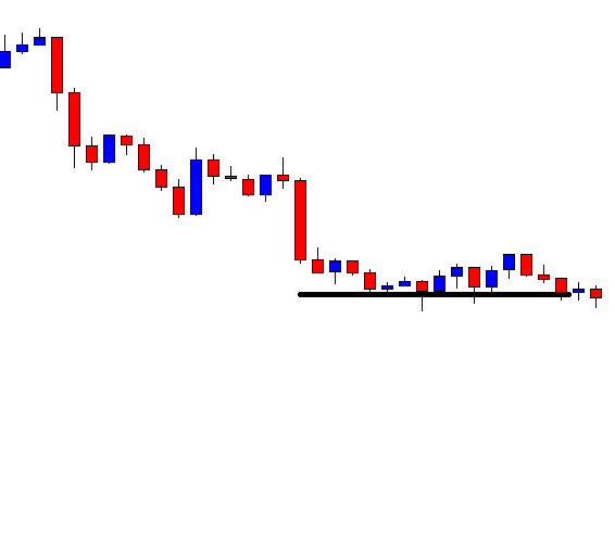
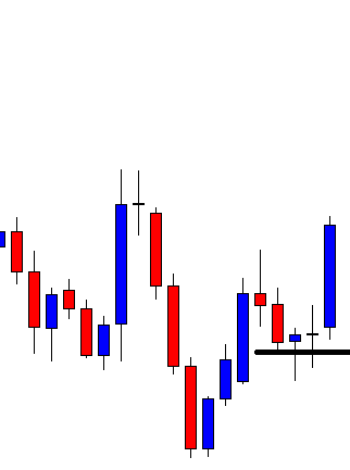
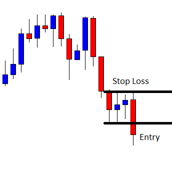
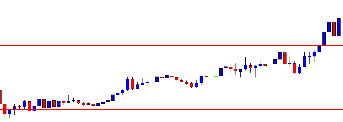
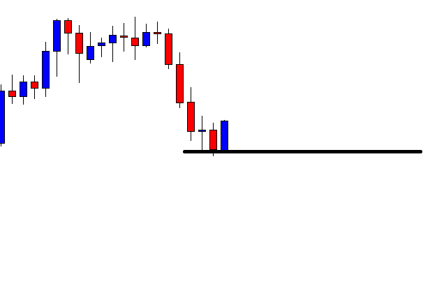
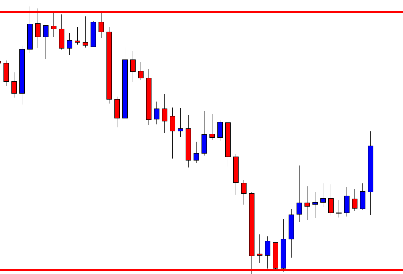
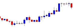
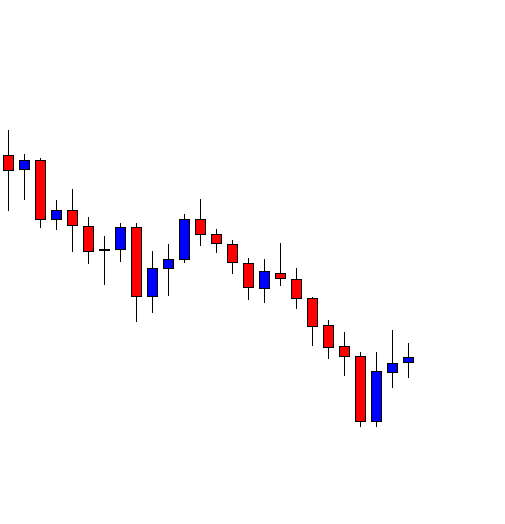
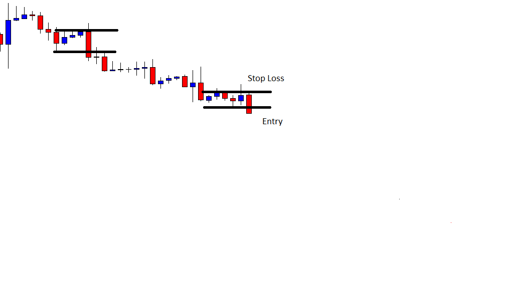
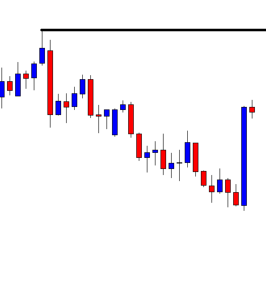
The price comes down. It produces a bullish engulfing candle. Some sellers may have to encounter a loss here. Upon creating the bullish engulfing candle, the price heads towards the North with good bullish momentum. Now a few questions may be raised here.

  1. Why does the price not head towards the North but comes down?
  2. Why does the price not continue its bearish move but produces a bullish engulfing candle?
  3. Why does not price head towards the North at its second attempt?


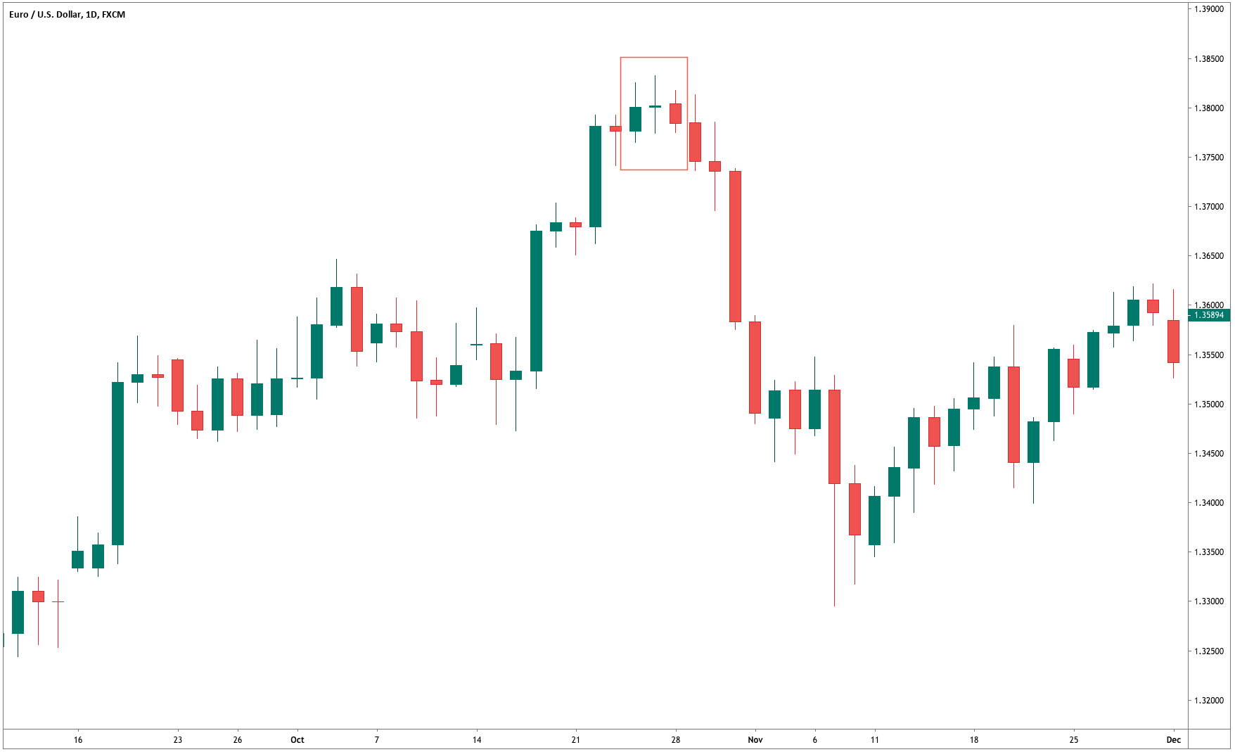
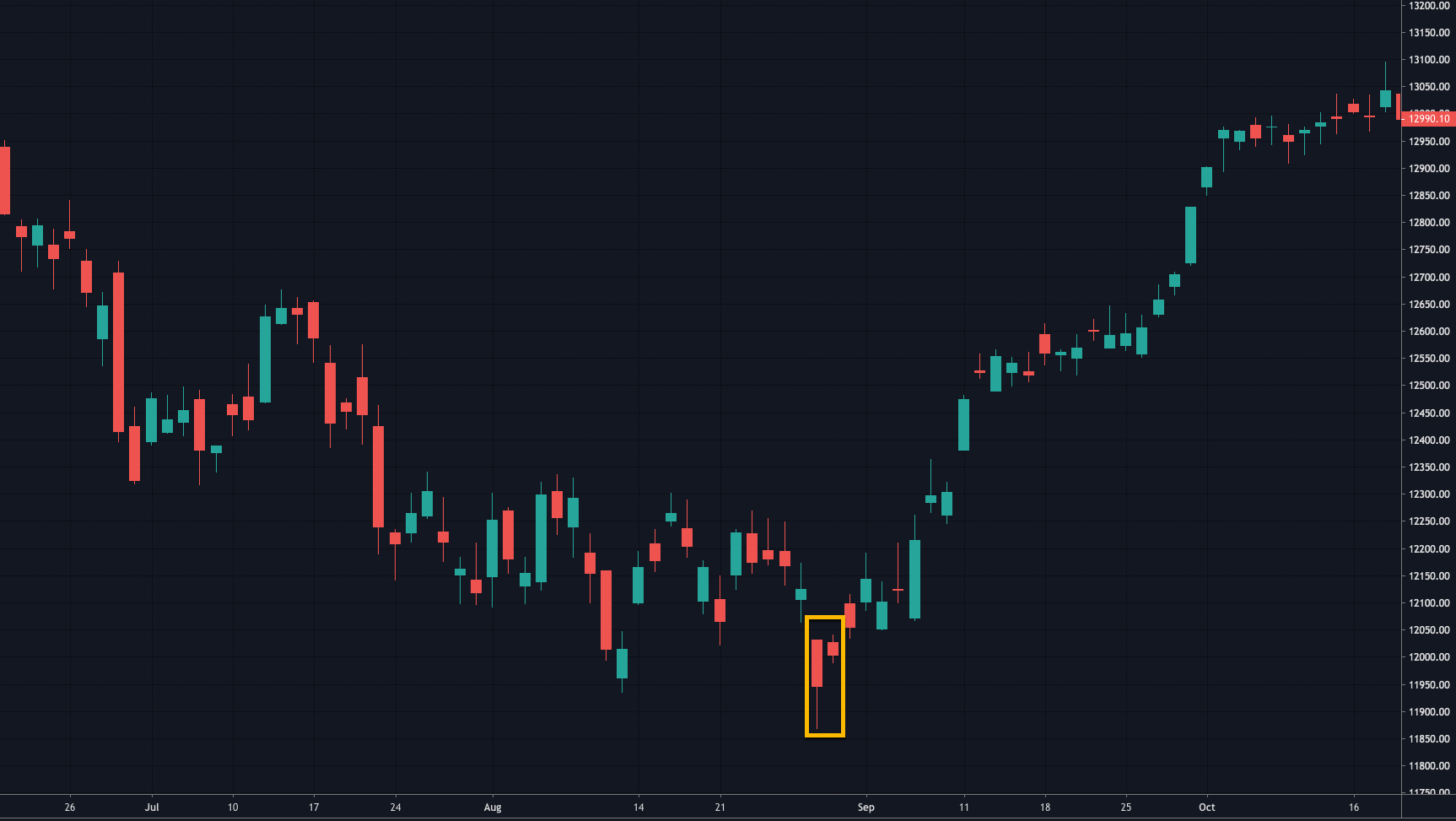
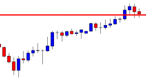
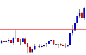
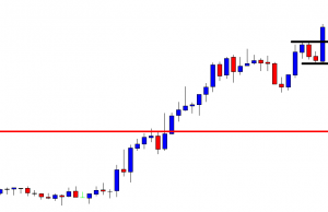
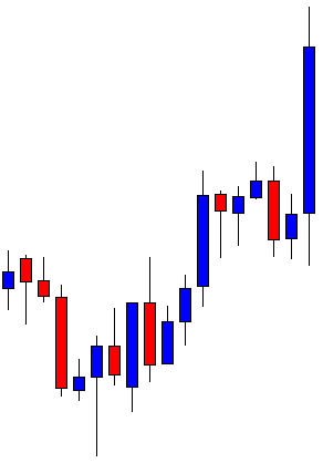
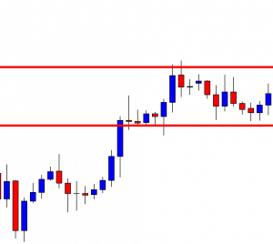
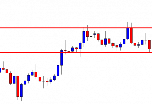
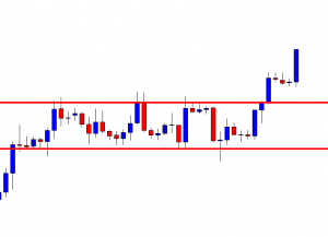
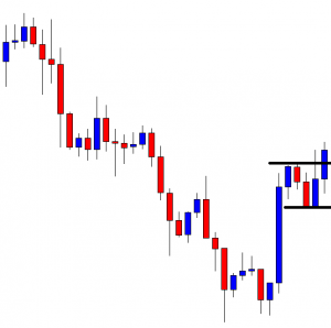
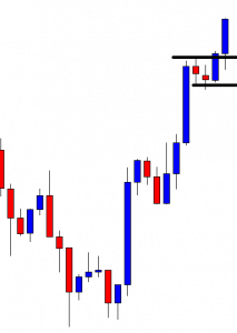
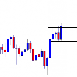
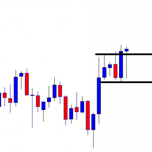
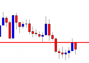
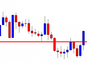
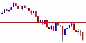
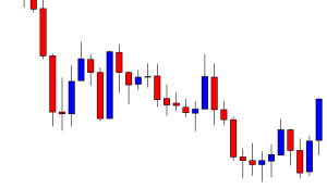
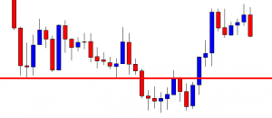
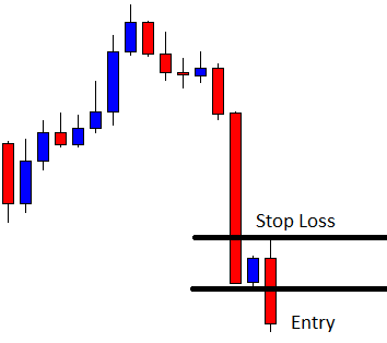
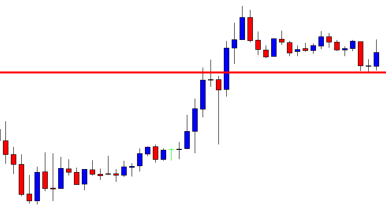
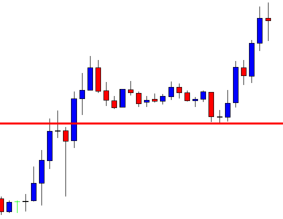
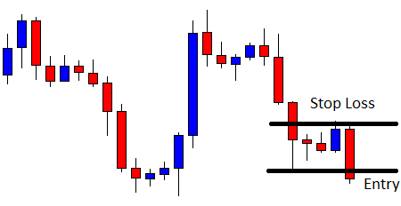
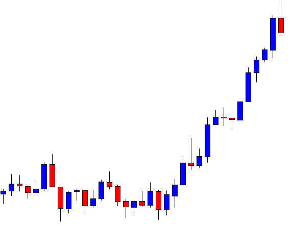
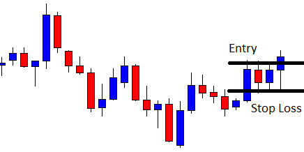
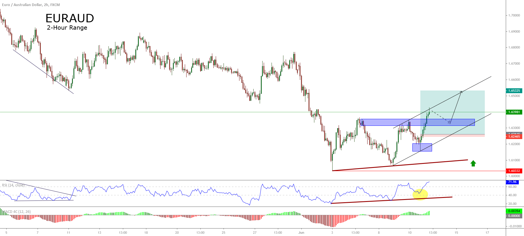
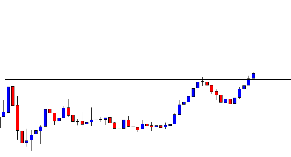
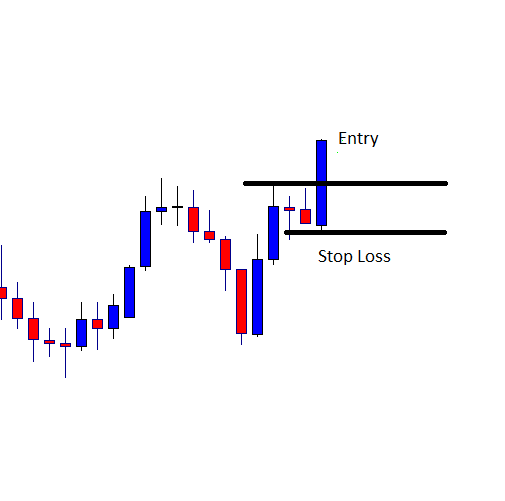
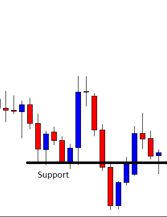
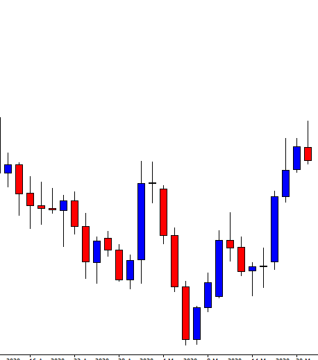
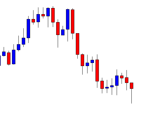
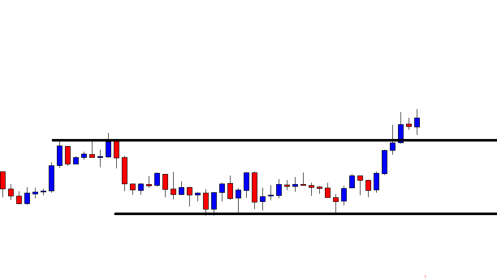
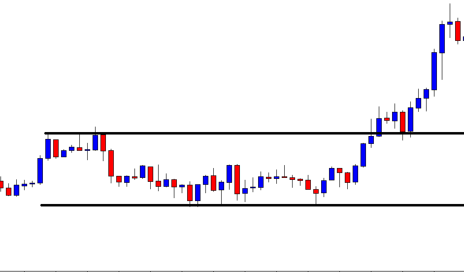
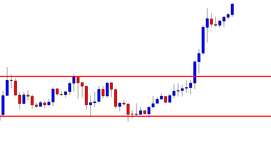
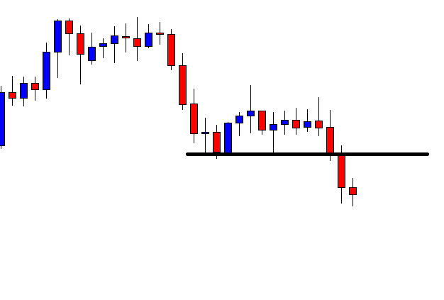
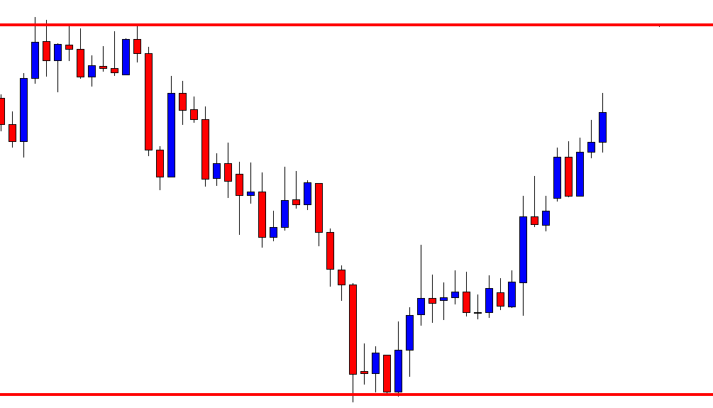
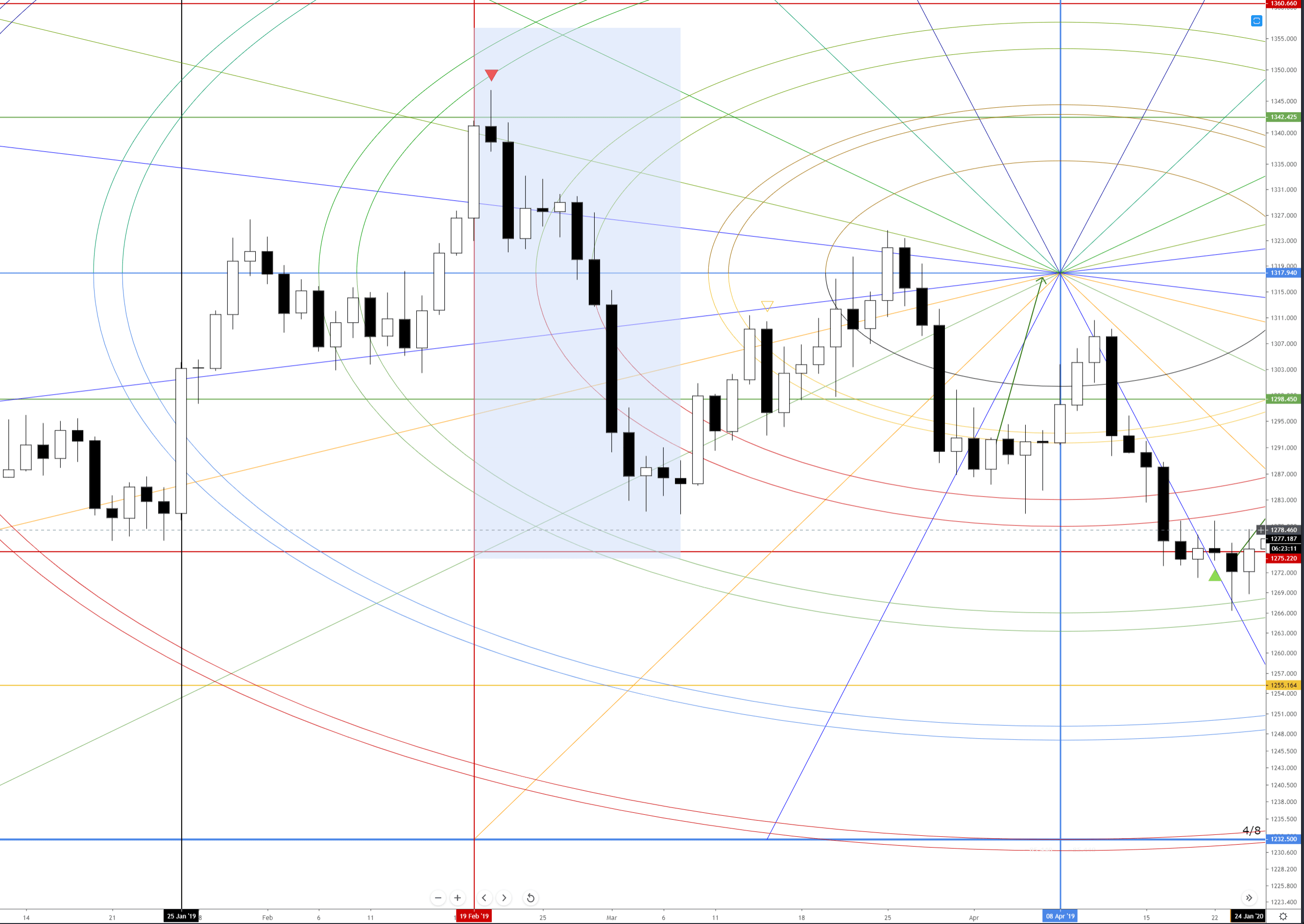
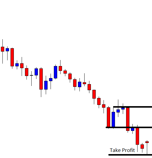
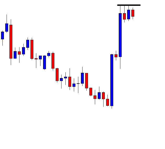
Have a look at the chart below with some drawings in it.

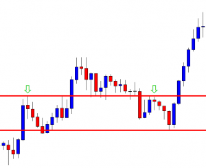
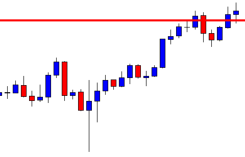
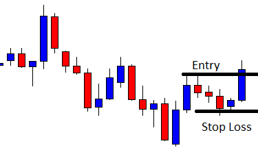
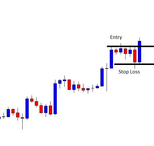
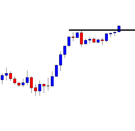
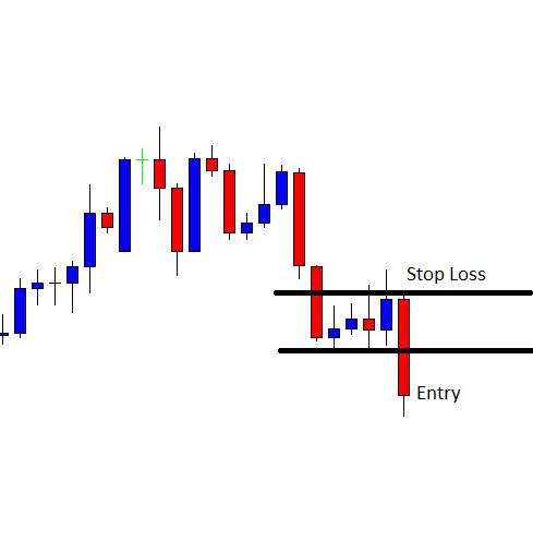
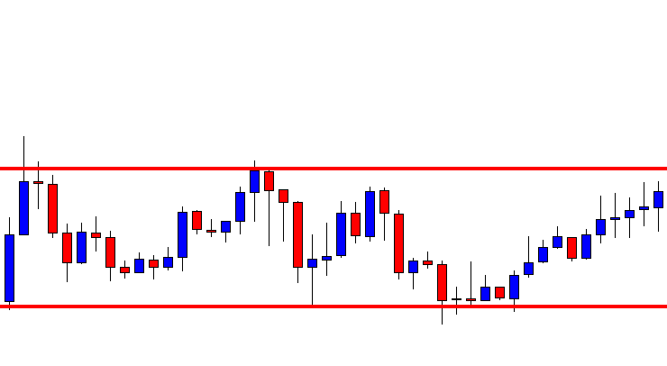
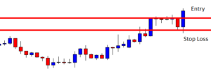
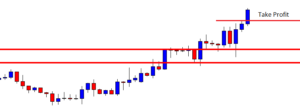
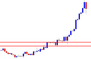
At its first attempt, the price does not make a breakout at the level of resistance drawn. The price reacts at this level several times. Thus, this is a crucial level, which is to be counted by the buyers before taking long entries. The price finds its resistance here and makes a bearish move. It finds its support at the drawn line, where the price reacts to it earlier as well. The reversal candle comes out as a Doji candle, and the chart takes four candles to make the breakout. This is one of the reasons that the price does not continue its bearish move.

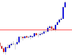
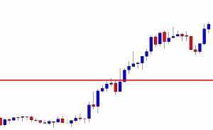
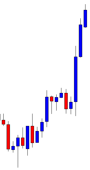
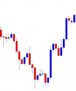
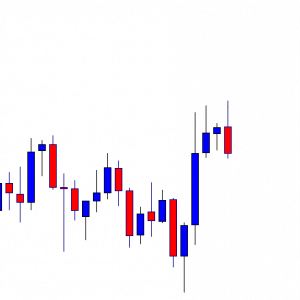
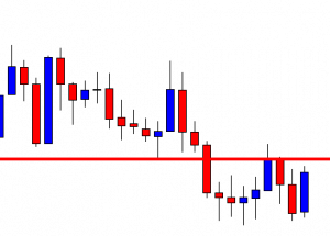
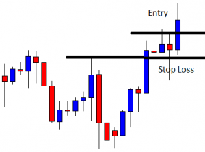
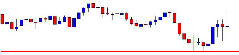
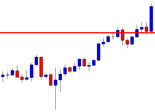
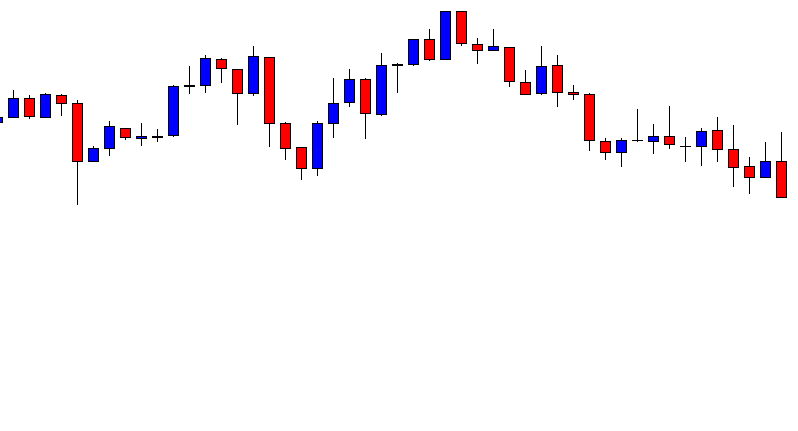
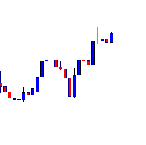
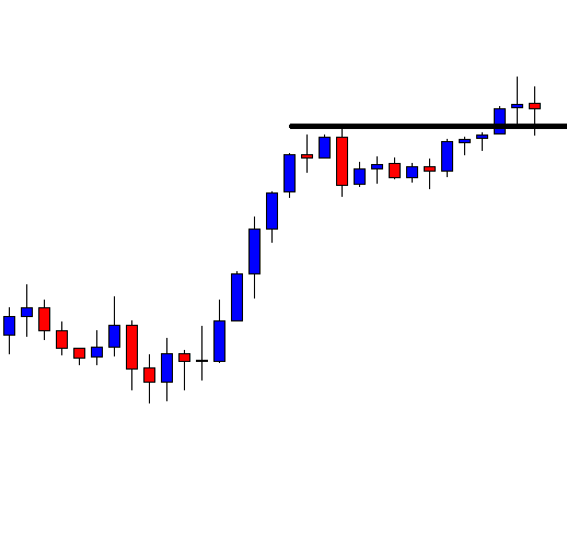
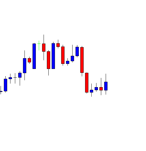
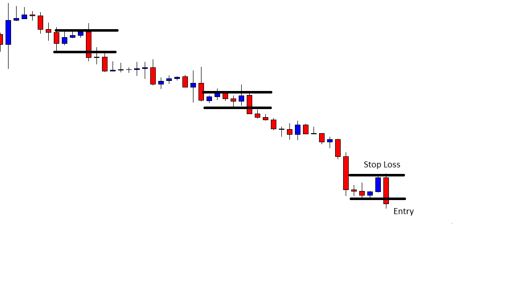
At its last attempt, it produces a bullish engulfing candle, the candle is produced at a key level, the price makes a breakout at the last swing low, and the breakout candle comes out as a strong bullish candle. These factors attract more buyers and make the price move towards the North with good bullish momentum. We need to remember such factors every time we take entries as far as price action trading is concerned.

Categories
Forex Daily Topic Forex Price Action

Reversal Breakouts Offer a Lot

The trend is traders’ friend. Breakout is traders’ best friend. In today’s lesson, we are going to demonstrate an example of an H1 breakout, which makes a reversal even in the daily chart. Thus, the price heads towards the breakout direction with good momentum ending up offering an excellent reward. Let us get started.

The chart shows that the price makes a strong bearish move and finds its support. Upon producing a bullish engulfing candle, the price heads towards the North at a moderate pace. The price does not make a breakout at the last swing high. Thus, the chart is still bearish biased. Please note, the H1 chart does not show, but the daily trend has been bearish in this chart.

The chart shows that one of the candles breaches through the last swing high, closing well above the level. The last candle comes out as a bullish candle as well. It confirms the breakout. The buyers may wait for the price to consolidate and get a bullish reversal candle to go long in the pair.

The last two candles come out as bearish candles. The spinning top closes within the level of support. If the level produces a bullish engulfing candle, the buyers may go long in the pair.

The last candle comes out as a bullish engulfing candle closing well above consolidation resistance. The buyers may trigger a long entry right after the candle closes by setting stop loss below the level of support and by setting take profit with 1R.

The price heads towards the North with extreme bullish momentum. The way the chart looks, it seems it may continue its journey for a while. The chart shows that the buyers achieve their target within the next two candles after triggering the entry. Let us proceed to the following chart to see what the price does.

The last candle comes out as a bearish engulfing candle. It is produced at the second rejection as well. This means the chart forms a double top here. A double top resistance forming a bearish engulfing candle suggests that the price may make a bearish move here. However, if we calculate the length of the bullish move, it ends up being a very good one. This is what usually happens when the price makes a breakout at the last daily candle’s highest high when the daily chart is bearish and if the breakout takes place at the lowest low when the daily trend is bullish. Make sure the price consolidates and produces a strong reversal candle at the breakout level. If that happens, it often ends up offering an excellent reward in the end.

Categories
Candlestick patterns

Trading with Confidence Using Candlestick Patterns

Introduction

Previously, we had discussed how a group of different candlestick formations provides the necessary information to comprehend the market sentiment and evaluate the probability of a trend reversal, which could help traders in joining the start of the new trend. 

In this educational article, we’ll review how candlestick formations can be used to establish a trading strategy and which patterns could bring more confidence in the trading setups.

The Candlestick Patterns’ Usefulness

Candlestick patterns arise as a result of the price action at a determined range of time. Independently of the timeframe under visualization, e.g., weekly, daily, hourly, or even minute timeframe, the price never is a lagging indicator.  Furthermore, candlestick patterns tend to appear in every market and timeframe.

Trading Signals with Candlesticks Patterns

There exist a set of candlestick patterns that frequently appears in the financial markets across time, although the technical trader must consider the market context before consider if the candlestick represents a continuation or a reversion of the trend.

Hammer and Hanging Man

The hammer characterizes itself by presenting a large shadow and a small body located near the high of the day. When this pattern appears at the end of a bearish trend, it tends to be a bullish reversal signal.

When a hammer pattern shows up after a substantial descent, the technical trader may place a buy position on the next trading bar above the high of that hammer, placing its stop-loss below the low of the last day.

On the opposite side, the hanging man pattern arises when an uptrend ends. The sell setup will take place in the next session candle using the low of the hanging man candle as entry level, with a stop-loss above its high.

Engulfing Candlestick Pattern

The engulfing pattern is a formation constituted by two candles. The bullish engulfing pattern will occur at the end of a downtrend. During the trading session, the action takes place in a wide range. The price opens near the low of the day and closes near the high of the day, erasing the losses of previous trading session or sessions.

A bullish position will take place at the high of the previous day, with a stop-loss located below the low of the last trading session. A bearish position will occur at the low of the previous trading session, with a stop-loss order placed above the highest level of the engulfing candle.

Harami Pattern

The harami pattern tends to indicate the change of the trend only when it appears at the end of a bull or bear leg. The Harami is the weakest form of a reversal pattern. 

A buy position will trigger if the price breaks and closes above the high of the day of the narrow range candle during the next trading session, the stop loss is to be placed below the low of the session in progress.

A sell position will occur if the price breaks and closes below the narrow range candle, and its stop-loss may be located above the highest level of the harami candle.

Morning Star and Evening Star Pattern

Both the morning star as the evening star pattern are formations that hold three candlesticks for its configuration.

The Morning star pattern is a bullish trend formation, which will activate a buy position above the high of the last trading session, with its stop-loss below the low of the previous day or candle.

The evening star pattern is a bearish formation, which will trigger a sell position below the third candle of the pattern, its stop-loss placed above the high of the last trading session.

Conclusions

In this educational article, we presented a group of candlestick patterns, which could increase the confidence in an entry setup. However, although the formation provides an entry-level and stop-loss, these formations don’t identify a profit target level. This context could not ensure the technical trader a risk to reward ratio at least one to one, reducing the profitability of any candlestick pattern.

To reduce this variability on the expected results, we remark the Fischer and Fischer conclusions; they unveil the advantage of the use of candlestick formations compared to bar charts, stating that candlesticks are easier to understand and most useful for short-term traders.

Finally, they conclude that the most reliable candlestick formations are the engulfing pattern, hammer, and hanging man. In this context, the technical trader should consider that before ramping up a trading strategy based on candlestick formations, it’s recommended to evaluate its performance, developing a statistical backtest before jumping in the real-market.

Suggested Readings

  • Fischer, R., Fischer J.; Candlesticks, Fibonacci, and Chart Patterns Trading Tools; John Wiley & Sons; 1st Edition (2003).
Categories
Forex Price Action

H1-15M Combination Trading: Consolidation Level May Vary

In today’s lesson, we are going to demonstrate an example of an H1-15 chart combination trading. The price makes a strong bearish move in the daily chart. Then, it is trapped within two horizontal levels. Next, it makes a bullish breakout and ends up offering an excellent entry. Let us get started.

This is the H1 chart. The chart shows that the price is trapped within two horizontal levels. Upon having a bounce, the price heads towards the North. The buyers are to wait for the price to make a bullish breakout at the level of resistance. Let us proceed to the next chart.

The chart shows that the price heads towards the North and trades above the level of resistance upon making a bullish breakout. The H1-15M chart combination traders are to wait for the price to consolidate and produce a bullish reversal candle to offer them a long entry.

Here it comes. One of the candles comes out as a bearish engulfing candle. However, the next candle comes out as a bullish engulfing candle closing above consolidation resistance. The H1-15M combination traders may flip over to the 15M chart to trigger a long entry.

This is how the 15M chart looks, and it looks very bullish. The buyers are to wait for a bullish candle to close above the last candles to trigger a long entry. As far as the recent price action is concerned, it may not take too long to produce a 15M signal candle.

The chart produces two bearish candles and consolidates. The last candle comes out as a bullish engulfing candle closing well above consolidation resistance. The buyers may trigger a long entry right after the last 15M candle closes by setting a stop-loss order below consolidation support and by a take-profit target with 1R. Let us find out how the trade goes.

The price heads towards the North with good bullish momentum and hits 1R in a hurry too. It keeps going towards the North. It may extend its bullish wave as well. Ideally, the price is to consolidate around the breakout level.

In this example, the price consolidates way above the breakout level. It often happens in the H1 chart. It does not mean that we do not get the opportunity to take an entry. Chart combination trading may help us take entries in such a situation. Once a breakout takes place (H1 chart), we are to wait for the price to consolidate and produce a reversal candle. Then, we are to flip over to the 15M chart and wait for the trend continuation to trigger entry.

Categories
Forex Daily Topic Forex Price Action

If Double Bottom/Top Does Not Offer Entry, Wait for Triple Bottom/Top

In today’s lesson, we are going to demonstrate an example of double bottom support, which does not end up producing entry. However, the price comes back to the level of support again, and upon producing a triple bottom, support offers a beautiful trade setup. Let us get started.

This is the daily chart. The price makes a strong bearish move and bounces off at a level of support. It produces a bullish inside bar and heads towards the North. The price comes back to the level of support again upon producing a bullish engulfing candle. The buyers may flip over to the H4 chart for the price to consolidate and produce a bullish engulfing candle to trigger a long entry.

We are still on the daily chart. The H4 chart does not consolidate or produce a bullish reversal candle. On the daily chart, the price comes down again and consolidates around the level of support. Both the buyers and the sellers are to wait for the price to see what it does. Does it produce a bullish reversal candle, or does it make a bearish breakout?

The chart produces a bullish engulfing candle at the level of support again. It has become a level of triple support. Thus, the buyers may be more interested in going long in the pair. The buyers may flip over to the H4 chart now.

This is how the H4 chart looks. The last candle comes out as a hammer. The buyers are to wait for a bullish engulfing candle to trigger a long entry. Let us proceed to the next chart to find out what the price does.

The price consolidates for four more H4 candles. At last, it produces a bullish engulfing candle closing well above consolidation resistance. It takes a long time to produce the signal candle, but it does just before the day ends. It is a valid signal. The buyers may trigger a long entry right after the last candle closes by setting take profit with 1R.

The price heads towards the North with good momentum and hits the target. The extreme bullishness of the signal candle makes the price hit the target in a hurry.

If we look back, when the chart produces the first bullish engulfing candle at the level of double bottom support, it does not end up offering an entry. When it bounces again at the same level of support, it ends up offering an entry. This is what may happen more often than traders think. If a buyer leaves the chart when it does not offer entry, he will lose the chance to make a profit from the trade setup that we have demonstrated here.

Categories
Forex Price Action

Do Not Abandon a Chart with Choppy Price Action

In today’s lesson, we are going to demonstrate an example of a chart where the price gets caught within two horizontal levels and makes a bullish breakout. We try to find out what it has to offer and how the price action goes. Let us get started.

The price makes a strong bullish move. Upon finding its resistance, it is in a bearish correction. The buyers may eagerly wait to go long in a chart like this if the chart makes a breakout at the last highest high. The last two candles come out as bullish candles. It seems that the price may have found its support.

The chart shows that two lines may be drawn by using significant levels, where the price reacts several times. The buyers may eye on the price and hope that the chart makes a breakout at the level of resistance to offer them a long entry.

The chart shows that it does not make a breakout at the highest high. However, it gets rejection and makes another bearish move towards the level of support. Here is an interesting thing. The sellers may wait for the chart to make a breakout and offer them a short entry here since the level is a double top resistance.

The chart does not make a breakout, but it produces a long bullish engulfing candle. It gets rejected again and heads towards the South. Upon having a bounce, it heads towards the North. Two horizontal levels may be drawn, which is called horizontal channel or box channel. The price may go either way. Now, the buyers are to wait for a bullish breakout and go long in the pair.

After a long while, the chart makes a bullish breakout. The buyers may wait for the price to make a correction/consolidate and produce a bullish reversal candle to offer them a long entry.

The price makes a bearish correction and seems to have found its support. It produces a doji candle. The buyers may get ready to trigger a long entry. Some buyers may flip over to the smaller chart to trigger a long entry, and some may go long above the last highest high. Some may wait for a bullish engulfing candle closing above resistance. It depends on their trading strategy.

The chart produces a bullish engulfing candle closing above consolidation resistance. The price may head towards the North with good bullish momentum as far as the last candle’s attributes are concerned.

The price heads towards the North and hits 1R within the next candle. The last candle comes out as a bearish inside bar. It suggests that the price may consolidate and make a bearish correction. In the end, the buyers have made some green pips.

The market ranges most of the time. When it makes a breakout, it does not take too long to offer an entry. In today’s lesson, we have seen that the price makes us wait for a long. It takes a long time to make a breakout. Traders must keep their eyes on such charts and wait for the price to take a direction. In the end, even a choppy chart may end up offering a good entry too.

Categories
Forex Daily Topic Forex Price Action

Double Top or Double Bottom Often Offers More

In today’s lesson, we are going to demonstrate an example of a chart offering multiple entries upon producing the double bottom. We know the double bottom is one of the strongest bullish reversal patterns. When a chart produces a double bottom, price action traders keep their eyes on the chart to keep going long. Usually, a double top or a double bottom ends up offering multiple entries. Let us now have a look at today’s example of how it offers us multiple entries.

This is an H4 chart. The chart shows that the price heads towards the South with good bearish momentum. It makes a long bearish move too. However, look at the last candle in the chart. It comes out as a bullish inside bar, which is produced at double bottom support. The buyers are to wait for a breakout at the neckline and go long in the pair.

The chart shows that one of the candles breaches through the neckline level. The next candle comes out as a bullish candle. The buyers are to wait for the price to consolidate and produce a bullish reversal candle to go long in the pair.

Upon producing a bearish inside bar, the price produces a bearish candle. The last candle looks very bearish. However, the buyers must keep their eyes on the chart since it may produce a bullish reversal candle anytime as far as double bottom and neckline breakout are concerned.

The chart produces a bullish reversal candle followed by another bullish candle breaching through consolidation resistance. The buyers may trigger a long entry right after the last candle closes by setting stop loss below consolidation support and by setting take profit with 1R.

The price heads towards the North with good bullish momentum. It hits 1R within the next candle. The price consolidates and produces a bullish reversal candle closing above the last swing high. Do you notice anything here? Yes, this is another entry. The buyers may trigger a long entry right after the last candle closes. Let us have a look at the trade setup with two horizontal lines on the chart.

The price heads towards the North again and hits 1R within the next candle. It seems that the buyers are having a feast here. The way it has been going, they may wait for the price to consolidate again and produce another bullish reversal candle to offer them one more entry. In a word, this is a chart that is going to be closely monitored by the buyers until it produces a strong bearish reversal pattern such as a double top or a bearish engulfing candle on the daily chart (this is an H4 chart). Next time when you see a double top or bottom on a chart, keep eyeing on the chart to make full use of that.


Categories
Forex Price Action

How Market Tests You and What You May Learn from It

In today’s lesson, we are going to demonstrate an example of a daily-H4 chart combination trading, which has a good lesson to give us. Usually, daily-H4 combination traders look for a strong reversal candle in the daily chart. Then, they flip over to the H4 chart to trigger entry upon consolidation and a signal candle. We get all these in our today’s example, but the price acts a bit differently after triggering the entry. Let us proceed to find out what happens there.

It is the daily chart. The chart shows that the price produces a bullish engulfing candle at a level of support where the price bounces several times. The combination traders may flip over to the H4 chart now and wait for the price to consolidate and produce a bullish reversal candle.

This is how the H4 chart looks. It looks very bullish. The last candle comes out as a bullish candle closing within a level, where the price gets rejection twice. The pair may consolidate here.

The pair produces a bearish engulfing candle. This is a strong bearish reversal candle. However, the H4 buyers must not lose their hope since the last daily candle comes out as a bullish candle. They must wait with hope.

The next candle comes out as a bullish engulfing candle closing above the level of resistance. The buyers may go trigger a long entry right after the last candle closes by setting stop loss below consolidation support and by setting take profit with 1R. Typically, this is an ideal price action to go long for the daily-H4 chart combination traders. Let us proceed to the next chart to find out what happens next.

The next candle comes out as a bullish pin bar. Look at the lower shadow. The price is about to hit the stop loss. However, if the stop loss is set here accordingly, the entry is safe. Nevertheless, the last candle comes out as a surprise for the buyers. It has three lessons to give us. We will learn them in the conclusion. Meanwhile, let us find out how the entry goes.

The price then heads towards the North with a moderate pace and hits the target. The combination traders make some profit out of the trade. It is good. Let us now find out what those three lessons are.

  1. Look at the daily chart again. See the price consolidates within two horizontal levels. There are two resistances. It means the price does not have enough space to travel towards the North as far as the daily chart is concerned. It may have held some buyers in the H4 chart back to go long in the pair.
  2. Set your stop loss accordingly with some safety pips as well.
  3. Be patient. If a trade does not go according to your expectation, do not panic.


Categories
Forex Daily Topic Forex Price Action

Evaluate Whether the Chart Belongs to Your Strategy or Not?

In today’s lesson, we are going to demonstrate an example of an H1 chart, where the price makes a bearish breakout and produces a bearish reversal candle upon making a bullish correction. However, things do not go as the sellers would like. Let us find out what happens and what the reason may imply.

The chart shows that the price produces two bearish candles consecutively. The level of support seems to be a strong one. It may produce a bullish reversal candle and push the price towards the North. However, the sellers may wait for the price to make a bearish breakout at the level of support.

Here it comes. The next candle breaches the level of support closing well below the level. This is one good-looking breakout candle. The sellers are to wait for the price to consolidate or make a bullish correction to produce a short signal.

The price makes a bullish correction. The last candle closes within the breakout level. Please pay attention to the number of candles the chart uses to make the bullish correction. The chart takes five candles to complete the correction. It means the level of support has become H4 support. Let us proceed to the next chart.

The chart produces a bearish inside bar. This is a bearish reversal candle, of course. However, the question may be raised here whether the sellers take a short entry depending on the H1 chart or not? Let us assume that a seller triggers a short entry by setting stop-loss above the breakout level.

The next candle comes out as a bearish candle. However, the last candle comes out as a bullish engulfing candle. The level is H4 support now. Thus, the buyers may look to go long in the pair and drive the price towards the North. It does not look good for the seller. The price may hit stop loss.

The next candle comes out as a strong bullish candle closing well above the breakout level. The short entry has been wiped off. If we consider the sequence bearish breakout, bullish correction, bearish reversal candle at the breakout level, it seems perfect to go short in the pair. What goes wrong here? In the Forex market, any entry may go wrong. However, over here, the H1 sellers may miss the point that the support is not H1 support anymore. It is H4 support since the level of support holds five candles. This is why the H1 traders may skip taking the short entry in this chart. It often happens in combination trading that traders forget to calculate or synchronize the chart that they are trading at. However, to be successful in trading, traders must not miss this point.

Categories
Forex Daily Topic Forex Price Action

The H1-15M Charts Combination Trading: Watch Out for Signal Candle’s Attributes

Reversal candle’s attributes play a significant role in driving the price towards the trend. An Inside Bar is considered to be the weakest reversal candlestick. However, in combination trading, even an Inside Bar may create good momentum as a reversal candle. In today’s lesson, we are going to demonstrate an example of that.

This is an H1 chart. The chart shows that the price heads towards the South with good bearish momentum. The price has a bounce at a level of support and makes a bullish correction. The sellers are to wait for a bearish breakout at the lowest low of the wave.

The chart produces a bearish reversal candle that comes out as a bearish engulfing candle. The last candle comes out as a bearish candle as well. However, it has a long lower shadow.

The chart makes a breakout at the lowest low of the wave. The last candle comes out as a bullish engulfing candle, which is a strong bullish reversal candle. However, the sellers may still keep their hope. If the breakout level produces a bearish reversal candle, they are right on the track.

This is what the H1-15M combination traders are waiting for. It produces a bearish reversal candle. Now they have to wait for a 15 M bearish candle to go short in the pair. It is time for the combination traders to flip over to the 15M chart.

This is how the 15M chart looks. The sellers are to wait for the price to produce a bearish candle closing below the last 15M candle. Let us wait and see what the price does. Let us proceed to the next chart.

The last candle comes out as a bearish candle without having any lower shadow.

The sellers would love to see a candle like this every time as a signal candle.  The combination traders may trigger a short entry right after the last candle closes. Let us find out how the entry goes.

This is the H1 chart again. The price heads towards the South with extreme bearish momentum. The last candle comes out as a doji candle. The price hits 1R within two candles. Those who love letting their winners run, they may close their entry right after the last candle closes.

If we notice, the bearish reversal candle at the breakout level comes out as an Inside Bar. However, it creates a strong bearish momentum. It is because the 15M signal candle comes out as a strong bearish continuation candle. Thus, combination traders may focus more on the signal candle. Signal candle’s attributes are more important than the reversal candle’s attributes as far as chart combination trading is concerned.


Categories
Forex Price Action

One Minute Down, Next Minute Up

The Double Bottom is one of the strongest bullish reversal patterns. When the price gets its second bounce at the same level and makes a breakout at the last swing high, the pattern it produces is called the double bottom. In today’s lesson, we are going to demonstrate an example of a double bottom in the H1 chart. At the end of the wave, an interesting thing happens. Let us proceed and find out how the double bottom offers entry and what that interesting thing is.

This is an H1 chart. The chart shows that the price has its second bounce and produces a bullish engulfing candle. Since the same level of support produces a bullish engulfing candle at the second bounce, it is going to have a strong impact on the market if it makes a breakout at the last swing high.

Here is the level of resistance, which the buyers are going to wait for a breakout to go long in the pair upon breakout confirmation. The price reacted at the drawn level earlier as well. Thus, this has been a significant level. The last rejection signifies it more.

Look at the next candle. The candle comes out as a bullish Marubozu candle. The candle closes well above the level where the price had a rejection earlier. Some buyers may want to trigger a long entry right after the last candle closes. Some buyers may wait for the breakout confirmation to go long in the pair.

The next candle comes out as a spinning top with a tiny bullish body. The price closes above the last candle’s highest high. It confirms the breakout. The buyers may trigger a long entry right after the last candle closes since they have the breakout confirmation.

See how the price heads towards the North with good bullish momentum. The price hits 1R within one candle. The last candle suggests that the price may continue its move towards the North. Let us see what happens next.

The chart produces a bearish inside bar. It suggests that the price is still bullish. If the next candle comes out as a bullish engulfing candle, the price may resume its journey towards the North with good bullish momentum. However, many buyers may come out with their profit and wait for the next bullish reversal candle to go long.

The price gets choppy within two horizontal levels. The last candle comes out as a bearish engulfing candle. Do you notice anything interesting here? Yes, the chart produces a Double Top this time, and it produces a bearish engulfing candle at the second rejection. The sellers may want to go short if the price makes a breakout at the last lowest low. This is how things change in the Forex market. It is interesting, is not it?

Categories
Chart Patterns

How to Use Continuation Chart Patterns to Set a Trading Strategy

Introduction

In our previous educational article, we presented a set of trend reversal patterns, which allowed the investor to participate from the beginning of a new trend. Sometimes, however, for various reasons, the investor doesn’t join the latest trend. When this situation occurs, a continuation pattern may present an opportunity for the investor to join and make an entry to the trend in progress.

In this educational article, we’ll present a set of continuation patterns that help traders to time new trades in the direction of the established trend.

Triangles

There are three basic types of triangles: symmetrical, ascending, and descending. A triangle pattern must contain at least two peaks and two valleys; however, considering the odds of a false breakout, in conservative trading, the investor should wait for the third peak (or valley) to complete and be able to recognize two valleys (or peaks) in the pattern.

The symmetrical triangle is characterized by having two converging trend lines. In a bull market, a buy-side position will trigger once the price breaks and closes above the upper trend line. The confirmation of this setup is given by a close above the last peak preceding the breakout.

On the ascending triangle, the upper trendline is horizontal and represents a short-term resistance, while the baseline is an ascending dynamic support. A market entry will be activated once the price breaks and closes above the horizontal guideline.

The descending triangle is a bearish continuation pattern in which the base guideline is short-term support, and the descending upper trendline acts as a dynamic resistance. A sell-side signal will rise once the price break and closes below the horizontal guideline.

The initial profit target corresponds to the range of the bigger height of the triangle pattern projected from the breakout level in the trend direction.

Rectangle Pattern

The rectangle formation generally acts as a continuation pattern; however, it can sometimes act as a reversal pattern when the price action develops a triple top or bottom structure. The next figure represents the rectangle pattern breakout.

A buy-side signal will arise if the price breaks and closes above the resistance, in a bear market, a sell-side signal will trigger once the price breaks and closes below the support of the sideways formation. An initial profit target level will be the amplitude of the rectangle pattern. Investors should be alert for false breakouts and set propper stop-loss levels and breakout confirmation rules.

Broadening Formation

The broadening pattern is a complex formation difficult to trade due to its divergent guidelines expands across time as an expanding triangle. The following figure illustrates the broadening pattern.

In a conservative market positioning, the investor should consider that this formation tends to appear at the end of a trend. On the other hand, investors should also wait for the completion of three peaks or valleys, and then the breakout and close above or below the previous high or low. Reward/risk ratios are a handicap in these formations, as the invalidation level tends to be far away from the entry levels.

Flag and Pennant Pattern

The flag pattern is a technical formation that goes against the prevailing trend that tends to retrace up to fifty percent of the previous movement. To trade this formation, the investor should wait for the flag structure to complete its three peaks or valleys depending on the last move.

A buy-side position will trigger once the price breaks and closes above the descending dynamic resistance. The initial profit target will be the price range of the previous upward move. A sell-side position will show up when the price completes three peaks and breaks and closes below the lower line of the flag.

The pennant pattern looks similar to a symmetrical triangle, but the pennant takes less time than a symmetrical triangle. A bullish position will be valid if the price completes three valleys and then breaks and closes above the pennant’s upper guideline. Similarly, a bearish trade will emerge once the price breaks and closes below the lower trendline of the pennant formation.

Wedge Pattern

The wedge pattern is a technical formation that looks like a symmetrical triangle moving with the primary trend, but whose outcome is mostly against it. In consequence, an ascending wedge is a bearish formation, and a descending wedge is bullish.

In a bullish wedge formation, the investor should wait for the three peaks to be completed before deciding a short position entry. The initial profit target will be defined by the range of the broadest side of the wedge (between the upper and lower guideline).

In a bear market, the entry setup requires that the technical formation completes three valleys before a buy-side order could be established.

Conclusions

In this educational article, we presented a set of chart patterns that could provide to the chart patterns’ investor a group of strategies to entry and exit setups from the market.

Trend-follower traders should remember that in financial markets, trends show up merely about 30%. In this context, continuation patterns provide opportunities to join the trend when it is already in progress.

In the following article, we’ll present a set of guidelines to use trendlines and trend channels to create a trading strategy.

Suggested Readings

  • Fischer, R., Fischer J.; Candlesticks, Fibonacci, and Chart Patterns Trading Tools; John Wiley & Sons; 1st Edition (2003).
Categories
Forex Price Action

Traders are to be Artists

In today’s lesson, we are going to demonstrate an example of the daily-H4 chart combination trading. The H4 chart offers a long entry. The chart’s breakout and level of support are to be spotted with some calculation. We try to learn those from today’s lesson.

This is the daily chart. The chart shows that the price makes a very strong bullish move. It then makes a bearish correction. At the correction, it produces a bullish engulfing candle once but continues its journey towards the South. The daily-H4 chart combination traders may have flipped over to the H4 chart upon having that bullish engulfing candle. Anyway, look at the last candle. It is a strong bullish reversal candle. The buyers may flip over to the H4 chart to go long in the pair.

This is how the H4 chart looks. The last candle comes out as a doji candle. The buyers are to wait for the price to consolidate and produce a bullish candle to trigger a long entry.

The chart shows that the price consolidates and produces a bullish engulfing candle. Let’s focus on those two drawn levels. We may not count the lower spike of that spinning top to draw the support line. We try to draw the line by using a flipped level that holds some candle’s wicks and bodies of all the candles. To draw the level of resistance, we count the spike of the spinning top (the last rejection) but skip some part of the upper shadow of a candle. Yes, it is not a bad idea to draw a breakout level by using spikes to some extent. In most cases, however, significant rejection, along with candles’ bodies, matters a lot. Let us assume that we trigger a long entry in this chart.

The price heads towards the North with good bullish momentum. The last candle does not hit the target of 1R, but the price is almost there. It seems that the buyers may not have to wait too long to achieve their target.

The last candle comes out as a bearish candle with a long upper shadow (the body is relatively thicker though). However, the upper shadow shows that the price hits the target. However, it is a bearish reversal candle because the body closes within the last bullish candle, suggesting that the price may continue its bullish move.

If we look back and study with the flipped H4 chart, we find that the buyers are to count some factors to draw consolidation support and resistance. They are to count some spikes and to skip some of those. As we know, trading is not science; it is an art. Thus, traders are to be artists. To be an artist (successful trader), one needs a lot of practice and experience.

Categories
Forex Price Action

Make Full Use of a Strong Reversal Candle

An engulfing candle makes a strong statement about the price reversal. The longer the body, the stronger the statement is. In today’s article, we are going to demonstrate an example of the daily-H4 chart combination trading, where the daily chart produces a bearish engulfing candle with a long bearish body. We find out what it has to offer to the sellers in the end.

The chart shows that the price produces a bearish engulfing candle having a tiny lower spike. The body of the candle is a long one closing well below the last bullish candle. This is one good-looking bearish engulfing candle. Since it is the daily chart, the daily-H4 chart combination traders may flip over to the H4 chart to look for short entries.

The above figure shows the H4 chart. We can see that the last candle comes out as a bullish inside bar. It means the price in the H4 chart may consolidate. The sellers are going to wait to get a bearish reversal candle to go short in the pair.

The last candle comes out as a bearish engulfing candle closing well below consolidation support. The sellers may trigger a short entry right after the last candle closes by setting stop-loss above consolidation resistance and by setting take profit with 1R. Let us now find out how the entry goes.

The next two candles come out as bearish candles. However, the price does not head towards the South as expected. Moreover, the last candle comes out as a doji candle having a long upper shadow. The sellers are to wait for the price to hit the target. The last candle does not convey a good message to the sellers.

Here it comes. The last candle hits the target of 1R. The reversal candle in the daily chart is a very strong one. Do the sellers get anything extra out of it? Let us proceed to the next chart to see what the price does in the chart.

The price makes a long bearish move. It heads towards the South upon having consolidation. The sellers can make a handful of pips by eying in the chart. One of the reasons may be the bearish reversal candle in the daily chart. As far as a candlestick pattern is concerned, an engulfing candle is the most reliable reversal pattern. When you get an engulfing candle like the one we have seen here, it does have a lot to offer. Okay, here is a question. What do you see in the H4 chart here? Yes, the last candle comes out as a strong bullish engulfing candle. This has a lot to offer to the H4-H1 chart combination traders. Therefore, if you are an H4-H1 combination trader, flip over to the H1 chart and make full use of it.

Categories
Forex Price Action

H1-15M Chart Combination Trading: Mind the Weekend

In today’s lesson, we are going to demonstrate an example of H1-15M chart combination trading. Usually, the H1-15M chart combination trading offers 1:2 risk-reward. However, in this example, the buyers may need to come out with their profit with 1:1 risk-reward. We find out why they shall do that so.

This is the H1 chart. The price heads towards the North with good bullish momentum. The price breaches the last swing high and continues its journey towards the North upon confirming the breakout. Look at the last candle. It comes out as a strong bearish candle. The buyers are to keep their eyes on the pair to get a bullish reversal candle to go long.

The price makes a long bearish correction. Look at the last candle in the chart. It comes out as a bullish candle. The combination of the previous three candles is not a morning star since the last candle does not close above the bearish candle. Nevertheless, the last candle comes out as a bullish engulfing candle. It is a strong bullish reversal candle. It is time for the buyers to flip over to the 15M chart.

This is how the 15M chart looks like. A bullish candle closing above the last candle’s body would be a good signal to go long in the pair. The buyers must keep their eyes in the chart. Let us proceed to the next chart to find out how it comes out.

Look at the last candle. This is one beautiful bullish engulfing candle closing well above the last candle’s wick. A signal candle like this attracts more buyers and usually brings good liquidity. The H1-15 chart combination traders may trigger a long entry right after the last candle closes by setting stop loss below the support level and by setting take profit with 2R. Let us now flip over to the H1 chart again to see how the trade goes.

The price heads towards the North with good bullish momentum. It hits 1R in a hurry. The last candle comes out as an inside bar, which is the weakest bearish reversal candle. In most cases, H1-15 chart combination trading offers 1:2 risk-reward. The question is whether the buyers keep holding the trade or not. I may mention that it is Friday and only three/four hours to go to shut down the market. I think now you know what buyers should do here. Yes, they should close the trade and come out with the 1R profit. The H1-15M chart combination traders should not keep holding their trade during the weekend. In some cases, it may bring them some extra pips. However, in many cases, it may hurt them badly.


Categories
Forex Price Action

Chart Combination Trading: Even an Inside Bar Has a Lot to Offer

An Inside Bar is considered the weakest reversal candle as far as candlestick trading is concerned. However, in today’s article, we find out the significance of a daily Inside Bar in the daily-H4 chart combination trading. Let us get started.

This is the daily chart. The chart shows that the last candle comes out as a bearish Inside Bar. The daily chart traders may still think that the chart is bullish biased. However, the daily-H4 chart combination traders are to flip over to the H4 chart and look for short entries since it is a bearish reversal candle after all.

The H4 chart looks to be tailor-made for the sellers. The chart produces a double top, and the price breaches the neckline. The last candle comes out as a doji candle. The price may consolidate now.

The chart produces another bearish candle closing within the same resistance. Then, it creates a bullish engulfing candle. Let us draw two lines here. The level of support looks very evident. However, the level of resistance still has a lot to prove.

The level of resistance produces a bearish reversal candle. To be precise, it creates a bearish engulfing candle, closing below the level of resistance. The sellers may trigger entry right after the last candle closes by setting stop-loss above the level of resistance and by setting take profit with 1R.

The price heads towards the South in the next candle as well. It seems that the sellers may not have to wait too long to achieve their target. Let us proceed to the following chart to find out how it goes.

As expected, the next candle comes out as another bearish candle. This time it has even a longer body. Look at the last candle. The candle comes out as a bullish inside bar. Technically, the chart is still bearish biased. Do not forget that for the H4-H1 chart combination trading, they may have to flip over to the H1 chart to go long in the pair. This is what we have just demonstrated in the daily-H4 chart combination trading.

To sum up the lesson, an Inside Bar may not be a strong reversal signal in the chart. For the chart combination traders, it is a bit different. As long as it is a reversal candle does not matter how weak it is. The combination traders may flip over to the counterpart and wait for consolidation and a signal candle to trigger entry.

Categories
Forex Price Action

Mark Significant Levels and Watch out Price Action around Them

In today’s lesson, we are going to demonstrate an example of the H4-H1 chart combination trading where the breakout takes place, but the traders have to be sensible to spot out the breakout. Let us get started.

This is an H4 chart. The chart shows that the price heads towards the North upon having its second bounce at the level of support. Look at the last candle. The candle comes out as a bullish engulfing candle since it closes well above the body of the last candle. Can you spot something out here?

The candle closes well above the level where the price had a rejection earlier. The price reacted around the same level before producing the last candle. If we draw a level by using the significant level, which has been working as the level of resistance, we see that the last candle breaches the level. This means the piercing may be considered a breakout. Let us now flip over to the H1 chart.

This is how the H1 chart looks. The chart shows that the last candle comes out as a Spinning Top. The H4-H1 buyers are to wait for the price to consolidate and to get a bullish reversal candle to go long in the pair. Let us wait and see what the price does.

The chart produces a bearish engulfing candle closing within the breakout level. Look at the last candle. The last candle came out as a long bullish engulfing candle. The buyers may get huge confidence about the earlier H4 breakout and trigger a long entry right after the last candle closes. Let us now find out how the entry goes.

The price heads towards the North with good bullish momentum. The last candle comes out as a bearish Inside Bar. This action suggests that the Bull may continue its run. It is a bearish reversal candle (the weakest one). Thus, the buyers may consider closing their entry. In the end, this comes out as an excellent trade setup.

If we concentrate on the breakout, it is to be found out by the traders. Without drawing the horizontal line, it would be difficult to found that out. Thus, mark the points that are significant and keep looking at our charts. It would help you find out breakout and make the trading decision easily. Some breakouts may not seem like a breakout without drawing lines on the chart. Thus, pick your drawing tool to mark significant levels with horizontal lines/trend lines/channels on your trading chart and watch out how the price reacts around them.

Categories
Forex Price Action

The Trend in a Bigger Frame is Traders’ True Friend

There is a saying in financial trading “Trend is traders’ friend.” Without any doubt, this is true. In a chart combination trading, a bigger timeframe’s trend plays an important role and helps traders a lot to go with an entry in its counterpart. Let us have a look through an example of how it works.

This is a daily chart. The chart shows that the price heads towards the North at a moderate pace. The last candle comes out as a bullish candle closing well above consolidation resistance. It means the daily traders may start eyeing to go long in the pair.  The daily-H4 combination traders may flip over to the H4 chart for the price to consolidate and produce a long signal.

This is the flipped H4 chart. The chart shows that the last candle comes out as a bullish candle with an upper shadow. The buyers are to wait for the price to consolidate now.

The price consolidates and produces a bullish candle breaching consolidation resistance. Here is a thing. The consolidation range is shallow. The consolidation range plays a significant role in determining the next move’s length. The length of consolidation here does not suggest that the next move will be a big one. The daily-H4 combination traders may trigger a long entry by setting stop loss below consolidation support and by setting take profit with 1R. Let us proceed to the next chart.

The price hits the target of 1R by the next candle. Concentrate on the last candle. The candle comes out as a bullish Marubozu candle. It suggests that the price may head towards the North further. Let us find out how far it goes.

The price heads towards the North with three more candles. This means it travels almost three times more length than the combination traders have anticipated. Can you guess what may be the reason for this?

The daily chart is in a strong bullish trend. The last daily candle breaches through consolidation resistance and makes a strong statement about its bullishness. That may have attracted the daily buyers to go long in the pair as well. This brings extra liquidity and helps the price head towards the North with extreme pressure. This happens most of the time in combination trading. If the bigger chart makes a breakout and has a solid trend, the price seems to head towards the trend’s direction at a good pace in the minor chart. The combination traders may keep this in their mind and make full use of this.

Categories
Forex Price Action

When the Same Chart Offers a Better Trade Setup

In today’s lesson, we are going to demonstrate an example of an H4 chart offering two entries. The first one does not create enough bullish momentum right after the breakout, but the second one does. Let us now get started.

The chart shows that after being bearish for a long while, the chart produces two bullish candles consecutively. The H4 traders may keep their eyes on the daily chart to get a daily bullish reversal. Then, consolidation followed by an H4 bullish reversal candle would be the signal to go long in the pair.

The price starts having a bearish correction. The buyers are to wait for a bullish reversal candle first to go look for a long opportunity. The price is at a significant level, where it reacted earlier several times. The reversal candle might be around the corner.

Yes, the chart produces a bullish Inside bar. It is not a strong bullish reversal candle, but it is a sign that the price may get bullish soon, considering other factors. Let us proceed to the next chart.

The next candle comes out as a bullish candle with a long bullish body having a tiny upper shadow. The buyers may trigger a long entry right after the candle closes by setting stop loss below consolidation support and by setting take profit with 1R.

The next candle comes out as a bearish inside bar. The buyers usually would love to see the price head towards the trend’s direction after triggering entry. It does not happen here. However, it does not look too bad.

What a surprise! The chart offers one more entry. Look at the last candle, which comes out as a bullish engulfing candle closing well above consolidation resistance. Some buyers may trigger another entry. Yes, it is a debatable issue whether traders should take multiple entries in the same pair. At least, if traders miss the first chance, they may consider taking entry here. Let us find out what the price does next.

The price heads towards the North with good bullish momentum. It hits the buyers’ target with ease. On the second occasion, the bullish engulfing candle forming right at consolidation support makes the pair very bullish. On the first occasion, the price does not get that bullish after the signal candle. On any day, the second signal is better than the first one. Some traders do not like taking multiple entries, which is fair enough. If a trader does not mind taking multiple entries, he may as well consider taking entry if it is a better trade setup than the last one with relatively a smaller lot than his usual trading lot.


Categories
Forex Forex Indicators Forex Market Analysis Forex Price Action Forex Signals

EURAUD Reveals Strength Signals (UPDATE)

In our previous market analysis corresponding to EURAUD cross (read here,) we commented that the price action revealed potential raises, supported by the price action and confirmed by the RSI oscillator.

Trade Update

In the current update, we distinguish that the EURAUD cross soared until 1.64 level, from where the price found resistance in the dynamic resistance corresponding to the upper line of the ascending channel. Likewise, the RSI oscillator moves over level 70, which warns us about the intraday overbought.

With the advance over 120 pips in our previous setup, this situation carries us to consider the risk reduction or partially close the long position placed previously.

What’s Next?

For the next path, EURAUD could retrace until the blue box in the area of 1.6357, which could act as a pivot zone from where the price could find fresh buyers expecting to incorporate additional positions in the long side. If the price action does not experience the retracement forecasted, this is signal strong bullish sentiment in the EURAUD cross.

Categories
Forex Price Action

Some to Take and Some to Skip

In today’s lesson, we are going to demonstrate an example of an H4 chart, which seems to be offering several entries. However, a trader has to be very calculative before taking an entry. Some entries are there to be taken, and some are there not to be taken. We would try to find out why we shall skip taking some entries. Let us get started.

This is an H4 chart. The chart shows that the price makes a strong bullish move and consolidates for a long time. The last candle comes out as a bullish candle breaching consolidation resistance. It usually a scenario of taking a long entry. Before taking an entry, we must calculate whether the price consolidates for more than a day or not. Over here, the price consolidates more than a day. It means the level of resistance becomes daily resistance. The breakout is not for the H4-daily combination traders to trigger a long entry.

The chart shows that the price heads towards the North. The buyers may wait for the price to consolidate and get a bullish reversal candle to go long in the pair. They must keep their eyes on the pair.

The chart produces a bearish inside bar. It may consolidate more and make a deeper consolidation. This is what the buyers are to hope for. Let us find out what the price does here.

The chart shows that the price consolidates for five candles altogether. The last bullish candle is the last H4 candle of that day. It means if the chart produces the next candle as a bullish engulfing candle, the buyers will have an opportunity to go long in the pair. Otherwise, they are to wait longer.

The last candle comes out as a bullish engulfing candle breaching consolidation resistance. The buyers may trigger a long entry right after the last candle closes by setting stop loss below consolidation support and by setting take profit with 1R.

The price consolidates again and produces a bullish engulfing candle. It seems the bull is going to dominate in the pair for a long time since it finds another level of support. When price trends like that, traders add more positions, and the price keeps trending relatively for a longer time.

Here it is. The price hits the target of 1R. They buyers grab some green pips. Yes, they wait for the price to hit the target. Some traders may take a partial profit out of it and let the rest of the trade run to grab more pips.

In this lesson, we have demonstrated that traders may take the second entry and skip the first one because of the daily resistance factor. Traders must calculate these things before taking entry.

Categories
Forex Price Action

Significance of Having the Belief in Your Analysis

In today’s lesson, we are going to demonstrate an example of H1-15 combination trading. The price trends from the level of 61.8%. Usually, when the price trends from the level of 61.8%, it does not take that long to make a breakout. However, in this example, we will demonstrate that it may sometimes take longer than our expectations. Let us get started.

The chart shows that the price makes a strong bullish move towards the North. The last candle comes out a bearish inside bar. It indicates that the price may make a bearish correction. The buyers are to wait for the price to produce a bullish reversal candle followed by a bullish 15M breakout at the highest high of the wave to go long in the pair. This is the plan of the game. Let us find out how it goes.

The next candle comes out as a bearish candle as well. The last bearish candle has a long lower shadow. It indicates that the chart may produce a bullish reversal candle anytime soon. The buyers are to wait here with patience.

As expected, the chart produces a bullish reversal candle. The candle comes out as a bullish engulfing candle. The H1-15M combination traders are to flip over to the 15M chart and wait for a bullish 15 candle breaching the wave’s highest high to trigger a long entry.

You may have noticed that the price has been within the level of resistance for several candles. It means the buyers are to keep their eyes on this pair for a long time. Look at the last candle. After so many hours of waiting, the 15M chart produces a bullish candle that closes above the level of resistance. The buyers may trigger a long entry right after the last candle closes. Let us flip over to the H1 chart with Fibo levels on and find out what happens here.

The Fibo level shows that the price trends from the level of 61.8%. This is one of the levels, which usually produces good momentum. In this example, it produces a good bullish momentum after the breakout, but it takes a long time to make the breakout. The H1-15 combination traders’ patience is tested here. The buyers who wait and keep the belief that it may end up producing the signal make money out of this setup in the end. It is not easy, but this is what trading is all about. Having a belief in analysis helps a trader be a better trader.

Categories
Forex Price Action

H1-15M Combination Strategy: Entry upon Consolidation and Fibo Targets

In today’s lesson, we are going to demonstrate an example of the H1 -15M combination trading strategy offering entry upon consolidation. We are going to integrate Fibonacci levels to see how far the price moves. This would give us an idea of how effective Fibonacci levels are to determine the stop loss and take profit level. Let us get started.

The H1 chart shows that the price makes a strong bearish move and finds its support. The black marked level is the level of H1 support here. The price moves towards the North with two candles and may have found its resistance. One of the candles comes out as a bearish engulfing candle. Traders are to wait for an H1 breakout followed by a 15M bearish reversal candle to go short in the pair. Let us see what happens here.

The chart produces one more bearish candle followed by a doji candle. It means the price consolidates in this chart. The next candle closes just below the level of support. Ideally, this is not a perfect breakout candle. However, the price consolidates and produces an H1 bearish reversal candle (the last candle). This is a signal that the price may get bearish and head towards the South. Let us flip over to the 15M chart.

The 15M chart shows that the last candle comes out as a bullish candle. Do not forget that H1 candle closes with a bearish body. Thus, a 15M bearish reversal candle (preferably engulfing candle) will push the price towards the South.

Look at the last 15M candle. It comes out as a bearish engulfing candle closing well below the last candle. This means the price may head towards the South with good bearish momentum. Let us proceed to the next chart with Fibonacci levels to find out how far the price heads to.

The price trends from the 78.6% level and reaches 161.8%. Usually, the 78.6% Fibo level drives the price towards the level of 138.2% with good momentum. It often reaches up to the level of 161.8% because of momentum. However, we may set our target at 138.2% if it trends from 78.6%. Another point you may have noticed is that we draw Fibonacci levels by using the lowest low, not the H1 support. These are two different things.

If the H1 chart makes a straight breakout, we may wait for a 15M reversal candle to take entry. If it consolidates and produces an H1 reversal candle, we may trigger entry if 15M chart produces a strong reversal candle closing well below the wave’s lowest low. Do some backtesting; you will see many charts where the price makes a move like this. Stay tuned. We will reveal more examples of this.


Categories
Forex Price Action

The Daily-H4 Combination Trading: Do Not Only Look for Reversal Candle

The daily–H4 combination traders are to wait for the daily chart to produce a reversal candle first to look for entry. Once the chart produces a daily reversal candle, traders are to flip over to the H4 chart; wait for consolidation and an H4 reversal candle to trigger an entry. We must not forget that if the daily chart is trending, the daily-H4 combination trading strategy may offer entry as well. In today’s lesson, we are going to demonstrate an example of that.

This is a daily chart. The pair produced a bullish engulfing candle and three more bullish candles followed. The daily-H4 combination traders are to keep their eyes on the pair right after it produces that bullish engulfing candle. Let us assume on the fourth day, we flip over to the H4 chart as well.

This is how that H4 chart looks. The chart shows that after making a bullish move, the price starts having consolidation. The last candle comes out as a bearish pin bar. It seems the chart may take time to produce a bullish reversal candle to offer a long entry. Then again, we never know. It may be just around the corner.

The char produces a good-looking bullish engulfing candle closing well above consolidation resistance. The buyers may trigger a long entry right after the last candle closes by setting stop loss below consolidation support and by setting take profit with 1R. Let us move to the next chart to see how the trade goes.

The price consolidates again. After producing such a good-looking signal candle, it seems a bit unusual. The last candle has a bearish body but it has a long lower shadow. Be patient and see what the price does next.

Look at the last candle. It comes out as a bullish engulfing candle. This is a strong sign that the price may head towards the North now. As far as the last candle is concerned, the price may not take too long to hit the target.

As expected, the price heads towards the North with good bullish momentum. It produces only one bearish candle before hits the target. As it seems, a bearish inside bar followed by a bullish engulfing candle may push the price towards the North further. Anyway, the buyers have achieved their 1R here with ease.

The message we get from today’s lesson is that if the daily chart is trending, we may keep an eye on the H4 chart to take entries with the trend as well. If it produces a reversal candle, we may look for entries too. However, we must not look for short entries if the last daily candle is bullish and vice versa.

Categories
Forex Price Action

The H1-15M Combination Trading: Waiting for an H1 Reversal Candle Ensures Better Reward

The H1 reversal candle plays a significant part in the H1-15M chart combination trading. If the traders wait to get an H1 reversal candle, by using candle’s lower low/higher high, they get a better risk-reward. In a bearish market, a trader needs to wait for an H1 bearish reversal candle after the breakout. In a bullish market, he needs to do the opposite. In today’s lesson, we are going to demonstrate an example of a bullish market where the H1-15M chart combination offers an entry upon producing an H1 bullish reversal candle. Let us get started.

This is an H1 chart. The chart shows that the price heads towards the North with good bullish momentum. The price, then upon finding its resistance, has been in a bearish correction. It consolidates around a level and heads towards the North. The buyers are to keep their eyes on the chart with a hope that it may make a bullish breakout.

The chart shows that the last candle makes a bullish breakout closing well above the last highest high. The buyers are to wait for the chart to produce an H1 bullish reversal candle followed by a 15M bullish candle to trigger a long entry. Let us keep watching the chart to get that H1 bullish reversal candle.

The chart shows that it produces two doji candles. It means the price has been in bearish correction at the minor charts. An H1 bullish reversal candle at the breakout level would be the ‘getting ready’ signal to go long in the pair.

Look at the last candle. The last candle comes out as a bullish candle forming at the breakout level. The buyers are waiting for the chart to produce such a candle. They may flip over to the 15M chart now. Let us flip over to the 15M chart.

The last candle comes out as a bearish inside bar. Since the H1 candle closes as a bullish candle, so a 15M bullish candle is the signal to trigger a long entry. Let us proceed to the next chart.

Here it is. The chart produces a bullish Pin Bar. The buyers may trigger a long entry right after the last candle closes. Traders may set their stop loss below the H1 bullish reversal candle’s lowest low, which is below the red-marked level. To set take profit, they may use Fibonacci levels. If the price trends from 61.8%, it usually goes up to the level of 161.8%. Let us find out how this one goes.

Yes, the price heads towards the level of 161.8% with good bullish momentum. If we flip over to the 15M chart right after the breakout, we would take entry by setting stop loss below 00.00%. By waiting for an H1 reversal candle, we may set the stop loss below 38.2%. This ensures a better risk-reward. On the other hand, if we always wait to get an H1 reversal candle after the breakout, we may not get it all the time. Thus, we end up being offered less number of entries in the H1-15M chart combination trading.


Categories
Forex Daily Topic Forex Price Action

The Levels You Need to Pay Extra Attention

Support and Resistance are the two key factors of Forex trading. The good thing is in most cases time these levels can be guessed well earlier. By drawing support/resistance levels where the price reacts earlier,   we can spot those levels. This helps a trader set his stop loss, take profit and make a trading decision. In today’s lesson, we are going to demonstrate an example of how the previous levels where the price reacts earlier play a significant part as far as support/resistance is concerned.

Look at the chart carefully. The price makes a strong bearish move and makes an upside correction. The chart produces a spinning top followed by a bearish engulfing candle. If we consider the existent trend and candlestick pattern, it is a short signal. The question is whether it really is a short signal or not. Look at the next chart.

At the correction, one of the candles breaches through a level. This level was a level of support earlier. After being bearish, the level should work as a level of resistance. It does not. The price breaches through the level. In fact, it may work as a level of support again. If it produces a bullish reversal candle, the buyers are going to take control here.

The level seems to hold the price as a level of support. It produces two a bullish pin bar and a doji candle. If it produces a bullish engulfing candle here, the price may get bullish and head towards the North.

The chart produces a bullish engulfing candle closing well above the wave’s highest high. Let us calculate whether the buyers should go long here or not. The price makes a bullish move breaching a significant level. The price makes a bearish correction and the breakout level works as a level of support. As far as price action trading is concerned, traders may trigger a long entry right after the last candle closes.

As expected, the price heads towards the North with good bullish momentum. It gets the buyers 1R already. The last candle comes out as a bearish inside bar. The price may reverse now. However, there is still a 40% possibility that the price continues its bullish move. Let us assume that the buyers close the trade and cash in some profit.

If we consider the whole scenario, the market seems bearish in naked eyes. When we draw the significant level, it gives us a clearer picture of the breakout and correction. We, then realize that the market is actually bullish. A long entry at the pullback gets the buyers some green pips. This is what Support and Resistance (significant levels) do.

Categories
Forex Price Action

The H4-Daily Combination Strategy: Do not Get Carried Away

In today’s lesson, we are going to demonstrate an example of an H4-daily chart combination trading. The lesson has an important message to remember for the H4-Daily combination traders. Let us get started.

The chart shows that the price produces a double top and heads towards the South with good bearish momentum. The daily candle closes as a bearish Marubozu candle having no lower shadow at all. The next trading day starts with a Spinning Top. It seems that the H4 chart starts having consolidation. The last H4 candle comes out as a bullish engulfing candle. This looks good for the sellers that the price is having consolidation after making a good bearish move. However, the H4-Daily combination traders must not forget one thing that the signal is to be produced within the next two candles. Otherwise, it becomes daily support.

The fifth H4 candle of the day comes out as a bearish engulfing candle. The candle closes well below consolidation support. The sellers may trigger a short entry right after the last candle closes by setting stop-loss above consolidation resistance and by setting take profit with 1R.

The next candle comes out as a bullish inside bar after triggering the entry. The sellers would love to get a long bearish candle here. However, a bullish inside bar suggests that the bear still holds the key. Let us proceed to the next chart.

The next candle comes out as a bearish engulfing candle. This looks extremely good for the sellers now. The price finds another resistance. This attracts sellers to add more short positions. Anyway, the H4-Daily combination traders are to wait for the price to hit their 1R take profit.

The price takes two more candles to hit the target. I would say that the price hits the target at a moderate pace here. Anyway, the H4-Daily combination strategy offers entry, and the trade setup works well for the sellers.

The message this lesson has is that we must not get carried away with bullish or bearish move followed by consolidation. The H4 chart is to produce a trade signal within the next day. If it does not, that chart does not belong to the H4-Daily combination trading strategy.  If it does, then the H4-Daily combination traders may trigger an entry.

Categories
Forex Daily Topic Forex Price Action

Double Top-Engulfing Combination and Trade Management

In today’s lesson, we are going to demonstrate an example of daily-H4-combination trading. The trade setup starts with a double top, and the trend-initiating candle comes out as a bearish engulfing candle. The price consolidates and produces another bearish engulfing candle closing below consolidation support. We find out what happens next and how we may manage the trade to get the best result out of it.

This is an H4 chart. The chart shows that the price produces a double top. At the second rejection, the reversal candle comes out as a bearish engulfing candle and drives the price towards the South with good bearish momentum. Upon finding its support, it consolidates for a while and produces another bearish engulfing candle. We know what the daily-H4 combination traders are to do here.

The daily-H4 combination traders may trigger a short entry right after the last candle closes by setting stop-loss above consolidation resistance and by setting take profit with 1R. Let us proceed to the next chart to find out what the price does after triggering the entry.

The next candle comes out as a bearish candle as well. It looks good for the sellers. It seems the price may not take too long to hit the target of 1R. Let us proceed to the next chart.

It does not look good for the sellers now. The last candle comes out as a bullish engulfing candle. It suggests that the price may get bullish and hit the stop loss. Since this is an H4 chart, traders are to manage their trades according to the candlestick. The entry is carrying a loss now. Traders have three options here.

  1. They may close the whole entry
  2. They may let the whole trade run
  3. They may close 50% of the entry

It depends on an individual trader how he likes to manage his trades. Some traders may want to keep the whole trade, and some may want to close the whole trade. There is a saying that cut your losses short and let your profit run. Thus, we may manage the trade by closing half of it and let the rest of it run. This is how we earn or lose 50% of the initial target. Let us see how it goes now.

The chart produces a spinning top and heads towards the downside. The last candle comes out a hammer, but it hits the target of 1R. This means the trade setup brings profit for the sellers. It may have gone another way round. Thus, in such a situation, taking out half of the trade offers us less profit but less loss as well in the end. It does not always happen. However, when it does, we may consider managing the trade by doing it so.

Categories
Forex Price Action

The H1-15M Breakout Trading: Concentrate on Breakout and Reversal Candle

In today’s lesson, we are going to demonstrate an example of a trade setup based on the H1-15M chart combination. Usually, the straighter the first move, the better it is.  However, the price sometimes consolidates in the first arm as well. Such consolidation makes a move look weak and may hold us back from eyeing on the chart. We try to find out whether we should skip eyeing on such a chart or not.

This is an H1 chart. The chart shows that the price makes a bullish move. Then, it produces a bearish inside bar followed by a bullish engulfing candle. The H1-15M buyers may flip over to the 15M chart to get a 15M bullish reversal candle to trigger a long entry. However, those two bearish H1 candles suggest that the 15M chart does not produce any bullish reversal candle after the H1 breakout. The price starts having a bearish correction instead.

The chart makes its bullish move, followed by a bearish correction. The bullish move does not look that impressive. It consolidates before making the bearish correction. Many traders may skip eyeing on this chart to go long in the pair. Ideally, the H1-15M combination trading requires an H1 breakout followed by a 15M bullish reversal to offer a long entry. Let us proceed to the next chart to find out what the price does here.

The price finds its support and heads towards the North. The last candle closes above the level of resistance. This is an H1 breakout. The H1-15M combination traders are to flip over to the 15M chart to trigger a long entry. Let us flip over to the 15M chart first.

This is how the 15M chart looks right after the H1 breakout. If the price comes back to the breakout level, and the level produces a 15M bullish reversal candle, the buyers may trigger a long entry.

The 15M chart produces a bearish engulfing candle closing within the breakout level. The next candle comes out as a bullish engulfing candle. The H1-15M buyers may trigger a long entry right after the last candle closes by setting stop loss below consolidation support and by setting take profit with 1R.

The price never looks back before hitting 1R. It heads towards the North at a very good pace. Consolidation and bullish reversal candle come out exactly the buyers would want to get. Do not forget that the first bullish move does not look that impressive. The breakout and 15M chart’s price action attract the buyers to go long here, though. This is what we are to look for in the H1-15M combination trading. It is good if the price makes a strong move in the first arm. However, if it does not, we may still eye on the chart to see whether it makes an H1 breakout and offers us an entry by producing a 15M bullish reversal candle.

Categories
Forex Daily Topic Forex Price Action

The H1-15M Combination Trading in a Bearish Market

In today’s lesson, we are going to demonstrate an example of the H1-15M combination trading strategy offering a short entry. In one of our previous lessons, we demonstrated an example of a long entry. Let us see how it ends up offering us the entry.

This is an H1 chart. The chart shows that the price gets caught within two horizontal levels. The chart shows that the price after getting the last rejection has been heading towards the South. The sellers are to wait for a bearish breakout to go short in the pair.

Here it comes. The last candle breaches the level of support closing well below it. The H1-15M combination traders may flip over to the 15M chart to get a bearish reversal candle for triggering a short entry. Let us flip over to the 15M chart.

This is how the 15M chart looks. As expected, the last candle comes out as a bearish candle. If the next 15M candle comes out as a bearish candle closing below the last candle, the sellers may trigger a short entry. If the chart consolidates, the sellers are to wait for a 15M bearish reversal candle to take the entry. Let us find out what happens here.

The chart produces a bullish corrective candle. The sellers are to wait for a bearish reversal candle to go short in the pair. Usually, if the price makes a correction, it goes towards the breakout level and produces a reversal candle there. Let us find out where it produces a bearish reversal candle for the sellers.

The chart produces a bearish engulfing candle closing below consolidation support. The sellers may trigger a short entry right after the last candle closes. Stop Loss and Take Profit are to be set according to the H1 chart. Stop Loss is to be set above H1 horizontal resistance before the breakout, and Take Profit is to be set with 1R. Let us now find out how the entry goes.

This is the H1 chart. We see that the price heads towards the South with good bearish momentum and hits the target of 1R with ease. After producing the 15M bearish reversal candle, the price never looks back but goes towards the trend’s direction. This is what usually happens in the H1-15M combination trading. The price heads towards the trend’s direction without wasting time.

Do a lot of backtesting in your trading chart to find out some entries based on the H1-15M chart. Then, do some demo trading with the strategy before going live. It will help you be a better trader.


Categories
Forex Daily Topic Forex Price Action

When a Double Top and an Engulfing Candle Comes Together

In today’s lesson, we are going to demonstrate an example of a chart where the price heads towards the downside upon making a double top. At the second rejection, the chart produces a bearish engulfing candle. Usually, a combination of these two does not usually go wrong. The price does not make a deep consolidation afterward. However, it still heads towards the South with good bearish momentum. Let us have a look at how it happens.

This is a daily chart. The chart shows that the last candle comes out as a Shooting Star. The daily –H4 combination traders may consider it as a bearish reversal candle and flip over to the H4 chart.

The H4 chart shows that the price produces a double top. At the second bounce, the reversal candle comes out as a bearish engulfing candle. This combination may attract the sellers to look for short entries upon consolidation and getting bearish reversal candle.

The chart produces a bullish candle. It finds its resistance and produces a bearish engulfing candle closing below consolidation support. The sellers may trigger a short entry right after the last candle closes by setting stop-loss above consolidation resistance and take profit with 1R. Here is an equation that we may think about that. The price does not make a deep consolidation. Since the price is bearish upon a double top and an engulfing candle, most probably, it will make a strong bearish move. However, if you are in doubt, leave it out. Let us proceed to the next chart to find out what happens.

The next candle comes out as a doji candle. The price heads towards the Stop Loss, but it does not hit, though. It looks good for the sellers since the candle closes below the breakout level. Let us proceed to the next chart to find out what the price does.

The chart produces a long bearish candle and hits the target of 1R. Shallow consolidation may hold the price back a little to hit the target in a hurry. However, in the end, the sellers make some green pips with a combination of a Double Top and an Engulfing candle.

This trade setup does not meet all the requirements for combination breakout trading. The trend starts from a Double top resistance along with a bearish engulfing candle; it continues its bearish journey with more candles even after a shallow consolidation. This is what a combination of a Double Top/Bottom along with an engulfing candle can do. Thus, be keen on a chart if a trend starts with a combination of these two.

Categories
Forex Daily Topic Forex Price Action

The H1-15M Combination Trading Has a Lot to Offer

In today’s article, we are going to demonstrate a combination strategy. The combination is made of the H1 and the 15M chart. Since these two are busy intraday charts, thus a trader can find a good number of entries with this strategy. Let us now proceed and find out how it works.

The above image displays the H1 chart. The chart shows that the price gets caught within two horizontal levels. At the last bounce, the chart produces a bullish engulfing candle and heads towards the North. The sellers may wait for the chart to produce a bearish reversal candle at the level of resistance. On the other hand, the buyers are to wait for a breakout at the level.

The bull wins. A good-looking bullish candle breaches through the level of resistance, closing well above the level of resistance. Some traders may trigger a long entry right after the last candle closes. Some may initiate their long entries by setting limit order above the level of resistance. Every strategy has some advantages as well as disadvantages. Anyway, we are going to flip over to the 15 M chart to trigger an entry.

This is how the 15M chart looks. The last candle closes as a bullish candle too. This suggests that the bull has taken control. The H1-15M combination traders are to wait for the price to consolidate and produce a 15 M bullish candle to offer them a long entry.

The chart produces a bearish engulfing candle followed by a bullish engulfing candle. The buyers (H1-15M combination traders) may trigger a long entry now. The stop loss is to be set below the level of new support (breakout level), and take profit may be set with 2R. Let us proceed to the next chart to find out what the price does after triggering the entry.

This is the H1 chart. The chart shows that the price heads towards the North with good bullish momentum. The buyers achieve their 1R with ease. The point we may notice that the price never even comes back to the breakout level again after triggering the entry.

By using the H1-15M strategy, traders can get an excellent risk-reward. It offers a high winning percentage as well. In most cases, the price heads towards the trend’s direction with good momentum. On the contrary, the 15M chart may not always consolidate and produce the signal candle. Thus, traders may not get as many entries as they would like. However, since it is the H1-15M combination, it still offers a good number of entries per week in major pairs.

Categories
Forex Daily Topic Forex Price Action

Spot the Chart Accordingly before Triggering for an Entry

In today’s lesson, we are going to demonstrate an example of a chart, which may entice traders to take entry more than once. Some traders may get themselves engaged in taking entry. We find out why we price action traders skip taking those entries. Let us get started.

This is an H4 chart. The price makes a strong bearish move by producing three consecutive Marubozu bearish candles. The last candle comes out as a doji candle. The price may consolidate now. The sellers are to wait for a strong bearish reversal candle upon consolidation to go short in the pair. Let us proceed to the next chart.

The chart produces a bearish Marubozu candle again. As a reversal candle, it is a strong one. However, the price has not consolidated well. It has produced the bearish reversal candle upon having a shallow consolidation. Moreover, the last candle does not close below the level of support. Thus, the sellers may skip taking the entry but wait for the right time to come. The chart still looks good for the sellers.

The chart produces a bullish engulfing candle. The price may make a deeper consolidation this time. The sellers may keep their eyes on the chart again to go short in the pair. Let us proceed to the next chart to find out what happens next.

The price makes a deeper consolidation. Upon finding its resistance, it makes a bearish move. It seems that the price may make a breakout here. A question may be raised here whether the sellers on the H4 chart shall take the entry or not? We find out the answer in a minute. Meanwhile, let us proceed to the next chart.

The next H4 candle closes well below the level of support. The pair trades below the breakout level for one more candle as well. However, the sellers on the H4 chart may skip taking the entry. The reason behind that is the chart takes more than six candles (a day) to make the breakout. This level of support is a daily level of support now. Thus, the sellers may take the trading decision as far as the daily chart is concerned. If they take their trading decision by observing the H4 chart, it may not be that fruitful. The risk-reward may not be a good one. It may not end up being a daily breakout, but the price may come back in. Or, the daily chart may produce a bullish corrective candle next day, which makes the price hit the H4 sellers stop loss. Thus, in such cases, they might have to take losses only because the pair belongs to the daily chart. Thus, for better trading, traders shall take a closer look before taking entry on a chart to determine whether it favors their trading chart.

Categories
Forex Basic Strategies Forex Daily Topic Forex Price Action

Support, Resistance and Trade Management

-Support and Resistance are the two most important concepts in the financial market. Forex traders strongly rely on support and resistance, as well. Price action traders’ main weapon is support and resistance. In today’s article, we are going to demonstrate an example of how the price reacts to a major level of support and resistance. Let us get started.

Look at the chart. The price consolidates around the red-marked level, it finds its resistance there and makes a bearish move. After having a correction, it makes the new lowest low. This is now the sellers’ territory. Let us assume that there is no significant level, which may hold the price as support. Thus, we are not able to mark any level as support. The sellers are to wait for the price to consolidate and produce a bearish reversal candle to offer them short entry in this chart.

The price makes new lowest lows and heads towards the South with good bearish momentum. However, it seems that it may have found its support. It consolidates for a while around the red-marked level and produces a bullish engulfing candle. The buyers on the minor chart may get them engaged to keep an eye on the chart to go long above the highest high of the last candle. Let us find out what happens next.

The price heads towards the North. It consolidates and produces another bullish engulfing candle. It means the chart is now the buyers’ territory. This is where the game of support and resistance begins. You may have noticed that we have red-marked the level. This is the most significant level in this chart for the buyers. The price may consolidate and find its resistance in this chart before it reaches the red-marked level. However, this is where traders may make a decision concerning their long position. They may either close their whole trade or take partial profit.

The price keeps heading towards the North. It buyers are having a party here. They must not forget the red-marked level, though. Let us proceed to the next chart.

Look at the chart carefully. Do you notice that the price consolidates around the red-marked level, which is the swing high in this chart? It produces a bearish engulfing candle followed by another bearish one. The last candle on this chart comes out as a bullish inside bar. If the next candle comes out as a bearish engulfing candle, the sellers may drive the price towards the South. I am sure now you know where the sellers are to be careful with their trade management. Yes, they must take the red-marked support (swing low in this chart) into account to manage their short entries.

Categories
Forex Daily Topic Forex Price Action

A Business of Glorious Uncertainty

Trading on the daily-H4 chart combination often brings more reward than our initial expectation. Typically, traders aim to earn 1R. However, it may even bring up to 5R. In today’s lesson, we are going to show an example of this.

This is a daily chart. The price heads down with good bearish momentum. The last candle is a spinning top. In a strong bearish daily trend, a spinning top does not suggest that the trend may change. However, the H4-daily traders’ strategy is different. They are to flip over to the H4 chart and wait for consolidation followed by a bullish breakout, to go long on the pair. Let us flip over to the H4 chart.

The H4 chart looks good. The chart produces two bearish candles consecutively. The buyers are to wait for a bullish engulfing candle closing above consolidation resistance to go long. The chart suggests that the buyers shall stick with the chart.

It consolidates more and produces a bullish engulfing candle. However, the candle closes within consolidation resistance. They are to wait for more. Look at the last candle. It seems like it is going to have a deep consolidation again.

This time the chart produces a bullish engulfing candle closing well above consolidation resistance. The buyers could trigger a long entry right after the candle closes and set the stop loss below the signal candle’s lowest low.

The trade does not go as per buyers’ expectations. It takes time to hit the target. However, the candle breaches through the take-profit level, closing as a strong bullish candle. The buyers may consider taking a partial profit and let the rest of the trade run. Let us find out what happens next.

This time the price heads towards the North with extreme bullish pressure. It travels about five times the distance of the buyers’ initial target. Assume, by taking partial profit, how much more a trader can earn. This is the beauty of trading on the daily-H4 combination. Since the daily chart is involved here, the price often heads towards daily support/resistance. This brings traders more profit if they deal with their trade accordingly. Another interesting point here to be noticed, despite producing an excellent bullish engulfing candle, the price does not head towards the North with good bullish momentum. On the other hand, once it hits the target level by producing another bullish Marubozu candle, it keeps going towards the North with extreme bullish momentum. This is why trading may be called a business of glorious uncertainty.


Categories
Candlestick patterns

Practical Application of Candlesticks: GBPNZD Long

This is the second article in a series of articles highlighting the importance and effectiveness of Japanese candlesticks in your trade plan.

Chart 1 – Original Trade Idea

If you haven’t read my first article in this series, you can read it here. That first article describes my approach to trading and how I identify trade setups. The trade I took back in December 2018 to go long on GBPNZD was one of the best performing trades I’ve had in the past two years. It remains a great trade! I wrote the following as justification for my trade idea.

Dec 12, 2018

Holy 2,000+ pip trade batman

The GBPNZD pair has a massive upswing potential, with little risk. And I’m just talking about a move to the center of the linear regression channel.

  1. The weekly chart shows two hammer candles – with the current week showing strong buying from the lows. Massive buying actually – firm rejection lower so far.
  2. The Chikou Span/Lagging Span is right near the bottom of the cloud – the probabilities of the Chikou Span just crossing below the bottom of the cloud on a weekly chart is very little, especially given that we’ve had ten weeks down without any meaningful retracement.
  3. YUGE bullish divergence that goes from July of 2017 to the present weekly low. It’s ridiculous.

This could be one of the biggest trades I’ve ever made – and the realistic target is 2,000 pips above, and the risk is only 275 – I’ll take those odds. And it’s very probable we trade higher than the center of the regression channel.


Using Candlesticks

If you are interested in learning about Japanese candlesticks, you should really pick up the Bloomberg Visual Guide to Candlestick Charting by  Michael C. Thomsett. There are over 200 different candlestick patterns in his book. And that is not even all of them! There are some patterns that exist that are very rare and very powerful. One of those rare and powerful patterns is on the GBPNZD weekly chart below:

Dragon Fly Doji
Dragon Fly Doji

The candlestick highlighted above is known as a dragonfly doji. As I wrote in my original trade idea, my entire purpose for going long was based on the existence of two consecutive hammers. When I saw these candlesticks occur on the weekly chart, I knew I was onto a big trade opportunity. Why? Because candlesticks are incredibly useful on weekly charts. Candlesticks were never meant to be used on anything less than a weekly chart – that might explain why they are more powerful on weekly charts. Just look at that dragonfly doji. It’s important to remember something about Japanese candlesticks: they tell a story. What does the dragonfly doji tell us? Panic and fear. Panic and fear for anyone short on the GBPNZD.

Look how long the wick is! That means a ton of sellers were able to push prices lower but gave up all of those gains – bulls took over. Anyone who was short during that weekly candlestick either covered immediately or experienced significant pain and had to cover eventually. Ultimately, the trade idea and initial profit target ran from the entry at 1.8457 to the bottom of the regression channel, where it wicked against at 1.9494 – a 1,037 pip move.

My actual trade results from that period:

GPNZD Results
GPNZD Results


Categories
Candlestick patterns Gann

Practical Application of Candlesticks: Gold Short

Practical Use of Candlesticks: Gold Short

This article is the first in a series of articles over the practical use of Japanese candlesticks. Japanese candlesticks are an excellent and powerful analytical tool. Candlesticks are three-dimensional because, to interpret and use candlesticks properly, we need price, time, and volume.

Each of these guides will utilize a trade idea I’ve shared on TradingView in the past. The nice thing about trade ideas that you share on TradingView is that you can hit ‘play’ and watch how price action played out after your idea. It’s one thing to say, “I called Gold dropping to this level, and it did” – it’s another to show evidence of that idea. I will also share some of my trade results from that same time period.


Identifying a Trade

I am a Gann-based trader through and through. I believe that time is the most important factor in the market, and that time is the reason why trends change. Gann Analysis is the study of cycles and finding the rhythm of a market. It is almost singular in its approach to financial analysis in that Gann Analysis is a Leading form of analysis. In other words, Gann Analysis seeks to predict what will happen in the future. We do that through the use of natural cycles like Lunar Phases, the cycles of Planets, Gann’s cycles, and numerous other measurements. I can’t get into all the details of what Gann analysis is but suffice to say; it is how I identify when I should take a trade.

In the trade idea for this setup, I identified the following reasons for wanting to short XAUUSD on Feb 19, 2019:

Feb 19, 2019

Time is the reason for trend changes.

Feb 18 was a time pivot in the current Law of Vibration cycle, a powerful 6/8th time-harmonic which acts as a source of resistance in time to the trend in force.

Feb 19 is a Full Moon, and the Moon is Apogee – trends reverse violently if these two astronomical cycles occur near a swing low/high.

Gold has been an uptrend for 186-days – which is well within the 180-day Gann Cycle of the Inner Year.

Violent short term reversal ahead.

Additionally, not shown is the Longitudinal position of Jupiter, which rests at 1330. When it comes to Gann’s Planetary Lines, I’ve learned to give equal weight to those levels as I would to Gann’s time cycle. Price has moved above that line – so the time cycles could just be conditions for further and swifter moves higher.

I updated the trade idea with an additional short:

Added to shorts at 1345.30 – 1235 CST

Ultimately, I took profits on Mar 6, 2019.


Using Candlesticks

Gold (XAUUSD) Daily Chart

The image above is the daily chart for Gold (XAUUSD). I’ve highlighted in a light blue box the trading period of this trade idea. Observe the first candlestick on the chart (red triangle above it). I consider that top candlestick a shooting star. Now, there are some real sticklers out there who are very dogmatic about what is an actual candlestick pattern and what isn’t. Japanese analysis is very dynamic and allows for a significant amount of interpretation. I only need to know a couple of things about the shooting start pattern:

  1. Did it show up at the top of a move?
  2. Is the shadow at least twice as long as the body?

Both 1 and 2 are true. The small wick below the body is irrelevant. When I combine this candlestick pattern – which is one of the most bearish candlestick patterns – to my Gann analysis, I get a very high probability setup for a short. But then I added to the short again, one day later on the 20th.

Gold (XAUUSD) 30-minute chart.

Switching to the 30-minute chart, I’ve labeled the additional short entry. Why did I enter that short? First, there is a rising wedge against the prior swing high. Second is the nature of the candlestick itself. The candlestick with the price label on it is two different patterns – but both are bearish. That candlestick is both a shooting star and a bearish engulfing candlestick. When we add the bearish engulfing candlestick to the shooting star and a break of the rising wedge, we get handed one of the highest probability short setups that you could see.

The results of this trading period are below:

Trade Results
Trade Results


Categories
Forex Price Action

Never Know What is around the Corner

In today’s lesson, we are going to demonstrate an example of trend riding along with the H4 breakout trading strategy. We often see that the market is in a strong direction, but it does not offer many entries. It is frustrating, but we must take it easy. We must not be impatient but keep our eyes on the chart. We never know what is around the corner.

This is an H4 chart. The chart shows that the price has been heading towards the South with strong bearish momentum. However, it has not offered any A+ entry yet. It produces some strong bearish engulfing candle breaching through consolidation support. However, consolidations have been shallow. Thus, the sellers on this chart have not been able to make the most of it. Look at the last candle. It comes out as a strong bearish candle as well. It suggests that the bearish trend is strong enough, and it may drive the price towards the South further. Let us proceed to the next chart.

The chart produces a bullish inside bar. This time it looks better since the inside bar candle is a long one. This means if the chart produces a bearish engulfing candle again, it would be after a deep consolidation. The deeper consolidation, the better it is as far as reward is concerned.

The chart produces two more bullish candles. It looks like it has been searching for its support. Deeper consolidation/correction is good, but if it goes too far by making a bullish breakout, equation changes. Let us proceed to the next chart.

Here it comes. An A+ bearish engulfing signal candle this is. The sellers may trigger a short entry right after the candle closes by setting stop-loss above the candle’s high. Take profit may be set with 1:1 risk-reward.

The chart produces another bullish corrective candle after such a nice-looking bearish reversal candle. However, it heads towards the South and hits the target. We learn two lessons here.

  1. A chart may not offer as many entries as we anticipate, even it is on a strong trend.
  2. We never know what is around the corner in the Forex market.

At one point, it seems that the chart may not offer any short entry for the H4 sellers. The price keeps heading towards the North. Deep consolidation is about to get into too deep. At last, the signal candle comes and offers an excellent short entry. While trading, we are always to be on our toes since we do not know what is around the corner in the Forex market.


Categories
Forex Daily Topic Forex Price Action

Riding on a Trend is rewarding

The trend is the trader’s friend. To be able to spot the trend and reversal point are the two most important factors of price action trading. In the Forex market on the minor charts, trend changes in a second. However, the trend usually continues on major charts such as the H4, the daily as well as weekly. In today’s lesson, we are going to demonstrate an example of how we can ride on a trend and make most of it.

The chart shows that after making a strong bearish move, the price produces three consecutive bullish corrective candles. It finds its support and creates a bearish engulfing candle closing below consolidation support. The sellers may trigger a short entry right after the last candle closes. Let us proceed to the next chart.

The price heads towards the South and hits 1R. Look at the last candle. The candle comes out as a bearish engulfing candle as well after a long consolidation. However, the sellers on this chart shall skip taking this entry for its shallow consolidation. Let us find out what happens next.

The price again consolidates and produces another bearish engulfing candle. The sellers may trigger another short entry right after the last candle closes. This is the second entry of the trend.

As expected, the price again heads towards the South. This time the price moves with strong bearish momentum. The sellers again make some profit here. Let us proceed to the next chart.

The chart after producing one stronger bearish candle consolidates. This time the chart presents an A+ trade setup with deep consolidation and a strong bearish engulfing candle. The sellers may trigger another short entry here with 1R.

This is what tells the story of the Forex market. This one has been the best entry so far on this chart. However, the price does not head towards the trend’s direction as expected. Nevertheless, it hits the target again (1R). The sellers again make some pips. Altogether, it offers three entries and this is called riding on a trend. By looking at the chart, it seems it may provide more. The buyers must stay out of this chart until it produces a strong bullish reversal.

Meanwhile, the sellers shall keep eying on the chart to go short with the same process. It does not happen so often but when it does, traders shall make most of it. As they say, “Trend is your Friend,” and we have just demonstrated that riding on a trend is very rewarding.

Categories
Crypto Daily Topic Forex Price Action

Calculate Risk-Reward along with Candle’s Attributes

In today’s lesson, we are going to demonstrate an example of the importance of risk-reward. To be successful in price action trading, traders are to calculate risk-reward before every single entry they execute. Let us find out from the charts below the importance of risk-reward.

The price heads towards the South with an average bearish momentum. Ideally, it is the sellers’ territory. However, it has come a long way. The buyers must wait for a strong bullish reversal candle to go long on this chart.

This is an extremely strong bullish reversal candle. The buyers may wait for the price to consolidate and produce a bullish reversal candle. Within a candle, things are very different now.

The chart produces a bearish inside bar. Thus, buyers may get more optimistic. They are to wait for a bullish engulfing candle closing above the last swing high to trigger a long entry. The price may travel towards the drawn level, which is a significant level of resistance on the chart.

The chart produces a bullish engulfing candle closing well above the last resistance. As explained earlier, the buyers are to set their stop loss below the last candle and trigger a short entry right after the candle closes. The question is whether they shall take a long entry here or not. Think about it. The last candle closes within the level of resistance. Technically, there is no space for the price for traveling towards the North unless it makes another breakout here. The reward is zero here.

As anticipated, the price consolidates again and struggles to make another breakout. The last candle comes out as a bearish candle. Thus, things do not look good for the buyers. It may change its direction. If it makes a bullish breakout, that is another ball game, though. Let us proceed to the next chart.

The price does not make a bullish breakout but changes its trend. It is the sellers’ territory again. By looking at the last candle, the sellers may trigger a short entry by setting their take profit at the last swing low.

In this lesson, we have seen that the trend-initiating candle and the signal candle both get 10 on 10. However, the chart does not offer an entry because there is no space for the price for traveling towards the upside. Consequently, the sellers take over and drive the price towards the downside. To sum up, we not only look at the candle’s attributes but also calculate risk-reward.

Categories
Candlestick patterns Forex Candlesticks

Candlestick Reversal Patterns V – The Morning Star and the Evening Star

The Morning Star and the Evening Star

The morning Star and the Evening Star formations are patterns made of three candlesticks. The original candlestick patterns were made on the Japanese rice futures trading and were created for daily timeframes. Thus, they could depict gaps from the previous close to the next open. The Star was a small real body – white or black – that was gaping away from a previous large body. The only place where that could occur in the Forex markets is during weekends. Thus, what is required to form a star in Forex is a small body, the smaller, the better, at the end of a large body, preferably with large shadows.

The Morning Star

The Morning Star is a three-candle formation at the bottom of a descending trend. In astronomy, Mercury is the morning star that foretells the sunrise and the arrival of the day. That was the name the Japanese gave to the formation, as they consider it to be the precursor of a new uptrend.

As said, it is formed by three candlesticks. The first one is a large and black candlestick. The session day the price starts with a gap down (or just at the close in Forex) continues moving down for a while, then it recovers and closes near the open, creating a tiny body. The third day is a white candlestick that closes near the open of the first black candlestick. The important factor in the signal is the confirmation of buyers after the star candle is formed. The close of the third day should, at least, cross the halfway up to the black candle body, as in the case of a piercing pattern. 

Chart 1 – Morning Star on the DAX-30 Index (click on it to enlarge)

Criteria for a Morning Star 
  1. The downtrend was evident
  2. The body of the first candle continues with the trend (black)
  3. The second candle is a short body figure showing indecision
  4. The third day the candle closes at least above 50 percent the body of the black candle.
  5. The larger the black and white candles, the better.
  6. A gap is desirable but doesn’t count on it on 24H markets
  7. A high volume in the first and third candles would be good signs of a selloff and consequent reversal.
Market Psychology

As in most bullish reversals, the first day, the hopeless bulls capitulate with a significant drop and substantial volume. The next day the power of the sellers stops in a short-bodied candle. The third day began bullish, touching the stops of the late short-sellers, and also caused by the close of positions of profit-takers. That fuels the price to the upside, making more short sellers close their positions -buying- and pushing up further the price. At the end of the day, buyers take control of the market action closing with a significant white candle on strong volume.

The Evening Star

The Evening star is the reciprocal of the Morning star, and even more so, when trading pairs in the Forex market, or any pair, for that matter. In this case, the Japanese linked this formation with the Venus planet, as the precursor or the night. It is created when a long white candle is followed by a small body and a large black candle.

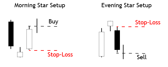
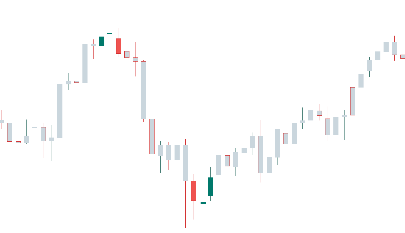
As the case of the Morning Star, a gap up on the second small-bodied candle followed by a gap down on the third black candle is further confirmation of a reversal, but that seldom happens in the Forex Market.  Also, the third candlestick is asked to close below 50 percent of the body of the first white candle.


Chart 2 – Evening Star on the EURUSD Pair (click on it to enlarge)

Criteria for an Evening Star
  1.  The upward trend has been showing for some time
  2. The body of the first candle is white and large.
  3. The second candlestick shows indecision in the market
  4. On the third day, it is evident that the sellers have stepped in and closes below 50 percent of the initial white candle.
  5. The longer the white and black candles, the better
  6. A gap before and after the second candle is desirable, although not attainable in Forex.
  7. A good volume in the first and third candles is also desirable.
Market Psychology

The uptrend has attracted the buyers, and the last white candle has seen an increasing volume. In the next session, the market gapped of continue moving up for a while, catching the last stops by short-sellers, but suddenly retraces and creates a small body, with the close next to the open. The next day there is a gap down makes the stops of the long positions to be hit, adding more selling pressure to the profit takers and short-sellers. The day ends with a close that wipes most of the gains of the first white candle, that shows that the control is in the hand of sellers.


Reference: Profitable Candlestick Patterns, Stephen Bigalow


Categories
Candlestick patterns Forex Candlesticks

Candlestick Reversal Patterns IV – The Hammer and The Hanging Man


The Hammer

The Hammer is a one-candle pattern. The Hammer is identified as a small body with a large lower shadow at the bottom of a downtrend. The result of having a small body is that the open and the close are near each other. The large lower shadow means during the session sellers could move down the price but, then, buyers stepped in and pushed the price back to the levels of the open, or, even, a bit further up. That means sellers lost the battle, and the buying activity started dominating the price action. A positive candle is needed to confirm the price action. This usually converts this candle into a Morning Star formation.

Chart 1 – Hammer in the USDCHF Pair

Criteria for Hammers

  1. The lower shadow must be at least twice the length of the body
  2. The real body is at the upper side of the range. The color does not matter much, although a white body would increase the likelihood of the reversal.
  3. There should be no upper shadow or a very tiny one.
  4. The longer the lower shadow, the better
  5. A large volume on the Hammer is a good signal, as a blob woff day might have happened.

Market Psychology

After a relatively large downtrend, the sentiment of the traders is rather bearish. The price starts moving down at the open and makes a new low. Then, buy orders to move the price up. Profit-taking activity also contributes to the upward move. Then intraday stop-loss orders come in fueling the action further up. A positive follow-up candle would confirm the control of the action by the buyers.

The Hanging Man

The Hanging Man is also a figure similar to a Hammer, with its small body and large lower shadow, but it shows up after a bullish trend. The Japanese named this figure that way because it looks like a head with the body and feet hanging.

Chart 2 – Three Hanging Man in the DOW-30 Index

Criteria for the Hanging Man

  1. The lower shadow must be at least twice the length of the body
  2. The real body is at the upper side of the range. The color does not matter much, although a white body would increase the likelihood of the reversal.
  3. There should be no upper shadow or a very tiny one.
  4. The longer the lower shadow, the better
  5. A large volume on the Hammer is a good signal, as a blowoff day might have happened.

Market Psychology

After a strong trend, the sentiment is quite positive and cheerful. On the day of the Hammer, the price moves higher just a bit, then it drops. After reaching the low of the session, the buyers step in again and push the price back up, close to the open level, at which level the session ends. This would indicate the price action is still in control of the buyers, but the considerable drop experienced in the first part of the session would mean the sellers are eager to sell at these levels, and a resistance zone was created. A lower open or a black candlestick the next day would move the control to the sell-side.


Reference.
Profitable Candlestick Patterns, Stephen Bigalow

Categories
Chart Patterns Forex Trading Guides

Chart Patterns: Start Here

Chart Patterns: Start Here

Something that I stress repeatedly throughout our series on chart patterns is the difference between traditional markets like the stock market and the forex market. I’m sure a good number of readers have spent time reading books on technical analysis and have recorded and have seen various statistics regarding the performance of the various chart patterns that exist. There’s a big problem that exists in the realm of technical analysis and its use in forex markets, and that is related to nearly 100% of all technical analysis trading material focused on the stock market. Why is this a problem? Several reasons.

  1. Statistical performance values for chart patterns based on the pattern’s performance in the stock market is overwhelmingly long-biased: the stock market has been in a bull market for over a decade.
  2. Forex markets do not ‘trend’ in the traditional sense of financial analysis, they range.

In a nutshell, just because a particular pattern in the stock market may not perform that well in the forex market, it does not mean that its performance isn’t positive in forex. I’ve learned that most underperforming chart patterns in the stock market perform very well in forex markets. As always, make sure you do your own due diligence and research – investigate each pattern for yourself and see how they play out in your own trading.

To begin learning about Chart Patterns, follow this series of education articles.

Chart Patterns: Pullbacks and Throwbacks

Chart Patterns: Symmetrical Triangles

Chart Patterns: Ascending Triangles

Chart Patterns: Descending Triangles

Chart Patterns: Head-And-Shoulder Patterns

Chart Patterns: Broadening Patterns


Sources:

Kirkpatrick, C. D., & Dahlquist, J. R. (2016). Technical analysis: the complete resource for financial market technicians. Upper Saddle River: Financial Times/Prentice Hall.

Bulkowski, T. N. (2013). Visual guide to chart patterns. New York, NY: Bloomberg Press.

Bulkowski, T. N. (2008). Encyclopedia of candlestick charts. Hoboken, NJ: J. Wiley & Sons.

Bulkowski, T. N. (2002). Trading classic chart patterns. New York: Wiley.


Categories
Candlestick patterns Forex Candlesticks

Candlestick Reversal Patterns III: Understanding the Harami

So far, the reversal formations we saw – the Piercing Pattern, the Dark Cloud Cover, and the Engulfing patterns, were strong reversal signals, showing that the bulls or bears had the control. The Harami is usually a less powerful signal.

The Harami is created when a short candle’s body is entirely contained inside the body of the preceding candle. The color of the second body of this pattern is unimportant, although the color of the first one follows the trend (black in downtrends and white in uptrends). The name “Harami” comes from the old Japanese word meaning “pregnant.” Japanese traders call the first candle, “the mother,” and the second one, “the baby.
The appearance of a Harami is indicative that the current trend has ended. According to Steve Nison, the Japanese say the presence of a Harami shows the market is losing its breath. They contend that, after a large healthy candle, the small inside candle shows uncertainty.
We have to say that if we look at the charts, harami-like formations appear often, but most of it was just pauses or pullbacks of the primary trend. Thus, although not good enough to call for a reversal of the trend, they could be potential signals to exit a trade or take partial profits.
Also, we have to remember that, since trading the Forex markets, and, also, intraday, there are no gaps available. This fact makes a harami quite similar to a Piercing pattern or a Dark cloud Cover if the body of the second candle surpasses half of the previous body.

Chart 1 – Several Haramis in the Cable.

As we see in chart 1, haramis and engulfing patterns are alike, with the exception of the second one.  What we can see is that be it harami or engulfing, the pattern is worth to pay attention to since most of the time signals the end of the previous leg.

Criteria for a Bullish Harami

  1. The body if the first candle is black (red) and the body of the second candle is white (green)
  2. There is evidence of a downtrend.
  3. The second candle opens higher or at the close of the first candle.
  4. Just the body needs to be inside the body of the first candle. That is unlike the inside day.
  5. A confirmation is needed for a reversal signal.
  6. The longer the black and white candles, the more powerful the signal
  7. The higher the white candle closes, the better.

Market Psychology of a Bullish Harami

After a selloff day, the next day, sellers don’t have the strength to push the prices further down. Concerned short-sellers start to take profits of just close the trade fuelling the purchases. The price finishes higher, and traders mark the double bottom as support. A strong day following the harami formation would convince the market participants that the trend has reversed.

Criteria for a Bearish Harami

  1. The body if the first candle is white (green) and the body of the second candle is black (red)
  2. There is evidence of an uptrend.
  3. The second candle opens lower or at the close of the first white candle.
  4. Just the body needs to be inside the body of the first candle. That is unlike the inside day.
  5. A confirmation is needed for a reversal signal.
  6. The longer the white and black candles, the more powerful the signal
  7. The lower the black candle closes, the better.

Chart 2- Several Haramis in the GBPAUD pair. Not all are successfully signaling a reversion of a trend

Market Psychology of a Bearish Harami

After a strong bullish trend, a long white candle emerges. In the next session, the longs cannot force more upsides. The asset began to drop, as concerned bulls are closing their positions to pocket their profits, and the day finished lower. Also, short-term traders mark the top of the white candle as a resistance level. A third day showing weakness is what is needed to convince everybody that the uptrend is over and a new leg down is starting.


References:

Profitable candlestick Patterns, Stephen Bigalow

The Candlestick Course: Steve Nison


Categories
Chart Patterns

Chart Patterns: Wedge Patterns

Wedge Patterns

I want to stress, again, that the frequency and positive expectancy of patterns in technical analysis will vary from market to market. Most of the literature is written for the stock market, which is an overwhelmingly long-biased market. So, bullish patterns perform much better than bearish patterns in the stock market. I don’t have any real statistics to reference other than my years of trading experience. It has been my experience that wedge patterns are one of the most profitable setups in the forex market.

Wedges look like (and in fact, are) extended triangles. Wedges are made of two trend lines that are drawn just like a triangle. The difference between wedge patterns and triangle patterns is simple: the trendlines in a wedge pattern point in the same direction. Ascending triangles have flat tops and a rising bottom. Descending triangles have flat bottoms with declining tops. Symmetrical triangles have a downtrend line and an uptrend line. Wedges are different. Rising wedges have a trendline both above and below price sloping up. Falling wedges have a trendline both above and below, but sloping down. Depending on the technical analysis material you read, you will see wedges that may look like channels, and that is fine – many do.

Wedge patterns should tell you one thing: the end is coming. Because wedges have two trendlines that point in the same direction, the slope of the move is often extreme and is indicative of a climax move. These are incredibly profitable and favorable patterns when you spot them – and they are horrible to trade against if you are trading inside of them. If you read Bulkowski’s work, you’ll know that he recommends at the trendlines in a wedge should be touched at least five times in order for the wedge pattern to authentic. This is true in the stock market as well as in the forex market.


Rising Wedge

Rising Wedge
Rising Wedge

You might think that a rising wedge pattern shows up at the top of a trend, and it often does. But you will also find the rising wedge appear at the bottom of a trend. When you see the rising wedge appear after a prolonged downtrend, be careful! The rising wedge that forms after a long bear move is often a continuation pattern. An easy way to think of the rising wedge is that it is an overwhelmingly bearish pattern. It doesn’t matter where it shows up in any trend – it is an extremely bearish pattern.

When I am trading the rising wedge, I generally take the initial breakout that moves below the second to last test of the bottom trendline. The example above shows that there is no immediate retest of the breakout lower. Retests do happen, but they are less frequent than what we see in the ascending, descending and symmetrical triangles.


Falling Wedge

Falling Wedge
Falling Wedge

The inverse of the rising wedge pattern is the falling wedge pattern. It can show up at either the end of an uptrend or a downtrend. If you see a falling wedge that occurs at the top of an uptrend, then you could we witnessing a false breakdown lower and see a resumption of the prior bull move. If you see the falling wedge at the end of a downtrend, then you can expect a swift reversal or deep throwback. Just like the rising wedge, the falling wedge is heavily biased towards one direction: overwhelmingly bullish.

On the image above, I’ve added an Impulse Wave to show how you can use Elliot Waves to help determine whether or not a wedge pattern is valid. Remember: Bulkowski said that that a wedge pattern is only confirmed when the trendlines have been tested at least five times. Another condition on the chart above that we didn’t see on the falling wedge is the attempted retest of the break. Again, retests are common in all patterns, but they are definitely less frequent with wedge patterns – that has been my experience with them in forex markets.

When trading the falling wedge, I like to enter when price moves above the second to last swing high. On the chart above, the entry would be above wave four.


Sources:

Kirkpatrick, C. D., & Dahlquist, J. R. (2016). Technical analysis: the complete resource for financial market technicians. Upper Saddle River: Financial Times/Prentice Hall.

Bulkowski, T. N. (2013). Visual guide to chart patterns. New York, NY: Bloomberg Press.

Bulkowski, T. N. (2008). Encyclopedia of candlestick charts. Hoboken, NJ: J. Wiley & Sons.

Bulkowski, T. N. (2002). Trading classic chart patterns. New York: Wiley.

Categories
Candlestick patterns Forex Candlesticks

Candlestick Reversal Patterns: Refresh your Knowledge

After our last articles on candlestick reversal patterns, test your knowledge.

If you need to give a second read, these are the links:


Let’s begin


[wp_quiz id=”59882″]


Reference:

The Candlestick Course: Steve Nison


Categories
Chart Patterns

Chart Patterns: Broadening Patterns

Chart Patterns – Broadening Pattern & The Diamond Pattern

Broadening Top
Broadening Top

This pattern is also called a funnel or a megaphone pattern. It’s an inverse symmetrical triangle. This pattern is definitely not that common, and it’s a tricky pattern to trade. The behavior of price in a broadening pattern is to increase swing ranges where new higher highs and new lower lows are made. In my opinion, it is best to ignore this pattern. The breakout and retest of the upper or lower trendlines are the prevailing trade strategies utilized for this pattern. Of all the patterns, to trade, this is one of the least profitable. However, I’ve learned that the breakouts are often false, due to the nature of the final swing in the pattern being mostly overbought or oversold. It is not uncommon to see megaphone patterns turn into a triangle pattern – which results in a rare but profitable pattern known as a Diamond.


Chart Patterns – Diamond Pattern

Diamond Top
Diamond Top

The diamond pattern is rare. It is also difficult to even notice if it exists. In fact, Thomas Bulkowsi writes on his site, ‘Let me clear about this. I don’t like diamonds. They are as tough to spot as nightcrawlers in the grass on a summer night.’ I believe that is a pretty accurate description. But, while diamond patterns are challenging to spot, they are a very powerful pattern that often results in fast and violent moves in the opposite direction – higher for diamond bottoms and lower for diamond tops. It is ok for the patterns to have one side that seems more slanted than the other and, in fact, they often do not appear as symmetrical as the example above. We trade a diamond pattern the same way we would any other triangle pattern.


Sources:

Kirkpatrick, C. D., & Dahlquist, J. R. (2016). Technical analysis: the complete resource for financial market technicians. Upper Saddle River: Financial Times/Prentice Hall.

Bulkowski, T. N. (2013). Visual guide to chart patterns. New York, NY: Bloomberg Press.

Bulkowski, T. N. (2008). Encyclopedia of candlestick charts. Hoboken, NJ: J. Wiley & Sons.

Bulkowski, T. N. (2002). Trading classic chart patterns. New York: Wiley.

Categories
Candlestick patterns Forex Candlesticks

Candlestick Reversal Patterns II: Let’s know The Engulfing Patterns


The engulfing pattern is a major reversal figure, and it is composed of two inverted candlesticks, as in the case of the Piercing pattern and the Dark Cloud Cover figure. Typically, this figure appears at the end of an upward or downward trend. It is common that the price pierces a significant resistance or support level, then making a gap up or down in the following session, to, suddenly, change its direction and end the day entirely covering the first candle.

The Bullish Engulfing

The bullish engulfing candle shows at the bottom of the trend. After several sessions with the price controlled by sellers, another black candle forms. The next session opens below the previous session close and closes above the last open, thus, completely covering the body of the black candle made on the previous session.

Criteria:

  1. The body of the second candlestick covers completely that of the black candle.
  2. There is evidence of a downward trend, even a short-term one.
  3. The body of the second candle is white and of the opposite color of the first candlestick. The exception is when the first candlestick is a doji or a tiny body. In this case, the color of the first candle is unimportant.
  4. The signal is enhanced if a large body engulfs a small body.
  5. a Large volume on the engulfing day also improves the signal.
  6. A body engulfing more than one previous candle shows the strength of the new direction.
  7. Engulfing also the shadows of the previous candle is also good news.
  8. In case of a gap, the larger the gap, the higher the likelihood of a significant reversal.

Market Sentiment:

After a downtrend, the next day, the price starts lower than the previous close but, after a short while, the buyers step in and move the price up. The late sellers start to worry, as they see their stops caught, adding more buying to the upward movement. As the price moves up, it finds a combination of profit-taking, stop-loss orders, and new buy orders. At the end of the day, this combination creates a strong rally that moves the price above the previous close.

 Fig 1- Bearish and Bullish engulfing patterns in the Bitcoin 4H  chart

The Bearish Engulfing

The Bearish engulfing pattern is the specular figure of a Bullish engulfing figure. And more so in the Forex market where assets are traded in pairs, making every move symmetrical.

The bearish engulfing forms after an upward trend. It is composed of two different-colored bodies, as in the above case. This time, though, the order is switched, and a bullish body is followed by a black candle. Also, the black body engulfs completely the body of the previous white candlestick. Sometimes that comes after the price piercing a key resistance, to then come back, creating a fake breakout.

Criteria:

  1. The uptrend is evident, even short-term.
  2. The body of the second day engulfs the body of the previous day.
  3. The body of the second candle is black, and the previous candle is a white candlestick, except for tiny bodies or dojis. In that case, the color of the first candlestick is unimportant.
  4. A large body engulfing a small body is an enhancement, as it confirms a change in the direction.
  5. A large volume on the engulfing day is also good for the efficacy of the signal.
  6. A body engulfing more than one previous candle shows the strength of the new direction.
  7. Engulfing also the shadows of the previous candle is also good news.
  8. In case of a gap, the larger the gap, the higher the likelihood of a substantial reversal.

Market sentiment:

After an uptrend, the price opens higher but, after a while, it reverses and moves below the previous open and below. Some stops trigger and add more fuel to the downside. The downward action accelerates on a combination of profit-taking, more stops hit, and new short orders. At the end of the day, the price closes below the open of the previous session, with the sellers in control. 

—- 

References:

The Candlestick Course: Steve Nison

Profitable candlestick Patterns, Stephen Bigalow

Categories
Candlestick patterns Forex Candlesticks

Candlestick Reversal Patterns I: Overview and The Piercing Pattern

Candlestick Reversal patterns: An Overview

Candlestick reversal figures are composed mainly of bu two or three candlesticks, which in combination harness the psychological power to shift the market sentiment. 

Depending on the importance of the severity of reversal, their names vary. Japanese are very visual regarding the names they gave to them. Therefore, we can almost visualize them just by its name.

In this article, we will learn the following content:

  • Overview of the reversal candlestick patterns
  • how to identify a Bullish Piercing pattern and its specular Dark Cloud Cover pattern
  •  How important engulfing patterns are and how to recognize them
  • Experience how counterattack figures lead to swift trend reversals.

The predicting power of two candle figures is sometimes astonishing. For a sample to be statistically significant, scientists need more than 20 samples for normally distributed phenomena, sometimes more. A reversal figure only shows eight data points. 2x (OHLC), and besides that traders most of the time, the reversal figure warns about a trend reversal or at least the end of the current trend.

The typical reversal pattern is a two candle figure that begins with a topping or bottoming candle followed by an opposite candle that erases partially or totally, the price action of the first one.

Piercing pattern and Dark Cloud Cover

The Piercing Pattern and the Dark Cloud Cover are specular patterns. The Piercing Pattern warns of a reversal of the bearish trend, whereas the Dark Cloud Cover heralds the end of a bullish trend.

 Candlesticks are not always good predictors, and the Piercing Pattern is a weak signal, especially if the trend has not moved too deep yet. Of course, the most oversold is the price, the better a Piercing Pattern predicts a reversal. The Dark Cloud Cover, though, is seen to show much more predicting power.

Timeframes

The Japanese used them mostly in daily and weekly timeframes. The use of these two patterns in intraday trading must be confirmed with other signals, as, for instance, the Piercing Pattern occurring after hitting a significant support or a Dark Cloud cover as a result of a strong resistance rejection. The use of short-term oscillators such as 10-period stochastics or Williams percent R in combination with these two signals will improve the likelihood of success while trading them.

Recognizing a Piercing Pattern


The bullish Piercing Pattern is composed of a large bearish body forming after a broad downtrend. The next candle begins below the low of the first black candle, and closes above the midway up, or even near the open if the preceding bearish candle. 

Criteria:
  1. The first candle shows a black body
  2. The second candle shows a white body
  3. The Downtrend is clear and for a long time
  4. The second day opens below the range of the previous day
  5. the second white candle closes beyond the 50% of the range of the last day.
  6. The longer the candles, the better their predicting power.
  7. If there is a gap down, the greater, the better
  8. The higher the white candle closes, the stronger the signal
  9. A large volume during these two candles is significant.

The Dark Cloud Cover

Apply the specular conditions to the Dark Cloud cover. We also should remember that trading forex pairs make both patterns fully symmetrical.

Criteria:
  1. The first candle shows a white body
  2. The second candle shows a black body
  3. The upward trend is clear and for a long time
  4. The second day opens above the range of the previous day
  5. the second black candle closes below the 50% of the range of the last day.
  6. The longer the candles, the better their predicting power.
  7. If there is a gap up, the greater, the better
  8. The lower the black candle closes, the stronger the signal
  9. A large volume during these two candles is significant.


Final words

lease note that the Forex and crypto markets rarely have gaps. Therefore, the condition that the second open being below the range of the first candle is almost impossible to satisfy. In this case, we rely solely on the relative size of both candlesticks and the closing above 50 percent of the range of the black candle. Of course, it is almost impossible to get gaps in intraday charts except for spikes due to sudden unexpected events.


References: 

The Candlestick Course: Steve Nison

Profitable candlestick Patterns, Stephen Bigalow

Categories
Chart Patterns

Chart Patterns: The Head And Shoulders Pattern

The Head And Shoulders Pattern

Of all the patterns that exist in any market, the most well known is the Head And Shoulder Pattern. Kirkpatrick and Dahlquist’s book, Technical Analysis, detailed many studies on the performance of this pattern. The result of all the data is that the Head And Shoulder Pattern is the most profitable of all standard patterns. Interestingly, Dalquist and Kirkpatrick made no distinction between the performance of the head and shoulder pattern and the inverse head and shoulder pattern (sometimes called the bottom forming head and shoulder pattern). While this pattern is successful across many markets, it is also the pattern that causes the most losses to new traders. We’ll get into the specifics of why this pattern destroys a good number of traders. First, we need to understand what the pattern is.

Regular and Inverse Head & Shoulder Pattern

The image above shows two head and shoulder patterns, the regular pattern and the inverse pattern. It just so happened that the daily chart of the AUDUSD conveniently had both of the patterns right next to each other – not a common occurrence. Now, you can and will read a lot of rules and theories behind the head and shoulder pattern. I could go into the behavior of this pattern, the psychology behind the three triangles that make up the broader pattern, the symmetrical nature of the left and right shoulders, etc., etc., etc., but we don’t need to complicate a pattern that can be very easily understood.

There’s a great book by Larry Pesavento titled Trade What You See. While the book Trade What You See is focused primarily on Harmonic Patterns, the title always stuck with me. If you were to stand in front of a mirror, you would more than likely notice the symmetrical nature of your left and right shoulders (unless you’ve had some significant injury or disease. There’s a good number of people who believe that both the right and left shoulders need to be as exact as possible – but this isn’t necessary.

Here’s a simple rule to follow:

If it doesn’t look like a human head and shoulder, then it probably isn’t a head and shoulder pattern.

 Are you familiar with the poker game Texas Hold’em or any other form of poker? There are several maxims that poker players follow, one of them is ‘Don’t chase the straight or the flush.’ Why? Because when you get dealt a hand that is missing just one card for your straight or one more suite to complete your flush, the odds are overwhelmingly against you getting that final card to complete the straight/flush. Head and shoulder patterns are the same way. The head and shoulder pattern is only complete when the neckline has been broken. Let me repeat that three times for you:

A head and shoulders pattern is not complete until the neckline is broken.

A head and shoulders pattern is not complete until the neckline is broken.

A head and shoulders pattern is not complete until the neckline is broken.

Failed Head & Shoulder Pattern


Many a trading account has been the victim of trying to anticipate the completion of a head and shoulder pattern, only to have it be broken. In addition to being the most profitable basic pattern, the head and shoulder pattern is also one of the most rejected patterns. We don’t chase straights or flushes in poker, and we don’t chase patterns in trading. In addition to the information above, here are some other factors that can help you interpret the head and shoulder pattern:

  1. If the volume in the left shoulder is greater than the right shoulder, there is an increased likelihood of the head and shoulder pattern completing.
  2. If the volume in the right shoulder is greater than the left shoulder, failure rates are higher.
  3. Horizontal necklines increase the probability of a head and shoulder pattern completing.
  4. The more dramatic the slop of the neckline, the more likely the pattern will fail to develop.
  5. Aggressive entries can be taken immediately when the price breaks the neckline.
  6. Conservative entries can be taken after the neckline has been re-tested post-breakout.
  7. If price breaks the neckline, retracements occur almost 70% of the time.


Sources:

Kirkpatrick, C. D., & Dahlquist, J. R. (2016). Technical analysis: the complete resource for financial market technicians. Upper Saddle River: Financial Times/Prentice Hall.

Bulkowski, T. N. (2013). Visual guide to chart patterns. New York, NY: Bloomberg Press.

Bulkowski, T. N. (2008). Encyclopedia of candlestick charts. Hoboken, NJ: J. Wiley & Sons.

Bulkowski, T. N. (2002). Trading classic chart patterns. New York: Wiley.