Introduction
Industrial and manufacturing productions are one of the pillars of any economy. Whenever policies are implemented, governments tend to focus on ways to improve or increase production in the country. The main significance of manufacturing and industrial production is that they create employment opportunities in the local economy and ensure value addition to domestic products, making them competitive in the international markets. Furthermore, they contribute majorly towards technological advancements, which is why data on machinery orders is vital.
Understanding Machinery Orders
As an economic indicator, machinery orders measures the change in the total value of new orders placed with machine manufacturers, excluding ships and utilities.
The data on machinery orders are categorized into orders by; the private sector, the manufacturing sector, governments, overseas orders, and orders made through agencies. All these orders exclude volatile orders from power companies and those of ships.
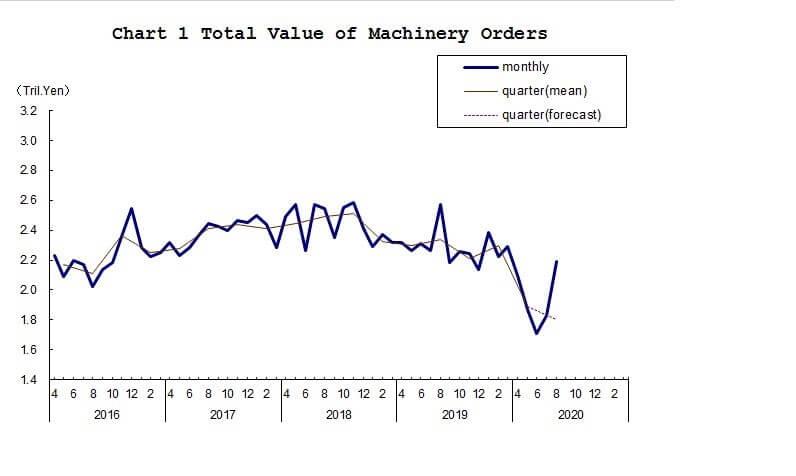
Source: Cabinet Office, Government of Japan
The machinery orders by electric companies and that of ships are considered too volatile. This volatility is thanks to the fact that ships and the machinery used by electric companies are extremely expensive. Furthermore, these orders usually are placed once over long periods. Therefore, including these orders might unfairly distort the value of the machinery orders data.
To get a clear picture of what machinery, in this case, means, here are some of the components that are included in the machinery orders data. They are metal cutting machines, rolling machines, boilers, power units, electronic and communication equipment, motor vehicles, and aircraft.
Machinery orders from the government are categorized into; transport, communication, ministry of defence, and national and local government orders.
In the industrial sector, machinery orders are categorized by the manufacturing and nonmanufacturing sectors. The nonmanufacturing orders include agriculture, forestry, fishing, construction, electric supply, real estate, finance and insurance, and transportation. Some of the categories of orders in the manufacturing sector include; food and beverages, textile, chemical and chemical production, electrical and telecommunication machinery, and shipbuilding.
Using Machinery Orders for Analysis
By now, you already understand that machinery orders data encompass every aspect of the economy. It ranges from domestic government orders, agriculture, manufacturing and production, services delivery, and even foreign orders. As a result, the monthly machinery orders data can offer a treasure of information not only about the domestic economy but also foreign economies as well.
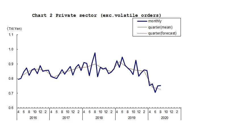
Source: Cabinet Office, Government of Japan
When companies invest in new machinery, it is considered a capital investment. Capital expenditure is usually considered whenever there is an anticipation of increased demands and services provided by the company. In this case, companies must scale up their operations to increase supply to match the increased demand. In the general economy, an increase in aggregate demand can result from increased money supply in the economy. Thus, it can be taken as a sign that unemployment levels in the economy have reduced or that households are receiving higher wages. Both of these factors can be attributed to an expanding economy.
Note that machinery, in this case, means heavy-duty machinery. Typically, these types of machinery take long in the production and assembly lines. At times, orders have to be placed weeks or months in advance. Therefore, the machinery delivered now may have possibly taken months in the assembly line. When the machinery orders increase, we can deduce that these machinery producers and assembly plants have to employ more labor.
Consequently, an increase in machinery orders means that unemployment levels will reduce. In turn, households’ welfare will improve, and aggregate demand for consumer products will rise. In the end, discretionary consumer industries will also flourish. A decrease in the machinery orders will tend to have the opposite effect.
Suffice to say, the machinery in question here are not cheap. Most companies finance their capital expenditure using lines of credit. Therefore, an increase in machinery orders could imply the availability of cheap credit in the economy. Access to cheap financing by companies and households stimulates the economy by increasing consumption and investments. As a result, the increased aggregate demand leads to an increase in the GDP and expansion of the economy.
Machinery orders data can also be used as an indicator of the economic cycles and to predict upcoming recessions and economic recoveries. When firms anticipate that the economy will go through a rough patch and demand will fall, they cut back on production. Scaling down operations means that they won’t be ordering any more machinery to be used in the production. Conversely, when companies are optimistic that the economy will rebound from recession or a depression, they will order more machinery to scale up their production in anticipation of the increased demand. Furthermore, when the economy is going through an expansion, the aggregate demand tends to increase rapidly. This rapid increase forces companies to increase their machinery orders to enable them to keep up with the demand.
Impact on Currency
The machinery orders data is vital in showing the current and anticipated state of the economy. For the domestic currency, this information is crucial.
The currency will appreciate when the machinery orders increase. Machinery orders are seen as a leading indicator of industrial and manufacturing production. Therefore, when the orders increase, the economy can anticipate an increase in industrial production. And along with it, a decrease in the level of unemployment. Generally, the increase in machinery orders means that the economy is expanding.
Conversely, when machinery orders are on a continuous decline, it means that businesses expect a more challenging operating environment. They will scale down their operations in anticipation of a decline in the demand for their goods and services. In this scenario, higher levels of unemployment should be expected in the economy. Since the economy is contracting, the domestic currency can be expected to depreciate relative to others.
Sources of Data
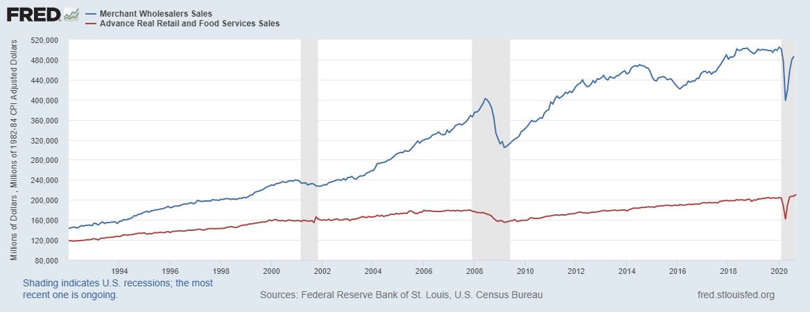
In this analysis, we will focus on Japan since one of the world’s leading producers of heavy machinery. The Cabinet Office, Government of Japan, releases the monthly machinery orders data in Japan. Trading Economics publishes in-depth and historical data of the Japanese machinery orders.
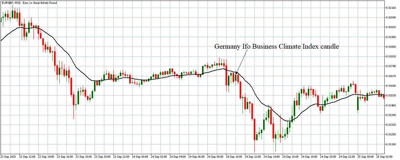
How Machinery Orders Data Release Affects The Forex Price Charts
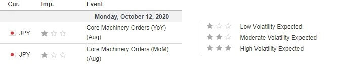
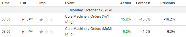
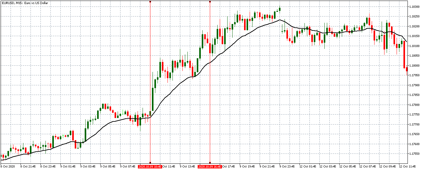
The Cabinet Office, Government of Japan, published the latest machinery orders data on October 12, 2020, at 8.50 AM JST. The release can be accessed at Investing.com. The release of this data is expected to have a low impact on the JPY.
In August 2020, the monthly core machinery orders in Japan increased by 0.2% compared to the 6.3% increase in July 2020. During the same period, the YoY core machinery orders were -15.2% compared to -16.2% in the previous reading. Both the MoM and YoY data were better than analysts’ expectations.
Let’s see how this release impacted the AUD/JPY forex charts.
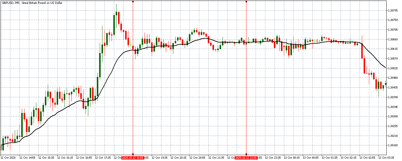
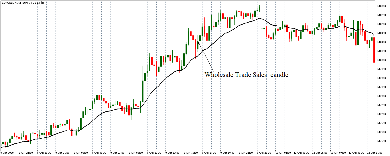
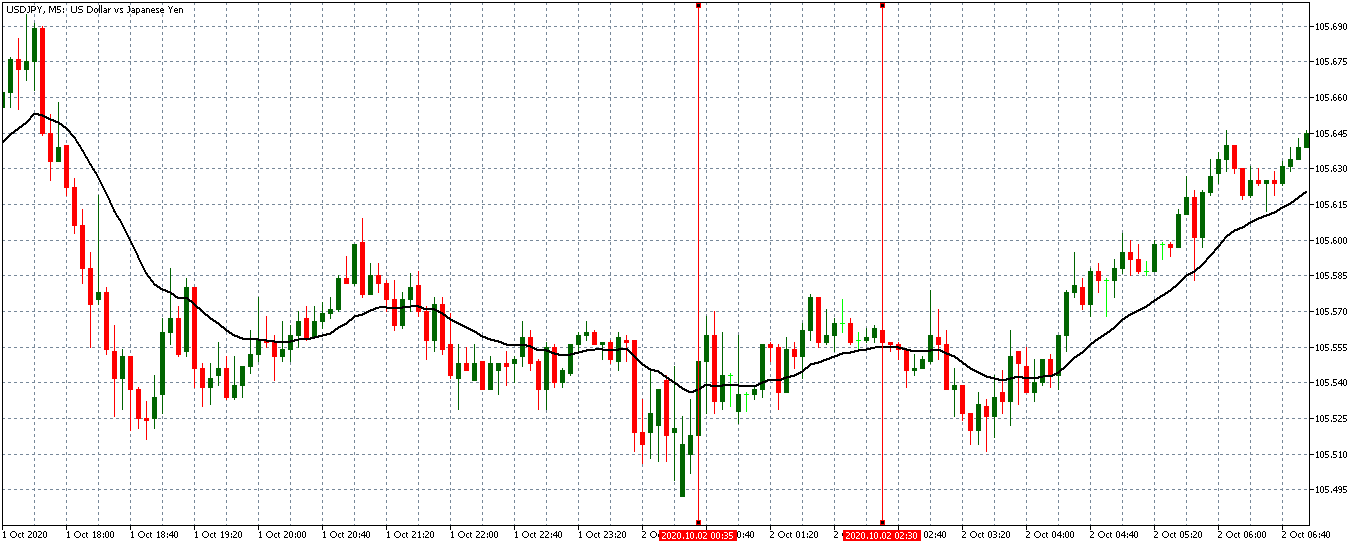
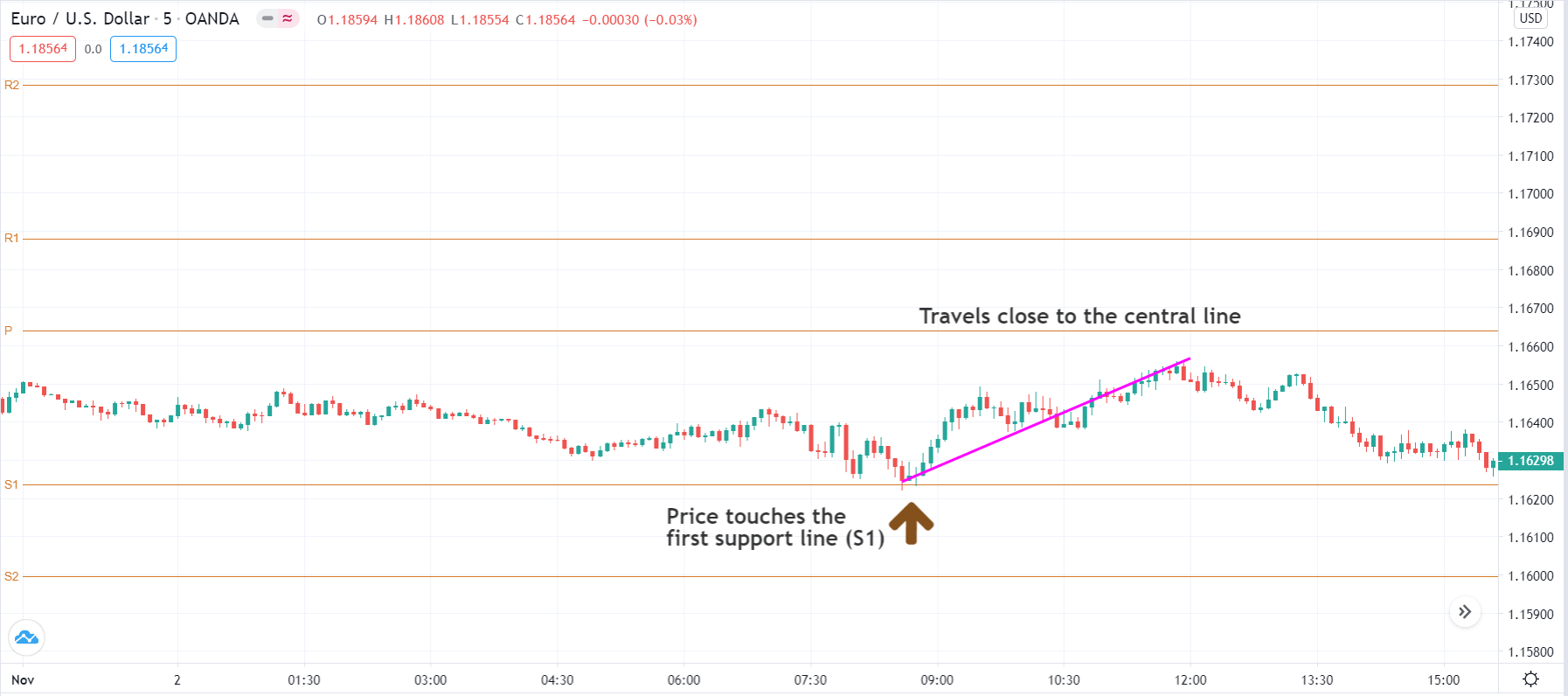
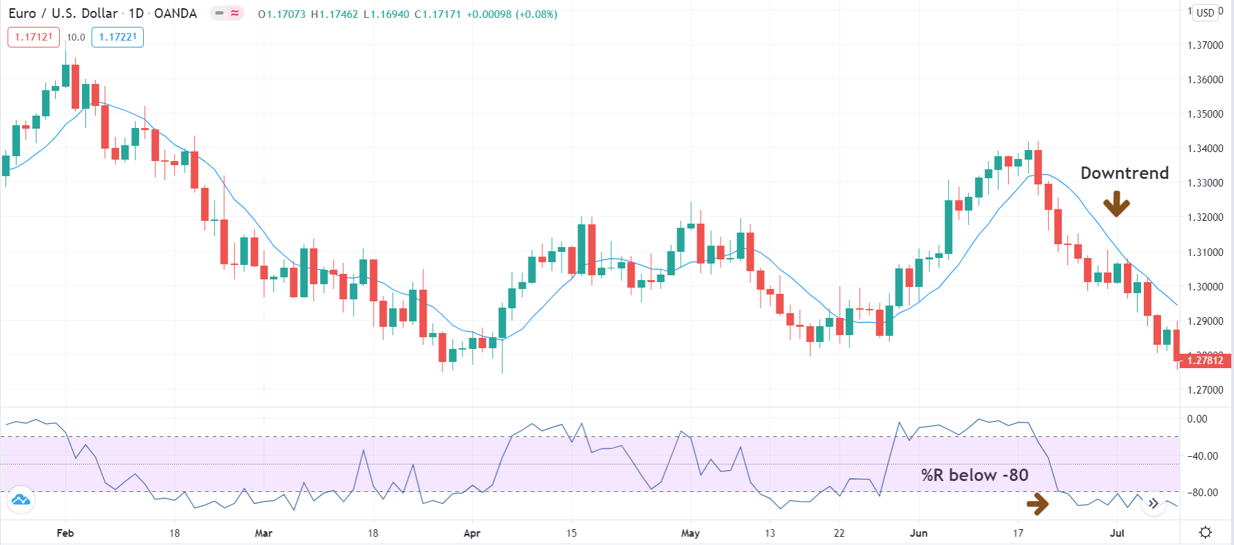
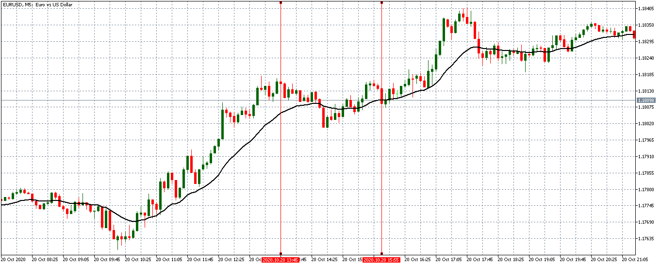
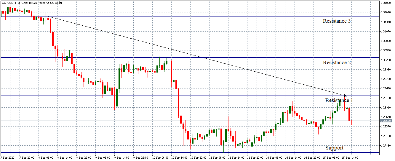
AUD/JPY: Before the Machinery Orders Data Release on October 12, 2020,
just before 8.50 AM JST
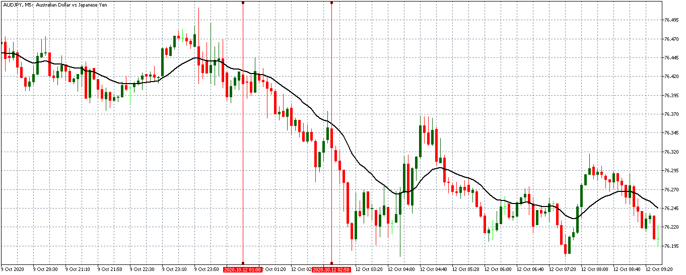
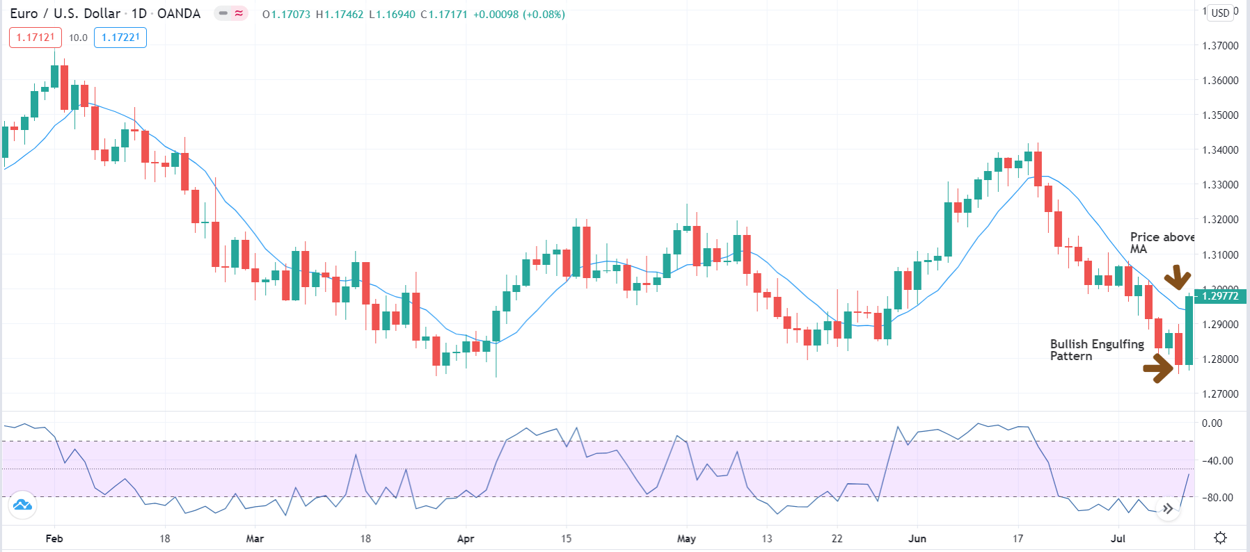
Before the release of Japan’s machinery orders data, the AUD/JPY pair was trading in a steady downtrend. The 20-period MA was falling with candles forming below it. Fifteen minutes before the news release, the pair formed three bullish 5-minute candles showing that the JPY was weakening against the AUD.
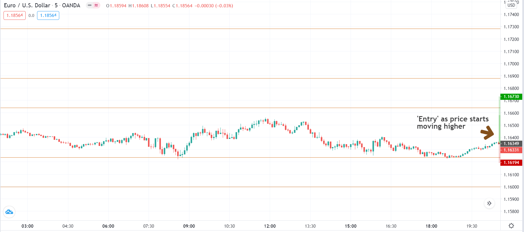
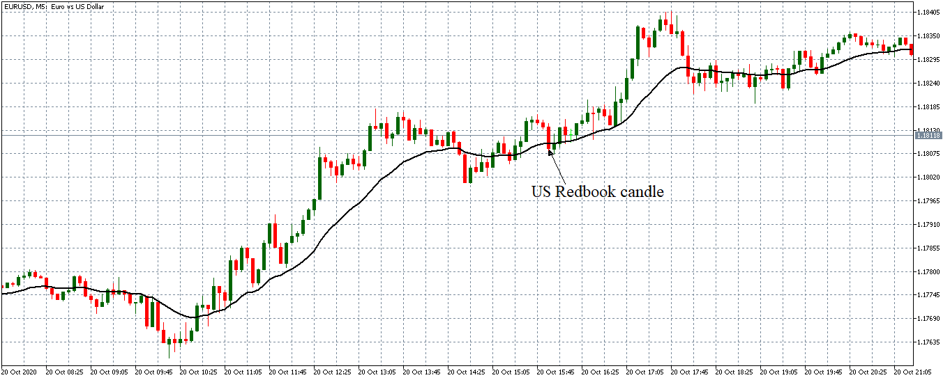
AUD/JPY: After the Machinery Orders Data Release on October 12, 2020,
at 8.50 AM JST
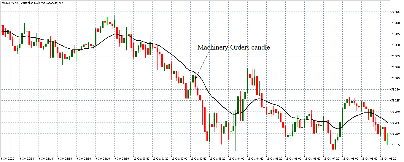
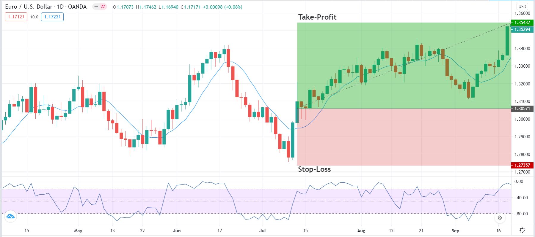
As expected, the pair AUD/JPY pair formed a long 5-minute bearish candle. Subsequently, the pair traded in a renewed downtrend as the 20-period MA steeply fell with candles forming further below it.
Bottom Line
Although the machinery orders data is a low-impact economic indicator, its release had a significant impact on the forex price action. This is because better than expected data shows that the Japanese economy might be bouncing back from the coronavirus-induced recession.


