Categories
Forex Fundamental Analysis

What Should You Know About ‘Income Tax’ As A Fundamental Indicator?

What is the Income Tax?

An Income Tax is a percentage of our income that the government takes in the form of taxes. Income Tax is paid by individuals and entities depending on the level of earning and gains during a financial year. In most of the countries, a single income tax does not usually apply to the entire income, but rather various rates apply to different portions of the “taxable income.” The different tax rates and the income levels at which they apply vary widely.

Types of Income which attracts Tax 

Income Tax is a direct tax that is levied on the income and other types of earnings of an individual in a financial year. Below are some types of incomes and taxation rules.

Income from Salary: This includes basic salary, taxable allowances, and profit in lieu of salary, pension received by the person who himself has retired from the service. They all fall under the category of taxable income.

Income from business/profession: This includes presumptive incomes from business and professions that individuals do in their capacity and maybe their part-time work. This is also added to the taxable income after adjustment of the allowed deductions.

Income from properties: A taxable person may also own one or more house properties. These properties can be self-occupied or rented out or even vacant. The rules of Income Tax state that rent from house properties is to be treated for the purpose of calculation of taxable income. An income tax assessee can, however, claim certain deductions for house maintenance in certain areas.

Capital Gains: They are the gains that one makes from selling capital assets like Gold, house properties, stocks, mutual funds, securities, etc. Although capital gains are a part income tax, they are not added to taxable income, as they are taxed at different rates.

Economics and Income Tax

Tax plays a major role in maintaining a balance between people, businesses, and governments,  which broadly represents the economic activity of a country. Here are two ways in which changes to Income Tax affects the economic activity and well being of people.

Tax Incentives

By granting incentives, taxes can affect both supply and demand in an economy. Reducing marginal tax rates on wages can motivate workers to work more. Expanding the income tax credit can bring more low-skilled workers into the labor force. Reducing Tax rates can also encourage to employed persons to invest in stocks and bonds, which improves the capital flow of companies.

Budget Deficit

Large Tax cuts can slow economic growth by increasing budget deficits. When the economy is operating at its potential, a sudden reduction in tax rates may provoke the government to borrow capital from foreign investors and institutions. They will also divert some funds allocated to private investment, reducing productive capacity relative to what it could have been. Either way, deficits increase and thus reduce well-being.

The Economic Reports

The Income-tax rates are announced every year by the Finance Ministry during a press release, which puts out all the slabs and tax brackets based on the income level. This is usually the Central Government tax rate, but there is also a yearly announcement made by all the states, which impose income taxes in the same way the federal government does. In some countries, a single tax rate is applicable to everyone, regardless of the income level. This is called a “flat tax.”

Analyzing The Data

Investors, when analyzing a currency Fundamentally, give extreme importance to the Capital Gains tax of that country. Income Tax is not a major concern for investors when taking a position in the market. But a major deviation from the standard Income Tax rates catches the attention of investors. However, if the Federal government has been maintaining a fixed rate over the years without any major changes, there is no reason to worry, as they fell, the economy is stable. However, an increase in Capital Gains tax is not taken well by the institutional investors, which changes their stance on the economy and the currency, mostly to negative.      

Impact on the currency

A study conducted by economists examined the impact of taxes on the real exchange rates through their effects on economic activity. Their report says that an increase in the capital interest tax rate leads to depreciation in the currency, while an increase in the wage or consumption tax leads to a real domestic currency appreciation. This hypothesis is supported by the data estimations of annual data from 10 OECD countries over 17 years.

A marginal increase in Income Tax is considered to be good for the economy as it increases the revenue of government organizations, but a substantial increase in tax rate can have a reverse effect on the economy, and this will be unbearable for salaried persons.

Source of information on Income Tax rates

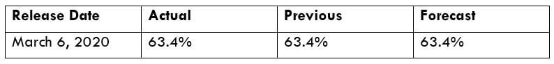
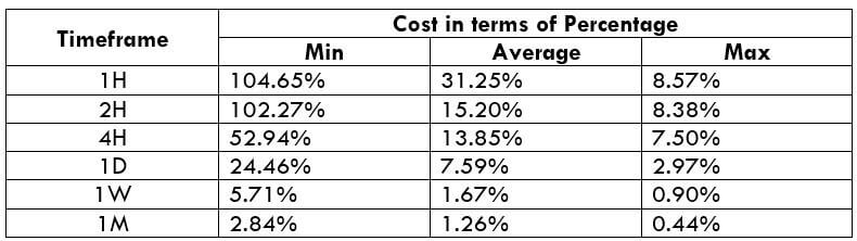
Income Tax rates are available on the official website of the finance department of the country, where one can also find the rates for previous years as well (of more than 30 years). Using this information, a trader can analyze the trend in the Income Tax rates over the years. Here is a list of major countries of the world with their Income Tax rates.

Links to Income Tax information sources
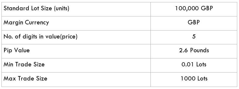
GBP (Sterling)USDEURCHFCADNZDJPY

Income Taxes is a compulsory contribution to state revenue, levied by the government on workers’ income and business profits. This gives the ability to the government to provide basic safety and community systems for the public. This ensures freedom and basic living standards that citizens expect. Therefore, it is the duty of citizens to timely file Income Tax returns and be a responsible civilian.  

Impact of the Income Tax news release on the price chart 

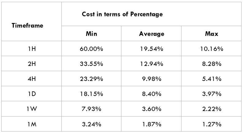
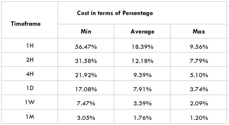
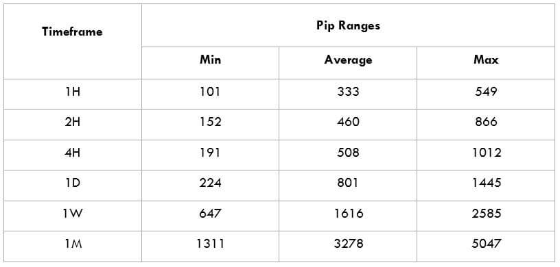
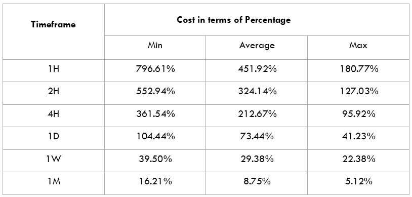
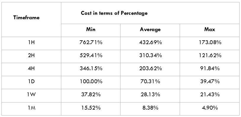
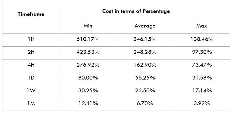
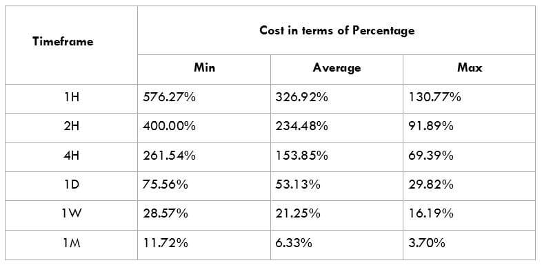
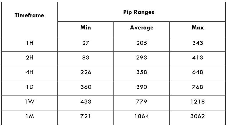
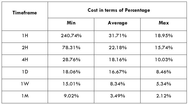
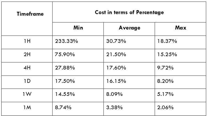
After having a clear understanding of the Income Tax and its role in the economy, we will now extend our discussion and study the impact of the same on the value of a currency. Investors and traders mainly consider the Capital Gains tax rates, which is also a form of Income Tax. Any major changes to the Capital Gains tax cause extreme volatility in the currency pair and a change in the outlook for that currency. Thus, the income tax alone is not explicitly taken into account by traders.

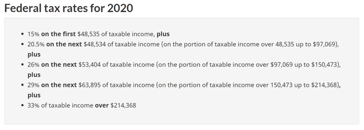
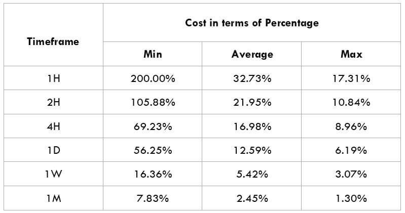
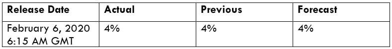
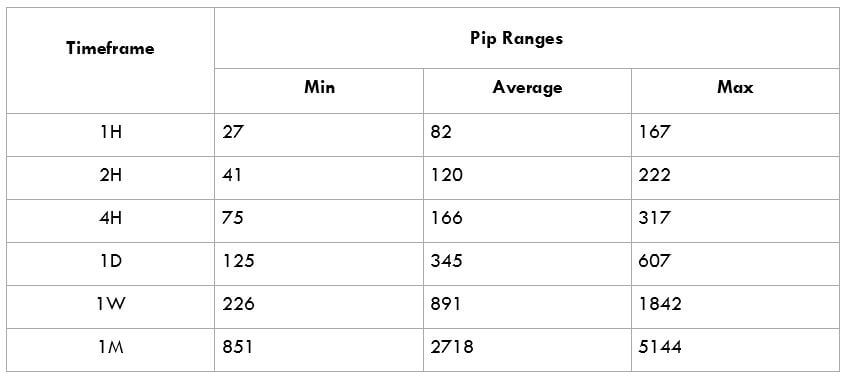
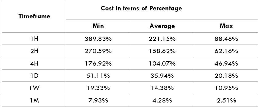
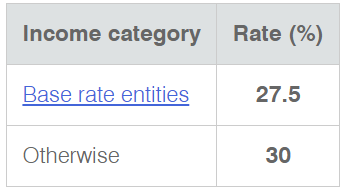
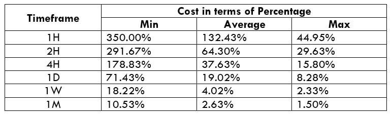
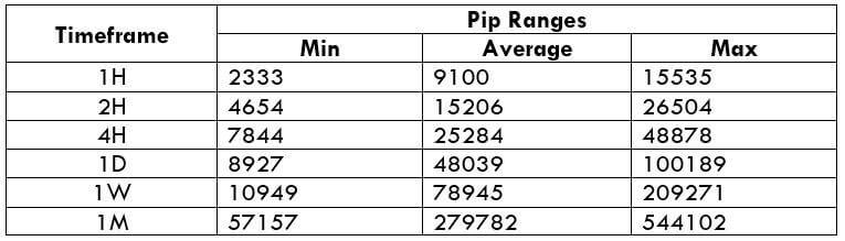
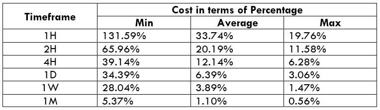
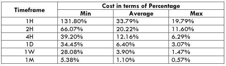
In the upcoming sections, we will analyze the change in volatility in the currency pair due to the announcement of Income Tax rates. The above image shows the Federal Tax rates of Canada for 2020, where we can see the percentage of income that will be levied as Income Tax on individuals of the country. This is also known as ‘Tax Bracket.’ The maximum Income Tax rate stood at 33%, and this rate has been maintained from the past four years. This data is published by the Canada Revenue Agency, where one can find other tax rates as well.

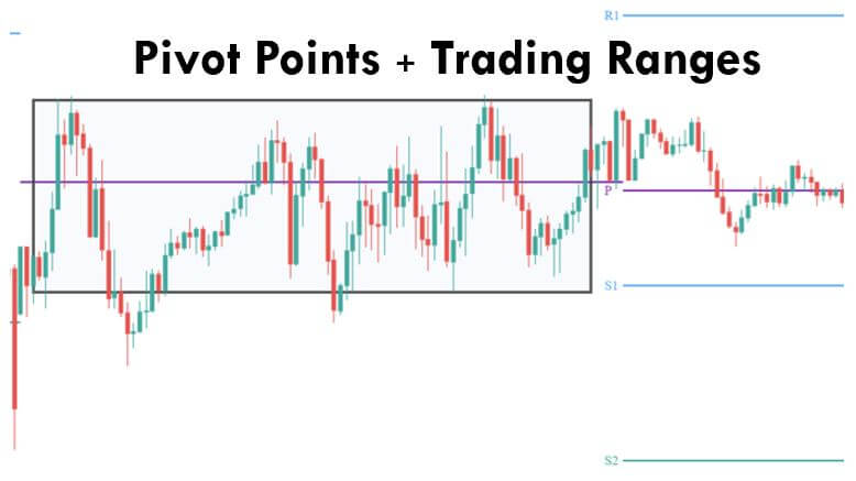
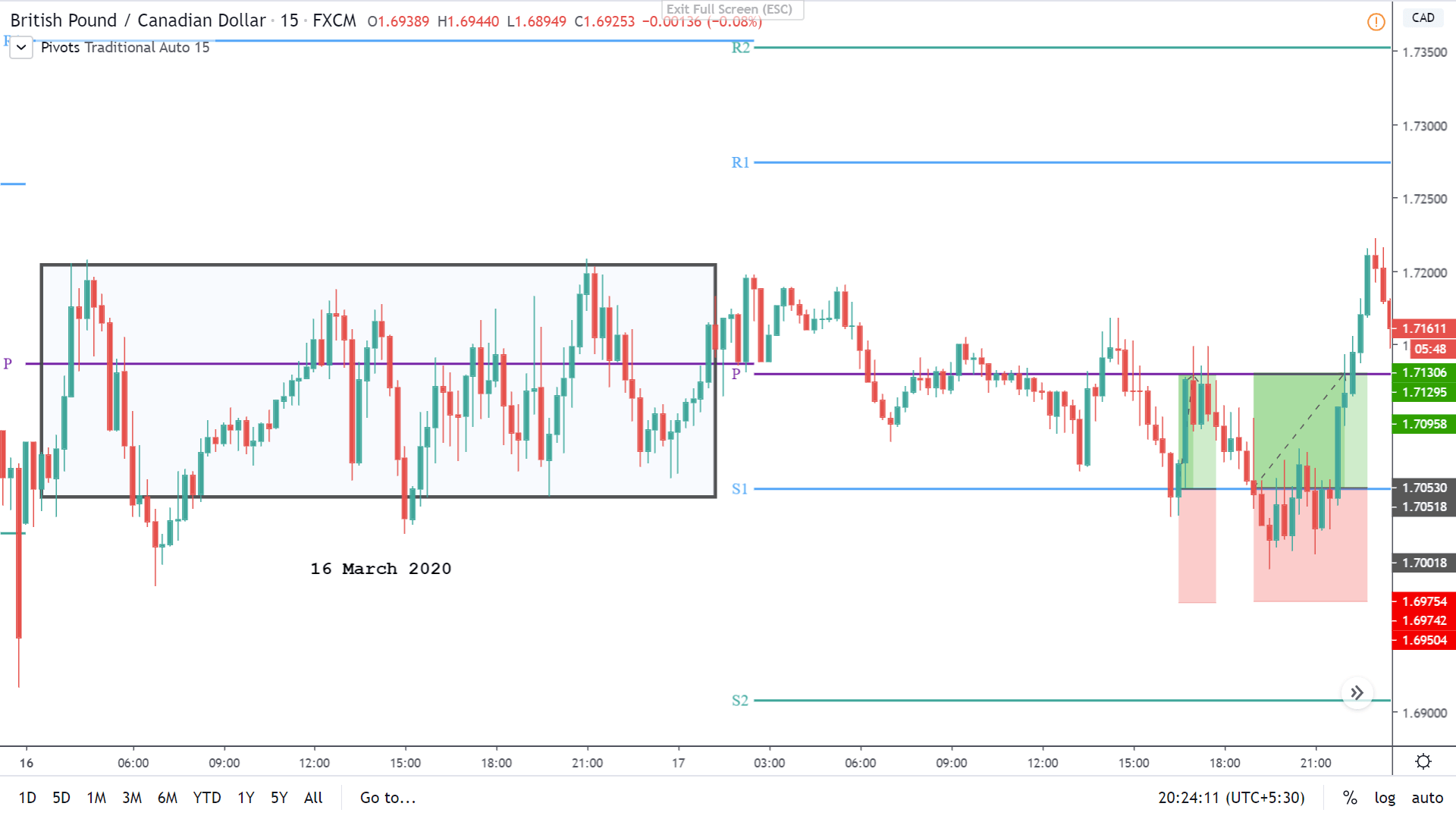
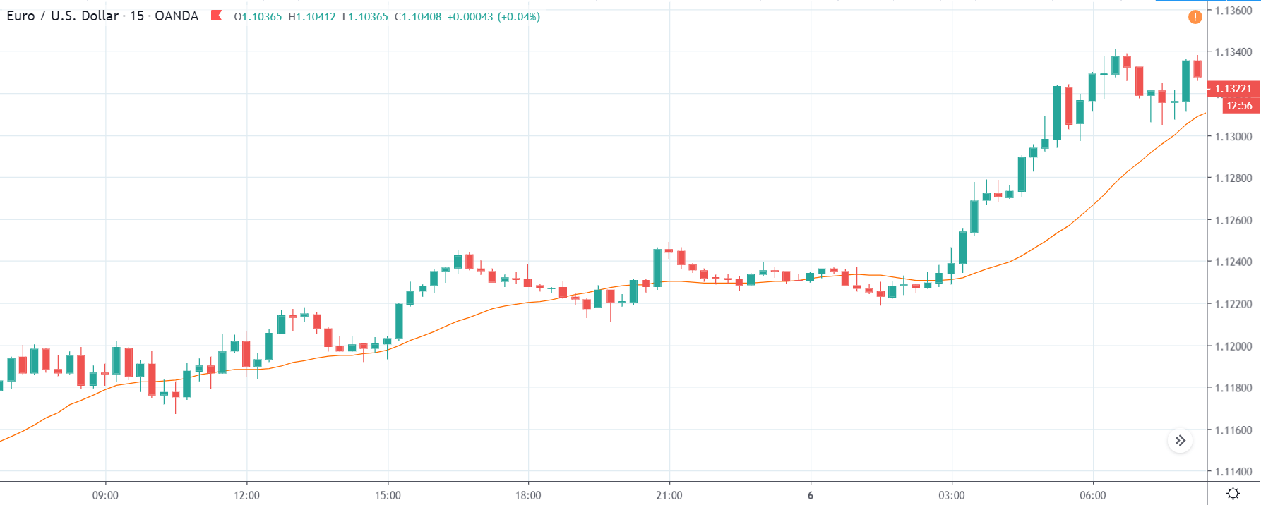
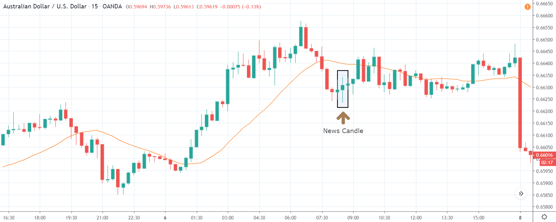
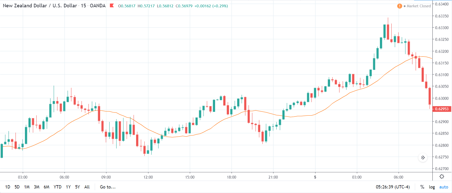
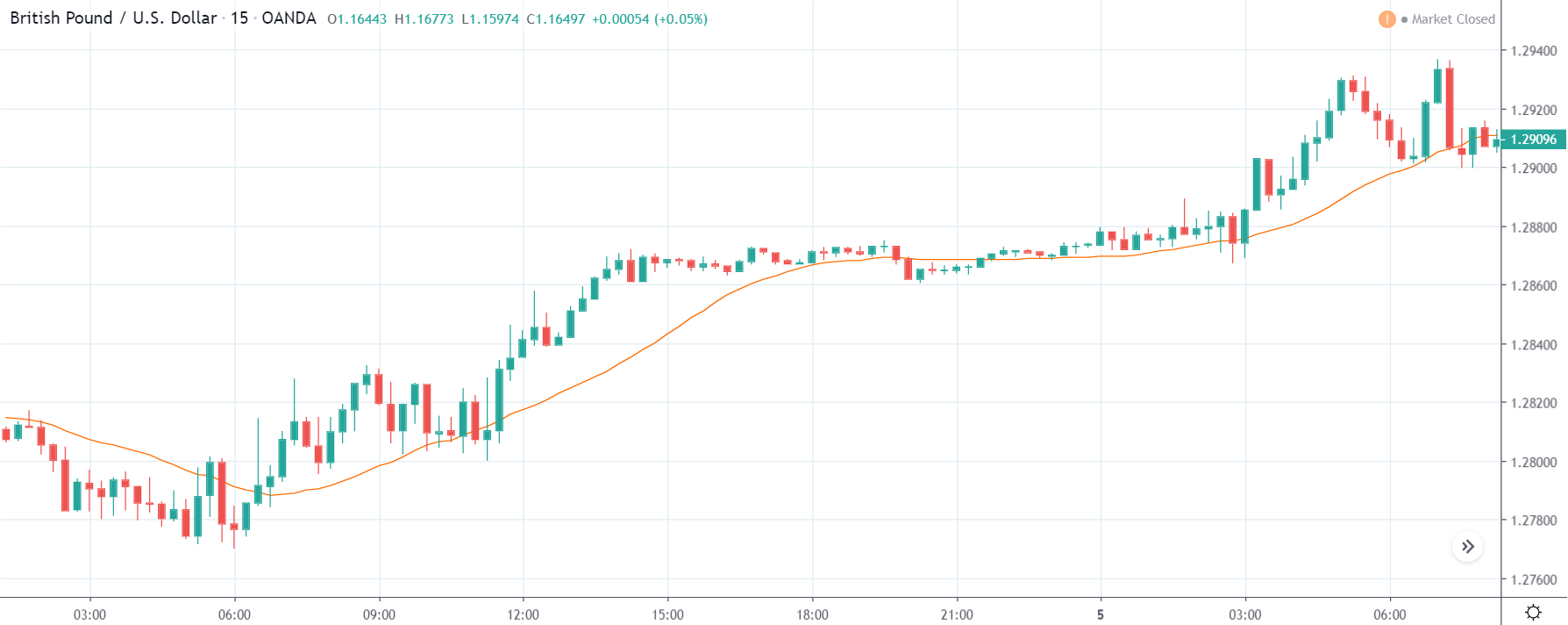
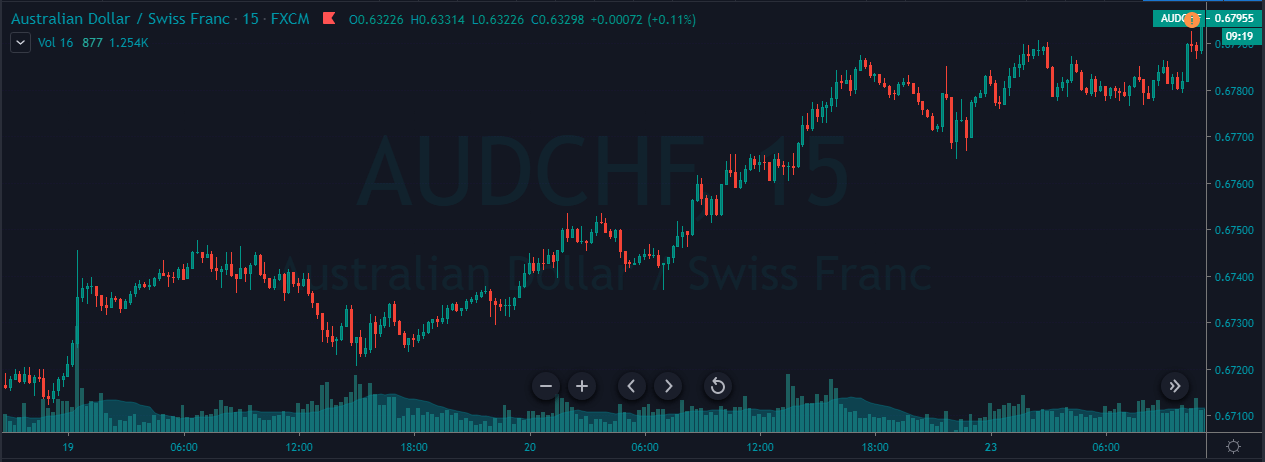
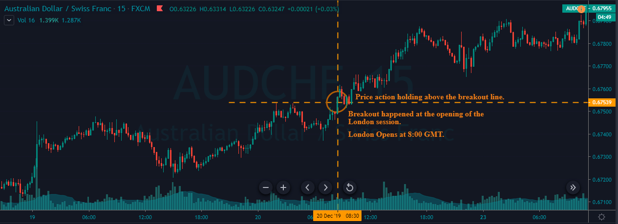
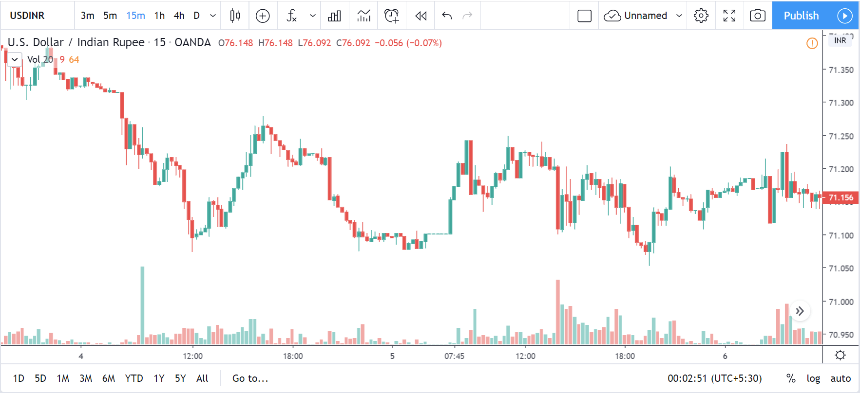
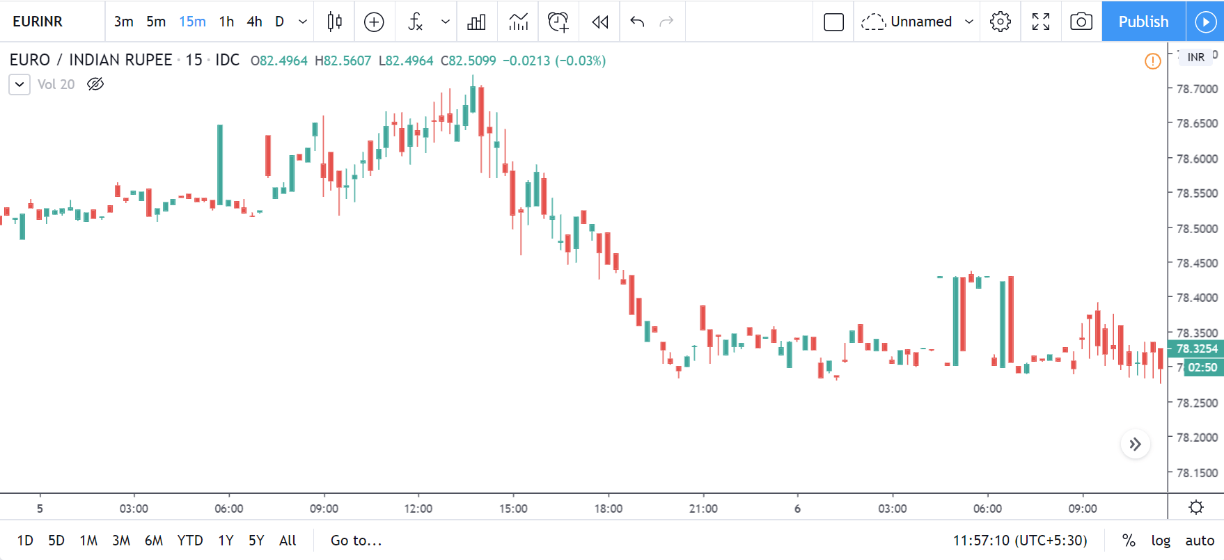
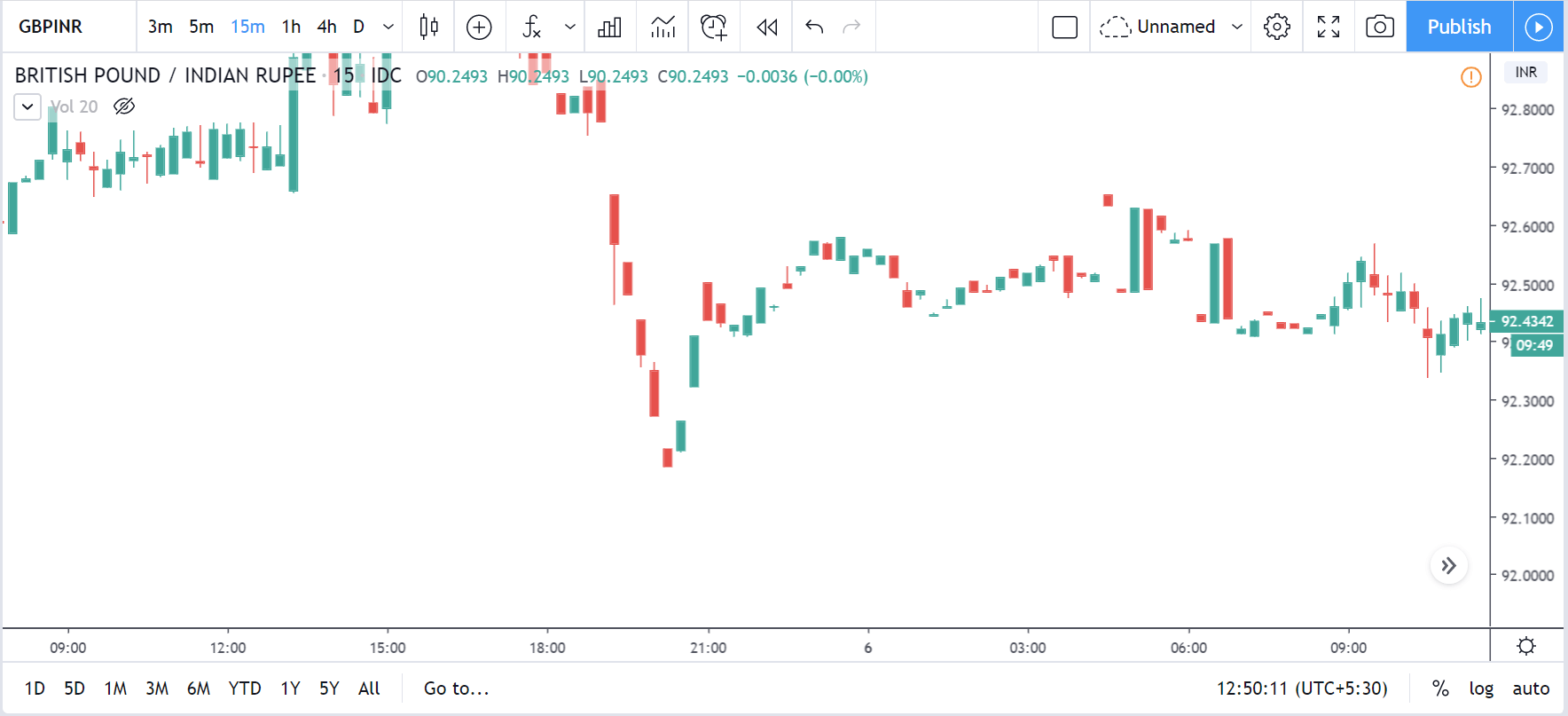
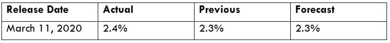
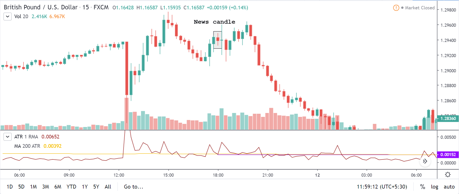
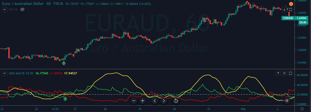
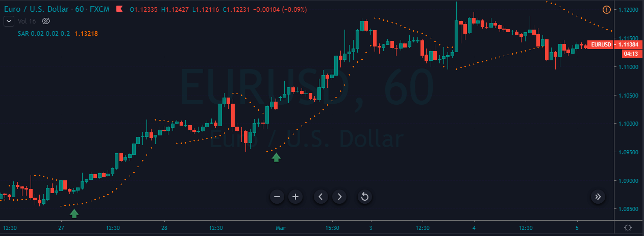
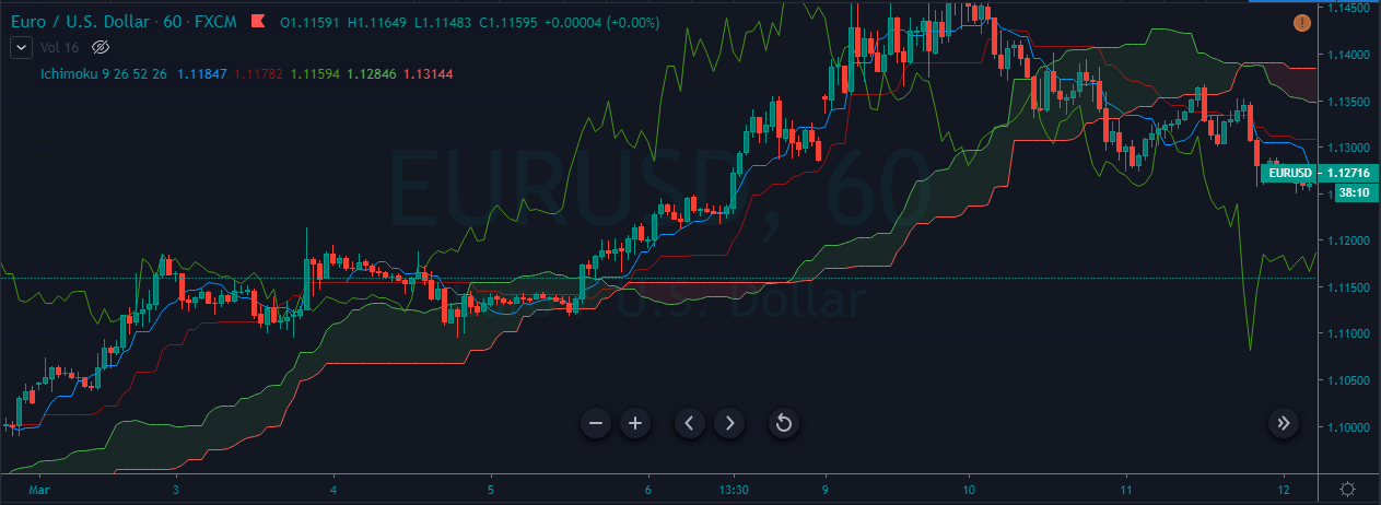
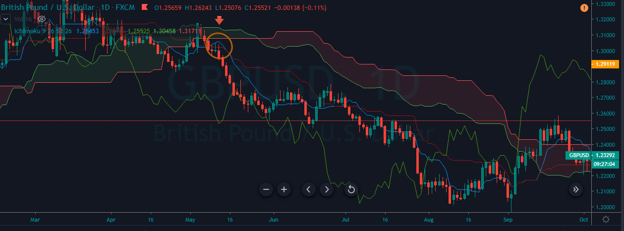
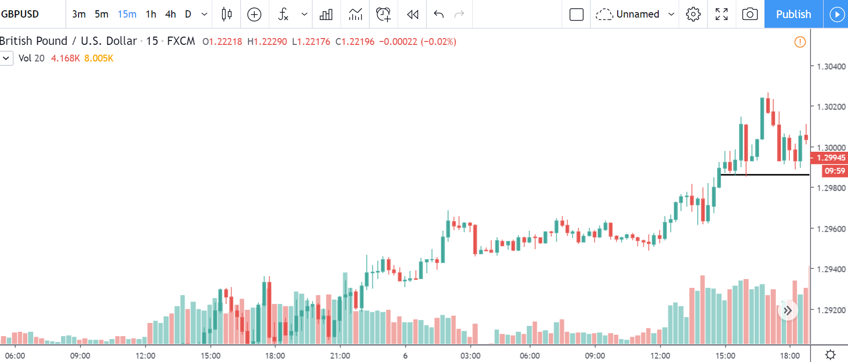
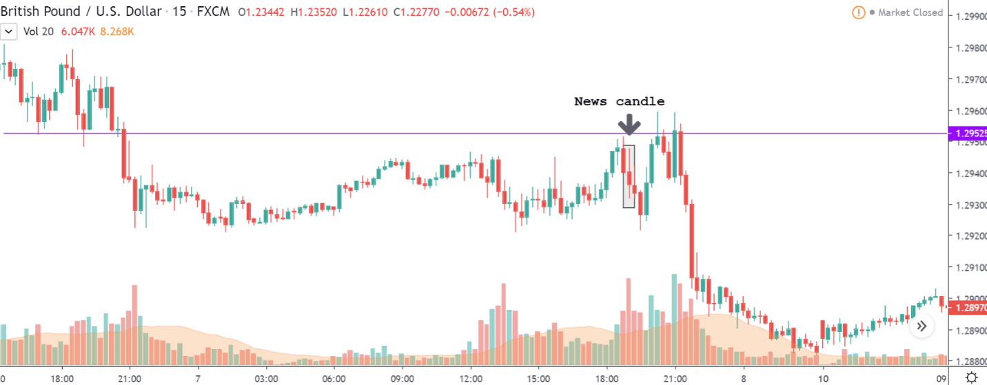
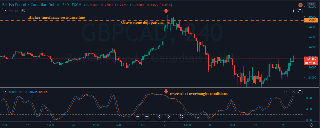
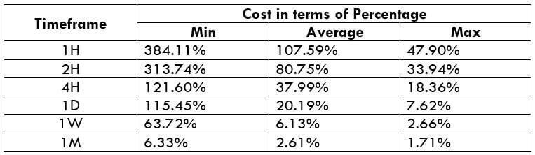
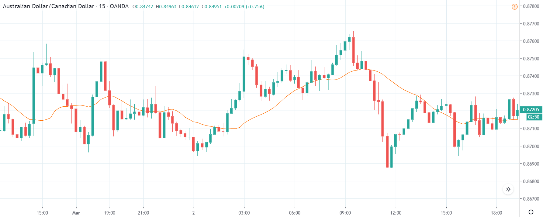
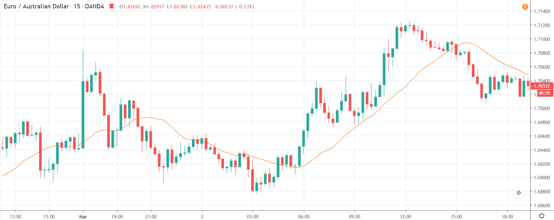
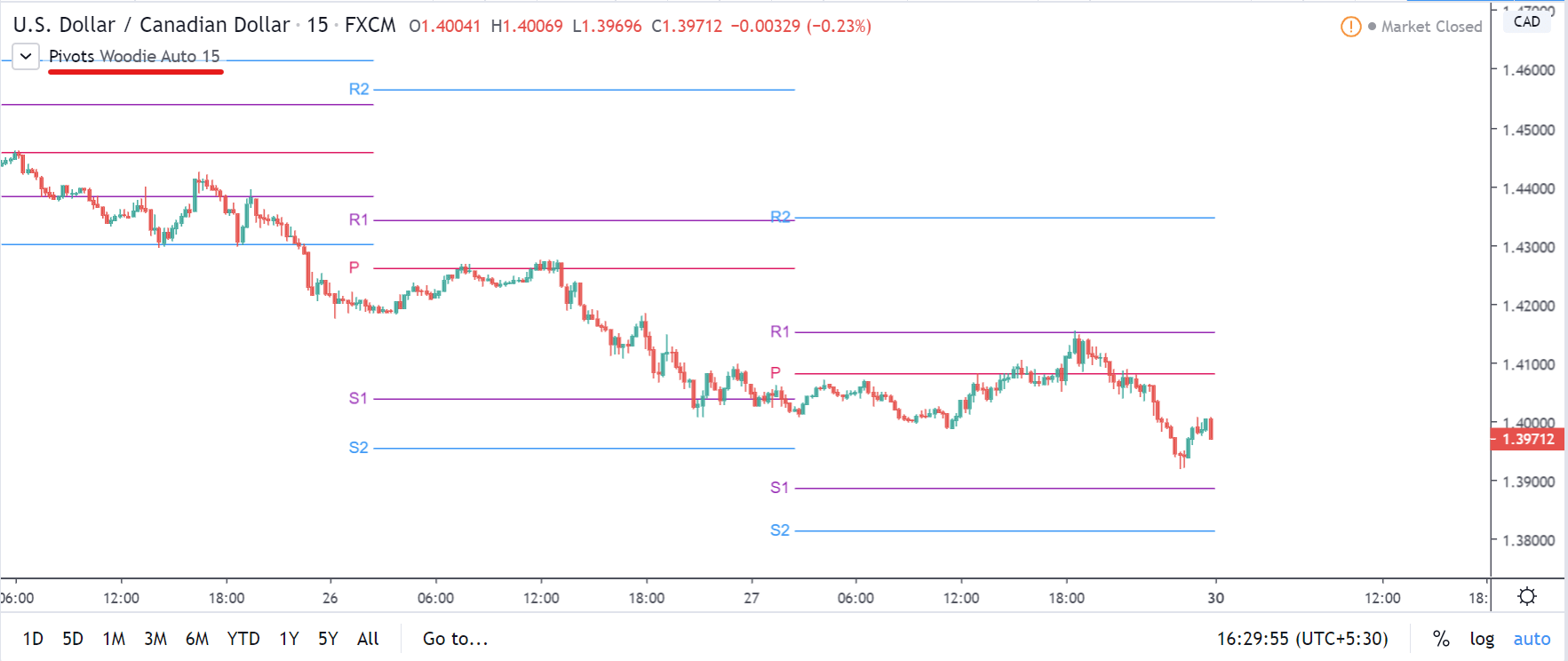
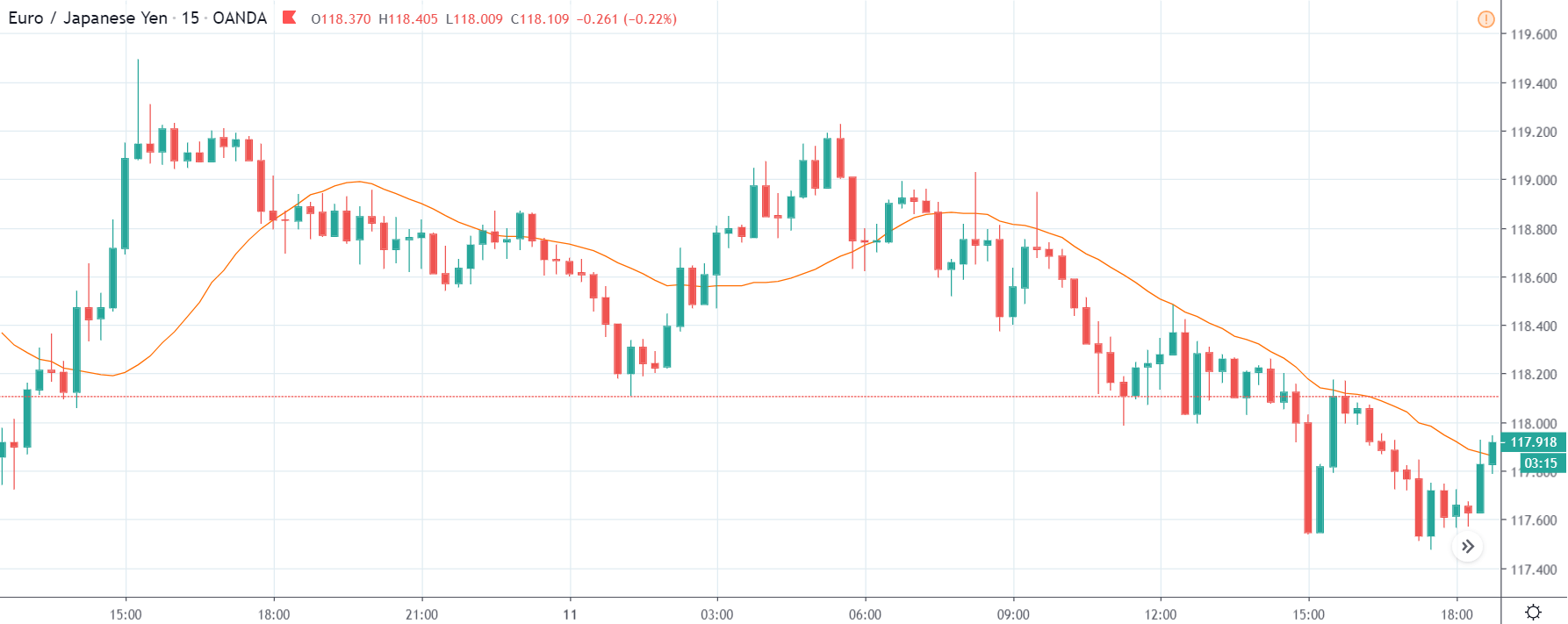
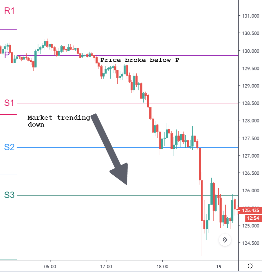
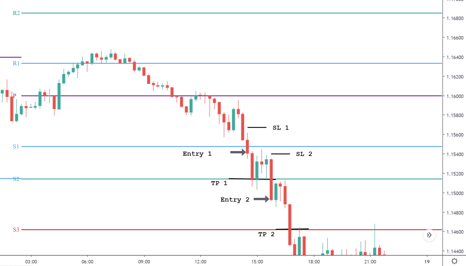
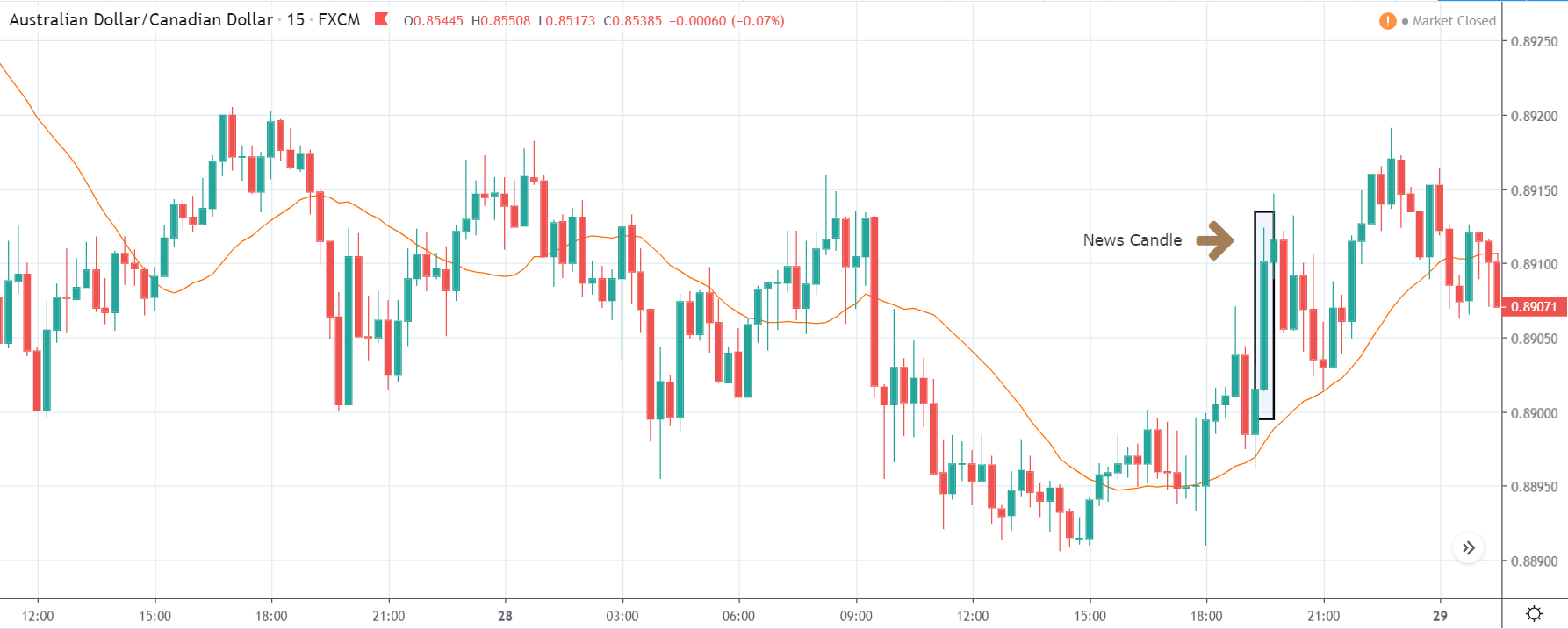
GBP/CAD | Before The Announcement

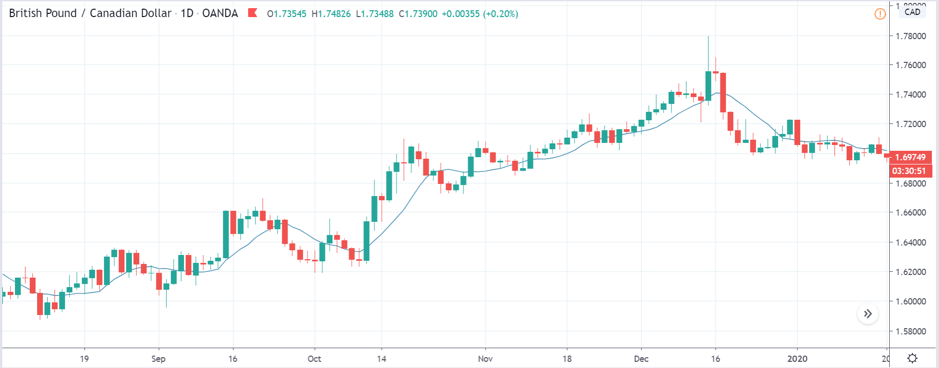
We start our discussion with the GBP/CAD currency pair, where the above image shows the behavior of the chart before the news announcement. Price action suggests that the price seems to be retracing the big uptrend and is at a key ‘support’ level. If the Income Tax rate announcement comes out to be negative for the Canadian economy and not per expectations, one can take a ‘buy’ trade in the above pair. Whereas positive data might not result in a trend reversal as the overall trend is up.

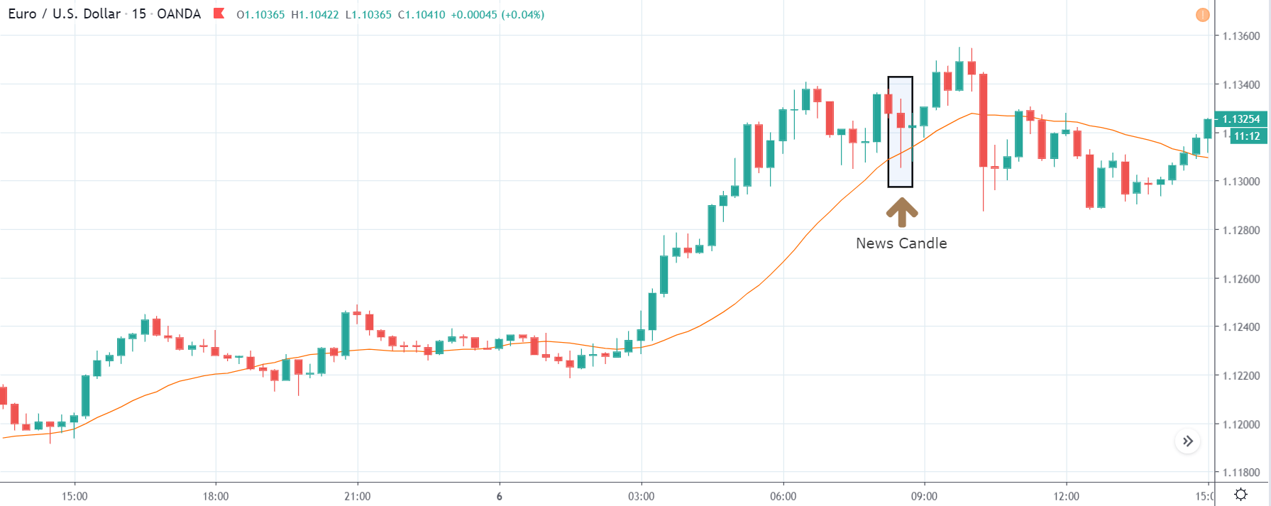
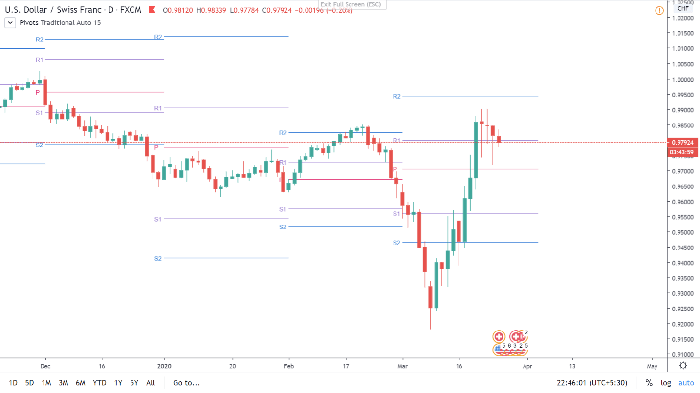
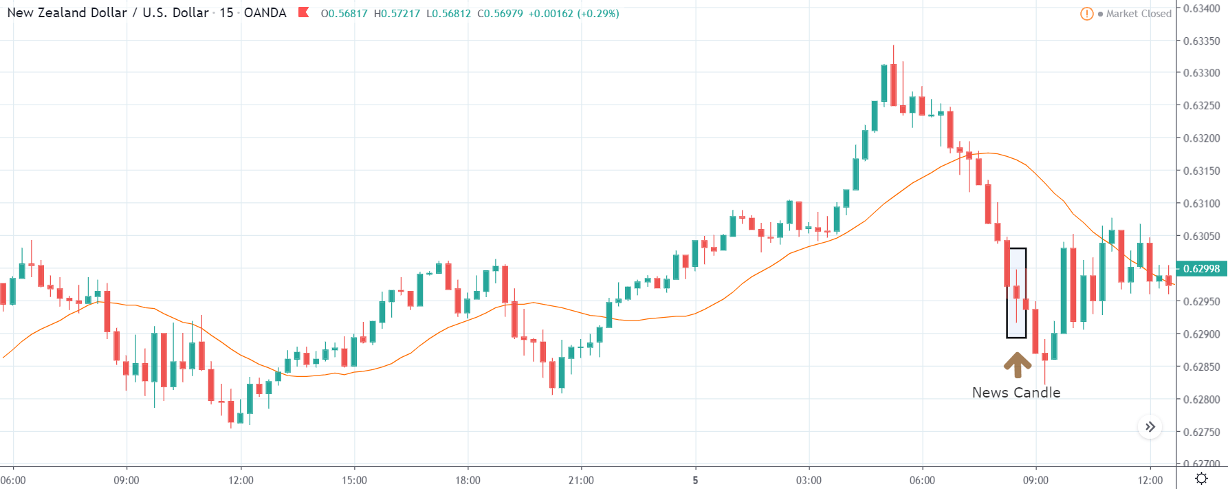
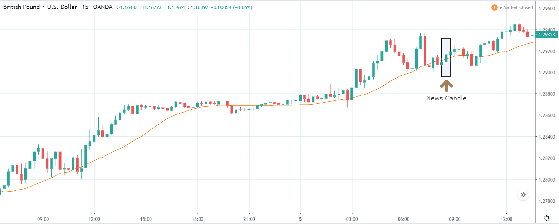
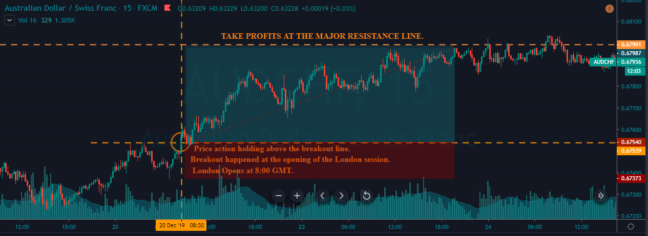
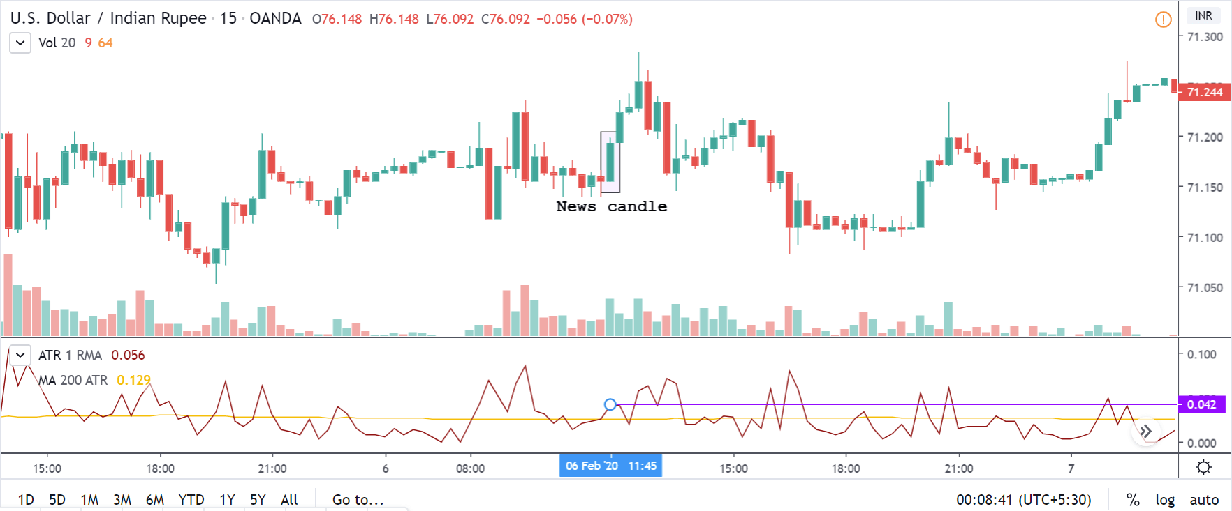
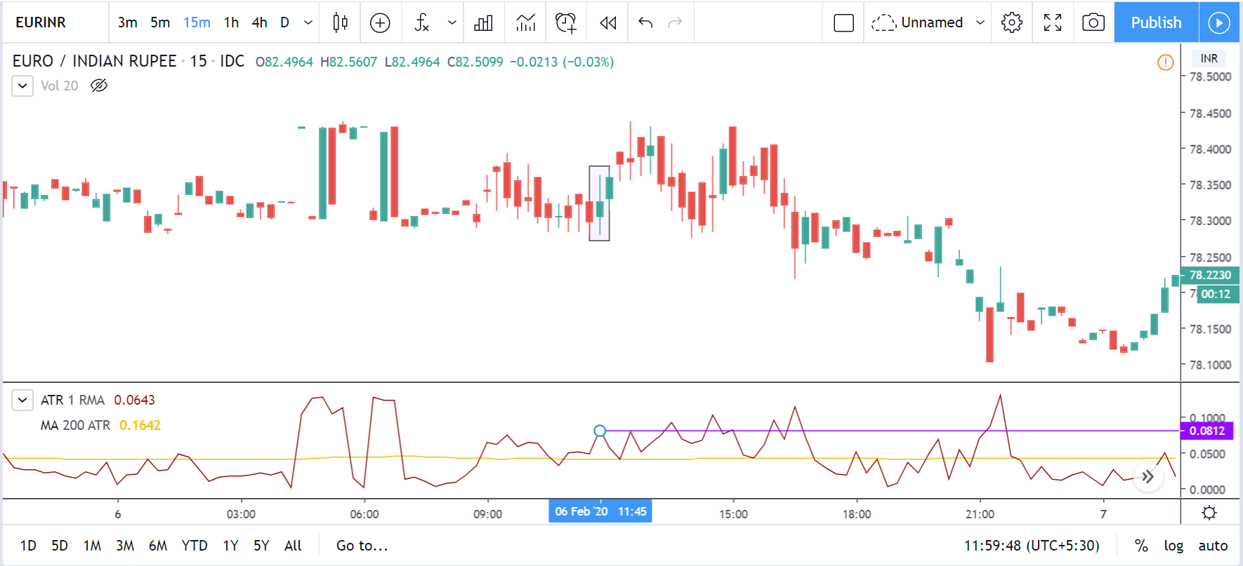
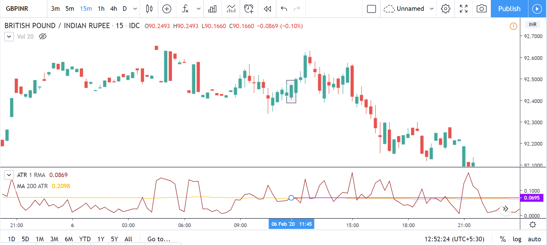
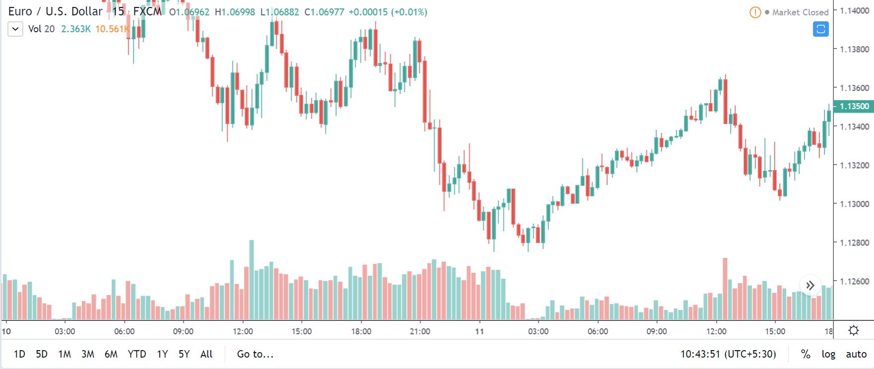
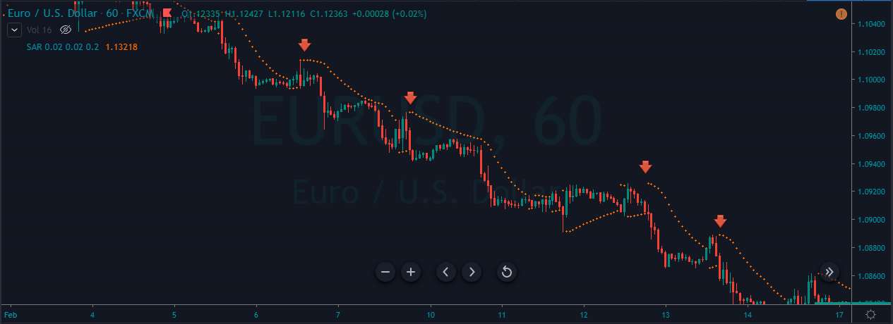
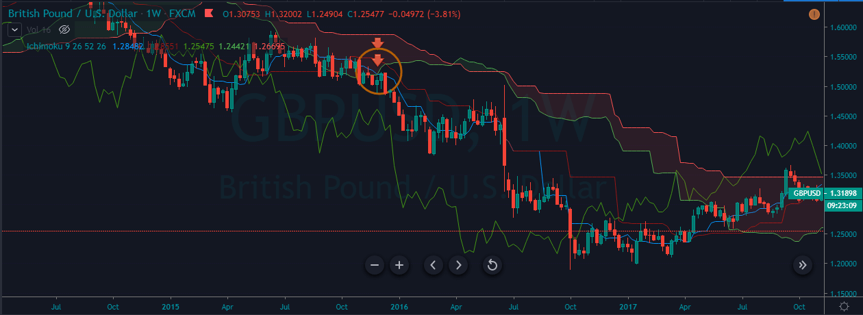
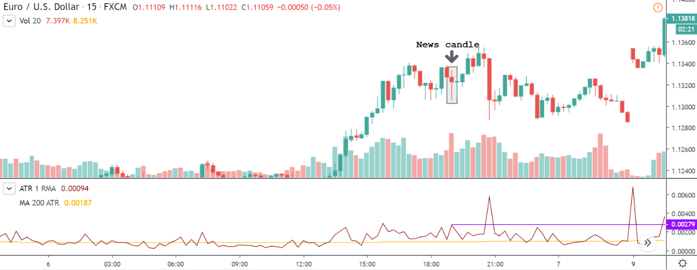
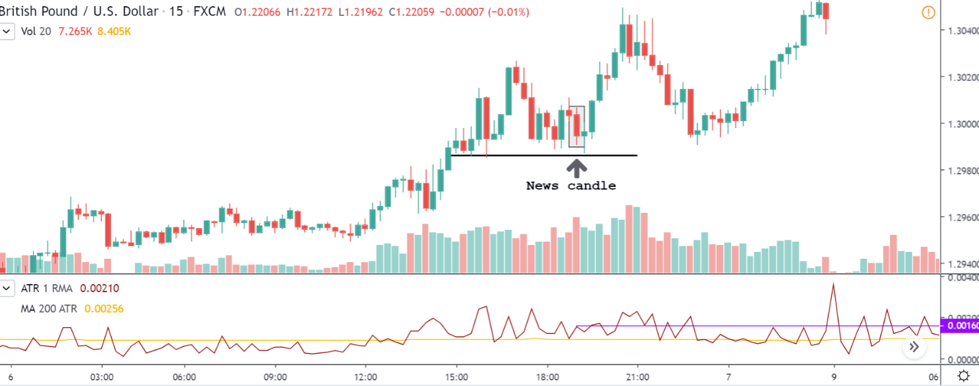
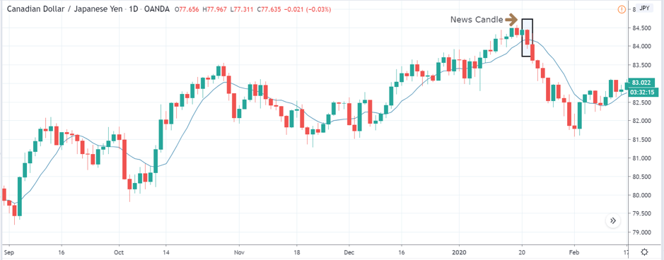
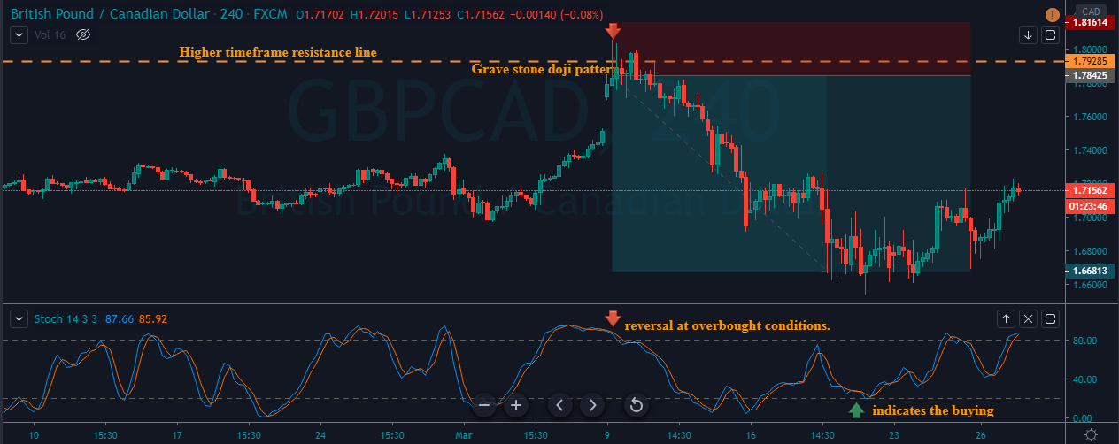
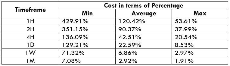
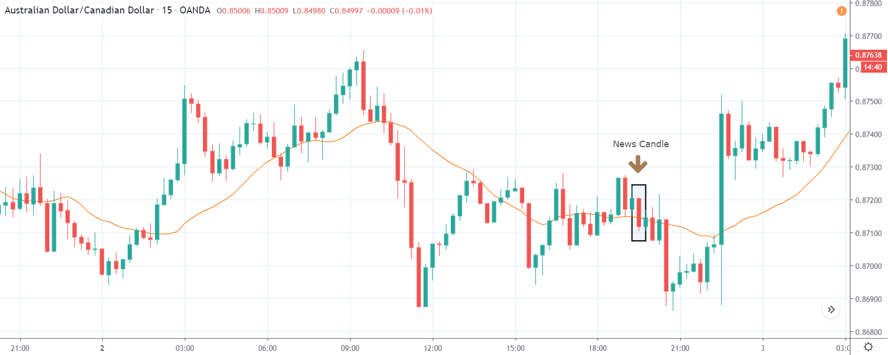
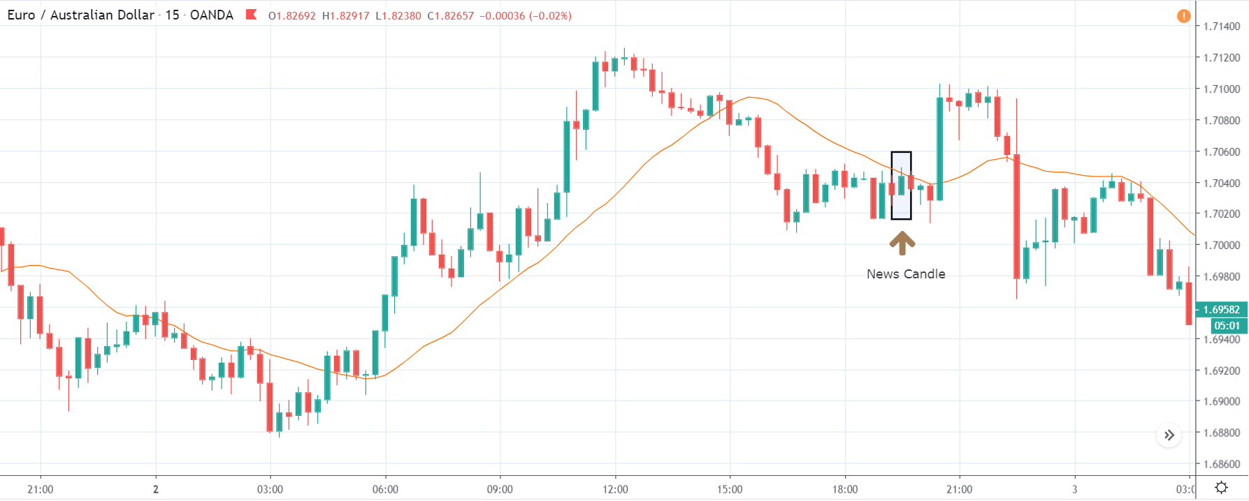
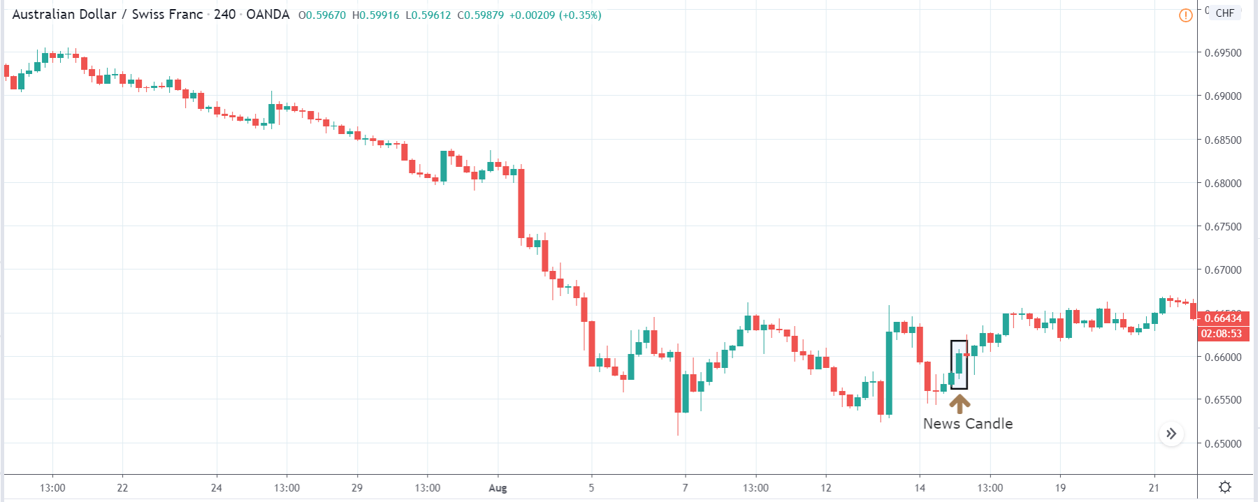
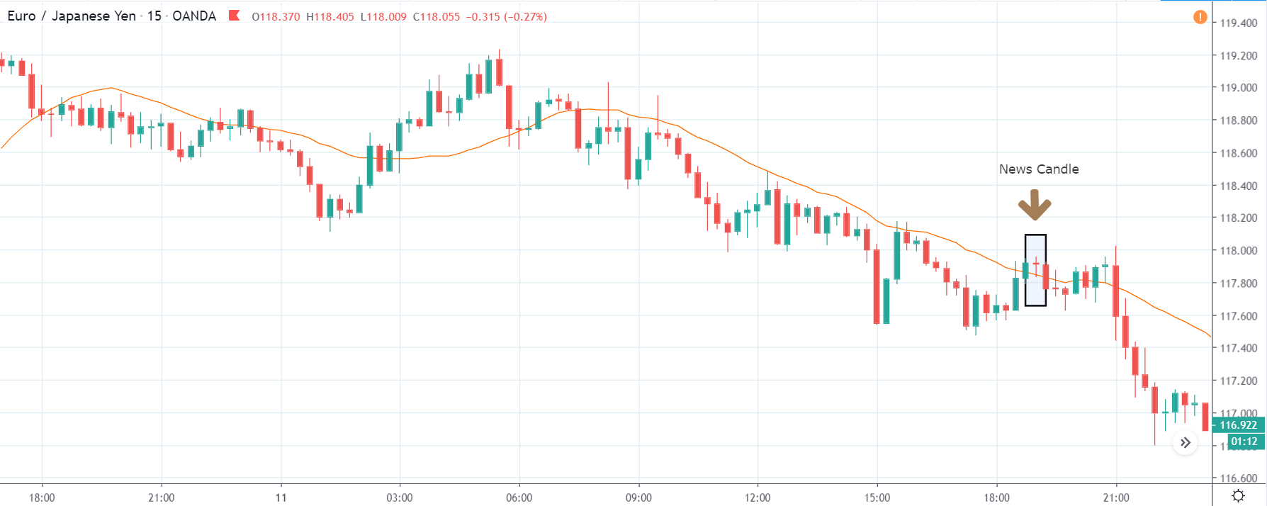
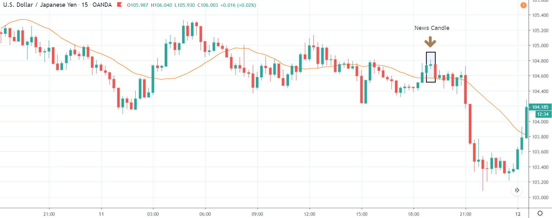
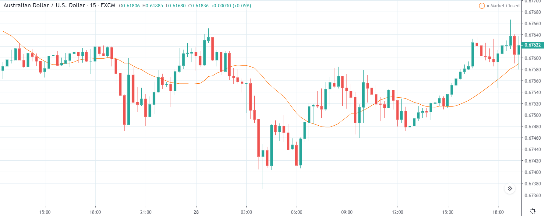
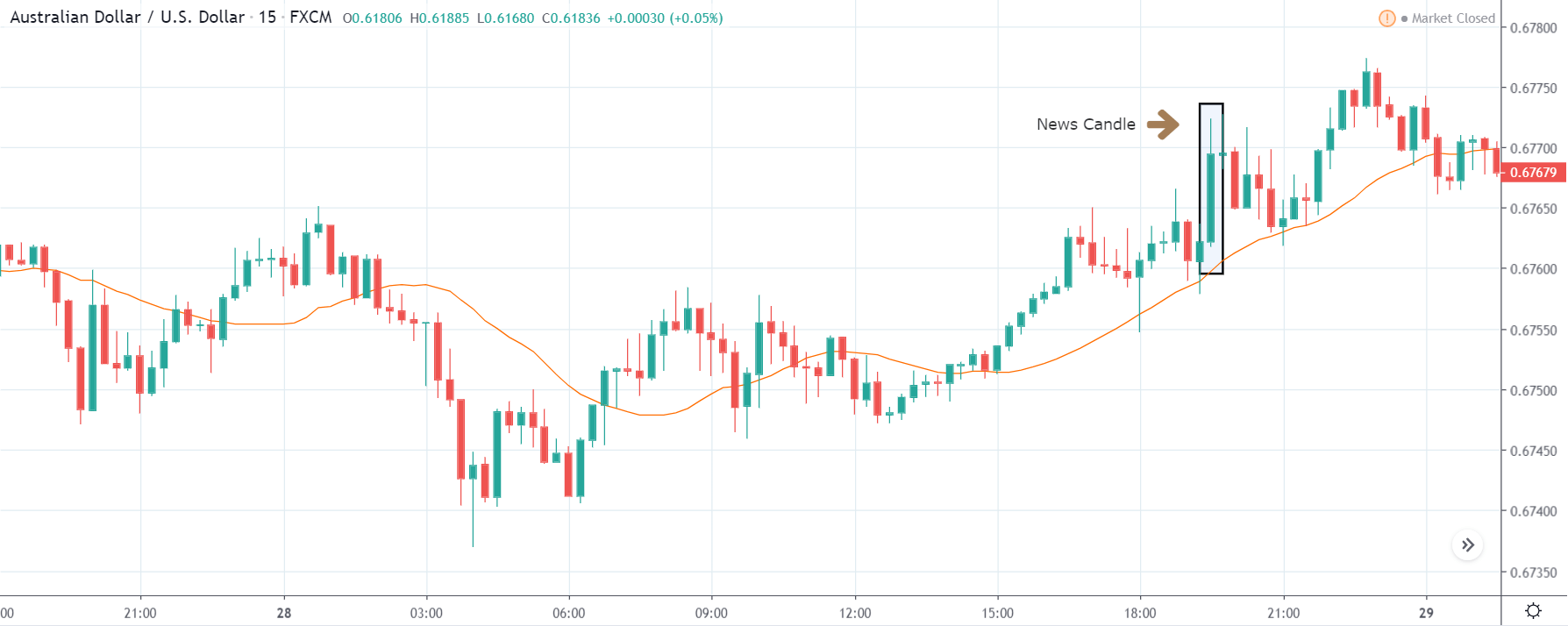
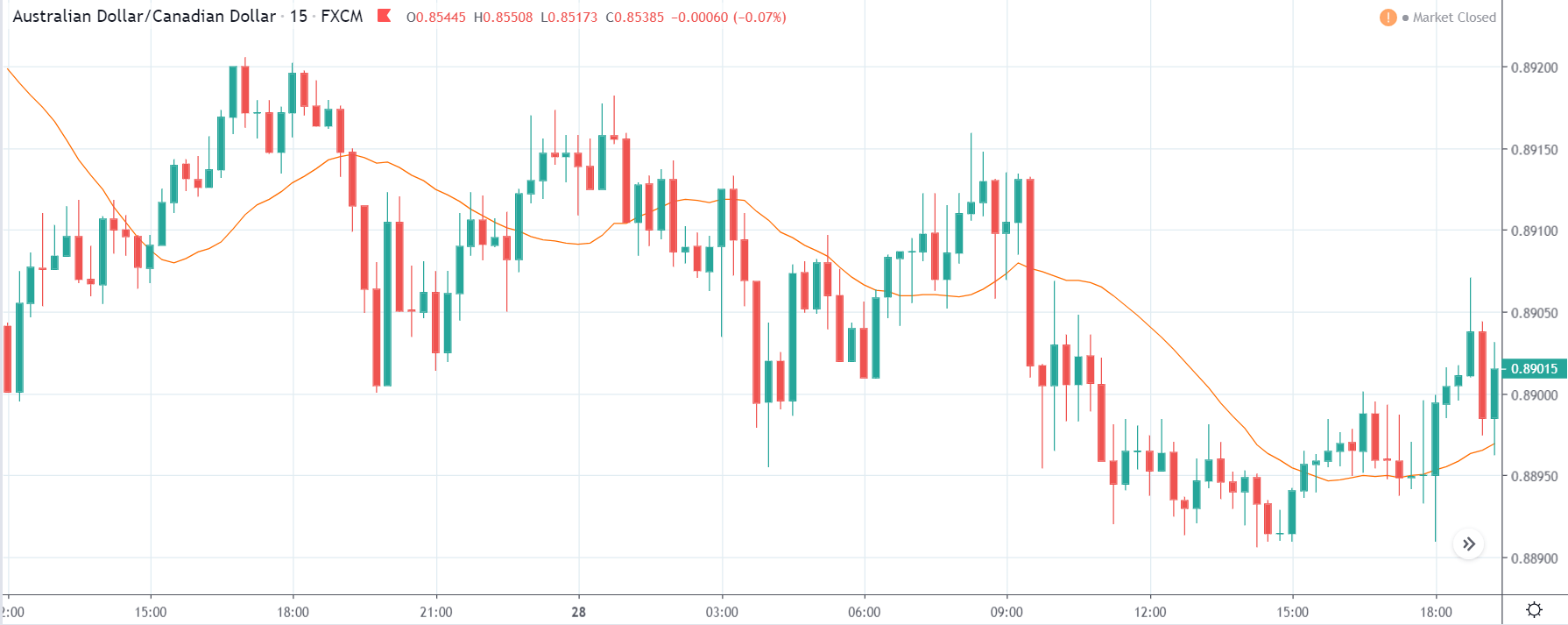
GBP/CAD | After The Announcement

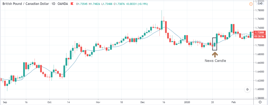
After the announcement, we see that the price moves higher, and it closes with a fair amount of bullishness. The increase in volatility to the upside is a sign of continuation of the trend, and this shows that the data was not very positive for the Canadian dollar. The bullish ‘news candle’ indicates a weakness in the currency where traders find the data to be negative for the economy. As the market moves higher, once can go ‘long’ in the market with a stop loss below the ‘news candle’ and ‘take profit’ at the recent ‘high.’

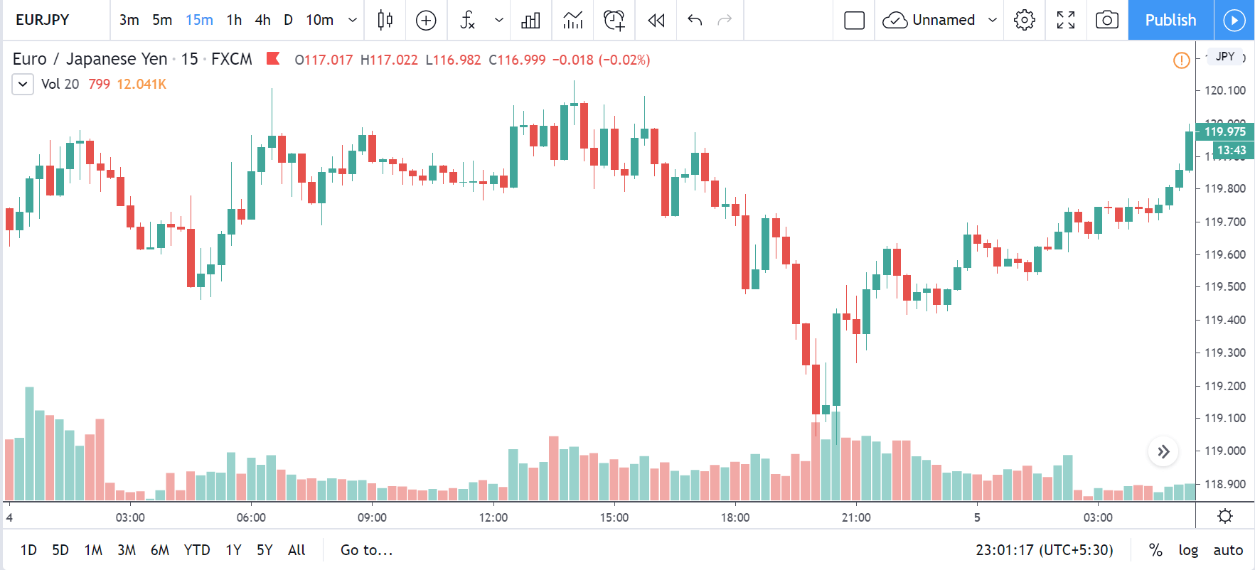
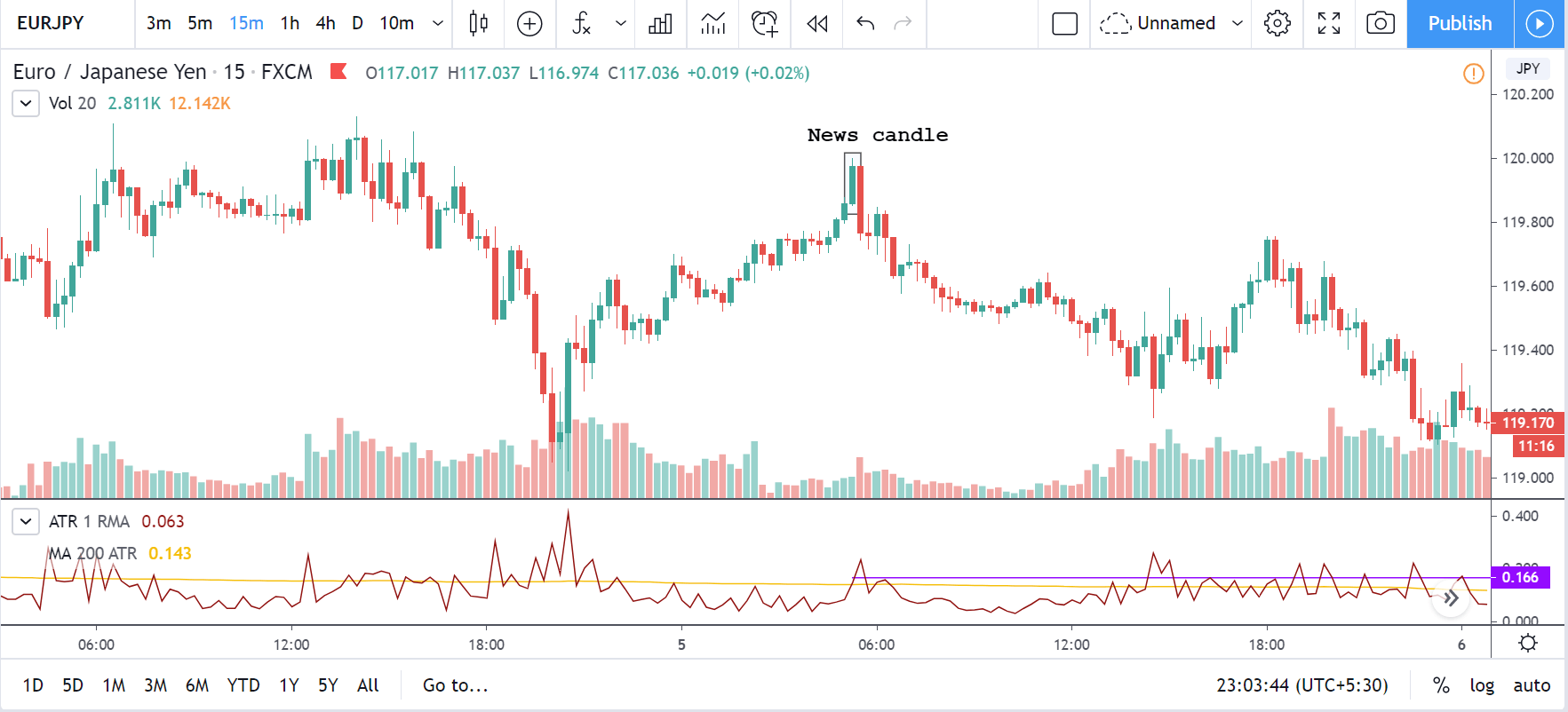
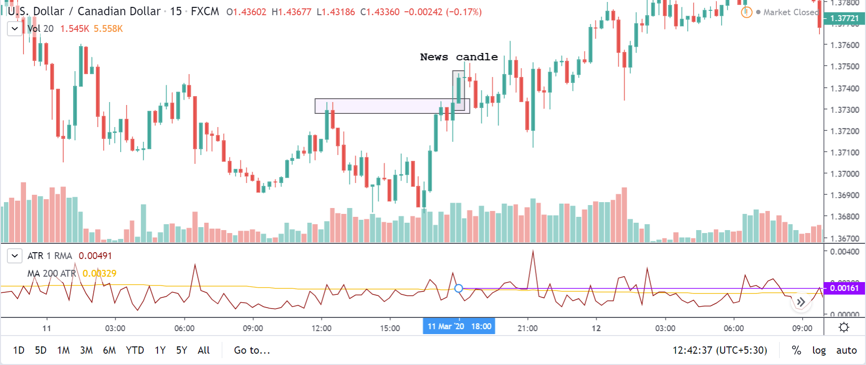
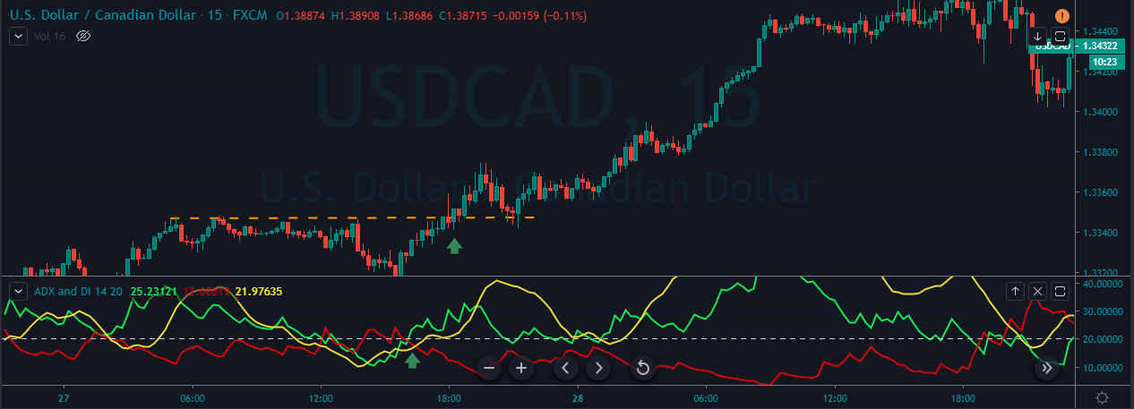
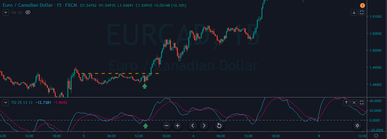
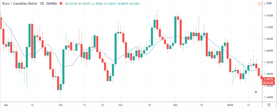
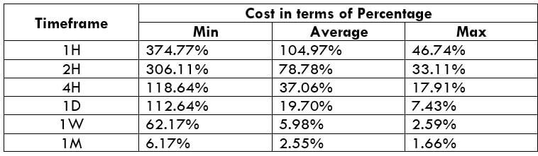
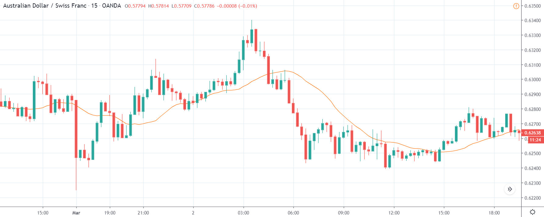
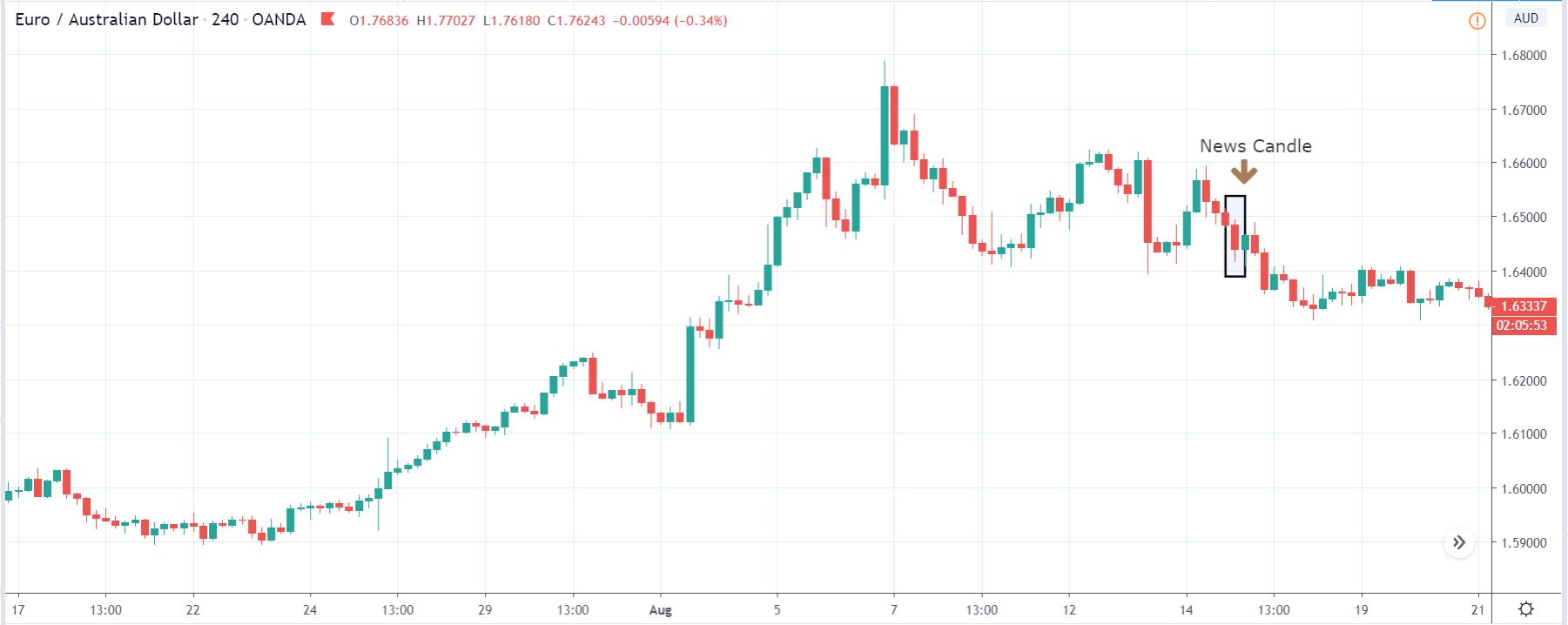
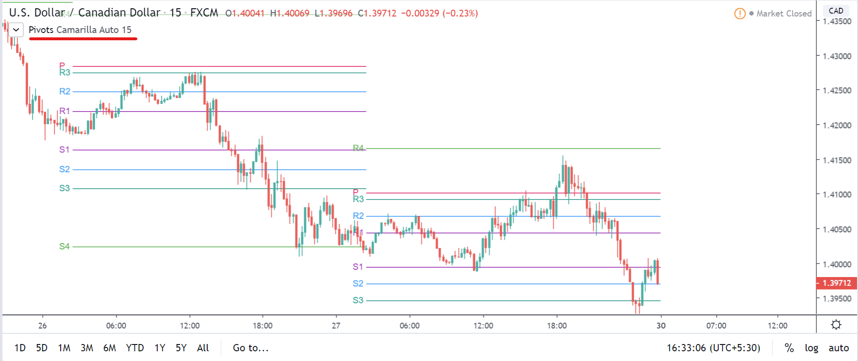
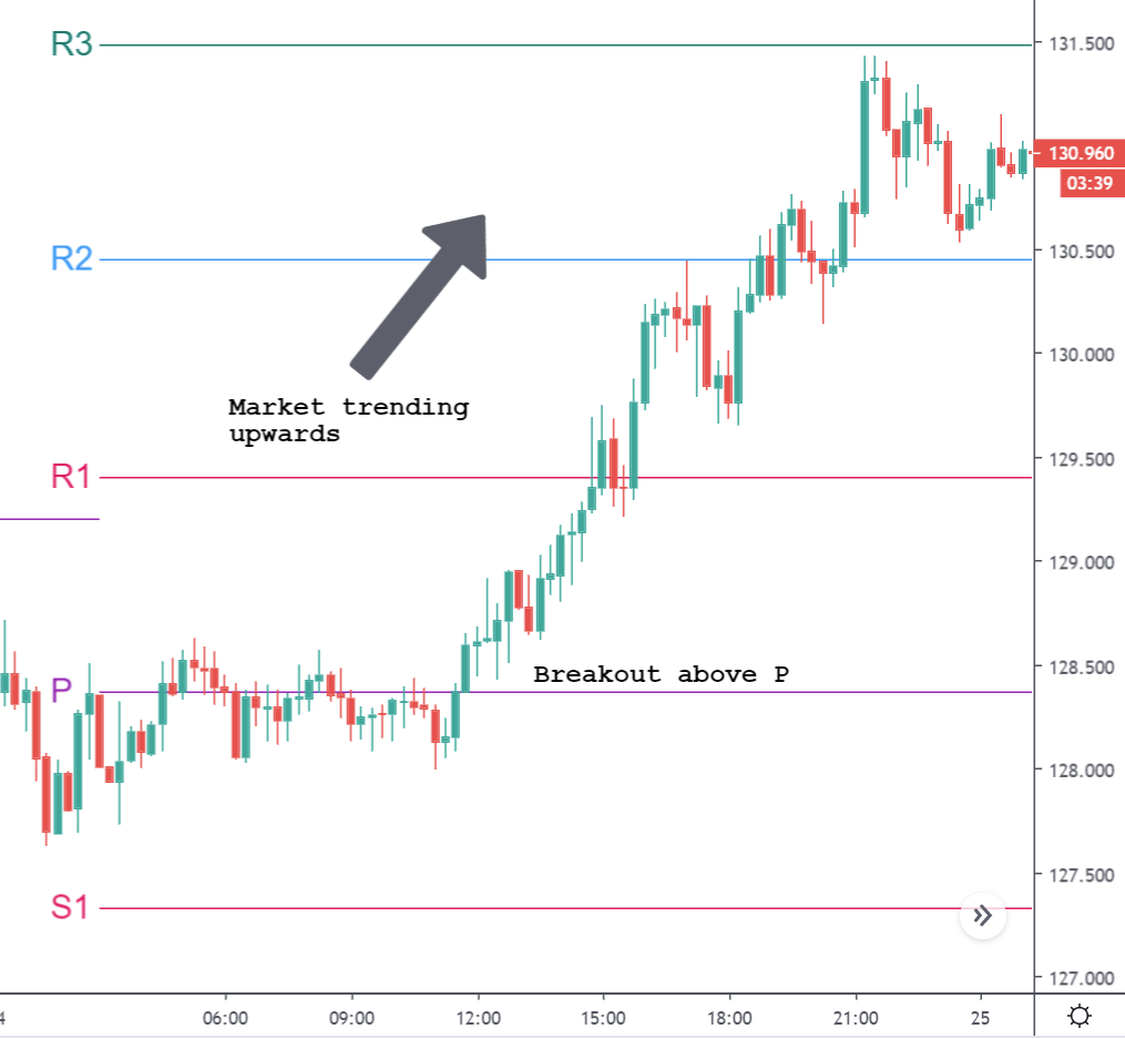
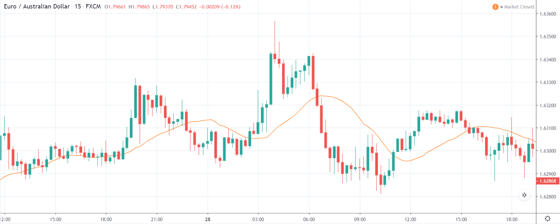
EUR/CAD | Before The Announcement


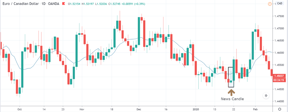
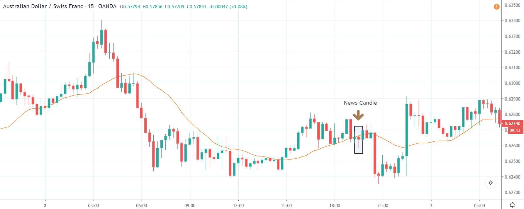
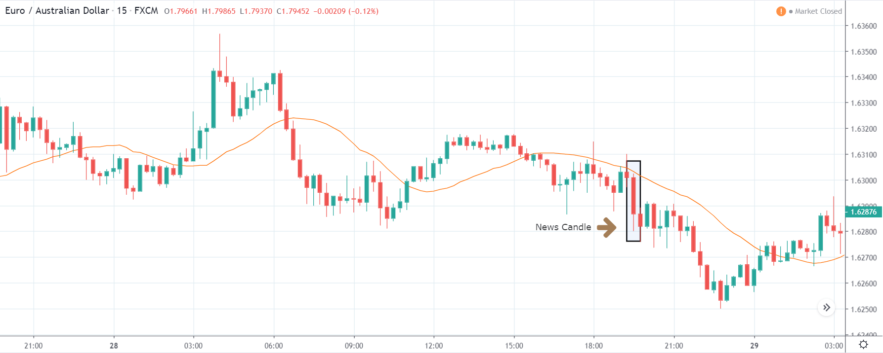
EUR/CAD | After The Announcement

The above images represent the EUR/CAD currency pair. In the first image, we see that the price is moving within a range, and just before the announcement of Income-tax rates, the price is at the bottom of the range. Since the price is at an optimal place for going ‘long’ in the market, aggressive traders can buy the currency pair with a strict stop loss of a few pips below the ‘support’ area.

We are essentially advantage of the increased volatility and movement in the pair. After the Income Tax rates are published, the market moves higher similar to the GBP/CAD pair, but later, the market gets sold into, and the candle closes with a large wick on the top. We can say that the news data was neutral to negative for the economy. Thus, there some confusion among traders can be seen. As the ‘news candle’ is not a bullish candle, it is wise to wait for the price to cross above the moving average and then a ‘buy’ trade.

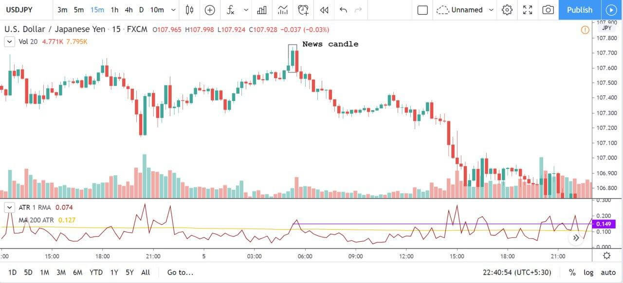
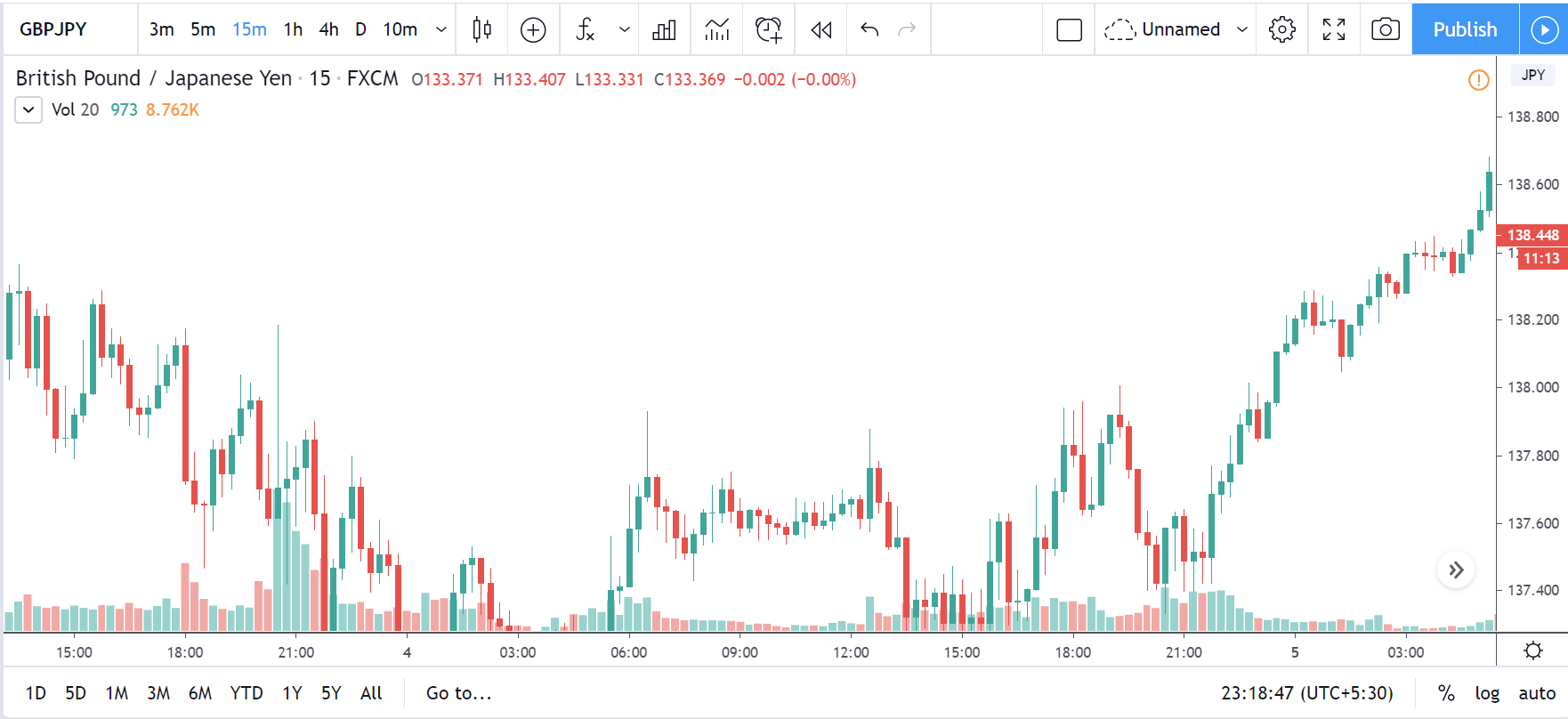
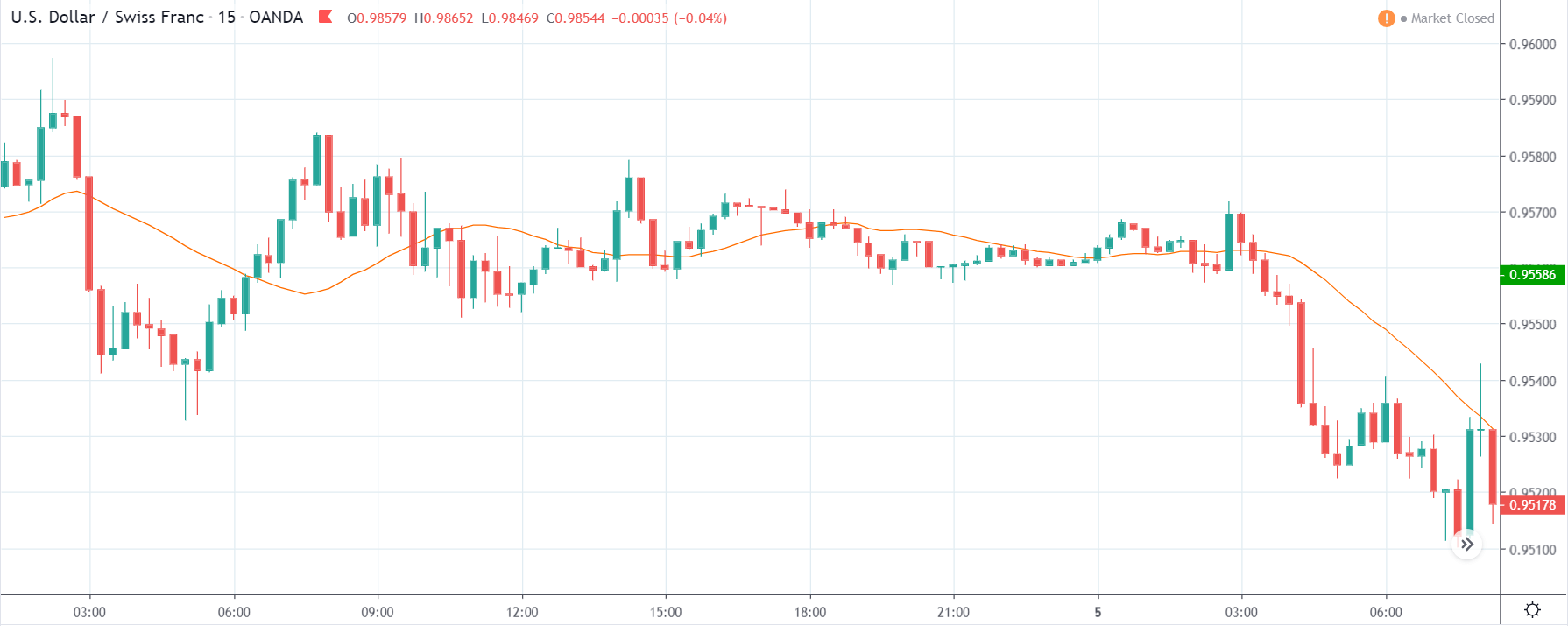
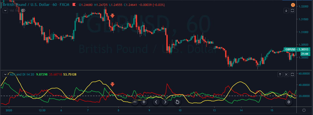
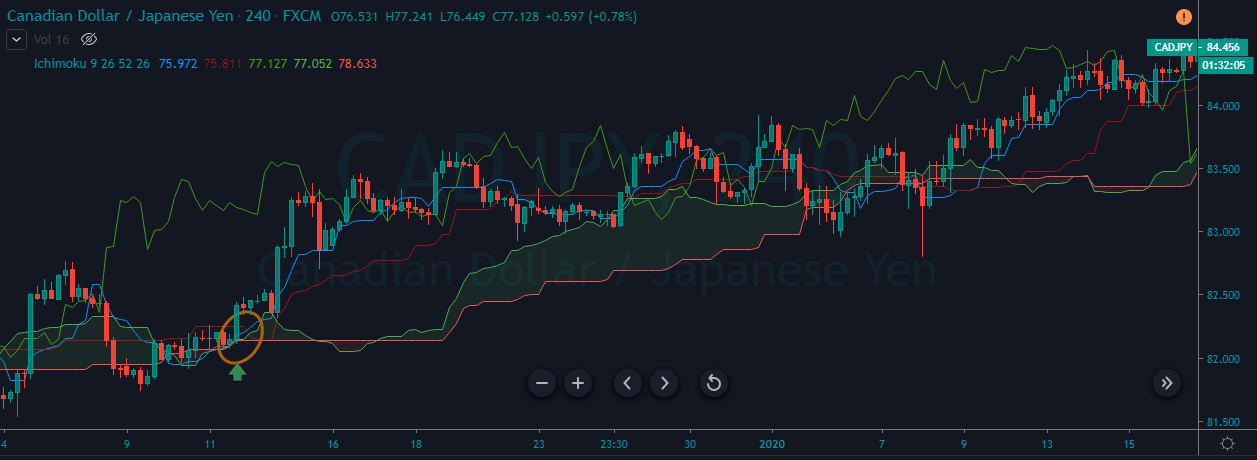
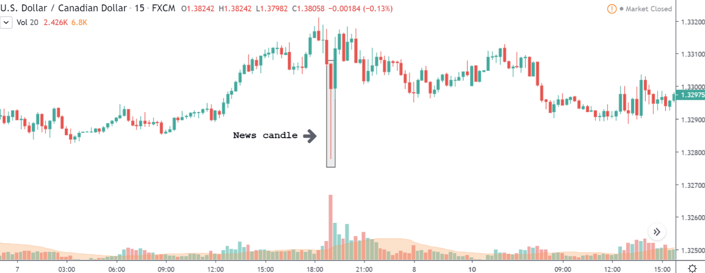
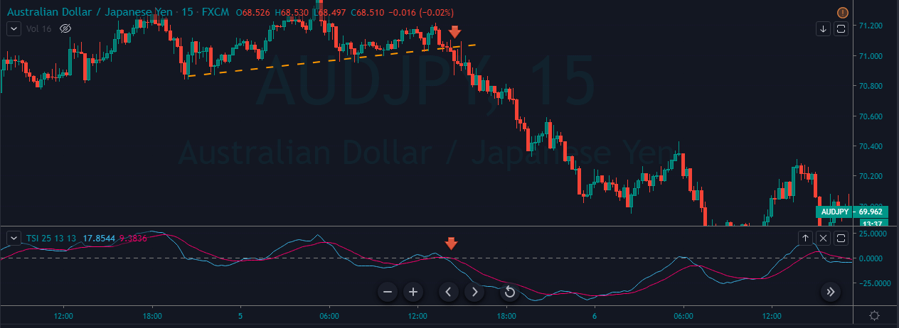
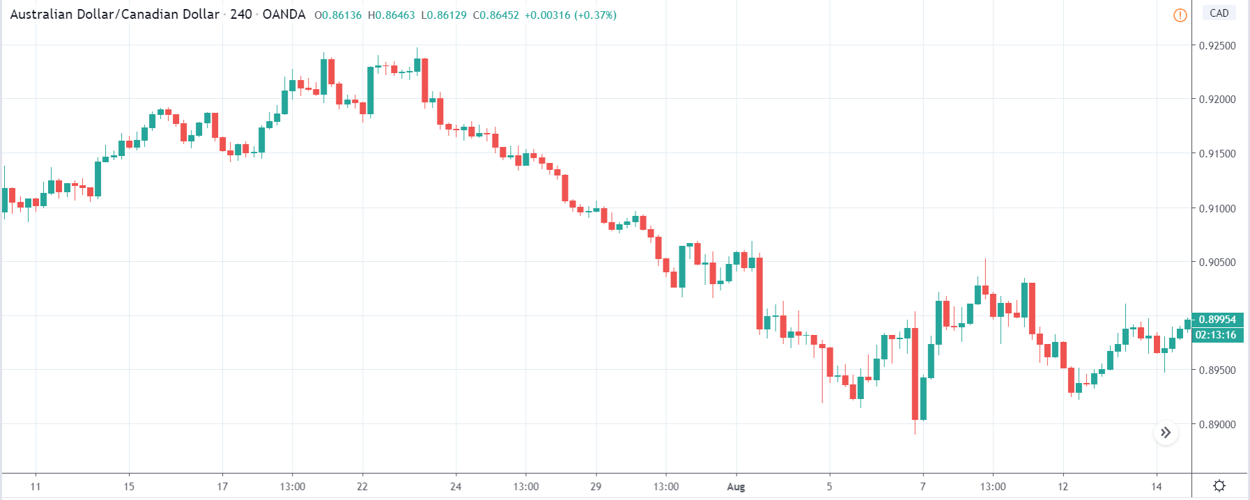
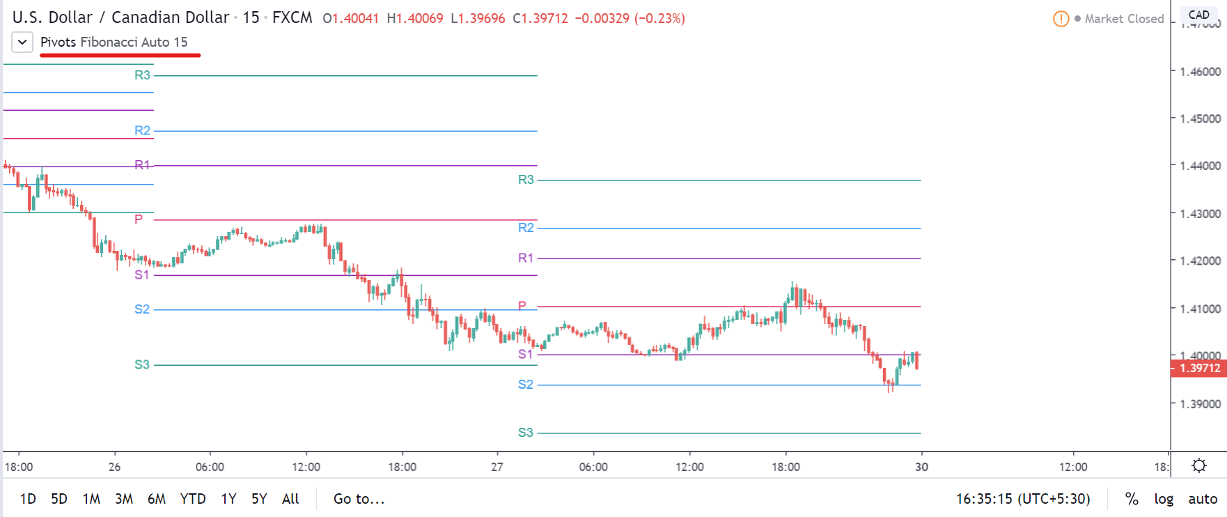
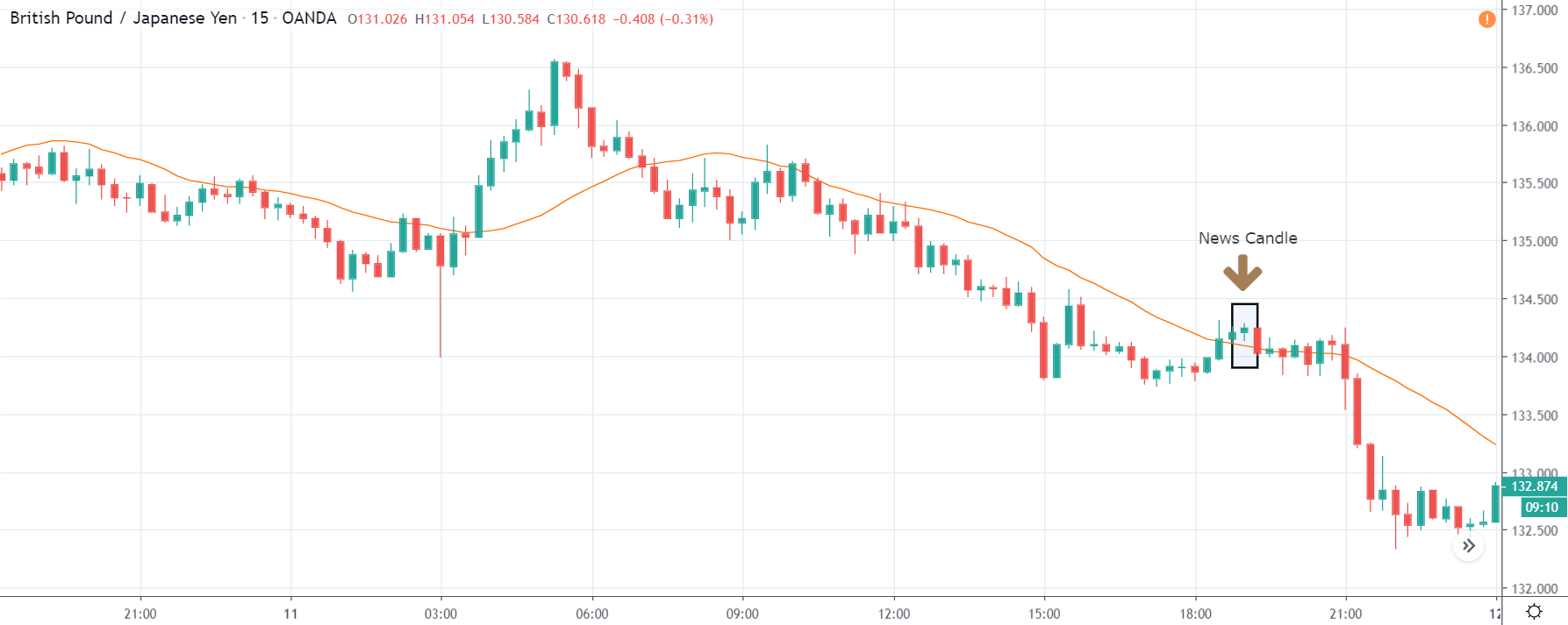
CAD/JPY | Before The Announcement

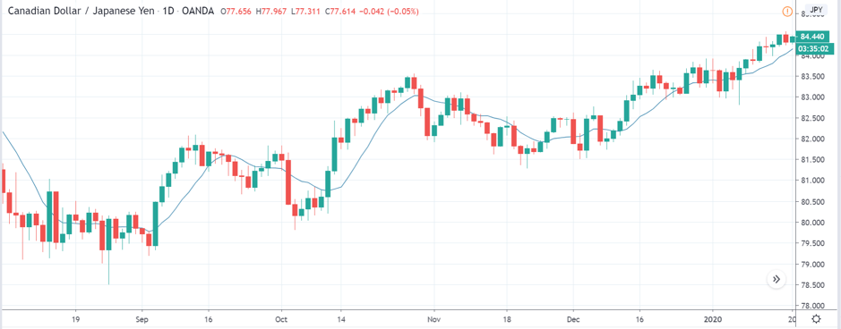
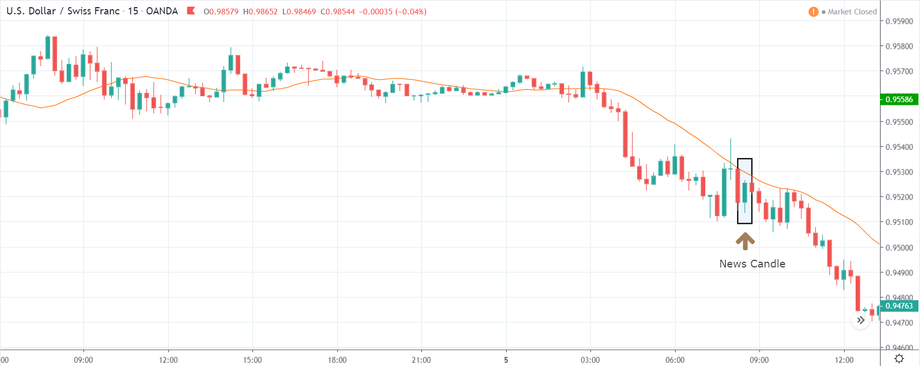
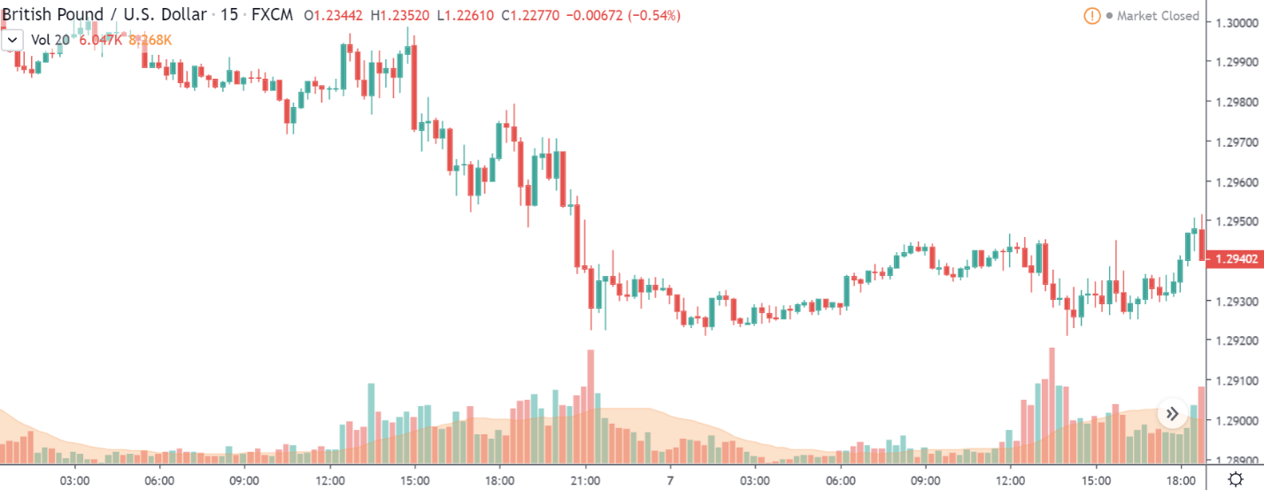
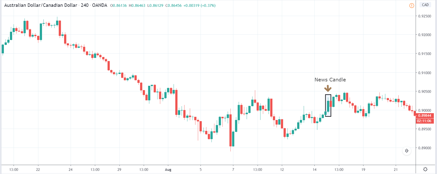
CAD/JPY | After The Announcement

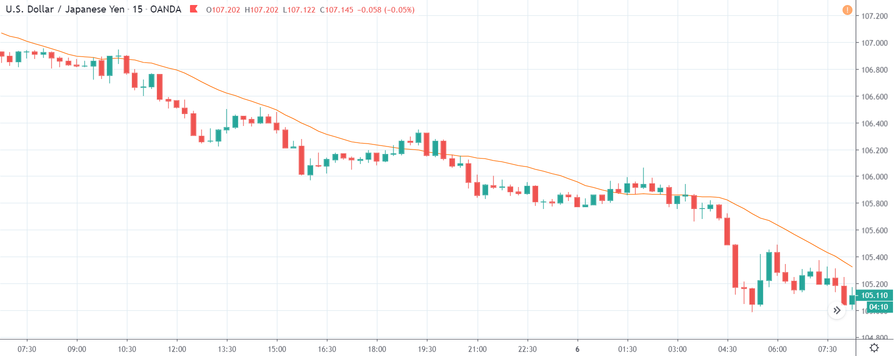
Lastly, we discuss the CAD/JPY currency pair, where the characteristics of the chart appear to be different from the above two pairs. Since the Canadian dollar is on the left-hand side, an uptrend in the first image signifies a great amount of strength in the currency. As the market is continuously moving higher before the announcement, we need a lot of confirmation from the market in order to go ‘short’ in the market. I

f the news data is positive for the economy, the move gets accelerated to on the upside and, in that case, once can join the trend after a retracement. After the news announcement, the market crashes, and volatility increases to the downside, thereby indicating a possible reversal. The bearish ‘news candle’ shows that the Income Tax rates were not very positive for the economy, and thus traders sold Canadian dollars. One should take ‘short’ trade only after the price goes below the moving average.

That’s about Income Tax and the impact of its new release on the Forex Market. Let us know if you have any questions in the comments below. Cheers.

Categories
Forex Basic Strategies

Pairing The ‘Gravestone Doji’ Pattern With Significant Resistance Levels

Introduction

Gravestone Doji is a bearish reversal candlestick pattern that occurs at the top of an uptrend. This pattern helps the traders to visually see where the significant resistance level is located on the price chart. The most important aspect of the Gravestone Doji pattern is its long upper shadow. The candlestick’s open, close, and low are all the same in this pattern.

The psychology behind the long upper shadow is this – In an ongoing uptrend, when the price action hits the significant resistance line, buyers exit their positions, and the price action is smacked down by the sellers. In short, the appearance of this pattern represents the losing momentum of the buyers and essentially indicates a bearish reversal in the market.

Most of the traders place their trades as soon as this pattern appears on the price chart. But that’s definitely not the right approach. Instead, we must wait for the next candle to close for the confirmation and only then take the trades. The opposite of the Gravestone Doji is the Dragonfly Doji, which appears at the bottom of a downtrend or the major support area. The below image represents the Gravestone Doji Pattern.

Trading Strategies – Gravestone Doji Pattern   

The Gravestone Doji pattern indicates that the buying trend is ending, and the market is reversing to the selling side. However, this doesn’t hold true all the time. We will be finding this pattern quite often in all the types of market conditions, and if we start trading every time we find them, we will end up on the losing side. We always need to ask our self the reason why this pattern appears in certain conditions. Is it going to reverse the market or not?

Pairing the pattern with a significant resistance level

If you find this pattern at the bottom of the range, do not trade it. But if the price action prints this pattern at the top of a range, it can be considered a sign for us to go short. Similarly, find the trending markets and look for a major resistance level where the price could possibly react. So when the price action prints a Gravestone Doji at the major resistance level, it’s a strong sign for us to go short.

In the below USD/CHF Forex chart, we can see that the price action has printed the Gravestone Doji pattern at the significant resistance level. We should be going short as soon as the Doji candle closes.

In the below image, we can see that we took a sell entry when the market printed the Gravestone Doji pattern. We have placed the stop-loss just above the resistance level. It is safer to put the stop-loss above the pattern or at the resistance line because if the price goes above the pattern, the pattern gets invalidated. We know that the Gravestone pattern indicates a market reversal, and most of the time, these reversals travel quite far. That is the reason why we go for deeper Take Profits.

In the above chart, we can see that we had exited our full positions when strong buyers showed up. This indicates that the sellers are losing their momentum, and there is no logic to continue holding our positions.

Gravestone Doji + Stochastic Oscillator

The strategy that we shared above is for aggressive traders who like to take risks. However, if you are A type of trader who needs more confirmation to pull the trigger, we suggest you follow this strategy to trade this pattern. Most of the conservative traders do have a fear in their minds that one single candle does not have the potential to reverse the market. And it is completely okay to think like that. The truth is that sometimes even a single candle can move the market, and sometimes it doesn’t. Ultimately it is your money management system that makes all the difference.

But to filter out some poor signals and to get an additional confirmation, it is advisable to use the Stochastic oscillator to confirm the probability of our trading signal. Stochastic is a range-bound indicator that oscillates between the 0 & 100 levels. When the Stochastic goes above the 70 level, it means that the market is in an overbought condition, and we can expect a change in the trend. Likewise, when it goes below the 30 levels, it means that the market is oversold are we can expect a reversal anytime soon.

The Stochastic indicator also shows the bearish and bullish divergence, which helps the traders in trading the upcoming reversals. The divergence is when the market moves in one direction, but the indicator is signaling a different direction. Now we believe that you understand the basics of trading with the Stochastic indicator. Now let’s dive into the strategy.

The strategy here we are using is simple and straight forward. First of all, identify the Gravestone Doji pattern at a significant resistance level in an uptrend. Then, apply the Stochastic indicator to the price chart and check if the indicator is at the overbought area, indicating a downside reversal. If yes, go short and place the Stop-Loss just above the pattern.

The GBP/CAD chart below indicates the appearance of the Gravestone Doji pattern in an uptrend. When the price is approaching the upper resistance level, it got smacked down immediately, and the market ended up printing the pattern. The next six candles tried very hard to break the pattern & resistance line, but nothing worked, and the price ended up rolling down. We can also observe the Stochastic indicator was at the overbought area, which is a confirmation sign for us to go short.

We have entered for a sell when both the conditions are met, and placed the Stop-Loss just above the pattern. For the Take-Profit, we choose to go for deeper targets. When the selling trend started to struggle, the Stochastic indicator was at the oversold selling conditions. At that point, we have closed our full positions for obvious reasons.

Conclusion

The trades taken based on the Gravestone Doji pattern are pretty reliable. But do not make the mistake of identifying the pattern everywhere on the price chart. The psychology behind this pattern says that the bulls drove the price to a peak point, and the sellers are comfortable in reversing the market. For booking profits, you can expect an equal move to that of a previous trend. If you are an intraday trader, make sure to exit your positions at any significant level. Although this pattern appears on all the timeframes, the reliability is higher on higher timeframes to that of lower timeframes.

We hope you find this article informative. Try trading this pattern on a demo account and master it before applying the above-mentioned strategies on the live market. Cheers.

Categories
Forex Assets

Analyzing The BCH/USD Crypto-Fiat Pair

Introduction

BCH/USD is a cryptocurrency abbreviated for the Bitcoin Cash against the US Dollar. This is the highest traded cryptocurrency in terms of volume. Also, it is a 24/7 market. Note that, Bitcoin Cash is not the same Bitcoin; both are two different cryptocurrencies.

Understanding BCH/USD

The price of BCH/USD represents the value of the US Dollar that makes up one Bitcoin Cash. It is quoted as 1 BCH per X USD. For example, if the value of BCH/USD is 234.06, these many US Dollars are required to purchase one Bitcoin Cash.

BCH/USD Specifications 

Spread

Spread is the difference between the bid and the ask price. Spread is different with different brokers and the type of execution model they use. Below are the ECN & STP values for the BCH/USD pair.

Spread on ECN: 400 pips (4.00 USD) | Spread on STP: 450 pips (4.50 USD)

Fee

A Fee is a commission paid on each position a trader takes and closes. This fee is charged only by ECN brokers. The slippage for each lot traded is a pip. The seems to be less because one lot accounts for only 1 BCH.

Slippage

Slippage is the difference between the price demanded by the trader and the price given by the broker. There are two reasons for slippage to occur:

  • High market volatility
  • Broker’s execution speed

Trading Range in BCH/USD

A Trading range is the representation of the volatility in BCH/USD for different timeframes. The numbers help in determining the approximate risk and reward on a trade.

Procedure to assess Pip Ranges

  1. Add the ATR indicator to your chart
  2. Set the period to 1
  3. Add a 200-period SMA to this indicator
  4. Shrink the chart so you can assess a large time period
  5. Select your desired timeframe
  6. Measure the floor level and set this value as the min
  7. Measure the level of the 200-period SMA and set this as the average
  8. Measure the peak levels and set this as Max.

BCH/USD Cost as a Percent of the Trading Range

A Fee is a variable that varies as the volatility of the market changes. Below are tables depicting the variation in the costs with the change in the volatility.

ECN Model Account

Spread = 400 | Slippage = 10 |Trading fee = 1

Total cost = Slippage + Spread + Trading Fee = 10 + 400 + 1 = 411

STP Model Account

Spread = 450 | Slippage = 10 | Trading fee = 0

Total cost = Slippage + Spread + Trading Fee = 10 + 450 + 0 = 460

Trading the BCH/USD

As mentioned, BCH/USD is currently the most traded cryptocurrency in the market. Therefore, one can expect enough volatility and liquidity. The volatility in BCH/USD is very high. For example, the minimum volatility on the 1H timeframe is 20, while the maximum is 118 on the same timeframe, which is five times the minimum. Hence, this makes this pair highly volatile and risky as well.

So, it is ideal for traders to trade when the volatility is between the average values. The volatility during such times is neither too high nor too low. Also, the costs aren’t too high. If traders wish to reduce costs even further, they could trade via limit or stop orders instead of market orders, as this would completely cut the slippage on the trade. The cost variations when the trades are executed either by limit or stop is given below.

ECN Model Account (Using Limit Orders)

Spread = 400 | Slippage = 0 |Trading fee = 1

Total cost = Slippage + Spread + Trading Fee = 0 + 400 + 1 = 401

Categories
Forex Course

100. Leading and Lagging Indicators: How are they different from one another?

Introduction

When getting started with trading, the first things people look out for are indicators. Indicators exist in both technical analysis and fundamental analysis. The difference between the two beings, fundamental indicators indicate or predict a long-term trend while technical indicators predict or confirm a short-term trend.

One of the best forms of analyzing the markets is by using indicators, as it helps interpret the trend in the market and also the opportunities available in them. Indicators are of two types, namely, leading indicators and lagging indicators. The former one is used to predict the future trend while the latter is used to confirm a trend.

What is a Leading Indicator?

It is a type of technical indicator that forecasts future prices in the market using past prices. That is, when the indicator makes its move, the prices follow a similar move. These indicators lead the price; hence they are called leading indicators.

However, never there is a 100 percent surety that the price will move in the direction as predicted by the indicator. Yet, traders can get their ideas from the indicators, see how the market unfolds, and then act accordingly.

What is a lagging indicator?

A Lagging indicator is also a technical indicator that uses past prices and confirms the trend of the market. It does not predict future price movements. Basically, it follows the change in the prices.

Classifying Indicators

There are five types of indicators in technical analysis. Let’s put these indicators in the right bag.

Trend indicators – It is a lagging indicator to analyze if the market is moving up or down.

Mean reversion indicators – A lagging indicator that measures the length of the price swing before it retraces back.

Relative strength indicators – It is an oscillator which is a leading indicator that measures the buying and selling pressure in the market.

Momentum indicators – This leading indicator evaluates the speed with which the price changes over time.

Volume indicators – could act as a leading or a lagging indicator that tallies up trades and quantify the buyers and sellers in the market.

Examples of leading indicators

The widely accepted and used leading indicators include:

  • Fibonacci Retracement
  • Donchian channel
  • Support and Resistance levels

Difference between Leading and Lagging Indicators 

Conclusion

All novice traders are in the hunt for the so-called “best indicator” in trading. But there is no such thing as ‘best’ indicator. Every indicator is a useful indicator if applied in the right way. For instance, we cannot use a trend indicator to predict the future of the market and then undermine that it does not work. Instead, one must understand the category under which an indicator falls and then use it accordingly.

I hope you were able to comprehend the types of indicators and the difference between them. In the next lesson, we shall apply some of the indicators into the real market and test them.

[wp_quiz id=”70435″]
Categories
Forex Fundamental Analysis

What Impact Do ‘Building Permits’ News Release Have On The Forex Market?

Introduction

The building permits monthly reports is one of the major indicators closely watched by economists and Fundamental analysts. It is also one of the most misunderstood numbers even by experienced traders. Understanding the difference between building permits report, housing starts report, and housing completion reports and what they imply is key here. It is important to understand the building permits report because it plays a key role in predicting GDP growth.

What is a Building Permits Report?

Building Permit Report

It is an official authorization by the local governing body to allow construction of a new building or the reconstruction of an old one. An individual owning land cannot simply build a house or a commercial store without any approval from the concerned legal authorities. The building which has obtained its permit implies that it has received the planning permission by the local state planning department.

The governing body dictates construction rules and regulations, which will be specific to that geographical location. For example, a state which is vulnerable to earthquakes is likely to have a mandate which dictates that building should be able to tolerate a certain level of seismic activity. A coastal region-building permit might require the builders to construct the building to tolerate high-velocity winds etc.

Housing Starts Report

It is a monthly report which tells the number of houses that have started their construction activity recently and are at the beginning stage of the construction process.

Housing Completion Report

It is also a monthly report which tells the number of houses that have reached their finishing stage with the majority of the construction work completed recently.

How is the Building Permits Report obtained?

In the United States, the United States Housing Sector monitors building permits. The Housing Sector releases the U.S. Housing Starts report from which the United States Census Bureau releases the monthly building permits report. The report is released every month in the second or third week for the previous month (eighteenth working day to be precise).

As per the Census Bureau, the organization conducts a voluntary mail survey, to which the officials give a response with their reports and figures from which they generate the final report. They cover almost the entire country through the individual permit offices, which in most cases, are the municipalities. Based on geographical locations, the reports can be categorized for area-specific analysis. 

Is the Building Permits Report important?

The number of building permits applied is genuine, as it costs around 500 to 2000 dollars on the type of building, which can be a residential home or a commercial store. All the numbers are, in actuality, going to translate into real newly constructed buildings.

Construction of a building involves a lot of economic activities like the hiring of the labor force, preparing raw materials, purchasing construction items, hiring engineers, etc. Because of the scale and nature of the activity, more money gets circulated into the economy. A large increase in the number of building permits can indicate an increase in employment, increased consumption of goods and services, flourishing businesses, etc.

Construction permits also indicate that the population has enough funds or has the necessary means, which is usually bank loans. Most people construct a home through a mortgage, which implies that banks are ready to lend money; this again implies that money was injected into the economy to stimulate economic activity.

An increase in building permits can also mean that the population has more confidence in their economic prospects and trust the solvency of the plan. Since the construction of a home or a commercial store involves a significant amount of money, we can also give an insight into the nation’s liquidity and health of the economy. An increase in building permits also gives us an idea about the country’s lending environment, i.e., whether the health of the banking sector for the monetary base of the nation will expand or contract, which can be inflationary or deflationary respectively.

How can the Building Permits be Used for Analysis?

The data set goes back to the 1960s, which is a fairly decent range to rely on its correlation with economic activity with good confidence. The U.S. Census Bureau publishes building permits report, housing starts report, and housing completion report. Among these, the building permits report is the most closely watched reports as it indicates an upcoming economic activity. Whereas the housing starts report tells us about the current economic activity, while the housing completion report tells us of the past economic activity.

An increase in the building permit report tells that the construction sector people are confident about an increase in demand for house sales, which implies more money will be in circulation soon. Conversely, decreased building permits report tells us that the economy is slowing down or contracting due to which people are not ready to buy new houses or do not have sufficient funds to afford the cost.

The building permits report is an advanced indicator, whereas the housing starts report is a current indicator, and the housing completion report is a trailing indicator. The building permit indicates first of an upcoming economic surge or plunge while the housing starts report reflects the current economic condition, and the housing completion report shows the effect of a past economic surge or plunge.

It is noteworthy to mention that the housing completion follows the housing starts numbers, and the housing starts number follow the building permits numbers. An increase in the building permits will automatically result in a rise in the housing starts number in the subsequent months, and a few more months later, the same numbers will appear in the housing completion report. Hence, understanding which reports implies what economic activity is key here.

Sources of Building Permits Reports

We can browse through the historical building permits survey reports on the official website of the United States Census Bureau here. You can also find the construction-related statistics here.

Impact of Building Permits news release on the price chart 

In the first part of the article, we understood the importance of Building Permits in a country, which is a key indicator of demand in the housing market. The ‘Building Permits’ indicator, also known as ‘Building Approvals’, is one of the most impactful events in the forex market.

Traders and investors around the world pay a lot of attention to this data and keep close on its numbers. The ‘Building permits’ data is released on a monthly basis and is said to cause a fair amount of volatility in the currency pair. In the following section, we shall see how the data of ‘Building Permits’ affects the price charts and notice the change in volatility.

For illustrating the impact of the news, we will be analyzing the latest month-on-month ‘Building Permits’ data on Australia and measure the impact of the same. A higher than expected reading is considered to be positive for the economy, while a lower than expected reading is considered to be negative. In this case, the ‘Building Permits’ of Australia was reduced to -15.3% from +3.9%, which is a reduction of a whopping 19.2%. One would already imagine this to be very bad for the Australian economy but let us see what it meant for currency traders.

AUD/CAD | Before The Announcement

We shall begin with the AUD/CAD currency pair, where the above chart shows market action before the news announcement. We see a decrease in volatility as the announcement is nearing as the market players are eagerly waiting for the ‘Building Permits’ data. We already have an idea from what is forecasted by economists that the data is going to much worse than before due to a fundamental factor that has affected the Australian economy. Instead of predicting what the numbers are going to be, it is better to wait for the actual news release and trade based on the shift in momentum.

AUD/CAD | After The Announcement

In the above chart, after ‘Building Permits’ data is released, the market collapses, and the price goes below the moving average. The market reaction was as expected, where there was a sudden increase in volatility on the downside. The data shows that there was the least confidence in the housing market of Australia in the month of February. As the market falls and given that the ‘Building Permits’ data was very bad, we can ‘short’ the currency pair with certainty.

A few hours later, we see that the market shot up and reversed completely.  This move was influenced by the announcement of ‘Interest Rate’ by the Reserve Bank. We need to always be aware of such events, especially when we are already in a trade. This teaches us the importance of trade management, which crucial for every trade.

AUD/CHF | Before The Announcement

AUD/CHF | After The Announcement

The above images represent the AUD/CHF currency pair, where it seems like the market has factored in weak ‘Building Permits’ data before the news announcement. After a big downward move, the market has retraced from the ‘lows,’ which is the ideal use case for going ‘short.’

Also, at present, the price is below the moving average, which shows the weakness of the Australian dollar. After the data is released, the price goes lower but leaves a spike on the bottom, and we see increased volatility on both sides. But this shouldn’t scare us, and we need to stick to our plan of going ‘short’ in the currency pair as the data was really bad.

EUR/AUD | Before The Announcement

EUR/AUD | After The Announcement

In the EUR/AUD currency pair, the Australian dollar is on the right-hand side, which means a news release positive for the currency should take the price lower and vice versa. The characteristics of this pair are different from the above-discussed pairs since the price has retraced the major uptrend by a lot. This means the Australian dollar is very strong against the Euro.

Therefore, any news release that is negative for the Australian economy may not collapse the Australian dollar here. Therefore, it needs to be traded with caution. After the news announcement, the price does go up because of the weak ‘Building Permits’ data, but after a couple of candles, the price goes below the ‘news candle.’ We see that the news data does not have much impact on this currency pair and not suitable for trading based on news.

That’s about Building Permits and the impact of its new release on the price charts. Let us know if you have any questions in the comments below. Cheers.

Categories
Forex Assets

‘LTC/USD’ – Understanding The Crypto/Fiat Pair & Trading Costs Involved

Introduction

Cryptocurrencies are traded in pairs by pairing them with a fiat currency. Always, the cryptocurrency is written on the left and the fiat currency on the right. LTC/USD is a cryptocurrency, which is an abbreviation for the Litecoin versus the US Dollar. Like the Bitcoin and Ethereum, Litecoin is extensively traded in the exchange market.

Understanding LTC/USD

The market price of LTCUSD depicts the value of the US Dollar, which is equivalent to 1 Litecoin. It is quoted as 1 LTC per X USD. For example, if the value of LTCUSD is 41.69, then one Litecoin is worth 41.69 US Dollars.

LTC/USD specifications

Spread

Spread is the difference between the bid and the ask price in the market, where bid price is given considered when shorting a pair and ask price when going long on a pair. The varies from broker to broker. It also differs based on the type of execution model used. Below are the spreads for the LTC/USD pair for both ECN & STP accounts.

  • Spread on ECN: 50 pips (0.5 USD)
  • Spread on STP: 60 pips (0.6 USD)

Fee

ECN brokers charge some commission on every position a trader opens and closes. The fee for ECN accounts is about $0.18 per standard lot, which corresponds to 18 pips.

Slippage

Slippage is the difference between the price asked by the user and the price given by the broker. There is this difference due to two reasons – High market volatility & broker’s execution speed.

Trading Range in LTC/USD

Below is the trading range table for the LTCUSD, which represents the minimum, average, and maximum volatilities of a pair for different timeframes using the ATR indicator. These values can prove to be helpful for assessing one’s profit/loss on a trade.

Procedure to assess Pip Ranges

  1. Add the ATR indicator to your chart
  2. Set the period to 1
  3. Add a 200-period SMA to this indicator
  4. Shrink the chart so you can assess a large time period
  5. Select your desired timeframe
  6. Measure the floor level and set this value as the min
  7. Measure the level of the 200-period SMA and set this as the average
  8. Measure the peak levels and set this as Max.

LTC/USD Cost as a Percent of the Trading Range

The cost as a percent of the trading range represents the variation of cost on a trade based on the change in the volatility of the market. And these variations are indicated as a percentage. Using the magnitude of the percentages, we shall determine the ideal times of the day to trade this coin.

ECN Model Account

Spread = 50 | Slippage = 5 |Trading fee = 18

Total cost = Slippage + Spread + Trading Fee = 18 + 50 + 5 = 73

STP Model Account

Spread = 60 | Slippage = 5 | Trading fee = 0Total cost = Slippage + Spread + Trading Fee = 5 + 60 + 0 = 65

Trading the LTC/USD

LTCUSD is a crypto-fiat pair that has got enough volatility and liquidity to trade in the market. LTC is the fourth highest traded coin in terms of volume. However, it is not apt to trade anytime during the day. There are ways through which one reduces their costs for the same trade.

In the above table, if the percentages are high, then the costs are very high and vice versa. So, the cost is more for low volatile markets and less for high volatile markets. If you are a scalper or short-term trader, you may trade when the volatility is high as the profit margin is small, and you can avoid high costs.

Positional traders – these traders usually aim for large movements, and high costs become a little insignificant for their big pip movements. So, such traders may trade when the volatility is around the average values. Finally, it is not advisable to trade during low volatilities because the costs are high, and there is barely any movement in the market.

Slippage is a variable in total costs that can be eliminated by placing orders as ‘limit’ or ‘stop.’ We hope you found this analysis on LTCUSD useful. Stay tuned for more informative content. Cheers.

Categories
Forex Course

99. Pivot Points: What have we learned so far?

Introduction

In the previous six lessons, we discussed pivot points right from understanding what they are, to the strategies one can apply to trade the markets. Now, let’s summarize what we’ve learned so far and move on with another exciting tool for analyzing the markets.

Pivot Point Basics

A pivot point is a technical indicator in technical analysis trading, which determines potential support and resistance levels in the market. This indicator is stationary, unlike the other indicators that move with the change in price.

The pivot points are levels that are essentially determined using the previous day’s high, low, and close price. So, every trading day, we can obtain one set of the pivot point.

What is the pivot point made up of?

There are up to six levels that make up the pivot point levels. One of the levels is the pivot point level, and the rest are support and resistance levels. The six pivot levels are symbolized as follows:

Pivot Point (PP/P)

First Support (S1), First Resistance (R1)

Second Support (S2), Second Resistance (R2)

Third Support (S3), Third Resistance (R3)

Fourth Support (S4), Fourth Resistance (R4)

Fifth Support (S5), Fifth Resistance (R5)

Note that, most of the time, we stick to the levels until S3/R3 because the price does not usually touch the levels beyond it.

How are the pivot levels calculated?

As mentioned, the pivot points are calculated using the close, high, and low of the prior trading day.

For example, the Pivot Point, First Support, and First Resistance are calculated as follows:

PP = (High + Low + Close) / 3

S1 = (2 x PP) – High

R1 = (2 x PP) – Low

Similarly, one can calculate levels until R5/S5. However, these values need not be calculated practically. There are trading platforms that automatically calculate these values.

Types of Pivot Points

There are four types of pivot points based on how the levels are calculated.

  1. Standard
  2. Woodie
  3. Camarilla
  4. Fibonacci

Most of the time, the standard pivot point levels are used.

Strategies using Pivot Points

There are several ways through which one applies pivot points. In our course, we have listed out three strategies.

Range trading strategy

According to this strategy, one can consider buying when the support level of the pivot points coincides with the support level of the range. A similar strategy can be applied for shorting as well.

Breakout Trading Strategy

As the name pretty much suggests, traders can consider going long or short when the price breaks above the resistance or below the support level.

Measuring Sentiment

Traders can use the pivot point level (PP) to determine the trend of the market. If the market breaks above the PP, it indicates a buyer’s market and vice versa.

Summing it up

The pivot point is that indicators that can be used every level of traders from beginners, intermediate to the advance trades. However, this indicator is not a standalone indicator. It must always be used in conjunction with other indicators and tools to have higher odds of favoring you. We hope you enjoyed this series on pivot points. Happy trading!

Categories
Forex Fundamental Analysis

Understanding The Impact Of ‘Corporate Tax’ On The Forex Price Charts

Introduction

The Corporate Tax is one of the most poorly understood economic indicators when it comes to fundamental analysis of currency pairs and the broader stock market. Most economists have concluded that the Corporate Tax is among the least efficient and least defensive Tax. Although, there is an ongoing debate among economists about the efficiency of Corporate Tax collection from various companies. Beurocrats have agreed that it causes significant distortions in economic behavior.

The common person on the street believes that the Tax is directly paid by Corporations, which is not true. Owners and Managers of corporations often assume that the Tax is simply passed along to consumers—the vagueness about who actually pays the Tax accounts for its continued popularity among officials.

What is Corporate Tax?

The Federal Corporate Tax differs from the individual income tax in two ways. First, the Tax is levied on the net income and not on gross income. This means the profit of the organization is also included in the net income with permissible deductions of business costs. Second, it applies only to businesses that as registered as Corporations and not as partnerships or sole proprietorships.

The Corporate Tax is levied at different rates for different brackets of income. For example, in the U.S., 15% on taxable income under $50,000, 25% on income between $50,000 – $75,000 and rates varying from 34% to 39% on income above that. The federal government has kept the rates low for small corporates with a lower turnover as it can benefit companies to a greater extent. However, lower rates have little economic significance. More than 90% of all the Corporate Tax revenue came from 1.5% of corporations with assets higher than $10 million.

States levy further income taxes on these corporations, the rates ranging from 3 to 12 percent. One of the main reasons behind low State Corporate Tax is that the states can easily relocate out of states that impose unusually high taxes.

Effect on Capital Flow due to Corporate Tax

Today, economists are of the opinion that the burden of Corporate Tax falls entirely on the owners of capital. The latest research says that, since capital is mobile, it will flow to investments that produce the highest after-tax returns. High Corporate Tax raises the cost of capital and reduces after-tax returns in the corporate sector, thus leads to relocation of capital into Tax-exempt sectors of the economy.

When governments reduce the rates under various tax brackets, it has two major effects. Firstly it increases the supply of capital available to corporations, and secondly, it increases the rate of return on investments in the non-corporate sectors as capital becomes more plentiful there.

The major drawback of the relocation of funds due to higher tax rates is that the burden of Tax ultimately shifts to workers and employees. The workers, over time, become less productive and earn lower real wages.

The Economic Reports

The Economic Reports of Corporate Tax are announced on a yearly basis for most of the countries. However, during economic emergencies, changes to the Tax rates will be made by the Finance Ministry to stabilize the money flow into the companies. In the U.S., the Corporate Tax data is published and maintained by the Internal Revenue Service (IRS), which is the government agency responsible for the collection of taxes and enforcement of tax laws. The IRS also handles corporate, excise and estate taxes, including mutual funds and dividends. People in the U.S. refer to the IRS as the “tax man.”

Analyzing the Data

Corporate Tax plays a vital role in the long term growth of a country. Most investors pay close attention to the Corporate Tax rate of a nation as it determines the development of the Manufacturing sector and GDP as a whole. Institutional traders compare the Corporate Tax rates of different economies and invest in those countries where the Taxes are low. They feel that lower tax rates lay down the path of growth for companies, and they will also be able to pay dividends to their shareholders.

Impact on the currency

When the government reduces tax rates, companies will be able to retain their profits, and hence this will lead to reinvestment in the company. This directly leads to the expansion of the business and will be able to increase production. When the Manufacturing sector starts to perform well, investors will be prompted to invest in the economy either by purchasing shares of a company or in the currency. When large investors invest, smaller fund houses also start buying the currency, which leads to an appreciation in the currency.

Sources of information on Corporate Tax

Corporate Tax data is available on the official website of every country’s Finance department, which also provides a comprehensive analysis of the same. Here are the Corporate Tax rates of some of the major countries of the world.      

Sources to find more information on Corporate Tax 

GBP (Sterling)AUD | USD | CAD | NZDJPY

There are many arguments in favor of the removal of Corporate Tax, but this is from the perspective of industries. When we think from the government’s point of view, the Corporate Tax is said to increase the revenue of the government, which is very much needed for running the nation. Executives believe that ‘an old tax is a good tax’ holds validity even today. Any major change in the tax regime imposes new costs and complications during the transition period.

Impact of Corporate Tax rates news release on price charts

We understood in the previous section of the article, the meaning of Corporate Tax, and the role it plays in an economy. In the following section, we will see how the Corporate Tax announcement impacts the value of a currency and cause volatility in the pair. The data of this economic indicator is keenly watched by long term investors and representatives of the manufacturing sector. In the below image, we can see that the Corporate Tax rate announcement has a moderate to high impact on the currency, and in most cases, the announcement is made by the Deputy Governor.

Today we will be analyzing the Corporate Tax rate of Australia, which shall be imposed on the companies for the current financial year. It is published on the official website of the Australian Taxation Office, which gives statistics of previous data as well. The below image shows that the Base Rate was fixed at 27.5%, while for the general category, the Tax rate was fixed at 30%. There were no changes in the Tax rate as compared to the previous year. Let us see how the market reacts to this data.


EUR/AUD | Before The Announcement

We shall first look at the EUR/AUD currency pair, where the above image signifies the state of the chart before the announcement is made. What we see is that the overall trend is up, and recently, the price has been moving within a range. We should be cautious before taking any sell trades in such chart patterns, as the price is at the bottom of the range, and the major trend is up. Depending on the news data, we shall trade the currency pair.

EUR/AUD | After The Announcement

After the Corporate Tax announcement is made, market crashes below, and we witness selling a fair amount of pressure, which takes the price lower, thereby strengthening the Australian dollar. One of the reasons behind the sudden downfall is that the Corporate Tax rates were maintained at the same level as before, which is said to be good the economy (due to overhead costs of changing rates). At this point, we cannot immediately go ”short” in the market as the price is the key ”support” level. Therefore, we should wait for the price to break the ”support” and then take a ”breakdown trade.” In such trades, the ”take profit” should be small based on the overall trend.

AUD/CAD | Before The Announcement

AUD/CAD | After The Announcement

The above images represent the AUD/CAD currency pair, and in the first image, we see that the overall trend is down, suggesting weakness in the Australian dollar, and now the price seems to be retracing the down move. If the data were to be positive for the Australian economy, we need to be extra cautious before attempting a buy trade as the trend is down, and there is a high chance that it might get sold into. However, bad news can work in our favor and might result in a further down move. After the news announcement, we see an increase in volatility to the upside, and the price closes with a bullish ”news candle.” Traders buy Australian dollars after they realize that the Corporate Tax rate was unchanged, which is good news for the manufacturing sector, particularly. One should be trading the pair on the long side, only after suitable reversal patterns are seen in the market.

AUD/CHF | Before The Announcement

AUD/CHF | After The Announcement

This is the AUD/CHF currency pair, where the chart characteristics appear to be similar to the AUD/CAD currency pair. Also, here the market has recently formed a range and currently at the bottom of the range. In this pair, positive news data can prove to the ideal case for going ”long” in the market as the price is at a point from where some buyers can pop up anytime. In any case, it is advised to analyze the data and then trade. After the Corporate Tax rate announcement, the market again moves higher, and volatility increases on the upside, which strengthens the Australian dollar by little. The sudden surge in price is because of the positive Corporate Tax data, and thus traders turn bullish on the currency. One can go ”long” in the market with a ”take-profit” at the ”resistance” of the range and stop-loss below the ”support.

That’s about Corporate Tax rates and the impact of its new release on the price charts. Let us know if you have any questions in the comments below. Cheers.

Categories
Forex Assets

Exploring The ETH/USD Pair & The Relative Costs Involved

Introduction

Trading cryptocurrencies is similar to trading in the Forex market, but the only difference being, both base and quote currencies are not fiat currencies. In crypto pairs, one of them is a virtual currency, and the other is a fiat currency. ETH/USD is a cryptocurrency pair, which is an abbreviation for Ethereum against the US Dollar. Participants can trade them via Forex brokers or through cryptocurrency exchanges.

Understanding ETH/USD

The value of ETHUSD represents the value of the US Dollar that is required to purchase one. It is quoted as 1 ETH per X USD. For instance, if the market price of ETHUSD is 170.46, then around 170 US Dollars are needed to buy one ETH.

ETH/USD Specifications 

Spread

The difference between the bid price and the ask price marked by the brokers is called the spread. Spread is the main source of revenue for brokers. Spread on major and minor currency pairs is typically very low. But, in cryptocurrencies, the spread is usually high. Below are the spread values of ECN & STP accounts for the ETH/USD pair.

  • Spread on ECN: 200 pips (2 USD)
  • Spread on STP: 250 pips (2.5 USD)

Fee

A Fee is applicable only on ECN accounts and the pro accounts of brokers. Typically, it is between 40-50 pips.

Slippage

Slippage is the difference between the price at which a trader opened a position and the price given by the broker. Due to the high volatility of the market and slow execution by the brokers, slippage occurs.

Trading Range in ETH/USD

Below is the representation of the volatility from minimum to maximum for ETHUSD in different timeframes. These numbers are very helpful in assessing one’s risk on a trade.  

Procedure to assess Pip Ranges

  1. Add the ATR indicator to your chart
  2. Set the period to 1
  3. Add a 200-period SMA to this indicator
  4. Shrink the chart so you can assess a large time period
  5. Select your desired timeframe
  6. Measure the floor level and set this value as the min
  7. Measure the level of the 200-period SMA and set this as the average
  8. Measure the peak levels and set this as Max.

ETH/USD Cost as a Percent of the Trading Range

With the application of the volatility values with the total cost on the trade, the variation in the cost of a trade can be assessed. To do so, the ratio between the total cost and volatility is taken and expressed in terms of a percentage.

The magnitude of the costs represents how high the costs are. If the percentages are large, it indicates high costs and vice versa.

ECN Model Account

Spread = 200 | Slippage = 15 |Trading fee = 45

Total cost = Slippage + Spread + Trading Fee = 15 + 200 + 45 = 260

STP Model Account

Spread = 250 | Slippage = 15 | Trading fee = 0

Total cost = Slippage + Spread + Trading Fee = 15 + 250 + 0 = 265

Trading the ETH/USD

Cryptocurrencies can be traded just like any other asset. In ETHUSD, the volatility is good enough for both short-term and long-term traders. Though the volatility values appear to be high, they don’t have a large reflection on your profit/loss. This is because, unlike forex currencies where one lot was equivalent to 100,000 units of the base currency, one lot in ETHUSD represents only 10 units of ETH.

From the above volatility table, it is seen that the costs are more when the volatility of the market is low and is less when the volatility is high. So, trading this pair majorly depends on the type of trader you are. For example, scalpers might trade when the volatility is high to get the greatest number of pips in a short amount of time. If they do so, they can get the benefit of lower costs.

In general, costs on a trade can be reduced by placing orders as ‘limit’ or ‘stop.’ In such orders, the slippage becomes nil. Hence, the total cost would be brought down to a good extent. The cost variations for limit orders or stop orders are given below for your reference and comparison.

ECN Model Account (Using Limit Orders)

Spread = 200 | Slippage = 0 |Trading fee = 45

Total cost = Slippage + Spread + Trading Fee = 0 + 200 + 45 = 245

Categories
Forex Course

98. Do You Know There Are Four Types of Pivot Points?

Introduction

In all the previous lessons of pivot points, we considered the traditional pivot points. But this is not the only type of pivot points that are existing. There are three other types to it as well. In this lesson, we shall cover the four different types of pivot points that exist.

Types of Pivot Points

The four types of pivot point are mentioned as follows:

  • Traditional Pivot point
  • Woodie Pivot point
  • Camarilla Pivot point
  • Fibonacci Pivot point

Since we’ve already discussed the traditional pivot point in detail, we shall be concentrating on the rest of the types. Note that, in all the different types of pivot points we will be studying, the only difference is the calculation of the pivot point levels. As far as the concept to trade using these pivot points is concerned, it remains the same as the traditional approach.

Woodie Pivot Point

The Formulae

Pivot point (P) = (High + Low + 2Close) / 4

First Resistance (R1) = (2 x P) – Low

Second Resistance (R2) = P + High – Low

First Support (S1) = (2 x P) – High

Second Support (S1) = P – High + Low

From the above formulas, we can notice that the way of calculations is pretty different from that of the traditional type. In the traditional, we considered the difference between High and Low to calculate support and resistance levels. But, in this case, consider the range as well as the close of the previous day. Some traders prefer this over the traditional pivots because it gives more weightage to the close price of the previous day.

Camarilla Pivot Points

The Formulae

P = (High + Close + Low) / 3

S1 = Close – ((High – Low) x 1.0833)

S2 = Close – ((High – Low) x 1.1666)

S3 = Close – ((High – Low) x 1.2500)

S4 = Close – ((High – Low) x 1.5000)

R4 = Close + ((High – Low) x 1.5000)

R3 = Close + ((High – Low) x 1.2500)

R2 = Close + ((High – Low) x 1.1666)

R1 = Close + ((High – Low) x 1.0833)

If we look closely, we can infer that the support and resistance levels are calculated using the range and the close price similar to the Woodie calculation. The only major difference being, in Camarilla, four levels of Support and Resistance is calculated and is multiplied by a multiplier.

The theory with which Camarilla was created is based on the concept that the price has a natural tendency to return to the mean (here, close of the previous day). So, the simple strategy here is to sell when the price reaches the R3 or R4 level and buy when the price bottoms to S3 or S4 level. However, if the price breaches the S4 or R4 level, it indicates a strong trend in the market.

Fibonacci Pivot Points

The Formulae

P = (High + Low + Close) / 3

S1 = P – ((High – Low) x 0.382)

S2 = P – ((High – Low) x 0.618)

S3 = P – ((High – Low) x 1.000)

R3 = P + ((High – Low) x 1.000)

R2 = P + ((High – Low) x 0.618)

R1 = P + ((High – Low) x 0.382)

For calculating Fibonacci level, the pivot point level is calculated using the traditional method. Then the Support and Resistance levels are obtained by finding the product of the previous day’s range and the corresponding Fib level. The most used Fib levels are 38.2%, 61.8%, and 100%. Finally, adding/subtracting this value with the pivot point yields the Support and Resistance levels.

All of these indicators will be available with most of the brokers and charting tool software. Consider trying all of these pivot points on a demo account and use the ones that work the best for you. This hence brings us to the end of this lesson as well as the concepts involved in the pivot points. In the next lesson, we’ll summarize this topic and move ahead with another interesting technical analysis tool. Cheers!

[wp_quiz id=”70131″]
Categories
Forex Assets

BTC/USD – Trading Costs Involved While Trading This Crypto-Fiat Pair

Introduction

Apart from currencies pairs, exchanges allow trading of cryptocurrencies as well. Cryptocurrencies can be bought and sold in the exchange market through Forex brokers. Trading cryptocurrencies can be closely related to Forex trading but not stock trading. This is because cryptos are traded as pairs and not individually. In this series, we will be analyzing the trading costs involved while trading cryptocurrencies that are paired with fiat currencies (Ex: USD).

BTC/USD is a cryptocurrency pair where BTC stands for Bitcoin, and USD stands for US Dollar. This pair is traded through Forex brokers as CFDs, or through cryptocurrency exchanges where cryptos are bought and sold exclusively.

Understanding BTC/USD

The price of BTC/USD in the exchange market represents the value of the US Dollar equivalent to one 1 Bitcoin. It is quoted as 1 BTC per X USD. For example, if the current market price of BTCUSD is 7356.50, then it can be said that one Bitcoin is equal to the US $7356.50.

BTC/USD specifications

Spread

Spread is the difference between the bid and the ask price in the exchange market. It is determined by the brokers and exchanges, and it hence varies from time to time. Typically, the spreads for trading cryptocurrencies are very high. In recent years, the spread of coins having two decimal places is between 1500-6000 pips. The approx. spread on ECN and STP accounts are given below.

  • Spread on ECN: 3000 pips (30 USD)
  • Spread on STP: 3050 pips (30.5 USD)

Fees

The fee is simply the commission paid for the position a trader takes. It is charged only for ECN and Pro accounts and not for STP accounts. For our analysis, we shall keep the fee at 45 pips.

Slippage

Slippage is the difference between the price at which a client executed trade and the price which was actually given by the broker. This difference occurs either because of high market volatility or speed of trade execution.

Trading Range in BTC/USD

The trading range is the representation of the pip movement in the pair for different timeframes. The values are calculated using the average true range indicator. And the procedure to assess it is given below as well.

Procedure to assess Pip Ranges

  1. Add the ATR indicator to your chart
  2. Set the period to 1
  3. Add a 200-period SMA to this indicator
  4. Shrink the chart so you can assess a large time period
  5. Select your desired timeframe
  6. Measure the floor level and set this value as the min
  7. Measure the level of the 200-period SMA and set this as the average
  8. Measure the peak levels and set this as Max.

BTC/USD Cost as a Percent of the Trading Range

Cost is a factor that varies with the change in the volatility of the market. By finding the ratio between the total cost and volatility, the variation in the costs is measured.

ECN Model Account

Spread = 3000 | Slippage = 25 |Trading fee = 45

Total cost = Slippage + Spread + Trading Fee = 25 + 3000 + 45 = 3070

STP Model Account

Spread = 3050 | Slippage = 25 | Trading fee = 0

Total cost = Slippage + Spread + Trading Fee = 25 + 3050 + 0 = 3075

The Ideal way to trade the BTC/USD

It is a general impression that trading cryptos are very risky because of its high volatility. But it is not completely true. To clear the misconception, consider the following example.

The pip value of BTC/USD per lot is 0.01 USD. That is, for every pip up or down, you will gain or lose 0.01 USD. The average pip movement in the 1H timeframe is 9100 pips. So, if you trade one lot of BTC/USD, you will win or lose about $0.01 x 9100 = $91 in a time frame of one hour. Hence, though the pip movement seems to be high, the profit/loss remains within decent boundaries.

Considering the cost variation in the above tables, it can be inferred that the costs are more for low volatile markets and less for a highly volatile market. But, the cost for average volatility acts as a median. Hence, trading when the volatility is around the average values is recommended. Furthermore, costs can be lowered by trading via limit orders instead of market orders. In doing so, the slippage on the trade will be nullified and will not be included in the total cost. In the above example, the total cost would reduce by 25 pips.

That’s about the trading costs involved while trading the BTC/USD pair. We will be discussing more Crypto/Fiat pairs in the upcoming articles. In case of any queries, let us know in the comments below. Cheers!

Categories
Forex Fundamental Analysis

‘Producer Price Index’ & The Degree Of Its Impact On The Forex Charts

Introduction

Producer Price Index PPI, which sounds very similar to the Consumer Price Index CPI is also an equally important indicator. It is widely used as a leading indicator to predict the upcoming CPI and thereby draw economic conclusions accordingly ahead of time. Hence, understanding the Producer Price Index, its history, and the resultant effect it has on the market is significant for traders who trade on Fundamental Analysis.

What is the Producer Price Index?

As the name suggests, the calculation of this index is from the viewpoint of the Producer, i.e., a manufacturer or maker of goods and services. Producer Price Index, in the simplest sense, measures the average of the selling prices of the goods and services at the manufacturing end place. In other words, it is the average of the prices at which the manufacturer sells his products and services to the retailers, who then take it to the local markets and make it available to the general public.

Understanding the difference between what Producer Price Index and Consumer Price Index represent is the key here. Consumer Price Index CPI represents the cost at which goods and services are made available to the general public. Hence, CPI is the measure of average weighed in COST PRICE of finished goods while the Producer Price Index represents the weighted average of SELLING PRICE of the manufactured goods. CPI represents what the end consumer or customer pays, and PPI represents what the manufacturer receives for his commodities.

An item when manufactured and sold from the place where it got manufactured incurs certain costs before it reaches the end consumer. These costs include transportation fees, some specific goods & service taxes, storage costs, etc. Hence, Producer Price is a more rudimentary or cruder form of CPI, and there is an inherent correlation between both. For this reason, PPI is considered an advanced signaling tool to assess CPI and make informed economic decisions by various groups.

How is the Producer Price Index PPI calculated?

The Bureau of Labor Statistics (BLS) surveys almost all industries in the goods manufacturing section and a majority of service sectors. This organization continues to include more and more divisions as time progresses. Producer Price Index of BLS is calculated by first collecting data from all the listed industries by field economists. These people collect data through various means like an onsite visit, phone calls, or even emails, etc.

The producer Price Index uses an altered version of the Laspeyres index. For any given set of goods, it compares the base period revenue to the current period revenue.

Producer Price Index =  (∑QoPo(Pi/Po)) / (∑QoPo)  ×100
  • Qo: Commodity Quantity shipped in the base period
  • Po: Commodity Price in the base period
  • Pi: Commodity Price in the current period

The above equation tells clearly that based on size & importance, items are weighted. The base price corresponds to 100 for which the base year corresponds to 1982. The PPI is published as a percentage increase or decrease with regards to the previously released number, which may be monthly, quarterly, and annually.

Why is the Producer Price Index important?

CPI measures consumer inflation, and PPI measures business inflation. The significance of the Producer Price Index is many-fold. First are the range and history of the data. The index data set goes way back in time. For example, PPIFGS (Producer Price Index by Commodity for Finished Goods) goes as far back as 1947. With such huge data, the reliability of the data set is high, and it usually depicts the macroeconomic picture of country and industrial health with good confidence.

Also, The PPI program is the oldest continuous series of the Federal Government going back to 1902. Second is the frequency & direct ground-level nature of the statistic meaning this data is a real-time reflection of the current industrial health. Thirdly, PPI is very closely related to CPI in the sense that it is an index of the same goods at an earlier stage of the life cycle.

While CPI shows the stats for a product at the near-end of its transaction life cycle in terms of changing hands, PPI shows the stats at the first transaction life cycle, which is very helpful. In this Index, there are many subcategories, wherein certain goods and services get included or excluded from the basket to give a more accurate picture of the concerning market in absolute or relative terms. For example, PPILFE Producer Price Index Excluding Food & Energy (Core PPI) strips away food, gas, and oil prices from the equation whose prices are volatile and measures the absolute changes.

How can the Producer Price Index be Used for Analysis?

The range of PPI is such that there is something for everyone here. Narrowing down into the PPI, any industry can be analyzed. Broadly there are three most popular classifications:

Industry classification: Here, groupings of commodities are done based on the industry sector they represent. The PPI releases about 535 indexes with more than four thousand specific product lines and product category sub-indexes.

Commodity classification: Here, the grouping of items is done based on the similarity of goods and services in terms of their making.

Commodity-based Final Demand-Intermediate Demand (FD-ID): Here, Based on the consumer group, the commodities are classified and are one of the most used PPI stats.

Due to the diversity in the statistics, different sectors of economists can isolate and use the Producer Price Index for their purposes.

Producer Price Index is a widely used indicator for predicting Consumer Price Index. Manufacturers and Industrialists also use these PPI to adjust pricing on the goods and services they buy and sell to fellow manufacturers to avoid having fixed pricing or unfair price changes during the duration of their business contract, which usually tends to be very long periods.

Sources of Producer Price Index

The U.S. Bureau of Labor Statistics releases all the indexes as mentioned above here

You can also find out the same indexes along with many others with a comprehensive summary and statistics of various categories on the St. Louis Fed website.

Impact of PPI’s news release on the Forex market 

After understanding the definition and significance of the Producer Price Index (PPI) in an economy, we shall look at its importance on price charts. For analysis purposes, we have taken the PPI data of Japan, where the survey responses from large Japanese manufactures provide the data for the report. Even though the PPI is a key indicator of the manufacturing sector of the economy, currency traders do not consider it to be the most important indicator of the overall economy. The below image The Business Manufacturing Index (BSI), along with PPI, measures the business sentiment in manufacturing.

The PPI data is released by ‘Bank of Japan’ that measures the change in selling prices of goods purchased by Japanese Corporations. A higher than expected PPI is considered to be positive for the currency and vice versa. The PPI data is released on a monthly, quarterly, and yearly basis, but the highest importance is given to the year-on-year data. The below image shows the latest year-on-year PPI data of Japan that was released in the month of March. As we can see, there is so much variation in the data from ‘previous’ to ‘forecasted to the ‘actual.’ This means, there are many other factors that influence the manufacturing industry that it is difficult to measure for the economists.

EUR/JPY | Before The Announcement

The above chart is that of EUR/JPY, and since the Japanese Yen is on the right-hand side, a down-trending market indicates the strength of the Japanese Yen. The reason behind this downtrend before the news release is because of the bullish expectation of the PPI data from market players. Traders have already forecasted the PPI to be around 1%, which 0.5% lower than the previous reading. Since it is lower, we should expect weakness in the Japanese Yen, but 1% seems to be a good PPI figure for the Japanese economy, hence the downtrend. We need to remember that a higher PPI data is not compulsory to take the currency higher, but rather sometimes the data alone plays importance.

EUR/JPY | After The Announcement

After the PPI numbers are announced, the price barely goes above the moving average line, and there is not much change in the volatility. As the PPI is not an impactful event, the volatility is as expected. A reduction in PPI is bad for the currency, but even though the PPI was reduced, the Japanese yen did not get weak. Therefore, we should just not be paying attention to the news but also use technical analysis to take trades. In this example, we can go long in the market only if we get ‘reversal’ signs, but we don’t see any such patterns. Thus, we should be looking for trend continuation patterns and join the downtrend.

GBP/JPY | Before The Announcement


GBP/JPY | After The Announcement

The above image represents the GBP/JPY currency pair, which shows similar characteristics as that of EUR/JPY, where the downtrend is much stronger than the latter. Since the downtrend is prominent, only a much worse PPI than before can take the currency higher. Even if the PPI was very low, the uptrend would not last as it is not an important measurement of the economy. After the news announcement, there is hardly any effect on the currency pair, and the volatility is in the same range. The PPI data was almost the same as that was forecasted by traders, and we can say that it was as per the market expectations. This made the Japanese Yen to strengthen more and downtrend extended on the downside after a bit of consolidation. Once the market slips below the moving average, a ‘short’ trade can be taken with a stop loss above the ‘news candle.’

USD/JPY | Before The Announcement


USD/JPY | After The Announcement

This is the USD/JPY currency pair, where the chart characteristics are a little different than the above two charts. Here we don’t really witness a downtrend but rather a ranging nature of the market. Since we are near the resistance area, any positive news release should be taken as an opportunity to ‘short’ in this pair. This is the way we should combine fundamentals with technical analysis. After the news is released, we don’t see any change in the volatility, and the ‘news candle’ leaves a wick on the top. The PPI data was again positive for the Japanese Yen, where the price crashed right after the ‘news candle.’

That’s about PPI and how the Forex price charts get affected during the news release of this fundamental indicator. Let us know if you have any questions in the comments below. Cheers!

Categories
Forex Course

97. Where Are The Pivot Point Levels Put To Use?

Introduction

In our previous two discussions, we enlightened you with different strategies for using the pivot points. If you noticed, there we focused only on the pivot support and resistance levels. We didn’t really touch base on the Pivot Point (P) level. So, in this chapter of pivot points, we shall understand how the pivot point level is useful.

The usefulness of Pivot Point

The pivot point is used to measure market sentiment. Yes, with pivot points, we can even gauge the sentiment of the market. In other words, the pivot point helps us determine the direction of the market. It tells us in which direction is the money flowing in the market. So, basically, it indicates the trend of the market. Now, let’s take a few examples to understand the use of pivot points.

What does a Pivot Point tell us?

We know that the pivot point determines the type of market we are in. Inferences are made when the price falls below or above the pivot point.

  • When the market breaks below the pivot point (P), it indicates a bearish market or a market where the sellers are under control.
  • When the market breaches above the pivot point (P), it indicates a bullish/buyer’s market.

Bearish Example

Consider the chart below representing the GBP/JPY on the 15min timeframe. The pivot points are indicated as shown. Initially, we can see that the market was holding above the Pivot Point (P). Later in the day, it broke below the pivot point and then continued to move south. Also, it didn’t even respect the support levels. From this, we can conclude that the support levels do not work every single time. It perfectly fine when it is combined with other tools of analysis. However, a breakout trader would’ve profited the most from it.

Most importantly, one must not use this pivot point level as a tool to enter a trade. It is only an indicator that determines the sentiment of the market. It only tells us if the buyers are showing interest in the currency pair or the sellers. And with information in hand, we use other trading techniques to time the market.

Bullish Example

In the below chart, we can see that the market was trading below the pivot point level. Then it shot up and broke the pivot level as shown. This marks the start of an uptrend. And it is clearly visible that the market headed north by breaking through R1 as well as R2. But at R3, it found resistance. Now since the market is trending up, one can look at the price drop from R2 as a discount and anticipate buying at the R2 level, which is ‘resistance turned support.’

Similarly, traders can determine the direction of the market using the pivot point level and time their entry based on other technical tools and ideas. We hope you found this lesson informative and interesting. Cheers!

[wp_quiz id=”69915″]
Categories
Forex Assets

Understanding The GBP/HUF Exotic Currency Pair

Introduction

GBP stands for British Pound Sterling, and it is the 4th most traded currency in the Foreign Exchange market after USD, EURO and YEN. It is the official currency of the United Kingdom and some other countries like Jersey, South Georgia, and Guernsey. Whereas HUF stands for Hungarian forint, and it is the official currency of Hungary.

GBP/HUF

We know that the currencies in the Forex market are traded in pairs. GBP/HUF is the abbreviation for the Pound sterling against The Hungarian Forint. In this case, the first currency (GBP) is the base currency, and the second (HUF) is the quote currency.

Understanding GBP/HUF

To find the relative value of one currency in the Forex market, we need another currency to compare. If the value of the base currency goes down, the value of the quote currency goes up and vice versa. The market value of GBP/HUF determines the strength of HUF against the GBP. It can be easily understood as 1GBP is equal to how much of HUF. So if the exchange rate for the pair GBP/HUF is 414.425, it means we need 414.425 HUF to buy 1 GBP.


Spread

Forex brokers have two different prices for currency pairs: the bid and ask price. Here the “bid” price at which we can SELL the base currency, and The “ask” price is at which we can BUY the base currency. Hence, the difference between the ask and the bid price is called the spread. Some brokers, instead of charging a separate fee for trading, they already have the fees inbuilt in the spread. Below are the ECN and STP for the pair GBP/HUF.

ECN: 57 pips | STP: 60 pips

Fees

When we place any trade, there is some commission we need to pay to the broker. A Fee is simply that commission that we pay to the broker each time we execute a position. The fee also varies from the type of broker we use; for example, there is no fee on STP account models, but a few pips on ECN accounts.

Slippage

Slippage alludes to the difference between the expected price at which the trader wants to execute the trade and the price at which the trade is being executed. It can occur at any time but mostly happens when the market is fast-moving and volatile. Also, sometimes when we place a large number of orders at the same time.

Trading Range in GBP/HUF

The trading range is a tabular representation of the pip movement in a currency pair for different timeframes. Using this, we can assess the risk on a trade for each given timeframe. A trading range essentially represents the minimum, average, and maximum pip movement in a currency pair. This can be evaluated easily by using the ATR indicator combined with 200-period SMA.

Procedure to assess Pip Ranges

  1. Add the ATR indicator to your chart
  2. Set the period to 1
  3. Add a 200-period SMA to this indicator
  4. Shrink the chart so you can assess a significant period
  5. Select your desired timeframe
  6. Measure the floor level and set this value as the min
  7. Measure the level of the 200-period SMA and set this as the average
  8. Measure the peak levels and set this as Max.

GBP/HUF Cost as a Percent of the Trading Range

The cost of trade mostly depends on the broker and varies based on the volatility of the market. This is because the total cost involves slippage and spreads apart from the trading fee. Below is the representation of the cost variation in terms of percentages. The comprehension of it is discussed in the following sections. We will be looking into both the ECN model and the STP model.

ECN Model Account

Spread = 57 | Slippage = 3 |Trading fee = 5

Total cost = Slippage + Spread + Trading Fee = 3 + 57 + 5 = 65

STP Model Account

Spread = 60|Slippage = 3 | Trading fee = 0

Total cost = Slippage + Spread + Trading Fee = 3 + 60+ 0 = 63

Trading the GBP/HUF

The GBP/HUF is an exotic-cross currency pair, and the volatility in this pair is decent. As seen in the Range table, the average pip movement on the 1-hour time frame is 205. Here in the GBP/HUF pair, HUF is an emerging currency. We must know that the cost of trade decreases ad the volatility od the pair increases. But this should not be considered as an advantage because it is risky to trade high volatile markets as the price keeps fluctuations.

For instance, in the 1-hour timeframe, the maximum pip range value in this pair is 343 pips, and the minimum pip range value is 27 pips. When we compare the fees for both the pip movements, we find that for 27 pip movement fees is 270.74%, and for 343 pip movement, the fess is only 18.95%.

So, we can confirm that the prices are higher for low volatile markets and high for highly volatile markets. Hence we must always try to make our entries and exits when the volatility is minimum or average than to that of maximum values. But if your preference is absolutely towards reducing your trading costs, you may trade when the volatility of the market is around the maximum values.

Categories
Forex Course

96. Trading Breakouts using Pivot Points

-Introduction

We know that pivot points are no different from the typical support and resistance levels. We also saw how these levels were respected when trading a ranging market. But, could it used to trade breakouts? Let’s find out in this lesson.

Just like your normal Support and Resistance, the pivot levels don’t hold forever. At one point or the other, the price breaks out from these levels. In our range strategy, we always hit buy at the support and sell at the resistance. But there are times the market breaks from these levels and stops us out. When such things happen, we can develop another plan ready for the same and take advantage of it.

In the trading community, there are two types of traders: aggressive traders and conservative traders. And the approach to trade breakouts is different for both. So, we made two strategies to benefit the aggressive as well as the conservative traders.

The Pivot Points Breakout Strategy

Doing it the Aggressive way

The aggressive approach to trade breakouts is very simple. The strategy for such traders is to trigger the trade when the price breaks above resistance or below the support. The logic to this is that the resistance/support which was supposed to hold is now not being respected. It means that the opposite party is showing more strength. Hence, we will also be following the stronger side.

Aggressive traders are the ones to catch the initial move of the breakout. But there is high risk involved in these types of entries.

Trade Example

Below is the chart of GBP/CHF on the 15min timeframe. The pivot points are marked as shown. Initially, we can see that the price broke below S1 support. Here, aggressive traders can get in for a sell after the close of the candle. Later, the price continued to fall down and ended up breaking the S2 support as well. This could be another entry for the aggressive breakout traders.

Placements

As aggressive traders, it is important to have good risk management on the trades. The most basic necessity is the placement of stop-loss and take-profit orders. For the above trades, traders can keep the stop-loss just above the level they entered the trade. However, it would be better to place the stop-loss much higher than that level because we can stay safe from spikes. And a typical TP would be the next Support level. Refer to the above chart to get better clarity on it.

Doing it the Conservative way

The conservative approach is more of a safe approach to trade breakouts. According to this strategy, look to enter the trade when the price retests the level after breaking through that level. In trading terms, this is called the ‘role reversal’ concept. This concept simply means the turning of ‘support into resistance’ and ‘resistance into support.’ For example, when the price breaks below the support level, it is not a ‘support’ anymore; but is now ‘resistance.’ Now, let’s put this into action.

Consider the same chart shown above. We shall be looking if there are opportunities for conservative traders in the same market. In the below chart, we can see that the market broke below the S1. So, now we treat S1 as the resistance and prepare to sell when the price retraces to the S1 level. Similarly, we can enter for a sell when the price breaks below S2 and retests back to S2.

When it comes to the placement of stop-loss and take-profit, one can follow the same approach, as explained in the aggressive traders’ placement.

This brings us to the end of this lesson. Note that the above strategy is only to get an understanding of how to trade breakouts using pivot points. It is highly recommended to apply other technical tools to have more odds in your favor. Cheers.

[wp_quiz id=”69720″]
Categories
Crypto Guides

Blockchain & Internet Of Things – The Brilliant Combination!

Introduction

Blockchain alone can revolutionize many industries, as we have seen in our previous articles. But when blockchain applied together with the next generation innovative technologies such as IoT, Artificial intelligence, Machine Learning (to name a few) will do wonders. The combination of these technologies brings the best of each other. Especially in terms of security and authenticity of the data generated from millions of devices across the world on a daily basis.

What is IoT?

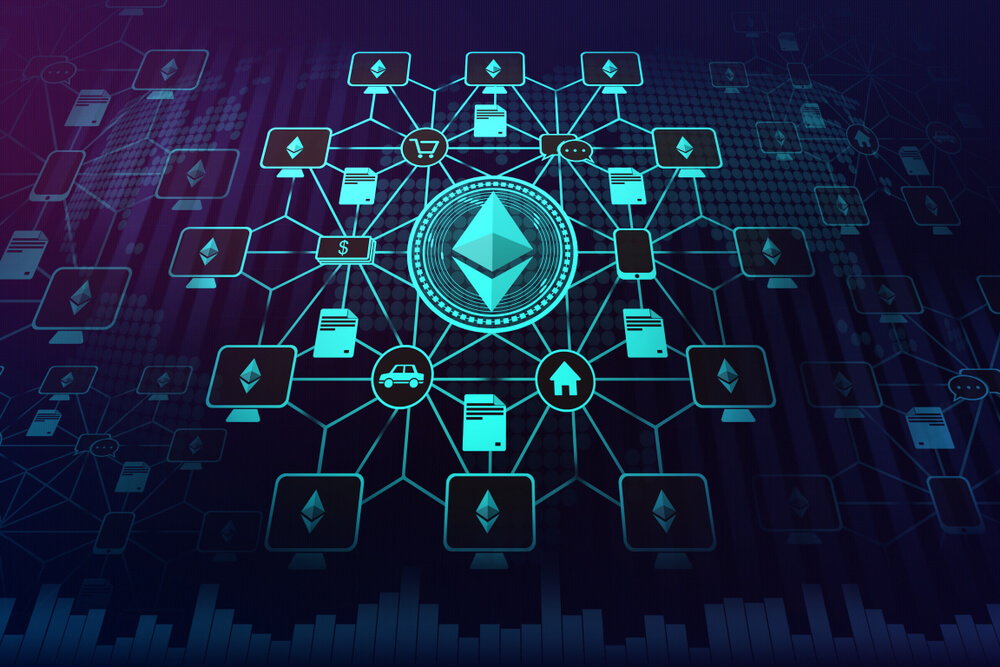
IoT stands for the Internet of things. It is a system of interrelated computing devices, mechanical and digital devices. These devices are provided with unique identifiers that can transfer data in the network without human-to-human or human-to-machine interaction. This is possible as the devices are extended with internet connectivity and sensors so that the transfer of data is possible.

With so much data being generated and transmitted without any human intervention, there are many concerns about the security and privacy of data. Blockchain comes to rescue to address the concerns of privacy and security in the world of IoT. Let us see how, with the help of some use cases below.

Smart Homes

The concept of IoT enables smart homes. Most of the devices we use at home can be embedded with sensors, and with the help of IoT, we can control them remotely using our smartphones. When at home, they can easily be controlled using Alexa, Google Home, with the help of voice recognition. To enable all these functionalities, sensitive data such as voice and facial recognition should be stored. This data can be stored securely in the blockchain, which allows strict access restrictions. It can be accessed by anyone else if required only through individual permissions using smart contracts.

HealthCare

IoT plays a very crucial role in health care these days. Remote health care can be achieved using IoT. Elderly care is essential to most of the countries these days as the elderly population is increasing in countries like China, Japan, and the US. Since there are fewer people to take care of the elderly, IoT can come to our rescue.

With the help of IoT, if the patients don’t take medicine on time, a message will be directly sent to their smartphones, reminding them to take medication (since the quantity isn’t reduced from the containers). Whenever a fall or sudden change in a heartbeat is detected, the nearest health care providers are automatically alerted with the help of IoT. These are only some examples of uses in health care, but since this is very sensitive data, blockchain can help in keeping them secure. Most importantly, tampering cannot be done if the data is stored in the blockchain, which is very crucial to achieve the desired outcome in these cases.

Agriculture

Agriculture can be widely improved by deploying IIOT (Industrial IOT) sensors and satellite imagery to monitor the millions of acres of land. With IoT used in the supply chain, provenance tracking can be enabled. Crops can be sold by using smart contracts even before harvesting them as all this data ensures the buyer of the quality of the product from the fields to their floor. This makes a profitable trade for all the parties involved.

There are ample opportunities for blockchain and IoT together in Industrial sectors when it comes to the maintenance of the machines. With the help of sensors continuously updating the performance of the devices, wear and tear can be restricted, thus decreasing the downtime. Automobile industries can use real-time data to get the vehicles serviced on time or replace a crucial part in time. Autonomous cars can be made more reliable and usable using IoT and blockchain. The combination of IoT and Blockchain is amazing, but it is important to remember that a lot of other potentials are yet to be achieved.

Categories
Forex Fundamental Analysis

The Momentous ‘Consumer Price Index’ & How It Impacts The Forex Market

Introduction

Consumer Price Index, in short, known as CPI, is one of the most closely watched Fundamental Indicators. It is the most direct measure of the current inflation in the economy that a citizen can look at and find out. Hence, Understanding the Consumer Price Index, its history, and the resultant effect it has on the market is very important to build an understanding of the macroeconomics of a nation.

What is the Consumer Price Index?

As the name suggests, the calculation of this index is from the viewpoint of the end consumer, i.e., a regular citizen who buys his/her daily needs from a local grocery store or market. Consumer Price Index, in the simplest sense, is the average of the most commonly purchased household goods and services like toothpaste, milk, grocery, petrol, etc. But instead of a simple average here, each good and service is assigned a certain weightage based on their importance or usage degree amongst the population.

For example, milk, which is a daily need for many consumers, will have a higher weightage in the mean price calculation than that of furniture, which we do not purchase daily or frequently. Also, when we say most commonly purchased goods and services, it covers a wide range of goods and services (over 80,000 items) and does not include rarely purchased items like stocks, bonds, foreign investments, or real estate.

How is the Consumer Price Index CPI calculated?

The Bureau of Labor Statistics (BLS) surveys the prices of 80,000 consumer items to create the index and publishes it monthly. The Consumer Price Index has two subcategories; one is CPI-W, which stands for Consumer Price Index for Urban Wage Earners and Clerical Workers. CPI-W statistics are published first, and later the CPI-U (Consumer Price Index for Urban Consumers) values are released. CPI-U is a broader statistic in terms of population and goods & services coverage.

CPI-U is the more accurate and complete statistic relatively as it takes the urban population, which represents about 93% of the United States population into account. While the CPI-W covers only about 29% of the population. Hence, It is the measure of an aggregate weighed in the price level of most commonly bought goods and services. The list includes items like food, clothing, shelter, fuel, transportation fares, service fees (water and sewer service), etc.

Consumer Price Index, whenever released, is given out as a percentage change, and here the change is concerning the previous number, which can be monthly, quarterly, or yearly.

Note: Here, the base year cost amounts to 100, and this base year is in the year 1982 to 1984, where the average amounted to 100. But the data released monthly is shown as a percentage increase or decrease concerning the previous period (usually the previous month).

Why is the Consumer Price Index important?

The importance of the Consumer Price Index is many-fold. First are the range and history of the data. With such a huge data set, the reliability is pretty high, and it usually depicts the macroeconomic picture of a country. For example, the history of CPIAUCSL (Consumer Price Index for All Urban Consumers: All Items in U.S. City Average) goes all the way back to 1947. Second is the frequency & direct ground-level nature of the statistic meaning this data brings out. CPI is a real-time reflection of the current economic situation faced by the end customer or citizens.

Thirdly, the change in CPI is useful to ascertain the retail-price changes associated with the country’s cost of living. Hence it is used widely to assess inflation in the United States. In this Index, there are many subcategories, wherein certain goods and services get included or excluded from the basket to give a more accurate picture of inflation in absolute or relative terms. For example, Core CPI strips away food, gas, and oil prices from the equation as the prices of these items are relatively volatile.

How can the Consumer Price Index be Used for Analysis?

Due to the diversity in the statistics, different sectors of economists can isolate and use the Consumer Price Index for their purpose. For example, the United States Bureau Of Labor Statistics provides indexes based on various geographic areas also. Moreover, they even release average price data for select utility, automotive fuel, and food items, which gives this Index the status of a key indicator in gauging multiple economic indicators.

Consumer Price Index is a widely used indicator for inflation measure. For other economic indicators like hourly wages and currency worth within the nation (dollar’s purchasing capacity to procure goods and services), CPI can be considered as a regulator. On average, for a developed nation like the United States, 0.2-0.5% of Consumer Price Index increase is common, and any number beyond these figures usually indicates volatility in the growth of the economy in either direction.

Sources of Consumer Price Index

The U.S. Bureau of Labor Statistics releases all the indexes that are mentioned above. This data can be found here – Consumer Price Index

You can also find the same indexes along with many others with a comprehensive summary and statistics on the St. Louis Fed website as given below.

CPIAUCSL (CPI for All Urban Consumers: All items in U.S. City Average)

This is a broadly used statistic for measuring the overall inflation. It includes Food and Energy prices, unlike CPIFESL. The information related to this index can be found here.

CPIFESL (CPI for All Urban Consumers: All items minus the Food and Energy in U.S. City)

It excludes volatile components like Food and Energy (Oil Prices) and gives more of a Core CPI change within the United States. The information related to this index can be found here.

Impact due to news release

In this section of the article, we will analyze the impact of the Consumer Price Index (CPI) on a currency right when the announcement is being made and see where the market finally gets to. The image below shows that the CPI data has a huge impact (Red box indicates high impact) on the currency, which means it might cause a drastic change in the volatility after the news announcement. Ideally, if the actual CPI numbers are greater than the forecasted numbers, it is good for the currency and vice versa.

We have taken the recent CPI data of Australia, which is quarter-on-quarter. The quarterly data is more important and impactful than the monthly numbers. The below image gives the 4th quarter data of CPI that was measured in January, and the next quarter data will be released in April. We see below that the CPI data for the 4th quarter was 0.7%, which is 0.2% greater than the previous reading. It is also 0.1% greater than the forecasted number. But, let us see how the market reacted to the data.


AUD/USD | Before The Announcement

The above image represents the chart of AUD/USD, where we see that the market is in an uptrend showing the strength of the Australian dollar. One of the reasons behind the uptrend is that traders and investors forecast the CPI data where they are expecting a 0.1% increase in the same. If the CPI numbers are increased more than expected by the ‘Australian Bureau of Statistics,’ it could be the best-case scenario for going ‘long’ in the market. However, if the numbers are below expectations, volatility could increase on the downside.        

AUD/USD | After The Announcement

Here, we see a sudden surge in volatility on the upside that after the news announcement is made. The reason for this is that the CPI got increased by 0.2%, where the market was expecting a 0.1% rise. The large green candle shows how impactful the CPI data is on the currency. From a trading point of view, one should not be chasing the market but instead, wait for a pullback at the nearest support and resistance area and then take suitable positions. The CPI data was so positive for the Australian dollar that the price does not even come below the moving average. Take Profit‘ for the trade can be at the new ‘high’ with a stop-loss below the opening of the news candle.

AUD/CAD | Before The Announcement

AUD/CAD | After The Announcement

The AUD/CAD currency pair appears to be in a ‘range’ just before the news announcement and is at the bottom of the range. An interesting way of positioning ourselves in the pair is by having small ‘buy’ positions before the news announcement. Because the forecasted CPI data is greater than the previous reading, and we are at a technically important level that is supporting our ‘buy’ positions. The news outcome makes the ‘support’ area work beautifully as the market shoots up to the resistance area. Here too, the data proved to be very positive for the Australian dollar as a higher CPI data drives the currency higher. We can hold on to our trades even if the price is at ‘resistance’ since the news data is very good for the currency, and it has the potential to break the ‘resistance’ and move further.

EUR/AUD | Before The Announcement

EUR/AUD | After The Announcement

In this currency pair, the Australian dollar is on the right-hand side, which means a positive CPI data should take the currency lower. We can see that the Australian dollar already strong as the market is in a downtrend, and the market participants are optimistic about the CPI data of Australia. After the CPI announcement, the volatility increases on the downside, taking the price to a new ‘low.’ Again, when we witness better than expected data of any economic indicator, we should not be chasing the market but wait for a retracement to key levels. In this case, since we don’t see a retracement after the red ‘news candle,’ only aggressive traders can take ‘short’ positions with the confidence that the CPI numbers were exceedingly better than before and that it will take the currency lower.

That’s about CPI and its impact on the Forex market. We hope you find this information useful and if you have any questions, shoot them in the comments below. Cheers.

Categories
Crypto Guides

The Fascinating Applications of Smart Contracts

Introduction

In the previous guide, we have understood what smart contracts are and what role they play in eliminating third parties. You can find that guide here if you didn’t get to read that yet. Smart Contracts have come out as one of the interesting applications of blockchain technology but it evolved so well that it has already been applied in most of the industries. Experts believe that these smart contracts do have significant applications in many other industries. Hence, in this article, let us see their usage in different industries.

Health Care and Medical Records

One primary application of smart contracts lies in the healthcare industry. Transferring and sharing patients’ electronic medical records (EMR) should be done in the most secure way. We are not saying that the current technology is not secure at all. We are just saying that using this technology will enhance the existing security.

Smart contracts enable multi-signature approval features enabling both patients and health care providers, allowing them to share the information securely as these are sensitive data. Patients can allow their data to be sent to research organizations for various studies and can be sent micropayments to the patients for participation using the same platform. We must not forget that a lot of infrastructure and technology should be built to achieve the same.

Banking

Banking systems have undergone a lot of changes proportional to technology adoption by the people. Smart contracts can play a crucial role in the mortgages provided by banks or any non-banking financial institutions. Banks spend a lot of money to check if the property that is being mortgaged currently is already mortgaged or not. To check if the property does indeed belong to the person applying for the mortgage or not. If the documents of the property are placed in blockchain with the help of smart contracts, this can be verified in a click. This saves a lot of money to both consumers and banking, reportedly in billions.

KYC

These days we have to provide our KYC documents at various places like to open a bank account, to take a sim card, driving license, registering property to name some. If the KYC documents are stored in a blockchain, with the help of smart contracts, the right people can be given proper authority to access them. Also, if any changes required from our side, we need to make a change at one single repository instead of making changes at every entity where we have given the documents.

Supply Chain

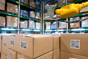
Supply Chain is one major area that can benefit hugely using blockchain adaptability and thereby using smart contracts. There are various documents throughout the supply chain cycle which can be misplaced and tough to authenticate at and every area required. If smart contracts are used to share and verify these documents, a lot of time and money can be saved to clear the goods at national highways, significant seaports, etc. Provenance tracking can also be done, thus increasing the bar of trust among consumers.

Voting

Voting can be achieved relatively and transparently using blockchain and smart contracts. With blockchain involved, no one can tamper with the election process, and with the smart contracts, it is possible to ensure the correct person is voting instead of the duplicity of votes.

Insurance

We all know it takes time for the insurance industries to clear the claims as it takes time to check the claims for its authenticity. With the adoption of smart contracts, the respective authorities can easily fact check the claims. For example, for travel insurance, we can easily verify whether the flight is a delay or canceled, thus passing the request.

However, all these industries can actively adapt and grow using blockchain only in the ideal world where blockchain is integrated throughout all sectors and government institutions. Active engagement and development are only possible when adoption is at a high rate. The blockchain technology is still growing, and a lot of innovation and growth is yet required to use the full potential of blockchain and thereby smart contracts as well.

Categories
Forex Assets

Analyzing The GBP/TWD Forex Currency Pair

Introduction to GBP/TWD

GBP stands for British pound sterling, and it is typically known as Pound. It is the official currency of the United Kingdom and some other countries like Jersey, South Georgia, and Guernsey. The pound is also the 4th most traded currency in the foreign exchange after USD, EUR & YEN. Whereas TWD is the abbreviation of The New Taiwan dollar. The central bank of Taiwan issues this currency.

GBP/TWD

Currency pairs are the national currencies from two countries coupled for being exchanged in reference to each other. In the Forex market, one currency is always quoted against the other. GBP/TWD is the abbreviation for the Pound sterling against the New Taiwan dollar. In this case, the first currency(GBP) is the base currency, and the second(TWD) is the quote currency.

Understanding GBP/TWD

In Forex, to find out the relative value of one currency, we need another currency to compare. If the value of the base currency goes down, the value of the quote currency goes up and vice versa. The market value of GBP/TWD determines the strength of TWD against the GBP. This can be easily understood as 1GBP is equal to how much of TWD. So if the exchange rate for the pair GBP/TWD is 37.093, it means we need 37.093 TWD to buy 1 GBP.

Spread

Forex brokers have two different prices for currency pairs: the bid and ask price. The bid price is the selling price, and ask is the buy price. The difference between the ask and the bid price is called the spread. Spread is basically a type of commission by which brokers make their money. Below are the ECN and STP for the pair GBP/TWD.

ECN: 49 pips | STP: 52 pips

Fees

Each time we place a trade, we need to pay some commission on it. A Fee is simply that commission we pay to the broker for opening a particular position. The fee also varies from the type of broker we use; for example, there is no fee on STP account models, but a few pips on ECN accounts.

Slippage

Slippage refers to the difference between the trader’s expected price and the actual price at which the trade is executed. It can occur at any time but mostly happens when the market is fast-moving and volatile. Also, sometimes when we place a large number of orders at the same time.

Ranges in GBP/TWD

The Range is a measure of volatility. It tells how much the currency pair has moved in a determined period. Whether a trader makes a profit or loss in a given time period depends on the movement of a currency pair and can be determined using the trading range table. It is a representation of the minimum, average, and maximum pip movement in a currency pair. This can be evaluated simply by using the ATR indicator combined with 200-period SMA.

Procedure to assess Pip Ranges

  1. Add the ATR indicator to your chart
  2. Set the period to 1
  3. Add a 200-period SMA to this indicator
  4. Shrink the chart so you can assess a significant period
  5. Select your desired timeframe
  6. Measure the floor level and set this value as the min
  7. Measure the level of the 200-period SMA and set this as the average
  8. Measure the peak levels and set this as Max.

GBP/TWD Cost as a Percent of the Trading Range

The cost of trade mostly depends on the broker and varies based on the volatility of the market. This is because the total cost involves slippage and spreads apart from the trading fee. Below is the representation of the cost variation in terms of percentages. The comprehension of it is discussed in the following sections. We will look into both the ECN model and the STP model.

ECN Model Account

Spread = 49 | Slippage = 3 |Trading fee = 5

Total cost = Slippage + Spread + Trading Fee = 3 + 49 + 5 = 57

STP Model Account

Spread = 52| Slippage = 3 | Trading fee = 0

Total cost = Slippage + Spread + Trading Fee = 3 + 52 + 0 = 55

Trading the GBP/TWD Forex Pair

The GBP/TWD is an exotic-cross currency pair and is a ranging market. A market is said to be ranging when the price hits the support and resistance at least three times. As seen in the Range table, the average pip movement on the 1-hour time frame is only 47. This clearly shows that if we trade in this pair, we will have to wait for a more extended period of time to get some good profit because of such a less movement in the pips.

Here in GBP/TWD, TWD is considered to be an emerging currency. Note that the higher the volatility, the lower is the cost of the trade. However, this is not an advantage as it is risky to trade highly volatile markets.

For example, in the 1M time frame, the maximum pip range value is 3009 and in minimum pip range, the value is 687. When we compare the fees for both the pip movements, we find that for 687 pip movement fees is 8.30%, and for 3009pip movement, fess is only 1.89%.

So, we can infer that the cost of trade is higher in the low volatile markets and high in the highly volatile markets. It is recommended to trade when the volatility is around the minimum values. The volatility here is low, and the costs are a little high compared to the average and the maximum values. But, if our priority is not towards reducing costs, we may trade when the volatility of the market is around the maximum values.

Categories
Forex Course

95. Adding Pivot Points to Your Range Strategy

Introduction

In the previous two lessons, we completely understood the basics of pivot points as well as how to calculate and interpret them. And now, we can move on and start applying this indicator to our charts and find trading opportunities using it.

In this lesson, we shall use the pivots points in our range trading strategy. We will be giving you a complete guide on the trading range with the assistance of pivot points.

Incorporating Pivot Points into Ranges

The Basics

As we already learned, pivot point has S1, R1, S2, R2, etc. which represents Support and Resistance whose working principles are the same as the typical Support and Resistance. According to the definition, support is the area in which the market tends to hold and move up, and resistance is the area where the market holds and typically moves downwards.

Talking about a range, it is the state of the market which moves in a sideways direction and repeatedly bounces off from support and resistance level. So, we shall be testing the pivot points as the place where the market can hold and possibly reverse.

The Thumb Rule

When the market is at any of the upper Resistance levels, we look to go Short on the security. When the price is at any of the lower Support levels, we look to go Long on the security.

Live Chart Example

Below is the chart of GBP/CAD on 15min timeframe. We can see that currently, the market is in a range (as shown in the box). The market was ranging on the 16th of March. With these values of 16th March, we calculate the pivot points for the next day and find trading opportunities.

Now consider the same chart after we’ve determined the P, S1, R1, S2, R2 pivot levels. Following up range, we can see that the S1 level was formed exactly at the bottom of the range. Now, both S1 and the bottom of the range is indicating a Buy a signal. Hence, when the price touches the S1 level, we can go long on this pair.

From the chart, we can clearly see that we found two opportunities to hit the buy at the first Support level S1.

Placements

Having a predetermined take profit and stop loss is vital in trading. In this particular example, the take profit can be placed at the pivot point (P) and stop loss below the S1 such that the trade yields 1:1 Risk Reward. Note that there are times when the take profit can be placed at the R1 level as well. But this requires expertise in technical analysis as well as in pivot points.

The above example is the way for traders to get the hang of how to trade pivot points. To do it more professionally, one must use other technical analysis tools to have a confirmation on the pivot levels. For instance, if there appears a Doji candle at the S1 level and also the stochastic indicator is indicating that the market is in the oversold area, then there are more odds in our favor that the support will work in the direction we predicted.

So, to sum it up, one must use the pivot point levels by clubbing it with other technical tools to find optimum results. We hope you comprehended this lesson to the best of your ability. Cheers!

[wp_quiz id=”69435″]
Categories
Forex Assets

Asset Analysis – Exploring The ‘GBP/BND’ Exotic Pair

Introduction

The abbreviation of GBP is the Great British Pound, and this currency is mostly known as pound sterling across the globe. It is one of the most-traded currencies in the Forex market and stands at the fourth position right after USD, EUR, & JPY. Whereas the abbreviation of BND is the Brunei Dollar, and it has been the currency of the Sultanate of Brunei since 1967. The Monetary Authority of Brunei Darussalam issues the Brunei Dollar.

GBP/BND

In the Forex market, currencies of the two countries are paired for being exchanged in reference to each other. GBP/BND is the abbreviation for the Pound Sterling against The Brunei Dollar. In this case, the first currency (GBP) is the base currency, and the second (BND) is the quote currency. The GBP/BND is classified as an exotic-cross currency pair.

Understanding GBP/BND

In the Forex, one currency is quoted against the other. To find out the relative value of one currency, we need another currency to compare. If the value of the base currency goes down, the value of the quote currency goes up and vice versa.

The market value of GBP/BND determines the strength of BND against the GBP. This can be easily understood as 1GBP is equal to how much BND. So if the exchange rate for the pair GBP/BND is 1.7660, it means 1GBP is equal to 1.7660 BND.

Spread

Forex brokers set two different prices for the currency pairs – Bid & Ask prices. Here the ‘bid’ price is at which we can sell the base currency, and the ‘ask’ price is at which we can buy the base currency. The difference between the ask and the bid price is called spread. The spread is how brokers make their money. Some brokers, instead of charging a separate fee for trading, they already have the fees inbuilt in the form of spread. Below are the ECN & STP spread values for GBP/BND Forex pair.

ECN: 12 pips | STP: 15 pips

Fees

A Fee is simply the commission we pay to the broker each time we execute a position. There is no fee on STP account models, but a few pips of the trading fee is charged on ECN accounts.

Slippage

Slippage refers to the difference between the expected price at which the trader wants to execute the trade and the price at which the trade gets executed. The slippage can occur at any time but mostly happens when the market is fast-moving and volatile in nature. Slippage also occurs when we place a large number of orders at the same time.

Trading Range in GBP/BND

The amount of money we will win or lose in a given time can be assessed by using the trading range table. It is a representation of the minimum, average, and maximum pip movement in a currency pair. This can be evaluated easily by using the ART indicator combined with 200-period SMA.

Procedure to assess Pip Ranges

  1. Add the ATR indicator to your chart
  2. Set the period to 1
  3. Add a 200-period SMA to this indicator
  4. Shrink the chart so you can assess a significant period
  5. Select your desired timeframe
  6. Measure the floor level and set this value as the min
  7. Measure the level of the 200-period SMA and set this as the average
  8. Measure the peak levels and set this as Max.

GBP/BND Cost as a Percent of the Trading Range

The cost of trade mostly depends on the type of broker we chose and also varies based on market volatility. This is because the total cost involves slippage and spreads apart from the trading fee. Below is the representation of the cost variation in terms of percentages. The comprehension of it is discussed in the following sections.

ECN Model Account

Spread = 12 | Slippage = 3 |Trading fee = 5

Total cost = Slippage + Spread + Trading Fee = 3 + 12 + 5 = 20

STP Model Account

Spread = 15 | Slippage = 3 | Trading fee = 0

Total cost = Slippage + Spread + Trading Fee = 3 + 15 + 0 = 18

Trading the GBP/BND

The GBP/BND is an exotic-cross currency pair and it is typically a Ranging market. The average pip movement of this pair on the 1H timeframe is 55 pips. Since the market is ranging, the volatility is less and the trading costs are relatively high while trading the GBP/BND pair. Always remember that cost of trade increases as the volatility decreases and vice versa.

Conservative traders who don’t mind spending more on trading fees can trade this pair on all the timeframes as the volatility is moderate. Comprehending the above tables, we should note that the costs on the trade are high when the volatility is less. But traders who don’t prefer spending more on trading costs can trade this pair when the volatility of the market is around the maximum values. Cheers!

Categories
Forex Course

94. Calculating and Comprehending Pivot Points

Introduction

In the previous lesson, we understood what pivot points are. However, it is also necessary to understand how these levels are calculated. So, in this lesson, let’s go ahead and figure out how these levels are marked and comprehended.

Before getting right into it, let’s brush up the previous topic real quick.

  • The pivot point is an indicator used to identify Support and Resistance levels.
  • It is a static indicator, unlike the other indicators that move with the price.
  • It helps in determining the overall trend of the market in any given timeframe.
  • It is calculated using high, low, and close values.

Below is an image of how pivot points look when applied on the charts. As already mentioned, S stands for Support, R stands for Resistance, and P(PP) stands for Pivot Point. Now we shall see what exactly is S1, R1, S2, R2, etc.

Calculating Pivot Points

Different levels of Support and Resistance are shown when calculating the Pivot point’s support and resistance levels, and they are represented as S1, R1, S2, R2, etc. Now, let’s calculate each one of them. The Pivot Point P(PP) value is given by the average of the high price, low price, and the close price.

Pivot point P(PP) = (High + Low + Close) / 3

First level Support and Resistance Formula:

First Resistance (R1) = (2 x P) – Low | First Support (S1) = (2 x P) – High

Second level Support and Resistance Formula

Second Resistance (R2) = P + (High – Low) | Second Support (S2) = P – (High – Low)

Third Level Support and Resistance Formula

Third Resistance (R3) = High + 2(P – Low) | Third Support (S3) = Low – 2(High – P)

In the above formulas:

High represents the high price from the previous trading day,

Low represents the low price from the previous trading day, and

Close represents the closing price from the previous trading day.

Note: Since the forex market is open 24 hours, the New York closing time, i.e., 5:00 pm EST, is taken as the previous day data. For example, if you want to calculate the levels for Wednesday, you must consider the values of Tuesday.

Comprehending Pivot Points

In this indicator, we came across three levels, namely, Pivot point level, Support level, and the Resistance level. Let’s now understand what they actually depict.

The pivot point is a level drawn at the price of the average of the High, Low, and the close price of the prior trading day. So, if the market falls below the pivot point level on the subsequent trading day, we say that the market is showing bearish sentiment. And if the price goes above the pivot point, we say that the indicator is indicating bullish sentiment.

When it comes to the Support and Resistance levels, their meaning is the same as that of the actual Support and Resistance that is defined in the industry. The Support level is the price at which the market tends to shoot up, and Resistance is the level where the market tends to fall.

This brings us to the end of this lesson. In the coming lessons, we will understand how to trade the markets applying the Pivot Points indicator.

[wp_quiz id=”69225″]
Categories
Forex Fundamental Analysis

‘Non Farm Payroll’ as a Macro Economic Indicator & Its Impact On The Forex Market

Introduction

The NFP is one of the most important fundamental indicators in the Forex market, which causes large price movements in currency pairs. This article will explain the basics of NFP, the role of NFP in economics, and how to interpret the NFP data after its release.

What is the Nonfarm Payroll (NFP)?

The Nonfarm Payroll report gives the number of jobs added or lost in a country compared to the previous month. These numbers do not include agricultural farmers, employees belonging to the non-profit organization, self-employed individuals, private households, and employees of military agencies. NFP also provides the statistics of the long-term employment and youth unemployment rates. This indicator tells which sector of the economy is generating jobs and which are not. The government investigates these numbers carefully and takes appropriate actions to improve the employment situation of that sector.

The economic reports of NFP

The ‘Employment Situation’ report is a monthly report that is released by the Bureau of Labor Statistics (BLS) on the first Friday of every month. The report is released at approximately 8:30 in the morning. The NFP report is a comprehensive report that is made after the survey of two major sectors of the economy. The two sectors are the ‘Household Sector’ and the ‘Establishment Sector.’ The ‘Household Survey’ gives the employment rate of individuals in various categories, and the ‘Establishment Survey’ provides the number of new nonfarm payroll jobs added within the economy.

Survey of the ‘Household Sector’

Key components of this survey include

  • The total unemployment rates
  • Unemployment rate based on Gender
  • Unemployment rate based on Race
  • Unemployment rate based on Education
  • Unemployment rate based on Age
  • Reason behind unemployment
  • Participation (for employment) rate by individuals

Survey of the ‘Establishment Sector’

Key components of this survey include

  • The total nonfarm payrolls added by industries of durable goods, non-durable goods, services, and government
  • Hours worked by employees
  • Average hourly earnings of employees

Analyzing the Data

The economic report of NFP is an essential factor of fundamental analysis that investment managers evaluate before making investment decisions. This data is crucial when determining the strength of the economy and, thus, the value of the currency. One can analyze the data by comparing the release of the current month to that of the previous month. This comparison helps to determine if the country has generated more jobs for its people or have, they lost more jobs compared to the previous month.

Based on the month on month numbers, we can conclude if the economy is strengthening or deteriorating. We can also anticipate if the US economy will perform at the expected growth rate, or there will be a reduction in the GDP.

Impact on currency

When unemployment rates are low, banks and institutions gain confidence in that economy and will be willing to invest in that country. When several other banks invest in the country, it leads to an appreciation of the currency and the economy. Forex traders and investors consider this factor as a very important indicator for predicting the future value of a currency.

NFP data has a direct impact on most of the asset classes, including Forex, commodities, equities, and Index CFDs. It is seen that the market reacts quickly to the data with a huge rise in volume. During the news announcement, all major market players and institutions take new positions in the market or exit their existing positions. As millions of positions are created and removed at the same time, one can witness heavy volatility during the news release. The condition of the job market has a direct link to consumer spending, which represents the health of the economy. When people of a nation are employed, they use their wages for purchasing various goods and services to fulfill their needs.  This means the consumer spending automatically increases.

Sources of information on NFP

The Bureau of Labour Statistics (BLS) releases the typical NFP data on the first Friday of each month. However, the first round of data is released on the third Friday after the end of the reference week. But as traders, we need to focus on the data that is released on the first Friday of each month and monitor it carefully. We also need to keep with us the previous month’s data and the forecast for the current month. There are many financial websites that give a graphical representation of the historical data that will give a clear understanding of how the NFP data has changed over time.

Sources of information for major economies  

USDCHFCAD

Nonfarm Payroll is vital because it is released monthly and is a very good indicator of the current state of the economy. This data can be found on the ‘economic calendar’ of every broker. When the unemployment rate is high, policymakers tend to have a monetary that will increase economic output and increase employment. There are timely revisions that take place to review the components of NFP, and the components may change if necessary. Another aspect of unemployment is the number of working hours and hourly wages. It is possible that people are employed but will be working part-time or earning less for that work.

The NFP data release is accompanied by increased volatility and widened spreads, which means in order to avoid getting stopped out, we recommend using larger stop loss without changing the risk to reward ratio. This is possible is we use no leverage at all during NFP news release and enter with a smaller position in the market. We need to do 90% of the analysis even before the news is released so that when the actual data is out, we should quickly be able to decide if we have to go ‘long’ or ‘short’ in any given Forex pair.

Impact Of NFP News Release On The Forex market

The non-farm-payroll (NFP) is a key economic indicator that measures the health of the economy for the United States. The NFP represents the number of jobs added in a period of one month that excludes farmers, government employees, and employees of other non-profit organizations.

So, a higher than expected reading should be taken as positive for the US dollar, while a lower than expected reading is taken to be negative for the US dollar. NFP releases generally cause large movements not only in the forex market but also in the commodity and stock market. In this section of the article, we will explain the impact of NFP on the price chart and see how to apply the NFP data in our trading strategy.

The below image was taken from Forex Factory, and the red indication there implies that this Fundamental Indicator’s new release will have a strong impact on the Forex price charts.

The below image shows the latest NFP data that was collected for the month of February. The NFP data is published by the Bureau of Labor Statistics (BLS), which also carries out surveys across the country. Based on the NFP data, traders and investors from all over the world take suitable positions in the market, which is the reason behind increased volatility. The expected NFP results for March 8, 2020, was around 175k (job additions), and the actual data came out to be 273K (job additions), which was much better. Even though this should be positive for the US economy, let us see how the market reacted.

EUR/USD | Before the announcement | March 6th, 2020

We shall start with the most liquid currency pair in the world and see the impact of NFP news release on it. In the above chart, EUR/USD is in strong uptrend signifying the weakness of the US dollar. One of the reasons behind the weakness is lower NFP expectations from economists as compared to the previous data. The market feels that there were fewer job creations in the month of February, and hence they don’t want to buy US dollars. From a technical perspective, the market is just going up without a retracement, and we cannot take a position on any side at this point. When there is constant movement on one side, it is better to wait for the news outcome, and then based on the data, one can enter the market.

EUR/USD | After the announcement | March 6th, 2020

The NFP numbers were the same as before, and an equal number of jobs were created this time too. This was more than what the market was expecting and optimistic data for the US dollar. In the above chart, we see that the price falls soon after the NFP data was announced, and the US dollar strengthens all of a sudden. The volatility expands on the downside as NFP data was above expectations, but it could not result in a reversal of the trend. The ‘news candle’ leaves a wick on the bottom, and the price rallies further up. Since the current data was no better than previous data, some traders consider it to be negative for the economy and hence sell US dollars. Until one gets clear reversal patterns, he/she should not go ‘short’ in the market, thinking that the data is positive.

USD/JPY | Before the announcement | March 6th, 2020


USD/JPY | After the announcement | March 6th, 2020

The above images represent the chart of the USD/JPY currency pair, where the market is in a strong downtrend, again showing the weakness of the US dollar. Since the impact of NFP is high, robust data can result in a reversal of the trend, and a weak to not-so-positive data can result in trend continuation. For risk aversion, one needs to go ‘long’ in the market with a great amount of caution, and we need to combine the news outcome with technical analysis. However, it is much easier to go ‘short’ in the pair if the NFP data is not good. After the news announcement, we see the bullish candle and witness increased volatility on the upside. But this NFP data was not sufficient to talk the price even to the recent ‘higher high,’ this means the data was mildly positive for the US economy.

AUD/USD | Before the announcement | March 6th, 2020

AUD/USD | After the announcement | March 6th, 2020

In the AUD/USD currency pair, the US dollar is much stronger than other pairs where the price is below the moving average before the news announcement. Since the US dollar is already showing strength, we can say that a mildly positive data can take the currency lower and result in an extended downward move. And only a negative NFP data can result in an up move. After the NFP data is released, we see a formation of the ‘Doji’ candlestick pattern, indicating indecision in the market. As the price continues to remain below the moving average, we can expect the volatility to increase on the downside.

That’s about Nonfarm Payrolls and its impact on the Forex market. If you have any questions, let us know in the comments below. Cheers.

Categories
Forex Fundamental Analysis

Understanding ‘Foreign Exchange Reserves’ & Its Impact On The Forex Market

Introduction To Foreign Exchange Reserves

Foreign Exchange Reserves are foreign assets held by a country’s central bank. Most of the foreign reserves are held in the form of currencies, while the other reserves include deposits, bonds, treasury bills, other government securities. There are plenty of reasons why central banks hold reserves. And the most important reason is to control their currencies’ values. The reserves act as a backup for their liability. From an economic point of view, it essentially influences the monetary policy.

When a country’s currency falls considerably, the foreign exchange reserve acts as a backup of their economy. Typically, countries hold the US dollar as their forex reserves because it is the most traded currency in the world. Apart from that, the Great Britain Pound, Chinese Yuan, Euro region’s Euro, and Japanese Yen are the currencies that are held as FX reserves.

Understanding Foreign Exchange Reserves

Let us understand with an example, how exactly are the forex reserves accumulated.

Consider two countries, the United States and Great Britain Pound. In the present situation, let’s say the value of USD and the GBP is the same with stable economies. Now let’s say the investors start believing that the USD is going to perform exceptionally well in the coming years. So, they begin flowing in cash into the US’s real estate and the stock market. This brings up a massive demand in the US dollar, while supply in Pound.

In such a situation, people must pay more Pounds to purchase one US Dollar. Or in USD’s perspective, people must pay lesser US dollars to buy one Pound. Moving further, let’s say the US does not want its currency to get very strong. This is because it has led to high volatility in the price and dramatic moves in the market.

With this concern, the central banks start printing more of their currency (US Dollar). And this money is deployed into buying the GBP. In doing so, the supply and demand of both the currencies stabilize again. Now the Pounds that the US central banks own are the foreign reserves. This hence appears on the balance sheet of the US.

What is the Purpose of Foreign Exchange Reserves?

There are several ways central banks use FX reserves for different purposes.

The countries use their foreign reserves to keep their currency’s value at a fixed rate. An example of the same is given above. Countries with a floating exchange rate system use FX reserves to keep the value of their currency less than the US dollar. For example, Japan follows a floating system. The central bank of Japan buys US treasury so that the Yen stays below the Dollar.

Another critical function of the reserves is to maintain liquidity in case of economic crises. For instance, a natural calamity might bring a halt to local exporter’s ability to produce goods. This cuts off their supply of foreign currency to pay for imports. In such scenarios, central banks can get their local currencies in exchange for the foreign currency they have. Hence, this allows them to pay for and receive imports.

The foreign currencies are supplied by the market to keep markets steady. It also buys the local currency to prevent inflation and support its value. Central banks provide confidence to investors through reserves. They assure their foreign investors that they’re ready to take action to protect investors’ investments. This will prevent the loss of capital for the country.

Some countries use their foreign reserves to fund sectors. For example, China has used its reserves for rebuilding some of its state-owned banks.

How Forex Reserves impact the currency?

Foreign exchange reserves are important to investors as it controls the supply and demand of the currency in the forex market. Knowing that central banks try keeping the currency values stabilized, we take advantage of this and try predicting the value of a currency pair.

Let’s say the US is buying large quantities of Australian goods, bonds, etc. This would create a demand in the Australian Dollar against the US dollar. That is, the value of AUD/USD would rise in doing so. Now, if the value rises to a significant amount, the central banks will buy back the US dollars from them, which creates a demand in the USD. And this hence will bring down the value of AUD/USD to keep it stable again. Therefore, traders can look to go short on AUD/USD knowing that USD would buy back their currency to keep both the currencies stable.

Reliable Source of information on Foreign Exchange Reserves

Traders and investors need the data of foreign exchange reserves to make their investments. And this data is publicly available for free. Below are the portals to access the reports on the Forex reserves of different countries. Apart from the current data, one can access the historical data with graphical charts as well.

USD | CAD | GBP | AUD | EUR | JPY | CHF

Impact Of Foreign Exchange Reserves’ News Release On Forex

From the above topics, it is evident that Foreign exchange reserves affect the currency of an economy. Now, we shall see how the price charts are affected when the reports are released. Typically, the impact of the news after its release is low. The Forex reserves of a country are released on a monthly basis and usually at the beginning of a moth. However, the source of the announcement is different for different countries.

For analysis, we will be considering the data released by Japan. The reports on the FX reserve is announced by the Ministry of Finance of Japan. Specifically, we will be considering the reserves that are held as USD. Consider the below report of Foreign exchange reserves (USD) held by Japan’s central bank. The news was announced on 5th March 2020. We can that the newly released data was higher than the previous month by 16.7B.

Source: Investing.com

USD/JPY | Before the Announcement | 5th March 2020

Below is the chart of USD/JPY on the 15min timeframe before the release of the news. Currently, the market is showing some strength from the buyers.

USD/JPY | After the Announcement | 5th March 2020

Below is the same chart, but after the release of the news. We can see that a green candle popped at first but was eaten up by a red candle. Basically, the up move was nullified by the sellers. Also, we cannot really say that the up and down move was due to the news because the volume didn’t show any sudden spike up. Typically, for impactful news, the volume increases drastically, which did not happen for this news. However, the volatility rose a little above the average but dropped below in a few minutes. One of the reasons we could account for the low volatility and volume is that the report was almost the same as the previous month’s report.

EUR/JPY | Before the Announcement | 5th March 2020

EUR/JPY | After the Announcement | 5th March 2020

Consider the chart of EUR/JPY on the 15min timeframe given below. The news candle is marked by a rectangle around it. We can see that the price action of this pair is very similar to that of USD/JPY. Initially, the market showed a bullish move but dropped the next candle. Speaking of volatility, it was a pip or two above the average volatility. The Volume, too, did not increase during the announcement of the news, which usually happens for other impacting news. Hence, in this pair too, the FX reserves did not have an immediate impact on the currency pair.

GBP/JPY | Before the Announcement | 5th March 2020

GBP/JPY | After the Announcement | 5th March 2020

Below is the chart of GBP/JPY on the 15min timeframe. Similar to the above two pairs, in this pair too, the price action is almost the same. In 30 mins after the release of the news, the market showed a little bullish but ended on a bearish note. The volatility at this time was at the average line, and the volume was feeble. In fact, it was lesser than the time when the London or New York market opens. Hence, with this, we can come to the conclusion that the impact of Foreign exchange reserves on GBP/JPY was insignificant.

Conclusion

Foreign exchange reserves are the assets of other countries held by the central bank of a country. The reasons for doing so are plenty. The Foreign Exchange Reserves has its influence in determining the monetary policy. FX reserves can control the rate of a currency and can use to stabilize the same.

However, if we were to see its immediate impact on the price charts, it is low. The impact on the currency pair is usually when it is significantly overvalued or undervalued. FX reserves are also helpful to central banks in bringing up the economy to an extent. This indicator may not predict the future economy but can help economists in several other ways.

That’s about Foreign Exchange Reserves and their impact on the price charts. If you have any questions, let us know in the comments below. Cheers!

Categories
Forex Course

93. Introduction to Pivot Points

What is a Pivot Point?

The pivot point is a technical indicator that shows the levels typically used to determine the overall trend of the market in different timeframes. These points are essentially used by professional traders to identify support and resistance levels. As a retail trader, one must keep an eye on these levels to identify potential buy/sell signals. To put in simple terms, the pivot points and its corresponding support and resistance levels are places at which markets can possibly change its direction.

The reason this indicator is very enticing is because of its objective. Unlike other technical indicators, there is no decision making involved. The Pivot Points are very similar to the Fibonacci levels. This is because these levels are pretty much self-fulfilling. However, there are some differences in some respects, which shall be discussed in the next section.

It is important to know that the pivot point indicator is mostly designed for short-term traders who wish to take advantage of small price movements. The technique to trade this is similar to that of trading support and resistance, where we participate in the market on a break or bounce from these levels.

The Difference between Pivot Points and Fibonacci Retracements

Though Pivot points and Fibonacci retracements are made by drawing horizontal lines to depict potential support and resistance levels, there vary in few aspects. In Fibonacci levels, there is subjectivity involved in picking the swing lows and highs. But, in pivot points, there is no discretion involved.

In Fib retracements, the levels can be constructed by connecting any price points on a chart. Once the levels are determined, the lines are then drawn at percentages of the selected price range. In the case of pivot points, fixed numbers are used instead of percentages. And the fixed values are the high, the low, and the close of the prior day.

Interpreting Pivot Points

Pivot points indicator is typically used by traders who trade the market using technical analysis. This indicator can be applied to the Stock, Forex, Commodity, Futures as well as the Cryptocurrency market. This indicator is unique from the other indicators because it doesn’t move with the price action.

It is static, and the levels drawn remain at the same prices throughout the day. This means that traders can plan their strategy much in advance. For example, in most of the approaches, if the price falls below the pivot point, traders will go short on the security. And similarly, if the price goes above the pivot point, they will look for buying opportunities.

How do Pivot Points look?

When the standard pivot points are applied to the charts, it will look something like this (as shown below).

In the above chart, P stands for Pivot Point | stands for Support | stands for Resistance

There are R1, S1, R2, S2, etc. as well, but it shall be explained in the upcoming lessons. Stay tuned!

[wp_quiz id=”69068″]
Categories
Forex Assets

Trading The GBP/PHP Exotic Currency Pair

Introduction

The expansion of GBP is the Great Britan Pound, and this currency is very well known as the Pound Sterling. It is the official currency of the United Kingdom and many other countries like British Overseas Territories, South Sandwich Islands, etc. Where in PHP is known as the Philippine peso and generally referred to as the Piso. It is the official currency of the Philippines, and it is printed by The Central Bank of the Philippines.

GBP/PHP

In the Forex market, currency pairs of any two countries are coupled for being exchanged in reference to each other. GBP/PHP is the abbreviation for the Pound sterling against The Philippine peso. In this case, the first currency (GBP) is the base currency, and the second (PHP) is the quote currency. The GBP/PHP is classified as an exotic-cross currency pair.

Understanding GBP/PHP

As we know, the trading of currencies in the Forex market typically happens in pairs. One currency is quoted against the other, and to find out the relative value of one currency, we need another currency to compare. The market value of GBP/PHP determines the strength of PHP against the GBP. This can be easily understood as 1 GBP is equal to how much PHP. So if the exchange rate for the pair GBP/PHP is 63.377. It means 1 GBP is equivalent to 63.377 PHP.

Spread

Forex brokers have two different prices for currency pairs, and they are the bid and ask prices. The bid is a selling price while the ask is a buy price. The difference between the ask and the bid price is called the spread. The spread is how most of the brokers make their money. The spreads of GBP/PHP in both ECN & STP brokers can be found below.

ECN: 45 pips | STP: 48 pips

Fees

When we execute a trade, we need to pay the broker some commission. A Fee is that commission we pay to the broker each time we execute a position. There is no fee on STP account models, but ECN brokers charge some pips as a trading fee.

Slippage

Sometimes while trading in a volatile market, we won’t be able to execute a trade at the price we want it to get executed. Slippage is the difference between the trader’s expected price and the actual price at which the trade is executed. It may occur at any time but mostly happens when the market is fast-moving and volatile. It can also happen when we place a large number of orders at the same time.

Trading Range in GBP/PHP

The amount of money we will win or lose in a given amount of time can be assessed using the trading range table. It is a representation of the minimum, average, and maximum pip movement in a currency pair. This can be evaluated by using the ART indicator combined with 200-period SMA.

Procedure to assess Pip Ranges

  1. Add the ATR indicator to your chart
  2. Set the period to 1
  3. Add a 200-period SMA to this indicator
  4. Shrink the chart so you can assess a significant period
  5. Select your desired timeframe
  6. Measure the floor level and set this value as the min
  7. Measure the level of the 200-period SMA and set this as the average
  8. Measure the peak levels and set this as Max.

GBP/PHP Cost as a Percent of the Trading Range

The cost of trade mostly depends on the broker and varies based on the volatility of the market. This is because the total cost involves slippage and spreads apart from the trading fee. Below is the representation of the cost variation in terms of percentages. The comprehension of it is discussed in the following sections.

ECN Model Account

Spread = 45 | Slippage = 3 |Trading fee = 5

Total cost = Slippage + Spread + Trading Fee = 3 + 45 + 5 = 53

STP Model Account

Spread = 48 | Slippage = 3 | Trading fee = 0

Total cost = Slippage + Spread + Trading Fee = 3 + 48 + 0 = 51

Trading the GBP/PHP Forex Pair

The GBP/PHP is an exotic-cross currency pair with great volatility. For instance, the average pip movement on the 1H timeframe is 261 pips. As a matter of fact, PHP is one of the most emerging currencies in the previous year. We can find amazing trading opportunities in this currency pair if observed correctly.

When the volatility is high, the cost of trade will always be less. It is vice versa when the volatility is low. But this should not be considered as an advantage because it is always risky to trade when the volatility is high. To comprehend the above tables, higher percentages mean the costs of trade in the corresponding time frames are high. And when the percentages are low, trading costs are relatively low in those time frames.

Generally, it is recommended to take trades when the volatility of the market is around minimum to average values. Because, at min values, the volatility of the market will be low. But the costs are a bit high here when compared to the average and the maximum values. Trading at max values will reduce your trading costs but increase the risk of the trades. So we suggest you take a call according to the market situation.

There is another way to reduce the cost of trades, i.e., by using Limit Orders over Market Orders. By using these limit orders, slippage can completely be eliminated and thereby reducing the overall trading costs. In the below table, you can see how the costs have reduced by using limit orders with an STP broker.

STP Model Account (Using Limit Orders) 

Spread = 48 | Slippage = 0 | Trading fee = 0

Total cost = Slippage + Spread + Trading Fee = 0 + 48 + 0 = 48

Categories
Forex Fundamental Analysis

‘Productivity’ as a Fundamental Indicator & Its Impact On The Forex Price Charts

Introduction

Productivity is an important fundamental indicator that talks about the levels of the industrial output of a country. It is one of the leading indicators in the Forex market, which has a long-term impact on the currency’s value. The industrial output is linked to the theory of demand and supply, which means the availability of raw material and policies set by the monetary policy committee directly affects the overall output. Let us understand this concept in depth by looking at the definition of Productivity first.

What is Productivity?

Productivity is defined as the ratio of total output volume to the total input volume. The ratio is mentioned in the form of an average, which expresses the total output of a category of goods divided by the total input, say raw materials or labor. In simple words, Productivity measures how efficiently the inputs such as labor and capital are being used in a country to produce a given level of output.

Productivity determines economic growth and competitiveness and hence is the basic source of information for many international organizations for measuring and assessing a country’s performance. Analysts use ‘Productivity’ data to also determine capacity utilization, which in turn allows one to assess the position of the economy in the business cycle and to forecast economic growth.

Measuring Productivity

Before we see how Productivity is analyzed, we need to consider various methods of measuring the output and input components of Productivity and the limitation of using each of these estimates.

Output

When we are talking about output, the number of units produced of each category of commodity or service should be counted in successive time periods and aggregated for the company, industry, and the whole economy. This output should be measured in comparison to some other indicator of equal importance, usually cost or price per unit in a period. The changes in the price of the goods produced are observed for two or more periods that are said to influence the aggregate output volumes. Price deflation is usually employed to get the estimation of the real gross product by sector and industry. The obtained estimates will be used as numerators in the productivity ratios.

The limitation of using the above methods is that quantities and prices for many outputs of finance and service industries are deficient.

Input

Labor input is easy to measure, as it only involves counting the heads of persons engaged in production. But in fact, the number of hours worked is preferable to just the number of people. This dimension, too, is related to the compensation received per hour of work, also known as wage. The official estimates, however, do not differentiate among various categories of labor where they measure labor inputs by occupation, industry, and other categories.

The drawback of using this method for estimating the labor input is that it is difficult to find the relation between the number of hours worked and hours paid for during paid holidays and leaves.

Determinants of Productivity

Technology determines the maximum level of output that can be reached and the quality of output that is required. In this age of technological advancement, innovations and automates systems play a major role in carrying out the production activity. Technological changes are happening very fast in some industries while it is gradual in others.

The Skills of the workers matter a lot when determining Productivity on an individual level. For example, if an unskilled worker tries to carry out a task, he might make more mistakes and will not be able to optimize the time to work, whereas a skilled worker will need less time to do the same job.

Some other methods of attaining high Productivity are through adequate levels of earnings, high job security, quality education and training, good and safe working conditions, and an appropriate work-life balance.

The Economic Reports

The economic reports of Productivity are published every month for most of the countries. There is also the collective data that combines the monthly statistics of a country which is published on a yearly basis. The productivity data is maintained and provided by two big OECD (Organisation for Economic Cooperation and Development) databases, which are ISDB (International Sectoral DataBase) and STAN (Structural Analysis DataBase). At these sources, we can find the data from 1970 for countries like the United States, Japan, and other European countries.

Analyzing The Data

From a trading perspective, Productivity plays a vital role in the fundamental analysis of a currency pair. The productivity data shows the production capacity of a country. Using this data, various agencies decide which goods need to be imported and exported from the country. By comparing the data of two countries, one can determine which economy is stronger and has the potential to grow.

One thing to keep in mind when analyzing the data is to compare similar economies as different countries will have a different level of development. When looking at developed countries, it is fair to expect the productivity ratios to be in triple digits, and for developing economies, it could be in two digits.

Impact on the currency

The impact due to Productivity on the currency is split into two different categories, i.e., the ‘traded’ and the ‘non-traded’ sector of the economy. The ‘traded’ sector is made up of industries that manufacture goods for import to foreign countries and hence have a presence in the foreign exchange market. The ‘non-traded’ sector is comprised of industries that produce goods for the domestic market only.

So, as the prices of goods of the ‘traded’ increase, the currency of that country is set to appreciate and thereby increasing the inflow of funds into the country. In the case of ‘non-traded’ sector goods, an increase in the price of such goods is not good for the economy as this would make the products costlier and people will have to spend more to purchase them. This would negatively impact the currency, and institutions will not be willing to invest in such countries.

Sources of information on Productivity

Productivity data is available on the most prominent economic websites that provide a detailed analysis with a comparison chart of previous data. Using this information, a trader can analyze and predict the future data of the economy. Here is a list of major countries of the world with their productivity stats.

GBPAUDUSDEURCHFCAD | NZDJPY  

Higher Productivity has an impact on the profit of a company and the wages of the employees. High profits due to high Productivity generate cash flow, increase loan provision from banks, and, most importantly, attract investment from foreign investors. Due to this, companies can afford to pay more wages to their employees without losing market share.

Impact Of Productivity News Release On The Price Charts 

Productivity is one of the most important economic indicators that measure the annualized change in the labor efficiency of the manufacturing sector. As Productivity plays a major role in an economy, it is necessary to analyze the impact of the same on the currency. The below image shows that Productivity is not a crucial factor for forex traders, which means the Productivity data might not have a long-lasting effect on the currency. However, one should not forget the data that affects the manufacturing sector and hence indirectly impacts the GDP. Therefore, we should not underestimate the figures.  

To explain the impact, we have considered the NonFarm Productivity of the US, which is released by the Bureau of Labor Statistics of the US Department of Labor. A ‘higher than expected’ reading should take the currency higher and is said to be positive for the economy, while a lower than expected reading is considered to be negative for the economy and should take the currency lower. The latest figures show that there has been a 1.4% rise in Productivity levels from the previous quarter. Let us find out the impact on the US dollar.

NZD/USD | Before the announcement | 5th March 2020

The above chart is of the NZD/USD currency pair before the Productivity numbers are announced. What we essentially see is a strong down move that has resulted in a reversal of the uptrend. The volatility is high even before the news release. The reason behind this move is much greater expectations of Productivity than before, which is making traders buy US dollars. Now, if the Productivity numbers were to be lower than before, we can expect a reversal of the downtrend, but it might not be sustainable as it is not a high impactful event.

NZD/USD | After the announcement | 5th March 2020

After the Productivity data is announced, volatility further increases on the downside, and the market moves much lower. What we need to observe is that even though the market goes lower, it fails to make a ‘lower low.’ This is because the productivity data is not of much importance to traders, and hence the impact will not last long. Therefore, the market respects the news for just a couple of candles and later takes support at the lowest point and goes higher. From a trading point of view, the only way to trade Productivity news release in this pair is by going ‘short’ after the news outcome and exit at the nearest opposing point.

GBP/USD | Before the announcement | 5th March 2020

GBP/USD | After the announcement | 5th March 2020

The above images represent the GBP/USD currency pair, where the characteristics of the chart are totally opposite to that of the NZD/USD chart. Here, the uptrend seems to be dominating, which is also confirmed by the moving average indicator. The forecasted productivity data is not having any impact on the pair before the news announcement, which means the data is relatively weak against British Pound. After the announcement is made, we see the market moves up as the data was no better than the forecasted data. The ‘news candle’ leaves a wick on the top since the data was mildly positive for the US dollar but has no significance. Therefore, the volatility increases on the upside with a minor impact, and the market continues its uptrend. In this pair, we don’t really see a point of ‘entry’ as we don’t have technical factors supporting the trade and hence should be avoided.

USD/CHF | Before the announcement | 5th March 2020

USD/CHF | After the announcement | 5th March 2020

The above chart of USD/CHF is similar to that of GBP/USD pair, but since the US dollar is on the left-hand side, the chart is in a downtrend. Here too, the US dollar is showing a great amount of weakness before the news announcement, which means even a positive Productivity data is less likely to result in a reversal of the trend. After the news announcement, we see that the price suddenly shoots up, and the price closes as a bullish candle. As the impact of Productivity data is less, the sudden rise in volatility shouldn’t last, and hence this could provide an opportunity for joining the trend. When volatility increases on the downside, we can take ‘short’ positions in the market with a stop loss above the ‘news candle.’ This is how we need to analyze such news outcomes.

That’s about Productivity and its impact on the Forex market. If you have any doubts, please let us know in the comments below. Cheers.

Categories
Forex Assets

GBP/INR Exotic Pair – Analyzing The Trading Costs Involved

Introduction

GBP Pound sterling, also known as the pound, is the official currency of the United Kingdom. It is very well known, and in fact, it is the fourth most-traded currency in the Forex market. INR (Indian rupee) is the official currency of India. This currency is controlled and managed by the Reserve Bank of India.

GBP/INR

In the Forex market, one currency is always quoted against the other as the currencies are trades in pairs. GBP/INR represents the trading of the Pound sterling against the Indian rupee. In this case, the first currency (GBP) is the base, and the second (INR) is the quote currency. The GBP/INR is classified as exotic-cross currency pair.

Understanding GBP/INR

To find out the relative value of one currency, we need another currency to compare. If the value of the base currency goes down, the value of the quote currency goes up and vice versa.

The market value of GBPINR determines the strength of INR against the GBP. This can be easily understood as 1GBP is equal to how much INR. So if the exchange rate for the pair GBP/INR is 94.034, it means 1GBP is equal to 94.034 INR.

Spread

Forex brokers have two different prices for currency pairs: the bid and ask price. The bid price is the selling price, and ask is the buy price. The difference between the ask and the bid price is called the spread. The spread is how brokers make their money. Below are the spreads for GBP/INR currency pair in both ECN & STP brokers.

ECN: 55 pips | STP: 57 pips

Fees

A Fee is simply the commission we pay to the broker each time we execute a position. There is no fee on STP account models, but a few pips on ECN accounts.

Slippage

Slippage refers to the difference between the trader’s expected price and the actual price at which the trade is executed. It can occur at any time but mostly happens when the market is fast-moving and volatile. Also, sometimes slippage occurs when we place a large number of orders at the same time.

Trading Range in GBP/INR

The amount of money we will win or lose in a given amount of time can be assessed using the trading range table. It is a representation of the minimum, average, and maximum pip movement in a currency pair. This can be evaluated simply by using the ART indicator combined with 200-period SMA.

Procedure to assess Pip Ranges

  1. Add the ATR indicator to your chart
  2. Set the period to 1
  3. Add a 200-period SMA to this indicator
  4. Shrink the chart so you can assess a significant period
  5. Select your desired timeframe
  6. Measure the floor level and set this value as the min
  7. Measure the level of the 200-period SMA and set this as the average
  8. Measure the peak levels and set this as Max.

GBP/INR Cost as a Percent of the Trading Range

The cost of trade mostly depends on the broker and varies based on the volatility of the market. This is because the total cost involves slippage and spreads apart from the trading fee. Below is the representation of the cost variation in terms of percentages. The comprehension of it is discussed in the following sections.

ECN Model Account

Spread = 55 | Slippage = 3 |Trading fee = 5

Total cost = Slippage + Spread + Trading Fee = 3 + 55 + 5 = 63

STP Model Account

Spread = 57 | Slippage = 3 | Trading fee = 0

Total cost = Slippage + Spread + Trading Fee = 3 + 57 + 0 = 60

Trading the GBP/INR Exotic pair

The GBP/INR is an exotic-cross currency pair and is volatile in nature. For instance, the average pip movement on the 1H timeframe of this pair is about 432 pips. From the above tables, it is clear that the higher the volatility, the lower is the cost of the trade. However, this is not an advantage as it is risky to trade when the markets are highly volatile.

While reading the above tables, if the percentages are larger, higher are the costs on the trade. Likewise, if the percentages are small, lower are the costs. So, this can be interpreted as the trading costs are higher for low volatile markets and lower for high volatile markets.

It is always recommended to trade when the volatility is around the minimum values. Because at min values, the volatility is low, and the costs are a little high compared to the average and maximum values. But, if your priority is towards reducing costs, you may trade when the volatility of the market is around the average values. Cheers!

Categories
Forex Course

Introduction To Forex Course 4.0

Hello People,

As you all know, we have completed Course 3.0 successfully. Thanks a lot for the brilliant response and great job on the quizzes you all have taken. We have covered some of the most critical fundamentals pertaining to technical analysis in course 3.0. Please make sure to practice all the concepts we have discussed in a demo account. Without practice, it is impossible to ace the Forex Market using technical analysis. We have also made a quick navigation guide for Course 3.0 so that it’ll be easier for you to get a quick recap whenever required. You can find that guide in the link below.

Quick Navigation Guide – Forex Academy Course 3.0

With all these learnings in mind, we will be moving on to the Forex Academy Course 4.0. We have discussed most of the basics concerning technical trading in the previous course. Hence, we will be exploring some sophisticated strategies and intermediate to advanced concepts of technical analysis in Course 4.0. It is crucial to have acquired the knowledge of whatever we have studied in the previous course to catch up with these complex concepts. So it is highly recommended to finish the previous course before starting off with this one.

Topics that will be covered in Course 4.0

Forex Chart Patterns & Their Importance

Trading The Most Popular Chart Patterns

Oscillators

Momentum Indicators

Pivot Points & their importance

Each of these topics will have about 7 to 10 course articles with corresponding quizzes. The USP of this course are the writers who prepared TOC and the related content. They are professional technical & price action traders who have a combined experience of 20+ years in the Forex market. So make sure to follow all the concepts that are discussed in this course and practice them well to become a successful Technical Trader. Also, try to answer the quiz questions until you get all the questions right. We wish you all the luck. Cheers!

Categories
Forex Assets

GBP/TRY – Knowing The Trading Costs Involved While Trading This Exotic pair

Introduction

GBP Pound sterling, also known as the pound, is the official currency of the United Kingdom and many others. The sterling is the fourth most-traded currency in the Forex market. On the other hand, TRY is known as the Turkish lira. It is the official currency of Turkey and the self-declared Turkish Republic of Northern Cyprus.

GBP/TRY

Currency pairs are the national currencies from two countries coupled for being exchanged in reference to each other. In the Forex, one currency is quoted against the other. GBP/TRY is the abbreviation for the Pound sterling against The Turkish lira. In this case, the first currency(GBP) is the base currency, and the second(TRY) is the quote currency. The GBP/TRY is classified as an exotic-cross currency pair.

Understanding GBP/TRY

In the Forex market, to find out the relative value of one currency, we need another currency to compare. The market value of GBPTRY determines the strength of TRY against the GBP that can be easily understood as 1GBP is equal to how much lira(TRY), so if the exchange rate for the pair GBPTRY is 8.0877. It means in to order to buy 1GBP we need 8.0877 TRY

If the value of the base currency goes down, the value of the quote currency goes up and vice versa.

Spread

The broker provides us with two prices, Ask price and Bid price. Here, the Bid price is the buy price, and the Ask price is the Sell price. The difference between the ask and the bid price is called the spread. The spread is how brokers make their money.

ECN: 61 pips | STP: 64 pips

Fees

A Fee is simply the commission we pay to the broker each time we execute a position. There is no fee on STP account models, but a few pips on ECN accounts.

Slippage

Slippage refers to the difference between the trader’s expected price and the actual price at which the trade is executed. It can occur at any time but mostly happens when the market is fast-moving and volatile. Also, sometimes when we place a large number of orders at the same time.

Trading Range in GBP/TRY

The amount of money you will win or lose in a given amount of time can be assessed using the trading range table. It is a representation of the minimum, average, and maximum pip movement in a currency pair. This can be evaluated simply by using the ATR indicator combined with 200-period SMA.

Procedure to assess Pip Ranges

  1. Add the ATR indicator to your chart
  2. Set the period to 1
  3. Add a 200-period SMA to this indicator
  4. Shrink the chart so you can assess a significant period
  5. Select your desired timeframe
  6. Measure the floor level and set this value as the min
  7. Measure the level of the 200-period SMA and set this as the average
  8. Measure the peak levels and set this as Max.

GBP/TRY Cost as a Percent of the Trading Range

The cost of trade mostly depends on the broker and varies based on the volatility of the market. This is because the total cost involves slippage and spreads apart from the trading fee. Below is the representation of the cost variation in terms of percentages. The comprehension of it is discussed in the following sections.

ECN Model Account

Spread = 61 | Slippage = 3 |Trading fee = 5

Total cost = Slippage + Spread + Trading Fee = 3 + 61 + 5 = 69


STP Model Account

Spread = 64 | Slippage = 3 | Trading fee = 0

Total cost = Slippage + Spread + Trading Fee = 3 + 64 + 0 = 67


Trading the GBP/TRY

From the trading range table, it can clearly be ascertained that this pair is very volatile. For example, the pip average pip movement in the 1H timeframe is as high as 400 pips. This also means that the risk is high from the 1H timeframe all the way to the 1M timeframe.

As far as the costs are concerned, it is in favor of the traders. This is because the greater the volatility, the lower are the costs. That is the reason the percentage values are large in the min column and comparatively smaller in the average and max columns.

With this in mind, one can opt to trade this pair when the volatility values are between the minimum and average. In doing so, the volatility will be comparatively lower, which in turn reduces the risk on the trade and also keeps the cost in balance with the volatility.

Categories
Forex Course Guides

Forex Course 3.0 – Complete Guide

Hello everyone,

Firstly, we want to thank you guys for following us throughout the course so well. We feel privileged that we are helping you guys in becoming better traders. Especially in Course 3.0, we have discussed some of the most crucial aspects of technical trading, which are essential for every aspiring technical trader to know. We have seen the quiz results for all the course articles that you guys have taken, and that gave us a gist of how well you’ll be following the topics discussed.

However, for the people who want to revisit a few topics, we would like to make their lives easier. So we are putting up a list of topics that we have discussed in this course. Also, this article will act as a quick revision guide for all the basics involved in Technical Analysis.

In this course, we have started by discussing the concept of Candlesticks and its fundamentals. Then we learned how to trade various candlestick patterns along with their importance. Introduction to Fibonacci trading has been done, and we also have paired the Fib levels with various indicators to generate accurate trading signals. We extended that discussion to Moving Averages and its types. Finally, we have learned the principles of indicator-based trading, where at least 10 of the most popular indicators have been discussed.

Below are the corresponding links for each of the topics that we have discussed in this course.

Candlestick Charts

Concept of CandlesticksIntroduction | Anatomy | Fundamentals

Trading Candlestick PatternsSingle Continuous | Single Reversal | Dual Continuous                                                   Dual Reversal | Triple Continuous | Triple Reversal

Deeper InsightCandlestick Patterns Cheat Sheet | Candlestick + S&R

Fibonacci Trading

Introduction | Entry Using Fib Levels | Challenges of using Fib levels | Fib + S&R Candlestick Patterns + Fib Levels | Fib + Trendlines | Fib for TP & Fib for SL | Summary

Moving Averages

Introduction | SMA | EMA | SMA vs. EMA | MAs to identify the trend | MA Crossover Strategy | MA + S&R | Summary 

Indicator-Based Trading

Introduction | Pros & Cons | Bollinger Bands | RSI | MACD | Donchain Channel | RVI | TSI | Stochastic | Ichimoku Cloud | Parabolic SAR | ADX | ATR 

With this, we have ended our Course 3.0, and soon we will be starting our Course 4.0, where we will be discussing some of the advanced topics in Technical Trading. So stay tuned and watch this space for more interesting and informative content. Cheers!

Categories
Forex Basic Strategies

Trading The ‘London Session’ Like A Professional Technical Trader

Introduction

In total, there are five major trading sessions in the Forex market, and we have already discussed the New York Breakout Strategy. In this article, let’s learn the best way to trade the Forex London session.   The London session is one of the biggest market movers because a lot of trading volume for instrument trading occurs in this session. The volume of the instrument essentially means the total amount of money that moves the market in any particular session.

Most of the financial centers and major banks start their day around the London session. These banks and institutions try to accommodate their clients in this session alone. This is one of the reasons why the price action is quite volatile and aggressive in this session. In other words, for retail traders, the London session is a prime window to make huge profits from the market. Because of the higher the volatility, the more the trading opportunities.

In this article, we will be sharing some of the proven techniques that can you can use to trade the London Session. The key to finding success while trading the London session is to be extremely disciplined. It is crucial to follow the rules of the strategy and do the required analysis before the London opening. If we miss our entries at the time of the London opening, we can’t expect a second chance to get back with the trend.

London session opens at 8 AM GMT. If you are not aware of the exact time when the London sessions open, you can make use of the Forex Time Zone Converter to accurately find the opening of this session in your local time.

London Session – Breakout Trading Strategy

We have backtested the strategies that have been mentioned below. The results revealed that most of the time, these strategies provide trading opportunities during the first three hours of the London session. Sometimes, the volatility picks up 30 minutes before the opening of the London suggest. But we always recommend you activate your trades only after the opening of the London session.

  1. Find out any currency pair which is in a strong uptrend.
  2. Price action must hold below the resistance line if the market is ranging before the opening of the London session.
  3. Wait for the breakout to happen in the London session.
  4. Let the price action hold above the breakout to confirm if the breakout is valid.
  5. Take a buy entry.
  6. Place the stop-loss below the breakout line.
  7. Take-profit can be placed at the next resistance area.

The same is the opposite in a down-trending market and when we are willing to go short.

Identifying The Currency Pair

The below AUD/CHF Forex pair represents an up-trending market.

Confirming The Breakout

We can see a breakout happening at the opening of the London session. This indicates that the big players are now ready to move the market. The price action held above the breakout line, indicating that the breakout is real. Going long at this point will be a good idea.

Entry, Stop-Loss & Take-Profit

In the below image, you can see that we have taken a buy position right after the breakout in the London session. The stop-loss is placed just below the recent low, and we chose the higher timeframe’s major resistance area to place our take-profit. A lot of traders believe that if they use this strategy to trade the London session, they must close their positions on the very same day. But that’s a wrong perception as we should be deciding that depending on the market conditions. It is logical to hold your positions until the price reaches our desired take-profit area.

London Breakout + MACD Indicator

In this strategy, we have used the MACD indicator to trade London breakouts. MACD is a celebrity indicator which is popular among most of the professional traders. MACD stands for Moving Average Convergence and Divergence. This indicator consists of two lines; the first one is the MACD line, and another one is known as the second line. MACD is a trend following indicator which is used to identify the overbought and oversold market conditions.

The strategy here is to wait for the breakout to happen right after the opening of the London session. At the time of breakout, check if the MACD indicator is at the oversold area. If yes, it is a clear indication for us to go long. If the MACD is above the zero lines, it is even a greater sign as it indicates that the ongoing trend is strong. Anticipating bullish moves from this point will be a good idea.

The below price chart represents the AUD/CAD Forex pair, and we can see the market is in an uptrend.

In the below image, it is clear that the MACD lines crossed over precisely when the breakout happened at the London opening. This is a clear indication for us to look out for buy opportunities in this currency pair.

We went long right after the breakout in the London session as it was confirmed by the MACD crossover.  We have placed the stop-loss just below the resistance line. We can set the stop-loss order according to our trading style. If you are a confirmation trader, wait for the things to be in your favor to make an entry and use a wider stop-loss. If you are an aggressive trader, the stops below the recent candle are good enough.

If you are a conservative trader, the stops we placed in the below example is good enough. We always suggest you close your positions at the next resistance area. You can follow that process for this strategy as well. Here in this example, we tried to be a bit creative and closed our positions when the MACD indicator gave us an opposite signal. When the MACD indicates that the market is in an overbought condition, it means that the buyers are exhausted now, and it’s time for us to go short. You can see the bearish moment in the market right after we have booked our entire profits.

Conclusion

Both of the strategies mentioned above are simple and easy to use to trade the London market. If you are a beginner, we suggest you practice them first on a demo account. London breakout often gives reasonable risk to reward trades, and most of the trade results can be seen within a few hours. Make sure to follow all the rules of the above strategies to have the edge over the market. All the very best.

Categories
Forex Fundamental Analysis

The Impact Of ‘Cash Reserve Ratio’ On A Country’s Currency

Introduction to Cash Reserve Ratio

The cash reserve ratio (CRR), also called the reserve ratio, is the minimum amount of deposits of the clients that are to be held by the commercial banks as cash or deposits with the central bank of the country. It is expressed in terms of a percentage. However, the rest can be used for investment and lending purposes. This is primarily done for two reasons; one, to maintain liquidity in the banks, and two, to not let the banks go bankrupt when they need to pay their depositors when demanded.

The amount deposited by the commercial bank into the central bank is unlike depositing into debt and equity funds. That is, the central banks will not pay any interest to the commercial banks for it.

How is the Cash Reserve Ratio Calculated?

The Reserve Requirement times the Bank Deposits yields the Cash Reserve Ratio.

Cash Reserve Ratio = Reserve Requirement Bank Deposits

Where,

Reserve Requirement is a percentage value determined the central banks by considering factors such as supply and demand, inflation rate, spending rate, trade deficits, etc.

Bank Deposits is the Net Demand and Time Liabilities (NDTL), which is the deposits made by the customers into commercial banks.

To understand this clearly, let’s take an example. Let’s say a depositor deposits the US $5000 into his bank account. This amount is referred to as Net demand and Time Liability (Bank Deposits). Also, consider the reserve ratio (reserve requirement) to be 6%. Now, the bank will have to hold 6% of the depositor’s amount (the US $5000) as reserves; that is, US $300 is given to the central bank as cash reserves. The leftover amount (US $4700) can be used for investment as well as for lending loans. If we were to assume that the lost out of $4700, then the bank will have will still $300 safe with the central bank.

The Measure and Impacts of Cash Reserve Ratio 

The Cash Reserve Ratio is an important tool in the monetary policy. As its primary use, the reserve ratio is used to control the money supply of an economy. It also regulates inflation rates and keeps in the liquidity flowing in the markets.

The Reserve Ratio typically measures the change in the interest rates and inflation in an economy. Now, let’s vary the CRR and check on the changes in the inflation rates, interest rates, and the money supply.

Case 1: Decrease in the Cash Reserve Ratio

The CRR is the part of deposits of the customers that are held by the central banks. Now, if there is a decrease in the CRR, the amount held by the central banks is lesser, which implies that the commercial banks will have more amount in their hands. In such scenarios, the banks typically reduce the interest rates on loans they provide. Also, the decrease in the reserve ratio increases the money supply in an economy, and this, in turn, increases the inflation rate.

Case 2: Increase in the Cash Reserve Ratio

The implication when the CRR increases is the opposite of the above case. An increase in the CRR means that the amount held by the central banks is higher, which reduces the amount held by the commercial banks. Now since they have less money in hand, they compensate it by increasing the interest rates on the loans they provide. The money supply, in this case, decrease, which drops the inflation rates as well.

Impact of Reserve Ratio on the Currency

The Reserve Ratio does have an impact on the currency, but indirectly. It does help in determining the demand for the currency. In the previous section, we saw that an increase or decrease in CRR affects inflation and interest rates. As a matter of fact, an increase in the interest rate increases the demand for the currency, given all other factors are kept in favor of the currency. Also, the increase in the interest rates attracts more foreign investors, which creates more demand for the currency. On the other hand, the decline in the interest rates, in general, brings down the demand for that currency. Foreign investors, too, don’t have their eyes here anymore.

Note that, Reserve Ratio or the interest rate for that matter alone does not determine the demand for that currency. There are several other considerations that must be made along with this—for instance, the relationship between interest rates and inflation. Higher interest rates with a decent and feeble increase in inflation can prove a positive effect on the currency.

Cash Reserve Ratio: The Stats

There are portals over the internet where one can find the historical data as well as the forecast data. One can also analyze them by the different types of graphical representations they provide.

India | Brazil | China | Russia

How often is the data released?

The frequency of release of the reports is the same for most of the countries. In countries such as China, Malaysia, Russia, Brazil, etc. the data released every month, while it is released daily in India.

Effect of Cash Reserve Ratio on the Price Charts

Now that we’ve fairly got an idea about the reserve ratio, let’s see how the prices are affected after these reports are out. Precisely, we will see how the volatility of the market has changed as well as the effect in volume.

For our example, we will be taking the Indian Rupee into account to analyze the charts. The frequency of release of data of Reserve Ratio in India is daily. The reports are published by the Reserve Bank of India.

Note that the Cash Reserve Raito data has a feeble impact on the currencies. Since the CRR is indirectly impacted on the currency, the level of impact is pretty low compared to other fundamental indicators such as interest rates, GDP, inflation, etc.

Consider the below announcement made by the Reserve Bank of India. We can that the announcement was made on February 6th at 6:15 AM GMT, and the value reported was 4%, which was the same as the previous month as well as forecasted value.

Now, since the actual values are the same as the previous and the forecasted value, we cannot expect any high volatility or a shoot up in volume as such. However, let’s analyze a few charts and see its impact.

USD/INR | Before the Announcement – (February 6, 2020)

Below is a chart of USD/INR on the 15min timeframe just before the news was released.

USD/INR | After the Announcement – (February 6, 2020)

Consider the chart of USD/INR on the 15min timeframe after the release of the news. The news candle is represented as well. We can see that the news favored the US dollar but not the Indian Rupee. However, the movement wasn’t as gigantic as such. The volatility was above the average, and the volume was quite low. From this, we can conclude that the reports didn’t have any massive impact on the USD/INR.

EUR/INR | Before the Announcement – (February 6, 2020)

EUR/INR | After the Announcement – (February 6, 2020)

Below is the chart of EUR/INR in the 15min timeframe. The news candle has been marked in the box, as shown. We can clearly infer that the news candle barely made a drastic move in the market. Nonetheless, the volatility was above the average mark. So, news traders cannot expect any high volatility during the release of the news. And traders who stay away from the markets during the news can now trade fearlessly as the news doesn’t have a major impact on the currency.

GBP/INR | Before the Announcement – (February 6, 2020)

GBP/INR | After the Announcement – (February 6, 2020)

Below is the chart GBP/INR on the 15min timeframe after the release of the news. The news candle is illustrated in the box, as shown. Similar to the USD/INR and the EUR/INR, this pair, too, has not shown any rise in the volatility as such. In fact, the volatility of this pair is at the average line. So, with this, we can conclude that the Cash Reserve Ratio barely has an impact on the currency.

Conclusion

The Cash Reserve Ratio is the amount of money that is deposited by the commercial banks into the central banks. This is primarily done to maintain the volatility in the banks. The reserve ratio is an important monetary policy tool. Moreover, it determines and maintains the interest rates, inflation, as well as the money supply of an economy. A rise or fall in the CRR brings a change in the previously mentioned indicators. Hence, this is a vital and very helpful fundamental indicator for both economists and investors. But comparatively, it is less helpful for the day traders, as the impact is feeble.

Categories
Forex Course

90. The ATR Indicator & Its Corresponding Trading Strategy

Introduction

ATR (Average True Range) is a popular volatility indicator in the market. It is used to find how much the instrument moves on an average over a given period of time. This indicator is introduced by J. Welles Wilder Jr. in his book, ‘New Concepts in Technical Trading Systems.’ Apart from ATR, this book also includes some of the most famous technical indicators such as RSI, ADX, and Parabolic SAR, etc.

The ATR indicator was originally developed to trade the commodities market, but it has been modified in such a way that it could be widely used for stocks, indices, and the Forex market as well. This indicator is not developed to indicate the price direction. Instead, it is used to measure the volatility of the instrument, which is caused by the gaps, up & down moves. ATR is a boundless indicator, unlike the other indicators we learned till now. Higher the ATR level, higher is the market volatility, and lower the ATR level, lower is the volatility of the underlying asset.

Below is an illustration of how this indicator looks on a price chart.

Trading With The ATR Indicator

The image below represents the ATR indicator on a GBP/AUD Forex chart. The orange box indicates the pullback phase, and at this phase, we can see the ATR indicator keeps going down. This means that there is currently low volatility in this pair. Conversely, the uptrend in the Green box indicates high ATR value. This means the big players are back in the business, and they are accumulating big chunks. As a result, the instrument is quite volatile. Furthermore, the yellow box again shows a decline in volatility.

Traders can use this indicator to get an idea of how far the price of an asset is expected to move on a daily basis. We suggest you use this way of trading only on higher timeframes such as daily, weekly, and monthly. If the last closed candle of a daily chart shows 50 ATR value, it means that the last candle has moved 50 pips, and we can expect the next day price movement to move similarly.

First of all, we must find out the ATR value of the last closing candle on the daily chart. Then we can look for buy/sell opportunities at the opening of a new day’s candle. The profit target should be based on the last day’s ATR value. Some traders also use double the value of the ATR indicator to place their take-profit orders. It all depends on what kind of trade you are. If the ATR value is 50, we can go for 50 pip target (conservative move), or you can even go for the 100 pip target (aggressive move)

We can also use the ATR indicator for placing Stop-loss orders. When the ATR gives us the value of the present day, we can use those values to place the stop-loss orders below or above our entry points. If the market hits the stop-loss, it means that the daily price range is moving in the opposite direction. Hence we must exit our positions as soon as we can. The major benefit of placing the stop-loss orders by using the ATR value is that we can avoid the ‘market noise.’ That is, the unusual up and down moves will not stop us out.

Changing the Settings of this Indicator affects its Sensitivity

The standard setting of this indicator is 14, which means the ATR indicator will measure the market based on the last 14 candles. If we use a setting lower than 14, it makes the indicator more sensitive, and it will show us a choppier ATR line. On the other hand, a setting above 14 makes the indicator less sensitive to the price action and shows smoother reading.

In short, most of the Traders use the ATR indicator to check the market volatility and to place the stop-loss & take-profit orders. The higher value of the indicator implies that we must go for deeper stops, and the low value means we must go for smaller stops.

That’s about the ATR indicator and its use cases. Try using this indicator to check the market volatility and place accurate stop-loss orders. There are traders who use this indicator to enter the market as well, but those are advanced strategies that we will be discussing in the future. Cheers.

[wp_quiz id=”68339″]
Categories
Forex Assets

Asset Analytics – Analyzing The GBP/DKK Currency Pair

Introduction

GBP Pound sterling, also known as the pound, is the official currency of the United Kingdom and many others. The sterling is the fourth most-traded currency in the forex market. Where in DKK is known as The krone and sometimes Danish crown. It is the official currency of Denmark, Greenland, and the Faroe Islands.

GBP/DKK is the abbreviation for the Pound sterling against the Danish crown. In the Forex, one currency is quoted against the other. Here, the first currency(GBP) is the base currency, and the second(DKK) is the quote currency. The GBPDKK is classified as exotic-cross currency pair.

Understanding GBP/DKK

In Forex, to find out the relative value of one currency, we need another currency to compare. The market value of GBPDKK determines the strength of DKK against the GBP that can be easily understood as 1GBP is equal to how much DKK, so if the exchange rate for the pair GBPDKK is 8.3430. It means that we need 8.3430DKK to buy 1 GBP.

If the value of the base currency goes down, the value of the quote currency goes up and vice versa.

Spread

Forex brokers have two different prices for currency pairs: the bid and ask price. The bid price is the selling price, and ask is the buy price.

The difference between the ask and the bid price is called the spread. The spread is how brokers make their money.

ECN: 39 pips | STP: 42 pips

Fees

A Fee is simply the commission we pay to the broker on each position we open. There is no fee on STP account models, but a few pips on ECN accounts.

Slippage

slippage refers to the difference between the trader’s expected price and the actual price at which the trade is executed. It can occur at any time but mostly happens when the market is fast-moving and volatile. Also, sometimes when we place a large number of orders at the same time.

Trading Range in GBP/HKD

The amount of money you will win or lose in a given amount of time can be assessed using the trading range table. This is a representation of the minimum, average, and maximum pip movement in a currency pair. This can be evaluated simply by using the ART indicator combined with 200-period SMA.

Procedure to assess Pip Ranges

  1. Add the ATR indicator to your chart
  2. Set the period to 1
  3. Add a 200-period SMA to this indicator
  4. Shrink the chart so you can assess a significant period
  5. Select your desired timeframe
  6. Measure the floor level and set this value as the min
  7. Measure the level of the 200-period SMA and set this as the average
  8. Measure the peak levels and set this as Max.

GBP/DKK Cost as a Percent of the Trading Range

The cost of trade mostly depends on the broker and varies based on the volatility of the market. This is because the total cost involves slippage and spreads apart from the trading fee. Below is the representation of the cost variation in terms of percentages. The comprehension of it is discussed in the following sections.

ECN Model Account

Spread = 39 | Slippage = 3 |Trading fee = 5

Total cost = Slippage + Spread + Trading Fee = 3 + 39 + 5 = 47

STP Model Account

Spread = 42 | Slippage = 3 | Trading fee = 0

Total cost = Slippage + Spread + Trading Fee = 3 + 42 + 0 = 45

Trading the GBP/DKK

The GBP/DKK is an exotic-cross currency pair and is a volatile market. For instance, the average pip movement on the 1H timeframe is only 333 pips. DKK is considered to be an emerging pair.

Note that the higher the volatility, the lower is the cost of the trade. However, this is not an advantage as it is risky to trade highly volatile markets. Also, the larger/smaller the percentages, the higher/lower are the costs on the trade. So, we can infer that the prices are higher for low volatile markets and high for highly volatile markets.

It is recommended to trade when the volatility is around the minimum values. The volatility here is low, and the costs are a little high compared to the average and the maximum values. But, if you’re priority is towards reducing costs, you may trade when the volatility of the market is around the maximum values.

Categories
Crypto Guides

Smart Contracts – A Brief Introduction

What are Smart Contracts?

Smart contracts are nothing but deals that are digitally stored using digitization to enable digitalization of the business process. The smart contracts can be touted as one of the best applications of blockchain. Blockchain eliminates the middlemen in whichever industry the technology is leveraged, and smart contracts do the same. One doesn’t have to rely on a third-party player to authenticate the deal but pay some money to build the code which is suitable for all the parties involved and deploy the contract in the blockchain to make it active.

How do they work?

Smart contracts in real is a piece of code which can be written in any language that the blockchain platform may support. The code is written in such a way that when predefined parameters are met, the contract execution triggers automatically, and the conditions are met without any human intervention. This makes it very easy to handle and execute smart contracts.

Are they reliable?

Immutability is one of the essential characteristics of blockchain, as we have seen in our previous articles. Since the blockchain works on the concept of distributed ledgers, a copy of the contract will be available with every party involved. Smart contracts deployed in the blockchain network are immutable; once used, they cannot be changed. All the predefined terms should be met as agreed and signed by all the involved parties. Payments, if any concerned, will be done automatically as well without any human involvement. Thus, not delaying the cash, which makes all the parties happy about the work done. Hence the smart contracts are considered very reliable.

The real-life example of Smart Contracts

There are infinite real-life scenarios where smart contracts can be used. We all have booked tickets for our most awaited events, say concerts, movies, sports and so on. We always use a third-party website/app to book the tickets. Here the audience, as well as the event organizers, are trusting this third-party service provider with their money.

Instead of a third-party service provider, if one can deploy smart contracts in these scenarios, it would be easy to manage money. People buy their passes for the event, and this money is stored in the escrow linked to the contract. The money is not credited to the event organizers’ account unless the event is completed. If the event is completed, the funds will be automatically transferred to the organizers of the game. If not, the amount will be refunded to the audience account as per the terms and conditions of the event.

In this case, we do not depend on a third party for the refund of the amount, which may delay in case of any eventualities. We are also not paying any other extra fee to book the ticket as no third party is involved—this the best real-life example where once can use smart contracts.

Conclusion

The new technologies in our lives have come to make our life easy, and smart contracts come under such a category. We not only save money using them but also get rid of concept terminology of terms and conditions which lawyers use to cash the loopholes when something goes wrong. In this case, we use straightforward language to code the words and get them triggered as required, thus making them comfortable and very reliable to use.

Categories
Forex Assets

Exploring The GBP/HKD Forex Exotic Currency Pair

Introduction

GBP Pound sterling, also known as the pound, is the official currency of the United Kingdom and many others. It is one of the oldest currencies and is further divided into pence. Where in HKD is known as Hong Kong Dollar, and it is the official currency of Hong Kong. One HKD is divided into 100 cents.

GBP/HKD is the abbreviation for the Pound sterling against the Hong Kong Dollar. Here, the first currency (GBP) is the base, and the second currency (HKD) is the quote currency. It is classified as an exotic-cross currency pair.

Understanding GBP/HKD

In Forex, to find out the relative value of one currency, we need another money to compare. The market value of GBP/HKD determines the strength of HKD against the GBP, i.e., It can simply be understood as 1GBP is equal to how much HKD, so if the exchange rate for the pair GBPHKD is 9.254. It means that we need 9.254 HKD to buy 1 GBP. If the value of the base currency goes down, the value of the quote currency goes up and vice versa.

Spread

Forex brokers have two different prices for currency pairs: the bid and ask price. The bid price is the selling price, and ask is the buy price. The difference between the ask and the bid price is called the spread. The spread is how brokers make their money. For this currency pair, the spread values for ECN & STP brokers are as follows.

ECN: 33 pips | STP: 36 pips

Fees

A Fee is simply the commission we pay to the broker on each position we open. There is no fee on STP account models, but a few pips on ECN accounts.

Slippage

Slippage refers to the difference between the trader’s expected price and the actual price at which the trade is executed. It can occur at any time, but it mostly happens when market orders are placed during high volatile conditions. It may also occur when large orders are placed at a time.

Trading Range in GBP/HKD

The amount of money we win or lose in a given amount of time can be assessed using the trading range table. The following table is a representation of the minimum, average, and maximum pip movement in a currency pair. This can be assessed very easily by using the Average True Range (ATR) indicator combined with 200-period SMA.

Procedure to assess Pip Ranges

  1. Add the ATR indicator to your chart
  2. Set the period to 1
  3. Add a 200-period SMA to this indicator
  4. Shrink the chart so you can assess a large time period
  5. Select your desired timeframe
  6. Measure the floor level and set this value as the min
  7. Measure the level of the 200-period SMA and set this as the average
  8. Measure the peak levels and set this as Max.

GBP/SGD Cost as a Percent of the Trading Range

The cost of trade varies based on the volatility of the market. This is because the total cost involves slippage and spreads apart from the trading fee. Below is the representation of the cost variation in terms of percentages. The comprehension of it is discussed in the coming sections.

ECN Model Account

Spread = 33 | Slippage = 3 |Trading fee = 5

Total cost = Slippage + Spread + Trading Fee = 3 + 15 + 5 = 41

STP Model Account

Spread = 36 | Slippage = 3 | Trading fee = 0

Total cost = Slippage + Spread + Trading Fee = 3 + 19 + 0 = 39

Trading the GBP/HKD Currency Pair

The GBPHKD is an exotic-cross currency pair and is a normal ranging market. For instance, the average pip movement on the 1H timeframe is only 49 pips. Note that the higher the volatility, the lower is the cost of the trade. However, this is not an advantage as it is risky to trade highly volatile markets.

Also, the larger/smaller the percentages, the higher/lower are the costs on the trade. So, we can infer that the costs are higher for low volatile markets and high for highly volatile markets. To reduce our risk, it is recommended to trade when the volatility is around the minimum values. The volatility here is low, and the costs are a little high compared to the average and the maximum values. But, if your priority is towards reducing costs, you may trade when the volatility of the market is around the maximum values.

Advantage from Limit orders

When orders are executed as market orders, there is slippage on the trade. But, with limit orders, there is no slippage as such. Only trading fees and the spread will be taken into consideration to calculate the total costs. This method will bring down the cost significantly.

Categories
Forex Fundamental Analysis

Understanding ‘Core Inflation’ & It’s Impact On The Forex Price Charts

Introduction

Core inflation is the change in the price of the goods and services that do take food and energy into account. It is referred to as ‘core’ because it represents the most accurate illustration of the underlying inflation trends. The reason for the exclusion of food and energy is due to its high volatility. They change so often that they may depict an inaccurate reading of the inflation rate. And the commodity market is the sole cause behind the volatility, as it extensively traded all day.

Why Exactly Food and Energy are Excluded

As already mentioned, Food and Energy are exempted from the calculation of core inflation because the volatility in these markets is too high. This reduces the accuracy of the core inflation rates. Food and energy are considered as the most necessary staples; that is, their demand does not change even if there is a price hike. For instance, let’s say the gas prices rise due to the rise in oil prices. But this rise will hardly affect you as you’ll still need to fill up your tank in order to drive your vehicle. Similarly, you will not become hesitant to go to the grocery store because the prices have risen.

Oil and gas are commodities that are traded on the exchange market where people can buy and sell them. The commodity traded bid on the oil prices when they suspect a fall in supply or a rise in demand. Also, the thick that war will bring down the supply of oil. With this assumption and analysis, they buy at the present price and anticipate a higher price in the future. And this is enough to pump up the oil prices in the market. And if things don’t go as per the plan, the prices fall when they sell. Hence, this creates high volatility in the market.

The food prices are dependent on the prices of gas. The food prices tend to rise along with the gas prices because transportation of the food is dependent on trucking. When the oil prices rise, the effect can be seen in the gas price a week later. And if the gas prices maintain its uptrend, the effect of it can be observed on the food prices a few weeks later.

Measuring Core Inflation

The core inflation is measured by both the Consumer Price Index (CPI) and the core Personal Consumption Expenditure Index (PCE). The PCE is the depiction of the prices of goods and services purchased by consumers in the United States. Also, since inflation determines the trend in trend in the rising prices, the PCE is a vital metric in assessing inflation. However, both PCE and CPI are considered to be very similar as both help in determining the inflation in the economy.

CPI and PCE – Which is the Preferred Measure?

It is observed that PCE tends to provide inflation rates that are less affected by the short-term price changes, which is why the Federal Reserve prefers the PCE index over the CPI. The Bureau of Economic Analysis (BEA), a division of the Department of Commerce, measures the rates by using the existing gross domestic product (GDP) data, which helps in determining the overall trend in the prices. The GDP gives the measure of the total production of goods and services. In addition, BEA takes in the monthly Retail Survey data and compares it with the consumer prices generated by the CPI. In doing so, the data irregularities are removed, which helps in providing long-term trends.

Why is Core Inflation Important?

It is important to asses core inflation because it determines the relationship between the price of the goods and services and the level of the consumer income. If there is an increase in the price of the goods and services and no proportional increase in consumer income, consumer buying power will decrease. So, we can conclude that inflation causes the value of money to depreciate compared to the prices of goods and services.

However, if the consumer income increases, but the price of the goods and services remains unchanged, consumers will theoretically have money buying power. Moreover, there will be an increase in the investment portfolio, which leads to asset inflation. And this can generate additional money for consumers to spend.

Core Inflation and its Impact on the Economy and Currency

Core inflation has both a subtle and destructive effect on economic growth. It is said to be subtle because an increase of one or two percent takes quite a while. However, this can have a positive effect at this rate as well. People purchase goods and services beforehand, knowing that price will rise in the near future. Hence, this increase in demand stimulates economic growth. And since currency depends directly on the economy, the price of the currency rises as well.

Inflation can have a negative effect on the economy, as well. That’s because people will have to spend how much ever high price on food and gas, as they are the essentials. This brings down other consumer sectors in the market because people tend to spend less here. Their businesses are less profitable now. This imbalance in the market lowers the economic output.

Reliable sources of data for Core Inflation

The core inflation rate is released by the countries’ statistics board. For most countries, it is released on a monthly basis. And the reports are in terms of percentages. Below is a list of sources of core inflation data for different countries.

EURUSDAUDGBP  For other world countries, you may access those reports here.

How does Core Inflation Affect the Price Charts?

Until now, we understood the definition of Core inflation and its impact on the economy and the currency. Here we shall see the immediate effect of the currency pair when the reports are released. For our example, we will be taking the U.S. dollar for our reference. The core inflation rate in the U.S. is released by the U.S. Bureau of labor statistics. The frequency of the announcement of data is monthly.

Below is the core inflation data released by the U.S. Bureau of labor statistics for the month of February. But, the data for it is announced in the first week of March. We can see that the core inflation has turned to be 2.4 percent, which is 0.1 percent higher than the previous month and the forecasted value. Now, let’s see how this value has affected the U.S. Dollar.

EUR/USD | Before the Announcement – (March 11, 2020 | Before 12:30 GMT)

Below is the chart of the EUR/USD on the 15min timeframe just before the release of the news.

EUR/USD | After the Announcement – (March 11, 2020 | After 12:30 GMT)

Below is the same chart of EUR/USD on the 15min timeframe after the release of the news. The news candle has been represented in the chart as well. It is evident from the chart that the news did not have any effect on the currency pair. Though the reports showed an increase in the core inflation, there was hardly any drastic pip movement in the pair. Also, the volatility was below the average, and the volume was low. With this, we can come to the conclusion that the core inflation rate did not impact the EUR/USD.

GBP/USD | Before the Announcement – (March 11, 2020 | Before 12:30 GMT)

GBP/USD | After the Announcement – (March 11, 2020 | After 12:30 GMT)

Consider the below chart of GBP/USD on the 15min timeframe. We can see that the news candle was a bearish candle. That is, the news was positive for the U.S. Dollar. However, if we were to check on the volatility of the market, the volatility when the news came out was at the average value. Seeing the volume bar corresponding to the candle, it wasn’t high as such. Hence, the core inflation did not impact the GBP/USD.

Traders who wish to trade this pair can freely go ahead with their analysis as the news has a very light impact on the USD.

USD/CAD | Before the Announcement – (March 11, 2020 | Before 12:30 GMT)

USD/CAD | After the Announcement – (March 11, 2020 | After 12:30 GMT)

Below is the USD/CAD candlestick chart on the 15min timeframe after the release of the news. The news showed an increase in the core inflation rate by 0.1 percent. In the chart, we can see that the report turned out to be positive for the USD. In fact, the news candle actually broke the supply level and went above it. Compared to EUR/USD and GBP/USD, the core inflation had a decent impact on USD/CAD. However, the volatility was at the average mark, and the volume didn’t really spike up.

Conclusion

Core inflation is an economic indicator that measures the inflation of an economy without considering food and energy. This is because of the high volatility in the food and energy market. The core inflation rates are usually taken from the CPI or the PCE. This is an important indicator as it determines the relationship between the price of goods and services and consumer income.

It also gives an idea of the current economy of a nation. However, when it comes to its effect on the currency, there is not much impact on it. So, conservative traders can trade the markets without fearing the release of the news, as there is no drastic rise in the volatility of the markets.

Categories
Forex Course

89. Identifying Trading Signals Using The ‘ADX’ Indicator

Introduction

The ADX indicator is created by a technical analysis legend, ‘J Welles Wilder.’ ADX (Average Directional Index) shows how strong the market is trending in any direction. This indicator doesn’t have a negative value, so it is not like the oscillators that may fluctuate above and below the price action. The indicator gives a reading that ranges between 0 and 50 levels. Higher the reading goes, stronger the trend is, and lower the reading goes, weaker the trend is.

The ADX Indicator Consists of Three Lines.

  1. The ADX Line.
  2. The DI+ Line. (Plus Directional Movement Index)
  3. The DI – Line. (Minus Directional Movement Index)

The chart above is the visualization of the ADX indicator. We can see the green line (DM+), the Red Line (DM-), and the Yellow Line. (ADX)

Trend Direction and Crossovers

Buy Example

To take a buy trade using this indicator, the first requirement is that the ADX line should be above the 20 level. This indicates that the market is in an uptrend. We go long when the DI+ crosses the DI- from above as it indicates a buy signal.

The chart below is the EUR/AUD Forex pair, where we have identified a buy trade using the ADX indicator. As we can see, the market was in an uptrend, and it is confirmed by the ADX line going above the 20 level. At the same time, we can also see the crossover happening between the DI+ and DI- lines of this indicator. This clearly indicates a buying trade in this pair.

The stop-loss placed below the close of the recent candle is good enough, and we must exit our position when the ADX line (yellow line) goes below the 25 level.

Sell Example

The first requirement to take a seeling position using the ADX indicator is that the ADX line must be below the 20 level. This indicates that the market is in a downtrend. We go short when the DI+ line crosses the DI- line from below as it indicates a sell signal.

The below chart of the GBP/USD Forex pair indicates a sell signal. In a downtrend, when the ADX line (yellow line) goes below the 20 level, it confirms the strength of the downtrend. At the same time, when the DI+ crosses the DI-  from below, it shows that the sellers are ready to resume the downtrend.

Breakout Trading Using The ADX Indicator

This strategy is similar to the crossover strategy that is discussed above. However, we are adding the price action breakout part to it. The idea is to go long when the ADX line is above the 20 level and when the DI+ crosses the DI- line from above. Also, the price action must break above the major resistance level to confirm the buying signal.

As we can see, in the below USD/CAD Forex chart, when the ADX line goes above the 20 level, it indicates that the uptrend is gaining strength. It also means that we can expect a break above the resistance line soon. When the price action broke above the resistance line, we can see the crossover on the ADX indicator. This clearly indicates a buy trade in this currency pair.

We can exit the trades when the opposite signal is triggered. Most of the time, breakout trades travel quite far. So if your goal is to ride longer moves, exit your position when the momentum of the uptrend starts to die or when the price action approaches the major resistance area.

That’s about the ADX indicator and related trading strategies using this indicator. If you have any questions, please let us know in the comments below. Cheers!

[wp_quiz id=”68035″]
Categories
Forex Assets

Trading The GBP/THB Forex Exotic Pair

Introduction

GBP

Pound sterling, also know as the pound, is the official currency of the United Kingdom and many others. The Pound sterling is the oldest currency and even the fourth most-traded currency in the foreign exchange market, after the United States dollar, the euro, and the Japanese yen.

THB

Thai Bhat is the official currency of Thailand. It’s divided into 100 satangs, According to Bloomberg, the Thai baht was the world’s best-performing currency in 2018, and since then, Thai baht is the 10th most frequently used world payment currency.

GBPTHB is the abbreviation for the Pound sterling against the Thai baht. Here, the GBP is the base currency, and the THB is the quote currency. It is classified as an exotic-cross currency pair.

Understanding GBP/THB

In Forex, to find the relative value of one currency, we need another money to compare. The market value of GBPTHB determines the cost of THB that is required to buy one GBP. It can simply be understood as 1GBP is equal to how much THB, so if the exchange rate for the pair GBPTHB is 1.6894. It means that we need 38.92 THB to buy 1 GBP.

Spread

Forex brokers have two different prices for currency pairs: the bid and ask price. Here the “bid” price at which you can SELL the base currency, and The “ask” price is at which you can BUY the base currency. Hence, the difference between the ask and the bid price is called the spread. The spread is how brokers make their money. Some broker Instead of charging a separate fee for trading, they already have the fees inbuilt in the spread.

ECN: 28 pips | STP: 31 pips

Fees

A Fee is simply the commission you pay to the broker on each position you open. There is no fee on STP account models, but a few pips on ECN accounts.

Slippage

slippage refers to the difference between the trader’s expected price and the actual price at which the trade is executed. It occurs when market orders are placed during high fast-moving, highly volatile as well as when large orders are placed at a time.

 Trading Range in GBP/THB

The amount of money you will win or lose in a given amount of time can be assessed using the trading range table. This is a representation of the minimum, average, and maximum pip movement in a currency pair.

Procedure to assess Pip Ranges

  1. Add the ATR indicator to your chart
  2. Set the period to 1
  3. Add a 200-period SMA to this indicator
  4. Shrink the chart so you can assess a large time period
  5. Select your desired timeframe
  6. Measure the floor level and set this value as the min
  7. Measure the level of the 200-period SMA and set this as the average
  8. Measure the peak levels and set this as Max.

GBP/THB Cost as a Percent of the Trading Range

The cost of trade varies based on the volatility of the market. This is because the total cost involves slippage and spreads apart from the trading fee. Below is the representation of the cost variation in terms of percentages. The comprehension of it is discussed in the next sections.

ECN Model Account

Spread = 28 | Slippage = 3 |Trading fee = 5

Total cost = Slippage + Spread + Trading Fee = 3 + 28 + 5 = 36

STP Model Account

Spread = 31 | Slippage = 3 | Trading fee = 0

Total cost = Slippage + Spread + Trading Fee = 3 + 31 + 0 = 34

Trading the GBP/THB

The GBPTHB is an exotic-cross currency pair and is a normal ranging market. For instance, the average pip movement on the 1H timeframe is only 82 pips. Note that the higher the volatility, the lower is the cost of the trade. However, this is not an advantage as it is risky to trade highly volatile markets.

Also, the larger/smaller the percentages, the higher/lower are the costs on the trade. So, we can infer that the prices are higher for low volatile markets and high for highly volatile markets.

To reduce your risk, it is recommended to trade when the volatility is around the minimum values. The volatility here is low, and the costs are a little high compared to the average and the maximum values. But, if you’re priority is towards reducing costs, you may trade when the volatility of the market is around the maximum values.

Categories
Forex Course

88. Trading The Forex Market Using The Amazing ‘Parabolic SAR’ Indicator

Introduction

Parabolic SAR is a trend following indicator that was developed by ‘Welles Welder.’ The SAR in the name stands for the ‘Stop and Reverse.’ Welder introduced this indicator in his 1978 book “New Concepts in Technical Trading System.” In this book, he also introduced many of the revolutionary indicators like RSI, ATR, and Directional Movement Concept.

As the trend of the currency pair extends over time, this indicator trails the price action. If the indicator is below the price action, it means that the price of the currency is rising, and when it goes above the price, it indicates that the market is in a downtrend. In this regard, the Parabolic SAR stops and reverses when the trend of the instrument changes its direction.

During the volatile market, the gap between the price action and the indicator widens. In a choppy or consolidation market, the indicator interacts with the price quite frequently. Most of the technical indicators represent the overbought and oversold market conditions, whereas the Parabolic SAR visually provides us an insight on where to exit our position.

Parabolic SAR – Trading Strategy

The basic strategy while trading with this indicator is to go long when the dots move below the candlestick and go short when the dots go above the candlestick. It is advisable to use this way only in a strong trending market. If the trend is choppy or if the price action is continuously being pulled back, this indicator will continuously give us the buy-sell signal. All of these trading signals won’t be genuine and can produce many losses if we trade all of those signals generated.

As we can see in the below EUR/NZD price chart, the market was in an uptrend. But the momentum of the buying trend was quite weak. That’s the reason why this pair gives a lot of buying and selling opportunities in this pair. If we trade every opportunity, we will end up on the losing side. This is the reason always we must always find the pair which is in a strong uptrend or downtrend.

Buy Example

First of all, find a currency pair that is in a strong uptrend. While the price is in an uptrend wait for the indicator to go below the price action when the price pulls back. If this happens, we can take buy entry. We can expect a ~ 50+ pip movement if the market is trending. Place the stop-loss just below the dots of the Parabolic SAR.

As we can see in the above image of the EUR/USD Forex pair, the market was in a strong uptrend. We have identified two trading opportunities, and both the trades gave us 150+ pip profit. One crucial thing to remember is, in an uptrend, only go for the buying trades and ignore all the sell signals. Place the stop-loss just below the parabolic dots and book the profit when the market gives an opposite signal.

Sell Example

For identifying sell opportunities, we must first find out a strong downtrend. When the indicator goes above the price action, we can activate our sell trades.

In the below chart, we have identified a couple of selling opportunities in the EUR/USD Forex pair. We can see that each trade travels a significant amount of time before we see the next trading opportunity. This is because the sellers were super strong. Parabolic SAR provides amazing trading opportunities in strong trending markets only. This is the only way to use this indicator for buying and selling.

That’s about the Parabolic SAR indicator and how to use it to trade the markets. This indicator can be combined with others to find the accuracy of the trading signals generated. Try using this indicator and let us know if you have any questions in the comments below. Cheers.

[wp_quiz id=”67826″]
Categories
Forex Assets

Trading The GBP/SGD Exotic Currency Pair

Introduction To GBP & SGD Pairs

GBP

Great Britain Pound is also known in some contexts as the pound or sterling. It is the official currency of the United Kingdom and many British overseas territories. It is subdivided into 100 pence. The Pound Sterling is the oldest currency in continuous use, and also the fourth most-traded currency in the Forex market, after the United States dollar, the euro, and the Japanese yen.

SGD

The Singapore dollar is Singapore’s official currency, and it is divided into 100 cents. This currency is the thirteenth most traded currency in the world by value.

GBPSGD is the abbreviation for the Pound sterling against the Singapore Dollar. It is classified as an exotic-cross currency pair. In this currency pair, the GBP is the base currency, and the SGD is the quote currency.

Understanding GBP/SGD

In Forex, in order to find out the relative value of one currency, we need another currency to compare. It shows how much the GBP (the base currency) is worth as measured against the SGD (quote currency). It can simply be understood as 1GBP is equal to how much SGD. So if the exchange rate for the pair GBPSGD is 1.6894. It means that one GBP costs 1.6894 SGD.

Spread

The spread is the difference between the Bid (Sell) price and the Ask (Buy) price of an asset. The spread is how brokers make their money. Some broker Instead of charging a fee for performing a trade, the cost is built as a difference between the buy and sell prices of the currency pair.

ECN: 15 pips | STP: 19 pips

Fees

A Fee is simply the commission we pay to the broker on each position we open. There is no fee on STP account models, but a few pips on ECN accounts.

Slippage

Slippage is the difference between the price at which the trader wants to execute the trade and the price at which the trade is effectively executed. Slippage can occur at any time but is mostly happens when the market is very Volatile.

Trading Range in GBP/SGD

The amount of money we will win or lose in a given amount of time can be assessed using the trading range table. This is a representation of the minimum, average, and maximum pip movement in a currency pair.

Procedure to assess Pip Ranges

  1. Add the ATR indicator to your chart
  2. Set the period to 1
  3. Add a 200-period SMA to this indicator
  4. Shrink the chart so you can assess a large time period
  5. Select your desired timeframe
  6. Measure the floor level and set this value as the min
  7. Measure the level of the 200-period SMA and set this as the average
  8. Measure the peak levels and set this as Max.

GBP/SGD Cost as a Percent of the Trading Range

The cost of trade varies based on the volatility of the market. This is because the total cost involves slippage and spreads apart from the trading fee. Below is the representation of the cost variation in terms of percentages. The comprehension of it is discussed in the coming sections.

ECN Model Account

Spread = 15 | Slippage = 3 | Trading fee = 5

Total cost = Slippage + Spread + Trading Fee = 3 + 15 + 5 = 23

STP Model Account

Spread = 19 | Slippage = 3 | Trading fee = 0

Total cost = Slippage + Spread + Trading Fee = 3 + 19 + 0 = 22

Trading the GBP/SGD currency pair

The GBPSGD is an exotic-cross currency pair and is a normal ranging market. For instance, the average pip movement on the 1H timeframe is only 62 pips. Note that the higher the volatility, the lower is the cost of the trade. However, this is not an advantage as it is risky to trade highly volatile markets.

Also, the larger/smaller the percentages, the higher/lower are the costs on the trade. So, we can infer that the costs are higher for low volatile markets and high for highly volatile markets.

To reduce the risk, it is recommended to trade when the volatility is around the minimum values. The volatility here is low, and the costs are a little high compared to the average and the maximum values. But, if you’re priority is towards reducing costs, you may trade when the volatility of the market is around the maximum values.

Also, we can take advantage of the Limit orders to reduce costs. When orders are executed as market orders, the risk of slippage always persists. But, with the help of limit orders, we can completely avoid slippage, thereby reducing the overall trading cost. When slippage is Zero, only trading fees and the spread will be taken into consideration to calculate the total costs. Hence, it brings down the cost significantly.

Categories
Forex Course

87. Using Ichimoku Cloud To Identify Trading Signals In The Forex Market

Introduction

The Ichimoku Cloud is a Japanese charting method and a trading system developed by Mr. Goichi Hosoda. This indicator consists of many different lines embedded in the price chart. Hence it might look complicated at first and might even make novice traders unforgettable reading the charts. But with enough experience, we can grab all the information presented by the indicator. The indicator consists of five Moving Averages and a cloud formed by two of those averages. The default settings of the indicator are 9, 26, and 52, and these settings are configurable according to the trader preference.

Components of the Ichimoku Cloud

This indicator consists of five lines in total, as discussed. They are a Red Line (Tenken Sen), Blue Line (Kijun Sen), Green Line (Chinoku Span), and Two Orange lines that make the cloud (Senkou Span A and B). Each line of the indicator is a moving average, so we can also look at the Ichimoku cloud indicator as a five moving average indicator.

The Basic Interpretations of the Ichimoku Cloud

When the price is above the cloud, it means the market is in a bullish trend. Contrarily, when the price is below the cloud, it means the market is in a bearish trend. When the price action is in the middle of the trend, it means that the market is in a consolidation phase.

Below is how a Forex price chart looks when the Ichimoku cloud is plotted on it.

Ichimoku Cloud Trading Strategy – Buy

First of all, the price action must be above the cloud as it indicates that the market is in an uptrend. When the Tenken Sen (Red Line) crosses the Kijun Sen (Blue line) from below, it indicates a bullish signal, and we can go long.

Buy Example 1

The image below represents a buying trade in the CAD/JPY Forex pair. We can see that the cloud goes below the price action, and it indicates that the trend is up. Soon after Tenken Sen (Red Line) crosses the Kijun Sen (blue line) below the price action, we know that the pullback is exhausted, and buyers are ready to resume the uptrend.

Buy Example 2

The image below belongs to the Weekly chart of the USD/CHF Forex pair. In Dec 2000, the Ichimoku indicator generated a clear buy signal when the cloud was below the price action, and the crossover of both the lines shows that it’s a perfect moment to go long in this pair.

Ichimoku Cloud Trading Strategy – Sell

The price action must be below the cloud as it indicates that the market is in a downtrend. Go short when the Tenken Sen (Red Line) crosses the Kijun Sen (Blue line) from above as it indicates a sell signal.

Sell Example 1

The below example is from the daily chart. It doesn’t matter which timeframe we trade; this strategy works well on all the timeframes. In the below image, at first, the market was in the consolidation phase. When the cloud goes above the price action, it’s a sign for us to prepare to go short soon in this pair. When the Tenken Sen (Red Line) crosses the Kijun Sen (Blue Line), it indicated that the sellers are now ready to print a new lower low.

Sell Example 2

If you are an investor or a higher timeframe trader, the below example is for you. The Red arrows and the encircled area indicate that the price action is below the cloud. Also, the Tenken Sen (Red Line) crosses the Kijun Sen (Blue line), indicating a sell signal.

The example below we took was from 2016, and the price action continuously goes down for the complete year. We should be patient enough and have control over our emotions to ride longer moves. We have placed the stop-loss above the crossover of two lines and booked the profits when the cloud goes below the price action.

That’s about Ichimoku Cloud and relative trading strategies. There are many other ways through which the signals can be generated using this indicator, but the ones discussed above are the most basic yet reliable ones. Cheers.

[wp_quiz id=”67661″]
Categories
Forex Fundamental Analysis

‘Labor Force Participation Rate’ & It’s Impact On The Forex Market

What is the Labor Force Participation Rate?

Labor force participation rate can be defined as the group of the population who are between the age of 16 and 64 in the economy that is currently employed or unemployed (seeking employment). The other set of the population, including the ones who are still undergoing studies, people who are above the age of 64, and the housewives, do not fall into the labor force participation rate. As far as the formula for this concerned, it is the sum of all the employed people and the people seeking employment divided by the total noninstitutionalized, civilian working-age population*.

LFPR = Labor Force / Civilian Non-Institutionalized Population

Where Labor Force = Employed + Unemployed

Working-age population – this is the population of people in an area that is considered to be capable of working in a predetermined age range criterion.

More about Labor Force Participation Rate

The LFPR is a measure to evaluate the working-age population in an economy. This working-age population is a dataset of only those people who are between the age of 16-64.

Since the LFPR involves the calculation of the number of employed and unemployed people, this indicator is closely related to the unemployment rate. The LFPR is a vital metric when the economy is under recession or is slowing down. This is when the people get their eye caught into the unemployment data.

When the market is under recession, the labor force participation rate tends to go down. The reason to account for it is simple. At the time of recession, the economic activity is feeble, which results in fewer jobs across the nation. This, in turn, discourages the people from focusing on their employment and hence leads to a lowering of the participation rate. In addition, the participation rate is an important factor in understanding the unemployment rate.

The group of people who are not interested in working or are in some sort of insignificant type of job is not included in the participation rate. But, when it comes to the understanding of the unemployment rate in detail, we do take the participation rate into account. A population that has a majority of them who are aging, it can have a negative impact on the economy of any country. And this is when the labor participation rate comes into play. If the value is on the higher side, this is a good sign for the economy. But, for smaller values, the countries need to be cautious of their economies. This is the reason, both participation rate, as well as the unemployment rate, must be looked carefully into and simultaneously to get a clear understanding of the overall employment status in the economy.

What do the trends have to say?

Consider the above chart representing the labor force participating rate in the U.S. for two over two decades from 2000 to the present year. Defining as per the chart, the labor force participation rate is the population of people who are able to work as a percentage of the total population.

Going behind the specified period, the rate increased from 1960 to 2000, as women came into the picture of the workforce. At the beginning of 2000, the rate peaked at 67.3 percent. But, due to the recession that happened the very next year, the rate dropped to 65.9 percent by April 2014. Similarly, the recession in 2008, lowered the labor force participation rate even more to 62.3 percent by October 2015. In the coming years, though there wasn’t any significant financial crisis, the rate had risen only to 62.9 percent.

The primary implication to drop could be the falling of the supply of workers. So now, fewer works should manage to negotiate for higher wages. But things turned out to be different. The income inequality increased, and as a result, the average income workers were hit hard. And understandably, they could not put up a competition with robots. Moreover, businesses replaced capital equipment instead of hiring more labor as they found it be cost-effective.

The consistent falling rates of the labor force participation can be boiled to the four points listed below:

  • An aging population
  • Long-term unemployment, leading to structural unemployment
  • Increased opioid dependency
  • Sickness to the extent that they cannot work

How the ‘Labor Force Participation Rate’ Impacts the Economy?

The countries whose population has a skilled and mobile labor force that can adapt to the changing business needs, tend to have a good labor force and stable participation rate.

Investment in human capital plays a role in the valuation of the LFPR. When countries invest more in human capital and stand better than the crowd (rest of the countries), their economy tends to stay above the average mark.

Labor mobility acts as a great add-on to the labor force as well as the economy. The nations with mobile workers have the skill set to negotiate workers, change employers, and start new businesses. The U.S. is one such example of the same. They are much better than other developed countries when it comes to moving to find a job.

Impact of Labor Force Participation Rate on the Currency

The labor force participation rate determines the population in an economy who are employed and unemployed in a certain predefined age range. And this goes hand in hand with the unemployment rate of an economy. Hence, we can conclude that the impact of the currency from LFPR correlates with the unemployment rate.

A rise in the labor force participation rate implies an increase in the participation rate. And this is a positive sign for the economy of a country. Thus, an increase in the participation rate can lead to an appreciation in the value of a currency.

Contrarily, a downfall in the labor force participation rate implies that the labor force is dropped due to the bad performance of an economy. This typically happens during recession times. Therefore, to sum it up, a decline in the LFPR could indicate a negative effect on the currency.

Reliable Sources for Statistics on Labor Force Participation Rate

Firstly, the frequency of release of reports on the Labor Force Participation Rate is 30 days. All the data is expressed as a percent.

Below is a list of links through which one can access the participation rate data for different countries. The information that can be retrieved from the sources are as follows:

  • Actual, previous, highest, and lowest data
  • Graphical statistics for a period of more than 25 years
  • Forecast

USD | GBPEUR

For the rest of the countries, you may click the link here to access the reports.

Impact of Labor Force Participation Rate Announcement on the Price Charts

Now that we’ve understood pretty much on the theoretical concepts of Labor Force Participation Rate, let’s get a little technical and see how the reports of this economic indicator affect the prices of the currency. Basically, we will be seeing the movement in the charts before the release of the news and then observe its effects after the release of the news.

As already mentioned, this data is released on a monthly basis for most of the countries. For our discussion, we shall be considering the LFPR of the United States. That is, we will be analyzing how the LFPR affects rates of the U.S. Dollar.

Consider the below report released by the U.S. Bureau of Labor Statistics. The Labor Force Participation Rate in the United States has remained unchanged at 63.4 percent in February 2020. Note that, though the data is released in March, in reality, it is the reports for the month of February.

Now that we know the actual value is the same as the previous data, as well as the forecasted data, let us examine how it has affected the prices of the U.S. Dollar.

EUR/USD | Before the Announcement (March 6, 2020)

Consider the EUR/USD chart on the 15min timeframe. At this point in time, we can see that the market is in an uptrend and is presently moving sideways. Let’s see how the price is affected when the news comes out the next candle.

EUR/USD | After the Announcement (March 6, 2020)

Below is the same chart, but after the announcement of the news. The news candle is clearly represented in the chart as well.

We can see that after the news was released, the candlestick left a small wick on the top and a long wick on the bottom and closed a few pips below the open price. We can infer that the news didn’t much create a drastic move in the market. This is because the actual rate was the same as the previous rate. However, the volatility of the market showed an increase. The ATR indicator indicated that the current market volatility was ten pips. But, the volatility after the news release jumped to 27 pips. The volume too increased after the release of the news, which can be seen at the bottom of the chart.

This also means that the news could not really affect the current trend of the market. So, traders can still look out to buy entries after the release of the news. For instance, the wick in the bottom could be interpreted as the strength of the buyers in the market.

GBP/USD | Before the Announcement (March 6, 2020)

Below is the chart of GBP/USD on the 15min timeframe. The market is in an uptrend and currently is at the support (black line). We need to see if the news will respect the support or will break through it.

GBP/USD | After the Announcement (March 6, 2020)

Below is the same chart of GBP/USD after the announcement of the news. We can see that the news was positive for the USD. However, the USD wasn’t strong enough to break below the support. And this was because the actual value was the same as the previous value.

Coming to the volatility, the average volatility was ten pips, and when the news came out, the volatility increased 16 pips, which was decently above the average value. There was a slight increase in the volume as well.

As far as trading this pair is concerned, we can prepare to go long when a doji-like candle was formed at the support area.

Conclusion

Labor Force Participation rate is that economic indicator that measures the workforce of a country by considering a specific age group. As mentioned, the LFPR and the unemployment rate are closely related to each other. That is, for assessing the unemployment rate, having an idea about the participation rate is quite vital. The labor force participation rate has a good weightage in the valuation of the economy of a nation. It has its effects on currencies as well. So, this indicator turns to be handy for economists as well as traders and investors.

Categories
Forex Assets

Everything About The EUR/RUB Forex Asset

Introduction

The EUR/RUB is the abbreviation of the Euro Area’s Euro against the Russian Ruble. This is an exotic-cross currency pair. The volatility and volume in this pair are good enough for traders to day trade this currency. Here, the EUR is the base currency, and the RUB is the quote currency.

Understanding EUR/RUB

The price in the exchange market of the EUR/RUB specifies the value of RUB that is needed to purchase one Euro. It is quoted as 1 EUR per X RUB. For example, if the value of EUR/RUB is 85.769, this much of Rubles are required to buy one Euro.

Spread

The price of buying is not the same as the price for selling. One must pay the ask price for buying and bid price for selling. And the difference between the bid price and the ask price is called the spread. This value varies based on the type of execution model used by the broker.

ECN: 42 pips | STP: 44 pips

Fees

Like in the stock market where you pay commission on both sides of your trade, in the forex market as well, you must pay few pips of fee for your trade. This could be between 5-10 pips. Note that the fee on STP accounts is nil.

Slippage

Due to the volatility in the market and the broker’s execution speed, there is a difference in the price at which you execute the trade and price, which is actually given by the broker. This is known as slippage.

Trading Range in EUR/RUB

The depiction of the minimum, average, and maximum volatility in the market for different timeframes is given in the below table. These values help us in assessing the risk of trade for a specified time frame.

Procedure to assess Pip Ranges

  1. Add the ATR indicator to your chart
  2. Set the period to 1
  3. Add a 200-period SMA to this indicator
  4. Shrink the chart so you can assess a large time period
  5. Select your desired timeframe
  6. Measure the floor level and set this value as the min
  7. Measure the level of the 200-period SMA and set this as the average
  8. Measure the peak levels and set this as Max.

EUR/RUB Cost as a Percent of the Trading Range

The cost of trade changes as the volatility of the market also changes. In the below tables, we have illustrated the cost variation in the trade-in different timeframes and volatilities for both ECN and STP model account.

ECN Model Account

Spread = 42 | Slippage = 3 |Trading fee = 3

Total cost = Slippage + Spread + Trading Fee = 3 + 42 + 3 = 48

STP Model Account

Spread = 44 | Slippage = 3 | Trading fee = 0

Total cost = Slippage + Spread + Trading Fee = 3 + 44 + 0 = 47

Trading the EUR/RUB

The EUR/RUB is one of the most traded exotic-cross currency pairs. The volatility in this pair is pretty high. However, a retail trader can still trade it.

Consider the above two volatility tables. We can see that the values are large in the min column and small in the max column. This means that the costs are more when the volatility is low, and less when the volatility is high.

Traders looking to trade with low cost can consider trading when the volatility is high. And traders who need low volatility will have to bear higher costs. There are traders who look for a balance between the two. Such traders can trade when the volatility of the market is around the average values. This will ensure enough volatility as well as low costs.

Another simple way to reduce cost is by placing orders using limit and stop instead of the market. This will take away the slippage on the trade. Hence, this will reduce the total cost of the trade. So, in our example, the total cost will reduce by three pips.

Categories
Forex Fundamental Analysis

Impact of Unemployment Rate On A Nation’s Economy & It’s Currency

Introduction

The unemployment rate is a fundamental indicator of macroeconomics. Before getting into defining the unemployment rate, let’s first understand what even unemployment is. Later, we shall get deep into understanding the unemployment rate and its effects on the economy and the currency (using price charts).

What Is Unemployment?

To put it in simple terms, Unemployment is a scenario where a person is constantly looking for work but is unable to find it. So, works are considered to be unemployed if they do not work but are capable and are willing to do so. This is a great factor in determining the health of the economy. And the measure of unemployment is what is termed as the unemployment rate.

Understanding Unemployment Rate

The unemployment rate can be defined as the percentage of unemployed workers in the total labor force, where the total labor force comprises of all the employed and unemployed citizens within an economy. Mathematically, it is the number of labor force divided by the number of unemployed people. And as mentioned, to be considered unemployed, the person must have an active history of them looking for jobs. So, if you’ve given up looking for a job or work, you will not be considered unemployed.

More about Unemployment

Unemployment is a vital economic indicator as it indicates the inability of the workforce to obtain work to contribute to the productive output of the economy. The simple implication of unemployment would be less total production than that could have been possible. Also, an economy with high unemployment would have lower growth output with disproportional fall in the requirement for basic consumption.

On the flip side of things, a low unemployment rate implies that the economy is producing goods almost at its full capacity, having a commendable output, and rising standard living standards. Talking it further, an extremely low unemployment rate would mean an overheating economy and signs for inflationary pressures. It could be a hard time for businesses that would be in need of additional workers.

Types of Unemployment

Now that the definition of unemployment is clear, let us go ahead and understand how economists have classified unemployment. Unemployment is broadly classified into two types, namely, voluntary and involuntary. Voluntary unemployment is the case when the person has quit the job voluntarily in search of another job. But, in the case of Involuntary unemployment, the person has been fired by the organization. Now, the person must look for other employment. Voluntary and involuntary unemployment can be further divided into four types.

  • Frictional Unemployment
  • Cyclic Unemployment
  • Structural Unemployment
  • Institutional Unemployment
Frictional Unemployment

Frictional Unemployment is the most obvious type of unemployment. This occurs when a person is in between jobs. When a person quits a company, it takes some time to search for a new job. However, this unemployment is typically short-lived. Moreover, this type of unemployment does not really cause problems for the economy. Frictional unemployment is something natural, as ideally, it is not possible to find a job right after a person leaves a job.

Cyclic Unemployment

Unemployment varies based on the cycles of the economy is termed as cyclic unemployment. During the course of economic growth and declines, there is variation in the number of unemployed workers. For example, during economic recessions, unemployment rises, and during economic growth, unemployment decreases.

Structural Unemployment

This type of unemployment causes due to the advancements in the technology, or the structure through which the labor markets operate. The technological advancements could be the automation of manufacturing or the use of automobiles in place of horse-drawn transport. Such things lead to unemployment because there is no requirement of labor for it.

Institutional Unemployment

The consequence of permanent or long-term institutional factors and incentives in the economy could be unemployment. Such unemployment is called institutional unemployment. Some of the factors leading to institutional unemployment include

Government policies
  • High minimum wage floods
  • Generous social benefit programs
  • Restrictive occupational licensing laws
Labor market phenomena
  • Efficiency labor
  • Discriminatory hiring
Labor market institutions
  • A high rate of unionizations

How the Unemployment Rate Affects the Economy

We know that the unemployment rate is a vital indicator, as it gauges the joblessness in an economy. This, in turn, gauges the economic growth rate as well.

The unemployment rate economic indicator is a lagging indicator. This indicator does not predict that the market is going to rise or go under recession, but it measures the effect of the economic events. Based on the event, this indicator makes a move. For example, the unemployment rate does not rise until the recession has officially begun. But, a point to note is that the unemployment rate continues to rise even after the recession starts to fade away.

There are two reasons for it. One of them is that the companies are reluctant to lay off their people when the economy takes a downside. For large companies, it might take a few months to come up with a layoff plan. Secondly, the companies are more reluctant to hire new workers until they have a confirmation that the economy has stepped into the expansion phase of the business cycle.

For example, during the well-known financial crises that happened in 2008, the recession actually began during the first quarter of the year. The US GDP had 1.8 percent. Until May 2008, the unemployment rate was 5.5 percent. But, when the recession came down, and the economy started to do well, the unemployment rate hit 10.2 percent in October 2009.

So, with this, we can entitle the unemployment rate as a powerful confirmation indicator rather than a lagging indicator. For example, if the other leading indicators are already showing an expansion in the economy, and the unemployment rate has started to decline, then you are confident that the companies are yet again going to hire people.

Unemployment Rate and its Impact on the Currency

As already discussed, unemployment signals the economic growth of a country. If the economy is doing is bad, then then the unemployment rate rises. And if the economy is growing fairly, the unemployment rate declines. When it comes to currency, it is proportional to the economic growth of a country. This, in turn, implies that unemployment is inversely proportional to the value of the currency.

Frequency of the release of the Unemployment rate

The unemployment rates are released by the Bureau of Labor Statistics on Friday of every month. Typically, the present values are compared with the previous month’s values. Sometimes, a year-to-year comparison is made as well.

Dependable Sources of Information 

With the list of sources mentioned below for different countries, one can obtain valuable statistical information on the unemployment rates. Specifically speaking, one can get a visual representation of the historical values over a period of as high as 25 years. Apart from that, users get access to information regarding the actual, previous, highest, lowest unemployment rates as well.

USD | CAD | CHF | AUD | JPY | EUR | GBP

How the ‘Unemployment Rate’ News Release Affects the Price Charts?

Now that we have a good amount of theoretical information on the Unemployment rate, let’s get a little technical. In this section, we shall analyze how the prices of the currencies are affected after the release of the reports.

As mentioned, the reports on the unemployment rate are released by the Bureau of Labor Statistics on a monthly basis, typically on Fridays. As a usual effect, it is said that the actual data less than the forecasted data is good for the currency.

Also, note that, as per sources (Forex factory), this news is expected to have a high impact on the currency. For our illustration, we have taken into account of the Unemployment rate of the US released on 7th February.

In the below image, we can see that the Actual percentage is 3.6%, which is 0.1% higher than the forecasted percentage (3.5%). Also, it is higher than the previous month’s value. So, we can conclude that the unemployment rate in the US has increased in February compared to January.

When it comes to the effect on the forex exchange market, we can expect the US dollar to drop as the unemployment rate has increased (which is not good for the economy).

Now, let’s see its effect on few USD charts by pairing it with other major currencies.

USD/CAD | Before Announcement – 7th February

Below is the candlestick chart of USD/CAD on the 15min timeframe. If we were to look at the recent trend, we could see that the market is in an uptrend. Now, we need to see if the trend continues after the release of the news or reverses its direction.

USD/CAD | After Announcement – 7th February

Below is the candlestick chart of USD/CAD on the 15min timeframe after the release of the news. The news candle is indicated as shown. We can see that when the news was released, the market just plunged down. Here, we can infer that the market moved as the way we expected it to move. Also, the volatility surged up when the news came out. If you look at the volume indicator as well, we can see that the volume shot up high.

However, in hindsight, the market recovered from the drop and left a wick on the bottom. With this, we can conclude that the drop in price was consumed by the strong buyers. The buyers did not let sellers reverse the market.

EUR/USD | Before Announcement – 7th February

In the below chart of EUR/USD, we can see that the market is in a downtrend, where the purple line represents the support and resistance line. Currently, before the release of the news, the market is in the S&R area. We need to see how the market will react after the news.

EUR/USD | After Announcement – 7th February

When the news was announced, we can see that the market went up, came down, and closed below the open price. There was strength from both sides, and the volatility was pretty high. If you look at the volume bar corresponding to the news candle, we can see that the volume too was high at that point in time.

In this currency pair, EUR is the base currency, and USD is the quote currency. According to the impact of the news, the market was supposed to shoot up. The market did try to go higher but got rejected by the sellers. So, basically, the seller’s market was more dominated than the news in this case.

 GBP/USD | Before Announcement – 7th February

GBP/USD | After Announcement – 7th February

Below is the chart of GBP/USD on the 15min timeframes after the release of the news. We can see that this chart is very similar to the EUR/USD chart. The news candle initially shot up, but came down and closed red. The volatility during this time was quite high, which can be inferred from the corresponding volume bar below. And according to the news, the market was supposed to go north, but the market continued its downtrend.

Bottom line

The unemployment rate, though a lagging indicator, should not be taken for granted. It is as vital as the other economic indicators such as GDP, inflation rate, interest rate, etc. Employment is one of the primary reasons for the economies do well. Economies with high unemployment rates are being hit hard. Coming to the investors’ and traders’ point of view, one must keep an eye on the rate of this indicator and treat it as a powerful confirmation tool rather than just a lagging indicator.

Categories
Forex Assets

What Should You Know Before Trading The EUR/RON Forex pair

Introduction

The abbreviation of the Euro Area’s euro against the Romanian Leu is written as EUR/RON. This pair is classified as an exotic currency pair. The volume traded in this pair is pretty low. Here, the EUR is the base currency, and the EGP is the quote currency.

Understanding EUR/RON

The value of the EUR/RON determines the value of RON equivalent to one EUR. It is quoted as 1 EUR per X RON. For example, if the value of EUR/RON is 4.8512, then exactly 4.8512 RON is required to buy one Euro.

Spread

The difference between the bid and the ask price for that currency pair is referred to as the spread. The spread is different on ECN and STP accounts.

ECN: 75 pips | STP: 80 pips

Fees

The fee is simply the commission on the trade. One has to pay a few pips of fee on the trade for entering as well as exiting the trade. However, this is only on ECN accounts. On STP accounts, there is no fee.

Slippage

The slippage is the difference between the trader’s required price for execution and the price the broker actually gave the trader. There is this difference due to the volatility of the market and the broker’s execution speed.

Trading Range in EUR/RON

A Trading range is the illustration of the pip movement of a currency pair in different timeframes. The values are obtained from the average true indicator. The volatility values help us in determining the number of pips our trade can move in a given time frame.

Procedure to assess Pip Ranges

  1. Add the ATR indicator to your chart
  2. Set the period to 1
  3. Add a 200-period SMA to this indicator
  4. Shrink the chart so you can assess a large time period
  5. Select your desired timeframe
  6. Measure the floor level and set this value as the min
  7. Measure the level of the 200-period SMA and set this as the average
  8. Measure the peak levels and set this as Max.

EUR/RON Cost as a Percent of the Trading Range

With the volatilities values obtained above, we can even determine the variation in the cost of the trade. Below are the cost variation tables for ECN and STP accounts.

ECN Model Account

Spread = 75 | Slippage = 5 |Trading fee = 3

Total cost = Slippage + Spread + Trading Fee = 5 + 75 + 3 = 83

STP Model Account

Spread = 80 | Slippage = 5 | Trading fee = 0

Total cost = Slippage + Spread + Trading Fee = 5 + 80 + 0 = 85

Trading the EUR/RON

Which timeframe to trade?

Consider the below chart on the 1H timeframe. We can clearly see that the volatility in this pair is very high. There is hardly any movement for a few hours, but a big spike up/down suddenly. And this type of movement is very risky for business. Hence, it is recommended to avoid trading smaller timeframes of this pair.

Nonetheless, considering the 1D chart of EUR/RON, we can see that the volatility is decent enough. Hence, this becomes a tradable timeframe for us. In fact, any timeframe above the daily can be traded efficiently.

How to manage costs?

In the trading cost table, we can see that the percentage values are large in the min column and small in the max column. This means that the costs are high for low volatilities and small for high volatilities. So, to have a balance between the volatility and costs, one may trade when the volatility is around average values.

Furthermore, trading through limit orders is another way to reduce costs. In doing so, the slippage on the trade will not be applied to the total costs.

Categories
Forex Course

86. Learning To Trade Using The Dependable ‘Stochastic Oscillator’

Introduction

Stochastic is a momentum indicator that was developed in the late 1950s by ‘George Lane.’ This indicator does not follow the volume or price of the underlying instrument; instead, it measures the speed and momentum of the price action. As a result, the indicator changes its direction before the price itself. This makes the Stochastic a leading indicator in the market.
We can change the sensitivity of this indicator to the market movement by adjusting the settings. Stochastic is a bounded indicator which oscillates between the 0 to 100 level. When the indicator reaches the 70-level, it indicates the overbought markets, and when it goes below the 30-level, we can assume that the market is in an oversold condition. The bullish and bearish divergences on the Stochastic indicator help us in anticipating the upcoming price reversals.

Trading Strategies Using The Stochastic Oscillator

Oversold & Oversold Areas

This is the basic yet powerful Stochastic strategy that is widely used by most of the traders. The idea is to go long when the indicator reverses at the oversold area and go short when it reverses at the overbought area. Let’s understand this with an example.

The image below is an NZD/CAD Forex price chart. It represents two buying and one selling opportunity in an uptrend. These trades are solely taken based on the strategy that we discussed above.

We have placed the stop-loss just below the recent candle and close our position when the market gave an opposite signal. The market circumstances don’t matter as this indicator can be used in any situation. The crucial thing is to follow the rules of the indicator very well.

If the indicator generates a buy signal, only take buy entries, and when it says sell, only consider selling opportunities. If we are in a buy trade and if the indicator represents a sell trade, that is the time to close our position. Never be rigid and ignore the indicator signals to hold the position for extended targets. If that happens, we will be on the losing side.

Stochastic Indicator + Bollinger Bands

Bollinger band is a leading indicator, and it consists of two bands, which are above and below the price action. This indicator also has the centerline, which is a Moving Average. The bands of the indicator expand and contracts according to market volatility. They expand if the volatility is more and contract when the volatility is less.

Buy Example

First of all, find an uptrend in any Forex pair. When the price action hits the lower Bollinger Band, see if the Stochastic indicates the oversold market condition. If it does, it means that the sellers now have a hard time to go lower and taking buy entries from here will be a good idea.

As you can see in the below image, the EUR/AUD was in an uptrend. During the pullback phase, the Stochastic reaches the oversold area, and the price action hits the lower Bollinger Band. This is an indication to go long in this pair. As we have activated our trade, the price action blasts to the north. We can close our position when the Stochastic indicator reaches the overbought area. If you want to ride longer moves in the trending market, exit your position at the major resistance area.

Sell Example

First of all, find a downtrend in any Forex pair. When the price action hits the upper Bollinger Band, see if the Stochastic is indicating overbought market conditions. If it does, it means that the buyers now have a hard time to go higher and taking sell entries from here will be a good idea.

The image below is the EUR/CHF Forex pair, and the pair was in an overall downtrend. During the pullback phase, the price action turned sideways. But when the price action hits the upper Bollinger Band and the Stochastic indicator reverses at the overbought area, it is a sign to go short in this pair.

We can place the stop-loss just above the upper Bollinger band, and the take-profit must be at the higher timeframe’s support area. If you are an intraday trader, close your positions when both the indicators give an opposite signal.

That’s about Stochastic indicator and related trading strategies. If you have any doubts, let us know in the comments below. Cheers.

[wp_quiz id=”67442″]
Categories
Forex Assets

Understanding The EUR/EGP Exotic Currency Pair

Introduction

The Euro Area’s euro against the Egyptian Pound is abbreviated as EUREGP. This is an exotic-cross currency pair in the forex market. In this pair, the EUR is the base currency, and the EGP is the quote currency.

Understanding EUR/EGP

The market price of the EUREGP depicts the value of EGP that is equivalent to one euro. It is simply quoted as 1 EUR per X EGP. So, for example, if the market price of this pair is 17.8341, then exactly 17.8341 Egyptian Pounds is required to purchase one Euro.

Spread

The difference between the bid price and the ask price is referred to as the spread. These two values are set by the brokers. Hence, it is different for different brokers. The spread also varies based on how the orders are executed.

ECN: 100 pips | STP: 111 pips

Fees

The fee is simply the commission paid on the trade. There is no fee on STP execution model but a few pips on the ECN execution model. However, the fee absence on STP accounts is usually compensated by higher spreads.

Slippage

Slippage is the difference between the price which was wanted by the trader and the price the broker actually gave the trader. It is typically not possible for brokers to give the exact price intended by the traders due to reasons:

  • Broker’s trade execution speed
  • Market volatility

Trading Range in EUR/EGP

Trading range is an illustration of the pip movement in a currency pair for different timeframes ranging from 1H to 1M. These volatility values help in assessing the risk involved in a trade. Basically, it acts as an effective risk management tool. Another application to it is discussed in the subsequent section.

Procedure to assess Pip Ranges

  1. Add the ATR indicator to your chart
  2. Set the period to 1
  3. Add a 200-period SMA to this indicator
  4. Shrink the chart so you can assess a large time period
  5. Select your desired timeframe
  6. Measure the floor level and set this value as the min
  7. Measure the level of the 200-period SMA and set this as the average
  8. Measure the peak levels and set this as Max.

EUR/EGP Cost as a Percent of the Trading Range

This is a very helpful application of the trading range. In the cost as a percent of the trading range, we combine the volatility values with the total cost on the trade and observe how the cost varies for changing volatilities.

ECN Model Account

Spread = 100 | Slippage = 10 |Trading fee = 3

Total cost = Slippage + Spread + Trading Fee = 10 + 100 + 3 = 113

STP Model Account

Spread = 111 | Slippage = 10 | Trading fee = 0

Total cost = Slippage + Spread + Trading Fee = 3 + 111 + 0 = 114

Trading the EUR/EGP

The EUR/EGP is an exotic-cross currency pair. This pair is highly volatile, but the trading volume is pretty low. However, this pair can still be traded in certain situations.

Firstly, we can see that the spreads on this pair are high. This is because the volatility in this pair is very high. For example, the average pip movement in the 1H timeframe is over 400 pips. So, we can’t really say that the spread of this pair is high.

Consider the table representing the variation in the costs. We can see that the percentages are highest in the min column. And the values are considerably small in the average and max column. If we were to interpret this, the cost of the trade reduces as the volatility of the market increases. So, based on the type of trader you are, you can choose to enter the market. For example, if you’re concerned about the high costs, then you may trade when the volatility of the market is at its peak. If you’re a conservative trader who needs petty low volatility, then you may use it during low volatilities, but you’ll have to bear high costs for it.

Furthermore, there is a way through which you can bring down your existing cost on the trade. This is simply by executing trades using limit or stop orders instead of the market. In doing so, the slippage will be nullified. So, in our example, the total cost would reduce by ten pips.

Categories
Forex Course

85. Learning To Trade By Using The ‘True Strength Index’ Indicator

Introduction

The True Strength Index (TSI) is a technical indicator used to analyze the financial markets. ‘William Blau’ developed the indicator in the mid of 1991. If you are interested to know more about William Blau and the technical tools developed by him, we suggest you read his book – ‘Momentum, Direction, and Divergence.’ The True Strength Index abounds between the +100 and -100 levels, and most of the values fall between +25 and -25.

Typically, the price action moves between these levels, and they are considered as overbought and oversold levels. This indicator also warns the weakening of a trend through the divergence and indicates a potential trend changes via centerline. When the indicator goes above the zero-level, it means the indicator is in positive territory, and the buying market is strong. But if the indicator goes below the zero-level, it means that the indicator is in negative territory, and the selling market is strong.

Below is how the price chart looks when the True Strength Index indicator is plotted on it.

True Strength Index Trading Strategies

Traditional Trading Strategy

Buy Example

We must look for buy trades when the crossover of the TSI lines happen at the oversold levels and hold it until the price action reaches the overbought level. The image below represents a buying entry in the AUD/JPY Forex pair. In an uptrend, when the market gives a decent pullback, the TSI indicator reached the oversold area, which means that the sellers are exhausted now and prepare for the buys. Soon after the exhaustion, the crossover happened on the TSI indicator, indicating a buy trade.

Sell Example

Look out for selling opportunities when the crossover happens at the overbought levels and hold it until the price action reaches the oversold level. The below chart represents the sell trade in the AUD/JPY Forex pair. The TSI indicator reached the overbought level when the price action gave enough pullback; the crossover indicates the failure of buyers to move price action higher, and as a result, reversal happened. We can exit our positions at any of the major support levels, or when the indicator gives an opposite signal.

TSI Breakout Strategy

Buy Example

The strategy is to identify a breakout on the price chart. Once the breakout happens, the TSI indicator must be above the zero-line to take the buy trade. We can see that in the below image when the breakout happened on the EUR/CAD Forex pair. After the breakout, we can see that the TSI indicator was also above the zero line, indicating a buy signal in this pair. We can exit our positions at the higher timeframe’s resistance area or exit when the TSI reaches the overbought area.

Sell Example

In a downtrend, find out a sell-side breakout. After the breakout, if the TSI indicator goes below the zero-line, it indicates a sell trade. As we can see in the image below, when the price action broke the trend line, the TSI indicator also breaks below the zero line, which shows that the sellers are ready to print a brand new lower low in this pair.

That’s about TSI and trading strategies related to this indicator. Make sure to try this indicator and these strategies and let us know hoe did your trades go in the comments below. Cheers.

[wp_quiz id=”67291″]