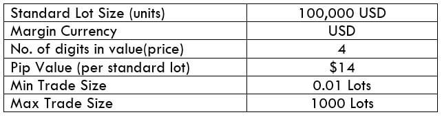
Introduction
Based on the current inflation rate and future monetary policies, we can effectively gauge the current economic situation of a country. Using the Inflation rate data, we can also get an insight into the current currency’s value and in which direction the economy is heading towards. Hence we must look at this key indicator in its depth to solidify our fundamental analysis.
What is Inflation?
In Economics, Inflation is the increase in the prices of goods & services, and the resultant fall in the purchasing power of a currency. What this means, in general, is that when a country experiences Inflation, the prices of the most commonly used goods & services by the citizens of a country increase. Because of this, the average person has to spend more money to buy the same amount of goods which cost less in the previous period.
For instance, if John went to a grocery store to purchase his monthly groceries, and it cost him 100$ in 2018. Next year, i.e., in 2019, John goes to the same store to buy the same set of goods, and it had cost him 105$. Now John either has to remove some items or pay more to make the same purchase. Here John has experienced Inflation of 5%.
What is Inflation Rate?
The percentage increase in the price of goods & services over a period (usually monthly or yearly) is called the Inflation Rate. In our previous example of John, we see we have an inflation rate of 5%.
Inflation Rate is compounding in nature, i.e., it is always calculated with reference to the most recent statistic and not any particular base year or a base inflation rate. For example, if John were to buy the same goods in 2020, if it costs him 110$, then John has experienced 4.54% of Inflation and not 10% inflation.
Why is Inflation Rate important?
Inflation, in general, when kept in check, is good for an economy as it fuels growth. The increase in the prices of common goods and services means people have to compete and work better to earn more to meet their needs. But as in any case, excess or high Inflation can be crippling for an economy.
Because the citizens of the country get poorer when the purchasing power of the currency falls due to a high increase in prices, inflation Rates can be used to gauge the current financial health of an economy and what the citizens of a country are currently experiencing.
How does Inflation Occur?
A general view in the economic sector is that steady Inflation occurs when the money supply in the country outpaces economic growth. It means more currency is being circulated into the economy than its equivalent activity (revenue-generating practices). Inflation occurs mainly due to the rise in prices. But in brief, Inflation can occur due to the following situations:
Demand-Supply Gap: When the demand for a particular good is higher than the supply or production of the same, then there is a natural surge in the price of that good.
Increased Money Supply: When more money is in circulation in the economy, it means an individual has more disposable cash. This increases consumer spending due to a positive future sentiment resulting in increased demand, which ultimately increases the price of goods.
Cost-Push Effect: When the cost of inputs to the process of manufacturing good increases, it coherently increases the overall cost of the finished good. This results in a higher selling price of goods, which ultimately results in Inflation.
Built-In: Built-in inflation happens when there is a sort of feedback loop in the prices of goods and incomes of people. As people demand higher wages to meet the needs, it results in higher prices of goods and services to fund their demand and vice-versa. This adaptive price and wage adjustment automatically feed off each other and result in an increase in prices.
How is Inflation measured?
Based on different sectors, the costs of different sets of goods & services are used to calculate different inflation indexes. However, there are some most commonly used inflation indices in the market, like the Consumer Price Index (CPI) and Producer Price Index (PPI) in the United States.
Consumer Price Index (CPI): The Bureau of Labor Statistics (BLS) surveys the prices of 80,000 consumer items to create the Index and publishes it on a monthly basis. It is a measure of an aggregate price level of most commonly purchased goods and services like food, shelter, clothing, and transportation fares. Service fees like water and sewer service, sales taxes by the urban population, which represent 87% of the US population, are weighted into the percentage, based on their importance in terms of need.
Changes in CPI are used to ascertain the retail-price changes associated with the Cost of Living, and hence it is used widely to assess Inflation in the USA. In this Index, there are many subcategories wherein certain goods are either included or excluded to give a more accurate picture of Inflation in absolute or relative terms. For example, Core CPI strips away food, gas, and oil prices from the equation whose prices are volatile in nature.
Producer Price Index (PPI): It measures the average change in the selling prices received by domestic producers for their output over a period of time (usually monthly). Unlike CPI, which measures retail prices from the viewpoint of end customers who purchase the items, PPI measures the prices at which goods and services are sold to outlets from the manufacturer. PPI measures the first commercial transaction, and hence it does not include the various taxes and service costs that are associated and built into the CPI.
PPI vs. CPI
PPI measures the change in average prices that an initial-producer or manufacturer receives whilst CPI estimates the change in average prices that an end-consumer pays out. The prices received by the producers differ from the prices paid by the end-consumers, on the basis of a variety of factors like taxes, trade, transport cost, and distribution margin, etc.
Sources of Inflation Indexes
The US Bureau of Labor Statistics releases all the above-mentioned indexes here:
Consumer Price Index | Producer Price Index
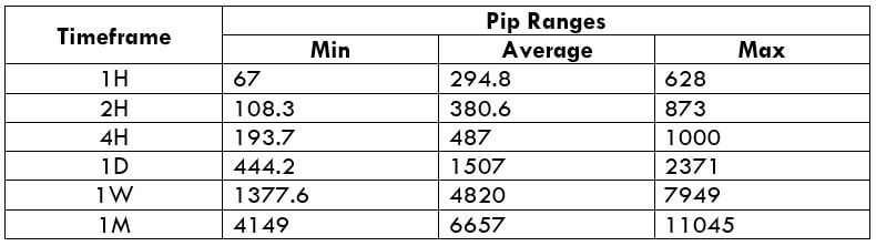
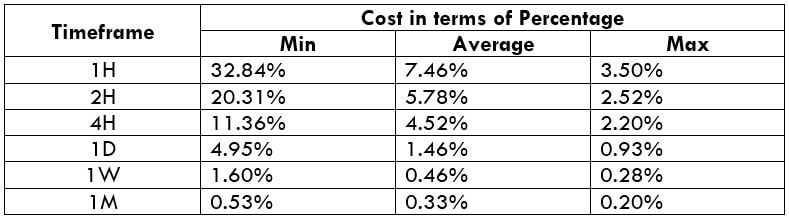
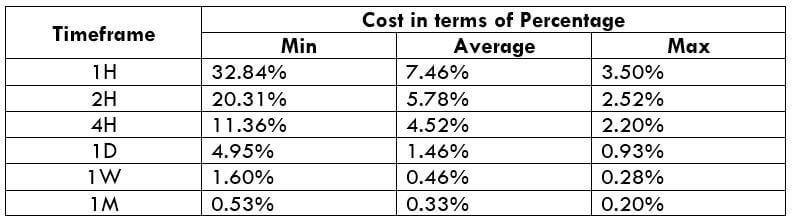
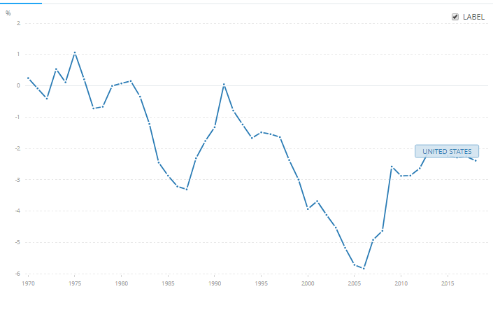
Inflation Rates of some of the major economies can be found below.
United Kingdom | Australia | United States | Switzerland | Euro Area | Canada | Japan
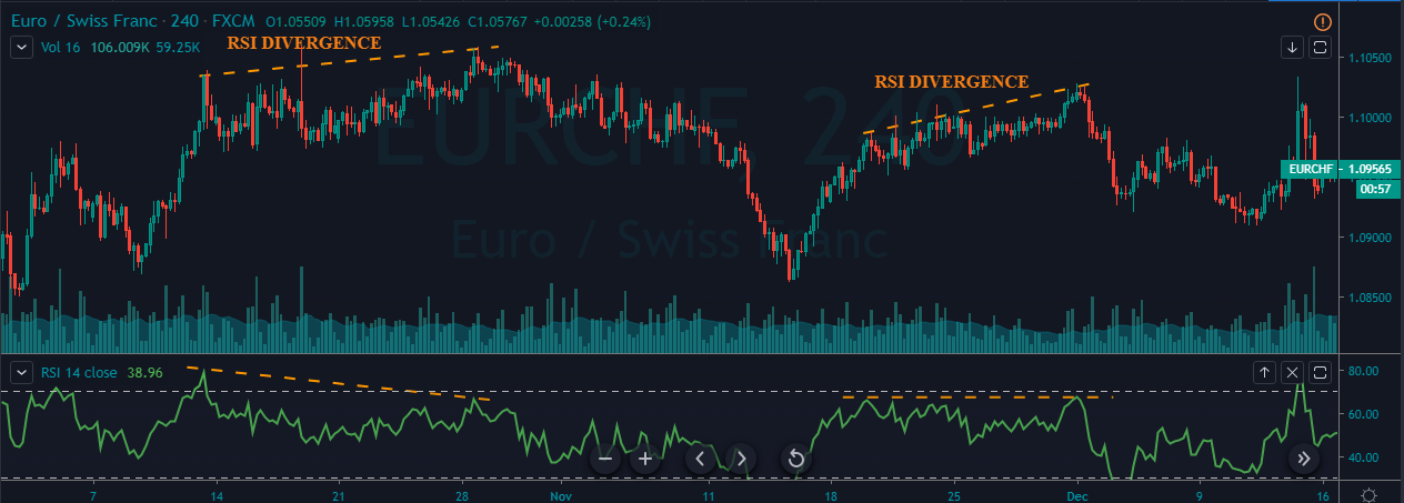
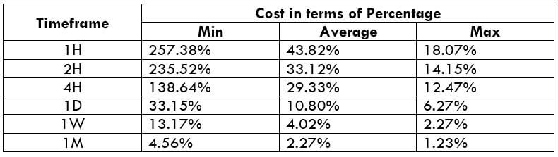
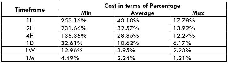
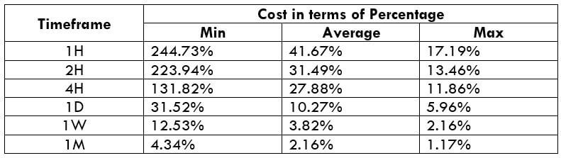
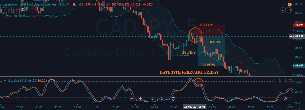
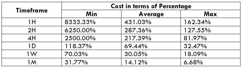
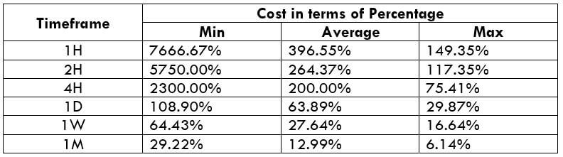
How ”Inflation Rate” News Release Affects The Price Charts?
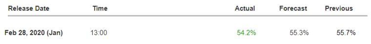
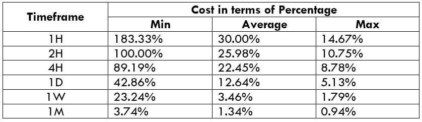
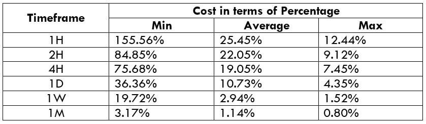
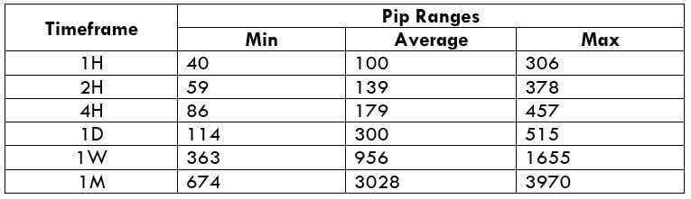
In this section of the article, we shall find out how the Inflation rate news announcement will impact the US Dollar and notice the change in volatility after the news is released. As discussed above, CPI is a well-known indicator of Inflation as it measures the change in the price of goods and services consumed by households. Therefore, the data which we should be paying attention to is the CPI values and analyze its numbers. We can see that the Inflation Rate does have a high impact on the currency of the respective country.

Below, we can see the month-on-month numbers of CPI, which is released by the US Bureau of Labor Statistics. The data shows that the CPI was increased by 0.1% compared to the previous month, which is exactly what the analysts forecasted.

Now, let’s see how this news release made an impact on the Forex price charts.
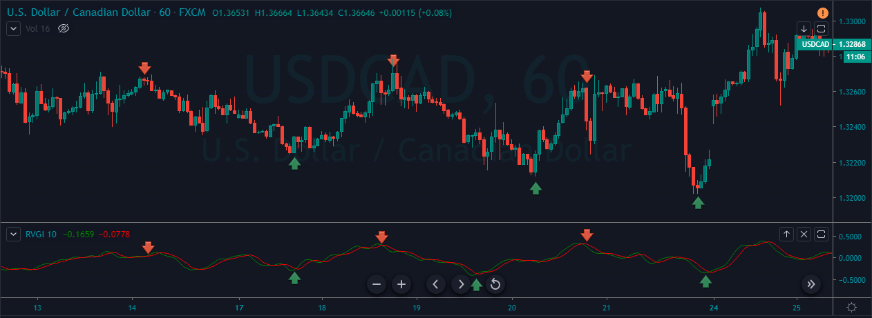
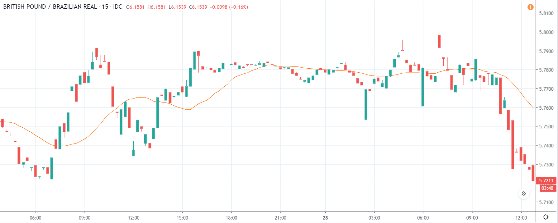
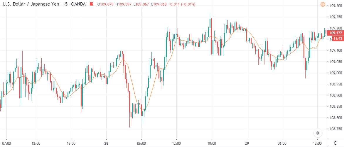
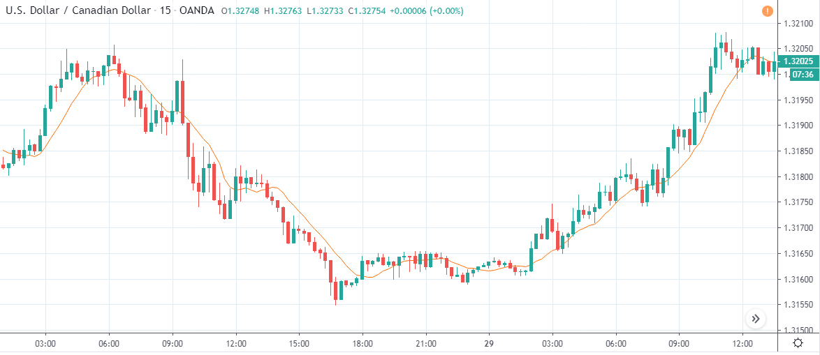
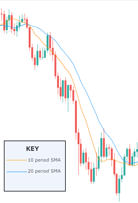
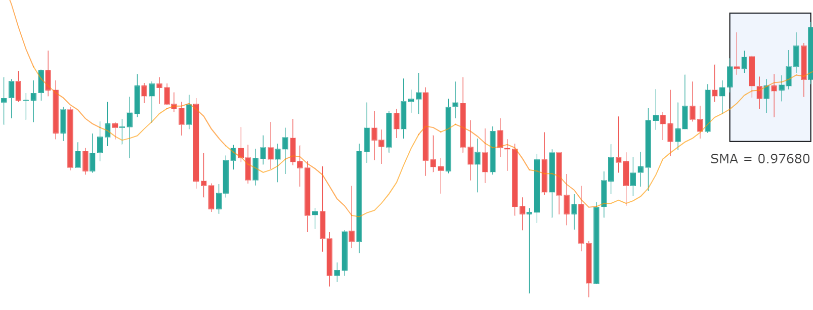
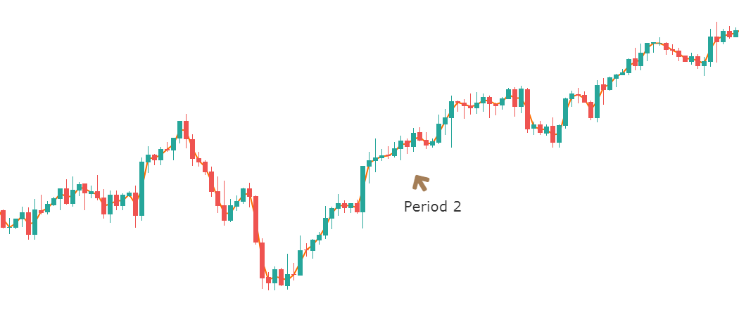
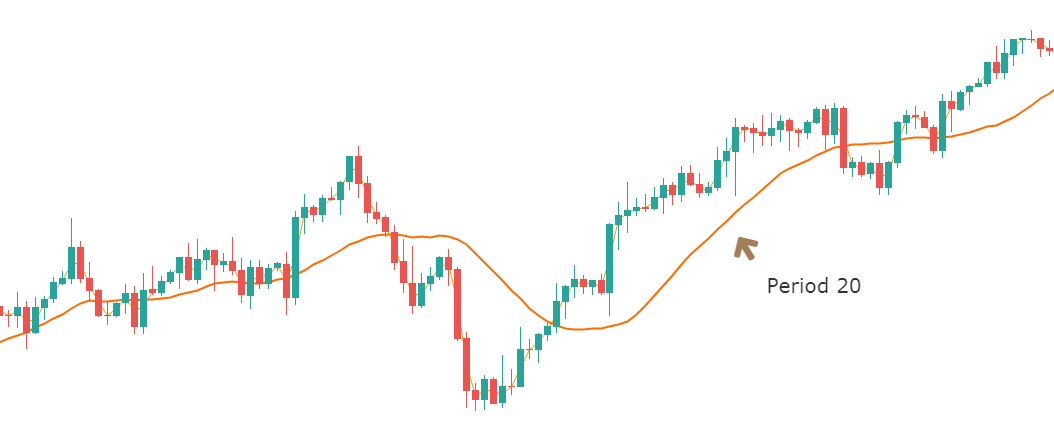
USD/JPY | Before The Announcement - (Feb 13th, 2020)
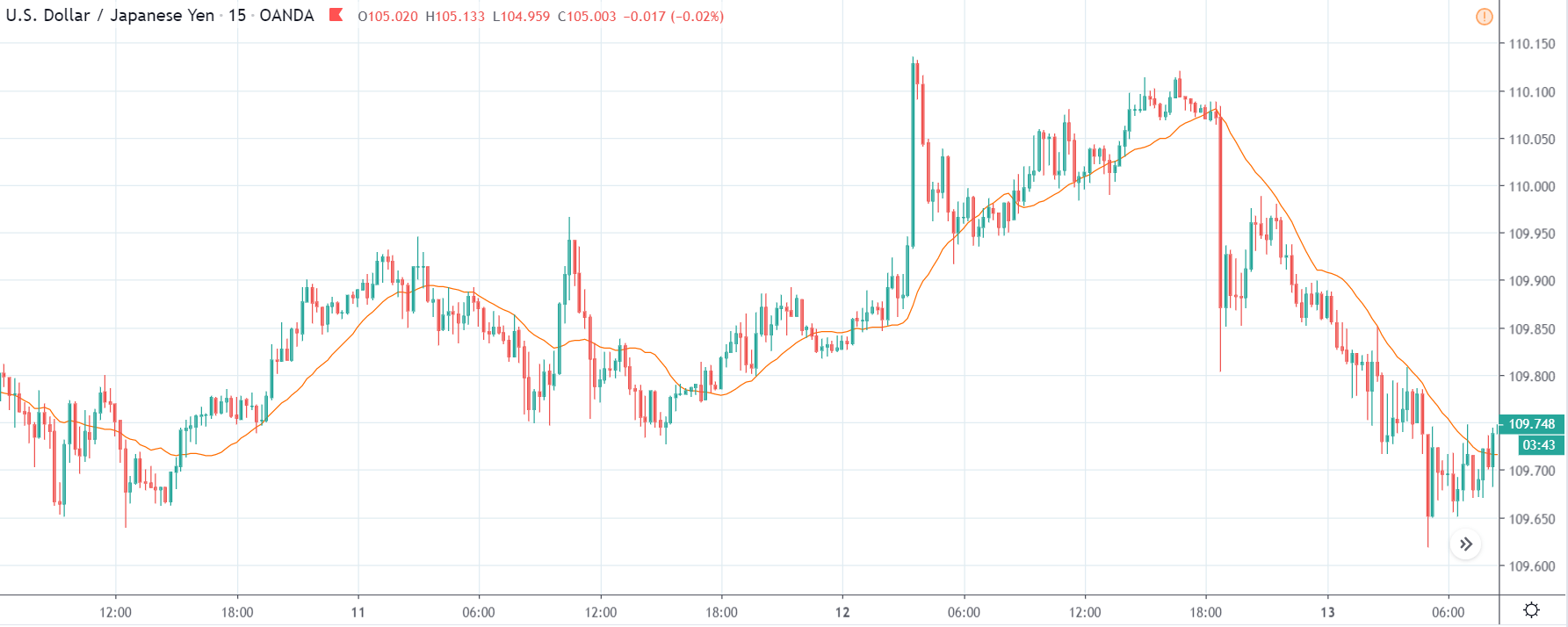
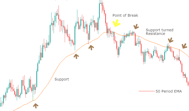
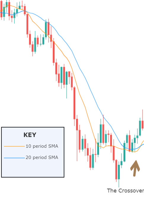
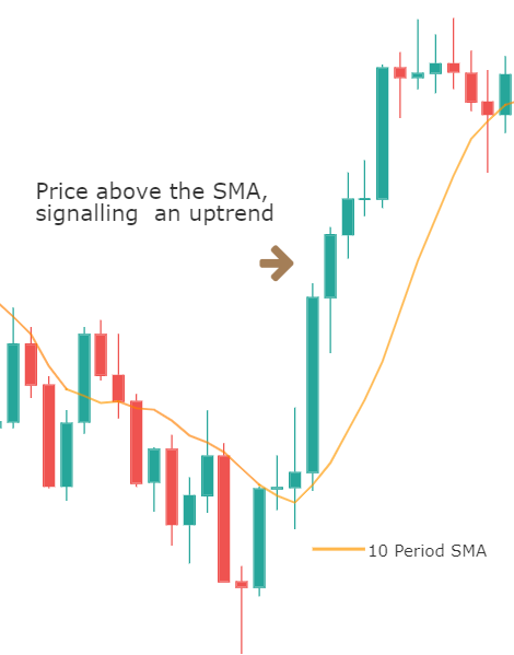
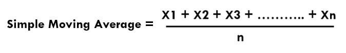
On the chart, we have plotted a 20 ”period” Moving Average to give us a clear direction of the market. From the above chart, it is clear that the US Dollar is in a strong downtrend, which is also evident from the fact that the price remains below the ”Moving Average” throughout. Just before the news announcement, we see a ranging action, which means the market is in a confused state.
Now we have two options with us, one, to ”long” in the market if there is a sudden large movement on the upside and, two, to take advantage of the volatility in either direction by trading in ”options.” We recommend to go with the first option only if you have a large risk appetite, else choose the second option by not having any directional bias. Let us see which of the above options will be suitable after the news announcement is made.
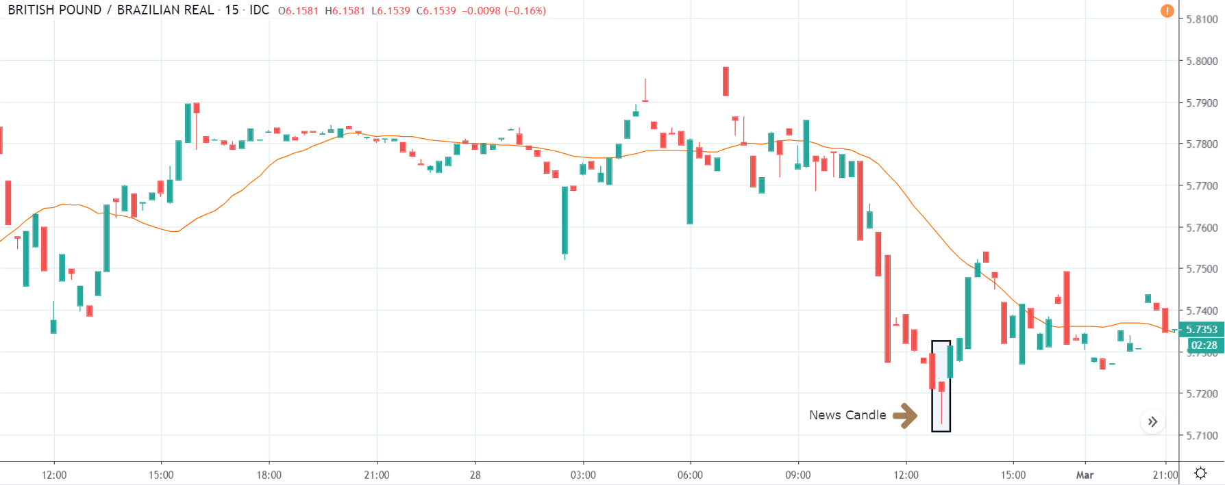
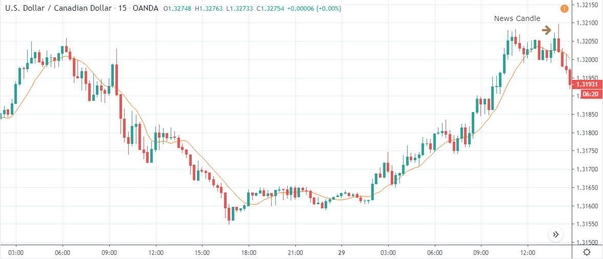
USD/JPY | After The Announcement - (Feb 13th, 2020)
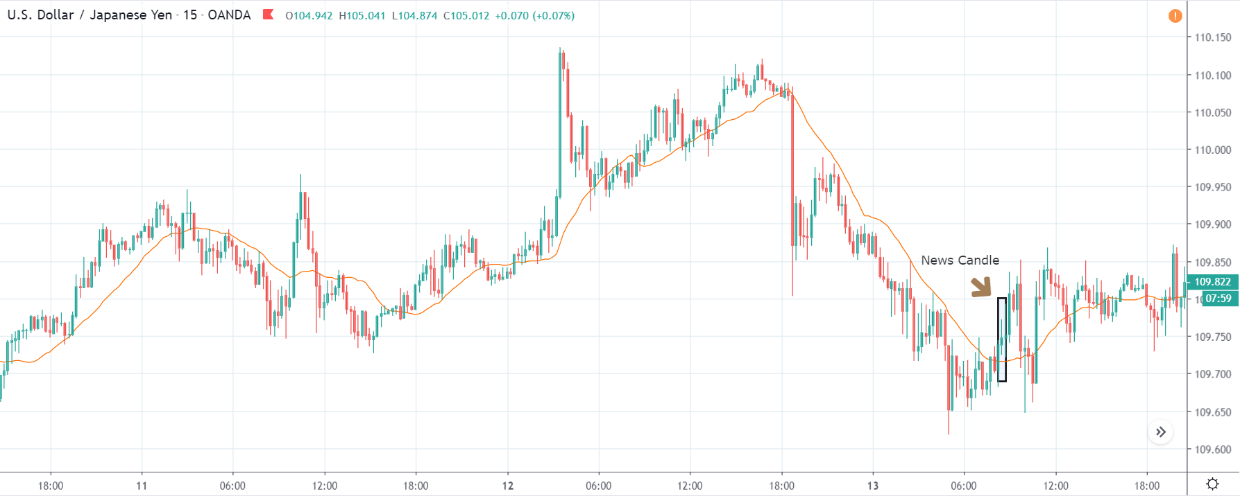
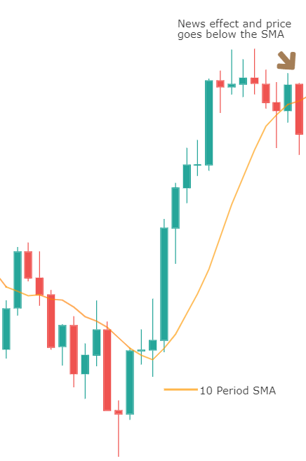
After the CPI numbers are announced, we see that the price does not go up by a lot, and it creates a spike on the top and falls below the moving average. It is very apparent that the news did not create the expected volatility in the above currency pair. From the trading point of view, in the two options discussed above, the first one is completely ruled out as the market did not show a strong bullish sign, and if we had gone with the second option, we would land in no-loss/no-profit situation.
The reason for extremely low volatility after the news announcement can be explained by the fact that the CPI numbers were merely increased by 0.1%. Since an increase in CPI is positive for the US Dollar, the market does not fall much and continues to hover around the same price.
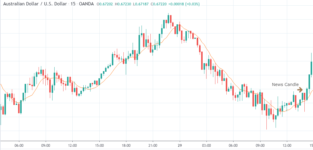
AUD/USD | Before The Announcement - (Feb 13th, 2020)
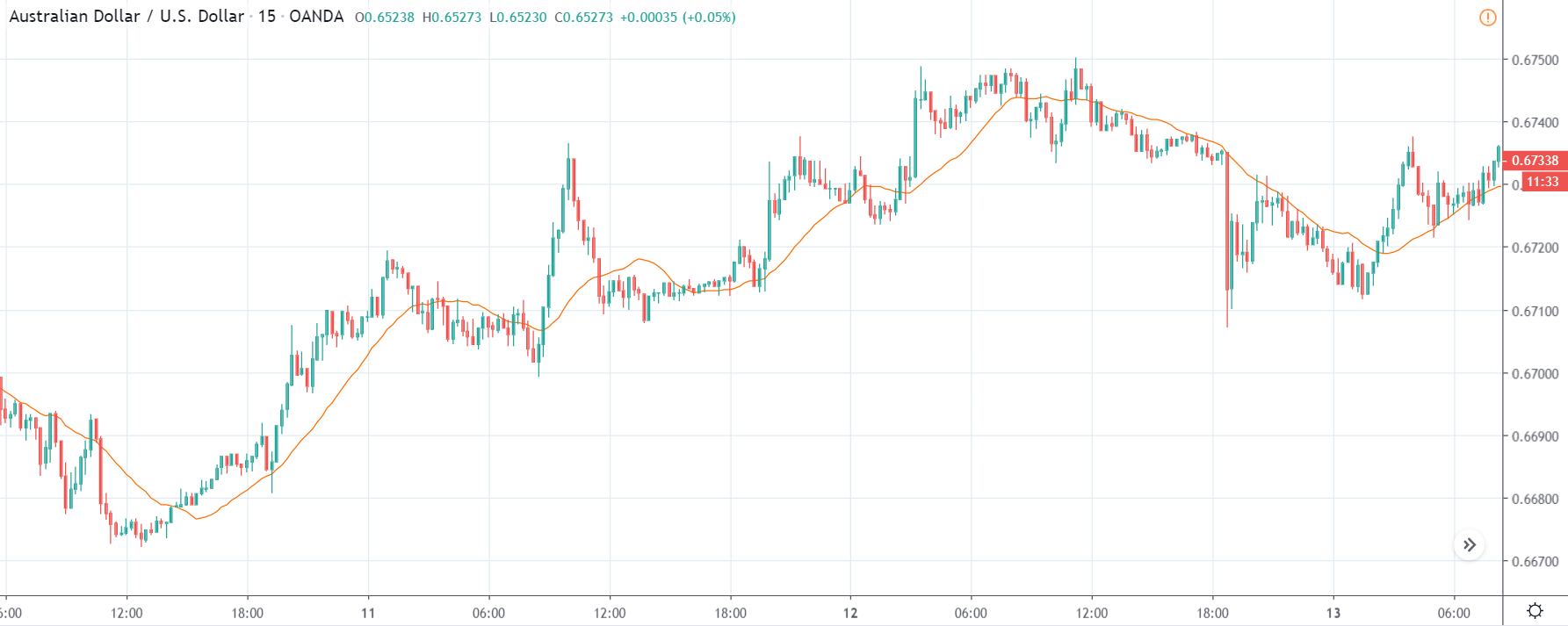
AUD/USD | After The Announcement - (Feb 13th, 2020)
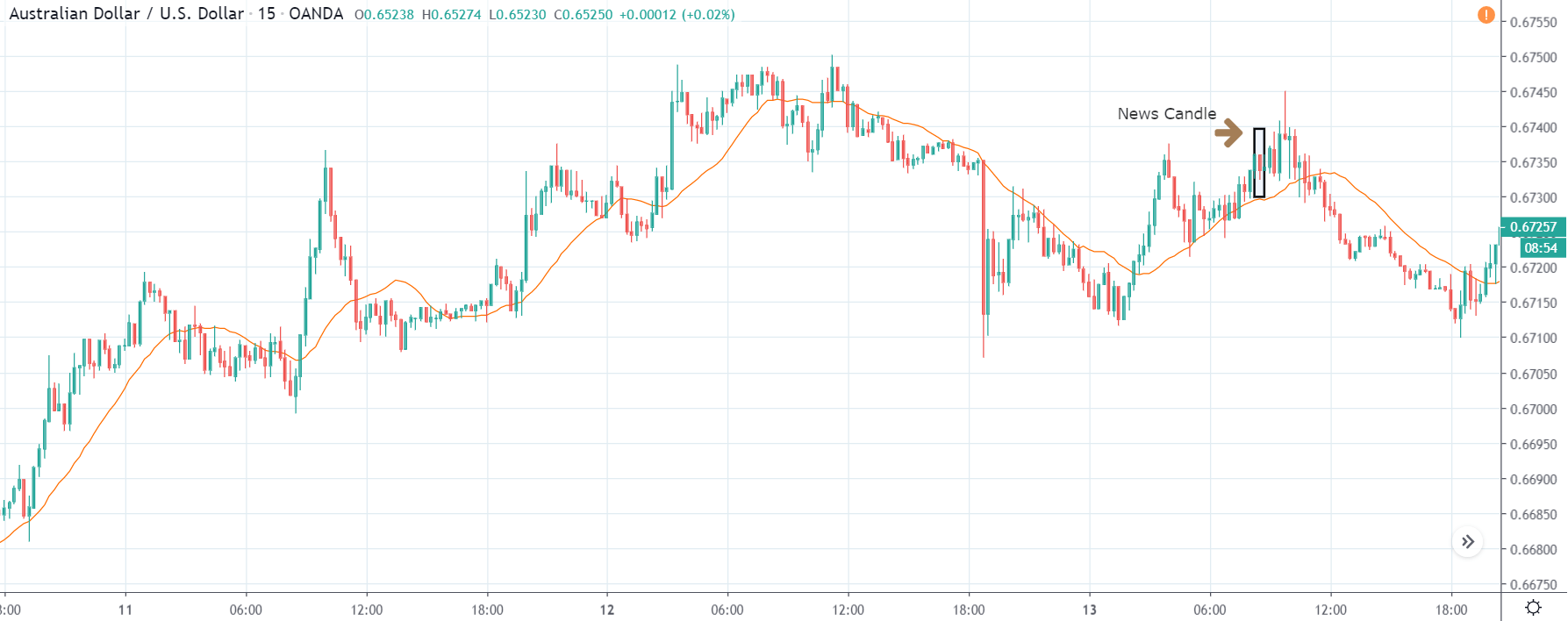
The above charts represent the currency pair of AUD/USD. Here since the US dollar is on the right side, we should see a red candle after the news release since the CPI data was good for the US dollar. By looking at the reaction of the market, we can say that the volatility did increase after the news announcement, which means AUD/USD proved to be better compared to USD/JPY.
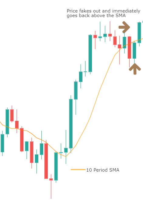
A mere rise in the CPI number was good enough for the currency pair to turn into a downtrend from an uptrend. One can also see that the price goes below the moving average indicator. This means that the Australian Dollar is a very weak pair compared to the US dollar, the reason why the US dollar became so strong after the news release. Hence one can take a ”short” trade in the currency pair after the price breaks the MA line.
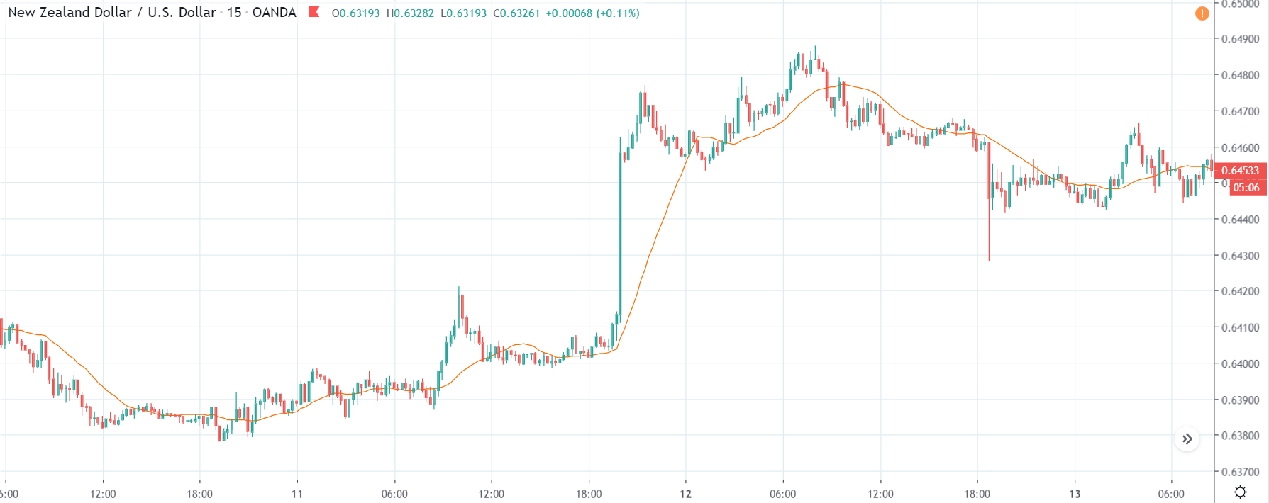
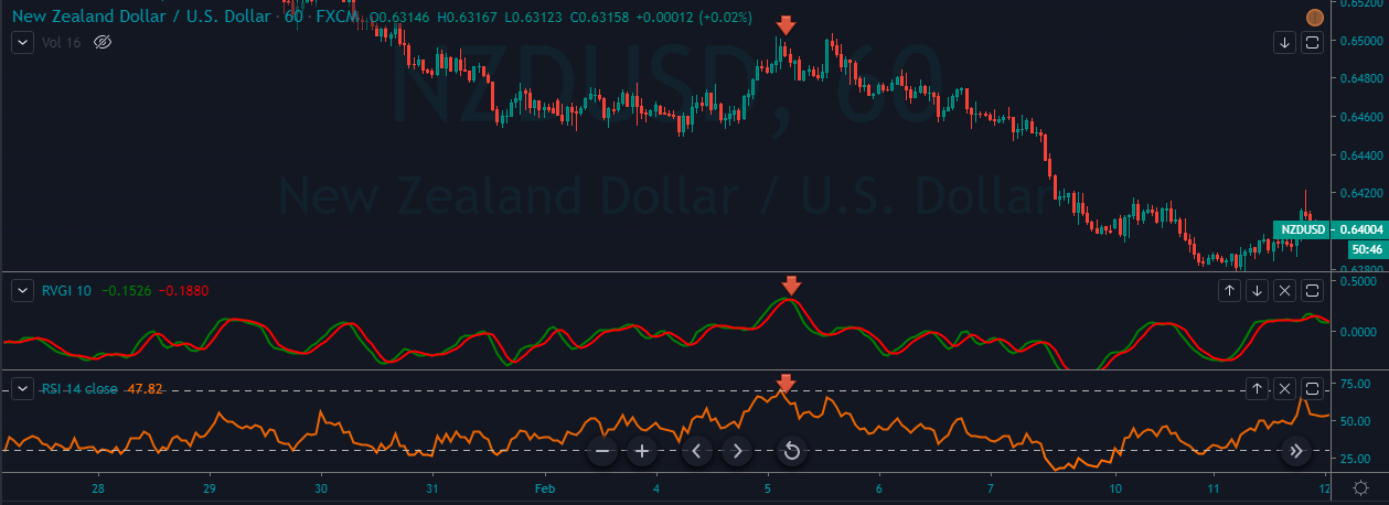
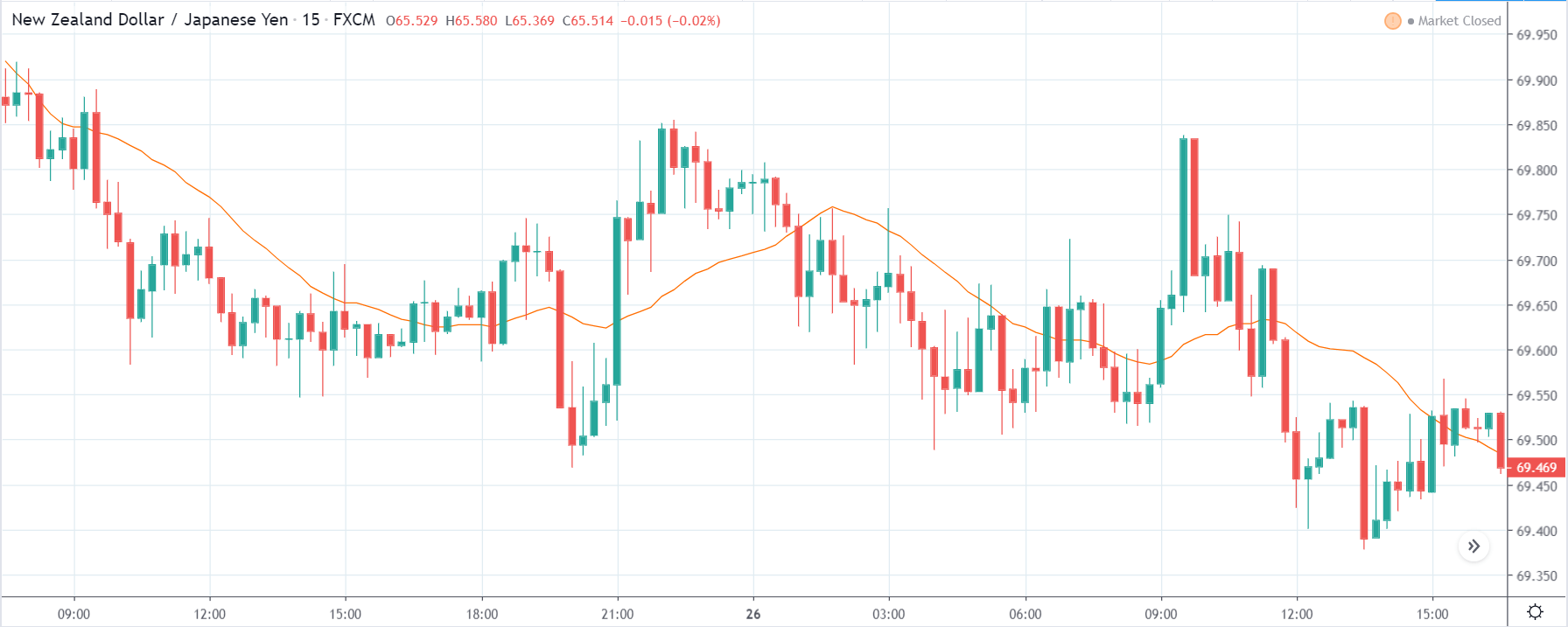
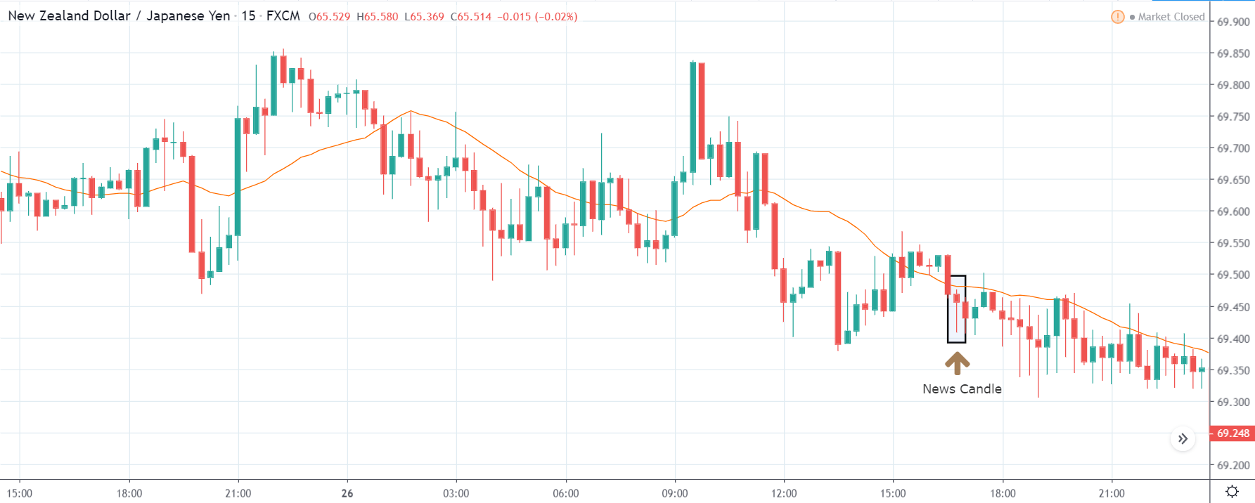
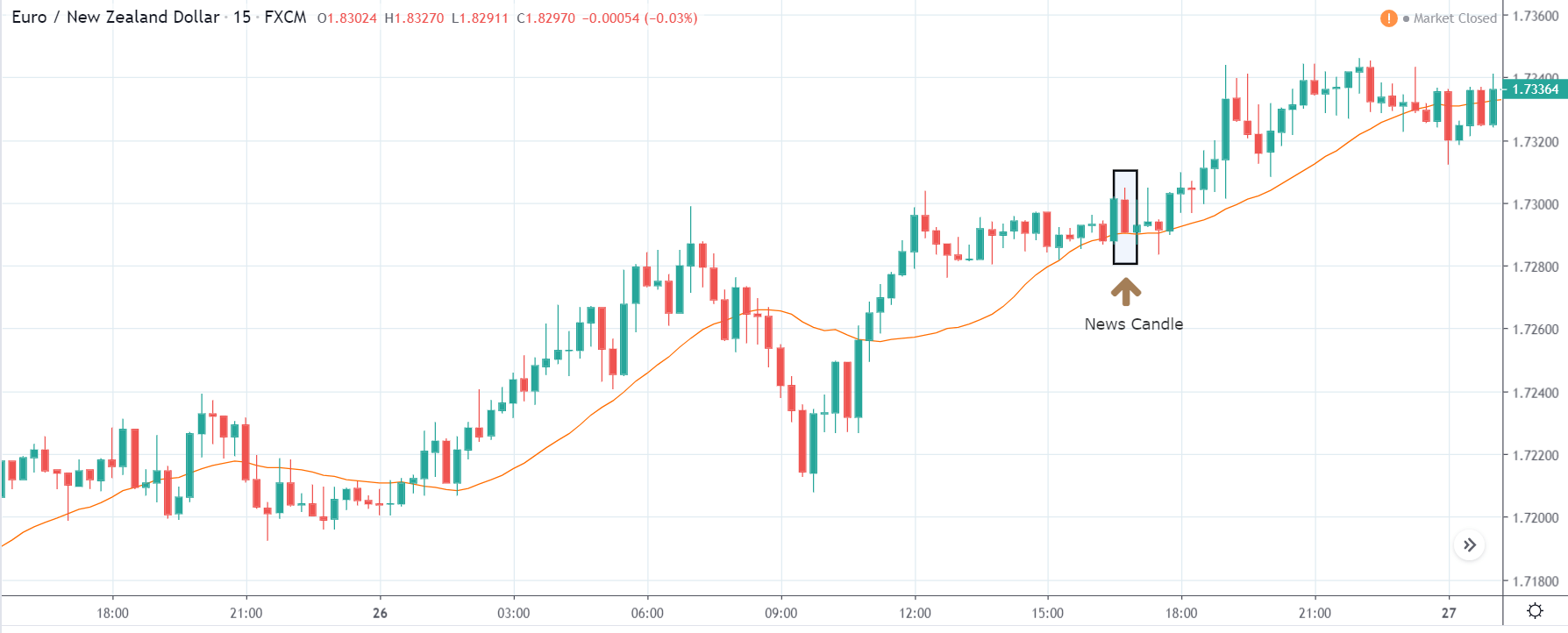
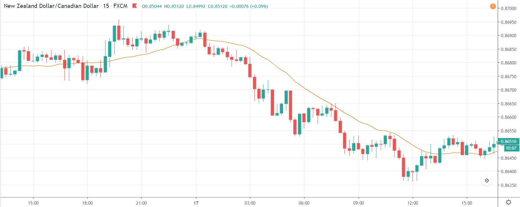
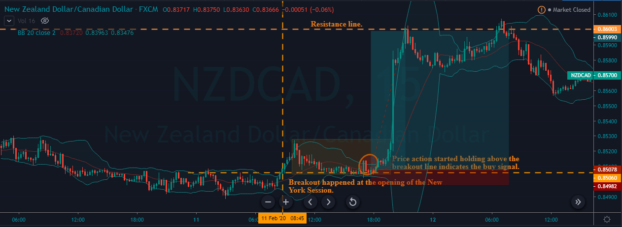
NZD/USD | Before The Announcement - (Feb 13th, 2020)
NZD/USD | After The Announcement - (Feb 13th, 2020)
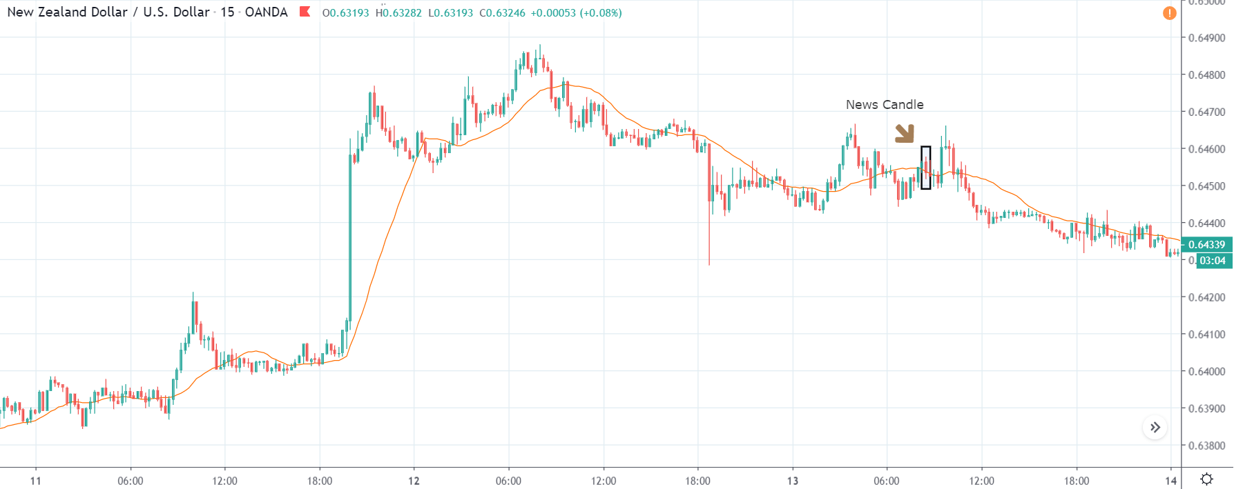
The above charts represent the currency pair of NZD/USD. It shows similar characteristics as that of the AUD/USD pair before and after the news announcement. The CPI data caused the US dollar to strengthen against the New Zealand dollar, where the volatility change can be seen when the market turns into a downtrend.
The CPI data did have a positive impact on the currency pair, but the pair did not collapse. This means the data may not be very positive against the New Zealand dollar, where the price just remains on the MA line after news release and does point to a clear downtrend. Hence, all traders who went ”short” in this pair should look to take profits early in such market conditions as the market can reverse anytime.
That’s about Inflation Rates and its impact on some of the major Forex currency pairs. If you have any queries, please let us know in the comments below. Cheers.


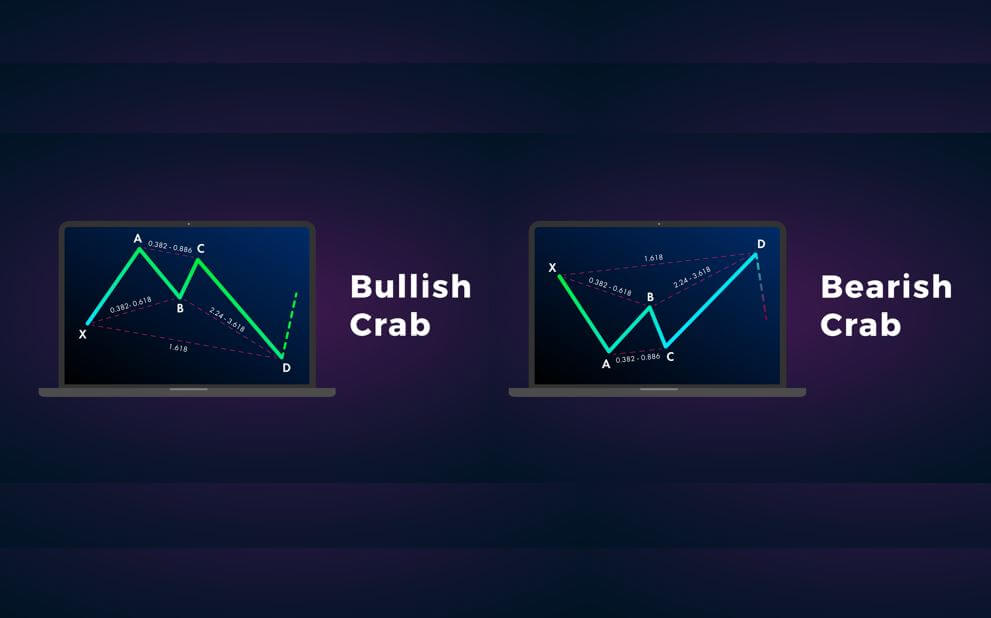

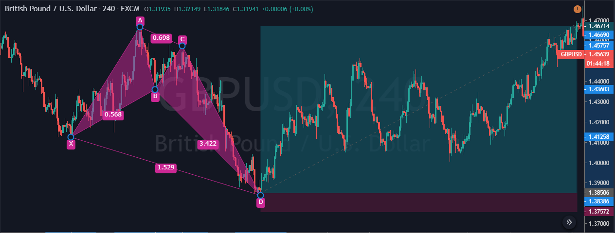
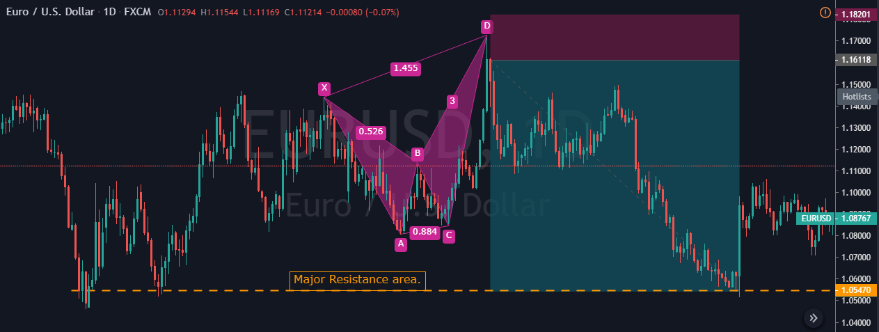


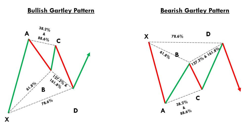 Gartley Pattern Trading Strategy