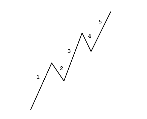
Introduction
Government Debt as an economic indicator has recently been gaining more attention from economists, investors, and traders. Many economies have chosen to actively take on debts to boost economic growth. Hence, it has become a metric & also a concern for many.
Just like a piling up debt is terrible for a householder, huge government debt is a negative sign for any economy. How the debt is used to run economic activities, methods deployed to repay it, all these have a long-term financial impact. In this sense, Government Debt is a critical metric by itself that needs to be watched out for, as investors decide to lend money to governments, basing this also as one of the reasons.
Government Debt levels have consequences that are many-fold to understand. Hence, understanding Government Debt now is more important than ever as the world’s largest economies are taking on debts beyond their revenues.
What is Government Debt?
Government Debt, also called Sovereign Debt, Country Debt, National Debt is the total public Debt and intragovernmental Debt owed by the governing body of the country. It is the money that the Government owes to its creditors.
Government Debt = Public Debt + Intragovernmental Debt
Public Debt – It is the Debt held by the public. The Government owes this Debt to the buyers of the government bonds, who can be its citizens, foreign investors, or even foreign governments.
Intragovernmental Debt – It is the Debt owed by the Government to other Government departments. It is generally used to fund Government and citizen’s pensions. The Social Security Retirement account would be one such typical example.
Whenever the Government spends more than its generated revenue, it creates a budget deficit and adds to the total Government Debt. To operate in this budget deficit mode, the Government has to issue treasury bills, notes, and bonds, which are promissory notes to lenders that the Government shall pay back the amount along with interests.
Hence, The National Public Debt is the net accumulation of all annual budget deficits of the Federal Government.
How can the Government Debt numbers be used for analysis?
The Governments depend mainly on public spending to stimulate growth in the economy by assisting businesses and individuals in the form of unemployment compensations, wage hikes, etc. This leaves Government no choice but to fall back on taking on more Debt and keep paying interests from the tax revenues and other income sources.
The piling Debt may let things continue smoothly now but will inevitably tighten the belt for the economy in the future. When Debts go out of hand, it can lead to economic collapse, as default on Debts leads to reduced credibility and may lead to a lack of funds during times of need.
When support is lost for the Government, it has to fall back on assets, selling them and thus going to the brink of bankruptcy. At this stage, a nation is vulnerable as enemy nations can also use this situation to their advantage to wage wars in extreme cases. When there is no monetary support, business slowdowns and recessions are unavoidable.
The following are some strategies the Government may opt to reduce the debt burden:
📎 Low-Interest Rates: By lowering interest rates through open market operations, the Government can make borrowing money easy for the business and people in the economy to boost the economy. This has been the case in the United States. Prolonged low-interest-rate environments have not proven to be an effective solution to Debt-ridden Governments.
📎 Monetization: Countries like the United States, whose currency is not pegged to any other currency or commodity, can print off money and clear Debt. But this can lead to hyperinflation and currency depreciation. Hence, it is not preferable.
📎 Spending Cuts: This is the hard pill to swallow that actually works. It is the spending that leads to an increasing debt burden. If the Government cuts back on spending, which is equivalent to cutting back of money supply into specific segments or programs, that will lead to deflationary situations in the economy that can lead to a recession. Furthermore, when the Government cuts back on spending, they lose the support of citizens and fear losing favors in elections by businesses and the population.
📎 Tax Raises: The main culprit is failing to cut back on spending. As the spending continues to rise year after year, increased tax revenues do little to help reduce the burden of Debt. It is the most common practice but is not effective in the long run.
📎 Pro-Business/ Pro-Trade: By selling off real assets like real estate, gold, and military equipment, the Government can reduce the burden. It is like selling your house to pay off the mortgage. This type of solution is not applicable to all countries, but some like Saudi Arabia reduced their Debt significantly from a debt 80% of GDP to 10% in seven years by selling off oil.
📎 Debt restructuring or Bailouts: When the solvency of the Government is at the brink, Debt restructuring (renegotiating the terms of Debt, or partial payments) is one final option. It is a pseudo-defaulting case. This is not also a practical solution, as the credibility is damaged after this, as it tells the world that the economy is weak.
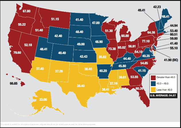
📎 Default: Defaulting may seem the most effective way to get rid off Debt. This is considered only when there are no other options for the Government. This leads to a lack of future monetary support from the rest of the world. Defaulters like Pakistan, Greece, and Spain are good examples of this. Defaulting occurs when the Debt burden crosses way beyond the tipping point, which is 77%. For the United States, it has already passed 100% in recent years.
Impact on Currency
The National Debt is an increasing concern in recent years as the repayments are starting to take more massive proportions of the Government’s revenue. What method the Government decides to opt for to tackle its debt burden in a given year directs the growth for that business year.
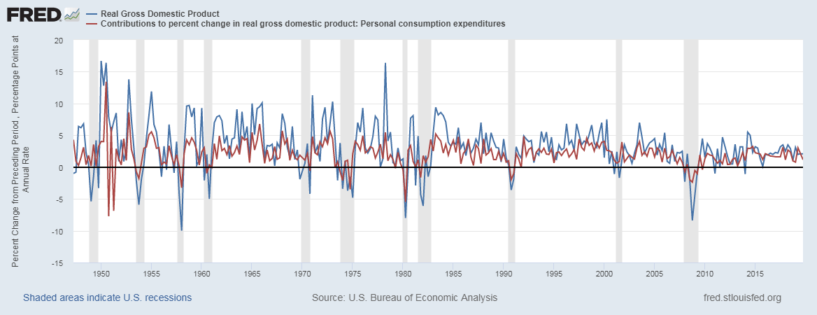
The Government Debt is a proportional indicator, meaning higher Government debt numbers are more stimulating for the economy, and appreciating for the currency and vice-versa. The vital thing to note here is that as long as the Debt has not gone way out of control that the Government cannot afford to pay the interests also. For the United States, the Debt burden will be unbearable by 2034, at which point they have to cut back on spending and raise taxes.
The Government Debt is a lagging and reactionary number. It is taken on to solve an issue and is not an initiative effort. Debt numbers follow the already ongoing situation. Hence, it has a low market impact. The more direct implications of the taken Debt are manifested through press releases and other news reports like wage growth, employment statistics, etc.
Economic Reports
The Treasury Department has the “Debt to the Penny” section on their website which shows, the daily Debt after all purchase and sale of the Government Bonds.
The U.S. Treasury Department releases quarterly, end of the period, the Federal Government’s Debt reports.
Sources of Government Debt
The Office of Management has a historical tables section where we can find Federal Debt records. Some of the most reliable sources are given below.
Impact of the ‘Government Debt’ news release on the price charts
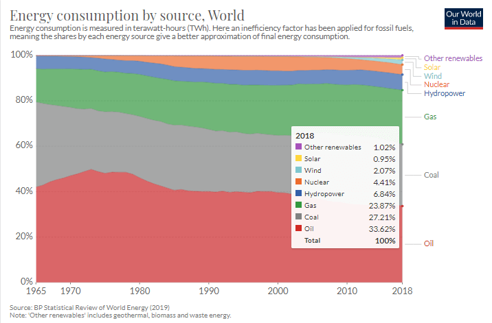
Government Debt which also known as the national debt, is the public and intergovernmental debt owned by the federal government. The government may take a loan from the World Bank and or from other financial institutions for a variety of reasons. It could be required for fulfilling the needs of the people, for defense purposes, or for stabilizing the economy. A moderate increase in debt will boost economic growth, but too much debt is not good for the economy.
It dampens growth over the long term. Higher debt means a higher rate of interest and, thus, more burden on the government while repaying the loan. Investors compare the debt held by the government and its ability to pay it off. Based on this data, they have a short to long term view on the currency. However, traders do not react violently to the Government Debt news release and make few adjustments to their positions in the market.

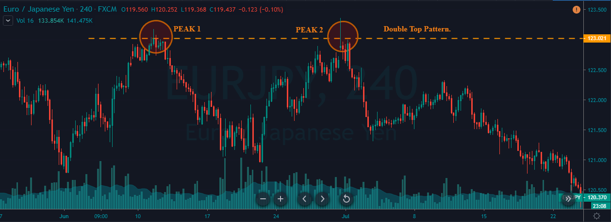
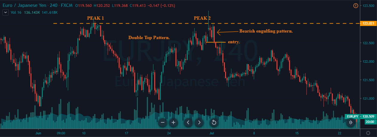
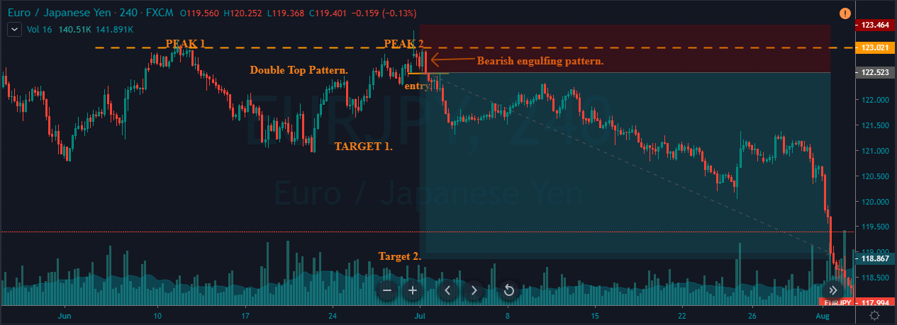
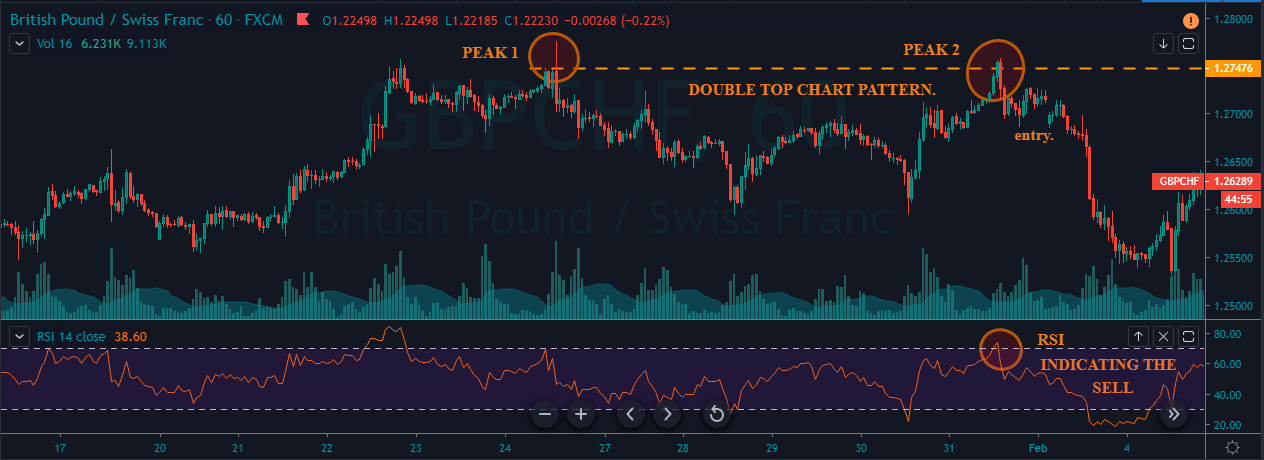
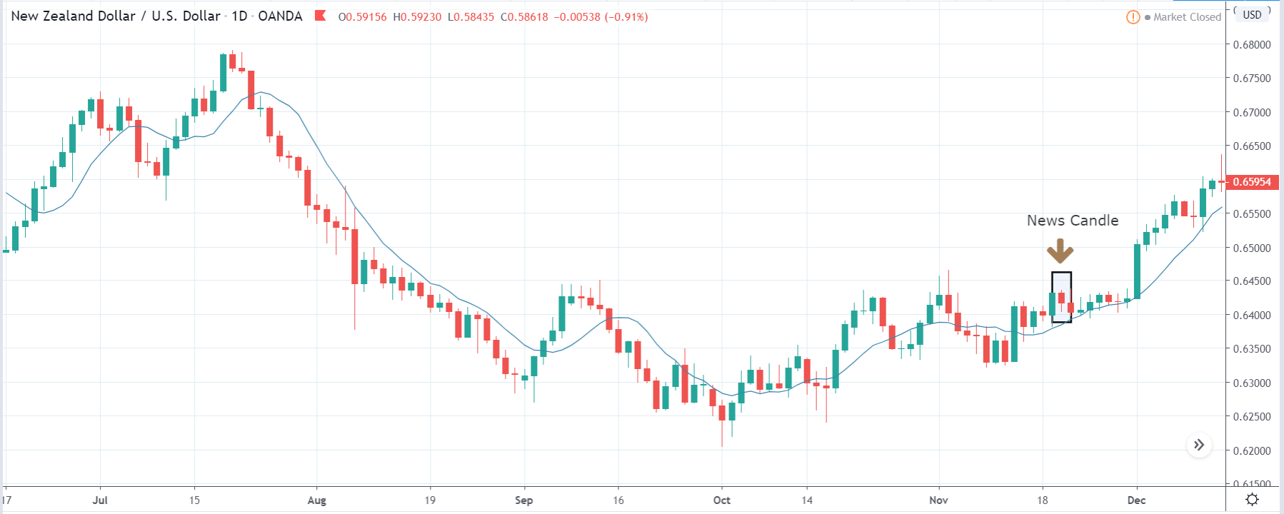
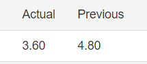
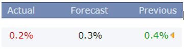
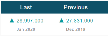
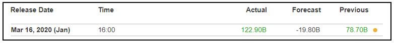
In today’s article, we will be analyzing the impact of the Government Debt announcement on Turkish Lira as traders identify the debt of the Turkish Government. The below image shows the previous and latest Government debt of Turkey, which indicates an increase in debt from last month.

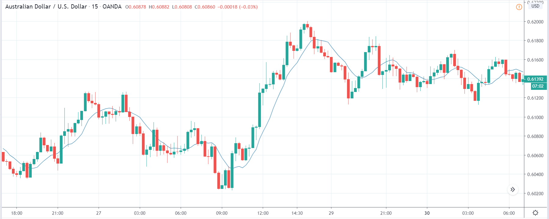
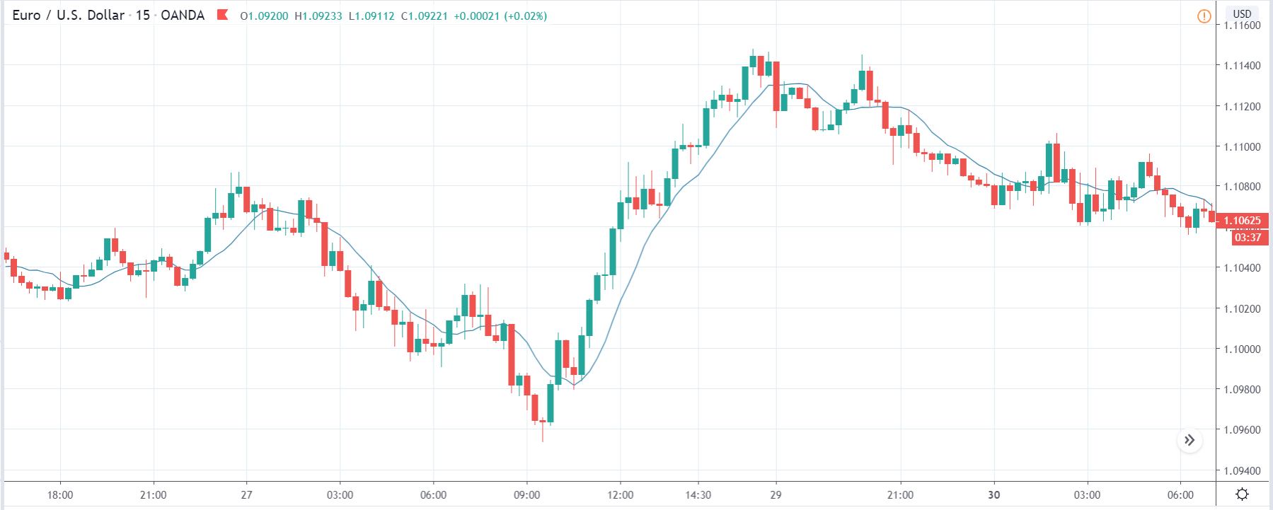
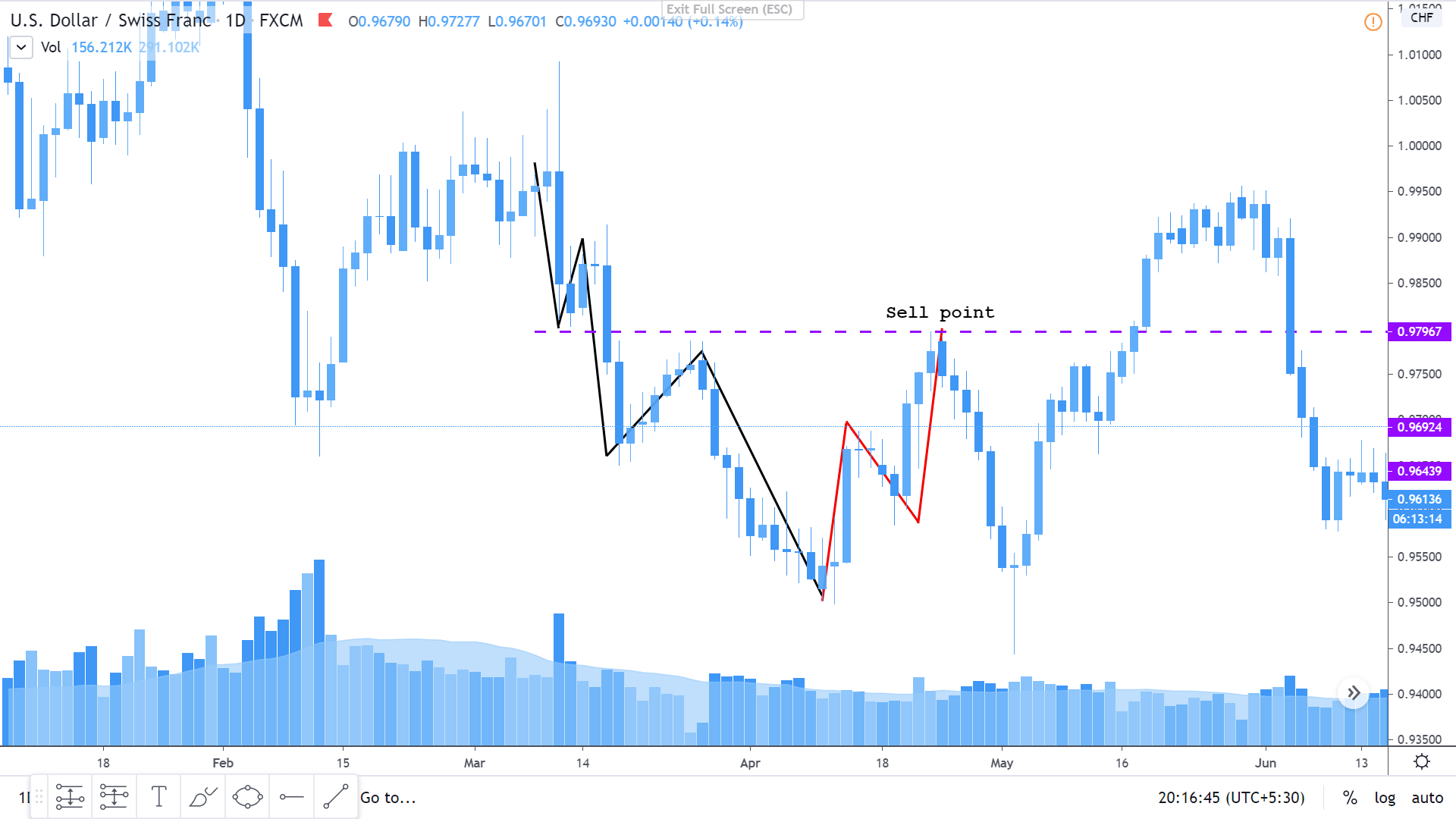
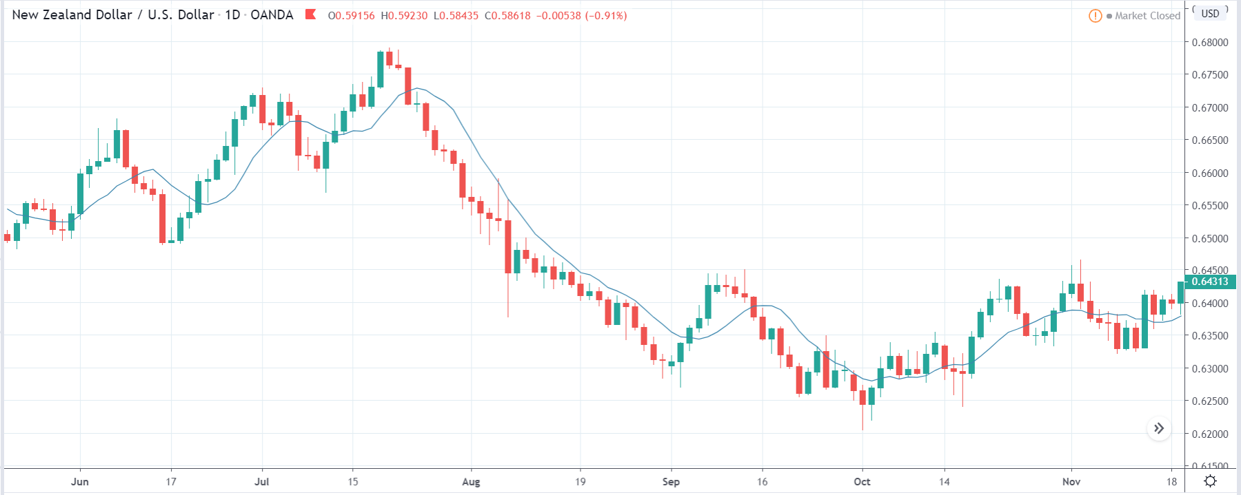
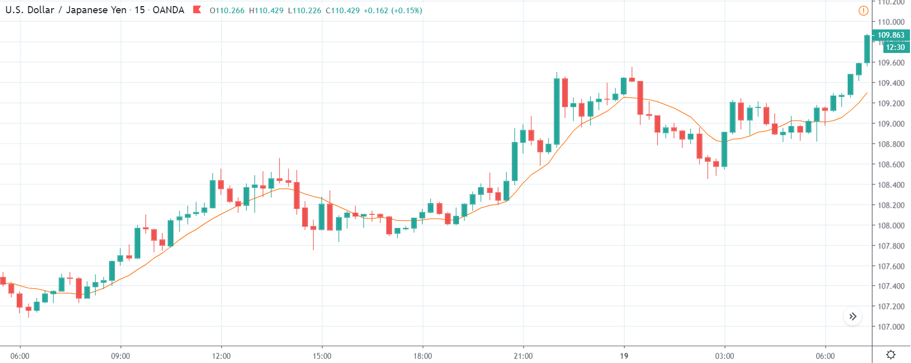
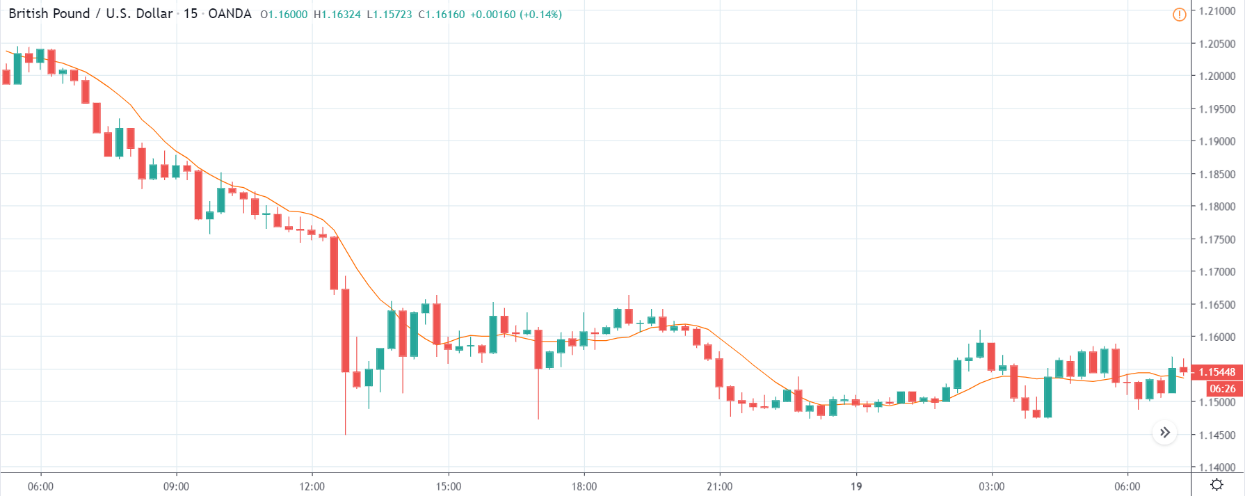
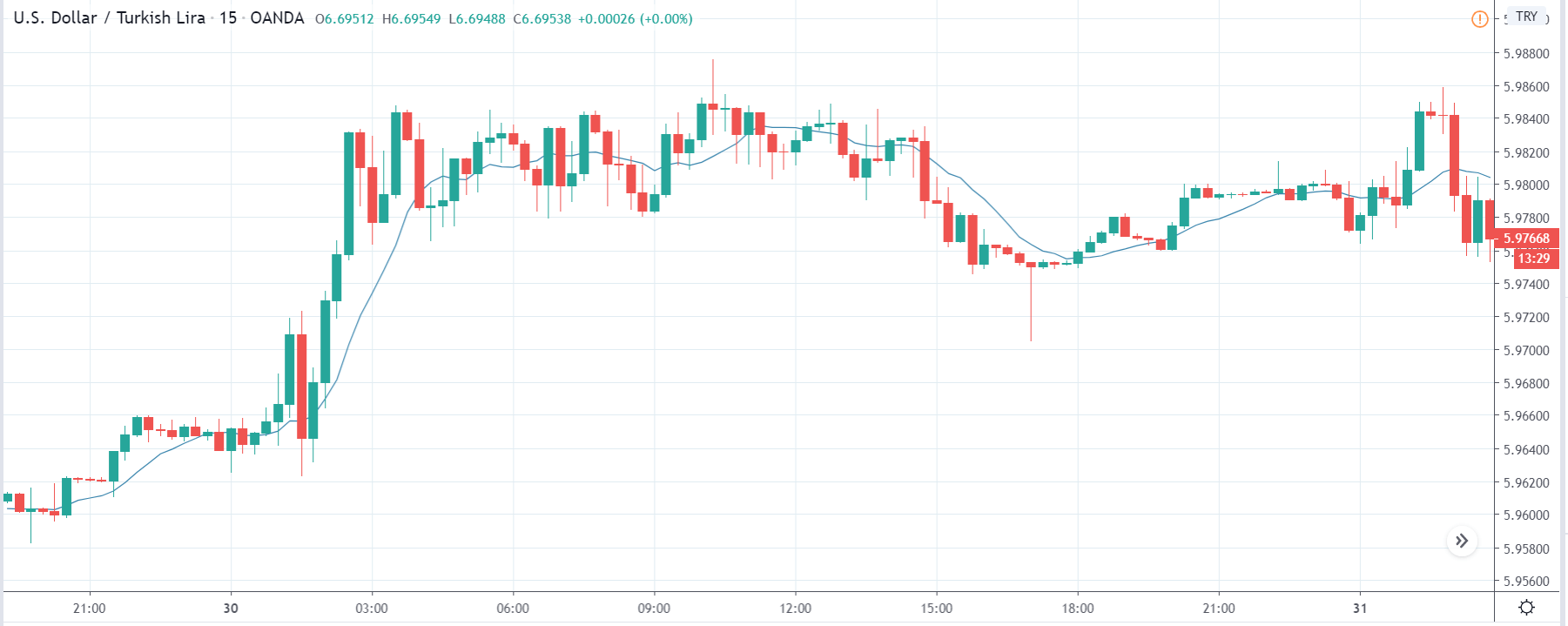
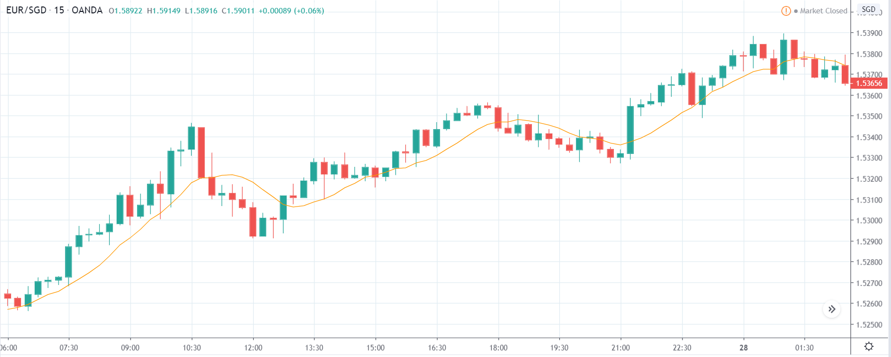
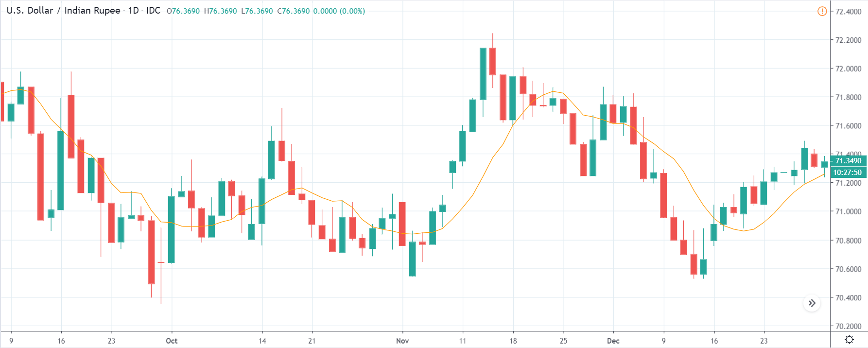
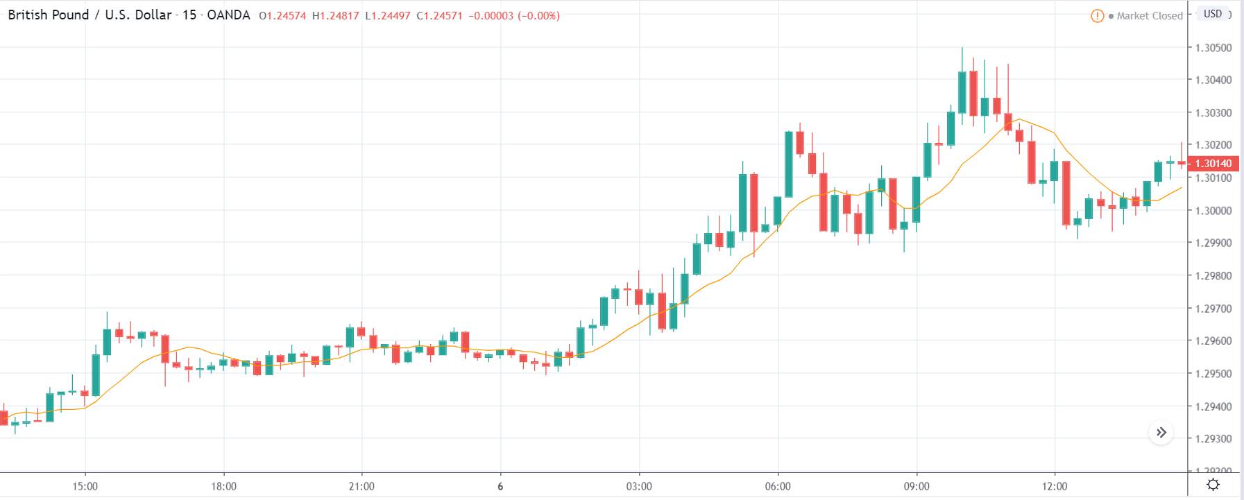
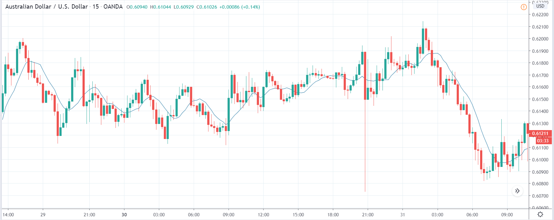
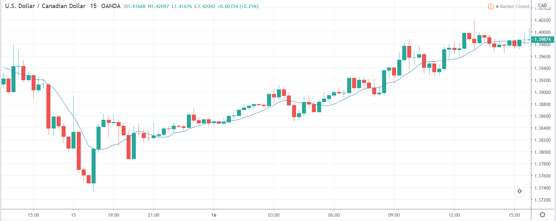
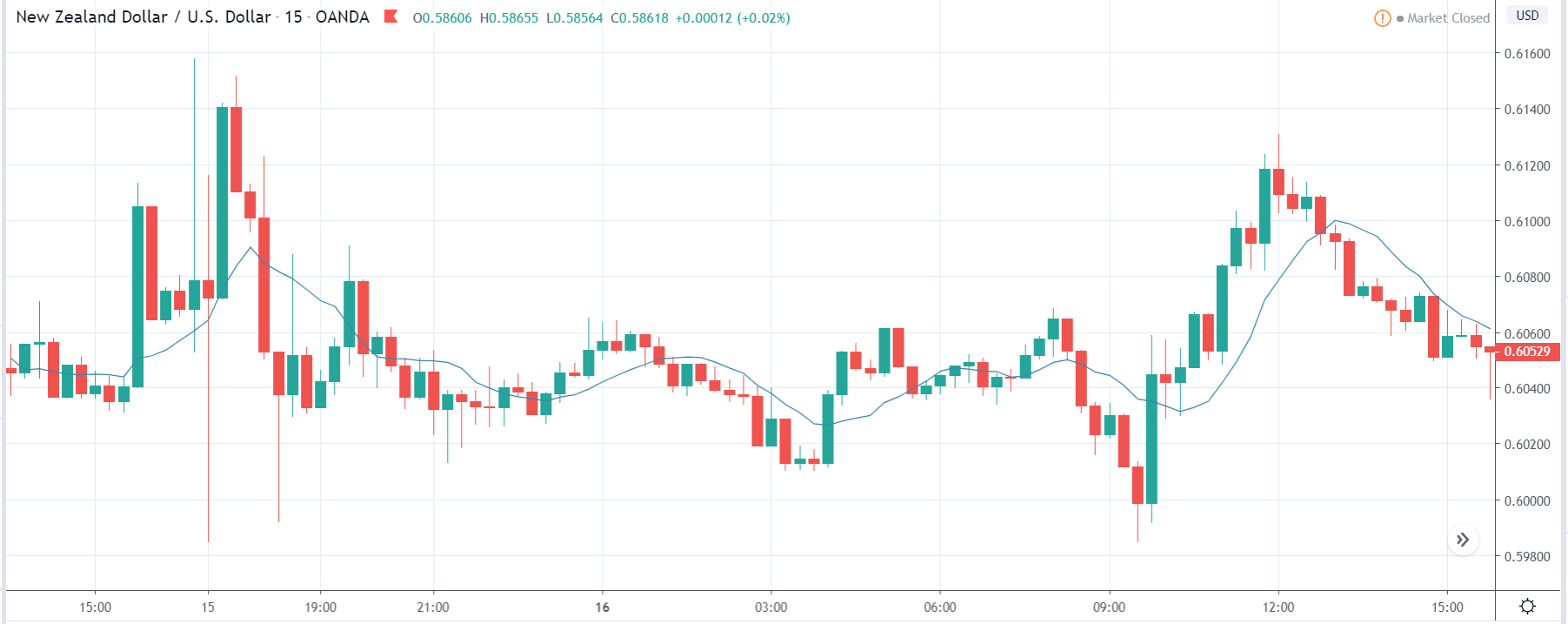
USD/TRY | Before The Announcement
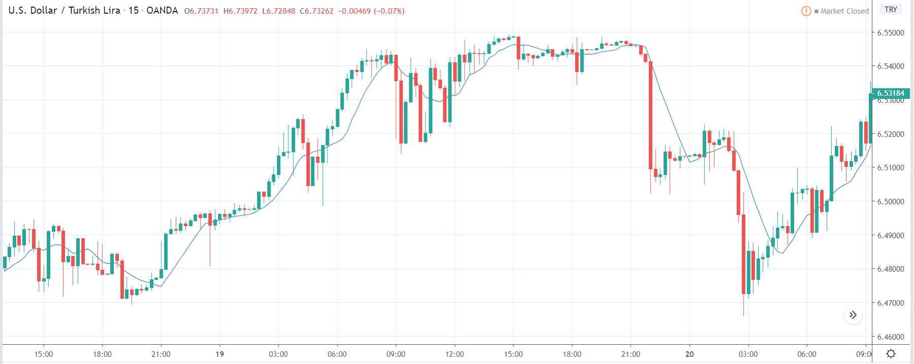
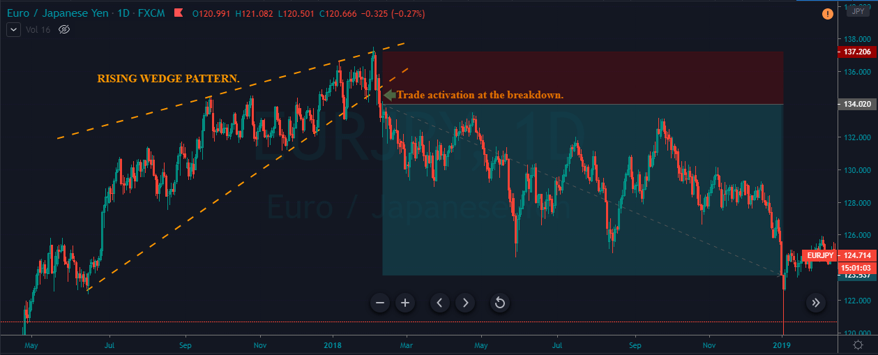
The above image represents the USD/TRY currency pair before the news announcement. We see that the chart is in an uptrend and the price has broken many resistance points. Currently, it is approaching a major resistance area from where the market has reversed earlier. High volatility on the upside could be an indication that the market is expecting a weak Government Debt data. One can join the uptrend only after the market gives a retracement.
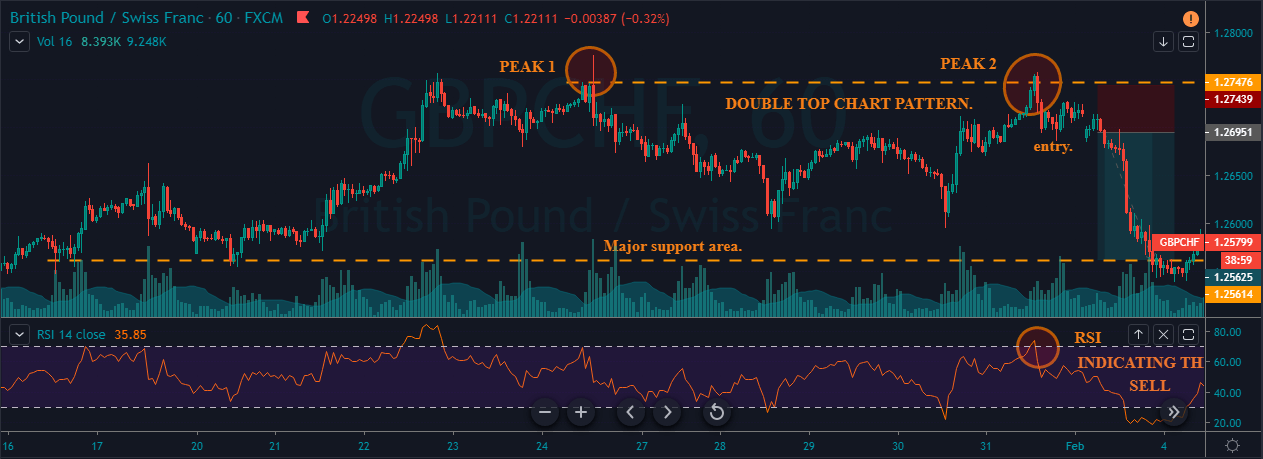
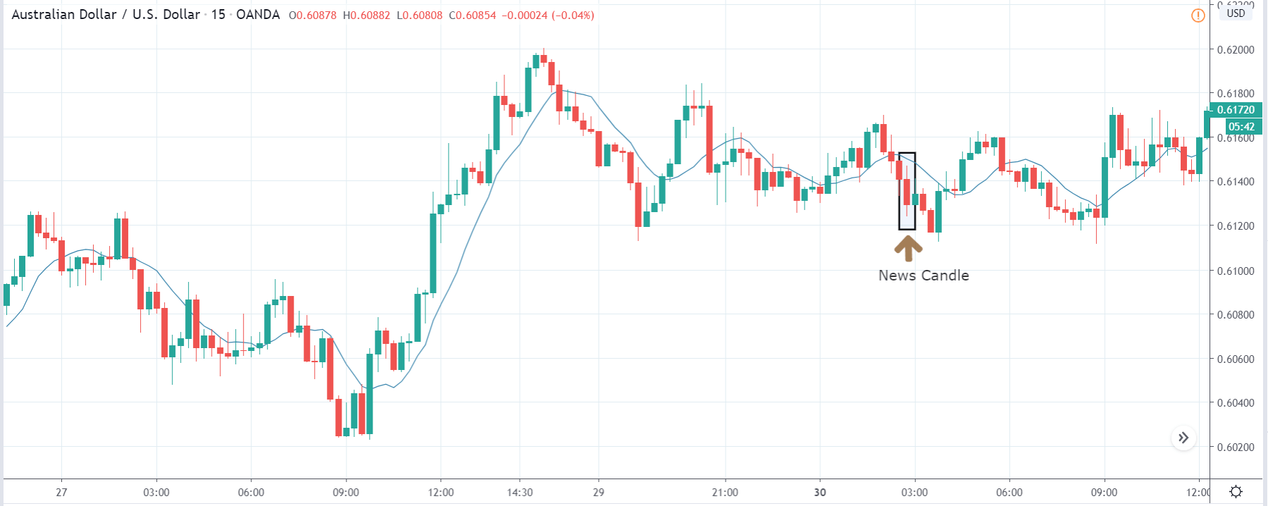
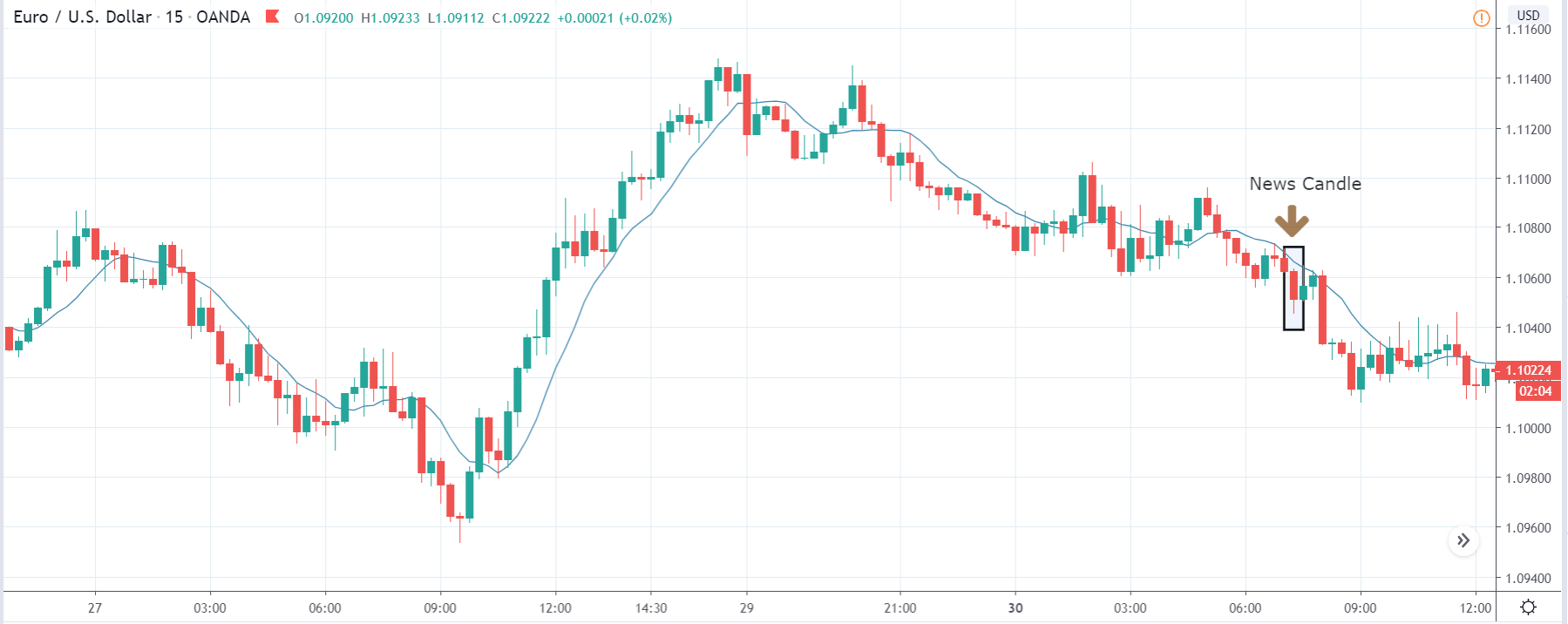
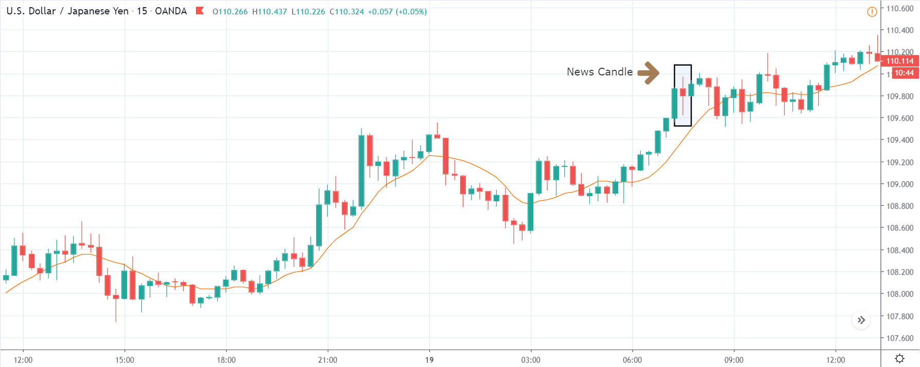
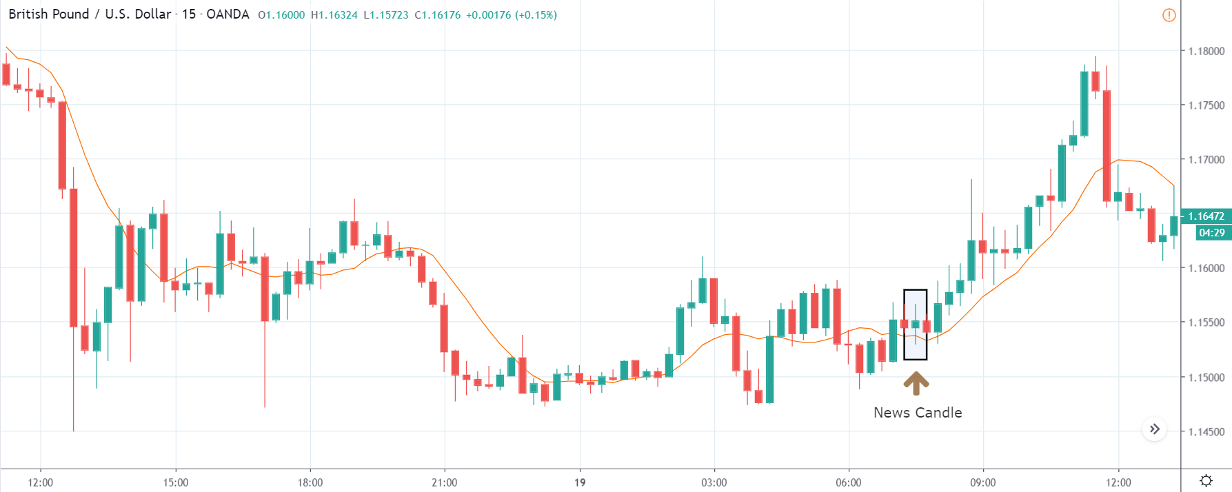
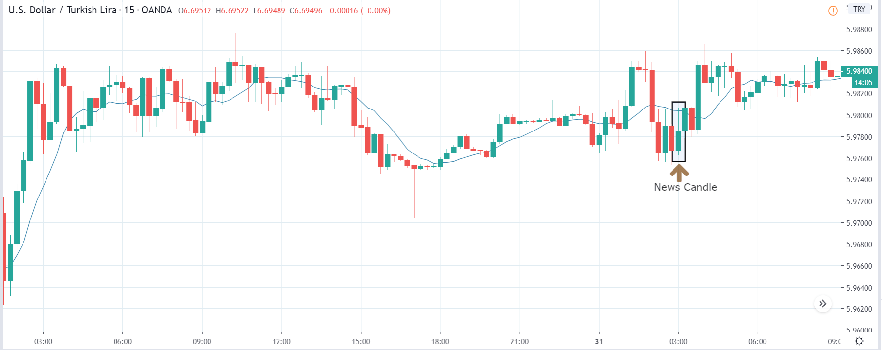
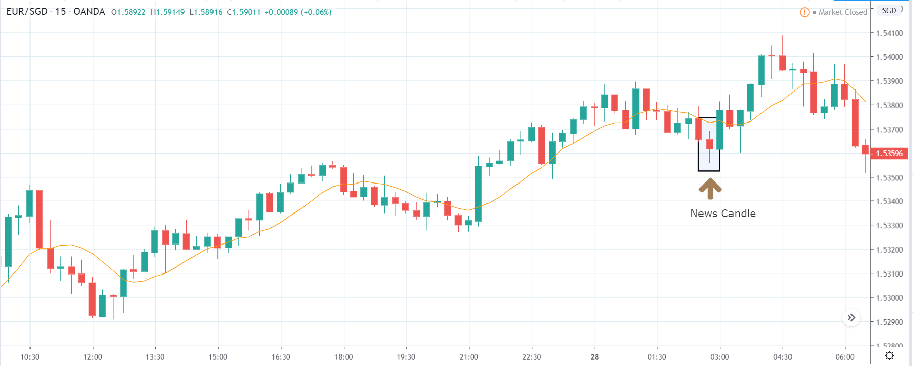
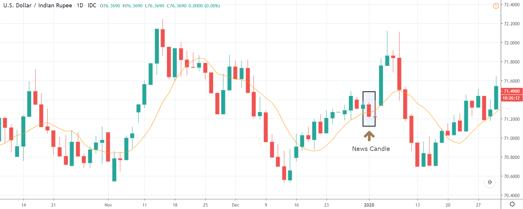
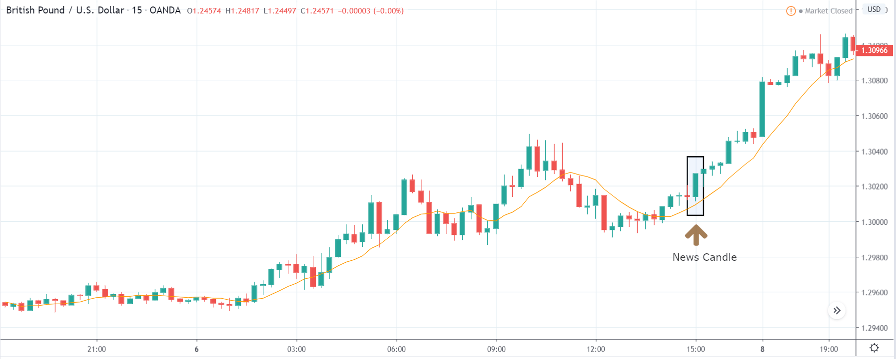
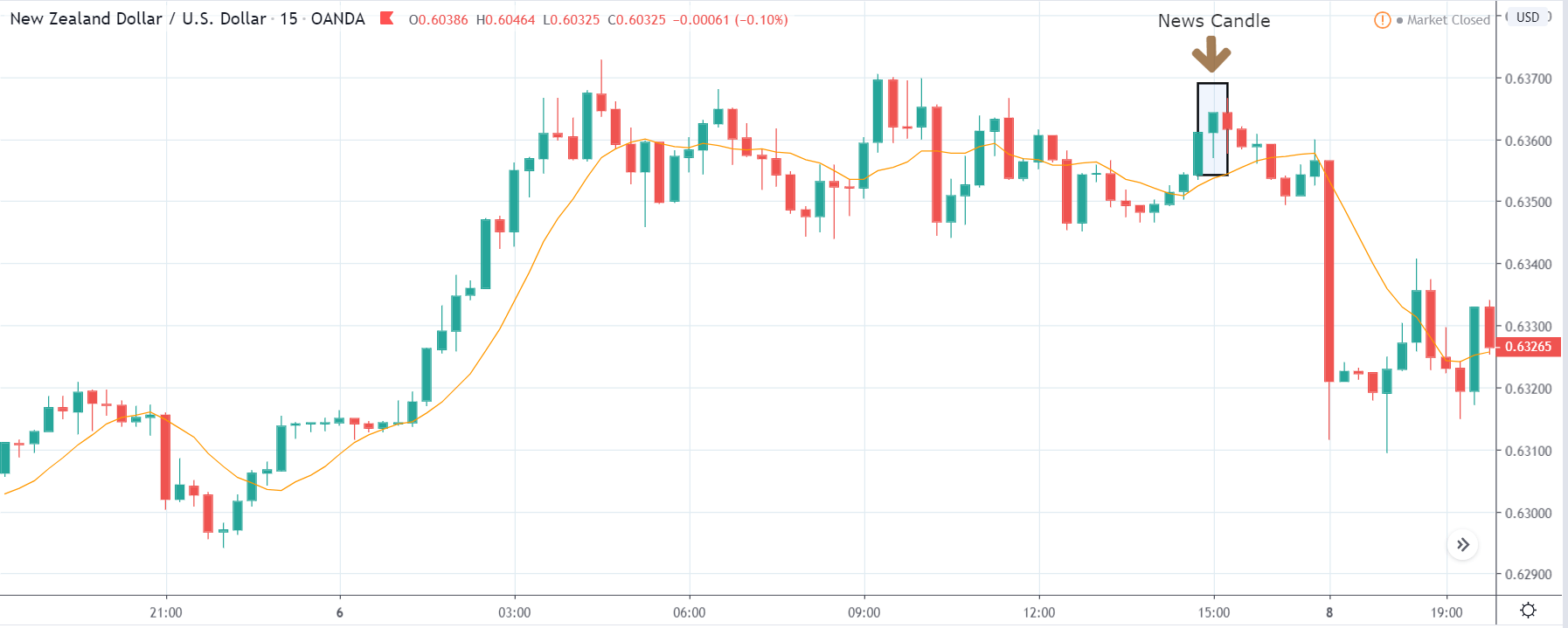
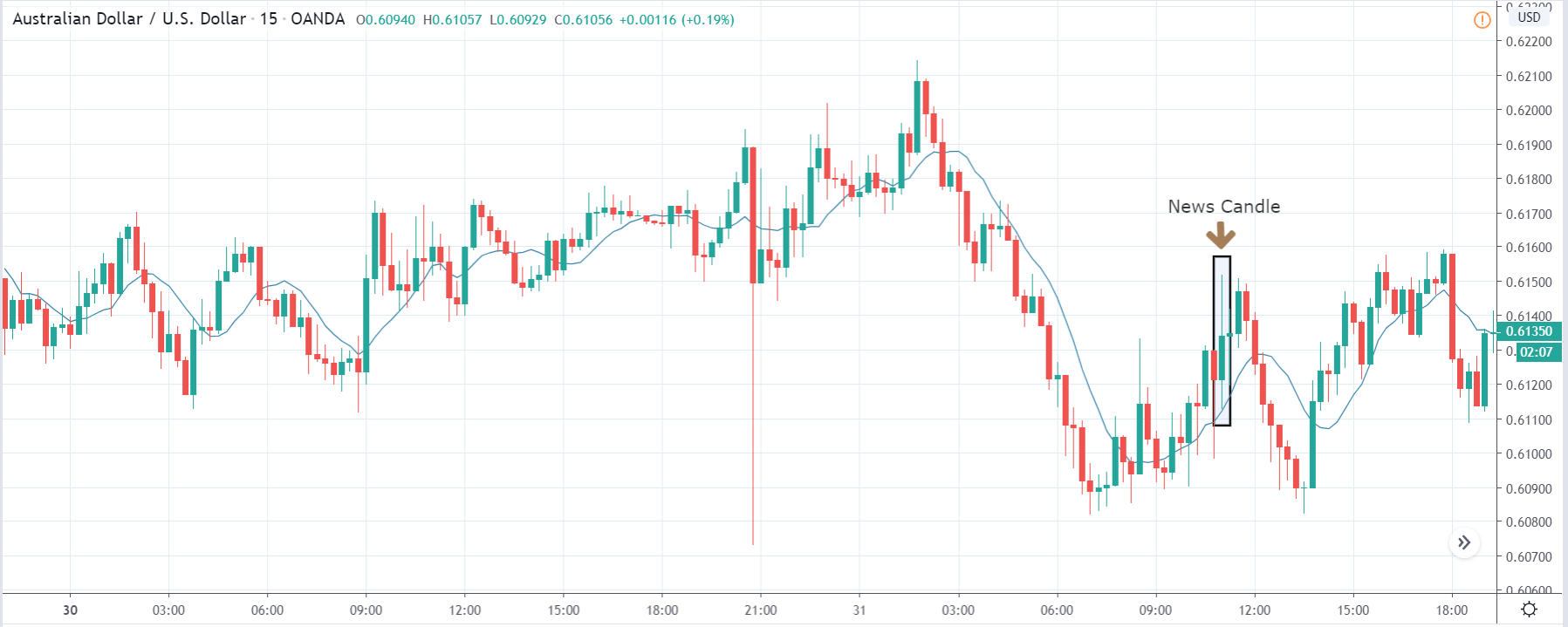
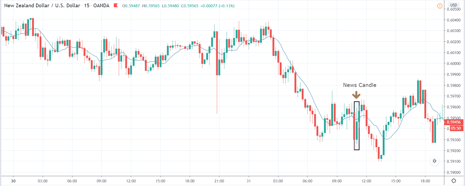
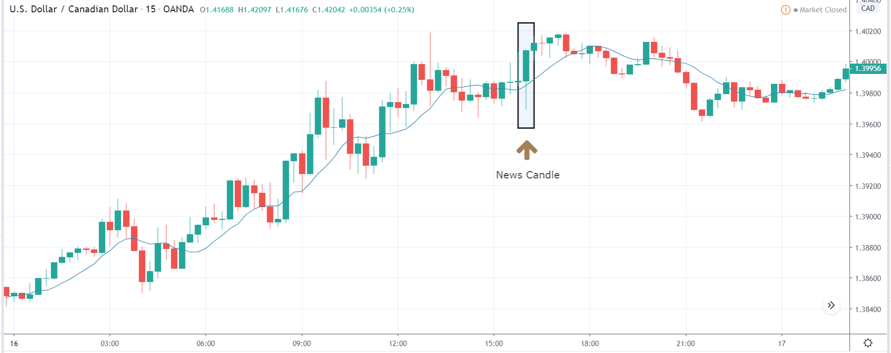
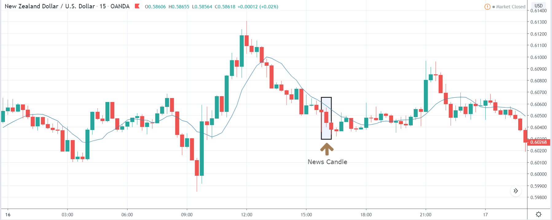
USD/TRY | After The Announcement
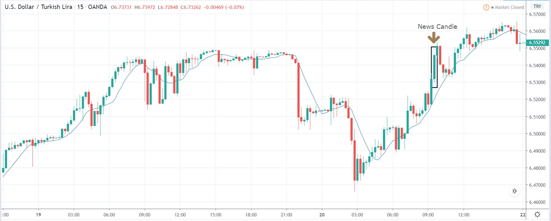
As soon as the Government Debt data is announced, the market violently moves higher, and price rises quickly to the top. The reason behind the increase in volatility to the upside is that the Government Debt increased by almost $70B for the month of March. As a rise in Debt is considered to be negative for the economy, this explains why traders and investors sold Turkish Lira and bought U.S. dollars after the numbers were announced. The bullish ‘news candle’ is a sign of trend continuation, and thus one can go ‘long’ in the pair after a suitable price retracement.
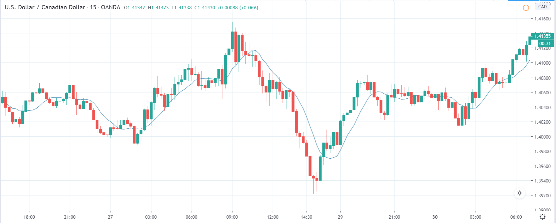
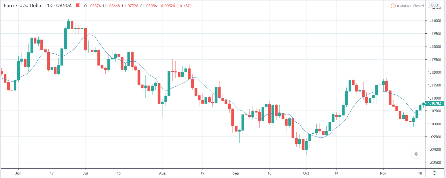
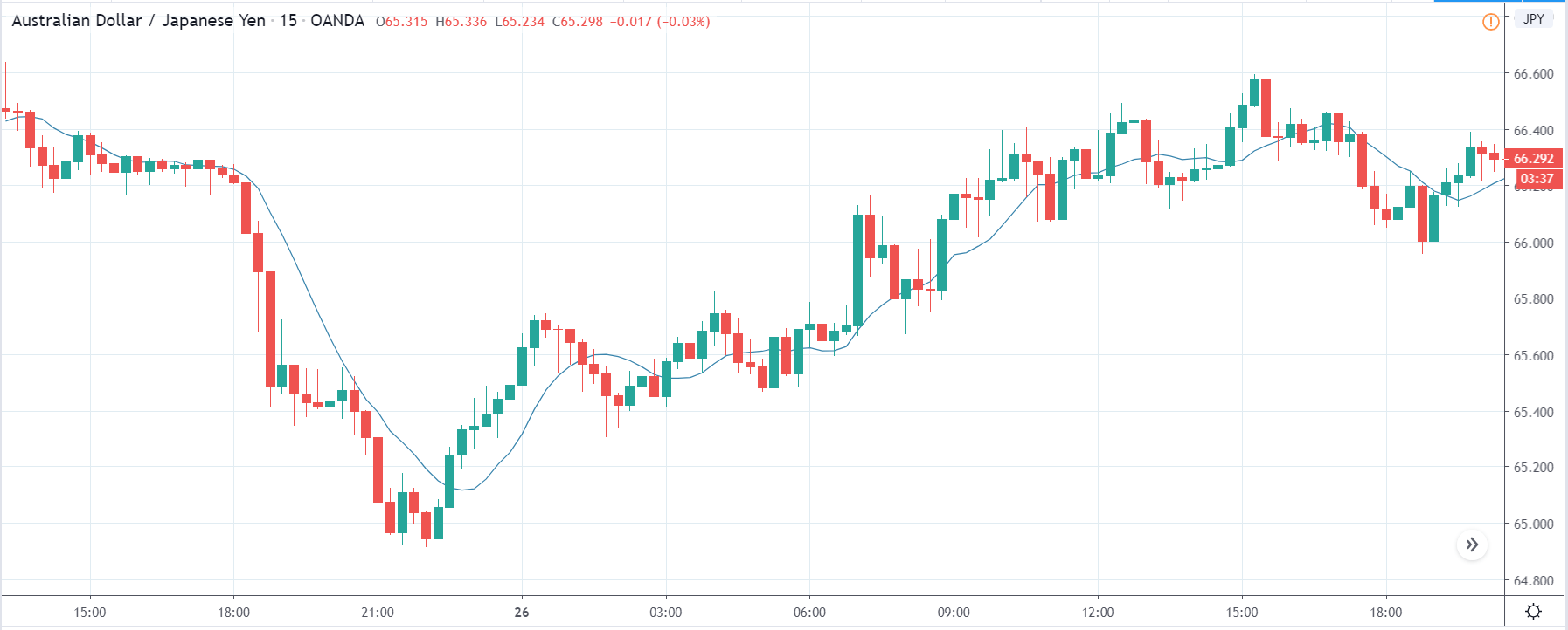
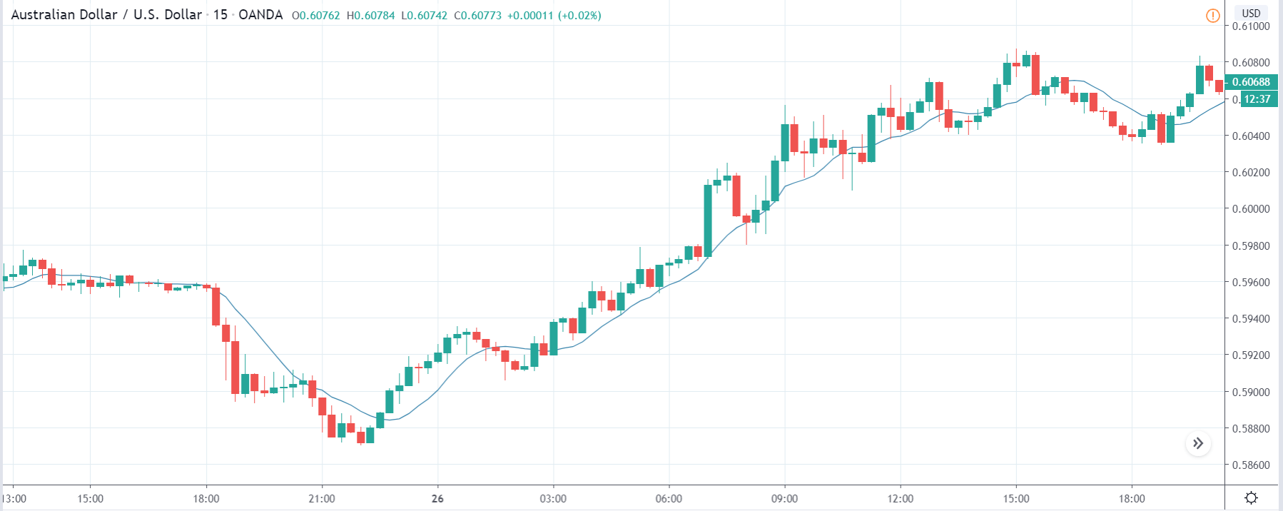
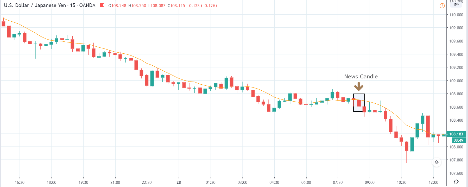
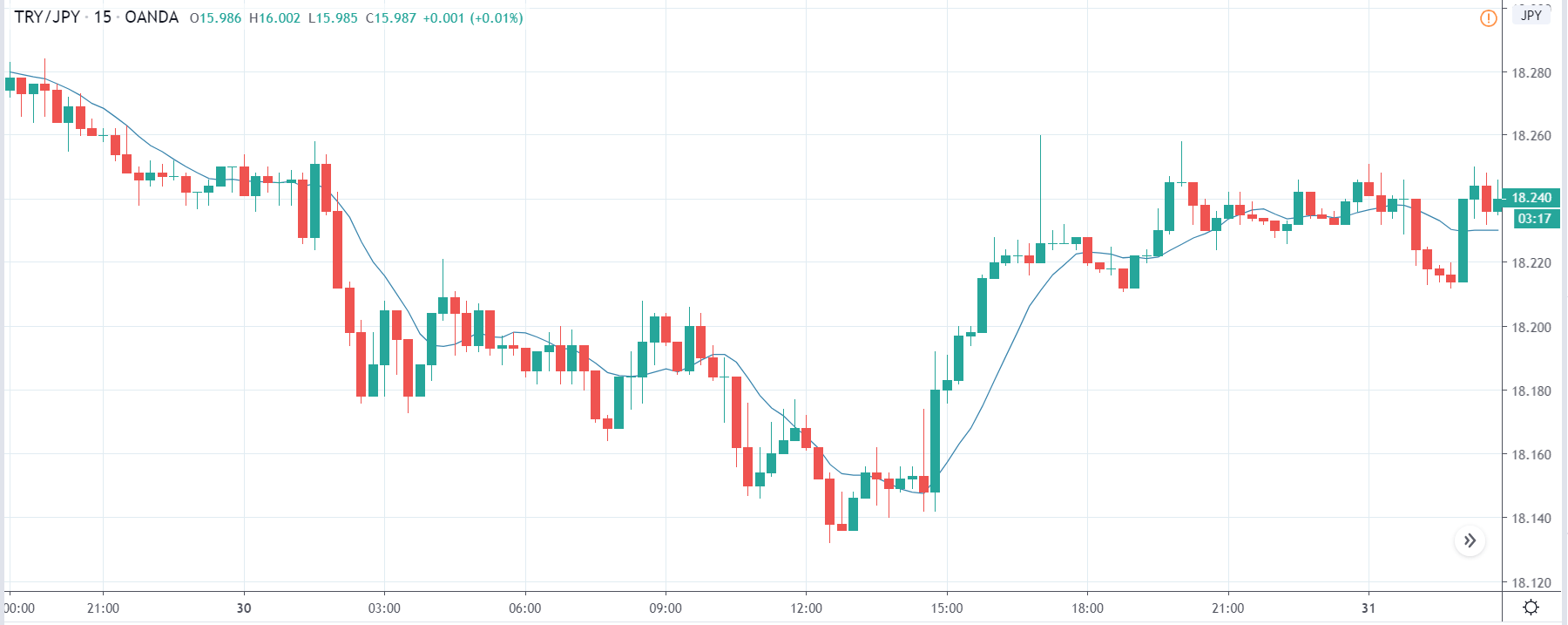
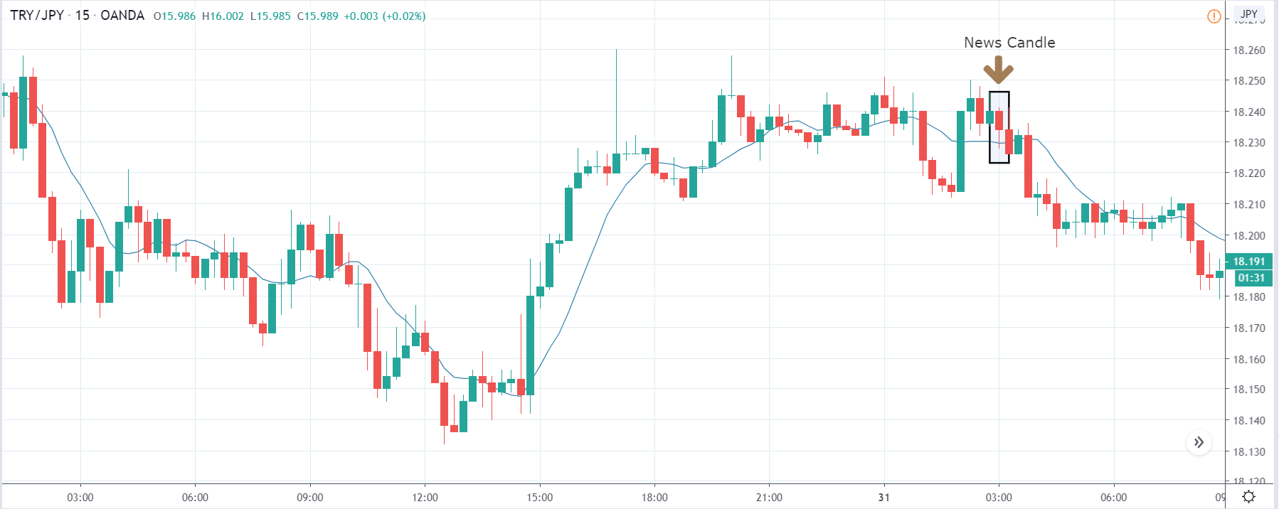
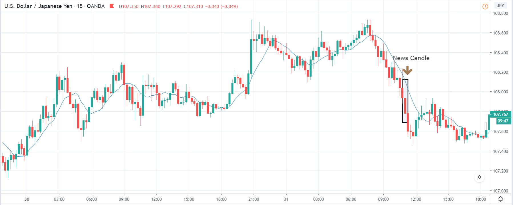
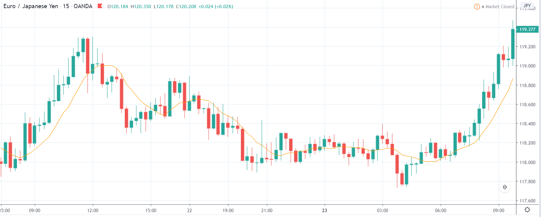
TRY/JPY | Before The Announcement

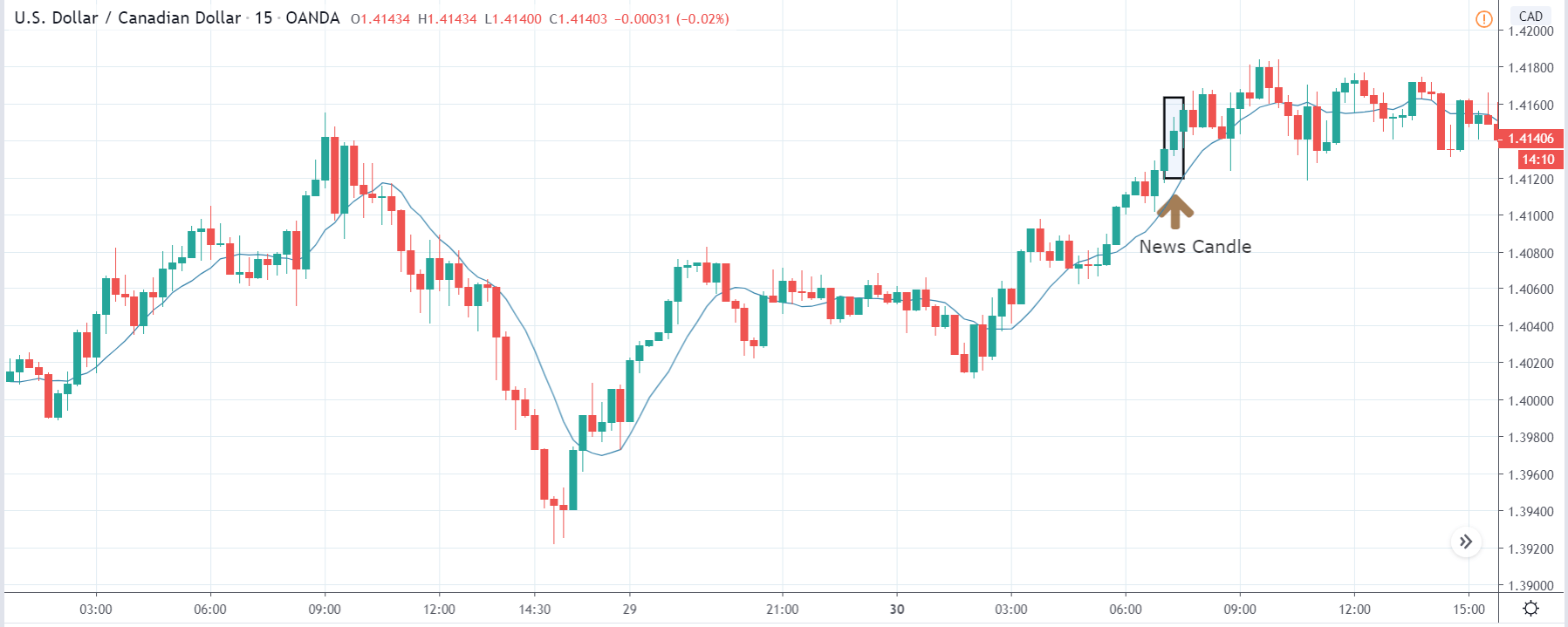
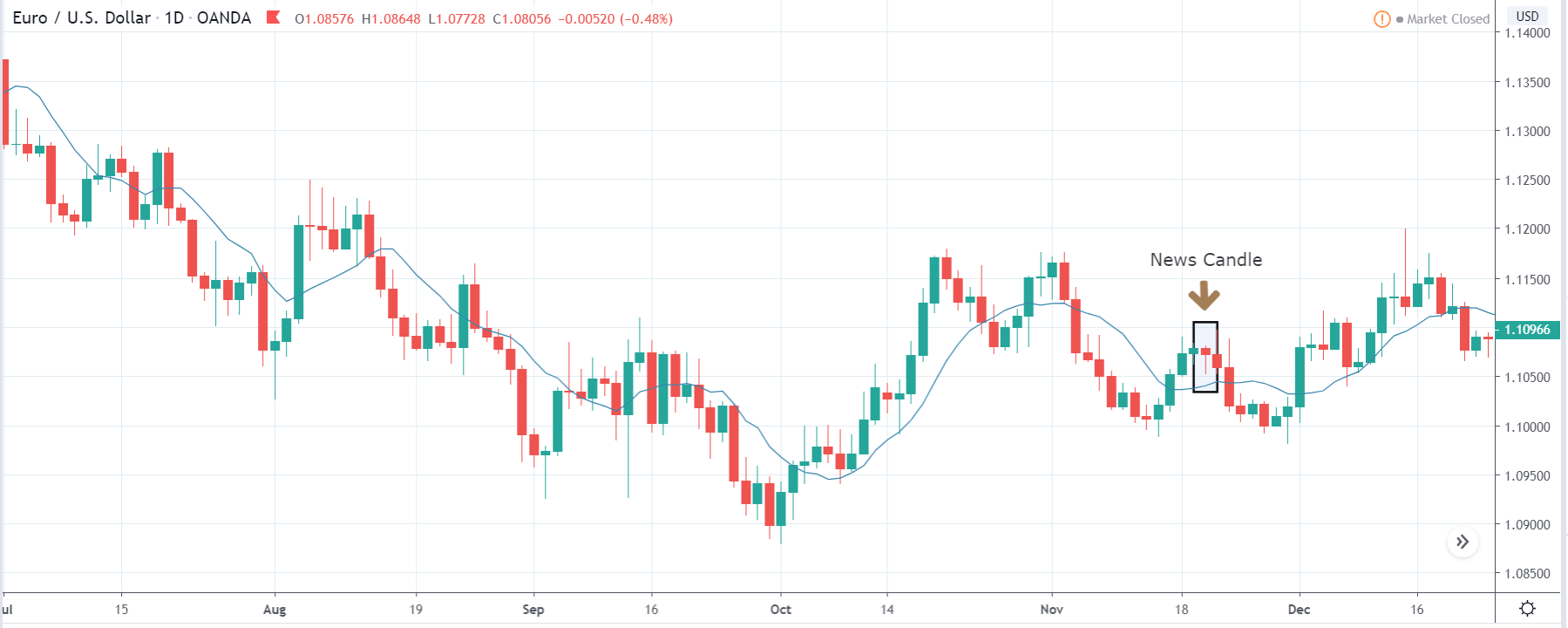
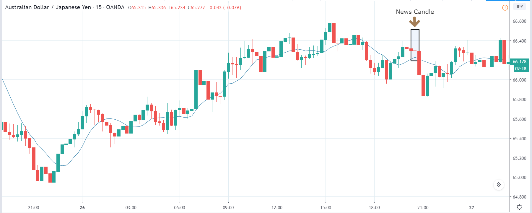
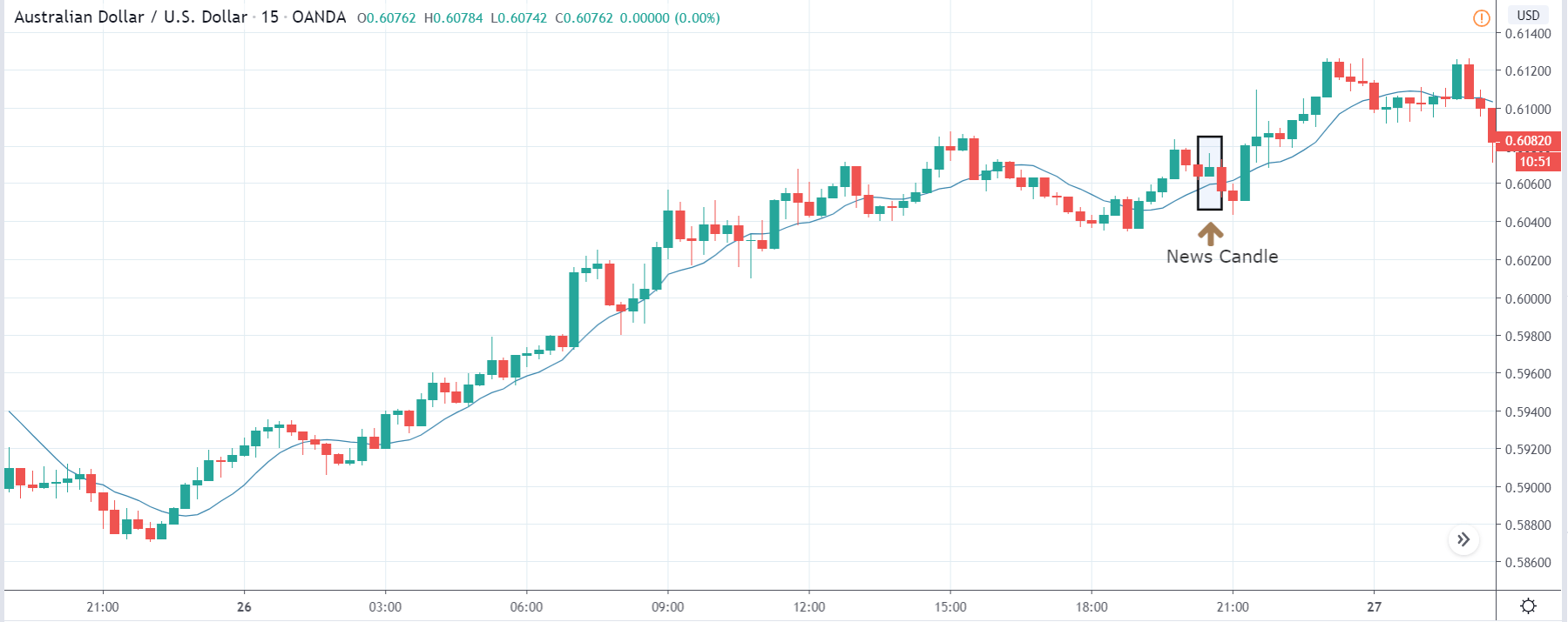
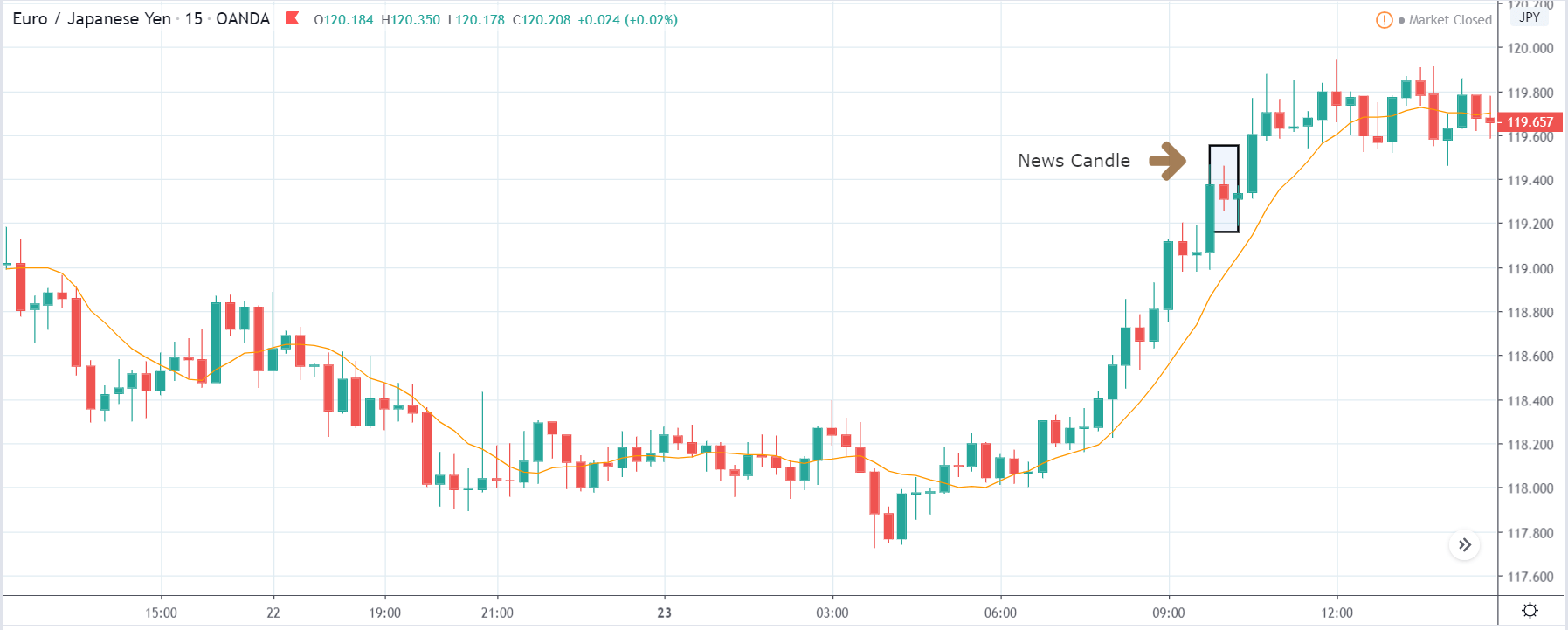
TRY/JPY | After The Announcement

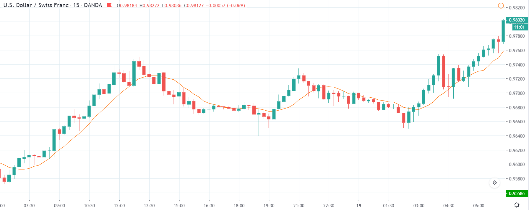
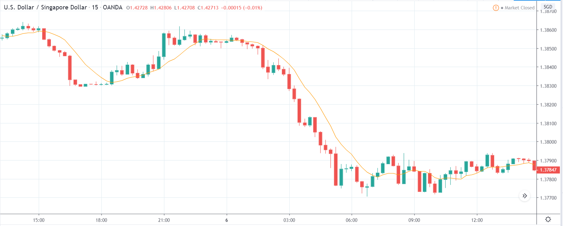
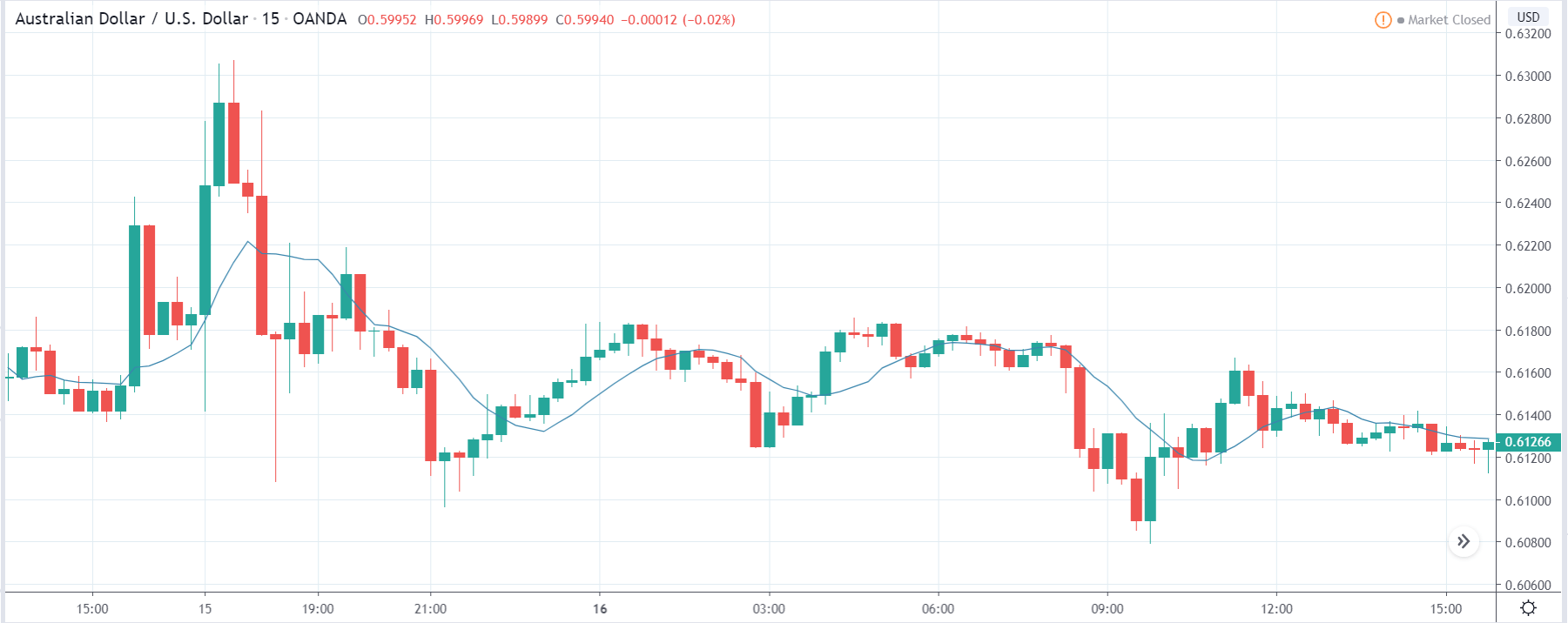
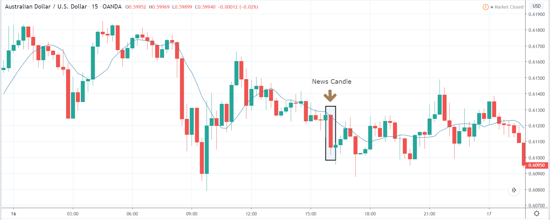
Next, we will discuss the impact of the news on the TRY/JPY currency pair, where we see that the market is moving in a range, and the overall trend is up. As the Turkish Lira is on the left-hand side, a ranging market indicates an indecision state of the market. Before the news announcement, price is at the ‘resistance’ area, and thus one can expect some selling pressure from this point, which can take the price lower. In such a market scenario, aggressive traders can take a ‘short’ trade in the market, expecting bad news for the economy.
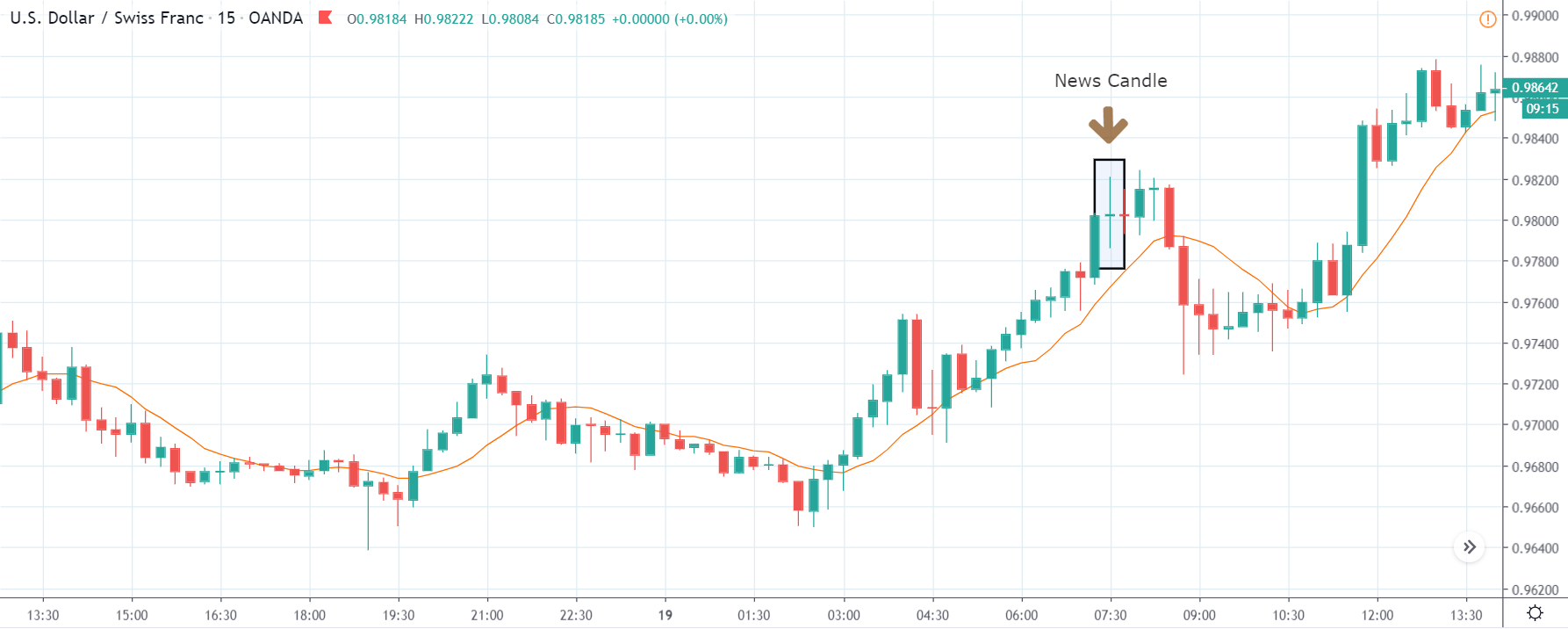
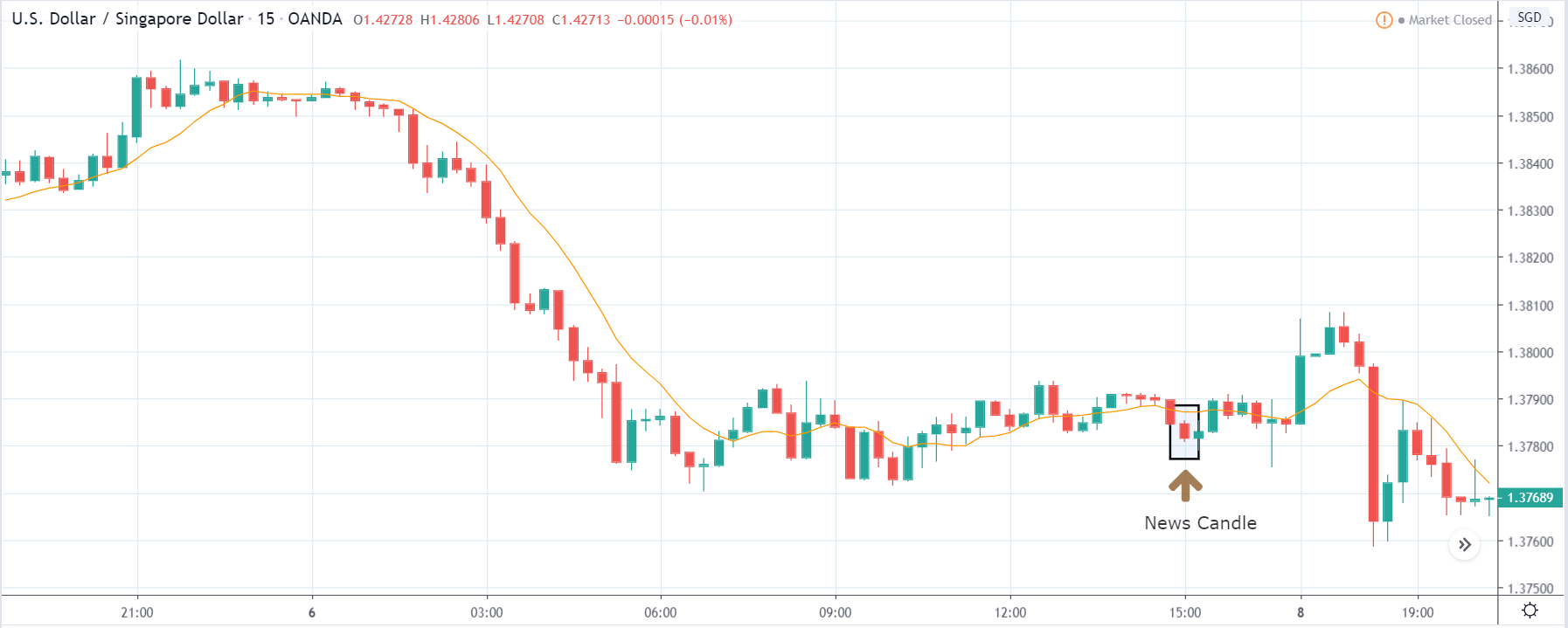
The news release resulted in volatility expansion on the downside as the market reacted negatively owing to poor Government Debt data. The price crashed and closed as a strong bearish candle. But this was immediately retraced by a bullish candle, which could be due to the reaction from ‘support’ of the range. Thus, one should go ‘short’ in the pair after the price breaks key levels as the overall trend is up.
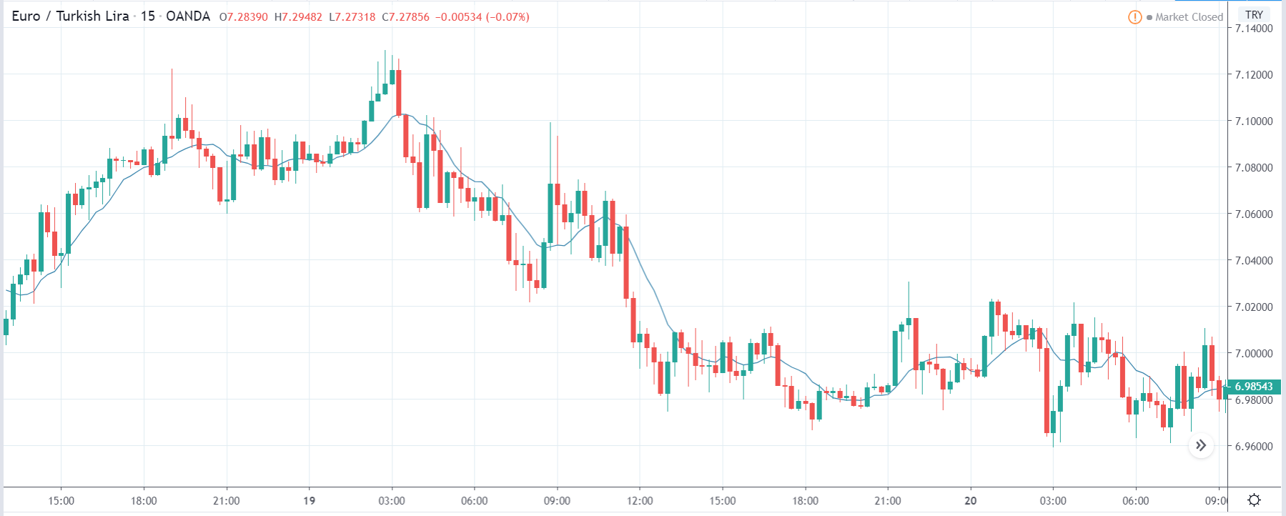
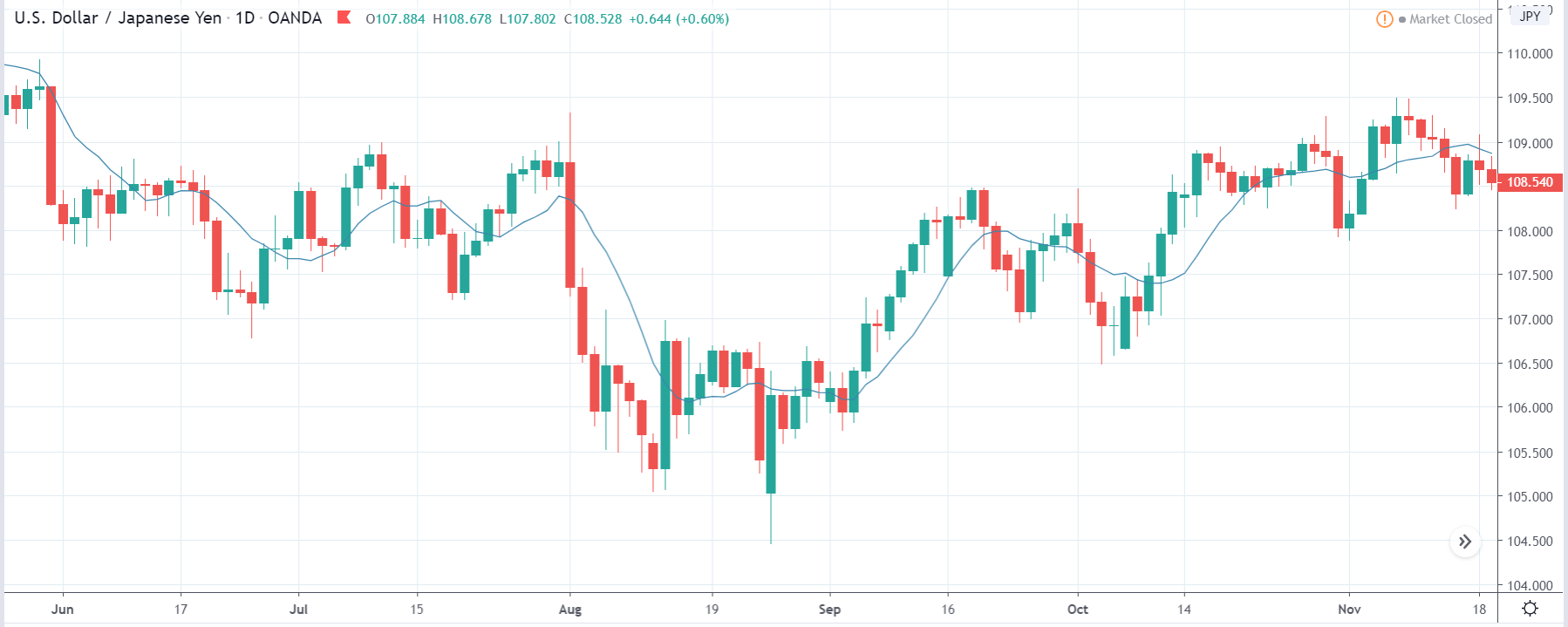
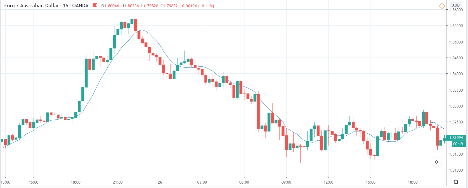
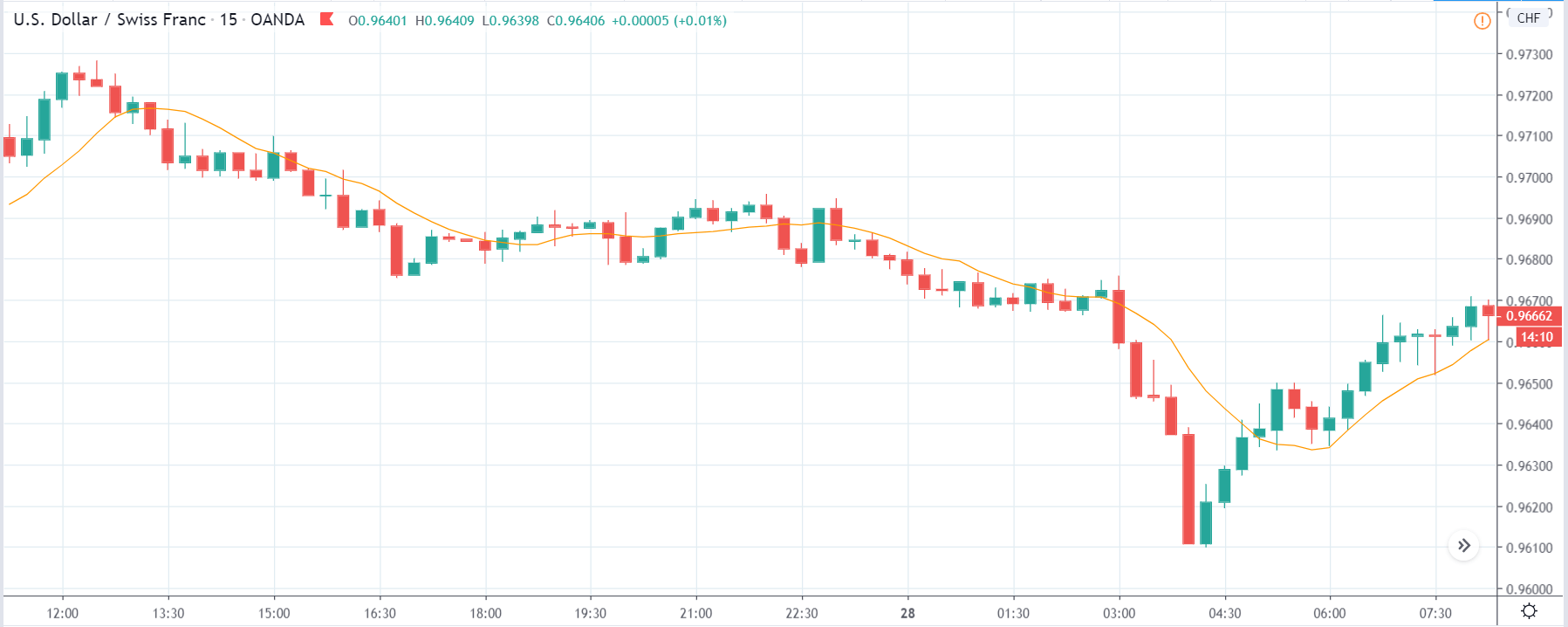
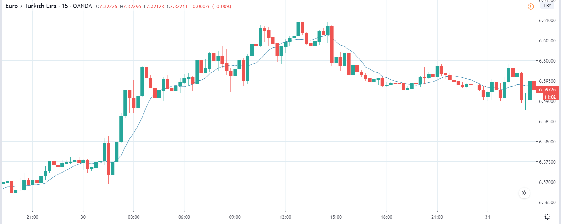
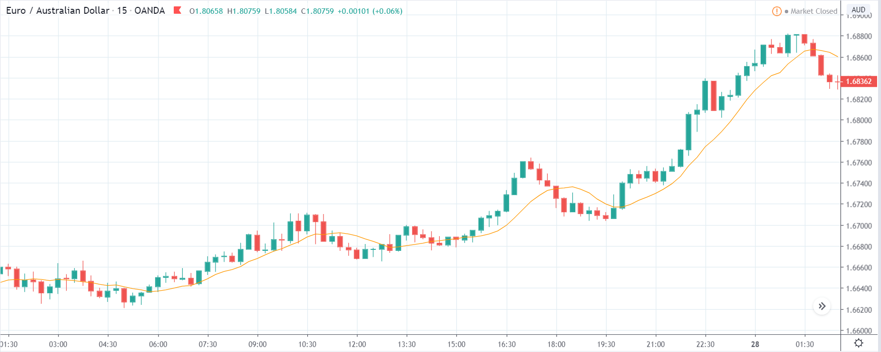
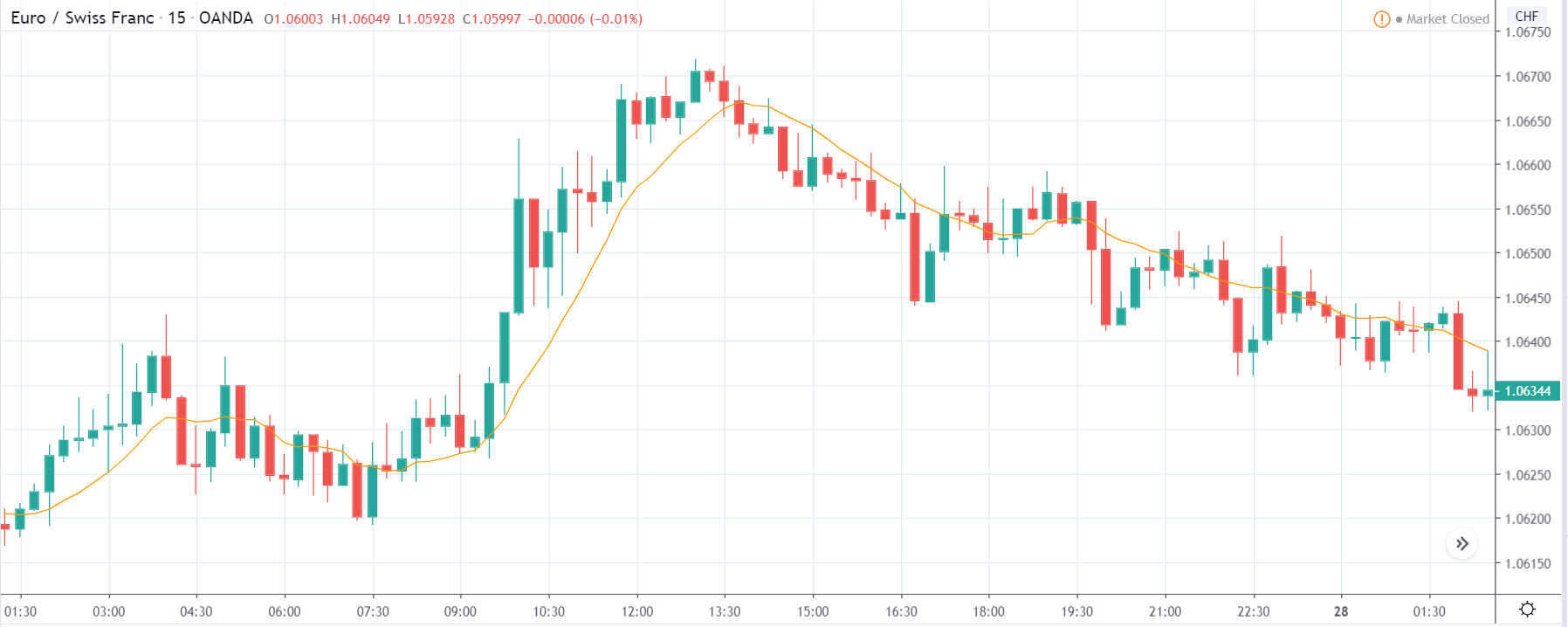
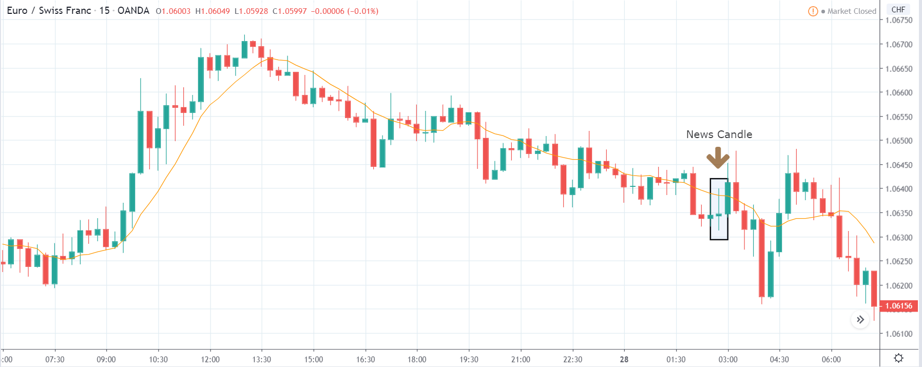
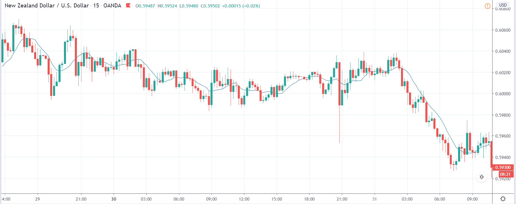
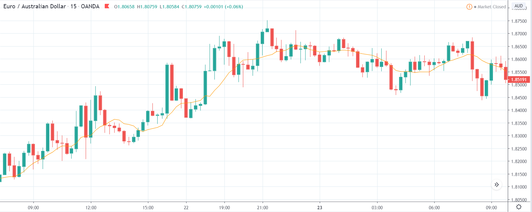
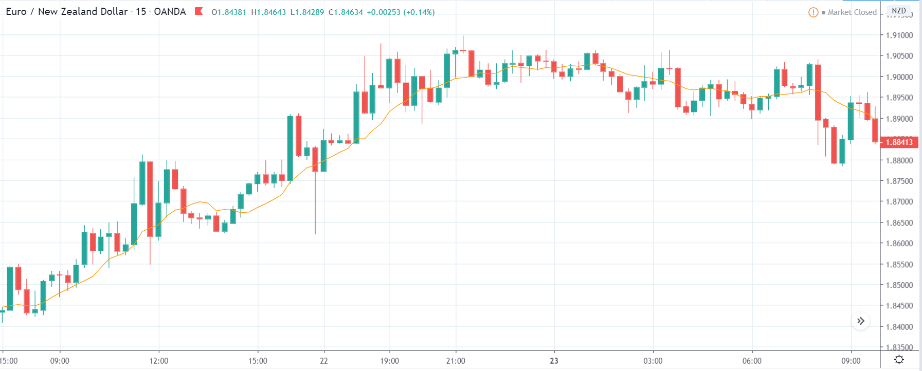
EUR/TRY | Before The Announcement
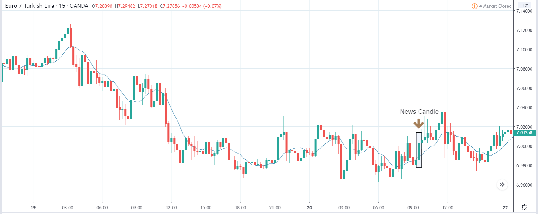
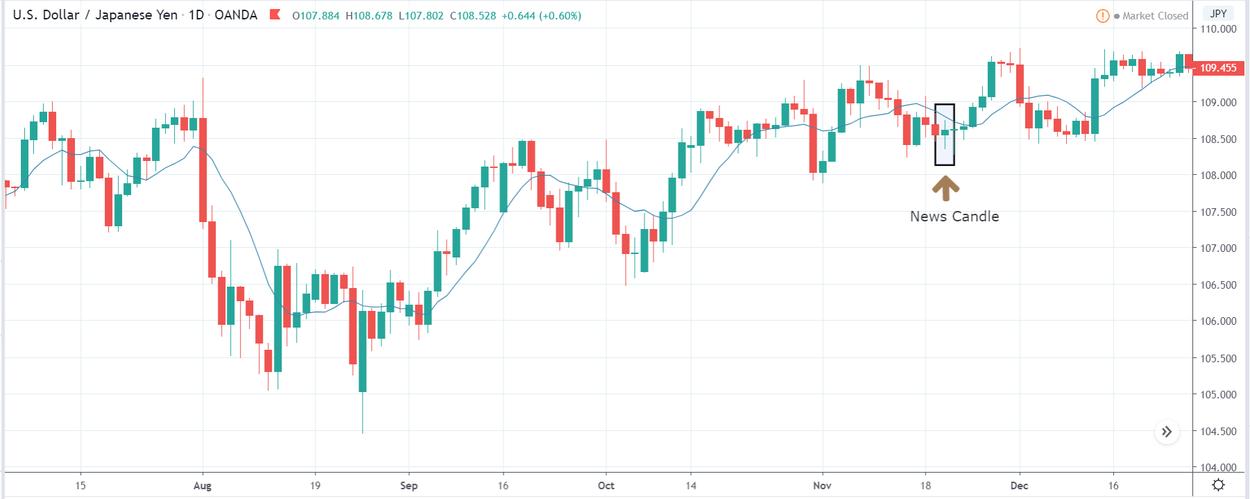
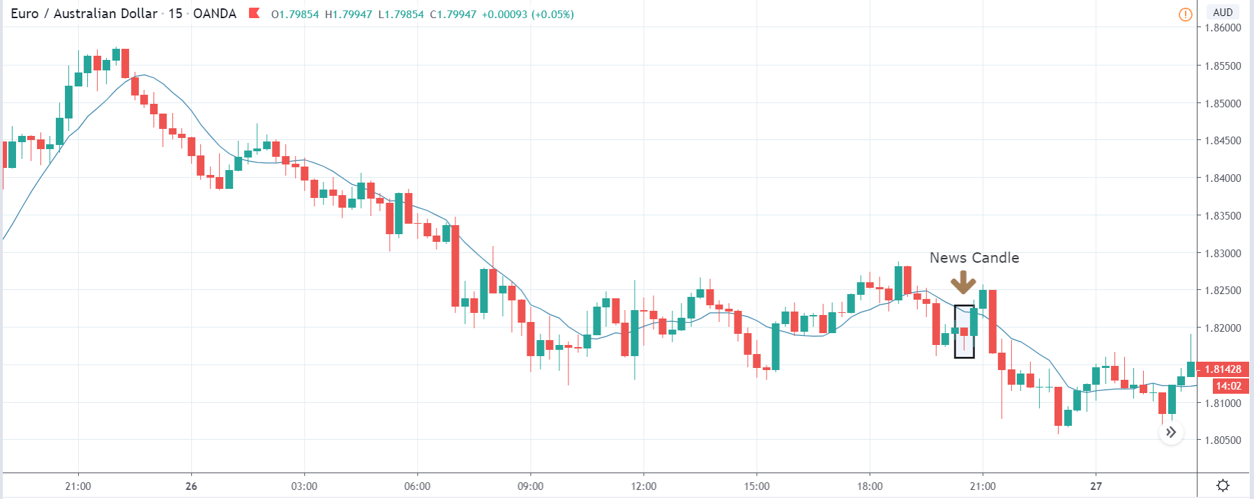
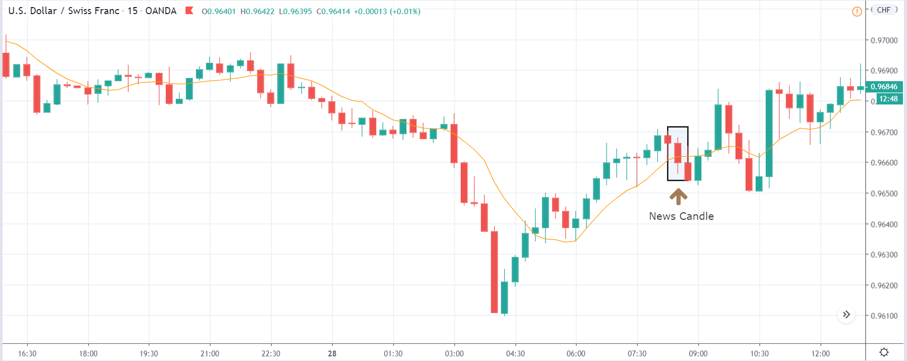
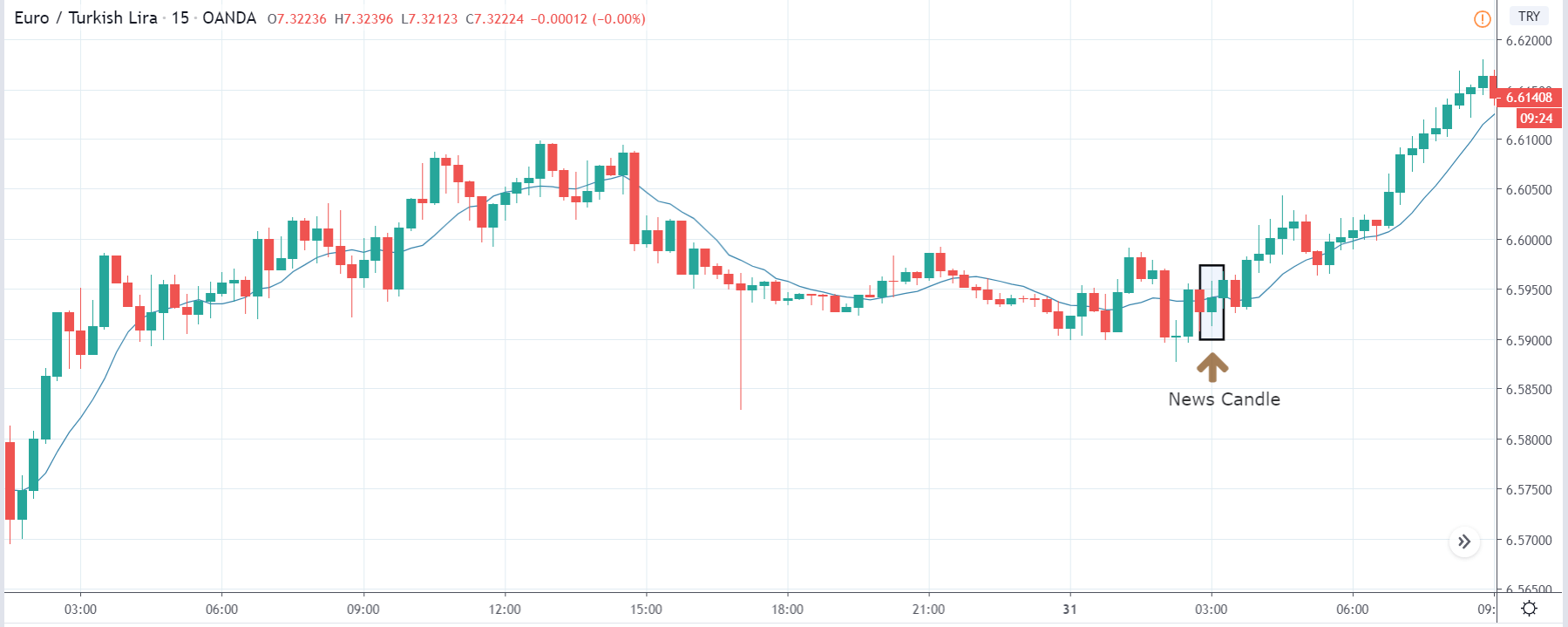
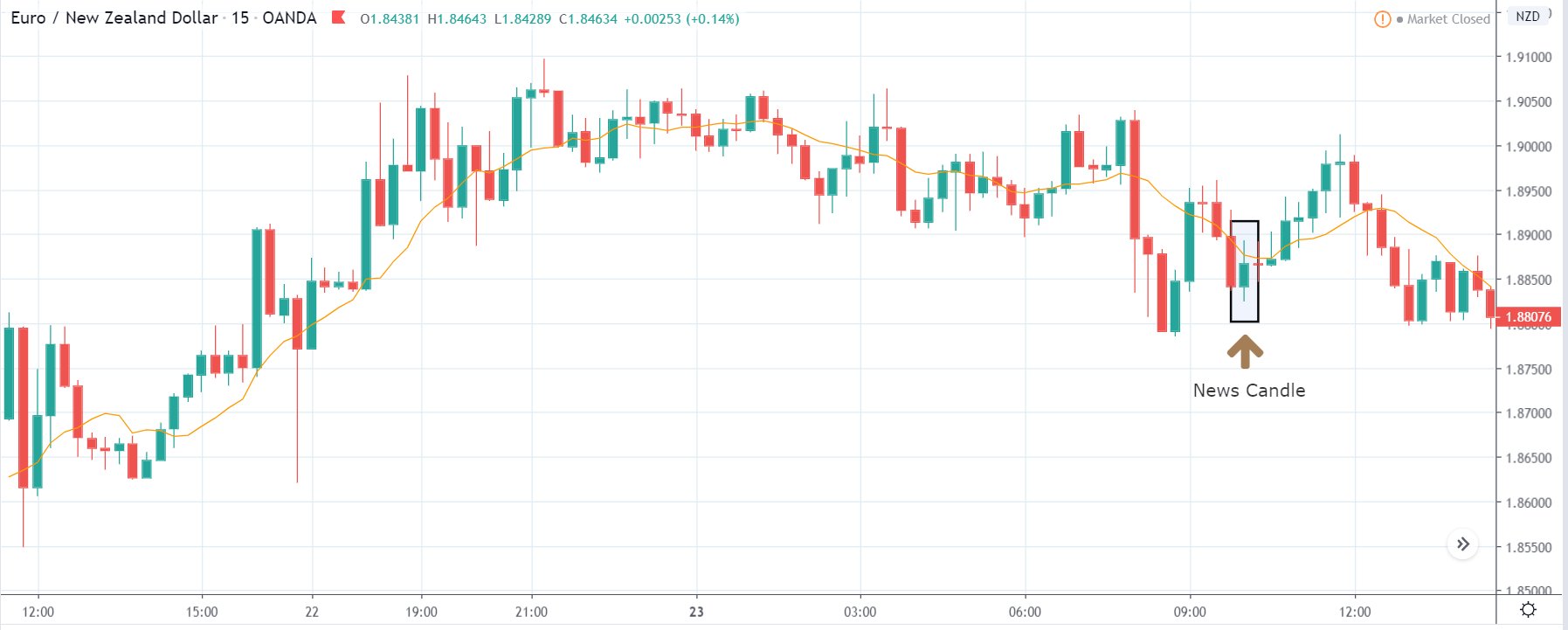
EUR/TRY | After The Announcement
The above images are that of the EUR/TRY currency pair, and here too, the market is range-bound where the overall trend is down. Since the Turkish Lira is on the left-hand side, a ranging market indicates a moderate strength in the currency. Just before the announcement, price is at the ‘bottom’ of the range, and one can expect some buying strength in the market, which can take the price higher from here. The safer approach is to wait for the shift in volatility due to news release and then trade based on the data.
After the data is released, the market, just as in the above pairs, moves higher sharply, and traders sell Turkish Lira. The bullish ‘news candle’ indicates that the Government Debt data was extremely bad for the economy and thereby prompting traders to go ‘long’ in the pair. As now the price is at resistance, one should wait for a breakout and then ‘buy.’
That’s about ‘Government Debt’ and its impact on the Forex market after its news release. If you have any questions, please let us know in the comments below. Good luck!


