Introduction
MACD regular divergence is a trading strategy that considers the relationship between Moving Average Convergence Divergence and the price.
MACD, a technical indicator, invented by Gerald Appel in 1979. It is very famous among professional and institutional traders; therefore, it can provide a reliable trading opportunity. On the other hand, divergence is a significant concept in trading that happens between the price and oscillator.
In most of the cases, oscillators like MACD or RSI move with the price. However, there is some condition where MACD does not follow the same direction of the price and creates divergence.
What is the MACD Divergence Strategy?
MACD is a Momentum based indicator that shows the correlation between two moving averages. Traders use this indicator in stocks, bonds, and forex trading as a trend continuation and reversal indicator. If you want to become a successful forex trader, MACD would be the best indicator to follow.
If you use a momentum-based strategy, MACD is the best available technical indicator for you. If you trade using the MACD divergence strategy, it will show you the proper entry and exit points.
There are several types of divergence, but in most cases, investors use the following types of divergences:
Hidden Divergence
It happens when the MACD histogram creates divergence with the price. It indicates a minor market reversal and significant trend continuation.
Regular Divergence
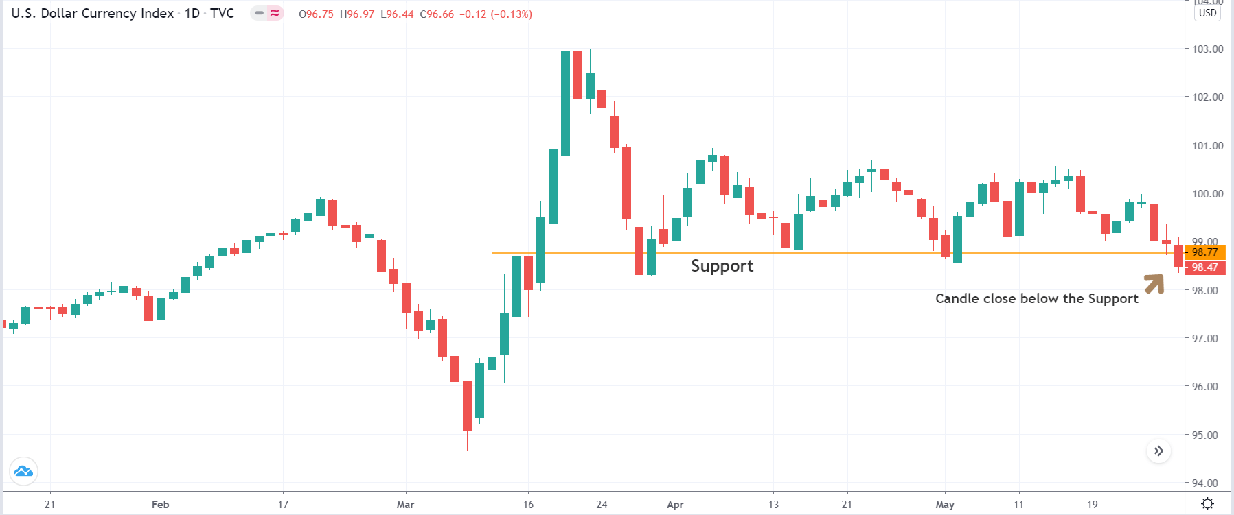
It happens when MACD EMA moves to the opposite direction of the price. Regular divergence from a significant support or resistance level indicates a potential market reversal.
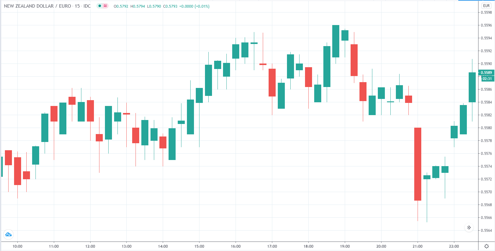
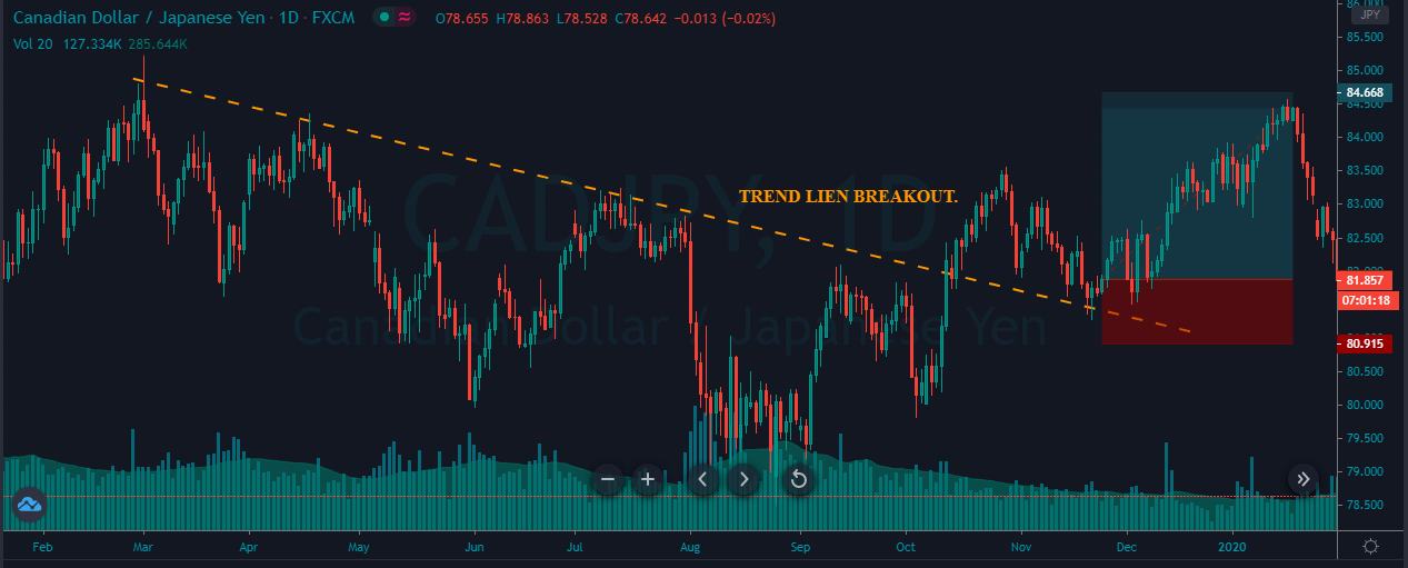
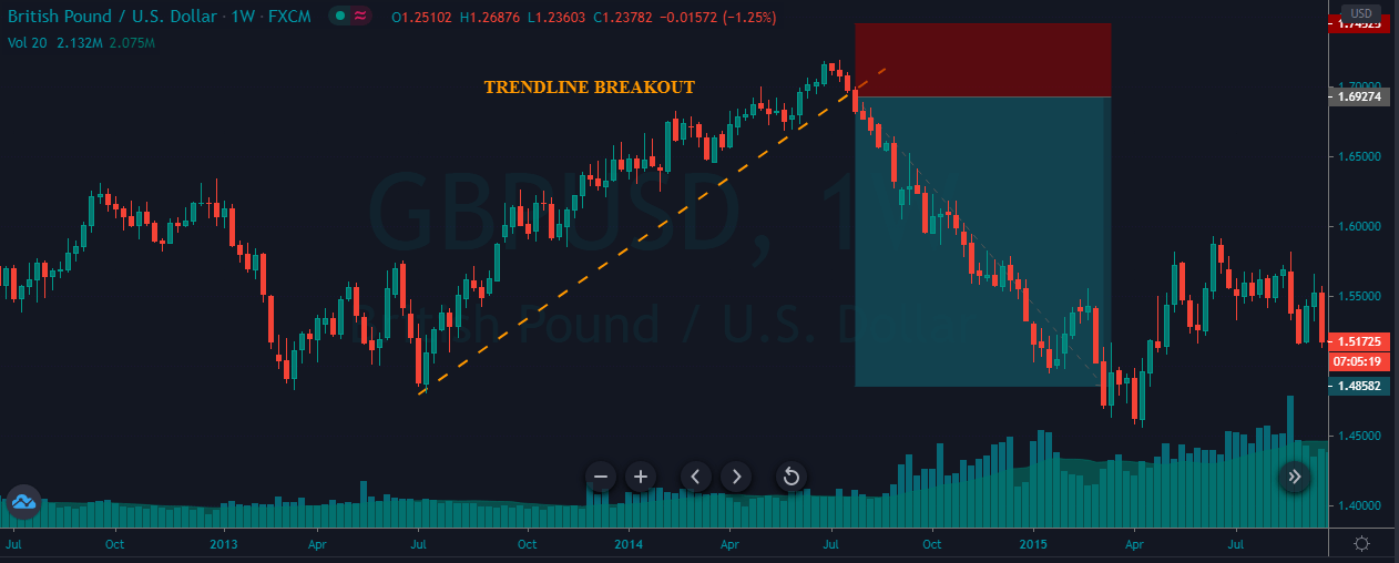
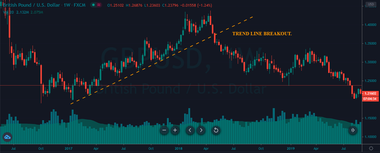
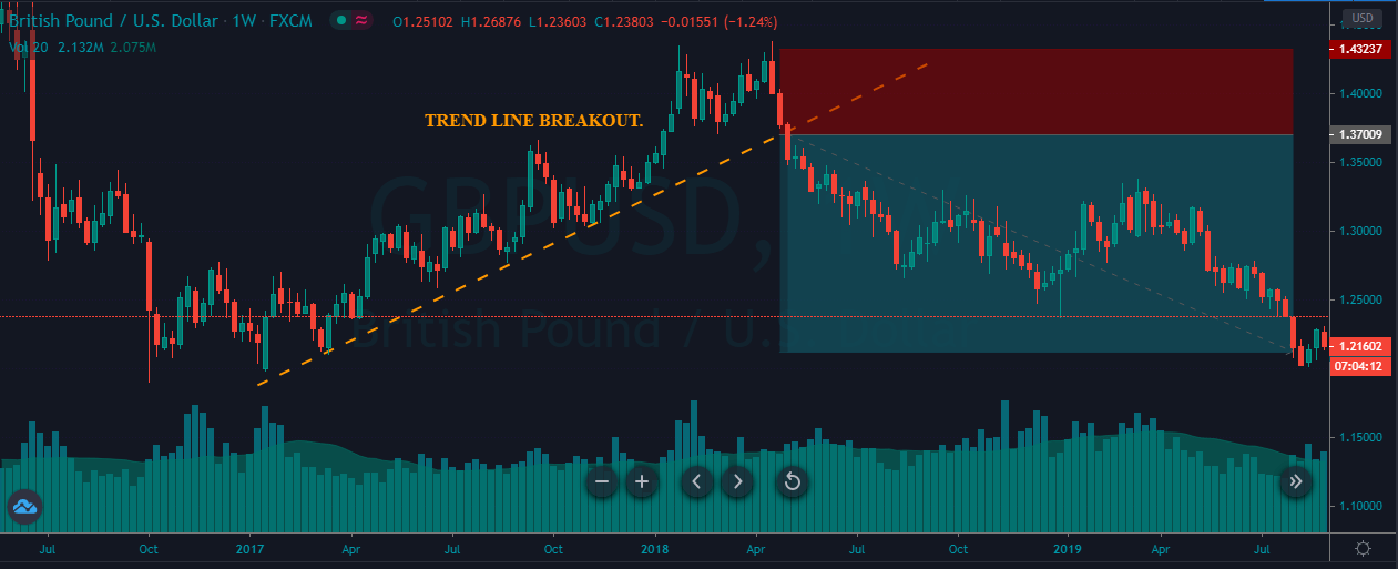
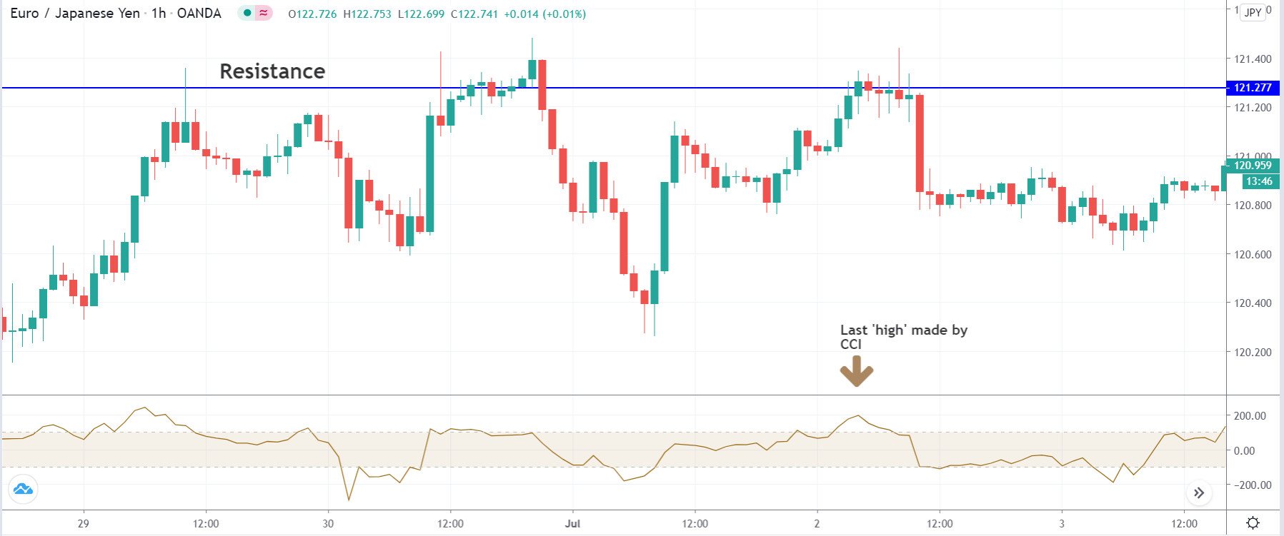
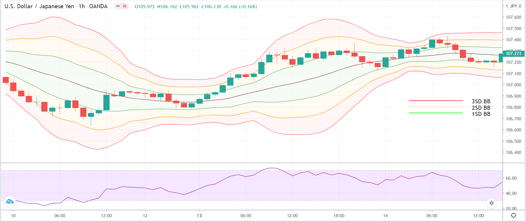
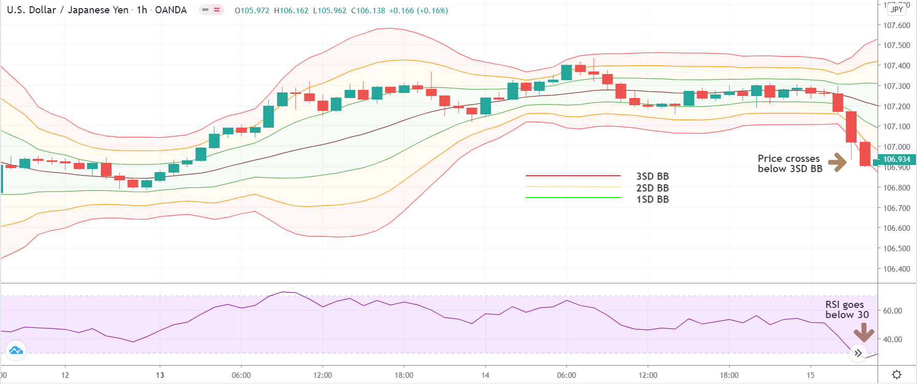
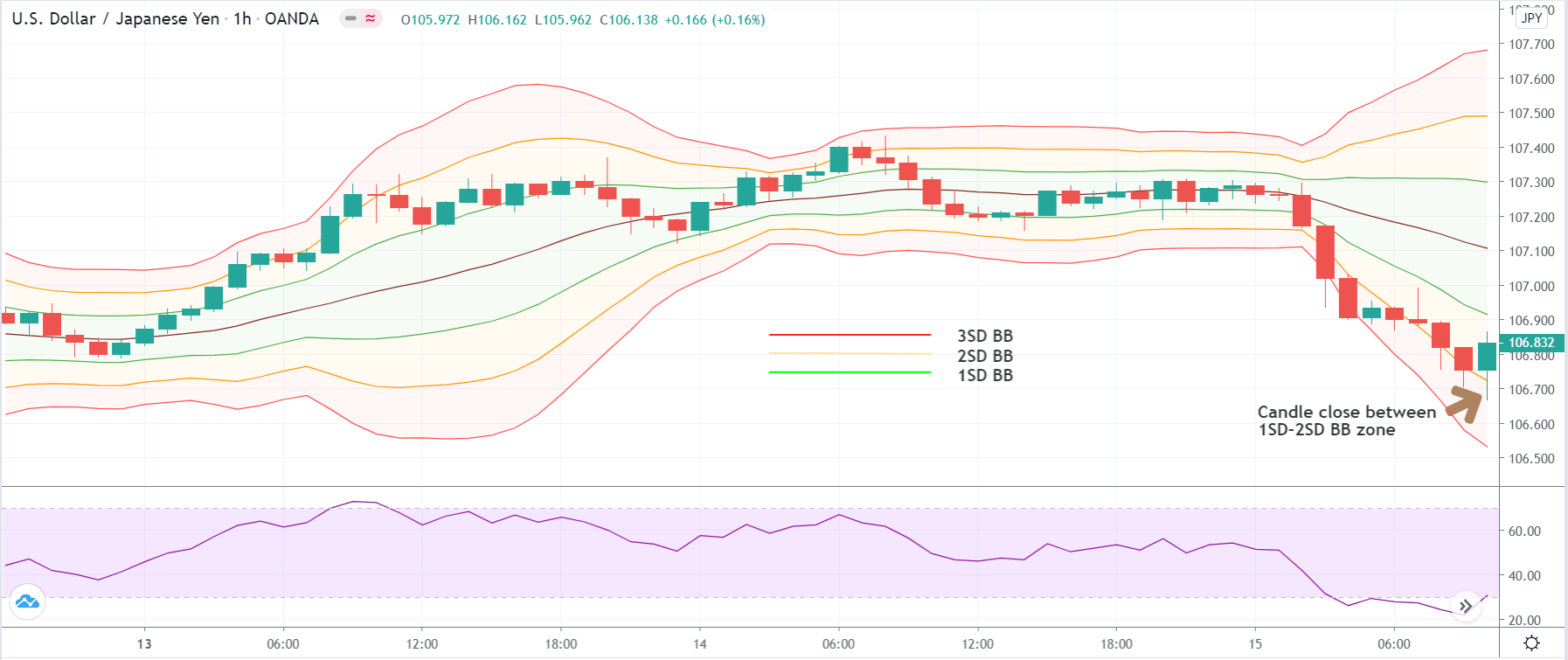
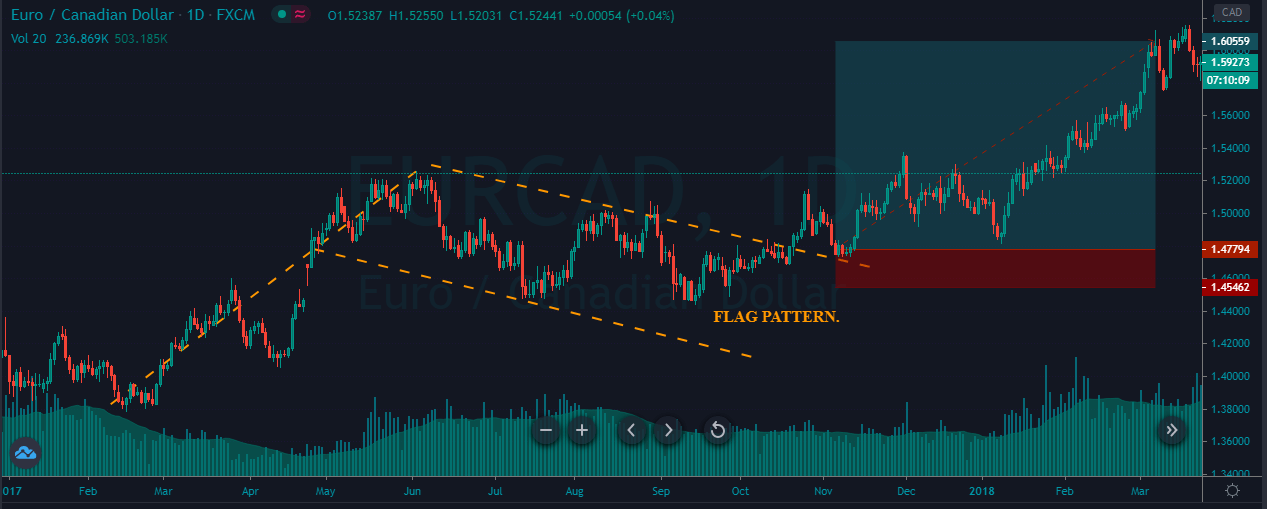
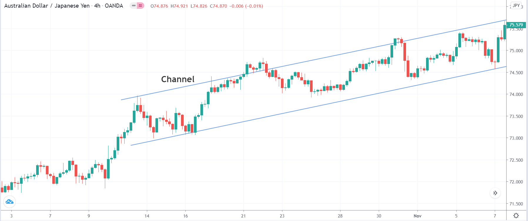
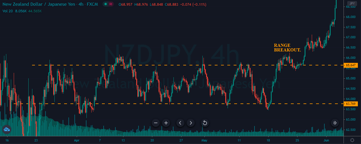
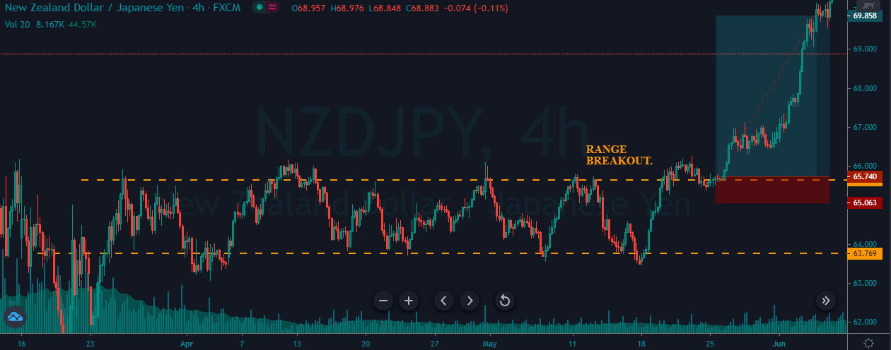
In the example below, we can see a naked chart with a MACD indicator.
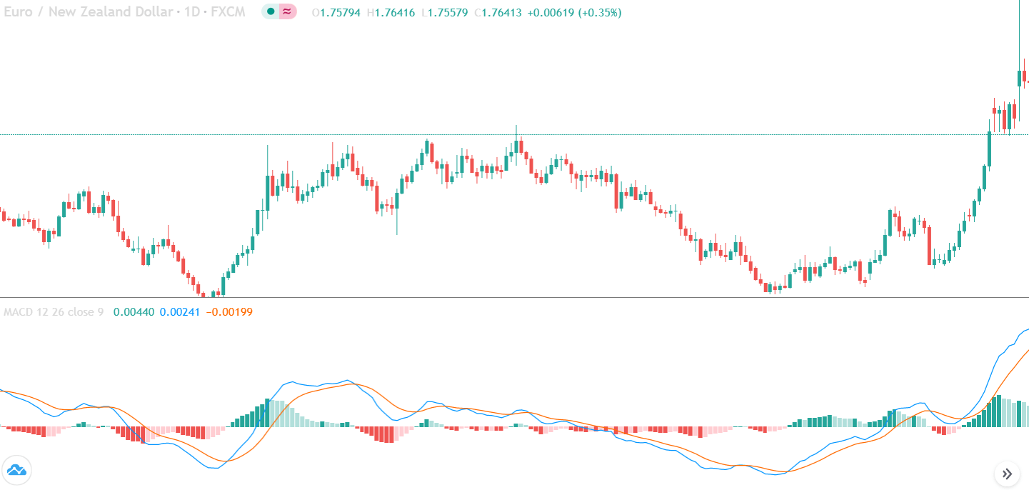
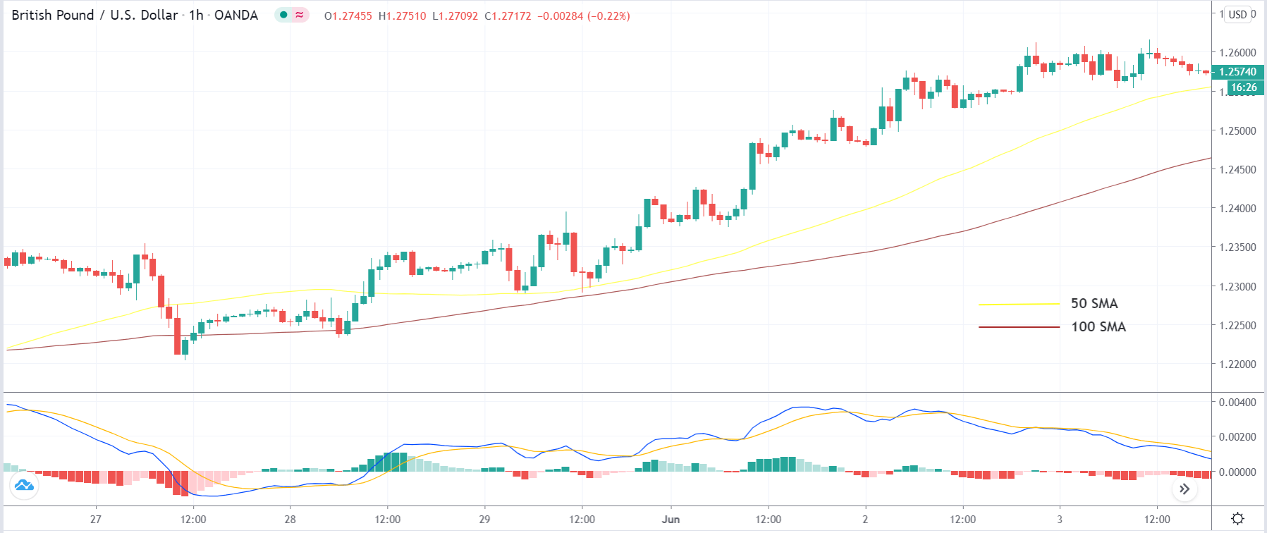
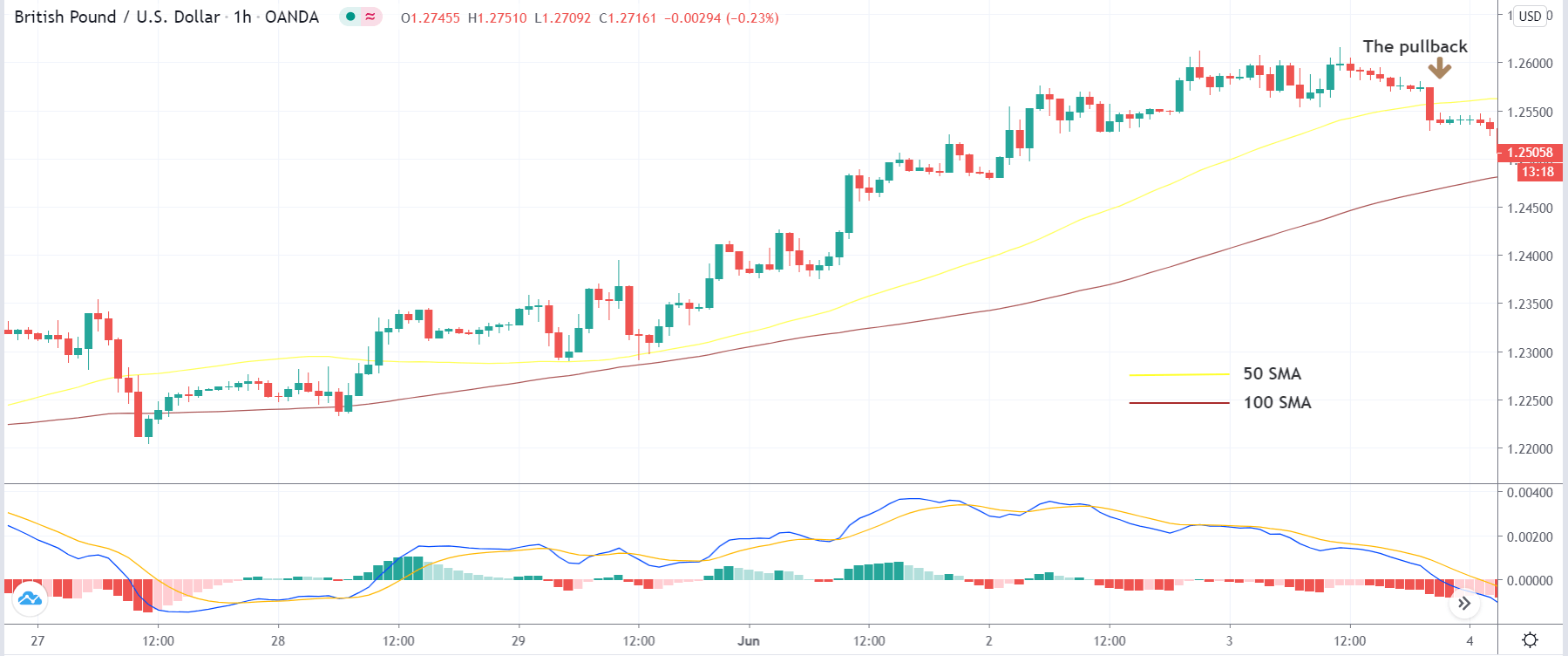
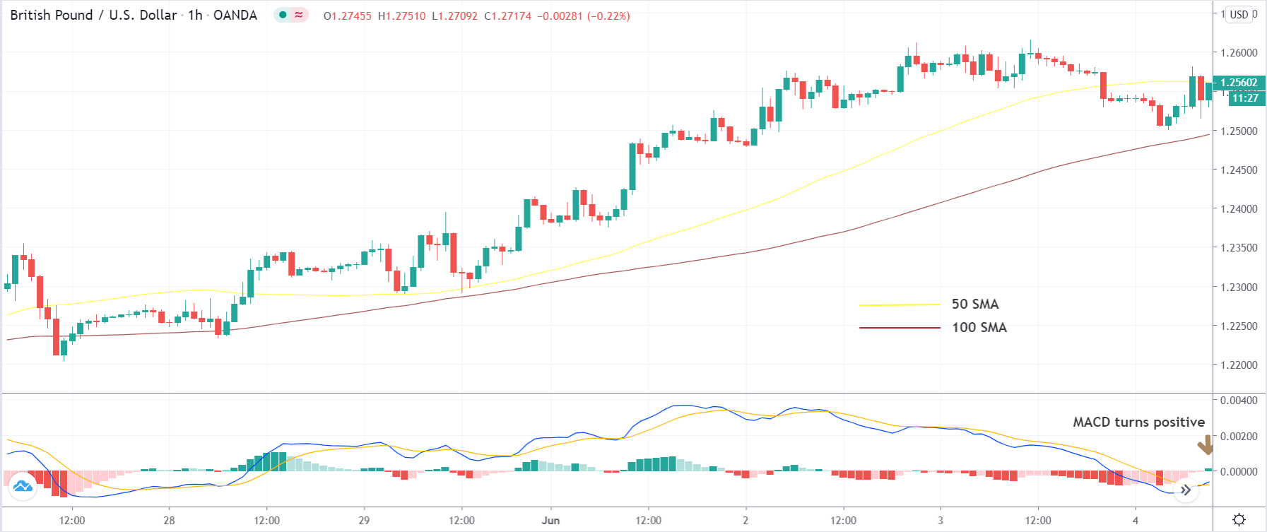
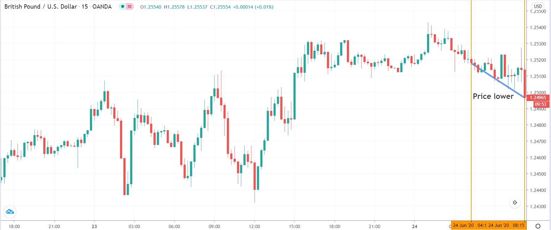
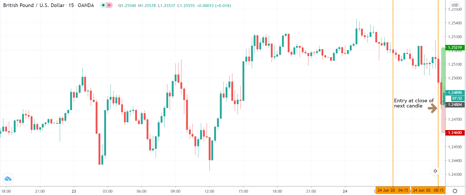
If you look at the image, you can see several lower lows, and higher highs in the price and MACD EMA also followed the same direction. However, there is some point where the price and MACD did not follow the same direction as indicated in the image below.
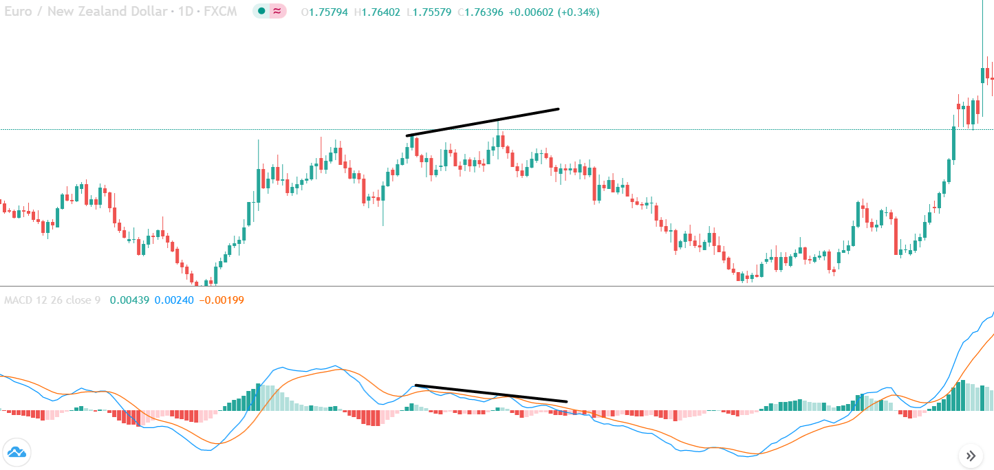
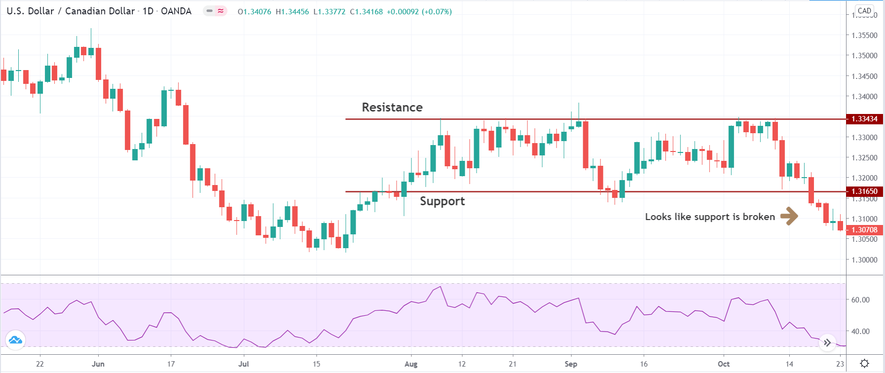
This is how divergence forms in the price. It indicates a potential market reversal if it happens from significant support or resistance levels.
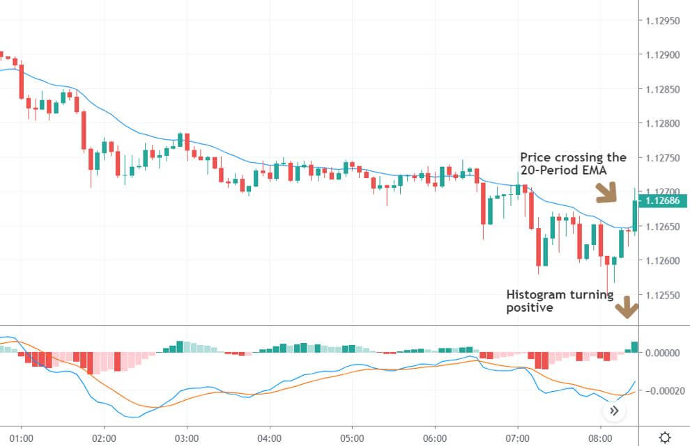
Bullish MACD Regular Divergence Trading Strategy
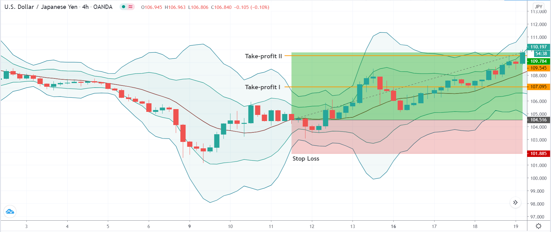
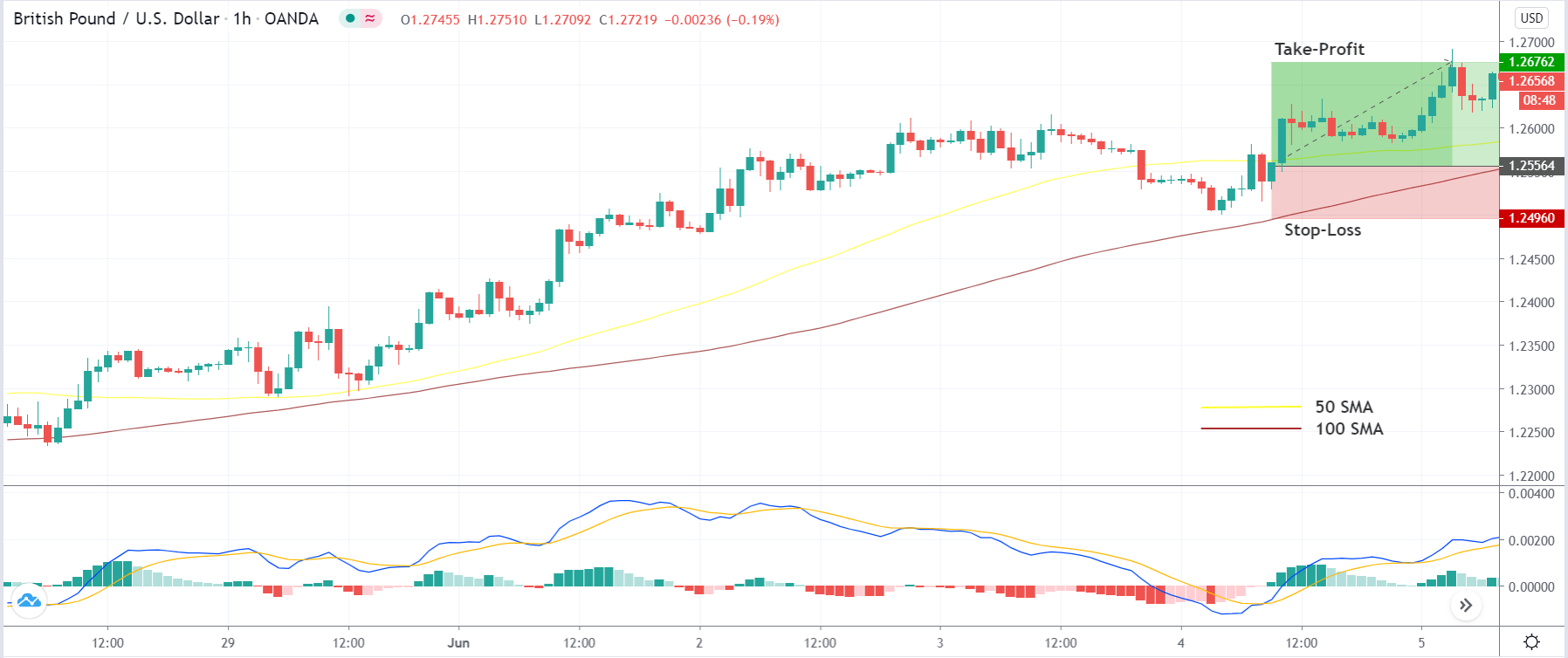
Bullish MACD regular divergence happens when the price of a currency pair moves to the opposite direction of the MACD histogram from a significant support level. Therefore, bullish MACD divergence strategy is considered as the positive divergence signal.
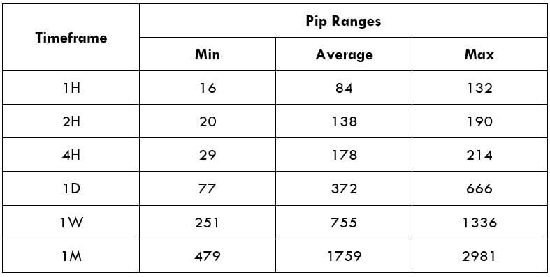
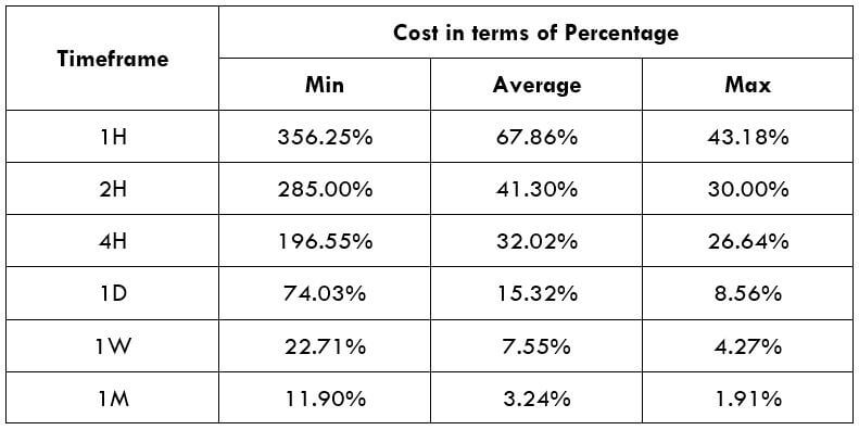
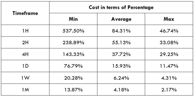
Timeframe
In this trading strategy, there is no specification of the timeframe. However, this trading strategy works well in H1 and H4 timeframe.
Currency Pair
The MACD divergence trading strategy works well in most major and minor currency pairs, including EURUSD, GBPUSD, USDJPY, and AUDUSD.
Location of the Divergence
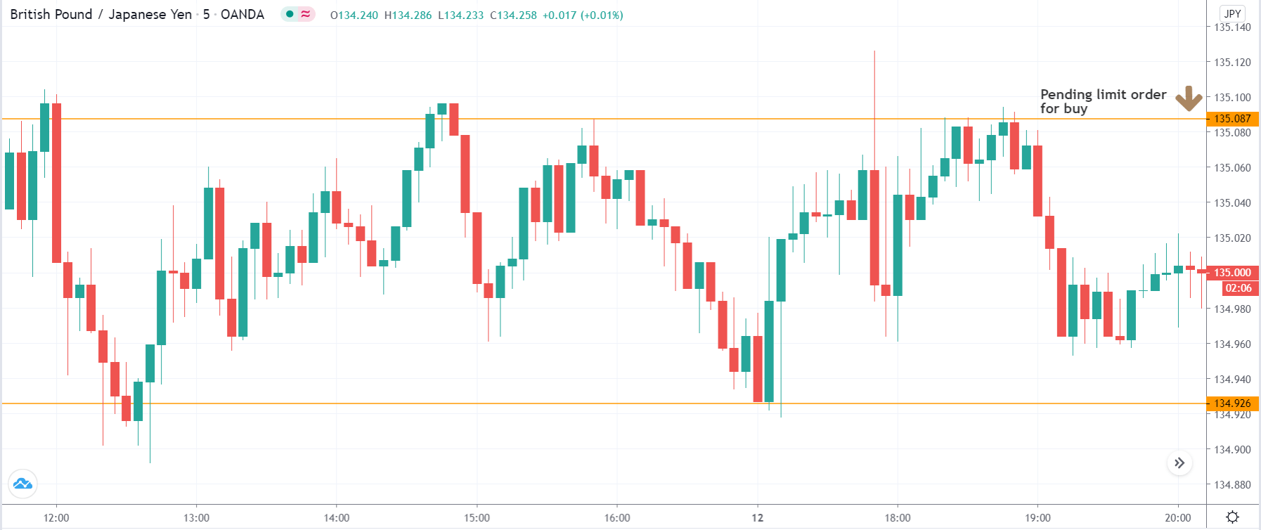
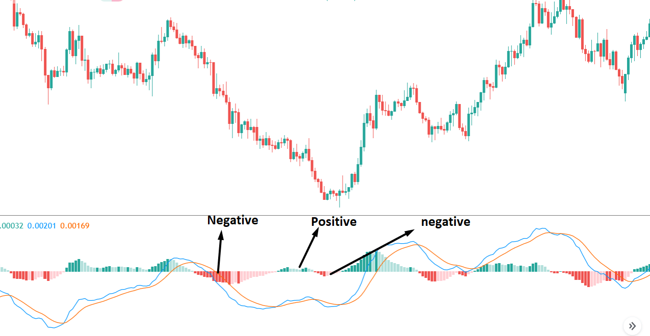
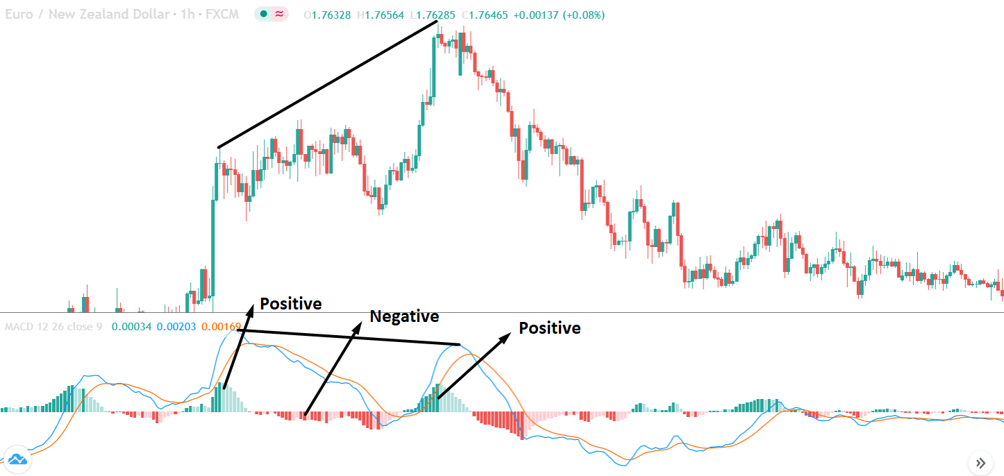
It is essential to identify the location of the price. In this bullish divergence trading strategy, the price should form the divergence in a critical support level. Any divergence from a random place rather than a vital level would not provide good profitability. Before moving to the entry point, we should find Negative Positive and Negative (NPN) MACD histogram to form.
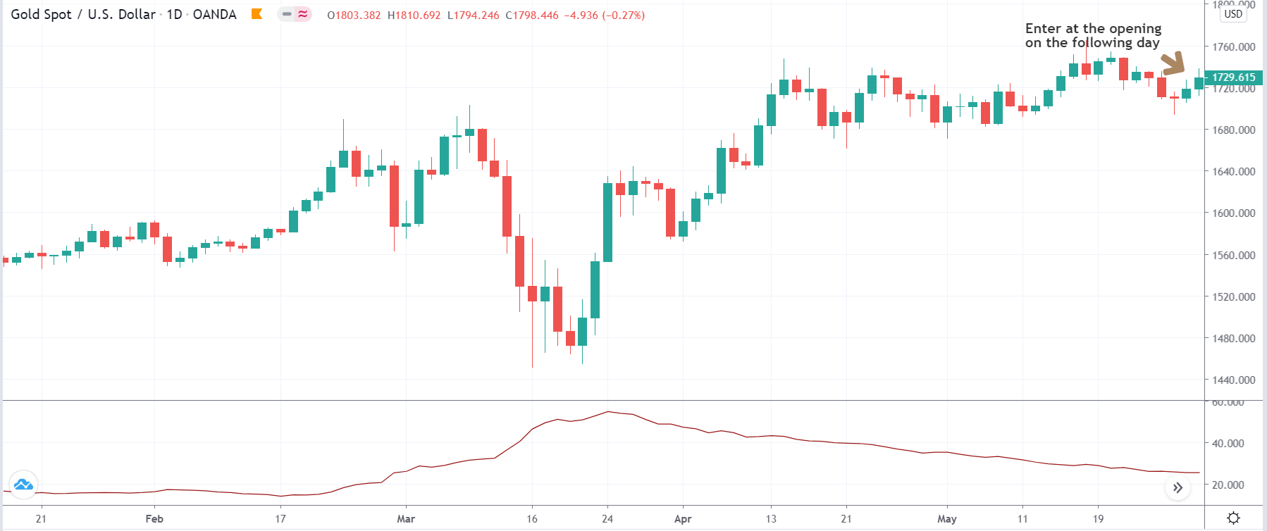
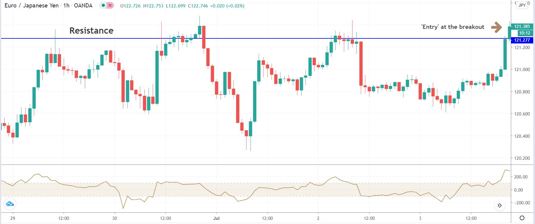
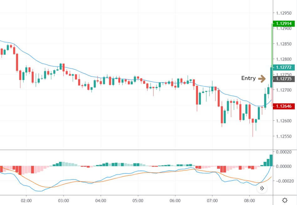
Entry
After forming the divergence, we should wait for a bearish reversal candlestick to enter the trade. Make sure to enter the trade as soon as the candle closes.
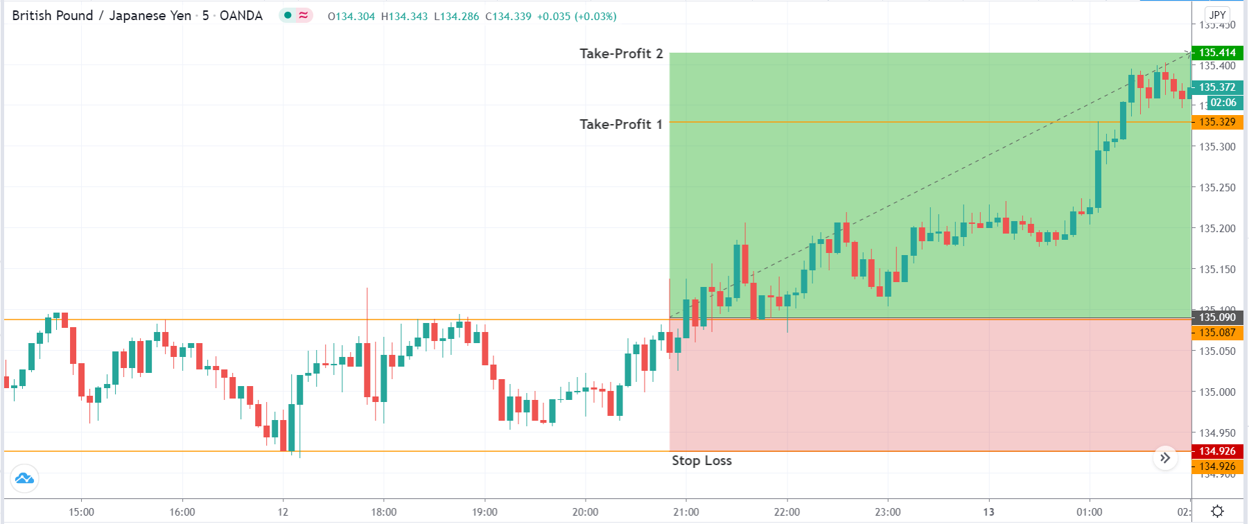
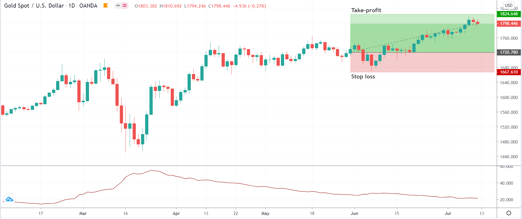
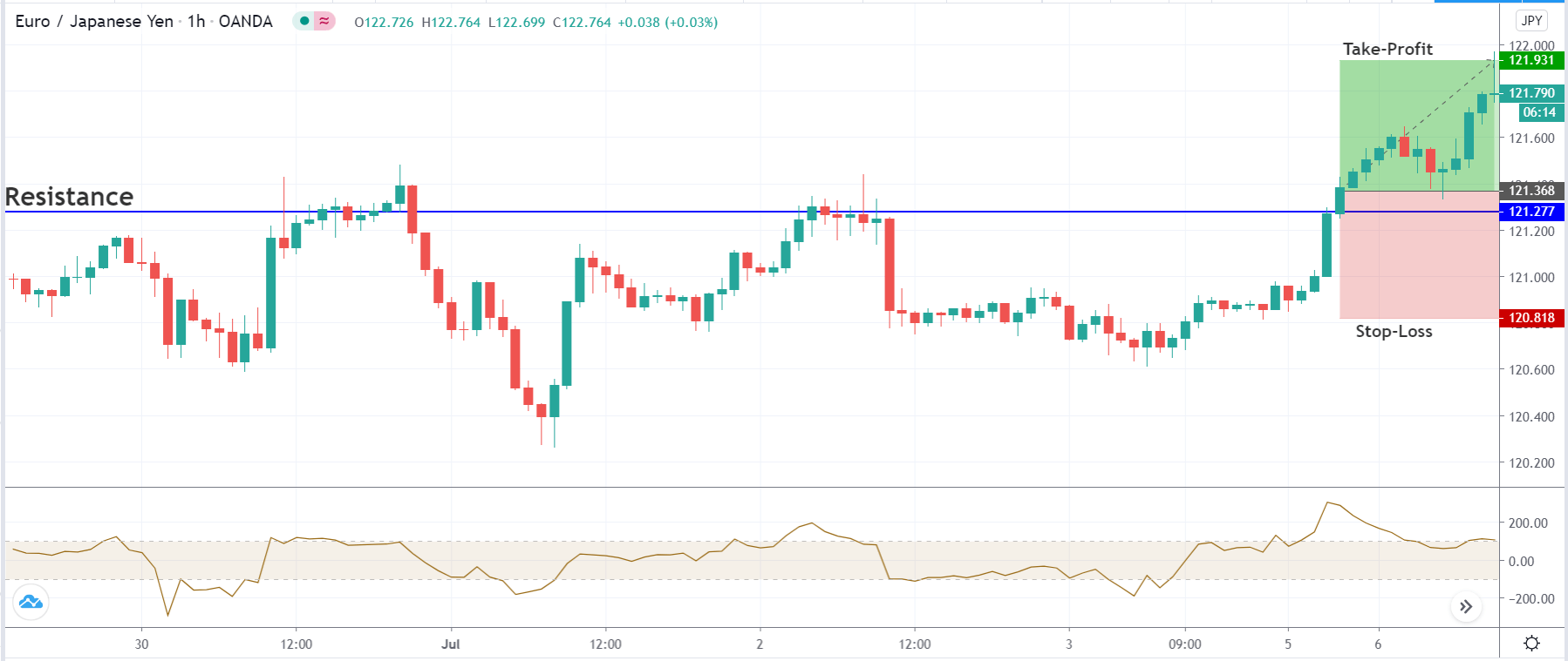
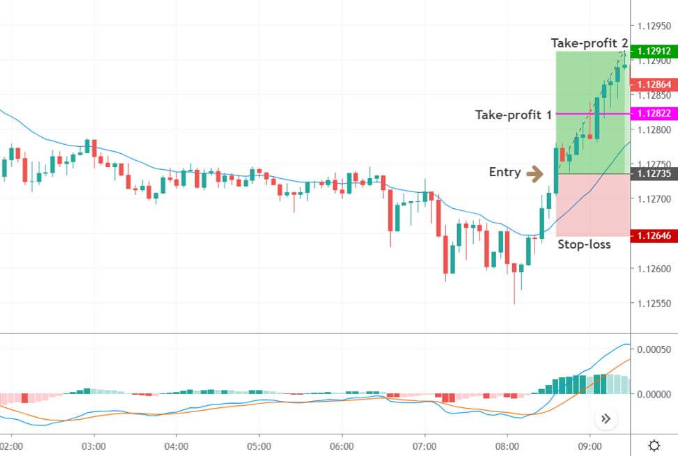
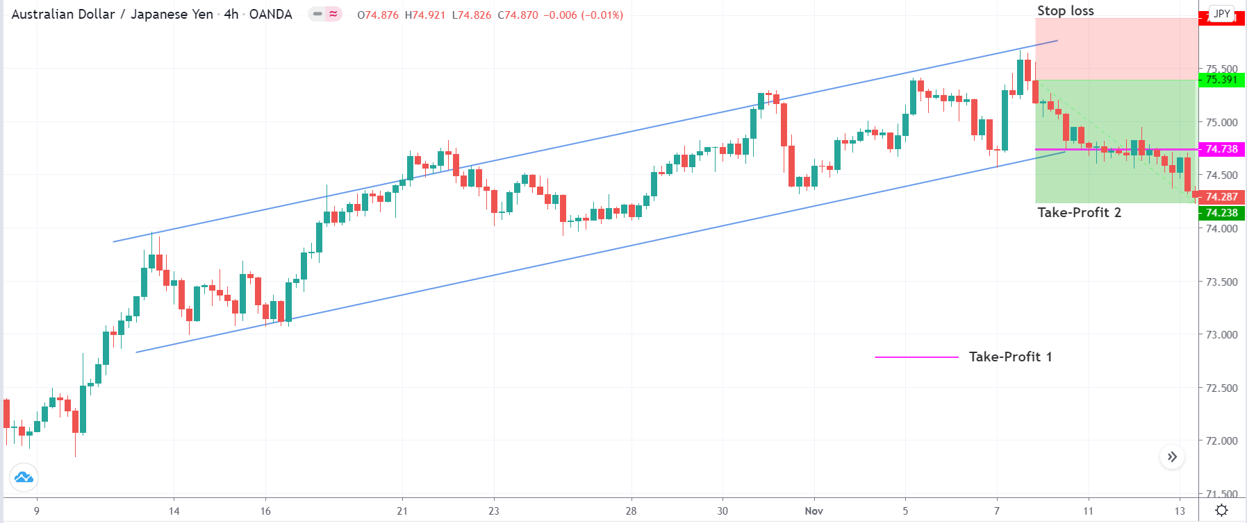
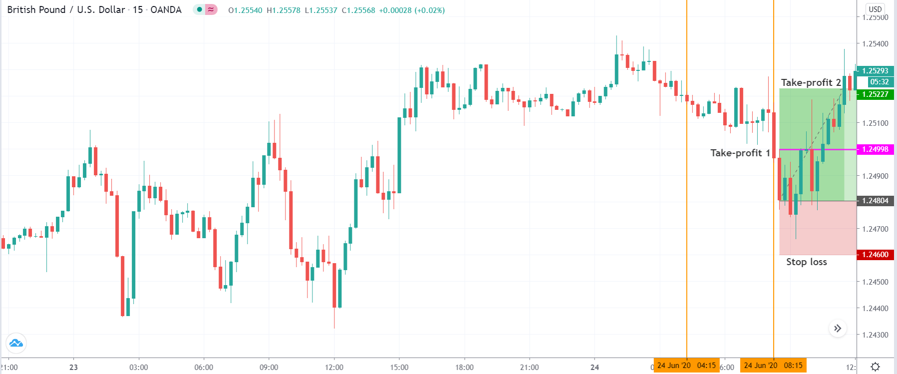
Stop Loss and Take Profit
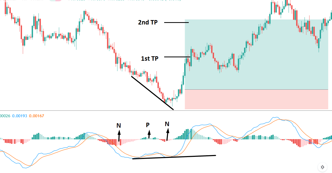
In the bullish divergence trading strategy, stop loss would be below the reversal candlestick candle with 10-15 pips buffer.
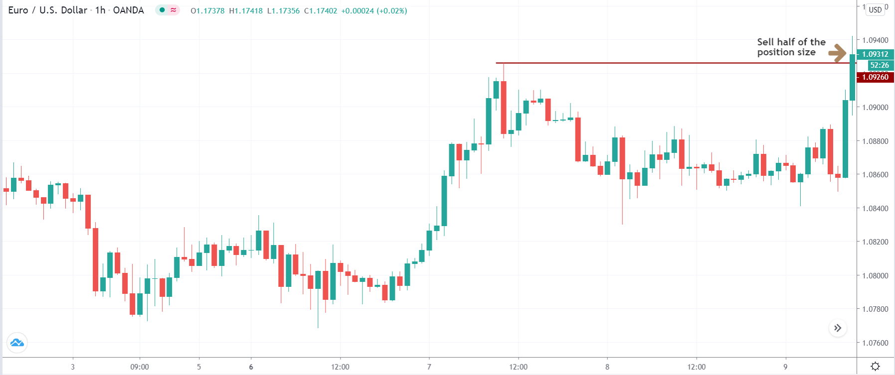
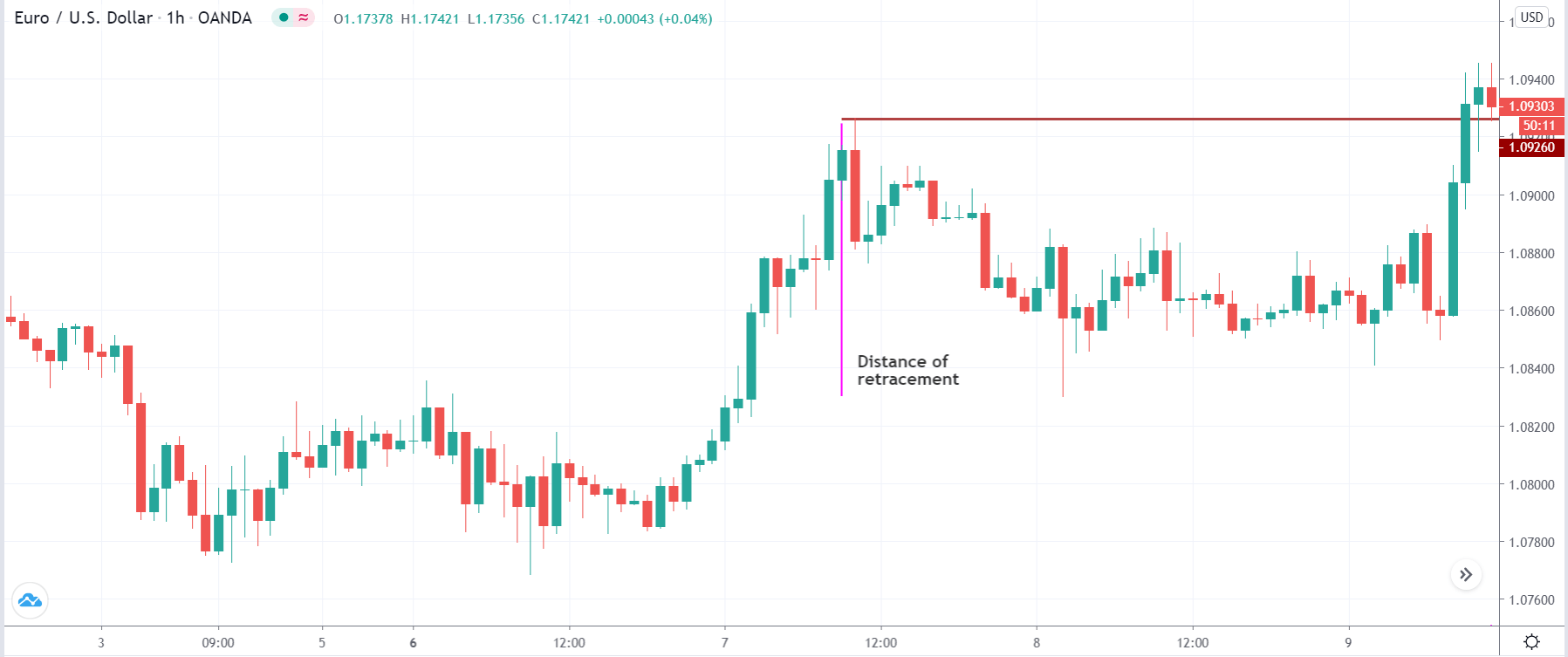
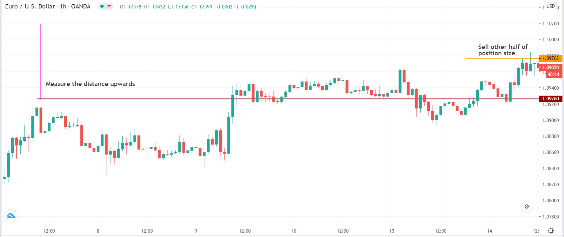
The first take profit level would be based on 1:1 risk: reward, where you should close 50% of the trade and move the stop loss at breakeven. Later on, the 2nd take profit level would be based on near term event level from where the market is expected to show some correction.
However, as part of the trade management, you can extend the take profit level based on the market momentum. If the price shows an impulsive bullish pressure near the resistance level, it may break the level by creating a new high. In that case, you can extend the take profit level if your trade management system allows.
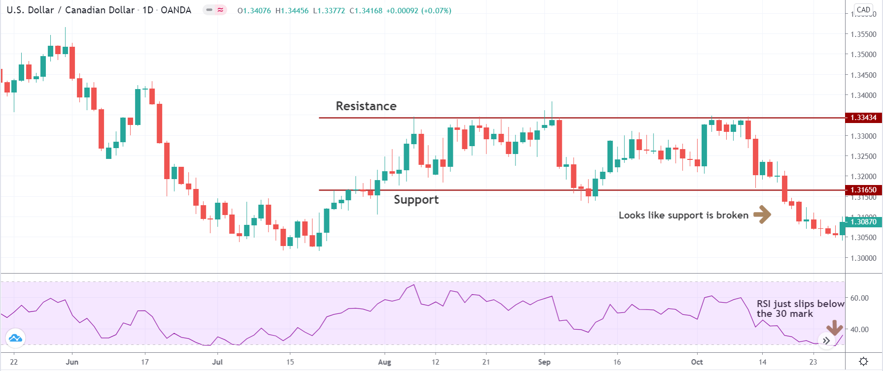
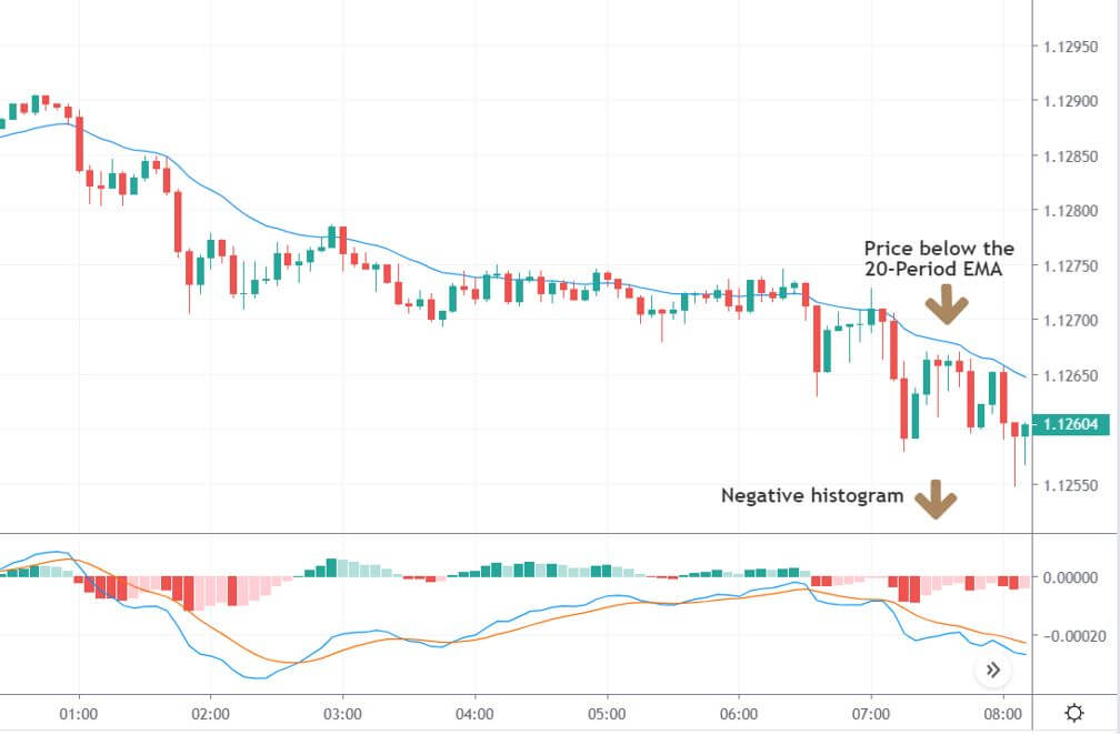
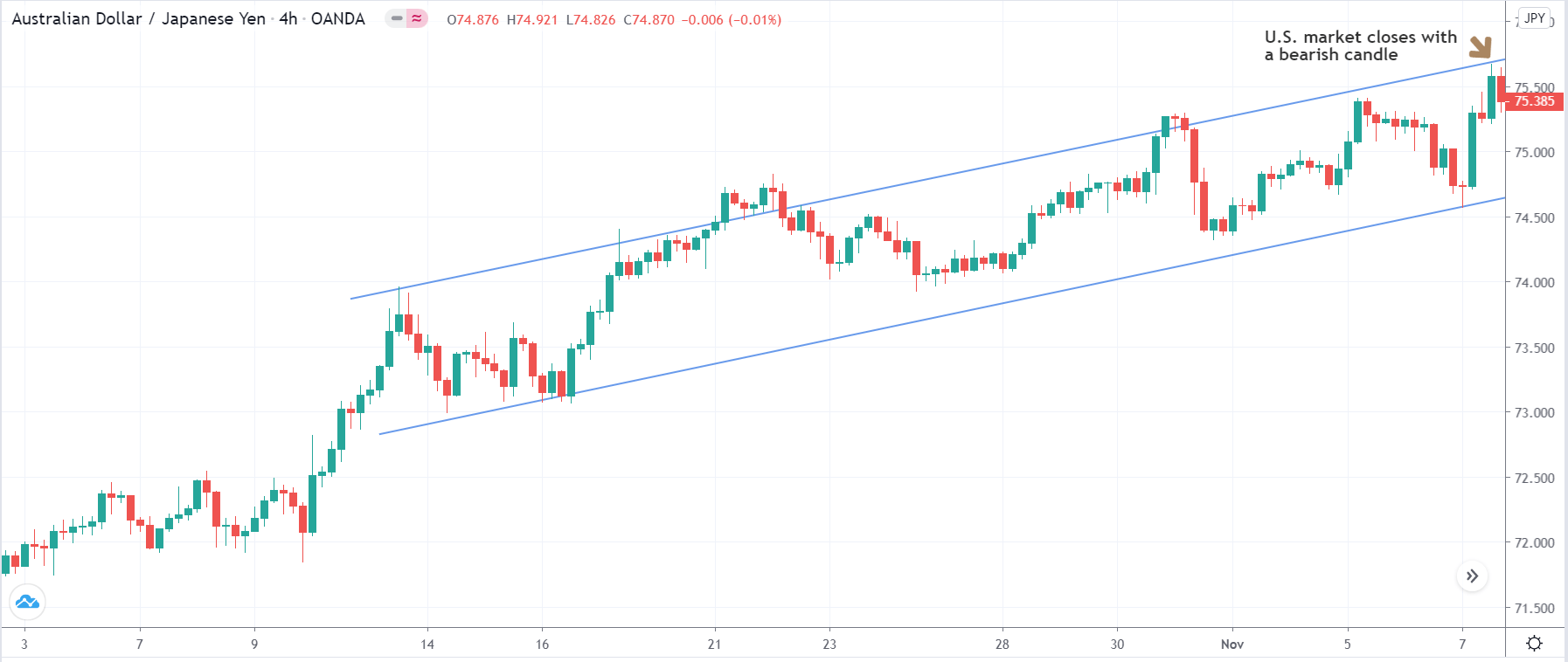
Bearish MACD Regular Divergence Trading Strategy
Bearish MACD regular divergence happens when the price of a currency pair moves to the opposite direction of the MACD histogram from a prominent resistance level. It is also considered as a negative divergence signal.
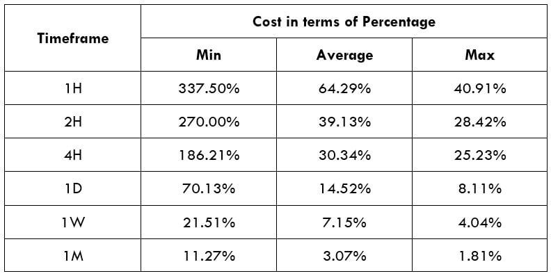
Timeframe
Similar to the bullish divergence, this trading strategy works well in H1 and H4 timeframe. You can use this trading strategy in all timeframes, but the higher timeframe provides a reliable result. On the other hand, traders often find it challenging to observe the price in daily and weekly timeframes. Therefore, H1 and H4 are ideal for swing traders.
Currency Pair
The bearish MACD divergence trading strategy works well in most major and minor currency pairs, including EURUSD, GBPUSD, USDJPY, and AUDUSD.
Location of the Divergence
It is essential to identify the location of the price. In this bearish regular divergence trading strategy, the divergence should format a significant resistance level. Any divergence from a random place would not provide good profitability.
Before moving to the entry point, we should find Positive Negative Positive (PNP) MACD histogram to form.
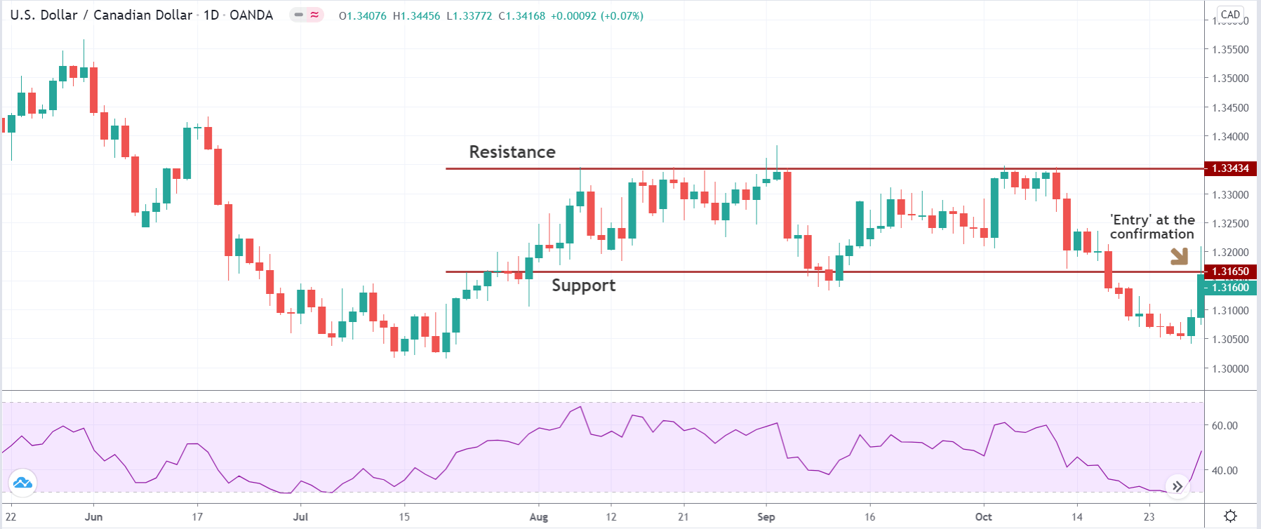
Entry
After forming the divergence, we should wait for a bullish reversal candlestick to enter the trade. Make sure to enter the trade as soon as the candle closes.
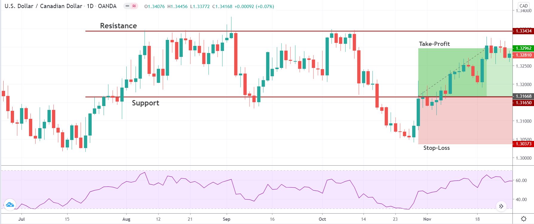
Stop Loss and Take Profit
In the bullish divergence trading strategy, stop loss would be above the reversal candlestick candle with 10-15 pips buffer.
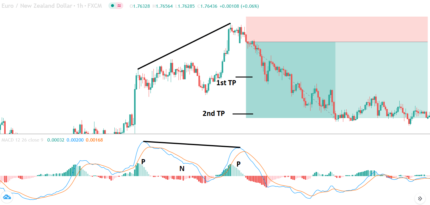
The first take profit level would be based on 1:1 risk: reward, where you should close 50% of the trade and move the stop loss at breakeven. Later on, the 2nd take profit level would be based on the near term event level.
Summary
Let’s summaries the MACD regular divergence trading strategy:
- Find the divergence based on NPN and PNP from a significant level.
- Enter the trade after a reversal candlestick formation.
- Stop-loss should be below or above the reversal candlestick with 10 to 15 pips buffer.
- The first take profit would be based on 1:1 risk: reward ratio, and the second take profit would be based on the price action on the next event level.
There are more ways to use divergence as a trading strategy. Besides the divergence formation, you should focus on how the price is approaching a critical level. Any weakness at a significant level would indicate the first impression of market reversal. Later on, the divergence would indicate the final try of the opposite party. Happy Trading!


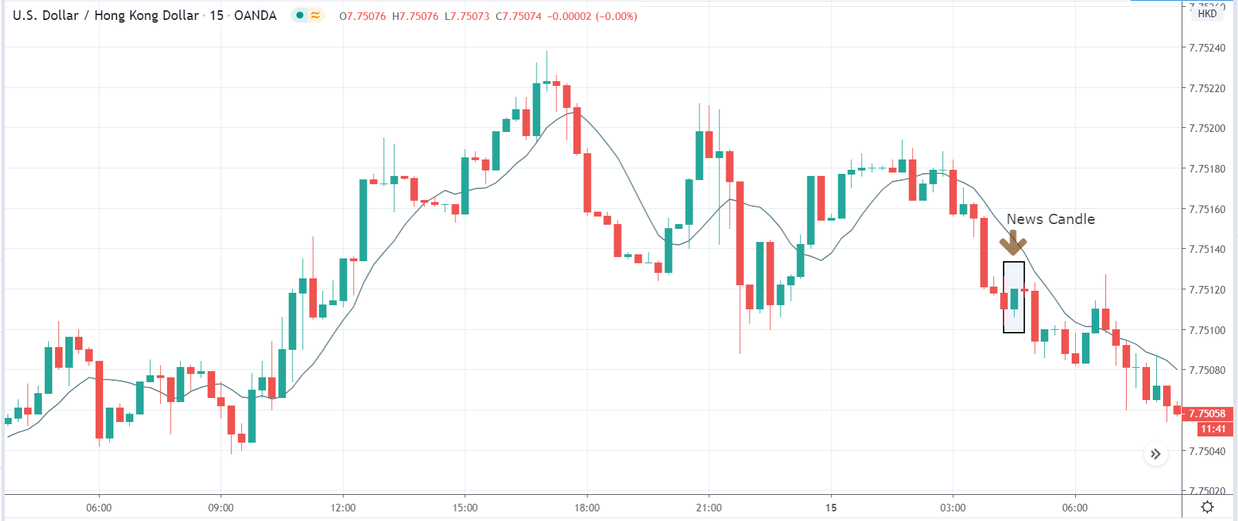


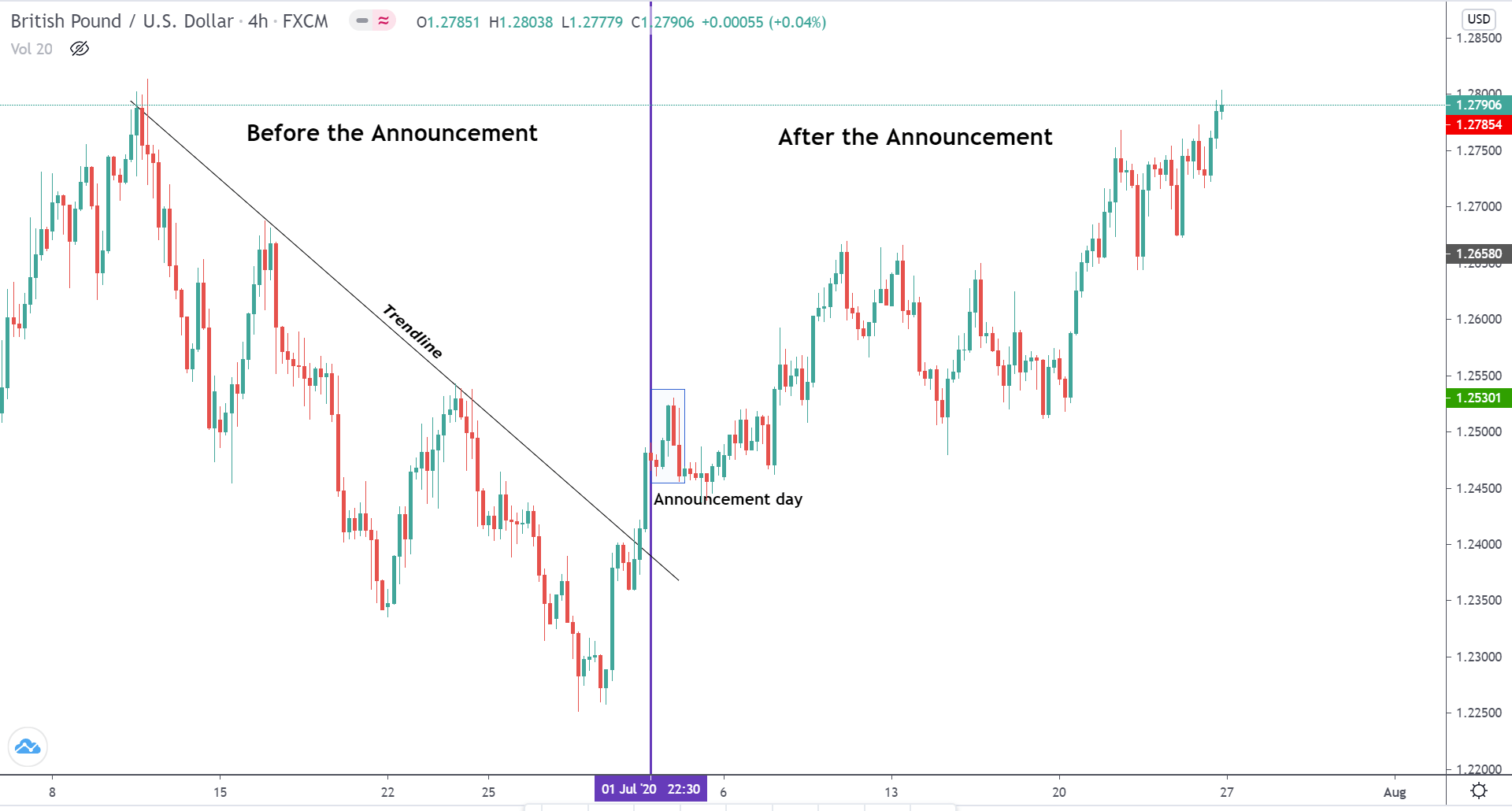


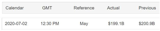


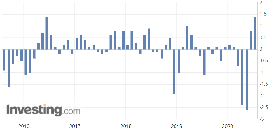
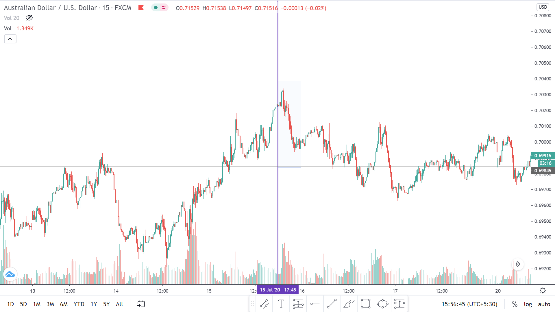


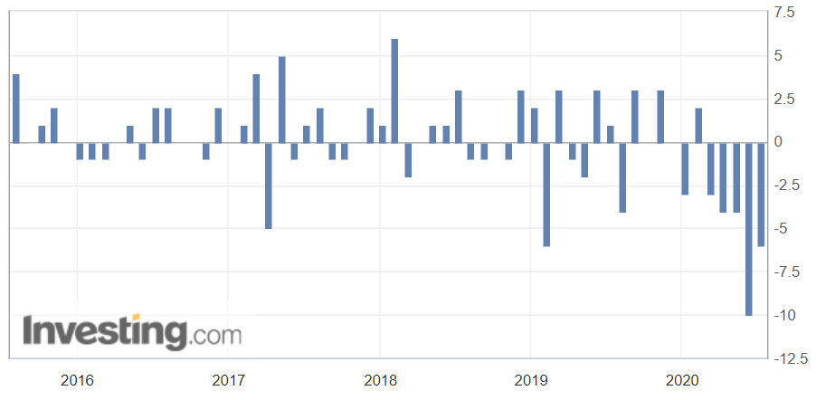
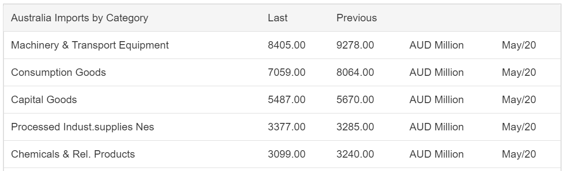
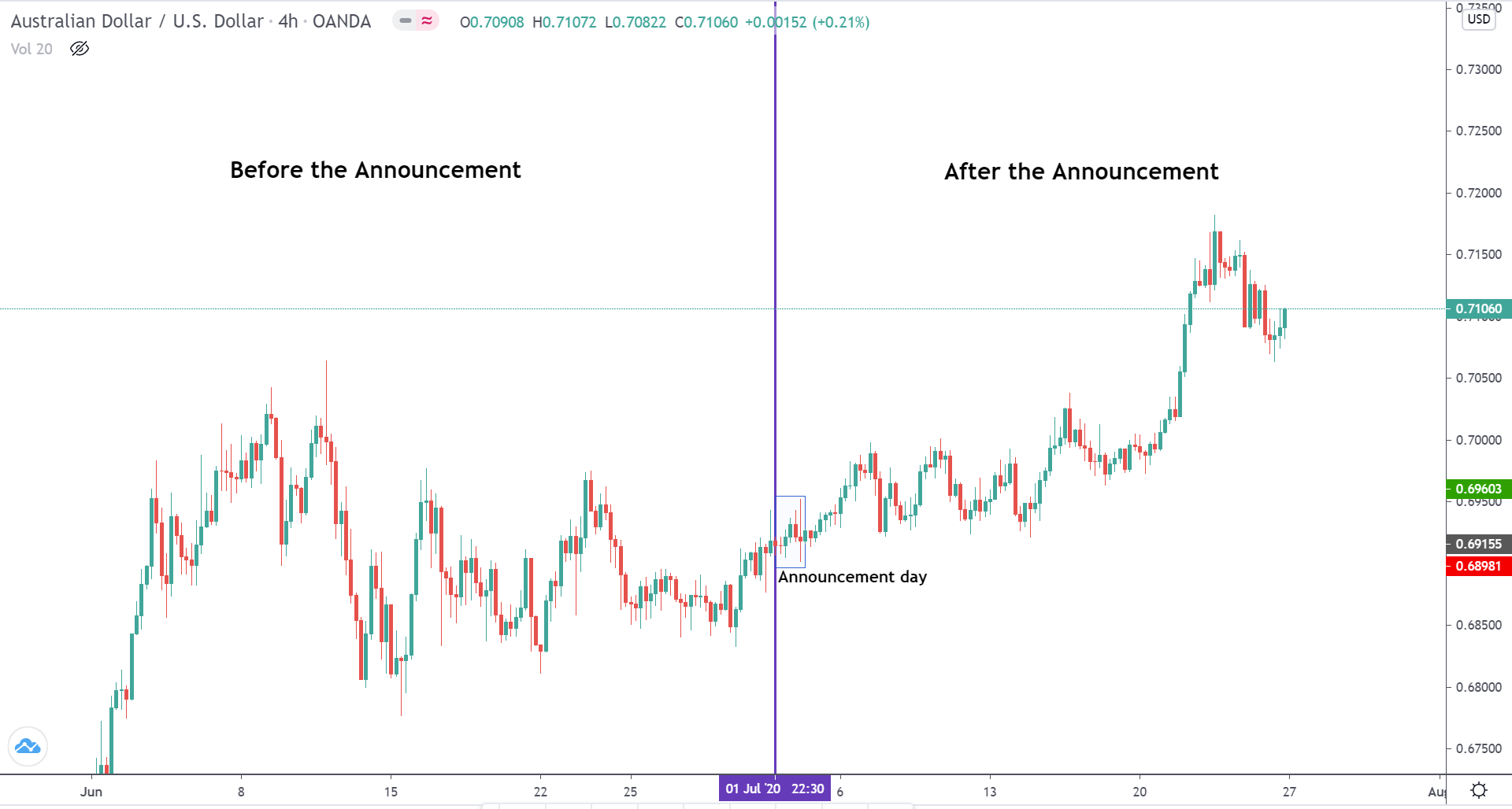
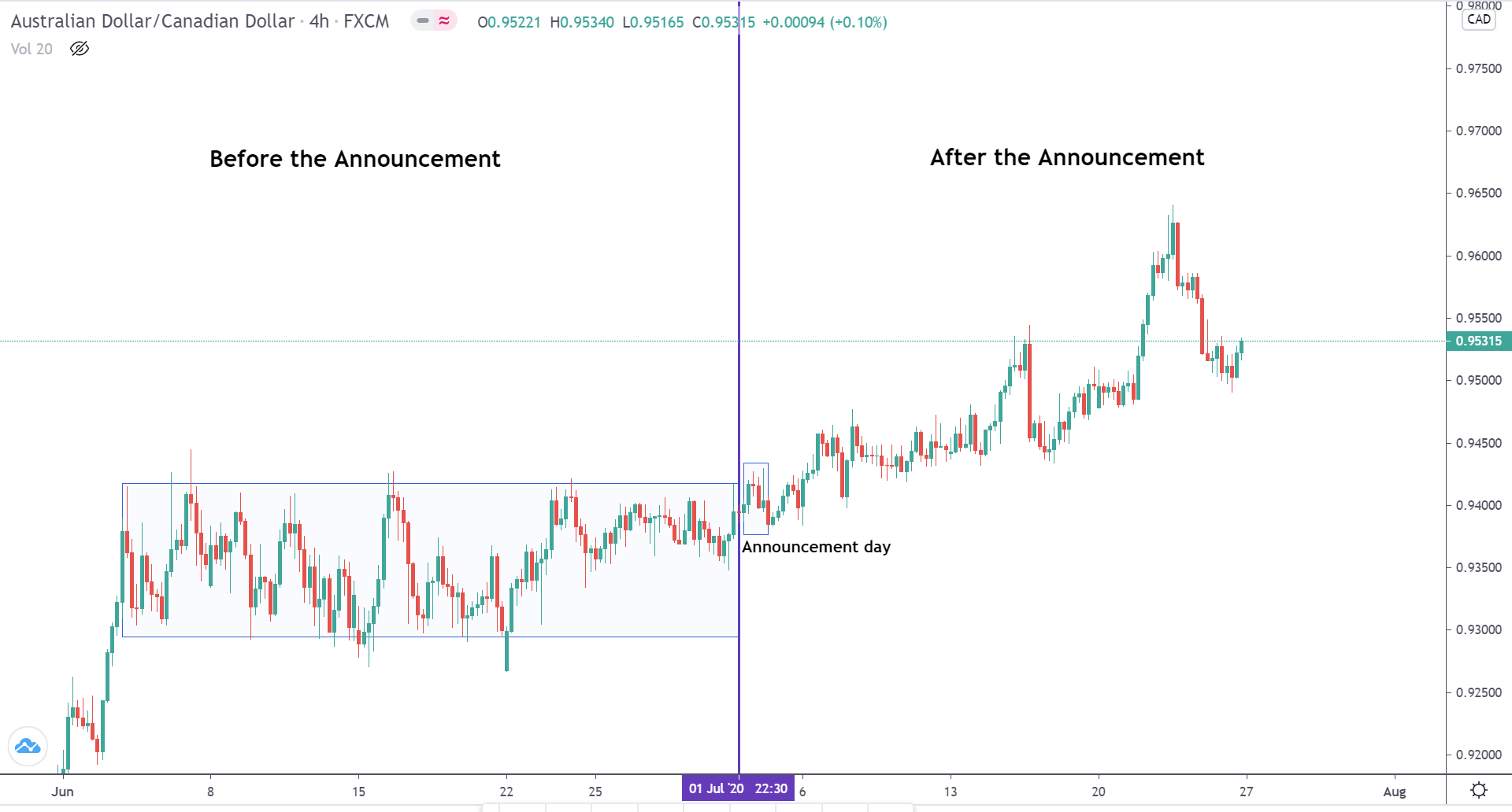
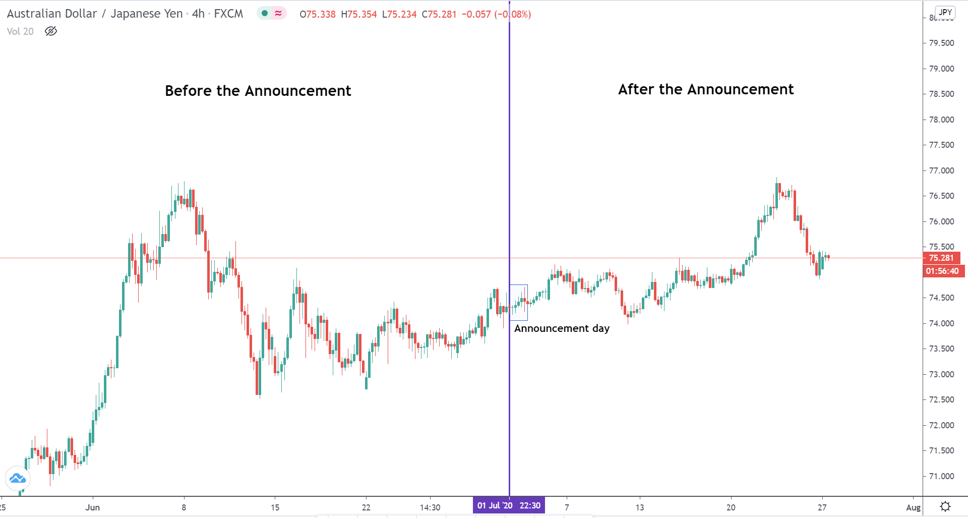


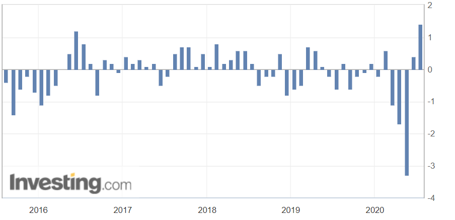


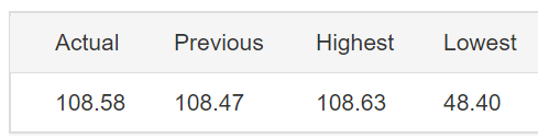
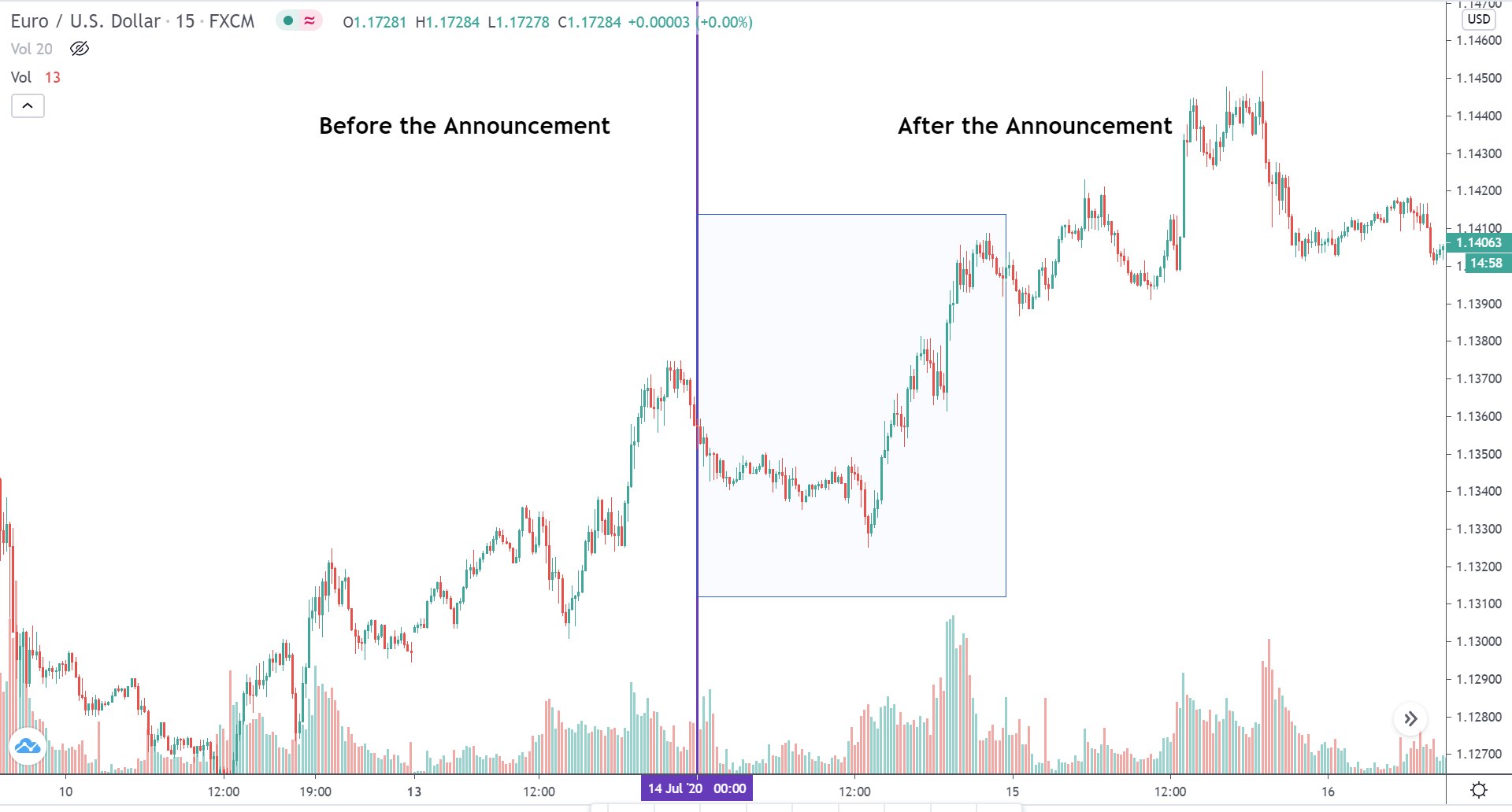
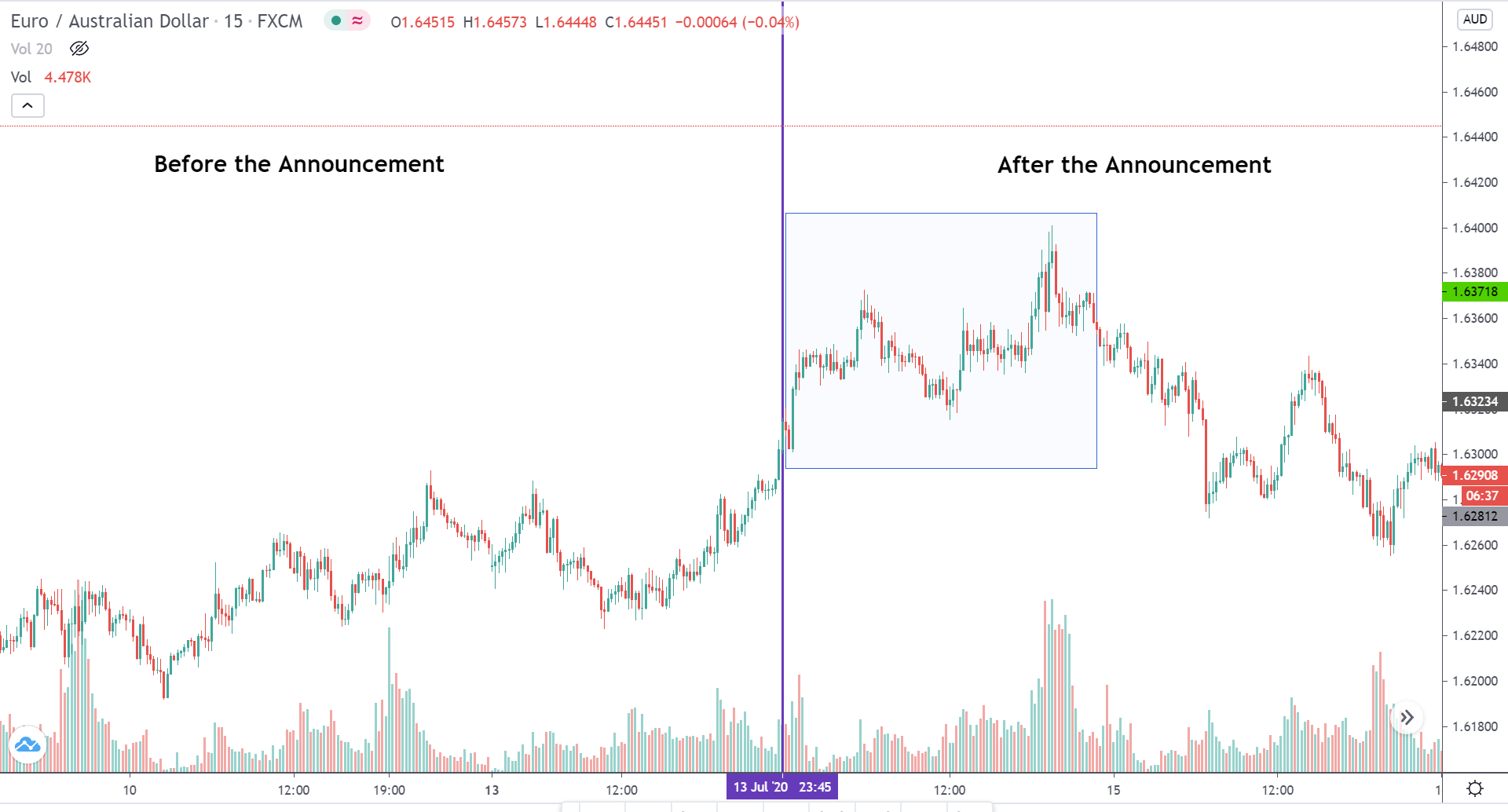


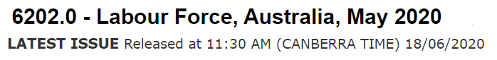
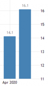

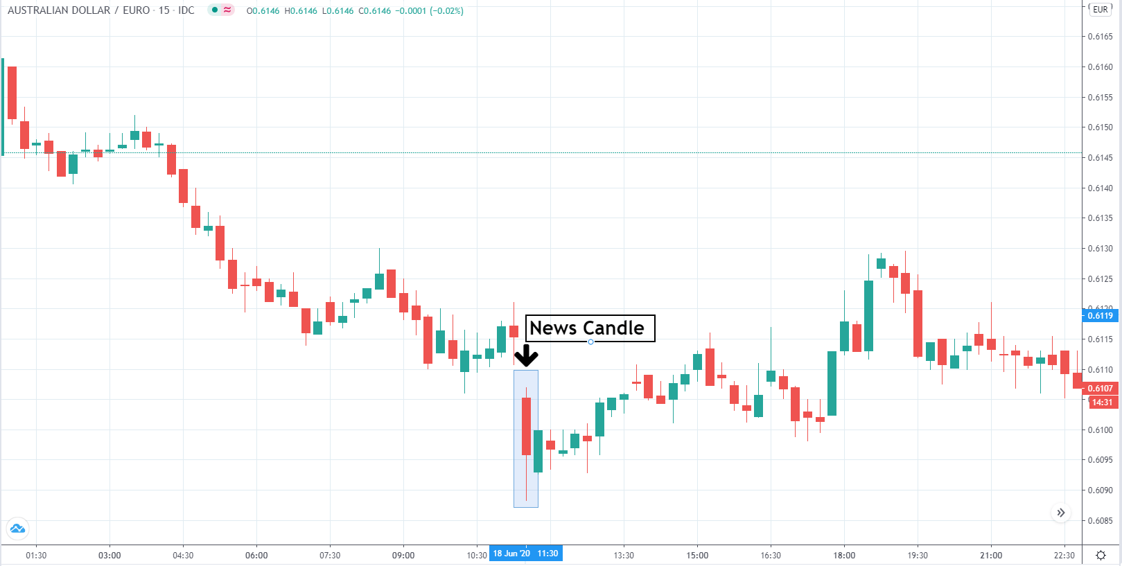
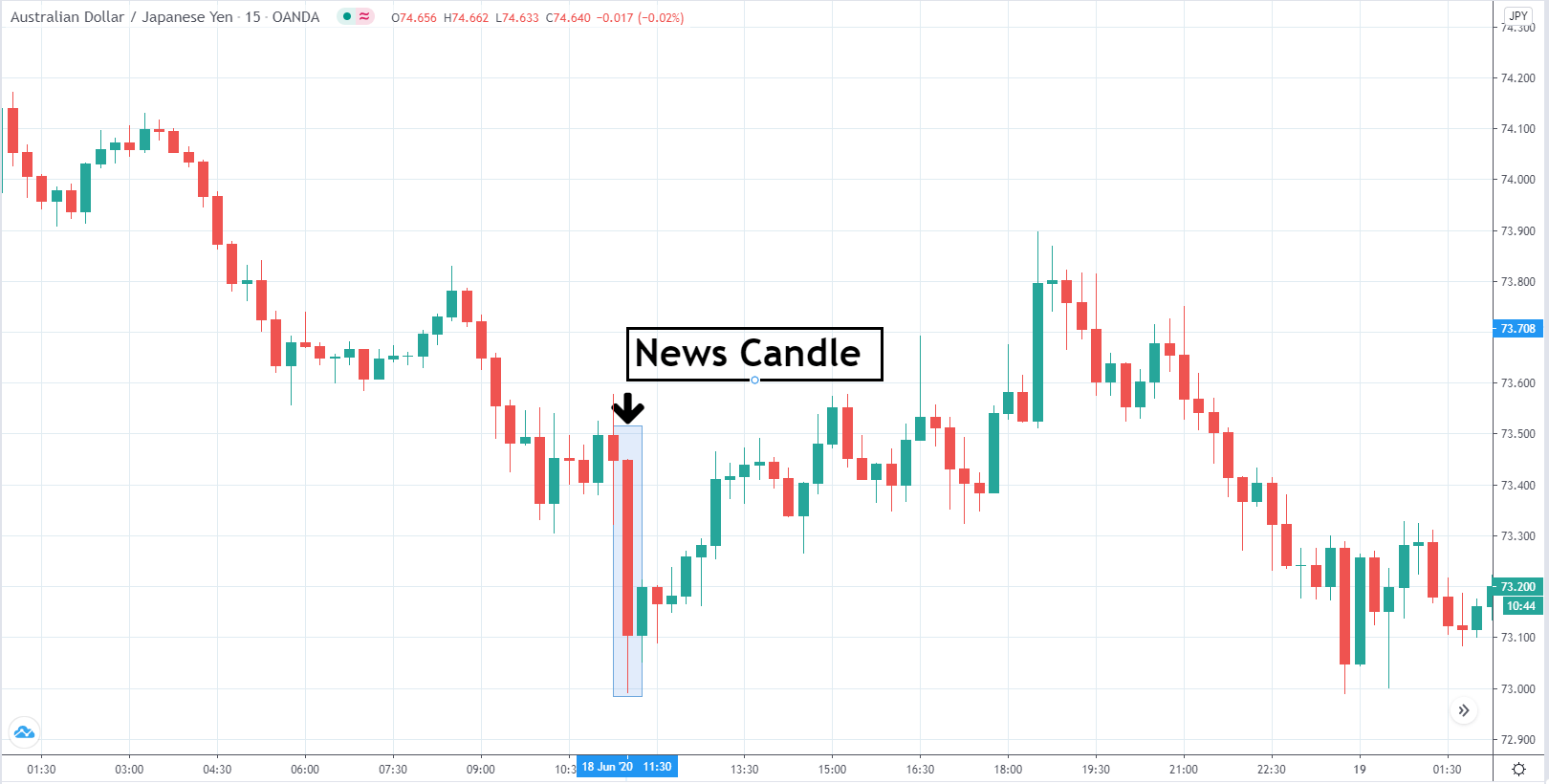


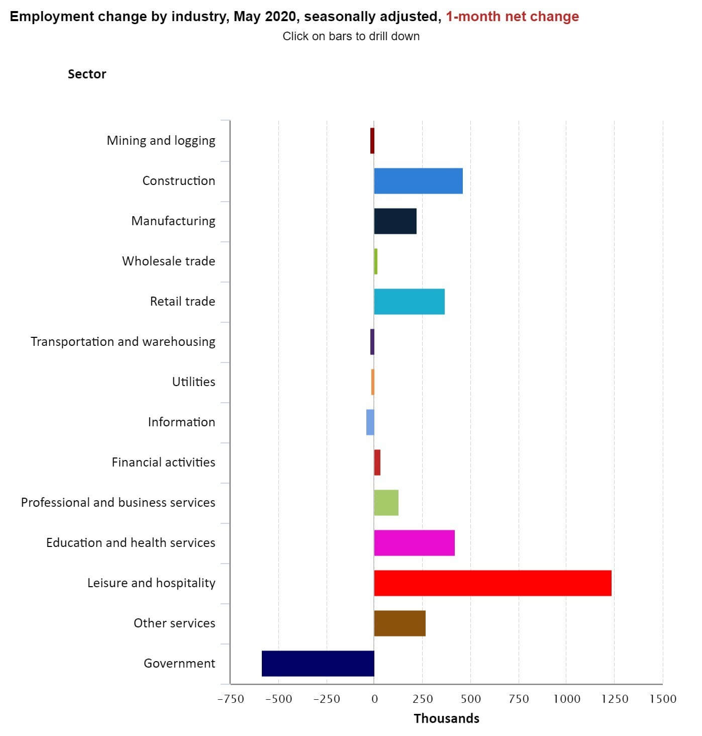


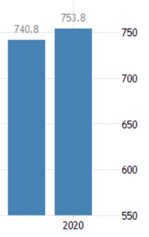
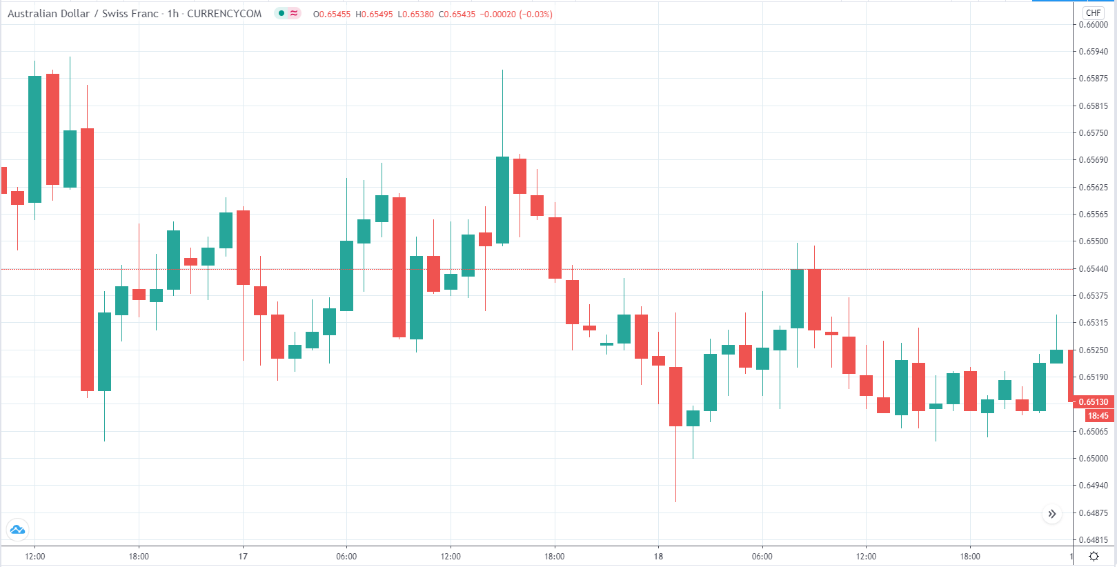
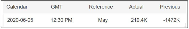
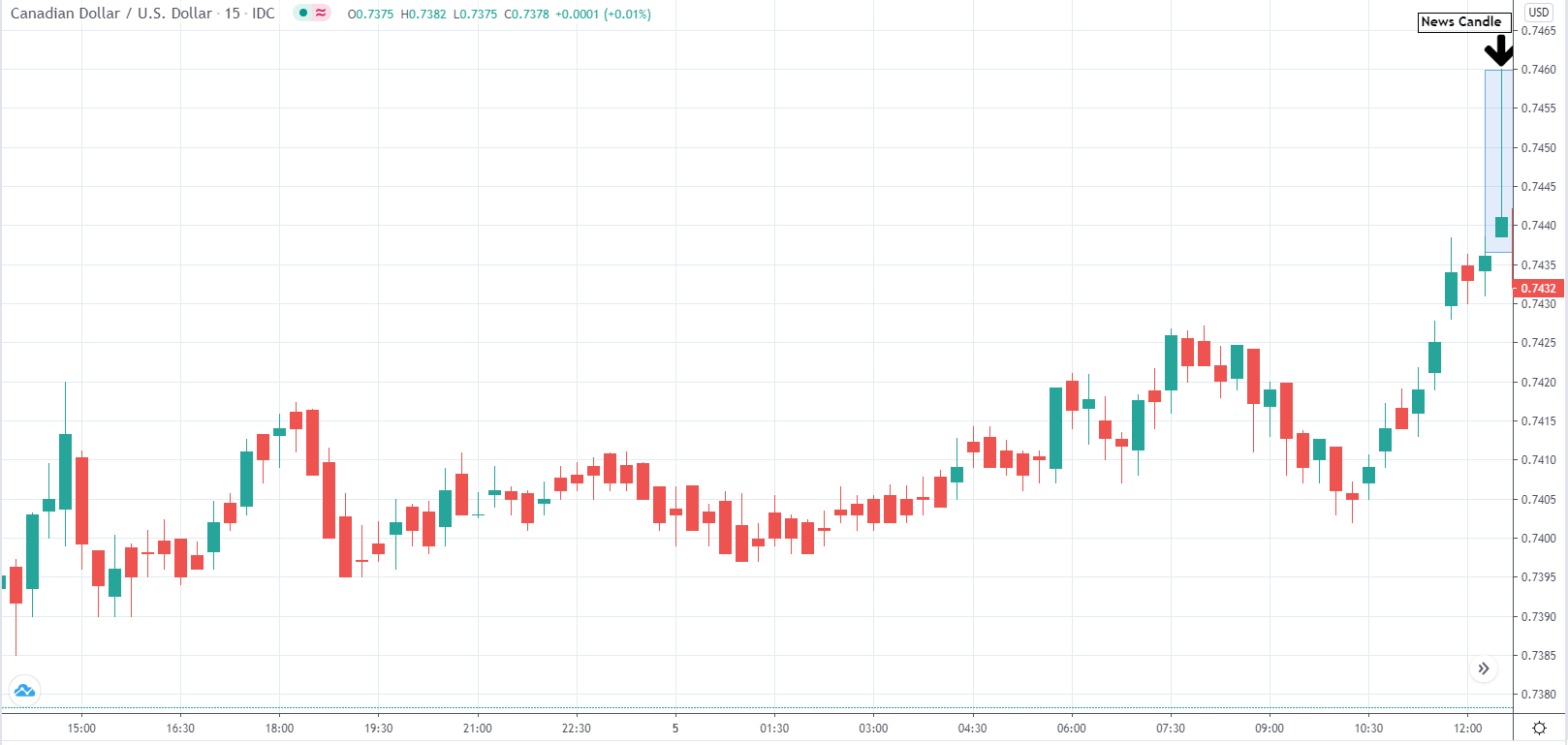
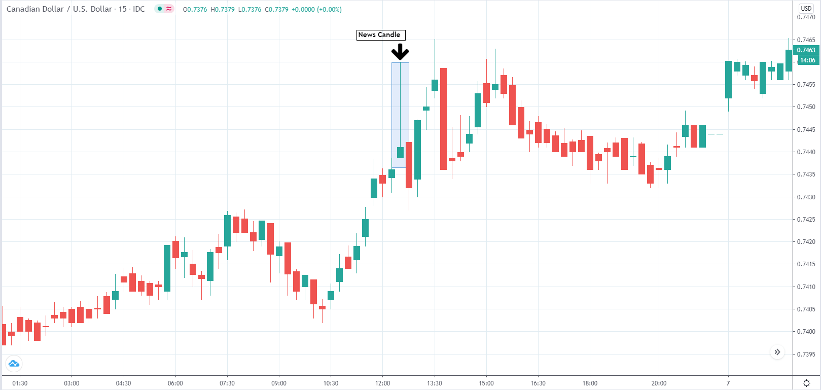
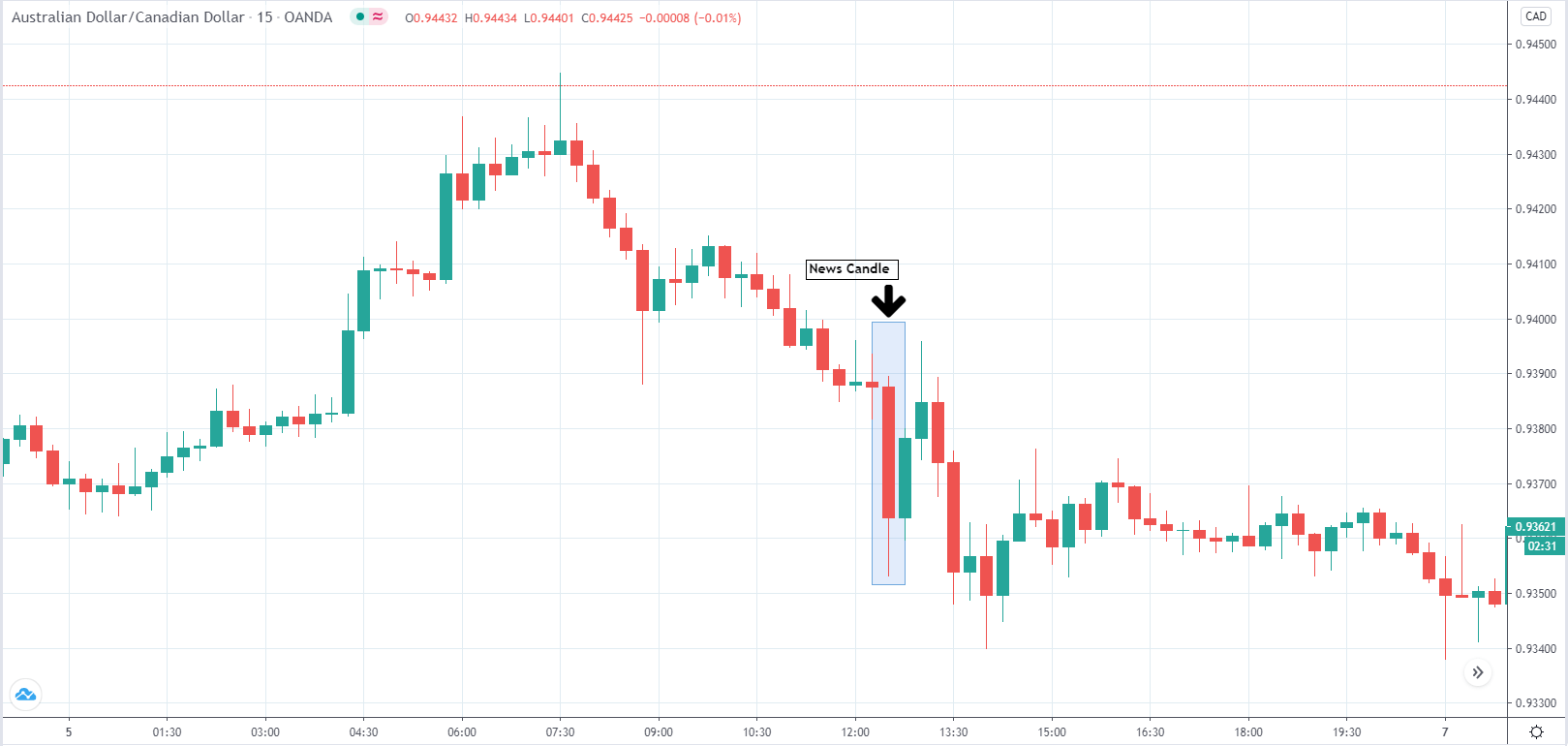
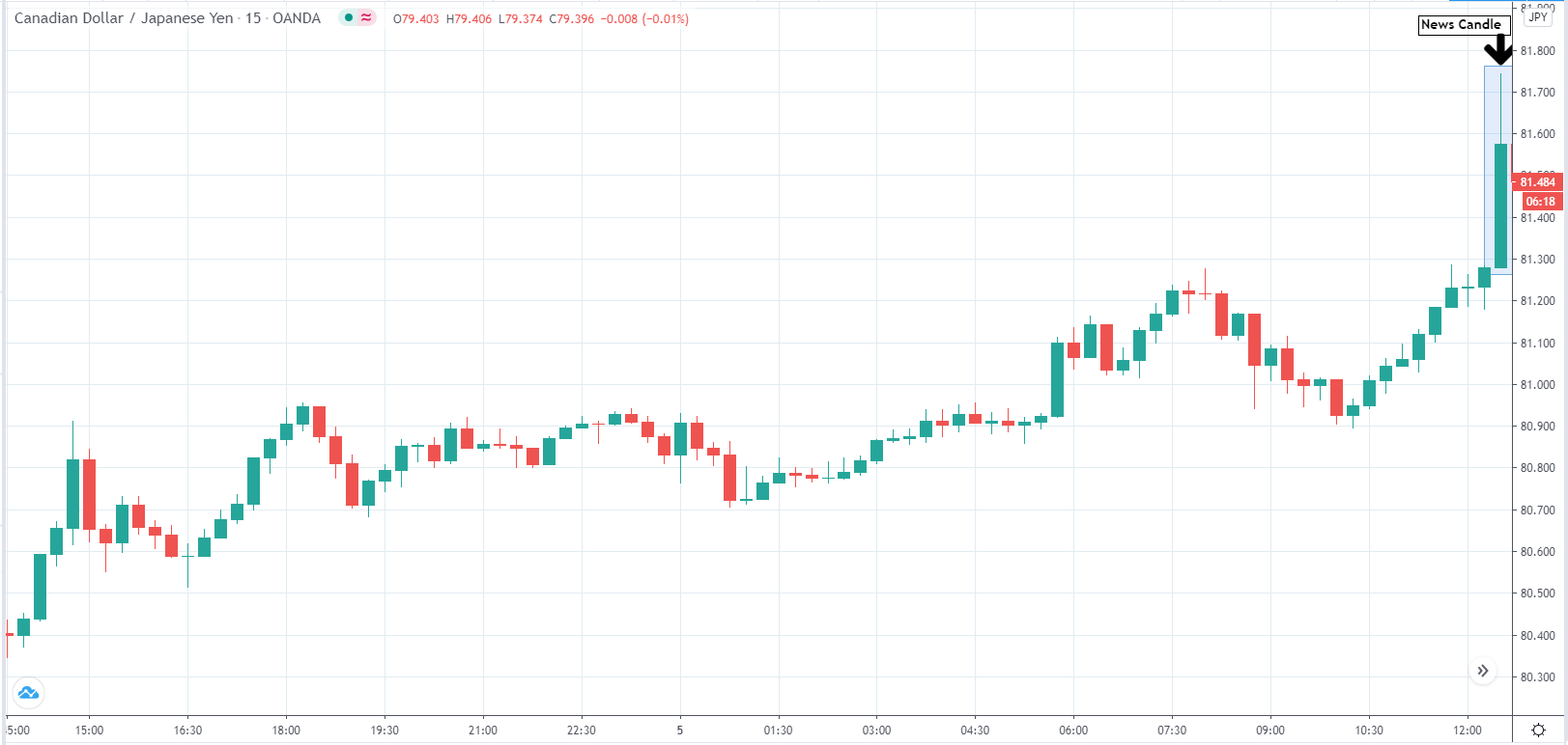
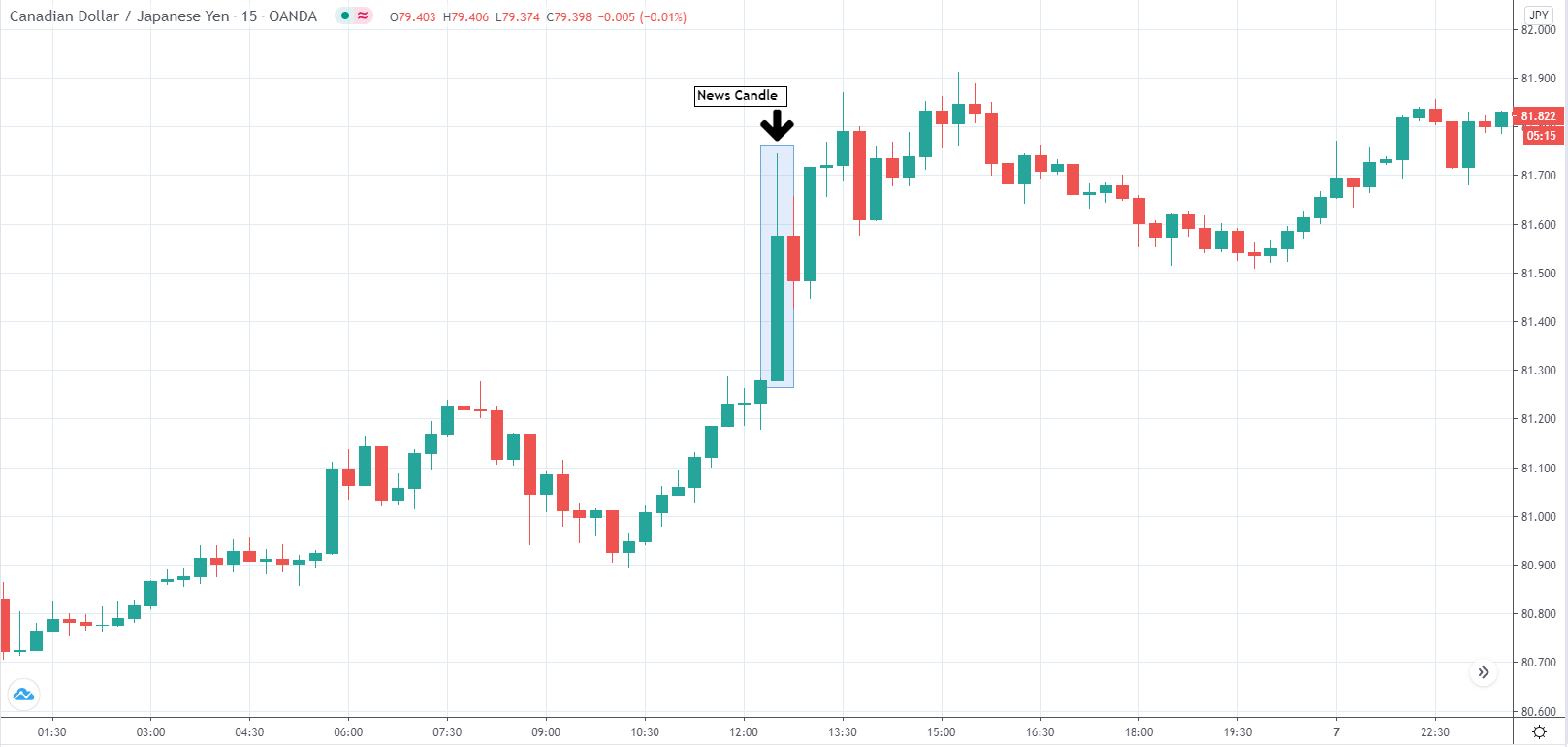
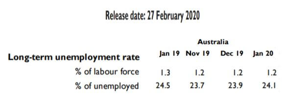
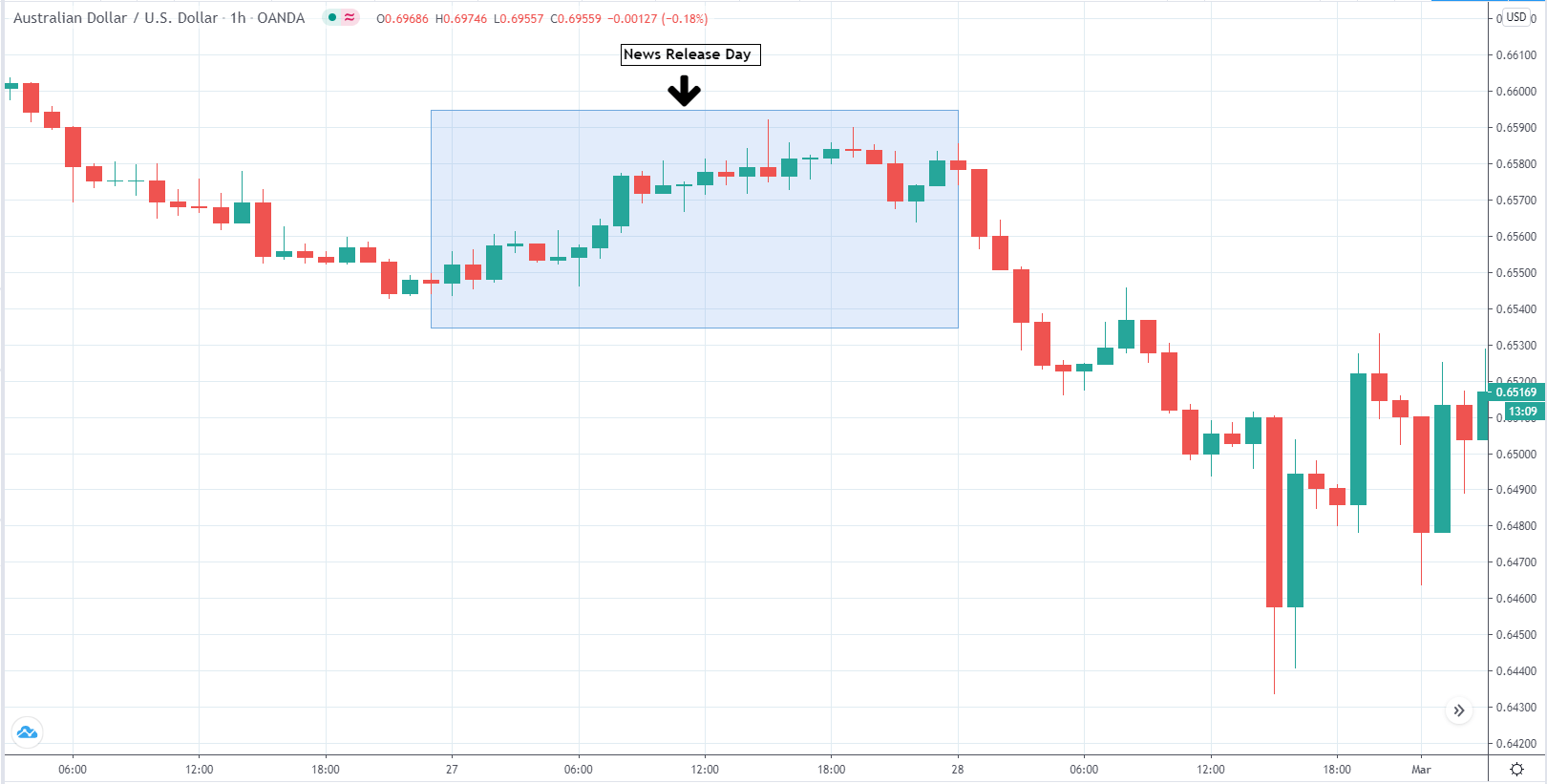
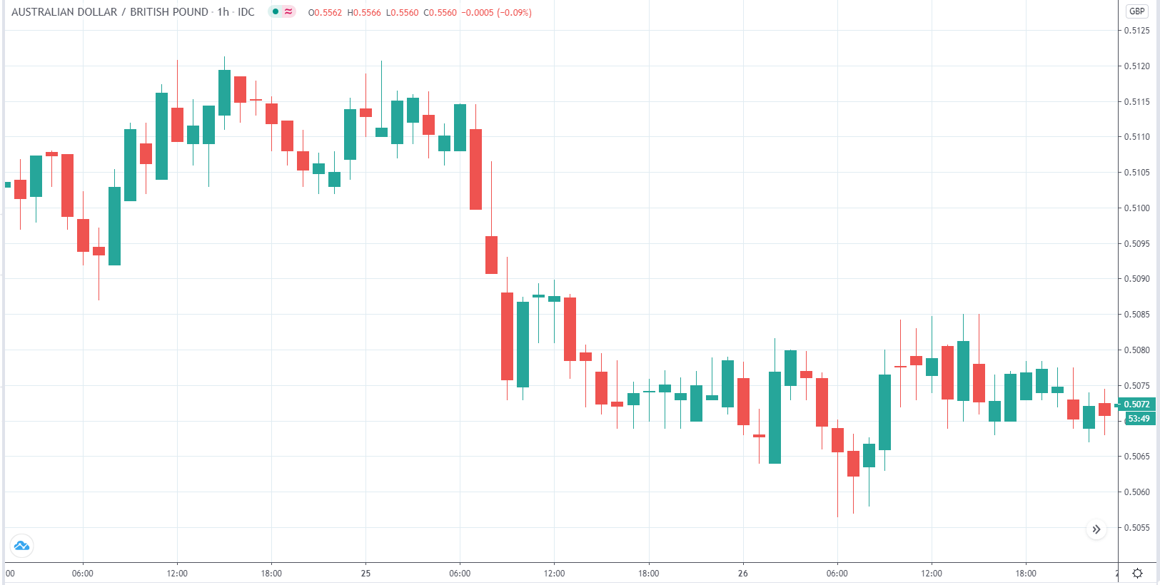
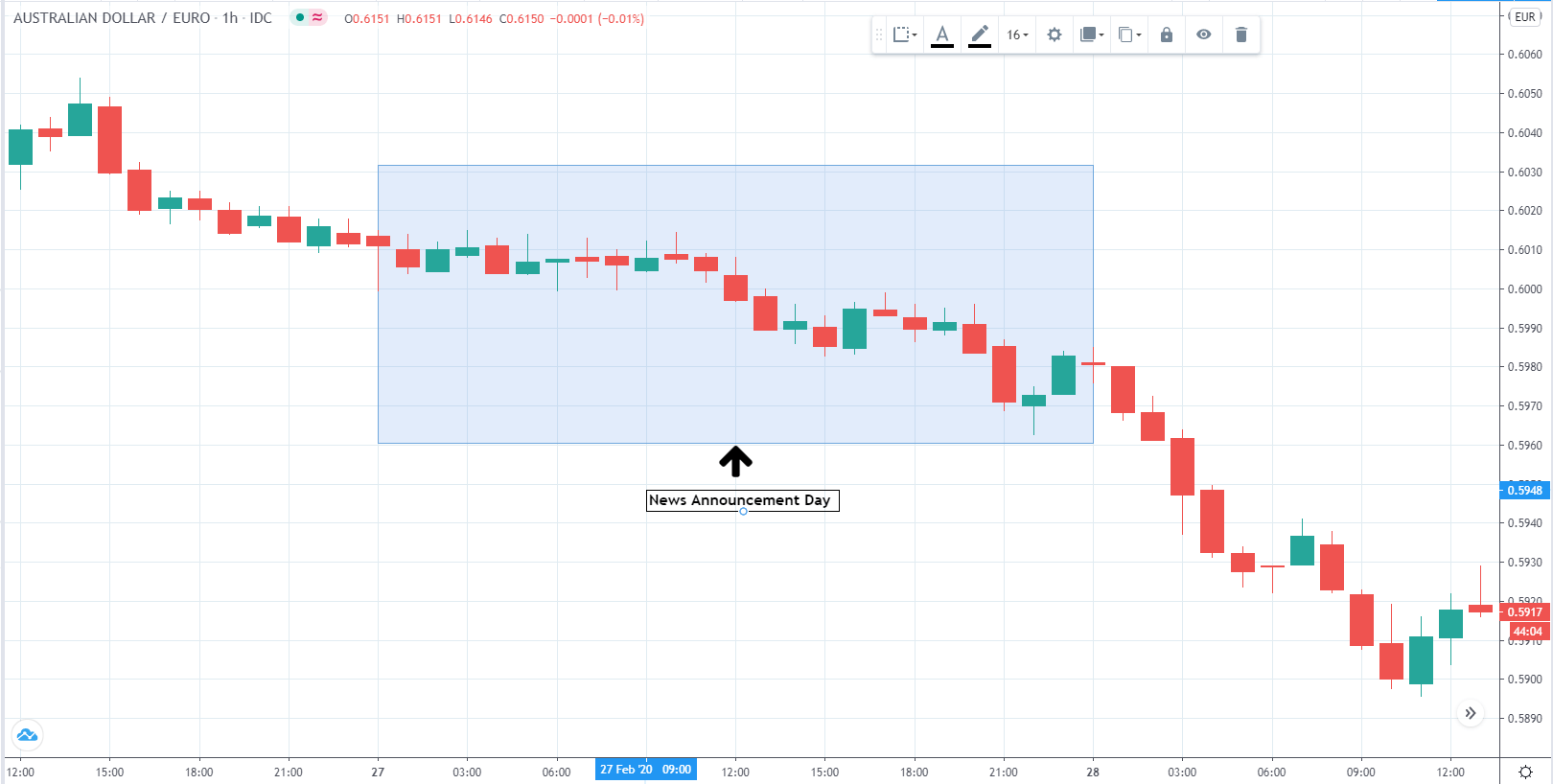
 The below image shows that the weekly wages were increased for Australian employees in 2020. Although the difference is not huge, it still is a positive step taken for the daily wage workers. Looking at the data, we should not expect significant volatility in the currency pairs during the announcement.
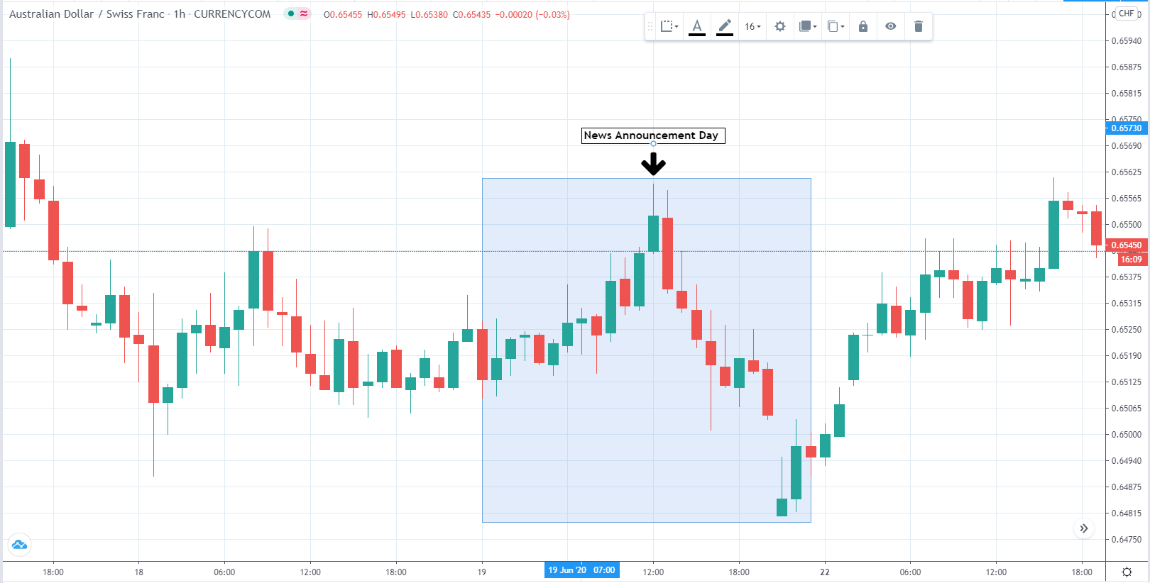
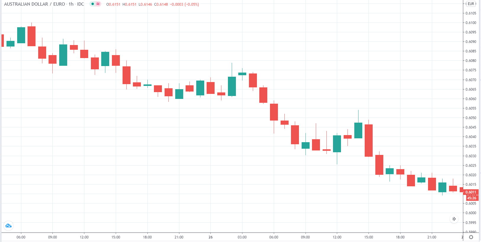