Introduction
The Forex market consists of are several types of traders. They are broadly classified based on the time frame traded. For example, swing traders use time frames like 1H or 4H, while positional traders analyze the 1D or 1W time frame. Similarly, there are “scalpers” who trade the 1-minute and the 5-minute time frames. Note that scalpers are different from day traders, as they do not consider the 15-minute or 1H time frame for their analysis.
What is Scalping in Forex?
Scalping is a type of real-time technical analysis, where traders make several trades in a small period. Scalping involves entering and exiting from the market within a few minutes and moving on with the subsequent trade. This type of traders aims for tiny profits rather than home runs.
Scalping is usually most popular among forex traders than those trading stocks and commodities. This is because the FX market is the most liquid and volatile market. Thus, traders make use of this benefit by extracting 10-20 from the market in a short time. Since scalping involves making of few pips on a trade, they are traded with big volumes.
Getting Started with Scalping in Forex
Now that we know the basics of Forex scalping, let’s discuss the analytical side of it and then understand some powerful scalping strategies as well.
Timeframe
The ideal time frame to the scalp is either 1-min or 5-mins. However, some traders get an outlook from the 15-min time frame too.
Take Profit and Stop Loss
The most critical part of scalping is to have a take profit and stop loss on every trade. Since you will be using the 1-min time frame, the profit or loss level should be within 5-10 pips. It is risky to keep the TP and SL greater than ten pips when the analysis is based on the 1-min time frame.
Volatility and Liquid
Volatility and liquidity are other vital points of consideration before scalping any market. Forex is indeed the best market to the scalp as it offers the needed volatility and liquidity. However, you must select the right pair to trade because not all currency pairs offer enough market volatility. There are pairs that barely move on the 1-min time frame, and thus traders must end up waiting several minutes on a trade. Hence, it is recommended to trade only major pairs and a few minor pairs.
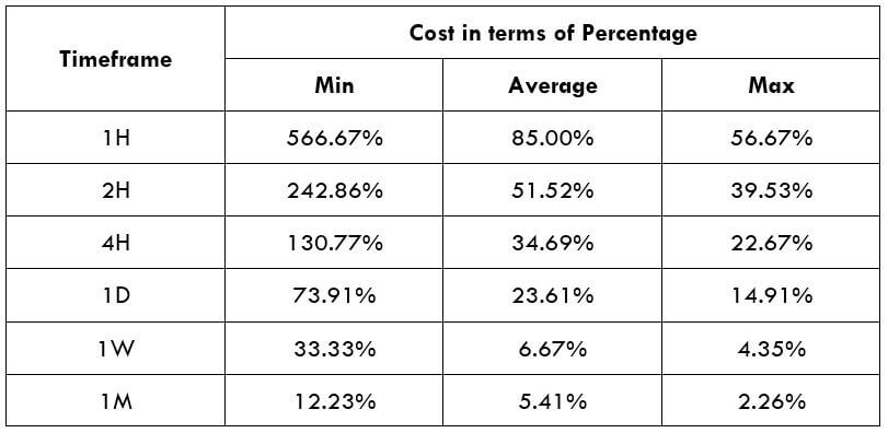
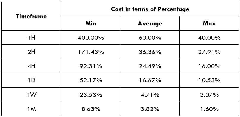
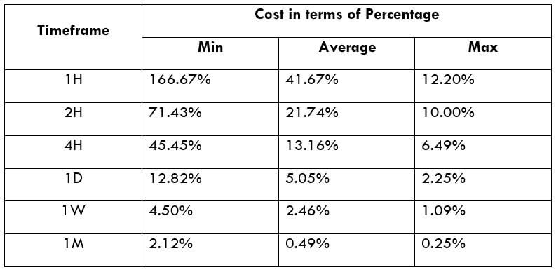
Spread
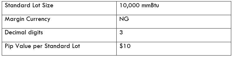
Spread plays a major role in scalping as it greatly affects the P/L of the trade. For instance, let’s say the spread on EUR/USD is two pips. The pip value of the pair is $10. If one lot is traded, the expense of the trade would be $20. Now, if a trade yields you four pips, then the net profit would be $40 – $20 = $20. We infer that 50% of the profit gets deducted as a fee. Thus, scalpers always have an eye on the spread.
Forex Scalping Strategies
Scalping strategies are unlike strategies used by swing and positional traders. Scalpers do not wait for several confirmations before entering a trade. Instead, they aggressively enter after a couple of confirmations. Here are some scalping strategies made for non-conservative traders.
Scalping using Moving Average
This scalping strategy, two moving averages – the 5-period MA and the 20-period MA is used applied onto the 3-min charts. Let us understand the strategy with a couple of examples.
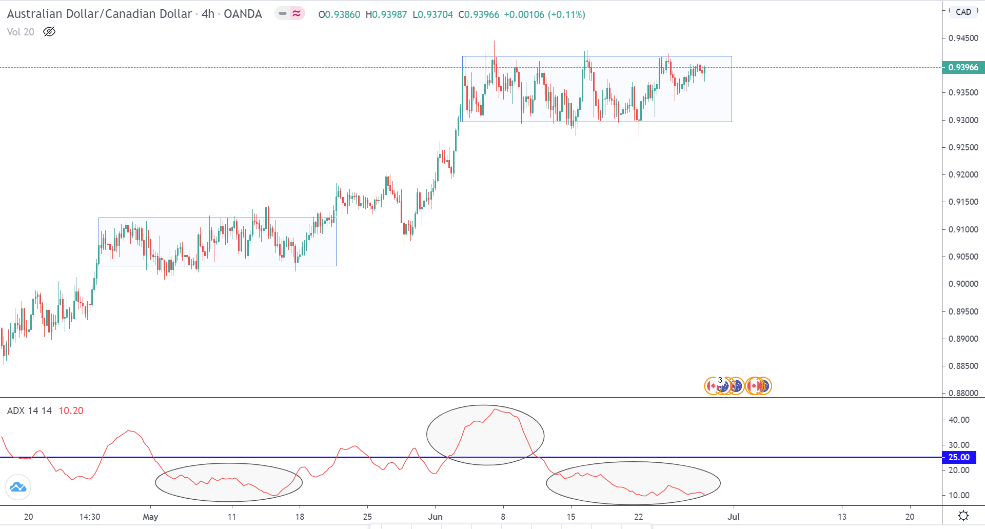
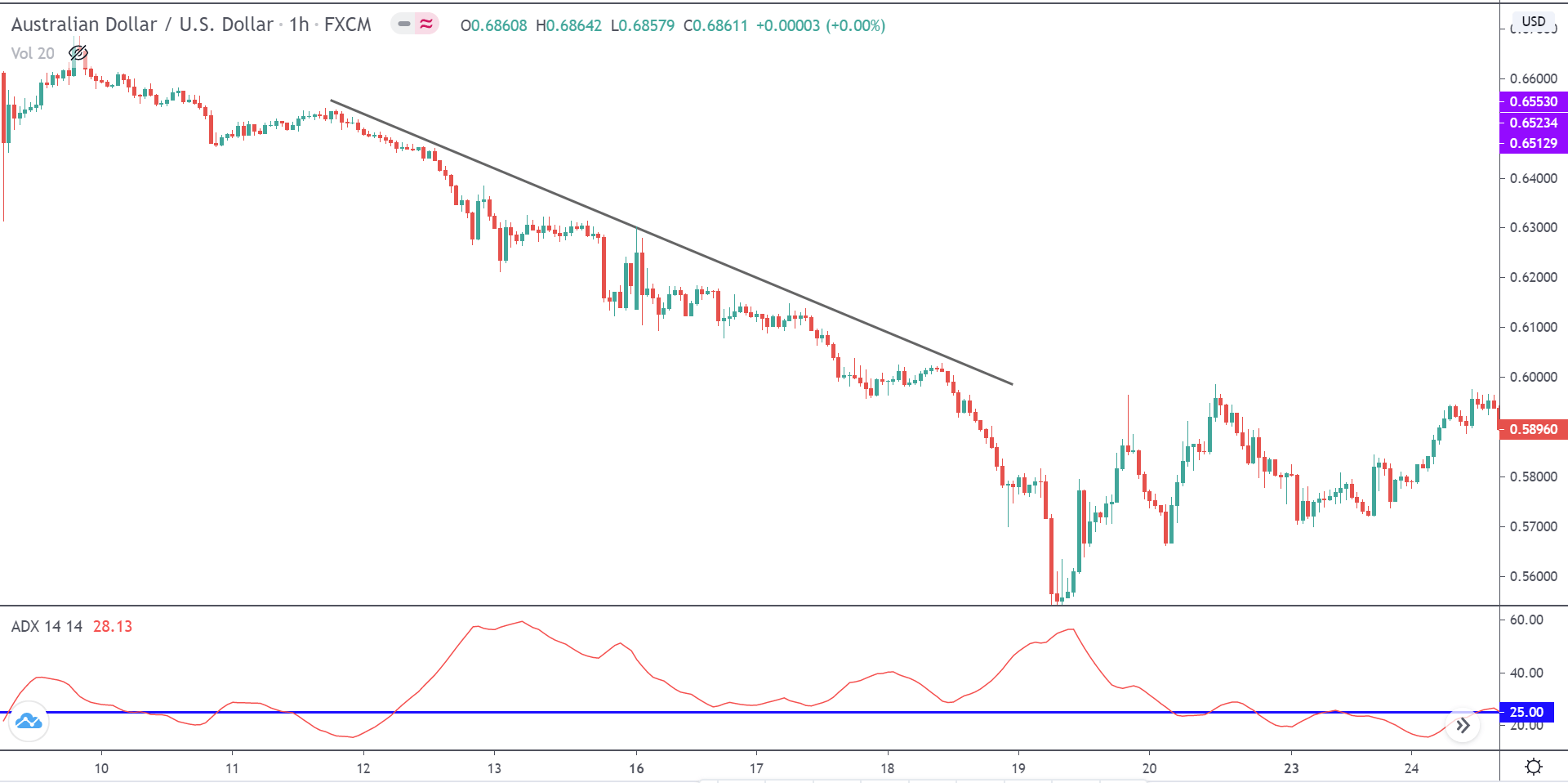
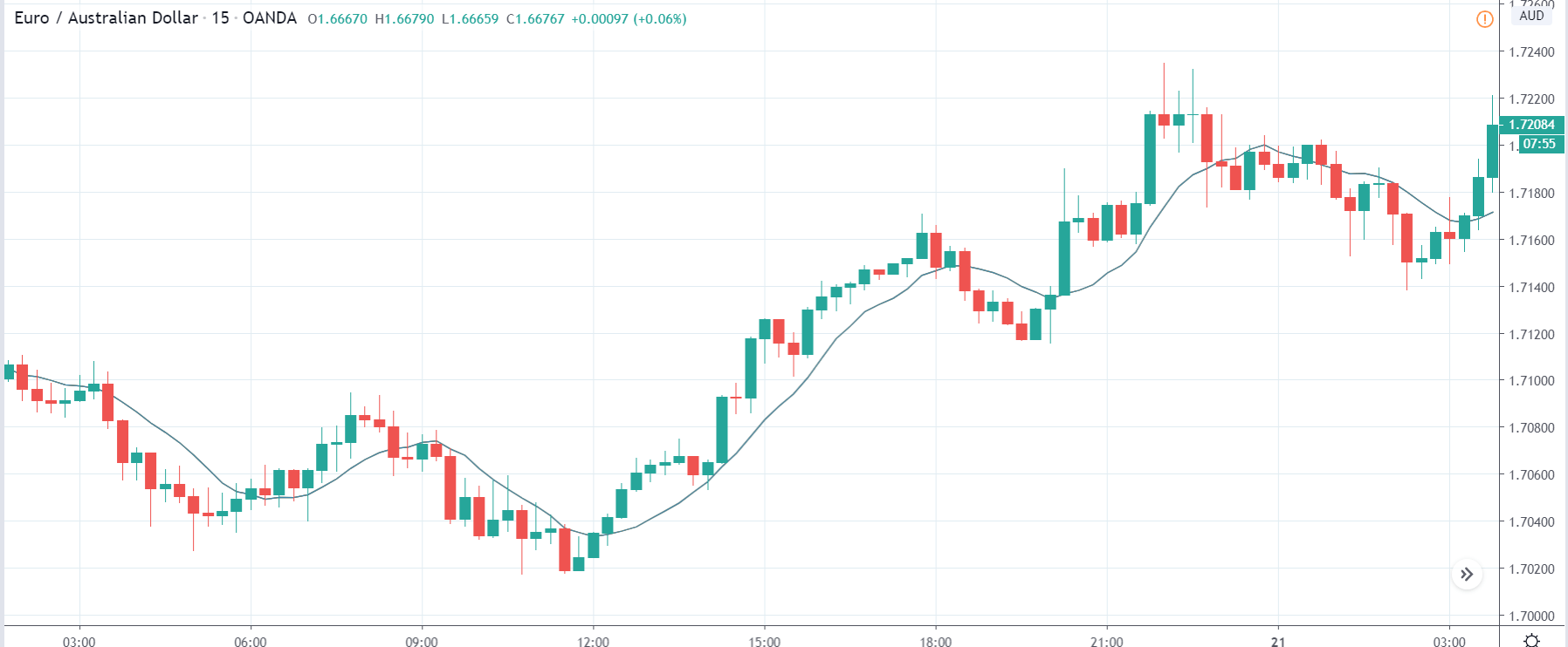
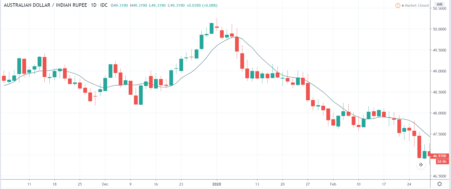
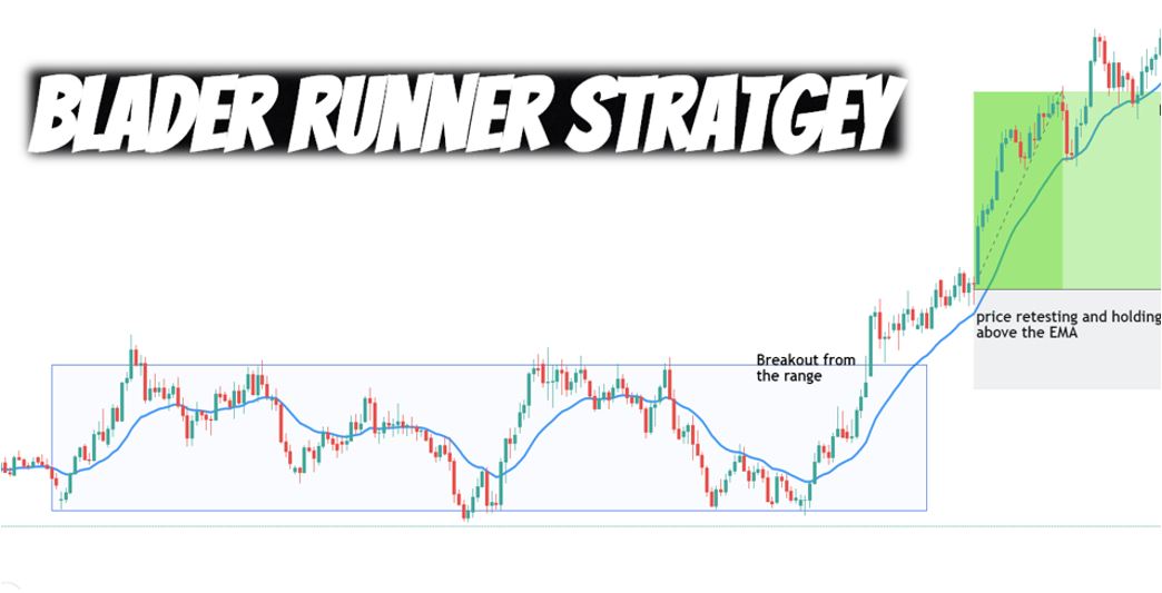
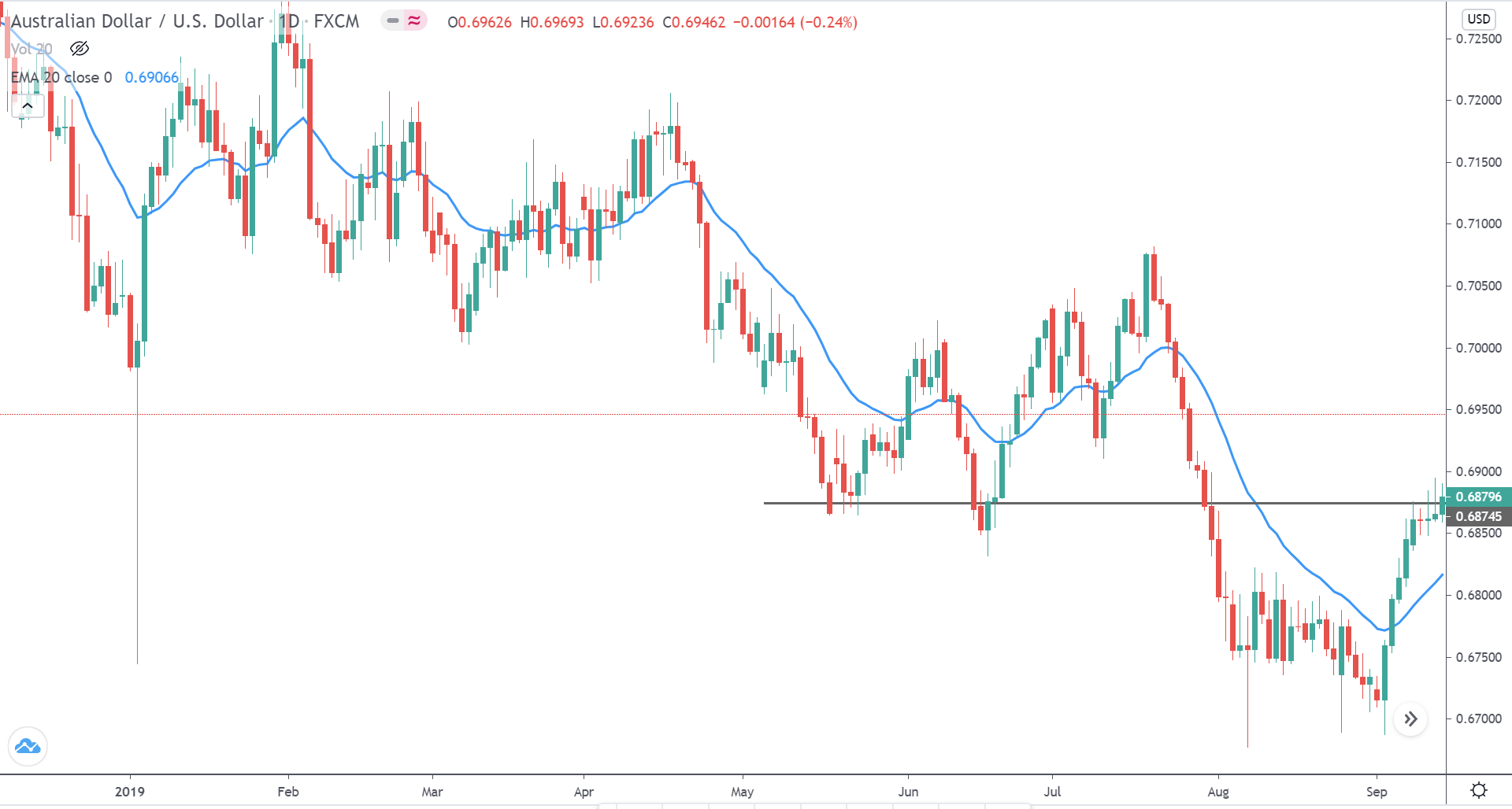
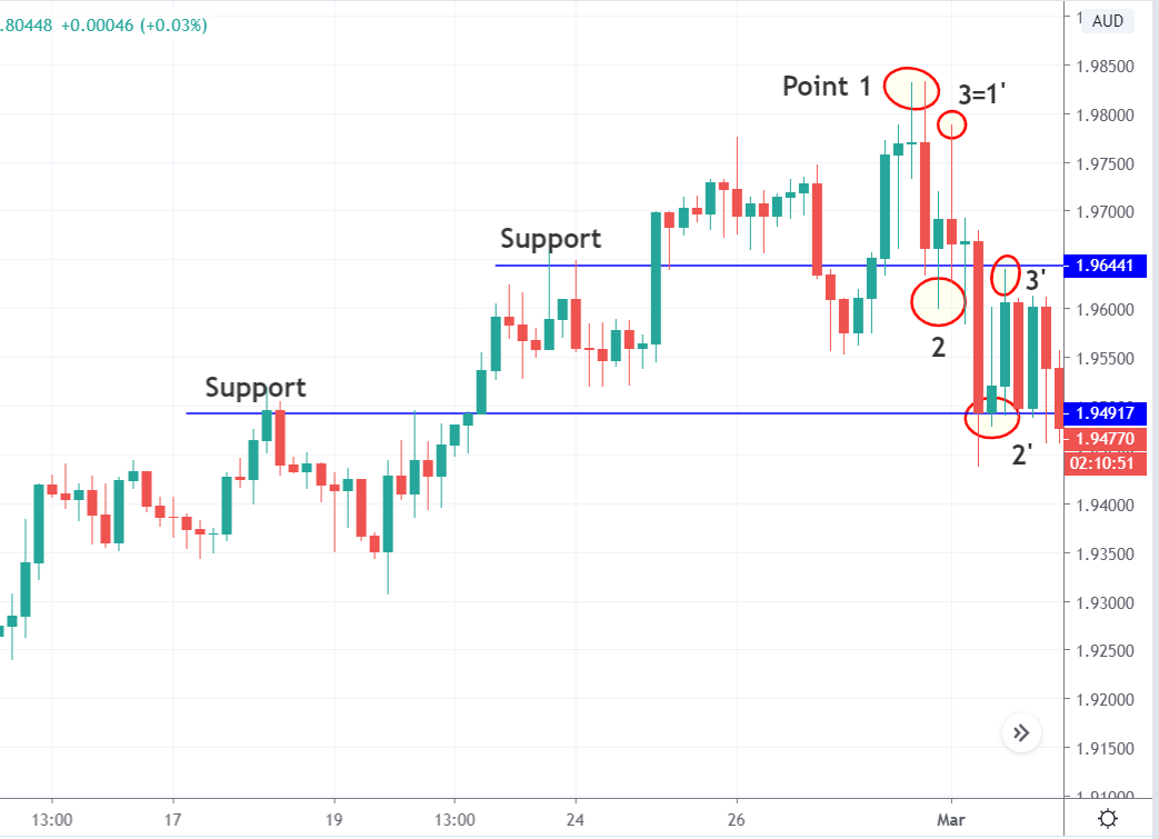
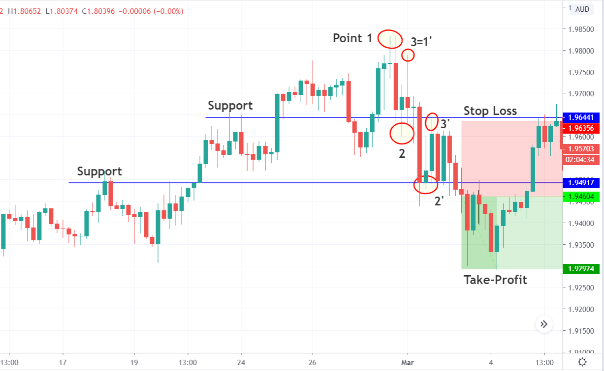
Firstly, we must have a look at the overall direction of the market. Note that this strategy is only for trending markets, not ranging markets. In the below chart of AUD/USD on the 3-minute time frame, we see that the market is in a clear downtrend.
Secondly, the five period MA must be below the 20-period MA. When the price action tries to break above five-period MA (yet below the 20-period MA) and falls back into MA, we can open short positions.
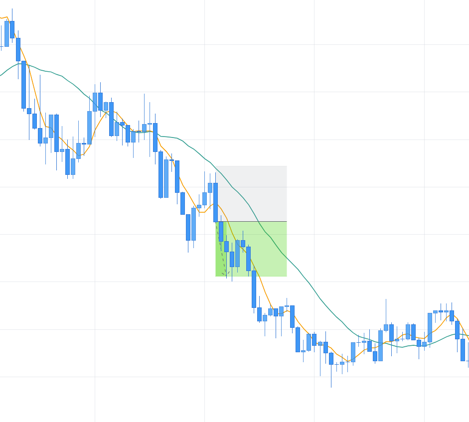
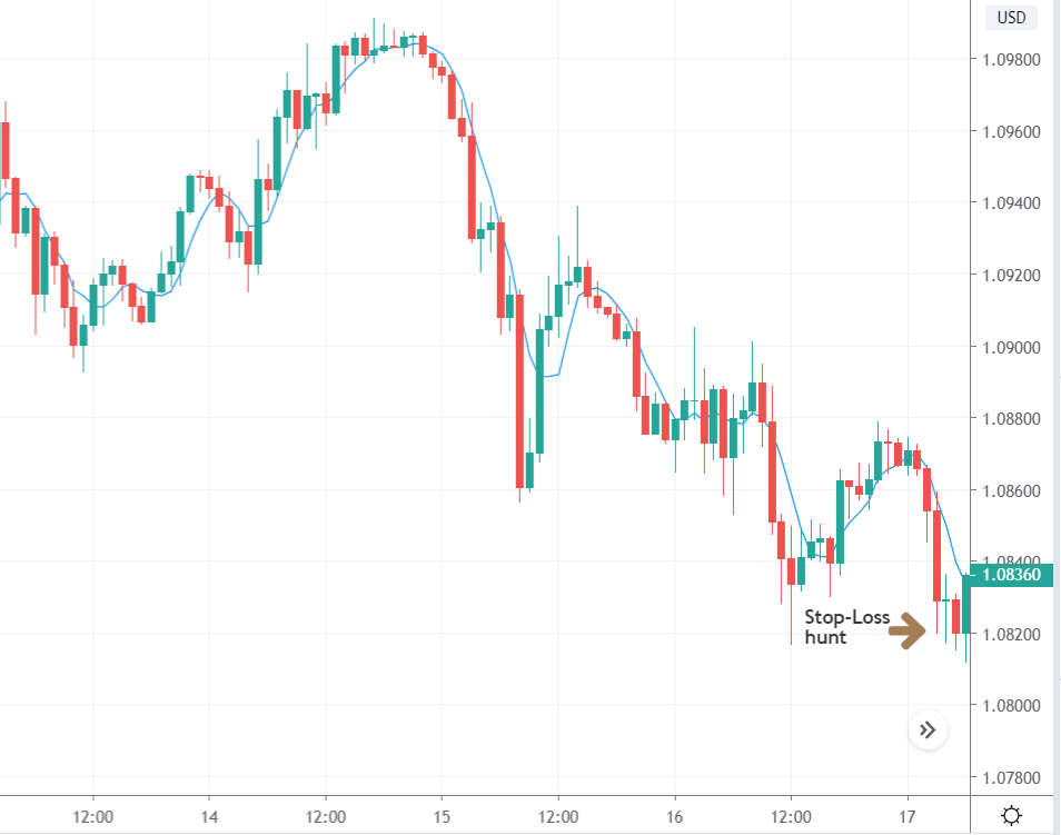
The stop-loss must be placed above the high of the candle that broke below five-period MA. One must exit the trade when the price reaches up to 1:1 risk-reward or at a profit of 5 pips.
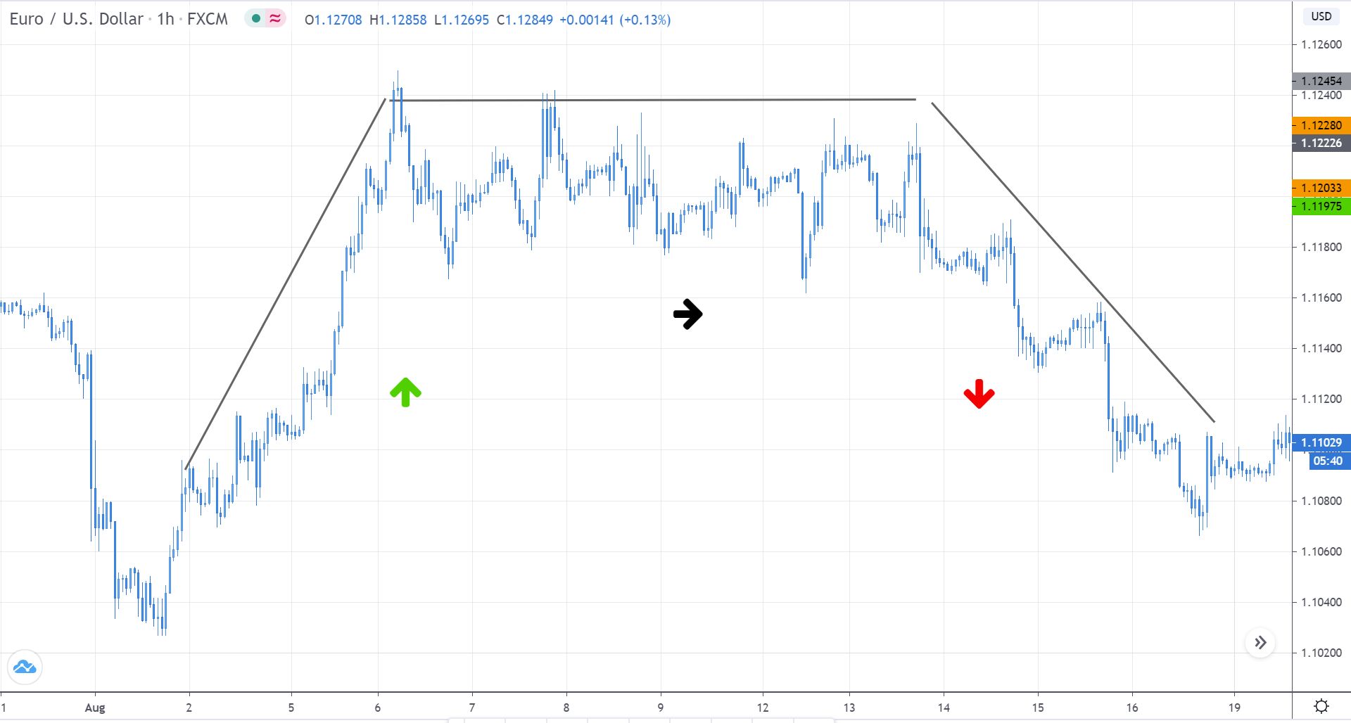
Scalping using price-volume charts
Indicators are not a must to scalp in forex. Scalping is possible solely using price action concepts. And here is a strategy for the same. This strategy works on a small time frame used on any currency pair. However, we’ll be sticking to the 3-min time frame for all the strategies.
Below is the chart of AUD/USD on the 3-minute time frame. According to the strategy, we can take entry when the market breakthrough a range strongly with high volume. In the below example, we see that the price fiercely broke above the range with high volume too. This is a confirmation that the big buyer is back into the market. Thus, we can take a long position right after the candle closes above the range.
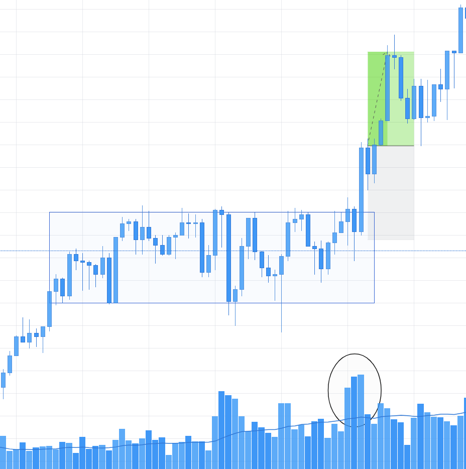
The stop-loss can be placed below the low of the candle that broke through the range and places the take profit at a 1RR ratio. Note that, the stop-loss and take profit must exceed above 10-12 pips.
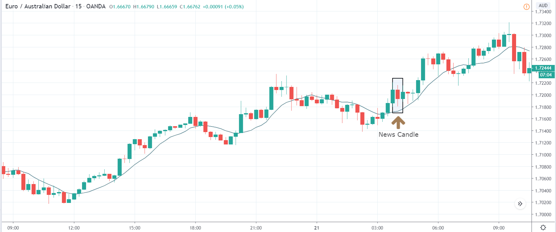
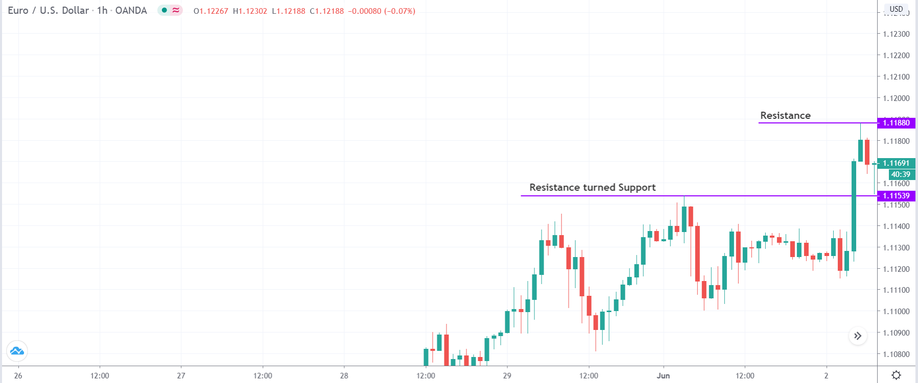
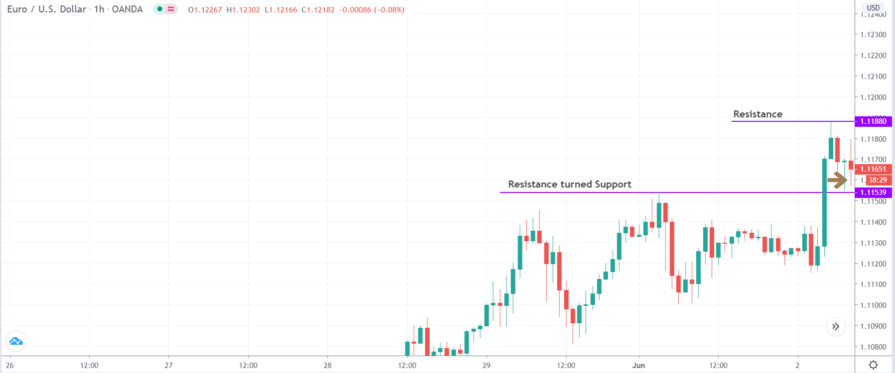
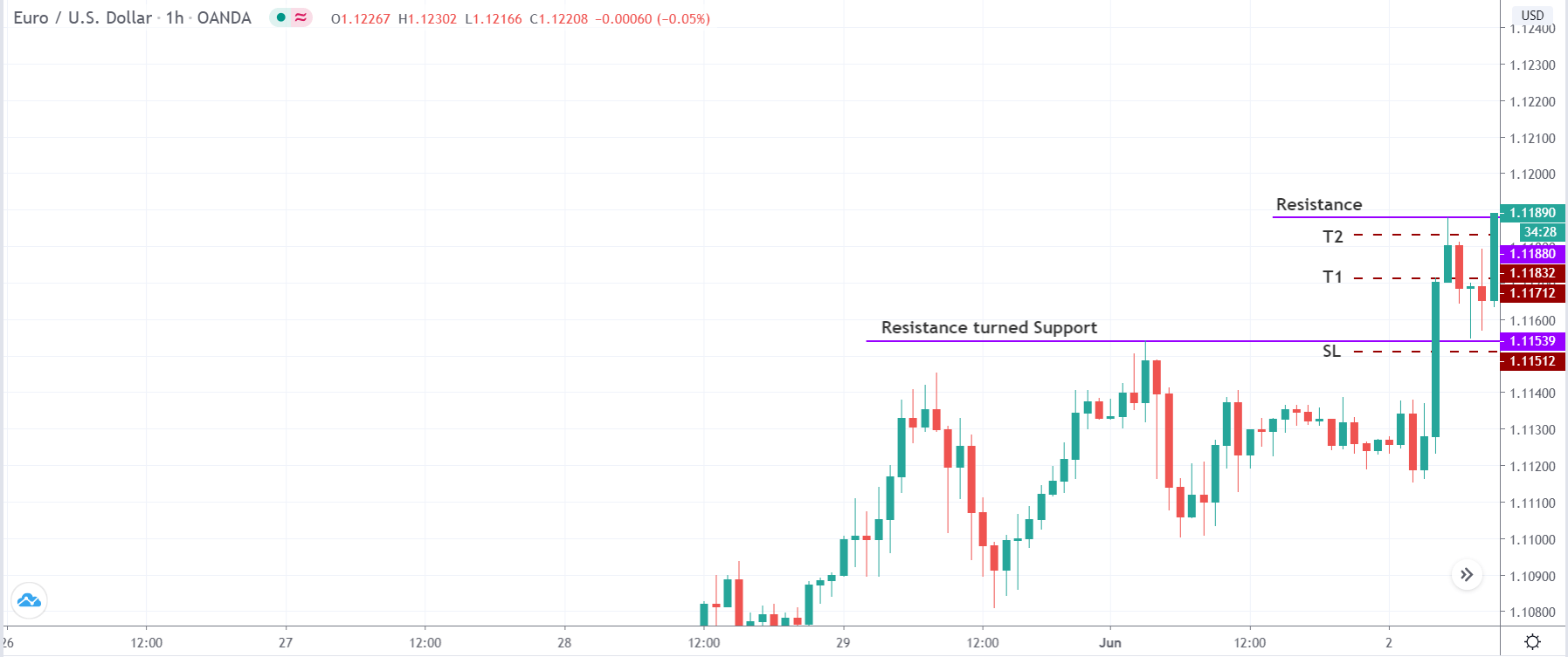
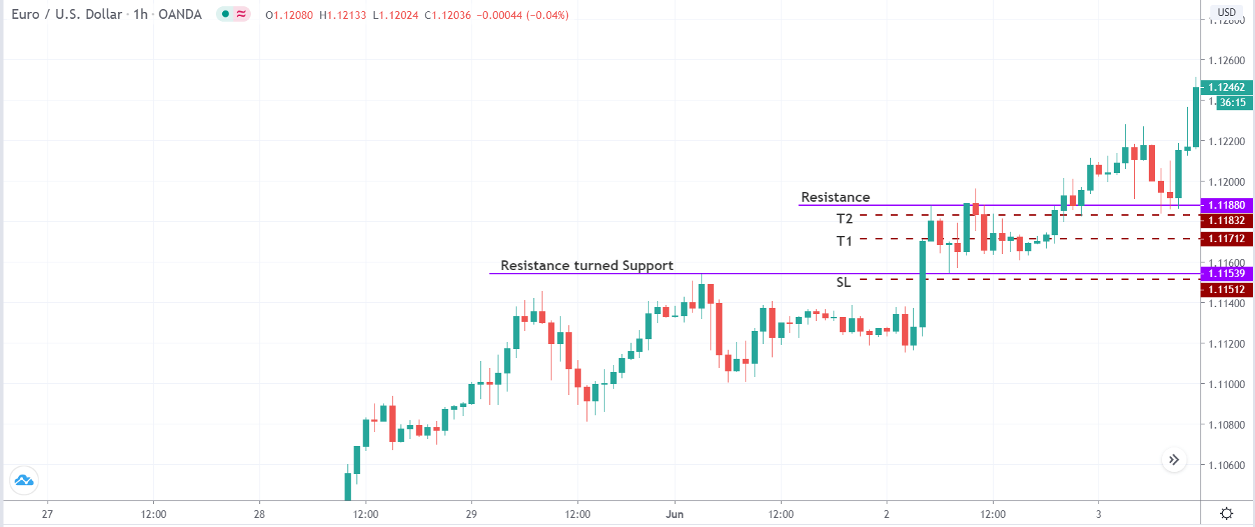
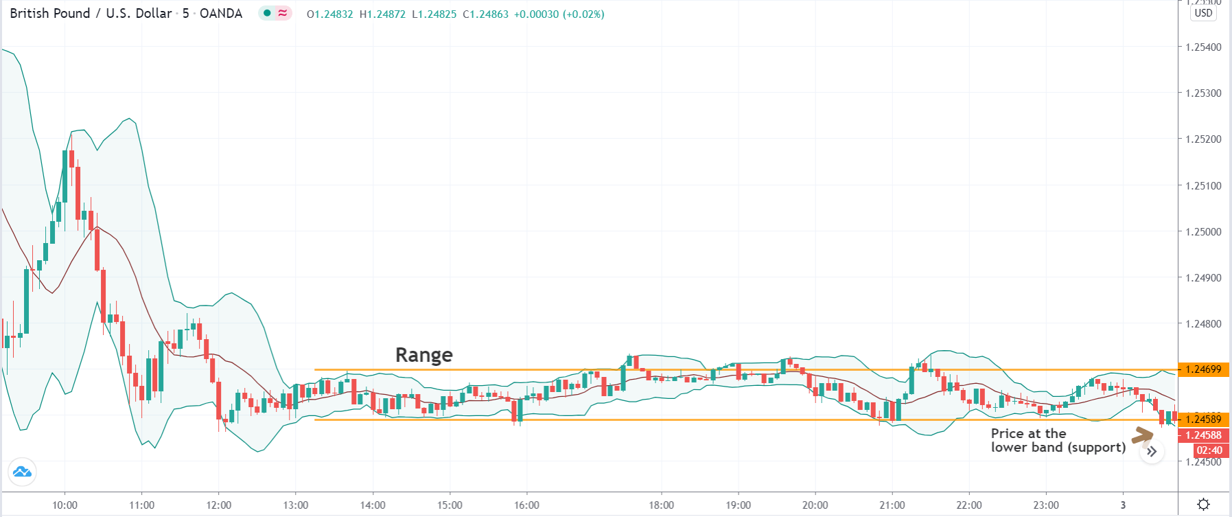
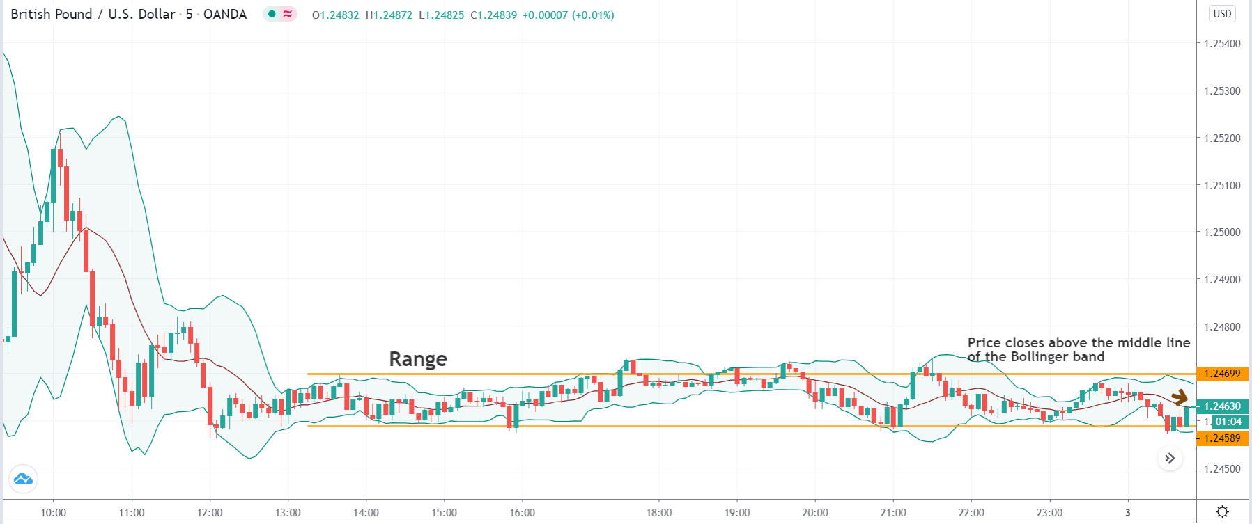
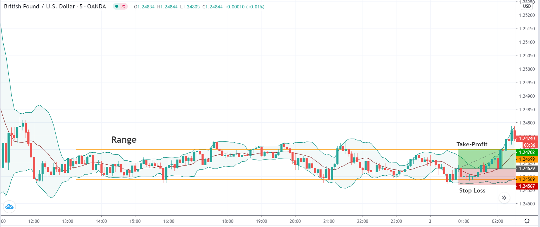
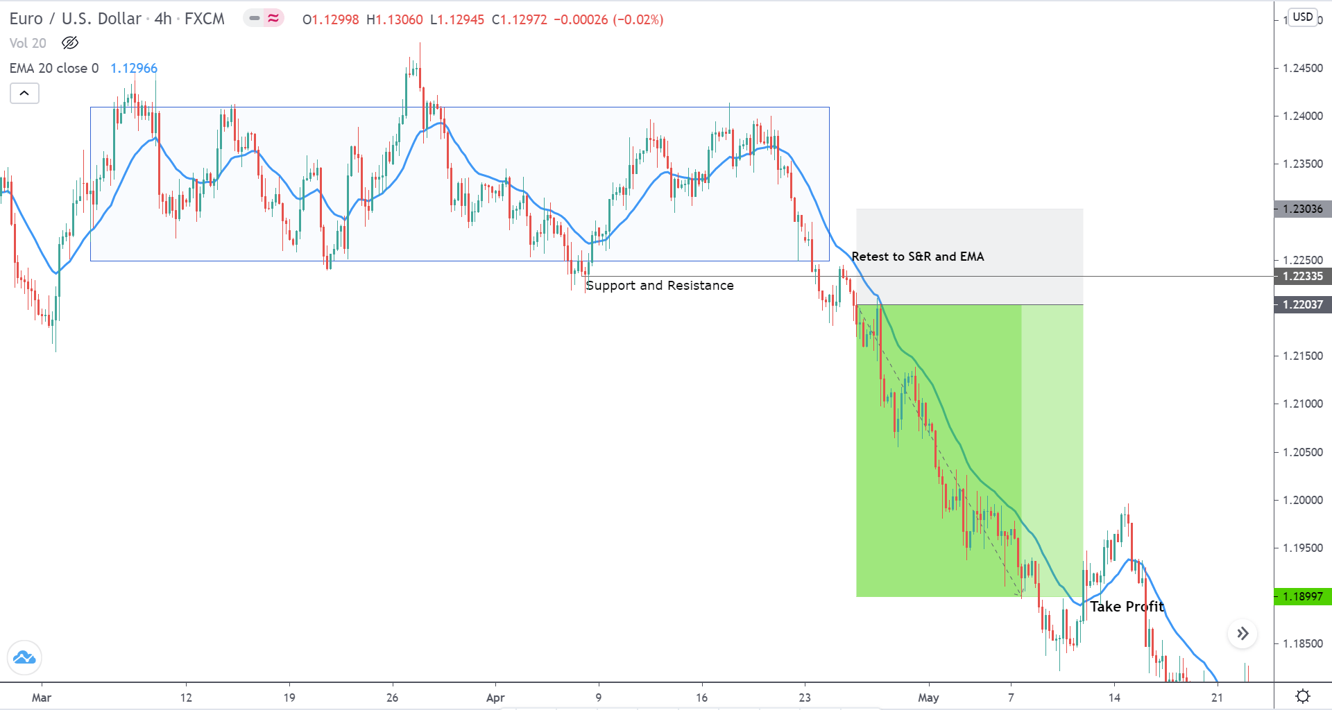
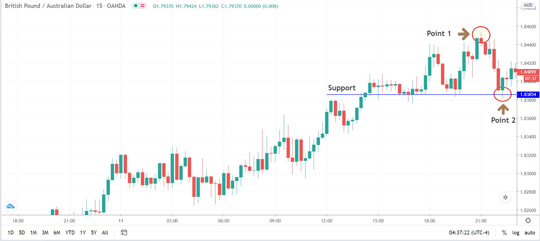
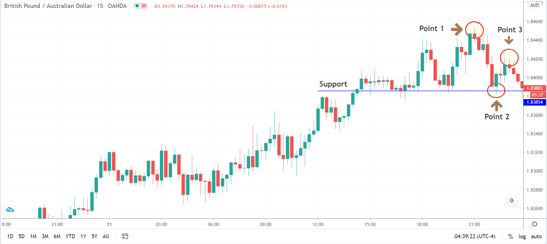
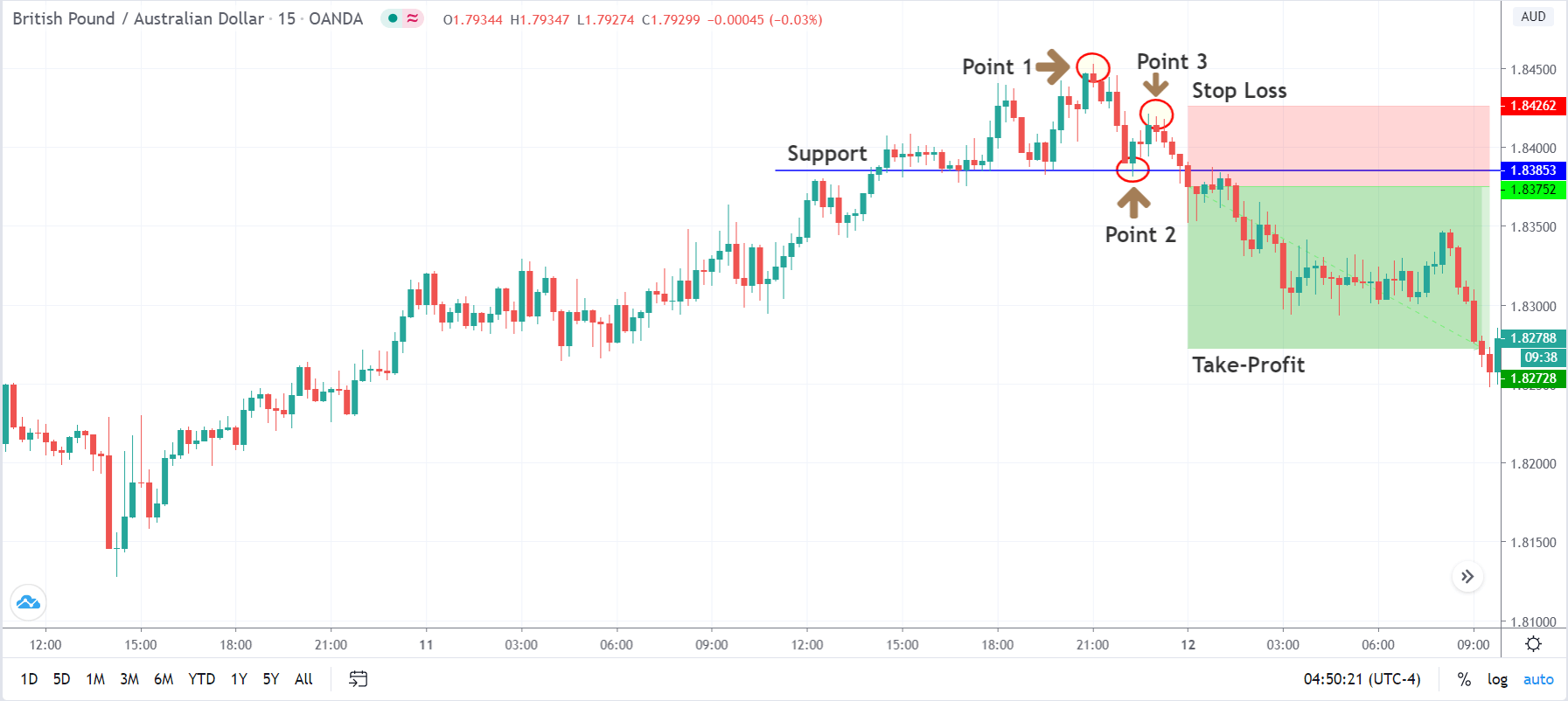
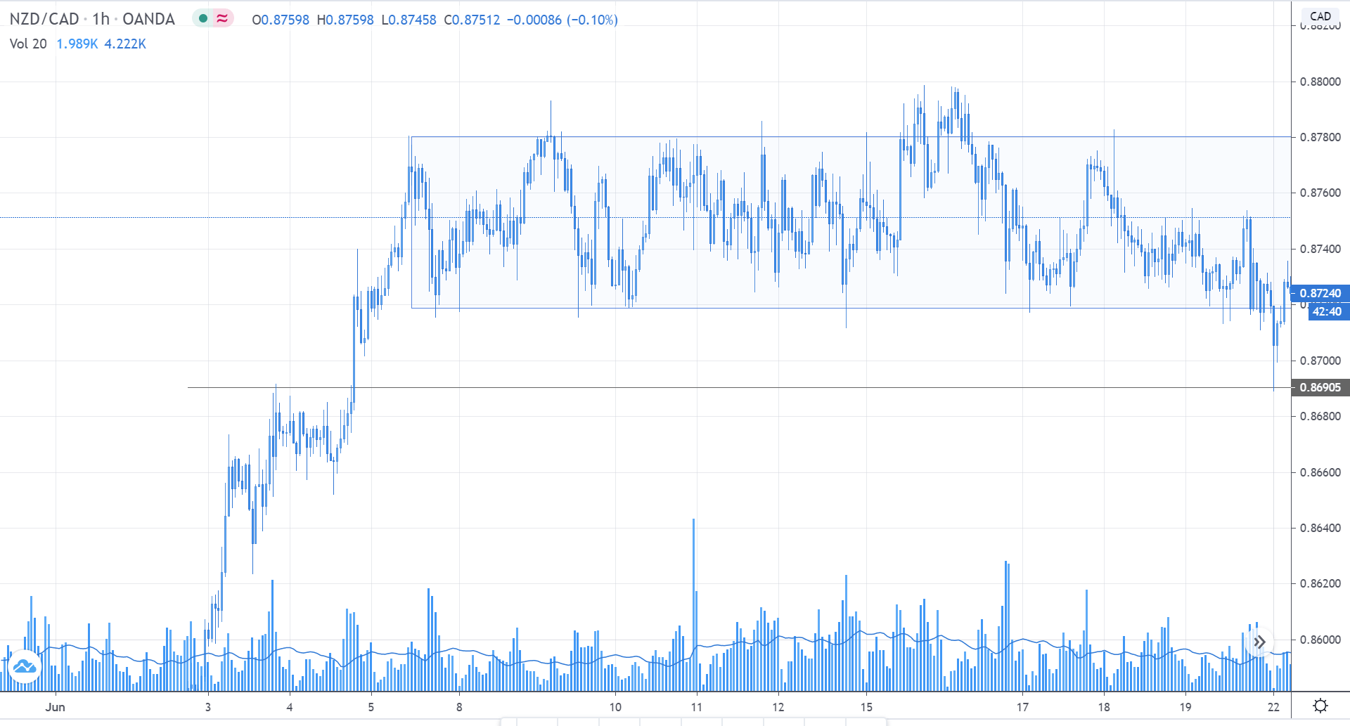
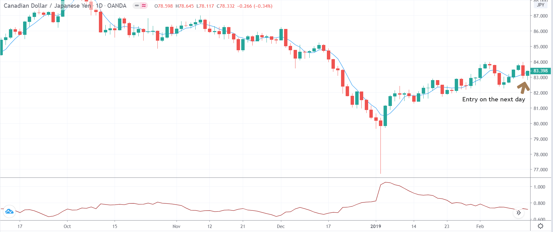
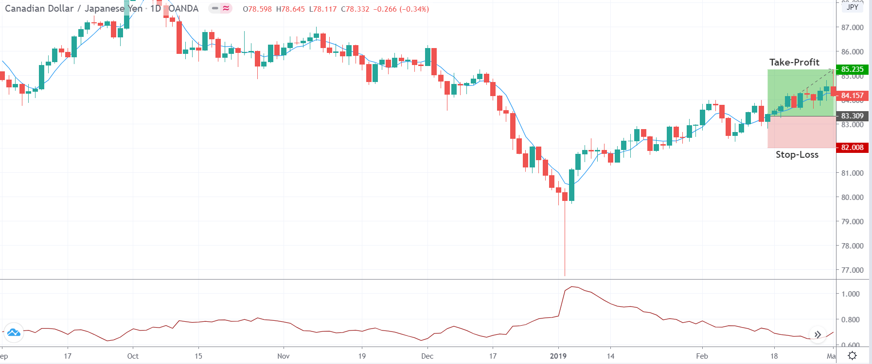
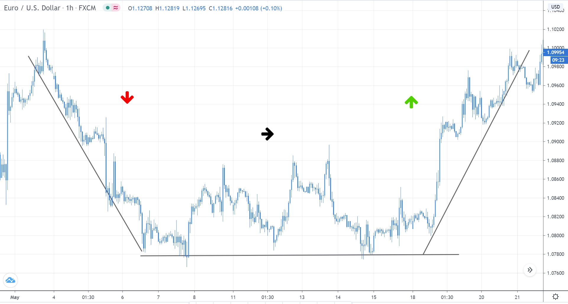
Scalping using Support and Resistance
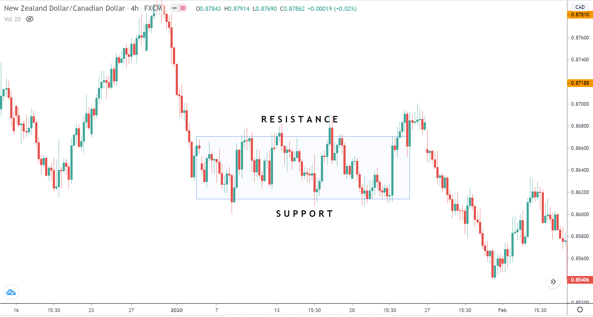
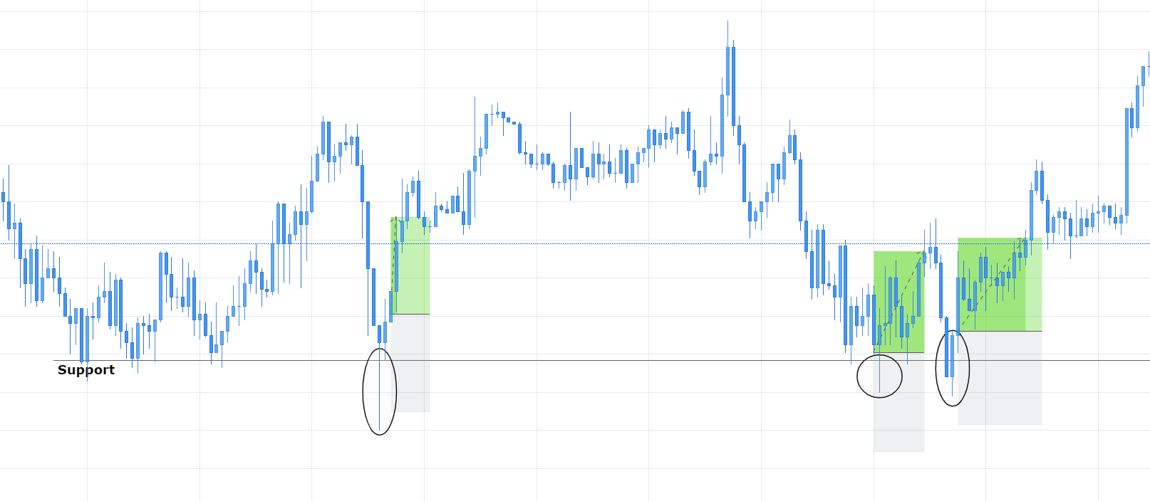
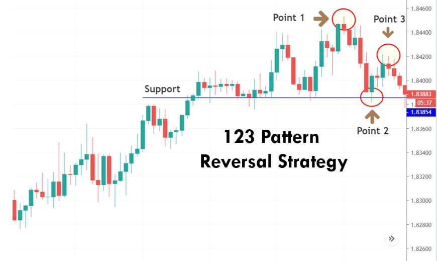
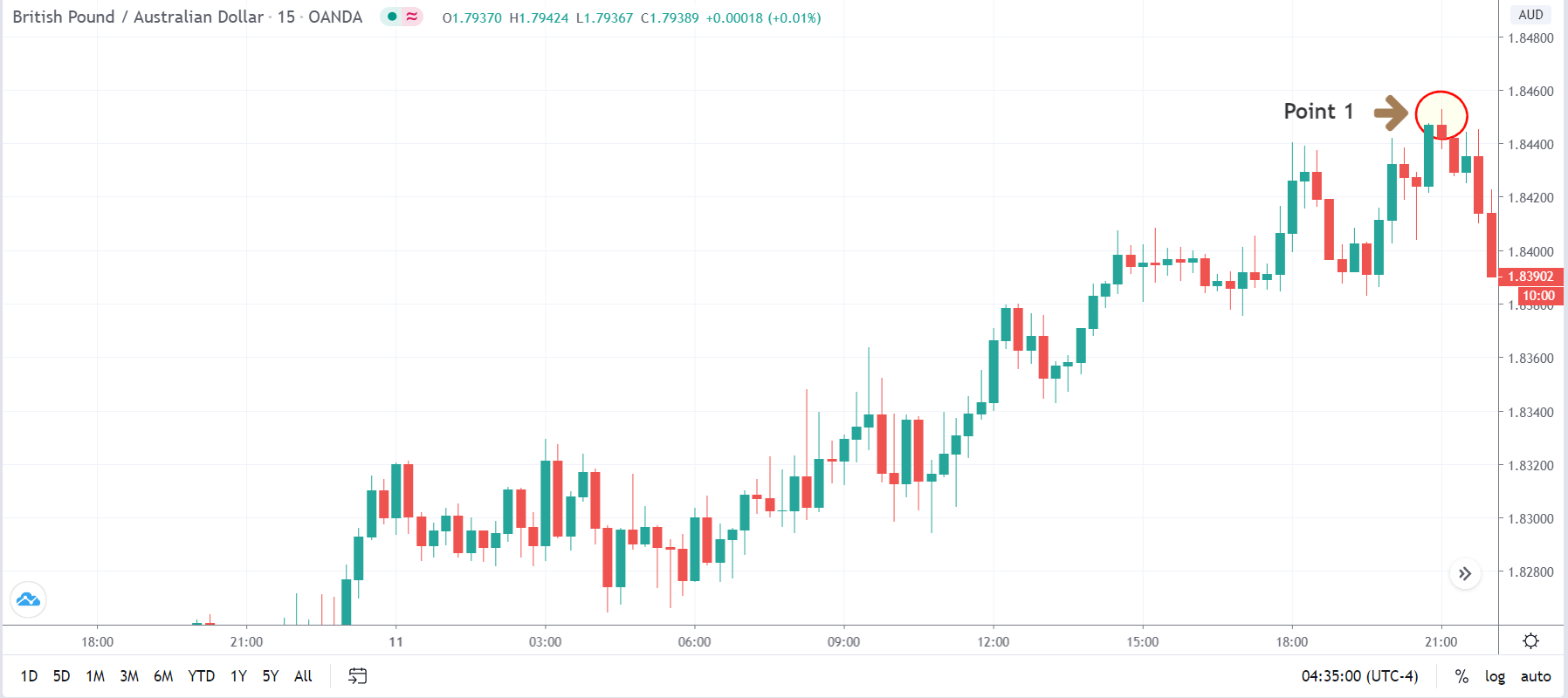
Scalping at support and resistance levels is the most popular technique in the forex industry. Yet most traders apply it illogically. Even though the textbook says to buy at the support and sell at resistance, it cannot be applied practically incorporated in the market as there is a pinch of psychology in it. According to this strategy, one must buy at support and sell at resistance only if there is a false breakout prior to it.
Consider the below chart of NZD/CAD on the 3-minute time frame. The gray ray represents the support level. It is seen that the price broke below the support thrice and came right back above it. Thus, one can enter when the price is holding above the resistance post the fake-out. The stop-loss and take-profit for all such trades much be a maximum of 5 pips.
We hope you found these strategies interesting and helpful. If you are an aggressive trader, do try them out and let us know the results in the comment section below.


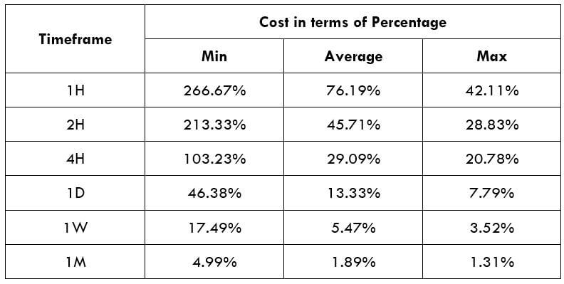
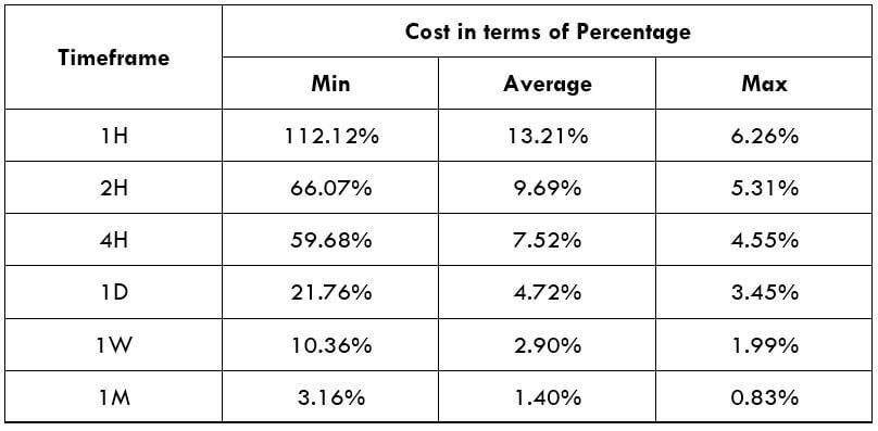
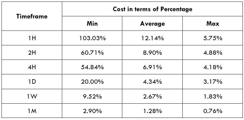
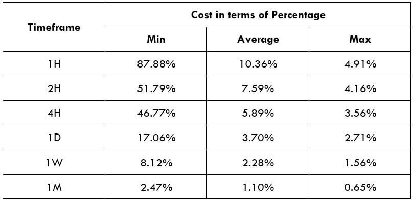
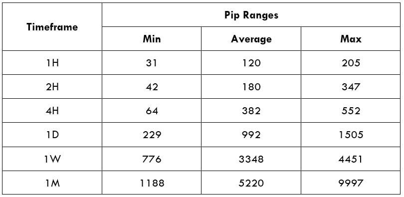
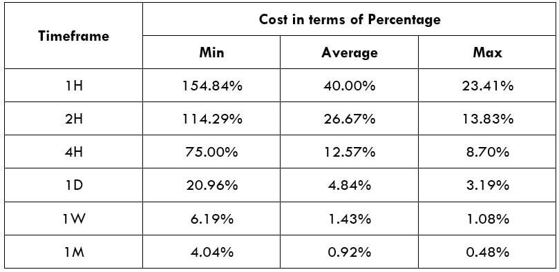
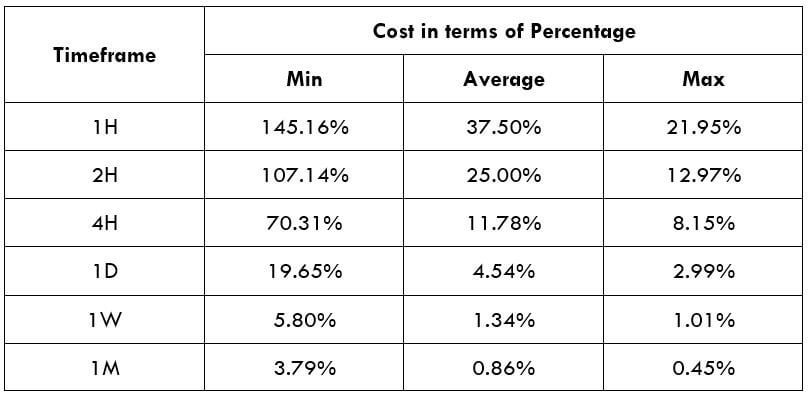
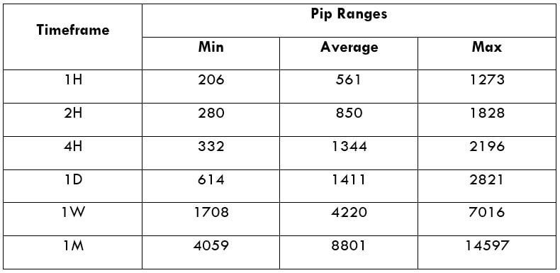
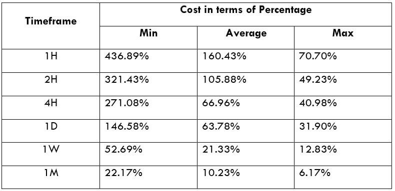
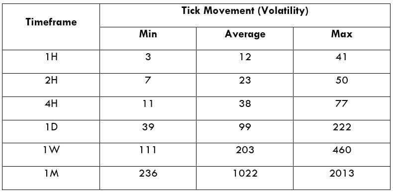
 Spread
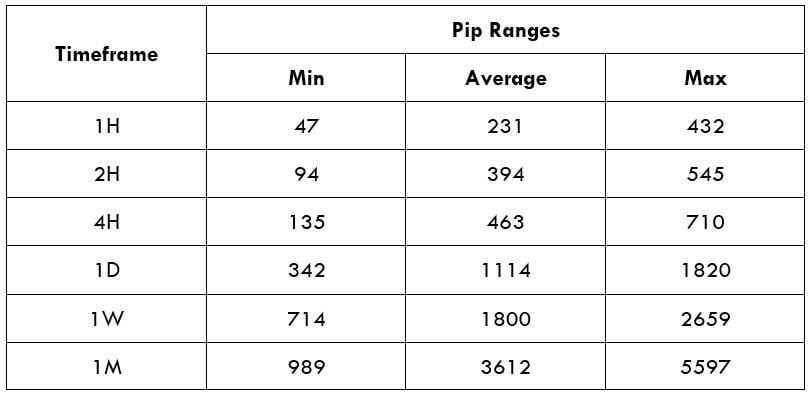 Procedure to assess Pip Ranges
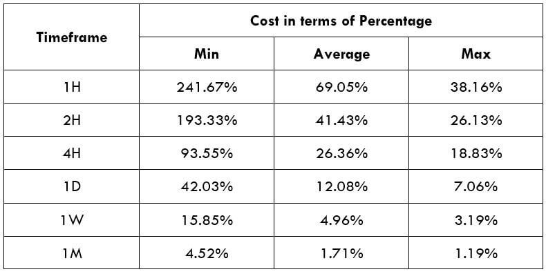
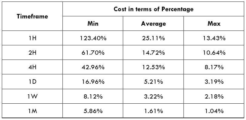 STP Model Account
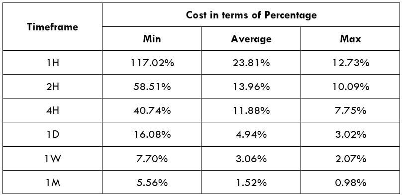


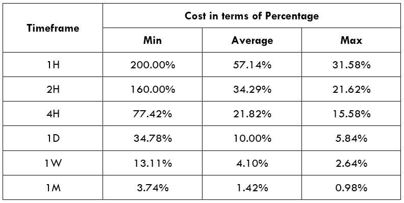


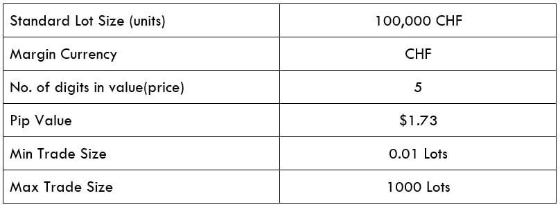 Spread
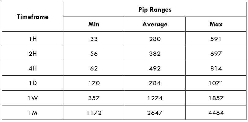


 Mt.Gox, a Japan-based cryptocurrency stock exchange, was the biggest and busiest of exchanges, with 70% of bitcoin transactions from all over the world was going in the platform back then in 2013-14. With cryptocurrency or cryptocurrency exchanges, there were no regulations. There were many loopholes in the company’s management, like there was no VCS, Version Control Software. The VCS mainly stores all the information of all the features, coding set up of a particular version of the software product.
 Before the 2019 Hack of Ethereum classic, DAO hack was the major one in the Ethereum platform. DAO, Decentralized Autonomous Organization, is a smart contract that was supposed to revolutionize the platform. The DAO acts as a decentralized venture capital fund for all the future DAPPS getting developed in the platform. Anyone can buy DAO for some ether and gain voting rights for any proposed app developed in the platform.
 The Bitfinex exchange for increasing the security and ease the transactions for the users came up with multi-sig wallets with the collaboration of Bitgo. Multi-signature wallets are such wallets that have multiple keys. One key is owned and stored by the company. While the owner of the wallet has two keys, he may give one key to his trustworthy friend/relative, so that even he loses his key, he has a backup. Generally, the multi-signature wallets need two keys to operate.
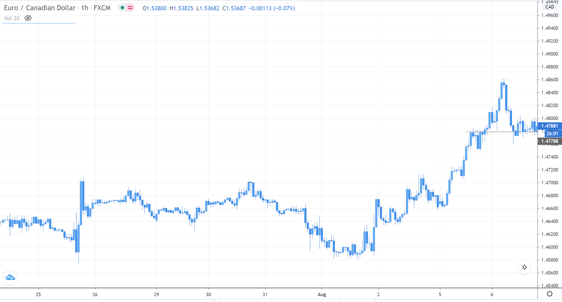


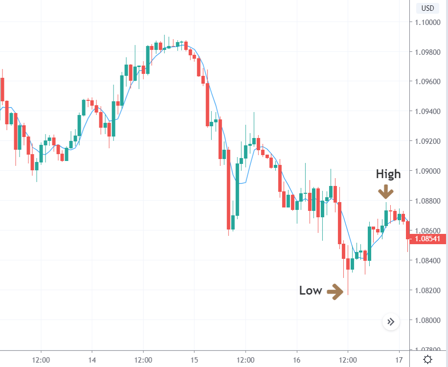


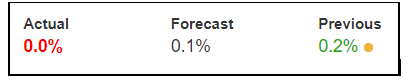
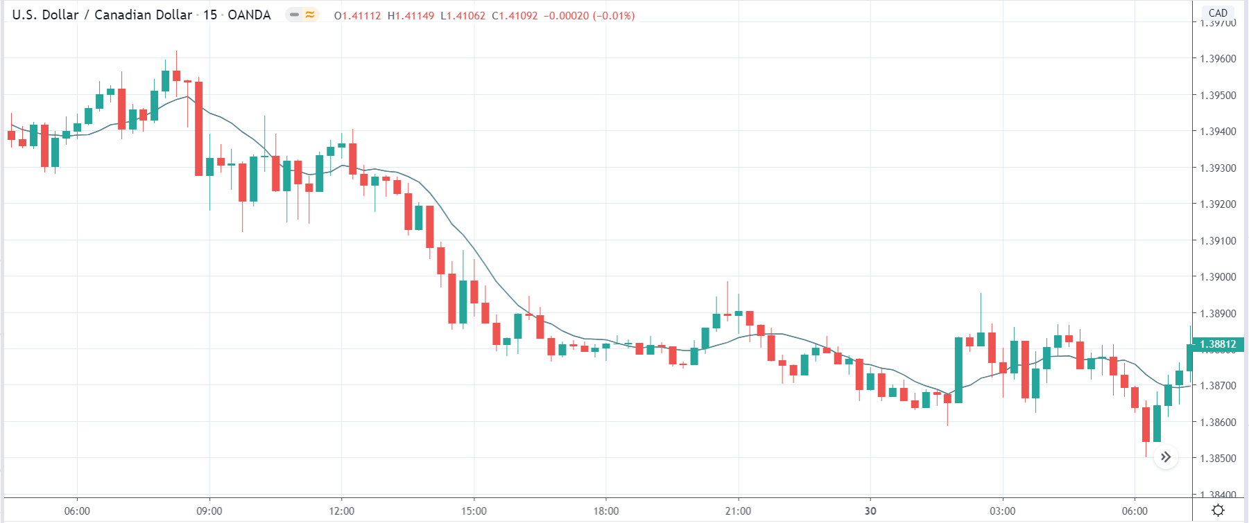
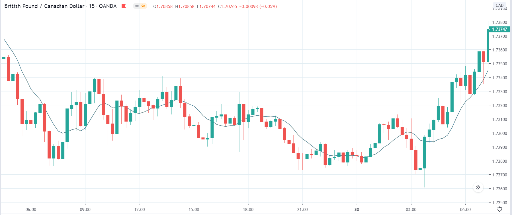
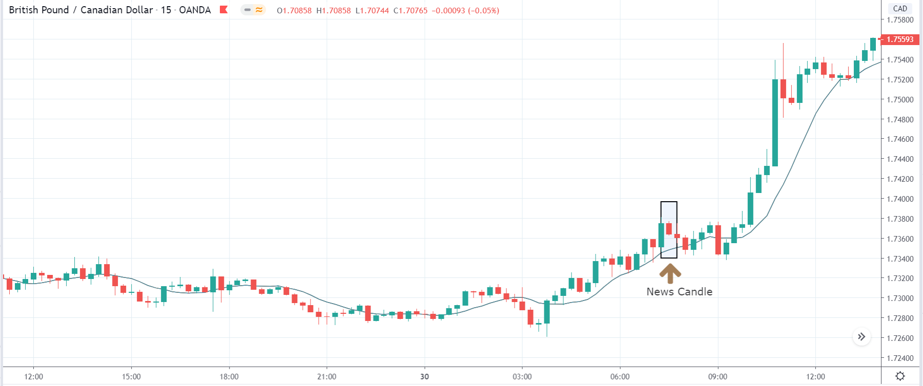
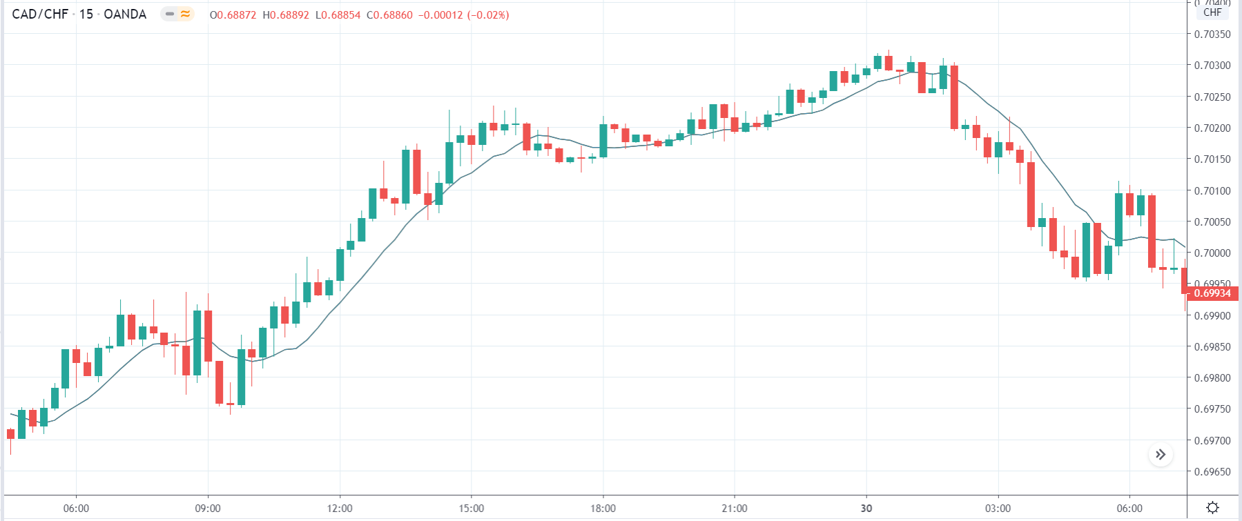
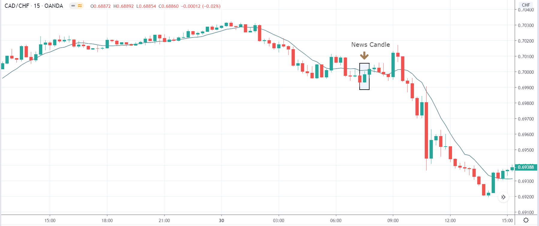
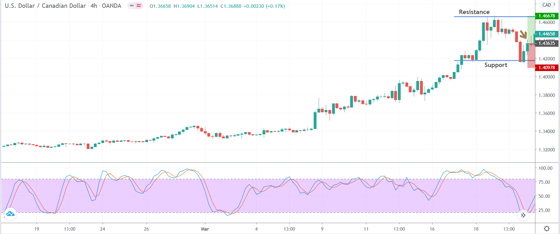
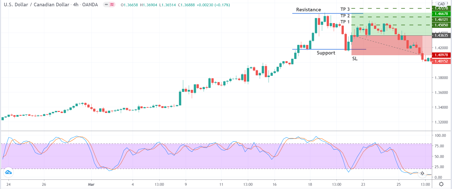
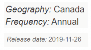
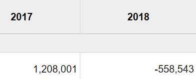
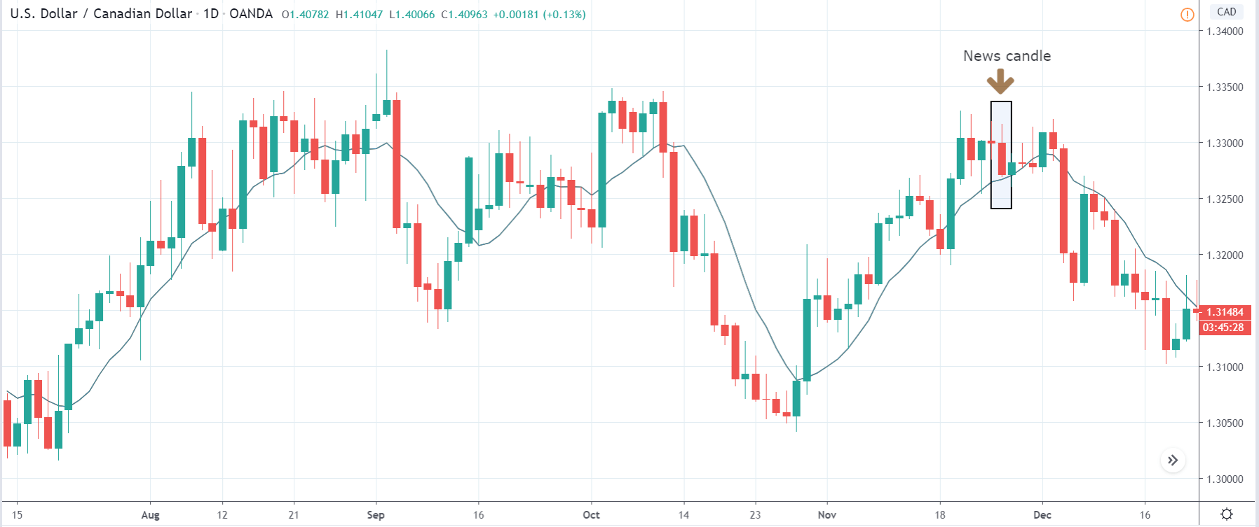
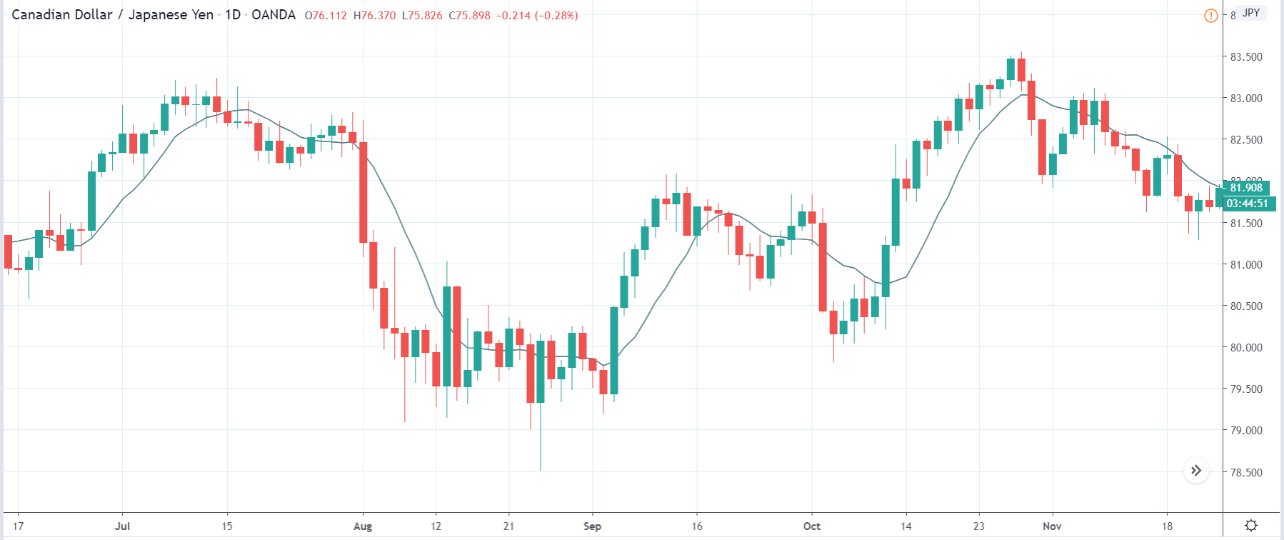
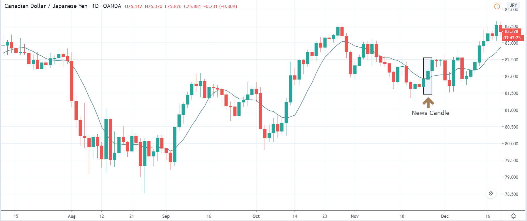
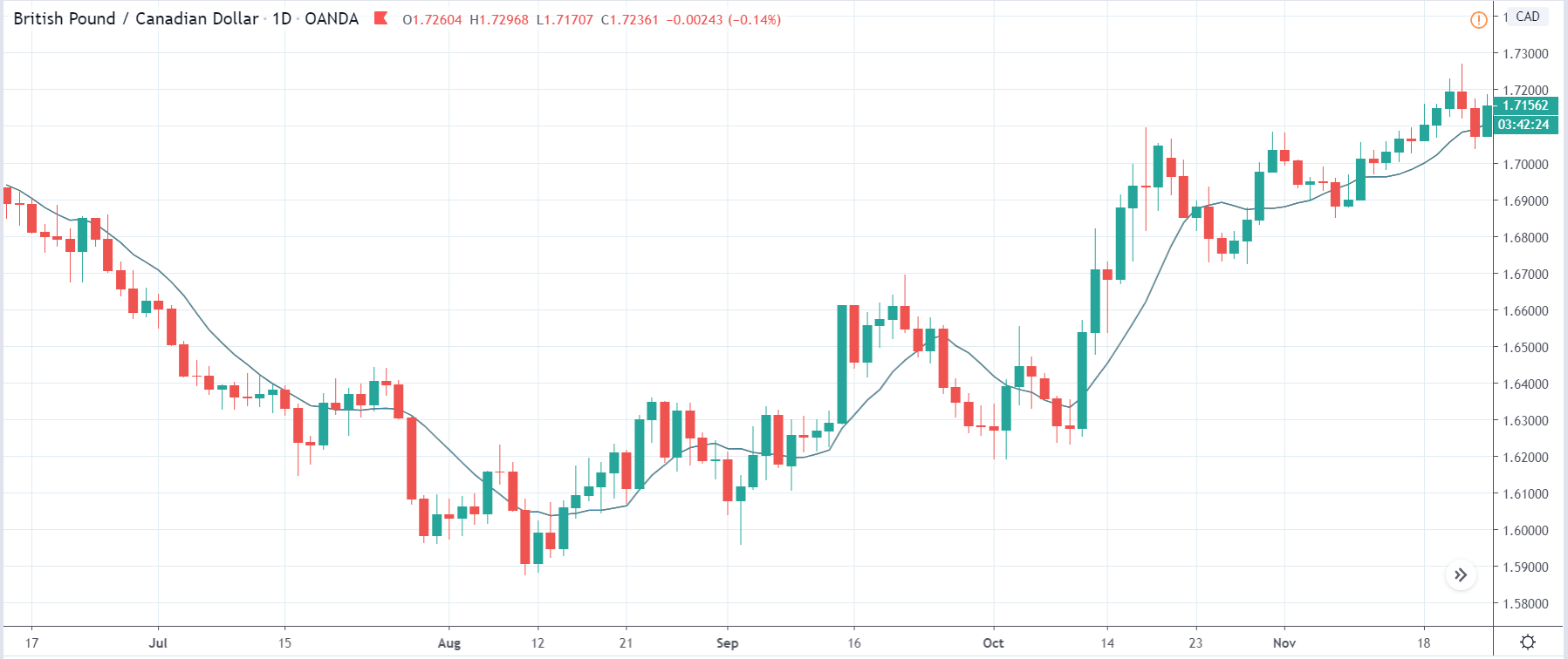
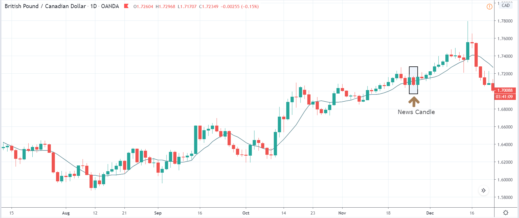
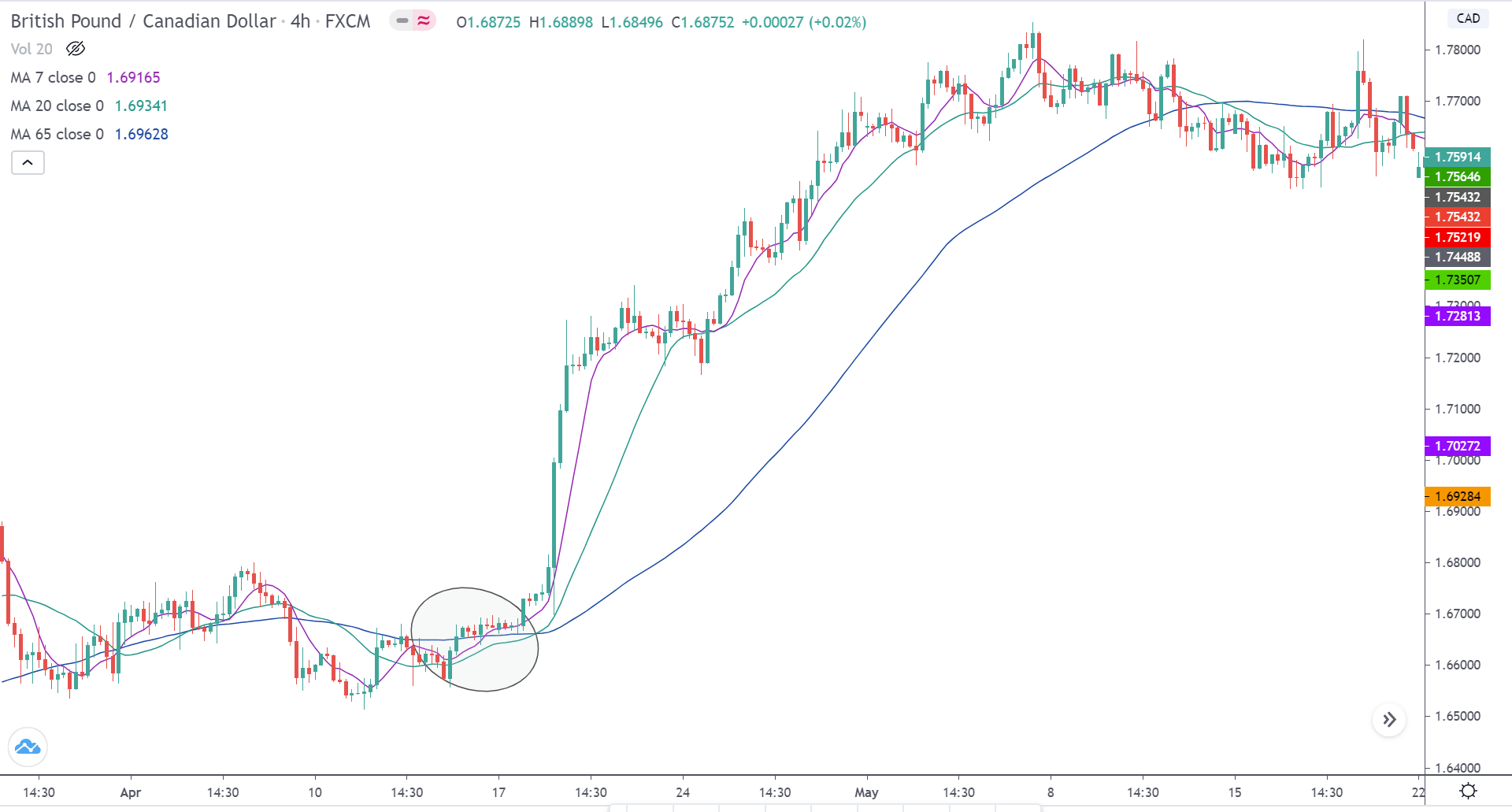
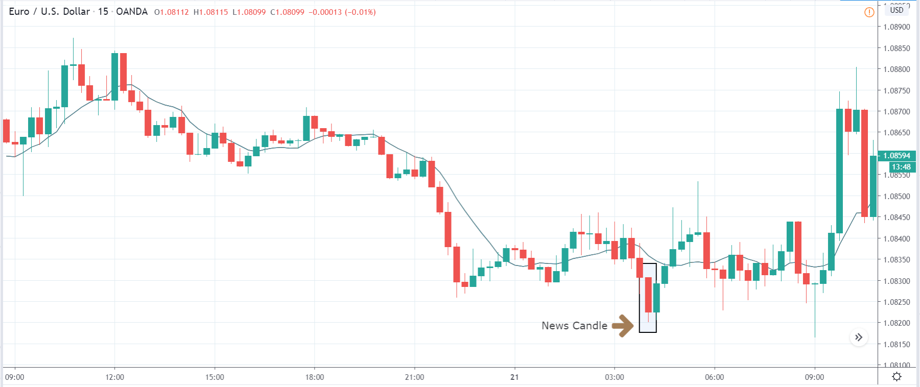
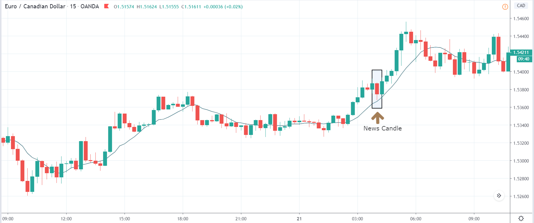
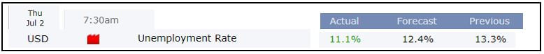
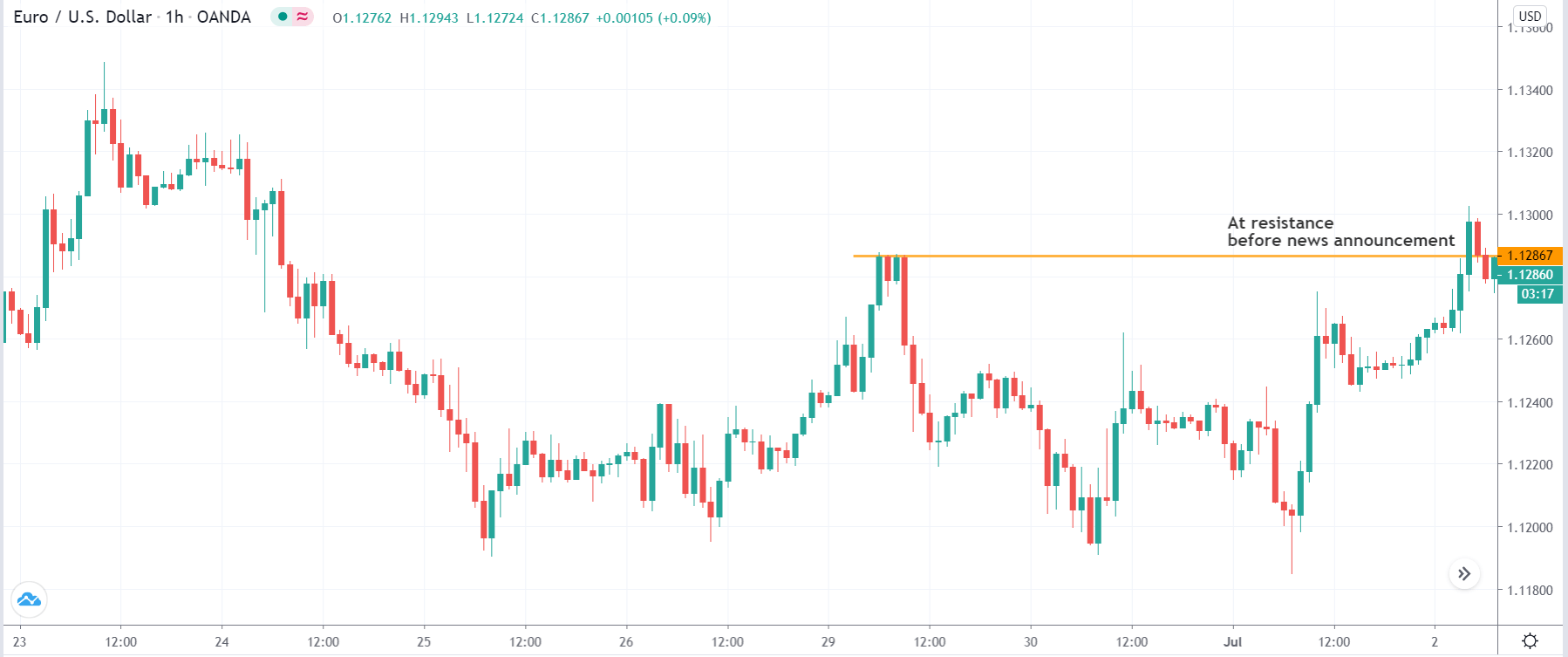
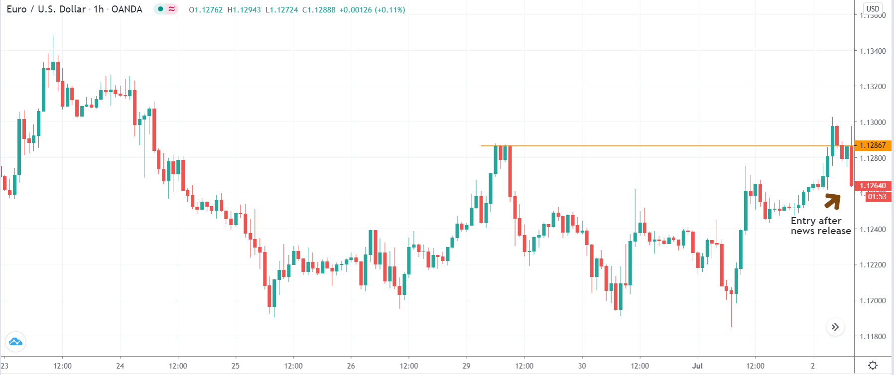
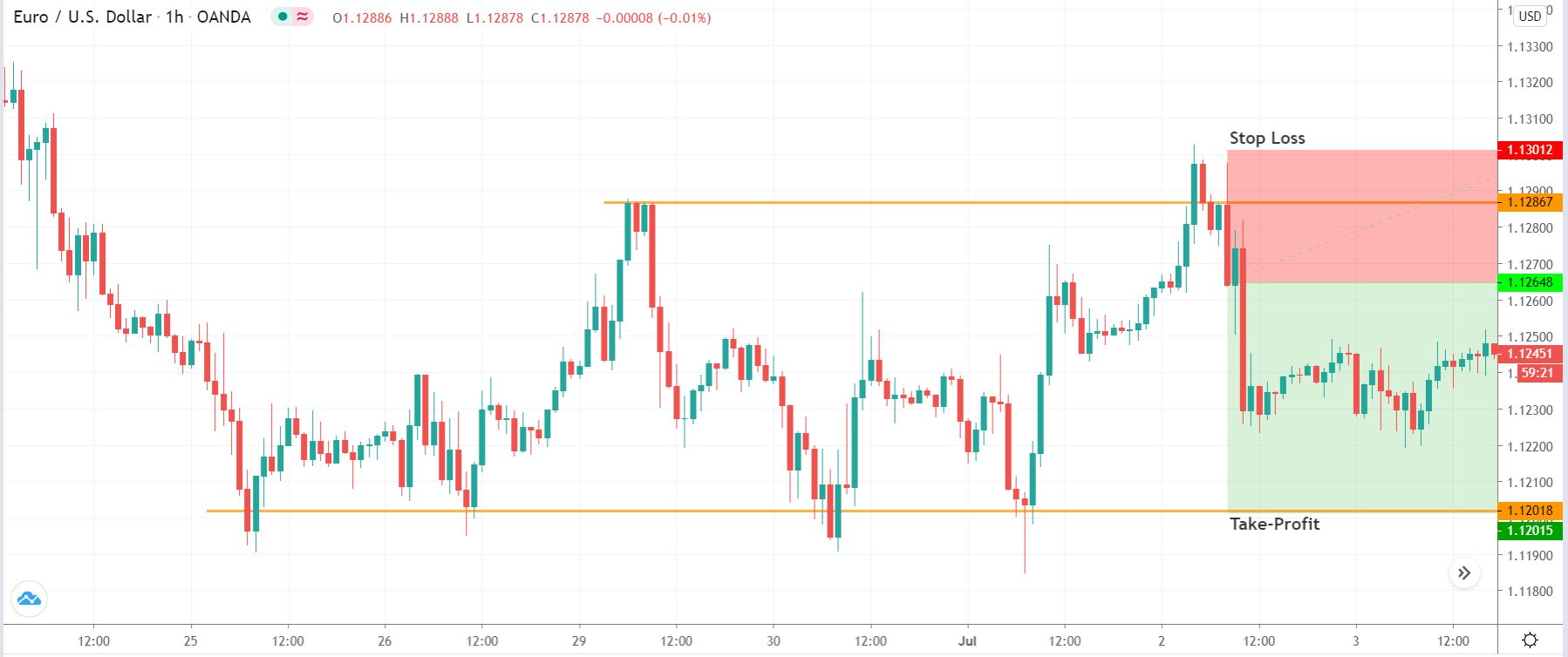
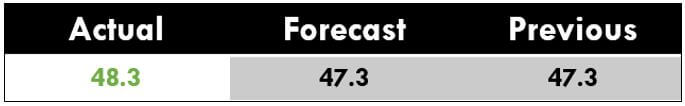
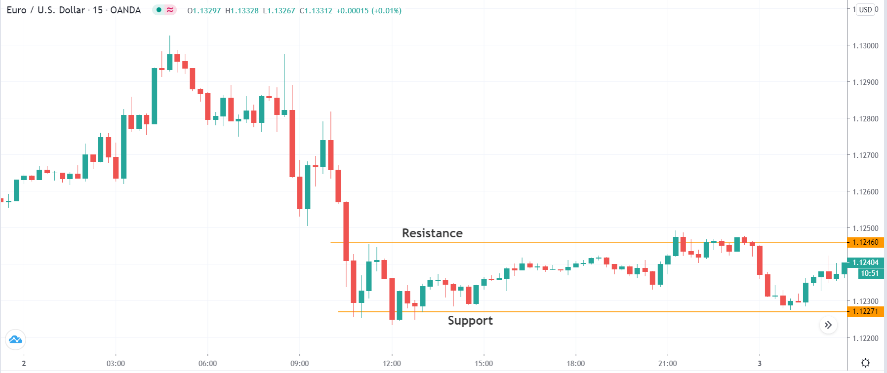
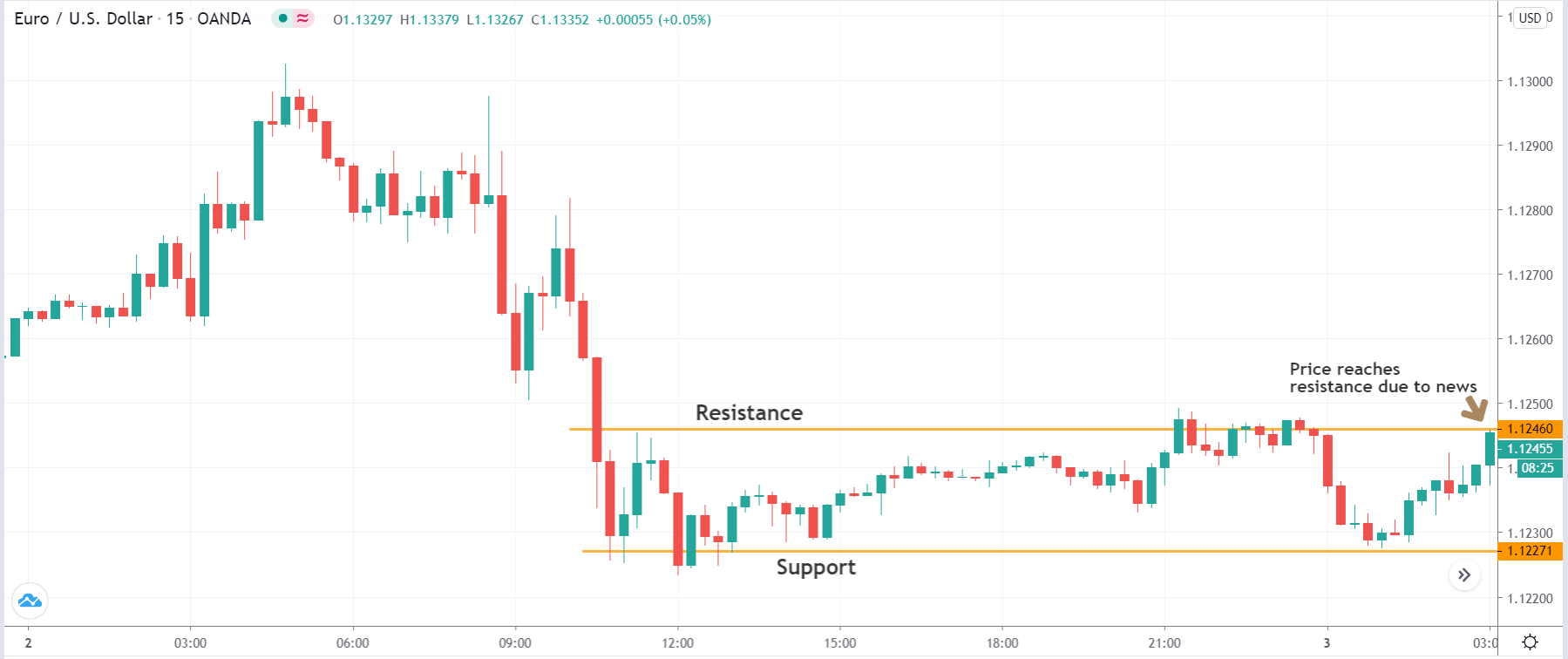
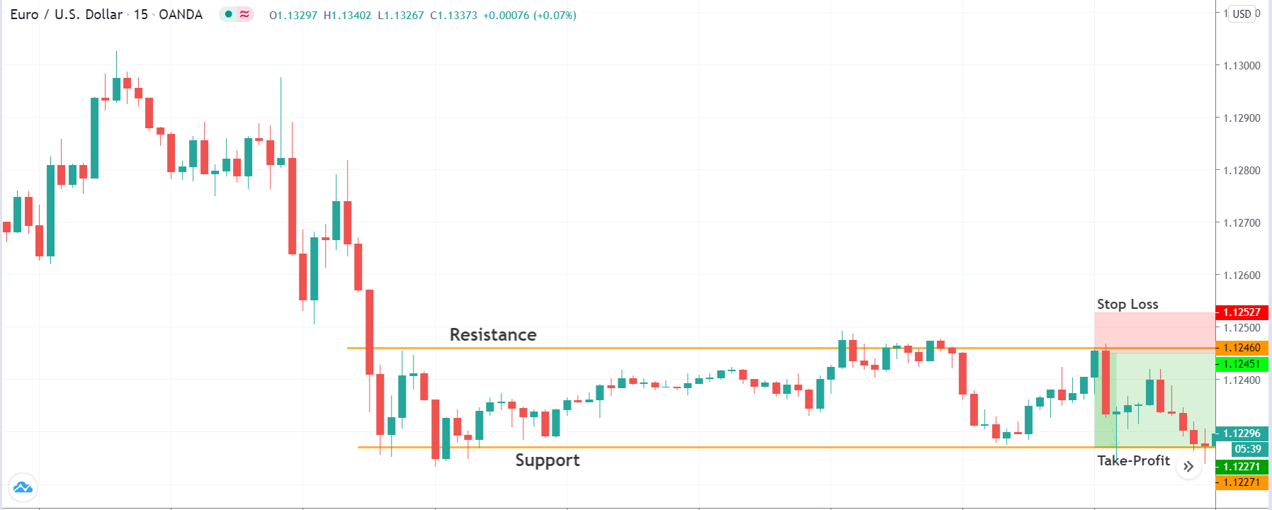
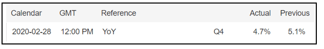
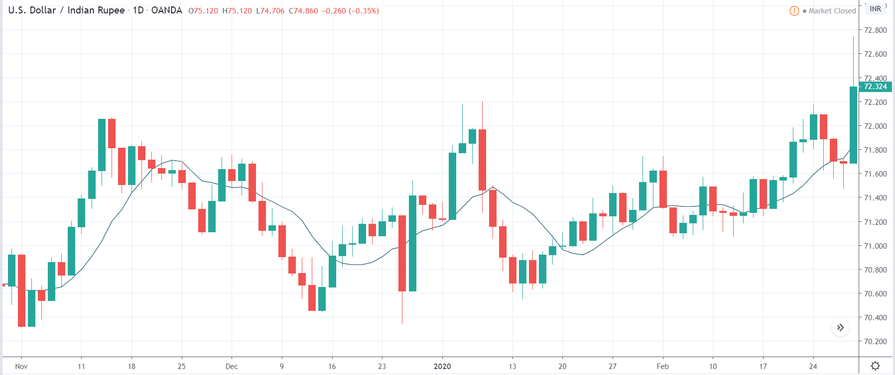
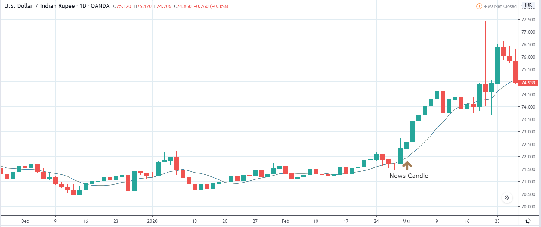
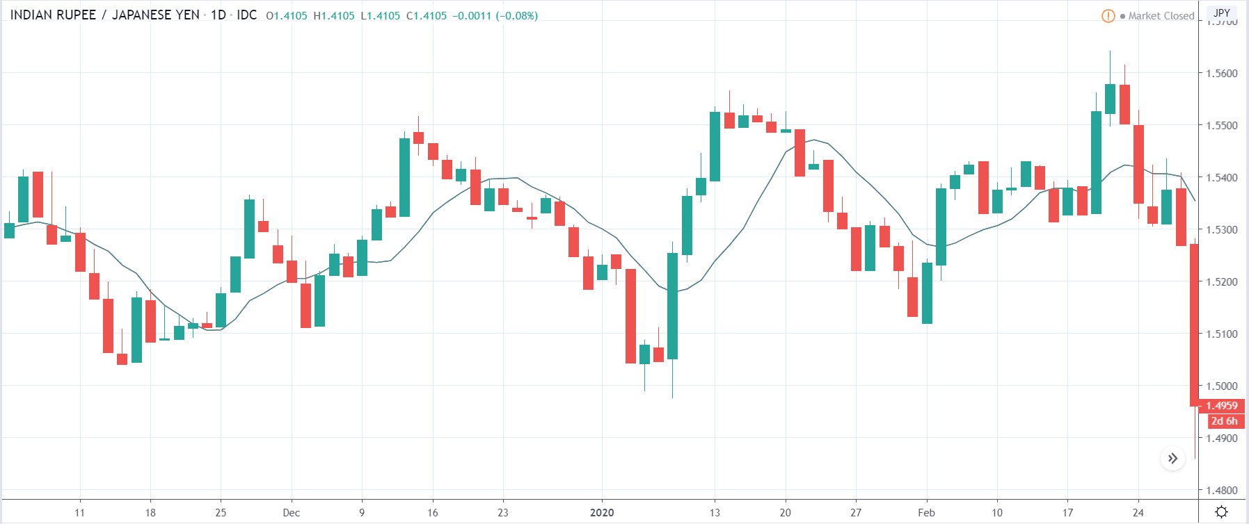
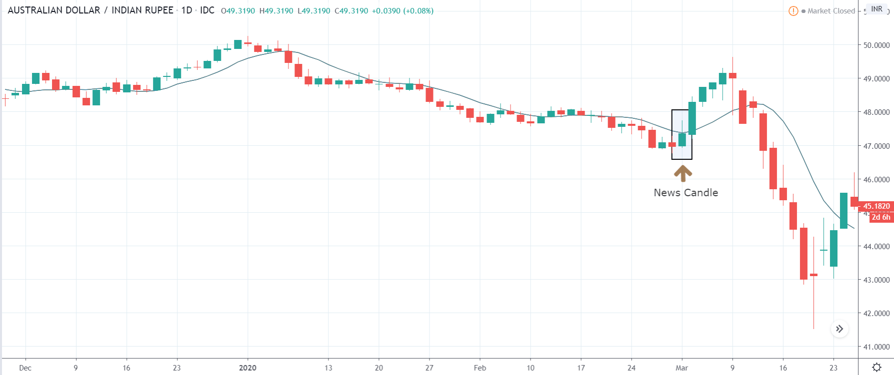
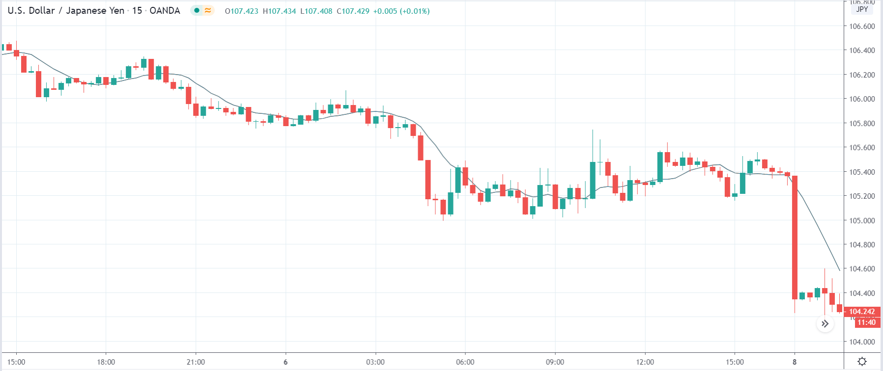
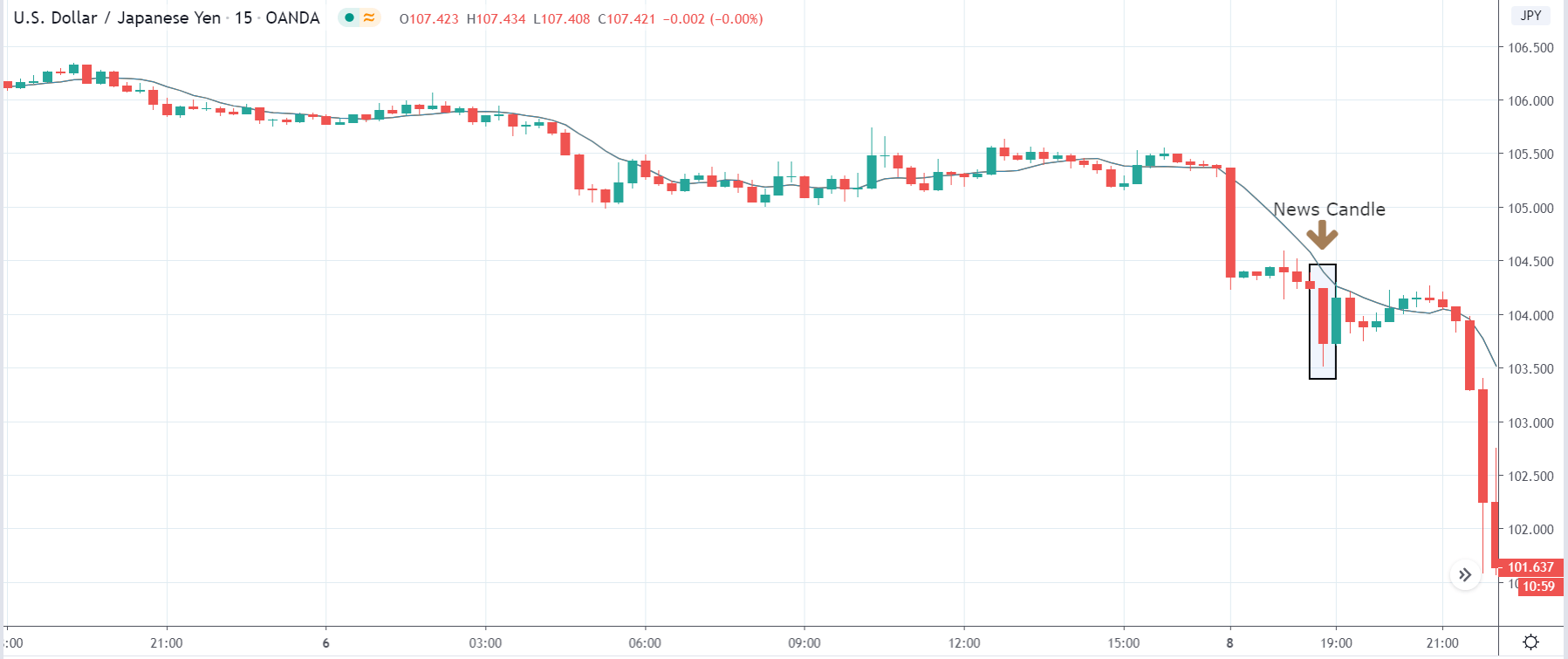
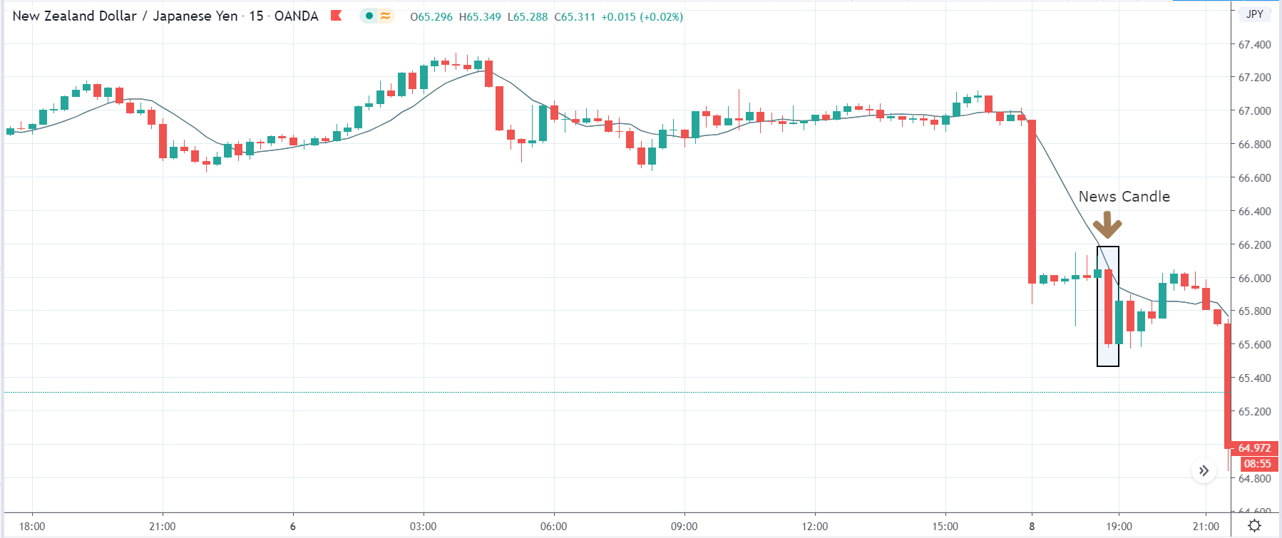
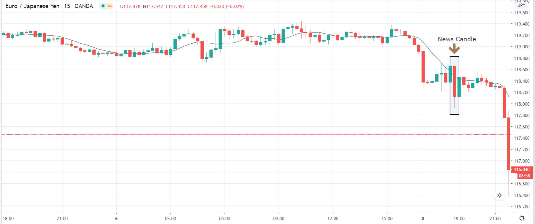
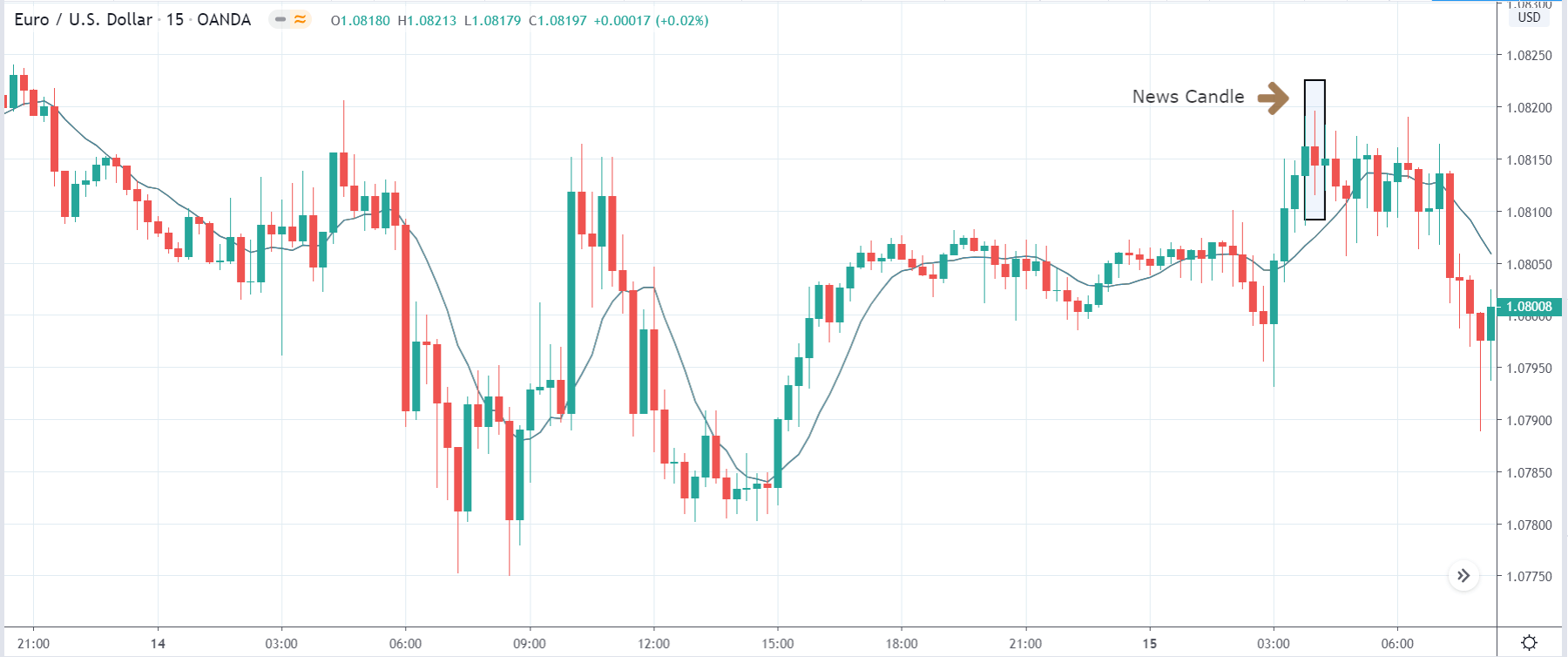
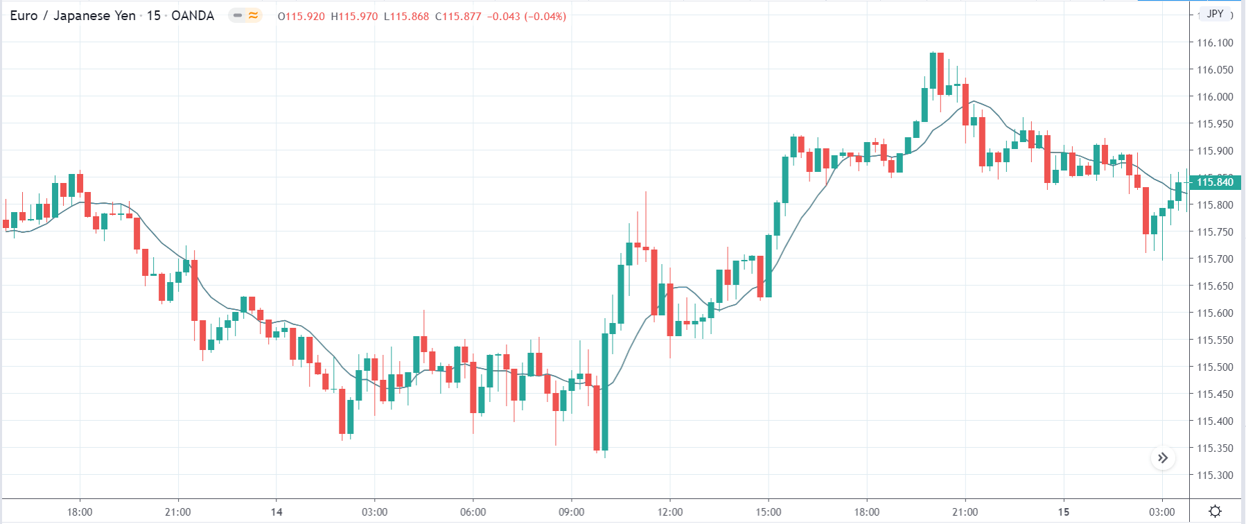
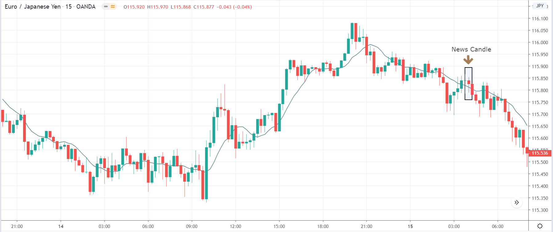
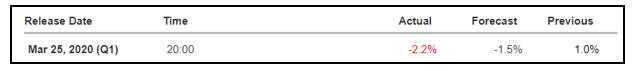
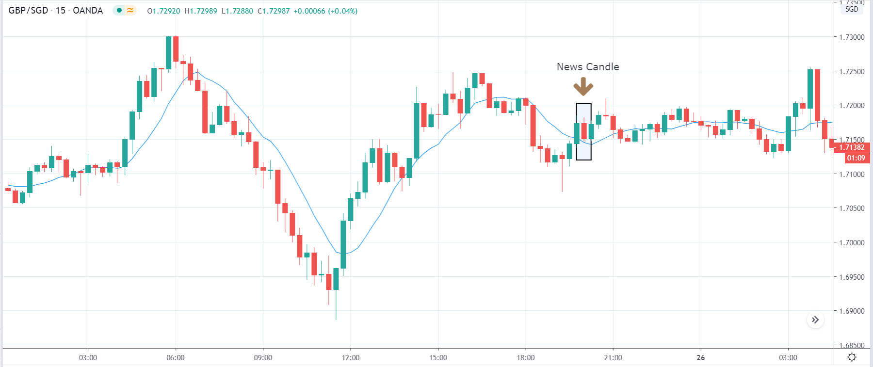
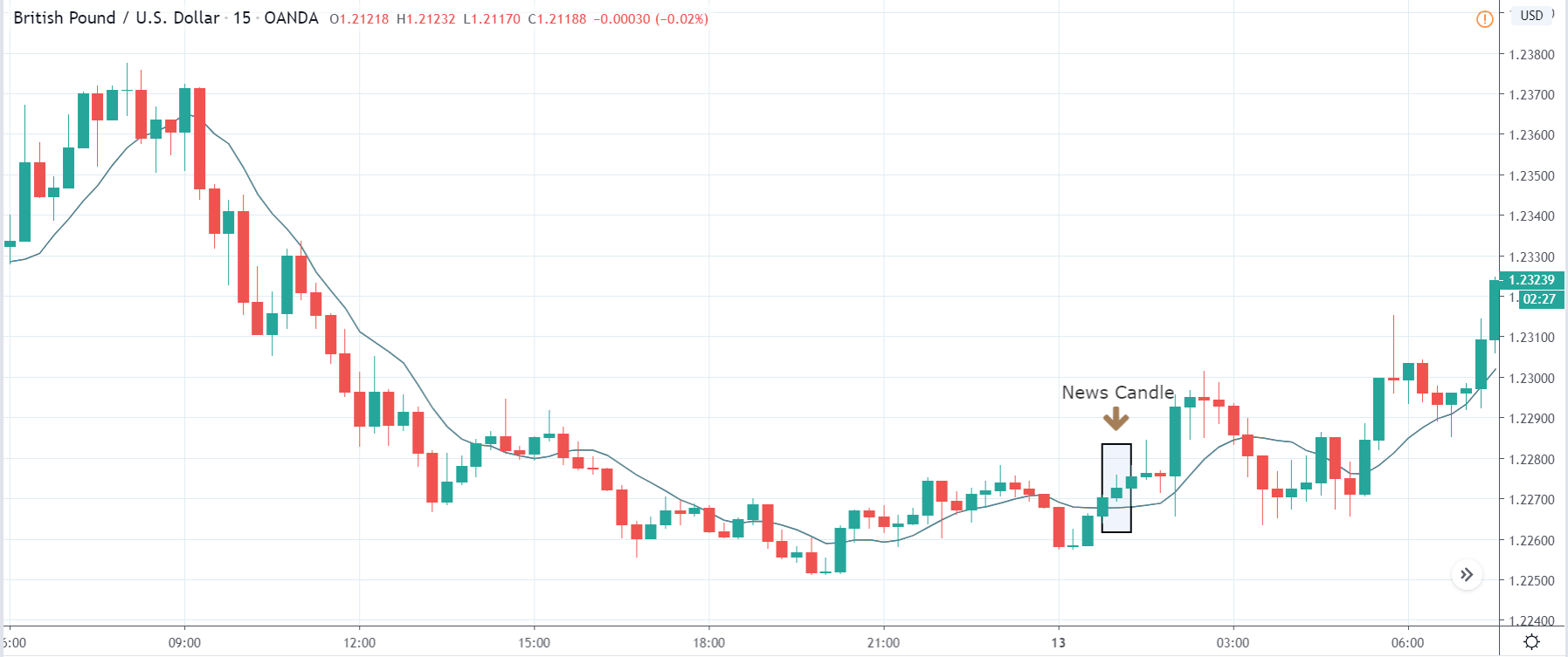
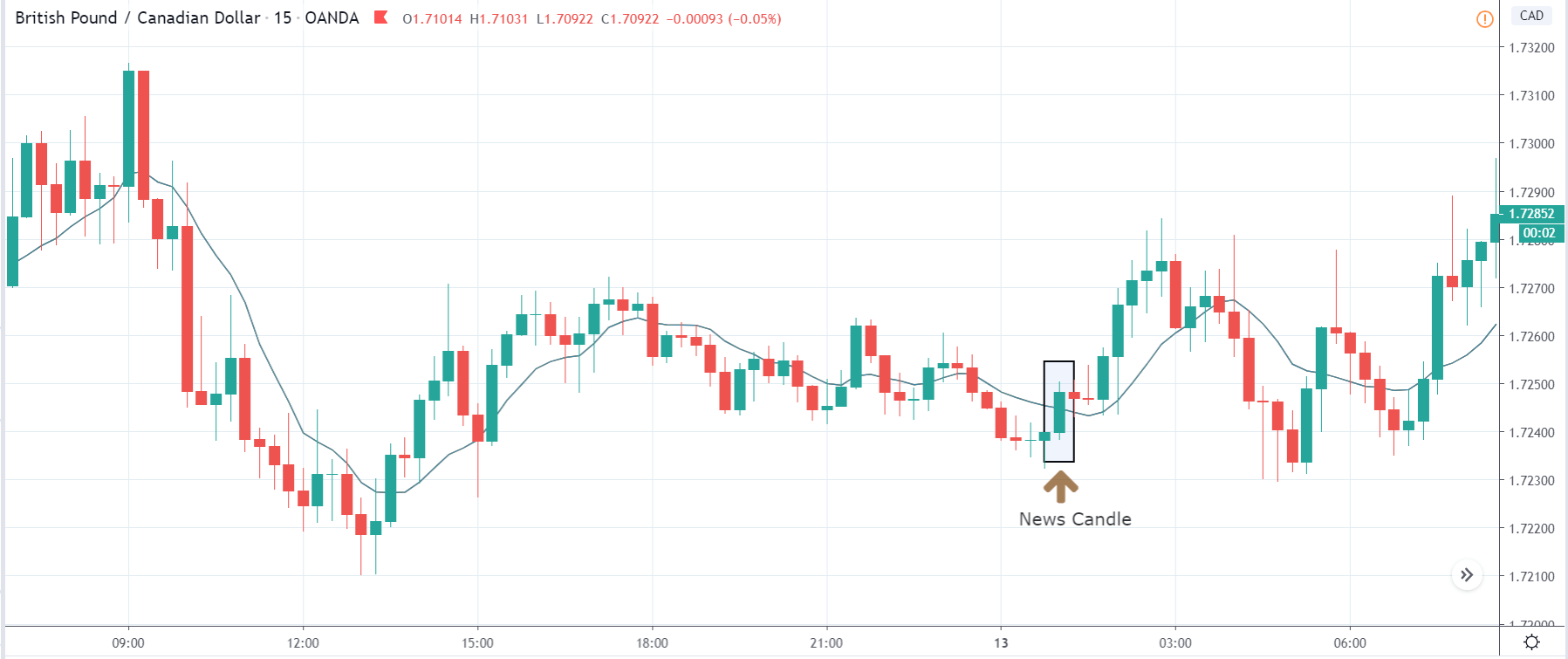
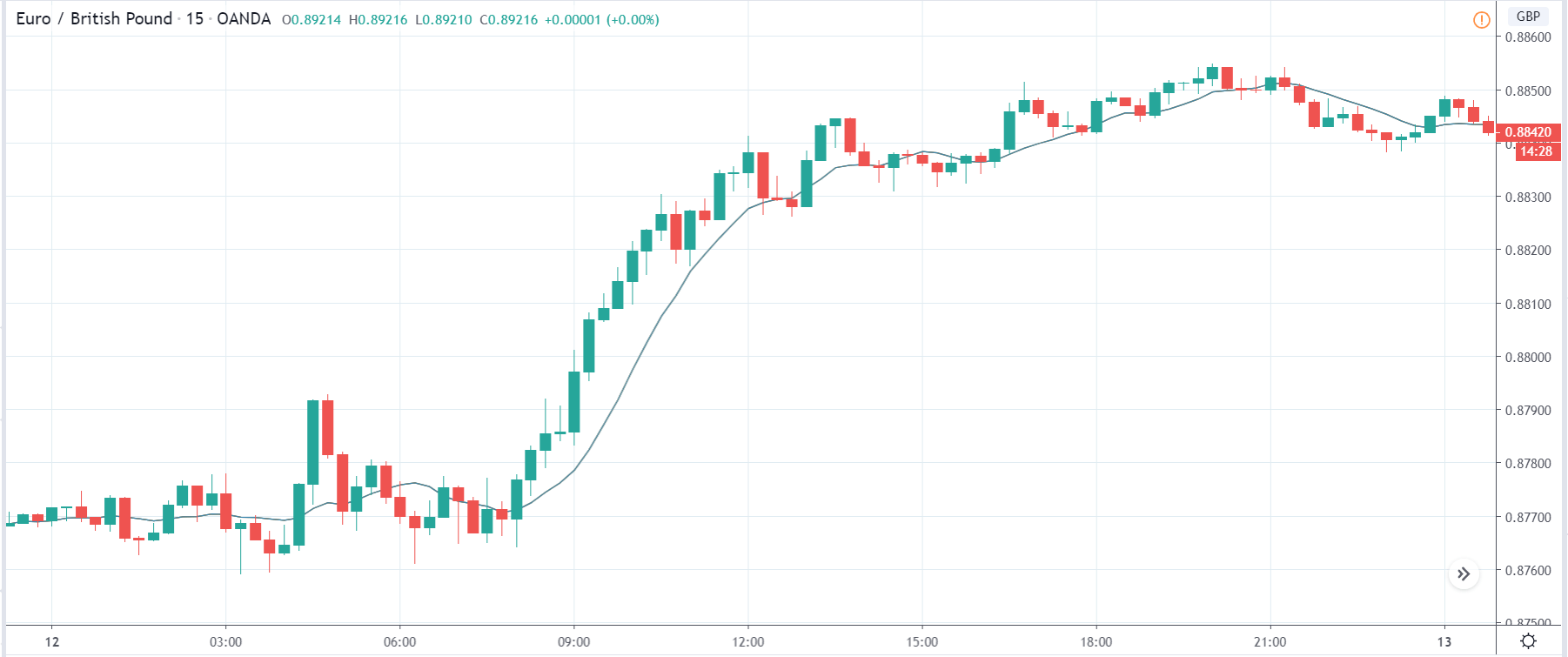
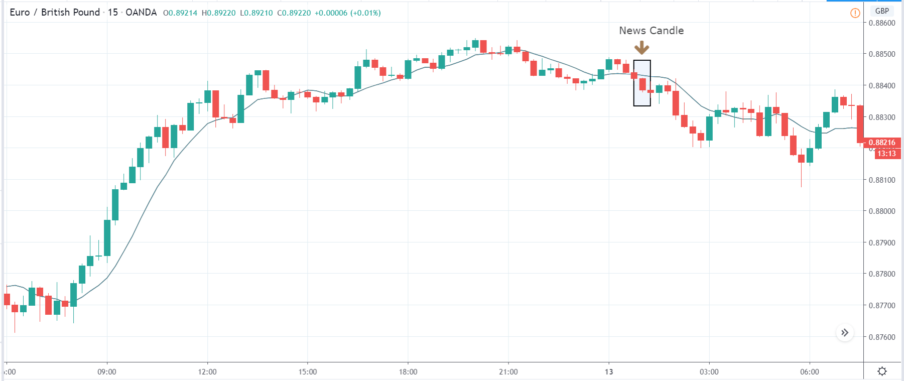
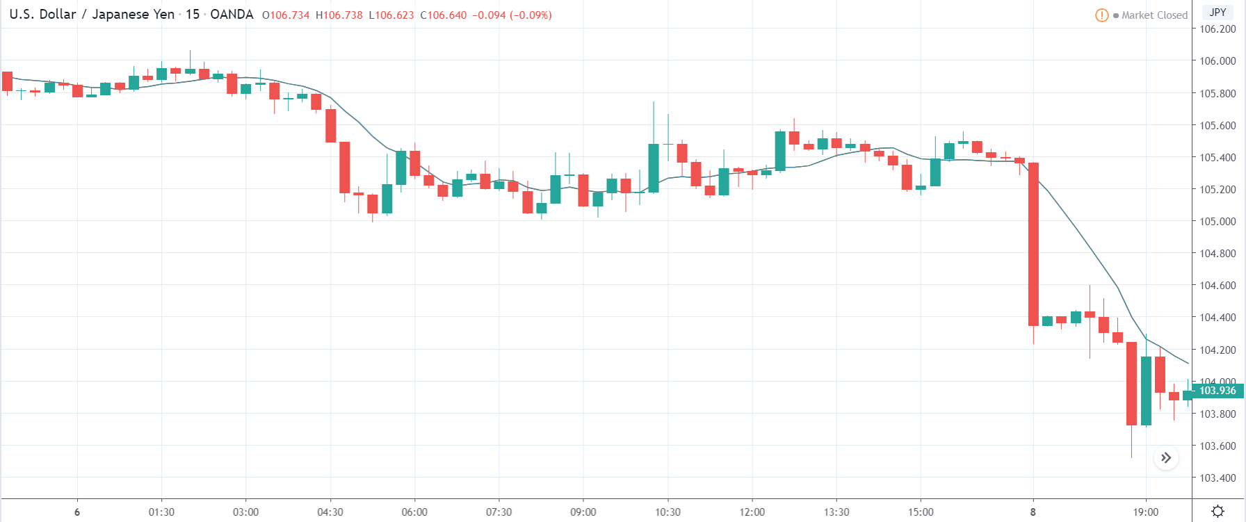
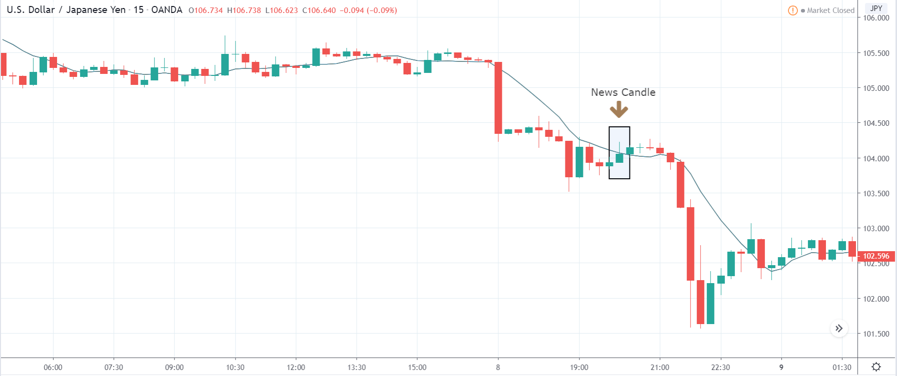
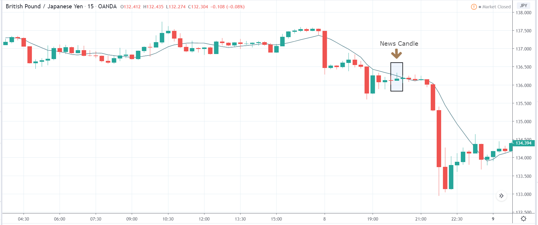
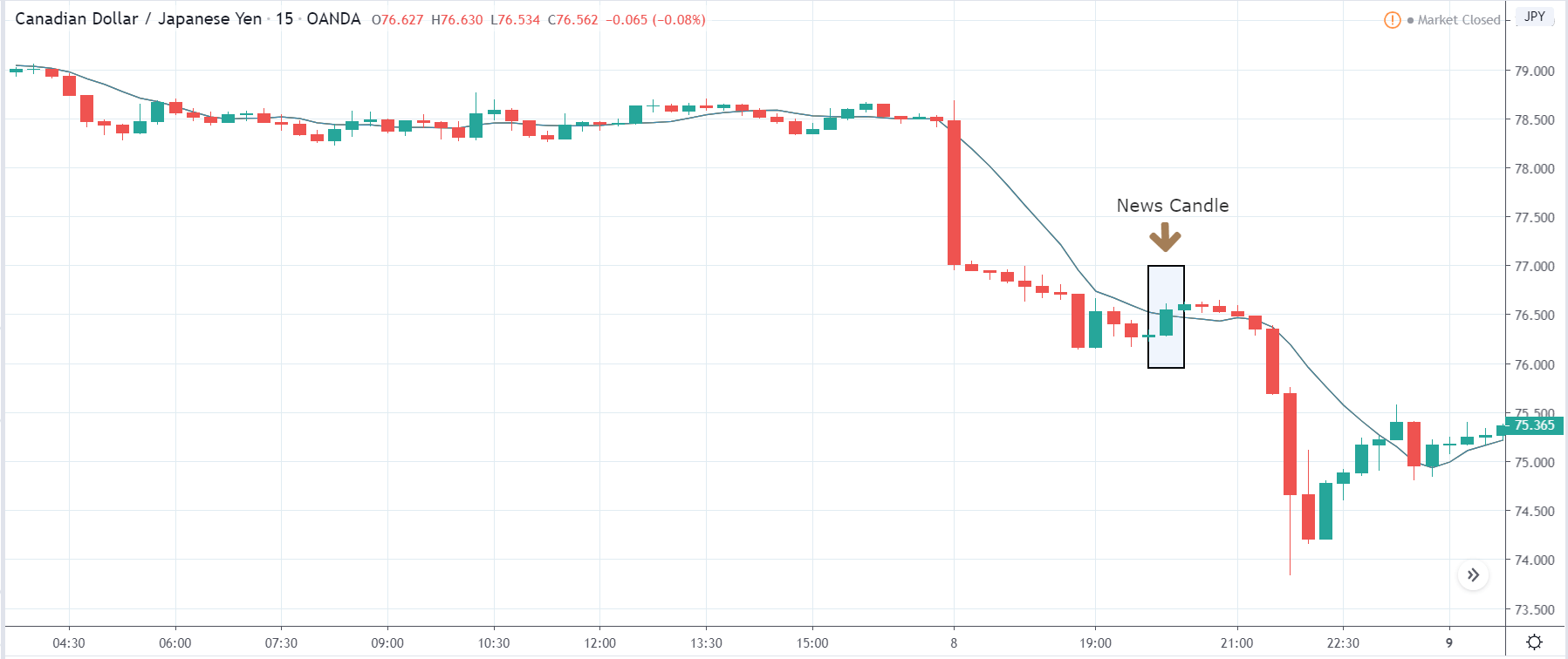
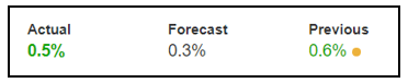
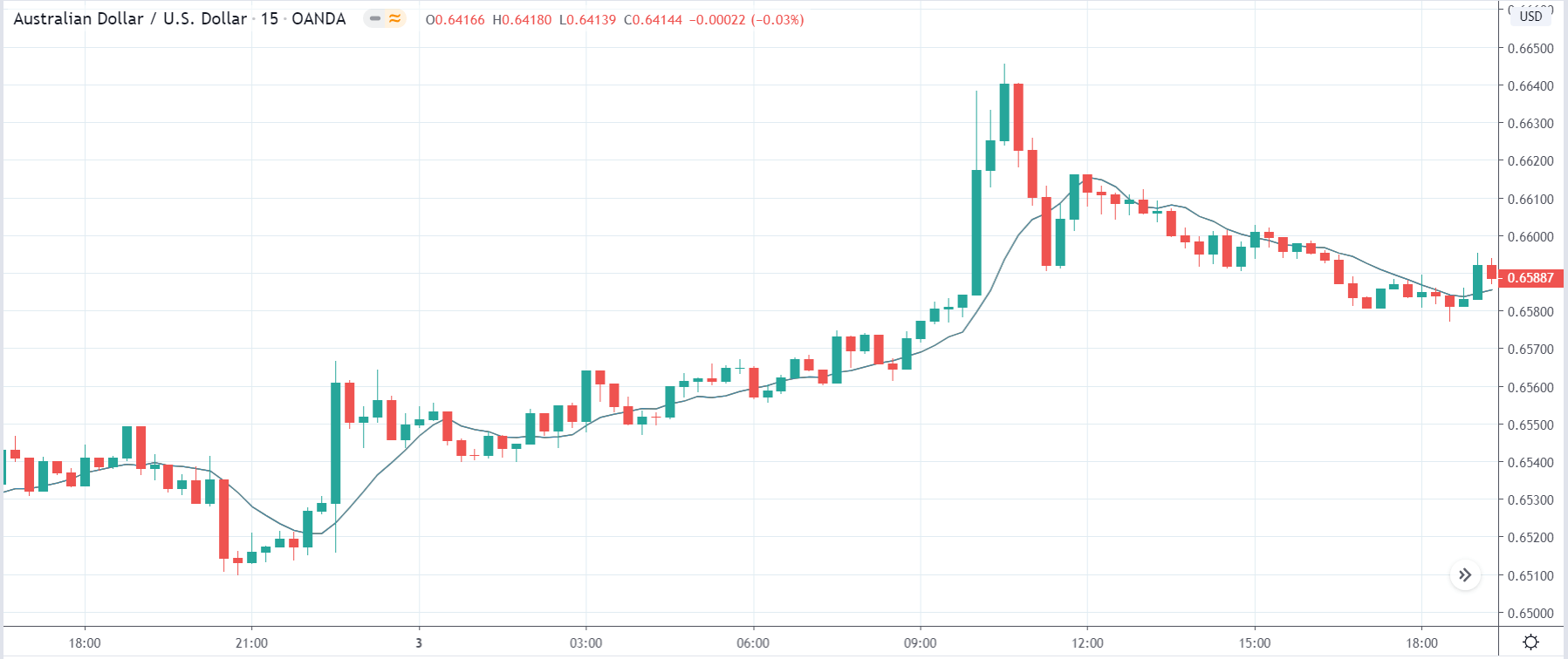
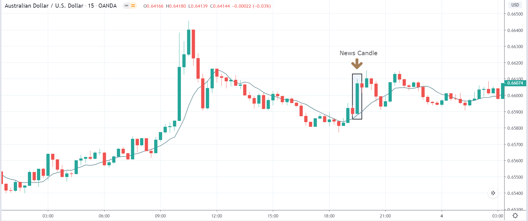
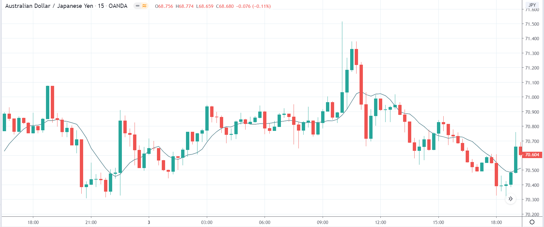
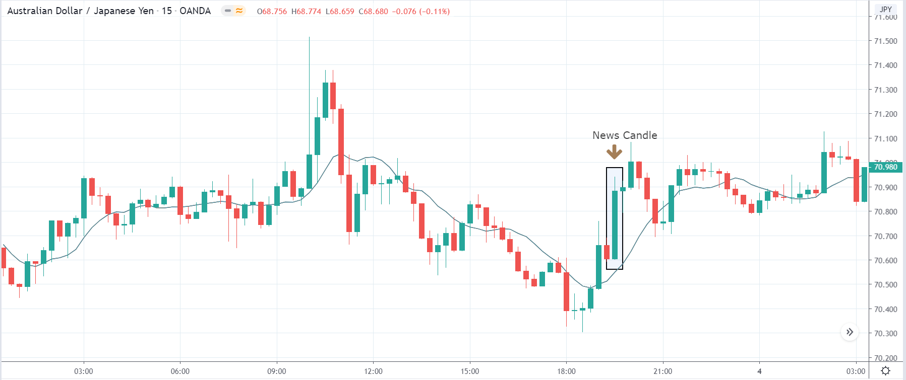
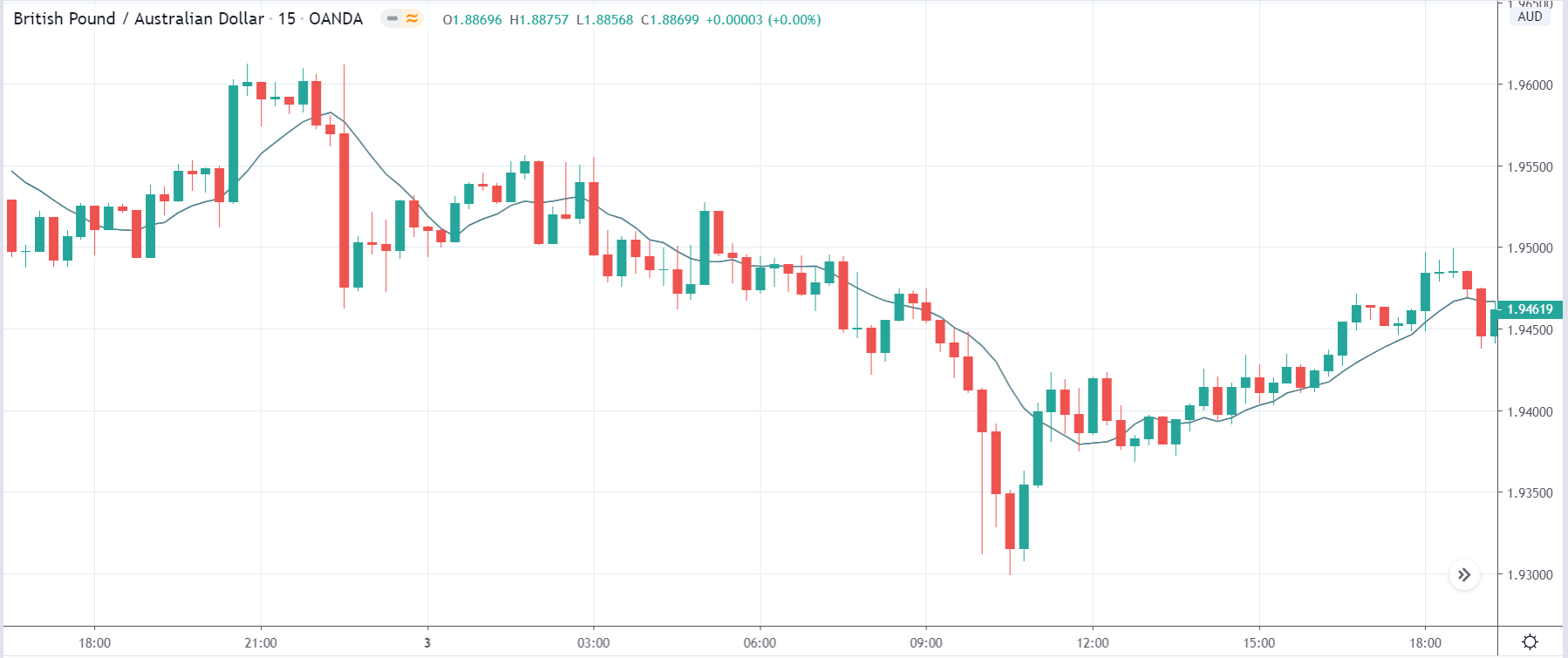
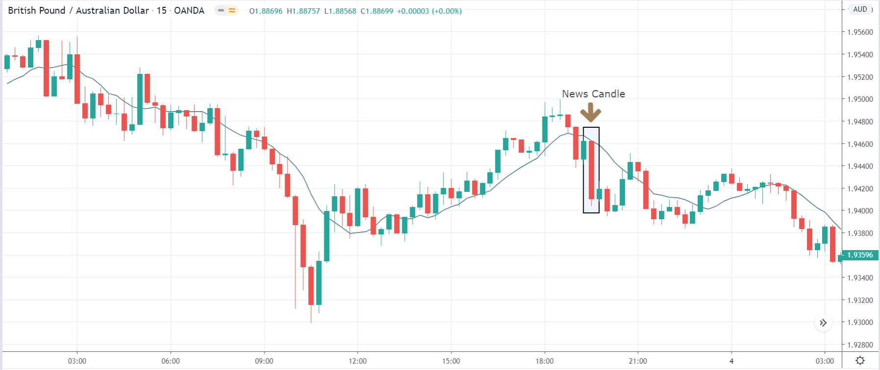
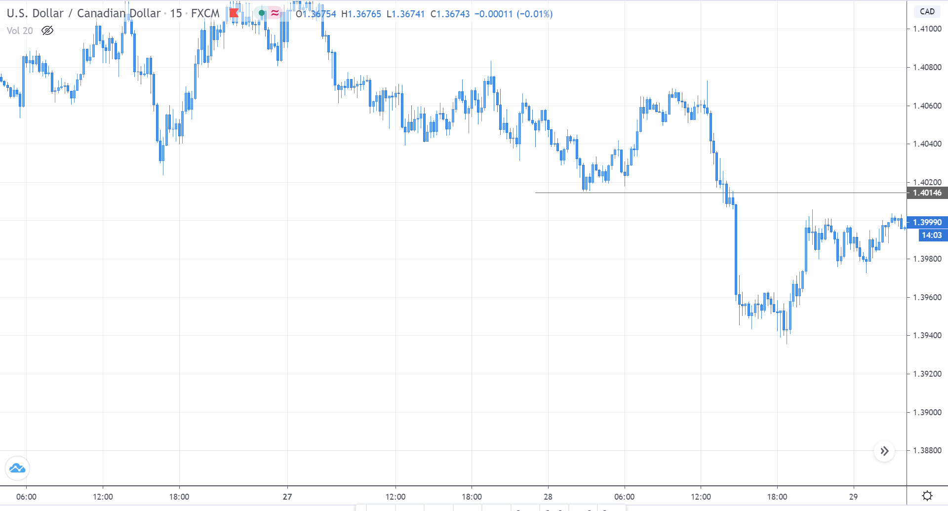
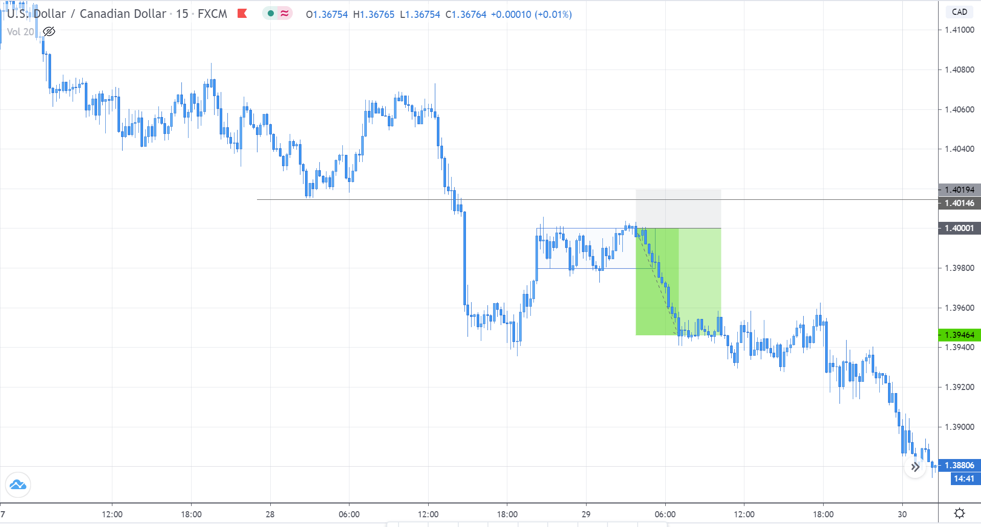
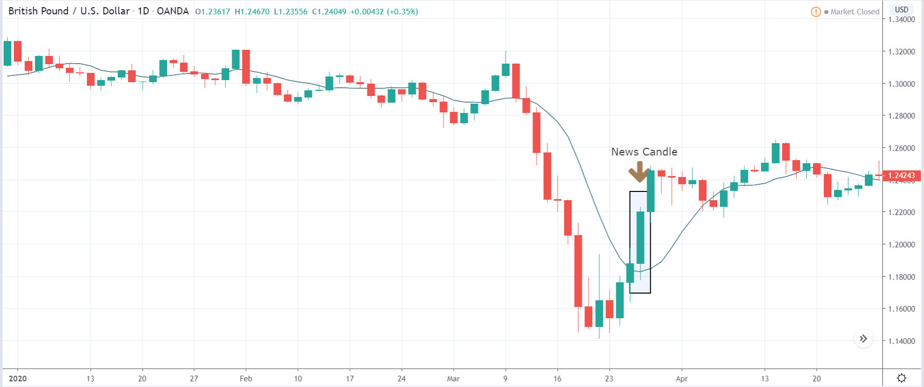
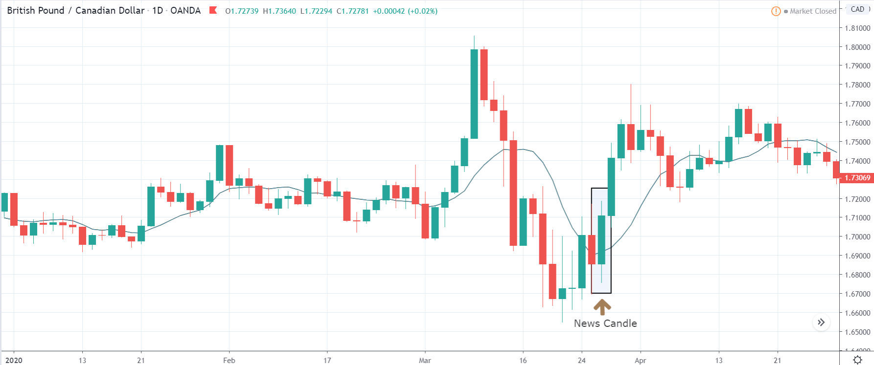
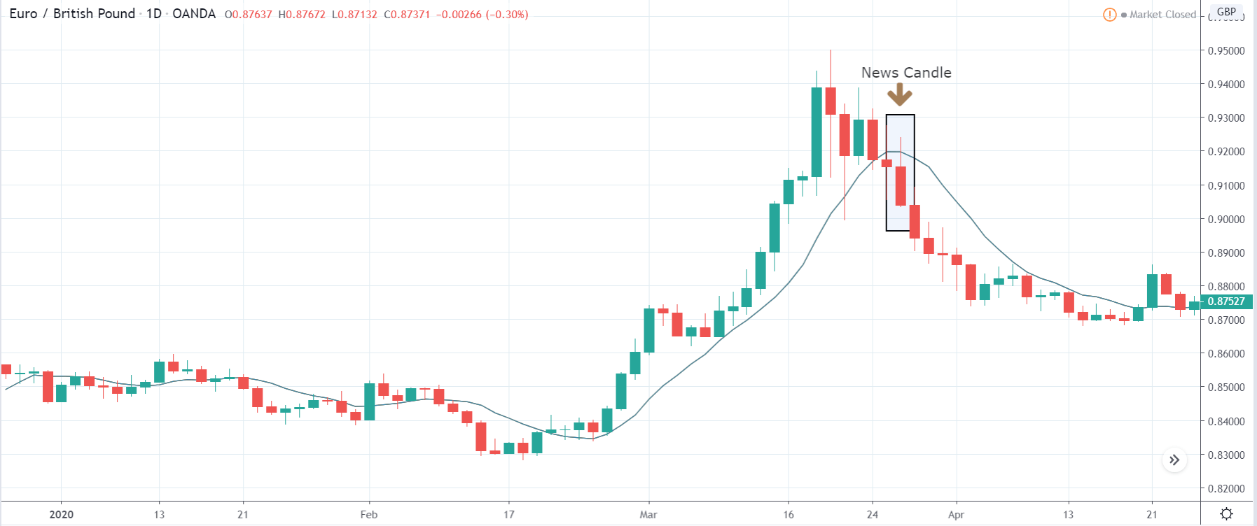
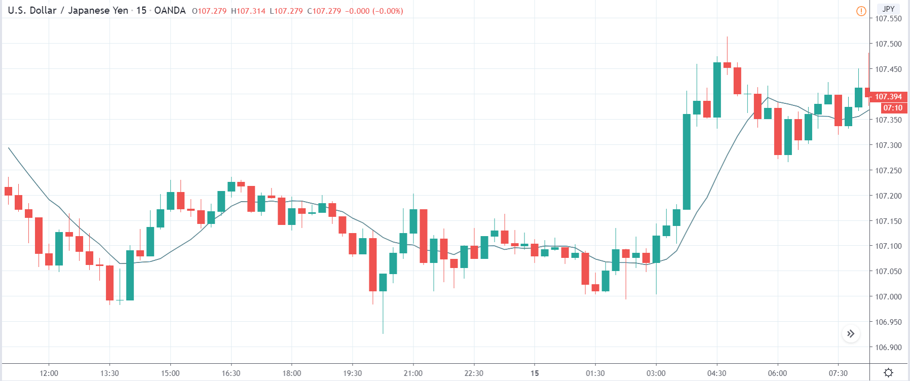
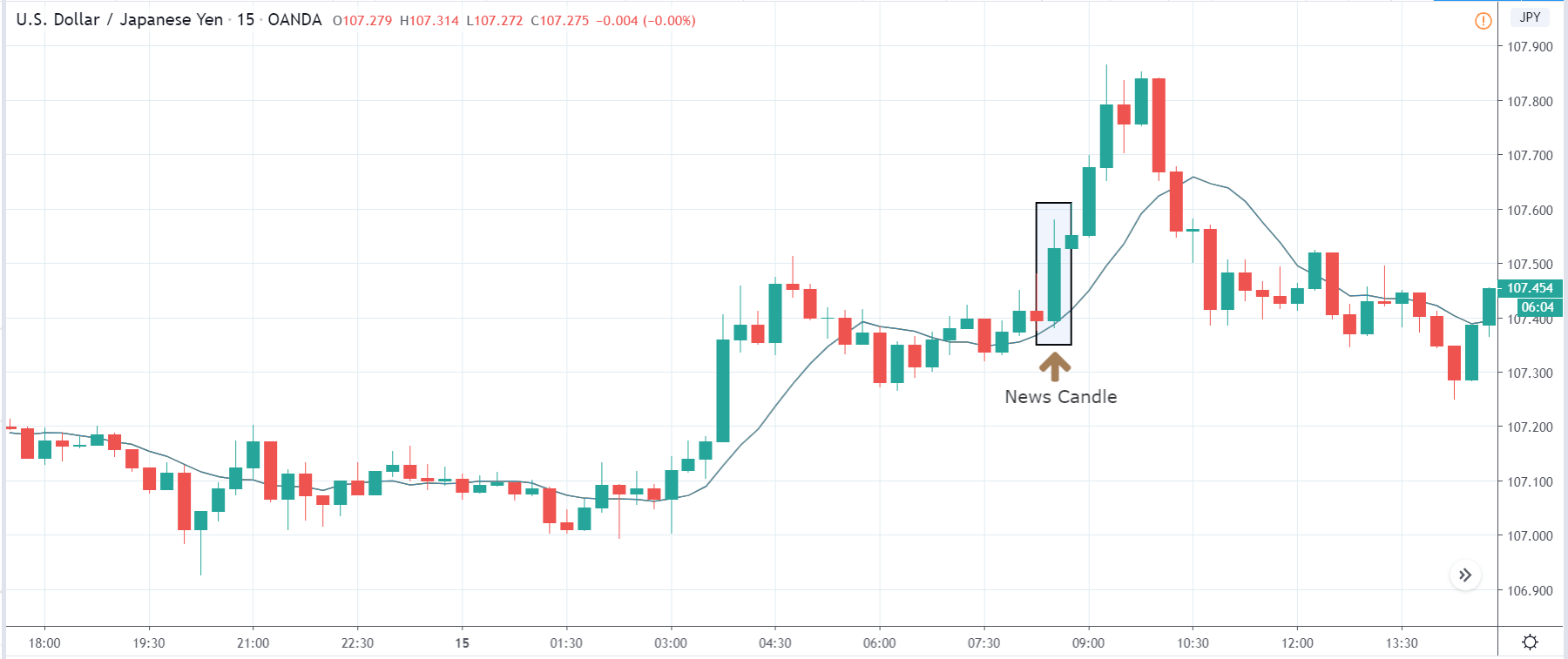
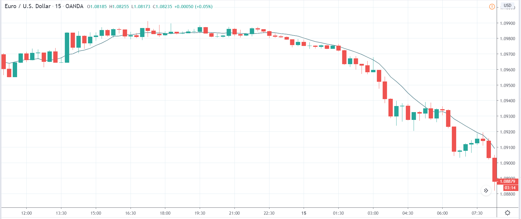
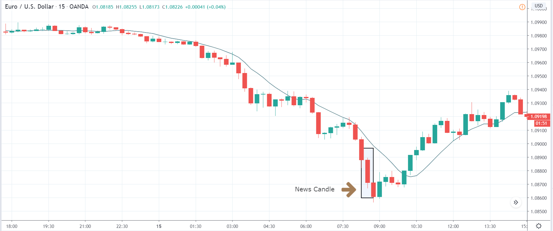
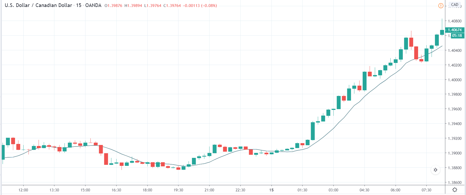
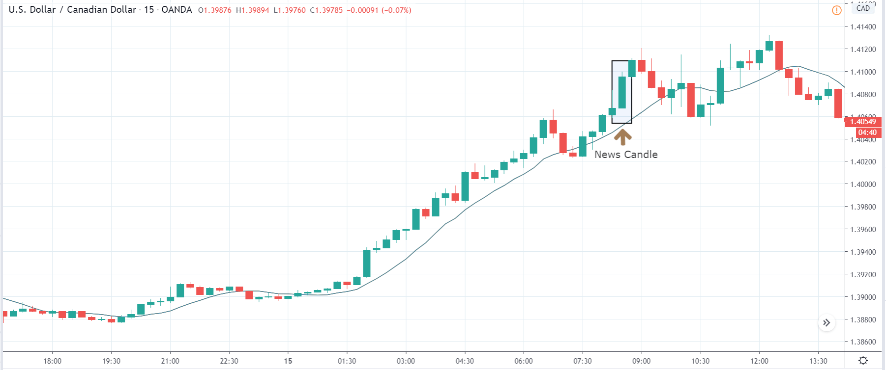
 In today’s lesson, we will analyze the impact of GDP on various currency pairs by observing the change in volatility before and after the news announcement. For that purpose, we have collected the GDP data of Canada, where the below image shows the month-on-month GDP data released recently. Let us find out the market’s reaction to this data.