Categories
Candlestick patterns

Practical Application of Candlesticks: GBPNZD Long

This is the second article in a series of articles highlighting the importance and effectiveness of Japanese candlesticks in your trade plan.

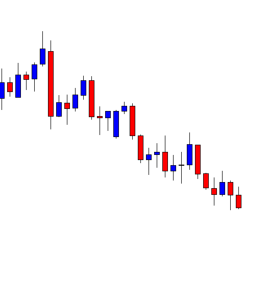
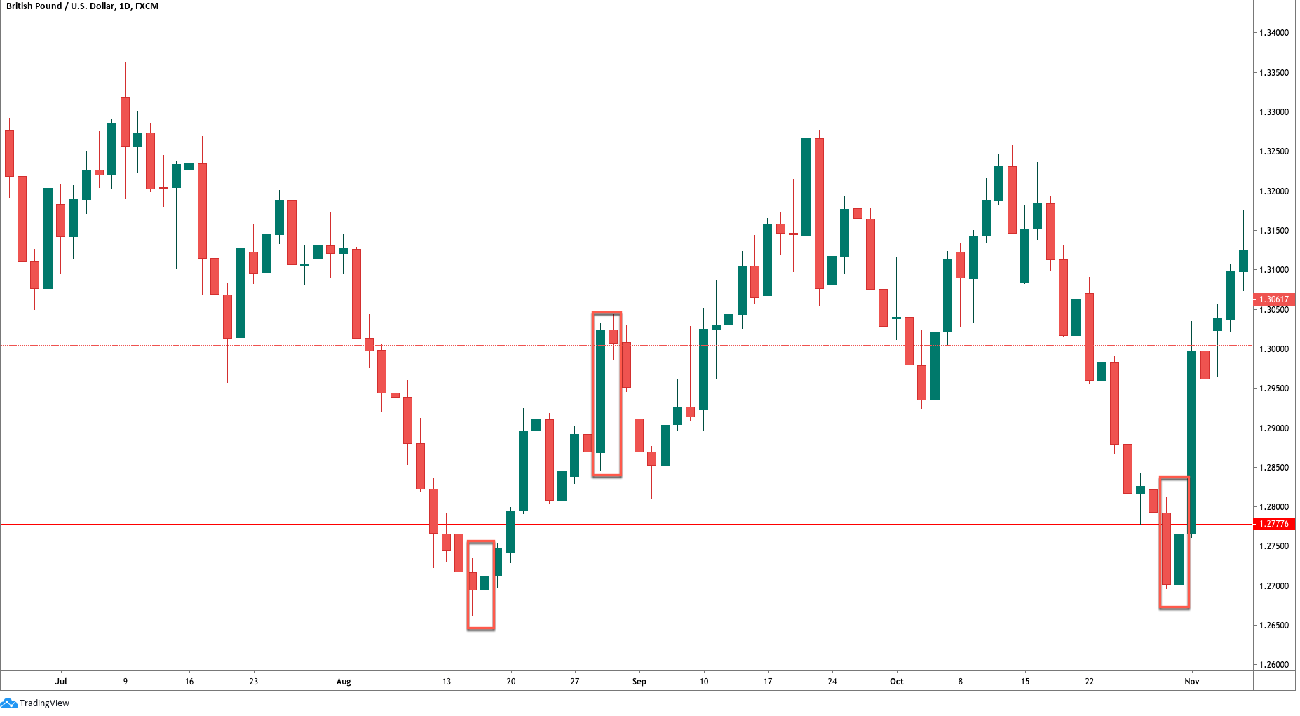
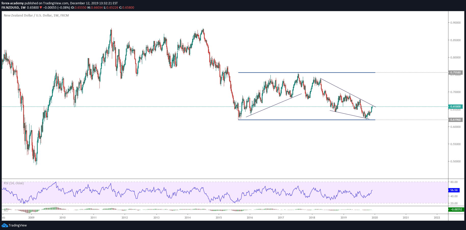
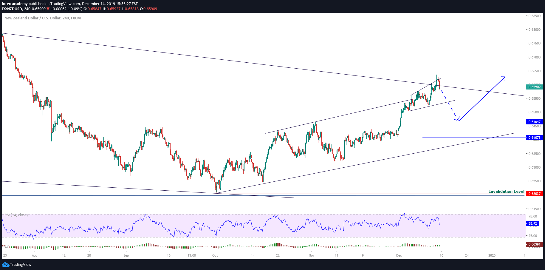
Chart 1 – Original Trade Idea

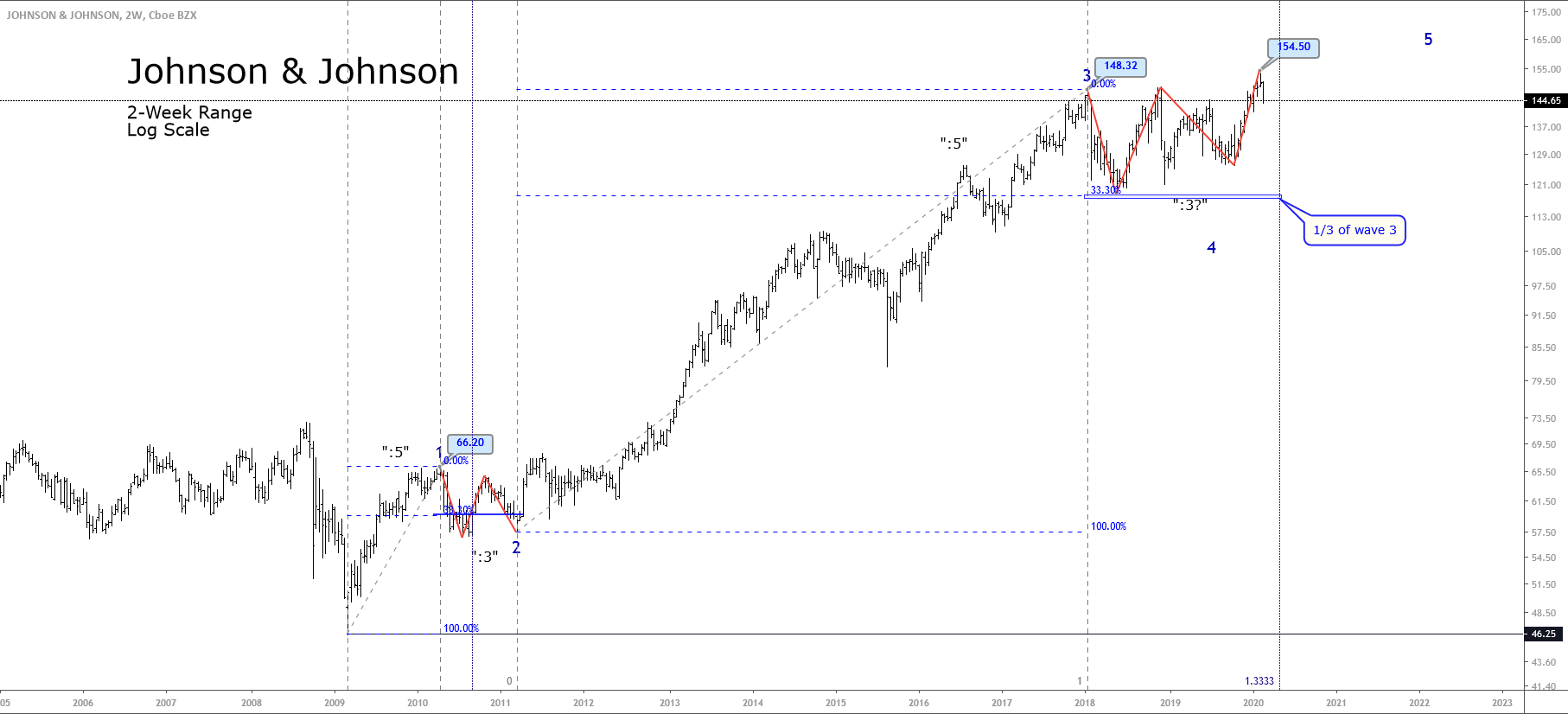
If you haven’t read my first article in this series, you can read it here. That first article describes my approach to trading and how I identify trade setups. The trade I took back in December 2018 to go long on GBPNZD was one of the best performing trades I’ve had in the past two years. It remains a great trade! I wrote the following as justification for my trade idea.

Dec 12, 2018

Holy 2,000+ pip trade batman

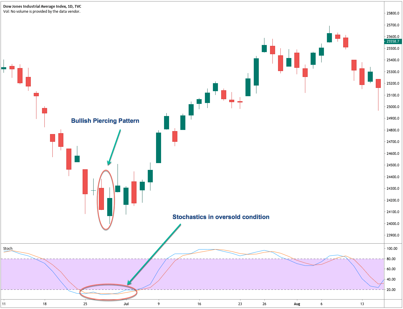
The GBPNZD pair has a massive upswing potential, with little risk. And I’m just talking about a move to the center of the linear regression channel.

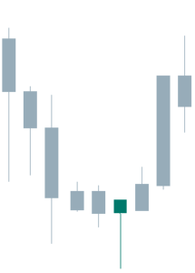
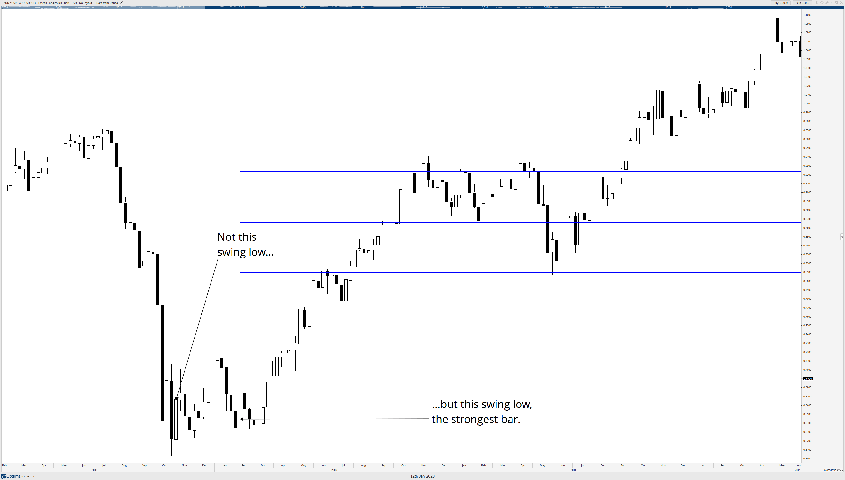
  1. The weekly chart shows two hammer candles – with the current week showing strong buying from the lows. Massive buying actually – firm rejection lower so far.
  2. The Chikou Span/Lagging Span is right near the bottom of the cloud – the probabilities of the Chikou Span just crossing below the bottom of the cloud on a weekly chart is very little, especially given that we’ve had ten weeks down without any meaningful retracement.
  3. YUGE bullish divergence that goes from July of 2017 to the present weekly low. It’s ridiculous.

This could be one of the biggest trades I’ve ever made – and the realistic target is 2,000 pips above, and the risk is only 275 – I’ll take those odds. And it’s very probable we trade higher than the center of the regression channel.
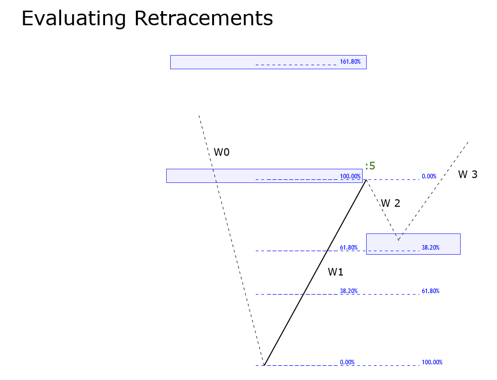
 

Using Candlesticks

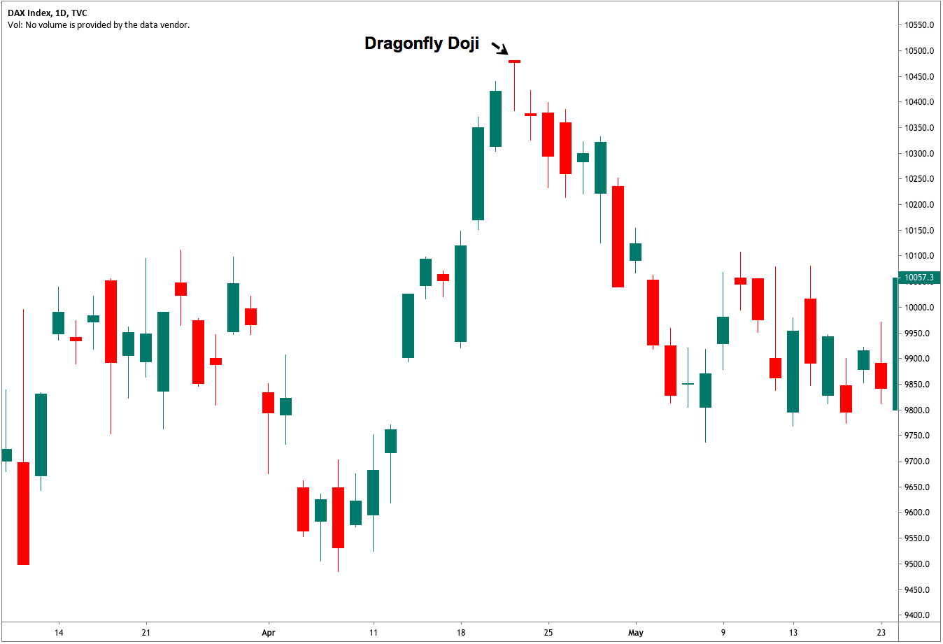
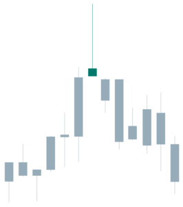
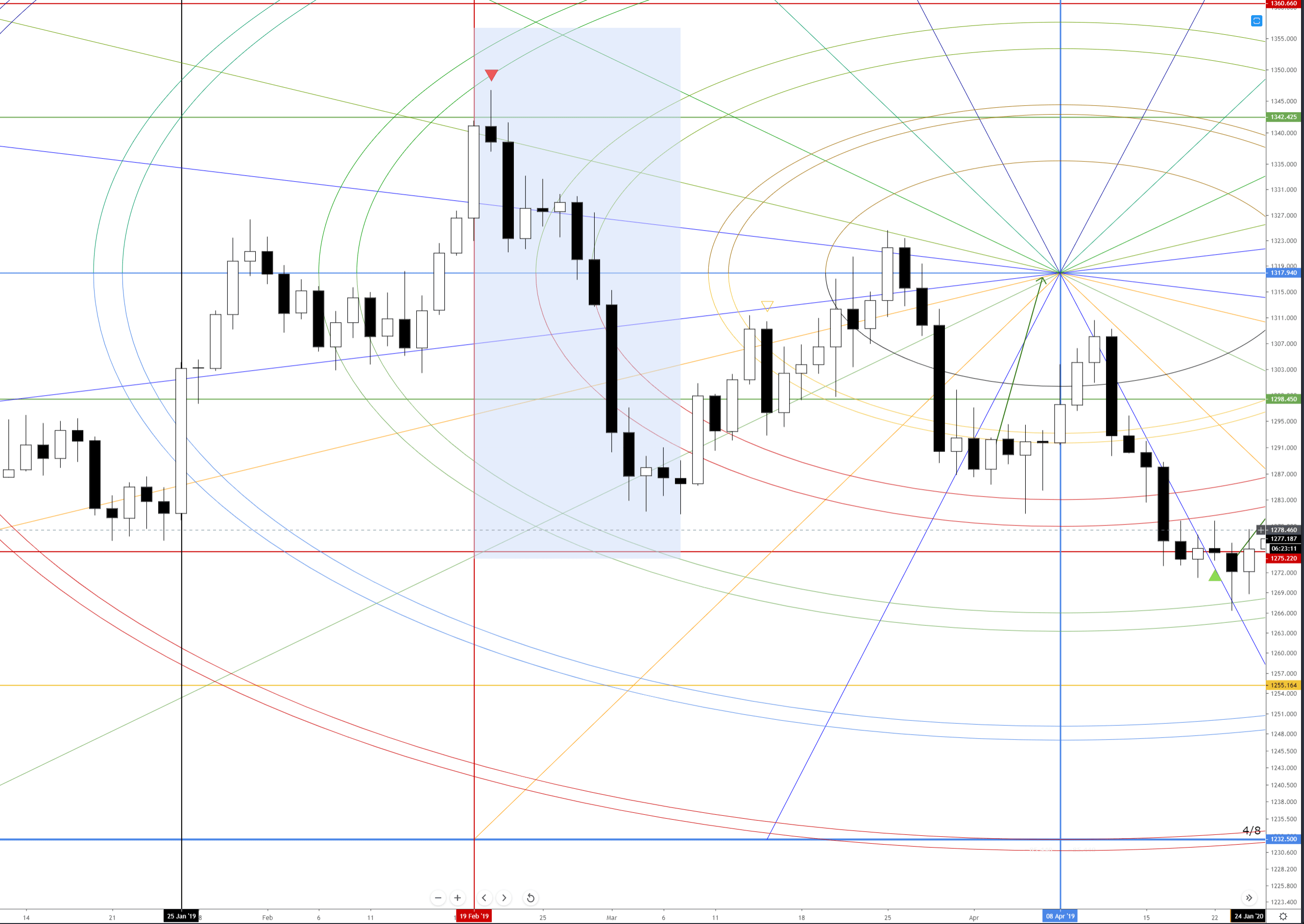
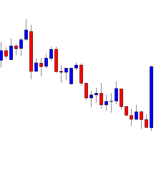
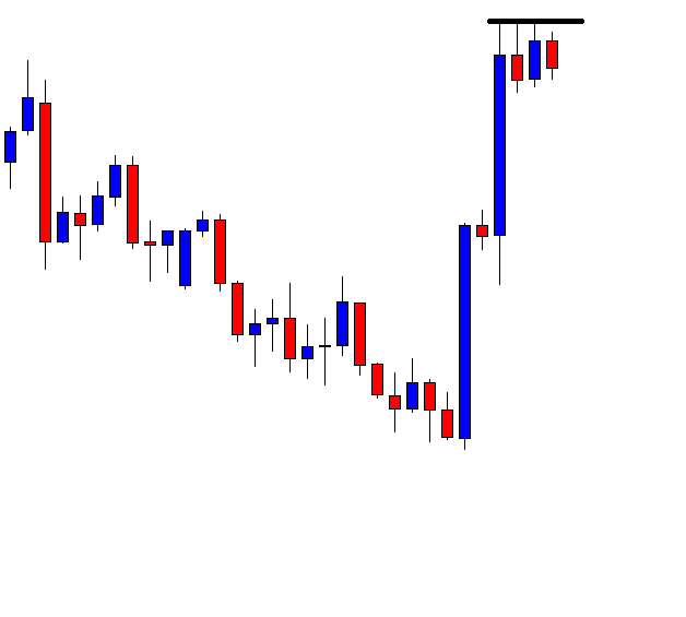
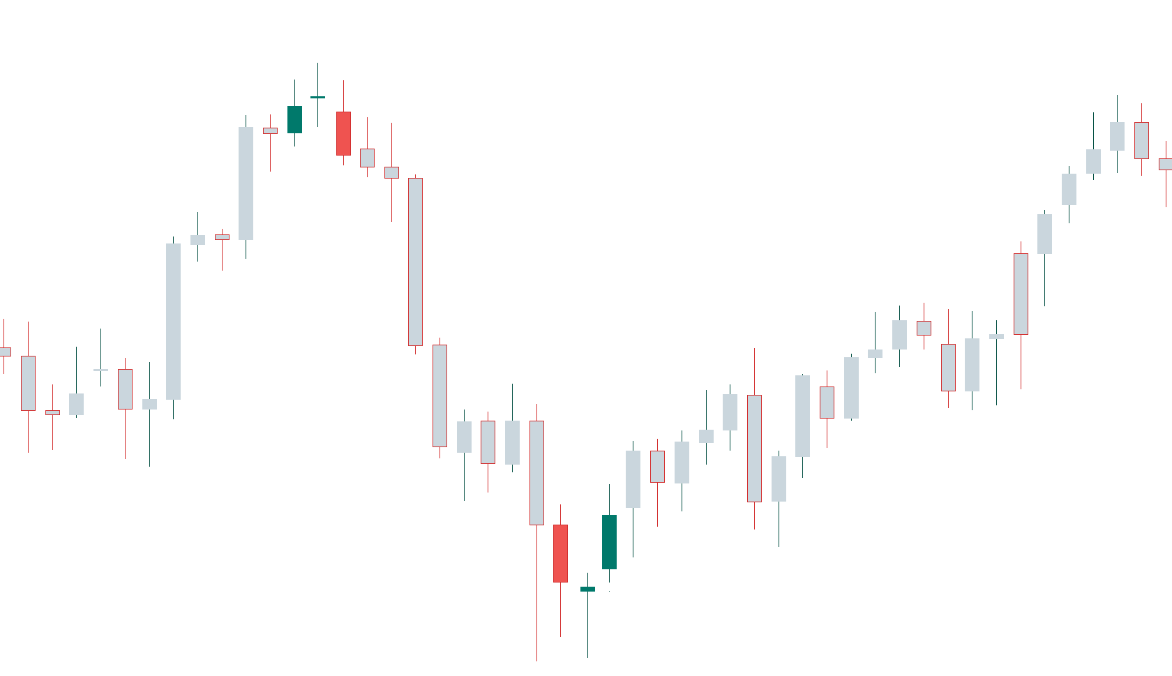
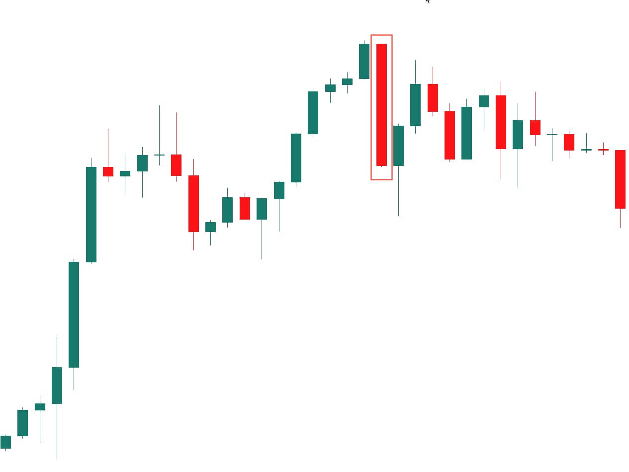
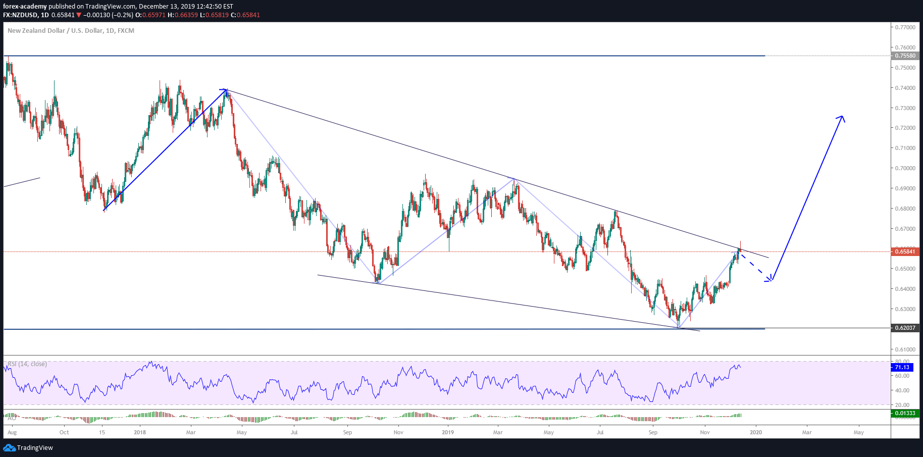
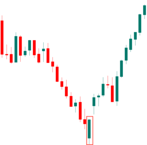
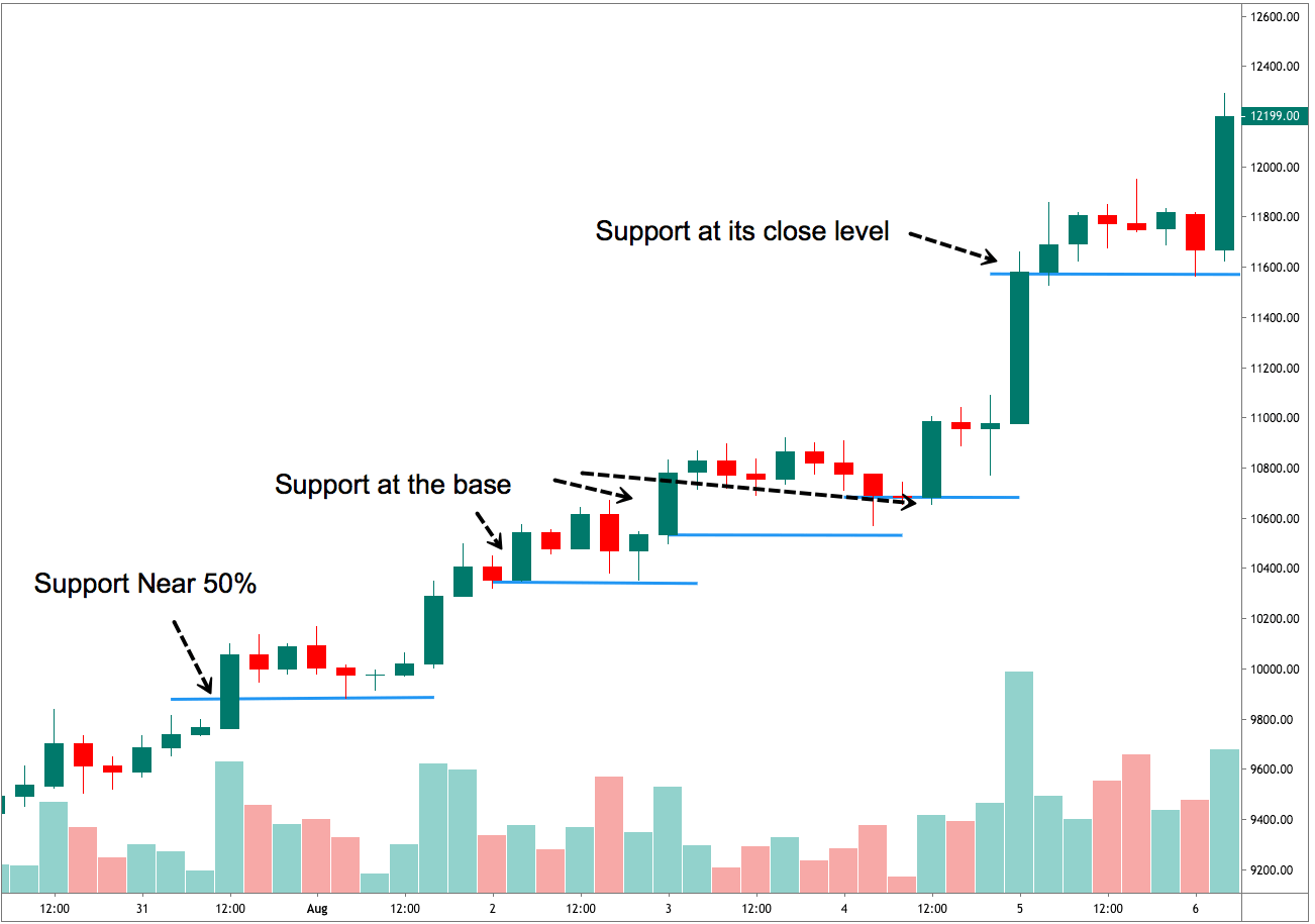
If you are interested in learning about Japanese candlesticks, you should really pick up the Bloomberg Visual Guide to Candlestick Charting by  Michael C. Thomsett. There are over 200 different candlestick patterns in his book. And that is not even all of them! There are some patterns that exist that are very rare and very powerful. One of those rare and powerful patterns is on the GBPNZD weekly chart below:

Dragon Fly Doji
Dragon Fly Doji

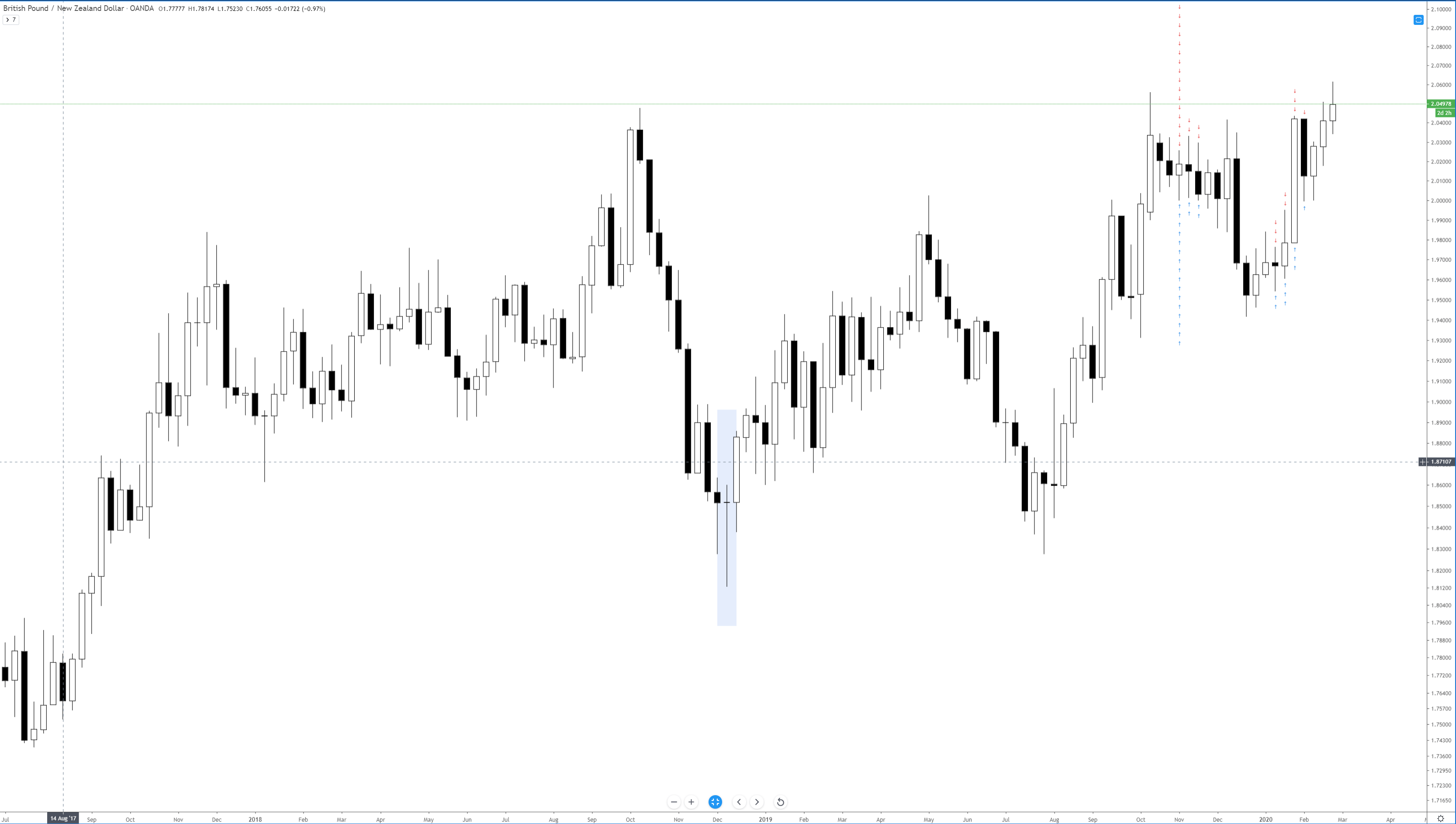
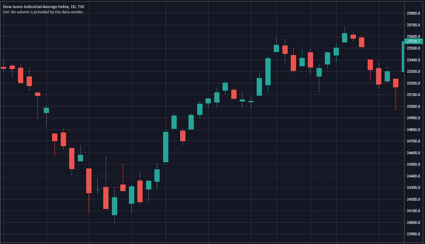
The candlestick highlighted above is known as a dragonfly doji. As I wrote in my original trade idea, my entire purpose for going long was based on the existence of two consecutive hammers. When I saw these candlesticks occur on the weekly chart, I knew I was onto a big trade opportunity. Why? Because candlesticks are incredibly useful on weekly charts. Candlesticks were never meant to be used on anything less than a weekly chart – that might explain why they are more powerful on weekly charts. Just look at that dragonfly doji. It’s important to remember something about Japanese candlesticks: they tell a story. What does the dragonfly doji tell us? Panic and fear. Panic and fear for anyone short on the GBPNZD.

Look how long the wick is! That means a ton of sellers were able to push prices lower but gave up all of those gains – bulls took over. Anyone who was short during that weekly candlestick either covered immediately or experienced significant pain and had to cover eventually. Ultimately, the trade idea and initial profit target ran from the entry at 1.8457 to the bottom of the regression channel, where it wicked against at 1.9494 – a 1,037 pip move.

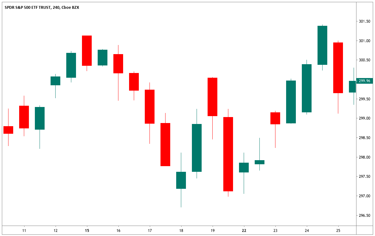
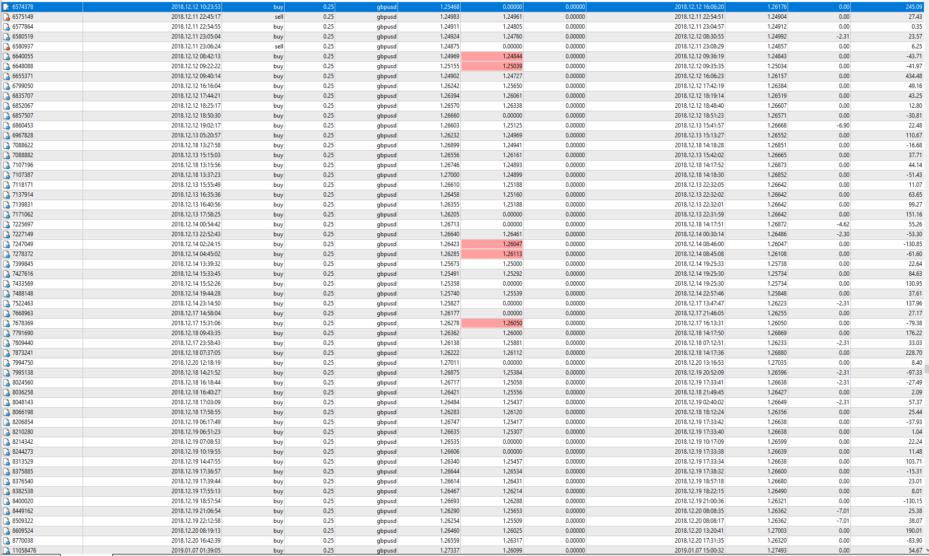
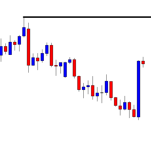
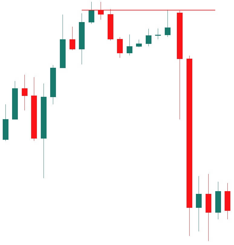
My actual trade results from that period:

GPNZD Results
GPNZD Results


Categories
Candlestick patterns Gann

Practical Application of Candlesticks: Gold Short

Practical Use of Candlesticks: Gold Short

This article is the first in a series of articles over the practical use of Japanese candlesticks. Japanese candlesticks are an excellent and powerful analytical tool. Candlesticks are three-dimensional because, to interpret and use candlesticks properly, we need price, time, and volume.

Each of these guides will utilize a trade idea I’ve shared on TradingView in the past. The nice thing about trade ideas that you share on TradingView is that you can hit ‘play’ and watch how price action played out after your idea. It’s one thing to say, “I called Gold dropping to this level, and it did” – it’s another to show evidence of that idea. I will also share some of my trade results from that same time period.


Identifying a Trade

I am a Gann-based trader through and through. I believe that time is the most important factor in the market, and that time is the reason why trends change. Gann Analysis is the study of cycles and finding the rhythm of a market. It is almost singular in its approach to financial analysis in that Gann Analysis is a Leading form of analysis. In other words, Gann Analysis seeks to predict what will happen in the future. We do that through the use of natural cycles like Lunar Phases, the cycles of Planets, Gann’s cycles, and numerous other measurements. I can’t get into all the details of what Gann analysis is but suffice to say; it is how I identify when I should take a trade.

In the trade idea for this setup, I identified the following reasons for wanting to short XAUUSD on Feb 19, 2019:

Feb 19, 2019

Time is the reason for trend changes.

Feb 18 was a time pivot in the current Law of Vibration cycle, a powerful 6/8th time-harmonic which acts as a source of resistance in time to the trend in force.

Feb 19 is a Full Moon, and the Moon is Apogee – trends reverse violently if these two astronomical cycles occur near a swing low/high.

Gold has been an uptrend for 186-days – which is well within the 180-day Gann Cycle of the Inner Year.

Violent short term reversal ahead.

Additionally, not shown is the Longitudinal position of Jupiter, which rests at 1330. When it comes to Gann’s Planetary Lines, I’ve learned to give equal weight to those levels as I would to Gann’s time cycle. Price has moved above that line – so the time cycles could just be conditions for further and swifter moves higher.

I updated the trade idea with an additional short:

Added to shorts at 1345.30 – 1235 CST

Ultimately, I took profits on Mar 6, 2019.


Using Candlesticks

Gold (XAUUSD) Daily Chart

The image above is the daily chart for Gold (XAUUSD). I’ve highlighted in a light blue box the trading period of this trade idea. Observe the first candlestick on the chart (red triangle above it). I consider that top candlestick a shooting star. Now, there are some real sticklers out there who are very dogmatic about what is an actual candlestick pattern and what isn’t. Japanese analysis is very dynamic and allows for a significant amount of interpretation. I only need to know a couple of things about the shooting start pattern:

  1. Did it show up at the top of a move?
  2. Is the shadow at least twice as long as the body?

Both 1 and 2 are true. The small wick below the body is irrelevant. When I combine this candlestick pattern – which is one of the most bearish candlestick patterns – to my Gann analysis, I get a very high probability setup for a short. But then I added to the short again, one day later on the 20th.

Gold (XAUUSD) 30-minute chart.

Switching to the 30-minute chart, I’ve labeled the additional short entry. Why did I enter that short? First, there is a rising wedge against the prior swing high. Second is the nature of the candlestick itself. The candlestick with the price label on it is two different patterns – but both are bearish. That candlestick is both a shooting star and a bearish engulfing candlestick. When we add the bearish engulfing candlestick to the shooting star and a break of the rising wedge, we get handed one of the highest probability short setups that you could see.

The results of this trading period are below:

Trade Results
Trade Results


Categories
Forex Price Action

Never Know What is around the Corner

In today’s lesson, we are going to demonstrate an example of trend riding along with the H4 breakout trading strategy. We often see that the market is in a strong direction, but it does not offer many entries. It is frustrating, but we must take it easy. We must not be impatient but keep our eyes on the chart. We never know what is around the corner.

This is an H4 chart. The chart shows that the price has been heading towards the South with strong bearish momentum. However, it has not offered any A+ entry yet. It produces some strong bearish engulfing candle breaching through consolidation support. However, consolidations have been shallow. Thus, the sellers on this chart have not been able to make the most of it. Look at the last candle. It comes out as a strong bearish candle as well. It suggests that the bearish trend is strong enough, and it may drive the price towards the South further. Let us proceed to the next chart.

The chart produces a bullish inside bar. This time it looks better since the inside bar candle is a long one. This means if the chart produces a bearish engulfing candle again, it would be after a deep consolidation. The deeper consolidation, the better it is as far as reward is concerned.

The chart produces two more bullish candles. It looks like it has been searching for its support. Deeper consolidation/correction is good, but if it goes too far by making a bullish breakout, equation changes. Let us proceed to the next chart.

Here it comes. An A+ bearish engulfing signal candle this is. The sellers may trigger a short entry right after the candle closes by setting stop-loss above the candle’s high. Take profit may be set with 1:1 risk-reward.

The chart produces another bullish corrective candle after such a nice-looking bearish reversal candle. However, it heads towards the South and hits the target. We learn two lessons here.

  1. A chart may not offer as many entries as we anticipate, even it is on a strong trend.
  2. We never know what is around the corner in the Forex market.

At one point, it seems that the chart may not offer any short entry for the H4 sellers. The price keeps heading towards the North. Deep consolidation is about to get into too deep. At last, the signal candle comes and offers an excellent short entry. While trading, we are always to be on our toes since we do not know what is around the corner in the Forex market.


Categories
Forex Elliott Wave

Introduction to Intermediate Wave Analysis

The wave analysis consists of the market study following the principles described by R.N. Elliott in its Treatise “The Wave Principle.” In this educational article, we’ll introduce the concept of wave patterns.

Introduction

In the preliminary section, we presented the fundamentals of the wave analysis. We learned the wave concept, which will allow us to identify the segments that build a sequence of waves. Additionally, we unveiled the way to recognize the start and the end of each formation. Finally, we presented different rules to describe each kind of sequence according to which the wave analyst will get a panoramic overview of the market.

In the current section, we will present the concepts of wave analysis defined by Glenn Neely, expanding R.N. Elliott’s work.

Grouping Waves

In the preliminary wave analysis section, we presented the concept of monowave,” or segment, that corresponds to the basic unit of a movement developed by a wave sequence. R.N. Elliott, in his work “The Wave Principle,” defined a set of patterns that follows a specific order according to its internal subdivision.

Elliott grouped these patterns into two main groups, defined as impulses and corrections. In simple words, impulses are directional movements, having five internal segments that create trends. On the other hand, corrections are non-directional movements and, also, moves against the trend; these formations present three sub-divisions.

According to the process of wave grouping, we have five basic kinds of patterns, these are:

  1. 5-5-5-5-5: Impulse.
  2. 5-3-5: Zigzag.
  3. 3-3-5: Flat.
  4. 3-3-3-3-3: Triangle.
  5. 3-3-3-3-3: Terminal.

There are, also, other complex combinations called double and triple three, that will be studied in depth in the advanced analysis wave section.

Analyzing Waves Formations

The process for an Elliott wave pattern analysis begins with the separation of formations that have 3 or 5 internal segments. The knowledge of the basic structures will allow the wave analyst to simplify the study of complex corrective patterns.

As the formations under study are recognized, the analyst should consider that the waves must have a certain level of similarity to each other, in terms of price and time. Two consecutive waves will be similar in both price and time if the smaller of the two is not less than one third (1/3) of the largest. In case the next wave is shorter, then the next wave is said to belong to a sequence of lesser degree. In other words, if W2 does not meet the price and time rule with respect to W1, then W2 must be associated with W3. After this association is made, the new segment should be called W2.

Example

The following chart illustrates Johnson & Johnson (NYSE: JNJ) in its log-scale 2-week timeframe. On the figure, when we compare wave 2 with wave 1 we observe that both comply with the similarity rule in price and time. However, wave 4 does not reach the 1/3 of time rule when compared with wave 3.

Fig 1 – Johnson & Johnson (NYSE: JNJ) 2W Log-scale. (click on it to enlarge)

Conclusions

In this article, we introduced the five basic Elliott wave patterns, which will use in the wave analysis process. Also, we presented the rule of similarity in terms of price and time between waves.

The application of these criteria and integrating the concepts of Directional and Non-Directional moves drove us to conclude that Johnson & Johnson moves in its fourth wave due that does not accomplish the 1/3 rule of minimum time compared with wave 3.

Suggested Readings

  • Neely, G.; Mastering Elliott Wave: Presenting the Neely Method; Windsor Books; 2nd Edition (1990).
Categories
Forex Daily Topic Forex Price Action

Riding on a Trend is rewarding

The trend is the trader’s friend. To be able to spot the trend and reversal point are the two most important factors of price action trading. In the Forex market on the minor charts, trend changes in a second. However, the trend usually continues on major charts such as the H4, the daily as well as weekly. In today’s lesson, we are going to demonstrate an example of how we can ride on a trend and make most of it.

The chart shows that after making a strong bearish move, the price produces three consecutive bullish corrective candles. It finds its support and creates a bearish engulfing candle closing below consolidation support. The sellers may trigger a short entry right after the last candle closes. Let us proceed to the next chart.

The price heads towards the South and hits 1R. Look at the last candle. The candle comes out as a bearish engulfing candle as well after a long consolidation. However, the sellers on this chart shall skip taking this entry for its shallow consolidation. Let us find out what happens next.

The price again consolidates and produces another bearish engulfing candle. The sellers may trigger another short entry right after the last candle closes. This is the second entry of the trend.

As expected, the price again heads towards the South. This time the price moves with strong bearish momentum. The sellers again make some profit here. Let us proceed to the next chart.

The chart after producing one stronger bearish candle consolidates. This time the chart presents an A+ trade setup with deep consolidation and a strong bearish engulfing candle. The sellers may trigger another short entry here with 1R.

This is what tells the story of the Forex market. This one has been the best entry so far on this chart. However, the price does not head towards the trend’s direction as expected. Nevertheless, it hits the target again (1R). The sellers again make some pips. Altogether, it offers three entries and this is called riding on a trend. By looking at the chart, it seems it may provide more. The buyers must stay out of this chart until it produces a strong bullish reversal.

Meanwhile, the sellers shall keep eying on the chart to go short with the same process. It does not happen so often but when it does, traders shall make most of it. As they say, “Trend is your Friend,” and we have just demonstrated that riding on a trend is very rewarding.

Categories
Forex Elliott Wave Forex Fibonacci

How to Use Retracements to Analyze Waves – Part 5

Until now, we studied different scenarios for the retracement of W2 when it is lower than 100% of W1. In this educational article, we’ll review what to expect when the retrace experienced by W2 is higher than 100% of W1.

The Fifth Rule

The fifth rule surges when the price runs in wave two (W2) and its progress extends between 100% and 161.8% of the first wave (W1).

In this case, could exist four possible conditions as follows.

Condition a: this condition occurs if W0 is lower than 100% of W1. As a first scenario, W1 could be part of a corrective sequence, and in consequence, W1 should identify as “:3”. In terms of the Elliott wave formations, W1 could be the first or the second segment of a corrective pattern, like a Flat pattern, a triangle formation, or the center of a Complex Correction.

A second option considers the possibility of a five-wave structure. If it occurs, W1 should label as “:5”, and the structure could correspond to the end of a zigzag pattern.

Condition b: occurs when W0 moves between 100% and 161.8% of W1. In this scenario, W1 should be part of a three-wave structure. It means that we should identify it as “:3”. In consequence, W1 could belong to the first segment of a Flat pattern, a section of a Triangle structure, or the center of a Complex correction.

Condition c: this condition occurs if W0 is between 161.8% and 261.8% of W1. In the same way that condition b, in this scenario, W1 should be part of a corrective formation as a flat (which should be an irregular flat), triangle, or complex correction.

Condition d: occurs when W0 is higher than 261.8% of W1. In this case, W1 likely will be the first part of a corrective structure; then, W1 should identify as “:3”. In terms of the Elliott wave formations, the structure in progress could correspond to a Flat pattern, a triangle, or the center of a complex correction.

The Sixth Rule

This rule will activate if wave 2 retraces between 161.8% and 261.8% of W1. The possible conditions are similar as in the fifth rule and are detailed as follows.

Condition “a”: this condition occurs if W0 is lower than 100% of W1. In this scenario, W1 could be a three-wave structure (labeled as “:3”), and W1 could correspond to a flat, triangle, or the connector of a complex correction. A second scenario considers that W1 could be a five-wave formation (identified as “:5”), then, W1 could be the end of an impulsive movement.

Condition “b”: occurs when W0 moves between 100% and 161.8% of W1. In the same way that Rule 5, condition b, the most probable formation for W1 is a three-wave structure and should identify as “:3”. W1 could be the first segment of a flat, an internal section of a triangle, or the center of a complex correction.

Condition “c”: this condition occurs if W0 is between 161.8% and 261.8% of W1. The structure that W1 develops could correspond to a corrective pattern, which should identify as “:3”, and the formation developed could be a flat pattern with failure in C or an expansive triangle.

Condition “d”: occurs when W0 is higher than 261.8% of W1. In this case, W1 could be part of a zigzag, a segment of a contractive triangle, a flat pattern with a failure in C, or the correction of an impulsive move. In any case, W1 should identify as “:3”.

The Seventh Rule

The wave analyst must use this rule when the retrace experienced by wave 2 is higher than 261.8% of wave 1. In this case, the possible conditions of W0 are similar to rules fifth and sixth, which are as follows.

Condition “a”: this condition occurs if W0 is lower than 100% of W1. In this case, W1 could be part of a three-wave structure (identified as “:3″) developing a complex correction, or a flat with a complex wave B. Another option for W1 could be a five-wave structure (labeled as”:5″) running in the failure of the fifth wave.

Condition “b”: occurs when W0 moves between 100% and 161.8% of W1. In this condition, W1 could be a three-wave structure (identified as “:3”) performing the center of a complex correction, a flat pattern, or a contractive triangle.

Condition “c”: this condition occurs if W0 is between 161.8% and 261.8% of W1. In this case, W1 could be part of a corrective formation as a continuous correction, a flat pattern, or a contractive triangle, and W1 should identify as “:3”.

Condition “d”: occurs when W0 is higher than 261.8% of W1. In this scenario, the structure suggests that W1 could be part of a corrective formation (tagged as “:3”) as a zigzag pattern, the connector of a double zigzag, the center of a complex correction (or wave-x), or a contractive triangle.


Conclusions

In this educational article, we reviewed what should be the Elliott wave structure that W1 build when W2 exceeds 100% of W1. As can be observed, in most cases, the formation developed by W1 corresponds to a corrective sequence.

According to R.N. Elliott’s words, the knowledge of the corrective formations could provide to wave analyst an edge over what should be the next move. In this context, the comprehension of different rules and conditions presented could ease and offer a relevant clue in the wave analysis to the Elliott wave trader.

Suggested Readings

  • Neely, G.; Mastering Elliott Wave: Presenting the Neely Method; Windsor Books; 2nd Edition (1990).
  • Prechter, R.; The Major Works of R. N. Elliott; New Classics Library; 2nd Edition (1990).
Categories
Forex Elliott Wave Forex Fibonacci

How to Use Retracements to Analyze Waves – Part 4

In this educational article, we’ll review the fourth rule defined by Glenn Neely for the preliminary wave analysis. This rule, by its nature and context, it is likely that correspond to a corrective structure.

The Fourth Rule

The fourth case described by Neely considers the context when the price action developed by W2 retraces between 61.8% and 100% of W1. In the same way that the wave analyst measures the retracement developed by W1 on W0, and W2 on W1, it is necessary to evaluate the retracement of W3 on W2.

The author of “Mastering Elliott Wave” identified three possible categories of movements for wave three (W3), which are as follows.

  • Category “i”: will be considered if W3 is higher or equal to 100% and less than 161.8% of W3.
  • Category “ii”: this category occurs if W3 moves between 161.8% and 261.8% of W2.
  • Category “iii”: this category will occur if W3 is higher than 261.8% of W2.

The categories mentioned and their implications are detailed below.

Condition “a”: we consider this condition if W0 is lower than 38.2% of W1. For the three categories mentioned, in the most common cases, W1 could be the first segment or the center of a three-wave formation. In this context, W1 should identify as “:3”. In terms of the Elliott wave patterns, the structure could correspond to a Flat formation, the center of a triangle, or a segment of a complex corrective sequence.

In some particular cases, W1 may correspond to the end of a zigzag pattern inside of a complex correction or the end of a third wave. In this situation, W1 should identify as “:5”.


Condition “b”: will occurs if W0 is greater or equal than 38.2% and lower than 100% of W1. Depending on the extension of W3, W1 be likely the beginning or the mid-part of a corrective formation; then, W1 should identify as “:3”. In this context, W1 could be part of a flat pattern or the center of a Triangle formation.

In a particular case, W1 could be the end of a five-wave sequence; therefore, W1 must label as “:5”. If this scenario occurs, W1 could correspond to the end of a zigzag pattern.


Condition c: this condition occurs if W0 is greater or equal than 100%, and lower than 161.8% of W1. In this case, W1 belongs to a three-wave formation and should identify as “:3”. In terms of the structures defined by R.N. Elliott, the sequence in progress could correspond to a Flat pattern, a Triangle formation, or the center of a complex corrective formation, for example, a double or triple three pattern.

Condition d: this condition occurs if W0 is between 161.8% and 261.8% of W1. Similarly to condition “c,” in this case W1 should identify as “:3”. And in terms of the Elliott wave analysis, the structure in progress could be a flat, a triangle formation, or any part of a complex corrective sequence.

Condition e: will consider if W0 is higher than 261.8% of W1. In this condition occurs the same situation that conditions “c” and “d.” It means that W1 is part of a three-wave structure and should be tagged as “:3”.

According to the structures defined by the Elliott wave theory, W1 could be the first segment of a flat pattern, the center of a triangle formation, or the center of a complex corrective sequence.

Conclusions

In this article, we have seen the possible formations that could develop according to the retracements experienced by waves W0 and W2 concerning W1, and W3 compared to W2.

In terms of the patterns defined by the Elliott wave theory, the most likely formations to which W1 might belong is to a flat pattern, a central segment of a triangle structure, or the center of a complex corrective sequence.

Suggested Readings

  • Neely, G.; Mastering Elliott Wave: Presenting the Neely Method; Windsor Books; 2nd Edition (1990).
  • Prechter, R.; The Major Works of R. N. Elliott; New Classics Library; 2nd edition (1990).
Categories
Crypto Daily Topic Forex Price Action

Calculate Risk-Reward along with Candle’s Attributes

In today’s lesson, we are going to demonstrate an example of the importance of risk-reward. To be successful in price action trading, traders are to calculate risk-reward before every single entry they execute. Let us find out from the charts below the importance of risk-reward.

The price heads towards the South with an average bearish momentum. Ideally, it is the sellers’ territory. However, it has come a long way. The buyers must wait for a strong bullish reversal candle to go long on this chart.

This is an extremely strong bullish reversal candle. The buyers may wait for the price to consolidate and produce a bullish reversal candle. Within a candle, things are very different now.

The chart produces a bearish inside bar. Thus, buyers may get more optimistic. They are to wait for a bullish engulfing candle closing above the last swing high to trigger a long entry. The price may travel towards the drawn level, which is a significant level of resistance on the chart.

The chart produces a bullish engulfing candle closing well above the last resistance. As explained earlier, the buyers are to set their stop loss below the last candle and trigger a short entry right after the candle closes. The question is whether they shall take a long entry here or not. Think about it. The last candle closes within the level of resistance. Technically, there is no space for the price for traveling towards the North unless it makes another breakout here. The reward is zero here.

As anticipated, the price consolidates again and struggles to make another breakout. The last candle comes out as a bearish candle. Thus, things do not look good for the buyers. It may change its direction. If it makes a bullish breakout, that is another ball game, though. Let us proceed to the next chart.

The price does not make a bullish breakout but changes its trend. It is the sellers’ territory again. By looking at the last candle, the sellers may trigger a short entry by setting their take profit at the last swing low.

In this lesson, we have seen that the trend-initiating candle and the signal candle both get 10 on 10. However, the chart does not offer an entry because there is no space for the price for traveling towards the upside. Consequently, the sellers take over and drive the price towards the downside. To sum up, we not only look at the candle’s attributes but also calculate risk-reward.

Categories
Forex Elliott Wave Forex Fibonacci

How to Use Retracements to Analyze Waves – Part 3

In this educational post, we will review the third rule on the use of retracements in the wave analysis devised by Glenn Neely.

Third Rule

The third rule occurs when wave 2 (W2) retraces precisely 61.8% of wave 1 (W1). This scenario tends to be somewhat confusing to analyze because when the price retraces to 61.8%, there is the same likelihood that the structure in progress is an impulsive or corrective formation.

Once the retracement of W2 is compared with the height of W1, the wave analyst should evaluate the length of W0 relative to W1. From the resulting measure, several potential scenarios follow, each meeting one of the six following conditions.

Condition “a”: this condition occurs when W0 is lower than the 38.2% level of W1. In this case, W1 could be the end of a zigzag structure inside a complex corrective sequence. In this case, the end of W1 should be identified as “:5”. Another option is that W1 moves inside a continuous correction, or it is part of the first leg of a flat pattern, in this case, the end of W1 should be identified as “:3.

Condition “b”: this condition occurs if W0 is higher or equal than 38.2%, and lower than 61.8% of W1. Considering the lengths of waves “3” (W3) and “-1” (W-1), W1 could be the end of a zigzag pattern inside of a complex correction; in this case, W1 should be identified as “:5. There is another possible scenario when W1 is part of an ending pattern of an impulsive structure; for this setting, W1 should be tagged as “:3”.

Condition “c”: this condition arises when W0 is higher or equal than 61.8% and lower than 100% of W1. In this scenario, W1 could be part of a corrective structure, like a Flat or Triangle pattern. In consequence, W1 should be identified as “:3”. When the length of wave 3 (W3) is shorter than W1, W1 could be the end of a zigzag pattern, and W1 should be labeled as “:5”.

Condition “d”: this condition appears when W0 is higher or equal than 100% but lower than 161.8% of W1. Depending on the lengths of waves W2, W3, and W-1, W1 could be the first segment of a zigzag pattern. In this case, W1 will be identified as “:5”. In another instance, W1 could correspond to a section of a triangle structure or the central part of a flat pattern. If the wave analyst faces this scenario, it should identify to W1 as “:3”.

Condition “e”: This condition occurs when W0 is between 161.8% and 261.8% of W1. In the same way as with the “d” condition, W1 could correspond to the first segment of a zigzag pattern. Therefore, W1 will be identified as “:5”. The second possibility is that W1 could be the central section of a flat formation that concludes in a complex corrective pattern or a segment of a triangle formation. In this case, W1 will be tagged as “:3”.

Condition “f”: this condition occurs when W0 is higher than 261.8% of W1. In this case, it applies the same identification alternatives for W1 as a “:5” or “:3” described in the previous conditions. In other words, W1 could be part of a zigzag, flat, or triangle pattern.

Conclusions

The third rule studied in this article, reveals that this case corresponds mainly to a corrective formation. On the other hand, during the preliminary wave analysis, it is relevant to study the context in which the price action advances.

In the same way, although there are three kinds of basic corrective structures, as the price advances, the wave analyst must discard the options that couldn’t correspond to the Elliott wave formation. As said by R.N. Elliott in his work ” The Wave Principle,” the knowledge of the corrective structures provides the student an edge to visualize the potential next move of the market.

Suggested Readings

  • Neely, G.; Mastering Elliott Wave: Presenting the Neely Method; Windsor Books; 2nd Edition (1990).
  • Prechter, R.; The Major Works of R. N. Elliott; New Classics Library; 2nd Edition (1990).
Categories
Forex Elliott Wave Forex Fibonacci

How to Use Retracements to Analyze Waves – Part 2

In our previous educational post, we presented the first rule defined by Gleen Neely to analyze waves. In this article, we will introduce the second rule.

Second Rule

The second rule defined by Neely occurs when W2 is greater or equal than 38.2%, and lower than 61.8% of W1. Once the retracement realized by W2 is measured, the length of W0 will provide five possible conditions as follows.

Condition “a”: occurs when W0 is lower than 38.2% of W1. In this case, wave W1 should be identified as “:5”. This movement could correspond to an ending sequence of a corrective structure. Another possibility for this condition is that W1 belongs to the ending move of an impulsive sequence.

Condition “b”: this condition takes place when W0 is greater or equal to 38.2%, but lower than 61.8% of W1. In this case, it is likely that W1 corresponds to a five-wave sequence and completes a corrective formation and should be tagged as “:5”. However, it is also possible that according to a specific advance of waves W2 and W3, wave 1 is a three-wave structure and should be identified as “:3”.

Condition “c”: this condition occurs when W0 moves between 61.8% and 100% of W1. In this case, W1 could correspond to the end of a flat, or zigzag pattern, and in consequence, W1 should be identified as “:5. Depending on the context of the market under study, the structure could correspond to a complex corrective sequence. On the other hand, if W0 and W2 hold some specific lengths, W1 could be a three-wave structure, and W1 should be labeled as “:3”.

Condition “d”: this condition must be considered when W0 moves between 100% and 161.8% of W1. In this case, W1 could correspond to a zigzag formation, and in consequence, W1 should be labeled as “:5”. Another scenario may consider the possibility that the structure in progress would correspond to a triangle formation. In this case, W1 should be identified as “:3”.

Condition “e”: this considers the movement of W0 beyond of 161.8% of W1. When this situation occurs, wave 1 corresponds to a five-wave structure, and in consequence, W1 should be labeled as “:5”.

Conclusions

As commented in the previous article, when the wave analysts study the market structure, each movement should not be analyzed individually, instead of this, wave analyst must study the market in a context from the previous moves, and the progress developed by market across time.

In the following educational article, we will unfold the third rule described by Glenn Neely.

Suggested Readings

  • Neely, G.; Mastering Elliott Wave: Presenting the Neely Method; Windsor Books; 2nd Edition (1990).
Categories
Forex Elliott Wave Forex Fibonacci

How to Use Retracements to Analyze Waves – Part 1

In our previous educational post, we learned to identify the end of a movement. In this article, we will discuss how to use and evaluate retracements in the wave analysis.

Defining Retracement Rules

Glenn Neely, in his work “Mastering Elliott Wave,” establishes a set of rules and conditions to evaluate the retracements that each wave makes.

The first step begins with the analysis of the first movement and comparison of the retracement made in the second move (W2) with the first one (W1). Once we evaluated the retracement of W2, we need to analyze the retracement developed on the previous wave (W0) with respect to the first move.

In summary, depending on the retracement of wave 2 (W2) with respect to wave 1 (W1) and the retrace of wave zero (W0) compared to W1. Neely defined a ser of rules and conditions to evaluate and identify each movement. The set of rules will be as follows.

First Rule

We consider this rule when the second wave (W2) is lesser than 38.2% of the first wave (W1). Once we have measured the retracement made by W2, we must evaluate the previous wave (or wave W0). Under this rule, there are four possible conditions.

Condition “a”: occurs when the high of W0 is below the 61.8% level of W1. However, it is necessary to evaluate the retracement experienced by the previous wave to W0 (it is W-1). Depending on its length, W1 could be identified as “:3” or “:5”. It means that W1 could be part of a corrective or impulsive structure.

Condition “b”: this condition occurs when if  W0’s high is above 61.8% but below 100% of W1. Depending on the length of W-1, W1 could correspond to an impulsive or a corrective wave; thus, W1 could be identified as “.5” or “:3.

Condition “c”: this condition occurs when W0 is above or equal to 100%  of W1 level and less or equal than 161.8 of W1. In this case, we will label as “:5” the end of wave 1. However, under certain conditions, W1 could correspond to a “:3” structure.

Condition “d”: occurs when W0 is larger than 161.8% of W1. In this case, the end of W1 must be identified as “:5”. The labeling means that W1 corresponds to a five-wave sequence.


Conclusions

The evaluation of the retracements experienced by W2 and W0 could deliver insights to the wave analyst of what kind of wave is W1. However, in some cases, it is necessary to evaluate the context of more waves. This study would provide the wave analyst an overview of the Elliott wave structure that the market develops. For example, if the structure in progress corresponds to a terminal movement of a corrective sequence or an impulsive wave in development.

In the following article, we will continue discovering the rules described by Gleen Neely for the wave analysis.

Suggested Readings

– Neely, G.; Mastering Elliott Wave: Presenting the Neely Method; Windsor Books; 2nd Edition (1990).
– Prechter, R.; The Major Works of R. N. Elliott; New Classics Library; 2nd edition (1990).

Categories
Candlestick patterns Forex Candlesticks

Candlestick Reversal Patterns V – The Morning Star and the Evening Star

The Morning Star and the Evening Star

The morning Star and the Evening Star formations are patterns made of three candlesticks. The original candlestick patterns were made on the Japanese rice futures trading and were created for daily timeframes. Thus, they could depict gaps from the previous close to the next open. The Star was a small real body – white or black – that was gaping away from a previous large body. The only place where that could occur in the Forex markets is during weekends. Thus, what is required to form a star in Forex is a small body, the smaller, the better, at the end of a large body, preferably with large shadows.

The Morning Star

The Morning Star is a three-candle formation at the bottom of a descending trend. In astronomy, Mercury is the morning star that foretells the sunrise and the arrival of the day. That was the name the Japanese gave to the formation, as they consider it to be the precursor of a new uptrend.

As said, it is formed by three candlesticks. The first one is a large and black candlestick. The session day the price starts with a gap down (or just at the close in Forex) continues moving down for a while, then it recovers and closes near the open, creating a tiny body. The third day is a white candlestick that closes near the open of the first black candlestick. The important factor in the signal is the confirmation of buyers after the star candle is formed. The close of the third day should, at least, cross the halfway up to the black candle body, as in the case of a piercing pattern. 

Chart 1 – Morning Star on the DAX-30 Index (click on it to enlarge)

Criteria for a Morning Star 
  1. The downtrend was evident
  2. The body of the first candle continues with the trend (black)
  3. The second candle is a short body figure showing indecision
  4. The third day the candle closes at least above 50 percent the body of the black candle.
  5. The larger the black and white candles, the better.
  6. A gap is desirable but doesn’t count on it on 24H markets
  7. A high volume in the first and third candles would be good signs of a selloff and consequent reversal.
Market Psychology

As in most bullish reversals, the first day, the hopeless bulls capitulate with a significant drop and substantial volume. The next day the power of the sellers stops in a short-bodied candle. The third day began bullish, touching the stops of the late short-sellers, and also caused by the close of positions of profit-takers. That fuels the price to the upside, making more short sellers close their positions -buying- and pushing up further the price. At the end of the day, buyers take control of the market action closing with a significant white candle on strong volume.

The Evening Star

The Evening star is the reciprocal of the Morning star, and even more so, when trading pairs in the Forex market, or any pair, for that matter. In this case, the Japanese linked this formation with the Venus planet, as the precursor or the night. It is created when a long white candle is followed by a small body and a large black candle.

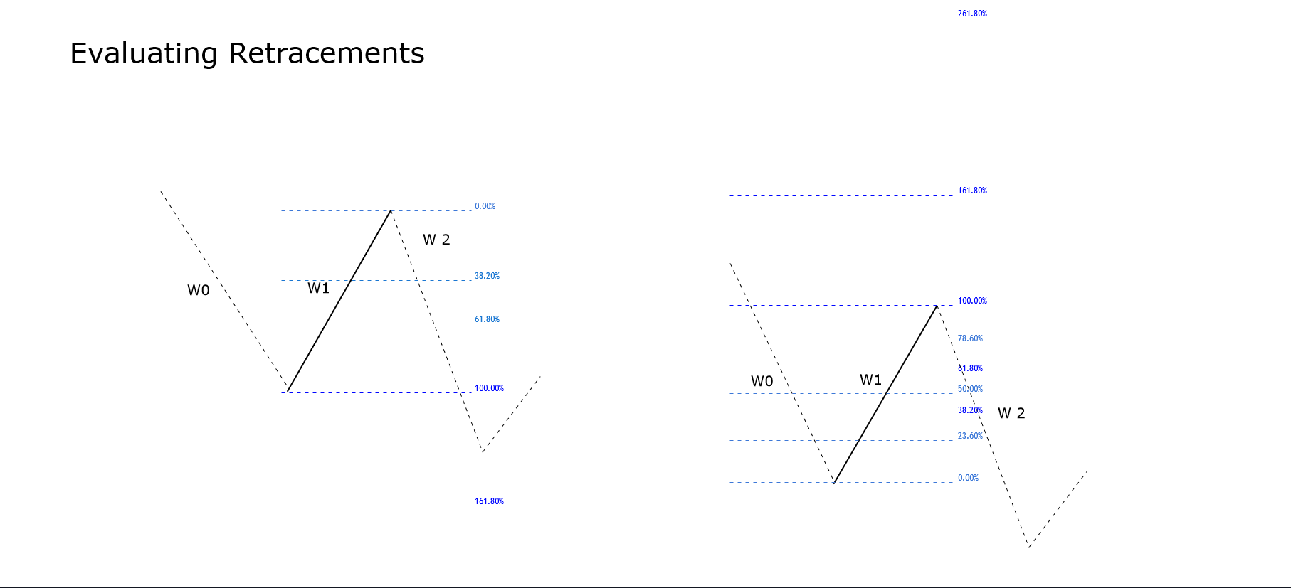
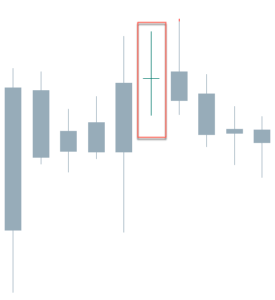
As the case of the Morning Star, a gap up on the second small-bodied candle followed by a gap down on the third black candle is further confirmation of a reversal, but that seldom happens in the Forex Market.  Also, the third candlestick is asked to close below 50 percent of the body of the first white candle.


Chart 2 – Evening Star on the EURUSD Pair (click on it to enlarge)

Criteria for an Evening Star
  1.  The upward trend has been showing for some time
  2. The body of the first candle is white and large.
  3. The second candlestick shows indecision in the market
  4. On the third day, it is evident that the sellers have stepped in and closes below 50 percent of the initial white candle.
  5. The longer the white and black candles, the better
  6. A gap before and after the second candle is desirable, although not attainable in Forex.
  7. A good volume in the first and third candles is also desirable.
Market Psychology

The uptrend has attracted the buyers, and the last white candle has seen an increasing volume. In the next session, the market gapped of continue moving up for a while, catching the last stops by short-sellers, but suddenly retraces and creates a small body, with the close next to the open. The next day there is a gap down makes the stops of the long positions to be hit, adding more selling pressure to the profit takers and short-sellers. The day ends with a close that wipes most of the gains of the first white candle, that shows that the control is in the hand of sellers.


Reference: Profitable Candlestick Patterns, Stephen Bigalow


Categories
Candlestick patterns Forex Candlesticks

Candlestick Reversal Patterns IV – The Hammer and The Hanging Man


The Hammer

The Hammer is a one-candle pattern. The Hammer is identified as a small body with a large lower shadow at the bottom of a downtrend. The result of having a small body is that the open and the close are near each other. The large lower shadow means during the session sellers could move down the price but, then, buyers stepped in and pushed the price back to the levels of the open, or, even, a bit further up. That means sellers lost the battle, and the buying activity started dominating the price action. A positive candle is needed to confirm the price action. This usually converts this candle into a Morning Star formation.

Chart 1 – Hammer in the USDCHF Pair

Criteria for Hammers

  1. The lower shadow must be at least twice the length of the body
  2. The real body is at the upper side of the range. The color does not matter much, although a white body would increase the likelihood of the reversal.
  3. There should be no upper shadow or a very tiny one.
  4. The longer the lower shadow, the better
  5. A large volume on the Hammer is a good signal, as a blob woff day might have happened.

Market Psychology

After a relatively large downtrend, the sentiment of the traders is rather bearish. The price starts moving down at the open and makes a new low. Then, buy orders to move the price up. Profit-taking activity also contributes to the upward move. Then intraday stop-loss orders come in fueling the action further up. A positive follow-up candle would confirm the control of the action by the buyers.

The Hanging Man

The Hanging Man is also a figure similar to a Hammer, with its small body and large lower shadow, but it shows up after a bullish trend. The Japanese named this figure that way because it looks like a head with the body and feet hanging.

Chart 2 – Three Hanging Man in the DOW-30 Index

Criteria for the Hanging Man

  1. The lower shadow must be at least twice the length of the body
  2. The real body is at the upper side of the range. The color does not matter much, although a white body would increase the likelihood of the reversal.
  3. There should be no upper shadow or a very tiny one.
  4. The longer the lower shadow, the better
  5. A large volume on the Hammer is a good signal, as a blowoff day might have happened.

Market Psychology

After a strong trend, the sentiment is quite positive and cheerful. On the day of the Hammer, the price moves higher just a bit, then it drops. After reaching the low of the session, the buyers step in again and push the price back up, close to the open level, at which level the session ends. This would indicate the price action is still in control of the buyers, but the considerable drop experienced in the first part of the session would mean the sellers are eager to sell at these levels, and a resistance zone was created. A lower open or a black candlestick the next day would move the control to the sell-side.


Reference.
Profitable Candlestick Patterns, Stephen Bigalow

Categories
Chart Patterns Forex Trading Guides

Chart Patterns: Start Here

Chart Patterns: Start Here

Something that I stress repeatedly throughout our series on chart patterns is the difference between traditional markets like the stock market and the forex market. I’m sure a good number of readers have spent time reading books on technical analysis and have recorded and have seen various statistics regarding the performance of the various chart patterns that exist. There’s a big problem that exists in the realm of technical analysis and its use in forex markets, and that is related to nearly 100% of all technical analysis trading material focused on the stock market. Why is this a problem? Several reasons.

  1. Statistical performance values for chart patterns based on the pattern’s performance in the stock market is overwhelmingly long-biased: the stock market has been in a bull market for over a decade.
  2. Forex markets do not ‘trend’ in the traditional sense of financial analysis, they range.

In a nutshell, just because a particular pattern in the stock market may not perform that well in the forex market, it does not mean that its performance isn’t positive in forex. I’ve learned that most underperforming chart patterns in the stock market perform very well in forex markets. As always, make sure you do your own due diligence and research – investigate each pattern for yourself and see how they play out in your own trading.

To begin learning about Chart Patterns, follow this series of education articles.

Chart Patterns: Pullbacks and Throwbacks

Chart Patterns: Symmetrical Triangles

Chart Patterns: Ascending Triangles

Chart Patterns: Descending Triangles

Chart Patterns: Head-And-Shoulder Patterns

Chart Patterns: Broadening Patterns


Sources:

Kirkpatrick, C. D., & Dahlquist, J. R. (2016). Technical analysis: the complete resource for financial market technicians. Upper Saddle River: Financial Times/Prentice Hall.

Bulkowski, T. N. (2013). Visual guide to chart patterns. New York, NY: Bloomberg Press.

Bulkowski, T. N. (2008). Encyclopedia of candlestick charts. Hoboken, NJ: J. Wiley & Sons.

Bulkowski, T. N. (2002). Trading classic chart patterns. New York: Wiley.


Categories
Candlestick patterns Forex Candlesticks

Candlestick Reversal Patterns III: Understanding the Harami

So far, the reversal formations we saw – the Piercing Pattern, the Dark Cloud Cover, and the Engulfing patterns, were strong reversal signals, showing that the bulls or bears had the control. The Harami is usually a less powerful signal.

The Harami is created when a short candle’s body is entirely contained inside the body of the preceding candle. The color of the second body of this pattern is unimportant, although the color of the first one follows the trend (black in downtrends and white in uptrends). The name “Harami” comes from the old Japanese word meaning “pregnant.” Japanese traders call the first candle, “the mother,” and the second one, “the baby.
The appearance of a Harami is indicative that the current trend has ended. According to Steve Nison, the Japanese say the presence of a Harami shows the market is losing its breath. They contend that, after a large healthy candle, the small inside candle shows uncertainty.
We have to say that if we look at the charts, harami-like formations appear often, but most of it was just pauses or pullbacks of the primary trend. Thus, although not good enough to call for a reversal of the trend, they could be potential signals to exit a trade or take partial profits.
Also, we have to remember that, since trading the Forex markets, and, also, intraday, there are no gaps available. This fact makes a harami quite similar to a Piercing pattern or a Dark cloud Cover if the body of the second candle surpasses half of the previous body.

Chart 1 – Several Haramis in the Cable.

As we see in chart 1, haramis and engulfing patterns are alike, with the exception of the second one.  What we can see is that be it harami or engulfing, the pattern is worth to pay attention to since most of the time signals the end of the previous leg.

Criteria for a Bullish Harami

  1. The body if the first candle is black (red) and the body of the second candle is white (green)
  2. There is evidence of a downtrend.
  3. The second candle opens higher or at the close of the first candle.
  4. Just the body needs to be inside the body of the first candle. That is unlike the inside day.
  5. A confirmation is needed for a reversal signal.
  6. The longer the black and white candles, the more powerful the signal
  7. The higher the white candle closes, the better.

Market Psychology of a Bullish Harami

After a selloff day, the next day, sellers don’t have the strength to push the prices further down. Concerned short-sellers start to take profits of just close the trade fuelling the purchases. The price finishes higher, and traders mark the double bottom as support. A strong day following the harami formation would convince the market participants that the trend has reversed.

Criteria for a Bearish Harami

  1. The body if the first candle is white (green) and the body of the second candle is black (red)
  2. There is evidence of an uptrend.
  3. The second candle opens lower or at the close of the first white candle.
  4. Just the body needs to be inside the body of the first candle. That is unlike the inside day.
  5. A confirmation is needed for a reversal signal.
  6. The longer the white and black candles, the more powerful the signal
  7. The lower the black candle closes, the better.

Chart 2- Several Haramis in the GBPAUD pair. Not all are successfully signaling a reversion of a trend

Market Psychology of a Bearish Harami

After a strong bullish trend, a long white candle emerges. In the next session, the longs cannot force more upsides. The asset began to drop, as concerned bulls are closing their positions to pocket their profits, and the day finished lower. Also, short-term traders mark the top of the white candle as a resistance level. A third day showing weakness is what is needed to convince everybody that the uptrend is over and a new leg down is starting.


References:

Profitable candlestick Patterns, Stephen Bigalow

The Candlestick Course: Steve Nison


Categories
Forex Elliott Wave

How to Start a Wave Analysis – Part 4

In our previous educational article, we learned to identify the end of the directional and non-directional movements. In this article, we will learn to recognize neutral movements.

The Neutral Movement

When the wave analyst faces the market in real-time, it is common to observe the price action running at a lower price/time relationship than the usual market speed. When this phenomenon occurs, we are in the presence of a neutral movement.

In particular, when the price changes its direction if the angle between the initial move and the next one is lesser than 45° thus, we are facing a neutral movement.

Depending on the kind of movement developed by segments under study, there exist two possible scenarios of a neutral move.

  • If the neutral movement runs in the middle of two legs that advances in the same direction, thus the end of the first path will be at the end of the neutral segment.
  • The second case occurs if the neutral movement advances between two segments that run in the opposite direction. In this case, the end of the first movement will be at the end of the second segment.

Neutral Movements in the US Dollar Index

The following chart shows the US Dollar Index in its 8-hour timeframe. In the figure, we observe a first neutral movement, which runs upward from 96.98 until level 97.40.

The ascending sequence makes two pauses that look horizontal. Applying the neutral movement concept, we conclude that this movement corresponds to a single path that advances into the rectangle.

In the second rectangle, we observe the decline that the Dollar Index from level 97.72 until 96.45. This bearish move exposes an acceleration that turns complex the wave analysis. In this case, the neutral movement concept helps us in determining that the bearish move corresponds to a single movement.

If the wave analyst looks for a detailed decomposition of the entire bearish segment simplified by the neutral movement, in words of R.N. Elliott, the wave analyst should have to study the move in a lower timeframe to identify every segment.

Waves Observation

Until the previous section, we observed that each movement produced is divided into two main categories depending on the segments that compound each sequence.

According to the Wave Principle, R.N. Elliott described the existence of a movement that follows a trend, and the reaction of the initial move. Elliott defined to these movements as an impulsive and corrective wave.

  • An impulsive wave progresses in a defined direction. Its internal sequence is formed by five segments, where three movements follow the same path, and the other two move against the main trend.
  • A corrective wave characterizes by its progress against the main trend direction. A corrective formation is composed of three segments.

Identifying Movements

To facilitate the wave analysis, R.N. Elliott, in his Treatise, defined the use of labels to identify the advance of the movement of each segment.

Elliott, in his work “The Wave Principle,” tells us that the use of tags to identify each movement is not an end by itself. Instead, it is a tool to ease the wave study.

The following chart represents the GBPUSD in its 4-hour range. From the figure, we observe the Cable developed a rally that advanced in five segments from level 1.19585 touched on September 03rd, 2019.

The sterling reached its highest level at 1.35149 on December 12th, 2019, from where the price action began a corrective process that still looks in progress.

Conclusions

Sometimes, the nature of the movement makes complex the waves’ observation process, and in consequence, to determine where it begins or ends.

The neutral movement concept aid the wave analyst to determine, in an objective way, where it starts or ends a move when it is not simple to define. Once the wave analyst discerns where each movement starts and finishes, the analyst will be able to advance in the wave identification process.

Suggested Readings

  • Neely, G.; Mastering Elliott Wave: Presenting the Neely Method; Windsor Books; 2nd Edition (1990).
  • Prechter, R.; The Major Works of R. N. Elliott; New Classics Library; 2nd edition (1990).
Categories
Chart Patterns

Chart Patterns: Wedge Patterns

Wedge Patterns

I want to stress, again, that the frequency and positive expectancy of patterns in technical analysis will vary from market to market. Most of the literature is written for the stock market, which is an overwhelmingly long-biased market. So, bullish patterns perform much better than bearish patterns in the stock market. I don’t have any real statistics to reference other than my years of trading experience. It has been my experience that wedge patterns are one of the most profitable setups in the forex market.

Wedges look like (and in fact, are) extended triangles. Wedges are made of two trend lines that are drawn just like a triangle. The difference between wedge patterns and triangle patterns is simple: the trendlines in a wedge pattern point in the same direction. Ascending triangles have flat tops and a rising bottom. Descending triangles have flat bottoms with declining tops. Symmetrical triangles have a downtrend line and an uptrend line. Wedges are different. Rising wedges have a trendline both above and below price sloping up. Falling wedges have a trendline both above and below, but sloping down. Depending on the technical analysis material you read, you will see wedges that may look like channels, and that is fine – many do.

Wedge patterns should tell you one thing: the end is coming. Because wedges have two trendlines that point in the same direction, the slope of the move is often extreme and is indicative of a climax move. These are incredibly profitable and favorable patterns when you spot them – and they are horrible to trade against if you are trading inside of them. If you read Bulkowski’s work, you’ll know that he recommends at the trendlines in a wedge should be touched at least five times in order for the wedge pattern to authentic. This is true in the stock market as well as in the forex market.


Rising Wedge

Rising Wedge
Rising Wedge

You might think that a rising wedge pattern shows up at the top of a trend, and it often does. But you will also find the rising wedge appear at the bottom of a trend. When you see the rising wedge appear after a prolonged downtrend, be careful! The rising wedge that forms after a long bear move is often a continuation pattern. An easy way to think of the rising wedge is that it is an overwhelmingly bearish pattern. It doesn’t matter where it shows up in any trend – it is an extremely bearish pattern.

When I am trading the rising wedge, I generally take the initial breakout that moves below the second to last test of the bottom trendline. The example above shows that there is no immediate retest of the breakout lower. Retests do happen, but they are less frequent than what we see in the ascending, descending and symmetrical triangles.


Falling Wedge

Falling Wedge
Falling Wedge

The inverse of the rising wedge pattern is the falling wedge pattern. It can show up at either the end of an uptrend or a downtrend. If you see a falling wedge that occurs at the top of an uptrend, then you could we witnessing a false breakdown lower and see a resumption of the prior bull move. If you see the falling wedge at the end of a downtrend, then you can expect a swift reversal or deep throwback. Just like the rising wedge, the falling wedge is heavily biased towards one direction: overwhelmingly bullish.

On the image above, I’ve added an Impulse Wave to show how you can use Elliot Waves to help determine whether or not a wedge pattern is valid. Remember: Bulkowski said that that a wedge pattern is only confirmed when the trendlines have been tested at least five times. Another condition on the chart above that we didn’t see on the falling wedge is the attempted retest of the break. Again, retests are common in all patterns, but they are definitely less frequent with wedge patterns – that has been my experience with them in forex markets.

When trading the falling wedge, I like to enter when price moves above the second to last swing high. On the chart above, the entry would be above wave four.


Sources:

Kirkpatrick, C. D., & Dahlquist, J. R. (2016). Technical analysis: the complete resource for financial market technicians. Upper Saddle River: Financial Times/Prentice Hall.

Bulkowski, T. N. (2013). Visual guide to chart patterns. New York, NY: Bloomberg Press.

Bulkowski, T. N. (2008). Encyclopedia of candlestick charts. Hoboken, NJ: J. Wiley & Sons.

Bulkowski, T. N. (2002). Trading classic chart patterns. New York: Wiley.

Categories
Candlestick patterns Forex Candlesticks

Candlestick Reversal Patterns: Refresh your Knowledge

After our last articles on candlestick reversal patterns, test your knowledge.

If you need to give a second read, these are the links:


Let’s begin


[wp_quiz id=”59882″]


Reference:

The Candlestick Course: Steve Nison


Categories
Chart Patterns

Chart Patterns: Broadening Patterns

Chart Patterns – Broadening Pattern & The Diamond Pattern

Broadening Top
Broadening Top

This pattern is also called a funnel or a megaphone pattern. It’s an inverse symmetrical triangle. This pattern is definitely not that common, and it’s a tricky pattern to trade. The behavior of price in a broadening pattern is to increase swing ranges where new higher highs and new lower lows are made. In my opinion, it is best to ignore this pattern. The breakout and retest of the upper or lower trendlines are the prevailing trade strategies utilized for this pattern. Of all the patterns, to trade, this is one of the least profitable. However, I’ve learned that the breakouts are often false, due to the nature of the final swing in the pattern being mostly overbought or oversold. It is not uncommon to see megaphone patterns turn into a triangle pattern – which results in a rare but profitable pattern known as a Diamond.


Chart Patterns – Diamond Pattern

Diamond Top
Diamond Top

The diamond pattern is rare. It is also difficult to even notice if it exists. In fact, Thomas Bulkowsi writes on his site, ‘Let me clear about this. I don’t like diamonds. They are as tough to spot as nightcrawlers in the grass on a summer night.’ I believe that is a pretty accurate description. But, while diamond patterns are challenging to spot, they are a very powerful pattern that often results in fast and violent moves in the opposite direction – higher for diamond bottoms and lower for diamond tops. It is ok for the patterns to have one side that seems more slanted than the other and, in fact, they often do not appear as symmetrical as the example above. We trade a diamond pattern the same way we would any other triangle pattern.


Sources:

Kirkpatrick, C. D., & Dahlquist, J. R. (2016). Technical analysis: the complete resource for financial market technicians. Upper Saddle River: Financial Times/Prentice Hall.

Bulkowski, T. N. (2013). Visual guide to chart patterns. New York, NY: Bloomberg Press.

Bulkowski, T. N. (2008). Encyclopedia of candlestick charts. Hoboken, NJ: J. Wiley & Sons.

Bulkowski, T. N. (2002). Trading classic chart patterns. New York: Wiley.

Categories
Candlestick patterns Forex Candlesticks

Candlestick Reversal Patterns II: Let’s know The Engulfing Patterns


The engulfing pattern is a major reversal figure, and it is composed of two inverted candlesticks, as in the case of the Piercing pattern and the Dark Cloud Cover figure. Typically, this figure appears at the end of an upward or downward trend. It is common that the price pierces a significant resistance or support level, then making a gap up or down in the following session, to, suddenly, change its direction and end the day entirely covering the first candle.

The Bullish Engulfing

The bullish engulfing candle shows at the bottom of the trend. After several sessions with the price controlled by sellers, another black candle forms. The next session opens below the previous session close and closes above the last open, thus, completely covering the body of the black candle made on the previous session.

Criteria:

  1. The body of the second candlestick covers completely that of the black candle.
  2. There is evidence of a downward trend, even a short-term one.
  3. The body of the second candle is white and of the opposite color of the first candlestick. The exception is when the first candlestick is a doji or a tiny body. In this case, the color of the first candle is unimportant.
  4. The signal is enhanced if a large body engulfs a small body.
  5. a Large volume on the engulfing day also improves the signal.
  6. A body engulfing more than one previous candle shows the strength of the new direction.
  7. Engulfing also the shadows of the previous candle is also good news.
  8. In case of a gap, the larger the gap, the higher the likelihood of a significant reversal.

Market Sentiment:

After a downtrend, the next day, the price starts lower than the previous close but, after a short while, the buyers step in and move the price up. The late sellers start to worry, as they see their stops caught, adding more buying to the upward movement. As the price moves up, it finds a combination of profit-taking, stop-loss orders, and new buy orders. At the end of the day, this combination creates a strong rally that moves the price above the previous close.

 Fig 1- Bearish and Bullish engulfing patterns in the Bitcoin 4H  chart

The Bearish Engulfing

The Bearish engulfing pattern is the specular figure of a Bullish engulfing figure. And more so in the Forex market where assets are traded in pairs, making every move symmetrical.

The bearish engulfing forms after an upward trend. It is composed of two different-colored bodies, as in the above case. This time, though, the order is switched, and a bullish body is followed by a black candle. Also, the black body engulfs completely the body of the previous white candlestick. Sometimes that comes after the price piercing a key resistance, to then come back, creating a fake breakout.

Criteria:

  1. The uptrend is evident, even short-term.
  2. The body of the second day engulfs the body of the previous day.
  3. The body of the second candle is black, and the previous candle is a white candlestick, except for tiny bodies or dojis. In that case, the color of the first candlestick is unimportant.
  4. A large body engulfing a small body is an enhancement, as it confirms a change in the direction.
  5. A large volume on the engulfing day is also good for the efficacy of the signal.
  6. A body engulfing more than one previous candle shows the strength of the new direction.
  7. Engulfing also the shadows of the previous candle is also good news.
  8. In case of a gap, the larger the gap, the higher the likelihood of a substantial reversal.

Market sentiment:

After an uptrend, the price opens higher but, after a while, it reverses and moves below the previous open and below. Some stops trigger and add more fuel to the downside. The downward action accelerates on a combination of profit-taking, more stops hit, and new short orders. At the end of the day, the price closes below the open of the previous session, with the sellers in control. 

—- 

References:

The Candlestick Course: Steve Nison

Profitable candlestick Patterns, Stephen Bigalow

Categories
Candlestick patterns Forex Candlesticks

Candlestick Reversal Patterns I: Overview and The Piercing Pattern

Candlestick Reversal patterns: An Overview

Candlestick reversal figures are composed mainly of bu two or three candlesticks, which in combination harness the psychological power to shift the market sentiment. 

Depending on the importance of the severity of reversal, their names vary. Japanese are very visual regarding the names they gave to them. Therefore, we can almost visualize them just by its name.

In this article, we will learn the following content:

  • Overview of the reversal candlestick patterns
  • how to identify a Bullish Piercing pattern and its specular Dark Cloud Cover pattern
  •  How important engulfing patterns are and how to recognize them
  • Experience how counterattack figures lead to swift trend reversals.

The predicting power of two candle figures is sometimes astonishing. For a sample to be statistically significant, scientists need more than 20 samples for normally distributed phenomena, sometimes more. A reversal figure only shows eight data points. 2x (OHLC), and besides that traders most of the time, the reversal figure warns about a trend reversal or at least the end of the current trend.

The typical reversal pattern is a two candle figure that begins with a topping or bottoming candle followed by an opposite candle that erases partially or totally, the price action of the first one.

Piercing pattern and Dark Cloud Cover

The Piercing Pattern and the Dark Cloud Cover are specular patterns. The Piercing Pattern warns of a reversal of the bearish trend, whereas the Dark Cloud Cover heralds the end of a bullish trend.

 Candlesticks are not always good predictors, and the Piercing Pattern is a weak signal, especially if the trend has not moved too deep yet. Of course, the most oversold is the price, the better a Piercing Pattern predicts a reversal. The Dark Cloud Cover, though, is seen to show much more predicting power.

Timeframes

The Japanese used them mostly in daily and weekly timeframes. The use of these two patterns in intraday trading must be confirmed with other signals, as, for instance, the Piercing Pattern occurring after hitting a significant support or a Dark Cloud cover as a result of a strong resistance rejection. The use of short-term oscillators such as 10-period stochastics or Williams percent R in combination with these two signals will improve the likelihood of success while trading them.

Recognizing a Piercing Pattern


The bullish Piercing Pattern is composed of a large bearish body forming after a broad downtrend. The next candle begins below the low of the first black candle, and closes above the midway up, or even near the open if the preceding bearish candle. 

Criteria:
  1. The first candle shows a black body
  2. The second candle shows a white body
  3. The Downtrend is clear and for a long time
  4. The second day opens below the range of the previous day
  5. the second white candle closes beyond the 50% of the range of the last day.
  6. The longer the candles, the better their predicting power.
  7. If there is a gap down, the greater, the better
  8. The higher the white candle closes, the stronger the signal
  9. A large volume during these two candles is significant.

The Dark Cloud Cover

Apply the specular conditions to the Dark Cloud cover. We also should remember that trading forex pairs make both patterns fully symmetrical.

Criteria:
  1. The first candle shows a white body
  2. The second candle shows a black body
  3. The upward trend is clear and for a long time
  4. The second day opens above the range of the previous day
  5. the second black candle closes below the 50% of the range of the last day.
  6. The longer the candles, the better their predicting power.
  7. If there is a gap up, the greater, the better
  8. The lower the black candle closes, the stronger the signal
  9. A large volume during these two candles is significant.


Final words

lease note that the Forex and crypto markets rarely have gaps. Therefore, the condition that the second open being below the range of the first candle is almost impossible to satisfy. In this case, we rely solely on the relative size of both candlesticks and the closing above 50 percent of the range of the black candle. Of course, it is almost impossible to get gaps in intraday charts except for spikes due to sudden unexpected events.


References: 

The Candlestick Course: Steve Nison

Profitable candlestick Patterns, Stephen Bigalow

Categories
Forex Elliott Wave

How to Start a Wave Analysis – Part 3

In our previous article about the preliminary wave analysis, we commented on the relation between price and time and distinguished the difference between directional and non-directional movement. In this educational post, we will extend new concepts to develop a wave analysis.

Finding the end of a Movement

Identifying the end of a movement is usually a tough task, especially when the wave analyst makes its first analysis.

To reduce the subjectivity in this stage, the basic rule to identify the end of a segment is: if the price action of the following section of a directional movement experiences a retrace for more than 100%, it is indicative that the movement has ended.

To illustrate this rule, let us consider the GBPNZD in its 8-hour chart. In the figure, we observe the bearish directional movement starts at 2.00187. The last directional segment that begins at 1.87283 and declines until 1.82790.

Once the price surges from the lowest level, and advances over 1.87283, reaching at 1.90588, we observe that the bearish directional movement has finished.

In the case of a non-directional movement, the segments series that conforms to the consolidation formation frequently tends to finish once the price exceeds the 161.8% level of the non-directional range.

The next chart exposes to NASDAQ e-mini futures contract in its 12-hour timeframe. The figure illustrates the non-directional movement that developed once the price reached 8,040.75 pts.

The e-mini NASDAQ futures price made a first bearish segment From 8,040-75 until 7,359.75 pts. From this low, the price action reacted, making a bounce that exceeded the 61.8% of the first bearish decline. In the same way, the third internal segment retraces more than 61.8% of the second non-directional move.

After NASDAQ surpassed 8,040.75 pts, the price continued developing a directional sequence that drove the e-mini index to reach several consecutive record highs to the date.

GBPJPY Continue Developing in a Non-Directional Move

The GBPJPY cross went bearish, starting from the 147.954 level in a five-segmented wave creating a directional sequence until 141.161. From there, the price found new buyers expecting the boost of the GBPJPY once again.

The surpassing of the previous high of segment “4” at 143.054 makes us perceive that the bearish directional movement ended with the advance of leg “6” that ended at the 144.364 level.

Once the top of segment “6” at 144.364 was reached, the price reacted bearishly, making a new decline that created a new lower low at 140.818. In view that the movement exceeded a retracement of 61.8% and was less than 161.8%, the sequence corresponds to a non-directional move.

The next movement, identified as “8”, brought the price to 144.524. This path corresponds to an additional segment of the non-directional sequence. Once that fresh high was reached, the price action reacted downward. The movement remains currently active and based on the previous analysis, the price action bias is bearish.

Conclusions

The identification of the beginning and end of each segment allows the wave analyst to reduce subjectivity in the study.

We must remark that directional and non-directional movements are not the same concepts as impulsive and corrective movements.

Suggested Readings

  • Neely, G.; Mastering Elliott Wave: Presenting the Neely Method; Windsor Books; 2nd Edition (1990).
  • Prechter, R.; The Major Works of R. N. Elliott; New Classics Library; 2nd edition (1990).
Categories
Forex Elliott Wave

How to Start a Wave Analysis – Part 2

In the previous article, we presented the wave identification process starting with the segment as the basic unit of the price movement. In this educational article, we will introduce some rules to support the preliminary analysis.

Price and Time in the Waves Identification

When an Elliott wave analyst decides to study a financial asset, he tends to choose a specific timeframe, and in consequence, he will visualize a defined group of waves. However, in view that the speed of price changes across time, the analyst must be flexible in the timeframe selection process.

The psychology of masses changes over time; this phenomenon can be reflected in the speed of price, making a market more volatile in a specific moment than another. For this reason, it is useful to analyze using different timeframes.

R.N. Elliott, in his work “The Wave Principle,” exposes the importance of selecting different timeframes when the speed of price doesn’t allow us to visualize the different waves adequately.

Directional and Non-Directional Movement Concept

Before starting to analyze the price through time, it is essential to distinguish the concept of directional and non-directional movement. The directional move contains a group of segments that produces a global increase or decrease in the value of a financial asset.

When the price action runs in a directional movement, the segment that moves in the opposite direction of the previous move, never retracing beyond the 61.8% Fibonacci level of that movement.

Directional and Non-Directional Movement in GBPJPY Cross

The following chart illustrates the concept of directional and non-directional movement. The GBPJPY cross in its 2-hour chart exposes the bearish directional movement started on December 13th, 2019, when the price reached 147.954 and ended when the price found support at 141.161 on December 23rd, 2019.

The bearish directional movement ended once the segment identified as “6” surpassed the origin of the last bearish section tagged as “5”.

The sixth segment climbed until 144.364, from there, the cross found fresh sellers, which drove its price to a new low at 140.817. This non-directional movement is identified as the segment “7”.

After this new support, GBPJPY bounced in a segment identified as “8” until 144.524, being the third segment of the non-directional sequence. Currently, the price is retracing in a bearish segment that still is active.

Conclusion

The price moves following a rhythm that changes through time. Sometimes, in a different timeframe, it isn’t straightforward to visualize the Elliott wave formations, in this case, the wave analyst has to be flexible to select a different timeframe to develop its study.

The identification of directional and non-directional movements will allow the analyst to understand and follow the rhythm of the market.

Suggested Reading

– Neely, Glenn. Mastering Elliott Wave: Presenting the Neely Method. Windsor Books. 2nd Edition.

Categories
Chart Patterns

Chart Patterns: The Head And Shoulders Pattern

The Head And Shoulders Pattern

Of all the patterns that exist in any market, the most well known is the Head And Shoulder Pattern. Kirkpatrick and Dahlquist’s book, Technical Analysis, detailed many studies on the performance of this pattern. The result of all the data is that the Head And Shoulder Pattern is the most profitable of all standard patterns. Interestingly, Dalquist and Kirkpatrick made no distinction between the performance of the head and shoulder pattern and the inverse head and shoulder pattern (sometimes called the bottom forming head and shoulder pattern). While this pattern is successful across many markets, it is also the pattern that causes the most losses to new traders. We’ll get into the specifics of why this pattern destroys a good number of traders. First, we need to understand what the pattern is.

Regular and Inverse Head & Shoulder Pattern

The image above shows two head and shoulder patterns, the regular pattern and the inverse pattern. It just so happened that the daily chart of the AUDUSD conveniently had both of the patterns right next to each other – not a common occurrence. Now, you can and will read a lot of rules and theories behind the head and shoulder pattern. I could go into the behavior of this pattern, the psychology behind the three triangles that make up the broader pattern, the symmetrical nature of the left and right shoulders, etc., etc., etc., but we don’t need to complicate a pattern that can be very easily understood.

There’s a great book by Larry Pesavento titled Trade What You See. While the book Trade What You See is focused primarily on Harmonic Patterns, the title always stuck with me. If you were to stand in front of a mirror, you would more than likely notice the symmetrical nature of your left and right shoulders (unless you’ve had some significant injury or disease. There’s a good number of people who believe that both the right and left shoulders need to be as exact as possible – but this isn’t necessary.

Here’s a simple rule to follow:

If it doesn’t look like a human head and shoulder, then it probably isn’t a head and shoulder pattern.

 Are you familiar with the poker game Texas Hold’em or any other form of poker? There are several maxims that poker players follow, one of them is ‘Don’t chase the straight or the flush.’ Why? Because when you get dealt a hand that is missing just one card for your straight or one more suite to complete your flush, the odds are overwhelmingly against you getting that final card to complete the straight/flush. Head and shoulder patterns are the same way. The head and shoulder pattern is only complete when the neckline has been broken. Let me repeat that three times for you:

A head and shoulders pattern is not complete until the neckline is broken.

A head and shoulders pattern is not complete until the neckline is broken.

A head and shoulders pattern is not complete until the neckline is broken.

Failed Head & Shoulder Pattern


Many a trading account has been the victim of trying to anticipate the completion of a head and shoulder pattern, only to have it be broken. In addition to being the most profitable basic pattern, the head and shoulder pattern is also one of the most rejected patterns. We don’t chase straights or flushes in poker, and we don’t chase patterns in trading. In addition to the information above, here are some other factors that can help you interpret the head and shoulder pattern:

  1. If the volume in the left shoulder is greater than the right shoulder, there is an increased likelihood of the head and shoulder pattern completing.
  2. If the volume in the right shoulder is greater than the left shoulder, failure rates are higher.
  3. Horizontal necklines increase the probability of a head and shoulder pattern completing.
  4. The more dramatic the slop of the neckline, the more likely the pattern will fail to develop.
  5. Aggressive entries can be taken immediately when the price breaks the neckline.
  6. Conservative entries can be taken after the neckline has been re-tested post-breakout.
  7. If price breaks the neckline, retracements occur almost 70% of the time.


Sources:

Kirkpatrick, C. D., & Dahlquist, J. R. (2016). Technical analysis: the complete resource for financial market technicians. Upper Saddle River: Financial Times/Prentice Hall.

Bulkowski, T. N. (2013). Visual guide to chart patterns. New York, NY: Bloomberg Press.

Bulkowski, T. N. (2008). Encyclopedia of candlestick charts. Hoboken, NJ: J. Wiley & Sons.

Bulkowski, T. N. (2002). Trading classic chart patterns. New York: Wiley.

Categories
Chart Patterns

Chart Patterns: Flags and Pennants

Flags and Pennants

If you’ve ever traded a chart and you’ve seen what looks like a reversal in the trend, but as soon as you enter the trend seems to continue, odds are you were trading against a continuation pattern. Flags and pennants are titles given to patterns that show up as small countertrend moves that ultimately trap participants and then use their momentum to keep the price moving in the direction of the trend. Flags are represented as rectangular channels, and pennants are represented as triangles.

Before a flag or pennant can be identified, we first need a flag pole. A flag pole is any clear trending price action that, well, looks like a pole. See below:

Flags and Pennants
Flags and Pennants


The images above show examples of bearish flags and bearish pennants, as well as bullish flags and bullish pennants. If you are unfamiliar with how to trade triangles or rectangles, refer to the articles that discuss the various triangle patterns. But we can review the basics of entering these great continuation patterns.

Bearish Pennant
Bearish Pennant
Bear Flag
Bear Flag
Bullish Pennant
Bullish Pennant
Bull Flag
Bull Flag


Learning how to trade flags and pennants is one of the most useful and enjoyable things that you can learn – especially as a new trader. Flags and pennants help train your brain to get used to buying dips during bull runs and shorting rallies during bear moves. If you get to a point where you can profitably trade flags and pennants, then you have transitioned into a trader who is very near outperforming the vast majority of your peers. It may seem like an easy thing to do – but it is an entirely different thing to execute. Analyzing and identifying a flag or pennant is easy; trading it is difficult.

I can not stress enough how profitable these patterns can be – and how easily you can miss them even in plain sight. The problem resides with your brain – that ‘lizard’ part that kicks in when you are are fearful of your account. When you begin to feel the fear of your account losing money, that triggers a powerful part of your brain known as the limbic system. The limbic system controls fear and pleasure. And when your fear sense is triggered, it hyper focuses the synapsis across your brain. Things that you would passively identify like flags and pennants are tertiary in their importance when the limbic system is acting in your defense. You need to find ways to ‘pause’ the process with things like alerts. On the images above, you saw horizontal lines above prior swing highs and below prior swing lows. Placing alerts at those points may be enough to interrupt your primary fear response and allow you to make money on your emotions.

Because if you are feeling it, so is everyone else.


Sources:

Kirkpatrick, C. D., & Dahlquist, J. R. (2016). Technical analysis: the complete resource for financial market technicians. Upper Saddle River: Financial Times/Prentice Hall.

Bulkowski, T. N. (2013). Visual guide to chart patterns. New York, NY: Bloomberg Press.

Bulkowski, T. N. (2008). Encyclopedia of candlestick charts. Hoboken, NJ: J. Wiley & Sons.

Bulkowski, T. N. (2002). Trading classic chart patterns. New York: Wiley.

Categories
Chart Patterns

Chart Patterns: Symmetrical Triangles

Symmetrical Triangles

Out of all the triangle patterns, symmetrical triangles are perhaps the most common and the most common and the most subjective. Symmetrical triangles have a standard neutral bias; however, symmetrical triangles most often form after a prior trend, because they most commonly form after a prior move. The preference of their trading direction is determined by the direction from the previous move. If the preceding move was bullish, then the symmetrical triangle is viewed as a bullish continuation pattern. Like all triangle patterns that form after a trending move, they are known as pennants.

The construction of a symmetrical triangle is like any other triangle: it requires to trendlines that intersect: one upward sloping angle and one downwards sloping angle. Price action should touch both the upper and lower trendlines at least twice – but ideally three times. A lack of open space within the triangle is ideal. Breakouts often occur in the final 1/3rd of the triangle. Volume typically falls before the breakout.

I believe that understanding the psychology of how this pattern forms is essential. The symmetrical triangle is the result of a condition that is very common in any traded market: consolidation. It’s not just common; it’s normal. Consolidation is representative of two things: equilibrium on the part of buyers and sellers and indecision by active speculators. The psychology of price action inside a symmetrical triangle is different than what occurs in an ascending or descending triangle, which both have a marked bias during the construction. Symmetrical triangles are the epitome of indecision, and traders can very quickly fall victim to whipsaws.

Symmetrical triangles, while the most common, are also the most confusing. Take the image below:

Symmetrical Triangle

The symmetrical triangle on the daily chart for the AUDJPY is a bearish pennant – a bearish continuation pattern. While any triangle that forms after an established trending move has a high probability of pushing the price in the direction of the trend, it doesn’t always happen that way. As I wrote above, symmetrical patterns are inherently neutral – so it is important to watch them. We can see that this symmetrical triangle did not cause a continuation move south – it reversed. Regardless of the direction of the breakout, some rules should be applied when entering a trade based on a breakout of a symmetrical triangle.

Symmetrical Triangle - Long Entry
Symmetrical Triangle – Long Entry

First, unlike the ascending and descending triangles, we don’t enter on the break. We want to enter when price breaks the prior high (or low). For the chart above, we would enter long above the previous swing high that touched the downtrend line.

Symmetrical Triangle - Short Entry
Symmetrical Triangle – Short Entry

The short entry from a breakout below a symmetrical triangle is the inverse of the bullish entry. On the chart above, the short entry is when price moves below the prior swing low that tagged the uptrend line – not on the initial breakout.

Pullbacks and throwbacks occur 59% of the time. Symmetrical triangles are notorious for many false breakouts, so look for frequent wicks/shadows to pierce the trendlines. Dahlquist and Kirkpatrick wrote that volume that increases on the breakout increases the performance of the pattern, but it is otherwise below average in its performance.


Sources:

Kirkpatrick, C. D., & Dahlquist, J. R. (2016). Technical analysis: the complete resource for financial market technicians. Upper Saddle River: Financial Times/Prentice Hall.

Bulkowski, T. N. (2013). Visual guide to chart patterns. New York, NY: Bloomberg Press.

Bulkowski, T. N. (2008). Encyclopedia of candlestick charts. Hoboken, NJ: J. Wiley & Sons.

Bulkowski, T. N. (2002). Trading classic chart patterns. New York: Wiley.

Categories
Chart Patterns

Chart Patterns: Descending Triangle

Descending Triangle
Descending Triangle

The descending triangle is another version of the many triangle patterns in technical analysis. It is the opposite of the ascending triangle. This pattern is overwhelmingly bearish and is one of the more common bearish continuation patterns. If you’ve read Dahlquist and Kirkpatrick’s Technical Analysis, you will find that this pattern is treated with some considerable positivity. It was one of the best-performing patterns. But there is a caveat to why this is.

Descending Triangle
Descending Triangle

The two trendlines required for the formation of a descending triangle are a flat, horizontal trendline that acts as support with a downward sloping trendline that acts as resistance. Ideally, price should touch both the upper and lower trendlines twice. Volume typically decreases as price gets closer to the apex. Breakouts occur within the final 1/3rd of the pattern. Dahlquist and Kirkpatrick report that increasing volume is actually more favorable for this pattern. The most common breakout is lower at 64% of the time.

I’ve written in prior articles about the dangers of putting to much stock into technical analysis books where the initial testing of patterns and results have been in traditional equity markets (stock markets). I believe that one of the reasons that Dahlquist and Kirkpatrick have reported such powerful and swift moves with a downward breakout is due to the nature of bear moves in equity markets. Because markets like the stock market are exceedingly long-biased, any dramatic drop below crucial support will have an exceedingly more dramatic move when compared to the forex markets – which are primarily range bound. Another factor that may attribute to the overperformance of this pattern in stock markets vs. forex markets is the ease of shorting in forex vs. the stock market.

Sources:

Kirkpatrick, C. D., & Dahlquist, J. R. (2016). Technical analysis: the complete resource for financial market technicians. Upper Saddle River: Financial Times/Prentice Hall.

Bulkowski, T. N. (2013). Visual guide to chart patterns. New York, NY: Bloomberg Press.

Bulkowski, T. N. (2008). Encyclopedia of candlestick charts. Hoboken, NJ: J. Wiley & Sons.

Bulkowski, T. N. (2002). Trading classic chart patterns. New York: Wiley.

Categories
Chart Patterns

Chart Patterns: Pullback and Throwbacks

The most common term people associate with retracements in price that retest prior areas of support or resistance is a pullback. There is another term that goes with pullback, and that is a throwback. Let’s review the differences between these two definitions.

Pullback

Pullback
Pullback

Pullbacks occur after the price has moved lower. Think of any pattern or support line that has price breaking out to the downside. When price pulls back up to the price level of the initial break, that is known as a pullback. Pullbacks occur during breakouts lower.


Throwback

Throwback
Throwback

Throwbacks occur after the price has moved higher. Think of any pattern or level of resistance that has price breaking out to the upside. When the price is thrown back down to the first level of the break, that is known as a throwback. Throwbacks occur during breakouts higher.

While there are different definitions for retests of breakout zones, know that people will often call throwbacks, pullbacks. In practice, the description itself does not matter as much as you see the behavior that price exhibits after breaking out of support or resistance. The table below identifies the average occurrence rate for a pullback or throwback from the following patterns.

Pattern

Pullback Rate (%)

Throwback Rate (%)

Ascending Triangle

56

60

Descending Triangle

55

50

Double bottom

—-

56

Inverse Head-And-Shoulder

—-

57

Head-And-Shoulder

59

—-

Symmetrical Triangle

58

58

Triple Bottom

—-

58

Triple Top

63


The table above comes from Thomas Bulkowski’s book, ‘Visual Guide to Chart Patterns.’ His book is part of the Bloomberg Financial Series. Bulkowski is, by far, the authority on the frequency of patterns experiencing pullback and throwbacks. His work focuses extensively on chart patterns. However, there is one problem, and it has nothing to do with his phenomenal work. This is a problem for anyone who focuses primarily on the Forex markets. Why? Because Bulkowski’s work and the broader technical analysis writer/education community focuses primarily on equity markets. This is a big deal because equity markets spend the vast majority of their time in one direction: up. This is especially true over the past decade. Again, this is not a dig towards the truly phenomenal authors and analysts who spend years creating their written work – it’s just a reality of the world we are in. It’s important to understand that the Forex markets, as we know them, are still a relatively new market – especially when compared to the stock market.

If you read Bulkowski’s work or any other work studying the frequency of throwbacks and pullbacks from patterns and support/resistance – I would recommend attributing the same rate of throwbacks to pullbacks in the forex market.


Sources:

Bulkowski, T. N. (2013). Visual guide to chart patterns. New York, NY: Bloomberg Press.

Bulkowski, T. N. (2008). Encyclopedia of candlestick charts. Hoboken, NJ: J. Wiley & Sons.

Bulkowski, T. N. (2002). Trading classic chart patterns. New York: Wiley.

Categories
Forex Elliott Wave

How to Start a Wave Analysis – Part 1

The wave analysis begins with a preliminary study of the basic patterns defined by the Elliott Wave Theory. In this educational article, we will view how to start to develop a wave analysis.

The Basic Concept

Glenn Neely, in his work “Mastering Elliott Wave,” introduces the concept “monowave” to describe a basic movement that develops the price within a price chart. However, by convenience, we will use the term “segment” hereafter to identify the basic move.

Waves Identification

The first step is the chart representation on the chart with which the entire wave study will be guided for it. The simplest way is to begin through a daily timeframe.

Concerning the type of chart, this could be a bar chart or a candlestick chart. This election does not be a limitation to advance in the wave analysis. In some cases, the use of a line chart could be useful in identifying structures.

Once chosen the asset to study, we will have to identify the lowest point, and the end of the first movement once identified these movements we identify the point where the move exceeds the end of the first wave.

The following chart corresponds to Copper in its daily range.

From the figure, we distinguish each segment that Copper develops in green, the upward move, and in red the downward movement.

The bullish sequence started in early January 2019, when Copper found buyers at $2.52 per pound. The red metal ended the upward path on April 17th, 2019, at $2.99 per pound.

Alibaba Still Moves Higher

The following example corresponds to Alibaba (NYSE: BABA) in its 2-hour timeframe. The chart exposes the rally developed by the e-commerce giant since October 08th, 2019, when BABA found fresh buyers at $161.92 per share.

Once the price found support at $161.92, BABA started to move upward, building the first segment. We identified this first move as “1” labeled in blue, the section ends at $178.59 on October 17th, when the price reacted retracing the first segment. This drop is identified as “2”.

The third segment is active after the surpass of the end of the first move at $178.59. The third movement finishes at $188.17 per share. From this segment, we distinguish that the third movement is extender than the first segment. In other words, the first upward movement advanced $16.89, while the third progressed $20.10.

However, we observe that the seventh segment rallied $28.17, which is the most significant move developed by the entire bullish sequence that started on October 08th to date.

Conclusion

Wave identification is a first step that allows us to recognize the trend of each market in a specific timeframe. Due to the fractal nature of market movements, this procedure will be valid in any range of time.

Suggested Reading

  • Neely, Glenn. Mastering Elliott Wave: Presenting the Neely Method. Windsor Books. 2nd Edition.
Categories
Forex Fibonacci

Fibonacci Confluence Zones

Fibonacci Confluence Zones

If you have not first read my article, ‘You’re still misusing Fibonacci retracements,’ please do so before reading this article. This article will continue where we left off in discussing the new and improved way of drawing accurate and efficient Fibonacci retracements using the Brown Method. I am going to use the same Forex pair that we used in the first article. The purpose of this article is to show you how you can create Fibonacci Confluence Zones to create natural price levels that act as future support and resistance. First, I am going to start my first swing using the March 2001 low and then retracing back to the confirmation swing high in March 1997. See below.

Fibonacci Retracement from low to confirmation lower swing high.

First, I want to know if this retracement is appropriate given how much time has passed – we’re 23 years from the March 1997 high and 19 years from the March 2001 low. Do these Fibonacci retracement levels still work? Do they remain valid? The black vertical line is the start of the retracement, so anything before the retracement is not used, it’s the data afterward that matters. Let’s look.

Fibonacci Retracement - testing of 20 year old retracement range.
Fibonacci Retracement – testing of 20 year old retracement range.

Are these Fibonacci retracement levels we drew still relevant? I would say so. A quick look at A, B, C, and D prove it. Especially for the most recent data at D on the AUDUSD weekly chart – seven-year lows bounce off of the 61.8% Fibonacci retracement level from 20+ years ago! But let’s look at some more Fibonacci retracements made off of other significant swings. Fair warning: there’s going to be several images here.

Fibonacci Retracement 2011 to 2008

The Fibonacci retracement above is from the swing high in July 2018 to the confirmation swing low in October 2001. Like the previous Fibonacci image, we can see that prices have respected the retracement levels even a decade after the retracements were established. But we’re not done.

Fibonacci Confluence Zones

The above image is the first retracement we looked in this article (the same swing low in March 2001) using the same swing low; we draw more retracements to the next confirmation swing lower highs. I’ve drawn two additional Fibonacci retracements in Red and Orange. Notice how some of the Fibonacci retracements occur within proximity of one another. Letter A is shared retracement zones of the 50% and 61.8% of two different retracements. B has a confluence zone of three Fibonacci retracement levels, 50%, 61.8%, and 38.2%. And C has two overlapping retracements of 50% and 38.2%. Now let’s get to the fun part.

The previous image showed three Fibonacci retracement confluence zones at A, B, and C. Those confluence zones were just three of many that will appear on any chart on any time frame. What happens if we draw a series of retracements using major swings as the start point of the Fibonacci retracements and then retrace to the next confirmation swing highs and lows? We’ll get a chart that looks like the one below.

Full Confluence Zones

I’ve added some other letters to identify more confluence zones. I admit the chart does look like a mess. And it should. Not every Fibonacci retracement to a new confirmation swing high or low will coincide with shared Fibonacci levels, but they frequently do. Once we’ve drawn out a series of retracements, we should see a set of these confluence zones. Now begins the cleanup phase. We’re going to place horizontal lines where there are confluence zones of Fibonacci retracement levels.

Horizontal Lines replace confluence zones.

The letters A, B, C, D, and E show where the Fibonacci confluence zones have formed, and are represented by horizontal lines (black) on the chart. Now, you can either delete or hide all of the Fibonacci retracements so that we are left with only the horizontal lines at A, B, C, D, and E.

Just the horizontal lines

I know that the horizontal line at D represented the most confluence zones on the AUDUSD weekly chart, but it also represented some of the longest-lasting and respected Fibonacci retracement levels. Starting at the horizontal level at D, I draw a box from D down to the major low on the AUDUSD chart. Now, the width of this box doesn’t matter – just the range.

First Box
First Box

After I’ve established that box from D down to the major low, I can remove the horizontal lines. Then I start to copy the box all the way to the top of the range. All I’m doing here is copying and pasting the box so they ‘stack.’

Stacking Boxes
Stacking Boxes

Now comes the cool part. I’m going to treat each box like its own range and place Fibonacci retracements inside each box, moving from bottom to top.

Fibonacci Retracements drawn inside boxes

No matter how many times I’ve done this, it still blows my mind. But there is probably a lingering question. You’re probably looking at the chart and saying, ok, cool, but there are some massive gaps between these Fibonacci levels. You are correct if you are thinking about this. Now, Connie Brown never wrote about this next part; it’s something I discovered and developed on my own. The approach comes from the idea that markets are fractalized and proportional, so we should be able to break down like zones into smaller ranges. This is especially important and useful for traders who prefer to trade on faster time frames like four-hour or one-hour charts. Using price action that is more recent and relevant, I can draw a Fibonacci retracement from the 50% level at 0.71688 to the start/end of the box at 0.6368.

Intra Fibonacci level retracements

Letters a and b on the chart above identify the 50% Fibonacci level and start/end level described in the prior paragraph. The black horizontal lines represent the Fibonacci retracement drawn from a to b. I’ve also switched the chart from a weekly chart to a daily chart. When we see that daily chart, we get a real idea of how powerful the Brown Method of Fibonacci analysis is and how precise the study of these confluence zones can be.

In summary, to utilize the Brown Method, the followings steps are as follows:

  1. Create Fibonacci retracements by using a major swing high/low and drawing to the confirmation swing with a strong bar – not the next extreme high/low.
  2. After identifying Fibonacci confluence zones, place horizontal lines on the major price levels where multiple Fibonacci levels share the same price range.
  3. Delete or hide the Fibonacci levels so that only the horizontal lines are present – make sure you identify which horizontal line had the most powerful collection of Fibonacci levels.
  4. After identifying which horizontal line was the most potent and relevant, determine if it is closer to the all-time high or all-time low. Draw a box or a price range from that horizontal line to the all-time high or low – whichever is closest.
  5. Repeat the boxes by copying the same box and ‘stack’ it to the all-time high/low – the opposite of whichever was used to establish the box/price range.
  6. Draw Fibonacci retracements in the boxes.


Sources:

Brown, C. (2010). Fibonacci Analysis: Fibonacci Analysis. Hoboken: Wiley.

Brown, C. (2019). The Thirty-Second Jewell: Thirty Years Behind Market Charts From Price To W.D. Gann Time Cycles. Tyton, NC: Aerodynamic Investments Inc.


Categories
Forex Fibonacci

You’re still using Fibonacci Retracements Incorrectly

You’re still using Fibonacci retracements incorrectly

Like any discipline or field of study, Technical Analysis goes through changes. Old theories and approaches are rigorously utilized and tested, new ideas are studied, and advancements in the field occur. And, like any discipline or study, it takes a while for people to adapt to the new way of doing things. There is a shocking amount of updated theory and application in Technical Analysis that has yet to make its way down to the retail trader and investor – some of it is almost 25+ years old! One of the updates to old application and practice is how we use a tool known as a Fibonacci retracement. For many years, the method has been to draw a retracement from one extreme swing to the next (from swing high to swing low or swing low to swing high). In practice, there are a few incidents where this may work out just fine, but the new and better way shows how much more accurate and useful the update has been.


Old vs. New

I want to start off right away by showing you the difference between the old and new methods – I reference the new approach as the Brown Method. The AUDUSD Weekly chart below shows the old way of drawing Fibonacci retracements. With the old process, the Fibonacci retracement is drawn from the extreme swing high on the week of August 5th, 2011, to the extreme swing low on the week of October 31st, 2008. The vertical line delineates the starting point of the retracement, and no data to the left of that vertical line should be used to determine the efficacy of the retracement. It is only the data after the vertical line that is important and relevant.

Fibonacci Retracement: Incorrect

Now, contrast the image above with the new Brown method below.

Fibonacci Retracement: Correct

You will observe how much more accurate the Fibonacci retracement levels are on the Brown Method vs. the old method. What changed? Observe the swing low retracement on both charts – they are different. They both start at the same level, but the retracement end for the Brown method is drawn to the swing low on the week of February 6th, 2009. But why? Why do you draw to a seemingly random or ‘off’ swing and not the extreme? The reason for this is based on the writings of W.D. Gann.


The Brown Method

I call this new Fibonacci retracement method, the Brown Method, after Connie Brown. It is Connie Brown who discovered this new theory and wrote about it in her 2008 book, Fibonacci Analysis. It is not a very large book, under 200 pages, but it is one of the single most important works in Technical Analysis of the past 15-years. Her discoveries of how confluence zones of Fibonacci retracements dictate the normal rhythm and pulse of the market are truly groundbreaking. But to the first question of why I did not draw the retracement to the extreme low? Connie Brown points out that W.D. Gann made the point that the end of a trend is not established by the extreme high or low – it is the secondary high/low that confirms the change in trend (sometimes known as the confirmation swing). This makes sense because the extreme is very rarely the level where the participants in a market agree that a trend is finished.

So how do we identify what swing to use? How did I identify what candlestick was the confirmation swing low on the weekly AUDUSD chart? Again, this goes back to Brown – but this information is from her penultimate work (her magnum opus in my opinion), The 32nd Jewel. The first chapter of her massive book (it weighs about eight lbs., is three inches thick and nearly 1100 pages long) addresses some of the problems students of hers have had with the application of her updated Fibonacci retracement method. To identify the correct swing to use, we look for the strongest bar. Let’s take a ‘zoomed’ in look at the swing low used on the AUDUSD weekly chart above.

Brown Method: Confirmation higher swing low

It will take you some practice to find the swing bar (also, gaps are used, but that is for another article) that would be considered the ‘strong bar.’ What constitutes a strong bar? That can be somewhat subjective, but look at the candlestick that I’ve identified as the strong bar compared to the candlesticks before it and around it. Why did I pick this candlestick? First, it is a bullish engulfing candlestick on the weekly chart. Second, that candlestick rejected any further downside pressure after a consecutive four week period of weekly candlestick closes below the open. Third, the open and low of the candlestick created the support zone for the next five weeks. In a nutshell, the candlestick is massive, its sentiment overwhelmingly one-directional, and the lows of that candlestick were respected. That candlestick was the confirmation swing low because it confirmed the end to lower prices and was the most substantial candlestick before the new uptrend occurred.


Side note: Connie Brown also said to look for gaps in the price action as areas to draw the confirmation swing. Finding gaps is a much easier process when looking at traditional markets like the stock market. Forex data can vary from broker to broker as some data providers show gaps, and others do not.


The following articles will go into further detail on how to implement more of the Brown Method. I believe that what you will read and learn will be one of the ‘wow’ moments you experience in the study of Technical Analysis. To say that what Connie Brown has discovered is truly amazing is an understatement when we learn about the confluence of Fibonacci zones and how they create the natural price zones that an instrument swings to, it is a truly eye-opening experience.


Sources:

Brown, C. (2010). Fibonacci Analysis: Fibonacci Analysis. Hoboken: Wiley.

Brown, C. (2019). The Thirty-Second Jewell: Thirty Years Behind Market Charts From Price To W.D. Gann Time Cycles. Tyton, NC: Aerodynamic Investments Inc.

Categories
Forex Elliott Wave

Basic Concepts of Wave Analysis

The Elliott waves reflect the behavior of the masses, which characterizes by repeating itself over time. In this educational article, we will look at the basic concepts of wave analysis.

The Wave Concept

The first step before to start to analyze waves is to understand what a wave is? A wave is a movement that develops a market in terms of price over time. This move has its origin in the imbalance between the buying and selling forces that interact in the market.

Glenn Neely defines a “monowave” as a movement that begins with a variation in the direction of the price. This move ends when the next price variation occurs.

A monowave can have an ascending or descending diagonal direction. The speed with which it occurs in time can vary, but in no way will this be a vertical line.

The movement that develops the price through time can slow down and then gain momentum again. This variation is part of the same wave.

The Psychology of Participants

When a market moves for a large part of the time in the same direction, the interest of public participation tends to increase.

Different information media starts to pay more attention to the same time that the market movement progresses. In this stage, the general public seeks to participate and benefit from that movement. However, when it occurs, market movers tend to start to close their positioning.

R.N. Elliott, through his study, identified specific patterns that tend to repeat over time in different markets. However, these patterns do not have the same dimension; neither happens in the same way in the markets.

On the other hand, as patterns described by Elliott have specific similar characteristics. Its knowledge and identification allow making forecasts about the next movement with a high level of precision.

Types of Waves

There exist two types of basic wave movements; these are:

  • Impulses, that move in a defined direction. Impulsive waves characterize by composed of 5 segments, of which 3 of them move in the same direction of the trend.
  • Corrections move in the opposite direction of the motive movement. Generally, it tends to progress in a sideways sequence. These formations are composed of 3 segments.

Waves Identification

The market moves across time, and each movement developed can be grouped in different time ranges, from seconds to years. Elliott defined degrees and labels to ease the study of any market through time.

When a movement is grouped in a specific timeframe, each move should be considered in terms of the relationship between price and duration of itself over time, and not analyze it in absolute terms either price or time.

Once recognized, the wave to study, the next step is its identification. This stage will require the use of labels in each part of the sequence. Labels are a tool that allows distinguishing both the impulse as the correction and the degree to which it belongs each wave.

When the wave analyst carries on the labeling process, these should be used in waves of similar size and complexity. It means that waves should be identified in the same timeframe and kept proportionality between one and another measure. The labeling process will make it easier to ask where the market is going.

Another aspect to take into consideration is the complexity of waves. In other words, complex structures are the result of a combination of the combination of three or five waves; the result of this combination is the creation of a wave of a higher degree or timeframe.

The figure represents the concepts of wave (or monowave used by Glenn Neely), impulsive and corrective wave and label.

Conclusions

The study of Elliott waves lets us understand the path that a market develops. In this way, the study and the identification of patterns described by R. N. Elliott, allows the wave analyst to answer the question of where the price is and where it possibly goes with a considerably high level of precision.

Both, the use of degrees and the labels are tools that permit maintaining a logical order in the wave analysis.

Finally, when identifying wave patterns, there must be a level of proportionality in the structure being analyzed, that is, there must be consistency in terms of price ranges and time.

Categories
Forex Elliott Wave

Introduction to Wave Analysis

To think about a scientific and objective method to analyze and forecast using the Elliott Wave Theory could sound impossible. However, Glenn Neely was the first one to develop it. This educational article is the first part of a series dedicated to exposing his contribution towards the Wave Analysis.

The Background

The Elliott Wave Principle is part of nature and can be applied to the financial markets as a socio-economic phenomenon. The result of this application is a graphic representation of mass psychology.

The interaction of different market participants reflects prices into identifiable patterns. These patterns tend to repeat across time and allow us to foresee the most likely next movement of the market.

In financial markets, the price does not have an absolute top or bottom. The application of the Elliott Wave can help to determine the time and price where a trend could start or end. The study and analysis of specific patterns or price structures support this analysis once formation ends.

Why the Wave Theory?

The comprehension of the psychology of the masses allows the trader to participate in any financial market. For example, stock markets, commodities, currency market, among others.

Compared with traditional technical analysis, the wave theory is based on the perspective of price behavior over time, not on the identification of a specific pattern, for example, a head and shoulders pattern, double or triple top or bottom, etc.

It should be noted that the wave theory is adaptable over time. Further, although wave patterns repeat over time, there are not two markets that make the same move at the same magnitude.

Pros and Cons

  • Panoramic overview, Wave theory knowledge provides an overview of the market and what should be the most probable next path.
  • To know the psychology of masses and the wave structures allows us to understand the market expectations. Further, it will enable us to identify the phenomena as fear and euphoria.
  • Complexity, the wave theory is probably the most complex method of analysis in its understanding.
  • Flexible mentality, the wave analysis requires to detach from the mass opinion, and comprehend what stage runs the market.
  • Time available to study and apply this method.
  • Indetermination when a price structure is incomplete. However, once the wave pattern is complete, the structure and the potential next move is clear.

Conclusions

The wave theory is a complete method that can represent the psychology of masses in identifiable patterns. This method provides a comprehensive perspective of the market situation and the most likely next move.

The difficulty in the application of wave theory requires not only to learn the basic concepts. It also is fundamental to develop the capacity of abstraction to visualize the movements in progress. This capability increases across time and continuous study of different markets and conditions.

Categories
Candlestick patterns Forex Daily Topic

Candlestick Trading Patterns V – The Long Black-bodied Candlestick

In the previous article, We talked about candles with long and white bodies and discovered how such a candle could provide us with very useful information about the hidden properties of the market situation and the psychology of its participants.

Actually, a black body in a currency pair is equivalent to a white body in the reciprocal pair. That is, the black body of the EUR/USD is the white body of the USD/EUR. In any case, in Forex, we can also operate with commodities, energy, or stock CFDs, therefore in this article, we will develop the properties and informative potential offered by the long-black candle bodies.

As we said in the article on long-white candles, the market can be described by two types of movement: impulsive movement and corrective movement. Large black-bodied candles (like the long-white candles) belong to the impulsive movement category, and as such, are indicators of a trend, in this case, a bearish one.

A black body in a topping area

As in the case of the white candle, a long black candle in a topping zone is a clear warning of the trend halt. For the warning to be stronger, the black candle must clearly be longer than the candles that preceded it. A black candle of this kind indicates that the bears have taken control.

Image 1 – The long black-bodied candle appearing after an uptrend.

In the previous image, we can see that the black body erased the gains acquired by the preceding five candlesticks showing a rush of close orders. Then, after the initial selloff, a short recovery but buyers were not able to move the price to new highs.

A long Black-bodied candle confirms resistance

If a top consolidation area appears, and, then, a black body shows up, it is an extra confirmation that the resistance area will hold, and the trend is reversing.

Image 2 – The long black-bodied candle appearing at a resistance level

On the picture above, the price topped and retraced, followed by a recovery touching but not exceeding the previous top close. Then the engulfing black body started up at the same level, but it created an exceedingly large body surpassing the previous retracement low and closing near it. That was the confirmation for bears to push the market down.

The Long Black-bodied candle breaks a support

The break of a support level by a long black candlestick is terrible news for bulls. This situation should be considered more bearish than other less evident breakouts.

Image 3 – The long black-bodied candle breaking support trendline and SMA 50-SMA

In the case of the preceding image, which corresponds to a 2H Euro Stoxx 50 chart, the large-bodied candle not only broke the ascending trend line but, also, the 50-Period SMA. This confirmation is what bears needed to move down the price.

Long Black-bodied Candle as Resistance

The top and open of a long black-bodied candle will act as resistance levels. That situation happens when the price retraces the complete impulse. According to Mr. Nison, it is more typical the retracement to stop near 50% of the candle’s body. In consequence, a typical strategy following the trend is to place a sell-short position at that level with a stop-loss level over the top of the candle.


Image 4 – The top of a black-bodied candle as a resistance

Conclusions

A large black body is a clear indication of a bear trend, especially if it appears at previous tops or resistance areas. We should always pay attention to a black body and analyze the implications of it in terms of market sentiment, and also its meaning as a new resistance area. Finally, from the point of view of a price-action trader, large black bodies are an opportunity to open a position with the trend, after waiting for a pullback. Not always the pullback will happen, but when it does, it is a low-risk place to create a short entry.


Categories
Elliott Wave Guide Forex Elliott Wave

Advanced Elliott Wave Principle Concepts Guide

We have finished the section that covers advanced concepts of the Elliott Wave Principle. These concepts are unfolded, including the following aspects.

  1. Correlations, also known as Intermarket Analysis. In this section, we reveal how to use the relationship between markets.
  2. The use of technical indicators. This section divided two parts reveals two of the most popular oscillators used in the EW analysis.
    1. Awesome Oscillator (AO).
    2. Relative Strength Index (RSI).
  3. Corrective Patterns. Divided into three parts, expands the concepts discussed in the essential section.
    1. Flat Pattern.
    2. Corrective waves and the flag pattern.
    3. Analysis and trading with triangles.
  4. Markets and Speed. Every market vibes with speed. In this section unveiled into two parts shows how to analyze fast markets.
    1. Price and Speed relationship.
    2. How to Disclose the Speed.
  5. How to Create Spreads. In this section, we expose how we can create spreads to find strength and weakness between different markets.
  6. The Alternation Principle. This article shows how the market alternates across time.
  7. Forecasting with the Elliott Wave Principle. In this part, we present a way of how to realize a forecast and to set different scenarios using key concepts of the EW Principle.
  8. Examples. In this four-part section, we apply different concepts discussed in the real market to make forecasts.
    1. The USDJPY and its 3-years triangle.
    2. NZDUSD long term wave analysis.
    3. Dollar Index long term wave analysis.
    4. DAX and an Elliott Wave scenario planning.
Categories
Forex Daily Topic Point and Figure

Point & Figure: Profit Target and Stop-loss Settings Made Simple

Something new traders struggle with is trying to find appropriate profit targets and stop targets. Point & Figure charts make a process that is a struggle into something that is very, very easy. Two methods can be used to identify profit targets on a Point & Figure chart: Vertical Method and Horizontal Method. I am only going to show you the Vertical Method because the entire series I’ve done here has strictly been on the use of 3-box reversal Point & Figure charts.

The Horizontal Method can be found in Jeremy Du Plessis’s work. The Horizontal Method is more applicable to the most traditional form of Point & Figure – the 1-box reversal chart. There’s a formula for calculating the profit target on Point & Figure. Don’t get freaked about the word formula – the process is very simple.

Long Profit Target
Long Profit Target

Buy/Long Profit Target = (number of Xs in prior column * box size) * (reversal amount) + lowest O of the current O column.

Short Profit Target
Short Profit Target

Short Profit Target = (Number of Os in prior column * box size) * (reversal amount) – highest X of the current X column.


Stops

Regarding stops, I always stick with the reversal amount – so my risk is always, no matter the trade, 3-boxes worth. On my standard 20-pip box size Point & Figure charts, 60 pips are my max loss on any trade. Some authors suggest putting the stop one box below (or above) the reversal amount, but I’ve always stuck with the reversal amount being my stop.

The Blind Entry Trading System

I want to tell you something that might be a little mind-boggling. I’ve been teaching Point & Figure to another class this year, and we’ve focused on live testing the ‘blind entry’ trading strategy in Point & Figure – which is nothing more than taking every single multiple-top or multiple-bottom break without any other filter. We focused on the following pairs:

GBPUSD, AUDUSD, USDCAD, USDJPY, GBPJPY, EURGBP, EURUSD, and AUDJPY.

We did not use any profit targets. We exited trades only when the reversal column appeared. So our losses were always limited to just 60 pips on a 20-pip/3-box reversal Point & Figure chart. We traded from March 1st, 2019 through December 7th, 2019. The results below detail the net pips at the end of our trading period:

GBPUSD = +1,060 pips

AUDUSD = -60 pips

USDCAD = +200 pips

UDSJPY = +1060 pips

GBPJPY = + 2,620 pips

EURGBP = +480 pips

EURUSD = -280 pips

AUDJPY = +1,200 pips

Net Total pips = +6,280 (the average for the class was +5443 pips).

To put that into perspective, with a 0.1 (10,000 unit) Lot size, that’s a net $6,280.00. A full Lot would have equaled a net $62,800. I had one woman who traded an odd 3.33 Lots as her standard position size (I guess it is not that odd if you think about it). She led the pack with her real net pip count at +6,880 – with a 3.33 lot size that meant she made a net $229,104. I was and remain very envious of her performance – she should probably be teaching!


Sources:

Dorsey, T. J. (2013). Point and figure charting: the essential application for forecasting and tracking market prices (4th ed.). Hoboken, NJ: John Wiley & Sons.

Kirkpatrick II, C. D., & Dahlquist, J.R. (2016). Technical Analysis: The Complete Resource for Financial Market Technicians (Third). Old Tappan, NJ: Pearson.

Plessis, J.J. (2012). Definitive Guide to Point and Figure – a comprehensive guide to the theory (2nd ed.). Great Britain: Harriman House Publishing.

DeVilliers, V., & Taylor, O. (2008). Point and figure charting. London: Financial Times/Prentice Hall.

Categories
Point and Figure

Point & Figure: Applied Trading Strategies and Theory

Of all the chart styles and trading styles I’ve used in my years of trading, Point & Figure is by far the least stressful and most profitable I’ve ever used. Point & Figure, for a trader, I believe, is the most stress-free form of charting available.

There is no need for economic reports or balance sheets. Point & Figure is concise, logical, and it eliminates guesswork and emotion. It is the most scientific and fact-based chart form. From an analysis perspective, I believe chart forms that include time, volume, and price are superior to Point & Figure (Japanese Candlesticks and American Bar Charts). From a trading perspective, Point & Figure is superior to all. I believe this because trading is an emotional career, and the more we can filter out the stimuli that cause emotional reactions, the better traders we become.

This section will review common patterns and strategies for Point & Figure charts. These are limited to 3-box reversal charts. I have debated whether to write about 1-box and 2-box reversal charts, but I have decided against it. The reason is that I do not use them, I stick with 3-box reversal charts only for Forex markets.

The following are chart patterns, as described in the books I’ve identified as sources at the end of these articles. Many of these patterns I’m going to show are from Dahlquist and Kirkpatrick’s phenomenal book, Technical Analysis – The Complete Resource for Financial Market Technicians (3rd Edition). If you want to get an understanding of how vital and powerful Point & Figure is, compare the size of the Point & Figure chapter against all the other sections in that book (consequently, that book is part of the required reading for the CMT certification.

I have ping-ponged the idea of skipping some of the patterns in Dahlquist’s and Kirkpatrick’s book because some of the patterns were determined to be ineffective in their cited research. The sources Kirkpatrick and Dahlquist’s reference showed pattern results in equity markets. Equity markets and Forex markets are not the same, so while some of the patterns described in Technical Analysis indicate they should be ignored, I am going to include them because they may work better in Forex markets. You will find this a constant throughout technical analysis literature: the positive expectancies of patterns, strategies, and theories have almost exclusively been tested in equity markets.


Trap Patterns

I am starting off our study with a pattern that you will frequently encounter. Trying to avoid them is near impossible, but because losses are extremely limited in Point & Figure, even successive traps generate minimal losses compared to gains. But I believe it is imperative to understand that traps do occur, they can be frequent, and you will have to get used to them. There are two types of traps, bull traps, and bear traps. Traps occur when a breakout from a multiple top or bottom creates an entry, but price changes direction, and the next column generates a trade entry on the opposite side of the trade.

Bull Trap Pattern
Bull Trap Pattern

Bull Trap: Bull traps occur when price breaks a multiple top and creates a buy entry, but then the X column reverses to an O column that creates a new short entry.

Bear Trap Pattern
Bear Trap Pattern

Bear Trap: Bear traps occur when price breaks a multiple bottom and creates a short entry, but then the O column reverses to an X column that creates a new buy entry.


Rising Bottoms

Rising Bottoms Pattern

A rising bottom pattern may look like a regular double top pattern, but it is different. It is different because of the columns of Os in this pattern. The Rising Bottoms pattern has at least four columns with sequential higher lows. The last O column must have a higher low than the first column of Os, and the previous X column must have a higher low than the first X column. The long entry occurs when the double top is broken.


Declining Tops

Declining Tops Pattern

The Declining Tops pattern is the inverse of the Rising Bottoms pattern. The Declining Tops pattern has at least four columns with sequential lower highs. The last X column must have a lower high than the first column of Xs, and the previous O column must have a lower high than the first O column. The short entry occurs when the double bottom is broken.


Split Tops and Bottoms

Split Bottom Pattern
Split Top Pattern
Split Top Pattern

Split Tops and Bottoms generally occur in the form of Split Triple Tops and Split Triple Bottoms. Split Tops and Bottoms have a ‘gap’ in between the tops and bottoms. How many columns do you consider in the formation of a Split Top or Bottom? It is generally believed that 6 to 10 columns are appropriate for finding Split Tops and Bottoms. We trade Split Tops and Bottoms patterns the same way we trade any other multiple top or bottom.


Triangles

Triangles
Triangles

Triangles are common patterns you will find on Point & Figure charts. But it is important to remember that just because price breaks through a triangle, that doesn’t mean that we take an immediate entry on the break – we still have to wait for a multiple top or bottom to be broken.


Catapults

Bullish Catapult Pattern

Catapults can be a somewhat confusing pattern, but they are compelling. The Catapult Pattern was one of the few patterns in Technical Analysis that generate equally positive returns on the short side of equity markets as it did on the long side. The strength of these patterns is related to the psychological component of trading. Catapults generally show up after a trendline break or after multiple top or bottom (at least a triple top/bottom or a split triple top/bottom). Catapults are most often pullback/throwback trades, and that is why they are so powerful.


Spike Patterns

Bearish Spike Pattern
Bullish Spike Pattern

Spike Patterns (along with Pole Patterns) are the only patterns that have a small amount of subjectivity and interpretation. Even Dalquist and Kirkpatrick could not identify consensus from other Point & Figure experts on what constitutes a Spike Pattern. A spike pattern is a massive column that is around 15 to 20 boxes in length. This is my absolute favorite pattern because it has such an enormous reward and minimal risk. This is also only one of two patterns (the other being the Pole Pattern), where the entry does not require a multiple top or bottom. Spike patterns are entered immediately on the reversal column.


Pole Patterns

Pole Pattern
Pole Pattern

Pole patterns are hands down the most subjective pattern in Point & Figure. The problems with identifying with what qualifies as a Pole comes down to broad interpretation. A Pole is very much like a Spike Pattern in that it’s a substantial column, but it is smaller than a Spike. Poles are any column that is less than sixteen boxes but also more significant than ‘normal’ size columns. One of the identifying factors of a Pole Pattern is the same as a Spike Pattern: they show up at the end of swings. Trading a Pole Pattern is relatively simple. All we do is measure the length of the Pole with a Fibonacci retracement tool (doesn’t matter where you start) and then enter long or short when price moves beyond the 50% level.


Sources:

Dorsey, T. J. (2013). Point and figure charting: the essential application for forecasting and tracking market prices (4th ed.). Hoboken, NJ: John Wiley & Sons.

Kirkpatrick II, C. D., & Dahlquist, J.R. (2016). Technical Analysis: The Complete Resource for Financial Market Technicians (Third). Old Tappan, NJ: Pearson.

Plessis, J.J. (2012). Definitive Guide to Point and Figure – a comprehensive guide to the theory (2nd ed.). Great Britain: Harriman House Publishing.

DeVilliers, V., & Taylor, O. (2008). Point and figure charting. London: Financial Times/Prentice Hall.

Categories
Forex Elliott Wave Forex Market Analysis

DAX Could Keep Making New Highs- An Elliott Wave Scenario Planning

The German index DAX 30 contains the 30 biggest German public companies traded in the Deutsche Böerse. In this article, we will review what to expect from the German index for the coming weeks.

The Big Picture

DAX 30, in its two-week chart, shows the price action progress of the index from the lowest level it touched in early March 2009. Once the DAX found buyers at the 3,585.8 points, the price rallied until 13,602 points when the German index completed the wave III labeled in black.


Since the March 2009’s low, the price moved in a bullish impulsive sequence that is still incomplete. The German index has already completed three waves of Primary degree, labeled in black. Currently, the price is running in its wave IV, also labeled in black.

The First Scenario

As we discussed in a previous article, scenarios allow us to analyze the likelihood of different “what if?” viewpoints.

The first possible scenario showed on the daily chart consists if wave IV is complete with the corrective move as an (A)-(B)-(C) sequence ended at 10,279.1 points.

Thus, a first approximation to the current path could be a possible ending diagonal pattern in progress. If this scenario is valid, the DAX should be moving in a wave (3) (labeled in blue), and we must assume that this wave is incomplete.

Consequently, the next leg should have a limited decline, and bringing the way for a new bullish movement as a wave (5).

The Alternative Count

The second scenario proposes an alternative count. In this case, the daily chart shows the price action moving in an incomplete wave (B), labeled in blue.

In this context, as the wave (B) is incomplete, the price action is running in an internal leg identified as wave C labeled in green. At the same time, wave C is incomplete and should finish the waves ((iv)) and ((v)) of Minute degree labeled in black.

According to the Elliott Wave Principle, under this scenario, DAX could be developing an irregular flat formation. This structure is characterized by following an internal sequence divided into 3-3-5, and the price tends to surpass the previous relevant high, in this case, located at 13,602 points.

If this scenario is valid, the price should develop a downward wave (C), which could drive to DAX to re-test the zone of the last Christmas low at 10,279 points.

The Conclusion

Both scenarios proposed to grant us the likelihood of a marginal upside and, then, a corrective move. However, the extension of the next path will confirm the Elliott wave structure that corresponds.

Probably, DAX will extend its gains over the 14,000 points, reaching a new all-time high before starting a deeper corrective move. This movement to the upside could emerge as a three or five wave structure, depending on which scenario is right, as stated above.

Categories
Forex Daily Topic Point and Figure

Point & Figure Charts: Introduction

Point & Figure Charts

If the only chart style you have ever been familiar with is Japanese candlesticks or American bar charts, then no doubt Point & Figure charts will look very foreign. They have the appearance of random and new while also being very organized and very old looking. Point and Figure charts are the earliest known forms of technical charting that we know of, and many civilizations have generated some Point and Figure charts out necessity. Another concept that may be difficult to grasp if you are new to price action only chart styles is that Point and Figure charts are an intraday charting style, but is void of any time component. Live data is necessary when using Point and Figure charts. The fact that Point and Figure is an intraday chart style will confound most people who are familiar with charts that utilize the component of time, like Japanese candlesticks. Most of you who are learning about Point and Figure charts will assume that Point and Figure is a long term chart form. It is tough to create the mindset that time is not a factor in Point and Figure. But let’s get to the chart.


Point & Figure Chart Basics – Box Size and Reversal Amount

Point & Figure charts are represented by a Box Size and a Reversal Amount. Boxes are represented as Xs and Os. The trader or analyst determines the Box Size. Depending on the market you are trading and the Reversal Amount, the Box Size will vary from one market and instrument to the next. I will provide a table with the box sizes I use in my trading at the end of this article. On a Point & Figure chart, Xs and Os represent price direction. Xs, often colored green, represent price moving up. Os, usually colored red, represent price moving down.

The trader or analyst also defines the Reversal Amount. Historically, Point & Figure charts were 1-box Reversal charts. Today, 3-box reversal charts are the most common. There is no limit on the number of boxes required for a reversal. I only use 3-box reversal charts – they perform exceptionally well in Forex markets. The Reversal Amount dictates how many boxes price needs to move to print a new column of Xs or Os. Let’s look at the Box Size and Reversal Amount on the chart below.Box Size & Reversal Amount

Box Size & Reversal Amount

Pair Box Size (in pips) Pair Box Size (in pips)
AUDCAD 20 GBPAUD 40
AUDCHF 20 GBPCAD 40
AUDJPY 20 GBPCHF 20
AUDUSD 10 GBPJPY 20
CADJPY 20 GBPNZD 40
CHFJPY 20 GBPUSD 20
EURAUD 40 NZDCAD 20
EURCAD 20 NZDJPY 20
EURCHF 20 NZDUSD 20
EURGBP 20 USDCAD 20
EURJPY 20 USDJPY 20
EURNZD 40 USDCHF 20
EURUSD 20


How much time does it take for a column to change from X to O?

Your transition to a price action only chart from a Japanese candlestick chart is going to continually be hampered by continuing to think that ‘time’ has someplace on a Point & Figure chart. You will look at a chart and say to yourself, ‘Well, that column of Xs has been there for a while, it can’t move anymore, it will probably reverse.’ While the concept of time is not used, some pieces of software will allow you to imprint the month on the chart where the month’s number will appear at the price level it was trading at when the month started. This can give those who are transitioning to Point & Figure as a new chart style some ‘grasp’ of time. See below.

Months on Boxes
Months on Boxes

Some traders may find having the month displayed as a benefit. Is it useful? I think so. It does at least give a sort of perspective of time and how long something has remained in a single column or how many reversals have been printed on the screen. Additionally, cycle analysis teaches that we often see some of the highest probabilities of trend changes or corrective moves occurring at the start of a new month. If we observe a new month starting near an extreme high or low, we could be looking at an imminent reversal with at least a high probability short term trade option.


Trend Lines and Patterns

Another concept that people new to a price action only chart style might find difficult to understand is that P&F charts are always in a bear or bull market. And depending on the time frames you trade on a Japanese candlestick chart, Point & Figure charts may change bull and bear trends frequently or infrequently. Two types of trendlines can be drawn on a Point & Figure chart:

  1. Objective (requires only one point to draw).
  2. Subjective (requires two or more to draw).
Trendlines
Trendlines

Objective Trend Lines or Dominant Angles are also called 45-degree angles. Dominant angles only require one point to be drawn, and they are always drawn from O to X or X to O (in 3-box reversal charts) – and always to the column right next to eachother. The software I am using for these articles is called Optuma by Market Analyst. In Optuma’s software, they auto-draw some of the dominant trend lines. Subjective trendlines are drawn the same way you would draw any other trendline on a Japanese candlestick chart. I rarely, if ever, utilize subjective trendlines. In some of the strategies I will go over, the dominant/45-degree trendlines are useful in determining the direction of the trading you should take.

Patterns such as flags and pennants will show up on Point & Figure charts just like you would see on Japanese candlestick charts. The same principles that we would apply in trading continuation patterns like flags and pennants are the same on a Point & Figure chart. There are some stark differences between the breakouts of a pattern on a candlestick chart versus a Point & Figure chart. There is a primary difference between how we treat breakouts of patterns and trendlines on a Point & Figure chart versus a candlestick chart.


Most Important Rule To Follow

                There is one primary rule that must be followed when trading on Point & Figure charts.

Only Enter Trades After Multipletops/Multiplebottoms have been broken.

I’ve said that Point & Figure charts are unambiguous. The entry rules in Point & Figure reinforces that statement. When a multiple top appears, the entry is always on the next X above the multiple top. When multiple bottoms appear, the entry is always on the next O below the multiple bottom. See the charts below:

Double Top & Double Bottom
Multiple Tops and Bottoms

A question often arises when an X or O breaks a trendline: do you enter a trade when the trendline is broken? It depends. The entry rules of multiple tops and multiple bottoms still apply. Even if the price breaks a trendline, a multiple top or bottom needs to be broken to take an entry. Further discussion into entry rules and entry strategies will be discussed in further articles.


Sources:

Dorsey, T. J. (2013). Point and figure charting: the essential application for forecasting and tracking market prices (4th ed.). Hoboken, NJ: John Wiley & Sons.

Kirkpatrick II, C. D., & Dahlquist, J.R. (2016). Technical Analysis: The Complete Resource for Financial Market Technicians (Third). Old Tappan, NJ: Pearson.

Plessis, J.J. (2012). Definitive Guide to Point and Figure – a comprehensive guide to the theory (2nd ed.). Great Britain: Harriman House Publishing.

DeVilliers, V., & Taylor, O. (2008). Point and figure charting. London: Financial Times/Prentice Hall.

Categories
Forex Elliott Wave Forex Market Analysis

Dollar Index Long Term Wave Analysis

The US Dollar Index (DXY) from last October shows signs of exhaustion of the bullish cycle that started in February 2016. What says us the Elliott Wave Principle about the next path of the US Dollar? In this article, we will discuss what to expect for the Greenback.

Fundamental Perspective

The Federal Reserve, during the last FOMC meeting, realized on December 11, decided to keep the interest rate at 1.75% by letting it unchanged for the second consecutive month.

The FED’s Chairman Jerome Powell, in his latest statement, indicated that the current monetary policy is adequate to sustain the expansion of economic activity in the United States. On the other hand, the labor market conditions remain stronger, and inflation continues in the 2% target.

In its projections for next year, the committee members do not visualize any further cut changes in the reference rate.

Technical Perspective

Dollar Index (DXY), in its weekly chart, shows the price action developing a downward corrective structure. This bearish structure began on January 03, 2017, when the DXY reached the level 103.82.

Until now, DXY has carried out two internal waves, which we identified as wave ((A)), and ((B)) labeled in black. In the weekly DXY chart, we observe that wave ((A)) progressed in five waves.

According to the Elliott Wave Principle, the formation developed by DXY should correspond to a corrective structure that presents the characteristics of a zigzag pattern. A zigzag formation is characterized by a 5-3-5 internal sequence.

The graph below shows the daily DXY chart, which reveals a bullish sequence that develops into three internal waves, labeled in blue as (A), (B), and (C), which corresponds to the complete movement of upper-degree, identified as wave ((B)).

Likewise, we recognize how the price developed a structure in the form of an ending diagonal, that in terms of the Elliott Wave Theory, appears typically in waves “5” or “C.”

On the other hand, the pierce and closing below the August 2019 low at 97.17, make us suspect that the price could be making a change from the upward cycle started in February 2018 to a downward trend.

This movement could start the third internal move of the corrective wave, which should be developed in five waves.

Our Forecast

The 4-hour chart shows DXY has completed its first bearish motive wave labeled as (1) in blue. Once its five internal segments has ended, the price bounded off from the level of 96.59 on December 12.

Short term, we expect a bullish rebound in three waves that could reach the zone between 97.94 and 98.44. From this zone, the Greenback could find sellers waiting to activate their short positions.

The long-term target is located in the zone of the 90 points as a psychological round-number level. Further, this zone is the area of the 2018’s lows. This target area coincides with the lower line of the downward channel.

The invalidation level of the bearish scenario is located at level 99.67, which corresponds to the highest level reached in early October 2019.

Categories
Forex Price Action Point and Figure

Point & Figure Introduction: The Problem with Japanese Candlesticks

Problems with Japanese Candlestick Analysis

One of the big buzz words or methodologies used in trading over the past ten years has been the term and/or style called ‘Price Action Trading.’ It is also known as ‘Naked Trading’ or, much less known as ‘Dynamic Impulse Trading.’ Price Action Trading is a style and methodology that teaches students to utilize candlesticks charts with no lagging indicators or oscillators. Students learn to utilize very little in the form of any tools beyond trend lines, subjective horizontal support/resistance, and pattern recognition. Not surprisingly, many people fail at Price Action Trading. I would venture that out of all the methodologies taught to new traders and analysts, Price Action Trading with Japanese candlesticks causes more new trader accounts to go bust than almost any other trading style or system.

The problem with Price Action Trading using Japanese candlesticks gets exacerbated the faster the time frame used. Japanese candlesticks are, believe it or not, a very advanced form of analysis that requires a significant amount of study to interpret and apply today’s financial markets properly. Traditionally, the application of Japanese candlesticks did not occur on fast time frames. Instead, they were limited to longer time frames such as weekly and monthly charts, and those are timeframes where the analysis, interpretation, and execution of Japanese candlesticks have very few equals. To make Japanese candlesticks work on fast time frames in modern markets requires the use of a myriad of supporting tools such as oscillators and indicators. The use of oscillators and indicators with Japanese candlesticks is necessary is because Japanese candlesticks are three-dimensional: price, time, and volume. Point & Figure only records price.


Point & Figure Analysis

For the Price Action Trader, no chart style is purer than Point & Figure because Point & Figure records only price. In Point & Figure Analysis, time is not measured or used, and volume is anecdotal. That may seem anathema to many traders, but it makes perfect sense from the perspective of a Point & Figure user. Because Point & Figure only records price moves, it makes sense why volume is anecdotal and not significant. If you think about it, the volume itself isn’t relevant unless there is a corresponding price move. Price is the only thing that matters. One of the greatest authorities and written works of Technical Analysis is de Villiers and Taylor’s Point and Figure Charting. They make a compelling case for the weight and authority of this chart and analysis style.

  • Point & Figure is logical in its application.
  • Simple and easy to master.
  • Point & Figure is void of mystery, guessing, and complications caused by subjective analysis.
  • News, economic reports, and other sources of market noise are not necessary.
  • Losses are limited while profits accrue – easy stop and profit target calculations.
  • Point & Figure signals are clear and unambiguous.
  • The method avoids and dismisses manipulation.
  • Inside information not necessary.
  • Volume manipulations are pointless and irrelevant.
  • Solo traders outperform professional money, proprietary trading firms, and traditional buy and hold investors with this method.
  • Insignificant price moves are ignored.
  • Support and resistance easy to identify.


Sources:

Dorsey, T. J. (2013). Point and figure charting: the essential application for forecasting and tracking market prices (4th ed.). Hoboken, NJ: John Wiley & Sons.

Kirkpatrick II, C. D., & Dahlquist, J.R. (2016). Technical Analysis: The Complete Resource for Financial Market Technicians (Third). Old Tappan, NJ: Pearson.

Plessis, J.J. (2012). Definitive Guide to Point and Figure – a comprehensive guide to the theory (2nd ed.). Great Britain: Harriman House Publishing.

DeVilliers, V., & Taylor, O. (2008). Point and figure charting. London: Financial Times/Prentice Hall.


Categories
Forex Elliott Wave Forex Market Analysis

NZDUSD Long Term Wave Analysis

The NZDUSD pair has shown signs of recovery in recent weeks. Have we to think in the buy-side for the coming weeks? In this article, we will review the probable next movement from the oceanic pair.

Fundamental Perspective

The Reserve Bank of New Zealand (RBNZ), realized in November its last monetary policy decision, from where the policymakers kept the Official Cash Rate unchanged at 1%.

In the decision statement, Governor Adrian Orr stated that employment remains at high levels; however, inflation remains below the 2% target. Moreover, the RBNZ projections for the coming year 2020 pointed to stable interest rates at low levels so that inflation can be ensured to reach the target level.

The next meeting of the reserve will be in February 2020. As a consequence, the fundamental traders will have to closely monitor the evolution of macroeconomic data during the following two months.

Technical Perspective

From the technical point of view, the NZDUSD in its weekly chart moves sideways in a corrective process that found the first support in August 2015 at 0.61968.

During 2019, NZDUSD approached the lowest level of 2015, developing Elliott’s ending diagonal pattern, which found support at 0.62037 in early October.

According to the Elliott Wave Principle, a diagonal ending formation is an impulsive pattern that has an internal structure that is divided into 3-3-3-3-3. In turn, this formation can be found in a wave ‘5’ or ‘C’ within a corrective structure.

Once NZDUSD touched the level 0.62037, the pair found buyers and began to realize a bullish movement in three waves. The completion of this upward sequence makes us foresee the possibility of a new decline. Probably the next move will be in three waves.

Our Forecast

The NZDUSD pair in its 4-hour range shows the possibility of a corrective move to the area between 0.64647 and 0.64078. This zone could bring us the opportunity to incorporate us in the potential long-term next rally.

The invalidation level is placed at 0.62028, which corresponds to the lowest level reached by the NZDUSD in October 2019. Our long-term target is at 0.7558 level.

Finally, depending on the retracement level of the NZDUSD, the corrective sequence will reveal to us the strength or weakness for the next path.

Categories
Candlestick patterns Forex Daily Topic

Candlestick Trading Patterns IV – Long White Bodies

There are two kinds of price movements in the markets: Impulsive movements and corrective movements. The ideal impulsive action is characterized by a continuous rise or decline from the opening level to the closing one, this being the highest or lowest point of the period. The ideal corrective movement is described by a lateral movement in a short-range and close opening and closing levels.

Most trading candles can be separated into those two moves. When impulsive movement prevails, the candle shows a large body, and only visible traces of the corrective action are perceived as upper and lower wicks. Corrective-motion candles have a short body and relatively long wicks at one or both ends.

A white and large-bodied candle body is indicative of a bullish impulse, whereas a black and large-bodied one shows a bearish or selling impulse. Therefore, when one of these appears at a critical level showing the opposite direction to the prevailing trend, we have to take notice of it.

Long White Candle at a low price level

A single candlestick Is mostly not enough for a proper forecast. However, a large candlestick at the end of a severe drawdown is a warning sign that the trend might have ended. If the candlestick shows its low, touching resistance levels, that is a second clue for a reversal, and also serves as a confirmation of the support level.  A white candlestick bouncing off a trendline gives credibility to that line.


In the above chart, we see the retracement of the price touch the trendline and then bounce with a white candle, that might have served as a good entry point to trade long. Further up, we see that the price still obeys the line in the second retracement, in this case, with a candle with a large lower wick.

Long White body breaking resistance

A Long white-bodied candle breaking resistance levels are usually a good confirmation of that fact. As we see in the chart below, the price crossed the resistance level decisively and never looked back. This is the kind of confirmation for a bullish continuation traders need.

Long White Body as Support

A long white body sometimes is retraced to test the bulls. But, on the occasions, the price retraces all the previous candle’s advance, its body bottom acts as a support level to hold the price and maintain the trend alive. It is more common that a Fibonacci level of the candle’s retracement would stop the pullback. According to Mr. Nison, the middle of the candle body is a usual support zone.

Once the underlying trend is established, a suitable method to enter the trend is to buy at 50% retracement, with a stop-loss below the white body. That way, the risk of entry is halved while profiting from mild retracements.

Takeaway

A single white-bodied candlestick can depict great information value to a savvy trader. This impulsive candle warns about potential trend changes, confirms breakouts when breaking resistance levels, and acts as support during retracement periods, thus, also showing potential levels to jump in and profit from the newly discovered trend.

Categories
Candlestick patterns Forex Basic Strategies Forex Trading Strategies

Pairing The Hanging Man Candlestick Pattern With MACD Indicator

Introduction

The Hanging Man is a visual candlestick pattern which is used by traders and chartists in all type of markets. The term ‘Hanging Man’ refers to the shape of the candlestick. Visually the hanging man looks like a ‘T,’ and it appears in an uptrend. The formation of this candlestick is an indication that the uptrend is losing its strength. Meaning, sellers started showing interest, and the current trend of an asset is going to get reversed. Anyone can easily predict from the name of this pattern that it is viewed as a bearish sign.

The Hanging Man candle composes of a small body and a long lower shadow with little or no upper shadow. The vital point to remember is that the hanging man pattern is a warning of the upcoming price change, so do not take it as a signal to go short. Also, trading solely based on one pattern is risky. To confirm the sign given by the Hanging Man pattern, traders must pair it with support resistance or any other trading indicator.

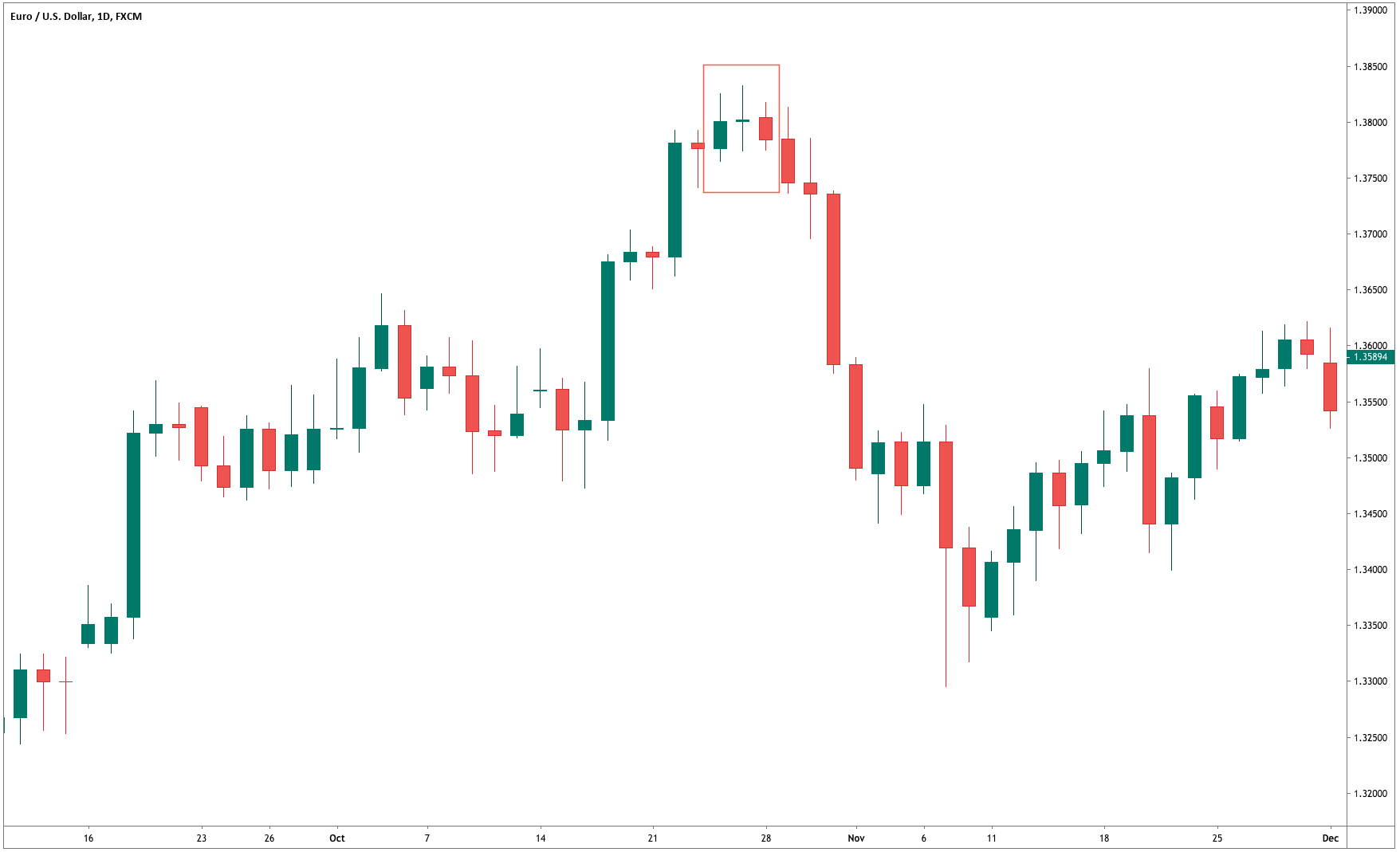
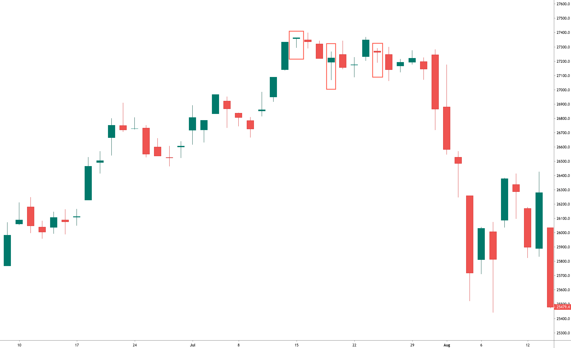
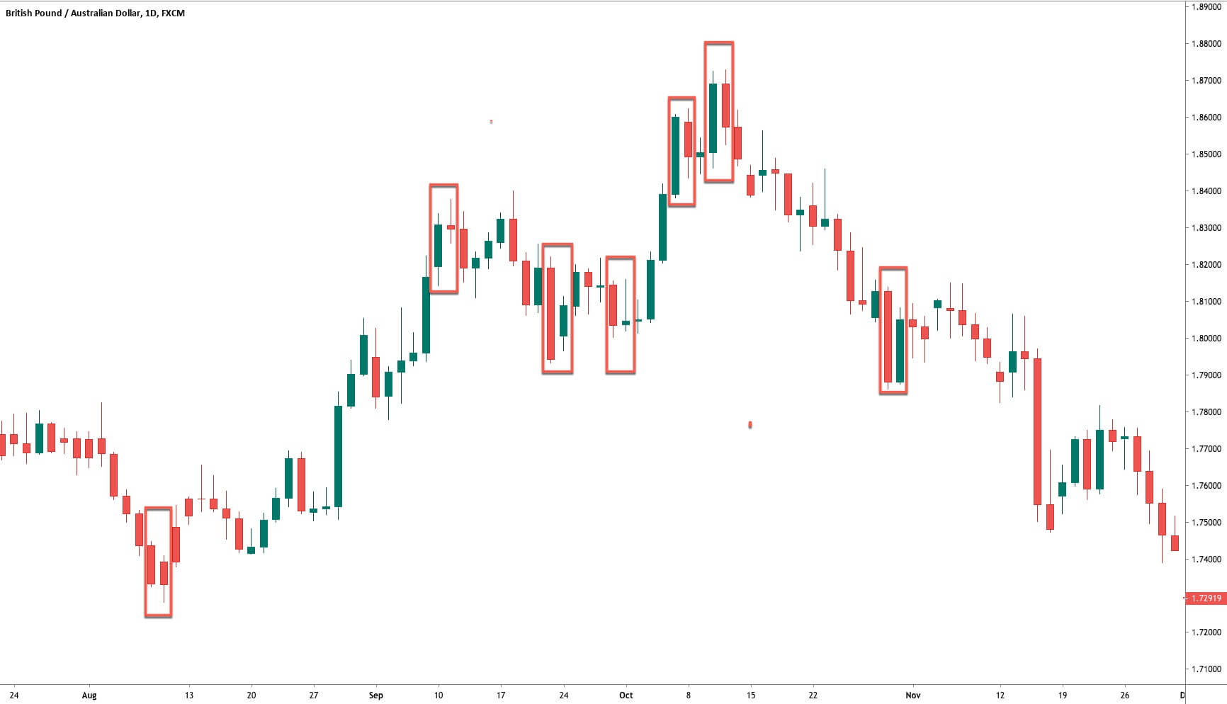
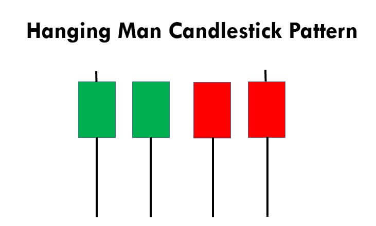
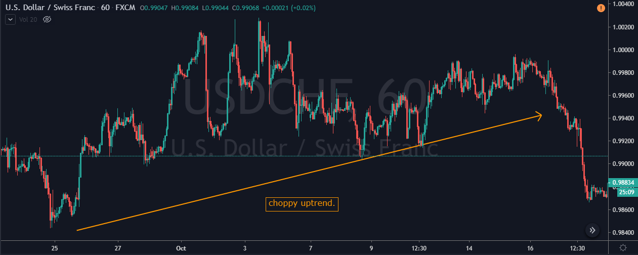
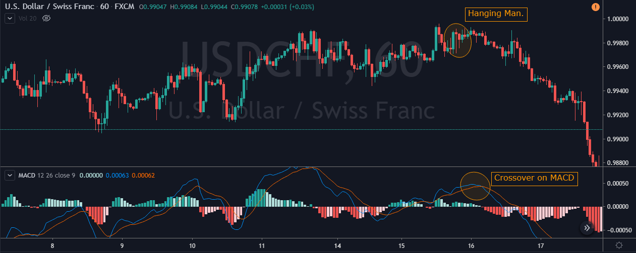
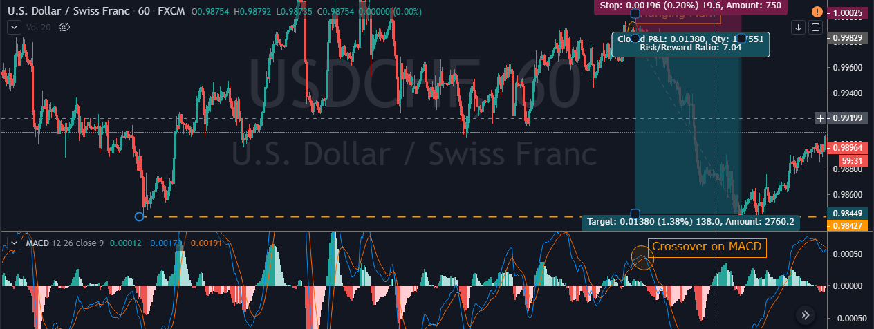
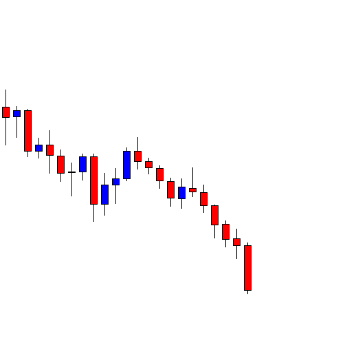
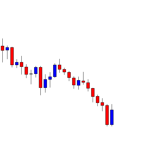
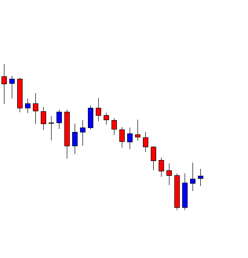
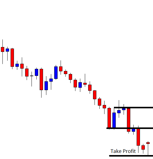
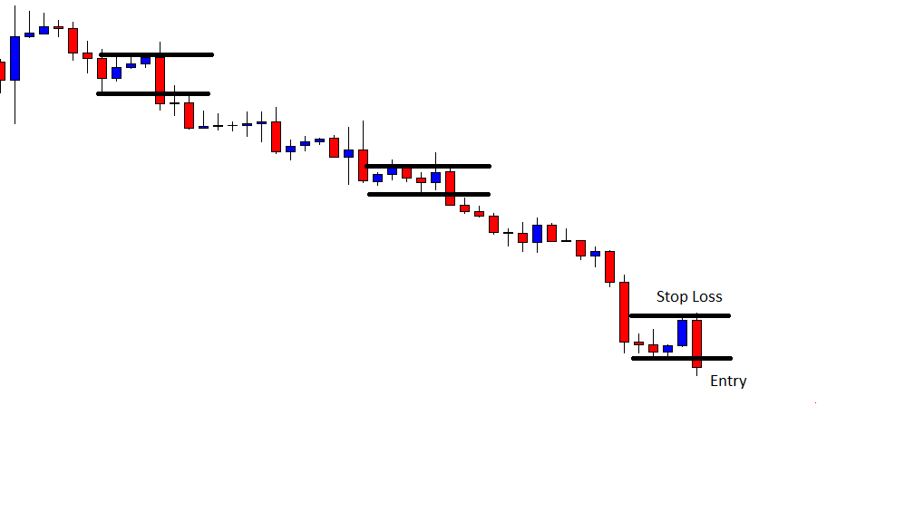
This pattern is not confirmed unless the price falls shortly after the Hanging Man. If the next candle closes above the high of the Hanging Man, this pattern is not valid. After the pattern, if the very next candlestick falls, then it’s a clear indication of the reversal. Now, if you see a Hanging Man candlestick and the above-discussed rules apply, you can go ahead and take the trade. But since it is crucial to have an extra confirmation, let’s pair this pattern with a technical indicator.

Pairing the Hanging Man Pattern With MACD Indicator

In this strategy, we have paired the Hanging Man pattern with the MACD indicator so that we can filter out the low probability trades. MACD stands for Moving Average Convergence and Divergence, and it is one of the most popular indicators in the market. It is essentially an oscillator that is used for trading ranges, trend pullbacks, etc. Also, this indicator identifies the overbought and oversold market conditions. In this strategy, we are using the default setting of the MACD indicator to identify the trades.

Step 1 – Confirm the uptrend first on your trading timeframe

We can’t use the Hanging Man pattern to take the buy trades. Since it is a reversal pattern, it only signals the selling trades. So first of all, find out the uptrend in any currency pair. One more primary thing to remember when trading this pattern is this – After finding a clear uptrend, if you see the market printing the Hanging Man, then try not to trade that pair. Because, in a strong trend, it’s not easy for a single candle to change the direction of the entire trend. But if you find this pattern when the uptrend is a bit choppy, it has higher chances to perform. As we can see in the image below, the uptrend in USD/CHF was not strong enough.

Step 2 - Find out the Hanging Man pattern on your trading timeframe

Some traders use two or three timeframes to trade patterns. But that’s not the right way of pattern trading. If you are an intraday trader, use only lower timeframes to identify the pattern. So the next step here is to find out the Hanging Man in this chart. Also, apply the MACD indicator. For us to go short, the MACD indicator must be in the overbought area.

As you can see in the image below, the USD/CHF Forex pair prints a Hanging Man pattern. This is the first clue for us that the buyers aren’t able to push the market higher. Soon after the crossover happened on the MACD indicator, we can say that this forex pair is in the overbought condition. So now, two forces are aligned, and they are indicating us to go short. Within a few hours, the pair rolls over, and it prints brand new lower low.

Step 3 – Entry, Take Profit & Stop Loss

We go short as soon as we see the Hanging Man candlesticks and MACD indicator at the overbought area, we can go short. In this pair, buyers were quite weak, and this is an indication for us to place deeper targets. As we suggest in every strategy, often close your position at significant support/resistance area, or when the market starts to print the opposite pattern. In this pair, we closed our full trade at 0.9844. Overall it was 7R trade, and we made nearly 140+ pips.

Placing the stop loss depends on what kind of trader you are. Some advanced traders use their intuition to close their positions, while some use logical ways such as checking the power of the opposite party. In this trade, we know that the buyers are not strong enough, so there is no need to use the spacious stop loss.

Difference Between Hanging Man and Hammer Patterns

The Hanging Man and Hammer both look the same terms of size and shape. Both of these patterns have long, lower shadows and small bodies. But the Hanging Man forms in an uptrend, and it is a bearish reversal pattern. Whereas the Hammer forms in a downtrend, and it is a bullish reversal pattern. These two patterns appear in both short and long term trends. Do not use these patterns alone to trade the market. Always use them in conjunction with some other reliable indicators or any other trading tool.

Bottom Line

Most of the professional traders never see this pattern alone as a predictor of a potential trend reversal. Because there will be times when the price action continues to move upward even after the appearance of the Hanging Man. Hence technical indicator support is required to confirm the reversal of the trend. Make sure to stick to the rules of the pattern so that you can use it to your advantage. This pattern forms in all the timeframes, but we suggest you master it on a single timeframe first. Cheers!

Categories
Candlestick patterns Forex Daily Topic

Candlestick Trading Patterns III – The Doji, The Most Critical Candle

The Doji

The Doji is a special candle, not only because of its striking appearance but also because it is one of the most vital signals in trading. This figure is so important that we need to understand it very well, as it is one of the safest trading signals when properly applied.

Fig 1 – A Doji on a chart

The Doji is characterized by having the open and close at the same level while standing out for its elongated upper and lower shadows. The figure of the Doji has a precise meaning. Buyers and sellers are in a state of mental indecision. The Doji is a powerful sign of trend change. The probability of a turn increases if in addition to the Doji:

  1. The next candles confirm the Doji’s signal
  2. The market is overextended
  3. The chart does not have many Doji.

The perfect Doji has the same open and close values. Nevertheless, if both levels are separated a few pips, and the candle can still be seen as a single line, it can be considered as Doji.

The Doji is a powerful signal to detect market tops. Steve Nison says that a dog is a sign of indecision by buyers, and an upward trend cannot be sustained by undecided traders. Nison also points out that, from his experience, the Doji loses some reversal potential during downtrends. That observation may apply to the stock market but is useless in pairs trading, as they are symmetric. In this case, a bullish trend of a pair is a bearish pare on the inverse pair and vice-versa. So a Doji will always have a similar meaning: The trend is compromised.  When trading commodities, indices, or stock ETFs the trader should take this into account, though.

In view that a Doji is such a powerful signal, it is better to act upon it. Better to attend a false signal than ignore a real one. Therefore, dojis are signals to close positions, since a Doji alone does not mean a price reversal.

The Northern Doji

The northern Doji is called a Doji that shows up during a rally. According to Mr. Nisson, ” The Japanese say that with a Doji after a tall white candle, or a Doji in an overbought environment, that the market is “tired.” Therefore, as said, a Doji does not mean immediate market reversal. It shows the trend is vulnerable.


FIg 2 – Down Jones Industrial Average showing northern Doji.

As we can see in the chart above, a Doji after a large candle, as in the first case, is followed by a gap and a drop to the base of a previous candle that surged after a gap.  The next Doji we see was an inside bar that just acted as a retracement and continuation. In the third case, we can see two Dojis, the second being a kind of hanging man with no head. In this case, we notice that the third bearish candle is the right confirmation of the trend reversal. It is not uncommon to observe tops depicting several small bodies, one of which is a Doji.

The Long-legged Doji

Fig 3 – Long-legged Doji in a SPY Daily chart.

We already know that a small body and long upper and lower shadows is called a high wave candle. If the figure doesn’t have a body is called “long-legged Doji,” and also called “rickshaw man.” As it happens with high-wave candles, it reflects great confusion and indecision.

Gravestone Doji

The gravestone Doji is the Doji that begins and ends at the low of the day. According to Stephen Bigalow, the Japanese name is set to represent “those who died in the battle.” Gravestone Dojis are a rarity.

Fig 4 – Long-legged Doji in the UK-100 Daily chart.


Dragonfly Doji

The Dragonfly Doji occurs when the price moves down since the open, and then it comes back and closes at the open. When it happens after an uptrend is a variant of a hanging man.

Fig 5 – Long-legged Doji in the DAX-30 Daily chart.

Conclusions

Dojis are important figures that warn trend reversals, especially if it happens at support or resistance levels.

Dojis need confirmation for trend reversals. When that happens, they create morning star and evening star formations. They also are followed by other small bodies, creating a flat top or bottom.

A safe precaution when encountering these figures while a trade is active is to close or reduce the position or, alternatively, tight the stops.


Sources:

Japanese Candlestick Charting Techniques, Second Edition, Steve Nison

Stephen Bigalow, Profitable Candlestick Signals


Categories
Forex Elliott Wave

Forecasting with the Elliott Wave Principle

The analysis and forecast process of any financial asset can support the decision process to take any positioning on the market. However, the time dedicated to developing it could increase the cost of the trade as this grows on time. In this educational article, we will review how to analyze and make a forecast by applying the main concepts of the Elliott Wave Principle.

The Elliott Wave Principle in a Nutshell

R.N. Elliott, in his work The Wave Principle, identified a nature’s law that governs everything, from nature to human socio-economic activities. Elliott comments that the financial markets are the most important socio-economic activity, so, when someone understands that law, he can get forecasts about the phenomena under study, the financial markets, in this case.

In this context, Elliott described that price moves in two types of movements impulses and corrections, and at the same time, the price tends to repeat some specific structures and sequences.

On the one hand, impulsive movements create trends and follow a sequence of five waves. On impulses, three waves move in the direction of the primary trend and two in the opposite direction.

On the other hand, a corrective movement consists of three waves; two of them will be in the opposite move to the main trend.

This eight-waves movement creates a cycle, and when it is complete, a new cycle of the same degree will start. In other words, when a five-waves and three-waves movement is complete, a new cycle of the same extension will take place.

Elliott gave intensive importance to corrections and told us the position of the market and the outlook. Elliott’s experience drove him to identify four main types of corrections as zigzag, flat, irregular, and triangles.

Making Simplifications

In the two latest articles, we discussed how we could simplify corrective patterns in the wave analysis using some chartist patterns as flags and triangles. Also, we commented on how it can help us in our study, reducing the time elapsed to develop a forecast and, finally, a trading plan.

The Analysis Process

The basic methodology to carry on the market analysis is to analyze from a higher to lesser time frame. In other words, we can start the study from a monthly range and finish in the hourly chart. Once we have identified the market structure, we begin to define scenarios that have a probability of occurrence. The scenarios are relevant to the analysis process because, using them, we can evaluate all possible price paths and decide which one of them is the most probable.

The Heating Oil Triangle

The following chart corresponds to Heating Oil in its weekly timeframe. In the figure, we observe the bullish sequence developed in three waves, which began on January 17, 2016, at $0.8552 per gallon. The energy commodity reached its highest level on October 03, 2018, at $2.4496 per gallon.

Once Heating Oil reached its high at $2.4496, the price started to make a bearish move, that found support at $1.6436 per gallon on January 02, 2019.

After that descent, the asset found buyers at $1.6436, Heating Oil’s traders started doing market swings. We can observe this as a triangle structure, as shown in the next daily chart.

According to the Elliott Wave Theory, we know that a triangle structure has five internal segments which follow a 3-3-3-3-3 sequence. However, there is the possibility that the triangle pattern does not build a fifth inner leg.

Now, let us identify some scenarios for the next path on Heating Oil.

  • Scenario 1:The price moves down and crosses the base-line of the triangle (dark orange arrow), with a first potential profit target at $1.6719, and a second target at $1.4339 per gallon.
  • Scenario 2 (blue arrow) considers that Heating Oil drops and, then, bounces off from the base-line, but does not surpass the previous high at $2.0994. From there, the price action begins a new bearish wave that would drive the energy commodity to $1.6719 per gallon.
  • Scenario 3 (black arrow), considers that the price overcomes the resistance determined by the upper-line of the triangle and the invalidation level at $2.1374.

Conclusion

As we discussed in this article, the time dedicated to analyze and forecast a financial market is a valuable resource that could increase or reduce the hidden cost of the potential trade. As occurs in mathematical models, valid simplifications can help the analyst to reduce the time to a decision process.

Flags and triangles are simple and basic formations that can ease the market study.

Finally, the formulation of different scenarios provides a wide range of options about the next potential paths of the price action. Also, these scenarios create different answers facing the question of what if the market does that?

Categories
Candlestick patterns Forex Daily Topic

Test your knowledge about Candlesticks

After our discussion about short-bodied candlestick in our article

Candlestick Trading Patterns II – Everything you need to know about Single Candlestick Signals

Here you can test your newly acquired knowledge about the matter. If you haven’t read it, please do so before the quiz.


[wp_quiz id=”51631″]


Reference: The Candlestick Course – Steve Nison

Categories
Forex Daily Topic Forex Elliott Wave

Analysis and Trading with Triangles

In our previous article, we discussed how we could simplify the zigzag and flat pattern by the chartist figure known as a flag. In this educational article, we will see how triangles can be used in wave analysis.

The Background

Within the Elliott wave theory, triangles represent one of the three basic corrective formations. Similarly, in traditional technical analysis, triangles represent consolidation and continuation formations of the trend.

Elliott defined triangles as a formation that have an internal structure subdivided into five waves following a 3-3-3-3-3 sequence. At its time, Elliott identified two triangle variations, which are classified as expansive or contractive.

In general terms, triangles represent the market indecision or the balance between the buying and selling forces.

The following chart shows the model of the triangles in their contractive and expansive variants, under the Elliott Waves theory and Traditional Technical Analysis perspective.

According to the point of view of the traditional technical analysis, we can observe that the triangle pattern is not forced to have five internal segments, as in Elliott’s wave theory. In consequence, a truncated zigzag or truncated flat structure could be simplified by a triangle pattern.

The Trading Setup

The trade configuration of a contracting triangle pattern has the following characteristics:

  • Entry Level: A buying (or selling) position will be activated if the price exceeds and closes above the swing of the previous top.
  • Profit Target: The first profit target level will take place at 78.6% of the Fibonacci expansion, while the second will be at 100%, and finally, the third profit target level will be at 127.2%.
  • Protective Stop: The invalidation level of the trade setup will be located below the lowest swing of the triangle pattern.

The trade configuration of an expansive triangle pattern has the following properties:

  • Entry Level: The trade will be activated if the price exceeds the height of the expanding triangle.
  • Profit Target: The first profit target level will be at 100% of the Fibonacci expansion. The second profit target level will be at 127.2%.
  • Protective Stop: The level of invalidation will be located below the lowest low of the expansive triangle pattern.

Examples

The following chart corresponds to the AUDUSD pair in its 12-hour timeframe. We can observe that the price action developed an expanding triangle formation, which began from mid-May 2019 and culminated in mid-July 2019.

From the chart, we detect that the expanding triangle reached its highest level at 0.70821, which corresponded to a false breakout. Subsequently, the price action resolved the next movement with a drop that took it to plunge until 0.66771.

The sell-side entry was activated once the price closed below the lowest level of the expanding triangle at 0.68317. Once activated the sales position, the price reached the first target at 0.67080.

Another possibility of entry that could be considered would be the closing below the last relevant swing, that is, the closing below 0.69105. This option could provide the trader with a higher profit compared to the risk taken compared to the original entry setup.

The next example corresponds to Silver in its daily chart. From the figure, we observe that the price made a record high early July 2016, reaching $21,225 per ounce, after this, the price action performed a corrective movement, once its found support, Silver built a tight contractive triangle.

After breaking below $18,715, Silver activated a bearish scenario that drove the price to fall to the third bearish target at $15.66 per ounce.

After having fulfilled the third bearish target, the price fell and reached $18.435 on April 17, 2017, where Silver began to build a contractive triangular structure that lasted until the end of June 2018.

Once the downward break of the long-lasting triangle occurred, we see that the price made a limited downward movement, which did not yield below $14 per ounce.

Conclusion

Based on the discussion of this article, we can conclude that regardless of the corrective structures that have three or five internal waves, these can be simplified as triangular patterns. Also, we can observe that a corrective wave or a short-range narrow triangle is likely to have an extended move that, in terms of Elliott’s wave theory, could correspond to an extended wave.

On the other hand, extensive triangular formations, or of a wide range, could lead the price to move in a range not as broad as in the previous case.

Finally, in the last example, we recognize how the alternation principle works in Elliott’s wave theory. Just as the first observed triangle is simple, and has a short duration, and the second corrective formation is extensive and complex.

Categories
Candlestick patterns Forex Daily Topic

Candlestick Trading Patterns II – Everything you need to know about Single Candlestick Signals

This article is to be dedicated to single candlestick key figures. The majority of patterns are created by more than one candle, but some particular candlestick shapes are key figures to gauge the market sentiment and spot reversals.

In every one of them we will deal with the following aspects:

  • Identification of the candlestick
  • Marker psychology interpretation
  • Criteria and use

Key Single Candlestick Figures:

  • Doji
  • Spinning top
  • High Wave Candlestick
  • Hammer
  • Hanging man
  • Shooting star

The Japanese traders call the real body “the essence of the price action.” A scientist might call it the Signal part of the message, while the shadows are the nose of the market. The relation between the body and the shadows delivers unique insights into the sentiment of the traders. Shadows show the fight between buyers and sellers to control the price. A large body and small shadows denote that one of the sides has won the battle during that interval. A short body with large shadows after an extended trend indicates the winning herd is losing steam.

Spinning tops and high wave candles

Fig 1 – Spinning tops and High Wave candles

A spinning top is a visual clue for a candle with a tiny body. The color of the body does not matter.  A spinning top without a body is called Doji, such as the second one in the figure above. The fourth one is very close to it too.

Market sentiment in spinning tops

A the smaller the body, the larger the fight between bulls and bears. It shows that no one had control of the price during this period, as the sellers pressure the price down and buyers up, a small body means no one could outweigh the other party. The demand is counteracted by fresh supply,  and vice-versa, so the market is unable to move.

High Wave Candles

Steve Nison also mentions a close relative to the spinning top, called High Wave Candle. High Wave candles also have very small bodies, but to qualify as High Wave, the formation must also have large shadows on both sides. Shadows need not be of the same size, but they must be large.

Market sentiment in a High Wave Candle

According to Mr. Nison, If indecision is the crucial sentiment on spinning tops, High Wave candles represent “downright confusion.” That is evident because, in the same period, the market goes from the euphory of an extended high to the fear of a large drop, and then to close very near to its opening value. That means total confusion.

Trends and spinning tops

A large white body is like a green light for bulls in an uptrend. A large red body is also a green light to sell. But finding a spinning top in an uptrend means that the buyers do not have the complete control of the price. Therefore, such tops are a warning sign that the trend might be ending. Spinning tops acquire more importance when the price is overextended or close to resistance levels.

Spinning tops during ranging markets do not have any power to warn a trend change, as these stages are too noisy, and filled with lots of small bodies, anyway. Therefore, spinning tops and high waves during horizontal channels have no trading value.

Hammers, Hanging Man, and Shooting stars

Three special cases of spinning tops are the Hammer, the Hanging Man, and the Shooting Star.

Hammer

Fig 2 – Hammer

The hammer has a small real body and a large lower shadow. It is the equivalent of a reversal bar.  The price went from the open to the bottom, then it recovered and closed near or at the high of the session. The color of the body has less importance, although a close above the open has more upside implications. The signal is confirmed with a followthrough candle next to it.

Criteria:
  • The occurrence is after a lengthy downward movement, and the price is overextended.
  • The real body is at the upper top of the trading range
  • The shadow must be two times the length of the body. The longer, the better.
  • No upper or just a tiny shadow
  • Confirmation with a strong bullish candle, next
  • A large volume on the candle confirms a bottom.


Hanging Man

Fig 3 – Hanging Man

The hanging man has a similar shape of the hammer, but it shows up after an uptrend. The Japanese named that way because it is similar to the head and body of a man hanging by the neck.

Criteria:
  • The occurrence is after a significant upward move, and/or the price overextended.
  • The body is at the upper end of the trading range.
  • The lower shadow at least two times the height of the body. The color is not essential, but a bearish finish is preferred. the longer the shadow, the better
  • Tiny or no upper shadow.
  • Confirmation with a large bearish candle
  • High volume on the candlestick is indicative of a potential blowoff.
Shooting star

Fig 4 – Shooting Star

The shooting star is a top reversal candlestick and is the specular image to the hanging man.  In the case of a shooting star, it began great for buyers, but after the euphory of new highs, it came to the deception of the selling pressure with no demand to hold the price.  The close happens at the lower side of the trading range. A bear candle next confirms the trend change.

Criteria:
  • The upper shadow should be two times the height of the body. The larger, the better.
  • The real body is at the bottom of the trading range.
  • Color is less important, although a  red candle implies more bearishness.
  • Almost no lower shadow.
  • A large volume would give more credibility to the signal.
  • A  bear candle next is the confirmation of the change in the trend.


Reference: Steve Nison: The Candlestick Course

Profitable Candlestick Trading, Stephen Bigalow


Categories
Candlestick patterns Forex Daily Topic

Candlestick Trading Patterns I – The Story

The Financial markets are an exciting place for many people, attracted by dreams of infinite wealth. However, these markets are one of the most complicated environments on earth. The fact that millions of people exchange assets in financial markets makes them very difficult to predict, as each of the participants has its own vision, interests, and objectives.
That is why traders are always investigating the best tools to allow them to detect market sentiment in every situation.

Fundamental versus Technical

In the past, fundamental analysis was the only tool that allowed investors to detect whether a value was overvalued or undervalued. That gave them the keys to future trends, and to be able to overtake other investors with less information.
Then, at some point, the theory arises that the analysis of price history shows everything necessary for an informed investment. According to this theory, launched by Charles Dow, the price is already included in the fundamental analysis, since the chart is the trace left by investors about the consensus value of the good.

That said, there is a consensus that fundamental analysis is still necessary to detect the macro trend and to position the buying and selling actions in favor of the primary trend, while technical analysis is essential to generate the timing of trading activities.

Fig 1- Old NY Stock Exchange price table and Average chart. Source (https://pix-media.priceonomics-media.com/blog/1230/image04.png)

Chartism was encouraged in the early 1970s and 1980s by the emergence of personal computers, which allowed graphs to be automatically generated, instead of manually drawn, and also analyzed in time frames shorter than the daily.

The OHLC Chart

The technical analysis popularized the use of OHLC graphs that not only indicated the closing value of each interval but also gave the opening, maximum, and minimum data. This allowed chartists to observe the range of movements of the period and obtain an assessment of the volatility.

Fig 2- OHLC Chart in its classical B&W style.

The use of OHLC charts was a big advancement in the analysis of the price action. Soon analysts began to define profitable patterns such as reversal bar, key reversal bar, Doble and triple tops and bottoms, head and shoulders pattern round bottoms, Cup and handle, and many more.

Candlestick Charts

A centuries-old hidden way to analyze the markets came from Japan helped by Steve Nison’s studies of candlestick charting methods. According to him, centuries back, Japanese merchants were at the bottom of Japan’s social scale, well below soldiers, artisans, and farmers. But a prominent merchant began rising in status by the XVIIth century. His name was Munehisa Homma. At that time rice was a medium of exchange. Feudal Lords would store it in Osaka’s warehouses to, then, exchange the receipts when it was convenient for them, thus, becoming a de-facto futures market. Homa’s trading techniques, which included analysis through a primitive form of candlestick charts to gauge the psychology of the marker would earn him an immense fortune.

Fig 3- Candlestick Chart in its modern colorful style.

The major advantage of a candlestick chart over an OHLC chart is the ability to assess at a glance the overall trend and, also many hints about the current sentiment or psychological mood of the trader collective. Color is key to assess the current trend. Also, large bodies signify genuine momentum, short bodies and large wicks mean indecision and fight between buyers and sellers to control the price action.

Candlestick Patterns

Many of the western analysis methods can be applied also to candlestick charts, but these Japanese charts have brought a brand new batch of new patterns to assess market turns and continuations.  We will try to cover most of them, including obviously all major trading candlestick patterns such as Morning and evening stars, haramis, engulfing, three soldiers, and so on.

To refresh your basic knowledge of candlesticks, we recommend the following articles:

https://www.forex.academy/all-you-need-to-be-introduced-to-trading-charts-part-1-line-bar-and-candlestick-charts/

https://www.forex.academy/facts-about-candlesticks-you-never-knew/

https://www.forex.academy/dissection-of-candlestick/

https://www.forex.academy/candlestick-charts-and-its-advantages-in-financial-trading/