Categories
Forex Market Analysis

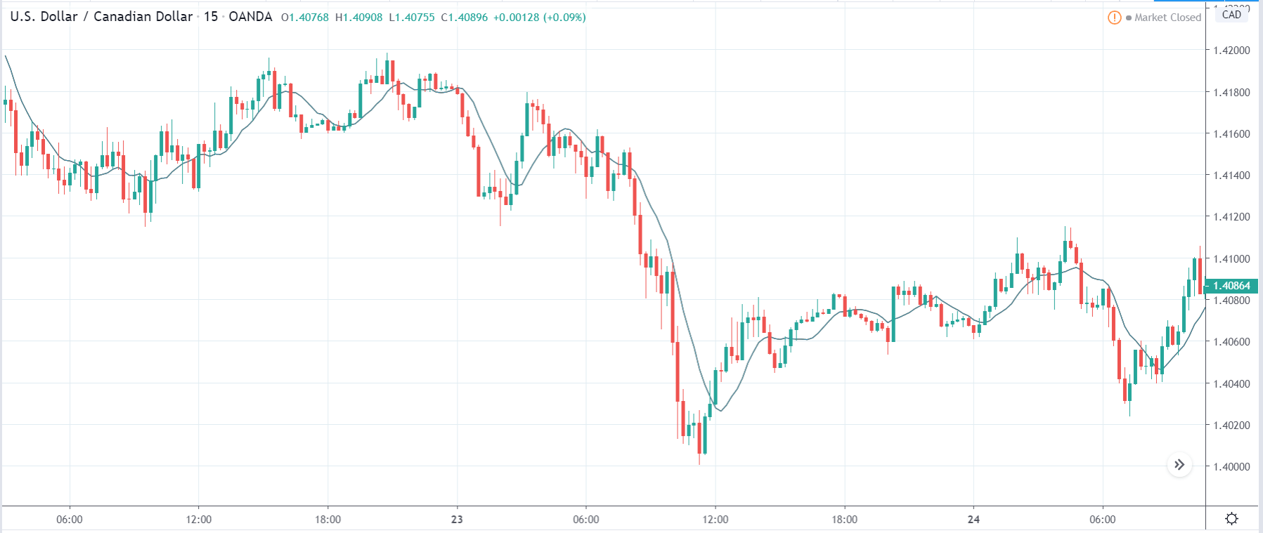
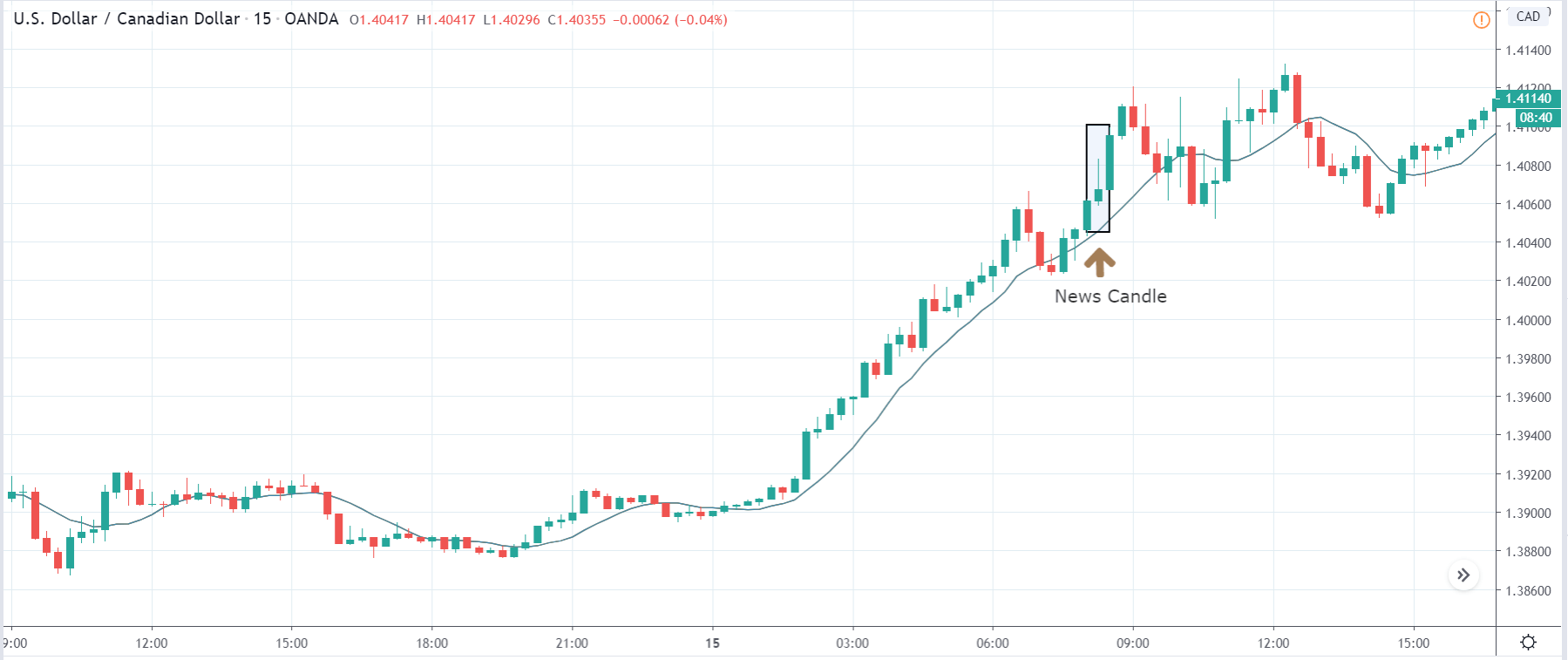
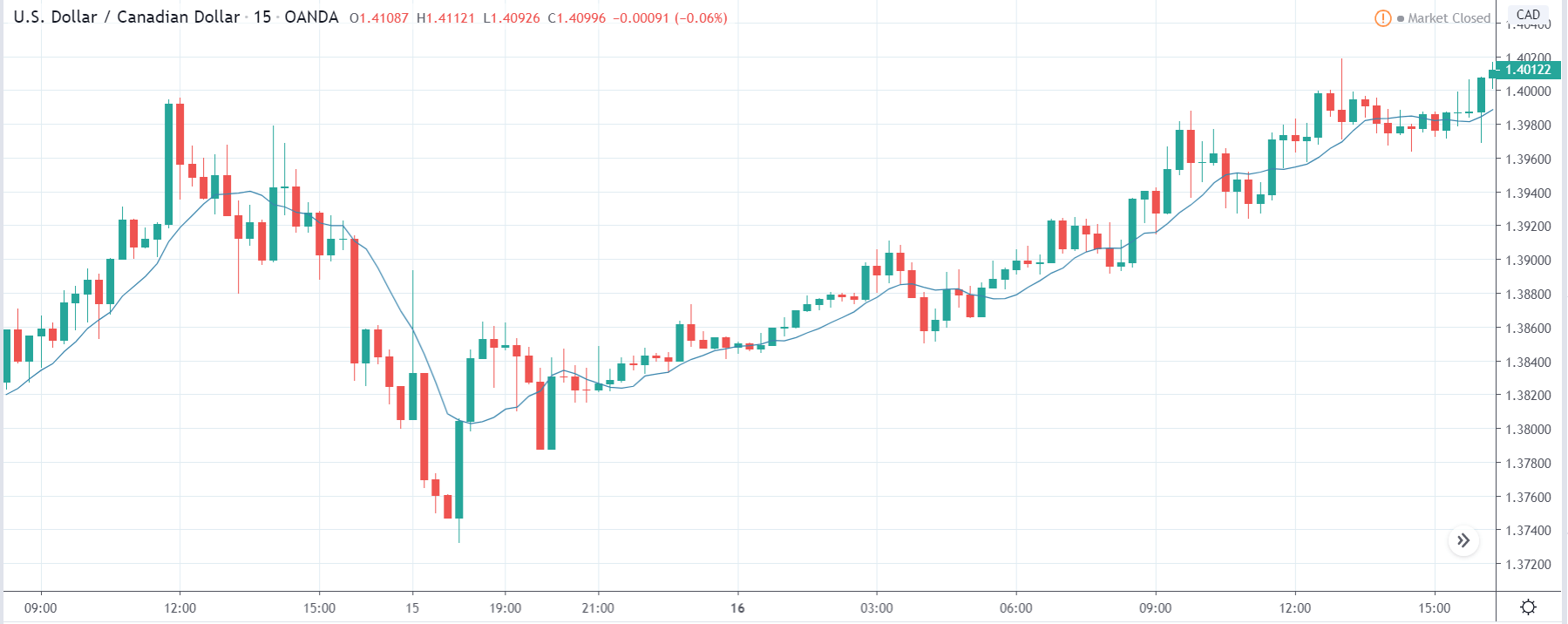
USD/CAD on a Bullish Mode – Forms Higher’s High & Highers Low Pattern In Play!

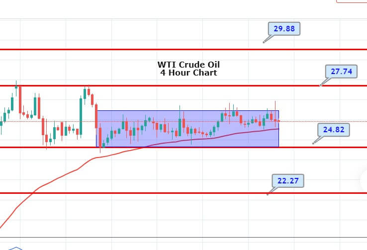
During Thursday’s Asian trading hours, the WTI crude oil prices looking directionless despite Wednesday’s decrease US inventory report. However, the crude oil prices trading mostly unchanged on the day near the $25.40. Technically, the 4-hour chart shows prices are confined between the tight price range outlined by the trendlines from May 7 and May 13 highs and May 6 and May 7 lows. 

The reason for the confined trading could be attributed to the risk-off market sentient and second wave of coronavirus, which turned out to be one of the key factors that kept a lid on any gains in oil prices. The WTI crude oil is trading at 25.82 and consolidate in the range between the 25.20 – 26.00.

A range breakout would indicate a continuation of the recovery rally from lows below $10 observed in April. However, a bearish reversal would be confirmed if the range is breached to the downside. 

Thus, the breakout can’t be rejected because the US inventory report released Wednesday showed the 1st-decline in outputs since January. The US crude inventories dropped by 745,000 barrels last week, the Energy Information Administration said, compared with analysts’ expectations in a Reuters poll for a 4.1 million-barrel rise.

Support Resistance 

1.4032       1.4144

1.3962       1.4186

1.3919       1.4256

Pivot Point 1.4074

For the time being, the investors are cautious about placing any strong position mainly due to the fear of coronavirus second wave caused y easing lockdowns. As well as, the reason for the risk-off market sentiment could also be attributed to the renewed concerns concerning the economic slowdown. 

Categories
Forex Market Analysis

Daily F.X. Analysis, May 14 – Top Trade Setups In Forex – U.S. Jobless Claims in Focus! 

The reason for the risk-off market sentiment could be attributed to the latest disagreeability about negative rates showed by Fed Chair Powell as well as Powell’s comments on the economy keep the market risk-tone heavy and helping the greenback to take bids. Let’s wait for the U.S. Jobless claims to predict further price action in the market. 

Economic Events to Watch Today 


EUR/USD – Daily Analysis

The EUR/USD currency pair flashing red and dropped from 1.0896 to 1.0812 on Wednesday while representing 0.10% losses on the day and currently drawing offers near below 1.0810 mainly due to the broad-based U.S. dollar strength in the wake of risk-off market sentiment. The reason for the risk-off market sentiment could be attributed to the latest disagreeability about negative rates showed by Fed Chair Powell as well as Powell’s comments on the economy keep the market risk-tone heavy and helping the greenback to take bids. The EUR/USD pair is trading at 1.0808 and consolidates in the range between the 1.0804 – 1.0825. However, traders are keenly awaiting the U.S. key data ahead of placing any strong position.

As we already mentioned that the market participants avoided risker assets and started buying the U.S. dollar mainly due to the risk-off market sentiment in the wake of renewed growth concerns. The Federal Reserve’s chairman gave warning on Wednesday about the scope and speed of the ongoing economic downturn while compared the slowdown pace with the World War II recession. Whereas, the Fed Chair Powell hints that the ongoing recession could be for the long-term if Congress fails to provide additional fiscal support.  

Moreover, the Fed Chair Powell said we are not looking forward to keeps the negative rates. As well as, the Cleveland Federal Reserve President Loretta Mester said, “Negative rates not a tool we think we would use to support the economy. The reasons for the heavy risk-tone could also be attributed to the US-China tussle. It should be noted that the recent fire shots of words from China came after the U.S. President Trump ended Federal retirement savings fund from diversifying into the Chinese stocks.

On the other hand, the final German Consumer Price Index for April, which is scheduled to release at 06:00, could fail to leave any strong impact on the market until or unless the number prints significantly below estimates. As in result, the shared currency may face stronger bearish moves. At the coronavirus front, the number of confirmed coronavirus cases increased to 172,239, with a total of 7,723 deaths reported according to the latest figures from the German disease and epidemic control center, Robert Koch Institute (RKI).

On the other hand, from the United States, the PPI data came in poor than expected and was almost ignored by the market traders. The Producer Price Index from the U.S. for April was dropped by -1.3% against the forecasted -0.5%. The Core PPI from the U.S. for April also dropped to -0.3% against the expectations of -0.1%. The U.S. dollar ignored the data and was supported by Powell’s speech on Wednesday, so the strong U.S. dollar dragged down the upward movement of EUR/USD pair on Wednesday and ended the pair’s day with a bearish candle. 

Market participants look forward to the key U.S. data, which highlights the U.S. Initial Jobless Claims, scheduled to release at 12:30 GMT, and final German Consumer Price Index for April, which is scheduled to release at 06:00, as these key data could influence the market moves. The trade/virus updates also will be key to watch.

Daily Support and Resistance

  • S1 1.0722
  • S2 1.0783
  • S3 1.0811

Pivot Point 1.0843

  • R1 1.0871
  • R2 1.0904
  • R3 1.0964

EUR/USD– Trading Tips

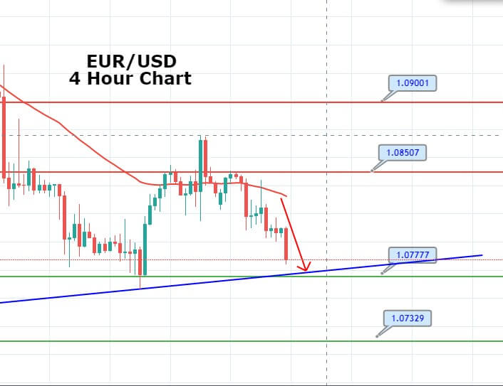
On Thursday, the EUR/USD price dropped to test the support level of 1.0800, which is extended bu the upward channel. On the chart, the EUR/USD os closing a Doji above upward channel trendline, but at the same time, the 50 EMA and horizontal resistance seems to drive bearish sentiment for the EUR/USD pair. Continuation of selling until 1.0778 level may lead the EUR/USD prices towards 1.07782 level, and below this, the next support is likely to be found around 1.0730. 


GBP/USD – Daily Analysis

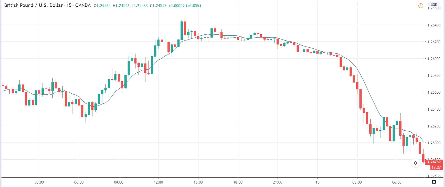
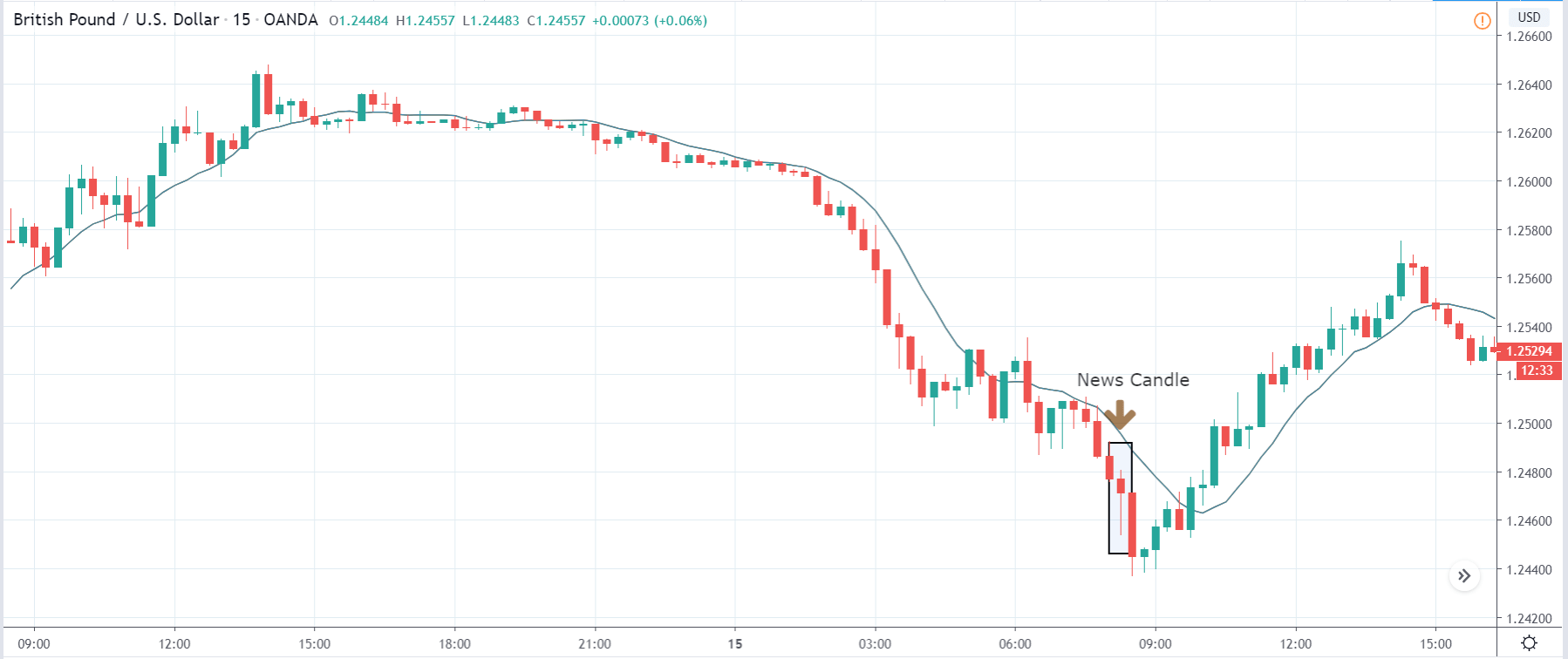
During Thursday’s early Asian trading hours, the GBP/USD currency pair failed to stop its 4-day losing rally and dropped around 1.2200 while representing 0.26% losses on the day mainly due to the Wednesday’s downbeat performance of the U.K. data. The Brexit and coronavirus fears also weighed on the British Pound. Moreover, the broad-based U.S. dollar bullish trend in the wake of risk-off market sentiment keeps the currency under pressure. At the press time, the GBP/USD currency pair is currently trading at 1.2189 and consolidates in the range between the 1.2187 – 1.2242. However, traders are keenly awaiting the U.S. Jobless Claims for near-term direction in the greenback.

As we already mentioned that the reason for the pair’s declines could be attributed to the multiple factors, like downbeat U.K. fundamentals, comprising sluggish data, coronavirus outbreak, Brexit worries, and most impactful is U.S. dollar strength.

The broad-based U.S. dollar is taking bids due to its safe-haven demand in the wake of risk-off market sentiment. Also, the Federal Reserve’s latest disagreeability from the negative rates bolstered the U.S. dollar strength. As well as, the ongoing uncertainty about coronavirus and the US-China trade war also keeps the market risk-tone heavy, which also contributed to the greenback’s gains. The U.S. Dollar Index that tracks the greenback against a basket of other currencies gained 0.03% to 100.317 by 11:47 AM ET (4:47 AM GMT).

However, the risk-off market sentiment further bolstered by the second wave of virus spread in major economies as well as the US-China tussle. At the U.K. data front, yesterday’s downbeat performance of the U.K. data urged the British Chancellor Rishi Sunak to say that there are many chances that the Uk economy will suffer in the deeper recession this year, and we’re already in the middle of that as we speak.

Powell said that Fed would continue using its tools in the betterment of economic recovery; however, it would need White House and Congress by its side for new fiscal aid. Powell stressed that the outlook of the economy was still uncertain, and risks remain downside. He did not give any signals about the negative interest rates and said that the need for them has not yet come. The pair dropped to 1.2210 level after Powell’s speech on the back of U.S. dollar strength on Wednesday and ended its day with a bearish candle.

Daily Support and Resistance

  • R3 1.2577
  • R2 1.2508
  • R1 1.2422

Pivot Point 1.2353

  • S1 1.2268
  • S2 1.2198
  • S3 1.2113

GBP/USD– Trading Tip

The GBP/USD bearish at 1.2200 after breaking below the narrow trading range of 1.2320 – 1.2245. The Cable is still holding below 50 EMA, which is extending resistance around 1.2350 level today. On the 4 hour chart, the GBP/USD is gaining support at 1.2185 level while the 50 EMA and horizontal resistance stay at 1.2365 level. Today, the U.S. jobless claims may drive the selling trend in the GBP/USD pair to lead its prices towards an immediate support level of 1.2190 and 1.2150. Conversely, the worse than expected Jobless Claims will lead the GBP/USD pair towards 1.2240 and 1.2310. 


USD/JPY – Daily Analysis

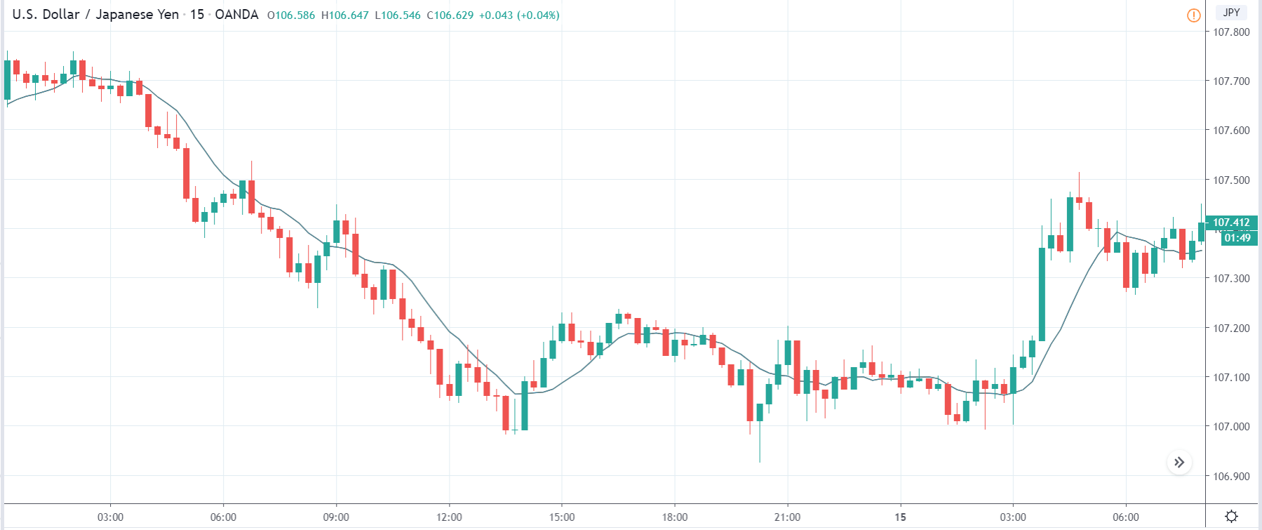
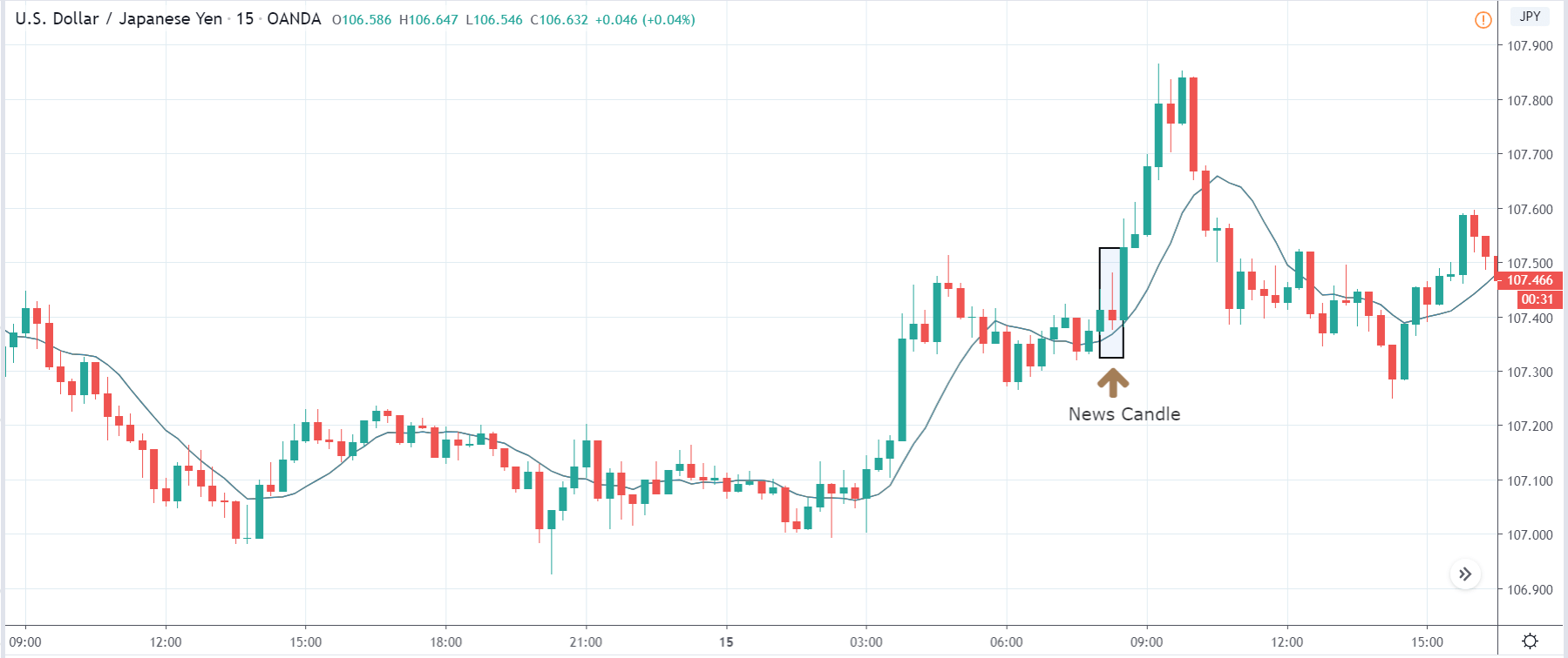
The USD/JPY pair was closed at 107.025 after placing a high of 107.275 and a low of 106.741. Overall the movement of USD/JPY remained Bearish throughout the day. The USD/JPY extended its previous day’s losses and continued its downward movement on Wednesday to post losses for the 2nd trading session

The pair followed the previous bearish trend in the early trading session, but after the speech from Jerome Powell, pair started to recover some of its daily losses and move in the reverse direction. However, the pair USD/JPY failed to reverse its direction due to poor than expected PPI reports from the U.S.

At 4:50 GMT, Japan’s Bank Lending figure for the year exceeded the expectations of 2.0% and came in as 3.0% in favor of Japanese Yen. The Current Account Balance from Japan’s Ministry of Finance showed a decline to 0.94T against the forecasted 1.29T for March. At 10:02 GMT, the Economy Watchers Sentiment dropped to a low of 7.9 against the forecasted 10.1 and showed that current economic conditions were not right.

Furthermore, Safe-haven Yen was also supported by the growing fears of the second wave of coronavirus along with the increased tensions between China &US, which weighed on the U.S. dollar.

From the American side, the Core Purchasing Price Index (PPI) for April showed a decline to -0.3% against the forecasted decline by -0.1% and weighed on U.S. dollar, which in turn added in the downfall of USD/JPY pair. The pair USD/JPY further dropped after the release of PPI, which also declined to -1.3% against the forecasted -0.5%.

Daily Support and Resistance    

  • R3 109.37
  • R2 108.57
  • R1 108.12

Pivot Point 107.33

  • S1 106.88
  • S2 106.09
  • S3 105.64

USD/JPY – Trading Tips

The USD/JPY traded bearishly to trade below the support level of 107, which marked the 50% Fibonacci retracement level. Currently, the USD/JPY is holding at 106.875, where the 50 EMA is resisting the pair, and it may drop further below the 107 level. At the moment, the 4-hour candle seems to close below 107 support become resistant, and this may drive more selling in the USD/JPY pair. The pair may extend selling until 106.600 level, whereas the closing of buying candles above 107 can trigger bullish bias until 107.50. By the way, bearish bias seems solid today. All the best for today! 

Categories
Forex Fibonacci

Determining Higher Highs or Lower Lows to Draw Fibonacci Levels

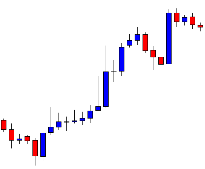
Fibonacci levels are obtained by using higher highs or lower lows. A chart may have many higher highs/lower lows. Thus, Fibonacci levels can be obtained at different levels. A trader may find it difficult to spot out the levels where the price may react. In today’s lesson, we are going to see how different higher highs may lead us to having Fibonacci levels where the price does not react.

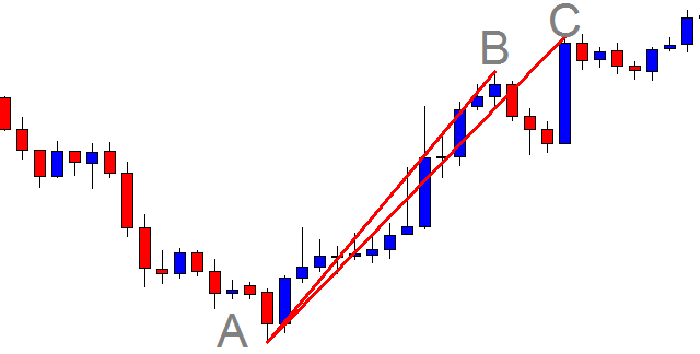
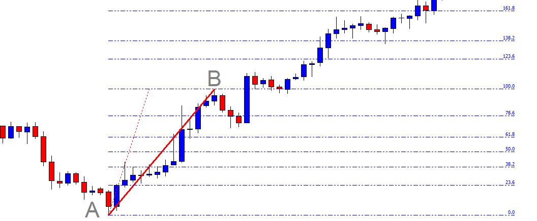
This is an H1 chart. The price heads towards the North with good bullish momentum before making a bearish correction. The point can be used to draw Fibonacci levels. The price then makes another bullish move and makes a new higher high. Some traders may want to use the last higher high to draw their Fibonacci levels. To make it clear, look at the chart below.

Some traders may use AB, while some others may use AC to draw Fibonacci levels. These two arms point out Fibonacci levels at different levels. Let us assume that we draw our Fibonacci levels by using AC.

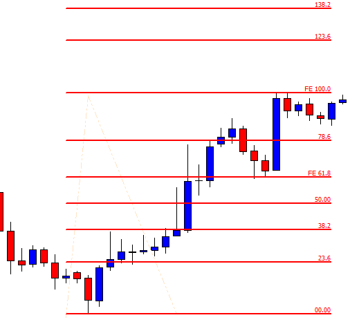
The chart shows that the price after making the last higher high has started having a bearish correction. The buyers are to wait for the price to come at 78.6% level and make a breakout at the level of 100.0 to offer them a long entry. If the 78.6% is breached, 61.8% may do the same and offer them an entry as well. Let us proceed to the next chart to find out what happens next.

The price does not even come at 78.6%. It heads towards the North and makes a breakout at the level of 100.0. The price then never looks back. It hits the level of 161.8% in a hurry. The Fibonacci buyers do not find an entry here since the price does not trend from a 78.6% level. It trends way above the level of 78.6%.

Let us draw the Fibonacci levels with AB arm.

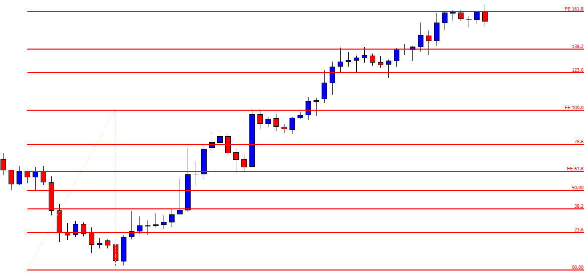
If we draw Fibonacci levels by using AB, we see that the price trends from 78.6% level. One candle breached through the level, but the next candle closes well above the level of 100.0. The buyers may set their target around 138.2% since it trends from 78.6%. However, it goes up to 161.8%.

To sum up the lesson, Fibonacci traders are to be well calculative at the time of selecting the first arm. With AC, there is no correction. The price trends towards the North straight. With AB, the price makes a correction and then makes another bullish move. Usually, a straight arm works well and provides accurate Fibonacci Fibonacci levels. Over here, we have seen that AB provides the Fibonacci levels, where the price reacts and help the buyers take a trading decision.


Categories
Forex Basic Strategies

Best Way To Trade The ‘Pin Bar’ Forex Chart Pattern – The Pin Bar Reversal Strategy!

Introduction

Price action or Candlestick analysis combined with some of the factors and confirmations is more reliable as they work out even without using too many indicators on the price chart. Using many indicators on the charts makes it difficult for traders to see the bigger picture (opportunities) in the market. We have numerous candlestick patterns in trading, but there are few on which many traders have their eyes on. One of those is the Pin bar candlestick pattern.

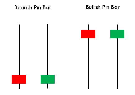
The pin bar candle is mostly used as a reversal pattern. A pin bar typically consists of a price bar with a long wick or shadow. The region between the open and close of the pin bar is called its real body, and a long tail is known as the wick. Pin bars generally have small real bodies in comparison to their long wick. The body of the pin bar is one-third of the total size of the candle. The long wicks of the candle show the area of the price that was rejected and signifies that the price will now move in the opposite direction of the wick.

The psychology behind trading a pin bar candle is that when a price is moving in one direction and reaches significant support or resistance level, it gets rejections. Rejection in a downtrend signifies that the seller pressure (supply) in the market is decreasing, and the buyer pressure (demand) has started increasing and vice versa. The pin bar, either bullish or bearish, signifies that the price does not want to go more down or up and want to reverse from that strong support or resistance level.

Understanding The Bullish & Bearish Pin Bars

Every time a pin bar candle occurring at a strong level does not always mean that the market is going to reverse from that level. To make this valuable, we must see that the overall picture and not just a single candle. In this trading strategy, we will see how we can analyze the overall market near that confluence level. Before that, let’s understand the two types of pin bar candlestick patterns.

Bullish Pin Bar Reversal Pattern

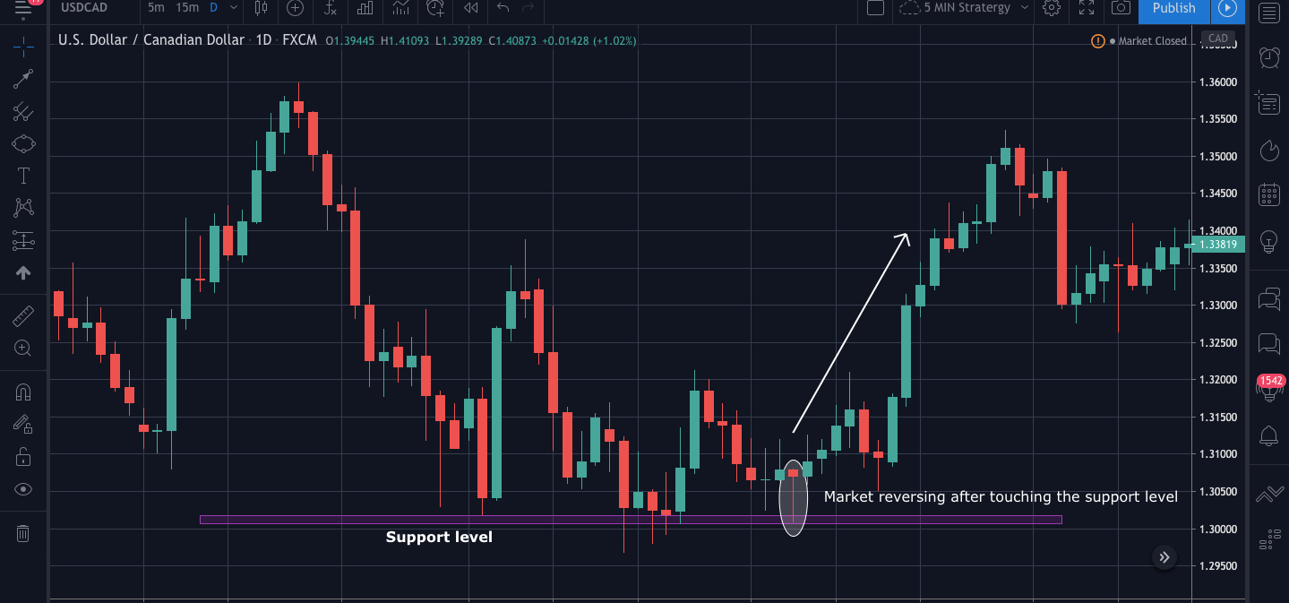
The bullish pin bar candle occurs when the price comes near a strong support level; this leads to the formation of a long wick of the pin bar and shows rejection from that level. This candle usually forms at the end of a downtrend and signifies that there can be either a short-term uptrend or a full reversal forming a strong uptrend.

Bearish Pin Bar Reversal Pattern

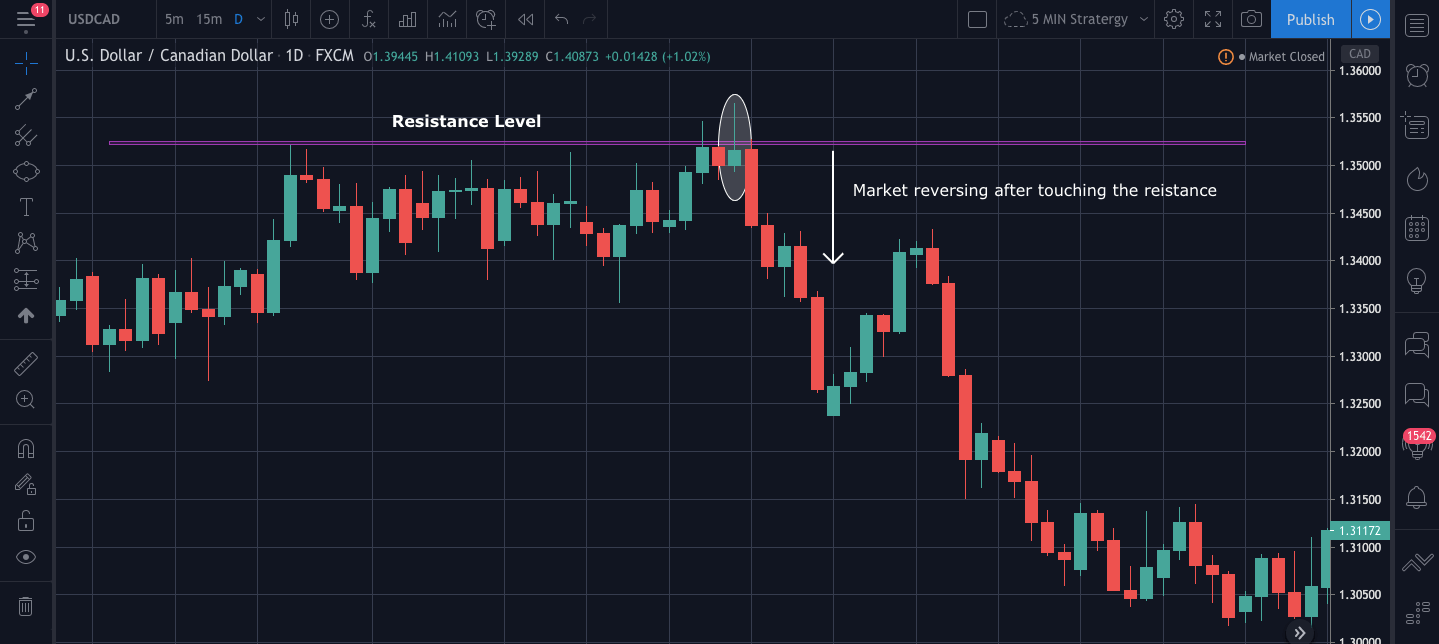
The bearish pin bar candle occurs when the price comes near a strong resistance level; this leads to the formation of a long wick of the pin bar and shows rejection from that level. This candle usually forms at the end of an uptrend and signifies that there can be either a short-term downtrend or a full reversal forming a strong downtrend.

Trading Strategies

Pairing The Pin Bar candles With Support & Resistance Levels

As already mentioned, just finding a pin bar candle at the support and resistance level is just not sufficient to trade. We have to figure out what the market is exactly trying to show us. When we see the candles approaching a strong support or resistance level, we have to analyze all the previous candles carefully. If the candles are very big and the momentum is very high, it is less likely to bounce back from that particular level. So, what we have to do is carefully track the candles with wicks. Candles with wicks show that the particular trend momentum is getting weak, and the pressure is reducing as the level is approaching.

After we see candles with wicks and some weaker candles, we will wait for our pin bar candle. As soon as we see the pin bar candle, we have to wait for the next candle to close above the pin bar’s high. We can then buy or sell in the market and place our stop loss 2-3 pips below the pin bar’s low.

In the below USDCAD 1Hr chart, we can see that the market touches the support level 3 times, the first time the candle was a long and strong bearish candle, and so we must take trades as the picture is still not clear. The second time when the market reaches the support, we see the candles have small bodies and more wicks. This tells us that the seller pressure is decreasing. Finally, for the third time, the market started getting rejections even before touching the support level, and we can also see so many long wicks in the candles. Finally, we see a pin bar candle touching the support level and getting the rejection, and then we see so good bullish momentum.

Below is the chart of USDCAD 1hr, market getting a rejection from the resistance level.

Pin Bar Pattern + Bollinger Bands

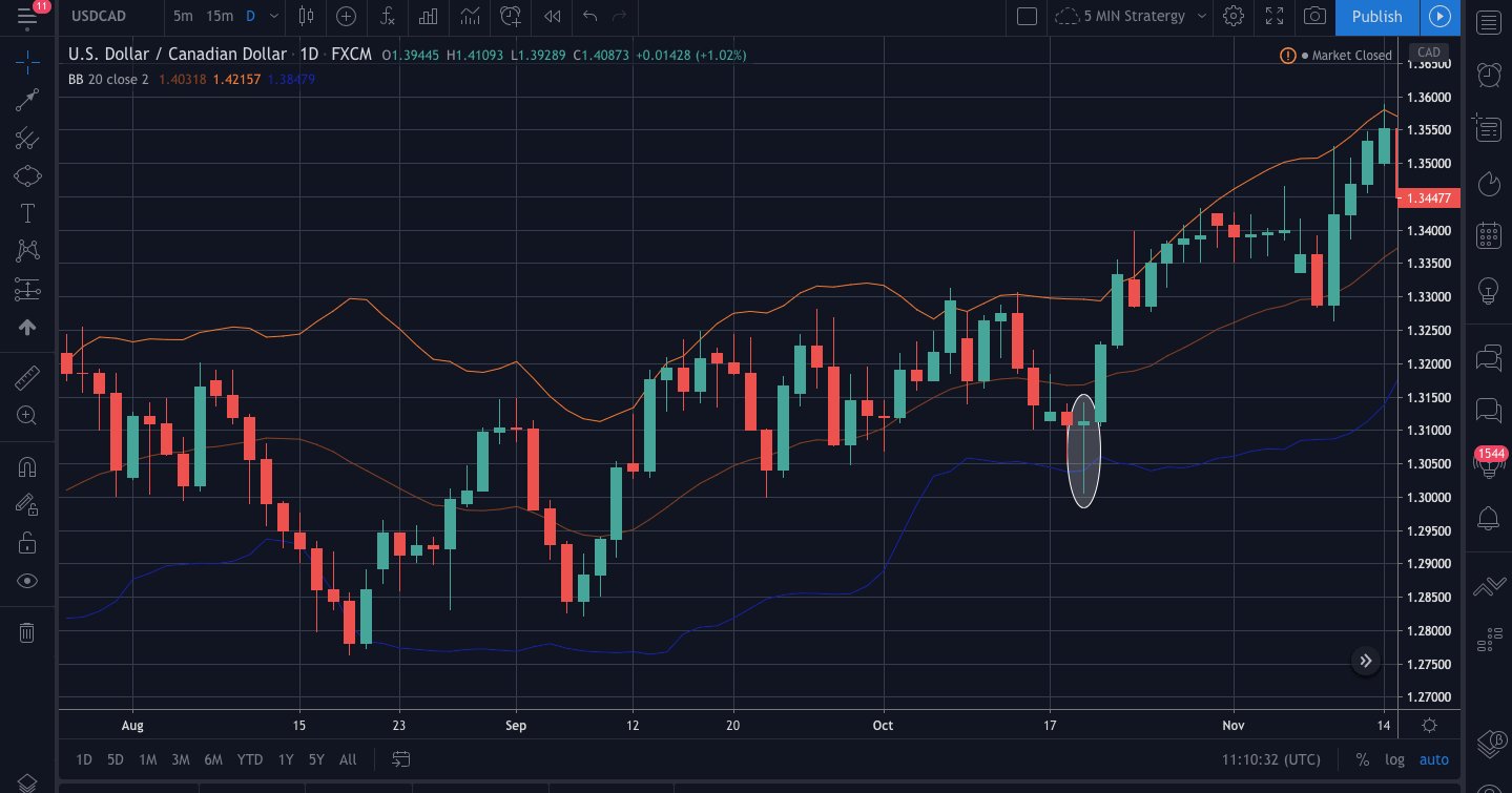
We are already familiar with one of the famous indicator called the Bollinger band that is used to measure the volatility of the market. We will now use a pin bar with the Bollinger band and understand how we can find some good trades opportunities.

The below chart is USDCAD 1Hr time frame over here. We can see that the market has not pierced the lower band since a long time as mostly the price is between the upper and the lower band. Moving forward, when the candles come close to the lower band, we see a pin bar occurring after the market gets rejection. After the formation of a pin bar candle, we can see the market getting the buying momentum, and it becomes bullish.

Trading With The Confluence Level

As from the above strategies, we are clear how the market behaves when a pin bar occurs at strong support and resistance level and the extreme level of Bollinger band. Now we will see what happens when a pin bar occurs at confluence level. A confluence level is an area that is on the radar of many traders, and many technical indicators generate the same signal. This trading concept is used by price action traders to filter their entry points and spot high probability signals in the market.

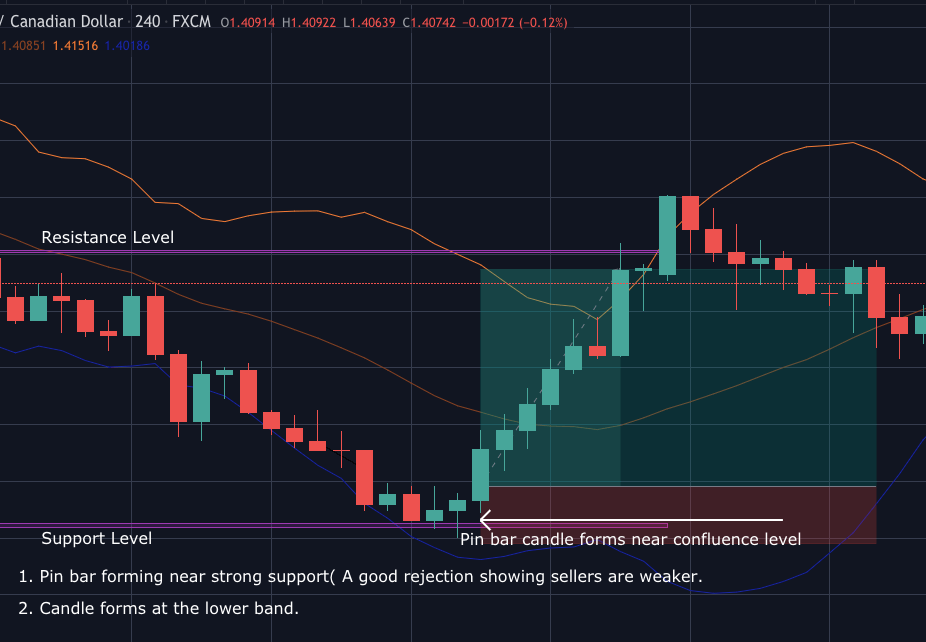
The below example is the pin bar forming at the extreme lower band and a strong support level. We can see that as the market reaches the support level, the bodies of the candles get weaker and smaller, forming longer wicks. Also, the pin bar pierces the lower band near that support level giving us a better signal for a buy.

Talking about the entry and exit points, our entry will be the point when the next candle crosses the high of the pin bar candle. As we see, it is a bullish pin bar; we can be sure that our entry is good if it crosses the high with good momentum. Our exit here will be the next strong resistance level. If you use a trailing stop loss, then we can move the stop loss to breakeven and be in the trade as long as you see the higher high higher low as, after a trend reversal, the candles move very fast and gives more profit and risk to reward ratio.

Conclusion

Trading with a pin bar candle has been proven to be one of the most effective trading strategies. As we saw, we must have a watch on all the candles when it approaches a confluence level because a single candlestick will not give us much information about what market is going to do next. The reliability of these candles is more with the higher time frame as it omits the noises on the chart, and we can have a clear picture. If you are a day trader, then you can 30min or 1hr time frame for executing the trade. Cheers!

Categories
Forex Options

FX option expiries for May 14 New York cut

Thank you for visiting the Forex.Academy FX Options Expiries Section. Each day, where available, we will bring you notable maturities in FX Options of amounts of $100 million-plus, and where these large commutative maturities at specified currency exchange rates often have a magnetic effect on price action, especially in the hours leading to their maturities, which happens daily at 10.00 AM Eastern time. This is because the big institutional players hedge their positions accordingly. Each option expiry should be considered ‘in-play’ if labelled as Hot or Warm, or ‘out of play’ if labelled Cold with regard to the likelihood of price action meeting the strike price at maturity.

…………………………………………………………………………………………………………………..

FX option expiries for May 14 NY cut

FX option expiries for May 14 NY cut at 10:00 Eastern Time, via DTCC, can be found below.

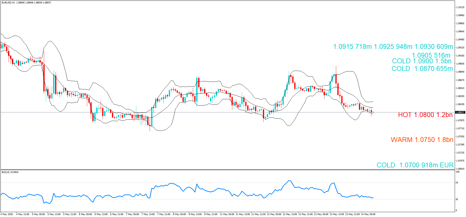
EUR/USD

  •  1.0700 918m EUR
  •  1.0750 1.8bn
  •  1.0800 1.2bn
  •  1.0870 655m
  •  1.0900 1.5bn
  •  1.0905 516m
  •  1.0915 718m
  •  1.0925 948m
  •  1.0930 609m

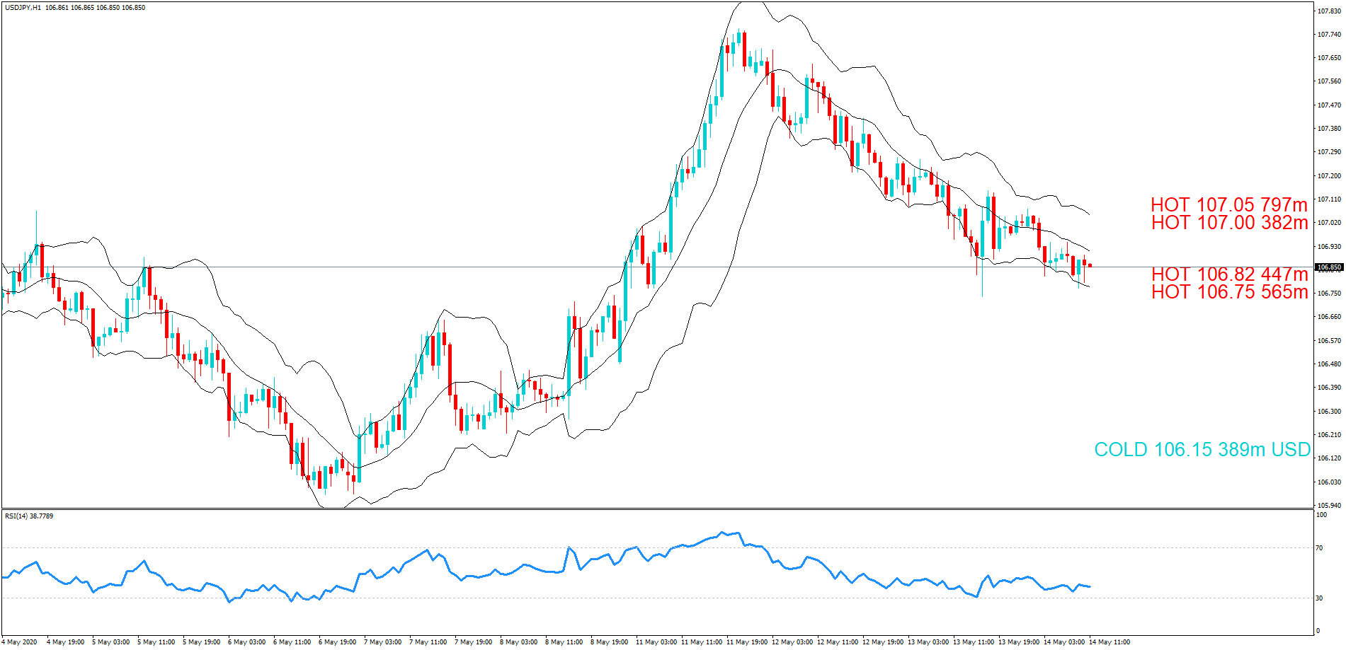
USD/JPY

  • 106.15 389m USD
  • 106.75 565m
  • 106.82 447m
  • 107.00 382m
  • 107.05 797m

 GBP/USD

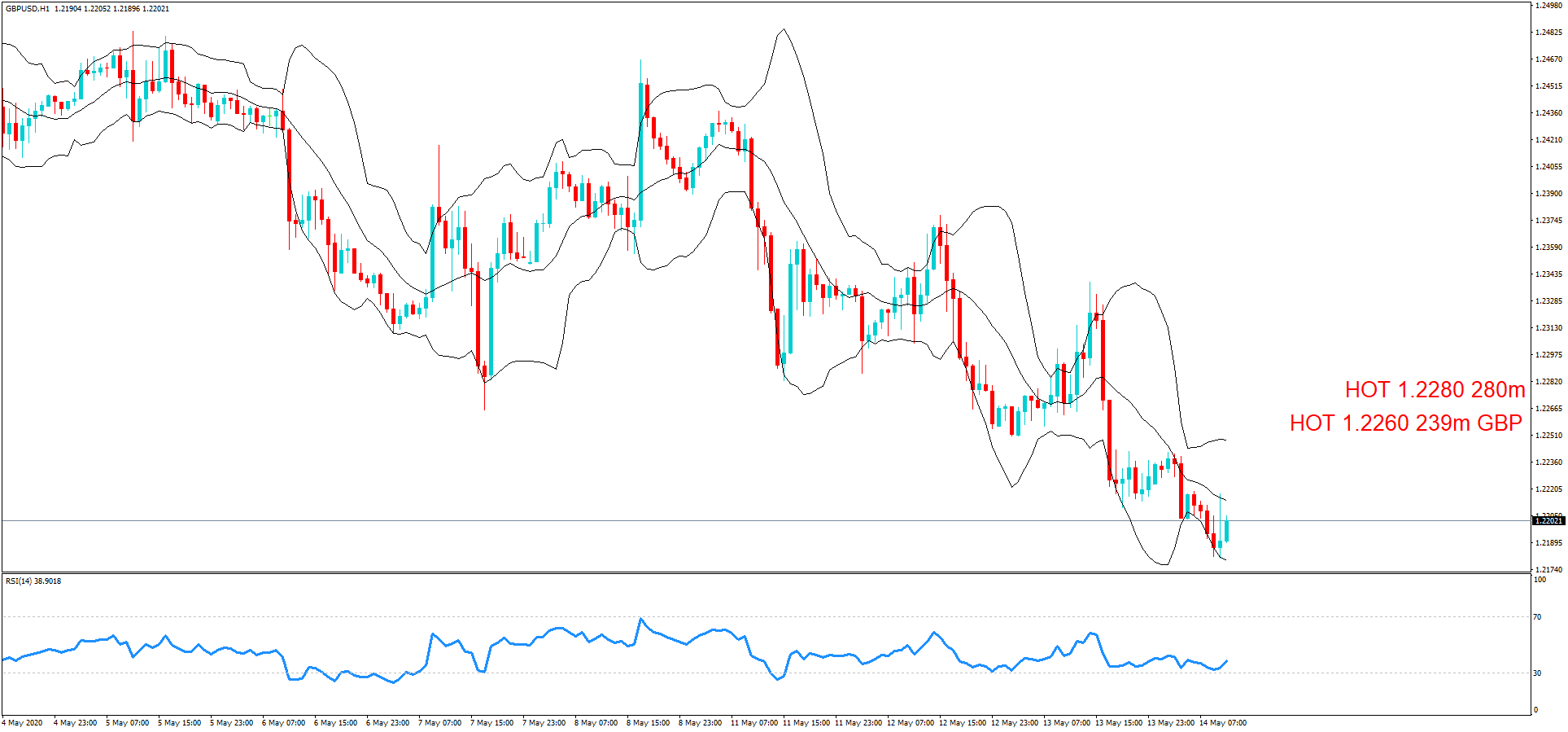
  • 1.2260 239m GBP
  • 1.2280 280m

 AUD/USD

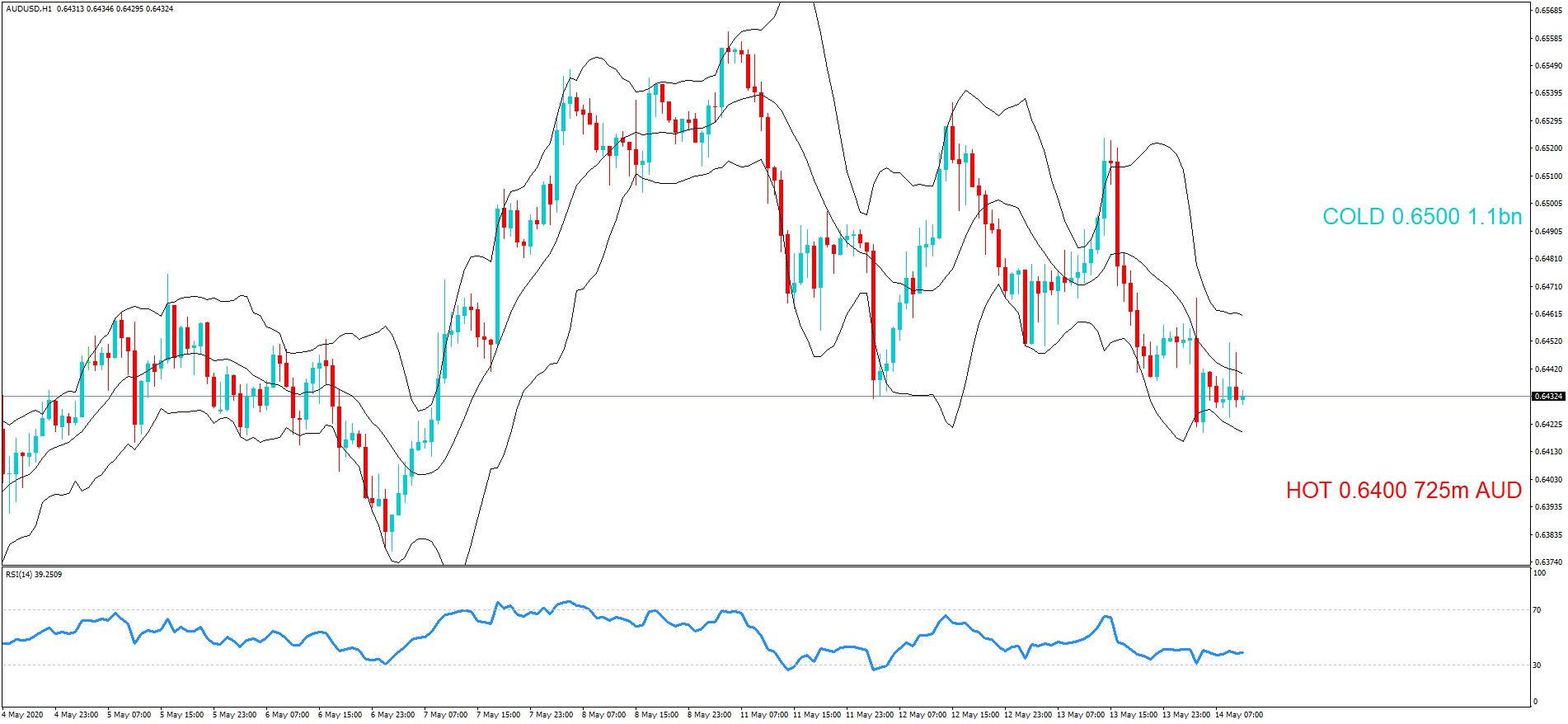
  • 0.6400 725m AUD
  • 0.6500 1.1bn

 EUR/GBP

  •  0.8750 542m EUR
  •  0.8800 851m  

………………………………………………………………………………………………………………

As you can see on the charts we have also plotted the expiration levels at the various exchange rate maturities and we have also labelled them as cold, warm or hot.

Therefore, if you see exchange rates labelled as warm or hot, these should be considered In-Play, because we believe there is a greater chance of the expiry maturing at these levels based on technical analysis at the time of writing. However, if we have labelled them as Cold, they should be considered Not In-Play and therefore price action would be unlikely to reach these levels, which are often referred to as Strikes, at the time of the New York cut. Please bear in mind that we have not factored in upcoming economic data releases, or policymaker speeches and that technical analysis may change in the hours leading up to the cut.

We suggest you take the levels and plot them onto your own trading charts and incorporate the information into your own trading methodology in order to use the information to your advantage.

Remember the higher the amount, the larger the gravitational pull towards the exchange rate maturity at 10:00 AM Eastern time.

If you want to learn how forex option expiries affect price action in the spot FX market see our educational article by clicking here: https://bit.ly/2VR2Nji

DISCLAIMER: Please note that this information is for educational purposes. Also, heat levels may change throughout the day in line with the exchange rate fluctuations due to technical analysis trading and upcoming economic data releases of the associated pairs.

Categories
Forex Market Analysis

WTI Crude Oil Slipped to $25.75 – Sideways Channel Intact! 

The WTI crude oil prices dropped to $25.90, mainly due to the price-positive API data, which revealed a rise in U.S. crude inventories. The tensions about a potential second wave of coronavirus cases after countries starting to ease lockdowns also keep the oil prices under pressure. 

Moreover, China’s war with the U.S. and Australia also weighed down on the oil market. At this moment, the WTI crude oil is currently trading at 25.36 and consolidates in the range between the 25.07 – 25.79. The weekly announcement of a private stockpile report from the American Petroleum Institute (API) indicates a build of 7.64 million barrels versus the prior extension of 8.44 million barrels into the stockpiles.

The idea for recent support in the oil prices could be connected to the further request by Saudi Arabia for more extensive output cuts to balance the market induced by virus-induced demand disruption. The recent reopening of major economies’ confidence also supporting the oil prices.

On the other hand, the United States started once again to announce the new claims of coronavirus following easing coronavirus restraints and revived nonessential businesses in U.S. states as per the previous FDA Commissioner Dr. Scott Gottlieb. Whereas, China and South Korea are also fighting to control second wave outbreaks that spread during the weekend, While, Korea showed 26 new cases on May 12. As in result, the oil demand could face further crisis ahead.

Recently, the Energy Information Administration announced Wednesday that U.S. crude stockpile report which slipped by 700K barrels for the week ended May 8.

Daily Support and Resistance

  • S1 22.23
  • S2 23.74
  • S3 24.66

Pivot Point 25.25

  • R1 26.16
  • R2 26.75
  • R3 28.26

The U.S. oil is consolidating at 26.04 within a symmetric triangle pattern, which is rendering tripe top resistance at 26.70 along with support at 25.10 and 24.10. While bullish crossover of 26.70 may lead to WTI prices towards 27.30. Good luck! 

Categories
Forex Signals

Gold bounces off the Linear Regression line and heads up to meet the top of the channel

The idea

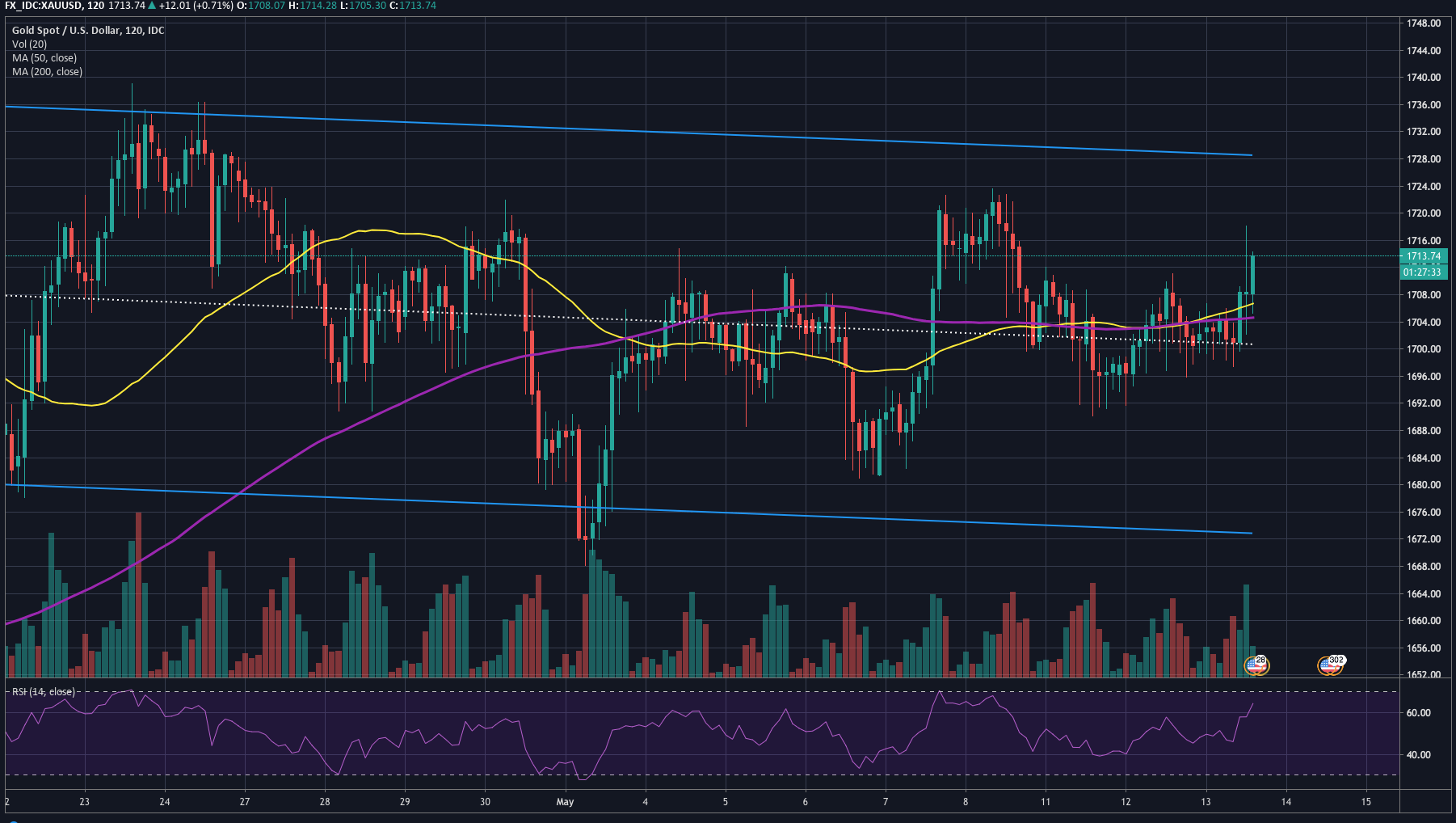
Gold has been having a corrective movement lately. The price has created a slightly descending channel. If we draw a linear regression channel we can easily see the consensus of price, represented by the mean line, which is the average line of the price set for the range, and the edges of the channels are set at ±2 Sigmas (standard deviation) of the centerline.

On the 2H chart we see that, after the price did a higher low below the centerline, it went up, and consolidated for a while above that line. Today it made an engulfing figure that broke through the recent range and is heading up.

A long position was entered at 1,711.12 with a stop-loss at $1,699.12 and a take profit of 1,725.12, which gives a reward to risk ratio of 1.17, which is less than the usual, but also the target can be reached easier, as it is not set at the top of the channel but at the recent high of the price, made on May 08.

Main levels:

  • Long entry: 1,711.12
  • Stop-Loss: 1,699.12
  • Take-profit: 1,725.12

Reward/Risk Ratio: 1.17

Dollar Reward and Risk

  • Risk:$1200 per lot, $120 per mini lot, 12 per micro lot
  • Reward: 1400 per lot, $140 per mini lot, $12 per micro lot.


Categories
Forex Market Analysis

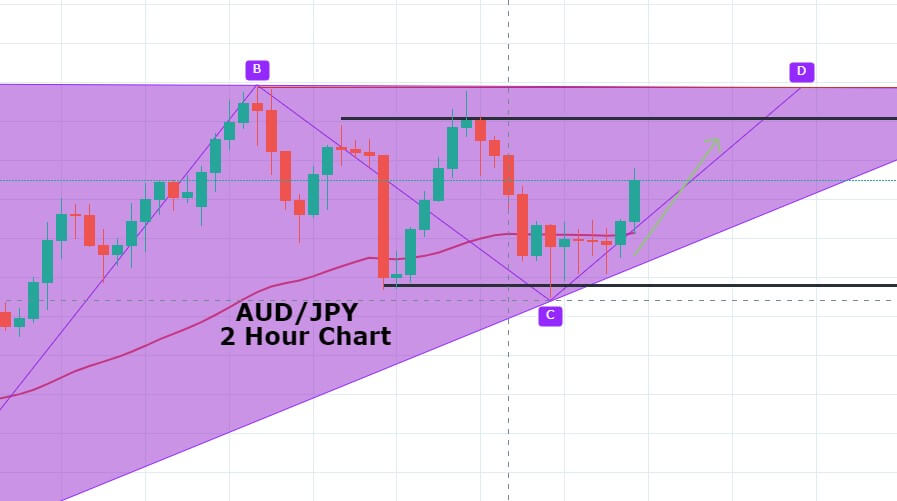
AUD/JPY Ascending Triangle Pattern – Stronger Aussie Lift the Pair! 

The AUD/JPY pair is flashing green and bounced off the 69.160 support level. The currency pair seems to come out of pressure, which was there on JPY due to the risk-off market sentiment. The wave 2.0 of the coronavirus (COVID-19) is eventually underpinning the safe-haven Japanese yen. 

At the same time, Australia’s Wage Price Index increased by 2.1% year-on-year in the first quarter, as expected, after the previous quarter’s 2.2% surge. The quarterly figure also came in line with the estimate of 0.5%. It should be noted that the data is representing the period before the coronavirus-led lockdown, which was caused by massive job destruction.


Technically, the AUD/JPY pair has formed a bullish engulfing pattern followed by a series of Doji candles above 69.15 support. Continuation of a bullish trend may drive the AUD/JPY prices towards the next resistance area of 70. The pair has also closed an ascending triangle on the 4-hour timeframe which may lead the pair on a higher side. 

Entry Price: Buy at 69.52    

Take Profit .70.12    

Stop Loss 68.92    

Risk/Reward 1

Profit & Loss Per Standard Lot = -$465/ +$465

Profit & Loss Per Micro Lot = -$$46.5/ +$$46.5

Categories
Forex Market Analysis

Daily F.X. Analysis, May 13 – Top Trade Setups In Forex – U.S. Inflation Ready to Play! 

The latest economic figures from the United States raised expectations that the Federal Reserve will launch more monetary stimuli in the next meeting, and markets started to price in for a negative interest rate scenario. Donald Trump, while examining the state of Beijing amid coronavirus lockdown, warned about the US imposing new tariffs if China failed to purchase $200B worth U.S. farm goods. After that, trade delegates from both sides held a meeting via phone call and released a positive statement hence created optimism about the US-China relationship.

Economic Events to Watch Today 


EUR/USD – Daily Analysis

The EUR/USD currency pair remained directionless around the 1.0850 as investors found on the waiting track and cautious about placing any strong position ahead of the Federal Reserve Chairman Jerome Powell’s speech on economic issues. The broad-based U.S. dollar flashing green and likely turned out to be one of the key factors that kept a lid on any gains in the pair, at least for now. As of writing, the EUR/USD currency pair is currently trading at 1.0850 and consolidates in the range between the 1.0843 – 1.0858.

As we all well aware that the investors expected the interest rate would be negative in June 2021. Whereas, the rate options market was putting in a 23% chance of the key federal funds rate falling below zero by end-December, As well as, the U.S. President Donald Trump also urged by the tweet that the negatives rate cuts would be considered good for the U.S.

On Wednesday, the European Commission will also recommend a phased approach to reopen borders with countries that have similar coronavirus risk profiles for tourists. Travel between similar risk profile countries will be recommended in the COVID-19 recovery plan.

The E.U. Foreign policy chief, Josep Borrell, said on Tuesday that coronavirus pandemic will likely deteriorate the security environment in years ahead and that countries should not slash their defensive spending in their budgets. He stressed the importance of security and defense funding in the challenging environment of a pandemic.

Meanwhile, due to the easing of lockdowns from countries across the globe, the new coronavirus cases were started being reported from many countries, including China, South Korea, and Germany. This weighed on markets as chances for second-wave of coronavirus could hurt the hopes of quick economic recovery. There was no economic data to be released from the European side, so the movement of pair EUR/USD followed the directions from U.S. dollar and market news.

Daily Support and Resistance  

  • R3 1.0995
  • R2 1.094
  • R1 1.0894

Pivot Point 1.0839

  • S1 1.0793
  • S2 1.0738
  • S3 1.0691

EUR/USD– Trading Tips

The EUR/USD price dropped after testing the double top resistance level of 1.08770. The market is a bit slow today, which is why, the EUR/USD prices are consolidating above 1.0826, which is working as support that’s been extended by the 50 EMA. The bearish breakout of 1.0826 level can extend the selling trend until the next support level of 1.0777, while bullish breakout of 1.0850 can lead EUR/USD prices towards 61.8% Fibonacci retracement level of 1.0869 level. Consider taking selling trades below 1.0839 and buying above the same today.


GBP/USD – Daily Analysis

The GBP/USD currency pair stops its 2-day losing streak and hovering near the late-April low 1.2250 as traders are cautious to place any strong position ahead of critical U.K. macro releases. As we mentioned, the market participants are waiting for the key data while staying near April low, a continued break of a bullish sloping trend line from April 06 keeps sellers hopeful of targeting April month low near 1.2165 beneath 1.2250. At the press time, the GBP/USD currency pair is currently trading at 1.2271 and consolidates in the range between the 1.2251 – 1.2284.

At the data front, the U.K.’s heavy economic calendar is going to control the markets moves at 06:00 GMT with the first quarter (Q1) GDP figures for 2020. As well as, the March month Trade Balance and Industrial Production detail will also decorate the economic calendar.

According to the forecasted view about GDP, the United Kingdom GDP is expected to reach -8.0% MoM in March against -0.1% prior while the Index of Services (3M/3M) in the same timeframe is seen higher from 0.2% to 0.30%.

Broadbent said that risks were still to the downside and committee would do whatever will be necessary to recover.

Meanwhile, the Brexit talks were on board, and a little progress was made in the future fisheries agreement between E.U. & U.K. According to the MEP for CDU, it was only because of France and Netherland that U.K. was set to come to an agreement with E.U. on fisheries. U.K. did not want fisheries to be a part of economic agreement but number of member states including France & Netherland made very clear that they will not agree on any future economic partnership without long-term solution on fisheries.

Pound dropped on slow progress of post-Brexit deal with the E.U. and increased fears of second wave of coronavirus. However, The GDP data from U.K. will remain under high focus for GBP Traders on Wednesday.

Daily Support and Resistance

  • R3 1.2577
  • R2 1.2508
  • R1 1.2422

Pivot Point 1.2353

  • S1 1.2268
  • S2 1.2198
  • S3 1.2113

GBP/USD– Trading Tip

The GBP/USD sideways trading continues in between a narrow trading range of 1.2320 – 1.2245. The Cable is still holding below 50 EMA, which is extending resistance around 1.2370 level today. On the 4 hour chart, the GBP/USD is gaining support at 1.2285 level while the 50 EMA and horizontal resistance stay at 1.2365 level. Today, the Fed chair Powel speech may drive the selling trend in the GBP/USD pair to lead its prices towards an immediate support level of 1.2240 and 1.2190. Conversely, the worse than expected retail sales data will lead the GBP/USD pair towards 1.2360 and 1.2450. 


USD/JPY – Daily Analysis

The USD/JPY was closed at 107.147 after placing a high of 107.691 and a low of 107.120. Overall the movement of USD/JPY pair remained bearish throughout the day. The pair USD/JPY lost its previous day gains but managed to remain above the 107 territory on Tuesday. On the back of broad-based U.S. dollar weakness, the pair USD/JPY dropped about 0.5% on that day.

U.S. dollar was weak due to the poor than expected CPI data in the month of April. The U.S. Consumer Price Index fell and posted its biggest monthly decline since the 2008-2009 recession. The CPI dropped by -0.8% against the expected decline by -0.7% and weighed on U.S. dollar. The Core CPI dropped by -0.4% against the forecasted -0.2%.

Moreover, the tensions between China and the U.S. have increased the fears of renewed trade-war. There were reports suggesting that Chinese Officials revive the possibility of revoking the signed trade deal and negotiate a new deal which will tilt more to the Chinese side. 

U.S. President, Donald Trump was asked about this possibility and in response to whether he would renegotiate a deal with China, he said, “No, not at all. Not even a little bit.” He was not interested in renegotiate the deal. He said that he also had heard about it that China wanted to reopen the trade talks to make it better deal for them but a deal has already been signed and he would not cancel it.

Apart from China-US trade war, another trade-war fears are emerging in the market between Australia and China. The announced duties on Aussie meat by China is being considered as a safe play against the action of Australian PM to favor the inquiry of China’s role in the origin of the virus.

 All these renewed trade-war fears along with coronavirus pandemic have increased the risk in the market. The virus cases in Germany increased, and the Wuhan city in China reported fresh rise in number of coronavirus cases after easing of lockdown.

Furthermore, an ex-member of White House Coronavirus Task Force Team, Doctor Anthony Fauci warned that gradual restart of economy was dangerous because it could cause needless suffering and would slow down the economic recovery.

Additionally, the officials from Bank of Japan also cited negative impact of virus on Asian economy and stated the importance of acting quickly by central banks when needed. At 10:00 GMT, the Leading Indicators of economy from Bank of Japan came less than the expected 84.3% as 83.8% and weighed on JPY.

Daily Support and Resistance    

  • R3 109.37
  • R2 108.57
  • R1 108.12

Pivot Point 107.33

  • S1 106.88
  • S2 106.09
  • S3 105.64

USD/JPY – Trading Tips

The USD/JPY pair is gaining support at 107 level which marks the 50% Fibonacci retracement level. At the same level, the 50 EMA is supporting the pair and it could drive a bounce off above 107 level. At the moment, the 4-hour candle seems to close above 107 support, but it’s not sufficient to go long on USD/JPY. We need to wait for couple of more candles to give us closing above this level.

The MACDis holding in selling , which is supporting the bearish trend in the USD/JPY pair. The violation of an immediate support level may extend selling until 106.600 level. Conversely, the closing of buying candles above 107 can trigger bullish bias until 107.50. By the way, bearish bias seems solid today. All the best for today! 

Categories
Forex Course

117. How to Trade the ‘Head and Shoulders’ Forex Chart Pattern?

Introduction

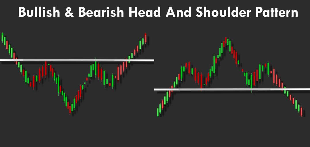
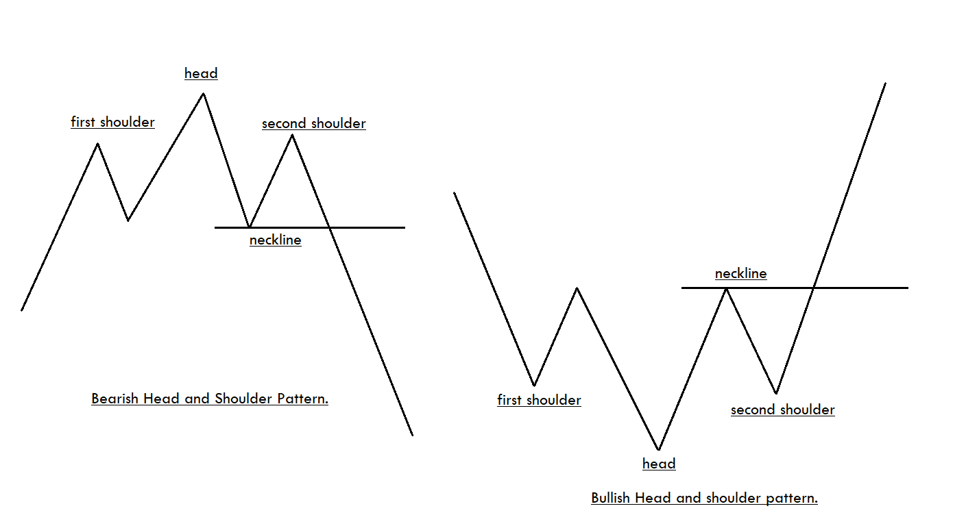
The Head and Shoulders formation is a popular Forex chart pattern, which is pretty easy to recognize on the price charts. There are both bullish and bearish Head and Shoulders patterns, and both indicate potential market reversals. This pattern consists of three peaks, which is developed after a strong bullish trend. The first and third peaks are of the same height, and they are classified as shoulders. The second peak of the pattern is the highest and hence classified as the head.

There are both bullish and bearish Head and Shoulder patterns. The appearance of bullish Head and Shoulder pattern on the price chart indicates that the momentum is transferring from the sellers to buyers. Likewise, the appearance of the Bearish Head and Shoulder pattern indicates the momentum is transferring from the buyers to sellers. While trading the Bearish Head and Shoulders pattern, it is advisable to go short when the price breaks below the neckline. Contrarily, go long when the price goes above the neckline while trading the Bullish pattern.

How To Trade The Head And Shoulders Pattern?

It is advisable not to wait for the perfect pattern instead look for the good entry/exits when you spot the pattern on the price chart. Sometimes the left shoulder will be bigger than the right shoulder and vice-versa. Please do not focus on minute details. Instead, our focus must be on deciding if the pattern looks reliable enough to trade or not. If the answer is yes, only then take entries.

Trading The Bearish Head And Shoulders Pattern

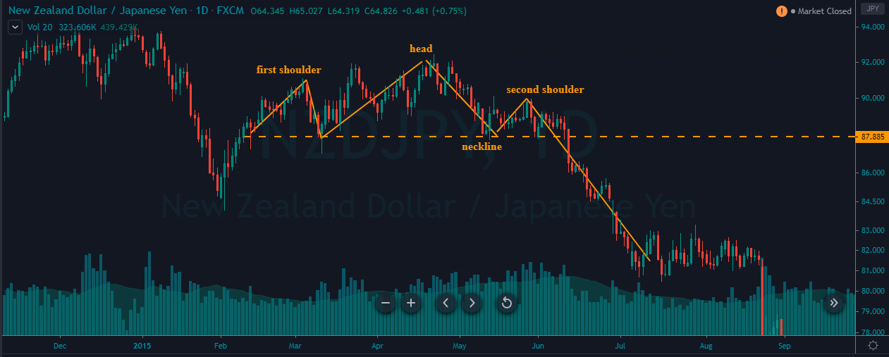
The below chart represents the formation of the Head and Shoulder pattern on the NZD/JPY forex pair.

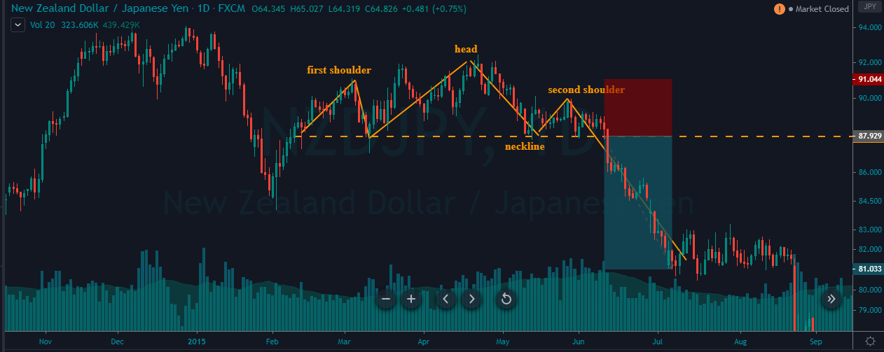
As you can see, in the below NZD/JPY chart, the formation of the pattern doesn’t look perfect, but the overall pattern looks reliable to trade. We went short as soon as the price action broke below the neckline. The stop-loss order was placed above the second shoulder. For TP, we went double the size of the pattern. We had exited the market when the price got consolidated, as it implies the opposite party is gaining strength.

Trading The Bullish Head And Shoulders Pattern

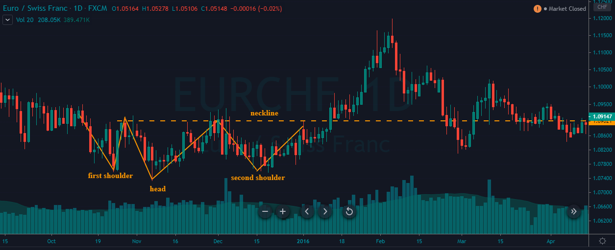
In the below chart, we have identified the Bullish Head and Shoulder pattern in the EUR/CHF Forex pair.

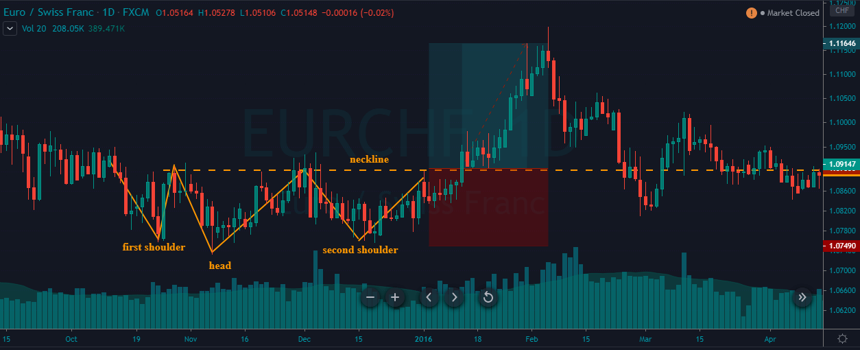
In a choppy downtrend, a bullish Head and Shoulder pattern is formed. When the price goes above the neckline, it is an indication for us to go long. The take-profit is again placed two times the size of the pattern, and the stop-loss is just below the second shoulder.

In the above chart, we can clearly see that the Bullish Head and Shoulder pattern is not perfect, like the ones we see in textbooks. But still, our trade worked beautifully. So it is crucial to bends our rules here and there; we will hardly find such kind of perfect patterns. If we just wait for them, we will hardly get to trade. Also, once you gain some experience in trading this pattern, you will automatically be able to decide which pattern works and which will not. Mastering any pattern requires tons of practice and patience.

That’s about identifying and trading the Head and Shoulders pattern. Advanced strategies related to this pattern can be found in our trading strategies section. Please feel free to explore. Cheers!

[wp_quiz id=”73064″]
Categories
Forex Price-Action Strategies

Price Action Trading: Dealing with Daily Chart’s Support/Resistance

In today’s price action lesson, we are going to demonstrate an example of a daily chart where the price reacts to support and resistance. We will dig into the chart and find out what message it has to offer us.

The chart shows that the price heads towards the North upon producing a bullish track rail pattern. The next candle comes out as another bullish candle. However, the price finds its resistance. The level has been working as a level of resistance where the price has rejection twice already. Look at the last candle on the chart. It comes out as a bearish inside bar. However, the level is now triple top resistance. Intraday sellers may look to go short in the pair and drive the price towards the South.

As expected, the pair produces another bearish candle. The last swing low offers enough space for the sellers to go short in the pair. Thus, they may still go short in the pair and drive the price towards the South further. The daily sellers are to wait for the price to consolidate and produce a bearish reversal candle to offer them a short entry. Let us see what happens next.

The chart produces a bullish inside bar. The sellers on the daily chart may go short if the next daily candle comes out as a bearish reversal candle. They are to keep this chart on their watch list.

The next candle comes out as a bearish engulfing candle. This means the sellers on the daily chart may go short in the pair and drive the price towards the last swing low as far as price action trading is concerned. If the next daily candle breaches the level of support (last swing low), they may keep holding the position to grab more pips. Let us find out what happens next.

The next candle comes out as a bearish candle closing within the last swing low though. The sellers make some green pips. It might be time for them to close the trade since the candle closes within the level of support. If the candle closes below the level of support, it would surely be a different ball game for the sellers.

Intraday traders obey Support/Resistance on the daily chart a lot. Thus, daily support/resistance plays a significant role in the Forex market to make a reversal/correction/consolidation. Thus, if we take entry even based on the daily chart, we must count those to manage our entries.

Categories
Forex Signals

CADJPY triple bounce off the upper linear regression channel boundary

The Setup

Fig 1 – CADJPY triple bounce off the upper linear regression channel boundary

CADJPY has been obeying a slightly descending linear regression channel. On the 60 min chart, the ± 2 sigma lines are shown in blue, whereas the regression line, is shown in dotted white. In that chart, we can observe that the price has bounced three consecutive times off that line, and now, in its third bounce, it also pierced its 50-hour SMA to the downside.

A trade can be created with an entry at the current price and a target neat the bottom of the channel, for an excellent reward to risk factor. The rationale for this type of trade is the following. On channels like that, the odds of a reversal from a 2 sigma line is high, at least 95% of the time. The issue here is the reversal is strong enough to reach our target? Usually, it is highly likely a movement to touch the mid of the channel, but, since here the channel is descending, the odds of it moving to the bottom is higher. We will follow this trade, though, and adapt our stop-loss level and take profit as we see how the bearish momentum evolves.

Key Levels

  •         Entry: 76.495
  •  Stop-Loss: 76.895
  • Take-profit: 75.295
  • Reward/Risk: 3

Dollar Risks and Rewards

Risk: 40 pips = $372 per lot, or $37.2 per mini lot.

Reward: 120 pips = $1,117 per lot, or 111,7 per mini lot


Categories
Forex Assets

Costs Involved While Trading The ‘AUD/PLN’ Exotic Pair

Introduction

The expansion of AUD/PLN is the Australian Dollar and Polish Zloty. Here, AUD is the official currency of Australia, and it is the fifth most traded currency in the Forex market. Hence, it is considered as a major currency. In contrast, the PLN (Polish złoty) is thinly traded, and it is the official currency of Poland.

Understanding AUD/PLN

In AUD/PLN currency pairs, the first currency (AUD) is considered the base currency, and the second (PLN) is considered the quote currency. In the foreign exchange market, we always buy the base currency and simultaneously sell the quote currency and vice versa. The market value of AUD/PLN helps us to understand the strength of PLN against the AUD. If the exchange rate of AUD/PLN is 2.7427, it means that we need 2.7427 PLN to buy 1 AUD.

Spread

In Forex, spreads are inevitable, and it is mainly controlled by the broker. Forex brokers have two prices for currency pairs: the bid and ask price. The bid is the price at which we sell an asset, and ask is the price at which we buy it. The difference between the ask price and the bid price is called the spread. Below are the ECN & STP spread values for AUD/PLN Forex pair.

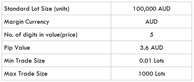
ECN: 17 pips | STP: 20 pips

Fees & Slippage

A fee in Forex is the charges we pay to the broker for opening a trade. Mostly, these fees depend on the type of broker (STP/ECN) we use.

There are times when we want to execute a trade at a particular price, but instead, we end up executing it at a different price. This happens because of slippage. Slippage can take place at any time, but mostly it occurs, we can counter a volatile market.

Trading Range in AUD/PLN

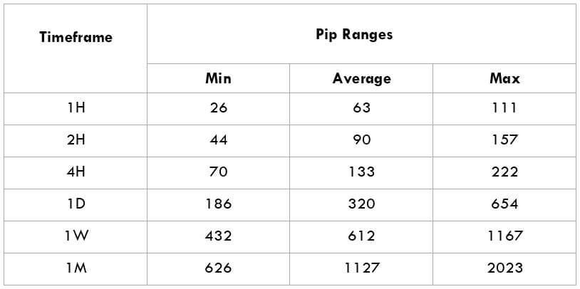
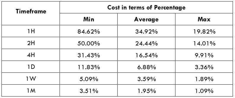
As a trader, we must be aware of the risks involved before entering any trade. The trading range here will guide us about the amount of money we will win or lose in a given amount of time. In the below table, we have the representation of the minimum, average, and maximum pip movement in a currency pair. We will evaluate it by using the ATR indicator combined with 200-period SMA.

Procedure to assess Pip Ranges

  1. Add the ATR indicator to your chart
  2. Set the period to 1
  3. Add a 200-period SMA to this indicator
  4. Shrink the chart so you can assess a significant period
  5. Select your desired timeframe
  6. Measure the floor level and set this value as the min
  7. Measure the level of the 200-period SMA and set this as the average
  8. Measure the peak levels and set this as Max.

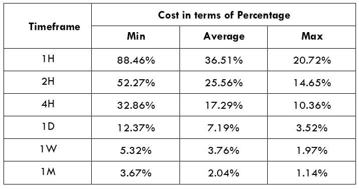
AUD/PLN Cost as a Percent of the Trading Range

The cost of trade depends on the broker type and varies based on the volatility of the market. The total cost of trade involves spread, fees, and sometimes slippage if the volatility is more.

ECN Model Account

Spread = 17 | Slippage = 3 |Trading fee = 5

Total cost = Slippage + Spread + Trading Fee = 3 + 17 + 5 = 25

STP Model Account

Spread = 20| Slippage = 3 | Trading fee = 0

Total cost = Slippage + Spread + Trading Fee = 3 + 20 + 0 = 23

Trading the AUD/PLN

AUD/PLN is an exotic currency pair that is rarely traded in the Forex exchange market. The average pip movement in 1hr is 63 pips, and that shows the volatility is at medium range.

Note – The higher the volatility, the higher is the risk, and the lower is the cost of the trade and vice versa. Taking an example, we can see from the trading range when the pip movement is more, the cost is low, and when the pip movement is low, the cost is high.

To reduce our trading costs, we may place trades using limit orders instead of market orders. In doing so, the slippage will not be included in the calculation of the total costs. This greatly helps us in reducing the overall cost of the trade. An example of the same is given below. In the below table, we can see how the trading costs have reduced comparatively.

ECN Model Account (But by using Limit Orders)

Spread = 17 | Slippage = 0 |Trading fee = 5

Total cost = Slippage + Spread + Trading Fee = 0 + 17 + 5 = 22

Categories
Crypto Videos Forex Options

Forex Expiries For The 30th Of April

FX option expiries for Apr 30 NY cut

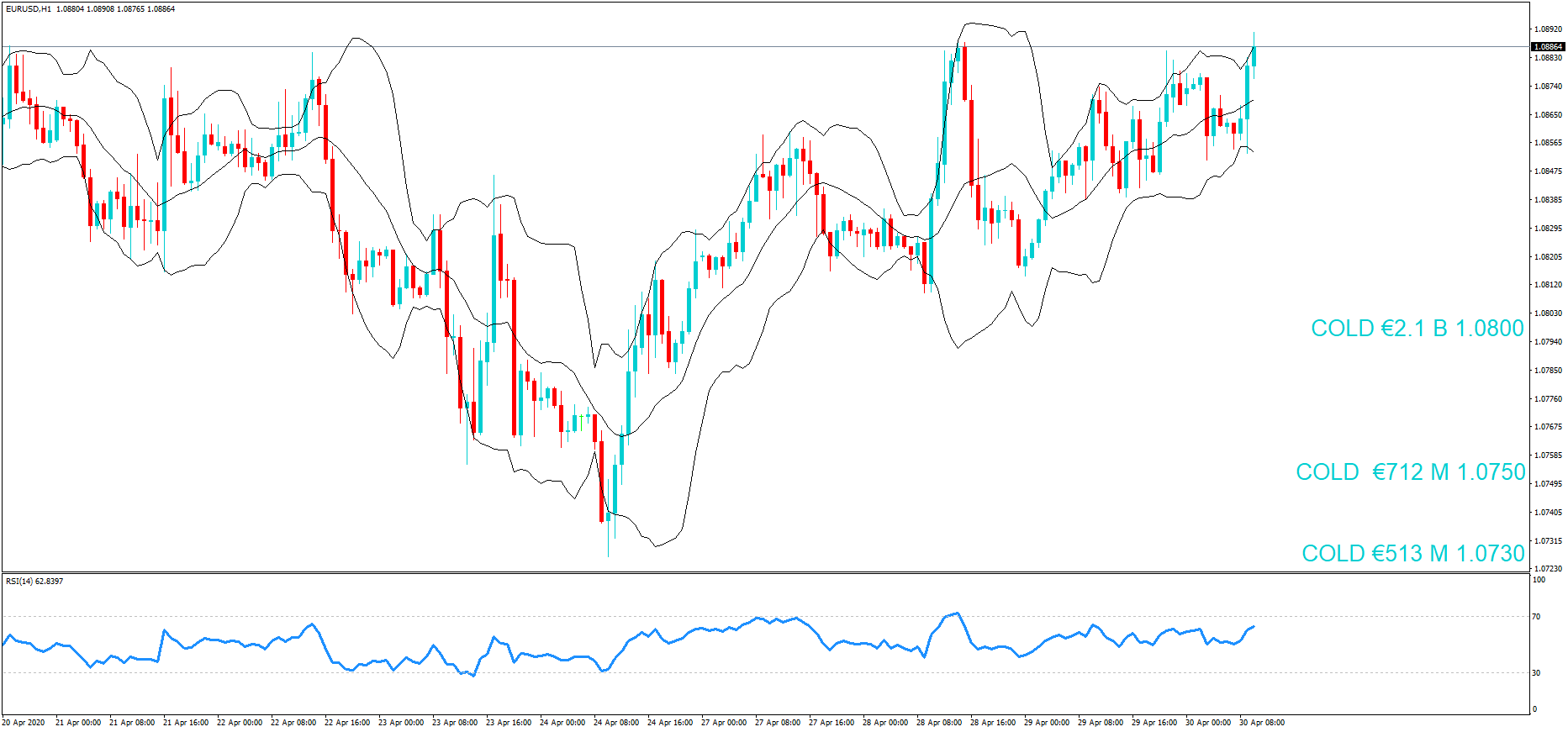
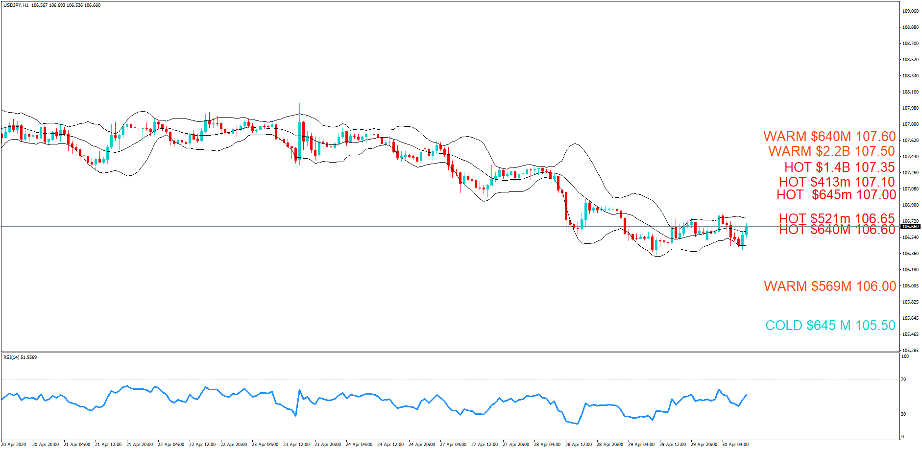
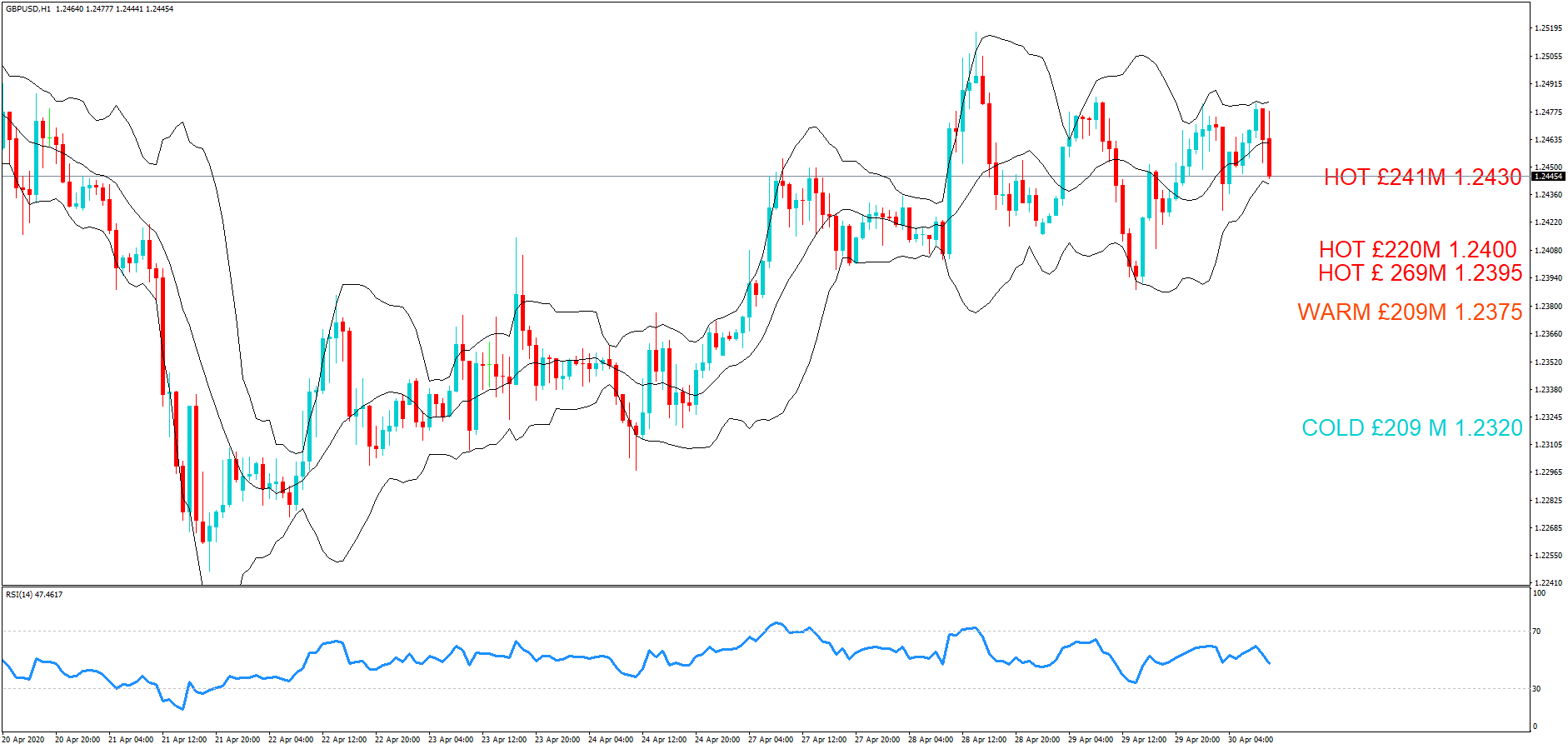
FX option expiries for Apr 30 NY cut at 10:00 Eastern Time, via DTCC, can be found below. – EUR/USD: EUR amounts
• 1.0730 513m
• 1.0750 712m
• 1.0800 2.1bn
• 1.0947 1.1bn
– USD/JPY: USD amounts
• 105.50 645m
• 106.00 569m
• 106.60 640m
• 106.65 521m
• 107.00 645m
• 107.10 413m
• 107.15 573m
• 107.35 1.4bn
• 107.50 2.2bn
• 107.60 640m
– GBP/USD: GBP amounts
• 1.2320 209m
• 1.2375 209m
• 1.2395 269m
• 1.2400 220m
• 1.2430 241m
– AUD/USD: AUD amounts
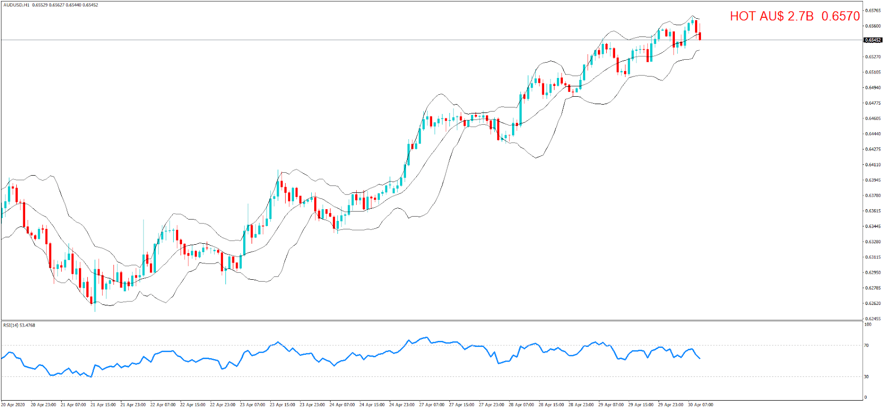
• 0.6570 2.7bn

INTRO + Hello everybody, and thank you for joining us for the daily FX expiries briefing video for the 10 am New York cut today.
If it is your first time with us, the FX currency options market runs in tandem with the spot FX market, but where traders typically place Call and Put trades on the future value of a currency exchange rate and these futures contracts typically run from 1 day to weeks, or months.
Each day we bring you details of the notable FX option expiries where they have an accumulative value of a minimum of $100M + and where quite often these institutional size expiries can act as a magnet for price action in the Spot FX arena leading up to the 10 am cut.
We will also plot the levels on to the relevant charts at the various exchange rates where there are due to expire, and also identify the levels which are in play, and where we believe there is a greater chance of the expiry maturing based on technical analysis at the time of writing, we will label them as hot, warm or cold.


So today we have four Option Expires for the EUR/USD pair today ………………

Also, there are also 10 Options expiring for the USD/JPY pair…………………….

Also, there are also 5 Options expiring for GBPUSD…………………….

Also, there is also one Option expiring for AUDUSD…………………….

Of the notable option expiries which we brought you yesterday: price action hit the 108.65 level for EURUSD pair, which was an official strike at the 10 am cut. We listed this as Hot.
ERUGBP hit 0.8730 at the cut, which was only 30 pips from the 0.8700 option expiry. We listed this as Hot too.

GBPUSD had an expiry at 1.2425, and where we saw price action hit 124.47 at the cut, just 22 pips from the option expiry. We also listed this as Hot.

We suggest you take the levels and plot them onto your own trading charts and incorporate the information into your own trading methodology in order to use the information to your advantage.

Remember, the higher the amount, the larger the gravitational pull towards the exchange rate maturity at 10:00 am Eastern time.
For a detailed explanation of FX options and how they affect price action in the spot forex market, please follow the link to our educational video.

Categories
Forex Videos

Everything You Need To Know About The Forex Market Right Now!

When the fundamentals lag behind the technicals

In recent weeks you will have noticed that the financial markets are in complete turmoil, with extreme volatility in all sectors, but especially in the oil markets more recently, and where stock markets seem to be propped up by hope more than fundamentals; after all, many indices have been rallying while the world economies have ground to a halt. And where volatility has also spilled over into the currency market.

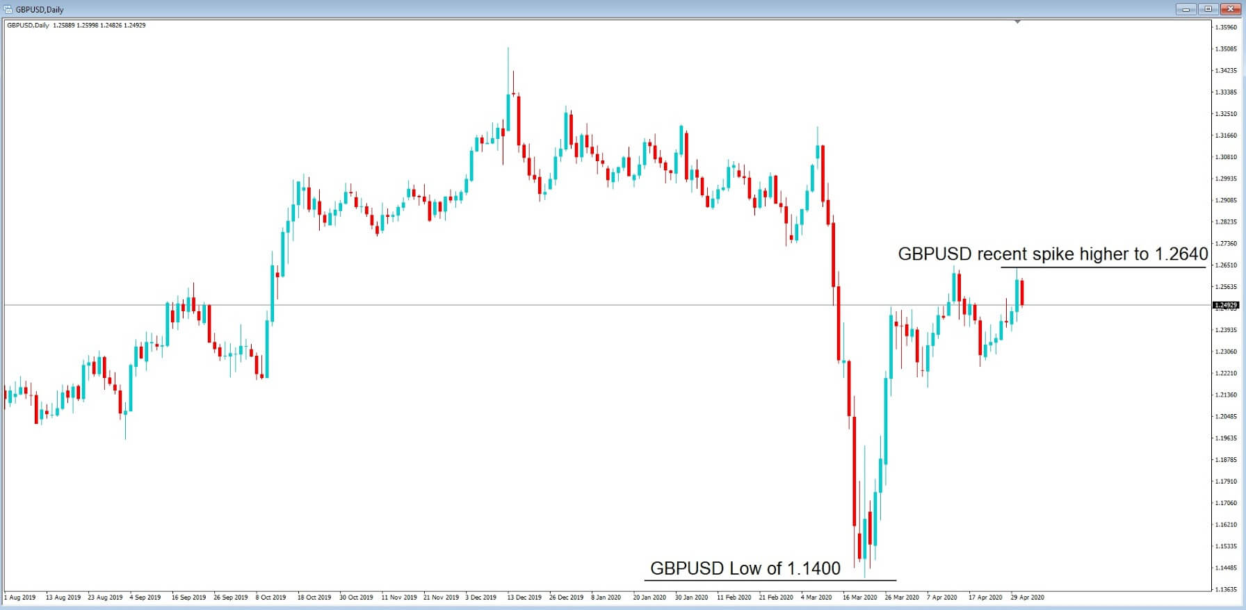
At the end of March 2020, we saw huge moves in currency pairs including a spike in cable, which only a few short weeks ago was trading at 1:14 and yet has recently spiked up to 1.2640, and where fundamentals for the British economy do not support this huge increase in the value of the pound.

So what is going on? Well, one thing is for sure, British economic data releases are not really showing the true extent of the fallout of the Covid-19 pandemic yet. And so, the fundamentals are lagging the technicals. In other words, the markets are being driven by technical analysis rather than fundamental analysis, in some circumstances.
Something that has stuck out like a sore thumb with regard to fundamentals lagging technicals is the USDCAD pair’s recent choppy price action. Let’s drill down in a little more detail to try and establish what is going on.


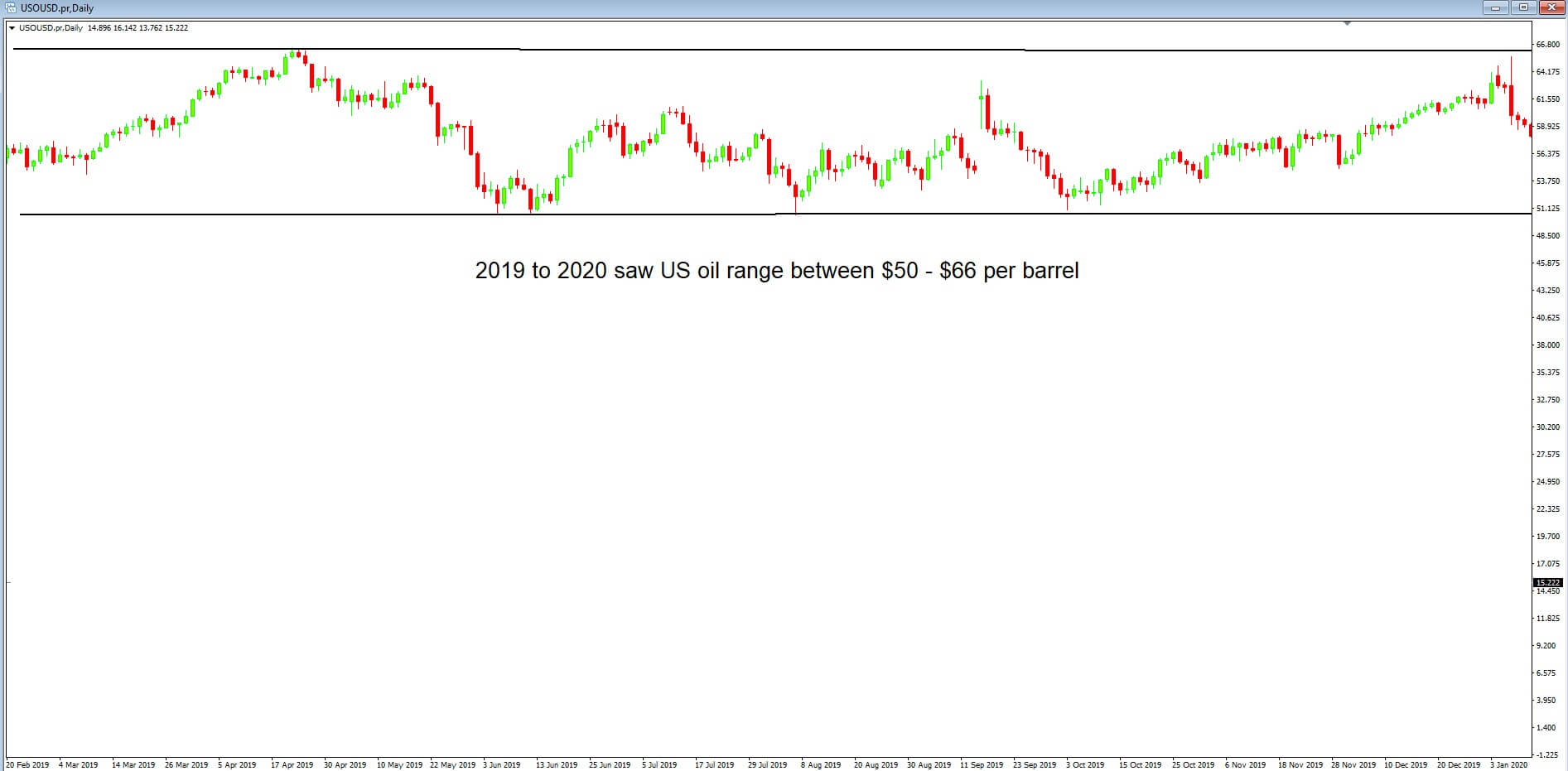
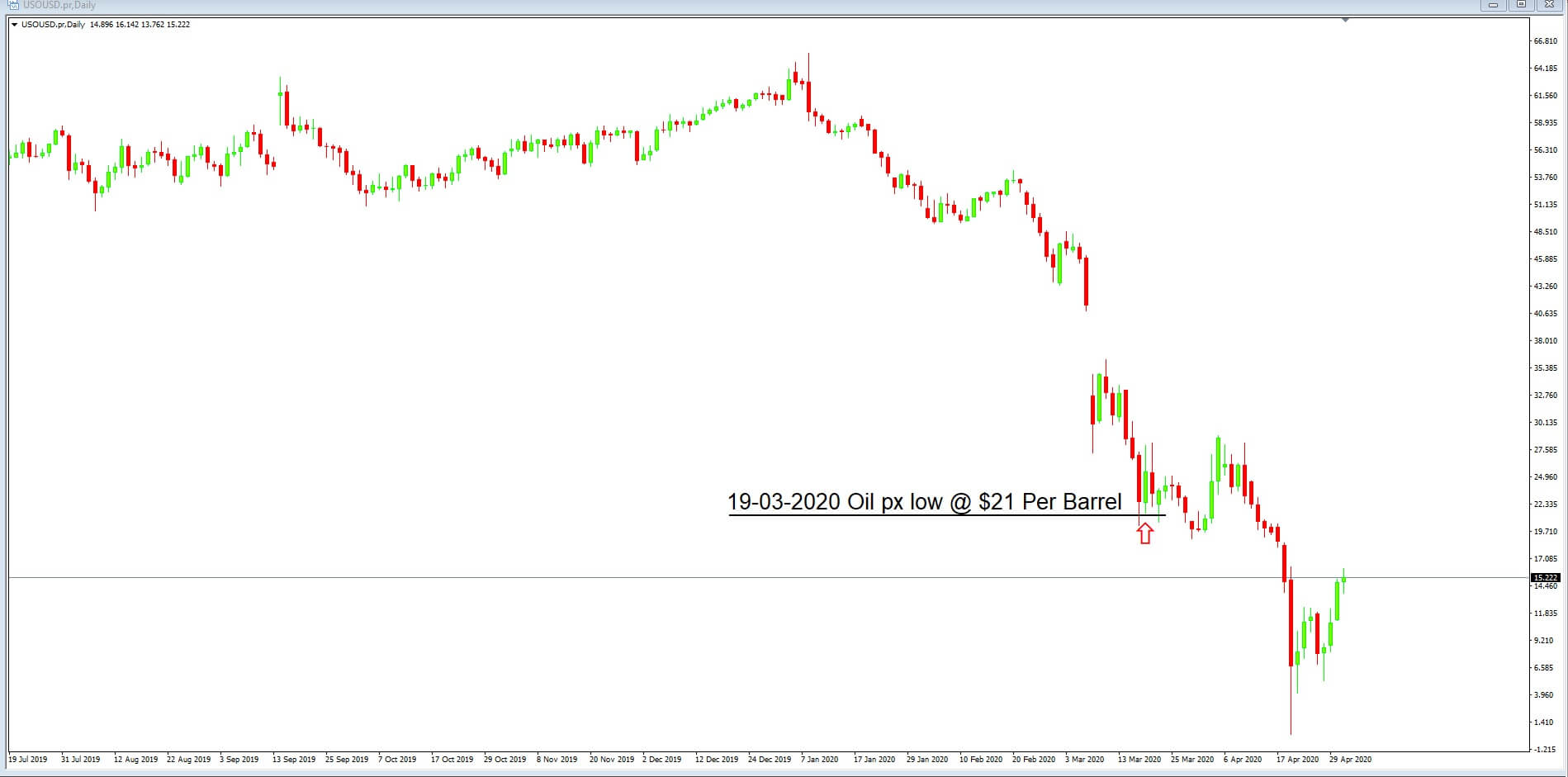
Before we do that, let’s take a look at the West Texas Intermediate or WTI, price action chart of the last 12-months. WTI is the benchmark for crude oil, and from 2019 to 2020, the price of a barrel of crude oil ranged between $50 to $66. West Texas Intermediate is a specific grade of crude that is used around the world and is seen as a benchmark in pricing oil.


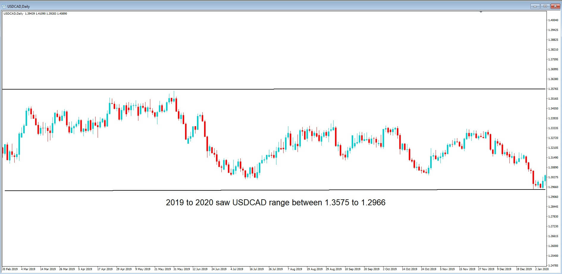
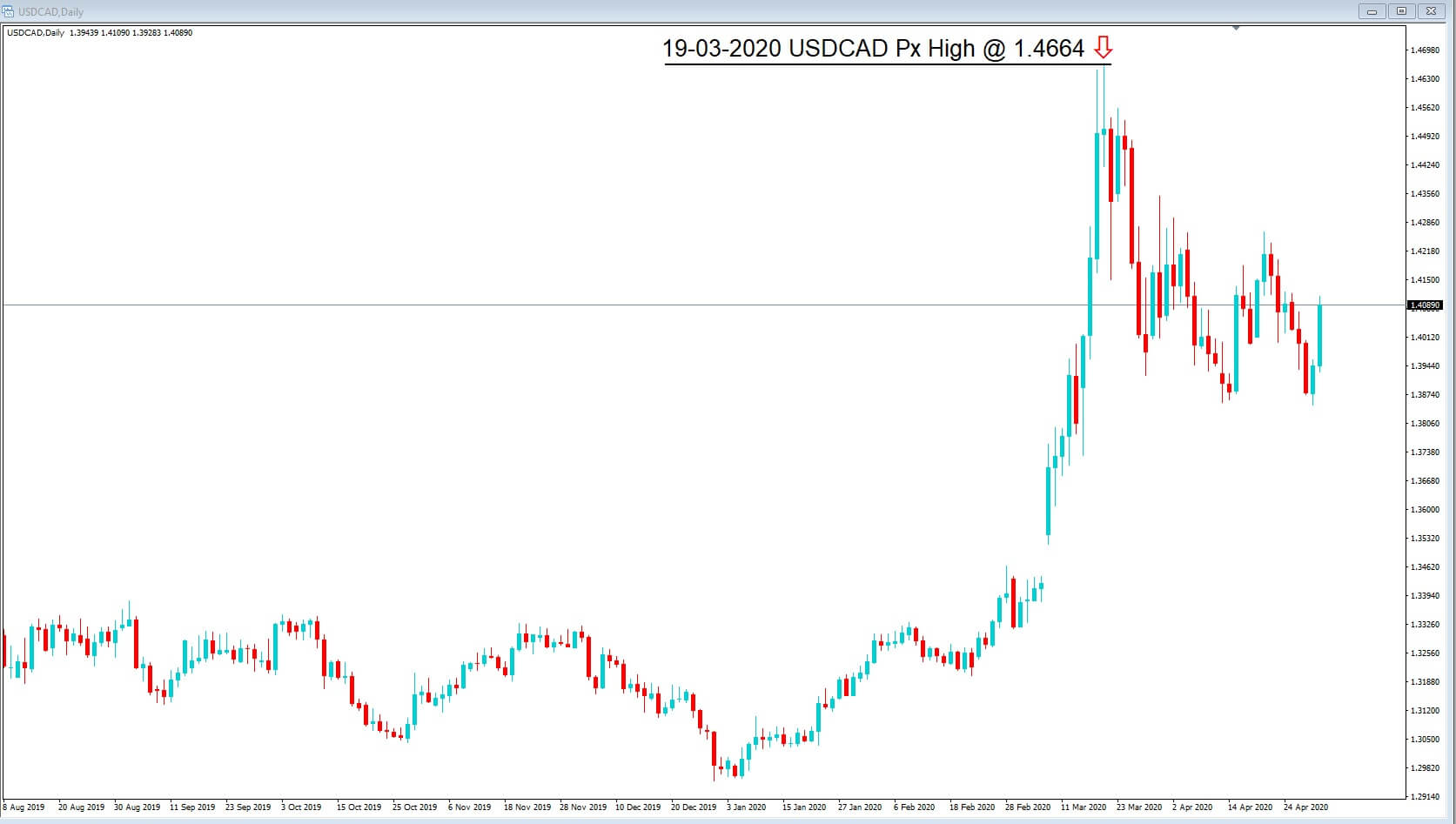
In this chart, we can see that in the same 12-period, USDCAD ranged between 1.2966 to 1.3575. Obviously, this was just before the virus pandemic. But in case you didn’t know, Canada is the fourth-largest producer and fourth-largest exporter of oil in the world, with 96% of Canada’s oil exports going to the United States.
Production and exportation of all products, including gas and electricity in Canada, contributed to around 170 billion in Canadian Dollars to it’s 1.8 trillion dollars of gross domestic product, which equates to around about 10% of GDP. And so oil is big business in Canada. And anything that upsets the production and exportation of oil will have a dramatic effect on Canada’s gross domestic product, and a spillover will, of course, be the value of the Canadian dollar, where we would expect price action volatility.
In fact, Canada has huge reserves of crude oil in Alberta’s Oil Sands and large deposits off the coast of Atlantic Canada. Oil is such a big business here, including exploration, drilling, production, field processing, as well as storing and the transportation of oil.

The Canadian dollar is sometimes referred to as the Loonie because of the loon bird, as depicted on the Canadian $1 coin. The Canadian dollar is one of the major currency pairs. It is widely traded in the financial markets and has been subject to extreme volatility during the current crisis.
However, we have also noticed that the USDCAD price action has become out of kilter recently, and this can be attributed to price action falling out of line with fundamental analysis and where traders have been preferring to trade on the basis of technical analysis. But be warned, fundamental reasons will catch up eventually and make the relevant corrections.
let’s set out our reasoning behind this theory:


In this daily chart of the USDCAD, pair we can see that the price action, which had previously been contained within the 1.2966 to 1.3575 area, has spiked higher to reach a multi-year high at 1.4664 on the 19th March 2020. There are several reasons for this, including the perceived Covid-19 related hit to the Canadian economy, which affected and devalued the Canadian dollar.


But if we take a look at this chart of WTI, we can also see that the 2019 to 2020 price of a barrel of crude oil range of $50 to $66 has spiked lower to $21 per barrel and therefore this would have been the main contributor for the Canadian dollar spiking higher because traders envisaged that the low price of oil, which is attributed to a global slowdown and a lack of demand, would devalue the Canadian dollar and that is exactly what happened; Oil price lower, Canadian Dollar value lower.


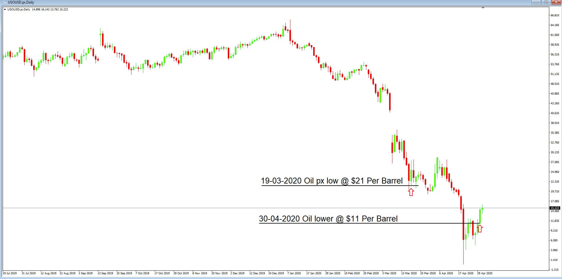
Let’s move forward to 30th April where the price of oil has continued to collapse, at one point going into negative territory to – $40 a barrel for WTI for May’s futures contract, which is the first time in history that this has ever happened. But at this point, we can see that price has somewhat recovered to $11 dollars per barrel. And we might, therefore, expect that the Canadian dollar has also weakened.


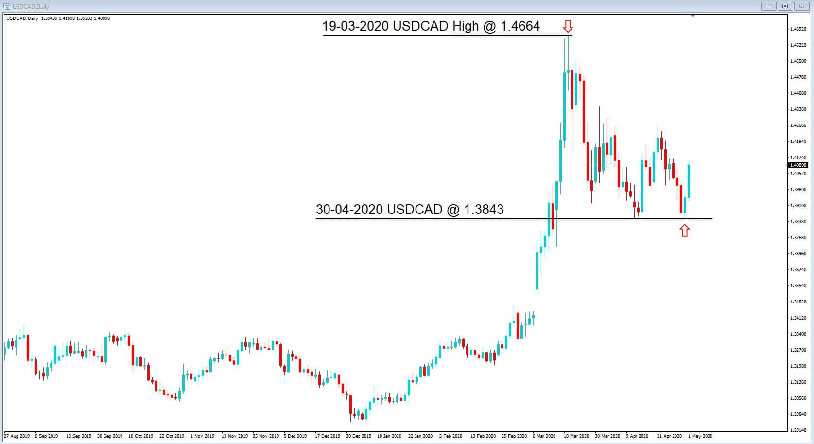
However, on the same day of the oil low, 30th April, the Canadian dollar has rallied higher in value, with the USDCAD showing a low of 1.3843, its highest level in six weeks. Before moving higher again to 1.4100 where it currently sits.
While some of the increase in the value could have been attributed to the oil price coming off of its low, especially the minus figures, on hopes of a fuel demand recovery, the prospects of further economic stimulus by the Canadian government, and the gradual reopening of western economies, we can be in no doubt that there has been a lag in fundamental analysis, and where traders have preferred to move with technical analysis, during the period of 19th March to 30th April.
However even if things began to get back to normal, this is going to be an extremely long process, and yet many oil-producing countries such as Saudi Arabia and Russia keep pumping out oil in a high volume regardless of the slowdown in global economic growth and where the

surplus of oil in storage all around the world is not likely to be consumed until 2022, according to some analysts.
Therefore no matter what type of recovery we see, and it won’t be rapid until there is a cure for Covid-19, on the basis of supply and demand, we will see low oil prices for a long time to come. Therefore we should expect the US dollar CAD to continue to rise, perhaps to previous highs of $1.46, as the fundamentals catch up with the technicals.

Categories
Forex Fibonacci

Fibonacci Trading: Be sure whether the Level is Held or Breached

Breakout plays a very vital role in the Forex market. Traders use breakout, breakout levels to make a trading decision. Fibonacci traders are to make sure whether a particular level is breached or it holds the price to make a better trading decision. In today’s lesson, we are going to demonstrate an example where Fibonacci traders may need to concentrate more to be sure about the Fibonacci level from where the price trends. Let us get started.

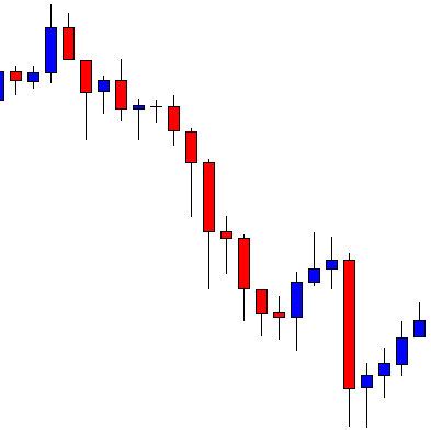
This is an H1 chart. The chart shows that the price makes a strong bearish move. It makes an upside correction followed by a strong bearish move again. The price has been having an upside correction again. Fibonacci traders are to draw the Fibonacci levels in the chart to find out where the price makes a bearish reversal and how far it may go up to.

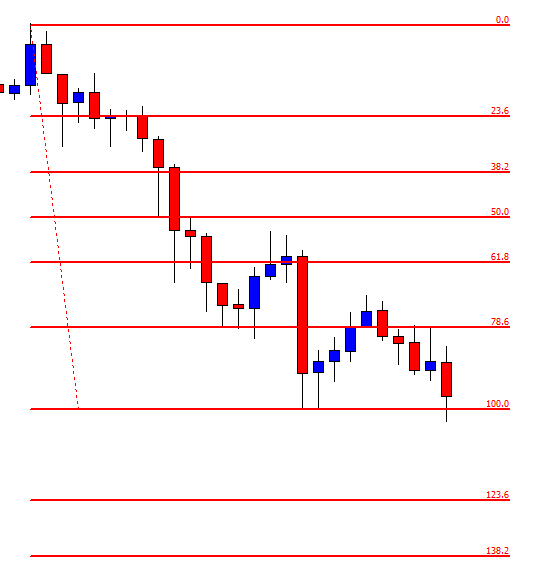
Here are the levels. The chart shows that the price produces a bearish engulfing candle and heads towards the South with good bearish momentum. The question is whether the price trends from 78.6% or 61.8%. It is a vital issue since the price heads towards either 138.2% or 161.8% based on these two levels. If we concentrate on the chart, we see one of the bullish candles closes above the 78.6% level. However, the price comes back within the 78.6% level with the next candle. This means the H1 chart does not make a bullish breakout at 78.6%. The sellers may plan their entries to go short up to 138.2% in this chart. Let us proceed to the next chart to find out what price does.

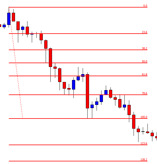
The price breaches the 100.0 level and trades below for several candles. The sellers may wait for a bearish reversal candle and go short in the pair as long as they are satisfied with the risk-reward factor. Usually, it is best if the price goes back to the 100.0 level and produces a bearish reversal candle around the level as far as the risk-reward ratio is concerned. However, it may be produced anywhere between 100.0% to 123.6%. The sellers with different strategies may set their stop loss at different levels, but their last take profit level is to be set at 138.2 %. Let us proceed to the next chart to find out what the price does next.

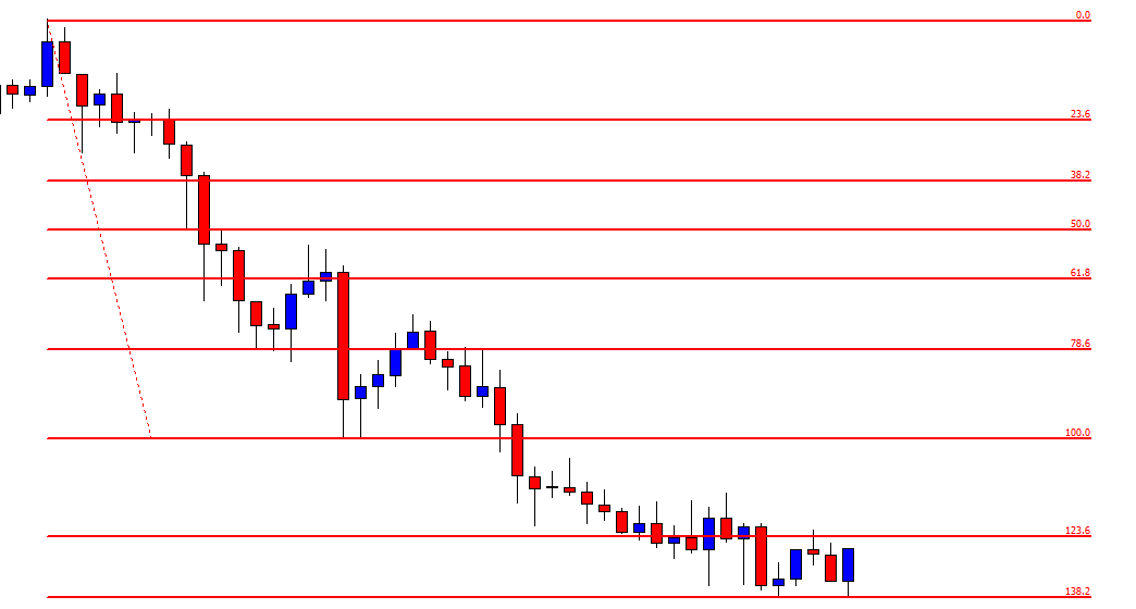
The chart shows that the price hits 138.2%. As expected, it has been roaming around the level. It seems that the price may have found its support around 138.2% level, and it may make a bullish reversal. The sellers with Fibonacci levels have completed their mission with perfection.

Categories
Forex Course

118. Using Rectangle Chart Patterns to Trade Breakouts

Introduction

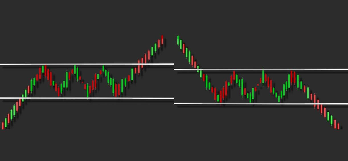
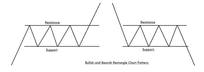
The Rectangle is a technical chart pattern that is described by two horizontal lines acting like potential support and resistance levels on the price chart. Trading this pattern is similar to buying at the support and selling at the resistance level. Conventional traders can trade this pattern only after the appearance of the breakout.

The Rectangle represents a trading range, which indicates the fight between the two parties – buyers & sellers. As the price reaches the support level, buyers step in and push the price higher. And when the price reaches the resistance level, bears take over and force the price lower.

In this fight, one party will eventually get exhausted, and the winner will emerge when the price breaks out in any direction. So we can say that the Rectangle is a neutral pattern as either trend continuation or reversals may happen after the formation of this pattern.

Rectangle Chart Pattern – Trading Strategies

Buy Example

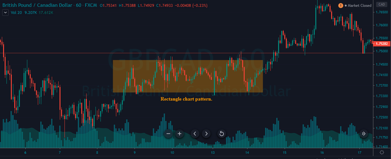
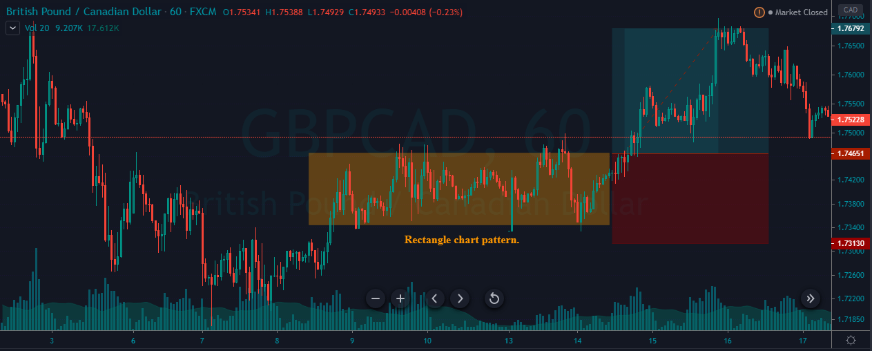
The below chart represents the formation of a Rectangle pattern in the GBP/CAD pair.

As we can see in the below chart, the market just started its uptrend, and during the pullback, it turned into the consolidation phase forming a range. This consolidation phase eventually forms the Rectangle pattern.

This pattern is very easy to spot and trade. We can wait for the pattern to break the range to enter the market. If you are an active trader, you can even take a couple of buy/sell trades in a lower timeframe. In the example shown below, we have decided to go long as soon as the price action broke the pattern from the upside. The stop-loss order is placed just below the Rectangle, and the take-profit is at the recent high.

Sell Example

The image below represents the formation of a Rectangle pattern in a downtrend.

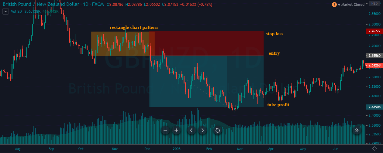
The below chart represents the entry, exit, and the placement of stop-loss & take-profit orders in the GBP/NZD Forex pair. In an ongoing downtrend, when the prices reached the significant support zone, it started to hold. The sideways movement of the price shows that both the parties are super strong, and the breakout to any side will be a good trade.

After the battle, prices broke towards the downside, which is a clear indication for us to go short. The stop-loss order is placed just above the pattern. Because, in a downtrend, if the price breaks the Rectangle pattern’s resistance, it must be considered invalid. Hence there is no need to go for deeper stop-loss. We would always recommend placing the stops just above or at least at the same height as the pattern.

For booking profits, we didn’t choose any specific location. Instead, we were watching the price action keenly and chose to close our full positions when the sellers started to die. We can close our positions in different ways, depending on the market situation. For instance, we can exit the trade when prices approach the significant support area. We can even take the help of technical indicators to close our positions. Technical traders are also using price action techniques these days to exit their running positions.

That’s about the Rectangle chart pattern and how to trade it. If you have any queries, let us know in the comments below. Cheers.

[wp_quiz id=”73928″]
Categories
Forex Course

116. Trading The Ascending & Descending Triangle Chart Patterns

Introduction

The Triangle Chart pattern is one of the most frequently found Forex patterns on the price charts. Technical traders prefer trading this pattern as it provides greater insight into the future price movement and the upcoming resumption of the current trend. This is a consolidation pattern that occurs in the midway of the trend, and it signals the continuation of the existing trend.

The Triangle pattern is formed between the two converging trend lines as the price temporarily moves into a small range. We must wait for the breakout to happen in an existing trend to take a trade. There are three types of Triangle chart patterns, and they are the Ascending Triangle, Descending Triangle, and The Symmetrical Triangle.

Ascending Triangle

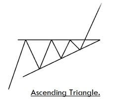
It typically appears in a bullish trend. When the price action breaks the upper horizontal trend line with increased volume, it indicates a buy signal.

Descending Triangle

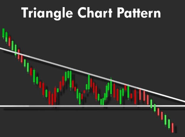
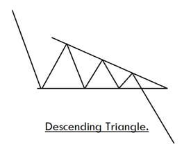
It is a bearish continuation pattern, and it appears in a downtrend. When the price action breaks the lower horizontal trend line with increased volume, it implies that the original sellers are back in the show, and it is an indication for us to go short.

Symmetrical Triangle

It is composed of diagonally falling upper trend line and diagonally rising lower trend line. When the price action reaches the apex, the price can break out from any side. We must be taking our positions depending on the price momentum and strength.

How To Trade The Triangle Chart Pattern?

Trading The Bullish or Ascending Triangle Pattern

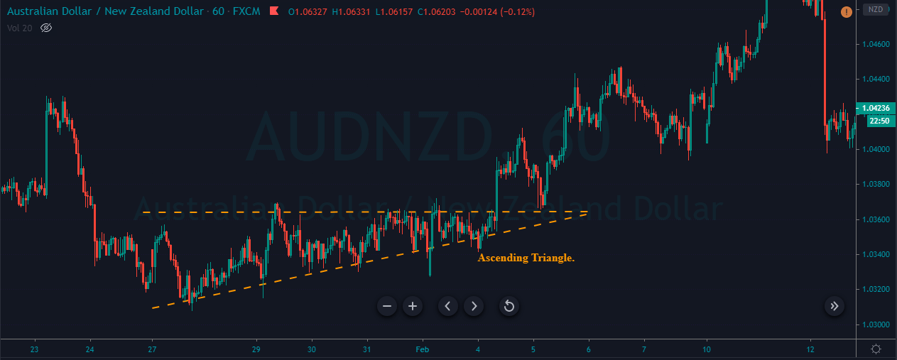
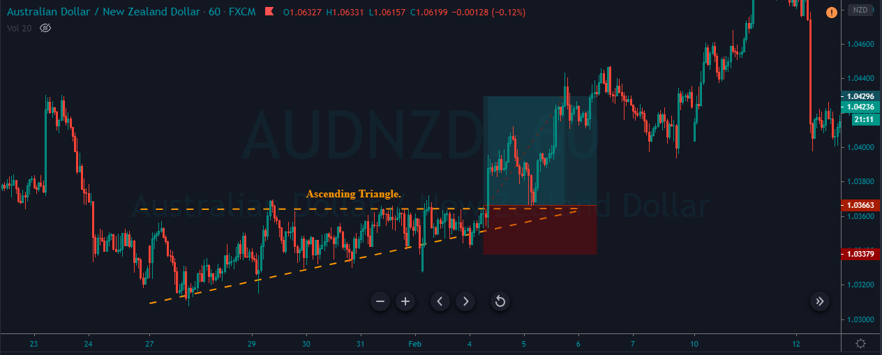
The below chart represents the formation of an Ascending Triangle chart pattern in the AUD/NZD forex pair.

In the below Ascending Triangle pattern, we can see that both buyers and sellers are super strong. When the buyers break above the resistance line, it indicates that the game is finally in the hand of buyers. Hence, this is the perfect time to go long. The stop-loss was placed just below the pattern, and we book the profit when price action reached the previous significant high.

Trading The Bearish or Descending Triangle Pattern

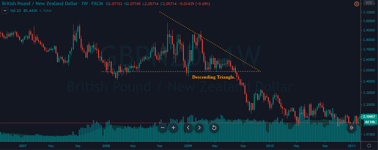
The below chart represents the formation of a Descending Triangle chart pattern in the GBP/NZD Forex pair.

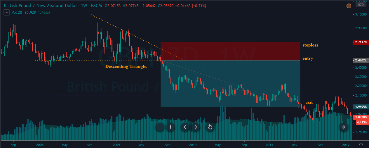
As we can see in the below chart, the pair was in an overall downtrend. When the price action reached a significant support area, the market started to move in a range. This range eventually has turned into a Descending Triangle chart pattern. As discussed, this pattern indicates that buyers and sellers are aggressive in taking the lead.

But the breakdown towards the sell side shows that the sellers have finally won the battle. We have placed the sell order right after the breakout, and stop-loss was placed just above the recent higher low. You can observe from the below chart that after going short, the price action started to move smoothly in our direction. We have closed our entire position when the price is started to struggle going down.

That’s about Ascending and Descending Triangle chart patterns. There are many strategies we can use to maximize profits while trading this pattern, and they can be found in the Basic Strategies section. All the best.

[wp_quiz id=”72812″]
Categories
Forex Signals

Quick Up On USD/CAD Signal – Breakout, Fakeout! 

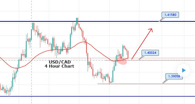
The USD/CAD pair was closed at 1.40160 after placing a high of 1.40424 and a low of 1.39000. Overall the movement of the USD/CAD pair remained bullish throughout the day. 

The USD/CAD pair posted gains on Monday after falling for the past 2 trading days. The decreased crude oil prices on Monday caused the CAD to outperform its rival currency US dollar and raised the USD/CAD pair.

In the past week, the WTI crude oil prices were supported by the heightened hopes of recovery in global energy demand amid the easing of coronavirus induced lockdowns from across the globe. 

The barrel of WTI crude oil rose almost 30% last week, which is the largest weekly gain of the year. However, the cautious market mood on Monday dragged down the WTI crude prices by 3.5% to 25.20$.


During the Asian session, bullish bias was dominating the USD/CAD prices as these lead the pair towards the next resistance level of 1.4100. On the 4 hour timeframe, the USD/CAD pair managed to crossover the 50 EMA and has closed bullish candles above the EMA support level of 1.4000. 

On the higher side, the USD/CAD prices may lead the pair towards the next resistance level of 1.4100, but currently, the pair is retracing back and it may test the support area of 1.4000 level. But I case, the pair manages to close below 1.4000 level, our signal will be at risk of hitting the stop loss. Let’s see how it goes. 

Entry Price: Buy at 1.40494    

Take Profit 1.40994    

Stop Loss 1.39994    

Risk/Reward 1.00

Profit & Loss Per Standard Lot = -$500/+$500

Profit & Loss Per Micro Lot = -$‭‭50/+$50

Categories
Forex Market Analysis

Daily F.X. Analysis, May 12 – Top Trade Setups In Forex – U.S. Inflation Ready to Play! 

The latest economic data from the United States fueled expectations that the Federal Reserve will stimulate more in the next meeting, and markets started to price in for a negative interest rate environment. Donald Trump, while considering the state of Beijing amid coronavirus lockdown, threatened to impose new tariffs if China failed to buy $200 worth U.S. farm goods. After that, trade representatives from both sides held a meeting via phone call and announced a positive report hence created optimism about the US-China relationship.

Economic Events to Watch Today 


EUR/USD – Daily Analysis

The EUR/USD prices were closed at 1.08066 after placing a high of 1.08504 and a low of 1.08004. Overall the movement of the EUR/USD pair remained bearish throughout the day.

EUR/USD pair dropped on Monday and posted a fresh daily low of 1.0801. The downward trend of the EUR/USD pair was due to the strength of the U.S. dollar. The U.S. Dollar Index was up by 0.45% and was back to above 100.00; it was pushed by higher U.S. yields on Monday.

On the data front, at 13:00 GMT, the Italian Industrial Production in the month of March showed a decline in production activity by 28.4% against the forecasted decline of 20.0%. It weighed on single currency euro and added in the downward track of EUR/USD pair. 

Furthermore, the EUR was also affected by the news about filing a case against the German constitutional Court. On Sunday, the European Union Commission announced that it could open a legal case against the German Constitutional Court ruling of European Central Bank’s easing programs.

The president of the European Commission, Ursula von der Leyen, has said that the judges in the German Constitutional Court have overreached their authority by calling the part of ECB’s bond-buying program illegal, which was critical and necessary to stabilize the economy in coronavirus crisis.

However, the loss in EUR/USD prices gained after new six coronavirus cases started to reappear from Wuhan city after more than a month when lockdown restrictions were eased in the city, which is considered as the epicenter of coronavirus outbreak.

The E.U. and U.K. resumed talks on Monday with rising pressure on both sides to make some progress as the deadline to reach a deal is coming closer. 2 rounds of talks have been made, which included first face-to-face in March and another in April via video conference.

Daily Support and Resistance  

  • R3 1.089
  • R2 1.0871
  • R1 1.084

Pivot Point 1.082

  • S1 1.0789
  • S2 1.0769
  • S3 1.0738

EUR/USD– Trading Tips

The EUR/USD price is trading slightly bearish below an immediate resistance level of 1.0823, which is extended by the 50 EMA. On the 4 hour timeframe, the 50 EMA is pushing the EUR/USD pair around 1.0820. Below this, we may see EUR/USD prices falling until 1.0777, while bullish breakout of 1.0850 can lead EUR/USD prices towards 61.8% Fibonacci retracement level of 1.0869 level. Later today, the U.S. retail sales will help determine further trends in the EUR/USD prices. 

GBP/USD – Daily Analysis

The GBP/USD pair was closed at 1.23326 after placing a high of 1.24376 and a low of 1.22827. Overall the movement of GBP/USD pair remained bearish throughout the day. 

The GBP/USD pair remained relatively quiet above 1.2400 level at the start of the day but came under intense bearish pressure in late trading sessions. GBP/USD pair dropped to a fresh four day low of 1.2282 on the back of U.S. dollar strength and GBP weakness. However, it maintained to recover some of its losses in late session and ended up closing the day in a negative trend. 

The U.K. government has published its recovery-strategy on Monday, which noted that the coronavirus was expected to circulate for an extended period of time and with the periodic waves. According to the strategy, the financial measures taken by the government to cope up with the damage caused by coronavirus to the economy were very expensive and that these measures could not be sustained for a longer period.

Furthermore, PM Boris Johnson has said that different parts of the U.K. will stay in lockdown longer than other parts. He added that any wrong move would be disastrous for the U.K. economy, and they will show no hesitation in reintroducing the measures if needed.

On Sunday, PM Johnson announced that restrictions will be lifted from local travel and local parks after six weeks of lockdown and that workers who cannot do work from home like construction & manufacturing industries were encouraged to return to their jobs. 

However, he spared the details about how they could continue the work and not spread the virus. So, on Monday, groups representing U.K. businesses and workers criticized the government’s plan to ease lockdown. They complained that PM Johnson missed the crucial details while announcing the easing of lockdown, that how companies should prepare for safe return to work.

Daily Support and Resistance

  • R3 1.2577
  • R2 1.2508
  • R1 1.2422

Pivot Point 1.2353

  • S1 1.2268
  • S2 1.2198
  • S3 1.2113

GBP/USD– Trading Tip

The GBP/USD sideways trading continues in between a narrow trading range of 1.2360 – 1.2285. The Cable is still holding below 50 EMA, which is extending resistance around 1.2370 level today. On the 4 hour chart, the GBP/USD is gaining support at 1.2285 level while the 50 EMA and horizontal resistance stay at 1.2365 level. Today, the positive retail sales may drive the selling trend in the GBP/USD pair to lead its prices towards an immediate support level of 1.2280 and 1.2250. Conversely, the worse than expected retail sales data will lead the GBP/USD pair towards 1.2360 and 1.2450. 

USD/JPY – Daily Analysis

The USD/JPY pair was closed at 107.651 after placing a high of 107.766 and a low of 106.472. Overall the movement of the USD/JPY pair remained bullish throughout the day. USD/JPY pair climbed to 2 weeks high above 107.70 level on Monday on the back of U.S. dollar strength. The pair USD/JPY moved up by 0.85% on the day amid U.S. dollar strength due to increased risk-on market sentiment. 

The increased risk sentiment of the market made it difficult for JPY safe-haven currency to find demand on Monday hence gave a push to the USD/JPY pair prices. On Monday, the Bank of Japan signaled more measures in order to avoid the 2nd Great Depression caused by the coronavirus pandemic.

In its report published on Monday, BoJ announced that it would lift the cap from government & corporate bond purchases and also pointed to take additional measures if needed. BoJ had already decided to expand its monetary stimulus program on April 27 when it held its last meeting in which it described the current economic situation as “increasingly severe.”

BoJ, in its monthly meeting, forecasted that country’s economy would experience a contraction between 5 and 3 percent in the current year. Japan’s current coronavirus cases are recorded as 15,777, with 624 deaths. The increased number of appearing cases after the easing of lockdown has made BoJ take additional measures to put the world’s third-largest economy back on track.

On another note, on Monday, the Central Bank of Japan appointed its first woman executive director since it has originated. Tokiko Shimizu, a 55-year-old banker, was appointed as a first-ever female executive director in 138 years.

Daily Support and Resistance    

  • R3 109.37
  • R2 108.57
  • R1 108.12

Pivot Point 107.33

  • S1 106.88
  • S2 106.09
  • S3 105.64

USD/JPY – Trading Tips

The USD/JPY traded sharply bullish to place a high around 107.850 amid stronger U.S. dollar and the risk-on sentiment. On the 4 hour timeframe, the USD/JPY pair is now trying to exhibit some correction as it’s price fell from 107.850 area to 107.400 support zone. 

However, the 50 periods EMA are still suggesting strong odds of bullish bias, along with the MACD, which are also supporting the bullish trend in the USD/JPY pair. The violation of an immediate resistance level may extend buying until 107.900 level. Conversely, the closing of selling candles below 107.460 can continue selling bias until 107 and 106.850. The 50 EMA is supporting the bullish bias around the 106.650 area. All the best for today! 

Categories
Forex Signals

Bearish Bias Dominates on EUR/USD – Quick Sell Trade!  

The EUR/USD prices were closed at 1.08066 after placing a high of 1.08504 and a low of 1.08004. Overall the movement of the EUR/USD pair remained bearish throughout the day.

EUR/USD pair dropped on Monday and posted a fresh daily low of 1.0801. The downward trend of the EUR/USD pair was due to the strength of the US dollar. The US Dollar Index was up by 0.45% and was back to above 100.00, it was pushed by higher US yields on Monday.

On the data front, at 13:00 GMT, the Italian Industrial Production in the month of March showed a decline in production activity by 28.4% against the forecasted decline of 20.0%. It weighed on single currency euro and added in the downward track of EUR/USD pair. 


Daily Technical Levels

Support Resistance

1.0826 1.0847

1.0813 1.0855

1.0804 1.0868

Pivot Point: 1.0834

The EUR/USD price is trading slightly bearish below an immediate resistance level of 1.0823, which is extended by the 50 EMA. On the 4 hour timeframe, the 50 EMA is pushing the EUR/USD pair around 1.0820. Below this, we may see EUR/USD prices falling until 1.0777, while bullish breakout of 1.0850 can lead EUR/USD prices towards 61.8% Fibonacci retracement level of 1.0869 level. 

Entry Price: Sell at 1.07954    

Take Profit 1.07454        

Stop Loss 1.08454    

Risk/Reward 1.00

Profit & Loss Per Standard Lot = -$500/+$500

Profit & Loss Per Micro Lot = -$‭‭50/+$50

Categories
Forex Fundamental Analysis

Bank Lending Rate – How Important Is It To Know This Fundamental Driver?

Introduction

Bank Lending Rate serves as a useful metric to assess the liquidity of the banking sector and the overall economy. Bank Lending Rate helps us to understand the ‘cost of money’ or how expensive the money is in the economy.

The Lending environment within the economy determines whether the consumer and business sentiment is bearish (save more spend less) or bullish (spend more save less), which will have a multitude of impacts in various sectors. Investors, Traders, Economists use these rates to assess the current ease of flow of money within the economy and its corresponding consequences.

What is Bank Lending Rate?

Bank Lending Rate, also called the Prime Rate, is the interest rate at which the commercial banks are willing to lend money to their most creditworthy customers. The most creditworthy customers would usually be the corporate companies that have an outstanding past credit record.

At the top of the lending, chain sits the Central Bank, which determines the rate at which banks lend each other money in the interbank market. In the United States, the Central Bank is the Federal Reserve, and it influences the interbank rate, also called the Fed Funds Rate, by purchasing or selling government securities.

When the Federal Reserve purchases bonds, it results in the injection of money into the system, thereby increasing the liquidity of the bank market, and correspondingly the overall economy. When the Banks have more money to lend, the banks will lend this newly injected money at a lower rate, as a result of competition, and excess reserves.

On the other hand, when the Federal Reserve sells the bonds, it takes money out of the system, where banks become less liquid and thereby increasing their interest rates to get the best price for their remaining funds.

Hence, the Fed Funds rate serves as the base for the Prime Rate or Bank Lending Rate. This Prime Rate serves as the basis for all other subsequent forms of loans like a personal, business, student, or even Mortgage loans. The below diagram is illustrative of the above points.

The below diagram summarizes the hierarchy of the rates. The lower cell type of interest rate derives its value from its upper cell interest rate.

How can the Bank Lending Rate numbers be used for analysis?

The Prime Rates change based on the Fed Funds Rate, which is decided by the Central Bank based on economic factors.

The remaining forms of loans are derived from the Prime Rate and a percentage spread that is charged by banks for lending the money. The spread (or profit) varies from bank to bank and also on the customer’s credit score. Hence, there is no single Prime Rate as the best customers of the banks vary, and hence, usually, the quoted Prime Rate is the rate published daily in the Wall Stree Journal.

The Prime Rate is seen as a benchmark for commercial loans. In most cases, that would be the lowest rate available to the general public and business corporations, and it is not a mandatory minimum. In the end, banks can tweak their rules in their favor. A decrease in Fed Funds rate does not necessarily guarantee that a subsequent drop in the Prime Rates, but due to competition amongst banks, the general trend is that the Prime Rate follows the Fed Funds Rate.

We must understand that a Bank’s primary motive is to make money out of money. They make their profit on the difference between the Lending Rate and the Deposit Rate, also called the Net Interest Margin. A variety of factors come into play before a loan is sanctioned. The risk associated with the borrower (credit score, income source, assets, and existing liabilities), fluctuating market and economy, general consumer and business sentiment, etc. all add to the decision-making process of setting the Prime Rate, or other loan forms derived from it.

The ease at which loans are available to the public determines the type of monetary policy. In a loose lending environment, the Bank Lending Rates are typically low, which encourages consumers to borrow more and spend more into the economy. On the contrary, when the Rates are high, it discourages consumers from borrowing and encourages saving more.

The Central Bank regulates money flow through its interbank operations to manage inflation and deflation. In developed economies, a loose lending environment promotes growth & avoids possible deflationary threats. The tight lending environment is a strategy to slow down or cool down an overinflating economy.

The affordability of loans determines how much money is in people’s hands to spend. Low Prime Rates ensure high spending environments that are good for businesses and promote growth and higher GDP prints and vice-versa.

The effectiveness of the Prime Rate changes is not immediate, as the changes in the Fed Funds Rates, Prime Rates take time to come into effect. There is generally a 4-12 months time lag before the intended changes start to play out, and yet there is no guarantee that these levers will work.

Impact on Currency

Higher Bank Lending Rates is deflationary for the economy, and currency appreciates. On the other hand, Low Bank Lending Rates are inflationary for the economy, and the currency depreciates in the short-run.

Although, the low rates are typically set to boost the economy, which will cancel out the depreciation effect on a longer time frame, the immediate effect is as stated above.

Economic Reports

For the United States, the Federal Reserve publishes daily Selected Interest Rates, which includes the Prime Rate figures also. Weekly average and monthly Prime Rate figures are also available. In general, weekly and monthly data are monitored by the market.

The data is posted from Monday to Friday at 4:15 PM every day for the Daily Selected Interest Rates.

Sources of Bank Lending Rate

Selected Interest Rates – Daily – Federal Reserve

Selected Interest Rates – Weekly Monthly – Federal Reserve

The St. Louis FRED also keeps track of Prime Rates, and it is available here

Bank Lending Rates for various countries are summarized together and available here

Impact of the ‘Bank Lending Rate’ news release on the price charts 

In the previous section of the article, we learned about the ‘Banks Lending Rate’ fundamental indicator, which talks about the change in the total value of outstanding bank loans issued to customers and businesses. A country that lends more to people and companies is said to encourage economic growth by giving more money in the hands of people. This directly stimulates consumer spending and promotes the overall development of the country. This is one of the key parameters, if not very important, which investors look at before taking a position in the currency.

In the following section of the article, we shall look at the impact of the Bank Lending Rate announcement on various currency pairs and examine the change in volatility due to the announcement. The below image shows the previous and latest data of Japan, where the rate was reduced from the previous month. Let us analyze the impact of the same on some major Japanese Yen pairs.

EUR/JPY | Before The Announcement

We shall start with the EUR/JPY currency pair for discovering the impact of the Bank Lending Rate on the currency. The above image shows the characteristics of the chart before the announcement was made, and we see that after a high volatile move, the price has developed a small ‘range.’ Currently, the price is at the ‘support’ where we can expect to pop up any time. Thus, the bias is on the ‘long’ side.

EUR/JPY | After The Announcement

After the news announcement, the price suddenly goes higher and closes as a bullish candle. The spike in volatility to the upside was a result of the negative Bank Lending Rate, which was slightly reduced as compared to the previous month. As the rate was not increased, traders bought the currency and sold the Japanese Yen. But since the data was largely poor, the ‘news candle’ was immediately retraced fully, and volatility increased on the downside. Thus, we need to wait for the volatility to subside in order to make a trade.

AUD/JPY | Before The Announcement


AUD/JPY | After The Announcement

The above images are that of the AUD/JPY currency pair, where we see that before the news announcement, the pair in a strong uptrend with nearly no retracement of any sort. This means the Japnese Yen is extremely weak, and irrespective of the news data, a ‘short’ trade is not recommended whatsoever.

After the news announcement, the price initially moves higher, but later volatility increases to the downside and goes below the moving average. This shows that the Bank Lending Rate news was not bad for the Japanese Yen, which is why traders bought the currency later on. We need to be careful by not taking a ‘short’ trade as the overall trend is up and that the impact is not long-lasting.

CHF/JPY | Before The Announcement

CHF/JPY | After The Announcement

The above images represent the CHF/JPY currency pair, where we see in the first image that the market is clearly ‘range’ bound and is not trending in any direction. Just before the announcement, the price is near the top of ‘range,’ which means we can expect sellers to get active any moment from now. We shall wait and see what the news release does to the currency pair and then take a suitable position in the market based on the data.

After the news announcement, the price moves higher, similarly as in the above currency pairs, but gets instantly retraced. The currency pair forms a ‘Rail-Road Track’ candlestick pattern, which indicates that the pair is going to continue its downward move. Hence traders can take ‘short’ after noticing such a pattern after a news announcement. Technically also the place is supportive of a ‘sell.’

That’s about ‘Bank Lending Rate’ and its impact on the Forex market after its news release. If you have any questions, please let us know in the comments below. Good luck!

Categories
Forex Fundamental Analysis

The Impact Of ‘Capacity Utilization’ On The Forex Price Charts

Introduction

Capacity Utilization is a straightforward and crude way of finding out whether a business or an economy is operating at its peak potential. Investors would always prefer to direct their capital, where their returns are maximized to the optimal levels. In this sense, Capacity Utilization can tell us which sectors, or companies, or even economies would attract capital, which would further fuel growth and prosperity. Hence, understanding Capacity Utilization figures will prove advantageous for our fundamental analysis.

What is Capacity Utilization?

Capacity Utilization refers to the proportion of the real potential economic output that is realized at a given point in time. It tells us at what level of maximum capacity is an industry operating at. It is expressed in percentage and is given by the below equation:

For example, a firm that can produce 10,000 phones a day, if it is producing 6,000 phones only, then the company is said to have a Capacity Utilization of 60%.

In the simplest sense, Capacity Utilization is like a report card of an industry or an economy. It tells the current score (or marks) out of the maximum possible marks.

How can the Capacity Utilization numbers be used for analysis?

Capacity Utilization Rate is an essential operational parameter for businesses, especially those manufacturing physical goods, as it is easier to quantify the output.

A company operating at less than 100% implies that the firm can increase its production, and consequently, its profit margin without incurring additional costs of installing new equipment to increase production. Likewise, economies with scores of less than 100% can afford to increase production capacity when demanded.

For the companies, it serves as a metric for determining operating efficiency. Capacity Utilization is susceptible to the following factors:

  • Business Cycles: Businesses are often seasonal, seeing an increase in business during specific periods of the years, although some companies may have consistent business activity throughout the year. It depends on the nature of business and the products being manufactured.
  • Management: Lack of proper management can also lead to wastage of resources; therefore, undermining the efficiency of the company itself. It is not often the common cause but is also one factor that investors must look into to make sure proper management is there to handle the business to utilize the available resources in terms of workforce and equipment to optimize revenue for the firm.
  • Economy’s Health: Economic conditions drive consumer sentiment and affect the spending patterns of people. During fluctuating inflation rates and unstable market economic conditions, people tend to save more and spend less, which can effectively reduce the demand for goods and services. In this case, the company may need to adjust their production to demand.
  • Competition: In an open market environment, competition always takes away a portion of our business, as companies battle for a bigger portion of the market, the best companies with excellent quality goods, and reputation tend to take a higher proportion of market revenue. At the same time, the laggards end up with lower demands for their product.

In general, competition and management factors are a minor component that applies to novice companies that are in the early stages of development. In most cases, the industries are well established in their field and have consistent performance and are indeed susceptible to Economic health and business cycles.

Low Capacity Utilization figures are not desirable. Fiscal and Monetary Policymakers ( Government and Central Banks) monitor the Capacity Utilization figures and intervene using fiscal or monetary levers to stimulate business and economy. Governments can decrease the tax burden on specific sectors to encourage them to invest capital in their growth. At the same time, Central Banks can reduce interest rates to encourage business owners to borrow money and increase business activity through expansion or investment opportunities.

 High Capacity Utilization figures are always preferable, as it indicates that the companies are running at their maximum capacity, and earning maximum achievable profit through their current business setup. When Capacity Utilization is close to 100%, the economy is performing at its peak, and it is ideal an ideal environment for investors to invest in industries. It implies that economic health is stable and growing.

Sector-wise Capacity Utilization rates difference can tell us what amount of slacks each industry is carrying and can direct investment capital into the growing industries than the slowing sectors. By comparing historical highs and lows, we can get a reference, on an industry’s current performance with regards to its peak high and low performances, to understand how it is faring right now.

Impact on Currency

Capacity Utilization is a coincident indicator that is reflective of the market environment and the corresponding policy levers executed to counter the market conditions by the Fiscal and Monetary policymakers. Hence, it gives us a current economic picture as it is a function of the market environment and policy levers.

It is a proportional indicator, where high Capacity Utilization Rates indicate healthy revenue-generating activity, which is suitable for the economy, higher GDP prints, and currency appreciates accordingly. On the other hand, decreasing Capacity Utilization Rates indicate a stagnating or deteriorating business activity, which poses a deflationary threat to the economy, or extreme cases recession, which is depreciating for the currency.

It is a low impact indicator, as the corresponding impacts would have been already priced into the market. We are saying this because policy maker’s decisions come out in the form of interest rates, tax exemptions or reductions, and through survey indicators like business and consumer surveys.

Economic Reports

The “Industrial Production and Capacity Utilization – G17” reports are published every month by the Federal Reserve in the United States on its official website. The reports are published in the formats of estimates and revised estimates.

The first estimate is released around the 15th of every month at 9:15 A.M. for the previous month. It factors in about 75% of the data. The second estimate accounts for 85%, the third estimate 94%, the fourth estimate 95%, and 96% in the fifth and sixth estimates as more of the source data becomes available after each passing month.

Sources of Capacity Utilization

The monthly Capacity Utilization statistics are available on the official website of the Federal Reserve for the United States. The St. Louis FRED website provides a comprehensive list of Industry Production, and Capacity Utilization reports on its website with multiple graphical plots. We can also find global Manufacturing Production figures for various countries in statistical formats here.

Impact of the ‘Capacity Utilization’ news release on the price charts

In the previous section of the article, we understood the meaning and significance of Capacity Utilization, which essentially talks about the manufacturing and production capabilities that are being utilized by a nation at any given point of time. If demand increases, Capacity Utilization increases, but if demand decreases, the rate will fall. Policymakers use this data for fixing interest rates and while calculating inflation in the economy. Thus, investors give a reasonable amount of importance to the data and take a stance in the currency based on the Capacity Utilization rate.

The below image shows the latest and previous Capacity Utilization rate of Japan. We see there was a decrease in Capacity Utilization in March, which means the country underutilized its resources. A higher than expected number should be taken as positive for the Japanese Yen, while a lower than expected number as negative. Let us discover the impact of the data on different currency pairs.

USD/JPY | Before the announcement:

We shall begin with the USD/JPY currency pair to analyze the change in volatility before and after the news announcement. The above image shows the state of the currency pair before the news announcement, where the price moving within a range broadly and currently is in the middle of the range. As there is no clarity with respect to the direction of the market, we shall be trading based on the outcome of the news.

USD/JPY | After the announcement:

After the news announcement, the price falls below the moving average, and volatility increases to the downside. Even though the Capacity Utilization data was not very good for the economy, traders considered the data to be mildly positive for the economy in this case and bought the Japanese Yen. After the market has shown signs of weakness, we are now certain that the volatility will expand on the downside, and thus, we can take a ‘short’ position with a stop loss above the ‘resistance’ of the range.

GBP/JPY | Before the announcement:

GBP/JPY | After the announcement:

The above images represent the GBP/JPY currency pair, where we see that before the announcement, the price has started to move in a ‘range’ after a large move on the upside. This also a place from where the market had reversed earlier, thus we need to trade with caution, as we are not sure where the market will head now.

After the news announcement, the price crashes and sharply moves lower. The Capacity Utilization data proved to be positive for the Japanese Yen, and traders went ‘short’ in the currency pair, thereby strengthening the currency furthermore. This is our final confirmation for taking a ‘short’ trade and taking entry as the volatility increases to the downside.

AUD/JPY | Before the announcement:

AUD/JPY | After the announcement:

The above images are that of the AUD/JPY currency pair, where in the first image, we see that the market is in a strong uptrend indicating a great amount of weakness in the Japanese Yen. Technically, we should be looking for buying the currency pair after a suitable price retracement to the ‘support’ area, but a news release can change the entire plan. Thus, we need to wait and see what the news outcome does to the currency pair.

After the news announcement, volatility slightly increases to the downside, and the ‘news candle’ barely closes in red. This means the impact of Capacity Utilization was least on this currency pair that did not result in huge volatility in the pair. As the overall trend is up, a ‘short’ trade can be very risky as the risk to reward ratio is not in our favor.

That’s about ‘Capacity Utilization’ and its impact on the Forex market after its news release. If you have any questions, please let us know in the comments below. Good luck!

Categories
Forex Fundamental Analysis

Everything About ‘Cement Production’ & Its Importance as an Economic Indicator

Introduction

Cement is a commodity that is likely to never run out of demand any time soon. As buildings get kept on renovated in the developed economies, and significant infrastructures like apartments, independent single-family houses, and corporate company buildings continue to be constructed in the developing economies, Cement is required. Increasing Cement Production figures are suitable for the economy, and if the increase is due to international demand, then it is good for the global economy.

Few commodities like Crude Oil, Iron, Steel, and Cement are very required in the modern economy, and countries that are ahead in the production of these goods have experienced substantial growth. Concrete stands behind water in second place as the most widely consumed resource on the planet. Hence, understanding of Cement Production and its impact on economies can help us understand the macroeconomic picture for better fundamental analysis.

What is Cement Production?

The Cement that we generally refer to is the Portland Cement. Cement is the primary ingredient of concrete used in construction. Cement combines with water, sand, and rock to harden to form a concrete structure that has high strength and durability.

Cement is manufactured through a tightly regulated chemical combination of Calcium, Aluminum, Silicon, Iron, and other ingredients. Cement is made using limestone, shells, and chalk or marl combined with shale, clay, slate, blast furnace slag, silica sand, and iron ore. These together, when heated at high temperatures, form a rock-like substance that is ground into the fine powder that we generally refer to as Cement.

How can the Cement Production numbers be used for analysis?

Cement is an essential ingredient in today’s urban infrastructure. It is used in the construction of homes, buildings, apartments, etc. Hence, every physical structure that we can set our eyes on around us is probably made out of Cement. It is for this very reason Cement stands second after water as the planet’s most consumed resource.

Hence, the demand is virtually inexhaustible, not for the near future, at least. As the emerging economies continue to develop at a pace higher than that of the mature economies, there will be a large section of the global population coming into the middle-class, where invariably demand for housing, expansion of businesses are set to increase.

In the world of Cement Production,  China is miles ahead of any other country, exporting 2,500 million metric tons of Cement in 2014. China has the largest cement industry. China uses this Cement for its construction as well as exporting to other countries. Cheaply available Cement has mostly helped China in its infrastructure improvement.

In the second place, far lies India with about 280 million metric tons output in 2014. Even further lies the United States, with about only 83 million metric tons in 2014.

(Source)

(Source)

Although the United States remains the largest economy in the world, that is going to change, as China and India continue to grow at a pace higher than the USA. The growth rate of India is the highest, while China is close to the United States in GDP terms.

As of 2019, the USA GDP is 21.5 trillion dollars, while China stands second with 14.2 trillion dollars. But it is important to note that China’s growth rate is higher than that of the USA, and if this continues, China will beat the United States. Most emerging economies are achieving their economic growth through exports, and dominating such essential commodities, like Cement, gives the economy an upper hand.

The availability of Cement at low prices helps the erection of commercial infrastructure easy that promotes the ease-of-doing-business factor in the country. As many companies like Apple develop their products in the United States but manufacture them in China, this promotes growth. The availability of infrastructure helps boost the economy to a great extent.

An increase in Cement Production helps developing economies to tap into the global market demand to compete against China for a more significant portion of the world market. For example, Indonesia is improving its share in the global market by providing Cement for as low as just 20 dollars compared to the 34 dollars price tag of China.

Hence, developing economies that can produce Cement commercially can boost their economy through international trade exports. Once a system is established that is efficient, upscaling it to unprecedented levels can boost the economy significantly.

(Source)

Note: Cement Production, although important, comes at the cost of air pollution. Cement Industry is one of the primary sources of Carbon Dioxide (Greenhouse gas) in the atmosphere, which is responsible for global warming. It is also responsible for soil erosion that destroys the top layer of land, which is necessary for agriculture.

An alternative called Green Cement is to replace Cement. It has better functionality, uses fewer resources, and is less damaging for the environment. With environmental issues being a significant concern, a potential shift may occur in the market towards green Cement as the go-to product for construction. Countries that will come up with an efficient way of mass-producing this green Cement at affordable prices can beat the current Cement industries. The only challenges are pricing and lack of availability in large quantities.

Impact on Currency

Cement Production is an economic indicator in our analysis solely based on its importance and demand. It is a proportional indicator, meaning an increase or decrease in its numbers can grow or contract the economy, thereby appreciating or depreciating domestic currency, respectively.

It is a micro-economic indicator, as it does not cover the entire economy’s production and can be closely monitored for countries whose dependency on Cement Production is high, which is more useful for regional level assessment.

In the currency markets, Cement Production values are not macroeconomic indicators and are only useful in microeconomic analysis within the country to predict construction-related growth, as an increase in labor force employment, wage growth, which are generally seasonal.

Economic Reports

The National Bureau of Statistical of China publishes monthly data of its Cement Production on its official website.

We can find global Cement Production data on globalcement.com given in the sources.

Sources of Cement Production

Cement Production – National Bureau of Statistical of China

Global Cement Production – globalcement.com

Cement Production statistics for various countries can be found here

Updates on Cement Industry, in general, can be obtained here

Impact of the ‘Cement Production’ news release on the price charts 

In the previous section of the article, we understood the Cement Production fundamental indicator and saw how it could be used for analyzing a currency. We shall extend this part of the discussion and see the impact it makes on a currency pair when the data is released. We would like to mention that Cement Production is not an important economic indicator when it comes to the fundamental analysis of a currency. Investors don’t consider it to a significant driver of the currency, but it surely impacts the construction segment, as building construction is largely dependent on Cement production and supply. This, in turn, affects the economy.

In today’s example, we will examine the impact of Cement Production on the Indian Rupee and look at the change in volatility to the news release. A higher production rate than before is considered to be positive for the currency, while a lower than the previous production is considered to be negative. The below image shows the graphical representation of Cement Production in India for the last two months. We see that there has been a reduction in total production for the month of February. Let us find out the market reaction.

USD/INR | Before the announcement:

We will first analyze the impact on the USD/INR currency pair. The above image shows the state of the chart before the news announcement, where we see that the overall trend is up, and recently there has been a price retracement to a ‘demand’ area. The buyers have already reacted from the demand area, and the price is on the verge of continuing the uptrend. Since the Cement Production indicator does not a major impact on the currency, traders can take ‘long’ positions and trade with the trend.

USD/INR | After the announcement:

After the news announcement, the price falls and goes below the moving average line. The ‘news candle’ closes with bearishness, indicating the Cement Production data was not lower by a large margin for that month as compared to the previous month. There is little change in volatility due to the news release, which explains the importance of the indicator among traders. Thus, traders should analyze the chart technically and trade based on that.

GBP/INR | Before the announcement:

GBP/INR | After the announcement:

The above images represent the GBP/INR currency pair, where, in the first image, we see that the market is moving within a range and currently is near the top of the range. At this point, one can expect sellers to activate and sell the currency. Since the ‘news announcement’ is a less impactful event, traders can take a ‘short’ position with a stop-loss above ‘resistance.’

After the news announcement, the market reacts positively to the data, and traders take the price lower. The impact of Cement Production was similar to the above pair as we see that traders bought Indian Rupee and strengthened the currency. Thus, it is clear that the market reacted technically (price fall from ‘resistance’) and not much to the news data.

EUR/INR | Before the announcement:

EUR/INR | Before the announcement:

The above images are that of EUR/INR currency pair where we see that before the news announcement, the market is in a strong uptrend, and recently the price has retraced to a ‘support’ area. This is a desirable market condition for going ‘long’ in the market after price action confirmation from the market. As the news data does not have a major impact on the currency, traders should not be worried about high volatility, which is typically observed after news announcements.

After the news announcement, the market moves lower by the bare minimum, and there is hardly any volatility witnessed. The Cement Production data did not create any major impact on the currency pair, where the market remains around the same price even after the news release. Once the market continues to move higher, one can join the trend by taking a ‘buy’ position.

That’s about ‘Cement Production’ and its impact on the Forex market after its news release. If you have any questions, please let us know in the comments below. Good luck!

Categories
Forex Fundamental Analysis

‘Disposable Personal Income’ – Understanding The Macro Economic Indicator

Introduction

Disposable Personal Income, also called DPI, is an economic indicator that can help investors understand the spending and saving patterns of the general population. It is from this data other forms of expenditures and savings are derived. Hence, understanding the changes in the relative disposable income numbers from time to time can help us understand the economic conditions better as part of our fundamental analysis.

What is Disposable Personal Income?

Disposable Personal Income, also called After-Tax Income, is what’s left of an individual’s income after all federal tax write-offs. Consequently, It is the amount people can spend, save, or invest. For example, An employee making 100,000 dollars a year, paying 25% of his income as tax would have to pay 25,000 dollars as tax payment, which leaves him with 75,000 dollars for that year. This 75,000 dollars would be his DPI, or more aptly the After-Tax Income.

Hence, the calculation of DPI is simple; it is just the difference between personal income and income taxes.

Note: The federal government may use the disposable income for further mandatory deductions like defaulted student loans, delinquent child support, or payment of back taxes. Hence, in the broader sense, the DPI would be the amount that is left after tax and other mandatory payments.

DPI is often confused with Discretionary Income, which is the amount that is left when the living expenses are deducted from the DPI. Living expenses are all the necessary expenditures incurred to conduct one’s lifestyle and would typically include rent, water bill, electricity bill, transportation costs, and groceries, etc.

For Example, A video gamer’s discretionary income would go to typically spending on purchasing new games, whereas a music-loving person would spend his discretionary income attending concerts perhaps. During times of recession or high deflationary conditions, the discretionary income takes the hit as it is miscellaneous spending and does not precede importance over taxes and necessary expenditures. Businesses that sell discretionary goods and services take the worst hit and hence are closely watched by investors for signs of recession and recovery.

Economic Reports

The U.S. Department of Commerce: Bureau of Economic Analysis (BEA) releases the DPI numbers every month in the last week for the previous month titled “Personal Income and Outlays” release. The month-on-month numbers are expressed in percentage changes with respect to last month’s figures.

The BEA also releases the other derived metrics from the DPI, like the REAL DPI, which takes inflation into account, and hence it is the inflation-adjusted version of DPI, PCE (Personal Consumption  Expenditure) and REAL PCE reports.

How can the Disposable Personal Income numbers be used for analysis?

The DPI data set goes back to as far as 1929. With such a long-range, the confidence in the numbers is high amongst economists with regards to its reliability. When compared against GDP growth, there is a good correlation between both.

As we can see below, the graphs have a similar trend, the first one is the Real GDP, and the second graph corresponds to the DPI, which are taken from the St. Louis FRED website for reference and illustration here. The shaded region indicates periods of recessions.

We can also see that during recessions, the GDP and DPI flat out from their usual trend and trend sideways or downwards (during more extended recessionary periods).

As DPI shows what the amount left with the individual after deductions are, the numbers can be used to derive other metrics. Economic indicators like Discretionary income, savings rates, Marginal Propensity to Consume (MPC), and Marginal Propensity to Save (MPS).

All these indicators are useful in speculating the direction of money flow, whether it ends up in banks in the form of savings or other people’s hands as part of the expenditure.

A healthy and growing economy would be reflected in the DPI numbers as the people make up the economy. It is important to remember that DPI is a reflection of the present financial situations of employees and hence only shows what the current economic status of the nation is. It is a coincident indicator in this sense and is dependent on macroeconomic factors like the government’s policies, Quantitative Easing, inflation, etc. which direct the money flow. Hence, it is the effect in the cause-and-effect equation. It reflects the results of an action rather than the act itself.

Impact on Currency

A steady increase in the DPI is always good for the economy and, therefore, the currency.  It is a proportional indicator. Low numbers are depreciating, and high numbers are appreciating for the currency.

A strong economy or most developed nation’s populations are expected to have higher DPI numbers relative to other economies, thereby enjoying a higher standard of living as they can spend on goods and services, beyond meeting their necessities.

An oncoming recessionary period would result in stagnant or dip in DPI numbers as people tend to save more when they are uncertain of their financial future.

Sources of Disposable Personal Income Reports

The monthly DPI numbers releases can be found on the official website of the Bureau of Economic Analysis as given below for reference:

Personal Income and Outlays

We can find historical and graphical analysis of the same numbers in the St. Louis FRED website as given below for reference:

Disposable Personal Income – Seasonally Adjusted Quarterly

For a more detailed analysis of the same, you can browse through the below relevant categories:

Personal Income – FRED

You can also find out the pure DPI numbers (not percentages) of other countries here:

DPI Trading Economics

Impact of the ‘Disposable Personal Income’ news release on the price charts

By now, we have understood the definition and significance of the Disposable Personal Income economic indicator. In this section, let’s analyze the impact of this economic indicator on currency and observe the change in volatility.

Personal Income, Disposable Personal Income, and Personal Consumption are announced together, and data of each of them is released along with the Personal Income. This is why we have collected the date and time of the announcement of Personal Income. As we can see below (yellow mark), traders do not give a lot of importance to the Personal Income data, and therefore one should expect moderate to less volatility during the announcement.

For illustrating the impact, we have used the latest Disposable Personal Income data of the United States. It is published by the Bureau of Economic Analysis of the U.S. The release said that Personal Income was increased by $106.8 billion in February, and the Disposable Personal Income (DPI) was increased by $88.7 billion which was 0.5% higher from the previous month. Let us look at the impact of this data on currency pairs.

EUR/USD | Before the announcement:

The above image shows the state of the chart before the DPI data is announced, and we can see that the market is in a downtrend, and recently it has given a retracement. Technically, this is the ideal condition for going ‘short’ in the market, but as the volatility is high, it is better to wait for the actual data rather than trading based on the market expectations. Taking a ‘buy’ in this pair can be risky even if the DPI data is positive for the U.S. economy as the down move is quite strong, and the reversal will not last (DPI is not a high impact event).

EUR/USD | After the announcement:

The DPI announcement induced a fair amount of volatility in the pair, and the ‘news candle’ leaves a long wick on the top indicating high selling pressure. From the reaction, we can conclude that the DPI for the month of February was very positive for the U.S. economy, which made traders buy more U.S. dollars. This sudden increase in volatility to the downside is a confirmation sign that the market will go much lower. Thus, as the price goes below the 20-period moving average, one can take a ‘short’ trade with a stop-loss just above the news candle.

USD/JPY | Before the announcement:

USD/JPY | After the announcement:

Next, we discuss the USD/JPY currency pair, where the behavior of the chart is different from the EUR/USD pair. Even though the chart is in a downtrend, the U.S. dollar is on the left-hand side. Hence, a downtrend indicates weakness in the currency. Just before the announcement, price is at the lowest point from where the market had retraced earlier. This means, irrespective of the news announcement, we can expect some buying strength from here. We cannot position ourselves on any side of the market at this point as technically, there is no supporting reason.

After the DPI data is announced, the market moves higher as a result of good DPI numbers, and the price makes a ‘bullish hammer’ candlestick pattern. But the data was not very upbeat to increase the volatility too much on the upside. As the market does not give clear signs of reversal, we cannot go ‘long’ in the market based on the data.

USD/HKD | Before the announcement:

USD/HKD | After the announcement:

The above images represent the USD/HKD currency pair where the price appears to be moving in a range, and predominantly the trend is down. Just before the announcement, the price is in the middle of the range, and we cannot predict at this point as to where the price will go. We need to wait to see the shift in volatility due to the news release and then have a view on the market.

After the DPI numbers are out, price falls to the bottom of the range, and we see a strong bearish candle. The DPI data proved to be positive for the currency in the above two pairs, but here the market reacted negatively. This could be due to the strength in the Hong Kong dollar or extreme weakness in the U.S. dollar. As the impact of DPI on currency is less, one can ‘buy’ USD/HKD near the ‘support’ with a target near to the ‘resistance.’

That’s about ‘Disposable Personal Income’ and its impact on the Forex market after its news release. If you have any queries, let us know in the comments below. Cheers!

Categories
Forex Fundamental Analysis

What Is ‘Government Budget’ & How It Helps In Determining A Nation’s Economy?

Introduction

Government Budget is one of the annual reports that moves the market volatility significantly. The Government of a country or a state is responsible for managing the economic activity of that region. Hence the Budget will primarily determine the pace of economic activity for that fiscal year. Government Budget figures are incredibly crucial for traders and investors as it can impact everything from taxes to Sovereign risks.

What is Government Budget?

Government Budget is a detailed annual plan for public spending by the Government. The Budget, in general, applies to individuals, corporations, and Governments. An individual planning his finances for the year determining what portion of his monthly/annual income he is going to allocate for his expenses would be his Budget. For corporations, annual budgets would detail what amount of revenue would be spent on different departments like R&D, marketing, infrastructure, etc.

The Government Budget is the same as the above, but the list of expenses is related to public welfare. The Government is responsible for a multitude of operations like salary payments to Government employees, financing agricultural subsidies, providing financial support to specific industries. It may also include paying for military equipment, payout pension funds to the applicable people, and other Government running operations expenses, etc.

The Government Budget is calculated on an annual basis, and for the United States, this fiscal year begins on the 1st of October to the next year’s 30th of September.

What a Government earns through taxes is called revenue, and what it spends on is categorized under Government Spending. When the spending exceeds its revenue, then we call it as a Budget Deficit or Fiscal Deficit. On the other hand, when the revenue exceeds spending, we have what is called a Budget Surplus or Fiscal Surplus. The United States has been running a budget deficit most of the time throughout history, as shown below:

Budget money spent is usually categorized into two categories:

  • Mandatory Spending: These are the spending that the Government has no choice to cut back on as these are stipulated by law, which the Government cannot fault on. For the United States, Social Security is one such program that was brought into the United States law by President Roosevelt in 1935, under the Social Security Act. Medicare and Medicaid are also typical examples of Mandatory Spending, which are fixed and must be paid out by the Government.
  • Discretionary Spending: This part can make or break an economy. It is the part of Budget that the Government decides to spend on other programs that are not mandatory but essential for growth. There is certain flexibility on how much can be spent on which part of the economy.

How can the Government Budget numbers be used for analysis?

The Government’s Fiscal Deficit is financed through borrowing money from investors in the form of bonds for which the Government promises to pay interest. Deficit each year adds to the debt. The United States and many other developed economies have spent most of their time maintaining a Budget Deficit as the spending has been failing to stimulate the economy year after year.

If the Government decides to cut back on spending to service debt and interest payments, then the economy may slow down due to a lack of funding stimulus. On the other hand, if the Government continues to spend beyond its revenues to stimulate the economy, then it will keep piling up the previous debts.

The Budget has both short-term and long-term impacts on the economy. Based on which sectors the Government has chosen to allocate its spending, investors and traders can predict economic growth and slowdowns in different sectors.

The Budget’s portion that is being spent on servicing debt and interest payments also decides whether the country is in danger of Sovereign Credit Risk. The credit rating agencies like Standard & Poor’s, Fitch Group, and Moody’s, etc. credit rate the Government. If the credit rating falls, then investors quickly lose confidence in the Government’s ability to pay back.

Hence, investors demand higher interests for the risk associated and which further cuts a bigger pie out of the Budget, leaving less room for spending. The vicious cycle of debt is tough to get out of for the Government and hence, Budget figures and strategic allocation of funds is crucial.

Impact on Currency

Currency markets quickly lose faith in the Government that is unable to resolve National Debt and large Budget Deficits, and currency immediately depreciates. Increased confidence in the Government can appreciate the currency value.

Budget strategy tells the market the Government’s ability to maintain its debt and simultaneously invest its Spending on Growth. Only servicing debt slows the economy, and only spending on Growth piles up debt, which eats up tax revenue. Both are dangerous for the Government and the economy.

Hence, the Government Budget is a significant leading economic indicator for traders and investors alike. 

Economic Reports

The Budget reports of all countries are available on their respective Federal Government’s website. On an international scale, the World Bank and International Monetary Fund maintain the budget data for most countries. For the United States, the Budget reports are available on the Treasury Department’s official website and Office of Management and Budget’s website.

Sources of Government Budget

A comprehensive summary of all Budget related statistics are available on the St. Louis FRED and some other credible websites that are given below:

Impact of the ‘Government Budget’ news release on the price charts

Till now, we have understood the importance of Government Budget in an economy and how it can be used for fundamental analysis of a currency. The Budget impacts the economy, interest rate, and stock markets. How the finance ministry spends and invests money affects the economy. The extent of the deficit influence the money supply and the interest rate in the economy. High-interest rates mean higher cost of capital for the industry, lower profits, and lower currency prices.

In this example, let’s analyze the impact of Government Budget on various currency pairs and examine the change in volatility due to the announcement of the same. For that, we have collected the data of Canada, where the below image shows the latest Budget that was fixed by the Canadian Government during the reference month. Let us find out the reaction of the market to this data.

USD/CAD | Before the announcement:

The first currency pair which we will be discussing is USD/CAD. The above image shows the exact position of the currency before the news announcement. We see that the market is in a downtrend, and recently the price has pulled back to a ‘supply’ area, and some initial reactions (red candle) can also be seen. Since the impact of the news outcome is less, aggressive traders can take a ‘short’ position with a stop loss above the ‘supply’ area.

USD/CAD | After the announcement:

After the news announcement, we see that the market moves higher, and there is a sharp surge in the price. The volatility increases to the upside the price closes as a bullish ‘news candle.’ Even though the Government Budget was higher than before, it narrowed to 3.58 billion in February from 4.31 billion in the corresponding month of the previous year. This is negative for the economy when analyzing from a yearly perspective. Thus, traders went ‘long’ in the currency and weakened the Canadian dollar.

CAD/JPY | Before the announcement:

CAD/JPY | After the announcement:

The above images represent the CAD/JPY currency pair, where we see that in the first image, the market is in moving within a ‘range,’ and currently, the price seems to have broken below the ‘support,’ showing an increase in the selling pressure. Since the Canadian dollar is on the left hand of the pair, a strong down move indicates a weakening of the currency. Since the price has broken below, we will be looking to sell the currency pair after some consolidation in the market.

After the news announcement, the price crashes below, and volatility extends on the downside. The bearishness in the price is a consequence of the weak Government Budget data that saw a decrease in the value compared to the previous year. Therefore, traders went ‘short’ in the currency pair by selling Canadian dollars. One needs to be cautious before taking a ‘short’ trade as the price is approaching a ‘demand’ area, and buyers can pop up at any moment.

GBP/CAD | Before the announcement:

GBP/CAD | After the announcement:

The above images are that of GBP/CAD currency pair, where we see that the market is in a strong downtrend before the news announcement, signifying strength in the Canadian dollar. We also observe that the price has recently bounced back from its’ lows’ and has crossed the moving average. This could be a sign of trend reversal, which we shall validate based on the outcome of the news.

After the news announcement, the price initially moves higher, but later selling pressure is seen, and the candle closes in the red. Here the volatility is witnessed on both sides of the market, and the price manages to close above the moving average line. The market appears to be volatile even after the news announcement, and we do get a sense of the direction of the market. However, aggressive can go ‘long’ in the market on the basis that the price continues to remain above the moving average, after the news release.

That’s about ‘Government Budget’ and its impact on the Forex market after its news release. If you have any questions, please let us know in the comments below. Good luck!

Categories
Forex Fundamental Analysis

‘Housing Starts’ – The Significant Of This Fundamental Indicator!

Introduction

‘Housing Starts’ Report is a widely used economic indicator by investors and traders to gauge the economic activity of a country. Construction of Houses affects many other dependent sectors like employment, raw material supplies, etc. Hence, we need to understand Housing Starts as part of our overall fundamental analysis.

What are Housing Starts?

Housing Starts refers to those properties whose housing construction activity has started on the foundations. It means only those are counted for which the building activity has crossed beyond the beginning foundation or footing laying stage. Houses for which only pillars and foundations are laid and stopped are not counted in.

This report follows the Building Permits reports, and after this stage, we have a Housing Completion report. Here each of the survey reports signifies different stages of the housing construction activity.

An increase is first observed in Building Permits, which then translates to an increase in Housing Starts and later translates to Housing Completion reports accordingly as the construction activity goes from start to completion. In this regard, understanding which report follows which one and what they mean from an economic viewpoint is crucial, as we will see later in the analysis section.

Housing Starts Report data is divided into the following three main categories:

Single-family homes: A single independent house constructed by a single-family is regarded as Single-family homes. This is the go-to type of home that people go for when they are financially secure and well off.

Townhomes and Condominiums (Condos): These are typically multi-storied or have multiple homes within a single structure that are independently owned. They differ from Apartments mainly in terms of ownership. Different owners own each independent unit.

Multi-family Structures: These would typically include Apartments or large townships which are owned by a single organization and made available on lease.

Economic Reports

The United States Census Bureau releases the Housing Starts reports under “New Residential Construction Survey Report” at 8:30 AM on the 12th working day of every month, which usually falls on 17-18 of every month, on their official website.

The survey is partially funded by The Department of Housing and Urban Development. The data is collected by Census field representatives using interviewing software through laptop computers.

In February, the annual estimates of New Residential Construction are finalized and released for the previous year. Initial estimates of single-family homes sold and for sale are also available every month in the New Residential Sales (NRS) press release as per the NRS Release Schedule. The housing numbers are seasonally adjusted to accommodate the weather dependency on the nature of the housing work to give more statistical accuracy.

How can the Housing Starts numbers be used for analysis?

The Housing Starts number is confused and misinterpreted with its sibling reports, i.e., Building Permits and Housing Completion reports, all signify different stages of economic activity effects. In that sense, Housing Starts numbers are current economic indicators, which means it tells what is going on in the economy right now. Building permits then in relativity is a leading or advanced indicator, and housing completion would be a lagging indicator.

When the government injects money into the economy, loans are available easily, and businesses are stimulated. There would be an increase in employment, which would have resulted in better wages for many. Such an activity would have prompted a rise in building permits, and when the money does reach people, housing starts numbers would see an increase. In this sense, an increase in housing starts tells investors that the economy is moving in a positive direction.

The type of Houses that have seen increase can also tell us the sentiment of people towards the financial future of the economy. An increase in single-family homes would suggest that more people are wealthy enough to afford one and are confident towards mortgage repayment. This also indicates that banks are also giving higher loans to more people, and the economy has more liquid money injected into the system.

An increase in condos or multi-family structures with respect to single-family homes would suggest that people are not comfortable enough to go for expensive homes and would rather save and settle into cheaper alternatives. This is usually prevalent during weaker economic periods, and a significant difference in the numbers can indicate an oncoming recessionary period.

Impact on Currency

An increase in the Housing Starts is reflective of the present current economic conditions. A strong economy would have higher numbers in the housing reports relative to a weaker economy where people would shy away from purchasing single-family homes.

An increase in housing starts reports also implies that demand for construction materials, hiring of labor forces, loans, and other construction-related activities has risen, and the economy is actively generating revenue than before, which is good for the nation and its currency.

Below is a snapshot of the Housing Starts historical report taken from the FRED official website, which shows the economic indicator’s correlation with the national economy’s growth. During times of recession (shaded bars in the background), there have been significant plunges in the numbers and vice versa. The below graph proves the importance of Housing numbers as an indicator of the economy’s performance in our fundamental analysis.

Sources of Housing Starts Index

Given below is the latest Housing Starts report taken from the official website of the Census Bureau. Follow this link for reference. Here, you can find the data related to New Residential Constructions. The St. Louis FRED website has comprehensive data in graphical forms, which will be easier for our analysis. The Census Bureau also explores other related economic indicators related to Housing Activity within the United States.

Impact of the ‘Housing Starts’ news release on the price charts

Housing Starts is one of the leading economic indicators which measures the strength of the housing sector. It shows the change in the number of new residential buildings that began construction during the reported month. The indicator, however, is not said to cause a major impact on the currency, and the volatility during news release will be ‘low.’ So, traders around the world do not pay much attention to this data. However, they do keep a watch on the trend to gauge the economy’s strength in the longer-term. Hence, based on the current data, they make some changes to their current position in the currency.
Many of the countries release the housing starts data on a Monthly and Yearly basis, where today we will be analyzing the month-on-month numbers of Canada. The below image shows previous, forecasted, and actual Housing starts data of Canada, where we see an increase in the number of constructions in the month of February. The Canadian Mortgage and Housing Corporation release the housing starts data of Canada. A higher than forecasted reading is considered positive for the currency, while a lower than expected data is taken to be negative.

CAD/JPY | Before the announcement:

We start our analysis with CAD/JPY currency pair, and the above image shows the state of the pair before the news announcement. We see that the Canadian dollar is in a strong downtrend, and recently it has formed a range that has created areas of ‘support’ and ‘resistance.’ There is of pessimism in the market as the economists and institutional investors are expecting a lower ‘housing starts’ data than before, which is one of the reasons behind the price going lower. Since the market is at the ‘support’ area, it is risky to go ‘short’ in this pair, and thus we need some clarity of the ‘housing starts’ data before entering the market.

CAD/JPY | After the announcement:

After the ‘housing starts’ numbers are out, there is very little change in volatility, which was expected as it is not a highly impactful event. The price initially goes up, which is a result of better than forecasted ‘housing starts’ data, but it gets immediately sold, and the candle closes at the opening price. The selling pressure is seen because even though the data was better than expected, it was still lesser than previous data, and this is negative for the currency. As the volatility is less and the price is at the ‘support’ area, we do not recommend a ‘short’ trade as the risk-to-reward ratio is unhealthy.

EUR/CAD | Before the announcement:

CAD/JPY | After the announcement:

The above images represent the EUR/CAD currency pair, and since the Canadian dollar is on the right-hand side, weakness in the Canadian dollar should take the currency higher, which is why the market is going up in the above pair. The ‘range’ before the news announcement seems to be much more established and clearer than in the previously discussed pair. Since price is close to the ‘resistance’ point, a positive ‘housing starts’ data can be an opportunity to go ‘short’ in the currency pair.

After the news release, we see that the candle closes with a wick on the top indicating strength in the Canadian dollar. Since the data was positive for the economy, one can take a ‘short’ trade expecting the volatility to expand on the downside. We should not forget that since the data does not have much impact, our ‘take-profit‘ for the trade should be the recent ‘support’ area.

NZD/CAD | Before the announcement:

NZD/CAD | After the announcement:

The next currency pair which we will be discussing is NZD/CAD, and in the first image, we see that the market is in an uptrend trying to make a new ‘higher high.’ This shows the amount of weakness in the Canadian dollar and the strength of the New Zealand dollar. As we have explained that the event does not cause much volatility in the pair, taking any position against the trend would be very risky.

After the news announcement, the Canadian dollar shows some strength owing to positive ‘housing starts’ data but not enough to take the price lower. This minimum volatility is a sign that once cannot go ‘short’ in the pair and instead look to join the trend.

That’s about ‘Housing Starts’ and its impact on the Forex market after its news release. If you have any questions, please let us know in the comments below. Good luck!

Categories
Forex Fundamental Analysis

Importance Of ‘Housing Index’ In Gauging The Strength Of An Economy

Introduction

Housing Index is a broad and long term metric for investors and traders to judge the Housing Market in a country or specific region. There is a good correlation between the Housing Market, Stock Market, and economic growth. Housing Markets generally reflect the health and strength of the economy. Hence, the Housing Index serves as a pulse check or double-check for traders to affirm their economic assessments.

What is the Housing Index?

It is a measure of changes in the price movement of single-family houses. It generally measures the changes in residential housing prices as a percentage change from an index period (base period). The Housing Price Index for the base period is 100, and subsequent reports measure the change relative to this period.

For example, an HPI of 110 indicates a 10% appreciation in the single-family housing prices in a region. Hence, it is a direct measuring tool for housing price trends and serves as an indirect measurement tool for housing affordability, mortgage default rates, and prepayments, etc.  It is often expressed as change with regards to the previous month in percentage also.

Although different agencies are measuring the Housing trends, the most prevalent is the Housing Price Index by the Federal Housing Finance Agency in the United States. The FHFA HPI is a weighted, repeat sales index. It means it takes Houses that have also been refinanced into account. This data is obtained from reviewing the repeat mortgage transactions on single-family properties that have been securitized by Fannie Mae or Freddie Mac.

The HPI covers the entire 50 states, and also publishes for the nine Census Bureau Divisions, for Metropolitan Statistical Areas (MSA) and Divisions for more specific and detailed analysis.

How can the Housing Index numbers be used for analysis?

Housing Index is a widely used economic indicator by traders and investors. It gives a head check to the economic health of a country or region.

Generally, people buy houses through mortgages. When the Housing Price rises, it indicates that the market or citizens can pay for much higher rates. It indicates that the liquidity of the economy is good.

Secondly, people buy homes using mortgages most of the time, and it indicates the ease of obtaining a loan from banks at cheaper interest rates. It indicates that the bank has enough reserves to dish out mortgage loans at such low rates. It ultimately means the economy has an actively circulating wealth in the system.

Rising Housing Prices are accompanied by wage growth, employment in the construction industry, especially. It also stimulates confidence for the owners of Houses to know that they have a high-value asset with them that generally translates to increased consumer spending. Overall the total demand increases, boosting the economy and resulting in a higher GDP print.

When the Housing Prices fall, it indicates that consumers are less willing to purchase Houses as they are less confident about their future financial security. It can also indicate that banks are also lending at higher interest rates that are not affordable by middle and lower-middle-class families. The Housing Sector slowing down is a reflection of the economy in this sense. Slowdown accompanied by Mortgage defaults can be warning signs for investors, and traders about an oncoming slowdown or recession.

The below graph confirms our analysis as the housing prices fall during recession periods. As it can be seen that the Housing Index is not market sensitive and does not fluctuate to temporary shocks and instead, it has a trend that builds up over a time frame of certain months or years. Hence, it is a better tool for long term trends than a short-term trend.

Impact on Currency

The Housing Price Index is a coincident and lagging indicator in the short run, as it is a consequence of what has already happened in the economy. When the citizens feel confident about their financial security sufficiently, then only would they take a step to purchase a house. Hence, the Housing Price Index is a confirmation of a trend that would have been predicted by the leading economic indicators.

But for investors and traders who are looking for long term trends, the Housing Price Index acts as an efficient tool to assess current market prices and use it to predict the trend.

Potential shifts in the Housing Price Index can move the stock markets. The currency market movement depends on the strength of the economy.

When compared with indicators like Building Permits and Housing Starts, it relates to as a coincident indicator. In the long run, it can be used as a leading indicator to spot the trend that has already begun.

It is a proportional indicator, meaning when the Housing Price Index rises, it has a ripple effect through jobs, wages, and other industries related, and hence increased economic activity translates to higher GDP prints and appreciating currency.

Economic Reports

The Housing Price Index (HPI) is released by the Federal Housing Finance Agency (FHFA). It gets data from Fannie Mae and Freddie Mac, which are Government Sponsored Enterprises (GSE).

It releases monthly and quarterly reports for HPI on its official website. The dates for the subsequent year are already announced and are typically released at 9:00 AM on the specified date.

Many other agencies provide Housing Indices, one such popular one is the S&P’s Case-Shiller Index, which uses a slightly different approach in measuring the Housing Prices.

Sources of Housing Index

The Housing Price Index from FHFA is available here

All the current and previous reports are available here

We can find the different Housing Indices on the St. Louis FRED website here

We can find Housing statistics for various countries in the statistical form here

Impact of the ‘Housing Index’ news release on the Forex Market 

In the previous section, we discussed the House Price Index (HPI) economic indicator, which essentially is a measure of the single-family house prices movement, with mortgages backed by government-sponsored enterprises. This report helps to analyze the strength of the country’s housing market and the economy as a whole. The house price index contributes only a small portion of the GDP of the country. Thus investors do not give much importance to the news release.

In today’s example, we will be exploring the impact of the announcement of the U.S. House Price Index on different currency pairs and witness the change in volatility. A higher than expected number is considered to be positive for the currency, while a lower than expected reading is taken negatively. This report is published by the Federal Housing Finance Agency. The above image shows an increase in the value of the House Price Index from the previous month, which should be positive for the currency. Let us see how the market reacts to this data.

USD/JPY | Before the announcement:

Let’s begin with the USD/JPY currency pair and try to analyze the impact on the pair. As we can see in the above chart, the price is an overall uptrend and recently has retraced to a ‘demand’ area. Looking at the price, we can say that the price might move higher and continue the uptrend, but we need to wait and see if the news announcement causes major changes to the dynamics of the chart.

USD/JPY | After the announcement:

After the news announcement, the price sharply moves higher, and we see a bullish ‘news candle,’ indicating that the House Price Index data was positive for the economy. The volatility, which was quite less before the news release, suddenly increases to the upside after the release. This was a result of the increase in the House Price Index by 0.2% for the current month, which made traders go ‘long’ in the U.S. dollar. This is a confirmation sign that the market will further move up.

USD/CHF | Before the announcement:

USD/CHF | After the announcement:

The above images represent the USD/CHF currency pair where we that before the news announcement, the market is in a downtrend, and currently the price is at the lowest point. This means the U.S. dollar is showing weakness in this pair, or Swiss Franc is strong. When the price is strongly moving lower, it is not recommended to have any ‘buy’ positions as it could be very risky. Thus, it is better to wait for the news release and gain some clarity about the data. Based on the data, we can take a position in the market. After the news announcement, there is a sharp rise in the price and a spike in volatility to the upside. This again came from the fact that the House Price Index news data was better than last time, which brought cheer in the market and made investors buy more U.S. dollars. The bullish ‘news candle’ is a sign of trend reversal that could be extended further.

GBP/USD | Before the announcement:

GBP/USD | After the announcement:

The above images are that of the GBP/USD currency pair, where we see that the overall trend of the market is down, and recently the price has pulled back from its ‘lows.’ Here, since the U.S. dollar is on the right-hand side of the pair, a down-trending implies strength in the U.S. dollar. We will be looking to trade this pair after we see some trend continuation patterns in the market, indicating that the downtrend will continue. After the news announcement, the price falls by a good amount, and the volatility increases to the downside. The bearish ‘news candle’ signifies that the House Price Index news was positive for the economy that took the price lower and increased the selling pressure.

That’s about the ‘Housing Index’ and its impact on the Forex market after its news release. If you have any questions, please let us know in the comments below. Good luck!

Categories
Forex Fundamental Analysis

The Significance of ‘Imports’ Data In Determining A Nation’s Economy

Introduction

Imports are one of the components of International Trade. The Import and Export figures determine whether a country is running a Trade Surplus or Deficit. What and how much a country is importing in contrast to its exports mainly drives economic growth. It is crucial to understand Import’s role in a country’s International Trade Balance and Balance of Payments and its pros and cons.

What is Imports?

The foreign goods and services sold to domestic consumers are called Imports. Goods and Services manufactured in a foreign country consumed by the domestic population all come under Imports. When a country is importing more compared to its exports, it is said to have a trade deficit. A trade deficit is generally bad for the economy as it means it is consuming more than it is earning.

An import is noted as a debit in the Balance of Payments in the Current Account Balance Reports. When a country imports money flows out of the country. An export brings money into the economy. Hence, Import is analogous to an individual’s monthly expenses, and exports are analogous to his income. It is not ideal for us to spend more than we earn for long periods as it could pile up a massive debt from which we may not be able to recover. A country running a trade deficit is no different.

A country needs to borrow capital to finance its excess import or net import (imports minus exports). It is always preferable for mature economies to be a net exporter than a net importer.

A trade deficit is not a bad thing always as countries might be importing raw materials for future projects and constructions whose output is not yet recorded. The United States has continued to be a net importer and has been running a trade deficit since 1975. Hence, what a country is importing and for what purposes is vital to understand its implications on the economy.

How can the Imports numbers be used for analysis?

A country imports generally the goods that they either cannot produce domestically or as cheap as other countries. Countries that naturally do not have the natural resources may import their raw materials from nations that are abundant in it. For example, China imports Iron Ore, which Australia exports for its manufacturing industries.

Countries may also import goods for which labor cost is expensive in the home country compared to other countries. For example, NAFTA agreement shifted Car and Automotive parts manufacturing to Mexico from the United States and Canada due to cheap labor availability.

Countries also often import goods and services in which they do not have a competitive edge in the global market. For example, even though Apple is an American Company, its production of phones is done in China as the production cost is low due to well-established infrastructure for electronic and chip manufacturing industries.

Imports are to be offset by corresponding levels of exports ideally, otherwise end up having a trade deficit which can be harmful in the long run. As the country keeps borrowing, the piling debt slowly starts crippling the economy as much of the revenue goes into servicing interest payments and debt repayments in the long run.

The heavy dependence of an economy on imports from a particular foreign nation or small group of nations can be dangerous as the economy’s function becomes dependent on the trades. It would be more crippling if the Imports are necessities like food or energy. For example, the USA faced an oil shortage and went into recession when OPEC cut its oil supply to the USA.

Imports are subject to trade tariffs and trade agreements. Imported goods and services compete with local produce, and the selling price of the corresponding goods differs based on the import tariffs implemented by the Government.

On the one hand, importing goods at a lower price rather than producing domestically at a higher price seems reasonable to some as it gives consumers goods and services at a lower rate avoiding inflation effects. On the other hand, imports affect the local manufacturing sectors in the same category. Foreign Competition can wipe out local businesses, which can, in turn, slow down the economy.

In the long run, exports stimulate growth while imports impede growth. Hence, Import is a double-edged sword that needs to be handled carefully in conjunction with exports to strike a correct-balance in the Balance of Trade.

Impact on Currency

When a country imports the country pays for it, and hence currency flows out of the country. When a country’s imports outweigh its exports (net importer), the domestic currency is in oversupply in the global market, and hence currency value depreciates.

A sudden surge in imports over exports is followed by currency depreciation and vice-versa. The global FOREX market is self-regulating and adjusts to such shocks, and the Government can intervene to peg their currency higher to reduce the cost of imports. Japan and China are good at winning this type of Currency War games in the global markets where they peg their currency high during imports and low during exports to maximize benefits in their favor.

Economic Reports

Imports form part of a country’s Balance of Trade, which is reported under the Current Account Balance part of the International Balance of Payments Report of the country. The Balance of Payments report is released quarterly and annually for most countries. The Balance of Trade reports are published every month, which consists of Exports and Imports figures.

For the United States, the Bureau of Economic Analysis publishes the monthly Balance of Trade reports on their official website in the first week of every month for the previous month.

Sources of Import Reports

Data related to U.S. Imports can be found here. The World Bank also publishes the World Trade reports of many countries categorized by different sectors in their World Integrated Trade Solution’s official website. We can also get the statistical data of Imports and Exports of various countries from the International Monetary Fund’s official website.

Visual representation of a country’s imports can be accessed here. Below is the illustration of the same. 

Impact of the ‘Imports’ news release on the price charts 

Until now, we have learned all about imports and the different ways it can affect the economy and the currency. Imports offer many benefits to the consumer of the importing nation, such as greater choices, a wide range of quality, and access to lower-cost goods and services. Imports create healthy competition in the domestic market, forcing local producers to improve their quality or by reducing costs. Therefore, if imports are kept at a reasonable level, they can be beneficial to companies, consumers, and the economy. We need to change the method in which the value o trade is measured.

In today’s illustration, we will be analyzing the impact of Imports on different currency pairs and see the change in volatility before and after the news announcement. The below image shows the latest Imports data of the United States, where it says that there has been a reduction in the net Imports from the previous month. Let us find out how the market reacts to this data.

USD/JPY | Before the announcement:

The first pair we will be discussing is the USD/JPY currency pair and where the above image shows the state of the chart before the announcement. We see that the market does not appear to be moving in any single direction, which means there is volatility on both sides, and there is confusion prevailing in the market. Traders need to watch the impact of the news announcement and then take a suitable position.

USD/JPY | After the announcement:

After the news announcement, the price sharply falls lower, and volatility expands on the downside. As there was a reduction in the value of Imports, the market reacted negatively to this data by causing weakness in the U.S. dollar. The long bearish ‘news candle’ is an indication of the continuation of the downward move, and so, one can take a ‘short’ position in the currency after the news release with a stop loss above the recent ‘high.’

GBP/USD | Before the announcement:

GBP/USD | After the announcement:

The above images represent the GBP/USD currency pair, where we see that, in the first image, the market again is not trending in any direction, and currently the price is at the ‘supply’ area. Therefore, we can expect sellers to come back into the market and stimulate selling pressure. Since the impact of Imports data is moderate to high, it is advised to wait for the news release to see what changes it will cause in the price. After the news announcement, there is a sudden surge in the price where the ‘news candle’ closes with a fair amount of bullishness. Since the U.S. dollar is on the right hand of the pair, a rise in the price indicates weakness in the currency. As the Imports were lower, traders increased the volatility to the upside by selling a lot of U.S. dollars. From a ‘trade’ point of view, we will go ‘long’ in the market only after the price breaks the ‘supply’ area and moves higher.

AUD/USD | Before the announcement:

AUD/USD | After the announcement:

The above images are that of the AUD/USD currency pair, where we see that the market is in an uptrend, and at present, it looks like the price on the verge of continuing the trend after a price retracement. The price is currently at the previous ‘high,’ so we can sellers become active at this point. Thus, we should not take any position before the news release. After the news announcement, the price goes higher and closes as a bullish candle. As the Imports are relatively weak, traders sold U.S. dollars and increased the volatility to the upside. This could be a confirmation sign of the continuation of the trend. Aggressive traders can take ‘long’ positions with a stop loss below the recent ‘low.’

That’s about ‘Imports’ and its impact on the Forex market after its news release. If you have any questions, please let us know in the comments below. Good luck!

Categories
Forex Fundamental Analysis

‘Households Debt to GDP’ – What Should You Know About This Economic Indicator?

Introduction

Households Debt to GDP is an indicator of ascertaining the financial soundness of the economy. There is a certain amount of healthy correlation between the Households Debt and GDP, and by understanding this ratio correctly, we can predict major economic events with reasonable confidence. This metric has gained more attention around the time of the global financial crisis of 2008. Hence, understanding this metric is important in understanding long-term macroeconomic trends.

What is Households Debt to GDP?

Household Debt

It refers to the total debt incurred by households only. All the monthly debt payments people owning a home are taken into consideration. The debt can be of any type like mortgage loan, student loan, auto loan, personal loans, credit cards. Any form of credit for which you are paying back from your income is a debt in this context.

But, merely measuring household debt without any relative quantity to ascertain the burden of debt to an individual is not useful. For example, a country earning 100 billion dollars in a year having a debt of 70 billion dollars can be burdensome. While a nation making 200 billion dollars would be comfortable paying off this debt and still afford to invest in public spending and other activities. It is this relative context that appropriately paints the macroeconomic picture of a nation in front of us.

On the Macroeconomic level, GDP is equivalent to the income of the nation, and the portion of that income that goes into servicing debt payments determines what is left for other activities. The debt burden can also be measured in different forms, like by taking the ratio of the debt to disposable income or pre-tax income (gross income).

How can the Households Debt to GDP numbers be used for analysis?

The household debt impacts the Personal Spending (which is the amount left after deducting necessary expenditures from the Disposable Personal Income, DPI). High debt results in lower spending, which promotes saving and discourages spending. When spending is reduced, the demand falls in the market, and businesses enter a slowdown.   Expansionary plans are rolled back, and employees are laid off, resulting in deflationary conditions overall.

The financial crisis of 2008 – From 1980 to 2007, the increase in debts due to the low-interest rate environments stimulated the economy beyond its sustainable levels, which resulted in extended spending by individuals buying houses all over the United States.

Once the individuals bought their homes, till then, the market and economy were seeing a boom, but soon reality hit when people started repaying the debt, which reduced the overall spending that resulted in a slowdown of the overall economy. What happened here is, the government tried to give an artificial boost to the economy, which although sped up the economy for some time, it later dragged the economy back to the extent that even today, the economy’s growth rate is lower than it should be.

The debt burden led to a global financial crisis in many countries where loan defaults were becoming increasingly common. Many people just abandoned their house and debt, due to which the real estate market fell, the investors lost money, the stock market crashed. All this resulted in an economic collapse in the United States. Similar patterns followed throughout the world in many countries.

Historically, when the Households Debt reached 100% of GDP, the economy took a severe downturn and went into recession. The years leading up to the financial crunch, i.e., 2007, many industrialized countries experienced a major spike in Households Debt. Countries that experienced 100 and above percentage figures in the Households Debt to GDP ratio experienced the Credit Crunch and entered a prolonged slowdown period. In the below plot, we can see during the recession (shaded region), the Households Debt to GDP reached around a hundred percentage.

Impact on Currency

The Households Debt to GDP percentage figure is an inverse indicator. The higher numbers are bad for the economy and the currency. Lower values mean that either the debt has reduced, or the GDP has increased, or both. It is suitable for the economy, and the currency appreciates.

Since GDP is a quarterly figure, and hence the ratio numbers are also released quarterly. Also, the Households Debt to GDP is a long-term number, in the sense that the numbers will not rise or fall overnight. It may take years to build-up or go down. Hence it is a low-impact indicator as it is indicative of the long term trend and does not reflect the current short term trends in the economy.

But, Households Debt to GDP can be used to analyze severe economic downturns like that of 2008’s financial crisis. In this sense, investors, economists can use this statistic to predict any shocks that may occur in the future.

Economic Reports

The International Monetary Fund ( IMF) releases the Financial Soundness Indicators (FSI) for many economies based on the data they receive from the individual countries. There are no fixed release dates of the report’s release, as they compile and publish once they receive information from the source countries. The FSI data goes back to 2008 for many countries, but for some, it goes back to 2005.

The IMF FSI reports contain different types of loans and their ratios to GDP and other metrics that are available on their official website.

For the United States, the Board of Governors of the Federal Reserve System releases the report titled “Financial Accounts of the United States – Z.1”, also called Z1 reports, quarterly on their official website. This report gives the Households Assets and Liabilities and Net Worth, the charts show the balance sheet of households and non-profit organizations to DPI.

Sources of Households Debt to GDP

  • IMF FSI reports are available here.
  • United States Assets and Liabilities report can be found here.
  • The above-mentioned figures are available in the St. Louis FRED website.
  • Compilation of the Households Debt to GDP for all major economies is available here.

Impact of the ‘Households Debt to GDP’ news release on the price charts

After understanding the Household Debts to GDP economic indicator, we will now proceed and analyze the impact of the same on the country’s currency. The Household Debt to GDP is a metric that measures the country’s public debt to its Gross Domestic Product (GDP). From the definition, it is clear there exists an inverse correlation between the indicator and value of the currency. When there is an increase in the value of the indicator, it means people’s debts are increasing, and consumer spending is reducing. This negatively impacts the economy and, thus, the currency, whereas a decrease in Household Debts is positive for the currency.

In today’s example, let’s analyze the Household Debts to GDP data of India and find out the impact of the same on Indian Rupee. As we can see, India’s Household Debt accounted for 11.3% of the country’s Nominal GDP in March 2019, compared to the ratio of 10.9%  in the previous year. The year-on-year data is said to have a long term effect on the currency, and hence we are observing the impact on the ‘daily’ time frame chart.

EUR/INR | Before the announcement:

We first look at the EUR/INR currency pair, where we see that the price is in a major downtrend and has been moving in a range from the past two months. Just a few days before the news announcement, the market has retraced the downtrend partially and is on the verge of continuation of the trend. Technically, it is judicious to go ‘short’ in this pair as it is the best way to trade the trend. Now we only need confirmation from the market in terms of the market going below the moving average after the news release.

 EUR/INR | After the announcement:

After the news outcome, the market moves a little higher owing to weak Housing Debt to GDP data, and traders around the world sell Indian Rupee. There is an increase in volatility to the upside, but on the immediate next day, the market gets sold into. This means that even though the data was unhealthy for the Indian economy, it wasn’t as bad to take the price much higher and result in a reversal of the trend. Therefore, we enter the market for a ‘short’ trade only after the price slips below the moving average, and volatility increases on the downside.

GBP/INR | Before the announcement:

GBP/INR | After the announcement:

The above images represent the GBP/INR currency pair, and as we can see, the market has reversed the downtrend of 2018 and is currently in an uptrend. This up move started at the beginning of the year and has been new ‘highs. Before the announcement, the price seems to have made a top and might be going down to the ‘support’ area to resume the up move. Since we do not have the forecasted data of the indicator, we cannot take any position in the market. After the news announcement, the market does not fall much, nor does it go higher. This means the HOUSING DEBT TO GDP data was neutral for the economy and thus for the currency. As the change in HOUSING DEBT TO GDP was not drastic, we do not witness substantial volatility during the announcement. The ‘trade’ idea for this pair is similar to the above-discussed pair, where we go ‘short’ in the pair once the price goes below the moving average.

CAD/INR | Before the announcement:

CAD/INR | After the announcement:

In the CAD/INR currency pair, we see a retracement of the big downtrend of 2018 in the form of an uptrend, similar to the GBP/INR pair. One major difference is that the uptrend in this case not very strong and is unable to make new ‘highs. This means the down move is having more influence on the pair and that the up move might get sold into anytime. If the Housing Debt to GDP data were to be positive or neutral for the Indian economy, we could join the downtrend after suitable confirmation from the market. After the Housing Debt to GDP data is released, the price suddenly falls below the moving average, and volatility increases on the downside. A bearish ‘news candle’ shows the impact of the news on this pair, and we can conclude that Housing Debt to GDP data did not prove to be negative for this pair.

That’s about ‘Household Debts to GDP’ and how this economic indicator impacts the Forex market. For any queries, let us know in the comments below. Good luck!

Categories
Forex Fundamental Analysis

‘Leading Economic Index’ – Understanding This Forex Fundamental Driver

Introduction

Business people, Investors, and Politicians are often more interested in where the economy is heading than where it has been in the past or where it is right now. In this regard, the Leading Economic Index receives more attention than Coincident Index indicators or any individual economic indicators.

Leading Economic Index gives a more accurate snapshot of the future economic trend than any individual leading or coincident indicator. In this sense, the Leading Economic Index is essential to observe the economy’s ‘big picture’ better.

What is the Leading Economic Index?

Leading Economic Index is an amalgamation of multiple leading economic indicators that give us a better snapshot of the economic prospects of the country.

Economic Activity Index: The Economic Activity Index for the states presently includes five indicators, namely: non-farm employment, unemployment rate, average hours worked in manufacturing, industrial electricity sales, and real personal income minus transfer payments. It is a Coincident Economic Index that tells us the current economic situation in the broader sense. The below table summarizes the composition of the Economic Activity Index.

The Leading Economic Index uses the Economic Activity Index for each state as well as various state, regional, and national variables to predict the nine-month-ahead change in the state’s economic activity index. This estimate of the nine-month percentage change in the state’s current Economic Activity Index is the state’s Leading Index.

Hence, by using a mix of coincident indicators, leading indicators, and other variables, the Leading Economic Index is constructed. The below table summarizes the composition of the Leading Economic Index.

The Leading Economic Index has the base period 1992, i.e., the Leading Economic Index score for the year 1992 is 100. Based on this period, all subsequent index periods are scored.

A score below 100 is observed as contractionary. A score above 100 is seen as expansionary for the economy. The Leading Economic Index uses a time-series model (vector autoregression). The current and prior values of the forecast are combined to determine the future values of the index.

Below is a snapshot of the Leading Economic Index of the three districts and the USA:

(Source – Philadelphia Fed)

How can the Leading Economic Index numbers be used for analysis?

Individual economic indicators like Initial Unemployment Claims, Purchasing Manager’s Index from the Institute of Supply Management, Employment rate can often give conflicting signals.

No one indicator can give us the broader economic outlook that we are seeking to have. It is often preferred to have an idea on different sectors (private, public, or manufacturing, services, or business, consumer) and different economic indicators to obtain a complete macroeconomic picture.

An economy consists of many moving parts, imports, exports, jobs, businesses, banks, money supply, etc. all these economic levers push or pull the economy. With so many levers in place, it is indeed difficult for the common man to know for sure the overall economic condition. The geography also plays a part, a slow down in one state does not necessarily translate to the overall economic slowdown, it might even be the case ten other states have improved above average.

In this regard, the Leading Economic Index is useful to get the big picture more accurately. As shown in the below plot, for Pennsylvania, four recessions since 1970 have been preceded by a minimum of three negative readings. The Leading Economic Index is generally measured as a change in percentage concerning the previous month score.

(Source – ST Louis Fed)


Impact on Currency

Improvement in the Leading Economic Index figures signals an expansionary growth in the economy ahead, which is appreciating for the currency and vice-versa.

In this sense, the Leading Economic Index is a leading and proportional economic indicator, i.e., it forecasts growth and the increase or decrease in figures generally translate into improvement or deterioration of the economic growth.

The Leading Economic Index is a low impact indicator as the data from the individual indicators that make up the Leading Economic Index would have already been released a week before, and the corresponding market short-term moves would have already taken place. Although, the long-term trends and forecasting power of the Leading Economic Index makes it a suitable tool for investors and long-term traders to assess economic direction over a time horizon of 3-6 months better.

Economic Reports

The Federal Reserve Bank of Philadelphia releases the Leading Economic Index for all of the 50 states. The Indexes are released every month generally a week after the release of the composing coincident indicators. The release dates for the upcoming year’s Leading Economic Index reports are already posted on its website.

Sources of the Leading Economic Index

The State’s Leading Economic Index is available on the official website of the Federal Reserve Bank of Philadelphia:

Leading Economic Index – FRB -P

Release Schedule – Leading Economic Indexes

The Leading Economic Index and the Coincident Economic Activity Index are also available on the St. Louis FRED website:

Leading Economic Index – FRED

Coincident Economic Activity – FRED

The Leading Economic Index for various countries are available here in statistical and list form:

Impact of the ‘Leading Economic Index’ news release on the price charts

In the previous section, we described the Leading Economic Index fundamental indicator, where we said that it is a composite index that is based on nine economic indicators and is used to predict the direction of the economy. The data is gathered from economic indicators related to consumer confidence, housing, money supply, stock market prices, and interest rate spreads. The report tends to have a relatively muted impact on currency pairs because most of the indicators that are used in the calculation are released previously.

The below image shows the previous and latest data of Leading Economic Index indicator, where we see a decrease in 0.4% compared to the previous month. A higher than expected data should be taken to be positive for the currency and vice-versa. Let us observe the change in volatility due to the news release.

AUD/USD | Before the announcement:

The above image shows the chart of the AUD/USD currency pair before the news announcement. We see that the price is in a downtrend, and recently it has formed a ‘range.’ This looks like a retracement where the price may continue its downtrend after touching a key technical level. Depending on the news data, we shall take an appropriate position in the market.

AUD/USD | After the announcement:

After the news announcement, the price falls and goes below the moving average, indicating that the Leading Economic Index data was negative for the economy. As there was a decrease in the value, traders went ‘short’ in the currency pair and increased the volatility to the downside. This was accompanied by another news event that was positive for the Australian dollar, and hence we see the sharp rise in price. Nonetheless, the Leading Economic Index was bad for the economy due to which the currency weakened initially.

AUD/CHF | Before the announcement: 

AUD/CHF | After the announcement:

The above images represent the AUD/CHF currency pair, where we see that the characteristics of the chart are similar to the above-discussed pair before the news announcement. Here too, the market is in a downtrend signifying weakness in the Australian dollar, and the price has pulled back from its ‘lows’ recently. There is a possibility that the downtrend might continue depending on the outcome of the news. After the news announcement, the market moves lower, and the price closes as a bearish ‘news candle.’ Since this announcement followed another news release, one needs to be cautious before taking any position in the market. If we are to analyze this data alone, we can expect an increase in volatility to the downside, leading to further weakening of the currency.

EUR/AUD | Before the announcement: 

EUR/AUD | After the announcement:

The above images are that of the EUR/AUD currency pair, and here, the market is an uptrend before the news announcement. Since the Australian dollar is on the right- hand side of the pair, an up-trending market indicates weakness in the currency. The price is currently moving in a ‘range,’ and just before the news release, it is at the bottom of the range. Ideally, this is the ideal place for going ‘long’ in the market. Aggressive traders can take a ‘long’ position with a stop loss below the support. After the news announcement, we see that the market moves higher, and the bullish ‘news candle’ indicates weak ‘Leading Economic Index’ data where there was a reduction in the value for the current month. Compared to the other fundamental drivers, the Leading Economic Indices news release would have taken the currency higher, and high volatility would be witnessed on the upside. Therefore, we need to keep a watch on the economic calendar to be aware of all the news announcements.

That’s about the ‘Leading Economic Index’ and its impact on the Forex market after its news release. If you have any questions, please let us know in the comments below. Good luck!

Categories
Forex Fundamental Analysis

Understanding ‘Manufacturing PMI’ & Its Impact On The Forex Market

Introduction

The Manufacturing Purchasing Manager’s Index is an excellent leading or advanced macroeconomic indicator, which is used widely to predict economic expansion or contractions. It has a variety of applications for investors, economists, traders alike. It is a significant indicator to predict GDP, employment, and inflation in the upcoming periods. Hence, understanding of Manufacturing PMI can be hugely beneficial for a trader’s fundamental analysis.

What is Manufacturing PMI?

The Manufacturing Purchasing Manager’s Index is a survey of about 400 largest manufacturers in the United States of America. The word Manufacturing here implies that the study is associated with the industries that produce physical goods. Non-physical goods come into the category of Services Purchasing Manager’s Index, which is different.

Purchasing Managers in a company are the employees associated with procuring the raw materials, goods, and services that are required for running the company. For example, A car manufacturing company’s Purchasing Manager would typically be in charge of procuring nuts and bolts at the lowest or best prices from the market. The Purchasing Manager’s in this sense have a good idea of what the company requires and during what periods these requirements are set to increase or decrease.

How is the Manufacturing PMI calculated?

The Manufacturing PMI hence is a compilation of the survey answers given by the Purchasing Managers of the largest 300 manufacturing giants in the USA. The questions typically involve asked in the survey are related to month-over-month changes in the New orders, Production, Employment, Deliveries, and Inventories with equal weightage, as shown in the table below:

All the five categories, as seen when putting together, form the PMI. These five components are enough to ascertain a growth or contraction in the business activity of that company.

The Manufacturing PMI rating lies within the range of 0-100, where a score of above 50 indicates an expansion in the economic activity in the manufacturing sector, below 50 indicates contraction and 50 indicates no change in comparison to the previous month.

Economic Reports

In the United States, the Institute for Supply Management widely known in short as ISM releases the Manufacturing Purchasing Manager’s Index every month.

The ISM, established in 1915, is a large non-profit organization in its field. The members of the ISM Business Survey Committee (BSC) receive the questionnaire each month, asking them to identify the monthly changes for each index.

The ISM releases its Manufacturing PMI on the first business day of every month. The data for the Manufacturing sector goes back to 1947.

There are other companies that also publish PMI numbers, and IHS Markit Group is one such company that puts out numbers for the companies outside of the United States. Still, within the United States, the Insitute for Supply Management’s PMI is the most popular.

How can the Manufacturing PMI be Used for Analysis?

The data of ISM Manufacturing Reports on Business or the PMI goes back to 1947 due to which the data is robust and has high levels of confidence in ascertaining economic figures like GDP, inflation and employment, etc.

The Manufacturing sector of the United States makes up 20% of the total GDP, and hence the Manufacturing PMI is a significant economic indicator in that regard. The Manufacturing sector primarily drives the economic activities within the nation as it involves physical goods; hence it affects other dependent industries like transportation, labor force, etc.

The historical correlation between the real GDP and the ISM Manufacturing Data is about 85%, which is pretty good. The main advantage of studying Manufacturing PMI is that it is a leading or advanced economic indicator. It predicts the real GDP with a 12-month time lag, meaning it predicts a year ahead of time the real GDP due to which this index is widely sought after by investors.

A score of 80 and above has been correlated with a 3% average real GDP growth historically. A score of 70-80 correlates with 0-2% GDP growth rate and 55-70 correlates with -3% to 0% real GDP rate. Hence, above 50 indicates the overall economy is growing, and below 50 indicates contraction and possible recession.

Based on the Manufacturing PMI of different sectors, Suppliers can adjust their prices with the market. For example, if a cereal producing company’s Manufacturing PMI indicates expansion, then the crop suppliers can change their prices to a higher level to match the increase in demand and vice versa.

Below is a snapshot of Manufacturing PMI plotted against the real GDP growth rate historically, and we can clearly see the healthy correlation that exists between both. This shows the importance of this leading indicator’s importance in fundamental analysis of traders.

Impact on Currency

Since the United States is the largest economy, the US GDP drives the global GDP. In this sense, monitoring Manufacturing PMI gives us a good clue of the direction of the US economy and the relative direction of other economies. From this perspective, we can ascertain the currency direction also.

The further the score is away from 50 and closer towards 100, the better it is for the economy and resultantly for the currency. Higher scores translate to oncoming currency appreciation periods, while low scores would signal an oncoming recession and currency depreciation period.

A score of 85 and above is a strong signal for improving economic conditions and inflation in the economy.

Sources of Manufacturing PMI Reports

We can monitor the reports on the official website of the ISM. We can also go through the PMI of other countries from the IHS Markit official website.

Impact of the ‘Manufacturing PMI’ news release on the price charts

The Manufacturing Purchasing Manager’s Index (PMI) measures the activity of the purchasing managers in the manufacturing sector. The indicator is particularly important for the manufacturing industry, which measures the growth of that sector; this eventually contributes to the growth of the economy. Therefore, the index has a direct and indirect effect on the economy. When speaking about the impact on the currency, the indicator does not cause a drastic change in volatility, but we do witness some positions being build up in the currency during the announcement.

In this section, we will be analyzing the latest Japanese Manufacturing PMI which was released in the month of March. The below image shows the previous and actual PMI data, where we see an increase in PMI from before. A higher than before PMI reading is considered to be bullish for the currency, while a lower PMI than before is taken to be negative. Let us view the reaction of the market in this case.

AUD/JPY | Before the announcement:

We start our analysis with the AUD/JPY currency pair, and as we can see in the above chart, the market is in an uptrend pointing towards weakness in the Japanese Yen. One of the reasons is that the market is expecting a subdued PMI data this time which is making the pair go higher. The only way to trade this pair is if the PMI data of Japan comes out to be very positive, which could result in a reversal and strength in the Japanese Yen. However, if the data proves to be negative, we cannot join the trend until we get a retracement.

AUD/JPY | After the announcement:

After the PMI numbers are announced, we see a sudden surge in volatility on the upside as the data was negative for the Japanese economy. As the numbers were disappointing, traders sold the Japanese Yen and took the price higher. A strong bullish candle shows the impact of PMI data on the currency pair. From a trading point of view, one cannot enter the market for a ‘buy’ soon after the news release. By doing this, he would be chasing the market, which is against the principles of risk management.

NZD/JPY | Before the announcement:

NZD/JPY | After the announcement:

The above images represent the NZD/JPY currency pair, which again is in a strong uptrend, but the up move is not as aggressive as in the case of the AUD/JPY currency pair. Just before the news announcement, the price appears to be at the ‘resistance’ area, which means if the PMI data comes out to be negative for the economy, we can see a breakout on the upside or if the data is positive, it could result in a short-term reversal.

After the PMI data is released, volatility expands on the higher side, and later the candle closes with a wick. This wick is a result of selling witnessed at ‘resistance.’ Therefore, the Manufacturing PMI data has a similar effect on the currency pair. We can trade the above pair after the price retraces to the resistance turned support area and then going ‘long’ with a strict stop loss.

USD/JPY | Before the announcement:

USD/JPY | After the announcement:

In the USD/JPY currency pair, the characteristics of the chart seem to be different from the above-discussed pairs. Here, the Japanese Yen is showing signs of strength before the news announcement. Thus, a positive PMI data should take the currency lower while negative data might result in an up move. The volatility is seen on both sides of the market. Thus, it is advised to wait for the actual data before taking any action. It is also not advisable to trade in the ‘options’ segment as it is a less impactful event and volatility after the announcement will be ‘low.’

After the announcement is made, the market goes up just by a little, signifying the least amount of volatility. The Manufacturing PMI, even though it was negative for the Japanese economy, it failed to take the price higher as in other pairs, as the impact of it very less. Thus, the small rise in price could be used as an opportunity to join the downtrend.

That’s about ‘Manufacturing PMI’ and its impact on the Forex market after its news release. If you have any questions, please let us know in the comments below. Good luck!

Categories
Forex Fundamental Analysis

What Should You Know About The ‘Manufacturing Production’ Of A Country?

Introduction

Manufacturing Production statistics are a direct measure of current economic activity. It is instrumental for investors to get a correct estimate of current industrial activity. The Manufacturing Production Index also provides the capacity at which the industries are operating at which is useful for Government officials and business owners for planning and optimizing the performance of these industries. For economists, it helps to cut through media propaganda easily as the numbers reveal the real present situations of these industries and help analyze economic performance better.

What is Manufacturing Production?

Manufacturing Production, also called Industrial Production (IP) Index, measures the real or genuine output of the mining, manufacturing, and electric and gas utility industries. Hence, it covers some of the most important industrial sectors that play a significant role in economic growth and society’s sustenance.

Manufacturing Production Index is a measure of current industrial output. The Index’s reference period is 2012, which means that for the year 2012, the IP Index score is 100. All the scores that are published thereafter are in reference to this period. Hence, it is in a way it is a report card for the industrial sector’s final production output. The report also includes capacity utilization statistics that tell us at what percent of maximum capacity are different industrial sectors are operating at.

In the United States, the Manufacturing Production figures are taken from production data of all industries included in the North American Industry Classification System (NAICS) and industries like logging, newspaper, periodical, book, and directory publishing that have been traditionally considered to be Manufacturing.

The individual indices of Industrial Production (IP) are constructed through two sources:

  • Output measured in physical units.
  • The output is inferred from the data on inputs to the production process.

The IP index measures the output of individual industries taking their weightage derived from the proportional contribution of that industry to the combined output of all industries.

How can the Manufacturing Production numbers be used for analysis? 

If we are to be very strict with our analysis, then Manufacturing Production figures are coincident or current indicators when compared against New Orders Figures of the Institute of Supply Management’s Purchasing Manager’s Index.  It is more indicative of the current trend rather than a future trend. A decrease in New Orders is more indicative of future Production while Industrial Production (IP) Index is more current.

Although, since it is a monthly report, some use it as a leading indicator to oncoming economic turns as generally, these indices are indicative of ripple effects through employment, wages, and business activity.

Hence, it is more appropriate to take IP numbers as current economic indicators and use it to verify the fundamental trends that have been predicted by other leading indicators. We can use IP figures to identify whether our predicted trends have started to play out or not.

The data set for the IP index goes back to 1920, and hence it is a very reliable measure of economic activity, as shown above.

Below is the zoomed-in period of IP index, where we can see during the recession the IP index accurately depicts the economic conditions for that period. Through this, we can understand that the IP index is a double check for us to understand the current economic situation correctly. It is a one-for-one measure of economic activity.

Impact on Currency 

The Manufacturing Production Index has a mild impact on the currency market as the ongoing trend in the economy would have been already depicted by other macroeconomic leading indicators.

On the other hand, it does influence investor’s confidence in the different manufacturing sectors that can affect the stock market and correspondingly, resulting in a mild impact on the currency too.

It is essential to keep in mind that the mild impact is because the United States is a mature and developed economy and has a diverse portfolio of exports and imports. It may not be the same case for all countries where individual developing or commodity-dependent economies may heavily depend on the performance of their manufacturing sector. It all comes down to what percentage of GDP does the Industrial Production Index industries make up. The higher the percentage, the higher the impact.

For the United States, the Manufacturing Sector makes up 20% of GDP while the Services Sector drives 80%. The Manufacturing Production Index is a proportional and coincident indicator. Higher production figures lead to increased economic activity and lead to currency appreciation and vice-versa.

Sources of Manufacturing Production

The monthly Manufacturing Production statistics are available on the Federal Reserve’s official website here. The St. Louis website offers a comprehensive list of Manufacturing Production reports, and they can be found here. We can also find global Manufacturing Production figures for various countries in statistical formats here.

Impact of the ‘Manufacturing Production’ news release on the price charts

After getting an understanding of the Industrial Production economic indicator, we will now find out the impact of the news announcement on different pairs and witness the change in volatility due to the release. The development of Industrial Production and machinery output are the main drivers of economic growth.

Economists believe that country’s development and enhanced standards of living are positively correlated with the nation’s industrial activity. The GDP is directly proportional to growth in the economy’s manufacturing sector. Although it is an important determinant of the economy, when it comes to the movement of the currency, traders do not make drastic changes to their positions in the currency based on the data.

The below image shows the latest Industrial Production data of the U.S., where we see that there has been a decrease in production by a whopping 6.2% as compared to the previous month. A higher than expected value is considered as positive for the currency, while a lower than expected is considered negative. Let us look at the reaction of the market to this data.

USD/JPY | Before the announcement:

We will first look at the USD/JPY currency pair and analyze the impact of the Industrial Production data on this pair. In the above image, we see that the market was in a downtrend, and very recently, the price has shown a sign of reversal to the upside. The price action suggests that the market might move higher from here before going down. Since the economists have predicted a lower Industrial Production data, it is advised not to take any ‘short’ positions.

USD/JPY | After the announcement:

After the news announcement, the price initially moves higher due to increased volatility but later loses all the gains and closes in the red. Even though the Industrial Production data was very bad for the economy, the price did not react that bad as expected. We see a neutral response from the market where the ‘news candle’ closes near its opening price. Therefore, we can say that the impact of the news outcome was not great on the currency pair, and the volatility was average.

GBP/USD | Before the announcement: 

GBP/USD | After the announcement:

The above images represent the GBP/USD currency pair, where we see that the market is violently going down before the news announcement. Currently, the price is its lowest point, and there has been no price retracement of any kind. As per the technical analysis, we cannot take any position at this moment, as this would mean chasing the market and, this carries a huge risk.

After the news announcement, we see that that the price goes lower in the beginning, but later buying pressure takes the price higher, and the candle closes with a wick on the bottom. Overall, the volatility increases to the downside after the news release but does not sustain for long. The price continues to move higher one candle after the ‘news candle,’ which implies that Industrial Production does not have a long-lasting effect on the currency.

USD/CAD | Before the announcement:

USD/CAD | After the announcement:

The above images are that of the USD/CAD currency pair where we see that before the news announcement, the market is in a strong uptrend, and here too, there is no price retracement of any sort. This shows that the U.S. dollar is extremely strong. At this point, we cannot take any position in the market as this is against the rules of risk management.

After the news announcement, volatility increases to the upside resulting in further strengthening of the U.S dollar. Despite the fact that the Industrial Production data was really weak, the market does not react negatively to the news data, but rather we see an increase in the price. This might be due to the fact that the news data is of least importance to traders.

That’s about ‘Manufacturing Production’ and its impact on the Forex market after its news release. If you have any questions, please let us know in the comments below. Good luck

Categories
Forex Fundamental Analysis

The Importance of the ‘Car Registrations’ Data While Gauging The Economy’s Health

Introduction

Since the advent of mass production of Cars, by Henry Ford in 1913, the automobile industry has been booming. The consequent effects on the dependent industries are as significant as the study of Automobile Industries itself. Car Registration statistics are useful for policymakers, and many dependent industries of automobiles.

What is Car Registrations?

Vehicle Registration is the process of registering a newly purchased or resold vehicle with a government authority. The primary purpose is to link every car with a corresponding owner. It helps in identifying owners of lost vehicles and reckless driving caught on traffic cameras, etc.

How can the Car Registration numbers be used for analysis?

Car Registrations in our analysis is useful to the following sectors of people:

Policy Makers – Car Registration statistics are useful for policymakers to predict traffic volume, forecasting congestions in narrow road areas, and planning new highway construction projects to facilitate smoother transportation.

Oil Vendors – It is useful for the Oil vendors, who can use this data to forecast an increase or decrease in fuel demand and adjust their inventory or stock in advance to meet the demand.

Road Construction companies – Companies can track regional increases in car sales and identify traffic patterns, to put forward a proposal for road construction to government officials to get a construction contract.

Modification Jobs – Many companies in the modern world offer customization options. By monitoring what type of cars are more frequent and in which locations, can help such small scale businesses to set up their business, and offer suitable services.

Sales analysis by Car Manufacturers and Investors – Car Registration figures are the number of cars purchased by customers and are on-road as we speak. The Car Production figures show the picture from the manufacturer’s perspective, while Car Registrations show the actual demand from the customer’s viewpoint. It is the actual sale that counts, and Car manufacturing companies can analyze what type of cars are trending the market right now, which can help them build similar models of cars. Investors can analyze this data to know which company sales are growing in which sector, and where potential growth lies in different regions.

Environmental Analysts: Cars are one of the primary sources of Air pollution, by analyzing the trend in Car Registrations, environmental analysts can assess whether people are shifting to more eco-friendly options like electric cars. Thereby research the implications for submission of their reports on environmental impacts.

Of these factors, road construction, sales analysis is essential, and that is what most of the time data is mainly used for.

In the aspect of economic growth, Car Production and Car Registration statistics point in the same direction, where  Car Registration is more accurate, as production does not equal equivalent purchase.

As more Cars are registered, it indicates more consumers can afford it. It indicates consumers have enough disposable income and are financially stable enough to either procure a loan or direct purchase. It also indicates, banks also have enough liquidity to disburse loans for such purposes.

Historically, during times of recession, there is a corresponding decrease of Car Registrations, as evident from the above graph, as Consumer Sentiment is low, and prefer to save more than spend to save for a future rainy day. Overall, Car is not a cheap commodity, and an increase in its registration indicates, increased Consumer Confidence, and tells us the economy is stable and faring well.

With more emerging economies like India, Japan, etc. improving their economic conditions by export-led growth in the global markets, the total number of people who are above the poverty level is increasing. This would ultimately translate into increasing Car Registration figures in the upcoming times. The below plot justifies this:

As the standard of living improves in the emerging economies, we are bound to see an increase in demand for automotive, in those countries. As people become wealthier and have extra income after accounting for the daily needs, people open up to the more non-essential or luxury goods, and first in that list comes a car and a home in most developing economies. Hence, increased car registration figures are a sign of an increase in the standard of living of that economy.

Impact on Currency

Car Registrations are a lagging indicator of economic health, as purchase happens only when the economic conditions have improved significantly and have continued to stay good for a while. In this sense, it is a lagging indicator, compared to other leading and coincident indicators like Disposable Income, Interest Rates, Personal Consumption Expenditure, etc. for traders.

Hence, it is a low impact indicator, as the change in numbers is backward-looking and not forward-looking. It is more useful for policymakers and investors interested in Automotive industries looking for investment ideas and opportunities.

It is a proportional indicator, and a decrease in registrations of new vehicles is just signaling weakening economy and corresponding currency devaluation, which has already been confirmed by other indicators. It will be just confirming our predictions from leading indicators.

Economic Reports

The Federal Highway Administration keeps track of the total vehicle registrations by type and builds on its official website.

The Organization for Economic Co-operation and Development maintains the data for all its member countries, which is available on the St. Louis Fred website that is easier to access.

Sources of Car Registrations

Federal Highway Administration State Vehicle Registrations – 2018

Annual Motor Vehicle Registration – Total – CEIC Data

The St. Louis FRED data also maintains data extracted from the OECD database about the vehicle registrations here and here. We can find the monthly data for the Car Registrations data in the statistical form here and here.

Impact of the ‘Car Registrations’ news release on the price charts

After getting a clear understanding of the Car Registration fundamental indicator, we will now try to comprehend the impact of the indicator on different currency pairs and observe the change in volatility due to the news announcement. The Car Registrations figure gives an estimate of the total number of purchased Cars and which is billed to the customer during that month. The indicator helps us to understand the growth in the purchasing power of people in a country. Even though the purchasing power is measured by many other parameters, Car Registration is one of the major factors. Thus, traders do not give much importance to this data while analyzing a currency.

In the following section of the article, we will analyze the impact of the Car Registration economic indicator on various currency pairs and try to interpret the data. The below image shows the Car Registrations data of Canada, where the data says there were 113K registrations in January. There is a decrease in the number of registrations as compared to the previous month. Let us find out the reaction of the market.

USD/CAD | Before the announcement:

We shall begin with the USD/CAD currency pair for analyzing the impact. The above image shows the position of the chart before the news announcement. We see that the currency pair is an uptrend making higher highs and higher lows and apparently has broken out above the ‘supply’ area. This means the uptrend is getting stronger, and the news will determine if it will continue further or not.

USD/CAD | After the announcement:

After the news announcement, the price moves in both directions but very little. The currency pair exhibits the least amount of volatility due to the news release, and the candle closes, forming a ‘Doji’ candlestick pattern. The lukewarm reaction of the market indicates that the data was not very disappointing, and thus traders do not make changes to their positions in the currency pair.

CAD/JPY | Before the announcement:

CAD/JPY | After the announcement:

The above images represent the CAD/JPY currency pair where before the announcement, we see that the pair is in a strong downtrend, and as the Canadian dollar is on the left-hand side, it shows extreme weakness in the base currency. Recently, the price seems to be moving in a range, and just before the news release, the price was at the bottom of the range. Thus, buying force can be seen at any time in the market from this point.

After the news announcement, the market falls slightly but gets immediately bought back. Due to a lower Car Registrations, market players initially sold the currency but later took the price higher as the data was not very bad. Technically, this is a ‘support’ area, and thus traders went ‘long’ in the market, which resulted in the price rally. Therefore, the impact due to the news announcement was least in the currency pair.

AUD/CAD | Before the announcement: 


AUD/CAD | After the announcement:

Lastly, we discuss the AUD/CAD currency pair where, before the announcement, the market is range-bound, and there isn’t any clear direction of the price. The currency pair is seen to exhibit minimum volatility before the news release. It is necessary to have market activity in order to analyze a currency pair rightly. Trading in such currency pairs attract extra slippage and spread.

Therefore, it is advised not to trade in pairs where the volatility is less. After the news announcement, the price moves higher, and ‘news candle’ closes with a slight amount of bullishness owing to poor Car Registration data. But since the news data is not very important to traders, we cannot expect the market to start trending after the news release also. We need to wait until the volatility increases, to take a trade.

That’s about ‘Car Registration’ and its impact on the Forex market after its news release. If you have any questions, please let us know in the comments below. Good luck!

Categories
Forex Fundamental Analysis

How Important Is ‘Mining Production’ For a Nation’s Economy?

Introduction

Mining Production is a key economic indicator as the final output of Mining Production is the primary input for many industries. Therefore, it is the core part of many industries’ business activity.

Fluctuations in the Mining Production figures are bound to translate to all the dependent industries that use the Mined resources as input in their production process. The knock-on effect can be many-fold, and hence it is a vital economic indicator for investors, economists, and government authorities.

What is Mining Production?

Mining Production refers to the entire process of searching for, extraction, beneficiation (purification), and processing of naturally occurring minerals from the Earth. Mining is the process of extracting useful minerals by excavating into the Earth as these minerals cannot be produced on the surface. Minerals are essential for running society to a large extent.

Minerals typically drilled can be Coal, metals like Copper, Iron, Zinc, or industrial minerals like limestone, potash, and other crushed rocks. Coal remains one of the most significant sources of energy throughout the world. Metals like Iron, Copper have a wide range of usage in industries, from small chips in computers to construction of giant buildings. Limestone, Sand, and other rocks have used in cement industries, which all contribute to the construction and housing industries.

In the United States, the Mining Production figures are released as part of the “Industrial Production and Capacity Utilization – G. 17” report by the Federal Reserve. This report is also called the Industrial Production Index (IP Index) or Factory Output.

The Mining Production numbers are expressed in index and percentage change formats. The base year for the reference index period is 2012, for which the score is 100. Every month the Mining Production numbers are published according to this index. For example, an index figure of 130 indicates that Mining Production has increased in contrast to 2012 statistics. The percentage change compares the figures to the previous month. It is a seasonally adjusted statistic. The figure below illustrates the Mining figures dating back to 1920.

How can the Mining Production numbers be used for analysis?

Hence, it is apparent that Mining lies at the heart of all industrial activities. A decrease in Mining production can adversely affect all the dependent industries, and correspondingly the effects will pass onto unemployment, layoffs, wages, economic slowdown, etc.

Since the end products of the Mining Industry act as the starting input for many industries, it serves as a leading indicator for the economy. It lies at the very start of the economic activity chain, and the ripple effect through fluctuations in Mining Production figures will effect dependent industries with 1-6 months’ time lag depending upon the nature of dependent business.

Investors, government authorities, and economists extensively use the IP Index report for their purposes. Mining is the extraction of minerals that are essential for the economy; the government monitors and provides the necessary support to improve Mining Production. In 2006, the mining industry alone produced shipments worth 78.65 billion dollars, and that is excluding oil and gas. Coal accounts for 50% of electric power generated in the United States.

Mining Production is susceptible to some of the following:

Resource Availability – Since minerals are non-renewable resources, which means they are exhaustible. Once a region is depleted of the particular resource, search for new mining areas, relocation, and Mining again is expensive to process.

Weather – Bad weather conditions can interrupt Mining Production as it typically involves explosions and heavy drilling equipment. Heavy rains can close down mines and access roads. Lightning can put the massive equipment operations, explosion handling personnel at risk. Strong winds disrupt blasting. High temperatures can affect Mining workers.

Technology – The amount of latest and advanced mining technologies that are available at the disposal of the country determines the Mining Production cost and total output.

Terrain – The type of terrain that needs to be mined can also affect Mining costs and Production levels. Mining Industries are the leading employers at the place of their operation. Mining supports more than 500,000 jobs directly and an additional 1.8 million jobs indirectly through its dependent industries. Hence, wages, employment, economic activity, revenue generation, exports, energy consumption are all affected by Mining Production.

Impact on Currency 

The Mining Production figure is a proportional and leading economic indicator. An increase in Mining production figures translates to stimulated business activity in the dependent industries, higher employment, wages, and improvement in economic activity. It will also generate higher revenue for the nation through exports of Mining Produced goods like Coal, Iron, etc. All this has a positive effect on the currency, and the currency appreciates. The reverse also holds.

Economic Reports 

The Mining Production report is a part of the IP report that is published by the Fed every month. This report is published in the form of estimates with subsequently revised estimates. The first version/estimate is released on the 15th day of every month, and this shows the Mining data of the previous month. This is the major report as it factors in about 75% of the data. The next four estimates account for 85%, 94%, 95% & 96% respectively as the source data becomes available after each passing month.

Sources of Mining Production 

The monthly Mining Production statistics are available on the official website of the Federal Reserve for the United States. The St. Louis FRED provides a comprehensive list of Industry Production, and Capacity Utilization reports on its website with multiple graphical plots. You can find this information here and here. We can also find global Manufacturing Production figures for various countries in statistical formats here.

Impact of the ‘Mining Production’ news release on the price charts

In the previous section of the article, we learned the Mining Production economic indicator and understood it’s significance in an economy. The mining industry is critical to a nation’s economic well-being. It influences the country on a regional and individual level, with significant dependence on the resources under development as well as government policies. The mining industry is today is opening up new opportunities for foreign investments and technical assistance. Mining also impacts employment opportunities and income generation.  Governments and mining companies are working together to achieve these goals.

In today’s example, we will analyze the impact of Mining Production South African Rand and witness the change in volatility because of the news announcement. The below image shows that the Mining Production in South Africa increased 7.5% year-on-year in January 2020, following a 0.1% gain in the previous month and beating market expectations by a huge percentage. Let us see find out how the market reacts to this data after the news release.

USD/ZAR | Before the announcement:

The first pair that will be discussed is the USD/ZAR currency pair. Here, we see that the market is in a strong uptrend before the news announcement, as shown in the above image. As the impact of Mining production is less on the value of a currency, we will wait for the price to retrace near a ‘support’ area and then take a ‘buy’ trade. Until then, we have to watch if the price crashes below or shows signs of reversal.

USD/ZAR | After the announcement:

After the news announcement, the market hardly reacts to the Mining Production data keeping the volatility at the bare minimum. Later we see that volatility increases to the downside, which causes the strengthening of South African Rand. The market shows positively to the news release after the close of the ‘news candle.’ As the Mining Production data was bullish, traders are seen going ‘short’ in the currency pair and strengthening the South African Rand, immediately after the ‘news candle.

ZAR/JPY | Before the announcement:

ZAR/JPY | After the announcement:

The above images represent the ZAR/JPY currency pair, where the first image shows the characteristics of the chart before the news announcement. We see that the market is a strong downtrend, and since the South African Rand is on the left-hand side of the pair, it signifies extreme weakness in the currency. Presently, the price seems to have formed a ‘range,’ and right now is at the bottom of the ‘range.’

Thus, we can expect buyers to get active at any moment. We cannot take any position in the market at this moment. After the news announcement, volatility remains at the same level as before, and the price does not respond to the news data as expected. The ‘news candle’ forms a ‘Doji’ candlestick pattern where the price closes almost at the opening price. Since the Mining Production data does not have a major impact on the currency, traders should analyze the currency pair from a technical perspective and take suitable positions.

EUR/ZAR | Before the announcement:

EUR/ZAR | After the announcement:

The above images are that of EUR/ZAR currency pair, where we see that the market is in an uptrend, and recently the price is within a ‘range.’ Here as well, the South African Rand is showing weakness with no signs of strength at all. Technically, we will be looking to buy the currency pair once the price ‘pullbacks’ to a key ‘support’ or ‘demand’ area.

After the news announcement, the price stays at the same level as before and closes, forming a ‘Doji’ pattern. A bullish reaction to the Mining Production data can be witnessed after the close of the ‘news candle,’ which showed an increase in volatility to the downside and thereby strengthening of the South African Rand.

That’s about ‘Mining Production’ and its impact on the Forex market after its news release. If you have any questions, please let us know in the comments below. Good luck!

Categories
Forex Fundamental Analysis

‘New Orders’ – Everything About This Economic Indicator & Its Impact

Introduction

New Orders are essential for economists, government officials, and investors alike. It is a direct indication of oncoming expansion or contraction in the economy. For investors, decisions regarding investment in different sectors are critical, and New Orders figures are perfect tools to gauge an increase or decrease in economic activities. Hence, understanding this economic indicator can help us predict economic prospects better in our Fundamental Analysis.

What is the “New Orders” number?

The New Orders is not in itself a separate report. Still, it is published as part of an overall report that details the performance of Manufacturing Industries in terms of the previous month’s and current business activity and prospective plans.

The New Orders form the part of the report titled: “Manufacturer’s Shipments, Inventories, and Orders,” which is generally referred to as Factory Orders, published by the United States Census Bureau. It is also called the M3 Survey, which constitutes the New Orders Report that we are interested in. The overall report measures the performance of the industrial sectors by factoring in the total Shipments, New Orders, Order Backlogs, Total Inventory, etc. Hence, M3 Survey is a broad measure of economic conditions in the domestic manufacturing sector.

New Orders are reported in the dollar value of goods and services that have been ordered in advance. In the manufacturing sector, generally, orders are made months ahead of supply so that production can be planned and delivered accordingly. Hence, a New Order is conveying an objective to buy for immediate or future delivery from clients. New Orders report of M3 Survey includes all the manufacturing companies in the United States with more than 500 million dollars of annual shipments and specific selected smaller firms overall.

Also, Orders data for industries that have almost immediate deliveries are not recorded. Only the Orders which are supported by legal binding documents like a letter of intent, or signed contracts detailing booking of orders are included. The New Orders report all the New Orders received, excluding the canceled Orders for the previous month.

Special Consideration:

The word “New Orders” is also a component of the Performance of Manufacturing Index (PMI) and Performance of Services Index (PSI), which are also used to gauge business activity through similar survey-based index development. The New Orders in these statistics are also similar to the one we are discussing in this section and differ slightly in methodology, participants of surveys, surveyors, seasonal adjustments, and specific calculations that are different for Service Industries. These New Orders are different from the ones reported by the Census Bureau. Hence, care must be taken not to confuse with similar terminologies in both surveys.

How can the New Orders numbers be used for analysis? 

In the life cycle of production and consumption of goods and services, New Order is the earliest indicator in the manufacturing sector. In this sense, it is an advanced or leading indicator of an increase in economic activity.

The M3 survey is extensively used by government officials to develop economic, fiscal, and monetary policies. The New Orders serve as a warning sign for the officials to support the manufacturing sector as any significant downturns can lead to economic contractions and even employee layoffs. Politicians are motivated to keep employment rates high to ensure their chances of winning during elections.

As illustrated in the plot of the New Orders graph, the shaded areas indicate a recession period where we can observe a significant decline in the New Orders figures well before the actual recession, which confirms the importance of this economic indicator. It is also important to note that the year to year fluctuations are due to seasonally unadjusted figures.

Impact on Currency

Since New Orders are leading indicators of economic growth, the corresponding impact on the currency may be visible only after a certain period, which can vary from 1 month to 6 months. It is also important to note that the percentage change in New Orders from the previous month is not amplified by inflation and is only due to an increase in New Orders.

It is also essential to understand that the New Orders are seasonal for many industries, and it is vital to take the Seasonally Adjusted figures for a more accurate indication of economic growth.

An increase in New Orders indicates an increase in economic activity, which is good for the country and correspondingly to its currency. Hence, the New Orders figure is a proportional indicator, and a decrease in New Orders for previous months indicates a slowdown or contraction of economic activity.

The influence of investment markets on the economy is significant, and hence investors closely monitor for economic signals through New Orders. A positive change in New Orders translates to a positive change in equity markets too.

Economic Reports

The United States Census Bureau publishes the monthly M3 Survey reports on its official website. The Bureau releases two press releases every month.

The first one is “Advance Report on Durable Goods Manufacturers’ Shipments, Inventories, and Orders,” which is available about 18 working days after every month.

The second one is “Manufacturers’ Shipments, Inventories, and Orders,” which includes durable and non-durable manufacturing and is available about 23 working days after every month.

Sources of New Orders Reports

Census Bureau’s Factory Orders report is available here. For reference, you can find the latest advance report of the Census Bureau here. We can find the New Orders for different economies with statistical representation here. The graphical plot of New Orders is available on the St. Louis FRED official website.

Impact of the ‘New Orders’ news announcement on Forex

Till now, we have discussed the New Orders fundamental indicator and understood it’s significance in an economy. New Orders measures the value of orders received in a given period of time. They are legally binding contracts between a consumer and a producer for delivering goods and services. New Orders help in predicting future industrial output and production requirements. Investors feel that the data does not necessarily gauge the growth in the manufacturing and so they do not give a lot of importance to the data during the fundamental analysis of a currency.

Today, let’s analyze the impact of New Orders on different currency pairs and observe the change in volatility due to the news announcement. The below image shows the New Orders data of Sweden, where we see there has been a huge reduction in the percentage of New Orders compared to the previous month. A higher than expected reading is considered as bullish for the currency while a lower than expected reading is considered as negative. Let us see how the market reacts to this data.

USD/SEK | Before the announcement:

The first pair we will be discussing is the USD/SEK currency pair, where the above image shows the position of the price before the news announcement. It is clear from the chart that the market is in a strong downtrend, and the price is presently at its lowest point. Technically, we will be looking for a price retracement to a ‘resistance’ or ‘supply’ area so we can join the trend. At this moment, we cannot take any position.

USD/SEK | After the announcement:

After the news announcement, the market moves higher initially, but due to the selling pressure from the top, the candle closes almost near its opening price. As the New Orders data was extremely weak for the economy, traders go ‘long’ in the currency and sell Swedish Krona in the beginning. But since the trend is down, sellers push the price lower, and the ‘news candle’ leaves a wick on the top. We still cannot take any position after the news release.

EUR/SEK | Before the announcement:

EUR/SEK | After the announcement:

The above images represent the EUR/SEK currency pair, where the characteristics of the chart are similar to that of the above-discussed pair. The market here too is in a strong downtrend signifying the great amount of strength in the Swedish Krona, as the currency is on the right-hand side of the pair. We can see in the first image that the currency pair is not very volatile, which means there will be additional costs (Spreads & Slippage) when trading this currency pair.

Hence, we should trade this pair if the news announcement ignites volatility in the market. After the news announcement, the price hardly reacts to the news data where it stays at the same point as it was just one candle before. Therefore, the news release does not have any impact on this currency pair, and there is no alteration to the volatility.

SEK/JPY | Before the announcement:

SEK/JPY | After the announcement:

Lastly, we will look at SEK/JPY currency pair and see if there is any change in volatility due to the news announcement in this pair. Before the news announcement, the market is in a strong uptrend indicating strength in the Swedish Krona. In order to join the uptrend, we should wait for the price to pull back at a’ support’ area, as the price is at the highest point, and then take position accordingly.

After the news announcement, the price initially falls lower owing to poor New Orders data, but it bounces exactly from the moving average and closes with a wick on the bottom. Hence, we can say that the news release has some impact on this pair, causing a fair amount of volatility after the announcement.

That’s about ‘New Orders’ and its impact on the Forex market after its news release. If you have any questions, please let us know in the comments below. Good luck!

Categories
Forex Elliott Wave

How to Count Using the Elliott Wave Principle Part 3 of 3 – Advanced Level

Introduction

Previously, we presented in a theoric way several criteria to realize wave counting, which could allow the wave analyst to foresee the likelihood next path of the market. In this educational article, we’ll analyze some examples in the real market.

Case 1 – NZDUSD Advances in a Corrective Sequence

The NZDUSD price in its hourly chart shows the progress in two consecutive corrective patterns. Our intraday analysis begins at the intraday high at 0.61305 reached on April 14th.

The price market reveals a decline in five internal segments of Subminuette degree identified in green. Once completed this move, the kiwi reacted bullishly, moving upward in three waves. This move ended a wave (b) of the Minuette degree labeled in blue. 

Observe how the price action completed the wave (c) of Subimiuette degree, developing an ending diagonal pattern, as commented on the previous article. The breakdown of this Elliott wave formation suggests the beginning of a bearish sequence that will correspond to a wave (c) of the Minuette degree.

The bearish sequence corresponding to wave (c) ended at 0.59104 on April 23rd reveals us that NZDUSD completed a zigzag pattern of Minuette degree.

The next move, developed by the NZDUSD cross, reflected the advance as a flat pattern and ended at 0.61758 on April 30th, when the kiwi developed an ending diagonal in the same way that the wave (b) of the previous zigzag pattern.

On the other hand, from the two patterns analyzed, we note the alternation principle in the corrective sequence, while the first correction is a zigzag, the second one is a flat pattern

Finally, the two consecutive corrective patterns, lead us to observe that NZDUSD completed a 3-3 sequence. In this context, the study of previous waves will reveal what should be the likely structure in progress and what could be the potential next move.

Case 2 – EURGBP Begins a Five-Wave Sequence from a Different Low

The second case considers the scenario when the market starts a five-wave sequence from a higher low. 

The EURGBP cross in its hourly chart shows the aggressive sell-off developed on December 12th, when the price plummeted to 0.82758. After this decline, the price consolidated and reached a slightly higher low at 0.82767 from where the cross began an impulsive movement identified as wave (i) of Minuette degree labeled in blue. 

Once the second wave ended, EURGP realized a third extended wave, which boosted the cross until 0.85917 reached on December 23rd. 

In this case, we observe the alternation principle in action. As the second wave is a simple correction. In consequence, the fourth wave must be a complex correction. In fact, from the chart, we observe that EURGBP developed a triangle pattern, which retraced beyond 38.2% of the third wave of Minuette degree. This context leads us to conclude that the cross should not reach a new higher high.

In this sense, the price action realized a limited higher high, which topped at 0.85959 last January 14th, from where it started to decline.

Conclusions

In this educational article, we showed a group of examples. In the first one, corresponding to the NZDUSD cross, we learned how the price action tends to end in ending diagonal patterns. 

In the same way, we observed the alternation principle applied in corrective waves, while the first corrective structure corresponded to a zigzag, the second formation built a flat pattern.

In the second chart, we observed that an impulsive sequence not necessarily will begin in the lowest (or highest) level of the price chart. This context makes us remember that an Elliott wave structure could finish developing a failure in the wave 5 or C.

On the other hand, the retracement experienced by the third extended wave beyond the 38.2% warned us about the exhaustion of the bullish momentum. This context provides us a signal of the limited potential next move corresponding to the fifth wave.


Categories
Forex Market Analysis

Daily F.X. Analysis, May 11 – Top Trade Setups In Forex – Choppy Sessions In Play! 

The latest economic data from the United States fueled expectations that the Federal Reserve will stimulate more in the next meeting, and markets started to price in for a negative interest rate environment. Donald Trump, while considering the state of Beijing amid coronavirus lockdown, threatened to impose new tariffs if China failed to buy $200 worth U.S. farm goods. After that, trade representatives from both sides held a meeting via phone call and announced a positive report hence created optimism about the US-China relationship.

Economic Events to Watch Today 


EUR/USD – Daily Analysis

The EUR/USD currency pair failed to stop its Friday’s winning streak and rose just under the 4-hour chart 100-candle average at 1.0852 from the 1.0822 level, mainly due to the U.S. dollar weakness on the on back of the risk-on market sentiment. However, the reason for the risk-on market sentiment could be attributed to the on-going optimism about the easing of coronavirus-led restrictions in the U.S. and around the world. 

The EUR/USD is trading at 1.0848 and is consolidating in the range between 1.0825 and 1.0851. At the USD front, the U.S. dollar erased its gains from the earlier session as most of the countries plan to ease the lockdown. As in result, the investor’s confidence got boost in the wake of risk-on market sentiment.

On the other hand, the Netherlands and France are pushing the European Union (E.U.) to use trade policy instruments and tariffs, to ensure the implementation of international environmental and labor standards. The initiative came after E.U. and Britain have tried to negotiate about the new trade deal, and it has raised concerns that Britain might seek to undercut the E.U. labor & environmental standards to boost its competitiveness.

The involvement of pro-free trade Netherlands might be able to change the attitude of the European Union E.U. towards thinking on the need to protect domestic industry and job, as per a French Diplomat.

However, it will remain to see if the proposal by France and the Netherlands can get support from other members and considered by Trade Commissioner Phil Hogan, as we know Phil Hogan is scheduled to announce a policy review later this year although the increase of protectionism may weigh on the shared currency.

At the virus front, the number of confirmed coronavirus cases rose to 169,575, with a total of 7,417 deaths reported so far on Monday, While the cases increased slightly by 357 in Germany on Monday against Friday’s +667. The death toll increased by 22, as per the German disease and epidemic control center, Robert Koch Institute (RKI).

If talking about recoveries, so approximately 145,600 people are reported to have recovered from the coronavirus so far. Looking forward, the economic calendar is empty, and the pair is expected to continue taking cues from the action in the stock markets. The fresh virus updates will be key to watch.

Daily Support and Resistance  

  • S1 1.0722
  • S2 1.0783
  • S3 1.0811

Pivot Point 1.0843

  • R1 1.0871
  • R2 1.0904
  • R3 1.0964

EUR/USD– Trading Tips

The EUR/USD price is trading slightly bearish below an immediate resistance level of 1.0853, which is extended by the 50 EMA. On the 4 hour timeframe, the 50 EMA is pushing the EUR/USD pair around 1.0850. By the way, it’s the same level at which the EUR/USD completes the 50% Fibonacci retracement. Below this, we may see EUR/USD prices falling until 1.0780, while bullish breakout of 1.0850 can lead EUR/USD prices towards 61.8% Fibonacci retracement level of 1.0869 level. Above this, the next resistance may be found around 1.0900. Consider staying bearish below 1.0852 today. 

GBP/USD – Daily Analysis

The GBP/USD currency pair extended its Friday’s bullish moves and continued to take bids around 1.2432 while representing 0.16% gains on the day. As well as, the currency pair cheered the fresh optimism about easing lockdowns statements by UK PM Boris Johnson’s. Moreover, the reason for the bullish run-up of the GBP/USD pair could also be attributed to the expectations surrounding an extension of wage aid.

However, the pair’s traders are cautious about placing any strong bids ahead of the third round of Brexit negotiations between the U.K. and European Union (E.U.). The UK PM Boris Johnson recently took a step to ease the lockdown restrictions from level 4 to 3 of the new five-tier ranking system, whereas the meaning of level 1 will be that coronavirus is no longer existing.

As well as, the Tory government also announced that the people could join their workplaces from Monday to those who cannot work from home. The previous stance of government was only to go if they must have too, but now the government has announced that anyone who cannot work from homes like construction and manufacturing business should go to their works. 

On the other hand, the greenback gain traction in earlier sessions on optimism about easing lockdown restrictions, which eventually boosted the investor’s confidence in the market in the wake of risk-on market sentiment. Whereas, California, Michigan, and Ohio, three of the important states for U.S. manufacturing, permitted to open factories and some businesses, which eventually kept the U.S. dollar steady. While the U.S. Dollar Index that tracks the greenback against a basket of other currencies slipped 0.04% to 99.725 by 11: 25 PM ET (4:25 AM GMT).

At the coronavirus front, as per the latest report by the Department of Health, Britain’s COVID-19 death toll has increased by 269 to 31,855.

The UK Chancellor Rishi Sunak is expected to announce the extension of wage aid on Monday. The report hints that the Ministers are expected to extend the state bankrolling of wages by the end of September, although at a reduced rate of 60pc, while also boosted the salary packages of staff returned to work on a part-time basis.

At the US-China front, U.S. President Donald Trump fueled the US-China tension once again by claiming China for the virus outbreak, while China defied roughly. However, the UK PM Johnson has already rejected the agreement that ensures E.U. fishermen’s long-term access to British waters, while insisting the focus should be on annual negotiations.

Daily Support and Resistance

  • S1 1.2188
  • S2 1.2299
  • S3 1.2352

Pivot Point 1.241

  • R1 1.2464
  • R2 1.2521
  • R3 1.2632

GBP/USD– Trading Tip

The GBP/USD continues trading bearish below 50 EMA, which is extending resistance around 1.2420 level today. On the 4 hour chart, the GBP/USD is gaining support at 1.2313 level while the 50 EMA extends resistance at 1.2315 level. We can also see a strong selling candle right below 50 EMA, which suggests the potential of a selling bias in the GBP/USD pair. The more robust NFP figures have also driven selling bias in the GBP/USD pair, which is leading the GBP/USD pair towards 1.2315 and 1.2255 level. Conversely, a bullish breakout of 1.2470 level may influence the GBP/USD prices towards the next resistance level of 1.2488 level. 

USD/JPY – Daily Analysis

The USD/JPY pair was closed at 106.609 after placing a high of 106.746 and a low of 106.219. Overall the pair USD/JPY moved in a bullish trend that day. At 4:30 GMT, the Average Cash Earnings for the year from Japan came in line with the expectations of 0.1%. The Household Spending for the Year from Japan was dropped by -6.0% against the expected drop by -6.3% and supported Yen.

At 17:30 GMT, the closely watched Average Hourly Earnings, Non-Farm Employment Change, and the Unemployment rate from the United States was released, which came in better than the expectations and raised the bars for U.S. dollar across the board. The Average Hourly Earnings were increased to 4.7% against the forecasted 0.5% in the month of April. 

The Unemployment Rate from the United States was increased to 14.7% in April against the expectations of 16% and in comparison to March’s 4.4%. The Non-Farm Payrolls, which lost during April month, were recorded as 20.5M against the expected loss by 22 M and gave strength to the U.S. dollar.

If we look at the results, the drop in jobs was higher ever recorder as 20.5M but was under the expected value, so gave strength to the U.S. dollar. The huge number of lost jobs in a single month was even higher than it was in the Great Depression. However, it still managed to support the U.S. dollar.

On the other hand, the recorder unemployment rate was also high in the month of April in comparison to the previous month’s rate, but it still managed to support the U.S. dollar on Friday as it did not exceed the expected rise of rate.

Daily Support and Resistance    

  • R3 107.31
  • R2 106.99
  • R1 106.63

Pivot Point 106.31

  • S1 105.95
  • S2 105.63
  • S3 105.27

USD/JPY – Trading Tips

The USD/JPY is trading sharply bullish at 117.450 in the wake of sharp bullish bias in the U.S. dollar since the release of less bad than expected economic data. On the 4 hour timeframe, the USD/JPY pair has formed three white soldiers who are likely to drive bullish bias in the USD/JPY pair. These may lead the USD/JPY prices further higher towards the next resistance level of 107.460. 

The violation of an immediate resistance level may extend buying until 107.900 level. Conversely, the closing of selling candles below 107.460 can extend selling bias until 107 and 106.850. The 50 EMA is supporting the bullish bias around the 106.650 area. All the best for today! 

Categories
Forex Fundamental Analysis

Why ‘Core Consumer Price’ Is Considered A Crucial Macro Economic Indicator?

Introduction

The Core Consumer Prices are a sub-segment of the Consumer Prices, which is used by professionals and economists to get a more accurate picture of the inflation within the country. Understanding of Consumer Price movements can help traders predict inflation rates, industrial trends, identify demand, and supply gaps to invest in a particular section of goods and services. It is a widely used statistic and is one of the critical components in assessing economic expansion or contraction, thereby.

What is Core Consumer Price?

The ”Core “ Consumer Price is the generally called name for the “Consumer Price for All Urban Consumers: All Items Less Food and Energy.” This term comes up in the Consumer Price Index monthly published Reports where this is another variant of the CPI-U and is widely known as the “Core” CPI where CPI stands for Consumer Price Index.

What is the Consumer Price Index?

Consumer Price Index is a survey report which determines the average price of some of the most commonly purchased goods. These goods include toothpaste, grocery, fuel, etc. Instead of using a simple average, each good is assigned a specific weight based on the degree of their importance amongst the people. For instance, milk will have a higher weightage in the mean price calculation compared to the furniture.

Core Consumer Price Index is the same Consumer Price Index for all the commonly consumed goods and services except food and energy items. This distinction has arisen due to the highly volatile nature of food and energy prices.

Why are the food & energy prices volatile in the first place?

Let us talk about food first. In the short run, the supply of food cannot immediately accommodate the increase in demand for food. To meet the increased demand,  it has to result in the planting of more seeds and growing, which take somewhere about a few months to at least a year.

Due to this situation, we say the supply is inelastic to the demand, meaning it cannot stretch immediately to meet the demand. Hence, the demand-supply gap causes price volatility. For example, in India itself last year, the price of onions went up to 150 rupees per kg from its usual 30 rupees per kg. This volatility can also occur due to crop loss at the time of adverse weather conditions or due to some other issues like forest fires etc.

The same goes for energy items like crude oil. Industries or Countries that are heavily dependent on these sources have little choice but to pay higher prices when there is a shortage of supply. Switching from one source of energy to another or alternate forms of power is not a small task, nor is it a viable solution. The primary energy source areas have been historically subjected to political tensions, which have led to significant shocks in oil prices worldwide. Factors like weather conditions also hinder oil production, or unexpected incidents can lead to significant dips in the energy supply levels in the global market.

Below is a historical 70-year plot of Crude oil prices where shaded regions indicate periods of recession.

(Source: MACROTRENDS)

With such a massive rise and drops in prices, it is very easy to overlook the actual inflation or deflation within the economy. As the CPI takes into account the food and energy prices, there can be situations where the food and energy prices skyrocket while other items have observed deflationary trends in their prices to a scale that the volatility masks the deflationary trend or vice versa is also true.

To avoid this inaccuracy in CPI, the Core CPI comes into the picture, which is a more accurate inflationary measure than the CPI-U.

Economic Reports

The Bureau of Labor Statistics generally conducts a survey of 80,000 consumer item prices to create the Index and publishes it monthly.

BLS data collectors visit in person, or virtually through the internet, or call thousands of retail stores, service establishments, rental units, and doctors all over the United States. They do this to generate info on the prices of items and then measure price changes in the CPI.

How can the Core Consumer Prices be Used for Analysis?

The index data set goes as way back; for example, Core CPI goes as far back as 1957. With such a large data set, the reliability of the data set is high, and it usually depicts the macroeconomic picture of a country with reasonable confidence.

CPI changes are useful to ascertain the retail-price modifications associated with the Cost of Living. Hence it is widely used to determine inflation in the United States.

Many payment agreements are directly tied to CPI; it can affect the incomes of 80 million people. Social Security benefits, various pension payments are all indexed by CPI. Hence, CORE CPI is essential to understand current monetary conditions and can also be used to assess how the governments and policymakers will act to these changes.

Impact on Currency

In general, CPI is associated as a proportional indicator meaning higher CPI signals currency appreciation for traders and vice versa.

Below is a snapshot of CORE CPI plotted against GDP for the last 15 years, and we see this macroeconomic indicator’s importance in fundamental analysis:

Sources of Consumer Price Index

The U.S. Bureau of Labor Statistics releases all the indexes as mentioned here –

Consumer Price Index and Core CPI

CPIAUCSL: CPI for Urban Consumers: All Items in U.S. City Average: Broadly uses the statistic for a measure of overall inflation in prices. It includes Food and Energy prices, unlike CPIFESL. This info can be found here.

CPIFESL: Consumer Price Index for All Urban Consumers: All Items Less Food and Energy in U.S. City Average: It excludes volatile components like Food and Energy (Oil Prices) and gives more of a Core CPI change within the United States. This info can be found here & here.

Impact of the ‘Core Consumer Prices’ news release on the price charts

The Core CPI is not only an important indicator of inflation but that of the overall economy, thus it is sure to impact the value of the currency. In this section of the article, we will be discussing that impact and look to trade the news announcement. As we can see in the below image, core CPI is said to highly impact the currency when the numbers are being announced. The data released on a monthly and yearly basis, but today we will be analyzing the month-on-month core CPI data of the United States.

The below image shows the latest Core CPI data for the month of February, along with the forecasted and previous numbers. A higher than expected reading is considered to be bullish for the currency while a lower than expected reading is believed to be bearish. The latest figures show that the Core CPI numbers were unchanged from before, which was exactly predicted by economists. The CPI numbers are published by the U.S. Bureau of Labor Statistics, the official agency that carries out surveys and collections. Now let us analyze the impact it created on the U.S. dollar.

EUR/USD | Before The Announcement

We start with the most liquid forex pair in the world, which is the EUR/USD pair. Looking at the from a technical perspective, before the news announcement, we see a market reversal retracement on the downside with a retracement to the nearest ‘higher high’. One can assume that the market has factored in the Core CPI data as it is expected to remain the same as before. Hence, one should not expect a great amount of volatility during the announcement. Technically, we can take a ‘short’ trade in the above pair, but without having a lot of assumptions, it is advised to keep a wide stop loss to protect ourselves from spikes.

EUR/USD | After The Announcement

The Core CPI numbers are announced, and since it was on expected lines, the price falls a little, showing some bullishness for the U.S. dollar. As there was minimal volatility, we can confidently take a ‘short’ trade with a stop loss above the recent ‘higher high.’ The ‘take profit’ for this trade should be near the recent ‘low’ or ‘support’ area. We shouldn’t forget that earlier, it was said that it is a high impactful event, but due to subdued expectations, it did not induce high volatility.

USD/CAD | Before The Announcement

USD/CAD | After The Announcement

The above images represent the USD/CAD currency pair where it looks like, before the news announcement, the market is in a pullback mode, and this is the perfect scenario for going ‘long’ in the market. As the impact of Core CPI is high, it could turn the market either way; hence it is safer to wait for the news release and then a suitable position in the market.

After the news announcement is made, we see that the volatility expands on the upside, which takes the currency higher. This could essentially be the confirmation sign for trend continuation, and we can now enter for a ‘buy’ with a stop loss below the recent ‘low.’ Since there was no reduction in Core CPI numbers, it resulted in being positive for the U.S. dollar, and thus we see a bullish candle after the news release.

NZD/USD | Before The Announcement


NZD/USD | After The Announcement

Here, in NZD/USD currency pair, before the news announcement, we see an uptrend, and since the U.S. dollar is on the right-hand side, it shows the excessive weakness of the same. The behavior of this chart is different from that of the above-discussed pairs due to the strength in the New Zealand dollar.

Therefore, only a significant increase in the Core CPI can result in a reversal of the trend else we can witness volatility on both sides. Since the news announcement was mildly positive for the U.S. economy, the price drops but not enough. Hence, we can conclude that the news release did not cause much volatility in the pair, and the current trend is still intact.

That’s about ‘Core Consumer Prices’ and its impact on the Forex price charts after its news release. If you have any questions, please let us know in the comments below. Good luck!

Categories
Forex Fibonacci

Fibonacci Trading: When Momentum is Lacking

Traders wait for the price to trend from 61.8% Fibonacci level. This is what attracts more traders to trade, which generates good momentum. When the price trends from 61.8% level, it usually goes up to 161.8%. Since the price gets enough space to move, it offers better risk-reward. This is another reason that Fibonacci traders love to trade in a chart when the price trends from 61.8%. However, the Forex market is uncertain. We may see that the price does not head towards 161.8% with good momentum upon trending from 61.8% from time to time. In today’s lesson, we are going to demonstrate an example of this.

This is an H1 chart. The chart shows that the price heads towards the South with good bearish momentum. Upon producing a strong bearish candle, it starts having a bullish correction. Fibonacci traders shall get themselves ready by drawing Fibo levels on the chart to find out potential short opportunities in the pair.

Here it is. The chart shows that the price breaches 78.6% level and trades above the level for two more candles. This means the price is in 61.8% zone. If the price trends from here, it may go towards 161.8% level. Yes, it would be better if the price goes towards the North and trends right from the level 61.8%. Nevertheless, the sellers still are to count the move from 61.8% zone. The chart produces a bearish engulfing candle followed by a doji candle. Since the reversal candle comes out as a bearish engulfing candle forming from 61.8% zone, some sellers may trigger a short entry (some may wait for the price to breach the last lowest low). Let us proceed to the next chart to find out what the price does.

The price heads towards the South and it makes a breakout at the last swing low as well. The pair may get more short orders now. However, the price does not head towards the South. It seems that 161.8% level is far away for the price to reach. It does not usually happen but this is how the Forex market runs. It does not always run on a single equation. A question may be raised here what does a trader do with his entry? Since it is an H1 chart based entry, it must be left behind and let it decide its fate by setting Stop Loss and Take Profit accordingly.

Categories
Forex Course

114. How To Trade Bearish & Bullish Pennant Patterns

Introduction

The Pennant is both a bullish and bearish continuation pattern that is used by technical analysts across the globe. This pattern can easily be identified on the price chart and is typically used for trading the upcoming price movements. In an ongoing trend, when the instrument experiences a significant upward or downward movement, followed by a brief consolidation, the Pennant pattern is formed.

Pennant Pattern’s Key Characteristics

A Flagpole The Pennant pattern always begins with a flagpole, and that is the initial strong move.

Breakout Level – Two breakouts should occur in this pattern. The first one will be at the end of the flagpole, and the second one should be after the consolidation period.

The Pennant Itself A triangular pattern is formed when the market consolidates between the flagpole and the breakout, and we call that a Pennant.

How To Trade The Pennant Pattern?

The Pennant is a relatively simple and easy-to-spot pattern on the price charts. We will find this pattern on all the timeframes, and the strategies that we are going to discuss will work on any timeframe you trade. In the below examples, we have used 15 minutes, Daily, and Weekly charts to prove the same. All you need to do is to train your eyes well to spot the pattern. Once we master this pattern, we can easily increase the probability of our winning trades.

Trading The Bullish Pennant Pattern

Example 1

In the below EUR/GBP chart, we have identified the formation of a Bullish Pennant Pattern.

We must always look to take long or short positions depending on the breakout in the Pennant chart pattern. If we find a bullish Pennant pattern, we must wait for the price action to break out in the north direction to take a buy trade.

In the below chart, you can see that when have placed a buy order after the price action broke the Pennant’s upper trend line. The take-profit should be placed at the higher timeframe’s resistance area, whereas the stop-loss order should be below the lower trend line. The best part about trading this pattern is that it offers a good risk to reward ratio, and most of the trades hit the targets within a few hours.

Example 2

In the below AUD/NZD chart, we have found another Bullish Pennant pattern.

Here, we can see the market has started a new downtrend, and we have placed a buy order right after the price broke the upper trend line. We can see our trade hitting the TP within a few hours. If we find this pattern in active trading hours, or when any trading session is about to begin, it is advisable to take bigger trades because opening trading hour breakouts have higher chances of succeeding.

Trading The Bearish Pennant Pattern

In the image below, you can see that we have identified a Bearish Pennant pattern on the GBP/NZD pair.

In the below chart, we can see that a brand new downtrend has just begun. The first leg of the pattern (flagpole) was quite strong. When the price action broke below the lower trend line, it is an indication for us to go short in this pair. The take-profit is as placed as same as the size of the flagpole, and stop-loss was just above the pattern formation.

That’s about Bullish and Bearish Pennant pattern and how to trade them along with appropriate risk management. Following money management principles is as crucial as entering the market at the right time. If you have any questions, let us know in the comments below. Cheers!

[wp_quiz id=”72786″]
Categories
Forex Elliott Wave

How to Count Using the Elliott Wave Principle Part 2 of 3 – Advanced Level

Introduction

In our previous educational article, we discussed the basic concepts of the Wave Principle developed by R.N. Elliott and the wave counting process.

Glenn Neely, in his work “Mastering Elliott Wave,” describes a series of rules that will allow the wave analyst to objectively identify what kind of structural sequence is developing the price action.

In this educational article, we present a summary of the basic rules described by Neely and their impact on the wave analysis and counting process.

Use of Retracements in Wave Analysis.

When the wave analyst faces his first real-time market analysis, it may seem confusing to define what kind of wave the market is developing.

To solve this problem, Neely defined a set of rules that will allow the wave analyst to determine what kind of sequence the market develops.

These rules are described as follows.

Our reader can examine with more detail these rules and the Fibonacci retracements use in wave analysis here.

Types of Structural Series

R.N. Elliott, in his work “The Wave Principle,” defined some specific patterns that tend to repeat across the time. These patterns are built by different structural series that the wave analyst should know before to start the counting process. These Elliott wave structures are formed as follows.

Impulsive waves (:5)

  • Impulse – 5-3-5-3-5
  • Leading or Ending Diagonal – 3-3-3-3-3

Corrective waves (:3)

  • Zigzag – 5-3-5
  • Flat – 3-3-5
  • Triangle: – 3-3-3-3
  • Double Three – 3-3-3
  • Triple Three – 3-3-3-3-3

Remember that double and triple three are combined patterns.

The First Count and the Recount

As the level of complexity increases, wave sequences tend to create new waves of a higher degree, which can lead to confusing the wave analyst to identify where each wave begins and ends. For this, we use the validation channels and rules we have seen in previous articles.

Usually, the first analysis tends to be the one that presents the greatest challenge, because it tends to consider the highest level, or the lowest, to start the wave count. However, not necessarily the lowest, or highest level will be the beginning of an impulsive structure. This situation occurs because most methods of analysis consider the highest and lowest level as the starting point for analysis.

In terms of wave theory, a structural sequence will not end at the highest (or lowest) point due to the loss of momentum of price action. This situation will be reflected in one of the following four ways:

  1. An impulsive sequence containing a failure in the fifth wave.
  2. A flat pattern will end with a C-wave failure.
  3. A complex formation will end with a non-restrictive contractive triangle.
  4. An impulsive structure ends with a terminal pattern.

The following figure shows each of the four scenarios where the sequence will not end at the lowest level.

When a potential impulsive pattern experiences a reversal higher than its beginning, then the recount must consider that the origin of the previous movement is not the origin of an impulsive structural series, but can be part of a complex corrective structure.

Conclusions

In this educational article, we review different criteria described by Glenn Neely in his work “Mastering Elliott Wave,” which allow the wave analyst to identify what kind of structure the market could be developing.

Later, we reviewed the different patterns that R.N. Elliott described in his work “The Wave Principle” and his internal sequences. Currently, the patterns described by Elliott in the 1930s still can be recognized in the real market.

Finally, we discussed the cases where the market does not finish or start a new impulsive or corrective sequence from the lowest or highest point but will depend on how the previous structural series ends. 

In the next educational article, corresponding to the third and last part of the wave counting process, we will see a series of examples of wave counting and identification.

Suggested Readings

  • Neely, G.; Mastering Elliott Wave: Presenting the Neely Method; Windsor Books; 2nd Edition (1990).
  • Prechter, R.; The Major Works of R. N. Elliott; New Classics Library; 2nd Edition (1990).
Categories
Forex Signals

Gold Breaking Below 50 EMA and Support – Brace for Selling!

The safe-haven-metal prices flashing green and take bids around the $1,710 while representing 0.50% gains on the day mainly due to fresh allegations on China by the United States helping to increase the safe-have demand in the market. The Sino-US relationship was eased after both parties agreed to improve the atmosphere for fulfilling the phase-one deal’s promises. This came after President Donald Trump threatened new tariffs on Chinese goods in case of not buying $200 worth U.S. farm products by China.

The Consumer Credit for the month of March was released from the Federal Reserve of the U.S., which showed a decline by -12.0B against the expectations of positive 14.9B. This weighed on the U.S. dollar and limited the downfall of gold prices on Friday. 

Furthermore, the latest economic data from the United States fueled expectations that the Federal Reserve will stimulate more in the next meeting, and markets started to price in for a negative interest rate environment. On Saturday, President Donald Trump said that the United States would purchase $3B worth of dairy & farm products in order to help the struggling U.S. farmers. He stated that the government’s purchase would be a part of “Farmers to Family Food Box.” 

The demand for agricultural products was decreased due to the lockdown caused by the coronavirus pandemic, which started in March, and it has disrupted the supply chains across the nations. This has caused some U.S. farmers even to destroy their products, which they can’t store.  Donald Trump also said with no evidence that coronavirus pandemic will go away without a vaccine. He spared the specifics, said that other viruses also disappeared, and the same would happen with this COVID-19. He added that viruses die too like everything else, and he was hopeful that this virus would also go away after some time.


Daily Support and Resistance  

Support Resistance

1,699.50 1,731.90

1,685.10 1,749.90

1,667.10 1,764.30

Pivot Point: 1,717.50


XAU/USD – Daily Trade Sentiment

Gold is trading with a bearish bias, holding mostly below 1,710 resistance level. Gold is trying to cross below the 50 EMA support area, which can lead to gold prices further lower towards 1,694 level. Alongside, the RSI is also holding below 50, suggesting odds of selling bias in gold. 

On the upper side, gold’s resistance is expected to be found near 1,720 and 1,737, whereas the support continues to stay around 1,694 regions. In case of a downward breakout, gold prices may slip towards 1,671 level.

  • Entry Price: Sell at 1700.8    
  • Take Profit .1688.8    
  • Stop Loss 1708.3    
  • Risk/Reward 1.60

Profit & Loss Per Standard Lot = -$750/ +$1200

Profit & Loss Per Micro Lot = -$75/ +$120

Categories
Forex Course

115. Trading The Double Tops and Double Bottom Chart Patterns

Introduction

We will be discussing many Forex chart patterns in the upcoming course lessons that are widely used by traders around the world. But none of those patterns can beat the popularity of Double Bottom and Double Top chart patterns. This pattern can be seen frequently in not just the Forex market but all types of markets.

This pattern is independent of timeframes, i.e., it appears on all the time frames and the strategies that we are going to discuss work on all the trading timeframes too. Fundamentally, the Double Top and Double Bottom are reversal patterns, and they consist of two price swings approximately the same size on the same price level.

Double Top Chart Pattern

The Double Top chart pattern typically appears in an uptrend. It is formed when a bullish trend is interrupted at some point, and as a result, the price action tends to range. If that range consists of two swing tops, we can consider that as the formation of a Double Top chart pattern. After the second top, the price action drops and starts a new bearish trend.

Double Bottom Chart Pattern

The Double Bottom chart pattern typically appears in a downtrend. It is formed when the downtrend is interrupted at some point, which results in the price action to form a range. In the consolidation phase, if the range consists of two swing lows, and if the second low is struggling to reach the BottomBottom of the range, we can confirm the formation of the Double Bottom chart pattern. When the second Bottom is printed, we can expect the price to print a brand new higher high.

Neckline

The Double Top and Double Bottom patterns consist of a neckline. The Neckline is often used to confirm the pattern. The Neckline in a Double Top pattern is the horizontal level at Bottom where the two tops converge. Likewise, Neckline in a Double Bottom pattern is the horizontal level at the top where the two bottoms converge.

How To Trade The Double Top & Double Bottom Patterns? 

Double Top Pattern

The below charts represents the formation of a Double Top pattern on the AUD/JPY daily Forex chart.

In the below chart, we had activated a sell trade when the price action broke below the Neckline. The stop-loss is placed just above the Double Top pattern. It is advisable to set the take-profit order two times below the size of the pattern. Activating our trades at the Neckline is the safest and most professional way of trading this pattern; because it shows that the last buyers are out of the league, and going short positions from here is a good idea.

Double Bottom Pattern

The chart below represents the formation of a Double Bottom chart pattern on the GBP/AUD Forex pair.

As we can clearly see below, when the price action is closed above the Neckline, it indicates a buy signal.  We can see the most recent leg of the buyers being very strong, which indicates the buyers’ strength. Hence, in this case, we have decided to place the stop-loss just below our entry. For placing TP, we chose the previous recent high, and we can see how perfectly the price respected our placement.

This ends our discussion on Double Top & Double Bottom Forex chart patterns. We, at Forex Academy, have provided a lot of strategies to trade this pattern in the Basic Strategies section. You can check them out to get a deeper insight into these patterns. Cheers!

[wp_quiz id=”72810″]
Categories
Forex Fundamental Analysis

Comprehending ‘Credit Rating’ & Its Importance as a Macro Economic Indicator

Introduction

The credit rating of an institution, organization, the government is like a pseudo report card of its ability to pay back its debt. The credit rating process is thorough and detailed. The credit rating of a country or a government, in that case, can significantly impact the inflow of domestic and foreign Investments. It is one of the major indicators around which a lot of volatility occurs in the financial markets; therefore, understanding the credit rating system is important.

What is Credit Rating?

Credit Scoring

Among the general population, people who have a job are usually aware of a credit score that is attributed to them buy one or more agencies within that country. For example, in India, CIBIL, which stands for Credit Information Bureau (India) Limited, is the primary agency that assigns credit rating to individuals.

The credit rating of an individual largely determines the eligibility to apply for a loan from any financial institution. A high score would indicate that the individual is capable of repaying on time, and conversely, a low score would mean that there is a high risk of defaulting on repayment by the individual. The credit score of an individual takes into account the history of loans, repayment records and past defaulting records, and his current net income. Based on all these factors, the calculated score then tells their worthiness of credit.

For example, a CIBIL score greater than 750 in India is usually seen as a minimum requirement to be eligible for a loan by most banks. The individual usually seek out to maintain a high CIBIL score to be eligible to borrow a higher amount of loan and lower interest rates as a lower score would greatly diminish their loan eligibility, and even if they do get a loan, they will have to pay higher interest rate than people with a good CIBIL score.

Credit Rating 

Credit scoring applies to individuals within a country, whereas credit rating applies to institutions, organizations, and governments. Similar to credit scoring credit rating tells whether that organization is credit working or not.

Credit rating becomes important as here the borrowers are big institutions, government, large financial organizations, and the lenders are also big investors or foreign bodies. The loan amount is high, often ranging in millions and billions, and the duration of the loan is also long. Hence, investors actively seek credit ratings before deciding to purchase a particular Bond and lending their money.

How are the Credit Ratings calculated?

There are many globally popular credit rating agencies. In the United States, three companies, namely, Fitch Ratings, Standard and Poor’s Global (S&P Global), and Moody’s Corporation, are the most famous and sought after agencies.

The credit rating process is very thorough and accounts for the entity’s entire debt and its repayment history. The process requires credit rating from the agency to meet with the organization and going over their financial records to assess their current financial status and assess their eligibility. They also take into account that past loan repayments and spending patterns, their current financial assets, and future economic prospects.

After this, a group of credit raters will work out the credit rating for that organization. The process may take up to 4 weeks in general. When the credit rating is ready, it is given out to the company and for a press release. The credit rating agencies usually follow an alphabet combination rating system.

For example, according to Standard and Poor’s Ratings, an organization having AAA rating is said to be outstanding, which is the highest rating possible. Next below is AA+, which means excellent this goes down a rating of D, which is the lowest score. The formats of writing may vary slightly from company to company, but in general, they have an understandable notation of alphabet combinations.

Are Credit Ratings important?

The credit ratings became particularly important after the 1936 rule, which restricted Financial Institutions to lend money to speculative bonds, i.e., having low credit ratings in other words.

Many companies now actively seek to get their credit rating assessed to gain the confidence of investors. The financial markets also have seen enough market crashes, the system collapses, and payment defaults even by the most reputed organizations and nations also. The European debt crisis and the Greece default one of the most popular instances wherein national level collapse of financial institutions and debt default occurred in the recent times of 2010-2011.

In one sense, there is a link between capital inflow and credit rating, hence government and financial corporations, when requiring money, the credit rating becomes a significant number.

The credit rating is not a performance report for a particular set year; instead, it is a continuously updated statistic that tells the credibility of the entity at the current time. For example, a country with the best credit rating last year may not have the same rating this year. The credit rating cuts through all the false alarms and directly gauges the financial numbers, which always tell the truth.

Hence, once the agencies publish credit ratings for a particular sovereign body, there tends to be a lot of volatility as investors either become gain or lose confidence in that body. Conversely, a decreased credit rating than the previous number, also stirs down the market in a negative direction.

Credit ratings, particularly sovereign credit ratings, are major indicators for investors, and hence the government bodies take utmost attention to loan repayment to avoid defaulting and thereby spoiling their credit rating, which will cost them future monetary indentures. Government bodies are aware that decreased credit rating will result in foreign investors stepping back, and consequently, losing their funding, which can, in extreme cases, lead to a total collapse of the institution or an economy at a large scale.

How can the Credit Ratings be Used for Analysis?

An institution with a low credit rating is considered a high-risk investment as the prospects of that company being able to repay is low.

A decrease in the sovereign credit rating signals an economic slowdown from which the country may take a significant time to recover. Conversely, a high credit rating for sovereign bodies and conglomerates indicates that the economy is stable and growing, and there are ample financial resources to pay back the debt on time.

Credit ratings are released quarterly, usually, after the financial numbers of the organization are released. They can be used as current macroeconomic indicators and also be used to predict future expansion plans of the borrowing party, as an institution borrows money to expand or invest in its growth.

Sources of Credit Rating Reports

For reference, Fitch credit ratings are published frequently on their official website.

Since Credit Rating is a major indicator, media coverage is huge and is easily available across the internet. For reference, this is a rating table given in Wikipedia.

Impact of the ‘Credit Rating’ news release on the price charts 

After understanding the meaning and significance of Credit Rating in a country, we shall now see the impact it makes on the currency after the Ratings are declared. There are many agencies that give Ratings to different countries, but the two most reliable and followed are the Ratings given Fitch and Standard and Poor’s (S&P). In today’s article, we will be analyzing the Credit Rating of the United Kingdom announced in the month of December. Credit Rating is said to be a major event in both the forex and stock market, which has a long-lasting effect on the value of a currency. Therefore, the rating could largely determine the degree of volatility in the currency pair.

In forex trading, Credit Rating is used by sovereign wealth funds, pension funds, and other investors to gauge the creditworthiness of a county, thus having a big impact on the country’s borrowing costs. As we can see in the above image that Fitch’s Credit Rating for the United Kingdom was last reported at AA with a negative outlook. Since the rating was unhealthy for the economy, let us see how the market reacted to this.

GBP/CAD | Before The Announcement
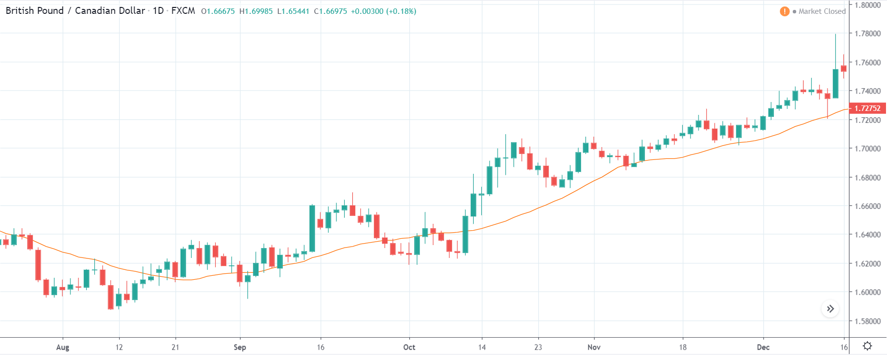
As the Credit Rating announcement is one of the biggest data releases of a country, volatility caused by the news release can be witnessed more clearly on a daily time-frame chart. Likewise, we have considered the ‘daily’ chart of GBP/CAD that shows an uptrend market. As we do not have any forecasted data available for the same, we cannot take any position in the market based on predicted ratings. The only way we position ourselves in the market before the news announcement is through the ‘options’ segment, where we can essentially take advantage of the increase in volatility on either side.

GBP/CAD | After The Announcement
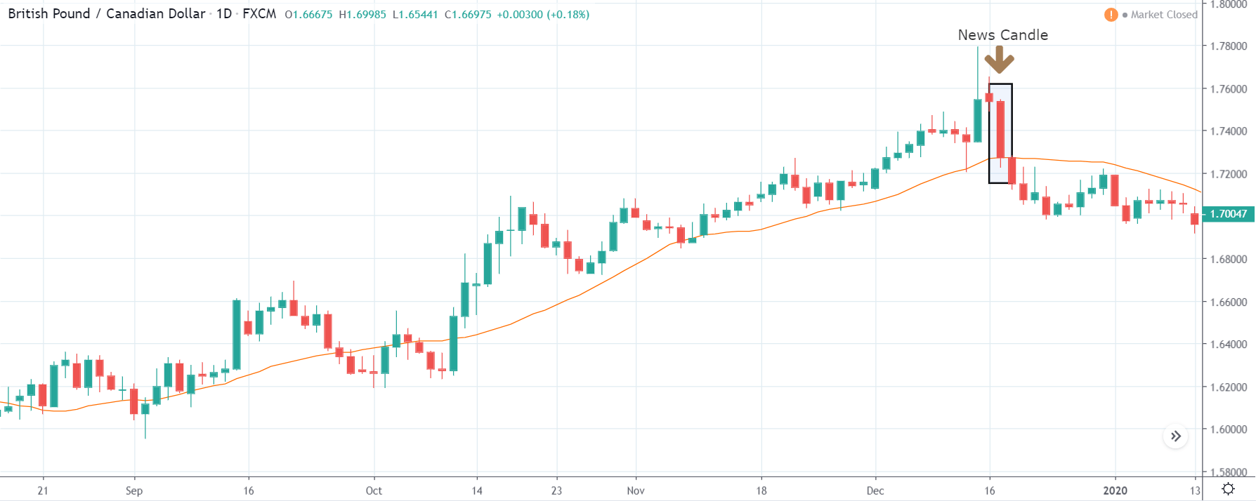
On the day of the Credit Rating announcement, we see that the market falls by more than 500 pips resulting in a complete reversal of the trend. This shows the extent of the impact of Credit Rating on a currency pair. The reason behind the collapse of the British Pound is negative Credit Rating given by the two most renowned agencies.

This rating is used by institutional investors and fund managers to decide if they want to park their cash in the economy. Therefore, when the rating is downgraded, investors withdraw their money from the market and sell British Pound. From a trading point of view, one can take a ‘short’ position in the market with a high much higher ‘take profit’ since the market has the potential to go much lower.

GBP/JPY | Before The Announcement
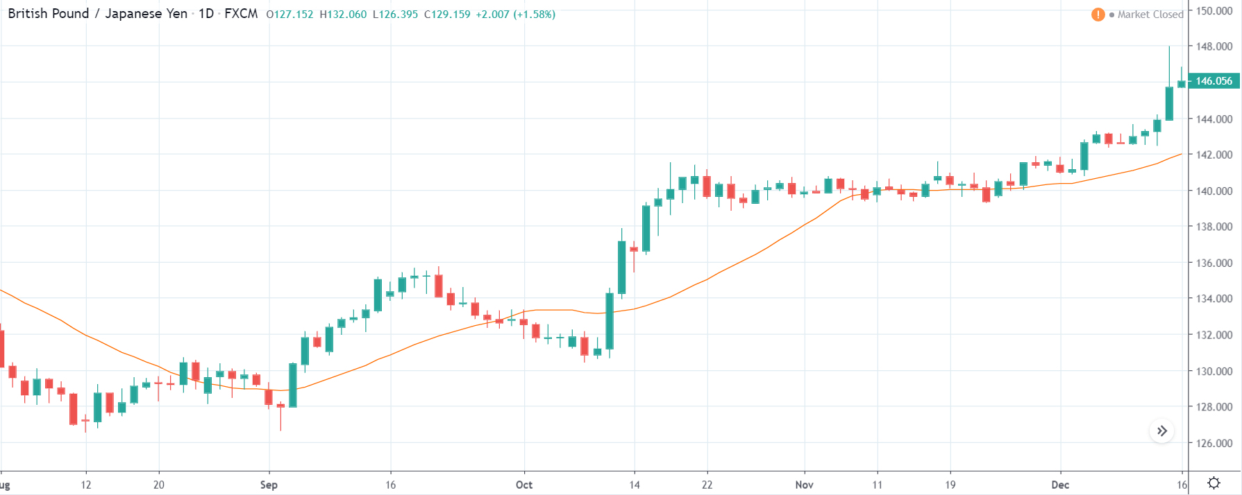
GBP/JPY | After The Announcement
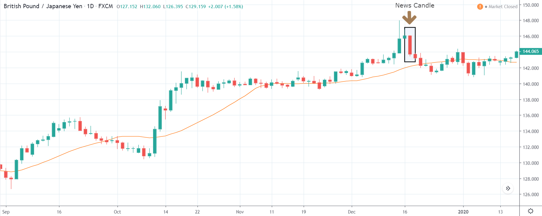
The above images represent the GBP/JPY currency pair where the chart characteristics are almost the same as that of the GBP/CAD, but with a difference that, the uptrend is more extended in this pair. When the market is trending strongly in one direction, we need to cautious while making trades in the opposite direction of the market. Here too, since we are not sure of the Credit Rating data, we cannot position ourselves on any side of the market.

After the news announcement, the British Pound falls but as much as in the above case. There is an increase in volatility on the downside but not sufficient enough to take a ‘short’ trade. Another reason behind a lesser fall in price could be the weakness of the Japanese Yen. Also, the price, even after bad news, is still above the moving average.

GBP/NZD | Before The Announcement
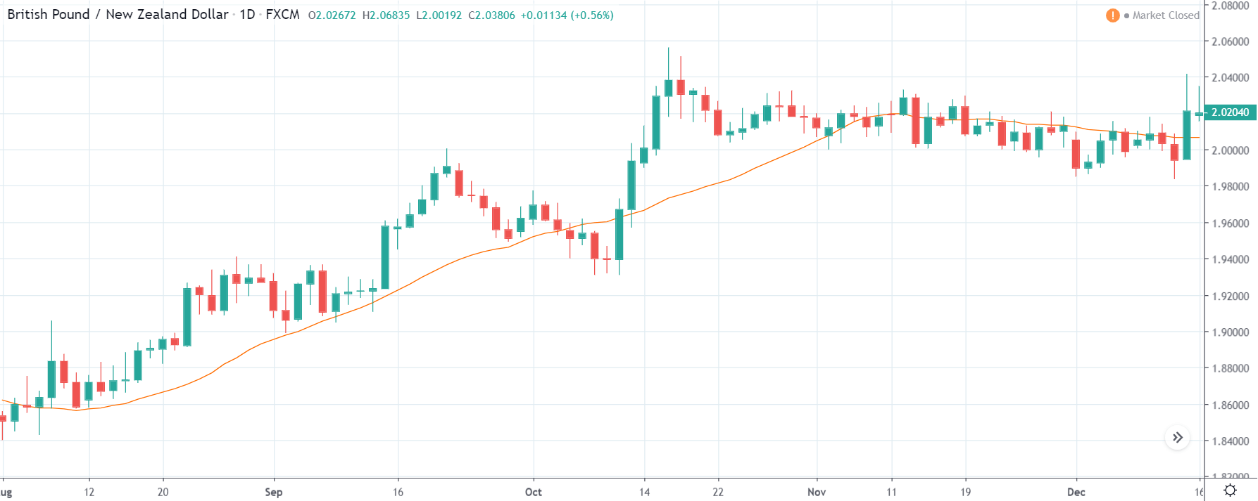
GBP/NZD | After The Announcement
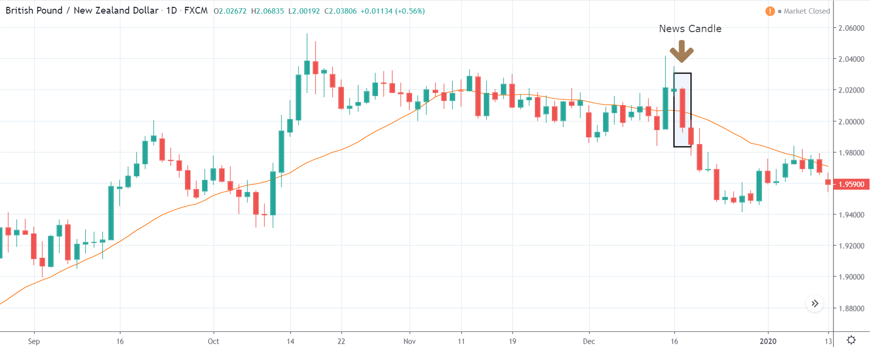
In GBP/NZD currency pair, before the Credit Ratings are declared, we can see that the market is showing signs of weakness. Since the overall trend is up, we need to wait for the news release and get a confirmation from the market. We can still trade in the ‘options’ segment of the market and profit from the increased volatility on either side after the news announcement.

After the Credit Rating data is announced by different agencies, the market falls, and volatility increases on the downside. This is a result of the negative Credit Rating given to the United Kingdom, which disappointed the market participants. Since the market was already showing weakness, this could prove to be the best pair to go ‘short’ with a much higher risk-to-reward ratio.

That’s about ‘Credit Rating’ and its relative impact on the Forex market after its news release. If you have any queries, let us know in the comments below. Cheers!

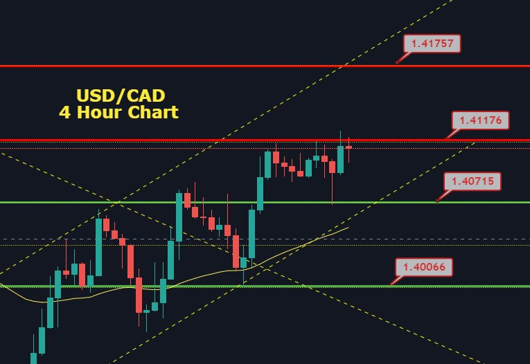
Categories
Forex Assets

Everything About Trading The ‘AUD/NOK’ Forex Exotic Pair

Introduction

The abbreviation of AUD/NOK is the Australian Dollar and the Norwegian Krone. AUD is the official currency of Australia and many others like Christmas Island, Cocos Islands, and Norfolk Island. This currency is also proven to be the fifth most traded currency in the Forex market right after USD, EURO, JPY, and GBP. Whereas the NOK stands for Norwegian Krone, and it is the official currency of Norway and its dependent territories.

Understanding AUD/NOK

In the Forex, Currency pairs are the national currencies from two countries coupled for being exchanged in reference to each other. The first currency here is the base currency, and the second currency is the quote currency. Here, the market value of AUD/NOK helps us to understand the strength of NOK against the AUD. So if the value for the pair AUD/NOK is 6.5921, it means we need 6.5921 NOK to buy 1 AUD.

Spread

All Forex brokers have two different prices for currency pairs: selling price and buying price, and they are known as bid and ask price. Spread is the difference between the selling price and the buying price. Below is the spread for ECN and STP brokers for the AUD/NOK pair.

ECN: 50 pips | STP: 53 pips

Fees & Slippage

A Fee in Forex is the commission we need to pay to the broker for executing a particular position. If we subtract the trader’s expected price with the actual price at which the trade is executed, we get the Slippage. It occurs when the volatility of the currency pair is high. It may also occur when a large number of orders are placed at the same time.

Trading Range in AUD/NOK

Volatility is a basic measure of risk every trader should be well aware of before entering the market. Whether we have a profit or loss in a given time period relies on the pip movement of that currency pair. This can be assessed using the trading range table. The trading range here represents the minimum, average, and maximum movement of the pip in AUD/NOK.

Procedure to assess Pip Ranges

  1. Add the ATR indicator to your chart
  2. Set the period to 1
  3. Add a 200-period SMA to this indicator
  4. Shrink the chart so you can assess a significant period
  5. Select your desired timeframe
  6. Measure the floor level and set this value as the min
  7. Measure the level of the 200-period SMA and set this as the average
  8. Measure the peak levels and set this as Max.

AUD/NOK Cost as a Percent of the Trading Range

We must be aware of the over cost we will pay to trade a currency pair. The cost of trading a currency pair depends mostly on the volatility and also the broker, which we use. The overall cost here involves spread, slippage, and the trading fee. Below we will see the calculation of the cost variation in terms of percentages.

ECN Model Account

Spread = 50 | Slippage = 3 |Trading fee = 5

Total cost = Slippage + Spread + Trading Fee = 3 + 50 + 5 = 58

STP Model Account

Spread = 53 | Slippage = 3 | Trading fee = 0

Total cost = Slippage + Spread + Trading Fee = 3 + 53 + 0 = 56

Trading the AUD/NOK

We are much aware of major and minor currency pairs, but there are few currencies that are less traded in the foreign exchange market. These currencies are called exotic-cross currency pairs. AUD/NOK is one such exotic pairs. As we see in the trading range chart, the average pip movement of AUD/NOK is 205, and by this, we can conclude that AUD/NOK is a volatile market.

To have a better understanding of the volatility, we will try to understand this with the help of an example. In the 1H time frame, the average pip movement is 205, and the cost percentage is 28.29%. Where in the minimum pip movement in 1hr is 81 and trading, it will cost us 71.60%.

This shows us that higher the volatility lesser is the cost of a trade. But trading in a volatile market involves risk as the movement of the pips is very fast. However, we can trade a volatile market if we follow proper money management rules.

Categories
Forex Signals

Three White Soldiers and 50 EMA – Should We go Long on EUR/JPY? 

The Japanese cross EUR/JPY is on a bullish run, having crossed over 50 periods EMA at 115.551. As for the Japanese economic data is concerned, the Monetary Base for the year from Japan showed a decline to 2.3% against the expectations of 4.5% and weighed on JPY, which resulted in the upward movement of the EUR/JPY pair.

On the other hand, the uptick move from the major US equity indexes also made it difficult for JPY to gather any strength. On the last day of the week, the traders keeping their eyes on Non-Farm Payrolls from the United States to further take hints about the US economy. Better than expected labor market is weakening the demand for safe-haven assets such as JPY itself. 


Technically, the EUR/JPY pair has closed three white soldiers pattern on the two-hourly timeframes at 115.650. Besides, the crossover above 50 EMA is also supporting the bullish bias among traders and typically drives an upward trend in the market. Lastly, the MACD is also forming strong histograms over 0, supporting bullish bias. Closing of the candle above 115.550 can drive more buying in the EUR/JPY pair. Thus, we have taken a buying trade. Let’s see how it goes. 

  • Entry Price: Buy at 115.727    
  • Take Profit .116.427    
  • Stop Loss 115.027    
  • Risk/Reward 1

Profit & Loss Per Standard Lot = -$658/ +$658

Profit & Loss Per Micro Lot = -$65.8/ +$65.8

Categories
Forex Basic Strategies

How To Trade The ‘Double Top’ Chart Pattern Like A Pro

Introduction

There are some patterns in the market that are widely used by traders across the world, and the Double Top is one of them. It is a simple and straightforward method of identifying the potential selling trades in any given Forex pair. Most of the novice traders who trade this pattern tend to face problems as they do not know how to use it correctly. Hence, for those types of traders, we are putting this piece together. By the time you finish reading this article, you will exactly know to identify and maximize gains using the Double Top chart pattern.

Double Top Pattern

The Double Top is a bearish reversal pattern that is usually formed at the end of a bullish trend. The two consecutive rounding tops complete this pattern with approximately the same highs. The first rounding top should be formed at a significant resistance area. Most of the time, the momentum of the second round top is quite weak, and this indicates the buyers are getting exhausted.

This eventually means that the sellers are now going to take control. Both the round tops retrace at a significant support area, which we call the neckline. The identification of this pattern can be comprehended as the professional traders and investors trying to obtain the profits from the bullish trend. And now, the markets are ready to publish a new selling trend.

Psychology Behind The Double Top Pattern

We know that the Double Top pattern occurs at the major resistance area. This pattern indicates when the price action reaches a significant resistance area, the buyers are now afraid to buy because of resistance. On the other hand, the sellers are hitting the sell orders at the same resistance area.

At this point, when the price action is pulled back to a significant support area, which we called the neckline, it shows that the buyers are now buying again at major support areas to print brand new higher high. However, when the price action reaches the resistance area again, buyers fail to print a brand new higher high. As a result, they start to book the orders, and now the sellers are gaining control. Hence the price action tends to move in the opposite direction.

Double Top Pattern – Trading Strategies 

There are several ways to trade the Double Top chart pattern. But the strategies we are going to share here are well-proven methods. Also, we have backtested these strategies time and again to make sure they are accurate.

Double Top Pattern + Bearish Candlestick Patterns

There are various bearish candlestick patterns that are widely used by the traders in the market. For this strategy, you can use any of the bearish candlestick patterns. Some of the most commonly used bearish candlestick patterns are Bearish Engulfing, Evening Star, Shooting Star, Hanging Man, Three Black Crows, etc.

The idea is to identify any of the above mentioned bearish candlestick patterns near the second peak. If you find any of these patterns, you can go short. Make sure to place the stop-loss above the resistance line. We can place two or more TP orders. First, take-profit must be at the neckline, whereas the second one can be placed two times above the size of the pattern formed.

Identifying the Pattern

In the below EUR/JPY chart, we have identified the formation of a Double Top pattern.

Entry

As we can see in the below chart, the price action prints a Bearish Engulfing candlestick pattern right after the second top. This indicates that the sellers have completely absorbed the buyers, and now it’s time to go short in this pair. We took a sell entry at the close of the Bearish Engulfing candle.

Stop-Loss & Take-Profit Placements

As we can see, we have entered the market at the closing of the Bearish Engulfing candle and placed the stop-loss just above the resistance line. This pattern has the highest odds of working in our favor; hence we can go with smaller stop-loss. Because, whenever this set-up is found, the price action has a very little chance to spike.

As discussed, the first take-profit was placed at the neckline of the pattern, and the second take-profit was placed double the size of the complete pattern. But, please decide the placement of TP according to your trading style. Remember that you can close your position wherever you want.

Double Top Pattern + RSI

In this strategy, we have paired the Double Top pattern with the RSI indicator to identify accurate shorting signals. As you might have probably known, RSI stands for the Relative Strength Index. It is a momentum indicator developed by the J. Welles Wilder Jr. in 1978. This indicator oscillates between the traditional levels of 70 and 30. When this indicator reaches the 70 level, it indicates that the market is in an overbought condition, and it indicates the market is oversold when the indicator reaches the 30 level.

Here, the strategy is simple. When the price action hits the second peak and starts to struggle, see if is the RSI is at the overbought market conditions. If it is, then it can be considered a potential sell signal.

Identifying the Pattern

We have identified a Double Top chart pattern in the below GBP/CHF Forex pair.

Entry

In the below chart, we can see the first peak and second peak of the pattern being quite strong. When the price action approached the second peak, it dropped immediately. This shows that the buyers are exhausted, and sellers took over the show. At the same time, we can also see the RSI giving a sharp reversal in the overbought area. Hence we can confidently go short in this pair.

Stop-Loss & Take-Profit

We went short when the criteria are fulfilled and placed the stop-loss just above the entry. Take-profit was placed at the higher timeframe’s support area. Overall, it was a 100+ pip trade. If there is no significant support area for you to exit your positions, you can close them when the RSI reaches the oversold area.

Conclusion

Pattern trading is the easiest way to make more profits in the market. Some patterns provide a great risk to reward trades, and some do not. The Double Top is one such pattern that offers some of the best risk-reward entries. This pattern works well on all the trading timeframes. Make sure to know the logic behind this pattern before trading so that any potential mistakes can be avoided. All the very best!
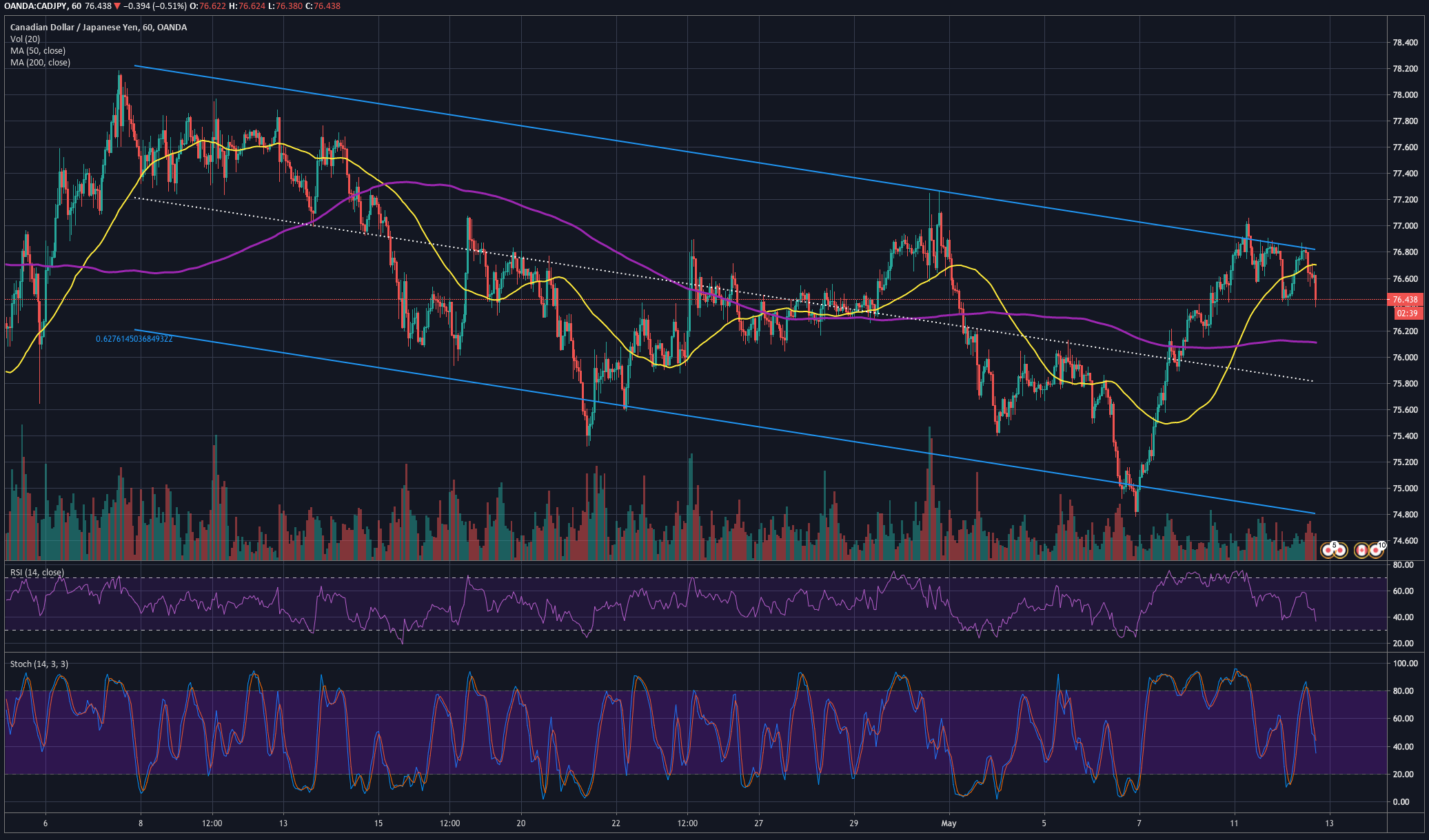
Categories
Forex Course

113. Introduction To Forex Chart Patterns

Introduction

We have learned a lot of concepts related to technical analysis in the past few course lessons. Starting from Moving Averages, we have extended our discussion to Fibonacci Trading, Candlestick Patterns, and Indicator based analysis. We have also gone through some of the advanced technical trading concepts like Pivot Trading and Elliot Wave Theory.

We hope you have understood these concepts and started to apply them in a demo account. If you have any queries, please post them in the respective lesson comments so that we can address them in the right place. However, this is not the end of the technical analysis basics. We must go through one most crucial concept before going further. And that is to learn the trading of Forex Chart Patterns.

What are Forex Chart Patterns?

Do not mistake these Forex chart patterns with the Candlestick Patterns that we have learned before. Two or more candlesticks form candlestick patterns. And the maximum number of candlesticks in a single candlestick pattern is not more than four. But when it comes to Forex Chart Patterns, there are more candlesticks involved. The number can range from 50 to 500 and beyond.

To explain in simple terms, we know the price action moves in three different stages – Trends, Channels, and Ranges. When moving in these stages, the candlesticks follow specific patterns at times. Primarily, these patterns are formed by a group of candlesticks, and they look similar to the shapes that we see in real life. For instance, below is the snapshot of one of the very well known Forex chart patterns known as Cup & Handle Pattern.

(Image Taken From – Forex Academy)

In the above image, we can see how candlesticks combined to form a Cup & Handle Pattern.

Why is it important to know them?

We can consider these Forex Chart Patterns as land mine detectors. Because, when mastered, we will be able to detect the market explosions before even they occur. Hence any technical trader needs to learn to identify and trade these chart patterns. Forex chart patterns are given the highest importance because of one simple reason – high probability performing trades.

For technical analysts and price action traders, these chart patterns offer reliable clues to make their moves in the direction in which the price might go in the future. The reason behind this is that these patterns have the potential to push the price in a specific direction. There is a logical reason behind the formation of every single chart pattern, and why the price will go in a particular direction after the formation of these patterns.

Types of Forex Chart Patterns

Just like what we have learned in the Candlestick pattern lessons, there are three different types of Forex Chart Patterns.

Continuation Patterns – The appearance of these patterns indicates that the underlying trend will continue, and the price will continue moving in the direction that it is currently moving.

Examples – Pennant Chart Pattern and Rectangular Chart Pattern

Reversal Patterns – If we have identified these kinds of patterns on the price chart, it is an indication that the market is about to reverse its direction. Hence the name – Reversal Patterns.

Examples – Wedge Pattern, Head & Sholders Pattern, and Double Tops & Bottoms.

Neutral Patterns – These patterns are termed neutral because the price can move in either of the directions after the formation of these patterns. So we must be careful while trading these kinds of patterns.

Example – Symmetric Triangle Pattern

We will be covering a combination of these in the upcoming articles so you will get a holistic knowledge of trading Forex patterns. Stay Tuned!
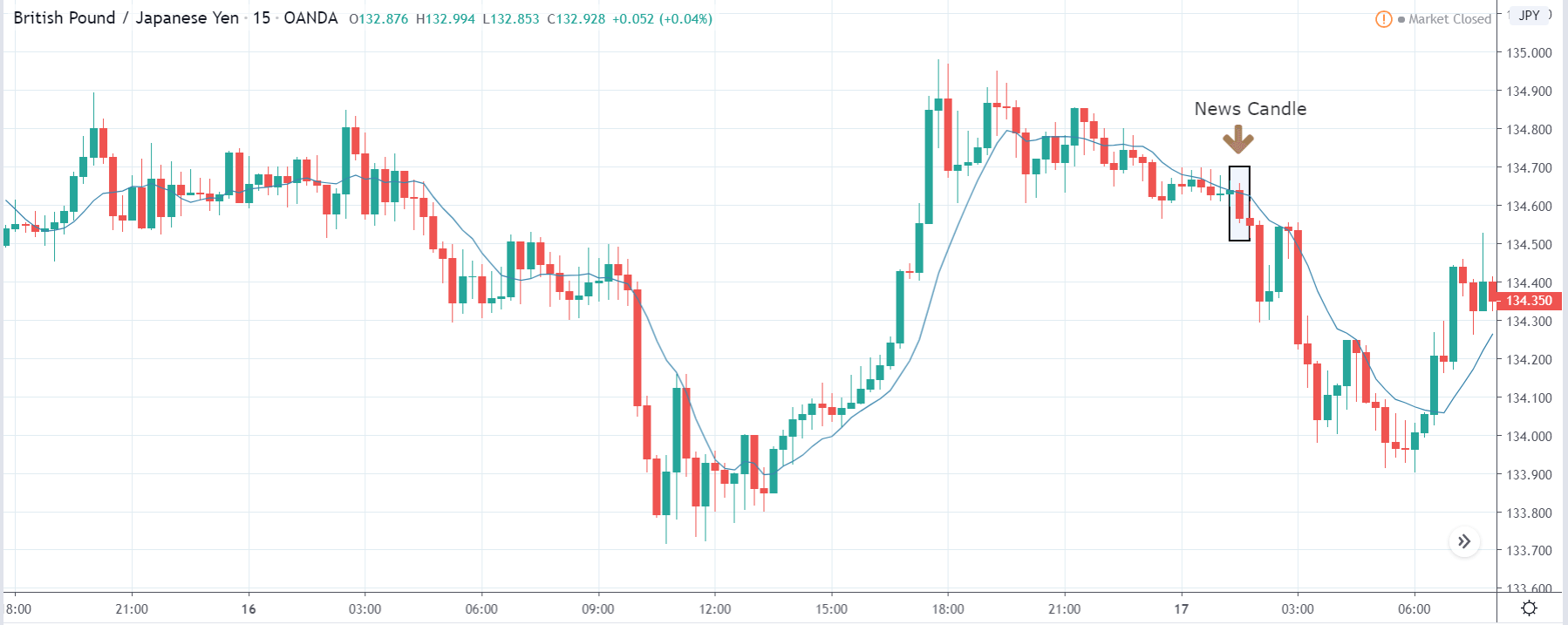
Categories
Forex Daily Topic Forex Price Action

Spot the Chart Accordingly before Triggering for an Entry

In today’s lesson, we are going to demonstrate an example of a chart, which may entice traders to take entry more than once. Some traders may get themselves engaged in taking entry. We find out why we price action traders skip taking those entries. Let us get started.

This is an H4 chart. The price makes a strong bearish move by producing three consecutive Marubozu bearish candles. The last candle comes out as a doji candle. The price may consolidate now. The sellers are to wait for a strong bearish reversal candle upon consolidation to go short in the pair. Let us proceed to the next chart.

The chart produces a bearish Marubozu candle again. As a reversal candle, it is a strong one. However, the price has not consolidated well. It has produced the bearish reversal candle upon having a shallow consolidation. Moreover, the last candle does not close below the level of support. Thus, the sellers may skip taking the entry but wait for the right time to come. The chart still looks good for the sellers.

The chart produces a bullish engulfing candle. The price may make a deeper consolidation this time. The sellers may keep their eyes on the chart again to go short in the pair. Let us proceed to the next chart to find out what happens next.

The price makes a deeper consolidation. Upon finding its resistance, it makes a bearish move. It seems that the price may make a breakout here. A question may be raised here whether the sellers on the H4 chart shall take the entry or not? We find out the answer in a minute. Meanwhile, let us proceed to the next chart.

The next H4 candle closes well below the level of support. The pair trades below the breakout level for one more candle as well. However, the sellers on the H4 chart may skip taking the entry. The reason behind that is the chart takes more than six candles (a day) to make the breakout. This level of support is a daily level of support now. Thus, the sellers may take the trading decision as far as the daily chart is concerned. If they take their trading decision by observing the H4 chart, it may not be that fruitful. The risk-reward may not be a good one. It may not end up being a daily breakout, but the price may come back in. Or, the daily chart may produce a bullish corrective candle next day, which makes the price hit the H4 sellers stop loss. Thus, in such cases, they might have to take losses only because the pair belongs to the daily chart. Thus, for better trading, traders shall take a closer look before taking entry on a chart to determine whether it favors their trading chart.