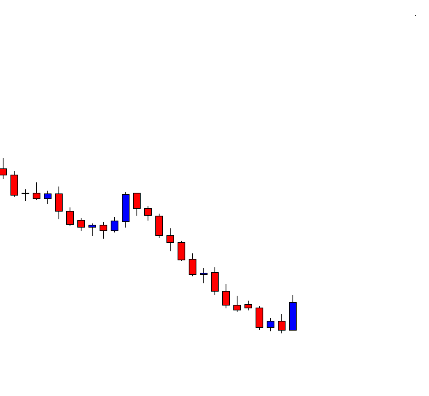
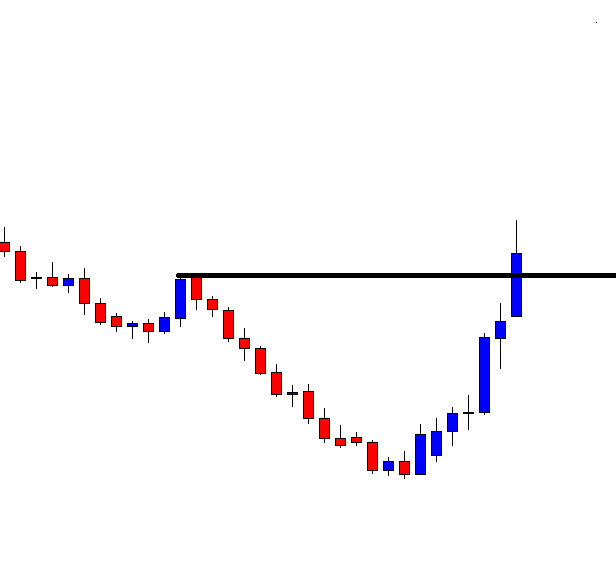
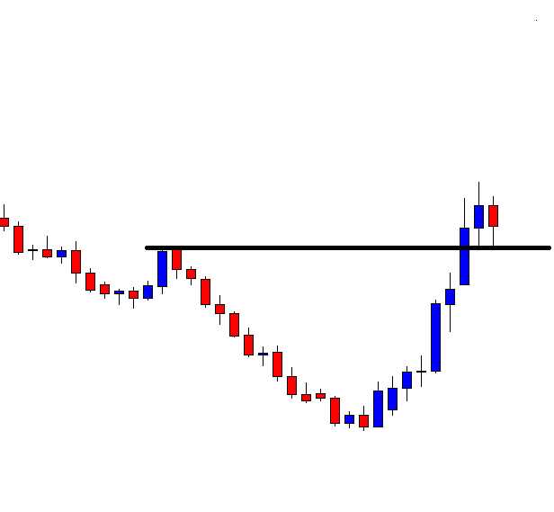
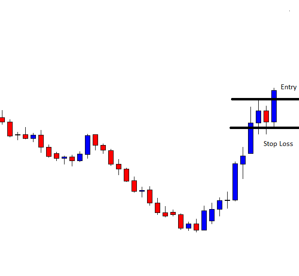
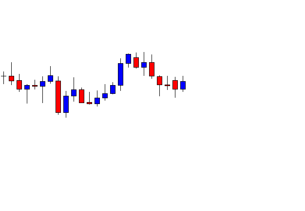
Categories
Forex Price-Action Strategies

If Price finds New Level of Support/Resistance

To measure risk-reward, price action traders must identify the level of support/resistance accordingly. It gets tricky sometimes. In today’s lesson, we are going to demonstrate an example of that.

This is an H1 chart. The chart shows that the price has a bounce at a level. Upon producing a bullish engulfing candle, it heads towards the North. It finds its resistance and produces a bearish engulfing candle followed by another bearish one. If it makes a breakout and confirms the breakout, the sellers may trigger short entry by setting stop-loss above the level of resistance and take profit with 1R.

The price does not make a breakout, but it heads towards the North. The sellers must wait to find out what happens next. It may go back to the level of resistance, have a rejection at double top, and make a breakout.

It may even make a breakout from here. Let us find out from the next chart what happens.

The price finds its resistance at a new level. It produces a bearish engulfing candle again. If it makes a breakout at the level of support and confirms it, it would be a short signal.

The chart produces a bearish candle, which breaches the level of support. If the next candle closes below the last candle, the sellers may trigger a short entry.

The next candle confirms the breakout. The sellers may trigger a short entry right after the candle closes. Question is where do they set their stop loss and take profit? Do they use the new level of resistance to set stop loss and take profit or use the old one? We find out the answer in a minute.

The price heads towards the South with good bearish momentum. Trade setup works as well as it usually does in breakout trading strategy. The price keeps making lower lows, and it seems it may go further down. However, since the price makes an upward correction before making the breakout, we may consider the second level to set our stop loss. We may set our take profit with 1R by measuring the same number of pips from the entry point to stop loss as well. This provides fewer pips as a reward, but to be safe with an entry like this, we may do this. The price often makes a consolidation, or it makes a correction (once it hits 1 R from the new resistance/support) after such breakout. A correction/consolidation sometimes leads towards a trend reversal as well. Thus, there is no point in taking a loss for hunting some extra pips. Always remember ‘safety first.’

Categories
Forex Daily Topic Forex Price-Action Strategies

Price Action Trading: The Daily Chart’s Consistency

The Price Action Breakout Strategy works in almost all the charts. However, it works best on the daily chart. In today’s lesson, we are going to demonstrate an example of a breakout-trading example of that. The chart has a bullish gap, but consolidation followed by a bearish engulfing candle offers an excellent entry for the sellers.

The chart shows that it makes a strong bullish move. Upon finding a level of resistance, it produces a bearish engulfing candle. The sellers may want to keep an eye in this pair to go short.

The price keeps going towards the South. The sellers must wait for the price to consolidate and produce a bearish reversal candle. The swing low is far enough, which offers the price to travel towards the South further.

Here it comes. The chart produces a bullish candle. The sellers are to be attentive here. The chart may produce a bearish reversal candle and offer a short entry to them. Do not miss the point that the price has a little bullish gap. The gap is not visible explicitly, but if you count the last candle’s opening and the closing one before it suggests that the price starts with a gap.

The chart produces a bearish engulfing candle closing well below consolidation support. The sellers may trigger a short entry right after the candle closes by setting stop-loss above the signal candle’s highest high. The space between the last swing low and the signal candle’s closing price suggests that the entry offers 1R. This should be enough to bring enough liquidity and drive the price towards the South.

As anticipated, the price heads towards the swing low and hits the target. The sellers achieve 1R here with ease. The last candle comes out as a bullish reversal candle since it closes within the previous candle’s lowest low. The sellers may want to close their whole trade and wait for the next one.

Price action breakout strategy works in 5M to the weekly chart. However, the daily, the H4, and the H1 are the three best charts that work best with the strategy. Usually, the gap creates confusion among traders. It creates more confusion among price action traders. In this example, we have demonstrated that the gap does not create confusion, but the Price Action Breakout Strategy works well as it usually does. The little gap may be one of the reasons. However, if the daily chart produces a trade setup like this, it does not usually go in vain.

Categories
Forex Daily Topic Forex Price-Action Strategies

Keeping an Eye on Some Levels Comes Handy

Forex price action trading requires a clearer chart. Traders are to keep an eye on candlesticks’ attributes, consolidation, reversal candle, and support/resistance levels. The last swing high and the last swing low are two levels that traders must count. However, the price often reacts to certain levels, where it reacts heavily earlier. We may keep an eye on those closely since they often offer entries. In today’s lesson, we are going to demonstrate an example of that.

The chart produces a bullish engulfing candle after being bearish for a long time. The buyers still hold the key. However, the sellers may keep start eyeing on the pair as well. The chart shows a pullback level in its bearish wave. The highest high is further up, though. Thus, if the price makes a bullish move from here, it would be a big one.

The price heads towards the North with good bullish momentum. The buyers are to wait for the price to consolidate and produce a bullish signal candle to go long on the pair. A level of resistance (drawn level) is nearby. The price may consolidate around the level. Thus, this is time for the buyers to keep an eye in the pair closely.

The price does not consolidate around the level of resistance, but it makes a breakout.  Some traders may think that they have wasted time here by keeping an eye on the pair, which is never right. In Forex trading, we need to invest money and time. After such a breakout, the price usually keeps going towards the trend’s direction for one or two more candles before having consolidation. Do not forget, it often consolidates around the breakout level and offers entry.

The chart produces one more bullish candle followed by a bearish candle. The last candle closes within the breakout level. This means the price is having consolidation around the breakout level. If the chart produces a bullish engulfing candle closing consolidation resistance, the buyers are going to push the price towards the North.

The buyers crave for getting such a good–looking bullish candle to go long from here. The equation is simple here. The buyers may trigger a long entry right after the candle closes. Let us find out how the entry goes.

The price heads towards the North with good bullish momentum. The buyers achieve their 1R easily here. The highest high is further up. Thus, it may remain bullish for some more candles.

The price may consolidate and offer entry at any level when it is trending. However, it tends to consolidate around some particular levels often. By spotting them out, we may make our trading life a bit easier.

Categories
Forex Basic Strategies Forex Daily Topic

Significance of Breakout Confirmation or Reversal at Pullback

Breakout trading is one of the most widely used trading strategies in the Forex market. Breakout confirmation is equally important. Without breakout confirmation, a breakout may not work in favor of the traders in many cases. Thus, if we want to have a tremendous rate of winning, we may wait for breakout confirmation or reversal at pullback before taking entry. In today’s lesson, we are going to demonstrate an example of this.

The price after being rejected at a resistance level heads towards the South. It produces a bullish inside bar and heads towards the North again. The momentum suggests that the price may make a breakout at the level of resistance. Breakout traders are to keep an eye on the pair to get a breakout followed by breakout confirmation or reversal candle at the pullback to go long on the pair.

The last candle breaches through the level of resistance. Candle’s attributes suggest that this is an ideal breakout candle. The candle barley has the upper shadow. The breakout traders are to wait for either for the next candle to close above the breakout candle or the price to come back at the breakout level to consolidate and produce a bullish reversal candle to offer them a long entry.

The price does not head towards the North. It comes back at the breakout level closing within the breakout level. The breakout is still valid. However, the buyers must wait to get a bullish engulfing candle to close above consolidation resistance to trigger a long entry by setting stop loss below the breakout level. Let us proceed to the next chart to find out what happens next.

The price breaches the level of support and closes well below the breakout level. The sellers may take control soon in the pair. Traders taking a long entry right after the breakout candle closing are to have a loss here. If they set stop loss below the lowest low, the risk-reward would not be lucrative. When the price breaches a breakout level, it usually generates more momentum and changes its trend. Let us see what happens here.

The price goes back to the breakout level. This time it makes a bullish correction. The equation changes completely another way round. If the chart produces a bearish engulfing candle closing below consolidation support, the sellers may go short and drive the price towards the lowest low.

The chart produces a bearish engulfing candle followed by another strong bearish candle. It looks like a different ball game completely now. It is now the sellers’ territory.

In the bullish market, the chart does not produce a bullish reversal candle; thus, the price gets bearish. In the bearish market, it produces a bearish reversal candle (engulfing) and offers entry to the sellers. By taking entry upon breakout confirmation, we may not find as many entries as we would like, but it gets us more consistency in winning trades.

Categories
Forex Price-Action Strategies

Price Action Trading: Weekend and Partial Profit Taking

Partial profit taking is an option to be safe with our investment. It provides less reward to some extent. However, for the Forex traders, it is a great way to make sure that they cash in some profit or lose less money in a particular trade. In today’s lesson, we are going to demonstrate an example of a trade setup offering an entry four hours before the market closes. Traders have only one H4 candle to hit their target, or they would have to carry the trade during the weekend. Let us find out what we should do in such a situation

This is an H4 chart. The price heads towards the South at a moderate pace. The last candle comes out as a bullish engulfing candle. This may work as a bullish reversal for the minor charts’ traders. However, the H4 breakout sellers are to wait for the chart to produce a bearish engulfing candle closing below consolidation support to offer them a short entry.

The price makes a bearish breakout. However, the H4 breakout sellers do not wait for such a breakout. The last candle comes out as a bearish engulfing candle, but the consolidation is shallow. Thus, the sellers may skip taking this entry as well.

Again, the price consolidates and makes another bearish move. This time it does not make any bearish breakout. The chart may end up producing a double bottom here. It is a long way to go. Meanwhile, the sellers must wait.

The chart produces a bullish engulfing candle followed by a bearish inside bar. Now, it looks that the buyers may take control. Let us proceed to the next chart and find out what happens next.

What a Surprise for the H4 breakout sellers! The last candle comes out as a bearish engulfing candle closing well below consolidation support. The sellers may trigger a short entry right after the last candle closes with 1 R by setting stop-loss above consolidation resistance. Do not forget this is Friday. The market is closing within 4 hours.

This is how the last candle looks. It suggests that the price may keep heading towards the South. However, carry trade during the weekend on the H4 chart is risky a little. The market often starts Monday with big gaps that affect the H4 charts. Thus, the sellers may consider taking a partial profit just before the market closes on Friday. It would not get them to achieve 1R in the end, but it would make sure that they earn some profit out of it. Even if the rest of the trade hits the stop loss, he will not lose as much as he would with his whole trade.


Categories
Forex Daily Topic Forex Price-Action Strategies

Price Action Trading: An Important Thing to be Remembered

To draw Support/Resistance, price action traders are to be sensible. They often need to be adjusted. In today’s lesson, we are going to demonstrate an example of this. To spot out support/resistance, traders are to aim the zones. Then, in the end, they are to draw levels to have the confirmation of a breakout. Let us learn more about this from the examples below.

This is an H1 chart. The chart shows that the price has been choppy for quite a while. It has been roaming within a descending triangle. The price may make a breakout to either side. Let us work with horizontal support and spot out point/points where the price bounces twice.

We may spot out two points here. These two levels are nearby to each other. Without any doubt, this is a strong support zone. If we consider levels, we may get confused since we get two levels. In such a situation, we may closely observe what the price does around the last swing low. Let us proceed to the next chart.

The chart shows that the last candle breaches the level of support (the last swing low). This is not an explicit breakout. We must wait for the next candle to have the breakout confirmation.

The next candle comes out as a bearish candle as well as closing well below the breakout candle. If we consider the price action for the last two candles, it is clear that the sellers have taken the control. The level of support at the last swing low holds the key as far as the last two candles’ price action is concerned. The H1 breakout strategy sellers may trigger a short entry right after the candle closes. Let us proceed to the next chart what the price does after triggering the entry.

The price heads towards the South with good bearish momentum. The sellers achieve their 1R with ease. The last candle’s attributes suggest that the price may go towards the South further. In a word, this has been a prolific trade setup for the sellers.

If we consider the first swing low on this chart, we may get confused about the breakout. Considering the price action and the last swing low, it is a basic thing to understand that the price makes a breakout at the last swing low. The last swing low matters most as far as the breakout strategy is concerned. If the price consolidates after a breakout, then other levels (previous levels of support/resistance) may work as flipped support or resistance. This is one important thing to be remembered by the price action traders.

Categories
Forex Daily Topic Forex Price-Action Strategies

Price Action Trading: Entries to Take and Entries to Skip

In today’s price action trading lesson, we are going to demonstrate an example of a chart that offers multiple entries. We try to spot out entry/entries that we may skip and the entry/entries we may take. We try to find out the reasons behind that as well. Let us get started.

The price after being bullish for a long time produces a bearish reversal candle and heads towards the South. Look at the last candle. It comes out as a bullish inside bar. Price action traders start eyeing on such a chart to go short. However, the sellers would love to see the price have deeper consolidation.

The chart does not make a deep consolidation. It produces a bearish engulfing candle closing well below consolidation support. The trend and the reversal candle get 10 on 10, but the consolidation is not deep enough. It is not an A+ entry. It is best if we restrain ourselves from taking such entry. Let us proceed to the next chart.

Many of us may think an opportunity missed. Here is one added lesson on ‘ do not cry over spilled milk.’ Forex traders must obey this. Let us concentrate on the chart again. The last candle comes out as a very strong bearish candle. The pair may offer more short entries.

The chart produces a bullish inside bar again. The equation is simple for the sellers based on price action. The chart is to produce a bearish engulfing candle closing well below consolidation support. Let us proceed to the next chart.

Here it comes. This is one good-looking bearish engulfing candle closing well below consolidation support. The trend, consolidation length, and the bearish reversal candle all get 10 on 10. As far as price action breakout trading strategy is concerned, this is an A+ entry. Let us now find out how the entry goes.

It does not go according to our expectations. It rather produces a bullish inside bar again. It is an inside bar. Thus the sellers still hold the key here. The fact remains at the first consolidation, despite having shallow consolidation, the price heads towards the South with extreme bearish momentum. On the contrary, despite being an A+ entry, the price does not move according to the sellers’ expectations. It may even go towards the North and hits the stop loss. Then again, we must stick with our trading rules and be extremely disciplined. Let us proceed to the next chart to find out what happens next.

Ah! What a move this is! The sellers make some green pips here. The chart makes them wait, but it pays them back. As mentioned, it could go another way. That does not mean we start thinking to change our strategies or start taking random entries. We must make sure we only take entries that get A+ after considering all the segments.

Categories
Forex Daily Topic Forex Price-Action Strategies

Price Action Trading: Let it go

The Engulfing Candle is considered one of the most influential candles to indicate a trend reversal. Price action trading is closely related to identifying trend reversal for which price action traders give value to engulfing candles a lot. In today’s lesson, we are going to demonstrate an example of an engulfing candle, which does not work in favor of the traders. We try to find out the reason behind that.

The chart shows that the price heads towards the South with good bearish momentum. On its way, it makes a breakout and trades below the level for one more candle. The sellers are to keep an eye on this pair for the price to consolidate and produce a bearish engulfing candle closing below consolidation support. Do not miss the point ‘closing below consolidation support’.

The price does not consolidate. It instead produces another bearish candle. It may consolidate now. A candle like this attracts more sellers to go short on the pair. Let us proceed to the next chart.

The chart produces a bullish inside bar. This means the chart is still bearish biased. The signal candle may come out at any time. The waiting game gets intense. The sellers are to keep checking the chart since the next candle may be the signal candle.

The chart makes them wait further. It produces a bearish inside bar followed by a bullish engulfing candle. The chart is still bearish biased, but the chart may get choppy as well if the next candle comes out as a bullish candle. Let us wait and find out how the next candle comes out.

The next candle comes out as a bearish engulfing candle. Is this what the sellers want? Here is a question for you. Would you trigger a short entry?

If the answer is no, you are right. The reason behind that is this is an engulfing candle, but it does not close below consolidation support. Look at the line below. This is where both candles get rejection. Thus, we may consider this one as consolidation support. Even if we consider only their bodies (not the best way), the candle closes within that level as well. The equation is an engulfing candle does not make a breakout. Thus, traders may skip taking this entry. We need to make sure these four things are there before taking entry based on this setup.

  1. Clear trend
  2. Consolidation
  3. Engulfing candle
  4. Breakout

If a trade setup misses any one of these, be patient. Let it go.


Categories
Forex Basic Strategies

Scaling Positions Using The Pyramid Trading Strategy

Introduction

You would have heard most of the successful traders and market gurus say ‘let your winning trades run.’ That is very true, but do you know how to do that? You would have probably asked this to yourself many times. In today’s article, let’s understand a strategy that helps you in turning your small trades to big ones using a strategy called Pyramiding.

This Forex Pyramid Strategy helps you in increasing the chances of making consistent returns as a Forex trader. Using this strategy, we can scale our winning position and make the most of the trend. This strategy cannot be used in every market situation. If you do that, it will be the most destructive thing you do to your trading account.

Pyramiding our trades work very well in trending market conditions only. To make consistent returns from the market, we need to buy or sell strategically to add to an existing position. Always remember that when we are right, we must be really right, and when we are wrong, we must cut our trades immediately. The concept of this strategy can be applied to both long and short positions.

We can get a basic idea of the pyramid strategy from the below image. Here, we can see the price action printing brand new higher highs and lower highs continuously. The market is clearly breaking the resistance line and taking that line as a support. Note that the price action must break the resistance line with strong power. The price should also show the sign of holding at the support line.

The key to successful Pyramiding is to have a proper risk to reward ratio in place. That means our risk should never be greater than the reward. So if our target is 50 pips, our stop-loss must not be greater than the 25 pips.

Rules to Trade the Pyramid Strategy

🏁 Pick a market that is in a strong uptrend and wait for the price action to break the significant resistance area. Let the price test that resistance line as support.

🏁 Go long when the market gives you a buy signal. You can even look out for the appearance of any bullish candlestick patterns like Engulfing, Dragonfly, or a Bullish pin bar, etc.

🏁 Let that trade run because the market is in a strong uptrend.

🏁 Then wait for the price to break through the second resistance line and retest it as strong support.

🏁 Notice if the price is holding at the support line, and if it prints any buying candlestick pattern, go long again by extending your buy position. Make sure to trail your stop-loss after taking the second position.

🏁 Repeat the same, and do not forget to place your trailing stop-loss orders just below the entry points.

The same is vice-versa when the market is in a downtrend and when we are going short. By following this, we have built a good amount of buying position with minimum risk involved. Also, as discussed, the key to successful Pyramiding is to maintain proper risk to reward in each of the trades. As a thumb rule, our risk must never be greater than half the potential reward.

Trading The Pyramid Strategy

Market Identification - Strong Uptrend or Downtrend.

The below price chart represents the AUD/CAD Forex pair, which is in a strong uptrend.

To understand the strategy better, let’s consider a $10,000 trading account. In this particular pair, we decided to buy two mini lots on a retest of each of the levels. The take-profit for each trade is varied as per the market conditions, but the stop-loss for each new position should not be more than 15 pips.

Market Entries

In the below chart, we can see the market broke through a resistance level. We have decided to buy 20,000 units right after the price took the broken resistance line as support. In a few hours, we have observed the price action blasting to the north and broke a new resistance level. The price again started to retest the level as new support.

At this point, we decided to buy 20,000 more units. You can see that the buy order 2 in the below chart indicates the second trade, and we have trailed the stop-loss below the second position. We found the trend to be super strong still, so we let this trade to run for the deeper targets.

On the 5th of February, the price again broke through a new resistance level and retests as a support area. By seeing the uptrend’s strength, we have bought another 20,000 units and placed the trailing stop-loss order just below the third position.

We did a lot of buying up until this point and built 80,000 units in one single pair. So the real question by the end of the third position is how much of our money is at risk? Nothing. The worst-case scenario would be us making 10% profit by the end of the third position.

Final Trade Set-Up

In the above chart, we can see the final trade setup of all the three trades we took. By the end of all the three trades, we made a profit of 28 percent. The profits on each of the trades have compounded throughout the process, where the risk in each trade remains the same. Overall, we have generated 12R, 10R, and 6R in the first second and third trades, respectively.

Conclusion

Never forget that the pyramid strategy works very well only in the trending markets. Also, try to avoid using this strategy in volatile markets. Pyramiding is a great way to compound our profits in a winning trade. Knowing when to use and when not to use the pyramid strategy is the crux here. Hence it is advisable to read the different market situations on a demo account first before using this strategy on a live account.

Categories
Forex Daily Topic Forex Price-Action Strategies

Price Action Trading: Support/Resistance and Breakout

Support and Resistance are the two most important things as far as price action trading is concerned. We often see that too many support levels/resistance levels are nearby being too close to each other. It may confuse us to be sure whether a breakout takes place or not. In today’s lesson, we try to find an answer to that. Let us get started.

This is a daily chart. The chart shows that the price heads towards the South after producing a bearish engulfing candle. Look at the last candle, which comes out as a bullish corrective candle. If the next candle comes out as a bearish engulfing candle closing below consolidation support, the sellers may trigger a short entry.

The last candle comes out as a bearish engulfing candle closing below consolidation support. The question is whether the sellers may trigger the entry or not. Look at those two drawn levels. The price reacts to those levels. Usually, price action traders count such levels to determine risk-reward or to set take profit level. Let us assume a trader takes the entry.

Typically, he should trigger the entry right after the last candle closes with 1R. Do not forget this is a daily chart. The daily chart usually offers more than 1R. Let us proceed to the next chart.

The price heads towards the South with extreme bearish pressure. As mentioned, it gets him more than 1R. It seems it may continue its bearish journey. At least the seller may hold his position until it produces a bullish reversal candle.

Here it comes. It produces a bullish inside bar. This is not a strong bullish reversal candle. However, some traders may consider come out with their profit or at least some part of it. Some sellers may still hold it until it produces a strong bullish reversal candle.

The last candle comes out as a bullish engulfing candle. This time the sellers are to think twice whether they should hold the entry. Many price action traders close their entry here. The trade setup works excellently well here. However, do you remember those two more support levels? The price does not seem to react to those levels at all. You may notice this next time. When support/resistance levels stand too close to each other, the last level and the last breakout gets the priority (in 80% cases). However, if they have enough space in between, then they must be counted by the traders to calculate risk-reward or to set take profit.

Categories
Forex Price-Action Strategies

Price Action Trading: Be Psychologically Strong

Today, we are going to demonstrate an example, which has several lessons. Forex price action traders need to concentrate hard on the trading charts. They must have ‘never give up’ attitude, must not make decisions emotionally. In a word, they need to be psychologically strong. Let us now proceed to our lessons with examples.

This is a daily chart. After being bearish, the chart produces a bullish reversal candle. The combination of the last two candles is called Track Rail. It is a strong bullish reversal pattern. The daily- H4 combination traders may flip over to the H4 chart to go long on the pair.


The H4 chart does not look that promising. The price heads towards the North, but the momentum has not been strong. However, the buyers have their first signal to keep an eye on this chart. They are to wait for the price to consolidate and produce a bullish engulfing candle to offer them a long entry.

The price makes a deep consolidation and produces a bullish engulfing candle. However, it closes within a level where the price gets rejection twice. The engulfing candle does not close above the level of resistance, but the next one does. This is not an A+ entry. The buyers may skip taking the entry.

The price continues to go towards the North. Some traders may think an opportunity is missed. Do not forget that we shall only go with A+ trade setups. Here is a question. Look at the last consolidation and the bullish reversal candle. The candle closes well above the level of resistance. However, it is not a deep consolidation. Would you trigger a long entry here? Do not miss the point that it is not a deep consolidation. Thus, this is not an A+ entry either. Let us skip it and concentrate on the next chart.


Again, the price heads towards the North. This is where we must not panic and think we keep losing opportunities. It is always better to be safe than sorry. What do you think about the last bearish candle? This seems to be a deep consolidation. If the chart produces a bullish engulfing candle, the buyers may trigger a long entry.


The last candle comes out as a bullish engulfing candle closing well above the level of resistance. The price makes a deep consolidation. This is an A + trade setup. We may trigger a long entry right after the last candle closes. Let us proceed to the next chart to find out how the entry goes.


The price heads towards the North with good bullish momentum. It gets us more than 1R. At last, our patience has paid off. Do you notice how strong we need to be psychologically? This may seem easy, but it never is when we trade and make a decision in the live market. It is tough to restrain ourselves from taking bad entries. Sometimes they may make a profit and make us upset if we do not take the entry. To be consistent, we must not be upset but wait for the best setup (A+ trade setup) to offer us entry.

Categories
Forex Basic Strategies

Trading The New York Breakout Forex Strategy

Introduction

Forex is a 24 hours market, and it is open five days a week. So there are a hell lot of opportunities this market offers to the traders across the world. However, to make more profits and be successful in this market, we don’t have to trade 24 hours on all the days it is open. On any given day, the Forex market shuts down in some continents and opens in some other continents. This leads to the opening and closing of different Forex sessions.

The two most essential sessions are the New York session and the London session. Most of the traders across the globe prefer trading the New York session because, in this session, instruments often have less spread. Also, the markets are quite volatile during this session, and prominent players prefer making most of the significant trades in this session only. In this article, let’s understand different trading techniques to catch the more notable moves that occur during the opening of the New York Session.

We will also be trading the Forex market when the New York session overlaps with the London session. At this point, the volatility will increase furthermore as it is an overlap of the two biggest Forex sessions. The idea is to trade in the direction of the larger players. For each country, the New York session opens at different times. For instance, if you are trading the Forex market from England, the US Session opens for you at around 13:00 GMT. Likewise, if you are trading the market from India, the US session begins at 18:30 IST.

If you are not sure of the exact time of the opening and closing of different trading sessions, you can follow the below link to accurately identify the opening and closing of the New York session according to your local time.

|Forex Time Zone Converter|

Breakout Trading Strategy

During the New York session, all the major, minor, & exotic currency pairs move very fast. Some traders believe that we must trade the currency pairs according to the corresponding session. For example, in the Asian session, we must trade only AUD, NZD, and JPY. In the London and Frankfurt session, we must only trade GBP, EUR, & CHF. Finally, in the New York session, go for USD and CAD currency pairs.

There might be a valid reason behind this, but this shouldn’t be taken seriously. Currency pairs do not move according to the session. Instead, they move according to market circumstances. So in the New York session, we can choose any pair, but we must follow the below rules in order to trade this session profitably.

  1. Before the opening of the New York session, find a currency pair that is in a strong uptrend.
  2. Price action must be held at the major resistance area.
  3. Wait for the breakout to happen in the New York Session.
  4. Let the price action hold above the breakout.
  5. Go long.
  6. Stop-loss below the breakout line.
  7. Take-profit must be at the next major resistance area.

The same is vice-versa for a currency pair if the market is in a strong downtrend.

Buy Example

In the below image, we can clearly see that the EUR/AUD Forex pair is in a strong uptrend.

We can see the price breaking out at the opening of the US session. This indicates that the big players are ready to take over the market. The price action then holds above the breakout line, and this suggests that the breakout is real. Hence we can anticipate buy trades in this Forex pair.

Entry, Stop-loss & Take-profit

We have gone long in this pair as soon as the prices started to hold above the breakout line. The stop-loss is placed just below the support line. We can go for smaller stops when the price action respects the breakout line as it essentially indicates the opposite party giving up. Overall, it was swing trade, and we book the whole profit at the higher timeframe’s resistance area. This entire trade resulted in 150+ pip profit.

Most of the traders believe if they activate the trade in the New York session, they must close the trade in the New York session only no matter what. That’s just another myth. It is always advisable to milk the markets when there’s an opportunity to do so.

Breakout Trading Using Bollinger Bands

In this strategy, we are going to use the Bollinger Bands to trade the New York session. Bollinger Bands, as most of us know, is a quite popular indicator created by John Bollinger. This indicator consists of three lines, which are named as middle, upper, and lower band. These bands expand and contract according to market volatility. Most importantly, this indicator works very well in all types of market conditions.

The below image represents the NZD/CAD Forex pair, which was in an overall uptrend. The price action breaks the major resistance level at the opening of the New York session on the 11th of February 2020. After the breakout, prices started to hold above the breakout line, which tells that the breakout is real, and any long trade anticipated from here will lead to a fruitful result.

Entry, Stop-loss & Take-profit

In the below image, you can see that we have taken a buy entry in the 2nd half of the New York session. Sometimes, the price action breaks the major S&R level in the morning, and it goes sideways for a while before blasting out in the evening. As professional technical traders, we must trust our analysis and be patient enough even when the market is not going in the anticipated direction. We must always let the price action to tell us what is going to happen next and act accordingly.

So right after the breakout, the momentum of sellers is very weak (can be seen in the above chart). So the stop-loss can be placed just below the breakout line. The take-profit was at the higher timeframe resistance area. At first, prices failed to break the resistance line, and during the second try, prices again failed to go higher. The failed second attempt is a clear indicator to close our winning position. Overall it was a good trade, which gave us nearly 90+ pips in just a couple of hours.

Conclusion

Both of the strategies mentioned above are simple and straightforward. Did you observe that in both of our examples, we didn’t choose USD pairs? Instead, we went for minor pairs, and both of the pairs performed really well in the New York session. This proves that it is not about the currency pair of that particular session. It is about what is happening in that pair. It is critical to follow all the rules first and then make a trading decision. It is always advisable to try these strategies on a Demo account and then use it in the live markets. Happy Trading.

Categories
Forex Daily Topic Forex Price-Action Strategies

Forex Traders: Get Patience, Optimism, and Never Give Up Attitude

In today’s lesson, we are going to demonstrate an example of the daily-H4 combination trading, which makes traders wait for a long time. Usually, if the daily chart produces a daily reversal, it creates an H4 entry within a day or two. In today’s lesson, the H4 chart takes four days after creating a daily reversal to produce the signal candle. Let us find out how it offers us entry.

This is a daily chart. The chart shows that it produces a bearish inside bar at a strong resistance zone. An inside bar is not a strong reversal candle, but a strong resistance zone may attract the sellers to look for short opportunities. The daily-H4 combination traders are to flip over to the H4 chart for the price to consolidate and produce a bearish reversal candle to offer a short entry. We flip over to the H4 chart later. Let us now have a look at the daily chart with four more daily candles.

The chart produces four more candles that are bearish. However, the daily-H4 combination traders do not get any A+ entry to go short. Should they skip eyeing on this pair? Never, they need to perform the same duty. As long as the last daily candle is bearish, they are to flip over to the H4 chart. The last candle on this chart is bearish. Let us flip over to the H4 chart this time.

You may notice that the H4 chart does not make deep consolidation followed by a bearish engulfing candle to offer them a short entry so far. Traders are to flip over to the H4 chart every day with no luck. Let us proceed to the next H4 chart.

The chart shows that it is having a deep consolidation. The last candle comes out as a bullish engulfing candle. However, the chart is still bearish biased unless it produces a bullish daily reversal candle. The sellers are to wait for an H4 bearish engulfing candle closing below consolidation support to offer them a short entry.

Here it is. The last candle comes out as a bearish engulfing candle closing well below consolidation support. The sellers may trigger a short entry right after the last candle closes with 1R.

The price heads towards the South with extreme bearish pressure. The price hits 1R with ease. Some traders may even make much more than 1R by taking a partial profit. In the end, it ends up being a prolific entry.

It does not come easily, though. The daily-H4 combination traders are to keep eying on the charts for four consecutive days. The H4 chart produces the signal on the fifth day after producing the daily bearish reversal candle. This is why Forex traders need to have patience, optimism, and never give up attitude.

Categories
Forex Price-Action Strategies

A Pair Offering Multiple Entries on Different Charts

In today’s lesson, we are going to demonstrate an example of a chart, which ends up offering two breakout entries for the price action traders. There is a saying, “do not put all your eggs in the same basket.” Forex traders are to maintain this as well. However, sometimes we may have to do things a bit differently. Let us find out why and how.

This is a daily chart. The chart shows that a bearish engulfing candle followed by a bullish inside bar sets a strong bearish tone in the chart. If a bearish candle closes below consolidation support, the sellers may go short on the pair.

Here it comes. The last candle on this chart closes below consolidation support. This is an explicit breakout. The daily breakout traders may trigger a short entry right after the candle closes by setting their stop loss above the signal candle’s highest high and by setting their take profit with 1 R.

Here is something interesting you may have noticed. Since the daily chart is bearish biased, the H4 chart shall be bearish as well. Let us flip over to the H4 chart.

This is how the H4 chart looks. The price consolidates and produces a bearish reversal candle already, although it is not a deep consolidation. Let us not talk about it. Let us proceed to the next chart.

The last candle comes out as a bullish inside bar. This time there is a deep consolidation as well. If the chart produces a bearish engulfing candle, the sellers may trigger a short entry. Let us not forget that the daily breakout traders have already taken an entry.

The H4 chart produces a beautiful bearish engulfing candle closing below consolidation support. The H4 breakout traders may trigger a short entry right after the last candle closes by setting stop-loss above the signal candle’s highest high and by setting take profit with 1R.  Let us find out how the trade goes.

The price heads towards the South with extreme bearish pressure. Some H4 breakout traders may get 3R from this chart. Now the question may arise here is whether we should take an entry on the H4 chart as well? If we go by saying, “do not put all your eggs in the same basket’, we may not.

We actually should take the entry on the H4 chart as well after taking the first entry on the daily chart. First, we are not taking the second entry based on the daily chart. It is a different setup, although the strategy is the same. If we are confident and experienced in trading different charts, we are all right to take entry in the same pair. This usually brings us a bagful of pips.

Categories
Forex Price-Action Strategies

A Thing You May Notice in the H1 Breakout Strategy

We are going to demonstrate an example of the H1 breakout strategy in today’s lesson. Usually, the H1 breakout strategy does not make traders wait too long to hit the target. However, if the breakout level is a double top or a double bottom level on the H4 chart, the price gets even more momentum to hit the target. Today’s breakout level is a double bottom level on the H4 chart. Let us now find out what happens after the breakout.

After making a bearish move, the price makes a correction. The last candle on the chart comes out as a bearish engulfing candle. This means the price finds its resistance. If it heads towards the swing low and makes a breakout, price action sellers may jump into this chart to make some green pips by going short in the pair.

The last candle makes a breakout at the level of support. This is an explicit breakout. Please note that the price bounces at the same level earlier. This means this is a double bottom support level on the bigger chart. This is an H1 chart. Thus, this must be a double bottom support level of the H4 chart.

The next candle closes below the breakout candle. It confirms the breakout. The sellers may trigger a short entry right after the last candle closes by setting stop-loss above the level where the trend starts and setting the take profit with 1R.

The price heads towards the South with extreme pressure. The price is about to hit the target on the next candle after triggering the entry. It does not, but the sellers get their message. A strong bearish candle like this suggests that the pair would remain bearish at least for two more candles. That would be enough to hit the target.

The chart produces a bullish inside bar before hitting the target. If we count, it takes only three candles to hit take profit level. As mentioned, the H1 breakout strategy hits take profit level in a hurry. So does this one. If we calculate the next candle after the signal candle, we see that the candle comes out as a very strong bearish candle and generates strong bearish momentum. This is often seen when the H1 chart makes a breakout at a level, which is a double top or double bottom level on the H4 chart too. We do not need to concentrate on this if we aim to trade on the H1 breakout strategy. However, noticing such things help us be better traders to some extent.


Categories
Forex Basic Strategies

Making Consistent Profits with ’10 Pips A Day’ Forex Strategy

Introduction

There is a lot of buzz in the Forex industry about the ten-pip a day strategy. We have seen both experienced and novice traders getting excited about this strategy. So we decided to talk in detail about this topic in today’s article. Some expert traders believe that it’s not possible to make ten-pip consistently in the market, while many others say it is possible.

In reality, it entirely depends on the person’s trading skills, mindset, and experience. Traders need to adapt themselves to the market situations to be successful. Making ten-pip a day is a great way to accumulate wealth in the Forex market, and it is easily possible. All we need is to master our skills to the point where we exactly know when to take a trade and when not to.

Statistics say that it’s not easy to make consistent money in the Forex market, and the losses are a part of the game. This is true to an extent, but if we practice this strategy enough on a simulator, we can easily make ten pips a day no matter what. In this article, let’s understand how to make ten pips per day in the Forex market by using five different buy and sell examples of five trading days in a week.

Trading Strategy For Making 10 Pips A Day

’10 Pips A Day’ – The idea behind this term is to stop trading for the day right after making ten pips that day. Also, it is up to you to follow this idea or not. You can stop trading after making ten pips, or you can ignore that and go for 20, 30, or even 100 pips a day according to the market situation.

But only go ahead if you are 100% confident about the markets. In case of any tiny bit of uncertainty, make sure to exit right after you make ten pips. One critical aspect of this strategy is selecting the currency pairs. One must be professional enough to understand the market situations and pick the pairs where there is a minimum potential of making ten pip profits.

Pairing The Bollinger Bands With The Stochastic Indicator

Rules For Going Long
  1. The market must be in a strong uptrend.
  2. Wait for the price action to slowdown at the lower Bollinger Band.
  3. Let the Stochastic Indicator reverse at the oversold area.
  4. Only go long if the above two rules are satisfied. Also, consider the momentum of the price.
  5. Place the stop-loss just below the lower Bollinger Bands.

Now, to understand how this works, we have taken five different trades for five trading days in the last week of Feb 2020 and have generated 10, 20, and 30 pips in the market successfully. According to this strategy, conservative traders must stop trading after making ten pips for that trading day. But, if you are an aggressive trader, go ahead for bigger targets. Let’s get into the examples.

Monday Trade

The below chart represents a buy trade in EUR/CAD Forex pair. When all the rules mentioned above are met, we took a long position in the New York Session on 24th Feb 2020. Our stop-loss is placed right below the lower Bollinger Band.

We have gone for three different targets according to the market situations and predominant S&R levels. As mentioned, exit the trade as soon as you make ten pips if you are a conservative trader.

Tuesday Trade

For the second day, we have picked the EUR/AUD Forex pair as we identified some potential market moves. We have gone long on this pair in the New York session on 25TH Feb 2020. We can clearly see both the indicators indicating a clear buy signal.

Here, we have gone for the third target and exited the trade as soon as we made 30 pips.

Wednesday Trade

Our third trade was in the EUR/CAD Forex currency pair in the Asian session on 26th Feb 2020. When prices hit the lower Bollinger bands, and the Stochastic indicated the oversold market conditions, we went long on this currency pair.

We would have exited the trade at ten pips, but the market started printing continuous bullish candles, which made us wait for the prices to hit the third target.

Thursday Trade

On the 4th day (27th Feb 2020), we took a long position in the AUD/NZD Forex pair. The entry was at the point where the prices touched the lower Bollinger Band, and the stop-loss is placed just below the recent low.

Since the higher highs were getting continuously printed, we went for the third target and exited the trade as soon as we made 30 pips.

Friday Trade

For the Friday trade, we chose the AUD/NZD Forex pair. We went long in the Asian session on 28th Feb 2020. When both the indicators lined up in one direction, it is a clear indication that the sellers have given up, and now it’s time for buyers to lead the market.

We had exited at the third target even when the market was moving up north.

 Rules For Going Short
  1. The market must be in a strong downtrend.
  2. Wait for the price action to slowdown at the upper Bollinger Band.
  3. Let the Stochastic Indicator reverse at the overbought area.
  4. Only go short if the above two rules are satisfied. Also, consider the momentum of the price.
  5. Place the stop-loss just above the upper Bollinger Band.

Monday Trade

The below chart represents the first sell trade we took in the NZD/JPY Forex pair on the 24th Feb 2020. We went short when the price action hit the upper Bollinger band, and the Stochastic indicated the overbought conditions.

The stop-loss is placed just above the upper Bollinger Band. We have gone for the third target, and the market printed a brand new lower low.

Tuesday Trade

The below image represents the USD/CHF Forex pair. This pair was in an overall downtrend, and on 25th Feb 2020, we have activated the sell trade right after our sell criteria is met.

We can see the market reaching all of our targets in just a couple of hours.

Wednesday Trade

For the third day, we have chosen the USD/CHF Forex pair to identify the sell opportunities on 26th Feb 2020. The entry was at the point where the price action touched the upper Bollinger band, and the stop-loss was just above the upper band.

The reason we place the stop-loss there is because of the bands of the indicator act as a dynamic support resistance level to the price action.

Thursday Trade

The 4th trade belongs to the CAD/JPY Forex pair, and we have activated our sell trades on 27th Feb 2020. We took sell when both of the indicators lined up in one direction, and we booked profit at the third target.

Friday Trade

For the last sell trade, we chose CAD/JPY currency pair. Sell trade was activated on Friday, 28th Feb, in the Asian session. When the Stochastic reached the overbought area and gave a sharp reversal, we saw the price action hitting the upper Bollinger band. This essentially means that the market is ready to go down.

Bottom Line

In almost all of the cases, we have gone for the third target only and make 30 pips profits. The reason behind this is to show you how reliable is the Bollinger Band and Stochastic combination. We are saying this time, and again, please stop trading after making ten pips per day if you are a conservative novice trader. But if you are experienced enough to predict the market, milk as much as you can depending on the market conditions. All the best.

Categories
Forex Basic Strategies Forex Daily Topic Forex Price Action

Support, Resistance and Trade Management

-Support and Resistance are the two most important concepts in the financial market. Forex traders strongly rely on support and resistance, as well. Price action traders’ main weapon is support and resistance. In today’s article, we are going to demonstrate an example of how the price reacts to a major level of support and resistance. Let us get started.

Look at the chart. The price consolidates around the red-marked level, it finds its resistance there and makes a bearish move. After having a correction, it makes the new lowest low. This is now the sellers’ territory. Let us assume that there is no significant level, which may hold the price as support. Thus, we are not able to mark any level as support. The sellers are to wait for the price to consolidate and produce a bearish reversal candle to offer them short entry in this chart.

The price makes new lowest lows and heads towards the South with good bearish momentum. However, it seems that it may have found its support. It consolidates for a while around the red-marked level and produces a bullish engulfing candle. The buyers on the minor chart may get them engaged to keep an eye on the chart to go long above the highest high of the last candle. Let us find out what happens next.

The price heads towards the North. It consolidates and produces another bullish engulfing candle. It means the chart is now the buyers’ territory. This is where the game of support and resistance begins. You may have noticed that we have red-marked the level. This is the most significant level in this chart for the buyers. The price may consolidate and find its resistance in this chart before it reaches the red-marked level. However, this is where traders may make a decision concerning their long position. They may either close their whole trade or take partial profit.

The price keeps heading towards the North. It buyers are having a party here. They must not forget the red-marked level, though. Let us proceed to the next chart.

Look at the chart carefully. Do you notice that the price consolidates around the red-marked level, which is the swing high in this chart? It produces a bearish engulfing candle followed by another bearish one. The last candle on this chart comes out as a bullish inside bar. If the next candle comes out as a bearish engulfing candle, the sellers may drive the price towards the South. I am sure now you know where the sellers are to be careful with their trade management. Yes, they must take the red-marked support (swing low in this chart) into account to manage their short entries.

Categories
Forex Basic Strategies

Identifying And Trading The Bullish & Bearish ‘Crab’ Pattern

Introduction

We have learned the importance of harmonic patterns in our recent Forex strategy articles. Also, we have understood how to identify and trade many of the famous harmonic patterns like Butterfly, Bat, Gartley, etc. In this article, let’s explore one last pattern in the harmonic group – the Crab pattern.

H.M Gartley introduced the Crab pattern in 2001, and Scott Carney added the respective Fib ratios to it. Just like the other harmonic patterns, the ‘Crab’ is also a reversal pattern that is used to identify when the trend of an asset is going to end and potentially reverse. There are both bullish and bearish Crab patterns, and they indicate bullish and bearish reversals in the market, respectively.

Each leg of the Crab pattern is denoted by a letter, and in total, there are five swing points – X, A, B, C, and D. Just like other harmonic patterns, there are different rules to trade the Crab pattern. Only trade this pattern and take positions if all of these rules get validated.

Crab Pattern Rules

XA – In its bearish version, the first leg of the pattern forms when the price of an underlying asset decline sharply from point X to point A. It can be any random bearish move. (vice-versa in the case of bullish)

AB – The AB leg is the counter-trend move to the previous leg and must retrace from the 38.2% to 61.8% of the distance covered by the first leg.

BC – Concerning the BC leg, price action changes its direction and goes down to 38.2% or 88.6% Fibs ratio of the AB leg.

CD – The CD move is the last and most important leg of the Crab pattern. So for printing this leg, the price action again changes its direction and goes to counter-trend to XA. The CD leg reverses between the 161.8% of the XA leg.

To identify the Crab pattern, one must follow all the above rules. Take a long or short position at point D as this is where the Crab pattern completes. Below is the pictographic representation of bullish and bearish crab patterns.

Crab Pattern – Trading Strategies 

Trading The Bullish Crab Pattern

The Crab pattern is quite popular in the market, so the respective tool with embedded Fib ratios is widely available in most of the trading platforms. The images we are using in this article are taken from the TradingView tool. If you are also someone who uses TradingView software, you can find this pattern’s charting tool on a toolbar on the left side.

So, first of all, select the Crab pattern charting tool and follow all the above rules to identify the pattern. Keep in mind that the Fibonacci ratios are incredibly crucial to trade the Crab pattern. If you recognize the pattern on a price chart and if you find the Fibs ratios not matching with the pattern rules, it means that the pattern is invalid. So do not trade that pattern.

Identifying The Pattern

The below image is a four-hour chart of the GBP/USD Forex pair. Overall the market was in a downtrend, but when all the rules of the Crab pattern are met, price action changes direction. As you can see below, XA is any random bullish move. The price action then retraces to 61.8% of the AB leg. Furthermore, the price action goes up again and retraces close to the 38.2% Fib level of the AB leg.

At this stage, price action confirms the three moves of the pattern following all the rules. In the end, the last move of the pattern clears that the Crab pattern was genuine. This move of the pattern is the longest one, and it has reached the 161.8% Fib level of the AB leg.

Entry, Stop-Loss & Take-Profit

As the price action confirms the pattern, we have immediately entered for a buy. If you are a conservative trader, make sure to wait for a couple of bullish confirmation candles to enter the trade.

We have four targets (X, B, C, A) to place the take-profit order in the crab pattern. In the beginning, we planned to book full profit at point A, but when the price crosses point B, the market turned sideways. So we have booked half of our profit at point B and then closed our full positions at point A.

We have seen most of the traders placing their stop-loss way below point D. However, that’s a wrong way to do it because they are risking more because of this simple logic – If the price action breaks point D, it automatically invalidates the pattern. Makes sense? In the above image, we can see that we have placed the stop-loss just below the D point, and overall, it was an 8R trade.

Trading The Bearish Crab Pattern

The below Daily chart represents the EUR/USD Forex pair. We have identified the bearish Crab pattern and plotted the Fib ratios on to the chart. As you can see, the market was in an uptrend. The first leg, which is XA, can be considered as a random bearish move. The AB bullish move reached close to the 38.2% of the XA leg. The third leg, BC, goes in the counter direction and retraces to the 88.6% Fib level of the AB move. The last leg is crucial because our decision making depends on this move alone. We can see the last candle reaching close to the 161.8% level of the AB leg, and this confirms the appearance of the bearish Crab pattern.

Entry, Stop-Loss & Take-Profit

We immediately went short in this Forex pair as soon as the final leg of the pattern closed. For some traders, it might be challenging to take a trade on the face of strong buyers. But when the market follows all the rules of the pattern, you can confidently pull the gun. Furthermore, the bearish candles increase the chance of trade working in our favor. Conservative traders can wait for these confirmations and then take the trade. In the end, price rolls over, and prints a brand new lower low.

We have followed the same rules of risk management as we have done with a bullish Crab pattern. However, we were being optimistic and placed the take-profit order at the higher timeframe’s major resistance area. If the market had started moving sideways, we would have booked our profits either at B or C or A. Stop-loss is placed just above point D, as discussed before.

Conclusion

The Crab patterns appear less frequently compared to other harmonic patterns in the market. But when it does, it often provides a high risk to reward ratio trades. If you are new to this pattern, you need a bit of experience and skill set to identify and trade this pattern on the price chart. Once you master this pattern, new trading opportunities will emerge, which can exponentially grow your trading account. In the end, trade the bearish Crab only when it appears in an uptrend, and trade the bullish Crab only when it appears in a downtrend. Only then the odds of your trades performing increase.

We hope you find this educational article informative. If you have any queries, please let us know in the comments below. Cheers.

Categories
Forex Daily Topic Forex Price-Action Strategies

Manage Your Trade Differently on Different Charts

In today’s lesson, we are going to demonstrate an example of an H1 breakout strategy. Before hitting the target, at some point, the price gets sluggish. Nevertheless, it hits the target in the end. Let us now proceed to find out the lesson it has to offer us.

This is an H1 chart. The price gets choppy within these two horizontal lines. It has a rejection and makes a bearish move upon producing a bearish inside bar. The chart is yet to make a breakout. Until it makes a breakout, it does not have anything to offer to the buyers or the sellers. However, as it stands, the buyers may have an upper hand here. Let us proceed to the next chart.

Here it comes. After a long while, a candle breaches through the level of support closing well below it. The candle has a long lower shadow, but the breakout is explicit. The sellers are to wait for the next candle to close its lowest low to trigger a short entry.

The next candle comes out as a strong bearish candle. This is one perfect looking bearish candle to attract the sellers to trigger an entry. The sellers may trigger a short entry right after the candle closes, setting stop-loss above the level where the trend starts with 1R.

As expected, the price heads towards the South with good bearish momentum. However, look at the last candle. It comes out as a spinning top. In a strong bearish trend, it is not considered as a strong bullish reversal candle. Moreover, it is an H1 chart, and the entry is triggered based on the H1 breakout strategy. Thus, the sellers must hold their position and wait. To be precise, they should not even look at this chart anymore by following the rule of ‘Set and Forget.’

The price hits the target. The next candle, after the spinning top comes out as a bearish candle. However, it closes within consolidation support. If it were an H4 or the daily chart, the sellers would have to close the trade manually. This is the difference between trading on the minor chart and major chart.

If we have a plan to take trading as our fulltime business, we may have to trade on different charts from the 15M to Weekly. Trade management varies from chart to chart. This is what we must remember. In the beginning, we shall master on a particular chart that we are comfortable with. Then, we may start trading on the other charts, preferably on the demo first. Once we are confident, we may trade on that chart in our live account. We must not apply a strategy or manage the trade the same way on the weekly chart that we are successful on the H1 or the 15 Chart.

Categories
Forex Price-Action Strategies

Do Not Ignore Significant Levels of Support/Resistance

Price action trading is considered one of the most effective and easiest ways of trading. Traders are to follow a few rules and be disciplined to be a successful price action trader. One of the most important factors is marking the support/resistance zone/level. If a trader draws support/resistance zone/level; accordingly, trade management gets easy for him. In today’s lesson, we are going to demonstrate an example of how important it is to mark support/resistance levels on our trading chart and manage trade accordingly.

This is a daily chart. The chart shows that the price after being very bullish produces two bullish candles consecutively. The first candle comes out as a bearish engulfing candle as well.  Thus, major intraday charts’ traders may flip over to their charts and look for short opportunities. However, before we proceed, we must mark significant levels that may work as a level of support. Think about the levels that you may mark as the level of potential support. If you are done, proceed to the next chart.

These two levels may work as a level of support. The line below is the most significant level on this chart because this is the lowest low, and this is where the trend starts. The line above is quite significant since it produces a double bottom earlier. There are levels where the price reacted earlier. Thus, they may work as flipped support. However, two marked levels are crucial as far as this chart is concerned.

The chart produces a bullish reversal candle right at the marked level. It has been extremely bearish. The second last candle comes out as a strong bearish candle as well. Price action traders usually keep their eyes on a chart like this to go short upon breakout. That does not happen here. It produces a bullish inside bar. The chart is still the sellers’ paradise. Nevertheless, it is a bullish reversal candle, and it may change the whole equation on this chart. To have a better idea, let us zoom out the same chart.

The chart now tells the whole story. Do you recognize these two marked levels now? The sellers shall plan about trade management before the price hits such levels. It is often seen the price makes a big anti-trend move after reaching such levels. The reason is many traders/ big traders set their take profit at such level. Once they get out of the market with their profit, the price goes another way around, causing an abrupt opposite move. This may make traders lose money and lose profit. Let us make sure we learn how and where to mark the support/resistance zone/level and manage our trade accordingly.

Categories
Forex Basic Strategies

Identifying & Trading The Bullish & Bearish Gartley Pattern

Introduction

We have discussed three of the most used Harmonic patterns in the previous strategy articles, and they are AB=CD, Butterfly, and Bat patterns. In today’s article, let’s learn how to trade one of the oldest Harmonic patterns – The Gartley. Trading harmonic patterns is one of the most challenging ways to trade but equally rewarding. There are traders across the world who highly believe in these patterns because of their accuracy in identifying trading signals, and the high RRR trades they offer.

The Gartley is one of the most commonly used harmonic patterns as it works very well on all the timeframes. IT is also one such pattern that frequently appears on the price charts. H.M Gartley introduced this pattern in his book ‘Profits in the Stock Market’ in the year 1935.

This pattern is also known as the Gartley 222 pattern because H.M Gartley introduced this pattern in the 222nd page of his book. There are both bearish and bullish Gartley patterns, and they appear depending on the underlying trend of the market. The Gartley pattern is made up of 5 pivot points; let’s see what these points are in the below section.

5 Pivot Points of The Garley Pattern

Just like other harmonic patterns, H.M Gartley used five letters to distinguish the five separate moves and impulses of the Gartley pattern.

  • The letter X represents the start of the trend.
  • The letter A represents the end of the trend.
  • The letter B represents the first pullback of the trend.
  • The letter C represents the pullback of the pullback.
  • The letter D represents the target of the letter C.

Gartley Pattern Rules

‘X-A’ – This is the very first move of the pattern. The wave XA doesn’t fit any criteria, so it is nothing but a bullish or bearish move in the market.

‘A-B’ – The Second move AB should approximately be at the 61.8% level of the first XA move. So if the XA move is bearish, the AB move should reverse the price action and reach the 61.8% Fib retracement level of the XA.

‘B-C’ – The goal of the BC move is to reverse the AB move. Also, the BC move should end either at 88.6% or 38.2% Fibonacci retracement level of XA.

‘C-D’ – The CD move is the reversal of the BC move. So if the BC move is 38.2% of the AB, CD move should respond at 127.2% level of BC. If BC move is at the 88.6% level of the AB move, the CD move should be at the 161.8% Fib extension level of BC.

‘A-D’ – This is the last but most crucial move of the Gartley pattern. Once the CD move is over, the next step is to measure the AD move. The Last AD move will show us the validity of the Gartley Pattern on the price chart. The pattern is said to be valid if this move takes a retracement approximately at the 78.6% Fib level of the XA move.

Below is the pictographic representation of the Gartley Pattern

 Gartley Pattern Trading Strategy 

Trading The Bullish Gartley Pattern

In the below NZD/USD weekly chart, we can see that the market is in a clear uptrend. We have then found the swing high and swing low, which is marked by the point X & Point A. We then have four swing-high & swing-low points on the price chart that binds together to form the Gartley harmonic pattern.

Always remember that every swing high and low must validate the Fibs ratios of the Gartley pattern. These levels can be approximate as we can never trade the market if we keep waiting for the perfect set-up. There are indicators out there where the Fibonacci levels are present in them by default. We generally use TradingView, and in this charting software, the below-used indicator can be found in the toolbox, which is present on the left-hand side.

Please refer to the marked region in the chart below. The first XA leg is formed just like a random bullish move in the market. The second AB move is a bearish retracement, and it is at the 61.8% Fib level of the XA move. Furthermore, the BC is a bullish move again, and it follows the 88.6% Fib level of the AB move. The CD leg is the last bearish move, and it is respecting the 161.8% Fib level of BC.

Now we have identified the bullish Gartley pattern on the price chart. We can take our long positions as soon as the CD move ends at the 161.8% level. The next and most crucial step of our strategy is to find the potential placement of our stop-loss. The ideal region to place the stop-loss is just below point X. If the price action breaks the point X, it automatically invalidates the Gartley pattern.

However, stop-loss placement depends on what kind of trader you are. Some aggressive traders place stop-losses just below the entry while some use wider stops. We suggest you follow the rules of the strategy and use point X as an ideal stop-loss placement.

B, C & A points can be considered as ideal areas for taking your profits. We suggest you go for higher targets in the case of the formation of a perfect Gartley pattern. Overall, placing a ‘take-profit‘ order depends on your previous trading experience also. Because, if you come across any ideal candlestick patterns in your favor while your trade is performing, you can extend your profits. We can also combine this pattern with other reliable technical indicators to load more positions in our trades.

Trading The Bearish Gartley Pattern

Below is the EUR/GBP four-hour chart in which we have identified the bearish Gartley pattern. In the highlighted region, we can see the formation of the bearish XA leg like a random bearish move. The second leg is AB – a bullish retracement stopping at the 61.8% level of the XA move. Furthermore, the BC move is bearish again, and it respects the 88.6% Fibs level of the AB move. CD is the final bullish move, and it is respecting the 161.8% Fibs level of BC.

As soon as the price action completes the CD move, we can be assured that the Gartley pattern is formed on our price chart. We can also see the formation of a Red confirmation candle indicating us to go short in this Forex pair. We have taken our short positions at point D and placed our stop-loss just above point X.

We have three targets in total, and they are points B, C, and A. Within a few hours, the price action hits the B point, which was our first target. Moreover, the price pulled back at point C, but we were safe in our trade as our stop-loss was placed above point X. Our final target was at point A, which is achieved within four days.

Conclusion

The Gartley pattern is wholly based on mathematical formulas and Fibonacci ratios. Remember to take the trades only when all the mentioned Fib levels are respected. If you have no experience with harmonic patterns, you must master this pattern on a demo account first and then use them on the live markets. We are saying this because it requires a lot of patience and practice to identify and trade these patterns.

We hope you understood how to identify and trade the Gartley Harmonic Pattern. If you have any questions, let us know in the comments below. Cheers!

Categories
Forex Basic Strategies

Trading The Bullish & Bearish Bat Pattern Like A Pro

Introduction

We have learned the importance of Harmonic patterns in our previous articles. We also understood a couple of interesting harmonic patterns – The Butterfly & AB=CD. In this article, let’s understand what a ‘Bat’ pattern is, and how to make money trading this pattern. The Bat pattern is a part of the Harmonic group, and ‘Scott Carney’ discovered this pattern in the year 2001. Out of all the patterns present in the harmonic group, Bat pattern has the highest accuracy. This pattern can be extremely profitable when traded correctly.

It works very well on all the timeframes but try not to trade it in smaller timeframes because the price in these timeframes tends to reverse quickly. The Bat pattern comes in both bullish and bearish variations and is made up of five swing points X, A, B, C, and D. In a downtrend, the appearance of a bullish Bat pattern indicates a bullish reversal. In an uptrend, the appearance of a bearish Bat pattern indicates a bearish reversal.

One of the critical characteristics of the Bat pattern is the power, speed, and strength of the reversal that occurs after the appearance of this pattern on the price chart. Fibonacci ratios are the core strength of any harmonic pattern, and thanks to the advanced technology for providing the Fibs ratios to the Bat pattern to increase its accuracy.

Bat Pattern Rules

Just like most of the harmonic patterns, the Bat pattern is a four-leg reversal pattern that follows specific Fib ratios. A proper Bat pattern needs to fulfill the below criteria.

‘X-A’ – In its bullish form, the first XA move of the Bat pattern could be any random upward move on the price chart.

‘A-B’ – For a Bat pattern to get validated, the AB leg’s minimum retracement should be 38.2% of XA leg or maximum of 50% Fib levels. Scott Carney suggests that the retracement at 50% Fibs levels increase the accuracy of the signal generated.

‘B-C’ – The BC move can retrace up to a minimum of 38.2% Fib level of AB and a maximum of 88.6%.

‘C-D’ – CD is the last move that confirms the Bat pattern. This move should be at 88.6% Fibs retracement of XA leg, or it should be between 161.8% or 261.8% Fibs extension of the AB leg.

For a bearish Bat pattern, point X should be at a significant high. Conversely, for a bullish Bat pattern, point X should be at a significant low.

Below is the pictographic representation of the Bat Harmonic Chart Pattern.

Bat Pattern Trading Strategy

Trading The Bullish Bat Pattern

In the below USD/CHF four hours chart, we can see the formation of a bullish Bat pattern. These days, on most of the trading platforms, we can find all the harmonic tools which are combined with Fib levels. These tools get extremely handy when we need to quickly confirm the pattern. We use TradingView charts, and the harmonic pattern tool can be found in the left-side toolbar.

Coming to the strategy, our starting point X was at 0.9840 from where the move has started. The price action started to counter the trend from 0.9984. Let’s consider this as our point A, and the XA is nothing but a random bullish move in the market. Now we located our first swing high, so the next step is to count the market wave movement. The AB move retraces at 38.2% of the XA move, and the BC move goes up again and retraces at 88.6% of AB. Furthermore, the market prints the last move of the pattern, which is at 88.6% level of the XA move. So now we have got all the four touch patterns for a bullish Bat pattern on the price chart.

While back-testing, we found the market blasting to the north whenever the CD move finishes at 88.6% level. This is the reason why we took the buy entry as soon as the price-action completes the CD move. Overall it was an excellent risk-reward ratio trade. Also, when the CD move touches the 88.6% Fib level, it always provides a decent risk-reward ratio. The stop-loss is placed below the ‘X,’ and take-profit can either be placed at A or C points.

Trading The Bearish Bat Pattern

Both the bearish and bullish Bat patterns have the same rules. The only difference is that it appears inversely. So in this strategy, let’s trade the bearish Bat pattern with at most accuracy.

In the below NZD/USD daily chart, we have identified a bearish Bat pattern. The very first move has started from point X and ends at point A. This can be considered as a random bearish move. The price action has then reversed back and retraced at 38.2% level of the XA move forming the AB move. The market then goes into the counter direction and forms a BC leg, which is also retraced at 38.2% Fib level of the AB leg. The last leg was the CD move, and it finished close to the 88.6% Fibs level.

These swing highs and lows confirm the formation of a bearish Bat pattern on the price chart. So when the price action prints a bearish confirmation candle, we went short in this pair. Scott Carney described the points B, C and A as the first, second, and third target respectively. We can book profit at any of these points, or we can hold for deeper targets depending on the market situation.

In this particular trade, we didn’t book profits at B or C after seeing the momentum of the price. We were sure that the price could easily reach the last target. The price action did hold at point C for a longer time, which indicates that this trade might not work. Any armature trader would have panicked and closed their trades at breakeven.

But, as mentioned, whenever an ‘almost perfect’ Bat pattern is formed, the trade will definitely work. We must be patient and confident enough to stick to the strategy. Stop-loss placement is crucial, and one thumb rule while trading harmonic patterns is to place the stop-loss just below point X.

Conclusion

In short, harmonic patterns imply that the trends can be subdivided into smaller or larger waves using which the future price direction can be predicted. These harmonic patterns only work if the fibs ratios are aligned with the pattern. Some traders do not believe the authenticity of harmonic patterns, but we assure you that you can trade these patterns confidently. This ends the discussion on the Bat pattern. Remember that this pattern provides accurate entries as well as good RRR trades compared to other harmonic patterns. In the upcoming articles, let’s discuss Gartley and Crab patterns, which are equally important to learn.

We hope you find this article informative. In case of any questions, please let us know in the comments below. Cheers!

Categories
Forex Basic Strategies

Learning To Trade The Bullish & Bearish ‘Butterfly’ Harmonic Pattern

Introduction

Harmonic patterns have always been popular among a set of traders around the world. So it is essential to learn them to have an edge over the market. There are two different types of Harmonic Patterns. The first type is external, and the second is internal. External Harmonic patterns include Butterfly and crab patterns. Whereas the internal Harmonic patterns include Gartley and Bat patterns. In today’s article, let’s discuss how to trade the Butterfly pattern profitably.

The Butterfly is both a bullish and bearish reversal pattern that falls into the category of the Harmonic group. It is developed by H.M Gartley. Scott Carney and Larry Pesavento then fine-tuned the pattern by adding the Fibs ratios. This harmonic pattern is composed of four legs, and they are marked as ‘X-A,’ ‘A-B,’ ‘B-C,’ and ‘C-D.’ The Butterfly pattern mostly appears at the end of the trend indicating a trend reversal.

By identifying this pattern on the price charts, traders can enter a trade anticipating a potential market reversal. The Butterfly structure on the chart resembles the letter’M’ in a downward trend. Conversely, in an uptrend, the pattern looks like a ‘W.’

Butterfly Pattern Rules

To confirm the appearance of the Butterfly pattern, the rules below must be met. Remember to accept the pattern even if the levels are closer to these Fib ratios. If we stick these levels only, we might be missing on well-performing trades as the setups with the exact Fib levels hardly occur.

‘X-A’ – This is the initial move of the Butterfly pattern, and in a downtrend, this leg is formed when the price drops sharply from point X to A. Likewise, in an uptrend, this leg is formed when price moves up swiftly from X to A.

‘A-B’ – The B point should retrace 78.6% of X-A leg.

‘B-C’ – The B-C move should retrace 38.2% or 88.6% of the A-B move.

‘C-D’ – The C-D move is the final and most crucial move of the pattern. If the B-C is 88.6% of the A-B, then the C-D must be reached the 261.8% extension of BC. On the other hand, if the B-C is 38.2% of A-B, then the C-D must reach the 161.8% extension of B-C.

A pictographic representation of the same is shown below.

How To Trade The Butterfly Pattern

Trading The Bullish Butterfly Pattern

The below picture is a 30-minute chart of the USD/JPY Forex pair. We have identified the Butterfly pattern and plotted Fib levels on to that. As we can see, the first X-A leg started as a random bullish move on the price chart. The second A-B bearish move retraces close to the 78.6% of the X-A move.

Furthermore, the B-C moves reach close to 88.6% of the A-B move. The last C-D bullish move reaches almost close to the161.8% of the B-C movement. So after the appearance of all the four legs, we confirm the formation of the Bullish Butterfly Pattern. Now let’s how we are going to trade this pattern.

Once the price action completes the CD move, we must wait for 2 to 3 bullish candles to take a buy entry in the USD/JPY pair. We must enter the market right after the appearance of the Green confirmation candles. As we can see in the above image, the market blasted to the north right after the appearance of confirmation candles.

Always remember that we are dealing with probabilities and not certainty while trading. So as technical traders, we must adjust according to the market sentiment. The ideal way is to exit our positions when the price approaches the level of point A. But in this particular trade, the market shows excessive volatility as we can see the appearance of a ‘three white soldiers’ candlestick pattern. As per our learnings, we know when this pattern appears, the trend is going to continue.

So we must place deeper targets in this Forex pair. That’s the reason why we didn’t book any partial profits and closed our whole position at a significant resistance area. So in any given trade, always decide your risk-management according to the market situation. Furthermore, we put the stop loss just below the X point, which is the safest position to set a stop-loss. Because, if the price breaks this point, directly it invalidates the Butterfly pattern.

Trading The Bearish Butterfly Pattern

The below image represents the 240-min chart of the GBP/USD Forex pair. We have identified the formation of a Bearish Butterfly pattern in this chart. In a downtrend, the first X-A leg started as a random bearish movement in the market. The A-B leg is a bullish move that retraces close to the 78.6% of the X-A leg. Then the third B-C movement is the bearish move again, and it retraces close to the 38.2% of the A-B move. Then finally, the C-D move happened, which completes the formation of the Bearish Butterfly Pattern.

As we can see in the above picture, the last leg retraces to the upside, and it was close to the 161.8% extension of the BC move. When the price action completes the C-D leg, it prints a couple of red confirmation candles indicating a potential market reversal. Hence in this pair, we took a sell at D point, and the stop-loss placement was just above the D point. We didn’t book any partial profit at point B or C; instead, we closed our whole position at our final target, which is point A.

When and When Not to Trade The Butterfly Pattern?

The good thing about Harmonic patterns is that they work very well in all the types of markets. They also work wonderfully in every market condition. We believe you have clearly understood that the Butterfly is a reversal pattern. We must use all of our previous learnings to win a trade. For instance, if a bullish Butterfly pattern is formed in a strong downtrend, try to avoid trading that pattern. This is because it is difficult for a single pattern to completely reverse the market trend.

If the market was in an uptrend, which is now turning into a dying channel, and if we identify a bearish Butterfly pattern on the price chart, the probability of it being an accurate trading signal is more. Sometimes we can observe the market printing a pattern within the pattern. This also increases the likelihood of our trades. For instance, we can see the formation of a ‘Three White Soldiers’ pattern (below chart) in one of the examples we discussed.

This example is not in the context of trading the Harmonic pattern as a whole but in the context of placing our take-profit orders while trading Harmonic patterns.

Alternative to Harmonic Patterns?

It is a bit difficult for new traders to learn and implement the Harmonic patterns on their trades. So, in the beginning, new traders can also use other forms of technical analysis tools to trade the market. These harmonic patterns are used by most of the professional traders in the industry as they provide an excellent risk to reward ratio. But once you gain some experience, you can try trading harmonic patterns on the demo account, and if you are confident enough, you can apply them to the live charts.

In the end, price action trading is the only tool which can be considered as a complete alternative to the harmonic pattern trading. But a large part of the traders in the industry does not know how to use price action alone to trade the market. So for them, candlestick pattern trading combined with technical indicators is the best method to trade. Overall, yes, there is an alternative to harmonic pattern trading. However, most of the traders in the market aren’t aware of it.

Bottom Line

The one main benefit of identifying and trading the Butterfly pattern is that it helps the traders to identify the top and bottom of the price action so that they can ride the whole trend. The Butterfly pattern is the easiest one in the harmonic group, which provides highly profitable trading signals. The Fibonacci extension levels are an integral part of trading the Butterfly pattern. If the Fib ratios are not attached to your pattern, make sure to add the fibs manually to your price chart so that you can visualize the pattern correctly. Best of luck!

Categories
Forex Basic Strategies

Trading The Bullish & Bearish ‘Cup and Handle’ Pattern

Introduction

The patterns on the Forex charts occur when the price movement of an underlying asset is in the form of the shapes that we come across in daily life. These are visual patterns, and they provide a logical entry point along with appropriate stop-loss and take-profit order placements. The Cup and Handle is one such pattern; this is one of the oldest chart pattern identified by technical trading experts back in the late 20th century. This pattern is very reliable and very commonly used by traders across the world.

American trader and author ‘William J. O’ Neil’ defined the Cup and Handle pattern in his 1988 classic, “How to Make Money in Stocks.” This pattern occurs in all the types of the markets and is not confined to Forex or Stocks. We can also find this pattern in almost all of the timeframe. Most traders prefer trading this pattern on a higher timeframe. Having said that, this pattern produces reliable trading signals on the lower timeframes as well.

The Cup and Handle is a continuation pattern that occurs after the ongoing bearish or bullish trend. In an uptrend, when the price action reaches a peak point, if there is a price wave down, followed by a rally (approx. the same size of the wave down), this pattern is formed. It means that the price action has created a U-Shape or the Cup, and the Handle is for the confirmation and entering the trade. After the Cup, most of the time, price action turns sideways, or it drifts downwards that appear in the form of a handle on the price chart.

According to market situations, the Handle takes different forms. It prints in the form of a triangle, rectangle, or even congestion. The critical point for the Handle is that its extension shouldn’t be smaller than the Cup. The Handle should not even drop into the lower half of the Cup. For instance, if a cup forms between 0.1000 and 0.1100, the Handle must not go below 0.1050. Identifying the Cup and Handle pattern on the price charts is easy compared to the other patterns that we have discussed until now.

The Cup And Handle Pattern – Trading Strategy

Buy Example

The below image represents the formation of a Cup and Handle pattern on the EUR/USD 15 minute chart. The highlighted part in the below chart is the Handle, and we can see the Cup on to its left.


There are many different ways to enter a trade using this pattern. In this particular example, let’s learn the most common way, which is the breakout method. A lot of advanced traders prefer trading the breakouts as they are reliable and work pretty well with the Cup and Handle pattern as well.

In the above chart, we can see that we had entered the market by placing a buy order when the price broke the primary resistance line. Now we can see why breakout trading is very reliable while trading this pattern. Our take-profit order was at the major resistance area, and stop-loss was just below the Handle. Here, we have seen how to trade this pattern for intraday trading. However, if you are a swing trader who plans to hold your position for more extended targets, please check out the next example.

Sell Example

In the below NZD/CAD 15 min Forex chart, we can observe the formation of an inverted Cup and Handle pattern.

Right after the formation of the Cup, the price moved in sideways and resulted in a handle-like structure. After struggling a bit, the price broke the support line and made a new lower low. We have taken the entry in this pair after the appearance of a bearish confirmation candle. Right after our entry, we can see the market dropping down and printing a new low.

As a basic rule, the stop-loss placement was just above the Handle, and we ride more extended targets in this pair. We closed all of our positions when the market had a hard time print a new lower low. If you are a trader who likes to ride deeper targets, close your position when you see a consolidation. The reason is that a consolidation phase implies that both the buyers and sellers are strong. So at that point, it is not easy for the price to print a brand new lower low.

Limitations Of The Cup and Handle Pattern

Everything strategy or a pattern will have some limitations to it, and the Cup and Handle pattern is no exception. Market experts believe that this pattern is unreliable to trade in an illiquid market. The depth of the Cup plays a significant role in the strategy to perform. If the depth of the Cup is more, it might generate false trading signals.

This pattern can be found quite often on a lower timeframe. Most of the time, on lower timeframes, the Cup forms without the Handle. So make sure to pair this pattern with other reliable indicators or price action techniques to filter out the false signals.

Bottom Line

William O’Neil spent 20 years to broaden his views towards various patterns and ways to trade them. The Cup and Handle pattern is one of the results of all that fantastic experience. His broader view allowed him to shift his attention from the classical trading patterns to wonderful patterns like these. Remember that you need to be at least a little better than the other traders out there to ace the market.

Hence it is important to have a different point of view that millions of traditional retail traders out there. The problem with the setup is that most of the traders use a similar approach to exit their positions. The way we showed you to close the positions when the market turns into consolidation is one such creative idea that we have to follow to have an edge. All the best!

Categories
Forex Daily Topic Forex Price-Action Strategies

ABC Pattern Trading: A Little Adjustment Needed According to the Charts

The ABC pattern is one of the traders’ favorite trading patterns for its lucrative risk-reward. It usually offers at least 1:2 risk-reward. In many cases, it offers even more. However, the price may sometimes find it hard to make a breakout at point B. That is where the ABC pattern traders must be patient and hold their nerves while trading on the minor charts. However, with major charts, it is a bit different. In today’s lesson, we are going to demonstrate an example of the ABC pattern trading on a minor chart.

This is an H1 chart. The price heads towards the North with good bullish momentum after having consolidation for a long time. The ABC pattern traders are to wait for the price to make a downside correction and produce a bullish reversal candle at C point.

The price has been on a downside correction. It produces three consecutive bearish candles. The ABC pattern buyers shall keep their close eyes on the chart to get a bullish reversal candle.

The chart produces a bullish engulfing candle. This is an A+ bullish reversal candle. The ABC pattern traders have some drawing work to do before the price produces a reversal candle. We find this out in a minute. Can you guess where the chart produces the bullish reversal candle? Have a look at the chart below.

Do you notice that the price had a massive rejection at the same level earlier? The chart produces the bullish reversal candle at the flipped support. This is an ideal C point. The buyers may trigger a long entry right after the candle closes by setting stop loss below the signal candle. As mentioned, take profit may be set at least with 1:2 risk-reward.

After triggering the entry, the price heads towards the North with good bullish momentum for three more candles. It then starts having consolidation around the last swing high (at point B). It often happens. The buyers must wait and hold their positions since the trade setup in on the H1 chart. The intraday ABC pattern traders must follow the rule “Set and Forget”. With the H4, the Daily, it is different though. Let us proceed to the next chart.

The chart produces another bullish candle and hits the target. The buyers’ have achieved their 2 R target. We must remember that when we trade on the ABC pattern, we adjust our target according to the chart. Intraday charts (5M, 15M, H1) usually makes a breakout at Point B. Thus, we let the trade run and decide its route. On the other hand, if an entry is taken on the charts such as the H4 and the daily based on the ABC pattern, we may consider taking at least 50% profit at Point B. This is where a little adjustment is needed if we trade based on the ABC pattern.

Categories
Forex Basic Strategies

Identifying & Trading The Bull Trap Pattern In The Forex Market

Introduction

A Bull Trap is one of the unique patterns that can be found in the Forex market. This pattern is comprised of two highs were the second high is failing to hold higher, and as a result, prices push to the new low. Unlike most of the patterns, a Bull Trap pattern generates false buying signals and indicate us to be cautious when we identify this pattern on the price charts. Hence it is also known as a whipsaw pattern.

The up-move that happens trick the buyers & investors into making bullish trades as they look identical to a buy signal. But the signal is not real, and they end up generating losses on long positions. Traders must seek confirmation after the breakout so that they can filter out these false buying signals and escape the Bull Trap. Bear Trap is the opposite of the Bull Trap pattern, which occurs when sellers fail to hold the prices below the break down level.

Psychology Behind The Bull Trap Pattern

The markets will be in a downtrend printing brand new lower lows & lower highs continuously. The price action then hits the major resistance level and starts pulling back. When the pullback begins to struggle, some of the aggressive traders and investors tend to take their long positions. Then, suddenly, one strong candle breaks the resistance line with power.

At that stage of the market, emotions are on a peak point, so as a result, most of the traders take buy entries believing the breakout. The market then prints one red candle, and the price action respects the resistance level and starts to hold below the resistance level. At this point, most of the trader will be hoping for the market to go up, but the prices roll into the sell-side.

How Does The Bull Trap Occur?

Example 1

As we can see in the below 15-minute EUR/JPY Forex chart, price action hits the resistance line twice, but both the times it failed to break the line. However, the third-time, price action broke the major resistance line with power. This would have resulted in most of the traders taking their long positions. When the four small candles held above the resistance line, it gives extra confirmation to the traders to buy this currency pair, but that was just a trap by the sellers. After some time, the price action dropped back, and that would affect most of the traders’ emotions negatively.

This kind of situation is common, and sometimes novice traders tend to immediately jump to the opposite side. But for professional traders, their emotions never play a role in decision making. So never take the opposite trade if that is not a part of your plan. In the above chart, we shouldn’t be going short unless the second or third bearish candle is formed after the beginning of a downtrend.

Example 2

In the below EUR/GBP chart, the pair was in an overall downtrend. During the pullback phase, when price action reached the major resistance area, most of the amateur traders visually see that as a bullish market. Price action respects the resistance line twice, but on the 25th of Nov, when strong buyers broke the resistance line, it creates the illusion of a buy signal in this pair.

But the buyers failed to hold the price higher, and the very next candle pushed the price below the resistance line. When the price broke the resistance line, amateur traders activate their buy trades. Still, technical traders will always wait for the prices to hold above the resistance line and take the buy entry only after the confirmation. In this example, prices never held above the resistance line, so there was no trade buy trade for professional traders. On the other hand, inexperienced traders end up booking losses.

Trading The Bull Trap Pattern

In the above examples, we discussed how to identify the Bull Trap pattern. Now, let’s understand how to trade this pattern. In the below EUR/AUD Forex chart, the price action tried to break the resistance line twice, but both of the time buyers failed to perform. On the 3rd of Jan, buyers broke the resistance line with some strong power. After the break, inexperienced traders would have activated their buy positions. But always keep in mind that the breakout never confirms the buy entry. We should be keeping a close look at the price after the breakout and only trade once we get the confirmation.

As you can see in the above chart, after the breakout, many candles held above the resistance line. After watching close to fifteen candles, we can confirm that the resistance has turned to support. The hold after the breakout confirms that the sellers failed to take prices lower.

Entry, Stop-Loss & Take-Profit

When buyers held the prices above the resistance line for a while, it is a clear indication of a buy signal. So now we enter the market as soon as the confirmation is done. We have decided to go for a smaller stop-loss because the hold confirms that the sellers left the ground.

Our take-profit is at the higher timeframe resistance area. We can see the price dropping back right after our take-profit level as the price tested the resistance line. Interestingly, a bull trap pattern is formed again above our take-profit order. This is the ideal way to trade this pattern, and most of the professional traders follow the same. Patience is the key to trade the Forex market. If you are patient enough to follow all the rules of the game, you will win for sure.

Conclusion

Bull Trap occurs when the prices fail to hold above the breakout. It could happen for various reasons. Some of them are buyers not being interested in pushing the prices higher, or they might have been booking the profits. On the other hand, professional sellers might have jumped into the market to take sell trades. As a result, they end up dropping the prices below the resistance levels, which will eventually result in triggering the stop-loss orders of the trapped buyers.

The best way to identify the Bull Trap pattern is to analyze the momentum of the buyers in the Forex market. If the buyers fail to hold the prices above the breakout, do not take long positions and never let the emotions drive your decision making.

Categories
Forex Basic Strategies

Trading The ‘Symmetrical Triangle’ Chart Pattern Using SMA

Introduction

A Symmetrical Triangle is one of the most reliable chart patterns in the market. This pattern is characterized by converging two trend lines, which are drawn by connecting a series of peaks and troughs. The Symmetrical Triangle pattern is made up of price fluctuations where each swings high and swing low makes lower highs and higher lows. Essentially, the coiling movement of price action creates the structure of a Symmetrical Triangle. When the triangle is forming on the price chart, it indicates that neither the sellers nor the buyers are pushing the price far enough to create a clear uptrend or downtrend.

This pattern is also known as the ‘coil’ because, most of the time, it forms in a continuation phase. Symmetrical Triangle pattern consists of at least two lower highs and two lower lows. So when these points are connected, the lines converge, and the Symmetrical Triangle takes shape. A part of the trading community believes that if this pattern is formed in an uptrend, the price will break upward. Likewise, if the pattern forms in a downtrend, the price action will break downward. However, these are just assumptions and are not entirely true.

The reason for the formation of the Symmetrical Triangle on the price chart is because of the lack of volume and price movement in any underlying currency pair. This eventually results in the formation of a coiling pattern. Hence it is merely impossible to find out which side of the pattern will breakout.  The only way to trade this pattern is to let the breakout happen on any of the sides and take the trade only after confirmations.

Symmetrical Triangle Chart Pattern – Trading Strategies

Conventional Way – Buy Example

Step 1 - Identifying The Pattern

We can see the formation of a Symmetrical Triangle pattern in the below GBP/NZD Forex pair. We can observe the market coiling and not moving in any certain direction, which eventually resulted in this pattern.

Step 2 - Entry, Stop-Loss & Take-Profit

In the below chart, we had taken the entry when the price action broke the upper trend line. This pattern is pretty reliable but needs a lot of patience as the only way to trade is by stalking the charts. We can notice the market blasting to the north immediately after the breakout of the upper trend line. The stop-loss is placed just below the lower trend line, and the take-profit is placed at the higher timeframe’s resistance area.

Conventional Way – Sell Example

Step 1 - Identifying The Pattern

The formation of the Symmetrical Triangle pattern can be seen in the below AUD/JPY Forex pair. The market was in an overall downtrend, but from 28th – 30th January, it turned into a consolidation phase, which resulted in the formation of this pattern.

Step 2 - Entry, Stop-Loss & Take-Profit

However, on 30th Jan, the lower trend line was broken, indicating a sell signal in the AUD/JPY Forex pair. The entry can be right after the breakage of the lower trend line if you are an aggressive trader. But for conservative traders, it is recommended to watch for the bearish confirmation candles and then take the trade.

Here, we have gone for two targets. The first one was at the recent low, and the second target was a bit deeper, which is at the higher timeframe’s support area. If you are an intraday trader, then the TP1 is a good location for you to close your position. But if you are a swing trader, TP2 is the best match. Most of the time, the breakout trades do perform, and that is the reason for us to use the recent higher low as an appropriate stop-loss placement.

Symmetrical triangle + Simple Moving Average

In this strategy, we have paired the Symmetrical Triangle pattern with Simple Moving Average to identify accurate trading signals. SMA is a technical indicator used by almost every technical trader to identify the market trend. A smaller period average reacts more to the price action, whereas the larger period tends to respond less. If the SMA is below the price action, it means that the trend is up, and if it is above the price action, it indicates a bearish trend.

Step 1 - Identifying The Pattern & Plotting SMA On To The Price Chart

We can observe the formation of a Symmetrical triangle pattern on the EUR/NZD Forex chart.

Step 2 - Knowing What Not To Do

One of the most common ways of trading the Symmetrical Triangle and SMA is to let the price action go above or below the MA line to take an entry. But that approach is riskier, and let’s see why. In the below image, we have marked two circles where the MA generates both buy & sell signal. It is clear that the selling signal failed to perform, and the price action goes above the SMA. When the price broke the SMA, some traders might have taken buy entries, but that’s an immature way to trade this pattern. The reason for the formation of the Symmetrical Triangle is due to the lack of volume or price movement. So there is no way to know which side of this pattern will break.

Step 3 - Entry, Stop-Loss & Take-Profit

The correct way to trade the Symmetrical Triangle pattern is to use both of the trading tools in conjunction with each other. When the SMA goes below the price action, it confirms that the prices are more likely to break upside. When strong buyers break the Symmetrical Triangle with strong power, it’s a clear indication for us to go long. So we have entered the market right after the price broke above the upper trend line of the pattern.

If you are a confirmation trader, we recommend you wait for the price action to hold above the Symmetrical Triangle to take a ‘buy’ entry. For this particular strategy, we placed the stop-loss below the SMA, and take-profit was at the higher timeframe’s resistance area. After our entry, we can see the buyers blasting to the north, and we end up milking 100+ pips in this Forex pair.

Conclusion

The Symmetrical Triangle pattern is widely used among traders. The difficult part of trading this pattern is predicting the direction of the breakout. All we can do is to watch the charts until the breakout happens and anticipate the trade. The traditional way to book the profit is at the beginning of the triangle itself. However, we can use some other approaches such as higher timeframe’s S&R areas, supply-demand zones, or exiting the position when the market turns into a consolidation phase.

We hope you had a good read. Let us know if you have any questions in the comments below, and we would love to answer them. Happy Trading.

Categories
Forex Basic Strategies

Most Profitable Ways To Trade The Triple Top Chart Pattern

Introduction

The Triple Top is a bearish reversal pattern that helps traders in identifying the peak areas of the market. This pattern occurs when the market prints three consecutive tops nearly at the same price level of any underlying asset. The areas of the touchpoints are the resistance levels, and the pullback between these points is known as the swing lows. After the third high or third touchpoint, if the price breaks the support and goes below, the pattern is said to be complete.

Traders can then activate their positions on the sell-side. Most of the traders try to be extra conservative and wait for the exact pattern to occur. But it can be challenging to find the Triple Top Reversal pattern with all the three highs at the same in size. We should always remember that the technical analysis is more of art and less of science. So even if 80% of the pattern rules are met, we can take the trades by confirming those signals with other credible technical indicators.

The Psychology behind the Triple Top Pattern

The appearance of a Triple Top Pattern implies that the buyers are slowly losing momentum in the market. It might also mean that the buyers are not willing to push the price higher. At the same time, the sellers are interested in taking the price lower. The Triple Top pattern is a way more powerful pattern than most of the other credible patterns in the market. This is because the third failed attempt of the buyers implies that the sellers are way too aggressive than the buyers. Hence we can expect stronger downward moves.

Triple Top Pattern – Trading strategy

The Triple Top pattern occurs very rarely on the higher timeframe. Even if it occurs, this pattern often takes a lot of time to develop fully. However, on an intraday timeframe, this pattern can be observed quite often.
Step 1: Identifying the TTP on a price chart

In the below AUDCHF Forex chart, we can see the market printing a clear Triple Top chart pattern.

Step 2: Entry 

The strategy is to wait for the breakdown to happen so that we can activate our short positions. On the 27th of January, we can observe the breakdown that occurred in this pair, and that can be considered as a clear Sell Signal.

Step 3: Stop-loss & Take Profit

We can activate our sell positions as soon as we see a bearish confirmation candle. We can go for two different targets in this trade. Both are at the higher timeframe’s support area. Most of the traders believe that their target must be double as compared to the size of the Triple Top pattern, but it’s just a myth. Always book the profit according to the market circumstances.

If the trend is super strong, go for the deeper targets. Contrarily, if the market momentum is fading, book the profit at any significant area. Traders who are well versed with pattern trading can add positions when the market goes back to the entry point so that they can ride the whole show again. While trading the breakout or break down patterns, always place the stop-loss near the recent low.

Triple Top Pattern + Double Moving Average

In this strategy, we have paired the Triple Top pattern with the Double Moving Average to identify accurate sell signals. A moving average will help us in identifying significant trends, trading opportunities, and entry/exit levels. Many traders believe that if they find the magic number of the period, then they can easily beat the market, but it’s not true. There are infinite numbers of periods available, and traders should practice only 3 to 4 periods, to use this indicator effectively.

Step 1: Identifying the TTP on a price chart

In the below chart, we can observe the market printing the Triple Top pattern on the NZD/JPY 60-minute Forex pair. We have applied the double MAs on to the price chart.

The traditional way to trade this pattern is to wait for the break down to happen and then go for sell just like we did in the above example. But in this strategy, let’s tweak things a bit by adding the double moving average to the plot. In this strategy, we are using the 14 and 9-period average. This strategy is purely for the intraday traders only.

Step 2: Entry, Stop-loss & Take Profit

After price action printing the third top, if we observe an MA crossover happening, we can activate our sell positions even before the breakdown. By following this approach, we get to enter the trade ahead of time, while the breakdown traders wait for the break down to activate their position. Most of the professional traders use this approach to maximize their profits.

There are many ways to close our positions. We can book profit at a significant support area. The placement of stop-loss depends on the trader’s trading style. If you are an aggressive trader, the smaller stop-loss is good. But expect more hits before the trade performs. If you are a conservative trader, use an extra spacious stop-loss.

Bottom line

A pattern is said to be paramount when it offers the best risk-reward ratio trades. Also, the pattern must have a higher probability of occurring in intraday timeframes. The Triple Top is one such pattern that offers both of these demands to every trader. Also, remember that the Triple Top is a bearish reversal pattern, so only take short positions when you see this pattern on the price charts. Apart from the ones mentioned above, there are different other ways to activate our position in the appearance of this pattern. But the above ones are the safest and most profitable ways to trade.

Try identifying and trading this pattern on a demo account before trading on the live charts. We hope you find this article informative. If you have any questions, please let us know in the comments below. Happy Trading.

Categories
Forex Basic Strategies Forex Daily Topic

Consolidation Length: An Important Aspect of Price Action Trading

In price action trading, new traders at their beginning often ignore an important factor. This leads them towards taking losing entries. In today’s lesson, we are going to demonstrate an example of a winning trade and a losing trade on the same pair. Later, we try to find out what that important factor is.

This is an H4 chart. On the chart, the price heads towards the South with good bearish momentum. Upon finding support, the chart produces three consecutive corrective candles. The sellers must keep their eyes on the chart. A bearish reversal candle, along with a breakout at consolidation support, would be the signal to go short on the pair.

The price action produces a bearish engulfing candle, which closes below the level of consolidation support. The sellers may trigger a short entry right after the candle closes with 1:1 risk-reward. Another point I may add here is the daily level of support is far enough, which allows the H4 chart to travel towards the South a lot further down.

The next candle comes out as an inside bar bullish candle followed by another bearish candle. The sellers are to wait a bit more to hit their take profit level. As things stand, it may not take long. Do you notice something here? Let us have a look at the same chart with more drawings on it.

Does it not offer another short entry? It does, since the daily support level is far enough, as mentioned earlier. Typically, the sellers shall go with 1:1 risk-reward. Let us proceed to the next chart. Do not forget that we have two entries here.

The next candle comes out as a bearish candle as well as closing within the previous candle, though. The first entry does not hit the target yet. It has a few more pips to reach. Things look good for those two entries.

The next candle hits Take Profit level for the first entry. Let us wait and find out what happens with the second one.


The price gets choppy and hits the stop loss of the second entry. Can you find the difference between the two entries? Do not worry about the next level of support. Both entries meet all the requirements for the sellers. However, there is one difference, which is consolidation length. On the first occasion, the price makes a deeper correction/consolidation. On the second occasion, the price makes a shallow correction. Usually, the price travel four times of consolidation length. It means if the consolidation length is 10 pips, the price travel 40 pips in total (from where the trend starts). Thus, the deeper the consolidation length, the stronger the trend gets. In our future articles, we will learn more about consolidation length, breakout, and target. Stay tuned.

Categories
Forex Daily Topic Forex Price-Action Strategies

Never Forget to Calculate Risk-Reward

Risk-Reward is an extremely important factor in Forex trading. The price often makes a reversal at a significant level of swing high/swing low. Thus, price action traders must emphasize those levels before taking any entry. By calculating risk-reward, they should only take entry once a trade setup is found lucrative as far as the risk-reward ratio is concerned. In today’s article, we are going to demonstrate an example of a trade setup, which looks good with candlestick patterns and price action. However, things do not go as it usually goes. We try to find out the reason behind it.

After being bearish for quite a while, the chart heads towards the North by producing a bullish inside bar. The chart presents a strong bullish candle followed by a corrective candle. This is what price action traders wait for. Ideally, they are to wait for a bullish engulfing candle closing above the consolidation resistance to go long on the pair. Do not miss the drawn level, which is the last significant swing high.

Here it comes. The chart produces a bullish engulfing candle closing well above the consolidation resistance. Some traders may think that they shall trigger a long entry right after the last candle closes. We must not forget that it is not only about candlestick and breakout. There is another factor, which is risk-reward. The reward does not look good comparing to the risk.

The next candle does not disappoint the buyers (if there are some). However, it gives a strong message that the level of resistance has gone stronger. The price may make a reversal. Let us find out what the price does next.

The next candle comes out as a bearish engulfing candle. This is one of the strongest bearish reversal candles. Since a significant level of resistance produces the candle, the sellers are getting ready to go short on the pair upon a bearish breakout. Those who took a long entry earlier, their trade is in great danger.

The next candle comes out as a bearish candle having a strong bounce at the level of last support. It must have swept away buyers’ stop loss. The last candle does not make a bearish breakout and has a long lower shadow, which is not a good sign for the sellers as well.  However, the buyers have not been able to take advantage of such nice bullish price action. The Forex market could take any direction since there are technical as well as fundamental aspects. Nevertheless, if we are to find one valid reason for the bearish reversal, it most probably is risk-reward.

Categories
Forex Basic Strategies

Understanding Welles Wilder PSAR Indicator

Introduction

The Parabolic Stop and Reverse system was presented by Welles Wilder in his classic book New Concepts in Technical Trading in 1978, and he originally calls it The Parabolic Time/Price System.

This system sets stops at points that are closer and closer to the price action as time goes on. Mr. Wilder calls it “parabolic” by the fact that the pattern forms a kind of parabola when charted. The main idea is to give the market room at the beginning of the trade and, as price moves in our favor, gradually tighten the stops as a function of time and price.

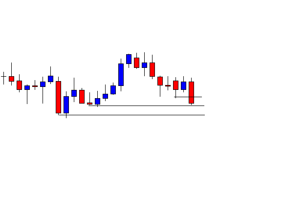
The PSAR stop always moves in the direction of the trade, as a trailing stop should do, but the amount it moves is a function of price because the distance the stop level is computed relative to the range the price has moved. It also gets closer to the price action regardless of the direction of the price movement.

PSAR equation

If the stop is hit, the system reverses; therefore, Wilder named each point SAR: Stop and Reverse point.

The formula to compute it is:

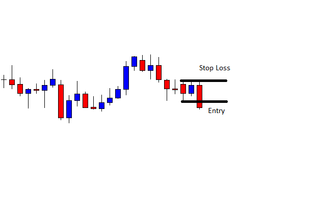
 SARTomorrow = SARToday + AF x (EPTrade – SARToday)

The AF parameter starts at 0.02 and is increased by 0.02 each bar with a new high until a value of 0.2 is reached.

The EP  parameter is the Extreme Price point for the trade made. If long, EP is the highest value reached. If short, EP is the lowest value for the trade.

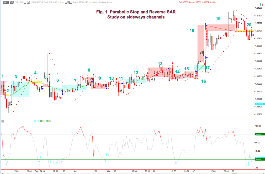
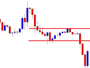
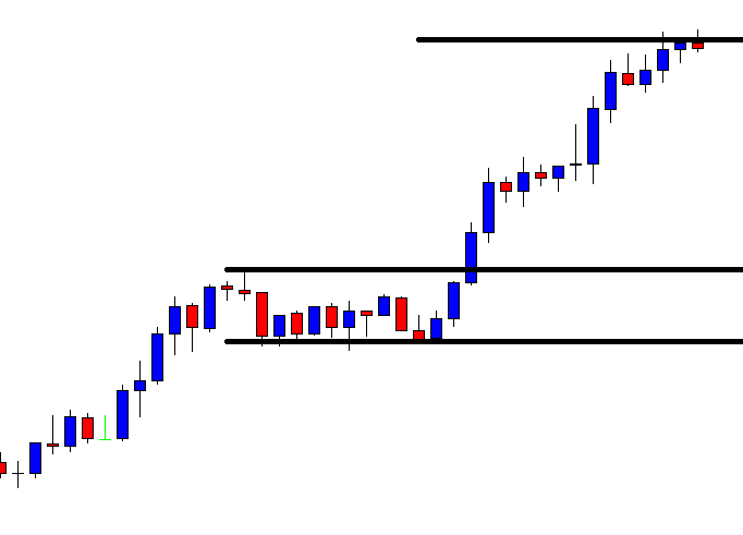
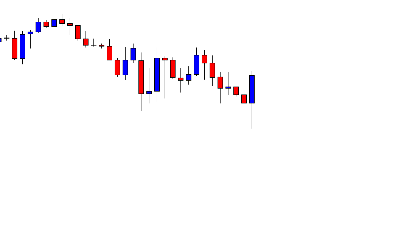
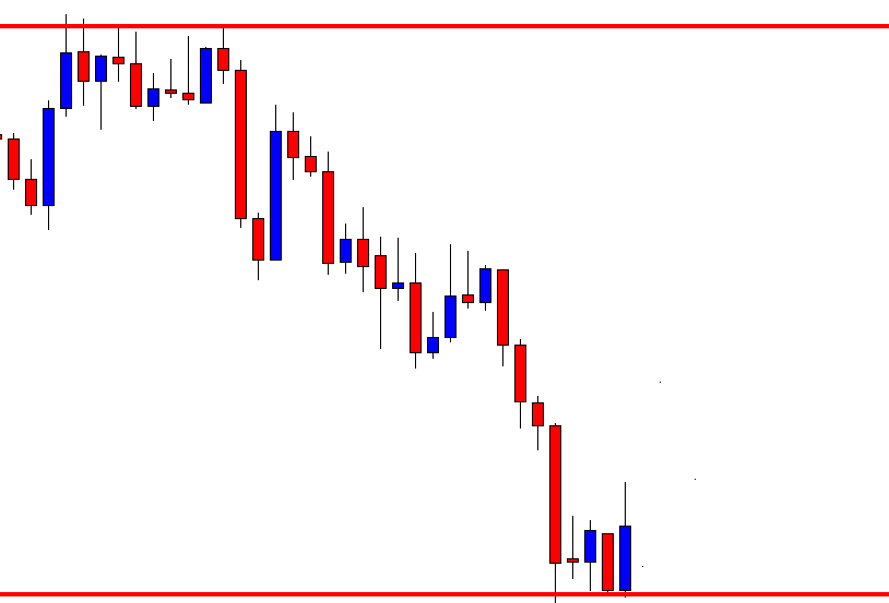
Fig 1: The magenta areas are winners, the yellow are break-even trades, and the pink regions are losers. As we might expect, in congestion areas, the SAR system is a loser.

The PSAR Trading System

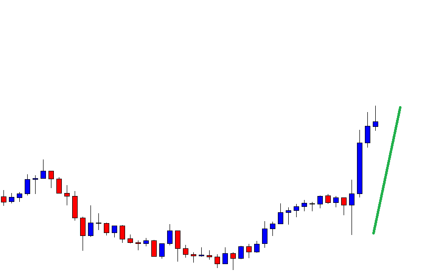
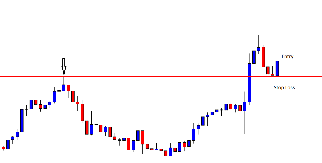
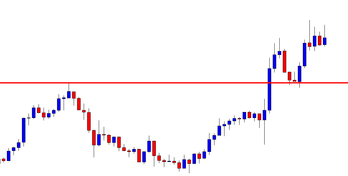
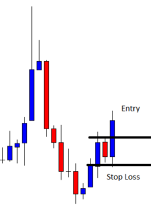
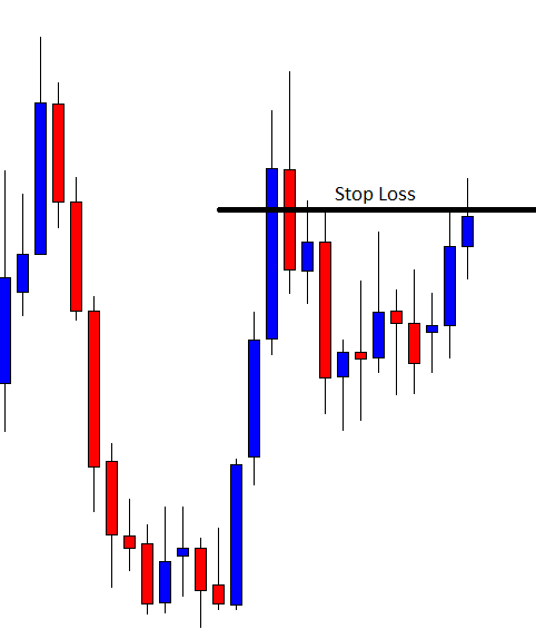
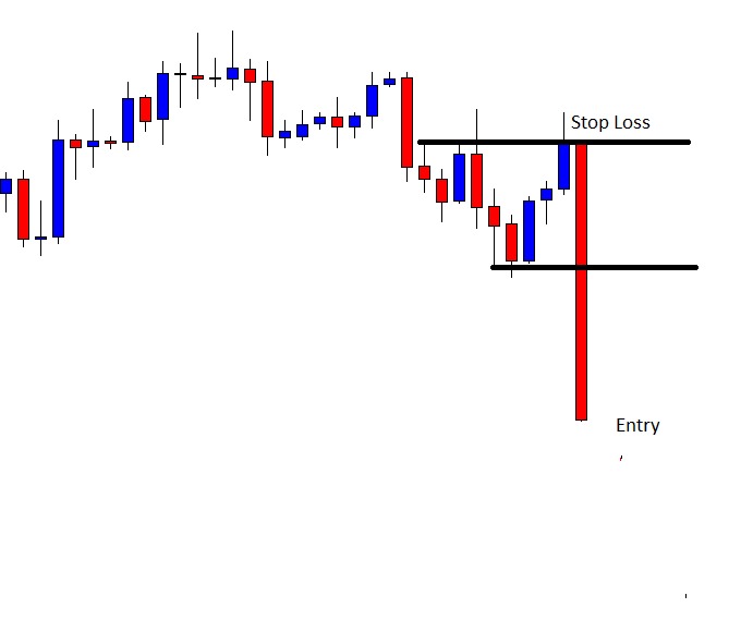
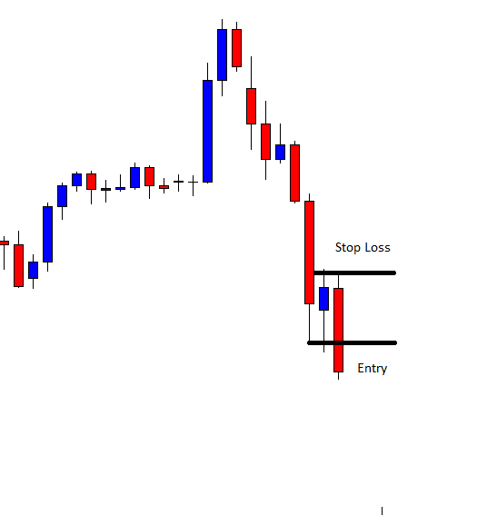
PSAR as a naked system isn’t too good, since trades that go against the primary trend tends to fail, and almost all trades fail when the price is not trending. Sudden volatility peaks also fool the PSAR system. See Fig 1, point 18, where an unexpected downward peak reversed the trade in the wrong direction, cutting short a nice trade and transforming it into a big loser.

Fig 2a and 2b show the profit curve for longs and shorts in the EUR/USD 1H EURUSD 2017 chart. As expected, the long-trade graph presents more robustness than the short-trade curve, since the EURUSD had a clear upward trend back in 2017, whereas the short trades lost money. That is an example of how following the underlying trend grant traders an edge.

Fig 2a equity curve for long trades

Fig. 2b – Equity curve for short trades

Anyway, it’s fantastic that using an entry system with absolutely no optimization could deliver such good results as the  PSAR system when taking only the trades that go with the primary trend. That shows, also, the power of a good trailing stop.

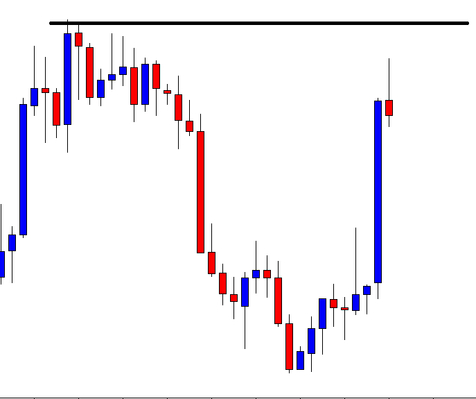
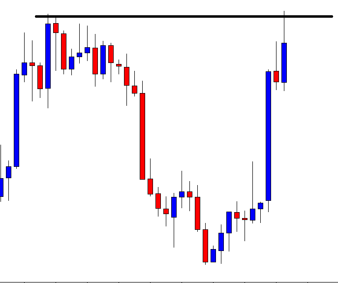
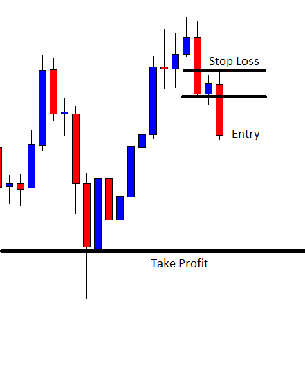
The naked system isn’t too good at optimizing profits, as well. A profit target makes it a lot better. Fig 3.a and Fig. 3.b shows the improvement after setting an optimal target for longs and shorts, especially relevant on shorts.

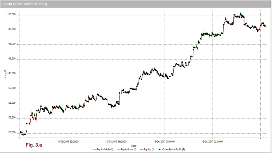
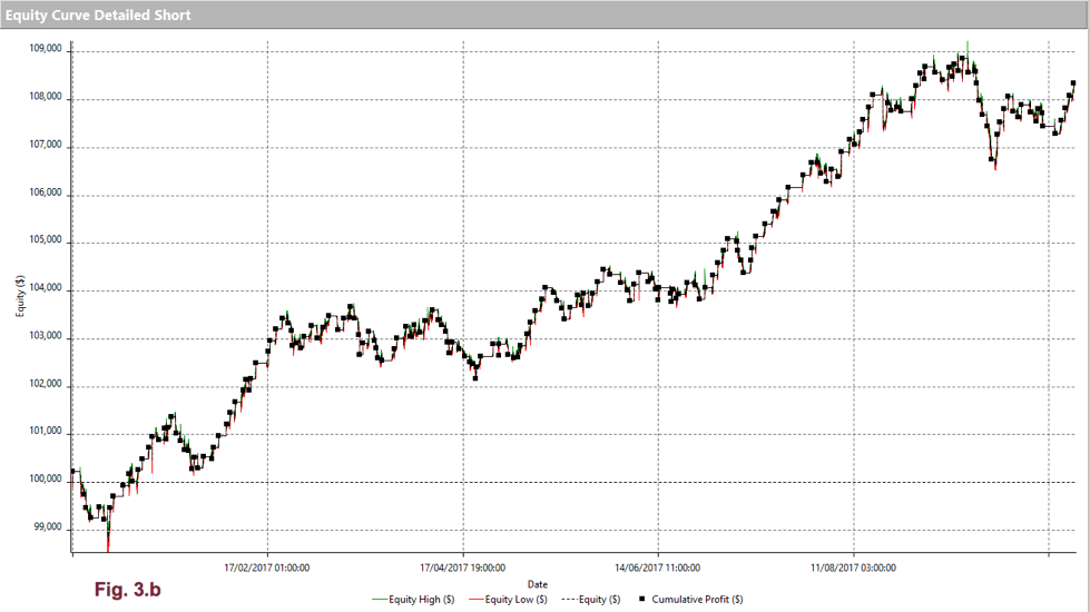
A small change in the AF parameter, lowering down to 0.18, to give profits more room run, and the use of profit targets, raised the percent profitable from 41.4% to 48.1. Max drawdown improved from -4.77% to -3.37%, as well, and the avg_win/avg_loss ratio went from 1.69 to 1.78. It seems not too much, but in combination with the increment in percent winners to 48.1% makes it an effective and robust system.

PSAR as a trailing stop

In this section, we’ll study the Parabolic Stop and (not) Reverse system, as it might be called, as the exit part of a trading system.

As an exercise, let’s consider a simple moving average crossover. We’ll use the same market segment that we used in the naked PSAR case. For longs, we’ll use an 8-15 SMA crossover, while, for shorts, a 7-23 SMA will be taken, as this arrangement creates optimal crossovers for the current market.

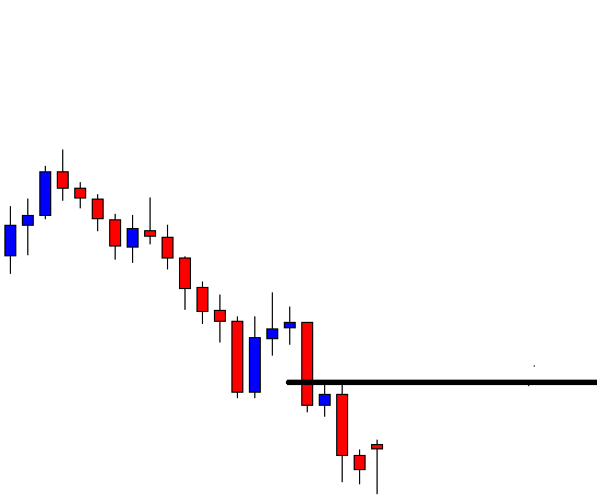
Figs. 4a and 4.b show the equity curve for longs and shorts, respectively, with a Simple Moving Average Crossover system, acting on its own. No PSAR stops added.

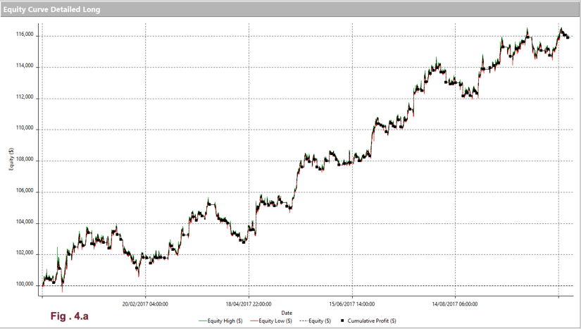
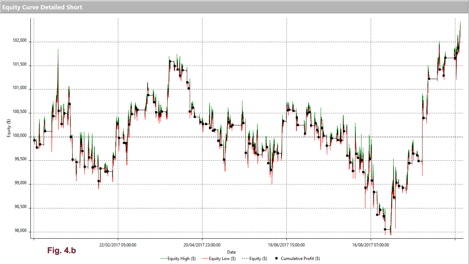
As we see in fig 4a, the long equity curve behaved much better than the short one, although that is due to the EUR/USD trending up. On the short side, even after optimizing its parameters, the crossover relationship is lousy.

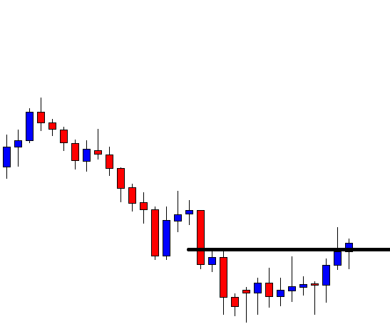
Fig 5.a and 5.b show the effect of a PSAR trail stop. There’s almost no noticeable positive effect. The oddity that PSAR, as a system, is more profitable than when it acts as a trailing stop in another system is related to the entry signal. It’s evident that the SAR signal takes place earlier than the SMA crossover, so the PSAR stop isn’t able to extract profits when the entry signal lags its own signal. On the short side, if we take a closer look, we can see that it improves a bit the drawdown.

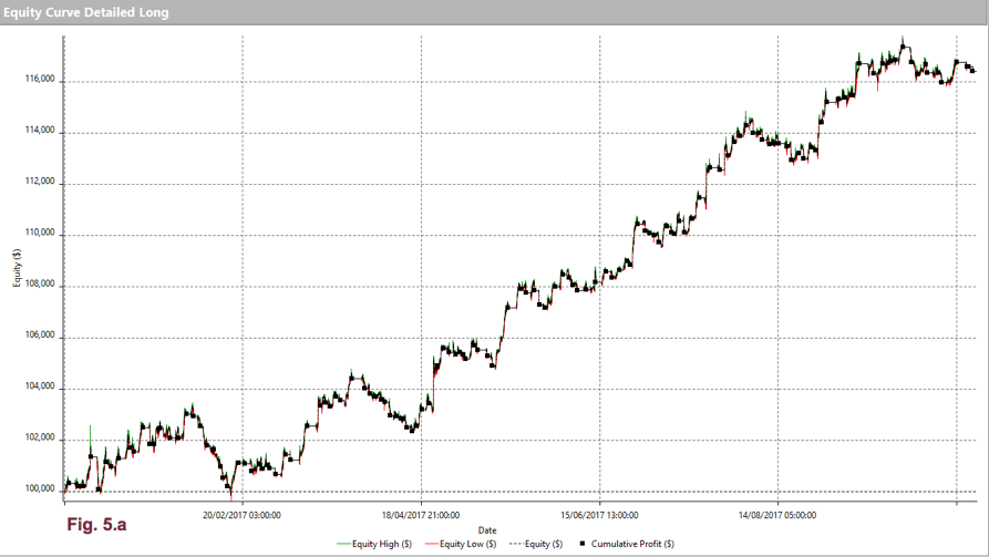
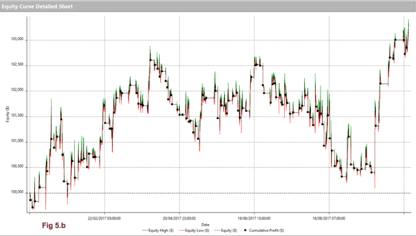
It may seem that the smart thing to do in a trending market such as the EUR/USD back in 2017 is NOT to trade the short side, at least not mechanically.
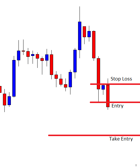
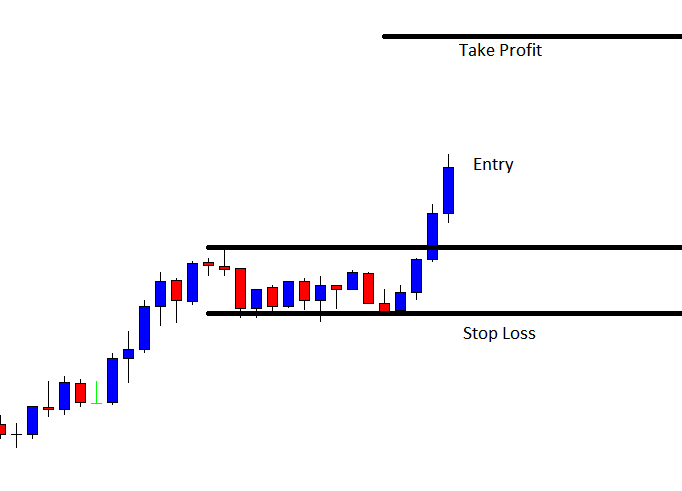
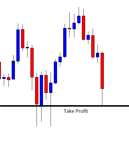
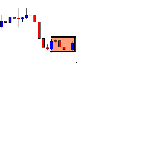
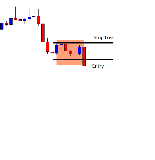
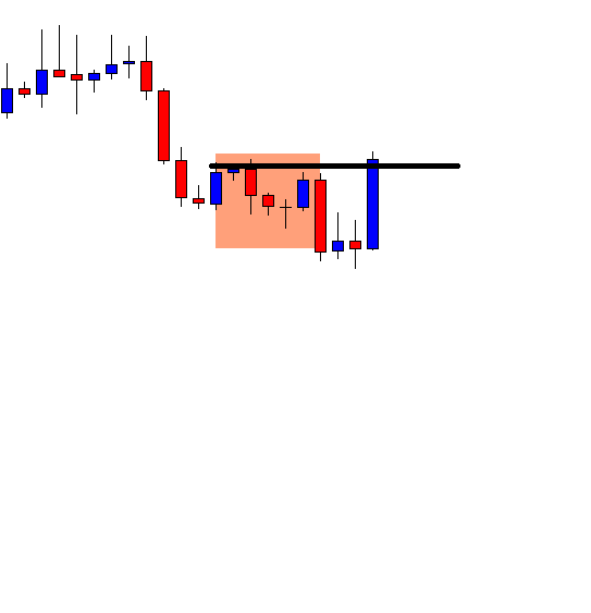
Take-Profit Targets

But, it’s impressive how take-profit targets help us extract profits and reduce risk when trading against the trend. Let’s see the equity curves using long and short targets:

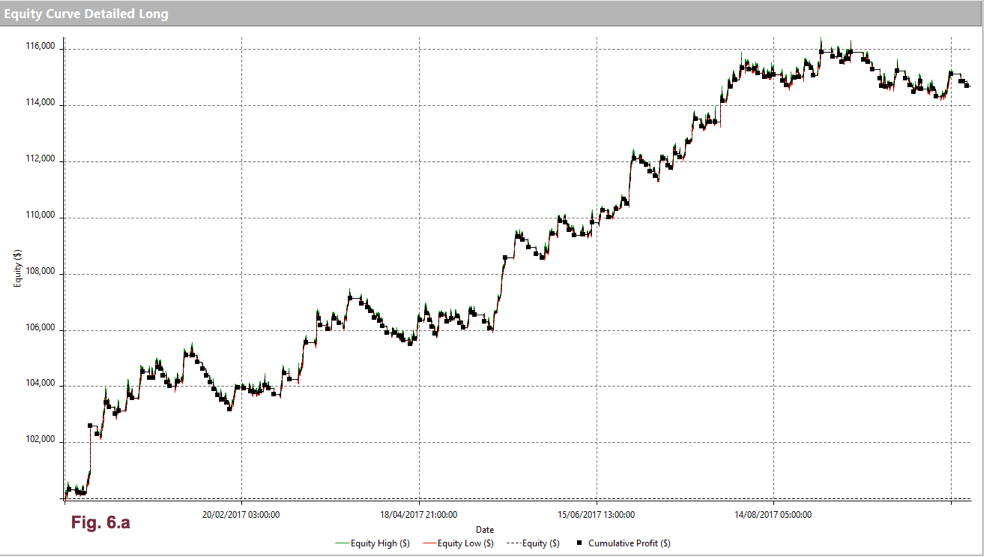
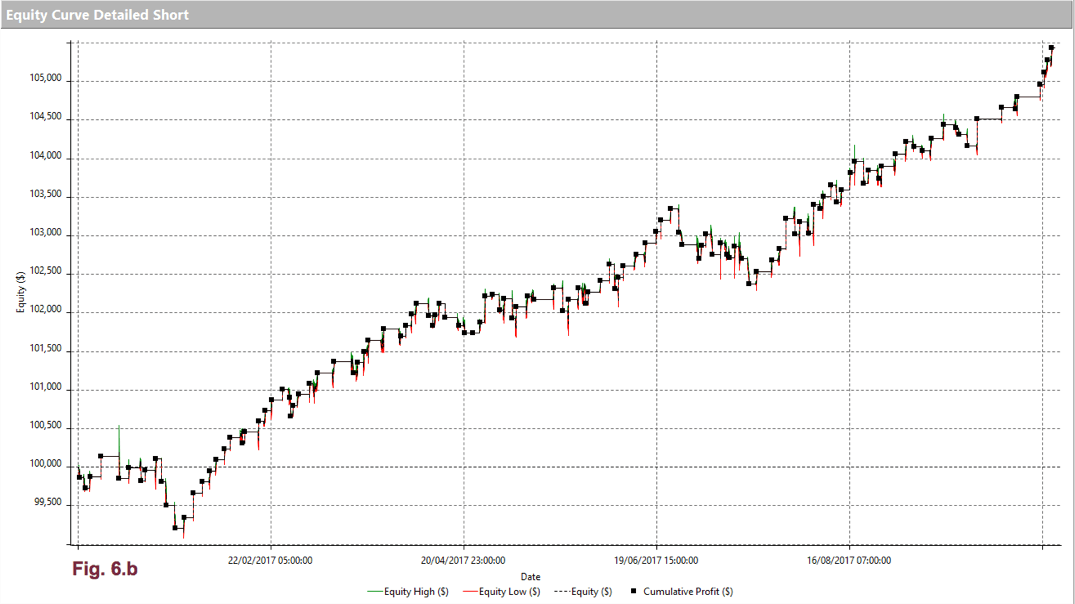
We observe that the long equity curve has a bit less drawdown, but, overall, it doesn’t change much. That was expected because the naked crossovers are very good at following a trend, so not very much can be gained using targets.

The use of profit targets is much more noticeable on the short side. It not only presents a higher final profit, but it’s drawdown practically disappeared, allowing us to better extract profits against the prevailing trend. We have to be cautious, though, if we detect a major trend change and adapt the targets accordingly.

Conclusions

Throughout this article, we tried to understand and analyze the PSAR as, both, an entry-exit system and its behavior as trailing stop to be used with other entry systems. We spotted its strengths and its weaknesses.

Given the results of our present study, we can conclude that:

  • The PSAR is a decent system if we combine it with a market filter and profit targets.
  • Trailing stops, even sophisticated ones, such as PSAR, doesn’t solve our problem of whipsaws when we trade against the trend.
  • By tweaking a bit the AF parameter down to .18, we were able to improve the trend following the nature of PSAR. Consequently, it is advisable to adapt PSAR to the current market volatility.
  • The best tool we own to profit using counter-trend strategies is profit targets, optimized to the current swing levels of the market.


References:

The definition of the PSAR is taken from New Concepts in technical trading, Welles Wilder.

The studies presented were made using Multicharts 11 trading platform programming capabilities, and its results and graphs were taken from its System Performance Report.
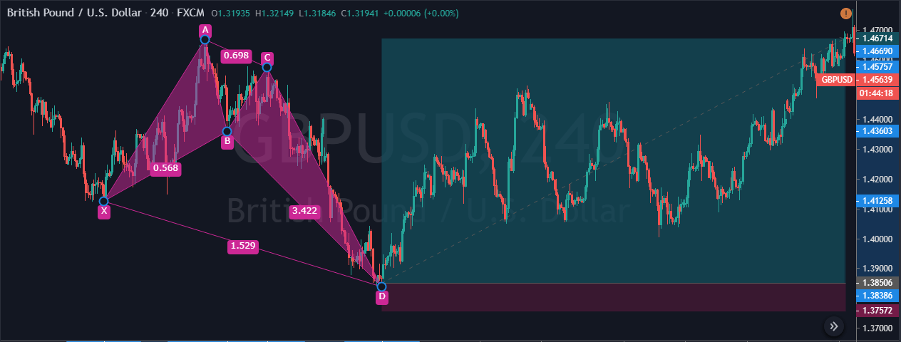
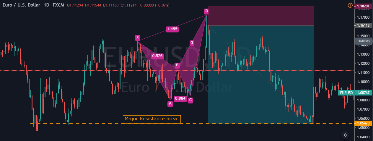
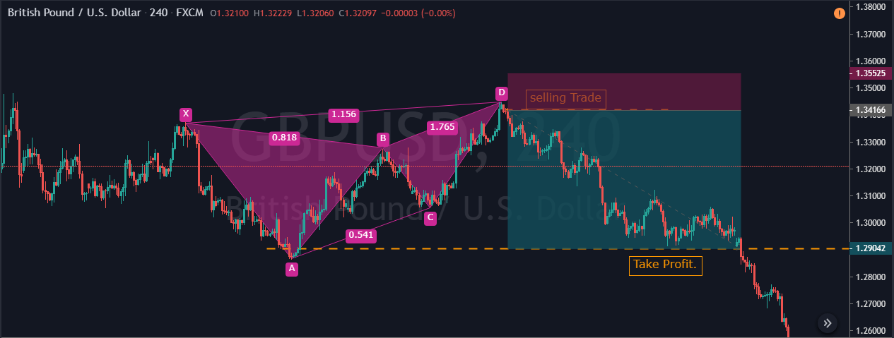
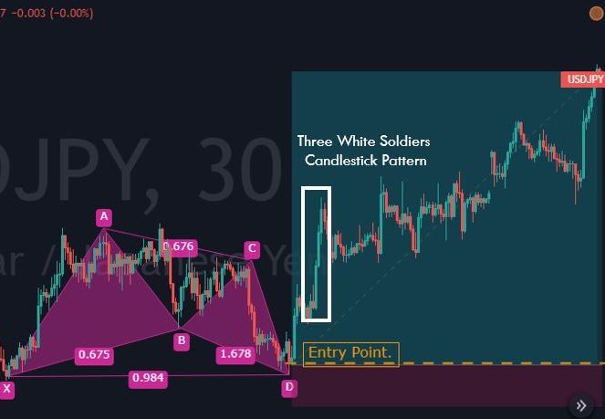
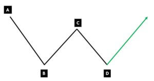
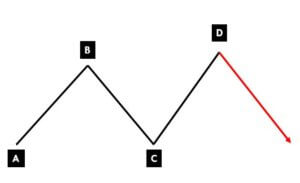
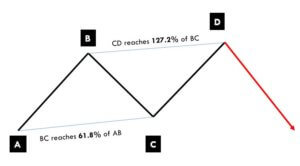
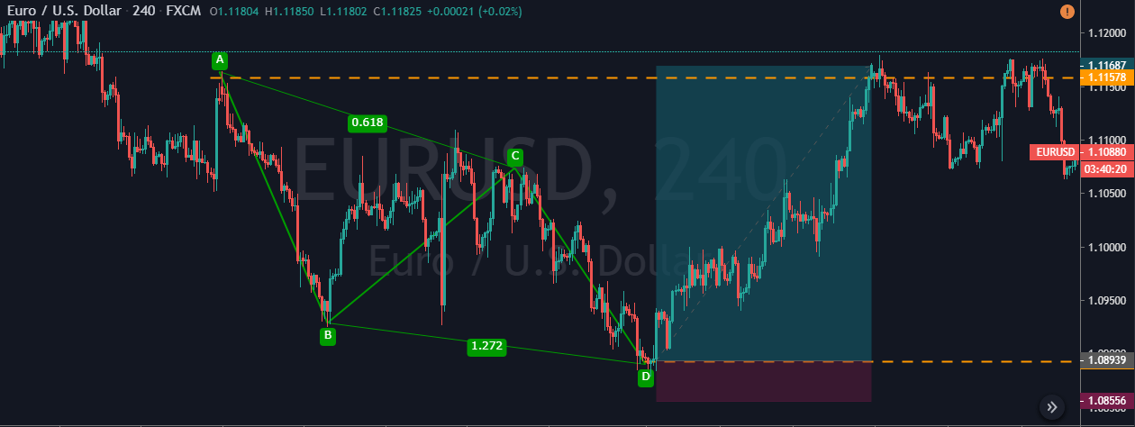
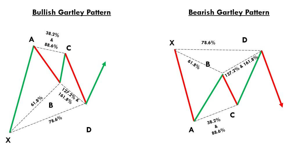
Categories
Forex Basic Strategies

Trading The Bullish & Bearish ‘Flag Pattern’ Like A Pro

Introduction

A Flag Pattern is one of the very well-known trend continuation patterns. Visually, this pattern looks like a flagpole and a flag, hence the name ‘Flag Pattern.’ A flagpole is printed by the sharp price upward move, followed by the symmetrical pullback, which forms the flag on the price chart of any underlying currency pair. When the flag breaks the trend line, it triggers the next trend move of an underlying asset. In simple words, flag forms when price action turns sideways after the sharp upward movement. This pattern can be seen on any timeframe; however, it is mostly found on lower timeframes such as 15, 5 or 3-minute chart.

Flag patterns can be both Bearish & Bullish

Bullish Flag Pattern

The bullish flag pattern starts with a strong upward move. This move implies that the sellers are entirely off guarded as the buyers took over the entire show. Eventually, the price action peaks, and it prints a pullback. The higher high and lower low of the pullback will be parallel to each other. This action results in the formation of a tilted rectangle. This whole process appears like a bullish flag pattern on the price chart.

By placing the trend line at the upper and lower end of the pullback, we can observe the diagonal parallel nature of that pullback. The breakout of the upper trend line indicates that the trend is ready to resume, and that is the best time to activate an extended position.

Bearish Flag Pattern

The bearish flag pattern is just the opposite of the bullish flag pattern that we discussed above. When the price action hits bottom, it prints the pullback where the lower low and higher high are parallel to each other.

The breakout of the lower trend line indicates that the trend is ready to resume, and it’s the best time to go short in any underlying asset.

Flag Pattern – Trading Strategies

Bull Flag Pattern Strategy

A Bull flag is a trend continuation chart pattern that indicates the likeliness of the market to move higher. (Uptrend Continuation)

Pattern Confirmation Criteria:

  • Find out a strong uptrend in any currency pair. In other words, the range of candles should be more bullish.
  • After the strong move, wait for the pullback to occur. A pullback is generally in the form of lower low and lower high. Here’s where we can expect to see a bull flag pattern on the price chart.
  • Draw the upper and lower trend lines on the price chart. When the price action breaks the upper trend line, it a sign to go long.

Here’s how the bull flag pattern looks like on price chart.

Entry – In the below NZD/USD Forex chart, we can see that the pair was in an overall uptrend. During the pullback phase, price action has printed the bullish flag pattern. The breakout of this pattern indicates a clear buy signal in this currency pair.

Stop-Loss & Take-Profit – When the price action breaks the upper trend line, it’s a sign to go long in this pair. The bull flag is quite a reliable pattern, so we can place our stop-loss just below the second trend line (lower part of the tilted rectangle). Placing the take-profit order is purely based on your trading style. If you are an aggressive trader, go for extended targets; but if you are a conservative trader, use smaller targets. In this particular trade, we closed our full position at one of the significant resistance areas.

Bear Flag Pattern Strategy

A Bearish Flag Pattern is also a continuation chart pattern, but it indicates the downward movement of the market. (Downtrend Continuation)

Pattern Confirmation Criteria:

  1. Find out a steady downtrend in any currency pair. In other words, the range of candles should be more bearish.
  2. After a strong move, wait for the pullback to occur. A pullback is typically in the form of a lower higher low and higher high. Here’s where we can expect the formation of a bearish flag pattern on the price chart.
  3. Draw an upper and lower trend line on the price chart. When price action breaks the lower trend line, it’s a sign to go short.

Here’s how the bearish flag pattern looks like on price chart.

Entry – In the below EUR/CHF 60 Forex chart, the overall market was in an uptrend. Then suddenly, sellers overwhelmed the buyers by printing a couple of strong red candles. If a bearish flag pattern appears on the price chart, we can confirm that the downtrend is going to continue. In the below picture, we can clearly see the formation of a bearish flag pattern. We can activate our sell positions as soon as the lower trend line breaks.

Stop-Loss & Take-Profit – In this trade, we must go for minimal stop-loss because the market is in a consolidation phase and not in a strong downtrend. We had closed our whole position when the price action started struggling to print a new lower low and lower high.

Bottom Line

The Flag pattern is always created by a swift up/down move, followed by the consolidation, which runs between the parallel lines. Always use the breakouts of the Flag pattern to take the positions.

Always remember that the trend is your friend. Take only buy trades in the appearance of a Bullish Flag and sell trades in the presence of a Bearish Flag.

Traditional ways suggest that the stop-loss must be set below the pole of the flag, but we don’t always have to follow this idea. While trading flag breakouts, the stop-loss just below the recent low is good enough.

In the Forex market, the flag pattern performs very well in active trading hours as most of the swift moves (like flagpole formation) occur in busy hours only. If you are a strict confirmation trader, let the price action to retest the trend line to activate your trades. This procedure will help you in picking the higher probability trades, although you’ll miss the higher-momentum moves that don’t pause to continue moving.

Categories
Forex Daily Topic Forex Price-Action Strategies

When You Confront a Loss

In today’s article, we are going to demonstrate an example of a failed entry on the daily chart. In a bullish market, the chart produces a bearish inside bar followed by a perfect looking bullish engulfing candle closing well above the level of resistance. However, the price heads towards the South and hits the stop loss. We try to find out what goes wrong here.

The chart shows that the price heads towards the South with strong bearish momentum. The sellers are having a feast here. Any intraday breakout at the lowest low of the last daily candle may get the traders to go short on the respective chart. Let us proceed with what happens next.

The last daily candle comes out as a bullish inside bar. Intraday buyers may search for a long entry on any breakout at the highest high of the last daily candle. On the other hand, the daily chart traders are to wait for the next day’s candle to close as a bearish engulfing candle.

The price heads towards the North with good bullish momentum. The chart produces two more bullish candles after that inside bar bullish candle. The chart looks good for the buyers on the daily chart as well. If the chart produces a bearish reversal candle followed by a bullish engulfing candle closing above the level of resistance, the buyers may go long on the daily chart.

The chart produces an inside bar. This must excite the buyers. If the next candle comes out as a bullish engulfing candle closing above the resistance of this bullish wave, the buyers may trigger a long entry.

Here it comes. This is what the buyers wait for. They may trigger a long entry right after the candle closes by setting stop loss below the candle’s lowest low. The significant level of resistance is far enough, which offers them a tremendous risk-reward. Moreover, this is the daily chart, which is one of the most consistent charts in the Forex market. In a word, this is a good trade setup for the buyers.

The price hits the stop loss the next day. The daily candle one after it comes out as a bearish candle too. The chart looked extremely good for the buyers two days ago. Now things are very different. If we dig into it, we do not find anything particular that the chart misses to produce such bearish candles all of a sudden. Technically, there is nothing wrong with the entry. We must remember this is how the market goes. It happens a lot. We must learn how to absorb such an unpleasant incident.


Categories
Forex Daily Topic Forex Price-Action Strategies

Daily-H4 Combination: A Daily Reversal on the Daily, Flip Over to the H4

In today’s article, we are going to demonstrate an example of a daily–H4 combination trade setup. On a strong bullish market, the daily chart produces a bearish reversal candle and offers a beautiful short entry for the sellers, the price gets exceptionally bearish, and it may remain bearish for a long time. Let us get started.

Look at the last candle, which closes as a bearish marubozu candle. Before that candle, the pair heads towards the North with strong bullish momentum. At some point, a bullish engulfing candle engulfs an inside bar bearish candle. This is an extremely good signal for the daily chart’s buyers to go long on the pair. Many daily buyers might have lost money here. However, the next candle (the last candle on this chart) changes the equation for daily-H4 combination traders. It is now time for them to flip over to the H4 chart.

This is how the H4 chart looks after flipping over. The price starts having consolidation, as well. A bearish engulfing candle closing below the lowest low is the signal for the sellers to trigger a short entry.

The next candle comes out as a bearish engulfing candle closing well below the lowest low of the bearish wave. The sellers may trigger a short entry right after the candle closes by setting stop-loss above the level of resistance (with some safety pips) and by setting take profit with 1:1 risk-reward.

As expected, the price heads towards the North with good bearish momentum. It seems that the price is in a hurry to hit the target. It may hit the target within the next candle. Let us find out what it does.

The price hits the target. The last candle comes out as a very strong bearish candle, which suggests that the price may head towards the North further. However, 1:1 risk-reward is achieved. This is what the first target as far as daily-H4 combination trading is concerned.  Considering the last candle’s attributes, the price may produce at least one more bearish wave in this chart. Anyway, we have a lesson to learn from here. We are to wait for the daily chart to produce a strong reversal candle. It does not matter how strong the trend has been. As long as we get a strong bearish reversal daily candle, our job first job is to flip over to the H4 chart. We must wait for the H4 consolidation and the signal candle closing below the highest high/lowest low of the last wave to trigger entry.


Categories
Forex Daily Topic Forex Price-Action Strategies

Mind the Gap Price Action Traders

In the Forex market, most pairs start trading with a gap after weekends. Most of them are not visible on charts such as the H1, H4, or the daily. Some pairs begin with a big gap, which is visible even on the major charts. It gets difficult for price action traders to trade and make a profit when a pair starts with an evident gap. In today’s article, we are going to demonstrate an example of this.

The trend starts with a bearish engulfing candle, which is a strong indication that the trend may sustain for a long time. The sellers are to wait for the price to consolidate and strong bearish reversal candle to go short on this chart. However, do not miss that the chart has a gap followed by trend continuation. It finds its support since it produces a doji candle followed by a bullish engulfing one.

The price finds its resistance as well. Look at the last candle on the chart. It is a bearish engulfing candle closing well below the level of support. Usually, the sellers may trigger a short entry right after the last candle closes in such price action. It is not a usual chart since it has a gap. Let us assume we have triggered a short entry here.

The next candle comes out as an inside bar bullish candle. The last candle comes out as a doji candle closing right at the breakout level. The bear still has control.

The last candle on this chart breaches through the level of stop loss. The trade does not go according to the sellers’ plan. The trend initiating and the breakout candle gets a 10 on 10. However, it gets us a loss. Do not forget this could happen any time with any trade setup. With this chart, something works against price action traders in both buying and selling. Can you guess what that is? Yes, it is the ‘Gap.’ Let us proceed to the next chart. It may create more drama.

It produces a spinning top. The buyers may think that they have a chance to take control next if it produces the next candle as a bullish engulfing candle.

It does not. It continues heading towards the South again at a slower pace. A chart with a big gap may act weird like this. Thus, it is best to avoid taking entry on a chart with a big gap.

Categories
Forex Price-Action Strategies

To Maintain Better Winning Ratio, Go with A+ Entry

In today’s lesson, we are going to demonstrate an example of H1 breakout trading. In this example, the breakout candle, as well as the confirmation candle, is not the best one the price action traders like to have. Nevertheless, the price heads towards the trend’s direction nicely. In most cases, it does not happen though.

The price after being bullish gets choppy. It then makes a bearish move but upon finding its support, it produces a bullish engulfing candle. This is the strongest bullish reversal candle, which shall attract the buyers to keep an eye on this chart. Let us proceed to the next chart.

The price does not get bullish as expected. However, an inside bar means that the buyers still hold the key. The chart may produce bullish candle and end up making a breakout at the swing high. The H1-breakout traders must be waiting for a breakout here.

The next candle comes out as a bullish engulfing candle closing above the level of resistance. It is a breakout but the breakout is not explicit. If the candle closes well above the level of resistance, it would attract more buyers. Let us now wait for the confirmation candle. If the next candle comes out as a bullish candle closing well above the breakout candle, it may attract more buyers in the end.

The confirmation candle does not look very promising either. As far as H1 breakout price action trading is concerned, the buyers may trigger a long entry. Considering candles’ attributes, it is not an A+ entry though. Let us proceed to the next chart and find out what the price does.

The price heads towards the North with good bullish momentum. It takes only two candles to hit the target. As mentioned, it is not an A+ entry but the trade gets the buyers some profit. In some cases, we see that even an A+ entry gets us a loss instead.

This is how the market works. We must not lose our patience but stick with our plan. If we take such entry, we may have to encounter less momentum after triggering entry, and more losing trades. We have to have the mental strength to face such losses then. Otherwise, we may skip taking such entry. Such an entry does not always get us profit. We have demonstrated this in today’s lesson.

Another equation we should remember, if we want to take A+ entry, we get less number of entries but more consistency. On the other hand, if we take a signal as long as it meets our trading strategy requirement, we get more entries but less consistency.

Categories
Forex Daily Topic Forex Price-Action Strategies

A Weak Breakout Candle Makes Things Different

In H1 breakout trading, the signal candle’s attributes are as important as the breakout candle. We know that a breakout candle means a lot. So is the breakout confirmation or signal candle. In today’s article, we are going to demonstrate an example of this. Let us get started.

The price after being bearish gets caught within a horizontal channel. However, the last candle comes out as a bearish engulfing candle. It seems that the sellers may take control soon. It all depends on the breakout at the level of support followed by breakout confirmation.

The next candle comes out as a bearish candle as well closing within the level of support. The sellers are to wait longer. On the other hand, the buyers would love to get a bullish reversal right here. The battle is on.

The bear wins. The last candle comes out as a bearish engulfing candle closing well below the level of support. This is what H1 breakout traders want. If the next candle closes well below the breakout candle, the sellers may trigger a short entry.

The next candle comes out as a bearish doji candle. It closes below the breakout candle. The sellers may trigger a short entry. However, this is not an ideal candle showing strong bearish momentum. If a candle like this confirms a breakout, the price may not go towards the take profit level that we would love to see.

After triggering the entry, the chart produces two bullish candles. It looks extremely ominous. Most probably, the entry is going to get us a loss. Taking a loss is a usual thing in the Forex trading. However, the last two candles may be produced because of the fragile confirmation candle. This is where H1 breakout traders shall be a bit careful. If the confirmation candle does not come out as a strong candle, the price may go another way round. Let us find out from the next chart what the price does here.

Oh! It is about to hit the stop loss. It produces a bearish engulfing candle again. The price may head towards the downside and hit take profit level. It is still 50-50 since the price is trading within the level of last swing low. Let us find out how it ends.

Yes, it hits the target at last. However, this is what the price does not usually do when the H1 chart makes a breakout and confirms it. As mentioned, it often happens when the breakout and confirmation candle come out as weak candles. Thus, we may consider this when trading H1 breakout strategy next time.

Categories
Forex Daily Topic Forex Price-Action Strategies

‘Set and Forget’ Tailor Made for H1 Breakout Trading

In today’s article, we are going to demonstrate an example of H1 breakout strategy. It is a typical example of the rule ‘Set and Forget’. To trade on the H1 chart, we must be patient and let the price do its job once we have taken entry. Let us proceed.

The chart shows that the last candle breaches closing below the level of support. As far as the H1 breakout strategy is concerned, traders must wait for the next candle to be bearish closing well below the breakout candle.

The last candle comes out as a bearish candle closing well below the breakout candle. The sellers wait for such candle to confirm a breakout. The sellers may trigger a short entry right after the last candle closes. Stop loss is to be set above where the trend starts and Take Profit is to be set with a 1:1 risk-reward.

The next candle comes out as a bearish candle as well. The sellers must let the price to hit the target. To be precise, they shall not even look at the chart. Stop Loss and Take Profit are set. All they can do is let the price do its job.

Where does that one come from? The chart produces a bullish engulfing candle. It is a strong bullish reversal candle, which may change the trend. To be honest, a candle like this may intimidate any price action trader. Do not forget this is an H1 chart and the entry is taken on H1 breakout strategy. Set and Forget rule comes very handy in this trade setup. Let us assume, we do not even know that the chart produces such a candle. We let the market do its own job.

The next candle comes out as a bearish inside bar. It looks more ominous. If the next candle comes as a bullish engulfing candle, the sellers will be in serious trouble. Let us proceed to the next chart.

The next candle comes out as a doji candle followed by another doji candle. However, the price heads towards Take Profit level and hits the target at last. If we keep looking at such chart, would we be able to hold ourselves back from closing the entry manually? It may get very tough for the traders to hold their nerves with such price action when a trade is running. If a trader trades on the daily or the H4 chart, he may consider closing the entry manually. With the H1 chart trading, traders may not do this. In other words, set and forget when you are trading on the H1 chart.

Categories
Forex Basic Strategies

Trading The ‘AB=CD’ Harmonic Pattern Using Fibonacci Ratios

Introduction

H.M Gartley published a book known as ‘Profits in the Stock Market’ in 1932. In this book, Gartley shared the entire group of harmonic patterns that are widely being used by traders across the world. AB=CD is one such pattern from the harmonic group. As time has passed, professional traders and market technicians improved this pattern a lot. They have also incorporated the Fibonacci ratios to this pattern, which will be discussed in this article.

AB=CD is a reversal pattern that helps traders in predicting when the price action of an underlying asset is about to reverse. It is a visual geometric pattern comprised of three consecutive price swings. This pattern helps to identify the trading opportunities in all types of markets, on any timeframe, and in any kind of market condition. Bullish AB=CD pattern helps traders in identifying higher probability buy trades, whereas bearish AB=CD patterns help in determining selling opportunities.

This pattern includes a total of four letters – A, B, C, D. Each turning point represents a significant high or low on the chart. These turning points are referred to as AB move, BC move, and the CD move. Let’s see how traders must perceive this pattern in the upcoming sections.

AB=CD Pattern Rules

Bullish AB=CD Pattern

  • The bullish AB=CD pattern always appears in a downtrend.
  • First of all, point A to B will be any random downtrend move.
  • Then the price action must go into the counter side of the AB move, printing the B to C move.
  • The original selling trend should resume and print the CD leg resembling the AB leg.
  • Once all these three moves are completed, we can conclude that the market has printed the bullish AB=CD pattern
  • Activate the buy trades only at point D.

Bearish AB=CD Pattern

  • Bearish AB=CD pattern is nothing but a mirror image of the Bullish AB=CD pattern.
  • The pattern begins with a bullish line from point A to B.
  • These points could be any random move in an uptrend.
  • B to C move should reverse the trend of the market but shouldn’t cross point A.
  • C to D move should be equal in size to point A and B.
  • Once all these moves are completed, we can conclude that the market has printed the bearish AB=CD pattern
  • Start taking sell trades only from point D.

AB=CD Pattern – Fibonacci Ratios

As already mentioned, Fibonacci ratios can be used to confirm the validity of the AB=CD patter. Below are the fib levels that are incorporated in the AB=CD pattern by trading experts for pattern validation.

BC leg is the 61.8% Fib retracement of AB leg.

CD leg is the 127.2% Fib retracement of BC leg.

Only at these retracement levels, the length of AB will be equal to the length of the CD.

Only take the trades if these above Fibonacci levels are matching with the setup on your charts. Ignore the setup if the Fib levels aren’t matching.

As you can see in the above image, the BC move retraces 61.8 of the AB and CD move is the 127.2% extension of the BC move. Also, the length of the AB move is equal to the extent of CD, i.e., both the movements must take the same time to develop on the charts. If any underlying currency pair is confirming all the mentioned rules, only then we can safely anticipate a higher probability trade.

AB= CD Pattern Trading Strategy

We believe by now, you understood the formation of the AB=CD pattern very well. Now let’s combine this pattern with the Fibs ratio as discussed to learn how to trade this pattern in the right way. As soon as we identify this pattern on the price chart, the only problem most of the traders have is while determining the accurate Fib ratios. Novice or intermediate traders go wrong most of the time in this aspect. As a result, they lose their trade. So make sure always to set the accurate fibs ratio and only then trade the AB=CD setup.

Bullish AB=CD Pattern

In the below EUR/USD 240 minutes chart, we can see that the pair was in an overall downtrend. We can also see that the CD move is equal in size to AB move. Also, after applying Fib ratios, we now know that the BC is 61.8% retracement of the AB move, and CD is the 127% extension of the BC. Therefore we can confirm the validity of the Bullish AB=CD pattern.

Entry, Stop-loss & Take Profit

Execute a buying trade at point D. Furthermore, always place the stops just below the D point. This is because, if price action goes beyond this point, it invalidates the pattern. This pattern provides two ‘take profit’ targets. The first one is point C, and the other is point A. We have closed our full position at point A because after activating our trade, the price action immediately blasted to the north. This indicates that we can expect more extended targets in this pair.

Bearish AB=CD Pattern

In the below 60 minute chart of the NZD/CAD Forex pair, the market was in an uptrend. This means that if at all, we are expecting an AB=CD pattern, it will be bearish. Notice that the AB is completely equal in size to the CD move. Following the rules of the pattern is critical while trading the AB=CD pattern. After applying Fibs, we can see that the BC is 61.8% retracement of the AB move, and the CD move was also a 127% extension of the BC move on the price chart. This confirms the authenticity of the bearish AB=CD pattern. We have executed a sell trade at point D. Although it was not a smooth ride, we have closed our full position at the major support area.

Bottom Line 

AB=CD is one of the most popular trading patterns in the market. It is straightforward to identify, confirm, and trade as well. Also, we get to see this pattern frequently in the market, and traders can pair it with other forms of technical analysis to improve the odds of their trades. Always remember to follow the rules of the game; else, it is very difficult to win the game of trading. We hope you find this strategy useful. Try applying this strategy on a demo account and then apply it on the live charts. If you have enough questions, let us know in the comments below. Cheers!

Categories
Forex Price-Action Strategies

A Different Kind of Breakout Does Its Job Well

In today’s lesson, we are going to demonstrate an H1 breakout trade setup. Usually, the breakout candle makes a breakout by breaching through a level of support/resistance. Today, we are going to study about a breakout that takes place right at the level of resistance, which becomes support after the breakout. We need to be familiar with such a breakout since it happens quite a lot.

The price produces a bullish engulfing candle. The buyers wait for such a good-looking bullish reversal candle. They shall wait for the price to go towards the level of resistance and makes a breakout later. Let us proceed to the next chart.

The price heads towards the North but not right after the reversal candle. However, the bullish momentum looks good. Look at the last candle. It closes right at the level of resistance. It seems the price may make a breakout here soon.

The next candle closes well above the level of resistance. However, the candle is formed right at the level of resistance. Typically, a bullish breakout candle’s 25% of its lower body shall remain below the level of resistance. In this case, candle’s 100% (almost, ignore that very tiny lower body) body is above the level of flipped support. Such a breakout takes place in the Forex market very frequently.

The next candle closes well above the breakout candle. This means the breakout is confirmed. The buyers may trigger a long entry right after the last candle closes.

After triggering the entry, the price heads towards the upside with good bullish momentum. The chart produces two consecutive bullish candles after breakout confirmation. The buyers shall wait for the price to hit the target. For that, the price still has some space to travel towards the North.

The price hits the target and comes back down a little. It goes towards the level again. In this trade setup, the breakout candle’s breakout is not a good one that price action traders look for. In many cases, we may see that the chart does not confirm a breakout but goes another way around. It happens because such a breakout consumes some extra space. Thus, the majority of such breakouts are not confirmed and may not end up offering entry. However, once the breakout is confirmed, and there is enough space for the price to travel, most likely trade setup would work in traders’ favor. In the beginning, we may get puzzled with such a breakout. The fact is if the next candle after a breakout closes above (bullish market) the breakout candle, it is a valid breakout and works as well as the typical breakout candle does.

Categories
Forex Price-Action Strategies

Patience Required Even with H1 Breakout Trade Setup

In today’s lesson, we are going to demonstrate an example of an H1 breakout strategy. Usually, the price heads towards the trend’s direction with good momentum on the H1 breakout trade setup. In today’s example, the price does not behave as it usually does. Let us get started.

The price after being bullish, it has been on consolidation. Look at the last two candles. The price heads towards the consolidation resistance. The buyers eagerly wait for a bullish breakout at the level of resistance on such price action. Let us proceed to the next chart.

Here comes the breakout candle. The buyers love to get a breakout with such a candle. Now, they must wait for the next candle to close above the breakout candle. If that happens, traders may trigger a long entry.

The next candle comes out as a bullish candle closing well above the breakout candle. The buyers may trigger a long entry right after the last candle closes. The stop loss is to be set below the trend-initiating candle, and the take profit is to be placed with 1:1 risk-reward. Six out of ten times, the price goes towards the take-profit level with ease in a hurry. Let us proceed to the next chart and see how this one goes.

The price does not head towards the North with good bullish momentum. The way it has been going for the last five candles, it looks ominous. A question may be raised here, “shall we close the entry?” The price still has a lot of space to hit take profit level. The market is not about to close down for the weekend or holiday. Thus, we must be patient and hold the entry. In other words, we shall apply the rule “set and forget.” The set and forget rule is tailor-made for intraday trading, such as the H1 chart to the 5M chart. Let us wait and find out what happens.

After a long while, the price makes a move towards the North again. It seems the trade is going to get the buyers some green pips. They must wait and let the price to hit the target.

It loses its momentum again a bit, but it hits the target. We often head that patience is required more when traders trade on major charts such as the H4, the daily or the weekly. The reality is patience is required for traders of all kinds. Today’s example has proved this again.

Categories
Forex Price-Action Strategies

The ABC Pattern’s C Point May Confuse You Time to Time

In today’s lesson, we are going to demonstrate an example of the ABC pattern trading. In this example, the price does not make a full-wave correction to produce C point. However, the signal candle comes out as a strong reversal candle, which drives the price towards the trend’s direction. Let us get started.

The price makes a long bearish move and produces a bullish reversal candle. The price heads towards the last swing high. The buyers are to wait for a breakout at the level of resistance (swing high) first. A correction followed by a bullish engulfing candle at the breakout level would be the signal to go long here.

The chart makes a breakout keeps producing bullish candles. The buyers are to wait for the chart to produce a bearish reversal candle to make a downside correction. Since the chart produces one more bullish candle, it may make a correction soon.

After producing a bearish reversal candle, the price keeps making a correction. Ideally, the buyers would love to see the price come back to the breakout level. However, it is the Forex market. Things do not always go by the book here.

As mentioned, things do not always go by the book. The price does not make a full-wave correction. Nevertheless, look at the bullish reversal candle. The candle closes way above the last swing high. The buyers may trigger a long entry right after the last candle closes. We must remember that this is not an A+ entry as far as the ABC pattern trading is concerned. Let us proceed to the next chart to find out how the trade goes.

The price heads towards the North with good bullish momentum. Typical 1 R is achieved as well. In a word, the long entry gets the profit for the buyers. As mentioned earlier, this is not an A+ entry. The question is, shall we go for such entry?

In most cases, such price action may get us profit. However, if we do not like to take losses, we may skip taking such entry. Especially, in the beginning, traders find it hard to digest losses. Thus, for beginners, it would be best if they skip taking such entry and only go for A+ entry. Traders learn the art of digesting losses with time. Yes, you have read it right. Digesting losses in Forex trading is an art. If you have already learned the art, then you may as well go with an entry like this. In the end, you will be able to come out with a profit.

Categories
Forex Daily Topic Forex Price-Action Strategies

Look for Such Price Action to Trade on the ABC Pattern

In today’s lesson, we are going to demonstrate an example of the ABC pattern trading. The trend-initiating candle comes out as a bullish engulfing candle followed by a bullish breakout. The price then makes a bearish correction and makes a bullish move upon producing a bullish reversal candle at a flipped support. Let us demonstrate with the charts how it happens.

The price has been bearish, but it has produced a bullish engulfing candle at the support zone. The buyers are to wait for the price to head towards the North and make a bullish breakout at the last swing high. Let us proceed to the next chart.

The price makes a breakout at the nearest swing high. The buyers are to wait for consolidation or correction and a bullish breakout. The last candle comes out as a strong bullish candle as well. It may keep going towards the North. Let us wait and find out what it does next.

It starts having a correction. Then, it produces a bearish inside bar followed by two more bearish candles. The price is at the flipped support. The buyers are to keep their eyes on this chart very closely.

Here it comes. The chart produces a bullish reversal candle. Do not miss the point that the level is the breakout level when the price heads towards the North. Such level is very significant as far as the ABC pattern trading is concerned.

The price makes a bullish breakout again and produces a new higher high. Traders may trigger a long entry right after the last candle closes by setting stop loss below the level of flipped support. It usually provides at least 1:1 risk-reward, which is the safest option. Let us proceed to the next chart to find out how it goes.

The price heads towards the North as expected. It hits the target (1R) with ease. The chart suggests that it may go towards the North further. Anyway, the ABC pattern traders shall enjoy their profit and hunt for the next one somewhere else.

In this example, we have seen that four aspects of the ABC pattern trading such trend initiating candle, breakout, reversal candle at the breakout level, and the signal candle get 10 on 10. Consequently, the price heads towards the desired direction with good momentum. If any of them fails to get 10 on 10, the trade may not go, exactly we would love to see it go. To keep excellent trading consistency, try your best to trade the ABC pattern on such price action that we have demonstrated today.

Categories
Forex Price-Action Strategies

Trading on the Daily Chart: The Inside Bar May Disappoint You More Often

In today’s article, we are going to demonstrate an example of price action trading on the daily chart. In price action trading, a reversal candle or reversal pattern means a lot. Usually, the engulfing candle, track rail, morning start, or evening star are considered strong reversal candles or patterns in price action trading. On the other hand, the inside bar is not considered a strong bearish reversal candle. In the daily-H4 chart combination trading, an inside bar still may offer a good entry since traders take their final decision depending on the H4 chart. To trade on the daily chart, it may be a different case in most cases. Let us have a demonstration of this.

After being bullish for several daily candles, the chart produces an inside bar at a resistance zone. To trade on the daily chart, traders wait for the price to produce a corrective candle followed by another candle towards the trend’s direction. Over here, traders are to wait for a bullish corrective candle followed by a bearish reversal candle closing below the level of support to offer a short entry.

The chart produces a bullish inside bar. Things are going according to the sellers’ expectations. If the chart produces a bearish engulfing candle closing below the last candle’s lowest low, the sellers may trigger a short entry. Let us proceed to the next chart.

The last candle comes out as a bearish engulfing candle closing well below the level of support. The nearest swing low is far enough, which offers an excellent risk-reward. The sellers may trigger a short entry right after the last candle closes.

Things are not going according to the sellers’ expectations. Anyway, the sellers must be patient with the position. Let us proceed to the next chart and find out what the price does next.

The price consolidates for several candles. The last two candles look good for the sellers. However, the level of consolidation support is still held. Do not forget the point that the sellers have been holding the position for the last five trading days.

It makes the sellers wait longer and heads towards the North to hit the stop loss. Taking a loss or getting the stop loss hit is a usual incident in the Forex trading. However, if we dig into this case study, we find that apart from the trend-initiating candle, everything gets A+. In trading on the daily chart, an inside bar may get us a profit on many occasions. However, if we compare it with other strong reversal pattern or candle, the winning percentage may not impress us.


Categories
Forex Daily Topic Forex Price-Action Strategies

Trading on the Daily Chart More Rewarding Than It Looks

Trading on the daily chart is very rewarding as well as hassle-free comparing to intraday trading. Trade management is different since it allows enough time for the traders to make a decision about their positions. This often allows the traders to earn more pips. In today’s article, we are going to demonstrate an example of price action trading on the daily chart, which allows the traders to hunt some extra pips. We find out how traders do it.

This is a daily chart. It shows that after being bullish for seven trading days, it produces a bearish engulfing candle. The Bearish engulfing pattern is one of the strongest bearish reversal patterns. The sellers are to wait for the price to consolidate and give them a level of resistance where they set Stop Loss above to ensure better risk-reward.

This is what the sellers want to see. The chart produces a bullish inside bar, which states that the sellers may take over the control upon getting another bearish engulfing candle closing below the level of support.

Look at the last candle. It comes out as a bearish engulfing candle closing below the level of consolidation support. The sellers may trigger a short entry right after the candle closes by setting the stop loss above the highest high of the signal candle. To set take profit, some traders may close the trade manually upon getting a bullish reversal candle; some may set at 1:1 risk-reward; some may set at the last significant lowest low. It depends on traders’ psychology and with the strategy (in terms of taking profit) they feel comfortable with.

The price consolidates with one more candle after triggering the entry. However, the price hits the target, which is set at the level of the significant lowest low. As mentioned, some traders may keep holding the position since the price is still with the bear. Let us proceed to the next chart and find out what the price does in the next candle.

It makes a breakout as well. The sellers holding the position may dream big. It seems the price may keep heading towards the South further. This is the good thing about trading on the daily chart. Traders get enough time to decide about their positions. They get 1:1 risk-reward in almost every trade. If they understand daily price action well and get well acquainted with daily trading, it usually gets them very lucrative risk-reward. Imagine, if traders want to manage trade like this on the H4 or the H1 chart, how painful it could be. Moreover, the H4 or the H1 chart is not as consistent as the daily chart. In our fore coming articles, we will demonstrate more examples of how we can maximize our profit by trading on the daily chart. Stay tuned.

Categories
Forex Price-Action Strategies

The Right Strategy with the Wrong Chart Creates a Losing Trade

In today’s lesson, we are going to demonstrate an example of the daily-H4 chart combination trading, which has everything to offer a good entry. However, the outcome is not what we would love to get. Let us dig into it and find out what may go wrong with the setup sometimes and where we have to be careful.

This is a daily chart. Look at the last candle. This is an A+ bearish engulfing candle, which the price action traders crave for. The sellers are to flip over to the H4 chart for the price to consolidate and make a bearish breakout to offer them a short entry. Let us flip over to the H4 chart.

The price consolidates for six H4 candles (remember the number six). However, it has not made any breakout. Let us assume that we keep an eye on the pair. Let us proceed to the next chart.

The chart produces a breakout candle. If we are to give it a grade, it would get A+ as well. It means everything looks good. We may trigger a short entry right after the breakout candle closes.

The price does not head towards the South according to the sellers’ expectations. It goes another way and hits the stop loss. The daily reversal candle and the H4 breakout candle both have all the attributes to attract the sellers to go short on the pair. Is there anything wrong with the entry?

First, it may happen. It does not matter how good a trade setup looks. It may get us loss. It is a game of probability after all.

Now concentrate here. This entry looks good in naked eyes but it is not. Do you remember how many candles it consolidated with? It consolidated with six H4 candles and makes the breakout by the 7th candle. It means the H4 support becomes daily support. Thus, an H4 breakout is not enough to attract the sellers to go short on the pair. To have a clearer view, have a look at the daily chart again.

The last candle comes out as a bullish inside bar. It means the pair is still bearish biased but it is for the daily traders. If the daily chart produces a bearish engulfing candle closing below the level of support, the daily sellers may go short. Meanwhile, it produces a false signal on the H4 chart and makes some sellers lose money.

Trading at the right chart with the right strategy is an important aspect to be successful in trading. It does not matter how good an angler you are. If you do not choose the right place and the right hook, you are going to come back home empty-handed.

Categories
Forex Basic Strategies

Identify Reliable Trading Signals Using ‘Piercing Line’ Candlestick Pattern

Introduction

The Piercing Line is a simple and effective candlestick pattern, and it is used to trade the bullish reversals in the market. This pattern typically appears in a downtrend. Also, when it appears in a significant support area, we can consider it more reliable. Piercing Line is a two candlestick pattern where the sellers influence the first candle, and the second candle is responded by enthusiastic buyers. Piercing Line essentially indicates the bears losing control, and bulls taking over the market.

  1. First of all, in a downtrend, the first candle of the pattern should be bearish.
  2. The second candle should be bullish, and it should open lower than the closing of the previous candle, and it must close above the midpoint of the bearish candle.

This indicates that buyers now overwhelmed the sellers. In terms of supply-demand, this pattern shows that the supply is depleted somewhere, and the demand for buying has increased. Remember not to trade this pattern alone. Always use it in conjunction with some credible indicators or other trading tools to further enhance the probability of winning.

Piercing Line Pattern Trading Strategies

Piercing Line Pattern + Percentage Price Oscillator

In this strategy, we have paired the Piercing Line pattern with the Percentage Price Oscillator to generate credible trading signals. The Percentage Price Oscillator is a momentum indicator. It consists of a centerline, histogram, and the two moving averages. Just like the MACD indicator, the PPO also represents the convergence and divergence in price action. This indicator gives a crossover at the overbought and oversold market conditions.

When price action crosses the centerline, it means that the bullish or bearish momentum is super strong. We want to let you know that PPO is not that popular in the industry. Also, it is not available in the MT4 terminal. However, you can download this indicator from this link and add it to your MT4 terminal. If you are a Tradingview user, search the PPO indicator in the indicators tab, and you should be able to find it.

Step 1 – Find out the Piercing Line pattern in a downtrend.

Step 2 – Once you find the Piercing Line pattern, the next step is to wait for the reversal to happen on the PPO indicator at the oversold market conditions.

In the below CHFJPY chart, the market was in an overall downtrend. We can see the market printing Piercing Line pattern, and that is an indication of a trend reversal. We can also see the PPO indicator giving crossover in the overbought area at the same time. Both of these clues indicate a clear buy signal in this pair. We can also see the price action showing divergence, which is another clue to go long. If we are able to find all of these clues on a single price chart, we shouldn’t mind placing bigger trades.

Step 3 – Stop-loss and Take Profit

PPO indicator quite often gives high probability trading signals. So when we take trades of that kind, most of the time, we must place the stop loss just below the first candle of the Piercing Line indicator.

There are several ways to book profits. For this particular strategy, we can close our position when the PPO reversed at the overbought area or when the market starts printing the opposite pattern. If you plan to make more money in a single trade with extra risk, it is advisable to book the profit at the higher timeframe’s major resistance area.

In the below chart, we can see that we have closed our whole position at the major resistance area and the stop-loss order was just below the recent low.

Piercing Line Pattern + Double Moving Average

In this strategy, we have paired the Piercing Line pattern with the Double Moving Average. Moving Average is a very well-known indicator in the industry. Many average indicators are available in the market. If you are using the lower period average, expect more trading signals. Contrarily, if you are using the higher period average, expect fewer but accurate signals.

Step 1 – First of all, find out the Piercing Line pattern in a downtrend.

Step 2 – Activate the buy trade when the lower period MA crosses the higher period MA. In the below EURAUD Forex chart, the price action was in a downtrend, and around the 22nd of December, the market prints the Piercing Line pattern. This means that the sellers now have a hard time to go lower, and buyers took over the market. Furthermore, when a lower period moving average crosses the higher period moving average, it is a clear indication to go long. After our entry, price action immediately prints a brand new higher high.

Step3 – Stop-loss and Take Profit

If you are an aggressive trader, use the recent low for stop loss. But if you are a conservative trader, make sure to place wider stop losses. If you plan to ride the longer moves, wait for the price action to hit the daily support area. But if you plan to go for intraday trades only, we suggest you exit your position when the double MA gives the opposite signal.

In the below chart, we can see that we have closed our full positions at the higher timeframe major resistance area, and stop-loss was just below the recent low. Overall, it was a 3R trade.

Bottom Line

Piercing Line pattern is a bottom reversal pattern, and it is one of the very well-known bullish reversal patterns. We can say that this pattern is exactly the opposite of the Dark Cloud Cover pattern. We won’t be able to see this pattern very frequently on the price chart, but when it appears, a trend reversal is guaranteed. Sometimes you will find this pattern in the consolidation phase, but it’s not worth your time to trade it in ranges. So it is always recommended to find this pattern in a clear trending market because that’s where we can generate more effective signals. The only limitation of this pattern is that it requires the use of other technical tools to confirm the signal and cannot be used stand-alone. But that’s the case of most of the candlestick patterns, so that’s not a major limitation.

That’s about the Piercing Line candlestick pattern. Let us know if you have any questions in the comments below. Cheers!

Categories
Forex Daily Topic Forex Price-Action Strategies

Taking Partial Profits: an Alternative if You are Too Defensive

In today’s article, we are going to demonstrate an example of the daily-H4 chart-combination price-action trading. The signal candle comes out as a strong bearish candle, which attributes have a lot to offer to the sellers. Let us find out how it ends.

This is a daily chart. The last candle comes out as a bearish engulfing candle. The daily-H4 combination traders are to flip over to the H4 chart for the price to consolidate and produce a bearish reversal candle to offer them a short entry below the consolidation level of support.

This is the H4 chart. The price consolidated earlier before producing that daily bearish reversal candle. Traders must wait for consolidation and a bearish candle from now. It produces two bearish candles consecutively. It may consolidate soon.

It produces one more bearish candle and starts having a correction instead of consolidation. It is less likely that the chart presents a bearish engulfing candle breaching the level of support. We shall never be certain, though, since it is the Forex market. Let us see what happens next.

Would you believe it? What a good-looking bearish engulfing candle that is! The sellers may trigger a short entry right after the candle closes by setting stop-loss above the level where it has a rejection. Such price action offers 1:1 risk-reward easily. Considering the signal candle, the price may go towards the South further and get more reward to the sellers.

The chart produces a bullish inside bar and heads towards the South again. The last candle comes out as a bearish Marubozu candle. The sellers must hold the trade to make a handful of pips.

The price heads towards the South for one more candle. However, it produces three consecutive bullish reversal candles. The last one comes out as a bullish pin bar. The price is still to cover a lot of space to get us 1:1 risk-reward. By looking at the price action for the last three candles, it seems that the price may have an upside correction before making the next bearish move. It may even change its trend as well. It is best to have a belief in our positions and hold it as long as we can. In other words, we shall remember the rule ‘set and forget.’ However, if the price produces too many reversal candles and strong reversal candle such as pinbar, truck rail, or engulfing candle, we may consider taking a partial profit.

In such cases, taking a partial profit comes handy. We may take out at least 50% profit and let the rest of it run. Even if the trend changes, we do not lose money. On the other hand, if it goes towards our desired direction, it gets us more profit.

Categories
Forex Basic Strategies

Trading The Most Profitable Candlestick Pattern With Stochastic Indicator

Introduction

Throughout the years, many professional traders and chartists spent thousands of hours in front of their screens and have invented hundreds of candlestick patterns that show in the market. Some of these patterns work very well, and some failed miserably. A lot of traders believe that pattern trading doesn’t work. But it is just a myth. Pattern trading does work if we use it in conjunction with other credible trading tools.

Most of the novice traders make the mistake of treating A candlestick pattern as a trading signal. They need to understand that the patterns alone do not hold enough power to reverse the trend of the market. Most of the candlestick patterns are defined by using the last three to four candlesticks alone. Also, most importantly, they ignore the price action context.

This is the reason why we always urge our readers to combines candlestick patterns with other trading tools like credible indicators or oscillators. In this article, we will be sharing one of the most profitable trading strategies that we have ever come across. It involves a candlestick pattern and a technical indicator.

Engulfing Pattern + Stochastic Indicator

After extensive research and backtesting, we found that the Engulfing Pattern is the most profitable Pattern when confirmed and traded with the Stochastic Indicator. Before going right into the strategy, let’s talk about the Stochastic Indicator and Engulfing Pattern in the interest of novice traders who have never heard of these things before.

Stochastic Indicator

George Lane developed the Stochastic Indicator in the Late 1950s. It is one of the most prominent indicators in the industry, and it has been identifying credible signals consistently in all the types of markets from the past 60+ years. The Stochastic is an oscillator, and it changes its direction even before the price action. It measures the relationship between the underlying asset’s closing price and its price range over a specific period of time. Just like other indicators, stochastic doesn’t follow the volume and price. Instead, it follows the momentum and speed of the price to identify the overbought and oversold areas.

Engulfing Pattern

Engulfing is one of the most prominent candlestick patterns in the market. This Pattern frequently appears in the Forex market than the stock or futures market. There are two types of Engulfing Patterns in the market – Bullish Engulfing Pattern & Bearish Engulfing Pattern. Engulfing is either a bullish or bearish reversal pattern, and it prints at the end of any prevailing trend.

Bullish and Bearish Engulfing Patterns

The Bullish Engulfing Pattern always appears in a downtrend. It is a three candle pattern. The first candle is Red; the color of the second candle doesn’t matter. Most of the time, the second candle is a Doji candle. The third candle is super important as it must be Green in color for the pattern confirmation. Also, it must close above the first Red candle.

Conversely, the Bearish Engulfing Pattern appears in an uptrend, and it indicates the bearish reversal. The first candle is Green in color, and that suggests the uptrend is still ongoing. The second candle is Doji, and the color doesn’t matter much. The third one is the decision making candle, which must be Red in color. This indicates the buyers not having enough power to lead the market.

Trading Strategy

Buy Example

This strategy works very well in all the timeframes. So irrespective of you being an intraday trader, swing trader, or an investor, you can still use this strategy. If you are a 60-minute trader, only trade with the current timeframe trend. Adding additional timeframes to this strategy often creates confusion, and as a result, it leads to wrong decision making. The strategy is as follows:

  • The very first step is to find a downtrend in any underlying security.
  • With a bullish view, look for a Bullish Engulfing Pattern.
  • Then apply the Stochastic Indicator on to the charts
  • To take a trade, the Stochastic must be in the oversold area. If the Stochastic is at the overbought area and you see a Bullish Engulfing Pattern, do not take the trade.

In the below GBP/CAD Forex chart the bottom panel shows the Stochastic Indicator. We can see the market was in an overall downtrend. At the end of the downtrend, we can notice the market printing the Bullish Engulfing Pattern. We can also see the crossover of the stochastic indicator at the same time.

This shows that the sellers are exhausted and buyers gaining control in this pair. If at all you are trade the Engulfing patterns alone, make sure to wait for two to three confirmation candles after the Pattern to enter the trade. Here, in our case, there is no need to wait for the next two-three candles as Stochastic confirms the Bullish Engulfing Pattern’s signal. Also, if we would have placed the Take Profit accurately, the winning pips in this trade would be huge. Hence we call this the most profitable candlestick pattern.

Sell Example

  • Firstly, check if the market is in an uptrend.
  • With a bearish view, look for the Bearish Engulfing Pattern.
  • The third step is that the Stochastic must be in the overbought area.
  • If the Stochastic is at the oversold area and market prints a Bearish Engulfing pattern do not take the trade.

In the below USD/CHF Forex pair, the overall market was in an uptrend. When the market turned sideways, it has printed the Bearish Engulfing Pattern. We can also see the Stochastic Indicator in the overbought area. Hence this is a clear indication of Sell trade in this pair. After the signal, price action turned sideways for a longer period. Here, a lot of amateur traders exit their positions if the price takes too long to respond.

But we suggest you have faith and only exit your trades when it hits the stop loss. In our case, we can see the price action holding for sometimes, and when it rolls over, it gave stronger moves. In the below image, we can see that after holding sideways, price action dropped very hard, and we booked full positions at the major support area.

Bottom line

Engulfing Pattern is quite popular, and one of the most profitable patterns that exist in the industry. It often provides good risk-reward ratio trades. When we master the combination of Engulfing Patterns and the Stochastic Indicator, we can easily take our trading to a whole next level. Combining these two technical tools is a sound approach, as they quickly help us in filtering low probability trades. This strategy works well in both ranging market conditions and trending/dying market conditions.

We hope you find this information useful. Test this strategy in a demo account before applying it to the live markets. Cheers!

Categories
Forex Daily Topic Forex Price-Action Strategies

High Impact News Events and Risk Management

In today’s lesson, we are going to demonstrate an example of price action trading on the daily chart. The lesson has a message if a high impact news event comes in between, what daily traders should do?. Let us get started.

This is EURJPY daily chart. The chart produces a bullish engulfing candle, which suggests that the buyers may dominate in the pair. Traders on different time frames may get themselves ready to go long on the pair. Traders who trade on the daily chart, they are to wait for the price to consolidate and produce a bullish reversal candle to go long on the pair. Let us proceed to the next chart.

The pair produces another bullish candle before creating the corrective candle. It means the buyers on the H4, H1, or 15M may have found some entries and drove the price towards the North last day. Anyway, the daily traders may keep an eye on the pair to go long upon a bullish engulfing candle closing above the last candle’s highest high.

Here it comes. A bullish engulfing candle closes above the daily resistance. The buyers may trigger a long entry right after the candle closes by setting stop loss below the candle’s lowest low. The nearest significant swing high is quite far away. It offers a tremendous reward considering the risk.

The price heads towards the North for one more candle. However, it does not get as bullish as expected. The good thing is it is a bullish candle. The buyers must hold the trade at least up to the level, which offers 1:1 risk-reward.

The pair produces a doji candle. The price hits the level, which offers 1:1 risk-reward. Then, it ends up producing a candle, which neither a bullish nor a bearish candle. Technically, the buyers shall take out at least 50% profit and let the rest of it run. As far as the price action is concerned, the price still may go towards the North further. I may give you information that this is the Wednesday market dated 11/09/2019. Here I have something interesting to show you before we start Thursday trading.

Source: Forex Factory

The pair we are dealing with here is EURJPY. Look at those news events with the EURO. The EURO pairs are to ride on a roller coaster on such news days. Let us not guess, but have a look at the daily chart to find out how it looks.

The price goes towards the trend’s direction. Do not miss the lower spike. You can see that it hits the stop loss. It is painful, but this is how the Forex market is. Thus, traders must take extra care of their positions before such high-impact news event. Otherwise, they may lose their hard-earned profit by getting hit such high impact news events.