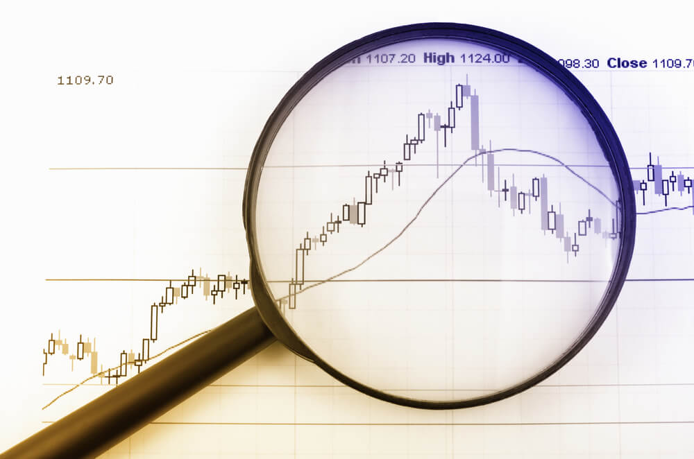
Introduction
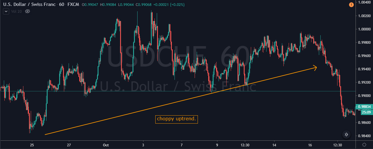
One of the most important characteristics of price in the Forex market is that it moves in the form of channels 20-25% of the time. So it is crucial to learn how to trade the market when it is in this state. The price channel strategy that we are going to discuss is intuitive and most straightforward. In this article, we will see how to implement this strategy and take profitable trades while reducing risk at the same time. Let’s get right into it.
What is the price channel pattern?
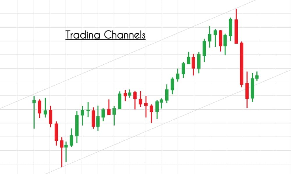
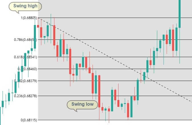
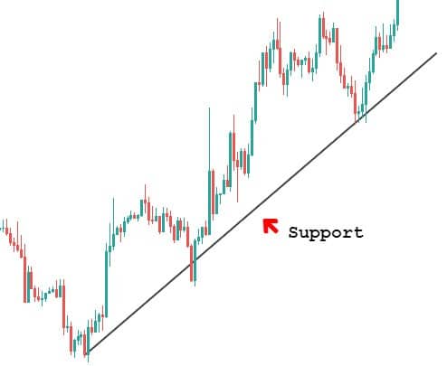
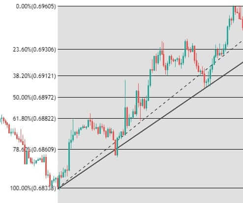
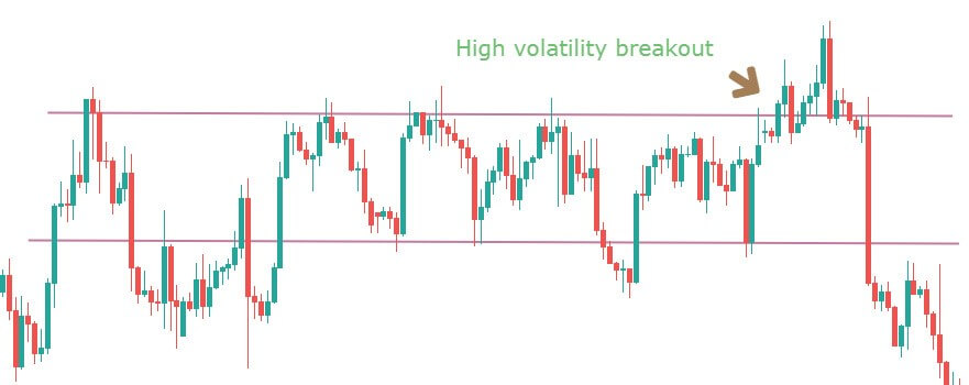
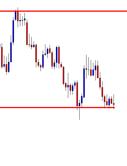
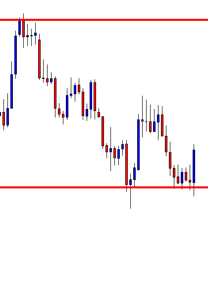
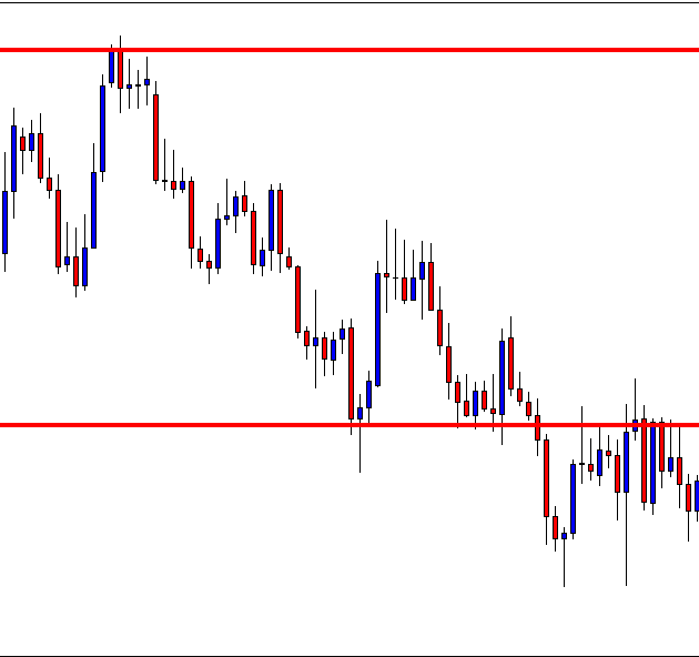
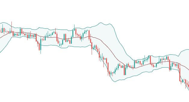
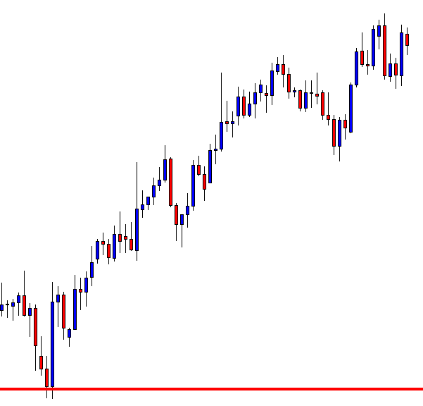
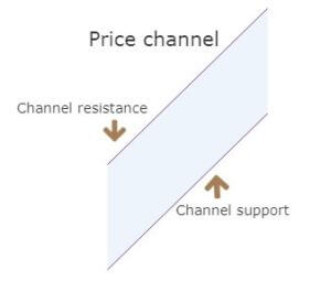
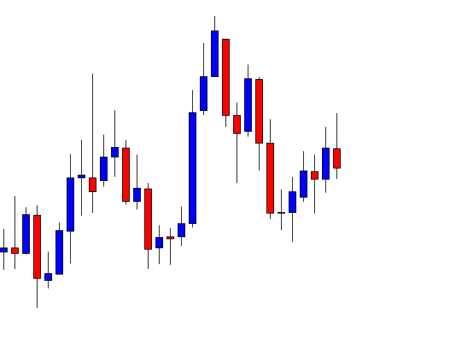
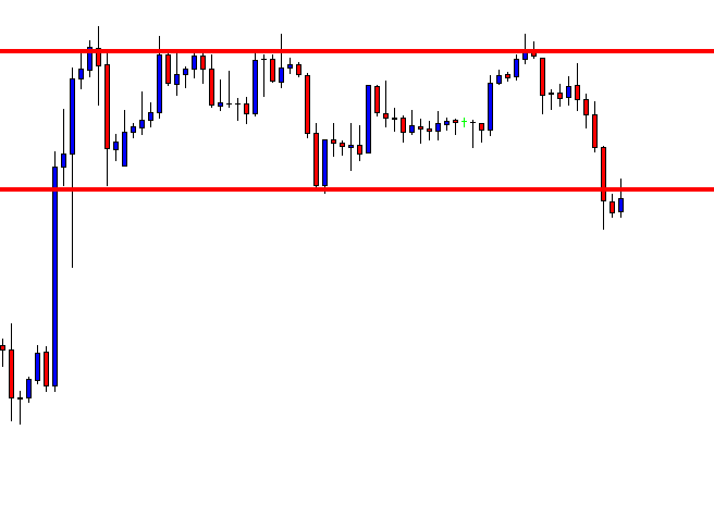
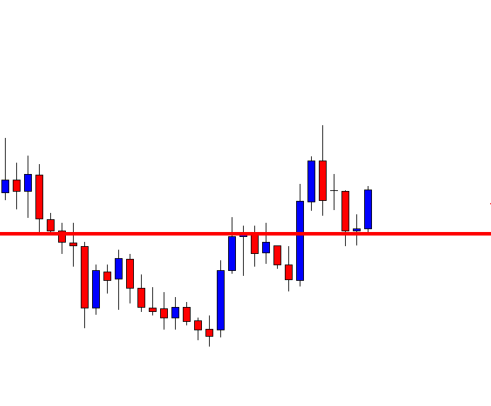
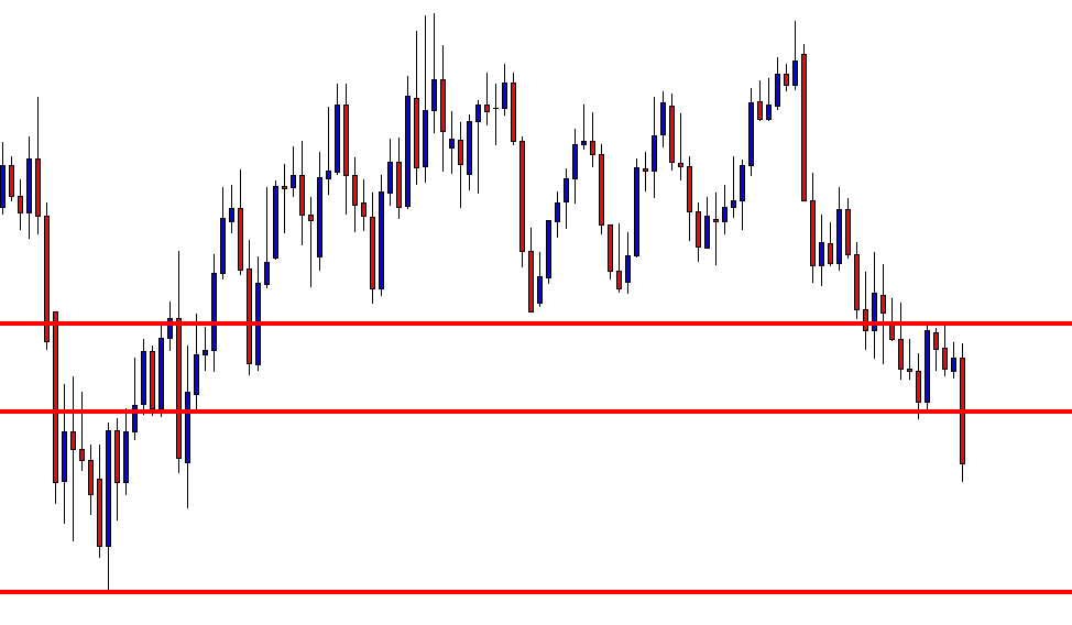
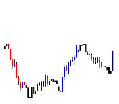
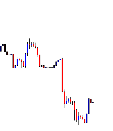
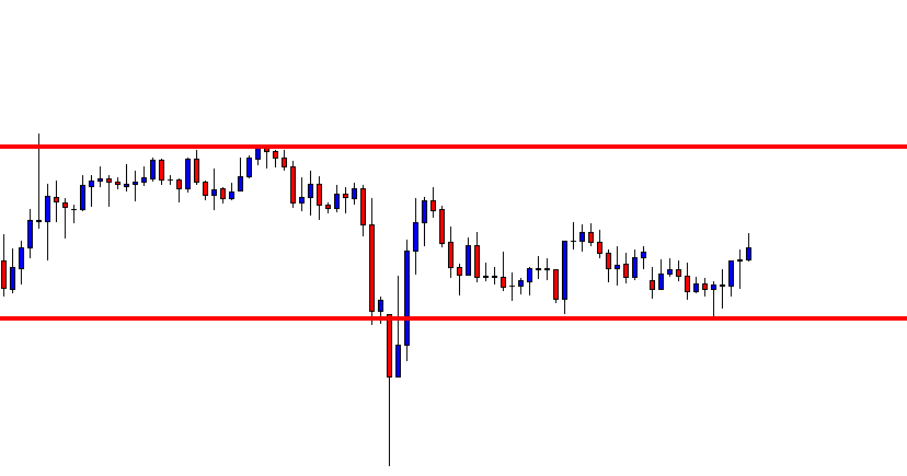
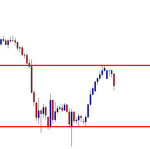
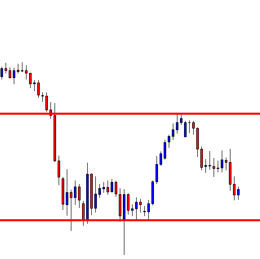
Before exploring the strategy, we need to know what a price channel means and the different types of channels. The price channel represents two trend lines drawn above (channel resistance) and below (channel support) the price. The price moves within these two trend lines.
The width of the channel should be big enough if you want to trade inside it. In this case, a simple trade would be to buy at channel support and sell at the channel resistance level.
However, the most significant opportunity is to trade the channel breakout.
We can distinguish the channel into two types:
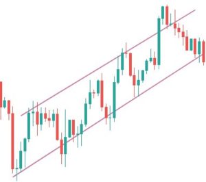
- Upward price channel
- Downward price channel
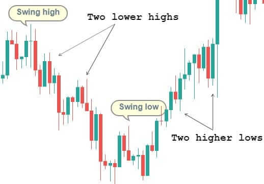
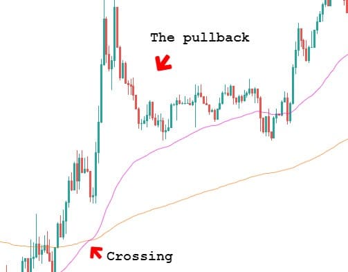
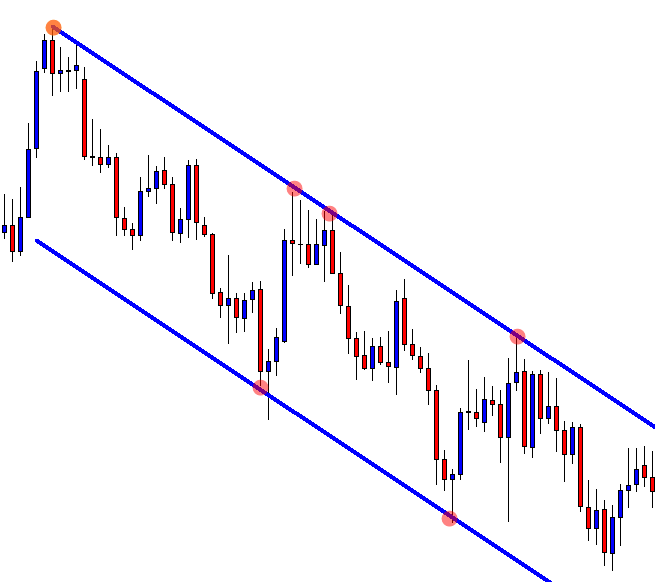
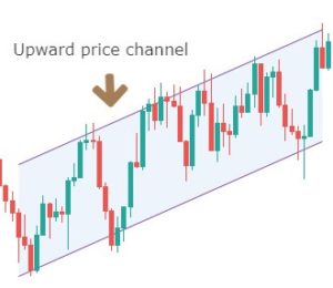
An upward price channel occurs when price makes higher highs and higher lows. More the number of touches the price makes to channel’s support and resistance, stronger is the channel.
A downward price channel occurs when the price makes a series of lower lows and lower highs. The trend line should be able to connect to these points; only then we can call it a channel.
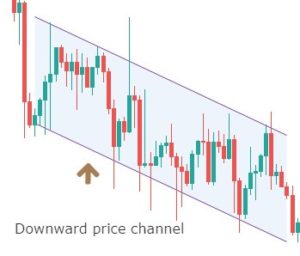
This represents the consolidation or ranging zone. Here the market bounces on and off between the two support and resistance lines.
If you understand the psychology and reason behind the formation of a price channel, it can save you a lot of losing trades. The reason why channel breakout is so significant is that many traders trade inside the channel. They place their stop loss above or below the price channel pattern.
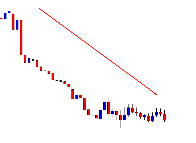
As more and more traders start placing their stops, they will eventually be targeted by smart money. One needs to remember that a price channel won’t last forever. Breakout in any form is inevitable.
So, now, let’s see what the price channel strategy is and how to trade it effectively. This strategy is independent of technical indicators and does not make use of it (except for taking profits). Hence, there is no prior knowledge of technical indicators is required.
Price channel strategy
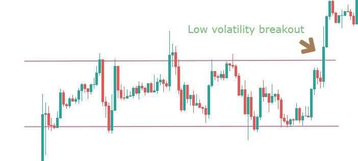
Recognize the early signs of a price channel breakout, as this will help you make better decisions. This strategy is based on such breakout signs, so knowing about them in advance is an advantage.
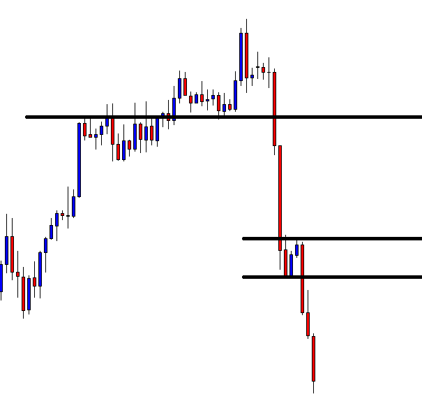
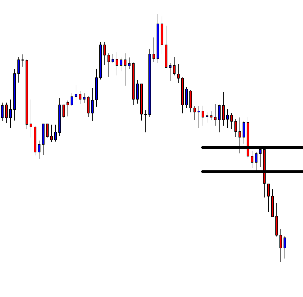
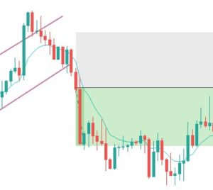
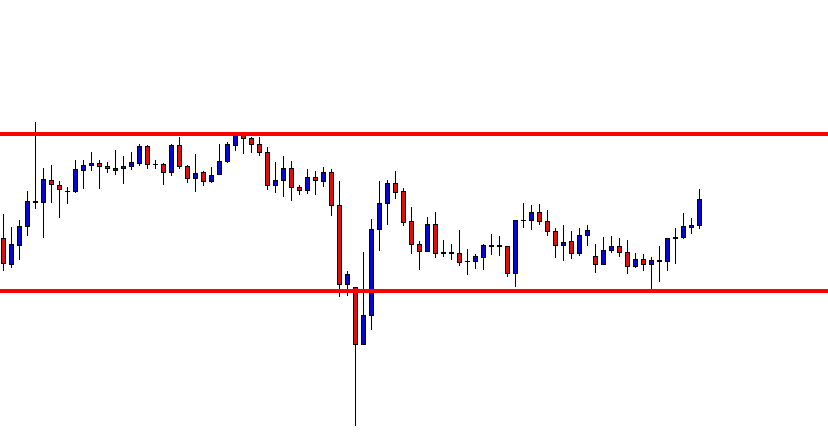
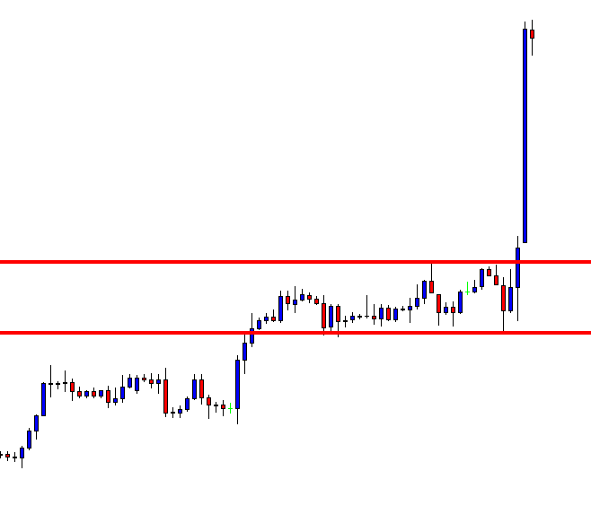
Here are the various steps involved in the strategy. We will be taking the example of a sell trade.
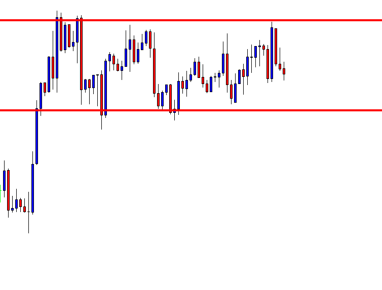
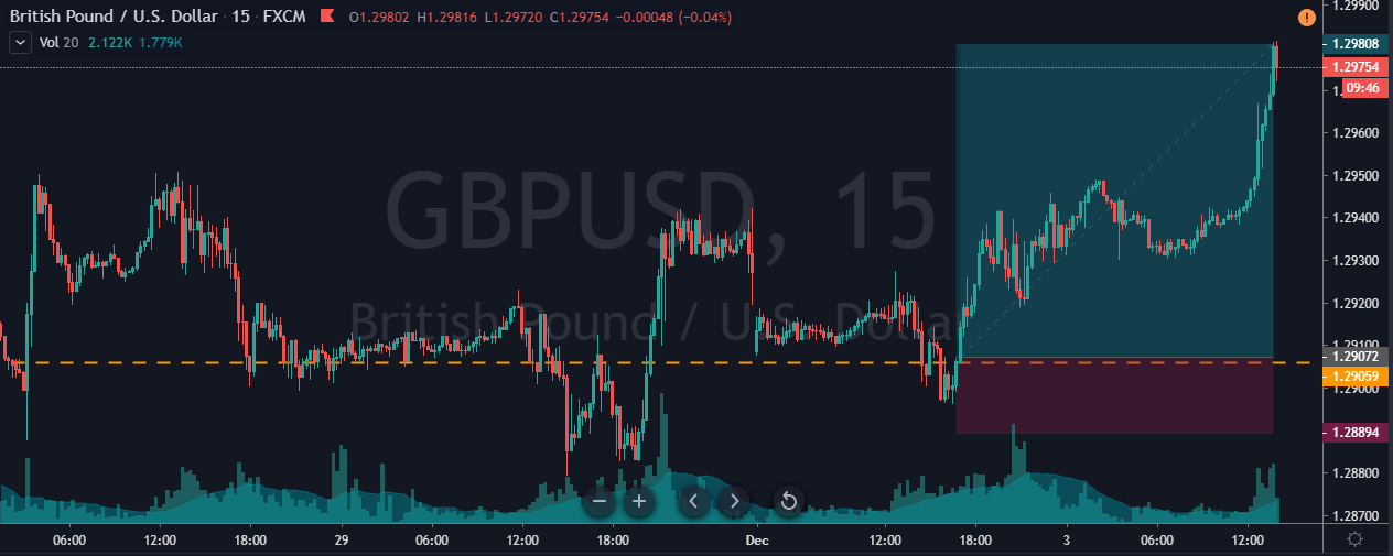
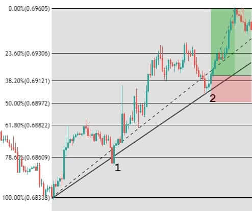
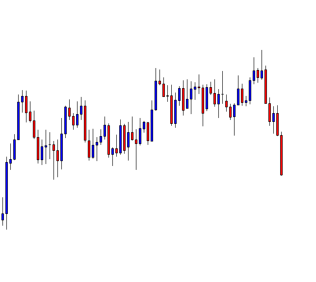
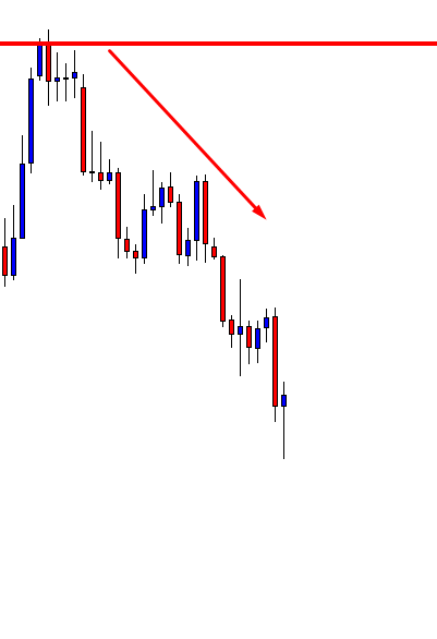
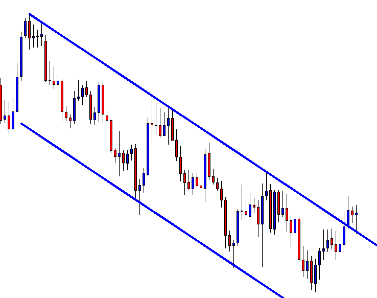
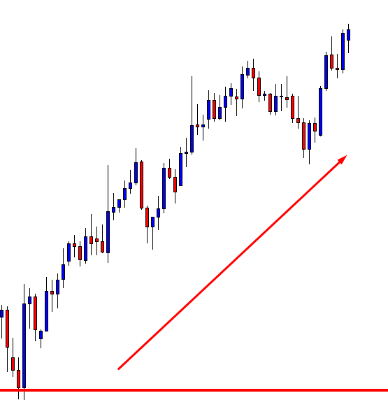
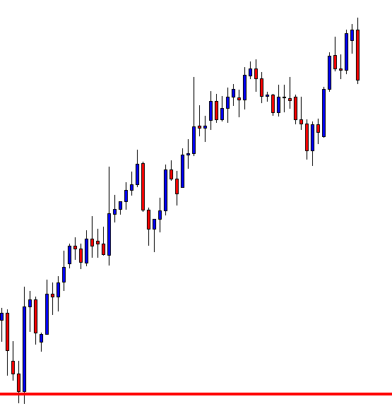
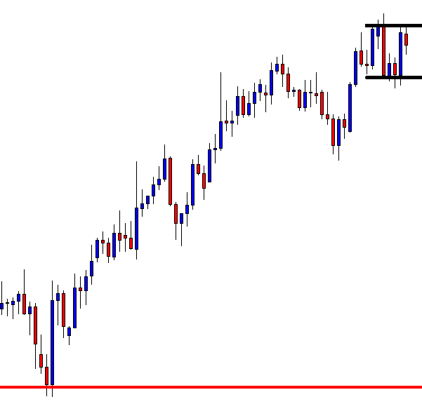
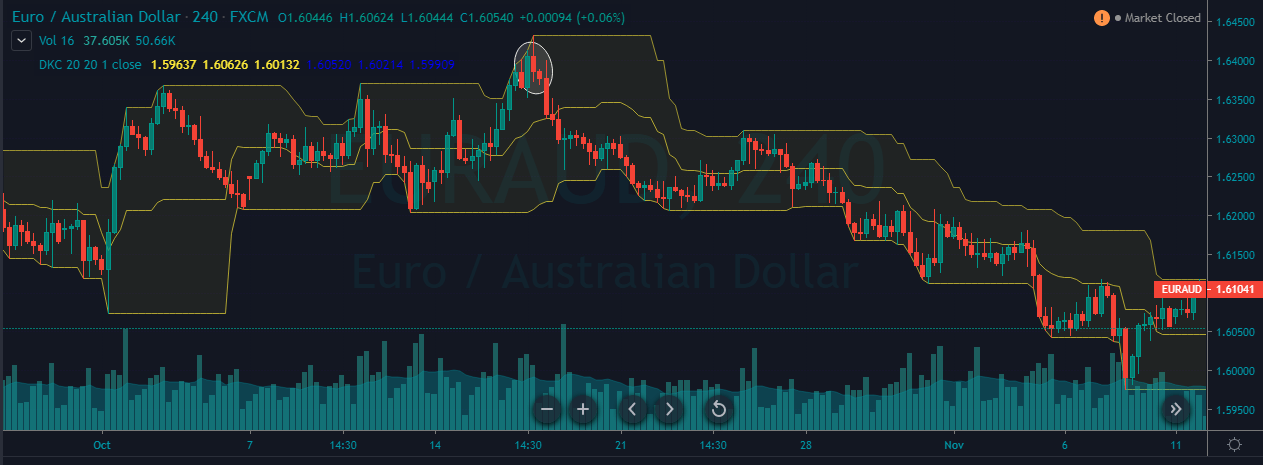
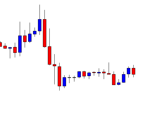
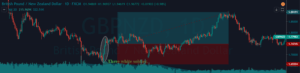
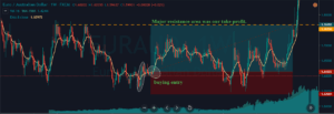
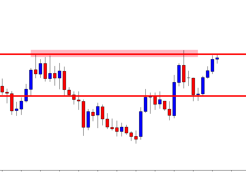
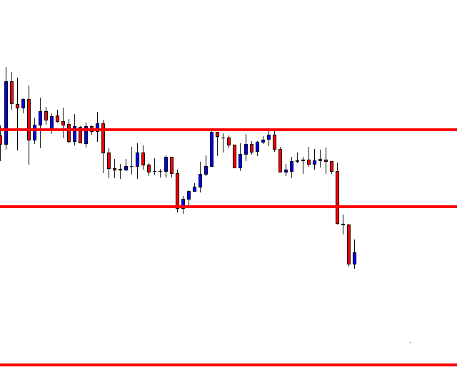
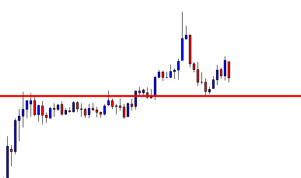
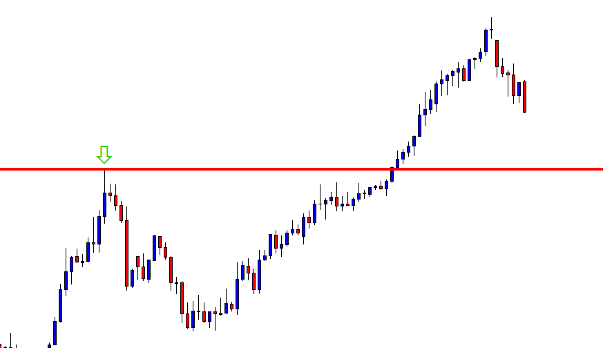
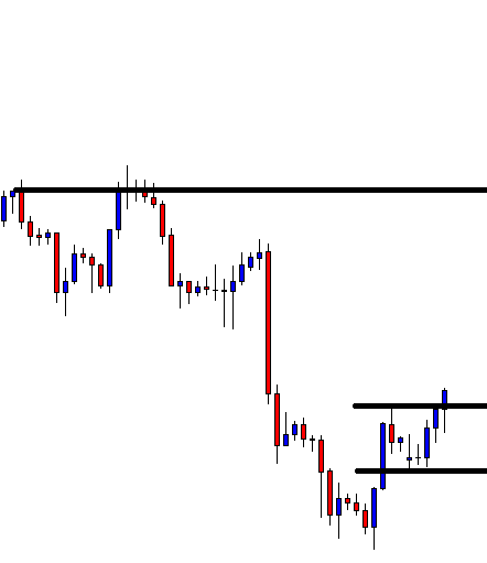
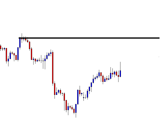
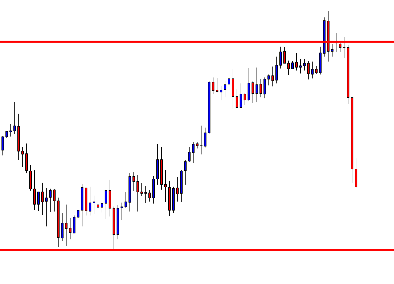
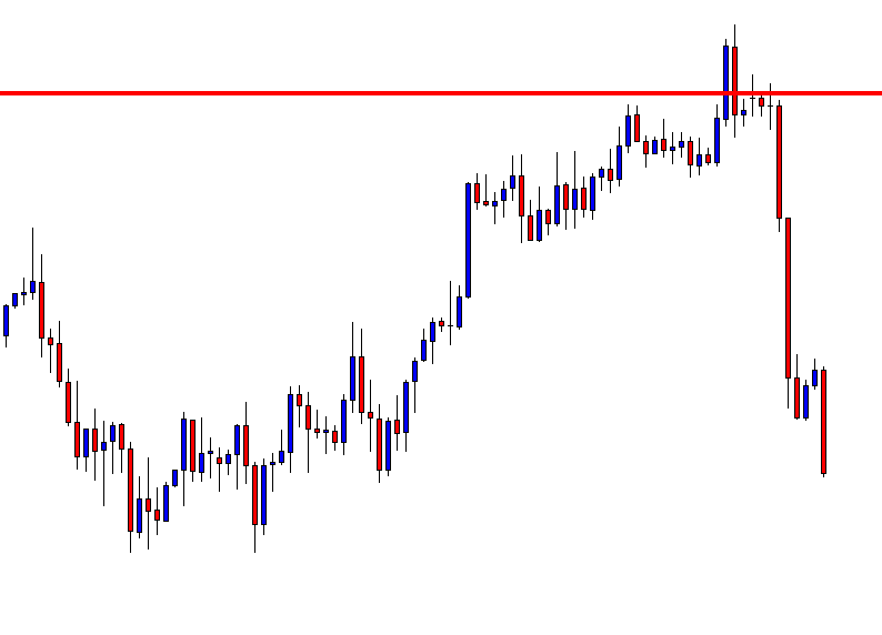
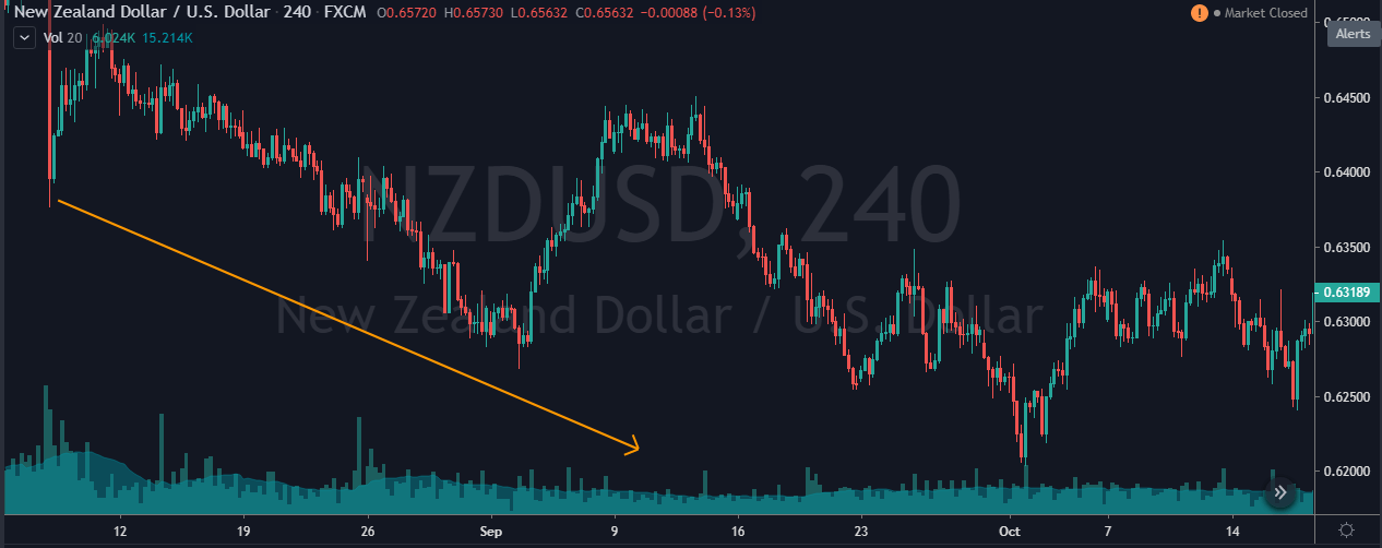
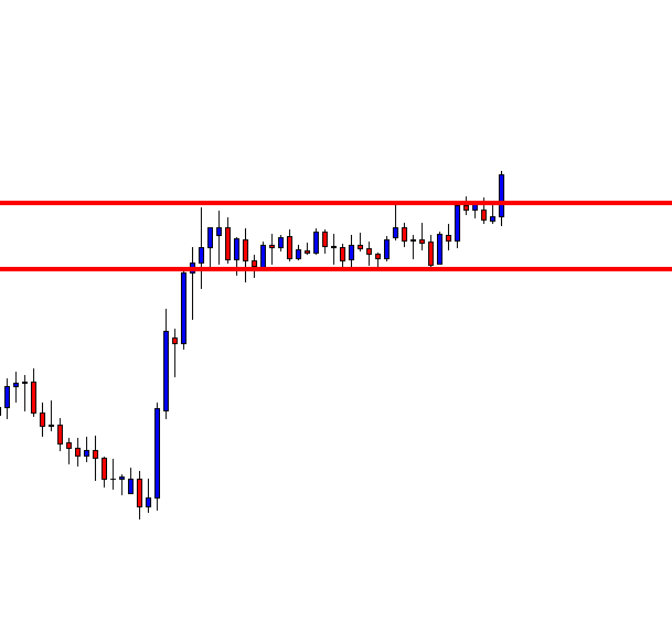
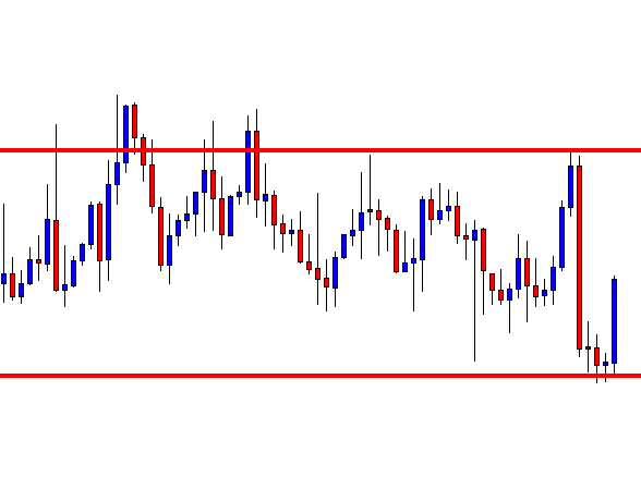
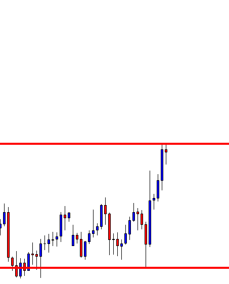
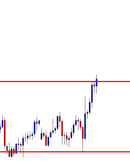
Step 1: Draw an upward channel
The upward channel should be constructed in such a way that it should connect at least two higher highs and higher lows. You can also make use of the price channel tool, which is provided by most trading platforms to connect the highs and lows.
Before the breakout, we need to make sure of an important rule, which brings us to the next step.
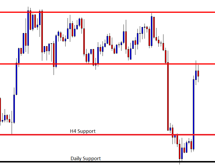
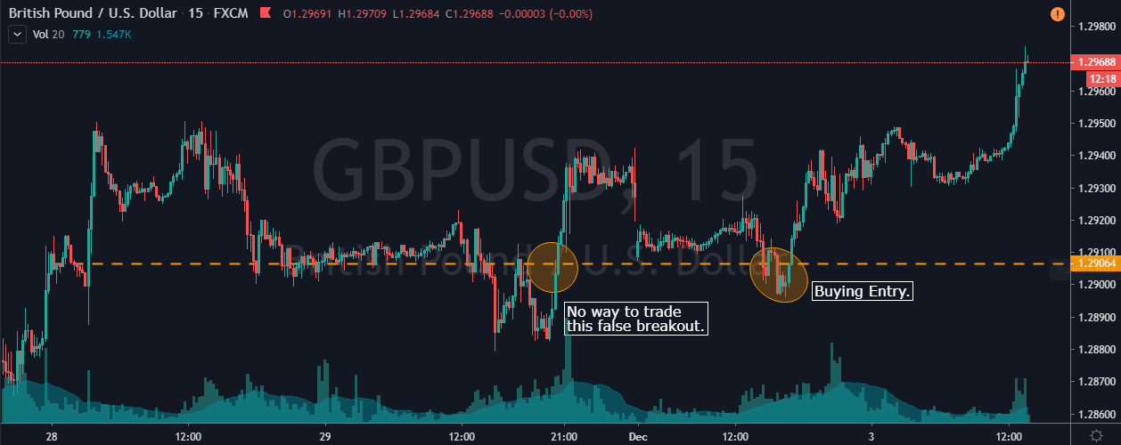
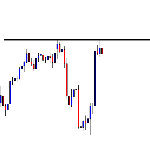
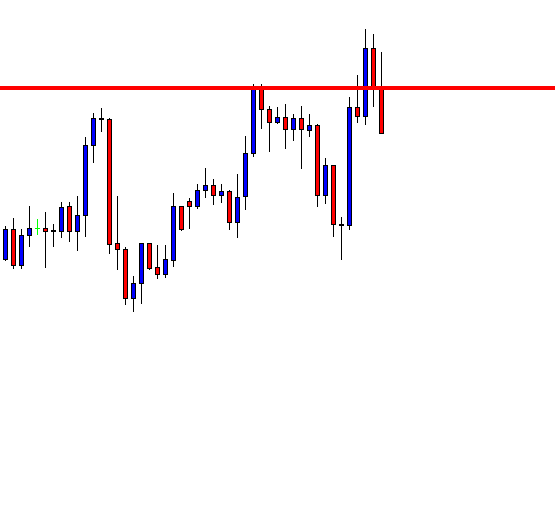
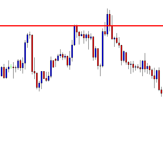
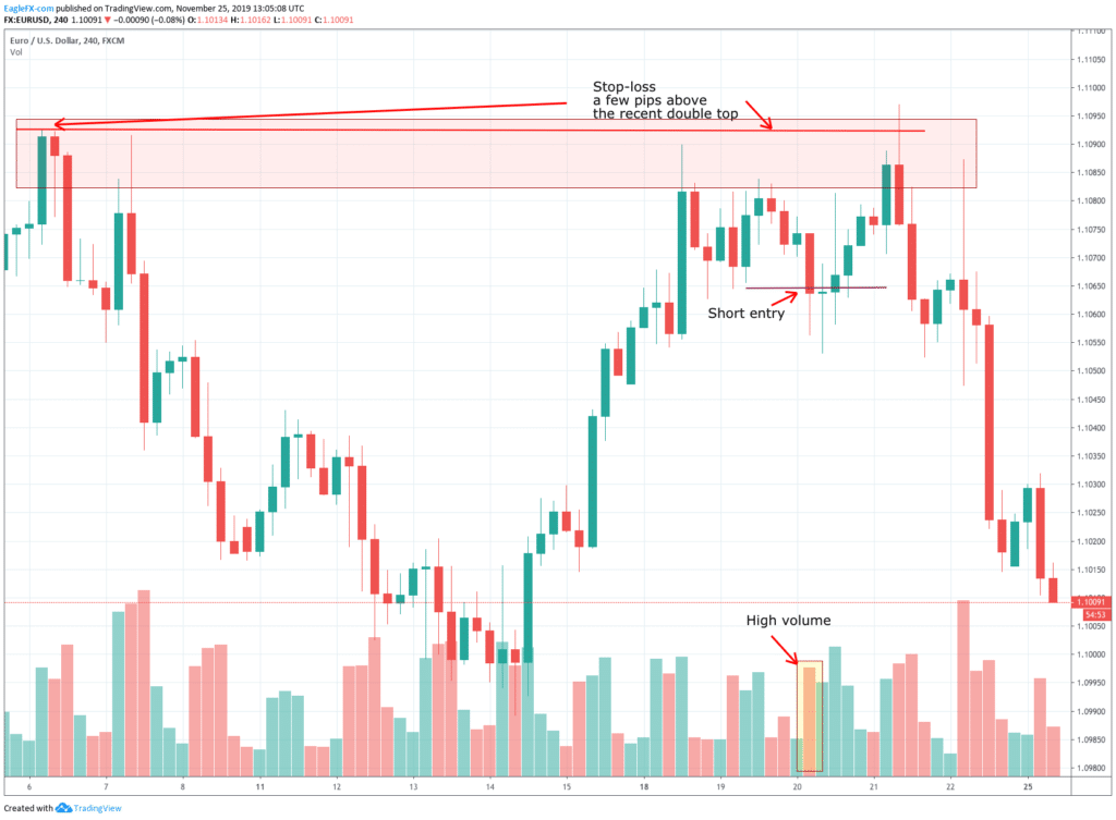
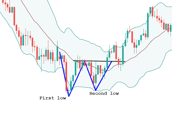
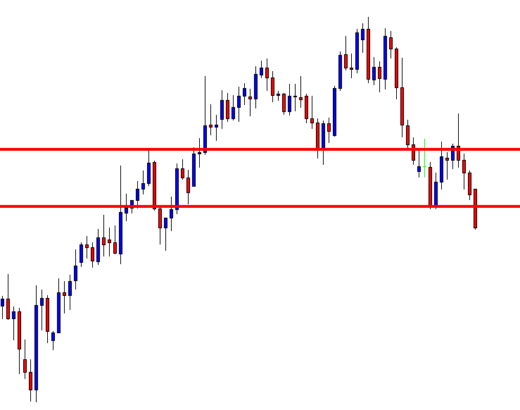
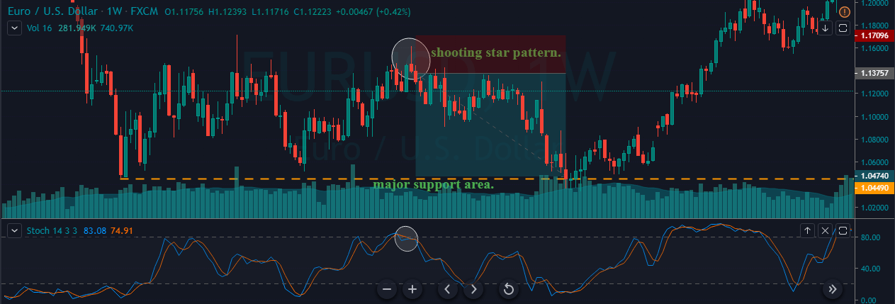
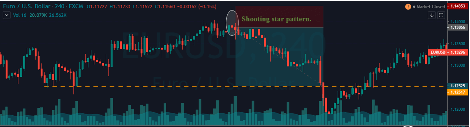
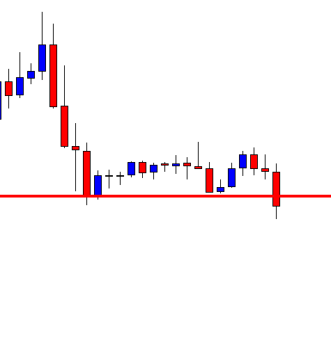
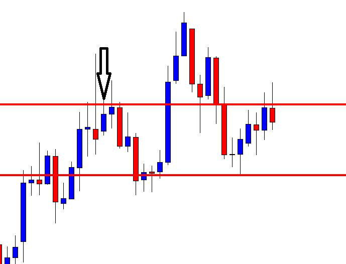
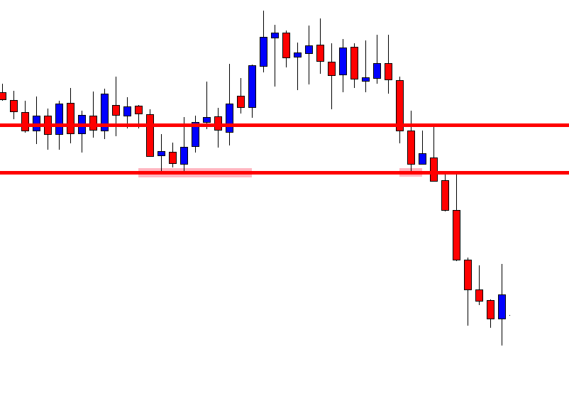
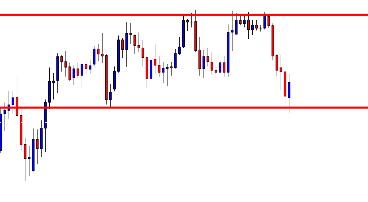
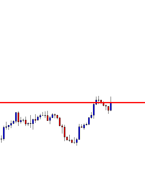
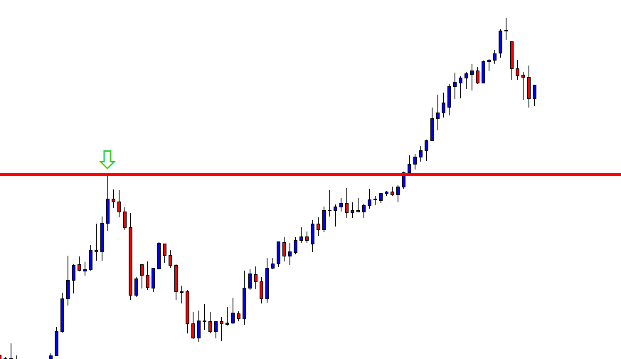
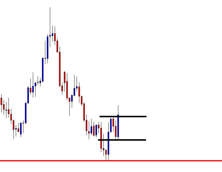
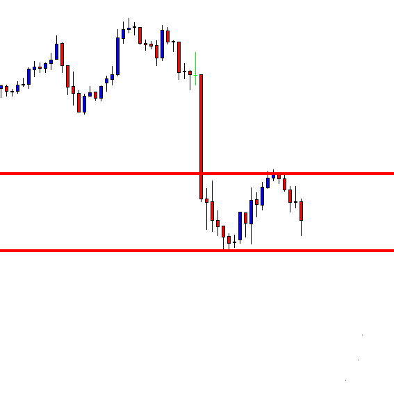
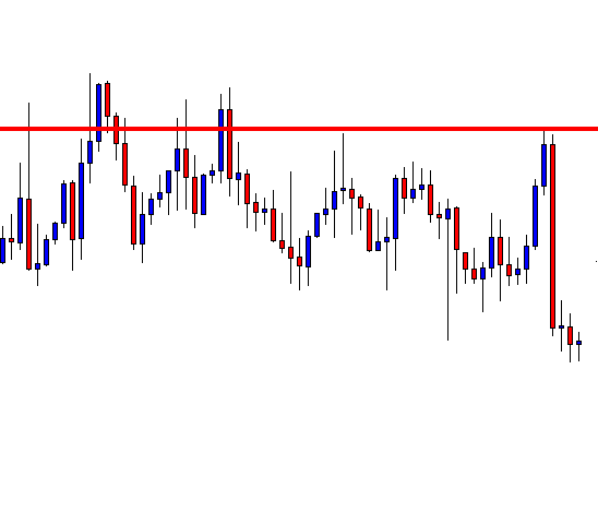
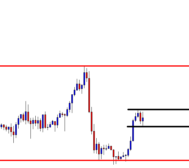
Step 2: For an upward channel, look for a false breakout above the channel resistance.
In the case of an upward channel, the first warning would be the price failing at the resistance and giving a false indication that the price has broken above resistance.
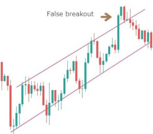
Only this strategy makes use of this powerful price reading technique. It is in this unique style that we have developed this strategy. The failed attempt at the top is a sign of ‘stop-loss hunt’ by large players, which is confirmed when the price comes back to the channel support.
Note – The more times a ‘swing high‘ tries to get violated and fails, the stronger will be the breakdown.
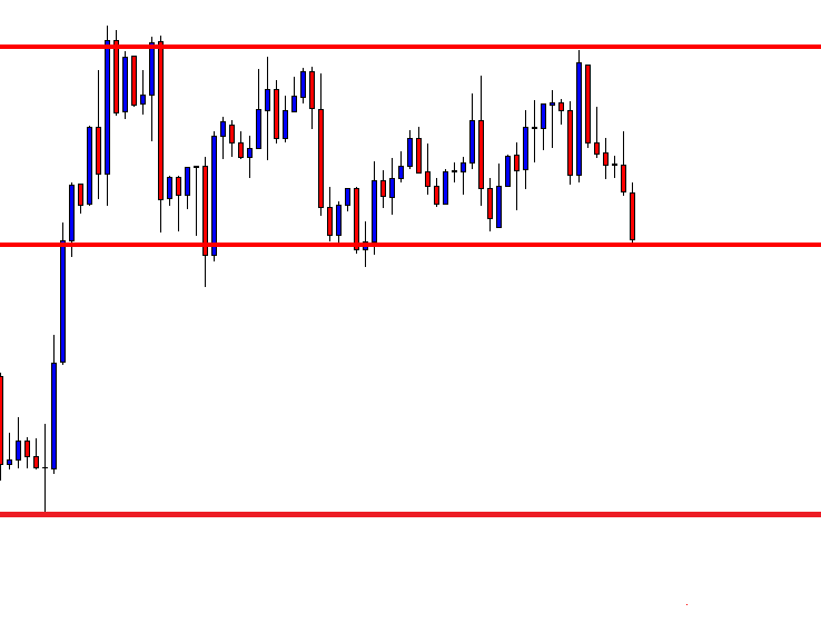
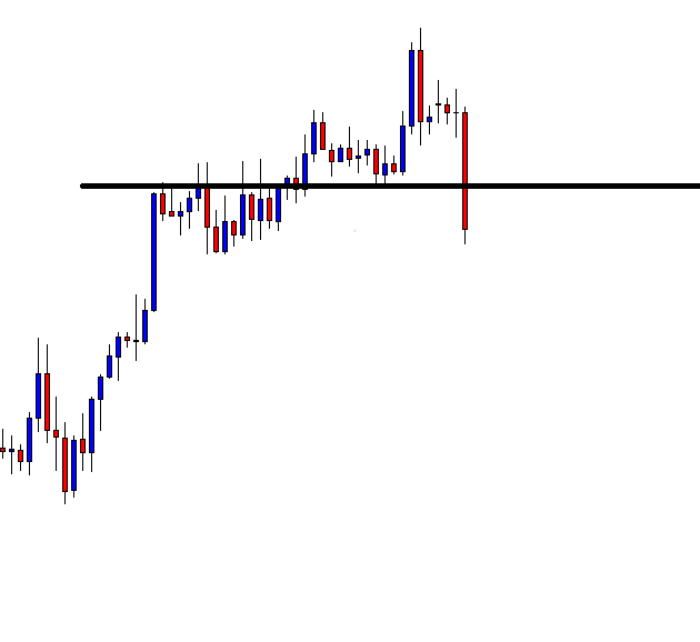
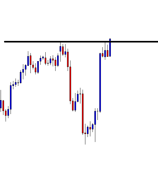
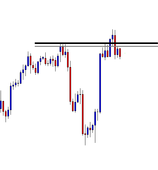
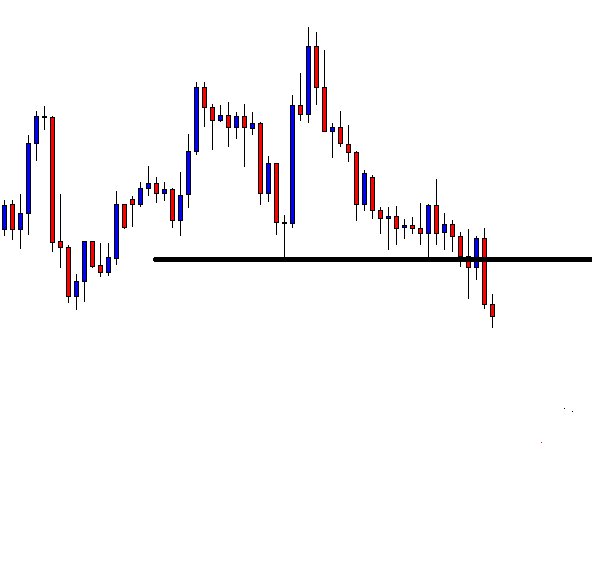
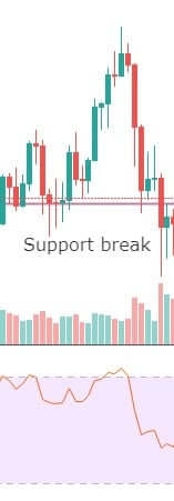
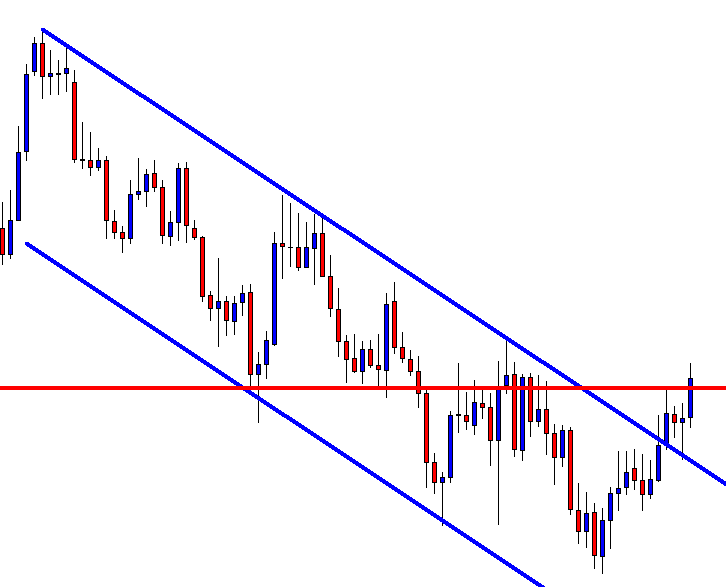
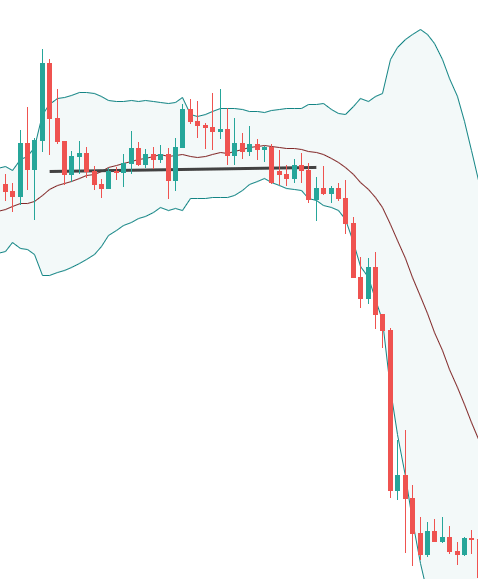
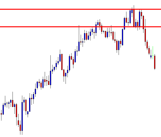
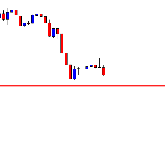
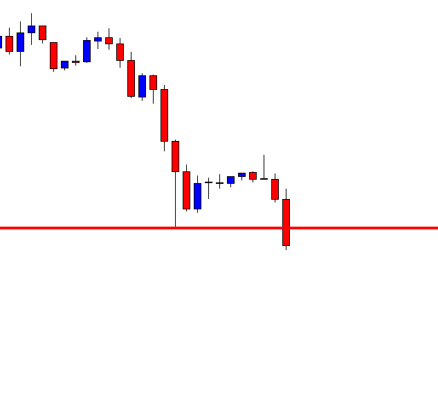
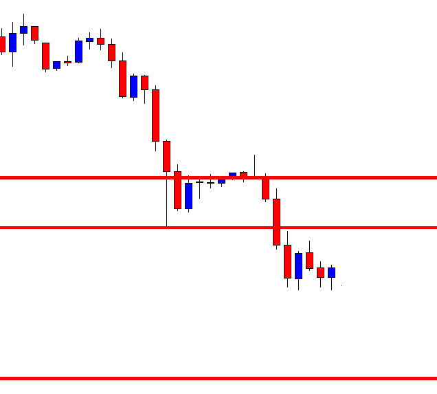
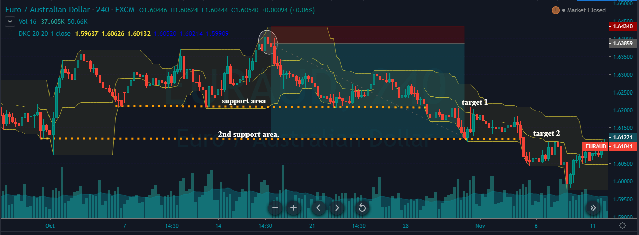
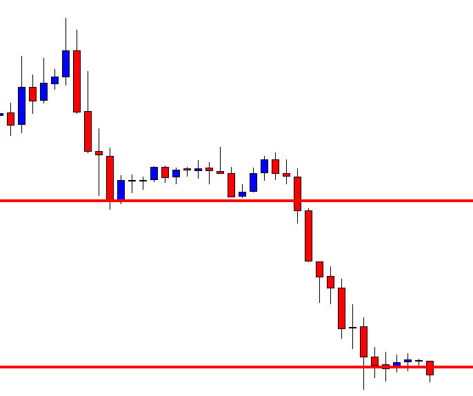
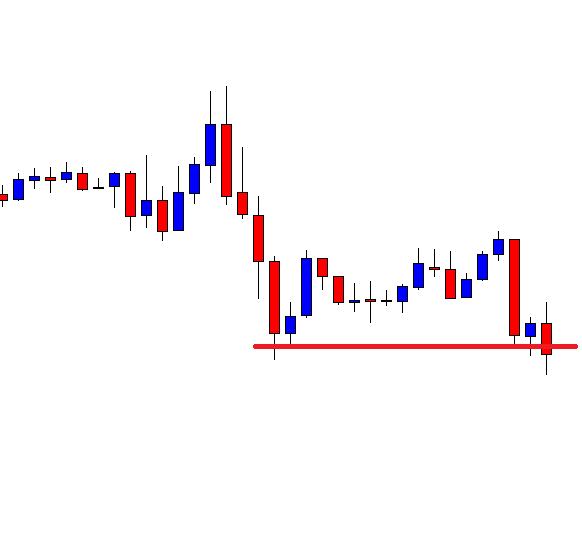
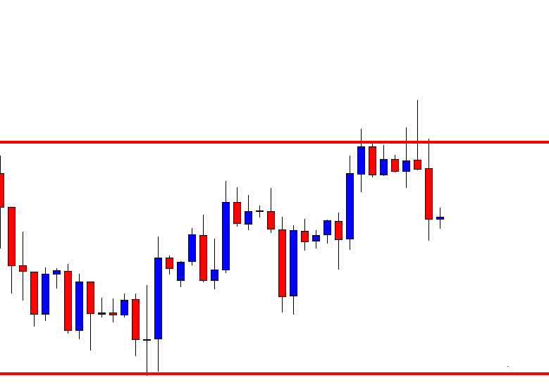
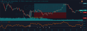
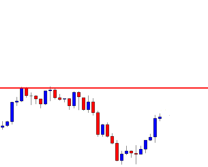
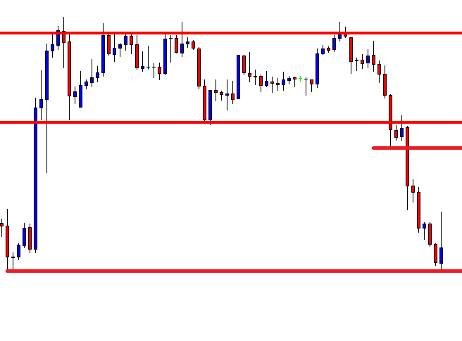
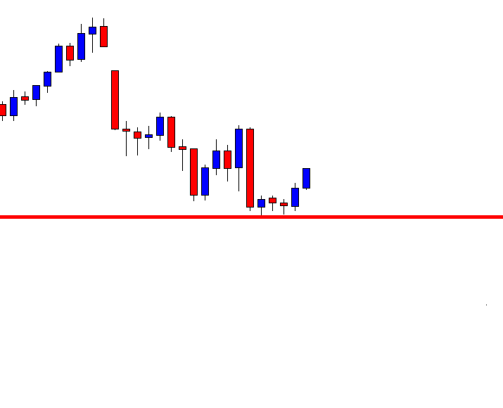
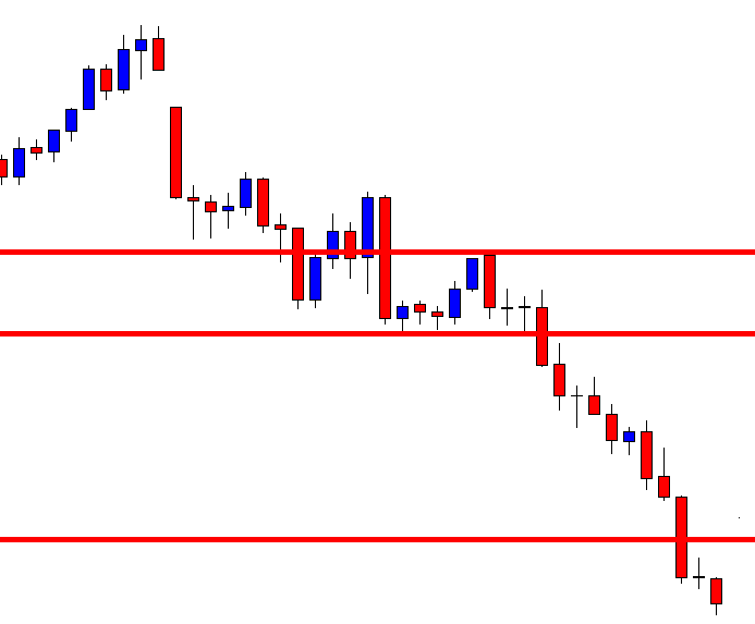
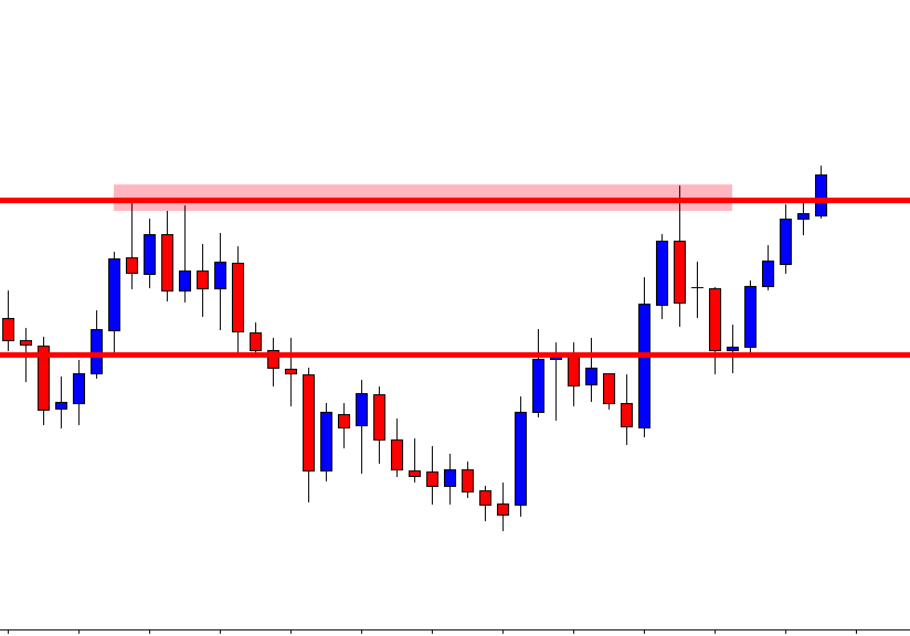
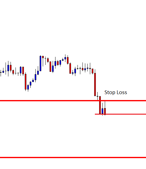
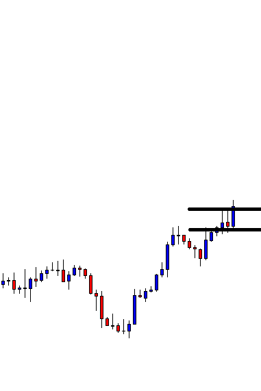
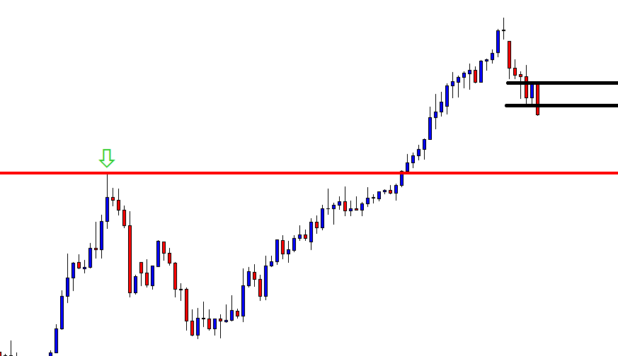
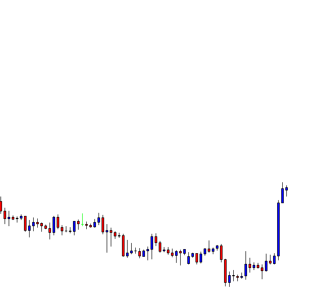
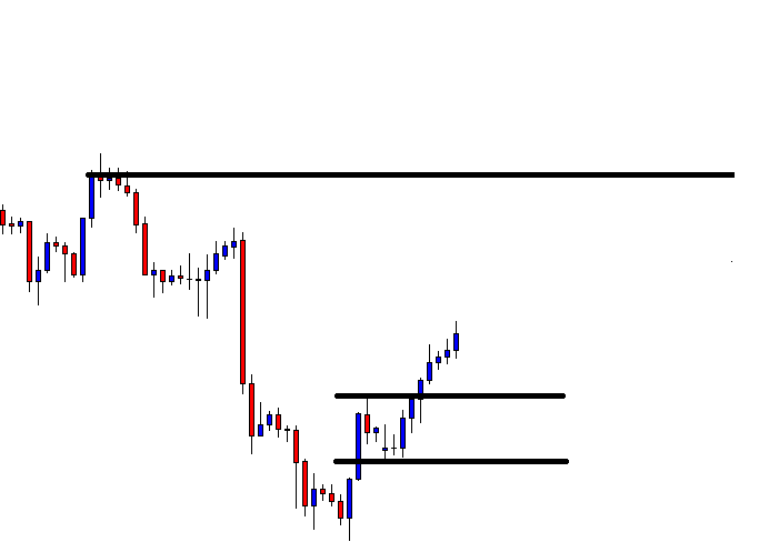
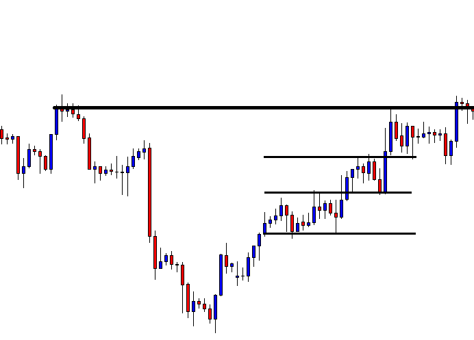
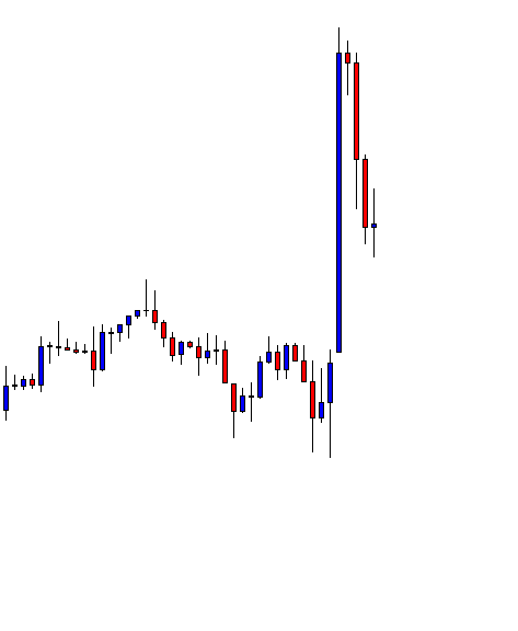
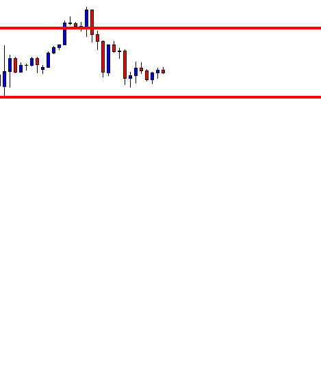
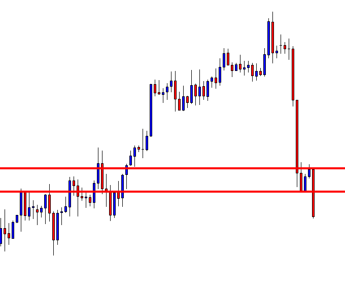
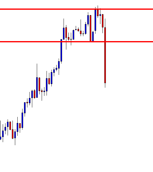
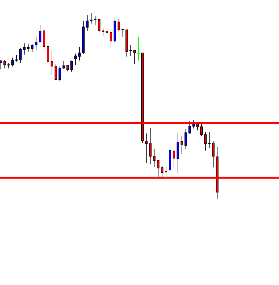
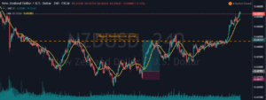
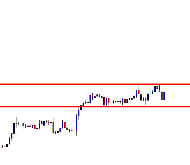
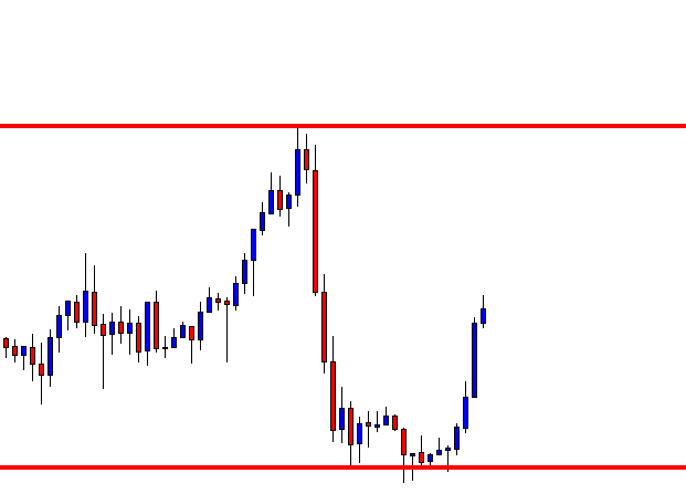
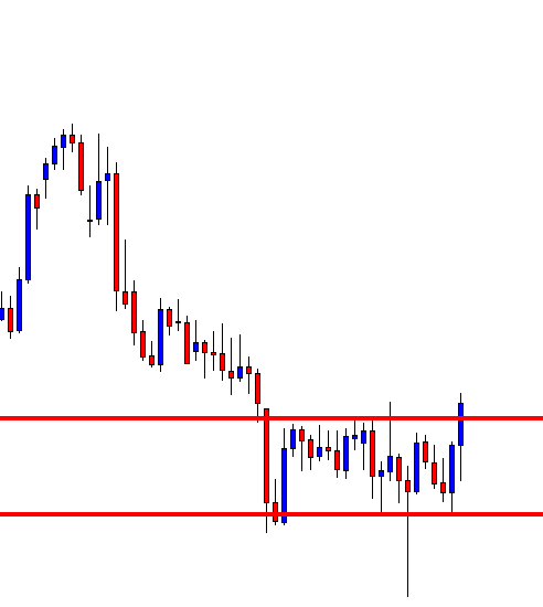
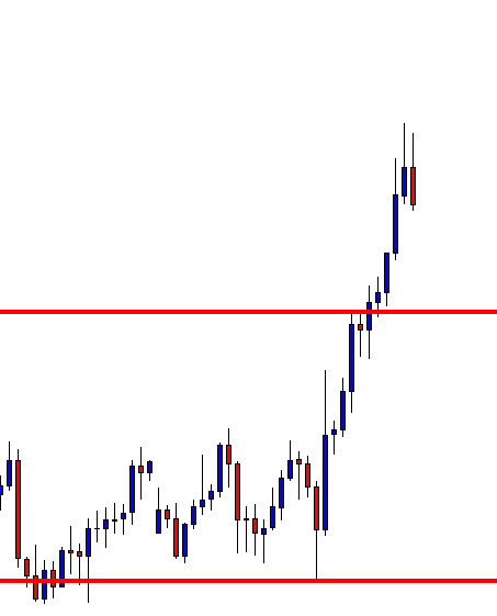
Step 3: Wait for the breakdown and confirmation
A mistake that most traders do is that they don’t wait for a confirmation signal after the breakdown happens. For this strategy, the confirmation is to wait for the breakdown candle to close below the channel support. Before this, wait for the breakdown and then look for confirmation.
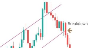
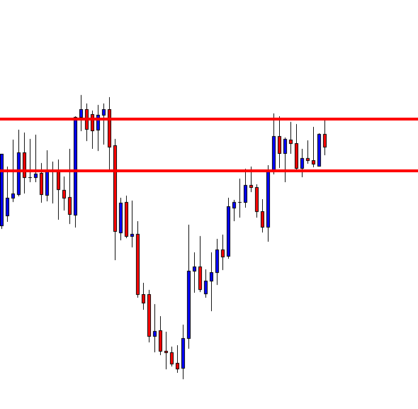
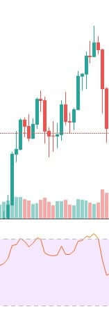
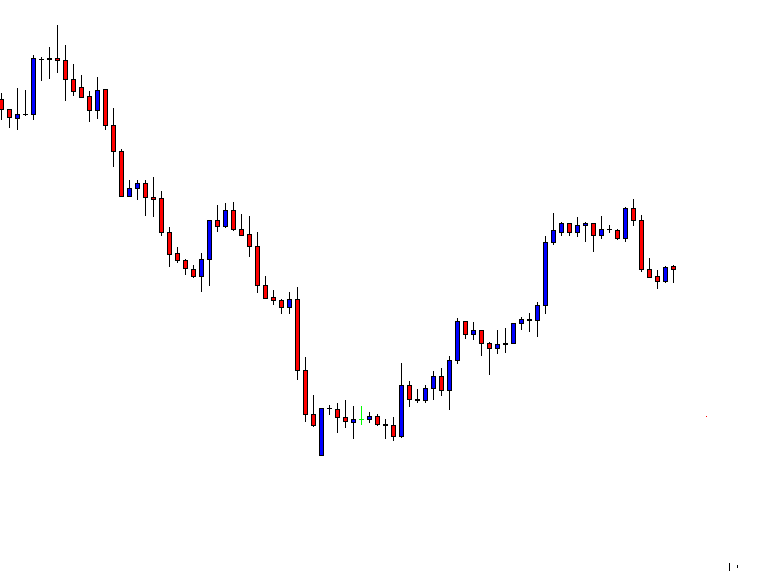
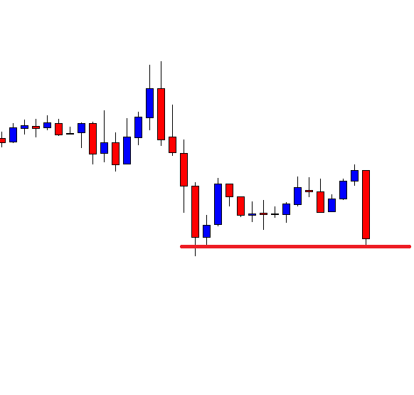
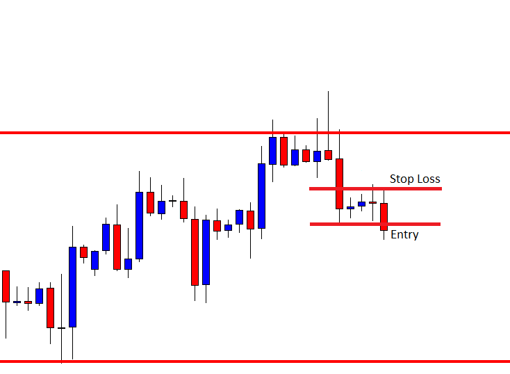
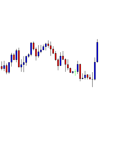
The closing of the candle should be like one in the below figure.
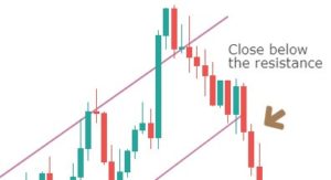
So, don’t just sell after the support is broken. Instead, see that the breakdown candle closes below the price channel. This is an effortless way to avoid false breakdown signals.
Note – If the breakdown candle is decisive, it’s good, but not mandatory.
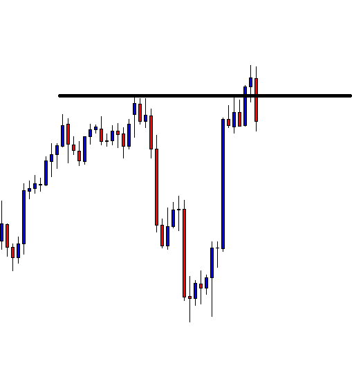
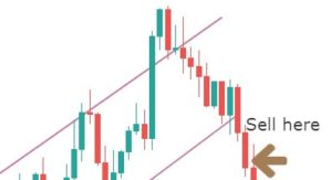
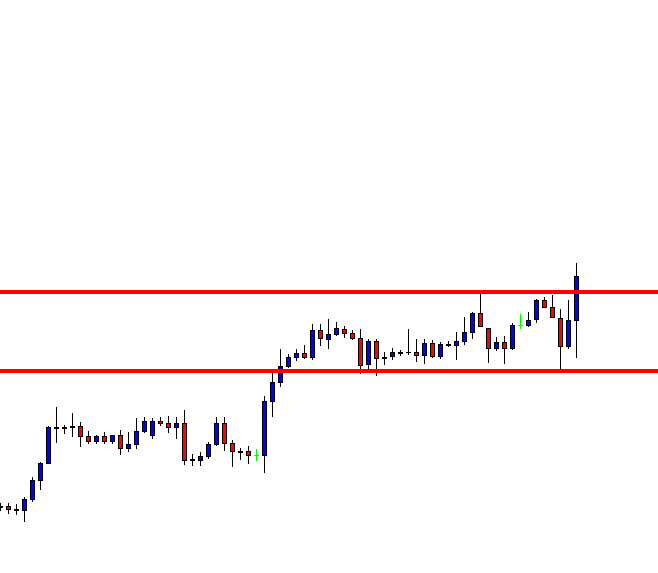
Then what is the exact point of entry? This brings us to the fourth step of the strategy.
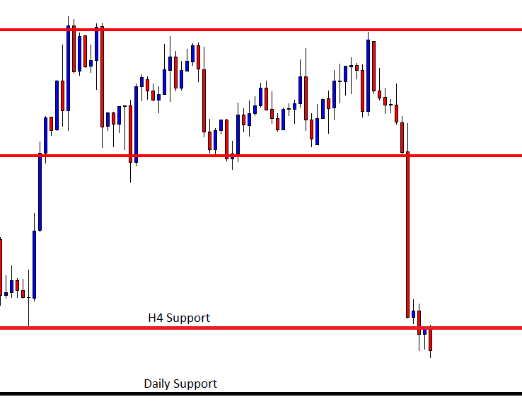
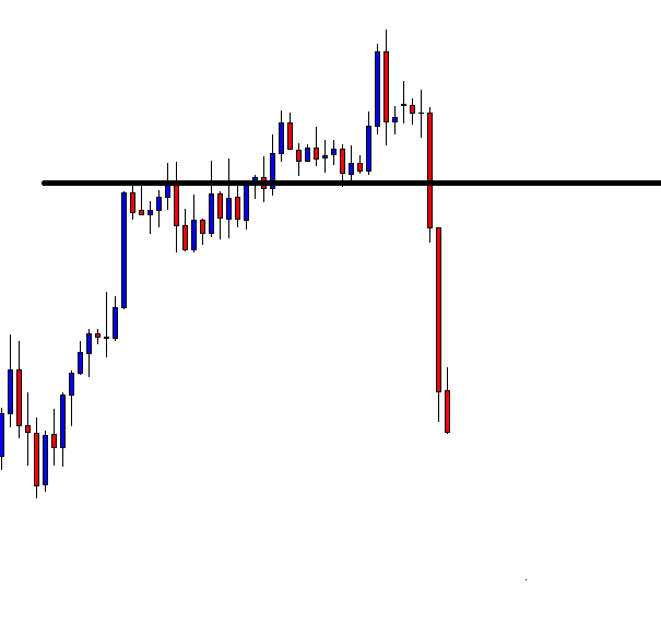
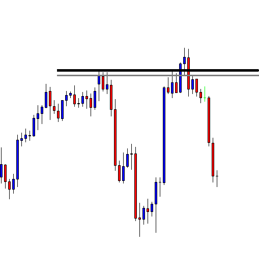
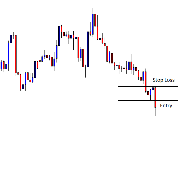
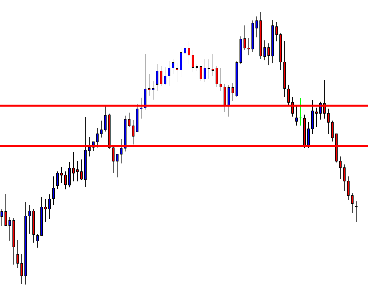
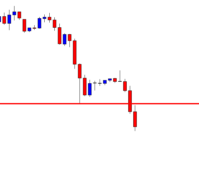
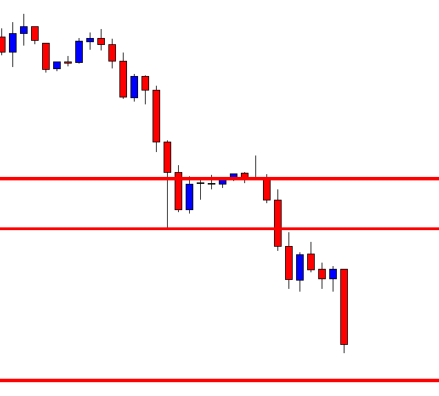
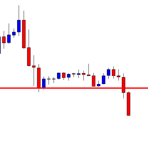
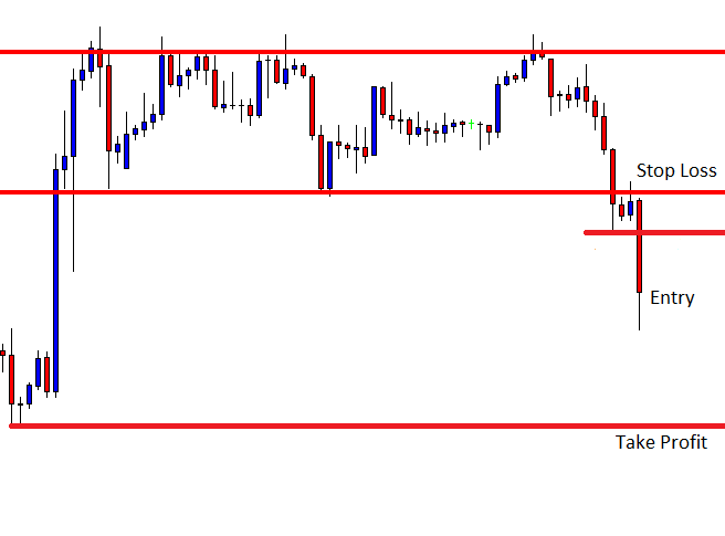
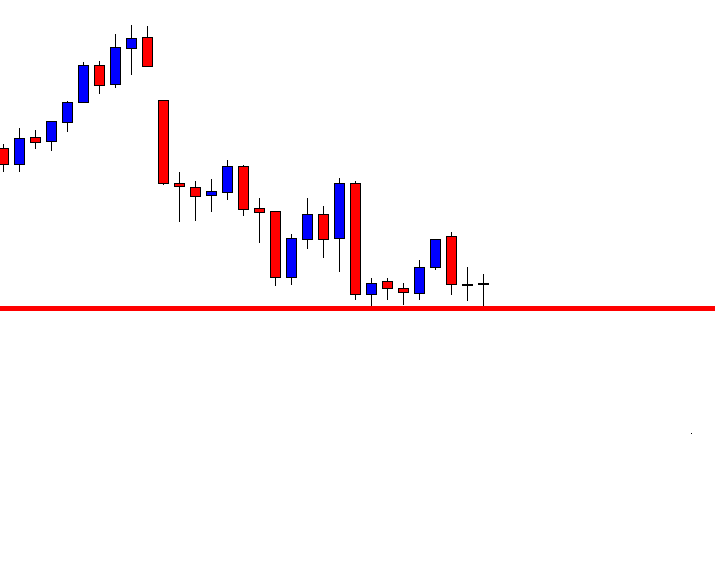
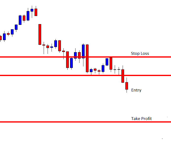
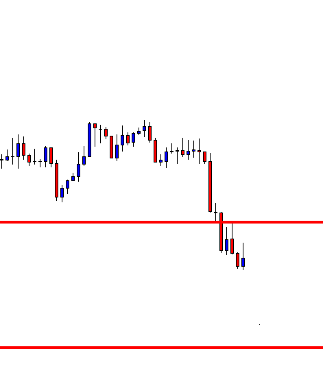
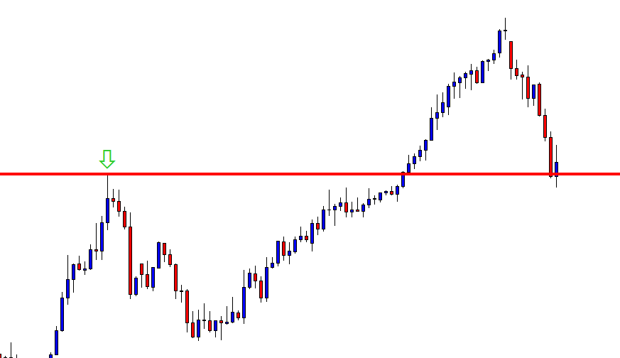
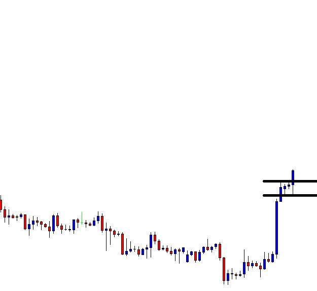
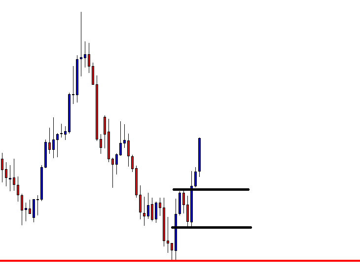
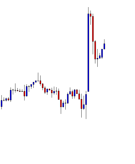
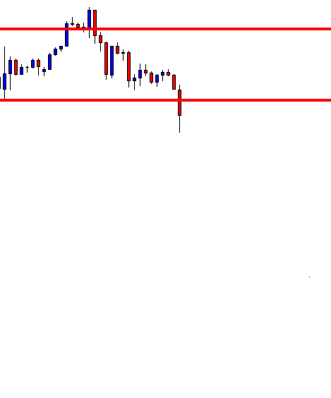
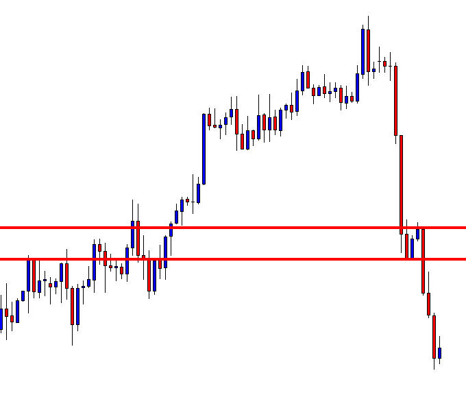
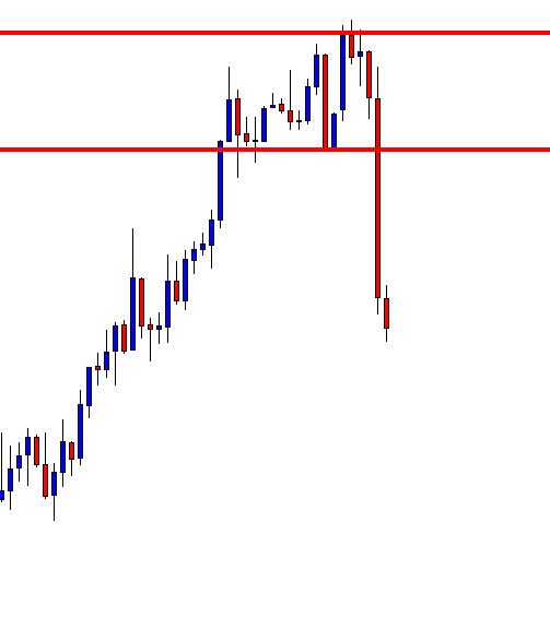
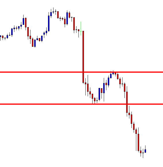
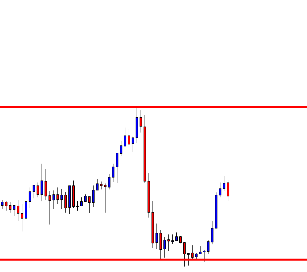
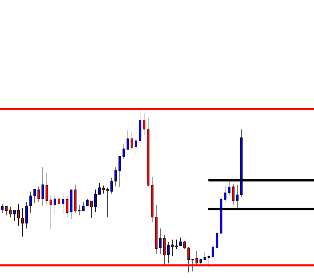
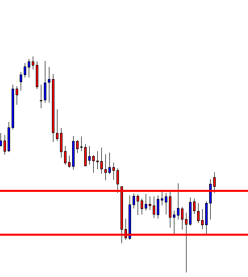
Step 4: Sell right at the closing candle
The entry technique of the strategy is quite simple. A sell order can be executed at the breakdown candle closing price.
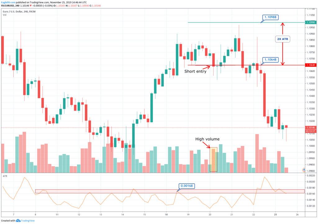
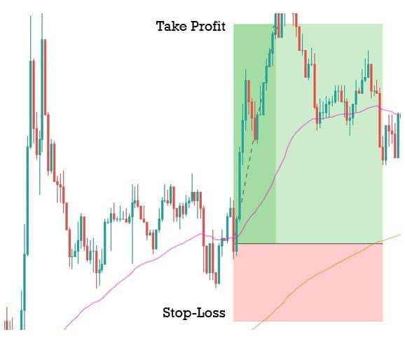
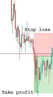
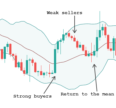
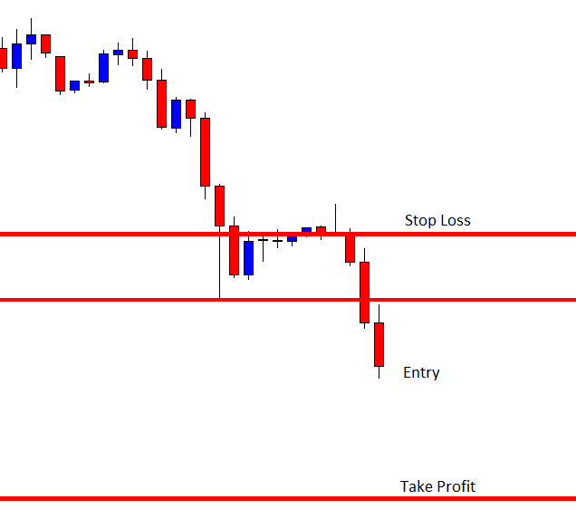
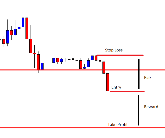
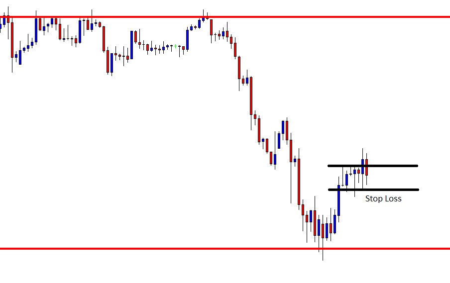
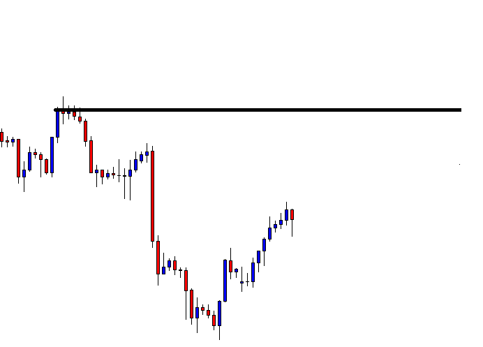
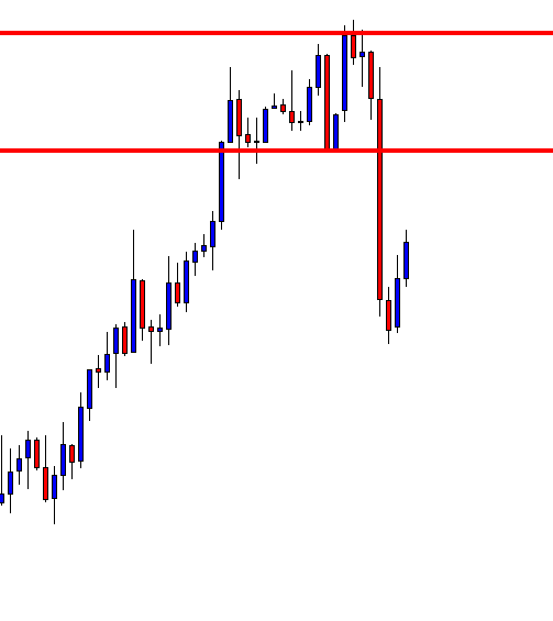
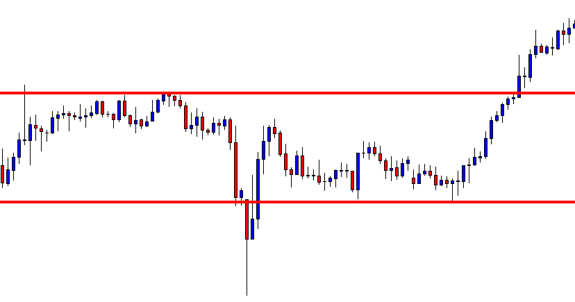
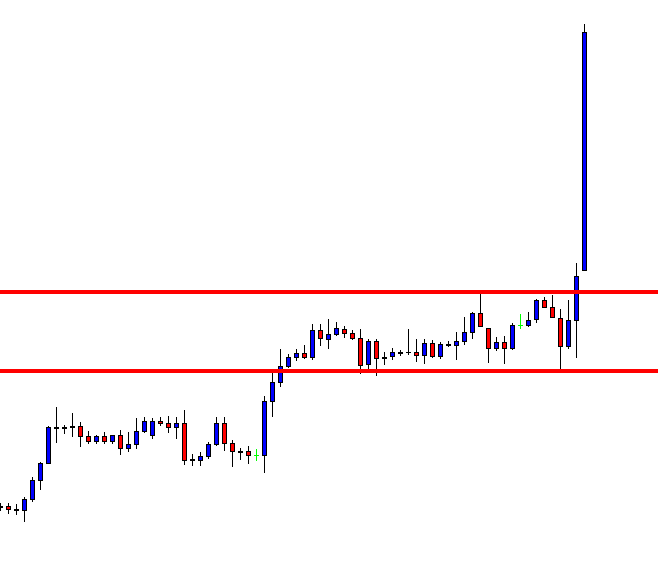
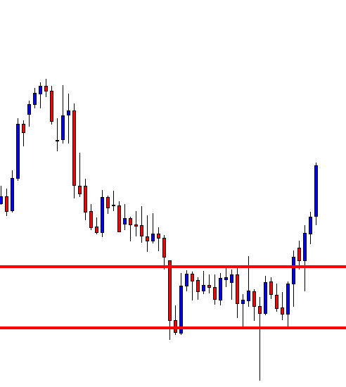
Now you can be confident in taking the trade, as you have done everything right until now. The next logical thing to do is to determine where to take profits and place the protective stops.
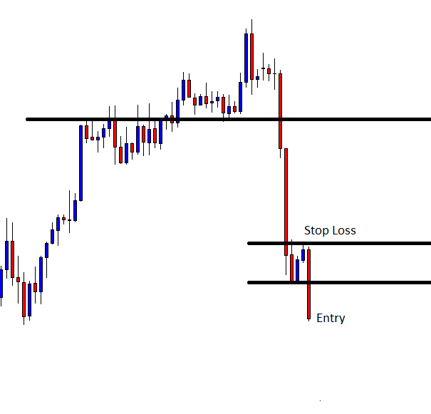
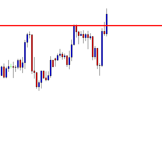
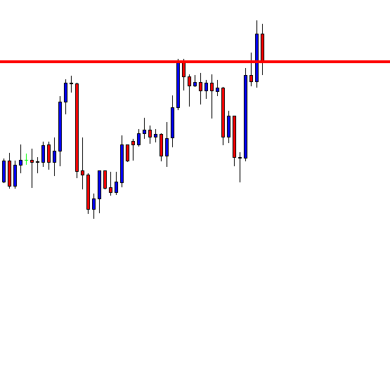
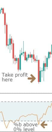
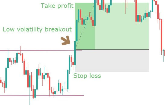
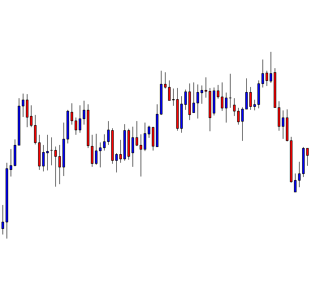
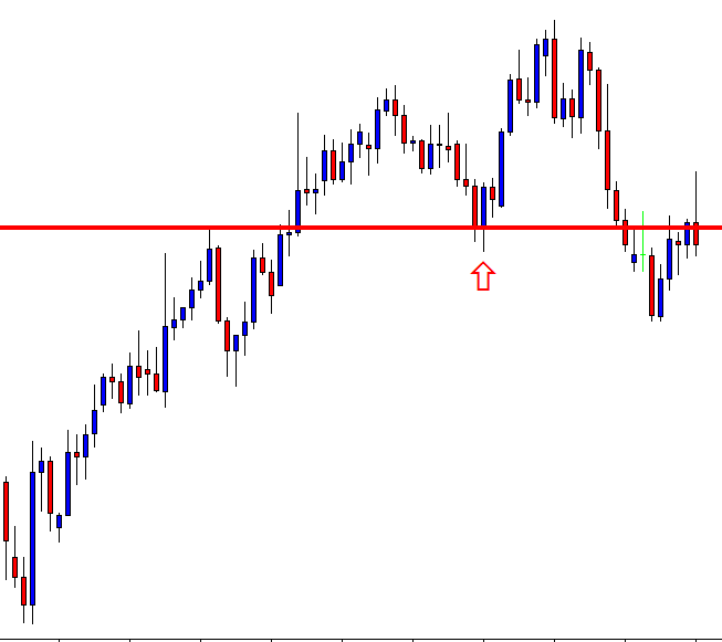
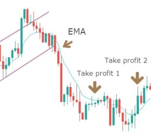
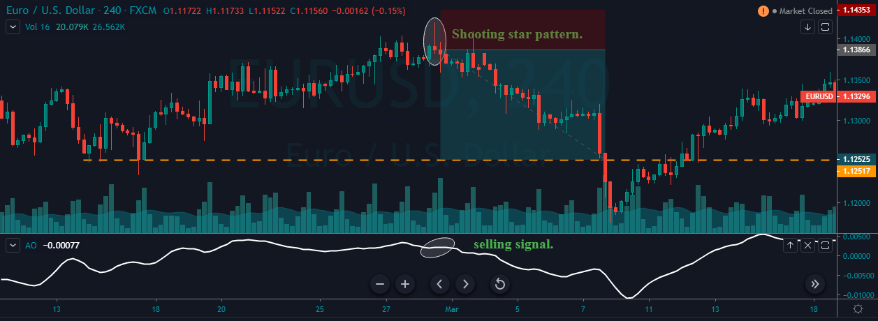
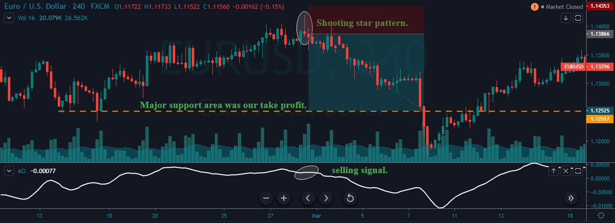
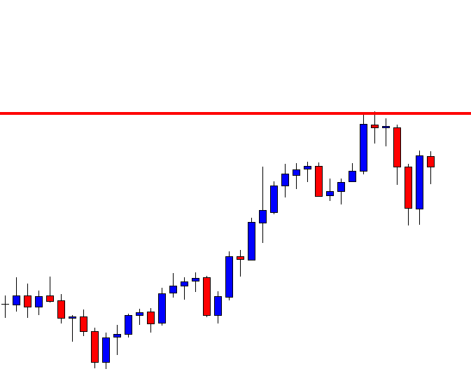
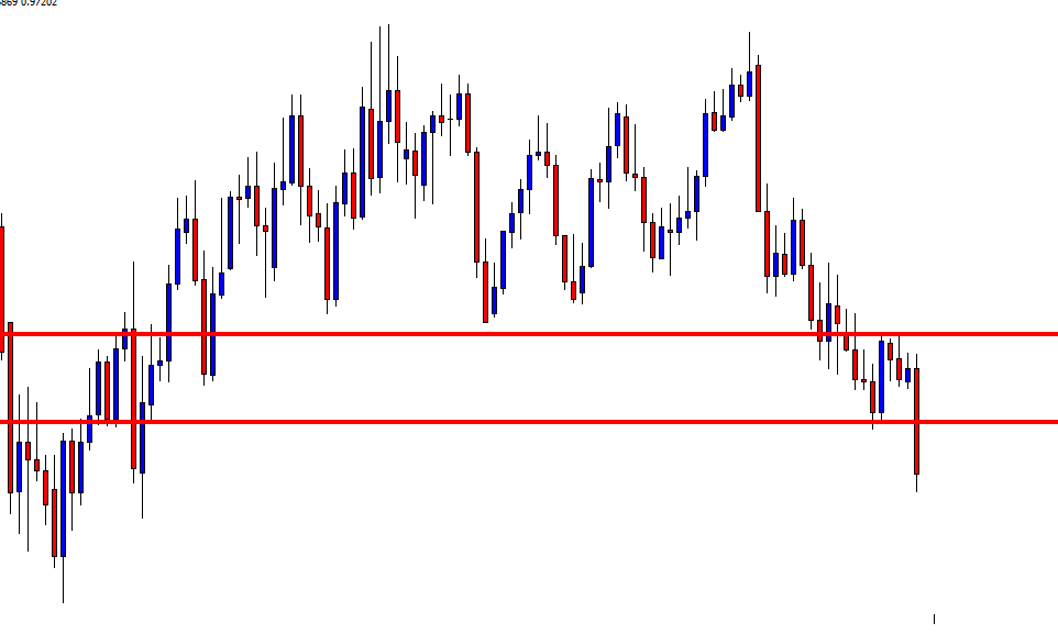
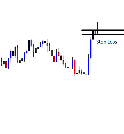
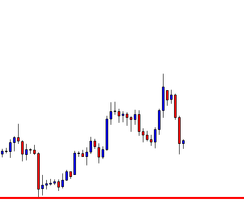
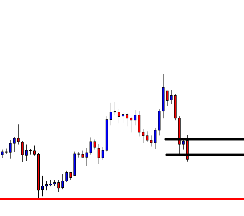
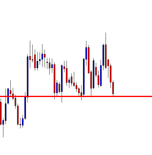
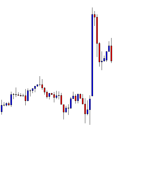
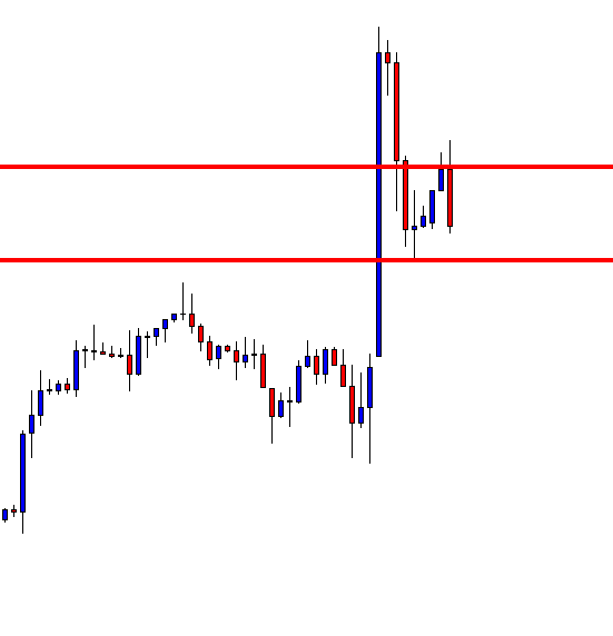
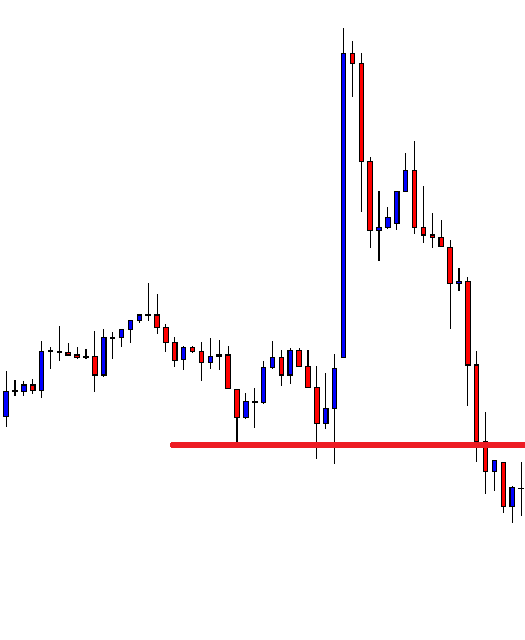
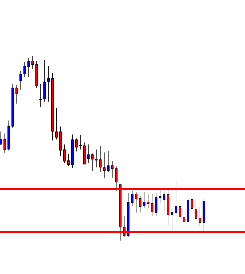
Step 5: Take 50% profit at consolidation near EMA and rest 50% after price crosses above the EMA. The stop loss has to be placed above the channel support.
We will be taking profits based on EMA plotted on our chart. Our first potential take profit zone is when the price starts to consolidate near the EMA and touches the line multiple times, as this means that the trend might be coming to an end.
The second potential take profit zone is when the price crosses above the EMA, signaling a reversal of the current trend.
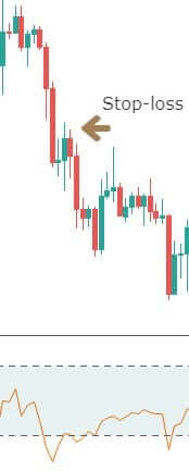
Next, we need to establish our stop-loss.
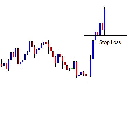
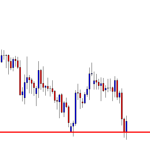
The stop-loss is placed right above the price channel support, which was broken. Stop-loss can also be extended up to price channel resistance to give more room for the price.
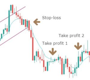
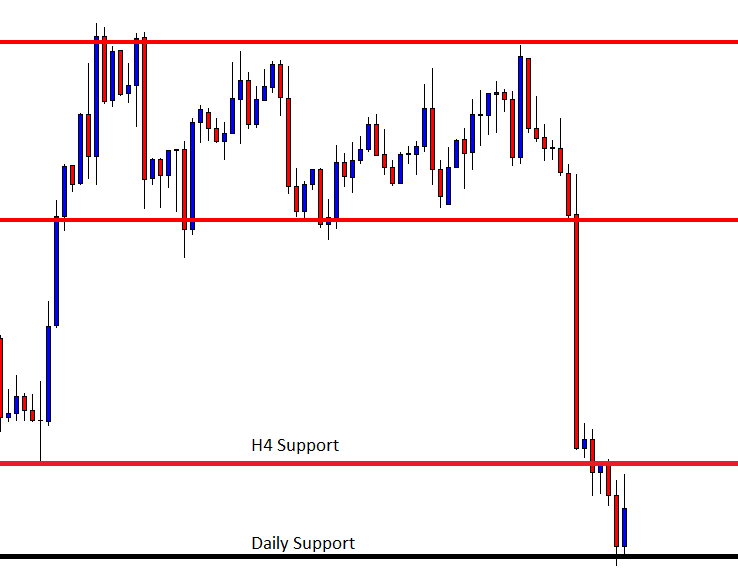
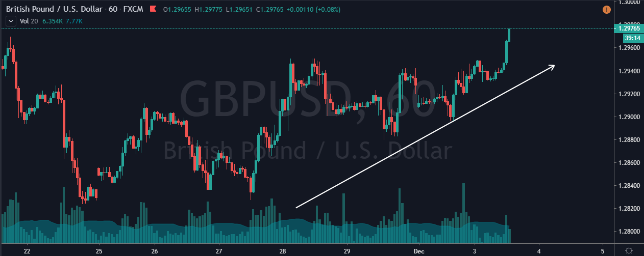
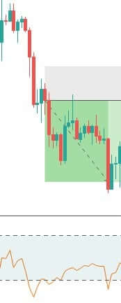
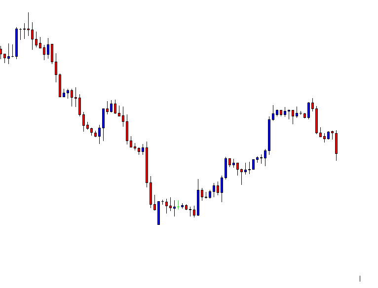
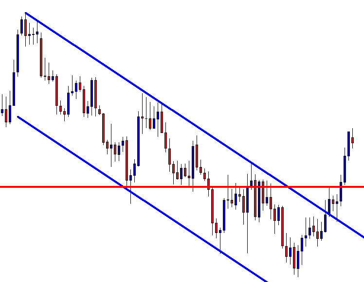
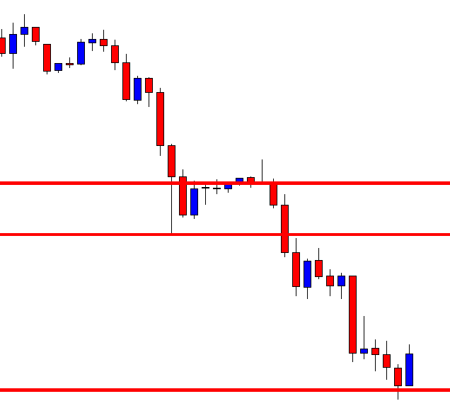
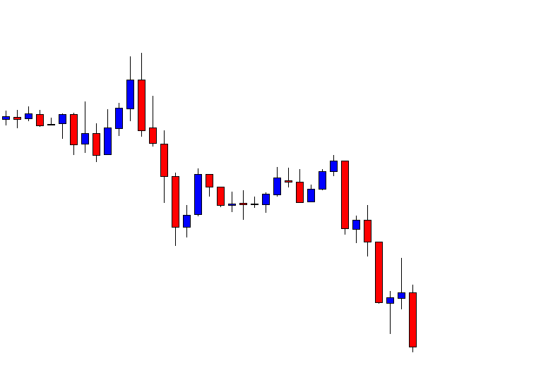
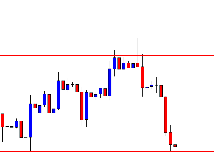
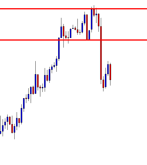
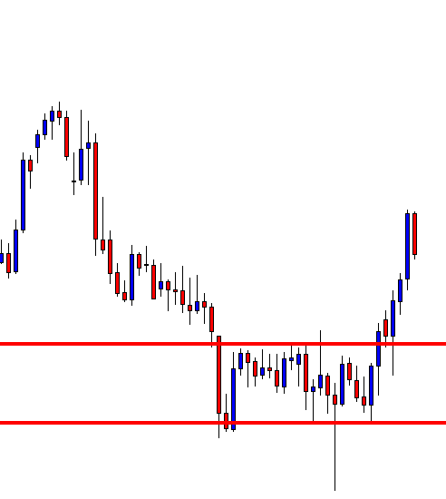
Finally, the trade would look something like in the below figure. This trade will result in a risk to reward ratio of 1:1 minimum. However, if you are patient enough to wait for the trend to continue, the RRR can be increased.
Note – The above trade is an example of a sell trade. The same rules apply for a ‘buy trade,’ but in reverse, as this time, you will be using a downward price channel.
Bottom Line
The price channel strategy can be used in any kind of market. It can also be incorporated into your current strategy to bring a new dimension to price action trading. If you are good at spotting price patterns and money management, this strategy can make huge profits. Happy Trading!


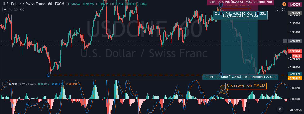
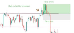
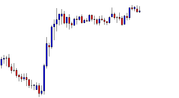
 Step 3 – Step Loss & Take Profit
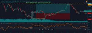
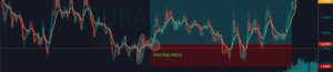


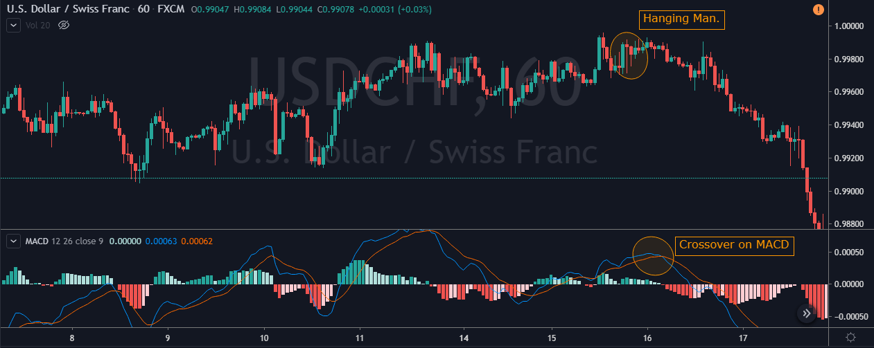
 This pattern is not confirmed unless the price falls shortly after the Hanging Man. If the next candle closes above the high of the Hanging Man, this pattern is not valid. After the pattern, if the very next candlestick falls, then it’s a clear indication of the reversal. Now, if you see a Hanging Man candlestick and the above-discussed rules apply, you can go ahead and take the trade. But since it is crucial to have an extra confirmation, let’s pair this pattern with a technical indicator.