Categories
Forex Basic Strategies Forex Trading Strategies

What Should Know About Trading Ranges Using Support & Resistance?

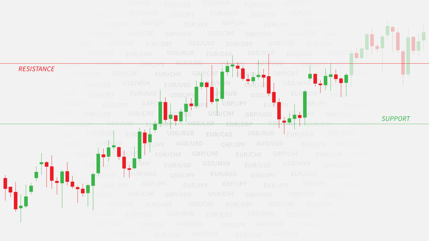
What is Range trading?

It is said that the market only trends for 30% of the time. So it becomes necessary to have a range trading strategy to take advantage of the other 70% of the time. Range trading is not difficult, but it requires discipline and determination to make most out of it. When a market is trending, it forms a pattern of higher highs and higher lows, in case of an uptrend. The move, in this case, is really strong and is known as an impulsive move. The other type of movement is known as the corrective move, which comes in the form of a pullback. Impulsive moves are stronger than corrective moves.

When the market is making any such moves, it finds itself stuck between a high or low and continues to oscillate between these two points. It means buyers and sellers are equally strong, and this creates a very choppy environment.

Traders now trade these extremes and continue to trade until price breaks out on either of the sides. These two points act as potential support and resistance points, used by traders to place their orders.

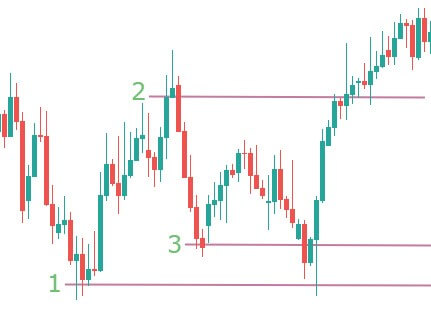
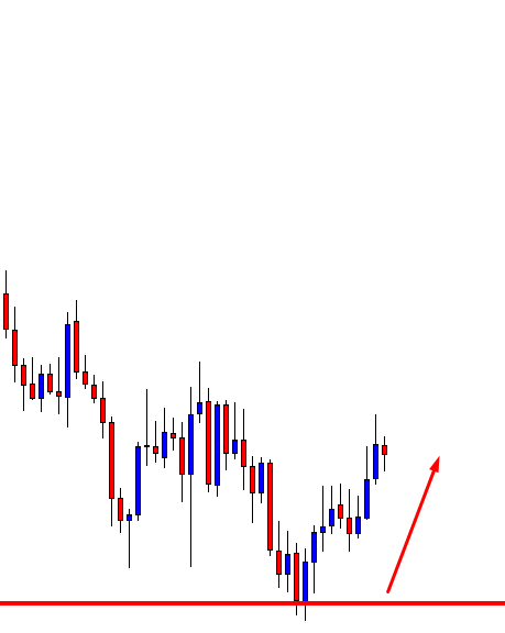
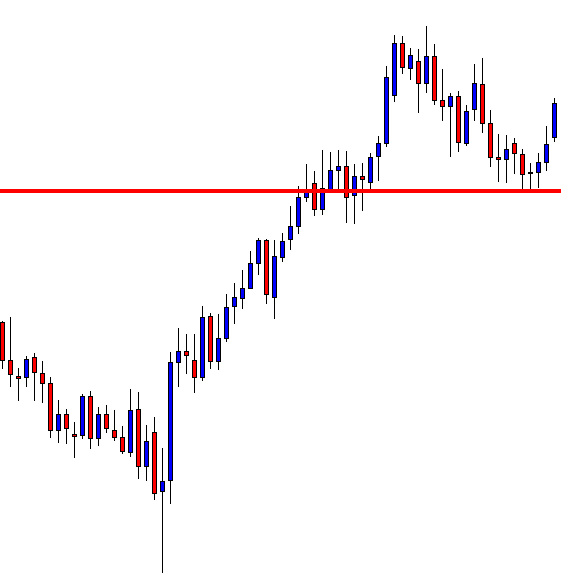
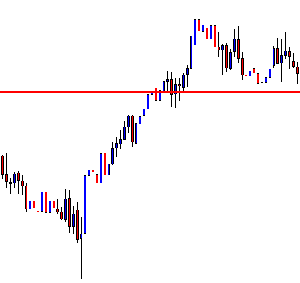
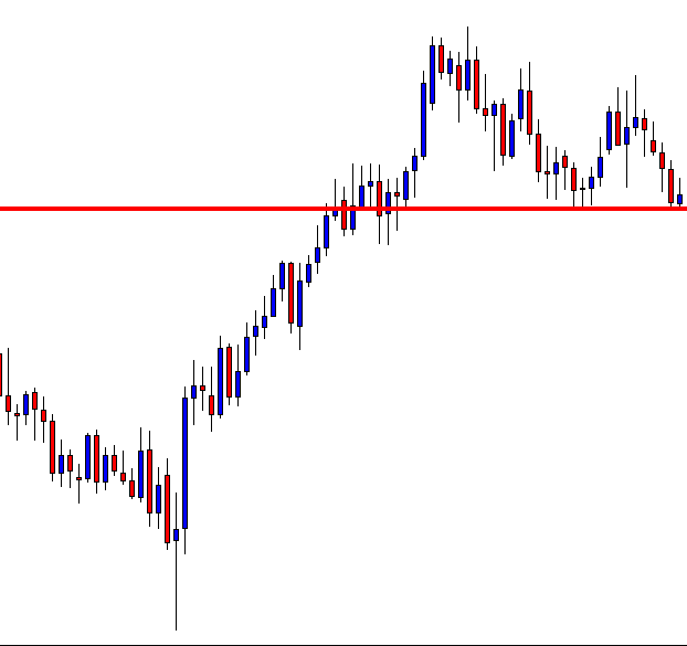
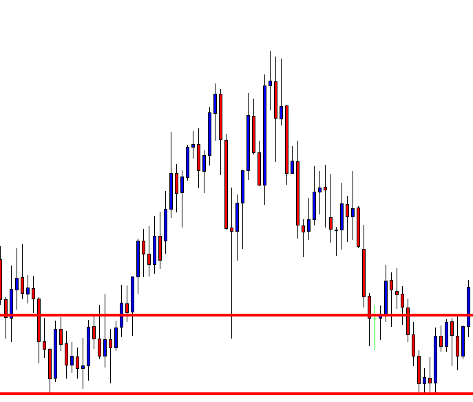
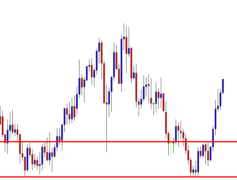
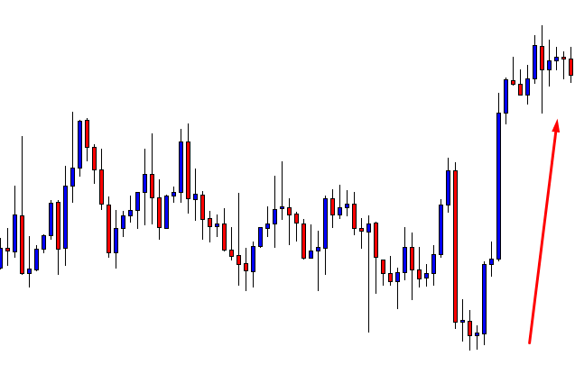
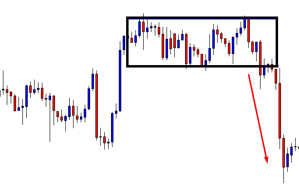
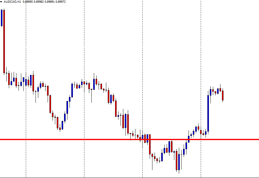
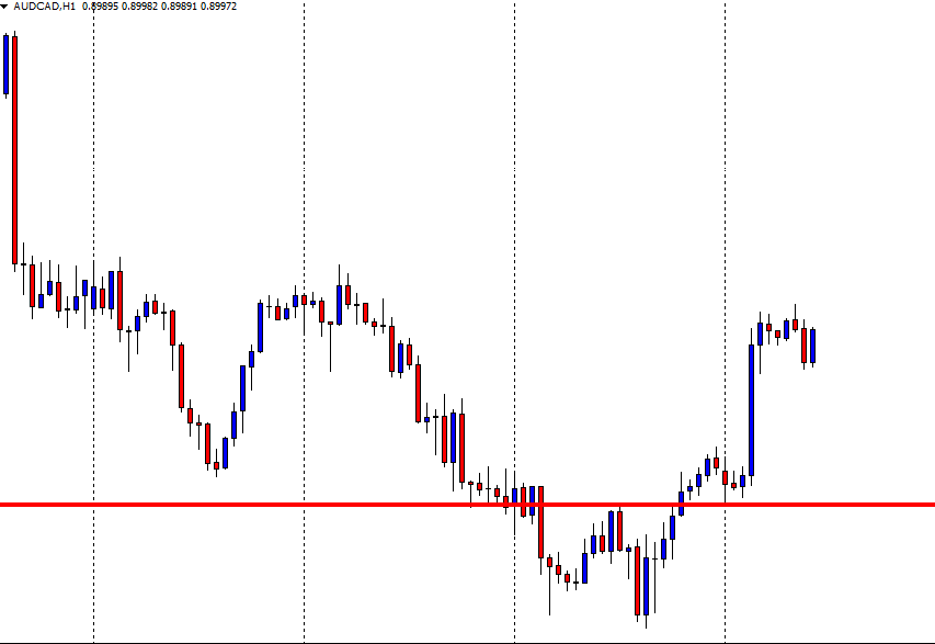
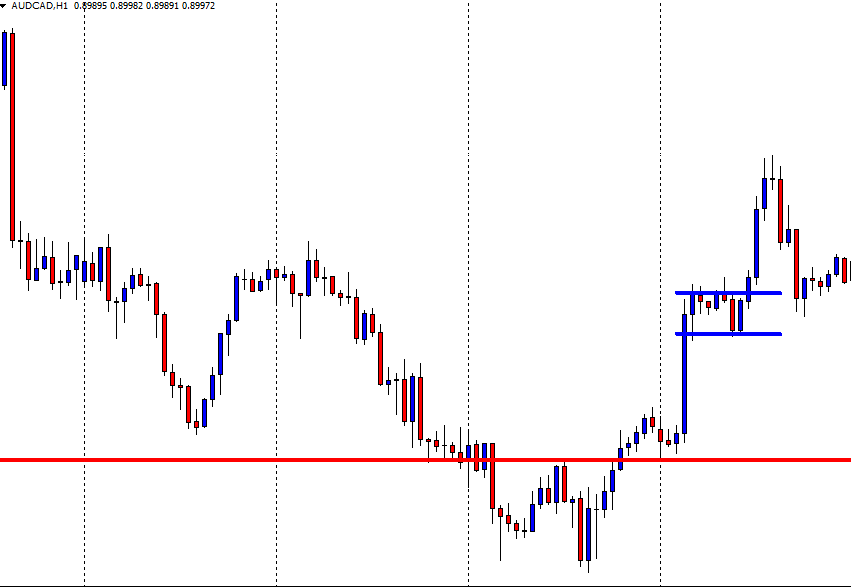
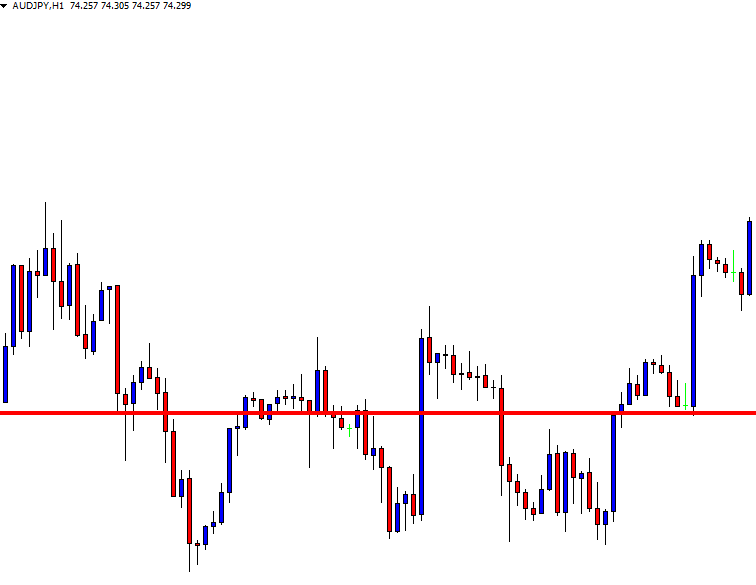
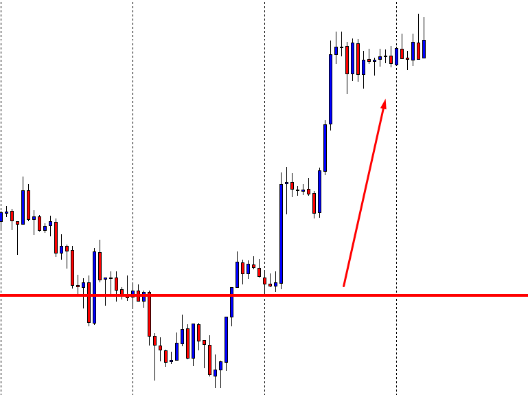
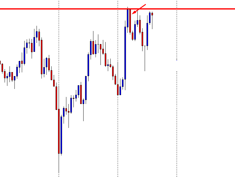
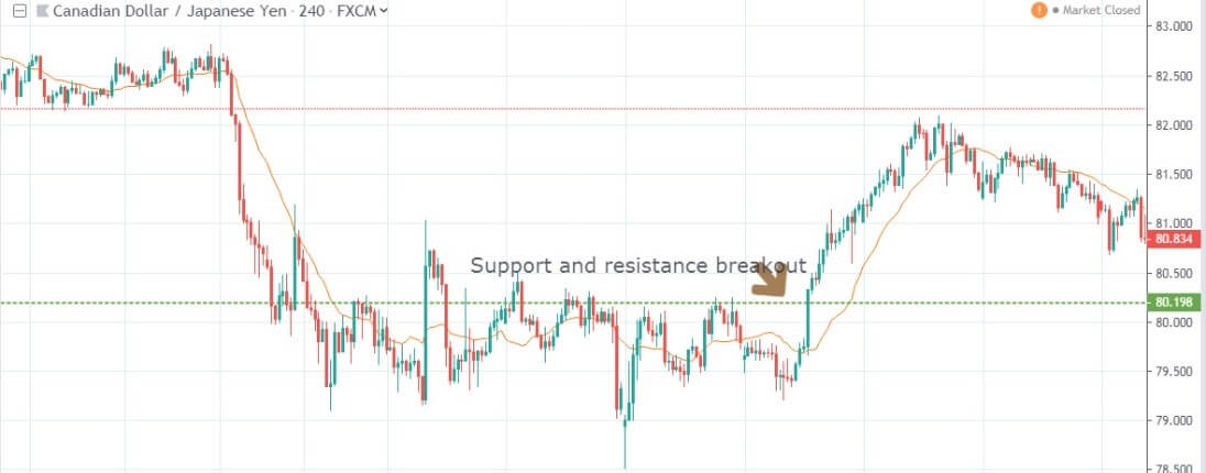
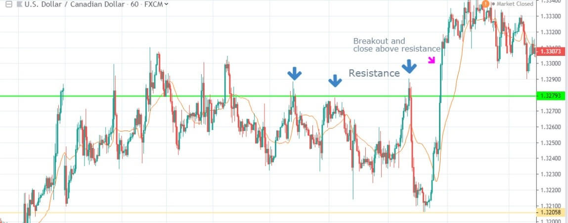
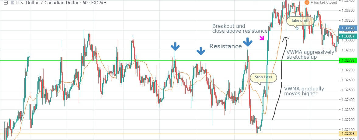
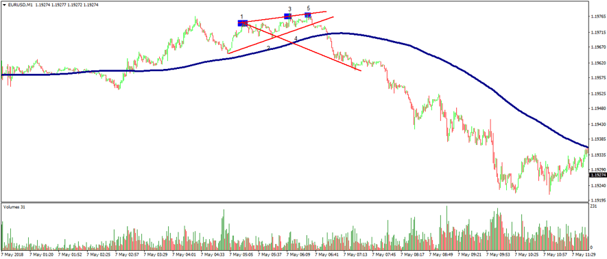
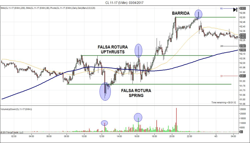
In the above chart, we have drawn a few lines from where the market bounced off. The price action in those areas creates many trading opportunities. The instrument in the chart first trends down and then puts up a low (marked by line 1). Initially, you might think it as a downtrend and expect the pattern of lower lows and lower highs to continue.

Then you see the market rally to line 2, from where the market falls back to line 3 but does not fall till line 1. This highlights the fact that the market is no more trending. The market instead could be stuck in a range between line 1 and line 2. These are not ‘defined’ prices. Always consider them as zones with a margin of error both outside and inside the range. A trader will look to position himself/herself at these zones of support and resistance that forms the range.

Why support and resistance?

The price that is stuck between these two extremes has a lot of significance. This is because, at this point, the price can either Stop, Reverse, or Breakout. When you have the right knowledge, it will stop you from simply pushing the buttons and will make you trade with a defined strategy.

Range = Consolidation

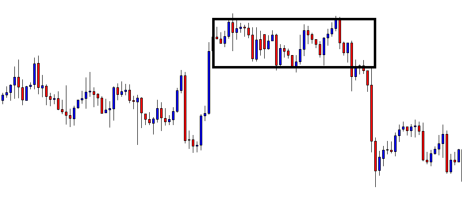
A range is nothing but a price consolidation of the overall trend move. It could either end the current trend or cause a reversal. The different price behavior pattern in the range creates many trading opportunities, which can be traded by all types of traders, depending on their risk appetite. Now let’s discuss some important trading strategies using support and resistance of ranges.

Strategy Using Technical Indicators

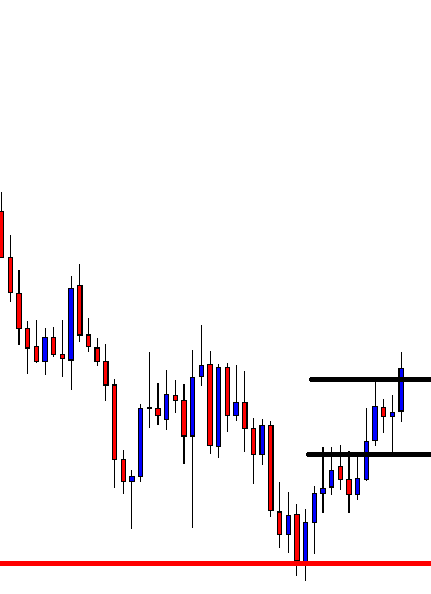
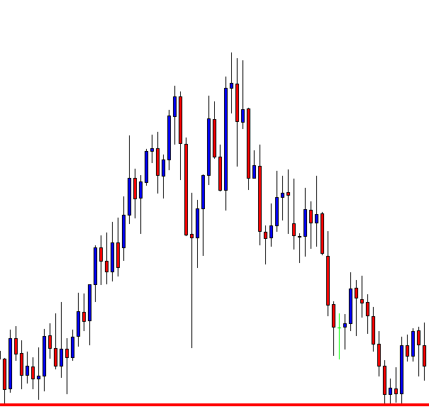
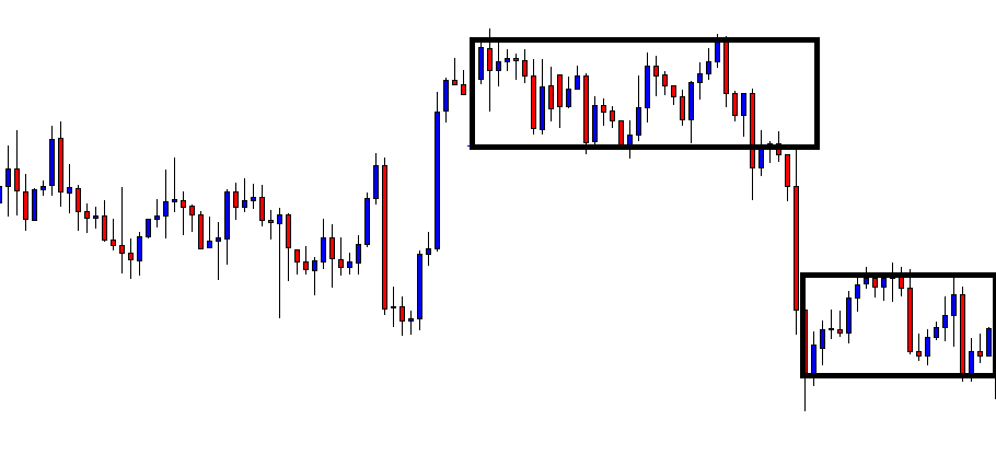
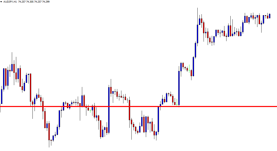
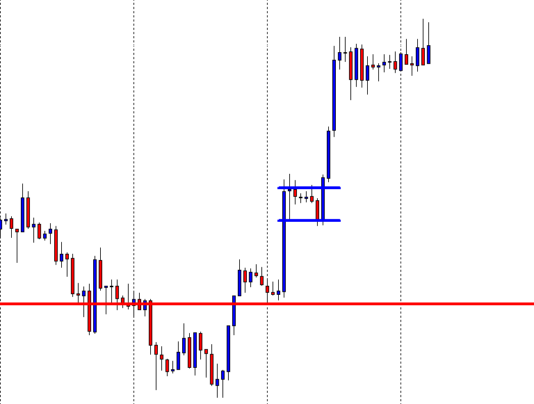
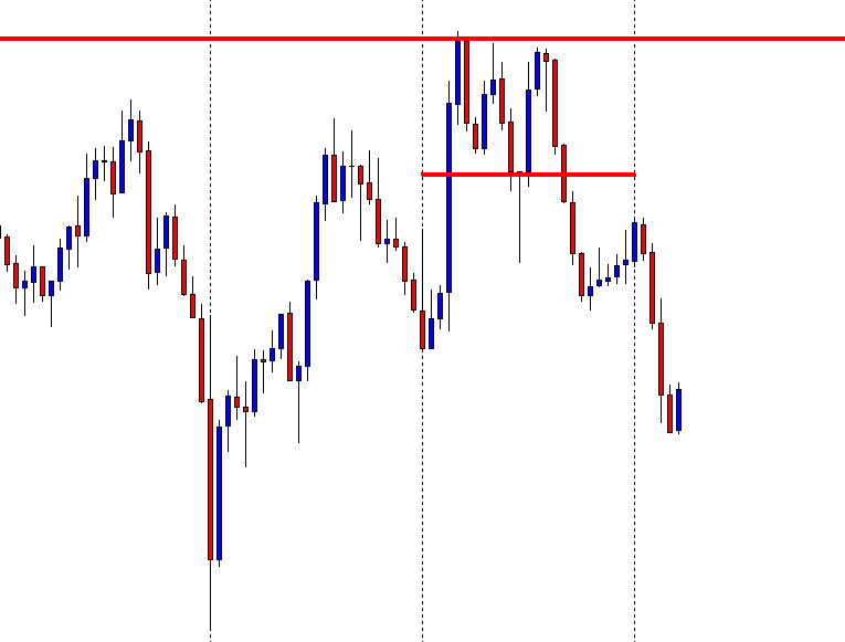
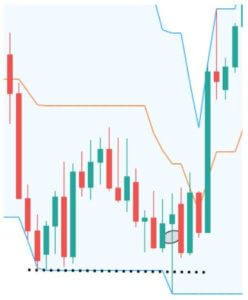
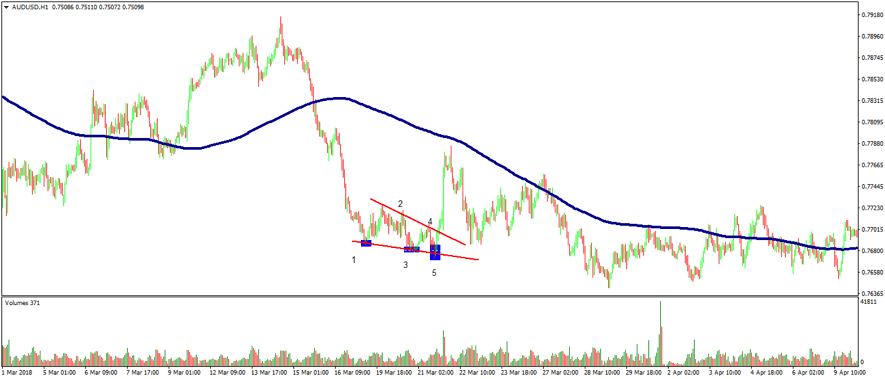
Using technical indicators to trade can aid your trading strategy. Especially while trading ranges, many indicators can be a part of your trading plan. Here, we have used the Stochastic Indicator as a tool to trade the ranges.

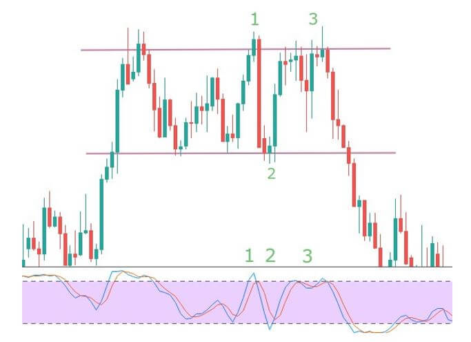
In the above image, the two lines represent the support and resistance of the range formed. When the price reaches the resistance at point 1, the Stochastic enters the overbought area, and the slowdown in momentum is the confirmation signal for a sell. The resistance pushes the price back to support (point 2), but this time the momentum is very strong, hence no entry. The stochastic also does not enter the oversold area clearly. Next time the price goes to resistance with greater momentum, and the Stochastic too does not give an entry signal as it is not in the overbought area. This means one shouldn’t be going short at this point.

Overall, there is only one risk-free trade available in the above chart, and that is at point 1 (short).

Strategy Recap

Firstly, we should be able to see the price at one of the extremes. When that happens, the indicator should show either be at overbought or oversold conditions. The momentum of the price should be an important factor that determines our entry. If we see reversal patterns, this could be the best entry with a good risk to reward ratio. Do not forget to place protective stops much below or above the support and resistance levels, respectively. This will always protect your trades from a false breakout.

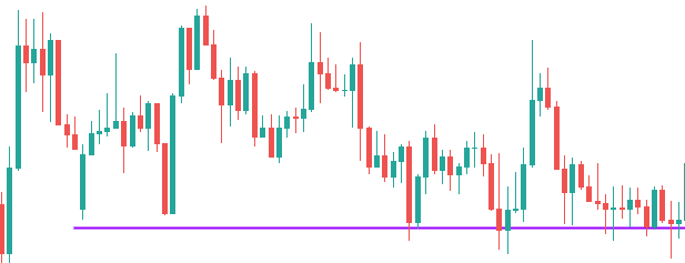
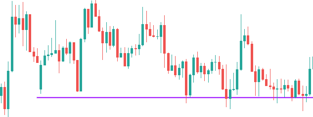
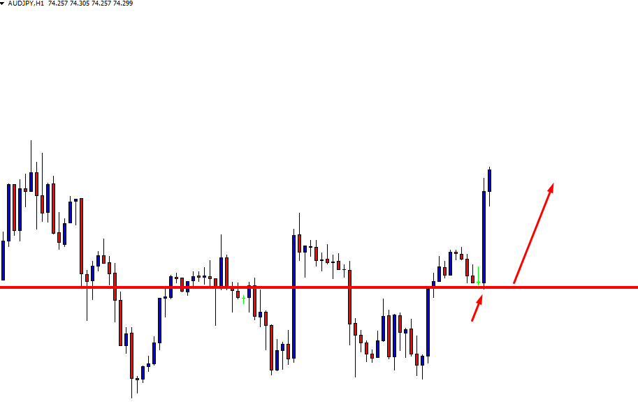
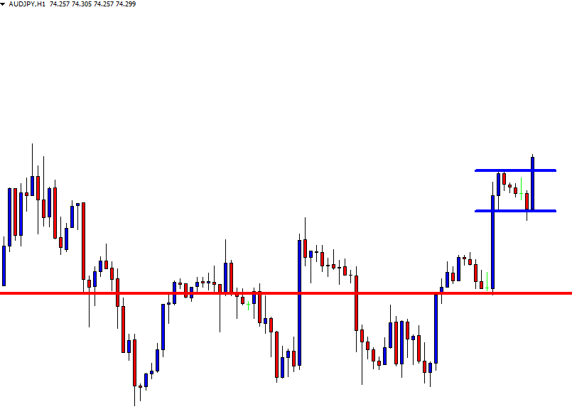
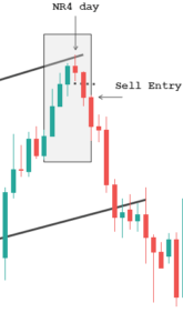
When not to buy at support and sell at resistance in ranges

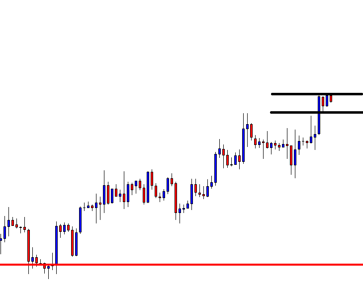
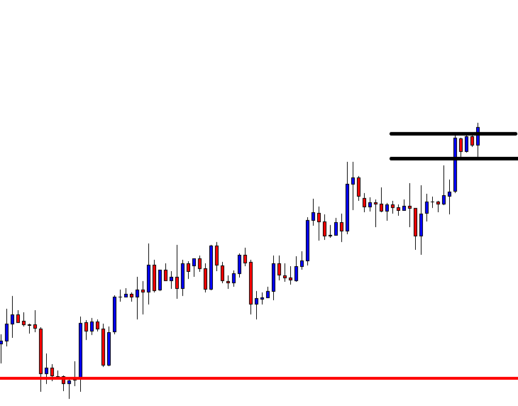
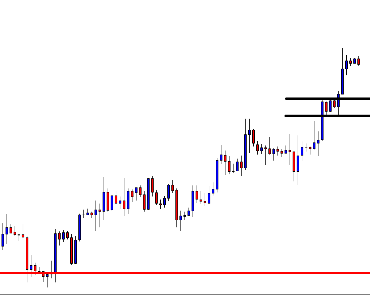
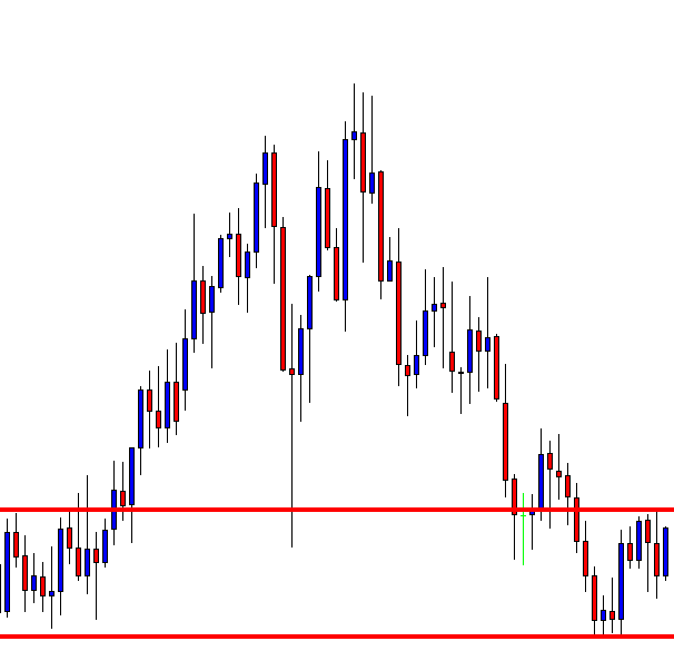
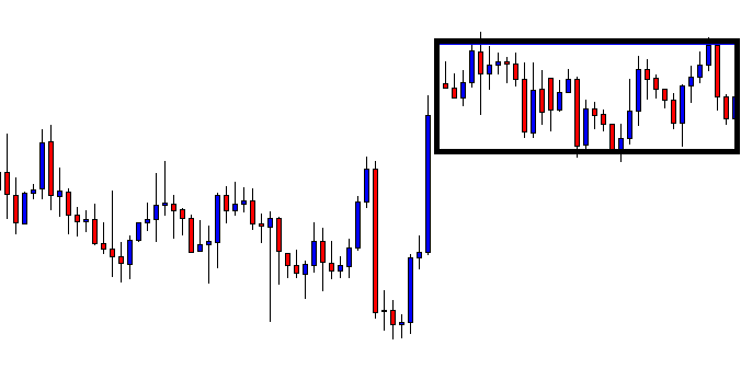
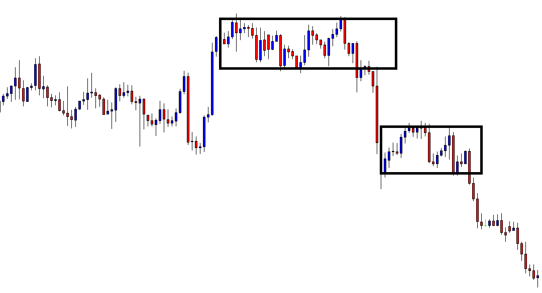
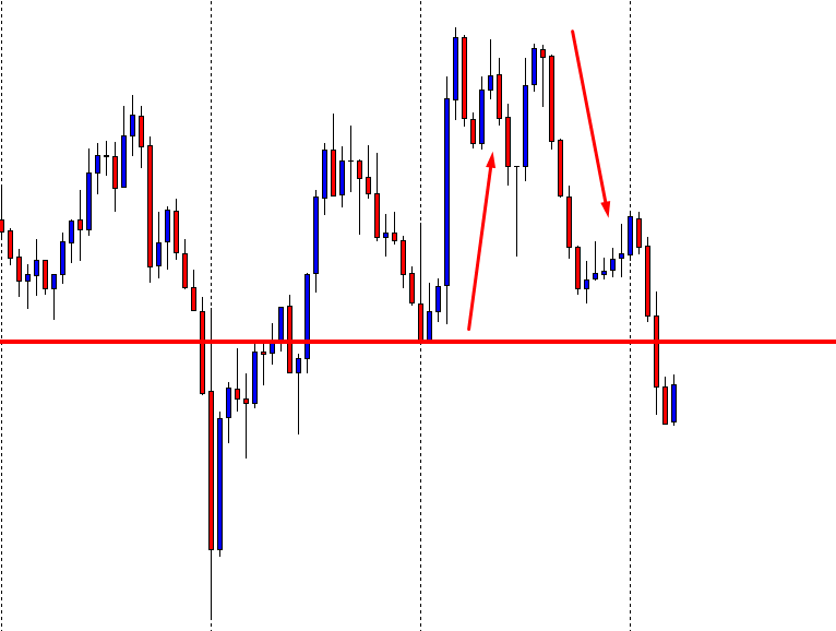
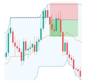
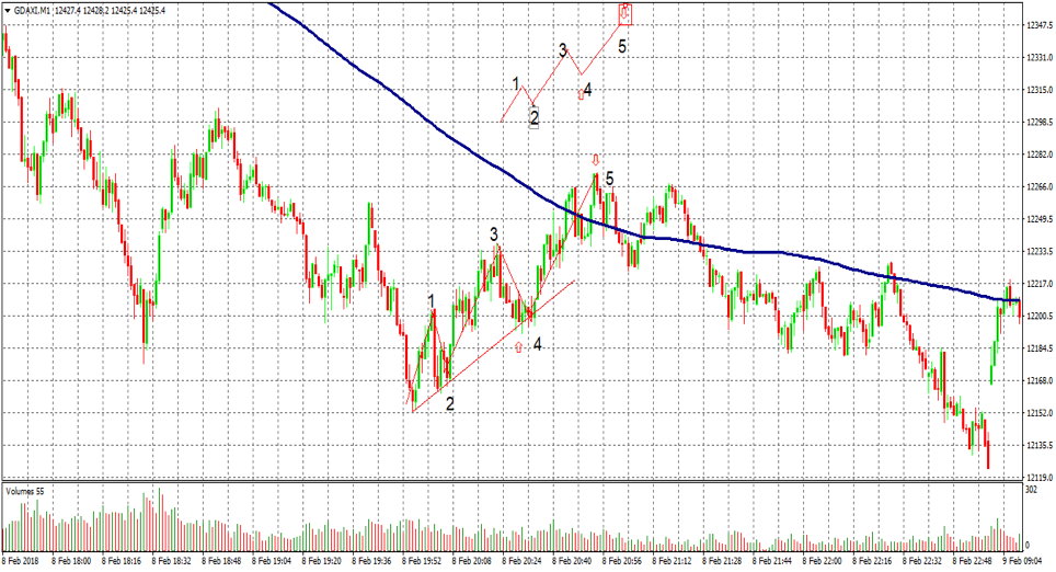
You must have probably heard traders saying that more time a level is tested, the stronger it becomes. This is not true in the case of our range break-out strategy. You need to start paying attention to the price patterns at these ends. If the price has made multiple touches, it could be getting ready for a breakout in the direction of the higher time frame.

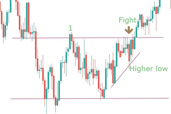
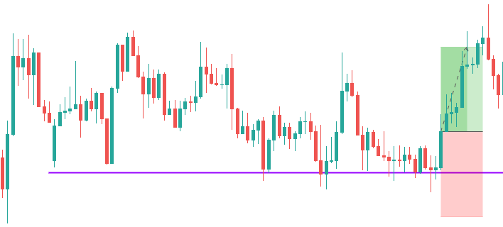
The above chart is an example of such a scenario. It shows a range, and at point 1, you can see the strength in the candle as price pushes towards the resistance area. The next push makes the price to consolidate at the extreme. It appears to be a battle between the bulls and bears. It is also making higher lows as a part of the uptrend. Hence a breakout after this point is not surprising.

You don’t want to see the higher lows at the resistance extreme and lower highs at the support extreme.

The resistance could still work, and a reversal could happen, but this type of price action does not give much confidence for shorts. Only aggressive traders may find some entry in that consolidation, for a potential long. They can put a protective stop below the higher low that was formed before the accumulation.

We hope you find this strategy informative. Let us know if you have any questions in the comments below. Cheers!

Categories
Forex Price-Action Strategies

Using Multiple Time Frames to Get Multiple Entries

We know using multiple time frames is an essential aspect of trading. Traders use the bigger time frame to find out the trend, breakout, vital support/resistance levels, and relatively smaller time frames to trigger an entry. In this lesson, we are going to learn how the trigger chart can be used as the analyzing chart to find out more entries.

This is a Daily chart, which is being used as the trigger chart. The weekly chart is used as the analyzing chart. It is a combination of Weekly-Daily. The price heads towards the North. Traders are to wait for the price to produce a bullish reversal candle.

A Spinning Top daily candle at a flipped support, the buyers have a lot to be optimistic here. One of the daily candles is to breach the daily resistance to go long on the pair. Let us draw the support and resistance on the chart to get a clearer picture.

This is how the chart looks like with support and resistance levels. If one of the daily candles breaches the resistance with good buying momentum, the daily traders are to trigger a long entry.

The next daily candle breaches the resistance. The buyer may take a long entry right after the breakout candle closes. An entry on the daily chart means that the trader shall leave the trade/chart for three to four trading days by setting Stop Loss and Take Profit.

However, if a trader uses the same daily chart as the trend-detecting chart and flips over to the H4 chart to find another entry, it surely would be more rewarding.

Let us flip over to the H4 chart.

Previously, the daily chart shows an upside breakout. Thus, the trend is bullish. The H4 chart shows that the price starts having consolidation. If the breakout level holds the H4 candles and makes an upside breakout, the H4 buyers are going to go long on the pair as well.

This is the H4 chart with the support and resistance of consolidation. The buyers must wait for an upside H4 breakout to go long on the pair. Let us proceed to the next chart.

Here it comes. An H4 bullish engulfing candle breaches the resistance. The H4 traders may want to trigger a long entry right after the candle closes.

The H4 chart shows the price may have consolidation again. The H4 buyers may want to cash in their profit. However, the entry, which is taken on the daily chart, traders are still to hold their positions until they get a bearish daily reversal candle.

At the end of the day, price action trading works very similarly on the Weekly, Daily, H4, and H1 chart. Today’s examples show that a Weekly-Daily combination offers an entry. After the daily breakout, the Daily-H4 combination offers an entry, as well. With a lot of practice, dedication, and hard work, a trader can trade both of them. This will surely beget more profit.

Categories
Forex Price-Action Strategies

Using Multiple Time Frames in Trading

Price action traders combine multiple time frames to trade. In most cases, they use a time frame to determine the trend and use the next one to trigger an entry. The most important factor in using multiple time frames is the combination. Usually, the combinations are Daily Chart with H4 Chart, H4 Chart with H1 Chart, H1 Chart with 15M Chart, and 15M Chart with 5M Chart. In today’s lesson, we are going to demonstrate an example of the combination of Daily and H4 Chart produces an entry.

This is a daily chart. In an uptrend, the price had a pullback. It produces a Doji candle followed by an engulfing candle (arrowed). The buyers may want to draw a support level here. Please note, it is not a Morning Star.

It is neither a Moring Star nor a Double Bottom. The price heads towards the North with good buying momentum. Many of us may think we miss an opportunity. The pair may have offered entries on minor time frames, but the daily chart does not provide anything yet.

Here we are. The price heads towards the support again. As far as the Daily chart is concerned, the price had a bounce at the level earlier. Thus, if the level produces a daily bullish reversal candle, the buyers are going to get themselves busy to look for long opportunities. Let us proceed to find out what happens next.

The last bearish candle closes within the marked level. This is a sign that the price may obey the support. However, we never know unless it produces a bullish daily reversal candle.

Here we are. The level produces an Inside Bar. It is not a robust bullish reversal candle. Nevertheless, it is a reversal candle. Do you know what the price action traders do next? They flip over to the H4 chart. Have a look at the H4 chart.

Since we are analyzing the daily chart, the trigger chart shall be the H4 chart. The H4 chart shows that the price is on consolidation. The buyers need to wait for bullish momentum.

The chart produces an H4 bullish reversal candle, although the resistance is still intact. Thus, the buyers need a breakout at that level. They must wait for it.

Here it comes. A Marubozu bullish candle breaches the resistance. The buyers may trigger a long entry right after the candle closes. Let us proceed to find out what the price does next.

As expected, the price heads toward the North with good buying momentum. There is enough space for the price to travel. It may go further North as well. Anyway, let us concentrate on what we have learned from these examples.

  1. Using multiple time frames is one of the key components of price action trading.
  2. The right combination of multiple time frames is essential.

We are going to learn more about using multiple time frames in our forthcoming lessons. Stay tuned.


Categories
Forex Basic Strategies

Heard Of The Amazing ’20 Pips Per Day’ Strategy?

Introduction

Forex is the most liquid and volatile market in the world. The average pip movement in the major currency pairs is around 100 pips. However, as a retail trader, it is not impractical to grab 100 pips every single day. Though there are some strategies out there, it is very challenging to make 100 pips per day every day. But, there is 20 pips strategy, 30 pips strategy as well as 50 pips strategy, which is much reliable than the 100 pips strategy. So, in this lesson, we shall be discussing the 20 pips strategy.


The 20 Pips Strategy


The strategy is very simple and straightforward. According to this strategy, when the price breaks above a range in a logical area, you must go long, and when it breaks below a range in a logical area, you must go short. So, this strategy is basically a breakout strategy. However, it’s not as straightforward as it sounds. There are some criteria one must consider before trading this strategy.

❁ Considerations

Currency Pair

You can trade this strategy on any currency pair. However, it is recommended to focus mainly on major and minor currency pairs.

 Session

Though the market is open 24 hours, it does not mean you can apply this strategy any time during the day. To keep it safe, it is advised to trade only during the times when there is high liquidity. That is, the London – New York overlap would be the best time to apply this strategy. Else, the London session or the New York session will work perfectly fine as well. And it is great if you do not trade it during the Asian session, as markets don’t usually break out during this period.

 Timeframe

Timeframe plays an important role when it comes to trading a strategy of this type. To make 20 pips a day, it is ideal to stay between the 1hour timeframe and the 15-minute timeframe.

Indicators

This strategy does not require any technical indicators.

How to trade the 20 pips strategy

Below is a step by step process to trade this strategy.

  1. Open the candlestick chart of any currency pair, preferably, a major or minor currency pair.
  2. Firstly, go to the 1-hour timeframe in the chart and see if the market is in a logical area to buy or sell (Ex: Support and resistance).
  3. If yes, then wait for the price to break above or below the consolidation area.
  4. Check the strength of the breakout on the lower timeframe (15 minutes). Based on the strength, prepare to hit the buy or sell.

 Trading the 20 pips strategy on the live charts

• Buy example

Below is the chart of AUDUSD on the 1-hour timeframe. We can see that the market has been bouncing off from the purple line. So, this becomes a logical area to buy. At present, the market is holding at the purple support line. And it was in a tiny range for like ten candles. Now, to apply the strategy, we need the market to break above this range.

In the below image, we can see that the market breaks above the range with a big green candle. But, before hitting the buy, we must switch to the lower timeframe and see if the momentum of the candle that broke the range was strong or not.

In the below 15 min chart, we can clearly see that the broke above the range in just two green candles. This is an indication that the buyers have come up strong. Hence, now we can prepare to go long.

Coming to the take profit and stop loss, the take profit would, of course, be 20 pips, and the stop loss can be kept a few pips below the support area. Alternatively, you can even go for a 1:1 RR by keeping a stop loss of pips.


• Sell example

Note that this strategy can be applied when the market is in a trending state as well. Below is the chart of EUR/USD on the 1-hour timeframe, and we can see that the market is in a downtrend. The market keeps making lower lows and lower highs. At present, it can be seen that the market is pulling back, and a green candle has appeared. Now, all we need is the price to break below the pullback to give us a heads up that the downtrend is still active.

In the below chart, we can see that, in the very next candle, the market broke below the pullback area. Hence, we can prepare to go short after getting confirmation of the strength from the lower timeframe.

In the below 15-minute timeframe chart, we can see that the momentum of the candle was sufficiently robust during the breakout. Hence, we can consider shorting in now.

As far as the take profit and stop loss are concerned, it remains the same as the previous example. That is, 20 pips take profit with 20 pips stop loss.

Bottom line

A great feature to consider about this strategy is that it can be used in any state of the market. However, all the criteria mentioned above must be met for the strategy to work. If you’re a beginner in trading, then this could be an ideal strategy to get started with. And if you have experience in trading, you can try enhancing the strategy by applying some indicators and patterns.

Note that this strategy, just like other strategies, does not provide 100% accuracy. There are times when this strategy fails, as well. Hence, it is recommended to use this strategy in conjunction with other strategies to have a better winning probability. Happy Trading!

Categories
Forex Price-Action Strategies

What Is Rectangle and How to Trade on It

The price after making a strong bullish or bearish move, it makes correction/ consolidation. The price consolidates within two horizontal lines. In the financial market, this is called Rectangle. In today’s lesson, we are going to demonstrate some examples of the bullish and bearish rectangle.

Let us start with a bullish rectangle.

The price heads towards the upside with good bullish momentum. At the top, the price seems to start having consolidation. A buyer may want to keep an eye for an upside breakout to go long from here. However, the price continues to consolidate.

The price consolidates within two horizontal lines. We can draw a rectangle here since the price produces the rectangle after a bullish move, so it is called ‘Bullish Rectangle.’ Traders are to wait for a breakout to take an entry. A downside breakout offers a short entry, and an upside breakout offers a long entry. Let us find out which way the next breakout takes place and the price heads to.

The price makes a downside breakout and heads towards the South. At rectangle breakout, the price usually travels at least the same distance of the consolidation length. It seems the price travels 1.5X distance of the consolidation length here. Let us concentrate on the next chart below.

The price consolidates getting trapped within horizontal support and resistance. Do you find anything interesting here? Yes, we find another rectangle. This time it is a bearish rectangle. Let us draw those two lines here.

Again, traders must wait for a breakout to find out its next direction. The price has several bounces and rejections within those two horizontal lines. It is a bearish rectangle, but we know a breakout can take place either way. There is no point in guessing. Let us wait and find out.

The price makes a downside breakout and heads toward the South with good enough selling momentum.

We have demonstrated two examples here. The first one is a bullish rectangle where the price makes a downside breakout. The second one is a bearish rectangle, on which the price makes a downside breakout as well. Breakout direction does not depend on the bullish or bearish rectangle. Trader’s job is to wait for the breakout and breakout confirmation. Entry is to be taken only when the breakout is confirmed. We can spot rectangles almost in all the time frames. However, it is often seen on the H1, H4, and Daily charts. Have some practice on the demo account or do some backtesting to get well acquainted with the pattern to make green pips.

Categories
Forex Basic Strategies Forex Trading Strategies

How To Trade Options With a Directional Bias Strategy

Introduction

A challenging question every trader comes across in his trading career is: whether he should be buying a call option or a put option? Traders establish directional bias by studying high-level charts, support and resistance levels, price action, and fundamental indicators. Dow Theory suggests that the market will continue to move in the same direction until an external force causes a reversal or break in the trend.

Directional bias plays a major role in the ‘trend-reversal’ strategy than in the ‘trend following’ strategy. Directional bias will help a trader decide if he should be going long or short in options. You can also identify the direction of the market trend. Once you establish a directional bias, you will have greater confidence in executing your trading strategy. During the process of execution, none of the actions are emotionally driven.

How to develop a directional bias?

Any trade which includes thorough preparation should consist of establishing directional bias, and it is a two-step process.

  1. Predicting the direction of the price move and overall trend.
  2. Identifying the trigger points and trading rules that will confirm our directional bias.

Determining a directional is just one step towards making a successful trade. There are many more things we need to put together before taking a trade. After backtesting a few strategies, establish some trading rules. Remember to include only those rules that confirm your directional bias. Confirming directional bias is an excellent habit that improves the success rate of trades.

A successful trading strategy is more about the right planning and psychology rather than a single entry technique or trading system. Options trading is said to be complex, hence requires a lot of knowledge before one can trade it. Other than that, you need to consider factors that are specific to options like time decay, option theta, option beta, and option gamma. We explain here how it is to be done correctly.

Directional bias through momentum indicators

The easiest way to establish directional bias is by using momentum indicators and price action analysis. If prices are trending in an upward direction, making higher highs and higher lows, traders should look to buy. On the other hand, if prices are making lower lows and lower highs, traders should look to sell. In this strategy, momentum indicators can be used as an additional confirmation tool.

Example of buying a call option

In the above picture, the orange line graph represents the momentum indicator. The price action pattern shows a formation of higher highs and higher lows, with the indicator pointing towards the buy-side. The candlestick pattern should be such that there is no opposing force that could possibly reverse the current trend.

Point of entry: The exact point of entry would be after the formation of at least one higher high and higher low. This is confirmed by the momentum indicator, which shows a sudden rise above the average value. This is a low-risk entry with maximum reward.

Take profit and stop loss: When the momentum indicator no longer makes higher highs and higher lows with the main trend, it is a sign that the trend might be coming to an end. Hence, you should book profits here. Stop-loss in this strategy should be placed below the previous higher low.

Note: All the trades discussed above are to be executed using a call option and not using the cash segment. It is advised to choose the strike prices accordingly. There could be some differences in the entry price and stop loss of options when compared to spot prices.

The same rules apply for sell trade as well, but here a put option needs to be bought, and you would essentially want to look for lower lows and lower highs.

Directional bias through Moving averages

We would like to conclude our methods of establishing directional bias with the use of ‘moving averages.’ This is one such technical indicator, which can be used to develop any new strategy. For this strategy, we use the 20-day moving average as it is considered to be one of the most powerful moving averages.

In the above figure, we have plotted the 20-day Moving average using the yellow line. This is a simpler strategy as compared to the momentum indicator strategy. Here, if you see the price trading above the 20-day MA, you should form a directional bias to buy. And if the price is trading below the 20-day MA, you should form a directional bias to sell.

Point of entry: When price crosses the MA line on any side and stays there for more than four candles, you should be taking entry in that direction of the trend. More the number of candles better will be the entry.

Take profit and stop loss: You can continue to hold on to the trade until the price reverses and crosses the other side of the MA line. If it crosses, book out your profits. Stop-loss can be placed at the high or low from where the market reverses.

Conclusion

If you use any other way of developing directional bias, make sure that it needs to be simple. If it becomes complicated, it can increase the complexity of your trading strategy. Having a directional bias will make you trade in the direction of the dominant trend, which is less risky. Finally, a trader needs to abstain from opening positions that have no directional bias.

We hope you find this article informative. If you have any questions regarding this strategy, please let us know in the comments below. Happy Trading!

Categories
Forex Price-Action Strategies

When A Breakout Occurs by More than One Candle

Price action traders’ main job is to watch the price action and find out the message out of it. The message comes from candles, various charts, momentum, as well as the attributes of breakouts. In this lesson, we are going to demonstrate an example of a breakout, which occurs with more than one candle. Let us find out whether a breakout with multiple candles gives us any message or not.

The price finds its support at the marked level and heads towards the North with good buying pressure. Price action traders start eyeing on the pair to go long on the pair. The first thing they would want is consolidation. Let us proceed to the next chart.

It seems that the price may have started having a pullback. The price is to come about 38% of the trend’s length to attract the buyers to watch for an upside breakout. Let us see what happens next.

The last candle seems to have covered a good distance. The buyers are going to be keen to get a bullish reversal candle on the chart now. If a reversal candle makes a breakout itself, it attracts traders more. Eventually, it pushes the price towards the trend’s direction at a good pace. Let us find out what happens here.

Here it comes. The bullish reversal candle is here. It is a ‘Track Rail,’ which is the second strongest reversal candle after the Engulfing candle. Traders are to wait for an important event. You know what that is, right?

‘The Breakout’!

The breakout occurs here by a Marubozu candle. Price action trader shall trigger a long entry right after the candle closes. Before triggering the entry, a trader must know where to set his Stop Loss and Take Profit. Stop Loss level is obvious here, which is below the support of the consolidation zone. Where the Take Profit level is to be set? Ideally, a 1:1 risk-reward ratio is the first target in any entry. However, there seems to be enough space for the price to travel. We may go for 1:2 risk-reward here. Does a trader go for a 1:3 risk-reward ratio or even more here? We get the answer later. Meanwhile, let us continue watching the drama.

The plan seems to be working amazingly well. The price heads towards the North with good buying momentum. 1:1 risk and reward ratio is easily achieved within the next candle. 1:2 risk-reward is achieved as well. Some may start splitting the hair for not setting the target with a 1:3 risk-reward ratio. Let us proceed.

The price has produced an Evening Star. This surely is not a good sign for the buyers. Those who set their Take Profit with a 1:3 risk-reward ratio must be in a pensive mood.

The price does not hit the Stop Loss, but there is no profit left for the buyers that are holding the positions. Targeting a 1:3 risk-reward ratio does not bring more pips. It rather makes them lose some pips that they could have earned.

Price Action breakout attributes suggest that if a breakout occurs with multiple candles, the trend often loses its impetus early. Thus, it is best to target 1:1 (in most cases), 1:2 (if there is enough space) risk-reward ratio when a breakout occurs by more than one candle.

Categories
Forex Price-Action Strategies

Breakout by a Single Candle Generate More Impetus

Breakout is one of the most important factors in trading. Attributes of a breakout give clues with what traders can manage their opened position to make more profit. Price action traders, in particular, love to compute the attributes of a breakout to determine their take profit level.

In this section, we are going to demonstrate an example of a single candle breakout and its impact afterwards. Have a look at the chart below.

The price finds support at the red market level and heads towards the North. The price action suggests that the buyers are going to control the pair. A downward correction/consolidation followed by a bullish reversal candle at a value zone is what they need to wait for. Let us find out what happens next.

The price seems to have started having a pullback. The first corrective candle comes out as an Inside Bar, which is a good sign for the buyers. The buyers wait for the price to come back at a level of support with a reasonable distance from the resistance. Let us see how far it comes up to.

The price has crossed a good distance from resistance. The buyers are to wait for a bullish reversal candle. Ideally, a bullish engulfing candle is the first choice for the buyers. Other candles such as Inside bar, Spinning Top do the job as well, but an engulfing candle’s signal attracts more traders, and it brings more liquidity. Let us see what happens next.

Price action traders dream of such a reversal candle. This is not only a bullish engulfing candle but also an engulfing candle, which breaches the highest high of the last wave. Let us draw the consolidation zone on the chart.

The reversal candle makes the breakout with good momentum. A trader shall trigger a buy entry shall right after the candle closes. When a reversal candle itself makes a breakout, it makes the fore coming move go towards the trend’s direction with good momentum. Look at the chart below.

Look at the pace of the bullish move after the breakout. Here is another very important factor that traders must remember. A single candle breakout usually offers a 1:2 risk-reward ratio. This means traders shall add some extra pips with their profit target when they get such price action. The drama remains. Have a look at the chart below.

The price makes a correction and seems to have found support again. It suggests that the buyers are still in control. Smart buyers take their Partial profit and let the rest of the trade run to earn more pips.

As mentioned, breakout attributes give clues about the trend’s strength. Eventually, this helps traders manage their trade nicely and make more money out of trading.

Categories
Forex Price-Action Strategies

Trade What You See on the Chart

Price Action traders are to look at a chart and make a trading decision according to that. They have to understand the language of it, which reflects the psychology of the market. In today’s lesson, we are going to demonstrate the importance of trading according to the chart’s price movement.

On 17.10.2019, the AUD did well against its counterparts in almost all the pairs. However, in AUDNZD, the AUD did not do well. It rather had a bad day against the NZD. On the day, the AUD was strong against other currencies, but why did it underperform against the NZD?

To start with, let us have a look at the H1-AUDUSD chart.

After finding the support at the red-marked line, the price heads towards the upside. It consolidates and continues the move towards the trend. The daily candle closes with a strong bullish tone, barely having an upper shadow. Let us have a closer look at the consolidation.

The first reversal candle is bearish. However, it closes within the wick of the last candle, which is a Spinning Top. The price finds support, and after producing an engulfing bullish candle breaching the resistance, it continues its bullish journey.

As mentioned earlier, the AUD was weak against the NZD. Let us now have a look at the H1-AUDNZD chart.

Look at the chart, the price heads towards the North (up arrowed) and comes down. You can assume how the daily candle would look like for that day. In the end, it makes a breakout at the support level and makes a new lower low. Things are completely different here with the AUD. Do you spot out the difference? Let us investigate on the chart.

The price heads towards the North as it does in other pairs. However, look at the first reversal candle (arrowed). This is a bearish engulfing candle. When the consolidation starts with such a candle, the minor time frames’ sellers shall keep their eyes to go short. This often makes a chart look choppy. Even after producing a good bullish reversal candle, the price does not make a breakout at the resistance. It rather comes down and gets choppy. After some hours, this is what happens.

A Double Top and breakout at the neckline drive the price towards the South. The consolidation followed by the breakout at the support makes the price bearish on the following day. We now understand the reason, despite having a good day, the AUD did not do well against the NZD.

To sum up, traders must understand the chart, price action, candlestick formation, and trade according to those to be consistent in making a profit.

Categories
Forex Basic Strategies

Understanding The N-period Narrow Range Trading Strategy

Introduction

There are three states in the market – trend state, channel state, and range state. A trending market is the one where the market makes higher highs or lower lows, and a ranging market is a state where the price goes through a consolidation phase. The channels can be considered as a particular case of range as they work similarly to a range, but are tilted.

What is consolidation?

To understand this strategy, we must first understand the concept of consolidation. Consolidation is a technical term in trading where the market loses momentum and starts to move in the form of a range.

A common tendency of the market is that, when the price starts to move in a range and begins to consolidate, it prepares blast in one of the sides. So, people always keep an eye on currency pairs, which are in a consolidation phase.

N-Period Narrow Range

In the N-period narrow range, the period N takes two values –4 and 7. So, we have the 4-period narrow range and the 7-period narrow range. These two are also referred to as the NR4 (Narrow Range 4) and the NR7 (Narrow Range 7).

The NR4 and NR7 trading strategy

This strategy is basically a modified range breakout strategy where the market consolidates in the beginning and then blasts out of a narrow range.

In NR4, number 4 refers to the period under consideration. That is, for NR4, the last four days are taken into consideration, and for NR7, the last seven days are taken into account.

What is the NR4 and NR7 strategy?

It is a breakout trading technique where we consider the last four or sever days to apply this strategy. And in these four or seven days, we compare the range of all these days and determine if the current day is an NR4 or NR7 day. Once we obtain the NR4 or NR7 day, we gear up to go long or short.

Calculating the range

Firstly, to trade this strategy, consider the candlestick chart on the daily timeframe. The range of a particular day is calculated as the difference between the high price and the low price.

What is the NR4 day and the NR7 day?

NR4 day

In layman’s terms, the least fluctuated day (4th day) in the recent four days is called the NR4 day. Technically, it is the day whose range is the smallest out of the previous four trading days.

NR7 day

Similarly, when the 7th day in the last seven days moves the least number of pips, it is referred to as the NR7 day.

How to trade the NR4/NR7 strategy?

Following is a set by step procedure to trade this strategy:

  1. Find the high and low of the last few days (seven for NR7 and four for NR4).
  2. Calculate the range (high – low) for each day under consideration.
  3. Compare these range values with the previous days.
  4. Determine if the present day is an NR4 or NR7 day. If so, then wait for the price to break out of the high or low of the NR4/NR7 day.

If the market breaks above the high, then it is an indication for a buy, or if it breaks below the low, then it is an indication for a sell.

Illustration to trade the N-period Narrow Range

Trading the NR4/NR7 strategy is simple. But, as far as the consistency of this strategy is concerned, one can make more out of this strategy only when the NR4/NR7 day appears in the right location. Hence, understanding ‘where’ the NR4/NR7 occurs is very vital. So, let’s consider a few examples to support this statement.

Below is the chart of USD/CAD on the Daily timeframe. We can clearly see that the market is moving in a channel state. Now, to trade this strategy, we blend it with the working of a channel.

Trading a channel is pretty straightforward. When the price is at the bottom of the channel, we look for buying opportunities, and when it is at the top of the channel, we look for short-selling opportunities. With this mind, we try spotting the NR4/NR7 days in these regions.

Below is the magnified image of the chart where we’re going to analyze the market. Initially, the market came down rolling until the bottom of the channel and began to hold down there. And the candle which held at the bottom turned out to be the NR7 day as it has the smallest range compared to the previous six days. This is an indication that the market (sellers) is slowing down. Later, the market blasts up north and breaks the high of the NR7 day. Therefore, now we can prepare to go long.

And as we can see, the trade performs exceptionally well. This is because the location was in favor of the NR7 day.

Continuing with the same chart, the market which was at the bottom of the channel now moves up to the top of the channel. During this up move, the market loses its momentum every step of the way and ends up giving us the NR4 day at the top of the Channel. Hence, once the price breaks below the low of the NR4 candle, we can go for the short sell. And as a result, the market does break through the NR4 day and heads down south.

Bottom line

Trading in the markets is not an easy task. There is no indicator, pattern, or strategy that can consistently work standalone. There are several other considerations that should be made before getting into a trade. For example, in the above trades, we saw how we combined the NR4/NR7 with the concept of channels and made a profit from them. Also, for any strategy, you trade, make sure that there is logical reasoning behind taking the trade. We hope you find this strategy informative. If you have any questions, please let us know in the comments below.

Categories
Forex Basic Strategies

Trade Breakouts Like A Pro With This ‘Breakout Trading Strategy’

Introduction

In previous strategies article, we have discussed the ‘Turtle Soup Strategy by fading the Donchian channel.’ We hope you tried that strategy. In today’s article, let us discuss how to trade breakouts. We will also cover some of the best strategies used by professional traders to trade breakouts. Aggressive traders prefer trading this Breakout strategy compared to the conservative ones.

What is breakout trading?

To understand breakout trading, it is necessary to know the two important types of breakouts.

Defining a breakout

Breakout trading is an effort to enter the market when price moves outside a defined price range. The price range could be between support and resistance or between swing high and swing low. It is good if the breakout is accompanied by high volume.

Breakout of support and resistance

This type of breakout is quite simple and straight forward. The breakout of support and resistance should ideally happen with a big and bold candle. Because that shows the genuineness of the breakout. In the below chart, the candle closes well above the support and resistance level. In the below figure, it can be noticed instantly. A rule of thumb is that the bigger the breakout candle, the better it is.

Breakout of swing high and swing low

Very similar to the support and resistance breakout, this type of breakout has an additional filter. The filter is nothing but to trade the setups that offer the best outcome. In a swing high and swing low breakout, we enter the market after the price crosses a long-time high (1hr or 4hr high). That high should be followed by a strong sell-off. Conversely, the same is true for a swing low.  A trader must backtest their strategy before applying them to the live markets.

Best Breakout Strategy

To increase the accuracy of the signals generated by this strategy, we use an indicator known as Volume Weighted Moving Average (VWMA). It is a very simple technical indicator that is used for volume analysis. It resembles a moving average but is based on volume. It gives extra information than just the price of an asset. This indicator can be found on most of the trading platforms by default, and when plotted, it looks something like this.

Step 1: Identify the swing highs from where the market sold off very strongly and traveled a fair amount of distance. Mark that price on the chart.

The first step of a breakout strategy is to identify those levels and mark them as breakout trading levels. This step is important because we should pay attention to only significant and clear levels.

The resistance level we have identified in the above figure is a significant level. If you look closely, you will see rejection off the resistance level took the price down three times. Whenever there was a rally, the swing high stopped the price.

Step 2: Wait for a break and close above the resistance level

Once we have identified the swing highs, it’s just a game of patience and waiting. Next, we need a breakout candle to close above our resistance level. This is a sign that bulls are in full power.

It is not the end yet. We need confirmation from the VWMA indicator. This will give us the green signal to enter the trade in this breakout.

Step 3: Buy when the price closes above the VWMA

The final step of the breakout strategy is confirmation from the VWMA indicator. You should buy only if the VWMA is stretching above the close of the breakout candle. Visually, the VWMA should look stretched up. It is better if the moving average inclination is towards the upside.

Let’s understand this more clearly with the help of a chart.

In the above chart, prior to the breakout, the VWMA moved gradually higher, and after the breakout happened, the VWMA moved aggressively higher. This shows a strong presence of volume behind the breakout.

We haven’t still talked about placing our stop loss, which is crucial to reduce your losses in a trade. We also need to know where to book profits. This brings us to the final step of the strategy.

Step 4: Put stop loss below the breakout candle and take profit when you see a break below the VWMA

It is obvious to place the protective stop loss below the breakout candle. Because, if the price breaks below the candle that initiated the breakout, it will quickly tell that it was a false breakout.

Our take profit technique is automatic because a break below the VWMA suggests no more buyers are willing to participate in the current rally. We want to book profit at the early sign of market rollover.

We have taken the example of a buy trade. The same rules apply for a sell trade but in reverse. The best breakout strategy can be used in all market trends, whether up or down.

Bottom line

One of the advantages of our breakout trading strategy is that you’re trading with the momentum of the price. A final tip for all the traders while using this strategy is that, if the breakout happens after a big news event, then it is likely that big institution money is behind this breakout. When both fundamentals and technicals are working for you, the probability of success increases. We hope you find this strategy useful. If you have any questions, please let us know in the comments below. Cheers!

Categories
Forex Basic Strategies Forex Swing Trading

How To Trade The Infamous Turtle Soup Strategy?

In this article, we shall be covering the Turtle soup strategy by fading the Donchian channel, and Connor’s RSI strategy.

What is the Donchian Channel indicator?

The Donchian channel is an indicator that considers the high and low for N number of periods. For this particular Turtle Soup strategy, we will be setting the value of N=20, which accounts for the most recent 20 days.

This indicator works based on the highs and lows made by the market. The channel makes a stair-stepping pattern for every high or low made in a period of 20 days.

Below is a chart that shows the Donchian indicator applied to it.

From the above chart, we can clearly see that the top and bottom lines (blue lines) are moving in the form of a stair-stepping pattern representing the highs and lows over the past 20 days. Precisely, the black arrows represent the highs and lows in a look back of 20 days.

Trading the Turtle Soup Strategy

The Turtle Soup is a strategy developed by a trader and author Linda Bradford-Raschke. She published this strategy in one of her books named “Street Smarts: High Probability Short-Term Trading Strategies.” Talking about history, this strategy was taught to a set of novice traders (called the Turtles) by Richard Dennis and William Eckhardt in the 1980s. Also, this strategy is in reference to a well-known strategy called ‘Turtle Trading.’ Over the years, Linda Bradford-Raschke inverted the logic and reasoning behind this strategy and came up with a short-term trading method using this strategy.

Strategy 1: Adding confirmation to Donchian Channel breakout

This is the typical Turtle strategy.

The Turtle strategy using the Donchian channel is simple. When the market breaks above the resistance line, we can prepare to go long. Similarly, when the market goes below the support line, we can go short.

Here are some of the tips and tricks for using this indicator.

  • When the market breaks above/below the lines, make sure that the price is holding above/below it.
  • The candle that breaks the line must be quite strong.

Trading Example

Consider the below figure. Reading from the left, we can see that the market was holding at the upper line of the channel. Later, a huge green candle broke above the channel. Many would hit a buy at this moment, but we wait for a confirmation. When another candle shows a bullish sentiment as well, we can hit the buy at the point shown on the chart.

According to the original Turtle trading strategy, a stop loss of ‘two volatile units is kept,’ which is equal to n-period ATR x 2.

However, to keep it simple, you can keep the stop loss a few pips below the candle, which broke the channel.

Let’s do the converse

In the above example, we saw the typical way of trading the Turtle strategy. In this set of examples, we shall reverse the logic. That is, we will look to go long when the price breaks below the channel and short when the price breaks above the channel. Let’s consider a few examples for the same.

Buy strategy

Let’s say the market makes a 20 day low and is visible on the Donchian channel. Later, the price comes down to that low and even tries to break below it. Once the price shoots right back up to the line, we anticipate on the buy.

Rules:

  • The new 20 day low must be at least four days apart from the previous 20 day low. So, you cannot compare the low of yesterday and the low of today as the difference is just one day apart.
  • Entry must be 5-10 pips above the previous 20 day low.
  • Stop loss must be placed 1-2 pips below the low of today.
  • Aim for a take profit of 1R.

Sell strategy

The sell strategy is just the opposite of the strategy discussed for a buy. When a 20 day high is challenged for the second time having a gap of at least four days from the previous low, we can look to go short.

Rules:

  • The 20 day high must be at least four days in the past.
  • Entry must be placed 5-10 pips below the 20 day low.
  • Stop loss must be placed 1-2 pip of today’s low.
  • Aim for a take profit of 1R.

Trading examples

Buy example

Below is the chart of the EUR/USD on the Daily timeframe. Starting from the left, we can see that the market came down and made a 20 day low (indicated by the black dotted line). Now that we have the first low, we wait for the price to down to that low in more than four candles (days). And when the price spikes below the prior low and comes back up, we can hit the buy at the encircled region.

As far as the stop loss and take profit is concerned, we can keep a stop loss 2-4 pips below the low of the present candle and aim for a good 1:1 RR on this trade.

Sell example

In the below chart, the market made a 20 day high up to the black dotted line. Later, the price goes above the previous 20 days high yet again. Here, the price holds above the line and then drops below the next candle. So, once it’s below by 5-10 pips from the previous 20 days high, we can go short. And the stop loss and take profit are self-explanatory.

Conclusion

With no disrespect to the turtle trading strategy, we can conclude that this strategy can be used in both ways. This strategy is backtested and proven by a number of experienced traders. Try this strategy in your trading activities and let us know if you have any questions in the comments below. Happy Trading!

Categories
Forex Trading Strategies

The Connors & Raschke’s 80-20 Strategy


Introduction


The original Connors & Raschke’s 80-20 Strategy is an intraday strategy that was published in Street Smarts by Larry Connors and Linda Raschke.

It is based on the Taylor Trading Technique, which is a manual for swing trading. Taylor’s method was the result of the observation that the markets move within a cycle that is made up of a buy day, a sell day, and a sell short day. That setup was further investigated by Steve Moore ar the Moore Research Center.

Mr. Moore focused on days that closed in the top 10% of the range for the day. Then, he checked on for the percent of time next day prices exceeded the previously established high, and, also, for the percentage of times it also closed higher.

His results showed that when prices closed in the top/bottom 10% of its range, it had an 80-90% chance of following-through the next session, but only 50% of them closed higher/lower. This fact implied an excellent possibility of reversal.

Derek Gibson, said Connors, found out that the market has an even higher chance of reversing if the set-up bar opened in the opposite end of the range. That is, a candlestick with short wicks and a large body. Therefore this pre-condition was added. To create more opportunities, they lowered the percent of the daily range from 90 to 80, because it didn’t affect the system’s profitability.


Long Setups


  1. Yesterday, the asset opened in the top 20% and closed in the lower 20% of its daily range.
  2. Today the market must trade at least 5-15 ticks below yesterday’s low. This is a guideline.
  3. An entry buy stop is then placed at yesterday’s low, once the trade is being filled, and an initial protective stop near the low extreme of today’s action.

Move the stop to lock in profits. This trade is a day trade only.


Short setups


  1. Yesterday the asset opened in the bottom 20% and closed in the higher 20% of its daily range.
  2. Today the market must trade at least 5-15 ticks above yesterday’s high This is a guideline.
  3. An entry sell stop is then placed at yesterday’s high, after being filled, and an initial protective stop near the upper extreme of today.

Move the stop to lock in profits. This trade is a day trade only.


Example of a trade


The Connors & Raschke's 80-20 Strategy


Testing the Strategy


We tested this strategy using the backtesting capabilities of the Multicharts64 version 11 Platform.

The naked strategy, as is, in EURUSD, USDGPY, and USDCHF over a range of 17 years, were positive in all cases. Below the equity curves for the three pairs:


Examining the parameter map


The figure above shows the parameter maps of the USD_CHF and the EUR_USD pairs. We see that the return of the strategy increases as the parameters move to the 50% level, meaning that the importance of the starting and ending point (Open to Close) in the previous candlestick is not essential. The critical fact is the next day’s break above(below) the previous highs(lows) and the subsequent return to that level (False Breakout).


Example of  50-50 System with optimized stops and targets on the EURUSD


As we said, this is a 50-50 system, meaning that we don’t care in which part of the candle is the Open and Close. This is a simple false breakout system.

We see that the curve is quite good over its 17-year history. Starting with 10,000 dollars, the final equity reached $72,000, for a 6X profit figure.


Looking at the Total Trade Analysis table, we can observe that this system is also robust, with almost 40% winners and an average Ratio Win to Average loss ( Reward/risk) of 2.19.


The shuffled Trades Analysis shows that the system is very reliable, with a likelihood of small drawdowns, depicting a max consecutive loss of 16 trades.


The Net Profit distribution Analysis shows that there is a 75% probability of getting a 5X equity profit over 16 years and a 25% probability of getting a 7X profit figure.


Above is the Max Consecutive Losing Streak analysis, which shows that there is less than 10% probability of ending above a 16 losing streak. Although you think that a 16-losing-streak is terrible, it is not, but we need to be prepared psychologically to endure it. This figure is the one needed to help us conservatively decide our risk strategy.

As I already mentioned in other strategy analyses, you, as a trader, need to decide which percent of your equity you can lose without losing your temper. Many don’t like to lose any amount so they shouldn’t trade, because losing streaks are part of the trading job. Many would say 10% while others 50%. That figure has a close relation to the rate of growth of your trading account because it will decide the size of your position.

And here it comes the way to do it. Once we know the distribution of drawdowns of our trading system, we, as traders, want to minimize the probabilities that a losing streak goes beyond our max drawdown figure. This is an approximation, but its good enough to allow us to decide the best position size for our risk tastes.

Let’s say we are an average-risk trader, and we will be upset if we lose ¼ of our account. Using this trading system, and admitting a 10% probability of error, we would choose 16 as the losing streak to compute our size per trade.

Therefore, we divide 25% equity drawdown by 16, which is 1.56%. In this case, we must trade using a 1.56% risk on every trade. That means that the cost of a trade computed by the distance from entry to stop-loss levels, multiplied by the dollar pip risk and by the number of contracts should be 1.56% of your current equity balance.

Let’s simplify it using elementary math:

Percent Risk (PR) = MaxDD / Max_losing_Streak

Dollar Risk = PR x Equity_Balance

Dollar Risk = (Entry-Stop) x PipCost x Nr_of_Contracts

Let’s call Entry-Stop, Pips. And NC the Number of Contracts. Then the equation is:

Dollar Risk = Pips x PipCost x NC

Let’s move the elements from this equation to compute the Nr of contracts.

NC = Dollar_Risk / (Pips x PipCost)


That’s all. Every trade will be different, and the distance in pips from entry to stop loss will be different, but we can compute the number of contracts quickly:

Let’s do an example. Our current balance is right now $12.000, and we want to enter a trade with 20 pips of risk, and our cost per pip is $10 per lot. Which is my optimal size?

Our Dollar Risk is 1.56% of $12,000 or $187

NC = 187 / (20 x 10) = 0.93 lots, or 93 micro-lots.


Computing the Performance of the System


Now we want to know how much on average are we going to get, monthly, from this system. That is easily computed using the numbers above. We know that this system’s history is 205 months long, and it had 1401 trades, which is seven trades per month on average. Evidently, this system trades very scarcely, but we can hold a basket of assets. Thus, If we manage to get a basket of 10 holdings, including pairs, crosses, indices, and metals, we could trade 70 times per month. And those trades will not overlap most of the time if the assets are chosen uncorrelated.

Based on our risk profile and the average Reward-to-risk ratio, we know that our average winning trade will be 2.2 times our average losing trade.

So,

AvgWin = 411

AvgLoss = 187

Our winning percentage is 40%, so our losing one is 60%

Then on a 10-asset basket, there will be 28 winners and 42 losers monthly, then:

Gross Profit: 411*28 = 11,508

Gross Loss:  42*187 =  7,854

Average Monthly Net Profit =11,508 – 7,854 = 3,654

This is an average 30,4% monthly from a $12,000 balance. Not bad!


Note: The computations and graphs were done using Multicharts 11 trading platform.


Categories
Forex Trading Strategies

STRATEGY 8: Swing Trading Strategy


Swing Trading Strategy


All of these strategies are based on setups that contain a prior market reading context with similar or, even, more important than the pattern itself. So we recommend learning to contextualize the market with Forex Academy traders, to always grasp which situation we are in.

That said, let’s see what this strategy is about and how could we apply it to the market.

Swing Trading is a kind of strategy that works in relatively long time frames, leaving trades open from one session end to the next one. It usually trades with the trend; so we position ourselves in favor of the dominant market bias; thus, the first and most crucial task is to identify it.

If we are trading on a bull market we will buy, on a bearish market, we will sell.

You need to understand that we must not buy at peaks nor sell at bottoms. We always have to wait for a retracement.

Let’s review using visual examples the best way to enter using this long-term trend strategy.


Here we observe a daily Dow Jones chart. The trend is clearly bullish, so our first requirement has been met. Now we need to wait for a retracement and detect its conclusion to enter a long position.

The easiest to identify are those retracements that develop into three smaller waves. In short time frames you can enter C-waves directly, but using this type of trading it is best to wait for the price to break the bearish guideline that signals the correction, and then, enter on its pullback in favor of the dominant trend (long in this case).

Please note the two red arrows on this chart, one close to its centre, where the price breaks the bearish trendline and continues its upward trend, for a very good long entry, and another one at the end of the chart, where it is currently breaking its corrective guideline again, to a priori, continue seeking fresh new highs. Therefore, we should remember that our first job is to identify the trend in a longer timeframe, and then identify the pullbacks and the guideline that forms them. Watch the break-out of this guideline and subsequent pullback to enter the market.


Let’s see another example:


Categories
Forex Trading Strategies

STRATEGY 7: Wolfe Waves


Wolfe Waves


All of these strategies are based on setups that have a previous market reading context, with similar or higher importance than the pattern itself. So helped by Forex Academy traders, we recommend you learn to contextualize the market to always know in what situation we are.

That said, let’s see what this strategy is about and how we could apply it to actual market action.

A Wolfe Wave is an exhaustion wedge subdivided into five waves. When we have higher highs and lows, but the distance between them is fading, we will have the context for a possible trend completion. The same happens when the wedge occurs with decreasing lows and highs.

This type of wedges will always provide us with a concluding context, but if we also ponder the five waves, we will have a setup to enter the market. Let’s view it using examples to understand it more clearly.


In this example, we are watching the EURUSD pair in a 1-minute chart. We can observe how the price moves on an upward trend with higher highs and lows, but in its latest section, these waves are dampening. The wedge is drawn in red, and we see three rectangles in part of the roof. It is important to discern these three touches on the top, which on a wave count, would be 1, 3, and 5. On the bottom of the wedge, there are Wave 2 and Wave 4. One way to find targets is to join point 1 with 4.


Here there is another example. In this case, it’s the 1-hour AUDUSD pair.  We see how the price moves on a bearish trend, and on its last section,  we observe lower bottoms and tops drawing a wedge pattern, giving us a Wolfe Wave. It is essential to recognize the three touches at the bottom, corresponding to waves 1, 3, and 5. On its tops, we would find the end of Wave 2 and Wave 4.We remind you that this type of wedges shows the final phase of a trend.


Categories
Forex Trading Strategies

STRATEGY 6: Elliot waves

Foreword

All our strategies are based on input setups that have a prior market reading context, which is equal to, or more important than the pattern itself. We recommend learning with Forex Academy traders to contextualize the market, so we always know what situation we are in.

With this being said, we are going to see what this strategy consists of and how we apply it to the market.

The Elliott Wave Theory

Elliot wave theory offers us different investment opportunities both in favor of the trend and against it. Elliott identified a particular structure to price movements in the financial markets, a basic 5-wave impulse sequence (three impulses and two correctives) and 3-wave corrective sequence.

Let’s see an example for a better understanding of this theory (click on the image to enlarge):


The chart above shows a rising 5-wave sequence. Waves 1, 3, and 5 are impulse waves because they move with the trend. Waves 2 and 4 are corrective waves because they move against this bigger trend. A basic impulse advance forms a 5-wave sequence.

The trend is followed by a corrective phase, also known as ABC correction. Notice that waves A and C are impulse waves. Wave B, on the other hand, moves against the larger degree wave and is a corrective wave.

By combining a basic 5-wave impulse sequence with a basic 3-wave corrective sequence, a complete Elliott Wave sequence has been generated, with a total of 8 waves. According to Elliott, this whole sequence is divided into two distinct phases: the impulse phase and the corrective phase. The ABC corrective phase represents a correction of the larger impulse phase.

The Elliott Wave is fractal. This means that the wave structure for one big cycle (Super Cycle) is the same as for one minute. So we will be able to work in any timeframe.

Let’s see the three rules for our trading:

  • Key 1: Wave 2 cannot retrace more than 100% of Wave 1.
  • Key 2: Wave 3 can never be the shortest of the three impulse waves.
  • Key 3: Wave 4 can never overlap Wave 1.
  • We could trade in favor of the trend on wave 3 and wave  5  and only against the trend once wave 5  has finished.

To know when a wave may have finished, we can use Fibonacci projections and retracement. Fibonacci ratios 38.2%, 50.0%, and 61.8% for retracements and 161.8%, 261.8% and 461.8% for Price Projections and Extensions.

© Forex.Academy

Categories
Forex Trading Strategies

STRATEGY 5: Market context + KEY levels

Foreword

All our strategies are based on input setups that have a prior market reading context, which is equal to, or more important than the pattern itself. We recommend learning with Forex Academy traders to contextualise the market, so we always know what situation we are in.

With this being said we are going to see what this strategy consists of and how we apply it to the market.

The strategy

This is one of our favourite setups. The first step is to identify the KEY market levels, i.e., price levels where historically the price reacted either by reversing, or at least by slowing down and prior price behaviour at these levels can leave clues for future price behaviour. There are many different ways to identify these levels and to apply them in trading. KEY levels can be identifiable turning points, areas of congestion or psychological levels.

The higher the timeframe, the more relevant the levels become.

When we have a price where two or three KEY levels come together, that price becomes an excellent trading zone.

We can see the setup in the following chart (click on the image to enlarge):

In this example, we can see the FDAX chart in a 1-minute timeframe. We have a bearish context: Short channel with a distribution phase in top and Elliot structure. Obviously, this is impossible to explain on a folio, the vital thing to understand is: when is the proper time to enter the market.

The first signal appears in the confluence between the top of the channel and the blue resistance. We mark it with a red arrow. You have to know that in a bearish context we will look for resistance levels to sell and vice versa in the opposite case.

The next arrow shows how the price breaks a support level, and then makes the ABC correction (pullback) leaving a selling opportunity.

The last arrow is again a classic pullback to a resistance level. In that case, to the green channel. The methodology is the same as on the previous occasion.

KEY levels: Supports and resistances / Bullish and bearish guidelines / trend channel / Fibonacci levels / SMA 200 / High Volume.

© Forex.Academy

Categories
Forex Trading Strategies

STRATEGY 4: Market context + professional manipulation

Foreword 

All our strategies are based on input setups that have a prior market reading context, which is equal to, or more important than the pattern itself. We recommend learning with Forex Academy traders to contextualize the market, so we always know what situation we are in.

With this being said, we are going to see what this strategy consists of and how we apply it to the market.

The Strategy

As retail traders, we know that markets are managed by institutional traders or “smart hands”, and we know that they practice different trading to ours. They use huge amounts of money to buy large blocks of contracts, and because there is usually not enough supply and/or demand to satisfy them, they need to create that volume by “smart” manipulation. In the market, we can observe that with false breakouts or “shakeouts”. We have learned to identify that professional maneuver in such a way that we will try to move in favor of the market trend.

This system is based on Wyckoff`s studies and accumulation, and distribution trading ranges. The market can be understood and anticipated through a detailed analysis of supply and demand, which can be ascertained from studying price action, volume and time. The main principle is: when the demand is greater than supply, prices rise, and when the supply is greater than the demand, prices fall. We study the balance between supply and demand by comparing price and volume bars over time.

We can see our setups in the following chart:

In this example, we can see the OIL TEXAS chart in a 5-minute time frame. Supports and resistances are marked with green lines.

The first setup is known as “spring”. Smart hands induce small and retail traders to sell because they need the counterpart to buy huge amounts of lots. The volume is the footprint.

If we know how to interpret this, we have a breakthrough in our trading. Obviously, this is a bullish pattern.

The second setup is the same as the first but on the other side of the market. In this case, we have a bearish pattern that is known as “upthrusts”. Smart hands induce small and retail traders to buy because they need a counterpart to sell huge amounts of lots. The volume is again the footprint.

More to the right we have the third setup, again a professional trick. Here there was a flurry of buying, quickly scooped up by the market pros, with the stock retreating above the resistance level before the close.

All these movements are shakeouts of retail stop-loss. It is important to say that smart hands know where most traders have their stops.


© Forex.Academy

Categories
Forex Trading Strategies

STRATEGY 3: CONTEXT PLUS “MINI B”

Forewords

All these strategies are based on input setups that have a prior market reading context, which is equal to or more important than the pattern itself. So, we recommend learning with Forex Academy traders to contextualize the market to know always on which situation we are in.

That said we are going to see what this strategy consists of and how we apply it to the market.

The Strategy

We know that the market moves by impulses and setbacks and that many of these setbacks are in 3 waves, the so-called. A and C are corrective waves, while B is impulsive. Knowing this behavior, and that the B often reaches the F62 of A, we can try to catch the C wave.

We can use graphics to make this explanation clearer.

In the center of the graph, we see how the price is falling and leaves us with a candle of climatic volume. As we already know, these candles are usually not followed, so we expect a correction. We know that the most usual corrections ABC patterns, so when B arrives at F62 of A, you can try the length to search for C. Remember that context is essential, in this case, the climax helps us.

Let’s go with another example:

Now we are looking at the graph of the DAX in the 15-minute time frame. We see how the price is in a bearish trend, and according to Elliott’s count, we are doing wave 4, and then doing the last bearish leg or wave 5. This wave 4 is a correction of the bearish trend, and as we have already said, the corrections are often in ABC. The context tells us that when the B reaches the F62 of A, it is a good area to look for a length and take the C.

We remind you that you must always combine context with setup, and in this case, it is understood that this pattern is not worth much without a proper context behind it. This is what happens with everyone, but we believe that with this example, it is shown clearer

© Forex.Academy

Categories
Forex Trading Strategies

STRATEGY 2: CONTEXT PLUS CLIMAX

Forewords

All these strategies are based on a series of input setups that have a prior market reading context, which is just as important or even more important than the pattern itself. We recommend learning with Forex Academy traders to contextualize the market, so we are always aware of the present situation.

That said, we are going to recap the basis of this strategy and how it can be applied to the market.

The Strategy

A climax is nothing more than a candle that we see at the end of a trend. Whether bullish or bearish, it has a lot of range, a large volume, and typically closes far from maximums in case of a bullish candle, or far from minimums in the case of a bearish candle. These are candles that mark a stop in continuation, and, for expert traders who know how to analyze them, they produce very good results.

Let’s see an example so that we can see the facts:

This is a graph of the DAX-30 1-minute chart, buy logically, these patterns are valid for any timeframe and market. When we have a candle with climatic volume at the end of a trend, we understand that a climax could happen, which means a pattern of no continuation. It is a very typical movement to finalize trends and create a market reversal, or at least to correct the current trend.

A simple way to trade climaxes is to look for volume discrepancies when the price falls (or rises) back towards the area of large volume.

In the example of a sale climax, we see how the price falls again, making a double bottom with volume divergence, hinting that the test to the offer to make up the bullish rally was right.

A bit further to the right in the graph, it shows a buying climax. Here the price moves to test the area (f62) with much less volume, implying that the demand test to begin the bearish rally is valid.

Categories
Forex Trading Strategies

STRATEGY 1: CONTEXT PLUS DOUBLE CONFLUENCES

Forewords

All these strategies are based on setups that have prior market reading knowledge, which is just as important as the pattern itself. We recommend you to learn using Forex Academy’s educational articles and videos to contextualize the market, so you are always aware of the present situation.

That said, let’s see what this strategy consists of and how we apply it to the market.

The Strategy

A confluence is nothing more than a price level where two or more key levels converge that act as support or resistance. If you are in a Bull market context, and you see that the price falls back to an area where two or more supports come together, you will have a pattern to enter the market long.

We are going to see some real examples in the graphs so that we can understand better what we are showing.


On this chart, we see the Dow Jones index in the 60-minute timeframe. A few days ago, the price had decreasing highs, which allowed us to draw a bearish trendline. That trendline was broken with an upward momentum, which turned the old resistance into a possible future support zone if the price were to pull back on it.

Looking at the short term, we also observe that the latest market lows were increasing, a situation that always calls for a bullish trendline. We see on the chart that there is an exact place where these two guidelines converge and that the price comes to a support level near this figure. This gives us a very good area to enter a long position, protected by two supports. Also, in the graph, we can see that the 200-period Moving Average is moving just below it, which provides even more value to the area.

Let’s see another example, but with resistance in this case.

In this image, we can see the 1-minute DAX index chart. We observe how the price is producing decreasing highs, which allows us to draw a bearish trendline.

In the first half of the current session, the price opened with a bearish gap and closed with bullish momentum. Then the market turned down to a bearish momentum that ended with a false dilation of the lows. If we draw the Fibonacci retracements on that bearish momentum, we can see how the Fibo-62 guideline converges in the same area, creating an important resistance where the price is likely to rebound. The red arrow would show the short-entry zone in this case.

In these two examples, there is no indication of whether we have a context for or against because that requires a much more in-depth analysis of various times frames. But as we have already mentioned, to learn how to assess the context, you will need to study on live markets with the help of experienced traders.

If you combine a favorable context, that is, a setting showing you the likely direction of the market, and a zone of confluences where the market can support and continue to favor the context, you would be able to build very powerful setups.


© Forex.Academy

Categories
Forex Trading Strategies

The Turtle Soup plus One System

Turtle soup

As Newton found out, an action carries its reaction. The market found a solution to profit from these anticipated turtle breakouts: Turtle Soup.

Larry Connors and Linda Bradford Raschke wrote a beautiful book called Street Smarts, filled with many ideas to swing trade.

The method that Connors and Raschke propose looks to identify those times when a breakout fails and jump aboard to catch a reversal. By the way, this strategy can be traded in all markets and time frames.

The Turtle Soup rules for long positions (the inverse goes for short positions):

  1. The market must make a 20-period low. The lower, the better.
  2. The previous low must have happened four periods earlier.
  3. After the market fell below the 20-period low, we place an entry buy-stop five ticks above the previous day low.
  4. If the buy-stop is filled, buy a stop-loss some tics under the current period low.
  5. Use trailing stops, as the current position is moving profitably.
  6. Re-entry rule: if you’re stopped out, you may re-enter at your original entry price if this happens in the next two bars.

Turtle soup plus one

This strategy is identical to the Turtle Soup, except it happens one day later.

This strategy is more conservative, as it waits for the current bar to end, and sets the buy stop at the same place, but one bar later.

To show that two radically different ways to trade are both valid, I’ve tested this strategy from mid-2006 up to Jan 2018.

As we observe above, the strategy’s percent winners are about 23%, but with a Risk/reward factor- which is the average win to the average loss ratio- of 3.77. Please note, also, that the average trade is rather small. That is the result of a short timeframe.

To achieve those values, we used a trailing stop of 0.22%

Main metrics of the naked Turtle Soup Donchian fading System, on the EUR-USD:

Conclusions:

The system is good. The reward to risk ratio is great, but it is hard to take just one successful trade every four trades.

The system could be much more profitable if we can assess when the asset is in a trading range, apply it only when this condition happens, and avoid trading it during prolonged trends. This can be done using a filter that allows only propper trades. For example, trading only when the ±1 STD Bollinger bands  (see figure below- BB bands in cyan) are shrinking in size, and its centerline goes flat. We should avoid the trade when the Bollinger bands start expanding with its center curving up or down. That would ensure a much higher success ratio.


How to use Metatrader 4 to trade this strategy:

The Donchian Channel indicator can be directly downloaded to your MT4 from:

https://www.mql5.com/es/market/product/4782

When clicking download, a pop-up window appears:


Clicking “Yes, I have MetaTrader 4,” the indicator installs directly in your trading platform.

To load the indicator to a chart, on your MT4, go to Insert -> Indicators -> Custom- Donchian Price Channels tfmt4:

Then, a popup window with the parameter selection appears:


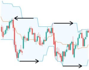
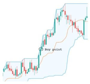
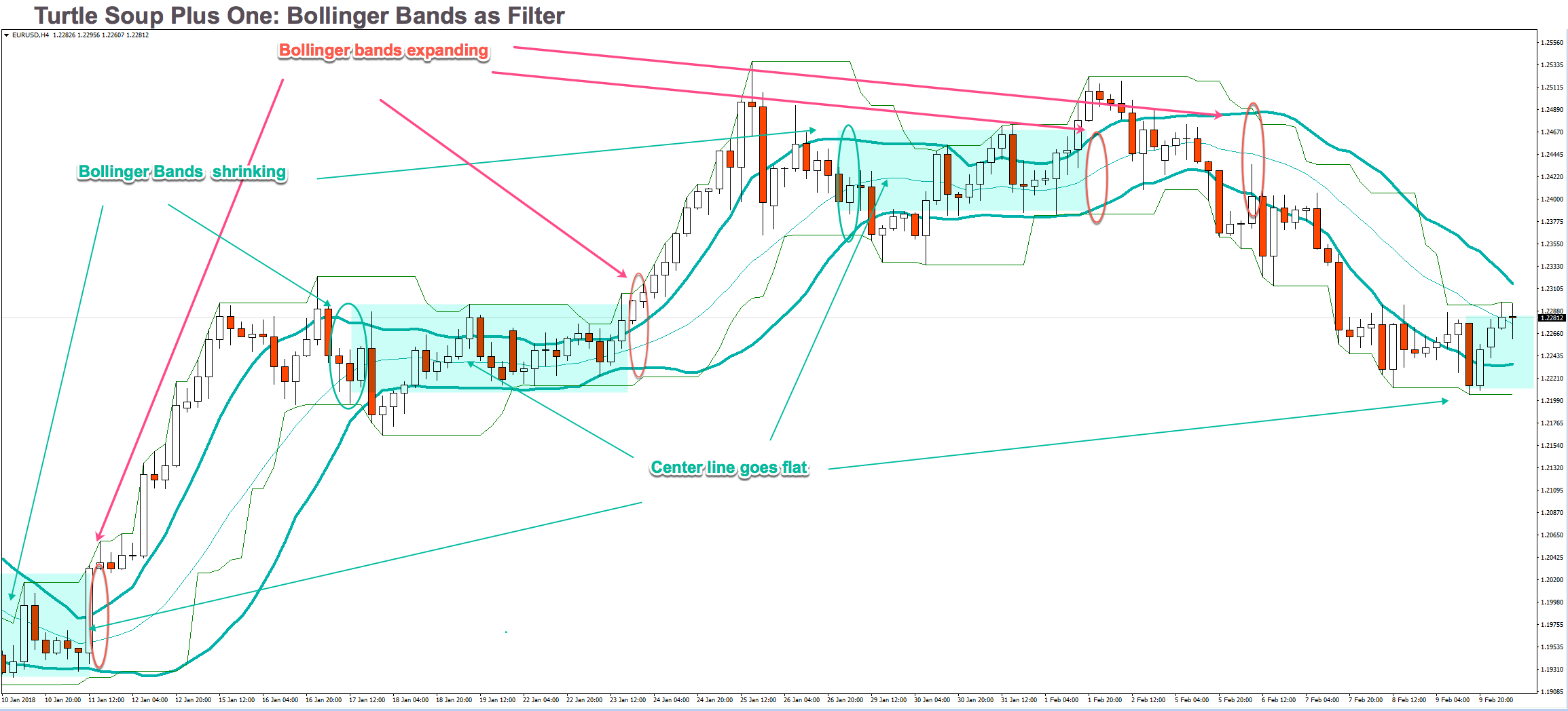
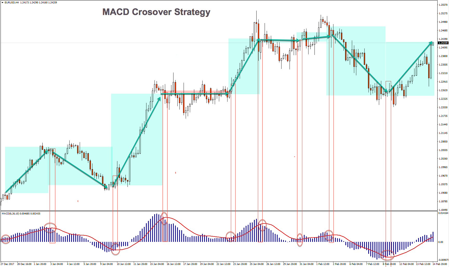
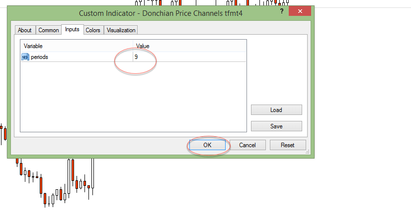
And, finally, we get the desired channel surrounding prices:


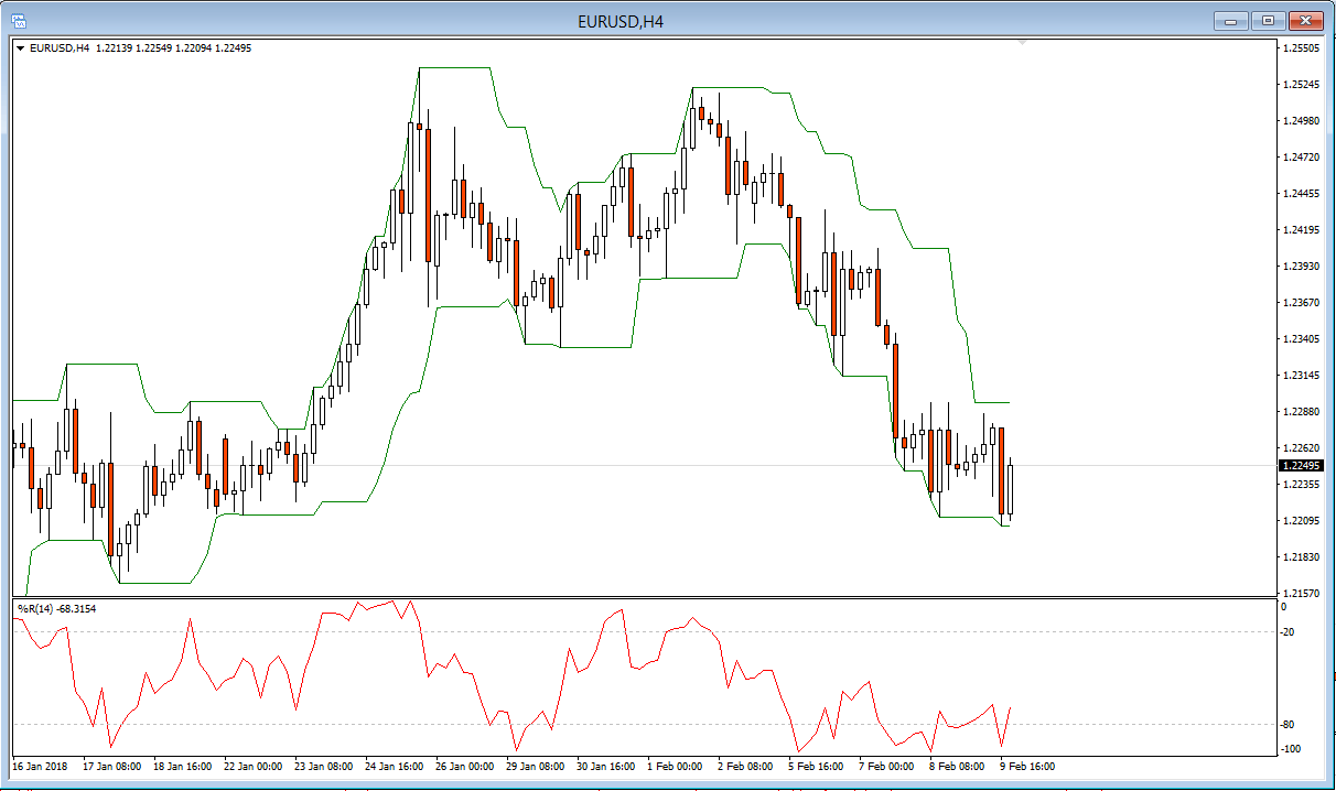
A sell signal happens at the candle following a close price breaking the channel’s current upper border. A buy signal occurs at the candle following a closing price below the line of the current lower edge of the channel. See figure below three consecutive winners on a flat channel signaled by a Bollinger band contraction.


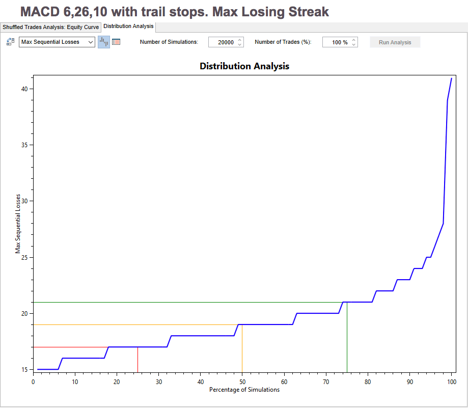
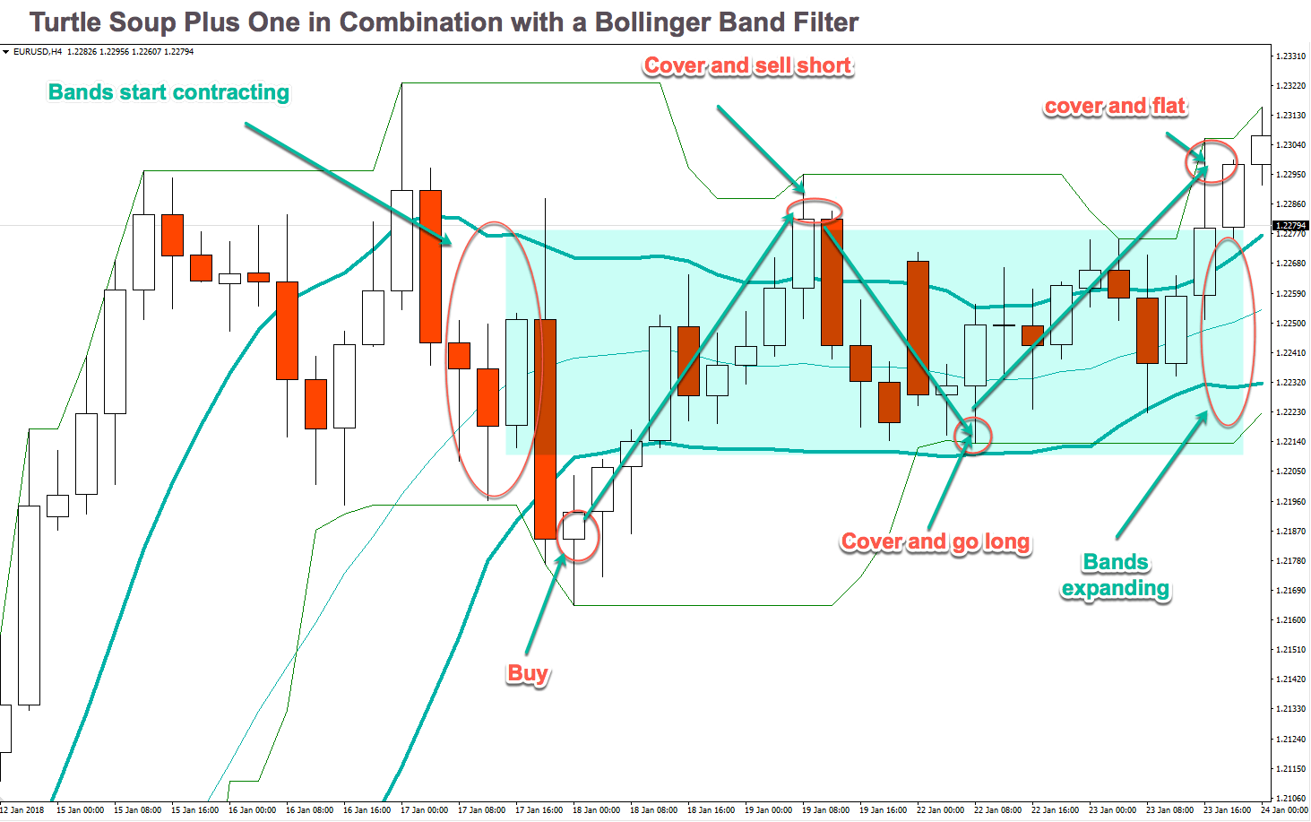
It’s not usual, but, from time to time, we can expect a streak of up to 10 losing trades. Thus, we have to apply adequate money management rules.

As an example, let’s say you don’t like to have a drawdown higher than 20% of your capital. Then, if you divide that figure by 10, that should be your maximum risk for a single trade. In this case, this is 2% of the current capital allotted to this strategy.

As a final note, the Turtle Soup and Turtle soup plus one are counter-trending systems profiting from false breakouts. Therefore, these systems work best in ranging markets. Bull or bear markets don’t fit well with its counter-trending nature. But they are a very good complement to trend following systems such as the Donchian channel breakout system or similar systems.

Categories
Forex Trading Strategies

SMA Crossover Strategy with a twist

Introduction

Some centuries back, Karl Friedrich Gauss showed that an average is the best predictor of stochastic series.

Moving averages are employed to grade the price.movements. It acts as a low-pass filter, taking out the fast changes in price, regarded as market noise. The period of the moving average controls how smooth is this low pass filter. A  three-period MA levels the action of three periods, while a 200-period MA produces a single value of the last 200 price values.

Usually, it is determined using the close value of the bar, but there can be made also of the open, high or low of the of bars, or a weighted average of all price points.

Simple Moving Average(SMA):

This average is computed as the sum of all prices on the period and divided by the period.

The main drawback of the SMA is its abrupt change in value if a significant price move is cut off, particularly if a short period has been chosen.

Averages with different periods result in different measures that can be thought of as a fair price during that period. Thus, if we observe two averages, a long-term and a short-term MA, and the short-term average moves above the long-term average, we might conclude that the new opinion about the price is changing, so it’s a good time to buy.  The converse holds if a short-term average falls below the longer-term one.

The Parameter Space

Let’s analyse the parameter space of a moving average crossover strategy. This strategy has only two parameters: The fast-MA period, and the Slow-MA period.

We use a simulator on a EUR-USD 15-min chart over a historical record of nearly 14 years and computed the returns using a constant one-lot trade, and the result is shown in the figure below. We go long when the fast MA crosses over the slow MA and price is above the fast MA. The opposite holds for short positions.

We observe that the map is somewhat un-smooth, with its better performers at about 60-70 periods for the slow MA and less than five periods for the fast MA.

The other fact is that only 48 out of 304 simulations deliver positive results, this shows us that the strategy is questionable without other parameters that might improve its performance.

Testing  the popular 5-10 Periods SMA

I have seen some people boosting a system that goes long when the 5-period MA crosses over the 10-period MA,  and short on opposite crosses, but as far as I had seen when I tested it, this strategy loses 32,000 Eur at the end of 14 years ( below its equity curve)

The use of trail-stops and targets can make this strategy positive, but the equity curve is hopelessly untradeable:

So what may help to improve this strategy?

Well, I thought about two ways. The first one is to move the slow MA period to about 70.

Well, that is a good improvement, although we have losing periods, it, definitely, is much better to use a longer-period parameter on the slow average.

What happens, if we add the condition that the slow MA should be pointing UP and prices above the slow MA?


When applying these rules, we observe that the better-performing slow-MA period moves around 80 bars, and the fast MA period stays at less than 5. Another point we observe is that the slow MA surface is smoother around 80 periods. This is a sign that we’ve found a right place for our parameters. Finally, in this simulation, 500 out of 735 simulations are in positive territory. That shows us that we have found a more robust strategy because 80% of the parameter values deliver positive outcomes.

So, that will be the basis of our moving average crossover strategy.

The Rules of the strategy:

Periods: Slow MA: 75, fast SMA: 3

Initial Stop-loss: 0.18%. This mean, we cut our losses if it crosses 0.18% away from our entry price.

Trailing stop-loss: 0.38%. We let the trade room to catch the trend.

For long entries:

1.- We define a bull market when the Fast SMA crosses over the Slow SMA

2.- We allow long positions only when the slow SMA points upward, meaning its current value is higher than its previous one.

3.- We buy when the price closes above the Slow SMA.

For short entries:

1.- We define a bear market when the Fast SMA crosses under the Slow SMA

2.- We allow short positions only when the slow SMA points downward, meaning its current value is smaller than its previous one.

3.- We sell short when the price closes below the Slow SMA.

The equity curve is much better, although it shows the typical equity curve of a trend-following system.

The Total Trade Analysis shows why. The system’s percent winners are 27.33%, and the reward-to-risk ratio is 3.5 (Avg Win/Avg Loss ratio). That tells the system is robust, by priming profitability over the frequency of winners.

Main metrics of the Donchian System, on the EUR-USD:

It’s not usual but, from time to time we may expect a streak of up to 20 losing trades, therefore we need to apply proper money management.

As an example, let’s say, you don’t like to have a drawdown higher than 25% of your running capital, then you need to divide that figure by 20, and that must be your maximum risk for a single trade, therefore, in this case this is 1.25% of the current capital allocated for this strategy.

How to trade this strategy on your JAFX MetaTrader 4:

Adding a moving average to a naked candlestick chart is simple:

A popup window appears after clicking “Moving Average”:

There you are able to set the period and MA method, Price to apply. We change just the period, and select the “Weighted Close (HLCC/4)” We may, also change the color of the Slower MA to a different color, so every MA has different colors.

© Forex.Academy

Categories
Forex Trading Strategies

The MACD Crossover Strategy

Moving Average Convergence Divergence: MACD

Moving Average Convergence-Divergence, MACD, was developed in 1979 by Gerald Appel as a market-timing tool, and It’s an advanced derivation of moving averages.

MACD consists of two exponential moving averages (EMA’s) of different periods that are subtracted, forming what is called the fast line. There is a second, slow line, that’s a short-period moving average of the fast line.

How to compute the standard MACD:

  1. Compute the 12-period EMA of prices (usually the closing price)
  2. Compute the 26-period EMA of prices
  3. Subtract 2 from 1. That is the fast MACD line.
  4. Compute the 9-period EMA of 3. That is the slow Signal line.

Almost any charting software allows the user to modify these periods and the kind of price (Open, High, Low, Close, or the average of all).

According to LeBeau and Lucas, on their classic book “Computer analysis of the Futures Market,” Gerald Appel had two setups: One for the entry side and another one for the closing side.

The entry side is 8-17-9, while the relatively slower closing side is12-26-9, that became the standard for commercial charting software.  This seems to indicate that Gerald Appel had a preference for getting in early in the trend and letting profits run.

My preference for intraday trading is 6-26-12, smoothing the signal line with a 12-period EMA. That reduces the indicator’s lag and having a faster signal that gets entries earlier, while a trailing stop keeps track of the trade at the exit side.

It’s not a good idea to optimize the MACD for a particular market, but, I think that a quicker formula is suitable for less than average volatility markets, and those with higher volatility require more extended period EMA’s. Pivot

Interpretation:

Price represents the consensus of value at a particular moment. A moving average is an average consensus over a period of time. The long-period EMA on a MACD reflects the longer-term agreement, while the short period EMA represents a fresher consensus that is arising.

The subtraction of the moving averages that shapes the fast MACD line reveals shifts in the short-term opinion in comparison to the longer-term (older) view.

Signal Crossovers

The usual MACD signal is a crossover between the fast MACD line and the signal line. When the fast MACD line rises above the slow signal line, it means a bull cycle has begun. If the fast MACD line crosses under the slow signal, a corrective period has started.

On Fig. 1, we show an example of a EUR/USD 1H chart. There we may observe that pink – unproductive- areas are usually crossovers going against the trend, which happens in reactive segments with ranging price movement. In spite of these failures, a MACD crossover is an efficient way to detect a trend change.

Testing the MACD over 14-year historical data on  a 15-min chart of the EUR-USD

To test this system, we use two separate MACD modules. One for the long signals (MACD LE), and one for the short signals (MACD SE).

We will keep a constant 26-period MACD slow MA on both sides, and we will test the map space of the fast MA and the smoothing period to obtain the slow MACD signal.

Below, is shown on both, Long and short signals.


Based on the above figure, we see that the best performing combination is around 6,26,10 settings. Below we show its Equity Curve. That is the raw strategy, without stops nor targets.


It’s great to see this kind of curve with almost no modification because it shows this trading system is robust, and we know it will improve by merely adding a trailing stop. And we’ll get even more improvement if we add proper profit targets. Below, Both equity curves.

As we can see, there is a slight improvement in the results using targets. But it’s very small and might be a by-product of the optimization process rather than a real improvement.

I would recommend the use of this system just using a trailing stop, because, since this is a trend following system, it follows the well-tested advice “let profits run.” Thus, starting from now, we will present the system numbers using just trailing stops. As usual, we show the system with a constant one-lot trade.

The Total Trade Analysis table shows that the percent winners is at 34.23% and the Ratio Avg Win/ Avg Loss, which shows the reward-to-risk ratio is 2.17.

Main metrics of MACD, on the EUR-USD:


How to use Metatrader 4 to trade this strategy

To add a MACD indicator to your chart do the following:

After clicking the MACD on the menu window, another popup window with several tabs appears. In the Parameters tab, change Fast EMA to 6 and MACD SMA to 10. The Fast MACD line in this platform appears as a histogram, but it’s easy to spot MACD line crossing the fast line. See figure, below:

Categories
Forex Trading Strategies

Volatility Expansion Strategy

Overview


There are two main measures we use routinely: The center of our observations and the variability of the points in our data set from that mean.

There’s one main way to compute the center of a set: the mean.

Mean: It’s the average of a set of data. It’s computed adding all the elements of a set and divide by the number of elements.

The variability of a data set may be calculated using different methods. One of the most popular in trading is the range.

Range:  The range is the difference between the highest and lowest points in a data set. On financial data, usually, a variant of the range is calculated: Average true range, which gives the average range over a time interval of the movement of prices.

The Strategy

The Volatility Expansion Strategy rationale is that a sudden thrust in the volatility in the opposite direction of the current momentum predicts further moves in the same direction.

For this strategy, we are going to use the Range as a measure of volatility. Specifically, we are going to use the Average True Range indicator to spot volatility sudden changes.

The rules of the strategy are:

Long Entries:

Set a buy stop order at Open + Average( Range, Length ) * NumRanges  next bar

Short Entries:

Set a stop sell short order at Open – Average( Range, Length ) * NumRanges next bar

The parameters are the Length of the average and the NumRanges for longs and shorts.

Manage your trade using a trailing stop.

Let’s see how an un-optimized system performs under 14 years of EUR_USD hourly data:

The standard parameters are:

 Length: 4

NumRanges: 1.5

As we can observe, the actual raw curve is rather good, showing a continuously growing equity balance. ( click on the image to enlarge)
The Total Trade Analysis for single-contract trades shows a nice 2:1 Reward to risk ratio (Ratio Avg Win/Avg Loss) and a 35% winners.

Analyzing the Parameter map:

As we observe in fig 5, there are two areas A and B where to locate the best parameters for this strategy. The surface is smooth, thus, guarantying that a shift in market conditions won’t harm too much the strategy. For the sake of symmetry we will choose the A region, thus, the Long ATR length will be 10 and the short ATR length is left at 13.

Fig 6 shows the map for the NumRanges That weights the ATR value and sets the distance of the stop order from the current open. The surface is, also, very smooth. Therefore we can be relatively sure that setting the NumRages value to 1.3 in both cases we will get good results.

The new equity curve has improved a lot, especially in the drawdown aspect, and in the overall results, as well, although we know this isn’t a key aspect because this equity result was achieved with just a single-contract trade.

This kind of strategy incorporates its stops because it’s a reversal system. Therefore there is no need for further stops or targets.

In fig 8 we observe that the percent winners are close to 39% while the risk to reward ratio represented by the ratio Avg win/ Avg loss is 1.9. Also, we see that the average trade us 28.5 euros which is the money expected to gain on every trade. That shows robustness and edge.

Main metrics of the Volatility Expansion System, on the EUR-USD

(click on the images to enlarge)

As a final note, one way to perform semi-automated trading using a volatility  expansion is the free indicator Volatility Ratio, from MQL5.com

When you click on the Download button, a pop-up window appears:

When you click on the Yes,  this indicator is installed automatically in your MT4 platform. To use it on a chart you just go to Insert -> Indicators -> Custom-> Volatility Ratio, as shown below:


The Options window for this indicator allows you to toy with the parameter values, but I advise you to keep the default values and paper trade them, so you get the idea about how it works and how parameter changes may affect its effectiveness and the number of trade opportunities.

Finally, this is the type of chart annotations of this indicator:

(click on the image to enlarge)

Categories
Forex Trading Strategies

Williams Percent R Scalper Strategy

Introduction

Williams Percent R is a momentum indicator developed by Larry Williams, which is similar to the Stochastic indicator. The Williams %R shows the position of the Close in relation to the highest high of the period.

Therefore, this oscillator moves from -100 to 0. Values below -80 are oversold levels while from -20 to 0 are overbought.

Some charting packages shift these values to positive 0 to 100 by adding 100 to the formula. In this case, oversold levels are between 0, and 20 and overbought condition happens from 80 to 100.

%R is noisier than Stochastic %D, but with less lag, so together with the confirming candle pattern, it allows for a better reward to risk ratio and tends to show more trade opportunities than Stochastic does.


Intraday trading is a dangerous profession. More than 85% of traders fail because they buy when they should sell and sell when they should buy. To those new to mean reverting markets, please welcome the Williams Percent R system!

The system rules are rather straightforward:

Use the 10-14 period % R indicator, as in the above figure.

For long entries:

1.- Wait for the %R line to enter the oversold territory ( -80 to -100)

2.- Go long the next candle whose %R line is above -60

3.- handle your trade using a trailing stop of about 0.3%

3.- let it run until % R reaches overbought then tighten your trail stop, but let the market take you out.

For short entries:

1.- Wait for the %R line to enter the overbought territory ( -20 to 0)

2.- Go short the next candle whose %R line is below -30

3.- handle your trade using a trailing stop of about 0.3%

3.- let it run until % R reaches oversold then tighten your trail stop, but let the market take you out.

Backtesting a Williams %R system

We used the 10-period Williams %R signal, a 0.37% Trail stop and a 0.8% target on a 14-year 1h data of the EUR-USD. Below, the total trade analysis table and the equity curve using a constant one lot trade. That is the standard way to assess the quality of a system. The important parameter here is not the amount won, but its statistical characteristics and curve smoothness.

This system delivers close to 4 million euro along 14 years, using a proportional 1.5% risk sizing strategy, with about 35% drawdown. In the case of a one-lot contract, the drawdown is just 7%.

The percent profitable is very good, with an overall 48.11% of positive trades, although we observe that this grows to 58.27% on long trades and shrinks to 42.25% on short trades.

The ratio win/loss that measures the reward we get for the risk we hold is not spectacular, but it’s fairly good on a system with no filter to allow only trades with the primary trend.

The use of a trending filter.

Ideally, the use of a trending filter might improve the system, because it avoids trades against the main trend, and it does, but the results are a bit surprising. Although It improves the overall results, the percent of winning trades goes down to 41%. That figure is compensated with an increase in the ratio Win/loss to 1.8%, from the original 1.55%, Overall.

Main metrics of the Williams Percent-R System, on the EUR-USD:


How to use Metatrader 4 to trade the Williams %R scalper:

The Williams %R is an indicator that comes together with the basic MT4. To add it to a chart, we select that chart and then click Insert -> Indicators -> Oscillators -> Williams Percent Range

Then a popup window appears to allow range selection:

After that you’ll get everything configured to start working with this technique:

It’s not usual but, from time to time we may expect a streak of up to 10 losing trades. Therefore we need to apply proper money management.

As an example, let’s say, you don’t like to have a drawdown higher than 25% of your running capital. Then you need to divide that figure by 10, and that must be your maximum risk for a single trade, Therefore, in this case, this is 2.5% of the current capital allocated for this strategy.


© Forex.Academy

Categories
Forex Educational Library Forex Trading Strategies

Trading using Trader Vic’s Patterns


Victor Sperandeo, known as Trader Vic on Wall Street, is a legendary futures trader who has over 45 years of experience in the commodities markets. In this article, we will show two trading setups when the trend is changing and how to take advantage of the markets.

2B PATTERN

In a bull market, the 2B pattern requires that the price performs a new maximum, then a significant retracement and then that price tests again the previous maximum or attaining a higher one, that is better known as false breakdown (or false breakout). When this test fails, it is a sign that the price may be developing a failure in the uptrend, thus creating a potential reversal of the trend. Some traders call this pattern “Trap” (bear trap and bull trap). An idealisation of this pattern is in figure 1.

Figure 2 is an example of a 4-hour EUR-USD chart. The Euro shows an initial bearish movement to 1.1573; when it reaches this level, the price reacts making a retracement to 1.1689. After this retracement, the Euro makes a new low as a false breakdown. When it happens, the price makes a bullish move starting a new bullish trend.

The setup of this pattern is:

  1. Entry: Buy above (or sell below) the false breakout (or breakdown) candle.
  2. Stop Loss: Below (or above) the last swing (see figure 1).
  3. Profit Target: Previous swing high (or low).


1-2-3 PATTERN

This pattern is based on the concept that the trend changes when the price breaks the trendline described by the Dow Theory. In an uptrend, the price is making higher highs and higher lows, but then, the market breaks down the trendline. Afterwards, the price makes a test of the tops, but it does not reach a new maximum. Some traders call this pattern as “Failure”. Figure 3 shows an idealisation

As in the case of 2B Pattern, the 1-2-3 Pattern looks to identify a trend reversal or the end of the current trend. Let’s consider in figure 4, the BNKG 30-minute chart, which is following an upward trend. Once it reaches a new maximum, BKNG breaks down the uptrend line (1), then it performs a test that cannot overcome the previous maximum (2) followed by a price failure to reach a new maximum and a break down of the last support (3).

The setup of this pattern is:

  1. Entry: Buy above (or sell below) the swing of the breakout (or breakdown) of the trendline.
  2. Stop Loss: Below (or above) the last swing (see figure 3).
  3. Profit Target: Previous swing high (or low).


THE BACKTEST

In a personal study that considered the frequency of recurrence of the patterns: Trap, Failure, Climax (or turn in V) and Double (Double Top, Double Bottom), the results were the following:

As can be seen in Figure 6, the possibility of detecting the Trap patterns (or 2B pattern) is 42.7%, and Failure (or 1-2-3 Pattern) is 41.3%, adding up to 84% of the changes in the trend that occurred in the market. The ability to detect these two patterns can provide an advantage over the market. Figure 6 is a USOIL hourly chart, 2B. 1-2-3 movements are commonly found when we make the backtest to these patterns, even in minutes, as on the GOLD 15-minutes chart (figure 7).

SUGGESTED READINGS:

  • Sperandeo, V. (1994). Trader Vic II – Principles of Professional Speculation. New York: John Wiley & Sons, Inc.