Categories
Forex Basic Strategies

Forex Trading Using ‘Commodity Correlation Strategy – 2’

Introduction

A correlation coefficient is a number that describes the extent to which two instruments are correlated to each other. The number ranges between -1 and +1. This number moves from periods of positive correlation to periods of negative correlation. Located on one end of the scale, +1 is considered a state of the positive correlation between two instruments.

If the number is anywhere between 0 and +1, the two assets are said to move in the same direction, with a certain degree of positive correlation. On the other end of the scale, -1 is considered a state of negative correlation between two instruments. If the number is anywhere between 0 and -1, the two instruments are said to move in the opposite direction, with a certain degree of negative correlation.

The strategy we will be discussing today seeks to exploit the inverse correlation between the dollar index and Gold’s price. According to the World Gold Council, Gold tends to rise when the U.S. dollar falls. It is observed in the past that the correlation coefficient for Gold and the dollar index was between -0.6 and -0.8. This means if the dollar index is up, there is a 60% to 80% chance that gold prices would come down. In contrast, if the dollar index is down, there is a 60% to 80% chance that gold prices would come down. Let us see how the strategy works.

Time Frame

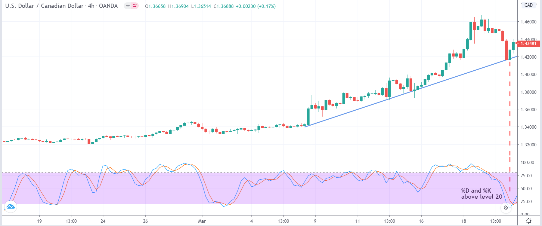
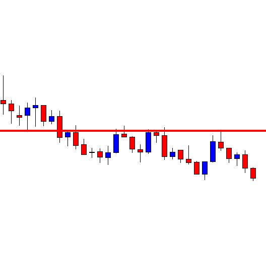
The commodity correlation strategy works well in the Daily (D) time frame. This implies that each candlestick on the chart represents the price movement of one day.

Indicators

We will be using the ATR indicator in the strategy. No other indicators are required for the strategy.

Currency Pairs

There are two charts we need to focus on in this strategy. The first one is the spot Gold or XAU/USD, and the second one is the chart of the dollar index.

Strategy Concept

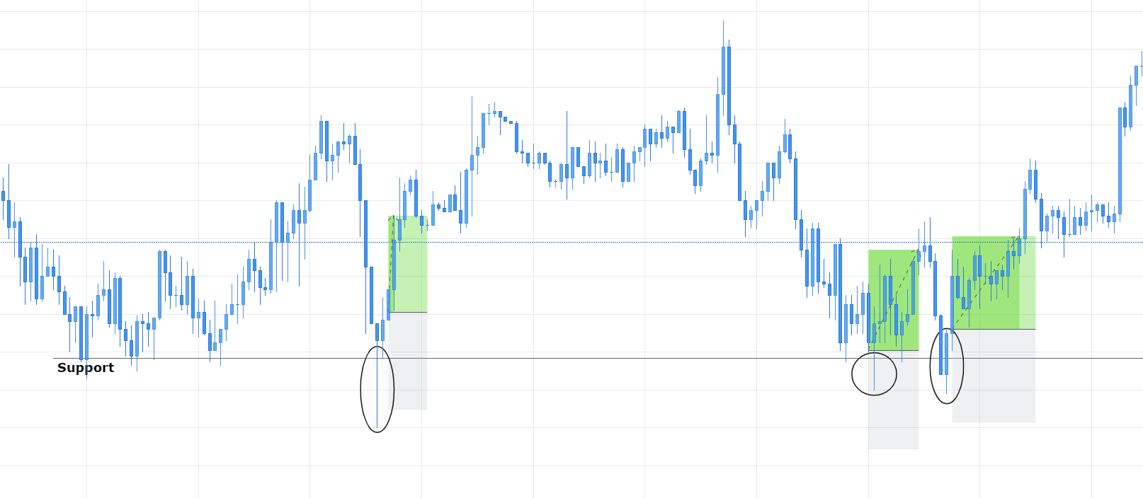
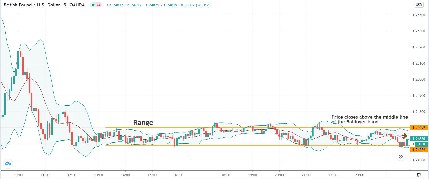
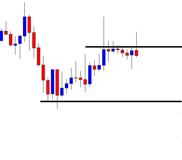
The dollar index’s price action is used as a reference to initiate a trade on the XAU/USD. Technical levels of support and resistance on the dollar index chart are used to spot long and short trades on XAU/USD. If the price closes below the support on the dollar index chart, a long trade is initiated on the XAU/USD the following day. Similarly, if price closes above resistance on the dollar index chart, a short trade is initiated on the XAU/USD the following day. The risk-to-reward of this trade is 1:2. A bigger target can be achieved by allowing the trade to run its course.

The strategy is very simple for those who have a basic understanding of support and resistance. Another reason behind its popularity is that it does not involve the usage of complex indicators. The trade setups are not formed too often as we are using the daily time frame charts. Hence, a lot of patience is required for the application of the strategy.

Trade Setup

Here are the steps to implement the commodity correlation strategy. In both the instruments, we will be using the daily time frame chart only.

Step 1

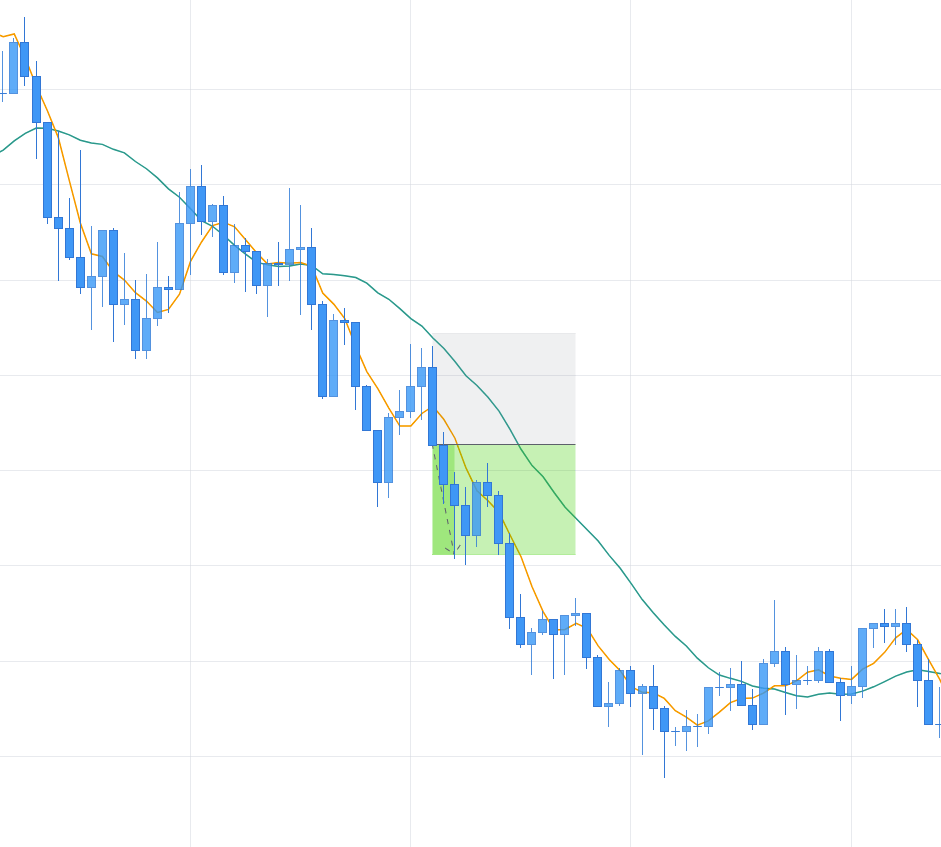
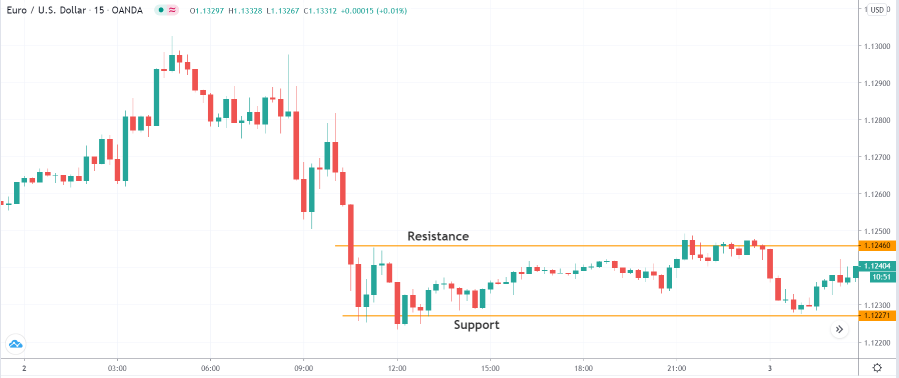
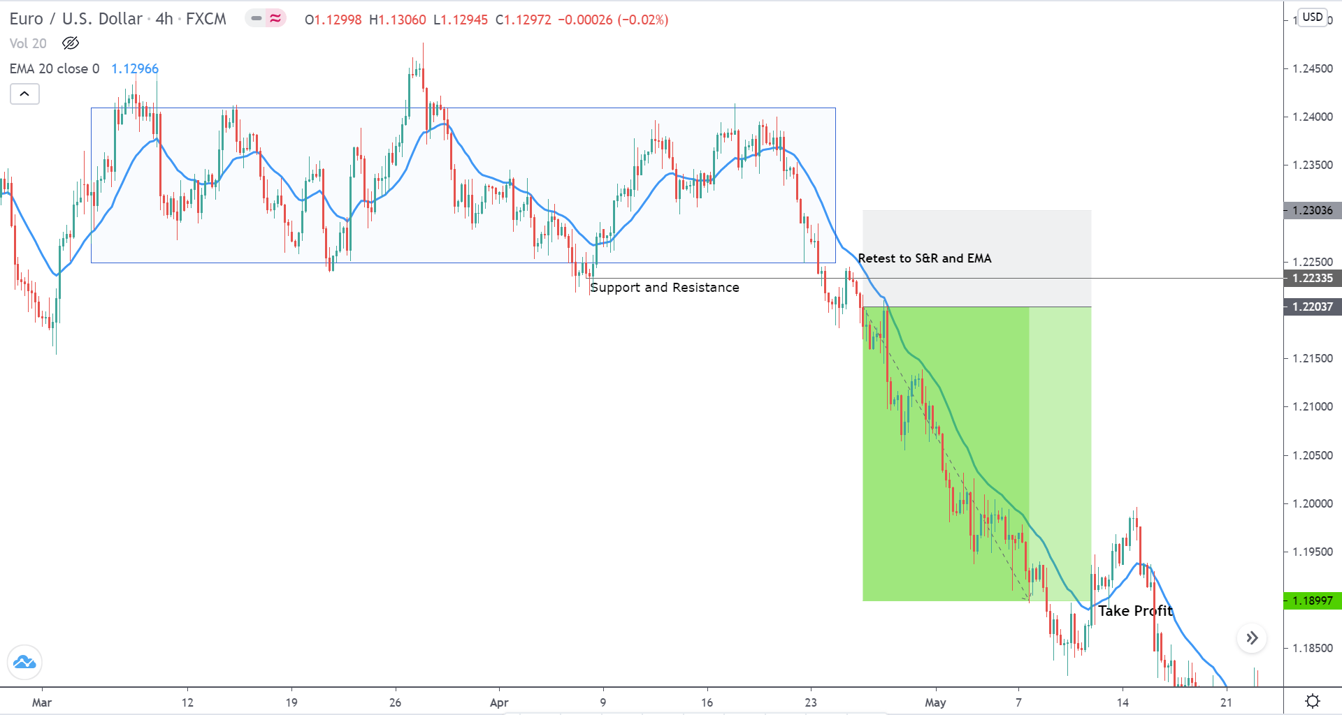
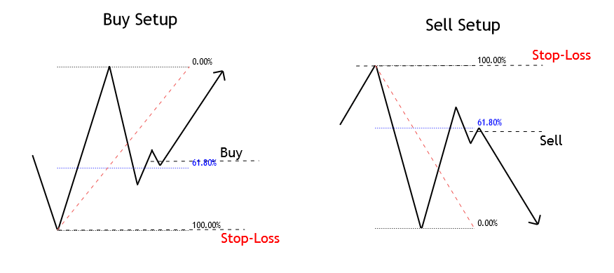
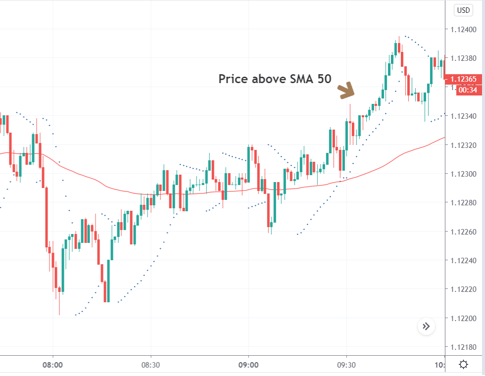
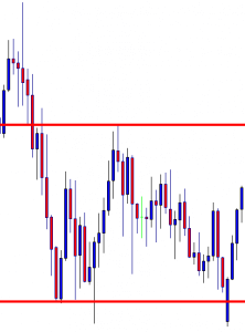
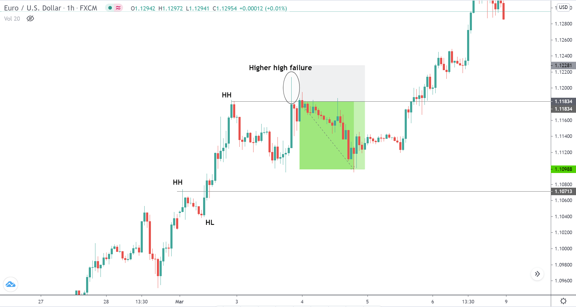
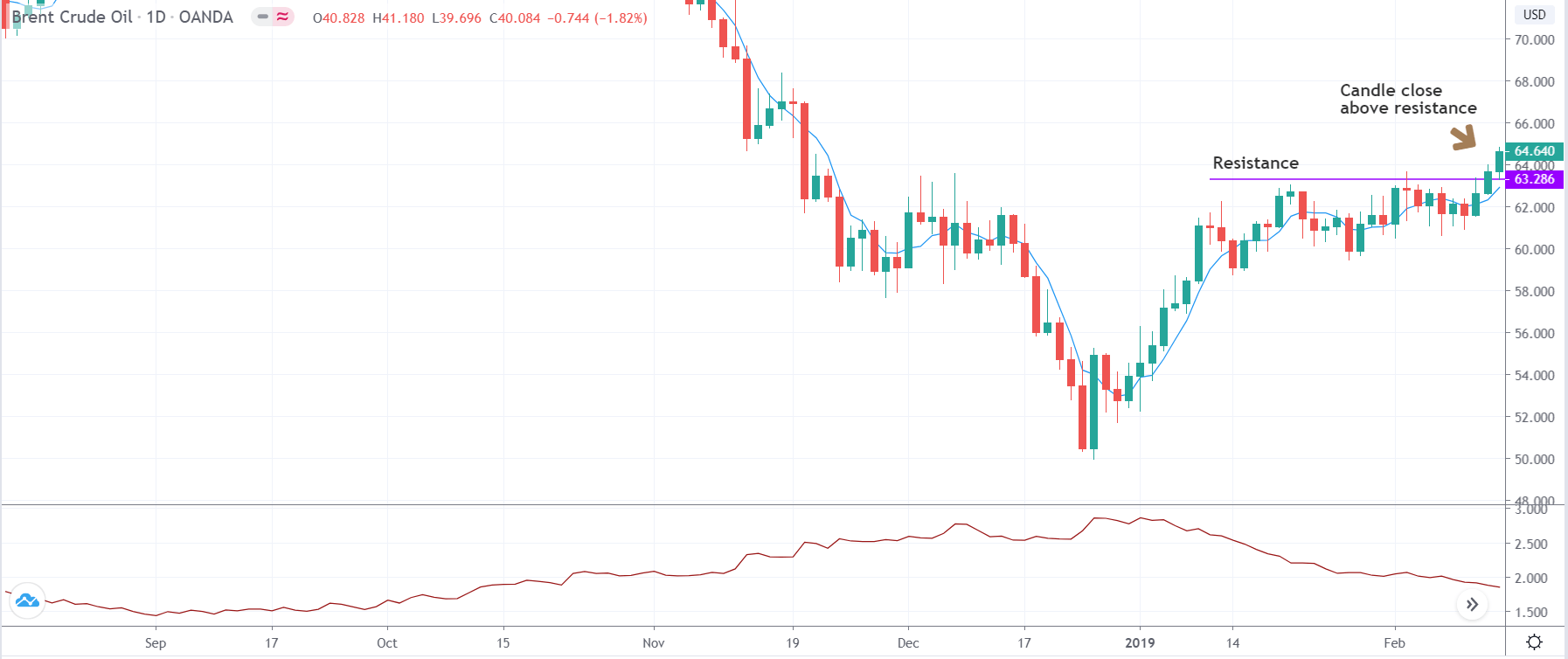
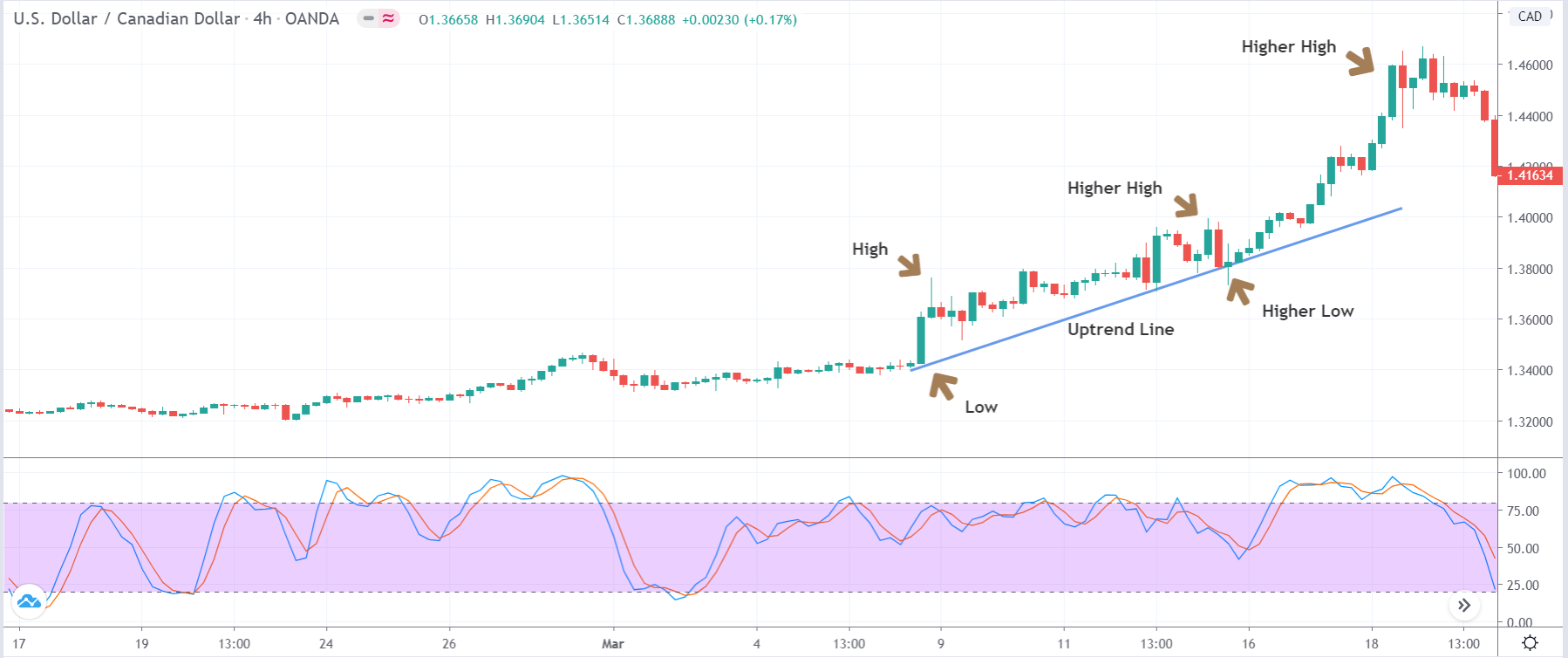
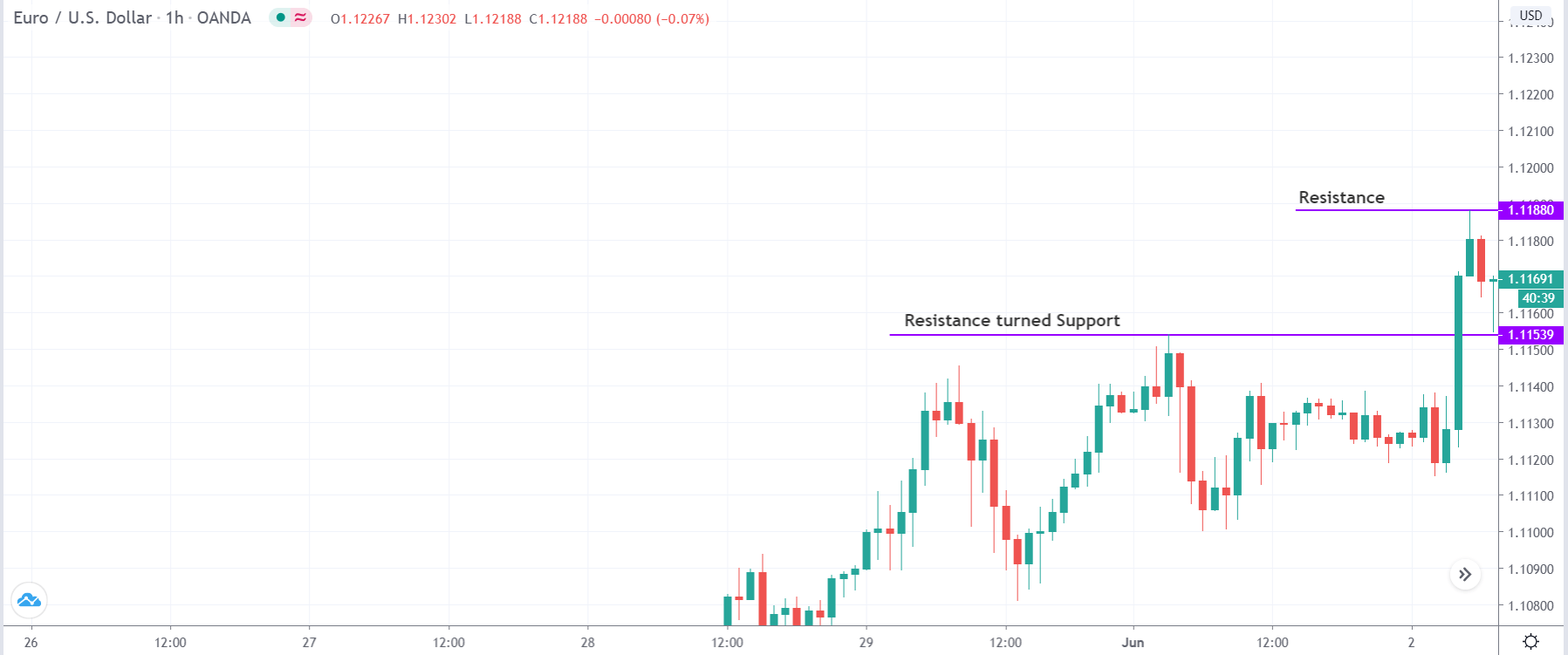
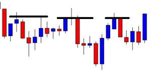
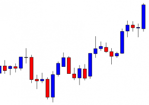
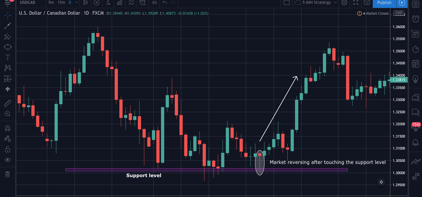
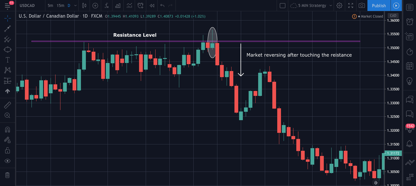
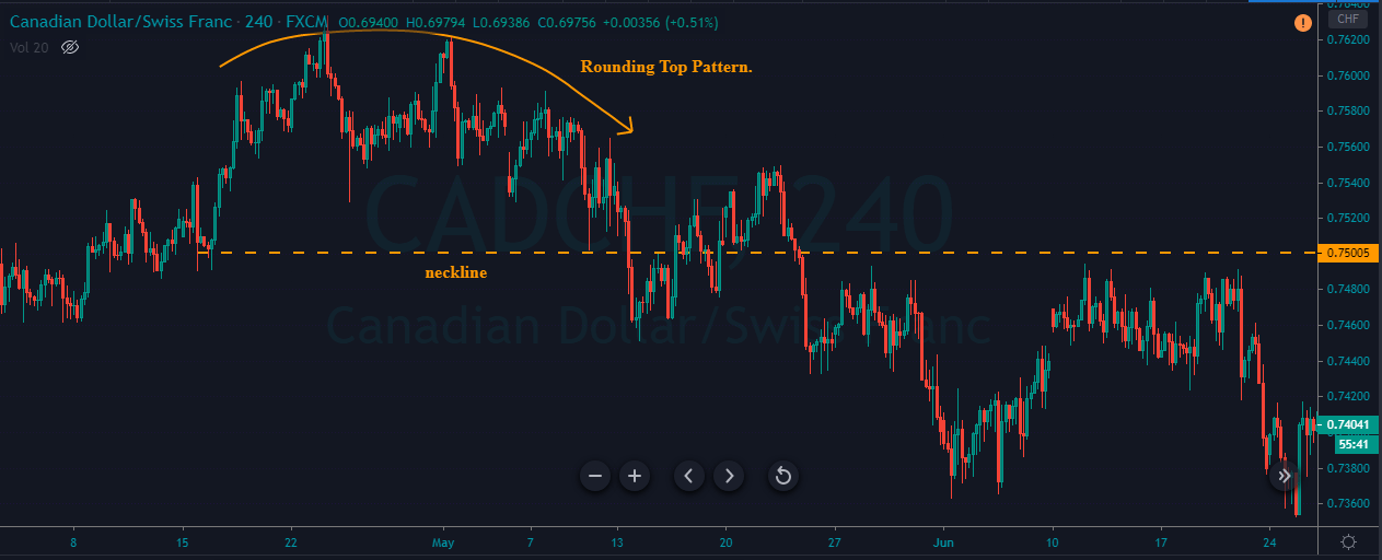
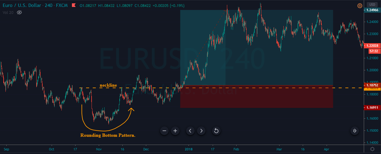
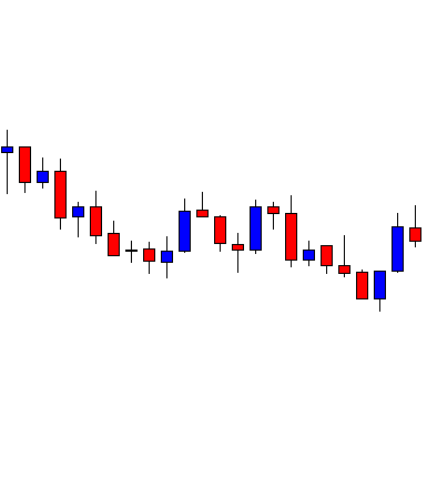
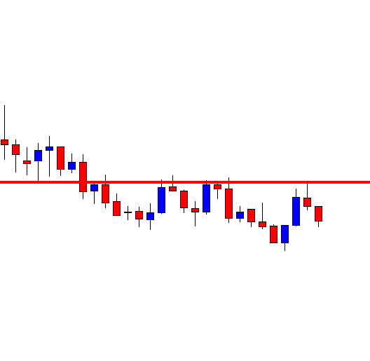
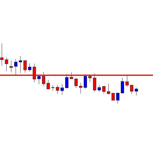
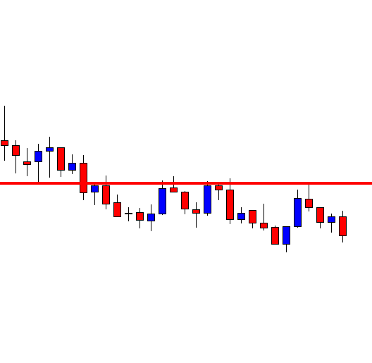
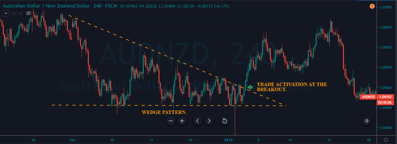
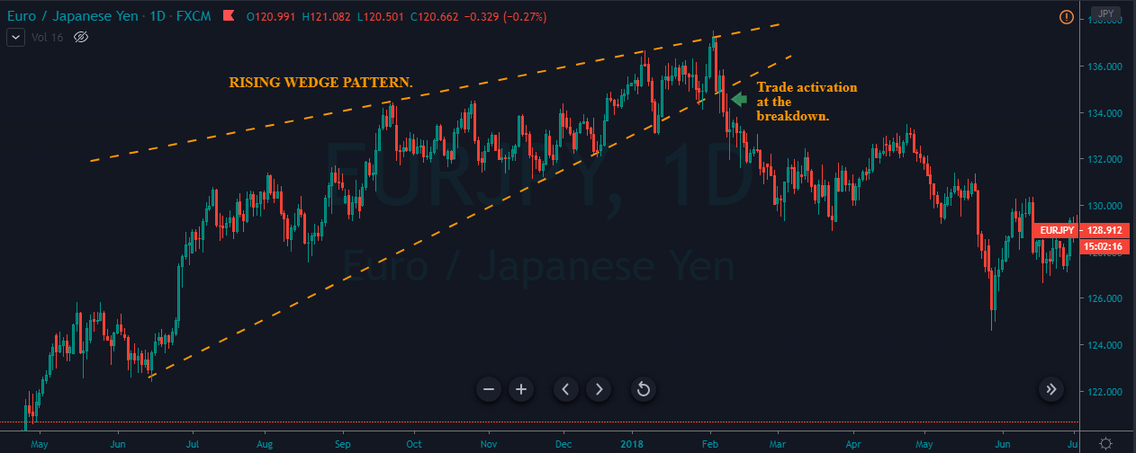
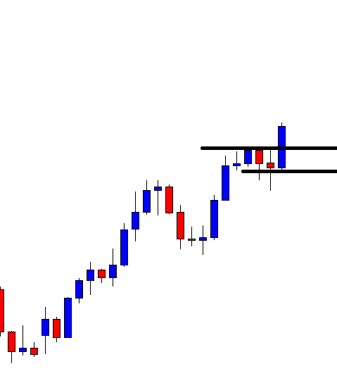
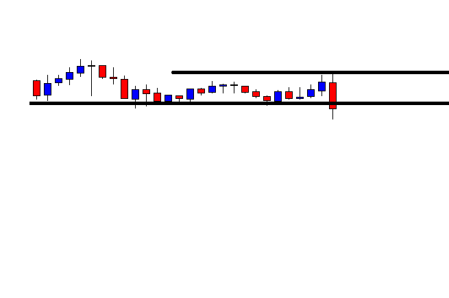
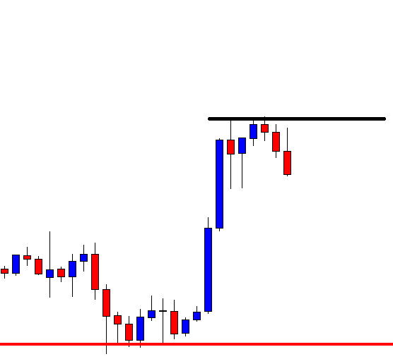
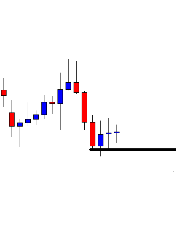
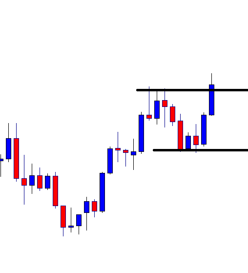
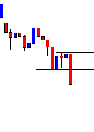
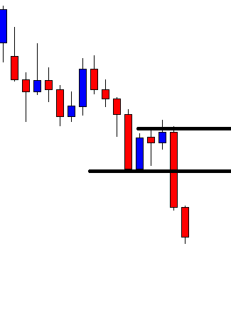
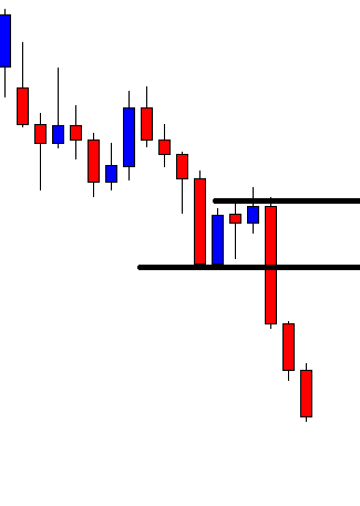
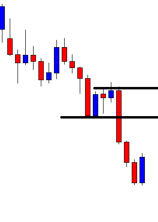
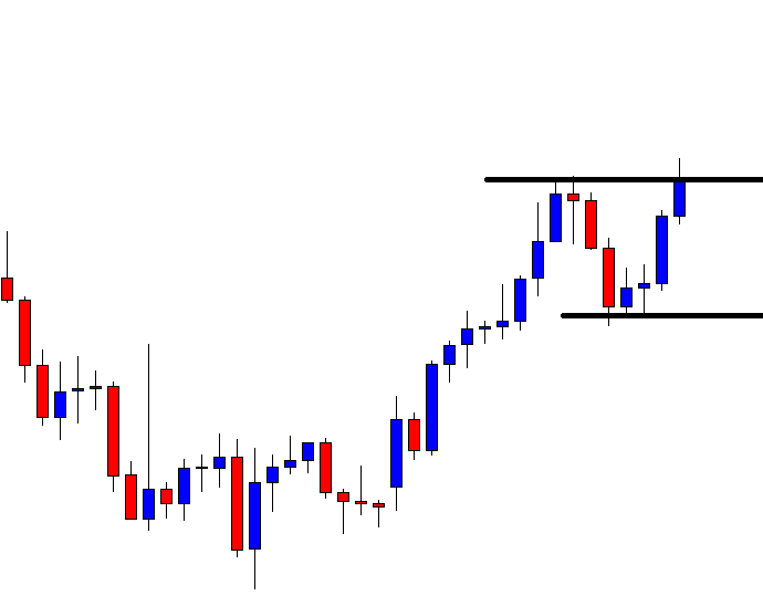
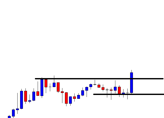
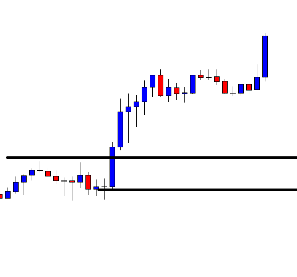
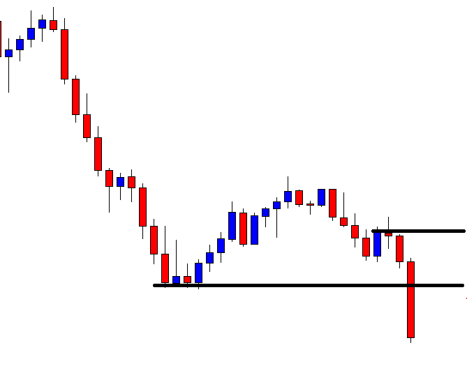
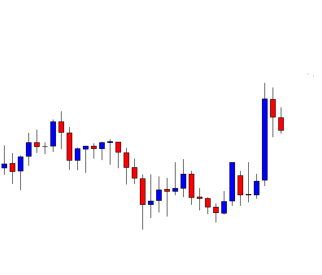
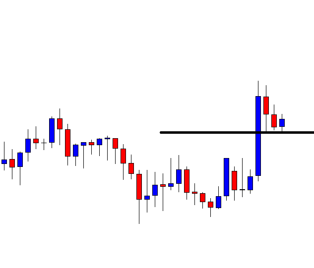
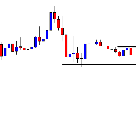
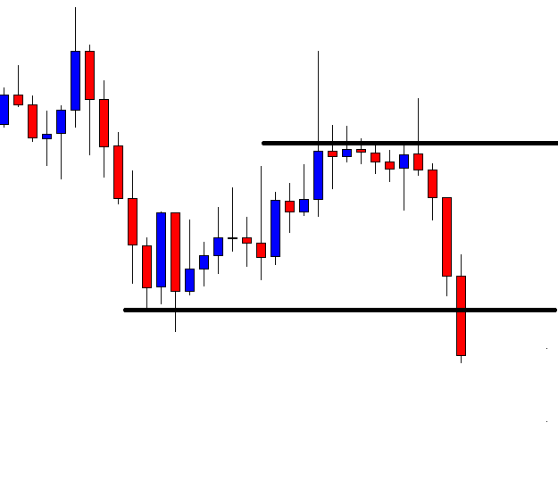
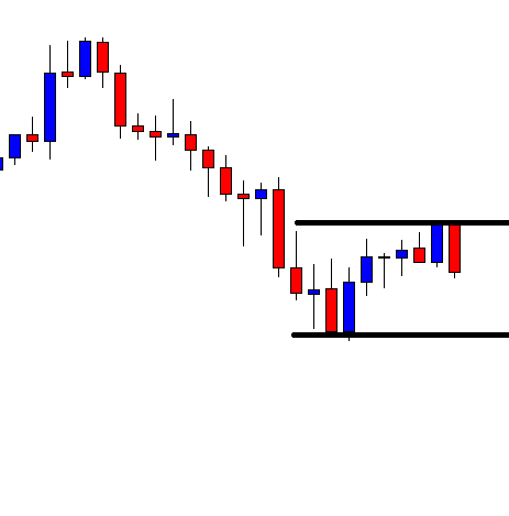
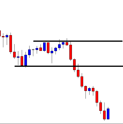
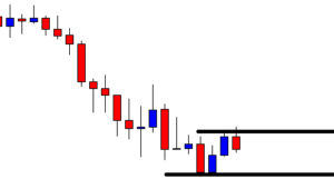
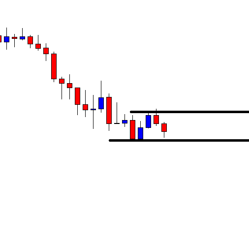
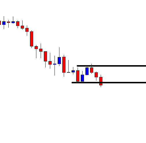
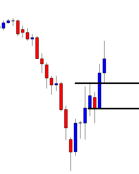
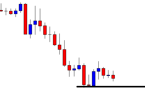
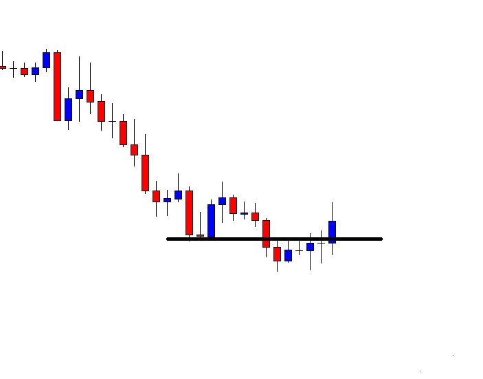
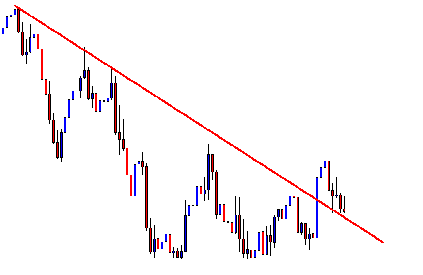
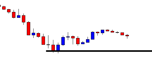
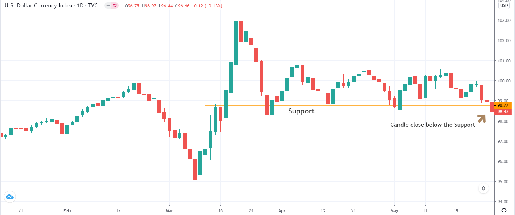
The first step of the strategy is to open the dollar index’s daily time frame and mark key areas of support and resistance on the chart. If one is looking for ‘long’ trades, the identification of the support area is crucial. And if one is looking for ‘short’ trades, identification of ‘resistance’ trade is crucial. After marking out of the lines, wait for the price to breakout or breakdown. In case of a breakout, we will look for ‘short’ trades in ‘gold,’ and in case of a breakdown, we will look for ‘long’ trades in ‘gold.’

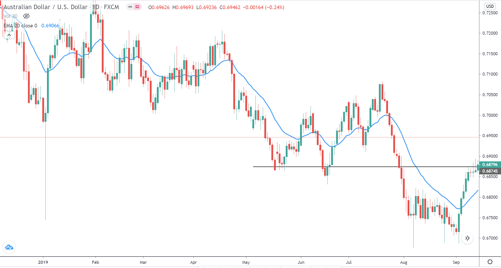
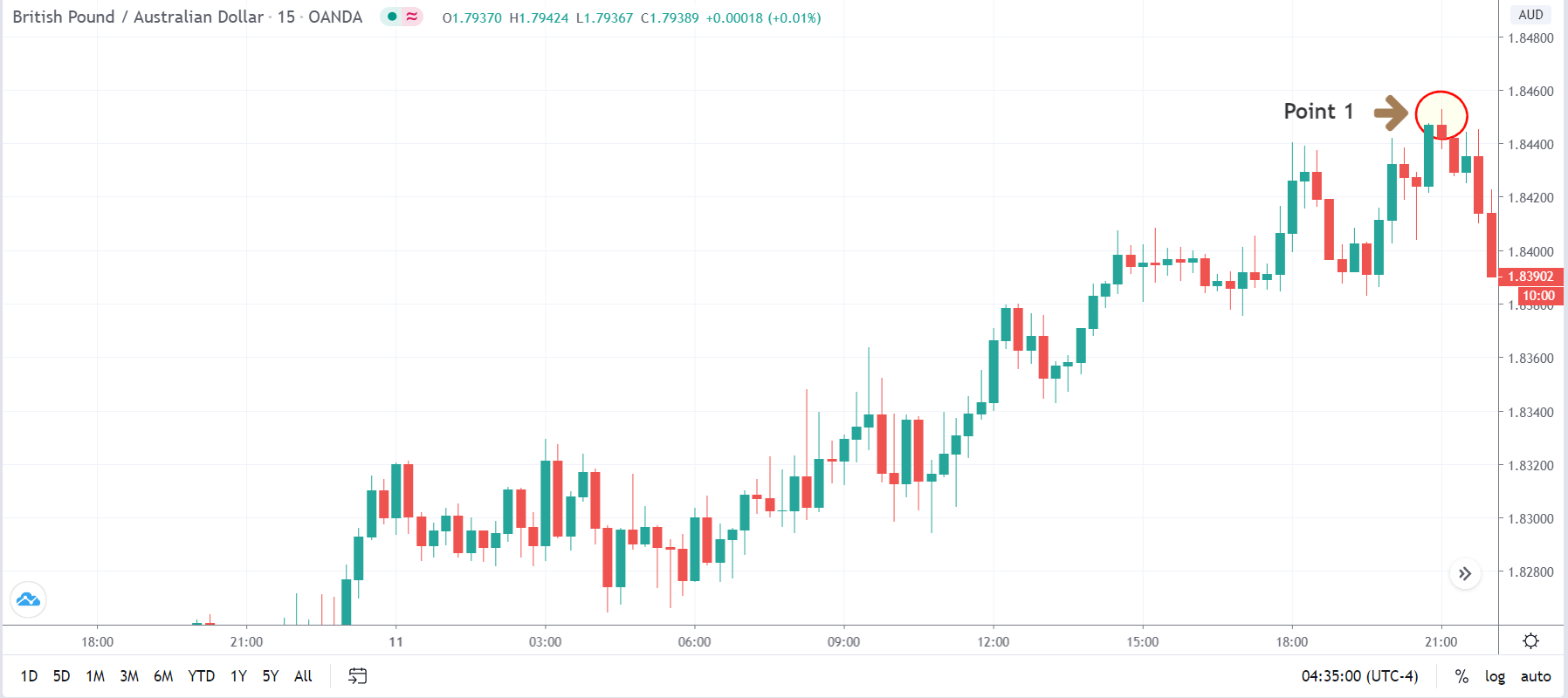
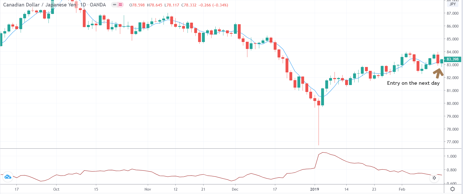
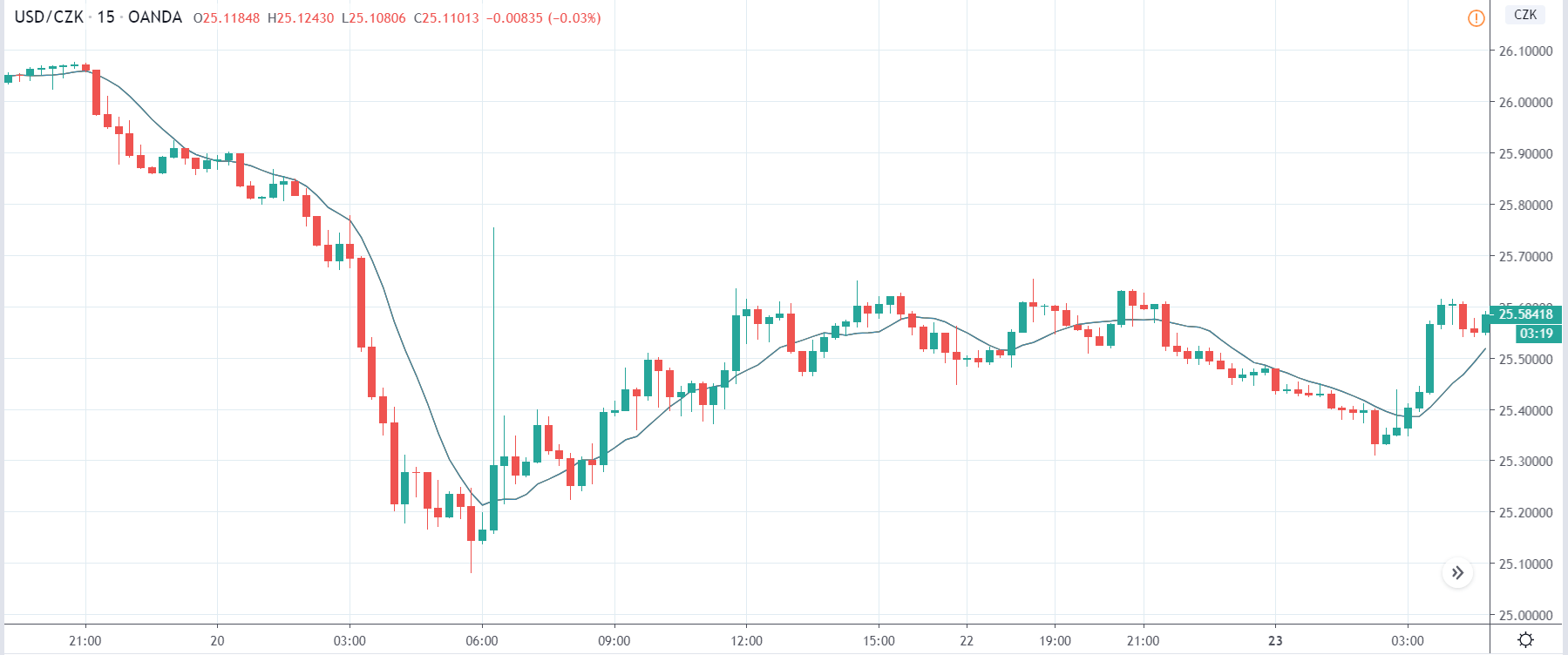
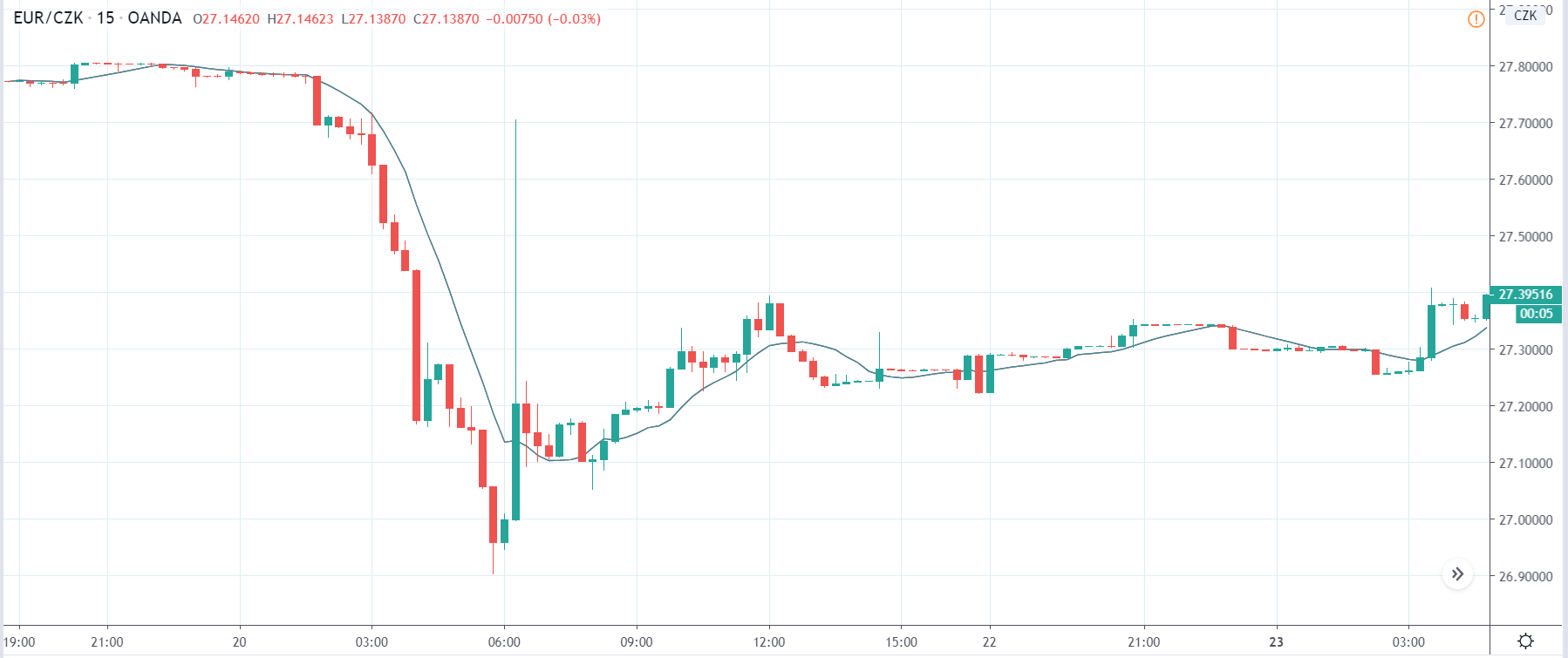
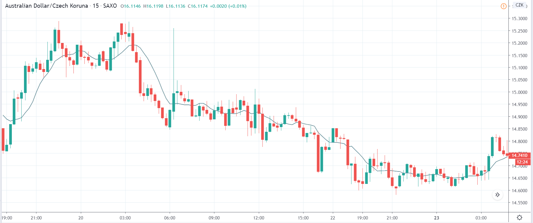
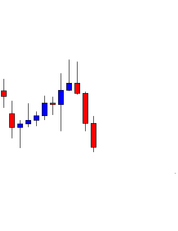
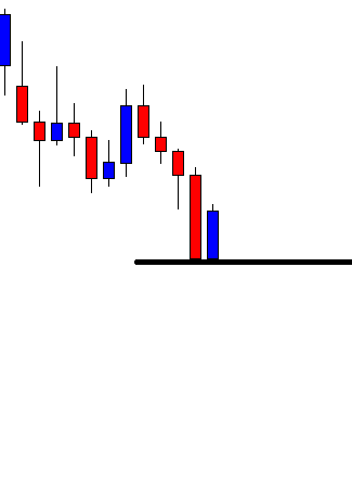
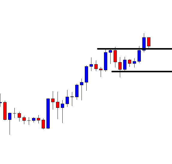
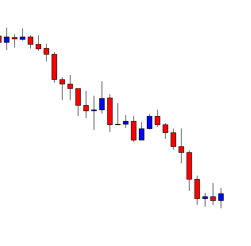
We have taken an example of a ‘long’ trade where we will be executing the steps of the strategy. In the below image, one can see that the price has broken below the long term support.

Step 2

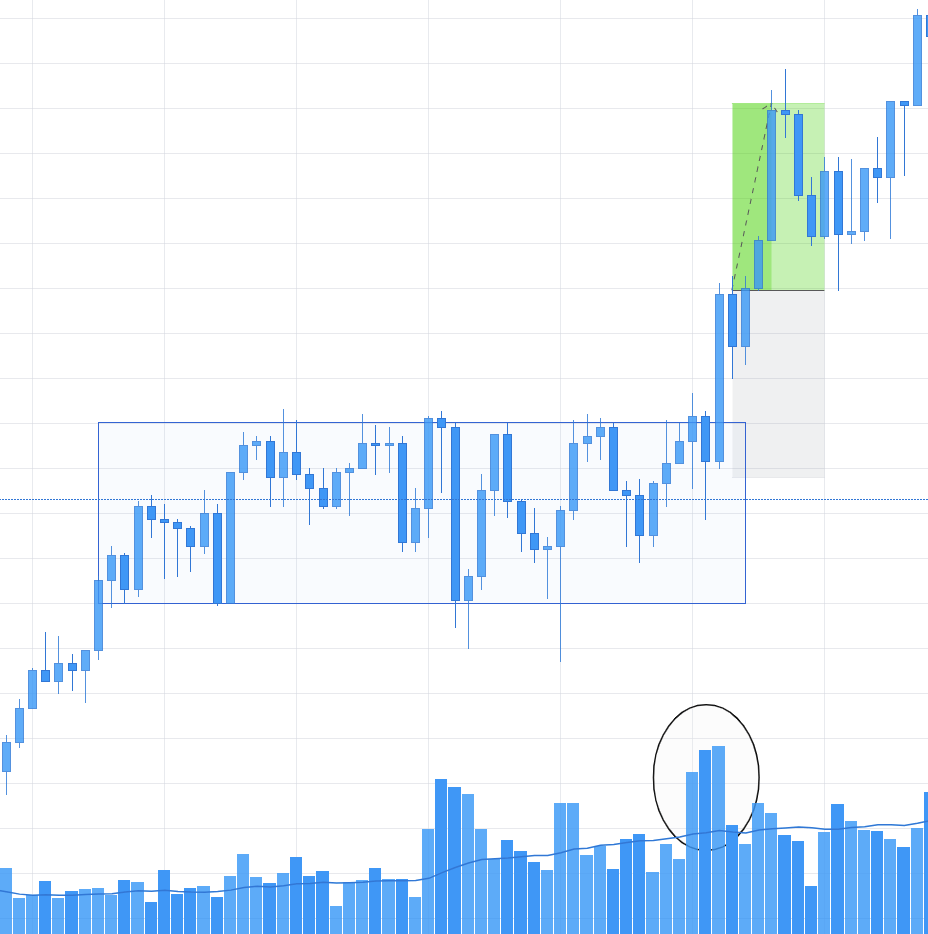
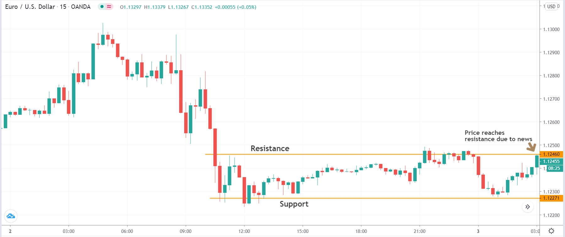
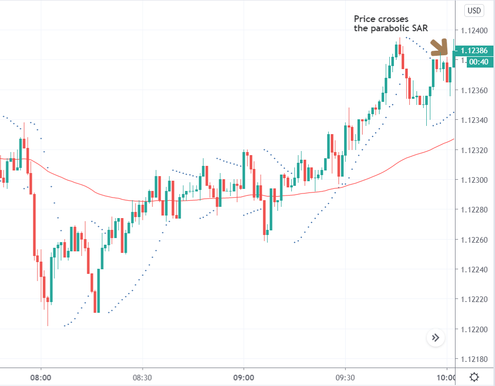
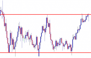
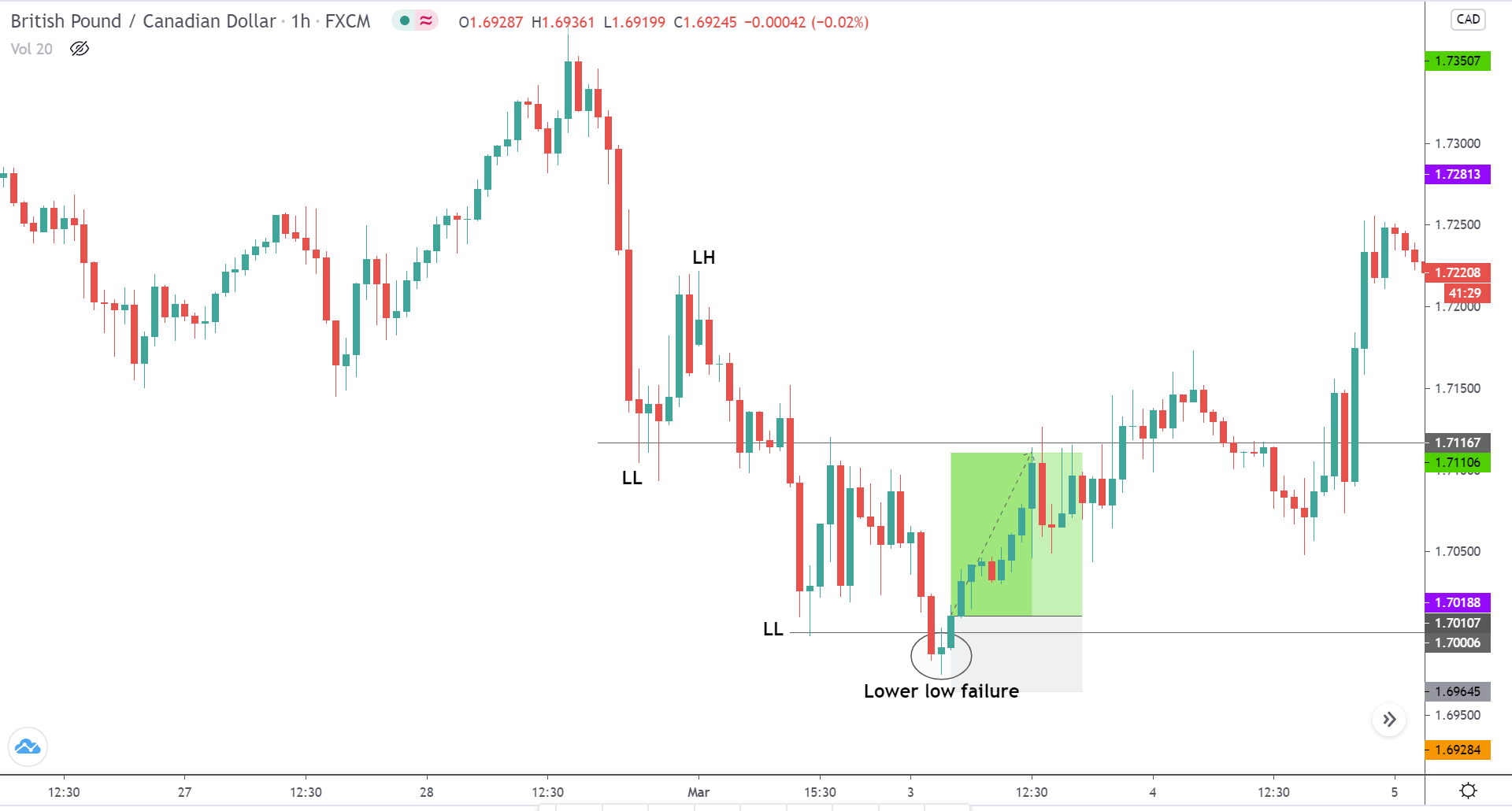
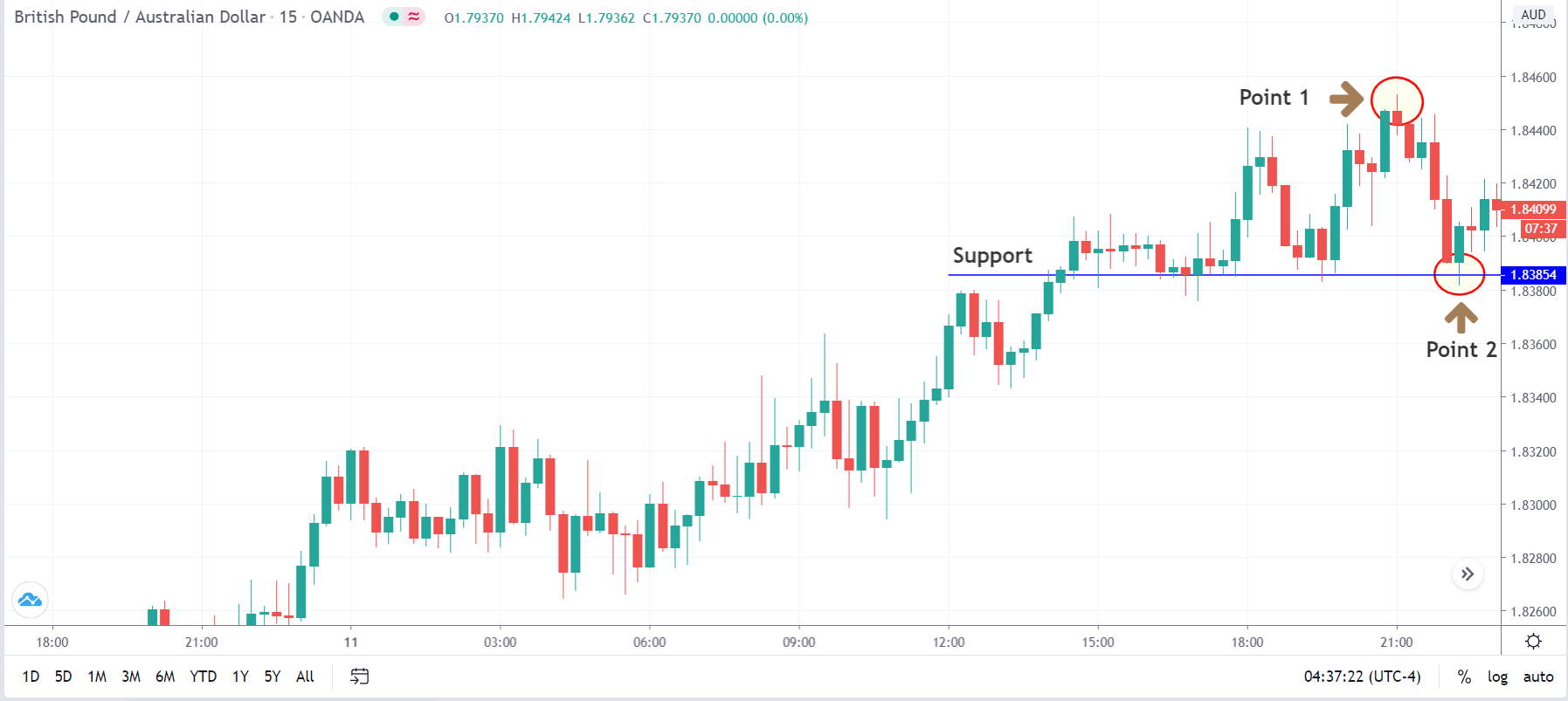
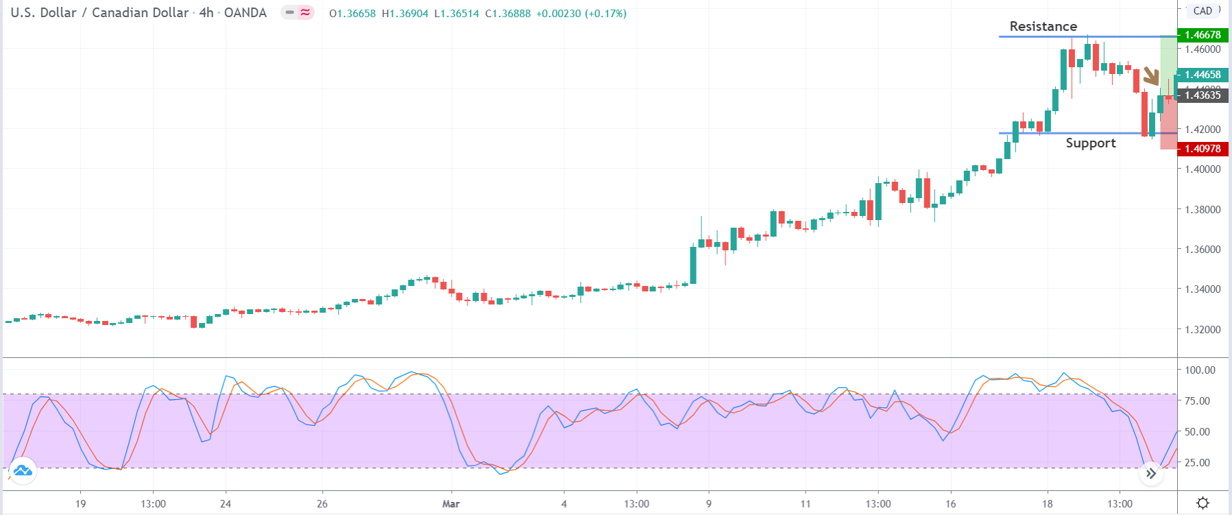
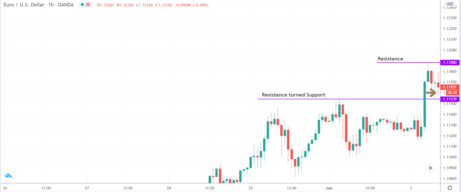
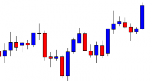
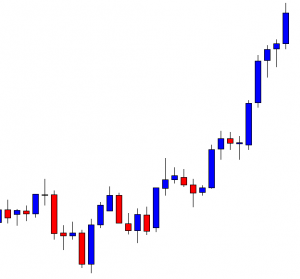
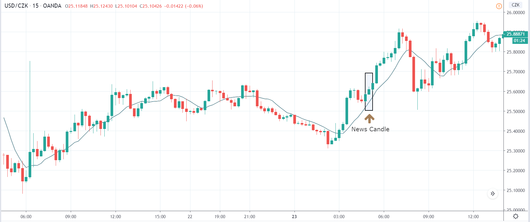
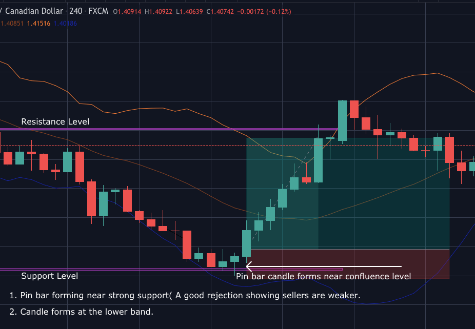
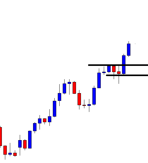
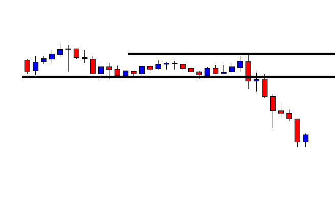
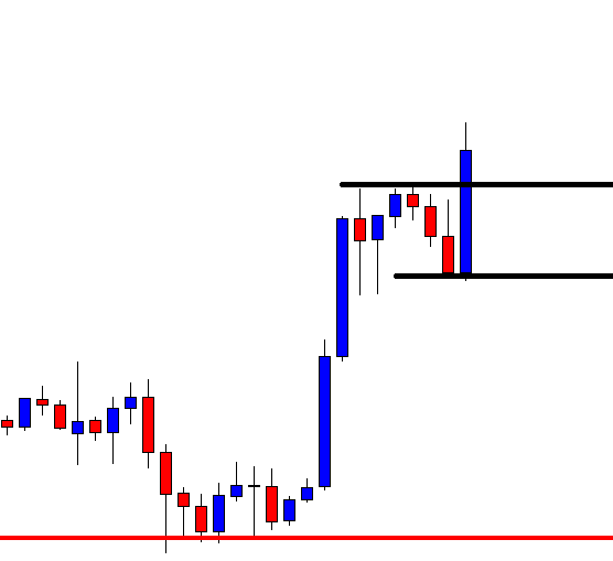
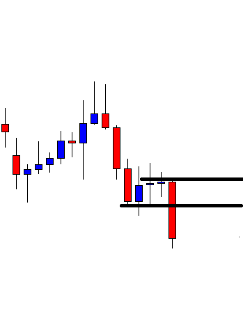
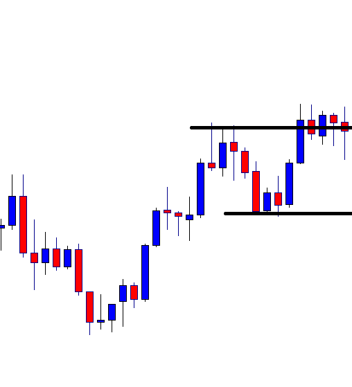
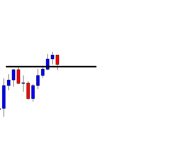
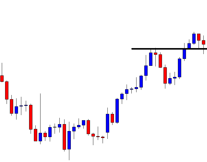
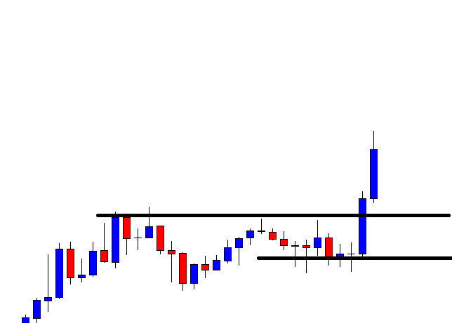
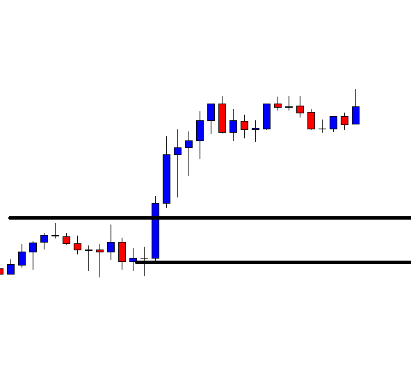
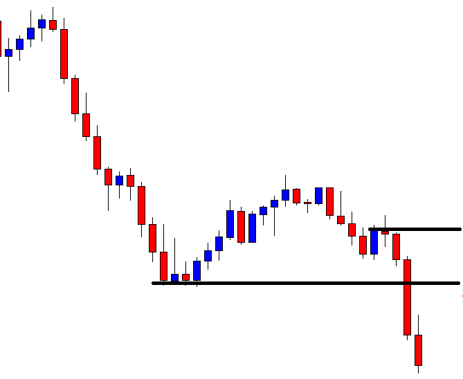
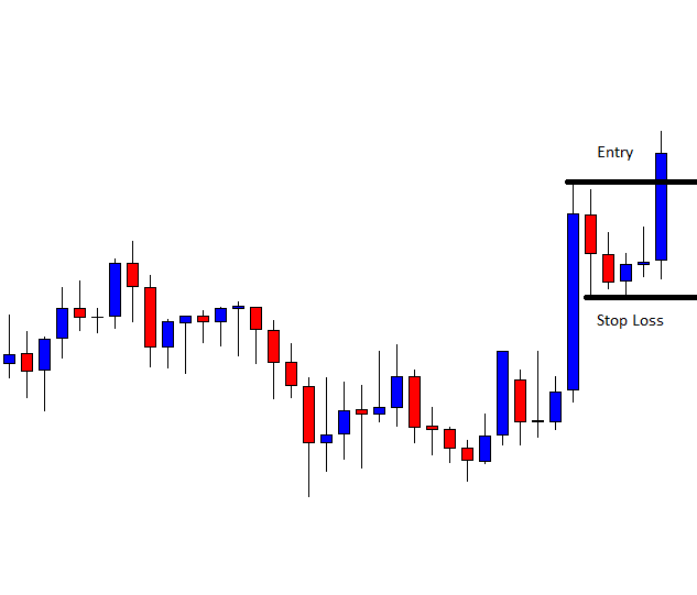
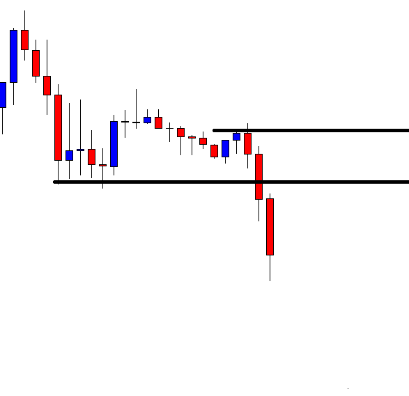
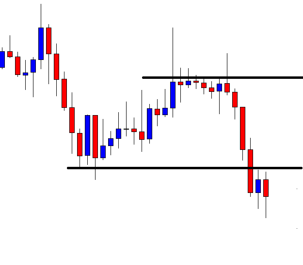
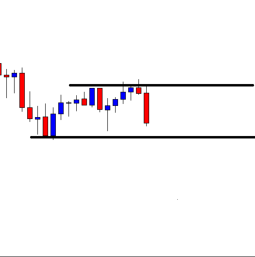
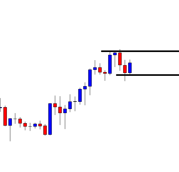
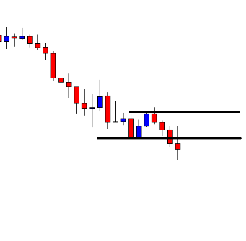
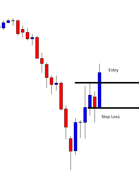
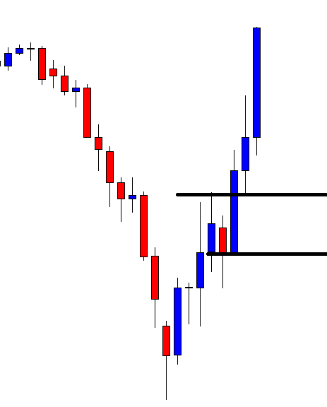
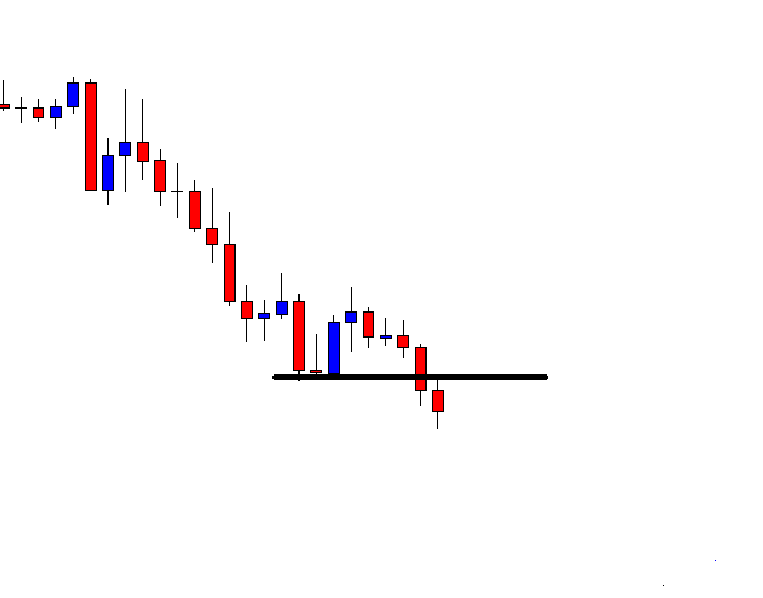
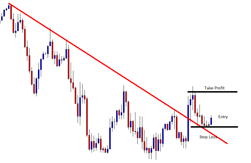
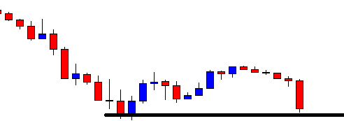
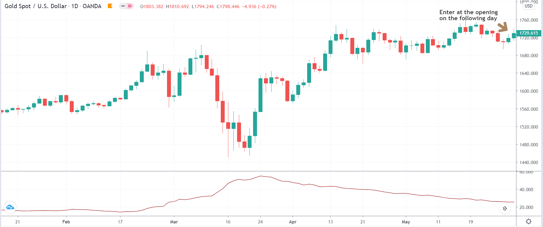
Next, we open the chart of XAU/USD, where we look for ‘long’ or ‘short’ entry. We enter for a ‘long’ in ‘gold’ on the following day of the dollar index’s break of support. Similarly, we enter for a ‘short’ in ‘gold’ on the following day of the break of resistance in the dollar index. The entry is taken right at the opening candle on the next day.

In our case, we are entering for a ‘long’ in ‘gold’ on the following day since the price had broken the dollar index’s support on the previous day.

Step 3

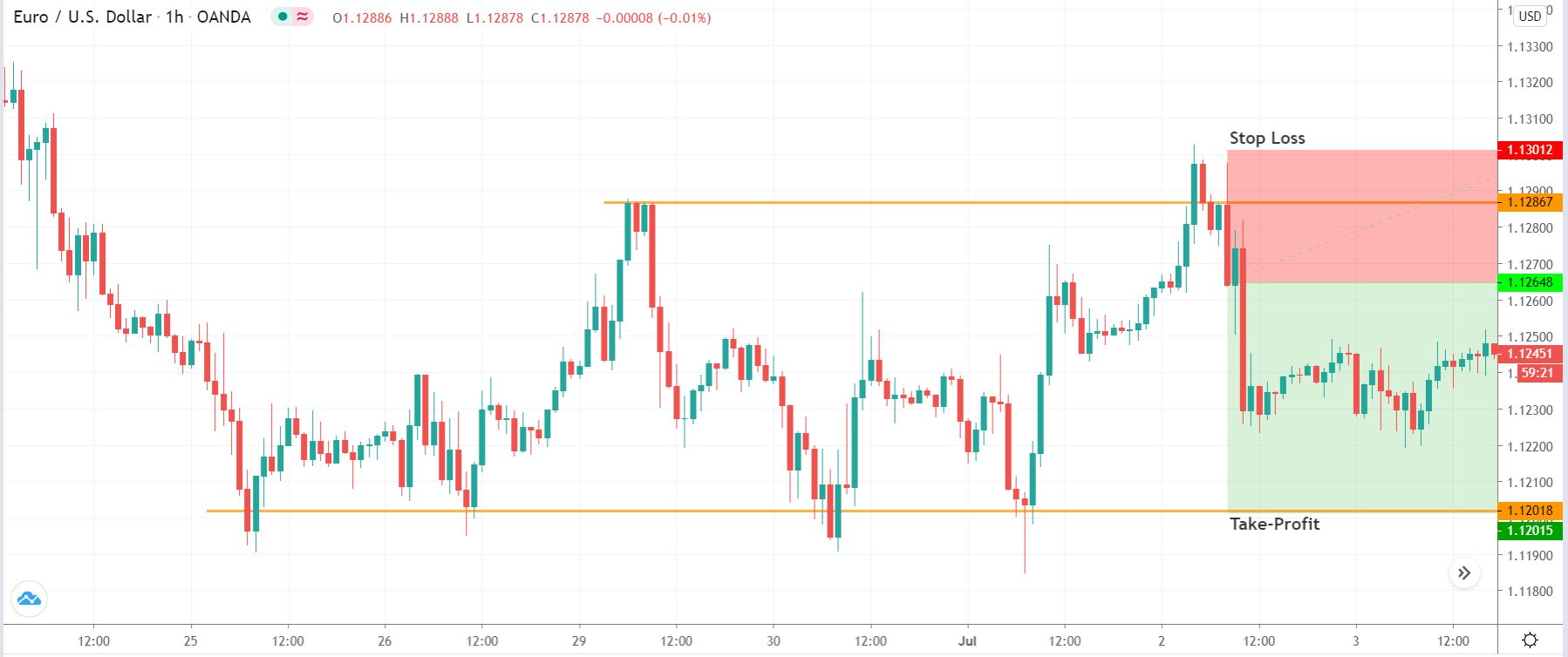
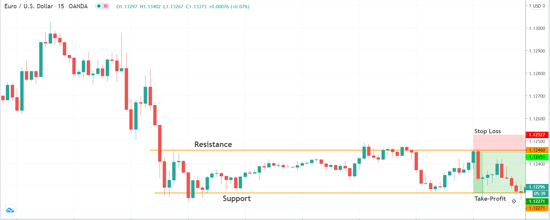
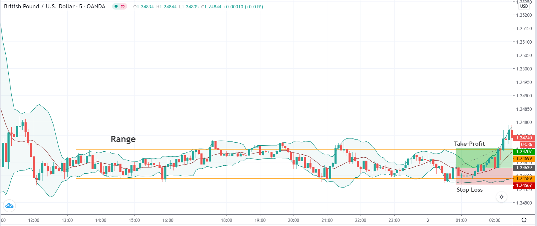
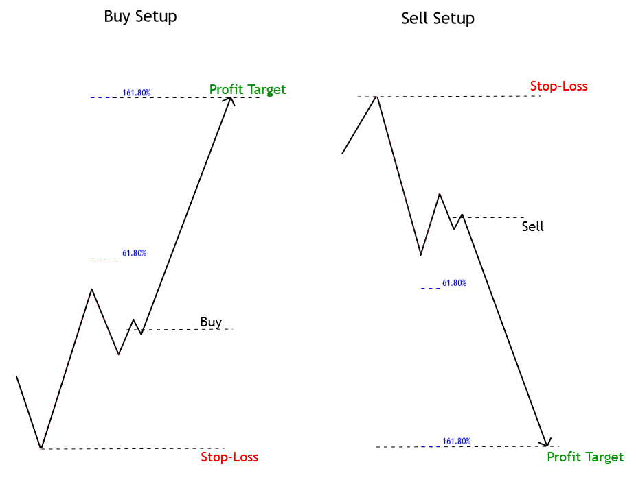
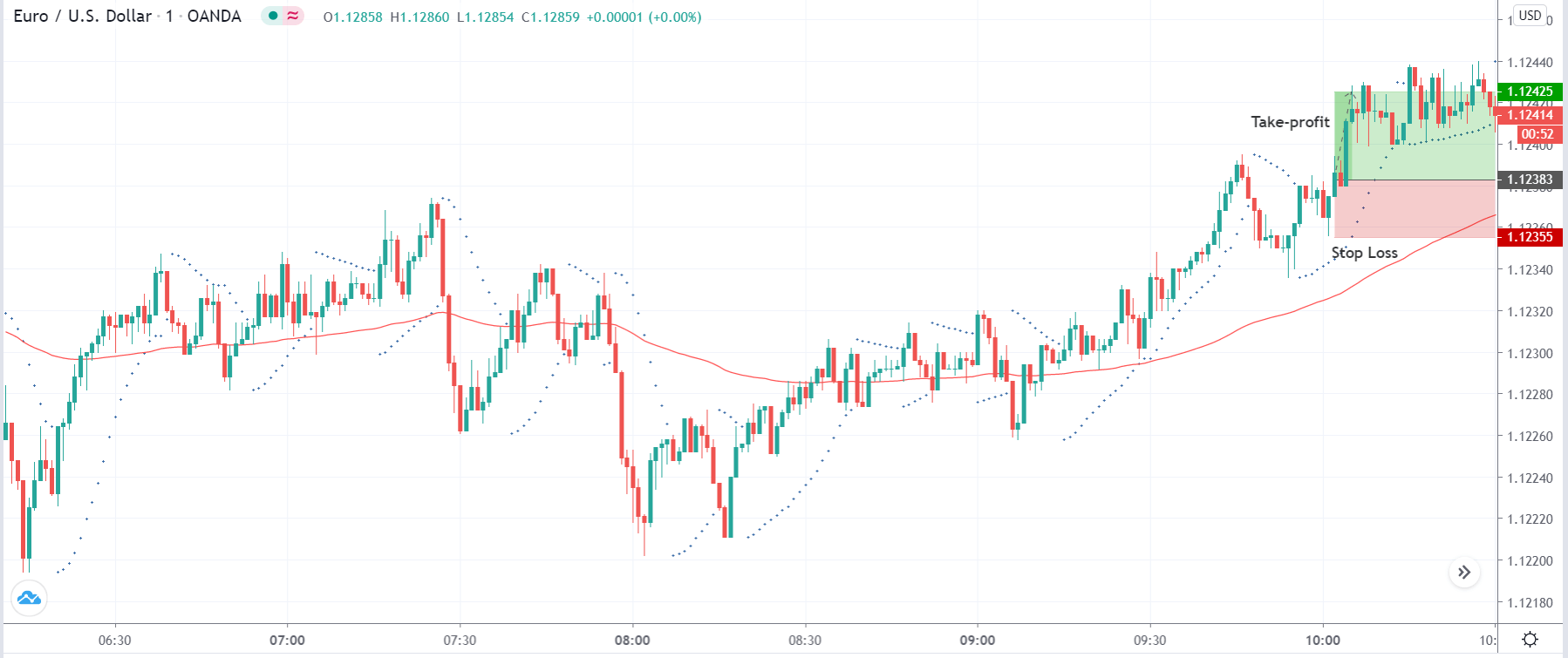
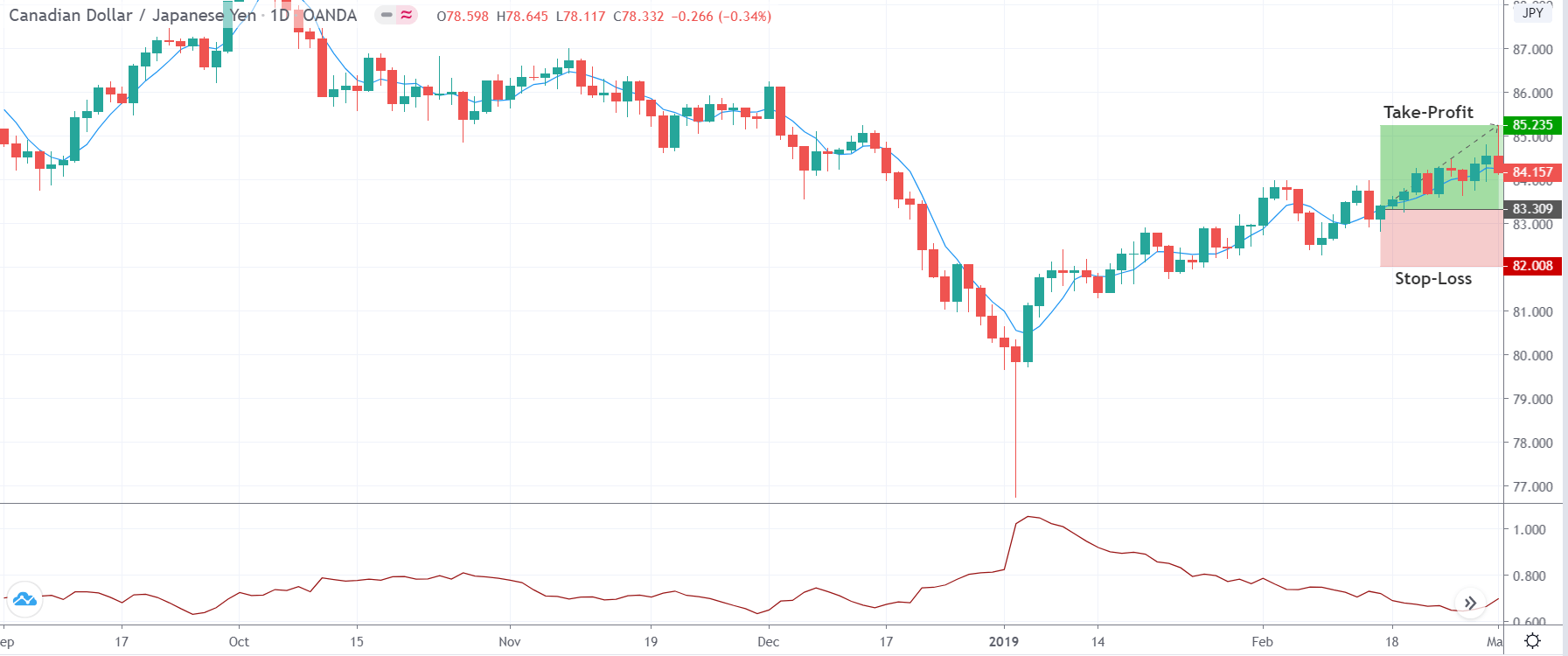
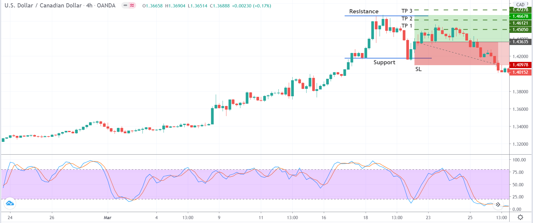
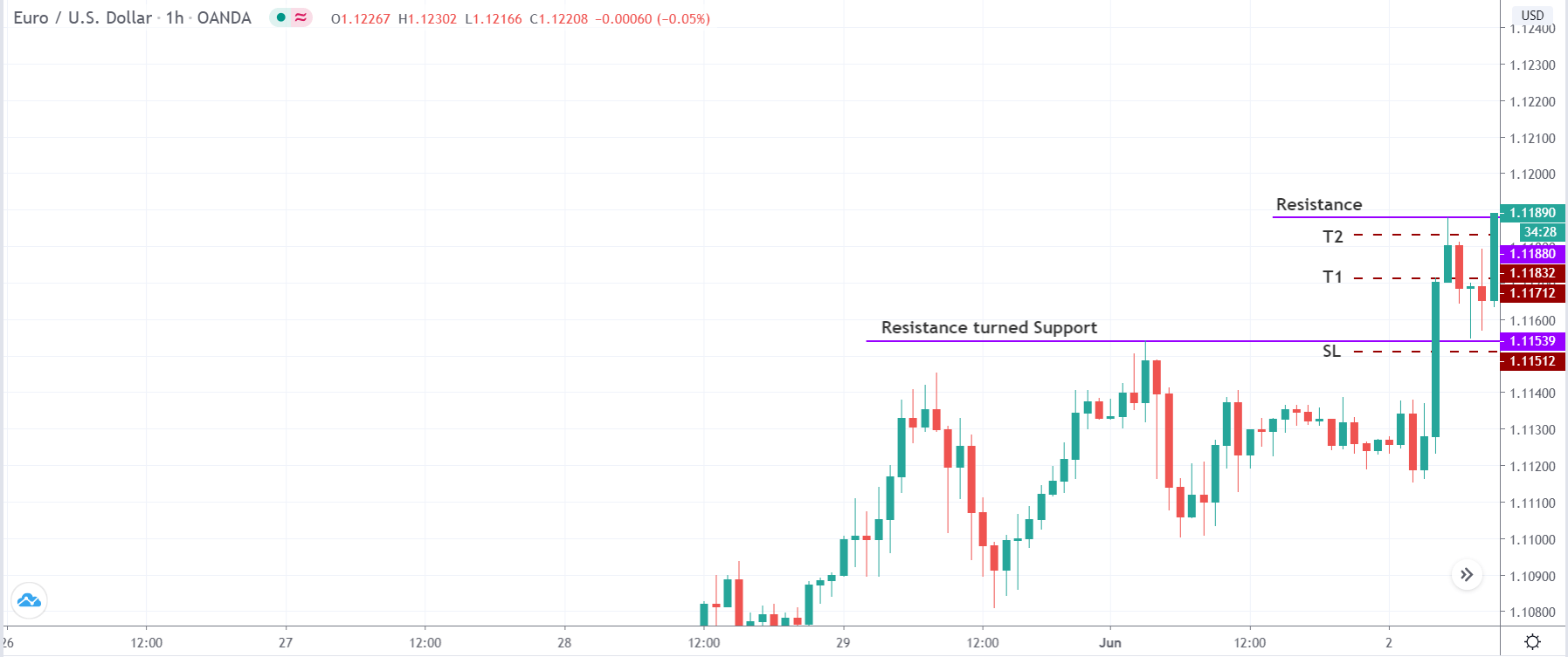
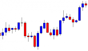
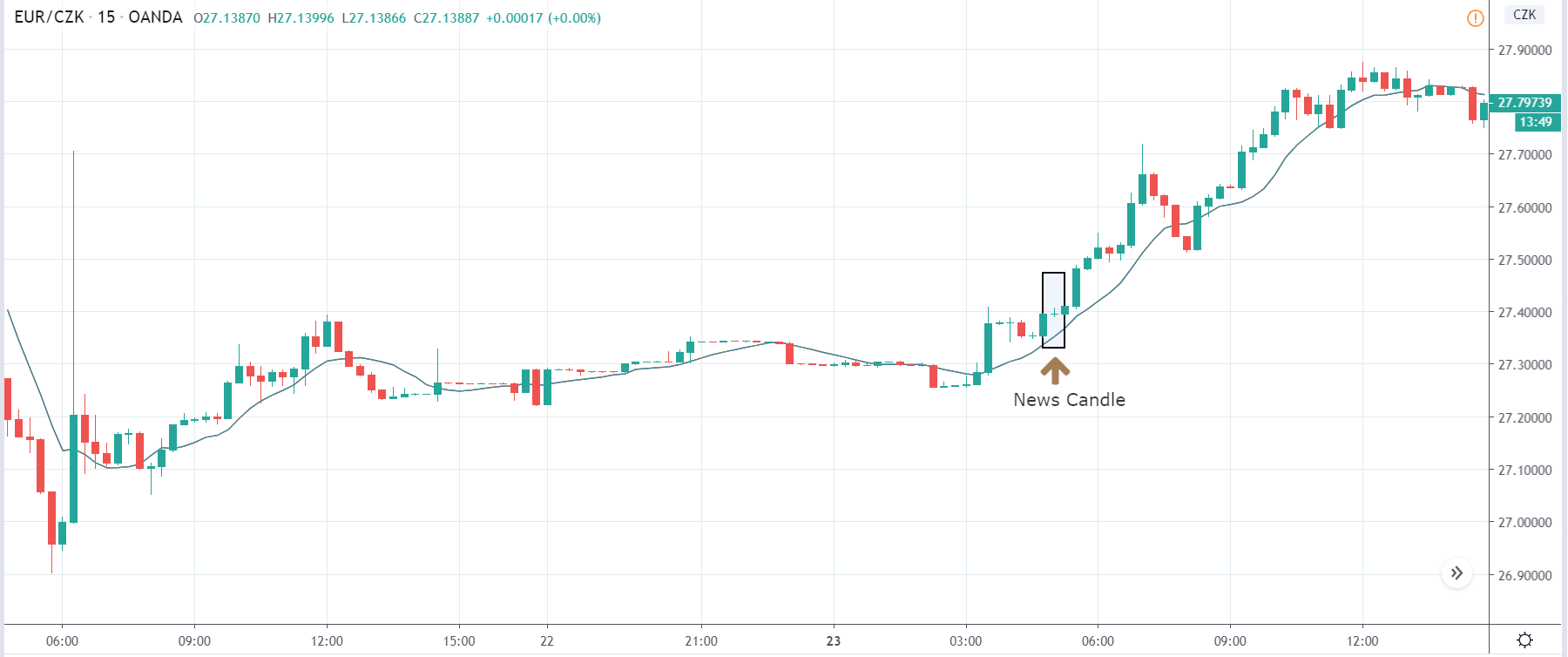
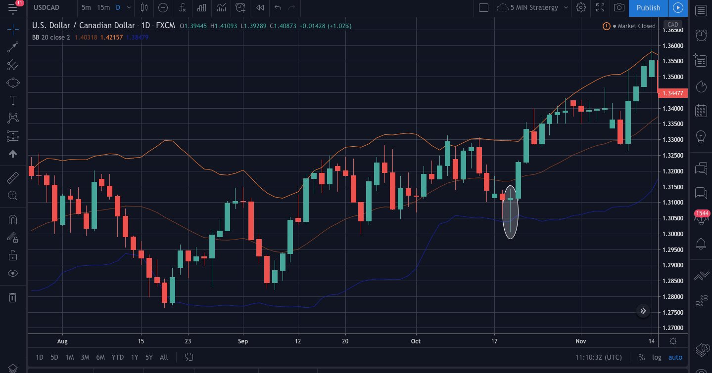
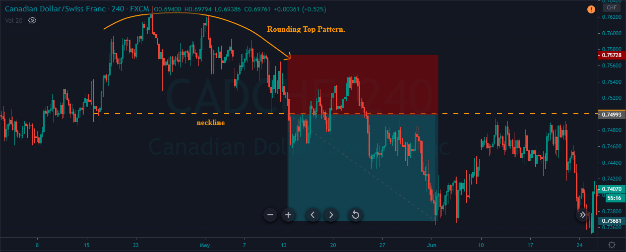
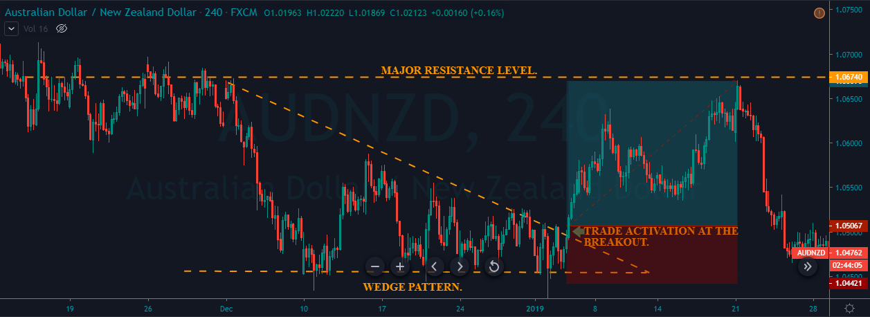
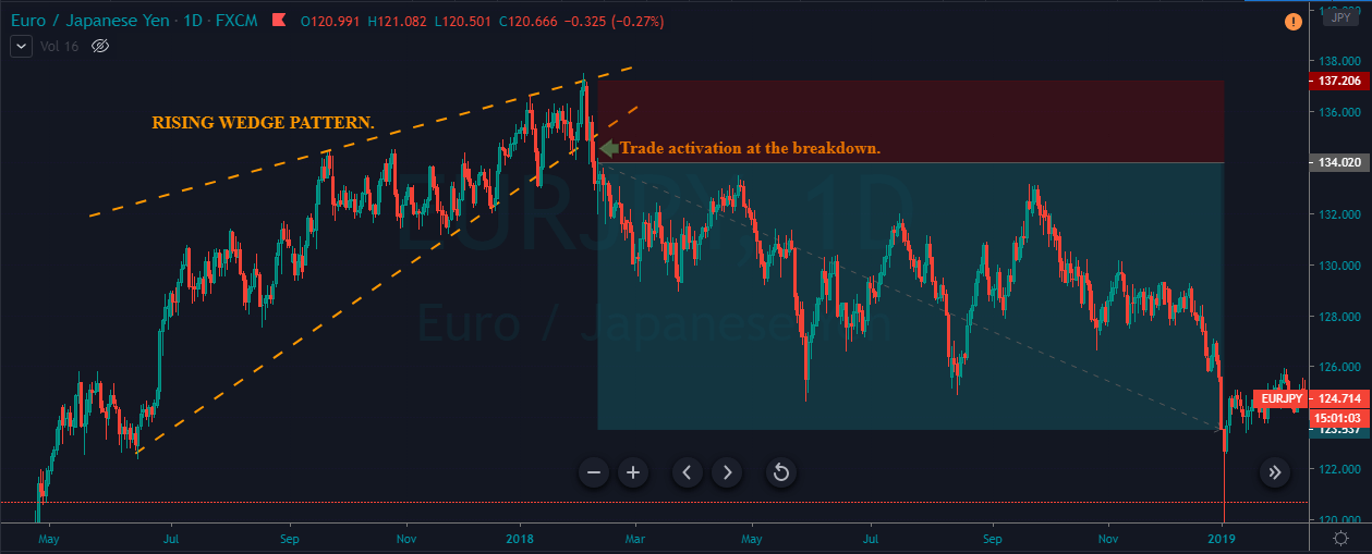
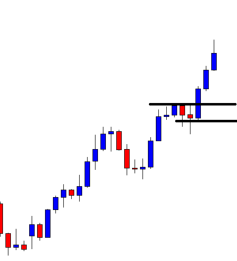
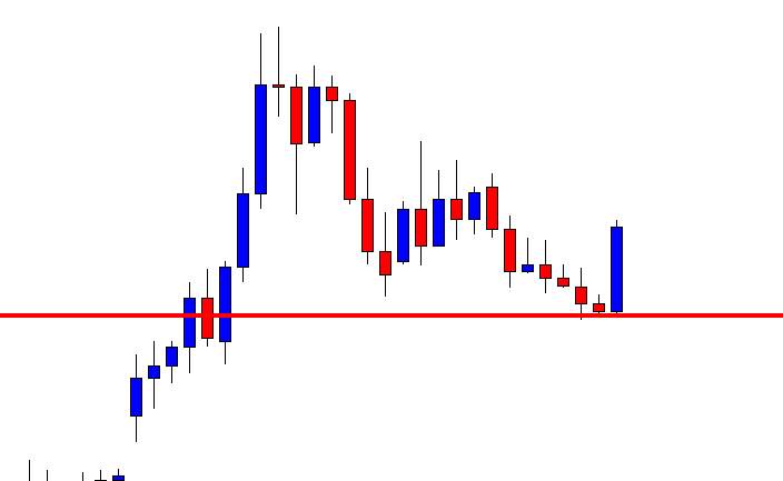
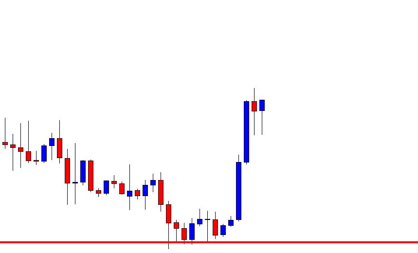
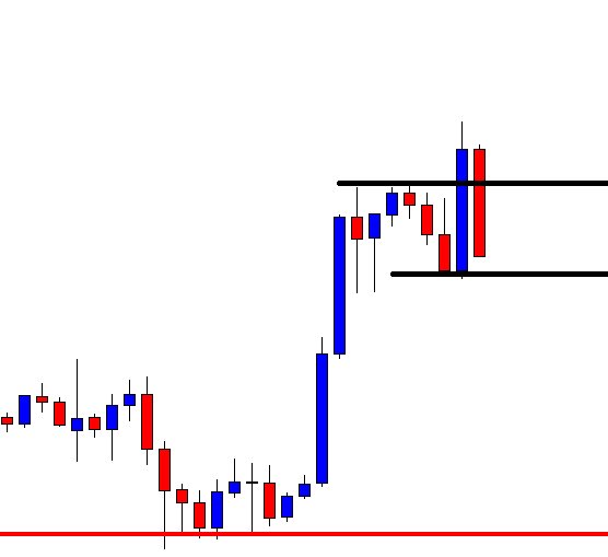
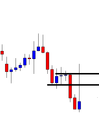
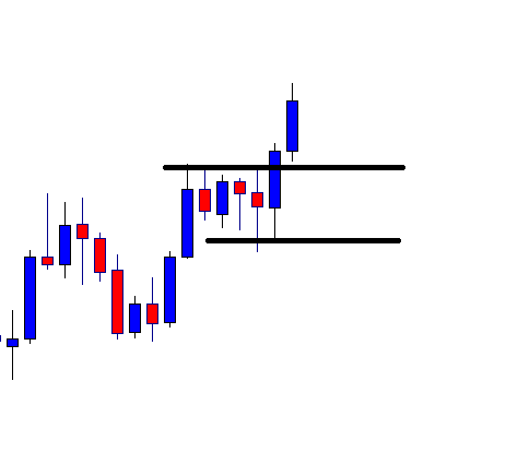
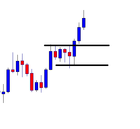
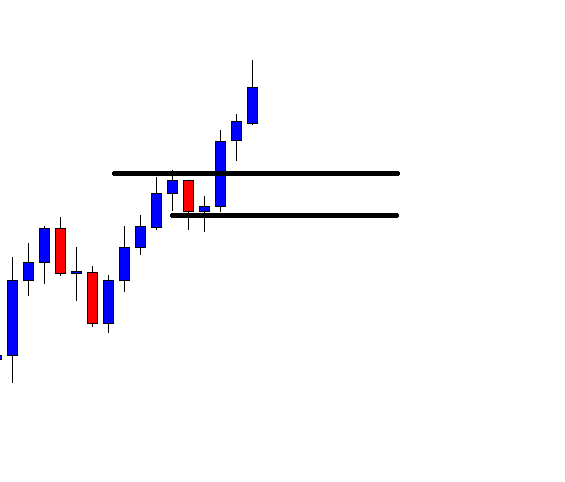
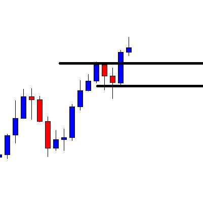
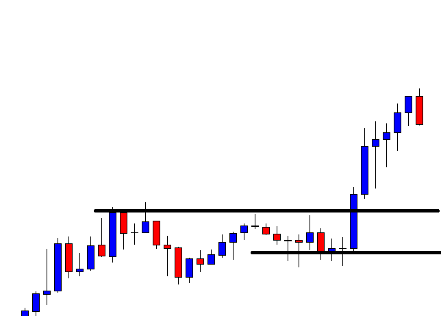
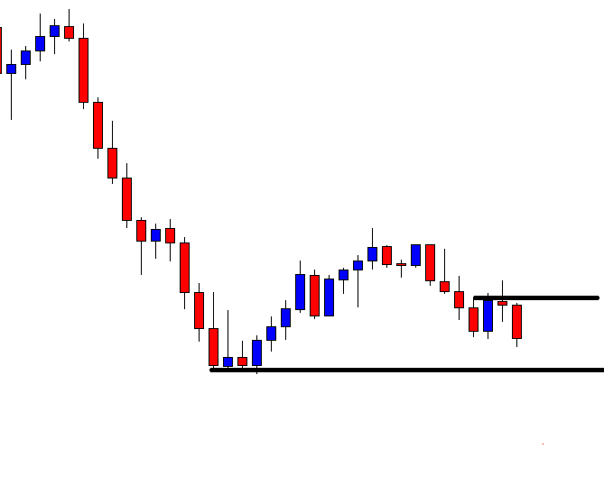
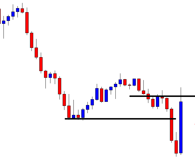
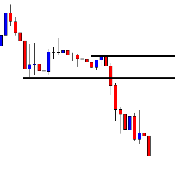
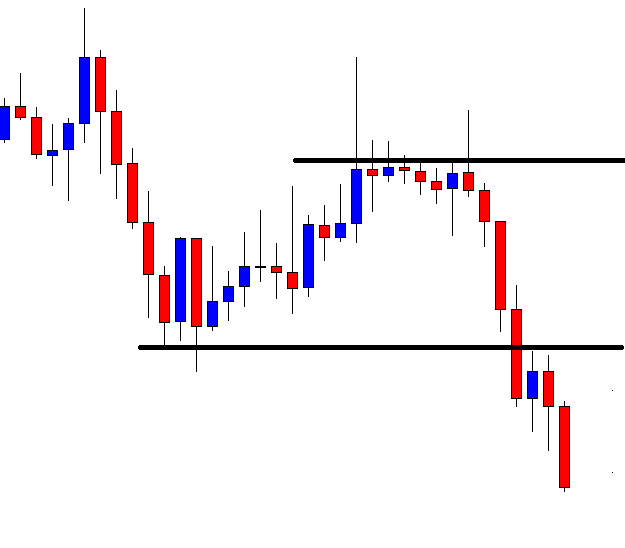
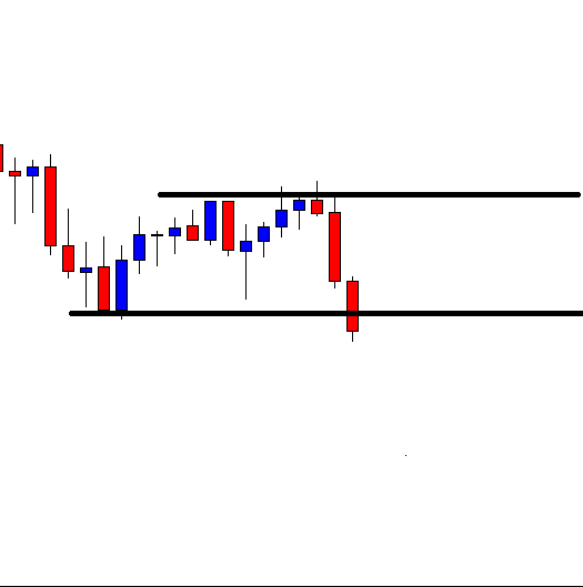
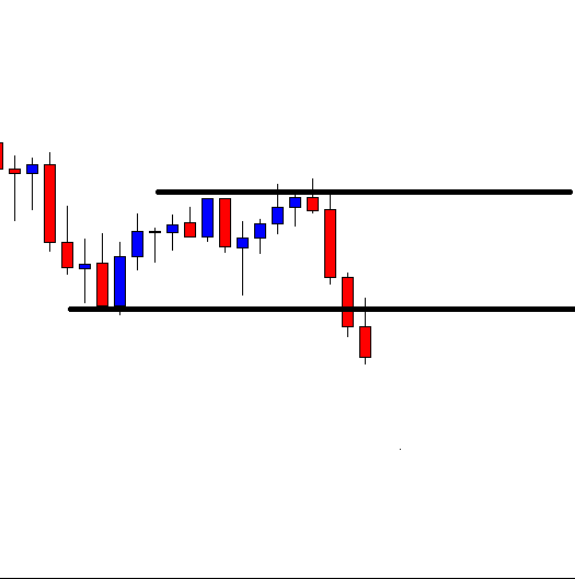
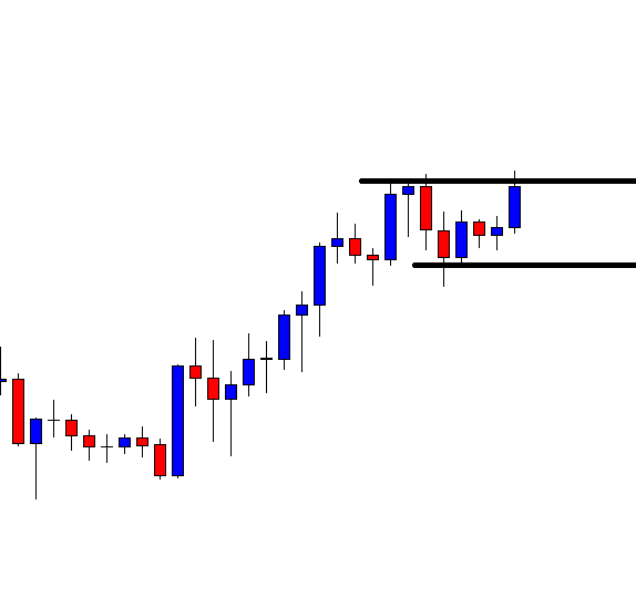
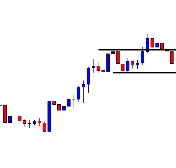
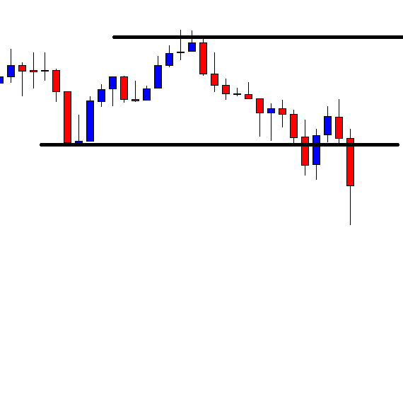
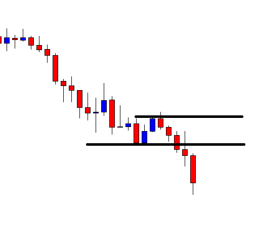
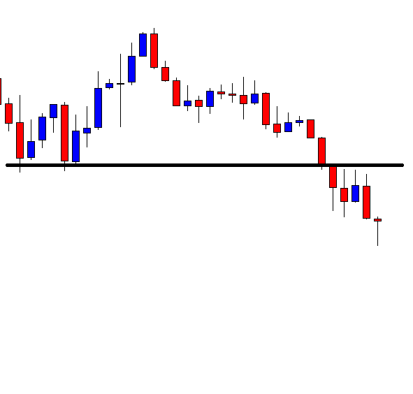
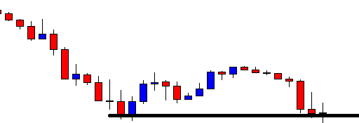
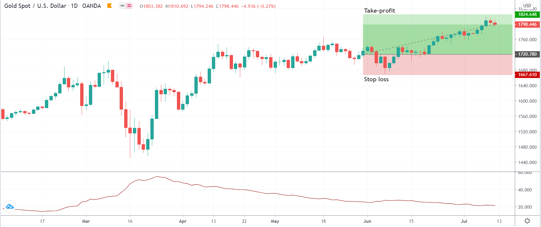
In this step, we determine the take-profit and stop-loss for the strategy. The stop loss is mathematically calculated where it is placed at the amount obtained after multiplying 2 to the value of the ATR indicator on the previous day. This means if the ATR value is 30, then stop loss will be set 60 points away from the current market price (CMP). The take-profit is extended up to a point where the trade results in a risk to reward ratio of 1:2. As mentioned earlier, since this is a long-term chart, the trade has the potential to give higher returns.

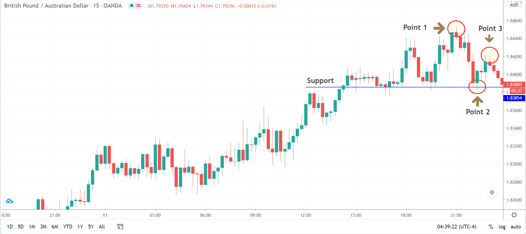
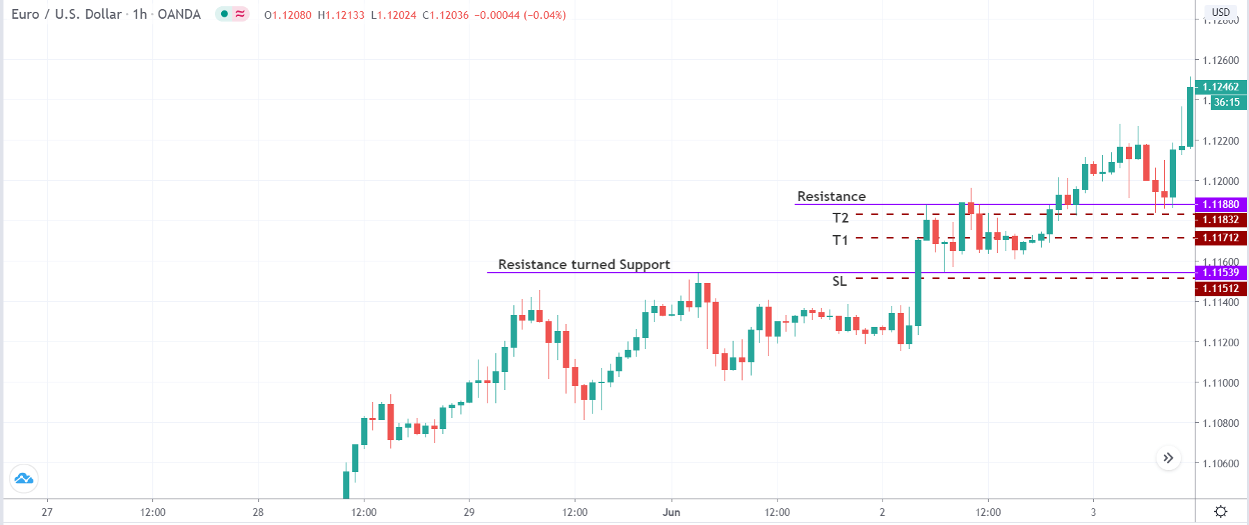
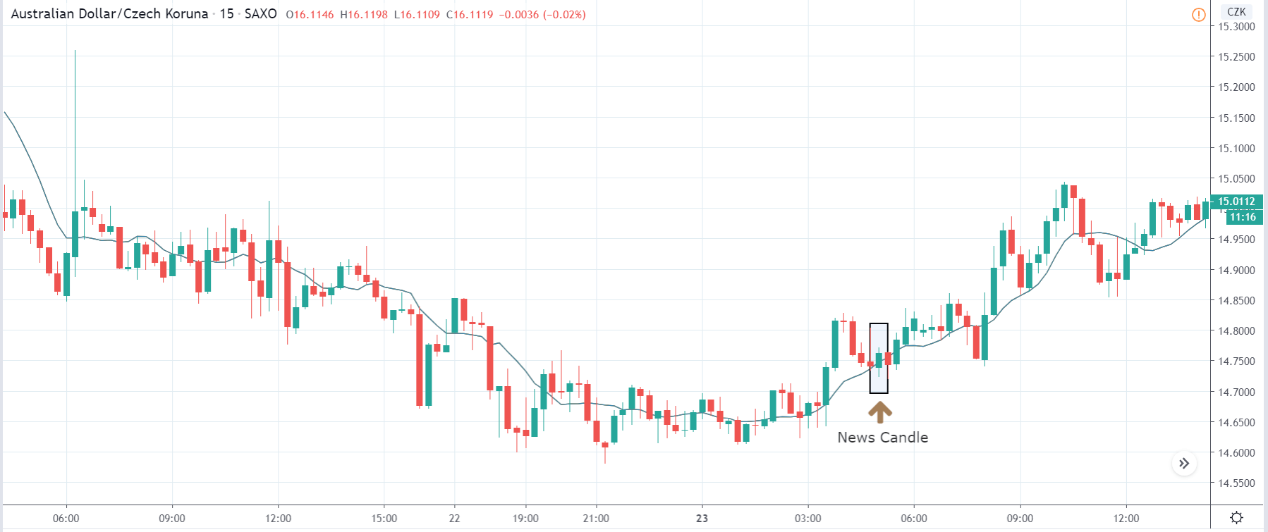
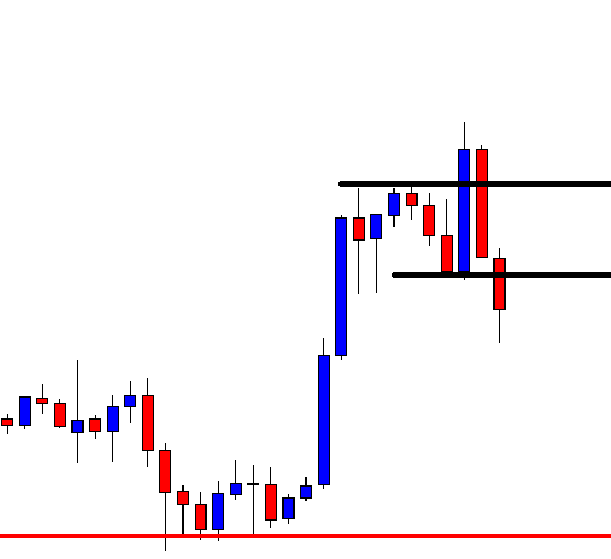
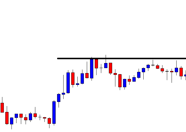
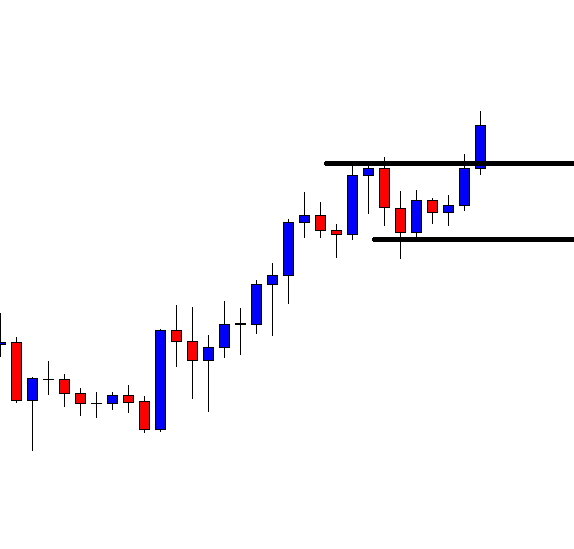
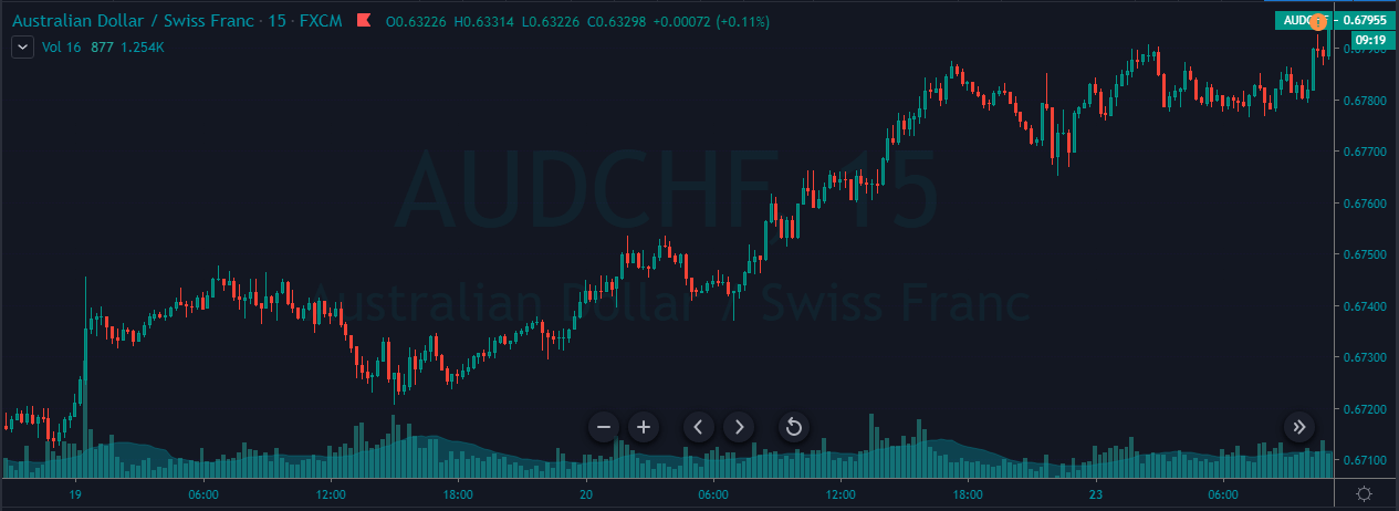
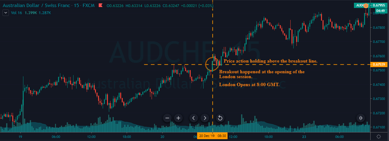
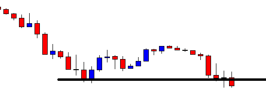
We can see in the below image that trade has almost reached our ‘take-profit’ where this is the current state of the market.

Strategy Roundup

Part II of the commodity correlation strategy seeks to take advantage of the negative correlation between the dollar index and gold prices. Using the dollar index as a reference, we are activating trades on the XAU/USD pair, which is nothing but the price of spot gold.

However, the interest rates announcement by the Federal Reserve will try to keep the inverse relationship between the U.S. dollar and Gold. This strategy is ideal for traders around the world who do not have time to watch the markets on a daily basis. The strategy can also be used to look for investment opportunities in Gold.

Categories
Forex Basic Strategies

The Most Simple Yet Effective Scalping Strategies You Must Know In 2020

Introduction

The Forex market consists of are several types of traders. They are broadly classified based on the time frame traded. For example, swing traders use time frames like 1H or 4H, while positional traders analyze the 1D or 1W time frame. Similarly, there are “scalpers” who trade the 1-minute and the 5-minute time frames. Note that scalpers are different from day traders, as they do not consider the 15-minute or 1H time frame for their analysis.

What is Scalping in Forex?

Scalping is a type of real-time technical analysis, where traders make several trades in a small period. Scalping involves entering and exiting from the market within a few minutes and moving on with the subsequent trade. This type of traders aims for tiny profits rather than home runs.

Scalping is usually most popular among forex traders than those trading stocks and commodities. This is because the FX market is the most liquid and volatile market. Thus, traders make use of this benefit by extracting 10-20 from the market in a short time. Since scalping involves making of few pips on a trade, they are traded with big volumes.

Getting Started with Scalping in Forex

Now that we know the basics of Forex scalping, let’s discuss the analytical side of it and then understand some powerful scalping strategies as well.

Timeframe

The ideal time frame to the scalp is either 1-min or 5-mins. However, some traders get an outlook from the 15-min time frame too.

Take Profit and Stop Loss

The most critical part of scalping is to have a take profit and stop loss on every trade. Since you will be using the 1-min time frame, the profit or loss level should be within 5-10 pips. It is risky to keep the TP and SL greater than ten pips when the analysis is based on the 1-min time frame.

Volatility and Liquid

Volatility and liquidity are other vital points of consideration before scalping any market. Forex is indeed the best market to the scalp as it offers the needed volatility and liquidity. However, you must select the right pair to trade because not all currency pairs offer enough market volatility. There are pairs that barely move on the 1-min time frame, and thus traders must end up waiting several minutes on a trade. Hence, it is recommended to trade only major pairs and a few minor pairs.

Spread

Spread plays a major role in scalping as it greatly affects the P/L of the trade. For instance, let’s say the spread on EUR/USD is two pips. The pip value of the pair is $10. If one lot is traded, the expense of the trade would be $20. Now, if a trade yields you four pips, then the net profit would be $40 – $20 = $20. We infer that 50% of the profit gets deducted as a fee. Thus, scalpers always have an eye on the spread.

Forex Scalping Strategies

Scalping strategies are unlike strategies used by swing and positional traders. Scalpers do not wait for several confirmations before entering a trade. Instead, they aggressively enter after a couple of confirmations. Here are some scalping strategies made for non-conservative traders.

Scalping using Moving Average

This scalping strategy, two moving averages – the 5-period MA and the 20-period MA is used applied onto the 3-min charts. Let us understand the strategy with a couple of examples.

Firstly, we must have a look at the overall direction of the market. Note that this strategy is only for trending markets, not ranging markets. In the below chart of AUD/USD on the 3-minute time frame, we see that the market is in a clear downtrend.

Secondly, the five period MA must be below the 20-period MA. When the price action tries to break above five-period MA (yet below the 20-period MA) and falls back into MA, we can open short positions.

The stop-loss must be placed above the high of the candle that broke below five-period MA. One must exit the trade when the price reaches up to 1:1 risk-reward or at a profit of 5 pips.

Scalping using price-volume charts

Indicators are not a must to scalp in forex. Scalping is possible solely using price action concepts. And here is a strategy for the same. This strategy works on a small time frame used on any currency pair. However, we’ll be sticking to the 3-min time frame for all the strategies.

Below is the chart of AUD/USD on the 3-minute time frame. According to the strategy, we can take entry when the market breakthrough a range strongly with high volume. In the below example, we see that the price fiercely broke above the range with high volume too. This is a confirmation that the big buyer is back into the market. Thus, we can take a long position right after the candle closes above the range.

The stop-loss can be placed below the low of the candle that broke through the range and places the take profit at a 1RR ratio. Note that, the stop-loss and take profit must exceed above 10-12 pips.

Scalping using Support and Resistance

Scalping at support and resistance levels is the most popular technique in the forex industry. Yet most traders apply it illogically. Even though the textbook says to buy at the support and sell at resistance, it cannot be applied practically incorporated in the market as there is a pinch of psychology in it. According to this strategy, one must buy at support and sell at resistance only if there is a false breakout prior to it.

Consider the below chart of NZD/CAD on the 3-minute time frame. The gray ray represents the support level. It is seen that the price broke below the support thrice and came right back above it. Thus, one can enter when the price is holding above the resistance post the fake-out. The stop-loss and take-profit for all such trades much be a maximum of 5 pips.

We hope you found these strategies interesting and helpful. If you are an aggressive trader, do try them out and let us know the results in the comment section below.

Categories
Forex Basic Strategies

What Is ‘Gawk the Talk Strategy’ & How To Trade It Effectively?

Introduction

Trading the news is one of the best ways to make a profit within a short span of time. This is because volatility is highest during these announcements, and traders look to capitalize on these news releases by analyzing the data and the price movement.

The strategy we will be discussing is amazingly suitable for traders who love the volatility associated with news announcements. One of the biggest advantages of trading the news is accessibility. Today, we can access the news outcome as soon as they are released without any delay.

Many free websites report economic events every day. The one which is widely used by investors and traders is a site called forexfactory.com. This site is user-friendly, and the economic calendar allows us to view the upcoming news at a glance.

The news that has red-coded flags linked to them have the greatest impact on the currency pairs. We will prefer to trade the news events with the highest impact as opposed to the orange or yellow ones because the possibility of large movement is high. Today’s strategy is also based on such news releases.

As the actual and forecasted figures are extremely important for this strategy, we will be watching these numbers very carefully. That is the reason why this strategy is named as ‘Gawk The Talk.’

The top news announcements that cause the greatest moves in the forex market are Interest Rates, Gross Domestic Product (GDP), Employment Change, Trade Balance, Consumer Price Index, Purchasing Manufacturing Index (PMI), and Retail Sales.

Time Frame

Gawk the Talk strategy works well with the 15 minutes and 1-hour candlestick charts. This means each candle on the chart represents 15 minutes or 60 minutes of price movement.

Indicators

No indicators need to be used in this strategy.

Currency Pairs         

The strategy is suitable for trading all currency pairs; however, it is healthier to trade in currency pairs such as the EUR/USD, USD/JPY, GBP/USD, USD/CHF, USD/CAD, AUD/USD, and NZD/USD.

Strategy Concept

The idea of the strategy is simple, where we long on the affected currency when the actual figures are greater than forecasted figures by a minimum factor of 15%. To lower the risk, we focus on news events that are related to the U.S. economy. Which means we will be primarily trading the U.S. dollar either as the base currency or counter currency.

We will use the 15 minutes time frame chart to determine our entries since the news is usually released in 15-minutes intervals. Some common times of news releases include 8 A.M., 9:15 A.M., 10:30 P.M., and 11:45 P.M.

For example, if the Reserve Bank of Australia raises the interest rates, we will go long in AUD/USD. And if the interest rates are lowered, we take a short trade in the pair. For news announcements that affect the United States, it is best to trade in the two most liquid pairs: EUR/USD and USD/JPY. Remember, we go long in the pair if the news outcome is positive for the base currency and ‘short’ in pairs wherever the currency is a counter currency.

Trade Setup

To illustrate the strategy, we will use the Unemployment rate news announcement, which was released on the 2nd of July 2020. As mentioned earlier, we will be dealing with currency pairs involving the U.S. dollar only. Hence, depending on the news data, we will take a suitable position in the EUR/USD pair.

Step 1:

The first t step is to go to the forex factory website and look for news releases that have the highest impact on the currency. The easiest way to find such events is to look for the red-colored flags on the left-hand side of the event. We will not consider any other news results other than red ones.

In this example, we will be analyzing the Unemployment rate data of the United States.

Step 2:

An important point most traders miss out while trading using this strategy is that they trade just based on the numbers. They forget to look at the charts from a technical angle. In this step, we mark the key technical levels on the chart based on the current state of the price.

As we can see in the below image, just before the news announcement, the price is at the resistance area. This means a ‘short’ trade is considered to be less risky than a ‘long’ trade at this point.

Step 3:

This step is the crux of the strategy. In this step, we take an appropriate position in the currency based on the news’s outcome. If the actual numbers are higher than the forecasted numbers, we will go long in that currency. Likewise, if the actual numbers are lesser than the forecasted numbers, we will go ‘short’ in that currency. The difference between actual and forecasted figures should be a minimum of 15% before we can take enter the market.

In our example, we see that the Unemployment rate was better than what was predicted by economists. This means the data is positive for the U.S. dollar, and thus we can expect bullishness in the currency. Therefore, we take a ‘short’ position in EUR/USD soon after the market falls from the resistance.

Step 4:

Stop loss for the strategy is placed just above the news candle, which is technically the right spot for placing the stop loss. The take-profit is also placed at a key technical level, which could be a hurdle for the trade. The risk to reward ratio of trades placed using this strategy is a minimum of 1.5. However, one should book partial profits at the halfway mark in order to lock in some profits.

In this case, the price moved about 60% of our take-profit, where would take some profits off. However, more often than not, the price does hit the take-profit levels.

Strategy Roundup

The strategy we discussed today is mostly for the aggressive traders and people with large risk appetite. In this strategy, we are essentially taking advantage of the volatility and the fundamental factors that affect the currencies. The trade management rules of the strategy ensure that we don’t make huge losses even if the trade does not work completely in our favor. Cheers.

Categories
Forex Basic Strategies

‘Balk the Talk’ Strategy – Combining Fundamentals With Technical Analysis!

Introduction

Fear is the greatest driving force in humans. We tend to react drastically in times of fear or when they are presented with sudden moves from the market. Fear is an emotion that drives traders around the world to watch out for every news announcement, for fear of missing out on important information. Fear results in fast decisions by traders, which are most of the time taken without thinking.

In the previous article, we mentioned that trading the news is one of the best ways to make a profit in a short period of time. We also mentioned focusing on news events with the highest impact (red flags) on the currency. In today’s strategy, we will be trading the Forex market by looking at news events that have the least impact on the currency and do not have a long-lasting effect on the pair.

Timeframe

Balk the talk strategy works well with the 15-minutes timeframe only. Since we are dealing with small price movements, we will capture those little gains by analyzing the 5 minutes time frame chart.

Indicators

In this strategy, we will not be using any technical indicators.

Currency Pairs

The strategy is suitable for trading in all major currency pairs listed on the broker’s platform. Make sure not to use the strategy on Minor and Exotic currency pairs. Currency pairs such as EUR/USD, USD/JPY, GBP/USD, USD/CHF, USD/CAD, AUD/USD, GBP/JPY, and NZD/USD are highly preferred.

Strategy Concept

Although we are trading based on the news data, this strategy’s concept is very different from the previous strategy. Here we will be taking advantage of the sudden surge in volatility due to the news announcement. The volatility leads to price movement, which is not reliable and mostly false. Hence, we will analyze the charts from a technical point of view and position in the currency pair based on the indications provided by technical analysis.

News events that have orange and yellow flags associated with them are the ones that are not of great importance to traders. Even then, during the news announcement, the volatility gives rise to price movement, mostly not dependable. This means any move in the market created by such news releases does not last for long, and the market continues to move in regular from a few minutes after the news release. We will take advantage of this false movement by combining the market’s current price with that of the key technical levels.

Trade Setup

In order to illustrate the strategy, we will be taking the example of the Final Services PMI news announcement, which was released recently. We will analyze the impact of data PMI on the currency and see how we can take a suitable position in the currency based on the volatility induced in the pair due to the announcement.

Step 1

The first step of the strategy is to look for news events that have an orange or yellow flag linked to them. Note down the date and time of the announcement and open the respective chart. We recommend looking for news announcements of major economies only and trade in currency pairs involving the U.S. dollar.

In our example, we will be considering the impact of Services PMI on the EUR/USD currency pair.

Step 2

In this step, we will mark out the key technical levels on the chart. They could be support, resistance, demand, supply, and some indicator signals. Based on the sign of each technical level, we will take the position accordingly.

We can see in the image below that we have identified two important levels of support and resistance and marked them on the chart.

Step 3

The crux of the strategy is that we wait for the price to reach our key technical levels as a result of the volatility due to the news announcement. Once the price reaches those levels, we will place trades based on our technical analysis and understanding of market psychology. For example, in the below image, we see that due to the Services PMI news release price reaches exactly to our resistance, which we had marked in the previous step. Since the PMI data was slightly better than expectations, it led to bullishness in the currency, thereby taking the price marginally higher.

Since the Services PMI is a low impact event, we cannot afford the market to continuously move higher. This means it will respect key technical levels and follow the major trend of the market. In this case, the trend is down. Therefore, we trigger a ‘short’ trade precisely at the resistance, taking a bearable risk.

Step 4

The next step is to determine stop-loss and take-profit levels for the strategy. Since we are taking an aggressive entry, the stop loss for the trade will be small, resulting in a high risk to reward ratio. The take-profit is pretty much straightforward, where it will be set at the latest obstacle.

In this case, the take-profit is placed at the support of the range, which is ideal for booking profits.

Strategy Roundup

The strategy takes advantage of the market reaction when the actual figures of some news events are not of great importance to traders. Such news announcements only create panic in the market with no confidence. Keep in mind that this requires many things to be assessed before being able to successfully use this strategy over and over again. This means a lot of practice is required to apply in the strategy effectively. Pay attention to news releases which do not hold much ground. All the best!

Categories
Forex Basic Strategies

Heard Of The ‘Piranha’ Forex Trading Strategy?

Introduction

The forex market is mostly seen to move in a trend or a range. In the previous article, we discussed the rapid-fire strategy, which works best in a trend. The piranha strategy that we are going to discuss is used in a ranging market.

Everyone would have heard of piranhas. They typically take small bites frequently off their prey until it is totally devoured. A single bite may not cause much harm, but it is the frequency of bites that causes the attack to be deadly. In the same way, the piranha strategy was developed to allow scalpers to bite the market and chew off small profits each time.

This strategy is specifically designed for the GBP/USD currency pair, where it is applied to the 5-minutes time frame chart. On average, one can find over 15 trades in a day using the piranha strategy.

Time Frame

The piranha strategy is useful for trading on the 5-minutes time frame. This means each candlestick on the chart represents 5 minutes of price movement.

Indicators

For this strategy, we use the Bollinger band technical indicator with the following settings.

  1. Period 12, Shift 0
  2. Deviation 2

When prices approach the upper band, the market is considered to be overbought, and when prices approach the lower band, markets tend to consolidate. By setting a higher deviation value, the price volatility will be magnified, and we geta a Bollinger band with wider upper and lower bands.

Currency Pairs

The strategy is designed for the GBP/USD currency pair, which is also referred to as The Cable. However, some other currency pairs in which the strategy can be used include EUR/USD, USD/JPY, and GBP/JPY. Since the strategy takes place in short timeframes it is advisable on highly liquid pairs.

Strategy Concept

We will use the Bollinger band indicator to identify the trading range of GBP/USD, after which we will mimic the nature of the piranhas by defining objective entries for long and short positions. Long trades are initiated when market prices touch the bottom of the band, and short trades are taken when prices touch the upper band.

Piranhas are active in rivers and ponds but not in the rough seas with strong currents and waves. In a somewhat similar way, we avoid trading this strategy at times of major news announcements during the U.S. or London sessions, as such environments reflect rough seas with strong currents and waves. We will analyze the GBP/USD currency pair on the 5-minutes chart to look for long and short trades.

Trade Setup

Step 1

The first step of the strategy is to first look for a range on the chart of GBP/USD. The range can be identified using the Bollinger band strategy. However, we need to apply the concepts of price action for the identification of the range. The essential criterion for a range is that the price should respect the support and resistance levels at least twice. After we have identified the range, we will apply our strategy at the extreme ends of the range to take a suitable position in the pair.

The below image shows an example of the kind range that is required for the strategy.

Step 2

The next step is to wait for the market to hit the lower band of the indicator or upper band of the indicator. At the lower band, we will look for buy opportunities, and likewise, if the price at the upper band, we will look for sell trades.

In this example, we see that the price has approached the lower band, which means there is a high chance that buyers will take the price higher from this point.

Step 3

One should not enter the market soon after the price touches the lower or upper band, which carries a huge risk. We need confirmation from the market before we can take a suitable position. In this step, we look for that confirmation. Once the price closes above the middle line of the Bollinger band indicator, it is a confirmation that the support is respected this time and that the price is heading at least till the range’s resistance.

Step 4

In this step, we determine the take-profit and stop-loss levels for the strategy. We have two take-profit levels – the first take-profit is set at the upper side of the range, a typical place for booking profits. Another method is to hold on to the trades until the market shows signs of reversals, which is when the price falls below the middle line of the Bollinger band.

The stop-loss for this strategy is placed below the support of the range or below the lower band. The trade offers a risk to reward ratio of around 1 to 1.5, which is not bad.

Strategy roundup

In the beginning, we mentioned that the piranhas hunt their prey until it is completely devoured. In a similar way, once the trade hits our stop loss, it means there is nothing left, and we need to look for a new setup.

The triggering of stop loss is an indication that the market is no longer trading in that band, and it has started a new trend. In such cases, wait until the market halts and starts moving in a range. The only difference will be that we will be looking for a trade in the opposite direction with the same rules.

This is an important point and a trick that one can use to navigate themselves in trending markets. As the strategy is developed to trade in a range, one will find few opportunities when the market goes into a strong trend.

Categories
Forex Basic Strategies

Trading The Forex Market Using The ‘Bladerunner Strategy’

Introduction

Moving averages are an important piece in analyzing the charts. Some traders simply use to determine the direction of the market, while others have solid trading strategies. The Bladerunner strategy is a powerful trading strategy based on the 20-period Exponential Moving Average (EMA). The best part about the strategy is that it can be applied to any time frame and currency pair. This strategy is given the term “Bladerunner” because the 20-period EMA cuts the price action like a blade.

What is the Bladerunner Forex Trading Strategy?

A market trading above the 20-period EMA indicates a bullish bias, while a bearish bias if it is trading below the 20-period EMA. If the price retests the EMA, traders look to long or short.

If the price is trading above the EMA, one can prepare to buy the currency pair once the drops and tests the EMA line and bounces back up. That said, if the market breaks below the 20-EMA, it can be comprehended as the market has switched directions – uptrend to a downtrend. Thus, traders can look for shorting opportunities.

On the flip side, if the price action is evidently below the EMA, traders may consider short selling the pair after the price retraces up to the EMA. However, if the market manages to break through the 20-EMA, it signifies that the buyers have taken charge of the market, and a potential reversal could happen. Thus, traders can catch the new trend after a proper test to the EMA line.

Criteria to trade the Bladerunner Strategy

Before taking an entry using the Bladerunner strategy, two criteria must be satisfied:

  1. Before entering based on the strategy, the price must breakout from a range or should already be in a strong trend.
  2. After the first criterion is satisfied, the price must successfully retest the 20-EMA. If the market is trading above the EMA, the test should be such that the price drops to the EMA, touches it, and reverses in the predominant trend. Finally, if the candle closes above the EMA, it is an indication that the uptrend is still active and intact. A similar concept applies to a downtrend as well.

These two points are vital to consider before attempting to trigger the order. Besides, traders who require more confirmation may trade those setups where the price bouncing off from the EMA is also a strong Support and Resistance level or a pivot point.

Trading the Bladerunner Forex Trading Strategy

The Bladerunner strategy can be traded in several ways, given the concept applied remains the same. Novice traders enter solely based on the EMA, while more professional traders combine this idea with their analysis and then execute their trade. Here are a couple of Bladerunner strategies designed for traders of all suites.

Buy Example

Below is the price chart of GBP/NZD on the Daily time frame with the 20-period EMA applied to it.

Reading the chart from left-most, it is observed that the market has been moving sideways in a range. During mid-May, the market finally broke above the top of the range. Also, the breakout happened such that the price was well above the 20-period EMA.

At the beginning of June, the market pulled back down to the EMA and left two tails at the bottom. This is an indication that the market is preparing to go north. Thus, a trader can go long as the holds for a couple of candles above the EMA.

Placements

Stop loss

The stop-loss must be placed few pips below the top of the range such that it is below the EMA as well.

Take Profit

There is no fixed take profit point for this strategy. However, the trade can be closed when the price drops below the 20-period EMA.

Sell Example

Below is the price chart of EUR/USD on the 4H time frame. Initially, the market was ranging, but later it was pushed down by the sellers. After the breakout, the price retraced and tested the EMA as well as the S&R. When the sellers pushed the market down yet again, it is an indication that the downtrend is going to continue.  Thus, one can prepare to go short at these levels.

Placements

Stop loss

The stop loss can be placed safely above the Support and Resistance and the bottom of the range.

Take Profit

Since there is no reference to the left, there is no fixed take profit. However, traders must liquidate their positions once the market crosses above the 20-period EMA.

Bonus Example

Consider the below price chart of AUD/USD on the Daily timeframe. We see that the overall trend of the market is down. The level 0.68745 represents the most recent Support and Resistance area.

To trade this market, we wait for the price to retrace up to the S&R level (grey ray) before entering the trade. Below is the same chart of AUD/USD on the 4H time frame. The pullback for the massive downtrend began in September. Observe that the price action of the retracement is above the 20-period EMA.

Once the price approaches the Daily S&R, it begins to consolidate, yet above the EMA. Later, as the market slows down, the price aggressively drops below the 20-period EMA. The price then retests the EMA, tries to go above it, but gets drawn down by a bearish candle. Thus, when another bearish candle appears, one can short sell the pair.

Placements

Stop loss

Since the market took a turnaround at the S&R level, the stop loss can be placed right above this level. Besides, one should ensure that the stop loss is above the EMA.

Take Profit

This strategy is basically a trend pullback trade that incorporates the Bladerunner strategy. Thus, the take profit can be placed at the recent lows.

The Bladerunner is a great strategy and helpful to several traders because it blends with any other strategy. Do try this strategy by combining it with your primary strategy and level up your trading skill. Cheers!

Categories
Forex Daily Topic Forex Fibonacci Forex Price-Action Strategies

Generating Trading Signals Using Fibonacci Tools

Introduction

In our previous educational article, we reviewed how the identification of double top and double bottom formations could provide a trading setup, which, according to its technical configuration, returns a risk to reward ratio equivalent to 1:1.

In this educational article, we’ll review the use of Fibonacci retracements and extensions to generate trading signals.

Trading the Market Corrections

Trading based on corrective movements has its origin in the idea that when the price action makes an impulsive move, the market develops a corrective movement before continuing to develop a new motive move.

This method’s risk derives from the possibility of false breakouts, which, depending on the primary trend, could be a “bearish trap” or “bullish trap.”

Considering that there is a broad range of Fibonacci ratios, Fischer & Fischer propose filtering the trading volume using the 61.8% level as a conservative level. The use of 61.8% provides the technical trader the possibility to invest risking a reduced part of its capital.

As a second entry filter criteria, traders could use the swing size average of the asset under analysis. Considering that every financial asset holds a different personality and volatility, this filter demands the technical trader to develop statistical backtesting to understand the asset’s inherent volatility under study.

Trade Setup

Entry Setup: Considering that the entry rule requires a unique Fibonacci level, the entry will occur once the price touches and closes above (or below) the level 61.8%. This criterion could help shield the technical investor against a potential false breakout.

Stop-Loss: The trade invalidation level will be set above/below the last peak/valley preceding the entry-level. The benefit of trading using the 61.8% level as the point of market entry is the reduced risk compared with other typical Fibonacci levels, such as 38.2% or 50%.

Trailing Stop as Profit Protector: This method by itself doesn’t make the use of a profit target level. As an alternative, the use of a trailing stop could help protect profits with a trailing criterion of the last peak or valley. The disadvantage of this method is that, constrained by the volatility observed in the real market, it is unlikely that the resulting risk to reward ratio goes beyond a mere 1:1.

Trading the Market Progress

As the Elliott Wave Theory states, the price tends to advance in three or five waves. This method uses Fibonacci extensions to define target levels.

In general, when the price action develops a price movement on strong momentum and, then, its correction doesn’t violate the starting level of the initial move, it means the market is not building a bullish or bearish trap; thus, it is likely the action will continue progressing in the direction of the first move.

Entry Rule:  In the same way as in the case of a price correction setup, the entry should be set when the price retraces and closes, starting a new impulsive move. This condition doesn’t require that the price retraces to the 61.8% level of the initial movement.

Stop-Loss: The invalidation level of the trade setup should be located below the last peak or valley preceding the entry-level.

Profit Target (Three Movements Case): When the price evolves following a three-move sequence, the profit target should be set at 161.8% of the projection of the first sequence, as illustrated in the next figure.

Profit Target (Five Movements Case): This scenario considers two options. The first one is when the progress happens in the third segment and the second one when the price action has completed the third move and could be initiating its fifth movement. These scenarios are illustrated in the following figure.

Conclusions

In this educational article, we reviewed two cases in which to use as Fibonacci retracements as the extensions tool. Both methods presented in this article offer specific risks. The use of the corrections method provides a reduced risk to the technical trader, due to the trailing stop use criterion, this doesn’t mean that it could deliver a risk to reward ratio of over 1:1.

On the other hand, the use of the Fibonacci extensions, according to Fischer & Fischer, always means to invest against the trend. However, a combination of both methods could provide an opportunity to enter in favor of the market direction.

To reduce the noise and risk in the investment process, the technical trader must evaluate the performance strategy developing statistical backtesting with historical data before risking real money.

Suggested Readings

  • Fischer, R., Fischer J.; Candlesticks, Fibonacci, and Chart Patterns Trading Tools; John Wiley & Sons; 1st Edition (2003).


Categories
Forex Basic Strategies

Trading The Rapid Fire Strategy – A Reliable Scalping Technique

Introduction

In recent times, the scalping style of trading has gained a lot of attraction from all types of traders. These strategies are characterized by high-volume trading, which is designed to enter the market frequently to make just a few pips.

Most scalping strategies are built using indicators that can make it extremely tough for beginners who are new to the markets. This is one of the reasons why scalping is not recommended for new traders. Whichever scalping strategy we use, we need to make sure that the broker’s platform allows us to employ the strategy on the lowest time frames.

The two scalping techniques we will be discussing are – Rapid-fire and Piranha. These strategies are developed on the 1 minute and 5 minutes time frame charts, respectively. These two time-frames provide ample opportunities to enter in and out of the market several times a day.

Although scalping can be exciting, it can lead to fatigue and loss of concentration due to constant monitoring of the markets. Therefore, besides just knowing about the strategy, one should meditate and learn to be away from the markets when not required. Overtrading does not profit all the time.

The rapid-fire strategy has two basic requirements:

Highly liquid currency pair | Lower timeframe

This criterion led to the development of the strategy on the 1-minute time frame chart using the EUR/USD currency pair. With this strategy, one can find around 30 to 40 trading opportunities every day.

Time Frame

The rapid-fire strategy works well with the 1 minute and even 2 minutes time frame charts, where each candlestick represents one minute of price movement.

Indicators

We use two indicators for the rapid-fire strategy with the following settings.

  1. Parabolic SAR – Step size 0.02 | Maximum 0.2
  2. A simple moving average (SMA) with period 50 and apply to close.

Currency Pairs

The strategy is designed specifically for most liquid currency pairs as EUR/USD, GBP/USD, USD/JPY, and a few others. However, the EUR/USD pair is the most preferred pair for the strategy.

Strategy Concept

The rapid-fire is basically a trend trading strategy. So, we will be applying the strategy on the pullback of a major trend. The strategy combines two trend indicators, SMA 60 and Parabolic SAR, with the appropriate setting. The SMA is used to identify the major trend of the market. This means we look to buy the currency pair when the price is above the SMA, and similarly, we look to short the pair when the below the SMA.

The Parabolic SAR is used to give the exact entry signal after identifying the market direction and pattern. Once we identify the direction, when the price moves above or below the parabolic SAR, we take a trade based on the current position of the price. Let us understand this in detail.

Trade Setup

In order to explain the step by step procedure of the strategy, we have considered the EUR/USD currency pair where we will be applying the strategy on the 1-minute time frame chart. It is advised not to switch to a time frame any lower than 1 minute as it is very hectic.

Step 1

Since it is a trend trading strategy, the first step is to identify the major trend of the market and wait for a retracement. If the retracement comes close to the SMA, it is the ideal case of a pullback. The longer the price remains above or below the SMA, the stronger is the trend.

In our example, we see the market is in an uptrend, as shown in the below image, where the price is well above the SMA for a long time.

Step 2

We can see that there are two dotted lines of the parabolic SAR, an upper one, and another is the lower. The next and most crucial step of the strategy is looking for the entry signal. In case of an uptrend, when the price retracement comes in from the highest point, the price is below the parabolic SAR, which means the price is still in its retracement frame. When the price goes above the upper dotted line of the parabolic SAR, it signals a continuation of the trend, and we enter right at the close of the candle above the SAR.

In the below image, we can see how the price crosses the parabolic SAR and signals an upward price movement.

Step 3

This is the final step of the strategy, where we determine our take-profit and stop-loss levels for the strategy. The stop loss is placed below the previous ‘low,’ or in some cases below the second previous low if the previous low is too close. In case of a downtrend, it is above the previous ‘high.’ As the stop loss is not too big, the risk to reward ratio is more than 1 for this strategy. The take-profit is set at 15-20 pips above or below the entry price, depending on ‘long’ or ‘short’ position.

In our case, the risk to reward of the trade was 1.5, where the market moves further above the take-profit point. Since we are trading with the trend, the trade has the potential to move much further, and thus, one can use trailing stop loss to maximize the gains.

Strategy Roundup

The rapid-fire strategy could also give another entry signal during the course of current trade. It is common to encounter consecutive trade signals one after the other, simply because of the low time frame being used. However, it requires a lot of practice before one can spot them. One should know how to manage the trades, especially when the setups come in fast and furious. The rapid-fire strategy works best in trading markets, which requires quick thinking and swift reactions.

Categories
Forex Chart Basics Forex Daily Topic Forex Price-Action Strategies

Spotting Out Support/Resistance is an Art

Support/Resistance levels are one of the most important factors in trading. In today’s lesson, we are going to demonstrate an example of adjustment in determining the support/resistance level.

Forex market gets volatile from time to time. It often produces spikes. Sometimes traders have to count those spikes to determine support/resistance level, and sometimes they do not have to do that. We try to learn when we have to count, and when we do not have to count those.

This is an H1 chart. However, any chart may look like this. If we are to draw support/resistance levels here, we may find out the two most significant points where the price bounces and where it gets a rejection from. Let us proceed to the next chart with those two lines.

Look at the level of drawn support. The price bounces at the level and produces a bullish inside bar. It comes back at the level and bounces twice. At the second bounce, it produces a long lower shadow and heads towards the North. We may skip counting the spike here and draw the level of support at where the price produces a bullish inside bar and bounces twice later.

Look at the level of resistance. This is where we have counted spikes since the price reacts at the level earlier. However, we may have to adjust it later. We will be able to find this out later as far as price action is concerned.

When the price comes back down, it breaches the level of support and produces a good bullish candle. However, there is a gap, and the price goes back within the previous level of support. Thus, we may still consider the drawn level as a significant level of support.

The price heads towards the North and breaches the level of drawn resistance. The price comes back within the drawn level again. The drawn level is still a significant level of resistance since the price reacts to it. However, we have a new highest high, which must be counted.

The price heads towards the South and reacts to the level of drawn support again. Upon producing a bullish inside bar, it heads towards the North again. Here are two questions.

  1. Where would you set your take profit level as a buyer?
  2. Do you have anything else to do here?

As a buyer, you may consider taking your profit at the previously drawn level. Here we have drawn the level of resistance with a little adjustment. Have you noticed it? Yes, this is what you have to do. Spotting out significant points and monitoring price action around them are two most important things to be able to make adjustments with the support/resistance level. To be able to trade accordingly, we often need to do this. Thus, we must learn the art of adjusting the support/resistance level.

Categories
Forex Basic Strategies

How To Trade The ‘Higher High Failure’ Countertrend Strategy?

Introduction

There are millions of strategies out there in the market. Some work exceptionally well, while some fail miserably. Trading successfully is not about knowing several strategies, but about one strategy that works consistently. All professional traders are never in the hunt for trying out different strategies. They have expertise in a single strategy and know when to apply it and when not to.

Here, in this article, we shall be walking you through a simple yet extremely strategy that both day and positional traders can apply. Besides, we will enlighten you on the dos and don’ts of the strategy.

Understanding a Trend

The most evident state of the market is a trend. It is indeed the best state to trade as one can easily bet on the market’s direction. In technical terms, the trend is the state of the market, where the price makes higher-highs/higher-lows or lower-lows/lower-highs.

A trend alone can be of different types – based on the pattern. The above image of a trend is how an ideal trend looks like. However, the number of occurrences of this type of trend is very less. Apart from the ideal trending market, we can have other types of the same state.

Figure 1: In this type, the market breaks about the Support and Resistance (purple line), retraces through the line, and then makes another higher high.

Figure 2: Here, the market makes a HH by breaking about the S&R (purple line), pulls back insignificantly, away from the S&R, and makes a higher high.

Figure 3: The market made HH passing through the S&R, retraced a little, tried to make a higher high, and failed. Later, it retraced more than the previous time, and then successfully made a HH.

What is the ‘Higher High Failure’ Countertrend Strategy?

The “Higher High Failure” countertrend strategy is based on the third figure of the above image. It is named countertrend because the overall trend of the market is up, but the strategy is to take a short position.

According to the strategy, in an uptrend, if the market fails to make a higher high on the very first attempt, then one can prepare to go short on the security.

Logic

In a sequence of higher highs and higher lows, if the market fails to break above the recent HH, it is an indication that the trend is preparing for another push down before heading up. The failure also indicates that the buyers are not strong enough to push the market higher with one retracement. Since the buyers are slowing down, one can swing down from the seller before the market resumes its trend. Note that the length of this south wing depends on the strength difference of the buyers are sellers.

Trading the Higher High Failure Strategy

Consider the below chart of Euro / US Dollar on the 1H time frame. We can see that the market is in an uptrend making higher highs and higher lows.

The most recent higher high made by the market was 1.11834. The market then retraced to 1.1098, tried to make a new high from the previous one, but failed by leaving a wick on the top.

The failure to make a higher high indicates that the buyers are losing momentum, and as a result, the sellers could temporarily take over the market. In addition, the wick on the top at the resistance area signifies the strength of the sellers. Thus, right after the price shoots down at holds below the S&R (grey ray), one can go short on the pair.

Take Profit Placement

Since the buyers shot up from 1.10988 the previous, we can expect a reaction from the same level. Hence, 1.10988 would be the safest level to place the take profit level. If the sellers are strong in momentum, one can ride down until the S&R.

Stop Loss Placement

Stop-loss few pips above the wick can keep you away from getting stopped out. But it is risky to keep the stop loss right above the resistance level.

On the flip side, this strategy will work like a charm on a downtrend as well. For a downtrend, the strategy could be termed as a “Lower Low Failure” countertrend strategy. Let’s take an example of the same and understand how to trade a down-trending market.

In the below chart of GBP/CAD, we can see that the market is in a downtrend, making lower lows and lower highs. Level 1.70006 was the most recent LL. The market retraced to the S&R and tried to make a new LL but failed. During the failure to make a LL, a spinning top candle appeared, which was then followed by a bullish candle to close above the LL level. This confirms that the sellers are have temporarily faded out, and the buyers are going take over the market.

Take Profit Placement

Take profit can be placed at the price where the market tried to make a lower low previously. In this example, the TP would be at the S&R.

Stop Loss Placement

The safest stop loss for this strategy would be right below the price where it failed to make a LL.

Important Points to Note

  • The price should attempt to make a higher high and fail. The strategy cannot be considered for an equal high.
  • After the failure to make HH, the price should hold below the S&R level.
  • The strategy will not work if the price makes HH, holds, and then drops below the S&R.
  • Since it is countertrend trade, make sure to take profits at every hurdle.
  • The stop loss must be above the high of the higher high failure, NOT right at the resistance.

We hope you found the strategy interesting and useful. Do test it out in the live market and let us know the results in the comment section below. Cheers!

Categories
Forex Basic Strategies

Learning To Trade The 123 Pattern Reversal Trading Strategy

Introduction

Strategies that we discussed in the previous set of articles were based on indicators and price action patterns. We are going into the trading strategies, where we will combine popular candlestick patterns and price action. The next two articles will discuss the 123 patterns as a reversal trading strategy and continuation trading strategy. First, we will look at the 123 pattern as an indicator of the end of a trend and also a market reversal. Hence, it is also known as the 123 top and bottom pattern.

The 123 top and bottom is a very powerful pattern that signals a reversal of a trend. It is also used as a trend continuation pattern, which we will be discussing in detail shortly. First, let us discuss the 123 patterns as a reversal trading strategy.

Time Frame

A fascinating feature of this strategy is that it applies to all time frames starting from 15 minutes to ‘daily.’ Before trying this strategy on extremely small time frames such as the 5 minutes or 1 minute, a lot of experience is required.

Indicators

As mentioned earlier, in this strategy, we will not be using any technical indicators. The only prerequisite of the strategy is to have a clear understanding of the 123 patterns before reading about the strategy.

Currency Pairs

The strategy is suitable for trading in all currency pairs. However, it is suggested to look for the trading opportunities in major and few minor currency pairs only as the patterns are more reliable and evident in these pairs.

Strategy Concept

The strategy begins by identifying three main points. For example, in an uptrend, when the market hits a new high, label that point as 1. We then wait for the price to pull back to a short-term support area. This point is labeled as 2. Finally, when the price moves up to an area between points 2 and 3, we label this as point number 3. We then take an entry at a suitable location, which we will address in the later part of the strategy.

The pattern is complete when the price stays below point 2. The strategy is to sell the currency pair on the break of point 2. The take-profit of the strategy is placed at a point that results in a 1:2 risk-to-reward ratio. The stop loss is put just above point 3, whereas a more conservative stop loss is placed just above the move, in order to maximize the risk to reward. The trader will be able to make this choice by trading the pattern again and again. Let us understand the step by step process of the strategy.

Trade Setup

In order to illustrate the strategy, we have considered the GBP/AUD currency pair, where we will look for ‘short’ trades by identifying the 123 top patterns. In this example, we are applying our strategy on the 15 minutes time frame and during one of the major trading sessions.

Step 1

The first step of the strategy is to look for point 1, which is essentially the highest point of a trend. The criteria for selection of point 1 is that the market should reach it’s previous low or high twice before it starts moving lower or higher.

In our example, we can see that the previous lows have been tested multiple times, and thus we have chosen the highest point as our point number 1.

Step 2

The next step is to mark the point number 2. When the market pulls back to the recent support or resistance area after reacting from point 1, we mark this as point 2. Remember that the price should not only reach that area but also react and move higher (for uptrend) or lower (for downtrend). This confirms the key technical level.

Step 3

The formation of the 123 pattern is complete after identifying the third point. When the market moves in the area between points 1 and 2 and later comes goes back to point 1, the point from where the market reversed becomes our point 3. Now the next step of the strategy is discovering the ‘entry.’

Step 4

In this step, we will be discussing the ‘entry.’ There are two ways of entering the market in this strategy. The first one is an aggressive way to take an entry on a break of point 2, and as the market starts moving in that direction. Traders who are confident about the pattern and have belief in the market can opt for such an ‘entry.’ The second one is a conservative approach where one takes an ‘entry’ at the test of the previous support or resistance. This gives additional confirmation that the market is ready to go in a favorable direction.

In this case, we have entered the market right after point 2 is broken, which is a little aggressive.

Step 5

Finally, we need to determine our stop-loss and take-profit levels for the strategy. The stop loss is placed a little higher than point 3, or if one wants to maximize their risk to reward ratio, he/she can place it at a 50% mark between point 2 and point 3. The take-profit is placed at a point where the resultant risk to reward is at least 1:2. However, if there is a hurdle in between, profits can also be taken at such points.

Strategy Roundup

The 123 pattern is a major trend reversal pattern is one of the best strategies for trend reversals. One can trade using this strategy on any time frame. The strategy is based on the idea that the market is losing momentum in the direction of the major trend and could reverse any moment. The probability of this strategy is high and does not require knowledge of technical indicators.

Categories
Forex Basic Strategies

Forex Trading Strategy – Trading The 123 Continuation Pattern

Introduction

In the previous article, we discussed the 123 patterns as a confirmation sign for the end of a trend. However, while the 123 top and bottom are a great entry method for taking reversal trades, it is observed that most of the time market moves in a trend that requires us to get into the trend in the middle of it. We have heard that ‘the trend is your friend,’ so now we will learn a method to get into a trend using the 123 trend continuation pattern.

The safest trades are the ones that we take in the direction of the major trend. In simple words, if the trend is up, we should be ‘long’ in the market, and if the trend is down, we should be ‘short.’ In fact, it is advised for new traders to always be with the trend and not go for trend reversal trades.

Sometimes, one might miss out on the start of a new trend, for which we need a method to enter the confirmed trend during its progress. In today’s strategy, we will discuss one such method of entering a trending market using the 123 patterns for trend continuation, also called internal 123.

Time Frame

An interesting feature of this strategy is that it can be used on all time frames. One needs to comprehend the strategy very well before trying out this on extremely small time frames, such as 5 minutes or 1 minute.

Indicators

No indicators shall be used in this strategy. However, the Simple Moving Average (SMA) can be used to identify the major market trend.

Currency Pairs

Since the strategy is based on the same 123 reversal pattern that we discussed earlier, the strategy’s parameters will remain the same here as well. Hence, the strategy is suitable for trading in all currency pairs, including major, minor, and few exotic pairs. However, it is advised to trade in the major and minor currency pairs only.

Strategy Concept

The strategy’s basic concept is the continuous identification of 123 points in the direction of the new trend. The initial 123 points are identified in the same way as was identified in the previous section, and subsequently, the same pattern is identified as the trend advances. In this strategy, we will be attempting to catch the trend at the second or third appearance of the pattern. Since we are joining the trend after the move has started and it is in the middle, we cannot expect a large risk to reward ratio. This means the risk to reward of trades using this strategy varies anywhere between 1 to 1.5.

One should be careful while using this strategy for trend trading since most traders end up taking late entries that result in a loss. The strategy cannot be applied when the trend is very much evident on the chart and has reached the end of it. The trader can gauge this through experience and practice. Let us understand the step by step procedure of the strategy with the help of an example.

Trade Setup

In order to explain the strategy, we have considered the GBP/CAD currency pair where will be analyzing the chart on the 4-hour time frame. In this example, we will be looking for ‘short’ trades by identifying a suitable 123 pattern in the currency pair, with the downtrend being our major trend.

Step 1

The first step of this strategy is only a recap of the previous strategy. It involves identifying the reversal of a trend by marking the 3 points and confirming the reversal of the trend. As we can see in the below image, we have marked all the points on the chart and identified the formation of the 123 patterns at the end of an uptrend.

Step 2

This is the crucial step of the strategy, where we only need to repeat the steps that were followed earlier to plot points 1, 2, and 3. The previous lower high or higher low becomes our point 1, the new support or resistance level from where the market reacts becomes 2nd point, and finally, the price that is between new point 2 and 3 from where the market starts moving in the direction of the new trend is the 3rd point.

If we carefully observe, point 3 of the previous step is our new point 1, labeled as 1′ in the below image. The new point 2 is labeled as 2′, and 3′ is our 3rd new point. In the example, we will be entering for a ‘short’ somewhere in the middle of the downtrend and not too late or too early.

Step 3

In this step, we enter the market with appropriate position size and risk evaluation. The entry is the simplest part of the strategy, where we enter the market right at the break of the support or resistance level. This level is nothing but our 2nd point.

Step 4

In this, we determine our take-profit and stop-loss levels for the strategy. As mentioned in the earlier section of the article, the risk to reward ratio will be lower as we are entering the middle of a trend. The stop loss is placed at the 3rd (3′) point, and the take-profit should be at the recent support or demand area that is a hurdle for the down move.

Strategy Roundup

This strategy is only an extension of the previous strategy, where we apply the same rules and steps once again. The difference is that the risk to reward ratio is lower, but we make sure that we are trading with the trend, which puts us in a safer position. Do not apply the strategy again on the same trend.

Categories
Forex Basic Strategies

Trading The CAD/JPY Pair Using ‘Commodity Correlation Strategy’

Introduction

Oil is one of the largest commodities in the world that is traded heavily. The reason for high liquidity is that it is a basic necessity. It is needed to run factories, machinery, ships, and cars. Canada is one of the largest exporters of Oil, and it forms a major part of the total volume of commodities exported. Due to these reasons, Canada is positioned in the world’s top ten oil-producing nations, and as a consequence, it’s economy is severely impacted when oil prices decline. Many traders today predict the movement of the Canadian dollar using the price of Oil.

When oil prices rise, the Canadian dollar tends to strengthen. Similarly, when oil prices are low, the Canadian dollar tends to weaken. Japan, in contrast, is considered as the net importer of Oil. So, when oil prices rise, Japanese yen weakens, and when oil prices drop, Japanese yen strengthens. Many traders are not very comfortable trading Oil due to the volatility it possesses.

An alternate and improvised way trading oil directly would be to utilize knowledge of oil prices to trade the CAD/JPY currency pair. As Canada is the net exporter and Japan is the net importer of oil, oil price becomes a major indicator for the movement of the CAD/JPY currency pair. That is why we have named this strategy a ‘Commodity Correlation Strategy.’ Let us dive into the strategy and explore the steps involved.

Time Frame

The commodity correlation strategy works well with the daily (D) and weekly (W) time frame charts. Swing trading is the most suitable trading style for this strategy as it has a long-term approach to the price. Therefore, the strategy cannot be used for day trading or on 4-hours’ time frame chart.

Indicators

We use just one technical indicator in this strategy, and that is the Average True Range (ATR) to set the stop loss for the trade. We don’t use any other indicator during the application of the strategy. If one is not familiar with the ATR indicator, it is recommended to refer our article on ATR before understanding the strategy.

Currency Pairs

This strategy can be used with CAD/JPY currency pair only, with the movement of oil prices as our leading indicator.

Strategy Concept

The price movement of crude Oil is used as a reference to catch a ‘trade’ in CAD/JPY currency pair. Key levels of support and resistance on the crude oil chart are used to spot long and short opportunities in CAD/JPY pair. If price closes above resistance on the oil chart, a long trade is activated on the CAD/JPY the following day. Similarly, if the price closes below support on the oil chart, a short trade is triggered on the CAD/JPY the following day. The risk to reward of trade taken based on this strategy is a minimum of 1:2, which is above normal. A bigger target can be achieved by allowing the trade to run.

Trade Setup

In order to explain the strategy, we focus on the price chart of crude Oil and CAD/JPY currency pair. We are not concerned with any other forex pair. The strategy can be easily understood by those who have basic knowledge of support and resistance.

Step 1

Firstly, we need to open the chart of crude Oil and then find key levels of support and resistance. After marking support and resistance levels, we wait for a breakout or breakdown of the range. After the breakout happens, make sure that the breakout is real and a faker. A close candle well above the resistance area gives us a confirmation of the breakout, and thus we can expect a continuation of the price in the direction of the breakout.

The below image shows how the breakout should be along with the confirmation candle.

Step 2

Now, we need to open the chart of CAD/JPY currency pair and locate the price on the day when the breakout took place on the oil chart. Since the breakout on the oil chart is above the resistance, we will ‘long’ in CAD/JPY currency pair after a suitable confirmation sign from the market. A bullish candle on the next day is the confirmation signal for going ‘long.’ In a case of a breakdown below the support, a bearish candle in the CAD/JPY pair on the next day of the breakdown is suitable for going ‘short’ in the pair.

In the above example, we see the formation of a bullish candle on the following day, which triggers a ‘buy’ trade. Let us see what happens further.

Step 3

In this step, we determine take-profit and stop-loss levels for our strategy. The stop loss for this strategy is calculated by multiplying the value of ATR by 2. The stop loss is placed by the number of pips obtained after performing the calculation. The take-profit is placed at the price where the risk to reward of the trade will be at least 1:2. However, in most cases, the trade has the potential to provide move higher.

In this example, the risk to reward of the trade was 1.5 as the major trend was down.

Strategy Roundup

Using the Commodity Correlation Strategy, traders can take advantage of the positive correlation between Crude oil prices and the CAD/JPY currency pair. This strategy is especially suitable for traders who want to trade in Oil but do not enjoy the volatility associated with it. This strategy is also suitable for traders who do not have the time to day trade and prefer long-term positions in the pair.

Crude Oil has the highest correlation with CAD and JPY Forex pairs. Hence we have considered these asset classes. You can use this strategy for different Forex pairs depending on which commodities they are correlated with. We hope you found this strategy informative. All the best.

Categories
Forex Basic Strategies Forex Daily Topic

Stop Hunting – The Strategy That Is Used By Most Of The Investment Banks

Introduction

Currently, there is a strategy that is followed by most investment banks around the world, and that is known as Stop Hunting. It attempts to force some market participants out of their positions by driving an asset’s price to a level where many retail traders set their stop-loss orders. The triggering of many stop losses at once generally leads to high volatility, and this can present opportunities to some smart traders who seek to trade in such an environment.

The fact that the price of a currency pair can experience sharp moves when many stop losses are triggered is exactly why many traders engage in stop hunting. Traders who are aware of this fact and have observed this phenomenon of the market try to make of this opportunity by being patient and conservative. The strategy we will be discussing today takes advantage of this sudden rise in volatility due to what is known as ‘stop-hunting.’

Timeframe

The beauty of this strategy is that it can be employed on all timeframes. However, it is not recommended in extremely small timeframes as there is a lot of noise in those timeframes, which may lead to confusion and misunderstanding. Hence, if one wants to profit greatly from this strategy, he/she should trade in 15 minutes or a higher time frame.

Indicators

We will be using just one technical indicator, and that is ‘Simple Moving Average (SMA)’ with 5 or 10 as it’s period. No other indicators are used in this strategy.

Currency Pairs

The strategy is suitable for trading in all currency pairs, including major, minor, and some exotic pairs. However, illiquid currency pairs should be avoided as the price action patterns are not reliable in these pairs.

Strategy Concept

In this strategy, we will be using the concept of previous highs and lows instead of support and resistance to act as our reference points. This is easy to understand and easier to spot in a chart. We will then anticipate these highs and lows as our support and resistance areas, which could break out of. Lows on a price chart are points where the price found support and started to go up.

In other words, this is a price point where there were ready sellers. When price revisits that area, sell orders get triggered, and the price starts to fall. However, during a breakout scenario, the momentum of the price is so much that it breaks the previous high and continues moving south. The Opposite is true for the breakdown of previous lows.

At times it is seen that even when the previous high or low is broken, the price doesn’t always continue in the direction of the breakout or breakdown. The price immediately retreats and bounces off the high or low. We will call these scenarios as fake-out or ‘stop-loss hunt.’ When price retraces back immediately, there is a high chance that it will continue in the same direction, at least until the latest hurdle. Let us explore the steps of the strategy.

Trade Setup

To explain this strategy, we will consider the EUR/USD currency pair and find a trade that fulfills all the criteria of the strategy. In this example, we will be analyzing the 1-hour time frame chart and look for appropriate price action patterns in the pair.

Step 1

The first step of the strategy is to look for highs and lows from where the market has traveled a fair amount of distance. Spotting for such areas in the direction of the major trend is preferred as the risk is lower in such trade setups. For instance, look for buying opportunities at lows of an uptrend and selling opportunities at the highs of a downtrend. This step is very important from a risk aversion point of view. Thus, one should give a lot of importance to this step of the strategy.

Step 2

The next step is to look for a fake-out price action pattern at the low, marked in the previous step. This is the first confirmation that buyers or sellers have come back into the market, and the banks have cleared out all the strategies that were placed below the low and above the high.

The below image shows how the price goes slightly below the previous low clearing all the stops of retail traders, and the last candle closes with a great amount of bullishness.

Step 3

In this step, we see where we take an entry in the market. We take an entry right after the price starts moving higher or lower and closes above or below the simple moving average (SMA), respectively. Conservative traders can wait for the price to retrace to the SMA and then take an entry while aggressive traders can enter right at the close of the candle.

The arrow mark in the below image shows that the entry is made at the close of the second bullish candle after the fake-out.

Step 4

We have one take-profit and one stop-loss point for this strategy where we take profit at the high or low as we had marked in the first step of the strategy while stop loss is placed below or above the low and high, respectively. If one is trading in the direction of the major trend, he/she can take profits at new highs or lows. However, one needs to be conservative while taking counter-trend trades.

Strategy Roundup

Stop-loss hunts are becoming as common as breakouts. By including this strategy in our trading arsenal, we will have something that we could use when we notice such patterns in the market where other traders are looking for breakouts. In this strategy, we have put a significant amount of stress on price action, which makes this strategy very reliable and consistent. One can use trailing stop-loss to protect their profit even when the target isn’t reached. All the best!

Categories
Forex Basic Strategies

Have You Tried This ‘Power Ranger’ Forex Trading Strategy?

Introduction

The forex market either trends or moves in a range. The last strategy was dedicated to trading the range. The strategy we will be discussing today is also based on trading the range. Range strategies are either pure price action based or a combination of both. Oscillators are one of those indicators that are commonly used in range strategies. This is because oscillators indicate a possible range that the price swings back and forth from.

Some common oscillators are the stochastic and relative strength index (RSI). It has been observed that identifying and trading ranges poses more challenges to traders than identifying trends. After all, ranges become evident only after it is formed.

To make things worse, when a range is formed, and one starts applying the range strategy, price action causes the market to break out or break down of a range again. The power range strategy tries to fill this gap. Let us look at how this can be done through the use of a powerful oscillator.

Time Frame

The power ranger strategy works well with the hourly (H1) or 4-hourly (H4) chart. This means each candle on the chart represents 1 hour or 4 hours of price movement. However, using the strategy on the 15 minutes time frame requires a lot of experience and practice. Hence, all new traders should use the strategy on the recommended time frame only.

Indicators 

We use the Stochastic indicator for this strategy with the following specifications.

%K period = 10 | %D period = 3 | Smooth = 3 | Levels = 20 and 80

The stochastic indicator is an oscillator that measures overbought and oversold conditions in the market.

Currency Pairs

The strategy is suitable for all currency pairs listed on the broker’s platform. However, it is advised to deploy the strategy on major currency pairs as patterns clearly show in these currency pairs. One should avoid trading in exotic or illiquid pairs as apart from unclear patterns, there are other problems associated with trading such pairs.

Strategy Concept

The strategy is based on the concept that the market will form a range after a trend. We use the stochastic indicator to give us an indication of a possible range formation. The current market momentum will tell us if we will go ‘long’ or ‘short’ in the market. If the market moves in an uptrend, we look for buy opportunities in the range where the entry will be determined by the stochastic indicator’s oversold region.

If the market is moving in a downtrend, we look to go short in the range. In this case, the entry is determined by the overbought region of the stochastic. We use the most recent high and low to determine the possible resistance and support of the range. Two of the ‘take-profit’ levels are located within the range, and the third one is located beyond the range in anticipation of a breakout.

Trade Setup

To illustrate the strategy, we shall consider the USD/CAD currency pair and find an appropriate trade using the strategy. Here are the steps to follow to execute the power ranger strategy.

Step-1

The first step is to find a trending market. By trending market, we mean, to look for higher highs and higher lows in case of an uptrend and lower lows and lower highs in a downtrend. Plot a trend line that connects these lows and highs, so that the trend looks eminent. This is the simplest step of the strategy. The below image shows an uptrend visible on the 4-hour time frame chart of the currency pair. Let us understand the further steps of the strategy.

Step-2

The next step is to look for a price retracement to a support area or an area close to the trendline. By doing so, we ensure that we are not chasing the market, which is crucial. Once we find such a retracement, observe the stochastic indicator’s position, and determine %K and %D level of the indicator.

We should look for price retracements where the %K and %D lines cross above the 20 levels indicating the market’s oversold condition. In a downtrend, the lines should cross below the 80 levels, indicating the market’s overbought condition.  The below image shows the crossing of both the lines above the 20 level exactly near the support, indicated by the red dotted line.

Step-3

As the price starts moving higher after reacting from the support line and a rise in the oscillator, we take our entry expecting a higher high in the market. One can notice here that, we enter the market only after we get a confirmation and just based on indicator signal and price level. We can see below that we are executing our ‘long’ trade after confirmation from the market in the form of two green candles, indicated by the brown arrow mark.

Step-4

In this step of the strategy, we determine our take-profit and stop loss. Basically, this strategy has three profit points and a single stop loss. We shall take 50% of our profits at the 50% mark of the range, 40% of the profit at 90% mark of the range and remaining profits at the new ‘high.’ The stop loss for this strategy is placed below the support, which would result in a 1:1 risk to reward ratio.

After looking at the below image, one might think that the trade does not hit our final ‘take-profit,’ but this is just one of many trades that does not result in a breakout. However, in most cases, the market makes a higher high and results in a fully profitable trade. The risk management part of the strategy ensures that even though the price does not hit reach our final target, we can still come out of the trade with no or minimum loss.

Strategy Roundup

This is an amazing strategy that allows us to take a range of trade in the early stages of its formation. Always determine the momentum of the market before looking for support and resistance levels. Giving importance to momentum will put ourselves in an advantageous position and prevents us from blindly trading just based on the signal given by stochastic indicator. Cheers!

Categories
Forex Basic Strategies

Trading The Forex Market Using The ‘Pendulum Strategy’

Introduction

In the previous set of articles, we developed techniques and strategies using the most important technical analysis indicators. We also discussed how one could enter the market and make the most out of those strategies. In today’s strategy, we shall discuss a technique that will help us to anticipate a range and trade in the later stages of the range formation.

Time Frame

The suitable time frame for this strategy is the hourly (H1) or 4-hourly (H4) chart. This means each candle on the chart represents 1 hour or 4 hours of price movement, respectively. This does not mean one cannot use the strategy on the 15 minutes or daily time frame. The only difference is that it is difficult to spot trading opportunities on those time frames.

Indicators

We will not be using any indicators for this strategy. The strategy is more price action based.

Currency Pairs

One should note that this strategy is suitable for all currency pairs listed on the broker’s platform. However, it is recommended to trade only in the seven major currency pairs, as the patterns are clearer in these currency pairs.

Strategy Concept   

A pendulum in motion swings back and forth because gravity is pulling it back to the normal position every time it swings away from it. The pendulum reaches a maximum height before it starts to fall back. However, if the swinging force is a lot, the string holding the pendulum will be cut, and the pendulum will fly off.

A ranging market acts similarly to the pendulum. Every time prices pull away from the mid-point of the range towards the top or bottom end of the range, market forces pull it back towards the mid-point of the range. However, sometimes when the market gains enough momentum, prices will break the support and resistance of the range and move into a trend.

In this strategy, we wait for the pendulum to reach it’s optimal height and fall before entering the trade. We do this by executing a trade after the prices bounce back at the 10% market from either support or resistance. Our first target is set at 50% of the range, and the second target is set at the 90% mark of the range.

Trade Setup

We used the EUR/USD currency pair to illustrate the strategy, where we will be discussing a ‘long’ trade. Here are the steps to follow in order to execute the pendulum strategy.

Step 1

The first step of the strategy is to look for established levels of resistance turned support. By established, we mean the resistance which has now turned into support should be quite strong. It will be prominent if the breakout happens with strength, or essentially which happens after a news release.  After that, we need to mark our resistance, or ‘high’ from the market retraces to our support. These two important levels are marked in the below figure.

Step 2

The next step is to wait for the price to bounce off from the support area by 10% of the range that is created between the two lines marked. In the above example, the arrow mark points at the 10% value of the range, as shown in the below image. We will be entering the market for a ‘buy’ exactly after this 10% bounce. The stop loss for this strategy is placed somewhere at a price where the resultant risk to reward is 1.

Step 3

The best part of this strategy is that many emphases are put on trade management. In this step of the strategy, we remove 50% of our positions at the 50% mark of the range and 90% of the positions at the 90% mark of the range. In this, we ensure that even if the market reverses from the middle of the range and breaks below the support, we will still be profitable and would not any money even if the price hits our stop loss.

The points of the first and second targets are shown in the below figure, represented by brown dashed lines. One can also see the position of the Stop Loss marked by a brown dashed line.

We can see in the image below that the market finally breaks out and continues its upward momentum. When critical levels of resistance turned support and support turned resistance are found in an uptrend and downtrend respectively, traders can wait for the market to make new ‘highs’ or ‘lows’ and then book their profits.

Strategy Roundup

This strategy is applicable as long as the market is swinging back and forth in the form of a range. However, the main requirement of the strategy is to find strong levels of resistance turned support in an uptrend (preferably) and support turned resistance in a downtrend (preferably). If the breakout or breakdown does not occur with strength, the strategy might not yield the desired result, or the trade might work just a little bit. Although it looks like trading simple support and resistance strategy, establishing key levels at the beginning of the strategy and application of trade management is what makes this strategy different from trading traditional support and resistance.

Point of Caution

Previously, we mentioned to look out for key levels in trending markets, but at the same time, one needs to be cautious while determining these levels. One needs to check if the market is overbought, in case of an uptrend, or oversold, in case of a downtrend. An indicator that can help us determine the overbought and oversold conditions of the market is the Stochastic indicator.

Categories
Forex Basic Strategies

Restrict Your Losses To Only 10-Pips a Day With This Strategy

Introduction

Every trader loves the idea of winning on each trade they take. After all, winning is the sole purpose of trading. Various strategies in the market promise to offer profits every day, but none of them are good enough to make you win every single trade you take. In the end, almost all of the traders wish for a method that could reap them good profit every day. But as we all know, trading is less about making money and more about saving your capital. For this same purpose, we have created the 10 Pip Loss Strategy.

The strategy suggests that we must take two to three trades a day by placing only ten pips stop-loss and go for bigger targets. For instance, let’s consider that we took three trades in a single day. If we lose two trades and end up winning one, we will be losing only 20 pips, but the gains that are earned on the third trade can be more. By following this strategy, our primary focus should be on taking three potential trades in a day.

The Strategy – Pairing Double Moving Average & Stochastic Indicator

It is highly advisable to use this strategy in a strong trending market.

To Go Long (Buy Trades)

  • Firstly, identify an uptrend in any currency pair.
  • Apply the double moving average indicator to the price chart. Go with 9 and 14 periods.
  • Wait for the pullback to happen, and the price action must hold below the double moving average.
  • Look if the Stochastic is reversing at the oversold area.
  • Go long if all the above rules are met.
  • Place the stop-loss just ten pips below the entry. Take profit placement depends on the market state. If the buyer movement is strong, expect a brand new higher high; if the momentum is a slow, exit at the most recent higher high.

The image below represents our losing trade in the AUD/CHF forex pair. As you can see, both the indicators gave us a trading signal at around 08:45 AM. We activated our trade when the price of the asset is 0.6129. It went a bit up and suddenly dropped down to hit our stop loss. As a result, we ended up losing the trade.

The best thing is that we lost only ten pips. Hence, these smaller losses won’t influence our decision-making abilities.

The image below represents our winning trade in the AUD/NZD Forex pair. We took this trade on 22nd April at around 08:45 AM. When the moving average went below the price, the Stochastic gave a reversal at the oversold area, indicating us to go long in this pair. Right after we went long, the price action blasted to the north and printed a brand new higher high. We end up making 90 pips in this trade.

Overall, we lost ten pips till now, and hence we stand at 80 pips profit.

The below price chart represents our third trade on 22nd April. We took this trade at around 6:45 PM. Following our strategy, we made entry, and the price action has printed a brand new higher high. This trade gave us a profit of 80 pips.

To sum it up, we took three trades out of which we made 170+ pips profit and a loss of only ten pips. By following this strategy, we can make profits on every single trading day. Note: Use this strategy only when you see the potential of having at least three trades in a single day. Otherwise, there is no point in using this strategy.

To Go Short (Sell Trades)

  1. Firstly, identify a downtrend in any currency pair.
  2. Apply the double moving average indicator to the price chart. Go with 9 and 14 periods.
  3. Wait for the pullback to happen, and the price action must hold above the double moving average.
  4. Look if the Stochastic is reversing at the overbought area.
  5. Go short if all the above rules are met.
  6. Place the stop-loss just ten pips above the entry. Take profit placement depends on the market state. If the seller movement is strong, expect a brand new lower low; if the momentum is a slow, exit at the most recent lower low.

The image below represents a sell signal in the CHF/JPY Forex pair. This is the first trade we activated on 13th April at around 08:45 AM. Overall, the market was in a strong downtrend, and when it pulled back, both the indicators gave us a sell signal. After we went short, the price sharply goes down and prints a brand new lower low. This trade gave us 60+ pip profit.

We took the second trade relatively at the same time in the USD/JPY Forex pair. Overall, this pair was also in a strong downtrend, and we activated the trade when both the indicators gave us a sell signal. In this pair, the seller momentum was strong enough, and we ended up making 82+ pips. 

This is the third trade we took in the EUR/JPY Forex pair. When price action pulled back to the moving average, the Stochastic also gave us a reversal at the overbought area, indicating us to go short. By the time we have exited, we booked 64+ pips of profit.

In total, we took three trades, and all of them hit our take-profit. If you observe, even if we would have lost two trades and won only one, we would still have ended up on the winning side. In a strong trending market, it is easy to win all the trades we take. All you need to do is to follow the rules of the strategy very well. To sum it up, with minimum risk, we gained a profit of 206 pips from the market.

We hope you understood the strategy well. Please try and trade this strategy in a demo account before applying it to the live market. Cheers!

Categories
Forex Daily Topic Forex Trading Strategies

Principles of Trading Strategies

Introduction

A trading strategy is a systematic methodology of investment that can be applied in any financial market, for example, bonds, stocks, futures, commodities, forex, and so on. In this context, a profitable trading strategy is more than a system that provides an entry signal on the long or short side with a stop-loss and a profit target.

Big traders make money to take their investment decisions systematically, reducing their risk with the diversification of the assets that make up their portfolio.

In this educational article, we’ll present a set of elements that can be part of a trading strategy.

The Elements of a Trading Strategy

A systematic trading strategy should be tested and validated with historical data, and its execution in the real-market should be done with the same accuracy as when using paper money.

The strategy should provide a setups series that allow us to recognize where to locate the market entry and in which direction. Finally, the trading strategy should allow market positioning in the long and short sides. This positioning should require identifiable stop-loss and profit target levels.

In particular, in this article, we’ll present the use of Fibonacci, candlesticks formations, chart patterns, trend lines, and trend channels.

Fibonacci Analysis

Likely, Fibonacci retracements and extensions are the most used tools in the world of retail and institutional trading. The Fibonacci series has its origin from the mathematical problem of the rabbits’ population solved by Leonardo da Pisa “Fibonacci” in his work “Liber Abaci” published in 1202.

The sequence discovered by Fibonacci not only can be applied in the rabbits’ population growth, but this series also solves other growth problems in nature and also on the financial markets.

Fibonacci and Corrections

One application of the Fibonacci tools in financial markets is the measurement of a retracement size that an impulsive wave may experience in its corrective move.

The rationale of this strategy considers that when the initial impulsive movement ends and following the subsequent corrective move, the market will develop a second impulsive move in the same direction of the first move.

The selection of the asset is linked to the timeframe under analysis; for example, the structure developed in a weekly chart will require more time than an hourly chart formation.

The following figure illustrates two potential entry setups using the Fibonacci retracement tool. The first scenario considers a retracement of 38.2% of the first move. The second scenario will occur when the price experiences a retracement of 61.8% from the top of the first impulse. 

The stop-loss will be placed at the origin of the previous impulsive movement.

Setting Targets with Fibonacci Extensions

Prices extensions are movements that resume the progress of a previous trend. Generally, the extensions occur in the third wave, and the correction corresponding to the second wave does not move beyond the origin of the first impulsive movement. The next figure exposes the extension of a regular three-wave pattern. Consider that the wave identification does not correspond to an Elliott wave labeling.

The analytic process follows the next steps:

  1. After an impulsive move, the price action must develop a minimum retracement of the first move.
  2. The size of the swing must be multiplied by the Fibonacci ratio of 1.618.
  3. The resulting level will correspond to the price target of the third wave.

The analysis in a five-wave pattern is similar to the three-wave case. The difference in this pattern is the seek the length of an additional impulsive move.

The five-wave pattern includes three impulsive movements and two corrective moves. The following figure illustrates the Fibonacci measures of this formation.

The Phi-Ellipse

The Phi-Ellipse is a countertrend trading method based on the oscillation of price with time. Its goal is to reduce the noise of falses breakouts and increase the stability of the investment strategy. The drawing process of a Phi-Ellipse requires to identify three points, as shown in the next figure.

After identifying the points A, B, and C, in a regular three-wave pattern, there should place the Phi-Ellipse in these points. We should expect a new impulsive move as the first impulse. There are three ways to trade against the trend at the end of the Phi-Ellipse, which are:

  1. Enter in a position when the price breaks outside the perimeter of the Phi-Ellipse.
  2. Entry based on a chart pattern at the end of the Phi-Ellipse.
  3. Place an order when the price action when the price moves outside a parallel line to the median line of the Phi-Ellipse.
  4. A buy position is recommended at the end of the Phi-Ellipse when it has a descending slope, and a sell position is recommended when the Phi-Ellipse has an upward slope.

Conclusions

In this educational article, we discussed the elements that should contain a trading strategy. The application of a systematic trading strategy or a combination with a strategy across time in a diversified portfolio could help the investor reduce the risk in its investment decisions.

On the other hand, the strategy’s analysis methodology should provide entry-setups for both long and short-side positions. In this context, in this article, we presented the use of Fibonacci retracements and extensions to offer entry setups inlcuding its stop loss and profit target level. Finally, we introduced the Phi-Ellipse method, which allows the investor to reduce the risk of falses breakouts in its investment portfolio.

In the next educational article, we will review the use of candlesticks formations, chart patterns, trend lines, and trend channels.

Suggested Readings

– Fischer, R., Fischer J.; Candlesticks, Fibonacci, and Chart Patterns Trading Tools; John Wiley & Sons; 1st Edition (2003).

Categories
Forex Basic Strategies

Pro Scalping Technique By Combining Stochastic With Bollinger Bands

Introduction

Scalping is a trading strategy that helps traders to take advantage of minor price movements on lower timeframes. It is one of the quite popular ways of trading the Forex market. There are many successful scalpers who make a lot of money by scalping the minor price moves. To be a scalper, we must be emotionally intelligent and have the ability to make quick decisions.

Scalpers place anywhere from 0 to a few hundred trades in a single day. Ideally, smaller movements in price are easier to catch compared to the longer moves. Typically while day trading, if the win/loss ratio is less than 50 percent, traders still make money. On the other hand, in scalping, it is critical to win most of the trades. Otherwise, we will end up on the losing side.

Stochastic Oscillator

Stochastic is a wonderful indicator developed by George C. Lane in late 1950. This indicator doesn’t follow the price or volume like other popular indicators in the market.  Instead, it follows the speed and momentum of the changes that occur in price before the trend formation. Stochastic is a range bounded indicator, and it oscillates between the 0 and 100 levels.

Typically, a reading above 80-level is referred to as the overbought signal, and a reading below the 20-level indicates an oversold signal. The Stochastic indicator consists of two lines, where one reflects the actual value of the indicator for each session, and another reflects its three-day simple moving average. The intersection of these lines indicates the reversal in price action.

Bollinger Bands

Bollinger Bands is a technical indicator developed by John Bollinger in the 1980s. It is a leading indicator, and it consists of two bands and a centerline. Out of the two bands, one stays above the price action, and the other stays below. Both of these bands contract and expand depending on the market’s volatility. When price action hits the lower band, it indicates a buy trade, and when it hits the upper band, it indicates a sell trade.

The Strategy

The strategy we are going to discuss is one of the most basic but effective scalping strategies ever used in the market. The idea is to apply both indicators (Bollinger Band & Stochastic) on the price chart. When the price action hits the lower Bollinger band, and the Stochastic is at the oversold area, it is an indication for us to go long. Conversely, when the price action hits the upper Bollinger band and if the Stochastic is at the overbought area, we can go short.

In the chart below, we can see that our strategy has generated a few buy/sell signals in the EUR/AUD Forex pair. The price action was in an overall uptrend. When both of the indicators gave us the signal, we took both buy and sell entries accordingly. In the chart below, the buy trades have given us some good profits, but in the sell trades, the profit was comparatively less. Always remember that these things are quite common in scalping. If you are an aggressive scalper, trade both buy sell signals. But if you are a trader who prefers to scalp the market with the trend, follow the next strategy.

Scalping The Market By Following The Trend

Buy Example

The chart below represents an uptrend in the EUR/AUD Forex pair. As you can see, by following our strategy, this pair has given us three buy signals, and all the trades were quite healthy and have performed well in the market. If you scalp the market by following the trend, it is easy to make big gains. For scalping, it is required to put smaller stops. Hence, always go for 4 to 5 pip stop-loss and 10 to 15 pip target. You can also exit your positions when the price hits the upper Bollinger band.

Sell Example

The below 3-minute chart of the GBP/JPY forex pair represents a couple of sell trades. As you can see, all the sell trades in this pair performed very well. We can also observe that every time the price action prints a brand new lower low. We took all the five selling trades on a single trading day, an all of them hit the take-profit range. So if we scalp the market by following the trend, it will be quite easy to make some profits from the market. The red arrows on the Stochastic and Bollinger Band indicators represent the sell signals.

Scalping The Ranges

Just like the trends, it is easy to scalp the ranges as well. In fact, the ranges are even easier to scalp than the trend because the support and resistance lines of the range offer extra signals for us. For ranges, all you need to do is to hit the sell when price action hits the top of the range and hit buy when prices hit the range bottom. If you add the Bollinger Bands and Stochastic indicator, the signals generated by the market will be stronger.

The chart below indicates a couple of buy/sell signals in the GBP/JPY 3-minute Forex chart. As you can see, we have gone long when prices hit the bottom of the range, combined with our strategy. The same applies to the sell-side. We have gone short when the price action hits the top of the range while respecting our strategy rules.

Conclusion

Scalping trading involves entering a trade for a shorter period of time to take advantage of small price fluctuations. When you enter a trade, it is advisable to risk lesser money and place as many trades as you can. We must have control over our inner greed and aim for smaller targets. In the beginning, it will be difficult for you to scalp the market as the smaller timeframes move way faster. You need to train your eyes a bit to understand the lower timeframes properly. Always try to scalp with a bigger trading account because the trading commissions can quickly eat up the smaller accounts.

Categories
Forex Price-Action Strategies

Do not Forget to Check the Daily Chart

In today’s lesson, we demonstrate an example of an H4 chart and try to evaluate its price movement after breakouts. The chart shows that the price makes three breakouts altogether. The first two breakouts do not create that much momentum towards the breakout, but the last one does. We try to find out the reason behind it.

This is an H4 chart. The chart shows that the price makes a bullish move and consolidates. It seems that the price has found its support since it has already produced a bullish engulfing candle. The buyers may go long in the pair above consolidation resistance.

The chart shows that consolidation resistance is a strong level of resistance where the price gets rejection several times. Since it is an H4 chart, three times rejections, on the same level, means that it is a daily level of resistance. Thus, an H4 breakout may not create that much momentum all the time.

The chart shows that the price after making a breakout consolidates for a long time again. It is because of the daily resistance factor. The daily candle confirms the breakout. Thus, the price in the H4 chart consolidates. Look at the last candle. This comes out as a bullish candle breaching consolidation resistance. Let us find out what happens next.

The last H4 bearish inside bar is the last candle of the day. It means the daily candle comes out as a bullish candle after the daily breakout, breakout confirmation, and daily reversal candle.

The price consolidates with one more candle to start the next trading day. A bullish reversal candle may push the price towards the North with good bullish momentum. Since the chart now belongs to the H4 traders as well.

Here it is. The chart produces a bullish engulfing candle closing well above consolidation resistance. The length of consolidation is shallow. However, the bullish reversal candle looks to be a perfect signal candle.

There she goes. The price heads towards the North with extreme bullish momentum. The last candle suggests that the price may continue its bullish journey. Let’s look at the last move. The price does not consolidate with enough depth, but it makes a strong bullish move. On the other hand, on the first two occasions, it consolidates well, but its breakout does not create good momentum. It is because, on the first two occasions, there is a daily resistance factor. The level of daily resistance makes the H4 traders wait for more. Once the price makes a breakout on the daily chart, it heads towards the breakout direction with good momentum. The H4 traders are to check the daily chart before taking entry. This is one more reason to check that one thoroughly.

Categories
Forex Basic Strategies Forex Daily Topic

How ‘External Debt’ Presents A More Clear Picture Of A Nation’s Economy

Introduction

External Debt, unlike regular Government Debt, is typically more objective oriented and is indicative of future development plans for which the loan was taken. In this sense, understanding the source and size of External Debt can help us deduce the upcoming economic developmental changes occurring in the borrowing nation and corresponding benefits that could be derived by the lending party, be it a foreign Government or Banks.

What is External Debt?

It is the part of a country’s Debt that was borrowed from a source outside the country. External Debts are usually taken from Foreign Governments, Banks, or International Financial Institutions. The External Debt must be paid back in the currency in which the loan was initially taken and usually corresponds to the currency of the Foreign Government’s local currency. It puts a de facto obligation on the borrower to either hold those currency reserves or generate revenue through exports to that specific country.

External Debt is sometimes also referred to as Foreign Debt and can be procured by institutions also apart from the Government. Typically External Debt is taken in the form of a tied loan, which means the loan taken must be utilized or spent back into the nation financing the Debt.

For example, if country A takes an External Debt from country B for developing a corn syrup factory, then it may purchase the raw materials required for construction and raw input like corn from the lender itself. It ensures that the lender benefits to a greater extent apart from the interest revenue on the lent money. Hence, in general, the External Debt, specifically tied loans, are transacted for specific purposes that are defined and agreed upon by both lending and borrowing countries.

How can the External Debt numbers be used for analysis?

External Debt takes precedence over Internal or Domestic Debts as agencies like the International Monetary Fund monitor the External Debts, and also, the World Bank publishes a quarterly report on External Debt.

Any default on External Debt can have ripple effects on the credibility of the nation. Internal Debts may be managed, but once Debt is External, it is public information, and defaulting affects the credit rating, and the country is said to be in a Sovereign Default.

When a country is either unable or refuses to pay the Debt back, then lenders will withhold future releases of assets that are essential for the borrowing country. When a country defaults on Debt, the liquidity of the Government and the nation is questioned. It leads to investors and speculators quickly lose confidence in the Government’s ability to manage the economy effectively and withdraw their investments, bringing the nation to a standstill. In the currency market, such situations lead to currency depreciations very quickly.

Once Debt levels cross a certain threshold (generally, it is 77-80% of the GDP) where default risk increases, it becomes a vicious cycle. The knock-on effects of Debt servicing to decreased spending to slowing the economy all result in a recession or a societal collapse in extreme cases.

Impact on Currency

Government Debt is usually taken to finance public spending and build future projects that can help boost the economy. External Debt, when taken, is inflationary for the economy internally and leads to currency depreciation as it floods the market with the domestic currency through its spending. Hence, optimal utilization of the Debt so that it pays off, in the long run, is essential. When a country takes on Foreign Debt and spends its currency depreciates in the short-run for the duration of spending and vice-versa.

Although, the size of the External Debt compared to the economy’s size and its revenue should also be taken into account as the size of the Debt is relative. Underdeveloped economies Debt Sizes are not comparable on a one-to-one basis with those of the developed economies. External Debt is also one of the parts of the total Government Debt and hence, is not a macro indicator when compared to the likes of Total Government Debt and Total Government Debt to GDP ratio in general.

Hence, External Debt is a low impact lagging indicator as it does not account for the complete economic picture. The reasons for taking on External Debt by organizations or Governments, in general, would have been announced months ahead through which economists and investors can make decisions accordingly. Also, the changes that the Government intends to bring through the Debt can be traced through other macroeconomic indicators better than External Debt as an indicator in isolation.

Economic Reports

The World Bank maintains the aggregate External Debt data for various countries on their official website and publishes quarterly reports.

For the United States, the Treasury Department publishes the Gross External Debt reports on its official website. It releases its reports at 4 PM in Washington D.C. on the last business day of March, June, and September, and at 1 PM on the last business day of December for the corresponding quarters.

Sources of External Debt

Below are some of the most credible sources for ‘External Debt.’

Impact of the ‘External Debt’ news release on the price charts 

In the previous section of the article, we understood the External Debt fundamental indicator, which essentially represents the amount a country (both public and private sector) owe to other countries. They involve outstanding loans to foreign private banks, international organizations like the IMF, and interest payments to other institutions. Growing levels of Debt reduce GDP because the monetary payments flow out of the country. It will discourage foreign and private investment because of the concerns that the Debt is becoming unsustainable. Therefore, a country’s External Debt should be at a very nominal level.

In today’s lesson, we will illustrate the impact of External Debt on various currency pairs and examine the change in volatility due to the news announcement. For that, we have collected the data of Sweden, where the below image shows External Debt of the country during the 4th quarter. The data shows a marginal increase in Debt compared to the previous quarter, which means it may not severely affect the currency. Let us find out the reaction of the market to this data.

USD/SEK | Before the announcement:

Firstly, we will look at the USD/SEK currency pair and analyze the impact of External Debt on the price. In the above image, we see that the price was in a downtrend, and recently the market has reversed to the upside, which could be a possible reversal. If the price breaks previous resistance, we can confidently say that the market has reversed to the upside. Looking at the impact of the news release, we will position ourselves accordingly.

USD/SEK | After the announcement:

After the news announcement, the price slightly goes higher and closes exactly at the resistance area. The price after the close of ‘news candle’ is at a very crucial level. Later, we see that the volatility continues to expand on the upside, signaling a change of the trend. As the External Debt data was slightly on the weaker side, traders bought the currency pair by selling Swedish Koruna. However, the price continues to move higher after the news release resulting in further weakening of the currency.

EUR/SEK | Before the announcement:

EUR/SEK | After the announcement:

The above images represent the EUR/CZK currency pair, where we see that market was in a downtrend, and now it has pulled back from the ‘low.’ This is an ideal place for taking a ‘short’ trade, but since the volatility is exceedingly less, we should be careful before entering the market. Low volatile pairs are not desirable for trading purposes as they carry additional costs such as high Slippage, above normal Spreads, and difficulty in order execution.

For these reasons, pairs like EUR/CZK should be avoided. After the news announcement, there is hardly any impact on the currency where the price remains at the same level during and after the announcement. Thus, we don’t witness any volatility in the market, and the External Debt data did not bring any change in the price of the currency.

AUD/SEK | Before the announcement:

AUD/SEK | After the announcement:

The above images are that of the AUD/CZK currency pair, where we see that the market is in a downtrend before the announcement, and recently the price has moved above the moving average, which could be a sign of reversal. Without having many assumptions, it is wise to wait for the news release, and depending on the impact of External debt news, we will take a suitable position.

After the news announcement, the price moves higher, reacting negatively to the External Debt data, which was slightly lower than last time. The volatility increases to the upside as traders go ‘short’ in Swedish Koruna. The price exactly bounces off from the moving average, indicating a possible reversal of the trend.

That’s about ‘External Debt’ and its impact on the Forex market after its news release. If you have any questions, please let us know in the comments below. Good luck!

Categories
Forex Basic Strategies

Best Way of Trading The ‘Rectangle Chart Pattern’

Introduction

The ‘Rectangle’ is a classical technical analysis pattern described by horizontal lines showing support and resistance levels on the price chart. This pattern resembles the concept of buying at A significant support level and selling at a predominant resistance level. The price can stay between the Rectangle pattern for a long time, or the pattern can be very small.

The appearance of this pattern implies that the supply and demand of the currency pair are in balance for an extended period. The price action finds resistance at the top of a rectangle and support at the bottom of a rectangle. The pattern can easily be recognized and confirmed after the formation of two highs and two lows. These highs and lows form two parallel lines above and below the price action. These lines act as a strong support and resistance levels to the price action.

Keep in mind that this pattern doesn’t have a bullish or bearish bias. It is a neutral pattern that shows both parties are holding an equal amount of power. Using this pattern, we can trade with the trend, or it can be used to trade the counter trend and reversals also. In short, the Rectangle chart pattern is both continuous and reversal as well. However, technical experts believe that using the Rectangle as a continuation pattern has higher odds of performing.

Trading The Rectangle Chart Pattern

Example 1

The Rectangle pattern can be easily found on the price charts, and it mostly appears on all the trading timeframes. The below chart indicates the formation of the Rectangle chart pattern on the AUD/NZD daily chart.

As discussed, there is no such thing as a bullish or bearish Rectangle pattern. When we find this pattern on any timeframe, all we need to do is to trade with the trend. We can also trade the Rectangle pattern, just like how we trade ranges.

The image below represents the same Rectangle chart pattern that is shown in the above figure but on the 240 Minutes timeframe. The orange box represents a couple of buy and sell opportunities, but we have decided only to trade this pattern with the trend. The green arrows represent our buying entry in the pair.

The below chart represents our entry and exit in the AUD/NZD Forex pair. The green arrow represents our entry in this pair, and the stop-loss is placed just below the orange box that represents the formation of this pattern. The placement of stop-loss depends on you. If you are an aggressive trader, place the stop-loss just below the entry, and the conservative traders must go for more profound stop-loss.

The take-profit placement is an art as we can exit our positions in many correct ways. You can make use of technical indicators to close the positions. When the trend loses its momentum, use the support, resistance area to close your positions. In the above example, we can see the reversed deeply as soon as we exited our position. This is because that is the place where the significant resistance line is.

Example 2.1

On the daily chart of the AUD/NZD, the below image represents the formation of two rectangle chart patterns in a downtrend.

The below image is the same rectangle pattern (1st) that is shown in the above chart but on a lower timeframe, which is 240 Minutes chart. Most of the time, we will find the Rectangle patterns in a trending market only. Also, this pattern represents the pullback phase of an ongoing trend. Another thing that a Rectangle pattern implies is that both of the parties hold equal power during the pullback phase. That is the reason for this pattern to form in the first place.

So be careful while trading this pattern because, in the consolidation phase, markets often throws a couple of spikes on the price chart. The safest way of trading this pattern is when the price action approaches at the upper area of the Rectangle. In the below chart, the Red arrow represents our selling trade in this pair.

The below chart represents our entry, exit, and risk management in this pair. The entry was at the top of the box. If you compare the stop-loss with take-profit, it clearly shows that we have opted for a smaller stop-loss, it was because the upper line of Rectangle acts as a primary resistance line. If the price action breaks the resistance line, the pattern by default gets invalid, and there is no need to hold our position. Around our take profit area, the price action started struggling, which indicates the power. Hence we decided to close our position.

Example 2.2

The below AUD/NZD Forex chart represents the formation of a Rectangle chart pattern on the 240 minutes chart. The pattern that you see below has appeared right after the previous trade that is discussed above. At times we will see these patterns consecutively, especially in a strong trending market. It is strongly recommended to go with the flow and trade them with confidence. The chart below shows that the price action spends some time in the rectangle box, and when it hits the bottom of the Rectangle, we activated our selling trade in this pair.

The chart below represents the entry, exit, and take-profit in this pair. As we can see, the entry was at the bottom of the Rectangle, and the stop-loss placement was above the Rectangle. For take-profit, we have waited for the sellers’ momentum to die out to close our trade.

Conclusion

For a Rectangle pattern to be valid, the price must have gone through at least two tops and two bottoms on the price chart. Always make sure to hold your trade till the market loses its momentum. You can also look for the formation of any candlestick patterns to exit the trades. If you activate your trade at the top of the Rectangle, make sure to place the stop-loss just above the Rectangle pattern. If the activation was after the breakout, place the stop-loss in the middle of the Rectangle range.

We hope you understood the trading of the Rectangle chart pattern. In case of any queries, let us know in the comments below. Cheers.

Categories
Forex Basic Strategies

Best Way To Trade The ‘Pin Bar’ Forex Chart Pattern – The Pin Bar Reversal Strategy!

Introduction

Price action or Candlestick analysis combined with some of the factors and confirmations is more reliable as they work out even without using too many indicators on the price chart. Using many indicators on the charts makes it difficult for traders to see the bigger picture (opportunities) in the market. We have numerous candlestick patterns in trading, but there are few on which many traders have their eyes on. One of those is the Pin bar candlestick pattern.

The pin bar candle is mostly used as a reversal pattern. A pin bar typically consists of a price bar with a long wick or shadow. The region between the open and close of the pin bar is called its real body, and a long tail is known as the wick. Pin bars generally have small real bodies in comparison to their long wick. The body of the pin bar is one-third of the total size of the candle. The long wicks of the candle show the area of the price that was rejected and signifies that the price will now move in the opposite direction of the wick.

The psychology behind trading a pin bar candle is that when a price is moving in one direction and reaches significant support or resistance level, it gets rejections. Rejection in a downtrend signifies that the seller pressure (supply) in the market is decreasing, and the buyer pressure (demand) has started increasing and vice versa. The pin bar, either bullish or bearish, signifies that the price does not want to go more down or up and want to reverse from that strong support or resistance level.

Understanding The Bullish & Bearish Pin Bars

Every time a pin bar candle occurring at a strong level does not always mean that the market is going to reverse from that level. To make this valuable, we must see that the overall picture and not just a single candle. In this trading strategy, we will see how we can analyze the overall market near that confluence level. Before that, let’s understand the two types of pin bar candlestick patterns.

Bullish Pin Bar Reversal Pattern

The bullish pin bar candle occurs when the price comes near a strong support level; this leads to the formation of a long wick of the pin bar and shows rejection from that level. This candle usually forms at the end of a downtrend and signifies that there can be either a short-term uptrend or a full reversal forming a strong uptrend.

Bearish Pin Bar Reversal Pattern

The bearish pin bar candle occurs when the price comes near a strong resistance level; this leads to the formation of a long wick of the pin bar and shows rejection from that level. This candle usually forms at the end of an uptrend and signifies that there can be either a short-term downtrend or a full reversal forming a strong downtrend.

Trading Strategies

Pairing The Pin Bar candles With Support & Resistance Levels

As already mentioned, just finding a pin bar candle at the support and resistance level is just not sufficient to trade. We have to figure out what the market is exactly trying to show us. When we see the candles approaching a strong support or resistance level, we have to analyze all the previous candles carefully. If the candles are very big and the momentum is very high, it is less likely to bounce back from that particular level. So, what we have to do is carefully track the candles with wicks. Candles with wicks show that the particular trend momentum is getting weak, and the pressure is reducing as the level is approaching.

After we see candles with wicks and some weaker candles, we will wait for our pin bar candle. As soon as we see the pin bar candle, we have to wait for the next candle to close above the pin bar’s high. We can then buy or sell in the market and place our stop loss 2-3 pips below the pin bar’s low.

In the below USDCAD 1Hr chart, we can see that the market touches the support level 3 times, the first time the candle was a long and strong bearish candle, and so we must take trades as the picture is still not clear. The second time when the market reaches the support, we see the candles have small bodies and more wicks. This tells us that the seller pressure is decreasing. Finally, for the third time, the market started getting rejections even before touching the support level, and we can also see so many long wicks in the candles. Finally, we see a pin bar candle touching the support level and getting the rejection, and then we see so good bullish momentum.

Below is the chart of USDCAD 1hr, market getting a rejection from the resistance level.

Pin Bar Pattern + Bollinger Bands

We are already familiar with one of the famous indicator called the Bollinger band that is used to measure the volatility of the market. We will now use a pin bar with the Bollinger band and understand how we can find some good trades opportunities.

The below chart is USDCAD 1Hr time frame over here. We can see that the market has not pierced the lower band since a long time as mostly the price is between the upper and the lower band. Moving forward, when the candles come close to the lower band, we see a pin bar occurring after the market gets rejection. After the formation of a pin bar candle, we can see the market getting the buying momentum, and it becomes bullish.

Trading With The Confluence Level

As from the above strategies, we are clear how the market behaves when a pin bar occurs at strong support and resistance level and the extreme level of Bollinger band. Now we will see what happens when a pin bar occurs at confluence level. A confluence level is an area that is on the radar of many traders, and many technical indicators generate the same signal. This trading concept is used by price action traders to filter their entry points and spot high probability signals in the market.

The below example is the pin bar forming at the extreme lower band and a strong support level. We can see that as the market reaches the support level, the bodies of the candles get weaker and smaller, forming longer wicks. Also, the pin bar pierces the lower band near that support level giving us a better signal for a buy.

Talking about the entry and exit points, our entry will be the point when the next candle crosses the high of the pin bar candle. As we see, it is a bullish pin bar; we can be sure that our entry is good if it crosses the high with good momentum. Our exit here will be the next strong resistance level. If you use a trailing stop loss, then we can move the stop loss to breakeven and be in the trade as long as you see the higher high higher low as, after a trend reversal, the candles move very fast and gives more profit and risk to reward ratio.

Conclusion

Trading with a pin bar candle has been proven to be one of the most effective trading strategies. As we saw, we must have a watch on all the candles when it approaches a confluence level because a single candlestick will not give us much information about what market is going to do next. The reliability of these candles is more with the higher time frame as it omits the noises on the chart, and we can have a clear picture. If you are a day trader, then you can 30min or 1hr time frame for executing the trade. Cheers!

Categories
Forex Basic Strategies

Profiting From The Rounding Top & Rounding Bottom Forex Pattern.

Introduction

The Rounding Top and Rounding Bottom are two of the most famous trend reversal patterns in the Forex trading industry. These patterns are mostly used to catch the end of a trend in both bullish and bearish markets. These patterns are extremely reliable as they are back-tested rigorously by a number of professional technical traders. Learning the trading of these patterns introduces us to a lot of trading opportunities while riding a brand new trend. Always remember that the Rounding top pattern appears at the top of an uptrend, and the Rounding Bottom pattern appears at the bottom of a downtrend.

Rounding Top

The Rounding Top pattern appears to be in the form of an inverted ‘U’ shape. Hence it is also referred to as an ‘Inverse Saucer.’ This pattern resembles the Double Top chart pattern but a bit more complex than that. Most of the time, the Rounding Top appears at the major resistance level on a price chart. This pattern has three major components – A rounding shape where the price action fails to print a higher high, a taper off, and the beginning of the lower trend.

Rounding Bottom 

The Rounding Bottom is a bearish reversal chart pattern, and it appears at the end of a downtrend, indicating a long term reversal in the price action. This pattern resembles the Cup and Handle pattern, but it doesn’t go through the temporary downward trend of the handle portion. This pattern can be found at the major support area in any trading timeframe. Just like the Rounding Top, this pattern also has three major components –  The Rounding Shape, where the price action fails to print a brand new lower low, taper off, and the beginning of an uptrend.

Trading The Rounding Top Pattern

The below CAD/CHF charts represents the formation of a Rounding Top pattern in this Forex pair.

We had decided to go short as soon as the pattern is confirmed when the price reached the neckline. The bear candles on the price chart were stronger than the bull candles indicating the gaining strength of sellers in the market. The sell trade is activated when the price goes below the neckline. Stop-loss is placed just above the region where the pattern is formed.

After activating the trade, price action didn’t blast to the south immediately. Instead, it pulled back to buy-side, before eventually going down. In this kind of situation, most of the traders doubt their strategy and exit their positions because of fear. But since our analysis is strong enough, it is a good idea to hold our positions and wait for the price to move in our direction.

Trading The Rounding Bottom Pattern

The below EUR/USD, 240 Minutes chart, represents the formation of the Rounding Bottom pattern on the price chart. We can see the market being in a downtrend when the Rounding Bottom pattern is formed. This is a clear indication for us to understand that the bears are losing momentum, and bulls are about to take over the market. We took a buy-entry when the price went above the neckline. The take-profit was placed at the higher timeframe’s significant resistance area.

Rounding Top Pattern + RSI Indicator

In this strategy, we have paired the Rounding Top pattern with the RSI indicator to identify accurate trading signals. As we all know, the RSI is a momentum indicator that measures the magnitude of the price change. RSI stands for Relative Strength Index, and it is developed, J. Welles Welder.

This indicator oscillates between the 0 and 100 levels. When RSI reaches the 70 level, it indicates overbought market conditions, and we must expect a downside reversal. Likewise, when it reaches the 30 level, it indicates the oversold conditions, and we must expect a buy-side reversal.

The strategy is simple –  Identify the Rounding Top pattern and see if the price action is going below the neckline. If yes, check where the RSI indicator is. If it is in the overbought area, it is a clear indication for us to go short.

The below price chart represents the formation of the Rounding Top pattern on the EUR/CHF Forex pair.

In the below chart, we can see the price going below the neckline. At the same time, RSI gave a reversal at the overbought area, indicating us to go short in this pair. We have activated the trade at the neckline, and the stop-loss placement was above the most recent higher low. We had closed our positions when the price action started to struggle at the Bottom.

Rounding Bottom Pattern + RSI Indicator

The below chart represents the formation of the Rounding Bottom pattern on the NZD/CAD Forex pair.

We had gone long when the price broke the neckline, and the RSI gave a reversal at the oversold area. As you can see in the chart below, right after our buy activation, the price smoothly blasted to the north. We booked our whole profits when the price reached a significant resistance area. Stop-loss was just below our entry as the neckline acts as a strong support to the price action.

Conclusion

The Rounding Top and Bottom are bullish and bearish reversal patterns that are used to identify the end of an ongoing trend. You need to know that you must wait for the breakout of the neckline to take long or short positions according to the pattern formed. The stop-loss can be placed above the neckline when trading the Rounding Top and below the neckline when trading the Rounding Bottom pattern.

The take-profit must be equal to the size of the pattern formed, and if the trend is strong enough, consider going for deeper targets. Overall, these patterns are quite popular and easy to spot on the price chart. Practice trading these patterns using a trading simulator or a demo account before applying these strategies on live accounts.

We hope you find these strategies informative. If you have any questions, make sure to let us know in the comments below. Cheers.

Categories
Forex Price-Action Strategies

Price Action Trading: Dealing with Daily Chart’s Support/Resistance

In today’s price action lesson, we are going to demonstrate an example of a daily chart where the price reacts to support and resistance. We will dig into the chart and find out what message it has to offer us.

The chart shows that the price heads towards the North upon producing a bullish track rail pattern. The next candle comes out as another bullish candle. However, the price finds its resistance. The level has been working as a level of resistance where the price has rejection twice already. Look at the last candle on the chart. It comes out as a bearish inside bar. However, the level is now triple top resistance. Intraday sellers may look to go short in the pair and drive the price towards the South.

As expected, the pair produces another bearish candle. The last swing low offers enough space for the sellers to go short in the pair. Thus, they may still go short in the pair and drive the price towards the South further. The daily sellers are to wait for the price to consolidate and produce a bearish reversal candle to offer them a short entry. Let us see what happens next.

The chart produces a bullish inside bar. The sellers on the daily chart may go short if the next daily candle comes out as a bearish reversal candle. They are to keep this chart on their watch list.

The next candle comes out as a bearish engulfing candle. This means the sellers on the daily chart may go short in the pair and drive the price towards the last swing low as far as price action trading is concerned. If the next daily candle breaches the level of support (last swing low), they may keep holding the position to grab more pips. Let us find out what happens next.

The next candle comes out as a bearish candle closing within the last swing low though. The sellers make some green pips. It might be time for them to close the trade since the candle closes within the level of support. If the candle closes below the level of support, it would surely be a different ball game for the sellers.

Intraday traders obey Support/Resistance on the daily chart a lot. Thus, daily support/resistance plays a significant role in the Forex market to make a reversal/correction/consolidation. Thus, if we take entry even based on the daily chart, we must count those to manage our entries.

Categories
Forex Basic Strategies

How To Trade The ‘Double Top’ Chart Pattern Like A Pro

Introduction

There are some patterns in the market that are widely used by traders across the world, and the Double Top is one of them. It is a simple and straightforward method of identifying the potential selling trades in any given Forex pair. Most of the novice traders who trade this pattern tend to face problems as they do not know how to use it correctly. Hence, for those types of traders, we are putting this piece together. By the time you finish reading this article, you will exactly know to identify and maximize gains using the Double Top chart pattern.

Double Top Pattern

The Double Top is a bearish reversal pattern that is usually formed at the end of a bullish trend. The two consecutive rounding tops complete this pattern with approximately the same highs. The first rounding top should be formed at a significant resistance area. Most of the time, the momentum of the second round top is quite weak, and this indicates the buyers are getting exhausted.

This eventually means that the sellers are now going to take control. Both the round tops retrace at a significant support area, which we call the neckline. The identification of this pattern can be comprehended as the professional traders and investors trying to obtain the profits from the bullish trend. And now, the markets are ready to publish a new selling trend.

Psychology Behind The Double Top Pattern

We know that the Double Top pattern occurs at the major resistance area. This pattern indicates when the price action reaches a significant resistance area, the buyers are now afraid to buy because of resistance. On the other hand, the sellers are hitting the sell orders at the same resistance area.

At this point, when the price action is pulled back to a significant support area, which we called the neckline, it shows that the buyers are now buying again at major support areas to print brand new higher high. However, when the price action reaches the resistance area again, buyers fail to print a brand new higher high. As a result, they start to book the orders, and now the sellers are gaining control. Hence the price action tends to move in the opposite direction.

Double Top Pattern – Trading Strategies 

There are several ways to trade the Double Top chart pattern. But the strategies we are going to share here are well-proven methods. Also, we have backtested these strategies time and again to make sure they are accurate.

Double Top Pattern + Bearish Candlestick Patterns

There are various bearish candlestick patterns that are widely used by the traders in the market. For this strategy, you can use any of the bearish candlestick patterns. Some of the most commonly used bearish candlestick patterns are Bearish Engulfing, Evening Star, Shooting Star, Hanging Man, Three Black Crows, etc.

The idea is to identify any of the above mentioned bearish candlestick patterns near the second peak. If you find any of these patterns, you can go short. Make sure to place the stop-loss above the resistance line. We can place two or more TP orders. First, take-profit must be at the neckline, whereas the second one can be placed two times above the size of the pattern formed.

Identifying the Pattern

In the below EUR/JPY chart, we have identified the formation of a Double Top pattern.

Entry

As we can see in the below chart, the price action prints a Bearish Engulfing candlestick pattern right after the second top. This indicates that the sellers have completely absorbed the buyers, and now it’s time to go short in this pair. We took a sell entry at the close of the Bearish Engulfing candle.

Stop-Loss & Take-Profit Placements

As we can see, we have entered the market at the closing of the Bearish Engulfing candle and placed the stop-loss just above the resistance line. This pattern has the highest odds of working in our favor; hence we can go with smaller stop-loss. Because, whenever this set-up is found, the price action has a very little chance to spike.

As discussed, the first take-profit was placed at the neckline of the pattern, and the second take-profit was placed double the size of the complete pattern. But, please decide the placement of TP according to your trading style. Remember that you can close your position wherever you want.

Double Top Pattern + RSI

In this strategy, we have paired the Double Top pattern with the RSI indicator to identify accurate shorting signals. As you might have probably known, RSI stands for the Relative Strength Index. It is a momentum indicator developed by the J. Welles Wilder Jr. in 1978. This indicator oscillates between the traditional levels of 70 and 30. When this indicator reaches the 70 level, it indicates that the market is in an overbought condition, and it indicates the market is oversold when the indicator reaches the 30 level.

Here, the strategy is simple. When the price action hits the second peak and starts to struggle, see if is the RSI is at the overbought market conditions. If it is, then it can be considered a potential sell signal.

Identifying the Pattern

We have identified a Double Top chart pattern in the below GBP/CHF Forex pair.

Entry

In the below chart, we can see the first peak and second peak of the pattern being quite strong. When the price action approached the second peak, it dropped immediately. This shows that the buyers are exhausted, and sellers took over the show. At the same time, we can also see the RSI giving a sharp reversal in the overbought area. Hence we can confidently go short in this pair.

Stop-Loss & Take-Profit

We went short when the criteria are fulfilled and placed the stop-loss just above the entry. Take-profit was placed at the higher timeframe’s support area. Overall, it was a 100+ pip trade. If there is no significant support area for you to exit your positions, you can close them when the RSI reaches the oversold area.

Conclusion

Pattern trading is the easiest way to make more profits in the market. Some patterns provide a great risk to reward trades, and some do not. The Double Top is one such pattern that offers some of the best risk-reward entries. This pattern works well on all the trading timeframes. Make sure to know the logic behind this pattern before trading so that any potential mistakes can be avoided. All the very best!

Categories
Forex Basic Strategies

Trading The ‘Wedge Pattern’ Like A Professional Technical Trader

Introduction

A Wedge is a technical chart pattern marked by converging trend lines on the price chart. The trend lines on the price chart are drawn to connect the highs and lows of price action over a specific period of time. The wedge pattern holds three significant characteristics:

  1. The converging trend lines.
  2. A major decline in volume as the price action progresses through the pattern.
  3. A major breakout on either of the sides.

The Two Types of Wedge Patterns

  • The Rising Wedge (signals a bearish reversal)
  • The Falling wedge (signals a bullish reversal)

The Rising Wedge

The Rising Wedge is a bearish trading pattern that begins with a wide bottom. The pattern contracts as the prices rise. This pattern typically appears in an uptrend, and on higher timeframes, it takes nearly 3 to 6 months of time to form. Upper and lower trend lines must have at least 3 to 4 higher highs and higher lows to consider that as a Rising Wedge pattern. The loss of volume on each successive high indicates that the price is losing its momentum, and soon we can expect the downside reversal.

The Falling Wedge

The Falling Wedge is a bullish pattern that begins wide at the top and contracts at the bottom. To confirm this pattern, see if the direction of the trend is downward. Most often, the Falling Wedge pattern forms at the end of the downtrend, as it prints the last lower low on the chart. Mostly this pattern takes almost three to four lower lows and lower highs to print on the price chart. As the price action drops, the loss of volume and momentum increases the probability of bullish reversal.

Wedge Pattern Trading Strategy

The Falling Wedge Pattern

As discussed, a Falling Wedge indicates that the sellers are losing momentum in the market, and the buyers are gaining momentum. This means that we can soon expect a buy-side reversal in the trend. As we can see in the image below, we have identified a Falling Wedge pattern in the AUD/NZD Forex pair. We can clearly see that the price action is confined within the two lines, which gets closer together to create a Falling Wedge pattern. The loss of selling momentum indicates that the buyers are gaining control. When the price action breaks the upper trend line, it shows that the sellers are now out from the game, and this instrument is ready for brand new higher highs and higher lows.

The image below represents our entry, exit, and stop-loss in the AUD/NZD Forex pair. The entry was purely based on the breakout, and the stop-loss was just below the second line. In this example, we go for deeper stop-loss because the market was quite volatile. Most of the time, the breakout line acts as a strong support to the price action. So we can go for a smaller stop-loss just below the close of the recent candle as well. The placement of take-profit order entirely depends on you. Some of the common ways to exit our position are when the price hits the major resistance line, or when the buyers start to lose momentum. In this example, we have placed the take-profit order at the higher timeframe’s resistance area.

The Rising Wedge Pattern

Markets prints the Rising Wedge pattern in an uptrend. When the two lines of the pattern get closer, it indicates that the uptrend is losing momentum, and the probability of the downside reversal is increasing. So when the price action breaks the lower trend line, it is an indication to go short. The below image represents the falling wedge pattern in the EUR/JPY Forex pair, and the entry was at the breakout of the lower trend line.

The below chart represents our entry, exit, and take profit in this pair. As mentioned, the entry was after the breakout, and the stop-loss was at the most recent higher high. To place the take-profit, we choose the major resistance line. But notice that on this daily chart, price action took so much time to hit our take profit. This is normal, and while trading this pattern, we will face these types of situations. Most of the time, this pattern offers very strong signals. So it is important to control our emotions and not panic. Holds your positions for the target you are looking for. If the price action came back to the breakeven, only then we suggest you close your position. Otherwise, place the stop-loss at breakeven and wait for the market to hit the take-profit.

Pros & Cons Involved

Just like any other technical trading pattern, the Wedge pattern also has its own pros and cons. The problem is that there is no specific benchmark for this pattern of where to enter and where to exit our positions. Some traders pair this pattern with the other technical indicators to take an entry while some traders wait for the trend line breakout to take entry.

Both ways work very well, and both have the chance to lead us to more significant profits. The biggest advantage we have is the leverage of more than two lines coming together. It is a warning for us to stop taking sell trades and expect a buy-side reversal soon. So with this, we know the shift in the direction of price action ahead of time. This will ultimately help us in entering the trend at the earliest.

Conclusion

For us to witness & confirm this pattern on the price chart, three things are required. Two trend lines must come close to each other as the price action moves and within those two lines, and that’s primary. The second rule is that one-party must be losing its momentum while the other party must show the sign of coming back in the show. The third thing is that the breakout of either one line according to the circumstances is necessary.

To take a trade, we can enter the breakout, or we can wait for the price to retest the trend line. The stop-loss should be set above/below the second line, and the take-profit order must be placed at the higher timeframe’s resistance area. Identifying this pattern is easy compared to the other trading patterns out there. We must train our eyes to find this pattern visually on the price chart and look for the best entry, exit, and stop-loss areas. All the best!

Categories
Forex Price-Action Strategies

Good Things Come to Those Who Wait

Patience is a virtue. Forex traders need to keep patience and must not get carried away. It is not easy, but to be successful in trading, traders must be patient. A trader needs to have a sniper approach. He is to wait for the best trade setup to trigger an entry. The Forex market often produces entry with less chance. If a trader can restrain himself from taking those entries, he would be able to keep a better winning ratio. In the end, it gives him more confidence and makes him a good trader. In today’s lesson, we are going to demonstrate an example of an entry with less chance and a good entry. Let us get started.

The chart shows that the price makes a strong bullish move. Upon finding its resistance, it makes a bearish correction. It finds its support and produces a bullish engulfing candle. Such a nice price action for the buyers this is! However, it takes one more candle to make a breakout at consolidation resistance. As far as the breakout trading strategy is concerned, this is not an A+ trade setup. The price may come back down and consolidates again. Thus, it is better to skip such an entry.

The chart produces two more bullish candles, but the price does not go too further up. It rather starts having consolidation. The buyers may keep an eye on this chart to see whether it produces a bullish engulfing candle.

The chart does not take long to produce such a good-looking bullish engulfing candle closing well above consolidation resistance. This is an A+ trade setup. The buyers may trigger a long entry right after the last candle closes by setting stop loss below consolidation support and by setting take profit with 1R. Let’s proceed to the next chart to find out how the entry goes.

The chart produces another bullish candle. The last two candles suggest that the bull has taken control. It may hit the target soon.

As expected, the price hits the target. The last candle comes out as a bullish candle having an upper shadow. The price may reverse now. Anyway, the buyers have made some green pips. Their plan has worked well.

If we look back to the chart, we find that the first entry would not be that good an entry. It would make them wait too long. Often the price goes the other way and hits the stop loss. The second one comes out as an excellent entry. It does not make them wait but hits the target in a hurry. Traders must remember that if they want to avoid waiting with their entry to hit the target, they must wait and calculate well before triggering an entry.

Categories
Forex Price-Action Strategies

The Longer It Ranges, The Harder It Breaks

Price action traders usually look for entries on the chart that has a clear trend. However, even a choppy chart end up providing good entry to the traders. In today’s lesson, we are going to show how a choppy chart ends up producing a good entry. Let us get started.

The chart shows that the price has been choppy. It bounces at a level of support three times. As far as resistance is concerned, the price has a rejection at a level once and comes back down. Then, it heads towards the upside and finds its resistance getting rejection twice. The level of support seems stronger than the resistance here.

The price finds its resistance, and at the second rejection, it makes a breakout. As mentioned, the price bounces three times at the level of support. Thus, the breakout is strong as well. The sellers are to wait for the price to be held by the breakout level and a bearish reversal candle to go short in the pair.

The next candle comes out as a doji candle closing within the breakout level. The breakout comes out as a valid breakout. The sellers are to wait for the level to create a bearish reversal candle to trigger a short entry.

Here it comes. The last candle on the chart comes out as a bearish engulfing candle closing well below the last swing low. The sellers may trigger a short entry right after the candle closes by setting stop loss above the resistance and by setting take profit with 1R. Let us proceed to the next chart to find out how the entry goes.

The price heads towards the South with good bearish momentum. The price hits the take profit (1R). The last candle suggests that the price may head towards the South further. Some traders may take partial profits and let the rest of the trade run to make more pips.

The chart produces a bullish inside bar. The chart still favors the Bear. However, it may be time for the sellers to give it a second thought to close the whole trade. If we look at the chart, the price heads towards the downside and hits the target without producing any bullish candle in between. This is how it usually goes if the price makes a breakout within a long choppy market. Thus, traders may keep their eyes on the choppy charts to see whether the price makes a breakout to offer them an entry. A breakout in a choppy market is often very rewarding.

Categories
Forex Price-Action Strategies

Forex Price Action: Do Not Be Over Confident

Engulfing candle is the strongest reversal candle. In a bearish market, the buyers wait for a bullish engulfing candle and flip over to the minor chart to take entry. It does not usually go wrong. However, from time to time, things may not go according to traders’ expectations, even with engulfing candle. In today’s lesson, we are going to demonstrate an example of that. Let us proceed.

This is a daily chart. The chart shows that the price makes a bearish move and finds its support. It produces a bullish engulfing candle. Thus, the H4 breakout traders may flip over to the H4 chart and wait for the price to consolidate and to create a bullish engulfing candle to go long in the pair. Let us flip over to the H4 chart.

The H4 chart also looks very bullish. The price starts having consolidation. Then, it produces a hammer. It seems the chart may not take too long to produce a bullish engulfing candle breaching consolidation resistance.

The chart produces another bullish candle closing within consolidation resistance. The price heads towards the South to search for its support. It has been taking longer than the buyers’ expectations. They must not be impatient but keep their eyes on the chart.

The price finds its support and produces a bullish engulfing candle. The candle closes well above consolidation resistance. The buyers may trigger a long entry right after the last candle closes by setting stop loss below the level of support and by setting take profit with 1R. The signal candle suggests that the buyers find a good deal here. Let us proceed to the next chart to find out what the price does.

I do not think that the buyers are ready for this. The last candle comes out as a bearish inside bar, but it closes within consolidation resistance and support. It does not hit stop loss yet. The buyers still have a chance to win this. This looks ominous for them, though.

The price hits stop loss now. The last candle comes out as a bearish candle closing below consolidation support this time. All of a sudden, it becomes the sellers’ territory. The H4 buyers must avoid this chart for a while.

The lesson we get from today’s example is a chart, which looks only for the buyers’ turns into opposite within two candles. Things get changed anytime in the Forex market. Thus, traders should not be overconfident with their analysis, strategy at any point in their trading life.

Categories
Forex Daily Topic Forex Price-Action Strategies

Forex Price Action: A Losing Trade

Forex trading is considered one of the riskiest businesses. The market is volatile and it gets unpredictable from time to time. There is no trading strategy, which can guarantee one hundred per cent success. Thus, Forex traders must be mentally prepared to take losses. In today’s lesson, we are going to demonstrate an example of a losing trade.

The chart shows that the price upon finding its resistance heads towards the South with good bearish momentum. The first candle comes out as a bearish engulfing candle followed by two bearish candles. These suggest that the bear takes control. The sellers are to wait for the price to consolidate and a bearish engulfing candle to go short in the pair. Let us proceed to the next chart to find out what the price does.

The price finds its support. It produces a bullish inside bar followed by two doji candles. It seems that the price has been searching for its resistance. The sellers are to keep their eyes on this chart.

The price finds its resistance. It produces a bearish engulfing candle closing below consolidation resistance. Without any doubt, this is an A+ breakout candle. The sellers may trigger a short entry right after the candle closes by setting stop loss above consolidation resistance and by setting take profit with 1R. Let us find out how the trade goes.

It looks fantastic for the sellers. The next candle comes out as a bearish candle as well. Consecutive two bearish candles suggest that the bear is in a hurry to hit the take profit. The sellers may not have to wait too long to achieve their target as far as the price action in this chart is concerned.

Would you believe it? The next candle comes out as an inverted hammer. The upper shadow hits the stop loss. The sellers are out with their entry with a loss. That was beyond their imagination some might say. However, it happens a lot in the Forex market. Thus, traders must not be overconfident with any entry. Discipline and money management are to be maintained with every single trade.

Some traders, especially at the beginning can’t take losses easily. It bugs them up. Losing money may make them think something is wrong with their strategy. There is nothing wrong if traders want to try to develop new strategies. However, they should not just lose the belief and abandon a long proven strategy all of a sudden.

Categories
Forex Price-Action Strategies

Breakout With and Without Momentum

A Breakout without momentum often does not push the price towards the trend. The price seems to come back at the breakout level again. On the other hand, a breakout with momentum pushes the price towards the trend in most of the cases. In today’s lesson, we are going to demonstrate a chart, which has two types of breakouts. Let us get started.

The chart shows that it heads towards the North. Upon finding its resistance, it makes a bearish correction. It finds its support and produces a bullish engulfing candle. The price heads towards the North again. It makes a breakout with a candle having a long upper shadow. It is a breakout. However, the breakout takes place with two bullish candles. Let us proceed to the next chart to find out what the price does.

Despite making a breakout, the price does not head towards the North. It rather consolidates around the breakout level. The breakout level still holds the price. Nevertheless, it does not look that good for the buyers. The price may come back within those two levels and hit the lower support. Let us find out what happens next.

The price does not come back within the breakout level. It makes another breakout at consolidation resistance. It takes only one candle to make the breakout. Breakout traders want to get this kind of breakout to trigger a long entry. The buyers may trigger a long entry right after the last candle closes by setting stop loss below consolidation support and by setting take profit with 1R.

The price heads towards the North with good bullish momentum. The next candle comes out as a strong bullish candle. It suggests that the bull has taken control. It seems the price may hit 1R in a hurry as well. This is what the breakout traders want.

As anticipated, the chart produces another bullish candle and hits the target. It takes two candles to achieve 1R. It gives traders more confidence about the strategy and saves their time. They can concentrate on other charts to look for entries. It does not mean it goes like this every single time though.

The above charts show that a breakout by two candles does not generate the momentum towards the trend. However, when the breakout takes place with a single candle, the price heads towards the trend’s direction in no time. Thus, if we do not want to hang around with our entries and keep an amazing winning rate, we may take entries on a breakout that takes place with good momentum.

Categories
Forex Daily Topic Forex Price-Action Strategies

Price Action Trading and Trade Management

Trade management is such an important factor in Forex trading. Managing trades effectively saves traders from making a loss or help them secure their profit. Sometimes traders are to close their trades earlier or lock the profit. This shall be done only when trading is done on major time frames such as the H4, the daily, or the weekly, though. In today’s lesson, we are going to demonstrate an example of an early exit in the H4 chart.

The chart shows that the price makes a strong bearish move. It makes a breakout and produces a bullish inside bar. The H4 breakout traders are to wait for the price to find its resistance and produce a bearish engulfing candle to offer them a short entry. The price is at the breakout level. It seems that the breakout level is going to play a vital role here.

The chart produces a bearish spinning top and a bullish candle. However, the breakout level works as a level of resistance and produces a bearish engulfing candle closing well below consolidation support. The sellers may trigger a short entry right after the candle closes by setting stop-loss above the breakout level and by setting take profit with 1R. The signal candle suggests that the sellers do not have to wait too long to achieve their target.

As expected, the next candle comes out as a bearish Marubozu candle as well. The sellers would love to get a bit longer bearish candle. However, as long as it comes out as a bearish candle, they should be happy with it. Remember, this is an H4 chart. Thus, a bearish Marubozu candle means a lot for the sellers. It seems the price is going to take one more candle to hit the target.

The next candle comes out as a Bearish Marubozu candle as well. However, it does not hit the target 1R. A very few pips are left to achieve the target. The sellers must wait. The last candle suggests that it is only a matter of time for the sellers to reach their destination. Let us proceed to the next chart and find out what happens next.

The last candle comes out as a bullish engulfing candle. This does not convey a good message for the sellers. The price is yet to hit the target. They have some profit running in the trade. What should the sellers do here?

If it is an inside bar bullish candle, the sellers should keep holding the position to hit the target. However, the last candle comes out as a bullish engulfing candle (in an H4 chart). This means a lot for the minor intraday buyers. Thus, the best thing to do would be if the trade is closed manually, right after the last candle closes. It gets the sellers some profit, at least. Yes, the target is not achieved, and some profit is lost. Take it easy. Things go according to plan and sometimes don’t. This is what trading is all about.

Categories
Forex Price-Action Strategies

Price Action Trading: The Morning Star at a Breakout Level

Breakout is the first thing that attracts the price action traders to keep eying on a chart. Then, correction/consolidation followed by reversal candle breaching consolidation support/resistance is the signal to trigger an entry.

The breakout level plays an important role, which often becomes consolidation support/resistance and produces the reversal candle. Sometimes a breakout level produces even stronger reversal patterns such as Morning Star and Evening Star. When that happens, it attracts more traders and brings more liquidity. In today’s lesson, we are going to demonstrate an example where the breakout level holds the price as support; produces the Morning Star to offer a long entry. Let us get started.

The chart shows that the price heads towards the North with good bullish momentum. On its way, it makes a breakout at the highest high. The pair then produces a bearish reversal candle to consolidate around the breakout level. The buyers are to keep an eye on this chart. If the breakout level produces a bullish engulfing candle closing well above consolidation resistance, they may trigger a long entry.

The chart produces a Doji candle (tiny bullish body with long shadows both sides). The breakout level holds the price, for which the buyers are going to be very keen to keep an eye on this pair. If the next candle comes out as a bullish engulfing candle, it would also form a candlestick pattern called Morning Star.

The chart produces a bullish engulfing candle closing well above consolidation resistance. A bullish engulfing candle is enough to attract the buyers to go long in this chart. The combination of the last three candle forms Morning Star, which is a strong bullish reversal candlestick pattern. The buyers may trigger a long entry right after the last candle closes. Stop Loss is to be set below the breakout level and Take Profit is to be set with 1R. Let us proceed to the next chart to see how the trade goes.

The next candle comes out as a bullish candle. The buyers seem to have taken control. The price may hit the target soon.

It takes only two candles to hit the target. Traders make some green pips in a hurry. If we analyze this trade, we find

  1. The price makes a bullish breakout and comes back at the breakout level.
  2. The breakout level works as support and holds the price
  3. It produces a bullish engulfing candle closing above consolidation resistance.
  4. It produces a candlestick pattern called Morning Star as well.
Categories
Forex Basic Strategies

Pairing The ‘Gravestone Doji’ Pattern With Significant Resistance Levels

Introduction

Gravestone Doji is a bearish reversal candlestick pattern that occurs at the top of an uptrend. This pattern helps the traders to visually see where the significant resistance level is located on the price chart. The most important aspect of the Gravestone Doji pattern is its long upper shadow. The candlestick’s open, close, and low are all the same in this pattern.

The psychology behind the long upper shadow is this – In an ongoing uptrend, when the price action hits the significant resistance line, buyers exit their positions, and the price action is smacked down by the sellers. In short, the appearance of this pattern represents the losing momentum of the buyers and essentially indicates a bearish reversal in the market.

Most of the traders place their trades as soon as this pattern appears on the price chart. But that’s definitely not the right approach. Instead, we must wait for the next candle to close for the confirmation and only then take the trades. The opposite of the Gravestone Doji is the Dragonfly Doji, which appears at the bottom of a downtrend or the major support area. The below image represents the Gravestone Doji Pattern.

Trading Strategies – Gravestone Doji Pattern   

The Gravestone Doji pattern indicates that the buying trend is ending, and the market is reversing to the selling side. However, this doesn’t hold true all the time. We will be finding this pattern quite often in all the types of market conditions, and if we start trading every time we find them, we will end up on the losing side. We always need to ask our self the reason why this pattern appears in certain conditions. Is it going to reverse the market or not?

Pairing the pattern with a significant resistance level

If you find this pattern at the bottom of the range, do not trade it. But if the price action prints this pattern at the top of a range, it can be considered a sign for us to go short. Similarly, find the trending markets and look for a major resistance level where the price could possibly react. So when the price action prints a Gravestone Doji at the major resistance level, it’s a strong sign for us to go short.

In the below USD/CHF Forex chart, we can see that the price action has printed the Gravestone Doji pattern at the significant resistance level. We should be going short as soon as the Doji candle closes.

In the below image, we can see that we took a sell entry when the market printed the Gravestone Doji pattern. We have placed the stop-loss just above the resistance level. It is safer to put the stop-loss above the pattern or at the resistance line because if the price goes above the pattern, the pattern gets invalidated. We know that the Gravestone pattern indicates a market reversal, and most of the time, these reversals travel quite far. That is the reason why we go for deeper Take Profits.

In the above chart, we can see that we had exited our full positions when strong buyers showed up. This indicates that the sellers are losing their momentum, and there is no logic to continue holding our positions.

Gravestone Doji + Stochastic Oscillator

The strategy that we shared above is for aggressive traders who like to take risks. However, if you are A type of trader who needs more confirmation to pull the trigger, we suggest you follow this strategy to trade this pattern. Most of the conservative traders do have a fear in their minds that one single candle does not have the potential to reverse the market. And it is completely okay to think like that. The truth is that sometimes even a single candle can move the market, and sometimes it doesn’t. Ultimately it is your money management system that makes all the difference.

But to filter out some poor signals and to get an additional confirmation, it is advisable to use the Stochastic oscillator to confirm the probability of our trading signal. Stochastic is a range-bound indicator that oscillates between the 0 & 100 levels. When the Stochastic goes above the 70 level, it means that the market is in an overbought condition, and we can expect a change in the trend. Likewise, when it goes below the 30 levels, it means that the market is oversold are we can expect a reversal anytime soon.

The Stochastic indicator also shows the bearish and bullish divergence, which helps the traders in trading the upcoming reversals. The divergence is when the market moves in one direction, but the indicator is signaling a different direction. Now we believe that you understand the basics of trading with the Stochastic indicator. Now let’s dive into the strategy.

The strategy here we are using is simple and straight forward. First of all, identify the Gravestone Doji pattern at a significant resistance level in an uptrend. Then, apply the Stochastic indicator to the price chart and check if the indicator is at the overbought area, indicating a downside reversal. If yes, go short and place the Stop-Loss just above the pattern.

The GBP/CAD chart below indicates the appearance of the Gravestone Doji pattern in an uptrend. When the price is approaching the upper resistance level, it got smacked down immediately, and the market ended up printing the pattern. The next six candles tried very hard to break the pattern & resistance line, but nothing worked, and the price ended up rolling down. We can also observe the Stochastic indicator was at the overbought area, which is a confirmation sign for us to go short.

We have entered for a sell when both the conditions are met, and placed the Stop-Loss just above the pattern. For the Take-Profit, we choose to go for deeper targets. When the selling trend started to struggle, the Stochastic indicator was at the oversold selling conditions. At that point, we have closed our full positions for obvious reasons.

Conclusion

The trades taken based on the Gravestone Doji pattern are pretty reliable. But do not make the mistake of identifying the pattern everywhere on the price chart. The psychology behind this pattern says that the bulls drove the price to a peak point, and the sellers are comfortable in reversing the market. For booking profits, you can expect an equal move to that of a previous trend. If you are an intraday trader, make sure to exit your positions at any significant level. Although this pattern appears on all the timeframes, the reliability is higher on higher timeframes to that of lower timeframes.

We hope you find this article informative. Try trading this pattern on a demo account and master it before applying the above-mentioned strategies on the live market. Cheers.

Categories
Forex Daily Topic Forex Price-Action Strategies

Example of a Breakout Unfit for an Entry


In today’s lesson, we are going to demonstrate an example of a breakout on the H4 chart. The chart shows that the price heads towards the North with good momentum. It makes a bullish breakout upon consolidation. However, the breakout is not the kind that the breakout traders look for. Thus, this is going to be an example which we should skip taking entry. Let us now have a look at what happens.

The chart shows that it produces a bullish candle followed by a bearish inside bar. The next candle comes out as a bullish engulfing candle. Do you notice something here? Yes, this is an entry for the buyers. However, this is not where we concentrate today. Let us proceed to the next chart to dig out the main story.

The price keeps going towards the North. The buyers are to wait for the price to consolidate and produce another bullish engulfing candle to offer them entry. The way it has been going, it seems that the buyers hold the key and dominate over the sellers.

The price makes a bearish correction and finds its support. The first bullish reversal candle comes out as a bullish inside bar. This is not a strong bullish reversal candle. It produces three more bullish candles but the price does not make a breakout at the level of resistance. The last candle closes within the level of resistance, which is a point to be noticed. It means even the next candle makes a breakout, it would be a breakout right from the level of resistance.

The next candle closes well above the level of resistance. This is a breakout but not the kind of breakout that the breakout buyers wait for. The price is trending towards the upside; it consolidates and makes a bullish breakout. These three equations suggest that the buyers may take a long entry. They must not forget that the breakout candle does not make an explicit breakout. If a breakout takes place by one bullish engulfing candle that brings momentum. Over here, it needs four candles to make the breakout. Moreover, the breakout candle forms right at the level of resistance (now support). The buyers may restrain themselves from taking such entry. Let us find out what the price does next.

The price comes back to the breakout level. This is what usually happens when the price does not make a breakout with an A+ breakout candle. The price may still head towards the North, but 1 out of 3 times, it may come back in and hits the stop loss. Thus, to have winning consistency, we might as well skip taking entry in such price action.

Categories
Forex Price-Action Strategies

A Classic Example of the H4 Breakout Trading

In our trading lesson, we have been demonstrating H1 breakout strategies in our last five lessons. Today, we are going to demonstrate an H4 breakout trade setup, which is a classic example of price action breakout trading. The price makes a bullish breakout at the last highest high; comes back at the breakout level and produces a beautiful bullish engulfing candle closing well above consolidation resistance to offer a long entry. Let us proceed and see how it occurs.

The chart shows that the price heads towards the North with good bullish momentum. On its way towards the North, it does not produce even a single bearish reversal. It suggests that the buyers have been very confident. It makes a breakout at the last swing high. The breakout is not explicit though. However, the price continues to go towards the North after the breakout. Then, it finds its resistance and produces two bearish reversal candles. Look at the last candle. It closes within the last highest high (breakout level), which is a flipped support now. This is one of the most important factors in price action trading. The price reacts to such levels and produces reversal candles.

As mentioned, the level produces a bullish engulfing candle closing well above consolidation resistance. The buyers may trigger a long entry right after the candle closes by setting stop loss below the level of support and by take profit with 1R. Let us proceed to the next chart how the trade goes.

The last candle comes out as a spinning top. Not a good start for the buyers, but the buyers must keep patience here. Trading on the H4 chart allows traders to manage their trade and take early exit. However, they must not think taking an early exit here. The last candle is not a strong bullish candle, but it is not a strong bearish reversal either. Let us proceed to the next chart. It may take one good candle to hit the target.

The price does not take too long to hit the target. It hits the target with the last candle. This is a classic example of trading on the H4 breakout trading. After the breakout, the price comes back at the breakout level. It produces a bullish reversal candle right at the breakout level. The bullish reversal candle comes out as an engulfing candle closing well above consolidation resistance. Price actions traders wait for the price to behave like this to take an entry.


Categories
Forex Daily Topic Forex Price-Action Strategies

H1 Breakout Trading: Keep Holding Your Positions

Price action traders are to maintain discipline with their entry and trade management. As far as trade management is concerned, it varies on time frames. Trade management on the H4 chart and the H1 chart is different. A reversal candle on an H4 chart has more potential to change the existent trend. Thus, traders may need to think about an early exit. On the other hand, H1 breakout traders may keep holding their positions until it reaches the target. In today’s lesson, we are going to demonstrate an example of this.

The chart shows that the price after being bullish has rejections at a level of resistance. The price heads towards the North but does not make any breakout. It has been in the bearish correction again. Let us see whether it finds its support and makes a bullish breakout or not.

Here it comes. The price finds its support and produces a bullish engulfing candle breaching the level of resistance. This is an A+ breakout candle. The buyers are to wait for the next candle to close above the breakout candle to trigger a long entry.

The next candle comes out as a bullish candle as well. It has an upper shadow, but the last 15 candle comes out as a bullish candle. The buyers may trigger a long entry right after the last candle closes by setting stop loss below the support level and take profit with 1R.

The price heads towards the North. However, it seems that the price does not head towards the target with good bullish momentum. Moreover, the last candle comes out as a bearish engulfing candle. This is ominous for the buyers. Do not forget this is an H1 chart, and the buyers are not supposed to take an early exit. They should keep holding their position and wait for the price to do the rest.

The price gets rather choppy. It has been testing traders’ patience. It is hard to keep holding positions. However, traders must not keep looking at the chart. Meanwhile, they might as well concentrate on other charts to find out potential entries.

Patience pays back to the buyers at last. The last candle comes out as a bullish candle, which helps the buyers to reach their take profit target. In the end, the trade goes well for the buyers. It may have gone the other way, but H1 breakout traders should stick with their plan and keep discipline.

Categories
Forex Daily Topic Forex Price-Action Strategies

Breakout Length: Key to Trend’s Strength

In today’s lesson, we are going to demonstrate the relation between the trend’s strength and breakout length. The breakout length usually represents one-fourth of a potential trend. If the breakout length is 25 pips, the trend may sustain up to 100 pips before making a big correction or long consolidation. It is important for breakout traders since the market often makes a breakout; confirms the breakout. However, the price does not head towards the trend direction. Let us clarify this by the examples below.

The price has been bearish upon making a bearish engulfing candle. The last swing low is quite far. This means the breakout length looks good for the sellers. The more the breakout length, the better it is for the traders.

The chart produces a bullish engulfing candle in between. This is bad for the sellers. The price may find its new resistance to produce a bearish reversal candle to make a breakout at the lowest low. This means the breakout length most probably needs to be adjusted.

The price seems to have found its new resistance here. It produces a do candle followed by a bearish engulfing candle. This means it produces an evening star. If the price heads towards the South and makes a breakout, the sellers may go short upon breakout confirmation. However, they must calculate new breakout length from the new resistance to the lowest low.

Here comes the breakout candle. This is an explicit breakout. The sellers are to wait for the price to make a breakout confirmation. If the next candle closes below the breakout candle, the sellers may trigger a short entry.

The confirmation candle looks to be an A+ breakout confirmation candle as well. However, do not forget the distance the price has already crossed. The price has crossed about 70% length considering the breakout length. Thus, the price may make a bullish correction. It usually happens when the price finds a new level of support/resistance. Let us proceed to the next chart.

The chart produces a big bullish engulfing candle, which changes the entire scenario. It happens when the price is about to make a correction. Sometimes corrective wave changes the trend. The sellers if the blindly trigger a short entry after the breakout confirmation without calculating breakout length and trend’s strength, they are to take a loss here.

Breakout strategy traders must calculate breakout length to determine how far the price could go. If it crosses more than 50% to confirm the breakout, it is better to skip such entries.


Categories
Forex Basic Strategies

The ABC pattern: One of the Traders’ Favorites

Trading ABC pattern is one of the most frequently used trading strategies by Forex/financial traders. Once the price makes a breakout, makes a correction, and produces a reversal candle upon finding point C, traders trigger their entry. It is a favorite pattern among all kinds of financial traders. It brings profit at least on 80% occasions. In today’s lesson, we are going to demonstrate an example of an ABC pattern trading.

The chart shows that the price after being bearish has a double bounce at a level of support. It produces a bullish engulfing candle followed by another bullish candle. However, the price starts having consolidation. Since it is double bottom support, the buyers may keep their eyes on the chart.

The chart produces another bullish candle followed by a long bullish one. The price usually makes a correction after such a move. The buyers are to wait for the price to make a bearish correction and produce a bullish reversal candle to go long in the pair above the last highest high.

As expected, the price starts having the correction. It produces two bearish candles. The buyers hope that the chart produces a bullish engulfing candle closing above the last highest high to trigger a long entry. This is what pushes the price with more momentum. Let us find out what happens next.

The chart produces an inside bar. This is not a strong bullish reversal candle. However, the price finds its support. This is called the C point. If the price makes a breakout at the last highest high, the ABC pattern traders trigger a long entry.

The price makes a breakout closing well above the last highest high. The buyers may trigger a long entry right after the candle closes by setting stop loss below the last support (C point). Take Profit is to be set with 1R. Let us proceed to the next chart and find out how the trade goes.

The price heads towards the North with good bullish momentum. It produces two consecutive bullish candles and hits the target (1R). Here is an important point to remember. The ABC pattern is a widely used trading strategy. Thus, the price often reverses once it hits the target. Thus, the traders are recommended that they close the whole trade and enjoy the profit. Trailing Stop Loss and partial profit-taking do not work well in this pattern. Do some backtesting and get well acquainted with this pattern. It may bring you a handful of pips.

Categories
Forex Price-Action Strategies

When Price Finds New Support/Resistance

Price action traders are to be calculative and watchful. Breakout and breakout confirmation are two things that price action traders keep eyes on. Trend initiating candle is another important factor. We often see that the price upon finding its support/resistance does not make a breakout straightway. It sometimes makes a little correction and then starts trending to make a breakout. This new level of support/resistance plays a significant role in price action breakout trading. In today’s lesson, we are going to demonstrate an example of this.

The chart shows that the price after being bearish makes a bullish correction. It produces a bearish engulfing candle and drives the price towards the downside. However, look at the last candle. It comes out as a bullish engulfing candle. This means the price is to find its resistance again.

It does not take long to find its resistance. The next candle comes out as a bearish engulfing candle. The sellers are to keep their eyes on the pair to get a breakout. It seems that the price may head towards the South and make a breakout this time upon finding its new resistance.

The chart makes the breakout by the next candle. The sellers are to wait for the next candle to close below the breakout candle to trigger a short entry. Do not forget that it makes the breakout upon finding a new resistance.

The next candle comes out as a bearish candle having a long lower shadow. Thus, they should flip over to the 15 M chart to see how the last 15 M candle comes out. Despite having a long lower shadow, the last 15M candle comes out as a bearish candle too. The sellers may trigger a short entry right after the last candle closes. Stop Loss is to be set above the last resistance and Take Profit is to be set with 1R. This is why the new level of support/resistance plays a significant role.

The price heads towards the South but not with strong bearish momentum. It hits 1R though. The distance between new resistance to entry point= Entry point to Take Profit= 1R.

Whenever the price finds its new resistance/breakout, breakout traders must count those to set their stop loss and take profit level. Breakout trading needs the price to make a breakout with good momentum. If it takes any pauses before making a breakout, ignore the last support/resistance. It gives us better risk-reward as well as more chance of winning a trade.

Categories
Forex Price-Action Strategies

Breakout Confirmation Candle and the Difference It Makes

Breakout trading strategy traders first wait for the breakout with good momentum. Then, they are to wait for the breakout confirmation candle. A breakout can be confirmed in two ways. It can take the price towards the trend, or it could come out as in inside bar reversal candle. As long as the candle closes below the breakout level, it confirms the breakout. However, these two types of breakout confirmation push the price towards the trend a bit differently. In today’s article, we are going to demonstrate an example of this.

The price after being bearish makes a bullish correction. The last candle comes out as a bearish pin bar. This is a strong bearish reversal signal. The sellers are to wait for the price to head towards the level of support, where the price has a bounce earlier.

The price heads down with good bearish momentum. It seems that it is going to make a breakout at the drawn level. The breakout sellers are to keep their eyes on the pair closely to take a short entry upon a bearish breakout and breakout confirmation.

Here it comes. The last candle breaches the level of support closing well below it. This is an explicit breakout, which the sellers wait for. If the next candle confirms the breakout, the sellers may drive the price towards the South further.

The next candle comes out as a bullish inside bar. However, it closes within the breakout level. It means the breakout is valid. It is not an A+ breakout confirmation. It offers less reward and does not drive the price towards the trend with good momentum. If the candle came out as a bearish candle closing below the breakout candle, it would be a different ball game. The price may make a move towards the downside by offering 1R at least. Let us see what happens here.

The next candle comes out as a bearish candle. Some sellers may trigger a short entry. In most cases, it does not travel as far as it has traveled to offer the entry.

It produces a strong bearish candle. It seems that the sellers are in control. The question is whether it travels the same distance of Stop Loss-Entry or not. Let us find out from the next chart.

The price starts making an upward correction. It goes back within the breakout level. This chart does not look good for the sellers any more unless it makes a bearish breakout at the last lowest low.

We have seen that the breakout candle and breakout momentum are good. However, the price does not head towards the trend and travel the distance as it usually does. This is what happens if the breakout confirmation candle comes out as an inside bar reversal candle. Thus, it is best if we skip taking such entry.

Categories
Forex Daily Topic Forex Price-Action Strategies

Do Not Give Up Until It Is Void

Forex traders have to have no given up attitude. With patience, discipline, and diligence they have to stick with a chart unless it is completely messed up. In today’s lesson, we are going to demonstrate an example of this.

The chart shows that the price makes a strong bearish move. It finds its support and heads towards the North for an upward correction. Look at the last candle on the chart. This comes out as a bearish engulfing candle, which the sellers wait for in such price action. If the price heads towards the downside and makes a breakout followed by a breakout confirmation, the sellers are going to trigger a short entry. Let us proceed to the next chart.

The sellers do not expect this. The price does not head towards the downside. It rather goes towards the North and roams around the level of resistance. It is painful for the sellers. However, observe on the chart that the level of resistance is still intact. The price may head towards the North but the sellers still have a chance. Let us see what happens next.

The sellers are on their toes again. The chart produces an inverted hammer followed by another long bearish candle. If the price makes a breakout and confirms that, the sellers are going to trigger a short entry.

Here comes the breakout candle. A good-looking bearish candle breaches the level of support closing well below it. This is an explicit breakout. The sellers are to wait for the next candle to close below the lowest low of the breakout candle to trigger the entry.

The next candle comes out as a bearish candle closing well below the breakout candle. The sellers must not waste a second here but trigger the entry right after the last candle closes. A dead-looking chart for the sellers ends up producing entry. Let us proceed to the next chart to find out how the trade goes.

The price heads towards the South in a hurry. It is quite a big bearish move, which offers more than 1R. A trade setup works wonderfully well for the sellers.

Let us recap the entry again. It looks good at the beginning. The price then goes towards the upside and it seems that it may not offer a short entry. The price finds its resistance at the same level; makes a breakout followed by a breakout confirmation. As far as breakout strategy is concerned, the sellers trigger a short entry and make a profit out of it. This is why traders must not give up but stick with the chart as long as it’s valid to produce a signal.

Categories
Forex Daily Topic Forex Price-Action Strategies

Don’t Lose Patience if a Chart Does not Produce the Signal

Breakout strategy traders wait for a breakout followed by a breakout confirmation candle. If the next candle does not close with a new higher high/lower low from the breakout candle, traders must not trigger entry. The price may go towards the trend sometimes, but it often goes another way. In today’s lesson, we are going to demonstrate an example of this where everything looks good, but it ends up without producing a signal candle.

The chart shows that the price heads towards the North with good bullish momentum. It finds its resistance and makes a correction. Upon finding its support, the chart produces a bullish engulfing candle. The candle suggests that the price may head towards the North. The buyers are to wait for the breakout followed by a breakout confirmation candle to trigger a long entry.

The price heads towards the North but does not make a breakout candle yet. The last candle closes within the level of resistance. The buyers must wait and keep their eyes on the chart since the breakout may take place anytime soon.

Here it comes. The last candle on the chart breaches through the level of resistance closing well above it. This is one good breakout candle. This must attract the buyers to stick with the chart and hope for the next candle to close above the breakout candle to trigger the entry. It looks extremely good. The entry is knocking at the door. Let us proceed to the next chart.

The breakout strategy buyers must be disappointed. After all the hours of waiting, the chart produces a bearish inside bar. Pullback buyers may wait for a bullish engulfing candle to go long in the pair. However, this chart does not have anything to offer for the breakout strategy traders at the moment. Let us proceed to the next chart to find out what happens.

The chart produces a bullish inside bar. However, the price heads towards the South with good bearish momentum. The last candle seems to hit the level of support as well. This means it does not produce any signal for the pullback buyers as well. It is disappointing when traders do not get the signal they wait for a long time. However, it does not hurt as much as a losing trade does. After a long wait, if a chart does not produce the signal, it often leads us towards taking bad entry in other pairs. Let us make sure we never do that. Patience is a great virtue as far as Forex trading is concerned. Traders must make sure that they have this virtue.

Categories
Forex Price-Action Strategies

The Benefit of Checking Minor Chart before Taking Entry

In one of our lessons, we have learned that when a breakout confirmation candle comes out with a long upper or lower shadow needs to be checked on the 15-min chart. The last 15 M candle plays a significant role to drive the price towards the breakout direction. A breakout confirmation candle with a long upper or lower shadow does not mean that the last 15M candle comes out as a reversal candle. We are going to demonstrate an example of this in today’s lesson.

The price after being bearish finds its support. The chart produces two bullish candles consecutively. A level of resistance produces a bearish reversal candle. The correction length looks good. Let us proceed to the next chart.

The next candle comes out as a bearish candle as well. However, it closes within the consolidation support. The sellers are to wait for a candle to breach the level closing well below it. It is waiting time for the sellers.

The last candle breaches through the consolidation support. The breakout does not look an explicit breakout. However, it closes below the level. If the next candle closes below the breakout level, that would confirm the breakout. The breakout confirmation candle holds the key for the sellers.

The last candle closes below the breakout candle. This confirms the breakout. However, look at the long lower spike. This looks ominous for the sellers. In naked eyes, it does not look to be a good confirmation candle for the sellers to trigger a short entry. Let us now flip over to the 15 M chart and find out how the last candle comes out.

This is the 15 M chart. The last candle is a strong bearish candle despite having a long lower spike. We do not need to flip over to any minor chart here. This means the pair is having a strong bearish momentum in the 15 M chart, which is a signal for the sellers to trigger a short entry.

As expected, the next candle comes out as a bearish candle. It seems that the price is going to hit 1R in a hurry. Let us proceed to the next chart to find out how the trade goes.

The price heads towards the South with one more candle. It hits the take profit level (1R) with ease. The price may make a more bearish move as well. The trade setup with a less promising breakout confirmation candle works wonderfully well for the traders. Do not forget to check the 15 M chart if the confirmation candle has a long upper/lower shadow. It may help you decide which entry to take and which one not to.

Categories
Forex Price-Action Strategies

Shallow Consolidation to Skip, Deep Consolidation to Go For

In price action trading, consolidation length is a vital factor. The deeper the consolidation, the further the price goes towards the trend. Sometimes, shallow consolidation takes the price towards the trend direction as well. However, we may skip taking entry when the price makes a shallow consolidation. In today’s lesson, we are going to demonstrate an example of these in the same chart.

This is a daily chart. The price after being bearish produced a bullish engulfing candle. The breakout trading strategy traders are to wait for the price to consolidate and produce another bullish engulfing candle to offer them entry.

The price consolidates with a doji candle followed by a bullish engulfing candle. It makes a shallow consolidation. Moreover, the bullish engulfing candle has a long upper shadow. The buyers may skip taking the entry. Let us proceed to the next chart.

The chart shows that the last candle comes out as a bearish candle. If the price consolidates from here, it is going to be a deep consolidation. Let us wait for a bullish engulfing candle closing well above consolidation resistance to trigger a long entry.

Here it comes. The chart produces a bullish engulfing candle closing well above consolidation resistance. The buyers may trigger a long entry right after the candle closes. The last swing high is quite far, offering more than 1R.

The next candle comes out as a bullish candle as well. The candle has a long upper and a lower shadow. Nevertheless, it is a bullish candle. It looks good for the buyers. The price keeps going towards the North with good momentum. It looks the price hits the last swing high easily.

It does not take more than two candles to hit the last swing high. The last candle suggests that the price may go further up. However, the buyers may consider closing their entry or at least take partial profit. The plan has worked wonderfully well for the buyers.

In this chart, we have seen a shallow and a deep consolidation together. Both have offered entries. However, to be safe, we need to stick with the breakout trading strategy’s rule. We may skip taking entry when the price makes shallow consolidation. In most cases, shallow consolidation brings less liquidity. It means it often goes wrong. On the other hand, if the price makes a deep consolidation followed by an engulfing reversal candle, we may trigger an entry.

Categories
Forex Basic Strategies

Trading The ‘London Session’ Like A Professional Technical Trader

Introduction

In total, there are five major trading sessions in the Forex market, and we have already discussed the New York Breakout Strategy. In this article, let’s learn the best way to trade the Forex London session.   The London session is one of the biggest market movers because a lot of trading volume for instrument trading occurs in this session. The volume of the instrument essentially means the total amount of money that moves the market in any particular session.

Most of the financial centers and major banks start their day around the London session. These banks and institutions try to accommodate their clients in this session alone. This is one of the reasons why the price action is quite volatile and aggressive in this session. In other words, for retail traders, the London session is a prime window to make huge profits from the market. Because of the higher the volatility, the more the trading opportunities.

In this article, we will be sharing some of the proven techniques that can you can use to trade the London Session. The key to finding success while trading the London session is to be extremely disciplined. It is crucial to follow the rules of the strategy and do the required analysis before the London opening. If we miss our entries at the time of the London opening, we can’t expect a second chance to get back with the trend.

London session opens at 8 AM GMT. If you are not aware of the exact time when the London sessions open, you can make use of the Forex Time Zone Converter to accurately find the opening of this session in your local time.

London Session – Breakout Trading Strategy

We have backtested the strategies that have been mentioned below. The results revealed that most of the time, these strategies provide trading opportunities during the first three hours of the London session. Sometimes, the volatility picks up 30 minutes before the opening of the London suggest. But we always recommend you activate your trades only after the opening of the London session.

  1. Find out any currency pair which is in a strong uptrend.
  2. Price action must hold below the resistance line if the market is ranging before the opening of the London session.
  3. Wait for the breakout to happen in the London session.
  4. Let the price action hold above the breakout to confirm if the breakout is valid.
  5. Take a buy entry.
  6. Place the stop-loss below the breakout line.
  7. Take-profit can be placed at the next resistance area.

The same is the opposite in a down-trending market and when we are willing to go short.

Identifying The Currency Pair

The below AUD/CHF Forex pair represents an up-trending market.

Confirming The Breakout

We can see a breakout happening at the opening of the London session. This indicates that the big players are now ready to move the market. The price action held above the breakout line, indicating that the breakout is real. Going long at this point will be a good idea.

Entry, Stop-Loss & Take-Profit

In the below image, you can see that we have taken a buy position right after the breakout in the London session. The stop-loss is placed just below the recent low, and we chose the higher timeframe’s major resistance area to place our take-profit. A lot of traders believe that if they use this strategy to trade the London session, they must close their positions on the very same day. But that’s a wrong perception as we should be deciding that depending on the market conditions. It is logical to hold your positions until the price reaches our desired take-profit area.

London Breakout + MACD Indicator

In this strategy, we have used the MACD indicator to trade London breakouts. MACD is a celebrity indicator which is popular among most of the professional traders. MACD stands for Moving Average Convergence and Divergence. This indicator consists of two lines; the first one is the MACD line, and another one is known as the second line. MACD is a trend following indicator which is used to identify the overbought and oversold market conditions.

The strategy here is to wait for the breakout to happen right after the opening of the London session. At the time of breakout, check if the MACD indicator is at the oversold area. If yes, it is a clear indication for us to go long. If the MACD is above the zero lines, it is even a greater sign as it indicates that the ongoing trend is strong. Anticipating bullish moves from this point will be a good idea.

The below price chart represents the AUD/CAD Forex pair, and we can see the market is in an uptrend.

In the below image, it is clear that the MACD lines crossed over precisely when the breakout happened at the London opening. This is a clear indication for us to look out for buy opportunities in this currency pair.

We went long right after the breakout in the London session as it was confirmed by the MACD crossover.  We have placed the stop-loss just below the resistance line. We can set the stop-loss order according to our trading style. If you are a confirmation trader, wait for the things to be in your favor to make an entry and use a wider stop-loss. If you are an aggressive trader, the stops below the recent candle are good enough.

If you are a conservative trader, the stops we placed in the below example is good enough. We always suggest you close your positions at the next resistance area. You can follow that process for this strategy as well. Here in this example, we tried to be a bit creative and closed our positions when the MACD indicator gave us an opposite signal. When the MACD indicates that the market is in an overbought condition, it means that the buyers are exhausted now, and it’s time for us to go short. You can see the bearish moment in the market right after we have booked our entire profits.

Conclusion

Both of the strategies mentioned above are simple and easy to use to trade the London market. If you are a beginner, we suggest you practice them first on a demo account. London breakout often gives reasonable risk to reward trades, and most of the trade results can be seen within a few hours. Make sure to follow all the rules of the above strategies to have the edge over the market. All the very best.

Categories
Forex Daily Topic Forex Price-Action Strategies

Long Shadow in Breakout Confirmation Candle

In price action trading, breakout, as well as confirmation candle’s attributes, plays a significant role. In today’s lesson, we are going to demonstrate an example of how the upper/lower shadow of a breakout confirmation candle plays a role in offering us an entry. Let us get started.

This is an H1 chart. The chart shows that the price makes a strong bearish move. It finds its support. Having a bounce, it goes towards the North. The last candle suggests that the price may have found its resistance too. If it makes a breakout at the level of support, upon getting breakout confirmation, the sellers may go short in the pair.

The price heads towards the South but not with good momentum. It takes only one candle to make a breakout. The sellers must wait. Let us find out what happens next.

Here it comes. The last candle breaches through the level of support. It has a lower shadow, but it closes well below the level. The sellers are to wait for the second important factor, which is breakout confirmation.

The next candle comes out as a bearish candle closing well below the breakout candle’s lowest low. In naked eyes, the sellers may trigger a short entry right after the last candle closes. However, the confirmation candle has a long lower shadow. To be sure about it, we may flip over to the 15 M chart. Let us have a look at the 15 M chart.

Look at the last 15M candle. This is a bullish pin bar, which is a strong bullish reversal candle. The 15 M traders may push the price towards the North. It means the H1 sellers may have to wait to reach the target. That may even end up being a losing trade. Let us flip over to the H1 again.

The last candle comes out as a bullish corrective candle. Usually, the price goes down after a breakout confirmation in such a setup. It this case, it does not. It may keep pushing towards the North even further. Let us find out what happens next.

The last candle comes out as a bullish corrective candle. Usually, the price goes down after a breakout confirmation in such a setup. It this case, it does not. It may keep pushing towards the North even further. Let us find out what happens next.

Yes, the price heads towards the North further. The last candle breaches through the breakout level as well. This does not look good for the H1 sellers. It all starts with a long lower shadow (in a selling market).

Whenever we see a long lower/upper shadow in an H1 chart, we may check it with the 15 M chart. If the last 15 M candle is a strong reversal candle (for opposite trend), we may skip taking the entry.

Categories
Forex Price-Action Strategies

Forex Price Action: Trendline Breakout Strategy

In today’s lesson, we are going to demonstrate an example of trendline breakout trading. Price action trading is mainly based on support/resistance and breakout. It does not mean that support/resistance is only horizontal. A trendline works as support/resistance as well. Let us now proceed and find out how a trendline breakout offers entry.

The price has been bearish by obeying a down-trending trendline. The price has rejection at the trendline four times. Now, it is the sellers’ territory. However, one bullish candle may change the game.

Here it is. One big bullish candle breaches through the trendline’s resistance closing well above it. Usually, trendline breakout traders wait for the price to come back at the trendline again and get a reversal candle to take entry. This is the safest thing to do in trendline breakout trading.

The chart shows that the price heads towards the North for two more candles and comes down for a correction. Trendline’s resistance becomes support now, which is what happens with horizontal support/resistance. The buyers are to wait for a bullish reversal candle to go long in this chart. Typically, a bullish engulfing candle is the best reversal candle to go long as far as the trendline breakout trading strategy.

The chart produces two doji candles. These are reversal candles. However, look at the last candle. This is a bullish engulfing candle; thus, the buyers may go long right after the candle closes. Stop loss is to be set below the new support.

The next candle comes out as a bullish candle too. This looks good for the buyers. Since the price makes a breakout, confirms the breakout, and produces a bullish engulfing candle, it may make a new higher high. However, the safest option to set take profit is at the last swing high.

The price heads towards the North with good bullish momentum. The price hits the last swing high in a hurry. It gets us 2R here. As long as it offers us 1R, we shall go with it. If it offers less than 1R, we may skip taking the entry. The last candle comes out as a bullish candle. It suggests that the price may make a bullish breakout. That is another game. If we want to take a long entry upon the next bullish breakout, it would be based on a horizontal breakout trading strategy.

Trendline breakout trading is quite simple and rewarding. Stay tuned to get to more about trendline breakout trading strategy in our fore coming lessons.


Categories
Forex Price-Action Strategies

Skip Some Entries to Maintain Winning Consistency

Forex price action breakout trading strategies mainly rely on the breakout. Breakout candle’s attributes mean a lot, whether we shall take entry or not. If a breakout takes place with a strong bullish/bearish candle followed by another strong bullish/bearish candle, it is considered a good entry. On the other hand, if a breakout takes place right from the support/resistance level, it is not considered a good entry. In today’s lesson, we are going to demonstrate an example of a breakout from the breakout level. Let us find out what happens in the end.

The price after being bearish finds its support. It has been making a bullish correction. The sellers should wait for the price to produce a bearish reversal candle and a breakout with a good-looking bearish candle.

The price heads towards the level of resistance. If the last candle makes a breakout closing well below the level of resistance, it would be a perfect breakout by a good-looking bearish candle. It rather closes adjacent to the level, which may not produce a strong bearish candle to make the breakout.

It produces more candles but does not make the breakout. The price is roaming around the breakout level, which is not a good thing for the sellers. Usually, if a candle closes below the breakout level right from the level, it consolidates. Traders are to wait more and get less reward.

The next candle closes below the breakout level. It is a breakout but not the breakout that the breakout traders would love to get. Let us proceed to the next chart to find out what happens next.

The next candle closes well below the breakout candle. It confirms the breakout. A question may be raised here whether the sellers take the entry or not. Since the breakout is rather a fragile breakout, it is best to skip such entry. The price often comes back to the breakout level and takes time to finds its next direction. Yes, sometimes it continues to go towards the breakout direction too. Let us proceed to the next chart and find out what happens here.

The price here heads towards the South with extreme bearish pressure. The last candle suggests that the trend is strong, and it may continue. According to our today’s lesson, we shall skip taking such entry. It means we have wasted an opportunity. Do you really believe so?

Do not think it is an opportunity missed. A losing trade hurts a lot. We do not only lose money, but we also lose our faith. Forex trading is a psychological game. To be consistent, we must have strong faith in our trading strategy. To have that,  we must maintain winning consistency.