Categories
Forex Market Analysis

How Elliott Wave View of NASDAQ Anticipates Trump’s Coronavirus Outcome

Overview

The NASDAQ 100 Index fell 2.2 percent on Friday’s trading session on the news of the US President Donald Trump’s positive coronavirus test. Still, the price action unveiled the wave B completion, suggests further declines for the US technologic benchmark in the following trading sessions.

Market Sentiment Overview

During the last trading week, the NASDAQ 100 volatility has been driven by market participants’ expectations facing the first presidential debate between US President Donald Trump and former Vice President Joe Biden.

The advance experienced by the technology index was boosted by the expectation of new economic stimulus, driving the NASDAQ 100 to raise over 4%. However, its gains were lowered after the announcement of President Trump’s positive Coronavirus test, leading it to ease up to 2.74% on Friday’s trading session.

The following 8-hour chart of NASDAQ 100 reflects the 90 days high and low range. In the figure, we distinguish that the price halted its advance towards the extreme bullish sentiment zone, closing the trading week in the bullish market sentiment area and under the weighted 200-day moving average. This market context leads us to weight a neutral market sentiment.

On the other hand, the 12-hour chart corresponding to the NASDAQ 100 Volatility Index shows the 90 days high and low range where we distinguish a sideways movement consolidating above the 200-period weighted moving average. This volatility context of the NASDAQ 100 index, added to the new test of the upper-line of the consolidation structure, leads us to expect an increase in volatility within the coming trading sessions.

Summarizing, NASDAQ 100’s market sentiment unveils that this index and its volatility figures will be driven by the news on the upcoming presidential elections on Tuesday, November 03. In particular, NASDAQ 100 could turn bearish in the following trading sessions.

Elliott Wave Outlook

The overview of NASDAQ 100 shows the full development of a five-wave bullish sequence, which began on June 15, when the price found fresh buyers at 9,383.6 pts pushing the price towards new record highs September 02 at 12,466.6 pts. Once reached the all-time high, the technological index began to perform a bearish corrective movement, which remains in progress.

The following chart shows the NASDAQ 100 in its 4-hour timeframe, where we distinguish that the price has completed a five-wave impulsive structure of Minor degree labeled green. At the same time, we can confirm that the Elliott wave theory rule, stating that there must be only one extended wave. In this case, the NASDAQ 100 index developed a fifth extended wave that ended on September 02 when the price found resistance at 12,466.6 pts. Once the fifth wave of Minor degree concluded, the NASDAQ 100 began performing a corrective sequence, which remains in progress.

In particular, the completion of the wave ((c)) of Minute degree identified in black, which completed the wave B of Minor degree, coincided with the news media release concerning the US President Trump’s positive test, activating the beginning of the wave C, labeled in green.

The following hourly chart of NASDAQ 100 illustrates the first bearish movement’s internal structure corresponding to its wave (i) of the Minuette degree identified in blue. This first downward wave reveals a drop in five moves of Subminuette degree identified in green in its internal formation. Once this second move has been completed, the technological benchmark should resume its declines.

Finally, considering that wave (i) of Minuette degree completed its descending move at 11,220.8 pts on Friday 02nd, the price could retrace, forming its second wave of the same degree. In terms of the Dow Theory, this retrace could be between 33% and 66%, or between the 11,352.3 pts and 11,483.7 pts, where NASDAQ 100 might start to develop a new decline, corresponding to wave (iii) in blue.

Categories
Forex Market Analysis

Daily F.X. Analysis, October 05 – Top Trade Setups In Forex – Eyes on Eurogroup Meetings! 

The Asian sessions exhibit thin volatility as Chinese banks are closed in observance of National Day. However, the European and the U.S. session may drive some volatility on the back of Services PMI, Euro-group Meetings, and ISM Non-manufacturing PMI data. Let’s keep an eye on them today.

Economic Events to Watch Today  


EUR/USD – Daily Analysis

The EUR/USD pair was closed at 1.17160 after placing a high of 1.17488 and a low of 1.16955. . On Friday, the EUR/USD currency pair posted losses on the back of a strong U.S. dollar and weak Euro due to declining Consumer prices in many countries of the European Union. 

The 19-nation Eurozone saw a decline in Consumer prices on Friday more than forecasted in September and kept the pressure on the European Central Bank over the decision to add further stimulus help in the economy for fighting against the coronavirus crisis. At 11:45 GMT, the French Gov Budget Balance was released that showed a deficit of -165.7B against the previous decline of -151.0B. At 12:00 GMT, the Spanish Unemployment Change showed that the unemployment was reduced by -26.3K figure against the forecasted positive 59.5K and helped Euro gained strength. 

At 14:00 GMT, the Flash estimate for the year of Consumer Price Index for the whole Eurozone declined to -0.3% against the forecasted -0.1% and weighed on Euro. The Core CPI Flash estimate for the year also declined to 0.2% against the forecasted 0.5% and weighed on Euro. The weak inflation rate from Eurozone could be attributed to many reasons, including the temporary sales-tax cut in Germany, subdued demand, and the declining import costs due to the appreciation of the Euro.

The President of the European Central Bank (ECB), Christine Lagarde, has already warned that the region’s prices will slip in the months coming ahead, but she also said they would turn up again in early 2021. The ECB is currently looking to adjust its target inflation of 2% as part of its strategic review as the average inflation in 2022 is projected as 1.3%, which is far below its goal.

Many policymakers have started to lay the ground for further support from the government as one of the executive members of ECB said that there was less risk in delivering too much support than delaying and being shy to deliver. The ECB Vice President Luis de Geindos said last week that there was no need to immediately take any decision; however, in time of need, the Bank could recalibrate its 1.35 trillion euros emergency bond-purchase program. There are also some predictions that this program will be increased by 350 billion euros this year in December. All these things kept the Euro currency under pressure on Friday and added weight on EUR/USD pair prices.

The U.S. dollar was strong across the board after releasing the Unemployment Rate and Revised Consumer Confidence report. At 17:30 GMT, the U.S. job loss rate declined to 7.9% in August against the projected 8.2% and supported the U.S. dollar. The Revised UoM Consumer Sentiment rose to 80.4 against the anticipated 78.9 and supported the U.S. dollar. The U.S. dollar’s strength was also supported by the news that U.S. President Donald Trump and his wife were diagnosed with coronavirus. The U.S. Dollar Index rose to 93.918 level in late Friday after this news raised the safe-haven appeal and the U.S. dollar gained due to its safe-haven status and weighed on EUR/USD pair.

The pair was also down due to low-risk sentiment and declining U.S. stocks that fell sharply after the news that Trump and First Lady tested positive for COVID-19. The S&P 500 futures were down by 1.3%, the Dow Futures were down by 1.2%, and the NASDAQ was down by 1.8%; this weighed further on EUR/USD pair on Friday.

Daily Technical Levels

Support Resistance

1.1724     1.1739

1.1715     1.1745

1.1709     1.1754

Pivot point: 1.1730

EUR/USD– Trading Tip

The EUR/USD is trading over a resistance become a support level of 1.1728 level. Above this level, the EUR/USD can soar until the next resistance level of 1.1740 and 1.1760. Conversely, a bearish breakout of 1.1720 can lead EUR/USD pair towards 1.1711 areas. Let’s keep an eye on the Eurogroup meeting to determine further trends in the market. The bullish bias remains dominant today.


GBP/USD – Daily Analysis

The GBP/USD pair was closed at 1.29345 after placing a high of 1.29538 and a low of 1.28364. The GBP/USD pair remained positive throughout the day on the back of rising hopes that this weekend there might be a breakthrough in the Brexit deal as PM Boris Johnson and ECB President Ursula Von der Leyen are set to meet.

Pound investors see this weekend meeting as a positive sign for the Brexit deal and raised the British Pound value on renewed hopes that this meeting will provide some fresh hopes on the Brexit deal. However, the gains remain limited as there were many uncertainties in the market weighing on the riskier assets.

During the late-night Thursday, the news that U.S. President Donald Trump and his wife, First Lady, tested positive for COVID-19. The uncertainty related to the U.S. President and a candidate for the upcoming U.S. Presidential Election, Donald Trump’s health, raised concerns that it might cause the election’s complications.

Although the U.S. dollar gained in this uncertainty due to its safe-haven status, the gains remain limited and failed to reverse the GBP/USD pair’s an upward trend as the issue affects the U.S. in particular. So, in this situation, investors found other safe-havens like the Japanese Yen comparatively more appealing.

On the data front, the highly awaited Average Hourly Earnings for September declined to 0.1% on Friday against the forecasted 0.5% and weighed on the S.U. dollar. The Non-Farm Employment Change revealed that the U.S. created only 66K jobs in September projected as 900K and weighed heavily on the U.S. dollar. In August, the factory orders of the U.S. also fell to 0.7% from the projected 1.5% and weighed on the U.S. dollar.

Due to negative macroeconomic data, the weak U.S. dollar added further support to the rising GBP/USD prices on Friday. Meanwhile, the pair GBP/USD remained supported by the progress being made in the Brexit process and the U.S. Presidential Elections. The hopes in the market raised that weekend talks could lead to a breakthrough or approve further months of negotiations due to comments that progress has been made, but some significant gaps were still there. 

If some more time is provided for negotiations, then the Brexit deal might get approved, and that is why investors were cheering the news of a meeting between Johnson and Ursula. Furthermore, the GBP/USD pair’s gains were capped by the rising number of coronavirus cases in the U.K. U.K. reported roughly 12,900 cases in a single day that was the biggest daily record that raised fears that a full lockdown could be imposed in the U.K. The U.K. has already imposed a lockdown in some areas, and fears for further restrictions capped further gains in GBP/USD pair. The investors will look forward to Bank of England’s Haldane’s speech on Monday to find fresh clues about the pair’s movement.

Daily Technical Levels

Support Resistance

1.2912     1.2948

1.2896     1.2968

1.2876    1.2984

Pivot point: 1.2932

GBP/USD– Trading Tip

The GBP/USD is holding below a strong resistance level of 1.2954 level after violating the narrow trading range of 1.2835 – 1.2810. Above this resistance level of 1.2954, the GBP/USD may go after the 1.3000 level. The leading technical indicators such as 50 periods EMA and MACD suggest bullish bias in the Sterling; however, the recent closings below the 1.2950 level can drive selling bias until the 1.2885 level today. Consider taking selling trade below 1.2955 level or buying above the same level today. 


USD/JPY – Daily Analysis

The USD/JPY pair was closed at 105.361 after placing a high of 105.664 and a low of 104.941. Overall the movement of the USD/JPY pair remained bearish throughout the day. The pair USD/JPY fell to its seven days lowest level on Friday amid the U.S. President’s shocking news being infected with the coronavirus. In the early trading session on Friday, the pair suffered heavy selling bias; however, during the late trading session, the pair recovered most of its daily losses but remained bearish all day.

On the data front, at 04:30 GMT, the Unemployment Rate from Japan remained flat with 3.0% expectations in August. 

At 04:50 GMT, the Monetary Base for the year from Japan raised to 14.3% from the forecasted 11.9% and supported the Japanese Yen. The Consumer Confidence from Japan was released at 10:00 GMT that raised to 32.7 from the projected 31.6 in September and supported the Japanese Yen. The strong JPY weighed on the USD/JJPY pair, and the pair started to decline on Friday.

However, the pair was already under pressure due to Trump’s late-night announcement being infected by COVID-19. He twitted that he and the Frist Lady of the U.S. were tested positive for coronavirus. This news kept the uncertainty higher in the market as the 2020 U.S. Presidential Elections were coming, and an influencing candidate fell sick of coronavirus. The news came in hours after a top adviser to U.S. President Donald Trump was tested positive for COVID-19.

The bullish bets in the Japanese Yen caught up after this news as the issue was related to the United States and investors found the Yen more appealing. The rising JPY added further pressure on the USD/JPY pair that dropped to its 7-days lowest level. In the late trading session, the U.S. dollar saw some buying that capped some earlier daily losses in the USD/JPY pair on Friday. The U.S. Dollar Index posted gains on Friday with reaching at 93.918 level in the late trading session. The US Stocks also declined on Friday amid the shocking news with S&P futures down by 1.3%, and Dow futures fell by 1.2% along with NASDAQ futures down by 1.8%. 

From the U.S. side, the Average Hourly Earnings for September declined to 0.1% from the anticipated 0.5% and weighed on the U.S. dollar. The Non-Farm Employment Change also dropped to 661K against the projected 900K and weighed on the U.S. dollar. Simultaneously, the Unemployment Rate in August dropped to 7.9% from the forecasted 8.2% that supported the U.S. dollar.

After these releases, the President of Philadelphia Federal Reserve, Patrick Harker, provided his reviews over Fed’s new framework. He said that the employment gap in society would be closed by allowing inflation to move slightly higher. He added that more support would be needed from governments and employers to ensure that lower-income workers could benefit from it. Harker also stressed the need to build an equitable workforce recovery and added that it would not be easy to recover all lost jobs during a pandemic crisis. Harker suggested that a program is needed to help workers provided better jobs and pay. Harker’s positive comments provided some strength to the U.S. dollar that was further supported by the late session positive data release.

At 19:00 GMT, the Revised Consumer Sentiment raised to 80.4 from the projected 78.9 and supported the U.S. dollar. Whereas, the Revised UoM Inflation Expectations came in at 2.6%. These positive updates gave the U.S. dollar strength and capped further losses in the USD/JPY pair.

Daily Technical Levels

Support Resistance

105.34     105.65

105.16     105.78

105.04     105.96

Pivot point: 105.47

USD/JPY – Trading Tips

The USD/JPY is also trading neutral at 105.560 amid thin trading volume and China national holiday today. The downward trendline is extending resistance at 105.560 level on the two-hourly timeframes today. The closing of Doji candles below the trendline is suggesting neutral bias among traders. The technical side of USD/JPY may extend the pair lower towards 105.200, and the series for EMA is now developing support at 105.400 level. On the flip side, the bullish breakout of 105.590 level may lead the safe haven pair towards 105.800. Consider taking buying trade over 105.450 level and selling below the same today. Good luck! 


Categories
Crypto Daily Topic

How to Buy Bitcoin with PayPal

The crypto community celebrated when it emerged in June that PayPal would be supporting Bitcoin. Bitcoin is the most popular cryptocurrency, representing 57.5% of the crypto market at the time of writing. Thus, when PayPal, one of the biggest payment processes in the globe, announced its support, it was a turned page for the Bitcoin community. 

However, many fans of the currency still do not have an idea of how to purchase bitcoin through PayPal. In this article, we’ll explore ways on how you can do that. We’ll also see the pros and cons of each method so you can decide which one would work best for you.

1. eToro

Buying Bitcoin from eToro with PayPal is one of the simplest methods. This is especially if you’re trying to profit from price fluctuations rather than getting the actual coins. 

Pros 

  • Requires low fees
  • Fully regulated in several nations
  • High-level security
  • If you are a first-time buyer, the limits are quite favorable

Cons

  • It can be quite confusing if you do not have the handle on it. 
  • Not available globally

How to Purchase Bitcoin through eToro

As stated above, buying Bitcoins through eToro is quite simple. After loading the eToro homepage, scout for the ‘Get Started’ button. Next, choose the ‘Sign Up’ option. Here, enter your full details. 

Once you have an account set up and you’re logged in, click on the ‘Deposit Funds’ option. Indicate the number of funds you wish to deposit, then select the ‘PayPal’ option. From here, you will be redirected to the PayPal website to complete the transaction.

You now have funds in your account, move on to scour for the ‘Bitcoin’ option at the very top of your page. Click on the ‘Trade’ option.

You’ll need to fill in the amount of Bitcoin you want in your local currency. After doing so, click on ‘Buy.’ 

2. Paxful

Paxful is known for its simple and friendly interface. Users can purchase Bitcoin on Paxful through a variety of ways, i.e., Amazon gift cards and Skype credits. With PayPal, the steps of acquiring Bitcoin through Paxful take a very short time.

Pros

  • Diverse sellers

Cons

  • A rather high exchange rate

How to Purchase Bitcoin through Paxful

Head to the Paxful homepage. Create an account by filling in your crede. Select your desired payment method – in this case, PayPal. This is after inputting the amount of money you want to spend. 

Now that you have funds available choose your seller. You can either do this manually or let Paxful select one for you.

Once you click on ‘Trade’, the website opens up a window where you can chat with your chosen seller. Here, you will finalize the trade deal by indicating that you have sent your payment. At this point, the seller’s Bitcoins will be held in ‘escrow.’ The seller will then release the Bitcoins into your wallet.

There is an approximately thirty-minute window that allows you to complete this transaction. Failure to do so within this time frame will lead to the transaction getting canceled. 

3. LocalBitcoins

LocalBitcoins allows people from more than 200 countries to sell and buy Bitcoin. Its wide use can be attributed to the more than twenty payment methods it supports, which of course, include PayPal.

Pros

  • Secured – both seller and buyer are protected by escrow
  • Simple sign up process
  • A variety of sellers accept payment from PayPal

Cons

  • Because of the risk the seller might incur, they tend to charge higher rates.
  • Sellers might request your verification credentials. This is largely because of the chargeback risks posed by PayPal. 

How to purchase Bitcoin through LocalBitcoins

Head to the LocalBitcoins homepage and create an account. Once again, you are encouraged to fill in your information as honestly as possible. This is advised in order to find a seller who is willing to accept payment through PayPal. 

With your new account, scour for the ‘Buy Bitcoin’ option at the very top of the page.and click on it. Enter your local currency, then proceed to select the country where you want to buy your Bitcoins from. Once you have secured your country, look for a drop-down box with the option of ‘All Online Offers’. Select ‘Search’. 

A list with varied sellers who are willing to allow payments through PayPal will appear. Here, you will have to make a decision based on the detailed information provided on the sellers. The sellers are ranked by the price that they are willing to accept, the total amount of trades conducted by the sellers, and also the feedback from their previous customers.

Once you select a seller, click on ‘Buy.’ Also, include the rate and the amount you wish to purchase. On the right side, you will see specified information by the sellers. Read through this information and see if you can meet these terms. 

If you do, click on ‘Send Trade Request’. The moment the seller accepts your Bitcoin PayPal request, their coins will be locked in an escrow. A PayPal address will be released to you. As soon as you have done the payment, click on ‘Payment Sent’. 

When the seller receives the payment, the Bitcoin will be released to your LocalBitcoins wallet.

Final Thoughts

It’s exciting that Bitcoin users who also use PayPal can now seamlessly use the payment processor to sell and buy Bitcoin. It’s a milestone for the crypto space that helps push the idea to the mainstream, and it remains to be seen how the two will be useful for each other going forward. If you intend to use PayPal to buy/sell Bitcoin, then def do your own research (DYOR) to identify the method that best suits you. 

Categories
Forex Videos

FOREX – Fundamental Analysis for Novices – US JOLTS Job Openings!


Fundamental Analysis for Novices: US JOLTS Job Openings


Thank you for joining the fundamental analysis for novices’ educational video. In this session will be looking at United States JOLTS job openings. Jolts defines job openings as all the positions that are opened on the last business day of the month. The criterium is that a specific position exists and that there is work available for that position.


If it’s the first time that you have seen one of our fundamental analysis videos for novices, we strongly recommend that you use an economic calendar every day if you are not already doing so. An economic calendar should act as your Bible in order to trade around it while avoiding high impact news data releases which may have a negative impact on your trades.


The key components of any economic calendar are the time of the release, the day and date, the type of event, and the impact that any such data release will likely have on the market, which is typically low, medium, and high. And where we can see an impact bar here displaying various levels of impact from low, which is in light orange, to medium shown in a darker orange and taking up a third of the box, to the full red impact box, which means that any data release is likely to cause extra volatility on its release.
Most economic calendars will also show you the previous period’s data release, which might be weekly monthly, quarterly, or annually, and also a general consensus of where market analysts believe the data statistics will be upon its release. And then we have the actual release data, which will be populated upon the release of the data. Most brokers will provide this information almost instantaneously to help your trading decision making.


Here we can see an example of the US JOLTS job openings for June 2020, which was released on Monday the 10th of August and came out at 3 p.m. BST and we can see the various data details including May’s release, the forecast or consensus, and the actual number of 5.89 million, which was higher than the consensus and higher than the previous for May.
Although the impact bar for this particular news release was set at low, because of the implications of the virus fallout, especially within the United States, which has suffered a huge economic collapse and massive unemployment, the market will be looking for any signs that jobs are rebounding, and this is a positive sign that job openings are appearing on the market.
This means that United States companies are confidence that they are recovering from the pandemic and that they are growing to a certain extent and need extra labour manpower to fill those vacancies which have been created within those organisations.

Typically, any increase in job openings is good for the United States economy, and therefore you might expect that United States stock indices to increase and where this is also good for the US dollar. However, when we see that job openings are lower, this would be bad for the United States economy and also bad for the US stock markets and the United States dollar.

Therefore, in these unprecedented times, we should not take for granted even US data releases, or from any economy, such low-impact status data, which at any normal time in history be met by a neutered response from the marketplace. Sometimes even low impact releases can cause extra volatility, and you should bear that in mind, especially until such time as the pandemic as gone away and things returned to some kind of normality.

Categories
Forex Videos

FOREX – Swiss go to the polls to vote on limiting EU immigration! CHF Prediction!

Swiss go to the polls to vote on limiting EU immigration: – where next for the Franc?

Thank you for joining the forex academy educational video. In this session, we will be looking at the Swiss who go to the polls to decide on limiting EU immigration and what this might do for the Swiss Franc.

Switzerland is a beautiful country with magnificent scenery and a high standard of living. It has become extremely attractive for people from the EU to visit via the open borders policy, and subsequently move and set up home in the country.

The Swiss national bank or SNB sets monetary policy within the country of Switzerland. The Swiss Franc, which is commonly referred to as swissie, or CHF, it is the fifth most traded currency in terms of global FX liquidity behind the United States dollar. It is considered to be a major currency. It is considered to be a safe haven currency because of the country’s economic stability, low-interest rates – making it attractive to borrow in, and making the currency attractive as a hedging mechanism. The SNB prefers a weaker currency to make exporting more attractive. 65% of its export market is with the EU.


This chart shows the US dollar CHF pair going back to July, the area marked position A shows a high of 0.9465, followed by a bear trend which takes us down to a low of 0.9000, which is a major psychological area of support for the pair, and then a subsequence bull run to its current level of 0.9286.

On Sunday, the 27th of September, Swiss voters go to the polls to vote on limiting immigration from the EU, which has seen a sharp increase in the last ten years of 30%. The vote, known as Ecopop, could see immigration from the EU capped at just 0.2% of the overall population, thus restricting migrants to around 16,000 per year and effectively closing its borders to the EU. It also calls for 10% of its overseas aid to be spent on family planning projects in developing countries.


This is where things get complicated because the Swiss has certain rights and trading privileges, including a free trade deal, and is based on the Swiss open borders’ agreement it signed up to as a part of its preferential trading pact with the EU. 25% of its workforce comes from within the EU. The counter-argument is that if you lose them, you lose the high-quality life that everyone in Switzerland enjoys.
A breach of this mechanism would throw the agreement into the long grass and potentially cause economic uncertainties with the trading partners with which could cause the levies being introduced by the European Union, which in turn would have a negative impact on the Swiss economy. While this may be somewhat negated by a weakening of the Franc, it will likely cause volatility in the markets, especially for the USDCHF and other CHF pairs. More worryingly, it could also cause volatility in the Euro, because this will look similar to the Brexit situation, to a degree, whereby major countries within the block and those exterior trading partners are losing faith in the closely tied and constrictive trading arrangements.

Categories
Forex Assets

Everything About Trading The CAD/SGD Forex Currency Pair

Introduction

CAD/SGD is a Forex exotic currency pair where CAD represents the Canadian Dollar and the SGD, – the Singapore Dollar. For this pair, the CAD is the base currency, and the SGD is the quote currency. Therefore, the price attached to the pair is the quantity of the SGD that can be bought by 1 CAD. If the price of the CAD/SGD pair is 1.0289, it means that 1 CAD dollar buys for 1.0289 SGD.

CAD/SGD Specification

Spread

In forex trading, the difference in pips between the buying price (bid) and selling price (ask) is the spread. Forex brokers primarily generate their revenues through the spread. The spread varies depending on the type of trading account. The spread for the CAD/SGD pair is:

ECN: 7 pips | STP: 12 pips

Fees

For every individual trade made on an ECN account, one has to pay a commission. This fee varies with the broker and depends on the type of trade executed and the currency being traded. STP accounts do not have fees.

Slippage

In forex trading, slippage is the difference in the price in which a trader initiates a trade and the price at which it is executed. Slippage is a direct result of the brokers’ speed of execution and market volatility.

Trading Range in the CAD/SGD Pair

In forex, the trading range shows the fluctuation of a currency pair within s specific timeframe. The trading range is useful to estimate potential profit or loss from trading different timeframes. For example, if the CAD/SGD pair fluctuates ten pips in the 2-hour timeframe, it means that a trader can expect to either gain or lose $97 by trading one standard lot.

Below is a table showing the minimum, average, and maximum volatility of CAD/SGD across different timeframes.

The Procedure to assess Pip Ranges

  1. Add the ATR indicator to your chart
  2. Set the period to 1
  3. Add a 200-period SMA to this indicator
  4. Shrink the chart so you can determine a larger period
  5. Select your desired timeframe
  6. Measure the floor level and set this value as the min
  7. Measure the level of the 200-period SMA and set this as the average
  8. Measure the peak levels and set this as Max.

CAD/SGD Cost as a Percentage of the Trading Range

Cost expressed as the Percentage of the trading range helps a forex trader establish the anticipated trading costs under different market volatility across different timeframes.

Total cost = Slippage + Spread + Trading Fee

The tables below show the percentage costs to be expected when trading the CAD/SGD pair. The costs are expressed as a percentage of pips.

ECN Model Account

Spread = 7 | Slippage = 2 | Trading fee = 1

Total cost = 10

STP Model Account

Spread = 12 | Slippage = 2 | Trading fee = 0

Total cost = 14

The Ideal Timeframe to Trade CAD/SGD

We can see that in both the ECN and the STP accounts, costs are higher when volatility is at a minimum across all timeframes. Furthermore, we can observe that these costs tend to reduce when the volatility increases to the maximum.

For the CAD/SGD pair, costs are highest when volatility is at the lowest at 0.02 pips during the 1-hour timeframe. Conversely, the trading costs are lowest at the 1-month timeframe when volatility is at a maximum of 8.7 pips. Since high volatility can be risky and low volatility less profitable, forex traders should consider trading during times of average volatility.

More so, traders can increase their profitability by eliminating the costs associated with slippage. By using limit instead of market orders, forex traders can avoid experiencing slippage when entering and exiting positions.

Let’s have a look at how zero slippage cost affects the total costs.

ECN Account Using Limit Model Account

Total cost = Slippage + Spread + Trading fee

= 0 + 7 + 1 = 8

Notice that using the limit order type reduces the overall costs. The highest cost, for example, has reduced from 169.49% to 135.59%.

Categories
Forex Market Analysis

Daily F.X. Analysis, October 02 – Top Trade Setups In Forex – Brace for Non-farm Payroll! 

On the news front, it’s going to be a busy day, as the U.S. economy will be releasing it’s Non-farm payroll figures. For all the new members, the NFP is the most awaited data, and it’s expected to show an 8.2% unemployment rate along with a 0.5% average hourly earnings. Such a figure should drive buying in the dollar, and gold may dip on the positive news release today. However, the 900K Non-farm employment change is below 1371K figures beforehand, which may burden on the U.S. dollar. The mixed movement is expected from the dollar today.

Economic Events to Watch Today  


EUR/USD – Daily Analysis

The EUR/USD prices were closed at1.17455 after placing a high of 1.17695 and a low of 1.17170. Overall the movement of the EUR/USD pair remained bullish throughout the day. On Thursday, EUR/USD prices rose on the back of upbeat European stock market amid improved risk sentiment due to rising hopes of U.S. stimulus measure and some positive corporate news.

Different European companies reported gains, and increased sales in September gave signals of a significant recovery in the European corporate sector. It raised the European currency against its rival U.S. dollar and supported the upward trend of the EUR/USD pair on Thursday.

Meanwhile, the optimism raised in the market related to the U.S. stimulus measures after U.S. Treasury Secretary Steven Mnuchin confirmed that talks with Nancy Pelosi had a significant breakthrough. However, the differences were still there. The fact that both sides were showing a willingness to reach a consensus and issue the next round of aid raised bars that the U.S. Congress would announce the package sooner.

These hopes in the market supported the risk sentiment that helped the riskier Euro currency to post gains against its rival U.S. dollar and push the EUR/USD pair even higher.

On the data front, at 12:15 GMT, the Spanish Manufacturing PMI for September remained flat with the expectations of 50.8. At 12:45 GMT, the Italian Manufacturing PMI dropped to 53.2 from the forecasted 53.6 and weighed on Euro. At 12:50 GMT, the French Final Manufacturing PMI for September increased to 51.2 against the forecast of 50.9. At 12:55 GMT, the German Final Manufacturing PMI remained flat with the projected 56.4. At 13:00 GMT, the Final Manufacturing PMI for the whole Eurozone also came in line with the expectations of 53.7. The Italian Monthly Unemployment Rate for August dropped to 9.7% against the expectations of 10.2% and supported Euro. 

At 14:00 GMT, the Producer Price Index for Eurozone dropped to 0.1% against the expectations of 0.2% and weighed on local currency. Whereas, the Unemployment Rate for the whole bloc remained flat with forecasts at 8.1%. Most data from Europe on Thursday came in as expected and supported Euro that also added further gains in EUR/USD pair.

On the U.S. side, the U.S. dollar remained depressed on Thursday after the release of negative ISM Manufacturing PMI and Personal Income data. At 17:30 GMT, the Personal Income for August dropped to -2.7% from the expected -2.0% and weighed on the U.S. dollar. At 19:00 GMT, the ISM Manufacturing PMI from the U.S. fell short of expectations of 56.0 and came in as 55.4 and weighed on the U.S. dollar.

The U.S. dollar index also fell by 0.2% on Thursday, and this weakness drove the EUR/USD pair in the upward direction, but the gains remained limited as the European countries were forced to implement renewed restrictions due to the second wave of coronavirus. 

On Wednesday, European countries like Finland, Spain, the Czech Republic, Slovakia, Spain, and Poland implemented new restrictions as the infection cases were continuously increasing. These restrictions kept the local currency under pressure, and the gains in EUR/USD pair limited on Thursday.

Daily Technical Levels

Support Resistance

1.1718      1.1771

1.1691      1.1797

1.1665      1.1824

Pivot point: 1.1744

EUR/USD– Trading Tip

The EUR/USD has violated the upward trendline support level of 1.1728 level, and now the same level is working as a resistance for the EUR/USD. Below this, the EUR/USD can trade with a bearish bias until the 1.1695 level. Conversely, negative NFP figures may lead the EUR/USD price towards the 1.1755 level. The bearish bias remains strong today.

GBP/USD – Daily Analysis

The GBP/USD pair was closed at 1.28859 after placing a high of 1.29785 and a low of 1.28194. Overall the movement of the GBP/USD pair remained bearish throughout the day. After posting gains for six consecutive days, the GBP/USD pair dropped on Thursday amid different headlines in the market related to Brexit talks. The talks between the U.K. and the E.U. suggested some progress in breaking the deadlock in Brexit talks.

The comments after the latest round of talks between the U.K. & E.U. over the post-Brexit deal provided differing reports of progress that suggested that both sides were far from reaching a consensus. This weighed on the Sterling and dragged the pair GBP/USD from its previous daily gains.

The differences over the key sticking issues like fisheries and level playing fields remain intact in the latest trade negotiations. Some reports suggested that a landing zone on state aid has been identified between the E.U. & the U.K., and the only fishing issue was left. Both reports were providing different information, and this confused the market traders and raised fears of a no-deal Brexit that weighed on local currency and ultimately on the GBP/USD pair.

The Cabinet Office Minister Michael Gove said that the U.K. has already made it clear that it will not look into the demands to take control over the access to its waters and fish after the Brexit-transition period. He said that the U.K. would rather leave the E.U. without a Brexit deal than sticking with the E.U.’s Common Fisheries Policies. 

The U.K. has also issued an internal market bill that undermines the withdrawal agreement, and this has already made the E.U. angry. The chances for a no-deal Brexit are increasing day by day as the E.U. has threatened to take legal actions against the U.K. in response to the internal market bill. The pressure over negotiators has been increased to reach a consensus before the European Summit on October 15 as the top E.U. negotiator Michel Barnier will have to address the latest updates on Brexit negotiations.

Meanwhile, on the data front, the Final Manufacturing PMI from the U.K. came in line with the expectations of 54.1. And from the U.S. side, the ISM Manufacturing PMI dropped to 55.4 from the forecasted 56.0 and weighed on the U.S. dollar that capped further losses in the GBP/USD pair on Thursday.

Moreover, on Thursday, the Bank of England’s governor Andy Haldane said that the corporate sector needed to spend more and hire more people to make the economic recovery smooth. He addressed that corporate investments were the missing ingredient in the economic recovery, and it should be met to see further growth in the economy.

Daily Technical Levels

Support Resistance

Support Resistance

1.2812     1.2974

1.2735     1.3057

1.2651     1.3135

Pivot Point: 1.2896

GBP/USD– Trading Tip

The GBP/USD is also supported over a strong trading range of 1.2835 – 1.2810 support levels. Above this range, the Cable will always have strong odds of bouncing off until 1.2901 and 1.2945 level. At the same time, a bearish breakout of 1.2811 level may lead the Sterling towards 1.2764 level. Today, we should look for a buy trade 1.2896 until the next target level of 1.2950 as the market is likely to stay supported. Let’s brace for the U.S. non-farm payroll data today to have further certainty about the pair. 


USD/JPY – Daily Analysis

The USD/JPY closed at 105.543 after placing a high of 105.726 and a low of 105.401. Overall the movement of the USD/JPY pair remained bullish throughout the day. Despite the broad-based U.S. dollar weakness and negative ISM Manufacturing PMI, the USD/JPY pair posted small gains on the day and climbed to a fresh daily high of 105.726 level. The upward momentum in the USD/JPY pair could be attributed to the improved risk sentiment in the market after the hopes for a U.S. stimulus package from the U.S. Congress increased.

On Thursday, the U.S. Treasury Secretary Steven Mnuchin said that he held talks with Nancy Pelosi to discuss the next round of U.S. stimulus measures, and he hoped that it would be released soon. The difference in the size of the package between Republicans & Democrats is still there, but they have agreed that consensus should be quickly reached, so the optimism surrounding the package increased and weighed on the safe-haven Japanese Yen that ultimately added Support to the USD/JPY pair. 

Meanwhile, on the data front, at 04:50 GMT, the Tankan Manufacturing Index came in as -27 against the forecast of -23 and weighed on the Japanese Yen. The Tankan Non-Manufacturing Index also dropped to -12 from the expected -9 and weighed on the Japanese Yen. The negative data from Japan gave strength to the USD/JPY pair on Thursday in early trading hours. 

However, at 05:30 GMT, the Final Manufacturing PMI from Japan rose to 47.7 against the projected 47.3 in September and supported the Japanese Yen that capped further upside momentum in the USD/JPY pair.

From the USD side, at 17:30 GMT, the Core PCE Price Index for August remained flat with the expectations of 0.3%. Personal Spending in August rose to 1.0% against the projected 0.7% and supported the U.S. dollar. The Unemployment Claims from last week also dropped to 837K against the expected 850K and supported the U.S. dollar. The Personal Income in August dropped to -2.7% against the forecasted -2.0% and weighed on the U.S. dollar.

At 18:45 GMT, the Final Manufacturing PMI for September remained flat with the expectations of 53.2. At 19:00 GMT, the ISM Manufacturing PMI dropped to 55.4 from the projected 56.0 in September and weighed on the U.S. dollar. Whereas, Construction Spending in August rose to 1.4% against the expected 0.8% and supported the U.S. dollar. The ISM Manufacturing Prices also rose to 62.8 from the forecasted 59.0 and supported the greenback.

The Wards Total Vehicle Sales from the U.S. also rose to 16.3M from the anticipated 15.5M in September and supported the U.S. dollar.

The U.S. dollar was weak across the board on Thursday, as the U.S. Dollar Index (DXY) posted 0.2% losses on the day. However, the USD/JPY pair still manage to post gains on the day due to positive data releases. Most of the data released on Thursday came in Support of the U.S. dollar except the highlighted data of ISM Manufacturing PMI. But traders tend to ignore the declining PMI and focused more on other positive releases like Personal Spending and Unemployment claims.

Daily Technical Levels

Support Resistance

Support Resistance

105.35    105.70

105.20    105.90

104.99    106.05

Pivot point: 105.55

USD/JPY – Trading Tips

The USD/JPY has violated the double bottom support level of 105.277 level amid an increased safe-haven appeal. The coronavirus news of Trump and his wife testing positive is making the market volatile. The technical side of USD/JPY continues to be bearish around 105.200, and the series for EMA is now extending resistance at 105.550 level. On the flip side, the support holds at 104.800 level. The MACD also supports the selling bias amid a stronger Japanese yen due to increased safe-haven appeal. Bearish trend continuation and violation of the 104.800 level can open additional room for selling until 104.350. Good luck! 


Categories
Crypto Market Analysis

Daily Crypto Review, Oct 2 – Trump Tests Positive for COVID-19; Crypto and Stocks Negatively Affected

The cryptocurrency sector has failed to confidently push towards new highs, which triggered a pullback. On top of that, the current macroeconomic situation has pushed both cryptocurrencies and stocks towards the downside. Bitcoin is currently trading for $10,476, representing a decrease of 2.82% on the day. Meanwhile, Ethereum lost 5.09% on the day, while XRP lost 3.7%.

 Daily Crypto Sector Heat Map

If we look at the top100 cryptocurrencies as well as their gains and losses, Bitcoin Gold gained 4.88% on the day, making it the most prominent daily gainer. Balancer (3.92%) and Celsius (3.43%) also did great. On the other hand, Energy Web Token lost 16.88%, making it the most prominent daily loser. It is followed by Arweave’s loss of 16.61% and yearn. finance’s loss of 14.45%.

Top 10 24-hour Performers (Click to enlarge)

Bottom 10 24-hour Performers (Click to enlarge)

Bitcoin’s level of market dominance stayed at the same spot since our last report, with its value currently being at 60.37%. This value represents a 0.11% difference to the downside when compared to when we last reported.

Daily Crypto Market Cap Chart

The crypto sector capitalization has lost value over the course of the past 24 hours. Its current value is $336.45 billion, which represents a decrease of $7.99billion when compared to our previous report.

_______________________________________________________________________

What happened in the past 24 hours?

_______________________________________________________________________

_______________________________________________________________________

Technical analysis

_______________________________________________________________________

Bitcoin

The largest cryptocurrency by market cap failed to break the 38.2% Fib retracement level, causing a pullback, which (as we mentioned in our previous article) brought its price to the $10,360 range. The pullback happened over the course of a few hours, and first tested the ascending (pink) resistance level, which got confirmed, triggering another push towards the downside.

Even though Bitcoin’s price went down slightly, the good news is that the $10,360 range has not been breached. If Bitcoin, on the other hand, breaks this level to the downside, we may expect a strong push towards the downside.

BTC/USD 4-hour Chart

Bitcoin’s short-term technicals remained tilted towards the sell-side ever since Bitcoin confirmed its position below the 38.2% Fib retracement. Its daily overview has become a bit more bearish as well, while its weekly and monthly overviews are extremely bullish.

BTC/USD 4-hour Technicals

Technical factors (4-hour Chart):
  • Price is below its 50-period EMA and its 21-period EMA
  • Price is below its lower Bollinger band
  • RSI is pushing towards oversold(37.02)
  • Volume is average (with a couple of spike candles)
Key levels to the upside          Key levels to the downside

1: $10,630                                 1: $10,500

2: $10,850                                 2: $10,360

3: $11,000                                  3: $10,015

Ethereum

Ethereum’s price movement has lost its structure ever since it broke the higher high/higher low pattern it has created. The second-largest cryptocurrency by market cap pushed towards the $371 resistance level, but failed to break it, causing a strong pullback which first tested $360, and then went all the way down to $340 as $360 failed to hold.

ETH/USD 4-hour Chart

While Ethereum’s 4-hour and 1-day technicals are now tilted towards the sell-side, its long-term overview seems extremely bullish. Its weekly or monthly technicals are both heavily tilted towards the buy-side.

ETH/USD 4-hour Technicals

Technical Factors (4-hour Chart):
  • The price right below its 50-period and its 21-period EMA
  • The price is below its lower Bollinger band
  • RSI is heading towards the oversold territory (36.74)
  • Volume is average with a couple of spike candles
Key levels to the upside          Key levels to the downside

1: $360                                     1: $340

2: $371                                     2: $300

3: $400                                      3: $289

Ripple

XRP’s trading in the upper part of the range-bound by $0.235 and $0.2454 got interrupted by the market tumbling, pushing its price down towards $0.235 as well. While the $0.235 level was passed in the most recent push towards the downside, it is still unsure whether the price will stabilize above or below it. Traders should be very careful and should either try “riding the wave” if XRP starts to drop, or they should wait until the picture becomes a bit more clear.

XRP/USD 4-hour Chart

XRP technicals are now quite uniformed, with both short-term and long-term technicals being bearish. However, its weekly outlook shows a slight tint of bullishness.

XRP/USD 4-hour Technicals

Technical factors (4-hour Chart):
  • The price is below both its 50-period EMA and its 21-period EMA
  • Price is slightly below its lower Bollinger band
  • RSI is heading towards the oversold territory (37.47)
  • Volume is average (with a couple of spike candles)
Key levels to the upside          Key levels to the downside

1: $0.2454                                 1: $0.235 

2: $0.266                                   2: $0.227

3: $0.27                                    3: $0.221


Categories
Forex Basic Strategies

Filtering The Most Profitable Trading Signals Using The ‘Zig-Zag’ Forex Trading Strategy

Introduction

In today’s article, we discuss a strategy that is based on the unfamous zig-zag indicator. The zig-zag indicator serves to shows changes and continuation in trends that occur in price movements. Usually, this indicator is used by traders to look for reversal points in the market. But in today’s strategy, we will use the zig-zag indicator to trade the continuation of a trend. However, if we think a little deep, this type of trading is also a form of ‘reversal trading’ where we will be finding the reversal points in a smaller trend within the larger trend.

At first glance, the indicator appears very simple but is not easy to understand by novice traders. The trading strategy that uses this indicator is not special because it uses this indicator, but since we are imparting various other concepts of technical analysis such as chart patterns, trend lines, and price action. But using this indicator alone too can generate good trading signals provided the trader is having good skill of this indicator properly.

Time Frame

The ‘zig-zag’ strategy can only be applied to the ‘Daily’ time frame. Hence, this strategy is not for intraday and short-term traders. We need to have a longer time horizon to trade using this strategy.

Indicators

We use two technical indicators in this strategy

  • Simple Moving Average (20-period)
  • Zig-Zag (default setting)

Currency Pairs

We can apply the following strategy on both minor and major currency pairs. Liquidity and volatility will not be a major issue here as we are trading on higher time frames.

Strategy Concept

We are basically using the zig-zag indicator to identify classic chart patterns of technical analysis and trade them. The indicator is very effective in reducing the noise by helping the technical trader in viewing the larger picture and general market direction. Here, we look for appropriate chart patterns and associated price action indications within the context of a trend.

When these patterns are formed just anywhere on the chart, they do not hold much value as there is no logic to that. Once we identify a trend using the simple moving average (SMA), we wait for trend continuation signs provided to us by the zig-zag indicator and the chart pattern. The formation of the chart pattern is the first sign of trend continuation. Once price action develops and the market moves in the direction of the major trend, we look for ‘entry’ signals and then only enter into a trade.

One of the astounding features of this strategy is it’s risk-to-reward (RR) ratio. Trades executed this strategy have high risk-to-reward (RR) because we are trading with the major trend and the need for a smaller stop-loss. Not only is ‘RR’ of trades high, but also the probability of winning is much higher in this strategy due to stricter rules and time given for a trade setup to be formed. Now that we got a gist of the strategy, let us find out the actions required to execute the strategy.

Trade Setup

In order to execute the strategy, we have considered the ‘Daily’ chart of the USD/JPY currency pair, where we will be illustrating a ‘short’ trade. Here are the steps to execute the strategy.

Step 1: Firstly, we have to identify the trend of the market on the ‘Daily’ chart. This can easily be done with the help of the simple moving average (SMA) indicator. If the price stays below the SMA for a long period of time, we say that the market is in a downtrend. And if it remains above the SMA for a sufficient period of time, we say that the market is in an uptrend. It is worthwhile to note that zig-zag is not being used for establishing the trend.

The below image shows that the market is in a strong downtrend in the case of USD/JPY.

Step 2: After identifying the trend of the market, we wait for the market to form a ‘head and shoulders’ pattern in a down-trending market and an ‘inverse head and shoulders’ pattern in an up-trending market. Here’s where the application of the zig-zag indicator comes into the picture. The chart pattern should essentially be indicated by the zig-zag pattern—the lines of indicator show the ‘real’ formation of the pattern in the market. In addition to this, we plot a trendline that connects the ‘lows’ (head and shoulders) or ‘highs’ (inverse head and shoulders) of the pattern as indicated by the indicator. This completes the execution of 80% of the strategy’s rules.

Step 3: We enter the market for a ‘buy’ or ‘sell’ after the price breaks the trendline and ‘tests’ it on the other side. In simple words, in a ‘head and shoulders’ pattern, we enter for a ‘sell’ when price breaks the ‘support’ trendline and re-tests after making a ‘lower low.’ While in an ‘inverse head and shoulders pattern,’ we enter for a ‘buy’ when price breaks the ‘resistance’ trendline and re-tests after making a ‘higher high.’

The below image shows how a ‘short’ entry is taken.

Step 4: Now, let us determine the stop-loss and take-profit levels for the strategy. When ‘short,’ we place a stop-loss above the right shoulder of the ‘head-and-shoulder’ pattern. Similarly, when ‘long, stop-loss is placed below the right shoulder of the ‘inverse head-and-shoulder’ pattern. Take-profit will be set at the ‘lower low ‘of the major downtrend and at the ‘higher high’ of the major uptrend. The risk-to-reward (RR) of trades executed using this strategy will be at least 1:1.5.

The below image shows the result of sample trade executed using the zig-zag strategy.

Strategy Roundup

Even though the above strategy takes a lot of time to present a potential trade, the risk-to-reward and probability of winning of these trades are worth waiting for. There are many applications of the zig-zag indicators. Traders make use of other technical indicators like the Stochastic Oscillator and Relative Strength Index (RSI) together with the zig-zag indicator to locate the overbought and oversold conditions of the market.

Categories
Forex Options

FX Options Market Combined Volume Expiries for 2nd October 2020

Thank you for visiting the Forex Academy FX Options market combined volume expiries section. Each day, where available, we will bring you notable maturities in FX Options of amounts of $100 million-plus, and where these large combined maturities at specified currency exchange rates often have a magnetic effect on price action, especially in the hours leading to their maturities, which happens daily at 10.00 am Eastern time. This is because the big institutional players hedge their positions accordingly. Each option expiry should be considered ‘in-play’ with a good chance of a strike if labelled in red, still in play and a possible strike if labelled in orange and ‘out of play’ and an unlikely strike if labelled in blue, with regard to the likelihood of price action meeting the strike price at maturity.

…………………………………………………………………………………………………………

FX option expiries for Tuesday, October 2 at the 10 am NY cut

EUR/USD euro amounts

  •  1.1700 1.2bn
  •  1.1750 2.0bn
  •  1.1800 1.7bn

EURUSD punched through the key 1.17 level overnight, US and Euro data, and the health status of President Trump all important in the next move.

USD/JPY USD amounts

  •  104.50 565m
  •  104.90 410m
  •  105.50 766m

GBP/USD GBP amount

  •  1.2900 202m

GBPUSD remains volatile and unpredictable. Brexit-related negotiations, US data later, and the health status of President Trump all important in the next move.

USD/CAD USD amount

  •  1.3420 518m

USDCAD is overbought, and the option is in play if the previous support line can be breached.

NZD/USD NZD amount

  •  0.6615 210m

NZDUSD is within range of a pullback

………………………………………………………………………………….

As you can see on the preferred 1-hour chart(s), we have also plotted the expiration levels at the various exchange rate maturities, and we have also labelled in red, orange, and blue.  Therefore, if you see option expiry exchange rates labelled in red, these should be considered in-play because we believe there is a greater chance of the expiry maturing at these levels based on technical analysis at the time of writing. There is still a lesser possibility of a strike if they are in orange, and so these are ‘in-play’ too. However, if we have labelled them in blue, they should be considered ‘not in-play,’ and therefore, price action would be unlikely to reach these levels, which are often referred to as Strikes, at the time of the 10 am New York cut.

Our technical analysis is based on exchange rates, which may be several hours earlier in the day and may not reflect price action at the time of the maturities. Also, we have not factored in economic data releases or keynote speeches by policymakers, or potential market volatility leading up to the cut.

Although we have added some technical analysis, we suggest you take the levels and plot them onto your own trading charts and incorporate the information into your own trading methodology in order to use the information to your advantage. Remember, the higher the amount, the larger the gravitational pull towards the exchange rate maturity at 10:00 am Eastern time.

If you want to learn how forex option expiries affect price action in the spot FX market, see our educational article by clicking here: https://bit.ly/2VR2Nji

DISCLAIMER: Please note that this information is for educational purposes. Also, the maturities will look more or less likely to become a strike at 10 am NY time due to exchange rate fluctuations resulting in a different perspective with regard to technical analysis and also due to upcoming economic data releases for the associated pairs.

Categories
Forex Market Analysis

DAX 30 Unveils Exhaustion Signals

Overview

The German DAX 30 index, which groups together the 30 most capitalized companies in Germany, shows signs of exhaustion after the rally it developed since the second half of March this year. Likewise, the Elliott wave theory’s perspective reflects the exhaustion of the bullish impulsive movement, which may be advancing in the last impulsive wave of Primary degree.

Market Sentiment Overview

The German benchmark DAX 30 shows a pause in its upward trend, consolidating the rebound that the price has been developing since March 19th when the German index found support in the yearly low located at 7,957.6 pts. Since this bottom zone, DAX 30 has advanced over 60% to date; however, this year the benchmark eases over 2.75% (YTD).

The following daily chart of the German index shows the price action running in the zone of extreme bullish sentiment. However, the shift in price below the 60-day weighted moving average reveals that it could be starting to develop a new short-term corrective process. 

Although the DAX 30 remains in the zone of extreme bullish sentiment, our market bias continues being neutral as long as the likely corrective movement is not confirmed.

Elliott Wave Outlook

The DAX 30 index overview shows a bullish impulsive sequence that looks incomplete. This five-wave structural series that began in early March 2009 currently moves in a consolidation phase, showing exhaustion signals.

In its log-scale weekly chart, the DAX 30 reveals the price moving in a possible fifth bullish wave of Primary degree identified in black. At the same time, we note that the German benchmark had developed a third wave extended of Primary degree.

According to Elliott wave theory, in an impulsive structure, there can only be one extended wave. In this context, and based on the price development formed by DAX 30, we can recognize the movement of five internal impulsive waves of Intermediate degree labeled in blue within the third wave of Primary degree. This bullish movement ended in the second half of January 2018 when DAX climbed until 13,602 pts.

On the other hand, the alternation principle between corrective waves is recognized to happen between the second and fourth waves. While the second wave performed a corrective movement that took 133 days, the fourth wave was developed in 784 days.

As for the fifth wave’s potential completion, there is still no evidence to confirm this completion. On the one hand, according to Elliott wave theory, when in an impulsive sequence, the third wave is extended, it is highly likely that the fifth wave will fail in its attempt to reach new peaks.

On the other hand, we recognize that there is no confirmation of the fulfillment of the criterion of similarity in price, time, or both between the first and fifth wave. In other words, while the first wave advanced 4,024 pts in just over two years, the fifth wave, which started in the second half of March 2020,  has grown about 5,500 pts in barely six months.

To conclude, the overall market sentiment seems to have shifted from the extreme bullish to neutral. Furthermore, the market structure shows the progress fifth wave of Primary degree progress, giving exhaustion signals. Thus, our bias for the German DAX 30 index continues being neutral.

Categories
Forex Daily Topic Forex Price Action

Breakout at Weekly High/Low, Wait for Consolidation

In today’s lesson, we are going to demonstrate an example of an H4 breakout at the weekly low. The chart produces a strong bearish candle to make the breakout. The Bear looks good to make a strong move towards the South. However, the price does not head towards the downside. It rather gets choppy. Let us find out the reason behind it.

It is an H4 chart. The chart shows that the price makes a strong bearish move. It has a bounce at a level of support twice. If the price makes a breakout at the neckline, the buyers may look to go long in the pair upon bearish correction. On the other hand, the sellers may wait for the price to make a breakout at the week’s low to go short upon consolidation and getting a bearish reversal candle.

The chart produces a strong bearish candle breaching through the last week’s low. The breakout length is good as well. It means that the sellers may wait for the price to consolidate and to get a bearish reversal candle to go short in the pair. It seems that the sellers may dominate in the pair in this week as well.

The chart produces another bearish candle followed by a bullish engulfing candle. Producing a bullish engulfing candle to consolidate is not a good sign for the sellers. However, if the next candle comes out as a bearish engulfing candle closing below consolidation support, the sellers will be right on the track.

The chart does not produce a bearish engulfing candle. It rather produces another bullish candle. It seems that the price is having a bullish correction. When the H4 chart makes a breakout at the weekly low/high, the price is supposed to consolidate and produce a reversal candle to offer entry. If it makes a long bullish/bearish correction, it is assumed that the traders are not confident to take the price towards the trend. The chart shows that the price is obeying the level of support, where it has its first bounce.

The choppy price action continues. The H4 traders may wait for the price to make a breakout in the next week. The level of support becomes daily support now. Thus, weekly-H4 traders must wait to find the next direction.

We must remember when a pair trades within last week’s high and low, the price usually makes a correction. When it makes a breakout, it consolidates. If it takes too long or too many candles to make a breakout, traders may skip taking entry on that chart.

Categories
Crypto Guides

Understanding Crypto Trading Bots & The Pros/Cons of Using Them

Introduction

Crypto trading bots are gaining popularity with rapid digitalization happening all across the globe. The automated trading programs built and designed for trading different cryptocurrencies are called trading bots. They have gained popularity because cryptocurrency trading has been expanding like never before.

Trading bots are very useful and can serve ample benefits because they are programmed to study and analyze complex data, including prices, market volume, trends, and trades. Also, a trading bot is employed 24*7, and the user will not have to worry about the holdings all the time. Crypto trading bots are generally used by users who do not have the physical time to analyze the market all the time. 

One should also remember that not all the cryptocurrency trading bots available in the markets are the same. There are only a few features that are found common in all of them. The crypto trading bots implement four aspects when they work i.e.

  • Backtesting
  • Strategy implementation
  • Execution
  • Job scheduler

Backtesting collects different market data, like slippage and fees, for analysis purposes. During strategy implementation, different strategies are implemented for generating returns. Execution allows users to test their ideas and strategies in real-time. Once the execution is done, then its time for the automation of the entire process and set-up a job scheduler.

Why can Crypto Trading Bots be the best decision? 

A Crypto trading bot brings a plethora of benefits to help a user. Apart from 24*7 monitoring of market data, these bots can analyze pre-defined criteria as well as complex metrics in a short period of time. A bot is responsible for conducting a lot of multi-tasking, but the best thing is that this multi-tasking is super-efficient. Another reason why crypto trading bots can be the best decision is the fact that they are immune to the emotional side of trading and human errors. Hence, a bot will never trade out of greed or disappointment. 

Why can Crypto Trading Bots be the worst decision? 

There are a lot of advantages that have been discussed until now, but sometimes, a crypto trading bot can become the worst decision of a user. To start with, they are extremely expensive. Hence, before choosing a crypto trading bot, it is necessary to conduct proper research and ensure that the bot they intend to use is reliable and profitable. There are a lot of developers who provide dodgy bots that cannot be trusted.

If a user is not experienced with trading in cryptocurrency, then it is not advisable to use a bot because it requires ace level skills to do configuration and monitoring. Also, if there is a failure to set stop-loss limits, then it can cause a lot of troubles for the inexperienced users. There are also some security concerns in the past associated with cryptocurrency trading bot. For example, Bitconnect has been labeled as one of the biggest cryptocurrency scams, and it was claimed that a trading bot was in use. 

Conclusion

Trading bots have different advantages as well as disadvantages. Going with a bot can either be your best decision or the worst decision. However, if a user has professional experience and expertise in configuration and monitoring, then he or she can use a trading bot to gain maximum benefits. Doing the proper research before selecting a bot is also important. 

Categories
Crypto Market Analysis

Daily Crypto Review, Oct 1 – Bitcoin Fighting for $10,850; Ethereum Bulls Rallying Against All Odds

The cryptocurrency sector ended up the day in the green, with most cryptocurrencies rallying towards the upside. Bitcoin is currently trading for $10,796, representing an increase of 1.28% on the day. Meanwhile, Ethereum gained 2.46% on the day, while XRP gained 1.15%.

 Daily Crypto Sector Heat Map

If we look at the top100 cryptocurrencies and their gains and losses, DigiByte gained 19.31% in the past 24 hours, making it the most prominent daily gainer. Ren (17.14%) and Maker (15.03%) also did great. On the other hand, The Midas Touch Gold lost 12.25%, making it the most prominent daily loser. It is followed by Energy Web Token’s loss of 7.37% and Hyperion’s loss of 5.71%.

Top 10 24-hour Performers (Click to enlarge)

Bottom 10 24-hour Performers (Click to enlarge)

Bitcoin’s level of market dominance decreased slightly since our last report, with its value currently being at 60.05%. This value represents a 0.43% difference to the downside when compared to when we last reported.

Daily Crypto Market Cap Chart

The crypto sector capitalization has gained in value over the course of the past 24 hours. Its current value is $349.36 billion, which represents an increase of $4.95 billion when compared to our previous report.

_______________________________________________________________________

What happened in the past 24 hours?

_______________________________________________________________________

_______________________________________________________________________

Technical analysis

_______________________________________________________________________

Bitcoin

Bitcoin’s 1-day chart shows that slight bullish sentiment took over after Bitcoin broke the triangle formation to the upside, pushing its price towards the 38.2% Fib retracement, which has proven as a resistance area. It is key for Bitcoin to confidently establish its price above this level if it wants to tackle $11,000 any time soon. However, if this does not happen, we may expect pullbacks to the $10,360 area.

BTC/USD 1-day Chart

If we zoom in to the 4-hour chart, we can see that the bulls are desperately trying to break the $10,850 level (38.2% Fib retracement), but to no avail. If the level does fall, however, we expect it to be on increased volume. Also, if that happens, the push will probably be extended, and traders can catch a lucrative trade on the way down while Bitcoin pulls back.

BTC/USD 4-hour Chart

Bitcoin’s technicals are showing strength all-around, with both shorter and longer time-frames showing bullish sentiment. This may be an indicator of Bitcoin’s current strength and a possible push past $10,850.

BTC/USD 4-hour Technicals

Technical factors (4-hour Chart):
  • Price is slightly above both its 50-period EMA and its 21-period EMA
  • Price is right above its middle Bollinger band
  • RSI is neutral (56.31)
  • Volume is average
Key levels to the upside          Key levels to the downside

1: $10,850                                 1: $10,630

2: $11,000                                 2: $10,500

3: $11,090                                  3: $10,015

Ethereum

Ethereum has shown some strength in the past 24 hours. Its price pattern of making higher highs and higher lows has been interrupted by a lower high and a lower low the past day. On the other hand, its current price movement seems to ignore this bearish sign and is pushing higher towards the $371 level. It seems that, however, $371 will not be reached as the volume is descending and showing a lack of interest in any volatility from both bulls and bears.

When it comes to any form of price direction prediction, traders are torn between putting Ethereum’s current movement in an ascending trend and calling for a rally towards the upside, or calling the most recent lower high/lower low combo a break of the ascending trend, and calling for a push towards the downside.

ETH/USD 4-hour Chart

Both Ethereum’s short-term and long-term technical overviews are tilted towards the buy-side. While its longer-term technicals were always bullish, its 4-hour and 1-day overviews changed from bearish to bullish since we last reported, indicating that the bullish traders might be in the right when it comes to Ethereum’s next move.

ETH/USD 4-hour Technicals

Technical Factors (4-hour Chart):
  • The price is above both its 50-period and its 21-period EMA
  • The price is above its middle Bollinger band
  • RSI is pushing towards the overbought area (59.99)
  • Volume is below average
Key levels to the upside          Key levels to the downside

1: $360                                     1: $340

2: $371                                     2: $300

3: $400                                      3: $289

Ripple

XRP has been trading sideways near its $0.2454 resistance level and tried to break it several times. However, each time failed, and the cryptocurrency had to pull back towards the middle of the range and prepare for its next move. XRP’s low volume and low volatility may be confirming that it is just preparing for the next big move, but the direction is currently unknown. If it rallies towards the upside, traders can either join the extended leg up or trade the pullback. If the price moves down, traders can either trade a bounce off of the $0.235 or wait for a possible break of this support level.

XRP/USD 4-hour Chart

XRP technicals are seemingly always the most interesting and confusing. When it comes to short time-frames, the 4-hour outlook is mixed (but tilted slightly towards the buy-side), while the daily outlook is slightly bearish. Its weekly outlook is back to bullish, while its monthly technicals show bearish sentiment.

XRP/USD 4-hour Technicals

Technical factors (4-hour Chart):
  • The price is slightly above both its 50-period EMA and its 21-period EMA
  • Price is at its middle Bollinger band
  • RSI is neutral (51.39)
  • Volume is stable, and average
Key levels to the upside          Key levels to the downside

1: $0.2454                                 1: $0.235 

2: $0.266                                   2: $0.227

3: $0.27                                    3: $0.221


Categories
Forex Market Analysis

Daily F.X. Analysis, October 01 – Top Trade Setups In Forex – Manufacturing PMI in Highlights! 

On the news front, the eyes will remain on the series of services PMI figures from the Eurozone and the U.K. Most of the data is expected to be neutral; however, the U.S. Unemployment Claims and Manufacturing PMI will be the main highlight of the day. Claims are expected to perform better, while the ISM Non-Manufacturing PMI is expected to report negative figures. Mixed bias prevail for the U.S. dollar today.

Economic Events to Watch Today  


EUR/USD – Daily Analysis

The EUR/USD closed at 1.17208 after placing a high of 1.17548 and a low of 1.16844. After posting gains for two consistent days, the EUR/USD pair dropped on Wednesday amid the broad-based U.S. dollar strength. Another major reason behind the fall in EUR/USD prices on Wednesday was the latest comments from ECB President Lagarde of talking up an idea of moving toward the average inflation targeting measure like the U.S. Fed to fight against pandemic recession. 

Lagarde said on Wednesday that ECB was considering following the footsteps of the U.S. Federal Reserve to ditch its current policy that sets the target of inflation below but close to 2%. The debate over whether ECB should follow the Fed in setting an average inflation target and let inflation run above 2% target came in as analysts suggested that the central bank was running out of tools. Another reason could be a low appetite for cutting interest rates below zero. These dovish hopes kept the market risk sentiment under pressure, and the Euro currency suffered that led to declining EUR/USD pair prices on Wednesday. 

Meanwhile, at the data front, the German Import Prices in August rose to 0.1% from the projected 0.0% and supported Euro. At 10:59 GMT, the German Retail Sales for August also rose to 3.1% from the anticipated 0.4% and supported Euro. 

The French Consumer Spending for August rose to 2.3% from the anticipated -0.2% and supported shared currency. The French Prelim Consumer Price Index (CPI) for September declined to -0.5% against the projected -0.3% and weighed on Euro. 

At 12:55 GMT, the German Unemployment Change in August came in as -8K against the forecasted -7K. At 14:00GMT, the Italian Prelim CPI for September declined to -0.6% against the forecasted -0.5% and weighed on single currency Euro. 

On the U.S. front, at 17:15 GMT, the ADP Non-Farm Employment Change showed a job creation of 749K against the forecasted 650K in September and supported the U.S. dollar. At 17:20 GMT, the Chicago Purchasing Managers Index (PMI) advanced to 62.4 from the forecasted 52.0 and supported the greenback. At 17:30 GMT, the Final GDP for the quarter came in as -31.4% against the projected -31.7% and supported the U.S. dollar. At 19:00 GMT, the Pending Home Sales also rose to 8.8% from the projected 3.1% and supported the U.S. dollar.

Despite the strong economic data from Europe, the pair EUR/USD continued declining on Wednesday as the focus has been shifted towards the U.S. dollar and its strength. The strong greenback managed to keep the pair under heavy pressure on Wednesday amid several factors supporting U.S. dollar gains. Furthermore, the U.S. dollar also gained its strength as the hopes for a new round of U.S. stimulus measures finally increased. Steven Mnuchin, the U.S. Treasury Secretary, said that the talks between Democrats and Republicans over the next round of the coronavirus aid package have resumed. This raised optimism in the market that both parties will reach a consensus soon given Tuesday’s statement of Lagarde in which she reiterated that she had high hopes that both parties will reach a deal by the end of this week. The broad-based greenback’s strength kept weighing on the EUR/USD pair on Wednesday.

Daily Technical Levels

Support Resistance

1.1686       1.1772

1.1630       1.1802

1.1600       1.1858

Pivot Point: 1.1716

EUR/USD– Trading Tip

The bullish bias of the EUR/USD continues to play in the market as the pair is trading at 1.1740 level. On the higher side, the EUR/USD pair may find resistance at 1.1750 level along with a support level of 1.1716 level. A bearish breakout of the 1.1715 level can extend selling bias until the 1.1694 level today. Overall, the price action of the EUR/USD pair will be highly influenced by the series of manufacturing PMI figures not only from the Eurozone but also from the U.S. economy. Bullish bias will be dominant upon the breakout of 1.1750.


GBP/USD – Daily Analysis

The GBP/USD closed at 1.29232 after placing a high of 1.29424 and a low of 1.28051. Overall the movement of the GBP/USD pair remained bullish throughout the day. The GBP/USD pair continued its bullish streak for the 6th consecutive days on Wednesday despite the broad-based U.S. dollar weakness. The upward momentum of GBP/USD could be attributed to the renewed Brexit hopes and positive comments from Haldane. 

On Wednesday, the U.S. Dollar Index remained flat at 93.92 despite the strong macroeconomic releases on the day. At 17:15 GMT, the ADP Non-Farm Employment Change from the United States rose to 749K against the expectations of 650K and supported the U.S. dollar. At 17:20 GMT, the Chicago PMI also rose to 62.4 from the expected 52.0. At 17:30 GMT, the Final GDP for the quarter showed a contraction of -31.4% in the second quarter against the projected contraction of -31.7%. At 19:00 GMT, the Pending Home Sales for August rose to 8.8% against the forecasted 3.1%. All these positive data from the U.S., but still GBP/USD pair managed to post gains on the back of high Brexit hopes. 

On Wednesday, the Cable moved higher as the latest headlines out of Brexit negotiations were positive. The E.U.’s chief negotiator Michel Barnier praised the improved atmosphere around the post-Brexit deal on Wednesday. The member states ordered France to back down from its demands to secure status quo access to Britain’s fishing grounds. Barnier said that a breakthrough could be made during this week’s round of negotiation as both sides had been able to engage more closely on fishing and state aid issues.

Apart from Brexit renewed hopes, the comments from Bank of England’s chief economist Andy Haldane also provided support to the rising GBP/USD pair. Haldane said that Britain’s economy was being held back by the overly pessimistic views about the coronavirus crisis. He provided some relief when he said that none of the conditions that would lead to negative interest rates had been met. 

It means his comments ruled out the option of negative interest rates in the current period when the country is facing a healthy and robust wave of coronavirus pandemic. These positive comments from Haldane supported British Pound that pushed the GBP/USD pair on the upside for the 6th consecutive days.

From the U.K., the BRC Shop Price Index for the year dropped to -1.6% against the forecasted -1.4% and weighed on Sterling. At 10:59 GMT, the Nationwide HPI for September rose to 0.9% against the forecasted 0.5% and supported the Sterling that added gains in GBP/USD pair. At 11:00 GMT, the Current Account Balance from the U.K. showed a deficit of 2.8B against the forecasted deficit of 1.0B and weighed on British Pound. The Final GDP for the quarter showed a contraction of -19.8% against the forecasted contraction of -20.4% and supported the local currency GBP that ultimately provided added support to GBP/USD pair’s gains on Wednesday. At 11:02 GMT, the Revised Business Investment for the quarter came in as -26.5% against the forecasted -31.4% and supported the upward momentum of the GBP/USD pair.

Daily Technical Levels

Support Resistance

1.2821       1.2902

1.2781       1.2943

1.2740       1.2983

Pivot point: 1.2862

GBP/USD– Trading Tip

The GBP/USD is consolidating with a bullish bias at 1.2875 level, having violated the sideways trading range of 1.2770 to 1.2725 level. Most of the buying trend was triggered amid stronger Sterling and weakness in the U.S. dollar. The Cable has formed an upward channel on the hourly chart that may support the pair at 1.2827 level along with a resistance level of 1.2909 level. Bullish crossover of 1.2900 level can open up further buying room until 1.2998 level today. Let’s consider taking buying trades over 1.2827 level today. 


USD/JPY – Daily Analysis

The USD/JPY pair was closed at 105.436 after placing a high of 105.802 and a low of 105.400. The USD/JPY pair broke its 7-days bullish streak on Wednesday and declined on Wednesday to its lowest level at 105.400. The USD/JPY pair managed to post losses on Wednesday despite the strong macroeconomic data releases from the U.S. 

On the data front, at 04:50 GMT, the Prelim Industrial Production from the United States in August rose to 1.7% from the forecasted 1.5% and supported the Japanese yen that ultimately weighed on the USD/JPY currency pair. The Retail Sales from Japan came in as -1.9% against the forecasted -3.2% and supported the Japanese Yen that exerted weighed on the USD/JPY pair. The Housing Starts for the year came in as -9.1% against the forecasted -10.0% and supported the Japanese Yen. The strong macroeconomic data from Japan pushed the Japanese Yen higher against the U.S. dollar and weighed on the USD/JPY pair.

On Wednesday, the U.S. Dollar Index (DXY) remained flat at 93.92 level but posted monthly gains in September by 2% and losses for the 3rd quarter by 3.5%. The steady U.S. dollar was due to the un-decisive presidential debate. Both candidates Donald Trump and Joe Biden took part in the first of third presidential debate on Tuesday and discussed issues like the coronavirus pandemic, Trump’s leadership, and the U.S. economy along with taxes. However, the debate failed to provide clues about the results of upcoming elections and weighed on the U.S. dollar that dragged the USD/JPY pair’s prices.

Moreover, the renewed hopes about the Stimulus package came under headlines after Steven Mnuchin said that the White House would hold talks with Democrats over the stimulus issue. Meanwhile, the Governor of Federal Reserve, Michelle Bowman, said that economic recovery from the pandemic crisis was bumpy because of the high rate of unemployment and persisting need for support from fiscal and monetary departments of the U.S.   

The President of Federal Reserve Bank of Minneapolis, Neel Kashkari, also called the U.S. economic recovery as grinding and told the lawmakers that it would remain the same unless a dramatic change or sooner than expected breakthrough in vaccine development. He said that to smooth the economic recovery of the world’s largest economy, a dramatic policy change was needed. The above comments from Fed officials also had a role in the downward movement of the USD/JPY pair on Wednesday.

Daily Technical Levels

Support Resistance

105.41      105.82

105.17      105.99

105.00      106.23

Pivot point: 105.58


USD/JPY – Trading Tips

The technical side of the safe-haven pair USD/JPY continues to be steady as it’s consolidating with a bullish bias to trade at 105.460 level, and the series for EMA is now extending at 105.750 level. On the lower side, the support holds at 105.300 level. The MACD also supports the bullish bias amid a stronger U.S. dollar and diminished safe-haven appeal. A bullish crossover of the 105.750 is likely to lead the USD/JPY price towards the next resistance level of 106.250. As we can see, the 50 periods EMA is also in support of buying; therefore, we should look for buying trades in the USD/JPY pair. However, bearish trend continuation and violation of the 105.300 level can open further room for selling until 104.900. Good luck! 


Categories
Forex Options

FX Options Market Combined Volume Expiries for 1st October 2020

Thank you for visiting the Forex Academy FX Options market combined volume expiries section. Each day, where available, we will bring you notable maturities in FX Options of amounts of $100 million-plus, and where these large combined maturities at specified currency exchange rates often have a magnetic effect on price action, especially in the hours leading to their maturities, which happens daily at 10.00 AM Eastern time. This is because the big institutional players hedge their positions accordingly. Each option expiry should be considered ‘in-play’ with a good chance of a strike if labelled in red, still in play and a possible strike if labelled in orange and ‘out of play’ and an unlikely strike if labelled in blue, with regard to the likelihood of price action meeting the strike price at maturity.

…………………………………………………………………………………………………………

FX option expiries for Tuesday October 1 at the 10am NY cut

EUR/USD (EUR amount )

  •  1.1600 2.9bn
  •  1.1650 679m
  •  1.1680 1.2bn
  •  1.1685 804m
  •  1.1700 656m
  •  1.1750 525m
  •  1.1775 561m
  •  1.1800 1.5bn

EURUSD is overbought and finding 1.1750 as an area of resistance. Euro and US data out later may play a role is a retest of the 1.1750 level where sizable option expiries lie.

USD/JPY (USD amount)

  •  105.00 1.3bn
  •  105.30 760m
  •  105.50 399m
  •  105.70 705m
  •  105.80 699m
  •  105.90 575m
  •  106.10 379m
  •  106.15 456m
  •  106.60 360m
  •  106.70 365m

USDJPY is in a wedge formation and looking to test the support line at 105.40. US data up later may pave the way for the next trend direction.

GBP/USD ( GBP amount)

  •  1.3000 284m

GBPUSD is retreating from its overnight high and has been extremely volatile. The fundamentals suggest a further pullback. The sentiment seems to have the opposite idea.

AUD/USD (AUD amount)

  •  0.7150 751m
  •  0.7170 524m

AUSUSD is running out of steam to the upside and a pullback looks likely. The option expiries will act as a magnet.

EUR/GBP (euro amount )

  •  0.9000 376m

EURGBP is overbought and looking to push lower.  Two areas of previous support must be breached before a test of the key 0.9000 level.

………………………………………………………………………………….

As you can see on the preferred 1-hour chart(s), we have also plotted the expiration levels at the various exchange rate maturities and we have also labelled in red, orange and blue.  Therefore, if you see option expiry exchange rates labelled in red these should be considered in-play, because we believe there is a greater chance of the expiry maturing at these levels based on technical analysis at the time of writing. There is still a lesser possibility of a strike if they are in orange and so these are ‘in-play’ too. However, if we have labelled them in blue, they should be considered ‘not in-play’ and therefore price action would be unlikely to reach these levels, which are often referred to as Strikes, at the time of the 10 AM New York cut.

Our technical analysis is based on exchange rates which may be several hours earlier in the day and may not reflect price action at the time of the maturities. Also, we have not factored in economic data releases or keynote speeches by policymakers, or potential market volatility leading up to the cut.

Although we have added some technical analysis, we suggest you take the levels and plot them onto your own trading charts and incorporate the information into your own trading methodology in order to use the information to your advantage. Remember the higher the amount, the larger the gravitational pull towards the exchange rate maturity at 10:00 AM Eastern time.

If you want to learn how forex option expiries affect price action in the spot FX market see our educational article by clicking here: https://bit.ly/2VR2Nji

DISCLAIMER: Please note that this information is for educational purposes. Also, the maturities will look more or less likely to become a strike at 10 AM NY time due to exchange rate fluctuations resulting in a different perspective with regard to technical analysis, and also due to upcoming economic data releases for the associated pairs.

Categories
Forex Basic Strategies

Generating Profitable Forex Signals Using The ‘Indicator-Price Action’ Combo Strategy

Introduction

Few strategies discussed previously focussed on chart patterns and indicators. Now let us a strategy that is based on two of the most powerful indicators in technical analysis. We already know how to trade using these indicators separately. But using any technical indicator in isolation will not generate a great amount of profit.

Therefore, it becomes necessary to combine at least two indicators and use them in conjunction to produce signals. In today’s article, we not only combine two indicators but also provide a price action edge to it that will make this one of the best strategies of all time. This particular strategy gives traders an insight into both volatility and momentum in the forex market.

The two indicators we will using are Bollinger Band (BB) and MACD. Using the two indicators together can assist traders in taking high probability trades as they gauge the direction and strength of the existing trend, along with volatility. Let us find out the specifications of the strategy and how we imbibe concepts of price action here.

Time Frame

The strategy is designed for trading on longer-term price charts such as the 4 hours and ‘Daily.’ This means the strategy is suitable for the swing to long-term traders.

Indicators

As mentioned earlier, we use Bollinger Band and MACD indicators in the strategy with their default settings.

Currency Pairs

We can apply this strategy to both major and minor currency pairs. However, pairs that are not volatile should be avoided.

Strategy Concept

In this strategy, we first identify the trend of the market and see if the price is moving in a channel or not. When looking for a ‘long’ setup, the price must move in a channel below the median line of the Bollinger band. The lesser time price spends above the median line of the Bollinger band better for the strategy.

The reason behind why we chose to have the price below the Bollinger band is to verify that the price is moving into an ‘oversold’ zone. When price moves into the zone of ‘overbought’ or ‘oversold,’ it means a reversal is nearing in the market. Similarly, in a ‘short’ setup, the price should initially move in an upward channel above the median line of the Bollinger band. This indicates that the price is approaching an ‘overbought’ area.

The MACD indicator shows when a true reversal is taking place in the market. The histogram tells about the momentum and strength of the reversal. Depending on the level of the bars, we ascertain the strength of the reversal. Not only is the strength of the reversal important, but also the ’highs’ and ‘lows’ it makes. Once price crosses previous highs and lows, we enter the market at an appropriate ‘test.’ Let us understand in detail about the execution of the strategy.

Trade Setup

In order to execute the strategy, we have considered the 4-hour chart of the GBP/JPY pair, where we will be illustrating a ‘long’ trade. Here are steps to execute the strategy.

Step 1: Firstly, we have to identify the trend of the market. In a ‘long’ trade setup, we need to look for series of ‘lower lows’ and ‘lower highs’ below the median line of the Bollinger band, and in a ‘short’ trade setup, we need to look for series of ‘higher highs’ and ‘higher lows’ above the median line of Bollinger band. When this is confined in the channel, the trend becomes very clear, and reversal can easily be identified.

Step 2: We say that an upward reversal has taken place when we notice a bullish crossover in MACD along with a positive histogram. While in an uptrend, we say that a reversal has occurred when we notice a bearish crossover in MACD along with a negative histogram. Once reversal becomes eminent in the market, it is necessary to confirm that the reversal is ‘true,’ and thus, we could take a trade in the direction of the reversal.

The below image shows a downtrend reversal, as indicated by MACD.

Step 3: In this step, we should make sure that the price makes a ‘high’ that is above the previous ‘lower high,’ in an upward reversal. While in a downward reversal (reversal of an uptrend), the price should make a ‘low’ that is lower than the previous ‘higher low.’ When all these conditions are fulfilled, we can say that the reversal is real, and now we will look to trade the reversal.

We enter the market for a ‘buy’ or ‘sell’ when price ‘tests’ the median line of the Bollinger band after the reversal and stays above (‘buy’) or below (‘sell’).

Step 4: Finally, after entering the trade, we need to define appropriate levels of stop-loss and ‘take-profit’ for the trade. The rules of stop-loss are pretty simple, where it will be placed below the lowest point of the downtrend in a ‘long’ position and above the highest point of the uptrend in a ‘short’ position. ‘Take-profit’ will be set such that the risk-to-reward (RR) of the trade is at least 1:1.5. Once the price starts moving in our favor, we will put our stop-loss to break-even and extend our take-profit level.

Strategy Roundup

The combination of the Bollinger band and MACD is not suitable for novice traders. Since it involves complex rules and indicators, we need prior experience of using the indicators and charts before we can apply the strategy successfully. Traders should pay attention to every rule of the strategy to gain the maximum out of it. As there many rules and conditions, there is a tendency among traders to skip some rules, but it is not advisable.

Categories
Forex Assets

Costs Involved While Trading The ‘CAD/TWD’ Forex Exotic Currency Pair

Introduction

The CAD/TWD is an exotic currency pair where CAD is the Canadian Dollar, and the TWD is referred to as the Taiwan New Dollar. In this pair, CAD is the base currency, and the TWD is the quote currency, which means that the exchange rate for the pair shows the quantity of TWD that can be bought by 1 CAD. In this case, if the exchange rate for the pair is 21.864, then 1 CAD buys 21.864 TWD.

CAD/TWD Specification

Spread

In the forex market, the spread is considered a cost to the trader. It is the difference between the ‘bid’ and the ‘ask’ price. Here are the spread charges for ECN and STP brokers for CAD/TWD pair.

ECN: 29 pips | STP: 34 pips

Slippage

When trading forex, slippage occurs when the execution price is below or above the price at opening the trade. The primary causes of slippage are the brokers’ speed of execution and market volatility.

Trading Range in the CAD/TWD Pair

The trading range in forex is used to analyze the volatility of a currency pair across different timeframes. This analysis gives the trader a rough estimate of how much they stand to gain or lose by trading that pair over a given timeframe. For example, say the volatility of the CAD/TWD pair at the 1-hour timeframe is 20 pips. Then, a trader can anticipate to either profit or lose $91.4

The trading range for the CAD/TWD pair is shown below.

The Procedure to assess Pip Ranges

  1. Add the ATR indicator to your chart
  2. Set the period to 1
  3. Add a 200-period SMA to this indicator
  4. Shrink the chart so you can determine a larger period
  5. Select your desired timeframe
  6. Measure the floor level and set this value as the min
  7. Measure the level of the 200-period SMA and set this as the average
  8. Measure the peak levels and set this as Max.

CAD/TWD Cost as a Percentage of the Trading Range

For us to understand the trading costs associated with the volatility, we will determine the total cost for both ECN and STP accounts as a ratio of the above volatility.

ECN Model Account

Spread = 29 | Slippage = 2 | Trading fee = 1

Total cost = 32

STP Model Account

Spread = 34 | Slippage = 2 | Trading fee = 0

Total cost = 36

The Ideal Timeframe to Trade CAD/TWD

From the above analyses, we can conclude that it is costlier trading the CAD/TWD pair on shorter timeframes when volatility is low. Longer timeframes, i.e., the weekly and the monthly timeframes, have lesser trading costs. Therefore, it would be more profitable trading the CAD/TWD pair over longer timeframes.

However, for intraday traders, opening positions when the volatility is above the average will reduce the trading costs. More so, using forex limit orders instead of market orders will reduce the trading costs by eliminating the costs associated with slippage. Here’s an example.

ECN Account Using Limit Model Account

Total cost = Slippage + Spread + Trading fee

= 0 + 29 + 1 = 30

You can notice that using the limit orders significantly reduces the cost as a percentage of the trading range.

Categories
Forex Indicators

Everything About ‘Treasury Bill Auction’ Macro Economic Indicator

Introduction

One of the primary ways any government funds its budget is through debt – borrowing. When borrowing, a government can do this from the international markets or locally, from its citizens and businesses. When taking debt locally, a government uses treasury bills and bonds. As is with any form of debt, borrowing using treasury bills, the government is obligated to pay interest upon the maturity date.

The interest rate that the government offers for its treasury bills gives an invaluable insight into the confidence investors have in the economy. Therefore, to understand the borrowing patterns of the government, the interest rates it is obligated to pay, we need to understand treasury bill auctions.

Understanding Treasury Bill Auction

To better understand how the treasury bid auction works, we first need to understand a few terms.

Treasury bill is a short-term debt instrument used by governments to borrow money over a short period – usually less than one year. Because the central banks back the treasury bill, they are considered to be of lower risk and secure form of investment.

Treasury bill auction is a weekly public offering of treasury bills by the central government with maturities ranging from one month to one year. The auction is the official avenue through which central banks issue their treasury bills.

Maturity is the maximum time that a treasury bill holder can hold it before they are eligible for redemption. Treasury bills have maturities ranging from days up to one year. Note that the longer the maturity period of a treasury bill, the higher the interest rate will be.

Discount is the difference between the price at which the treasury bills are issued and the face value of the treasury bills. It is customary for the treasury bills to be issued at a discount and be redeemed at face value upon maturity.

During the auctions, participants are generally divided into two categories – competitive and non-competitive bidders. Before the auctioning process begins, the central banks make public the following information about the treasury bills: the date of the auction; the day of the treasury bill issue; eligibility of auction participants; the amount of the bills being auctioned; and the time when the bidding ends.

When the auction begins, the competitive bids are accepted first to determine the discount rate for the treasury bills. These competitive bills are submitted on a pro-rata share of every Treasury bill auction. It is worth noting that the winning bid determines the interest rate that will be paid out on each issue of a treasury bill. Furthermore, the demand for treasury bills is determined by the prevailing market and economic conditions and sentiment. It is this demand and the interest rate that will be of importance in our subsequent analyses.

Since the pricing of the treasury bills is done through a bidding process, the winning bid is usually one that has the lowest discount rate. Such bids are preferred to ensure that the interest rate the government pays investors is kept as low as possible.

After investors have purchased the treasury bills, they are then free to sell, trade them, or hold until maturity.

How can treasury bills auction be used for analysis?

Using the auction of the treasury bills in the analysis is relatively straightforward. The biggest draw of the treasury bills is because of the presumed zero risks of default since the government backs them. As we mentioned earlier, the primary determinant of the discount rate at the treasury bill auction is the demand. This demand is driven by factors such as macroeconomics, market risks, and monetary policies.

When other markets such as equity markets appear to be less risky or offer better returns, investors in the treasury bills will demand higher discounts. The higher discount translates to a higher interest rate attached to the treasury bills. Furthermore, when the rate of inflation is rising, investors will demand a higher discount rate for the treasury bills to offset the effects of inflation.

Source: St. Louis FRED

When there is rapid economic growth, investors have several options that could earn them higher returns. Therefore, they will demand a higher discount from the government, which results in a higher rate. Similarly, when the economy is heading towards a recession, investors deem treasury bills as safe-haven investments. The resulting excess demand for the treasury bills leads to lower discounts received by the investors.

Thus, the change in the yield attached to the treasury bills gives us significant insight into the state of the economy.

Impact on currency

We have seen that the rate of the treasury bills being auctioned is a reflection of the prevailing market conditions or anticipated economic performance.

When the rate received at auction is higher, it signals that the economy is performing well. Furthermore, higher rates for the treasury bills imply that there will be increased interest in investment opportunities in the country, which results in increased demand for the local currency. Higher rates could also translate to the increasing rate of inflation, which forestalls contractionary monetary and fiscal policies. For the forex market, this translates to a well-performing economy hence the appreciation of the currency relative to other currencies.

Conversely, when the rate of treasury bills at auction are falling, it implies that the economic fundamentals are performing poorly. There will be a net outflow of capital and investment. Furthermore, the forex market would anticipate expansionary monetary policies, which result in the depreciation of the currency relative to others.

Sources of Data

In the U.S., the treasury bills are auctioned by the U.S. Department of Treasury. You can access the latest data on the auction of treasury bills here. The data on the upcoming auction of the U.S. treasury bills can be accessed from TreasuryDirect, which allows you to buy and redeem securities directly from the U.S. Department of the Treasury in paperless electronic form. You can access the in-depth review of the current and historical data on the U.S. treasury bills from St. Louis FRED. You can access the global data on Treasury bills from Trading Economics.

That’s about Treasury Bill Auction and the respective details related to this fundamental indicator. We did not see any reaction at all on the Forex price charts related to this indicator, but as explained above, we know the relative impact. We hope you have found this article informative. Cheers!

Categories
Forex Options

FX Options Market Combined Volume Expiries for 30th September 2020

Thank you for visiting the Forex Academy FX Options market combined volume expiries section. Each day, where available, we will bring you notable maturities in FX Options of amounts of $100 million-plus, and where these large combined maturities at specified currency exchange rates often have a magnetic effect on price action, especially in the hours leading to their maturities, which happens daily at 10.00 AM Eastern time. This is because the big institutional players hedge their positions accordingly. Each option expiry should be considered ‘in-play’ with a good chance of a strike if labelled in red, still in play and a possible strike if labelled in orange and ‘out of play’ and an unlikely strike if labelled in blue, with regard to the likelihood of price action meeting the strike price at maturity.

…………………………………………………………………………………………………………

FX option expiries for Tuesday September 30 at the 10am NY cut

 EUR/USD – EUR amount

  • 1.1600 919m
  •  1.1650 1.0bn
  •  1.1725 640m

EURUSD is oversold and finding support in a tight consolidation range after yesterday’s push higher. Lots of data from EU, and USA with policymaker speeches due out before the New York cut could push the pair out of this range.

USD/JPY – USD amount

  •  104.50 754m
  •  104.85 563m
  •  105.00 469m
  •  105.10 1.1bn
  •  105.62 444m
  •  105.70 450m
  •  106.00 445m

USDJPY is conforming to the recent oversold indicator and pushing higher with a cluster of option expiries within reach. 106.00 should act as resistance.

GBP/USD – GBP amount

  •  1.2800 244m

GBPUSD is oversold, but with dismal, if better than expected GDP numbers out this morning and a confirmed area of resistance and lack of movement in Brexit future trade agreement, more downside looks imminent.

NZD/USD – NZD amount

  •  0.6580 348m
  •  0.6675 240m

NZDUSD is looking to break out of a wedge formation.

………………………………………………………………………………….

As you can see on the preferred 1-hour chart(s), we have also plotted the expiration levels at the various exchange rate maturities and we have also labelled in red, orange and blue.  Therefore, if you see option expiry exchange rates labelled in red these should be considered in-play, because we believe there is a greater chance of the expiry maturing at these levels based on technical analysis at the time of writing. There is still a lesser possibility of a strike if they are in orange and so these are ‘in-play’ too. However, if we have labelled them in blue, they should be considered ‘not in-play’ and therefore price action would be unlikely to reach these levels, which are often referred to as Strikes, at the time of the 10 AM New York cut.

Our technical analysis is based on exchange rates which may be several hours earlier in the day and may not reflect price action at the time of the maturities. Also, we have not factored in economic data releases or keynote speeches by policymakers, or potential market volatility leading up to the cut.

Although we have added some technical analysis, we suggest you take the levels and plot them onto your own trading charts and incorporate the information into your own trading methodology in order to use the information to your advantage. Remember the higher the amount, the larger the gravitational pull towards the exchange rate maturity at 10:00 AM Eastern time.

If you want to learn how forex option expiries affect price action in the spot FX market see our educational article by clicking here: https://bit.ly/2VR2Nji

DISCLAIMER: Please note that this information is for educational purposes. Also, the maturities will look more or less likely to become a strike at 10 AM NY time due to exchange rate fluctuations resulting in a different perspective with regard to technical analysis, and also due to upcoming economic data releases for the associated pairs.

Categories
Forex Daily Topic Forex System Design

Designing a Trading Strategy – Part 5

Introduction

In a previous article, we presented the effect of incorporating additional rules in a trading strategy during the design process. In particular, we intuitively proposed a rule that opens a position using a size considering a percentage level of equity in the trading account.

In this educational article, corresponding to the last part of the series dedicated to designing trading strategies, we will expand position sizing concepts.

Position Sizing

The determination of the position size in each trade corresponds to the third element of a trading strategy. This decision will determine the capital that the investor will risk in each trade.

The position sizing corresponds to the volume committed in each trade. This volume can be the number of contracts, shares, lots, or another unit associated with the asset to be traded. The complexity of the position sizing is based on the efficient determination of the position to ensure maximum profitability with an acceptable risk level for the investor.

Programming the Position Sizing

To visualize the difference between some methods of position sizing, we will apply the criteria to the strategy of crossing moving averages analyzed in previous articles:

Fixed Size: This method is probably the most typical when developing a trading strategy. The rule consists of applying a fixed volume per trade. For example, consider the position size of 0.1 lot per trade, the code for our strategy is as follows:

extern double TradeSize = 0.1;

   //Open Buy Order, instant signal is tested first
   if(Cross(0, iMA(NULL, PERIOD_CURRENT, Period1, 0, MODE_LWMA, PRICE_CLOSE, 0) >
 iMA(NULL, PERIOD_CURRENT, Period2, 0, MODE_SMA, PRICE_CLOSE, 0))
 //Moving Average crosses above Moving Average
   )
     {
      RefreshRates();
      price = Ask;
      SL = SL_Pips * myPoint; //Stop Loss = value in points (relative to price)   
      if(IsTradeAllowed())
        {
         ticket = myOrderSend(OP_BUY, price, TradeSize, "");
         if(ticket <= 0) return;
        }
      else //not autotrading => only send alert
         myAlert("order", "");
      myOrderModifyRel(ticket, SL, 0);
     }
   
   //Open Sell Order, instant signal is tested first
   if(Cross(1, iMA(NULL, PERIOD_CURRENT, Period1, 0, MODE_LWMA, PRICE_CLOSE, 0) <
 iMA(NULL, PERIOD_CURRENT, Period2, 0, MODE_SMA, PRICE_CLOSE, 0))
 //Moving Average crosses below Moving Average
   )
     {
      RefreshRates();
      price = Bid;
      SL = SL_Pips * myPoint; //Stop Loss = value in points (relative to price)   
      if(IsTradeAllowed())
        {
         ticket = myOrderSend(OP_SELL, price, TradeSize, "");
         if(ticket <= 0) return;
        }
      else //not autotrading => only send alert
         myAlert("order", "");
      myOrderModifyRel(ticket, SL, 0);

Percentage of Risk per Trade: this criterion considers the account’s size given the account’s capital and estimates the stop loss distance needed to execute the trade according to the devised strategy. The common practice is to risk 1% of the equity currently available in the trading account. In this case, the implementation of the strategy is as follows:

double MM_Percent = 1;
double MM_Size(double SL) //Risk % per trade, SL = relative Stop Loss to
 calculate risk
  {
   double MaxLot = MarketInfo(Symbol(), MODE_MAXLOT);
   double MinLot = MarketInfo(Symbol(), MODE_MINLOT);
   double tickvalue = MarketInfo(Symbol(), MODE_TICKVALUE);
   double ticksize = MarketInfo(Symbol(), MODE_TICKSIZE);
   double lots = MM_Percent * 1.0 / 100 * AccountBalance() /
 (SL / ticksize * tickvalue);
   if(lots > MaxLot) lots = MaxLot;
   if(lots < MinLot) lots = MinLot;
   return(lots);
  }

Position Sizing to Equity: this method executes the trading order according to the trading account’s equity. For example, the developer could place one lot per $100,000 in the trading account. This method will increase or reduce each transaction’s volume as the capital of the trading account evolves.

extern double MM_PositionSizing = 100000;
double MM_Size() //position sizing
  {
   double MaxLot = MarketInfo(Symbol(), MODE_MAXLOT);
   double MinLot = MarketInfo(Symbol(), MODE_MINLOT);
   double lots = AccountBalance() / MM_PositionSizing;
   if(lots > MaxLot) lots = MaxLot;
   if(lots < MinLot) lots = MinLot;
   return(lots);
  }

There are other methods, such as martingale and anti-martingale, discussed in a forthcoming educational article. For now, we present your definition.

  • Martingale: this rule is based on the money management of gambling. This method doubles the position size after each losing trade and starts at one position after each win. This method is extremely dangerous and should be avoided.
  • Anti-Martingale: this method opposes martingale, that is, doubles the position size after each winning trade and starts with a position after a losing trade. This method plays with what the trader considers to be “market’s money.” It is advisable to reset the size after a determined number of steps since the logic bets on a winning streak, which will end at some point. A 3-step is good enough to increase profits substantially. 4-step may be an absolute maximum on most trading strategies.

Conclusions

Position sizing is one of the critical decisions that the trading strategy developer must make. This choice will influence both the trading account’s growth and the capital risk to be exposed in each trade.

On the other hand, we have seen three examples of position sizing, representing a criteria guide that the trading strategy developer can use.

Finally, the developer of the trading strategy should explore and evaluate which is the best option of position sizing to use, taking into account the benefits of each of the impacts on the strategy’s execution.

Suggested Readings

  • Jaekle, U., Tomasini, E.; Trading Systems: A New Approach to System Development and Portfolio Optimisation; Harriman House Ltd.; 1st Edition (2009).
  • Pardo, R.; The Evaluation and Optimization of Trading Strategies; John Wiley & Sons; 2nd Edition (2008).
Categories
Crypto Market Analysis

Daily Crypto Review, Sept 30 – Goldman Sachs Entering the Crypto Sector; Bitcoin Prepares for a Move

The cryptocurrency sector has stayed at virtually the same spot since our last report. Bitcoin is currently trading for $10,688, representing a decrease of 0.07% on the day. Meanwhile, Ethereum gained 0.18% on the day, while XRP lost 0.95%.

 Daily Crypto Sector Heat Map

If we look at the top100 cryptocurrencies and their gains and losses, The Midas Touch Gold gained 21.5% on the day, making it the most prominent daily gainer. Zilliqa (14.64%) and Energy Web Token (11.71%) also did great. On the other hand, DeFi projects took a hit as UMA lost 10.9%, making it the most prominent daily loser. It is followed by yearn.finance’s loss of 7.8% and OMG Network’s loss of 6.4%.

Top 10 24-hour Performers (Click to enlarge)

Bottom 10 24-hour Performers (Click to enlarge)

Bitcoin’s level of market dominance stayed at the same spot since our last report, with its value currently being at 60.48%. This value represents a 0.02% difference to the upside when compared to when we last reported.

Daily Crypto Market Cap Chart

The crypto sector capitalization has gained in value over the course of the past 24 hours. Its current value is $344.44 billion, which represents an increase of $0.55 billion when compared to our previous report.

_______________________________________________________________________

What happened in the past 24 hours?

_______________________________________________________________________

_______________________________________________________________________

Technical analysis

_______________________________________________________________________

Bitcoin

While it seems that Bitcoin is having quite a slow day, that is not exactly the case. Even though its price has not changed much since our last report, the largest cryptocurrency by market cap is fighting to stay above the triangle formation it has recently passed. If it manages to confirm its position above the triangle (and then 38.2% Fib retracement level), Bitcoin will set itself up to rush towards (and past) $11,000.

BTC/USD 1-day Chart

If we zoom in to the 4-hour chart, we can see that Bitcoin is right on the verge of going back under is level, but has held up nicely so far. Trading is quite simple at the moment, as Bitcoin is not making any sudden moves either towards the upside or downside.

BTC/USD 4-hour Chart

Bitcoin’s short-term technicals are tilted towards the sell-side and will be tilted in that direction until Bitcoin confirms its position above the 38.2% Fib retracement. However, its daily overview is slightly bullish, while its weekly and monthly overviews are extremely bullish.

BTC/USD 4-hour Technicals

Technical factors (4-hour Chart):
  • Price is slightly above its 50-period EMA and below its 21-period EMA
  • Price is right below its middle Bollinger band
  • RSI is neutral (48.90)
  • Volume is average
Key levels to the upside          Key levels to the downside

1: $10,850                                 1: $10,630

2: $11,000                                 2: $10,500

3: $11,090                                  3: $10,015

Ethereum

Ethereum has been pretty stable in the past 24 hours. Its price has been making higher highs and higher lows ever since Sept 24, until now. The trend has (seemingly) stopped, with Ethereum being stopped out by the $360 resistance level. While this makes Ethereum’s outlook slightly more bearish, in reality, this doesn’t change much as Ethereum Option traders have already made a prediction of ETH trading between $340 and $360 by the end of Oct.

ETH/USD 4-hour Chart

While Ethereum’s 4-hour and 1-day technicals are now tilted towards the sell-side, its longer-term overview is extremely bullish. If we take a look at its weekly or monthly technicals, the sentiment is heavily tilted towards the buy-side.

ETH/USD 4-hour Technicals

Technical Factors (4-hour Chart):
  • The price is at its 50-period and its 21-period EMA
  • The price is at its middle Bollinger band
  • RSI is neutral (50.89)
  • Volume is below average
Key levels to the upside          Key levels to the downside

1: $360                                     1: $340

2: $371                                     2: $300

3: $400                                      3: $289

Ripple

XRP has, after four days of trying, failed to break the $0.2454 resistance level. Its price has fallen off a bit since the last attempt, currently trading at around $0.24. We can also see that XRP has moved below its 50-period moving average, which may cause a further descent towards $0.235.

XRP/USD 4-hour Chart

XRP technicals are quite confusing. While its 4-hour outlook is mixed, its daily outlook is heavily tilted towards the sell-side. On the other hand, its weekly outlook is bullish, while its monthly outlook is, once again, bearish.

XRP/USD 4-hour Technicals

Technical factors (4-hour Chart):
  • The price is below both its 50-period EMA and its 21-period EMA
  • Price is slightly below its middle Bollinger band
  • RSI is neutral (48.16)
  • Volume is stable and average
Key levels to the upside          Key levels to the downside

1: $0.2454                                 1: $0.235 

2: $0.266                                   2: $0.227

3: $0.27                                    3: $0.221


Categories
Forex Course

147. How To Detect A Fakeout like a professional Forex trader?

Introduction

It is a general perception among Forex traders that the fakeouts are caused by the banks and large institutional players to stop retail traders players from moving the market in their desired directions. Although there is no evidence to prove this theory, we believe it is true. The manipulation is done by the big players. A fakeout is simply a failed breakout, and most of the time, they occur at significant areas like support, resistance, trend lines, Fibonacci retracement levels, and chart patterns, etc.

Typically, fakeouts are the result of a battle between both the parties on the price chart. So if you are witnessing a range and if we see both the parties printing aggressive candles, we can expect more fakeouts. The same applies to the trending markets as well. The aggressive battle between the buyers and sellers for domination leads to frequent fakeouts.

Trading Fakeouts

It is a common perception that it is impossible to trade these fakeouts, but that is not true. We can trade fakeouts, but a lot of market understanding is required to do so.

#1 Strategy 

The image below indicates a fakeout followed by an actual breakout in the EUR/GBP Forex pair.

As we can see below, when the price breaks above the breakout line, it started to hold there. If it didn’t hold, it means that the price goes above and came back into the range. So in our case, hold above the breakout line confirms that the price is not going to fake out, and riding the buy trade from here will be a good idea.

#2 Strategy 
Buy Example

The image below indicates a false breakout in this Forex pair.

As you can see below, we choose to enter a buy trade after the price action fakes below the major support area. We can see that it is eventually coming back and holding at the support area. This holding support clarifies that the sellers failed to move the market.

Now buyers are coming back and holding the market to go for a brand new higher high. We can see that price action respecting the trendline for a while, but then it breaks above the line, printing a brand new higher high.

Sell Example

The image below indicates the appearance of a faker on the EURGBP sixty-minute chart.

The image below represents our entry, exit, and stop-loss in this Forex pair. The pair was in an uptrend, and as it tries to go above the resistance line, it immediately came back and stated holding below the resistance line. This confirms the faker, and after our entry, prices go back to the most recent lower low.

That’s about identifying Fakeouts and how to trade them. Please be sure to trade these fakeouts only when you are absolutely sure about them. All the best.

Categories
Forex Basic Strategies

Trading Forex Majors and Crosses Using The ‘Awesome’ Strategy

Introduction

The Bollinger Bands is a technical analysis tool that uses a statistical measure of the standard deviation to establish levels of highs and lows in a trend. The upper band shows a level that is statistically high, and the lower band shows a statistically low level. The width correlates to the volatility of the market. This means, in volatile markets, Bollinger bands widen while in less volatile markets, the bands narrow.

In today’s strategy, we utilize this feature of the Bollinger band to anticipate a reversal in the market. But Bollinger bands alone are not sufficient in generating reliable signals. Along with the Bollinger bands, we use the Awesome Oscillator to confirm the reversal of a trend. Let us understand how both indicators can be combined to generate reversal signals.

Time Frame

Time frames suitable for trading this strategy are 1 minute, 5 minutes, and 15 minutes. Therefore, this a perfect strategy for ‘Scalpers.’

Indicators

Three indicators are applied to the chart listed below.

  • Bollinger bands (20,2)
  • Bill Williams’ Awesome Indicator
  • Exponential Moving Average (EMA)

Currency Pairs

The ‘Awesome’ strategy should ideally be traded with major forex currency pairs only. Liquidity and volatility are especially necessary for the strategy to work at its best, which is provided only by major pairs. Some preferred ones are EUR/USD, USD/JPY, AUD/USD, GBP/USD, GBP/JPY, EUR/JPY, CAD/JPY, and NZD/USD.

Strategy Concept

Apart from the Bollinger band, we use the awesome oscillator indicator that attempts to gauge whether bearish or bullish forces are driving the market. It market momentum indicator, which compares recent market movements to historical movements. It uses a line in the center, either side of which price movements are plotted according to a comparison between two different moving averages. We use this awesome oscillator to forecast a shift in market momentum and whether the prevailing trend will continue or reverse.

We look for ‘buy’ opportunities when EMA crosses up through the middle Bollinger band. At the same time, the Awesome Oscillator should be crossing above the zero levels. This is the first part of the reversal. We execute a ‘long’ trade at the ‘test’ of the previous ‘lower high’ that is a part of the earlier trend.

For ‘sell’ trades, we are looking for the opposite conditions of buy trades. The first condition being that the EMA crosses below the middle Bollinger band. At the same time, Awesome Oscillator also crosses below the zero-line. Finally, we enter at the ‘test’ of the ‘higher low’ of the previous trend.

A stop-loss a placed below the lowest point of the downtrend in an upward reversal while it will be above the highest point of the uptrend in a downward reversal.

Trade Setup

In order to execute the strategy, we have considered the 5-minute chart of AUD/USD, where we will be illustrating a ‘long’ trade. Here are the steps to execute the strategy.

Step 1: The first step is to identify the direction of the market. We can do this in two ways. If the price is making higher highs and higher lows, the market is said to be in an uptrend. While if the price is making lower lows and lower highs, the market is in a downtrend. The trend becomes clearer when price moves in a channel and plot the same on the chart.

In the case of AUD/USD, we have identified a downward channel, as shown in the below image.

Step 2: After identifying the direction, we need to wait for a reversal in the market. We can say that a reversal is taking place in the market when price breaks the trendline and starts moving in the same direction. Trendline break is not enough. Here’s where the indicators Bollinger band, EMA, and Awesome Oscillator come handy.

In case of a downtrend, the reversal is confirmed when EMA crosses above the middle line of the Bollinger band, and the Awesome Oscillator moves from negative to positive zone. While in an uptrend, the reversal is confirmed when EMA crosses below the middle line of the Bollinger band and Awesome Oscillator goes below the ‘zero’ level. However, we do not enter the market soon after this, where we need one last thing before that.

The below image shows that when the price is not able to make another ‘lower low,’ it reverses to the upside and breaks out of the channel. At the same, price EMA crosses above the middle line of BB, and Awesome Oscillator becomes ‘positive.’

Step 3: Now, let us discuss how to enter a trade. In a downtrend reversal, we enter the market for a ‘buy’ when the price tests the ‘lower high’ of the earlier trend and puts up a bullish candle. This is when we enter with an appropriate stop-loss and take-profit. Similarly, in an uptrend reversal, we enter for a ‘sell’ when price tests the ‘higher low’ of the previous trend and puts up a bearish candle.

As shown in the below image, we enter ‘long’ only when the price reacts from the ‘lower high’ of the previous downtrend and moves higher.

Step 4: Lastly, we determine the stop-loss and take-profit levels for the strategy. In a ‘buy’ trade, the stop-loss is placed below the lowest point of the previous trend, nothing but the lower low. While in a ‘short’ trade, it is placed at the highest point of the previous trend, nothing but the higher high. The take-profit is set in a manner where the risk-to-reward of the trade is at least 1:1. But since we are trying to grab a major reversal of the market, we move our stop-loss to break even once the market gets closer to the take-profit area.

Strategy Roundup

While it can get take a lot of effort to apply all the rules of strategy, it gets easier after little practice. Pay attention to the Awesome Oscillator, where it clearly indicates the shift in momentum in the market. Aggressive traders can also enter the market without waiting for additional confirmation from the ‘lower high’ or ‘higher low.’ All the best.

Categories
Forex Daily Topic Forex Price Action

Count the Breakout Length

In today’s lesson, we are going to demonstrate an example of a chart where the price makes an H4 breakout at the last week’s low. However, the chart does not offer entries. It rather gets choppy. We will try to find out the reason behind that. Let us get started.

It is an H4 chart. The chart shows that the price makes a bearish move and had a bullish correction. Upon producing a bearish engulfing candle, it heads towards the South again. The market is about to close for the weekend, and the sellers are going to wait for the H4 chart to make a bearish breakout and go short in the pair.

The chart produces a Doji candle to start its trading week. The next candle comes out as a bearish engulfing candle. It seems that the pair is going to make an H4 breakout at the week’s low soon.

The chart produces a long bearish candle closing well below the week’s low. It does not consolidate but produces a spinning top with a bearish body. The chart looks bearish, and the sellers may love to wait for the price to consolidate and to offer them a short entry. The question is whether they should wait to go short in the pair or not.

Look at those two drawn lines. One at the above indicates the highest high of the current week. The other one at the bottom indicates the lowest low of the last week. The difference between these two lines is vital. It determines the length of the next move. Usually, the price travels twice the distance of that length with good momentum. Once it travels three times that distance, the price usually makes longer consolidation or correction. The price travels three times that distance here. Thus, it may make a long bullish correction.

The chart produces a bullish engulfing candle followed by another bullish candle closing within the last week’s lowest low. The chart then creates an inverted hammer and drives the price towards the South. Look at the pace of that bearish move. It has been sluggish, and it suggests that the sellers are not interested in going short in this chart. The price has been roaming around the last swing low for quite a while. In a word, the H4 traders must wait for the price to give them the next direction. Meanwhile, it is a chart not to invest money and time in.

Categories
Forex Assets

Trading The ‘CAD/MYR’ Forex Exotic Currency Pair

Introduction

The CAD/MYR is an exotic Forex currency pair where CAD is the Canadian Dollar, and the MYR is the Malaysian Ringgit. In this pair, CAD is the base currency, while the MYR is the quote currency. The price associated with this pair represents the amount of MYR that can be traded for 1 CAD. For example, if the price of the CAD/MYR is 3.1163, it means that 1 CAD can purchase 3.1163 MYR.

CAD/MYR Specification

Spread

When trading a currency pair, the ‘bid’ price and the ‘ask’ price are different. This difference constitutes the revenues that brokers earn, and is called the spread. Below is the spread charges for ECN and STP brokers for CAD/MYR pair.

ECN: 4 pips | STP: 9 pips

Fees

Fees represent the charges that brokers impose on forex traders when opening a position. These charges vary on the ECN account, depending on your forex broker. STP accounts usually do not charge fees for trading.

Slippage

Sometimes we intend to complete a trade with a prevailing price, but instead, the trade is executed at a different price. The difference between the two prices is slippage, and it is a result of market volatility and your broker’s speed of execution.

Trading Range in the CAD/MYR Pair

The trading range shows the volatility of a currency pair across different timeframes from minimum to the maximum expected volatility. The knowledge of market volatility can help a trader estimate possible gains or losses for different timeframes. Let’s say that the maximum volatility for the CAD/MYR pair at the 1-hour timeframe is 20 pips. A forex trader trading one standard lot of this pair can expect to gain or lose $64.2

Below is the trading range for the CAD/MYR pair.

The Procedure to assess Pip Ranges

  1. Add the ATR indicator to your chart
  2. Set the period to 1
  3. Add a 200-period SMA to this indicator
  4. Shrink the chart so you can determine a larger period
  5. Select your desired timeframe
  6. Measure the floor level and set this value as the min
  7. Measure the level of the 200-period SMA and set this as the average
  8. Measure the peak levels and set this as Max.

CAD/MYR Cost as a Percentage of the Trading Range

When the cost of trading is expressed as a percentage of the trading range, it can help a forex trader implement proper risk management measures. Below are cost analyses of the CAD/MYR pair for both the ECN and the STP accounts.

ECN Model Account

Spread = 4 | Slippage = 2 | Trading fee = 1

Total cost = 7

STP Model Account

Spread = 9 | Slippage = 2 | Trading fee = 0

Total cost = 11

The Ideal Timeframe to Trade CAD/MYR

In both the ECN and STP accounts, the 1-hour timeframe during minimum volatility of 0.1 pips has the highest trading cost. Generally, the 1H, 2H, 4H, and daily timeframes have higher trading costs compared to the weekly and the monthly timeframes. Therefore, longer-term traders of the CAD/MYR pair enjoy lesser trading costs.

However, the intraday traders can reduce their trading costs by initiating trades when the volatility for the 1H, 2H, 4H, and daily timeframes is above average. They can further lower these costs by using the forex limit orders, which eliminates the slippage costs. Here’s an example with the ECN account.

ECN Account Using Limit Model Account

Total cost = Slippage + Spread + Trading fee

= 0 + 4 + 1 = 5

You can notice that the overall trading costs have reduced when the limit orders are used. For example, the highest trading cost has been lowered from 118.64% to 84.75% of the trading range. Cheers.

Categories
Forex Fundamental Analysis

What Should You Know About ‘Social Security Rate For Companies’ Forex Fundamental Indicator?

Introduction

Social Security Program is one of the most extensive Government programs in the world that pays out billions of dollars to its citizens each year. Social Security is a macroeconomic program intended to act as a safe-net for active workers of the United States. Changes related to this program tends to affect the majority of the population. Hence, understanding its role and impact on the living conditions of people can give us a better insight into how such programs work.

What is Social Security Rate For Companies?

Social Security Program: The Social Security Program is designed to facilitate retirement benefits, survivor benefits, and disability income for the citizens of the United States. It is run by the federal agency known as Social Security Administration. Social Security is the word used for the Old-Age, Survivors, and Disability Insurance (OASDI) program.

The program was born on August 14, 1935, where President Franklin D. Roosevelt signed the Social Security Act into law of the United States. Since then, the program has continuously evolved and changed significantly over the years. It is a government insurance program designed to act as a safety net for the working population in the United States.

To be eligible for the Social Security retirement benefits, the worker must have an age of 62 at a minimum and should have enrolled and paid into the program for ten years or more. Workers who wait till later ages like 66 or 70 receive higher and higher benefits accordingly.

Apart from the worker himself, a divorced spouse can also be eligible for benefits provided she has not remarried, and their marriage lasted over ten years. Similarly, children of retirees can also be eligible until the age of 18, which can be longer in the case of disability or child being a student.

Social Security Tax: It is the tax levied upon both the employer and employee to fund the Social Security Program (SSP). It is collected as a payroll tax as mandated by the Federal Insurance Contributions Act (FICA) and the Self-Employed Contributions Act (SECA).

Social Security Rate: For the year 2020, the Social Security Rate is 12.4% that is evenly divided between the employee and the employer. It implies the Social Security Rate for Companies is 6.2%.  Social Security Tax is levied on the earned income of employees and self-employed taxpayers. Employers generally withhold this tax from the employee’s paycheck and forward it to the Government.

It is also worth mentioning that there is a tax cap to the Social Security Fund. For 2020, the Social Security tax cap is $137,700, meaning any income earned above 137,700 is not subject to the Social Security tax.

How can the Social Security Rate For Companies numbers be used for analysis?

Social Security is regressive, meaning it takes a more significant percentage of income from low-income earners than their higher-income counterparts. It occurs because of the tax cap, as mentioned earlier, due to which higher-income earner’s portion of income is not subject to this tax deduction.

The collected funds are not stored for the currently paying employee; instead, they are used for the retirees currently eligible for collection. Some have raised concerns on this way of approach when the baby boomer generation starts to collect its benefits, then the ratio of paying to the collecting people would be tipped off. It would mean that more people are collecting benefits than the people paying into it.

Hence, a common worry in the 21st century is the insolvency of the Social Security Funds due to the increased life expectancy of people and decreasing worker-retiree ratio. Proposed solutions to this from analysts were to increase the current rate to keep the program funded. Still, politicians are hesitant to endorse it due to fear of backlash or negative sentiment outburst from the public.

The 2020 report from the OASDI trustees projects that the retirement funds would be depleted by 2035 and disability funds in 2065. When that occurs, the taxes would not be enough to fund the entire Social Security program, and the Government needs to fill this gap. It may result in higher taxes on workers, fewer benefits, higher age requirements, or a combination of these.

For companies, an increase in Social Security Taxes directly cut down their profit margin, and hiring is more expensive. As a result, companies would be forced to keep employees only when required to avoid losses. Hence, Tax rates have a cascading effect on business profitability for companies as well as employment rates for the United States. When Social Security Taxes increase, the income offered to the employees is also affected, which can discourage personal consumption and spending for the working citizens.

Impact on Currency

The Social Security Rate for the Companies and the employees are revised every year. For consecutive years it tends to remain constant and tends to change in small incremental steps over a few years at a time. Hence, the volatility induced in the currency markets is almost zero to negligible most of the time unless significant changes occur. The changes also would be priced in through news updates into the market long before we receive official statistics.

Hence, Social Security Rate is a low-impact indicator and can be overlooked for more frequent statistics for the FOREX markets.

Economic Reports

The U.S. Social Security Administration provides the complete historical data of the Social Security tax rates for both the employee and employer on its official website. The Organization for Economic Co-operation and Development (OECD) also maintains the same for its member countries on its official website.

Sources of Social Security Rate For Companies

Social Security Rates for companies can be found on the Social Security Administration website.

Social Security Rates for employees can be found on the OECD’s official website.

Social Security Rates for companies (similar policies with different names) across the world can be found on Trading Economics.

How Social Security Rate for Companies News Release Affects Forex Price Charts

By law, companies are required to contribute half of the social security rate that their employees contribute. In the U.S., this rate for companies in 7.65% for each employee on the payroll for up to $ 137,700 per employee. This rate is reviewed annually and has remained unchanged in the U.S. for the past 25 years. For forex traders, this release of this rate in the U.S. is considered a non-news event since it is not expected to impact the forex market.

The screen capture below shows the current social security rate for companies in the U.S. taken from Trading Economics.

The latest review of the U.S. social security rate was on October 10, 2020, at 4.00 PM ET, and the press release can be accessed here.

Now, let’s see how this news release made an impact on the Forex price charts.

EUR/USD: Before social security rate release October 10, 2020, 
just before 4.00 PM ET

As can be seen on the above 15-minute EUR/USD chart, the pair is on a weak downtrend before the news release. This downtrend is evidenced by the candles forming slightly below the 20-period Moving Average between 12.00 PM and 3.45 PM ET. Furthermore, the Moving Average appears to be flattening.

EUR/USD: After social security rate release October 10, 2020,
at 4.00 PM ET

As expected, there was no market volatility after the news release about the social security rate for 2020. The chart above shows a 15-minute “Doji” candle forming after the news is released. The pair later traded on a neutral pattern as the 20-period Moving Average flattened. The news release about the social security rate for companies did not have any impact on the price action of the EUR/USD pair.

Let’s quickly see how this new release has impacted some of the other major Forex currency pairs.

GBP/USD: Before social security rate release October 10, 2020, 
just before 4.00 PM ET

Before the news release, the GBP/USD pair is on a steady uptrend, as shown by the chart above. An hour to the release, the uptrend became subdued, and the pair adopted a neutral pattern.

GBP/USD: After social security rate release October 10, 2020, 
at 4.00 PM ET

After the news release, the pair forms a 15-minute “Doji” candle. It continues to trade in the neutral pattern observed earlier.

AUD/USD: Before social security rate release October 10, 2020, 
just before 4.00 PM ET

 AUD/USD: After social security rate release October 10, 2020, 
 at 4.00 PM ET

The AUD/USD pair shows a similar neutral trading patter as the EUR/USD and GBP/USD pairs before the news release. This trend is evidenced by the 15-minute candlesticks forming around a flattening 20-period Moving Average between 1.00 PM and 3.45 PM ET. After the news release, the pair forms a 15-minute “Shooting star” candle and continues to trade in the same neutral pattern as before.

From the above analyses, it can be seen that the news release of the social security rate for companies does not have any impact on the price action.

Categories
Forex Options

FX Options Market Combined Volume Expiries for 29th September 2020

Thank you for visiting the Forex Academy FX Options market combined volume expiries section. Each day, where available, we will bring you notable maturities in FX Options of amounts of $100 million-plus, and where these large combined maturities at specified currency exchange rates often have a magnetic effect on price action, especially in the hours leading to their maturities, which happens daily at 10.00 AM Eastern time. This is because the big institutional players hedge their positions accordingly. Each option expiry should be considered ‘in-play’ with a good chance of a strike if labelled in red, still in play and a possible strike if labelled in orange and ‘out of play’ and an unlikely strike if labelled in blue, with regard to the likelihood of price action meeting the strike price at maturity.

…………………………………………………………………………………………………………

FX option expiries for Tuesday September 29 at the 10am NY cut

 – EUR/USD: EUR amounts

  • 1.1600 512m

EURUSD is fading to the upside with divergence seen in the pair. Reading between the lines, it would appear the EU is uncomfortable with the Euro at such elevated levels. EU / German and US data up later.

– USD/JPY: USD amounts

  • 104.75 376m
  • 105.00 2.6bn
  • 105.10 375m
  • 105.30 685m
  • 105.32 444m
  • 105.35 404m

USDJPY is overbought with a defined area of resistance and with a large cluster of options within range of a pullback.

– NZD/USD: NZD amounts

  •  0.6580 343m

NZDUSD is testing the support line of a defined narrow bull trend where the option expiry is in play.

– EUR/GBP: EUR amounts

  • 0.9155 571m

EURGBP is in a wedge shape formation with the potential to pierce the resistance line. However, after the Pound’s strength yesterday, and further upside may be muted after rejections were seen due to negative Brexit related comments from the EU and UK Gov.

………………………………………………………………………………….

As you can see on the preferred 1-hour chart(s), we have also plotted the expiration levels at the various exchange rate maturities and we have also labelled in red, orange and blue.  Therefore, if you see option expiry exchange rates labelled in red these should be considered in-play, because we believe there is a greater chance of the expiry maturing at these levels based on technical analysis at the time of writing. There is still a lesser possibility of a strike if they are in orange and so these are ‘in-play’ too. However, if we have labelled them in blue, they should be considered ‘not in-play’ and therefore price action would be unlikely to reach these levels, which are often referred to as Strikes, at the time of the 10 AM New York cut.

Our technical analysis is based on exchange rates which may be several hours earlier in the day and may not reflect price action at the time of the maturities. Also, we have not factored in economic data releases or keynote speeches by policymakers, or potential market volatility leading up to the cut.

Although we have added some technical analysis, we suggest you take the levels and plot them onto your own trading charts and incorporate the information into your own trading methodology in order to use the information to your advantage. Remember the higher the amount, the larger the gravitational pull towards the exchange rate maturity at 10:00 AM Eastern time.

If you want to learn how forex option expiries affect price action in the spot FX market see our educational article by clicking here: https://bit.ly/2VR2Nji

DISCLAIMER: Please note that this information is for educational purposes. Also, the maturities will look more or less likely to become a strike at 10 AM NY time due to exchange rate fluctuations resulting in a different perspective with regard to technical analysis, and also due to upcoming economic data releases for the associated pairs.

Categories
Crypto Market Analysis

Daily Crypto Review, Sept 29 – Bitcoin’s Fail to Break $11,000 Causes a Red Day for Crypto: What’s Next?

The cryptocurrency sector has lost some value as Bitcoin failed to break $11,000. Bitcoin is currently trading for $10,660, representing a decrease of 1.68% on the day. Meanwhile, Ethereum lost 1% on the day, while XRP gained 0.76%.

 Daily Crypto Sector Heat Map

If we look at the top100 cryptocurrencies and their gains and losses, OMG Network gained 27% on the day, making it the most prominent daily gainer. ABBC Coin (18.7%) and Storj (16.95%) also did great. On the other hand, DeFi projects took a hit as Uniswap lost 16.2%, making it the most prominent daily loser. It is followed by DFI. Money’s loss of 13.47% and Ocean Protocol’s loss of 12.4%.

Top 10 24-hour Performers (Click to enlarge)

Bottom 10 24-hour Performers (Click to enlarge)

Bitcoin’s level of market dominance decreased slightly since our last report, with its value currently being at 60.46%. This value represents a 0.29% difference to the downside when compared to when we last reported.

Daily Crypto Market Cap Chart

The crypto sector capitalization has lost in value over the course of the past 24 hours. Its current value is $343.89 billion, which represents a decrease of $5.5billion when compared to our previous report.

_______________________________________________________________________

What happened in the past 24 hours?

_______________________________________________________________________

_______________________________________________________________________

Technical analysis

_______________________________________________________________________

Bitcoin

Bitcoin failed to end the day above the large triangle formation (and the 38.2 Fib retracement level), which caused its price to push back inside the body of the triangle. The move towards the upside exhausted the buyers as they couldn’t get past the 50-day moving average as well as the Fib retracement level.

BTC/USD 1-day Chart

If we zoom in to the 4-hour chart, we can clearly see that this was a fakeout that exhausted the buy-side even further. While it is unknown where Bitcoin’s next move will be, traders should look at the triangle and check for where BTC exits it.

BTC/USD 4-hour Chart

Bitcoin’s short-term technicals have changed its position from a “buy” to a “sell.” When comparing the technicals, we can see that the longer time frame we pick, the more bullish the Bitcoin overview is.

BTC/USD 4-hour Technicals

Technical factors (4-hour Chart):
  • Price is slightly below its 50-period EMA and below its 21-period EMA
  • Price is below its middle Bollinger band
  • RSI is neutral (47.23)
  • Volume is average
Key levels to the upside          Key levels to the downside

1: $10,850                                 1: $10,630

2: $11,000                                 2: $10,500

3: $11,090                                  3: $10,015

Ethereum

Ethereum has been in a state of constant price growth since Sept 24, with the price posting higher and highs as well as higher lows. This time, while the movement towards the downside was a bit sharper than usual, Ethereum has still posted a higher low, indicating it’s not as bullish as many people think. However, this move towards the downside stopped Ethereum from moving above the dreaded $360 resistance level, once again fulfilling the words of the majority of Options traders, which called for ETH trading between $340 and $360 until the end of October.

ETH/USD 4-hour Chart

While Ethereum’s 4-hour and 1-day technicals turned slightly more bearish and are tilted towards the sell-side, its longer-term overview is extremely bullish. When talking about weekly or monthly technicals, the sentiment is heavily tilted towards the buy-side.

ETH/USD 4-hour Technicals

Technical Factors (4-hour Chart):
  • The price is at its 50-period and its 21-period EMA
  • The price is at its middle Bollinger band
  • RSI is neutral (51.26)
  • Volume is average
Key levels to the upside          Key levels to the downside

1: $360                                     1: $340

2: $371                                     2: $300

3: $400                                      3: $289

Ripple

Not much has happened for XRP in the past 24 hours regarding price movement. The $0.2454 level stopped out any push from the bull-side, making XRP stagnant just below this resistance level. However, this made it almost clear that the 5th leg of the Elliot impulse wave did end with XRP’s move towards $0.219 (the circled candles). We can expect XRP to trader between the $0.235 support level and $0.2454 resistance level for some time.

XRP/USD 4-hour Chart

Ever since XRP left the Elliot wave pattern behind it, its short-term overview has turned bullish. However, its overview changes to bearish and then extremely bearish the longer we go in time (daily, weekly, monthly overview).

XRP/USD 4-hour Technicals

Technical factors (4-hour Chart):
  • The price is above both its 50-period EMA and its 21-period EMA
  • Price is slightly above its middle Bollinger band
  • RSI is neutral (55.23)
  • Volume is stable and average
Key levels to the upside          Key levels to the downside

1: $0.2454                                 1: $0.235 

2: $0.266                                   2: $0.227

3: $0.27                                    3: $0.221


Categories
Forex Market Analysis

Dow Jones Moves Under Bearish Signals

Overview

The Dow Jones Industrial Average is developing a descending sequence that could drive the price to new lower lows. This bearish context occurs in the middle of the US presidential elections campaign, which will take place on November 03rd.

Market Sentiment Overview

The United States benchmark, led by the Dow Jones index, appears to be preparing for the presidential elections on November 3.

The short-term market sentiment exposed in the following 8-hour chart illustrates the price shift below the 200-day weighted moving average, which has turned from support to the next short-term resistance to struggle with.

On the other hand, we observe the 90-day high and low range, where the Industrial Average Index has found support in the neutral zone at over the 26,700 pts, where it bounced, being traded slightly bullish during the last Friday 25th session. This context, added to the shifting movement of the price and against its 200-day moving average, leads us to suspect that the Dow Jones Index could see a further drop within the next few sessions.

Concerning the volatility associated with the Industrial Average, expressed by the Dow Jones Volatility Index (VXD) on its daily chart, we distinguish that the action consolidates above the 60-day moving average. Likewise, VXD shows an increasing sequence of short-term lows, which provides a chance of a new bullish movement of the VXD in the short term.

In consequence, the market context leads us to expect a potential bearish movement for the Industrial Average. However, this scenario still needs to be confirmed by the price action.

Technical Analysis Outlook

From a technical analysis perspective, the Dow Jones Index in its 4-hour chart is showing a descending sequence that began once the price found resistance at 29,193.6 pts on September 03rd. Once the Industrial Average found fresh sellers, the downward pressure drove the price to a retracement till the 26,541 level, where the leading US benchmark found support and began to bounce back to the current trading levels.

On the other hand, in the previous figure, we distinguish the progress of a head and shoulders pattern, which has its neckline at the level of 27,457.5. The bearish breakdown developed during the September 21st trading session, and its subsequent pullback confirmed the bearish signal in the Industrial Average. In this regard, according to the head and shoulder pattern definition, this trend reversal formation has a pending bearish target located at 25,724 pts.

Similarly, if the price confirms a new lower high under the previous peak at 28,370.8 pts, it would confirm a bearish continuation pattern identified as three descending peaks, which would support the bearish scenario for Dow Jones.

In conclusion, our short-term perspective is mainly bearish as long as the price remains below 28,370.8 pts, with a bearish target established at 25,724 pts. The invalidation of our bearish scenario will occur if the Industrial Average consolidates above 28,370.8 pts.


Categories
Forex Videos

The New Cold War Between America & China & What It Means For Traders!

The New Cold War

Thank you for joining this forex academy educational video. In this session, we will be looking at the escalating tensions between the United States and China.


If we believe everything that western media companies tell us about China and, in particular, regarding the Uyghur Muslims of Xinjiang province, we would have a right to be extremely concerned. Human rights advocates are calling it cultural genocide.
Max Blumenthal is an American investigative journalist for The Grayzone, and he believes that US corporate media and the US Government are deliberately sending out false news about China in order to disrupt China’s global rise to being a superpower and advancing the USA as the number one economic and military power. He calls the Executive Commission on China anti-china institutions, while Donald Trump refers to China as liars, thieves, and where he refers to the pandemic as the China virus.


Grayzone uses reliable sources to provide information regarding various US departments, which are actively initiating anti-China propaganda to destabilize China’s continued economic growth.


Max reports that while at a meeting recently in Congress, Capitol Hill, he met Omer Kanat, who is the leader of the World Uyghur Congress, a multi-million US dollar dissident group, which is entirely funded by the US Government. They are primarily focused on regime change and are heavily responsible for providing the western media with reports about the Uyghur’s. Max immediately confronted Kanat about the story from 2018 about the concentration camps in Xinjiang, where millions of these Muslims were supposedly imprisoned. Kanat admitted that he was supplying western media sources with the information about these camps and human rights abuses. And Kanat told him that some stories were provided by other western media sources and some direct witness statements.
This feedback loop, as Max calls, it is the reason why the story is being fuelled by misinformation to portray China as a new Nazi Germany to the West.

Grayzone dug deeper and was only able to find two other sources to back up the concentration camp story: one was Adrian Zenz, an Evangelical fanatic, who, in his 2010 book, Worthy to escape. Zenz has declared he is on a mission from God to wipe out the Chinese Communist Party, which he views as a satanic entity. Zenz believes homosexuals are evil, and yet he has been called as a witness by some US media groups to provide evidence on the human rights abuses of millions of Uyghur Muslims in so-called concentration camps in Xinjiang province.
The other source Max found was the group Chinse Human Rights Defenders, which is a dissident group based in Washington and funded by the US Government. The group says it has testimony from only 8 Uyghur Muslims.
Max says there is simply not enough evidence to collaborate the stories of forced labour, human rights abuses, the extermination of Muslims and their culture, or even that these camps exist.


The Chinese Media Group CGTN, interviewed Gerry Grey, a duel English, Australian passport holder, and Ex UK police officer, with ten years of service, who has travelled extensively five times around China, much of it on his bicycle, since retiring in 2005. He travelled to Xinjiang by plane 2019 and said there were no restrictions there. He could hear the call to prayer 4/5 times per day and witnessed many mosques, something he saw all over China, with some towns having 3 / 4 mosques and where Wiki reports a total of 25,000 mosques in the region alone. He said he could hear the Uyghur’s language being used everywhere and that it was just not true that the Uyghur’s and indeed the Muslim way of life was being eradicated by the Chinese. What’s more, he could find no evidence of concentration camps while travelling freely in the province.
So, are we being fed the truth? The narrative is predominantly being driven by US media groups, and they are being led by the US government. And the flames are then being fuelled by other Western governments, including Great Brittan and many countries in Europe and Australia.

In fact, US officials have been flying around the world looking for support in the so-called fight for injustice and human rights abuses in Mainland China and Hong Kong since the New Security Bill was passed in June 2020.
So who is right and who is wrong? If you believe the above, then it is clearly evident that we are not being fed the correct information about Chinese Muslims and human rights abuses, and it would appear that misinformation and fake news is being used to try and destabilize the Chinese economy, possibly with the effect of slowing it down in order to maintain united states economic supremacy.

But what does this mean for us as traders; well, we are seeing extreme volatility in the markets every single day right now, and while much of this is due to the economic fallout from the pandemic, a great deal of this is because of the continuing spat between the United States and China, and where this looks to have no end in sight.

Therefore traders should be looking out for updates on the status between the relationship of these two powerhouses and expect more market volatility to come.

Categories
Forex System Design

Designing a Trading Strategy – Part 4

Introduction

In our previous article, we presented diverse types of filters, which work as additional rules. We also showed how to incorporate these filters into a trading strategy so that they can help improve its performance. 

In this educational article, the fourth section of the series dedicated to developing a trading strategy, we will discuss the profit management.

Profit Management

Profit management is an aspect of risk management that characterizes by its high level of complexity. The difficulty lies in that profit management seeks to preserve the profits obtained during the trade and also to prevent a premature exit from a market that still moves in a trend not over yet.

There are two available methods with which the trading strategist may manage the profits realized in an opened position. These are the trailing stop and the profit target order.

Trailing Stop

This type of order is dynamic. It moves only in the same direction of the position as it moves in the direction of the trend. In other words, a trailing stop will move upward in a buy positioning and downward in a sell trade. 

Another characteristic of the trailing stop is that it steadily advances during the life of the trade. It will never retrace when the price develops a movement against the trade’s direction.

The trailing stop has two components, which are detailed as follows:

  • Trailing stop: corresponds to the number of pips in which the stop loss order will move once the price moves in the trade direction. For example, if an order has set a 40-pip stop-loss, and the price advances 30 pips in favor of the trend, the new stop-loss will shift to 10 pips below the opening price. In general, there are several ways to establish a trailing stop: by fixed pip variation and by volatility using the Average True Range (ATR) indicator, or using SAR (Stop and reverse) stops. 
  • Step: this corresponds to the variation in pips that the dynamic stop will move behind the price when it has been activated.

Profit Target Order

The second mechanism to manage profits is by using a profit target order. This type of order is conditioned to the prince advance to a predetermined level. Likewise, compared with the trailing stop case, this order is not affected by the price decrease. However, its activation is subjected to the price reaching a specific level.

 A profit target order can be set using a specific number of pips, by a multiple of the Average True Range (ATR), a percentage of price increase ( or decrease), specific levels of resistance or support, or a specific dollar gain.

Using the Trailing Stop in a Trading Strategy

This example illustrates the impact of using a trailing stop with a two moving averages crossover strategy, corresponding to LWMA(5) and SMA(55) periods using the EURUSD pair.

 We have evaluated the performance of a 40-pip trailing stop with a variable step from 1 to 15 pips. The results are as follows.

In the table above, we distinguish the impact on drawdown reduction with respect to the base scenario, after the incorporation of a trailing stop rule to the MA crossover strategy. The base case, on which the exit rule is the MA cross in the opposite direction to the opening of the position, exhibits a 22.66% drawdown. However, the addition of trailing stops led to a reduced 10.44% drawdown and a net profit of -525.88 (USD).

Each trailing stop step variation scenario, including the base exit scenario of the trading strategy, is shown in the following figure.

Finally, we observe that a 7-pip step provides the lowest losses. We also highlight that as the step increases, the drawdown also increases, confirming the growing losses.

Conclusions

The application of Profit Management represents a significant challenge for the developer of the trading strategy. This complexity arises due to a wide variety of combinations that can be used to ensure the strategy’s gains as each trade moves in the trend direction.

In this context, as we have seen, the parameter setting to be considered, the trailing stop, profit target orders, or its combination, should be carefully evaluated before applying them to the trading strategy, to ensure the optimal settings.

In the next educational article, we will present the fifth and last part of the series dedicated to developing trading strategies that will explain the position sizing process.

Suggested Readings

  • Jaekle, U., Tomasini, E.; Trading Systems: A New Approach to System Development and Portfolio Optimisation; Harriman House Ltd.; 1st Edition (2009).
  • Pardo, R.; The Evaluation and Optimization of Trading Strategies; John Wiley & Sons; 2nd Edition (2008).
Categories
Forex Options

FX Options Market Combined Volume Expiries for 28th September 2020

Thank you for visiting the Forex Academy FX Options market combined volume expiries section. Each day, where available, we will bring you notable maturities in FX Options of amounts of $100 million-plus, and where these large combined maturities at specified currency exchange rates often have a magnetic effect on price action, especially in the hours leading to their maturities, which happens daily at 10.00 AM Eastern time. This is because the big institutional players hedge their positions accordingly. Each option expiry should be considered ‘in-play’ with a good chance of a strike if labelled in red, still in play and a possible strike if labelled in orange and ‘out of play’ and an unlikely strike if labelled in blue, with regard to the likelihood of price action meeting the strike price at maturity.

…………………………………………………………………………………………………………

FX option expiries for Tuesday September 28 at the 10am NY cut

EUR/USD (euro amount)

  •  1.1600 846m
  •  1.1640 521m
  •  1.1700 806m

EURUSD is consolidating in a tight range. Euro area and US data out before the New York cut may play a role in a breakout.

USD/JPY (USD amount)

  •  104.80 400m
  •  105.00 432m
  •  105.15 407m
  •  105.50 1.6bn

USDJPY is in a pullback from the downtrend. Likely to see a test of the 105.00 level. Again, US data will prove key.

GBP/USD

  •  1.2800 457m GBP

Brexit future trade talks this week keeping hopes of a future trade deal alive. The price action suggests thinning interest to the upside and shows divergence.  Expect volatility.

AUD/USD (AUD)

  •  0.7000 1.4bn

AUDUSD showing signs of more downside and a test of the 0.700 level.

NZD/USD (NZD)

  •  0.6525 302m

NZDUSD looking to get squeezed out of a wedge formation. Being overbought with a firmer  US dollar could see the pair move lower on the break.

………………………………………………………………………………….

As you can see on the preferred 1-hour chart(s), we have also plotted the expiration levels at the various exchange rate maturities and we have also labelled in red, orange and blue.  Therefore, if you see option expiry exchange rates labelled in red these should be considered in-play, because we believe there is a greater chance of the expiry maturing at these levels based on technical analysis at the time of writing. There is still a lesser possibility of a strike if they are in orange and so these are ‘in-play’ too. However, if we have labelled them in blue, they should be considered ‘not in-play’ and therefore price action would be unlikely to reach these levels, which are often referred to as Strikes, at the time of the 10 AM New York cut.

Our technical analysis is based on exchange rates which may be several hours earlier in the day and may not reflect price action at the time of the maturities. Also, we have not factored in economic data releases or keynote speeches by policymakers, or potential market volatility leading up to the cut.

Although we have added some technical analysis, we suggest you take the levels and plot them onto your own trading charts and incorporate the information into your own trading methodology in order to use the information to your advantage. Remember the higher the amount, the larger the gravitational pull towards the exchange rate maturity at 10:00 AM Eastern time.

If you want to learn how forex option expiries affect price action in the spot FX market see our educational article by clicking here: https://bit.ly/2VR2Nji

DISCLAIMER: Please note that this information is for educational purposes. Also, the maturities will look more or less likely to become a strike at 10 AM NY time due to exchange rate fluctuations resulting in a different perspective with regard to technical analysis, and also due to upcoming economic data releases for the associated pairs.

Categories
Forex Market Analysis

Daily F.X. Analysis, September 28 – Top Trade Setups In Forex – ECB President Lagarde Speaks

The Asian session has exhibited thin trading volume and volatility amid Chinese banks will be closed in observance of the Mid-Autumn Festival. However, the eyes will remain on the ECB President Lagarde Speak later during the European session.

Economic Events to Watch Today  


EUR/USD – Daily Analysis

The EUR/USD pair was closed at 1.16299 after placing a high of 1.16848 and a low of 1.16120. Overall the movement of the EUR/USD pair remained bearish throughout the day. The pair dropped to its 2-months lowest level below 1.16200 level on Friday as the risk-sentiment was dropped in the market, and the U.S. dollar gained renewed strength. The strength of the greenback was the main driver of the EUR/USD pair on Friday.

The greenback posted the biggest weekly gain on Friday since March and rose to 2-months high level after the safe-haven momentum rose amid the weak economic data. The safe-haven appeal was also supported by the ongoing worries about the economic fallout from a delayed U.S. stimulus measure.

On Friday, the U.S. Dollar Index rose to its 2-months highest level above 96.6 level and weighed heavily on the EUR/USD pair. The M3 Money Supply from the E.U. dropped to 9.5% from the projected 10.0% at 13:00 GMT on the data front. Private Loans from the European Union remained flat with expectations of 3.0%. The depressing data from the E.U. added further losses in the EUR/USD pair.

From the U.S. side, the Core Durable Goods Orders in August dropped to 0.4% against the projected 1.0%, and the Durable Goods Orders also declined to 0.4% from the anticipated 1.1% and weighed on the greenback. The declining goods orders raised concerns for the economic recovery and raised the safe-haven appeal that ultimately supported the greenback. The strong U.S. dollar added further in the downward momentum of the EUR/USD pair. On the coronavirus front, the second wave of the pandemic in Europe was hitting the European countries hard as the number of coronavirus infections increased day by day. The daily count of infected people rose to an all-time high in France and the U.K. on Thursday. 

France recorded 16,096 new cases in a single day, and the U.K. reported 6634 cases in 24 hours. Meanwhile, other countries also saw the highest number of infected cases since the pandemic started earlier this year. 

The European Union health commissioner said that coronavirus’s situation was even worse in some member states than during the peak in March, and this weighed heavily on the local currency Euro. The declining Euro currency supported the downward momentum of the EUR/USD pair on Friday.

The rising safe-haven market sentiment kept the EUR/USD pair under heavy pressure due to its riskier nature. The U.S. dollar regained its safe-haven status and was further supported by the uncertainty in the market related to the rising number of coronavirus cases and the rising tensions between the U.S. & China that could also lead to a new cold war. The strength of the greenback kept the pair EUR/USD under pressure throughout the whole week.

Daily Technical Levels

Support Resistance

1.1636       1.1698

1.1600       1.1724

1.1573       1.1760

Pivot point: 1.1662

EUR/USD– Trading Tip

The bearish bias of the EUR/USD continues to dominate the market as it’s providing selling bias at 1.1650. Staying below 1.1650 level can extend the selling trend until 1.1590 level while resistance stays at the 1.1680 level today. A bullish breakout of the 1.1686 level can drive the buying trend until the 1.1760 level. Mixed bias prevails in the market today. The ECB President Lagarde Speech will remain in highlights today.


GBP/USD – Daily Analysis

The GBP/USD currency pair extended its early-day bullish bias and took some further bids around well above the mid-1.2750 level despite the U.K. preparing to impose a total social lockdown across much of Northern Britain and potentially London. However, the reason for the bullish trend in the currency pair could be associated with the bearish sentiment surrounding the broad-based U.S. dollar ahead of the U.S. presidential debate on Tuesday and the release of U.S. economic data. 

Adding to the U.S. dollar’s problem could also be the market risk-on sentiment, which tends to undermine the safe-haven U.S. dollar and contributed to the currency pair gains. Apart from this, the bullish tone around the currency pair was further bolstered by the latest positive report suggesting brighter odds of success for the key Brexit talks. On the contrary, the latest fears of strict lockdown conditions in the U.K. hampering global economic growth seem to challenge the currency pair bulls and become the key factor that kept the lid on any additional currency gains pair. At this particular time, the GBP/USD currency pair is currently trading at 1.2776 and consolidating in the range between 1.2752 – 1.2778. Moving on, the currency pair traders seem cautious to place any strong position ahead of the U.S. presidential debate on Tuesday and the release of U.S. economic data later in the week.

The market trading sentiment rather unaffected by the fears of rising COVID-19 cases in the UK, Spain, and some of the notable Asian nations like India, which keeps fueling worries that the economic recovery could be halt. However, the market trading sentiment has been reporting gains since the Asian session started, possibly due to the latest headlines suggesting a strong immune response to the coronavirus vaccine with a single dose in the early trial stages. Besides this, the market sentiment was further bolstered by the hopes of the U.S. stimulus to combat the coronavirus (COVID-19). Apart from this, the Brexit optimism also exerted a positive impact on market sentiment. 

This, in turn, the broad-based U.S. dollar failed to gain any positive traction and edged lower on the day ahead of the U.S. presidential debate on Tuesday and the release of U.S. economic data later in the week. Besides, the upbeat market sentiment also keeps the USD bulls on the defensive. However, the losses in that U.S. dollar kept the GBP/USD currency pair higher. Whereas, the U.S. Dollar Index that tracks the greenback against a bucket of other currencies edged down by 0.04% to 94.588 by 10 PM ET (2 AM GMT). 

At home, the Confederation of British Industry (CBI) head Carolyn Fairbairn showed some readiness about the Brexit trade deal ahead of the 9th-phase of talks starting from Tuesday. Also on the positive side is the Internal Market Bill (IMB) has ripped off the latest round of Brexit talks. This, in turn, underpinned the British Pound and extended some support to the currency pair. 

On the contrary, the Irish leader Taoiseach Micheál Martin’s latest statement that the U.K. headed for no-deal Brexit eventually fueled the worries of losing a trade deal and becoming the key factor that cap further gains in the currency pair. It is worth reporting that the cost of losing a trade deal is estimated as near 1.0 million British jobs, as per the Financial Times. Meanwhile, the further burden on the economy that is yet to overcome the COVID-19 woes seems to push the BOE policymakers to defend the negative rate policies.

Across the ocean, the U.K. policymakers are ready to a strict ban on socializing due to the recent surge in the coronavirus (COVID-19) cases, which also keeps challenging the currency pair upside momentum. The re[orts also revealed that the new lockdown measures put forward a complete closure for all pubs, restaurants, and bars for two weeks initially. Looking ahead, the market traders will keep their eyes on headlines concerning Brexit, pandemic, and U.S. Presidential Election, which may offer important clues. Meanwhile, the USD price dynamics will be key to watch. 

Daily Technical Levels

Support Resistance

1.2698       1.2791

1.2647       1.2833

1.2605       1.2884

Pivot point: 1.2740

GBP/USD– Trading Tip

The cable is consolidating in a sideways trading range of 1.2770 to 1.2725 level, as it has formed an ascending triangle pattern on the hourly timeframe. A bullish breakout of 1.2770 level can lead the Sterling price towards 1.2819 level on the higher side. Bullish bias will be more substantial over the 1.2770 level and bearish below the same level today.


USD/JPY – Daily Analysis

The USD/JPY currency pair extended it’s early-day losing momentum and picked up further offers around 105.30 level mainly due to the broadly weaker U.S. dollar. That was triggered by traders’ cautious mood ahead of Tuesday’s U.S. presidential election debate between President Donald Trump and Democratic candidate Joe Biden. Apart from this, the upticks in the U.S. stock futures, which refer to market risk-on sentiment, also undermined the safe-haven U.S. dollar. This, in turn, kept the currency pair under pressure. The reason for the currency pair losses could be associated with the stronger Japanese yen across the pond. Despite the upbeat tone in the Japanese stocks, the Japanese yen remains in demand across the board, which keeps the currency pair down. 

On the contrary, the upbeat market mood, backed by the recently positive coronavirus (COVID-19) vaccine news and stimulus hopes, tends to undermine the safe-haven Japanese yen, which might help the currency pair to limit its deeper losses. Meanwhile, the latest Japanese Chief Cabinet Secretary Kato’s latest report that the government will not hesitate to deploy additional economic measures could also be considered one of the key factors that kept the lid on any additional losses in the currency pair. 

Despite the rise in the COVID-19 cases, coupled with the expected return of lockdown conditions in major economies, the market trading sentiment started to flash green during the Monday’s Asian session amid hopes of the American stimulus, which keeps the broad-based U.S. dollar under pressure. Moreover, the cautious mood of traders ahead of Tuesday’s U.S. presidential election debate between President Donald Trump and Democratic candidate Joe Biden also kept the U.S. dollar bulls on the defensive. 

The broad-based U.S. dollar failed to keep its early-day gains and edged lower before the European trading hours due to the risk-on market sentiment. Moreover, the U.S. dollar losses could also be associated with lingering doubts about the U.S. economic recovery ahead of plenty of economic data and political developments in the United States. However, the losses in the U.S. dollar kept the USD/JPY currency pair under pressure. Whereas, the U.S. Dollar Index that tracks the greenback against a bucket of other currencies edged down by 0.04% to 94.588 by 10 PM ET (2 AM GMT). 

However, the market trading sentiment was supported by the hopes of the U.S. stimulus to combat the coronavirus (COVID-19). As per the latest report, the U.S. House Speaker Nancy Pelosi thinks that the COVID-19 aid package deal is possible while considering the Democratic preparation for a new package. Besides this, the New York Times alleged U.S. President Donald Trump over income tax returns of $750 for 2016 and 2017, which initially left the negative impact on the government. Afterward, the Democratic leader proved it as “fake news” while showing strong belief to have tremendous victory in the election. 

Across the pond, the reason for the upbeat market mood could also be associated with the latest reports suggesting that the Confederation of British Industry (CBI) head Carolyn Fairbairn is confident about the Brexit trade deal ahead of the 9th-round of discussions, which is scheduled to start from Tuesday.  

As in result, the S&P 500 Futures keeps its Friday’s upbeat performance of Wall Street while rising 0.36% to 3,298 as of writing. Although, the risk barometer seems to await clearer signals to extend the latest recovery.

At home, the new Japanese Chief Cabinet Secretary Kato told that the government would not hesitate to deploy additional economic measures if needed. This, in turn, undermined the Japanese yen currency and helped the currency pair limit its deeper losses. Looking ahead, the market traders will keep their eyes on headlines concerning Brexit, pandemic, and U.S. Presidential Election, which may offer important clues. Meanwhile, the USD price dynamics will be key to watch. 

Daily Technical Levels

Support Resistance

105.22       105.56

105.04       105.72

104.88       105.90

Pivot point: 105.38


USD/JPY – Trading Tips

The USD/JPY is consolidating with a bullish bias to trade at 105.460 level, and the series for EMA is now extending at 105.550 level. On the lower side, the support holds at 104.840 level. The MACD also supports the bullish bias amid a stronger U.S. dollar and diminished safe-haven appeal. A Bullish crossover of the 105.550 level may drive more buying until 106.258. The idea is to stay bearish below 105.470 today. Good luck! 


Categories
Crypto Market Analysis

Daily Crypto Review, Sept 28 – XRP Exiting Bearish Structure and Aiming for $0.245; Bitcoin Eyeing $11,000

The cryptocurrency sector was mostly trading sideways over the weekend, with a sudden burst towards the upside in recent hours. Bitcoin is currently trading for $10,877, representing an increase of 1.14% on the day. Meanwhile, Ethereum lost 0.59% on the day, while XRP gained 0.18%.

 Daily Crypto Sector Heat Map

If we look at the top100 cryptocurrencies, Arweave gained 36.17% on the day, making it the most prominent daily gainer. Swipe (21.16%) and CyberVein (12.64%) also did great. On the other hand, ABBC Coin lost 18.37%, making it the most prominent daily loser. It is followed by DFI.Money’s loss of 10.91% and Reserve yearn.finance’s loss of 10.43%.

Top 10 24-hour Performers (Click to enlarge)

Bottom 10 24-hour Performers (Click to enlarge)

Bitcoin’s level of market dominance decreased slightly since our last report, with its value currently being at 60.75%. This value represents a 0.72% difference to the downside when compared to when we last reported.

Daily Crypto Market Cap Chart

The crypto sector capitalization has increased in value over the weekend. Its current value is $349.48 billion, which represents a decrease of $13.19 billion when compared to our previous report.

_______________________________________________________________________

What happened in the past 24 hours?

_______________________________________________________________________

_______________________________________________________________________

Technical analysis

_______________________________________________________________________

Bitcoin

Bitcoin has spent the weekend preparing for a move towards the upside, which happened in recent hours. While the move did break the large triangle to the upside, it stopped at the 38.2% level, which it is now fighting for. Only a daily close above this level would mean that the bulls have taken over the market, while anything else is far less bullish.

BTC/USD 1-day Chart

If we zoom in to the 4-hour chart, we can see that the largest cryptocurrency by market cap got stopped out (for now) at the 38.2% Fib retracement level. The next couple of hours will be crucial in determining Bitcoin’s short-term future and its sentiment.

BTC/USD 4-hour Chart

Bitcoin’s short-term technicals tilted even more towards the bull side over the weekend. On the other hand, its long-term technicals are still bullish on all time-frames.

BTC/USD 4-hour Technicals

Technical factors (4-hour Chart):
  • Price is above both its 50-period EMA and 21-period EMA
  • Price above its top Bollinger band
  • RSI is static but close to being overbought (62.31)
  • Volume is steady with a few spikes
Key levels to the upside          Key levels to the downside

1: $10,850                                 1: $10,630

2: $11,000                                 2: $10,500

3: $11,090                                  3: $10,015

Ethereum

Unlike Bitcoin, Ethereum didn’t have a strong move towards the upside, but rather kept its trading within a range, bound by $360 to the upside and $340 to the downside. As we said in our previous post, options traders bet on Ethereum having over 55% chance of staying below $360 and above $340 in the next month, with only around 20% of them betting on ETH breaking the $360 mark in October.

ETH/USD 4-hour Chart

While Ethereum’s 4-hour technicals are tilted towards the buy-side, its 1-day technicals are bearish. When talking about weekly or monthly technicals, the sentiment is tilted towards the buy-side heavily.

ETH/USD 4-hour Technicals

Technical Factors (4-hour Chart):
  • The price is above its 50-period and its 21-period EMA
  • The price ascension is stopped by its top Bollinger band
  • RSI is neutral (57.76)
  • Volume is below average
Key levels to the upside          Key levels to the downside

1: $360                                     1: $340

2: $371                                     2: $300

3: $400                                      3: $289

Ripple

XRP’s price movement has surprised traders as they expected it to push more towards the downside and continue its Elliot impulse wave 5th leg movement. However, it seems that XRP wanted to move towards the upside and pushed towards its $0.2454 resistance (unsuccessfully).

Traders are calling for two scenarios, with one being that XRP hasn’t finished its Elliot impulse wave pattern yet and that it will revisit the $0.21 lows before doing anything else. However, many traders are now saying that the impulse wave has ended with XRP reaching $0.219 instead of $0.21 and that it is now moving freely and trying to push above its resistance levels. While both sides have their reasoning, the large ascending support level (red line) is tipping the scales in favor of XRP, already ending its Elliot wave structure.

XRP/USD 1-day Chart

If we zoom in to the 4-hour chart, it’s even more apparent that the Elliot impulse wave has finished, and that XRP is now moving towards its support/resistance levels without such a strong pattern behind it.

XRP/USD 4-hour Chart

XRP’s 4-hour sentiment has turned bullish after (most likely) finishing its Elliot impulse wave pattern. Not only that, but its slightly longer time-frames are also tilted towards the buy-side, which is a healthy change when compared to last week. However, its monthly overview is still looking bearish (though not as much as before the weekend).

XRP/USD 4-hour Technicals

Technical factors (4-hour Chart):
  • The price is above both its 50-period EMA and its 21-period EMA
  • Price is slightly below its top Bollinger band
  • RSI is neutral (59.22)
  • Volume is stable and average
Key levels to the upside          Key levels to the downside

1: $0.235                                   1: $0.227 

2: $0.2454                                 2: $0.221

3: $0.266                                  3: $0.214


Categories
Forex Videos

Forex Position Sizing Part 8 – Optimal F Revisited – Why You Must Know it?

Position Sizing VIII – Optimal F Revisited: Why You Must Know it?

Now that we know the properties of optimal f, many of you may ask why we bother with this theme, that Optimal f is just a theoretical limit nobody would even approach.

Well, that may be true ( or not). Nonetheless, information is power, and knowing the optimal f of our strategy or system is quite informative. To begin with, maybe unknowingly, you are trading beyond the optimal point.

The next graph shows several distributions’ f-curves with different percent winners and payoff (reward/risk ratios) that may match different trading systems.


In the graph, we can see that one of them, shown in red, is unprofitable, so the best position size is zero. The first profitable distribution shows its optimal f in the vicinity of 5%. That may indicate the system is poor, and a trader will be beyond its optimal f when several simultaneous trades are taken.
By knowing the optimal f of the strategy we are using, we can assess its quality and figure if we breach the optimal trading limit, risking too much. Thus, optimal f will allow us to compare the real power of a trading system, measured by its geometric mean. The best attainable geometric mean will indicate which trading system to choose among a list of candidates.

A safer way to compute optimal f?

Ralf Vince defines Optimal f as the divisor of the biggest loss, the result of which is divided by the total cash to know how many pips or contracts to have in the next trade. But he assumes that the worst loss has already happened. It is much better for a trader to assume it has not happened.

Due to the properties of the random processes, the statistical properties vary from sample to sample. There is no way to assess the real value, and that is true for all statistical distributions of trading systems.

Montecarlo resampling

With the use of computers and high-level programming languages such as Python, we have on our hands the possibility to create variations of the sequence of trades we took in real life. The use of Monte Carlo resampling will show a more realistic picture of a trading system, signaling its limits and allowing us to be on the safe side.
As an example, let’s examine the performance of forex.academy’s Live Signal service.
The system shows the following basic stat parameters:
STRATEGY STATISTICAL PARAMETERS :

Nr. of Trades: 145.00
Percent winners: 67.59%
Profit Factor: 2.41
Reward Ratio: 1.16

The code to create several thousand different histories is simple. We use Cython to speed up the process. Cython translates Python into C:

The gethistories() function returns a container with the desired number of trade histories, and with the number of desired trades on each history. This function returns just wins and losses, not capital accumulation.

Using a fixed trade size of 0.1 lots, applied to 10,000 paths, resulting from the Monte Carlo resampling of the original path, on a hypothetical account starting with $5,000, we obtain the following graph, representing about one year of trade activity.


The “smoke cloud” seen is typical of resampling. In the figure, we can see that some paths are luckier than others. The less lucky path shows a final equity of about $19,200, while the most profitable goes over $29,700. This will result in differing optimal f values. That happens because the laws of chance change the sequence’s values; so, every sequence will have its optimal fraction. We look for the lowest optimal f, which will minimize the risk of overtrading.

Finding a safer opt f

This procedure will also help us better assess the optimal f. That means we will compute all the optimal f of the resampled paths. As shown in the histogram below, we obtain a distribution of values that follows a normal distribution.


We can, then, compute the mean, max, and min of the optimal f collection. In this case, are:

  • max opt f: 0.915
  • mean opt f: 0.672
  • min Opt f: 0.39

What we look for with this procedure is to find out the minimum opt f value, since we want to minimize the risk of overtrading. In this case, our min opt f is 0.39, which is large enough to be on the safe side when using multiple positions.
For computer geeks, this is the Python code to do optimal f

Using these three functions, we can easily compute the opt f values of a collection of trade sequences in just one line of code. The second line is just to plot its histogram.


Here rawHist is a container of these sequences or histories. Optf is used to store the values obtained.
Stay tuned! The next episodes will explore more position sizing strategies.

Categories
Forex Videos

Forex Position Sizing Part 7 – Optimal Fixed Fraction Trading!


Position Sizing VII – Optimal Fixed Fraction Trading (I)

In the previous video, we have discussed the virtues and drawbacks of the Kelly Criterion. But, the Kelly Criterion formula is valid for fixed outcomes, such as bets, in which the gambler wins or loses predefined amounts, and the probability of success is known. In this video, we are going to explain Ralf Vince’s Optimal f. Optimal f is Ralf’s way of applying the concept of Optimal Fixed Fraction to the markets.

Investing in the markets generates a sequence of wins and losses. If this sequence has a positive mathematical expectation when using a normalized risk unit, ” […] there exists an optimal fraction between zero and one as a divisor of your biggest loss to bet on each and every event.” (Ralf Vince, The handbook of Portfolio Mathematics).

Many people think that the more you bet, the more you’re going to make. That is true in risk-free investing, but it is evident that if you risk 100% of your capital in a trade and lose, you’re losing all your funds. As we have seen in the previous video, there exists an optimal bet size that creates the highest multiplier for your initial capital. This value is different for strategies with distinct parameters.

The figure below shows the return curves of two games after 100 bets. The first blue one corresponds to the fair coin toss game with a 2:1 payoff. The amber curve corresponds to a game with 30% winning percent and 4:1 payoff. We can see that the top of the curves representing the optimal fraction to trade is different, as expected.


How to find the optimal f under market conditions

As said, the Kelly Criterion is valid when the size of the payoff and probability of success is known. When it is not, such as in trading, the procedure to find the optimal fraction is making iterations using different bet sizes to determine the historical best value. Ralf Vince proposes to find it using the Geometrical Mean (GM). He calls HPR to the return of a single trade:

HPR = 1 + f *(-trade/biggest loss)

The product of HPRs is what the calls The Total Wealth Return (TWR)

TWR = ∏(1 + f *(-trade/biggest loss)), where ∏ stands for product.

GM = TWR ^(1/n)

Thus, the Geometrical Mean is the n-th root of TWR, Where n is the number of trades. This Geometric Mean is the growth factor of the strategy.
By looping through f values between zero and one we can find the f for which GM is the highest.

The graph represents the same two games shown above, but depicting the Geometric Mean curves for the different fractions from zero to one. Values below one represent a negative growth factor, meaning the trade size leads to the loss of the capital.
Doing this on Python is straightforward:


To summarize:

  1. We take a list of trades of our trading system, with a standard 1 unit position size
  2. We create a loop from 0 to 100 compute the individual HPR of the trades using the different fractions.
  3. We compute the HPR for each trade fraction
  4. We compute its geometric mean (GM)
  5. We find the optimal f, which is the fraction that delivers the highest GM

Once found, we compute the optimal trade units using the formula

Units = Largest Loss / f.

for example, if our largest loss is $100 and f= 0.2, then Units = $100/0.2 , or $500. This means to trade one unit for every $500 in the cash balance of your trading account.
We see that the optimal fraction is a divisor of your biggest loss that gives you the dollars needed in your account for every unit of trade (lot or contract)
In the next video, we will continue discovering the properties of the optimal f, stay tuned…

Categories
Forex Videos

Position Sizing Part 6 – The Kelly Criterion! How To Find Your Optimum Risk In Forex!

Position Sizing VI: The Kelly Criterion

The Kelly Criterion is a formula that finds the optimal amount to bet based on the percent of winners and the reward/risk ratio. It was published by the Texan-born scientist John L. Kelly, in a paper entitled “A New Interpretation of Information Rate.” The formula is as follows:

f% = P – [(1-P)/R]

were, P is the probability of winning, and R is the reward/risk ratio.

For instance, in a coin toss game in which you win $2 when heads and lose $1 when tails,

f% = 0.5 -[(1-0.5)/2] = 0.5 -0.25 = 0.25%

The formula indicates that you need to bet 25% of the available cash for optimal growth.


Fig 1 – Final equity as a function of the percent bet. Coin-toss game with a 2/1 profit factor after 100 bets, starting with $1.

The fig 1 shows that in a winning game, there is an optimal bet which allows for the maximal growth of the capital. We can see also that after the optimal bet value is surpassed, the risk increases while returns decrease. Therefore, betting beyond optimal is harmful.
Another interesting fact is that the growth curve is steeper as the number of bets (trades) grows, and decreasing the position size by small amounts will significantly harm the overall growth.

The virtues of trading using the Kelly Criterion

Trading using the Kelly Criterion produces the fastest growth. As an example, the next image shows the progression of the equity curve with the same sequence of gains and losses, using 15% and 25% trade sizes in the mentioned coin-toss game. Please, remember, the game started with 1 dollar, so the figure shown in vertical axis of the image is a multiplier. If you’ve started with $1,000 at the end of the 100 tosses, you’ll end with $30 million using the Kelly Criterion (amber curve).


In the image, we can see that the 25% trade had a 30,000X profit in 100 bets, whereas the 15% trade size has a mere 2,200X. That difference grows with the number of bets. We can see also that the difference is not that much in the first sixty trades, but it explodes after trade nr. 70 and especially after trade nr. 90. Thus, the Kelly Criterion does not show its effects in the short-term; thus, trader should let it go long-term.

The downside of the Kelly Criterion

One downside of using the Kelly Criterion is that even on a fair coin-toss game with 2:1 reward/risk ratio in which we know the exact optimal position size (25%), the random nature of the coin toss would make it seem as if the optimal size should be different. The following figure shows 20 different coin toss curves of 100 bets using real random sequences.


The figure is set to log scale because the difference in the outcomes are so high that a linear scale does not reveal what we are looking for. In the image, we can see that the lower curves show its peak below the theoretical 25, while the more successful outcomes show optimal fractions of up to 42. This explains how difficult it is to find the optimal fraction on a trading system in which we only know the historic parameters, not the true parameters.
Linked to this, comes what we already have said: using the optimal fraction sizes may result in huge drawdowns.

Drawdowns

Similar to the growth curves shown, drawdowns cannot be fully predicted but using Monte Carlo simulations, we can create a good approximation of the typical and maximum values. On the next figure, plotting the histogram of max drawdowns, we can see that the typical value for the Kelly Criterion sizing is about 85% drawdown.


In the next figure, we can see the max drawdown probability plot. We observe that the likelihood of a max drawdown of at least 95% is about five percent in sequences of 100 bets, or once every 20 occasions. Therefore, we should assume the possibility of it happening over time is a sure thing.


So, if the Method is not tradeable, why waste our time?
Although it is rather hard to trade using optimal fractions, we can make use of the concept of maximal equity growth. So, stay tuned for practical applications of the Kelly Criterion in the future.

Categories
Forex Basic Strategies

Learning To Trade The ‘Make Your Wish’ Forex Trading Strategy

Introduction

The ‘make your wish’ strategy is based on one of the most popular candlestick patterns, i.e., the Shooting Star. As we all are aware that it looks similar to an inverted hammer, we try to develop a strategy that gives us the ability to capture small bearish reversal in the market. This pattern can prove to be a very “dangerous” pattern if developed at the right location.

Once we comprehend the importance of shooting stars, we discover that one candle pattern has such a power that it can signal the reversal of a strong bullish trend. Very few people take the risk of trading reversal, as this type of trading has badly hurt the trading accounts of many.

Today’s strategy will address this issue and will show how we can catch a falling knife without cutting off our fingers. The ‘make your wish’ can help us spot the top of the market and how to trade it properly. As Shooting stars are believed to make our wishes come true, we have named this strategy as ‘Make Your Wish,’ hoping that the strategy makes our wish of winning come true.

Time Frame

This strategy can only be traded on very short-term price charts such as 5 minutes or 1 minute. Hence, this is a perfect, intraday trading strategy.

Indicators

We make use of just one technical indicator in this strategy, and that is the Chaikin Oscillator.

Currency Pairs

The most suitable currency pairs are EURUSD, USD/JPY, GBP/USD, AUD/USD, GBP/AUD, USD/CAD, GBP/JPY, and CAD/JPY. Minor and exotic pairs should completely be avoided.

Strategy Concept

The ‘make your wish’ strategy is a very simple and effective technique to use in the forex market. Since most traders are interested in day trading and scalping, there isn’t a better strategy to use for that. The strategy is based on the simple concept that when the market moves sharply in one direction, it needs to ‘pullback’ at some of the time that will lead to a decent retracement in the price to the next technical level. The ‘shooting star’ helps us identifying the time when retracement will start.

Here, we take advantage of this retracement and try to particulate in the short-term reversal of the market. As this can involve high risk, we cannot solely rely on a candlestick pattern and use a technical indicator to give us the extra confirmation. We use the ‘Chaikin Oscillator, ’ which is designed to anticipate directional changes in the market by measuring the momentum behind the movements. Anticipating change in direction is the first step to identifying a change in the trend. But this also isn’t enough for forecasting a reversal, which we shall in detail in the future course of the detail.

The risk-to-reward (RR) of the trades will not be high as we are trading against the trend of the market, which may not be suitable for high ‘RR’ seekers. But at the same time, the probability of success is high for trades executed using this strategy.

Trade Setup

In order to execute the strategy, we have considered the 5-minute chart of where we will be illustrating a ‘long’ trade. Here are the steps to execute the strategy.

Step 1: Firstly, we identify the trend of the market by plotting a trendline. If the price bounces off from the trendline, each time it comes close to it, we can say that the market is trending. Here we should make sure that the price is not violating the trendline multiple times. This also means that there are no deeper retracements in the trend, which is desired for the strategy. The trendline is plotted by connecting the ‘highs’ and ‘lows’ of the market.

The below image shows that GBP/AUD is in a strong uptrend.

Step 2: Next, we wait for the ‘Shooting star’ candlestick pattern to appear in the trend. Once the pattern shows up on the chart, we look at the Chaikin oscillator and make a note of its reading. When this ‘rejection’ pattern appears in an uptrend, it indicates a reversal of the trend if the Chaikin oscillator starts moving lower and slips below the ‘0’ level.

When this ‘rejection’ pattern appears in a downtrend, it indicates a reversal of the trend if the Chaikin oscillator starts moving upwards and moves from negative to positive territory. When both these criteria are fulfilled, reversal is imminent in the market. But we cannot enter the market as yet.

The below image shows how the pattern emerges on the chart along with a falling Chaikin oscillator.

Step 3: It is important to note that we enter the market soon after the appearance of the pattern. After the formation of the pattern, it is necessary to wait for a ‘lower high’ in case of an uptrend reversal and a ‘higher low’ in a downtrend reversal.

The below image shows the formation of  ‘lower high’ after the appearance of the ‘shooting star’ pattern, which is the final confirmation for entering the trade.

Step 4: Now, let us determine the stop-loss and take-profit levels for the strategy. Setting the stop-loss is pretty simple, where it is placed above the ‘lower high’ in a ‘long’ trade and below the ‘higher low’ in a ‘short’ trade. The take-profit is set at a price where the distance of take-profit from the point of ‘entry’ is equal to the distance of ‘stop-loss.’ That means the risk-to-reward (RR) of trades executed using this strategy is not more than 1:1. The reason for low RR is because we are trading against the trend of the market. Hence there is a possibility that the market might start moving in its major direction.

Strategy Roundup

A lot of traders warn against reversal trading, but finding top and bottom in the market and trading reversal can be done successfully if we have a proven methodology like the ‘make your wish’ strategy. We need to take into consideration all the rules outlined in this strategy guide other than just looking for the ‘shooting star’ pattern.

Categories
Forex Market Analysis

Gold Still Under Bearish Pressure

Overview

Gold price eases over 4% during this week, dragged by the U.S. Dollar strength, which rallies nearly 1.5%. Considering the short-term structure observed on both the market sentiment and the Elliott wave outlook, the precious metal could experience further declines during the coming trading sessions.

Market Sentiment Overview

The price of Gold continues being dominated by selling pressure this week, driven by the U.S. Dollar strength, accumulating losses of over 4% in the week. However, during this year, the precious metal has advanced over 24% (YTD). 

The market sentiment shown in the weekly chart reveals a decrease in the bullish bias of market participants, who have shifted from extreme bullish sentiment until the past week to a bullish bias. Likewise, considering that the price action continues above the 26-week moving average, the mid-term trend continues being bullish.

Likewise, the wide-range weekly candle, still in progress, reveals the current control by the bearish-side participants. However, the rebound at $1,848.84 per ounce developed during the trading session on Thursday 24th, leads us to observe that the yellow metal could have found a short-term support level.

On the other hand, according to the latest reading unveiled in the Commitment of Traders Report, where the speculative net positioning reached 240,977 positions, reveals that the big participants still maintain their bias on the bullish side. Consequently, a massive sell-off could correspond mainly to the take-profit activity rather than to a reversal of the upward trend.

The volatility presented in the following daily chart corresponds to the Gold Volatility Index (GVZ) and shows the movement consolidating into a flag pattern. At the same time, the internal structure reveals an upward pressure, which is confirmed by its last close above the 60-day moving average. This the market context leads us to expect new increments in the precious metal volatility, and with it, further declines in the price of gold.

Under the market sentiment perspective, the big picture of the precious metal reveals that the long-term trend remains mostly bullish. However, the short-term bias suggests further declines.

Elliott Wave Outlook

The gold price on its 4-hour chart shows the progress of a corrective sequence, which began on August 06th when the price reached its all-time high at $2,075.14 per ounce. Once this record high was reached, the precious metal found sellers which currently are maintaining the price under pressure.

As said, after Gold was controlled by the sellers, the price began a corrective structure made by three waves of Minuette degree labeled in blue, which is currently developing its wave (c). In the figure, we distinguish that once the price closed below the base-line b-d of the triangle pattern, the yellow metal confirmed this wave (c) that remains in progress. The internal structure of the wave (c) unveils that Gold advances in its third wave of Subminuette degree identified in green.

According to the Elliott wave theory, the wave (c) follows an internal structure formed by five segments. In the previous chart, we see that the price moves in its wave iii labeled in green. Consequently, the precious metal should develop a consolidation sequence before dropping to a new lower low with a potential target zone between $1,802.56 and $1,744.76 per ounce.

Finally, the invalidation level of the current bearish scenario locates at $1,973.43 per ounce.

Categories
Forex Fundamental Analysis

Understanding ‘Social Security Rate For Employees’ Forex Fundamental Driver

Introduction

The Social Security Program of the United States is the government insurance program for retirees, disabled, and survivors. It is one of the most extensive Government Spending programs and affects the majority of its population. Hence, it is a macroeconomic statistic, and changes in the same results a significant impact on its citizens. An insight into the Social Security Rates and how it affects the individual and the economy as a whole can help us understand the monetary structure of the United States.

What is Social Security Rate For Employees?

The Social Security Program (SSP) is managed by the Social Security Administration (SSA) of the United States. The SSA is a federal agency and defines the SSP as a protection program against income loss due to retirement, disability, or death. The Social Security Program is officially called the Old-Age, Survivors, and Disability Insurance (OASDI) program.

The funds collected by the SSP are divided between two funds, namely the Old-Age and Survivors Insurance (OASI) and Disability Insurance (DI) Trust Funds. Retired workers and their families, or survivors (ex: wife of an expired husband) receive benefits from the OASI funds. The DI trust funds provide benefits to the disabled and their families. The benefits are paid out monthly to the eligible people.

The Social Security Programs receives its funds primarily from the currently active employees enrolled in the program, employers, and as well as self-employed citizens. The funds received at present are not stored for the future, instead, they are utilized to pay out for the currently eligible retirees. The cycle goes on, and it means the current employee pays out for the already retired people, and when the employee himself retires would be paid out through funds collected from the paying employees at that time.

Apart from the employee, employer, and self-employed, funds receive income from investments and interests on investments, and taxations of benefits. For the year 2020, the Social Security Rate is 12.4%, which is evenly divided amongst the employer and the employee. Hence, the employee pays 6.2% of their income. Generally, It is deducted monthly from their income. On the other hand, the self-employed people like small shop owners or freelancers are subject to pay the full 12.4% themselves.

The benefits apply to people who have enrolled and have paid for a minimum of ten years. The retirement age at which they are eligible for collecting their pension is 62, while people who wait longer, like the age of 66 or 70, receive higher and better benefits accordingly. The Social Security Tax has a cap limit of $137,700, above which the earned income is not subject to the tax deduction.

How can the Social Security Rate For Employees numbers be used for analysis?

Since the Social Security deductions are directly taken out from the gross salary, it directly affects the Personal Consumption Expenditure (PCE) and thereby Consumer Spending. Both of these are macroeconomic indicators bearing high significance in terms of currency market volatility. Suppose the taxes increase, Consumer Spending decreases, which can drive the economy into a recession. Consumer spending makes up two-thirds of the United State’s GDP.

The program collects from millions of people and pays out to millions of people. The transactions are in billions of dollars every year. Any change in the percentage is bound to affect a large chunk of the country’s population directly. Hence, the changes in the rates are less frequent over the years and change only during significant policy reforms.

The regressive nature is often criticized, meaning the more affluent section of the society ends up paying lesser than the lower-income bracket people due to the tax cap limit. Also, the model of the Social Security Program is a cause of worry for many as the increased life expectancy and the diminishing worker-to-retiree ratio will ultimately result in depletion of funds soon.

As the population stops to grow, and more people retire than the number of people actively working will ultimately force the Government to either raise taxes or retirement age-limit or decrease benefits. None of those above options is favorable, and the Government needs to plug this gap in funds sooner than later.

 Impact on Currency

The Social Security Rate for the employees is revised every year. Most of the time, it tends to remain constant and changes only in small incremental steps over a few years at a time. Therefore, the volatility induced in the currency markets is negligible unless significant changes occur. Above all, the changes would be priced into the market through news updates long before official statistics are published. Hence, Social Security Rate for employees is a low-impact indicator and can be overlooked for more frequent statistics in the currency markets.

Economic Reports

The Social Security tax rates for both the employee and employer are provided by the Social Security Administration of the United States on its official website. The historical figures of the same are also available. The OECD (Organization for Economic Co-operation and Development) also maintains the tax rates for employees of its member countries on its official website.

Sources of Social Security Rate For Employees

Social Security Rates for employees is available on the Social Security Administration website.

Social Security Rates for employees is also available on the OECD’s official website.

Social Security Rates for employees (similar policies with different names) across the world can be found in Trading Economics.

How Social Security Rate For Employees Announcement Affects The Price Charts

For employees, the social security tax is deducted through payroll withholding by the employer. This rate is split in half between the employee and the employer. Since the social security rate in the US is 15.3 %, an employee contributes 7.65% of their earnings up to $137,700.

The screengrab below shows the current social security rate for companies in the US from Trading Economics.

The latest review of the US social security rate was on October 10, 2019, at 4.00 PM ET, and the press release can be accessed here.

USD/CAD: Before Employee Social Security Rate Release October 
10, 2019, just before 4.00 PM ET

As can be seen on the above 15-minute chart, the USD/CAD pair was trading on a neutral trend before the news release. This trend is shown by the candles forming around an already flat 20-period Moving Average. This trend signifies relative market inactivity at this time.

USD/CAD: After Employee Social Security Rate Release October 
10, 2019, at 4.00 PM ET

After the news release, no market volatility is observed. The US/CAD pair forms a 15-minute “Shooting Star” candle. Afterward, the pair struggled to alter the trading pattern with the candles attempting to cross below the 20-period Moving Average but subsequently continued trading in the previously observed neutral pattern.

USD/JPY: Before Employee Social Security Rate Release October 
10, 2020, just before 4.00 PM ET

Before the news release, the USD/JPY market is on a weak uptrend. The pair can be seen struggling to maintain this trend as observed by multiple bearish spikes. The pair adopts a downtrend 30 minutes before the news release.

USD/JPY: After Employee Social Security Rate Release October 
10, 2019, at 4.00 PM ET

After the news release, the pair forms a 15-minute bearish candle. However, the news is not significant enough to maintain the earlier observed downtrend.

USD/CHF: Before Employee Social Security Rate Release October 
10, 2020, just before 4.00 PM ET

USD/CHF: After Employee Social Security Rate Release October 
10, 2019, at 4.00 PM ET

Before the news release, the USD/CHF pair shows a similar trading pattern as the USD/CAD pair. The pair was trading on a neutral trend with 15-minute candles forming around a flattening 20-period Moving Average. As the USD/JPY, the pair showed signs of reversing into a downtrend 30 minutes before the news release. After the release, USD/CHF formed a 15-minute “Shooting Star” candle. It later continued trading in a downtrend with subsequent candles forming below the 20-period Moving Average.

Bottom Line

On October 10, 2019, the US effectively increased the social security rate. Theoretically, this is supposed to be positive for the USD. However, as shown by our analyses, this news release had no significant price action impact on any currency paired with the US dollar.

Categories
Crypto Market Analysis

Daily Crypto Review, Sept 25 – ETH Options Traders Like Trading Below $360; Crypto Market In the Green

The cryptocurrency sector has surprised the market and pushed towards the upside despite the short-term bearish sentiment surrounding it recently. Bitcoin is currently trading for $10,630, representing an increase of 3.56% on the day. Meanwhile, Ethereum gained 5.49% on the day, while XRP gained 3.71%.

 Daily Crypto Sector Heat Map

If we look at the top100 cryptocurrencies, Avalanche gained 24.96% on the day, making it the most prominent daily gainer. ABBC Coin (22.9%) and Arweave (18.7%) also did great. On the other hand, Hyperion lost 3.05%, making it the most prominent daily loser. It is followed by CyberVein’s loss of 2.76% and Reserve Paxos Standard’s loss of 0.4%.

Top 10 24-hour Performers (Click to enlarge)

Bottom 10 24-hour Performers (Click to enlarge)

Bitcoin’s level of market dominance stayed at the same spot since our last report, with its value currently being at 61.47%. This value represents a 0.02% difference to the upside when compared to when we last reported.

Daily Crypto Market Cap Chart

The crypto sector capitalization has increased in value over the past 24 hours. Its current value is $336.29 billion, which represents a decrease of $11.24 billion when compared to our previous report.

_______________________________________________________________________

What happened in the past 24 hours?

_______________________________________________________________________

_______________________________________________________________________

Technical analysis

_______________________________________________________________________

Bitcoin

Bitcoin has spent the past 24 hours pushing towards the upside, which resulted in a price increase of around 6% during its peak. The largest cryptocurrency by market cap has reached $10,800 before the bulls have exhausted their resources. This move towards the upside has put BTC within the large triangle, meaning that we can expect another strong move (to either side of the triangle) in the short future.

BTC/USD 1-day Chart

If we take a look at the 4-hour time-frame, the largest cryptocurrency by market cap has pushed past 23.6% Fib retracement and established itself well above it. Once the move ended, BTC found immediate support at the 50-period moving average.

BTC/USD 4-hour Chart

Bitcoin’s short-term technicals have changed its overview from very bearish to slightly bullish. On the other hand, its long-term technicals remained extremely bullish on all time-frames longer than 4-hours.

BTC/USD 4-hour Technicals

Technical factors (4-hour Chart):
  • Price is above both its 50-period EMA and 21-period EMA
  • Price near its top Bollinger band
  • RSI is neutral and tilted towards the upside (56.98)
  • Volume is volatile
Key levels to the upside          Key levels to the downside

1: $10,850                                 1: $10,630

2: $11,000                                 2: $10,500

3: $11,090                                  3: $10,015

Ethereum

Ethereum has pushed towards the upside, following Bitcoin’s move and gaining a bit less than 10% in the past 24 hours (during its peak). The second-largest cryptocurrency by market cap pushed past the $340 resistance line and established itself above it, therefore turning it into support. However, further moves towards and past $360 may be difficult at the moment, as we saw option traders for October expiration contracts “betting” that Ether is most likely going to trade between $340 and $360.

ETH/USD 4-hour Chart

Ethereum’s short-term technicals have not changed much since yesterday, tilting just slightly less to the sell-side than before. Its overview of longer time frames is extremely bullish, especially on the 1-day and 1-month technical overview.

ETH/USD 4-hour Technicals

Technical Factors (4-hour Chart):
  • The price is below its 50-period and right at its 21-period EMA
  • The price is between its top and middle Bollinger band
  • RSI is neutral (47.68)
  • Volume increased (but descending towards average)
Key levels to the upside          Key levels to the downside

1: $360                                     1: $340

2: $371                                     2: $300

3: $400                                      3: $289

Ripple

While XRP didn’t differ from the rest of the top cryptocurrencies and pushed towards the upside as well, the gains it made may not remain gains for long. XRP managed to gain around 5% in the past 24 hours (during its peak) but found great resistance at the 5th leg of the Elliot impulse wave. XRP quickly bounced off of it, indicating that we may see consolidation and a continuation towards the downside, where XRP will fulfill its move at the $0.219 target.

XRP/USD 4-hour Chart

XRP’s bearish sentiment extends across all time frames, with its 4-hour overview showing a bit lighter tilt towards the sell-side, and its longer time-frame overviews showing a strong tilt towards the sell-side.

XRP/USD 4-hour Technicals

Technical factors (4-hour Chart):
  • The price is below its 50-period EMA and just above its 21-period EMA
  • Price is slightly above its middle Bollinger band
  • RSI is natural (49.02)
  • Volume is slightly above average
Key levels to the upside          Key levels to the downside

1: $0.235                                   1: $0.227 

2: $0.2454                                 2: $0.221

3: $0.266                                  3: $0.214


Categories
Forex Options

FX Options Market Combined Volume Expiries for 25th September 2020

Thank you for visiting the Forex Academy FX Options market combined volume expiries section. Each day, where available, we will bring you notable maturities in FX Options of amounts of $100 million-plus, and where these large combined maturities at specified currency exchange rates often have a magnetic effect on price action, especially in the hours leading to their maturities, which happens daily at 10.00 AM Eastern time. This is because the big institutional players hedge their positions accordingly. Each option expiry should be considered ‘in-play’ with a good chance of a strike if labelled in red, still in play and a possible strike if labelled in orange and ‘out of play’ and an unlikely strike if labelled in blue, with regard to the likelihood of price action meeting the strike price at maturity.

…………………………………………………………………………………………………………

FX option expiries for Tuesday, September 25 at the 10 am NY cut

 EUR/USD (euro amount)

  •  1.1550 945m
  •  1.1700 630m
  •  1.1725 535m
  •  1.1800 571m

EURUSD pair has found support at 1.1630 and resistance at around the 1.1700 level where there are a couple of options and price fading to the upside. US dollar now on the backfoot leaving the way for more possible upside to the option expiry levels.

USD/JPY (USD amount)

  •  104.50 895m
  •  104.70 650m
  •  105.00 1.3bn
  •  105.50 610m
  •  105.80 398m
  •  105.87 444m

USDJPY is in a consolidation phase but oversold.

………………………………………………………………………………….

As you can see on the preferred 1-hour chart(s), we have also plotted the expiration levels at the various exchange rate maturities and we have also labelled in red, orange and blue.  Therefore, if you see option expiry exchange rates labelled in red these should be considered in-play, because we believe there is a greater chance of the expiry maturing at these levels based on technical analysis at the time of writing. There is still a lesser possibility of a strike if they are in orange and so these are ‘in-play’ too. However, if we have labelled them in blue, they should be considered ‘not in-play’ and therefore price action would be unlikely to reach these levels, which are often referred to as Strikes, at the time of the 10 AM New York cut.

Our technical analysis is based on exchange rates which may be several hours earlier in the day and may not reflect price action at the time of the maturities. Also, we have not factored in economic data releases or keynote speeches by policymakers, or potential market volatility leading up to the cut.

Although we have added some technical analysis, we suggest you take the levels and plot them onto your own trading charts and incorporate the information into your own trading methodology in order to use the information to your advantage. Remember the higher the amount, the larger the gravitational pull towards the exchange rate maturity at 10:00 AM Eastern time.

If you want to learn how forex option expiries affect price action in the spot FX market see our educational article by clicking here: https://bit.ly/2VR2Nji

DISCLAIMER: Please note that this information is for educational purposes. Also, the maturities will look more or less likely to become a strike at 10 AM NY time due to exchange rate fluctuations resulting in a different perspective with regard to technical analysis, and also due to upcoming economic data releases for the associated pairs.

Categories
Forex Price Action

It is Not over until It’s Over

In today’s lesson, we are going to demonstrate an example of a trendline trade setup. The price heads towards the North, and upon finding its support, it keeps moving towards the upside. At some point, it seems that the price is about to make a breakout at the trendline. However, the trendline works as a level of support and produces a beautiful bullish engulfing candle ending up offering a long entry. Let us find out how that happens.

The chart shows that the price makes a bullish move and comes down to make a bearish correction. It makes a bullish move again but finds its resistance around the same level. At the moment, the chart suggests that the bears have the upper hand.

The chart produces a Doji candle having a long lower spike. It pushes the price towards the North, and the price makes a breakout at the highest high. The last move confirms that the bull has taken control. The buyers may look for buying opportunities. Assume you are a trendline trader. Do you see anything?

Yes, you can draw an up-trending trendline. The last candle comes out as a bearish engulfing candle. It suggests that the price may make a bearish correction. As a trendline trader, you are to wait for the price to produce a bullish reversal candle at the trendline’s support to go long on the chart.

The chart produces two more candles that are bearish. The last candle closes just below the trendline’s support. It seems that the price is about to make a breakout at the trendline. The next candle is going to be very crucial for both. If the next candle comes out as a bullish reversal candle, the buyers are going to push the price towards the North. On the other hand, if the next candle comes out as a bearish candle closing below the trendline’s support, the sellers may push the price towards the South. Let us find out what happens next.

The chart produces a copybook bullish engulfing candle. Traders love to get this kind of reversal candle. The buyers may trigger a long entry right after the last candle closes. Let us proceed to find out how the trade goes.

The price heads towards the North with good bullish momentum. It makes a breakout at the last swing high as well. It means the trendline is still valid for the buyers. The chart produces a bearish reversal candle. Thus, the buyers may consider taking their profit out here.

If we look back, we find that the trendline’s support produces an excellent bullish reversal candle, which some buyers may not expect. This is what often happens in the market. Thus, never give up until its really over.

Categories
Forex Market Analysis

Daily F.X. Analysis, September 25 – Top Trade Setups In Forex – U.S. Durable Goods Orders in Highlights! 

On the news front, the eyes will remain on the U.S. fundamentals, especially the Durable Goods Orders m/m and Core Durable Goods Orders m/m, which are expected to report negative data and drive selling bias for the U.S. .dollar.

Economic Events to Watch Today  


EUR/USD – Daily Analysis

The EUR/USD pair was closed at 1.6680 after placing a high of 1.16867 and a low of 1.16263. Overall the movement of the EUR/USD pair remained bullish throughout the day. After declining for four consecutive days, the EUR/USD currency pair fell to its lowest level in two months in an earlier trading session but reversed its direction in the late American session rose on Thursday.

During the first half of the day, the EUR/USD pair was continuously weighed by the broad-based U.S. dollar strength amid the lack of significant macroeconomic data from the Eurozone. The DXY that measures the greenback’s performance against its rival currencies rose to its highest level since late July at 94.59. However, the U.S. dollar gains were deteriorated by the decisive rebound in Wall Street’s main indexes. The S&P 500 Index was up by 1.23% on Thursday, and the DXY was also starting to decline near 94.30 level. This provided strength to the risk sentiment that ultimately pushed the EUR/USD pair to reverse its direction.

On the data front, at 13:00 GMT, the German IFO Business Climate dropped to 93.4 from the anticipated 93.9 and weighed on single currency Euro. At 17:57 GMT, the Belgian NBB Business Climate came in as -10.8 against the forecasted -11.0. From the U.S. side, the Unemployment Claims last week surged to 870K against the forecasted 845K and weighed on the U.S. dollar. The weak U.S. dollar added strength in EUR/USD pair on Thursday.

The rise in EUR/USD pair’s prices on Thursday could also be attributed to the chief economist’s positive comments for the Eurozone and Global Head of Macroeconomics, Carsten Brezesk. He said that the German economy has already entered the next recovery stage after the strong rebound in the third quarter. This was related to the German IFO Business Climate survey’s relatively strong release on Thursday that advanced in September to 93.4 from the previous 92.6. However, the single currency remained under pressure due to the high uncertainty faced by the largest Eurozone’s economy as the COVID-19 rate continued to increase across Europe.

On Thursday, both France and the United Kingdom counted record-breaking daily cases of COVID-19, with the U.K. reporting 6634 new COVD-19 cases on a single day. It was the highest number recorded by the country even before the nationwide lockdown. The rising number of infections across Europe and countries adopting new restrictive measures to control the spread and damage by coronavirus kept weighing the EUR/USD prices on Thursday.

Daily Technical Levels

Support Resistance

Support     Resistance

1.1636       1.1698

1.1600       1.1724

1.1573       1.1760

Pivot point: 1.1662

EUR/USD– Trading Tip

The bearish bias of the EUR/USD continues to dominate the market as it’s providing selling bias at 1.1650. The bearish breakout of the 1.1650 level can extend the selling trend until the 1.1590 level, while resistance stays at the 1.1680 level today. A bullish breakout of the 1.1686 level can drive the buying trend until the 1.1760 level. Mixed bias prevails in the market today.


GBP/USD – Daily Analysis

The GBP/USD pair was closed at 1.27434 after placing a high of 1.27808 and a low of 1.26902. Overall the movement of the GBP/USD pair remained bullish throughout the day. After posting losses for three consecutive days and remaining flat for a day, the GBP/USD pair finally rebounded on the upside on Thursday amid the U.S. dollar weakness and fresh actions by the U.K. government to lessen the impact of the second wave of coronavirus in the country.

The British Pound rebounded against the U.S. dollar on Thursday after the U.K. government revealed fresh measures to protect businesses and jobs. This helped decrease the ongoing fear about the economic fallout by the newly imposed restrictions on the economy. To contain the virus, the U.K. government made a law that prohibits gathering more than six people. Furthermore, the bars and pubs in the U.K. were ordered to close by 10 PM, and movie theatres and parks were closed again. However, on Thursday, the UK Chancellor Rishi Sunak attempted to ease the pandemic’s economic fallout.

According to the Tory government’s new plans, from November, the U.K. will subsidize the pay of employees who have not returned to work full time but are working at least a third of their usual hours. This came in as the furlough scheme’s expiry date at the end of October was near, and the U.K. businesses had been calling on the government to renew the support. The calls for new support increased after the fears emerged in the market that the second wave could improve the job losses.

On Thursday, the U.K. reported a record-high number of coronavirus cases in a single day with a count of 6634 cases. It was the highest single-day count even before the lockdowns. This pushed the need for new measures from the government that was also welcomed by the Bank of England’s Governor Andrew Bailey. However, the BoE governor, Andrew Bailey, was less optimistic about the economy when he said that the fast recovery pattern over the summer would not continue in the same way. The British Pound that was surged against the dollar on the back of new measures might not live for long as the uncertainty around the Brexit talks between the E.U. & the U.K. remains on the card.

The latest Brexit update shows that the E.U. has threatened to take legal actions against the U.K. over its plans to go ahead with the so-called internal market bill that would undermine some parts of the withdrawal agreement the Northern Ireland issue. The E.U. has given a deadline of the end of September to the U.K. to scrap the bill. Meanwhile, Michel Barnier, a top E.U. negotiator, has also said that despite the U.K.’s wrong intentions to halt the withdrawal agreement, the Brexit deal was still possible, but this time E.U. will remain firm and realistic in negotiations. This also kept supporting the GBP/USD gains on Thursday.

Meanwhile, on the data front, at 15:00 GMT, the CBI Realized Sales rose to 11 from the projected -10 and supported British Pound that added gains in GBP/USD pair on Thursday. On the USD front, the rise in unemployment claims during last week to 870K from the projected 845K weighed on the U.S. dollar pushed GBP/USD pair even higher.

 Daily Technical Levels

Support    Resistance

1.2698        1.2791

1.2647        1.2833

1.2605        1.2884

Pivot point: 1.2740

GBP/USD– Trading Tip

The cable is consolidating in a sideways trading range of 1.2770 to 1.2725 level, as it has formed an ascending triangle pattern on the hourly timeframe. A bullish breakout of 1.2770 level can lead the Sterling price towards 1.2819 level on the higher side. Bullish bias will be more substantial over the 1.2770 level and bearish below the same level today.


USD/JPY – Daily Analysis

The USD/JPY pair was closed at 105.409 after placing a high of 105.529 and a low of 105.203. After posting bullish bias for three consecutive days, the GBP/USD pair remained in a confined range on Thursday, but one way or another managed to close its day with modest gains.

The Governor of the Bank of Japan, Haruhiko Kuroda, and the Prime Minister of Japan, Yoshihide Suga, met on Wednesday met for the first time since the prime minister took office last week. After the meeting, Kuroda said that there was no change in the Bank of Japan’s stance that former PM Shinzo Abe set that pledged monetary easing in pursuit of a 2% inflation target. Furthermore, Kuroda said that the deadline for aid to pandemic hit firms might extend, and this weighed on the Japanese Yen that ultimately supported the USD/JPY pair’s upward momentum.

On the other hand, the persistent uncertainty over the U.S. stimulus and resurging coronavirus cases worldwide resumed the downfall momentum in Wall Street Indexes and provided support to the safe-haven greenback that added in the upward trend of USD/JPY.

In an early trading session on Thursday, the Bank of Japan published its Minutes from its latest meeting and showed that policymakers were willing to act as needed to counter the pandemic’s effects on the economy. However, the USD/JPY pair’s gains were limited by the increased number of jobless Americans who filed for Unemployment claim benefits during the last week. The actual number came in as 870K against the forecasted 845K and weighed on the U.S. dollar.

Furthermore, the Federal Reserve Chairman Jerome Powell and U.S. Treasury Secretary Steven Mnuchin testified before the Senate Banking Committee on Thursday. Both were gathered to discuss their agencies’ role in controlling the losses caused by the coronavirus crisis.

Powell said that the fears of slow economic growth have increased after the failure of the U.S. Congress to pass additional relief funds. Whereas, Mnuchin forced Congress to quickly pass the targeted relief fund by focusing on both parties’ needs and continuing the negotiations after that. The U.S. Dollar Index (DXY) rose to a two-month highest level, and this continued supporting the USD/JPY pair.

Daily Technical Levels

Support    Resistance

105.22        105.56

105.04        105.72

104.88        105.90

Pivot point: 105.38


USD/JPY – Trading Tips

On Friday, the USD/JPY is consolidating with a bullish bias to trade at 105.460 level, and the series for EMA is now extending at 105.550 level. On the lower side, the support holds at 104.840 level. The MACD is also in support of bullish bias amid a stronger U.S. dollar and reduced safe-haven appeal. Bullish crossover of 105.550 level may drive more buying until 106.258. The idea is to stay bearish below the 105.470 level today. Let’s wait for Jobless Claims from the U.S. to determine further trends. Good luck! 


Categories
Forex Basic Strategies

The Amazing Combination of ‘EMA & RSI’ While Trading The Forex Market

Introduction

Previously, we discussed several trading strategies that involved a combination of different indicators, but the number did not exceed two or three. In today’s article, we present a trading system that is based on five different Exponential Moving Averages, combined with the Relative Strength Index (RSI). This strategy will make a lot of sense to traders who are at an intermediate level of trading. It is totally mechanical in nature and requires a thorough understanding of technical indicators of MT4 or MT5.

Time Frame

The strategy can almost be used on any time frame, but a larger one is preferred, 1 hour or higher. This means the strategy is not suitable for trading during the day.

Indicators

As said, we will use five different Exponential Moving Averages and one Relative Strength Index (RSI). This is the reason we need to be well versed in the technical indicators.

Currency Pairs

This strategy can be used with any currency pair. Also, with few commodities as well. Liquidity will not be an issue here since we are trading on the higher time frames.

Strategy Concept

Firstly, we use 80-period EMA to identify the major trend of the market. If the price is above 80 EMA, we say that the market is in a bull market, while if it is below the 80 EMA, the market is in a bear market. Secondly, we use the 21-period and 13-period EMA to point out the current trend direction, meaning, the current minor trend within the major trend. If the EMA with a shorter period is above the one with the longer period, we have a minor bull trend, and vice versa.

Third, we use the other two EMAs with even shorter ‘periods’ in conjunction with the Relative Strength Index (RSI) to generate entry signals. These are the 3-period EMA and 5-period EMA. The crossing of these two EMAs supported by the appropriate value of RSI, tells us whether to go long or short in the currency pair.

However, a more conservative approach would be by ignoring the entry signals, which are in the opposite direction of the major trend. Therefore a ‘long’ entry signal would be generated when the 3-period EMA penetrates the 5-period EMA from below and starts moving higher. Also, the 80-period EMA must be below the price action discussed above, and RSI must have a value exceeding 50. We execute the trade once the signal bar closes beyond the 5-period EMA.

Conversely, a ‘short’ entry will be taken when the 3-period EMA penetrates the 5-period EMA from above and continues lower. This must be coupled with an RSI value below 50, and 80-period EMA be above the price action.

Trade Setup

In order to explain the strategy, we have considered the 4-hour chart of USD/CAD, where we will be applying the rules of the strategy to execute a ‘long’ trade.

Step 1

Since this a trend-based strategy, the first step is to identify the major direction of the market using the 80-period EMA. It is important that the price remains above the EMA for at least four consecutive higher highs and higher lows before we can call it an uptrend. Likewise, the price should be below the 80-period EMA for a minimum of 4 lower lows and lower highs.

The below image shows a clear uptrend visible on USD/CAD on the 4-hour chart.

Step 2

Once we have identified the trend, we need to wait for a price retracement that could give us an opportunity to enter the market and ride the trend. We need to evaluate if this a true retracement or the start of a reversal. In this step, we should wait until the price develops a ‘range’ or the 80-period EMA becomes flat. This partially confirms that the retracement is real, and the price could be making a new ‘high’ or ‘low.’

In the example we have taken, we can see how the price starts to move in a ‘range’ along with the flattening of the EMA. Next, let us discuss the ‘entry’ part of the strategy.

Step 3

We shall enter the market for a ‘buy’ when all the smaller EMAs cross the 80-period from below. The 3-period EMA should penetrate the 5-period EMA and start moving forward to generate a reliable ‘buy’ signal. Along with this, at the entry bar, the RSI should be above the 50 levels, and both the 3 and 5 periods EMA should cross the 13-21 EMA channel. Once all of these conditions are fulfilled, we can take a risk-free entry into the market. The same rules apply while taking a ‘short’ trade but in reverse.

The below image clearly shows the ‘entry’ where all the conditions mentioned above are met.

Step 4

Once we have entered the trade, we need to determine the stop-loss and take-profit levels. For this strategy, the take-profit and stop-loss are placed in such a way that the resultant risk-to-reward of the trade is 2.5. The RR is derived mathematically, where we have taken into consideration the possibility of a new ‘high’ or ‘low’ as we are trading in a strong trending environment.

Accordingly, we have set the take-profit and stop-loss in our example, as shown below.

Strategy Roundup

Combining two or more technical indicators has always proven profitable for traders. The above-discussed strategy considers the trend of the market, momentum, strength of the retracement, and shift of ‘highs’ and ‘lows,’ which makes it an amazing strategy to be used while trading part-time or full-time. Since there are many rules and requirements for the strategy, the probability of occurrence of trade-setup is less, but once formed, it can provide amazing results.

Categories
Forex Videos

Better Bid Or Better Offered – Determining Forex Trends!


Better bid or better offered?

In the old days of currency trading, long before the internet, around the late 1970s to mid-1990s, banks who traded in the foreign exchange market would largely rely on brokers to feed them exchange rate prices. This was much quicker than phoning around 150 banks in London, or the other major financial centres, in order to try and find a bid or offer which matched where they wanted to trade, although many of them would do this as well with preferred trading partners.

It was much easier to call up a broker who had a team who was directly speaking with all the banks simultaneously, and again, this applies to all the major trading centres such as London, New York, and Frankfurt.

Most brokers would call prices, which were offered to them by their banking clients, down a direct squawk box to the banker’s desk, in order to relay movements in foreign exchange currency rates. If the bank liked a rate, they would trade on the bid or the offer. Bank names would be checked for credit and risk purposes, and the deal would be closed within a few seconds, usually.

And because the current technology was not available, the volatility which we take for granted in the markets was pretty much unheard of and where brokers wood simply quote the exchange spreads as prices moved up and down. Nowadays, that would be absolutely impossible because an exchange rate can move 50 pips in a few seconds.

One of the features that brokers wood call out along with the prices was whether the market was better offered or better bid. In other words, whether there was more money on the offer than the bid or vice versa. This would suggest to the bank receiving the quotes that more people were selling than buying, or the other way around, and this type of information would influence how they traded currency pairs and, indeed, other sections of the currency markets like cash deposits, certificates of deposits, and forex forward rates.

In a market such as forex, where the volumes are not known, it is difficult to know where the offers and bids are greater because there are so many brokers and market makers in spot FX it’s difficult to see what volume is going through at any given time, although candlestick sizes and shapes can give a level of accuracy here. But another way is to look at trends to determine where the market is better bid or better offered, and that tool is the stochastic overbought/oversold oscillator.

This is a 1-hour chart of the GBPUSD pair, and at position A, if you follow the vertical line down, you can see that the stochastic indicator reaches the oversold position at the 20 line, with a standard setup of 5,3,3, and the pair acts accordingly and reverses the sell-off and moves higher. Now let’s focus on the vertical line at position B, where we can see that again, the stochastic shows oversold. However, this time, if we follow the vertical line, price action does not move higher. There is a very slight pullback, before a continuation to the downside. This tells a professional trader that the market is not going with the stochastic indicator, and at this time, the market is better offered than bid: in other words, there are more sellers.

If we follow so the chart across to position C, again, we see the stochastic showing oversold at the 20 line, and after a very brief pullback, the pair moves to the downside because there are more sellers than buyers, as you might expect, having seen a recent bear trend.
Always look for when the stochastic is working as per position A and failing as per position B and C. This will tell you where there are more sellers than buyers, or the opposite, as well as the market being overbought or oversold.

When trading, always try and look the where the volume is greater, and if therefore if there are more buyers than sellers, or vice versa, and if you keep this in the back of your mind to help you find weaknesses in directional bias, and this will ultimately will help you in your trading.

Categories
Forex Fundamental Analysis

Everything You Should Know About ‘Government Budget Value’ Fundamental Indicator

Introduction

Regardless of the country, the respective governments have a pivotal role to play in economic growth for a given year. The vast resources at the disposal of the nation and state’s government, when combined with effective planning and action, has yielded phenomenal results for many countries’ growth. Understanding the government budget and its role in economic growth helps us to predict how conducive the market place will be for economic growth for the fiscal year.

What is Government Budget Value?

Budget: A budget is a periodic estimation of revenue and expenses for a specified period. The time-frame can be monthly, quarterly, or even yearly. A budget can be drafted for an individual, a group, a business, the government, or anything else that has cash in-flow and out-flow.

Government Budget: When we refer to the term budget, it is generally associated with the local or central government. The Government Budget refers to the estimated or forecast of its expenditures and revenue for a particular period. The time-frame generally for which it is estimated is for a financial year, which may or may not coincide with the calendar year. The combined income and outlays of a government for a fiscal year make up the government budget.

Government Budget Value: Here, the government budget value refers to the actual dollar value of the entire budget. We are referring here to the raw or direct numerical dollar value of the total budget. The budget is drafted as per the plans and obligations of the government for the fiscal year. The government has obligations like paying out social security funds, interests, and principal on its debts, purchasing military equipment for national security, and other mandatory spending programs. The government receives incomes from interests on its investments, revenue from taxes, fees collected from government services offered, etc.

All these income sources, outlays are all detailed in the government budget report. It is analogous to a bank statement of an individual except that it is for the entire government as a single entity, and the transaction values would be in millions and billions of dollars.

How can the Government Budget Value numbers be used for analysis?

In the budget report, if the revenues exceed the expenditures, then it is called a budget surplus. When the expenditures exceed the revenue, it is called a budget deficit. When both the revenue and expenditure level off and are equal, it is called a budget balance. All three scenarios have different meanings and implications.

When there is a budget surplus, the government has additional funds to create new infrastructure, improve the living conditions, raise salaries of government officials, and even provide support for new businesses to improve business growth. In developed economies, when the government experiences prolonged periods of excessive budget surplus, there may be outbursts from the public to reduce taxes levied on them to make sure money stays with the people who earned and not the government. Ideally, a budget surplus is preferred.

The budget balance is an ideal situation for any government where all their outlays are met through the revenues received, although any change of plans or additional programs, if needed to be taken up, would push them to a deficit. In general, all the expected expenditures would be factored in. A balanced budget would indicate every penny is accounted for and is very hard to achieve in real-world scenarios. There would always be some differences in income and outlays.

When the income does not suffice the expenditures, we have a budget deficit. It is the less preferred and more commonly occurring scenario, especially for developed economies like the United States. However, some arguments can be made where a deficit is not always bad, as the government can borrow extra funds from investors to set up the infrastructure for future returns. Temporary deficits for future surplus are acceptable. Deficits arising out of sustainable expenses, meaning expenses that will pay off in the future more than what they cost now, are seen as good signs for the economy.

On the other hand, when the deficit arises out of unsustainable expenses, which are likely to continue due to increasing debt, interest payments, inflation, etc. all are warning signs for the economy. The government plugs in the deficit by issuing securities and treasury bonds. Corporations and investors buy these bonds. A budget deficit can arise out of a multitude of reasons. When the economic growth of the native country is slower than its trading partners, it would spend more and earn less, leading to a deficit. High unemployment rates, recessions, tight lending environments, increased government spending, etc. all add to the deficit.

The United States has been facing a deficit crisis for many years in succession now. Things are only getting worse as the baby boomer generation is retiring, further increasing the weight on the social security program adding to wider deficits in the budget. An ideal government should maintain a surplus or at least a balance to be safe. Still, like any real-world scenario, a surplus or balanced budget does not ensure or indicate high economic growth. It just makes economic growth more conducive and likely for the nation or state.

The nation’s growth depends on many factors, and one amongst them is through government budget planning and allocation of funds. When it is played right, many things fall in order, and a significant boost for the economy can be induced.

Impact on Currency

The Government Budget values are useful for analysts to ascertain what proportion of funds will be allocated to each of the listed programs. The raw value of the budget in itself is not useful for traders as it is just a number and does not bear significance until there is something to compare. In general, budget or government spending as a percentage of GDP offers a more relative picture to forecast whether stimulus from the government side is relatively more or less. Through it, we can forecast the growth rate and market environment.

The government budget value alone is not enough to bring forth any significant economic conclusions or make an investment decision. Hence, it is a low-impact lagging indicator that does not bring much volatility in the currency markets.

Economic Reports

The Treasury Department and Office of Management and Budget of the United States maintain the government budget reports on their official websites. Internationally, the World Bank and International Monetary Fund maintain the budget data for most countries.

Sources of Government Budget Value

Treasury department of the United States – Budget Reports and Office of Management and Budget – USA detail the budget reports

Government budget values for most countries are available on Trading Economics.

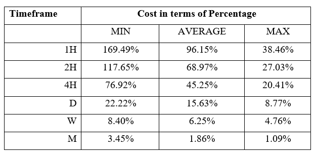
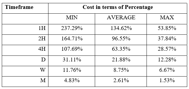
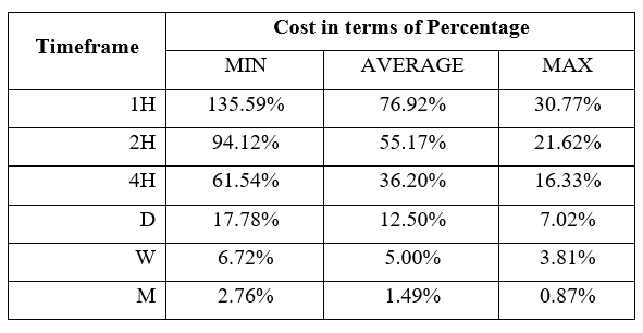
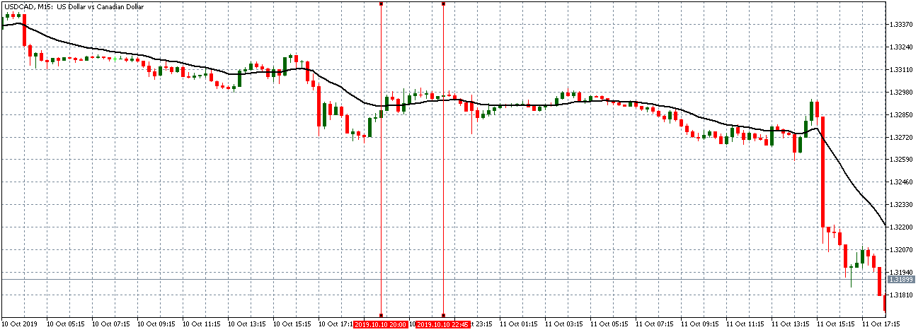
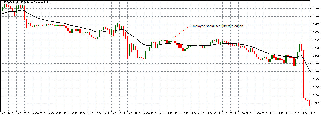
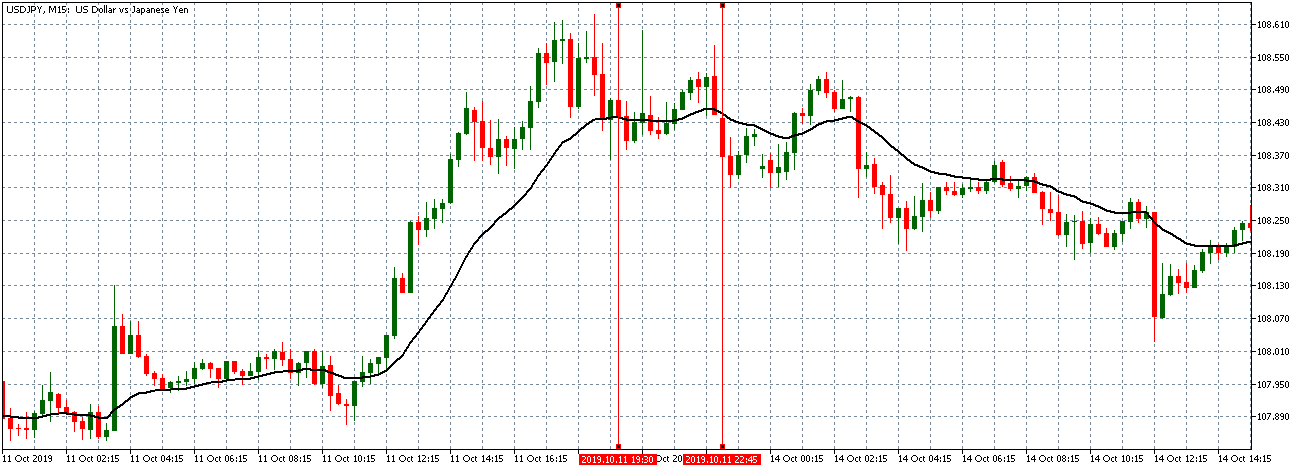
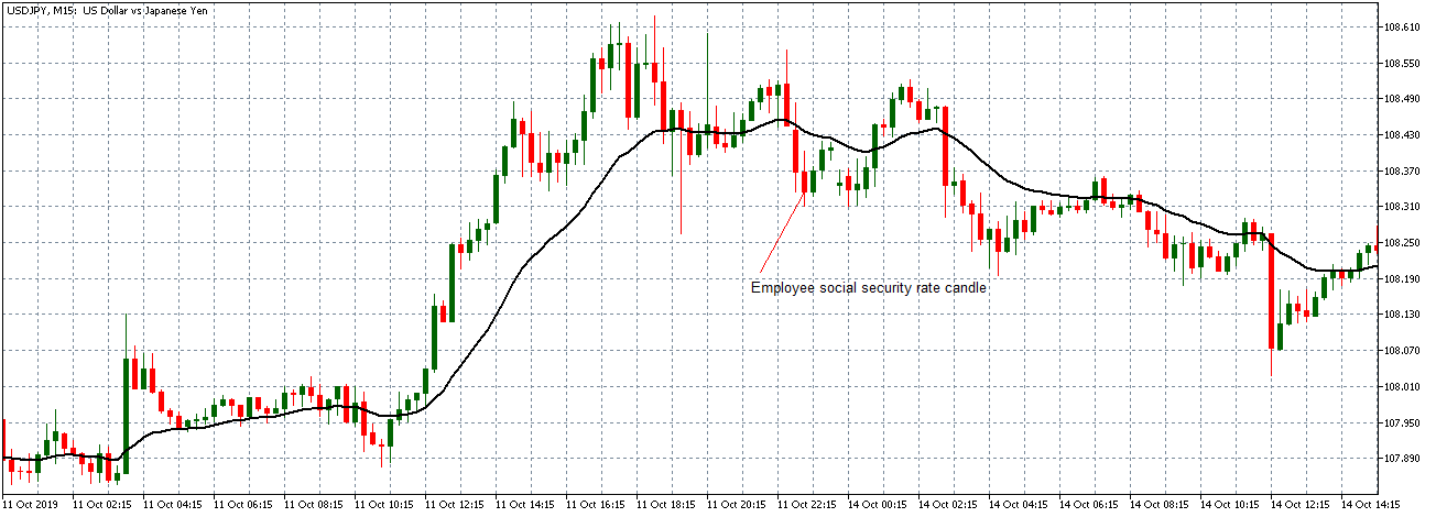
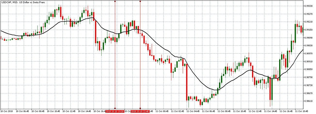
How Government Budget Value Release Affects The Price Charts

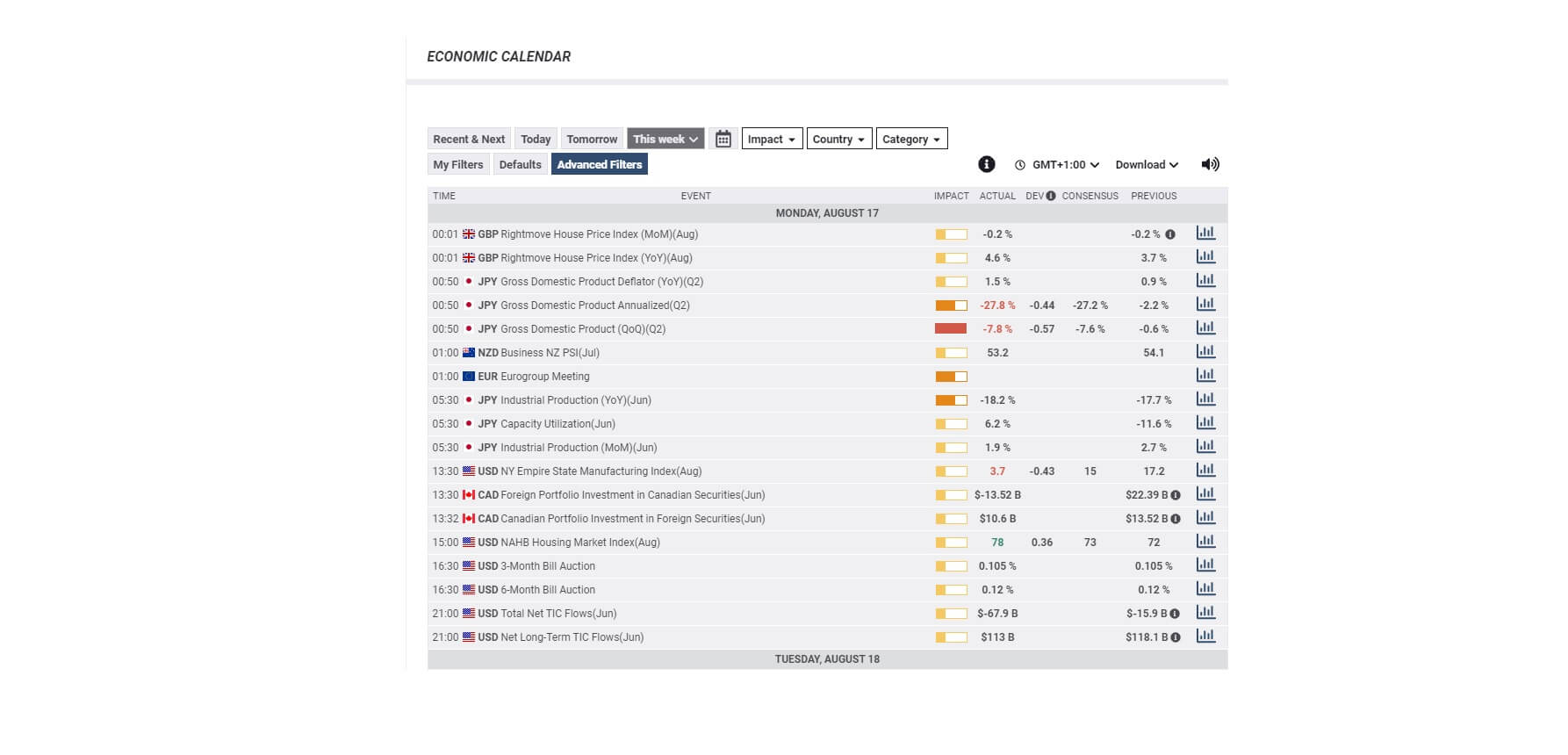
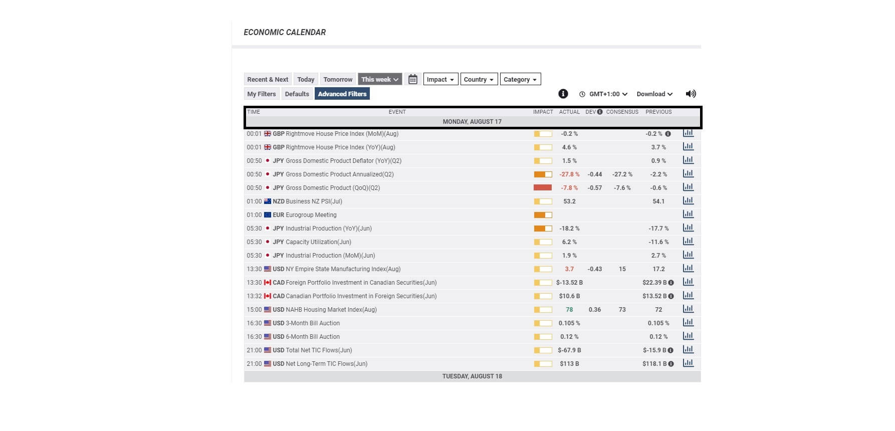
In the US, the Department of the Treasury is responsible for the release of the Monthly Treasury Statement. This statement contains the Federal Budget Balance, which is synonymous to the Government Budget Value. It measures the difference in value between the federal government’s income and spending during the previous month. The most recent release was on August 12, 2020, at 2.00 PM ET and can be accessed from Investing.com here. A more in-depth review of the Monthly Treasury Statement can be accessed at the US the Department of the Treasury here.

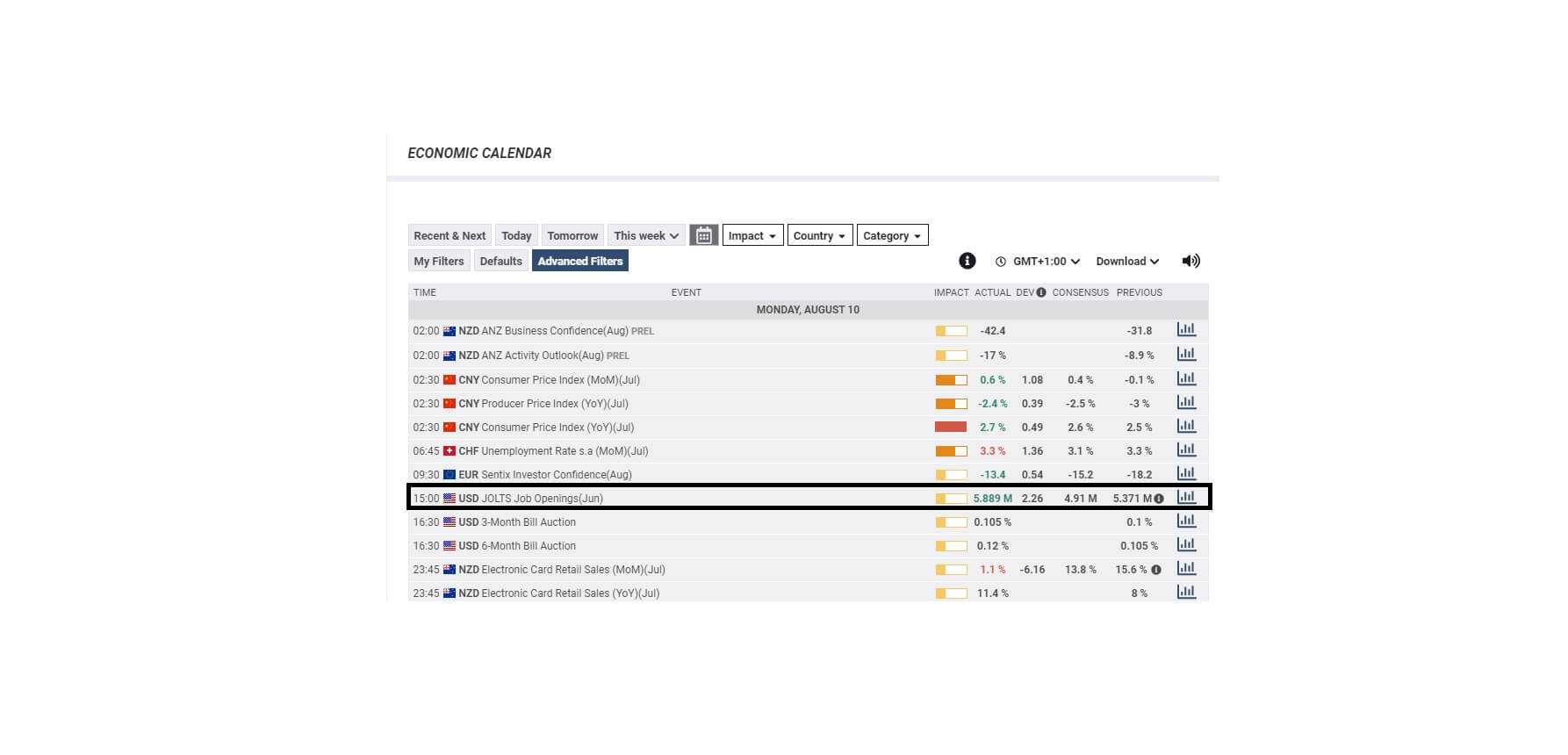
The screengrab below is of the monthly government budget value from Investing.com. On the right is a legend that indicates the level of impact the fundamental indicator has on the USD.

As can be seen, the government budget value data is expected to have a medium impact on the USD upon its release.

The image below shows the recent changes in the monthly government budget value in the US. In July 2020, the government budget value changed from a deficit of $864 billion to $63 billion, beating analysts’ expectations of a $193 billion deficit. This change is positive and, in theory, should make the USD stronger compared to other currencies.

Now, let’s see how this release made an impact on the Forex price charts.

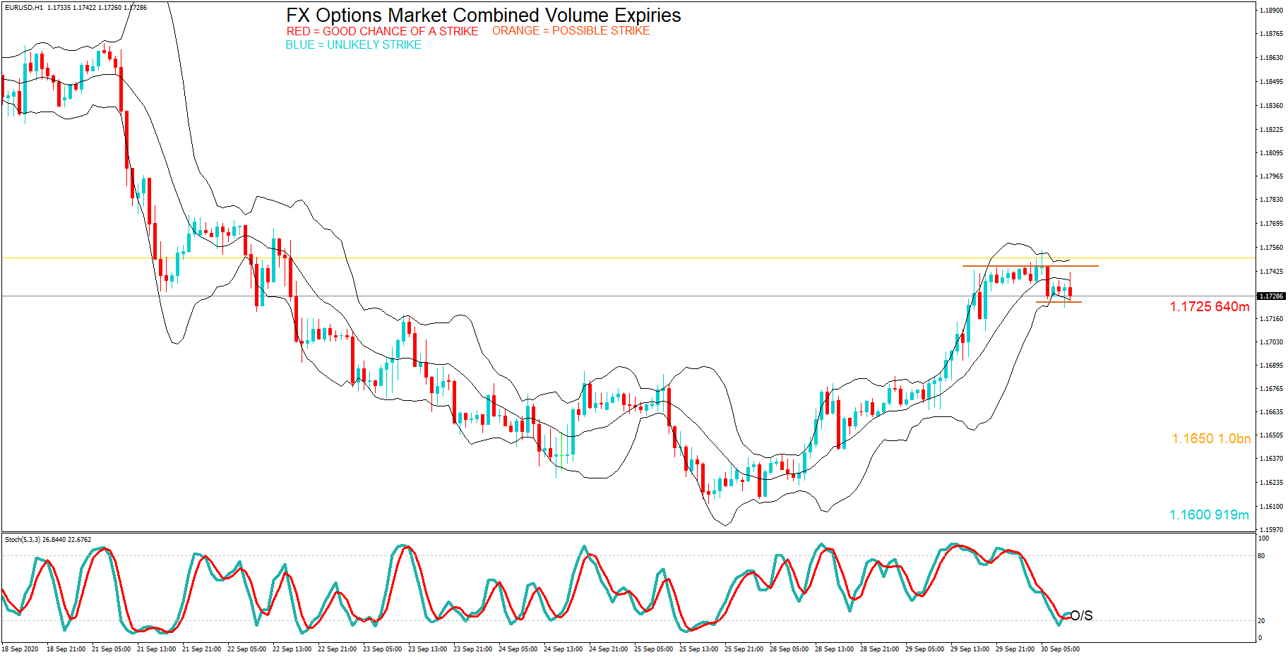
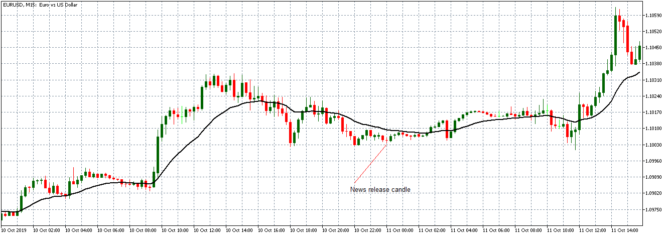
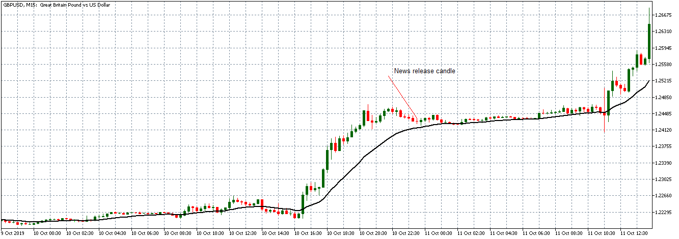
EUR/USD: Before the Monthly Government Budget Value Release 
on August 12, 2020, Just Before 2.00 PM ET

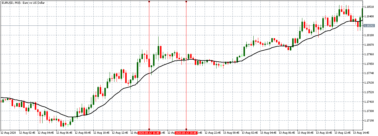
Before the budget data release, the EUR/USD pair was trading in a subdued uptrend. As seen in the above chart, the 15-minute candles are forming closer to the 20-period Moving Average, whose steepness is decreasing.

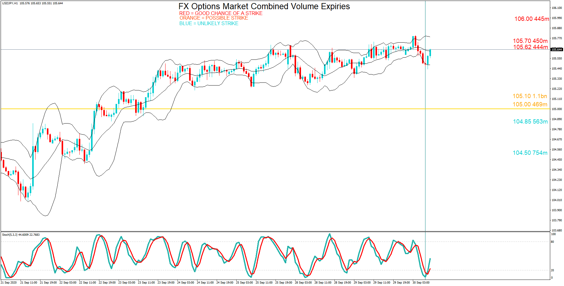
EUR/USD: After the Monthly Government Budget Value Release 
on August 12, 2020, at 2.00 PM ET

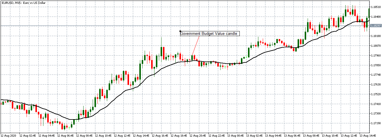
After the data release, the pair formed a 15-minute bullish candle, indicating that the USD weakened against the EUR contrary to the expectation. However, the data release was not significant enough to cause a shift in the trading pattern. The pair traded in a neutral trend with candles forming around a flat 20-period Moving Average.

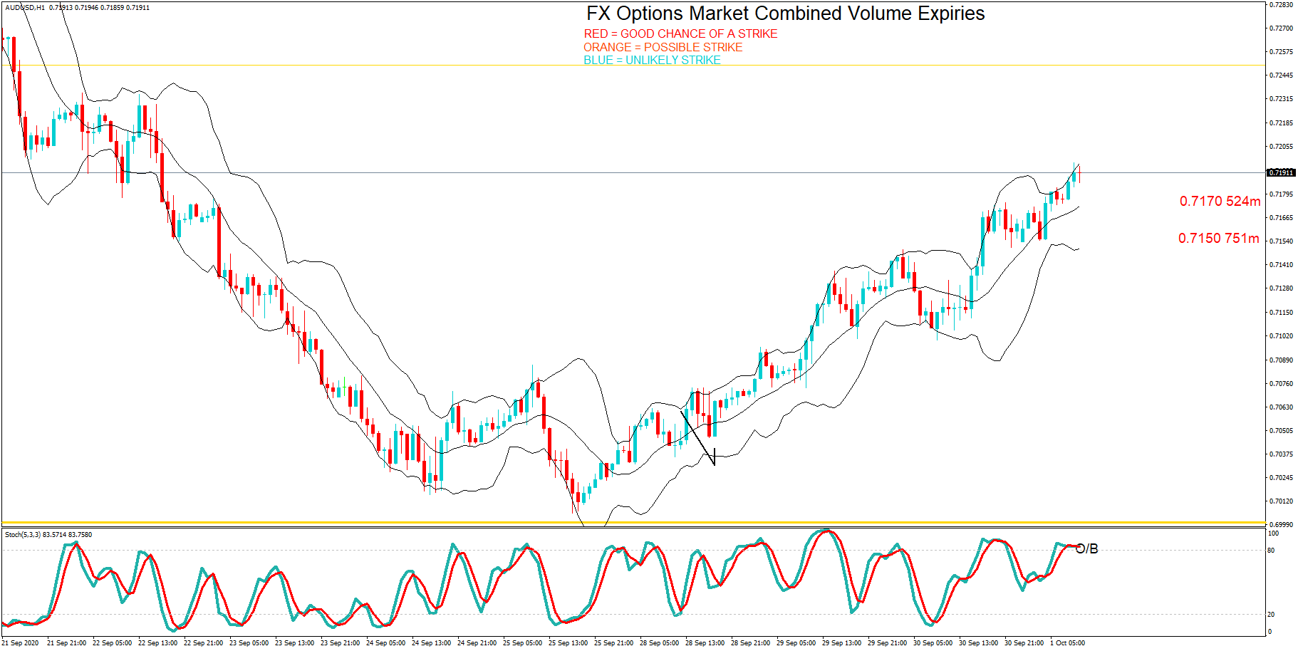
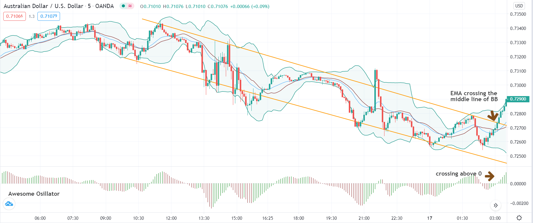
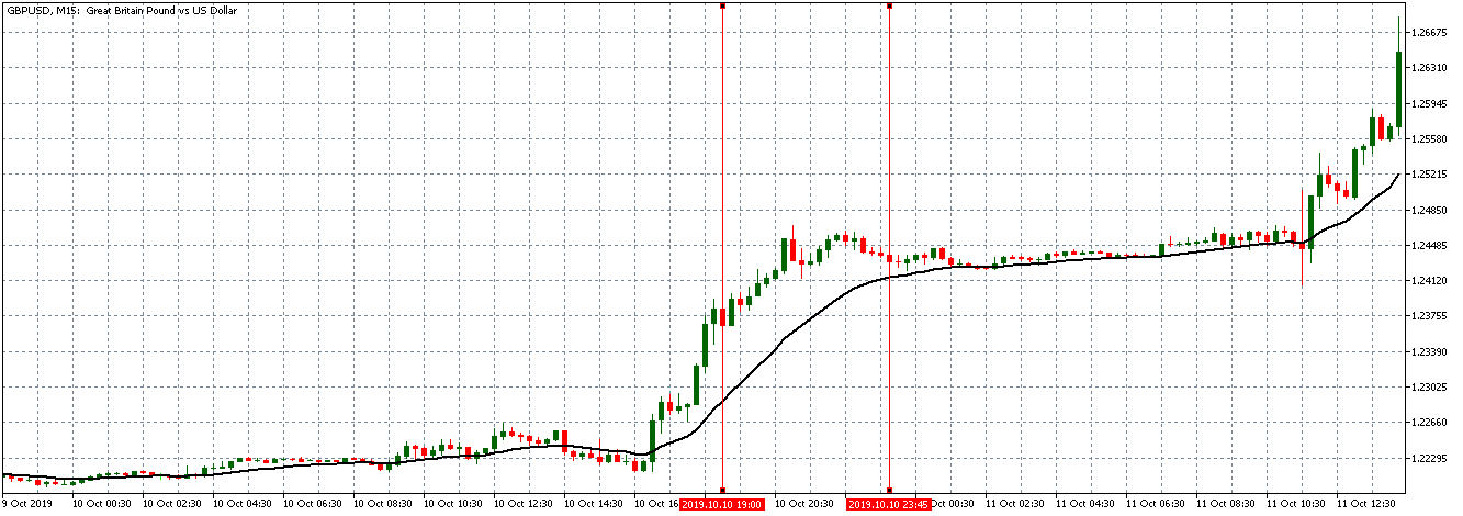
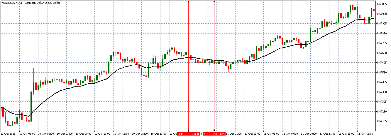
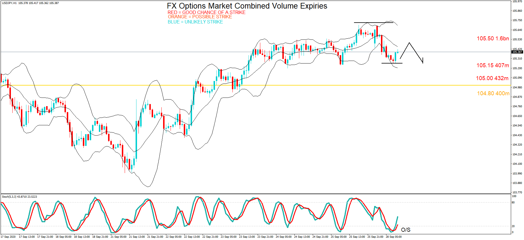
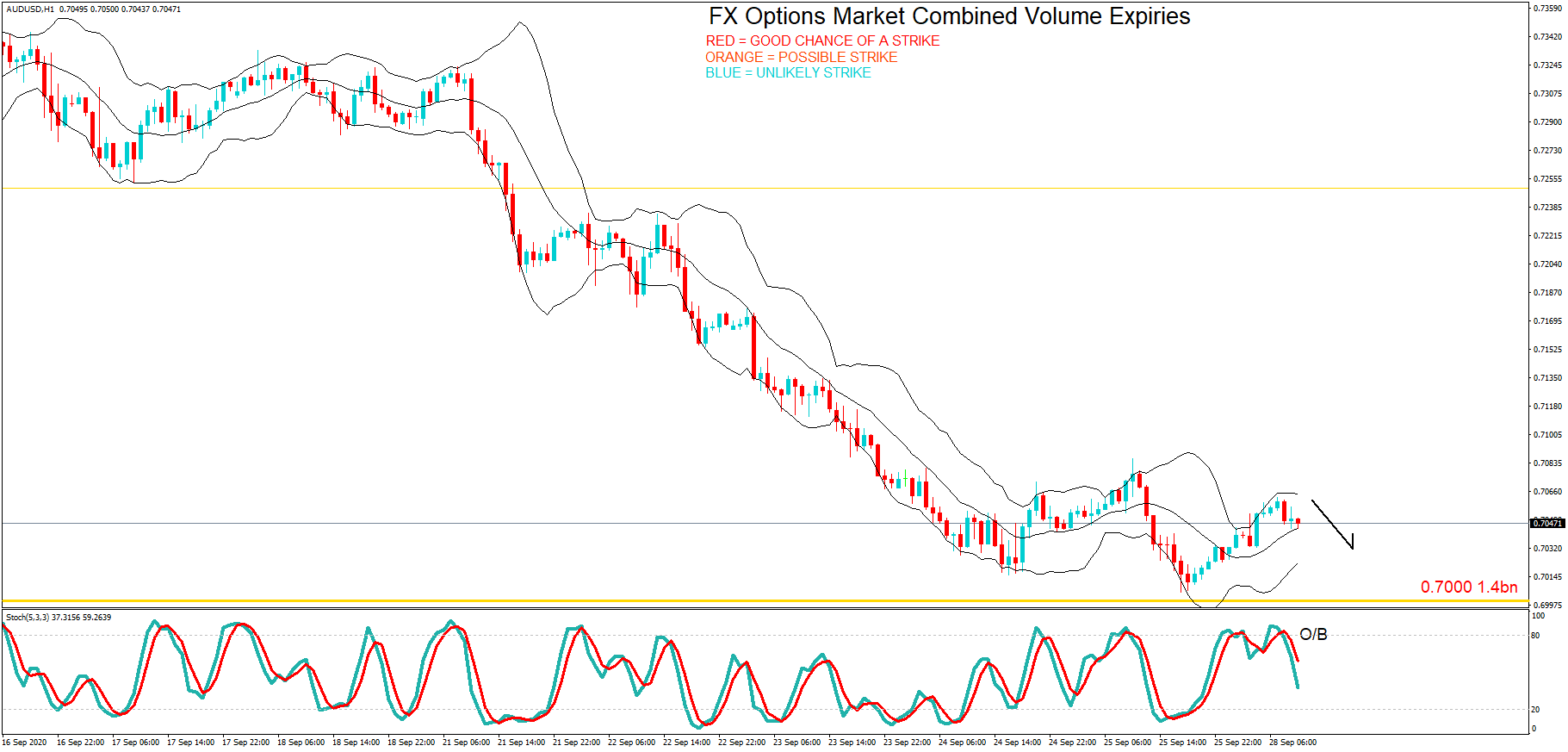
AUD/USD: Before the Monthly Government Budget Value Release 
on August 12, 2020, Just Before 2.00 PM ET

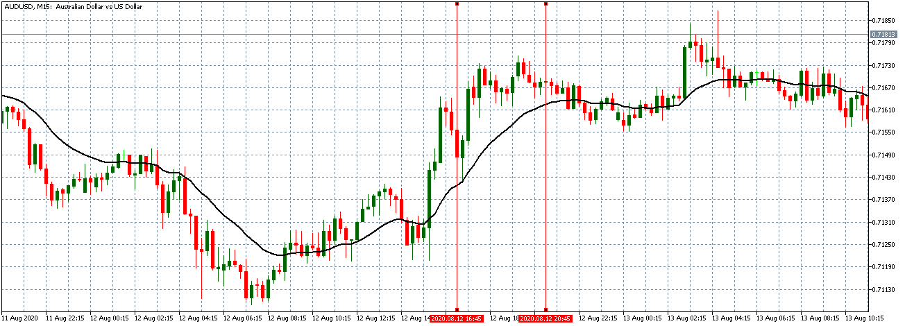
Before the data release, the AUD/USD pair traded in a steady uptrend with candles forming above a rising 20-period MA.

AUD/USD: After the Monthly Government Budget Value Release 
on August 12, 2020, at 2.00 PM ET

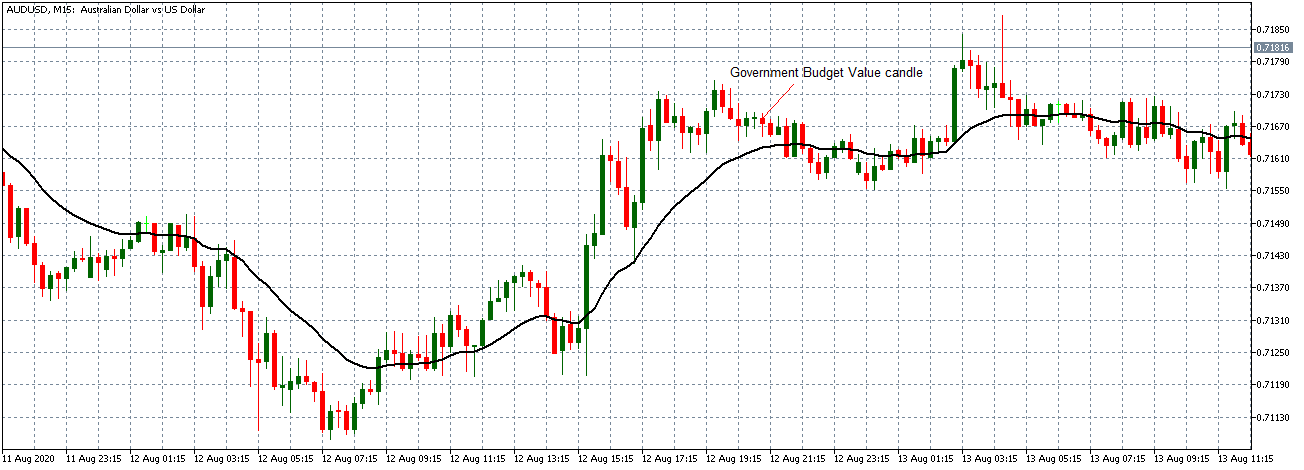
The pair formed a 15-minute bearish “hammer” candle after the data release. Similar to the EUR/USD, AUD/USD subsequently traded in a neutral trend with the 20-period MA flattening.

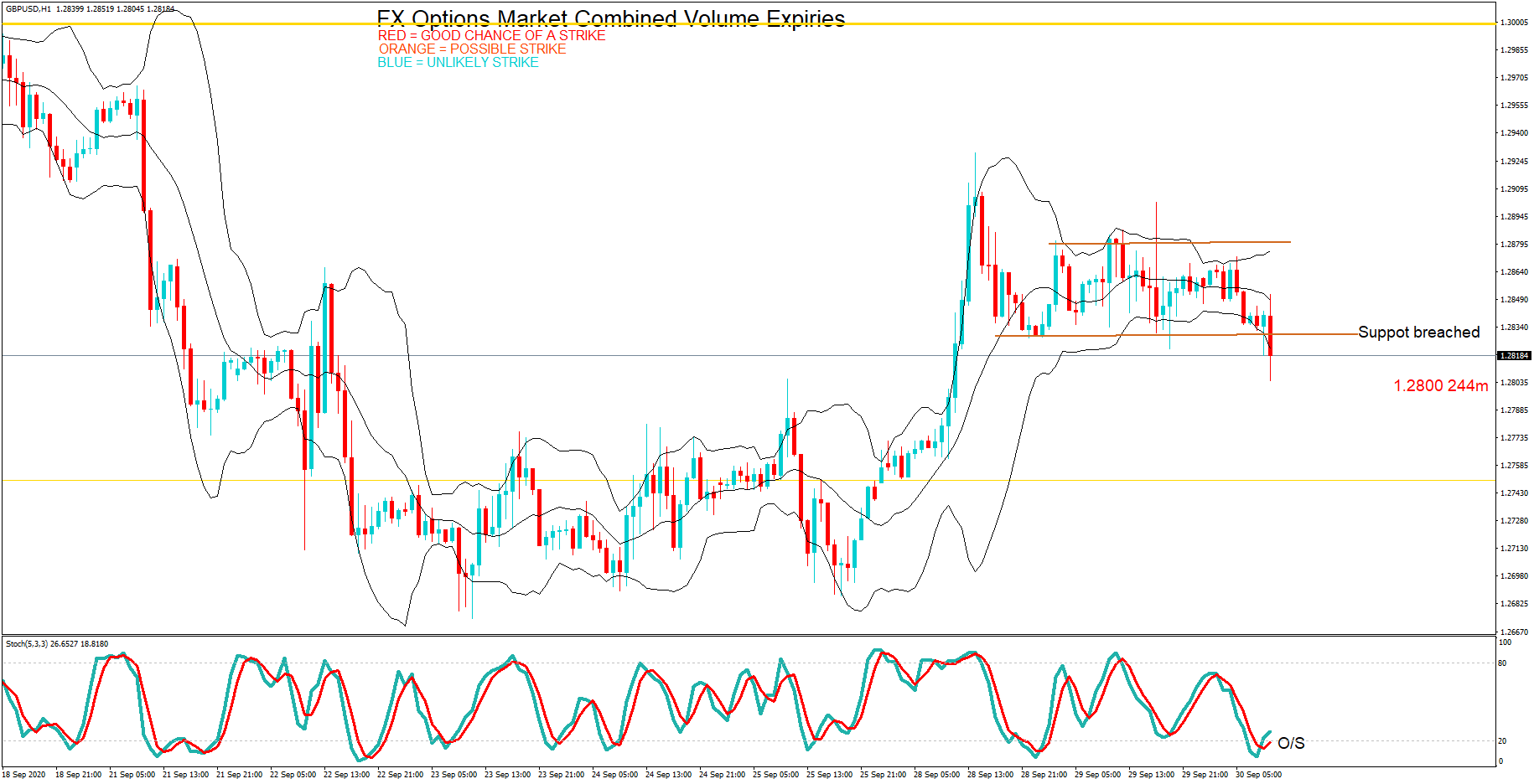
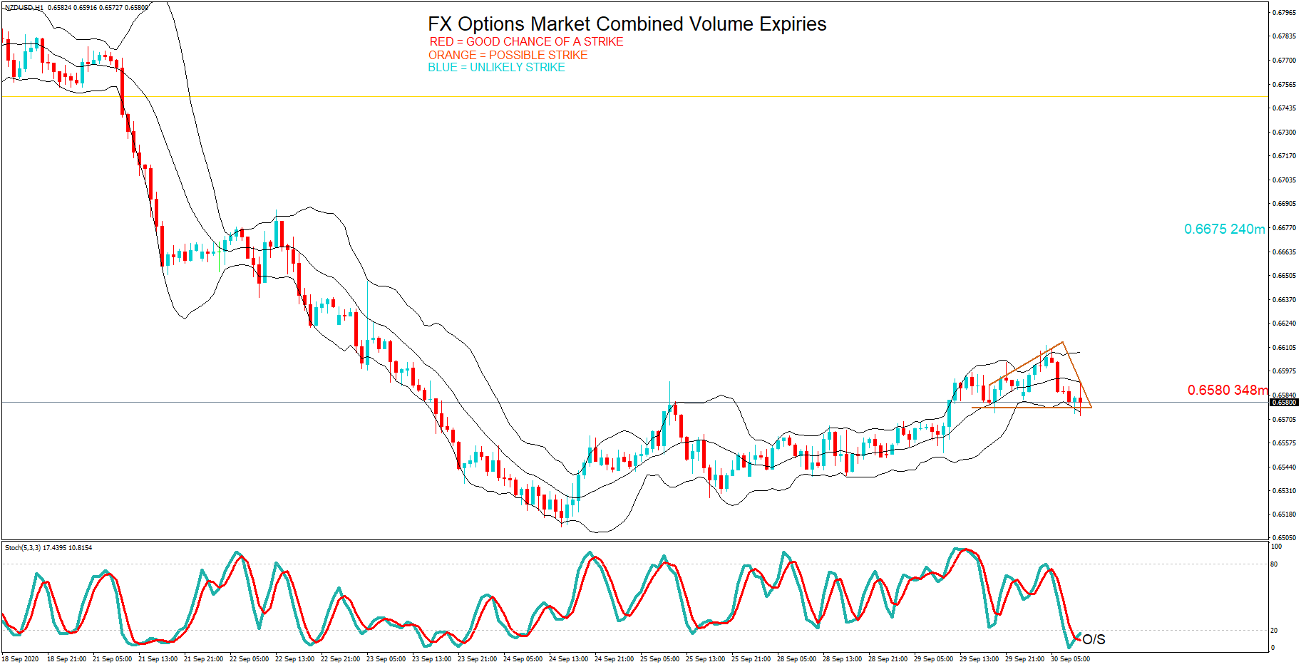
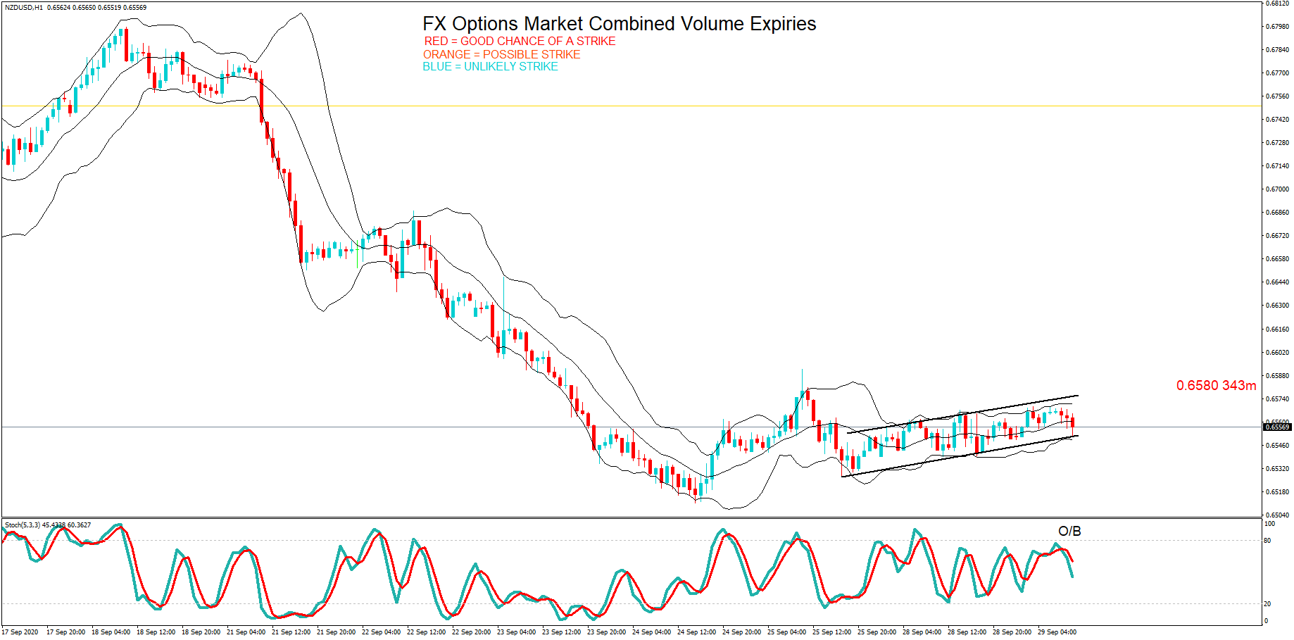
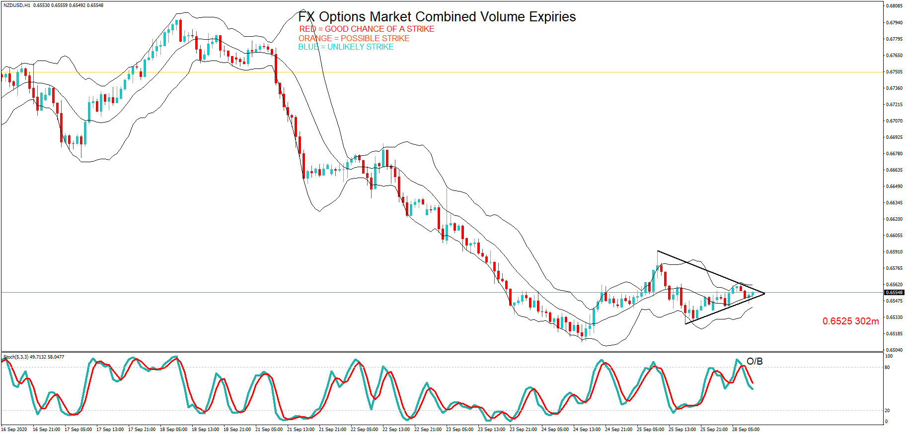
NZD/USD: Before the Monthly Government Budget Value Release 
on August 12, 2020, Just Before 2.00 PM ET

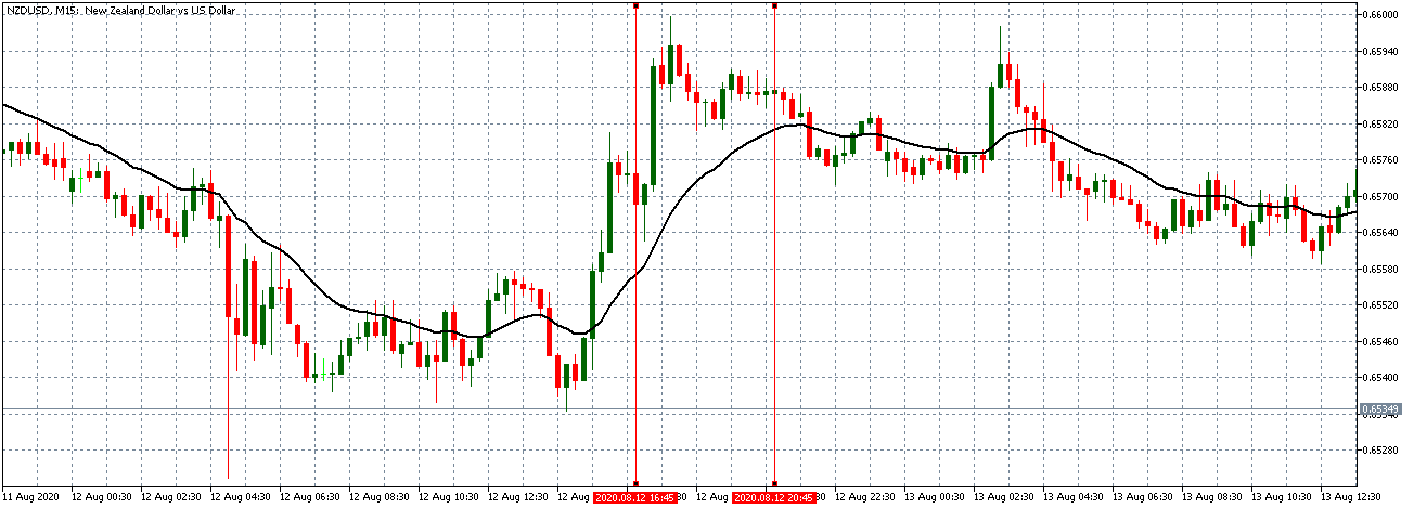
NZD/USD: After the Monthly Government Budget Value Release 
on August 12, 2020, at 2.00 PM ET

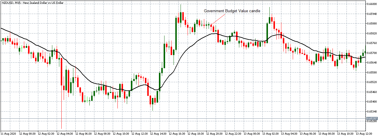
NZD/USD pair showed a similar steady uptrend as observed with the AUD/USD before the data release. The pair formed a 15-minute bearish candle. It subsequently traded in the neutral pattern observed with the other pairs.

Bottom Line

For economists, the monthly government budget value is an invaluable indicator showing the trends in government budget deficit, revenue, and expenditures. However, in the forex market, this fundamental indicator does not produce significant price action changes, as observed in the above analyses.

Categories
Forex Market Analysis

Daily F.X. Analysis, September 24 – Top Trade Setups In Forex – U.S. Jobless Claims in Focus! 

The economic calendar is again busy with Federal Reserve events such as today, the Fed Chair Powell Testifies. Jerome Powell is expected to testify on the CARES Act before the House Financial Services Committee in Washington DC. Besides this, the eyes will be on the Existing Home Sales from the United States. Overall, the market is likely to exhibit corrections today.

Economic Events to Watch Today  


AUD/USD – Daily Analysis

The AUD/USD failed to stop its previous losing streak and dropped to a 2-months low around below the mid-0.7000 level mainly due to the risk-off market sentiment, triggered by the renewed concern about the second wave of coronavirus infections, which continued weighing on investors sentiment and undermined the perceived riskier Australian dollar. The broad-based U.S. dollar strength, supported by the combination of factors, also dragged the currency down across the ocean. At the moment, the AUD/USD is currently trading at 0.7033 and consolidating in the range between 0.7029 – 0.7083. 

The traders seem cautious to place any strong position ahead of the testimony by the Fed Chair Jerome Powell and Treasury Secretary Steven Mnuchin, which will influence the USD price dynamics and provide some fresh direction to the currency pair.

Worries that the coronavirus pandemic’s resurgence could ruin the global economic recovery keeps the market trading sentiment under pressure and weakened the perceived riskier Australian dollar. As per the latest report, the coronavirus COVID-19 cases continue to climb in Europe, U.K., and the U.S. Whereas, some E.U. countries are now facing the starting of the second wave coinciding with the onset of the flu season. That was witnessed after the World Health Organization’s regional director for Europe said that “We have a dire situation unfolding before us,” H further added that Europe’s number of weekly infections was higher now than at the first peak in March. 

At the US-China front, the long-lasting tussle between the United States and China remains on the play as State Mike Pompeo took help from France, Germany, and the U.K. to reject China’s claims of the South China Sea at the United Nations (U.N.). This also exerted downside pressure on the market trading sentiment and contributed to the currency pair losses. 

As a result, the broad-based U.S. dollar succeeded in extending its previous session gains and remained well bid on the day as investors turned to the safe-haven in the wake risk-off market sentiment. However, the U.S. dollar gains could be short-lived or temporary due to the worries that the U.S.’s economic recovery could be stopped because of the reappearance of coronavirus cases. Besides this, the gains in the U.S. dollar was further boosted after the hawkish comments by Chicago Fed President Charles Evans, that further quantitative easing may not provide additional support to the U.S. economy. However, the gains in the U.S. dollar kept the currency pair under pressure. Whereas, the dollar index, which pits the dollar against a bucket of 6-major currencies, stood at 94.336 on the day, close to a nine-week high.

Moving Ahead, the traders will keep their eyes on the U.S. economic docket, which will show the release of Initial Weekly Jobless Claims and New Home Sales data. Apart from this, the U.S. Federal Reserve (Fed) Chair Jerome Powell’s testimony will also be closely observed. Across the ocean, the market risk sentiment and developments surrounding the coronavirus will not lose their importance. 

Daily Technical Levels

 Support      Resistance  

0.7035       0.7147  

 0.6996      0.7218  

 0.6924      0.7258  

  Pivot Point: 0.7107  


AUD/USD– Trading Tip

The stronger U.S. dollar has also driven sharp selling in the AUD/USD pair as it trades at 0.7042 level today. The AUD/USD pair has formed three black crows patterns on a daily timeframe, suggesting odds of selling bias in the AUD/USD. However, the AUD/USD has closed a Doji candle at 0.7042 level, and we may see some bullish correction over the 0.7001 support level until the next resistance level of 0.7098 and 0.7152 level. 


USD/CAD– Daily Analysis

The USD/CAD currency pair extended its previous session bullish bias and kept gaining positive traction around above 1.3400 level, mainly due to the broad-based U.S. dollar strength. The bullish tone around the U.S. dollar was sponsored by the concerns over rising COVID-19 cases and fears of renewed lockdown measures, which kept the market trading sentiment under pressure and supported the greenback’s status as the global reserve currency. 

On the flip side, the currency pair bullish bias could also be attributed to the weaker crude oil prices, which undermined the demand for the loonie, a commodity-linked currency, and contributed to the pair gains. Currently, the USD/CAD pair is trading at 1.3396 and consolidating in the range between 1.3370 – 1.3412.

As we already mentioned that the equity market had been flashing red since the Asian session started. The reason could be associated with the major negative catalysts. Be it the concerns about the second wave of coronavirus diseases or the fears of renewed lockdown measures, not to forget the long-lasting US-China tussle, all these factors weigh on the market trading sentiment and helping the U.S. dollar to put the safe-have bids. Apart from this, the slowdown in Europe, alongside concerns expressed by U.S. Federal Reserve officials over the U.S. economy, pushed the equity market down. 

The broad-based U.S. dollar keeps its gaining streak and still reporting gains on the day amid market risk-off sentiment. However, the U.S. dollar gains could be short-lived or temporary as worries that the U.S.’s economic recovery could be stopped amid the resurgence of the second wave of coronavirus cases. Besides this, the U.S. dollar gains were further boosted by the hawkish comments by Chicago Fed President Charles Evans, suggesting that further quantitative easing may not provide additional support to the U.S. economy. However, the gains in the U.S. dollar kept the currency pair higher. Whereas, the dollar index, which pits the dollar against a bucket of 6-major currencies, stood at 94.336 on the day, close to a nine-week high.

Across the pond, the crude oil prices failed to stop its previous session, losing streak and remained pressed around below the mid-$39.00 marks. Besides, the possibilities of Libya resuming oil exports added further bearish pressures around the crude oil prices. Thus, the declines in crude oil prices undermined demand for the commodity-linked currency the loonie and contributed to the currency pair gains. 

Looking forward, the traders will keep their eyes on the U.S. Federal Reserve (Fed) Chair Jerome Powell’s testimony. Furthermore, the U.S. Jobless Claims and Housing data will also be key to watch. Whereas, the updates concerning the US-China relations and the U.S. stimulus package will not lose their importance.

 Daily Technical Levels

Support      Resistance

  1.3323      1.3418  

  1.3260      1.3450  

  1.3228      1.3513  

  Pivot Point: 1.3355  


USD/CAD– Trading Tip

The USD/CAD is trading with a bullish bias at 1.3402 level, having violated the ascending triangle pattern at 1.349 level, and now it’s heading further higher until the next resistance level of 1.3460. The MACD and three white soldiers pattern is suggesting chances of bullish bias in the pair. In contrast, the pair has also crossed over 50 periods EMA at 1.3254 level. Today we should consider taking a buying trade over 1.3349 level to target the 1.3462 level. 


USD/JPY – Daily Analysis

The USD/JPY pair was closed at 105.362 after placing a high of 105.494 and a low of 104.847. The pair USD/JPY extended its gains on Wednesday for the third consecutive day and peaked six previous days. The rising USD/JPY prices were due to the strong rebound of the U.S. dollar’s safe-haven status and upbeat market data.

On Wednesday, the U.S. dollar was strong due to Fed officials’ more hawkish comments that raised the U.S. dollar and helped it regain its safe-haven status. The strong bullish momentum in the USD/JPY pair was also supported by Japan’s weak PMI data on Wednesday.

At 05:30 GMT, the Flash manufacturing PMI from Japan for the month of September declined to 47.3 against the projected 48.0 and weighed on the Japanese Yen. The figures showed that Japan’s manufacturing sector viewed contraction in September that was negative for local currency but positive for the USD/JPY pair. At 09:30 GMT, All Industrial Activity in September remained flat at 1.3% from Japan.

On the U.S. front, the Housing Price Index for July advanced to 1.0% against the expectations of 0.4% and supported the U.S. dollar that helped the gains of USD?JPY pair on Wednesday. At 18:45 GMT, the highly awaited Flash Manufacturing PMI also rose to 53.5 against the anticipated 52.5 and supported the greenback that added further gains in the USD/JPY pair. However, the Flash Services PMMI remained flat with a projection of 54.5.

Meanwhile, the President of the Federal Reserve Bank of Cleveland, Loretta Mester, said on Wednesday that the U.S. economy had rebounded significantly from the losses caused by the pandemic induced lockdowns. However, she also said that the recovery was still narrow and was not sustainable. The Fed Vice Chair Randal K. Quarles said that the coronavirus event was an enormous economic shock in the first half of 2020. He also said that the recovery was underway, but a full recovery was far off as the risks remain on the downside.

Apart from this, the Fed Chair Jerome Powell, in his testimony, faced many questions regarding the next round of stimulus package. He replied that the difference between Democrats & Republicans over the package’s size remains and caused a delay. Powell also urged more spending to help the economy recover from the pandemic crisis. All these developments raised the U.S. dollar prices due to its safe-haven status and boosted the USD/JPY pair.

Moreover, the tensions between the U.S. and China also escalated after U.S. President Donald Trump blamed China and called for holding it accountable for the global spread of coronavirus. In response to this, Chinese President XI Jinping accused Trump of lying and insulting the platform of the U.N. He also said that he had no intension of having a cold war with any country. These harsh comments from both sides also raised uncertainty and helped the U.S. dollar to gain traction due to safe-haven nature and post gains in the USD/JPY pair on Wednesday.

Daily Technical Levels

Support      Resistance

  105.0000      105.6100  

  104.6400      105.8600  

  104.3900      106.2100  

  Pivot Point: 105.2500  


USD/JPY – Trading Tips

The USD/JPY is trading with a bullish bias to trade at 105.460 level, and the series for EMA are now extending at 105.550 level. On the lower side, the support stays at 104.840 level. The MACD is also in support of bullish bias amid a stronger U.S. dollar and reduced safe-haven appeal. Bullish crossover of 105.550 level may drive more buying until 106.258. The idea is to stay bearish below the 105.470 level today. Let’s wait for Jobless Claims from the U.S. to determine further trends. Good luck! 


Categories
Forex Options

FX Options Market Combined Volume Expiries for 24th September 2020

Thank you for visiting the Forex Academy FX Options market combined volume expiries section. Each day, where available, we will bring you notable maturities in FX Options of amounts of $100 million-plus, and where these large combined maturities at specified currency exchange rates often have a magnetic effect on price action, especially in the hours leading to their maturities, which happens daily at 10.00 AM Eastern time. This is because the big institutional players hedge their positions accordingly. Each option expiry should be considered ‘in-play’ with a good chance of a strike if labelled in red, still in play and a possible strike if labelled in orange and ‘out of play’ and an unlikely strike if labelled in blue, with regard to the likelihood of price action meeting the strike price at maturity.

…………………………………………………………………………………………………………

FX option expiries for Tuesday September 24 at the 10am NY cut

 EUR/USD (euro amount )

  •  1.1600 975m
  •  1.1610 625m
  •  1.1625 523m
  •  1.1700 844m
  •  1.1750 1.1bn
  •  1.1800 2.7bn

EURUSD pair found support at 1.1650.  A pullback to the 1.17 area seems likely. Euro speeches and US Jobless claims up later will add to some extra volatility in the pair.

USD/JPY (USD)

  •  104.00 1.3bn
  •  104.50 471m
  •  104.55 438m
  •  104.90 830m
  •  105.00 1.8bn
  •  105.10 844m
  •  105.25 570m
  •  105.70 470m
  •  105.75 900m
  •  106.10 555m
  •  106.18 444m
  •  106.25 548m
  •  106.75 1.6bn
  •  106.87 750m

USDJPY is in a trading range of 105.00 to 105.50 and there is a huge cluster of option expiries within this area. US jobless claims up later may push the pair out of this range.

GBP/USD (GBP)

  •  1.2705 271m

GBPUSD remains on the backfoot. The pair is oversold and the 1.2705 option is in play. Lots of events may throw the pair off-balance: Chancellor lays out plans for an extension of the furlough program and US jobs data out later. Brexit negotiations drag on. Expect volatility.

AUD/USD (AUD)

  •  0.7100 1.0bn
  •  0.7110 703m

AUSUSD is oversold but remains in a bear trend. Potential for a pullback to the 0.71 level if US dollar buyers dry up after the bull run.

NZD/USD (NZD)

  •  0.6600 270m

NZDUSD is caught in a bear trend and is oversold. Potential for a reversal at the 0.65 level.

………………………………………………………………………………….

As you can see on the preferred 1-hour chart(s), we have also plotted the expiration levels at the various exchange rate maturities and we have also labelled in red, orange and blue.  Therefore, if you see option expiry exchange rates labelled in red these should be considered in-play, because we believe there is a greater chance of the expiry maturing at these levels based on technical analysis at the time of writing. There is still a lesser possibility of a strike if they are in orange and so these are ‘in-play’ too. However, if we have labelled them in blue, they should be considered ‘not in-play’ and therefore price action would be unlikely to reach these levels, which are often referred to as Strikes, at the time of the 10 AM New York cut.

Our technical analysis is based on exchange rates which may be several hours earlier in the day and may not reflect price action at the time of the maturities. Also, we have not factored in economic data releases or keynote speeches by policymakers, or potential market volatility leading up to the cut.

Although we have added some technical analysis, we suggest you take the levels and plot them onto your own trading charts and incorporate the information into your own trading methodology in order to use the information to your advantage. Remember the higher the amount, the larger the gravitational pull towards the exchange rate maturity at 10:00 AM Eastern time.

If you want to learn how forex option expiries affect price action in the spot FX market see our educational article by clicking here: https://bit.ly/2VR2Nji

DISCLAIMER: Please note that this information is for educational purposes. Also, the maturities will look more or less likely to become a strike at 10 AM NY time due to exchange rate fluctuations resulting in a different perspective with regard to technical analysis, and also due to upcoming economic data releases for the associated pairs.