
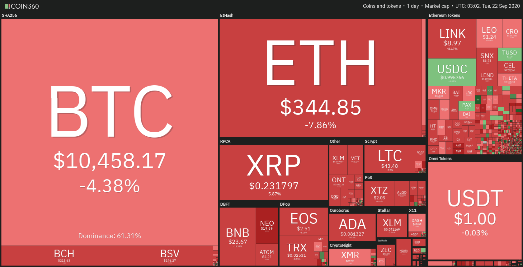
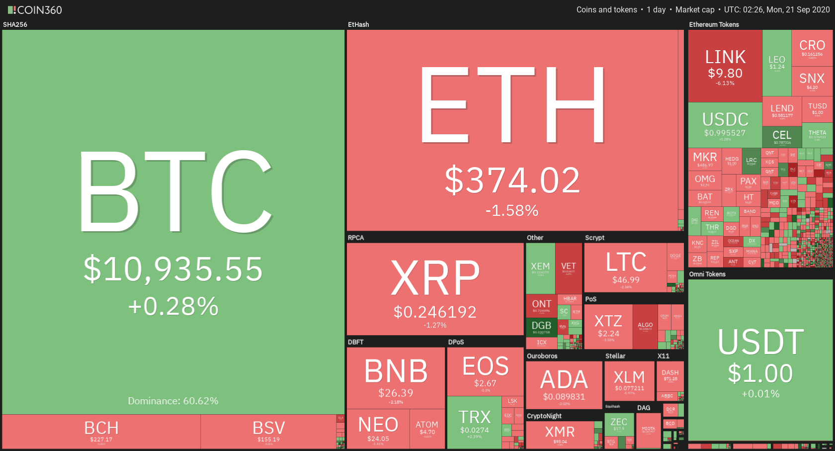
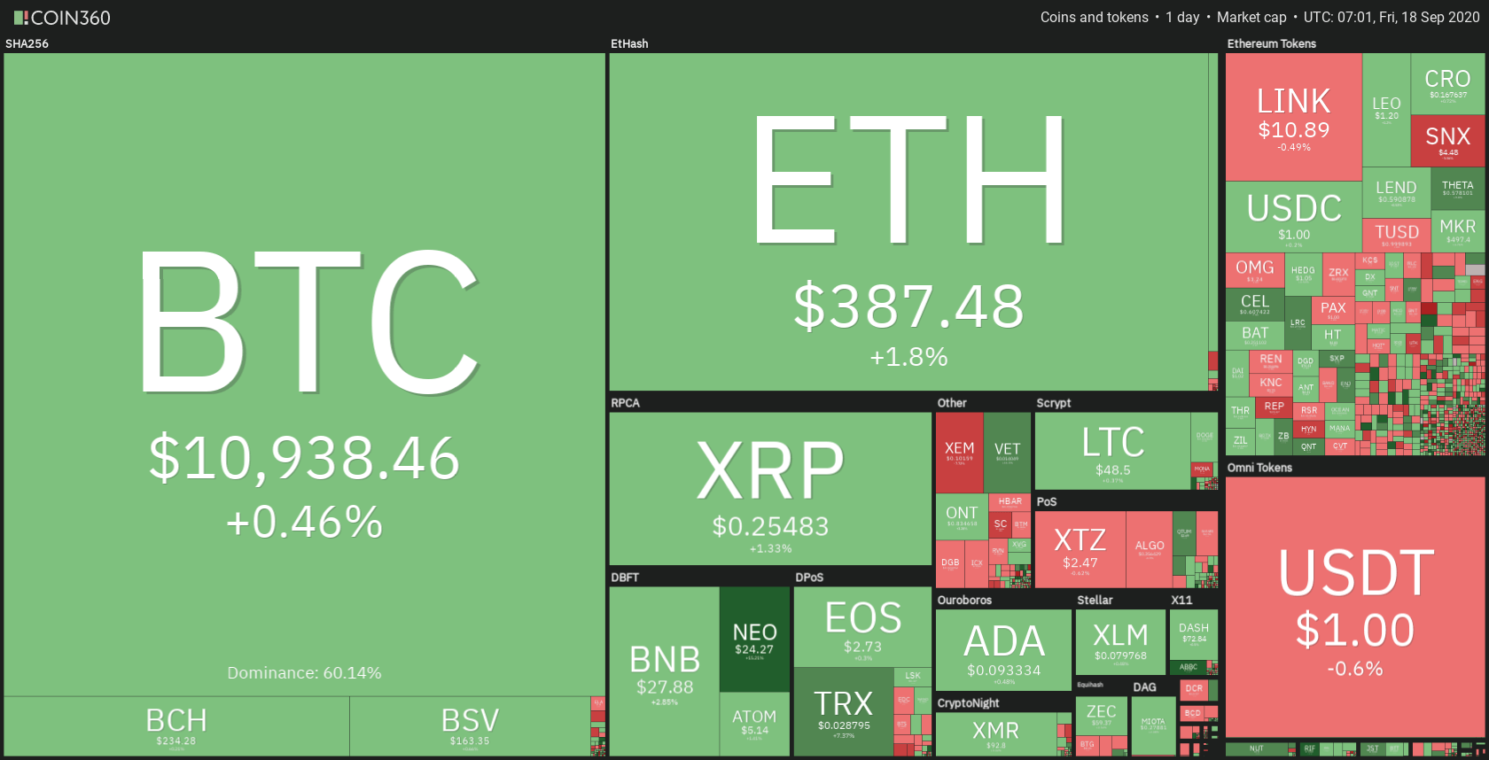
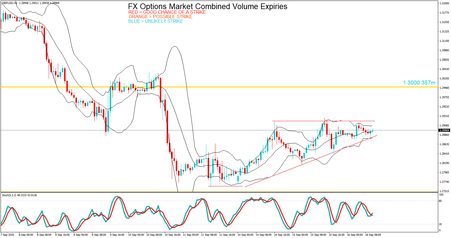
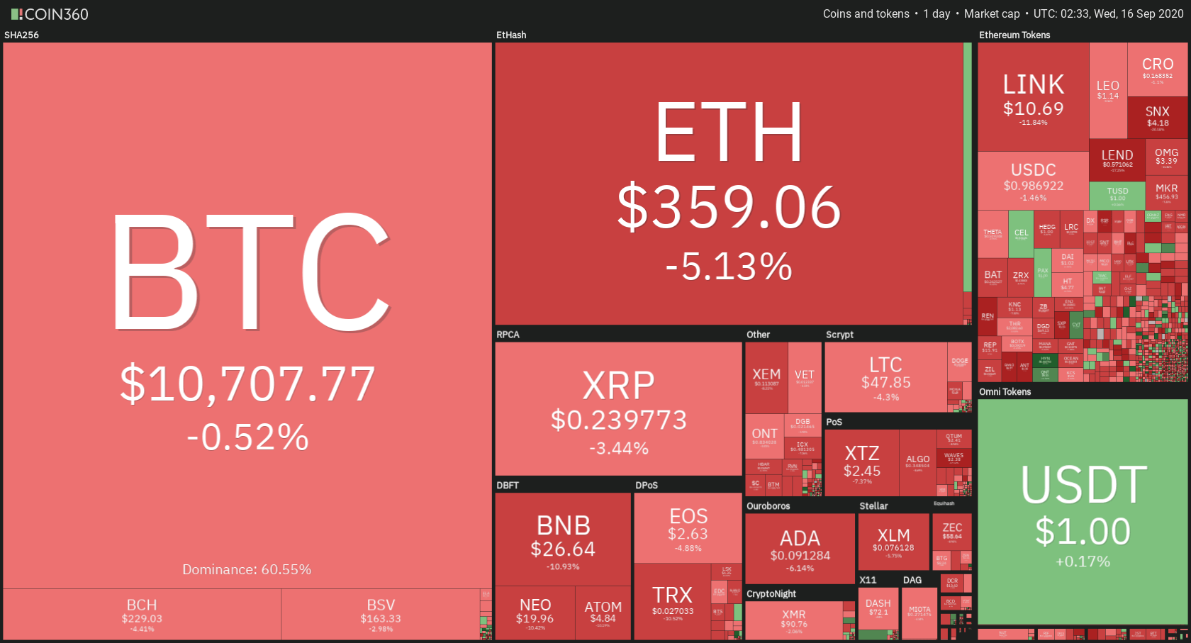
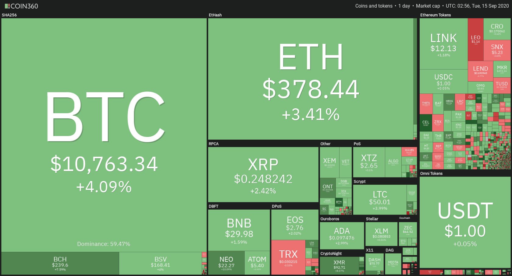
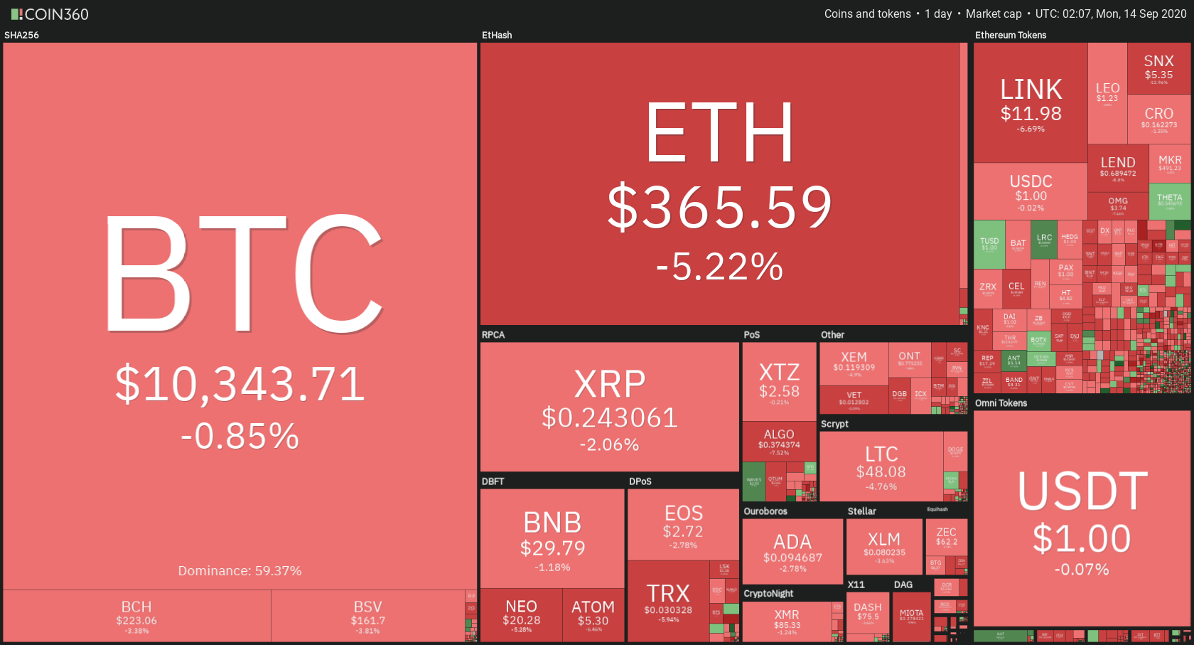
The cryptocurrency sector has experienced a slight decrease in value as (as many traders speculate) Bitcoin mirrored Gold’s triangle pattern breakout and headed towards the downside. Bitcoin is currently trading for $10,261, representing a decrease of 1.72% on the day. Meanwhile, Ethereum lost 4.54% on the day, while XRP lost 3.79%.
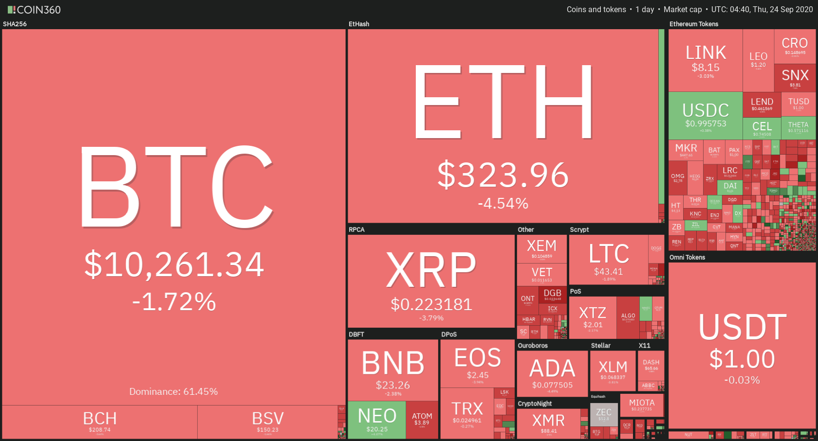
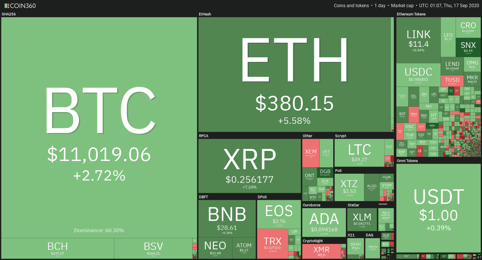
Daily Crypto Sector Heat Map
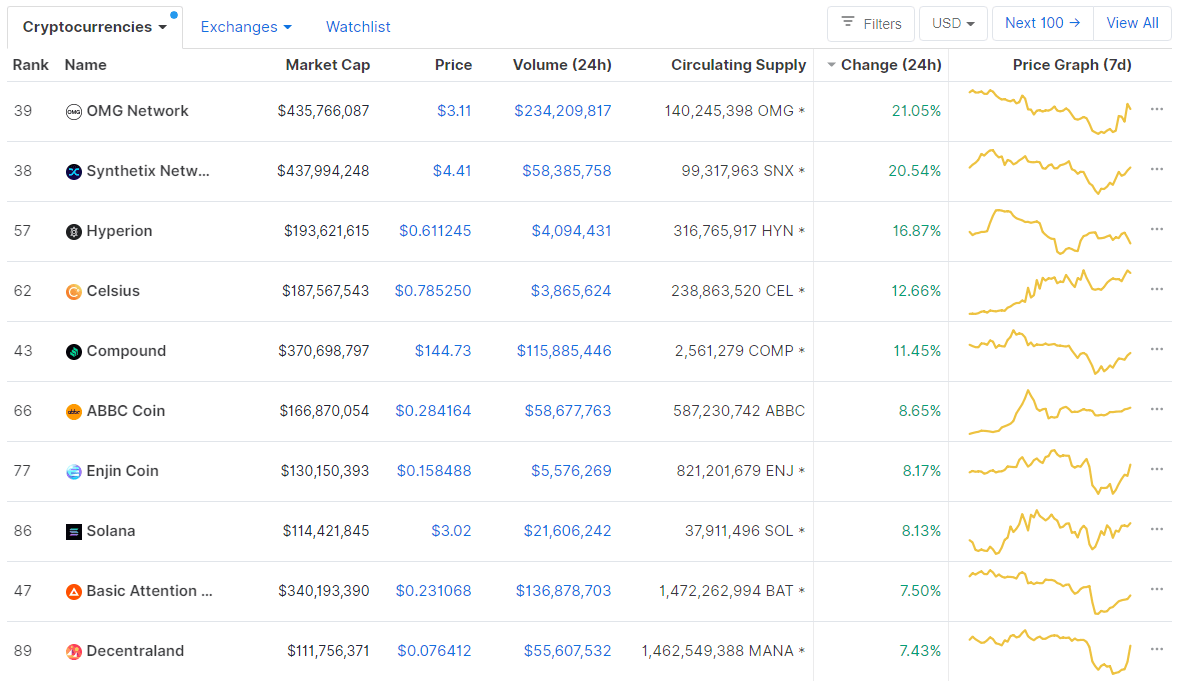
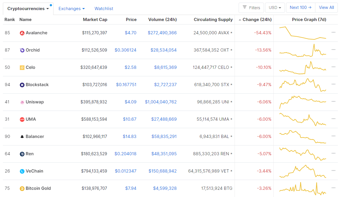
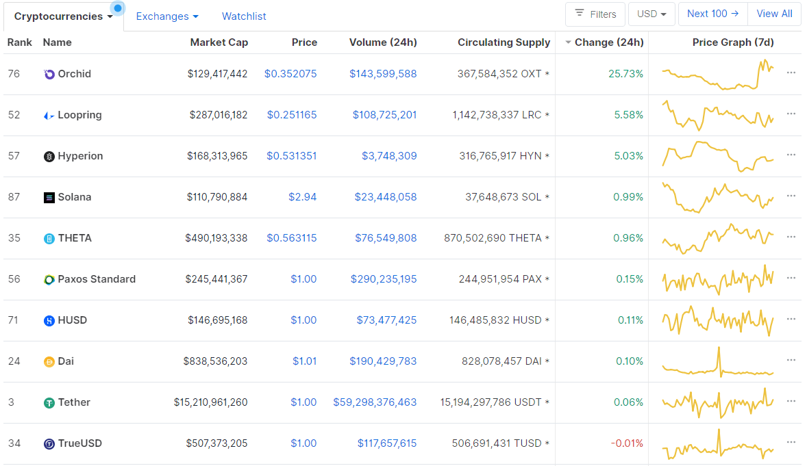
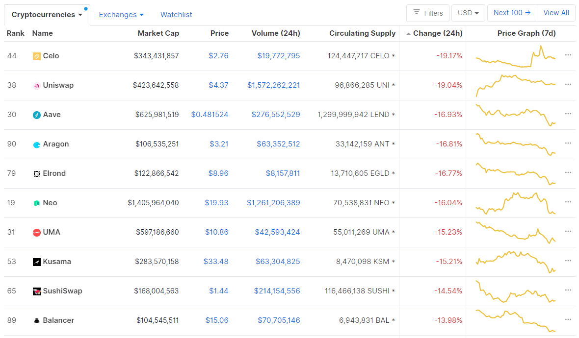
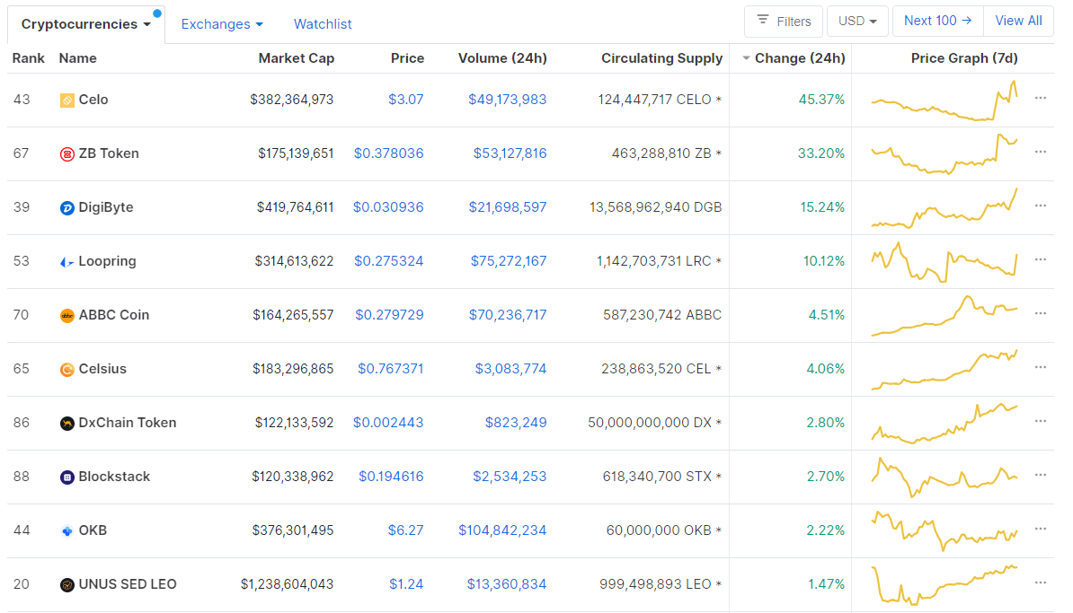
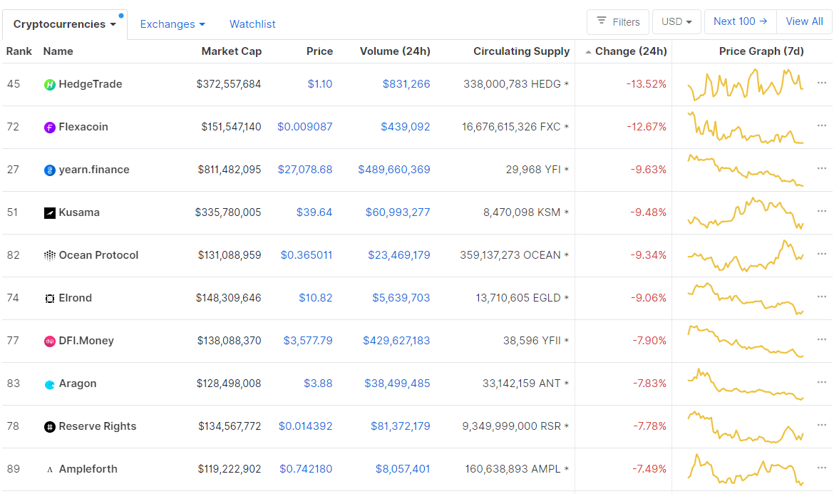
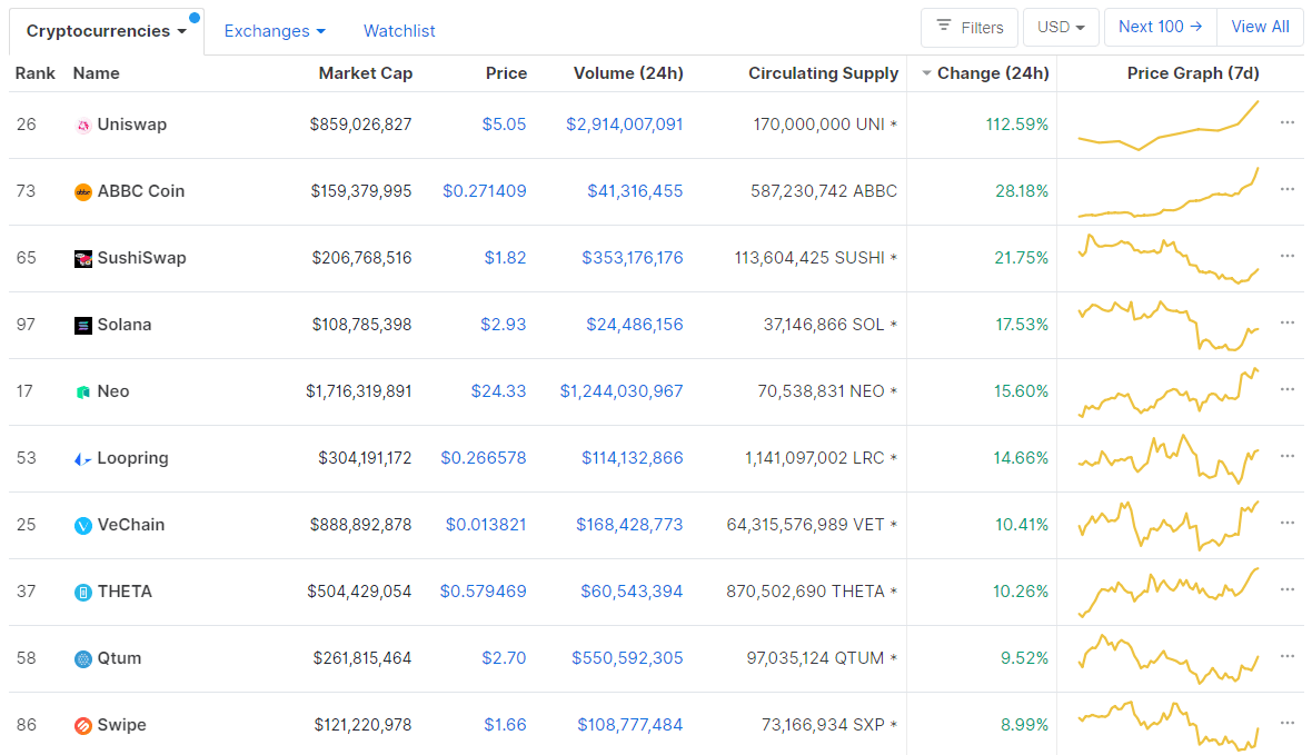
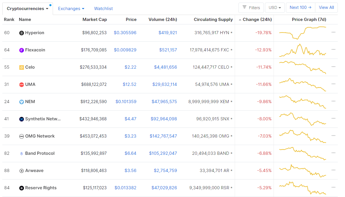
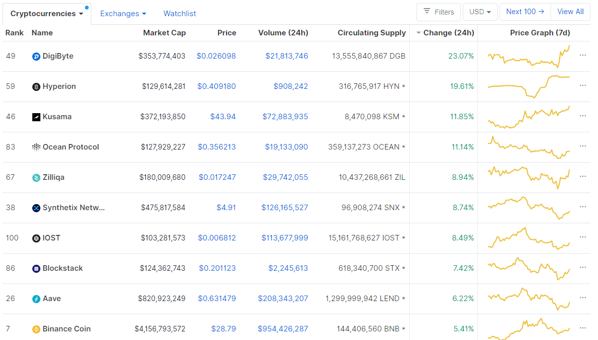
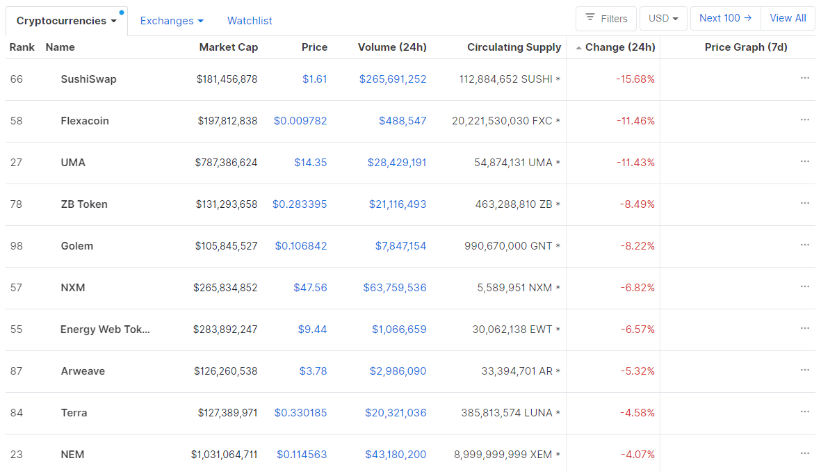
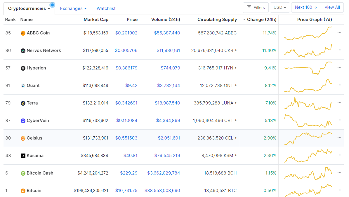
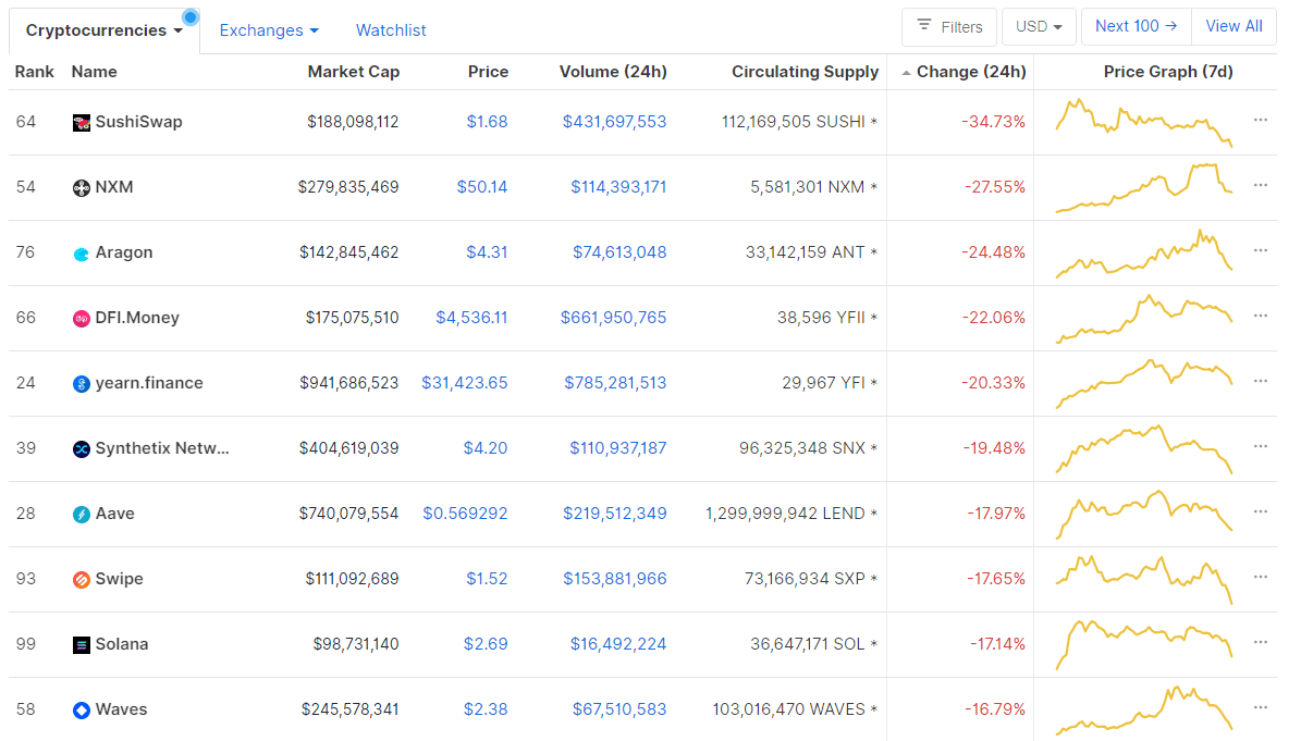
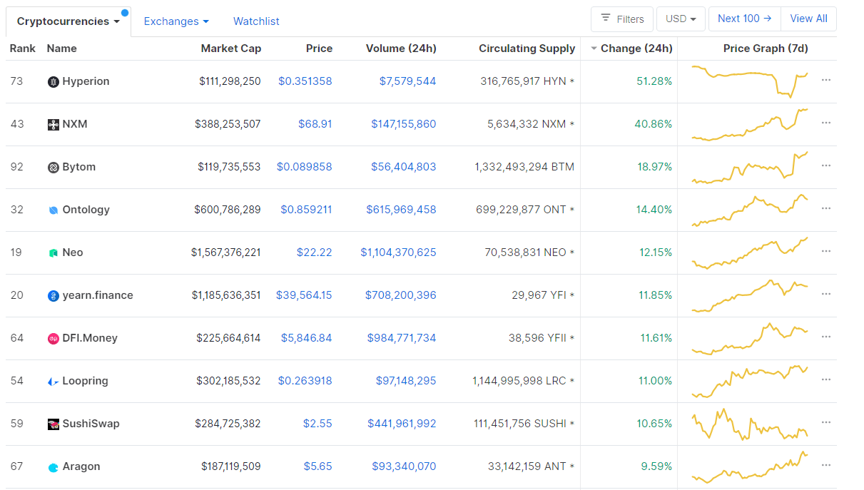
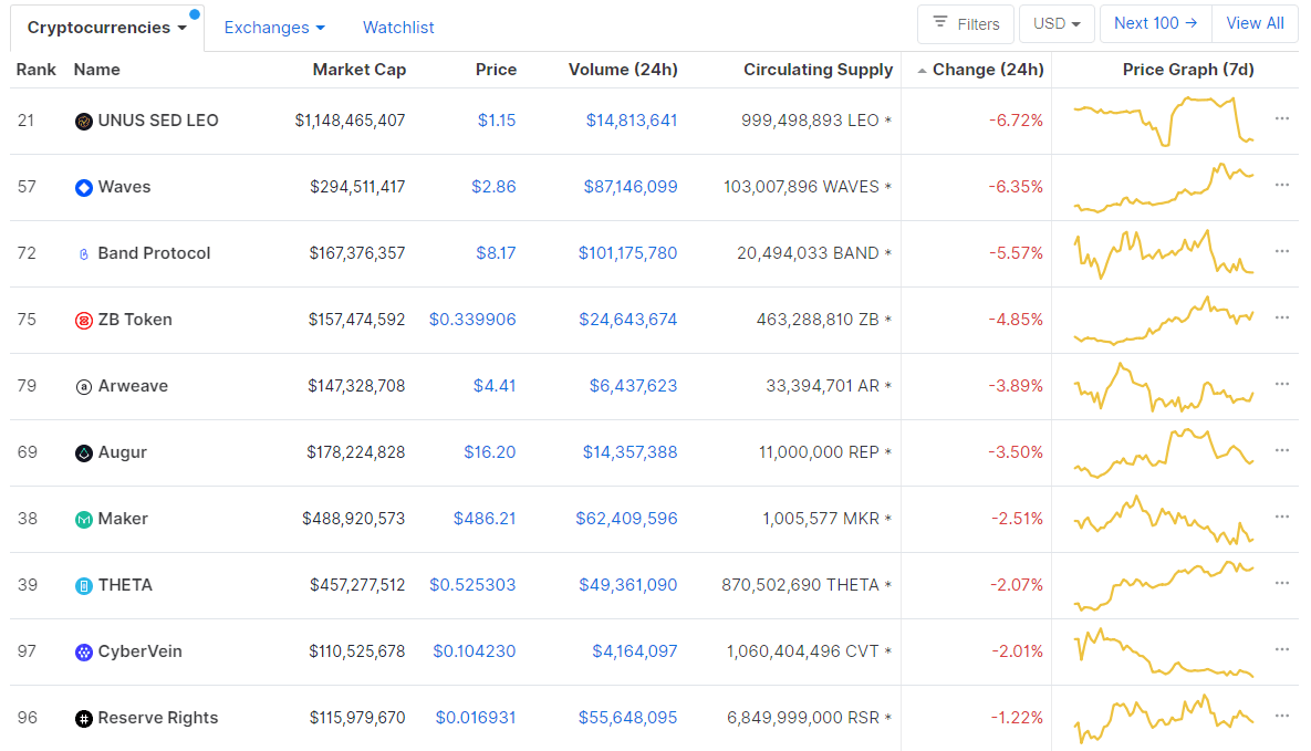
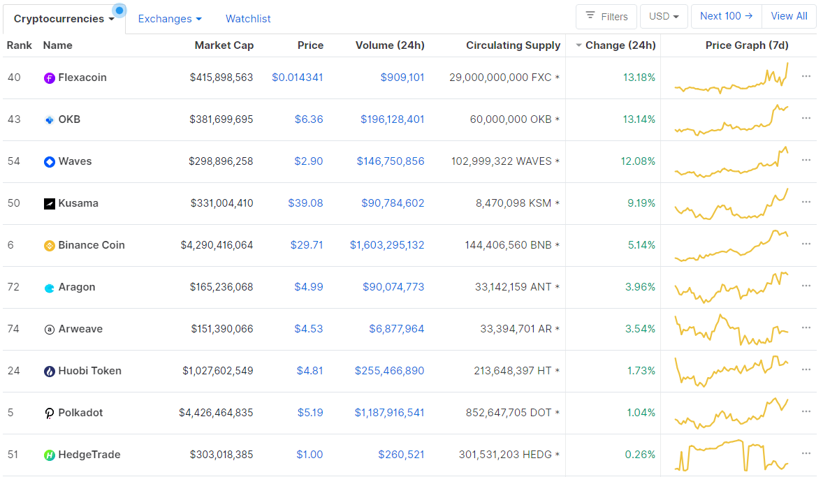
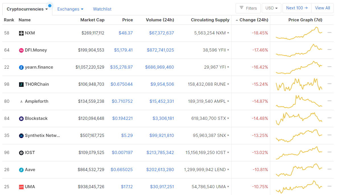
If we look at the top100 cryptocurrencies, Uniswap gained 13.73% on the day, making it the most prominent daily gainer. HedgeTrade (9.22%) and Hyperion (5.61%) also did great. On the other hand, DigiByte lost 17.91%, making it the most prominent daily loser. It is followed by Ren’s loss of 17.78% and Reserve Rights’ loss of 11.70%.
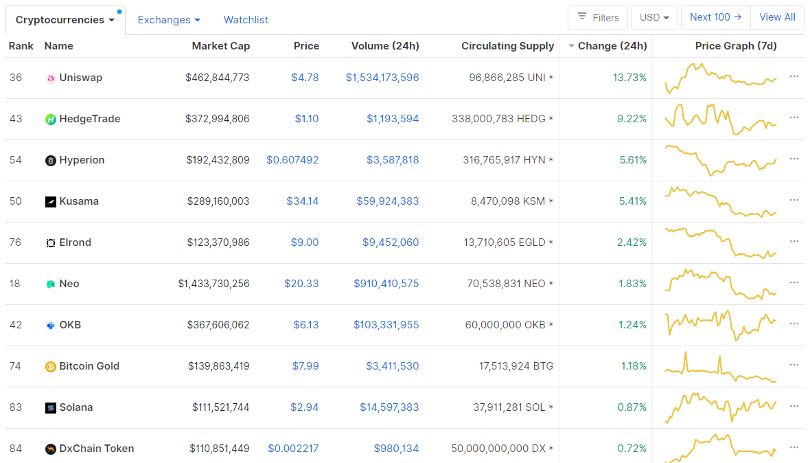
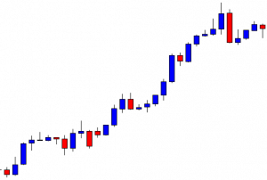
Top 10 24-hour Performers (Click to enlarge)

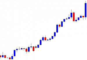
Bottom 10 24-hour Performers (Click to enlarge)
Bitcoin’s dominance level experienced a slight increase since our last report, with its value currently being at 61.45%. This value represents a 0.35% difference to the upside when compared to when we last reported.
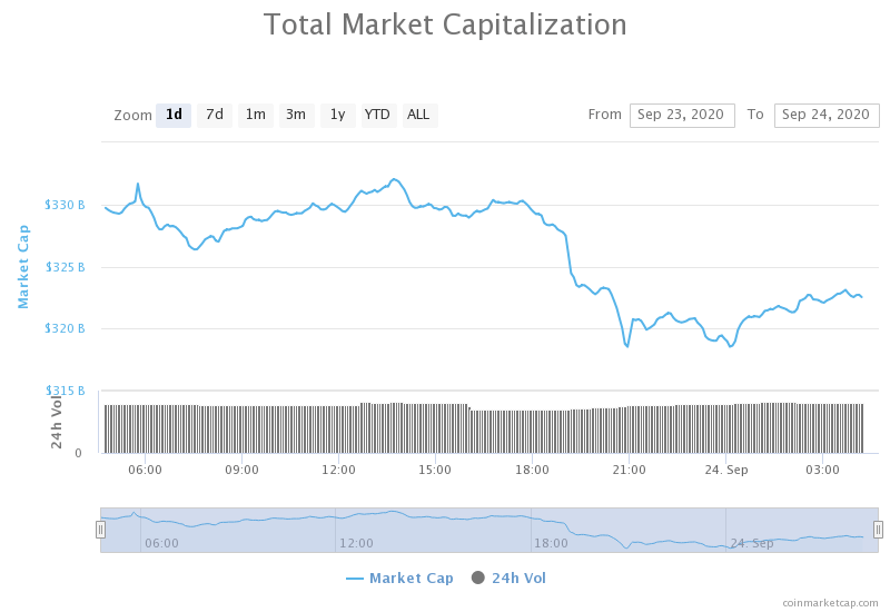
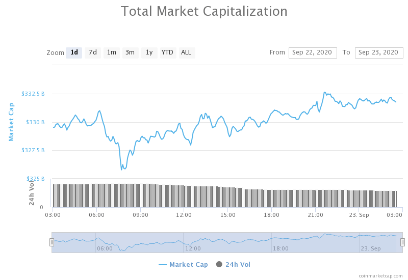
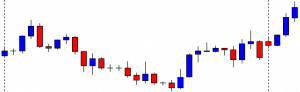
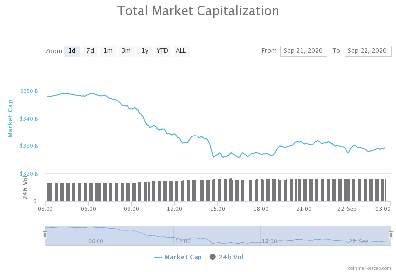
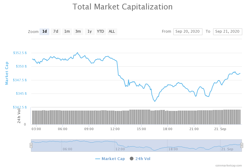
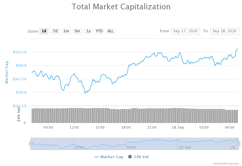
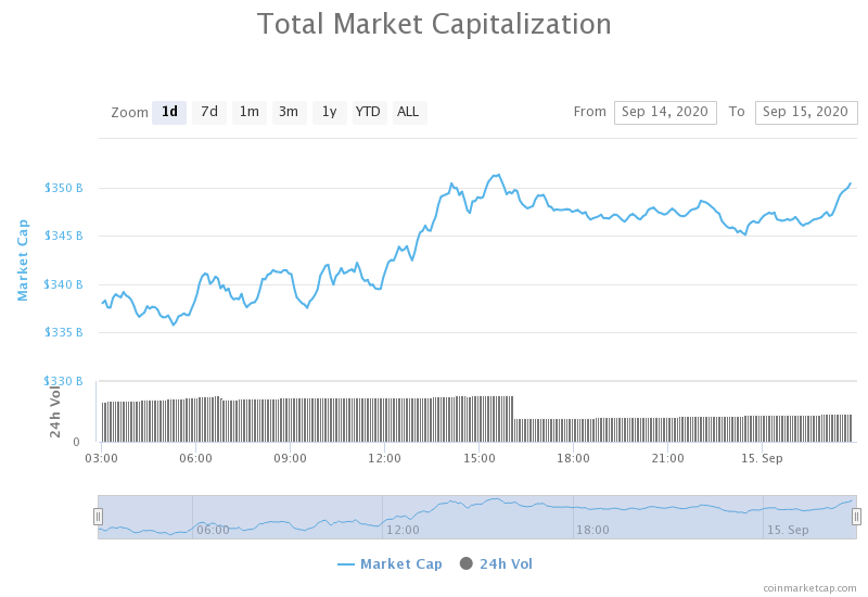
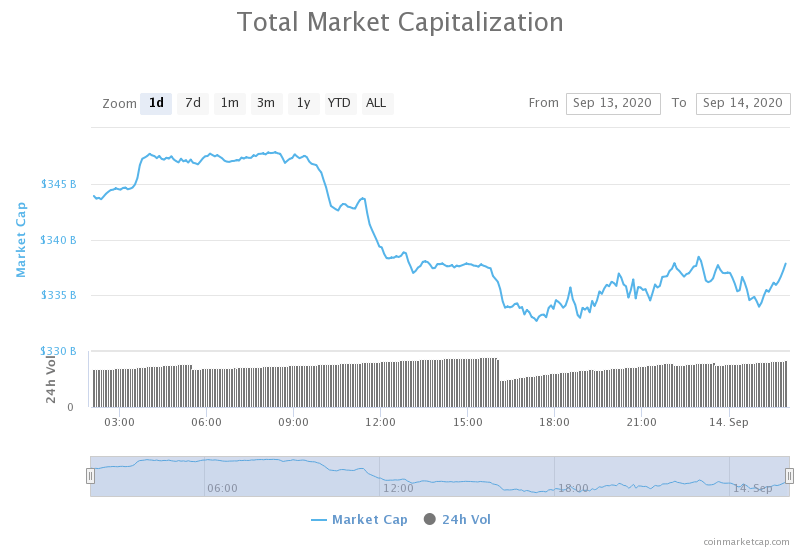
Daily Crypto Market Cap Chart
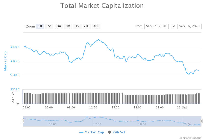
The crypto sector capitalization has decreased in value over the past 24 hours. Its current value is $325.05 billion, which represents a decrease of $8.86 billion when compared to our previous report.
_______________________________________________________________________
What happened in the past 24 hours?
_______________________________________________________________________
- Bears reign over BTC as 86% of September’s $284M CME Bitcoin options are worthless (Cointelegraph)
- Crypto exchange Gemini launches in the UK (The Block)
- Robinhood closes $660 million in Series G funding (The Block)
- Sia Tech raises $3 million in order to speed up the development of ‘free Internet’ (The Block)
- After Two Police Raids, Bitcoin Exchange Bithumb Up for Sale (Cryptobriefing)
- ECB Seeks to Eliminate Stablecoins, Accelerate Digital Euro Plans (Cryptobriefing)
- Biggest Expiry of Ethereum Options Looks to Amp Up ETH Volatility (Cryptobriefing)
- UNI, SNX, and DeFi tokens recover on Yearn.finance (YFI) lead: what’s next? (Cryptoslate)
- Crypto Hedge Fund Looks for $50M to Buy DeFi Tokens Amid Market Pullback (Coindesk)
- Venezuela Legalizes Crypto Mining but Will Force Industry Into National Pool (Coindesk)
_______________________________________________________________________
Technical analysis
_______________________________________________________________________
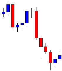
Bitcoin
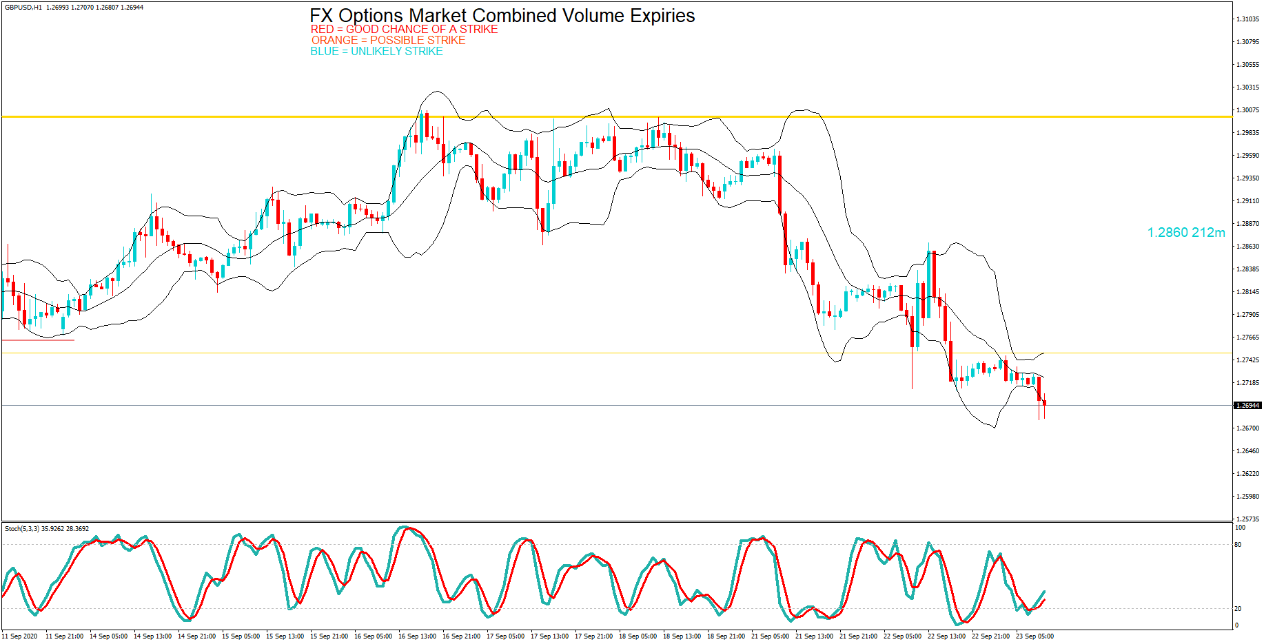
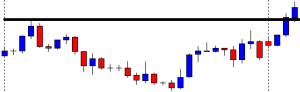
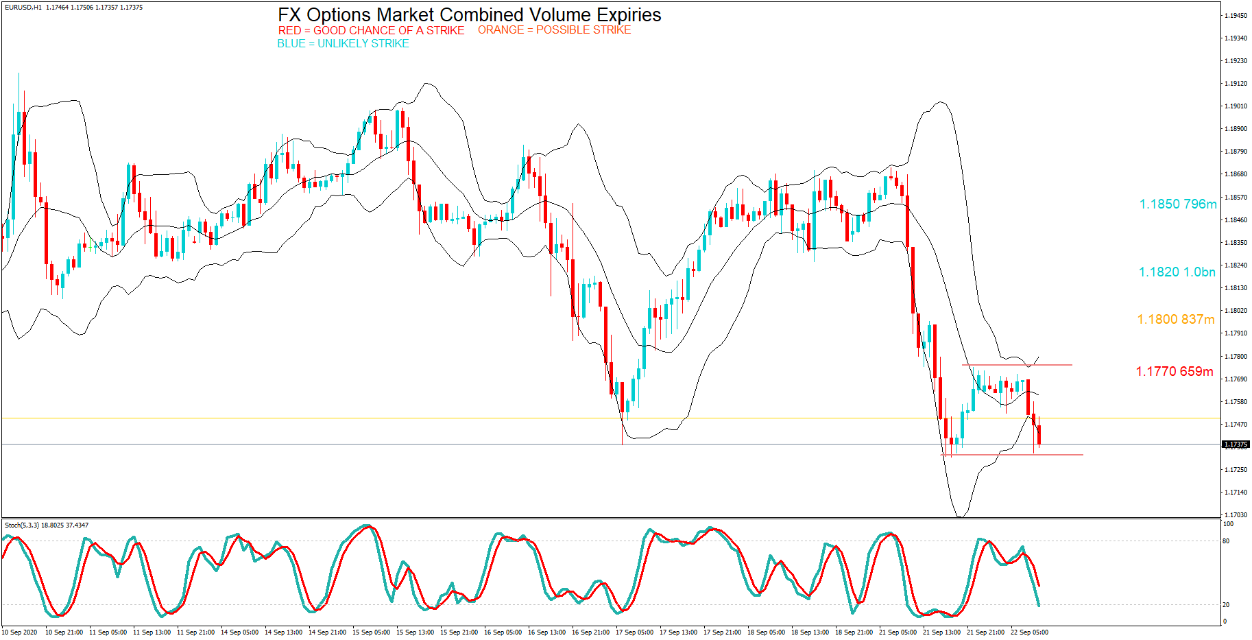
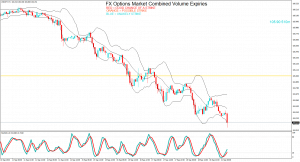
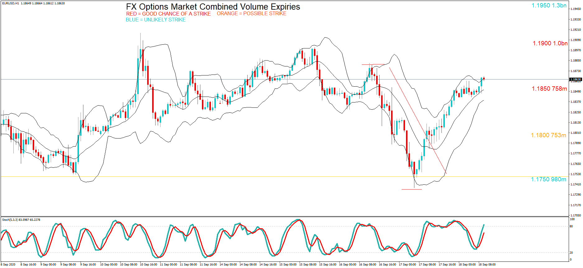
Bitcoin has spent the day mirroring Gold’s movement from a day ago, where it broke the same triangle pattern to the downside. With the same happening to Bitcoin, we saw its price falling to sub-$10,300 levels. If we take into account the CME Futures, which will expire on Friday, deeming as much as 86% of $284 million worth of contracts worthless, we can guess with accuracy that the bears will continue to reign over the market for now. The suggested price of $9,300 to $9,500 is even more realistic now.
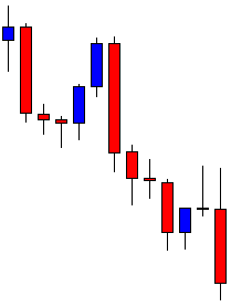
BTC/USD 1-day Chart
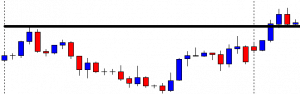
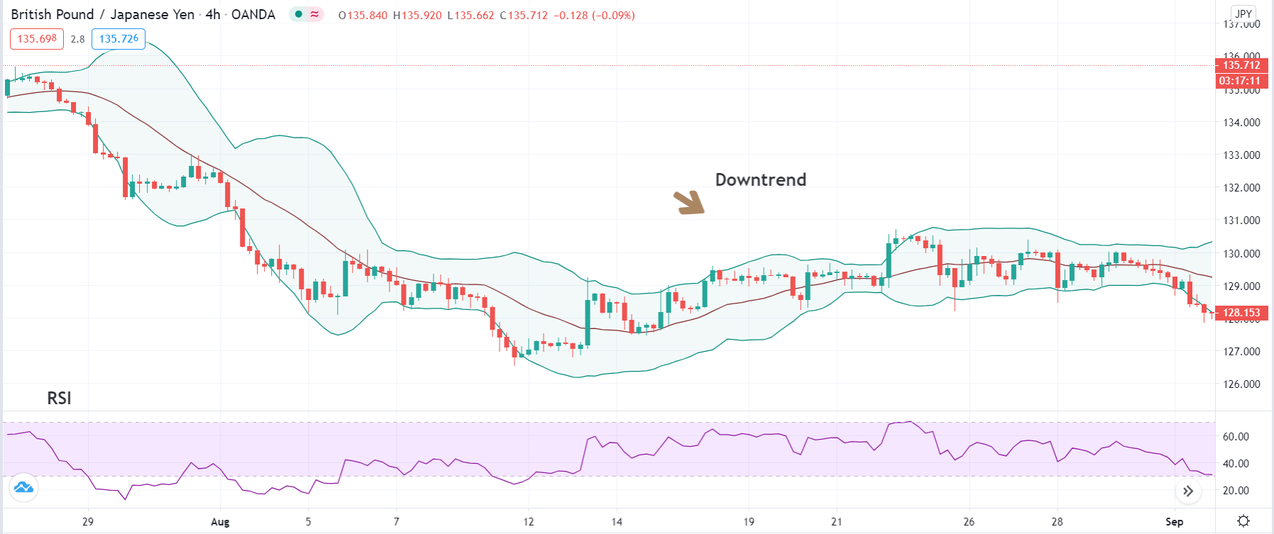
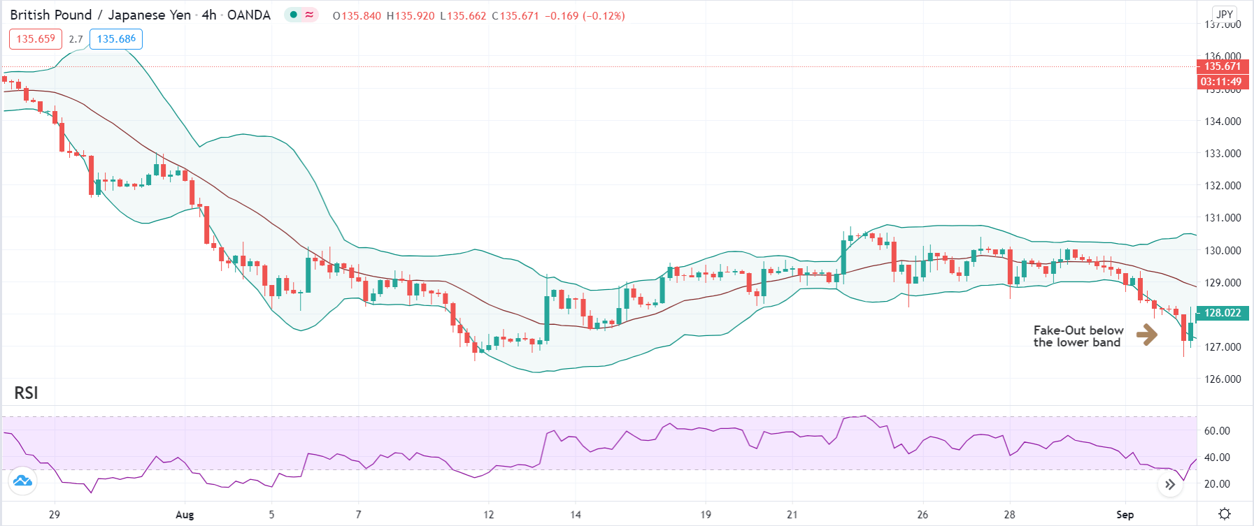
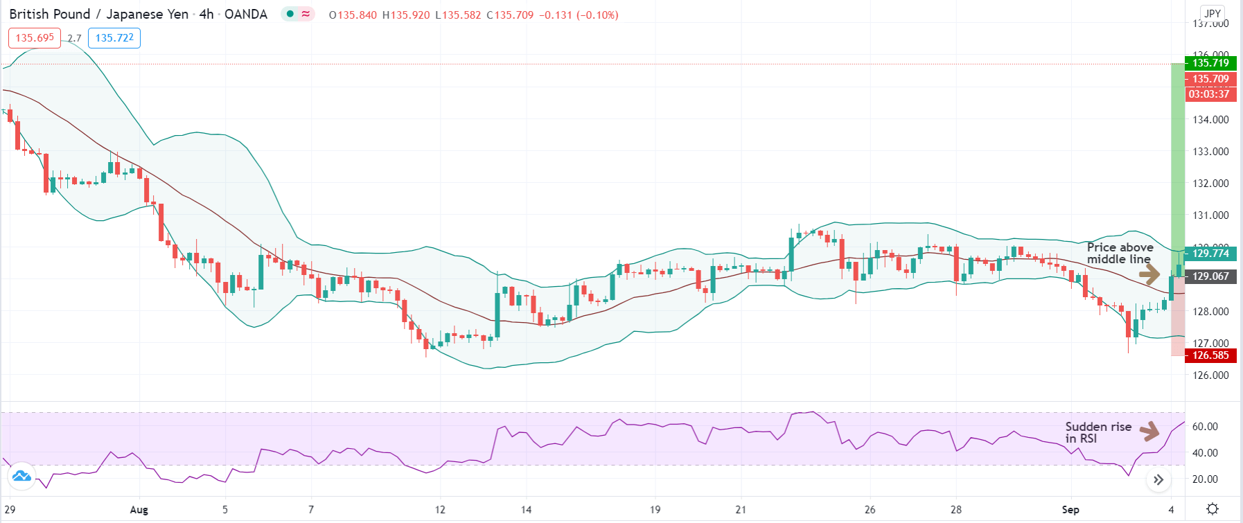
If we take a look at the 4-hour time frame, the largest cryptocurrency by market cap has dropped below the 23.6% Fib retracement as well as the triangle bottom line, suggesting strong bearish sentiment in the short-term. While the volume is descending and preparing for the next move, Bitcoin’s next one will most likely be to the downside.
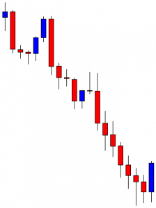
BTC/USD 4-hour Chart
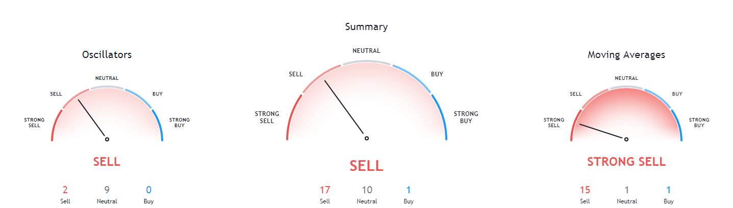
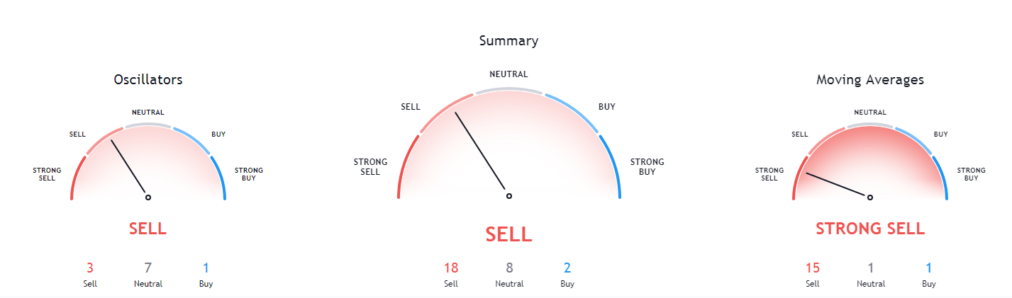
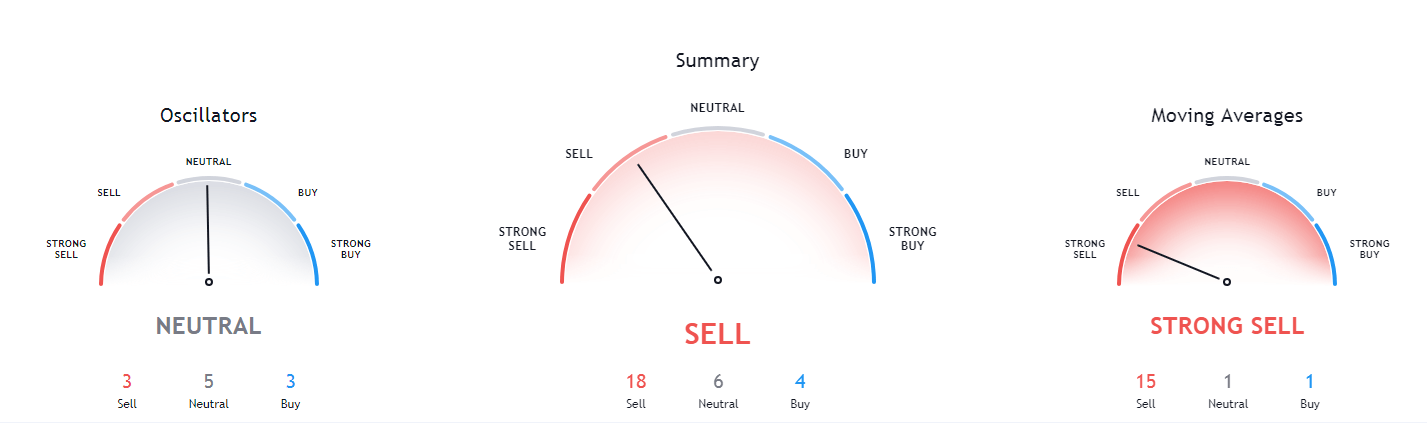
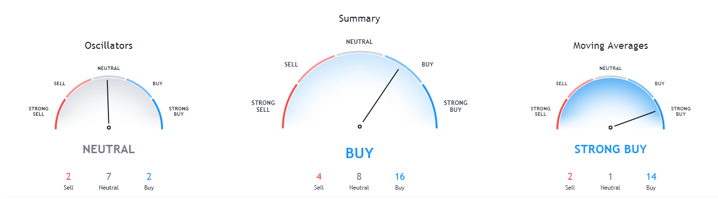
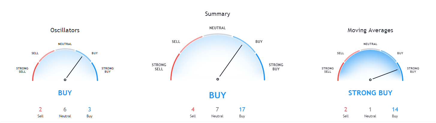
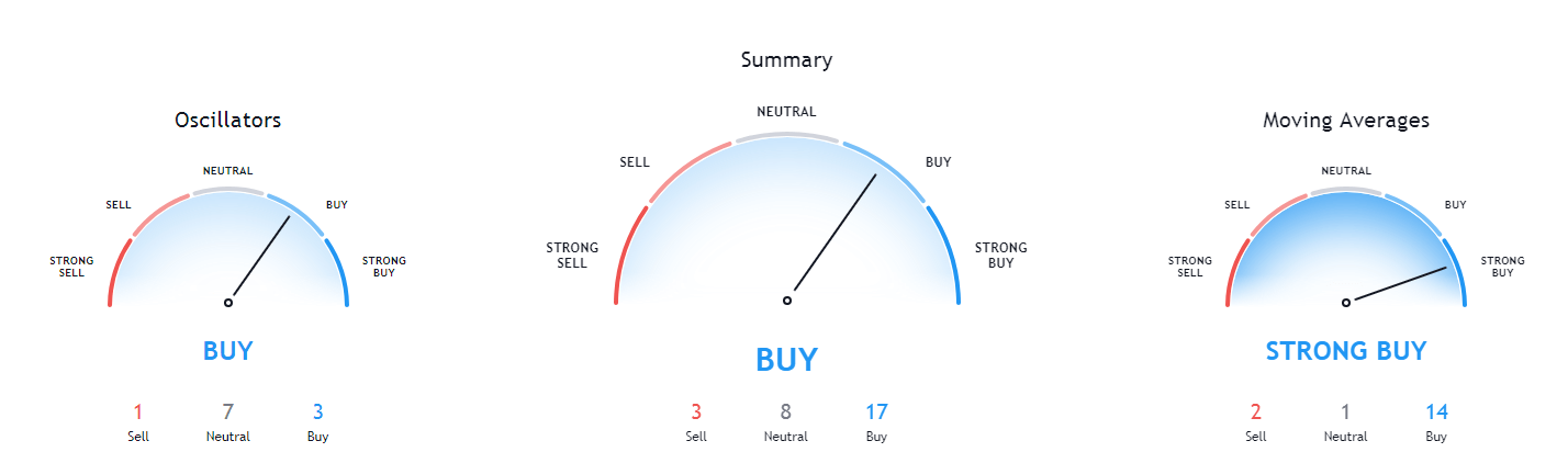
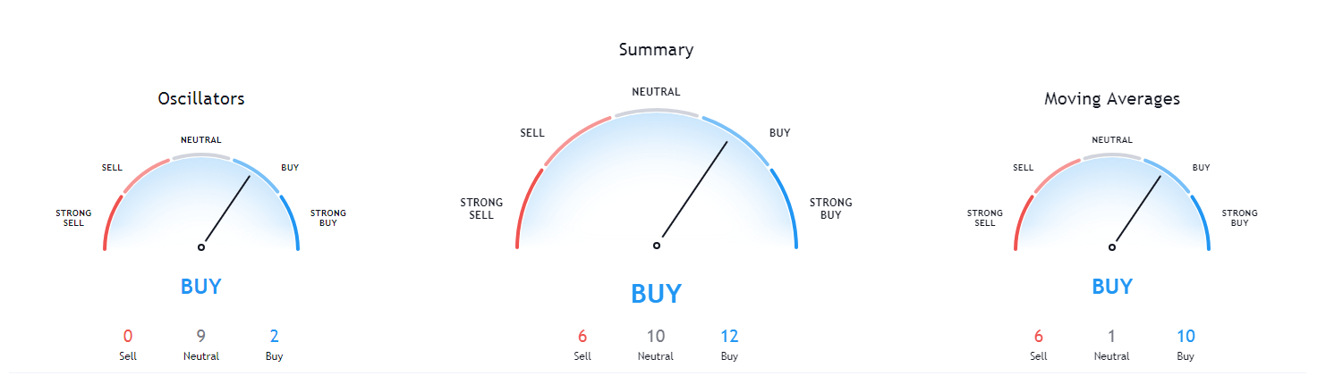
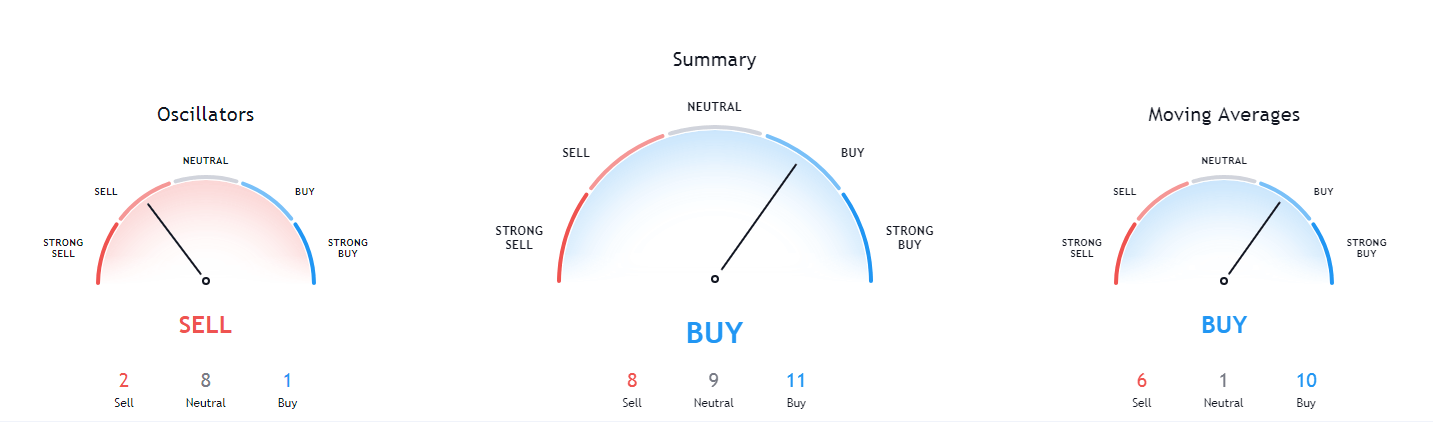
Bitcoin’s short-term technicals haven’t changed from yesterday, and are still very bearish. However, while the technicals are very bearish on the 4-hour chart, the daily and weekly technical overview is slightly less bearish, while the monthly overview is very bullish.
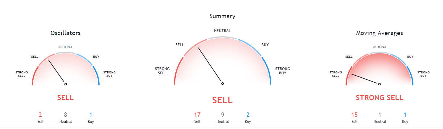
BTC/USD 4-hour Technicals
Technical factors (4-hour Chart):
- Price is below both its 50-period EMA and 21-period EMA
- Price slightly closer to the bottom Bollinger band
- RSI is neutral (34.72)
- Volume is slowly descending from a massive spike
Key levels to the upside Key levels to the downside
1: $10,500 1: $10,015
2: $10,630 2: $9,880
3: $10,850 3: $9,740
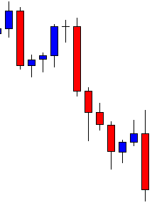
Ethereum
The DeFi market has managed to recover from its plummet, with yearn.finance leading the move to the upside. While Ethereum has lost value due to its correlation with Bitcoin, its short-term overview is slightly more bullish.
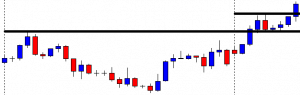
However, if we take a look at Ethereum’s chart, we can see that the second-largest cryptocurrency by market cap managed to stabilize after hitting the bottom Bollinger band, which provided adequate support. While ETH did fall below $340 and broke a major support level, which calls for a push towards $300, the situation is slightly more bullish than the day before.
ETH/USD 4-hour Chart
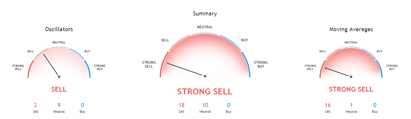
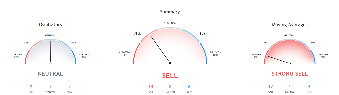
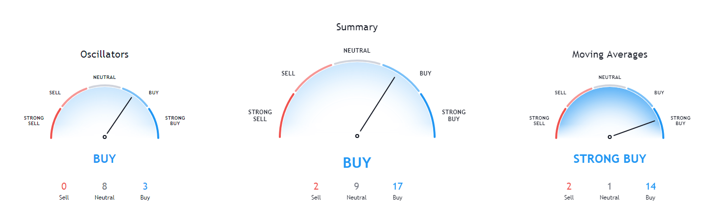
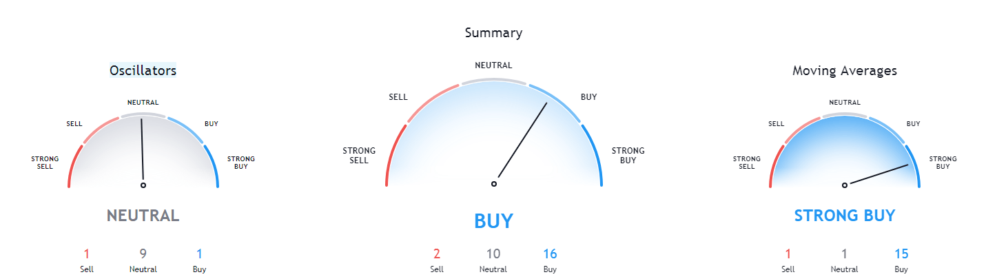
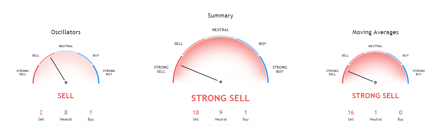
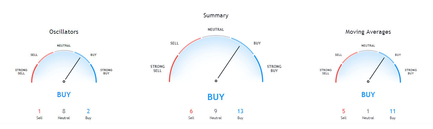
Ethereum’s short-term technicals are extremely bearish, while the situation changes drastically in the weekly and monthly overview, where the overview is quite bullish.

ETH/USD 4-hour Technicals
Technical Factors (4-hour Chart):
- The price is below both its 21-period and its 50-period EMA
- The near its bottom Bollinger band
- RSI is hovering around the oversold line (30.56)
- Volume is average (except for the one-candle volume spike during the downturn)
Key levels to the upside Key levels to the downside
1: $340 1: $300
2: $360 2: $289
3: $371 3: $278
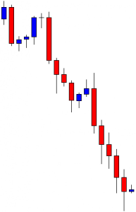
Ripple
XRP has spent the day continuing its Elliot impulse wave 5th leg. While its price did go down, many traders have turned slightly bullish, calling out for the end of the 5th leg of the impulse wave at the spot where the price meets the ascending trend line from March (the red ascending line). This would put the price target for XRP at somewhere between $0.215 and $0.218 before pushing towards the upside.
XRP/USD 1-day Chart
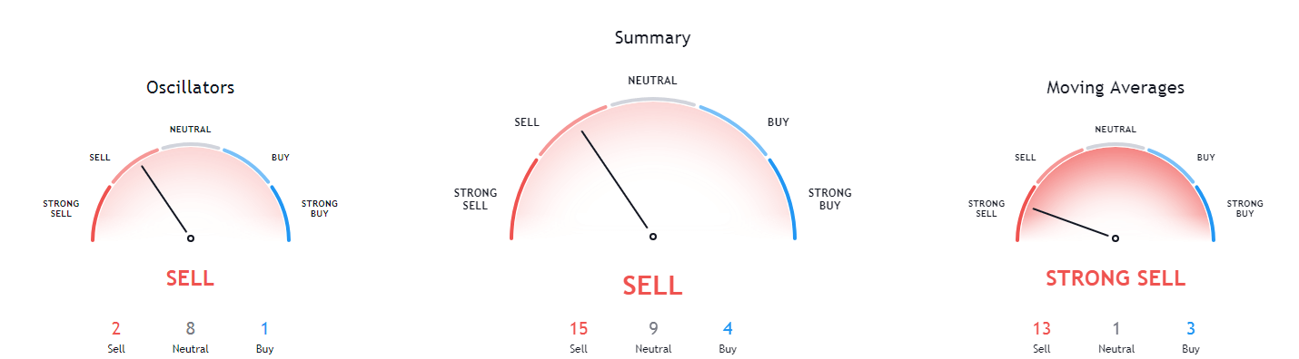
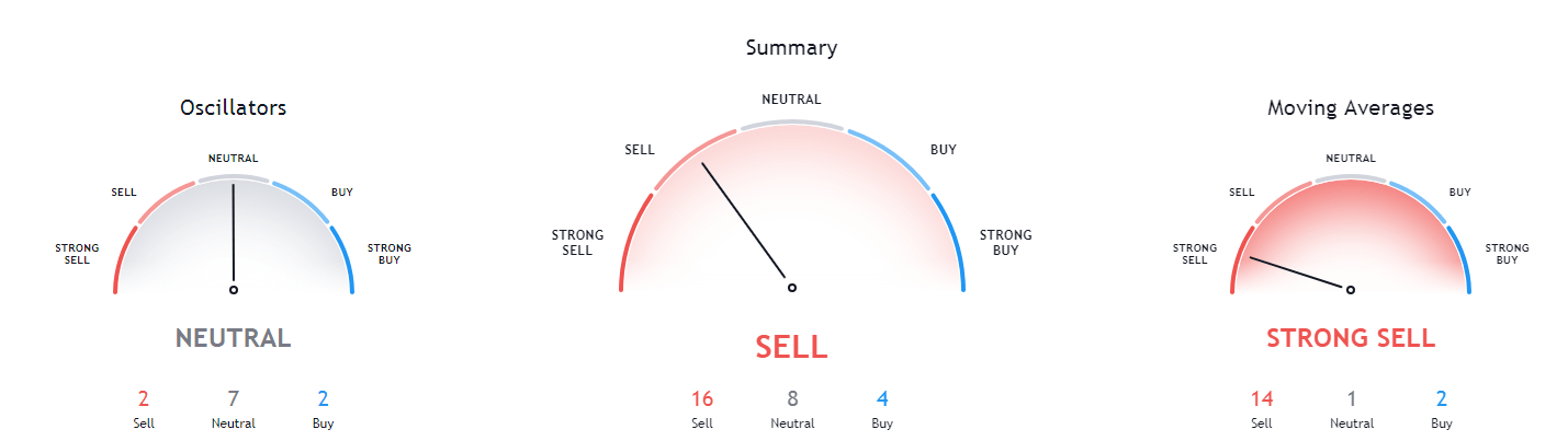
While many traders have turned bullish, XRP’s technicals are still firm with their bearish sentiment. The bearish sentiment doesn’t end at the shorter time frames; it rather extends to the daily and weekly overview as well.
XRP/USD 4-hour Technicals
Technical factors (4-hour Chart):
- The price is below both its 21-period EMA and its 50-period EMA
- Price is very close to its bottom Bollinger band
- RSI is in the oversold territory (27.28)
- Volume is volatile, with occasional spikes
Key levels to the upside Key levels to the downside
1: $0.227 1: $0.221
2: $0.235 2: $0.214
3: $0.2454 3: $0.2


