The latest economic data from the United States fueled expectations that the Federal Reserve will stimulate more in the next meeting, and markets started to price in for a negative interest rate environment. Donald Trump, while considering the state of Beijing amid coronavirus lockdown, threatened to impose new tariffs if China failed to buy $200 worth U.S. farm goods. After that, trade representatives from both sides held a meeting via phone call and announced a positive report hence created optimism about the US-China relationship.
Economic Events to Watch Today
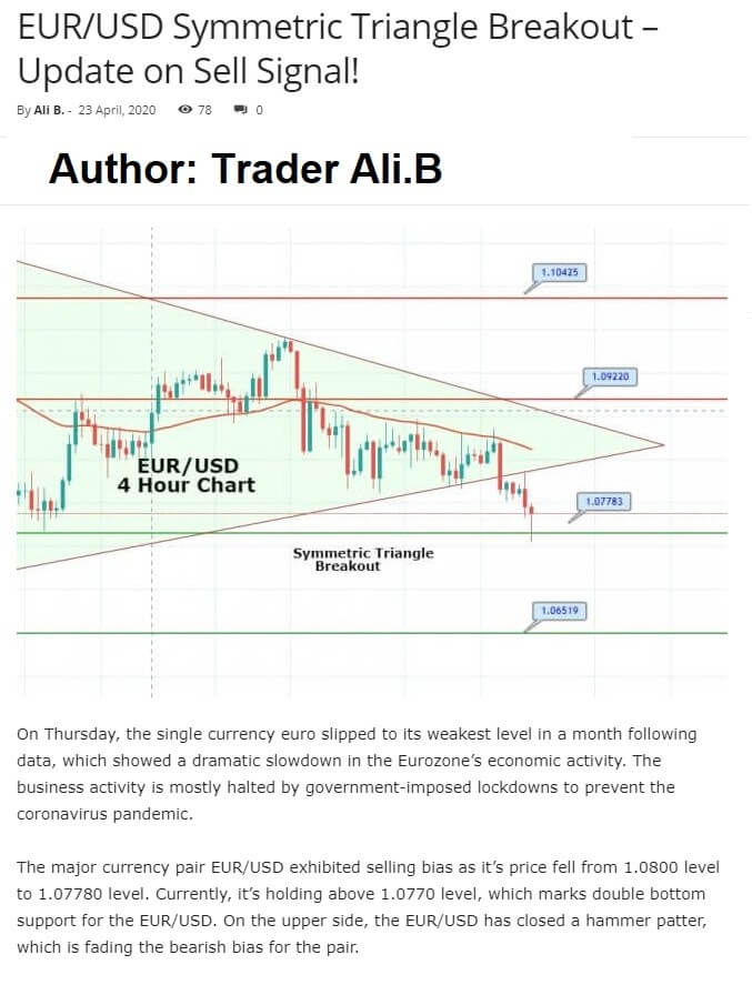
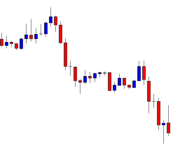
EUR/USD – Daily Analysis
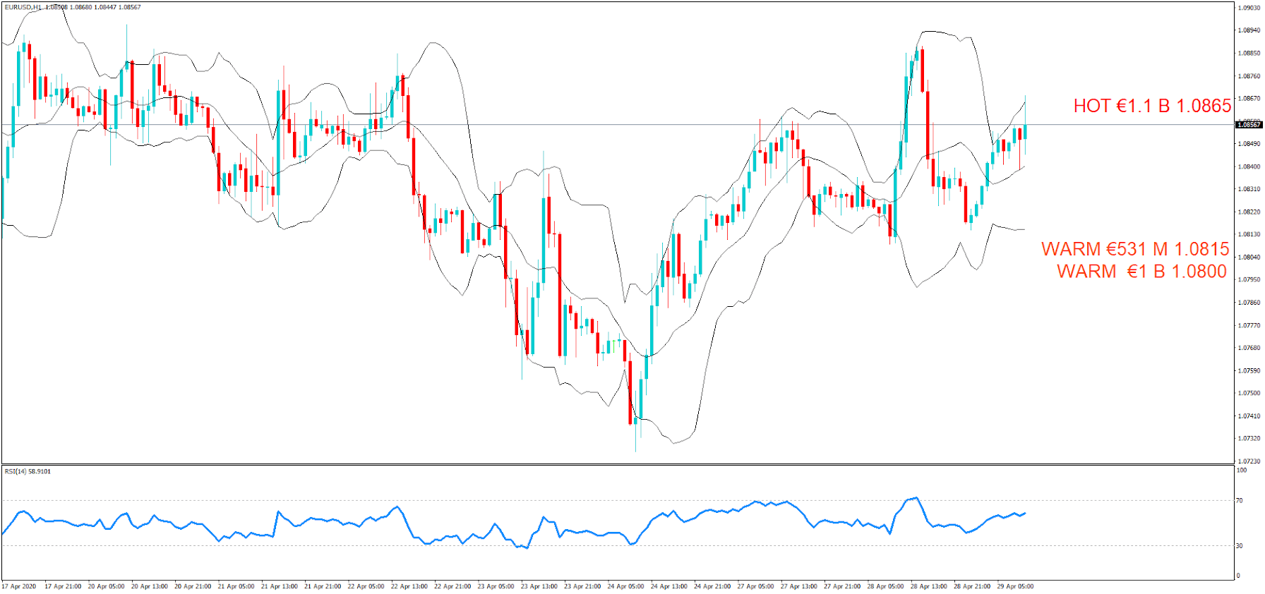
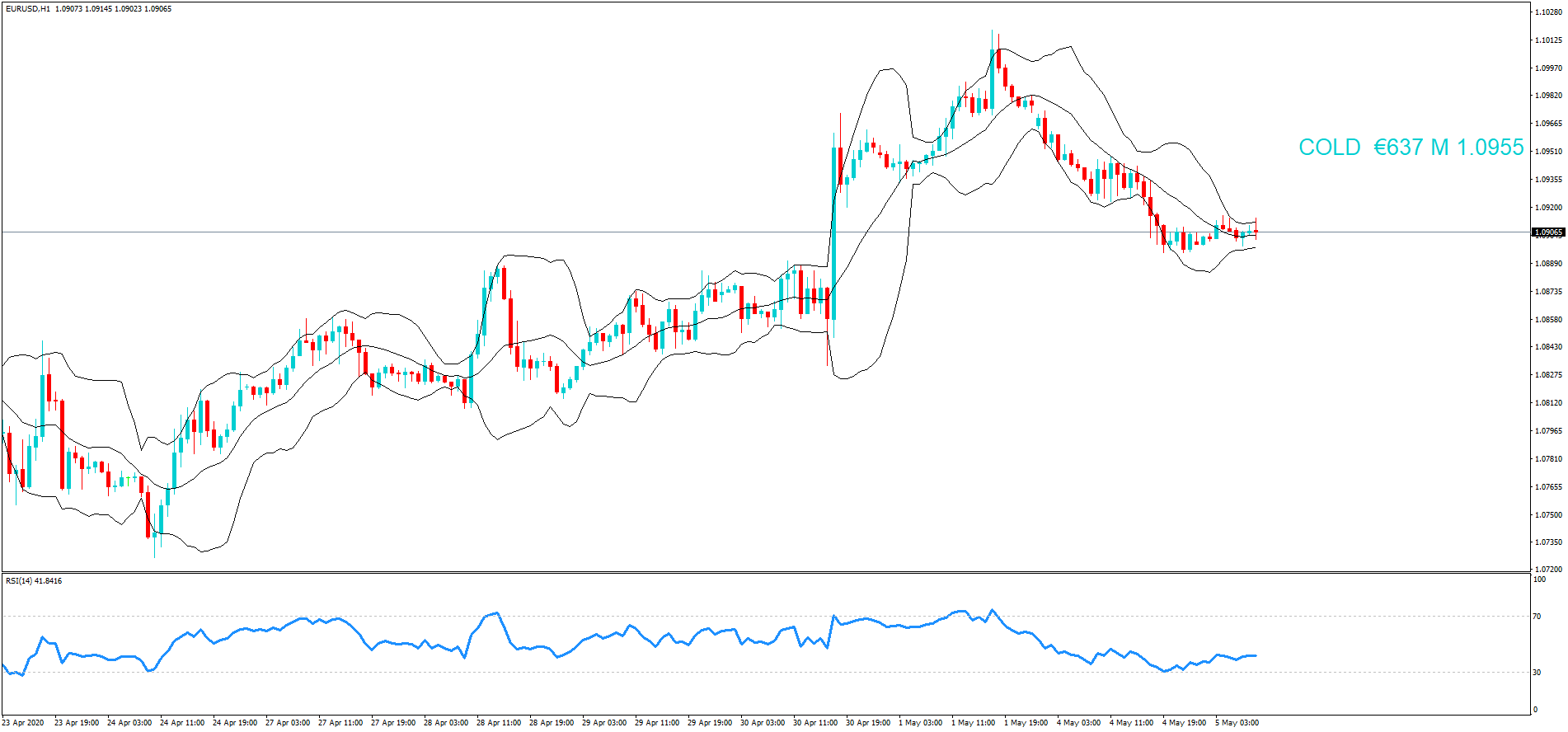
The EUR/USD prices were closed at 1.08066 after placing a high of 1.08504 and a low of 1.08004. Overall the movement of the EUR/USD pair remained bearish throughout the day.
EUR/USD pair dropped on Monday and posted a fresh daily low of 1.0801. The downward trend of the EUR/USD pair was due to the strength of the U.S. dollar. The U.S. Dollar Index was up by 0.45% and was back to above 100.00; it was pushed by higher U.S. yields on Monday.
On the data front, at 13:00 GMT, the Italian Industrial Production in the month of March showed a decline in production activity by 28.4% against the forecasted decline of 20.0%. It weighed on single currency euro and added in the downward track of EUR/USD pair.
Furthermore, the EUR was also affected by the news about filing a case against the German constitutional Court. On Sunday, the European Union Commission announced that it could open a legal case against the German Constitutional Court ruling of European Central Bank’s easing programs.
The president of the European Commission, Ursula von der Leyen, has said that the judges in the German Constitutional Court have overreached their authority by calling the part of ECB’s bond-buying program illegal, which was critical and necessary to stabilize the economy in coronavirus crisis.
However, the loss in EUR/USD prices gained after new six coronavirus cases started to reappear from Wuhan city after more than a month when lockdown restrictions were eased in the city, which is considered as the epicenter of coronavirus outbreak.
The E.U. and U.K. resumed talks on Monday with rising pressure on both sides to make some progress as the deadline to reach a deal is coming closer. 2 rounds of talks have been made, which included first face-to-face in March and another in April via video conference.
Daily Support and Resistance
- R3 1.089
- R2 1.0871
- R1 1.084
Pivot Point 1.082
- S1 1.0789
- S2 1.0769
- S3 1.0738
EUR/USD– Trading Tips
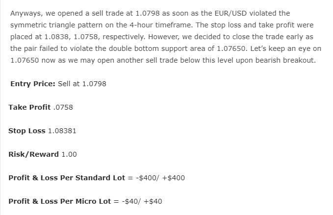
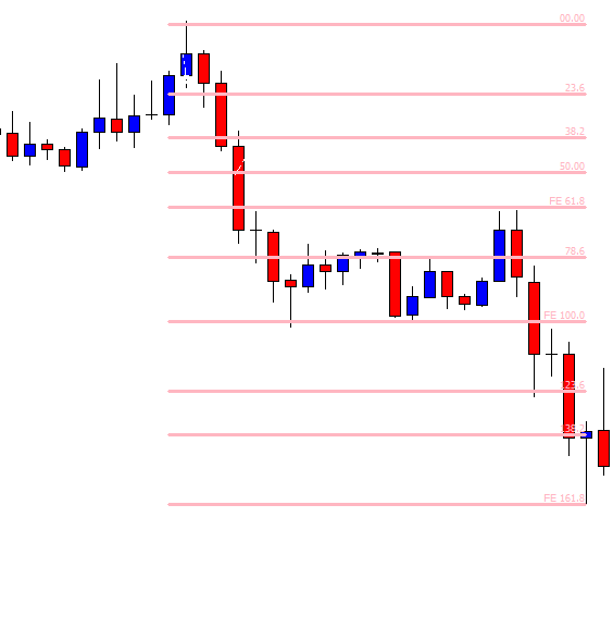
The EUR/USD price is trading slightly bearish below an immediate resistance level of 1.0823, which is extended by the 50 EMA. On the 4 hour timeframe, the 50 EMA is pushing the EUR/USD pair around 1.0820. Below this, we may see EUR/USD prices falling until 1.0777, while bullish breakout of 1.0850 can lead EUR/USD prices towards 61.8% Fibonacci retracement level of 1.0869 level. Later today, the U.S. retail sales will help determine further trends in the EUR/USD prices.
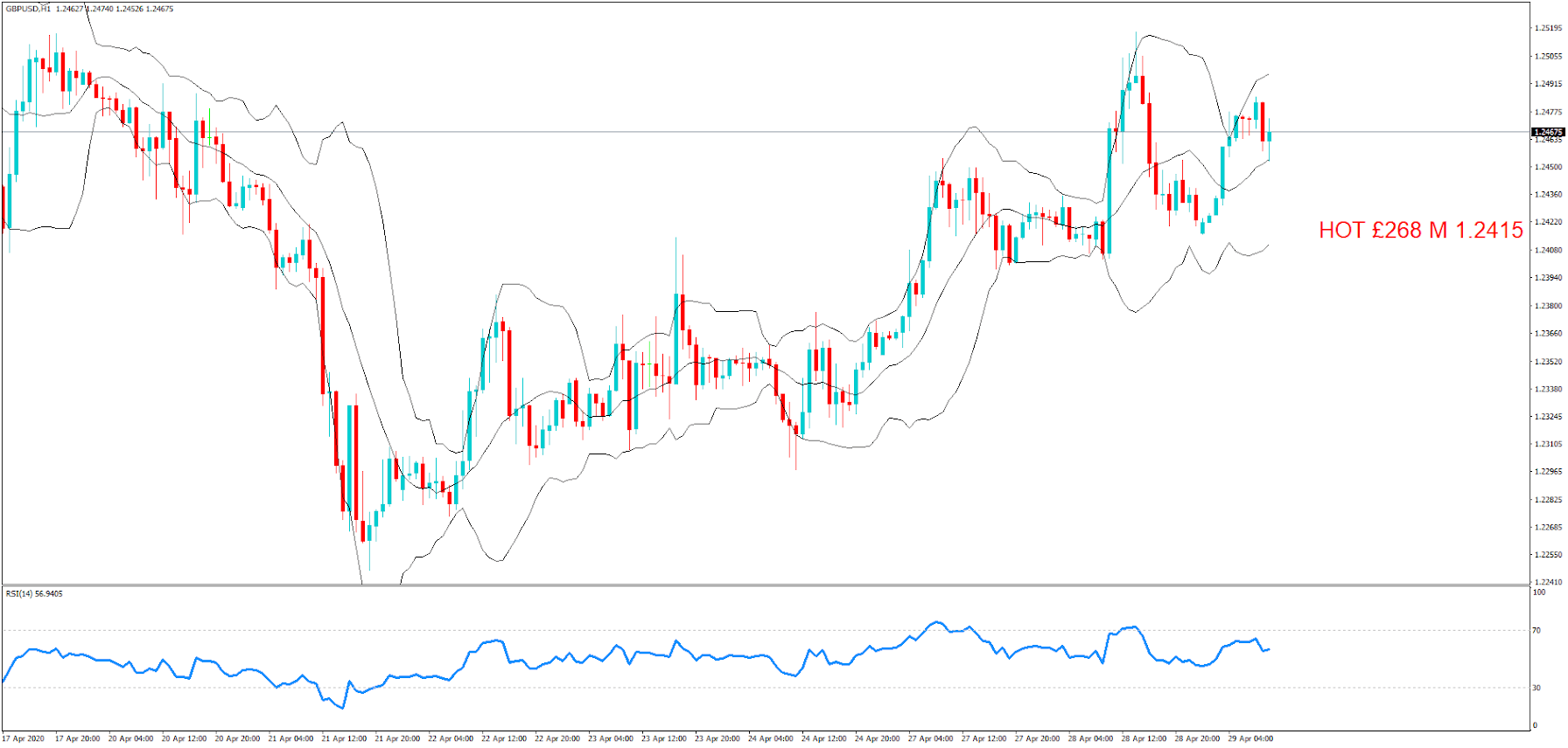
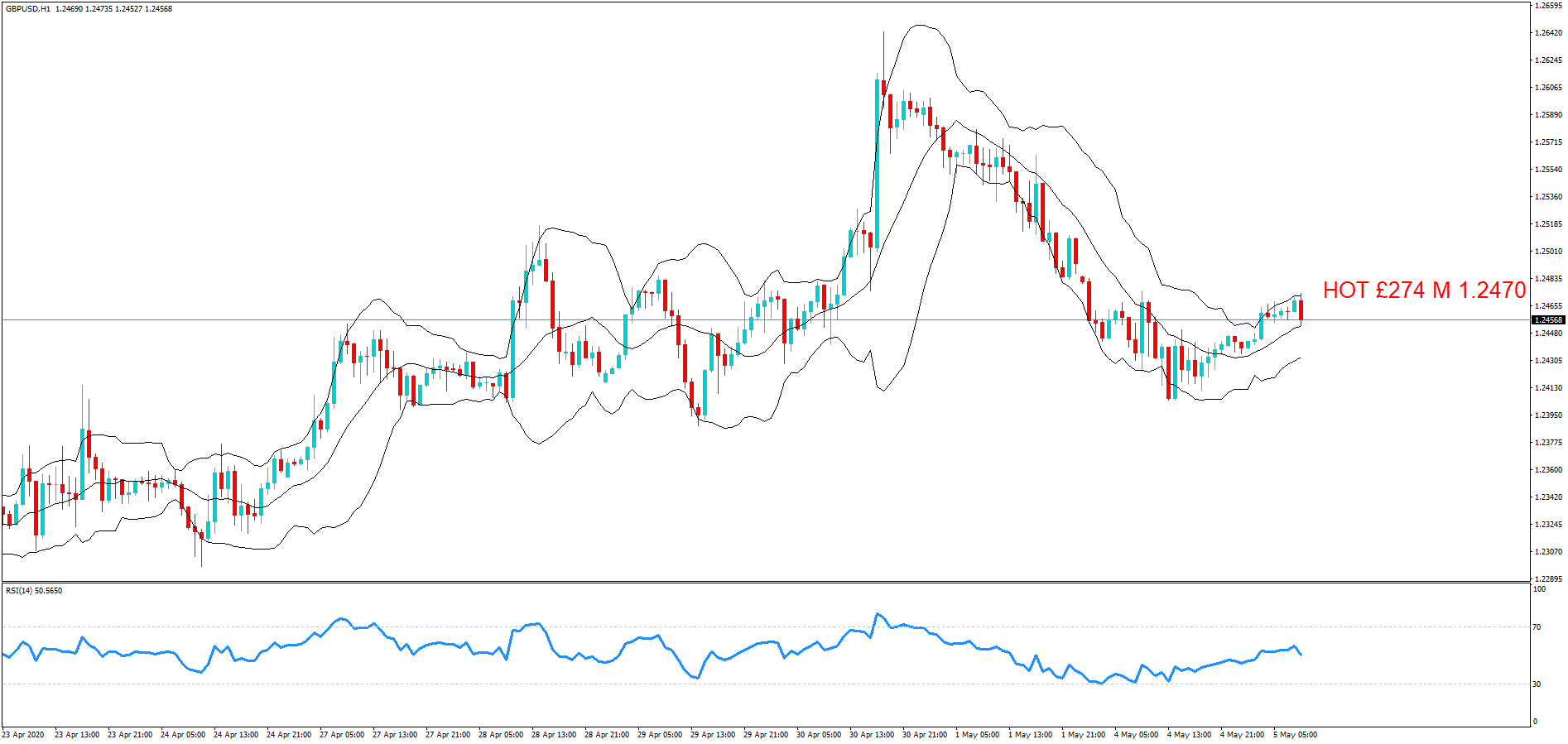
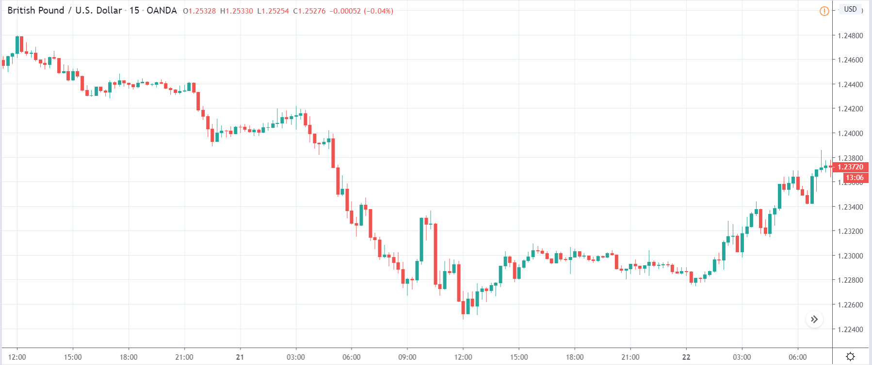
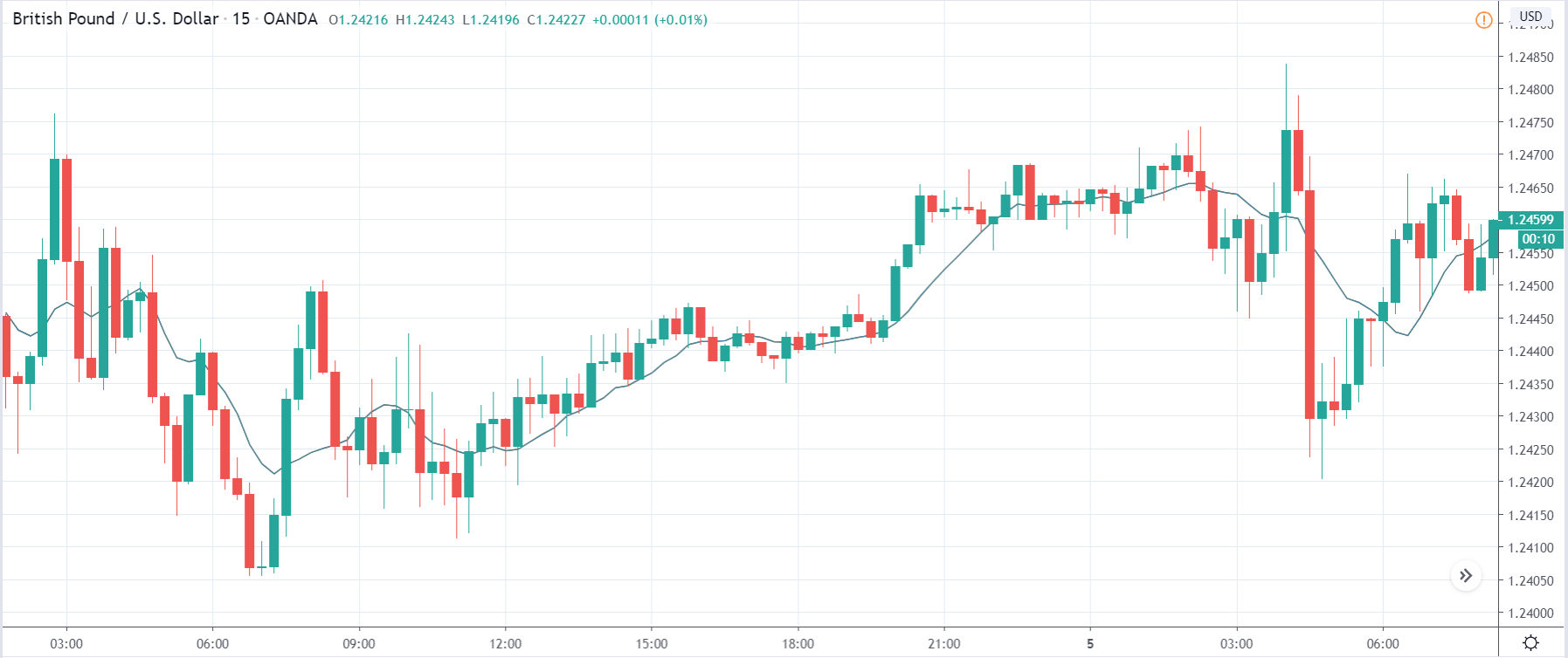
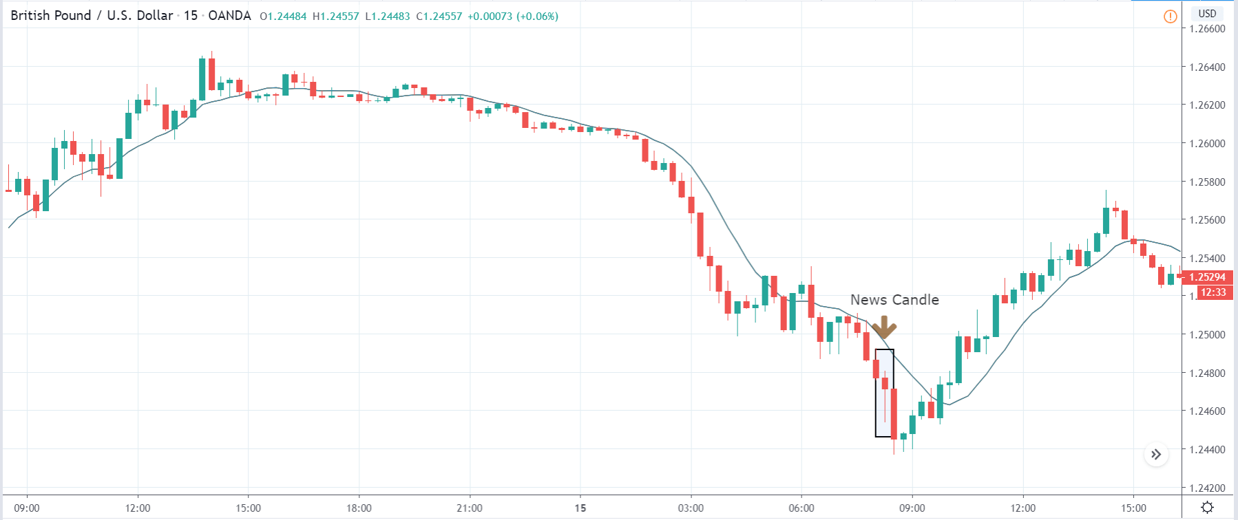
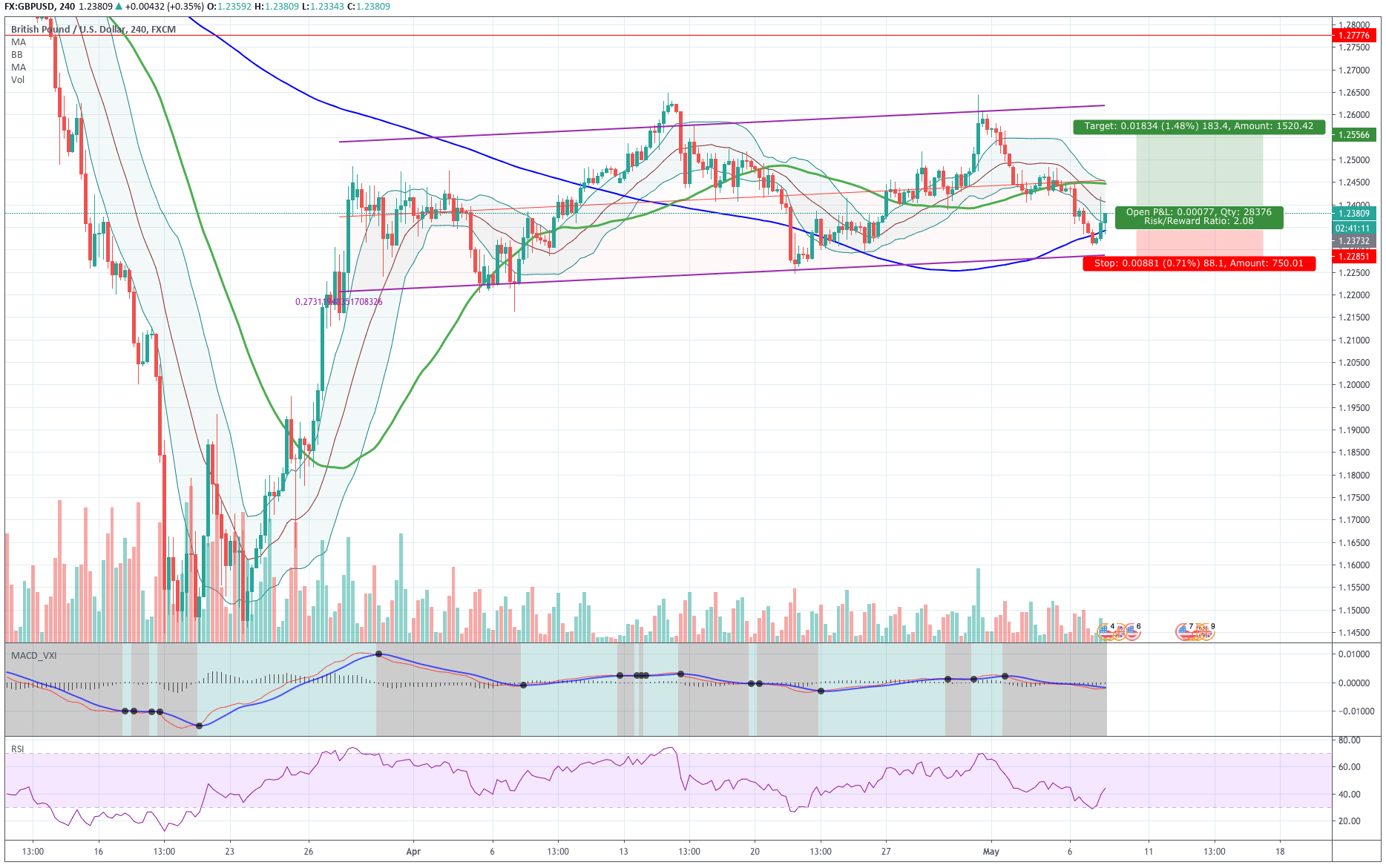
GBP/USD – Daily Analysis
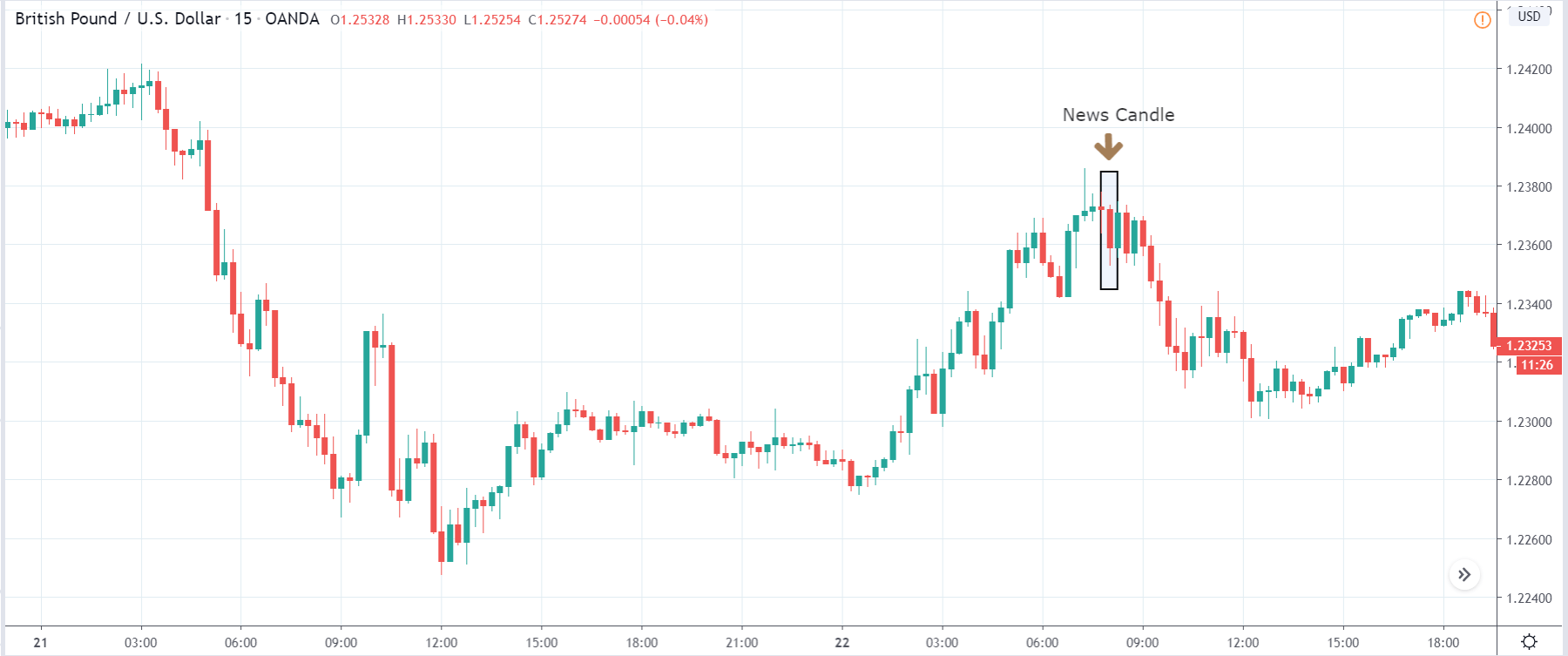
The GBP/USD pair was closed at 1.23326 after placing a high of 1.24376 and a low of 1.22827. Overall the movement of GBP/USD pair remained bearish throughout the day.
The GBP/USD pair remained relatively quiet above 1.2400 level at the start of the day but came under intense bearish pressure in late trading sessions. GBP/USD pair dropped to a fresh four day low of 1.2282 on the back of U.S. dollar strength and GBP weakness. However, it maintained to recover some of its losses in late session and ended up closing the day in a negative trend.
The U.K. government has published its recovery-strategy on Monday, which noted that the coronavirus was expected to circulate for an extended period of time and with the periodic waves. According to the strategy, the financial measures taken by the government to cope up with the damage caused by coronavirus to the economy were very expensive and that these measures could not be sustained for a longer period.
Furthermore, PM Boris Johnson has said that different parts of the U.K. will stay in lockdown longer than other parts. He added that any wrong move would be disastrous for the U.K. economy, and they will show no hesitation in reintroducing the measures if needed.
On Sunday, PM Johnson announced that restrictions will be lifted from local travel and local parks after six weeks of lockdown and that workers who cannot do work from home like construction & manufacturing industries were encouraged to return to their jobs.
However, he spared the details about how they could continue the work and not spread the virus. So, on Monday, groups representing U.K. businesses and workers criticized the government’s plan to ease lockdown. They complained that PM Johnson missed the crucial details while announcing the easing of lockdown, that how companies should prepare for safe return to work.
Daily Support and Resistance
- R3 1.2577
- R2 1.2508
- R1 1.2422
Pivot Point 1.2353
- S1 1.2268
- S2 1.2198
- S3 1.2113
GBP/USD– Trading Tip
The GBP/USD sideways trading continues in between a narrow trading range of 1.2360 – 1.2285. The Cable is still holding below 50 EMA, which is extending resistance around 1.2370 level today. On the 4 hour chart, the GBP/USD is gaining support at 1.2285 level while the 50 EMA and horizontal resistance stay at 1.2365 level. Today, the positive retail sales may drive the selling trend in the GBP/USD pair to lead its prices towards an immediate support level of 1.2280 and 1.2250. Conversely, the worse than expected retail sales data will lead the GBP/USD pair towards 1.2360 and 1.2450.
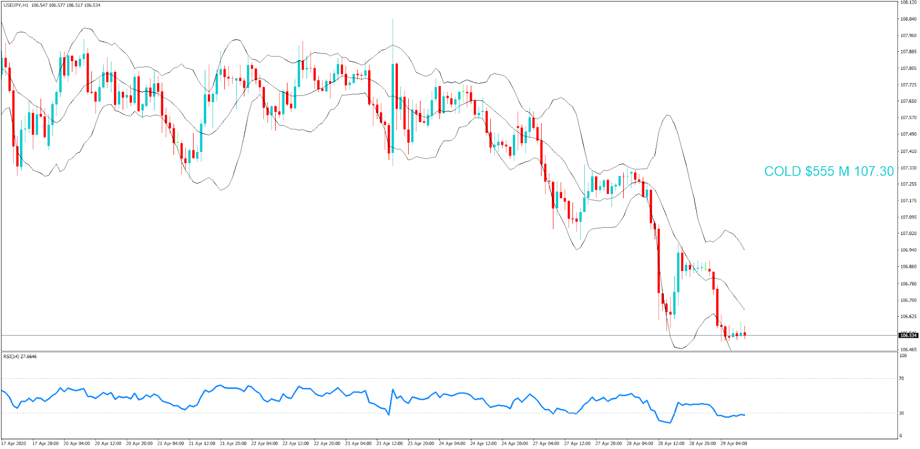
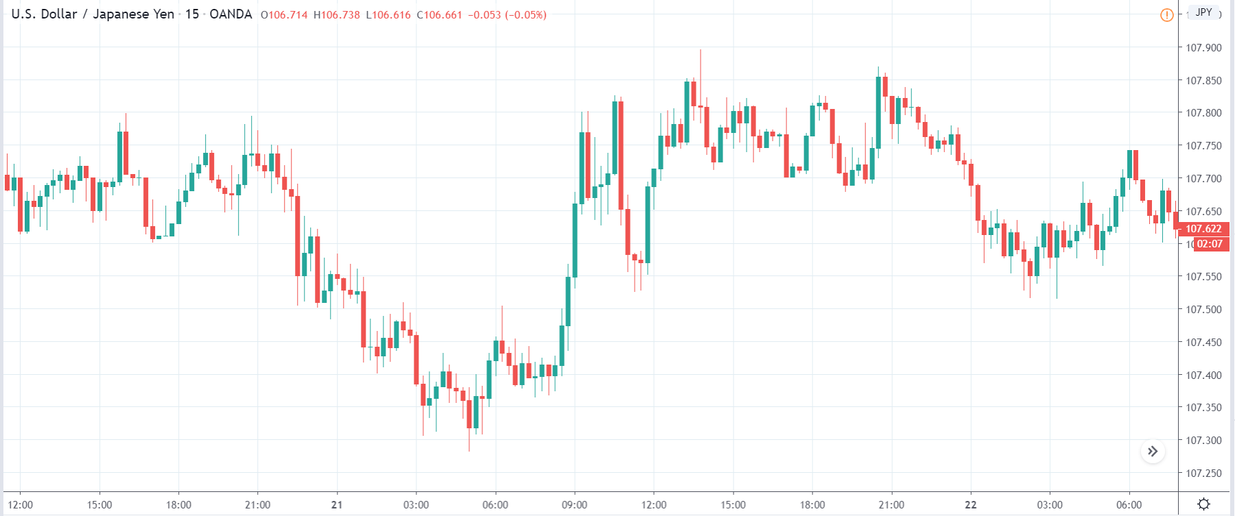
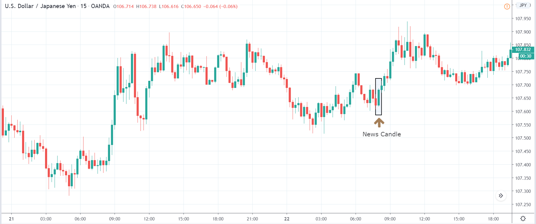
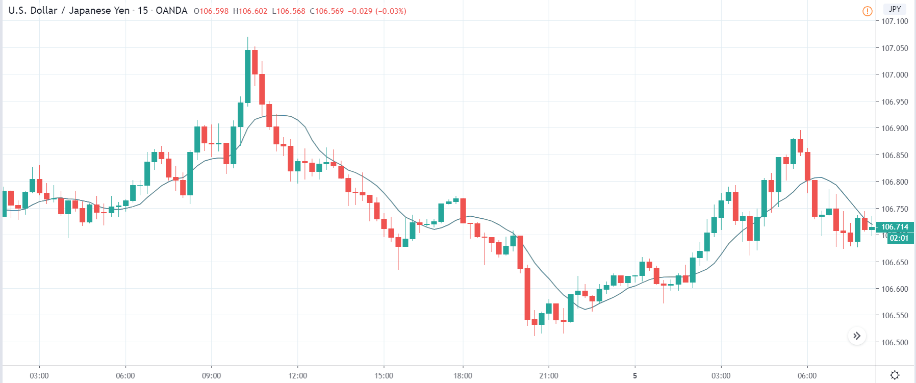
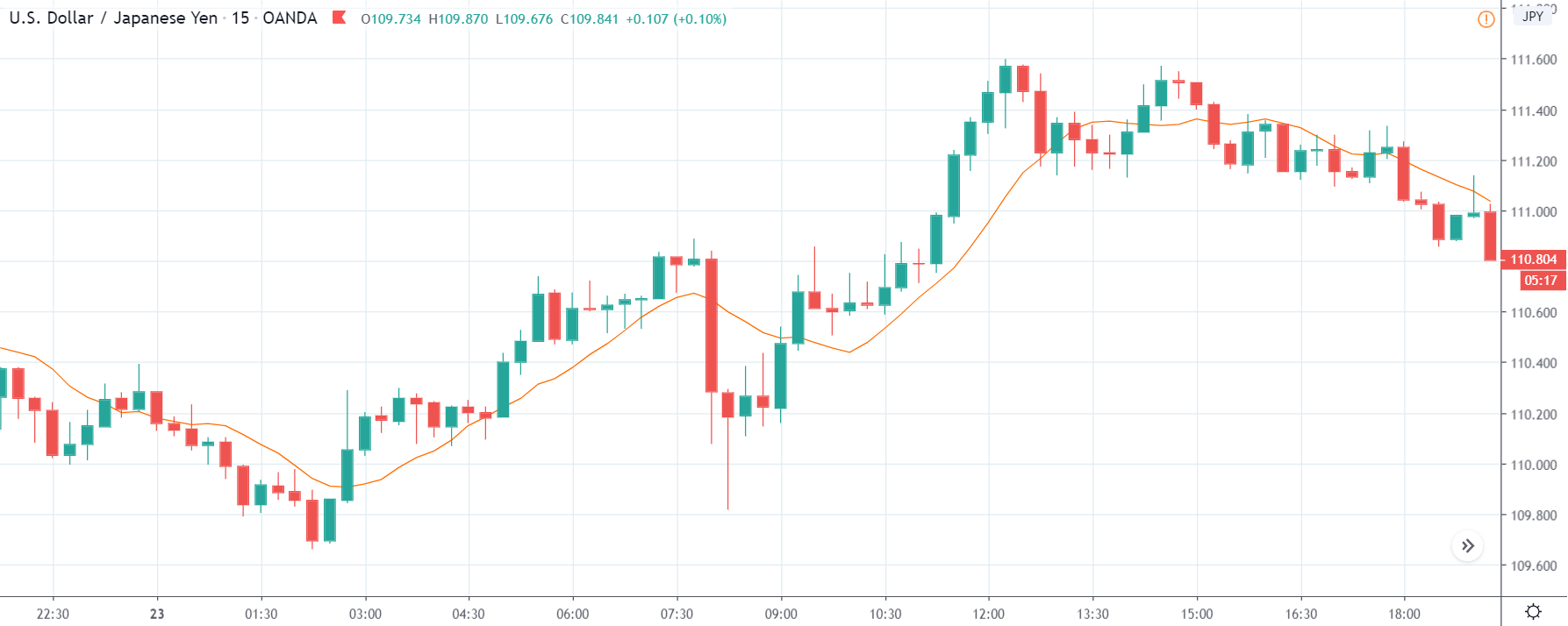
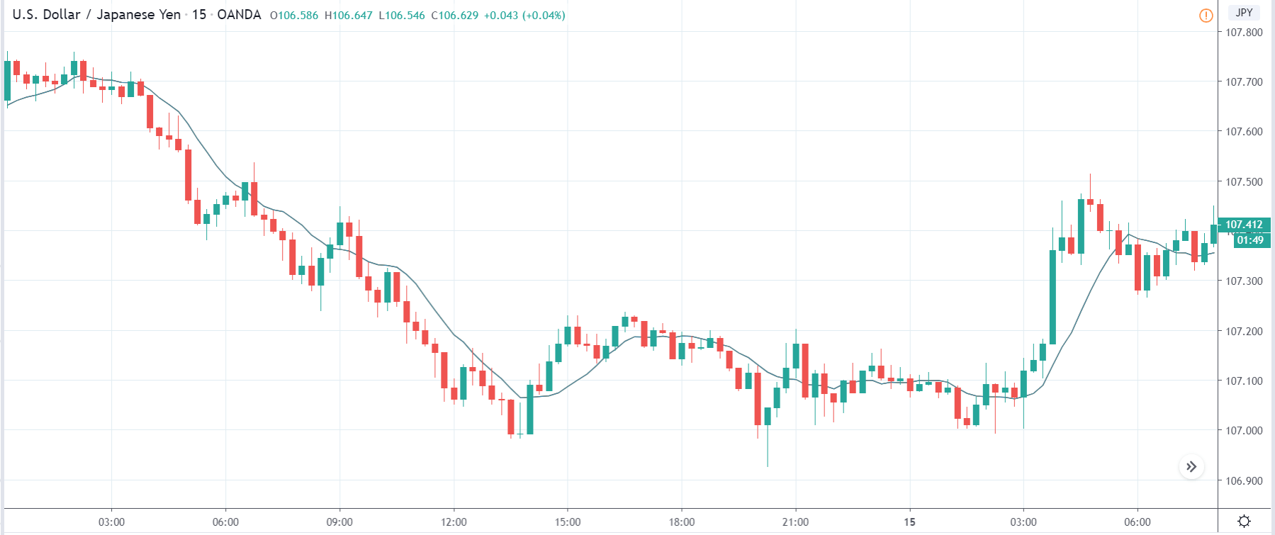
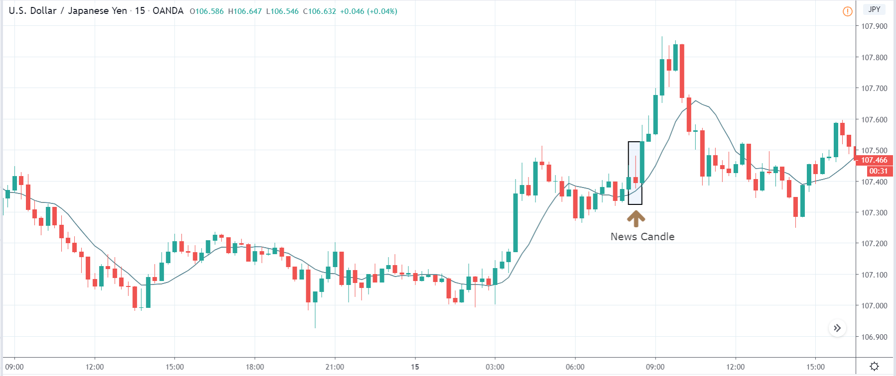
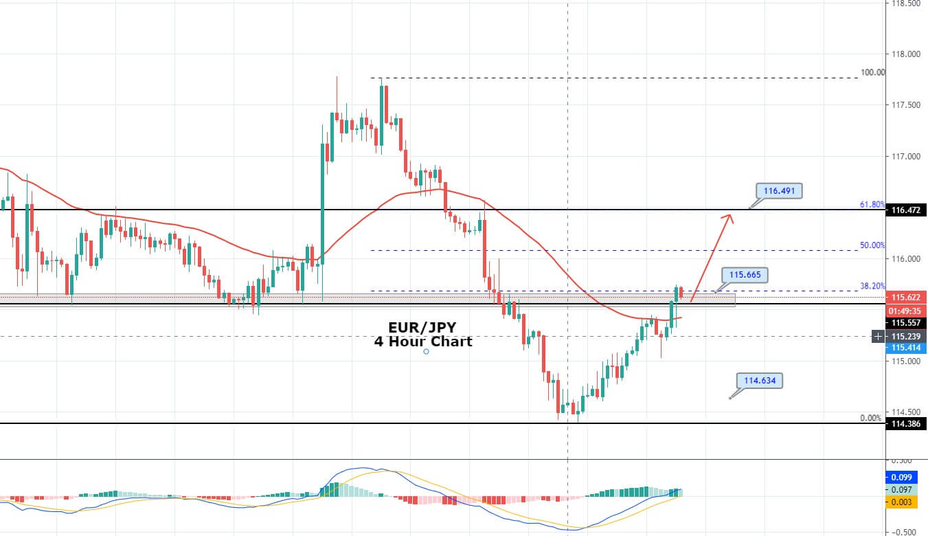
USD/JPY – Daily Analysis
The USD/JPY pair was closed at 107.651 after placing a high of 107.766 and a low of 106.472. Overall the movement of the USD/JPY pair remained bullish throughout the day. USD/JPY pair climbed to 2 weeks high above 107.70 level on Monday on the back of U.S. dollar strength. The pair USD/JPY moved up by 0.85% on the day amid U.S. dollar strength due to increased risk-on market sentiment.
The increased risk sentiment of the market made it difficult for JPY safe-haven currency to find demand on Monday hence gave a push to the USD/JPY pair prices. On Monday, the Bank of Japan signaled more measures in order to avoid the 2nd Great Depression caused by the coronavirus pandemic.
In its report published on Monday, BoJ announced that it would lift the cap from government & corporate bond purchases and also pointed to take additional measures if needed. BoJ had already decided to expand its monetary stimulus program on April 27 when it held its last meeting in which it described the current economic situation as “increasingly severe.”
BoJ, in its monthly meeting, forecasted that country’s economy would experience a contraction between 5 and 3 percent in the current year. Japan’s current coronavirus cases are recorded as 15,777, with 624 deaths. The increased number of appearing cases after the easing of lockdown has made BoJ take additional measures to put the world’s third-largest economy back on track.
On another note, on Monday, the Central Bank of Japan appointed its first woman executive director since it has originated. Tokiko Shimizu, a 55-year-old banker, was appointed as a first-ever female executive director in 138 years.
Daily Support and Resistance
- R3 109.37
- R2 108.57
- R1 108.12
Pivot Point 107.33
- S1 106.88
- S2 106.09
- S3 105.64
USD/JPY – Trading Tips
The USD/JPY traded sharply bullish to place a high around 107.850 amid stronger U.S. dollar and the risk-on sentiment. On the 4 hour timeframe, the USD/JPY pair is now trying to exhibit some correction as it’s price fell from 107.850 area to 107.400 support zone.
However, the 50 periods EMA are still suggesting strong odds of bullish bias, along with the MACD, which are also supporting the bullish trend in the USD/JPY pair. The violation of an immediate resistance level may extend buying until 107.900 level. Conversely, the closing of selling candles below 107.460 can continue selling bias until 107 and 106.850. The 50 EMA is supporting the bullish bias around the 106.650 area. All the best for today!


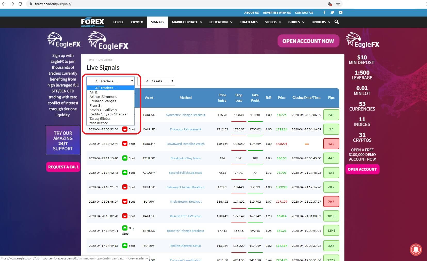
 Welcome to how can you make money using forex academies free trading signals service part 2. By connecting to the Forex.Academy website and clicking the tab for our Free
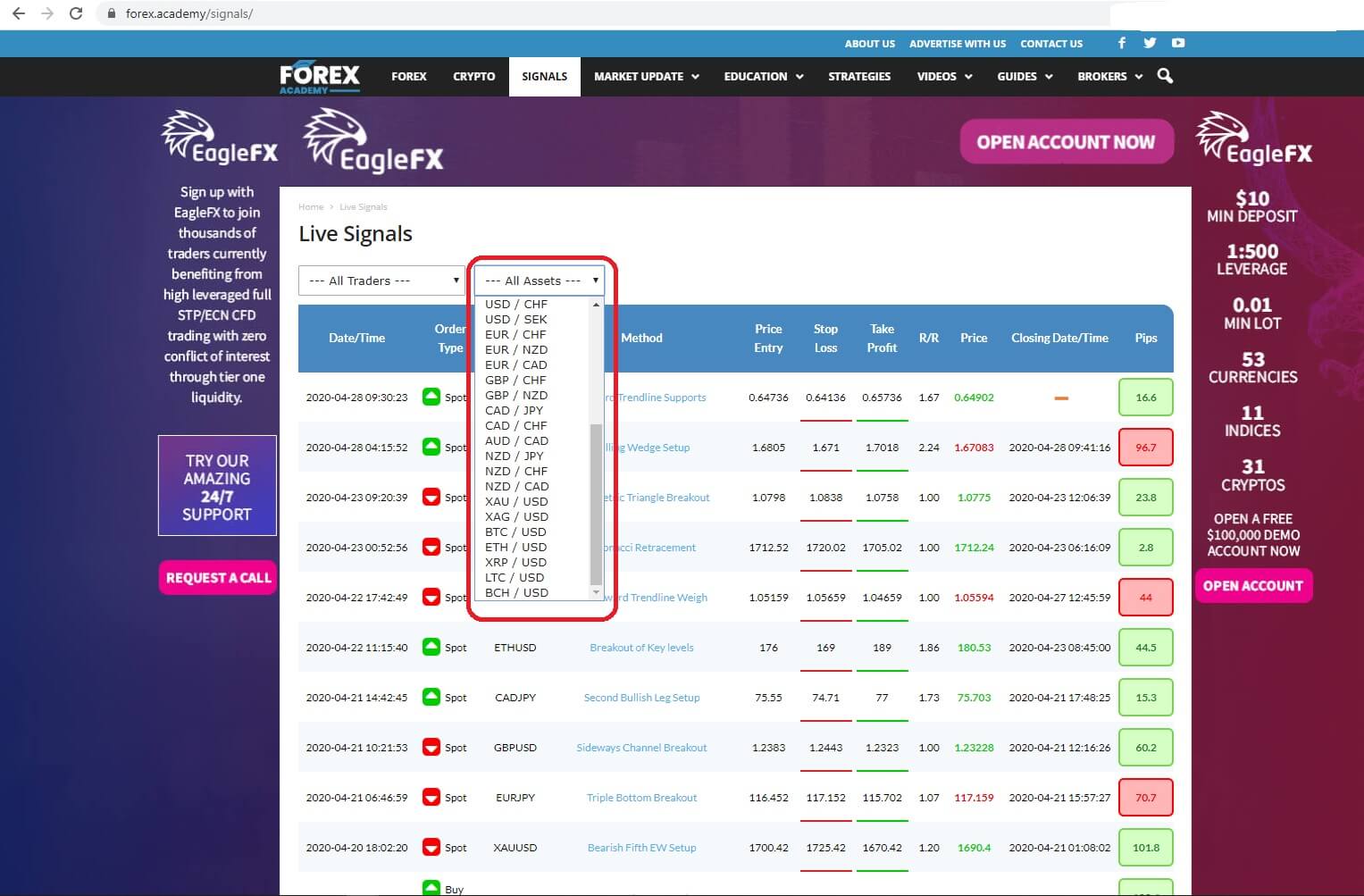
 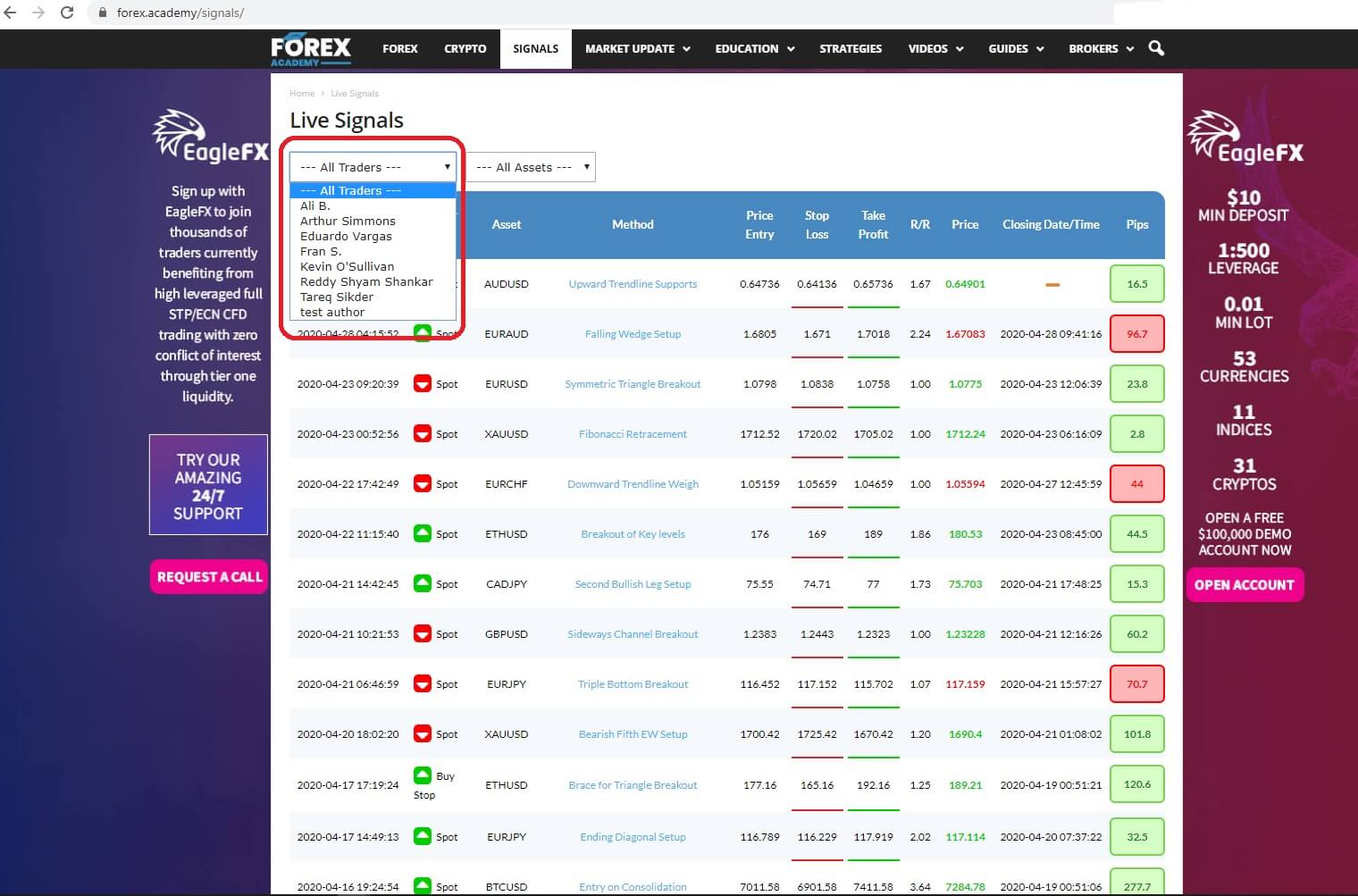 And where you get to choose the type of asset which is traded, from a basket of currencies and bitcoins.
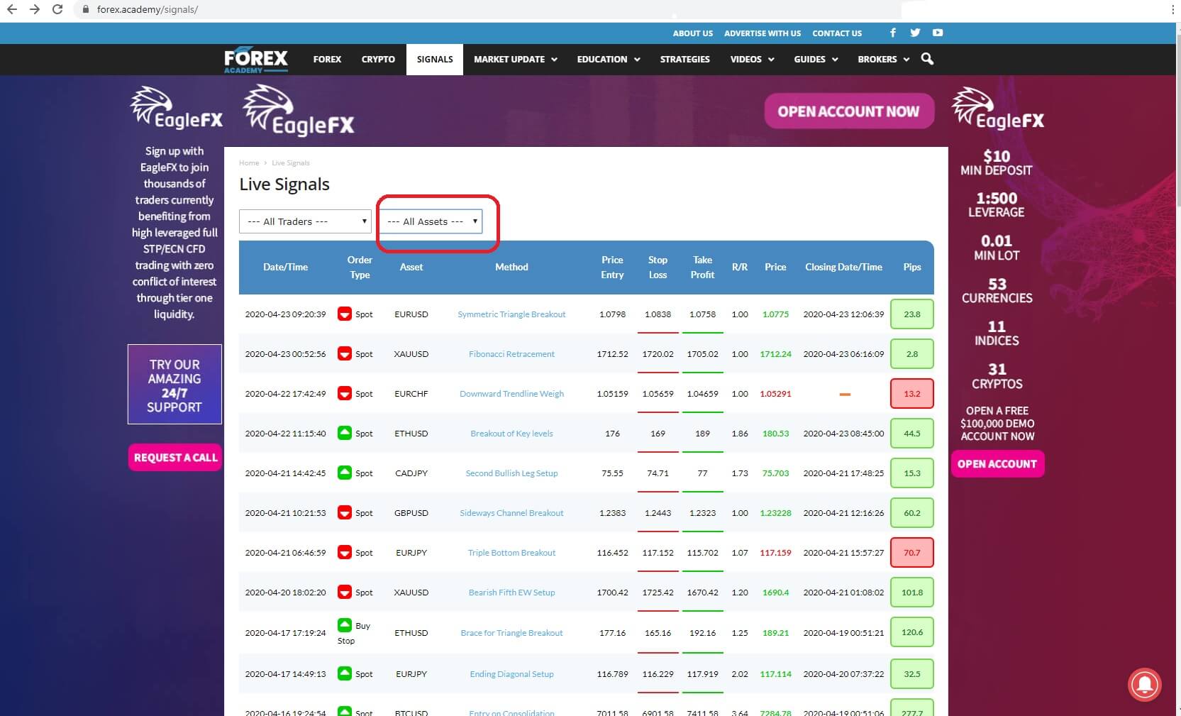
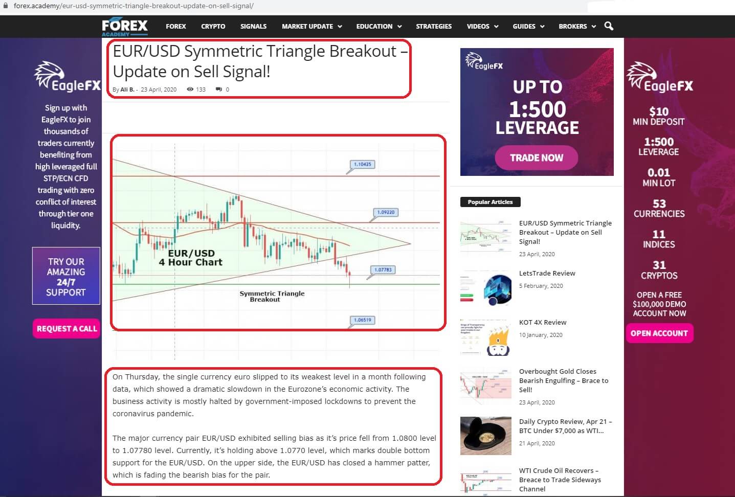
 And where you can find details of the trade, including the name of the asset being traded, the technical analysis name for the trade setup, up-to-date visual technical analysis charts of the setups, and a written description of the fundamental and technical analysis behind each and every trade. Our professional traders only use technical and fundamental analysis setups that are widely used in the
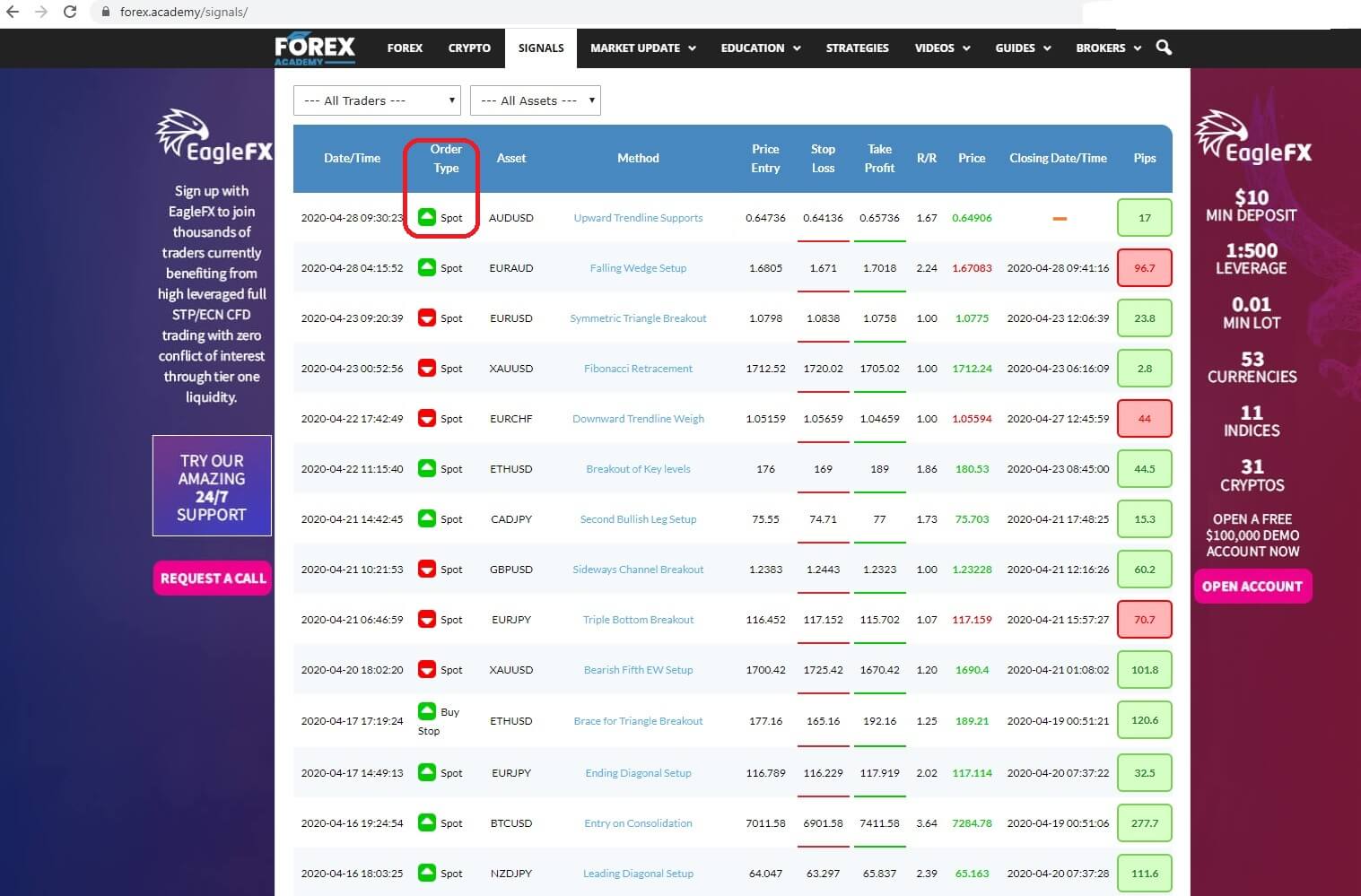
 bearing in mind that if it is an instant execution you might miss a few pips unless you are monitoring the table continually. However, you would be more likely to get in at the beginning of the trade by copying pending orders such as this


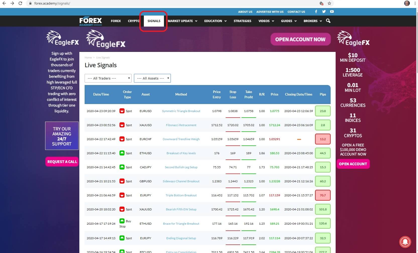

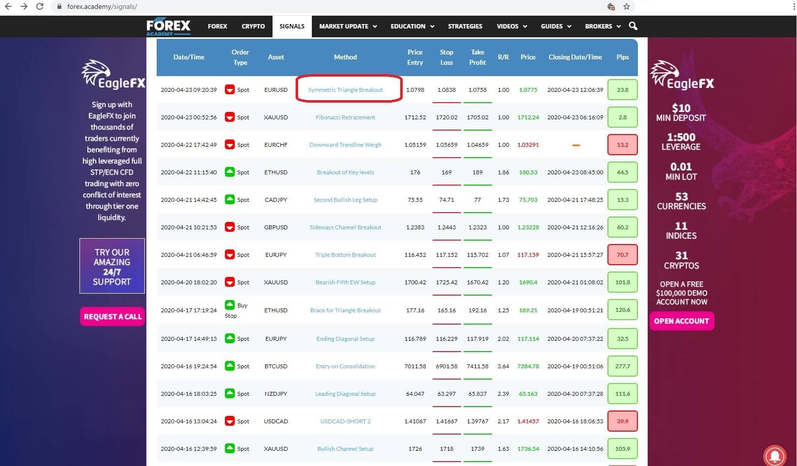
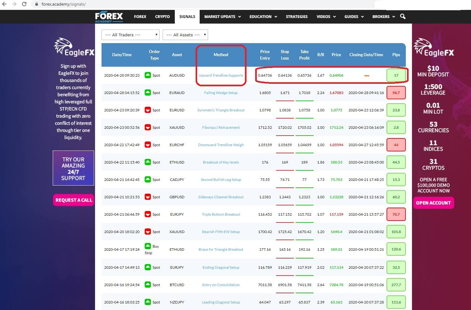
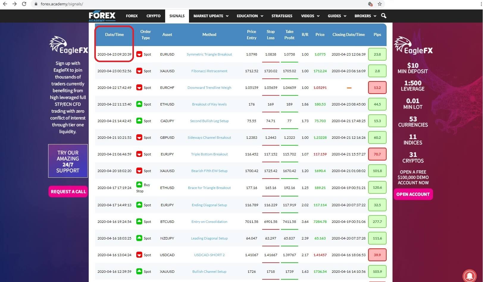 The date the trade was listed: Insert 2:
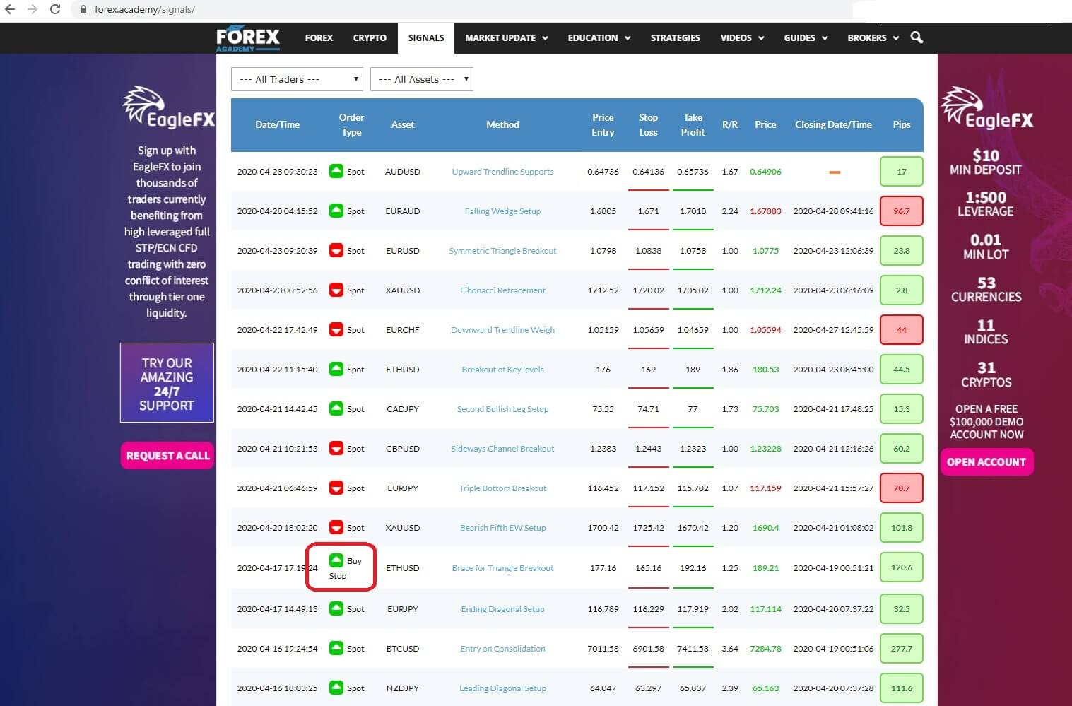
 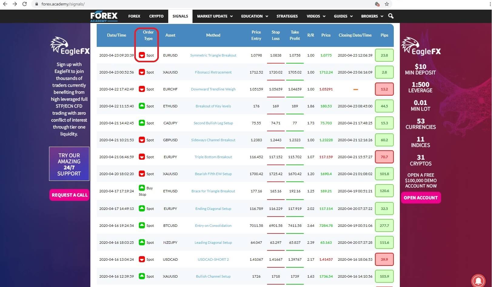 The type of order, which could be an instant execution, or spot trade, or a limit order including a buy limit or stop buy order or a sell limit or stop sell order, Insert 3:
 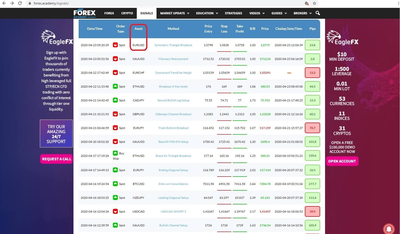 the type of asset, which could be a number of major or cross FX pairs and gold and bitcoin. Insert 4:
 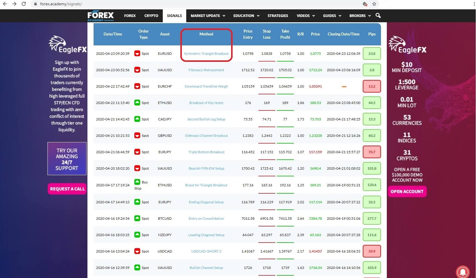 the method where the each trader gives a detailed analysis of the thinking behind each trade, which, incidentally, most other signal providers do not offer, and where we will come back later in this video to take a more detailed look, Insert 5:
 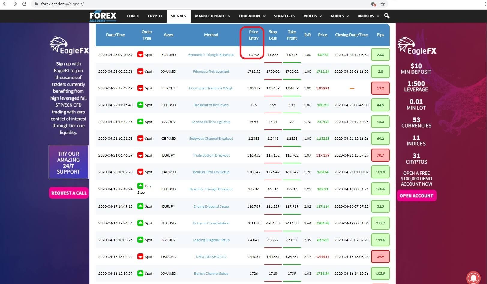 the entry price for the trade, Insert 6:
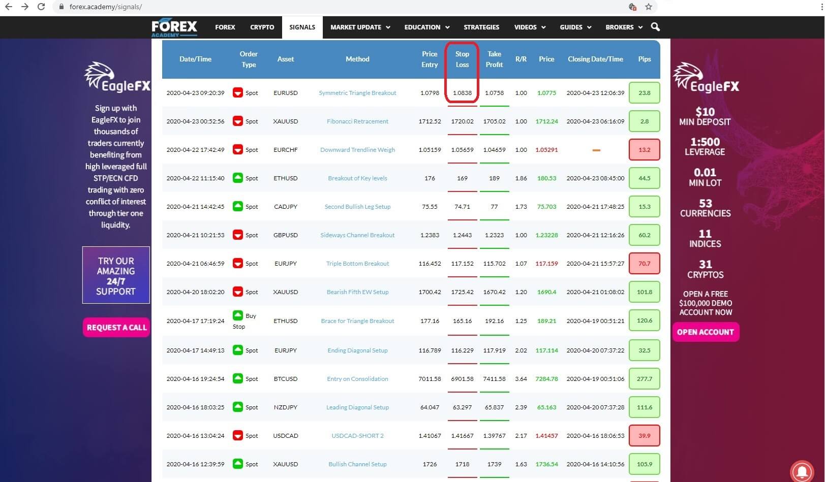 the stop loss for the trade, Insert 7 :
 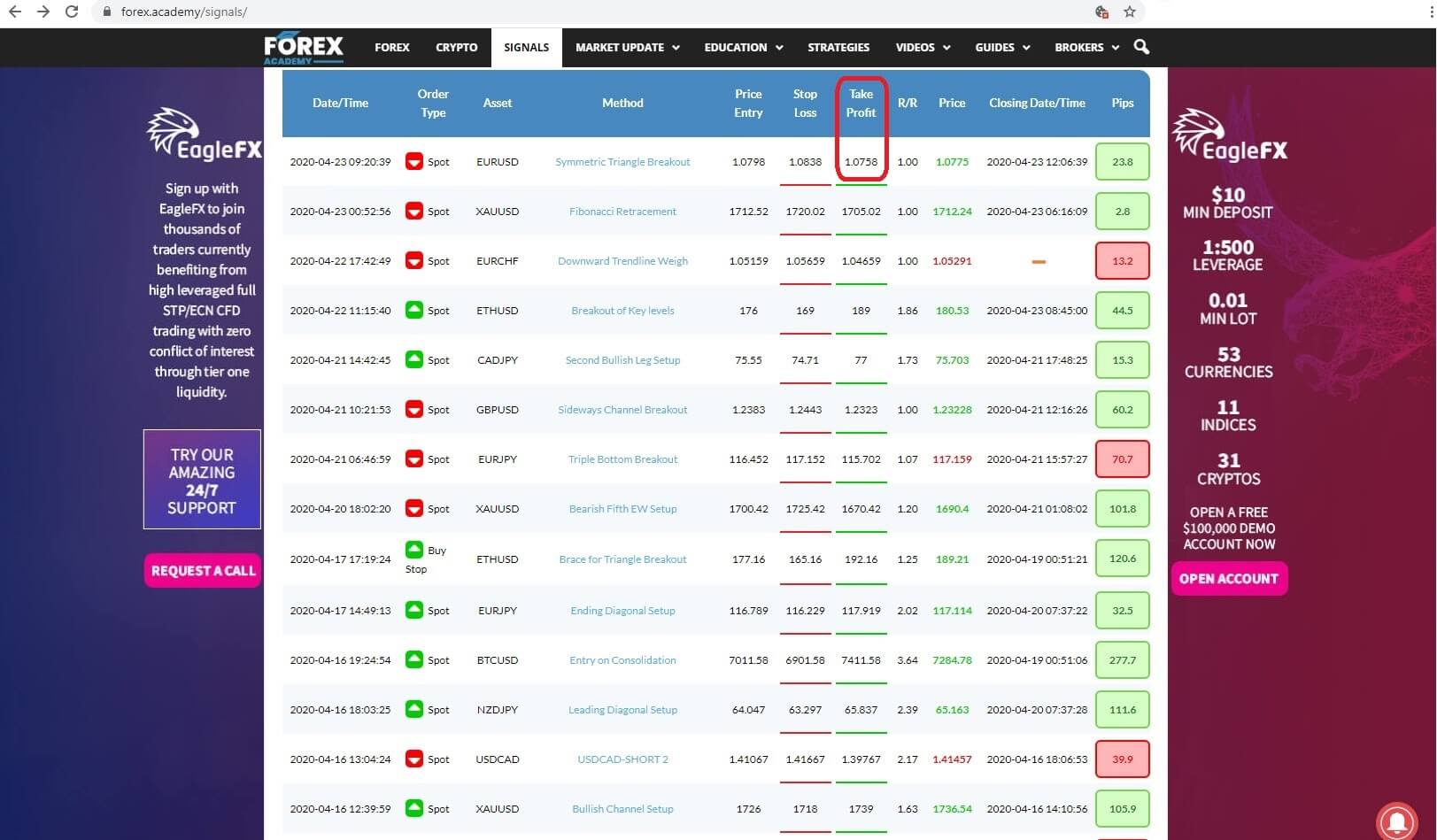 the take profit level, Insert 8,
 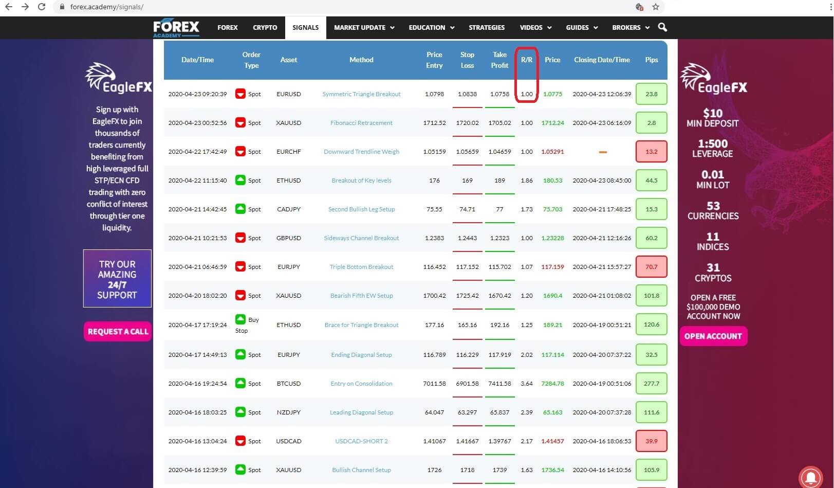 The risk to reward level, Insert 9:
  the price level at close; Insert 10:
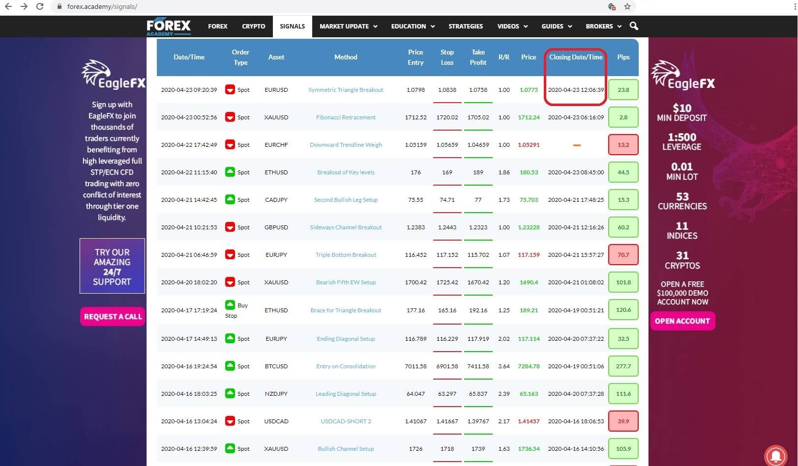
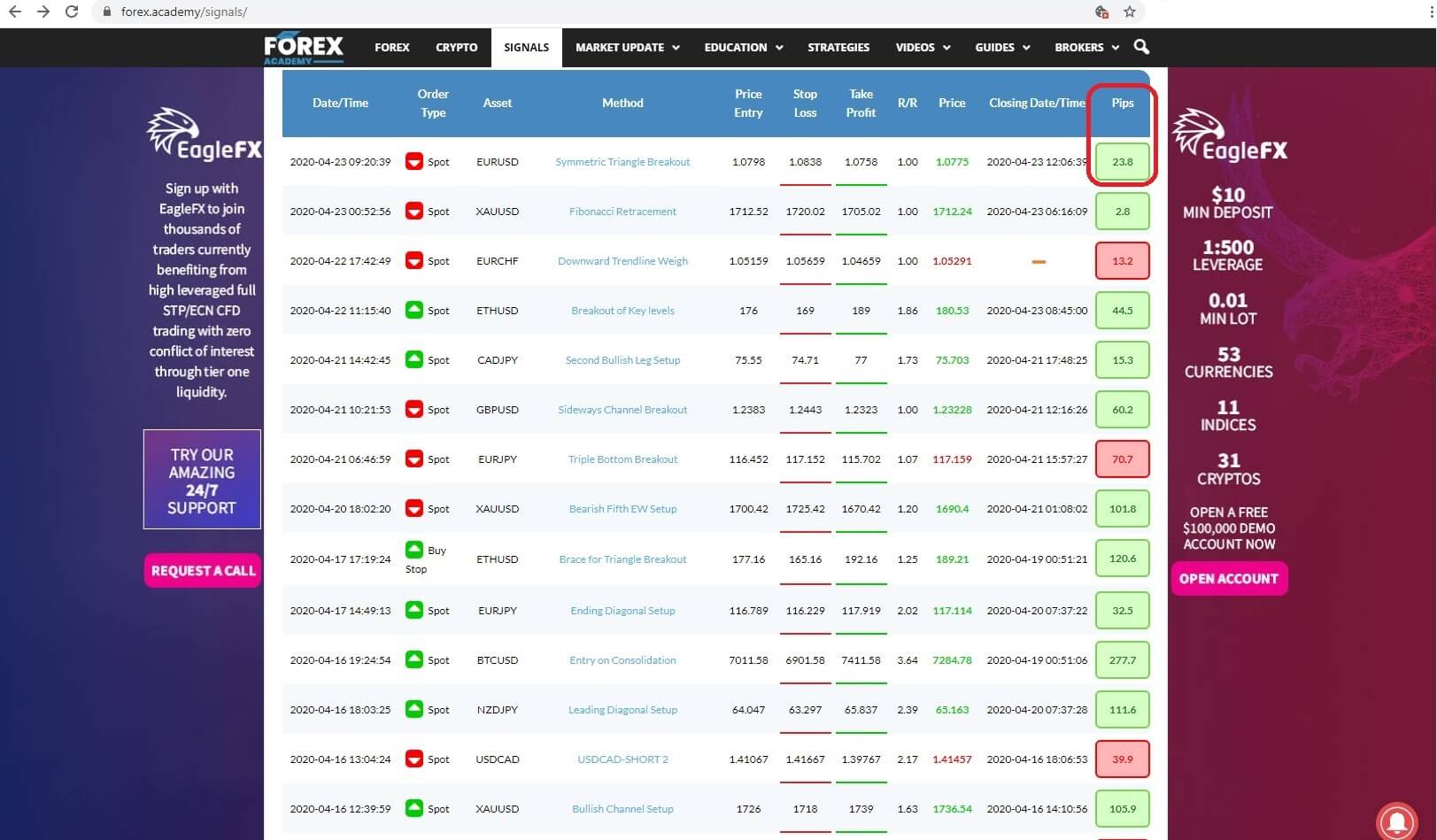 the amount of pips won or lost or in the event of an open trade the fluctuating level of pips in play.