Twitter accounts and websites offering educational material on trading currencies appear to have little awareness about the role they play in traders’ development. While eagerly sharing captivating content, giving comments, and advice on various forex-related questions, these sources successfully lure beginners into the community. By not addressing real, state-of-the-matter problems and challenges such complete novices are soon to encounter, not only do the information providers falsely glorify the effectiveness of poor-performing tools but they thus also deny their responsibility for generating an apparent high rate of failure.
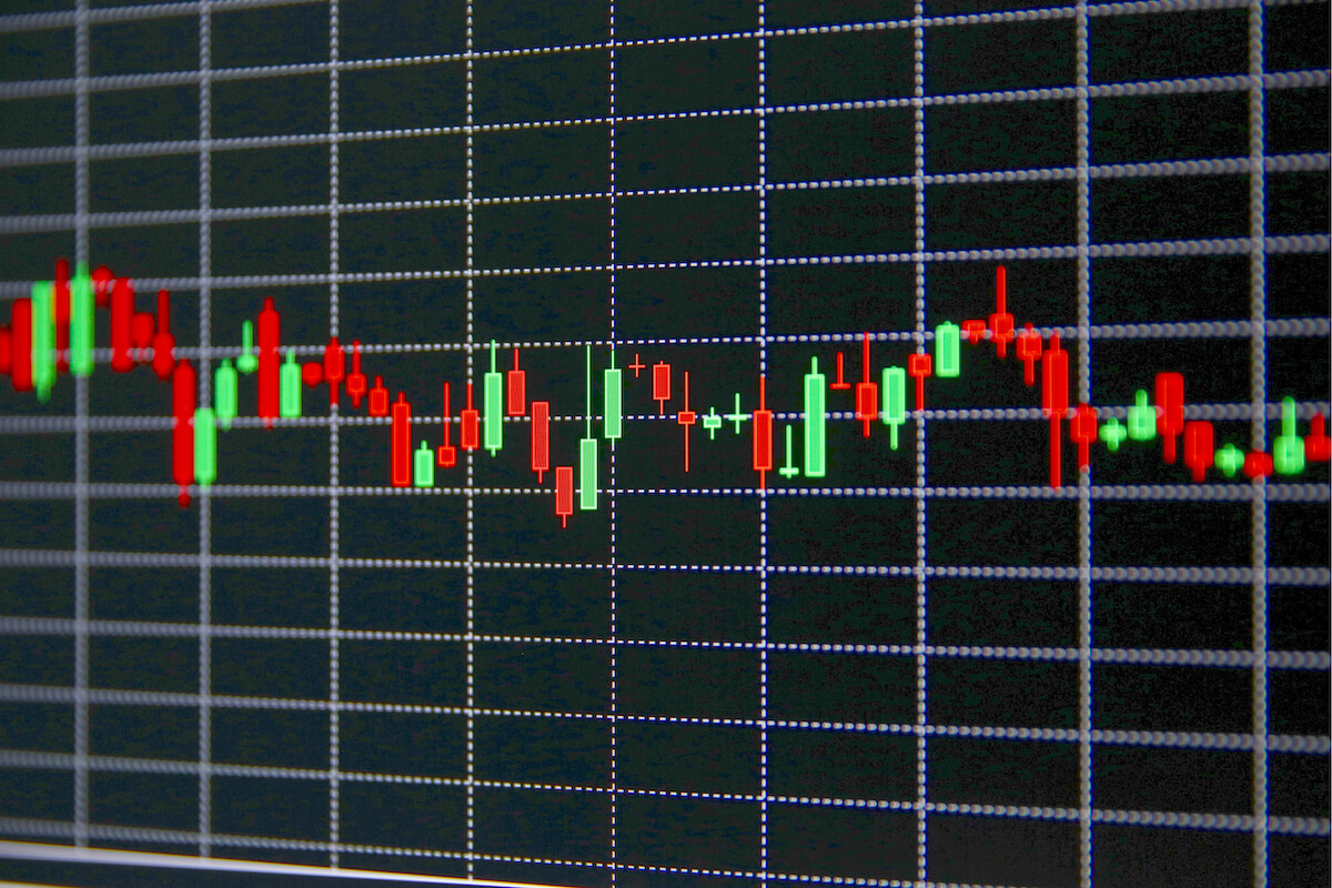
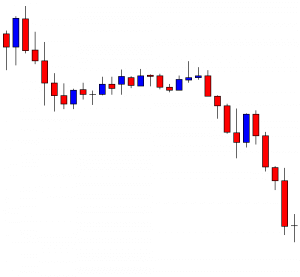
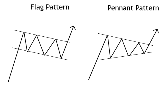
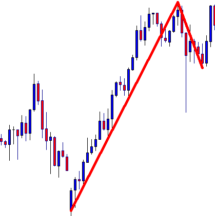
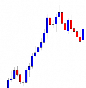
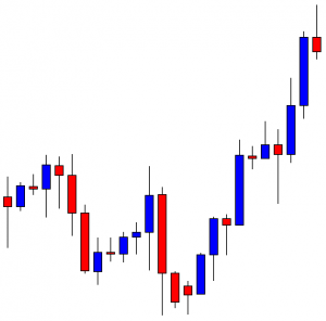
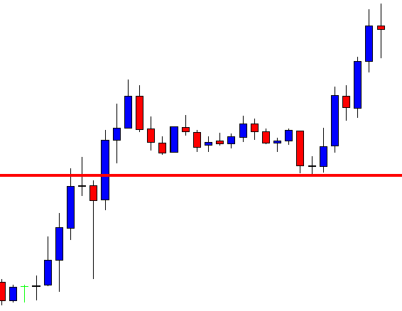
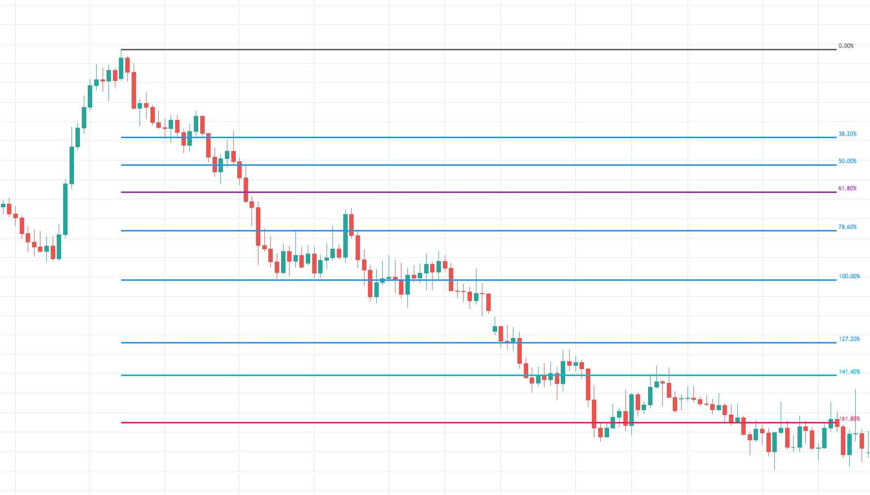
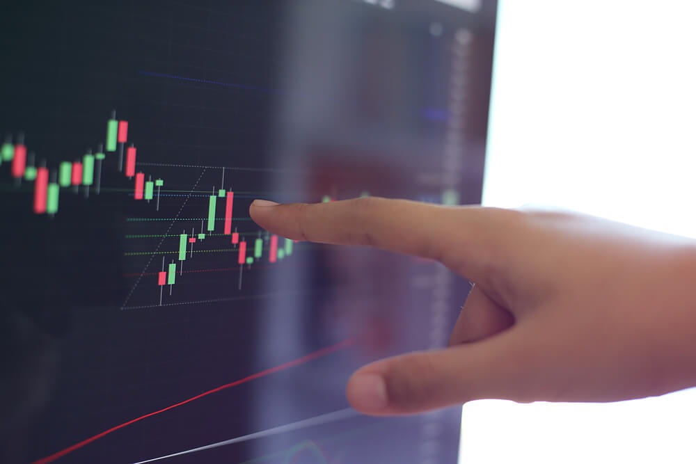
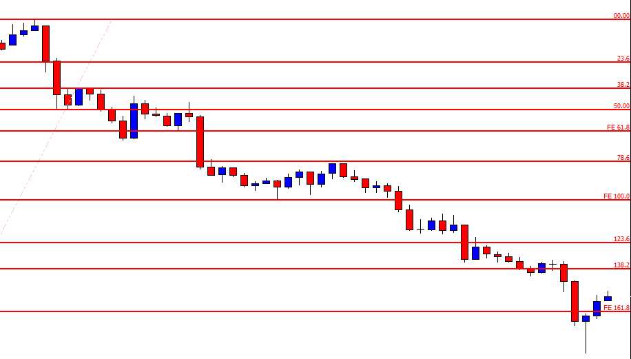
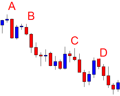
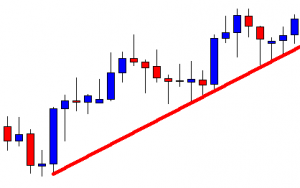
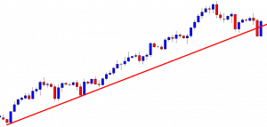
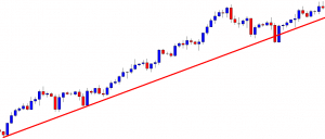
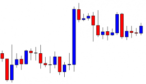
Considering how the recommendation is nowadays seen as one of the strongest marketing means that can practically charm any individual into believing in an asset’s quality, there is little doubt over what excessive and, more importantly, unfounded praise can do in a community of individuals eager for learning and exchanging experiences. The same can be said for the extensively lauded trend lines, a charting tool drawn over highs and lows that traders use to detect the prevailing direction of a price. Regardless of its vast application in trading and the presupposed analytic value, trend lines may not be the salvation traders seek and thus need to be further assessed so as to gather additional evidence of their effectiveness.
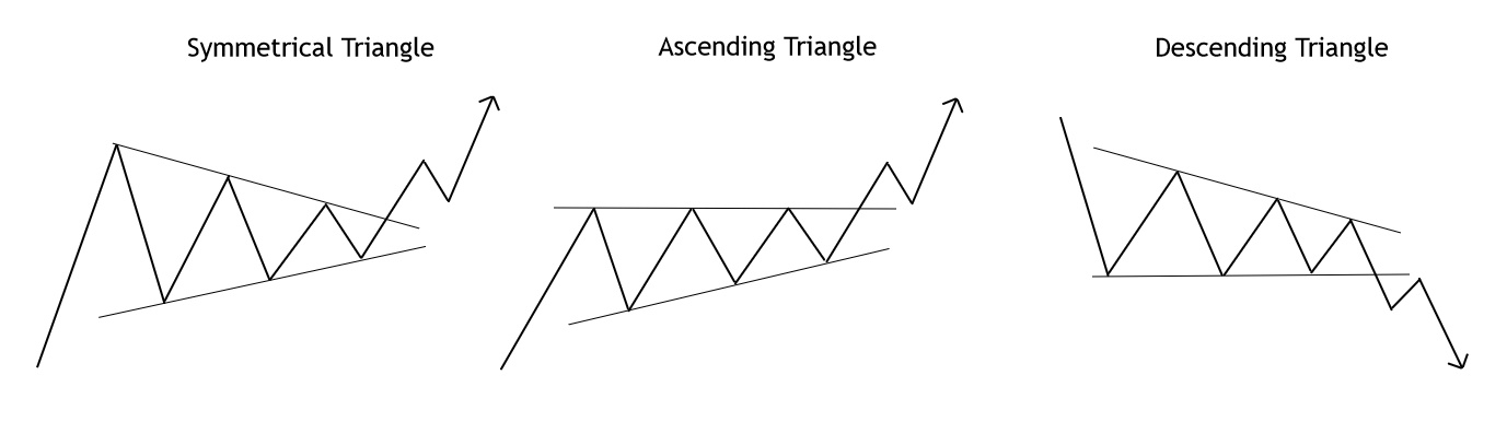
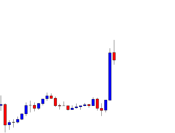
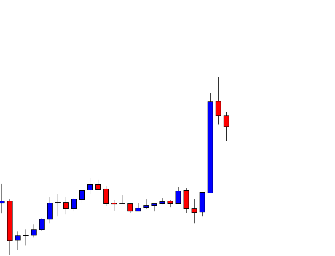
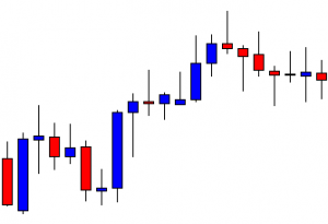
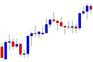
The first time beginners encounter trend lines, they have already gone through blogs and videos discussing the topic. They may have also consulted traders coming from other markets, e.g. the stock market, or have previous experience in trading various equities themselves. When they start applying the tool in their own charts, they hope to estimate how the price is going to react, whether it will break out of the trend line or bounce off of it. What traders find particularly appealing is the ease and convenience that come with drawing the lines. Nonetheless, some professional traders strongly object to the level of effectiveness of trend lines in charts, claiming that finding proof of their usefulness is harder than what one may expect. These traders go as far as to say that it may be quite difficult to find areas in the chart where trend lines fulfill the purpose of predicting where the price is going to go owing to the fact that they essentially lack any predictive value.
The situation becomes more alarming once we take into consideration the fact that traders do not base their judgment on analysis, but often post information about how the price bounced off or broke through on social media sites once a trend is already over. Some experts even believe that people behind websites and twitter accounts win every time, hinting at the belief that success has little to do with their knowledge about trend lines.
Forex traders need to know which direction the price will take beforehand, but the assumption that trend lines function as a safe method of trading may be fundamentally flawed. People love trends and what they also find particularly interesting is the ability to offer their own opinions and views regarding the future outcome. Based on such an approach where subjectivity plays the central role, we may freely put forward the idea that trend line-based predictions then uncannily resemble the world of sports betting. Interestingly enough, trends are also used by professional sports betters, but only sparingly. Whenever we do notice a trend, we know that there is a certain likelihood of it leading to a specific outcome, but are we truly ready to accept this level of randomness when investing our precious money and time?
Roulette wheel boards in casinos, for example, show approximately 15 numbers that last appeared (see picture on the left), based on which people make specific decisions concerning their next step. Casino goers typically assume that a specific number or color is due and that they are in fact following a trend, which cannot be any farther from the truth. In a world somewhat similar to casinos, markets, or important market players will never take any action in order to intentionally lose money. Hence, they will strive to make every single trader believe that randomness is not randomness at all, playing with your lack of knowledge and analytical skills. More often than not, what traders assume to be a trend proves not to be a trend at all, and they cannot thus serve as a direct confirmation of what will eventually happen with the price.
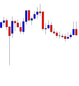
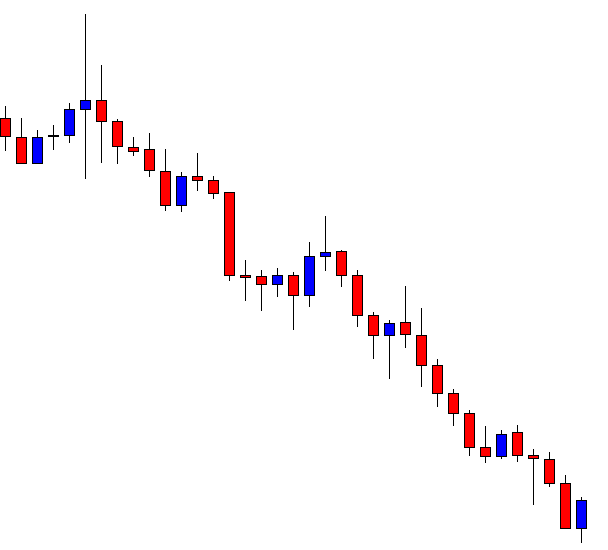
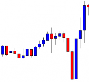
Even if we take a look at some definitions of the word, we would know that trend generally indicates a development or change, not a final destination. We then need not rely on trends to tell us whether we are seeing an uptrend or a downtrend, we can just look at the chart to gather data and draw conclusions. Instead of having a predictive quality to them, trend lines, in fact, rather reflect a statistical anomaly or a deviation. It is truly remarkable how we can choose to draw a trend line basically on any random chart, anywhere, and anytime. Nonetheless, what is peculiar is that there are as many places where we can draw these lines as there are places where we simply cannot.

Any chart has a trend happening somewhere, but seeing areas with highs and lows you can connect with a straight line is not an analytical advantage but a game of flipping a coin. If you can draw a connection between a coin landing on a particular side and a price breaking the trend line, then you certainly know how we are playing with a 50—50 proposition or even far less. Trend traders are often amazed at the predictions given on Twitter, but as we said before, the way someone looks smart is not equal to the level of luck you will have using the tool they advertise. As the price will inevitably have to go one way or the other, moving up or down, they will only later reveal the results they accredit to the trend line, which will push you to believe in trend lines’ ability to help you reach your goals faster.
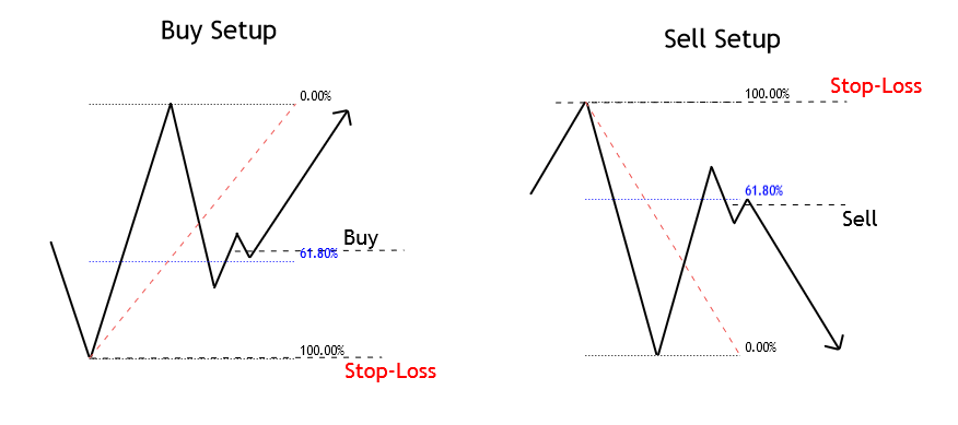
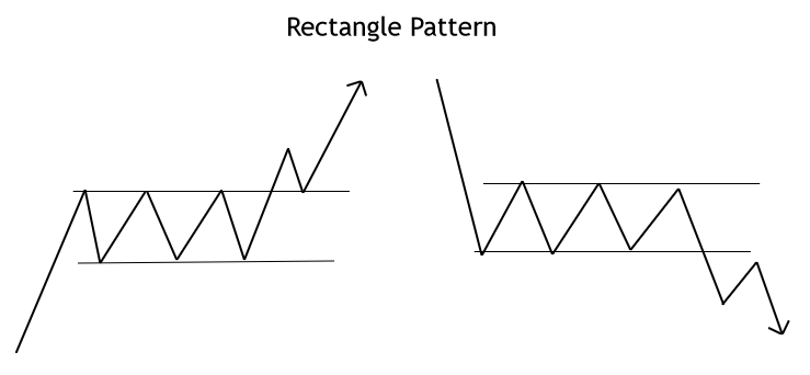
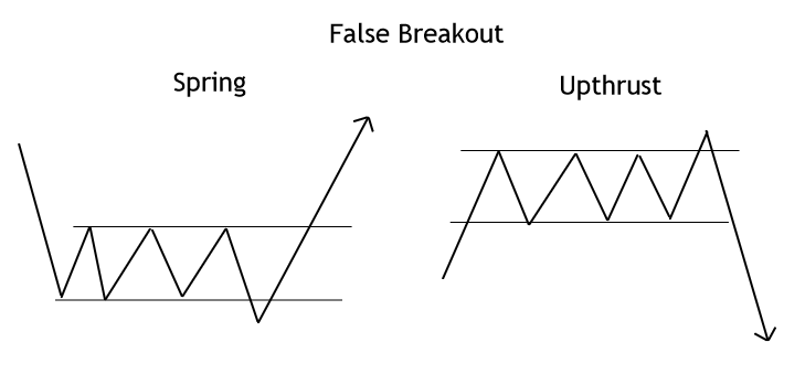
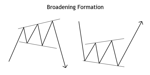
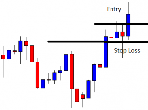
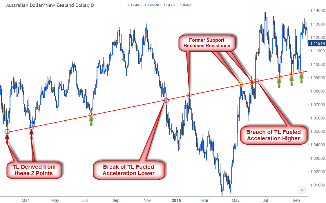
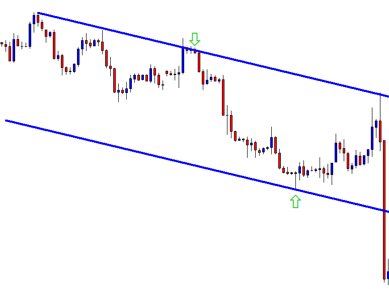
What do you want a trend line to show you? As traders typically look for signs whether the price would break out or bounce off, we can expect to see three different scenarios: a) breaking out, passing the trend line, and starting a new trend; b) bouncing off of a trend line and continuing on the trend they are on; or, c) false breakouts and false reversals that appear to be similar to the previous two. In the end, we are not really looking at an actual trend, but a statistical anomaly because trend lines have little to do with the question of whether prices move up or down. The only ones possessing this kind of information always turn out to be the big banks and institutions, which are constantly on the lookout for market activity. They eagerly look for the areas in the chart where the majority of retail traders are going on any currency pair only to take the price the opposite way and earn a profit. If you are already participating in the market, your success will undoubtedly and indisputably depend on your ability to get off the big banks’ radar, which means evading the places where the greatest number of individuals are trading.
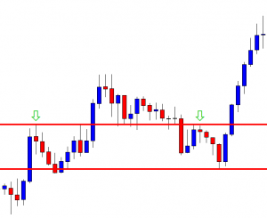
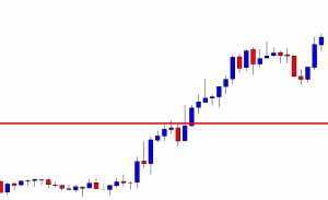
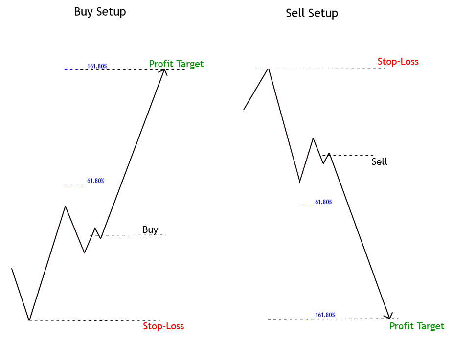
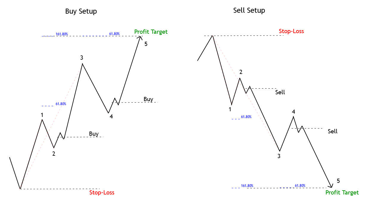
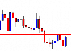
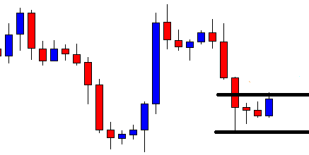
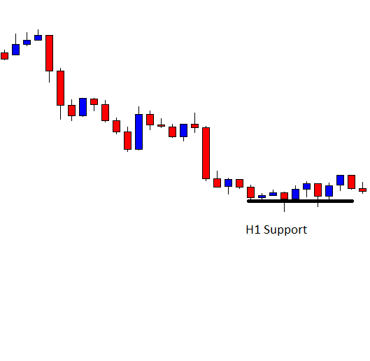
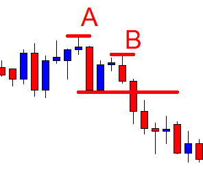
This further implies that tools such as support and resistance lines often prove to be completely useless since, unlike trend lines, they do reflect some consistency due to which every trader can have access to the exact same information, immediately sparking the big banks’ interest. Traders assume than these major players pay attention to diagonal support and resistance when they in fact only wait for the majority of traders to move into one direction so that they can redirect the price. Whatever you expect a trend line to show will not eventually provide you with enough security and keep you away from the areas in the chart which can get you to lose a lot of money.
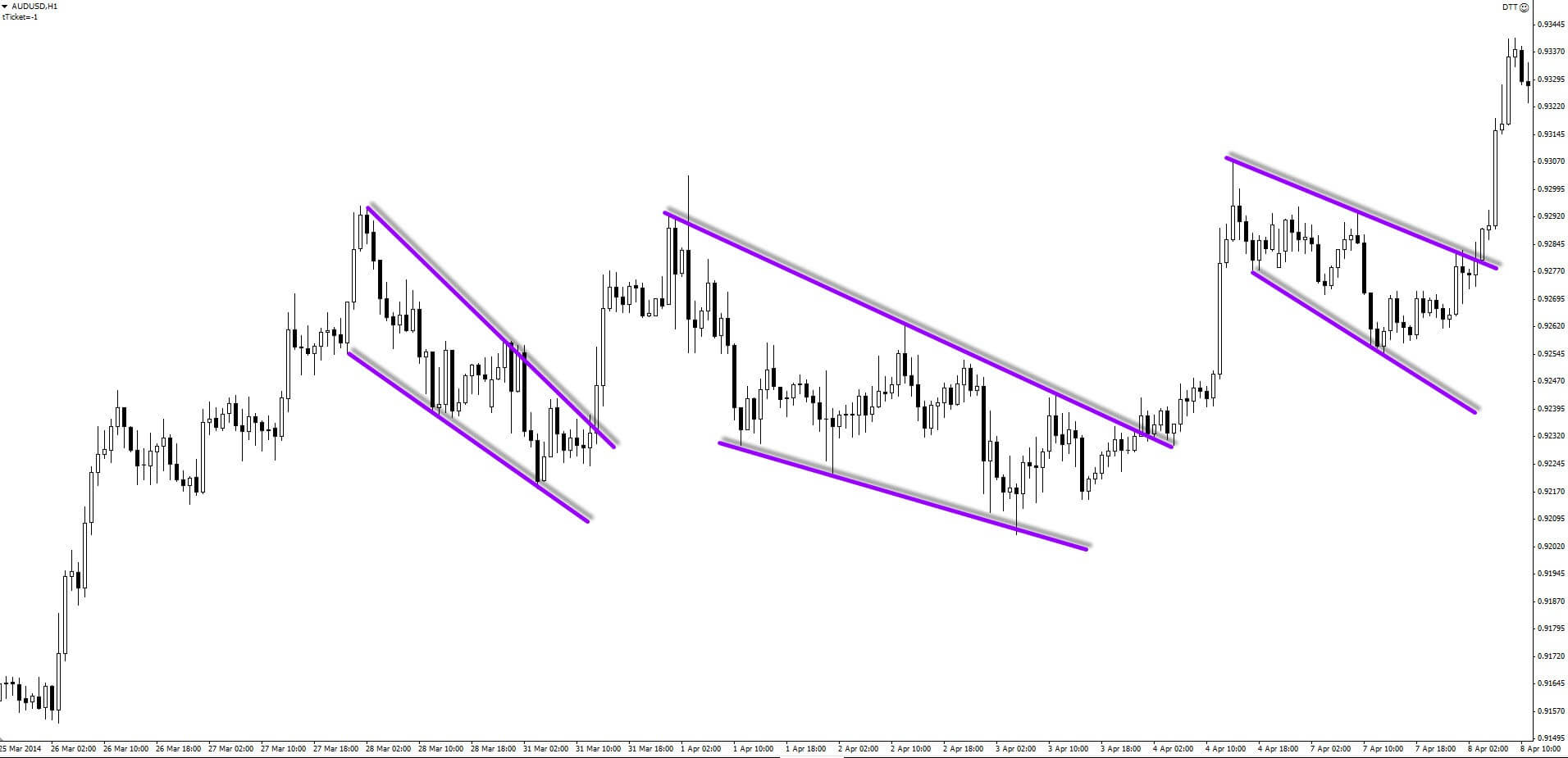
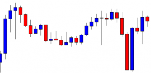
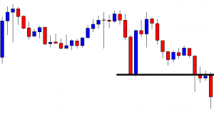
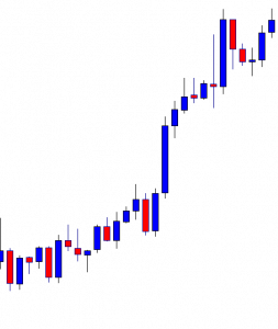
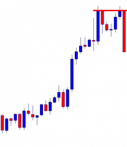
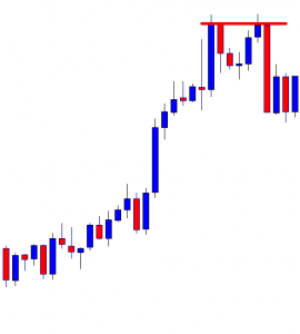
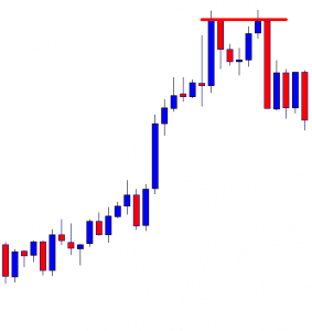
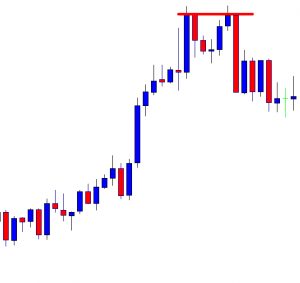
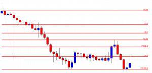
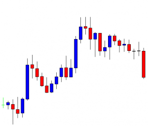
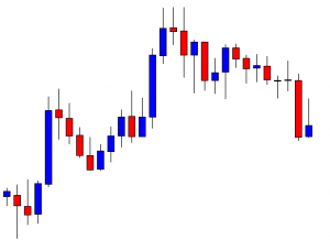
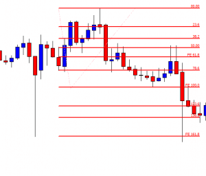
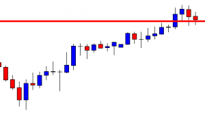
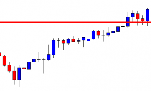
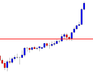
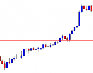
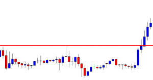
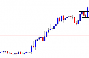
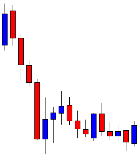
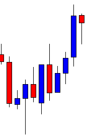
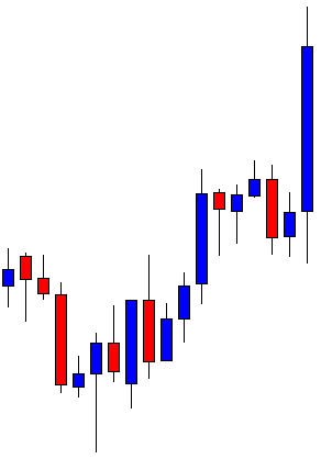
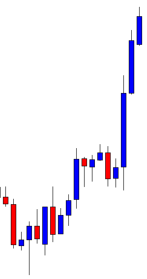
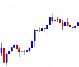
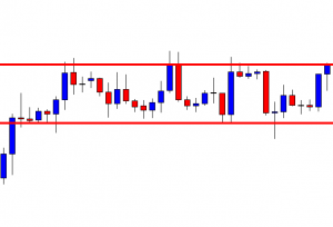
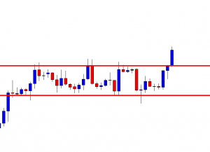
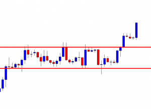
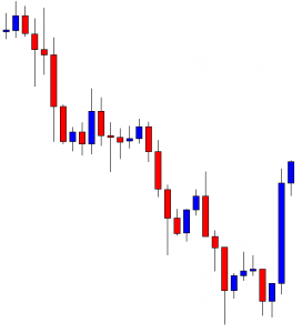
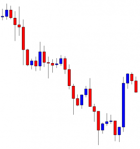
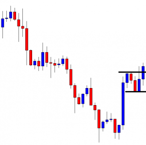
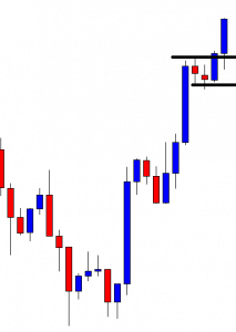
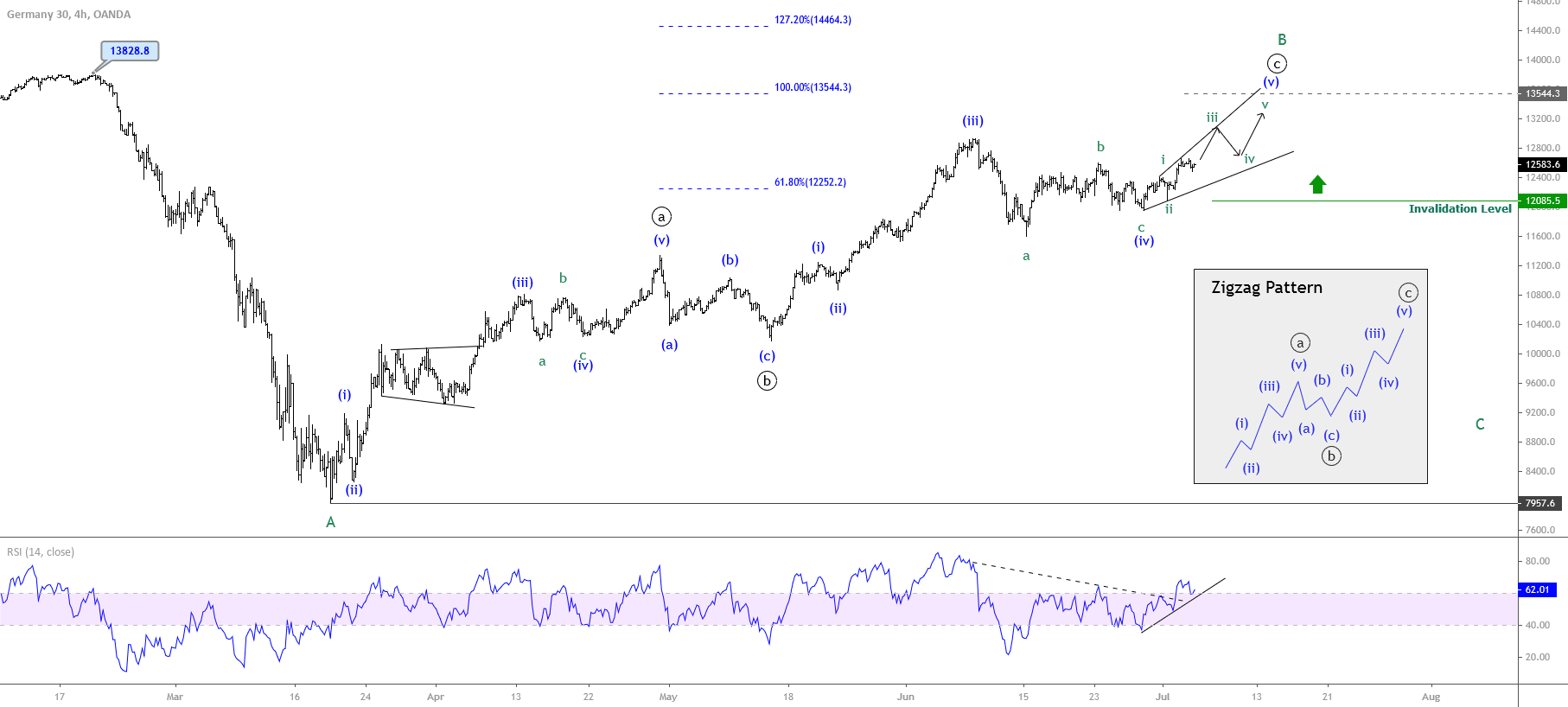
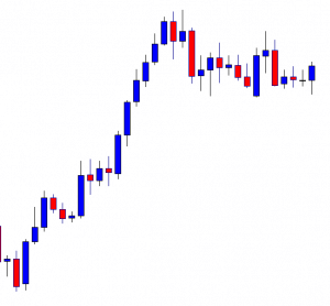
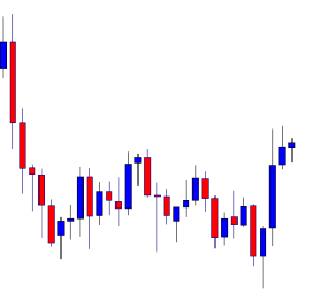
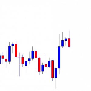
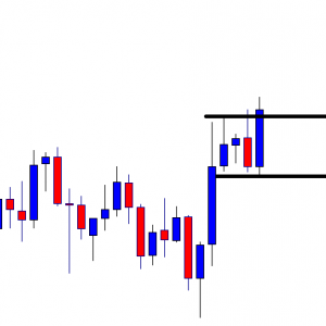
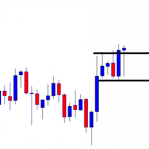
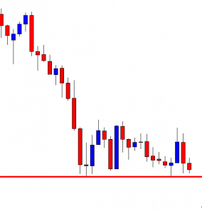
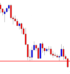
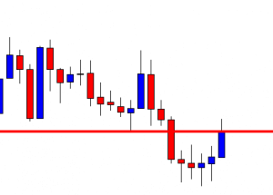
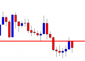
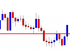
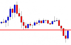
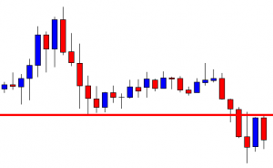
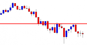
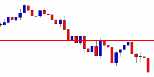
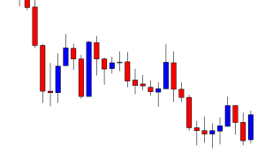
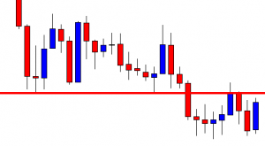
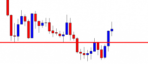
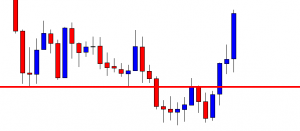
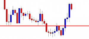
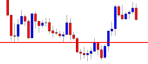
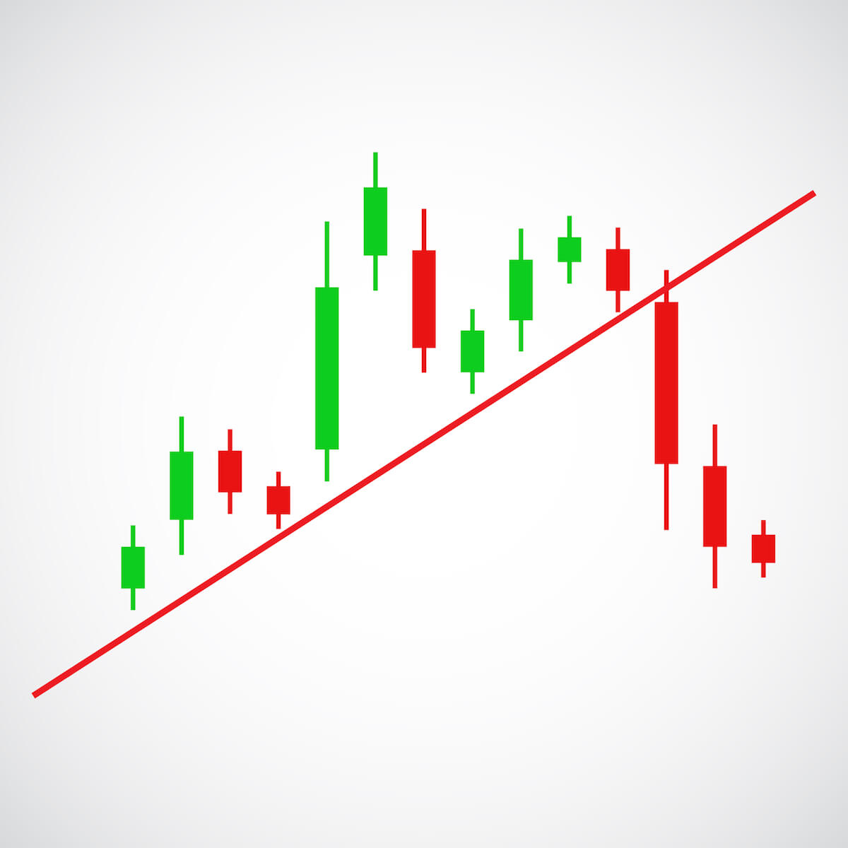
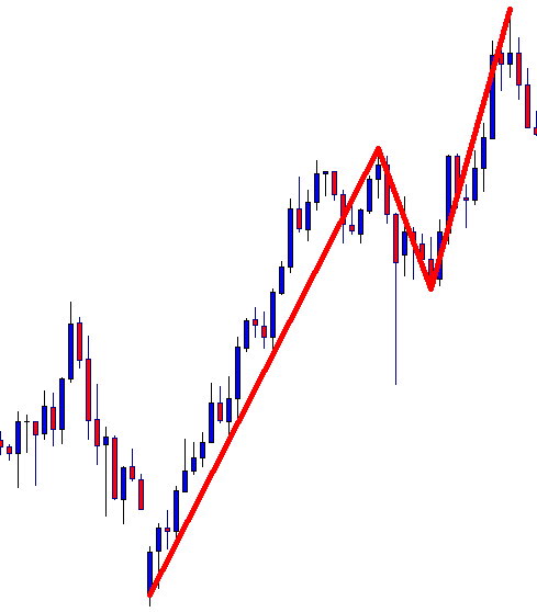
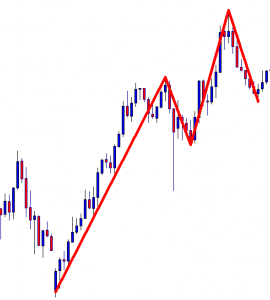
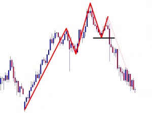
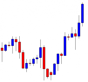
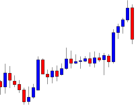
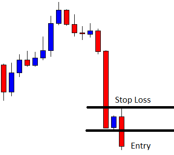
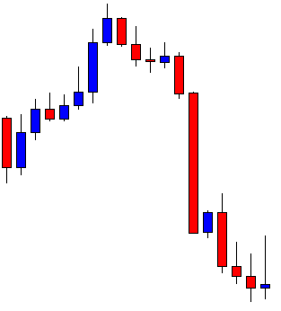
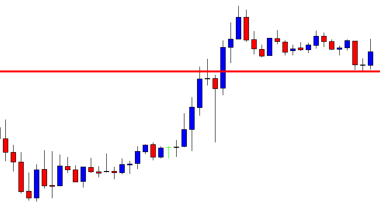
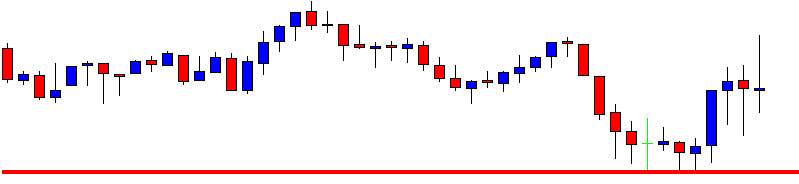
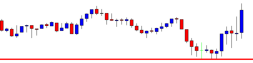
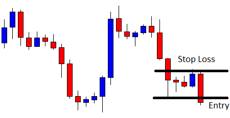
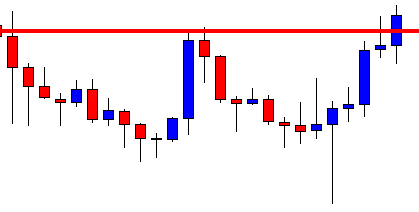
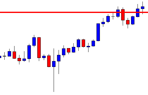
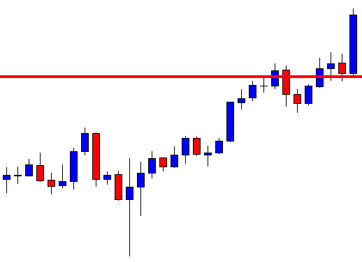
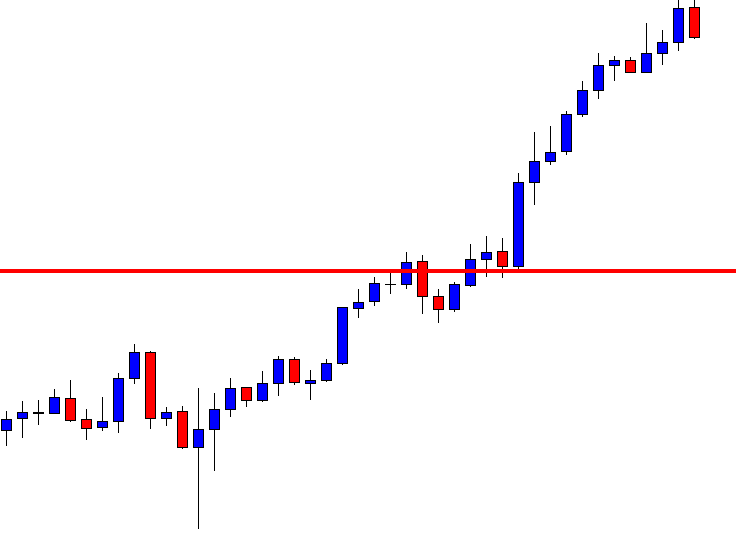
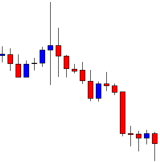
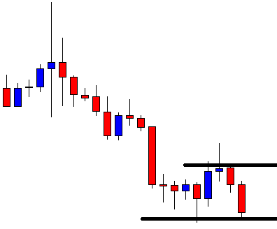
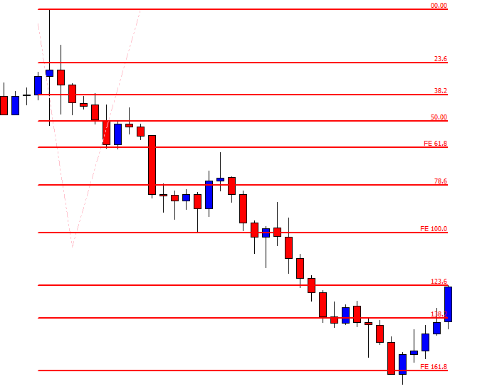
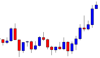
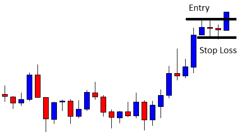
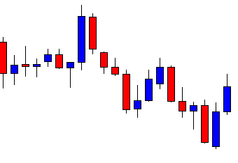
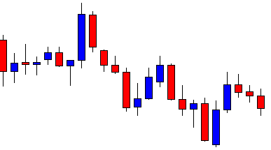
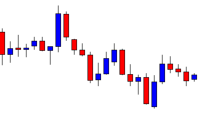
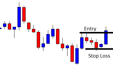
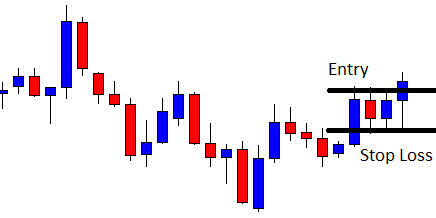
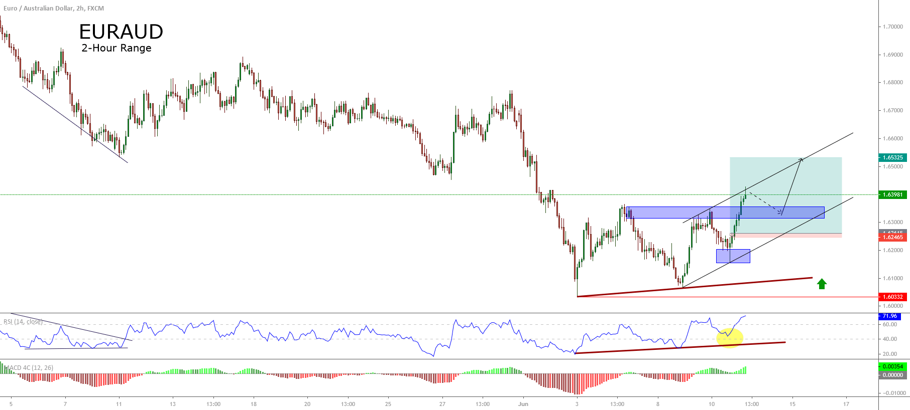
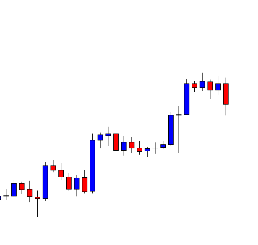
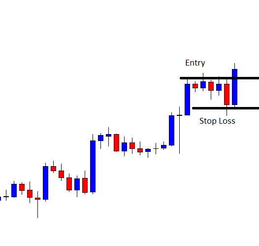
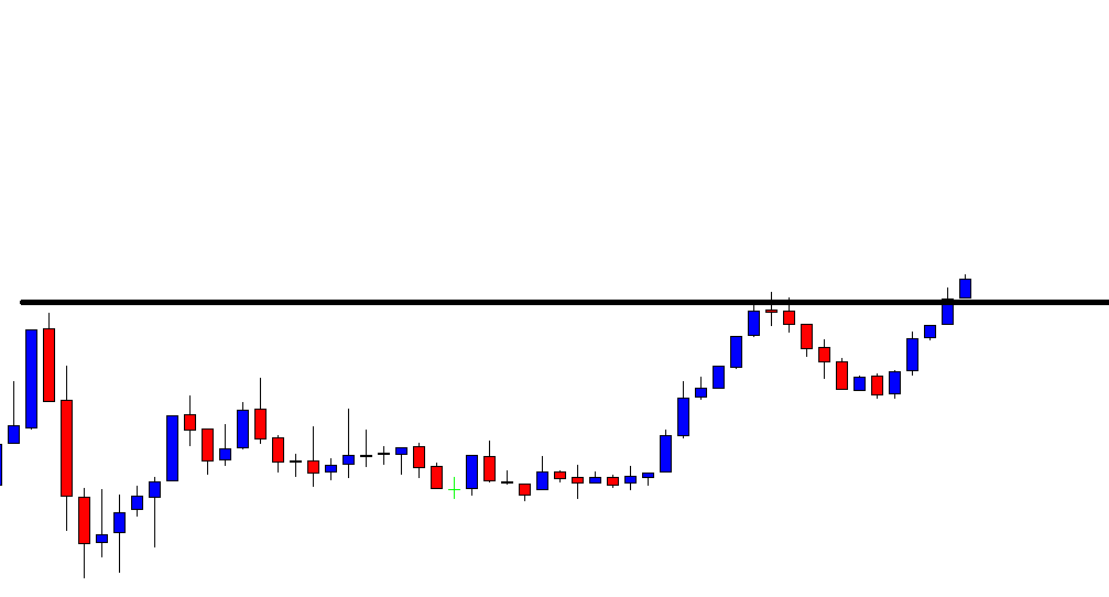
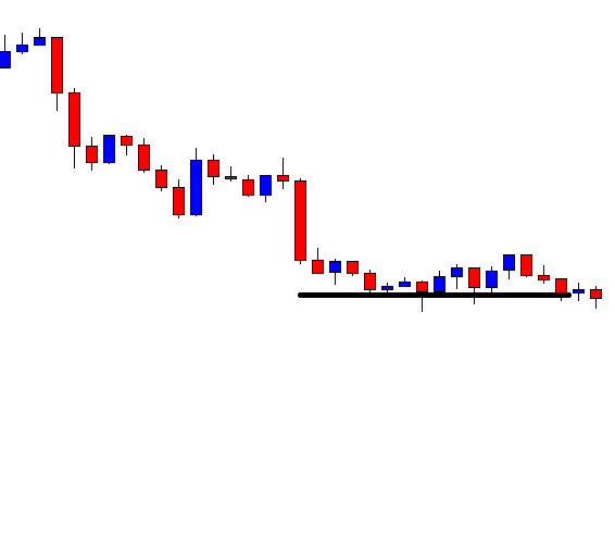
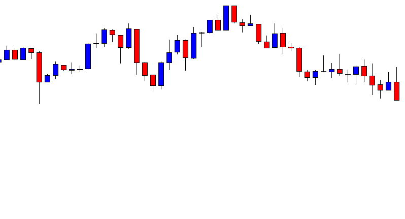
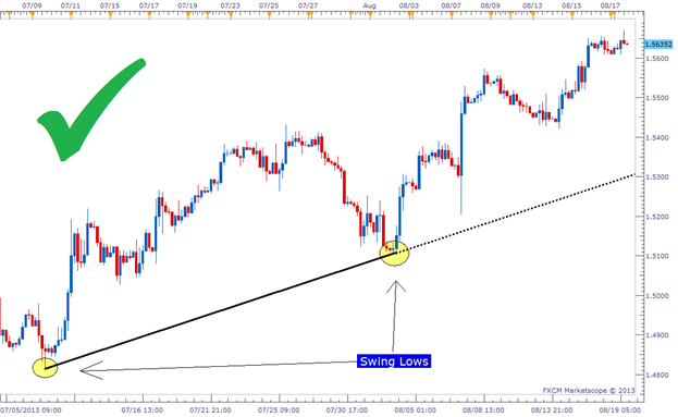
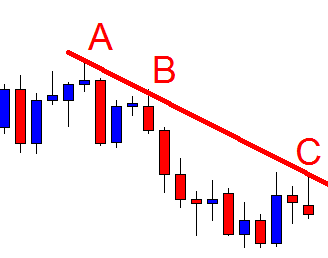
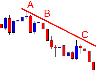
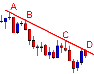
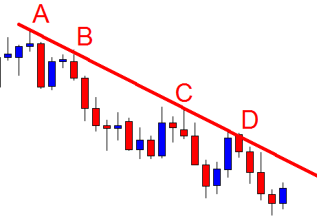
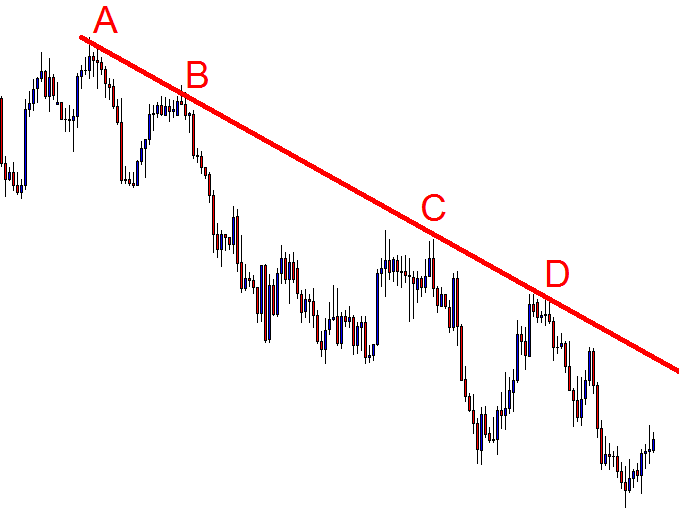
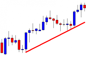
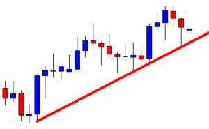
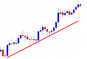
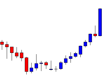
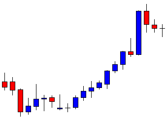
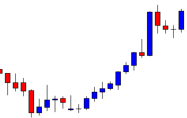
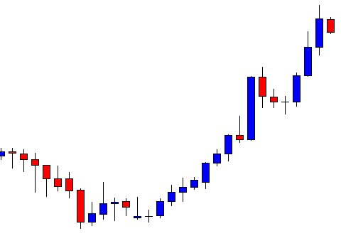
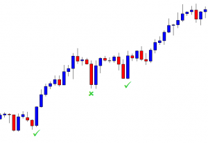
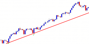
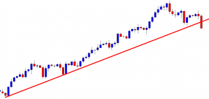
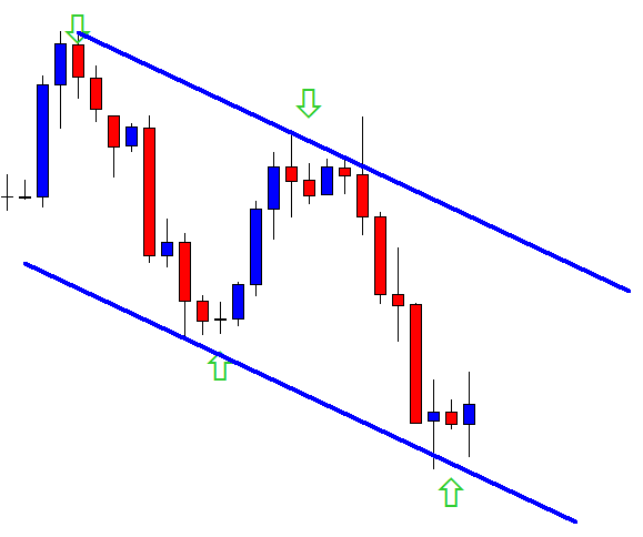
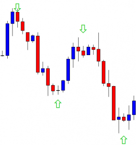
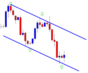
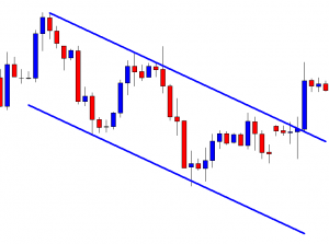
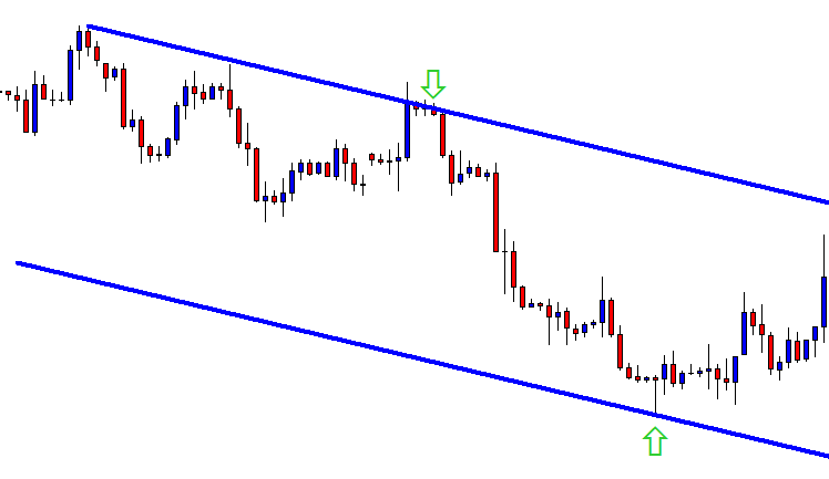
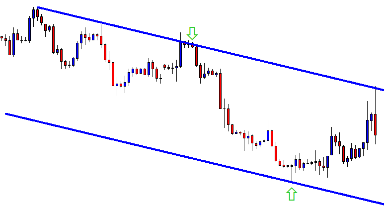
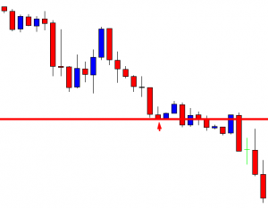
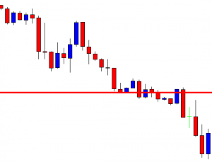
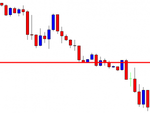
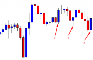
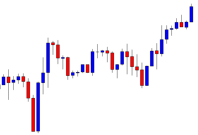
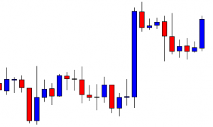
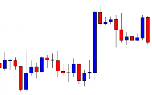
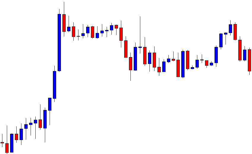
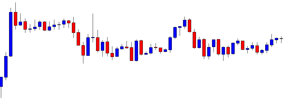
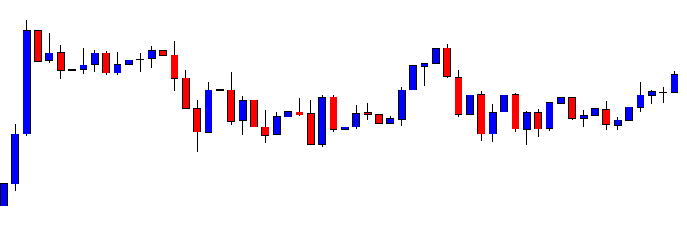
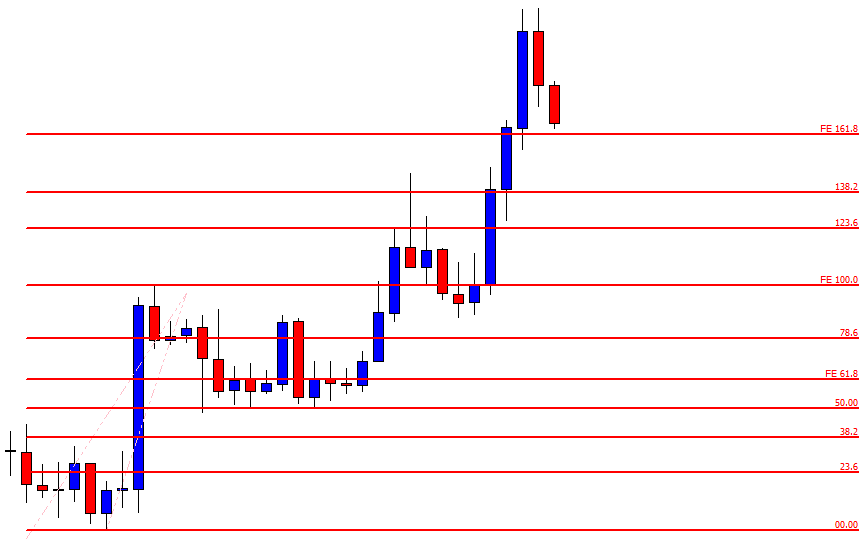
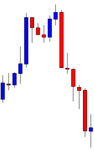
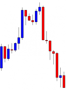
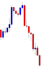
Despite the fact that some people claim to know everything about trend lines, if you ever try to find a specific standard for drawing them correctly, you will discover a great degree of inconsistency. If you take a look at the image below, you will see the extent of discrepancies between the rebound and break out points. Whereas support and resistance lines have very defined areas where people are trading, trend lines significantly differ from one trader to another. So, how can we draw them then? Do we focus on the highs and the lows or do we see them as noise and disregard them as a result? Are we to connect any two points or several ones? How many points make a single line then? Should we connect the bodies or concern ourselves with the opens and closes?
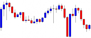
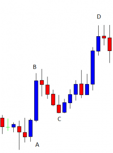
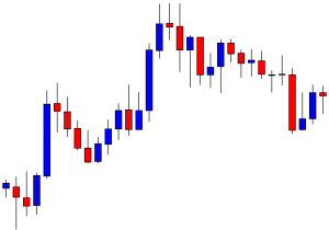
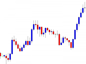
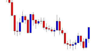
As you can see, every combination is a possibility, but we still wonder at what point a trend line stops serving us. When is it no longer legitimate and should we still keep it or erase it from the chart after the price has gone some other way? Because of the existence of countless possibilities, people can have different views on where entry and exit points are on a particular trend line. With zero consistency across charts, we can safely assume that trend lines are essentially whatever traders desire them to be.
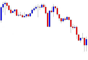
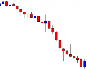
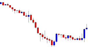
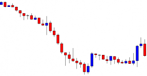
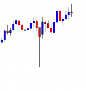
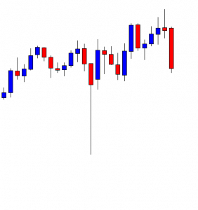
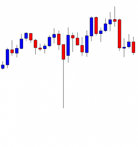
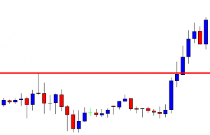
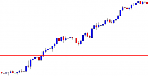
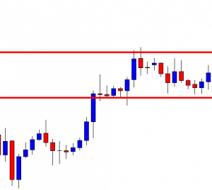
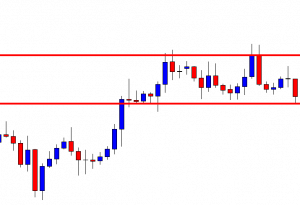
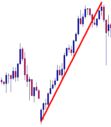
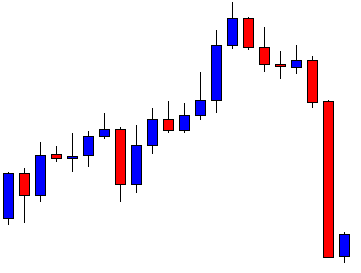
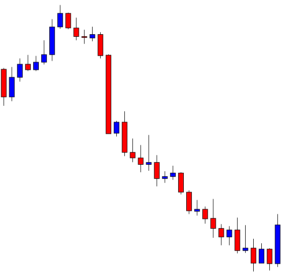
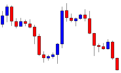
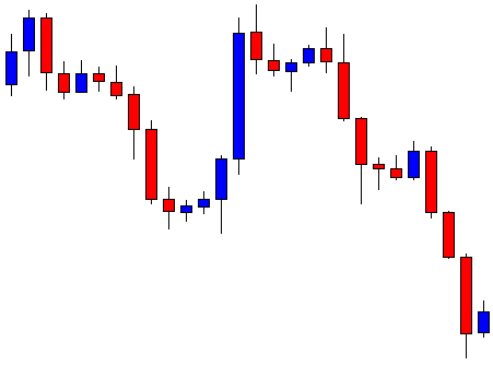
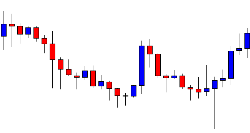
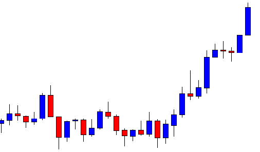
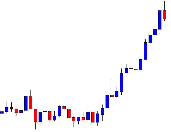
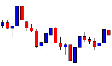
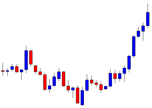
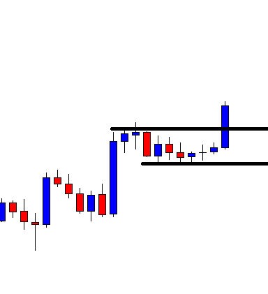
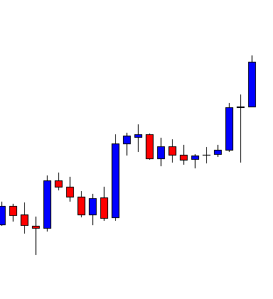
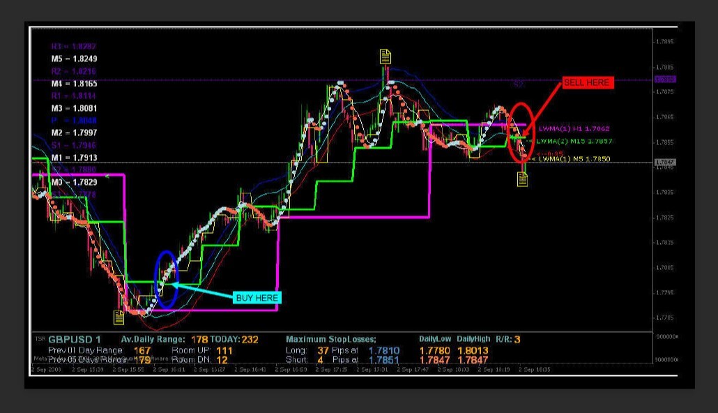
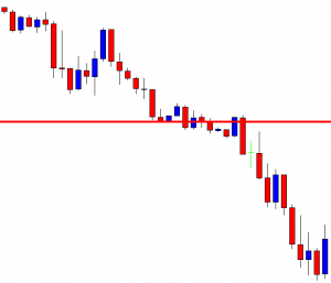
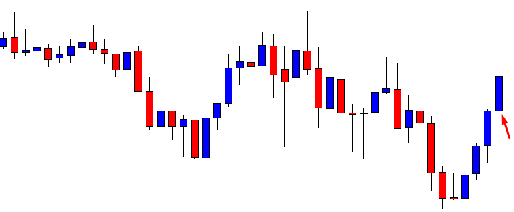
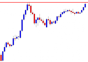
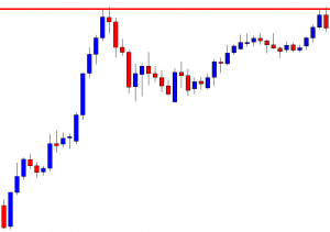
Examples of Different Approaches to Drawing Trend Lines
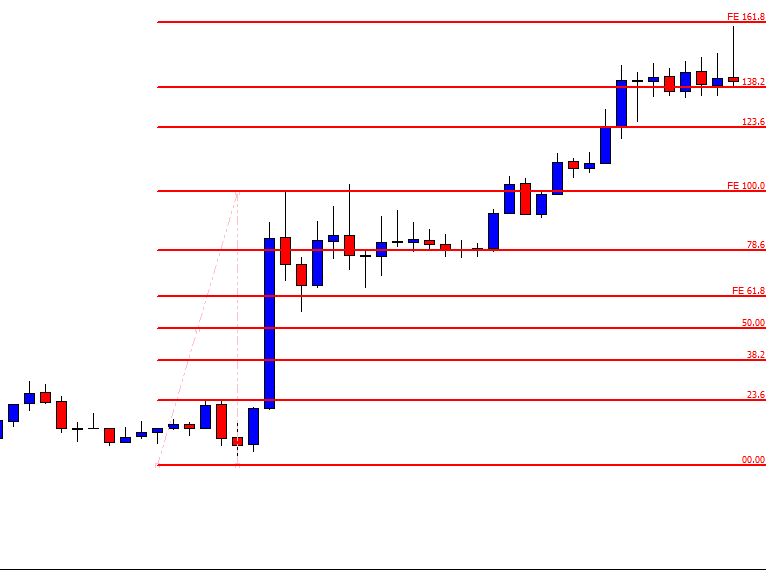
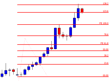
Since we cannot firmly state that any line can determine whether a price is going to move up or down, we should truly aim to follow the advice of the best traders out there and move on to tools that can actually grant us success. What many traders may think here is that they could use trend lines together with RSI, stochastics, or Fibonacci. However, instead of using two low-level tools, which are not only useless but dangerously overrated as well, you can give yourself the opportunity to search and test out thousands of other more modern tools created solely for the purpose of trading in the spot forex market. From its conception in 1996, this market has witnessed a turnover of approximately 10 thousand indicators and tools we can use in everyday trading as well as an incredibly high rate of failure at the same time.
Expert traders claim to have tested more than one thousand indicators only to find what serves them best, which is a clear indication of the fact that a popular tool is not always a good tool. Therefore, if you search hard and test vigorously, you can confidently expect to find some excellent tools that you will be able to use for good. Then, once you have discovered a few of such tools which prove to give great results, you may start to combine them, creating a stable system with an incomparably higher chance of predicting whether the price is going to go up or down. What we are seeing here still involves a portion of randomness, but we are also including the momentum which your set of tools will be able to recognize. It is precisely due to the mathematics within your toolbox that you will have the chance to trade on an above-average level. Your tools will predict if the momentum in the market is real and which way it is most likely to take the price, based on which you can stop making completely random predictions and starting earning a real profit.
Whichever tools you end up using, you should never lose focus over the importance of entering and exiting a trade on time, which trend lines fail to do over and over again. If you want to become a successful trader, do not fear the evident stigma of being different in the market. We have already seen in some other markets how news events and lack of independence play out, and the best way to avoid the staggeringly high failure rate is to build yourself as an independent trader. Use your analytical mind to assess whatever information you come across because writing and recording are always profitable, both to their creators and to the big banks eventually. Following trends is essential, but the fact that this tool has that word as part of its name has no relevance and certainly no power to provide you with the information you need. Whenever you encounter vagueness, start asking yourself whether it is testable, logical, and profitable.
With so many outdated tools, traders are not only entering trades when trends are already over, but they are entering trades that will get them right under the big banks’ radar. If you are still convinced that trend lines are your perfect companion, can you answer the question of whether you experienced a situation where a price did not align with your trend line? If the answer is yes, then you should know that the reason behind such a phenomenon is the fact that diagonal support or resistance simply does not exist, further supporting the claim that trend lines are not to be used in charts to predict the behavior of the price. Strive to construct an algorithm that will consistently and transparently send signals that will lead to successful trades, thus steadily building your trading account.


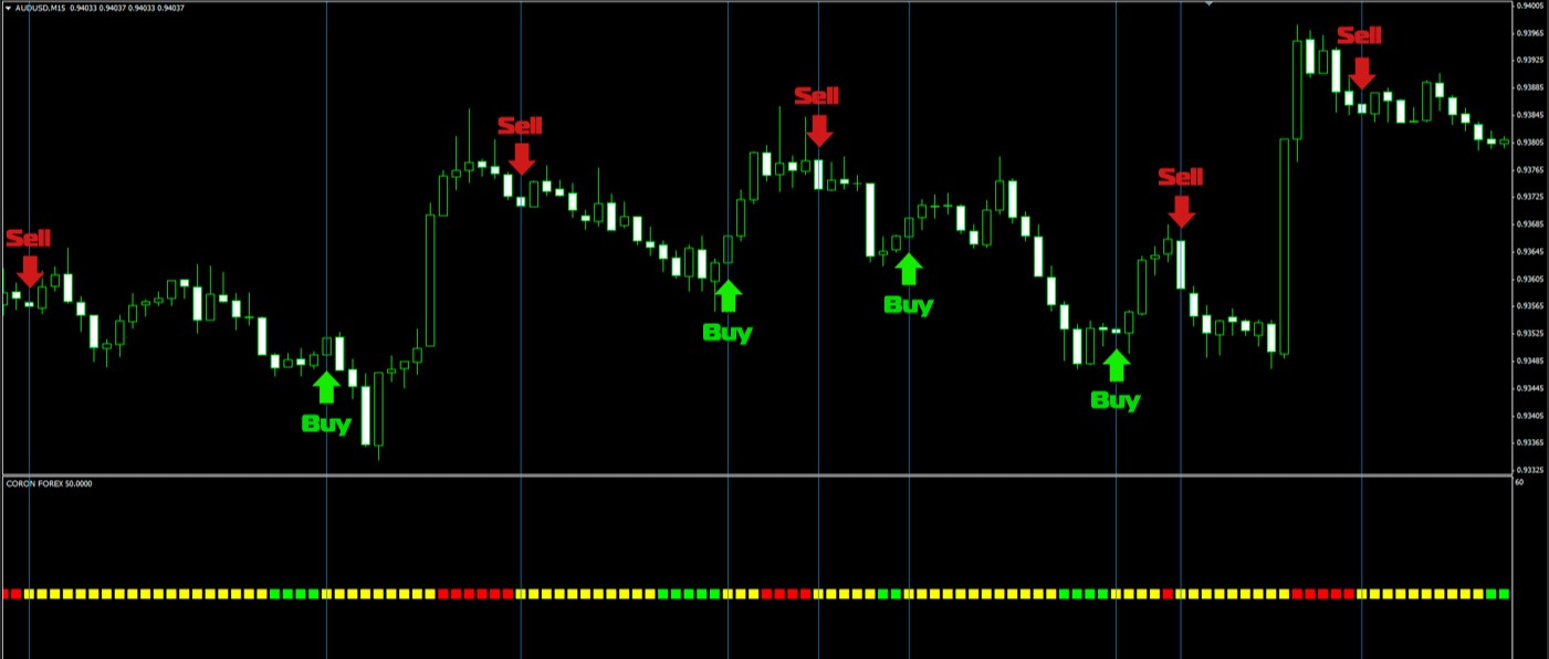
 In short, it needs to tell you whether there is enough volume to trade. Think of it as a stoplight. If it’s green (and all your other trade signals align), go ahead and enter the trade. If it’s red, however, that’s your cue to pull out of the trade. A good volume indicator will do both of these things. Another thing to keep an eye on is indicator lag. Some lag is inevitable – all indicators lag to a greater or lesser extent – but you don’t want your volume indicator to lag too much so watch out for that when searching for and testing volume indicators.


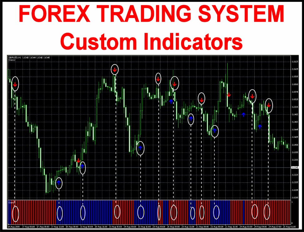
 There is no guesswork with indicators and you can customize settings. Adjust it in the way you like it and make it better than it already is. This cannot be done with Support and Resistance line, right? The best option is that you can combine indicators, and by this, make better results. Everything is going around choosing the right indicators and combining them together to make the system more accurate. One stand-alone indicator will not get anyone anywhere, what is recommendable to do, is to create algorithms – the system of rules to point out to the same signal at the time, which can be used and traded upon.