Categories
Forex Elliott Wave Forex Market Analysis

Silver Unveils an Incomplete Corrective Structure

Overview

Silver price advances in an incomplete corrective structure that remains in progress, after the precious metal topped at its highest level since March 2013. The market sentiment continues dominated by the bullish side. Nevertheless, the incomplete Elliott wave structure suggests that the precious metal could see a new low.

Market Sentiment Overview

The Silver price continues fading from the yearly highs that carried the price toward annual highs at $29.85 per ounce in early August. However, the precious metal eases over 19% from the yearly high, Silver advances 35.2% (YTD).

The following daily chart displays the Silver’s 52-week high and low range. The figure highlights the consolidation of Silver below $25.30 per ounce and the price action running below the 60-day weighted moving average. This market context suggests that the precious metal traders downgraded their market sentiment from extremely bullish to bullish.

On the other hand, according to the Commitment of Traders report, it is observed that the big participants’ speculative net positions remain on the bullish side. In this context, the descents developed by precious metal suggest that market participants are involved in a take-profit activity and do not represent a change in the current upward trend.

Therefore, in the long-term overview, the market sentiment remains bullish. Nevertheless, in the short-term, the declines observed represent a taking profit activity. Finally, as long as there is no confirmation of new signs of a new rally, our bias remains on the neutral side.

Elliott Wave Outlook

The next chart illustrates Silver in its log-scale 8-hour timeframe, which reveals the price action is developing the last move of a cycle, which began on March 18th when the precious metal found fresh buyers at $11.61 per ounce. The incorporation of new buyers drove the precious metal to a bullish impulsive structure development completed on August 06th when Silver reached $29.86 per ounce.

Once Silver prices found resistance at $29.86, it completed a five-wave sequence of Minute degree identified in black. Simultaneously, according to the price fractality principle, Silver finished the first wave of Minor degree labeled in green.

According to the Elliott Wave Theory, once completed the five-wave impulsive sequence, the price reacts in the opposite direction developing a three-wave movement. From the previous chart, Silver reveals that its corrective structure is incomplete.

In particular, the precious metal advances in its wave ((c)) of Minute degree identified in black. In turn, the internal structure of the wave ((c)) has pending the bearish movement of the wave (v) of the Minuette degree identified in blue. The last move will likely re-test the descending channel’s base, dropping between $21.35 and $19.44 per ounce.

Once Silver completes the bearish five-wave sequence of wave ((c)), traders may start looking for positioning alternatives on the bullish side. Finally, considering that wave 1 of Minor degree presents an extended wave’s characteristics, wave 3 of the same degree should not be the largest wave of the impulsive sequence of Minor degree.

In short, Silver’s market sentiment remains on the bullish side; however, the price moves in an incomplete corrective structure that could lead to new price lows. Once the short-term bearish sequence is completed, Silver could start producing entry signals on the bullish side, corresponding to the primary trend.

Categories
Forex Daily Topic Forex Price Action

Determinin Risk/Reward using Fibonacci Levels

In today’s lesson, we are going to demonstrate an example of a daily-H4 chart combination trading. We also find out how the price reacts to Fibonacci retracement levels and how Fibonacci levels may help us determine risk-reward. Let us start with the daily chart.

This is the daily chart. The chart shows that the price heads towards the North with good bearish momentum and crosses a long way. The last candle comes out as a spinning top with a bullish body. It is a bullish reversal candle, but not a strong one. Let us flip over to the H4 chart and see how it looks.

The chart shows that it produces a morning star. It is a strong bullish reversal pattern. The last candle comes out as a bullish inside bar. The buyers may wait for the price to find its support and produce a bullish reversal candle to go long on the chart.

The price heads towards the South to have a bearish correction. The last candle comes out as a Doji candle. It seems that the price may have found its support. It may not take long to produce a bullish reversal candle.

As expected, the chart produces a bullish engulfing candle closing well above the last swing low. Traders love to have a signal candle like this to trigger an entry. It usually attracts more traders to trade and brings more liquidity. However, here is an equation that we must remember. When the price makes a correction, it is good for the traders to have an engulfing candle as a signal candle closing within the last swing low. It offers the price to travel more space towards the trend. However, when the price consolidates, it must make a breakout at the last support/resistance, though. Let us find out how the price moves after that bullish engulfing candle.

The price heads towards the North with a sluggish pace. Moreover, the price gets caught within two horizontal levels for several candles. It seems that the price is struggling to go towards the North further. Let us draw Fibonacci levels and try to find out the reason behind it.

The chart produces the signal candle at the 61.8% level, which is fantastic. Usually, the price goes towards the level of 161.8% if it trends from the 61.8% level. Over here, the candle closes at 123.6% level, which means the price does not have enough space travel. This is why the price moves towards the North sluggishly. Fibonacci levels help us determine where to set stop loss and take profit. It also helps us determine the risk-reward, which we must not forget.

Categories
Forex Price Action

Do Not Be Biased, Take Decisions According to the Chart

In today’s lesson, we are going to demonstrate an example of a chart that makes a good bullish move but ends up having a rejection at a double top resistance. The price then shows the potential to make a bullish breakout. However, it has another rejection around the last week’s high and makes a bearish breakout. It looks good for the sellers at the time. We find out what happens afterward.

This is the H4 chart. The price makes a long bullish move. It ranges for a while and then continues its bullish journey again. Look at the last candle on the chart. It comes out as a bearish inside bar. Do not miss the point that the candle is produced right at the resistance, where the price has had a rejection.

The chart produces a bullish candle to start the next week. It then ranges for a while and produces two bullish candles. It seems that the price may head towards the North and makes a bullish breakout at the last weekly high.

It does not. It rather finds its resistance around the same level. Moreover, it produces a bearish engulfing candle. To be more precise, the chart produces an evening star. It is a strong bearish reversal candle. Let us wait and see what the price does next.

The chart produces a long bearish candle breaching the last swing low. The breakout is significant since the price trends from the last weekly low. The sellers may keep their eyes in the pair to go short. Before going short on this chart, the sellers shall wait for the price to make a bullish retracement since the price is within the last weekly range. Keep that in mind that the price is to make a bullish correction to offer a short entry.

The price does not make a bullish correction. It rather consolidates and produces a bearish reversal candle. Since the price is within the last weekly range, so it is not a short signal.

Here it goes. The price gets choppy. This chart becomes a risky chart to trade. Thus, traders might as well skip eyeing on the chart to trade at. At first, it looks good for the buyers. Then, it shows potential for the Bear to dominate since the price has several rejections at the same level. However, it ends up being an extremely choppy chart.  Thus, do not be biased with your initial assumption. Wait for the breakout, confirmation, and then trade.

Categories
Forex Technical Analysis

SQN in Forex Trading Systems

When you’ve made up your mind to participate in trading, you should focus on conducting a comprehensive and in-depth study of how your trading systems work. Yeah, I’m pretty heavy on this algorithmic trading and ratios But really, in the end, this is just evidence of whether what you’re going to apply works or whether you should throw it away and not make your money go away foolishly. In other words, you need to learn how to statistically and objectively evaluate the performance of your trading systems.

As you know, mathematical statistics provide you with a variety of tools that will allow you to correctly evaluate the results of a trading strategy or system. One of these tools is the SQN (System Quality Number) ratio.

The SQN ratio was created by Van K. Tharp, in 2008 in his book The Definitive Guide to Position Sizing, to evaluate or measure the performance of a trading strategy or system. Then some variations in use have emerged such as the market regime indicator, obtaining optimal parameters that simultaneously maximize the average size of the operation, and the standard deviation of results in a sample space of N operations.

The SQN ratio measures the ratio between the average (expectation) and the standard deviation of the profit distribution generated by a trading system. Van Tharp recommends that the number of N trading system trades be at least 100, the more exchanges the better.

The mathematical formula for calculating the SQN is quite simple and is described below:

SQN= (EM/DT)* N

Where,

N: Number of system operations.

EM: Mathematical hope of the system in terms of R (Expectation or Average Benefit).

DT: Standard or standard deviation of multiples of R.

The first thing we must have clarified is the concept of R. R is the difference between your entry price and the initial stop loss, that is, the initial risk. Then all gains and losses are expressed as multiples of R.

The expectation of the trading system can also be defined as the average of the trading system’s R multiples (negative and positive).

How to calculate the expectation, the expected profit, and the SQN ratio according to the value of R.

Suppose our trading system has given us these results:

N° Operations / Buy $ / Stop $ / Value R / Sale $ / Result /Operation $ / Multiples R

  • 1 40 30 10 70 30 1,5
  • 2 50 40 10 75 25 1,25
  • 3 55 45 10 45 -10 -0,5
  • 4 160 150 10 145 -15 -0,75
  • 5 125 115 10 140 15 0,75
  • 6 85 75 10 105 20 1
  • 7 165 155 10 155 -10 -0,5
  • 8 125 115 10 135 10 0,5
  • 9 115 105 10 137,5 22,5 1,125
  • 10 75 65 10 65 -10 -0,5

Based on our results we can obtain the following data:

  • % of winning trades: 60%
  • % of losing trades: 40%
  • Winning Trades Sum: 245
  • Sum of losing trades: 90
  • Average R: 0.775
  • Standard deviation of R: 1.73

In the Van Tharp model the hope (E) of the system is defined as the average of the n multiples of R, therefore, in our example:

System hope: 0.775

The hope of the trading system allows us to calculate the profit we can expect from our system in X number of trades, using the formula:

Expected profit = Hope * Number of transactions * value of R

Knowing the standard deviation of R, we can finally calculate the SQN ratio.

SQN=(0.775/1.73)* 10=1.42

Now we take the same example above, but instead of 10 operations, we will assume that the results were obtained based on 100 operations. The SQN ratio would be as follows:

SQN=(0.775/1.73)* 100=4.49

Once you know how to calculate the SQN ratio, we have one task that is no less important: how to interpret the values obtained? Are they good or bad?

In order to assess whether our trading system is profitable or not, Van Tharp proposes the following scale:

  • 1.6 – 1.9 Good. Below average, but you can trade
  • 2.0 – 2.4 On average
  • 2.5 – 2.9 Okay, OK.
  • 3.0 – 5.0 Excellent.
  • 5.1 – 6.9 Brutal.

Summarizing the table above, a system is considered good when the SQN ratio is greater than 2 and excellent if it is greater than 3.

It is important to take into account when calculating the SQN ratio that when the trading system does not have a fixed loss stop, the value of R can be estimated as the average loss of the trading sequence, provided that this average is sufficiently representative. From there we can see the distribution of multiples of R (standard deviation) and also calculate the expectation as the average of multiples of R.

SQN ratio a parameter optimizer.

Once we know how to calculate the SQN ratio and determine whether our trading system is good or not based on this ratio, the following question arises: Can I increase the value of the SQN ratio? How to do it the best way?

If we analyze the formula to calculate the SQN ratio, we can quickly realize that there are 3 parameters that we can adjust to increase this ratio:

3.1. Improve the average benefit.

To perform one of the most common ways to increase the average profit is to filter operations for fewer operations, but higher quality. Less trading also means less commission.

3.2. Reduce the dispersion of results around the mean.

This can be achieved by reducing loss stops and taking winnings. In this way, we get the results concentrated as close as possible to the average.

3.3. Increase the number of operations.

By making N as big as possible, we can also improve the robustness of our trading system and the statistical data we get from our system becomes more reliable. In addition, the profit curve becomes smoother and more continuous. Increasing the number of operations also allows us to have a broader picture of the behavior of our strategy in different time frames. It’s basically what I usually comment on in videos about having greater statistical relevance. The SQN ratio, therefore, favours systems with a longer operating history.

Conclusion

This measure developed by Van Tharp allows us to objectively evaluate the performance of our trading systems. With the SQN ratio, you can also optimize the parameters of your system to make it more robust. Although I am not a fan of optimization as you already know, especially when we look for robustness. But this is another topic. In my case, I use it only in evaluating my systems and it is not among my favorites, but I find it very useful.

Categories
Forex Price Action

Some Moves do not Belong to the Chart that You Follow

In today’s lesson, we will demonstrate an example of a chart that makes a breakout at the last weekly low. The price then goes back within the last weekly range and makes an interesting move. We will find out what that interesting move is all about in a minute. Let us get started.

It is the H4 chart. The chart shows that the price makes a bearish move. It finds its support and trades around it for a while. The last candle of the week comes out as a Doji candle. The sellers may keep their eyes on the chart to get a bearish breakout and find short opportunities.

The first candle of the week comes out as a bearish candle. The price heads towards the level of support, and it produces a hammer. The price may roam around the level of support before making its next move. Let us proceed to find out what happens next.

The chart produces two bearish candles. One of the candles closes well below the level of support. The sellers may keep the chart on their watch list closely. They may wait for the price to consolidate and produce a bearish reversal candle to go short in the pair.

The chart produces four candles with a bullish body. The last candle comes out as a commanding bullish candle closing above the breakout level. If the chart still produces a bearish engulfing candle closing below the last swing low, the sellers may still go short in the pair. However, it does not look that good for the sellers.

As expected, the price heads towards the North further. One of the candles closes above the weekly opening as well. It means the H4 sellers may skip eyeing on the chart to go short. The chart does not belong to the H4 sellers anymore. The buyers may go long on the pair upon bearish retracement followed by a bullish reversal candle at the key level of support though. That is another ball game. Let us find out what the price does afterward.

What a strong bearish move that is! The price does not produce a bullish reversal candle. It makes a strong bearish move and makes a new swing low instead. However, the H4 sellers upon weekly high/low breakout may not be able to catch the move. The move belongs to other chart traders. Most probably, the sellers on the daily chart can catch such a move.

We often find such a move that may not offer entry on the chart that we follow. Do not get disappointed. Stick to your chart and trading strategies. Something must be round the corner for you.

Categories
Forex Daily Topic Forex Price Action

Trading Within Last Weekly Range

In today’s lesson, we will demonstrate an example of a chart where the price is having a retracement within the last weekly range. The price produces a double bottom and makes a breakout at the neckline. It then consolidates but does not head towards the North as it normally does when it makes a breakout at weekly high/low. Let us proceed and find out the possible reason behind it.

The price makes a long bearish move and finds its support. Upon producing a bullish engulfing candle, it heads towards the North and comes back again. At the support zone, it produces a bullish inside bar. Let us see what happens next.

The price heads towards the North next week. It means it is trading within the last week’s range. The price is at the last swing high. If it makes a bullish breakout, the buyers may want to go long at its weakness.

The chart produces two bearish candles followed by a bullish engulfing candle closing within the last swing high. It seems that the price may consolidate more to find its way.

The price upon producing a spinning top followed by a bullish engulfing candle makes a bullish breakout at the last swing high. It is a neckline breakout of a double bottom. The buyers may keep their eyes on the chart to go long on its weakness.

The price produces a bearish inside bar followed by a spinning top with a bullish body. Then, it produces a bullish candle closing above consolidation resistance. Since it is a breakout at the resistance, it is supposed to be a buy signal. The question is whether the buyers should trigger a long entry or not. Let us see the next chart.

The price gets choppy, struggling to make a breakout towards the North. The buyers would not love to see such price action after triggering the entry. If the price makes a breakout at the last week high/low, traders wait for the price to consolidate and produce a bullish/bearish reversal candle to take entry upon a breakout. On the other hand, if the price trades within last week’s range, the price usually makes retracement (instead of consolidation) to offer entry. The Fibonacci level, such as the 38.2% and 61.8%, play a significant role in producing the reversal candle. In today’s chart, the price is in the weekly range. Thus, traders are to wait for the price to make a retracement to offer them entry. It rather consolidates, which ends up making the price choppy.

Categories
Forex Daily Topic Forex Price Action

Weekly High/Low Breakout Trading: The Chart You May Want to Avoid

In today’s lesson, we are going to demonstrate an example of a breakout at a weekly high. The price consolidates afterward but fails to make a breakout at consolidation resistance. Thus, the price does not head towards the North. Let us find out how that happens and what lesson it holds for us.

It is an H4 chart. The chart shows that the price makes a strong bearish move to start its trading week. Then, it gets choppy for the rest of the week. The chart closes its week, producing a bullish engulfing candle. Let us proceed to see how the next week goes.

The chart produces a bullish candle to start its trading week. However, it produces three consecutive bullish candles and makes a breakout at the last weekly high. The buyers are to wait for the price to consolidate and produce a bullish reversal candle closing above consolidation resistance to go long in the pair.

The chart produces two bearish candles closing within the breakout level. A bullish reversal candle closing above consolidation resistance is the signal for the buyers to trigger entry. They must keep their eyes on this chart.

The chart produces a bullish inside bar. It is a bullish reversal candle but not a very strong one. Since it closes within consolidation resistance, the buyers are to wait longer for the chart to produce a bullish candle closing above consolidation resistance.

The chart produces two more bullish candles. However, it has not made a breakout yet. It has been taking too long to produce the signal candle. Let us wait and see what it produces afterwards.

It produces a bearish inside bar at the consolidation resistance. It does not look good for the buyers. The price has a rejection at the level, and it produces a bearish inside bar. It means it is a double top resistance. A breakout at the last swing low may change the equation and attract the sellers instead. Let us proceed and see what happens next.

The price does not make a breakout at the last swing low, either. It produces a doji candle followed by a bullish engulfing candle at the last swing low. It means the chart keeps traders waiting for the next breakout. The bull holds the edge but weekly high/low breakout traders do not love to see such price action after a breakout. It is best to avoid taking entry on a chart like this.


Categories
Forex Signals Forex Technical Analysis

AUD/JPY Pair Failed to Gains Positive Traction – Brace for Selling!  

Today in the Asian trading session, the AUD/JPY currency pair failed to keep its early-day bullish momentum and dropped well below the 76.00 level despite the upbeat market sentiment. However, the reason for the prevalent bearish sentiment around the currency pair could be associated with the RBA’s announcement of no rate change, as well as, the RBA has a dovish view on the Australian economy, which could be considered as one of the key factors that undermine the Australian dollar and contributed to the currency pair losses. Across the pond, the currency pair declines were further bolstered after the US Secretary of State Mike Pompeo said Japan’s Prime Minister (PM) Yoshihide Suga would strengthen the relationship with the US. Thus, the Japanese yen got impressed by the above comments, which adds further downside pressure around the AUD/JPY currency pair. 

On the contrary, the upbeat market mood, backed by optimism over US President Trump’s health, could be considered one of the key factors that help the currency pair limit its deeper losses. The AUD/USD currency pair is currently trading at 75.64 and consolidating in the range between 75.60 – 76.16. As we already mentioned, the global risk sentiment got a strong boost after US President Trump leaves the hospital and feels “20-years younger”. Despite this, the doubts over Donald Trump’s remain high as a recent video from the American leader showed that he struggles while breathing. Besides, the doubts were further fueled after the White House’s recent confirmation that Trump will be under 24-hour care, and anybody nearing the President will need to wear the PPE kit. 

At the US-China front, the renewed US-China tussle also keeps challenging the market risk-on mood, adding further pessimism around the currency pair. As per the latest report, the Dragon Nation recently fueled the Sino-American tussle by criticizing the US ban on TikTok and WeChat at the World Trade Organization (WTO). 

At the AUD front, the Reserve Bank of Australia (RBA) held its cash rate, and the targeted yield on 3-year bonds unchanged at 0.25% during the latest announcement. In the meantime, the RBA has a dovish view of the Australian economy, which ten underpins the Australian dollar and contributes to the currency pair losses. It should be noted that the RBA confirmed that Unemployment and underemployment are expected to remain high for an extended period. They further added, “Wage and inflation pressures remain very depressed.”

Across the ocean, the currency pair losses got an additional boost after the US Secretary of State Mike Pompeo said Japan’s Prime Minister (PM) Yoshihide Suga is a ‘powerful force for good’, as well as Pompeo further added that he believes Suga will strengthen the relationship with the US. These positive comments tend to underpin the Japanese yen currency and drag the currency pair lower.


Daily Support and Resistance

S1 73.89

S2 74.62

S3 75.05

Pivot Point 75.36

R1 75.78

R2 76.09

R3 76.82

Looking forward, the market traders keeping their eyes on the crude oil supply data from the American Petroleum Institute (API) due later in the day. In the meantime, the updates surrounding the fresh Sino-US tussle, as well as the coronavirus (COVID-19), could not lose their importance.

Entry Price – Sell 75.862

Stop Loss – 76.262

Take Profit – 75.462

Risk to Reward – 1:1

Profit & Loss Per Standard Lot = -$400/ +$400

Profit & Loss Per Micro Lot = -$40/ +$40

Fellas, now you can check out forex trading signals via Forex Academy mobile app. Follow the links below.

iPhone Users: https://apps.apple.com/es/app/fasignals/id1521281368

Andriod Users: https://play.google.com/store/apps/details?id=academy.forex.thesignal&hl=en_US

Categories
Forex Technical Analysis

How to Trade with the “Evening Star” Pattern

I always describe markets as a battlefield… And the evening star candle pattern (also called evening star or evening star) is absolutely related to a battle.

On the battlefield, preparation is key. The story begins in feudal Japan about 450 years ago. One of Japan’s three great generals, Oda Nobunaga, is attempting to wrest control of the fertile rice lands from his enemy. A strong local defensive position and 3 rivers stand in your way. If Nobunaga wants to win, his army must cross the rivers. Once they do, the battle will be on their side. But if your army can’t cross the rivers, it’ll be a bad sign. The army finally manages to cross the 3 rivers and wins the battle. He gets control of new land and more rice, Japan’s strong currency at the time. His legend grows. Well, let us move on to this day…

The Battlefield of the Stock Market

The scene: A stock trader looking at his screens, looking for the perfect time to close a long position. Will the stock price continue to rise? Or will there be a bearish turn? If the bulls finally win the battle, the trader has the option to hold the position for more winnings, like Nobunaga winning the battle in ancient Japan. But if the bass players win, then it’s time to close the position and leave. A sign appears on the chart opposite the trader: the evening star candle pattern of three rivers. The trader knows that the chances of overcoming resistance are slim. Goal met. It’s time to step out of position. The merchant places a sales order. Moments pass. The order is executed and the merchant leans back, grateful for having studied the patterns. Does it seem too dramatic?

In my opinion, learning patterns are a key basis for learning to operate. The names of Japanese candle patterns hint at emotional confusion and refer many times to legends. It makes them more attractive to learn. But they go beyond names and stories. As a trader, learning these patterns will teach you about the psychology of the market. The battle between bulls and bears is psychological. Arm yourself well and you can be victorious. But not understanding the patterns could mean the end of your career as a trader or investor.

What is the Evening Star Candle Pattern?

An evening star candle is a turning pattern. This means that the momentum of a recent trend is slowing down. The evening star candle pattern is a bearish reversal. The upward momentum, controlled by the bullies, begins to lose strength. The star is a period of equilibrium between bullish and bearish with little price movement. Then the momentum changes and the bearings take over.

The first candle has a long body and is bullish: the price closes at a higher price than opened. In this case, in the pattern of stars of the night, there will be a gap until the second candle. This is the star.

The star signals a slowdown in momentum. It has a short body (called spinning top) or none (called Doji). It can be green or red. The most important thing we have to understand is that there is a balance between buyers and sellers.

The third sail is bearish: the opening price is higher than the closing price. The ideal evening star opens from the star to the third candle. The third candle ends abruptly in the body of the first candle.

Note: In the case of the evening star pattern, you should pay more attention to the candle body than to the shade. Shadows are the lines that extend above and below the body of the candle. They represent the trading range of that period. The candle body means the prices between opening and closing. A higher closed green candle that was opened. A red candle closed below the level it opened.

Knowing the Morning Star Pattern

The so-called morning star pattern is precisely the opposite of the evening star candle pattern. We’re talking about a reversal pattern that indicates the shift from a bearish to a bullish trend. As we have seen with the pattern of the evening star, we must detail the existence of three candles with the central sail with a long shadow down that has been bought by the bullies. The third candle is the confirmation candle of the upward turning pattern. Do you want to see the morning star pattern along with a higher volume? It is also a more convincing pattern if it occurs around a support level.

How does the Evening Star Pattern Work?

As I said earlier, the evening star candle pattern is an indication of a trend change. The evening star pattern acts as a visual guide to what happens in investor sentiment. The evening star candle day is the day of indecision between the bulls and the bears. If the third day is a low gap, it may be a good indication to sell a long position. Or you might want to cut short to take advantage of the downward movement.

Benefits of the Evening Star Candle Pattern

All star patterns (yes, there are others, including the morning star pattern) are spin patterns. All represent a deadlock between sellers and buyers. The benefit for you as a trader is that they are predictable. A warning before we look at an example from real life: this is not an exact science. It’s based on experience and study, but that doesn’t mean it always happens. You need to study!

One more caveat: When you look at graphs over different periods of time, you may not see the same pattern.

I used a 1-minute candle in the chart example below. When I looked at the 2-minute candle for the same chart, the pattern was different. It was a bearish wraparound pattern, another spin pattern. It confirmed what I was seeing on the 1-minute candle chart.
What we need to learn from using different periods of candles: perspective can make a big difference in action charts.

Example of Evening Star Pattern

The classic evening star candle pattern has a space between the first and second candle bodies. An ideal night star would also open between the second and third sail bodies. Steve Nison, the creator of the book “Japanese Candlestick Charting Techniques”, clarifies this point in his book. Nison brought Japanese candle graphics to the West. The book is a classic and it is well worth spending time with it if you want to better understand candle graphics.

Three White Soldiers and Black Crows

Three white or green soldiers is a bullish sail pattern. It is used as an indication of a reversal after a bearish trend on a chart. The figure of the three soldiers is a long-bodied candle attainment green or white. They open inside the body of the previous candle and close above the closure of the previous candles. There are usually no long shadows on the sails. The opposite of this pattern of candles is the three black crows. They indicate a reversal of an upward trend.

Three “Inside Up and Down”

Three “Inside Up and Down” is another turn pattern. We might be seeing the reversal of an uptrend or bearish trend. This pattern requires three candles to appear in a specific sequence. In an upward trend turning downwards will be a long green or white candle, then there will be a short red or black candle that closes and opens within the same body of the first candle. The third candle shall be a black or red candle that closes below the closure of the previous candle. In a bearish trend chart that is reversed upwards, the sails will be the opposite.

Importance of Action Indicators

Many traders use technical indicators along with patterns. Combined they can provide powerful information to set up your trading plan. One of the most popular indicators together with the evening or evening star candle is the relative force index (RSI). The RSI indicator measures the momentum to determine if a stock is overbought or oversold. Overbought or oversold conditions, measured by the RSI, indicate a likely turn. There are two reasons to use the RSI with the evening star pattern. Initially to see the daily levels of the RSI indicator in an overbought condition. Then, once you change the timeframe (step #4 below), use RSI to confirm the reversal.

The Evening Star Candle Pattern in 7 Steps

Let’s put this in perspective. If you spend time looking for evening star candle patterns to operate, you might be waiting until it runs. It’s a pattern that doesn’t always sweat. It is very positive to be able to recognize it and even have a plan prepared for those occasions when you see it.

#1 Set the correct chart timeframe: Setting the right timeframe depends largely on your trading strategy. You can (and should) change the deadlines I give you to adapt them to your strategy. You should practice paper trading to prove your thesis. For the sake of understanding the technical analysis of evening stars, imagine you are looking at a longer-term graph. Let’s think we’re talking about a one-year chart with a day candles. You are starting with the longer-term chart to get a general idea of the price action.

#2 Know the opening, maximum, minimum, and closing prices: If you look at a chart with day candles, you’re essentially doing this. You are looking at the daily opening and closing prices (the body of the candle) and the maximum and minimum prices (the shadows or wicks).

#3 Wait until the daily RSI exceeds 70: Many operators consider that a crossing of the RSI above 70 is a clear sign of over-purchase. It is a common strategy used by currency traders.

#4 Reduce the time frame: Once the overbought condition has been identified, with the RSI indicator having a value greater than 70, long-term chart, it’s time to zoom in. A common timeframe for this is the five-minute candle chart. Many traders like it because it is neither too fast nor too slow.

I want to reiterate the difference in graphics when I look at different time frames. While degrading the time frame to the five-minute graph is one way to play this, it’s not an exact science. Remember, RSI is calculated using a certain number of periods; 14 is the most common.

#5 Short sale: Short selling is the option to borrow to sell assets. You can borrow at a very high price and wait for the price to go down. Assuming the price drops, you buy shares at a lower price to return the shares to the broker. This is how some traders approach a market with a bearish trend or a stock with a bearish trend.

Warning: I do not recommend opening shorts for novice traders. It is a risky and difficult strategy. He could get caught in a short lock. That said, let’s look at how the evening star pattern can indicate a bearish reversal and a potential short play. Watch the stock price action you want to sell short. Depending on the time period you are using, watch for actions to rise and the star to appear. But don’t come in when you see the star.

Wait.

Why?

Because first, he wants to confirm the turn. Again, opening shorts is a very risky strategy. You need access to shares for short. All brokers do not have to have the shares to borrow them. You should make sure you have the knowledge action you are performing. Have a plan. Therefore, you should make sure you can find actions short. Then wait until the third candle confirms the pattern. Then the question is to sell and wait for the price to go down.

What can we do if the price reversal does not work as we expect? Follow my rule number one and cut the losses quickly. When you cut short, you lose money if the stock price goes up above the entry price. That’s because he pays more for the actions needed to close his position.

#6 Put a Stop Loss: A stop loss is your preset exit price if the operation goes wrong. You can set electronically established loss limits, but I’m not a big fan of doing this. I put a mental stop. If the price moves too fast, you can go long to your stop loss. This is called sliding. If you use a mental stop-loss, you can customize it. You can find the best price available to buy stocks and close your position. If you are in a short position, the stop-loss must be higher than the entry price. Assuming that everything is correct, at what point do you close the position? Many traders claim that it is convenient to wait until the RSI indicator drops to a level below 30. I would prefer you to have a clear negotiation plan and stick to it. That may or may not involve further use of RSI.

Now is the time to…

#7 (hopefully) Take advantage of your winnings! If your operation went well, enjoy the reward. Set your target before trading. I often aim at 10%, 20%, or 30%. Those trades add up. Remember, my results are unusual. Trading is risky. Keep in mind that you may lose money. Do your own research and never risk more than you can afford to lose.

Conclusion

The evening star pattern indicates a shift from bullish to bearish. Traders who detect this pattern can use it to determine when it is time to exit long positions or enter short trades.

Categories
Forex Technical Analysis

Filtering False Signals, TD REI, and TD POQ

TD REI indicator analysis and false signal filter TD POQ. Description, building principles, application conditions, and trading signals. Today’s learning block will focus on the study of the TD REI and TD POQ indicators, which are part of the TD Oscillators indicator group.

What is usually the main problem with oscillators?

The big problem that DeMark warns about using oscillators is that traditional traders tend to exaggerate the value of the indicator divergence with the price position. As a general rule, people who do not understand how an indicator works and based on which alternate principle, do not care what the composition and recommended interpretation of this indicator is. They try to interpret their vague signals that are not mainly signals and should also be confirmed by other indicators. An example very clear example of this is the famous indicator, RSI.

According to DeMark, the main problem when the interpretation of the signals is that traders do not usually realize the time that the indicator remains in the stages of oversold and overbought. DeMark points out that if the indicator is in the overbought or oversold zone for more than 6 candles, this indicates the strength of the trend, which means that this signal is false.

The number of sails can be different for other oscillators. Everything depends on the parameters of the indicator and the peculiarities of its composition. Therefore, in each particular case for each time period, one must perform a proper analysis of the number of bars in the oversold or overbought áreas.
To make the analysis of all parameters lighter, DeMark developed its own series of oscillators described below.

Introduction to the TD REI Indicator

The first DeMark indicator we will know is TD REI or Range Expansion Index (Range Expansion Index). This indicator is designed to filter false signals when the price is quoted in a strong trend, must confirm a signal only if the confidence of the market really changes. The TD REI gives us the total number of bars and, if the price is in the oversold – overbought by more than 6 bars, the indicator will show this and then indicate an important trend.

However, this indicator is more sensitive to price changes and, when the RSI is in the overbought area or remains in a neutral area, TD REI has already entered the oversold area some times, so a purchase signal is sent (in the chart above, all purchase signs on the indicator are marked with circles and with green flags on the price chart). It is logical that this indicator is much more complicated than it seems. Obviously, we can think it’s very peculiar, as I will describe later.

First, I would like to describe your mathematical model, so that you can understand the signals of the indicator…

TD REI Indicator Mathematical Model

The value of TD REI is calculated by adding the respective differences between the maximum of the current day and the maximum two days before and the minimum of the current day and the minimum two days before.

To simplify matters, the formula for the calculation would be as follows:

  • X = (L – L2) + (H – H2), where
  • H – current bar maximum
  • H2 – maximum price two days before
  • L – current bar minimum
  • L2 – at least two bars

In addition, two conditions must be met:

Condition #1

the maximum of the current bar price must be greater than or equal to the minimum of five or six bars ago, or the maximum of two previous bars must be greater than or equal to the closing of seven or eight back bars.

Condition #2

the minimum of the current bar price must be less than or equal to the maximum of five or six bars behind, or the maximum of two previous bars must be greater than or equal to the closing of seven or eight back bars.

If no conditions are met, a zero value is assigned to the bar on that day.

If both conditions are met, we will have as a result a different formula:

TD REI = 100 x (Y / (H5 – L5 ))

Where:

Y = (Sum X1 … X5)
H5 – maximum on last 5 candles,
L5 – maximum on last 5 candles,
In other words, TD REI shows the price movement, adjusted to a quotation range during the last five candles.

TD REI Signal Filter

Like most indicators, TD REI is not a Grail and also sends false signals. To filter these false signals, Thomas DeMark suggests using the TD POQ (Price Oscillator Qualifier) price oscillator. To be fair, keep in mind that this indicator can be used together with an oscillator, depending on the action of the price (e.g., MACD, RSI).

TD POQ Conditions for TD REI

Sign of purchase:

-TD REI has been in oversold condition (below -40) for six or more sails.

-The last full sail should be closed below the previous bar.

-The current open sail must be equal to or less than the maximum of the previous two sails.

The market must always trade above the price that has been opened up and breaking the highest level in the last two bars.

Signal of sale:

-TD POQ has been in overbought condition (above +40) for six or more candles.

-The last full sail should be closed above the previous bar.

-The current open sail must be equal to or greater than the lows of the previous two sails.

-The market should be trading below the open price and breaking the lowest level in the last two bars.

To explain how TD POQ can be used to filter tickets, we will analyze the buying and selling signals.

Sign of purchase:

-That price has been in the oversold area for more than 6 sails.

-The last full sail was closed below the previous bar closure.

Now we see that the current candle opens lower than the maximum of the previous two candles (the current opening price of the candle is the same as the previous candle close)
When the price crosses the zone of the maxima of the last two candles, there is a buy sign.

I must point out that the TD REI is a good complementary tool for other Thomas DeMark indicators.

Selling signal:

Now, let’s analyze the sales signal. As I said earlier, the indicator had been in the overbought area for more than 6 candles before the signal appeared. You can check the box.

The last candle was closed as a doji, the closing price is almost equal to the closing level of the previous candle. The market broke the minimum of the previous two sails and is trading downwards. Therefore, as there is no fully confirmed signal, it is important to use this indicator with other Thomas DeMark tools.

The combination of TD REI and TD POQ is a strong signal and it is not recommended to ignore it. The price is likely to pick up and continue its downward correction, according to the pessimistic scenario. After all, it does not suggest that the uptrend will necessarily end.

Categories
Forex Indicators

Negotiation Strategies on Arrow Indicators

Arrow indicators are a set of tools for the “lazy” traders. On Forex charts, possible market entry points are indicated with arrows, green means the ability to open a long position, and red means a short position. The trader’s task is to be close to the platform and when the signal appears make the decision to follow it or not.

Advantages of Forex arrow trend indicators:

Arrow indicators are combined indicators that are based on several tools. They are usually based on basic classical indicators such as МА, RSI, MACD, Bollinger bands, stochastic, etc. A trader does not need to put on Forex always draws different lines and adjusts each indicator independently. Arrow indicators are already well combined and have been simplified adjustments. They are visually convenient and reduce the psychological and eye strain of a trader.

Disadvantages of arrow indicators:

Slips and repaints. Indicators are hardly applicable in scalping strategies. Problems with quotation provision, price noise, indicator lag, all these factors can cause the indicator signals to be redrawn, so an open position will not be profitable. The indicators are best to be used in the medium and long term trading on the H1 timeframe. The key factors should be observed when applying the indicators.

Which is the best way to choose an optimal arrow trend indicator for Forex:

It is better to choose an indicator according to a particular strategy. There are no versatile arrows indicators. One gives you much more accurate signals when the negotiation is flat, another in trend trading, and the other in long-term trading. You should try it on the demo account with at least 100 operations (the number depends on the frequency of the signals). Efficiency should not be less than 70% of the signs of success.

The indicator must have an open-source software for a trader to understand its operating principle and make any corrections if necessary. Below I will give as an example two arrow indicator strategies that can be used even by novice traders. There are links for you to download the indicators for MT4 (you can find them on their own on the Internet). To install the template, go to the “File” menu, choose the “Data Catalog” section and move the template you downloaded to the folder called “Templates”, move the indicators to the “MQL4” – “Indicators” folder.

Trading Strategies on Forex Arrow Trend Indicators

1. Sidus

The combined indicator Sidus 2v shows the entry points by arrows: red for sale and green for purchase. The indicator is based on 2 very popular trading tools, classic RSI and EMA (exponential moving average). Sidus gives signs of purchase when the fast ЕМА is above EMA slow, RSI is above level 50. And on the contrary, the short position should be opened when RSI is less than 50 and the fast movement is below a slow one.

I recommend not trading in this strategy at the time of publishing news, choose the no lower timeframe of H1, H4 is better, apply the strategy for the currency pair EUR/USD. Optimal indicator adjustment: the rapid EMA period is 14, slow 21, the RSI period is 14.

Opening of a long position:

-When Sidus paints a green arrow we open a long position on the next sail.
We place stop-loss fixed at 20 points.

-When profit reaches 15 points, we move the stop loss to the opening point of the transaction (breakeven) and close 50% of the transaction. The remaining position must be secured by trailing stop at a distance of 15 points.

-To use a trailing stop, you need to have a VPS server, because when the connection is lost, the trailing stop does not work.

-The selling position is opened under the same conditions when a red arrow appears.

2. Point of entry

The Forex Dots arrow trend indicator points to a successful position to a trader, not with arrows, but with points, however, the essence does not change. Signals are always formed at the beginning of a price change cosine and use for calculations the current values of MA (moving averages). The advantage of the tools is extensive use: М15 timeframe (flexible enough conditions for strategies with different time periods), currency pairs are all volatile pairs (from the euro and dollar to the Swiss franc).

The Dots parameters are:

  • Length (indicator range) – 10
  • AppliedPrice (price type to use in calculations) – 0
  • Filter – 0
  • Deviation (vertical displacement of indicator) – 0
  • Shift (horizontal shift of indicator) – 0

Under different market conditions, indicator parameters can be changed as long as they have been previously tested on a demo or cents account.

Opening of a long position:

-The indicator paints a green dot that is above the minimum value of the rising sail. The distance between the minimum and the point is estimated visually (the less, the better). We open the position on the next sail.

-Stop-loss is set to the minimum value of the previous candle or to the green sign level (up to 10 points).

-We placed the trailing stop at a distance of 5 points and with it we left the market.

-The sale transaction opens the same way, but under opposite conditions: the indicator paints a red dot above the maximum of the falling candle.

If on the Forex chart the distance between the maximum sail and a red dot visually seems too large compared to previous periods, I do not recommend opening the position. For example, in the previous examples the distance was about 2 points, but in the image below the distance is about 20 points.

The advantage of this indicator is that you can build numerous strategies in markets with different volatility. But if volatility is not a feature of the market or has a fundamental reason, the position cannot be opened. The indicator is versatile and proves to be 70% effective (i.e., the number of transactions closed by stop loss is negligible).

Categories
Forex Daily Topic Forex Price Action

Weekly High/Low Breakout Trading: Count the Breakout Candle’s Attributes

In today’s lesson, we are going to demonstrate an example of an H4 breakout at the last week’s high. However, the price does not head towards the North as it usually does. Let’s find out why that happens.

The chart shows that the price after making a strong bearish move gets choppy. The H4 traders may wait for the price to make a breakout at either side. A bullish breakout may attract the buyers to go long in the pair. On the other hand, the sellers may wait for the price to make a bearish breakout.

The price produces a bearish candle to start the next week. The price finds its support, and it heads towards the North. However, the last weekly high is still intact. The buyers must wait for the breakout at the level to go long.

The price finds its intraweek resistance. It comes down. Intraweek support holds the price and produces a bullish inside bar. It is not a strong bullish reversal candle. However, it is produced at double bottom support. Let us wait and see whether it makes a breakout at the neckline or not.

The price heads towards the North and makes a breakout at the neckline. The candle closes within the last week’s high and consolidates. It then produces a bullish candle closing above the last week’s high. However, the candle has a long upper shadow. Considering its upper shadow, traders do not usually get attracted to trade upon such a breakout candle.

As anticipated, the chart produces some bullish candles with long upper shadow after the breakout. The price heads towards the North with a sluggish pace. It then produces a bearish Pin Bar and drives the price towards the breakout level again. A bullish reversal candle closing above consolidation resistance may attract the buyers to go long in the chart again. Let us find out what happens next.

The chart produces a long bearish candle with long lower shadow. The pair is trading within the last week’s range again. The H4 buyers have lost their hope. They may skip eying on the chart to concentrate on somewhere else.

If we look back, a double bottom, along with a breakout at the last week’s high, do not push the price towards the North. Most probably, this is because of the breakout candle’s attributes. We may still keep an eye on such a chart, but it would be wise to concentrate more on those charts, which makes a breakout with a commanding candle.


Categories
Forex Indicators

Boost Indicators Vs. Burst Indicators in Forex

Some traders prefer to use breakpoints that signal a trend entry, while others prefer to use indicators that simply show a strong directional impulse. Who is right and what works best?

Indicators of Momentum

There are several different impulse indicators to calculate the price boost, allowing the indicator used to quickly see if a currency pair is showing a strong long or short boost, or if it’s just crisscrossed and in a lateral range with no impulse at all.

Technical analysts have developed a wide variety of such indicators and they are available for free on almost all Forex trading platforms. The most popular are the moving average crosses, the relative strength index (RSI), the MACD, the Bollinger bands, and the Stochastic. What indicators usually do is mainly look back a given period of time and calculate whether price movements have been more upward or downward. The internal formulas that are used individually by each indicator to make the calculation the result are conceptually similar. In my opinion, the RSI works best.

Impulse traders tend to largely ignore supports and resistors and simply check if impulse indicators show that the price is more bullish or bearish in shorter and wider time frames. When both types of time frames show the same momentum, they place an operation in the direction of the current momentum.

Another approach that can be taken, and that can replace the use of indicators or used in a complementary way, is to draw supports and key resistors and check whether they are maintained or broken. For example, if resistance levels are continually broken while support levels are maintained, that would be a sign that there is upward momentum.

Ruptures in Forex

There are different ways to achieve the same type of entry with a strong boost and it tries to place a long operation when the highest price recorded during a certain period of time breaks. It is a method of operating with the trend well known and long tradition. In effect, the known turtle traders were using an entry system based on maximum or minimum price breaks of 20 and 55 days (these prices are indicated by the Donchian channel indicator).

This type of trading method is very attractive because it is very simple and time-consuming as it is a mechanical way of “placing an operation and forgetting”. For example, at the end of each trading day, you can simply place an order to go long or short on the X and Y prices, which are the maximum and minimum prices during the given review period, and then you no longer have to worry about it for the next 24 hours or so.

It is widely believed that such mechanical strategies based on ruptures are reckless and do not produce the best results. In today’s financial markets, there are more “false” than “breaks”, especially in Forex prices, which tend to move in narrower ranges than stocks and commodities.

A key issue to remember and which could counter this perception is to clarify what constitutes a successful break, a subject open for discussion. For example, the price breaks up, moves in your favor a few pips, and then moves against you 100 pips. Is this a failed break? The answer to that question sincerely depends on where you place the stop loss. If you put it in 50 pips, the rupture was a failure, resulting in a loss. However, if you have placed a wider stop loss, that could be an essential component for a complete trading strategy based on volatility, and if the price had undone your drop of 100 pips to finally climb 1000 pips, it would have been a successful break for you.

Traditionally, trend trading uses a stop loss of 3 multiples of True Middle Range (ATR), which also often uses breaks for entries. Of course, the use of a broad stop loss will tend to produce more profits, but the size of the gains will be smaller than if tighter stops had been used.

Comparison Between Impulse and Rupture Indicators

We can try to determine which of the entry strategies described above can work best in forex trading by performing a backtest on the same currency pair using the two different trading placement methods with the same stop-loss system. Let’s take a look at the EUR/USD pair in the period from 2001 to 2014. The stop loss used in each operation is always half the True Middle Range of 20 days.

In the pulse indicator method, an operation is placed when we reach the closing of any hour.

1. The price is on the same side as where it was 1 month and 3 months ago.

2. EMA 3 is on the same side as SMA 10 in the time frames H1, H4, D1, and W1.

3. The 10-period RSI is on the same side of 50 on the H1, H4, D1, and W1 time frames.

All these indicators must be bullish or bearish at the same time before placing an operation, thus showing that there is a strong directional impulse.

The results were as follows:

-With a risk target – reward of 2 times the stop loss, there was an average positive expectation of 6.2% per operation.

-With a risk target – reward of 10 times the stop loss, there was an average positive expectation of 39.6% per operation.

So, now let’s look at the method of breaking the Donchian canal. A long transaction is placed at the first moment during the day when the price is quoted above the maximum of the last 80 days, or a short transaction when the price is quoted below the minimum during the same period of time, assuming that the stop loss level was not reached before the operation was placed. The 80-day period is widely considered as a good measure to capture the best impulse break in Forex.

-With a risk target – reward of 2 times the stop loss, there was an average positive expectation of 11.72% per operation.

-With a risk target – reward of 10 times the stop loss, there was an average positive expectation of 42.68% per operation.

Conclusion

We can see that there was not much difference at the higher end of 10:1, but that the breaks produced a better result at the lower end. Needless to say, there were far fewer rupture operations in general.

One reason for this is that it has been well established for centuries that prices tend to move more easily when they are in “blue sky”, ie in areas where the price has not been for a relatively long time.

Finally, keep in mind that it mattered little what entry strategy was used if it was decided by large moves of 10:1. This only serves to show that traders tend to worry too much about tickets, while the real challenge is to stay in the market waiting for big profits instead of closing positions that turned out premature exits. As Jesse Livermore said, I made more money by staying in business than I ever did by being right.

Categories
Forex Daily Topic Forex Price Action

Breakout at Weekly High/Low, Wait for Consolidation

In today’s lesson, we are going to demonstrate an example of an H4 breakout at the weekly low. The chart produces a strong bearish candle to make the breakout. The Bear looks good to make a strong move towards the South. However, the price does not head towards the downside. It rather gets choppy. Let us find out the reason behind it.

It is an H4 chart. The chart shows that the price makes a strong bearish move. It has a bounce at a level of support twice. If the price makes a breakout at the neckline, the buyers may look to go long in the pair upon bearish correction. On the other hand, the sellers may wait for the price to make a breakout at the week’s low to go short upon consolidation and getting a bearish reversal candle.

The chart produces a strong bearish candle breaching through the last week’s low. The breakout length is good as well. It means that the sellers may wait for the price to consolidate and to get a bearish reversal candle to go short in the pair. It seems that the sellers may dominate in the pair in this week as well.

The chart produces another bearish candle followed by a bullish engulfing candle. Producing a bullish engulfing candle to consolidate is not a good sign for the sellers. However, if the next candle comes out as a bearish engulfing candle closing below consolidation support, the sellers will be right on the track.

The chart does not produce a bearish engulfing candle. It rather produces another bullish candle. It seems that the price is having a bullish correction. When the H4 chart makes a breakout at the weekly low/high, the price is supposed to consolidate and produce a reversal candle to offer entry. If it makes a long bullish/bearish correction, it is assumed that the traders are not confident to take the price towards the trend. The chart shows that the price is obeying the level of support, where it has its first bounce.

The choppy price action continues. The H4 traders may wait for the price to make a breakout in the next week. The level of support becomes daily support now. Thus, weekly-H4 traders must wait to find the next direction.

We must remember when a pair trades within last week’s high and low, the price usually makes a correction. When it makes a breakout, it consolidates. If it takes too long or too many candles to make a breakout, traders may skip taking entry on that chart.

Categories
Forex Indicators

Indicator Testing Pitfall – Repainters

30Test, test and test – the three most important things about choosing a new indicator. But can testing lead you down the wrong path?

Before you even think about introducing a new indicator to your forex trading system, you’re going to want to test it to death to make sure it works how you need it to work. Typically, that will mean backtesting it over a certain timeframe – up to and even over a year back in time if you’re trading on the daily chart – as well as forward testing it through a demo account. Now, for several reasons backtesting is your first go-to method of figuring out whether an indicator performs as advertised and as you need it to.

The main reason why backtesting is important and why you want to run that first is that it is so much quicker than forward testing – which you, of course, should also do. When backtesting you don’t need to wait for time to unfold at its natural rate – you can make things a great deal quicker.

Testing Trap

One potential pitfall or trap that an indicator testing process can lure you into – and that can be potentially dangerous if your testing regimen is not sufficiently robust – is the repainting indicator. What is a repainting indicator and why is it dangerous? Well, the short answer is that a repainting indicator is an indicator that moves the goalposts after the fact. It keeps changing its past values based on new candles and therefore makes it seem like it was more successful historically than it really was. This will, however, clearly be much easier through the use of a concrete example.

Backtesting an Indicator

So, let’s say you’re taking apart a combination indicator (like, for example, the Traders Dynamic Index) in order to have a better look at its constituent elements. Combination indicators, like the TDI, are made up of a number of separate indicators that work in concert together to provide what is hopefully a more accurate picture. You can, of course, test combination indicators as though they are one unit simply by treating them as a whole made up of constituent parts. But with combination indicators, there is also another possible approach and that is to examine each of the elements that make them up as a separate indicator. In fact, this is a very important way to test combination indicators – because if someone has gone to all the trouble to wrap up what amounts to a whole trading system into one downloadable tool, you’re going to want to know that all the parts of that tool work, right? Whenever you encounter a combination indicator, make sure you take it apart and test all of its components separately, as you would any other indicator. You can, afterward, always go back and test the whole combination as one tool.

The way to isolate those elements you want to test is to turn off or blank out those parts that you’re not looking at. Sticking with the example of the TDI, you might want to focus on one of the moving averages and temporarily (for the purposes of the test) turn off the other moving average, the Bollinger Bands, and the RSI. If you do this with the TDI, for example, you might notice as other traders have too that there’s something kind of special about the yellow line indicator. It seems that every time the line changes direction it is indicating a price trend. Indeed, it seems to be predicting price trends with an astounding level of accuracy that goes far beyond anything most indicators are able to achieve. Sure, you can’t use that as a trade entry signal but boy is it useful to have an indicator able to predict trends with a level of accuracy that exceeds 80 or even 90 percent. That’s astounding!

Too Good to be True?

How often is it that you find an indicator that you can add to your system that can achieve such levels of accuracy? Just imagine how many bad trades that will cut down on and how many winners it could help you to find. Well, if an indicator does come around and it looks like that, that’s your first red flag. Consider it a shot across your bows that sets alarm bells ringing.

If you’re being thorough and backtesting across multiple currency pairs and over a significant time period and you still come across something that is this accurate, that’s your first warning sign that you could be dealing with a repainting indicator.

As we said before, a repainter is an indicator that will draw you into thinking you’ve found the holy grail of indicators but could be truly dangerous if you start using it without taking the proper precautions. For a start, if you don’t put it through a comprehensive forward test and just rely on your results from backtesting, you could end up losing serious money.

Recognition and Identification

So, how do you know if what you’re dealing with is a repainter? Well, the first part of the problem is to recognise that you have a problem. The first clue should be, as above, that it performs so well in backtesting that you begin to suspect it isn’t quite what it seems. That’s step one. The second step is to identify it as a repainter.

What a repainter will do is basically change shape once a few candles have passed to show an outcome that better reflects what happened with price movements. In other words, the indicator will go back in time and repaint itself to show signals where there were no signals. That is a huge problem you’re your backtesting process and will mess with your results. An indicator that doesn’t repaint will stay the same as the chart moves on and will faithfully record what it showed you as the candles close but a repainter won’t.

The way to see that is to run the indicator through a fast timeframe and essentially catch it in the act. Go to a fast chart, like the five-minute chart or the one-minute chart, and run it through to see if it changes the data. Here you might want to even grab screenshots along the way because those changes might be quite subtle as time rolls forward and you may not want to wait long enough for it to give off false signals. If not, then those false signals will be a sure-fire sign that something is off. A false signal, in this case, is where the indicator initially does not show up a signal but as the candles move on it repaints itself in hindsight and shows up a signal. 

Another quick way of testing if an indicator is a repainter is using the MT4 Strategy tester module. Just set to work on a fast timeframe and look at how it behaves on the closed candles. Just bear in mind about the scale for that indicator. Sometimes when the value of the indicator pushes the window limits, or better to say higher or lower values which are not on the scale, the scale itself resizes to fit the representation. This can lead you into thinking the lines or historic values of the indicator repaints, but it is just because extreme values resize the scale and it may seem as indicator lines are reshaping. 

Catching a repainter in the act is the best and surest way to know that this is an indicator to steer clear of. The reason to use a fast chart in order to do this is because things will happen quickly enough for you to catch it and also because you don’t want to waste your own time waiting for a slower chart to unfold. Part of the purpose of backtesting is to eliminate indicators that would otherwise be a waste of your time to forward test through your demo account so making the process unnecessarily long would kind of defeat its purpose.

If you’re running an indicator through this repainter test on a fast chart and you see any kind of movement at all a few candles back, in the region where the data is supposed to be fixed, that is already too much movement. This is why it is a good idea to shoot off a few screenshots as you’re doing this because even the tiniest amount of alteration of data that is supposed to be fixed because it’s in the past is too much.

In addition to screenshots, another thing that will help you to identify a repainter is larger price movements. If you’re running an indicator through a one-minute chart but the price is not moving much, you will have a hard time catching any unwanted changes to the indicator’s history but if the price is moving up and down more drastically, those changes are likely to be more visible. Also, make use of the drawing tools in your platform to mark signals the indicator gives off as you go along. If you look back and signals you marked turn into non-signals or if new signals appear where you didn’t mark them, then you’re dealing with a repainting indicator.

Repainter Alert

So what can you do if you run a repainter check and the indicator you had such high hopes for because it looked so good in backtesting turns out to be repainting? The short answer is there is nothing you can do. Just steer clear of it like it’s the plague. Bin it and never think another thing about it.

The long answer is also there is nothing you can do. To change the indicator you would have to break into the code and start messing around in there to reprogram it. Now, some of you may feel that this is something you’d be good at and that’s fine as far as it goes. Just be aware that the reprogrammed indicator is going to essentially be a whole brand new indicator that you have to run through the full gamut of testing from scratch. None of the backtesting you’ve done on it so far will apply. However, even if you reprogram an indicator so that it no longer repaints, you now have to start wondering what else might be wrong with it.

Therefore, the best option remains scrapping it and continuing your search for indicators elsewhere.

Protecting Yourself

So, what can you do about repainters if you can’t fix them? Well, you can identify them and avoid them. Expand your testing regime to include a repainter check as described above – especially for indicators that seem to be too good to be true. Although you should really do this with every indicator before you introduce it into your system.

The second thing to do is to make sure you run proper forward testing and cross-reference this with results you expected to get on the back of backtesting you did. These will never precisely match up, of course, but there is a chance that this will help you catch out a repainter.

The last thing you want to do is introduce a repainting indicator into your system and use it to trade in the real world. It will throw your results off and it will require time and effort to identify the problem – hopefully before you lose too much money.

Finally, never get so hopeful or sentimental about any aspect of your trading system – whether it’s an indicator, a process or an approach – that you can’t ditch it the moment you discover it isn’t working for you.

Categories
Forex Indicators

Everything About ‘Treasury Bill Auction’ Macro Economic Indicator

Introduction

One of the primary ways any government funds its budget is through debt – borrowing. When borrowing, a government can do this from the international markets or locally, from its citizens and businesses. When taking debt locally, a government uses treasury bills and bonds. As is with any form of debt, borrowing using treasury bills, the government is obligated to pay interest upon the maturity date.

The interest rate that the government offers for its treasury bills gives an invaluable insight into the confidence investors have in the economy. Therefore, to understand the borrowing patterns of the government, the interest rates it is obligated to pay, we need to understand treasury bill auctions.

Understanding Treasury Bill Auction

To better understand how the treasury bid auction works, we first need to understand a few terms.

Treasury bill is a short-term debt instrument used by governments to borrow money over a short period – usually less than one year. Because the central banks back the treasury bill, they are considered to be of lower risk and secure form of investment.

Treasury bill auction is a weekly public offering of treasury bills by the central government with maturities ranging from one month to one year. The auction is the official avenue through which central banks issue their treasury bills.

Maturity is the maximum time that a treasury bill holder can hold it before they are eligible for redemption. Treasury bills have maturities ranging from days up to one year. Note that the longer the maturity period of a treasury bill, the higher the interest rate will be.

Discount is the difference between the price at which the treasury bills are issued and the face value of the treasury bills. It is customary for the treasury bills to be issued at a discount and be redeemed at face value upon maturity.

During the auctions, participants are generally divided into two categories – competitive and non-competitive bidders. Before the auctioning process begins, the central banks make public the following information about the treasury bills: the date of the auction; the day of the treasury bill issue; eligibility of auction participants; the amount of the bills being auctioned; and the time when the bidding ends.

When the auction begins, the competitive bids are accepted first to determine the discount rate for the treasury bills. These competitive bills are submitted on a pro-rata share of every Treasury bill auction. It is worth noting that the winning bid determines the interest rate that will be paid out on each issue of a treasury bill. Furthermore, the demand for treasury bills is determined by the prevailing market and economic conditions and sentiment. It is this demand and the interest rate that will be of importance in our subsequent analyses.

Since the pricing of the treasury bills is done through a bidding process, the winning bid is usually one that has the lowest discount rate. Such bids are preferred to ensure that the interest rate the government pays investors is kept as low as possible.

After investors have purchased the treasury bills, they are then free to sell, trade them, or hold until maturity.

How can treasury bills auction be used for analysis?

Using the auction of the treasury bills in the analysis is relatively straightforward. The biggest draw of the treasury bills is because of the presumed zero risks of default since the government backs them. As we mentioned earlier, the primary determinant of the discount rate at the treasury bill auction is the demand. This demand is driven by factors such as macroeconomics, market risks, and monetary policies.

When other markets such as equity markets appear to be less risky or offer better returns, investors in the treasury bills will demand higher discounts. The higher discount translates to a higher interest rate attached to the treasury bills. Furthermore, when the rate of inflation is rising, investors will demand a higher discount rate for the treasury bills to offset the effects of inflation.

Source: St. Louis FRED

When there is rapid economic growth, investors have several options that could earn them higher returns. Therefore, they will demand a higher discount from the government, which results in a higher rate. Similarly, when the economy is heading towards a recession, investors deem treasury bills as safe-haven investments. The resulting excess demand for the treasury bills leads to lower discounts received by the investors.

Thus, the change in the yield attached to the treasury bills gives us significant insight into the state of the economy.

Impact on currency

We have seen that the rate of the treasury bills being auctioned is a reflection of the prevailing market conditions or anticipated economic performance.

When the rate received at auction is higher, it signals that the economy is performing well. Furthermore, higher rates for the treasury bills imply that there will be increased interest in investment opportunities in the country, which results in increased demand for the local currency. Higher rates could also translate to the increasing rate of inflation, which forestalls contractionary monetary and fiscal policies. For the forex market, this translates to a well-performing economy hence the appreciation of the currency relative to other currencies.

Conversely, when the rate of treasury bills at auction are falling, it implies that the economic fundamentals are performing poorly. There will be a net outflow of capital and investment. Furthermore, the forex market would anticipate expansionary monetary policies, which result in the depreciation of the currency relative to others.

Sources of Data

In the U.S., the treasury bills are auctioned by the U.S. Department of Treasury. You can access the latest data on the auction of treasury bills here. The data on the upcoming auction of the U.S. treasury bills can be accessed from TreasuryDirect, which allows you to buy and redeem securities directly from the U.S. Department of the Treasury in paperless electronic form. You can access the in-depth review of the current and historical data on the U.S. treasury bills from St. Louis FRED. You can access the global data on Treasury bills from Trading Economics.

That’s about Treasury Bill Auction and the respective details related to this fundamental indicator. We did not see any reaction at all on the Forex price charts related to this indicator, but as explained above, we know the relative impact. We hope you have found this article informative. Cheers!

Categories
Forex Indicators

Overview of Forex Indicator Types and Uses

Indicators are a tool that Forex’s technical analysis, traders, and statisticians use in financial markets to take a statistical approach rather than a subjective approach to trading. They will use things like money flow, volatility, timing, and trends to get a better picture of the potential price movement. Thousands of indicators currently available, which means there is a lot of debate about which are the best.

Advanced Indicators 

Advanced indicators are one of the two main types that are available to traders. They tend to anticipate any price movement and predict the future. They tend to be used for trading in ranges, as they may give signs of a potential break, which of course is very powerful information to have.

Some of the most popular forward indicators are the stochastic oscillator, and the relative force index RSI. The worst part of these indicators is that can pre-empt events and perhaps give false signals occasionally. This is because most people will use something more than an advanced indicator, using it as a secondary indicator in addition to simple price action. Just as with most indicators, there is a complex mathematical formula that shows the moment and where the market will go.

Back Indicators

In contrast, retrospective indicators tend to follow the movement of prices. They are much more useful in the course of a well-defined trend, as they tend to give signals after the most popular indicators. This, unfortunately, comes with the disadvantage of being less profitable, even though they are more reliable. Retrospective indicators have been popular for years and are still one of the most basic indicators that traders will use.

Two retrospective indicators would be Bollinger bands and moving averages. As an example, the moving average is the estimate of the average price of the last “N” candles, which by virtue of its definition excludes the current price. However, in a trend, this information can be very useful, as it shows that the average price is going up or down. Again, as we mentioned earlier, these indicators are typically part of a larger trading system.

There are several types of indicators:

Oscillators

Oscillators are by far the most used technical indicator, usually subject to some sort of range. Generally, there is a complete range between two values that represent respectively the overplayed and over-bought conditions. Typically, there is some kind of line or indicator that lets you know when the market is going too far in one area or the other. A couple of examples could include the stochastic oscillator, the moving average convergence divergence, and the feedstock channel index. Even though these could measure the condition of over-bought and overbought with different formulas, in the end, they work in the same way.

Indicators with No Range

The non-rank indicator is much less common, but will usually be used to form signals in a trading system to show strength or weakness in a trend. Unlike oscillators, they generally do not have a set range. For example, the accumulation/distribution line indicator that measures the flow of money to a value is an example of an indicator without a range. However, in the world of Forex, you will realize that this is almost impossible to measure, however, some volume variations are going to be offered by forex brokers, using information from their own servers, which is only a part of the market.

The Use of Indicators

While there are some trading systems that use indicators only, these do not tend to be commonly used today. One of the most common systems that only use indicators is the system of crossed moving averages. This consists simply of graphing two moving averages on a graph, which (if you remember), are simply a mathematical average of a specific amount of prices over a certain amount of time, being one of the moving averages the slowest, and the other the fastest. The quickest is the one with the fewest candles, which will make you change direction faster. The less rapid one represents a more stable environment because it takes much more information to move around.

But if the fastest line crosses over the slowest line, this can mean that the moment is moving up, which is a sign of a buying opportunity. Otherwise, if the moving average falls below the fastest line, this is typically a signal to sell. With the system of crossed moving stockings, you are constantly on the market, buying and selling when these lines intersect. The biggest problem is that you need a strong trend to make profits. In a market that is not very active, you could be crushed.

As a general rule, the most beneficial thing is to combine support and strength with those indicators as it gives you different types of confirmation for your trade. A typical example would be to look for support, a particularly encouraging candle, and then buy a signal formed on the stochastic oscillator. The typical system will have a certain number of steps to go through to put money to work. Beyond that, you begin to pay attention to money management, and then before you realize you will have an entire system set up. You should think of the indicators as a tool, not the “holy grail” that so many traders are always looking for. As these increase your chances of success, nothing is perfect, and you should learn how they work and when they work if you are going to use them in your trades.

Since there are literally hundreds of indicators that can be used, preferences play an important role in selecting those who have more security for you. For what it’s worth, the more I trade, the less I use indicators to make decisions. When I use them, they are usually secondary and tertiary reasons.

Categories
Forex Daily Topic Forex Price Action

Count the Breakout Length

In today’s lesson, we are going to demonstrate an example of a chart where the price makes an H4 breakout at the last week’s low. However, the chart does not offer entries. It rather gets choppy. We will try to find out the reason behind that. Let us get started.

It is an H4 chart. The chart shows that the price makes a bearish move and had a bullish correction. Upon producing a bearish engulfing candle, it heads towards the South again. The market is about to close for the weekend, and the sellers are going to wait for the H4 chart to make a bearish breakout and go short in the pair.

The chart produces a Doji candle to start its trading week. The next candle comes out as a bearish engulfing candle. It seems that the pair is going to make an H4 breakout at the week’s low soon.

The chart produces a long bearish candle closing well below the week’s low. It does not consolidate but produces a spinning top with a bearish body. The chart looks bearish, and the sellers may love to wait for the price to consolidate and to offer them a short entry. The question is whether they should wait to go short in the pair or not.

Look at those two drawn lines. One at the above indicates the highest high of the current week. The other one at the bottom indicates the lowest low of the last week. The difference between these two lines is vital. It determines the length of the next move. Usually, the price travels twice the distance of that length with good momentum. Once it travels three times that distance, the price usually makes longer consolidation or correction. The price travels three times that distance here. Thus, it may make a long bullish correction.

The chart produces a bullish engulfing candle followed by another bullish candle closing within the last week’s lowest low. The chart then creates an inverted hammer and drives the price towards the South. Look at the pace of that bearish move. It has been sluggish, and it suggests that the sellers are not interested in going short in this chart. The price has been roaming around the last swing low for quite a while. In a word, the H4 traders must wait for the price to give them the next direction. Meanwhile, it is a chart not to invest money and time in.

Categories
Forex Daily Topic Forex Price Action

Weekly High/Low Offers a Better Reward in the H4 Chart Trading

We are going to demonstrate an example of a trade setup on the H4 chart. The price, after breaches the last week’s low; it consolidates and produces a strong bearish reversal candle. It then heads towards the South with extreme bearish momentum. Let us find out how that happens.

It is an H4 chart. Look at the vertical line on the left. It is the beginning of the week. The chart shows that the price gets trapped within two horizontal levels. The pair is about to finish its trading week. The chart suggests that both the sellers and the buyers are going to keep their eyes on the chart next week to get the breakout and trade.

The pair produces two bullish candles consecutively to start its trading week. However, it produces a bearish engulfing candle and drives the price towards the South. Do you see anything here? Yes, the pair makes a breakout at the last week’s low. It means that the Bear may dominate on the H4 chart. Ideally, traders are to wait for the price to consolidate or make a bullish correction followed by a bearish breakout to go short in the pair.

The price consolidates. It produces some bearish reversal candles such as spinning top, hammer, Doji candle. However, it does not make a breakout at the last swing low. The sellers must wait for an H4 candle to close below consolidation support. Let us wait for more and see what the price does.

The chart produces a bearish engulfing candle closing well below consolidation support. The sellers may trigger a short entry right after the last candle closes. They may set their stop loss above consolidation resistance and set their take profit with 2R. This is the beauty of using weekly high/low and the H4 chart. It offers an excellent reward. Let us now proceed and find out how the entry goes.

The price heads towards the South with good bearish momentum. It produces three bullish inside bars in this move. The last candle comes out as a bullish engulfing candle. The sellers may consider closing their entry and come out with the profit. If we count, we find that the entry offers more than 2R reward. This is what usually happens when the price makes an H4 breakout at the last week’s high/low. Deep consolidation and a strong reversal candle add more fuel to its journey as usual. In our fore coming lessons, we will learn to integrate Fibonacci levels in this strategy to determine our target with better accuracy. Stay tuned.

Categories
Forex Price Action

It is Not over until It’s Over

In today’s lesson, we are going to demonstrate an example of a trendline trade setup. The price heads towards the North, and upon finding its support, it keeps moving towards the upside. At some point, it seems that the price is about to make a breakout at the trendline. However, the trendline works as a level of support and produces a beautiful bullish engulfing candle ending up offering a long entry. Let us find out how that happens.

The chart shows that the price makes a bullish move and comes down to make a bearish correction. It makes a bullish move again but finds its resistance around the same level. At the moment, the chart suggests that the bears have the upper hand.

The chart produces a Doji candle having a long lower spike. It pushes the price towards the North, and the price makes a breakout at the highest high. The last move confirms that the bull has taken control. The buyers may look for buying opportunities. Assume you are a trendline trader. Do you see anything?

Yes, you can draw an up-trending trendline. The last candle comes out as a bearish engulfing candle. It suggests that the price may make a bearish correction. As a trendline trader, you are to wait for the price to produce a bullish reversal candle at the trendline’s support to go long on the chart.

The chart produces two more candles that are bearish. The last candle closes just below the trendline’s support. It seems that the price is about to make a breakout at the trendline. The next candle is going to be very crucial for both. If the next candle comes out as a bullish reversal candle, the buyers are going to push the price towards the North. On the other hand, if the next candle comes out as a bearish candle closing below the trendline’s support, the sellers may push the price towards the South. Let us find out what happens next.

The chart produces a copybook bullish engulfing candle. Traders love to get this kind of reversal candle. The buyers may trigger a long entry right after the last candle closes. Let us proceed to find out how the trade goes.

The price heads towards the North with good bullish momentum. It makes a breakout at the last swing high as well. It means the trendline is still valid for the buyers. The chart produces a bearish reversal candle. Thus, the buyers may consider taking their profit out here.

If we look back, we find that the trendline’s support produces an excellent bullish reversal candle, which some buyers may not expect. This is what often happens in the market. Thus, never give up until its really over.

Categories
Forex Education Forex Indicators Forex System Design

Designing a Trading Strategy – Part 3

Introduction

In our previous article, we presented the first component of a trading strategy, which corresponds to the market entry and exit rules. Likewise, we exposed the case of a basic trading system based on the crossing of two moving averages.

In this educational article, we will present the filters and how they can help the trader refine a trading strategy.

Setting Additional Filters in Trading Strategy

Signals originated in a trading strategy can use filters to improve the entry or exit signals that the system generates. The purpose of incorporating filters is to improve both the accuracy and reliability of the strategy. 

A filter can be an indicator’s level or additional instructions to the initial entry, or exit rules. Some examples of filters can be:

  1. Avoid buy entries if the reading of the 60-period RSI oscillator is less than 49. 
  2. Allow Buy entries if the price closes above the high of the previous day or allow sell-short signals if the price closes below the last day’s low.

Also, rules can be established to control the strategy’s risk, and preserve the trading account’s capital. In this context, two elements that can help to manage the risk are:

  1. Initial stop-loss, which can be a fixed amount of pips or depending on some previous periods’ volatility. In turn, this rule can be fixed or dynamic, its level moving as the trade progresses through time.
  2. limiting the number of simultaneously opened trades. This rule can be useful, mainly when the market moves in a sideways path.

Measuring the Risk of Strategy

The risk of trading strategy corresponds to the amount of capital that the investor risks with the expectation of a possible return on the financial market by applying a set of rules with positive expectations.

One way to measure the risk of trading strategy is through the maximum drawdown, which corresponds to the maximum drop in equity from the peak of the equity value to the subsequent equity low.

The developer can obtain this measure as well as other strategy performance indicators by running a historical simulation.

Incorporating Additional Rules into Trading Strategy

The following example corresponds to the addition of rules to the trading strategy formulated and developed in the previous article, based on  moving averages crossovers with 5 and 55 periods. 

Before incorporating additional rules and evaluating their subsequent impact on the trading strategy, we will display the results of a historical simulation, developed using the EURUSD pair in its hourly timeframe. Likewise, the size of each trade position corresponded to 0.1 lot in a $10,000 account.

The following figure illustrates the strategy’s performance in its initial condition, which executed 652 trades providing a drawdown level of 22.66% and a net profit of -$716.93.

The additional proposed filter rules are as follows:

  • The strategy must have an initial stop loss of 30 pips. This stop will limit the possible maximum amount of loss per trade.
extern double SL_Pips = 30;
  • We propose using a Break-Even rule to ensure the opened trades’ profits, which will be used when the price advances 40 pips. Likewise, the strategy will apply a Trailing Stop of 40 pips of advance and a 3-pips step
extern double BreakEven_Pips = 40;
extern double Trail_Pips = 40;
extern double Trail_Step = 3;

The function that computes the Trailing Stop is as follows:

void TrailingStopTrail(int type, double TS, double step, bool aboveBE, double 
aboveBEval) //set Stop Loss to "TS" if price is going your way with "step"
  {
   int total = OrdersTotal();
   TS = NormalizeDouble(TS, Digits());
   step = NormalizeDouble(step, Digits());
   for(int i = total-1; i >= 0; i--)
     {
      while(IsTradeContextBusy()) Sleep(100);
      if(!OrderSelect(i, SELECT_BY_POS, MODE_TRADES)) continue;
      if(OrderMagicNumber() != MagicNumber || OrderSymbol() != 
Symbol() || OrderType() != type) continue;
	  RefreshRates();
      if(type == OP_BUY && (!aboveBE || Bid > OrderOpenPrice() + TS + aboveBEval)
 && (NormalizeDouble(OrderStopLoss(), Digits()) <= 0 ||
 Bid > OrderStopLoss() + TS + step))
         myOrderModify(OrderTicket(), Bid - TS, 0);
      else if(type == OP_SELL && (!aboveBE || Ask < OrderOpenPrice()
 - TS - aboveBEval) && (NormalizeDouble(OrderStopLoss(), Digits()) <= 0 ||
 Ask < OrderStopLoss() - TS - step))
         myOrderModify(OrderTicket(), Ask + TS, 0);
     }
  }
  • Also, the strategy must allow a maximum limit of one trade at a time.
extern int MaxOpenTrades = 1;

In this context, the code that will determined the limit reached will be as follows:

   //test maximum trades
   if((type % 2 == 0 && long_trades >= MaxLongTrades)
   || (type % 2 == 1 && short_trades >= MaxShortTrades)
   || (long_trades + short_trades >= MaxOpenTrades)
   || (type > 1 && type % 2 == 0 && long_pending >= MaxLongPendingOrders)
   || (type > 1 && type % 2 == 1 && short_pending >= MaxShortPendingOrders)
   || (type > 1 && long_pending + short_pending >= MaxPendingOrders)
   )
     {
      myAlert("print", "Order"+ordername_+" not sent, maximum reached");
      return(-1);
     }
  • The trading strategy must preserve the account equity using a position size that should be proportional to 1 lot per $100,000 of equity.
extern double MM_PositionSizing = 100000;
double MM_Size() //position sizing
  {
   double MaxLot = MarketInfo(Symbol(), MODE_MAXLOT);
   double MinLot = MarketInfo(Symbol(), MODE_MINLOT);
   double lots = AccountBalance() / MM_PositionSizing;
   if(lots > MaxLot) lots = MaxLot;
   if(lots < MinLot) lots = MinLot;
   return(lots);
  }

Now, the entry rules with the Stop-Loss rule will be as follows:

   //Open Buy Order, instant signal is tested first
   if(Cross(0, iMA(NULL, PERIOD_CURRENT, Period1, 0, MODE_LWMA, PRICE_CLOSE, 0) >
 iMA(NULL, PERIOD_CURRENT, Period2, 0, MODE_SMA, PRICE_CLOSE, 0)) 
//Moving Average crosses above Moving Average
   )
     {
      RefreshRates();
      price = Ask;
      SL = SL_Pips * myPoint; //Stop Loss = value in points (relative to price)   
      if(IsTradeAllowed())
        {
         ticket = myOrderSend(OP_BUY, price, MM_Size(), "");
         if(ticket <= 0) return;
        }
      else //not autotrading => only send alert
         myAlert("order", "");
      myOrderModifyRel(ticket, SL, 0);
     }
   
   //Open Sell Order, instant signal is tested first
   if(Cross(1, iMA(NULL, PERIOD_CURRENT, Period1, 0, MODE_LWMA, PRICE_CLOSE, 0) <
 iMA(NULL, PERIOD_CURRENT, Period2, 0, MODE_SMA, PRICE_CLOSE, 0))
 //Moving Average crosses below Moving Average
   )
     {
      RefreshRates();
      price = Bid;
      SL = SL_Pips * myPoint; //Stop Loss = value in points (relative to price)   
      if(IsTradeAllowed())
        {
         ticket = myOrderSend(OP_SELL, price, MM_Size(), "");
         if(ticket <= 0) return;
        }
      else //not autotrading => only send alert
         myAlert("order", "");
      myOrderModifyRel(ticket, SL, 0);
     }
  }

Finally, the position’s closing code including the trailing stop will be as follows:

  {
   int ticket = -1;
   double price;   
   double SL;
   
   TrailingStopTrail(OP_BUY, Trail_Pips * myPoint, Trail_Step * myPoint, false,
 0); //Trailing Stop = trail
   TrailingStopTrail(OP_SELL, Trail_Pips * myPoint, Trail_Step * myPoint, false,
 0); //Trailing Stop = trail
   
   //Close Long Positions
   if(iMA(NULL, PERIOD_CURRENT, Period1, 0, MODE_LWMA, PRICE_CLOSE, 0) <
 iMA(NULL, PERIOD_CURRENT, Period2, 0, MODE_SMA, PRICE_CLOSE, 0)
 //Moving Average < Moving Average
   )
     {   
      if(IsTradeAllowed())
         myOrderClose(OP_BUY, 100, "");
      else //not autotrading => only send alert
         myAlert("order", "");
     }
   
   //Close Short Positions
   if(iMA(NULL, PERIOD_CURRENT, Period1, 0, MODE_LWMA, PRICE_CLOSE, 0) >
 iMA(NULL, PERIOD_CURRENT, Period2, 0, MODE_SMA, PRICE_CLOSE, 0)
 //Moving Average > Moving Average
   )
     {   
      if(IsTradeAllowed())
         myOrderClose(OP_SELL, 100, "");
      else //not autotrading => only send alert
         myAlert("order", "");
     }

The historical simulation with the inclusion of the additional rules to the trading strategy  is illustrated in the next figure and reveals a reduction in the Drawdown from 22.66% to 10.49%. Likewise, we distinguish a variation in the Total Net Profit from -$716.93 to -$413.76.

Although the trading strategy continues having a negative expectation, This exercise shows the importance of including additional rules to improve the trading strategy’s performance.

Conclusions

This educational article presented how the inclussion of filters into a trading strategy can improve the performance of two key indicators such as the Drawdown and the Total Net Profit.

On the other hand, we did not consider the parameters optimization during this step. Optimization will be discussed in a future article.

In the next educational article, we will extend the concepts of Profits Management and Position Sizing.

Suggested Readings

  • Jaekle, U., Tomasini, E.; Trading Systems: A New Approach to System Development and Portfolio Optimisation; Harriman House Ltd.; 1st Edition (2009).
  • Pardo, R.; The Evaluation and Optimization of Trading Strategies; John Wiley & Sons; 2nd Edition (2008).
Categories
Forex Daily Topic Forex Price Action

What Does A Combination of Double Top and Evening Star Do?

We know a double top is a strong bearish reversal pattern. When the price trends with a double top, it usually creates strong bearish momentum. At consolidation, if it produces an evening star, it creates more momentum that is more bearish since the evening star is a strong bearish reversal pattern as well. In today’s lesson, we are going to demonstrate an example of that.

The chart shows that the price has been roaming around within two horizontal levels. It has several rejections at the resistance zone. At the last two rejections, it produces two bearish engulfing candles. Moreover, the last candle breaches through the level of support or the neckline. It means the chart may get bearish since it produces a double top.

As expected, the price heads towards the South with good bearish momentum. The sellers are to wait for the price to consolidate and a bearish reversal candle/pattern to go short in the pair.

It seems that the price may have found its support. It produces a bullish inside bar followed by a Doji candle. If the price makes a breakout at the level of consolidation support, the sellers may go short in the pair and drive the price towards the South.

The chart produces a bearish engulfing candle closing well below consolidation support. It is a strong bearish reversal candle itself. The combination of the last three candles is called the evening star, which is a very strong bearish reversal pattern. It suggests that the price may get very bearish soon. The sellers may trigger a short entry right after the last candle closes by setting stop-loss above the last candle’s highest high. We talk about the take-profit level in a minute. Let us find out how the trade goes.

The price heads towards the South with extreme bearish momentum. The last candle comes out as a bullish engulfing candle. It may make a bullish correction or reversal now. However, before producing the bullish engulfing candle, the price travels 2R. Even if the sellers close the entry at the last candle close, they make 1R profit.

When a trend starts with a strong reversal pattern such as the double top/double bottom, morning star, evening star, and it produces a strong reversal pattern at consolidation as well, the price usually produces a longer wave. Trade management is to immaculate, though. Thus, make sure that the trade is made relatively on a bigger time frame such as the H4, the daily, the weekly, etc.

Categories
Forex Daily Topic Forex Price Action

Using Weekly High or Weekly Low in the H4 Chart Trading

The Weekly high or Weekly low plays a significant part in the H4 chart traders. In today’s lesson, we will demonstrate an example of how last week’s high works as a level of support and pushes the price towards the upside by offering a long entry to the buyers. Let us get started.

It is an H4 chart. Look at the vertical dotted line. The price starts its week with a spinning top having a bullish body. The price then heads towards the North and come down again. In the end, the price closes its week around the level where it starts its trading week.

The pair starts its week with a spinning top having a bearish body this time. The price heads towards the North and makes a breakout at the last week’s high. The price usually comes back at the breakout level to have consolidation and ends up offering entry upon producing a reversal candle. Let us draw the breakout level to have a clearer picture.

The drawn line indicates the last week’s high. Now, the H4 chart suggests that the price made a breakout, and the pair is trading above the level currently. The buyers are to wait for the price to consolidate and produce a bullish reversal candle to go long in the pair.

The chart produces a bearish candle closing within the breakout level first. The next candle comes out as a Doji candle. The buyers are to wait for a breakout at consolidation resistance to go long in the pair. Let us proceed to the next chart to find out what the price does next.

The chart produces three more bullish candles. One of the candles breaches through the level of resistance closing above it. The buyers may trigger a long entry right after the last candle closes. The buyers may set their stop loss below the breakout level. To set the take-profit level, the buyers may set their take profit with 2R. It is the best thing about this trading strategy. It offers at least 2R. Sometimes the price travels even more than 2R. Let us find out how the trade goes.

The price heads towards the North with good bullish momentum. Before hitting 2R, it produces a bearish inside bar. It continues its journey towards the North and travels more than 2R. The last candle comes out as a bearish engulfing candle. It suggests that the price may get bearish now.

The best things about using the strategy are

  1. Traders know where the price is going to consolidate.
  2. Which level is going to produce the signal candle.
  3. It offers an excellent risk-reward.
Categories
Forex Daily Topic Forex Price Action

Keep an Eye at the Last Daily Candle’s Closing

In today’s lesson, we are going to demonstrate an example of the daily-H4 chart combination trading. In the daily-H4 chart combination trading, the daily chart plays a very significant role. As long as the price in the daily chart heads towards the trend, the traders may find the opportunities to take entry. Let us now proceed and find out what that means.

It is a daily chart. The chart shows that the price heads towards the North with good bullish momentum. The last candle comes out as an inverted hammer with a tiny bullish body. The long upper shadow suggests that the price has a strong rejection at a level of resistance. Nevertheless, the candle has a bullish body, and the candle closes above its last candle’s highest high. Thus, the daily-H4 combination traders may flip over to the H4 chart to go long in the pair.

This is how the H4 chart looks. It produces a bearish engulfing candle followed by a spinning top. It seems that the price may have found its support. If the price makes a breakout at the last swing high, the buyers may go long in the pair.

The chart produces two more bullish candles. The last candle comes out as a hammer with a bearish body. It seems that the price does not know where to go. Traders must be patient here.

The chart produces a bullish engulfing candle closing well above the last swing high. The buyers may trigger a long entry right after the last candle closes. It seems that the bull may make another strong move towards the North. Let us find out how the trade goes.

As expected, the price heads towards the trend with extreme bullish pressure. It hits 1R by the next candle. The candle closes with a thick bullish body. It means that the buyers still have control in the chart. Thus, the buyers may wait for the price to consolidate and get a bullish reversal candle followed by a bullish breakout to go long and drive the price towards the North further.

If we concentrate on the daily chart, we see that the last daily candle is not a strong bullish candle. However, consolidation and a bullish engulfing candle in the H4 chart attract the buyers to go long in the pair. As long as the daily candle closes above/below the last candles highest high/lowest low, the daily-H4 chart combination traders shall keep their eyes in the H4 chart for finding trading opportunities.

Categories
Forex Daily Topic Forex Price Action

Double Top and Evening Star Drive the Price Far Down to Consolidate

In today’s lesson, we are going to demonstrate an example of a double top offering an entry, not right after the breakout. It rather offers an entry upon finding its resistance, which is well below the neckline level. Let us find out how that happens.

The chart shows that the price gets trapped within two horizontal levels. It produces a bearish engulfing candle but heads towards the North upon having a bounce at the level of support. The last candle comes out as a Doji candle around the resistance zone. Let us find out what happens next.

The chart produces a bearish engulfing candle closing well below the neckline. The chart produces an evening star to make the breakout. It suggests that the price may head towards the South with good bearish momentum.

The price heads towards the South with three more candles. However, the price does not consolidate around the neckline. Thus the sellers in the chart may find it difficult to go short in the pair. Let us wait and see whether it consolidates or not.

The chart produces two bullish corrective candles. If the price finds its resistance and produces a bearish reversal candle, the sellers may go short below the last swing low.

The chart produces a bearish engulfing candle closing well below the last swing low. The sellers may trigger a short entry right after the last candle closes by setting stop-loss above the candle’s highest high and by setting take profit with 1R.

The price travels a long way towards the South. The last candle comes out as a bullish inside bar. It is a weak bullish reversal candle. However, the way the price has been heading towards the South; it suggests that the price may continue its bearish move. However, many sellers may want to close their entries and come out with the profit after the last candle.

Usually, traders wait for the price to consolidate and produce a reversal candle at the breakout level. However, when a trend starts with a strong reversal pattern, such as the morning star/evening star, the price may not consolidate around the neckline level. Nevertheless, if the chart allows the price space to travel, traders may wait for the price to consolidate and to get a reversal candle to trade. This is what happens here. The price finds its resistance, not at the neckline but somewhere else, and produces a strong bearish engulfing candle offering an entry.

Categories
Forex Daily Topic Forex Price Action

Trendline Trading: A Trendline forming with a Tiny Slope

In today’s lesson, we are going to demonstrate the formation of a down-trending Trendline. A trendline can be formed with a double top or double bottom as well. However, double top’s resistance or double bottom’s support may not be horizontal. Let us find out how they may look in the chart.

The chart shows that the price heads towards the South with moderate bearish pressure. The last candle comes out as a bearish engulfing candle closing well below the last swing low. The sellers may wait for the price to consolidate or make a bullish correction to go short.

The chart produces two bullish candles. The price has a rejection from the zone where it had a rejection earlier. The last rejection does not come from horizontal support, but it looks adjacent to that. Thus, it can be considered as a double top’s resistance zone.

The price heads towards the South by making a breakout at the last swing low. It produces a bullish inside bar. If the chart produces a bearish reversal candle, the sellers may go short below the last swing low. Let us proceed to find out what happens next.

The price gets bearish by making a breakout at the last swing low. Look at the last three candles. The combination of these three candles is called Morning Star. It seems that the price may make a long bullish correction. Can you guess where the price may find its next resistance?

We can draw a down-trending trendline here by using those points of the double top. Look at the price action around the trendline’s resistance. The last candle comes out as a bullish candle with an upper shadow. A bearish reversal candle at the trendline’s resistance may drive the price towards the South again.

The trendline’s resistance produces a bearish engulfing candle. It has a long lower shadow, though. The sellers may go short below the last candle’s lowest low. Let us find out what the price does.

As expected, the price makes a strong bearish move and makes a new lower low. Thus, the sellers may wait again for the price to go towards the trendline’s resistance and get a bearish reversal candle to go short in the pair. In a word, a very valid trendline is in play in this chart. Do you remember how it has started? It has started from a point that does not seem to form a trendline. The slope has been tiny, making it difficult to spot out. However, the market often produces such a trendline with a tiny slope, which shall be taken into account by the trendline traders.

Categories
Forex Price Action

An Interesting Fact about Equidistant Channel

In today’s lesson, we are going to demonstrate an example of the formation of an up-trending equidistant channel. Usually, the price forms an up-trending equidistant channel by having two bounces and one rejection. However, the price sometimes determines the upper band first by having two rejections. In today’s lesson, this is what we are going to demonstrate.

The chart shows that the price makes a bullish move and produces a bearish engulfing candle. The last candle in the chart comes out as a doji candle with a long lower shadow. It suggests that the price finds a strong level of support in the minor charts.

The price heads towards the North and has a strong rejection. The last candle comes out as a bearish engulfing candle again. A candle with a long upper shadow followed by a bearish engulfing candle may drive the price towards the South.

It does not. It produces a bullish engulfing candle and pushes the price towards the North. The chart produces an inverted hammer. The long upper shadow suggests that the price has a rejection from a strong level of support. So far, we have noticed that the price is up-trending by making new higher highs. Do you notice anything else? Let us proceed.

After making a bearish correction, the price finds its support. It produces a bullish engulfing candle and pushes the price towards the North. The last candle comes out as a bullish candle with a long upper shadow though. It is more evident now that the price is up-trending by obeying an equidistant channel.

Upon finding its support, it produces a bullish inside bar. It seems that the buyers based on the equidistant channel may go long in the pair. We have not drawn the channel yet. The reason is we have to be able to spot out the channel by looking at the price action. Let us now draw an equidistant channel and see how the price has been obeying it.

It looks like a copybook equidistant channel. It offers two good long entries. Do you notice one thing here? The price gives a clear sign that it may form an up-trending equidistant channel at the very outset. When it has its second rejection, it does not trend from the lower band. However, it determines its upper band, which helps traders sniff about a potential up trending equidistant channel. This is what happens so often. The price may determine its upper band first not by bouncing off at the lower band or it may determine its lower band by not having rejection from the upper band.

Categories
Forex Daily Topic Forex Price Action

Double Top/Double Bottom and Intraday Trading

In today’s lesson, we are going to demonstrate an example of a double top that drives the price towards the downside in an intraday chart. The double top/double bottom usually makes the price bearish if they are formed in a major chart. However, they work in the same way in minor charts as well. Let us find out how it drives the price in an H1 chart. Let us get started.

It is an H1 chart. The chart shows that the price makes a long bearish move. The chart belongs to the sellers. The sellers may wait for the price to make a bullish correction and produce a bearish reversal candle at flipped resistance to go short in the pair.

The chart makes a strong bullish move instead, upon producing a bullish engulfing candle. The last candle comes out as a bullish engulfing candle after consolidation. It seems that the buyers are dominating the minor charts.

The price does not continue its bullish move. It has been in long consolidation. The price is roaming around the level of resistance, where it has had a bounce. A bullish breakout may attract the buyers to go long in the pair. On the other hand, a bearish reversal candle at a double top resistance may make the sellers wait to go short in the pair below the neckline.

The chart produces a long bearish candle closing below the neckline. It suggests that the Bear may dominate in the pair. The sellers are to wait for the price to consolidate and produce a bearish reversal candle to go short in the pair. Let us find out what happens.

The next candle comes out as a spinning top closing within the breakout level. It seems that the pair is getting ready to get bearish. The sellers are to keep their close eyes in the pair to get a bearish reversal candle and a breakout at the lowest low to trigger a short entry.

Here it comes. The pair produces a bearish engulfing candle. The candle’s body engulfs the last candle’s body. However, the sellers may wait for the price to make a breakout at the lowest low of the last candle (wick’s lowest low). It is very important as far as intraday trading is concerned.

The price breaches the wick’s lowest low and heads towards the South with good bearish momentum. It travels a long way by offering 1:2 risk-reward. It’s a good thing about intraday trading that it offers good risk-reward.

We have demonstrated an example of a double top driving the price towards the downside in the H1 chart. They work in any time frame from 1M to 1Month. However, it is better not to use it in too minor time frames such as the 1M, 5M, 15M.

Categories
Forex Daily Topic Forex Price Action

Intraday Trading: Watch Out for Highest High/Lowest Low

In today’s lesson, we are going to demonstrate an intraday chart that ends up offering an entry. Intraday trading can be prolific if it is done in the right way. In today’s example, the price heads towards the North by making a good bullish move. It seems that the bull is in control. However, the price gets bearish later and ends up offering entry to the sellers. Let us find out how that happens.

It is an H1 chart. The chart shows that the price makes a good bullish move. The last candle comes out as a hanging man. The price does not make any bearish correction, so the daily candle closes without having an upper shadow. It suggests that the bull may dominate in the pair the next day.

The next day, the price makes a bullish breakout at the last day’s highest high. The pair is trading above the level. Ideally, the price above the last day’s highest high means the bull is in control. However, in this chart, the price does not make any bearish correction before making the breakout. Thus, the buyers are to wait for the price to consolidate and produce a bullish reversal candle to go long in the pair.

The next candle comes out as a bearish engulfing candle. The candle closes below the breakout level. If the level works as a level of resistance, the sellers may come into play and go short in the pair. Let us find out what happens next.

The next candle comes out as a hammer closing within the breakout level. It looks good for the sellers. The sellers may wait for the price to produce a bearish reversal candle and go short below the hammer’s lowest low.

The chart produces a bearish engulfing candle closing below the hammer’s body. The sellers may trigger a short entry below the hammer’s lower shadow. The last day’s lowest low offers the price to travel towards the North with a good reward.

One of the candles comes out as a bearish Marubozu candle closing well below the hammer’s lowest low. The entry may be triggered earlier just by using price breakout. Some traders may wait for a 15M breakout to trigger the entry, and some even wait for an H1 breakout. Ideally, a 15M breakout is good enough to trigger such entry. Traders may set their stop loss above the breakout level since it is the new resistance and Take profit with 2R. If they set the stop loss above the trend’s highest high, they may set take profit at the previous day’s lowest low. Let us find out how the entry goes.

The price heads towards the South with good bearish momentum. It hits 2R in a hurry. The way it has been going, it may hit the previous day’s lowest low soon as well.

To do intraday trading, pay attention to the last day’s highest high and lowest low, breakout, breakout confirmation, and reversal candle. Do some backtesting and then try live trading with a tiny lot at the beginning. Once you have mastered this, it can make your hand full.

Categories
Forex Daily Topic Forex Price Action

Trendline Trading: How a Trend upon a Trendline Run Longer

In today’s lesson, we are going to demonstrate an example of a chart that made a long bearish move obeying a bearish trendline. The price after forming a bearish trendline does not offer entry to the sellers. It makes a breakout at the first trendline and then produces another bearish trendline ending up offering short entries. Let us now have a look at the chart and find out how it happens.

The chart shows that it makes two swing lows trending from two swing highs. By joining those points, we can draw a trendline shown in the above chart. The sellers may wait for the price to go back at the trendline’s resistance and produce a bearish reversal candle to go short in the pair. However, the price action has been choppy around the trendline’s resistance. The last candle comes out as a bullish engulfing candle. It does not look good for the sellers.

The price makes a breakout at the trendline’s resistance. It heads towards the North and then makes a strong bearish move. Such price action may puzzle traders. Do you notice something interesting here? Have a look at the next chart.

The sellers may draw another bearish trendline by joining two swing lows. As long as the price makes new lower lows, we can draw a bearish trend line by joining two higher highs. We know what sellers are to do here. Yes, they are to wait for the price to go back to the trendline’s resistance and produce a bearish reversal candle to go short in the pair.

The chart produces a bearish inside bar. It is not a strong reversal candle. However, it is produced at a trendline’s resistance. The sellers may keep their eyes in the pair to go short according to their trading strategies. The price may find its next support at the last swing low. The chart shows that the price has enough space to travel towards the South.

The price heads towards the South at a moderate pace. It makes a long bearish wave, though, by making a breakout at the horizontal support. In the end, it comes out as an excellent trade for the sellers.

If we recap, the first drawn trendline is disobeyed by the price. It is breached, and the chart looks slightly bullish biased. It does not make any more bullish breakout but makes a long bearish move by making a breakout at the last swing low. It gives the sellers an opportunity to draw another bearish trendline, and that ends up offering an excellent entry.

Categories
Forex Price Action

When Key Fibonacci Level Produces an Engulfing Candle

In today’s lesson, we are going to demonstrate an example of a chart that makes a strong bullish move upon producing a bullish engulfing candle at a key Fibonacci level. We know an engulfing candle creates good momentum. If it is created at a significant Fibonacci level, it often pushes the price towards the trend further than traders’ expectations. Let us see and find out what and how that happens.

It is an H1 chart. The chart shows that the price heads towards the South. It keeps making new lower lows. At the last bounce, the chart produces a Morning Star. It may make a bullish reversal now. Let us wait and see whether it makes a breakout at the last swing high or not.

The chart produces four consecutive bullish candles. The price breaches the last swing high. The buyers may wait for the price to consolidate around the breakout level and get a bullish reversal candle to go long in the pair.

It produces a bearish candle closing within the breakout level. The buyers may keep their eyes sharp to see how the next candle comes out. A bullish reversal candle followed by a breakout at the highest high is the signal to trigger a long entry. If the reversal candle comes out as a bullish engulfing candle closing above the resistance, the buyers may trigger a long entry right after the candle closes.

The candle comes out as a bullish engulfing candle closing well above the resistance. The buyers may trigger a long entry right after the candle closes. Since it is an H1 chart, Fibonacci levels come extremely handy to determine the take profit level. We find out that in a minute. At first, let us find out what the price does.

The price heads towards the North with extreme bullish momentum. It produces only one bearish candle and resumes its bullish journey. With naked eyes, we can tell that the price travels about 4R. It means as far as risk-reward is concerned, it is an excellent deal. Let us draw Fibonacci and see price trends from where to where.

The price makes the bullish reversal at 61.8% and heads towards the level of 161.8% in a hurry. It makes a breakout at 161.8% consolidates and resumes its bullish move. Ideally, the buyers should set their take profit at 161.8%. It would allow them to take 1:2 risk-reward. However, we have seen here that the price travels towards the North even further than that. It often happens when the reversal candle comes out as a bullish engulfing candle, and it is produced at the key Fibonacci level at 61.8%. We may not be too greedy but set our take profit at 161.8% in such cases. However, back in our mind, we know that we are dealing with an excellent trade setup.

Categories
Forex Elliott Wave Forex Market Analysis Forex Technical Analysis

Gold Continues its Triangle-Pattern Consolidation

Overview

Gold continues on the fifth consecutive week of consolidation. The pattern is developing a contracting triangle which remains incomplete. The internal structure observed in this consolidation pattern suggests a limited upside before completing the corrective formation in progress.

Market Sentiment Overview

The price of Gold continues moving sideways by the fifth week in a row, testing the support on the extreme bullish sentiment zone of the 52-week high and low range. Although the precious metal eases 7.5% from its all-time high at $2,075.14 per ounce to date, the yellow metal report gains over 27.7% (YTD).

The following chart presents the yellow metal in its weekly timeframe. In it we distinguish the price movement testing the extreme bullish zone support located at $1,917.81 per ounce. This market condition leads us to expect a new decline for the coming trading sessions, finding support in the 26-week moving average, which currently moves in the $1,850.10 per ounce.

The potential decline in Gold’s price is backed by the strength of the U.S. Dollar Index, shown in the next intraday chart. In the figure, we observe the Greenback showing recovery signals moving above the 120-hour moving average.

On the other hand, the Gold Volatility index continues consolidating in a flag pattern. As discussed in our previous analysis, the current sideways movement, in progress, converges with gold’s consolidating formation, suggesting a new decline in the valuation of the precious metal.

Summarizing, the market sentiment for the yellow metal reveals the exhaustion of the extreme bullish sentiment that dominated the market participants’ activity until early August when the yellow metal reached its record high at $2,075.14 per ounce. At the same time, the recovery signals unveiled by the U.S. Dollar Index lead us to expect further declines in the precious metal.

Elliott Wave Outlook

The short-term Elliott Wave perspective for the yellow metal illustrated in the following hourly chart reveals a consolidation formation identified as an incomplete contracting triangle pattern.

In the hourly chart, we recognize the price action advancing in an incomplete corrective structural series, which began after the yellow metal topped at $2,075.14 per ounce from where the golden metal started to find sellers. The first decline corresponding to wave (a) of Minuette degree identified in blue found support at $1,832.62 per ounce. This bearish aggressively-looking leg alternates with wave (b), which still remains in progress.

The incomplete wave (b) in progress follows the internal sequence of a contracting triangle pattern, which currently ended its wave d of Subminuette degree labeled in green. According to the Elliott wave theory, the price should develop a marginal advance completing a wave e, in green, before continuing its bearish path. The limited upward move expected corresponds with the potential decline foreseen in the Gold Volatility Index, which shows a consolidation in the form of a flag pattern.

Categories
Forex Daily Topic Forex Price Action

Trend Line Trading: The Entries to be Skipped

In today’s lesson, we are going to demonstrate an example of a chart that trends towards the North by obeying a trendline. It offers a long entry once the trendline is established. At the fourth bounce, it produces a bullish reversal candle. We find out whether the buyers should take a long entry or not upon getting the bullish reversal candle at the trendline’s support. Let us get started.

The chart shows that the price heads towards the North upon producing a bullish reversal candle. It consolidates and resumes its bullish journey. The chart looks like the buyers’ hunting ground.

The price upon producing a spinning top, it produces a long bearish candle. It consolidates with some candles and produces a bullish engulfing candle. The buyers may keep an eye in the chart to go long above the last swing high. If the price makes a bullish breakout, the buyers get two swing lows and two swing highs to draw an uptrending trend line.

Here it goes. The price makes a bullish breakout and heads towards the North further. The chart produces a bearish engulfing candle. It may make a bearish correction. As it looks, the chart belongs to the Bull without any doubt.

The price makes a bearish correction; consolidates and heads towards the North again. The breakout traders may find a long opportunity and grab some pips. The price makes a long bearish correction. In fact, it makes a breakout at a significant level of swing low. It seems that the chart is slightly bearish biased. Have a look at the chart below.

The trendline’s support holds the price and produces a bullish engulfing candle. The trendline traders may go long in the pair right after the last candle closes. The last swing high is the safest option to set take profit. It means the risk-reward ratio looks good for the trendline traders.

The price heads towards the North with good bullish momentum. However, it seems that the horizontal level of resistance is too strong to be breached. The price consolidates here with several candles. The last candle comes out as a bearish engulfing candle. The buyers may close the entry. The question is does the price come back to the trendline’s support or it makes a breakout at the highest high.  Let us proceed to the next chart and find out what happens.

The price comes back at the trendline’s support. It produces a hammer. Should the buyers go long from here as far as trendline trading is concerned? Think about it for a minute.

If your answer is ‘No’, you are right. The reason why the buyers should not go long from here is it does not make a new higher high upon getting its last bounce. In fact, traders may wait for the price to make a breakout at the trendline’s support and go short in the pair. In our forthcoming lessons, we will learn about trendline breakout and trendline breakout trading. Stay tuned.

Categories
Forex Indicators

Currency Strength Meter Indicators: What You Need to Know

When you go ahead and type into the Google Currency Strength Meter, believe it or not, you will see that this tool gets over 14000 searches per month average. This is almost the same as one of the most popular indicators RSI. Can you imagine?

So, what is the currency strength meter?

This is the kind of visual map – guidance that demonstrates which currencies are strong and which ones are weak in a certain moment. It uses the exchange rates of different currency pairs to show comparable strength of each of those currencies. There are different Currency Strength Meters to be found out there. The simpler ones may not use any weighting, while more complex and advanced ones may apply their own weightings. Some may even combine other indicators with the currency strength measurement in order to provide trading signals. For example, to calculate the strength of the EUR – this tool would calculate the strength of all pairs that consist of EUR currency, and then use those calculations to determine the strength of the EUR.  

What this tool actually does is to give you information about 8 major currency pairs, mostly, based on the fact how strongly these currency pairs performed over a certain time frame. It tries to give you an overall picture of which currencies have been strong and which ones have been weak for those periods. For Currency meters, the most common time frame is 24 hours. The one that knows will notice that most similar to this tool are Forex Heat Maps – which essentially do the same thing.

As it may happen with any tool, Currency Strength Meters may have their own issues, particularly when they are poorly coded. If CSM cannot give accurate currency strength indicator values, it is of little use – regardless of their other features. With outdated Currency Strength Meters, traders may experience the following issues: MT4 can freeze, PC or laptop can freeze, stutters, whipsaw signals, memory leakage, your CPU keeps on 100%, and so on. Some of these tools that you can find out there might even produce data that were not part of the original concept of Currency Strength Meter. Some traders apply smoothing filters to this tool, like moving averages, for example, while some traders apply other filters like the RSI or MACD. By adding these filters on top of the CS meter, traders may even experience getting some false trading signals, and they can enter some bad trades which may lead to the money loss.

In years of existence, Forex strength meters developed to currency correlation matrices that could quite possibly deliver more accurate and better information, so this can be one of the ways to measure currency strength that a CS meter gives you. Since currencies are traded in pairs, for example, EUR/USD, you can use correlations to measure the strength of individual currencies like EUR and compare it to Currency Strength Meter.

Some advantages to using Currency Strength Meter including its obvious simplicity, are the usefulness as a short-term indicator, the ability to avoid double exposure and unnecessary hedging, the possibility to signal high-risk trades, and last but not least, it is available for free.

There is an opinion of certain traders that the most usual thing that new traders do when they discover these tools, they get an idea that the hardest thing in trading is to put some money on the account for start, and after that money just comes – drops from the sky in loads, you just need to apply this easy and cool tools. Indeed.  

They conclude that these are the tools that only tell you what just happened, not what is going to happen – suppose that this should help you profit in your trades? Their standpoint is that charts already give you this information. Actually, what they mean is that you have charts for 27-28 different currency pairs and this has been confirmed as better and more reliable than any Currency Strength Meter. Carefully built experience in trading, so far, has shown that brokers that make money by taking the other side of your trade very much love this tool – to put you on to use it frequently in order to make money on your trades.

From their point of view, how these tools work is that the meter is taking readings from every forex pair over the last 24 hours and applies calculations to each. Then it by algorithm finds the current strength in the pair and gives you a visual guide. It displays which currencies are strong and which are weak at any given moment, reflecting that movement in a gradually colored matrix. Only by using an effective currency strength meter, you will have another tool at your disposal that will empower you to become a profitable trader. You must admire the sound of it!

The claim is that another thing that can attract the novice is the simplicity that this tool has. It is quite easy to use it, even though it doesn’t give much of a result in practice, to be honest. Listening to this, the conclusion to be drawn is that Heat Maps and Currency Strength Meters are not very useful. If you wish to stick to it, after all, you can do it on your own and they wish you a load of luck because you will need it by far.

Now, what they say about the Currency Strength Indicator, is that it is a little bit different in the outer look. They explain it as a graph with an overview of the strength of a currency, presented with lines in different colors. It is just a line version of Currency Strength Meter. It measures the strength of a currency based on all of the currencies that are available with your Forex broker in the last 24 hours or the period setting of your choosing. It then applies calculation and assigns individual strength to each currency and presents information in an easily understandable way.

What this indicator actually does is to allow you to overlay several currency pair graphs (lines) on top of each other so you can see and try to predict where the price of a certain pair may go next. This also can be used as a two-lines cross indicator – a position where you would make a move after two chosen lines finish crossing each other, or as a reversal trade, when two different lines both appear at their extremes.

We gave this indicator enough of our time and attention and tested it thoroughly. Unfortunately, it doesn’t give results strong enough to rely on it and to base your future trades on its results. However, you may discover something we don’t know yet, and we are all different people. The systems each trader builds, even if based on the same ideas are also different. If you like the idea of it, our suggestion is to try, to test it and see where it will get you. It could be worth trying. 

Some prop trading firms use individual currency baskets, also called currency index. Traders may be familiar with the dollar index, DXY, but other major currency indexes are not common. By analyzing how each major currency is holding against the others in the form of a simple chart, prop traders have an insight on what currency they should be trading. Custom currency baskets can be easily made using the now-famous Tradingview platform.

What you can do, also, is to go out to search for other places where different versions of Currency Strength Indicators can be found. Choose a couple, or more, that you like, download them, and start to test them. Try to test the indicator, up against a chart and see how it performs on its own first, before testing it out against other indicators or with other indicators.

You will certainly get better results by adding any momentum indicator that has enough volume behind it. We suggest doing the back-testing standalone and after that, test it together with the volume indicator already attached and measure test results when you are showing enough volume to do so. This thing should give you a million of false signals when there is no real volatility in the market. By our experience so far, it should make a big difference in overall results and this could be the most efficient way. Even though we don’t truly endorse it, there is a possibility that it might work for you.

This indicator is very unique to most of the indicators out there and should be handled accordingly. The conclusion from this would be that Currency Strength Meter is a sort of useless standalone, redundant and it is made only to get the novice in trading excited and in a better position to lose their money very fast.

Currency Strength Indicator could be, possibly, a little better – it may be worth testing if you choose to do it wisely and properly. The currency strength indicator is not an indicator that should be used on its own. Rather, this indicator can complement your existing trading strategies and could help you to pick the right combination of the currency pair to strength.

Categories
Chart Patterns

Forex Chart Patterns Might Be an Illusion

If you are new to forex trading, chart patterns are likely to attract your attention quickly because the trader community is full of praises for this kind of trading. They will certainly seem appealing due to habits developed from a young age when our parents used different shapes and forms to keep us entertained and amused. Nowadays, the entire toy industry and children based video games are based on shapes and forms used to provide preschool education to toddlers and children. Our brains are naturally wired to see patterns in every abstract form, be it star constellations or forex charts. We give meaning to randomness. Therefore, who could blame you for jumping on the chart pattern bandwagon once you enter the world of forex trading?

Indeed, some pattern names will easily trigger childhood memories that instantly attract you to explore more about pattern trading: triangle, wedge, rectangle, flag, and pennant. Some of them are appealing enough, such as head-n-shoulders or cup-n-handle. It just sounds like fun and games, and why not have some of it while trading. To make things more serious, most traders will tell you that it works and they will provide you with an abundance of examples. But the question is: have you learned to lose fun games when you were a kid?

The question is posed because there is not much information available on when chart patterns are not working. In reality, chart patterns supporters will show you examples when chart patterns have already worked but will rarely share the failed stories on using patterns that have completely misled them. The first instance would obviously create an image of a prominent trader, while the latter would discredit them and portray them as a showoff. Therefore, psychology plays a significant role in chart pattern trading as the availability of successful examples plays hand in hand with the trader’s inclination and ability to boost self-confidence. Reliance on the limited information that is available to the narrow circle of traders and a strong belief in skills that provide an advantage over the competition will eventually lead to overconfidence. Such a mindset represents a perfect stage for doubtless use of chart patterns as successful examples visible only in the aftermath is seen as an actual confirmation of self-confidence and perceived ingenuity. This fact is your first red flag when considering chart patterns as your go-to strategy in forex trading. 

It is also important to keep in mind that the overwhelming majority of traders are impressed by chart patterns, which is why new traders are attracted to this kind of trading. It is a classic example of social learning theory that can be summarized as the acquisition of new behaviors by noticing and imitating the behavior of others in the group. That same theory is proven in social experiments in which a random person not aware of the experiment is acting the same way as the group participating in the experiment, without even knowing the reasons for such behavior and regardless of how ridiculous that behavior may be. Simply put, chart patterns should not be utilized without any doubts just because the overwhelming majority is doing so, according to the contrarian traders’ opinion. This resonates as the second red flag especially if you put in the perspective that the majority of traders are on the losing end of the forex market. 

As a beginner, it is not easy to spot a forming shape when looking at charts. In fact, you have to draw it yourself and there are no clear instructions on how to do it. Line drawing can cause a lot of frustration, consume much of the precious time, and requires plenty of creativity. You are bound to make mistakes, redraw numerous lines and shapes and it still does not guarantee success. A good example that demonstrates drawing patterns is a matter of frustration rather than efficiency is drawing trend lines. As you may know already, traders analyze charts in numerous different manners and therefore see trend lines arising at different points. Therefore, your decision on breakouts and entry points will differ from other traders and chances are that the same is applicable to drawing chart patterns. There is simply no consistency in drawing patterns. When the first red flag is added to the equation, the fact that chart patterns work perfectly for others makes us question our own abilities and we quickly start blaming ourselves when the drawn patterns are not giving results.

Finally, it is not shapes and forms that move the prices but the big banks reacting to the retail traders. None of them are putting effort into creating triangles and wedges on the charts. On the contrary, they are bound to form eventually as a natural process of market movements. Their natural formation is not a clear indicator that prices are going to take a direction predicted by the pattern, despite the time amount invested in identifying the pattern. The reality is that the prices still have even odds of going one way or another, and there are more systematic ways to connect the dots that give us a higher chance of success than chart patterns.

Forex trading is not universal science and many different strategies and approaches could be used – and even developed – by traders. Those who develop unique trading systems based on evidence that demonstrate consistent results are more likely to achieve success, simply because they start to trust the process over time. In the process of building their exclusive trading system, traders develop a greater understanding of arising issues and use distinctive rationale thus dealing with market obscurities more effectively. Such traders do not waste time identifying and drawing shapes nor do they adjust their skills and knowledge to the chart pattern system that has not been empirically proven.

Although chart patterns are not supported by practical evidence that would confirm their (in)famous reputation, the red flags pointed out in this article represent just one school of thought. There is no need to change the system heavily relying on chart patterns that yield profits, as it certainly is a powerful tool for those traders who found the winning formula. Such traders may have a strong argument on using chart patterns; however, they cannot draw the lines and shapes for all the traders who just can’t get it right. And it is no surprise overwhelming majority struggles with chart patterns since there is more evidence available on why chart patterns do not work in practice. Once caught in its web, it is difficult for traders to break away from the habit of identifying shapes on the chart. Moreover, they tend to modify their systems and overthink when they spot a shape on the horizon. In an effort to avoid this trap, any trader should eventually pose the same question when getting lost with chart patterns: would I rather trust my own work and judgment or follow the signs along the way?

Categories
Forex Price Action

Fibonacci Trading: Fibonacci Levels Maximize Profit for Intraday Traders

In today’s lesson, we are going to demonstrate an H1 chart offering an entry by using intraday support/resistance. To go with it, Fibonacci levels are used to spot out the stop-loss and take-profit levels. Let us now get started.

The chart shows that the price makes a long bearish move. The H1 chart makes a breakout at the last day’s lowest low (black drawn line). Usually, the chart attracts the sellers to look for short opportunities upon getting a bearish reversal candle. However, look at the combination of the last three candles. It is called Morning Star, which is one of the strongest bullish reversal patterns.

The price heads towards the North and goes back in the last day’s lowest low. Moreover, it makes a breakout at today’s highest high as well (black drawn line). Within four candles, the chart looks good for the buyers. The buyers may look to go long in the pair upon getting a bullish reversal candle at the breakout level.

The chart produces a bearish candle. The breakout level seems to hold the price as a level of support. A bullish reversal candle at the level may attract the buyers to go long and push the price towards the North further.

Here it comes. The chart produces a bullish engulfing candle right at the breakout level. The buyers may trigger a long entry right after the last candle closes by setting stop loss below the lowest low of the signal candle. We are going to talk about the take profit level in a minute. Let us find out how the trade goes.

The chart produces a bullish candle. The price heads towards the upside with the next candle as well. However, the candle comes out as a Doji candle having a long upper shadow. It suggests that the price may make a bearish correction or make a bearish reversal. Since the trade setup is based on the H1 chart, the buyers may lose a good number of pips if they are to wait for the chart to produce a reversal candle to close their entry. It is tough to manage trade in the H1 chart manually. Thus, setting the take profit is the best way. The question is, where should we set our take profit? In this regard, Fibonacci levels come extremely handy. Let us draw the Fibonacci levels in the chart and find out how they work in the chart above.

There you go. The price produces a bullish reversal candle at 61.8% level and heads towards the level of 161.8%. It means the buyers may achieve 1:2 risk-reward easily by using Fibonacci levels in intraday trading. In our fore coming lessons, we are going to demonstrate more examples of integration of Fibonacci levels and intraday trading. Stay tuned.

Categories
Forex Daily Topic Forex Price Action

A Classic Example of Trading on a Double Top

Last week, in one of our lessons, we showed an example of how the price gets bullish based on the double bottom and flipped support. In today’s lesson, we are going to demonstrate an example of a double top and flipped resistance. a Double Top is the opposite of a Double Bottom, so it drives the price towards the South. It is one of the strongest bearish reversal patterns. Traders love to go short when a chart produces a double top in the Forex market. Let us now proceed and find out how it usually works.

The chart shows that the price heads towards the North and finds its resistance. It produces a bearish engulfing candle. Sellers on the minor chart may look to go short in the chart. However, the sellers in this chart may wait for either the price consolidates and makes a bearish breakout or to produce a double top.

The price finds its support and heads towards the level of resistance again. It consolidates around the level of resistance. A bearish reversal candle followed by a breakout at the last support may attract the sellers to go short in the pair since the chart would produce a double top, and the breakout would be a neckline breakout.

Here it goes. The price heads towards the South with good bearish momentum. It makes a breakout at the neckline and produces one more bearish candle. The sellers are going to wait to go short in the pair below the lowest low. However, it is best to wait for the price to consolidate around the breakout level and produce a bearish reversal candle to get a better risk-reward.

The price consolidates around the breakout level and produces a bearish engulfing candle at the breakout level. The sellers may go short below consolidation’s support by setting stop-loss above consolidation’s resistance and by setting a take-profit target with 1R at least. Please note, a double bottom/double top and consolidation around the neckline breakout level usually offers more than 1R. Let us find out how the trade goes.

The price heads towards the downside with extreme bearish momentum. It produces an inverted hammer. The price may make a bullish correction from here. Count the length that the price has traveled so far. It has traveled a long way offering about 6R to the sellers. One trade like this in a week may make a trader fulfilled. Thus, keep your eyes on patterns such as the Double Top/Double Bottom. Remember the procedure; wait for the price to consolidate and produce a reversal candle at the breakout level; trigger an entry below consolidation support/resistance, and manage your trade accordingly.

Categories
Forex Price Action

Trendline Trading: Be Sensible to Count or Not to Count Shadows

We are going to demonstrate an example of trendline trading in today’s lesson. The price, after being bearish, produces a bullish engulfing candle and heads towards the North. It makes a bearish correction and produces another bullish candle to make a bullish breakout at the last swing high. At the second bounce, the candles have tiny lower shadows. In the end, the pair makes another bullish move at the trendline’s support without counting those lower shadows at the second bounce. Let us now have a look at what and how that happens.

The price makes a bearish move makes a bullish correction and resumes its bearish journey. Upon finding its support, it produces a bullish engulfing candle at the last bounce in this chart. The chart is slightly bearish biased. Let us see what happens next.

The chart produces another bullish candle, consolidates, and heads towards the North. Then, it makes a bearish correction. A bullish reversal candle followed by a breakout at the highest high will make the chart a hunting ground for the buyers.

The chart produces a bullish engulfing candle and makes a breakout at the last swing high. It means the buyers may draw a trendline and wait for the price to come back at the trendline’s support to go long in the pair.

This is the drawn trendline, which is drawn by using the first two spikes. However, spikes at the second bounce are not counted. After the second bounce, the price heads towards the North, but it doesn’t come at the trendline’ support to offer a long entry to the buyers. As long as the price does not breach the trendline support, it is valid, and traders may wait for the price to come back at the trendline’s support and offer them a long entry.

Here it comes. The chart produces a bullish engulfing candle right at the trendline’s support. The buyers may go long right after the last candle closes by setting stop loss below the signal candle’s lowest low and by setting take profit with 1R. Let us find out how the trade goes.

The price hits 1R in a hurry. It then produces a spinning top. However, the next candle comes out as a bullish engulfing candle, which suggests that the buyers may wait again for the price to come back at trendline’s support to take another long entry.

If we use spikes of the second bounce, the trendline’s support would have more space for the price to travel. We have used spikes of the first bounce and candle’s bodies of the second bounce. Since both spikes of the second bounce cannot be added with a line, it is better to skip it. Moreover, the price at the third bounce produces a bullish engulfing candle. Most probably, the price is going to obey the trendline. This is what happens here, and this is what usually happens with a trendline.

Categories
Forex Daily Topic Forex Price Action

The Double Bottom and the Flipped Level of Support

In today’s lesson, we are going to demonstrate an example of a double bottom, which pushes the price towards the North. The example also proves an old theory of support becomes resistance or resistance becomes support after a breakout. Let us get started.

The chart shows that the price makes a bearish move and finds its support. The level of support produces a bullish candle, which is followed by two more bullish candles. The buyers may wait for the price to consolidate and produce a bullish reversal candle to go long in the pair.

The price makes a long bearish correction. It comes back to the level of support again. A bearish breakout may attract the sellers to go short and drive the price towards the South. On the other hand, the buyers may wait to get a bullish reversal candle at its second bounce.

The chart produces a bullish engulfing candle. Since it is produced at the second bounce, the buyers in the chart may wait for the price to make a breakout at the neckline and go long.

The price heads towards the North with good bullish momentum. It makes a breakout at the neckline and trades above the level for one more candle. The buyers would love to see the price to consolidate or make a bearish correction at the breakout level and produce a bullish reversal candle to trigger a long entry.

The price makes a bearish correction and produces a bullish engulfing candle closing above the level of resistance. The buyers may trigger a long entry right after the last candle closes by setting Stop Loss below the candle’s lowest low and by setting Take Profit with 1R. Here we must notice that the neckline level becomes the level of support. This is one of the most reliable theories in the financial market.

The price heads towards the North with extreme bullish momentum. It hits 1R in a hurry and travels towards the North further. The last candle comes out as a hanging man, which is a bearish reversal candle. However, it is not a strong one. The price may keep traveling towards the North. Anyway, the buyers achieve their target with the entry, which is taken on two theories.

  1. Double Bottom- A very strong bullish reversal pattern
  2. Resistance works as a level of support after the breakout.

In the case of a double bottom and neckline breakout, we may sometimes find that the price does not come at the breakout level. It consolidates well above and makes a bullish move. In some cases, the price may not hit the target. However, if the price comes and produces a bullish reversal candle at the breakout level, the price may hit the target in most of the cases.

Categories
Forex Technical Analysis

Intro to Technical Analysis for Forex Trading

Technical Analysis involves studying the historical price action to determine current trading conditions and potential price movements in the forex market. Traders that use this approach are known as technical analysts or chartists and believe that everything you need to know can be found in the charts, so they spend a lot of time poring over charts looking for data. Technical analysts look at indicators, technical studies, and other tools for patterns that have formed in the past with the idea that history tends to repeat itself. Here are a few more facts:

  • Traders look for major support and resistance levels that have occurred in the past so that they can base their trades around that historical price level. 
  • Technical analysts make decisions that are based more on probability than predictions. 
  • The process of technical analysis bases decisions on what will possibly occur based on past patterns, but nothing is ever certain in the forex market. 
  • Technical analysts are often referred to as chartists because many of them spend a great deal of time studying charts each day. 
  • Technical analysis can help you determine when and where to enter the market, along with when to get out. 
  • Many other traders look at fundamental analysis, which places a great deal of importance on economic headlines and news reports.

It’s important to remember that technical analysis is subjective, meaning that one can interpret data in different ways. Those that want to practice this need to understand Bollinger Bands, Fibonacci, and other terms that relate to these studies. You’ll obviously need some experience studying and interpreting charts before you’ll be able to practice technical analysis effectively. 

Technical analysts also place a great deal of importance on trading indicators. While these tools can be effective, traders should know that many indicators don’t work correctly and can cause you to lose your money, especially if they are offered by an individual or a company for a price. Always be sure to conduct research before purchasing any indicator and it’s a good idea to test these before using them on your live account. You’ll also want to avoid cluttering your charts with too many indicators – instead, focus on finding a couple of really good indicators or trade without them.  

The theory is based on the fact that although the market is chaotic, it is not completely random. Even though nobody can know for sure what is going to happen next, mathematical chaos theory has proven that identifiable patterns tend to repeat despite the chaos associated with the market. While nothing is guaranteed, the technical analysis method has been proven to increase one’s probability of making favorable trading moves. If you want to practice this method, be sure that you can read charts and understand advanced concepts related to technical analysis. 

Categories
Forex Elliott Wave Forex Market Analysis

Dow Jones: Still no New Record High Confirmation

Overview

The Dow Jones Industrial Average continues its advances toward the green side. During this year, it is still easing 1.08% (YTD). The DJIA index, which groups to the 30 largest capitalized U.S. companies, move in the extreme bullish sentiment zone unveiling the probability of new record highs in the U.S. stock market. Likely, it could find resistance at the 30,000 pts as a psychological barrier confirming the all-time highs observed both S&P 500 and NASDAQ 100.

Market Sentiment Overview

During this year, the Dow Jones Industrial Average eases 1.08% (YTD), returning from the bear market to bull market side. The recovery experienced by the Industrial Average, carried it to jump from the lowest level of the year at 18,213.5 pts to 28,287 pts gaining over 55%. 

The following figure compares the advance of Dow Jones and the S&P 500 in its weekly timeframe. In these two charts, we observe that both indexes move in the extreme bullish sentiment zone. However, although surprising, the recovery observed in the U.S. stock market, the Industrial Average still doesn’t confirm the all-time high of the S&P 500, reached on the latest trading sessions

If we look at the Dow Jones’ volatility (VXD), it is running below the 60-day moving average, which confirms that the market sentiment continues being in favor of fresh upsides on the Industrial Average.

Finally, considering that both NASDAQ 100 and S&P 500 reached fresh all-time highs in the latest sessions, the Dow Jones should follow the same path in the coming trading sessions.

Elliott Wave Outlook

The mid-term outlook for the Industrial Average provided by the Elliott Wave Analysis reveals the bullish continuation of the incomplete wave B of Minor degree labeled in green, which could push it toward new all-time highs.

The next 4-hour chart illustrates the price running in an uptrend that began on March 23rd when the U.S. Blue Chip index found fresh buyers at 18,213.5 pts, developing a corrective structural sequence that remains incomplete.

Once the Industrial Average broke upward the (b)-(d) upper-line of the triangle drawn by the wave ((b)) of Minor degree, the price activated its progression as wave ((c)), which is characterized by the inclusion of five internal waves. 

Currently, Dow Jones continues its development in an incomplete wave (iii) of the Minuette degree labeled in blue. Simultaneously, the bullish trendline looks intact, which leads us to conclude that the uptrend remains sound, calling for more upsides in the following trading sessions.

Finally, considering that both the S&P 500 and NASDAQ 100 reached new record highs, we expect further upsides and record highs on Dow Jones. A potential target could be at 30,000 pts as this psychological barrier will be a natural profit-taking level.

Categories
Forex Daily Topic Forex Price Action

Trend Line Trading and Trade Management

In today’s lesson, we are going to demonstrate an example of trendline trading and how the trade may be managed. We know that trading with a trendline is very rewarding since an established trendline often ends up offering several entries. However, things may not always go as smoothly as we like. Like other trading strategies, trendline trading may end up offering entries that may not hit the target or make traders have a loss. In today’s lesson, we are going to see an example of trendline trading, where things do not go according to traders’ expectations.

The chart shows that the price makes a strong bearish move. It may have found its support. It produces two bullish candles. The sellers may wait for the price to make a breakout at the lowest low to go short in the pair. Let us find out what happens next.

The price makes a long bullish move followed by a bearish correction. It produces a bearish engulfing candle and heads towards the South again. The chart is bearish biased, but the pair is trading around the level, where it had a bounce earlier.

The price makes a breakout at the level and trades below the level for several candles. It means the sellers have two higher highs from where the price makes two bearish breakouts. It means the sellers can draw a trendline here and wait for the price to go towards the trendline’s resistance to go short in the pair.

The price heads towards the South and produces a bearish engulfing candle. The sellers may trigger a short entry right after the last candle closes by setting take profit at the last swing low.

It looks fantastic for the sellers. The price heads towards the target in a hurry. It seems the sellers do not have to wait too long to reach the target. The way it has been going, the price may end up making a breakout at the last swing low too.

It does not. The price finds its support and produces a bullish engulfing candle. It heads towards the trendline’s resistance. The sellers must be disappointed with the entry. They may have to encounter a loss here.

The price finds its resistance as well. It does not go towards the trendline’s resistance, but it makes a bearish move. Look at the last candle. It comes out as a bullish engulfing candle. The entry is running with some profit, and the trendline’s resistance is still intact. What do you think the sellers do with the entry? If we follow ‘set and forget,’ we may leave it like this and wait until the price hits either the stop loss or the take profit. It is an H4 chart. Many traders look after their trades and manage their trade by taking a decision as far as price action is concerned. In this case, they may do two things.

  1. Close the whole trade
  2. Close 50% trade and let rest of the 50% run

We come across three types of trade management here. It is up to you which one you choose. Choose one that suits your trading style and stick with it.

Categories
Forex Indicators

Guide to Finding Trend Indicators

As an invested trader or a keen observer, you probably recognize the importance of understanding and using indicators in forex trading. Thankfully, owing to a plethora of available information, you can feel relieved knowing that such an abundance of sources may actually save you from months or even years of hard work (and quite a few losses too). Quite naturally, to be able to start trading, you really need to see where you are standing with regard to your level of skills and knowledge.

However, rest assured that, in terms of indicators, there is a definite list of types you should focus on, as well as the right approach to interpreting charts and following trends. Note that some expert traders do not rely on secondary indicators. Their primary source of information is Price Action and only occasionally use an indicator or two to support Price Action patterns. The article assumes you know how to handle the most popular trading platform, the MetaTrader 4/5.

One of the key points where traders often misinterpret the advice they come across is that indicators always work. This is true to a certain degree, of course. Before you read or watch any material on the topic of forex, you must think about what types of information you should be looking for are. That further implies that you must be aware of what your needs and goals are as a trader. Understanding how the fiat market functions is also a vital prerequisite to being able to make use of indicators, i.e. profit from forex trading.

Another essential principle of this market of which traders should become conscious as early as possible is that trading revolves around trends, not reversals. Many studies have confirmed that trend following is the most profitable course of trading. It is each trader’s task to learn how to read into these trends because these skills will essentially bring out the lucrative side of this business. Even more importantly, indicators are useful and much-needed tools, yet the way they are combined will eventually equal the amount of financial reward. Therefore, if you learn how to combine trend indicators effectively, you can achieve some amazing results.

Although each trader will need to put a great number of hours into grasping the complexity of this market at the beginning of their career, the purpose of learning about trend indicators is to reap quite a few benefits afterward. As an experienced trader, you may not need more than 10 to 15 minutes during the day to see how your efforts lead to profitable outcomes. In the end, everything boils down to the question of whether you want to sacrifice your time or money doing any other job. If the answer is neither, then you know that learning how to trade currencies properly is a crucial step.

Every trader will work towards understanding the degree of the risk involved in their everyday trading. This step is particularly important because you will need to set the limit, which will essentially help you know what the right time to stop is. Indicators alone are thus insufficient unless you become aware of your boundaries and your goals first.

Once you decide on your priorities and preferences, you can allow yourself to start searching for the right indicators that you will use eventually to build up your own algorithm. To achieve this, you will need to check various blogs and websites, as these sources of information often complement each other. Unfortunately, the search for the right indicator rarely ends here as you still have to think of a few other key points on your path to becoming an expert trader.

Firstly, you should pay attention to indicators that offer too many signals and thus push traders into starting off too early. Some others do the opposite by not alarming you to make a trade on time, which equally defective and dissatisfactory. In addition, if your indicator provides a narrow selection of information, it does not necessarily imply that these trades will be beneficial.

An example of great indicators is the one which can give you great signals and, at the same time, prevent you from trading during unstable periods. This is extremely important for the times when a price may be going in one direction, but the big banks unexpectedly get involved and completely change the prices’ direction without any prior warning or news event. An indicator able to avoid false trends and save you from these sudden price changes is the type of indicator you should strive to find and use in your trading.

Unfortunately, a surprisingly vast number of available indicators have proved to be impractical and of no use in reality. Created by programmers who often do not do any trading themselves, such indicators fail to provide the type of information traders necessitate. Nonetheless, most of the remaining ones can actually be quite useful with some additional adjustments, which all traders learn how to make after a while.

Despite the fact that the vast majority of indicators demonstrated poor performance, all good indicators typically fall into three main groups: 1) zero-line cross, 2) mutually crossing lines, and 3) chart indicators, which will be discussed in detail. In case the indicator you are thinking of using does not belong to any of the three, you may want to avoid it to evade any money-related losses. You may, nonetheless, use the following descriptions to see how good indicators function with real charts and currencies and decide to test them yourself later.

Categories
Forex Indicators

Backtesting Indicators of a Swing Trading System Guide

Most traders already know that designing an algorithm to trade in the forex market is an essential step. We also know that any such algorithm is generally based on several indicators, with ATR, the confirmation indicator, and the exit indicator altogether partly making the algorithm’s skeleton we will disclose fully as we progress. What some traders are curious about, however, is the way to backtest these indicators in order for them to assess their performance. If you come across an interesting indicator that you want to give a chance and see whether it works, it is only natural that you would want to apply it in your charts and see if it rendered any success in the past. If you have already had the opportunity to do some research on the indicators that forex traders use, you probably know which ones are the most popular. However, do not give in to the popularity of some outdated tools, such as Stochastics, Japanese Candlesticks, or RSI, because you may certainly have more luck with some of the more modern indicators designed specifically to trade in the forex market.

While some sources insist that there is no such thing as a bad indicator, you may need to ask yourself what your ultimate goal is because one indicator cannot possibly serve all trading needs. On top of that, the market of trading currencies, which have no intrinsic value themselves, cannot possibly be the same as the trading stocks, commodities, or other equities that, unlike fiat currencies, actually have real values. Therefore, even the way we perceive trading can affect our choice of indicators. Nonetheless, even if you are certain that an indicator would perform well, there is no one single reason why you should not test it and compare it, if possible, to some other tools you have used for the same purpose.

What is more, as it turns out, you may find out that some indicators, such as Heiken Ashi, are generally used for entering trades, while some professional traders warn people about its shortcomings and suggest that they use it as an exit indicator and as a tool to test other exit indicators instead. Furthermore, the previously mentioned indicator is a perfect example of tools that do not let traders adjust any settings, which may be a much-needed option for many trades. Another almost equally important topic besides indicators is planning due to the fact that the right strategy and an overall plan on how to enter and exit a trade, including your risk and win limits, will inevitably have an impact on the quality of your trading. In addition, knowing how to scale out is another precondition for trading successfully, which will determine the level of safety and possibly stabilize the situation should your finances ever be at risk because of some unforeseen events.

Professional traders around the globe know that indicators alone cannot be fully functional and bring us all the profit we desire unless we put effort into learning. Therefore, in the process of looking for a good indicator, you must first be aware of the nature of the market you trade, understand its needs, and see what your own needs are. Testing at this point can be not only better because you have a vast array of information at your disposal, but it can also lead to some truly amazing discoveries such as where you can use and how you should never use a specific indicator. Consequently, testing, along with demo trading, should be a precondition to using any tool in real trading, which is why we intend to discuss the tools which can help you backtest and enter any trade with peace of mind. In today’s example, we will go through the steps of how you can backtest a confirmation indicator, which should serve as an overall useful guide and the path to discovering backtesting indicators in general.

How should we then commence this process? Firstly, after finding a confirmation indicator which you are willing to test for yourself, you should choose a specific currency pair for testing the indicator of choice, open your daily chart, and turn this indicator on in the chart. You will be using the default settings at first and, interestingly enough, these default settings often prove to be the best choice after all. By using the default settings, you also give yourself more room to compare later on with some other values after some adjustments. This is the best way to begin this process and what you will also do here is put the ATR indicator in the MT4 platform right below the confirmation indicator in question.

At this point, you will probably need to go at least 6—12 months back in time, although you can always decide to go even further in the past to get even more signals. Some professional traders choose to go back as far as two to three years because a longer time span provides them with a bigger sample size and a clearer idea of how this tool can work out long term. Going too far back, however, is not something experts would recommend just because of the vast number of market changes that have such a profound impact on trading and also because the odds of some market conditions occurring once again are quite low.

Your next question will likely be related to the number of entry signals your confirmation indicator can give you because you really need to find out what a win and what a loss was before. ATR will come in handy here since you will compare it with the number of pips you could have made with your indicator of choice. If the ATR for the USD/JPY currency pair was 80 at the time of entry, you will want to discover if your new indicator made 80 pips before losing 120 pips, because the system we are using sets out first take profit level at 1xATR value (you may want to experiment with different values but this value proves to be the best on the daily time frame according to our tests).

Naturally, if the answer is yes, then it is a winning choice and vice versa. It is of utmost importance to record this information in a clear way so that you can always go back to it and use it for future analyses (e.g. spreadsheet as suggested in the table below). As you will go backward, you will want to document every time you get the same results like these, so for your specific time frame, you can obtain very comprehensive win-loss ratio information, which can help you get a winning percentage on which you can base your decision whether you will use that particular indicator or not. Generally speaking, there are a few other questions you will need to answer before you start: what is the number of currency pairs you will be testing with this indicator, will you be changing the settings, how many times will you tweak the settings, and how far back in time will you be going?

The only rule you should be following is to maintain separate sheets or tabs for different currency pairs. The table below should successfully exemplify how you can keep the necessary data and, to calculate the percentage of wins, you can either divide the wins by the total number of trades yourself or set up a function to do it for you. For example, if the Win % is located in the E column, you may create and duplicate the following equation for all indicators you wish to test: C1/(C1+D1)=E1. The reason why we store this information so meticulously lies in the fact that you will need to go through the same process again for other indicators at least and use the data you collected to rank all of the tested indicators based on how well they did. The two to three indicators with the highest win percentage are actually the ones on which you will be focusing from that point. Although we lack the information regarding what happened with the trade afterward and we do not have any news events involved as well as other relevant data we would otherwise be using in a real-life situation, it will suffice for the time being.

Even though backtesting in this simple manner may seem devoid of some important circumstantial data, it can still help you distinguish between winning indicators and the losing ones as well as pinpoint some vitally important information you will definitely need for your day-to-day trading in this market. Simply put, if you are already witnessing the scenario where any indicator is showing poor performance at this point, imagine how poorly it will perform once you have all facts at your disposal and decide to actually invest real money.

On the other hand, if you come across an indicator which offers a greater number of wins as opposed to losses, you can assume that it may be possible to include this tool in your algorithm in the future. What you will do here is wait on it, but you will also need to and want to know which ones are worthy of hanging on to. Once you have figured this part out, you can freely use it in trading, of course initially in your demo account. Testing out whether an indicator is legitimately good will not require an unreasonable amount of time, especially if you take recording data seriously. In the greatest number of cases, the few winning indicators that you select will outperform the losing wins by far. Now, depending on the type of indicator you are looking for, you may need to consider some other pieces of information.

For example, if you are looking for a confirmation indicator, you know that it should be able to signal favorable market conditions as well as tell you when the market is not ready for any action. Unfortunately, we could not have the same process for testing exit indicators since we would need to include trailing stops that are used to compare with your exit indicator of choice. Nonetheless, no matter how crude backtesting may seem to be, the data you gather should be relevant enough for you to know what your next step should be. To sum up, you will start from today firstly go back to a specific time in the past until the moment you see your indicator telling you to buy or sell.

Secondly, you will check for the ATR at that exact point in time when you discovered the buy/sell signal. And, thirdly, attempt to discover what happened first – the price hitting the ATR value (take profit) or the value of 1.5xATR in the opposite direction (stop loss level we use in our algorithm example). Keep repeating the same process for every indicator and every setting each time the indicator gives you any signal until the time you decide to stop recording data. If you have found a really good indicator, you can use it until a better tool comes along. Whatever you do, keep searching because this market, as well as the tools used for the purpose of trading currencies, is unbelievably prone to change and you may want to be equipped with the best and most modern tools you can get.

Maintain the level of curiosity which is necessary for this line of business and keep your records neat and tidy because you will inevitably direct your finances according to what you discover while backtesting. Finally, although this backtesting method is imperfect at this moment, its power lies in its ability to tell you which the winning and the losing indicators are, saving your time and quite possibly your finances. Together with your comprehensive knowledge of the different types of indicators, the forex market, and your personal goals, this approach to backtesting will surely lead to success and these are the skills you will always be able to use to your advantage regardless of the outside factors.

Categories
Forex Price Action

The Beauty of Horizontal Channel Trading

In today’s lesson, we are going to demonstrate an example of a chart where the price gets caught within a horizontal channel. We’ll try to learn how we can trade and make the most of it. Let us get started.

The chart shows that, after being bearish, the price bounces at the drawn level. It produces a bullish engulfing candle and heads towards the North. The chart is bullish-biased. Thus, price-action traders are to look for long entries. Let us see what happens.

The price finds its resistance instead. It produces a bearish inside bar, but it does not make a new higher high. Thus, the buyers do not get an opportunity to go long at the top. The price heads towards the South towards the level of support. Since the level has been working as a level of support, the buyers may wait for the price to produce a bullish reversal candle to go long in the pair.

The chart shows that the price produces a bullish engulfing candle at the support zone. The buyers may trigger a long entry by setting stop loss below the candle’s lowest low and by setting take profit at the level of resistance. The risk-reward looks good.

The price heads towards the North with good bullish momentum. It hits the target in a hurry too. At the moment, the price is right at the level of resistance. Can you guess what traders should do now? Look at the next chart.

The chart shows that the price produces a bearish engulfing candle at the resistance zone. A point is to be noticed here that the chart produces a bullish spinning top. However, it cannot be considered a breakout. It rather produces a bearish engulfing candle. Thus, the traders may go short in the pair by setting take profit at the support zone and by setting stop-loss above the last candle’s highest high.

The price heads towards the South with an average pace. It consolidates for a while and resumes its bearish journey. The price has been roaming around the level of support for quite a while. It means the support gets even stronger. Look at the last candle. It comes out as a bullish engulfing candle. The buyers may trigger another long entry here. Let us find out what happens next.

The price hits the target. The price makes a long bearish correction and tests the buyers’ patience, though. However, in the end, the buyers come out with their pips. Trading is beautiful when the price moves like this, isn’t it?

Categories
Forex Price Action

Trend Line Trading: An Incident That Often Confuses Traders

In today’s lesson, we are going to demonstrate an occurrence that often happens when the price trends with a trendline. A trendline works as a support/resistance. However, there is a little dissimilarity between horizontal support/resistance and trendline support/resistance. To draw a horizontal support/resistance, one bounce or rejection is enough. However, a trendline can be drawn only when the price makes a new higher low/lower high. This is what traders must remember, and we find this out the reason behind it.

The price makes a strong bullish move, as it produces seven consecutive bullish candles. The last candle comes out as a bearish engulfing candle. Considering the trend’s length, the buyers may keep their eyes on the pair to go long upon having a bullish reversal candle at flipped support.

The price consolidates and bounces at the same level twice. The last candle comes out as a bullish reversal candle. The buyers on the minor chart may look to go long in the pair and push the price towards the North.

The price heads towards the North and makes a breakout at the last swing high. It means we can draw an up-trending trend line and wait for the price to come at trendline’s support and to get a bullish reversal candle to go long in the pair. Let us find out what happens next.

The price does not produce a bullish reversal candle. It makes a breakout at trendline’s support and trades below the level for several candles. If the price makes a breakout at the last swing low, the sellers may look to go short in the pair. Let us see what happens next.

The price upon finding its horizontal support heads towards the North and makes a breakout at the last swing high. What does that mean? It means we can draw an up-trending trend line by using the last swing low from where the price makes a bullish breakout. Let us draw it and see how it looks.

It is a new trendline. It offers price to makes more bearish correction and more space towards the North to travel. As a matter of fact, its support zone has changed, but the new trendline is valid for the same old chart. It’s an incident that happens in the Forex market so often. Thus, keep an eye on a chart closely and do not make an immediate trading decision. Be sure about the breakout. If the breakout is confirmed, change your trading direction. If the breakout is not confirmed, let the price decide its way. We just have to follow the price and trade with its direction.

Categories
Forex Price Action

Trendline Trading: Major Chart’s Support/Resistance and Take-Profit Target

In today’s lesson, we are going to demonstrate an example of trendline trading where the price trends towards the South by obeying a down-trending trendline. In one of our lessons, we learned the importance of choosing a chart for trendline trading. In today’s example, we find out one more point to go with that. Let us get started.

It is an H4 chart. The chart shows that the price heads towards the South by having a bullish correction. The chart shows that the price produces a double bottom. The buyers may keep their eyes on the chart to go long upon having a breakout at the neckline.

The price makes a breakout at the neckline and heads towards the North. It makes a bearish correction and resumes its bullish journey. The last wave suggests that the buyers may push the price towards the level, where the price made its bearish move earlier.

It does not. The price finds its resistance and makes a strong bearish move. It makes a breakout at the last swing low. What does that mean? It means we have two swing highs. With those, we can draw a down-trending trend line and wait for the price to go towards the trendline’s resistance to go short in the pair.

The price attempts to go towards the trendline’s resistance several times. However, it comes back to its horizontal support again. If we look at the horizontal support, the price bounces at the level three times. It becomes daily support, considering the number of H4 candles. On the other hand, the trendline’s resistance is an H4 resistance. The question is whether the H4 trendline traders should wait to go short from the trendline’s resistance or not? Let us proceed to the next chart and find more about it.

The chart produces a bearish engulfing candle. The price trends towards the South from the same trendline’s resistance. It produces another bearish reversal candle in the same chart.  Ideally, trendline traders should trigger a short entry right after the last candle closes by setting their take profit at the horizontal support. This is how the daily support is respected as well as the H4 sellers go short in the pair by using the trendline trading strategy. Let us see how the trade goes.

Wow! The price heads towards the South with good bearish momentum. It hits the target and makes a breakout at the horizontal support. It means the trendline is still active. The sellers may wait again for the price to go towards the trendline’s resistance and to get a bearish reversal candle to go short in the pair.

We must choose the right chart for trendline trading to take entry and we must remember the bigger time frame’s support/resistance to set take profit. If the risk-reward ratio is at least 1:1, we may take entry. If it is less than 1:1, we may skip taking entry and concentrate on some other charts.

Categories
Forex Price Action

Strong Reversal Pattern in the Daily Chart? Make Full Use of It

In today’s lesson, we are going to demonstrate an example of a daily chart, which ends up offering an H4 entry by producing a Morning Star in the daily chart. The Morning Star is one of the strongest bullish reversal patterns. The combination traders may make full use of it too. This is what we are going to demonstrate in today’s lesson. Let us get started.

It is a daily chart. The chart shows that the price makes a bearish move. The last candle closes within a level, where the price had a bounce earlier. The buyers may keep their eyes on the chart to get a bullish reversal to go long in the pair. Let us proceed to the next chart to find out what happens next.

The chart produces a Doji candle. It means neither the buyers nor the sellers are confident. The next candle is going to be very crucial. A bearish candle may drive the price towards the South. On the other hand, a bullish reversal candle may push the price towards the North.

The candle comes out as a bullish engulfing candle closing well above the Doji candle’s upper wick. It is a sign that the buyers may take over. Do not forget that the chart produces a Morning Star. It is one of the strongest bullish reversal patterns. The buyers on the daily chart may keep their eyes on the pair to go long with their different strategies. What do the daily-H4 combination traders do? They are to flip over to the H4 chart to find out long entry. Let us flip over to the H4 chart.

The H4 chart shows that the price heads towards the North with good bullish momentum. The price has not produced any bearish candles yet. The combination traders are to wait for the price to consolidate and produce a bullish reversal candle to go long in the pair.

The chart produces a bearish candle. The candle length suggests that the bull may show its strength in the next candle. If that happens, the buyers may find the opportunity to trigger a long entry.

The chart produces a bullish engulfing candle closing well above consolidation resistance. The buyers may trigger a long entry right after the last candle closes. Let us proceed to the next chart to find out how the entry goes.

The price heads towards the North further. Do not forget to notice the upper wick’s length. It means buyers on the minor charts have had a feast here. Most probably, it is because of the Morning Star in the daily chart. When a daily chart produces a Morning Star, it usually attracts buyers in the minor charts and vice versa. Thus, keep your eyes on the daily chart and make full use of it when it produces such a strong reversal pattern.

Categories
Forex Indicators

Dangers of The RSI Indicator

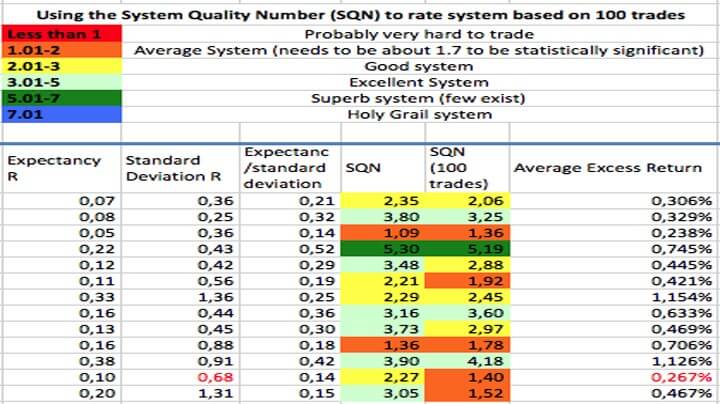
Relative Weakness or Relative Strength? The RSI is a popular indicator but it is not without its detractors. If you go online to learn more about technical forex trading – and who these days doesn’t? – then you will surely encounter a lot of people recommending the RSI. Indeed, most people you see on social media or YouTube who talk about the RSI will talk about it in glowing terms. This is why we think it’s important to bring you to the other side of the story. There is a growing number of technical forex traders out there who dismiss or outright criticize the RSI and this article is here to bring you their side of the story and the arguments they deploy to highlight the major problems with the RSI.

Popularity Contest

If you go online and do a search for all of the most popular indicators out there, you will likely find that you’ll get more hits for the RSI and just about any other indicator. You’ll hear about it all over social media whenever you’re trying to learn from others about forex and you’ll see video tutorials mentioning it or even promoting it. More than that, you’ll see it on your TV screens when you turn over to see the financial news and you will have heard about it from the very people you relied upon to teach you forex trading in the first place. Already here there are several serious problems to point out but we’ll come back to those further on in the article. First thing’s first, what is RSI?

Brass Tacks

The Relative Strength Index is an oscillating indicator that measures the velocity and magnitude of price movements. What you need to know though, is that it ultimately tells you if something is over-bought or over-sold. “Wait a minute, what do you mean over-bought or over-sold?”, you cry at your screen. Indeed, that’s one of the things about the RSI you should know. It was invented by a guy who is the father of a number of technical indicators, J. Welles Wilder. But the thing is, he invented it primarily for equities trading, where knowing if a stock is overbought or over-sold is pretty useful information because stocks – and commodities, where it is also heavily used – have an intrinsic value, while forex does not.

That isn’t to say that a currency pair can go as high or low as it wants, there are limits because governments or national financial institutions will eventually step in and rein things in. But that can happen thousands of pips down the line and there’s no guaranteed or even foreseeable limit where that kind of institutional intervention is going to kick in. Moreover, there is another issue with the RSI’s history, beyond it being invented for trading stocks, and that’s that it was invented back in the 1970s – literal decades before the kind of retail forex trading we are all doing was even a thing.

How Does It Work?

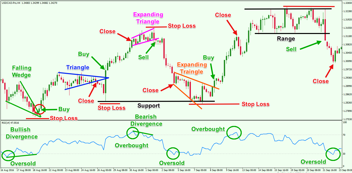
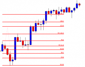
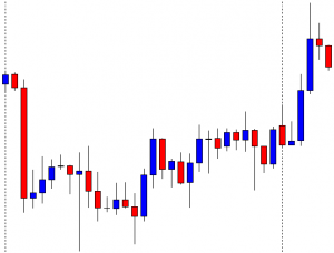
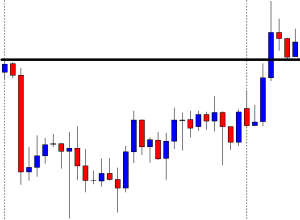
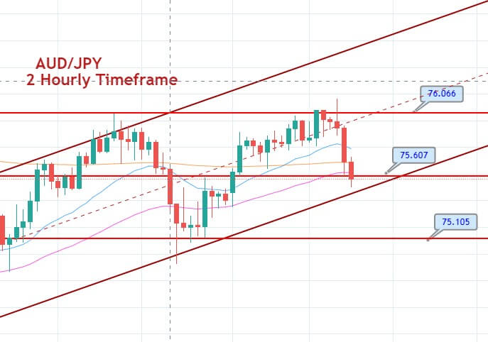
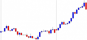
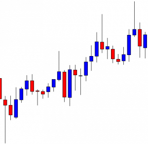
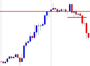
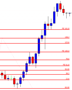
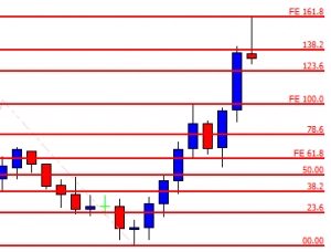
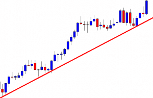
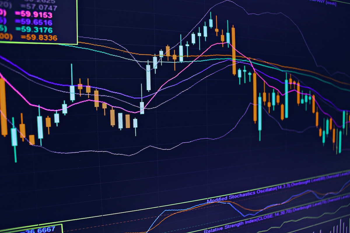
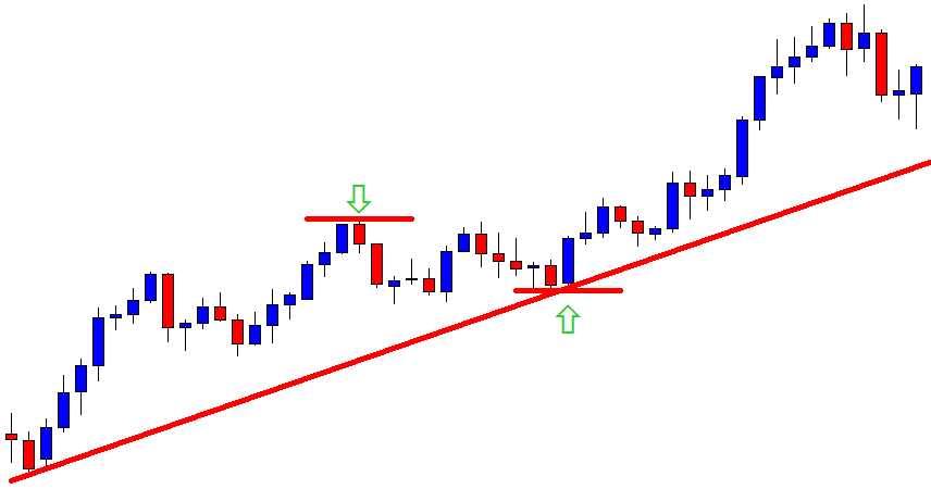
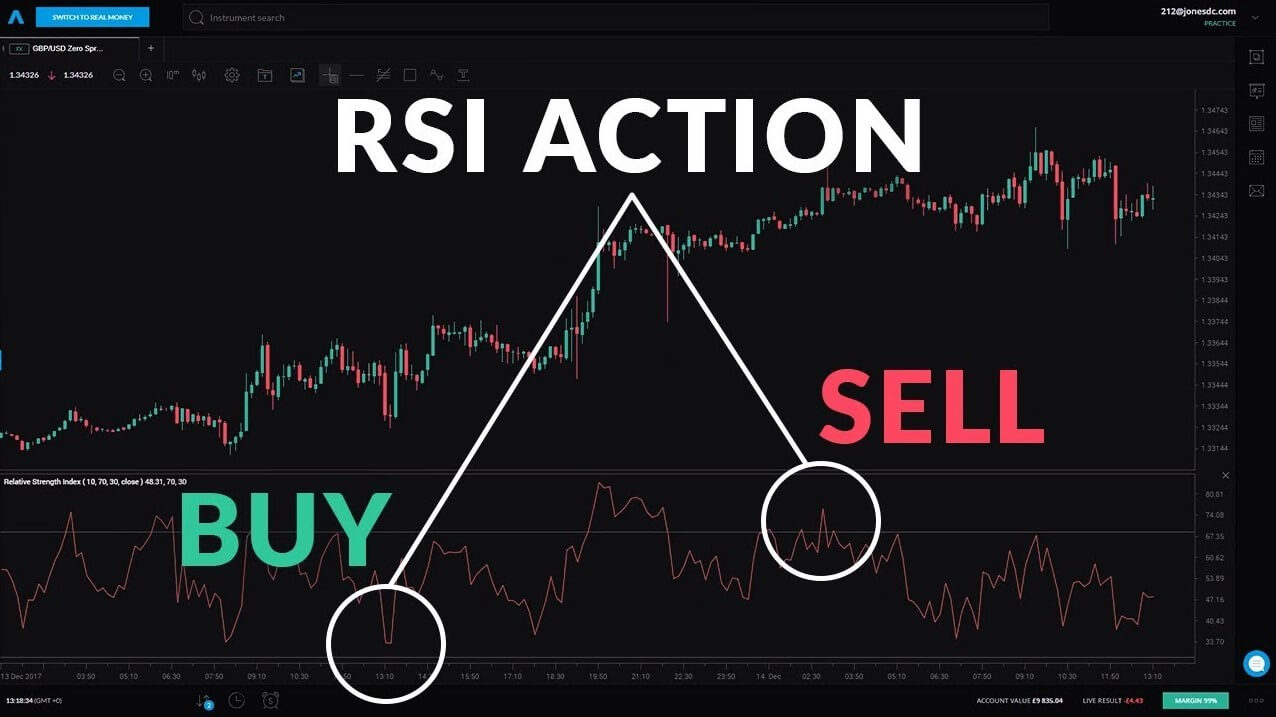
In its basic configuration, the RSI measures values from 0 to 100, where you will typically have lines at 30 and 70. When the reading goes below the 30 line, this indicates that a security or currency is oversold or undervalued and when the reading goes above the 70 line, this indicates that it is overbought or overvalued. As a default, the RSI will cover the previous 14-day period and is supposed to be overlaid against your chart to provide you with trade signals.

For example, if the RSI verges off into overbought territory and then drops down below 70 again, this should indicate that there is about to be a downward trend and you should go short. Conversely, if the inverse is happening with the RSI crossing into oversold territory and then rising back above the 30 line, this should indicate a reversal and the signal will be telling you to go long. That is how it’s supposed to work but – as many traders are increasingly keen to point out – there are several problems with that so let’s look at some of those.

The Problem of Popularity

As any high school prom king or queen will tell you, being popular is not always all that it’s cut out to be. In terms of the RSI, for us, it is important to understand why it’s so popular in the first place. Firstly – and this is pretty understandable actually, especially for traders who are just starting out – it is dead simple to use. Even if you’ve never encountered it before, just the short explanation above will tell you a huge chunk of what there is to know about using the RSI.

There isn’t a problem with simplicity per se – something being simple should not be a reason to avoid it. If there is a simple and easy to use indicator out there and it works, then just go ahead and use it. The problem comes from people who expect to be able to find one indicator and use it to consistently make money by trading on the back of that one indicator. But you should know by now – regardless of where you are in your trading career – that there are no silver bullets. In fact, if you think you’ve found a silver bullet that’s easy to use and is simple and everyone else is using it, you’re in big trouble.

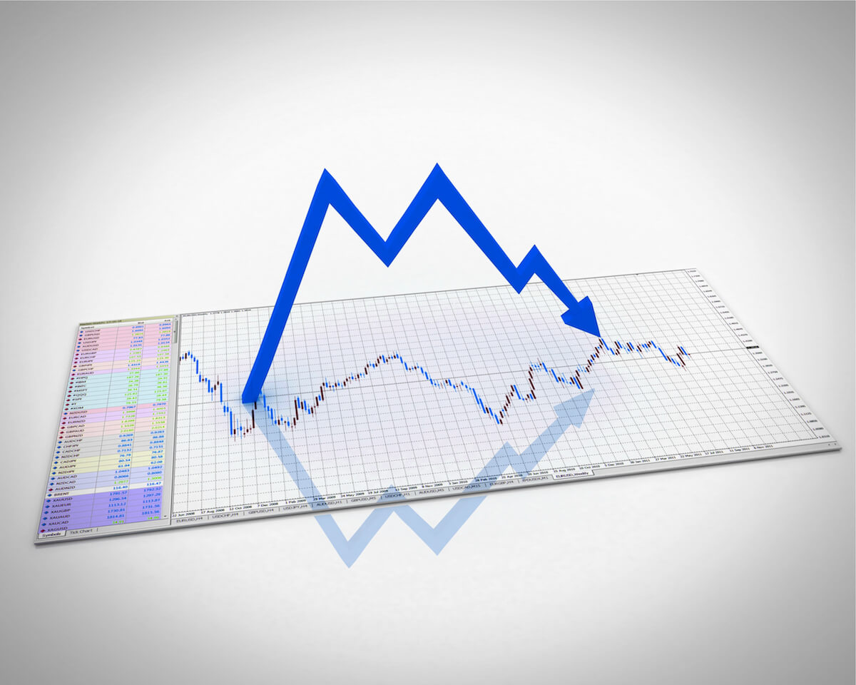
But that isn’t the real problem with the RSI’s popularity. The real problem with the RSI’s popularity is that it is popular. If that sounds like a tautology, it is. But in forex trading there is a big problem when everybody is doing the same thing so when something’s popular, it’s time to start hearing those alarm bells. If you’re doing something in forex trading that is popular, something everyone else is doing, you’re running with the herd. And if you’re running with the herd, there are big players out there, who have way more influence in the way the market behaves, who is going to notice that the herd are all moving in a particular direction. The herd as a whole are going to be on the radar of the big players who will manipulate the mechanics of the market to take advantage of that big clump of traders who are all doing the same thing and sending their money in the same direction.

Of course, you’ll eke out a win every now and then – that is, the big players will let you have a win from time to time – because this keeps you in the game and lets them pick you off the very next time the herd gets going together. This doesn’t work the same way in the equities trade, so if you’re used to that, get ready for something different. In forex trading, you want to steer clear of the herd and stay away from what’s popular as much as possible. If that were the only problem with RSI, it would be enough to make smart traders drop it immediately. But there are other problems lurking in there and if you are still clinging on and conjuring up counterarguments in your head right now, you should be aware of the other problems some traders are keen to highlight.

The Problem of Credibility

The RSI is not only one of the most popular indices out there, but it has also been given the weight of credibility by television. You will have noticed that financial news anchors will often pull up a chart of a given currency pair and show it on your screen referenced against its RSI. Now, why do they do this and why is it a problem?

The simple answer to why they do this is that they don’t know any better. Most financial analysts on television are not traders and certainly not technical traders. They make their living by being smart and credible and being extremely good at talking about the financial markets. They do not need to spend their time trading, researching, testing, and backtesting indicators. Moreover, they know full well that their audience is also not, for the most part (like 99%), technical traders. So neither are they in a good position to properly present and explain indices more complex than the RSI nor would their audience appreciate it because they would struggle to follow along.

So why is this a problem of the RSI and not just a problem of how the financial news treat forex trading? Well because if you are just starting out trading or have been trading using the RSI (with mixed results), seeing these prestigious financial news shows flashing that very same indicator up on the screen will probably mean you will give the RSI more weight than it deserves. If it deserves any at all. You might use it and lose money or you might continue using it beyond the time when you actually become aware that it isn’t working. All because it has been lent this credibility by being on television and being discussed by smart people in suits.

The Problem of Teaching

Speaking of smart people in suits, another reason why people continue to use the RSI and why it is so popular is that it is taught to people learning how to trade in just about every forex trading course out there. When you’re just starting out and you don’t know any better – and crucially, you haven’t built up any of your own trading experience in a meaningful way – RSI looks pretty valid. It is kind of exciting because you are taught this indicator that tells you to wait for certain conditions and when you see them, it gives you a signal to trade.

It’s really easy to learn and you pick it up with no effort at all (are those alarm bells ringing yet?) – all you have to do is look at your chart and identify when the RSI is giving you a signal to trade and just take it. If you’ve learned anything about forex trading by now, you should hear how unrealistic all of that sounds. What’s more, the RSI really easy to teach, which is why it has found its way onto all those courses and video tutorials. It doesn’t take a rocket scientist to teach it and you don’t have to have a foundation course in brain surgery to learn it.

But that’s where you have to question who it is that’s teaching you to trade. Is the person you’re learning from an actual trader? Chances are they are not. If they are making their money by teaching forex trading or by making forex tutorials and courses and then selling them on, there’s a good chance they don’t have to trade for a living. They just want to teach this stuff and, if you’re starting out, you’re hungry for knowledge and just want to learn. As a result, they will show you easy-to-teach indicators, like RSI, that fit neatly into their course material and are easy to back up with simple examples that will make them look like they’re teaching you something important.

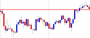
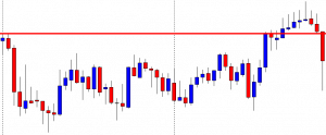
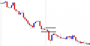
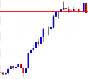
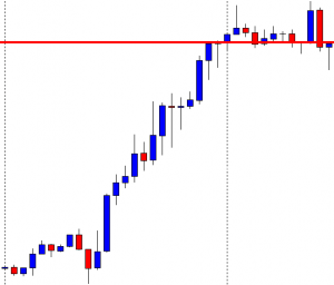
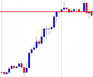
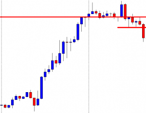
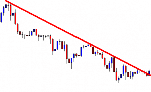
There’s a problem with those examples, however. In almost all cases, when somebody is showing you an example of how RSI works, they’re showing you a cherry-picked example. They’ll go out and find the perfect moment, on a chart of the perfect currency combination and set it to the perfect timeframe and then they’ll say, “see here where the RSI crosses back down under 70, that’s an indication that the price is about to trend downwards and here you can see that that is what’s happening”. But even in these best-case scenarios, if you look at the chart, you’ll probably be able to see a couple of cases of the RSI telling you to trade one way but the price going the other way or stagnating. You can try it now, go to YouTube or on social media and find somebody singing the RSI’s praises – there’s a 90% chance that you’ll be able to see for yourself that the example (the one that they chose) is full of holes.

Ultimately, the reason RSI gets taught so much to just about every last living soul who wants to learn about forex trading, is that the teachers themselves don’t know any better. As we said, they are almost certainly not traders themselves, and, more to the point, there are thousands of indicators out there to choose from. A great many of these are more difficult to teach than the RSI, less likely to throw up what appear to be sure-thing examples and more likely to work in conjunction with other indicators in a trading system that’s adapted to the needs and habits of the individual trader. Well, how do you teach that? Surely it’s just simpler to show people the RSI. It is and that’s why they do it.

The Problem of Success

With all of its popularity and credibility and the fact that it was taught to you when you first started trading, the RSI gets used a whole lot. Now, if everyone was learning the RSI and using it and it failed every time, people would simply drop it immediately and it would be resigned to the ash heap of history. But it doesn’t work that way. In fact, it’s much more insidious and sinister than that. The main reason people continue to persevere with the RSI is that even though it is probably losing them money in the long term, they have occasional successes with it, which reinforces all those cognitive biases generated by everything we’ve already covered in this article. It’s called gambler’s ruin or casino theory.

If you went to a casino in Las Vegas and you and everybody around you was just constantly losing money – never winning, not even 0.001% of the time – nobody would ever go to a casino again. The way the house keeps you coming back for more is that you do occasionally get that blackjack or the roulette ball does sometimes land on your number. It doesn’t happen nearly as often as the house wins but it happens often enough that it gives you that kick of adrenaline and clouds your judgment so you keep gambling.

Do not underestimate the power of that rush from winning. It will keep you in a casino for ten hands beyond the one at which you should have stopped or keep you using an indicator that you have seen doesn’t work consistently but that brought you that one win a few months ago and boy didn’t that feel good. The big players in the forex market understand the power of that thrill and will use it as mercilessly as the casinos in Vegas or Macau or anywhere else in the world. They reel out a little slack and the herd lap that up and comes back for more.

The Final Nail in the Coffin

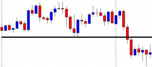
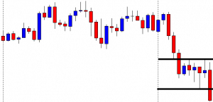
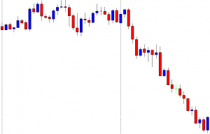
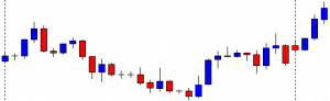
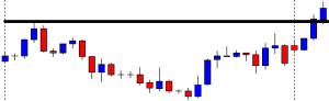
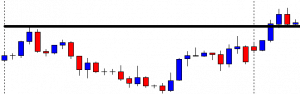
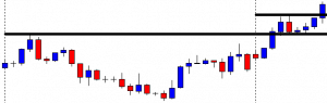
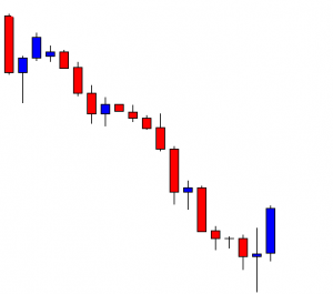
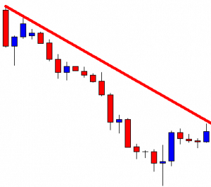
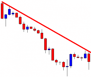
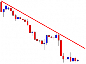
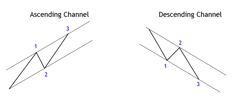
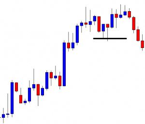
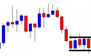
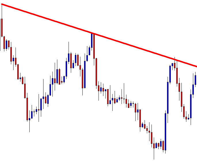
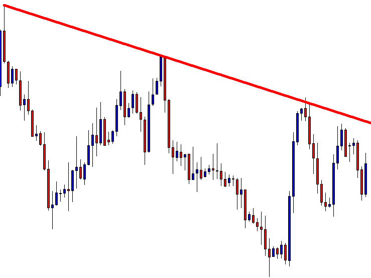
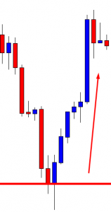
There is a counterargument to much of this and if you use and like the RSI, you’ve probably been reading through this like a coiled spring, waiting to counter with: “But the RSI does work in range-bound markets!” Well, there are a lot of seasoned technical traders out there that would respond like this: If you’re seeing a ranging market, it’s probably already over. Forex markets don’t range forever and identifying a ranging phase in the market is not as simple as textbooks will have you believe. You won’t know when it’s coming and when you see it forming it will likely be too late to take advantage of it using the RSI.

The problem is that there is a glut of reversal traders out there relying on the RSI to call out reversals for them and they outnumber the people who are trying to follow a trend when it does break out. It’s the very reason the price trends as long as it does sometimes. When it does, it sucks the life out of those reversal traders over and over again – erasing any gains they made when the price was consolidating.

Try It and See

Of course, the best way to be really sure that the RSI is flawed is not to listen to an endless to-and-fro of well-thought-out arguments. The best way to be sure is to take the thing to the testing range and see if it falls apart. One good way of doing that is to open a demo account and trade it using the RSI exclusively. Use this account to track the wins and losses over a meaningful period (anything less than a couple of months is too short) to see where it gets you. Sadly, most traders are not sufficiently disciplined to go through all of that and will not benefit from that learning experience but demo-testing an indicator like that does reveal a whole lot about it.

The alternative is to look at a historical example and analyse those moments where the RSI was giving a trade signal. Chances are you would see very few examples where the signal would actually have paid off. The way to do this is to take a popular currency pair or a pair that you actually trade and look back over a year’s worth of data. Pull up the RSI indicator, compare it against the price chart, and go through each and every time the RSI pinged a trade signal. Check forward from that point to see whether following that signal would have paid off but be honest with yourself about where you would have set your stop/loss and take profit limits.

You will find that, in most instances, following the RSI will completely kill you. That’s not to say it never throws up a win. It will give you a win from time to time but the losses will outweigh these infrequent wins over time. And not only that but the wins will more often than not be pretty mediocre and the losses will not. To sum up, there are a lot of traders out there who are very disparaging about the RSI and now you know why. If you feel like this is sound advice, don’t take their word for it, test it out for yourself in a demo account and see if it really lives up to any of its hype.

Categories
Forex Indicators

Which Indicator is Best for Trade Management and Risk Measurement?

Out of the thousands of indicators out there that technical forex traders add to their charts, there is one that is often overlooked. Sometimes even ignored. Indeed, though it is used relatively frequently, many traders often forget that it is part of their process. Yet, in reality, it is one of the most important indicators to have in your toolkit.

That indicator? It is, of course, the ATR.

What Is ATR?

Many of you will, of course, already know what ATR is and how it works as well as you know the back of your hand. It never hurts, however, to refresh that knowledge and take another look at it. Put as simply as possible, Average True Range is a measure of volatility. What it does is take a look at the last fourteen candles (it doesn’t have to be fourteen but that’s usually the default setting) and tells you how much movement there has been. This will be expressed in the number of pips the currency combination you have selected has moved, on average, over those last fourteen candles.

It’s a moving indicator so you need to take care when you’re measuring it and whether the most recent candle is throwing off the rating in some way. So, if you’re day trading, for example, it is best to wait to measure the ATR just as the candle you’re currently on is coming to a close. That way your measurement is of fourteen complete candles – which will give you the best reading.

And that’s it. It’s that simple.

But Why Is ATR So Important?

The thing is, ATR is simply not one of those glamorous indicators. Which is probably why it often goes so unnoticed. In fact, many traders don’t even have it up on their chart the whole time. But that doesn’t mean it isn’t a key part of their system. Perhaps even the most crucial one. That isn’t to say that it is the best indicator or some kind of silver bullet. But it needs to be part of your system because it provides you with two key pieces of information.

Firstly, by telling you how much a currency pair is moving over a given period, it can help you to make sense of your other indicators and tell you when to trade – or rather, when not to. For example, say a currency pair has already moved beyond its average range but your strategy is signaling that you should go long. Combining the ATR into your other indicators can help to show you whether what you’re dealing with is a breakout or whether it would be better to go short or simply not trade at all.

But, here’s the key thing. The ATR is not a silver bullet. No indicator on its own is. It must be just one part of your strategy and not the driving force behind it. You shouldn’t use the ATR on its own to decide whether you should pull the trigger on a trade or not. If you think any single indicator can do that, perhaps it’s time to duck out of trading altogether or, at the very least, get back to the classroom.

It is also useful to give yourself a little history lesson and use the ATR to explore how a currency pair has performed in the past under different circumstances. Crosscheck that with any significant news events you know about and it can provide a useful picture of the volatility of a currency combination – ultimately helping you to have a better understanding of what to expect.

Managing Risk

The second useful thing the ATR can give you – and according to some this should actually be its primary function – is that it can help you to manage how much you risk on a given trade. You should not make a single trade without consulting it. So, how does that work? Well, let’s say you’re doing everything right. You’re avoiding being drawn into trading with the herd. You’re ducking and diving and staying clear of the big players are – avoiding those hotspots where everyone else is trading. 0You’re using your system to identify when the optimal moment is to trade – getting all of your indicators to line up to make sure it’s the right moment and whether to go long or short.

Before you pull the trigger, you need to know how much to trade. And that’s where the ATR comes in. You need to factor it into the process you go through – make it part of your checklist – because in that sense it is probably the most useful indicator you have. It allows you to gauge risk in a measurable way so that you can improve how you manage your money and the amount that you invest per trade for any given currency pair. Now, the number one question here is how much money you put on a trade. But it doesn’t make sense to speak in terms of dollar amounts in this example. The ATR can’t tell you to put, say, USD 5,000 on a yen vs. pound trade. Neither does it make sense to talk in terms of lots, because a lot on the pound/dollar pair will be a different amount to a lot on another currency pair. Instead, it’s better to think of how much you are trading per pip.

To do that, compare the ATR for two currency pairs. For the sake of the example, let’s take a commonly traded pair like GBP/USD. Depending on what’s happening in the news cycle but assuming no dramatic news has been happening, this pair is likely to turn out a pretty low ATR. Perhaps something like 14 pips. If we compare that to the ATR of a more volatile pair, for example, GBP/AUD, here we might see an ATR of 115 pips. Some pairs will blow that out of the water and will easily generate ATRs of 200 or 300 pips regularly. And a lot of traders will look at that volatility and will steer clear of trading in those waters.

Sticking with the example of the dollar/pound and pound/Aussie dollar pairs, it doesn’t take a mathematical genius to look at the ATR and see that 115 pips is about eight times as many as 14 pips. That means the pound/Aussie is moving about eight times as fast as the dollar/pound. As we would expect given the respective volatilities of these pairs. So, armed with that knowledge, how do we trade it? It couldn’t be simpler. Let’s say that in this example you’re trading the dollar/pound at 16 dollars per pip. You can trade the pound/Aussie with full confidence, simply by trading it at eight times less. In short, when trading a faster currency pair, use the ATR to modify your per pip trading amounts to correspond to the increased volatility. In so doing, not only are you managing risk but you are also managing your overall approach to trading.

A Whole New World

Many, if not most, traders out there – particularly the less successful ones – start off by trading equal amounts per pip on different currency pairs, without taking into account the different speeds at which they move. This makes no sense. To all intents and purposes, by doing that they are saying that they have equal confidence in their trades across currency combinations of different volatilities. The danger that exposes them to could really take a chunk out of their account very quickly indeed if things go south. Traders who do that are taking on unnecessary risks because they are not mitigating the risk of greater volatility.

The ATR allows you to see that risk and modify your behaviour accordingly. It can be a tool for managing how much you trade per pip on a given pair and, consequently, it allows you to profile your trades for risk. This ability can introduce you to a whole new world of more exotic currency pairs because it enables you to broaden the spectrum of the pairs you trade. Placing the right amount of money per pip on a trade mitigates the risk of volatile pairs and means that you can add new currency combinations to your trading schedule without the fear of being towed under by fast-moving pairs.

In a Nutshell

The most important thing to take away from all of this is that managing risk and managing your money are the most important functions you have when you approach forex trading. If you can get these two right, you can separate yourself from the less successful or outright unsuccessful traders. It is the thing that will ultimately determine whether your forex trading career is going to result in more money in your bank account or less. And the primary tool you have at your disposal for mitigating risk and managing the money you invest in trades is the ATR. Even if you don’t have it on your actual chart – and many traders chose not to – you should still use it for every single trade you make.