Introduction
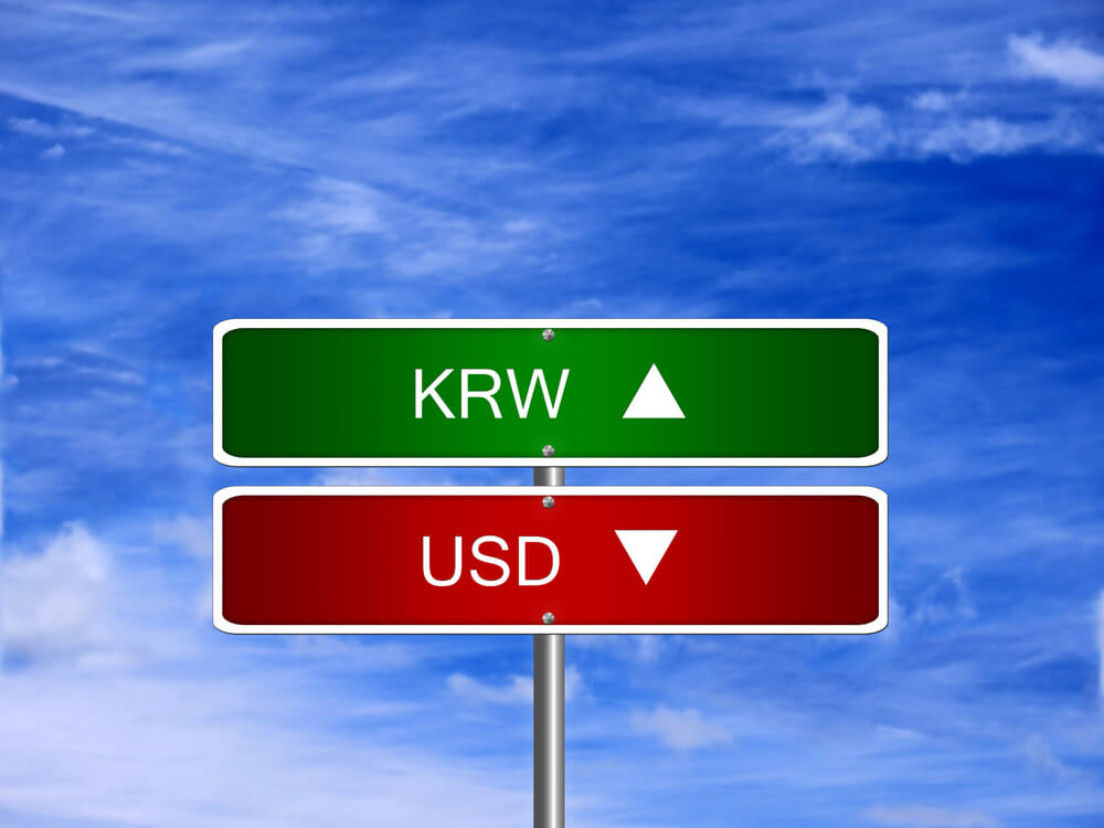
USDKRW is the abbreviation for the US Dollar against the South Korean Won. This pair comes under the branch of emerging currency pairs. Here, the US Dollar, being on the left, is the base currency, and the KRW is the quote currency.
Understanding USD/KRW
The market price of this determines the value of KRW equivalent to the US $1. It is quoted as 1 USD per X KRW. So, if the market price of USDINR is 1199.70, these many units of the quote currency are required to purchase one unit of the base currency.
Spread
The algebraic difference between the bid price and the ask price is referred to as the spread. This is the primary source through which brokers generate their revenue. The spread varies from broker to broker and also the way through which they execute the trades.
ECN: 24 pips | STP: 25 pips
Fees
A fee is nothing but the commission that you pay to the broker on each trade. It is similar to that one that is paid to stock market brokers. Below is the fee on ECN and STP accounts.
ECN – 5-10 pips | STP – 0 pips
Slippage
Slippage is the variation in the price that was intended by the trade and price that was executed by the broker. Market volatility and the broker’s execution speed are the sole reasons for slippage to occur.
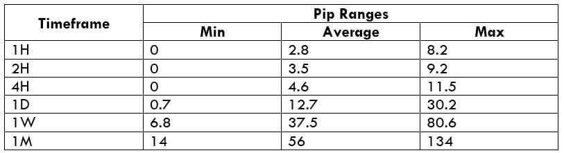
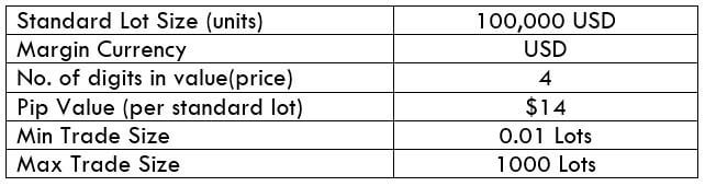
Trading Range in USD/KRW
A trading range is a table of volatility values in different timeframes. It shows the minimum, average, and maximum pip movement in USDKRW.
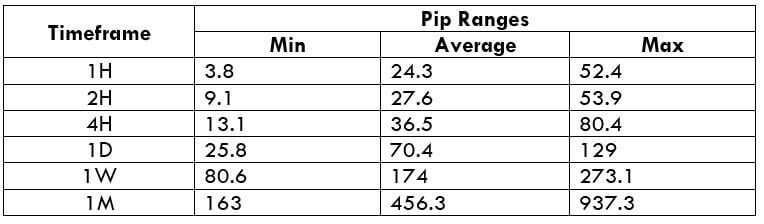
Procedure to assess Pip Ranges
- Add the ATR indicator to your chart
- Set the period to 1
- Add a 200-period SMA to this indicator
- Shrink the chart so you can assess a large time period
- Select your desired timeframe
- Measure the floor level and set this value as the min
- Measure the level of the 200-period SMA and set this as the average
- Measure the peak levels and set this as Max.
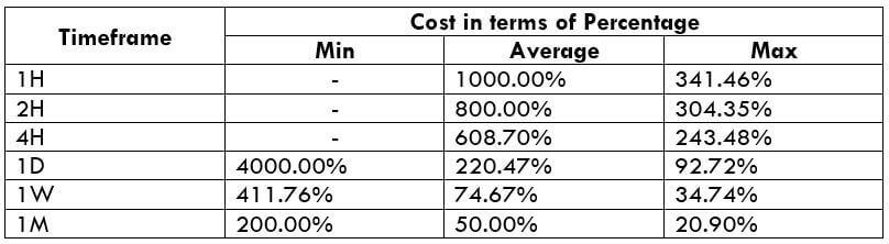
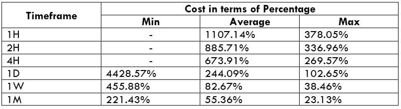
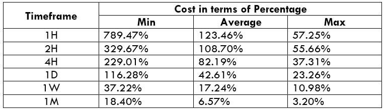
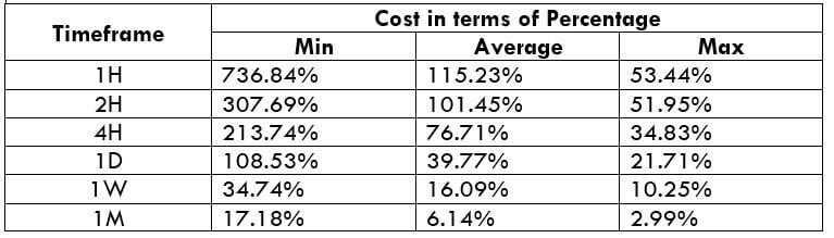
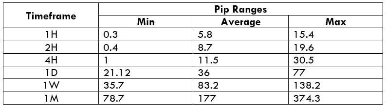
USD/KRW Cost as a Percent of the Trading Range
This an application to the above range table. Here, we determine the variation in the costs for changing volatility and a set of timeframes. With this, we can figure out the ideal times of the day to enter and exit this currency pair.
ECN Model Account
Spread = 19 | Slippage = 3 |Trading fee = 3
Total cost = Slippage + Spread + Trading Fee = 3 + 24 + 3 = 30
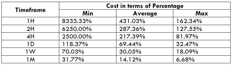
STP Model Account
Spread = 20 | Slippage = 3 | Trading fee = 0
Total cost = Slippage + Spread + Trading Fee = 3 + 25 + 0 = 28
The Ideal way to trade the USD/KRW
Though the Forex market is a 24-hour market, it is not really ideal to trade anytime during the day. This is due to the changes in the costs as the volatility changes.
From the table, we can observe that the cost percentage values are higher in the minimum column and comparatively lower in the maximum column. This means that the costs are high during less volatile markets, and low for highly volatile markets. So, choosing the right time to trade is dependent on the type of trader you are.
For instance, if a trader is concerned about the costs and ignorant of the volatility, then he may trade the market during high volatilities. But, if you’re a trader who’s concerned about both the factors, then you may trade during those times when the volatility of the market is around the average values. This will provide you with decent volatility with pretty low costs as well.
There is another way through which one can lower their cost much more. And this is through taking trades using limit orders instead of market orders. Considering the above-mentioned example, the total cost now would be reduced by three pips.


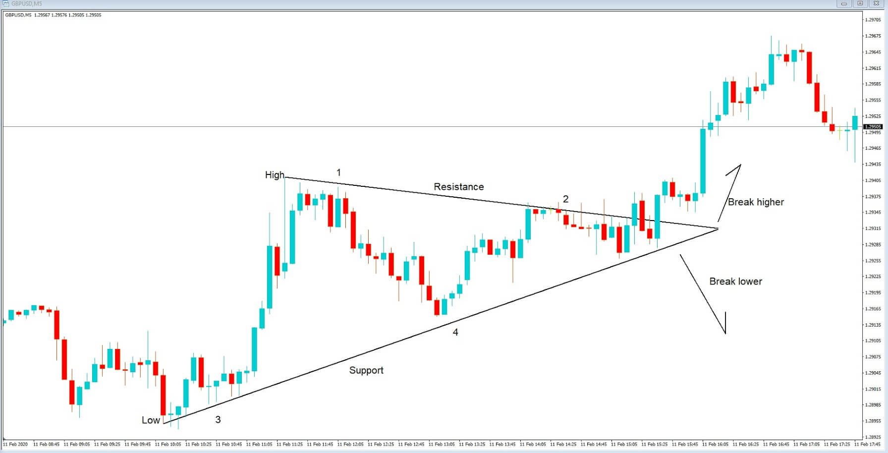
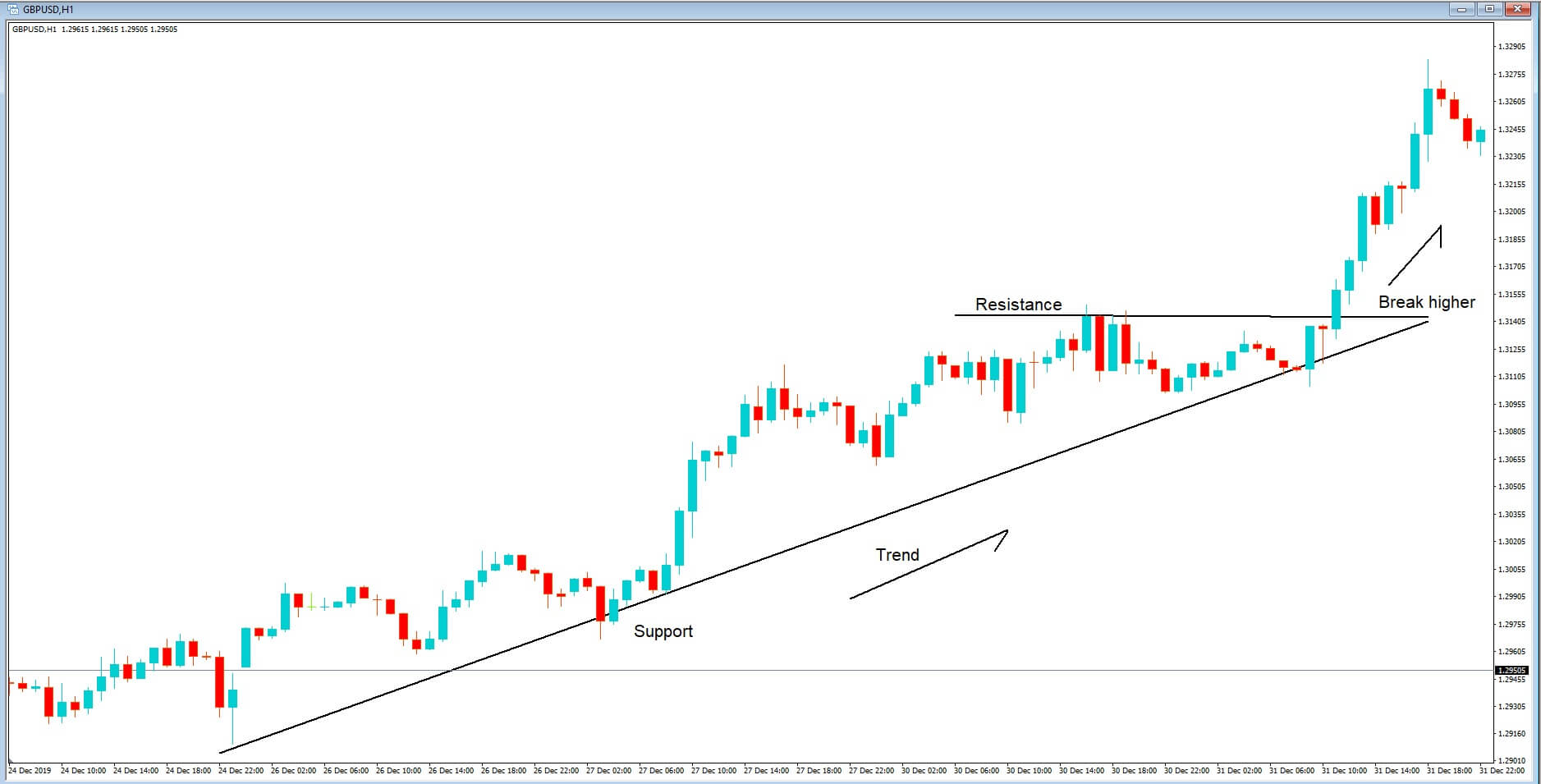
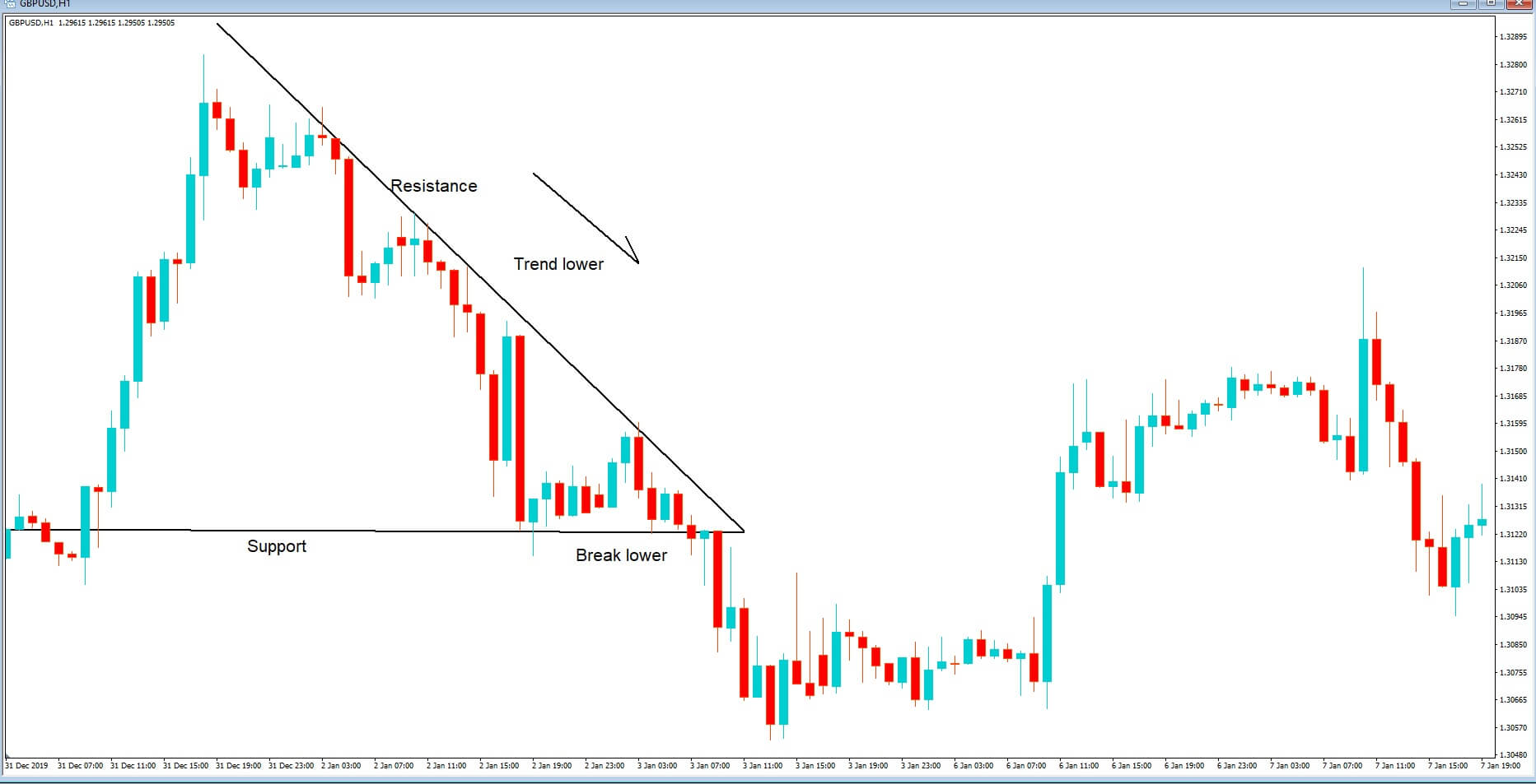
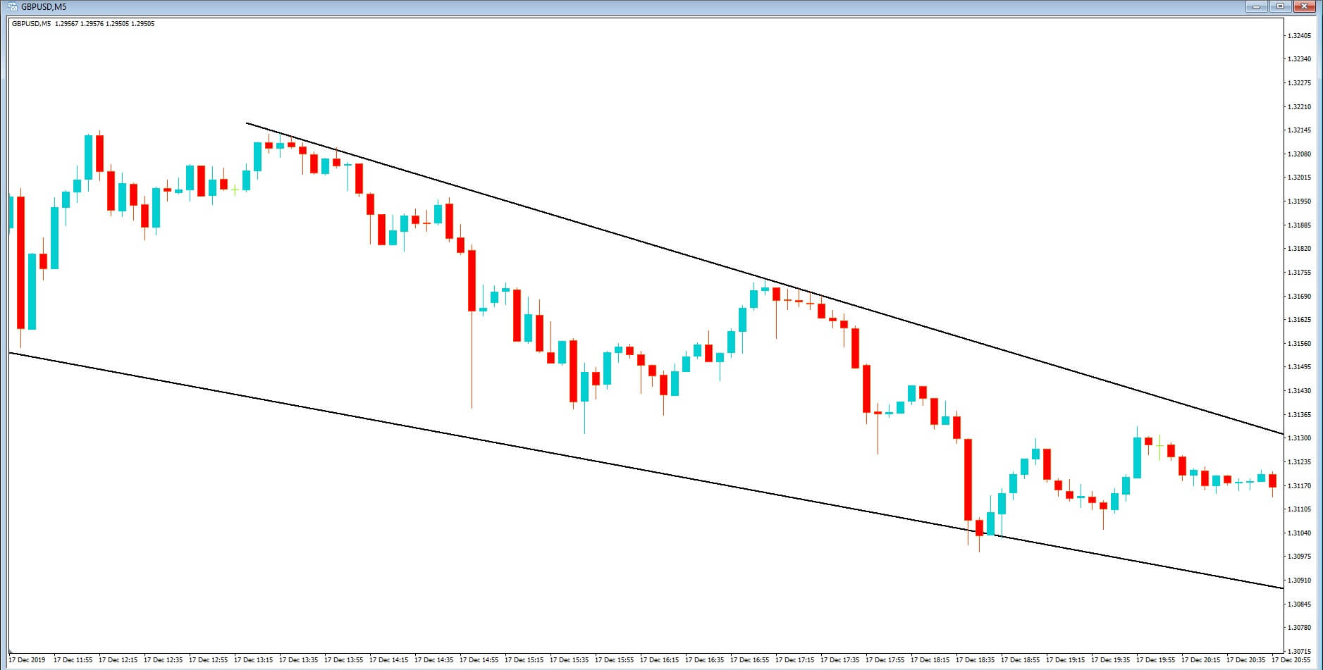
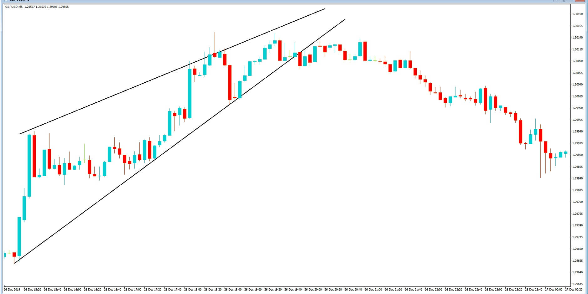
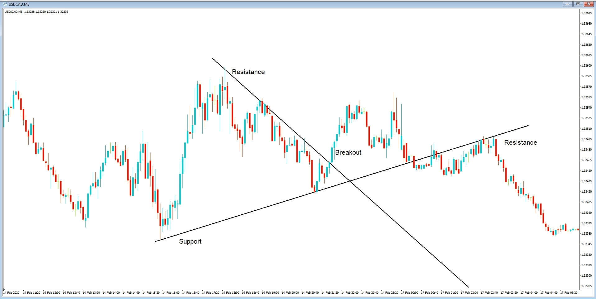
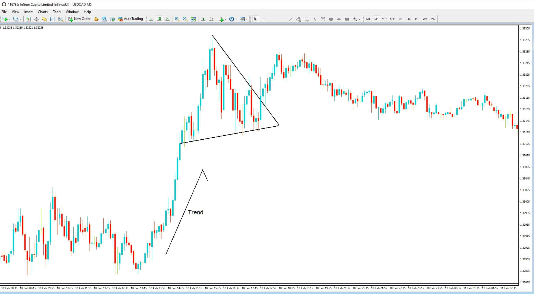

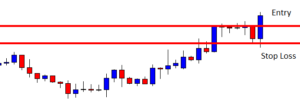
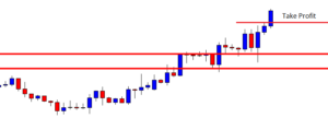


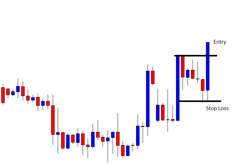
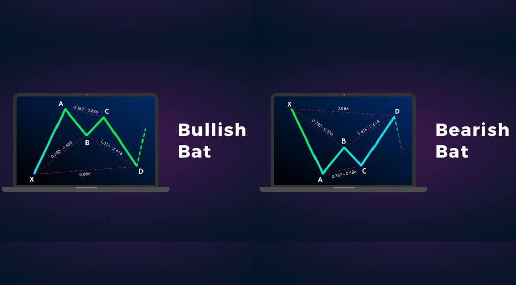
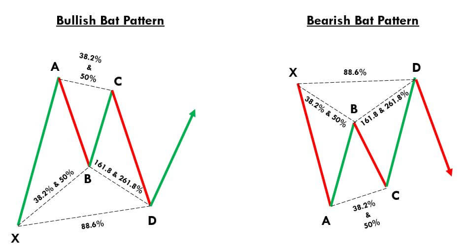
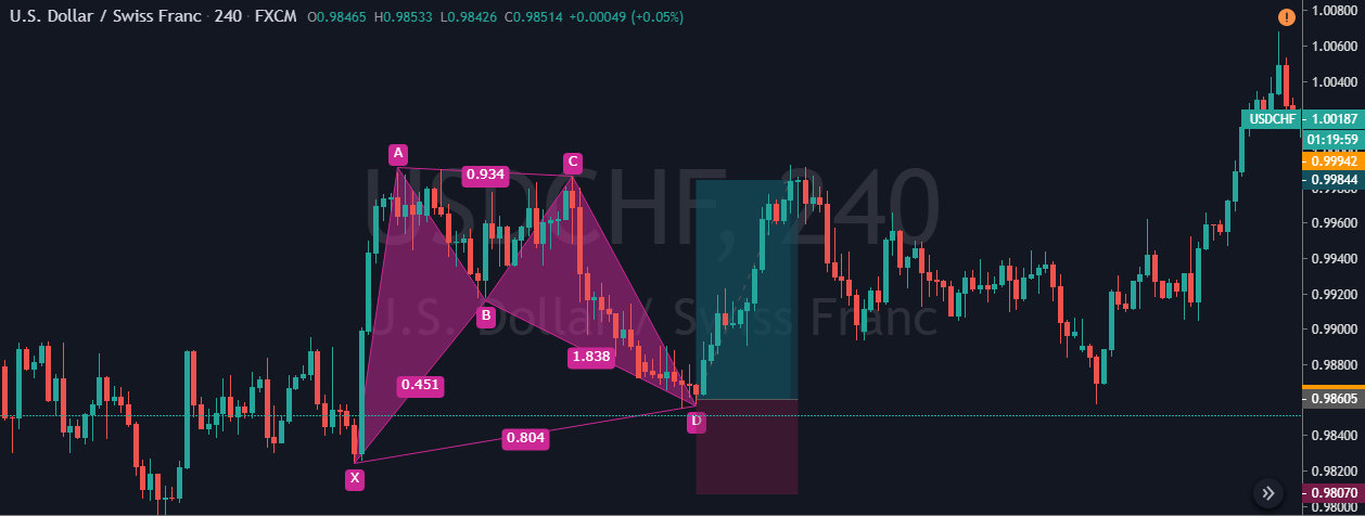
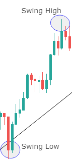
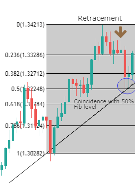
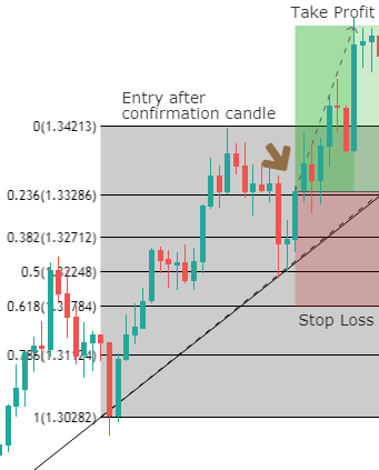
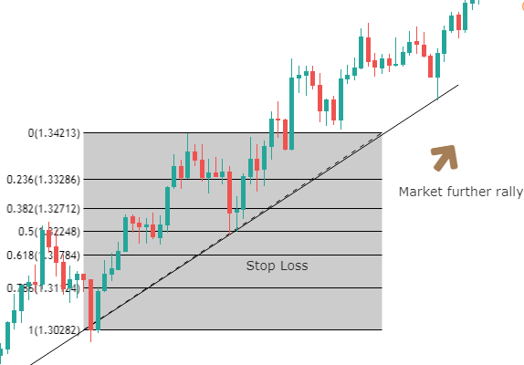
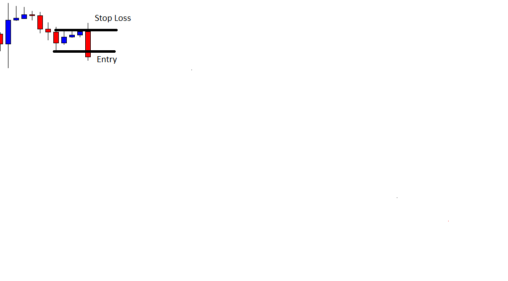
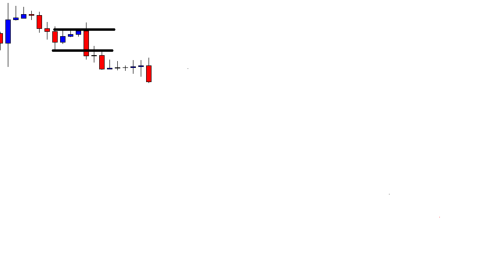
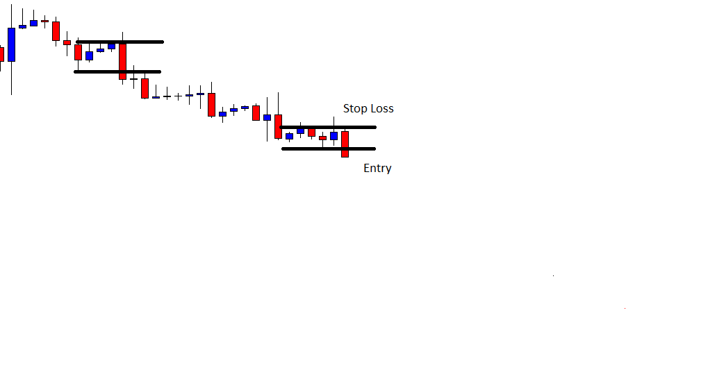
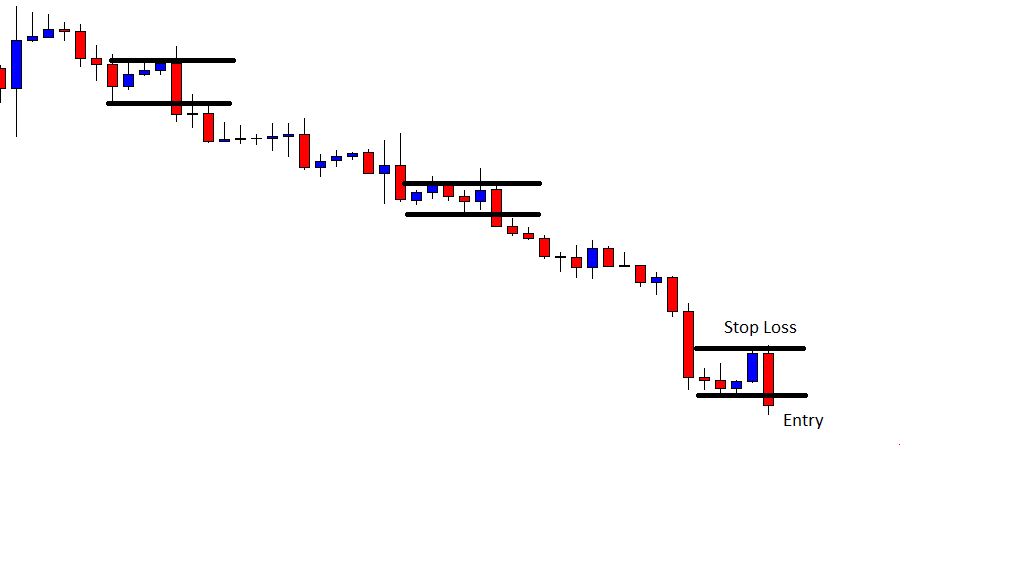
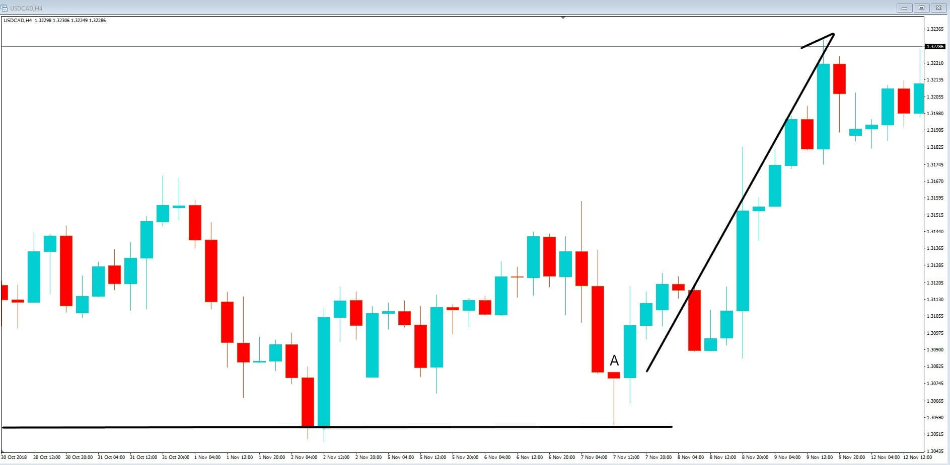
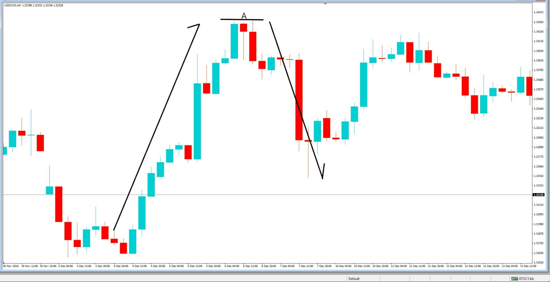
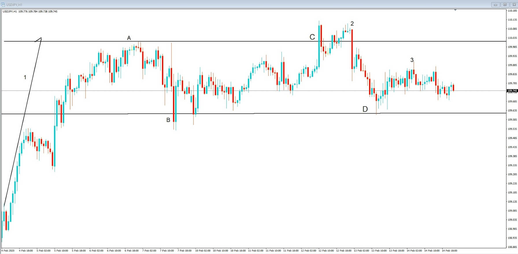
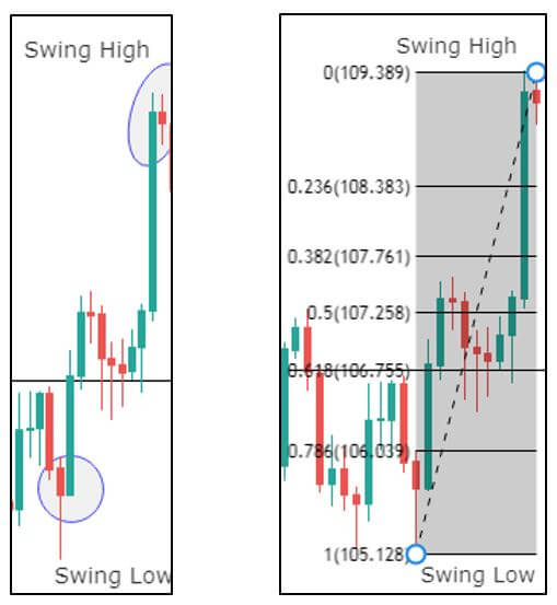
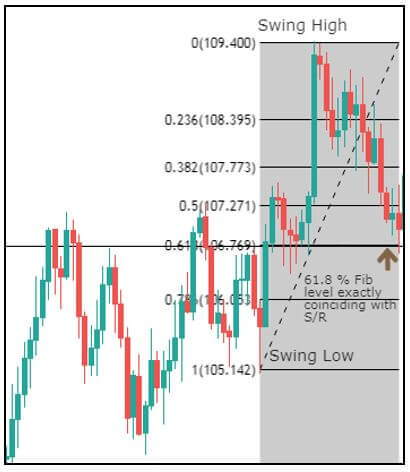
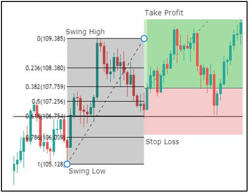
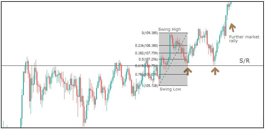
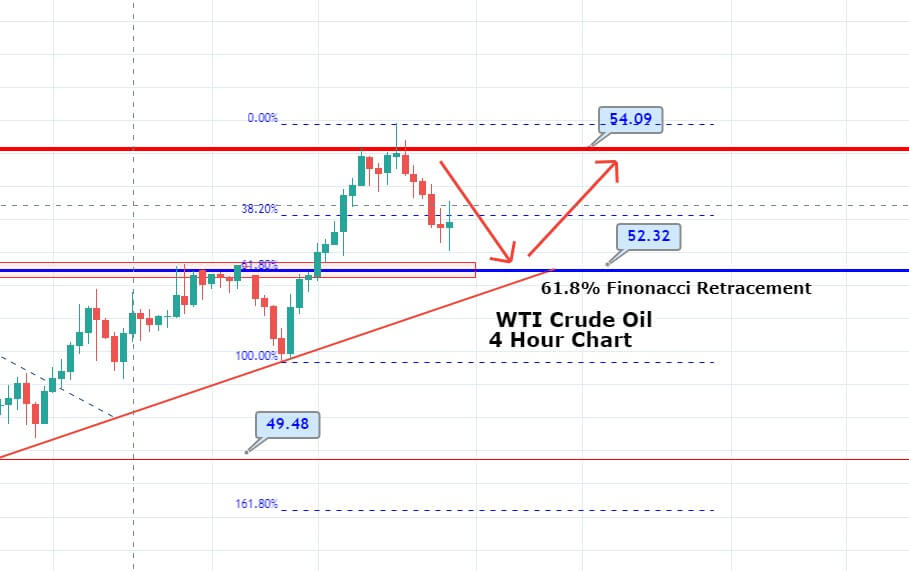
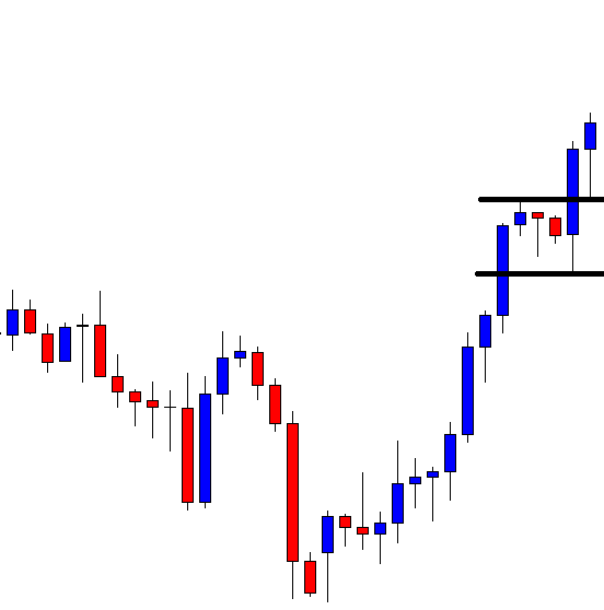
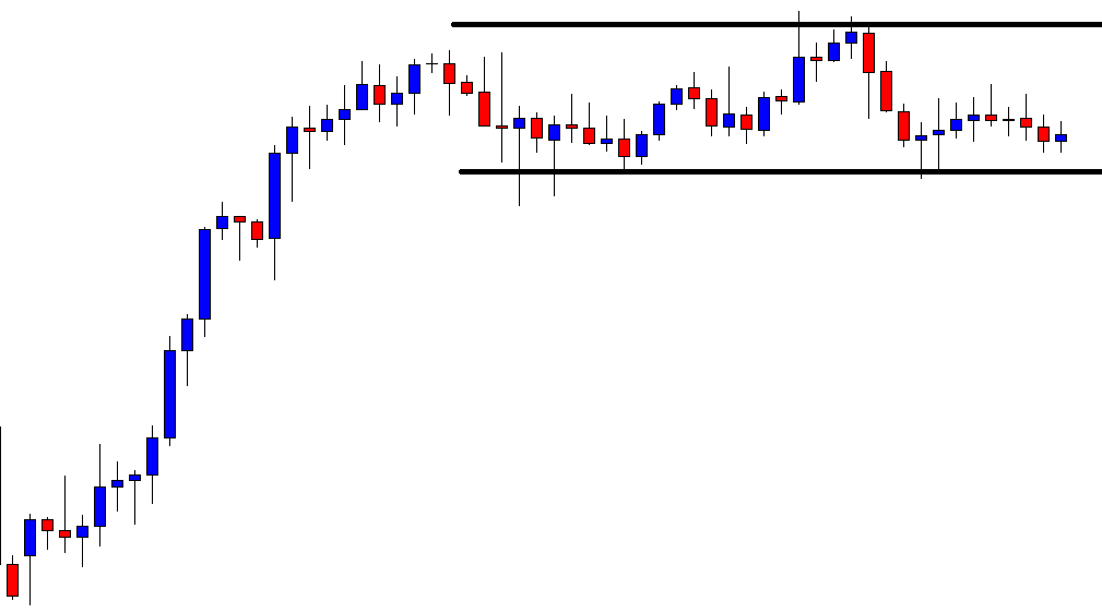
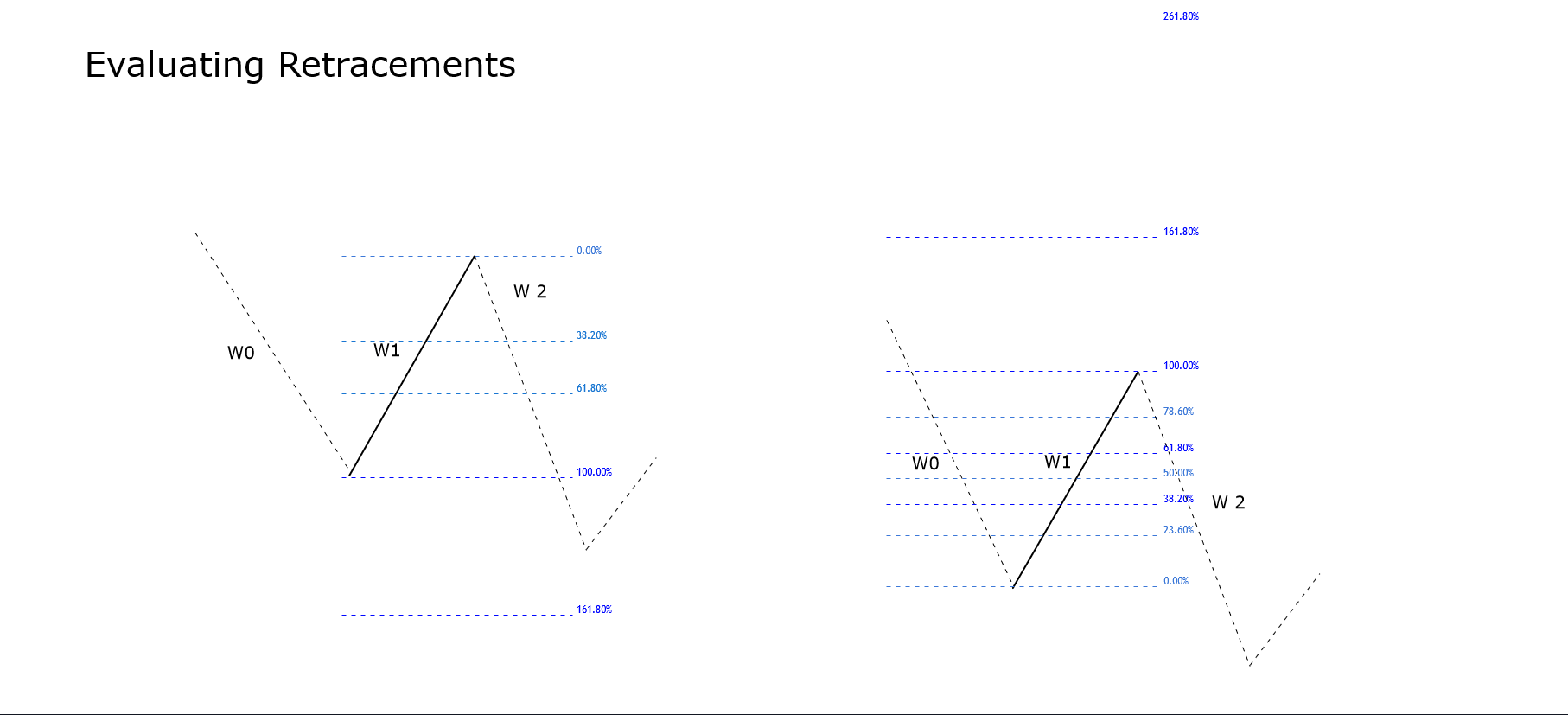
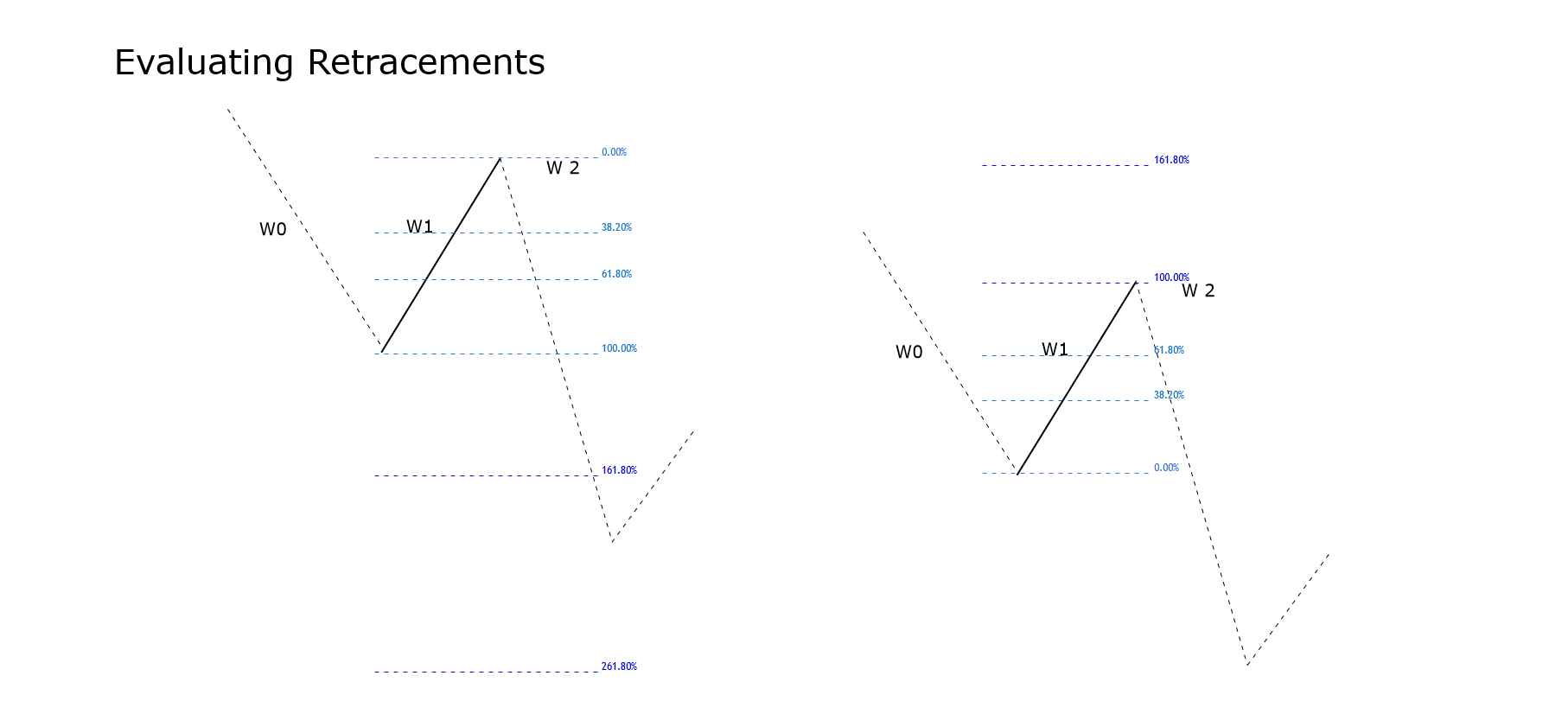
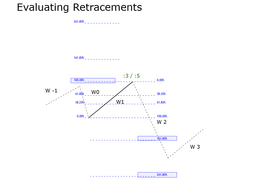
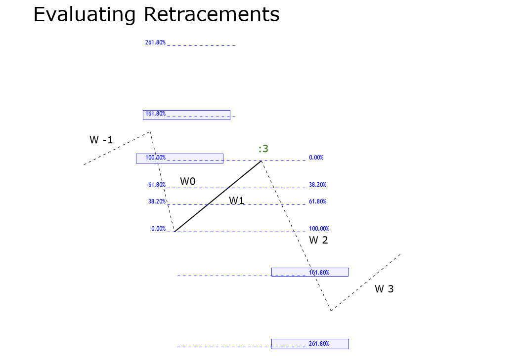
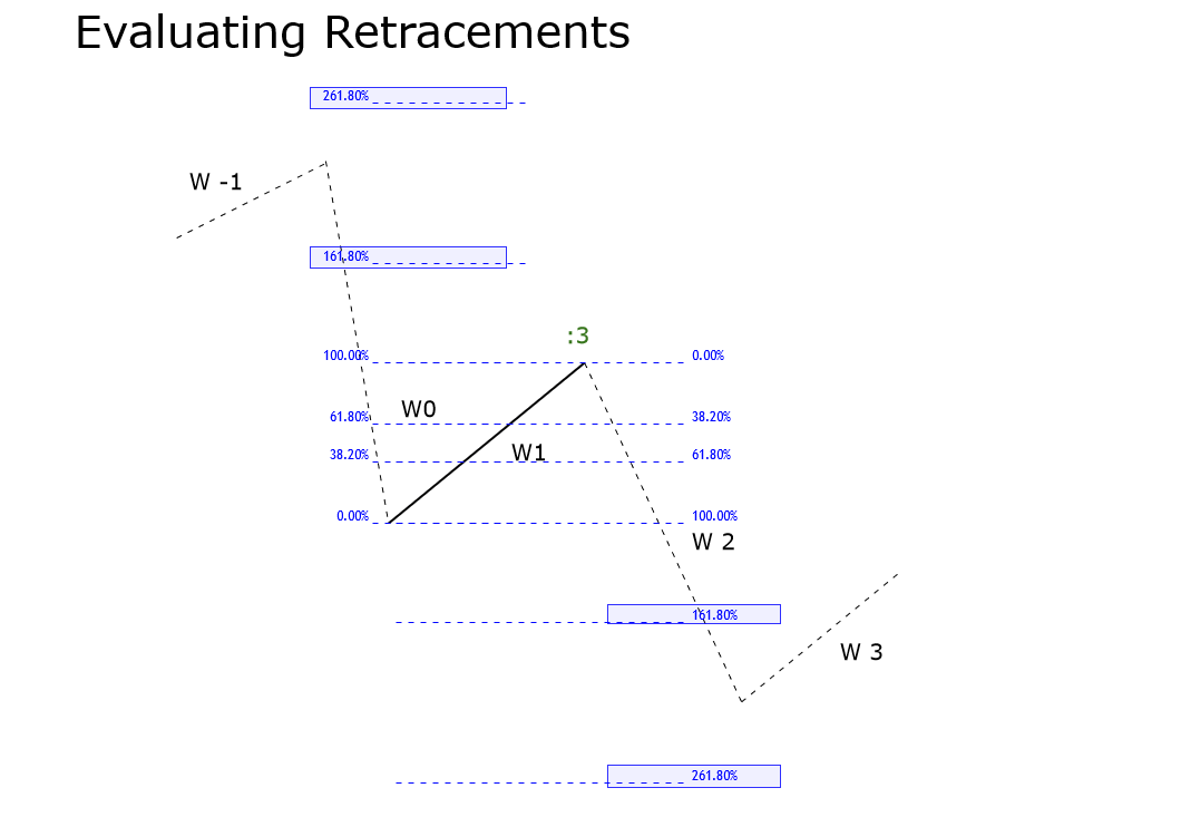
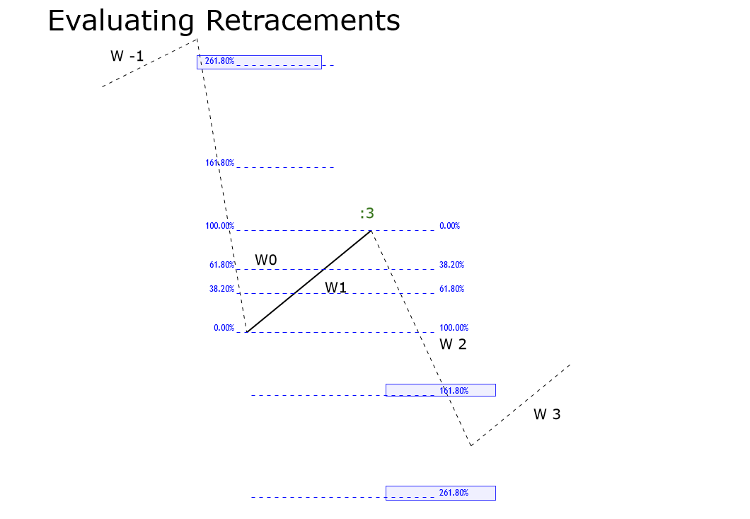
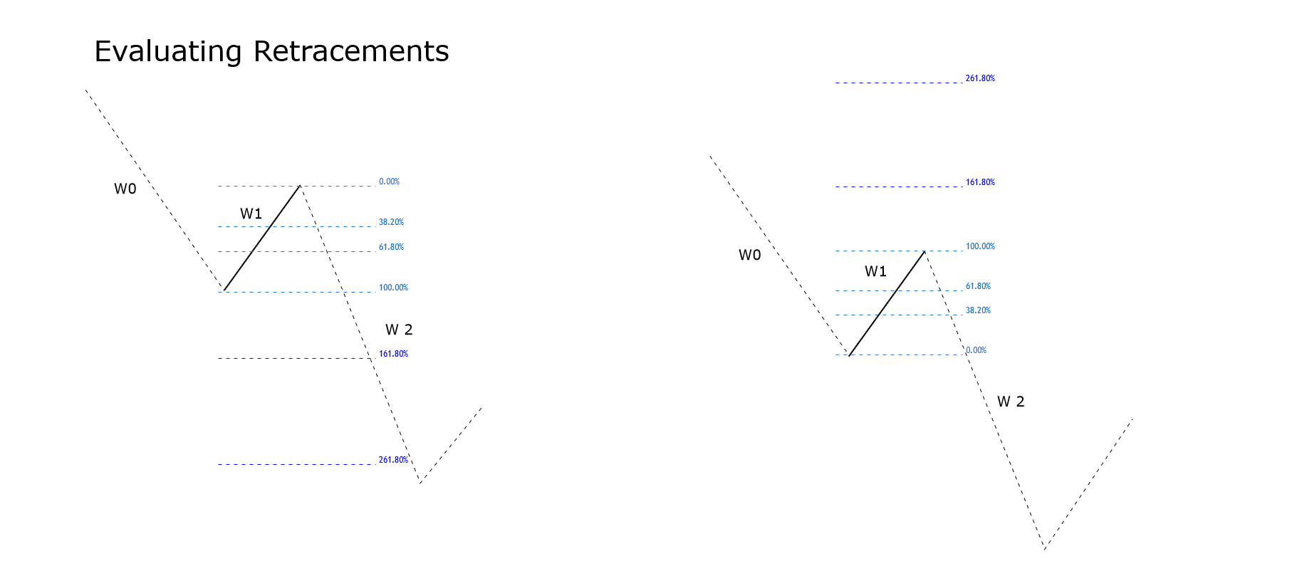
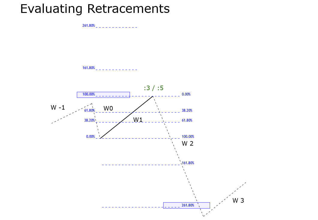
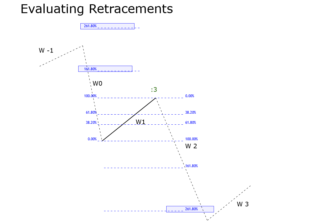
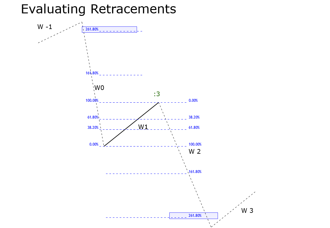
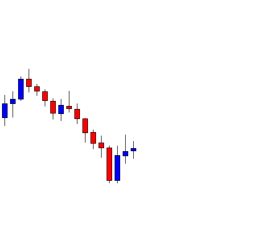
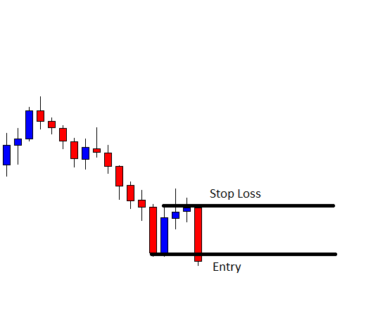
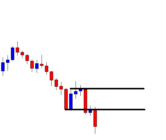
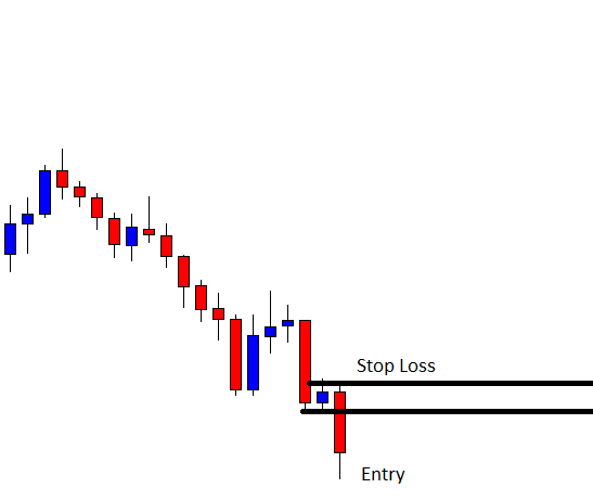
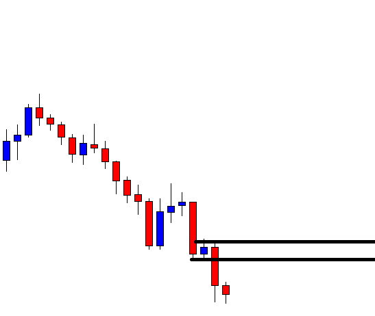
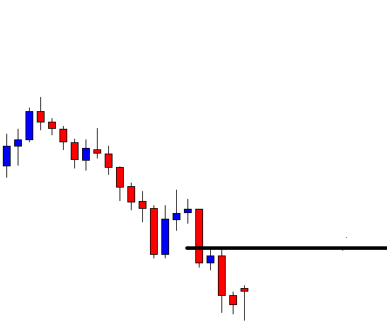
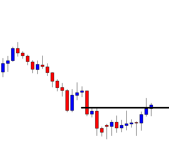
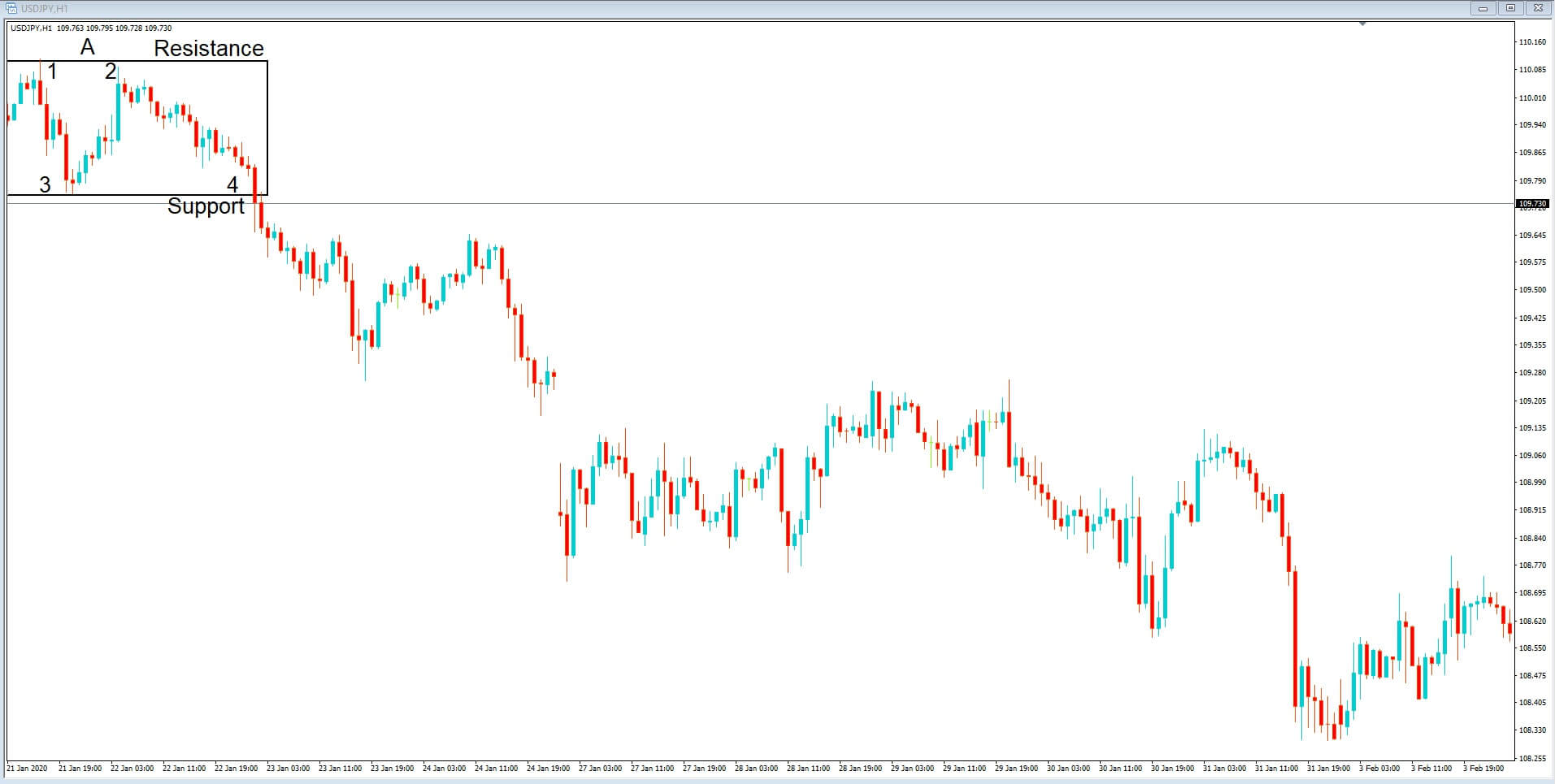
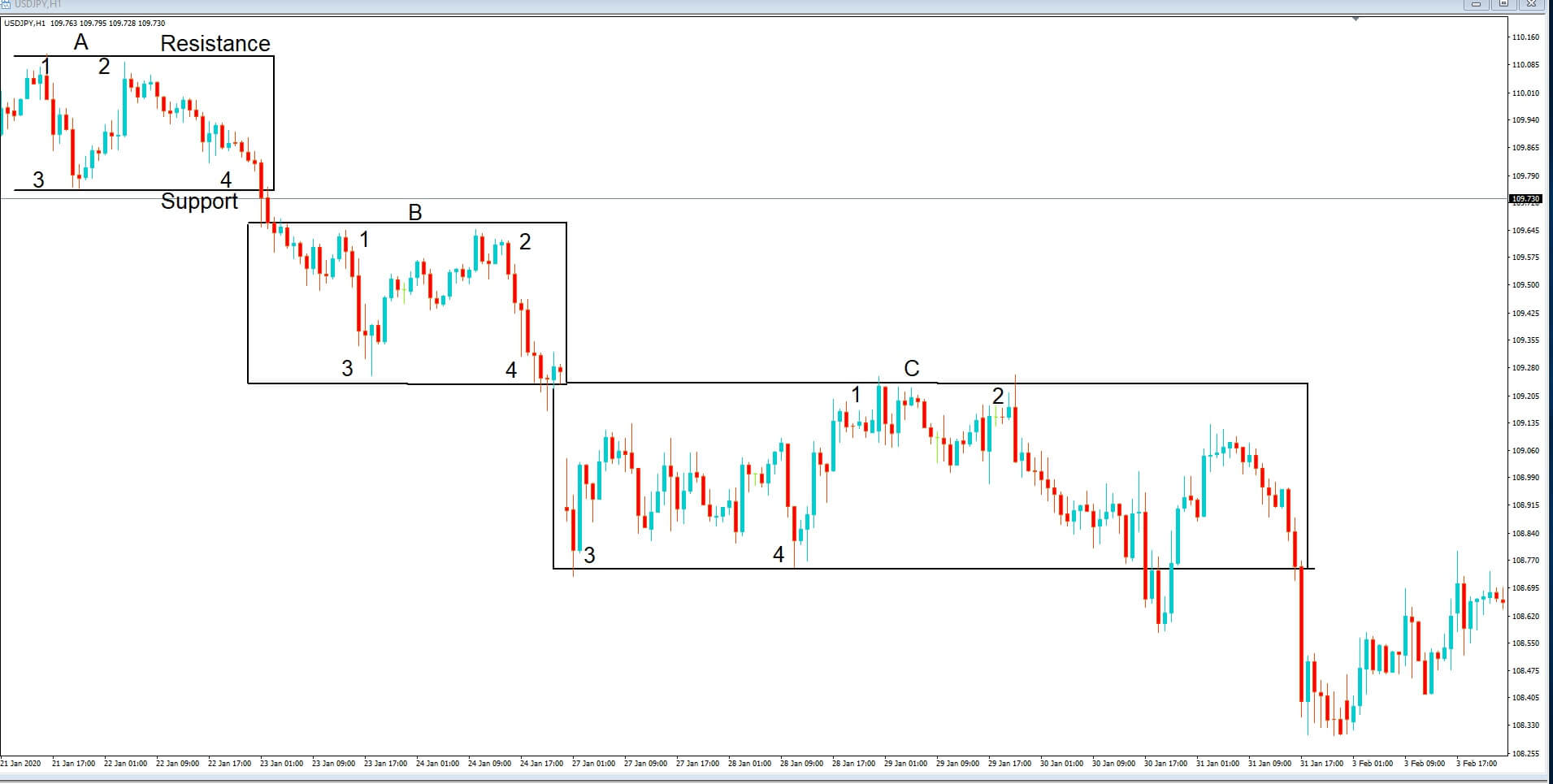
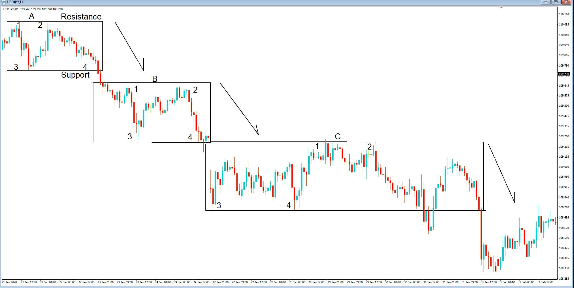
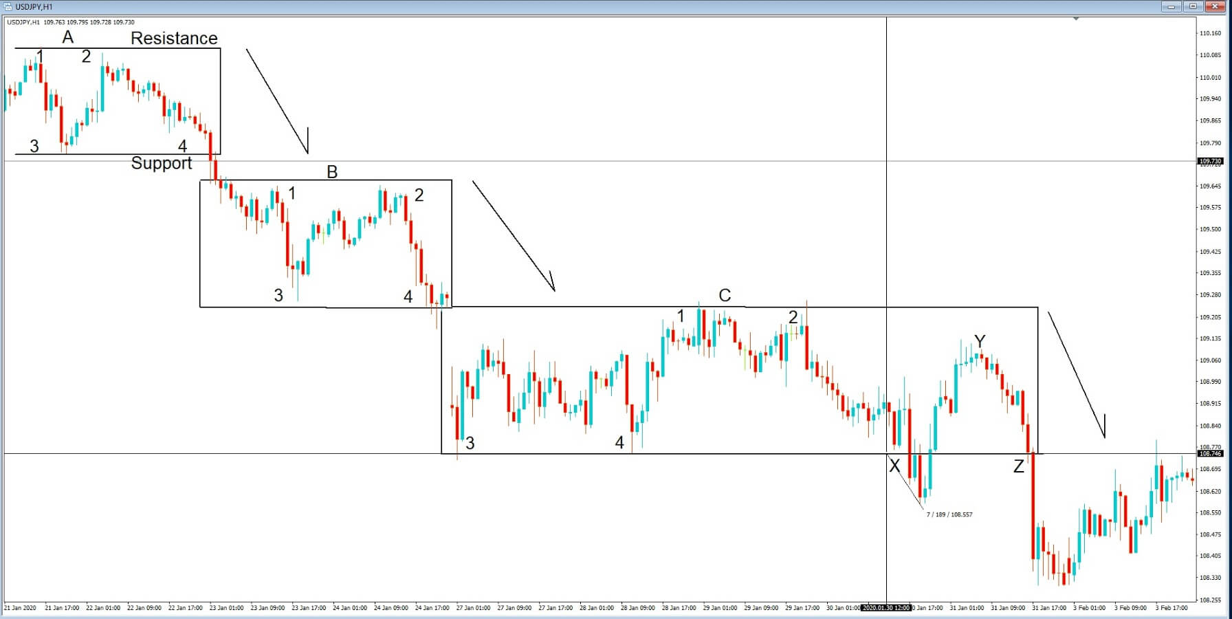
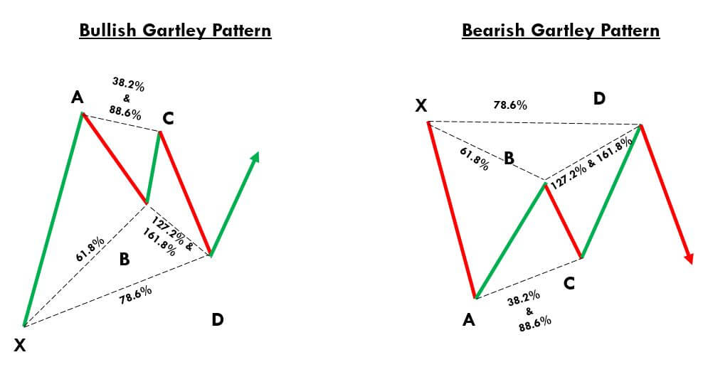 Gartley Pattern Trading Strategy