Categories
Forex Daily Topic Forex Price Action

Breakout at Weekly High/Low, Wait for Consolidation

In today’s lesson, we are going to demonstrate an example of an H4 breakout at the weekly low. The chart produces a strong bearish candle to make the breakout. The Bear looks good to make a strong move towards the South. However, the price does not head towards the downside. It rather gets choppy. Let us find out the reason behind it.

It is an H4 chart. The chart shows that the price makes a strong bearish move. It has a bounce at a level of support twice. If the price makes a breakout at the neckline, the buyers may look to go long in the pair upon bearish correction. On the other hand, the sellers may wait for the price to make a breakout at the week’s low to go short upon consolidation and getting a bearish reversal candle.

The chart produces a strong bearish candle breaching through the last week’s low. The breakout length is good as well. It means that the sellers may wait for the price to consolidate and to get a bearish reversal candle to go short in the pair. It seems that the sellers may dominate in the pair in this week as well.

The chart produces another bearish candle followed by a bullish engulfing candle. Producing a bullish engulfing candle to consolidate is not a good sign for the sellers. However, if the next candle comes out as a bearish engulfing candle closing below consolidation support, the sellers will be right on the track.

The chart does not produce a bearish engulfing candle. It rather produces another bullish candle. It seems that the price is having a bullish correction. When the H4 chart makes a breakout at the weekly low/high, the price is supposed to consolidate and produce a reversal candle to offer entry. If it makes a long bullish/bearish correction, it is assumed that the traders are not confident to take the price towards the trend. The chart shows that the price is obeying the level of support, where it has its first bounce.

The choppy price action continues. The H4 traders may wait for the price to make a breakout in the next week. The level of support becomes daily support now. Thus, weekly-H4 traders must wait to find the next direction.

We must remember when a pair trades within last week’s high and low, the price usually makes a correction. When it makes a breakout, it consolidates. If it takes too long or too many candles to make a breakout, traders may skip taking entry on that chart.

Categories
Forex Price Action

It is Not over until It’s Over

In today’s lesson, we are going to demonstrate an example of a trendline trade setup. The price heads towards the North, and upon finding its support, it keeps moving towards the upside. At some point, it seems that the price is about to make a breakout at the trendline. However, the trendline works as a level of support and produces a beautiful bullish engulfing candle ending up offering a long entry. Let us find out how that happens.

The chart shows that the price makes a bullish move and comes down to make a bearish correction. It makes a bullish move again but finds its resistance around the same level. At the moment, the chart suggests that the bears have the upper hand.

The chart produces a Doji candle having a long lower spike. It pushes the price towards the North, and the price makes a breakout at the highest high. The last move confirms that the bull has taken control. The buyers may look for buying opportunities. Assume you are a trendline trader. Do you see anything?

Yes, you can draw an up-trending trendline. The last candle comes out as a bearish engulfing candle. It suggests that the price may make a bearish correction. As a trendline trader, you are to wait for the price to produce a bullish reversal candle at the trendline’s support to go long on the chart.

The chart produces two more candles that are bearish. The last candle closes just below the trendline’s support. It seems that the price is about to make a breakout at the trendline. The next candle is going to be very crucial for both. If the next candle comes out as a bullish reversal candle, the buyers are going to push the price towards the North. On the other hand, if the next candle comes out as a bearish candle closing below the trendline’s support, the sellers may push the price towards the South. Let us find out what happens next.

The chart produces a copybook bullish engulfing candle. Traders love to get this kind of reversal candle. The buyers may trigger a long entry right after the last candle closes. Let us proceed to find out how the trade goes.

The price heads towards the North with good bullish momentum. It makes a breakout at the last swing high as well. It means the trendline is still valid for the buyers. The chart produces a bearish reversal candle. Thus, the buyers may consider taking their profit out here.

If we look back, we find that the trendline’s support produces an excellent bullish reversal candle, which some buyers may not expect. This is what often happens in the market. Thus, never give up until its really over.

Categories
Forex Market Analysis

CAD/JPY: A massive round number holding the key

CAD/JPY produced a bullish inside bar yesterday. The price had a bounce at the same level earlier and made a bullish move. The daily chart suggests that the price has some space to travel towards the North. However, if a bullish inside bar is followed by a bearish engulfing candle, it ends up being prolific for the sellers. The H4 chart looks bullish. On the other hand, the H1 chart looks a bit bearish biased. Thus, traders are to be very watchful to trade in the pair. Let us now have a look at three vital charts.

Chart 1 CAD/JPY Daily Chart

The chart shows that it had a bounce at the level of 80.000 earlier. It is a massive round number. It pushed the price towards the North, and the price made a bearish move, closing within the level. Yesterday’s candle came out as a bullish inside bar. As far as the round numbered support is concerned, the price may make a bullish move. However, if the price gets bearish and ends up producing a bearish engulfing candle closing below 80.000, the sellers may go short in the pair aggressively and drive the price towards the level of 78.300. On the other hand, if the price gets bullish, it may find its next resistance around 81.400.

Chart 2 CAD/JPY H4 Chart

The chart shows that the price upon having a bounce at the level of 80.800 produced a spinning top and headed towards the North. It made a bullish breakout at the level of 80.600. The pair had a rejection at 80.800. It has been in a bearish correction. The level of 80.600 may work as a level of support. If the level ends up producing a bullish reversal candle, the buyers may go long above the level of 80.800. The price may find its next resistance around 81.400.

Chart 3 CAD/JPY H1 Chart

The price had a rejection at the level of 80.800 twice. It produced a bearish engulfing candle. The pair is trading around the neckline at 80.640. A bearish reversal candle may attract the sellers to go short in the pair and drive the price towards the South. The price may find its next support around 80.150. On the other hand, the buyers are to wait to go long above the level of 80.800.

The H1 chart looks bearish biased. However, the daily and the H4 chart look bullish. Considering these three charts, it seems that the pair may end up having another bullish day.

Categories
Forex Daily Topic Forex Price Action

Trend Line Trading: The Entries to be Skipped

In today’s lesson, we are going to demonstrate an example of a chart that trends towards the North by obeying a trendline. It offers a long entry once the trendline is established. At the fourth bounce, it produces a bullish reversal candle. We find out whether the buyers should take a long entry or not upon getting the bullish reversal candle at the trendline’s support. Let us get started.

The chart shows that the price heads towards the North upon producing a bullish reversal candle. It consolidates and resumes its bullish journey. The chart looks like the buyers’ hunting ground.

The price upon producing a spinning top, it produces a long bearish candle. It consolidates with some candles and produces a bullish engulfing candle. The buyers may keep an eye in the chart to go long above the last swing high. If the price makes a bullish breakout, the buyers get two swing lows and two swing highs to draw an uptrending trend line.

Here it goes. The price makes a bullish breakout and heads towards the North further. The chart produces a bearish engulfing candle. It may make a bearish correction. As it looks, the chart belongs to the Bull without any doubt.

The price makes a bearish correction; consolidates and heads towards the North again. The breakout traders may find a long opportunity and grab some pips. The price makes a long bearish correction. In fact, it makes a breakout at a significant level of swing low. It seems that the chart is slightly bearish biased. Have a look at the chart below.

The trendline’s support holds the price and produces a bullish engulfing candle. The trendline traders may go long in the pair right after the last candle closes. The last swing high is the safest option to set take profit. It means the risk-reward ratio looks good for the trendline traders.

The price heads towards the North with good bullish momentum. However, it seems that the horizontal level of resistance is too strong to be breached. The price consolidates here with several candles. The last candle comes out as a bearish engulfing candle. The buyers may close the entry. The question is does the price come back to the trendline’s support or it makes a breakout at the highest high.  Let us proceed to the next chart and find out what happens.

The price comes back at the trendline’s support. It produces a hammer. Should the buyers go long from here as far as trendline trading is concerned? Think about it for a minute.

If your answer is ‘No’, you are right. The reason why the buyers should not go long from here is it does not make a new higher high upon getting its last bounce. In fact, traders may wait for the price to make a breakout at the trendline’s support and go short in the pair. In our forthcoming lessons, we will learn about trendline breakout and trendline breakout trading. Stay tuned.

Categories
Forex Price Action

The Beauty of Horizontal Channel Trading

In today’s lesson, we are going to demonstrate an example of a chart where the price gets caught within a horizontal channel. We’ll try to learn how we can trade and make the most of it. Let us get started.

The chart shows that, after being bearish, the price bounces at the drawn level. It produces a bullish engulfing candle and heads towards the North. The chart is bullish-biased. Thus, price-action traders are to look for long entries. Let us see what happens.

The price finds its resistance instead. It produces a bearish inside bar, but it does not make a new higher high. Thus, the buyers do not get an opportunity to go long at the top. The price heads towards the South towards the level of support. Since the level has been working as a level of support, the buyers may wait for the price to produce a bullish reversal candle to go long in the pair.

The chart shows that the price produces a bullish engulfing candle at the support zone. The buyers may trigger a long entry by setting stop loss below the candle’s lowest low and by setting take profit at the level of resistance. The risk-reward looks good.

The price heads towards the North with good bullish momentum. It hits the target in a hurry too. At the moment, the price is right at the level of resistance. Can you guess what traders should do now? Look at the next chart.

The chart shows that the price produces a bearish engulfing candle at the resistance zone. A point is to be noticed here that the chart produces a bullish spinning top. However, it cannot be considered a breakout. It rather produces a bearish engulfing candle. Thus, the traders may go short in the pair by setting take profit at the support zone and by setting stop-loss above the last candle’s highest high.

The price heads towards the South with an average pace. It consolidates for a while and resumes its bearish journey. The price has been roaming around the level of support for quite a while. It means the support gets even stronger. Look at the last candle. It comes out as a bullish engulfing candle. The buyers may trigger another long entry here. Let us find out what happens next.

The price hits the target. The price makes a long bearish correction and tests the buyers’ patience, though. However, in the end, the buyers come out with their pips. Trading is beautiful when the price moves like this, isn’t it?

Categories
Forex Price Action

Trend Line Trading: An Incident That Often Confuses Traders

In today’s lesson, we are going to demonstrate an occurrence that often happens when the price trends with a trendline. A trendline works as a support/resistance. However, there is a little dissimilarity between horizontal support/resistance and trendline support/resistance. To draw a horizontal support/resistance, one bounce or rejection is enough. However, a trendline can be drawn only when the price makes a new higher low/lower high. This is what traders must remember, and we find this out the reason behind it.

The price makes a strong bullish move, as it produces seven consecutive bullish candles. The last candle comes out as a bearish engulfing candle. Considering the trend’s length, the buyers may keep their eyes on the pair to go long upon having a bullish reversal candle at flipped support.

The price consolidates and bounces at the same level twice. The last candle comes out as a bullish reversal candle. The buyers on the minor chart may look to go long in the pair and push the price towards the North.

The price heads towards the North and makes a breakout at the last swing high. It means we can draw an up-trending trend line and wait for the price to come at trendline’s support and to get a bullish reversal candle to go long in the pair. Let us find out what happens next.

The price does not produce a bullish reversal candle. It makes a breakout at trendline’s support and trades below the level for several candles. If the price makes a breakout at the last swing low, the sellers may look to go short in the pair. Let us see what happens next.

The price upon finding its horizontal support heads towards the North and makes a breakout at the last swing high. What does that mean? It means we can draw an up-trending trend line by using the last swing low from where the price makes a bullish breakout. Let us draw it and see how it looks.

It is a new trendline. It offers price to makes more bearish correction and more space towards the North to travel. As a matter of fact, its support zone has changed, but the new trendline is valid for the same old chart. It’s an incident that happens in the Forex market so often. Thus, keep an eye on a chart closely and do not make an immediate trading decision. Be sure about the breakout. If the breakout is confirmed, change your trading direction. If the breakout is not confirmed, let the price decide its way. We just have to follow the price and trade with its direction.

Categories
Forex Price Action

Trend Line Trading: Establishment and Choosing the Chart Timeframe

In today’s lesson, we are going to learn how a trend line is established and how to choose the chart to trigger entry as far as trend line trading is concerned. Traders at the beginning often are carried away and select a wrong chart to trade with a trend line. The point is, we must choose the right time frame to make the best use of a trend line. Let us now find out how we can do that.

It is a daily chart. The chart shows that the price after making a bullish correction heads towards the South and makes new lower lows. We see four significant swing highs from where the price makes four swing low. If you are a trendline trader, you know from where you have to keep an eye on this chart, don’t you? Then again, let us explore it.

The price produces a spinning top followed by a bearish engulfing candle. It makes a bullish correction and finds its resistance at point B. The price makes a breakout at the last swing low and heads towards the South further. By joining two swing highs, we can draw a down-trending trend line.

The chart shows that the price is down-trending by obeying the drawn trend line with the first two points. Concentrate on the point C. This is where traders keep their eyes to get a bearish reversal candle to go short in the pair. The chart shows that the price produces an inverted hammer. The trend line sellers may go short below the last candle’s lowest low.

As expected, the price heads towards the South with good bearish momentum. The chart produces two consecutive bearish candles. Moreover, the chart makes a new lower low as well. This means the game is not over yet for the trend line sellers. They may wait to go short again from the resistance of the trendline upon getting a bearish reversal candle.

The chart produces a bearish inside bar. The sellers may go short again below the last candle’s lowest low. It seems that the sellers are having a feast here. This is the beauty of trend line trading.

The sellers again make a handful of pips. In fact, the price makes a breakout again at the last swing low. They may wait for the price to go towards the trendline and produce a bearish reversal candle at point E to go short again. Now, let’s flip over to the H4 chart and find out how it looks.

The chart shows that the price is down trending. However, it is tough to find out the signal candle. We get more than one bearish reversal candle at point B and C. At point D, it is extremely confusing were to trigger an entry. With the Daily chart, it is very explicit, though. To be able to choose the right chart that obeys a trend line, we may always concentrate on point B (2nd point) and calculate with which chart it responds more. We then keep our eyes on that particular chart to be able to take entry with precision.


Categories
Forex Daily Topic Forex Price Action

Trend Line Trading: It Takes at Least ‘two’ to Draw a Trend Line

In today’s lesson, we are going to demonstrate an example of trendline trading. We try to learn what steps traders need to take to trade using a trendline strategy. We are going to demonstrate a chart, which heads towards the North by obeying an up-trending trend line. With the trend line trading strategy, we must remember, “It takes at least ‘two’ lows to draw a trend line.” Let us proceed and find out how it works.

The chart shows that the price produces a double bottom and heads towards the North. The buyers may wait for the price to make a bearish correction and create a bullish reversal candle to go long in the pair. The last candle comes out as a bearish pin bar. The price may make a bearish correction from here.

The price makes a long bearish correction. It produces several Doji candles. However, it does not create any bullish momentum. It is an H4 chart. The correction takes more than six candles. The level of resistance becomes a daily resistance. Some buyers may skip eyeing on the chart to go long in the pair. Let us see what happens next.

The chart produces a bullish engulfing candle and heads towards the North by making a new higher high. Do you notice anything here? Yes, we can draw an up-trending trend line. Let us draw it.

Over here, we have two swing lows. At the second swing low, the price makes a breakout at the last swing high. It means as far as fundamentals of drawing a trend line is concerned, the chart offers the buyers to draw an up-trending trend line. We must remember that it takes at least two swing lows (price trending higher from those points) to draw a trend line. The buyers are to wait for the price to come at the level of support and produce a bullish reversal candle to go long in the pair.

The price comes at the level of support and produces a bullish pin bar. It is delivered right at the trendline’s support. The buyers may get ready to go long in the pair above the reversal candle’s highest high.

The next candle comes out like a spinning top, which breaks the reversal candle’s highest high. However, the price does not head towards the North according to the buyers’ expectations. Nevertheless, on the next day, the price makes bearish correction at intraday charts and heads towards the North. Let us proceed to the following chart to find out how the trade goes.

The price hits the first target in a hurry. It makes a breakout at the level and creates a new higher high as well. It means the buyers are going to keep their eyes on the chart to go long again from the trendline’s support, and this is the beauty of the trendline trading.

Categories
Forex Price Action

Trend Line Trading: Keep an Eye at New Highs/Lows

In today’s lesson, we are going to demonstrate an example of trendline trading. The trendline trading is one of the most consistent trading strategies. Thus, a trader can make profits by properly dealing with how trends develop. In today’s example, we will demonstrate a chart with an up-trending trendline, where the price goes down trendline’s support. However, it produces a bullish reversal candle and ends up offering a long entry. Let us get started.

The chart shows that the price heads towards the North upon finding its support. It has several higher lows that can be used to draw trendlines. However, before drawing a trendline on a chart, we have to spot out the most significant higher lows to draw an upward trend line and, conversely, the most significant lower highs to draw a downtrend line. Over here, look at the two points with the ‘right’ marks. Let us proceed to the next chart to find out how it looks with a drawn trendline.

We have drawn the trendline by using two right marks. Ideally, traders are to wait for the price to come at the level of support (trendline’s support) and get a bullish reversal candle to go long in the pair. At the last swing low, the price approaches at the level of support. However, the chart does not produce a bullish reversal candle at the level of support. They may wait for the price to come right at the drawn trendline’s support.

The price comes down. One of the bearish reversal candles closes below the level of support. The sellers may become interested here that the price may end up making a bearish breakout. If the next candle closes below the trendline, the sellers may consider having a breakout. Let us find out what happens.

The next candle does not close below the trendline. It comes back in. It means that the price obeys the trendline’s support. The last candle comes out as a bullish Marubozu candle forming by testing the trendline support. The buyers may go long in the pair again and push the price towards the last swing high.

The price heads towards the North at a moderate pace. As far as the bullish reversal candle is concerned, it is supposed to create more buying pressure. Anyway, the price hits buyers’ first take profit target. It may continue its bullish journey if it makes a bullish breakout at the last swing high. If it does not make a new higher high but comes back at the trendline’s support, the price may get choppy. If it makes a new higher high, the trendline becomes active, and the buyers may wait to go long from the trendline’s support again.

Categories
Forex Price Action

Equidistant Channel: An Excellent Price Action Trading Tool

In today’s lesson, we are going to demonstrate a trade setup with Equidistant Channel. Price action traders rely on Equidistant Channel a lot. It is one of the best price action trading tools. However, Forex traders’ life is not as easy as it seems. Like other trading tools, Equidistant Channel needs adjustment. To be able to do that traders need enough knowledge and experience. Let us now proceed to find out what a trader may need to do to make it work for him.

To draw the equidistant channel, we need to find out at least four points. Two swing highs and two swing lows are the best combinations. It works with three swing highs and one swing low or vice versa. In the chart above, we have two swing highs and two swing lows. In naked eyes, it seems that we will be able to draw an equidistant channel here.

We have drawn an equidistant channel. The price is now at the resistance. Some traders go long from here. Ideally, to get a good risk-reward, traders should wait for the price to go at the level of resistance and produce a bearish reversal candle to go short in the pair. Let us find out what happens next.

The chart does not produce a bearish reversal candle. It breaches the level instead. It means this is not a valid equidistant channel anymore. The sellers must be disappointed. What do you think is there any twist in the tail?

The chart makes the new lowest low. It gives three swing highs and one swing low. It means we can draw another equidistant channel. Look at the above chart where the price getting a bounce at the level of support. The price again heads towards the North. Traders may wait for the price to get a rejection at the level of resistance and produce a bearish reversal candle to go short in the pair again.

Here it comes. The level of resistance produces a bearish engulfing candle right at the level of resistance. Traders may trigger a short entry right after the last candle closes. To set take profit, they may use the level of equidistant support. The price often keeps going down with a down-trending equidistant channel. However, the best practice is closing down the trade at the first bounce in case of down-trending equidistant channel trading. Let us find out how the trade goes.

The price hits take profit level like a rocket. Some may regret that they should hold the position and close it manually. Do not forget the rule of sticking with the rule in forex trading. We have seen that the chart does not produce a signal on the first occasion. It rather breaches and lets traders draw another equidistant channel. Yes, it does offer an excellent entry for the sellers too.

Categories
Forex Daily Topic Forex Price Action

Pay Attention to the Signal Candle Along with Reversal Candle

In today’s lesson, we are going to demonstrate an example of a combination of an H1-15M chart trading strategy. The price makes a strong bullish move and makes a long bearish correction. It produces several bullish reversal candles, but the price does not react to all of them. It makes its bullish move at last. We try to find out why it reacts to that particular bullish reversal candle. Let us get started.

This is an H1 chart. The chart shows that the price produces a bullish engulfing candle and heads towards the North. The buyers are to wait for the price to make a bearish correction and produce a bullish reversal candle to go long again in the pair. The last candle comes out as a hanging man. It may make the pair make a bearish correction. Let us proceed to the next chart to find out what happens next.

The price makes a long bearish correction. It produces several bullish reversal candles. However, it does not make its bullish move. If we spot out, we find that there have been three significant bullish reversal candles. To make things clearer, have a look at the chart below.

Here are the three most significant bullish reversal candles that the chart produces. On the first two occasions, the price does not head towards the North. Let’s try to dig out what happens on the first occasion. On the first occasion, the chart produces a bullish engulfing candle. This is one of the strongest bullish reversal candles. The buyers are to flip over to the 15M chart. If the 15M chart produces a bullish continuation candle, they may trigger a long entry. Over here, the 15M chart does not produce a bullish continuation candle. Thus, the price does not head towards the North. On the second occasion, the 15M chart produces a bullish continuation candle. You can assume by the look of the next H1 candle. However, the price does not continue its move or makes a breakout at the highest high. The reason behind that is the reversal candle comes out as an Inside bar. On the third occasion, the reversal candle comes out as a bullish engulfing candle. Let us flip over to the 15M chart.

Look at the arrowed candle. This is what comes out after the bullish engulfing candle. The buyers have been waiting to get a candle like this after a strong H1 bullish reversal candle. They may trigger a long entry right after the candle closes (15M). Let us find out how the price moves now.

It moves towards the North with good bullish momentum. We must notice that when two factors come together, the price reacts vigorously. We may find that sometimes the price moves on the case of the second occasion as well. However, when it meets two of them together (H1 bullish engulfing and 15M bullish continuation and vice versa), most likely, it goes towards the trend and helps traders make money.

Categories
Forex Fibonacci

Fibonacci Levels: How Much Does 50% Level Influence the Market?

In today’s lesson, we are going to demonstrate an example of a chart, in which the price makes a reversal from 50% Fibonacci level. We know if the price makes a reversal from 61.8%, it usually goes up to 161.8%; if it makes a reversal from 38.2%, it goes up to 138.2%. In both cases, traders get good risk-reward. Do you ever wonder what happens if the price makes a reversal from 50%? Let us find this out through an example.

The chart shows that the price heads towards the South with good bearish momentum. It produces two bullish candles and heads towards the South. Look at the last candle. It comes out as a bullish inside bar. It makes a bullish correction. However, the sellers may wait for a bearish engulfing candle to go short in the pair.

The price has been in a bullish correction. It produces some bearish reversal candles, but it does not create any bearish momentum. The last candle comes out with a little bullish body having a long upper shadow. Let us proceed to the next chart to find out what happens next.

The last candle comes out as a bearish engulfing candle. It is a strong sign that the price may head towards the South again. The sellers may flip over to the minor chart to trigger entry.

The price heads towards the South with extreme bearish pressure. The last candle comes out as a bearish Marubozu candle. It seems that the price may continue its bearish journey towards the South further. Let us find out what actually happens.

It does not continue its bearish journey. It finds its support. Upon producing a hammer, it heads towards the North with one more bullish candle. It seems that it may continue its bearish journey considering bearish engulfing candle as a reversal candle. Next, two candles come out as strong bearish candles too. What may be the reason that the price makes a bullish reversal here? Let us find this out with Fibonacci levels.

If we calculate, we find that the price makes a bearish reversal from Fibonacci 50% level. It then heads towards the South with extreme bearish momentum. However, it finds its support at the Fibonacci 100.00 level. Usually, this is what happens when the price trends from the 50% level. A question may be raised here whether we should take entry if the price trends from the 50% Fibo level. It depends on risk-reward. If it offers a good reward, then we may take an entry. In most cases, it does not offer a good reward; thus, we may skip taking those entries.


Categories
Forex Chart Basics

How to Guess Support/Resistance Level Well Ahead?

In today’s example, we are going to demonstrate an example of a fundamental character of support/resistance. We know the importance of support/resistance in trading. Thus, if we get a clue about spotting support/resistance well ahead, it comes out handy. Let us find out whether it is possible or not.

This is a daily chart. The chart shows that the price heads towards the North with good bullish momentum. It makes bearish correction and keeps resuming its bullish journey. With naked eyes, we see that the price finds its support at three points. Let us investigate the chart with some drawings on it.

We have spotted out three points where the price gets rejection twice. When the price makes a bullish move, at its second wave, it finds its support at the third arrowed point. It works with a simple equation. Can you guess what that is?

Let us draw a line. We see that the price gets rejection at the same level twice. It means it is a level of resistance when the price is bearish. The price breaches the level later and finds its support at the same level. It produces a bullish reversal candle and heads towards the North. Once the price makes a bullish breakout, the buyers shall wait for the price to make a bearish correction. If the level produces a bullish reversal candle, the pair may head towards the North by offering a long entry. This is what happens here. Let us see the same chart by zooming out.

This is the same chart. We have spotted out two significant points and spotted them with two arrows. I assume this time you guess what I am going to say. Yes, the price makes a bullish breakout and finds its support at the breakout level. This is the level, which is a level of resistance in this chart. Since it gets broken and the chart produces a bullish reversal candle, the buyers may go long in the pair again. Let us draw a line here.

See how the price reacts here. Upon producing a Morning Star, the price heads towards the North with good bullish momentum. The price makes even a stronger move this time.

The plan of a buyer should be eyeing on the level to get a bullish reversal candle where the price finds its resistance when it is bearish and vice versa. This makes traders’ life easy, and in the end, it helps them make a better trading decision.

Categories
Forex Course

137. Differentiating between a Retracement and a Reversal

Introduction

Broadly speaking, there are three states in the market – trend, range, and channel. If we were to go a little more in detail, a market has components like retracement and reversal. Identifying and differentiating between a retracement and reversal is a skill in itself. In this lesson, let’s go and understand what these terms mean and how to differentiate them.

What is Retracement?

Retracement is the terminology usually associated in a trending market. We know that in a trending market, the price moves in one specific direction. For instance, an uptrend is defined as a sequence of higher highs and higher lows. As per the definition of an uptrend, the prices do not keep moving higher and higher continuously.

After trending up to a certain point, the price temporarily moves in the opposite direction. This movement against the original trend is referred to as retracement. Technically, the price action from a higher high to the higher low is called a retracement.

Uptrend Example

Downtrend Example

What is a Reversal?

A reversal can be defined as the overall change in the direction of the market. A market can reverse from an uptrend to a downtrend, or from a downtrend to an uptrend.

Reversal to the Upside

In this type of reversal, initially, the market trends in a downtrend making lower lows and lower highs. Later, the market goes into a transition state where the price typically ranges for a while. In other words, the price stops making lower lows and lows highs. Instead, it makes equal lows or higher lows. Finally, the market starts to trend north by making higher highs and lower lows.

Reversal to the Downside

This reversal happens when the market transits from an uptrend to a downtrend. In an uptrend, the price makes higher highs and higher lows. But, when the trend begins to diminish, the higher highs turn into equal highs, and higher lows start to become equal lows. Finally, when the seller’s pressure comes in, the price begins to make lower lows and lower highs, forming a downtrend. Thus, the complete scenario is referred to as a reversal.

Predicting a possible reversal or retracement in the market is pretty challenging. If you’re stuck in a position and unsure if it is a retracement or a reversal, you may try the following options to manage the trade:

  • Hold onto your positions by keeping the stop loss as it is. If it is a retracement, you can ride the trade, else get stopped if it is a reversal. This is the simplest approach.
  • If you are more inclined towards a reversal than a retracement, then you may close your positions. Based on where the market breaks through, you can look for re-entry. But, you might have to compromise on the risk: reward.
  • You could close the entire position and stay away from the pair and look for other opportunities. This is the safest option possible, especially for conservative traders.
[wp_quiz id=”79176″]
Categories
Forex Price Action

Traders are to be Artists

In today’s lesson, we are going to demonstrate an example of the daily-H4 chart combination trading. The H4 chart offers a long entry. The chart’s breakout and level of support are to be spotted with some calculation. We try to learn those from today’s lesson.

This is the daily chart. The chart shows that the price makes a very strong bullish move. It then makes a bearish correction. At the correction, it produces a bullish engulfing candle once but continues its journey towards the South. The daily-H4 chart combination traders may have flipped over to the H4 chart upon having that bullish engulfing candle. Anyway, look at the last candle. It is a strong bullish reversal candle. The buyers may flip over to the H4 chart to go long in the pair.

This is how the H4 chart looks. The last candle comes out as a doji candle. The buyers are to wait for the price to consolidate and produce a bullish candle to trigger a long entry.

The chart shows that the price consolidates and produces a bullish engulfing candle. Let’s focus on those two drawn levels. We may not count the lower spike of that spinning top to draw the support line. We try to draw the line by using a flipped level that holds some candle’s wicks and bodies of all the candles. To draw the level of resistance, we count the spike of the spinning top (the last rejection) but skip some part of the upper shadow of a candle. Yes, it is not a bad idea to draw a breakout level by using spikes to some extent. In most cases, however, significant rejection, along with candles’ bodies, matters a lot. Let us assume that we trigger a long entry in this chart.

The price heads towards the North with good bullish momentum. The last candle does not hit the target of 1R, but the price is almost there. It seems that the buyers may not have to wait too long to achieve their target.

The last candle comes out as a bearish candle with a long upper shadow (the body is relatively thicker though). However, the upper shadow shows that the price hits the target. However, it is a bearish reversal candle because the body closes within the last bullish candle, suggesting that the price may continue its bullish move.

If we look back and study with the flipped H4 chart, we find that the buyers are to count some factors to draw consolidation support and resistance. They are to count some spikes and to skip some of those. As we know, trading is not science; it is an art. Thus, traders are to be artists. To be an artist (successful trader), one needs a lot of practice and experience.

Categories
Forex Price Action

H1-15M Chart Combination Trading: Mind the Weekend

In today’s lesson, we are going to demonstrate an example of H1-15M chart combination trading. Usually, the H1-15M chart combination trading offers 1:2 risk-reward. However, in this example, the buyers may need to come out with their profit with 1:1 risk-reward. We find out why they shall do that so.

This is the H1 chart. The price heads towards the North with good bullish momentum. The price breaches the last swing high and continues its journey towards the North upon confirming the breakout. Look at the last candle. It comes out as a strong bearish candle. The buyers are to keep their eyes on the pair to get a bullish reversal candle to go long.

The price makes a long bearish correction. Look at the last candle in the chart. It comes out as a bullish candle. The combination of the previous three candles is not a morning star since the last candle does not close above the bearish candle. Nevertheless, the last candle comes out as a bullish engulfing candle. It is a strong bullish reversal candle. It is time for the buyers to flip over to the 15M chart.

This is how the 15M chart looks like. A bullish candle closing above the last candle’s body would be a good signal to go long in the pair. The buyers must keep their eyes in the chart. Let us proceed to the next chart to find out how it comes out.

Look at the last candle. This is one beautiful bullish engulfing candle closing well above the last candle’s wick. A signal candle like this attracts more buyers and usually brings good liquidity. The H1-15 chart combination traders may trigger a long entry right after the last candle closes by setting stop loss below the support level and by setting take profit with 2R. Let us now flip over to the H1 chart again to see how the trade goes.

The price heads towards the North with good bullish momentum. It hits 1R in a hurry. The last candle comes out as an inside bar, which is the weakest bearish reversal candle. In most cases, H1-15 chart combination trading offers 1:2 risk-reward. The question is whether the buyers keep holding the trade or not. I may mention that it is Friday and only three/four hours to go to shut down the market. I think now you know what buyers should do here. Yes, they should close the trade and come out with the 1R profit. The H1-15M chart combination traders should not keep holding their trade during the weekend. In some cases, it may bring them some extra pips. However, in many cases, it may hurt them badly.


Categories
Forex Price Action

H1-15M Combination Strategy: Entry upon Consolidation and Fibo Targets

In today’s lesson, we are going to demonstrate an example of the H1 -15M combination trading strategy offering entry upon consolidation. We are going to integrate Fibonacci levels to see how far the price moves. This would give us an idea of how effective Fibonacci levels are to determine the stop loss and take profit level. Let us get started.

The H1 chart shows that the price makes a strong bearish move and finds its support. The black marked level is the level of H1 support here. The price moves towards the North with two candles and may have found its resistance. One of the candles comes out as a bearish engulfing candle. Traders are to wait for an H1 breakout followed by a 15M bearish reversal candle to go short in the pair. Let us see what happens here.

The chart produces one more bearish candle followed by a doji candle. It means the price consolidates in this chart. The next candle closes just below the level of support. Ideally, this is not a perfect breakout candle. However, the price consolidates and produces an H1 bearish reversal candle (the last candle). This is a signal that the price may get bearish and head towards the South. Let us flip over to the 15M chart.

The 15M chart shows that the last candle comes out as a bullish candle. Do not forget that H1 candle closes with a bearish body. Thus, a 15M bearish reversal candle (preferably engulfing candle) will push the price towards the South.

Look at the last 15M candle. It comes out as a bearish engulfing candle closing well below the last candle. This means the price may head towards the South with good bearish momentum. Let us proceed to the next chart with Fibonacci levels to find out how far the price heads to.

The price trends from the 78.6% level and reaches 161.8%. Usually, the 78.6% Fibo level drives the price towards the level of 138.2% with good momentum. It often reaches up to the level of 161.8% because of momentum. However, we may set our target at 138.2% if it trends from 78.6%. Another point you may have noticed is that we draw Fibonacci levels by using the lowest low, not the H1 support. These are two different things.

If the H1 chart makes a straight breakout, we may wait for a 15M reversal candle to take entry. If it consolidates and produces an H1 reversal candle, we may trigger entry if 15M chart produces a strong reversal candle closing well below the wave’s lowest low. Do some backtesting; you will see many charts where the price makes a move like this. Stay tuned. We will reveal more examples of this.


Categories
Forex Course

120. Introduction To Harmonic Patterns

Introduction

In the previous course articles, we have been discussing a lot of concepts related to Technical Analysis. In that journey, we have learned the trading of some of the most significant chart patterns like Head & Shoulders, Triangle, Wedge, etc. The extension to the learning of these concepts is to know the process of identifying and trading of Harmonic Patterns. We want to mention that learning this part is a bit tricky as the concepts are advanced and require a lot of practice to master them. Let’s get into details.

Brief History

The discovery of these Harmonic patterns dates back to the 1930s. H.M.Gartley, an American author and technical analyst, mentioned the trading of these unique patterns in his book ‘Profits In The Stock Market.’ Later these patterns were highly improvised by ‘Larry Pesavento’ by adding Fib ratios to identify and confirm these patterns. Finally, ‘Scott Carney’ discovered more Harmonic patterns and published them in his most famous book ‘Harmonic Trading.’

What Are Harmonic Patterns?

Harmonic Chart Patterns are nothing but the same kind of Forex chart patterns that we have learned in our previous lessons. But the shapes of these patterns look similar to the real-life birds and animals. For instance, one of the very well known harmonic chart patterns is the Butterfly pattern. That is, when this pattern is complete, we will be able to see a butterfly-like structure on the price charts formed by the price action.

All the Harmonic patterns are both bullish and bearish in nature. That is, these patterns can be identified and traded in both up trending & down trending markets. Also, some of the Harmonic patterns indicate that the current market trend is going to continue, and some of them indicate a market reversal. Hence we can consider Harmonics as both trend continuation and reversal patterns.

Why is it important to know them?

The harmonic patterns levels-up the pattern-based trading as it involves an additional technical tool to confirm and trade them. And that tool is none other than the well known Fibonacci levels. The harmonic patterns can only be confirmed by analyzing at what levels the price action turning its directions. Only if these levels are in line with the predefined Fibonacci levels, we can confirm and trade these patterns. The harmonic trading enables traders in predicting the future price movements of an asset more accurately than any other form of trading.

How many Harmonic Patterns are there?

In total, there are nine Harmonic patterns out of which six are used frequently by the traders to trade the Forex market. The ideology behind trading any of these patterns is the same; we must wait for a particular Harmonic pattern to form completely on the price chart and then take long or short positions accordingly. In the upcoming course lessons, we will be discussing the six Harmonic patterns that we have mentioned below.

The other three less used Harmonic patterns are Shark Pattern, Cypher Pattern, and the ABC Pattern. Stay tuned to learn the trading of these patterns in the easiest way possible. Cheers!

Categories
Forex Price Action

The H1-15M Breakout Trading: Concentrate on Breakout and Reversal Candle

In today’s lesson, we are going to demonstrate an example of a trade setup based on the H1-15M chart combination. Usually, the straighter the first move, the better it is.  However, the price sometimes consolidates in the first arm as well. Such consolidation makes a move look weak and may hold us back from eyeing on the chart. We try to find out whether we should skip eyeing on such a chart or not.

This is an H1 chart. The chart shows that the price makes a bullish move. Then, it produces a bearish inside bar followed by a bullish engulfing candle. The H1-15M buyers may flip over to the 15M chart to get a 15M bullish reversal candle to trigger a long entry. However, those two bearish H1 candles suggest that the 15M chart does not produce any bullish reversal candle after the H1 breakout. The price starts having a bearish correction instead.

The chart makes its bullish move, followed by a bearish correction. The bullish move does not look that impressive. It consolidates before making the bearish correction. Many traders may skip eyeing on this chart to go long in the pair. Ideally, the H1-15M combination trading requires an H1 breakout followed by a 15M bullish reversal to offer a long entry. Let us proceed to the next chart to find out what the price does here.

The price finds its support and heads towards the North. The last candle closes above the level of resistance. This is an H1 breakout. The H1-15M combination traders are to flip over to the 15M chart to trigger a long entry. Let us flip over to the 15M chart first.

This is how the 15M chart looks right after the H1 breakout. If the price comes back to the breakout level, and the level produces a 15M bullish reversal candle, the buyers may trigger a long entry.

The 15M chart produces a bearish engulfing candle closing within the breakout level. The next candle comes out as a bullish engulfing candle. The H1-15M buyers may trigger a long entry right after the last candle closes by setting stop loss below consolidation support and by setting take profit with 1R.

The price never looks back before hitting 1R. It heads towards the North at a very good pace. Consolidation and bullish reversal candle come out exactly the buyers would want to get. Do not forget that the first bullish move does not look that impressive. The breakout and 15M chart’s price action attract the buyers to go long here, though. This is what we are to look for in the H1-15M combination trading. It is good if the price makes a strong move in the first arm. However, if it does not, we may still eye on the chart to see whether it makes an H1 breakout and offers us an entry by producing a 15M bullish reversal candle.

Categories
Forex Daily Topic Forex Price-Action Strategies

Do Not Give Up Until It Is Void

Forex traders have to have no given up attitude. With patience, discipline, and diligence they have to stick with a chart unless it is completely messed up. In today’s lesson, we are going to demonstrate an example of this.

The chart shows that the price makes a strong bearish move. It finds its support and heads towards the North for an upward correction. Look at the last candle on the chart. This comes out as a bearish engulfing candle, which the sellers wait for in such price action. If the price heads towards the downside and makes a breakout followed by a breakout confirmation, the sellers are going to trigger a short entry. Let us proceed to the next chart.

The sellers do not expect this. The price does not head towards the downside. It rather goes towards the North and roams around the level of resistance. It is painful for the sellers. However, observe on the chart that the level of resistance is still intact. The price may head towards the North but the sellers still have a chance. Let us see what happens next.

The sellers are on their toes again. The chart produces an inverted hammer followed by another long bearish candle. If the price makes a breakout and confirms that, the sellers are going to trigger a short entry.

Here comes the breakout candle. A good-looking bearish candle breaches the level of support closing well below it. This is an explicit breakout. The sellers are to wait for the next candle to close below the lowest low of the breakout candle to trigger the entry.

The next candle comes out as a bearish candle closing well below the breakout candle. The sellers must not waste a second here but trigger the entry right after the last candle closes. A dead-looking chart for the sellers ends up producing entry. Let us proceed to the next chart to find out how the trade goes.

The price heads towards the South in a hurry. It is quite a big bearish move, which offers more than 1R. A trade setup works wonderfully well for the sellers.

Let us recap the entry again. It looks good at the beginning. The price then goes towards the upside and it seems that it may not offer a short entry. The price finds its resistance at the same level; makes a breakout followed by a breakout confirmation. As far as breakout strategy is concerned, the sellers trigger a short entry and make a profit out of it. This is why traders must not give up but stick with the chart as long as it’s valid to produce a signal.

Categories
Forex Daily Topic Forex Price-Action Strategies

Keeping an Eye on Some Levels Comes Handy

Forex price action trading requires a clearer chart. Traders are to keep an eye on candlesticks’ attributes, consolidation, reversal candle, and support/resistance levels. The last swing high and the last swing low are two levels that traders must count. However, the price often reacts to certain levels, where it reacts heavily earlier. We may keep an eye on those closely since they often offer entries. In today’s lesson, we are going to demonstrate an example of that.

The chart produces a bullish engulfing candle after being bearish for a long time. The buyers still hold the key. However, the sellers may keep start eyeing on the pair as well. The chart shows a pullback level in its bearish wave. The highest high is further up, though. Thus, if the price makes a bullish move from here, it would be a big one.

The price heads towards the North with good bullish momentum. The buyers are to wait for the price to consolidate and produce a bullish signal candle to go long on the pair. A level of resistance (drawn level) is nearby. The price may consolidate around the level. Thus, this is time for the buyers to keep an eye in the pair closely.

The price does not consolidate around the level of resistance, but it makes a breakout.  Some traders may think that they have wasted time here by keeping an eye on the pair, which is never right. In Forex trading, we need to invest money and time. After such a breakout, the price usually keeps going towards the trend’s direction for one or two more candles before having consolidation. Do not forget, it often consolidates around the breakout level and offers entry.

The chart produces one more bullish candle followed by a bearish candle. The last candle closes within the breakout level. This means the price is having consolidation around the breakout level. If the chart produces a bullish engulfing candle closing consolidation resistance, the buyers are going to push the price towards the North.

The buyers crave for getting such a good–looking bullish candle to go long from here. The equation is simple here. The buyers may trigger a long entry right after the candle closes. Let us find out how the entry goes.

The price heads towards the North with good bullish momentum. The buyers achieve their 1R easily here. The highest high is further up. Thus, it may remain bullish for some more candles.

The price may consolidate and offer entry at any level when it is trending. However, it tends to consolidate around some particular levels often. By spotting them out, we may make our trading life a bit easier.

Categories
Forex Price-Action Strategies

Price Action Trading: Weekend and Partial Profit Taking

Partial profit taking is an option to be safe with our investment. It provides less reward to some extent. However, for the Forex traders, it is a great way to make sure that they cash in some profit or lose less money in a particular trade. In today’s lesson, we are going to demonstrate an example of a trade setup offering an entry four hours before the market closes. Traders have only one H4 candle to hit their target, or they would have to carry the trade during the weekend. Let us find out what we should do in such a situation

This is an H4 chart. The price heads towards the South at a moderate pace. The last candle comes out as a bullish engulfing candle. This may work as a bullish reversal for the minor charts’ traders. However, the H4 breakout sellers are to wait for the chart to produce a bearish engulfing candle closing below consolidation support to offer them a short entry.

The price makes a bearish breakout. However, the H4 breakout sellers do not wait for such a breakout. The last candle comes out as a bearish engulfing candle, but the consolidation is shallow. Thus, the sellers may skip taking this entry as well.

Again, the price consolidates and makes another bearish move. This time it does not make any bearish breakout. The chart may end up producing a double bottom here. It is a long way to go. Meanwhile, the sellers must wait.

The chart produces a bullish engulfing candle followed by a bearish inside bar. Now, it looks that the buyers may take control. Let us proceed to the next chart and find out what happens next.

What a Surprise for the H4 breakout sellers! The last candle comes out as a bearish engulfing candle closing well below consolidation support. The sellers may trigger a short entry right after the last candle closes with 1 R by setting stop-loss above consolidation resistance. Do not forget this is Friday. The market is closing within 4 hours.

This is how the last candle looks. It suggests that the price may keep heading towards the South. However, carry trade during the weekend on the H4 chart is risky a little. The market often starts Monday with big gaps that affect the H4 charts. Thus, the sellers may consider taking a partial profit just before the market closes on Friday. It would not get them to achieve 1R in the end, but it would make sure that they earn some profit out of it. Even if the rest of the trade hits the stop loss, he will not lose as much as he would with his whole trade.


Categories
Forex Daily Topic Forex Price-Action Strategies

Price Action Trading: Support/Resistance and Breakout

Support and Resistance are the two most important things as far as price action trading is concerned. We often see that too many support levels/resistance levels are nearby being too close to each other. It may confuse us to be sure whether a breakout takes place or not. In today’s lesson, we try to find an answer to that. Let us get started.

This is a daily chart. The chart shows that the price heads towards the South after producing a bearish engulfing candle. Look at the last candle, which comes out as a bullish corrective candle. If the next candle comes out as a bearish engulfing candle closing below consolidation support, the sellers may trigger a short entry.

The last candle comes out as a bearish engulfing candle closing below consolidation support. The question is whether the sellers may trigger the entry or not. Look at those two drawn levels. The price reacts to those levels. Usually, price action traders count such levels to determine risk-reward or to set take profit level. Let us assume a trader takes the entry.

Typically, he should trigger the entry right after the last candle closes with 1R. Do not forget this is a daily chart. The daily chart usually offers more than 1R. Let us proceed to the next chart.

The price heads towards the South with extreme bearish pressure. As mentioned, it gets him more than 1R. It seems it may continue its bearish journey. At least the seller may hold his position until it produces a bullish reversal candle.

Here it comes. It produces a bullish inside bar. This is not a strong bullish reversal candle. However, some traders may consider come out with their profit or at least some part of it. Some sellers may still hold it until it produces a strong bullish reversal candle.

The last candle comes out as a bullish engulfing candle. This time the sellers are to think twice whether they should hold the entry. Many price action traders close their entry here. The trade setup works excellently well here. However, do you remember those two more support levels? The price does not seem to react to those levels at all. You may notice this next time. When support/resistance levels stand too close to each other, the last level and the last breakout gets the priority (in 80% cases). However, if they have enough space in between, then they must be counted by the traders to calculate risk-reward or to set take profit.

Categories
Forex Price-Action Strategies

Price Action Trading: Be Psychologically Strong

Today, we are going to demonstrate an example, which has several lessons. Forex price action traders need to concentrate hard on the trading charts. They must have ‘never give up’ attitude, must not make decisions emotionally. In a word, they need to be psychologically strong. Let us now proceed to our lessons with examples.

This is a daily chart. After being bearish, the chart produces a bullish reversal candle. The combination of the last two candles is called Track Rail. It is a strong bullish reversal pattern. The daily- H4 combination traders may flip over to the H4 chart to go long on the pair.


The H4 chart does not look that promising. The price heads towards the North, but the momentum has not been strong. However, the buyers have their first signal to keep an eye on this chart. They are to wait for the price to consolidate and produce a bullish engulfing candle to offer them a long entry.

The price makes a deep consolidation and produces a bullish engulfing candle. However, it closes within a level where the price gets rejection twice. The engulfing candle does not close above the level of resistance, but the next one does. This is not an A+ entry. The buyers may skip taking the entry.

The price continues to go towards the North. Some traders may think an opportunity is missed. Do not forget that we shall only go with A+ trade setups. Here is a question. Look at the last consolidation and the bullish reversal candle. The candle closes well above the level of resistance. However, it is not a deep consolidation. Would you trigger a long entry here? Do not miss the point that it is not a deep consolidation. Thus, this is not an A+ entry either. Let us skip it and concentrate on the next chart.


Again, the price heads towards the North. This is where we must not panic and think we keep losing opportunities. It is always better to be safe than sorry. What do you think about the last bearish candle? This seems to be a deep consolidation. If the chart produces a bullish engulfing candle, the buyers may trigger a long entry.


The last candle comes out as a bullish engulfing candle closing well above the level of resistance. The price makes a deep consolidation. This is an A + trade setup. We may trigger a long entry right after the last candle closes. Let us proceed to the next chart to find out how the entry goes.


The price heads towards the North with good bullish momentum. It gets us more than 1R. At last, our patience has paid off. Do you notice how strong we need to be psychologically? This may seem easy, but it never is when we trade and make a decision in the live market. It is tough to restrain ourselves from taking bad entries. Sometimes they may make a profit and make us upset if we do not take the entry. To be consistent, we must not be upset but wait for the best setup (A+ trade setup) to offer us entry.

Categories
Forex Daily Topic Forex Price Action

A Business of Glorious Uncertainty

Trading on the daily-H4 chart combination often brings more reward than our initial expectation. Typically, traders aim to earn 1R. However, it may even bring up to 5R. In today’s lesson, we are going to show an example of this.

This is a daily chart. The price heads down with good bearish momentum. The last candle is a spinning top. In a strong bearish daily trend, a spinning top does not suggest that the trend may change. However, the H4-daily traders’ strategy is different. They are to flip over to the H4 chart and wait for consolidation followed by a bullish breakout, to go long on the pair. Let us flip over to the H4 chart.

The H4 chart looks good. The chart produces two bearish candles consecutively. The buyers are to wait for a bullish engulfing candle closing above consolidation resistance to go long. The chart suggests that the buyers shall stick with the chart.

It consolidates more and produces a bullish engulfing candle. However, the candle closes within consolidation resistance. They are to wait for more. Look at the last candle. It seems like it is going to have a deep consolidation again.

This time the chart produces a bullish engulfing candle closing well above consolidation resistance. The buyers could trigger a long entry right after the candle closes and set the stop loss below the signal candle’s lowest low.

The trade does not go as per buyers’ expectations. It takes time to hit the target. However, the candle breaches through the take-profit level, closing as a strong bullish candle. The buyers may consider taking a partial profit and let the rest of the trade run. Let us find out what happens next.

This time the price heads towards the North with extreme bullish pressure. It travels about five times the distance of the buyers’ initial target. Assume, by taking partial profit, how much more a trader can earn. This is the beauty of trading on the daily-H4 combination. Since the daily chart is involved here, the price often heads towards daily support/resistance. This brings traders more profit if they deal with their trade accordingly. Another interesting point here to be noticed, despite producing an excellent bullish engulfing candle, the price does not head towards the North with good bullish momentum. On the other hand, once it hits the target level by producing another bullish Marubozu candle, it keeps going towards the North with extreme bullish momentum. This is why trading may be called a business of glorious uncertainty.


Categories
Forex Daily Topic Forex Price-Action Strategies

Daily-H4 Combination – Rather Mechanical than Emotional


In today’s article, we are going to demonstrate an example of a daily chart, which after having a bounce at Double Bottom support heads towards the North. However, the question is whether the daily-H4 chart combination traders find an entry or not. Let us find this out.

The chart shows that the price has had several bounces at the level of support. Without any doubt, it is a strong level of support, in which buyers would love to keep an eye on the price action around this level. A bullish reversal candle around this level, like the last one, would make them flip over to the H4 chart to go long upon breakout. We are not flipping over to the H4 chart right now. You find out the reason in a minute.

The price on the H4 chart may have consolidated but never made any breakout on the following day. The candle is called Bearish Harami. Usually, it attracts buyers. However, the daily resistance is not too far, so the buyers may not be interested in buying the pair on the daily chart.

As expected, intraday sellers pushed the price down. Then, a bullish engulfing candle forms right at the level of support. The daily-H4 combination traders are to flip over to the H4 chart. Let us flip over to the H4 chart and find out how it looks.

The chart looks bullish, but the momentum is not there. The level of resistance is far enough, which suggests that there are still some pips for the buyers to grab. The buyers are to wait for consolidation and an upside breakout to go long on the pair.

The next candle comes out as a bullish candle too. The price has covered some distance. This means the price is offering less number of pips. However, if it consolidates from right there, the buyers would still be offered a good risk-reward. Let us proceed to the next chart.

The price keeps heading towards the North. It does not offer an entry. Moreover, it even makes a breakout at the level of resistance. This means the level of support has been working with command. Matter of regret, the daily-H4 chart combination traders have not been able to take an entry in such a strong bullish market.

When things go like this, it annoys us. This is obvious. After all, we are the human being, not a machine. The thing is we often have to deal with things like a machine in the Forex market. It is hard and needs someone to be mentally strong. Whatever it is, we must work towards it.


Categories
Forex Basic Strategies

No Breakout Confirmation or No Consolidation Means No Entry

Price Action traders crave for the breakout. Breakout is one of the most important components of price action trading. However, there is another equally important thing, which is breakout confirmation. Since the Forex market is very action-packed, it is often found that the price does not come up to the breakout level to confirm the breakout. It consolidates and produces a reversal candle to offer entry. The question is, does it always consolidate and offer an entry.

Let us find out.

The price headed towards the South and seems to have found its support. It has been heading towards the North now. The price is at the last swing high. Thus, the buyers are to wait for an upside breakout and breakout confirmation to take a long entry.

The price makes a breakout, but at the time of confirmation, it comes back in. Thus, the breakout is void. It goes towards the upside again. This time it gets rejected from the last swing high. Thus, the price does not make any breakout here.

This time it does. A huge bullish engulfing candle breaches the last swing high. That is a Double Top resistance as well. The buyers are to wait for the price to come back at the breakout level and get a bullish reversal candle right there. Alternatively, it may consolidate somewhere in between the highest high and the breakout level.

It keeps going up. Let us not give up but keep eyeing on the pair. It has gone too far up. It may not come back at the breakout level. It may rather consolidate. Let us find out what it does.

It keeps going towards the North. There is no sign of consolidation yet. A swing high on the chart is evident, which is nearby. As things stand, risk-reward is getting less lucrative.

As expected, the price has found its resistance before the level of the last swing high. The price action gets choppy. Traders are to wait for the price to give them the next direction. In a word, price action traders do not keep this kind of chart on their watch list.

The Bottom Line

A chart looked extremely good and was about to give us an entry ended up being a choppy chart. What more frustrating is it went towards the desired direction, but it did not offer us entry. Some traders may think it would be good if an entry is taken. At least some pips can be achieved. Please note, do not even think about it. After breakout, the price must confirm the breakout or consolidate. To sum up the whole equation, no confirmation or no consolidation means no entry.

Categories
Forex Basics Forex Daily Topic

A Winner is Not Always a Good Trade

Price action traders use chart combinations such as Weekly-Daily, Daily-H4, H4-H1, and H1-15M, etc. Intraday minor charts’ traders such as the H1, 15M, 5M do not have an undeviating relation with the daily chart. However, it is often seen that if the daily price action is choppy, it gets tough to find out a good entry for the intraday traders. Notably, on a choppy daily chat, it gets extremely tough for the H4 traders to find an entry with good risk-reward. Thus, even a trade that gets us profit may not always be a good one. Let us demonstrate an example of that.

This is a daily chart, which shows that the price action has been choppy. It gets caught within a bullish rectangle. The daily traders are to wait for a breakout. However, the H4 traders know the range. Thus, they are to wait for a daily bearish reversal at the resistance zone and bullish reversal at the support zone. Let us see where it produces the next reversal.

The chart produces an Inverted Hammer right at the resistance. The H4 traders are to flip over the chart; wait for consolidation and bearish breakout to take a short entry. The risk-reward looks good here.

The H4 chart shows the last candle comes out as a bearish candle. If the price consolidates with the support of the candle’s lowest low, a bearish breakout will be the signal to go short.

The next candle comes out as another bearish candle. The candle has a bounce at H4 support, as well. If the price consolidates and makes a bearish breakout, the sellers may take a short entry. There is still space for the price to travel towards the downside.

The price consolidates and makes a breakout at the support. The breakout candle looks good. By setting Stop Loss at the consolidation resistance, a short entry may be triggered right after the last candle closes. Take Profit shall be placed at the red-marked level. Let us find out whether it hits Take Profit.

It does. It gets us profit. The question is whether it is a good trade or not. As far as risk-reward is concerned, it is not a good entry. It gets us less reward than the risk. Thus, traders shall skip taking that entry in the first place.

The Bottom Line

Price action traders may find many trade setups that match with all the norms for taking an entry. However, they must consider risk-reward on every single trade. If it offers less than 1:1 risk-reward, they shall avoid taking that entry. In most cases, an entry offering less than 1:1 risk-reward has less chance to be a winning trade as well. In this example, it is a winner. However, considering entire facts, it is not a good entry.

Categories
Forex Harmonic Forex Trading Guides

Harmonic Pattern Guide – Walkthrough

 Harmonic Pattern – Walkthrough

Bearish Butterfly Pattern against 180-degree Square of 9 angle.

The chart above is the AUDJPY Forex pair on its 6-hour chart. If you are unable to identify this pattern without referencing notes or the prior articles, you are not ready to use this form of technical analysis. Regardless, the pattern above is a Bearish Butterfly Pattern.

Harmonic Patterns are by there very nature indicative of imminent price reversals. The PRZ (Potential Reversal Zone) is, in my opinion, the most critical level when determining whether to utilize a Harmonic Pattern in my trading. A Harmonic Pattern itself is not a sufficient enough form of analysis to decide whether or not to take a trade. Harmonic Patterns, in my opinion, should not be used as a primary form of analysis, but rather a complementary or confirmatory form of analysis. The chart above is an excellent example of this.

The horizontal levels on AUDJPY’s chart are derived from W.D. Gann’s Square of 9 – natural number values that represent angles. The methods and theories in Gann Analysis are an entirely different topic and require years of study and research – but for this article, one component of his work will help make my point. The red horizontal line at the top is a 180-degree Square of 9 angle. The 180-degree Square of 9 angle is already a strong and naturally powerful level of resistance. When I see price is near the 180-degree Square of 9 angle, I know one thing is for sure:

There is a high probability that the AUDJPY will have difficulty crossing this level and a high probability of price, at least initially, being rejected from moving higher.

So I would naturally look to be taking a short trade if the market shows rejection at that level. That is where the presence of a Harmonic Pattern is desirable. The Bearish Butterfly Pattern is one of the most reliable and most powerful reversal patterns in all Scott Carney’s work. I know that the Butterfly Pattern typically shows up at the end of a swing – not necessarily a trend, but the end of a swing. If I see a Bearish Butterfly Pattern, I know one thing is for sure:

The Bearish Butterfly Pattern is a reversal pattern. I also understand that the Bearish Butterfly Pattern appears at the top of a swing, indicating an extended and overdone market.

After seeing price approach, the naturally strong reversal level of the 180-degree Square of 9 angle, and then the completion of a Bearish Butterfly Pattern, I believe that there is a sufficient amount of analysis to risk taking a short trade. A short trade is further validated by the completion of a bearish engulfing candlestick, as well as some lengthily bearish divergence on the RSI.


Categories
Forex Price-Action Strategies

An Engulfing Candle at a Flipped Resistance

An Engulfing candle is a strong bearish reversal candlestick. This makes traders look for trading opportunities. In today’s lesson, we are going to demonstrate an example of how an Engulfing candle creates an entry. Let us proceed.

This is a daily chart. The price heads towards the downside with good bearish momentum. Traders shall wait for the price to have consolidation or an upside correction followed by a bearish reversal candle or pattern.

The price starts having the correction. It produces a bearish reversal candle after three consecutive bullish candles. The bearish reversal candle is an Inside Bar. This is not a strong bearish reversal candle. However, we still may flip over to the H4 chart (this is a daily chart) and wait for an entry.  The H4 chart does not produce any bearish momentum. Thus, the price goes towards the upside instead. Have a look at the chart below.

This is one strong bullish candle. However, the candle closed within the level, which the price breached earlier. Traders must be patient here to find out what the price does around this level. Does it make an upside breakout or produce a bearish reversal pattern?

It produces a Doji candle right at the flipped resistance followed by an Engulfing candle. This surely attracts traders to keep an eye on the pair to look for short opportunities. The question is, how do we find out entries? When the price is at correction, if we have such a bearish reversal candle at the valuable area, we shall flip over to a minor chart. This is a daily chart. Thus, we shall flip over to the H4 chart. Let us flip over to the H4 chart and find out how that looks.

The H4 chart looks bearish. We are to wait for consolidation and a downside breakout to take a short entry. This is what comes out after a while.

The price produces two bearish candles followed by a bullish one. Any bearish reversal candle breaches the support of the consolidation is the signal to go short here.

This is it. A bearish engulfing candle breaches the support of consolidation. A short entry may be triggered right after the candle closes. Let us find out how the trade looks like in a nutshell.

We may set our Stop Loss above the resistance of consolidation. The Entry-level is very explicit, as it has been explained a bit earlier. We may set our Take Profit at the last lowest low where the price started its correction on the daily chart. Alternatively, we may wait for the price to produce a bullish reversal candle. In this chart, we may come out with our profit right after the last candle (bullish) closes. The choice is yours regarding ‘Take Profit.’ Both have merits and demerits.

The Bottom Line

In the above examples, we have learned what to wait for when to flip over a chart, and on what entry shall be triggered. It does look and sound easy. Trust me. It’s never as easy as it looks when you are to deal with the live market. However, having a lot of practice, and with experience, it surely becomes easier.

Categories
Forex Harmonic

The Shark Pattern

Harmonic Pattern Example: Bearish Shark

The Shark Pattern

The Shark Pattern is the newest harmonic pattern from Carney’s work (2016). He revealed this pattern in his third book in his Harmonic Trading series, Harmonic Trading: Volume Three.

To gain a further understanding of the terminology used in this article, I would strongly encourage everyone to pick up all three of Carney’s books.

The Shark Pattern shares some of the more peculiar conditions that exist on some of the most extreme patterns. For example, both the 5-0 and the Shark Pattern are not typical M-shaped or W-shaped patterns. The Shark Pattern shows up before the 5-0 Pattern. It also shares a specific and precise Fibonacci level that the Deep Crab shares: The 88.6% retracement.

One behavior that might sound abnormal to all other harmonic patterns is that the reaction to the completion of this pattern is very short-lived. I think this is one of the most potent harmonic setups in Carney’s entire work because I am an intraday trader, and this pattern is very much for active traders.

Shark Pattern Elements

  1. AB extension of 0X must be at least 113% but not exceed 161.8%.
  2. BC extends beyond 0 by 113% of X0.
  3. BC extension of AX must be at least 161.8% but not exceed 224%.
  4. Because the Shark precedes the 5-0 Pattern, the profit target should be limited to the critical 5-0 Fibonacci level of 50%.


Sources: Carney, S. M. (2010). Harmonic trading. Upper Saddle River, NJ: Financial Times/Prentice Hall.  Gilmore, B. T. (2000). Geometry of markets. Greenville, SC: Traders Press.  Pesavento, L., & Jouflas, L. (2008). Trade what you see: how to profit from pattern recognition. Hoboken: Wiley.

Categories
Forex Harmonic

The Alternate Bat Pattern

Harmonic Pattern Example: Alternate Bat Bullish

The Alternate Bat Pattern

The Alternate Bat Pattern is another pattern by Scott M. Carney. This pattern comes from his second Volume Two in his Harmonic Trading series of books. He discovered this pattern roughly two years after (2003) his discovery of the Bat Pattern (2001). Carney wrote that ‘the origin of the alternate Bat pattern resulted from many frustrated and failed trades of the standard framework. The standard Bat pattern is defined by the B point that is less than a 0.618 retracement of the XA Leg.’ Essentially, with the Alternate Bat Pattern we observe an extension beyond the 88.6% level at D, where D moves slightly below X (in a bullish Bat) or above X (in a bearish Bat). I view Alternate Bats as classic and powerful bear traps and bull traps. And they are just plain nasty if you find yourself thinking that a new low means further downside movement and a continuation lower – but instead to you get whipsawed by a massive reversal.


Alternate Bat Elements

  • Whereas the 88.6% retracement is nearly singular to the Bat Pattern, the Alternate Bat Pattern utilizes the 113% retracement of XA to determine the endpoint.
  • B must be a 38.2% or less retracement of XA.
  • Minimum projection of 200%
  • The AB=CD pattern must be an extended AB=CD and often is a 161.8% level.
  • The pattern is potent when using a form of divergence detection, such as the Composite Index, to confirm the pattern.


Sources: Carney, S. M. (2010). Harmonic trading. Upper Saddle River, NJ: Financial Times/Prentice Hall.  Gilmore, B. T. (2000). Geometry of markets. Greenville, SC: Traders Press.  Pesavento, L., & Jouflas, L. (2008). Trade what you see: how to profit from pattern recognition. Hoboken: Wiley.

Categories
Forex Harmonic

The Bat Pattern

Harmonic Pattern Example: Bearish Bat

The Bat Pattern

The Bat Pattern is another harmonic pattern that was not identified by Gartley, but instead by the great Scott M. Carney – found in Volume One of his Harmonic Trading series (I believe that Mr. Carney’s work is essential in your trading library).

I am particularly grateful to Carney’s work because it was his work that introduced me to a very powerful Fibonacci retracement level: 88.6%. Previously, I have followed Connie Brown’s suggestions in her various books utilizing only the 23.6%, 50%, and 61.8% Fibonacci levels – the 88.6% is now a near-constant in my own analysis and trading. That particular level, the 88.6% level, is the primary level to reach with the Bat pattern.

One of the key characteristics of this pattern is the strength, power, and speed of the reversals that occur after a confirmed and completed pattern is verified. As a Gann based trader, this is the pattern I personally look for to identify the ‘confirmation’ swing in a new trend (the first higher low in a reversing downtrend and the first lower high in a reversing uptrend).

Bat Pattern Elements

  1. B wave must be less than the 61.8% retracement of XA – ideally the 38.2% or 50%.
  2. BC projection must be at least 1.618.
  3. The AB=CD pattern is required and is often extended.
  4. C has an expansive range between 38.2% and 88.6%.
  5. The 88.6% Fibonacci retracement is a defining and particular level to the Bat Pattern.
  6. The 88.% D retracement is the defining and exact limit of the end of this pattern.

Ideal Bullish Bat Conditions

  1. 50% retracement of XA.
  2. Exact 88.6% D retracement of XA.
  3. BC wave 200%.
  4. Alternate AB=CD 127% is required.
  5. C should be inside the 50% and 61.8% retracement range.

Ideal Bearish Bat Conditions

  1. B wave must be less than the 61.8% retracement of XA – ideally the 38.2% or 50%.
  2. BC projection must be at least 88.6%.
  3. BC projection minimum of 161.8% with the max extensions between 200% to 261.8%.
  4. AB=CD is required, but the Alternate 127% AB=CD is ideal.
  5. C wave retracement can vary between the 38.2% to 88.6% retracement levels.


Sources: Carney, S. M. (2010). Harmonic trading. Upper Saddle River, NJ: Financial Times/Prentice Hall.  Gilmore, B. T. (2000). Geometry of markets. Greenville, SC: Traders Press.  Pesavento, L., & Jouflas, L. (2008). Trade what you see: how to profit from pattern recognition. Hoboken: Wiley.

Categories
Forex Price Action

Equidistant Channel Trading: What Else to Consider?

Equidistant Channel is a very reliable trading tool for the price action traders. In an ascending Equidistant Channel, the buyers wait for the price to come at the support level and to get a bullish reversal candle to go long. It is vice versa, in the case of a descending channel. However, some other equations are to be taken care of by the traders when trading with an Equidistant Channel. In today’s lesson, this is what we are going to demonstrate. Let us get started.

The chart above shows that the price is caught within an ascending Equidistant Channel. Look at the last bearish wave. After a rejection, the price heads towards the support. As a trader, we shall wait for a bullish reversal candle to go long here. Let us proceed to find out what happens next.

Wow! The price action traders always dream of this. This is one good bullish reversal candle. A bullish engulfing candle right at the channel’s support, the buyers, shall jump into the pair to start buying. However, we must set stop loss, take profit. Stop Loss level looks very evident here, which will be below the signal candle (Bullish Engulfing Candle here). What is about the Take Profit level? Where shall we set it? Typically, we set it at the upper band of the channel since the price usually goes towards the resistance of the channel after having a bounce at the support level.

Look at the chart. At the last wave, the price produced a bearish engulfing candle right at a strong horizontal resistance (arrowed). It had a rejection at this level earlier, as well. Thus, this is a level, which must be counted at the time of setting Take Profit level.

Despite having an engulfing daily candle, the price does not head towards the North with a good buying pressure. Anyway, it heads towards the upside. Look at the rejection. This means setting our take profit at the horizontal resistance would give us 1:1 risk and reward ratio here. This is not bad. However, if we make a target to go all the way towards the upper band, it may get us a loss instead.

Let us see how the price action acts afterward.

We would not make a loss here, but see how the price action has been. It gets choppy. It may still offer more long entries since the support is held by the price. However, we know what else is to look for, a breakout at a significant level of horizontal resistance.

Key Points to Remember in Equidistant Channel trading:

  1. A significant level of horizontal support/resistance is to be broken.
  2. If there is no horizontal support/resistance, an anti-trend line is to be broken.
  3. The signal candle is to be a strong trend reversal candle.
  4. In the case of having horizontal support/resistance in the middle of a channel, at least the Risk-Reward ratio is to be 1:1.
Categories
Forex Basic Strategies

Moving Average Strategies: Three Simple Moving Averages Part 2

In the article “Moving Average Strategies: Three Simple Moving Averages Part 1”, we have come to know how three simple moving averages on a chart help us detect a trend. In this article, we will demonstrate how and where to take entries with the help of ‘Three SMAs”.

A Moving Average is an indicator that shows trends as well as it acts as support/resistance. In a buying market, it acts as support whereas it serves as a resistance in a selling market. Let us have a look at how it works as resistance and offers us entries in a selling market.

We have inserted “Three SMAs” with the value of 200, 100 and 50 on this chart. The chart shows that the price has been down-trending nicely as far as “Three SMAs” rules are concerned. Please notice that every time the price goes back to the 50- Period Simple Moving Average, it comes down. However, in some cases, the price makes a bit bigger move than the others. We need to understand which one is to make a bigger move and offers us an entry. Can you spot out the differences?

Have a look at the same chart below.

Look at the arrowed candle. The price comes down with a better pace and travels more after those marked candles. There are several reasons for this.

  1. The price goes back to the 50- Period Simple Moving Average; touches (or very adjacent to it).
  2. The bearish reversal candles are engulfing candle.

In some cases, the price starts down-trending without touching the 50-Period Simple Moving Average, it does not travel a good distance towards the downside. It rather goes back again; touches it and then makes a bigger move.

At the very left, the first arrowed candle, the bearish engulfing candle does not touch the Moving Average, but one of the bullish candles has had rejection at the 50-Period Simple Moving Average, thus this is an entry. However, see the very next candle comes out as a corrective candle. This means the sellers are not that sanguine since the bearish reversal candle is not produced right at the 50-Period Simple Moving Average.

With the second and third arrowed candles, they are produced right at the 50-Period Simple Moving Average and both of them are bearish engulfing candles. Those two are perfect entries as far as ‘Three SMAs’ is concerned.

At the very right, the last arrowed candle is very adjacent to the 50-Period Simple Moving Average and produces a bearish engulfing candle.  Most likely, the price would head towards the South again. However, “Three SMAs” does not recommend that we shall take an entry here.

We will learn more strategies with Moving Average in our fore coming articles. Keep in touch.


Categories
Forex Educational Library

Profitable Trading Chapter III: Chart patterns

Introduction

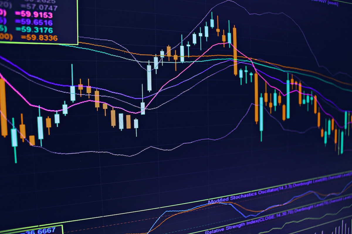
In the early days of technical analysis, charts were drawn by hand. Personal computers came much later. Traders and investors patiently drew their charts one day, hour or minute at a time. Indicators such as moving averages were calculated by hand. Sophisticated indicators- MACD, Bollinger bands- were mostly absent.

Under those conditions, traders focused on chart patterns for clues about market turns or continuations. Thus, patterns such as head and shoulders, triple bottoms, triangles, flags and so forth started being part of traders’ arsenal.

Actually, computer-oriented traders pay more attention to sophisticated indicators than to patterns, but there are many successful traders that sing praises to the good old method of pattern trading, because, they say, it’s faster than those lag-ish indicators.

One bar patterns

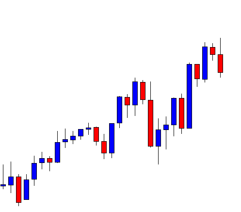
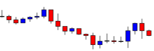
The easiest to recognize, of all chart patterns, is one bar patterns: Gaps, one bar reversal, spikes, inside and outside days.

Gaps and spikes

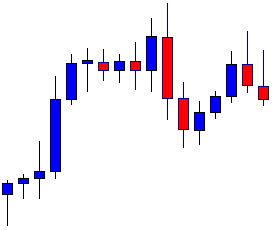
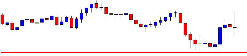
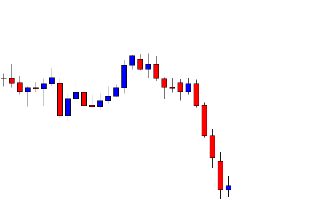
Gaps don’t occur in the 24/7 currency markets. Or do they? That depends on how we define a gap.

Gaps and spikes

And what is a gap: Technically it is a hole in the prices due to a price change that happened between the previous close and the open.

In order to make it extensive for its use in the currency markets lets define gap as a price shock. An extensive bar or a spike such as one that is caused by a news event.

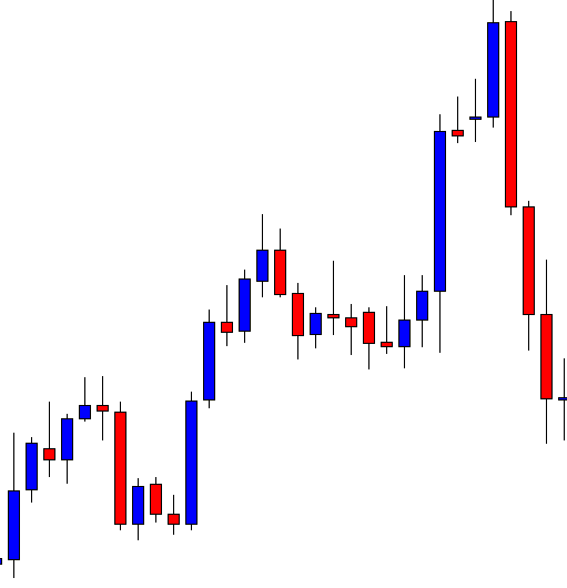
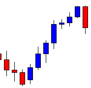
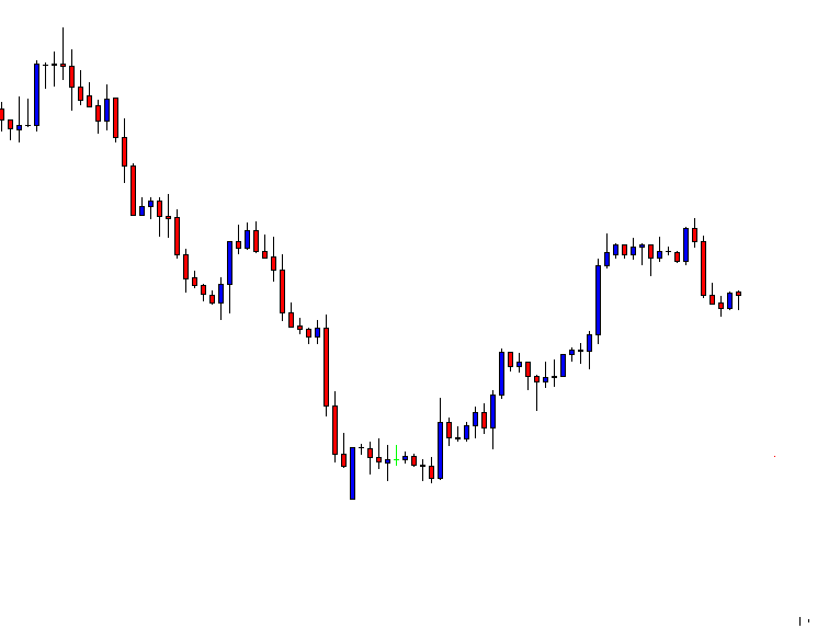
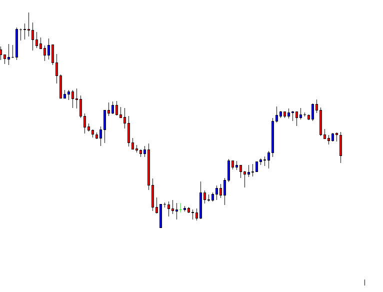
Fig 1.a shows a gap on a daily chart of a stock. Fig 1.b shows the same gap on a weekly chart as an elongated candle. It would be an elongated candle on its daily chart, too, if its open were drawn near the previous close.

The important factor is the traders’ sentiment about the price shock, not the way we draw it on a chart.

Using our brand new definition, a gap in the currency markets is a spike, a huge candle, produced by a news event that might have been a hole if the market had been closed during that event.spike in the usd/gbp hourly chart

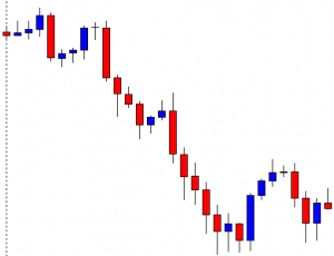
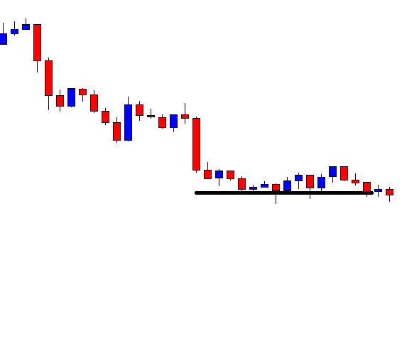
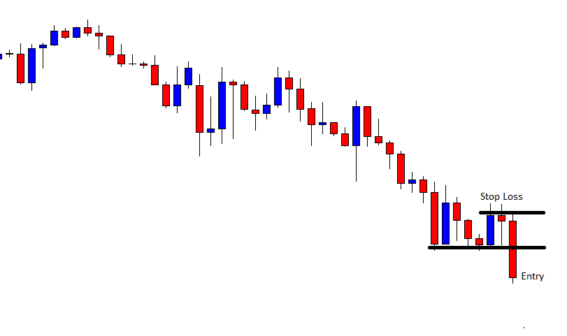
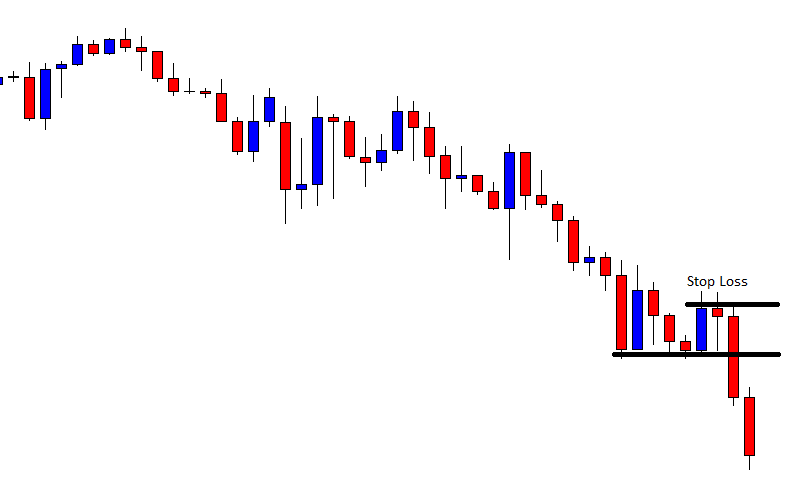
This pattern is the product of a large volatility jump, and it’s usually a local top or bottom. Thus, it’s often followed by a pullback, sometimes very large, as we may see in fig 1.d.

The majority of spikes show the direction of a future leg. It may be the same as the current leg or opposite to it. In any case, the gap is an indication of trend direction, at least mid-term. Although, the intelligent trader knew he must wait for a low-risk entry on a breakout or breakdown of the pullback leg.

Unexperienced traders must avoid trading events such as these. Money is made with method and discipline, not by greedy entries.
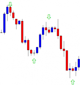
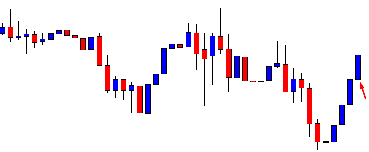
spike with pullback fill

Reversal bars


Reversal barsA bullish reversal bar is a bar with its low making a new low but closing higher.  A bearish reversal is a bar where there’s a new high but with the closing lower. Those reversals aren’t significant unless in context with highly oversold or overbought situations.


A bullish key reversal is a bar with new lows and then making a high higher high, closing, also, higher than the previous bar’s
close. The bearish key reversal is its specular pattern.

bearish key reversal


Important reversal patterns

From lower to higher or vice versa.

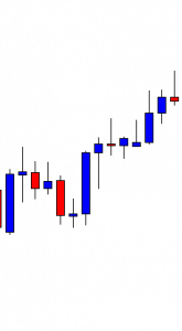
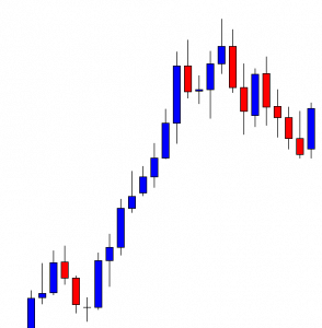
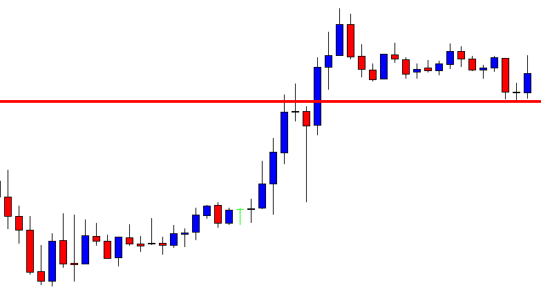
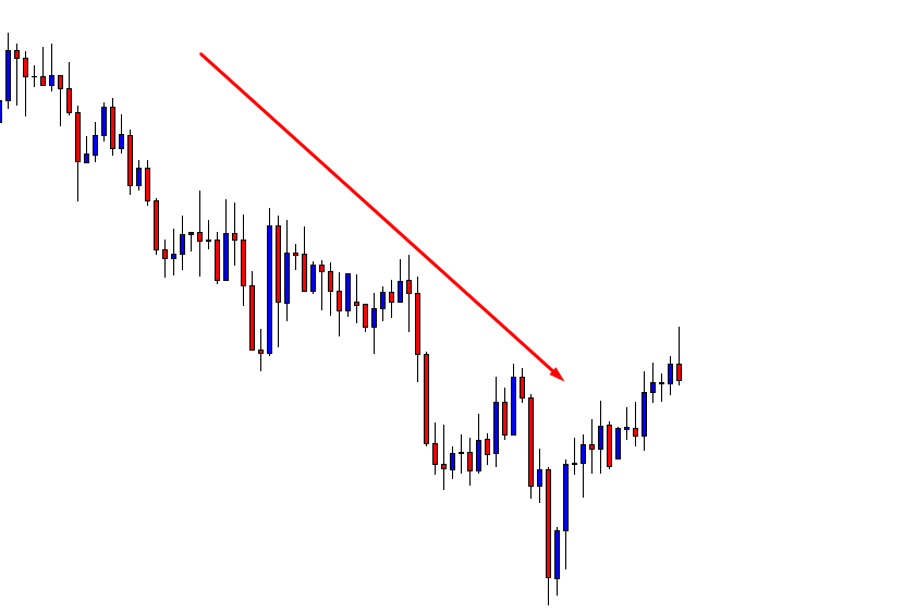
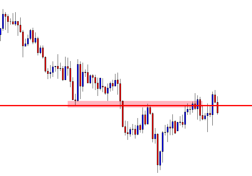
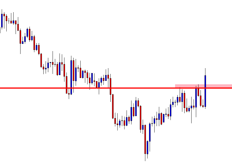
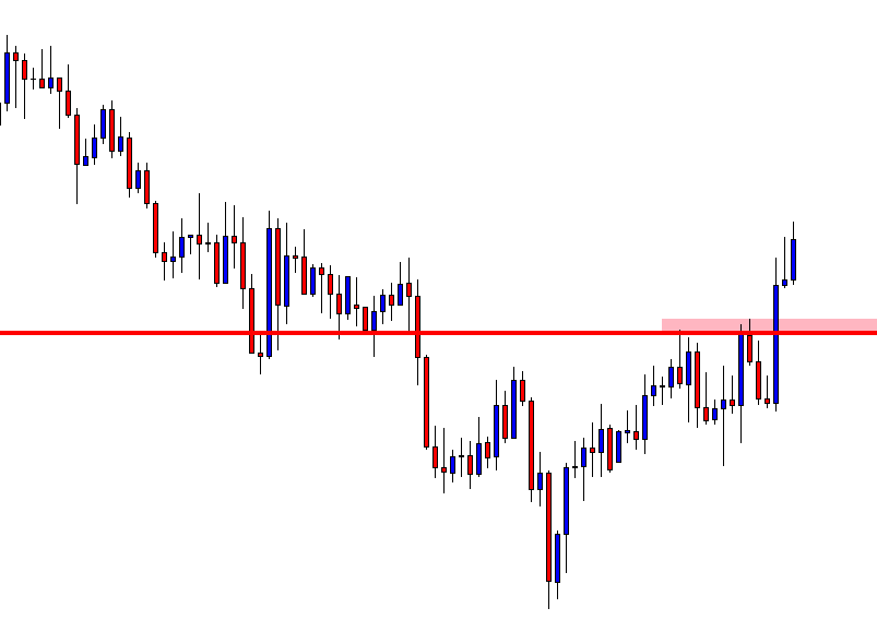
The most important pattern for determining a trend reversal has already been dealt with. Since a trend reversal -for instance from bear to bull trend- is going from lower highs and lows to higher highs and lows, this is a pattern, and it’s one of most important for the detection of a trend change.

From lower to higher or vice versa

It’s possible that we may detect a failure to new lows, but we don’t start getting higher highs and lows. Thus, we have shifted from a downtrend to a sideways market, that may resume a downtrend or break up. We still don’t know. But the bear trend has stopped.

Head-and-Shoulders

It’s a top formation. The inverted Head-and-Shoulders is its specular counterpart as a bottom formation.

Head-and-Shoulders

Stages of a Head-and-Shoulders pattern

  1. A strong rally followed by a minor pullback forms the left shoulder.
  2. Another high-volume rally reaches a higher high and, then, pulls back to or near to the previous low
  3. A third rally that doesn’t make new highs with a downward leg that push prices below those two previous lows, to D
  4. Prices are below the neckline that acts as resistance. Prices go up a bit, touching the neckline but failing to hold and descending to fresh lows.

Breakout: The confirmatory stage is D, with prices below the neckline failing to go back up.

The importance of the volume:

The majority of the volume appears during A and B legs, the highest occurring during B rally, and greatly diminished volume during the formation of the right shoulder.

Fig.4.b shows an inverted head-and-shoulders bottom, where the neckline isn’t horizontal, and a typical volume pattern of stronger trading before B and lightening after it.
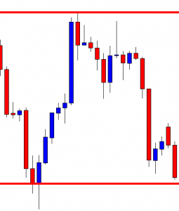
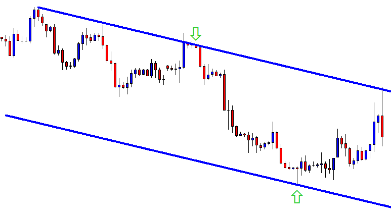
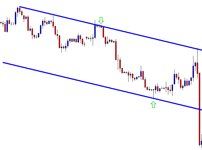
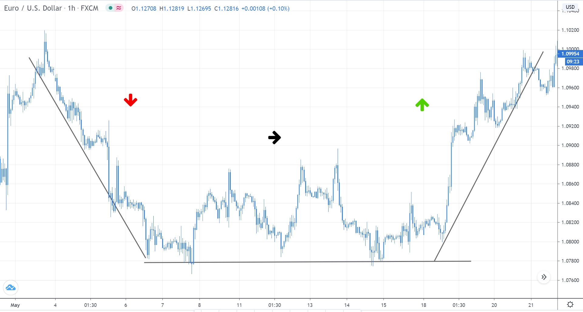
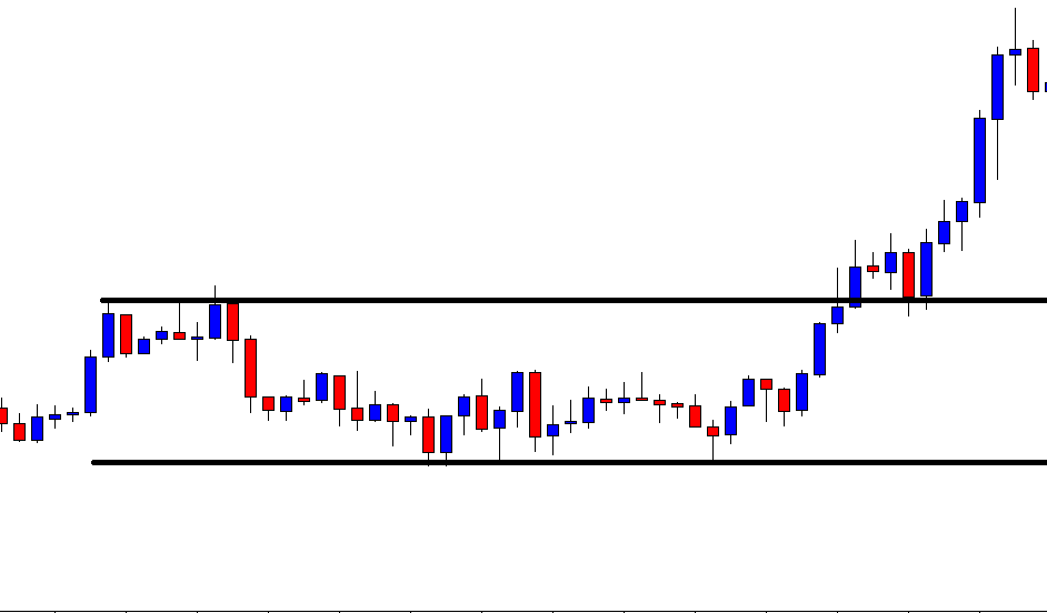
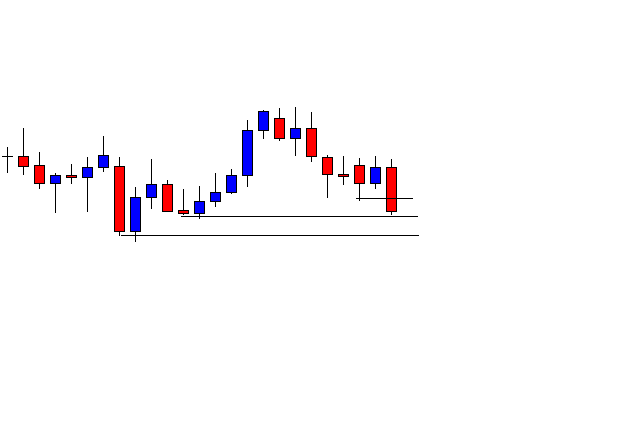
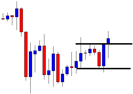
The importance of the volume

Broadening bottoms

Appearance:  Drawing trend lines at tops and bottoms of the formation it gives the impression of the silhouette of an ancient turntable’s horn.

Broadening bottoms

Identification:

Price Trend: declining.

Shape: Price seems an oscillating pattern with increasing amplitude.

Trend lines: The two trend lines across minor tops and bottoms diverge from each other. The upper trend line must be ascending or horizontal. The bottom one should be pointing down.

Touches: According to Thomas N. Bukowski’s book on patterns, a broadening bottom needs at least two minor highs and two minor lows to validate the pattern.

Volume: Volume follows price. When the price falls so does volume, and when price moves up volume increases, as well.

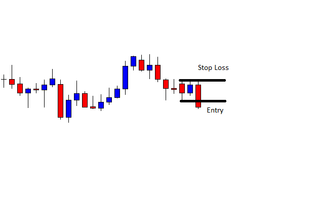
How to trade it: When the channel is wide enough, buy near the lower trend line and sell on weakness or when it touches the higher trend line. Also buy a pullback after the breakout or breakdown, if it fails.
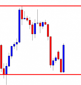
Broadening tops

Appearance:  Similar to a widening bottom.

Broadening tops

Identification:

Price Trend: Ascending.

Shape: Price seems an oscillating pattern with increasing amplitude.

Trend lines: The two trend lines across minor tops and bottoms diverge from each other. The upper trend line must be ascending. The bottom line should be pointing down or horizontal.

Touches: According to Thomas N. Bukowski’s book on patterns, a broadening top needs at least two minor highs and two minor lows to validate the pattern.

Volume: Volume follows price. When the price falls so does the volume, and when price moves up volume increases, as well.

How to trade it: This formation may show a trend change, but sometimes is just a trend continuation. When the channel is wide enough, sell near the higher trend line and buy when it touches the lower trend line. Also, buy the breakdown from the lower trend line.

Broadening ascending wedges

Appearance: similar to a broadening top, but the lower trend line is, also, ascending.

Broadening ascending wedges

Identification:

Price Trend: ascending.

Trend lines: The top line is steeper but the lower one is also trending up.

Touches: It needs at least three distinct touches (or close to it) on each of the lines.

Breakdown: In the majority of times there is a breakdown.

How to trade it: As in the case of the other broadening tops, sell near the higher trend line. Also, sell if it fails to make a new high. Sell the breakdown, as well.

Broadening descending wedges:

Appearance: similar to a broadening bottom, but the higher trend line is, also, descending.

Broadening descending wedges

Identification:

Price Trend: It usually acts as consolidation of an upward trend.

Trend lines: Both head down, but the bottom line is steeper.

Touches: It needs at least two distinct touches on each line.

Breakout: In the majority of times there is a breakout.

How to trade it: As in the case of the other broadening bottoms, buy near the lower trend line. Also, buy if it fails to make a new low. Buy the breakout, as well.
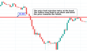
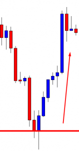
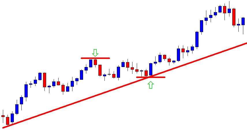
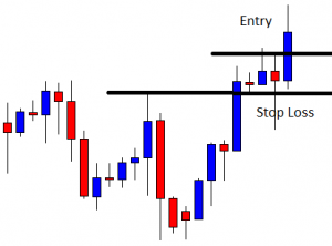
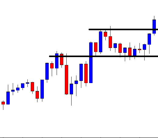
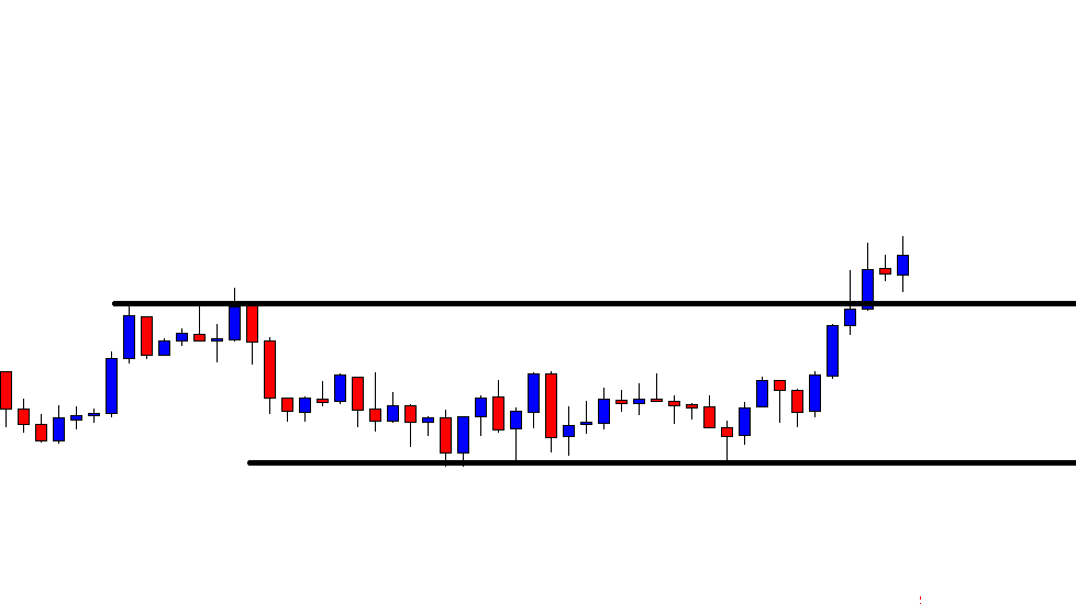
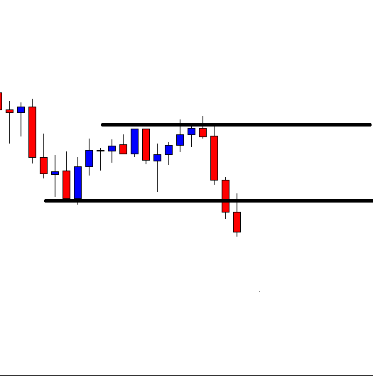
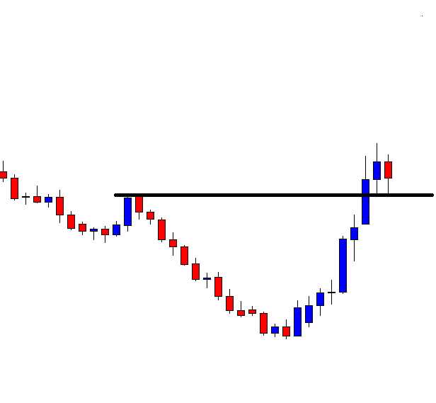
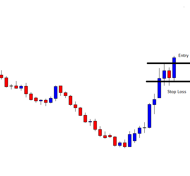
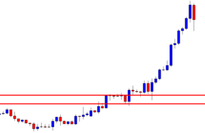
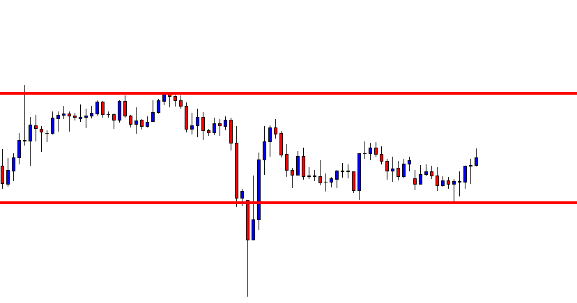
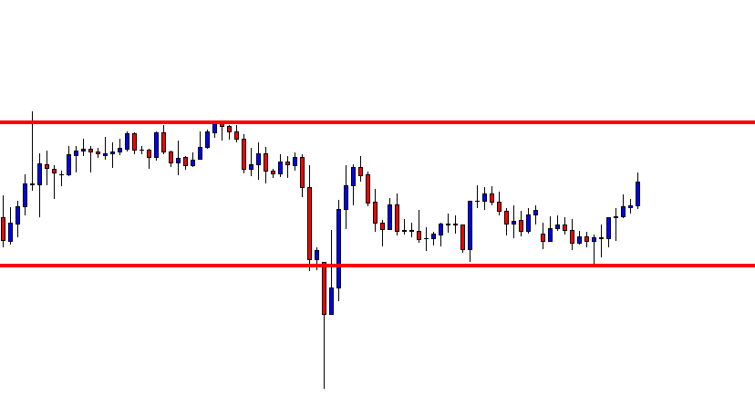
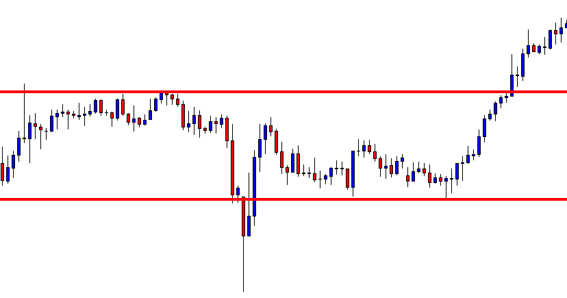
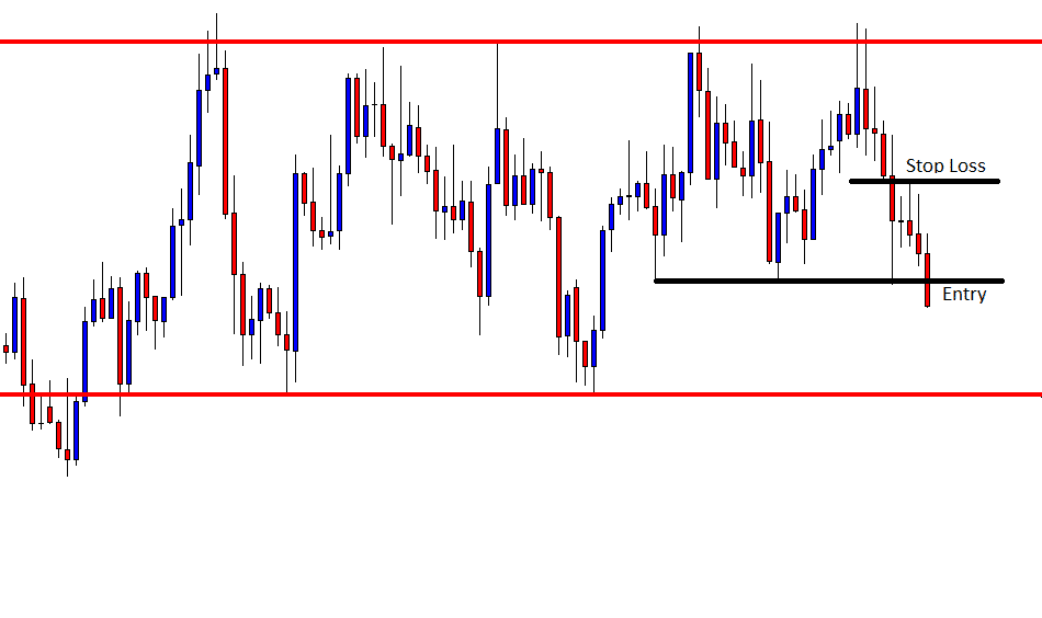
Double bottoms

A double bottom is the first confirmation that the trend has stopped making new lower lows and lower highs. After a new low is made, the following bars draw a small rally to the recent highs.

Then, the price experiences a pull-down from that resistance level, to test the recent lows: The test resolves to the upside, breaking the recent resistance up to fresh highs, starting an upward trend.

Double bottoms

Identification:

Price Trend: downward.

Bottom shape: Both bottoms are at the same level or close to it. The shadow of the second low may be below the first low, but it closes above it or the next candle does it.

Confirmation: The double bottom is confirmed by a breakout of the resistance level of the formation.

How to trade it: Buy the breakout.
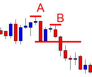
Double tops

Double topsA double top is the specular image of a double bottom. Price was on an uptrend and made a new local top. Then it pulled back to a local support level, and, after, it rallied again but failed to break the recent top and fell down, breaking down that local support to make fresh lows.

Price trend: upward.

Top Shape: both highs are at the same level or close to it.

Confirmation: The double top is confirmed when the support level is broken down.

How to trade it: Sell the breakdown.

Triple Bottoms

Triple bottoms are a form of oscillation. Not only present themselves after a long downward trend, but it’s usually three or more bottoms in sideways channels, or in reactive legs during an uptrend.

They are more reliable as a continuation pattern, on a bull trend than as counter-trend signal in bear markets.

Triple Bottoms

Price trend: Preferably upward

Bottoms: Three bottoms at similar levels. It helps that the second and third bottoms didn’t touch the first one.

Confirmation: Price breaks up the confirmation line.

How to trade: Wait for a pullback to support (confirmation line) and buy the second breakout.

Triple tops:

A Triple top is good trend continuation signal on a bear trend, after a pullback rally.

Triple tops

Appearance: Three distinct highs well separated. The peaks present sharp spikes.

Tops: The price variation between peaks is minor.

Confirmation: Prices must go below the lowest low in the formation.

How to trade: The breakdown risk is too high. Wait for a pullback to trade.
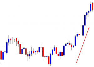
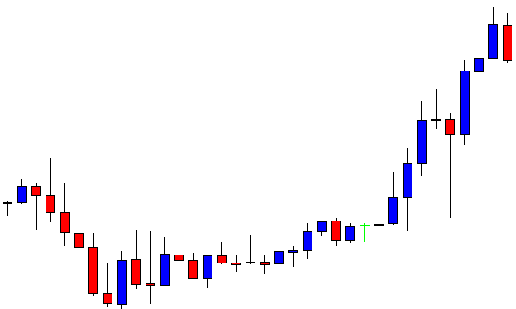
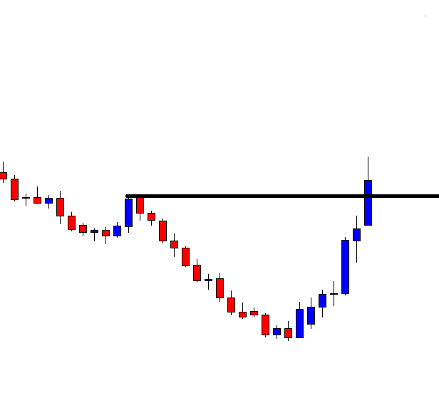
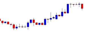
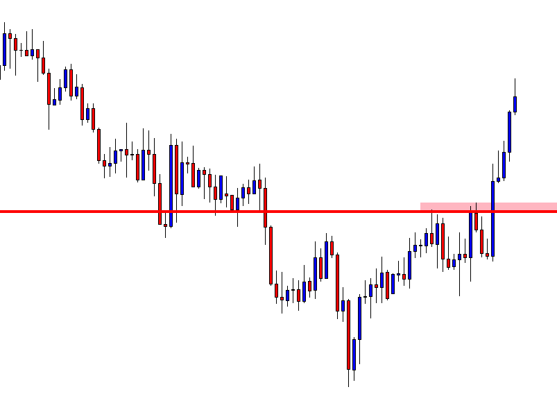
Rounding bottoms

Rounding bottoms and saucers are synonyms. This pattern, that’s supposedly trend reversal is so plagued by “surprise” failures that we hardly may call them “bottoms” at all. More usually, these formations appear during uptrends as a pullback, after which the trend resumes.

Rounding bottoms

Bottom Shape: The bodies on the downtrend candle get smaller, and then a bottom is formed (no fresh lows). Then a breakout happens with a tiny rally that holds the breaking level. Forming higher lows. A potential pattern of higher highs and higher lows emerges.

Confirmation: The second breakout to new highs, confirms the new leg.

How to trade it: Buy the first or the second breakout, after the small pullback. The second one is safer.

Rounding tops:

Yet another false pattern. Thomas Bulkowski writes about this pattern: “When is a top not a top? When it is a rounding top and prices break out upward 53% of the time. I like to refer to this pattern not as a rounding top, but as a rounding turn (RdT).

Rounding tops

Appearance: After a rally lost its steam, price moves on a pullback that erases most of it.  The last local bottom holds. A rally move proceeds up again.

Confirmation: Prices break the resistance of a confirmation line drawn at the high of the rounded formation.

How to trade it: To me, it’s a reactive leg in an uptrend, thus, if a new leg is confirmed by breaking a trend line drawn on the highs of the pullback segment, then a buy order may be entered at a breakout of recent highs. Taking the breakout of the confirmation line is too risky because we still don’t know if it will repeat the previous pullback by forming a sideways channel. Therefore, it’s better to wait for another pullback past the breakout of the confirmation line. See Fig. 13 for clarification.

Continuation patterns

Flags

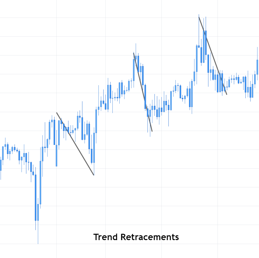
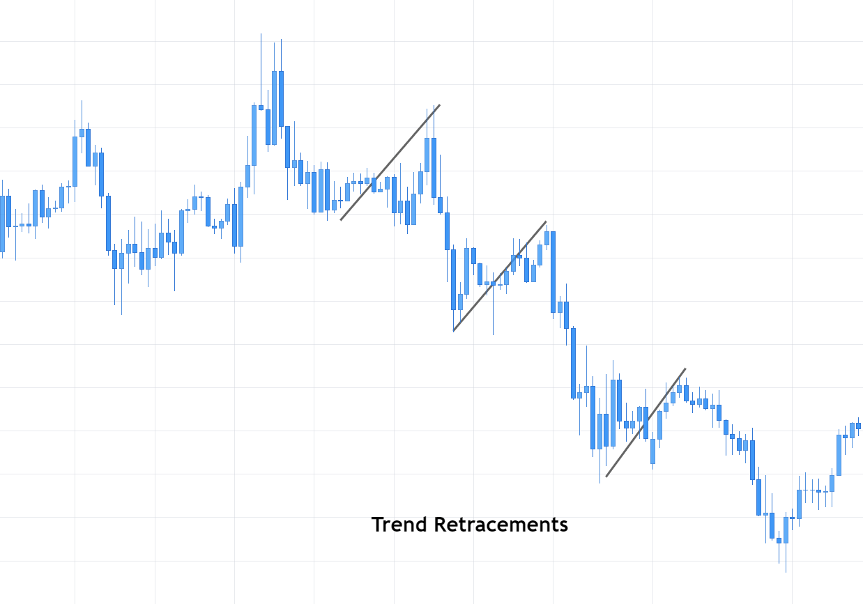
A typical continuation pattern. After an impulsive leg a pause in the opposite direction. It’s usually a nice entry point after an impulsive leg.

Flags - Forex Academy

Appearance: Flags are fast oscillating symmetrical patterns with a downward slope in bull trends and upward one in downtrends. A typical corrective leg.

Volume: Volume fades, receding with the trend.

Confirmation: Breakout, during uptrends, or breakdown on downtrends.

How to trade it: Enter the breakout, following the previous trend. Do not enter if it’s in opposite direction to the trend, such as, in fig.14, the 4th ascending flag.

Pennants

Pennants are a flag variation, but with its trend lines converging.

Pennants

The fact that the volatility fades on a pennant, makes it an excellent spot for good reward to risk trades.

Appearance: Flags are fast oscillating converging patterns. The slope usually is contrary to the main trend, but it may be horizontal or in the same direction to the main trend.

Volume: Volume fades, receding with the trend.

Confirmation: Breakout, during uptrends, or breakdown on downtrends.

How to trade it: Enter the breakout, following the previous trend.

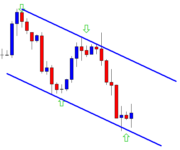
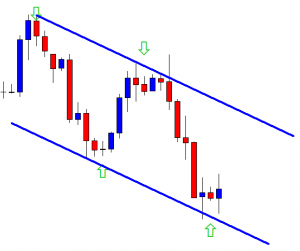
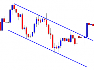
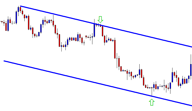
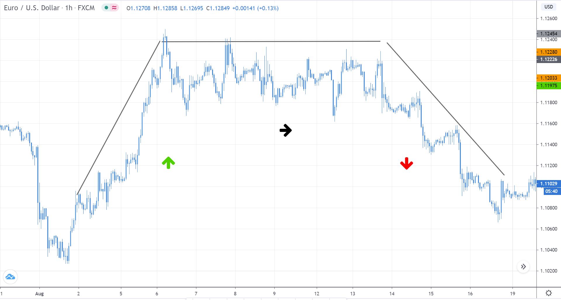
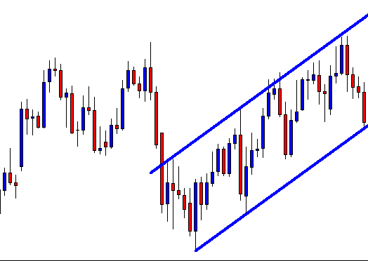
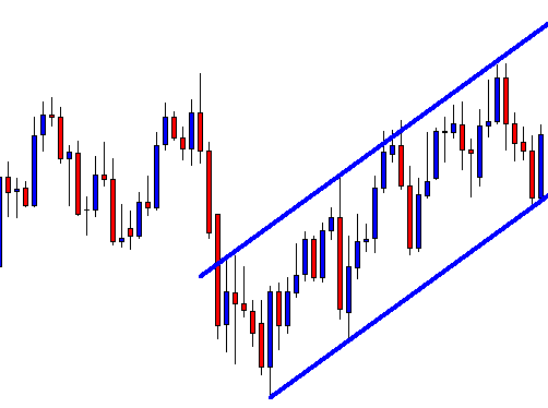
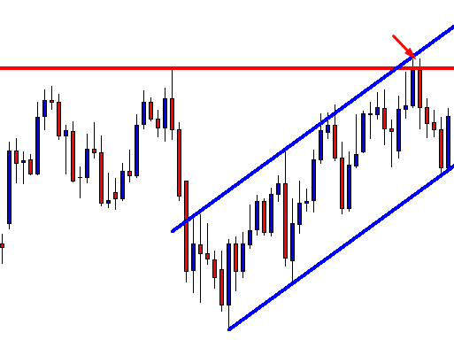
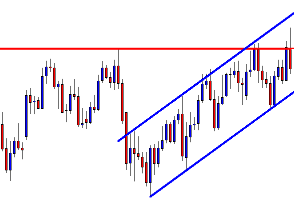
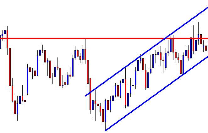
Triangles and Wedges:

Triangles and Wedges are like flags and pennants. The difference is the undulations are more noticeable and wide, so they take longer to develop. The difference between triangles and Wedges is a bit arbitrary: Triangles have lower highs and higher lows. Wedges may not because their tilt is higher, upward or downward.

They are reactive waves that, usually, end with the burst of another impulsive wave in the same direction as the previous one. Anyhow beware: All reactive waves, including wedges, are fights between bulls and bears, so its ending is uncertain.

There are upward and downward wedges. The fact that it usually breaks out in the opposite direction of its own is its reactive nature that opposes the main trend.

Wedge - Forex Academy

Appearance: Undulations with fading strength. Its upper and lower trend lines converge

Volume: Volume fades, receding with time.

Confirmation: Breakout, during uptrends, or breakdown on downtrends.

How to trade it: Enter the breakout, following the previous trend.

This covers all important chart patterns and formations available.

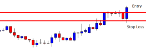
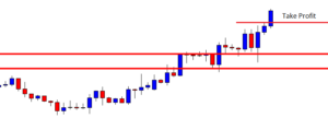
The main common feature is an ending with a breakout. To trade them we must evaluate carefully the reward-to-risk situation and, if not satisfactory, wait for the end of the first impulse and enter at the end of a continuation pattern – usually a flag or pennant.

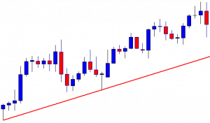
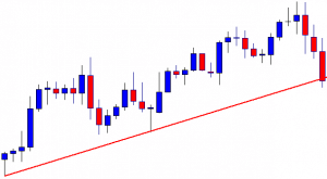
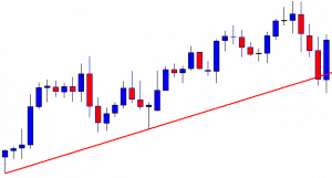
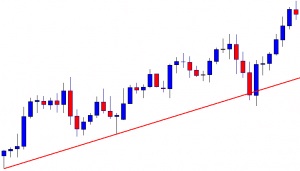
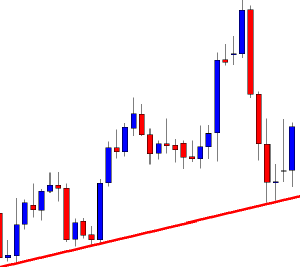
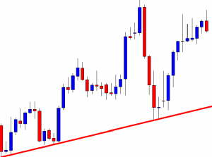
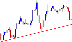
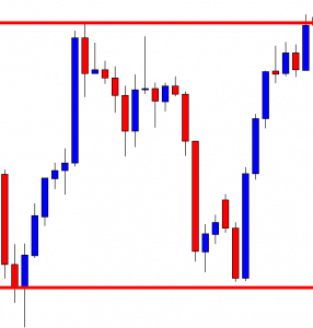
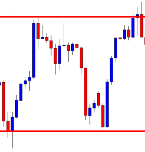
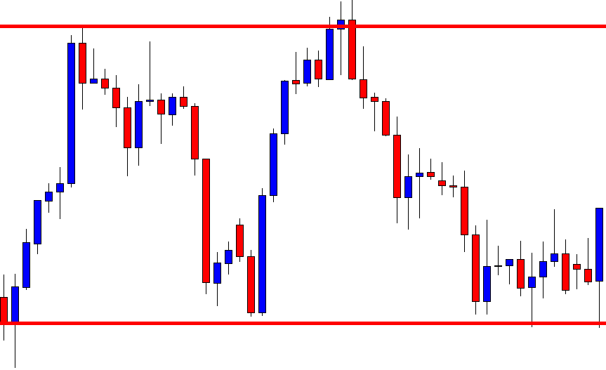
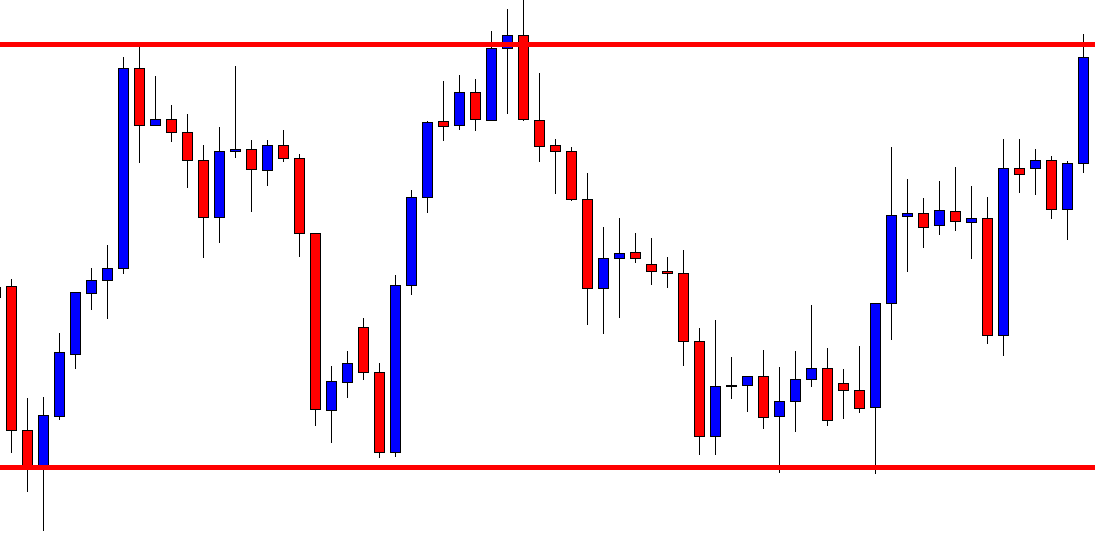
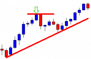
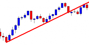
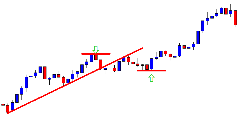
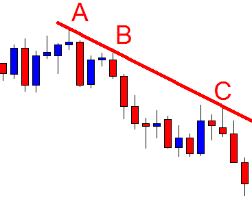
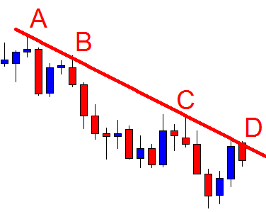
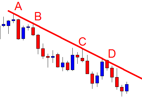
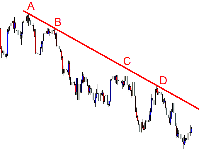
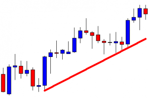
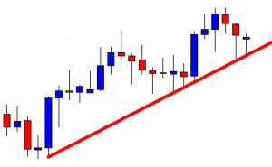
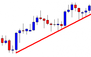
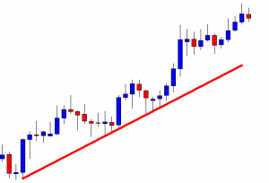
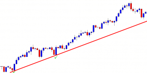
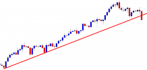
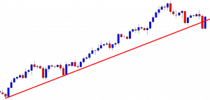
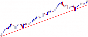
There are plenty of variations of these patterns, and, sometimes, they’re very hard to spot. But if we keep our trendlines touching the local tops or highs on downward legs, and at the local lows during uptrends, we’ll be able to spot trend breakouts, judge where we are, and if it’s a good risk to reward, take appropriate actions. See fig 19.

Profitable Trading Chapter III: Chart patterns

Next chapter, well be dealing with computerized indicators, such as MACD, RSI, Stochastics, Williams %R, On balance Volume, Parabolic SAR a so on.


References:

Encyclopedia of Chart Patterns 2nd edition, Thomas N. Bulkowski

Trading systems and Methods 5th edition, Perry Kaufman


 ©Forex.Academy