Categories
Forex Fundamental Analysis

The ‘Sentix Investor Confidence’: Revealing Market Sentiment

Introduction

The economy, financial, and forex markets are mainly driven by sentiment. Abstract aspects of demand and supply primarily drive these markets. A financial asset’s value will appreciate if a majority of investors believe that its future cash flows will increase. Conversely, the value of the asset will lower if these investors have a negative outlook on it. Therefore, knowing how most investors feel about the outlook of the economy can help you plan your future investments properly.

Understanding Sentix Investor Confidence

Investor confidence indexes are usually estimated by conducting surveys on investors and analysts throughout the economy.

In the EU, for example, the investors’ confidence is gauged using the ‘EU Sentix Investor Confidence’ index. Sentix is a German marketing and research firm predominantly dealing with behavioral finance. This index is compiled through a survey of about 2800 investors and analysts from across the 17-EU member countries. The primary role of the index is to obtain the confidence of the business people about the current economic climate and their anticipation about the future economy.

Sentix Investor Confidence Methodology

The Euro area Sentix economic report is categorized into the current situation and Expectations.

Current situation: This part of the report polls how the investors and analysts feel about the prevailing economic conditions. Ongoing geopolitical aspects inform the current economic conditions to the prevailing market conditions.

Source: Sentix

Expectations: As the name suggests, this part of the report concerns the future. Investors and analysts are polled to see what they think the future economic conditions will be. Do they expect the current conditions to improve, remain the same or deteriorate?

Both these parts of the report accommodate various economic indicators about the economy. The investors and analysts are asked their sentiments on various aspects of the economy, from the ease of doing business, labor conditions, interest rates to geopolitics.

As mentioned, Sentix surveys up to 2800 people who are mostly employees and investors in the private sector. The survey is conducted to ensure inclusivity of all economic sectors, thus obtaining a representative perspective about the state of the economy.

The results from the questionnaires are collated and indexed on a scale of -100 to 100. Readings of below 0 indicate that investors and analysts are pessimistic about the economy, with the severity of their pessimism increasing as the index approaches -100. On the other hand, a reading of above 0 shows optimism. The higher the index, the more optimistic the investors are about the economy.

Source: Sentix

Using Sentix Investor Confidence for Analysis

Keep in mind that the polled people for this index are experts – presumably authoritative in their various fields. Therefore, by following

Sentix

level of confidence in the economy can be incredibly helpful in making predictions about the economy at large.

Investments, in any economy, forms a major part of economic growth. When investors have a positive outlook about the economy, current, and future, we can expect them to make more investments in various sectors of the economy. Naturally, these investments create more jobs in the economy, increasing economic output, improving households’ welfare, and growing the GDP.

On the other hand, when the investors hold a negative outlook about the economy, they will halt any further investment plans. Some may go as far as cutting back on their investments. In this scenario, the industries in which they have invested in will be forced to scale down their operations. Consequently, the economy can expect a higher unemployment rate, depressed demand in the economy, reduced output, and a general contraction in the GDP.

Note that the current and the expectations of investor confidence aren’t always aligned. Policymakers can use this knowledge to make informed decisions on monetary and fiscal policies. When investors are confident about the current economic conditions but pessimists about the future, theoretically, governments and central banks could implement expansionary policies. Such policies will stimulate the economy and prevent any job losses, or adverse contractions of the economy in case investors shy away from further investing.

Furthermore, Sentix investor confidence is a vital indicator of recessions and recoveries. Let’s take the example of the ongoing coronavirus-induced recession. Towards the end of the first quarter of the year, investors were pessimistic about the future. They anticipated that the ravaging effects of the coronavirus would severely affect the economy. And true, as anticipated, the economy was ravaged. New investments during the months following the outbreak were at historic lows, and the unemployment levels globally were the highest ever witnessed. The Sentix investor confidence forestalls the current recession.

Similarly, the Sentix investor confidence index can be used to show signs of economic recoveries. Let’s still consider the example of the recent coronavirus pandemic; the Sentix investor confidence has been accurately used to show economic recovery signs. After governments and the European Central Bank (ECB) put in place economic expansionary measures, the Sentix investor confidence became less and less pessimistic. This showed that investors anticipated that the economy would recover.

Source: Sentix

Impact of Sentix Investor Confidence on Currency

As we mentioned earlier, sentiment is one of the major drivers of currency fluctuations. When the investor confidence is highly optimistic or improving from extreme pessimism, the domestic currency will appreciate. This appreciation is because investor confidence signals improvement in the economic condition, followed by lower unemployment levels, better living standards, and higher GDP levels.

Conversely, dropping levels in the Sentix investor confidence leads to the depreciation of the domestic currency relative to others. The depreciation is because forex traders will anticipate that adverse economic conditions will follow.

Sources of Data

Sentix conducts the surveys and publishes the Sentix Investor Confidence index for the Euro area.

How Sentix Investor Confidence Index Release Affects The Forex Price Charts

Sentix released the latest EU investor confidence index on October 5, 2020, at 8.30 AM GMT. The release of the index can be accessed at Investing.com. Since the investor confidence index is a low-impact indicator, low volatility is expected on the EUR.

In October 2020, the Sentix Investor Confidence index was -8.3 compared to -8.0 in September 2020. However, the October reading was better than the expected  -9.5.

Let’s find out how the October 2020 Sentix Investor Confidence index’s release impacted the ERU/USD price action.

EUR/USD: Before the Sentix Investor Confidence Index Release on October 5, 2020, 
just before 8.30 AM GMT

Before the release of the Sentix Investor Confidence Index, the EUR/USD pair was trading in a steady uptrend. The above 5-minute chart shows candles crossing above the 20-period MA and forming further above it.

EUR/USD: After the Sentix Investor Confidence Index Release on October 5, 2020, 
at 8.30 AM GMT 

After the release of the index, the EUR/USD pair formed a 5-minute bearish candle. However, the pair subsequently adopted a strong uptrend. The 20-period MA rose steeply with candles forming further above it. This trend shows that the EUR became stronger after the release.

Bottom Line

In the forex market, the Sentix Investor Confidence index is a low-impact indicator. In the current economic climate, however, this index can prove invaluable in predicting the directions of the economy – to show whether the Euro area economy is bouncing back from the effects of the coronavirus pandemic.

Categories
Forex Elliott Wave Forex Market Analysis

EURJPY: Can we Profit Short-Term?

Overview

The EURJPY cross advances in a corrective sequence that began on September 01st; this corrective movement looks incomplete. The short-term Elliott wave outlook foresees a limited recovery prior to its a coming decline corresponding to its fifth wave.

Technical Big Picture

The EURJPY cross, in its 12-hour chart, illustrates an incomplete downward sequence that began on September 01st when the price found fresh sellers at level 127.075. 

The previous figure exposes an upwards structural series subdivided into three-wave identified in Minute degree and labeled in black, which began on the May 06th low located at 114.397 and ended on the September 01st high when the price topped 127.075. 

Once the price found fresh sellers at 127.075, the cross started to retrace, developing a three-wave sequence identified in the Minuette degree labeled in blue. Until now, wave (c) doesn’t show bullish reversal signals, which lead us to expect further declines.

The short-term key supports and resistance levels are as follows:

  • Resistance 1: 123.160
  • Resistance 2: 124.233
  • Resistance 3: 124.999
  • Pivot Level: 122.377
  • Support 1: 121.144
  • Support 2: 120.271
  • Support 3: 119.311

Technical Outlook

The short-term outlook for EURJPY illustrated in its 3-hour chart reveals the intraday consolidation, which coincides with the progress of its fourth wave of Subminuette degree labeled in green.

In this regard, the market participants could mostly drive the price toward the supply zone between 122.550 and 122.890, from where the EURJPY cross could start developing the next decline corresponding to its fifth wave identified in green.

The potential target zone of the next decline locates between 121.038 and 120.051, which coincides with the base-line of the descending channel that extends from the September 01st high to date. 

Finally, the invalidation level of the downward scenario locates at 123.402.

Categories
Forex Psychology

The Supreme Discipline of the Forex Trader

Although the currency market is the largest market in the world, there are still many traders who have no idea how it works. So, the reality is that there’s a fair amount of prejudice against currency trading. Some traders even fear the market. If you’re one of those traders, be sure to read this article carefully.

In it, we will present to you the most important basic concepts of the currency market or Forex trading and show you the possibilities it offers. But even for readers with a lot of experience in this market, this article will be an interesting read, in which they will still be able to learn a little more.

Anyone who has made the decision to prove himself in the supreme discipline of traders must become intensely familiar with the currency market. If you know how the market works and what tools are available, you can optimally plan your operations and succeed.

Which players are represented in the market, how should risk and money be managed, what are the possibilities of analysis, and what are the most proven strategies? In this article, we want to work step by step on the most important points so that you can finally start successfully in the currency market (Forex).
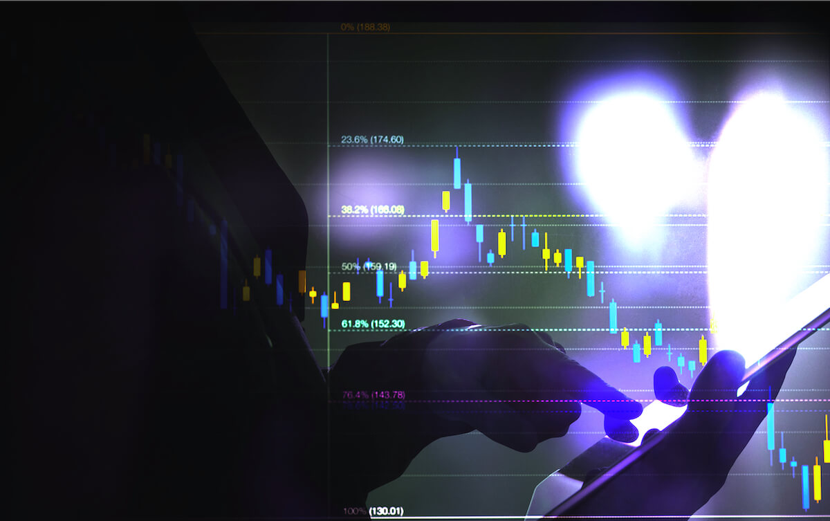
What is Forex?

In the Forex market (currencies), currencies (currencies) are traded on the OTC market (over the counter). In other words, there is no central market but only OTC operations. The foreign exchange market is made up of banks, large companies, central banks, funds, intermediaries, and private investors. The Forex market gives the trader a chance to actively trade in the currencies of different countries, with private traders who can only actively trade in the foreign exchange market since the mid-1990s.

Previously, it was available only to institutions. The special feature of this currency market is that it is open on Sunday afternoons and remains active until Friday evening. During this time, it is open 24 hours a day, with a daily trading volume of around $6,000 billion, much more than any other market. Of course, it has its advantages. For example, you can trade when you have time currency pairs that are actively trading.

For example, suppose you live in Germany and have a window of opportunity from 08:00 to 10:00 when European stock exchanges open. In this case, for example, the currency pairs GBP/USD and EUR/USD could be very interesting. In general, the Forex market is very flexible and is able to create a timeline based on individual criteria.

What Moves the Market?

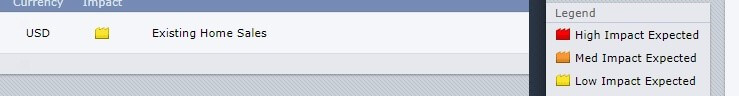
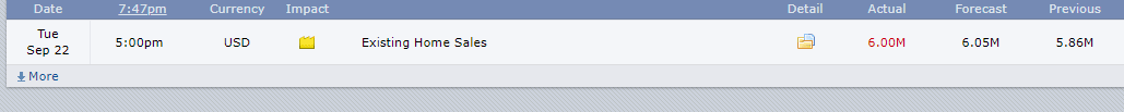
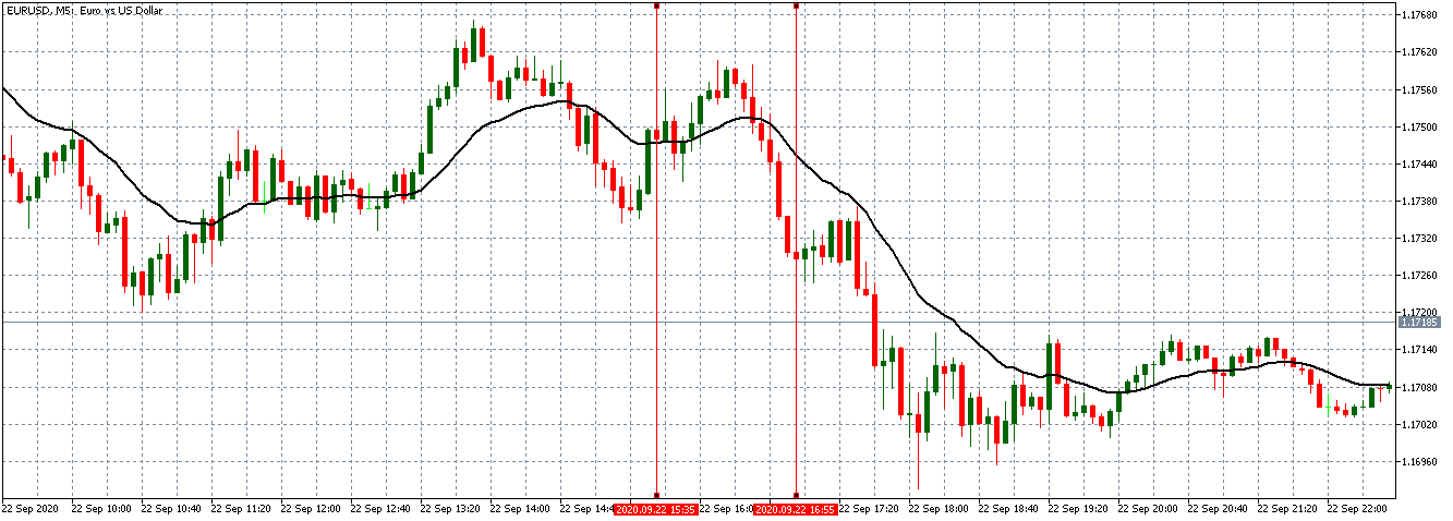
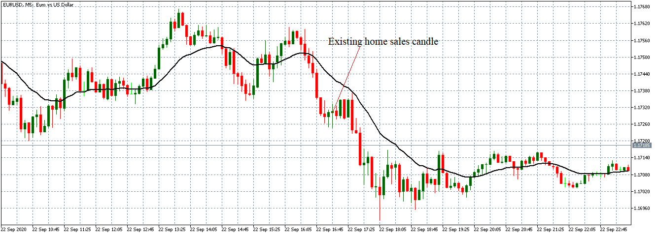
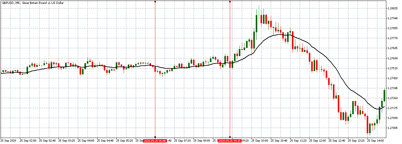
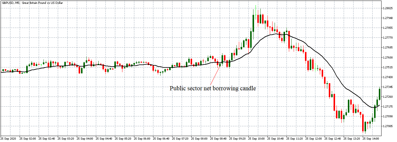
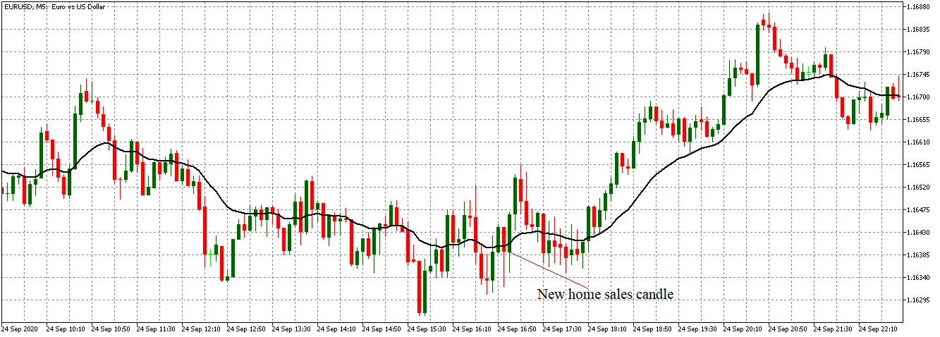
Economic data, in particular, has a significant impact on the Forex market, especially if a particular message deviates significantly from analysts’ and investors’ expectations. In some cases, however, a central bank could take a completely unexpected step at a certain point, leading to a dramatic price change in the currency market. Therefore, a position that is opened immediately before the central bank meeting is not advisable.

As with any trade, you should always remember to limit your losses through a limit on the Forex market, and consider what can happen when you post a specific message that moves the price directly to your loss limit. The amount lost due to a certain position is the question that must be asked again and again.

Entering the Currency Market

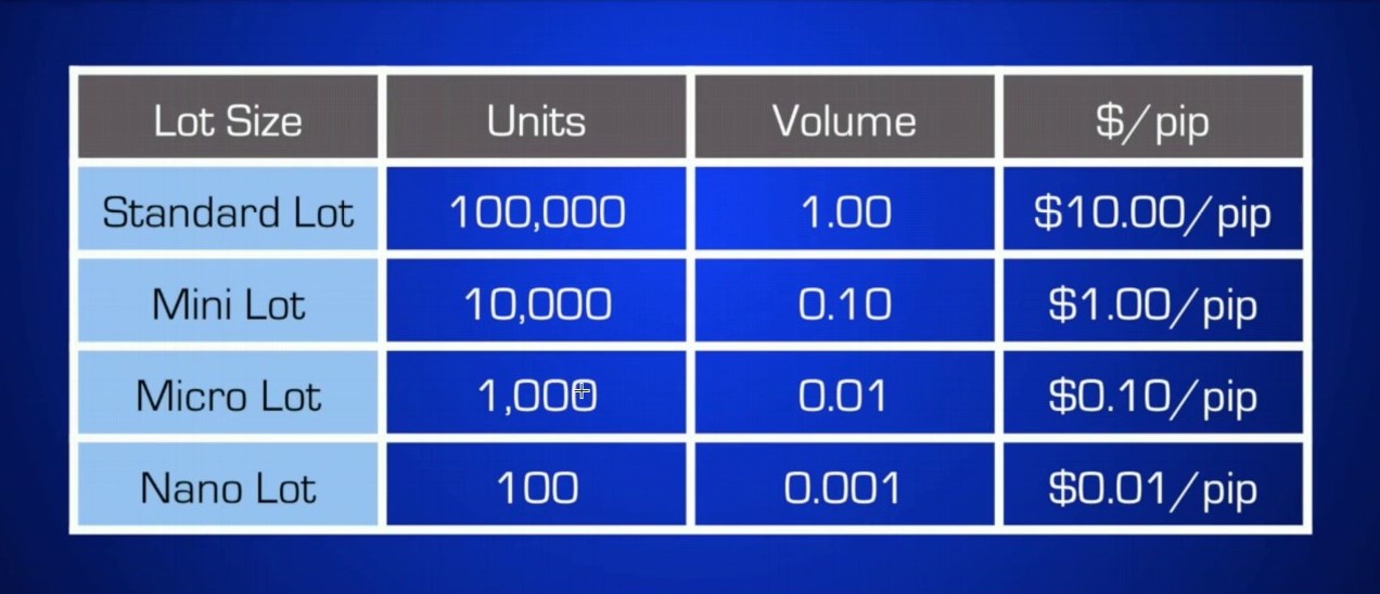
Currency pair trading can be done in different ways. Private investors, by choosing a suitable intermediary, gain access to various products with which they can directly or indirectly implement their trading ideas in the Forex market. In the case of cash trading, the two partners trade foreign currencies among themselves. For example, if Bank A with Bank B exchanges EUR 10 million/USD at an exchange rate of 1.30, Bank A will have to transfer USD 13 million. The A will receive 10 million euros from Bank B. The classic currency transaction is also available in a slightly modified form in private Forex trades under the name Spot Business.

Some brokers also offer trading with Forwards. Both methods are usually transactions based on a margin deposit; that is, with leverage. However, compared to cash trading in the interbank market, the foreign currency is not delivered but is “transferred” until the position is closed with an opposite order.

Costs Incurred 

Since the foreign exchange market is an interbank market and therefore does not incur additional fees to the stock exchange services, its trading is relatively cheap. Therefore, depending on the broker model, the trader only has to pay the differential or a combination of fork and commission. The tighter the hairpin, the better for the trader.

Since the currency market is very liquid, the odds of tight ranges are usually quite good. At the same time, dispersion is an important criterion when selecting the broker (in combination with commissions). However, traders need to know if the hairpin is fixed or flexible. In turbulent times, it can be a significant disadvantage when it suddenly reaches an expansion.

In addition, there may also be large differences between individual intermediaries in terms of corporate policy. Therefore, make sure that your broker guarantees the execution of the order and the setting of your loss limit. You should also make sure to include redundant systems to protect your hardware and software so that your commands always run, even if the server fails you during an operation. It should be noted that even in the less regulated currency market there are regulators who supervise many intermediaries, for example, the NFA (National Futures Association) in the U.S. The U.S. and the FCA (Financial Conduct Authority) in England.

On their websites, investors receive full information about private currency trading. Operators should be careful if the agent is in a peripheral country.

Trading Practice – Fundamental Analysis

The fundamental analysis analyses the causes that influence supply and demand in a given currency and thus determine the exchange rate. In assessing supply and demand, they consider, inter alia, the economic situation, and developments in the two currency areas included in each currency pair.

The development of factors such as interest rates, inflation, politics, and society, as well as economic growth plays an important role. Using models, it is possible to assess in a long-term context how a change in certain influencing factors affecting a given currency would affect and whether the current exchange rate seems justified. The exchange rate, which results from the models, is however only a theoretical guide.

In fact, prices may deviate from this, as particularly difficult future expectations to measure are included in price formation. Basically, however, it applies to the analysis: if the current price is below the value of the model, there is talk of an undervaluation, in the opposite case of an overvaluation.

Interest Rate Parity

The simplest model is interest rate parity. It requires traders to invest where they can achieve the highest return. Investment opportunities should have a similar level of liquidity and comparable risk. Capital flows between the two countries are based on the interest rate spread between the two currency areas, according to the interest rate parity model. If the interest rate is higher abroad, traders transfer their money there at the current exchange rate.

Later, the money is transferred back to the source at the current exchange rate. Depending on how the exchange rate develops during the investment period, it will have a positive or negative impact on profitability. If there were no exchange rate movements, the return would simply correspond to the foreign interest rate. Then, later, each investor would keep their money in the currency offering the highest interest rates.
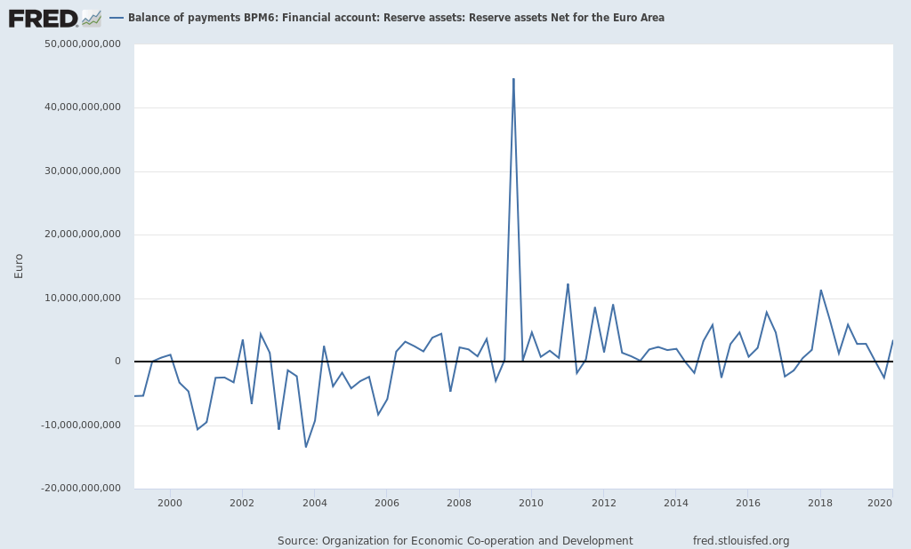
Balance of Payments

In contrast to interest parity theory, the balance of payments attempts to explain exchange rates with a holistic approach. The focus is not on the return efforts of investors, but on the flow of goods and capital flows between the respective economies of a currency pair. The balance of payments is a systematic record of economic transactions between private and public households, as well as businesses and banks at home and abroad. It consists mainly of the current account and the capital account. The current account records all transactions in the goods market.

The current account balance is often defined as the “external contribution”. In other words, it’s about the difference between exports and imports of goods and services. If a country has a positive external contribution, domestic capital increases as a result of net capital inflows. If, on the other hand, imports exceed exports, money flows out of the country and domestic assets diminish. The capital account records accounts receivable and household liabilities vis-à-vis other countries. Here, a distinction is made between capital imports and exports.

The difference is also called the net export of capital. If the performance and financial balance are not the same, an imbalance between the supply and demand of a currency is created. The resulting movement of the exchange rate returns the relation to the equilibrium point. Fixed exchange rate systems may also have long-term imbalances in the balance of payments.

Purchasing Power Parity Theory

The third model, the absolute theory of purchasing power parity (also known as purchasing power parity, PPP), compares the purchasing power of 2 currencies. The key message of the theory is that one currency that has been changed to another in the corresponding country will have the same purchasing power and therefore the same real value.

The external price level after conversion of the exchange rate should correspond to the domestic price level. If the exchange rate deviates significantly from this equilibrium, there should be a tendency to return to equilibrium according to this model, since in principle there is a possibility of a gain.

If, for example, a computer in the U.S. (In Euros) costs less than in the Eurozone, it would be worth buying it in the U.S. and reselling it in Europe. It’s worth it. The difference between the purchase price (converted to euros) and the sale price continues to provide a profit.

However, to purchase a computer in the United States, you will need dollars. The supply of the euro and the demand for the dollar will subsequently lead to an appreciation of the dollar, with the result that purchasing power in both monetary areas is adjusted. A popular example of this model is the so-called Big Mac index. This is a simple-built index of people’s buying power published regularly by The Economist.

The basis for calculating purchasing power is a comprehensive description of the prices of a standardized and readily available product: the Big Mac at a McDonald’s restaurant. For example, if a Big Mac in the U.S. costs $ 5.28 on average, while the price in Germany is $ 3.95, the theoretical exchange rate is $ 5.28 / € 3.95 = 1.34. If the current exchange rate deviates significantly from the theoretically determined value, it would be adjusted to this long-term value according to purchasing power parity. In reality, the purchasing power parity theory considers not only a good but a complete shopping cart. Moreover, not all price differences generate an opportunity for profit, as taxes, transport costs and customs duties must be considered.

Many goods cannot be marketed worldwide, especially services or haircuts which are not transferable. Therefore, the shopping cart should only contain marketable products worldwide.
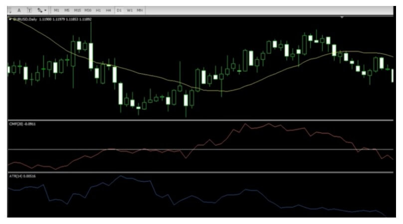
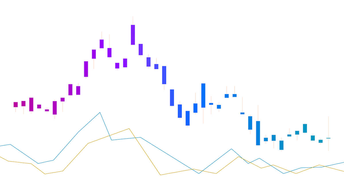
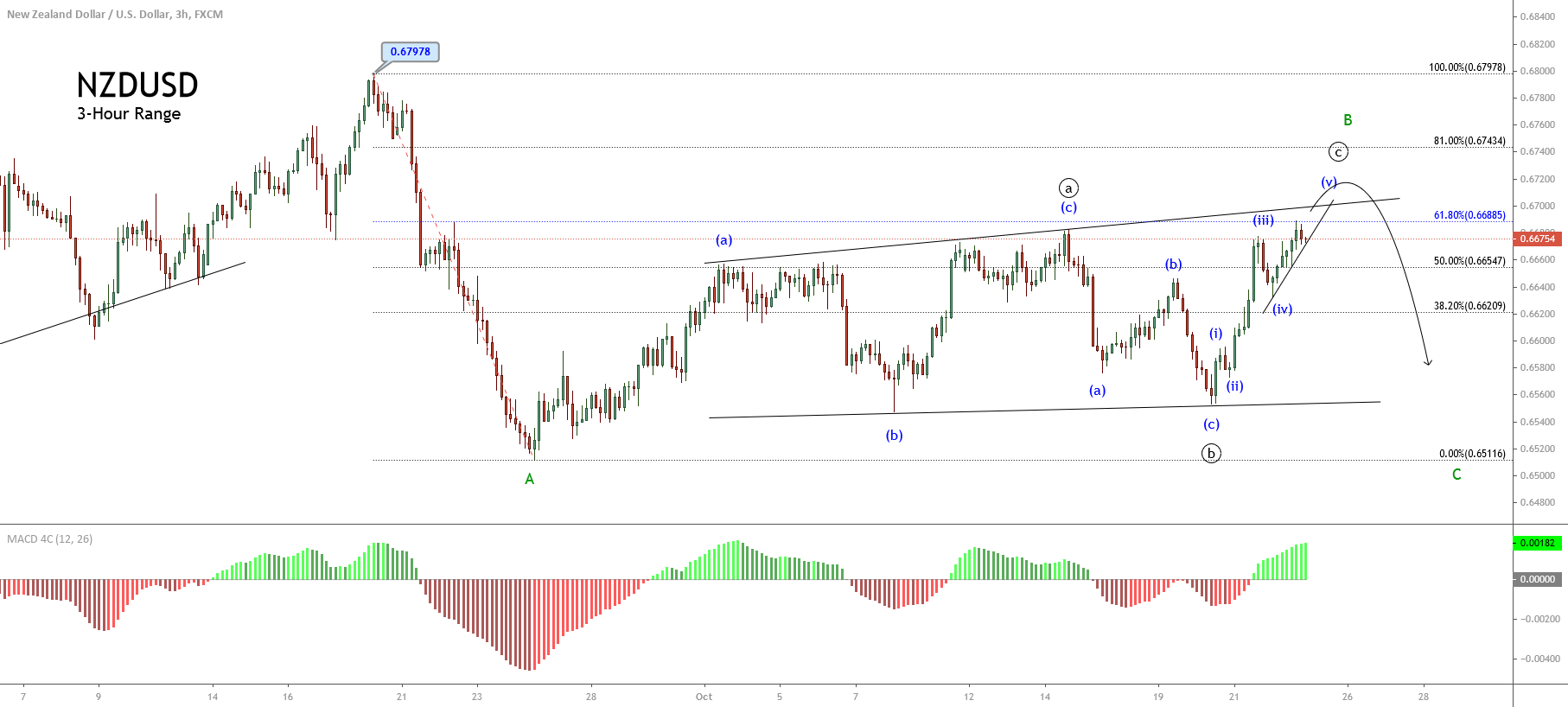
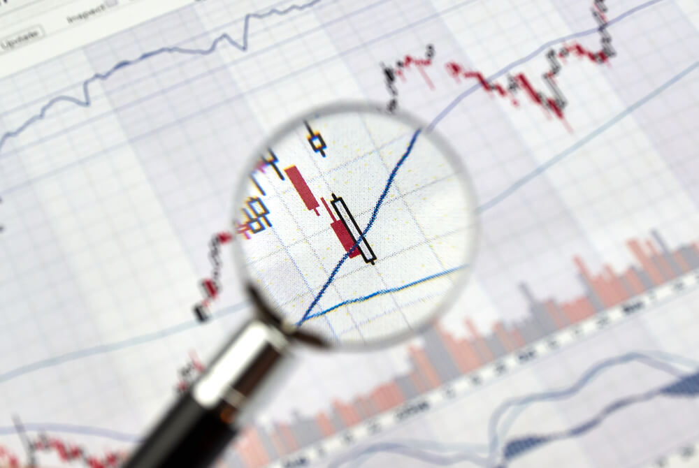
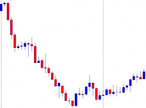
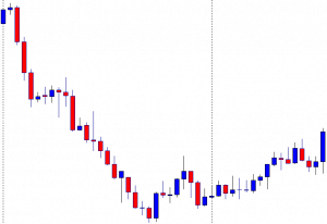
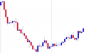
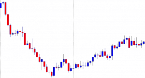
Technical Analysis

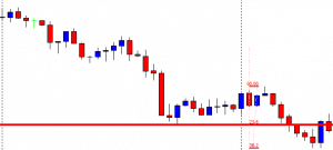
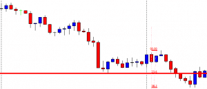
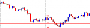
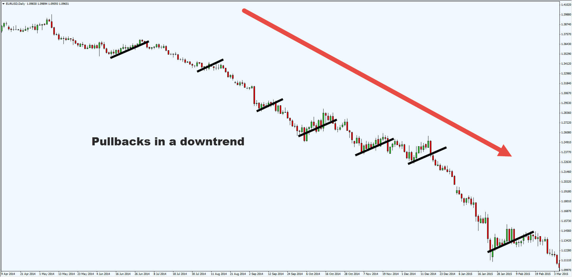
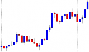
A general topic of controversy is whether the technical analysis in the currency market makes sense. On the one hand, there are so many price adjustments that many patterns can arise. On the other hand, the market is so inefficient that these patterns (theoretically) cannot function sustainably. However, most of the tools provided by Technical Analysis (TA) are well used in foreign exchange trading.

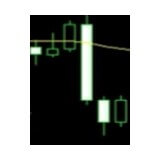
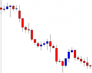
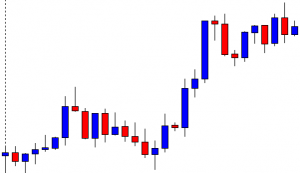
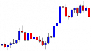
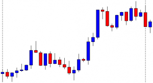
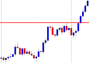
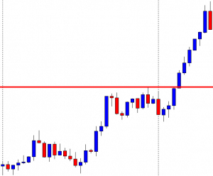
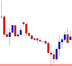
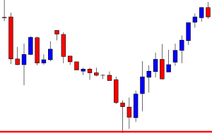
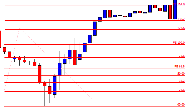
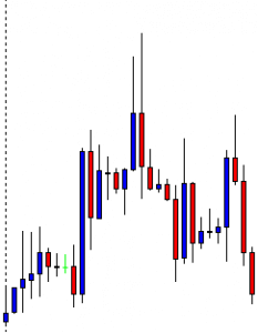
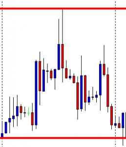
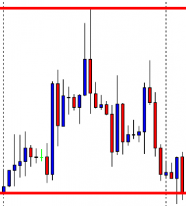
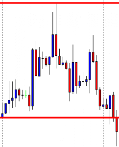
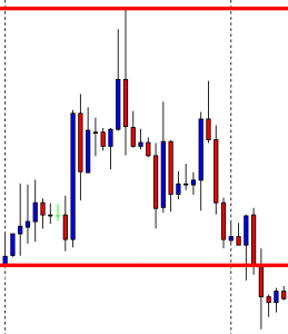
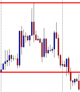
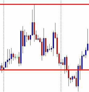
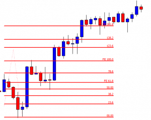
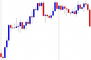
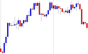
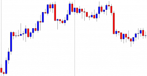
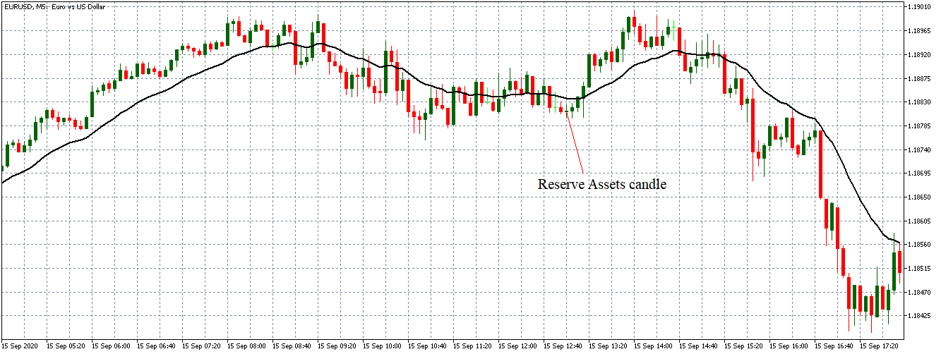
Classic graphics formations, such as trend channels or resistance and support lines, can be used, as well as the most advanced techniques of trend recognition, indicators, and oscillators, as well as candle formations. Due to the trend behaviour of the currencies, a relatively unknown type of graph is offered for the correct exchange rate analysis: the so-called “Graph of points and figures” (P&F – Point and Figure). This is a variant of alternative representation to the bars and candles graphics that are widely used.

In the foreground of the P&F table is no longer the movement of price in temporal terms, but the development of movement. Times when only small price changes (i.e., lateral movements) occur are filtered out of the table. A variant of similar representation, but more visually understandable, are the so-called Renko graphics. Both types of charts work with trend lines, indicators, and formations. When using it, you should always keep in mind that the time axis, unlike the “normal” graphics, is variable. Therefore, it may happen that the chart does not change over a longer period of time, if price fluctuations were too low or if a significant movement has not developed.

Various Time Levels

The methodology of integrating several time windows into the analysis and the resulting trading decisions are mentioned in the trader jargon as multiple time frame analysis. Due to the speed of the Forex market, this technique is particularly suitable. The concept derives mainly from 2 approaches. First, many operators check the situation in the main time window (for example, small time window: minutes chart, main time window: time chart) before entering a new position.

Only when the hourly chart does not have the resistance or support at the same level as the minutes chart and the exchange rate does not move in an opposite trend, will it enter the market. Second, many traders use this approach to enter into a long-term trend.

The smaller window often allows for a better entry time. However, once the entry is made, the operation will be managed in the longer-term chart. However, the danger of over-operation will be threatened. Instead of focusing on the long-term vision, many operators observe the position in the subordinated time frame, even after starting, and take unnecessary risks. If you consider support and resistance, you should start at the highest available time window and advance to the smallest primary unit in time.

Intermarket Analysis

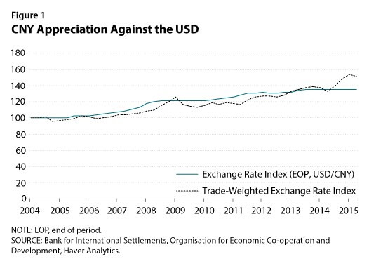
The dollar, of course, is the most important currency in the world’s financial system. Consequently, the dollar index is excellent for analytical purposes. Just look at the index to read the strength or weakness of the dollar against the main currencies: if the index rises, the dollar shows strength against the other currencies. If the dollar index falls, this indicates a weakness against the other major currencies. To measure even how a known currency is developed one compares its value with a basket of 6 coins. Specifically, this is the weighted geometric average of the US currency in euros, Japanese yen, British pounds, Canadian dollars, Swedish krona, and Swiss francs.

Market observers, who are interested in the interactions of different asset classes, know that the United States dollar plays an important role in cross-market analysis. From the historical development of the price, it can be clearly deduced that the global currency has a long-term negative correlation with the commodity market.

You can see how commodities entered a massive bearish trend, as the dollar index had a brilliant rally in mid-2014. For this reason, the United States dollar or the associated concept of the United States dollar index plays an important role in cross-market analysis, which examines the interactions between markets.

Appropriate Strategies – Long-Term

Now that we have learned a lot about currency market theory, we also want to deal with its practical application. To this end, we present two strategies that are interchangeable, on the one hand, in the long term and, on the other hand, in the short term. The carry trade is well known in exchange operations. Behind it is a simple system: funds are generated in a low-interest currency and invested in a high-yield currency. The difference between interest rates and the change in price is most important.

If the exchange rate does not change during the investment period, the return on the carry trade equals the interest rate spread. Also, a rise in the price of high-interest rates versus low-interest rates will lead to a further increase in revenue. In this case, the return on the interest rate advantage is further increased by the favourable development of the exchange rate. On the contrary, a devaluation of the currency in which it is invested leads to a reduction in yield.

If the percentage devaluation is above the interest rate spread, the trader loses money. If there are significant fluctuations in exchange rates to the detriment of the investment currency, the strategy could incur correspondingly high losses.

Carry trade is a popular strategy for hedge funds, as they are suitable for large sums of investment. Fund managers seek to identify macroeconomic developments at an early stage and make cost-effective use of appropriate strategies. In the same context, there is often debate about leveraged carry trades. Only part of the negotiated sum is deposited as collateral, taking advantage of existing capital. A Deutsche Bundesbank study in 2005 based on carry trade in euros against the dollar shows an average yield of 15 %, a multiple of the interest rate spread. A maximum of 71% profit would be possible.

However, annualized yields can vary widely and be markedly negative from month to month. Although carry trade is a long-term currency strategy it represents an interesting trading approach in the past and today. However, due to the high potential for detractions, the risk should not be underestimated. Rapid market movements can wipe out accumulated earnings in months or even years.

Appropriate Strategies – Short-Term

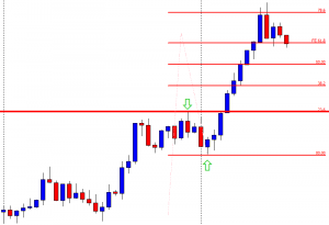
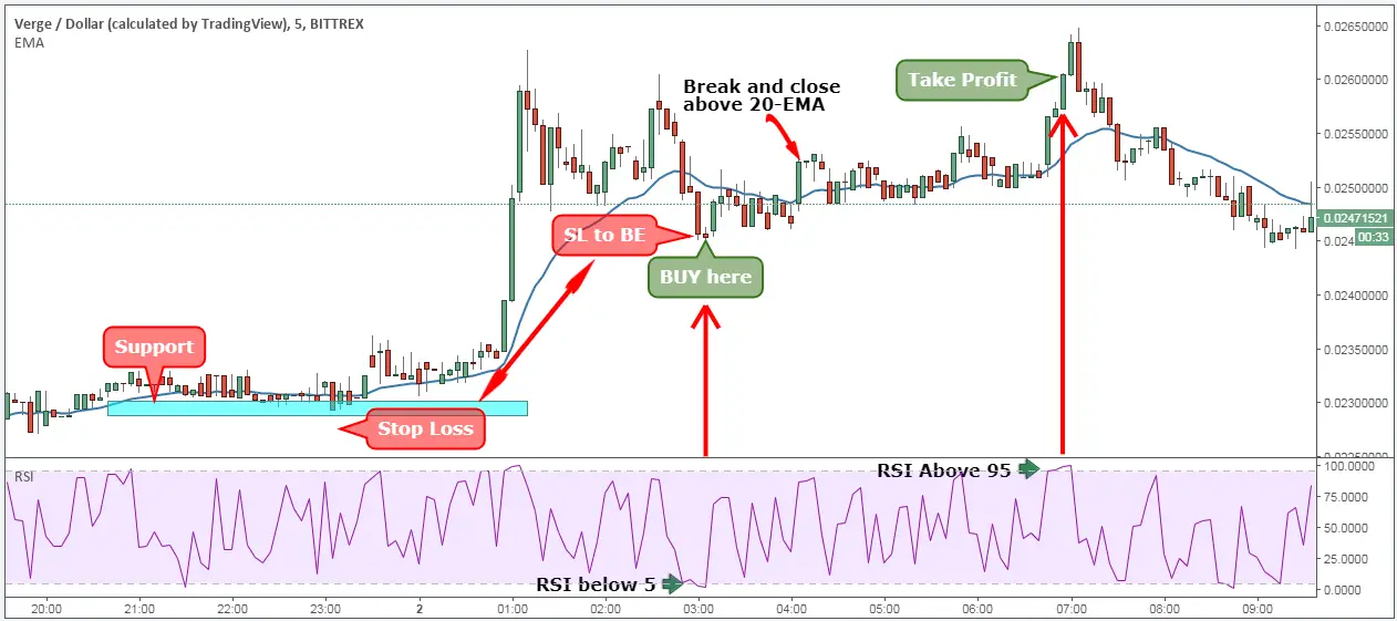
For short-term traders who want to generate profits in the volatile phases of the market, there is the breakup strategy of Maite Krausse. Breakage trading is a strategy used by many professional traders that offer satisfactory results in both swing and intraday trading. The best results are achieved in the volatile market phases or in strong trends, with uncertainty between market participants and continuous sidesteps minimizing the likelihood of successful entries. First, the range is displayed from 24:00 to 08:00 Central European Time (CET) on the 15-minute chart.

At this time, the maxima and minima are determined. Highs up to 8:00 a.m are considered the upper limit or resistance range, and lower prices represent a support level. If the price is now above the minimum marked or below the minimum, a purchase order is placed between 2 and 5 pips above the maximum, a sales order of 2 to 5 pips below the minimum.

This range is only valid during the respective day, after which it must be redefined and is therefore ideal for intraday traders. Orders are still valid until around 21:00. Thereafter, all pending orders are removed and redefined the next day. Once a purchase/sale order is activated, the transaction is carried out throughout the day, with a risk/probability ratio (CRV) of around 2:1 on mostly quiet days and a CRV of 4:1 on economically important days, given that the interest rate is a country’s decision.

For example, the loss limit (SL) can be set between 20 to 30 points. Profit-taking (TP) ranges from 40 to 100 pips, depending on market fluctuations. Therefore, a smaller TP will be chosen in the quiet phases of the market, and a higher estimated TP in days of interest rate decisions and global political events. Trading management is simple and must be set with an automatic limit of approximately 15 to 25 pips. In addition, in the 1-hour chart, you should pay attention to the areas of resistance or support in the area of the alleged inputs.

Therefore, a purchase order above the resistance, and a sale order below the support will be established. The most likely to benefit from this strategy lies mainly in the evolution of macro-influenced prices. Then, it is very useful to have a look at the daily economic calendar, as the greatest fluctuations are accompanied by surprises and new knowledge about the economic situation of a country and, therefore, the respective currency.

Particularly interesting are central bank decisions or protocols that provide directional indications. In those days, sometimes the profit can be generous around 100 or more pips. Inputs can be further improved by including breakdowns of price patterns such as upward and downward triangles, double floor/roof, and head and shoulders formations.

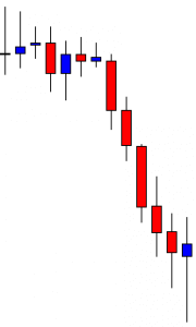
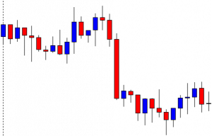
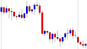
If the price has formed as a pattern, you should be careful and tune your inputs, because the buds of these patterns are often traded and are volatile. Another way to identify good break opportunities is through certain candle patterns that have formed on the daily chart. For example, the inner bar candle (also known as Harami bassist/bassist), can predict an imminent break, both in trend and in reverse, which is often used.

There is an inner bar formation when the next daily sail is of a different colour (day 2) and has its maximum and minimum price within the previous day’s sail (day 1). The entry is set on day 3 above/below the maximum/minimum sail of the second day.

Conclusion

The Forex market offers interesting trading opportunities that allow private traders to benefit from exchange rate changes. Whether it’s in the area of classic day-to-day operations, as well as to protect against price fluctuations or as a mix of separate strategies in the custody account. The advantages lie in the high liquidity and flexibility of the market and its 24-hour operation.

Moreover, foreign exchange markets always offer clear short-term trends. With trading margin and leverage, Forex is especially interesting for low capitalization traders. Operators also have the opportunity to choose between a more flexible interbank market, on the one hand, and standardised products, on the other. An investor will be able to choose from numerous trading instruments and strategies and combine them if necessary.

Categories
Forex Technical Analysis

Forex Technical Trading – Basic Algorithm Guide

You may feel that you have explored every possible source on indicators, learned about the best ways to combine them, and actually even started trading real money. However, you can always explore some new and innovative approaches to trading that may seem like an entirely new dimension despite having experienced success in the past. Whether they are beginners or whether they have already accumulated some experience, traders may still find some intriguing, refreshing, and stimulating facts and tips that can help them to collect more pips and considerably save time.

Lack of knowledge on some of these areas can even be held responsible for your previous losses or the fact that you might not have progressed as fast as you had hoped. Primarily, what we are going to be focusing on in this article is the proper way to read charts and manage the trades you are already in. As the title suggests, today’s advice will heavily rely on indicators, as the right use, aside from proper selection, directly influences a trader’s success and prosperity levels. 

We will first start with the general algorithm structure, which some traders are already aware of as it contains various measured trading categories. It is just an example you can follow right now for swing trading. Such an algorithm consists of six different indicators: the ATR is taking the first spot and the confirmation indicator holding the third one, while the exit indicator is positioned last. As this is an unfinished list, you should, upon extensive research and testing, make your own selection of indicators that can take the available places and complete the algorithm, as this article will not focus on it. What is more, you can keep searching for better options to adjust your current list, but make sure that you are confident regarding each tool’s purpose.

The ATR indicator is the very foundation of every trade that you will ever enter and since there is an extensive body of research on this particular tool, you should definitely put effort into learning as much as possible. It covers the volatility category and therefore also solidifies our position management. Next, the confirmation indicator’s job is to provide a signal so that you would know whether to go short, go long, or simply stay put and do nothing. The last one, the exit indicator, allows for you to exit trades before it knocks off any of your stops. However, even with this knowledge and after extensive research and use, traders can make fundamental mistakes that can outweigh the potential of the algorithm they have worked towards completing.

The ATR Indicator

The first step is to understand what the correct way of reading the chart is. We will first analyze the ATR indicator and pay special attention to where we want to focus on the chart to obtain the most accurate items of information. The image below is the example of the GBP/CAD daily chart, which can be considered as one of the more volatile currency pairs there are. The previous candle closed approximately an hour ago and this fact is the one piece of information you will always want to record and rely on in your trades. Some professional traders start analyzing the chart a little before the close of the daily candle as they can still discover information that will hardly change at that point, although the approach we are suggesting today is also equally important for everyone looking to enter a trade one hour after. Whether you choose to start assessing your options right before or slightly after the daily candle closes, what you should truly concentrate on is the candle that gives you data that you will be using in your next trade.

GBP/CAD Daily Chart: The Penultimate Candle

As the chart above reflects how one trading day ends and a new one begins, the place where we need to look is the penultimate candle in this chart or the candle which was last complete. Since the last candle that closed is not the last candle in this chart, make sure that you do not get confused as to where your focus of attention should be. We should not be then interested in the tiny candle indicating a day that has not ended yet (compare the last two candles marked by the yellow circle pointer), as it has only been one hour upon closing of the daily candle. The differences between the two will be valuable for your trading analysis and will still be relevant for other indicators as well.

The ATR of the currency pair in question equals 158 pips according to the indicator information provided on the left side of the chart below the white line. Nevertheless, forex experts insist that this is not the most relevant information, as the ATR value can be much higher. The reason for this lies in the data that is factored in the calculation of this value, so we need to pay attention to which 14 periods (ATR default setting) we are actually including in the average. Therefore, we should not make this ATR value on the left our focal point, but the value we get from the last candle that closed, which is the penultimate candle we marked yellow in the previous image. Since the trading day has just begun an hour ago, the last candle will never sufficiently add to the 14-candle average, throwing it off lower than should truly be. To obtain the information we need, we need only move the cursor over to the last closed candle for the white text box to appear, showing in this case the expected higher value of 162 pips. Therefore, this is the number we need to take into consideration to be best prepared to enter a trade.

This approach is how every trader can read the ATR properly regardless of whether they started trading slightly before or after the close of the daily candle. Some professional traders prefer to enter trades approximately 20 minutes before the candle closes due to the fact that they feel certain about having all the information they need at that point. Even if some changes occur, these experts point out that differences in terms of numbers would not be greater than one or two ATR pips maximum. Also, in the hour following the daily close spreads turn out to be changing drastically, so experts choose to start trading prior to these circumstances. This is an excellent perspective because it allows traders not to have to constantly worry about incorrect data or go back to find accurate information. This way you can access all relevant data and see it for what it truly is. 

In case you are ever unable to start trading at the time around the close of the daily candle, you can always rely on the ATR value shown on the left side of the chart. This data is far from incorrect because it is very close to the penultimate candle’s value. Therefore, you should not feel stressed about timing if your job-related duties or place of living, among other factors, do not allow you to be present at the time when you should factor in the data we discussed above.

Other Indicators 

What you should definitely pay attention to is the correct interpretation of other indicators, which involves several steps you need to understand properly. Many professionals lay emphasis on waiting for the candle to close in order to be fully able to read any indicator. If you allow yourself to be drawn up and down across the chart before a candle closes, your data will vary quite significantly. Some indicators may provide too many signals telling you to buy or sell several times in one day while the candle is forming. However, the only data you should be concerned with is the data you can access once this formation process is over, on the candle close. You can still choose to look at the numbers slightly before the close, but strive to be fully focused so as to be looking at the right candle and the right data.

The EUR/USD daily chart added below uses the Stochastics indicator, which is not a general recommendation but only a useful tool for a case study. If you focus on the blue and red lines in the following chart, you will see the yellow circle over the point where the blue line crosses downward the red one. When this phenomenon occurs, Stochastics is giving a trader an official signal to go short. Here, however, you may be surprised if you looked for the proof of the signal upon the close of the candle – the lines are close, but not actually crossing just yet. This is a clear indication that you should not be entering a trade at this point and you need to be very careful with how you interpret the chart. You will also not be including the last unfinished candle because, again, it would affect the 14-period average. The line connecting the candle with the red and blue lines of the Stochastics indicator below cannot be drawn perfectly straight, but it is a crucial point for traders to see how they, in fact, never received a real signal. 

The catch here is always to wait for the candle to close first because you need every piece of information pertaining to the candle and we can only obtain it upon candle close. From the perspective of now, we cannot know exactly what would happen with the price the following day – it might even go up really fast. Nonetheless, without having both conditions met – the signal and the candle close – you need to sit out and wait, refraining from taking any action at that point. In this case, as we noticed how the candle above the two-line cross was not a real signal, we would need to wait out for the next candle to close. Therefore, if you look below at the EUR/USD chart, the penultimate candle really does show the blue line crossing down beyond the read on, which is an official signal to go short. This information is only available upon candle closing or, what some professional traders do, trade 20 minutes prior to the close of the daily candle when you can expect little to no changes, and have a real chance of seeing how the lines would move next. Remember that your indicator is not really telling you the truth until a candle closes or is close to this point.

EUR/USD Daily Chart: Signal or No Signal?

How to Read Your Charts Fast

After accumulating knowledge on how to analyze what your charts and indicators are telling you, the very next step is to learn the ways in which you can quickly zoom through your trades. Professional traders, for example, can be trading as many as 28 currency pairs at the same time, but this does not in any way imply that they take more time to do so. Contrary to what one may expect, experts have actually managed to create a routine of trading approximately 15 minutes a day. Some of them claim to only trade 20 minutes before the close of the daily candle and many also trade across different markets too (e.g. forex and metals).

You may be wondering how a quarter of an hour can suffice with such a staggeringly high number of trades and information to read and process. The experts, in fact, manage their trades in a very similar fashion as everyone else with regard to the action they take – they observe the charts to see if they should make any changes, checking whether any trade should be closed out, half of the position taken off, or a stop loss adjusted, etc. Sometimes, your daily trade need not include any action as none is required, and being at peace with this is also a very important skill.

Professional traders also look for the opportunity to enter new trades every day, which can be done easily right after taking care of the trades they are already in. Here they advise traders to ensure that they are using the best possible confirmation indicator and invest time in looking for one should this step still pose as a challenge. The confirmation indicator is perceived as the backbone for almost every step of trading and is vitally important for increasing your efficiency in managing your trades. 

If your number one confirmation indicator is telling you not to proceed and enter a trade, any other indicators you are using will not be relevant. Since your main confirmation indicator is not giving you a signal to either buy or sell, you should stay put and accept this information. You should not at this point look elsewhere to find additional confirmation for what has already been confirmed, as it will only deplete your energy and waste your time. Any further clarification will only confuse you especially since this happens extremely rarely that your confirmation indicator does not give out any buy/sell signals.

Should your number one confirmation indicator tell you to enter a trade, you can look at the remaining parts of your structure. Here is where you can actually make use of other indicators to find additional proof that you should proceed and start to trade. If every indicator is telling you to go long or short, it is time for you to enter a trade. The process is, therefore, very simple as long as you follow these steps. 

To observe how this approach functions in reality, we will rely on the EUR/USD daily chart below. Here we are using the RSI indicator, which is another tool we do not recommend that you use despite its popularity among forex traders. The relevant information you are looking for when you are using the RSI essentially comes from a price moving into the oversold/overbought territory and returning to the middle area. This is the only signal this indicator will give you so focus on the line coming up/down and then coming back to the middle of the chart. One such example is surely the curve we see below the white pointer. However, should you ever get a signal of a few candles before the end of the chart, you should not pay attention to that. Rather focus your attention on the penultimate candle, which is this chart does not show any signals.

EUR/USD Daily Chart: RSI

You can also experience situations in which you happen to see the line going below the middle, for example, and you can tell that there is a high probability of it crossing back into the middle despite the daily candle being just about an hour old. From this standpoint, we can only predict based on the potential of the line crossing back some time later on that day, but we should never focus our actions based on prediction. If you use the RSI indicator, always wait for the daily candle to close, for it will generate real clues of where the line is going to end up eventually. Always remember that a false signal, despite how strongly we feel about it, is not a signal at all and we should not enter a trade based on impression or emotion but actual, real signal.

The steps provided above comprise the typical daily trading responsibilities of every professional trader. What you should do is simply apply these when going through your charts and there is no need for it to last long. If you start debating whether a signal is truly a signal or not and start giving in to your emotions, your trading experience will neither be fast nor lucrative. Look for the information your main confirmation indicator is offering and decide on your next step according to the signal, or the lack thereof. 

By following this approach, your trading should not last more than 10—15 minutes each day. The part where you assess the trades you are already in should approximately last up to two minutes, while the remainder is generally consumed by entering into new trades. Sometimes you will not initiate any new trades at all and just manage the existing ones. This mentality and these practical steps are absolutely the way to save your time and be more efficient in every respect.

To conclude, you should always make sure that you wait until the candle closes or start interpreting the chart just about 20 minutes before it happens in order for you to be able to get the most accurate information. Should you find time to be a precious commodity as well, always lock on your main indicator on each chart you are looking at. Should the number one confirmation indicator endorse you to move forwards, consult with your other tools. This is the easiest and the fastest approach to entering new trades and handling the existing ones, which will take only up to a quarter an hour of your time each day. 

Finally, do not give in to your impulses and desires, hoping for something to be a signal when it actually is not. Prevent any future failure with your firm reliance on technical support, clear rules, and discipline and stay away from predicting potential. Forex trading can be exceptionally easy if we leave out self-sabotaging tendencies and apply strict strategies that are supported by a fine selection of tools. Therefore, in order for you to use your indicators the best possible way, you really need to put effort into finding the right ones to complete these elements of the example algorithm, as well as use the facts and advice we shared with you today to propel your trading skills and maximize your rewards as a result. Other indicator categories that should be included in your algorithm is Volatility/Volume, on chart Baseline, and additional confirmation indicator belonging to a different theory. These elements and their function will be covered in another article, but the current basic algorithm example should point you in the right direction already.

Categories
Forex Education Forex System Design

How to Optimize a Trading Strategy

Introduction

Once the developer successfully ends both the multi-market and multiperiod test of a trading strategy, he can move to the optimization process. However, there are some risks associated with its execution that the developer should recognize.

In this educational article, we’ll present the different stages of a trading strategy’s optimization process.

Preparing for the Optimization

After passing the multimarket and multiperiod test, the developer has verified that the trading strategy works. Therefore, he could move toward the next stage that corresponds to the trading strategy optimization.

Optimization is used to determine the optimal parameters for the best result of a specific process. In terms of trading strategy, the optimization corresponds to selecting the most robust parameter set of a strategy that would provide the peak performance in real-time markets. 

Nevertheless, selecting the highest performance that provides the most robust set of parameters can result in challenging work. This situation occurs because each set of parameters will correspond to a specific historical data range used in each simulation.

In this regard, the developer’s top parameter selection must be part of a set of evaluation criteria defined before executing the optimization process.

Risks in Optimization

The optimization has pitfalls that the developer must consider at the time of its execution; these traps can lead to increased risks when applying the trading strategy.

The first risk is overconfidence that the results obtained during optimization will produce the same market results in real-time. The developer must understand the strategy and each effect of the results obtained in each part of the optimization stage.

The second risk involves excessive overfitting of the strategy’s parameters. This risk is due to the execution of the optimization without considering the guidelines and appropriate statistical procedures.

Finally, using a wide range of parameters can lead to obtaining extremely positive backtested results. However, such positive returns generated during the optimization stage do not guarantee that they will happen in real-time markets.

Optimizing a Trading Strategy in MT4

In a previous educational article, we presented the development process of a trading strategy based on the crossings of two moving averages, which corresponds to a linear weighted moving average (LWMA) of 5 periods and a simple moving average (SMA) of 55 periods. 

This example considers the execution of an optimization corresponding to both moving averages, and the optimization’s objective will be to find the highest profit.

Before executing the optimization, the developer must select the Strategy Tester located in the toolbar, as illustrated in the next figure.

Once picked the trading strategy to optimize, it must select “Expert Properties,” where the developer will identify and define the parameters to optimize.

The next figure illustrates the “Expert Properties” box. In the first tab, the developer will select the Testing properties, where the “Custom” option will provide a broad range of outputs for each scenario obtained during the simulation stage. 

After the Testing selection criteria, the developer can select the parameters to optimize during the historical simulation. In the example, the parameters to optimize will be the fast (LWMA(5)) and the slow (SMA(55)) moving averages. The developer must consider that as long as it increases the parameters to optimize simultaneously, the simulation will increase its length of time.

Once the “Start” button is pressed, the Strategy Tester in the “Optimization Results” tab will reveal each parameter variation’s output. In the case illustrated in the following figure, the results are listed from the most to less profitable. 

The results also expose the Total Trades, Profit Factor Expected Payoff, Drawdown ($), and Drawdown (%), and the inputs for each historical simulation.

In conclusion, the trading strategy based on the cross between LWMA(6) and SMA(192) in the historical simulation returned $1,818 of profits with a Drawdown equivalent to 5.77% or $688.17. Likewise, these parameters are valid only for a 4-hour chart

Nevertheless, analyzing the criteria described by Robert Pardo, which considers that a trading strategy should provide three times the drawdown, the strategy should generate three times the dropdown, in this case, the parameters applied into the model returned 2.64 times more profits over the drawdown. 

Next Tasks After the First Optimization

Once the first optimization was performed, the developer should analyze the trading strategy behavior with non-correlated assets and its performance in other timeframes. 

If the strategy passes this stage, the developer could make a walk-forward analysis. Among other questions, the strategist should answer whether the strategy will make money in real-time trading.  He also should evaluate the strategy’s robustness, where he would determine if the strategy is sufficiently robust and ready to trade in real-time.

Finally, once these stages are successfully passed, the trading strategy should be tested with paper money before its implementation in the real market.

Conclusions

In this educational article, we presented the steps for executing a simple optimization corresponding to a trading strategy based on the cross between two moving averages.

Before starting to optimize a trading strategy, the developer must weigh both the risks involved by the optimization process and the optimization analysis’s objective as the results that the study will generate.

Finally, although the optimization process reveals that the trading strategy is robust, the developer must continue evaluating if it can generate real-time trading profits.

Suggested Readings

  • Jaekle, U., Tomasini, E.; Trading Systems: A New Approach to System Development and Portfolio Optimisation; Harriman House Ltd.; 1st Edition (2009).
  • Pardo, R.; The Evaluation and Optimization of Trading Strategies; John Wiley & Sons; 2nd Edition (2008).
Categories
Forex Daily Topic Forex Price Action

How to Professionally Deal with Fake Breakouts!

In today’s lesson, we are going to demonstrate an example of an H4 breakout at the weekly low. The price consolidates after the breakout and produces a bearish reversal candle right at the breakout level. It is a matter of time for the sellers to go short and drives the price towards the South. Let us find out what actually happens.

The chart shows that the price makes a good bearish move. It finds its support where the pair is traded for a while. The pair closes its week by producing a bearish candle. By looking at the chart, it looks that the sellers are going to keep their eyes on the chart next week.

The pair produces a bullish engulfing candle to start its trading week. The buyers on the minor charts may push the price towards the North. However, the H4 chart is still bearish biased.

The chart shows that the price may have found its resistance. The price has been in consolidation for a while. The last candle comes out as a bearish engulfing candle. The price may make its move towards the South now.

The chart produces consecutive bearish candles and makes a breakout at the last week’s low. The pair is traded below the breakout level for two more candles as well. The sellers are to wait for the price to consolidate and produce a bearish reversal candle followed by a breakout at the consolidation support to go short in the pair.

The chart produces a bullish engulfing candle closing within the breakout level. The next candle comes out as a bearish inside bar. The sellers would love to get a bearish engulfing candle closing below the bullish candle’s low. However, a breakout at the consolidation support would signal the sellers to go short in the pair. By drawing Fibonacci levels on the chart with Fibonacci extension, we see that the price finds its support at the level of 38.2% and finds its resistance at the level of 23.6%. In a word, the stage is getting ready for the Bear to make a move.

The chart produces a bullish candle. It is not a good sign, but the sellers still have hope. If the chart produces a bearish reversal candle again followed by a breakout at the level of 38.2%, the game is on for the sellers.

Now, the chart produces another bullish candle and heads towards the North. The sellers must be very disappointed since it seemed such a nice trade setup for them. The reality is it often happens to all traders. No point in being disappointed, but it must be dealt with professionalism.

Categories
Chart Patterns

Pullbacks – How Prop Traders Manage Discounts

Pullbacks we will talk about are described as a correction candle (or bar) after a bigger, sudden price movement candle (period) on any asset chart. When you apply a technical trading system and all signals it is time to trade after a pullback, traders enter at a more favorable price. This is a great way to get more pips out of a trend although if you love this discount too much, you can easily become a discount hunter. In forex, this habit will only cut down your account. Professional traders play a very careful game with pullbacks, they are hard to gauge, and once they happen the odds are not as great as without them. The trend may not continue with the same momentum. We will address how proprietary traders manage pullbacks using their technical system and their ruleset. This example can be taken as is, although there are many ways to manage the risk of pullbacks and their psychological effect. 

Discount shoppers should not apply the same principles in forex. Entering at a better price is what we should aim for, there is a time and place for this but it does not happen often in forex. If we wait for a pullback every time, the benefits of pullbacks become a losing waiting game. Our example in this article will use technical system elements explored in previous articles to pinpoint the time and place a pullback can be used for a better price entry. With a rule addition once they happen. The element in question is the Baseline and the volatility measurements. We will also address why professional prop traders avoid them in all other circumstances. Most of the time pullbacks will not be inline with the rule set and the technical system signals, but on some occasions, they will add up and in the long term will have significance to your account. 

The pullback hunting concept is not easy to grasp for a beginner, especially if not yet accustomed to custom indicators, technical systems, and the base Moving Average element. In case you do not understand how to use pullbacks using our example, you can completely disregard this concept and move on with other strategies. Pullbacks setups do not happen often and they do not always end with benefits. Some traders will not enter a trade unless they get a pullback. This also means they miss out on 99% of other trends worth taking. But let’s see how a pullback is used in our trading system. 

Big candles happen on any currency pairs, and we are not talking about the flash crash candles like the one after the Swissy peg removal. Big candles that are unusual can be measured as the ones that break the 1.5 ATR (14) value. These candles are caused by several phenomena in the forex. Most of them are after News events, such as Non-farm payroll, GDP, rates, elections, and so on. Also, these can happen in low liquidity periods, be it brokerage, liquidity providers, or other market drivers. Stop-loss hunting by the big banks is something that happens in between these, and are more common on popular trading currency pairs. Stop-Loss hunting is deliberate price manipulation by the big banks with huge volume to trigger visible clusters around specific price levels set by traders.

This is not a conspiracy theory but a fact we can even read about in the newspapers once the fines are announced to familiar bank names. Stop hunting is not the only manipulation but this is part of forex and it is not always a bad thing. These candles are mostly in counter-trend direction and overshoot a few before it. If these movements are not caused by news, it is mostly bank dumps or a combination of both. Trends can also move like this when there is a huge trading pressure or volume but it is not that often to see it without any catalyst before. The news and big bank manipulation moves are exaggerated, and when the price is deviating so much what usually follows is a correction or a completely new trend in opposite direction – reversal. This is a point where we can take advantage of a pullback, but using elements and rules to increase our odds. 

The rules a pullback can be utilized are applied only when the price cross-closes our baseline element. This is a signal we have a good trend to enter when all other indicators agree on this. Now, we will use the ATR(14) last pip value on our target, daily chart, and see if the current candle which is about to close in a few minutes is past this ATR pip value, measured from our baseline. In MT4/5 this is quickly measured by clicking the middle mouse button or ctrl+f and dragging from the top/bottom of the candle to the baseline. The rule for pullbacks is that only trade the pullback if in the price level is back into the ATR value range from the baseline. If we do this step by step it would be like this: 

  • We use the daily chart for our trading. 
  • The candle or trading day is a few minutes before closing.
  • The price has crossed our baseline.
  • Pull up the ATR (14) indicator and see what the current pip value does it sit. 
  • Measure the range from the current price level of the candle to the baseline.
  • See if the pip range measured is higher than the ATR pip value.
  • If it is, wait for tomorrow to see if we have a pullback candle at the end of the day.
  • We measure the pullback candle current price level range from the baseline a few minutes before the day close.
  • If the measured pip range is below the current ATR pip value we enter the trade. 
  • Our system gives a trade entry signal and other rules allow for it. 

This procedure may look complicated but it is easy after a few times. Some tools which can be downloaded for free from the MQL5 market can draw the ATR range channel on the chart making it easy to see if the pullback has qualified for entry, no need to measure the distance. 

Now we will give a few pullback examples using MT4 included indicators. In the picture below we have the EURUSD pair on the daily timeframe, 20 period SMA as our baseline example, Chaikin Money Flow indicator as our trend confirmation indicator, and the ATR on the default settings (14 periods). 

Notice the big candle in the middle of the picture that close-crossed our 20 SMA baseline colored yellow. Below, our confirmation indicator signals the long trade as it is above the horizontal zero line. The ATR below the Chaikin Money Flow gives us a value of 1005 points (100 pips) when we hover over the line (take the decimal number as a whole). 

When we measure the price level distance from our baseline, we get 101 pips – bigger than our ATR value so we do not take this trade (see picture below). 

If you want to be precise, you can hove over the candle and the baseline to see the values and calculate the pip distance, although when you trade real time this precision is not important unless it is hard to tell. The next candle pulled back. Our confirmation indicator is still signaling the long trade, the closing price level is now inside the ATR range from the baseline – 33 pips.

So now we are entering this trade at a discount, 68 pips better price entry does matter plus we have a better risk as our Take Profit point is lower. Pullback situations like this are not common, but you should be ready once they do. Remember that the one candle rule is applied here. If the next candle is not in the ATR-Baseline zone you do not take that trade. We do not count later candles and qualify them as pullbacks, only the first after a big candle. Interestingly, this one candle rule is applied to some lagging indicators to give them a chance to catch up with the rest of the system, however, this is just one example of a trading system used by a prop trader. The picture below shows price action we do not qualify as a pullback, the second candle after the exaggerated one is not a correction while the third is not accountable. 

On some occasions, your confirmation indicators may be lagging so you do not catch a baseline crossing candle or the one after. If this happens and the price is already past the ATR range from the baseline, you pass on that trade. There is no waiting for any kind of a pullback. The baseline element cannot play its role if you take trades too far from it. The baseline is there to show the “balance” point to which the price comes back to after deviations. Entering a trade in the middle of the deviation decreases the odds it will continue to move away. The baseline element is also a protective function from losses. Of course, you can try other ATR settings or levels for this rule if it proves to be more effective in the testing. 

The ATR range rule is applied to normal trading signals too in our system example. Any deviation which is too far away once the baseline is crossed does not qualify for an entry. There is one exception though – when you encounter continuation trades. More on these situations is presented in another article. 

Pullbacks can work well, so well it can make you skip the rules you have set. The hype of success can lead you to seek pullbacks wherever you can, adjusting the system to only catch them as much as it can. This change will lead you into a losing spiral not only to your account but to your morale too. It is easy to get into the pullback hype and much harder to get out of it. There are no indicators that predict pullbacks and even less the ones that predict trends after it. You may rely on your hunches whenever you see a big candle, and this is a dangerous practice for your account. When your ATR is just one pip lower to qualify a pullback, there is no tolerance, you pass on that trade.

The rule discipline will get you out of the losing trades and, more importantly, you will not wait for pullbacks and miss out on winner trends just because the price kept going. These winners are what make a difference to your account after everything, missing them out is not an option. The choice between five 300 pip winners per year and one 350 pip winner with a pullback entry is very easy to make, but the hype of getting a discount cloud our judgment. Discount shopper patience does not apply to forex when it comes to pullbacks. Waiting for a high-percentage trade is not similar. Here, you are missing out on a signal from your system and your rulebook just because you want a better price to enter after a pullback. Do not mix this with high-percentage trading which is actually what you should do all the time. 

As you may have noticed, this example is based on measurements, indicators, and strict rules in conjunction with them. It is a technical system that may not be an appropriate way of trading for everyone. Some traders trade without any indicators, or as they might describe – secondary technical indicators. The primary indicator for them is Price Action. What they see on the chart is the base for their decision making. Identifying pullbacks is not exact practice, they might wait for a pullback every time with pending orders or wait for a Price Action pattern to unfold before making an entry. However, these skills are unique to them and cannot be replicated in any technical system. On the other side, by having something you can measure, you have an easy-going decision-making system ready for anyone who can just follow their signals to be successful.

Categories
Forex System Design

Starting the Testing Process of a Trading Strategy

Introduction

The development of a trading strategy requires steps to evaluate its reliability during its execution in real markets. To achieve this, the developer must develop a testing process to determine its robustness and viability as a previous step before its optimization.
In this educational article, we’ll introduce the steps of a trading strategy’s testing process.

Getting Started with Testing the Trading Strategy

Once the developer completed the programming of a  candidate trading strategy, it’s time to confirm if the strategy works as the conceptual model assumes. In this regard, the strategist should follow the following steps:

  1. Verify the preliminary profitability of the trading strategy.
  2. Assessing the robustness delivered by the strategy.

The robustness concept relates to the ability to continue generating substantial profits despite adverse market conditions, such as trend changes or extremely volatile conditions. An alternative method for verifying the strategy’s robustness is by assessing if it continues being profitable under a wide basket of markets.

Another critical part of the testing process is to verify the trading rules. As the strategy’s complexity increases, rules also increase in complexity. In this context, the developer must validate that the execution of the buy and sell signals happens at the levels triggered by the strategy’s rules. The verification of entry and exit signals will allow the developer to identify any programming error.

Analyzing Profitability

Once the programming stage is verified, the developer should estimate the trading strategy’s profitability considering a reasonably lengthy historical price series. 

As a guide, a short-term strategy may be tested using two years of price data, a mid-term would need up to four years, and a long-term up to eight years of historical data. Nevertheless, the window size may vary depending on the strategy type or the market conditions.

With this information, the strategist will have a panoramic overview of the trading strategy’s profitability and risk. In this regard, if the strategy’s performance is deemed acceptable, the developer could advance to the next stage of the testing process.

Nevertheless, if the strategy has a poor performance, the developer should judge if it could be redesigned or discard it.  

Finally, for a proper evaluation, the strategy must be run using a standard one unit trading size. This way, the profits would result in multiples of the risk.

The Multimarket and Multiperiod Test

The multimarket and multiperiod test corresponds to the last stage of the testing strategy’s performance. During this historical simulation, the developer must study a set of parameters of the strategy considering a small basket of diversified markets over a broad range of historical periods. In other words, the developer must develop a historical simulation taking a group of different assets using different timeframes.

The developer must select a small portfolio of non-correlated assets; in other words, markets that don’t relate to each other. An example of a non-correlated portfolio is a mix of a commodity, a bond, and a stock index.

Concerning the length of the test period, Robert Pardo suggests that to obtain solid results, the developer should use ten years of historical data for each market. However, it could start from five years of historical prices. Pardo’s figures are related to long-term stock trades using daily timeframes. Intra-day trading systems, as already stated, would require smaller data ranges.

The results obtained from the historical simulation will provide an objective overview of the trading strategy’s profit and risk.  Depending on the results obtained, the developer may terminate if the strategy is robust and produces reasonable returns or if it performs poorly and should be rejected. Likewise, the strategist may observe that the strategy presents mixed results, so it should not be rejected entirely.

Conclusions

During the testing process of a trading strategy, the developer must evaluate a broad range of aspects that ensure the correct work during its evaluation.

For example, the developer must verify if the opening and closing trades’ programming rules execute as the strategy requires. After this step, the robustness degree will drive the strategist to conclude if it is viable in real markets, needs improvements, or should be rejected.

Finally, on a multimarket and multiperiod test, the developer must evaluate the strategy’s performance in a small non-correlated portfolio using different timeframes. Once this historical simulation is made, the strategist would be able to confirm if the strategy is robust and viable or reject it before continuing with the optimization stage.

Suggested Readings

  • Jaekle, U., Tomasini, E.; Trading Systems: A New Approach to System Development and Portfolio Optimisation; Harriman House Ltd.; 1st Edition (2009).
  • Pardo, R.; The Evaluation and Optimization of Trading Strategies; John Wiley & Sons; 2nd Edition (2008).
Categories
Forex Fundamental Analysis

Everything You Should Know About ‘Home Loans’ Macro Economic Indicator

Introduction

The real estate market has always been an integral part of the economy – any economy. Where the real estate sector flourishes, economic development follows. It can be argued that entire economies, from the pre-renaissance period, have been built on the back of a thriving real estate. The strategic economic importance of the real estate market is that, where houses are built, other infrastructure developments follow, social amenities, and market places. In the current age, the flourishing of the real estate sector can be taken as a leading indicator of household demand; and this is why monitoring home loans is essential.

Understanding Home Loans

A home loan is also known as an owner-occupier home loan. These loans are given to people who fully own their current home outright or have a mortgage on their existing primary residence. The home loans are usually meant to either fund the purchase of a second home or conduct renovations and improvements on the current home.

Therefore, home loans can be categorized into two; home equity loan or a mortgage.

Home mortgage: In this type of home loan, a financial institution lends money to an existing homeowner to fund the purchase of another home or to make renovations on the existing one. In this case, you transfer the deed on your current house to the banks, which is used as collateral. The financial institution can fund up to 80% of the value of your home. i.e., if your home is worth $100000, you can receive up to $80000 in the loan. Note that you will only get this type of mortgage if you outright own the home. In case you have an existing mortgage, you can opt for a home equity loan.

Home equity loan: If a mortgage funded your primary residence, you could take a second mortgage if you have enough equity on the current home. Whenever you pay down the first mortgage on your home, the value of your home equity increases. Let’s say your current home is worth $300,000, and you have an outstanding mortgage worth $100,000; this means you have equity of $200,000. Here, the equity represents the value you will remain with if you were to sell the home. Therefore, when you take a home equity loan, you will receive a lump sum amount equivalent to the equity you have on your current home.

In both types of home loans, your primary residence is the collateral. The lender is entitled to foreclose on these homes if you default on the repayment.

Using Home Loans for Analysis

As a significant indicator in the real estate market, home loans data can be used as an indicator of the overall demand in the economy. Let’s take an example of an increase in home loans.

When home loans are growing, it can be taken to mean that households have increased demand in the real estate market. Home loans are primarily used to conduct renovations on existing homes or fund the purchase of second homes. Since both these activities are not essential needs for a household, an increase in home loans can only mean that households have satisfactorily taken care of their primary and intermediate needs. Therefore, the welfare of households can be said to be improving when home loans are increasing.

Furthermore, since one is required to make a predetermined repayment on home loans or risk foreclosure, it would imply that households have a steady stream of income when they take these loans. On a macroeconomic level, an increase in the home loans would imply that unemployment levels are down or that households receive higher wages. Lower levels of unemployment and increased wages tend to increase disposable income.

In such cases, an increase in aggregate demand is expected hence overall economic growth. Note that in most economies, households’ demand for goods and services account for almost 70% of the GDP. Therefore, an increase in the demand for houses implies that almost every other sector has also experienced increased demand. These sectors range from those providing essential to intermediate goods and services to households.

The home loans data can also be used to show the economic cycles recessions to recoveries. If the economy has gone through a period of recession, an increase in home loans can sign that money is flowing through the economy. Low economic activities characterize the economic cycles of recessions and depressions; therefore, an increase in home loans can be taken as a sign of increased economic activities. This increase can be an indicator that the economy is going through periods of recovery.

Source: ABC News Australia

Impact on currency

The forex market is forward-looking. This attribute means that for every economic indicator released, the forex market tends to anticipate how these indicators would influence the future interest rate.

When home loans are increasing, it could mean two things. Either household has access to cheaper financing, or the economic growth has increased the flow of money. In the forex market, a continuous increase in home loans can be seen as a potential trigger for contractionary monetary policies like increasing the interest rate. Such policies result in the appreciation of the currency relative to others.

Conversely, a continuous drop in the home loans leads to depreciation of the currency relative to others. In this case, governments and central banks could view the drop in home loans as a sign of the economy slowing down. Expansionary monetary and fiscal policies could be implemented to prevent the economy from going into recession.

Sources of Data

In Australia, the Australian Bureau of Statistics (ABS) is responsible for the publication of the home loans data. Trading Economics has a historical review of the Australian home loans and a global comparison with other countries.

How Home Loans Data Release Affects the Forex Price Charts

The latest publication of the home loans data by the ABS was on October 9, 2020, at 1.30 AM GMT. The release can be accessed at Investing.com. From the screengrab below, the AUD’s moderate volatility should be expected when the home loans data is released.

The home loans MoM change for August 2020 was 13.6%, an increase from 10.7% in July 2020.

Let’s see what impact this release had on the AUD.

AUD/JPY: Before Home Loans Data Release on October 17, 2020, 
Just Before 1.30 AM GMT

The AUD/JPY pair was trading a mild downtrend before the release of the Australian home loans data. From the above 5-minute chart, the 20-period MA is slightly falling with candles forming just below it.

AUD/JPY: After Home Loans Data Release on October 17, 2020, at 1.30 AM GMT

The pair formed a 5-minute inverted bearish ‘hammer’ candles immediately after releasing the home loans data. Subsequently, the AUD/JPY adopted a subdued bullish trend as the 20-period MA began rising, and the candles crossing over it. As expected, this trend showed that the AUD became stronger after the increase in home loans.

Bottom Line

From the above analyses, we can conclude that although the home loans data is a moderate-impact economic indicator, it significantly impacts the forex price charts. This indicator’s impact can be said to have been amplified since it signals the rebounding of the real estate sector from the coronavirus-induced recessions.

Categories
Forex Indicators

The ATR Indicator and Volatility in Trading

Have you ever considered how to use volatility in your trading? How to apply some filters according to their behavior? The ATR indicator can help you with this. In this article you will be able to show you a lot of information about the Average True Range (ATR), an indicator unfairly forgotten in trading systems.

Index
  • What are technical indicators and how can I use them?
  • What is the ATR?
  • How did ATR come about?
  • How to calculate the ATR – Average True Range
  • Find true range (True range)
  • Calculation of the ATR indicator
  • Graphic representation of the Average True Range
  • Uses of ATR
  • More frequent strategies using ATR
  • Momentum strategies
  • Böllinger bands
  • Supports and resistors
  • Conclusion
What are technical indicators and how can I use them?

The technical indicators, among those found in Average True Range (ATR) is based on a series of calculations on price action (some also on volume). I am sorry to say that the use of technical indicators does not always work. But they can be useful tools for detecting patterns of market entry and exit.

There are a number of technical indicators that have been developed, some show us when the market enters an overbought or oversold situation, others show us when a trend can be exhausted, if a movement is reliable and how much travel it can have.

The ATC shows us the volatility in a market, as well as its variations.

What is the ATR?

ATR stands for the name of this technical indicator: Average True Range. This indicator was developed by J. Welles Wilder. It is no more than an average of the price ranges (in fact, its name in Spanish corresponds to the average of the true range). A true range is the measure of volatility that can exist between two successive time periods (for example, two stock market sessions, two weeks, two hours, etc.).

To the point, it is a technical indicator of volatility. Volatility shows the strength they have, have had and can have (based on estimates) price movements. This can be useful both to calculate the risk and to filter market entries and exits (later we will delve into the importance of all this for our trading). The ATC simply reflects the periods in which the market has behaved more violently (is more volatile) and whether volatility increases or decreases.

How did ATR come about?

Wilder, the creator of this and other technical indicators (such as the Relative Strength Index; RSI or the Parabolic SAR, among others), was a commodity market operator. This trader used financial futures for its operations. Futures are leveraged instruments (like trading with Forex and CFDs) and are therefore very sensitive to strong price movements. For this reason, he discovered that it would be useful to have a tool that would allow him to know the range in which the market can move in a day.

However, it may be that the market opens at a different price than the previous session (what is known as a gap or gap) and does not move much further during the present day. In this case, the behavior in a day is not very volatile, but if we take into account the variation with respect to the previous closure, in fact, there may have been volatility.

For this reason, Wilder developed a calculation formula that allowed not only to see the volatility of a single day but in contrast to the previous day. Similarly, by averaging this calculation, you can observe how volatility in the market evolves over a period of time. His idea, which remains in force, was that after a period of high volatility he was continued from a period of low volatility; and vice versa.

All the technical indicators developed by J. Welles Wilder can be found in his book “News Concepts in Technical Trading Systems” (1978).

How to calculate the ATR – Average True Range

Like all other technical indicators, the Average True Range (ATR) is based on calculations of past price movements. To calculate this volatility indicator we must start from the True Range of the current period (True Range). The periods to be taken as the basis for the calculation (i.e., the number of immediately preceding sails or rods taken into account) must also be configured.

As a general rule, the period used is 14 (can be daily, weekly or monthly periods). Wilder, its creator, used this value for its development (in addition, on a daily basis). However, there are traders who use a very different trade from the father of the ATR and for this reason, the period is configurable.

Find true range (True range)

As I mentioned before, the ATR indicator is only an average of the true range calculated over the periods indicated. It is taken as a value to define the range (True Range), the highest value of these three:

  • The maximum price for the current period – minimum price for the current period.
  • The maximum price for the current period – closure of the previous period.
  • Previous period closure – the minimum price for the current period.

The difference between prices (in other words, the range of movement they have had) shows whether the market has been more or less volatile. The higher the range means the more volatility there has been.

Thus, the true range includes gaps that may arise in a market. This price difference, by taking the stock exchange session, better reflects the strength of the swings and helps us measure volatility in a more reliable way. As a last point, when creating an average on these values, we can observe the volatility changes. In other words, whether it goes up or down.

Calculation of the ATR indicator

The formula for calculating the ATR indicator is as follows:

ATR= [(previous ATR * n-1) + True range of the current period]/n

Wherein is the current period.

In any case, the default configuration of the ATR, which Wilder left us, was done over a period of 14 days. As discussed above, periods are taken on a daily basis (i.e., to calculate the ATR we take the price movements from the previous 14 sessions).

Thus, the original ATR would read as follows:

ATR= [(ATR previous period *13) + True range of current period] /14

Although this is the formula that its creator used to operate in the commodity market and know its volatility, the ATR can be configured according to the market, your trading style (scalping, swing, etc.), or strategy that you can use.

Graphic representation of the Average True Range

To make it easier to use the ATR indicator, it is graphically displayed at the bottom of our quotation chart (although there are platforms that allow you to place it at the top). The vast majority of trading platforms have this indicator and you just have to select it in the corresponding section and insert it. They also allow configuring of the number of periods on which we want to do the calculation. The ATR is represented by a linear graph, in which you can see the peaks and valleys of volatility. Increases and decreases in value are seen at a glance.

Uses of ATR

ATR has different uses in our trading. It can be useful both in designing strategies and in calibrating risk. As I mentioned at the beginning of this article is one of the most useful technical indicators, but, curiously, the least used.

Some of the uses we can give the Average True Range (ATR) are:

To calculate the size of the position in our trading account: dividing our risk according to the existing volatility (taken as a multiple of the ATR), we are in a position to limit the size of our trade.

Define the stop loss level: this is one of the most widespread uses of the ATR indicator. Sometimes you don’t know if the stop-loss order is too close to the price. Volatility can give you the answer. Knowing the violence with which the financial asset can move, we can calculate a safety margin to place our stop.

Set profit targets: just as we can limit risk based on the potential range of price movements. The ATR indicator will be useful to determine how far a movement has traveled. This way we will have an idea of what we can gain with an operation and set our take profit order.

To create strategies based on breaks: when the price goes through a trend, a channel, support or resistance, we must ask ourselves is this break reliable? If the price breaks with force, that is, with an increase in volatility, the break is more likely to be valid.

Select assets to trade: with the ATR you can create a filter to select which assets to trade on. You may want to exclude those in which volatility has been low and an explosion in price is expected. Assets that have excessive or very low volatility can also be discarded. To be able to compare the volatility of the assets, you just have to divide the ATR by its price and get a percentage (multiply it by 100).

More frequent strategies using ATR

Another of the most common uses of ATR is to use it as a criterion or filter within our trading system. For example, we can define that market entries occur “when volatility is greater than… (Usually a multiple of the ATR is taken).

Momentum Strategies

The ATC may indicate a change in the direction of prices. Bullish trends tend to occur in a less volatile way than market declines. If it is applied in an uptrend (in the long run) and there is an increase in volatility, it is possible that there will be a possible increase in panic and, therefore, a change in the direction of prices. Similarly, it is possible to exploit a bearish trend that is ending if we observe a decrease in volatility.

Böllinger Bands

A trading system could be, for example, combining the ATR with Böllinger Bands. If the price reaches the upper band and there is an increase in volatility, it is possible that we are facing a variation.

On the contrary, given that price falls occur with greater volatility, when the price reaches the bottom band and there is a decrease in the price, it could be interpreted as the end of the decline. As always this should be seen through a backtest. But I can tell you already that some of my strategies use ATR as an entry and exit criterion.

Supports and Resistors

This strategy has been outlined above when discussing the uses of ATR. However, it should be recalled that a strong price movement is more reliable as it better reflects market sentiment. The ruptures of supports and resistances must be validated and this indicator can help us to confirm it.

Conclusion

As you will have seen, the ATR (Average True Range) is a complete technical indicator that can be useful to exploit inefficiencies or improve your trading systems. Volatility is one of the most important aspects of the market and should be taken into account in your strategies. The ATR indicator can be incorporated into other systems and strategies. But it can also be an important element in determining risk and establishing proper risk management.

Categories
Forex Price Action

Weekly High/Low Breakout Trading: Importance of Candles’ Body before Making a Breakout

In today’s lesson, we are going to demonstrate an example of an H4 chart that seems promising to make a breakout at the last week’s low. It produces a strong bearish candle as well at last, but the price does not head towards the South. We try to find out the possible reason behind that.

It is an H4 chart. The chart shows that the price heads towards the South with good bearish momentum. The price bounces twice at a level of support. The pair closes its trading week by producing a bearish candle.

The pair starts its next week by producing a bullish engulfing candle. It means the breakout length gets bigger, which attracts the sellers more. The sellers are to wait for the price to make a bearish reversal candle followed by a breakout at the weekly low.

The price finds its resistance and produces two consecutive bearish candles. The sellers are to keep their eyes on the chart closely. It seems that the Bear is going to make a breakout soon. Let us proceed to the next chart to see what happens next.

The chart continues to produce bearish candles. However, it has not made a breakout at the weekly low yet. The last candle comes out as a spinning top closing within the weekly low.

The chart produces a spinning top followed by a bullish engulfing candle. The price then consolidates within the last week’s low and a new resistance. The last candle comes out as a bearish engulfing candle closing just below the weekly low. The question is whether it should be considered as a breakout. It is a breakout, but the H4 traders should skip taking entry on this chart based on a weekly high/low breakout. The reason behind that is the chart takes too long to make the breakout. Once the price starts trending, it must make a breakout without producing any reversal candle. It means if the chart produced the last candle right after the first spinning top; it would be a hunting ground for the sellers. Since it produces four bullish reversal candles before making the breakout, the chart does not belong to the H4 traders based on the weekly low anymore. We must not forget that it must consolidate after a breakout, though. It means it must produce bullish reversal candle/candles in case of a bearish breakout, but it must make a breakout only by producing bearish candles and vice versa.

Categories
Forex Elliott Wave Forex Market Analysis

Hang Seng Moves in an Incomplete Flat Pattern

Overview

The Hang Seng Index continues advancing mostly sideways in an incomplete bearish sequence, corresponding to a flat pattern sequence, still in progress. Once the current corrective formation ends, the Chinese benchmark will likely start developing a new long-term bullish cycle.

Market Sentiment Overview

The Chinese benchmark Hang Seng Index (HSI) shows a drop of over 12% (YTD). However, even when it has recovered 16 percent from the lows reached after the massive sell-off occurred during the first quarter of the year, the market sentiment of the Chinese benchmark index continues dominated by the bearish side. 

In the following Hang Seng’s daily chart, we can spot its 90-day high-low range. The figure exposes the index developing in a sideways movement happening since the second quarter of the year. On the other hand, the rejection of the 24,953.4 points suggests that the mid-term market sentiment is slightly bearish. 

Besides, considering that the Hang Seng Index moves on the 60-day weighted moving average, a short-term upward pressure is observed.

In conclusion, the Chinese benchmark’s market sentiment seems neutral, waiting for the price action to unveil the next trend’s direction.

Elliott Wave Outlook

Under an Elliott Wave perspective, Hang Seng’s big picture reveals the incomplete corrective movement from the end of a bullish cycle the Hang Seng Index initiated in mid-February 2016 from 18,278.8 pts. This bullish sequence ended its five-wave structural series when the Chinese benchmark reached its all-time high of 33,484.1 pts in late January 2018.

The next figure illustrates the HSI log chart on a 2-day timeframe. The price pattern reveals the Chinese benchmark moving mostly bearish on its wave (C) of intermediate degree labeled in blue, which seems incomplete. In this context, although HSI reached the minimum requirement for this movement: 100% of equal waves between waves A and C, the internal structure of its C wave is unfinished.

The following 4-hour chart exposes the internal structure of wave 4. We distinguish that the corrective structure has created two Minute degree segments, labeled in black on the figure. Considering that each leg follows an internal sequence subdivided into three waves, the Elliott Wave Theory leads us to expect its progression on a regular flat pattern.

On the other hand, short-term, the Hang Seng Index could develop a new upward movement subdivided into a five-wave sequence, which should complete the ((c)) wave of Minute degree labeled in black. Once this move ends, the Chinese benchmark could develop a new decline corresponding to a wave 5 of Minor degree, which should complete the (C) wave of Intermediate degree.

Finally, considering that the third wave of Minor degree labeled in green was the extended move, and considering the amplitude of wave 4, the fifth wave of Minor degree should not penetrate below the low of wave 3 located at 21,139.3 pts. In other words, the wave (C) of Intermediate degree identified in blue is likely not to end below 21,139.3 pts.

Categories
Forex Fundamental Analysis

Everything You Should Know About ‘Job Cuts’ As A Forex Fundamental Indicator

Introduction

The labor market plays play a crucial role in determining the strength of the economy. Perhaps one of the most closely watched fundamental economic indicator is the unemployment rate since it is one of the leading indicators of demand. The growth of any economy is entirely dependent on the forces of demand and supply. Entire industries have been built by surging demand and crippled by lack of it.

Understanding Job Cuts

Job cuts represent the number of corporate employees who have been laid off over a given period. The job cuts report shows the national number of people who were laid off. This number is further broken down by industry, ranking those with the most job cuts to the least. The job cuts are compared monthly, quarter-on-quarter, yearly, and year-to-date. The report goes further to include the hiring plans announced by the various sectors, thus showing the potential number of job vacancies.

Therefore, we notice that the job cuts report serves to show job losses and future openings. Thus, it is a powerful indicator in the labor market and the economy since it can be used to predict whether recessions are coming, the state of economic recovery, and show the sentiment about the economy from employers’ perspective.

Using Job Cuts Report for Analysis

As an indicator of economic health, job cuts can signal the following.

An increasing number of job cuts is a precursor to higher unemployment levels and signals a shrinking economy. It is considered a leading indicator of unemployment. With more and more people losing their jobs, households’ disposable income will be on a decline. Consequently, the aggregate demand in the economy will decline, and with it, the aggregate supply. These declines imply that producers are scaling down their operations, matching the lowering demand to avoid market price distortion.

Source: St. Louis FRED

Since the job cuts report is categorized by industry, it serves to show which sectors of the economy are performing poorly. Job cuts are a result of the general challenging operating environment. It shows that companies are attempting to reduce operating costs as a result of a decline in demand. With this report, we can analyze which sectors are hard hit by tough economic times and which sectors are resilient. For investors, this analysis is instrumental in deciding which sector to invest in. the report can also be used to show which industries are worse affected by economic recessions.

It will be useful for policymakers to implement sector-specific policies to help cushion the labor market in the future. The job cuts report can be used to establish which economic sectors are susceptible to business cycles by analyzing which sectors have the most cuts in times of recessions. During a recession, the aggregate demand is falling, and when the economy is recovering, the aggregate demand increases. Thus, it is expected for job cuts to reduce in time of recovery and economic expansion.

Similarly, investors can use historical figures to help pinpoint the peak and trough levels of the business cycle. Typically, the economy has the most job cuts when the recession is at its worst. This point can be considered the trough – and it precedes a recovery. Here would be the optimal point of investing for investors who would want to capitalize on the effects of recovery. When the economic recovery is at its peak and unemployment levels are their lowest, it signifies that the economy might overheat.

Source: St. Louis FRED

Together with the analysis of business cycles, the job cuts report can provide a clear picture of the number of temporary workers in the labor market. It goes to reason that in times of recovery, businesses tend to hire more workers. However, businesses most impacted by the economic cycles would opt to engage temporary labor instead. In times of recession, most of these jobs are lost. Therefore, the job cuts report can be used to identify which industries hire the most temporary workers.

Job cuts could also be a result of automation, not entirely because of a decrease in the aggregate demand. It is worth noting that the automation of business processes results in improved efficiency, higher output, and possibly higher quality of goods and services. While all these might be good for the businesses and possibly the economy, the effects of the jobs lost will still be reflected in the economy.

Impact on Currency

When analyzing the labor market, most forex traders concentrate their attention on the employment report. However, job cuts report is released ahead of the employment situation report; it can provide leading insights. Here are some of the ways job cuts can impact the forex market. The job cuts are used to forestall recessions and recoveries.

When the job cuts are increasing, it signals that the aggregate demand in the economy will decline. Businesses scaling down operations implies low investor confidence in the economy, which could mean there is a net outflow of capital. Increasing unemployment levels, a shrinking economy, and more households relying on the government social security programs signal a recession. Expansionary fiscal and monetary policies will be implemented. One such policy includes lowering interest rates, which make the currency depreciate relative to others.

A reduction in the job cuts signals economic recovery, making the currency increase in value relative to others. When job cuts are steadily reducing, businesses are retaining more of their employees as time goes by. This retention is a sign of improving economic fundamentals.

Sources of Data

Challenger, Gray & Christmas publishes the US job cuts data. Challenger, Gray & Christmas is a global outplacement and career transitioning firm. Comprehensive historical coverage of the US job cuts is accessed at Trading Economics.

How Job Cuts Data Release Affects Forex Price Charts?

The most recent release of the US Challenger job cuts was on October 1, 2020, at 7.30 AM ET and accessed at Investing.com. The screengrab below is of the monthly Challenger job cuts.

Low volatility is to be expected when the job cuts report is released.

In September 2020, the number of US job cuts was 118.804K compared to 115.762K in August. In terms of the YoY change, the September job cuts represented a 185.9% change compared to a 116.5% change in August.

Now, let’s see how this release made an impact on the Forex price charts.

EUR/USD: Before the Challenger Job Cuts Release on October 1, 2020, 
Just Before 7.30 AM ET

Before the new release, the EUR/USD pair was trading in a general uptrend. As shown in the above 5-minute chart, the candles were forming above a rising 20-period MA.

EUR/USD: After the Challenger Job Cuts Release on October 1, 2020, 
at 7.30 AM ET

After the US job cuts report release, the pair formed a bullish 5-minute candle as expected, due to the weakening of the USD. Subsequently, the pair continued trading in a subdued uptrend with the 20-period MA flattening.

Bottom Line

The job cuts report plays a vital role in the economy, especially now, by showing the state of economic recovery from the coronavirus-induced recession. However, in the forex market, the job cuts report is a low-impact indicator since most traders and analysts pay the most attention to the employment situation report. The low impact nature can be seen as the release of the Challenger job cuts report failed to advance the bullish momentum of the EUR/USD pair.

Categories
Forex Price Action

Disobeying the Breakout

In today’s lesson, we will demonstrate an example of a chart that makes a breakout, consolidates, and produces a reversal candle. However, it does not make a breakout at consolidation support. Thus, it does not offer an entry. Nevertheless, it makes a move towards the breakout direction later. We try to find out whether breakout traders find an entry from that move or not.

The chart shows that the price makes a long bearish move. It finds its support where it bounces twice. The chart ends its trading week by producing a Doji candle. The next week should be interesting.

The chart produces a bullish engulfing candle. The buyers may wait for the price to make a breakout at the last swing high. On the other hand, the sellers are to wait for the price to make a breakout at the last week’s low.

The chart produces a spinning top, and the price heads towards the South. It makes a breakout at the last week’s low. Thus, the sellers may keep an eye on this chart for the price to consolidate and produces a bearish reversal candle to offer them a short entry.

It produces a bullish engulfing candle. It is a strong bullish candle. However, the breakout level is still intact. If the level produces a bearish reversal candle followed by a breakout at consolidation support, the Bear may keep dominating in the pair.

The chart produces a Doji candle followed by a spinning top right at the breakout level. The sellers may go short below consolidation support. It looks it is a matter of time for the Bear to make a long move towards the South.

The chart produces a bullish candle breaching the breakout level. It spoils the sellers’ party. The weekly low is disobeyed by the H4 chart. Thus, the H4 sellers may skip taking entry on this chart. The chart becomes no hunting zone for both the buyers and the sellers as far as the H4 chart is concerned. Let us proceed and find out what happens next.

The price makes a bearish move. The pair is trading below the last week’s low. Look at the momentum. The price has been rather sluggish to head towards the South. It is because the pair is traded on other minor charts. As mentioned, if the price disobeys breakout on a chart, it is better not to trade based on that chart. The price may go either way, which makes things difficult for the traders to trade.

Categories
Forex Education Forex System Design

How to Determine the Size on a Historical Simulation

The simulation of a trading strategy requires a historical data series to assess the stability of the strategy’s results over time. Likewise, the strategist must consider the strategy before determining the window’s size before starting the historical simulation.

This educational article presents the concepts that will allow developers to estimate the data requirements to assess a trading strategy’s stability through a historical simulation process.

Setting the Requirements of Historical Data

As said, the strategy’s simulation process requires historical price data. Of this data, the developer must select a test window to perform the evaluation.

In this regard, in deciding the size of the historical data window, the strategy developer should consider both the statistical robustness and the relevance of the data for the trading system and the market.

However, these requirements will not accurately determine the test window’s size, either in hours, days, or even months. Instead, they provide a guideline for selecting a range of data suitable for developing the historical simulation process.

Suffice to say that the data window selection will have a significant influence on the results of a historical simulation.

Statistical Requirements

In statistical terms, the data window’s length must be large enough for the trading strategy to develop a sufficiently large number of trades to allow the strategy developer to reach meaningful conclusions about its performance. 

On the other hand, the data window should be large enough to allow sufficient degrees of freedom for the number of variables used in the trading strategy.

The standard error is a measure used in statistical analysis. The strategist can use this value as a measurement of the sample size impact in the historical simulation.

A high standard error suggests that each trade’s result is far from the strategy’s average profit. On the contrary, a low reading would indicate that the variation in an individual trade result will be closer to the average of the strategy’s benefits.

In other words, the standard error provides the strategy developer with a measure of the reliability of the average win based on the number of winning trades.

Quantifying the Required Amount of Trades 

According to the statistical theory, the larger the sample size is, the more reliable the trading strategy’s historical simulation results will be. However, several technical factors, such as data availability, avoids getting as many trades as the developer would like. 

The number of required trades increases in long-term systems, which tend to trade less frequently. In this case, the best option is to search for a sufficient amount of trades; another option is to make the data window wider.

In this regard, the statistical theory asks for a minimum sample size of 30 observations to be statistically acceptable. However, the strategy developer must aim for a much larger number of trades because the minimum of 30 samples requires the phenomenon under observation to follow a gaussian distribution, with is unlikely the financial markets would do.

Stability and Frequency of trades

The stability of a trading strategy corresponds to its results’ overall consistency during the strategy’s execution. In this way, as the strategy becomes more stable, it will tend to be more reliable over time.

The developer can distinguish the trading strategy’s stability by verifying whether the trades are distributed uniformly within the test window. Likewise, the strategist can confirm that the strategy is more stable as the standard deviation of the size and duration of the profits/losses shortens.

The frequency of trades will influence the length of the trading window. Thus, the higher the trading frequency, the shorter the historical data needed for historical simulation. 

In other words, a fast trading strategy running in markets with high volatility will require a small data window, which could reach up to three years. By contrast, a slower trading strategy, such as daily trend following, will require a larger data window, exceeding five years. 

One rule of thumb is: The strategist should make sure the trading system be tested under all market conditions, Bull, bear, sideways markets – under high, medium, and low volatility.

Conclusions

The execution of a trading strategy’s historical simulation requires a data size enough for the developer to evaluate its profitability and stability.

A high-frequency trading strategy will require less data than a long-term strategy, which will require a significant quantity of data, which could exceed three years of data.

The standard error can be used to evaluate the simulation’s results and determine the historical data window’s validity.

The strategist should ensure the trading system is tested under all market conditions: Bull, Bear, Sideways, and under all volatility types in which it is supposed will be used live.

Suggested Readings

  • Jaekle, U., Tomasini, E.; Trading Systems: A New Approach to System Development and Portfolio Optimisation; Harriman House Ltd.; 1st Edition (2009).
  • Pardo, R.; The Evaluation and Optimization of Trading Strategies; John Wiley & Sons; 2nd Edition (2008).
Categories
Forex Daily Topic Forex Price Action

Fibonacci Extension: How It Helps Traders

In today’s lesson, we will demonstrate an example of an H4 chart that makes a breakout heading towards the North. However, the chart does not offer entry. We try to find out the reason behind it.

It is an H4 chart. The chart shows that the price makes a good bullish move. Thus, the weekly candle ends up being a bullish candle. Let us proceed to the next chart to see how the price starts next week.

The first candle comes out as a bearish engulfing candle. However, the support level where the price had a bounce and headed towards the North is intact. The buyers may eye on the chart for the price to have a bounce and make a bullish breakout at the weekly high.

The chart produces a bullish inside bar. The candle is produced right at the level of support. It is not a strong bullish reversal candle, but things look good for the buyers.

The chart produces three more bullish candles breaching the level of resistance. The buyers are to wait for the price to consolidate and produce a bullish reversal candle to offer them a long entry.

The price keeps heading towards the North without having consolidation. In naked eyes, it seems that the price has traveled a long way. If it consolidates now, should the buyers go long?

The chart produces a bearish candle. It means the price may consolidate now. The breakout level is far away. If the price makes a bearish correction up to the breakout level, it will come out as a long bearish wave. This often changes the trend or makes the price get choppy, at least. Let us draw a Fibonacci Extension and explain it with the Fibonacci levels.

We know when the price makes a breakout; Fibonacci Extension can be used to determine the wave’s length. The breakout length is measured at 23.6%. The best level for the price to consolidate within 23.6% to 38.2% or 38.2% to 50.0%. Over here, the price consolidates within 61.8% to 78.6%. It means the price does not have much space to travel. Thus, the buyers may skip taking entry on this chart as far as the risk-reward ratio is concerned. The price may go up to the level of 100.0%, but it often ends up being choppy or makes a reversal in such cases. This is when Fibonacci Extension comes out as a handy tool with what traders can determine the trend’s potential length and calculate whether they should take an entry or not.

Categories
Forex Fundamental Analysis

How ‘Pending Home Sales’ Data Can Be Used For Analysing The Forex Market?

Introduction

For any economy, the real estate sector plays a significant role in signaling consumer demand, credit situation, and economic sentiment. For this reason, policymakers track real estate data that can be used to inform their monetary and fiscal policies. Furthermore, economists, financial analysts, and consumers use this data for their varying needs. It is essential for a forex trader to understand how the trends of pending home sales affect the forex market.

Understanding Pending Home Sales

Pending home sales is defined as homes that are yet to be sold. The contracts for sales have been signed, but the transaction has not been completed yet.

Note that the pending home sales can also be used as a leading indicator of existing home sales. It is leading the home sales because, generally, a real estate contract takes about a month or two to close. Thus, when the contracts are closed, pending home sales become existing home sales. It can be said to offer concrete data on future home sales and the trend in real estate. Broadly, it is a leading indicator for the real estate industry based on the fact that pending home sales data involves signed contracts in real estate.

Source: St, Louis FRED

The pending home sales data is calculated monthly. In the US, for example, pending home sales data is published by the National Association of Realtors (NAR). NAR surveys about 100 Multiple Listing Service (MLS) and large real estate brokers. The MLS is a database tracking property at different stages of the sales cycle. The sample size covers 20% of all transactions, covering up to 50% of the existing home sales. Thus, the pending home sales provide a highly accurate forecast of the existing home sales compared to other housing indicators with lower coverage.

It is important to note that not all pending home sales are closed. It is normal to have a few real estate contracts that fall through or get canceled. However, about 80% of all pending home sales are settled.

Pending home sales index (PHSI) is an index based on the pending home sales. This index is considered more accurate than the aggregate data of the pending home sales. It accounts for 20% of the home contracts that fall through. Its accuracy stems from the fact that it is based on aggregated trends in the pending home sales, thus not skewed by the fallout rate.

Using Pending Home Sales in Analysis

It is important to use the aggregate pending home sales data alongside the pending home sales index. In general, real estate data offers invaluable insight into economic growth. Let’s take an example of increasing the pending home sales index.

Since it typically takes about a month or two for the pending home sales to close, an increase in the numbers shows that households expect to have sufficient funds to complete the sale. An increasing PHSI shows that the number of sellers is increasing as well as the number of buyers. Buyers expect that in the coming months, they will be well-off enough financially to close. Similarly, sellers expecting the proceeds from the sale, are going to be better off financially. Furthermore, the process of selling a home involves realtors, lawyers, and financial advisors who get a commission on the sale for their professional services. Therefore, higher PHSI shows that the economy is expanding.

Home sales rarely involve an all-cash transaction. An increase in the pending home sales signals that households have access to cheaper financing. The cheaper home-purchase financing can only be made possible by the availability of lower interest rates. The presence of a lower interest rate in the economy generally means that more people can afford loans and lines of credit. For consumers, this increases the aggregate demand in the economy, which increases the aggregate demand. Overall, the availability of cheap loans results in economic expansion and the growth of consumer discretionary industries.

For those participating in real estate speculatively, buying and selling a property can be used as a gauge of their economic growth sentiment. When speculative buyers are increasing, they have a positive outlook for the economy and that their property’s value will increase thanks to a future increase in demand. Similarly, when a speculative seller is increasing, they can now fetch more in terms of the value of their property compared to when they bought them. Thus, the current economy is performing better than it was previously. Thus, the pending home sales data can be used to show economic prospects and compare the present economic conditions against the past.

Impact on Currency

As we have seen above, the pending home sales data and the pending home sales index can offer insights into the current economic climate compared to the past and give sentiment about the future. Although it is considered a leading indicator in the real estate sector, pending home sales is regarded as a medium-impact indicator in the forex market. Here are two ways this indicator can potentially impact the currency.

An increasing pending home sales show improving household welfare. It signals the presence of lower unemployment levels and increased aggregate demand in the economy. Furthermore, since people purchase property, expecting them to appreciate, increasing pending home sales gives a positive economic sentiment for the future, which makes the currency appreciate relative to others.

Conversely, it is negative for the currency when pending home sales are on a decline. The decline shows that macroeconomic fundamentals, such as employment, are declining. More so, it indicates a pessimistic economic outlook.

Sources of Data

In the US, the pending home sales data and the pending home sales index are published monthly by the National Association of Realtors. Trading Economics provides a detailed look into the historical pending home sales statistics in the US.

How Pending Home Sales Data Release Affects Forex Price Charts

The most recent data on pending home sales in the US was released on September 30, 2020, at 10.00 AM ET. The release can be accessed at Forex Factory. An in-depth look into the latest pending home sales and the PHSI can be accessed at the NAR website.

The screengrab below is of the monthly pending home sales from Forex Factory. To the right, is a legend that indicates the level of impact the fundamental indicator has on the USD.

As can be seen, the pending home sales data is expected to have a medium impact on the USD upon its release.

The screengrab below shows the most recent change in pending home sales. In August 2020, the US pending home sales increased by 8.8% compared to 5.9% in July. This change was better than the expected 3.1%.

Now, let’s see how this release made an impact on the Forex price charts.

EUR/USD: Before Pending Home Sales Release on September 30, 2020, 
Just Before 10.00 AM ET

The above 5-minute EUR/USD chart shows the pair mostly trading in a neutral pattern before the news release. Twenty minutes before the announcement, the pair adopted a sharp downtrend with candles crossing below a dropping 20-period MA.

EUR/USD: After Pending Home Sales Release on September 30, 2020, at 10.00 AM ET

After the news release, the pair formed a 5-minute ‘inverted hammer’ candle. Subsequently, the pair adopted a bullish stance as the candles crossed and formed further above the 20-period MA.

Bottom Line

As seen above, the US’s release pending home sales data did not have any impact on the USD. Therefore, we can conclude that as a fundamental indicator, pending home sales has a negligible impact on the forex market.

Categories
Forex Elliott Wave Forex Market Analysis

NZDUSD Short-Term Wave Analysis

Overview

The NZDUSD pair advances in a sideways corrective formation suggesting the progress in an incomplete short-term flat pattern. The completion of its move could give way to a new bearish movement of the upper degree; however, this incomplete correction could be temporary.

Market Sentiment Overview

The New Zealand Dollar moves slightly bullish this Thursday, 22nd advancing 0.13%, expecting the inflation data released by New Zealand’s Statistics, Stats NZ, in the upcoming overnight session. The data corresponds to the third quarter of 2020, and surveyed analysts expect an increase that could rise to 1.7% (YoY), being 0.2% more than the previous reading published in July.

The New Zealand Dollar futures market sentiment, presented in the following daily chart, unveils the price moving in the extreme bullish sentiment zone. In the chart, we can distinguish  0.6463 as support the level and 0.6797 as the resistance level. A level that corresponds to the 52-week high. 

On the other hand, the chart highlights the price action is moving mainly sideways, consolidating around the weighted moving average of 60 days. This context of price action suggests we can expect a corrective move before continuing its bullish trend.

Concerning the evolution of the Commitment of Traders Report, the previous chart exposes the institutional positioning on the bullish side. In consequence, although the current consolidation calls for a corrective move, the primary trend is bullish.

The next figure unveils that 73% of retail traders currently hold their positions on the bearish side, confirming a contrarian long-term upward bias to this pair.


Elliott Wave Outlook

The NZDUSD short-term outlook under the Elliott Wave perspective unveiled in its 3-hour chart exposes the kiwi’s sideways advance since the oceanic currency topped at 0.67978 on September 18th, where the pair started to develop a corrective structure that remains in progress.

Considering that a corrective structure is subdivided into a three-wave sequence, we can notice in the previous figure that the NZDUAD action progresses in its second wave, identified as wave B of Minor degree, and labeled in green. This segment corresponds to a flat pattern (3-3-5), which currently develops its wave ((c)) of Minute degree identified in black.

At the same time, the internal structure of the wave ((c)) reveals that the price action could be advancing in its wave (v) of the Minuette degree labeled in blue. This market context suggests the possibility of a limited upside before start developing a downward sequence, corresponding to wave C of Minor degree. 

In summary, the short-term outlook for the NZDUSD pair, under the Elliott Wave perspective, foresees a downward move, which corresponds to a wave C of Minor degree. This potential next move may subdivide into a five-wave sequence. Once this corrective formation completes, the Kiwi should begin to develop a new upward impulsive sequence of upper degree coinciding with the long-term institutional bias.

Categories
Forex Fundamental Analysis

Everything About ‘Durable Goods Orders’ Macro Economic Indicator

Introduction

Industrial production contributes to over 62% of the jobs in the goods production industry. Therefore, any changes in this sector’s production activity bring forth ripple effects into the overall economy. Owing to the significant role that industrial production plays in the economy, the investment goods bought for use in the industrial sector offer invaluable insights into the changes in the sector. Thus, durable goods orders as an economic indicator can be used to signal economic growth and businesses’ and consumers’ sentiment.

Understanding Durable Goods Orders

Durable goods are expensive and long-lasting items that have a lifespan of at least three years. These goods do not depreciate quickly. They include; heavy-duty machinery used for industrial purposes, computers and telecommunication equipment, raw steel, and transport equipment.

Core durable goods are the totality of durable goods, excluding data from transportation and military orders. The transportation equipment is excluded to ensure smoothening out the effects it would have on the durable goods data as a result of one-time large orders of new vehicles.

Durable goods orders data is, therefore, a monthly survey that tracks the purchase of durable goods. This data is used to assess the prevailing trend in industrial activity.

How to use Durable Goods Orders in Analysis

Since durable goods are expensive and long-lasting, their purchase is made on an occasional basis. For analysis reasons, the durable goods orders are treated as capital expenditure. The durable goods orders are used to signal near-term and future economic prospects. Let’s see what this data tells us about the economy.

Firstly, durable goods are heavy-duty machinery whose assembly and manufacture takes a long time. Therefore, the duration from when the assembly line of these goods begins to the time they are delivered to the buyers shows a period of sustained economic activity.

Capital expenditure in the industrial sector has a multiplier effect. The data on durable goods orders implicitly shows the level of activity in the industries along the supply chain of making and delivering these goods. Higher durable goods orders imply higher commercial activities in the relevant industries, while lower durable goods orders show reduced activities. So, what does this data tell us about the economy? Let’s take the example of increasing durable goods orders.

Higher durable goods orders imply that more jobs are created in the assembly lines, manufacturing, and mining. The resultant increase in employment levels leads to improved living standards and an increase in aggregate demand for consumer products in the economy. The increased aggregate demand for discretionary consumer products will force producers in these sectors to scale up their production, leading to more job creation and economic growth. Thus, the increase in durable goods orders can have both a direct and indirect impact on economic growth and the growth of other consumer industries.

Durable goods are used to further the process of production or service delivery. Therefore, the data on durable goods orders can gauge the sentiment of businesses and consumers. It is fair to say that businesses and consumers purchase durable goods when they are convinced that the economy is on an uptrend. Durable goods orders can thus be used as a testament to improving economic conditions and living standards. It follows the logic that businesses would not be scaling their productions or engaging in capital expenditure if they did not firmly believe that the economy is growing and a future increase in their products’ demand.

Due to their expensive nature, the purchase of durable goods heavily relies on credit financing. Thus, an increase in durable goods orders can be used to show that lending conditions are favorable. This willingness of lenders can be taken as a sign of improved liquidity in the banking sector, which in itself shows that the economy is performing well.

When capital expenditures are made, it is to replace the existing technology with a better one. Therefore, an increase in durable goods orders can be seen as businesses upgrading their current production means. Consequently, improved technology leads to efficiency in the production process and service delivery. This efficiency not only applies to improved quality and quantity of output but also in the allocation of factors of production.

Impact on Currency

In the forex market, the central banks’ perceived monetary policy is the primary mover of exchange rates. Forex traders pay close attention to economic indicators to gauge the health of the economy and speculate on the central banks’ policy decisions. Here’s how the durable goods orders can be used to this end.

Higher durable goods orders are associated with higher employment levels, increased wage growth, and steady growth in the aggregate demand and supply in the economy. When this trend is sustained for an extended period, governments and central banks may have to step in with contractionary monetary and fiscal policies to avoid an overly high inflation rate and an overheating economy. Therefore, sustained growth in the durable goods orders can be seen as a precursor to higher interest rates, which leads to the appreciation of the currency.

Conversely, a continuous decline in durable goods orders is an indication that businesses and consumers have a negative sentiment about the future. This sentiment could result from higher levels of unemployment, dropping levels of aggregate demand, or a stagnating economy. To spur economic growth, expansionary fiscal or monetary policies will be adopted. One such policy is lowering interest rates to encourage borrowing by making the cost of money cheap. Thus, a continuous drop in the durable goods orders can be seen to forestall a drop in the interest rates, which depreciates the currency relative to others.

Source of Information related to Durable Goods Orders

The US Census Bureau collates and publishes the data on the US durable goods orders. An in-depth and historical review of the US’s durable goods orders is found at St. Louis FREDTrading Economics publishes global data on durable goods orders.

We hope you got an understanding of what this Fundamental Indicator is all about. Please let us know if you have any questions in the comments below. Cheers!

Categories
Forex Daily Topic Forex System Design

Understanding Slippage Effect in a Trading Strategy

Introduction

Slippage is one of the hidden costs any trading strategy is exposed to. Usually, this type of cost tends to be overlooked from studies of historical simulation. However, a strategies’ developer must understand its nature and assess its impact on its performance.

Increasing Reality in the Historical Simulation

To properly create a historical simulation of a trading system, it needs to consider certain assumptions that, although they may seem insignificant, they are not inconsequential. Their omission could lead to the accuracy of the results obtained. The most critical assumptions that the strategy developer should consider are related to the trading strategy’s deviations.

Slippage in Price and Trade

Each executed trade has a cost that occurs when it is filled. This cost is made of two parts, one fixed and another one variable. The fixed cost is known as the commission, which corresponds to a broker’s fee when it places the order into the market.

The variable element corresponds to the slippage. Slippage can have a significant impact on the profitability of the strategy. The slippage’s origin and size depend on various factors, such as the order type, size, and market liquidity.

There exist three types of orders that the strategist can place into the market; these are as follows:

  • Market Order: this is an order to buy or sell an asset at a price quoted in the current market. This order is guaranteed, but not the level at which it is finally filled. Thus, slippage may be high.
  • Stop Order:  A Stop buy Order is placed above the current price, whereas a Stop Sell order is located below the market’s price. Stop orders can be employed to enter and exit the market. The problem with Stop orders is that they usually fill at a worse price than set by the stop level. This situation occurs because when the price touches the stop level, the order changes to a market order and is executed at the first available price.
  • Limit Order: A Limit Buy order is placed below the current price, whereas a Limit Sell order should be above the current price. Unlike stop orders, Limit orders are placed to get better fills than the current market’s price. But its execution is not guaranteed. However, when they are filled, they will at the same or better price than initially established.
  • Market If Touched (MIT) Order: this type of order is a combination of the limit with a stop order. In the case of a buy trade, an MIT order is placed at a price below the current level. In the case of a sell position, an MIT order is set above the current price. The MIT order seeks a desirable price by buying at declines and selling at rallies. In turn, MIT orders seek to ensure the order is filled at a price close to where the strategy identifies a desirable entry level. However, although MIT orders combine the best of both types, they are also subject to price slippage.

Opening Gap Slippage

Markets tend to have price gaps. Usually, a price gap happens from the current close to the next day’s opening. In most cases, this gap is not large enough to significantly impact the outcome of the strategy. However, there may be larger gaps caused by significant political or economic events, while markets are closed.

These high volatility situations can lead to large slippages, particularly on pending orders. Consequently, the strategist must consider the impact of this type of slippage on historical simulation results.

Slippage by Order Size

The size of the position has a proportional impact on the slippage. In other words, as the order size increases, the possibility of a higher slippage grows, since the order gets progressively filled at worse prices. In this case, the strategy developer should design a methodology to scale in and out trades to execute the desired total size with minimal slippage.

Conclusions

The slippage is a variable cost that cannot be avoided in the real market. It may not be significant in some cases, as on long-term strategies with fewer entry and exit orders.

However, it becomes more significant in high-frequency systems, characterized by being short-term and active. In this context, the developer must consider the effect of slippage and reflect it in the historical simulation process.

Finally, the strategist should not neglect the slippage impact since its presence can considerably reduce the profits a trading strategy can generate.

Suggested Readings

  • Jaekle, U., Tomasini, E.; Trading Systems: A New Approach to System Development and Portfolio Optimisation; Harriman House Ltd.; 1st Edition (2009).
  • Pardo, R.; The Evaluation and Optimization of Trading Strategies; John Wiley & Sons; 2nd Edition (2008).
Categories
Forex Fundamental Analysis

Importance Of ‘Existing Home Sales’ Forex Fundamental Indicator

Introduction

In any economy, the real estate market provides insights about households’ sentiment of the future and their present welfare. Policymakers, central bankers, businesses, economic analysts, and individual consumers track real estate data. They do so, to deduce, in one form or another, information about the state of the economy. The Existing Home Sales figure is estimated to account for up to 90% of total home sales. For forex traders, existing-home sales data provides an invaluable insight into the economy.

Understanding Existing Home Sales

Existing homes are homes owned and occupied before being listed in the market. Therefore, existing home sales as an economic indicator show the data on the sale of homes pre-owned and pre-occupied before being listed in the market.

Existing home sales data captures the prices and sales volume of existing homes in a country. It is worth noting that the existing home sales data strictly records transactions that have been completed. This record is unlike the new home sales, which includes data on partial payments and agreements of sale.

Calculating Existing Home Sales

Each month, a survey is done to determine the volume of existing-home sales and their prices. In the US, for example, a survey is done by selecting a nationally representative sample of 160 Boards and Multiple Listing Services. This sample represents about 40% of the total existing-home sales.

A non-seasonally adjusted data on existing home sales is derived by aggregating the raw data from the sample. The aggregated data is then weighted to represent the national existing home sales accurately.

A seasonally adjusted existing home sales data is arrived at by annualizing. This adjustment helps to smoothen out the disparities that arise due to seasons. Here’s how the disparity comes along. Research has shown that home resales are higher during spring and summer and slows down during winter. Therefore, from November to February, the resale of homes is lower. Typically, it is assumed that people tend to search for homes when the weather conditions are more agreeable, thus increasing demand and, with it, prices of homes. This seasonal difference is removed with annualizing, creating a more realistic trend in the existing home sales.

Note that the annualized existing home sales for a particular month show the resales the month represents if the resale pace for that month were to be maintained for 12 consecutive months.

Using Existing Home Sales in Analysis

As an economic indicator, existing home sales are regarded as a lagging indicator. However, since the data shows the changes in the number of home resales and the prices, it can provide invaluable insight into the trend of households’ welfare and the general economic health.

Most of the transactions in real estate involve mortgages. Let’s take an example of an increase in existing home sales shows that more households can afford and service mortgages. This increase could be for a number of reasons.

Source: St. Louis FRED

Firstly, it could show that the welfare of the households has improved. The improvement could result from an increase in disposable income or an increase in the rate of employment. Increasing disposable income means that households have more money to invest in the real estate market, whether speculatively or not. An increase in the employment levels, on the other hand, means that households who previously could not afford to buy a home are now eligible for mortgages. I both these instances, the existing home sales data shows that the economy is expanding and the welfare of households is improved.

Secondly, increasing home sales imply that interest rates are low, allowing more households to borrow cheaply. The availability of lower interest rates shows that the demand in the economy is bound to increase, which leads to economic growth.

Thirdly, since existing home sales involve the current homeowners selling their property, it means that they believe they can get better rates in the current market. This is especially true for speculative investors who participate in real estate to profit from price fluctuations over time. Now, a speculative homeowner buys a home at a lower price to resell when prices are higher. An increase in the price of homes means the economy is currently performing better than it previously did. Thus, an increase in the existing home sales shows economic improvement.

Similarly, current speculating home buyers offer the sentiment that they believe the economy is going to perform better in the near term. Therefore, existing-home sales data can be used to show periods of economic recoveries and forestall an impending recession.

Source: St. Louis FRED

Impact on Currency

As we have seen, existing home sales can be used to gauge how the economy is performing. Although it is lagging, it can be used as a leading indicator for the aggregate demand in the economy as well as the general economic health. Let’s see how this analysis affects the forex market.

An increase in the existing home sales shows that the economy has been performing well. It also indicates that households’ welfare is improving, with higher employment levels and increased disposable income, which can further influence the growth of the economy. Similarly, since an increase in the existing home sales offers the sentiment of a perceived economic improvement, it translates to the increasing value of the country’s currency.

Conversely, a country’s currency will depreciate as the existing home sales reduce. Continually dropping existing home sales imply worsening economic conditions for the households. These adverse conditions could result from increasing unemployment levels, higher income taxes, or general anticipation of challenging economic conditions that force households to cut back on discretionary expenditures.

Sources of Data

The National Association of Realtors is responsible for the survey and the publication of the US existing home sales data. An in-depth and historical review of the existing home sales data, both seasonally and non-seasonally adjusted, is published by St. Louis FRED. Trading Economics publishes global existing home sales data.

How the Monthly Existing Home Sales Data Release Affects Forex Price Charts

The most recent existing-home sales data in the US was released on September 22, 2020, at 10.00 AM ET and can be accessed at Forex Factory.

The screengrab below is of the monthly existing home sales from Forex Factory. To the right is a legend that indicates the level of impact the fundamental indicator has on the USD.

As can be seen, this is a low-impact indicator.

In August 2020, existing home sales were 6m compared to 5.86m in July. The sales were lower than analysts’ expectations of 6.05m.

Now, let’s see how this release made an impact on the Forex price charts.

EUR/USD: Before Existing Home Sales Release on September 22, 2020, 
Just Before 10.00 AM ET

The pair was trading in a new-found steady downtrend. This trend can be seen with the 20-period MA steeply falling with candles forming further below it.

EUR/USD: After Existing Home Sales Release on September 22, 2020, at 10.00 AM ET

After the news release, the pair formed a 5-minute ‘Doji’ candle. Subsequently, the pair continued to trade in the earlier observed downtrend.

Bottom Line

As expected, the existing home sales release had a negligible effect on the EUR/USD pair. Therefore, we conclude that in the forex market, existing-home sales data is a negligible indicator.

Categories
Forex Daily Topic Forex Price Action

Price Action Trading: Reasons to Skip Entries on Charts with Price Gap

Forex charts often have price gaps. It usually occurs in minor time frames. However, it sometimes occurs in time frames such as the H1, H4, daily chart as well. Since price movement is the key factor determining its next move for the price action traders, thus price gap creates confusion in price action trading. Thus, it is best to skip taking entries on charts with a price gap. Let us demonstrate an example and find out the reason behind it.

It is an H4 chart. The chart shows that the price produces a bullish engulfing candle right at a support level, where the price has several bounces. Thus, the H4-H1 combination traders may flip over to the H1 chart to go long in the pair.

The H1 chart shows that the price heads towards the North with good bullish momentum. The buyers are to wait for the price to consolidate and produce a bullish reversal candle to offer a long entry.

The chart produces a bearish engulfing candle. It is a strong bearish candle. However, the buyers may wait for the price to be held at a key level and produce a bullish reversal candle. Let us proceed to find out what happens next.

The chart produces a bullish reversal candle. It is an inverted hammer. Moreover, it is produced with a bullish price gap. Technically, the H4-H1 chart combination traders may trigger a long entry above the level of resistance. Here is an equation that must be considered if they are to determine risk-reward by using Fibonacci retracement. We find this out soon. Let us see how the price reacts now.

What a good bullish move it is! The price heads towards the North with very good momentum. The last candle comes out as a bearish candle. It suggests that the price may make a bearish correction. Let us now draw Fibonacci levels and explain the chart with some Fibonacci numbers.

Categories
Forex Psychology

Emotions and Success in Long Term Trading

Trading is emotional for most of its participants. Your own emotions added to the emotional side of the market will largely determine whether you will end up a trading day as a radiant winner or whether you will leave the market as a downcast loser. Not in vain, there is the following saying among experienced traders, “buy fear, sell greed”. This article is designed to explain initially why a discussion about emotions is essential to success in long-term trading and to show you later how to conquer the poisonous cocktail of fear and greed as well as how to use it to your own advantage.

Both academic and non-academic work on stock market price action has multiplied in recent decades. Many of these trials quickly show an overview of the basic problem we are going to address. However, they fail to provide you with the tools you need to succeed every day on the market. Therefore, I will only show you here an incomplete outline of the results of this research. This incursion into theory will clearly reveal the weaknesses of some of them and, at the same time, will answer the question of why the psychological-emotional part of market analysis is so important. Moreover, this market approach can be of great help to you.

Weaknesses in the Efficient Market Scenario

First, mention should be made of the fact that the two poles of investigation of the market efficiency hypothesis and behavioural finance have been more or less at odds for decades. Despite the fact that the efficient market hypothesis was created by Eugene F. Fama in the 1970s, it has since contributed significantly to describing markets and prices through simple models, making them more transparent. In short, this assumption assumes that markets will be efficient when markets reflect all available information. However, trading costs, as well as any existing information asymmetries between different groups of market participants, are not taken into account. Particularly questionable is the postulation of the hypothesis in its strict form, which indicates that the success of the investment of professional participants is more a random process. However, many traders who have been successful for decades have shown that the opposite is true.

Only behavioral finance can provide a plausible explanation for extreme volatility.

For a long time, markets were dominated by the efficient market scenario. However, as illustrated in Figure 2, the 1980s were characterized by an extreme increase in stock volatility, which was obviously impossible to explain by means of Fame theory. We had reached a point where it no longer made sense to look at markets without including human emotions. Therefore, the theoretical design of behavioral finance is equivalent to a revolution and rupture of a taboo, making the ivory towers of academic dogma tremble. Suddenly, the psychological variables of human behavior were especially those that had to be taken into account in such a way that the behavioral finance center was the main cause of the formation of bubbles in prices and the appearance of periods of high volatility. Since the limited rationality of market participants means that adaptation strategies, called “heuristics”, have had to be used in decision-making, information acquisition – to name just one example – may increase the cost incurred by market participants. Each operator is familiar with it, as it is part of their daily operation: When things get lively in the markets, they tend to look at prices more often.

When Emotions Become a Problem

You want to maintain some control over the market in which you operate. But in turn, it wastes time, creates unnecessary stress, and, if you are not careful, can even lead you to an impulsive operation. But if you have put the stop loss, and stick to your risk management, you don’t have to worry as you don’t control the market anyway. The real benefit of heuristics, the decision-making for saving resources, weakens, and in the worst case, deviates from the right path. You may act compulsively just because the market has again moved a few points against you. Despite your determination to comply with your negotiation strategy, you find yourself acting too quickly and drawing biased conclusions caused mainly by your emotional perception. For example, you have been able to decide that you want to make a profit on the operation you have open and give you “a little more leeway”. Novice traders often follow this process of increasing the stop-loss distance.

However, this behavior can completely undo even a sophisticated risk management strategy and significantly reduce your trading capital. Therefore behavioral finance comes with a statement that is diametrically opposed to the efficient market hypothesis: Because of the many incentives, the behavior of market participants, and the allocation of capital, financial markets are not efficient. Both suffer from information costs and psychological constraints. Each trader, whether private or institutional, knows from their own experience that decisions about individual trades are often made based on rules. The basic problem is that these decisions can be ‘colored’ emotionally.

Emotions also obscure the fundamental value.

Until recently the debate in the academic literature has been dominated by so-called “limits of arbitration” of mental construction. This implies that the fundamental price of an asset is of vital importance. Therefore, irrational price deviations are only allowed for a limited period of time due to arbitrage (risk-free profit) by rational investors. However, so-called “noise traders” do not look at the core values of a stock. They buy and sell in such large quantities that rational investors have difficulty closing the gap between fundamental rational value and actual market price. What matters here is the sheer power of the market. If you are aware of it you will be able to protect yourself according to the motto: The market is always right.

Rational Versus Irrational Behaviour

So far this article has focused on describing why dealing with the world of emotions is of vital importance in trading. Attempts have also been made to illustrate how emotions can put their results at serious risk. Now, however, we will move from the grey world of theory to the real world of everyday practice. How to transform past knowledge into operational success?

To this end, decision-making between rational and irrational behaviour must be optimized. As a trader, you should primarily learn how to quickly decide which ìtone’ is displayed by market participants; that is, whether in certain phases emotional behavior is more rational, or more irrational. That is the decision making in the outside world that can be explained very well with specific examples of trading.

Decision-making in the “Inner World”

A little more difficult, but essential to success in trading is the way to a correct interpretation of your own emotions. Especially in discretionary trading, emotions can never be ruled out. Anyone who says otherwise is denying human nature. So you have to learn to have companions of your emotions that you listen to carefully and keep in check the impulsive need to operate as your imagination will be conducting a riot. The first and most important rule is: In any situation, stay calm and don’t panic. True, that sounds easier than it looks in reality. Emotions have a powerful impact and will suggest you change your behavior. Now, how will you achieve the specific level of inner peace that is needed to operate successfully?

Don’t take pressure on yourself: Are you nervous about your friends and colleagues telling you stories of your countless successes? So it is adding an additional pressure to itself that it does not have to bear. If you fail in your trading, you can rest assured that you will be greatly affected and criticized. Instead, trade only for yourself. Look at it as a game you can’t win if you’re completely relaxed or with your knees completely straight. The optimal state of mind must be between fear and greed, which is also called “respect for the market”.

Pay attention to your diet: dairy products contain catalase, table salt is a chloride, and wheat products contain gluten. Taking these substances will change your digestion from aerobic to anaerobic, while activating a number of hormones in your body. Do you have the feeling of not obeying yourself? Maybe it’s because your hands are tied by your diet. It’s not a good omen for success in trading that, among other things, has a lot to do with reconciling yourself with your emotions. Try to lead a Spartan life for three months. Your health and trading account will thank you. Institutional traders are supported by entire risk departments. As a private trader, you operate on your own and what you need to succeed is to keep your head clear.

Analyze yourself: the traumas of the past tend to turn against you in troubled times and markets are the perfect breeding ground for it. Make an agreement with them, otherwise, they will show up again and sabotage your trade. This process will take years to complete. The stock market is an expensive location to investigate who you are. Therefore, use the time during which you do not operate to work yourself. It will be cheaper for you. Meditation and yoga can really do wonders.

Stay calm and don’t let others run your life: Not everyone needs to know what you do to live or earn extra income. In human relationships, many things happen subtly causing emotions that are a nuisance. Someone says something stupid and you’re thinking, “Wait and see, I’ll prove it to you”. In this business, you have to have thick skin. In most cases, getting angry involves making the mistakes of others. Don’t get carried away and don’t do impulsive operations.

Enjoy something enjoyable: Consumption financed by the benefits of trading will reinforce your positive feelings. These in turn will manifest in the neural circuits of the brain. Then you will begin to think like a winner.

Decision-Making in the Outside World

Now that we have seen how you can get a better view through the “inner world” of your emotions, let us open ourselves to the outer world. For traders, it is worth looking at the picture from the outside, for example, to analyze the “greed and fear index” reported by CNN Money which can also be used in intersectoral analysis. This indicator is based on seven sub-indicators with equal weighting among which is the VIX (CBOE volatility index), which is a typical measure of fear and momentum of the S&P 500.

This index is shown with values below the 25-point line which indicates a growing fear among securities operators. On the contrary, securities above 75 points are a sign of increased greed in stock markets. Its peak in 2007 was a good indicator that warned traders in time against the crash and also generated a good investment signal in 2009. However, it reached another peak in Q1/2012 generating a false long-term selling signal.

It is not the Holy Grail but it is useful when combined with filters.

After the above, we deduce that this isolated indicator has limited validity. But however, combined with filters such as market profiles or economic data, quite reasonable results are achieved. For example, the use of market profiles allows you to see well that novice operators operate in areas where prices are very low in volume. It is because their operations are often determined by fear. Only after the professionals have cashed out, the novels will overcome their fear and get in the car. Often, by then, it will be too late.

The situation makes one thing clear: A market sentiment that is characterized either by extreme fear or extreme greed deserves the trader’s attention. Often when everyone is afraid it is worth entering. However, keep in mind that a good investment sign combined with various counter-trend techniques is the best insurance against bad surprises. In the long run, markets will only move along the macroeconomic pathways. Therefore, a change of trend in the markets is always preceded by a very important development of the economy.

Unfortunately, what happens very often at the really relevant trading points are abrupt moves. Several hundred points in a day are not uncommon. But, obviously, you must also bear in mind that trends are long-lasting. This is where, statistically speaking, value will be rewarded in most cases, as long as volume is still important.

Concrete Advice

Most neophyte traders don’t see market action as what it really is, that is, a brutal business. What can you really do now to use the phases of greed and fear for your own benefit? A good preparation: Treat each operation with utmost care because a good preparation is the best way to deal with emotions. In professional trading, any real trade has been preceded by many hours of research. In particular, unconventional news sources such as the Project-Syndicate.org or ZeroHedge.com are good early indicators. The moment the stock market lets you see where you’re going, it’s usually too late. So make sure you devote at least eight to ten hours a week to studying the national and international press.

Working a scenario: Are you an intuitive operator? So much better, in that case, what you need is to regularly feed your intuition. Every second, the human brain is bombarded with 600-900 million bits of information. Most are processed unconsciously and largely determine their behavior through the decision-making process. All this is illustrated in Figure 5. Trading in the stock market is like a game of chess. It is necessary to create a scenario based on the information provided. Those who prepare their scenarios will see their operations in a much more relaxed way and will be free from fear and greed. If the scenario that we have prepared is not given, so much the better. In that case, we will use the loss stop and rethink the situation.

Never beat too much: As a trader, sometimes there will be too much risk in the market. Your initial greed will make you experience a feeling of discomfort that will worsen second by second before it finally turns into sheer terror. ¡ That fear is justified! You just over-leveraged your account and now you can inflict a lot of damage on it at any time. Among other things, the line between gambling and trading is determined by leverage.

Put loss stops: Do you often operate in the market without using loss stops? We must have the courage to do this because in the fast markets legitimate fears will be triggered.

Do not operate too much: Operate when you are mentally well prepared. If you operate the same way you play in a video game, your subconscious will be absolutely thrilled but the stock market will soon teach you a very tough lesson.

Conclusion

How you deal with your emotions will be the key to your success or failure in the stock market. Have the time to work yourself. Profitable trading is not a closed book, but the result of hard work applying a good strategy, with reasonable assumptions and, above all, control in itself. Only when these three factors interact properly will you be consistent with what happens and thus be able to succeed, such that you will catapult your trading to a new dimension. Keep it up and remember: never be too serious, never too informal – in the middle is just what works best.

Categories
Forex Technical Analysis

Statistical Concepts for Traders: Probability Distribution

Understanding statistics is one of the fundamental skills required for quantitative analysis. Today’s article discusses two basic concepts: Distribution and probability. The two concepts are closely related. The concept of probability provides support for mathematical calculations and distributions help us visualize what is happening with the data.

Frequency Distribution and Histograms

Let’s start with the simplest part: A distribution is simply a way to describe the pattern of the data.

A simple example: we think of the daily performance of a stock exchange or the results of a backtest. These returns are our sample data.

To have a clearer view of these yields or returns we can classify them in intervals with an identical size and also count the number of observations of each interval. If we represent these results in a graph we will get what in statistics is called a frequency histogram. Histograms allow us to have an overview of how returns have been distributed.

In addition, from this frequency distribution, we will be able to know its measures of the central trend of our sample.

– The value at the center of our histogram indicates the arithmetic mean of the data (the mean yield).

– The median part of the distribution in two leaving the same amount of values aside.

We can also see how variable the results have been (dispersion measures). Volatility of returns is measured with standard deviation or standard deviation. Finally, we can also see the shape of the distribution: if it is a symmetrical distribution, if it has “fatter tails” (read more extreme results) than it should, etc.

Let’s analyze these features in detail:

  • Characteristics of a distribution
  • Statistical asymmetry

A very important aspect is the symmetry of the distribution. “If a distribution is symmetrical, there are the same number of values on the right as on the left of the mean, hence the same number of deviations with a positive sign as with a negative sign.

We say there is positive asymmetry (or right) if the “tail” to the right of the mean is longer than the left, that is if there are values more separated from the mean to the right. We will say that there is negative (or left) asymmetry if the “tail” to the left of the mean is longer than the one to the right, that is, if there are more separate values from the mean to the left. (Wikipedia)

When we talk about trading systems, a system can have a negative or positive asymmetry according to its characteristics. For me, the most obvious example is when we analyze the distribution between the results of a trend system compared to the results of a reverse-to-mean system. In the first case, our sample would have a positive symmetry (when it succeeds it gains a lot and returns move away from the average mean value when it misses little and the values to the left of the mean are not far from it). In the second case, it would be the other way around.

Tannosis

Tannosis is a statistical measure that determines the degree of concentration of the values of a distribution around its mean. The tannosis coefficient indicates whether the distribution has “heavy” tails, that is, whether or not the extreme values concentrate a high frequency. The coefficient measures the “degree of pointing or flattening of the tails” with respect to the normal distribution. So if we take the normal distribution as a reference, a distribution can be leptocúrtica, platicúrtica, or mesocúrtica.

Probability Distribution

So far we have simply been analyzing our sample data (in the example, the results of operations) using descriptive statistics. However, when working with data we look for more than just describing it. We’re looking to predict how that dataset will behave in the future. For this, we use probability theory and inferential statistics. From the results of a sample, we seek to draw conclusions for the total population.

Formal Definition: What is a Probability Distribution

If we go to Wikipedia, we can learn that:

In probability and statistical theory, the probability distribution of a random variable is a function that assigns to each event defined on the variable the probability that such an event will occur. The probability distribution is defined over the set of all events and each of the events is the range of values of the random variable. It can also be said to have a close relationship with frequency distributions. In fact, a probability distribution can be understood as a theoretical frequency, as it describes how results are expected to vary.

The probability distribution is completely specified by the distribution function, whose value in each real x is the probability that the random variable call is less than or equal to x. (Source: Wikipedia)

How can we interpret this on a practical level? If the returns in our sample match the normal distribution, then the mean and standard deviation is all we need to calculate probabilities about profitability and risk. A little further down in the article, we explain this in more detail.

Normal Distribution and Probability Models

There are numerous types of variable distribution. In this article, we will only talk about the normal distribution, which is the most known type of distribution and on which most probability models are based. Only 2 parameters are needed to describe it: the arithmetic mean (which defines the central value) and the standard deviation (which describes the width of the bell).

In order to model the risk, it is only necessary to know the mean and the standard deviation. This is because the probability distribution assigns a probability to each possible outcome of an experiment. The probability function mentioned earlier in the Wikipedia extract is a mathematical concept that allows us to use the area below the curve to represent the probability space.

We can intuitively understand that those values that are more distant from the average are repeated less often, while those values closer to the average are much more frequent. In this way, probability intervals can be defined within which we can find the profitability of the total sample. This type of analysis uses the VaR (Value at Risk) model to assess the probability of an investment’s risk.

Volatility, which in this case is measured by the value of the standard deviation, is a measure of uncertainty (risk). This uncertainty is directly related to the probability of obtaining a return equal to the expected return (the average).

For the same expected yield, the curve flattens when volatility is greater while it becomes thinner and higher when volatility decreases. An asset whose profitability has a higher standard deviation is considered more volatile, and therefore riskier than an asset with lower volatility.

Other Notes

When we talk about the distribution of the entire population, the properties (mean, standard deviation, etc.) are parameters. When we talk about the distribution of the sample, the properties are statistics.

Why use statistical distributions to measure risk, if in the end, the results do not conform to a distribution model? Because you’re working with models. Having a theoretical framework in which to base a quantitative investment strategy adds solidity to the whole.

Categories
Forex Education Forex System Design

Seeking Accuracy in the Historical Simulation

Introduction

A historical simulation may seem like a simple process to perform; however, it goes beyond creating trading rules and introducing them into the simulation software. Within the software itself, some limitations can diminish the accuracy of the results and, in this way, overestimate or underestimate the possible results that the strategy would achieve in the real market.

This educational article explores the importance of precision in the simulation process and some simulation software problems.

Importance of the Accuracy 

The developing process of a trading strategy that systematically creates trades can be tested on a historical simulation procedure with relative confidence and accuracy. However, like all software, it can be affected by precision and lead to errors, which can increase, especially when looking for a historical simulation.

In this regard, the developer should not rule out a possible error in the simulation software, nor can it leave to chance the computer simulation’s lack of precision, as this may drag unpleasant results to the investor. In consequence, the developer should address the software errors in the best possible way.

The developer must seek to make the simulation as realistic as possible to address the accuracy problem. To achieve the desired accuracy, the historical data exchange must be as close as possible to real-time executions.

Thus, according to Robert Pardo (2008), achieving greater accuracy in the historical simulation will require two things: understanding software limitations and using conservative assumptions about costs and slippage in their various forms.

Software Limitations

Ignorance of historical simulation software limitations can lead the developer to a false confidence sentiment or be overly pessimistic about the historical simulation results. The most common constraints are:

Rounding of Data

The absence of the actual market price for the use of data rounding may have a cumulative effect on market entry and exit orders, which could lead to a cumulative effect, both positive and negative, on the trading strategy’s performance.

The problem of rounding in the historical simulation may lead to recording orders that, on a real market, would not have been executed or orders that would have been executed in real-time but not recorded by the simulation. A second error is a recurring understatement or overstatement in the strategy’s profits due to rounding.

The developer must determine if the historical simulation results are consistent with its real market results.

Finally, rounding errors will significantly impact a strategy that seeks small profits per trade. On the contrary, the impact will be less on those strategies that are slower or longer-term.

Price on Limit Orders

This error is a recurring problem in simulation software, and, in particular, it is presented in counter-trending strategies, which use pending orders to enter the market. In other words, the countertrend strategy places a buy limit when the market is falling and a sell limit when it is developing a rally. Contrary to a stop order, the execution of the limit order is not guaranteed.

The problem arises when the developer performs the historical simulation, and the software assumes that all limit orders will be executed during the simulation. However, according to Perry Kaufman (1995), up to 30% of all limit orders are not filled.

Faced with this problem, the strategy developer must define a security level to ensure that the order will be filled, increasing the probability of execution in the real market. This additional rule might consider that the price penetrates an additional distance to consider the order as executed.

Finally, this rule will not necessarily ensure that all limit orders will be executed; however, it will produce a more realistic approach to the simulation process.

Conclusions

The historical simulation process may present some problems generated by the code that the developer should be aware of. These inaccuracies can create false confidence by overestimating the results or drive it to be too pessimistic due to underperformance. These problems are mainly price rounding and limit-order executions.

In the first case, price rounding may induce the simulation software to execute input or output orders at levels other than those filled in the real market. To overcome this limitation, the developer must verify whether the strategy’s results are the same as the strategy would obtain in the real market.

The second error arises from counter-trend systems making use of limit orders. In this case, the developer must consider that not all limit orders are filled in the real market. Thus, the simulation could lead to overestimating the strategy’s results, creating a false optimism of the obtained performance. To mitigate this problem, the developer could introduce an additional requirement of an extra distance that the price should penetrate for the limit order to be executed.

Finally, in view that historical simulation software has limitations, the strategy developer should verify whether the simulation results are similar to those obtained in the real market.

Suggested Readings

  • Pardo, R.; The Evaluation and Optimization of Trading Strategies; John Wiley & Sons; 2nd Edition (2008).
  • Kaufman, P.J.; Smarter Trading – Improving Performance in Changing Markets; McGraw Hill; 1st Edition (1995).
Categories
Forex Fundamental Analysis Forex Technical Analysis

Cryptocurrency Negotiation Strategies for Fundamental and Technical Analysis

In this article, we summarize negotiation strategies for fundamental and technical analysis, telling you about the specific characteristics of cryptocurrency pairs in relation to fiduciary money and each other. You will learn: what news reacts more to cryptocurrencies, what are the prospects of start-ups, how to negotiate with patterns and resistance levels, and familiarize yourself with how to use the correlation dependency of cryptocurrency pairs with each other.

Cryptocurrency has become the most profitable asset of recent years. The strong side of cryptocurrencies: their high volatility, allowing them to win up to 30-50% in a successful operation in 1-3 days. No asset can show a similar result. However, high volatility carries great risks. If losing half the position in currency pairs in a day is only possible with the use of leverage, in cryptocurrencies it is possible to lose and without it. But the desire to win in the strong fluctuations of currencies does not stop. As the market moves in waves, there is always a chance to recover the previous loss without problems.

Cryptocurrency Trading Strategies

Compared to trading cryptocurrencies of exchange houses, Forex has a number of advantages:

Here you can open short positions. The high volatility indicates that currencies have long alternating ups and downs. This means that in case of an erroneous prognosis of the price direction it is necessary to simply open an opposite position, and in the case of an already open, or close in loss, or be patient until the quotes are not reversed. The undulating nature of the quotes is well visible in the weekly chart LTC/USD (Litecoin vs US Dollar). In addition to frequent intraday zigzags, the intra-week wave is clearly visible.

The speed of opening and closing of a position is several milliseconds. The purchase and sale of cryptocurrencies through purses can last several hours.

Perfect deposit protection. Nobody hacks into the broker’s accounts. Firstly, there is no sense (trading is done by CFDs), secondly, it is controlled by the regulator (exchanges are not controlled by anyone).

Trading According to Support and Resistance Levels

Graphical analysis in cryptocurrencies shows quite good results. Firstly, these are the psychological levels represented by the rounded figures. For example, for a ВТС is 6000, 7000, etc. coins often repel from rounded levels. It is easier for buyers to place a target sales level on a rounded number, in which a downward shift occurs. Below is the monthly graph of the pair DSH/USD (DASH vs US Dollar).

Also in the cryptocurrency market will be influenced by the general news: bankruptcy of cryptocurrency exchange houses, tightening of control over the trading of cryptocurrencies in China and South Korea, which represent the largest volume of sales, the loyalty of the legislation and the big corporations.

Trading According to Technical Analysis

As in currency trading, fundamental and technical analysis can be applied in the cryptocurrency market. Cryptocurrency is too young an instrument, in which there are a lot of speculative components. That’s why both options have advantages and disadvantages. Let’s look at the fundamentals of trading in technical and fundamental analysis.

Trading According to Fundamental Analysis

The cryptocurrencies presented are representatives of three types of projects. Payment systems (ВТС, LTC, XRP), decentralized networks for creation based on applications (ETH), anonymizer, payment systems with a high level of anonymity (XMR, DSH, ZEC). Consequently, they will influence the course of the news.

For example:

ETH/USD (Ethereum vs US Dollar). This pair will first be influenced by Vitalik Buterin’s statements regarding the effectiveness of the fork being performed, which includes the transition from the PoW algorithm to PoS. And although little information comes from him. However, ethereum is considered one of the most optimal currencies in the long run due to the potential interest of new projects on its platform.

XMR/USD (Monero vs US Dollar). Cryptocurrency encounters fierce resistance from legislation. Used for the gaming market and other online services, the currency is completely anonymous. This problem was one of the reasons the project lost its place in the Top 10 on the Coin Market Cap website. However, at the end of January, information appeared about the possible future merger of XMR and LTC. It is possible that developers are just filling in information. But if this happens, the hybrid will be able to turn the cryptocurrency market upside down.

Knowing there’s a perfect touch of levels, you can see. The yellow circle highlights the characteristic sections of the corridor. The first section is quite extensive, limited by the levels of 600 and 1000 US dollars. The second section that already shows the flat offensive is marked with a red circle and is at the level of 800 US dollars. The third section shows how the price has rebounded from the level of 400 US dollars, approaching 600 US dollars, almost stopped.

Rules for Building Support and Resistance Levels

-The level built by two points is not clear. Ideally, you should have at least three points. Let the price not reach the level or lose it slightly, it is not important for an overview.

-The ideal is the combination of the levels found in the short term and the long term, comparing how much they coincide.

-There are interesting indicators for MT4 that automatically draw levels. For example, PowerDynamiteAreas, ATR Levels.

Conclusion: In long term levels look pretty good due to the fact that traders basically don’t hold coins for long, winning on local raises. This is a psychological moment and must be taken into account in the development of the strategy. Some traders try to build strategies at Fibonacci levels, but for cryptocurrencies, this pattern is dubious, again due to psychology.

Trading According to Patterns

The psychology of traders is reflected in the cryptographic currency chart in the form of patterns, figures that indicate the possible reversion or origin of flat. Examples of the most common patterns in cryptocurrencies:

Pin bar. A candle with a very small body relative to the previous ones, a long shadow in the direction of the trend, and a short (or absent) reverse shadow. The model says that the price in the current term had a break forward, but at its end, it returned almost to the same positions. For a long position is a sign that the bulls stopped and a reversal is possible. The shade of a candle should be at least 2 times longer than the shade of the previous candle.

“Three soldiers on the move”. It is a model consisting of three consecutive sails (ascending or descending), each of which is larger than the previous one. The model shows that the trend has a pronounced direction. Generally, after them, there is a minor correction of 3-4 small candles. In the next sail of the main direction, one position can be opened.

For other more rare and less accurate patterns, but still useful, it is worth noting the following:

Double bottom (double vertex): Represents a double rebound of the support or resistance level. The first reverse can only be a correction before the level break. But if a second background (vertex) is formed and a rebound occurs, the trend will most likely develop.

Head and shoulders: A reverse figure, which is often found after a strong trend. It represents three consecutive peaks, of which the average is the highest (head). The first shoulder is characterized by a peak and a slight correction, the lowest point of which is not lower than the current price line. The head is a strong price boost, followed by recoil to the shoulder correction level. Then the third shoulder is formed, which means the attenuation of the trend and then you can safely open a short position. The second shoulder looks very confusing, but in the end, the price continues to fall.

Triangles, Flags, and Banners: Figures of consolidation, after which, as a general rule, follow the break of the limit of the figure.

Another interesting technical analysis tool is fractals. As practice shows, graphical analysis in the cryptocurrency market works under the same principles as in currency pairs. It will only be necessary to have the capacity to recognize the models in time and combine them with fundamental analysis and support levels.

If we are talking about technical indicators, in cryptocurrencies the classical stochastics, MACD, RSI, Momentum, ZigZag, sliding, give quite precise signals. The recommended period for the analysis, which mitigates volatility, is no less than H4.

Trading with Correlative Cryptocurrency Pairs

Compared to pairs, where the second currency is the US dollar, correlative pairs are less volatile. The strength of the coin in a pair, as practice shows, is determined by the enthusiasm of the market and its confidence in the project. A clear example is the strong outbursts of the last month. At the time of cascading growth, the “dinosaurs” ВТС and ETH grew more slowly. But at the time of a recession, they fell less.

At the time of growth of the entire cryptocurrency market, Ripple grew relative to both currencies, i.e., Bitcoin versus the dollar grew slower, than Ripple. But at the time of the reduction, the green line fell below the yellow line. This means that Bitcoin depreciated slower than Ripple. This is confirmed by Bitcoin’s share in capitalization. On January 10-13, it was 32-32.5% with a total capitalization of 750 billion US dollars, now the share of BTC is 35% with a capitalization of 400 billion US dollars. Very similar graphics in the other cryptocurrencies. The pair LTC/BTC (Litecoin vs Bitcoin) depreciated in the same proportion.

A stronger reduction in relation to BTC is the pair DSH/BTC (DASH vs Bitcoin) and ZEC/BTC (ZCash vs Bitcoin).

Conclusion: At the time of the rapid growth of the market it makes sense to bet on the reduction of ВТС in relation to other more recent projects, but at the time of the market fall “overflows” in ВТС. This can be explained as follows: Bitcoin is a payment system too old with many problems of scale and transaction speed. At the time of general growth, investors prefer to rely on young BTC analogs (this explains the drop in BTC’s share in capitalization from 60% in December 2017 to 35% by the end of February 2018). But in the moment of panic, the confidence towards BTC is much more due to its status in the world economic community.

Technical analysis can also be used in these pairs. And finally, some tips on trading cryptocurrencies on Forex:

-Do not use leverage or use it very carefully. Remember that because of volatility positions can be closed by stop out.

-Give preference to intraday trading, save on swaps.

-Limit the use of business advisors and better operate manually. The market is more subject to psychological and fundamental factors.

Categories
Cryptocurrencies Forex Fundamental Analysis

How Fundamental Factors Influence the Price of Cryptocurrencies

Investors believe in positive news and ignore the prohibitions of China and South Korea. On the eve of Segwit2x bitcoin for several days, it strengthened by more than 1000 US dollars and broke the level of 7000 dollars. Some believe that the exchange rate of bitcoin and cryptocurrencies is growing thanks to speculative capital, on the contrary others believe in the future of blockchain. A number of countries are on the road to progress, and some countries, on the contrary, impose limitations, trying to take cryptocurrencies under fiscal control. Traders ignore limitations, preferring to react to positive news. How fundamental factors influence cryptocurrencies and why legislative restrictions are ineffective.

What’s a Cryptocurrency Afraid Of?

Before a new bitcoin fork, there are still 2 weeks left, but cryptocurrency already puts new records on growth speed and historic highs. In recent days alone BTC has appreciated by more than 20%, rising from the level of 5700 to the level of 7200, in a year the cryptocurrency has grown almost 900% and clearly will not stop there. So far, analysts’ most optimistic forecasts regarding the bitcoin rate are around US$10,000 by the end of the year. According to the website of Coin Market Cup, the capitalization of bitcoin passed the level of 120 billion US dollars and represent more than 60% of the total capitalization of all cryptocurrencies. Still, a month ago, all capitalization accounted for about 130 billion and the share of bitcoin in it was about 47%.

For some prudent investors, such a rapid growth of bitcoin causes some concerns.

BTC speculative growth is too fast compared to other cryptocurrencies and may persist after fork (demand grows only because there is the possibility of obtaining coins after Segwit2x). Some analysts compare the situation of the cryptocurrency market with the situation of 2000 (“Bubble point”). Volatility of 400-500 US dollars in a day is too much. With such a sharp increase you can expect a no less sharp setback.

There are increasing restrictions on transactions and mining by several countries. Fears related to the reduction of bitcoin after fork are in vain. After the appearance of ВСН in August the bitcoin exchange rate instead went up. A similar situation with Bitcoin Gold. Only on fork eve was there a slight setback, and then again growth.

Fears in vain in relation to the “Dotcom Bubble”. Supporters of cryptocurrency believe that behind blockchain technology, in the future, it has as an argument the interest of corporations in technology. The capitalization of cryptocurrencies is 200 billion US dollars, the capitalization of NASDAQ companies at the time of the collapse of March 10, 2000 was trillions, so it is inappropriate to establish an analogy between cryptocurrencies and NASDAQ. The biggest problem with restrictions by other countries is that they can become an obstacle for bitcoin and cryptocurrencies.

How bitcoin responds to state restrictions and whether we should worry about them.

On September 4, 2017, in the media it was reported that China had banned ICO (initial offer of cryptocurrency), leaving the possibility for individuals to continue any operation with the cryptocurrency. A year ago, China accounted for about 85% of all bitcoin transactions, but after a series of restrictive measures, its volume dropped to less than 15%. Traders to China’s decision reacted with indolence, quotes fell temporarily from the 4800 level to the 4200 level and close to reaching the August lows.

The most influential traders reacted to the interruption of the trading of Chinese cryptocurrency ВТСС on September 14-15. This, obviously, we can see in the graph. A similar situation occurred on July 25, when one of the world’s largest stock exchanges ВТС stopped working. Then bitcoin lost about 20% of its value. This indicates that traders react more to practical problems with trading and trading than to any restrictions.

With the tightening of the policy of the Chinese authorities, the volume of bitcoin trading moved to Japan and South Korea. South Korea assumed about 30% of the cryptocurrency trading volume, ranking third in this indicator. By the end of September, traders were expecting the next blow, the ICO ban in South Korea. Although the country remains loyal to bitcoin, a ban is imposed on the emergence of new cryptocurrencies, as well as on all types of loans in digital currencies. The decision of South Korea on September 29 was almost ignored by traders, the low bitcoin of 4% compared to the subsequent growth is not serious.

Where the most active traders saw the news that Japan would legalize the cryptocurrency exchange and show loyalty to control over cryptocurrency trading. In April, Japan became the first country to equate bitcoin with fiduciary money. Last week bitcoin grows exclusively pending the November fork.

It is not far behind the countries of Asia and Russia. On October 24, Vladimir Putin ordered the government and the Central Bank to establish the requirements for the organization of cryptocurrency mining, and in the future to organize the registration of mining subjects. Previously, the Central Bank had already considered the possibility of taking control of the issuance and circulation of cryptocurrency in the country. The cryptocurrency exchange rate did not react to this message.

The desire of some countries to limit cryptocurrencies (and bitcoin, which has some degree of status as a means of payment) is understandable:

-The trading volume of cryptocurrencies and mining volumes are growing every day. And this is a good sector for taxes. And if income from trading on the stock exchange or Forex is taxed, why not tax income from trading in cryptocurrencies and mining?

-The virtue of cryptocurrency is anonymity. Countries that restrict the volume of cryptocurrency trading argue that they are preventing the country from withdrawing money by circumventing regulators and can serve as a means for money laundering.

-A country’s currency is an instrument for regulating the economy. And even the trading volume of the foreign currency is under the control of the regulator. The uncontrolled circulation of cryptocurrencies can be a threat to the economic integrity of the country.

Many countries still do not know how to interpret the concept of cryptocurrency from a financial point of view. The views of the authorities were as follows:

Cryptocurrencies are completely prohibited in Iceland, Vietnam, Bolivia, Ecuador, Bangladesh, Lebanon, Thailand (between countries it is easy to establish a parallel in terms of economic development). In Finland and Belgium, bitcoin is considered a valuable asset, exempt from VAT.

The United States

Here, cryptocurrency is a full-fledged financial instrument (commodity) subject to tax law. Already more than a year there is talk of the creation of the first ETF fund of cryptocurrency, but so far there is no permission from regulators.

Canada

Canada is completely open to bitcoin. Taxation is applied depending on how bitcoin is used: for resale or as an investment.

  1. Opinions are divided here. Germany with respect to bitcoin is loyal, admitting it as a “personal monetary fund”. In France, on the contrary, bitcoin is criticized for its anonymity. In 2015, the EU court abolished VAT on bitcoin transactions, calling it a kind of traditional currency.

In Cyprus, cryptocurrency status has not yet been determined, and in Bulgaria cryptocurrency is subject to taxation.

Russia

Cryptocurrency in this country is prohibited as a payment system, but mining is thriving, especially in regions with low electricity prices.

Most developed countries have not yet decided on bitcoin status and are looking for the possibility of its legitimization. They have already accepted the inevitability of cryptocurrency and allow operations on their territory. Amazon promised to start accepting bitcoins in October, at the moment does not accept bitcoins Aliexpress, but this problem is already beginning to be solved thanks to the help of intermediary services that accept cryptocurrencies and pay goods in real currency.

And now I’ll come back to the subject of fear of bitcoin and other cryptocurrencies, and what else they react to. It is easy to notice that traders ignore almost completely (or react in the short term) the decisions of countries, and vice versa, the price of cryptocurrencies grows at the time of reporting on new forks or agreements. Why traders ignore the prohibitions, it is easy to understand:

Regulators have almost no tools to limit cryptocurrency completely. Cloud services are on servers in different countries. It is almost impossible to ban mining or introduce a tax.

Cryptocurrency emission occurs in the global system. The lack of a single issuer (with the exception of private houses that create a cryptocurrency for personal purposes) does not permit the application of measures in relation to private natural persons.

While there is no unity between countries, the prohibition of cryptocurrency in one country automatically means the growth of its trading volume in another.

It is smarter to adapt to progressive technologies than to try to limit them.

The main key factors affecting cryptocurrency quotes are:

  • Innovations that make mining more profitable and simplistic.
  • Problems with cryptocurrency bags.

Bitcoin and ether in some cases have an inverse correlation with respect to other alts. Interest on a single alt may be the cause of the outflow of bitcoin money and vice versa, at the time of fundamental events (e.g., forks), the growth of bitcoin price is provided by the outflow of capital from other alts. The interest of traders with the project itself, which provides cryptocurrency. If the project is promising, then investors will react accordingly.

In the forums, you can find the opinion that volatility is related to algorithmic trading. It should be noted that analysts and themselves sometimes cannot accurately explain the reasons for the volatility of cryptocurrency, indicating a large speculative component and enormous popularity. In part, these are signs of a bubble, but maybe behind the cryptocurrency is really the future? And those who risk now, in the future will receive a huge benefit. In the near future, even bitcoin will not receive universal recognition, but within 5-10 years everything can change drastically.

While there are no serious fundamental factors that could deploy bitcoin in the opposite direction with a drop horizon of 25% or more. Traders prefer to hear positive news that can affect the reduction of commissions, the speed of transactions, the simplification of mining, and ignore all kinds of statements. That is probably the main difference between cryptocurrency and ordinary currencies, which are linked to speeches by representatives of the Fed, ECB, etc.

Categories
Forex Psychology

Behavioral Finance: How Can it Help Us in Our Trading?

Due to recent developments at the global level, which led to “abnormal” behavior in the financial markets, I consider it very opportune to insist on the main contributions made by the discipline in charge of studying the behavior of investors in the financial markets, commonly known as Behavioral Finance.

Behavioral Finance: Recent Moves in the S&P 500

The discipline responsible for studying the behavior of investors in financial markets, commonly known as “Behavioral Finance”. This discipline is the one that has had more transcendence in these years and it is the one that has been making great contributions to be able to explain what previous theories could not. Recall that previous theories based their analysis and conclusions considering or assuming that investors were rational, It is precisely where this new theory of behavior tries to focus and therefore allows us to better explain many of the events we see in the markets and that rational theories cannot.

Although historically there were contributions and ideas about the behavior of individuals, It was only at the beginning of the 21st century that this new trend gained strength when Daniel Kahneman was Nobel Prize in Economics for Study and Analysis psychology concepts in the economic area. Shiller and Thaler later received the same award for contributions that considered aspects in this regard to the economic academy.

Ultimately, academics and analysts have focused in recent years on aspects of investor behavior and psychology. Daniel Kahneman was Nobel Prize in Economics for incorporating psychology concepts in the economic area. Shiller and Thaler later received the same award for contributions that considered aspects in this regard to the economic academy.

In order to simplify, the theory of “Behavioral Finance” holds that most decisions of human beings are carried out thanks to “shortcuts” This means that many decisions are made without carrying out a strictly rational analysis process. Based on personal experience and characteristics, individuals make decisions without each of them involving a thorough analysis of decision-making based on a purely rational process.

The theory holds that there are inefficiencies or market failures, either due to errors in the valuation of assets or in non-rational decisions. The origin of these inefficiencies is, according to the theory, due to the fact that individuals have limited rationality that is produced by how they perceive the problem to be solved, the cognitive limitations, biases, and the time available. These issues lead individuals to make decisions that are not optimal from the rational and analytical point of view of the problem, but that allows them to reach a decision that satisfies them, explaining then why many times individuals do not behave in a rational way as expected by previous theories.

“This article is not intended for in-depth study into the theory but rather to take its main contributions and apply them to current reality.”

The aim of this article is not to delve into the theory but rather to take its main contributions and apply them to current reality. After many years of outstanding performance in the stock market, we face an extremely uncertain scenario, a significant increase in volatility, and a reaction from major central banks that leaves them feeling that they sense a recessive scenario.

We can’t be absolutely sure how much the real impact of the coronavirus will be or for how long, but what we can begin to conclude is that it triggered a change in expectations and behavior on the part of investors, consumers, and entrepreneurs. As much as the effect of the virus is temporary, it caused damage in more fundamental matters, remember that we are in the longest economic cycle in the United States and the actions were recording historical highs.

It is for the above mentioned that we have seen a chain reaction that was aggravated by the precipitous fall of oil, generating a 30% drop in a day, because there is no agreement between the oil producers and also the psychological effect of negative rates that seem to be arriving in the United States. In other words, these are events that were in the making but that were reinforced by the sequence of episodes that we marked earlier.

Behavioral Finance: Oil Price Developments

Evidently, these events impact all investors, from anywhere in the world, and who invest in any kind of asset. In addition, there was a strong impact on the currencies of several emerging economies that will undoubtedly lead to consequences that these countries will have to manage. In this scenario, where no one escapes, investors must make decisions and as we marked it at the beginning, we are all subject to our own biases, characteristics, and cognitive limitations.

That is why everything is complicated because investors feel they have to react to the behavior of the market, they sense that the time is limited and all this leads to the investor’s decision-making process not being optimal or even making mistakes when obtaining unwanted results. It is not easy to tolerate market sessions where on average 4% to 7% of the value is lost, this is precisely the factor that conditions us.

“Therefore, everything is complicated, because investors feel that they must react to the behavior of the market, they sense that the time is limited and all this leads to the decision process on the part of the investor is not optimal.”

We could list a huge number of biases that arise in a very marked way in adverse market situations such as inability to make losses, acting on what others do or what the media say, confirmation bias, Selection bias, etc. During the fall of the market, we have seen how investors are more aware of the evolution of the market, of the news and we have seen how they are prone to take decisions adjusting their portfolios.

“We could list a huge number of biases that arise in a very marked way in adverse market situations.”

In my experience, a lot of investors tend to make decisions at the worst time, in situations where the current scenario distorts and influences decisions. More than ever, and the recent fall is a demonstration, the investor must have a clear investment strategy in advance and what adjustments will be made to difficult market conditions. After having a plan, it is essential to generate a habit of discipline. It is logical that strategies or plan can be improved, but should never be modified in adverse scenarios.

The plan has to be designed so that: the investor can fully consider the options, analyse how the plan would have worked under complicated conditions, how it fits personal characteristics and, if possible, simulate different scenarios. Having a plan allows you to cope better with these events because the investor is prepared, already knows what to do, and is aware that it is not time to make discretionary adjustments.

“A lot of investors tend to make decisions at the worst time, in situations where the current scenario distorts and influences decisions. More than ever, and the recent fall is a demonstration.”

They seem simple but the reality shows that they are not habits that are incorporated in a generalized form in the retail investors nor is it usually measured what is the cost of losses that must be assumed for not implementing a plan and carrying it out in form disciplined.

It is very apt the phrase that many experts point out regarding the fact that the main “enemy” of an investor is himself, this phrase points to the fact that the problem is not the market but how we react to it.

Categories
Forex Indicators

How to Trade with Sentiment Indicators

Can sentiment indicators help us make good investment decisions? When is the best time to use them? In this article, we will see three of the main sentiment indicators used by traders.

A market is efficient if the prices of the assets listed therein reflect all available information. In addition, whenever new information appears, the price should be collected quickly. In such a market, value and price would match all assets. As all participants would have the same information, it would be impossible to obtain a consistent performance over the average, except by pure chance.

In order for this market to exist, certain characteristics should be given, in addition to all participants having the same access to information. Primarily, market participants should act rationally on the basis of any new information they receive.

You don’t need to be any great expert on behavioral finance to realize that human beings are far from acting rationally. Emotions are very important in the decision-making process, in all areas. Also in investments. There are all the discoveries of behavioral finance to prove it.

The logical consequence of accepting this is that markets should not be efficient. However, the vast majority of studies show that markets are indeed efficient (or at least quite efficient). News is quickly reflected in prices (both macro and business results, etc.). And the reality is that there are not too many managers able to beat their benchmarks, consistently, is also proof of that. And the truth is that even among those who beat them, almost none can truly be considered an outlier.

Emotions are very important as they significantly affect our decision-making process, in all areas. Also in investments.

Obviously, the topic gives for much more than a brief article, but it is relevant to keep it in mind when carrying out an analysis, whatever the type. In this context, it seems wise to ensure, inspired by Andrew Lo’s ideas, that markets that tend to efficiency but are not fully efficient are most likely. In other words, no investment strategy will generate results on average consistently over time and it will therefore be necessary to adapt to the changing environment. That is why it is so necessary to diversify strategies.

We have developed three ideas so far: that the market is quite efficient, that it should not be so because human beings do not always act rationally, and that the same strategies do not always work. A consequence of all three could be that there are times when the irrationality of market actors reaches such an extreme that price and value do not coincide. This could be used to beat the market for a while until irrationality returns to normal levels. And it is in this context that indicators of market sentiment make sense.

Sentiment indicators are those that try to measure market expectations, to find out if they are rational or not.

The best indicator of feeling is, without a doubt, the price itself. As Homma, father of Japanese candles, said, “To know about the market, ask the market”. The problem is that at all, the market will tell us if the value matches the price. We have to compare the price with something: with oneself (current price versus historical, basis of technical analysis) or against balance sheet data of the companies that compose it, as for example against its profits or sales (the basis of fundamental analysis).

In this sense, any analysis can be considered an analysis of feelings. For example, if we use the PER (sometimes that the benefits are contained in the price of a stock) as an indicator, we will know that the valuations are useful in long periods, but it is a bad idea to use them to make market timing. Therefore, it can be thought that there are market moments where it is rational that valuations are above average until they reach a certain level that is unsustainable.

Pure sentiment indicators, in any case, are those that compare current prices with other assets (for example fixed income against equities through the EYG, but also the evolution of assets refuge against cyclical, etc.), with their own components (number of companies doing maxima) or with the investor positioning (Ratio Put/Call or the American Investors survey).

Sentiment Indicators: VIX Index

One of the best-known sentiment indicators is the VIX. In short, it measures the volatility that traders expect in the next 30 days. It usually picks up when markets fall and that’s why it’s called the fear index. Investing in VIX, up or down, is complex and should be reserved only for more sophisticated investors who understand well the characteristics of the products available.

As an indicator, VIX is an example of how to benefit from “opposing opinion theory”. This philosophy defends that, in very extreme moments, it is worth positioning against the majority of the market. It is interesting to observe the strong VIX rebounds (when it is about 1.5 deviations typical of its mean)

For VIX it is interesting because although its negative correlation coincides with the S&P 500 is very high (when the S&P 500 has negative returns the VIX usually rebound), its correlation with future returns is zero or even positive. So, it’s very interesting to observe the strong VIX rebounds (when it is about 1.5 deviations typical of its mean). These moments have often given interesting buying opportunities.

We must stress that the strategy we are citing has not worked on the other side: historically low VIX levels have not been followed by S&P 500 drops. VIX exhibits some asymmetry in its average returns and is usually faster when above-average than when below average.

Sentiment Indicators: Ratio Put/Call

Another well-known sentiment indicator is the Ratio Put/Call. This ratio simply measures the volume of Put options between the volume of Call options. Broadly speaking, Put options are often used to take bearish positions and Call for bullish positions. If this indicator picks up means that there is either more volume of Puts or less of Calls and therefore the risk perception of operators increases. Similarly, if the indicator falls, it usually indicates greater complacency.

This ratio simply measures the volume of Put options between the volume of Call options.

It should be noted that the back-tests I have done on this indicator show quite poor results. For example, a strategy based on being 100% in Equities in bullish extremes, 100% in bonds in bearish extremes, and 50%/50% in the rest of the scenarios, is not able to beat a simple strategy of 50% Equities, 50% Bonds.

The above strategy is done using the CBOE aggregate indicator (known as Put/Call Ratio Composite or Total). Includes stock and index options. It is sometimes criticized for including indices because many investors use indices to make hedges and relative value strategies, which distorts it somewhat as a measure of positioning. However, using the Equity Put/Call Ratio results do not vary much.

Finally, it should be added that such indices are also calculated on other organised markets, such as ECI. However, the most often followed are those of the CBOE.

Sentiment Indicators: American Association of Individual Investors Survey

The last sentiment indicator I wanted to talk about in the article is the investor sentiment analysis conducted by the American Association of Private Investors. It is true that it can be criticized that sentiment indicators based on surveys could be less reliable than those based on the market, but the truth is that it is interesting to see a combination of both and their possible divergences, both between them and vis-à-vis the market.

Since 1987, AAII members are asked the same question every week: Do you think the stock market will rise, fall or stay as it is in 6 months? And every Thursday the results are published.

There are many ways to process published data, but perhaps the most interesting results can be found in the so-called Bull/Bear Ratio. This indicator is as simple as dividing the percentage of bullies among the bearings. Some add neutrals to bullies, but the results do not change significantly. The backtests on this indicator are surprisingly good.

In general, when the indicator reaches bearish extremes (fear) it would have been a good idea to add, giving good results even in the longer periods, and reduce in the bullish extremes.

Again, it is not a strategy in itself, nor an infallible indicator. But it proves a certain tendency that gives basis to the theory of opposing opinion. In line with what is seen in the VIX, it proves the initial theory: although markets tend to be efficient, there are times when they are not and the irrationality of investors overcomes. And these are just the moments to act.

Categories
Forex Fundamental Analysis

What Should You Know About ‘Public Sector Net Borrowing’ Forex Fundamental Indicator

Introduction

Every government runs a budget. It is rare to find a scenario where a government has a balanced budget, i.e., its revenues match expenditures. Economists, policymakers, financial analysts, and consumers pay close attention to budget analysis figures. This interest in the budget is helpful to determine if the government is running a surplus or deficit. This information is vital in determining the country’s global credit rating, which will impact future investment decision-making, trade, and value of the currency.

Understanding Public Sector Net Borrowing

Public sector net borrowing refers to the government budget deficit. The budget deficit occurs when the income earned by the government is less than the public expenditures. Thus, the government can be said to be spending more than it collects in the form of taxes and trade. Governments fund their budgets, primarily using debt and taxation. While different governments have different lines of expenditures, they can all be summed up under three categories: current expenditures, capital expenditures, and transfer payments.

The budget deficits run by governments can tell us a lot about the health of the economy and possibly the cost of future funding. The budget report might be a complicated and tedious document for the average forex trader to analyze in its entirety. Thus, while there is a relationship between budget deficits and the economy’s health, it is advisable to compare the budget deficits with other economic indicators to get the full picture.

Increasing the budget deficit can tell us two things, either revenue collection is decreasing or the government expenditure is increasing rapidly. Here’s a look at how the budget deficit occurs. It starts with a decline in revenue. It is worth noting that exceedingly high budget deficits are connected to worsening economic conditions. When the economy is performing poorly, job losses become prevalent, leading to decreased aggregate demand forcing most companies to scale down while some discretionary consumer firms collapse entirely. Consequently, fewer people pay income tax, and corporate tax declines since most companies are making losses or bankrupt.

Naturally, most people will have to depend on social security programs to get essential needs. This overdependency forces the government to increase its expenditure on such programs. Furthermore, to bring the economy from recession, the government will be forced to increase capital expenditure to create more jobs and spur demand in the economy. Expansionary monetary policies, such as lowering interest rates, can also be used to make cheap loans available to the public.

Using Public Sector Net Borrowing in Analysis

Increasing budget deficit implies that the economy is slowing down, and the government is attempting to revive it. Budget deficits differ for different countries and may not necessarily give the entire picture of the economy’s health. Therefore, it is prudent to combine budget deficit analysis with the analysis of other fundamental economic indicators to determine if the expanding budget deficit is justifiable. For example, using a combination of unemployment levels and the aggressive government expenditure is creating the intended multiplier effect in the economy. More so, it can be used as a scorecard for the government’s fiscal policies’ efficiency and the public sector financial management.

With this strategy, we can spot if the budgetary allocations are going into viable capital expenditures or being spent on non-income generating activities such as paying for a bloated civil service wage. Furthermore, this approach can help stem out corruption in the public sector and seal any public monies’ leakages.

Source: St. Louis FRED

If the government employs expansionary fiscal policies year after year, it may result in a continually increasing inflation rate. Pumping more money into the economy continually increases the rate of inflation. In the flow of income, government spending is an injection. The resultant increase in the aggregate demand drives up prices since demand changes faster than producers can increase their production. It may be more challenging to keep the rising inflation in check if the central banks do not counter the expansionary policies. If the central banks do not implement contractionary monetary policies, the resultant inflation will distort the real wage and real interest rate levels in the economy.

Impact on Currency

As we mentioned earlier, forex traders should analyze the public sector net borrowing data along with other fundamental indicators to get a more comprehensive outlook of the economy. However, here is how the budget deficit affects the forex market.

An expanding public sector net borrowing is negative for the currency. An increasing budget deficit means that the government has to rely heavily on debt to fund its expenditure. With debt accumulation, repayment burden, especially the annual interest rates, weighs heavily on the revenues. If this trend persists, a significant portion of the government’s revenues will end up being used for debt servicing instead of development projects. The government may also be forced to restructure its debts, which come with increased costs. More so, if the growth of debt exceeds that of GDP, it would imply that the budget deficit is reaching unsustainable levels.

Source: St, Louis FRED

In the international markets, the country’s credit ratings will deteriorate. The country’s bonds may be downgraded from investment grade to junk bonds. Consequently, taking debt from the international markets will be more expensive since investors will demand a premium for taking higher risks. Borrowing from the domestic markets using treasury bills will be expensive since investors will demand higher discounts. Similarly, multilateral lenders will insist that the government implement a series of stringent austerity measures to qualify for loans and grants. All these factors come with severe economic and financial consequences for the country.

Sources of Data

In the United Kingdom, the Office for National Statistics (ONS) publishes the UK public sector net borrowing in its monthly Public Sector Finances reportTrading Economics publishes an in-depth review of the UK’s public sector net borrowing along with historical figures. A list of a country’s debt to GDP is also available at Trading Economics.

How Public Sector Net Borrowing Data Release Affects Forex Price Charts

The most recent release of the UK’s public sector net borrowing was on September 25, 2020, at 6.00 AM GMT and can be accessed at Investing.com.

The screengrab below is of the monthly UK public sector net borrowing from Investing.com. To the right, we can find a legend that indicates the level of impact this fundamental indicator has on the GBP.

As can be seen, this low volatility is expected.

In August 2020, UK’s public sector net borrowing worsened to 35.2B from 14.72B in July. This data was worse than analysts’ expectations of 35.05B.

Now, let’s see how this release made an impact on the Forex price charts.

GBP/USD: Before Public Sector Net Borrowing Release on September 25, 2020,
Just Before 6.00 AM GMT

Before the news release, the pair was trading in a neutral trend as shown by the above 5-minute GBP/USD chart. The 20-period MA was flattened with candles forming just around it.

GBP/USD: After Public Sector Net Borrowing Release on September 25, 2020, 
at 6.00 AM GMT

The pair formed a 5-minute bullish candle after the data release. This trend is contrary to the expected negative impact on GBP. Consequently, the pair adopted a bullish stance as the 20-period MA started rising with candles forming above it.

Although the Public Sector Net Borrowing is considered a vital indicator of economic health, public sector net borrowing data has an insignificant impact on the forex price charts.

Categories
Forex Psychology

Seven Cognitive Biases that Can Impact a Trader

I’ve always liked to investigate cognitive biases. Not being aware of them, could directly ruin a trader’s career or simply prevent someone from being a winner in the long run. This is because many of them are directly related to the basic principles that make it possible to win consistently in trading. And in turn, on these principles, the different strategies are constructed.

In this article, I will explain 7 cognitive biases that cause us to make incorrect decisions in trading, what effects they have and some recommendations to try to solve them.

What are Cognitive Biases?

During the course of the day, the human brain makes an average of 35,000 decisions, but we are only aware of less than 1%. We can walk down the street looking for a pharmacy while we have a conversation with a friend, eat a sandwich and our body regulates all our bodily functions. And we do all this simultaneously without having to think about it.

This is possible because our brain takes mental shortcuts to be able to make judgments and decisions quickly and thus respond to certain stimuli, problems, and situations. And that’s where cognitive biases come from, which are situations where these shortcuts make our mental processing wrong and lead to distortion, inaccurate judgment, or an illogical interpretation of information.

Cognitive Biases and Trading

There are dozens of different cognitive biases, but there are some that are directly related to trading. The reason is that basically, cognitive biases can lead us to perform distorted and wrong information analysis, which in turn leads us to make wrong decisions and therefore affects our results as traders.

Examples of the negative effects of cognitive biases include:

  • Buy or sell at the wrong time
  • Getting out of an operation too soon
  • Deviating from the trading plan
  • Cut the losses too late
  • Failure to correctly analyse new information during operation
  • Stop loss gets you out of surgery for being too tight
  • Not taking an operation when we should
  • Relying on media or social media information rather than your own analysis

Anchor Bias

It’s about giving a lot of weight to the first piece of information we have when we make a decision.

HOW TO INFLUENCE A TRADER

It is mainly when a trader gives a lot of weight to the chart and the analysis that led him to make the initial decision and then doesn’t properly value the new information that is being provided to him.

For example, we take an operation in the face of a very strong resistance break. At this moment you are very convinced that it will be a very bullish day (basically, you are anchored to the information that is glimpsed after the «break of resistance with great force»). But as the day progresses, there are clear signs of weakness that we do not observe because we remain «anchored» to the initial vision of when we took the operation.

HOW TO FIX IT

We always have to be able to have a plan BEFORE going into surgery and doing it in writing would be a good idea.

Analyze each new piece of information provided by the chart (if you use the technical analysis in your operation), relate it to your plan to know if it is relevant, and act as indicated if necessary.

The idea is to force us to be more aware of what is happening in each moment.

A very simple example would be:

Once inside an operation, we regularly review our plan, which says we will close our position if once opened the price does not move decisively in the right direction in the next 4 sails.

In this situation, we close the position not being anchored to the initial information and acting on the new data obtained.

Effect of the last event.

It is the tendency to give more importance to recent events than to more distant events in time

HOW TO INFLUENCE A TRADER

One of the ways in which this trend manifests itself is in overreacting to recent losses. Being affected by losing trades, we will unconsciously try to improve our results by avoiding others similar to those that made us lose.

HOW TO FIX IT

Do not try to learn about recent experience but about results in longer periods of time.

That’s why it’s important to have a trading journal. We record our operations and in a large sample we analyze results, we see where they do not seem to be correct and in the case that we find a problem we try to solve it. But all about large samples, not the last four or five operations.

Confirmation Bias

Seek out, remember, and give more weight to information that confirms our beliefs, ideas, and actions.

HOW TO INFLUENCE A TRADER

We omit signals and reasons that go against our operation and look for only those that confirm that we are correct.

For example, a transaction goes into losses and we only look for information that is favorable to our trade so as not to close it.

HOW TO FIX IT

Be objective with the information we receive.

One idea may be to make a checklist of factors to take into account when entering the market, going out, etc. As in previous cases, do it on paper, makes us carry out additional checks on all important things, and become more aware of them.

Drag Effect

The tendency to do or believe something because many other people do or believe in those same things.

HOW TO INFLUENCE A TRADER

Give more weight to news, comments on social networks, and other media than to our own analysis.

An example is when we hear that a certain bullish market is about to end and the number of negative information increases. We have long positions and our analysis shows no warning signs. But as everyone increasingly agrees on the bearish market view, in the face of any doubts that arise we will tend to close our positions.

Another more negative case is to enter directly into a position because it is what certain people or media advise without carrying out any own analysis.

HOW TO FIX IT

To overcome the drag effect, one might think that it is best to adopt a vision contrary to that of the majority and always go against the crowd. It is not an optimal solution because the masses sometimes get it right and sometimes they get it wrong.

The solution is to develop a trading plan, stick to it, and isolate as much as possible from all kinds of opinions when we are trading. In this way, decisions will be less influenced by external factors.

Risk Aversion

It is the natural tendency to avoid losses rather than focus on making profits. Our brains don’t like to lose, and this is the way he has to protect himself.

HOW TO INFLUENCE A TRADER

It manifests in various ways, such as not taking positions for fear of losing when we should do it according to our trading plan. Or, for example, managing operations excessively defensively.

Let’s imagine that we buy in a price break and quickly put the stop loss in break even. But what was the reason? Has the price been turned in a way that we do not consider correct? or simply because we do not want to lose?.

HOW TO FIX IT

We have to look at losses differently, understanding that they are a part of trading. Losses are the cost of doing business and to have winning trades there must be other losers. In the best of cases (and according to the style of each one), having a success rate of 50-55% would be a success. Therefore, the rest will be losing trades.

Result Bias

The tendency to judge a decision by the final outcome rather than judging it by the quality of the decision when it was made.

HOW TO INFLUENCE A TRADER

This bias has a great weight because if we only value the final result, we can make wrong decisions, be rewarded by them, and repeat them constantly. Putting an extreme example of the subject, if we cross a road blindfolded and nothing happens to us, this is not synonymous that we will have the same luck on the next occasion. Therefore, the decision was bad regardless of the final result.

HOW TO FIX IT

Not focusing on the outcome but on the process: analyze the market, prepare in advance our operations, and execute our strategy in practice as best as possible.

Fallacy of the Player

This bias consists of the tendency to think that the probabilities of future events are altered by past events when in reality they do not change.

HOW TO INFLUENCE A TRADER

It occurs when a trader misinterprets randomness and may think, for example, that after 3 losing trades the next one is more likely to be a winner.

HOW TO FIX IT

Be aware that we reason this way and understand reality: the odds of a particular event do not vary based on past results. After 10 losses in a row, the next trade is unlikely to win. Every potential new operation presented to us must be treated as an event isolated from the previous ones.

Solving the Problem of Cognitive Biases

The above list of cognitive biases is not very exhaustive, just as the examples and possible solutions I have mentioned are not. There are dozens of biases and piles of different ways in which they manifest themselves both in our lives and when trading.

Therefore, it does not make sense to know all the types that exist and their variants. Simply being aware of the main ones that affect us, is a big step to be able to make better decisions.

A possible strategy to be followed to solve the problem of cognitive biases that encompasses everything seen in the article would be:

Be aware that not all the decisions we make are thoughtful and logical. When we do an action, analyze what led you to do it. Was it emotions? Did you do it as planned? Was it motivated by any of the cognitive biases you know?

Create a trading plan that encompasses from the search for potential trades, through the execution, management, and closing of the position. Create a journal or register of operations to be able to review with a cold mind the strategies and the quality of the decisions we are making.

Categories
Forex Daily Topic Forex Price Action

Importance of Choosing the Right Chart

In today’s lesson, we will demonstrate an example of a chart that makes a breakout at the weekly low, consolidates, and produces an excellent bearish engulfing candle. It looks like a good short entry for the sellers. However, things do not go as the sellers would love to see. We try to find out what may be the reason behind it.

It is the H4 chart. The chart shows that the price action has been choppy for the last three weeks. The price has been roaming around within two horizontal levels. Ideally, the price action traders would love to skip eying on such a chart to trade at. Let us proceed and see the H4 chart of the last week.

The chart shows that the price makes a bullish move to start its trading week. Then, it makes a bearish move and closes around the level where it started its week. It seems that the minor time frame sellers are driving the price down.

The chart produces a bullish engulfing candle right at the last week’s swing low. The minor time frame traders may push the price towards the North. The H4 sellers, on the other hand, may wait for the price to make a breakout at the swing low to go short on the chart. This is what the breakout traders usually do. However, the question is whether they should do it on this chart or not? We find it out in a minute.

It seems that the Bear is about to make a breakout at the last week’s low. The last candle comes out as a bearish engulfing candle closing right at the level of support.

The price makes a breakout at the weekly low. The last candle comes out as a bearish candle closing well below the level of support. The breakout traders are to wait for the price to consolidate.

The price consolidates. The last candle comes out as a bearish inside bar. If the price makes a breakout at the last swing low, the breakout traders usually trigger a short entry. Let us proceed and see what the price does.

The chart produces a bearish engulfing candle. It is an A+ signal candle as far as the breakout trading strategy is concerned. The sellers may want to trigger a short entry right after the last candle closes.

The chart produces a bullish engulfing candle and heads towards the North instead. The Forex market is unpredictable. The price could go either way anytime. However, it looks strange after the chart producing such a nice signal candle. There is nothing wrong with the entry apart from the fact that the chart has been choppy for the last three weeks. It means either the pair is waiting for a high impact news event to find its new direction or traded based on a bigger time frame. In a word, the price action traders may skip eying on such a chart to trade at. For them, choosing the right chart plays a vital role. Today’s example proves it again.

Categories
Forex Risk Management

Tips for Traders Wanting to Take on Larger Positions

Thinking of increasing your position sizes to bring in more profits? It’s true that this can help put more money in your pocket but increasing your position sizes also entails risking more money to make more money. Some traders rush to take larger positions too quickly and wind up blowing their accounts because they just aren’t ready, and they have issues along the way because they exceed their risk tolerance when doing so. If you want to pull off position size increases successfully, take a look at our tips below to get the best start. 

Tip #1: Check out your Performance so Far 

Is your desire to trade larger justified by your performance thus far? The truth is that you shouldn’t even think of trading larger positions if your account is in the red. If you jump to larger sizes when you aren’t doing well trading smaller ones, can you really expect to make a profit? If this is the case, don’t be discouraged, as you simply need to keep focusing on improving your results or practice on a demo before you start risking more money. On the other hand, if your account is in the green and has been for a while, this is a good sign that you’re ready to move on. 

Tip #2: Try a Gradual Approach

If you’ve determined that your profits prove you’re ready to take on larger position sizes, you don’t want to make the mistake of making a much larger increase all at once. Trading larger means taking more risks and might come with some downsides you didn’t expect. For example, you might start feeling anxious or fearful now that more money is on the line. Or you might find yourself feeling depressed if you take a large loss that you aren’t accustomed to. The best way to do this is to gradually increase your position sizes over time. As long as you’re getting good results and still feeling confident, you’ll know that it’s time to increase the size you’re taking a little more. 

Tip #3: Look at Percentages vs Dollar Amounts

If you lose money, it can be a lot harder to accept if you’re thinking of the exact amount of money you lost in terms of cash. Allow us to explain: if you risk 2% on a trade on an account that holds $10,000, then you would lose $200. If you risked the same 2% on an account holding $100,000, you could wind up losing $2,000 instead. Losing the $2,000 is obviously much more devastating, and this is why you should think of your losses in terms of percentages instead. It’s a lot easier to think of your loss in terms of over 2% over the raw dollar amount, so you’ll be less likely to become emotional over it. 

The Bottom Line

Before you even think of taking larger position sizes, you’ll need to make sure that you’re account is making money, rather than losing it. Once you’ve confirmed that you’re ready, it’s best to take a gradual approach to trading larger so that you can ensure you keep a secure profit coming in with no nasty surprises. If you ever start to feel overwhelmed, you might want to stay at the size you’re at or go back to taking smaller trades until you’re feeling more comfortable with the increased risk tolerance. Our final pro tip is to think of your risk in terms of percentages rather than dollar amounts so that you’ll be able to cope with larger losses without feeling overwhelmed. Remember that losses are inevitable, so you’ll need to ensure that you’re ready for the increased risk that comes with taking larger trades.

Categories
Forex Fundamental Analysis

Understanding The Importance Of ‘New Home Sales’ Macro Economic Indicator

Introduction

In any economy, demand is one of the primary leading indicators of economic growth and inflation. Therefore, the aggregate demand data plays a vital role in predicting economic growth and possible monetary and fiscal policies. Although considered a lagging indicator, the data on new home sales provides insight into households’ changing demand and their income situation.

Understanding New Home Sales

As the name suggests, new home sales provide data on the newly built single-family that were sold or are for sale during a given period. New home sales data is also referred to as new residential sales. Sales mean that a deposit for the house has been taken or a sales agreement has been signed.

The data on new home sales is derived from a survey of a sample of houses from the building permits register. Since the data obtained is from a sample survey, it is bound to be subject to sampling variability as well as non-sampling error. Response bias, nonreporting, and under-coverage factors also influence this data. Nonetheless, the data is nationally representative.

The new home sales report shows data for the new privately-owned houses and new houses by construction stage. The report presents data that are both seasonally adjusted and those not seasonally adjusted.

  • The number of units sold during the period
  • The number of units for sale at the end of that period
  • The ratio between the houses sold and those for sale
  • The median and average sale price

How to use New Home Sales Data for Analysis

Although the new home sales data is generally regarded as a lagging economic indicator of demand in real estate, there is no dispute that broader macroeconomic trends influence new home sales. Here are some of the factors that influence new home sales.

Household income: Significant changes in the households’ disposable income will change their demand for new homes. Disposable income is the residual amount after paying taxes. These income changes could be brought about by an increase in wages, reduction in taxes, or investment windfall. If there is an increase in disposable income, households’ demand for new homes will increase. They could right away purchase already completed units or get into sale agreements for houses ongoing construction. Therefore, new home sales can be expected to increase during the period of increased household income. Conversely, a decrease in disposable income will make households cut back on non-essential expenditure, such as buying new homes. Consequently, new home sales will be expected to decline.

Unemployment: The rate of unemployment in the economy is directly linked to the households’ welfare. A lower unemployment rate implies that more households have income and can thus afford to put down deposits for a new home. Similarly, the unemployment rate reduction signifies that more people can afford to service a mortgage loan. Therefore, a low unemployment rate can be correlated to an increase in the demand for new houses, hence increasing new home sales.

Source: St. Louis FRED

Conversely, higher rates of unemployment mean that more people are out of gainful employment. This instance forces households to prioritize their expenditures to cater to the essential items. Furthermore, higher unemployment could mean that more households do not qualify for a mortgage. Thus, a reduction in the new home sales can be expected with increasing unemployment.

Interest rate: In the financial markets, the prevailing interest rate determines the cost of borrowing – especially home mortgages. When interest rates are low, it means that more households can afford to borrow cheaply. It becomes easier for households to service debt without digging too much into their income, thus ensuring no significant changes in their welfare. Since most households can afford to borrow cheaply when interest rates are low, the demand for new homes can be expected to increase.

When interest rates are high, the cost of borrowing increases, and with it, the cost of a mortgage. Higher rates would restrict some households from servicing expensive debt without significantly impacting their welfare. Thus, with an increasing interest rate, it can be expected that new home sales will decline.

Impact on Currency

The new home sales data can impact a country’s currency in several ways. Here is how.

The new home sales can be used to show economic recoveries. Buyers of new homes could be speculative buyers – those who expect these homes’ prices to increase in the future then resell. To them, to them, new homes are an investment. Thus, the new home sales data can be taken as a sentiment about the economy. An increase in the new home sales could imply that the future economy is expected to improve. Similarly, in times of recessions, like the current coronavirus-inflicted recession, the new home sales data can be used to show market recovery. Therefore, an increase in the new home sales can be seen as a sign of economic recovery, which increases the value of the currency relative to others.

The new home sales can also be used to show when an economy is headed for a recession. Typically, recessions are punctuated with declining economic conditions, such as an increasing unemployment rate. Continually declining new home sales could indicate a looming recession as economic welfare of households is deteriorating. Furthermore, in these circumstances, expansionary monetary and fiscal policies tend to be implemented. These policies are designed to prevent the worst-case scenario from playing out. In the first quarter of 2020, such expansionary policies were witnessed globally. They were meant to prevent extreme economic shocks from the coronavirus pandemic. These policies result in the depreciating of the currency relative to other currencies.

Sources of Data

In the US, for example, the US Census Bureau conducts the survey and publishes the new home sales data for the US. An in-depth and historical review of the US’s new home sales is available at St. Louis FREDTrading Economics publishes new home sales data for countries globally. Furthermore, you can access the forecast of the new home sales globally up to 2022.

How New Home Sales Data Release Affects Forex Price Charts

The most recent release of the US’s new home sales was on September 24, 2020, at 10.00 AM ET. The news release can be accessed at Investing.com.

The screengrab below is of the monthly new home sales from Investing.com. On the right, we can see a legend that indicates the level of impact this fundamental indicator has on the USD.

As can be seen, high volatility is to be expected.

In August 2020, the new home sales were 1011K compared to 965K in July. The sales were higher than the anticipated 895K. Thus, a strong USD is expected.

Now, let’s see how this release made an impact on the Forex price charts.

EUR/USD: Before New Home Sales Release on September 24, 2020, 
Just Before 10.00 AM ET

Before the news release, the EUR/USD pair was trading in a neutral pattern as the 5-minute candles formed just around a flattening 20-MA.

EUR/USD: After New Home Sales Release on September 24, 2020, at 10.00 AM ET

After the news release, the pair formed a 5-minute ‘hammer’ candle, indicating that the USD weakened. Subsequently, the pair adopted a bullish stance with the 20-period MA rising.

As shown by the above analyses, the US new home sales data release failed to produce significant volatility. Therefore, we can conclude that new home sales are insignificant in the forex market as an economic indicator.

Categories
Forex Elliott Wave Forex Market Analysis

Silver Unveils an Incomplete Corrective Structure

Overview

Silver price advances in an incomplete corrective structure that remains in progress, after the precious metal topped at its highest level since March 2013. The market sentiment continues dominated by the bullish side. Nevertheless, the incomplete Elliott wave structure suggests that the precious metal could see a new low.

Market Sentiment Overview

The Silver price continues fading from the yearly highs that carried the price toward annual highs at $29.85 per ounce in early August. However, the precious metal eases over 19% from the yearly high, Silver advances 35.2% (YTD).

The following daily chart displays the Silver’s 52-week high and low range. The figure highlights the consolidation of Silver below $25.30 per ounce and the price action running below the 60-day weighted moving average. This market context suggests that the precious metal traders downgraded their market sentiment from extremely bullish to bullish.

On the other hand, according to the Commitment of Traders report, it is observed that the big participants’ speculative net positions remain on the bullish side. In this context, the descents developed by precious metal suggest that market participants are involved in a take-profit activity and do not represent a change in the current upward trend.

Therefore, in the long-term overview, the market sentiment remains bullish. Nevertheless, in the short-term, the declines observed represent a taking profit activity. Finally, as long as there is no confirmation of new signs of a new rally, our bias remains on the neutral side.

Elliott Wave Outlook

The next chart illustrates Silver in its log-scale 8-hour timeframe, which reveals the price action is developing the last move of a cycle, which began on March 18th when the precious metal found fresh buyers at $11.61 per ounce. The incorporation of new buyers drove the precious metal to a bullish impulsive structure development completed on August 06th when Silver reached $29.86 per ounce.

Once Silver prices found resistance at $29.86, it completed a five-wave sequence of Minute degree identified in black. Simultaneously, according to the price fractality principle, Silver finished the first wave of Minor degree labeled in green.

According to the Elliott Wave Theory, once completed the five-wave impulsive sequence, the price reacts in the opposite direction developing a three-wave movement. From the previous chart, Silver reveals that its corrective structure is incomplete.

In particular, the precious metal advances in its wave ((c)) of Minute degree identified in black. In turn, the internal structure of the wave ((c)) has pending the bearish movement of the wave (v) of the Minuette degree identified in blue. The last move will likely re-test the descending channel’s base, dropping between $21.35 and $19.44 per ounce.

Once Silver completes the bearish five-wave sequence of wave ((c)), traders may start looking for positioning alternatives on the bullish side. Finally, considering that wave 1 of Minor degree presents an extended wave’s characteristics, wave 3 of the same degree should not be the largest wave of the impulsive sequence of Minor degree.

In short, Silver’s market sentiment remains on the bullish side; however, the price moves in an incomplete corrective structure that could lead to new price lows. Once the short-term bearish sequence is completed, Silver could start producing entry signals on the bullish side, corresponding to the primary trend.

Categories
Forex Daily Topic Forex Price Action

Determinin Risk/Reward using Fibonacci Levels

In today’s lesson, we are going to demonstrate an example of a daily-H4 chart combination trading. We also find out how the price reacts to Fibonacci retracement levels and how Fibonacci levels may help us determine risk-reward. Let us start with the daily chart.

This is the daily chart. The chart shows that the price heads towards the North with good bearish momentum and crosses a long way. The last candle comes out as a spinning top with a bullish body. It is a bullish reversal candle, but not a strong one. Let us flip over to the H4 chart and see how it looks.

The chart shows that it produces a morning star. It is a strong bullish reversal pattern. The last candle comes out as a bullish inside bar. The buyers may wait for the price to find its support and produce a bullish reversal candle to go long on the chart.

The price heads towards the South to have a bearish correction. The last candle comes out as a Doji candle. It seems that the price may have found its support. It may not take long to produce a bullish reversal candle.

As expected, the chart produces a bullish engulfing candle closing well above the last swing low. Traders love to have a signal candle like this to trigger an entry. It usually attracts more traders to trade and brings more liquidity. However, here is an equation that we must remember. When the price makes a correction, it is good for the traders to have an engulfing candle as a signal candle closing within the last swing low. It offers the price to travel more space towards the trend. However, when the price consolidates, it must make a breakout at the last support/resistance, though. Let us find out how the price moves after that bullish engulfing candle.

The price heads towards the North with a sluggish pace. Moreover, the price gets caught within two horizontal levels for several candles. It seems that the price is struggling to go towards the North further. Let us draw Fibonacci levels and try to find out the reason behind it.

The chart produces the signal candle at the 61.8% level, which is fantastic. Usually, the price goes towards the level of 161.8% if it trends from the 61.8% level. Over here, the candle closes at 123.6% level, which means the price does not have enough space travel. This is why the price moves towards the North sluggishly. Fibonacci levels help us determine where to set stop loss and take profit. It also helps us determine the risk-reward, which we must not forget.

Categories
Forex Price Action

Do Not Be Biased, Take Decisions According to the Chart

In today’s lesson, we are going to demonstrate an example of a chart that makes a good bullish move but ends up having a rejection at a double top resistance. The price then shows the potential to make a bullish breakout. However, it has another rejection around the last week’s high and makes a bearish breakout. It looks good for the sellers at the time. We find out what happens afterward.

This is the H4 chart. The price makes a long bullish move. It ranges for a while and then continues its bullish journey again. Look at the last candle on the chart. It comes out as a bearish inside bar. Do not miss the point that the candle is produced right at the resistance, where the price has had a rejection.

The chart produces a bullish candle to start the next week. It then ranges for a while and produces two bullish candles. It seems that the price may head towards the North and makes a bullish breakout at the last weekly high.

It does not. It rather finds its resistance around the same level. Moreover, it produces a bearish engulfing candle. To be more precise, the chart produces an evening star. It is a strong bearish reversal candle. Let us wait and see what the price does next.

The chart produces a long bearish candle breaching the last swing low. The breakout is significant since the price trends from the last weekly low. The sellers may keep their eyes in the pair to go short. Before going short on this chart, the sellers shall wait for the price to make a bullish retracement since the price is within the last weekly range. Keep that in mind that the price is to make a bullish correction to offer a short entry.

The price does not make a bullish correction. It rather consolidates and produces a bearish reversal candle. Since the price is within the last weekly range, so it is not a short signal.

Here it goes. The price gets choppy. This chart becomes a risky chart to trade. Thus, traders might as well skip eyeing on the chart to trade at. At first, it looks good for the buyers. Then, it shows potential for the Bear to dominate since the price has several rejections at the same level. However, it ends up being an extremely choppy chart.  Thus, do not be biased with your initial assumption. Wait for the breakout, confirmation, and then trade.

Categories
Forex Technical Analysis

SQN in Forex Trading Systems

When you’ve made up your mind to participate in trading, you should focus on conducting a comprehensive and in-depth study of how your trading systems work. Yeah, I’m pretty heavy on this algorithmic trading and ratios But really, in the end, this is just evidence of whether what you’re going to apply works or whether you should throw it away and not make your money go away foolishly. In other words, you need to learn how to statistically and objectively evaluate the performance of your trading systems.

As you know, mathematical statistics provide you with a variety of tools that will allow you to correctly evaluate the results of a trading strategy or system. One of these tools is the SQN (System Quality Number) ratio.

The SQN ratio was created by Van K. Tharp, in 2008 in his book The Definitive Guide to Position Sizing, to evaluate or measure the performance of a trading strategy or system. Then some variations in use have emerged such as the market regime indicator, obtaining optimal parameters that simultaneously maximize the average size of the operation, and the standard deviation of results in a sample space of N operations.

The SQN ratio measures the ratio between the average (expectation) and the standard deviation of the profit distribution generated by a trading system. Van Tharp recommends that the number of N trading system trades be at least 100, the more exchanges the better.

The mathematical formula for calculating the SQN is quite simple and is described below:

SQN= (EM/DT)* N

Where,

N: Number of system operations.

EM: Mathematical hope of the system in terms of R (Expectation or Average Benefit).

DT: Standard or standard deviation of multiples of R.

The first thing we must have clarified is the concept of R. R is the difference between your entry price and the initial stop loss, that is, the initial risk. Then all gains and losses are expressed as multiples of R.

The expectation of the trading system can also be defined as the average of the trading system’s R multiples (negative and positive).

How to calculate the expectation, the expected profit, and the SQN ratio according to the value of R.

Suppose our trading system has given us these results:

N° Operations / Buy $ / Stop $ / Value R / Sale $ / Result /Operation $ / Multiples R

  • 1 40 30 10 70 30 1,5
  • 2 50 40 10 75 25 1,25
  • 3 55 45 10 45 -10 -0,5
  • 4 160 150 10 145 -15 -0,75
  • 5 125 115 10 140 15 0,75
  • 6 85 75 10 105 20 1
  • 7 165 155 10 155 -10 -0,5
  • 8 125 115 10 135 10 0,5
  • 9 115 105 10 137,5 22,5 1,125
  • 10 75 65 10 65 -10 -0,5

Based on our results we can obtain the following data:

  • % of winning trades: 60%
  • % of losing trades: 40%
  • Winning Trades Sum: 245
  • Sum of losing trades: 90
  • Average R: 0.775
  • Standard deviation of R: 1.73

In the Van Tharp model the hope (E) of the system is defined as the average of the n multiples of R, therefore, in our example:

System hope: 0.775

The hope of the trading system allows us to calculate the profit we can expect from our system in X number of trades, using the formula:

Expected profit = Hope * Number of transactions * value of R

Knowing the standard deviation of R, we can finally calculate the SQN ratio.

SQN=(0.775/1.73)* 10=1.42

Now we take the same example above, but instead of 10 operations, we will assume that the results were obtained based on 100 operations. The SQN ratio would be as follows:

SQN=(0.775/1.73)* 100=4.49

Once you know how to calculate the SQN ratio, we have one task that is no less important: how to interpret the values obtained? Are they good or bad?

In order to assess whether our trading system is profitable or not, Van Tharp proposes the following scale:

  • 1.6 – 1.9 Good. Below average, but you can trade
  • 2.0 – 2.4 On average
  • 2.5 – 2.9 Okay, OK.
  • 3.0 – 5.0 Excellent.
  • 5.1 – 6.9 Brutal.

Summarizing the table above, a system is considered good when the SQN ratio is greater than 2 and excellent if it is greater than 3.

It is important to take into account when calculating the SQN ratio that when the trading system does not have a fixed loss stop, the value of R can be estimated as the average loss of the trading sequence, provided that this average is sufficiently representative. From there we can see the distribution of multiples of R (standard deviation) and also calculate the expectation as the average of multiples of R.

SQN ratio a parameter optimizer.

Once we know how to calculate the SQN ratio and determine whether our trading system is good or not based on this ratio, the following question arises: Can I increase the value of the SQN ratio? How to do it the best way?

If we analyze the formula to calculate the SQN ratio, we can quickly realize that there are 3 parameters that we can adjust to increase this ratio:

3.1. Improve the average benefit.

To perform one of the most common ways to increase the average profit is to filter operations for fewer operations, but higher quality. Less trading also means less commission.

3.2. Reduce the dispersion of results around the mean.

This can be achieved by reducing loss stops and taking winnings. In this way, we get the results concentrated as close as possible to the average.

3.3. Increase the number of operations.

By making N as big as possible, we can also improve the robustness of our trading system and the statistical data we get from our system becomes more reliable. In addition, the profit curve becomes smoother and more continuous. Increasing the number of operations also allows us to have a broader picture of the behavior of our strategy in different time frames. It’s basically what I usually comment on in videos about having greater statistical relevance. The SQN ratio, therefore, favours systems with a longer operating history.

Conclusion

This measure developed by Van Tharp allows us to objectively evaluate the performance of our trading systems. With the SQN ratio, you can also optimize the parameters of your system to make it more robust. Although I am not a fan of optimization as you already know, especially when we look for robustness. But this is another topic. In my case, I use it only in evaluating my systems and it is not among my favorites, but I find it very useful.

Categories
Forex Fundamental Analysis

The Impact Of ‘Money Supply’ Fundamental Indicator On the Forex Price Charts

Introduction

Inflation plays an undeniable role in influencing the fiscal and monetary policies implemented within an economy. These policies’ role is to either mop up money from the economy or inject more money into the economy. Primarily, the rate of inflation tends to fluctuate depending on the amount of money in circulation. When the money in circulation is high, so is the rate of inflation, and when it’s low, the rate of inflation lowers. For this reason, the money supply statistics are vital and can be used as a leading indicator of inflation.

Understanding Money Supply

The money supply is the totality of the cash in circulation within an economy, bank deposits, and other liquid assets that can quickly be converted to cash. Note that the money supply is measured over a specific period, and it excludes any form of a physical asset that must be sold to convert to cash, lines of credit, and credit cards.

There are three commonly used measures of the money supply in an economy. They are M1, M2, and M3.

M1 Money Supply

This measure of money involves the entirety of the cash in circulation, i.e., the amount of money held by the public. This measure includes travelers’ checks, checkable deposits, and demand deposits with commercial banks. The money held by central banks and depository vaults is excluded from this measure. The M1 money supply is also known as the narrow measure of the money supply and can be referred to as the M0 money supply in other countries.

Source: St. Louis FRED

M2 Money Supply

This measure of the money supply is the intermediate measure. It includes the M1 money supply as well as time deposits in commercial banks, savings deposits, and the balance in the retail money market funds.

Source: St. Louis FRED

M3 Money Supply

This measure of the money supply is broad. It includes the M2 money supply as well as larger time deposits depending on the country, shorter-term repurchase agreements, institutional money market funds’ balance, and larger liquid assets. Note that this measure of money mainly focuses on the money within an economy used as a store of value.

Source: St. Louis FRED

Monetary Base

As a measure of money supply, the monetary base measures the entirety of the money in circulation and those held by the central banks as deposits by the commercial banks.

How to use Money Supply in Analysis

As we noted earlier, both fiscal and monetary policies are influenced by the economy’s money supply. For companies and households, the analysis of money supply not only helps predict the interest rates but also to determine business cycles, expected changes in the price levels and inflation.

Money supply in an economy can be used to analyze and identify seasonal business cycles. When the economy is going through a period of recovery and expansion to the peak, the economy’s money supply will increase steadily. During recovery, there is an increase in aggregate demand, unemployment levels reduce, and households’ welfare improves. At this point, the money supply in the economy begins to increase. The supply rapidly increases during the expansion cycle than during recovery. At the peak, the money supply in the economy stagnates, and the increase is lower than the previous two stages.

Similarly, the money supply begins to drop when the economy is going through a recession to depression. These periods are characterized by a decrease in the GDP levels signaling a shrinking economy, accompanied by higher unemployment levels and diminished aggregate demand in the economy.

Furthermore, an increase in money supply in an economy leads to lower interest rates, which means that businesses and households can invest more in the economy. More so, increased money supply stimulates increased demand by consumers, which leads to increased production and demand for labor. The rise in aggregate demand is followed by increased aggregate supply, which leads to economic expansion and growth of consumer discretionary industries.

Impact on Currency

The most notable impact of the money supply is inflation. Inflation is the increase in the prices of goods and services over time.

When the money supply is increasing, it shows that households have more money to spend, which increases the aggregate demand. Since the supply doesn’t change at the same pace as demand, the resulting scenario is an increase in the prices of goods and services. In most countries, the central banks have a target rate of inflation.

Therefore, when inflation is increasing, the central banks will employ deflationary monetary policies, such as increasing interest rates. The deflationary policies are designed to increase the cost of money and discourage consumption. Therefore, in the forex market, an increase in money supply can be seen as a signal of a future hike in the interest rates, which makes the local currency appreciate relative to others.

Conversely, a decrease in the money supply signals an economic recession, loss of jobs, and a shrinking economy. For governments, preventing economic recessions is paramount. Thus, a constant decrease in the money supply will trigger the implementation of expansionary fiscal policies. The fiscal policies can be accompanied by expansionary monetary policies by the central banks. These policies aim to spur economic growth and are negative for the currency. Therefore, a decrease in the money supply implies a possible interest rate cut in the future, which makes the local currency depreciate relative to others.

Sources of Data

In the US, the Federal Reserve publishes the money supply data and releases it monthly in the Money Stock Measures – H.6 Release. An in-depth review of the US’s total money supply can be accessed at St. Louis FRED, along with the historical data on M1 money supply, M2 money supply, and M3 money supply. Trading Economics publishes data on global M1 money supply, global M2 money supply, and global M3 money supply. In the EU, the data on the money supply can be accessed from the European Central Bank.

How the Money Supply Data Release Affects Forex Price Charts

The most recent release of the EU’s money supply data was on September 25, 2020, at 8.00 AM GMT and can be accessed at Investing.com.

The screengrab below is of the monthly M3 money supply from Investing.com. To the right is a clear legend that indicates the impact level of the FI has on the EUR.

As can be seen, this low volatility is expected upon the release of the M3 money supply data.

In August 2020, the M3 money supply in Europe grew by 9.5% compared to the 10.1% increase in July. The August increase was lower than analysts’ expectations of 10.2%.

Now, let’s see how this release made an impact on the Forex price charts.

EUR/USD: Before the M3 Money Supply Data Release on September 25, 2020, 
Just Before 8.00 AM GMT

Before the publication of the M3 money supply, the EUR/USD pair was trading in a subdued uptrend. Candles were forming just above a slightly rising 20-period MA.

EUR/USD: After the M3 Money Supply Data Release on September 25, 2020, 
at 8.00 AM GMT

The pair formed a 5-minute bearish candle after the release of the data. Subsequently, the pair adopted a strong downtrend as the 20-period MA fell steeply with candles forming further below it.

Bottom Line

The money supply data is generally expected to a mild impact on the forex price action. For this release, however, the worse than expected data was more pronounced in the markets. This effect could be attributed to the fact that the markets expected that the ECB’s pandemic stimulus program would have a visible impact on the money supply.

Categories
Forex Psychology

Trading Boredom and How to Deal with it

We’ve all experienced boredom from time to time, and in today’s day and age, the human race has spent a lot of resources developing all kinds of inventions to help us curb those feelings of being bored. Forex traders are especially prone to boredom when the market isn’t jumping because we thrive off of volatility and want to be kept on our toes. Unfortunately, some of us tend to abandon things once they become boring. We change the channel, we put down a book and never pick it up again, we lose interest and move on. Trading is no exception – many traders walk away because trading just doesn’t keep their attention. 

So, maybe you’ve tried to spice things up while you’re trading so that you won’t lose interest. You might play the radio in the background, turn on the tv, or introduce some sort of auditory/visual stimuli. You open Facebook on another tab and start scrolling away, you check your Instagram, you find something else to do. What you might not realize is that these distractions can actually have a negative impact on your trading results. If you aren’t focused, you might miss out on market information, overlook chart patterns you should have spotted, and make other mistakes. So how do you deal with the boredom without distracting yourself in the meantime?

The key here is for your mind to be focused on trading without having to multitask. One thing you can try is to trade during your most productive time of the day. In the morning, right after drinking a hot cup of coffee and eating breakfast can be a great time to really tune and focus before everyday stresses can affect you. On the contrary, you might not perform as well in the morning if you’re more of a night owl. Being well-rested is a good start to having a clear head. 

What you don’t want to do is deal with trading boredom by introducing negative habits. Some examples of this would be overtrading, forcing trades, or risking more money to feel some excitement. This might cure your boredom in the moment, but it can lead to losses that could have easily been avoided if you would have been patient. You have to think about how entering a trade just to do so could cause you to lose money and how it is completely unproductive to do so. You might feel unproductive by doing nothing, but it is better to do nothing if it means you’ll avoid losing money. It’s just like sitting at home on a rainy day – if you have to go out, you’re going to spend money. If you can sit back and be patient, you can save those funds for something else. 

At the end of the day, you’re going to have to embrace the fact that boredom will occur from time to time when you’re trading. Rather than trying to curb that boredom with distractions that can cause you to lose focus, you need to learn the art of trading discipline and patience. Try to trade during your most productive time of day and think of any activities you could do before trading to improve your focus, like jogging, mediation, yoga, drinking coffee, etc. If you’re ever feeling eager to enter a trade just because, consider the trade’s risk-to-reward ratio and ask yourself if evidence really supports entering that trade, or if you’re only looking to add some excitement.

Categories
Forex Psychology

What is the Most Dangerous Trading Emotion?

Trading psychology is a broad topic that focuses on the ways that emotions like fear, anxiety, anger, etc. can cause us to make altered trading decisions that typically result in a loss of money. For example, a fearful trader might enter trades too late or not at all, while an angry trader might take revenge trades that aren’t well thought-out in an effort to make their money back quickly.

Often times, traders that aren’t aware of trading psychology don’t even realize that these emotions are affecting them so they never get to deal with it. While some people may disagree, most trading psychology experts will tell you that greed is actually the most dangerous trading emotion of them all. 

Greed is defined as a selfish desire for more of something than is needed, usually referencing money, although food or other materialistic items can also cause greed. Every trader wants to make more money, but the greedy trader becomes so obsessed with making money that they sabotage themselves. While an anxious trader might avoid entering trades altogether out of a fear of losing money, the greedy trader is prone to overtrading and might enter trades that they shouldn’t in an effort to get as much of it as possible. Unfortunately, entering more trades is not a surefire way to make money and it is more likely to work against you, especially if you are thinking irrationally.

With each trade you enter, you need to think of the risk to reward ratio and also ask yourself if there is evidence that supports the decision to enter the trade based on your trading plan. You also might want to take smaller position sizes on trades that you’re less sure about and vise versa. However, greedy traders aren’t as likely to consider all these details because their mind is only focusing on the money they want to make. 

On the bright side, traders that are suffering from greed can find ways to overcome this emotion in the same ways that anxiety, fear, and other negative psychological issues can be overcome. The first thing you’ll need to do is accept the fact that you can’t win every time – even the best traders are wrong sometimes. You also might need to adjust your expectations if you’ve set monetary goals that aren’t realistic. In fact, it isn’t a good idea to set goals with hard monetary limits at all because of how unpredictable trading can be.

Another way you can curb greed is by focusing on goals that improve your skills as a trader. Spending a certain amount of time each day reading trading articles or practicing on a demo account are a couple of examples of positive tasks that lead to self-improvement. If you take steps to improve yourself as a trader, rather than only focusing on how much money you’re making, you’ll actually make money in the long run.

Categories
Forex Psychology

Identifying and Harnessing Your Trading Strengths

The internet is filled with resources for traders, including articles, videos, and other mediums where experienced traders can share information and tips that will help you. However, a lot of this information seems to focus on what you’re doing wrong as a trader. For example, the entire field of trading psychology seems to focus on negative emotions and the ways that they play against you. You’ll also find articles that talk about bad trading habits, weaknesses, and other mistakes you might be making as a trader. All of this is important, but you might be left wondering what you’re actually doing right if you only look at resources that tell you what you’re doing wrong. 

If you’re trying to identify your trading strengths, you can start by taking a look at your trading journal. Hopefully, you’ve already been keeping detailed notes about each trade you’ve taken in your journal to help make this step easier. If you haven’t, you should start keeping a log right now. This won’t only help you with identifying your trading strengths, but it can also help point out weaknesses and help you identify other issues you might miss otherwise. From there, try identifying your 10 most profitable trades and look for common factors among them. Did you trade the same pairs, stick to your trading plan, or enter the trades based on a certain type of evidence? If you can identify things those trades have in common, you’ll have an idea of what you’re doing right. 

Another tip is to try to identify your strengths as a trader. This can seem hard at first, especially since you have to apply the adjectives to yourself, so we’ll provide a few examples:

  • Persistence
  • Self-control/discipline 
  • Creativity
  • Open-mindedness
  • Interested in learning
  • Wisdom
  • Curiosity 
  • Humor 

Basically, you need to think of the positive traits you have and then figure out a way to apply them to trading. For example, if you have an easy time laughing even when things are tough, you could use your humorous personality to help yourself get over any trading losses, rather than feeling depressed over them. You probably already apply some of your positive qualities to your trades, but it can help if you’re more aware of these qualities so that they can be used most effectively. 

Finally, you can try asking other people for their opinions on the way you trade. This could be a close friend, family member, or colleague with trading experience, or you could turn to the internet to get help from other traders online. Sometimes, others might be able to see things you can’t see about yourself and you’ll be able to get opinions that aren’t biased. Ask your friends what they see as your trading strengths and then compare the results to what you originally pinpointed to see if they match or differ. You might just learn something about yourself!

As a trader, it’s important to identify your weaknesses so that you can figure out healthy ways to address them. At the same time, you need to know what your strengths are so that they can be used to your advantage. Try keeping a trading journal, identifying your personal strengths and comparing those results with other’s opinions, and figuring out ways to use your identified strengths when you’re trading to get the best results possible.  


Categories
Forex Risk Management

Ways to Keep Your FX Trade Earnings Consistent

Once you start making money as a forex trader, you’ll never want it to stop. Sadly, none of us are safe from trading fallout and you just might find yourself at the end of a string of losing trades if you aren’t careful. If you want to keep making profits consistently without falling victim to this problem, try following these tips:

Limit Your Losses

While we’re often thinking of how much money we could make on each trade, it’s more important to focus on avoiding losses. If you risk a lot on one trade, you might get lucky and profit, but you have to think of how much money you could lose as well. If you go risking 10% or more on each trade, you’re far more likely to blow your account. Think slow and steady rather than risking larger amounts as if you were gambling. When it comes to limiting these losses, different traders use different methods.

Using a stop loss is a common way to ensure that you don’t lose too much, but you’ll also want to think of your risk tolerance for each trade. You might prefer to risk a certain percentage of your account balance on each trade based on the trade’s risk to reward ratio. Everyone has their own risk tolerance, but you shouldn’t be risking large amounts of money on each trade you take. 

Know your Strategy

You can’t expect to keep consistent profits coming in if you don’t know the ins and outs of your chosen trading strategy. You’ll want to start by choosing a strategy that works for you depending on how much time you have available to trade and you’ll also need to ensure it isn’t too difficult. From there, you’ll need to figure out the strengths and weaknesses associated with your plan. 

Only Risk what you Can Afford to Lose!

You should never deposit money into your trading account that you can’t lose, so don’t even think of depositing money needed for necessities. You’re always hoping to make money, but you have to remember that there could be times when things don’t go in your favor. You’ll also want to think of how much you’re actually willing to lose on each trade, which goes hand in hand with our first tip that covers limiting your losses. 

Be Patient! 

Sometimes, you’ll just need to sit back and do nothing as a trader. Some struggle with this because they feel unproductive by doing nothing. Others are simply addicted to the rush of trading so they enter trades even when evidence doesn’t support those decisions. This can cause you to lose money and will certainly have a negative effect on your profits. 

Don’t Give Up!

The reason why most traders fail isn’t that trading is too hard, it’s because they give up too easily. One bad day, a few losses or a blown account are enough to send some traders packing for good because they decide that trading isn’t worth it or they just aren’t good at it. The truth is that the mistakes that caused those losses could have often been avoided, but many beginners just don’t put enough time into research and figuring out what they’re doing wrong. If you want to make consistent profits as a trader, you have to hang in there and work on any mistakes that are affecting your profits.

Categories
Forex Fundamental Analysis

Everything You Should Know About ‘Reserve Assets’ As A Macro Economic Indicator

Introduction

In the current age of globalization and increasing international trade, every country strives to have a favorable balance of payment and a stable currency in the international market. As is with any other market, a currency’s exchange rate is majorly determined by the forces of demand and supply. For stability of its exchange rate, a country might opt to purchase its currencies from the international market to reduce its supply, using its reserve assets.

Understanding Reserve Assets

In finance, reserve assets refer to foreign currencies held and controlled by a country’s central bank. The central banks are mandated to use the reserve currency as they deem fit to benefit the local economy. A reserve currency is supposed to be a universally accepted currency whose value is relatively stable over time. The US dollar is the most preferred reserve currency. Other major currencies include the Euro and GBP.

Purposes of the Reserve Assets

A country’s central bank can use the reserve assets it controls in several ways.

The reserve assets can be used to influence the exchange rate of the local currency against international currencies. Countries can do this whether their exchange rate is fixed or floating. For a fixed exchange rate, a country will peg the exchange rate of its currency against a reserve currency. Pegging the local currency against another one means that the local currency’s value will adjust at the same rate as the other currency.

In this case, when the local government wants to increase its currency value, it uses the reserve assets to buy its currency from the international market. In turn, the demand for the local currency goes up along with its value. The main goal for currency pegging is to remove inflation or changes in the interest rates from impacting the trade between two economies.

Source: St. Louis FRED

For countries whose exchange rate is floating, the central banks use the reserve assets to adjust their currencies relative to that of the reserve currency. If a country wants to weaken its currency to make its exports competitive in the international market, it will sell its currency to buy reserve assets. Conversely, if it wants to increase its currency value, it will use the reserve assets to purchase its currency from the international market.

Another function of the is to shore up the economy in case of natural or human-made disasters. In such disasters, economic activities in the country may be crippled, which significantly lowers the exports. Consequently, the foreign exchange earned in the international market. The central banks use the reserve assets to ensure there is enough liquidity of foreign currency for importation.

Furthermore, in such disasters, investors may flee the country by withdrawing from the local banks. The resultant shortage of foreign currency will reduce the value of the local currency. The central banks can use the reserve assets to buy the local currency to prevent over-inflation and keep the local currency stable.

The country’s reserve assets are also used to meet its financial obligations, such as debt repayment. When a country borrows from the international markets, the interest payments are usually demanded to be paid in the reserve currency. Debtors prefer the reserve currency since it guarantees them that their cash flow is protected from rapid inflation. Therefore, having adequate reserve assets gives investors and creditors confidence that their capital is protected.

Using the reserve assets data for analysis

There is a minimum limit of reserve assets that a country is recommended to hold. This minimum threshold is meant to ensure that in case of any economic shocks, the country can fund essential imports in the short term. Furthermore, the minimum reserves should cover all the country’s debt obligations for about a year.

Therefore, when the reserve assets held by a country are dropping, it could indicate that the economy is experiencing shocks, and the central banks have stepped in to mitigate. When these levels are continually dropping, it means that the economic shocks being experienced are not reducing.

Source: St. Louis FRED

Considering that the reserve assets increase when the balance of payments accounts is improving, a drop in the reserve assets signals that a country in exceedingly becoming a net importer. A reduction in the number of exports or a drop in the value of exports results in net imports. Either way, it implies that the country’s living standards have deteriorated, and unemployment is on the rise.

All these factors point towards a shrinking economy. Conversely, a constant increase in reserve assets implies that the country is a net exporter, which could increase the quantity of exports or quality through value addition. These two factors signal a growing economy with possibly improving labor market conditions.

Impact on Currency

Apart from the direct influence of the exchange rate by buying and selling the reserve assets, here are some of the ways changing levels of a country’s reserve assets impact its currency. Higher reserve assets levels show that the country is well prepared to deal with any unforeseen economic shocks. For investors, this is a sign of stability and encourages them to invest in the country, which leads to lower unemployment and economic growth. Thus, increasing levels of reserve assets lead to a currency’s appreciation.

Conversely, a persistent drop in the reserve assets is negative for the currency. Dropping reserve assets is an indicator that the local currency is under pressure, and the central banks are selling reserve assets to stabilize the currency. Similarly, it could mean that exports in the economy have been reducing over time. Both these instances point towards an adversely affected economy.

Sources of Data

In the US, the data on reserve assets is published monthly by the US Federal Reserve Board, while in the EU, it is published by the European Central BankThe IMF publishes data on global reserve assets balances.

How Reserve Assets Data Release Affects Forex Price Charts

The most recent release of the EU’s reserve assets data was on September 15, 2020, at 10.00 AM GMT. The release can be accessed at Investing.com. The screengrab below is of the monthly reserve assets from Investing.com. To the right is a legend that indicates the level of impact the FI has on the EUR.

As can be seen, this low volatility is expected upon the release of the reserve assets data.

In August 2020, the EU’s total reserve assets were 915.08 billion compared to 923.07 billion in July 2020.

EUR/USD: Before the Reserve Assets Data Release on September 15, 2020, 
Just Before 10.00 AM GMT

Before the publication of the reserve assets data by the ECB, the EUR/USD pair was trading in a neutral trend. The 20-period MA was flattening with candles forming just around it.

EUR/USD: After the Reserve Assets Data Release on September 15, 2020, 
at 10.00 AM GMT

After the news release, the pair formed a 5-minute “Doji” candle. Subsequently, the pair adopted a bullish trend with candles crossing and forming above the rising 20-period MA.

Bottom Line

The total reserve assets that a country holds is a crucial indicator of its economic health and balance of payments condition. But as can be seen in the above analyses, this indicator has no significant impact on the forex price action. We hope you found this article informative. Let us know if you have any questions in the comments below. Cheers!

Categories
Forex Price Action

Some Moves do not Belong to the Chart that You Follow

In today’s lesson, we will demonstrate an example of a chart that makes a breakout at the last weekly low. The price then goes back within the last weekly range and makes an interesting move. We will find out what that interesting move is all about in a minute. Let us get started.

It is the H4 chart. The chart shows that the price makes a bearish move. It finds its support and trades around it for a while. The last candle of the week comes out as a Doji candle. The sellers may keep their eyes on the chart to get a bearish breakout and find short opportunities.

The first candle of the week comes out as a bearish candle. The price heads towards the level of support, and it produces a hammer. The price may roam around the level of support before making its next move. Let us proceed to find out what happens next.

The chart produces two bearish candles. One of the candles closes well below the level of support. The sellers may keep the chart on their watch list closely. They may wait for the price to consolidate and produce a bearish reversal candle to go short in the pair.

The chart produces four candles with a bullish body. The last candle comes out as a commanding bullish candle closing above the breakout level. If the chart still produces a bearish engulfing candle closing below the last swing low, the sellers may still go short in the pair. However, it does not look that good for the sellers.

As expected, the price heads towards the North further. One of the candles closes above the weekly opening as well. It means the H4 sellers may skip eyeing on the chart to go short. The chart does not belong to the H4 sellers anymore. The buyers may go long on the pair upon bearish retracement followed by a bullish reversal candle at the key level of support though. That is another ball game. Let us find out what the price does afterward.

What a strong bearish move that is! The price does not produce a bullish reversal candle. It makes a strong bearish move and makes a new swing low instead. However, the H4 sellers upon weekly high/low breakout may not be able to catch the move. The move belongs to other chart traders. Most probably, the sellers on the daily chart can catch such a move.

We often find such a move that may not offer entry on the chart that we follow. Do not get disappointed. Stick to your chart and trading strategies. Something must be round the corner for you.

Categories
Forex System Design

How to Read a Simulation Report

Introduction

When the developer performs the trading strategy design, it evaluates through a historical simulation process to overview its results under certain conditions. However, once finished the simulation, the software delivers a series of data that could confuse the developer with a broad kind of information provided by the report.

In this educational article, we will present the main elements of the historical simulation report.

Essential Data of the Historical Simulation Report

Within the wide variety of platforms that allow historical simulations, there is a set of essential data that the software provides at the end of the simulation process. These data are grouped into three large blocks: Performance Summary, Equity Chart, and Trades List.

The following figure shows the example of a report of a historical simulation performed in Strategy Tester of MetaTrader 4.

The report presents three blocks, which are detailed as follows.

Performance Data Summary

This section provides summarized statistical data from the historical simulation of the trading strategy. The key performance indicators are as follows:

  • Total Net Profit: This is the financial result of all trades executed during the simulation period. This value corresponds to the difference between the “Gross Profit” and the “Gross Loss.” A reading above zero is indicative of a trading strategy with positive mathematical expectation.
  • Maximal Drawdown: This is the highest local maximum loss expressed in the deposit currency and percentage of the deposit. In general terms, this value should be as low as possible. The criterion of maximum permissible drawdown will depend on the risk target of the trading strategy developer.
  • Total Trades: Corresponds to the total number of trades executed during the historical simulation. The developer might consider this value to assess the level of aggressiveness of the strategy. Also, it can use it to value the strategy in terms of its operational costs. For example, a strategy with a high number of trades could be more aggressive for a conservative investor. In turn, it implies a high operational cost in terms of paying commissions.
  • Percentage of Trades Winners: This is the number of profitable trading positions divided by the total number of positions. 
  • Profit Factor: This is the relationship between Gross Profit and Gross Loss. A reading lower than 1 suggests that the strategy generates more losses than gains. On the contrary, if it is greater than 1, then the strategy provides more profit than losses for each currency unit invested.
  • Sharpe Ratio: Some historical simulation platforms of trading strategies provide the Sharpe Ratio. This indicator represents the expected return on a risk-adjusted investment of an asset. In general, investors tend to consider as risk-free return the rate of the United States Treasury bond. A reading of less than 1 suggests that the trading strategy provides more volatile results. In other words, the developer could assume that the trading system is riskier than another with a ratio greater than 1.

Balance Curve

The balance curve chart presents the cumulative result of the trading strategy using a line chart. The information provided in this chart represents the result of the strategy execution under conditions and parameters in which the developer carried out the historical simulation.

Considering the investor’s objectives, the developer could improve its performance by optimizing the initial parameters.

List of Trades

This section of the report shows in detail each trade that the strategy performed during the simulation period. This list usually shows the following data:

  • Date of entry.
  • Type of order (buy, sell).
  • Entry price.
  • Size of the position.
  • Date of close.
  • Closing price.
  • Profit or loss of the trade.
  • Profits and losses accumulated or Balance.


Conclusions

The historical simulation process provides an overview of trading strategy behavior according to the developer’s parameters initially defined. This information is reflected in the simulation report, which provides a wide variety of information about the strategy’s performance under predetermined conditions.

Within the information provided at the end of the historical simulation, there are key data that the developer should not fail to value these are: Total Net Profit, Maximal Drawdown, Total Trades, Percentage of Trades Winners, Profit Factor, and Sharpe Ratio, which some simulation software does not provide it. However, the lack of availability of this data is not a limitation for assessing the strategy’s performance but will depend greatly on the criteria and experience of the developer of the trading strategy.

The developer can use this information to confirm that the trading strategy is proceeding as specified initially. Also, it can use this data to understand the strategy’s behavior during each trade.

This information is also important to spot potential improvements in the strategy. For instance, you could detect that several large losses may be trimmed with a better stop-loss replacement. You could also find out that a good portion of the trades was closed at a less than optimal level. The developer may conclude that the system would greatly improve with a better take-profit algorithm.

Also, the information gathered from the simulation may help improve the entries. For instance, you could find out that there are large losses at the beginning of the trade most of the time. That could signal the entries flag too quickly, or you may notice that the strategy would benefit from early entries to improve profits.

Finally, according to the developer’s objectives and the information analysis, the developer could attempt to adjust and optimize the needed parameters that could improve the strategy’s performance.

Suggested Readings

  • Pardo, R.; The Evaluation and Optimization of Trading Strategies; John Wiley & Sons; 2nd Edition (2008).


Categories
Forex Psychology

Regret: Is it Negatively Impacting your Trades?

Regret is a negative emotion that we’ve all experienced at some point in our lives. Something we wish we had said, a sinking feeling in our stomach after making a big purchase, a person that we wish we had asked out, and other mistakes that we feel we’ve made along the way. Sadly, many of us feel those first stings of regret as early as childhood and we continue to find things to regret about our life choices as time moves forward. This negative emotion comes in a lot of different shapes and sizes – and it can affect forex traders rather harshly. 

When you’re trading, you obviously have the goal of making money and being successful. Sometimes, emotions come into the picture that makes you fear losing money and being left behind. To deal with that fear of losing money, you might back out of a trade sooner than you should have or convince yourself not to enter trades at all. However, it affects you; you wind up losing money because you’ll miss the shots you don’t take every time. Regret is like anxiety and fear in the ways that it controls traders and forces them to rethink everything they planned on doing. Even with a solid trading strategy and good past results, one bad move can introduce regret that will put the crippling fear of failure into your brain. 

Let’s say that you just made a trading decision and you wound up losing some money. You based your decision to enter the trade off of solid evidence that was outlined by your trading plan, but things just didn’t go your way this time. Now, you start thinking of what you could have done differently. You think to yourself “Maybe I could have tightened my stop-loss” or “I knew that I shouldn’t have entered that trade in the first place”. You daydream about what could have happened if you had made a different decision.

In another scenario, you see a trade that you want to enter but negative thoughts start to creep into your head. You think to yourself “What if I lose money?” Even though there is evidence that supports entering the trade, you decide not to. Later, you see that you could have made money if you’d followed your instincts and you regret sitting out on the winning trade. 

If either of these scenarios sounds familiar, you’re dealing with regret. But you need to know that there’s no point beating yourself up over what could have been and what you did wrong. Instead, you need to use regret to your advantage and allow it to give you that extra kick of motivation you need. Think of things this way: if you’re the trader that is avoiding trades because you don’t want to lose money, you’re likely losing more money on the trades you don’t take than you would if you took them. If you enter a trade that goes against you, you should evaluate what happened and figure out what went wrong. Don’t daydream about what could have happened, figure out if you made a mistake and learn from it instead.

If you learn to take control of emotions like regret, you’ll come out with a better trader for it. There’s no point sitting around thinking of what you’ve done wrong when you could learn from it and move on. Likewise, daydreaming about a trading move you wish you had made won’t put more money in your pocket. You’re probably going to feel regretful when you lose money, but you simply need to learn to let the emotion evoke a healthy response instead of letting it turn into fear and anxiety. In the end, you have to learn to keep regret from controlling your life. Rather than regretting things you can’t change, you can make better decisions in the future.

Categories
Forex Daily Topic Forex Price Action

Trading Within Last Weekly Range

In today’s lesson, we will demonstrate an example of a chart where the price is having a retracement within the last weekly range. The price produces a double bottom and makes a breakout at the neckline. It then consolidates but does not head towards the North as it normally does when it makes a breakout at weekly high/low. Let us proceed and find out the possible reason behind it.

The price makes a long bearish move and finds its support. Upon producing a bullish engulfing candle, it heads towards the North and comes back again. At the support zone, it produces a bullish inside bar. Let us see what happens next.

The price heads towards the North next week. It means it is trading within the last week’s range. The price is at the last swing high. If it makes a bullish breakout, the buyers may want to go long at its weakness.

The chart produces two bearish candles followed by a bullish engulfing candle closing within the last swing high. It seems that the price may consolidate more to find its way.

The price upon producing a spinning top followed by a bullish engulfing candle makes a bullish breakout at the last swing high. It is a neckline breakout of a double bottom. The buyers may keep their eyes on the chart to go long on its weakness.

The price produces a bearish inside bar followed by a spinning top with a bullish body. Then, it produces a bullish candle closing above consolidation resistance. Since it is a breakout at the resistance, it is supposed to be a buy signal. The question is whether the buyers should trigger a long entry or not. Let us see the next chart.

The price gets choppy, struggling to make a breakout towards the North. The buyers would not love to see such price action after triggering the entry. If the price makes a breakout at the last week high/low, traders wait for the price to consolidate and produce a bullish/bearish reversal candle to take entry upon a breakout. On the other hand, if the price trades within last week’s range, the price usually makes retracement (instead of consolidation) to offer entry. The Fibonacci level, such as the 38.2% and 61.8%, play a significant role in producing the reversal candle. In today’s chart, the price is in the weekly range. Thus, traders are to wait for the price to make a retracement to offer them entry. It rather consolidates, which ends up making the price choppy.

Categories
Forex Fundamental Analysis

What Should you Know About Commitments of Traders (COT) Report?

Introduction

One of the most significant uncertainties for policymakers is the future economic performance. All the policies adopted by governments and central banks are geared towards influencing the future’s economic performance. Economists, financial analysts, and forex traders alike use models and economic indicators to predict future economic performance. The commitment of traders (COT) report gives some insight into future economic performance.

Understanding the Commitments of Traders Report

In the US, the COT report is published by the Commodities Futures Trading Commission (CFTC). The COT report shows participation in the future market.

The COT report is comprised of four different types of reports. They are:

Legacy reports: This report breaks down the open interest positions of commercial, noncommercial, and retail traders into long, short, and spread positions. The report shows the total interest positions that are open along with the changes from the previous reporting period. This report is broken down into the long and short versions of ‘Futures Only’ and ‘Futures-and-Options-Combined’ segments. The Legacy COT report shows the open interests for 17 exchanges.

Supplemental reports: This report document contracts 13 agricultural commodities. These contracts are of both futures and options positions for noncommercial, commercial, and index traders together with nonreportable positions.

Disaggregated reports: This report covers the following five sectors; agriculture, petroleum, and its products, natural gas and its products, electricity, and metal. This report’s market participants are categorized into; producers, swap dealers, managed money, and ‘Others.’

Producers are entities whose core business activities involve the production, processing, and handling of physical commodities. These producers use the futures market to manage or hedge against risks potential to their core operations.

Swap dealer is one who enters into an agreement to exchange cash flows of a given commodity over a specific period. They use the futures market to manage and hedge against risks inherent in their swaps.

Money manager, as used in this report, means a registered commodity pool operator, an unregistered fund, or a registered commodity trading advisor identified by CFTC. They participate in the futures markets on behalf of their clients.

Others represent all other participants in the futures markets who cannot be placed in the above categories.

Traders in Financial Futures (TFF) report: This report shows the participants in the futures market for currencies, stocks, US Treasury securities, VIX, and Bloomberg commodity index. It categorizes market participants into; dealers, asset managers, leveraged funds, and others.

Dealer/ Intermediary is a participant on the ‘sell-side’ of a trade. Although they do not exclusively participate in the futures market, they have matched books meant to offset their risks. They are made up of large banks.

An asset manager is an institutional investor such as pension funds and insurance companies whose clients are predominantly institutional.

Leveraged funds hedge funds, registered commodity pool operator, an unregistered fund, or registered commodity trading advisors. Their activities in the futures market involve arbitrage across and within markets and taking outright positions.

Others include all reportable traders who cannot be placed in the above categories.

Using the Commitments of Traders (COT) Report in analysis

The COT report can be used to show whether investors are going long or short in the futures market. The CFTC collects the data used in making the COT report from reporting firms such as Futures Commission Merchants, foreign brokers, exchanges, and clearing members. Individual traders can also self-report by filling out the CFTC Form 40.

The COT report shows the open interests in the futures and options market as of Tuesday of each week. Since the COT report also shows the changes in the open positions, it can be used to show the sentiment about the economy over time. It is worth noting that the market positioning of the commercial traders and the noncommercial (speculative) traders is always the opposite of each other.

Commercial traders handle physical commodities. For them, it is natural to expect that the future price of their commodities will rise. In the futures and options market, commercial traders are hedging against risk; thus, they go short just in case prices fall. The noncommercial traders do not handle the underlying physical commodities, and thus, they are participating in the futures market speculatively and can either be long or short. Therefore, by looking at the behavior of noncommercial traders in the futures markets, we can gain insight into future price trends and the economy.

Take the above example of wheat futures, when the noncommercial traders are net short positioned in the futures market, the prices of wheat falls. Consequently, the wheat farmers and traders receive lesser pay for their products. In this case, their purchasing power is lowered, which decreases the aggregate demand in the general economy.

Impact on Currency

Forex traders pay close attention to the noncommercial traders in the financial futures. These speculative buyers tend to lead the market. When they are net long in a particular currency, it means that the demand for that currency will increase and, with it, its value relative to others. For most forex traders, the best way to trade forex using the COT report is by establishing the overbought and the oversold regions. These are the regions where trend reversal is imminent – when the noncommercial traders are at the lowest point could indicate a period of sustained short selling, and a reversal could follow.

The COT report can also be used to show a trend. For example, let’s take an instance where noncommercial traders are continuously net long on a particular currency in the futures market while the price for that currency steadily increases. With this strategy, forex traders can use noncommercial traders’ market positioning as confirmation of a trend.

Sources of Data

The US CFTC publishes the COT report.

How the publication of the COT Report Affects Forex Price Charts

The latest publication of the COT report was on October 2, 2020, at 3.30 PM ET. The release of this publication can be accessed at Investing.com.

The screengrab below is of the weekly CFTC speculative net positions of the AUD from Investing.com. To the right is a legend that indicates the level of impact the fundamental indicator has on the AUD.

As can be seen, moderate volatility is to be expected.

As of Tuesday, September 29, 2020, the AUD’s speculative net positions was 8.9K compared to the previous Tuesday’s of 16.3K. Noncommercial traders are net-long in the AUD futures, which should be positive for the AUD.

Now, let’s see how this release made an impact on the Forex price charts.

AUD/USD: Before the COT Report Release on October 2, 2020, Just Before 3.30 PM ET

The AUD/USD pair was trading in a neutral position before the release of the COT report. The 20-period MA was flattened with candles forming just around it.

AUD/USD: After the COT Report Release on October 2, 2020, at 3.30 PM ET

The AUD/USD pair formed a -minute bullish candle after the COT report’s release indicating that the AUD had appreciated relative to the USD. However, the pair could not sustain a bullish trend since it later continued trading in a neutral trend.

The effects of the COT report are long-term. For this reason, the weekly publication of the report has little impact on the short-term forex market.

Categories
Forex Fundamental Analysis

Understanding ‘Employment Trends Index’ and The Impact Of Its News Release On The Forex Market

Introduction

In any economy, the employment rate can be said to be the primary driver of economic growth. Due to its importance, several fundamental indicators track the labor market changes and many more attempting to predict the future of the labour market. Government and central banks’ policymakers may feel comfortable poring through all these economic indicators for the labour market, but for regular forex traders and households, keeping track of all these labour market indicators can be tiresome and even confusing. The Employment Trends Index (ETI), one of the most relevant labour market indicators, is making it easier to understand the labor market trends.

Understanding the Employment Trends Index

The Employment Trends Index is made by aggregating eight labour market economic indicators. The ETI report breaks down which labour market indicators positively impact the ETI and ranks them from the most positive to the least. Through the aggregation of these indicators, the “noise” in the labor market trend is filtered out. It is worth noting that these labour market indicators have shown to be accurate in their areas. These indicators are explained below.

Initial unemployment claims: This labour market indicator is collated and published by the U.S. Department of Labor. The indicator is published the Thursday of every week, and it shows the number of people who filed for the unemployment benefits for the first time. It is thus considered the latest indicator of unemployment.

Job openings: The U.S. Bureau of Labor and Statistics publishes this economic indicator. These job vacancies show the gap in the labour market that needs to be filled. It indicates the unfulfilled demand in the labour market and the desirable skills sought by employers. It further shows the potential of households to be gainfully employed in the short term.

Number of Employees Hired by the Temporary-Help Industry: The U.S. Bureau of Labor Statistics publishes this statistic. It shows the relationship between the labour market and business cycles since most businesses hire more temporary workers during peak periods and expansion phases.
The ratio of Involuntarily Part-time to All Part-time Workers: Published by the U.S. Bureau of Labor Statistics, this indicator shows the number of employees who are forced to work part-time. The indicator can be correlated to sub-optimal economic conditions, which would make filling positions full time uneconomical. An increasing ratio indicates worsening economic conditions.
Industrial Production: This indicator shows the level of output in sectors such as mining, manufacturing, and energy. The U.S. Federal Reserve Board publishes it. An increasing industrial production indicates that the employment levels are increasing while dropping industrial production levels signals higher levels of job loss.

Source: St. Louis FRED

Percentage of Respondents Who Say They Find “Jobs Hard to Get”: This indicator shows the scarcity of employment opportunities in the economy. Higher percentage signals either a stagnating or a shrinking economy. The Conference Board Consumer Confidence Survey publishes it.
Percentage of Firms With Positions Not Able to Fill Right Now: This statistic shows the lack of particular expertise in the labour market. It is published by the National Federation of Independent Business Research Foundation.
Real Manufacturing and Trade Sales: This indicator shows the level of engagement in the labour market, and the U.S. Bureau of Economic Analysis publishes it.

How to use the Employment Trends Index an analysis

The fact that the ETI aggregates most of the crucial labour market indicators makes it an ideal tool for analyzing the economy.

Since the labour market is considered one of the primary drivers of the economy, monitoring its trend can be used to detect the onset of recessions or recoveries. Here’s how. When the ETI is continually dropping, it indicates that the labor market conditions are worsening progressively. This condition is accompanied by a constant drop in the aggregate demand and supply, most consumer discretionary industries will go out of business, and the economy will progressively contract. Conversely, during a period of economic recession, an increase in the ETI signifies that the economy is on a recovery path.

An increase in the ETI does not necessarily mean that each of the underlying eight labour maker indicators improved. A higher ETI could mean that most of these indicators were positive, or they all were. In either of these instances, it means that the overall labour market is improving – it shows that labour conditions are improving. One of the most notable impacts of an improving labour market is the improvement of households’ welfare, which increases the aggregate demand and supply in the economy.

Source: St. Louis FRED

Conversely, a dropping ETI could be caused by a majority of the underlying labour market indicators being negative or all of them being negative. In either of these instances, the labor markets’ conditions are deteriorating, a condition usually punctuated with higher unemployment levels.

Impact on Currency

The ETI could be associated with contractionary and expansionary monetary and fiscal policies. Here are some of the ways that the ETI could impact a country’s currency. A continually increasing ETI means that the labour market has been enjoying a long period of constant growth. Such an instance signifies that the economy has been expanding, the welfare of households improving, and the unemployment levels low.

In any economy, if these conditions are not sustainable, an overheating economy with unsustainable levels of inflation becomes prevalent. In this case, the governments and central banks may be induced to implement contractionary monetary and fiscal policies. Thus, in the forex market, an increasing ETI can be a precursor for higher interest rates, which makes the currency appreciate relative to others.

A constantly dropping ETI is negative for the currency. The dropping ETI means that the overall labour market has been performing poorly. It means that more people are losing their jobs, wages are low, overall aggregate demand is dropping, and the economy is shrinking. With higher unemployment levels, governments and central banks tend to implement expansionary fiscal and monetary policies to stimulate demand and prevent the economy from sinking into a recession. These expansionary policies, such as lowering interest rates, makes the currency drop in value relative to others. In the U.S., the ETI data is published monthly by The Conference Board.

How the Employment Trends Index Report Release Affects Forex Price Charts

The latest release of the ETI report was on September 8, 2020, at 10.00 AM ET and accessed at Investing.com. The screengrab below is of the monthly ETI from Investing.com. To the right is a legend that indicates the level of impact the fundamental indicator has on the USD.

As can be seen, low volatility is to be expected.

In August 2020, the ETI was 52.55 and increase from 51.37 in July 2020.

Now, let’s see how this release made an impact on the Forex price charts.

EUR/USD: Before the ETI Report Release | September 8, 2020. Before 10.00 AM ET

As seen in the above EUR/USD chart, the pair went from trading in a neutral trend to a steady downtrend. The 20-period M.A. is steeply falling with candles forming further below it.

EUR/USD: After the ETI Report Release on September 8, 2020, at 10.00 AM ET

After the ETI report release, the pair formed a bearish 5-minute “Doji” candle. Subsequently, the pair adopted a weak bullish trend with candles forming just above the 20-period M.A.

Bottom Line

In the forex market, traders rarely pay close attention to the ETI. Most traders prefer gauging the underlying aggregated indicators separately, which explains the lack of impact by releasing the ETI report since the index shows what traders already know. It only serves to show the trend.