Categories
Forex Fundamental Analysis

Impact of ‘Commodity Prices’  On The Forex Market

Introduction

Thanks to international trade, some countries prosper disproportionately than others. The disproportionality in the balance of payments is mostly owed to the type of exports a country produces. Countries that are net exporters of precious commodities tend to have a better balance of payment than net importers. For this reason, the fluctuation of these commodities tends significantly affect their economy.

Understanding Commodity Prices 

A commodity can be defined as any physical product that can be traded in any form of exchange. With commodities, there is little differentiation, if any, regardless of where they originate. For example, we can say that an ounce of gold from South Africa is the same as an ounce of gold from Australia.

Naturally, different parts of the world are endowed with different types of natural resources. Furthermore, since commodities are inherently used to produce other goods and services, their value entirely depends on their rarity and demand. Take Copper and Wheat, for example. Both are commodities. But you cannot compare the value of a kilo of copper and a kilo of wheat. Copper is a rare and limited precious commodity, while wheat is readily cultivated. Therefore, a country that is a net exporter of copper will have a better balance of payment than a country that is a net exporter of wheat.

Furthermore, let’s take an example of country A with the largest deposit of commodity X in the world. In this case, country A is basically a monopoly; if it wanted to control the commodity prices, it would reduce the production of the commodity. By doing so, the demand for commodity X would exceed the supply, which means that country A will receive higher prices. Now, imagine a scenario where vast deposits of commodity X are discovered in country B. It now means that the supply of commodity X in the international market will increase, and as a result, the price of commodity X will decrease.

For countries whose economies heavily dependent on commodity exports, the fluctuation of commodity prices heavily impacts the earnings. Furthermore, the changes in the demand for these commodities also affect the GDP of these countries. Note that the price of these commodities also varies depending on their quality. For commodities which are used for trading in the future market, the minimum quality accepted is called the basis grade,

Using Commodity Prices  in Analysis

The commodity prices usually tend to impact the economies which heavily rely on the export of commodities to fund public expenditures.

An increase in commodity prices means that the producing country will receive more income. In turn, this translates to increased wages for workers involved in the production or mining of the commodity. Since households are well compensated, their welfare will significantly increase. Note that for countries heavily dependent on commodity exports, these commodities’ mining or production usually employs a majority in the labor market. Therefore, an increase in wages will significantly impact the changes in the aggregate demand in the economy for consumer goods and services.

This increase in demand tends to lead to an increase in the production of consumer goods. As a result, there will be an expansion of the consumer industry. More so, the expansion of these sectors leads to more job creation hence lowering unemployment levels. Other sectors of the economy will also benefit from this increase in wages. The real estate sector will also flourish since the increase in wages means that households can now afford to fund the purchase of homes or qualify for mortgages.

Conversely, a decline in the prices of commodities means that the labor involved will be compensated lesser. The resultant effect will be a contraction in demand for consumer goods and services since households will be forced to prioritize expenditure on essential products. Consequently, the consumer discretion industry will contract as producers scale down operations to match the decreased demand. As a result, some jobs in these sectors will be lost, contributing to increased unemployment. Therefore, we can see there is a direct link between the changes in commodity prices to the growth of the domestic economy and changes in the domestic employment levels.

Let’s look at another scenario. Say the economy of country A is intertwined with that of country C – country A imports multiple commodities from country C. Since country A’s economy heavily relies on commodities, the prices of these commodities increase, which means that the balance of payment of country A improves and that its citizens are well off. Thus, country A can afford to import more products from country C. therefore, country C’s economy will prosper. Increased imports from A means that production in C will increase, expand its economy, and improve labor market conditions.

Conversely, when commodity prices fall, it means that economic conditions in country A might deteriorate. Consequently, imports from country C will decrease, leading to either C’s economy to contract or a slowdown in its growth. This is usually the case with Australia and New Zealand, whose economies are close to each other.

Source: St. Louis FRED

Therefore, commodity prices do not just affect the economy of countries whose exports are majorly comprised of commodities.

Impact on Currency

The impact of the changes in the commodity price in the forex market is pretty straightforward.

When a country exports a commodity to the international market, it is paid in its currency. Therefore, when the commodity prices increase, it means that the domestic currency will be in high demand. Importers of the commodity will have to convert more of their currencies into the domestic currency. As a result, the value of the domestic currency will appreciate relative to other currencies.

On the other hand, a fall in the commodity means fewer amounts of the domestic currency will be required to purchase the exports. Consequently, the domestic currency will marginally depreciate relative to others.

Sources of Data

In Australia, the Reserve Bank of Australia publishes the Index of Commodity Prices report monthly.

Source: RBA

Trading Economics has a comprehensive list of commodity prices in both the spot and futures market.

How Commodity Prices Data Release Affects The Forex Price Charts?

The latest publication of the Index of Commodity Prices report by the RBA was on October 1, 2020, at 6.30 AM GMT and can be accessed at Invetsing.com. The release of the commodity prices is expected to have a low impact on the AUD.

In September 2020, the YoY the Australian commodity index decreased by 5.8% compared to a 10.2% decline in the YoY index for August 2020.

Let’s see if this release had an impact on the AUD.

GBP/AUD: Before Commodity Price Release on October 1, 2020, 
just before 6.30 AM GMT

The GBP/AUD pair was trading in a neutral pattern before the publication of the Australian commodity index. The 20-period MA was flattened with candles forming just around it.

GBP/AUD: After Commodity Price Release on October 1, 2020, at 6.30 AM GMT

The pair formed a 5-minute bullish candle when the commodity prices were released. Subsequently, the 20-period MA steadily rose with candles forming above it, showing that the AUD weakened against the GBP.

Bottom Line

In Australia, commodity exports account for about 50% of the export income. While this report plays a vital role in forecasting the Australian economy, it is a low-impact economic indicator in the forex market.

Categories
Forex Daily Topic Forex Risk Management

Position Size Risk and System Analysis

Introduction

Some authors label this topic as Money Management or Risk Management, but this misses the point. Money Management doesn’t tell much about what it does, and Risk Management seems more related to risk, which has been discussed on the subject of cutting losses short and let profits run.

However, Van K. Tharp has hit the point: He calls it position sizing, and it tells us how much to trade on every trade and how this is related to our goal settings and objectives.

1.    Risk and R

In his well-known book Trade your Way to your Financial Freedom, Van K. Tharp says that a key principle to success in trading is that the investor should always know his initial risk before entering a position.

He suggests that this risk should be normalized, and he calls it R. Your profits must also be normalized to a multiple of R, our initial risk.

The risk on one unit is a direct calculation of the difference in points, ticks, pips, or cents from the entry point to the stop-loss multiplied by the value of the minimum allowed lot or pip.

Consider, for example, the risk of a micro-lot of the EUR/USD pair in the following short entry:

        Size of a micro-lot: 1,000 units
                Entry point: 1.19344
                  Stop loss: 1.19621
Entry to stop-loss distance: 0.00277

Dollar Risk for one micro-lot: 0.00277 * 1,000 = $ 2.77
In this case, if the trader had set his $R risk – the amount he intends to risk on a trade – to be $100, what should be his position size?

Position size: $100/$2.77= -36 micro-lots (it’s a short trade)

Using this concept, we can standardize our position size according to the particular risk. For instance, if the unit risk in the previous example were $5 instead, the position size would be:

$100/5 = 20 micro-lots.

We would enter a position with a standard and controlled risk independent of the distance from entry to stop.

2.    Profit targets as multiples of R

Our profits can be normalized as multiples of the initial risk R. It doesn’t matter if we change our dollar risk from $100 to $150. If you keep our records using R multiples, you’ll get a normalized track record of your system.

With enough results, you’ll be able to understand how your system performs and, also, able to measure its statistical characteristics and its quality.

Values such as Expectancy (E), mean reward to risk ratio(RR), % of gainers, the number of R gains a system delivers (R multiple) in a day, week, month or year.

Knowing these numbers is very critical because it will help us to achieve our objectives.

You already know what Expectancy (E) is. But the beauty of this number is that, together with the average number of trades, it tells you the R multiple your system delivers in a time interval.

For example, let’s say you’ve got a system that takes six trades a day, and its E is 0.45R. This means it makes $0.45 per dollar risked.

 That means that the system also delivers an average of 0.45×6R=2.7R per day and that, on average, you’d expect, monthly, 54R.

Let’s say you wanted to use this system, and your monthly goal is  $6,000. What would your risk per trade be?

To answer this, you need to equate 54R = $6000

So your risk per trade should be set to:

R= 6000/60 = $111.

Now you know, for instance, that you could achieve $12,000/month by doubling our risk to $222 per trade and $24,000 if you can raise your risk to $444 per trade. You have converted a system into an exponential money-making machine, but with a risk-controlled attitude.

3.    Variability of the results 

As traders, we would like to know, also, what to expect from the system concerning drawdowns.

Is it normal to have 6, 10, 15, or 20 consecutive losses? And, what are the chances of a string of them to happen? Is your system misbehaving, or is it on track?
That can be answered, too, using the % of losers (PL).

Let’s consider, as an example, that we have a system with 50% winners and losers.

We know that the probability of an event A and an event B happening together is the probability of A happening times the probability of B happening:

ProbAB = ProbA * ProbB

For a string of losses, we have to multiply the probability of a loss by itself the number of times the streak duration.

So for a n streak:

Prob_Streak_n = PL to the power of n = PLn

As an example, the probability of 2 consecutive losses for the system of our example is:

Prob_Streak_2 = 0.52
= 0.25 or 25%

And the probability of suffering 4 consecutive losses will be:

Prob_Streak_4 = 0.54
= 0.0625 or 6.25%

For a string of six losses is:

Prob_Streak_6 = 0.56
= 0.015625, or 1.5625%
 

And so on.

This result is in direct relation to the probability of ruin. If your R is such that a string of six losses wipes 100% of your capital, there is a probability of 1.56% for that to happen under this system.

Now we learned that we must set our dollar risk R to an amount such that a string of losses doesn’t bring the account beyond the maximum percent drawdown that is tolerable to the trader.

What happens if the system has 40% winners and 60% losers, as is usual on reward/risk systems? Let’s see:

Prob_Streak_2 = 0.62 = 36%

Prob_Streak_4 = 0.64 = 12.96%

Prob_Streak:6 = 0.66 = 4,66%

Prob_Streak_8 = 0.68 = 1.68% 

We observe that the probability of consecutive streaks of the same magnitude increases, so now the likelihood of eight straight losses in this system has the same probability as six in the former one.

This means that with systems with a lower percentage of winners, we should be more careful and reduce our maximum risk compared to a system with higher winning ratios.

As an example, let’s do an exercise to compute the maximum dollar risk for this system on a $10,000 account and a maximum tolerable drawdown of 30%. And assuming we wanted to withstand eight consecutive losses (a 1.68% probability of it to happen, but with a 100% probability of that to occur throughout a trader’s life).

According to this, we will assume a streak of eight consecutive losses, or 8R.

30% of $10,000 is $3,000

then 8R = $3,000, and

max R allowed is: 3000/8 = $375 or 3.75% of the account balance.

As a final caveat, to get an accurate enough measure of the percentage of losers, we should have more than 100 samples on our system history (forward tested, if possible, since back-tests usually presents unrealistic results). With just 30 points, the data is not representative enough to get any fair result.

You could do the same computations for winning streaks, using the percent of winners instead, and multiplying by the average reward (R multiple).

1.    Key points and conclusions

  • Position sizing is the part of the system that tells us how much to risk on a trade and is directly relevant to fulfilling our goals
  • The unit of risk R is a normalized symbol for dollar risk
  • You should measure, register, and be aware of the main statistical parameters of your systems: Expectancy, Percent winners and losers, reward to risk ratio, and the mean monthly-R (the average number of R your system achieves in one month)
  • You should compute the maximum R allowed by your system and account size for the max drawdown bearable for you, and not bet more than that amount.

©Forex.Academy

Categories
Forex Elliott Wave Forex Market Analysis Forex Technical Analysis

Would you Trade this CADJPY Pattern?

The CADJPY cross moved up in the Tuesday trading session, boosted by the stock market’s risk-on sentiment. Although the cross advances 2.25% during the current month, the price is under -4% (YTD).

Technical Overview

The CADJPY prices represented in the next 12-hour chart reveal the short-term market participants’ sentiment moving in the 90-day high and low range. The figure illustrates the cross advancing mostly upward in the bullish sentiment zone.

On the other hand, the previous chart presents a contracting triangle, which began in early June when CADJPY found fresh sellers on 81.909, followed by a first support level at 77.614. According to the classic chartist theory, the triangle pattern distinguishes itself as a continuation formation. In this case, this contracting triangle suggests further upsides.

In this regard, the likely next move could lead to a test of its intraday resistance of 80.591: this level corresponds to the bullish sentiment zone’s resistance, as well. If the price overcomes it and extends its upward advance, the cross could reach its supply zone between 80.985 and 81.424, a level that matches the triangle pattern’s upper trendline.

Conversely, a downward correction could drop it to its demand zone between 79.468 and 79.237.

Short-term Technical Outlook

The short-term Elliott Wave view for the CADJPY cross displayed in the next 4-hour chart reveals the advance in an incomplete internal structural series of a contracting triangle pattern, which currently advances developing its wave (e) of Minuette degree, labeled in blue.

The previous chart presents the price advancing in the wave b of Subminuette degree, identified in blue, which belongs to wave (e), also in blue. According to the Elliott Wave theory, the triangle pattern follows an internal sequence subdivided into 3-3-3-3-3 waves. In this context, and observing its advance in the triangle formation, the cross could develop its latest decline before starting a rally that corresponds to wave ((c)) of Minute degree, labeled in black.

The current downward move, corresponding to wave c, in green, could reach two potential demand zones. The first one is located between 79.468 and 79.237, whereas the second one is seen from 78.878 to 78.394.

Once CADJPY starts to get fresh buyers, the cross could experience a strong rally and test June’s high zone of 81.909.

Finally, the bullish scenario has its invalidation level below the wave (a) of Minuette degree in blue located at 77.585, under the contracting triangle pattern limits.

Categories
Forex Daily Topic Forex Fundamental Analysis

Everything You Need To Know About The ‘Jobs to Applications Ratio’

Introduction

For any economy, one of the best indicators of health in the labor market is how quickly the unemployed get absorbed into the job industry. This would indicate if the current economy is expanding at par with the growing number of job seekers. Apart from showing the absorption rate in the job market, it can also be used as a coincident economic indicator.

Understanding Jobs to Applications Ratio

The jobs to applications ratio help to put into perspective the number of job vacancies available vs. the number of job applications made during a particular time.

The job vacancies, in this case, represents the totality of the existing Job Vacancies from the previous reporting period that haven’t been filled and the new vacancies in the current period. For example, the total job vacancies for October 2020 would include the unfilled vacancies from the previous months in 2020 and the vacancies that became available in October 2020. The number of job applications does not necessarily need to be those that directly applied for these vacancies. This number is the totality of job seekers who have registered with employment bureaus across the country seeking employment.

Therefore, the formula of the jobs to applications ratio is 

When the number of active job openings is higher than that of active job seekers, the jobs to applications ratio will be higher than 1. Furthermore, the jobs to applications ratio will increase if the number of job openings increases faster than that of active job seekers. Conversely, if the number of active job seekers is higher than that of active openings, the jobs to applications ratio will be lower. Similarly, when the number of active job seekers grows at a faster pace than that of active job openings, the jobs to applications ratio will decrease at a rapid rate.

In most countries, the number of graduates from tertiary academic institutions is usually high. For this reason, most jobs to applications ratio reports usually exclude new school graduates and part-time job seekers. The primary reason for doing this is to smoothen the data since it is not expected that the labor market will absorb all graduates.

Using Jobs to Applications Ratio in Analysis

The Jobs to Applications Ratio shows the health of the labor market and is also a coincident indicator of economic growth. The best way to use the jobs to applications ratio in the analysis is by viewing it as a time series. It will enable you to compare the change in the economy over time easily.

To understand the implication of the Jobs to Application Ratio, we must first understand how job openings and unemployment come about. When the economy is expanding, the unemployment levels go down. An expanding economy is mainly driven by an increase in demand in the economy. Usually, household demand is the primary driver of the increase in aggregate demand.

When the aggregate demand rises, producers of goods and services must also scale up their operations to take advantage of the increasing demand and to avoid distortion of equilibrium price. When they expand their operations, they will need to hire more workers; this is where the unemployment levels go down. Also, note that when the unemployment rate reduces, it means that households’ expenditure increases, which also leads to the expansion of the economy. It is a feedback loop.

It also means that when the economy is contracting, it is a sign of a decrease in aggregate demand. This decrease force producers of consumer goods and services to cut back their production, which results in fewer job openings and increased unemployment.

Now let’s see what jobs to application ratio has to do with all this. When the Jobs to Applications Ratio is increasing over time, it implies that the number of active job openings is growing faster than that of the active job seekers. If, for example, the jobs to applications ratio has been increasing steadily over the past couple of months or years, it would mean the economy has been expanding. This increase shows that increasingly more jobs have been created in the economy.

Alternatively, it could mean that the rate of job retention in the economy is higher since fewer people lose their jobs and begin seeking employment all over again. Conversely, when the Jobs to Applications Ratio is continually decreasing, it means that the economy is contracting and the economy is creating fewer jobs. It could also mean that more jobs are lost in the economy hence the higher number of new job seekers.

The Jobs to Applications Ratio can also show the business cycles and periods of recession and expansion in the economy. When the Jobs to Applications Ratio continually drops, it implies that the economy has been contracting over an extended period with a growing number of unemployed in the economy. This is a clear sign of economic recession. In Japan, for example, the persistent drop in the job to application ratio coincided with the coronavirus-induced recession of the first half of 2020.

Source: Japan Institute for Labour Policy and Training

In times of economic recovery, businesses are presumed to gradually increase their operations, which means that the jobs to applications ratio will steadily increase.

Impact of Jobs to Applications Ratio on Currency

The value of the currency fluctuates depending on the perceived economic growth. Thus, the direct impact that jobs to applications ration has on currency is its inherent ability to show economic expansions and contractions.

The domestic currency will be expected to appreciate when the jobs to applications ratio increases. The increase in the jobs to applications ratio shows that the economy has been growing hence improved living standards.

Conversely, the domestic currency will depreciate when the jobs to application ratio are steadily decreasing. The continual decrease shows that the domestic economy has been contracting.

Sources of Data

In Japan, the Japan Institute for Labour Policy and Training is responsible for conducting surveys of the Japanese labor market. The institute publishes the data on Jobs to Applications Ratio monthly.

Trading Economics has a historical review of the Japanese jobs to applications ratio.

How Jobs to Applications Ratio Release Affects The Forex Price Charts

The Japan Institute for Labour Policy and Training published the latest jobs to applications ratio on October 2, 2020, at 8.30 AM JST. The release is accessed from Investing.com. Moderate volatility is expected on the JPY when the data is published.

In August 2020, the jobs/applications ratio was 1.04 compared to the 1.08 recorded in July 2020. Furthermore, the August ratio was less than the analysts’ expectations of 1.05.

Let’s see how this release impacted the JPY.

USD/JPY: Before Jobs to Applications Ratio Release on October 2, 2020, 
just before 8.30 AM JST

Before the release of the ratio, the USD/JPY pair was trading in a subdued uptrend. The 20-period MA was only slightly rising.

USD/JPY: After Jobs to Applications Ratio Release on October 2, 2020, 
at 8.30 AM JST

The pair formed a 5-minute bearish “hammer” candle immediately after the release of the ratio. Subsequently, it traded in a neutral pattern before adopting a bullish trend.

Bottom Line

The Jobs to Applications Ratio plays a significant role in establishing the health of the labor market. However, in the forex market, the unemployment rate is the most-watched economic indicator when it comes to the health of the labor market.

Categories
Forex Indicators

What is the Best Forex Trading Software?

Several software categories could fit into this question, depending on if you are looking for a platform that connects to a broker market feedback, automated trading software, trade analysis software, standalone or web-accessible, or some other utility with a specific role such as the one that copies trading signals. Forex trading software that brings the market to your screen is also called a trading platform or a client. To other people trading software is an automated solution that trades autonomously, commonly known as trading robots. However, we are going to give you some insight into what software might be the best for you if you are starting with forex trading. 

Firstly, you need to know that MetaTrader 4 and 5 from MetaQuotes is the most supported trading platform and probably the only one you will ever need. Metatrader platforms are at the top of the market share in their category. There is no need to tell you about the history of how this came to be, but more about why. 

MetaTrader platforms pushed to the top for several reasons. Their products are easy to use and set up. Metatrader is supported by Microsoft operating systems, Apple OS and it is also developed for Android. Additionally, to completely leave no uncovered space, Metatrader is also available through the web browser. So if you do not have it installed, you only need an internet connection and trading account credentials. Metatrader platform is also free. When you have this combination of availability and no barriers to entry it is very easy to conquer the market. Although that software needs to cope with the traders’ needs and also be supported in various ways.

Metatrader developed great options for analysis such as their Strategy tester module, good customizability of charts, a good overview of the trades, markets, and easy orientation. The platform became popular and the network of supported broker grew to the point almost all brokers have this platform offered. The main advantage of the Metatreder platforms is their ability to have custom indicators and scripts. The MQL language is easy to learn and is a no brainer for established coders. MQL language paved the way to make so many indicators and utilities for the MetaTrader platforms traders can make specialized strategies and chart analysis not possible with any other software.

Modified MT4 or MT5 with these utilities can become unrecognizable from the default looks. Many traders have gathered together to create forums, coders enjoyed the demand to create customized indicators but also customized automated scripts. MetaTrader platforms allowed Expert Advisors or EAs to be plugged in like any other indicator or utility. Everything became big enough to form a completely new marketplace for these products, some are free while some are sold for a couple of thousand dollars. MetaTrader platforms became the mainstream and there is no sign anyone new will come in to replace all this.

The platform locked down and denied the competition with this huge support and network. Metatrader 5 is the newest iteration and it is not very well received. Mostly because it does not deliver a much better experience and the huge support is slow to adopt the MQL5 language. MQL4 made indicators and tools are not compatible with the MT5, they have to be rewritten. This problem created an adaptation gap to the point MetaQuotes stopped issuing new MT4 licenses to brokers to force the shift to the new MT5. MT4 is still the most used platform and most supported yet the MT5 is slowly taking over. 

MT4 and MT5 are not that different, you will barely notice the difference, however, MT5 has better options and follows new developments in the technology, but nothing revolutionary. As a new trader, it is better to start with these platforms right away than to get accustomed to broker proprietary software.

Proprietary trading software is developed with ease of use as the primary goal. When you look at the MetaTrader platform the first impression is that you do not want to mess with its unattractive layout. There are a lot of details, numbers, lines and everything is crammed into a few windows. It will seem you will have to face a steep learning curve to trade with this platform while the proprietary platform is very easy. Brokers will want to get you into trading quickly, before you lose interest, as many do. That is why everything is hidden that seems too complex, sometimes even missing key trading information such as the spreads. Proprietary platforms partially serve as marketing more than as a functional trading platform. Furthermore, even they look better, they may not perform better. 

Not all brokers offer their own platforms, and not all proprietary platforms are inferior to the Metatrader. Two such examples are with the OANDA and Forex.com brokers. OANDA has a very beginner-friendly platform with good utilities and presentations about the position sizes. If you are starting with a demo account and find Metatrader just too much, consider this proprietary platform for practice. You will get a feeling about proper money management as it has more calculation options. Forex.com also has a proprietary platform that has a lot of advanced features not found in Metatrader.

The analysis is more advanced, has more modules and news plugged in, and many more options. Additionally, the Forex.com platform has an incredible array of markets and assets. Simply, Forex. Com is a large broker brand and can afford to develop such platforms. On the other hand, know no proprietary platform allows custom made indicators and utility as the MetaTrader. If you really want to dive into forex charting and analysis tailored to your strategies, Metatrader will probably suffice even when you get advanced. 

When we talk about other, web-accessible trading platforms, TradingView is unavoidable. This is a subscription, web-based portal that offers a great way to charting and advanced technical analysis. It is packed with tools, it is easy on the eyes, and has a good structure. Definitely more attractive than the Metatrader, however, it does not quite match the tools range Metatrader has with its vast community. TradingView also supports indicator making, has some other abilities Metatrader simply lacks but is not quite trading oriented. It is more an analysis platform than trading. In that sense, you can do many useful things such as making your own currency baskets, indexes, advanced chart comparisons, and so on. Most experienced traders use this platform as an additional analysis utility. If you are new to trading, try it as you learn the basics. 

Other trading platforms are also good and in some aspects more advanced than the Metatrader. One such standalone platform is the Nninjatrader. The platform surpasses the analysis potential however it still cannot match Metatrader’s third-party add-ons availability. If you want to trade live with this platform, you will also have to purchase it. 

Now, if you do not want to spend time learning forex trading, you have other investment options, options where you invest your capital into managed portfolios or use copy trading platforms. One such popular platform is ZuluTrade. Copy-trading became popular and is still booming for people who just want to copy what good traders are doing, so they can copy their performance too. Copy-trading also requires some research on how to recognize a good trader.

Typically, you will want to seek out long term consistency, steady growth, and noting extreme like triple-digit percentages in a single month. People get hooked on performance rates, neglecting the long term risk. Drawdown and trading frequency are also parameters you will need to pay attention to with this platform when copying others. Also, consider diversifying and follow different traders or strategies as this platform also supports aggregated subscriptions. 

Categories
Forex Fundamental Analysis

USD/CAD Global Macro Analysis – Part 3

Introduction

The exogenous analysis for the USD/CAD pair will involve analyzing factors that significantly contribute to these two currencies’ interaction. Remember, when trading forex, you are trading a currency pair, which means you buy one currency and sell the other. With exogenous analysis, you get the bigger picture regarding the currency pair as a whole. In a sense, the exogenous analysis compares how the endogenous factors between the US and Canadian economies net against each other.

For the exogenous analysis, we’ll focus on:

US and Canadian Interest rate differential

Interest rate differential is the difference between the interest rates in the US and Canadian. When the interest rate in one country s higher than the other, investors will pull their funds from the country with the lower interest rate to invest in high yielding securities in the country with the higher interest rate.

Canada’s interest rate has for most of the year been higher than that in the US. We, therefore, expect that from March 2020, the USD weakened against the CAD. However, since the current interest rate differential is 0%, going forward, we do not expect that it will play a significant role in determining the value of the USD/CAD pair. Hence, we assign it a neutral score of 0.

GDP Growth Differential

A country’s GDP growth is mainly propelled by growth in international trade. Therefore, when the GDP expands, we can expect that the country is becoming a net exporter. That means the demand for its currency increases in the international market, which also increases its value.

Over the years, the Canadian GDP growth rate has outpaced that of the US. However, in the third quarter of 2020, the US GDP growth rate outpaced Canada by 23.1%. Based on our correlation analysis between the GDP differential and the USD/CAD pair, we assign an inflationary score of 2. If this trend continues, we expect a future strengthening of the USD against CAD.

Differences in Trade Balance

The balance of trade helps to show the trade deficits that a country operates in the international market. The trade deficit widens as the country consistently becomes a net importer. Furthermore, the trade deficit can also widen if the value of the goods exported by a country drops while the value of imports increases.

From April 2020, the Canadian trade deficit has been widening as compared to that of the US. In October 2020 data release, the Canadian trade deficit widened by CAD 3.25 billion while the US trade deficit widened by $3.1 billion. Due to its high correlation with the USD/CAD pair, we assign the difference in trade deficit an inflationary score of 3. If this trend persists, we expect it to result in bullish USD/CAD.

Conclusion

Based on the exogenous analysis, the USD/CAD gets an inflationary score of 5. It implies that if the current trend of the exogenous factors persists, we can expect a bullish trend for the USD/CAD pair in the near term.  Now that we know the trend, we can use technical analysis to find accurate entries and exits in this currency pair while keeping the bullish trend in mind.

From the exogenous analysis of the USD/CAD pair, we have observed that the pair is expected to adopt a bullish trend in the near term. Let’s see if this is supported by technical analysis. In the below weekly chart, we can see the pair bouncing off a 2-year support line and from the oversold territory of the Bollinger Bands. This indicates a clear bullish trend in the near future. 

We hope you found this analysis informative. Please let us know if you have any questions in the comments below, and we would love to address them. Cheers.

Categories
Forex Fundamental Analysis

USD/CAD Global Macro Analysis – Part 2

CAD Endogenous Analysis – Summary

The Canadian endogenous factors recorded a score of -11.5, implying a deflationary effect in the CAD as well. This means that according to the Fundamental indicators, the CAD has also lost its value since the year began, but not as much as the USD.

Unemployment Rate

The unemployment rate measures the number of people who do not have jobs and are actively seeking gainful employment. The unemployment rate is used to show business cycles and economic growth because when businesses expand, the demand for labor is higher when the economy is undergoing a contraction, the demand for labor decreases, and the unemployment rate increases.

In October 2020, the Canadian unemployment rate was 8.9% down from the historic highs of 13.7% registered in May 2020. The rate is still higher than the 5.6% average before the onset of the coronavirus pandemic.

Based on our correlation analyses, the Canadian unemployment rate gets a score of -6. It means that in 2020 the unemployment rate has a deflationary impact on the CAD.

Canadian Rate of Inflation

The Canadian CPI is a weighted average of the following categories: Shelter 27.5%, Transportation 9.3%, Food 16.1%, household operations 11.8%, education and recreation 11.8%, clothing 5.7%, health and personal care 5%, and alcohol and tobacco 3%.

The CPI target in Canada is 2%. The Bank of Canada uses monetary policy to maintain inflation within the target range of 2%. An increasing rate of inflation is positive for the CAD.

In October 2020, the annual inflation rate in Canada rose to 0.7 from lows of -0.4 in May 2020, but still below the 2.4 recorded in January.

We assign the Canadian rate of inflation a score of -7, meaning it had a negative impact on the CAD.

Canada Industrial production

Industrial production is used to measure the output from manufacturing, mining, and the utility sectors in Canada.

In August 2020, the industrial production in Canada declined by 9.04%. Based on our correlation analysis of the Canadian industrial production and GDP, we assign it a deflationary score of -5.

Manufacturing sales

The Canadian manufacturing sales measure the value changes in the output from the manufacturing goods in the economy. It can be used to measure the short-term health of the manufacturing sector and, by extension, the health of the overall economy.

In September 2020, the manufacturing sales were worth CAD 53.8 billion, representing a 1.4% increase from August. However, manufacturing sales are still 3.6% below the pre-coronavirus period.

Based on the correlation analysis with the Canadian GDP, we assign an inflationary score of 3 to the manufacturing sales.

Retail sales

The Canadian retail sales data measures the total value that households spend on purchasing goods and services for direct consumption. This value is adjusted for inflation.

Consumption by households accounts for up to 78% of the Canadian GDP. Changes in the retail sales data can be used as a leading indicator of the welfare of households. Higher retail sales imply increased demand in the economy hence higher manufacturing and lower unemployment rates.

The retail sales in September 2020 steadily increased by 1.1% from lows of -26.4% in April. Based on the correlation analysis with the GDP, we assign retail sales a score of 6.

Government debt to GDP ratio

In 2019, Canada’s public debt to GDP was 88.6, representing a 1.26% decline from 89.7 registered in 2018.

In 2020 the government debt to GDP in Canada is expected to rise due to the various stimulus packages necessitated by the coronavirus pandemic. However, based on the past correlation analysis with GDP, we assign a marginal deflationary score of -2 on Canada’s government debt to GDP ratio.

Canada housing starts

The housing starts indicators track the number of new residential buildings that begin construction. It is used as a leading indicator of the demand in the real estate market and demand in the housing market.

In October 2020, the housing starts in Canada were 214,875 units. Based on the correlation analysis with the GDP, we assign Canadian housing starts an inflationary score of 2.5.

Canada Government Budget Value

This indicator measures the value of the Canadian budget in terms of surplus or deficit. It takes into account the difference between revenues collected and the expenditures by the government. The government budget value doesn’t include public debt.

As of August 2020, the Canadian budget deficit was CAD 21.94 billion. Revenue collected by the government during the month dropped by CAD 1.3 billion, while expenditures increased by CAD 42.92 billion due to COVID-19 response measures.

Based on its high correlation with the GDP, we assign a deflationary score of -6.

Business confidence

In Canada, business confidence is measured by the Ivey Purchasing Managers’ Index (PMI). It measures the business expectations and operating environment from the perspective of an operating panel of purchasing managers from both private and public sectors across Canada.

The Ivey PMI focuses on supplier deliveries, purchases, employment, inventories, and prices. Values over 50 imply expansion while below 50 implies contraction.

The Ivey PMI reading for October 2020 was 54.5, indicating expansion. From our correlation analysis, we assign Canadian business confidence an inflationary score of 3.

In our next article, we will analyze the Exogenous factors of both USD and CAD to come to an appropriate conclusion.

Categories
Forex Fundamental Analysis

USD/CAD Global Macro Analysis – Part 1

Introduction

The global macro analysis of the USD/CAD pair involves the analysis of both the endogenous and exogenous factors inherent for both currencies. For this analysis, we’ll focus on analyzing those factors, which significantly impact both these currencies.

Endogenous factors are the fundamental economic factors that drive the GDP and economic growth in a country. These factors include fundamental economic indicators unique to a particular country. Note that although the fundamental economic indicators primarily drive an economy’s GDP, they can also be used to predict interest rate policies that impact the value of a currency. Therefore, we will analyze the endogenous factors that affect both the USD and the CAD.

Exogenous factors are the economic factors that define the relationship between these two currencies.

Ranking Scale

The endogenous factors are ranked on a sliding scale from -10 to +10; it shows their inflationary and deflationary impact on the respective currencies. This ranking scale is determined by the YTD change of the fundamental indicator being reviewed.

In this article, let’s first analyze the Endogenous factors that affect our base currency, that is, the USD.

USD Endogenous Analysis – Summary

While analyzing the endogenous factors affecting the USD, we have focused only on the indicators that significantly impact the economy. Due to the US’s coronavirus-induced economic recession, we can expect a net deflationary impact on the USD. The USD endogenous factors recorded a score of -19.1, implying a deflationary effect on the USD. This essentially means that according to these indicators, the USD has lost its value since the beginning of this year.

Unemployment rate

In the US, the rate of unemployment is used to determine the total percentage of the workforce that is actively looking for gainful employment.

The changes in the unemployment rate are also used to gauge the US economic recovery during the coronavirus pandemic. Reduction in the unemployment rate means that the economy is rebounding since we can deduce that when more companies resume operations,  more workers are employed.

The most recent unemployment rate for the US was 6.9% for October 2020. Notably, this is a significant decline from the historic highs of 14.7% registered in May 2020. Our correlation analyses assign the US unemployment rate a score of -8 in 2020, meaning that the unemployment rate had a deflationary impact on the USD in 2020.

ISM Manufacturing PMI

The Institute of Supply Management (ISM) Manufacturing Purchasing Managers Index (PMI) compiles data on over 400 US companies. This indicator tracks the changes in new export orders, imports, production, supplies and deliveries, inventories, price, employment, new orders, and the backlog of orders. The components of the indicator are weighted as follows: 30% for new orders, 25% for production, 20% for employment, 15% for deliveries, and 10% for inventories.

The US manufacturing sector accounts for about 20% of the overall GDP. When the index is above 50, it shows that the manufacturing sector is expanding, while a reading below 50 shows the sector is contracting.

The most recent publication of the ISM manufacturing PMI for October 2020 was 59.3 showing that the US manufacturing sector is expanding. Our correlation analysis gives the ISM manufacturing PMI a score of 3, meaning it had an inflationary effect on the USD in 2020.

ISM Non-manufacturing Purchasing Managers Index (ISM NMI PMI)

This indicator tracks the activities of over 370 purchasing and supply executives across 62 different services industries. The index aggregates the diffusion of the business activity, new orders, employment, and supplier deliveries in equal weights and seasonally adjusted.

Note that the services sector in the US contributes to about 80% of the overall GDP. When this index above 50, it means that the services sector is expanding. A  reading below 50 shows the sector is contracting.

Based on our correlation analysis, we assign the ISM non-manufacturing PMI a score of 4.4. It means it had an inflationary impact on the USD in 2020.

US rate of inflation

The inflation rate measures the changes in the prices of a basket of goods and services consumed by households. The consumer price index for all urban consumers (CPI-U) gives a better overview of the general population’s inflation rate since urban areas are generally the most populated.

A rapidly increasing inflation rate forebodes future interest rate hikes, which have an inflationary effect on the USD. A consistently dropping inflation rate could imply that interest rate cuts are looming, which depreciates the currency.

Our correlation analysis assigns the US rate of inflation a score of  -6, meaning it had a deflationary impact on the USD.

Gross Federal Debt to GDP ratio

This indicator measures the sustainability of the government’s debt. Effectively, the debt to GDP ratio compares what a country owes to what it produces hence showing its ability to repay its debts. This ratio can be used to determine when a government’s debt is getting unsustainably high. Hence, the higher the ratio, the more likely the default.

While it is normal for countries to operate budget deficit, increasing debt to GDP ratio is acceptable only when the country can sustainably finance its debt repayments at no expense to economic development. Note that the expansionary effect of higher debt to GDP ratio results in lower interest rates, hence, depreciating the domestic currency.

In 2020, the US debt to GDP ratio is 120; and according to our correlation analysis, we assign a score of -9.5, meaning it had a deflationary impact on the USD.

US Consumer Sentiment

The consumer confidence index is used to measure three aspects of the economy from the consumer’s perspective. It measures the consumers’ views on the prevailing economic conditions, their longer-term view on the economy, and personal financial situation.

The surveyed consumers and the questions posed are designed to represent all American households as accurately as possible statistically. Therefore, lower consumer sentiment means that consumers are more likely to reduce their consumption expenditure. Higher consumer sentiment implies that they are likely to increase their expenditure in the economy resulting in higher GDP.

The most recently published data on the US Michigan Consumer Sentiment showed the consumer sentiment was at 77 in November 2020 from yearly highs of 101 in February 2020. From our correlation analysis, we assign the consumer sentiment a score of -3, meaning it had a deflationary impact on the USD.

In the next article, you can find the endogenous analysis of CAD in the USD/CAD currency pair.

Categories
Forex Elliott Wave Forex Market Analysis

Is the US Dollar Index Ready for a Bounce?

The US Dollar Index (DXY) advances in the extreme bearish sentiment zone finding an intraday support on Monday’s trading session at 92.016. During this intraday bounce, the price jumped to the extreme bearish zone’s resistance, where the price action started to consolidate. Even considering this intraday recovery, the Greenback accumulates losses of nearly 4.40% (YTD).

Technical Overview

The US Dollar Index, represented in its 8-hour chart, shows the market sentiment’s participants moving within its 90-high and low range, and it reveals the bearish pressure on the Greenback. In this regard, as long as the price keeps moving below 92.663, the short-term trend should stay mostly bearish.

On the other hand, the big picture under the Elliott Wave perspective illustrated in its 8-hour chart reveals the progress in an incomplete corrective formation, which could correspond to a flat pattern.

According to the wave theory, the flat pattern follows an internal sequence subdivided into 3-3-5. In this case, the Greenback should advance in a rally in a wave ((c)) of Minute degree identified in black subdivided into five segments.

An alternative scenario considers the possibility of a triangle pattern (3-3-3-3-3) or a double-three (3-3-3) in progress. However, the structure observed until this point doesn’t allow us to confirm or discard any of these potential Elliott wave formations.

Short-term Technical Outlook

The Greenback in its 4-hour range unveils the completion of the wave ((b)) of Minute degree labeled in black in the demand zone between 92.019 and 91.750, where the price bounced from on Monday’s trading session until 92.800.


Once the price reacted mostly upward, the US Dollar Index began to decline in a wave ii or B of Subminuette degree identified in green. In this regard, a bullish confirmation should lead us to expect further upward movements that could boost the price toward the next supply zone between 93.343 and 93.545.

If the Elliott wave formation corresponds to a Flat pattern, the price could surpass the supply zone level of 94.303 and seek to test the end of wave ((a)) located on 94.742.

On the other hand, we should be aware that a rally in the US Dollar Index implies a potential drop in the pairs against the US Dollar, for example, EURUSD or GBPUSD.

Finally, the return to a  bullish scenario holds its invalidation level at 92.016, which corresponds to the bottom of the first upwards move identified in green.

Categories
Forex Fundamental Analysis

Exploring The ‘US Baker Hughes Oil Rig Count’ Macro Economic Indicator

Introduction

Countries like the US and Canada, whose economies largely depend on oil, knowing if oil production is increasing or decreasing can offer valuable insight into the economy. The changes in production not only serve as a leading indicator of demand for oil and its products but also of the labor market.

Understanding US Baker Hughes Oil Rig Count

Baker Hughes is an American energy technology company providing oil field services. The company specializes in the oil and gas industry, providing services from exploration, formation evaluation, oil drilling, production, and reservoir consulting. Baker Hughes is operational in over 120 countries. Other services provided by the company include turbomachinery and process solutions, software and analytics, and measurements, testing, and control, throughout the oil and gas industry.

The US Baker Hughes Oil Rig Count reports the number of oil and gas rigs operating in the US. The report is published every Friday at noon EST. The report details the rig count based on location, i.e., the number of rigs operational on land, inland waters, and offshore. It also contains a section on “US Breakout Information,” which has subsections on oil, gas, and miscellaneous.

This section of the report also shows the number of directional, horizontal, or vertical rigs. Furthermore, the report also shows the ‘Major State Variances.’ A different section of the US Baker Hughes Oil Rig Count report also breaks down the Rotary oil and gas rigs operations by State and location.

Suffice to say, the US Baker Hughes Oil Rig Count report provides a comprehensive look into the oil and gas weekly operations. The report shows the rigs that are operational during the current reporting period and the change from the previous reported period. It also shows the current change from a year ago.

Using US Baker Hughes Oil Rig Count in Analysis

The US Baker Hughes Oil Rig Count can show the demand for oil and oil products. Furthermore, the report is a leading indicator of the demand for products and services offered by the oil service industry.

When the oil rig count increases, more oil rigs have become operational during the reporting period. In the labor industry, this increase has two implications – an increase in direct and indirect labor. Direct labor increases since the workers in these rigs become active. Indirect labor is in the form of workers who will provide ancillary services to the operational oil rigs. In cities where these rigs are operational, they form an integral part of the economy. Therefore, when they are operational, the economies in these regions flourish, and the unemployment levels decline.

Furthermore, the consumer discretionary sectors also expand due to an increase in household demand. Conversely, when the count reduces, it means that the oil rigs are shutting down. The consequence of this is layoffs, which eventually depresses the demand in the economy. It is essential to know that while oil production in the US is not the major employer in the labor market, the effects of massive job losses on the broader economy cannot be ignored.

The increase in the US Baker Hughes Oil Rig Count means that there is an increasing oil demand.  To better understand the oil demand, we first need to understand the top consumers of oil in the economy. According to the US Energy Information Administration, the top consumers of oil in the US are; transportation 68%, industries 26%, residential 3%, commercial 2%, and electric power less than 1%. Therefore, we can safely conclude that whenever oil production increases, the increase in demand is primarily driven by transportation and industrial sectors.

Here is the implication to the economy, when oil demand by these two industries increases, demand for goods and services offered by these two sectors has also increased. In the transportation sector, whenever the demand for oil increases, it means that more people are purchasing cars. In the industrial sector, the increase in demand for oil implies an expansion in operations. An increase follows the expansion in employment opportunities and increased economic output. In both these instances, it is implied that the economy is growing.

Conversely, when the rigs are shutting down, it is usually to avoid overproduction, which might grossly distort the oil prices. This reduction in oil supply could be taken as a sign of a decrease in demand. Based on the top consumers of oil in the US, a decline in the oil demand implies that the economy is contracting.

The US Baker Hughes Oil Rig Count can also be used to show periods of economic recession and recovery. Take the example of the recent coronavirus pandemic. The pandemic resulted in nationwide lockdowns and social distancing. Virtually, transportation was halted as the majority of the population opted to work from home. Industries were shut down to depressed demand. This implied that the oil demand plummeted, which was followed by a recession of the US economy.

Source: Trading Economics

When the US economy started resuming some sense of normalcy, we can notice the US Baker Hughes Oil Rig Count increasing. This showed that the oil demand was picking up again, which means that transportations and industrial sectors were upping their operations.

Source: Trading Economics

Impact of US Baker Hughes Oil Rig Count on the USD

The value of a country’s currency depends on the fundamentals of its economy. Since the US Baker Hughes Oil Rig Count can be used as a leading indicator of the US economy, the change in the count impacts the USD.

Theoretically, an increase in the US Baker Hughes Oil Rig Count should be accompanied by an appreciating USD. The increasing count signifies that the US economy is expanding. Conversely, a decline in the count means that the US economy is contracting; hence the USD should be expected to depreciate.

Sources of Data

Baker Hughes publishes the US Baker Hughes Oil Rig Count report at the end of every working week. Trading Economics has a historical time series data of the US Baker Hughes Oil Rig Count.

How US Baker Hughes Oil Rig Count Release Affects The Forex Price Charts

The most recent publication was on October 23, 2020, at 1.00 PM EST and accessed at Investing.com. The USD is expected to experience moderate volatility when this report is published.

In the week to October 23, 2020, the number of oil rigs operating in the US was 211, increasing from 205 a week earlier.

Let’s find out how this increase impacted the USD.

GBP/USD: Before US Baker Hughes Oil Rig Count Release on October 23, 2020, 
just before 1.00 PM EST

Before the release of the US Baker Hughes Oil Rig Count, the GBP/USD pair was trading in a weak downtrend. From the above 5-minute chart, we can observe that the 20-period MA was only slightly dropping.

GBP/USD: After US Baker Hughes Oil Rig Count Release on October 23, 2020, 
at 1.00 PM EST

After the release, the pair formed a 5-minute bearish “hammer” candle. Subsequently, the pair traded in a weaker downtrend as the 20-period MA was flattening with candles forming just around it.

Bottom Line

The US Baker Hughes Oil Rig Count plays a vital role as a leading indicator of the demand for oil and oil products. As shown by the above analyses, the US Baker Hughes Oil Rig Count doesn’t significantly impact the Forex price action.

Categories
Forex Elliott Wave Forex Market Analysis

NZDUSD Reaches a Fresh 90-Day High

The NZDUSD pair ends the last trading week reaching its seventh fresh 90-day range high soaring to 0.69507. This advance brought the Oceanic currency to a close in the extreme bullish sentiment zone. 

Technical Overview

The next chart unveils the NZDUSD pair in its 8-hour timeframe, which shows the market participants’ sentiment in the 90-day high and low range. The figure illustrates the previous 90-day high and low range located at 0.67978 from September 18th. In this regard, the latest rally started on November 02nd created seven fresh 90-day highs.

On the other hand, the EMA(60)-to-Close index shows a bearish divergence that suggests both the bullish trend’s exhaustion and the price’s potential reversion to the moving average. However, a price breakdown and close below the recent lows is needed to confirm the current bullish trend’s correction.

Short-term Technical Outlook

The short-term view of the NZDUSD cross displayed under the Elliott Wave perspective reveals the intraday upward movement advancing in an incomplete Ending diagonal pattern of Minuette degree labeled in blue. Likewise, the advance of the fifth wave in blue should correspond to the ending of the fifth wave of Minute degree identified in black. Nevertheless, the Elliott Wave formation still doesn’t confirm it.

The next4-hour chart reveals the bullish sequence developed by the NZDUSD pair since October 20th when the kiwi found fresh buyers at 0.65555. Until now, the price action advanced in an incomplete upward five-wave sequence, which reached the potential target zone forecasted in a previous analysis.

According to Elliott wave theory, the Ending Diagonal pattern follows an internal sequence subdivided into 3-3-3-3-3 waves. In this context, the previous chart exposes the terminal formation of the bullish impulsive structure advancing in its fifth wave of Subminuette degree labeled in green, which provides two potential scenarios.

  • First Scenario: The price breaks below the base-line that connects the waves ii and iv, confirming the end of the Ending Diagonal pattern and starting a corrective upper degree structure.
  • Second Scenario: The price advances slightly over last Friday’s high and starts to decline below the base-line between waves ii-iv, from where the NZDUSD should begin to develop a correction of upper degree.

In both scenarios, the confirmation of the ending diagonal completion comes from the breakdown and closing below the base-line that connects the end of waves ii and iv.

Finally, the downward scenario will have its invalidation level once the ending diagonal pattern confirms its completion.

Categories
Forex Psychology

Tapping Into Mind Power for Ultimate Forex Success

Becoming a successful forex trader can be attributed to many different things, from higher education to dedication, money and time invested, available resources, and so on, but one thing remains the same – success starts with you.

From the very beginning, you have the choice to enter the market with a positive mindset and reachable goals, or you could speed into trading with little experience and negative thoughts. Even with everything else that trading entails, your attitude can make or break your trading career, so it’s important to ask yourself whether you’re on the path to success, or if you’ll soon be packing your bags along with the countless others that have failed. 

The buying and selling of foreign currency online is often considered to be a recreational activity that is driven by the trader’s performance. In many ways, traders can be compared to athletes because of the determination that trading involves. Athletes also spend a lot of time training, often with coaches or trainers, because it increases their chances of success, even though it doesn’t guarantee victory. Forex traders can improve their chances of success in the same ways by spending time researching, chatting with forex trainers and coaches, attending webinars or seminars, practicing on demo accounts, and so on. 

The following suggestions can help you master your trading thoughts and channel success in the forex trading actions that you choose to make:

Believe in Yourself and Become a Beacon of Positivity

If you want to become an expert trader, you need to believe that it’s actually a reachable goal without doubting yourself. If you say negative things about yourself out loud, you’re putting that negative energy into the universe, while positive thoughts do the opposite. Your perception of yourself is important when it comes to managing complicated emotions that can spring up when you’re trading – after all, trading often brings out feelings of regret and self-doubt, along with happier emotions like excitement. If you have a positive outlook on trading, you will have more control over your emotions and you’ll be less likely to beat yourself up over mistakes. The great news is that everyone has the chance to become a successful trader if they will just take advantage of available resources and work hard.

Here’s a tip: try writing down 5 or 6 positive statements about yourself each morning to get yourself thinking in a positive direction. 

Act Like a Professional Trader

If you want to acquire the same results as a professional forex trader, you have to learn to think and act like one. This means you can’t only focus on making money. Instead, you need to set short-term and long-term goals that focus on improving yourself as a trader. If you think this way and take steps to become a smarter, more savvy trader, profits will follow. You’ll also want to make sure that your goals are realistic, so don’t tell yourself that you’re going to make a million dollars by a certain date, as this is highly unlikely. Professionals don’t sit around feeling regretful over losses, they look back at past results and figure out what went wrong to try to keep it from happening again. 

Whenever you are about to make a trading decision, simply stop and ask yourself “what would an expert trader do in this situation?” If you keep this mindset, set realistic goals, and keep track of your results in a trading journal, you’ll be behaving like a serious forex investor

Don’t Consider Failure to be an Option

Once you make the decision to become a trader, it’s important to promise yourself that you won’t give up in spite of possible losing streaks or bad days. Losses are inevitable, but creating and sticking to a solid trading plan will help you to bring in as much profit as possible while limiting the losses you do take, so be sure to invest an ample amount of time into this plan. Even a blown trading account isn’t a suitable reason to give up because you can always invest more money and start from scratch. You live and you learn, so don’t let yourself give up over something that can be corrected. 

To get the best perception of your trading results, you should keep a detailed log of every trade you take in your trading journal. Be sure to log information about emotions you were feeling, the reasons why you decided to enter and exit trades at the time you did, how much money you made or lost on each trade, and so on. Later on, you can look back and find patterns or notice details that you just wouldn’t catch without having written it down. Your trading journal will help you achieve success because it can point out things that you should or shouldn’t change about your plan while helping to shed light on some of the hidden issues you may be overlooking.

Keep in mind that you have to become conscious of problems in order to take the proper steps to change. Everyone has the keys needed to become a successful forex trader, but what makes or breaks us is whether we believe in ourselves, make informed decisions that mimic those of an expert, and become aware of our mistakes so that they can be fixed. If you learn to think and act the right way, you’ll find yourself on the true path to trading success.

Categories
Forex Psychology

Trading Psychology: How to Manage Your Forex Trading Fears

If you’re human, there’s no doubt that you’ve worried or felt anxious about things that affect your everyday life from time to time. This is a completely normal human emotion that often affects forex traders as well. When our hard-earned money is on the line, it can feel impossible to avoid becoming worried about losses or to generally doubt that we’re on the correct side of the market.

Every trader has been there at some point, regardless of how successful they seem to be. After all, we’re all human, and none of us can be a 100% emotionless robot trading machine (wouldn’t that be nice!). Although worrying about these things is normal, it can become overwhelming, especially for those that are prone to over-worrying in general. This is why it’s important to learn to manage your anxiety and to find ways to use it to your advantage so that you can avoid the negative consequences that come with it. After all, that’s why we’re here. 

The Reason Why Fear is a Problem for Traders

Every forex trader makes the decision to open a trading account on their own, yet the fear of trading is one of the most common trading-related problems out there. So, what gives? 

Consider someone that is getting pulled over for speeding. Initially, they might have been enjoying the breeze, in a hurry, or they may have assumed that they wouldn’t get caught. Yet, the sinking feeling sets in as soon as they see the blue lights behind them…then they start thinking of the headache to come with speeding tickets, court, or whatever consequences are coming. This is similar to how it works with traders. They feel excited and aren’t as worried in the beginning, but the consequences and potential losses that can affect them once they’ve opened their trading account suddenly come into play once everything becomes real. 

When fear manifests itself in forex trading, it can cause us to make mistakes like pulling out of a trade too early. For example, a trader might do everything right and set up a trade based on solid analysis and facts, then they hear an unfounded rumor, and rush to exit the position. In the end, the rumor never comes true and the trader could have simply stayed in the profitable trade. This isn’t just a one-time occurrence – many traders find themselves in a never-ending cycle of making bad trading choices because they allow themselves to become overly anxious. Another way that anxiety can manifest itself is by keeping traders from entering positions altogether. Obviously, if you never enter a trade, you’ll never make any money, while you’ll walk away with less money if you exit trades too early. 

How to Overcome Your Trading Fears

The good news about fear is that a healthy dose of it can be helpful to traders in the right context. It’s important to consider rumors you hear, to be prepared in case things do move against you, and to pay attention to news events in case things go sour. If you jump into the market with too much confidence and you don’t pay attention to these things, you’ll be worse off than you would have been if you were too careful. It’s important to find a balance here so that you can make the best decisions.

One of the best things you can do is to figure out what it is you’re really afraid of. For example:

  • If you’re afraid to lose money, you could take steps like limiting the leverage you use and using strict risk-management precautions, such as setting a stop loss on every trade. If you know that you won’t lose much money if things do move against you, you’ll feel less anxious and will be less likely to rush to exit the trade over rumors or self-doubt.
  • If you’re afraid to lose profits on an active winning trade, you could make sure that you’ll walk away with something by breaking even or taking part of your profits once the market moves in your favor.

Whatever your fears may be, you can take steps like the ones above to help take some of the worries off your shoulders. Even though it is human nature to feel anxious when you aren’t sure of the outcome, keeping a positive mindset, trusting your trading plan, and taking important steps to overcome your trading fears are some of the most basic steps you can take to overcome trading psychology. We’re all prone to being fearful of certain things in life, but it is important to learn to keep your emotions in check while you’re trading so that they don’t wreak havoc on your profits.

Categories
Forex Technical Analysis

The Core Principles of Technical Analysis

Most of the content about the technical analysis will try to give you a narrow view of how we approach this analysis. And there is a reason for that. People will want what they can understand, masses are not amused with complex analysis, only a handful of people will really dive into what this analysis has to say. Therefore, limiting the technical analysis to line drawing, pattern recognition, and candlesticks is also a limitation to what you can learn unless you do your own research. 

Learning technical analysis is not hard to do, it can be as deep and complex as you want or very simple. Interestingly, technical analysis guides and books tend to repeat the same ways and tools of doing it even though it is a very wide concept. When we talk about the basics, the most dominant technical analysis methods are the Price Action patterns, candlesticks, pivots, support and resistance lines, and trend lines. They are regarded as basic since they are derived directly based on what is seen on the chart. We would also like to add they are mostly subjective even with the “rules” that define them. Technical indicators are the second method of chart analysis, also called secondary indicators by some professionals as they calculate based on the original price action data.

Volume or volatility is the third technical dimension, often missed by some analysts but very important to professionals. The last technical analysis dimension we would like to add is the timeframe or time scope. As we move on to each of these concepts, you can find traders who are successful using just the price action or only indicators without much regard to fundamental analysis. The main idea behind this is that they do not want to be distracted by the news that may not be as important or true and only want to keep the analysis based on factual data – historic price movements represented as charts. 

PA patterns are created by the price movement on the y-axis and time on the x-axis. As these shapes and patterns repeated, analysts collected them, making several most popular patterns regarded as most reliable. The patterns serve to predict the future price action once they are formed, all of these patterns point the price will likely go up o down. The most common patterns are double tops and bottoms forming the letter W and M, cup and handle, ascending and descending triangles, and the head and shoulders.

There is no good statistical record of how reliable are these patterns as they are subjective, one analyst can see the pattern others do not, or the patterns can stack one inside the other. However, they are used in conjunction with other tools and timeframes. All this can make you wonder if there is any reason to believe patterns exist or the movement is random, at the end of the day it is just another element to help you decide. The final judge of your technical analysis is the account balance. 

Candlesticks have more information about the price movement than a single line. They have several structural elements: the body color, the wick, and the top and bottom body levels. Based on these, analysts have created a plethora of patterns that aim to predict when a trend or reversal is about. Similar to price action patterns, candlestick patterns reliability cannot be tested objectively, only you can test and fit them in with other indications. Candlesticks are essential to creating pivot points, moments where the price turned in another direction. 

Pivot points consist of at least three candles and they mostly serve to draw lines, be it support and resistance, trend, channel, or Fibonacci retracement lines. Some traders will draw lines where others would not, thus a definitive support or resistance line cannot be drawn for all. The same applies to trend lines and other constructs where their form will depend on the beholder. While support and resistance lines indicate likely price direction reversal once they are reached, their interpretation can also help breakout strategies.

Now traders can get confused about whether they should enter a trade on an S/R line breakout or wait for a reversal. Of course, the price will not exactly break through the support or resistance line or bounce right off it, you will mostly see something in between. Consequently, this presents a question of how reliable can such analysis be. If we use multiple questionable elements for one comprehensive analysis, one can wonder would multiple more reliable elements result in better technical analysis and therefore trading. 

These basic technical analysis elements form the complete picture for a pure PA trader, with the addition of volume. Volume cannot be represented by a candlestick alone, nor by observing PA patterns or any other basic technical analysis element. Volume is measured and is represented as a special tool. Traders mostly use it to confirm a trend is emerging, to confirm a breakout, and also to exit any trades if the market is not active enough. Some trading strategies rely on low volume markets or sessions to avoid surprise movements. If we combine volume with other technical analysis tools, the result is almost always beneficial. Some strategies use volume or volatility to filter losing trades, others use volume for entries. 

Secondary indicators are derived from the price action statistics, numbers. At its base, they are formulas that give out a number of values. These values can be presented on a chart or in some other form in a separate plane. The basic secondary indicator is the Moving Average. MAs are very common and can be calculated in so many ways to reflect a specific price action interpretation. They can also contain other measurement values in an effort to be more reliable, lag less, and so on. One such example is the Volume Weighted MA where volume is also included in the calculation.

How a trader will use MAs depends on his goals and imagination, adding more different MAs can produce various uses, or, as some professionals do, use the MA and the price on the chart to produce trade signals when they cross. Indicators can be very complex to include many factors derived from the price action, to the point they represent complete trading solutions. Unlike PA patterns, support and resistance lines, and other subjective basic technical analysis tools, indicators are exact since they are based on data numbers. However, this does not mean they are reliable as reliability depends on the formula and how it is interpreted. 

The basic principle of technical analysis is the combination of several indicators. Some professionals just rely on how the chart looks to them and make trade decisions based on that. They do not need anything exact. Others need exact points, values, signals to the point their complete money management is based on this analysis. There are also mixed type analysis, PA lines, and patterns combined with Moving Averages and volatility indicators. The goal is to use the right combination that collectively gives meaning to a particular trader.

It is not only about combining several tools but also combining timeframes. The analysis will likely be more reliable if other time scopes are included. This will help traders to pinpoint optimal trade exits and entries and also see the bigger picture of what is going on in the market. Some strategies may require lower timeframes such as 5 minute or 15-minute candles, while other systems may work only on the daily timeframe. After all, technical analysis will become unique to a particular trader, aimed and aligned to his goals and personality. Also, be wary of over-optimizing and overcomplicating technical analysis, it is not going to result in the best performance.

Categories
Forex Fundamental Analysis

US 10-Year TIPS Auction – Everything About This Macro Economic Indicator

Introduction

For any long-term investment, taking the future rate of inflation into account is paramount. The reason for this is because inflation eats into the expected returns. Thus, if you could find a way to insulate your investments from this, you most definitely will. The goal of any inflation-protected investment is to ensure that you are cushioned from the reduction in the purchasing power.

Understanding the US 10-Year TIPS Auction

TIPS refers to Treasury Inflation-Protected Securities. As the name suggests, these are US government-issued securities meant to provide investors with protection against the effects of inflation.

US 10-Year TIPS are Inflation-Protected treasury bonds issued by the US Department of the Treasury. The principal on these bonds is meant to finance spending activities by the US government and is redeemable after ten years.

TIPS auction refers to the sale of the inflation-protected treasury bonds by the US Department of Treasury. Originally, the 10-Year US TIPS are auctioned twice a year – in January and July. The reopening auctions are done in March, May, September, and November. Thus, these auctions are scheduled every two months.

Discount rate: The percentage difference between the price at which the TIPS is bought at auction and the one at which it can be redeemed.

Maturity: For the US Treasury Inflation-Protected Securities, the maturity period refers to the maximum time an investor can hold the bonds before redemption. These bonds are usually issued with a maturity period of 5, 10, and 30 years from the auction date. Usually, the minimum duration of ownership is 45 days. Therefore, one can choose to sell their TIPS before maturity or hold them until maturity.

How to Buy TIPS

TIPS can only be bought in electronic form. The minimum amount of TIPS one can purchase is $100 and increments of $100 after that. The maximum amount that a bidder can purchase in a single auction is $5 million. During the auction, the interest rate on the TIPS is determined by the competitive buyers.

The competitive bidders usually specify the yield that they are willing to accept. The competitive bidders for TIPS are large buyers such as brokerage firms, investment firms, and banks. The competitive bidders set the yield for the TIPS, which requires one to have an in-depth knowledge of the money markets. Competitive bidders are required to submit the number of TIPS they intend to buy and the return on investment they seek. This return is the discount rate.

Not all competitive bids are accepted at the auction. When the competitive bid is equal to the high yield, less than the full amount wanted by an investor might be accepted. The bid might be entirely rejected if it is higher than the yield accepted during the auction. The non-competitive bidders are regarded as “takers” of the yield set by the winning competitive bidders.

Once the bidding process is over, the treasury distributes the issuance. Let’s say, for example, that in an auction, the US Department of Treasury is auctioning $20 billion worth of TIPS. If the non-competitive bids are worth $5 billion, they are all accepted. The remaining $15 billion is then distributed among the competitive bidders. The lower competitive bids are filled first until the $15 billion is exhausted.

Using the US 10-Year TIPS Auction for Analysis

Since the TIPS’s primary goal is to safeguard against the effects of inflation, the interest rate paid on them can be used as an indicator of possible inflation rates in the future.

Before we explain how the US 10-year TIPS auctions can be used for analysis, here are two things you need to keep in mind.

  • TIPS’s interest rate is paid semi-annually at a fixed rate, which is usually based on the adjusted principal.
  • Whenever inflation rises, the interest rate rises, and when there is deflation, the interest rate drops.

Once TIPS have been auctioned and traded in the secondary market, when inflation in the economy rises, the principal on TIPS increases as well. Thus, the interest rate payable on these TIPS increases as well. During the TIPS’ subsequent issues, the interest rate payable will reflect the prevailing rate of inflation. Furthermore, the discount rate set at the auctions can be used to gauge the level of confidence that investors have in the US economy. The lower discount rate shows that the current investment atmosphere in the economy is risky; hence, investors are willing to take lower returns than risk losing their principal in other markets.

On the other hand, when investors can get better returns in other markets within the economy, they would demand a higher discount rate. Furthermore, when there is deflation in the economy, the principal on the TIPS falls along with the interest rates payable.

Impact on Currency

Theoretically, the auction of the US 10-year TIPS can impact the currency in two ways. By showing the confidence level in the economy and by showing the prevailing rates of inflation.

When the interest rate payable on the TIPS increases, it shows that the levels are increasing. This increase shows that the economy is growing, which is good for the currency. Furthermore, the higher discount rate at auctions implies that investors can get better rates elsewhere in the economy.

Conversely, the currency will depreciate relative to others when TIPS’s interest rate decreases, which implies that there is deflation in the economy. This instance can also play out if discount rates at the auction are at historical lows. It shows that the economy is performing poorly and that investors may not get better returns elsewhere.

Sources of Data

US Department of Treasury is responsible for the auction of the US 10-year TIPS. The data of the latest TIPS auction can be accessed from Treasury Direct. Treasury Direct also publishes data on the upcoming TIPS auction, which can be accessed here.

St. Louis FRED publishes an in-depth series of the US 10-year TIPS.

Source: St. Louis FRED

How US 10-Year TIPS Auction Affects the Forex Price Charts

The most recent auction of the US 10-year TIPS was on September 17, 2020, at 1.00 PM EST. The data on the auction can be accessed at Investing.com. The US 10-Year TIPS auction is expected to have a low impact on the USD, as shown by the screengrab below.

During the recent auction, the rate for the 10-year TIPS was -0.996% compared to -0.930% on the July auction.

Let’s see what impact this release had on the USD.

EUR/USD: Before US 10-Year TIPS Auction on September 17, 2020, 
Just Before 1.00 PM EST  

Before the auction, the EUR/USD pair went from trading in a steady uptrend to a subdued uptrend. The 20-period MA can be seen going from a steep rise to almost flattening as the candles formed just above it.

EUR/USD: After US 10-Year TIPS Auction on September 17, 2020, at 1.00 PM EST

Immediately after the release of the auction data, the pair formed a 5-minute “Doji” candle. Subsequently, the EUR/USD pair continued to trade in the subdued uptrend with candles forming just above an almost flattened 20-period MA.

Bottom Line

From these analyses, we can establish that the US 10-year tips auction has no significant impact on the forex price charts. The reason for this could be because most forex traders do not keep an eye on bond auctions but instead focus on more mainstream indicators like the CPI and GDP.

Categories
Forex Elliott Wave Forex Market Analysis

GBPJPY Consolidates in the Bearish Sentiment Zone

The GBPJPY cross continues moving by its seventh session in a row in a sideways channel turning in the neutral zone. However, since the last Thursday trading session, the price is consolidating in the bearish sentiment zone.

Technical Overview


The following 8-hour chart illustrates the 90-day high and low range, which exposes the market participants’ sentiment. The figure shows the price action moving around the pivot level at 137.877. Nevertheless, the close below the pivot level pulled the price toward the bearish sentiment zone.

Additionally, the strong bearish rejection in the price action decreasing from the extreme bullish sentiment zone of 140.296 toward the pivot level leads to suspect that the intraday upward movement developed on November 09th couldn’t be as strong as it seemed.

On the other hand, both the positive EMA(60) to Price Index and the 200-period moving average moving below the price, leads to the conclusion that the mid-term sentiment remains on the bullish side. In this regard, the short-term sideways channel’s breakdown could confirm the turning bias from bullish to bearish.

Short-term Technical Outlook

The GBPJPY cross short-term view and under the Elliott Wave perspective reveals the sideways progress in an incomplete corrective sequence that corresponds to wave B of Minor degree labeled in green.

The next 4-hour chart illustrates the advance in a broadening structural series that could correspond to a possible double-three pattern that ended once the price topped at 140.315 on November 11th.

If this scenario is correct, then the pair’s action should be advancing in wave C of Minor degree labeled in green. In this context, the GBPJPY cross should confirm the end of its internal corrective wave corresponding to wave (ii) of Minuette degree identified in blue. In this scenario, the bearish pressure could drag the price toward the end of wave A zone located between levels 133.70 and 133.

The alternative count considers the possibility that wave B of Minor degree remains incomplete and the internal structural series corresponds to a triple-three pattern. In consequence, the current downward move would correspond to the second wave ((x)) of Minute degree. If this scenario is valid, the wave (c) of Minuette degree in blue should have a limited decline, likely until the previous lows located between 135 and 134.

Finally, the invalidation level for both short-term scenarios locates at 140.315, which corresponds to the end of wave ((y)) in black.

Categories
Forex Risk Management

How to Mitigate Forex Trading Risks and Profit More

Risk, something that people either love or hate, it is something that is there in everything that we do, every single day. When it comes to trading there are of course a lot of risks, the majority of the risks that we put ourselves under are in relation to the money that we have put into our accounts, there are, however, a number of different risks including those to our health and more importantly mental health. There are many different things that you can do when it comes to trading to help mitigate some of the risks, and when you have negated some of the risks you will also open the doors to better profits, so we are now going to be looking at some of the things that you can do to help reduce the risks that you are taking for a hopefully more safe and consistent trading experience.

One of the things that are being pushed out a lot in advertising and by various social media influencers is the leverage that you are able to use. To put things simply, the higher the leverage that you are using, the higher the risk that you are putting onto your account. Think about it, if you have $100, and a leverage of 100:1, this means that you will be trading with $10,000, you will be able to place larger trade sizes up to example 0.10 lots. But if you had leverage of 1000:1 you would be trading with a balance the equivalent of $100,000, allowing you to put on a trader of 1 lot. If the markets move a single pip in the wrong direction. With the 1000:1 account, you will lose $10, with the other $1. So it will take a much smaller movement for the account to blow on the 1000:1 account than it would with the 100:1 account, so keeping the leverage at a sensible level will limit your trade sizes but at the same time help to protect your account from bigger losses.

Stop losses, use them, their functionality is in their name, they help to stop further losses, they are one of the primary tools that you can use to help prevent losses and to protect your account. Stop losses are incredibly easy to implement when placing a trade. You can input the stop loss at the same time, the way it works is simple: you set a price in the market, if the markets fall down to that level, then your trade will be automatically closed. It is a fantastic way to protect your account, especially if you are not able to sit at the computer, it will allow you to walk away knowing that your account is still safe, even with a loss. Your trading strategy should have a risk to reward ratio built into it, this is the loss site of that ratio and ensures that your trades remain within your strategy, it also helps to take awesome of the psychological stress away from the trades, as you have already decided what the maximum loss is and so do not need to stress when deciding whether or not you need to close the trade or not.

Volatile conditions can be amazing for your profits, but also for your losses. Trading during times where there is a lot of volatility can make things a little more risky to your account, this is mainly due to the fact that the markets and the prices will be jumping up and down quite a bit more as well as there being higher spreads from the brokers. Trading during these moments can help you to produce some incredible profits, but there is also the risk, putting on stop losses during these times would be vital, but when there are huge amounts of volatility, the markets could actually pass through those levels for greater losses, so it is often a good idea to simply avoid trading during these conditions in order to remain safe.

Try to limit the amount that you are trading with each trade, if you are only risking 2% of your account with each trade, then you will be able to survive quite a few losses in a row without putting your account in danger. This can be limited through the use of stop losses that we mentioned above as well as limiting the trade size that you are using. Being able to limit the losses with each trade is one of the fundamental parts of a risk management plan. Of course, you will still need to put the proper analysis in motion in order to put on your trades, just because the account is protected from larger losses does not mean that you can simply put on any trade that you want, this will ultimately lead to losses.

Another option that you can use is to use a higher time frame of chart. Doing so will enable you to take slightly longer-term trades and to better view what trends are taking place. The higher p the time frame is on the charts, the longer term that you are looking to trade for, this also means that you will be putting in smaller trades and holding them for longer. When you trade on a lower time frame, you will be looking for quicker profits, so the trade size will be larger to make it more worthwhile, but you will only hold the trade for a short period of time. So a way of limiting your trade size is to trade on the target timeframe, the profits can be just as big, they will just come a little later down the line.

Those are some of the things that you can do to help overcome some of the risks that come with trading, there are of course some other things that you can do too, you should always be looking to help improve your own risk management and to protect your account, how you do it is up to you, but take some of what is written here and you will be on a good path in order to protect your forex trading account.

Categories
Forex Elliott Wave Forex Market Analysis

Is NZDJPY ready for a New Upward Move?

The Elliott Wave perspective of the NZDJPY pair reveals it is moving in an incomplete impulsive sequence that began on March 18th when the price found fresh buyers at 59.49.

Elliott Wave Landscape

In its 12-hour chart, NZDJPY is seen progressing in its fifth wave of Minute degree labeled in black. Its internal structure reveals a sideways action corresponding to the fourth wave of Minuette degree identified in blue. Looking at this context, the cross would likely develop a new upward movement, which should correspond to the fifth wave of Minuette degree of the fifth wave of Minute degree,  following the Elliott Wave theory.

In this regard, the next movement corresponding to the fifth wave in blue of the fifth wave in black should be a terminal move. However, this potential sequence will not necessarily be an ending diagonal pattern.

On the other hand, as exposed in the previous chart, the third wave of Minute degree corresponds to the extended movement of the complete impulsive sequence of Minute degree. Therefore, under the EW rules, the fifth wave cannot be an extended move.

Finally, considering that the fifth wave doesn’t reveal a reversal formation, the current uptrend is likely to continue mostly bullish.

Short-term Technical Outlook

The short-term Elliott wave outlook for the NZDJPY cross displayed in the following 4-hour chart reveals the incomplete internal sequence that currently appears advancing in its fourth wave of Minuette degree identified in blue. At the same time, the corrective wave in progress is running in wave b of Subminuette degree labeled in green.

Once NZDUSD completes its wave b (labeled in green), it could develop a new decline corresponding to wave c. This intraday downward movement, subdivided into five internal segments, could fail below the latest lows, with its potential support on 71.411, where the NZDJPY cross could find fresh buyers expecting to boost its price toward the potential target zone located between 72.569, even till the psychological barrier at 73.002. This likely decline could be a “bear trap,” the big market participant could use to incorporate their long positions.

On the other hand, looking back in our first 12H chart, considering that the third wave is the extended wave,we can perceive two potential scenarios for the wave (v), in blue.

  • Scenario 1: Wave (v) doesn’t surpass the end of wave (iii) located at 72.791 and starts to decline, unveiling the bearish pressure for the cross. In this case, the price likely would pierce and close below level 71.411.
  • Scenario 2:  Wave (v) exceeds the end of wave (iii). In this case, the bullish pressure continues; therefore, the cross retracement could find support above the recent low located at 71.51.

Finally, the invalidation level corresponding to the intraday bullish scenario is 70.511, corresponding to the end of wave (i) identified in blue.

Categories
Forex Elliott Wave Forex Market Analysis

Is EURGBP Ready for an Elliott Wave Rally?

Technical Overview

The EURGBP cross develops an incomplete Elliott wave correction of Minor degree labeled in green, which began on September 03rd when the price found fresh buyers at 0.88658 and rallied until 0.92916, in where the cross completed its wave A in green. 

The following 4-hour chart illustrates wave B completion.  We see that its internal structure looks like a double-three pattern. This second leg started on 0.92916 on September 11th and ended on November 11th when the price found fresh buyers that boosted the cross in a move that looks like an impulsive intraday rally.

According to the Elliott Wave theory, the double-three pattern is a complex correction that follows an internal structure subdivided into 3-3-3. Likewise, in a corrective formation subdivided into three-wave movements, the segment corresponding to wave C should hold five segments inside it.

On the other hand, considering the Elliott wave theory’s alternation principle, the price likely could advance in an aggressive rally after an extended complex movement.

The cross is advancing in its wave ((ii)) of Minute degree labeled in black that belongs to wave C of Minor degree. In this context, the descending channel’s upper line’s breakout would confirm the potential bullish continuation of wave (iii).

Short-term Technical Outlook

The next 4-hour chart shows the second wave of Minute degree’s internal corrective structure, which could be advancing in its wave (c) of Minuette degree labeled in blue. 

From the previous chart, if the cross finds support in the demand zone located between 0.8917 and 0.8901, opens the likelihood of a new rally corresponding to wave ((iii)), which could advance toward the first supply zone between 0.9126 and 0.91464. The next potential target zone resides between 0.9200 and 0.9218.

On the other hand, both the breakout of the intraday descending trendline that connects the end of waves ((i)) in black and (b) in blue and the surpassing of the end of wave ((i)) will confirm the advance in wave ((iii)) of Minute degree.

Finally, the bullish turning scenario’s invalidation level locates at 0.88610, which corresponds to the origin of wave ((i)).

Categories
Forex Indicators

All You Need to Know About Manual Trading Vs. Copy Trading

These days, there are a lot of different ways that you can trade, two of the main ways that people trade include manual trading the art of performing all the market analysis yourself and then placing the trades, ad copy trading, the simple act of finding a trader that you believe has a good strategy, and simply copying their trades onto your own account. The latter is fastly becoming one of the more popular ways to trade with multiple platforms appearing allowing people to copy other traders’ trades. We are going to be looking at the advantages and disadvantages of both so you can compare which method of trading may be best suited for you.

Manual Trading

If we start by looking at manual trading, this is the traditional style of trading that you see in the movies or have most likely read about online. This form of trading involves you looking at the markets, working out the direction of your trade, and then placing your trade in line with your strategy and any risk management plans that you have in place. There are a number of different advantages when it comes to manual trading, the first point to make is that when you are trading in a manual manner, you are less susceptible to certain events such as economic news, simply because you are in control of your trades and can decide not to put any trades on during these times.

You are also able to perform better than a computer in regards to placing trades, simply due to the fact that you have experience, your own intuition, and are able to make decisions based on real-world events that a robot may not be able to. The other main advantage is simply the fact that as a human trader you have the ability to analyse more variables that influence the markets whereas a computer will not be able to.

Having said that, there are also some disadvantages to trading in a manual manner, this includes the fact that as a human, you are prone to emotions, these emotions can have an effect on your trading and can potentially cause you to make mistakes. Trading can also take a long time, time that you do not always have and so you may need to make sacrifices to other parts of your life to trade properly. Due to this, he may also have to sit at the computer for long periods of time, making it a little boring if nothing is happening. Your trading will also be limited to your availability, you can only trade when you are there at the terminal, so this will be limited by things like sleep and work.

So that is manual trading, but what exactly is copy trading? There are actually a few different versions of copy trading including, signals, mirror trading, and social trading. Each one has a similar concept, you are finding a trader and then simply taking their trades and putting it onto your own account, hence the term copy trading. It takes a lot of responsibility, but you are putting your accounts and trades in the hands of someone else. So let’s take a quick look at the different versions and advantages of these trading methods.

Copy Trading

Specifically for copy trading, there is a master account that is controlled by a person. Then there are then a number of copy or save accounts that are linked to that original account. When a trade is placed on the master account, it is automatically copied to the copy accounts. The advantages of this sort of trading include that you can trade with very little knowledge of forex, there is no need for you to monitor your trades all day long, you won’t miss any trades as you are taking the same ones as the trader is, you have the opportunity to learn from the taker by watching what they are doing, you are also able to diversify your portfolio while at the same time keeping your risk low.

There are of course some downsides to copy trading, these include the fact that your account is out of your control, you are automatically copying trades, so if bad trades are made, you will make them too. You also can’t make any decisions based on your own findings or initiatives. Finally, you won’t gain as much knowledge and experience simply copying someone rather than doing the work yourself.

Mirror Trading

There is also mirror trading. It probably sounds pretty similar due to the names of copy and mirroring. The main difference is that with copy trading you are copying from a single trader, with mirror trading, you are taking trades from a basket of traders, you don’t necessarily have a choice of which traders and which trades to mirror, just that you will get some from that basket of traders.

Some of the advantages of this style are the fact that it does not take a lot of time at all, the trades and analysis are done by other people. There is a reduced risk when compared to copy trading due to there being a choice of multiple traders rather than just one. The potential for consistent profits are higher and can be expected due to the trading models generated from mirror trading, there are also no emotions when trading like this as they cannot affect the trades that are being put on.

There are of course some disadvantages too, including the fact that you are not in control of the trades that your account is making, the algorithms used to choose the trades are also often not known which can make it hard to know why certain trades are being made. It is also important to note that this form of automated trading is not recommended for beginners, as you need some form of understanding when choosing which traders to have in your basket.

Social Trading

The other style of trading is social trading, this is a mix between the other two, this is where there is a kind of marketplace where you can view other traders or trades and choose which ones to copy, it gives little more control over what you trade and copy.

The advantage of this style of copy trading is that you have more control over what you are trading. You are also able to engage with other traders, getting and giving ideas on trades, and working out different reading strategies. There is often more information available on the traders so you can better analyze their trading strategy to work out exactly what you want to trade.

There are once again some downsides, including the fact that it can take a long time to work out who to follow due to the amount of analysis that you will need to perform, you may also miss opportunities for trades if you are not at your computer, some traders and news events can have more hype than expected, giving a false sense of confidence in certain traders and some of the social trading platforms can have transparency issues, keeping their workings and costs hidden from the copiers.

So that is manual trading and copy trading, there are advantages and disadvantages both, you need to work out which one will work for you, or maybe even try a little bit of both. There Is no harm in trying multiple methods, as a beginner, copy trading is perfect, but it is always good to learn on the side so that you can later be an independent trader with the ability to trade fully yourself and not have to rely on others.

Categories
Forex Fundamental Analysis

Everything About ‘Germany Ifo Business Climate Index’ Forex Fundamental Indicator

Introduction

Although government expenditures play an important role in the economy, investments by the private sector can be said to be the backbone of any economy. Therefore, when the private sector businesses have a rosy outlook on the economy, it can be expected that they will increase their investments. For governments, economists, financial analysts, and forex traders, tracking investors’ expectations can help understand and even predict the future economy.

Understanding Germany Ifo Business Climate Index

The Ifo business climate index is used to rate the current business climate in Germany and also rates the expectations of businesses for the next six months. Thus, we can say that the Ifo Business Climate is a leading indicator of economic development in Germany.

Source: Ifo Institute

Since Germany is the largest economy in the Euro area, this index plays a vital role in influencing the E.U’s overall economic activity.

Calculating the Germany Ifo Business Climate Index

The Ifo Institute for Economic Research conducts a monthly survey of about 9000 businesses operating in Germany. The businesses operate in the construction, wholesaling and retailing, manufacturing, and service sectors – i.e., the survey covers the entirety of the German economy.

In the survey, the respondents are required to give their assessments of the current business environment and what they expect over the coming six months. In their responses, they can say that the current business environment is “good,” “satisfactorily,” or “poor.” For their expectations, they can respond as either “more favorable,” “unchanged,” or “more unfavorable.”

The Ifo then weighs these responses. The weight attached is based on the importance of the industry’s contribution to the overall economy. Their importance is gauged by the percentage of employees they have and their contribution to the GDP.

The balance in the current business situation is determined by the difference between the percentage of “good” and “poor” responses. Similarly, the balance business expectations are the difference between the percentage of the “more favorable” and “more unfavorable” responses. The business climate is calculated by taking the average of the balances of the current business situation and the expectations.

The Ifo index is seasonally adjusted to ensure that some of the recurring patterns are eliminated from the time series. To seasonally adjust the data, the Ifo Institute employs the X-13ARIMA-SEATS procedure developed by the U.S. Census Bureau.

Using the Germany Ifo Business Climate Index in Analysis

There are several ways in which this index can be used to show how the German economy is progressing.

When the index increases over time, it shows that the businesses are more inclined to increase their capital expenditure and investments in various projects in the economy. In doing so, they effectively ensure that the economic output will increase, which leads to higher GDP. Similarly, an increase in investments into economic projects and capital expenditures leads to an increase in production activities, which leads to higher employment levels.

Therefore, we can say that when the Ifo business climate index increases, it is expected that the rate of unemployment will reduce. Conversely, the rate of unemployment should be expected to rise when the Ifo business climate index drops. This is because the drop in the index implies that businesses expect business conditions will be more favorable. They will be prompted to cut back on investments and scale down core operations to mitigate losses. The resultant effect is lower levels of GDP and a higher unemployment rate.

Over the long term, the Ifo business climate index may be used to show the trends in business cycles and even used to predict recessions and economic recoveries. One of the primary drivers of any business is profiteering, which comes from their products’ demand. When businesses anticipate the demand to fall, their expectations are “more unfavorable.”

We know that the aggregate demand depends on the households’ demand. Therefore, when the demand is expected to fall, households are expected to have lesser disposable income, which could result from low wages and prevalent job losses; these are characteristics of a contraction. Therefore, when the Ifo business climate is continuously dropping, we can expect that the economy might go through bouts of recession.

On the other hand, if the Ifo business climate is steadily rising, it shows that the economy will undergo a steady period of expansion. This expansion comes from the fact that businesses will expect the demand for their goods and services to increase. This instance implies that households have more disposable income, which means wages have increased or employment increased.

Furthermore, when the economy has been through depression or recession, an improvement in the Ifo business climate index shows that the future is “more favorable.” It means that businesses do not expect the ongoing stage of recessions or depression to persist into the future. These expectations imply that businesses expect to increase their investments, a clear sign of economic recoveries.


Source: Ifo Institute

Impact of Germany Ifo Business Climate Index on the Euro

Germany is the largest economy in the E.U.; therefore, its economic outlook is bound to significantly impact the Euro since the EUR fluctuates depending on the economic performance of its member countries.

When the Germany Ifo Business Climate Index rises, it means that the German economy is expected to grow. Furthermore, the benefits of the resultant expansion of business operations in Germany might spill over to other countries in the E.U. in terms of job creation. As a result, the EUR will appreciate relative to other currencies.

Conversely, the EUR is expected to depreciate relative to other currencies when the Germany Ifo Business Climate Index continually drops. This drop signifies a potential contraction of the German economy, which may affect other EU-member countries.

Sources of Data

The Ifo Institute for Economic Research is responsible for conducting the surveys, aggregating data, and publishing the Germany Ifo Business Climate Index. Trading Economics has a historical time-series data of the Germany Ifo Business Climate Index.

How Germany Ifo Business Climate Index Release Affects The Forex Price Charts

The Ifo Institute for Economic Research published the latest business climate index on September 24, 2020, at 8.00 AM GMT. The release can be accessed at Investing.com. From the screengrab below, we can see that the German Ifo business climate index is a high-impact indicator.

In September 2020, the German Ifo business climate index was 93.4, lower than the analysts’ expectation of 93.8.

Let’s see how this lower than expected release impacted the EUR/GBP price action.

EUR/GBP: Before Germany Ifo Business Climate Index Release on 
September 24, 2020, just before 8.00 AM GMT

Before the release of the index, the EURGBP pair was trading in a weak uptrend. The 20-period M.A. was almost flattening. They adopted a weak downtrend moment before the release.

EUR/GBP: After Germany Ifo Business Climate Index Release on 
September 24, 2020, at 8.00 AM GMT

After the release of the Germany Ifo Business Climate Index, the pair formed a 15-minute bullish candle but adopted a strong downtrend afterward. The 20-period M.A. steeply fell with candles forming further below it. This trend shows that the EUR weakened against the GBP since the Germany Ifo Business Climate Index was weaker than expected.

As shown by the above analyses, the Germany Ifo Business Climate Index has a significant impact on forex price actions.

Categories
Forex Elliott Wave Forex Market Analysis

NZDUSD: Is the Rally Over?

The NZDUSD pair continues consolidating in the extreme bullish sentiment zone, as is revealed on its 8-hour chart. The chart comprises its 90-day high and low range. Currently, the cross remains testing the psychological barrier at 0.6900.

In the previous chart, we can observe the five new highs in the 90-day range reached by the NZDUSD each trading day after the last range maximum, which stood at level 0.67978. This market context leads us to expect a euphoric bullish movement followed by an imminent retracement.

On the other hand, the bearish divergence in the MACD oscillator moves us to recognize the current uptrend’s exhaustion, although it remains in progress.

The next 4-hour chart shows the upward incomplete impulsive sequence, which corresponds to the fifth wave of Minute degree identified in blue that began on October 20th at 0.65555.


Currently, the price action reveals the advance in its fourth wave of Minuette degree labeled in blue. At the same time, we can distinguish the NZDUSD pair’s price running in the wave c of Subminuette degree identified in green. In this context, the intraday decline could lead the price to develop a new short-term rally subdivided into a five-wave sequence.

Short-term Technical Outlook

The short-term Elliott wave view for the NZDUSD pair unfolded in its 4-hour chart foresees further upsides, which could advance to the area between 0.6926 and extend its gains until 0.6972. This upward movement could complete its fifth wave of Minuette degree labeled in blue.

An alternative scenario considers the possibility that the NZDUSD pair could achieve a limited decline to the demand zone between 0.68452 and 0.68281, where the pair could find fresh buyers and complete its fourth wave of Minuette degree identified in blue.

On the other hand, the limited correction corresponding to wave (iv) in blue could advance toward the ascending channel’s base-line, where the cross could find its dynamic support. Once the price finds fresh buyers, the pair may advance on its fifth wave of Minuette degree into five internal segments.

Lastly, the bullish scenario’s invalidation level is at 0.67242, which corresponds to the end of wave (i) of Minuette degree.

Categories
Forex Elliott Wave Forex Market Analysis

Is GBPJPY Brewing a New Decline?

Is GBPJPY Brewing a New Decline?

The GBPJPY cross in its 4-hour chart exposes an upward movement corresponding to an incomplete corrective structural series of Minute degree labeled in black that began at 142.714 on September 01st. In terms of the Wave Theory, the Elliott Wave formation in progress could agree with an incomplete flat pattern. This flat pattern may follow an internal sequence subdivision into 3-3-5 internal waves.

The previous figure shows a corrective rally corresponding to wave ((b)) of Minute degree labeled in black. This structural series shows the breakdown that the GBPJPY cross did after the price found resistance on 140.315. Moreover, the breakdown and consolidation below the intraday upward trendline suggest the completion of the wave ((b)) identified in black.

On the other hand, according to the Elliott Wave Theory, the next move that would correspond to wave ((c)) should follow an internal sequence subdivided into five movements of the Minuette degree labeled in blue.

The current consolidation sequence that is still in progress could correspond to wave (b) of the Minuette degree. However, while the price action doesn’t confirm the breakdown below the low of the November 13th at 137.541, wave (ii) will remain incomplete.

Finally, the wave ((c)) could extend its drops until the short-term ascending trendline that connects the end of waves ((a)) and (b).

Technical Outlook

The intraday Elliott wave view unfolded in the following 2-hour chart illustrates the sideways movement corresponding to an incomplete wave (ii) of the Minuette degree identified in blue. At the same time, the internal structure reveals the price action developing its wave b of Subminuette identified in green.

The previous chart suggests that GBPJPY could develop a limited recovery until the supply zone bounded between 138.65 and 138.965. Likewise, the price action could extend its gains until level 139.32. The cross could find fresh sellers expecting to incorporate their limited short positions with a potential profit target zone of the third wave of Minuette degree in blue locates in the demand zone between 136.45 and 136.03.

The bearish scenario’s invalidation level locates at 140.315, which corresponds to the downward sequence’s origin that remains in progress.


Categories
Forex Fundamental Analysis

The Impact Of The ‘US Redbook’ News Release On The Forex Market

Introduction

The growth in any economy is primarily driven by the growth of retail sales to households. For this reason, monitoring retail sales data can be the most suitable way of gauging if the economy is expanding or not. In most national retail sales data, the data is collected through surveys. However, having an index solely based on the growth of same-store sales can help provide a more accurate sense of growth in the retail industry.

Understanding US Redbook

Redbook Research Inc. is an American company primarily dealing with market research on the momentum of retail sales, macro and quantitative analysis, and consumer demand factors in public and private retail sectors. The company publishes the Johnson Redbook Retail Sales Index, also known as the US Redbook, which is considered one of the most respected proprietary indicators on retail sales in the US.

The Redbook index measures the growth in the US retail sector. The index uses a sales-weighted of the year-over-year growth in sales of the same store. About 9000 large general merchandise stores primarily operating in the US retail sector are sampled. When these sampled stores’ monetary value is measured, their combined output accounts for about 80% of the national retail sales. Note that in the US, the official government retail sales data is compiled and released by the Department of Commerce.

The Redbook index is published weekly. In this publication, the report extensively analyses and explains the current trends in retail sales and the economy. Since households’ demand is highly elastic, the weekly US Redbook publication can capture the most recent trends in consumer demand. Thus, the Johnson Redbook Retail Sales Index provides advance data on the trends in retail sales in the US.

In this report, the comprehensive analysis covers the sales in the current month, the quarterly sales, year-on-year and annual sales, company rankings, and data on historical sales. The 9000 retailers are categorized into; Apparel Specialty, Sporting Goods, Home Improvement, Home Furnishings, Books, Toy & Hobby, Department, Discount, Footwear, Furniture, Drug, Electronic, Jewellery, and Miscellaneous.

Using US Redbook in Analysis

We have already established that the US Redbook’s retail index provides a comprehensive and advance trend in household consumption patterns.

When the weekly US Redbook retail index increases, it means that households’ consumption is on the rise. At its core, higher levels of consumption are driven by increased disposable income in the economy. An increase in household consumption means that there is a general increase in demand in the economy. When households’ demand increases, it could mean that the economy’s unemployment levels have reduced. Since more people are gainfully employed, there is increased disposable income for households, hence the increase in consumption represented by the rise in the Redbook index. Similarly, it could also mean that wages received by households are increasing, which increases disposable income.

Conversely, when the weekly Redbook retail index drops, it means that households have reduced disposable income. The reduction in disposable income could directly result from increasing levels of unemployment or a reduction in wages received by households. With less disposable income, people will be forced to cut back on their consumption. In both these cases, the US Redbook retail index increase implies that the economy is expanding; conversely, a drop in the index shows that the economy is contracting.

Source: Trading Economics

The US Redbook retail index can also be used as a precursor to economic recessions and recoveries. We already know that the majority of growth in the economy is driven by consumer demand. It is estimated that household consumption accounts for up to 70% of economic growth. Now, picture this. When the consumer demand is consistently dropping, suffice to say the GDP should also be expected to drop significantly. This period will be marked by a reduction in production and increased unemployment levels. Note that recession is described as a consistent drop in GDP for two successive quarters.

Source: St. Louis FRED

At the onset of the 2020 coronavirus pandemic, the weekly US Redbook retail index continuously dropped. From the period between March to May, the index dropped steadily. This period coincided with a drop in the US GDP. Due to the nationwide imposed lockdowns and social distancing rules, unemployment surged to historic highs of 14.7%. Naturally, demand in the economy was depressed.

In times of recessions, the US Redbook retail index can be handy in changes in household consumption. Policymakers can implement several expansionary policies meant to stimulate the economy. Since the official government retail sales data is published monthly, the US Redbook can be used to show any immediate response by households. The US Redbook index can therefore be used to show if the expansionary policies are working as they are expected to. One such instance can be seen after the US government implemented the 2020 stimulus package worth $2 trillion. The US Redbook retail index can be seen to be rising from the lowest points of May 2020.

Impact of US Redbook on USD

When the US Redbook retail index increases, we can expect the USD to appreciate relative to other currencies in the Forex market. A consistently rising index implies that the economy is steadily expanding, the unemployment rate is falling, and there is a general increase in money in the economy. In such a situation, governments and central banks might step in with contractionary fiscal and monetary policies. These policies are meant to prevent the economy from overheating and avoid unsustainable inflation levels due to the increase in the money supply. Such policies make domestic currency appreciate.

Conversely, a dropping US Redbook retail index shows that the general economy might be contracting. Consequently, expansionary fiscal and monetary policies like lowering interest rates might be implemented to stimulate the economy. Such policies make the domestic depreciate relative to others.

Sources of Data

Redbook Research Inc. published the weekly, monthly, and annual US Redbook Retail Sales Index. In-depth and historical data on the US Redbook Index is available at Trading Economics.

How US Redbook Index Release Affects The Forex Price Charts

Redbook Research Inc. published Retail Sales Index the latest data on October 20, 2020, at 8.55 AM EST. The news release can be accessed at Investing.com. This release is expected to have a low impact on the USD.

The MoM index increased by 1.0% in the latest publication compared to 0.4% in the previous reading. Similarly, the YoY index showed an increase of 2.5% compared to the previous 1.2%.

Let’s find out if this release has an impact on the USD.

EUR/USD: Before US Redbook Release on October 20, 2020, just before 8.55 AM EST

Before the release of the US Redbook data, the EUR/USD pair was trading in an almost neutral trend. The 20-period MA is seen to be flattening with candles forming just around it.

EUR/USD: After US Redbook Release on October 20, 2020, at 8.55 AM EST

The EUR/USD pair formed a 5-minute bearish candle immediately after the publication of the US Redbook report. Subsequently, the pair continued trading in the earlier observed subdued uptrend.

Bottom Line

This article has established that the US Redbook report is a crucial leading indicator of retail sales and consumer demand. However, in the forex market, its significance is diminished since most traders pay close attention to the US Department of Commerce’s monthly retail sales data.

Categories
Forex Elliott Wave Forex Market Analysis

EURCAD Advances in an Incomplete Triangle Pattern

The EURCAD cross reveals a mid-term consolidation formation that looks like an incomplete triangle pattern. This pattern continues in development since March 18th, when the price topped at 1.59914. In this context, this chartist pattern suggests the continuation of the previous movement, in the

The following 12-hour chart depicts the EURCAD action consolidating after a sharp rally, the cross began on February 19th when it found fresh buyers on 1.42637 and ended on 1.59914 on March 18th.

In terms of the Elliott Wave Theory, the corrective pattern presents a three-wave subdivision; the last downward move of Minute degree identified in black began at 1.59791, and current advances in its wave ((c)) in black. Likewise, its internal structure unveils four internal moves of the Minuette degree labeled in blue. 

Considering that the wave ((c)) in blue looks unfinished, the EURCAD cross could develop a new decline corresponding to its fifth wave. On the other hand, the breakout of the line that connects the end of waves (ii) and (iv) should confirm the new upward sequence that could boost the price likely toward the psychological barrier of level 1.59.

Short-term Technical Outlook

The short-term Elliott wave view unfolded in the following 4-hour chart, reveals the incomplete descending wave ((c)) of Minute degree labeled in black, which could start to advance in its fifth internal leg marked in blue.

In this context, the price could decline and found fresh buyers in the demand zone between 1.5471 and 1.5451; it even could extend its retracement to the area of 1.5408 and 1.5389, where the EURCAD cross could start to bounce.

If the price reacts mostly upward and surpasses the supply zone between 1.5538 and 1.5549, the EURCAD bias should start to turn primarily bullish. Likewise, the short-term bullish target can be found in the supply region bounded by 1.5718 and 1.5739.

Finally, if the price penetrates and closes below 1.5312, the bullish scenario will be invalid, and likely, the cross could extend its declines in “free fall.”


Categories
Forex Psychology

Transformation of the Trading World Through Jack Bogle ETFs

Mahatma Gandhi said that when you try to change the world first they don’t notice you, later they laugh at you, and then they attack you, and finally, your enemies embrace the new world you have created. When you try to change the world first they ignore you, then they laugh at you, then they attack you, and finally, your enemies embrace the new world you have created.

This pattern is repeated in revolutionaries who have transformed entire industries, like Henry Ford did with automotive or Steve Jobs with telephony and music. Similarly, Jack Bogle transformed and democratized over four decades one of the most elitist and restrictive industries in history, that of asset management. Over the course of four decades, Jack Bogle transformed and democratized one of the most elitist and restrictive industries in history, that of asset management.

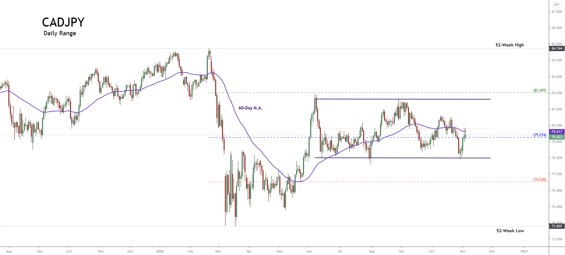
On January 16, John Clifton Bogle died at the age of 89. Jack, so was he called, was little known outside the investment industry. However, its impact on savers around the world has been far greater than that of any other private or public initiative: The revolution that Bogle started 40 years ago means saving some $155.75 billion a year to investors around the world (see Annex 1 at end of the article).

Saving around $155.75 billion a year to investors around the world.

Throughout his unexpectedly long and rugged life, Bogle managed to democratize the exclusive asset management industry, dominated by large banks and high barriers to entry, to make it a service available to everyone regardless of the size of their heritage.

Epiphany

Bogle didn’t have it easy from the start. His family was ruined during the Great Depression of the 1930s, shortly after his birth in 1929. The lack of opportunities during the Great Economic Depression of the 1930s caused his father to fall into alcoholism, which eventually led to his parents’ divorce. But despite the difficulties he had as a young man, he managed to get into Princeton University on a scholarship.

When he remembers how hard his youth years were -combining temporary jobs with studies-, Jack joked that he felt a certain “pity” for his wealthy and carefree Princeton classmates, for they had not been given the opportunity that he interpreted as his great advantage: to learn to face real problems and to overcome serious difficulties from a very small age. He was unaware at the time, but this ability and attitude to the problems would reveal, two decades later, crucial when the time came.

Its great advantage: learn to face real problems and overcome serious difficulties.

Its first and successful stage in fund management -within the Wellington Fund- coincided with “the go-go era”: the big bullish market of the 1950s and 1960s, in which the stock market rose by an average of 14.5% a year. The years passed and his «skills» as a fund manager began to be recognized, becoming President of Wellington in 1970. It is then that motivated overconfidence as he himself confessed to his great previous success led him to realize a good number of unfortunate decisions. Later, Jack would refer ironically to his “Wellington years” in these terms:

“It was a time when it was easy to seem intelligent.” – Jack Bogle

Indeed, seeking to further increase the profitability of the fund, he incorporated an external manager who excessively concentrated his positions on a few very speculative stocks. Thus, when the first of the two major recessions that would hit the United States in the 1970s hit, the fund lost more than 50% of its value. And when the same scheme was repeated in the next recession of 1973-74, Jack was definitely fired.

It wasn’t a good time to lose your job. In the midst of an economic recession, with 44 years and six children to feed, Bogle lost his job but also became seriously ill. Several heart attacks brought him to the hospital frequently. A doctor who treated him said him in 1974 that he had “little time” left, and that the best thing was to retire to spend «the few years of life that remained» in peace to say goodbye to his family.

With 44 years and six children to feed, Bogle had not only lost his job but also became seriously ill. Several heart attacks brought him to the hospital frequently. However, Jack did not retire, but it was in those extreme circumstances of uncertainty and apparent failure, during 1974, that Bogle had what we might call an epiphany that would eventually change the world of investment in the coming decades.

Influenced both by the ideas of the Nobel Prize winner Paul Samuelson on the impossibility of beating the markets in the long term and by his experience in the damage that produce in the investor the accumulation of commissions in the long term [see Annex 3 below], in 1975 it occurred to him to take advantage of the well-oiled back-office of the manager Wellington -together with the saving of not having to pay this time any manager to select the «best» actions-, to convince the new managers of the manager of his idea; and launch the first investment fund that would replicate the behavior of the market as a whole. Thus, on December 31, 1975, the first index fund with an initial capital of $11 million was born.

First, They Ignore You and Laugh at You

Like Jack, the first index fund didn’t have it easy at first either. The press and the rest of the professional industry considered it either nonsense that did not deserve the slightest attention, or directly a blatant business error that would be studied in business schools as an example of what never needs to be done.

Paul Samuelson was one of the few who appreciated him and recommended him within a few months of his birth (he too received criticism for it, more would be lacking). Indeed, despite the efforts made to market it during its launch, within a few years the refunds began. The fact that the next bullish stock market did not start until the second half of 1982 did not help, again underlining the weight of chance in timing when it comes to launching a business idea, however good it is in itself and well-executed it is.

About to be liquidated for lack of subscriptions in the early 1980s, Wall Street was known at the bottom of Bogle as “Jack’s madness” or “guaranteed mediocrity fund”. Practically no one believed then that a simple rule of stock selection based basically on weighting the index companies according to their market capitalization -as most indices do-, be able to outperform in profitability the sophisticated stock selection strategies of thousands of highly intelligent and prepared managers, dedicated every day of the year to seek and select the best stocks from the thousands available.

Then They Attack You

But as the 1980s progressed, the facts slowly began to prove Bogle right. Private jokes and jokes against him turned into surprise and disbelief on the part of his colleagues. After a decade and a half, its index fund began to rise in the ranking, revealing itself as one of the most profitable among all the funds and investment vehicles available in the United States. Bogle was attacked as anti-American (!) for not promoting the search for excellence in the active selection of the best actions.

Colleagues who made fun of him behind his back couldn’t believe it. What initially began as a footnote anecdote in the economy and investment books, was escalating in impact to generate a heated debate in the management industry during the 1990s. The most benevolent attributed their success to sheer luck. Others directly attacked Bogle as anti-American (!) for not promoting the pursuit of excellence in the active selection of the best actions. Many industry analysts began to say that passive or indexed management was a cancer not only for the financial markets but also for the country’s economy; because by ignoring the process of discovering anomalies in prices by investing in indices, the market would eventually stagnate and lead to a static price for all the shares (an argument which has, incidentally, been rescued again recently). These attacks have continued to be repeated cyclically since then and even today, almost three decades later, there is still debate within the industry about how “bad” indexation is or is not (especially for the interests of the industry, of course).

Many industry analysts began to say that passive or indexed management was a cancer not only for the financial markets, but also for the country’s economy.

In the midst of a debate about whether indexation was good or bad, whether it would continue to work or not in the future, his health problems returned with greater intensity in the early 1990s, forcing him finally to undergo a heart transplant in 1996.

Shortly before the operation and with little chance of survival (again the doctors did not give him much hope), he gave up command of the manager he had created, Vanguard, to his second-in-command then, John J. Brennan. After surviving the operation, not knowing how long he had to live and encountering unexpected friction with the new CEO, he left the Vanguard management. He then created and took over the management of the Market Research Centre that had been named after him since 2000.

Finally, You Win

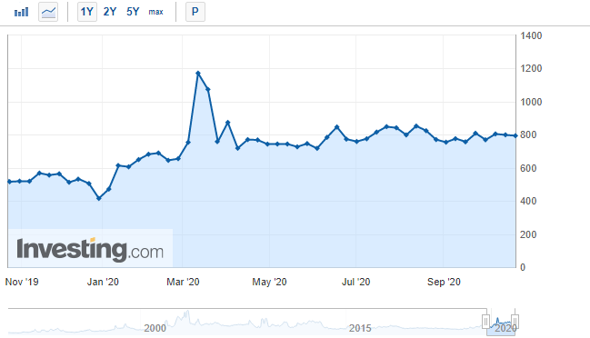
But his seed had already taken deep roots and the tree, the forest, was already unstoppable. More than four decades after its launch, Jack’s first “fund-madness” (now the Vanguard Total Stock Market Index Fund), which started with just $11 million and was about to disappear, has reached more than $800 billion in assets under management (higher than the GDP of Switzerland and similar to that of the Netherlands). Along with the rest of the funds launched afterward, Vanguard is the second-largest manager in the world (just behind BlackRock) with $5.3 billion (Anglo-Saxon trillions) in assets under management; In the United States, 50% of all funds marketed are index funds (while in Spain they only represent a surprising 1%).

The “Vanguard Total Stock Index Fund”, which started with just $11 million and was about to disappear, has reached more than $800 billion in assets under management (higher than Switzerland’s GDP and similar to that of the Netherlands).

The superiority of indexation when it comes to investing has become incontestable, and fewer and fewer choose to pay more commissions in exchange for a slim probability of surpassing the profitability that the market itself will give you in the long term. Or as he said, why strive to find the needle, being able to buy all the haystack much cheaper.

The Legacy of Bogle

Jack leaves us two big contributions to the investment world and a reminder. He first applied the common sense that any entrepreneur with his feet on the ground applies in his business: the future benefits are hypothetical and unknown, but the costs are known and real (see Annex 3).

“Investment is the only industry in which the more you pay for what you want, the less likely you are to get it.” – Jack Bogle

If we recall that the long-term profitability of the stock market is limited to about twice the average GDP of developed countries, then opting for a low-cost index investment can double our long-term equity compared to the more expensive options offered by the management industry. Private banking clients, for example, feeling special thanks to the treatment they receive and the exclusivity of the products offered to them, would be paying with half of their potential future wealth to buy products that are better for us, but they are wrapped in a more attractive and expensive “wrapping paper”. This is the immense impact that the commissions have when it comes to investing and that Bogle never tired of repeating for 40 years.

Bogle’s second legacy is far less evident to the naked eye. If active management pales in results against index-linked investment, it is not only because of the difference in total costs. It is because indexing, as an investment strategy, is better adapted to the nature of financial markets than most of the strategies used by active managers. (Central theme of the previous post «The hidden message of indices»).

Indexation, as an investment strategy, is better adapted to the nature of financial markets than most strategies used by active managers.

Indeed, if financial markets were to some extent predictable, those capable of exploiting such predictability would consistently and persistently succeed in outperforming indices by a sufficient margin that could justify higher fees. However, empirical evidence shows that surpassing the indices is a transient and not persistent phenomenon (in fact, those that have surpassed the index in recent years are the funds that most likely will not get it in the future!). So if markets are unpredictable, what kind of strategies are best suited to that nature?

Bogle had a clear answer from the start. Concave strategies (see Annex 2) work best the more predictable the dynamics of the environment in which they operate. Conversely, the more convex a strategy is, the better results you can achieve in unpredictable environments. Bogle’s vision was to realize, albeit intuitively in 1974, that if markets are unpredictable, then convex strategies will have a more favorable chance to survive and «doing better» in the long run. And that indices are a cost-effective implementation of convex strategy. The more convex a strategy is, the better results you can get in unpredictable environments.

His big business idea was to package the convex indexation strategy (resistant to our blindness to the future), pull down the price of the product (incorporating the essential importance of costs in the long-term profitability), and make it available to everyone. Bogle knew that as long as the competition is dedicated to offering attractive, sophisticated, and especially expensive concave strategies; they will be able to win some sprints in the short term (there are many funds that exceed the index to a year), but not the marathon of the long term (just 5% get it at 10-15 years). And it is not because he was a genius, but because he knew how to accept and transform into a viable product the fact that we cannot predict the future of markets.

His big business idea was to package the convex indexation strategy (resistant to our blindness to the future), pull down the price of the product (incorporating the essential importance of costs in the long-term profitability), and make it available to everyone.

The Human Side of a Revolutionary

As for Bogle’s reminder, it’s about our tendency to overestimate what we can achieve in the short term and to underestimate what we can achieve in the long term. It is in the long term that the power of exponential capitalization can materialize. Perhaps walking, running, or lifting today 1% more than yesterday may seem an irrelevant and boring change, but in a few years, it can produce extraordinary changes in our state of form. The same as consistent investment in the long term. Anodyne in the short and medium-term, but explosive in the long term.

As for Bogle’s reminder, it’s about our tendency to overestimate what we can achieve in the short term, and not to take into account what can be achieved in longer periods of time.

We tend to forget what we can achieve little by little; perhaps because of the growing need for immediate satisfaction that permeates our culture. And just focus on what we could get right away. In investment, it is much more popular a book or «trading course» on how to get 20 basis points a day on Forex, that others, such as those Bogle wrote, remind us that today is always the best time to plant the small seed of the tree that will give us shade in 20 years time.

Our expectations for the short term are usually inversely proportional to its possibility of realization. Meanwhile, we tend to dismiss the great achievements that only the long term can give us because today they seem an impossible task to achieve. Bogle did not start by trying to change the industry from one year to the next, but by planting a seed that would flourish decades later only if he endeavored to water and care for it daily. And he did it without even knowing if he’d still be alive the next month so he could keep taking care of the plant. If you want to move a mountain, one day you have to be the first to start digging-even with a spoon you can lose next month.

Jack Bogle’s life is one of those stories that moves and inspires us on various levels. When he could be considered unsuccessful and about to die, instead of giving up, he continued to struggle to start building what he considered most honest and valuable, without any guarantee of success or even the privilege of remaining alive. Without fear of recognizing that the first part of his life (for him then, his entire life) had been pursuing an illusion, striving in the wrong direction. Jack was always loyal to the search for the truth; he made a clean slate just as doctors gave him up and his family needed him the most.

Interestingly, despite Bogle’s enormous added value to society, his name will not be remembered for appearing on the Forbes list of millionaires. When he dies, he leaves his family an inheritance estimated at $80 million. Not a negligible amount, but it pales in comparison to the wealth that other giants in the industry have achieved. Like Warren Buffett ($83.5 billion) or his most direct competitor, Abigail Johnson, the CEO of fund manager Fidelity. Abigail, basically competing with Vanguard, has accumulated personal wealth of more than $17 billion in many fewer years than Jack.

But that didn’t matter to Jack. Of humble and friendly character, his personality never fit within an industry characterized by concentrating the greatest amount of pride per square meter known. When asked about the estate of his competitor Abigail, Jack replied laughing that he would not know what to do with so many “problems”. Bogle, generous even in his comments, reminded us with humility and humor that, beyond a reasonable threshold of personal wealth, increasing the wealth only leads to complicating our lives further.

Bogle, generous even in his comments, reminded us with humility and humor that, beyond a reasonable threshold of personal wealth, increasing the wealth only leads to complicating our lives further.

Jack never wanted to be the richest man in the cemetery. On the contrary, it was much more ambitious: It gradually transformed the most elitist and exclusive industry into an almost public service, helping millions of people achieve their economic goals, saving in the process $2 billion (Anglo-Saxon trillions) to millions of investors. With a sword of Damocles announcing his immediate death for most of his life, he preferred always to focus on building for the long term, continue watering the plant as long as life allowed, and leave a mark.

It was much more ambitious: It gradually transformed the most elitist and exclusive industry into an almost public service, helping millions of people achieve their economic goals, saving in the process $2 billion (Anglo-Saxon trillions) to millions of investors. And he sure did.

Annex 1: Bogle as Benefactor of HumanityVanguard

This has pushed the entire industry to lower its average commissions that it gained in popularity and volume of managed assets, leading it to a transformation today more profound than ever. This has been seen especially during the last two decades, growing each year and continuously, the percentage of assets managed passively through low-cost vehicles, mainly through index funds and ETFs.

According to Willis Towers Watson, of the approximately $81 trillion (trillions) of managed financial assets in the world, 21.6% or about $17.5 trillions are currently invested in vehicles that give exposure to indices. Therefore, if you compare an average total management fee of 1% on traditional vehicles (including investment funds and hedge funds, much more expensive), with the total average costs around 0.11% charged by Vanguard and its low-cost competitors, concludes that the Bogle revolution is saving investors about $155.75 billion a year. Every year, year after year.

That is money that first stays in the pockets of millions of people who save more efficiently for their retirement, their children’s studies, or the house of their dreams. But it’s also money that the management industry stops earning, so in certain circles, Bogle is not exactly a highly admired or popular character (something he didn’t care about). If we add the cumulative growing impact of the shift from active to passive management over the past three decades, we could be talking about total savings for investors (or loss in profits for the industry) around the $2 trillions referred to in the title of this article; almost twice the GDP of Spain.

Annex 2: Concave and Convex Strategies

The philosopher and trader Nassim Taleb classified investment strategies into two large families; concave and convex. The former try to understand empirically what happens in the markets, assuming hypotheses about their behavior in order to develop investment models with a high probability of success. During the time when such models are in sync with the dynamics of the markets, they work very well, giving sustained returns that make the funds that market them very popular. Until the underlying dynamics change or some of these hypotheses fail unexpectedly and the fund fails; ruining its investors, but not its managers (remember the LTCM fund in 1998, for example).

Conversely, convex strategies assume that it is not possible to construct predictive models about the future of markets that are accurate enough to be persistent, So the most efficient strategies will be to limit to the maximum the very likely losses, while letting the benefits run as much as possible when they appear. This produces strategies with a low probability of success (many small losses), but with a large profit on the few successes (it is the basis of option theory in the Venture Capital funds, for example). As there are numerous small losses before a high return comes, they are less popular among investors than concave strategies because nobody likes to start losing money.

Annex 3: The Impact of Commissions

The industry underestimates the huge cost impact on its customers. In part thanks to the volatility of the markets, it allows us to easily believe that -2% a year hardly affects when the stock market moves (due to its natural volatility) double up or down in a week. In other words, it tacitly sells the false belief that that -2% per year is “easily compensated and recoverable” by the talent of managers, thanks to the apparent abundance of opportunities that the volatility of markets offers every day.

Just so you know what the importance of costs in long-term investment, suffice it to remember that an annual difference of 3% in total costs (which is normal if you choose to hire the services of a private bank when managing your assets, compared to a globally diversified portfolio of cheap index funds) means in 25 years a loss of half of the capital that could accumulate.

Mr. Buffett, in the last letter to the shareholders this year 2019, expressed this same idea recalling that if at the beginning of his career he had invested 1 million dollars in an index fund like Bogle’s, today he would have $5.3 billion (!). But if I had chosen an active fund with only a 1% extra management fee, that figure would have been halved.

Categories
Forex Psychology

If You Don’t Learn About the Pygmalion Effect Now, You’ll Hate Yourself Later

The Pygmalion Effect (or Rosenthal Effect), named after the legendary namesake king of Cyprus and renowned sculptor who fell in love with a female statue of his creation to which he named Galatea, is the process by which a group’s beliefs and expectations of someone affect their behavior to such an extent that it triggers the confirmation of those expectations.

While some psychologists had already documented this behavior in the early 20th century, It was not until the late 1960s that Robert Rosenthal conducted an experiment in which he encouraged the teachers of a school to believe that a certain pupil would get better grades than the rest, which eventually happened. That is, the teacher acted by converting his perceptions about each student into an individualized didactic that led him to confirm these perceptions in a constructive way. In short, it showed that reality can be influenced by the expectations of others, creating self-fulfilling prophecies.

Although we do not realize it unconsciously, this type of behavior allows us to create and maintain social groups. Thus, cultural tradition assigns norms of behaviour to which its members are expected to conform; such norms, usually implicit, impose codes of conduct that are not easy to avoid. What begins as an imitation by children of what their parents do becomes their own way of being. This means that people take on a role from others, and end up believing their own. It can be said then, that we are what others expect us to be.

Well, what does all this have to do with trading? As Domibond007 points out on the Forum, the well-known topic that 95% of traders lose all their money at the end of their first year is actually a fairy tale! According to this user, four are the fundamental reasons that lead to failure in the trading business, with which I completely agree:

  • We are programmed to fail, simply by believing that the percentage of losers is so high (here we have the Pygmalion effect in action). That’s why we make the same mistakes, knowing they’re mistakes.
  • We go into the markets thinking they’re a casino. We look at the charts in the wrong way, trying to predict the behavior of price based on past trends, and not as what they are, an instrument to see the level of pessimism or optimism of the market.
  • In addition to a lack of preparation and discipline, we enter the market without sufficient capital. Let us remember that the capital we have will allow us to hold out more in the market.
  • Finally, we tend to complicate things too much, looking for the most complex trading system or style when really in simplicity is the trick. The simpler it all is, the more room you have in your brain for creativity.

In short, the fear of success is greater than the fear of failure… total, we are all educated to be employees, not to reason.

Now that we know what the Pigmalion effect is and how it can affect our trading, what can we do to neutralize it? How can we deprogram ourselves so we’re not losers? Very simple, we will take advantage of the opposite effect, the so-called Galatea effect (coined by Albert Bandura in the 1950s).

We must bear in mind that our performance as traders does not depend exclusively on the expectations others have of it. In most cases, the expectations that a person has about himself determine the achievements that he achieves. Thus, if the person has high expectations about himself, his effort will be high, and he will achieve great achievements. On the contrary, a person with low expectations of himself makes little effort, and his achievements are low. This is what is called the Galatea Effect.

Evidently, the Pygmalion Effect and the Galatea Effect interact permanently. If a person expects to fail in trading and everyone tells him he is not worth it, he will surely lose all his money quickly. On the contrary, it can happen that a person does not believe in himself as a trader, and yet the support from his environment to his activity as a trader allows him to achieve profits by trading.

Let’s see now what we can do to activate the Galatea effect and neutralize the Pygmalion effect in our trading simultaneously…

Measures to Neutralise the Pygmalion Effect

Clarify and communicate your own expectations. Ask friends and family to help you recognize their expectations of your own performance as a trader. Discuss the differences that exist between your expectations and those of your environment, in order to reach goals and strategies that both can realize feeling good, but that at the same time is challenging.

Recognize and clarify that expectations can be modified, according to subsequent performance. Ask friends and family to encourage you to take risks according to your abilities; to remind you that you do. is able to achieve success in trading, when it begins to show doubts; and to be recognized for the achievements made and to feel important for it. Similarly, ask those closest to you to help prevent failures that can be avoided.

Finally, remind the people around you that a person hurt in their self-esteem not only decreases their effectiveness but can even lead to the denial of our personal concept, accepting what others manifest.

Measures to Activate the Galatea Effect

Recognize that you are imperfect in trading but at the same time recognize its positive characteristics, based on concrete facts and data. Emphasize your strengths as a trader. Take an inventory of the achievements and goals you have achieved throughout your life. Define what are your characteristics as a trader that you want to develop and improve, as well as the habits that you want to change. Do not hesitate.

Develop and maintain a self-development plan to continuously improve your behavior and trading achievements. Remember that your goals must be both realistic and challenging. Imagine achieving the proposed goals, live them. Think about the consequences that the achievement of your goals could bring. Take risks, tackle new experiences as opportunities to learn more than opportunities to win or lose.

Self-evaluate, learn to evaluate yourself autonomously, doing so will help you avoid the feeling of confusion that results from being aware of the opinions of others. Focus on how you feel respect for your own conduct in trading.

Categories
Forex Fundamental Analysis

What Is Long Government Bond Auction and What Should You Know About It?

Introduction

Every government must finance its expenditures with a mixture of debt and revenue. Through debts, governments issue a mixture of short-term and long-term debt instruments to the public. When these debt instruments are being issued, they have an interest rate, one which government will pay the debt holders until maturity. For economists and financial market analysts, the interest rate paid can be used to analyze the government’s creditworthiness and the expected rate of inflation.

Understanding Long Term Bond Auction

A bond in finance is a fixed-income asset issued by an entity to borrow money from investors. Investors get to receive a fixed interest depending on the quantity they purchase. This fixed interest, called a coupon,  is usually paid at predetermined intervals until the bond reaches maturity.

Maturity is the duration in which an investor must hold the bond before they can redeem and get their principal back. It is the bond’s maturity that determines whether it is categorized as a short-term or long-term bond.

Long-term bonds are bonds that have maturities of more than one year.

On the other hand, long bonds are bonds with the longest possible maturity that the issuer can issue. For most governments, long bonds usually have a maturity of up to 30 years.

Long bond auction refers to when bond issuers offer the sale of long bonds to the public. It is at these actions where the rate is fixed. This rate is what bondholders will receive for holding the long bonds until maturity.

Bond yield is the return an investor can expect to receive from buying a bond. The bond yield usually comes into consideration when the bond starts trading in the secondary market. We will later see how this yield can be used for analysis.

Here is a list of long government bonds for the developed economies.

  • Austria 10-year bonds
  • The US 30-year bonds
  • Dutch 10-year bonds
  • Portugal 10-year bonds
  • Spain 50-year Obligation
  • France 30-year OAT
  • UK 30-year Treasury Gilts
  • Germany 30-year Bunds
  • Italy 30-year BTPs

The rate attached to these long bonds during auctions can tell us a lot about investor sentiment of these economies.

Using Government Long Bond Auction in Analysis

The rate ascribed to the bond at auction is what bondholders will expect to receive at predetermined intervals until maturity. Comparing this rate with the rates on past auctions, we can form an opinion about the debt situation of the country and the expected rate of inflation by the investors.

For investors, buying a bond is the equivalent of owning an asset that has a predetermined future cash flow. Since it is virtually unheard of for governments to default on interest rate payments or the repayment of principal upon maturity, long government bonds can be said to be risk-free. With this in mind, the only potential risk that bondholder faces is inflation. In fact, inflation has been called the “bond’s worst enemy.”

You see, a rise in inflation means that some percentage will erode the future purchasing power of money. This erosion of the value of future cash flows means that investors must demand a higher interest rate at long bond auctions. At the back of their minds, investors envision that the rate they demand at bond auctions must also include the expected inflation rate. Effectively, higher rates on bonds help mitigate the erosion in purchasing power of their future cash flows.

Source: St. Louis FRED

At the auction, the bond buyers would feel the need to bid for higher rates if they believe that the rate of inflation will remain relatively stable. In this scenario, they can be assured that the purchasing power of their expected cash flows won’t be eroded. So, what does long bind auction tell us about inflation? The rate at an auction will increase compared to the previous auction if investors believe that future inflation will rise. Conversely, the rate at the auction will decrease when investors hold the conviction that future inflation will remain relatively stable.

The other way government long bond auction can be used for analysis is by using the bond yield. For most economists and financial analysts, the yield is the most closely monitored aspect of a bond. The reason for this is because bond yield offers broad information about a country’s debt situation. Here’s the formula for calculation the bond yield.

Let’s use some simple calculations to illustrate how this works.

Say when the bond is being issued, it has a price of $1000 with an annual coupon payment of $50. Remember that the coupon payments are fixed and cannot change; investors can expect to receive this $50 until maturity.

In this case, the bond yield is 50/1000 * 100 = 5%

Now, imagine that the economic situation of a country is worsening, and it becomes increasingly indebted. In this case, the price of the bond will decrease, let’s say to $900, which means that the yield on the bond increases to 5.56%. Conversely, if the country’s economic performance improves, the bond prices will increase, meaning that the yield will fall. In our example, if the price increased to $1050, the yield will decrease to 4.76%.

Impact of Government Long Bond Auction on Currency

Using the yield on the long government bonds published during an auction, we can determine the economic performance. Therefore, when the yield increases, it means that economic performance in the country is worsening. To forex traders, this can be taken as a deep-seated economic contraction, which will make the domestic currency depreciate relative to others. On the other hand, if the yield falls during an auction, it could be considered a sign of economic prosperity. In this case, the domestic currency will appreciate.

Sources of Data

Globally, the central banks are responsible for auctioning long government bonds. Trading Economics has an exhaustive list of global government bonds and their yields. The United States Department of the Treasury, through TreasuryDirect, publishes the data on the US bond auctions.

How Government Long Bond Auction Affects The Forex Price Charts

The recent auction of the US 30-Year Bond was on October 8, 2020, at 1.00 PM EST and accessed at Investing.com. Low volatility is expected upon the release of the auction date.

In the October 8, 2020, auction, the yield on the US 30-year bond auction was 1.578% higher than the 1.473% of the previous auction.

Let’s see if this auction impacted the USD.

EUR/USD: Before Government Long Bond Auction on October 8, 2020, 
just before 1.00 PM EST

The EUR/USD pair was trading in a steady uptrend before releasing the US 30-Year Bond Auction yield. The 20-period MA can be seen rising with candles forming above it.

EUR/USD: After Government Long Bond Auction on October 8, 2020, at 1.00 PM EST

The pair formed a 5-minute bearish “hammer” candle immediately after the publication of the US 30-year bond yield. Subsequently, the pair traded in a subdued uptrend. The release of the data had no impact on the USD.

The auction of long government bonds serves a vital role in the economy. However, as we have observed in the above analyses, their impact on the forex market is not significant.

Categories
Forex Elliott Wave Forex Market Analysis

Is the EURJPY Ready to Develop a New Decline?

The EURJPY cross advances in a long-term consolidation structure, which began in early December 2016. The short-term Elliott wave view predicts a limited decline in the following trading sessions.

Market Sentiment

The EURJPY cross closed the last trading week, cutting Monday’s session gains when the cross jumped from 122.835 until 125.136, mainly supported by the stock market’s post-election rally.

The following figure shows the EURJPY in its daily timeframe, revealing the mid-term big-market participants’ sentiment exposed by the 90-day high and low range. In this context, the cross is entering into the bearish sentiment zone. However, the 60-day weighted moving average still doesn’t confirm the short-term bearish bias.

After a rally that carried the cross to advance over 11% since May 07th (when the EURJPY bottomed on 114.397 and then soared, reaching the highest level of the year at 127.075 on September 01st), the cross began to retrace, turning its mid-term market sentiment from extremely bullish to bearish.

Nevertheless, the price action still doesn’t confirm the bearish sentiment. In this regard, the short-term sentiment remains neutral until the price confirms the bias.

Technical Overview

The big picture of EURJPY illustrated in the following daily chart exposes a long-tailed yearly candlestick mostly bullish. However, the upper shadow hints at a bearish pressure near the psychological barrier of 127. Moreover, the next resistance is placed at 127.502, which corresponds to the high of 2019.

The EUJPY long-term trend under the Dow Theory perspective and exposed in the next log scale weekly chart reveals the primary trend identified in blue that remains slightly bullish.

At the same time, the secondary trend exposes the sideways movement developing as a pennant pattern, which began in early December 2016 when the price found resistance at 149.787 and could break soon.

According to the classic chartist theory, the pennant pattern is a technical figure that calls for the continuation of the previous movement. In this case, the pennant could resume the rally developed since late July 2012 at 94.114 ended at 149.787 in early December 2014.

Short-term Technical Outlook

The short-term Elliott wave view for EURJPY shows in its 12-hour chart advancing in an incomplete corrective sequence that began on May 06th at 114.397, where it completed its wave A of Minor degree labeled in green.

Once the price found fresh sellers at the highest level of the year, the cross started to advance in its wave B, still in progress. In this context, the previous chart unveils the intraday upward sequence corresponding to the incomplete wave ((b)) of Minute degree identified in black.

The price action could boost the cross until the next supply zone, located between 125.285 and 126.123, where the EURJPY could start to decline in an internal five-wave sequence corresponding to wave ((c)), in black, that may drop to 120.271, though, the price could extend its drops until 117.124.

The short-term bearish scenario’s invalidation level locates above the end of wave A in green at 127.075.

Categories
Forex Fundamental Analysis

The Impact Of ‘Machinery Orders’ Fundamental Indicator News Release On The Forex Market

Introduction

Industrial and manufacturing productions are one of the pillars of any economy. Whenever policies are implemented, governments tend to focus on ways to improve or increase production in the country. The main significance of manufacturing and industrial production is that they create employment opportunities in the local economy and ensure value addition to domestic products, making them competitive in the international markets. Furthermore, they contribute majorly towards technological advancements, which is why data on machinery orders is vital.

Understanding Machinery Orders

As an economic indicator, machinery orders measures the change in the total value of new orders placed with machine manufacturers, excluding ships and utilities.

The data on machinery orders are categorized into orders by; the private sector, the manufacturing sector, governments, overseas orders, and orders made through agencies. All these orders exclude volatile orders from power companies and those of ships.

Source: Cabinet Office, Government of Japan

The machinery orders by electric companies and that of ships are considered too volatile. This volatility is thanks to the fact that ships and the machinery used by electric companies are extremely expensive. Furthermore, these orders usually are placed once over long periods. Therefore, including these orders might unfairly distort the value of the machinery orders data.

To get a clear picture of what machinery, in this case, means, here are some of the components that are included in the machinery orders data. They are metal cutting machines, rolling machines, boilers, power units, electronic and communication equipment, motor vehicles, and aircraft.

Machinery orders from the government are categorized into; transport, communication, ministry of defence, and national and local government orders.

In the industrial sector, machinery orders are categorized by the manufacturing and nonmanufacturing sectors. The nonmanufacturing orders include agriculture, forestry, fishing, construction, electric supply, real estate, finance and insurance, and transportation. Some of the categories of orders in the manufacturing sector include; food and beverages, textile, chemical and chemical production, electrical and telecommunication machinery, and shipbuilding.

Using Machinery Orders for Analysis

By now, you already understand that machinery orders data encompass every aspect of the economy. It ranges from domestic government orders, agriculture, manufacturing and production, services delivery, and even foreign orders. As a result, the monthly machinery orders data can offer a treasure of information not only about the domestic economy but also foreign economies as well.

Source: Cabinet Office, Government of Japan

When companies invest in new machinery, it is considered a capital investment. Capital expenditure is usually considered whenever there is an anticipation of increased demands and services provided by the company. In this case, companies must scale up their operations to increase supply to match the increased demand. In the general economy, an increase in aggregate demand can result from increased money supply in the economy. Thus, it can be taken as a sign that unemployment levels in the economy have reduced or that households are receiving higher wages. Both of these factors can be attributed to an expanding economy.

Note that machinery, in this case, means heavy-duty machinery. Typically, these types of machinery take long in the production and assembly lines. At times, orders have to be placed weeks or months in advance. Therefore, the machinery delivered now may have possibly taken months in the assembly line. When the machinery orders increase, we can deduce that these machinery producers and assembly plants have to employ more labor.

Consequently, an increase in machinery orders means that unemployment levels will reduce. In turn, households’ welfare will improve, and aggregate demand for consumer products will rise. In the end, discretionary consumer industries will also flourish. A decrease in the machinery orders will tend to have the opposite effect.

Suffice to say, the machinery in question here are not cheap. Most companies finance their capital expenditure using lines of credit. Therefore, an increase in machinery orders could imply the availability of cheap credit in the economy. Access to cheap financing by companies and households stimulates the economy by increasing consumption and investments. As a result, the increased aggregate demand leads to an increase in the GDP and expansion of the economy.

Machinery orders data can also be used as an indicator of the economic cycles and to predict upcoming recessions and economic recoveries. When firms anticipate that the economy will go through a rough patch and demand will fall, they cut back on production. Scaling down operations means that they won’t be ordering any more machinery to be used in the production. Conversely, when companies are optimistic that the economy will rebound from recession or a depression, they will order more machinery to scale up their production in anticipation of the increased demand. Furthermore, when the economy is going through an expansion, the aggregate demand tends to increase rapidly. This rapid increase forces companies to increase their machinery orders to enable them to keep up with the demand.

Impact on Currency

The machinery orders data is vital in showing the current and anticipated state of the economy. For the domestic currency, this information is crucial.

The currency will appreciate when the machinery orders increase. Machinery orders are seen as a leading indicator of industrial and manufacturing production. Therefore, when the orders increase, the economy can anticipate an increase in industrial production. And along with it, a decrease in the level of unemployment. Generally, the increase in machinery orders means that the economy is expanding.

Conversely, when machinery orders are on a continuous decline, it means that businesses expect a more challenging operating environment. They will scale down their operations in anticipation of a decline in the demand for their goods and services. In this scenario, higher levels of unemployment should be expected in the economy. Since the economy is contracting, the domestic currency can be expected to depreciate relative to others.

Sources of Data

In this analysis, we will focus on Japan since one of the world’s leading producers of heavy machinery. The Cabinet Office, Government of Japan, releases the monthly machinery orders data in Japan. Trading Economics publishes in-depth and historical data of the Japanese machinery orders.

How Machinery Orders Data Release Affects The Forex Price Charts

The Cabinet Office, Government of Japan, published the latest machinery orders data on October 12, 2020, at 8.50 AM JST. The release can be accessed at Investing.com. The release of this data is expected to have a low impact on the JPY.

In August 2020, the monthly core machinery orders in Japan increased by 0.2% compared to the 6.3% increase in July 2020. During the same period, the YoY core machinery orders were -15.2% compared to -16.2% in the previous reading. Both the MoM and YoY data were better than analysts’ expectations.

Let’s see how this release impacted the AUD/JPY forex charts.

AUD/JPY: Before the Machinery Orders Data Release on October 12, 2020, 
just before 8.50 AM JST

Before the release of Japan’s machinery orders data, the AUD/JPY pair was trading in a steady downtrend. The 20-period MA was falling with candles forming below it. Fifteen minutes before the news release, the pair formed three bullish 5-minute candles showing that the JPY was weakening against the AUD.

AUD/JPY: After the Machinery Orders Data Release on October 12, 2020, 
at 8.50 AM JST

As expected, the pair AUD/JPY pair formed a long 5-minute bearish candle. Subsequently, the pair traded in a renewed downtrend as the 20-period MA steeply fell with candles forming further below it.

Bottom Line

Although the machinery orders data is a low-impact economic indicator, its release had a significant impact on the forex price action. This is because better than expected data shows that the Japanese economy might be bouncing back from the coronavirus-induced recession.

Categories
Forex Elliott Wave Forex Market Analysis

Is GBPUSD Ready for a New Decline?

Overview

The GBPUSD pair advances in an incomplete bearish corrective formation that corresponds to a wave B of Minor degree. In this context, the completion of wave B could lead to a new decline, which could drag the price below Septembers’ low.

Market Sentiment

The GBPUSD pair suffered another drop for the second day in a row, falling from the extreme bullish to a bullish sentiment zone, where it found support in the psychological barrier of level 1.31.

The following daily chart illustrates the 90-day high and low range, revealing the mid-term market participant’s sentiment. The figure shows the price action moving mostly sideways in a range that oscillates between the bearish and bullish sentiment zones; that is, between 1.27204 and 1.32289.

Furthermore, the 60-day weighted moving average is seen moving below the Pound’s price, which confirms the short-term bullish bias that carries the price.

Considering the indecision, the cable is exhibiting since last August. The intraday bias will stay neutral until the GBPUSD pair confirms its next movement, for example, through a breakout.

Technical Overview

The GBPUSD price reveals a yearly long-tailed candlestick that suggests the price will continue being dominated by the upward bias. As exposed in the following 2-day chart, the Pound erased the first 2020 quarter losses that reached up to 13.89%. The cable currently eases 0.67%(YTD).

The big picture of GBPUSD and under the Dow Theory unfolded in the next daily chart illustrates the cable developing a primary upward trend in progress, which currently could be forming a corrective secondary trend.

In this context, according to Dow Theory, the price retraced below 33% of the first upward movement, which accomplishes with the minimum requirement for a correction of the previous move of a similar level.

Nevertheless, considering that the price remains in a short-term downward trend, the price could continue developing a new bearish sequence.

Short-term Technical Outlook

The short-term Elliott wave outlook for GBPUSD unfolded in its 8-hour chart reveals the corrective rally that corresponds to an incomplete wave B of Minor degree identified in green, which leads us to expect a decline in a five-wave sequence for the following trading sessions.


The previous chart exposes a corrective structural series that began on September 01st when the price found fresh sellers at 1.34832 and dragged the cable until 1.26751 on September 23rd, where the pound started to advance in its wave B that remains in progress. 

In this regard, the current upward movement could find resistance in the first supply zone between 1.32069 and 1.32280. If the price extends its previous progression, creating a bull trap, it could climb until 1.33195. There, the price could start to decline in a five-wave sequence corresponding to wave C identified in green.

The potential next wave C could extend until the demand zone between 1.25658 and 1.24796, which corresponds with the mid-term descending channel’s base.

Finally, the bearish scenario’s invalidation level locates at 1.34832, which agrees with the origin of wave A in green. Nevertheless, before positioning on the downward side, the GBPUSD pair should confirm (or discard) the bearish entry. 


Categories
Forex Fundamental Analysis

The Importance Of ‘Personal Consumption Expenditures Price Index’ Macro Economic Indicator

Introduction

65%! That’s the average global economic output that households’ consumption contributes to economic output. Since inflation tends to go hand-in-hand with demand, most monetary policy decisions are centered around, ensuring a sustainable inflation rate in the economy.

You see, a manageable inflation growth can be the difference between a healthy economic growth, overheating heating economy, or a stagnating one. Therefore, understanding the factors that contribute to the overall inflation rate cannot just be the preserve for governments and central banks. This information can prove useful to forex traders as well.

Understanding PCE Price Index

To understand the PCE price index, we first need to understand PCE itself. Personal consumption expenditures measures how much households spend in an economy within a particular period. The consumption tracked by PCE includes consumption on durable goods, nondurable goods, and services.

Durable goods are consumer items that last for more than three years, such as cars and household appliances. On the other hand, nondurable goods include perishable consumer items like foodstuffs. The services, in this case, includes any services that might be sought by households ranging from professional services such as legal services to home-care services.

How PCE is Measured? 

As we have already established, most of the production within an economy is meant for household consumption. The government can be able to deduce the PCE using the GDP data. Firstly, the local manufacturers’ shipment data is used to estimate the amount designated for household consumption.

Next, deducing the consumption of services, the government uses data on revenue collected for utilities, professional services commissions, and receipts for services rendered. Net imports (i.e., imports fewer exports) are added, and the national inventory changes are subtracted. The resulting data represents the amount of consumption by households within the economy.

Purpose of the PCE Data

While PCE can be used to show the growth of aggregate demand and economic growth, it is also used to compute the PCE price index. The PCE price index is also known as PCE inflation. It measures the changes in the price of household goods and services over a specific period.

After obtaining the PCE data, it is converted into prices paid by the households. The conversion is achieved using the consumer price index. Note that the PCE price index incorporates the taxes paid, profit margins of the producers and suppliers, and the cost of delivery. Thus, the PCE price index is a broad measure.

Difference between PCE Price Index and the CPI

It is worth noting that both these indexes are used to measure the rate of inflation in an economy. However, the most notable difference between them is that the PCE data is derived from the GDP data and businesses’ surveys. CPI data, on the other hand, is arrived at from surveys conducted on the households. Based on their different sources, the PCE data covers a lot of the items that households on which household spend. Therefore, the PCE price index data tends to be smoothened since a significant change in the price of a single item won’t grossly distort the index.

Source: St. Louis FRED

Using PCE Data in Analysis

The PCE price index can be used as a broad measure of inflation within an economy. While CPI is a good measure of inflation, the PCE price index tracks the price changes in more goods consumed by households. More so, the price changes reflected in the PCE price index represents the cost of production, taxes, and the cost of delivering the goods and services to the consumers. Furthermore, using the core PCE price index eliminates the volatile prices of a few items, such as gasoline prices will distort the index reading compared to CPI.

Source: St. Louis FRED

As a measure of economic growth, the PCE data is unrivaled. Seeing that the PCE data itself is derived from the GDP figures, the changes in the immediate consumption by households can be used to track how the economy will grow in the short term. To properly gauge whether the increased expenditure on consumption is real or a result of inflation, the following factors are considered.

Firstly, is the quantity purchased by households increasing with little change in the prices? Are the households buying higher quantities at higher or lower prices? Are households spending more money to purchase lesser quantities? Since the PCE price index tracks broad changes in consumption, these factors will help determine whether the economy is growing or merely the prices of goods and services changing.

The changes in the PCE data can be used to show the conditions in the labor market. Household consumption represents the aggregate demand in the economy. Thus, when PCE increases, it shows that demand is increasing. The trickle-down effects of increased aggregate demand increase in the aggregate supply and expansion in production. The increased production implies that more labor will be needed hence lower unemployment levels and improved welfare. Conversely, decreasing PCE can be a leading indicator of worsening labor market conditions.

Impact on Currency

A straight line can be drawn from PCE to inflation to monetary policies. Demand is one of the primary factors behind inflation. In the forex market, the changes in PCE and PCE price index can be used to predict likely monetary policies. Note that most central banks use the PCE price index to set the target rate of inflation.

A continuous increase in PCE and rising PCE price index shows that inflation in the economy is increasing. Central banks are likely to implement contractionary monetary policies such as hiking interest rates to avoid an overheating economy. The contractionary policies make the currency appreciate relative to others.

Conversely, decreasing PCE levels accompanied by a lower PCE price index may be an indicator of a stagnating economy. Central banks are more likely to lower interest rates to stimulate the economy. Such expansionary policies make the currency depreciate relative to others.

Sources of Data

In the US, the Bureau of Economic Analysis publishes the Personal Income and Outlays report monthly. This report contains the PCE and PCE price index data. St. Louis FRED has an in-depth and historical analysis of the US’s PCE and PCE price index data.

How PCE Price Index Data Release Affects Forex Price Charts

In the US, the most recent publication of the PCE price index data was on October 1, 2020, at 8.30 AM EST and accessed at Investing.com.

Below is a screengrab from Investing.com. We can see that moderate volatility is expected in the forex market when the PCE price index data is released.

In August 2020, the core PCE price index increased by 1.6% from 1.4% in July 2020. This increase is expected to have a positive impact on the USD.

EUR/USD: Before PCE Price Index Release on October 1, 2020, 
Just Before 8.30 AM GMT

The EUR/USD pair was trading in a steady uptrend before the publication of the PCE price index data. The 20-period MA was steeply rising with candles forming above it.

EUR/USD: After PCE Price Index Release on October 1, 2020, at 8.30 AM GMT

After the release of the PCE price index data, the pair formed a 5-minute ‘Doji’ candle. As expected, the stronger USD made the pair adopt a bearish stance with the 20-period MA steeply falling and candles crossing over below it.

As observed, the PCE price index data release has a significant effect on the forex price action. Perhaps the relevance of the PCE data comes from the fact that the US Federal Reserve uses it to set the target inflation.

Categories
Forex Elliott Wave Forex Market Analysis

AUDNZD Continues Under Bearish Pressure

Overview

The AUDNZD cross remains moving mostly bearish in the bullish sentiment zone. It alters the price surpassing the 1.10 psychological barrier and begins a corrective sequence that remains in progress; however, this downward movement could end soon.

Market Sentiment

The AUDNZD moves mostly downward in the bullish sentiment zone, piercing July’s low area at 1.056. The Oceanic Cross advances over 1.5% (YTD).

The following figure exposes the AUDNZD cross in its daily timeframe. The chart reveals the long-term market participants’ sentiment bounded by its 52-week high and low range. The price action began a downward sequence; after that, the cross surpassed its last 52-week high of June 02nd, located on 1.08807 in a rally that elapsed six sessions in a row.


Moreover, the 60-day weighted moving average confirms the downward short-term bearish bias that favors the price action. Nevertheless, considering that the cross moves in the bullish sentiment zone, the AUDNZD cross’s decline could be a correction of the upward cycle that began last mid-March.

Technical Overview

The AUDNZD cross under the Dow Theory perspective reveals that the price has started to develop a bullish primary trend that began on March 18th when the price found fresh buyers at 0.99906.

The following chart illustrates AUDNZD in its daily timeframe. The figure exposes the demand incorporation below the parity, which carried up the price until 1.10438, from where the price started to decline in a secondary trend.

The retracement developed by the Oceanic cross beyond the 33% leads us to confirm that the latest decline in progress corresponds to the rally’s corrective movement that began on March 18th.

The mid-term Elliott wave view of the AUDNZD cross illustrates in its 12-hour chart the downward move in a complex corrective structure that looks like an incomplete double-three pattern (3-3-3).

The previous chart reveals the price action is moving in its wave (c) of Minuette degree labeled in blue, which belongs to wave ((y)) of Minute degree in black. Likewise, this entire move corresponds to wave 2 or B, which retraces the upward five-wave sequence that began on March 18th at 0.99906.

Technical Outlook

Once the AUDNZD found sellers at 1.07565, the Oceanic cross began its wave (c) of Minuette degree labeled in green that remains in progress.

As illustrated in the following 8-hour chart, the price could extend its declines to the area between 1.05186 and 1.04870, where the price could find support. Likewise, if the price extends its drops below 1.03511, the next movement’s strength could be limited to a re-test of the August 18th high located on 1.103.

On the other hand, if the price action breaks and closes above the supply zone between 1.06456 and 1.06718, there exists the possibility of a new rally. This new bullish leg could surpass the 1.103 mark.

Finally, the invalidation level for the short-term bearish scenario is located at 1.07565.

Categories
Forex Elliott Wave Forex Market Analysis

Is USDCAD Ready for a Short-Term Rally?

The USDCAD pair reveals a strong bearish movement that seems have found a short-term bottom. In this regard, the price could start a rally that could boost the price toward October’s highs zone.

Market Sentiment

The USDCAD pair continues moving in its extreme bearish sentiment zone, erasing the gains reached during the first quarter of the year when the price advanced over 13%. Currently, the Loonie gains a modest 0.67% YTD.

The next figure illustrates the USDCAD pair in its daily timeframe. The chart exposes the long-term market participants sentiment bounded by the 52-week high and low range. 

The chart reveals the price action continues developing fresh lower lows, which leads us to observe that market participants continue holding bearish positions on the pair. Furthermore, the 60-day weighted moving average continues above the price, which confirms the bearish bias that advances the price.

On the other hand, as long as the USDCAD price remains below 1.33631, the Loonie will stay under bearish pressure.

Technical Overview

The USDCAD pair exposes a bearish reversal formation that erased the progress developed during the first quarter of the year. The following weekly chart reveals a powerful bearish long-tailed candle in terms of a yearly candlestick, suggesting that the price would continue developing more declines in the long-term.


On the other hand, the big picture exposes a long-term sideways formation that persists since mid-2015. Likewise, the last downward movement that began at 1.46674 appears to have found a bottom on 1.29238 the current trading week. 

In this regard, if the price starts to develop a corrective rally, according to the Dow Theory, the USDCAD pair should advance to 1.35022 and up to 1.40761; this upward sequence would correspond to a valid correction of the same degree that the last bearish move developed by the pair since last mid-March.

The mid-term Elliott wave view of USDCAD illustrated in the next 12-hour chart reveals an incomplete corrective sequence that looks like a double three pattern (3-3-3) of Minor degree labeled, in green, which began on March 18th at 1.46674.

Currently, the USDCAD develops its wave ((b)) of Minute degree identified in black, which belongs to wave Y in green. In this context, the wave ((b)) looks like an incomplete flat pattern (3-3-5), which subdivides into a 3-3-5 sequence. Moreover, the actual structural series suggests that the Loonie started to develop its wave (c) of the Minuette degree labeled in blue. 

Short-term Technical Outlook

The short-term Elliott wave view of the USDCAD unfolded in the following 8-hour chart, anticipates its progress in an incomplete flat pattern, which could be starting to advance on its wave (c) of Minuette degree labeled in blue.

If the Loonie find fresh buyers in a retracement to the demand zone between 1.30433 and 1.30086, and the price breaks and closes above 1.31473, then the price could confirm the potential rally that corresponds to wave (c) of Minute degree with a potential target in the supply zone between 1.33970 and 1.34592.

Lastly, the invalidation level for the intraday bullish scenario locates at 1.29283

Categories
Forex Fundamental Analysis

US Crude Oil Inventories – Understanding This Fundamental Forex Driver

Introduction

Oil is one of the most universally used commodity. Its uses span every aspect of our lives, and we can’t escape from not using it. In the US, for example, the transportation sector consumes about 68% of the total oil in the economy while industries consume 26%. Therefore, by monitoring the inventories of crude oil, we can be able to deduce the changes in economic activities.

Understanding US Crude Oil Inventories

As an economic indicator, the US crude oil inventories measure the change in the stockpile of crude oil in major oil deports in the US. The US Energy Information Administration’s (EIA) publishes the crude oil inventories report weekly. This report tracks the changes in the number of barrels of commercial crude oil that is held by US firms.

The report is called Weekly Petroleum Status Report and is published on Thursday of every week. Below is a list of items from the report.

  • The US petroleum balance sheet
  • US crude oil refinery inputs
  • The daily average of US crude oil imports
  • The daily average of US commercial crude oil inventories. These inventories exclude those held by the Strategic Petroleum Reserve
  • The daily average of the total oil products supplied over the last four-week period

Using US Crude Oil Inventories

The uses of crude oil affect our daily lives. Although there has been a conscious shift towards green energy, crude oil, and its products are very much still part of our lives. To properly understand the implications of crude oil inventories on the US economy, we need to go back to supply and demand basics. Say that a supplier stocks inventory with the knowledge that there is consistent demand.

This demand is based on historical averages, of course. Now, if the supplier starts to notice that their inventory is increasing over time, it could mean that demand for their product is decreasing. Similarly, if their inventory gets depleted faster than average, it could indicate that demand for their product has increased over time. It is the same case with the US crude oil inventories.

When the crude oil invitatories increase, it is an indicator that demand for crude oil has gone down. The two significant consumers of oil in the US are the transportation sector and in industries. Suffice to say, when there is a substantial increase in the US crude oil inventories, the demand from these two sectors can be expected to have significantly declined. Let’s think about what we can infer about the economy using this logic. In nonfarm employment, the US industries are the largest employers in the labor market.

Since crude oil is used to run industries, crude oil inventories can be used as a leading indicator of economic health. A decline in demand for crude oil could mean that the industrial sector is cutting back on production and manufacturing. Being one of the largest employers in the US, scaling down industrial operations translates to massive job losses. There will be an overall increase in unemployment in the economy. The resultant unemployment also has its ripple effects on the consumer economy. Due to the decrease in disposable income, households will only spend on essential goods and services. As a result, the consumer discretionary industry will take a hit.

This increase in the US crude oil inventories can be witnessed towards the end of the first quarter in 2020. At the onset of the coronavirus pandemic, lockdowns and social distancing guidelines halted industrial activities and traveling. The demand for US crude oil took a hit, and inventories dramatically increased.

Source: Investing.com

Conversely, a continuous decrease in the US crude oil inventories could mean that crude oil demand is increasing. Any significant increase in the demand for crude oil can be taken as an increase in economic activities in the US’s transportation and industrial sectors. An increase in crude oil demand in the transportation sector could imply that more people are buying vehicles, which is an indicator of improved household welfare. In the industries, an increase in demand for crude oil means that industrial activities are expanding. This expansion translates to increased job opportunities and lower unemployment rates.

However, note that it is more plausible that a decrease in oil inventories can be a direct result of cutbacks in oil production by drilling companies. Back to the basics of the economy, the laws of supply and demand. It is inherent for any producer to strive to obtain the highest possible price in the market. According to the laws of supply and demand, oil producers might be attempting to stabilize the oil prices by cutting back on production. When prices are falling due to a decrease in demand, crude oil producers will try to cut back on drilling to stabilize the price. After all, it doesn’t make any economic sense to oversupply the market at lower prices while operation costs remain the same. This scenario was witnessed at the beginning of the second quarter of 2020. The graph below shows the decline in oil rigs that were operational in the US at the beginning of Q2 2020.

Source: Trading Economics

Due to depressed crude oil demand, crude oil prices were on a freefall, which led to cutbacks in production, hence a significant decline in inventories. Note that this decline in the US crude oil inventories does not coincide with economic expansion.

Impact of US Crude Oil Inventories on USD

We have observed that the increase in inventories can be associated with a decline in demand for crude oil. This decline in demand can imply that operations in major crude oil dependent sectors are scaling down. These are signs of economic contractions, which will make the USD depreciate in the forex market.

Conversely, when the inventories decrease, it could mean that the demand for crude oil has increased significantly. For economic sectors that are heavily dependent on crude oil, it means that they are expanding. Since this can be an indicator of economic growth, the USD can be expected to increase in value in the forex market.

Sources of Data

The US Energy Information Administration publishes the US crude oil inventories every week. Trading Economics has in-depth and historical time series data on the US crude oil inventories.

How US Crude Oil Inventories Release Affects The Forex Price Charts

The latest publication of the US Crude Oil Inventories was on October 21, 2020, at 9.30 AM EST. This release is available at Forex Factory. When the US crude oil inventories are published, low impact is expected on the USD.

In the latest release, the US crude oil inventories decreased by 1 million barrels compared to 3.8 million barrels in the previous week. This change was more than analysts’ expectations of a 0.5 million barrels decline.

Let’s see how this release impacted the USD.

GBP/USD: Before US Crude Oil Inventories Release on October 21, 2020, 
just before 9.30 AM EST

The GBP/USD pair was trading in a steady uptrend before releasing the US crude oil inventories data. The 20-period MA is seen to be steadily rising with candles forming above it.

GBP/USD: After US Crude Oil Inventories Release on October 21, 2020, 
at 9.30 AM EST

The pair formed a 5-minute bullish candle indicating the weakness of the USD. It continued trading in the steady uptrend for a while before adopting a neutral trend.

The US crude oil inventories data is a low impact indicator in the forex market. As shown above, the release of the data had no impact on forex price action.

Categories
Forex Psychology

Trading Psychology 101: A Complete Guide to Self-Actualization and Prosperity

When we start learning about trading, topics such as consistency and rules make it the last on our list, especially because, with the pace and the stress of everyday life, we make a profit our priority. However, if we are already eager to get to that financial freedom, there are specific points that we cannot turn a blind eye to and simply ignore. Experts in this field share how now, after several decades of trading, they have long stopped reading about trading itself. However, what they are still vigorously passionate about because of the benefits it brings is learning about trading psychology and about themselves.

Naturally, there is always room for improvement in terms of trading-specific knowledge, yet once you feel that you have covered enough to serve you consistently, it is time to truly focus on your actions and behavior. Today, we are going through this comprehensive list of lessons and tips which you can use as a guide to achieving self-actualization and prosperity.

Traders often see more benefits from short-term activities than what they can actually reap in real trading while heavily doubting the potential their actions can unlock over the long haul.

Lesson 1

At the beginning of a trading career, many traders are quick to assume that they can realize all of their potentials and surpass others faster than what is realistically possible. At the same time, beginners frequently miscalculate their steps and undervalue what they can produce in the long run. What this essentially means is that traders typically have a desired sum of money they wish to win in the shortest amount of time, but as it often turns out, this amount is usually equal to the overestimation of their skills and abilities at that particular stage of trading development as well as the underestimation of the success they can actualize from a long-term perspective.

Many professional traders have admitted to having had the same approach to trading at the very start, without realizing what this type of he/she wishes to attain and, for some people, this may be a dream house or a dream car, while for someone else the goal may have to do with overall financial stability that would secure a household. Especially for those with more pressing issues, everyday needs and challenges (e.g. raising children), or a strong vision of what their future should look like, the urge to reach a financial goal might make the idea of becoming a successful trader overnight that much more inviting.

What experts in this field always tend to stress over and over again is the perspective which most newbies seem to lack – if young traders could only take a step back and commit to a slower pace, they would be able to obtain increasingly greater freedom and finances. Therefore, instead of missing sleep over the initial $2000 a trader longs to earn, he/she would rather adopt a different mentality and take one step at a time to get to much more lucrative endeavors that would bring about sustainable capital just five or so years later. 

Growing as a trader is a process, not a matter of learning a few tricks.

Lesson 2

While traders are constantly surrounded and bombarded with dos and don’ts in every way possible, they also need to understand that the path to becoming a self-actualized and independent trader is also a developmental process. The same path of discovery can be found in different fields of work, so actors need not be able to play out all characters until they discover a sense of inner strength and control just because they read the plot or took acting classes before. Any form of brilliance is like a jewel whose outer layers need to be stripped off until it gets its form and shine to be of any use or to be sold.

Many successful professional traders have shared their own limitations and challenges in trading: some dealt with the excessive need to overtrade, some struggled with fearing the risk which often stopped them from entering good trades and making more money as a result, and some others found taking a loss too difficult so they felt compelled to immediately enter a new trade. It is important to understand that every trader has some part of the personality that demands more attention and that is likely to have a negative impact on trading if left unnoticed and unattended.

At the same time, no development can take place unless we are eager to look within and face our inner demons because without acceptance there can be no recovery and growth. It is in human nature to need to look and feel impervious, complete, and untainted and traders can find solace in the fact that this is a shared trait across all individuals regardless of their age, background, education, or else. 

The first step to growth as a trader is to acknowledge and accept one’s flaws.

Lesson 3

In order for any trader to be able to get over the hurdles caused by their own minds and emotions, he/she first needs to satisfy the number one condition and admit to being imperfect. If you are ready to recognize that you are, in this present form, less than what you need to be capable of producing the results you are hoping to obtain, you will also be able to accept yourself and leave space for improvement. Many traders are already aware of the mistakes they are making because they often stem from some unhealed parts of our minds or souls. If you are already able to notice that you feel tension building up in your body before you take some step (e.g. click the button to rush into another trade after a recent failure), you must also know that whatever action you are preparing yourself to take is not coming from a place of stability and control. However, many traders are also quite attentive and they already recognize these patterns that they feel obliged to repeat time and time again, so they feel tremendous guilt and shame for not being able to put an end to such behavior.

It is in the moment of realization that they will never be able to stop this continuous agony that helped some professional traders to discover a renewed sense of strength. Only once they gained this understanding of their inability did it become plausible for them to overcome such a tremendous challenge. Traders often keep putting more and more pressure onto themselves after they finally see traces and consequences of self-sabotaging behavior, but it is not through erasing or ignoring a specific behavior that leads to strength but through learning how to trade effortlessly in spite of it.

Trading will help you not only allow you to see the person you are but also help you build your character with time.

Lesson 4

The moment any true development is activated is after we acknowledge that we are “damaged” and accept the need to put the effort into finding a resolution to the existing problem. The gap between seeing the fault within ourselves and showing the willingness to do something about it is so vast that it is one of the key determiners of how successful a trader you can become. It is precisely this quality that will distinguish between high-achieving traders and the impulsive ones with an expiry date on their trading careers. Now that you have become aware of the triggers and situations which keep you in this perpetual loop, you are allowing yourself to get a different and more objective perspective where various creative solutions and ideas can emerge. You are growing tactics and methods that will put you out of that vicious circle, so you are no longer in need of exposing yourself to the things that used to trigger you before.

As trading is not exempt from everyday ailments and since it mimics life in all of its forms due to the shared human factor, it is easy to draw connections with some other real-life situations. We can see how some major life adjustments are carried out in the exact same manner, and any addict in recovery would also need to think of strategies to avoid provocations on a daily basis. Here we can prove to ourselves how despite the conscious assessment and recognition of our emotions, shady traits, and situations that may enable undesired behaviors and bring up more pressure and dissatisfaction, we can find peace through acceptance and focused action. When you are able to fully feel all the emotions that may range from exciting and positive to gloomy and scary and still keep moving towards your goals, you know that you have reached a new level of competency that will prevent all those hours of learning about technical tools and testing the algorithm from going to waste.  

Four key trading psychology terms we need to keep in mind are recognition, acceptance, investigation, and competency.  

Lesson 5

This journey is not easy, yet it is an exceptionally rewarding one in the sense of ensuring lasting changes that you will get to witness in different areas of your life. The entire introspection that you put yourself through will inevitably transfer onto your trades and your personal life as well because you will experience a renewed sense of self-confidence and self-reliance. Once you make a decision and commit to leaving no stone unturned until you see the causes of your actions, you will discover deep satisfaction and serenity that, looking back, you will know you have done the right thing. The fact that the best traders in the market keep bringing up the same topics, insisting on traders learning about trading psychology, is an indication that looking within is the only certain way to get to the top.

Even famous psychology book writers and scientists admit to there being two parts of us – one that makes an inherent part of our existence or what we call our nature and another that consists of the lessons and experiences we drew from our surroundings. Some people are, for example, born risk-takers and this is in the innate characteristic that can be further shaped or molded by the environment. Someone who was born in a family where financial literacy was openly discussed and stimulated will probably enjoy a massive head start in comparison to other trading beginners in the market. The keel will never be even and everyone will have their own share of deeply rooted beliefs that are blocking their progression towards expert-level trading. Especially since we cannot always be consciously aware of our subconscious beliefs, it is important to willfully try and test our assumptions about who we are and what we believe in. What you may discover is the realization that some ideas you firmly cling to have never truly served your best interest or helped lead to the results you are aspiring to achieve. And, of course, once we obtain new knowledge about ourselves, we can then take appropriate measures and become one or several steps closer to that ideal version of our future selves. 

Challenge your belief system regardless of where these teachings came from (family, school, etc.) because you may find out that the ideas you embraced so freely never served your highest purpose.

Lesson 6

Psychology tests are becoming increasingly available and resourceful, allowing for easy access and use to analyze how individual personality traits may affect one’s trading style overall. These evaluations typically assess the following four main areas: energy, mind, emotions, and perception. The analysis of one’s energy provides insight into how energy is generated and where it is directed. It reveals whether energy is focused inwards, which is characteristic of introverts, or if it is projected outwards, which we mainly find in extroverted personality types. Those traders who fall into the second group are, for example, much more likely to overtrade because extroversion is heavily drawn to a plethora of stimuli, activities, and achievement.

Having an introverted personality type, however, opens doors to some other patterns of behavior, which can prove to be equally detrimental to trading. The second level of analysis that covers the mind allows us to understand how we see the world and whether we are a more intuitive or a more observant type of person. Here we may find that we are not as detail-oriented as we might have initially assumed, and this knowledge of how we process information can prove to be of great benefit to all aspects of trading. It can reveal its potential in the process of creating your own trading system, which needs to match your own personality for it to be able to produce results. This is another reason why so many expert traders keep saying how some trading systems, despite their creators being extremely successful and affluent, never worked for them. The next point of assessment includes the analysis of one’s emotions, or the opposition between thinking and feeling, that determine our entire decision-making process.

Many professional traders always stress how important it is to acknowledge how you feel in some key points in trading to put an end to behaviors that sabotage your trades. The analysis of one’s perception is also extremely useful because it demonstrates whether traders make decisions based on perception or judgment, leaving room for a more advanced comprehension of their approach to work. And, it is now abundantly clear that one’s entire approach to trading reflects his/her unique set of values, thoughts, ideas, and emotions and these tests can truly help traders get to the core of who they are in order for them to interpret these results and use them intentionally to their benefit. 

Psychological tests do not only allow traders to learn about who they are but they also provide insight into how those traits might affect trading as a whole. 

Lesson 7

The study of epigenetics has shown how we all fall under the effect of different events that permanently influence our genetic makeup. It also proves how experiences that we have leave marks in our neurology, forever changing who we are. As human beings, there are many different causes of such epigenetic alterations as our nature is in constant interaction with our environment. Our experiences in time and place and our relations with other people inevitably impact how we think, what we believe, and how we feel. For example, all traders who have traded before now have this concept and experience of trading stored in their belief system, having thus become a part of who they are regardless of individual success. The events we experienced as children also created pathways for certain triggers to produce specific emotions as if we were trained to respond in a certain manner in similar situations.

Our biology is an equally strong determinant of how these external factors shape us, so someone who is a highly sensitive person may be more reactive to the surrounding stimuli than someone with a different biology. The brain is a powerful tool that stores information, and this process is likely to set off some reaction. The more these connections between a specific context or a situation and a responding emotion are made, the deeper the pattern becomes. That is how one day we may realize we are constantly rushing into trades without knowing the reason behind such behavior. And, while we cannot surgically cut through the lenses of our own neuroscience, we can find peace understanding that our responses seem to be out of control because they are not a conscious choice we choose to make, but a well-preserved bodily function.

Many responses to the external stimuli are of chemical nature, resulting in specific emotions that always provoke similar reactions. 

Lesson 8

In a Harvard study, carried out to assess altruism and fairness, the so-called Ultimatum Game was used to uncover different personality traits that take part in decision-making processes. The experiment paired two individuals, “the Proposer” who was tasked with making an offer and “the Receiver” whose role was to respond to the proposal. The players were given the sum of $100 which they were supposed to split after the Proposer decided on the amount willing to share with the other party. If both players agreed, each participant would receive the agreed amounts. However, if the Receiver refused to proceed, neither this person nor the other individual would earn any profit. During the entire process, both participants’ brains were monitored through an MRI to detect brain activity. The study has shown how, whenever the Proposer assessed how much money was to be gained, the prefrontal cortex was always activated. This particular region in the brain is responsible for various cognitive processes such as planning, decision-making, self-awareness, and problem-solving, among others, and is demonstrative of rational thinking. At the same time, whenever the Responder deemed the offer fair, the same part of the brain would lit up. While the Respondents consented with the offers they considered fair in most cases (close to 100%), the ones they believed to be unfair were rejected in approximately 50% of situations.

What is particularly interesting is that, in such cases, the MRI showed activity in a different part of the brain which governs emotional feelings such as fear or anxiety. This conclusion is extremely important because it proves how, despite the assumption that we are always coming from the place of clear, logical thinking, our decision-making processes are not necessarily always representative of rational thinking. The fact that another brain region activates when we make decisions proves how some of the decisions we make do not come from the right parts of the brain responsible for rational decision-making. Moreover, the study further suggests how in some situations people are utterly incapable of using the prefrontal cortex when they find themselves in a losing position, which should help traders understand why some of their reactions lead to losses. 

Even though we assume to be rational, studies have shown how some decisions are made in the part of the brain responsible for fear and anxiety.  

Lesson 9

Various other studies proved how different emotions activate different regions in the brain, which undeniably affects the decision-making processes. A study of hunger carried out at Ben-Gurion University of the Negev, Israel, researched judges and analyzed more than 1,000 parole decisions made across a period of 10 months. The judges who took part in the study had vast judiciary experience of 25 years on average, which also meant that they had attended numerous Parole Board hearings up to that point. What is interesting is that time of the day emerged as a crucial factor in determining the outcome of a hearing, and hunger directly proved to have a direct impact on the decisions made in the courtroom. The study has revealed how the best time of the day to go before the judge was between 9 and 11 in the morning, indicating a 25% higher chance of seeing a positive outcome. Nevertheless, the next time slot, between 11 and 12, turned out to be the least favorable period in a day, while the window of increased opportunity would only return after lunch. Another drop in parole rates was recorded after 3 PM, lasting until the next rise at 5 PM. These causal associations demonstrated in the above-mentioned study can also be found in the world of trading, where we need to use our systems to trade.

Things that happen inside the human body with all the processes and the connections that are established throughout our lives may have more to do with the sequential, repetitive decisions that we make without understanding why. Sometimes to quiet down their minds and get into a state of complete focus, some traders like to practice meditation which allows them to reach a state of complete centeredness. By doing so, traders quiet down their minds and emotions, thus heavily decreasing the potential of stress residue or any hidden emotional pile-up to affect the trading. Meditation is, however, only one type of activity that leads to improved physical, psychological, and of course physiological state, and traders should explore different pursuits and/or routines that would provide them with the peace and quiet their minds and bodies need before and during trading. 

If hunger can affect the decision-making in judges with over 25 years of experience, imagine what occurs in your body that you have no control over. Find an activity that can help you feel centered and relaxed before you start trading.

Lesson 10

The knowledge of the human body and mind we accumulate with time might make us feel that people are doomed in terms of the ability to fight against our own nature. However, it is only with this knowledge that we can willfully leave more room for acceptance. As more information is gathered, traders need to increasingly invest in exploring their own actions and which steps they choose to take at a particular moment in time. Often people fall for the same trap now commonly known as the Dunning–Kruger effect that makes them view their cognitive abilities as greater than what they actually are, which is the most vivid in those with the least amount of knowledge. Many traders feel exceptionally confident immediately after going through several books on trading, yet when they get immersed and explore the topic more thoroughly, they start to realize that trading is harder than what they had ever expected before. At this point, some traders decide to quit, whereas others choose to devote more time and effort into becoming more knowledgeable about this field. As the curve keeps rising, so does the understanding of the subject, with traders finally reaching a higher level of competency. The rationale of the chart below is to let traders know that if they continue to put energy and keep going further, they will inevitably accrue knowledge and experience and reach the level of expertise they need to be successful at trading. 

People are prone to having a cognitive bias in which the ones with low ability at a task overestimate their ability (see Dunning–Kruger effect). 

Lesson 11

The discoveries made in the field of homeostasis (or what we know as the Yerkes—Dodson law) indicate a connection between pressure and performance. This relationship is increasingly important for extroverted individuals who are usually fond of stress and a busy schedule. The ones who feel motivated by having a variety of tasks to complete may also feel less motivated if the quantity of stimuli is low. What these individuals perceive as a lack of challenge makes them put less effort as a consequence. On the other end of the spectrum, when the quantity of stimuli goes beyond a certain range, the levels of cortisol and some other hormones become increasingly high, thus affecting the natural homeostasis in the human body. At this point, these people may show signs of stress, anxiety, and impaired decision-making. The chart below also exhibits the mid-point where people at the peak of performance are found. The area in between the extremes exhibits the perfect homeostasis or the flow where we can find individuals who are sufficiently motivated and who may, at the same time, struggle if presented with a lighter workload. When transferred to trading, we may find direct implications of this study in the manner traders approach their trades, and it is becoming increasingly important to recognize these patterns our personality types bring into trading.  

The knowledge of how you work under pressure may tell you where your mistakes in trading are (see Yerkes—Dodson law).

Lesson 12

When you read about all the potential dangers of the human mind, the first thing you should not do is not fear yourself. Rather strive to be mindful before you sit to trade, enter that stage of homeostasis and flow through willful effort. Consider topics such as routine and steps to prepare yourself for whatever your next trade is going to bring along. It is vital that you think about the ways you can give yourself much room for allowing for good opportunities to occur, so clearing your mind should be made a priority. Here, at this stage of inner peace, you can actually go over the points where you have not acted in your best interest in the past without judgment. By facing the past challenges with a calm and open mind, you can come up with strategies to avoid any future repetition. All of these activities are there to support you and give you the strength to bring out your best qualities and potential. Without going deep, traders are not fully embracing who they are and are, thus, limiting themselves to a version of themselves that is simply “less than.” Trading skills are not a pill that we can just take to one day to reach success out of the blue. In the same way, we cannot see people as inherently, right from the start, good or bad traders, yet they have grown to become the best possible traders with time and with hard work.

Traders are not born but developed.

Lesson 13

As we can see from the information presented above, investing in learning general trading knowledge alone is simply insufficient and the sole focus on key trading terms can actually shift your perspective away from your real potential. This, naturally, does not imply that looking into charts and understanding the vast trading terminology is a negative approach but it does point to the need to pair it with the conscious effort to discover oneself. There is no fear or weakness in looking within because if you have already failed in the past, the results are there to remind you of the uneasiness of losing money and taking losses. Cut the strings of painful events and recognize your weak points. We cannot escape who we are, but we can endure the act of self-scrutiny if we know that the end result is going to be a positive one. When something hurts, the only way we can put an end to the continuation and the reverberation of its impact is through understanding why something happened in the first place. If something can serve as a lesson, it never truly was a mistake but an opportunity for growth. The purpose of any loss is to help us step into the individuals we feel proud of, helping us develop both as people and as traders.

If something helps us learn, we cannot call it a mistake.

Lesson 14

If you feel convinced now that introspection and inner work is the only real path to self-actualization and prosperity, you can follow the steps we are going to share with you here. Firstly, start off with identification and acceptance of your weaknesses, nurturing an understanding that we all have our own pile of dirt to tackle. Avoidance is not an option if you are serious about who you want to become, and it is also one of the easiest ways to fail as a trader. Secondly, devote time to the planning of how you will avoid repeating the mistakes of the past. Nevertheless, be mindful of the fact that jotting down a plan alone is not going to do the work. What all traders need is discipline that will create a completely new routine through the repetition of healthy strategies and techniques.

If you find discipline to be stressful, find comfort in knowing that numerous experts revealed how such a structure actually allowed them to feel liberated. Knowing what you need to do can put a lot of pressure off your chest and allow you to take up other creative endeavors in life too. Next, you do not need to fight your nature but embrace it in its full form. Learn to trade in spite of your shortcoming and, by all means, do not let yourself remain obsessed with your losses, letting the guilt and shame reside somewhere inside you. Instead, understand that your traits cannot be erased but can be guided and transmuted so as to serve you. Do not fall for the lie that you are ever going to be perfect because you will soon be in a fast lane going back to where you started. Keep reminding yourself of your weak points and maintain vigilance over your own risky behaviors through practicing discipline and consistency.

Discipline equals liberation.

Lesson 15

One of the last notes to remember is that the essence of success in trading lies in the combination of various key aspects which we all refer to as competence. Composed of experience, knowledge, skill, behavior, performance, and goal, competence is indeed both complex and layered. It is no wonder then that some believe how traders need 10,000 hours, or five years with a 40-hour week routine, to become experts. This, however, should not make you want to give up but the opposite because the benefits that you will grant yourself are immense and immeasurable. Aside from seeing the financial reward, you will get to learn about yourself in a way that you would hardly ever be able to. You will learn how to be successful and how to enjoy that success in every respect, applying it to all areas of your life. Now that you are fully equipped with all the knowledge, go ahead and start digging. It is worth it.

Categories
Forex Elliott Wave Forex Market Analysis

Euphoric Market’s Sentiment Pushes GBPCHF Up

Overview

The GBPCHF cross began the current trading week, advancing over 1.30%, boosted by the U.S. post-election rally and Pfizer’s Covid vaccine upbeat results. However, the Elliott Wave view anticipates that the euphoric rally could soon end, and the cross could reverse its course toward new lows.

Market Sentiment

The week started with a risk-on U.S. Presidential post-election stock market rally, driving the risk-off currencies to drop. In this context, the GBPCHF cross advances over 1.30% to its highest level since late September.

The following 8-hour chart displays the intraday market sentiment. Although the sideways movement predominates since late September, the strong bullish move developed in the Monday trading session takes the GBPCHF cross to the extreme bullish sentiment zone.

Likewise, we can see the price action developing above the 60-period weighted moving average, which confirms the intraday upward bias that could hold during the following trading sessions.

On the other hand, the euphoric sentiment bolstered by news media’s coverage of the U.S. elections and the continuation of the stock market rally added to the news of the promising vaccine results developed by Pfizer and BioNTech leads us to expect a limited upside in the risk-on currencies.

Technical Overview

The big picture of the GBPCHF under the Elliott wave perspective reveals its progress in a descending broadening formation. Its latest downward sequence began on December 13th, 2019, when the price found fresh sellers at 1.33113. We can see, as well, that this leg still remains in progress.

The following daily chart unveils the advance in the fifth wave of Minute degree labeled in black, which started on 1.22224, where the price action declined in a bearish impulsive movement reaching a new lower low. This decline that ended on 1.15989 completed the first wave of Minuette degree labeled in blue.

Currently, the GBPCHF cross moves in its second wave (in blue). Nevertheless, the psychological barrier of 1.20 could represent a significative intraday resistance.

Technical Outlook

The intraday outlook of the GBPCHF cross reveals the bullish continuation of the current upward momentum. The next 2-hour chart exposes the supply and demand zones according to the potential next move that the cross could develop in the coming trading sessions.

On the one hand, the price advances in its wave c of Subminuette degree identified in green, developing the third internal wave. Likewise, the retracement that should correspond to its fourth internal wave could retrace to the area between 1.19292 and 1.19694. This zone could back the possibility of a new rally that would boost the price toward 1.21012 and 1.21306. 

On the other hand, our first scenario considers the bearish continuation. In this case, if the price action penetrates and closes below 1.1803, the cross could see further declines toward the zone of 1.1650.

Finally, our second scenario considers that if the GBPCHF cross continues its advance beyond 1.22224, the cross could extend its gains toward the descending upper- trendline shown in the daily chart.

Categories
Forex Fundamental Analysis

What Should You Know About ‘Mortgage Market Index’ Macro Economic Indicator

Introduction

In the recent past, the real estate market has been a critical indicator of economic performance. As with any other aspect of the financial market that intertwines with consumer demand, the significance of the mortgage market cannot be overstated. Knowing if mortgage applications have increased or reduced can tell a lot about the demand in the housing market and households’ welfare. This index can be a leading indicator of demand in the economy.

Understanding the Mortgage Market Index

Primarily, the mortgage market index tracks the number of mortgage applications over a specific period. In the US, for example, the mortgage market index is compiled by the US Mortgage Bankers Association (MBA). The MBA mortgage market index is released weekly. MBA has an association of about 2200 members encompassing the entire real estate financing industry. The companies included in the association are deal originators, compliance officers, deal underwriters, servicers, and information technology personnel. These companies are active in residential, multi-family, and commercial real estate.

Owing to its vast network of real estate companies across the country, MBA is in the best position to provide comprehensive coverage of the mortgage applications made. The published data shows both seasonally adjusted and unadjusted changes in the US’s number of mortgage applications. Furthermore, the report also includes the Refinance Index,  which shows the number of applications made by households wishing to refinance their mortgages. The report also includes seasonally adjusted and unadjusted ‘Purchase Index,’ which shows the number of outright purchases in the real estate sector during that week.

Furthermore, this weekly report analyses the change in the Adjustable-Rate Mortgage (ARM) applications. As the name suggests, the ARM is a mortgage in which the interest rate payable on the balance varies throughout its life. The number of the Federal Housing Administration (FHA) loans are also included in the report. It further analyses the average contract interest rate for 30-year fixed-rate mortgages with Jumbo loan balances and conforming loan balances. Jumbo loan balances are those above $510,400 while conforming loan balances are less than this amount. Finally, the MBA mortgage market weekly report analyses the change in the average contract interest rate for 15-year fixed-rate mortgages.

Using the Mortgage Market Index in Analysis

The change in the number of mortgages in an economy tells a lot about the prevailing economic conditions. These conditions range from demand in real estate to prevailing monetary policies. Both of these aspects are integral in the growth of an economy.

When the mortgage market index is rising, it means that the number of mortgage applications has increased. The increase in mortgage applications could imply that there is a growing demand for real estate. One thing you have to know, when people decide to invest in the housing market, it normally means that they have increased disposable income and have thus fulfilled all other intermediate needs.

An increase in disposable income in the economy means that more people are gainfully employed or that wages have increased. In both these circumstances, we can deduce that the economy is expanding. The reason for this deduction is because when demand in the real estate market expands, it means that demand in the consumer discretionary industry has also increased. Thus, the output in the economy is higher.

More so, when the mortgage market index rises, it could mean that households and investors in the economy have access to cheap finance. Either they are creditworthiness has improved, or the market interest rates are lower. When the interest rate is lower in the market, it is usually due to the central banks’ expansionary monetary policy.

Such expansionary policies are adopted when the central banks aim to stimulate the growth of the economy. It means that people have access to cheap money and can borrow more. When there is a growing money supply in the economy, households can increase their consumption, and investors can scale up their operations. Overall, the economy will experience an increase in output, thus in the GDP.

Furthermore, it could also mean that households who previously could not afford to service a mortgage can now be able to afford mortgages due to low-interest rates. This scenario played out towards the end of the first quarter of 2020 when the US Federal Reserve made a series of interest rate cuts. The MBA mortgage market index is seen to have hiked. This hike can be taken as a sign that households and investors were taking advantage of the expansionary policies by increasing their holding in the real estate sector.

Source: Investing.com

On the other hand, a drop in the MBA mortgage index means that the demand for demand in the housing market is waning. The decrease in demand could be synonymous with an overall contraction of demand in the economy. The contraction of aggregate demand can be taken as a sign that the overall economy is also contracting. Similarly, it can also be taken as a sign that the public has lost confidence in the housing market as during the 2007 – 2008 housing market crash.

Source: Investing.com

Impact of the Mortgage Market Index on Currency

In theory, the domestic currency should be susceptible to fluctuations in the mortgage market index.

When the index increases, it can be taken as a sign that there is an increased money supply in the economy. Under such circumstances, contractionary monetary and fiscal policies might be implemented, such as hiking the interest rates. When such policies are adopted, the domestic currency tends to increase in value compared to other currencies in the forex market.

Conversely, when the index is continually dropping, it can be taken as an indicator of overall economic contraction. In this instance, expansionary policies might be implemented, like lowering interest rates to encourage consumption and prevent the economy from slipping into a recession. These policies make domestic currency depreciate.

Sources of Data

In the US, the mortgage market index is compiled and published weekly by the Mortgage Bankers Association. A historical time series of the data is available at Investing.com.

How the US Mortgage Market Index Affects The Forex Price Charts

The latest publication by the MBA was on October 21, 2020, at 7.00 AM EST. As seen in the screengrab below, a low impact on the USD is expected when the index is published.

For the one week to October 21, 2020, the mortgage market index was 794.2 compared to 798.9 in the previous publication.

Let’s see how this publication impacted the USD.

GBP/USD: Before US Mortgage Market Index Release on October 21, 2020, 
just before 7.00 AM EST

Before the publication of the US Mortgage Market Index, the EUR/USD pair was trading in a weak uptrend. In the above 5-minute chart, the 20-period MA is almost flattened with candles forming slightly above it.

GBP/USD: After US Mortgage Market Index Release on October 21, 2020, 
at 7.00 AM EST

The pair formed a 5-minute bearish candle after the release of the index. It later traded in a neutral trend as the 20-period MA flattened, and candles formed around it.

Bottom Line

This article has shown that the US MBA Mortgage Market Index plays an essential role as an indicator of demand in the housing market. But as shown by the above analyses, this economic indicator has no significant impact on price action in the forex market.

Categories
Forex Elliott Wave Forex Market Analysis

AUDJPY Could Develop a Limited Upside

Overview 

The AUDJPY cross advances in an incomplete upward sequence that belongs to a corrective structural series backed by Monday’s trading session’s euphoric sentiment. The Elliott Wave view unveils the likelihood of a limited upside before resuming its declines.

Market Sentiment

The AUDJPY cross retraces on the overnight Tuesday trading session after the surprising weekly kick-off, which jumped the price over 2.2%, climbing until 77.037, its highest level since September 18th.

The AUDJPY 8-hour chart illustrates the 30-day high and low range, which exposes the participants’ intraday market sentiment. The figure distinguishes the price action consolidating in the extreme bullish sentiment zone, backed by the stock market’s euphoric rally on Monday’s trading session.

The breakout of the last 30-day high of 76.274 during Monday’s trading session raised the participants’ extreme bullish sentiment, expecting further upsides on the cross. Moreover, we see that the price action remains above its 60-period linear weighted moving average, which confirms the bullish bias on the AUDJPY.

Nevertheless, the AUDJPY found resistance below mid-September’s consolidation zone. This market context expects a significative retracement or a consolidation movement before continuing the rally experienced in Monday’s session. Finally, a retracement below the 75.087 level would turn the market sentiment from bullish to bearish.

Technical Overview

The AUDJPY cross advances in an incomplete upward bullish sequence of a lower degree, which belongs to a descending structure that began on August 31st when the price topped on 78.462.

The below 8-hour chart exposes the price action running in an upward wave ((b)) of Minute degree labeled in black, which currently advances its fourth wave of Minuette degree identified in blue. Likewise, according to the Dow Theory, considering that the AUDJPY cross advanced over 66% of the bearish decline, the price should develop a bearish connector corresponding to wave ((b)).

In this context, following the Elliott Wave theory and considering the third internal segment of the intraday rally, the price could produce a limited upside toward the supply zone bounded between 77.295 and 77.497. Finally, the bearish divergence on the MACD oscillator may mean a confirmation of the upward movement’s exhaustion corresponding to wave ((b)).

Short-Term Technical Outlook 

The incomplete bullish sequence of the AUDJPY cross unfolded in its 4-hour chart exposes the progress in its fourth wave of Subminuette degree labeled in green. Likewise, considering that the third wave is the extended wave of wave (c), the fifth wave in green should not be extended.

On the other hand, considering that the second wave in green is a simple correction, the fourth wave should elapse more time than the second wave. Additionally, the fifth wave in green could extend itself between 77.140 and 77.654. The price could find fresh sellers expecting to open their shorts on the bearish side of wave ((c)) of Minute degree labeled in black. The invalidation level of the bearish scenario locates at 78.462. 


Categories
Forex Indicators

Parabolic Sar Need Not be Complicated – Read these Best Practices Today!

In forex trading, some indicators are a case study in making sure you’re using the right tool for the right job and what can go wrong when you take something at face value without doing your own research.

The Parabolic SAR is a great example of an indicator that absolutely crushes some traders – particularly beginners and traders who aren’t properly testing their tools. Like a lot of forex trading tools out there, the SAR is advertised as being good at one thing but it turns out that this superficial understanding of it leads you down a dead-end and can cause your portfolio serious harm if you use it wrong. And, just like a lot of other indicators out there, there may well be legitimate and effective uses for it that lurk beneath the surface but that you will never discover if you just use it out of the box, without taking the time to examine it properly.

This is precisely why the parabolic SAR merits a closer look. That means both that we’re going to talk about it here but also that you should put in the work and properly test how it can fit in with your trading setup.

What is it and Why is it?

There’s a recurring theme in the forex world and the world of trading in any kind of securities more broadly and that’s that the people who dream up and develop indicators and tools are just downright bad at naming them. So many times you’ll come across a tool or method or indicator and you’ll think it’s good at doing one thing because of what it’s called but, on further examination, you’ll realize that it’s actually no good at that thing and you end up using it for something completely different – sometimes you’ll straight up use it for the opposite of its intended application.

That’s kind of the case with the parabolic SAR, which is an acronym of Stop and Reverse. The indicator was the brainchild of pretty much the daddy of a whole host of technical trading indicators – you may have run into him before but if you haven’t, his name will still crop up often enough that you’ll end up remembering it anyway: Welles Wilder Junior. He came up with some of the most-used indicators out there, the Relative Strength Index (RSI), the Average True Range (ATR), the Average Directional Index, and, among them, the Parabolic SAR.

Now, it’s true that he came up with a lot of these indicators to assist equities traders rather than forex traders – they were mostly developed in the 1970s and 80s, well before spot forex trading was even a thing – but the fact that they are still so familiar to us today speaks to the fact that there is often still some value in them. And there is potentially some value in the parabolic SAR, it’s just that it may not be in using it as it was originally intended.

Wilder developed the SAR because he was looking for a way to measure an asset’s momentum in such a way that it would be possible to calculate the point at which it becomes more likely than not that the momentum would switch direction. The idea he had was that a strong movement in the momentum takes on the shape of part of a parabolic curve. A parabolic curve looks a little like a graph of exponential growth and traces a gentle arc from the near horizontal to the near-vertical. In the SAR, the momentum doesn’t always follow through the whole curve and might only mark out a section of it – nonetheless, that’s where the first part of its name comes from.

Wilder also noticed that when the price catches up to the curve mapped out by the momentum, the odds that it would change direction became higher than the chance of it continuing in the same direction. This meeting point of the momentum arc and the price is then the stop point and a reversal here becomes likely – hence stop and reverse.

Reversal Hunting

There’s one great thing about the Parabolic SAR that’s immediately obvious to everyone who comes across this thing and that draws traders into actually using it and that is that it’s almost ridiculously easy to read.

Now, to the more seasoned traders out there that might seem like a bit of a nonsensical thing to say, they would immediately see that as a red flag and be like, “well, you know what, just because something is easy to read doesn’t automatically mean that it’ll actually work the way it’s intended”. And they’d be right of course but once you’ve been trading a while it becomes kind of difficult to take yourself back in time and put yourself in the mindset of someone who’s just starting out.

Traders who have never seen anything like the SAR before will be immediately impressed with how clear and simple it is and how straightforward the signals it sends you are. And that’s its initial appeal – it looks like it does exactly what it was advertised to do and there’s zero input required from you the trader. You just plug it in and it’s ready to go.

On the surface of it, the SAR was developed as a reversal indicator that tracks momentum and then tells you, “hey, momentum has bumped up against price here, there’s a reversal unfolding”. And if you don’t look at it in any greater depth than that, this superficial approach to it is going to lead you down a blind alley where you could find yourself embroiled in some very serious losses.

The first thing to point out here is that reversal trading is a very dangerous, high-risk business and if you’re not 100% sure of what you’re doing, it is very hard to be in the small, elite club of traders that can make it reliably and sustainably work for them. If you are new to trading or even if you have a couple of years of experience under your belt and you decide to go hunting reversals using the parabolic SAR, you are doubly in trouble. Not only will you almost certainly run into big losses running reversal trading without an array of measures and systems (such as risk assessment, money management, and a thoroughly tested and evaluated toolkit of indicators and strategies) designed to cut back on bad trades, you will also be applying the wrong tool to the wrong job.

Reversal trading is not for the faint-hearted and it most definitely is not for beginner traders. But more than that, the parabolic SAR just isn’t a good indicator for the job. It will, almost without fail, call out reversals that are immediately followed by retracements – go test it out, it’s almost uncanny.

Alternative Uses

So if it sucks at doing what its name says it’s good at, what is the SAR actually good for? Well, those of you who have by now become accustomed to taking indicators for a spin around the testing range will be familiar with this one phenomenon that crops up all the time.

What happens, even with quite experienced traders, is that you’ll take a tool or an indicator and start backtesting it, and when you see it takes you into a trade, you’ll measure out how much of a win that trade would have been. So, if you see it take you into a trade that runs for, say 600 pips, you’ll say to yourself, “awesome, this thing is great, I just took home 600 pips!” Well, no, no you didn’t. If you were really making that trade in real-time, there’s no way that you would have taken all 600 pips of that run. Your trade entry and exit just cannot be that perfect in the real world. If you’re lucky, you might have grabbed half of it and taken a 300 pip win but more likely you’ll only have been able to realize something like a third of the whole movement and taken 200 pips.

Now, of course, the reverse is also true and you might have seen that move switchback early on just far enough to blow out your stops so you would have to count it as a loss. One would hope that you have the right money management approach to cut down on that loss by ensuring that you are going into the trade with the right stake that allows you to set your stops at a point that allows a bit of leeway in the price movement. The other thing that you can do here to maximize your win is to apply the right technical trading tools to ensure that you can reap as much of the reward as possible.

This is where the SAR comes in. Not, probably, as your primary entry indicator but more as a secondary, confirmation indicator that helps you to see out a trade to the maximum possible point. In short, you can use it as a trailing stop.

On your chart, the SAR will appear as a series of dots above and below the price that appears as lines – those are the sections of the parabolic curve that we talked about before. When the lines of dots cross the price line, they will flip across to the other side. In reversal trading, this is supposed to be a signal that a reversal is happening but – as we saw – that’s not the best way to use these things.

Context

It’s important to know when to use the SAR because, like a lot of other indicators, it only works in certain market conditions. The main thing to remember is to absolutely never use the SAR when the market is choppy. If you see that the market is ranging or heading sideways or even if there’s a weak trend then you are not going to want to use SAR because it will throw up lots of little false signals that will make it impossible for you to make any money out of the trades it leads you into.

So, the best way to approach the SAR is to use it once you have already identified a strong trend in the market and in conjunction with a primary indicator (or set of indicators) that will lead you into a trade. Under these conditions, the SAW can really shine.

When your system identifies a trade entry on a strong trend and you make the decision to pull the trigger, you can use the SAR as a continuation indicator to lead you down the movement to the point at which you can exit and still walk away with as many pips as possible.

To get accustomed to how this might actually function out in the real world, you will have to put in the work and try this thing out on your historical charts and through a demo account – making sure you combine it carefully with the tools you already use.

Round-Up

In short, the main things to take away from the SAR are that you should never ever use it in either of the following scenarios: a) as any kind of reversal indicator – it does not do this job well and it will lose you money; b) in any way shape or form if the market is not in a clear, strong trend – if there is any fuzziness to the market or even a weak, watered-down trend, don’t use the SAR.

But in its capacity as a secondary or confirmation indicator that you use as a trailing stop or continuation indicator that leads you through a trade you are entering (when the market is already in a strong trend), it has the potential to help maximize your wins.

Finally, make sure you test it for yourself and that it works in the system you have set up to suit your trading needs and preferences. If it doesn’t fit into this, never fear, there are plenty of other trend indicators out there that will do a similar or better job and all you have to do is get out there and find them.


Categories
Forex Risk Management

How to Deal With Overexposure Like A Professional

Risk management in forex is of extreme importance and traders around the world have often struggled with overexposing themselves in one currency. We will address this issue using our trading system as a practical example. Exceeding the 2% risk limit (according to our risk management using our algorithm structure from previous articles) without having any awareness of how these oversights occur is almost every beginner trader’s mistake. These scenarios are frequently driven by a news event or some other occurrence that affects the specific currency they are trading, which consequently leads to an enormous loss. These losses can at times be so grave that they completely extinguish a trader’s account or erase several-month-long work despite traders’ initial efforts to maintain the risk at 2%. Interestingly enough, it typically happens that most trader’s individual trades are properly set at 2% when the exposure to only one of those currencies turns out to be increasingly higher. Today we are going to assess risk from several real-life situations and discuss them in order to gain some insight into how to manage risk better. 

Imagine a situation where a trader who is already going long on EUR/USD gets a new signal somewhere along the line to enter a new trade and go short on EUR/GBP. The trader does not ask any questions and enters the trade as the system suggested, setting the risk at 2%. Naturally, if the system has been properly tested, there is a high chance of winning both trades, which is important for beginners as they often shy away from these situations. Although it may seem like too much risk, these circumstances can prove to be quite fruitful. Despite the fact that these occurrences happen often and that the outcome is generally positive, the trader from the story made a single mistake thinking that the risk on the EUR equals zero. The risk, in fact, is 2% long and 2% short at the same time, which further entails that the trader will not take any other EUR-based trades unless at least a portion of the existing trades is closed. What traders frequently fail to grasp is that the 2% short and long, despite the opposition in direction, cannot cancel one another or equal 0%. 

Another situation involves a trader who received two long signals for EUR/CHF and EUR/USD and decided to enter both trades at the same time. In order to manage risk in these ongoing trades, the trader would need to take 1% from each trade to have a 2% risk on the EUR. If the individual for some reason decided to exit either of the two trades, the risk would come down to 1%. In this case, the traders could enter another trade or a continuation trade of the one that had just been closed. The trouble is that many traders assume that they somehow have their whole 2% here, which then leads to increased risk. The goal here is to fit into that 1% that we have left after the second trade was closed.

Should a trader receive a EUR/USD long signal but then reconsider his/her options because another EUR-based pair is likely to get there in one day, they can take a 1% risk on the first currency pair and wait for the 24h to pass to see what will happen. The other trade may or may not get to the place we hoped or expected it to reach, which can be quite unsettling but does not involve any increased risk or missed-out opportunity since the previous requirement was met. The equity is settled with the EUR, so the trader can, if he/she wishes, enter a new trade later on when an opportunity presents itself. Even if you decide to enter a 2% EUR trade in the beginning without waiting for the situation with the other pair to fully develop, there is no mistake made. The choice falls on the traders alone and no damage is done until the risk limits are properly sit – 1% on one of the two trades or 2% on a single trade. 

Sometimes it happens that the market is quite active and that prices are moving, so you can get several signals on a single currency at a time. What you should do here is divide the 2% by the number of trades you wish to enter. Therefore, if you received four signals for four EUR trades, make sure that each of the four trades has a 0.5% risk. While this may seem like a lot, it actually can prove to be both useful and lucrative as long as the risk is managed well. If you assumed that the EUR is going to do well and your assumptions prove to be correct, you will take wins in all EUR-based trades you entered. However, if your assumptions somehow turn out the other way, your trades are secured because the proper risk management can function as a form of a hedge.

While this is an excellent strategy and a secure way of protecting oneself, this does not imply that any trader should go on a spree looking for several trades involving one currency as this often fails to bring the results we are hoping to get. The system you have worked to build should be enough as a source of signals, so there is no need to go beyond that. Moreover, it is also extremely important for traders to trust their algorithms when we do get several signals for one currency at the same time and not miss opportunities out of fear.

Traders can sometimes be misguided by the sudden success they experience in some of these situations when they win instead of losing despite not having set the risk properly. Such outcomes can be particularly dangerous for the understanding of how risk management truly works. Once the winning part ensues, traders can get so excited that their thinking processes get affected negatively and no logical conclusion can be drawn as a result. In order to overcome this challenge and improve your overall trading, especially if you are at the beginning of your forex career, you should devote time to learn about money management and trading psychology, which will prove to outdo all other forex-related topics by far.

The more advanced traders who have already started backtesting their systems may be experiencing some difficulty due to the inability to apply today’s advice during these processes. The problem with dividing risk while backtesting is that it would make the whole assessment that much longer, so the suggestion here is to test the system on different currency pairs one by one. Overexposure prevention is important but, for the backtesting part, it would dimply overcomplicate everything, However, during the forward testing, whose purpose is to gain more clarity and see the things which may be fixed, you can expect to see some differences. This second part of testing should also serve to prepare you emotionally for trading real money and traders should, thus, be particularly vigilant throughout the process. Any of the parts that you do not focus on entirely or fail to address with a sufficient amount of attention during the demo phase will inevitably haunt you down later on and probably in a much more serious situation affecting your or other people’s finances.

As we described above, the dangers of accidental success are real, which calls for increased attention to testing processes where one can discern what works well and what can potentially endanger his/her entire forex career. If you suddenly go into the negative having taken a few losses in a row after an incredible 15% win is quite indicative of a malfunctioning system. The challenge here is not to interpret the word system as tools, numbers, and indicators alone because, as we said before, money management and trading psychology are superior to any technical aspect of trading in the spot forex market. Even if you have already lost a lot and feel doubtful about your abilities and knowledge on trading, what you can and should do is go back to the basics – start a demo account and devote the proper amount of attention testing requires.

Therefore, to sum it all up, if you are intent on trading a single currency through several trades, make sure that your 2% risk is divided accordingly, based on the number of trades you enter. We can see from this how trading requires precision both in terms of settings and emotions. Traders may know everything there is to know about entering a few trades involving the same currency at the same time, but the excitement and the enthusiasm may still blur their vision and prevent them from interpreting their results in an objective manner. The testing should help traders get accustomed to their systems, wins, and losses, but the topic of risk management cannot unfortunately be applied in this format to backtesting due to its complexity. The psychological side of trading can become increasingly heavy on the trader if they fail to recognize which role their emotions play in risk management, causing traders to either take too little or too much risk. While forex is a complex net connecting various fields of our existence, articles such as this one can serve to guide individuals on their way of bettering themselves, their prospects of making money, and thus their living conditions as well.


Categories
Forex Indicators

What You Need to Know About Trading with the Williams %R Indicator

Do you trade using indicators? Still do not know this indicator created by Larry Williams? The Williams %R indicator, although less popular than others, is worth studying.

Introduction

The Williams %R is an impulse indicator developed by Larry Williams. It moves between 0 and -100, providing information about the weakness or strength of a financial instrument, i.e., stocks, currencies, or commodities. It can be used as overbought/oversold levels, impulse confirmations, and trading signals. Readings from 0 to -20 are considered overbought. Readings from -80 to -100 are considered oversold levels.

Calculus

The formula used to calculate the Williams %R is:

% R = (Maximum – Closing) / (Maximum – low) * -100

Minimum = lowest minimum over the period analysed.

Maximum = highest maximum in the period analysed.

The default setting for the Williams %R is 14 periods. It can be days, weeks, months, or an intraday period of time. An R %of 14 periods would use the most recent closure, the maximum of the last 14 periods and the minimum of the last 14 periods. The Williams %R has only one line by default.

When the indicator is:

-Near zero shows that the price is quoted near or above the maximum during the period analysed.

-If the indicator is close to -100, the price is traded near or below the minimum of the analysed period.

-Above -50, the price is traded within the upper part of the period analysed.

-Below -50, the price is traded at the bottom of the period analysed.

If we look at the daily chart, AAPL shows overbought at the -4 level. Back sessions were at the -80 oversold level.

Interpreting

Williams’ interpretation of %R is very similar to that of the Stochastic Oscillator, except that %R is traced backward and the Stochastic Oscillator has internal smoothing. Williams’ interpretation of %R is very similar to that of the Stochastic Oscillator. Values in the range of 80% – 100% want to tell us oversold, while readings in the range of 0 to 20% suggest that it is overbought.

Like other overbought indicators – oversold, the most favorable thing will always be to wait for the price to change direction before trading. The over-purchase may remain for an extended period of time. For example, if an overbought indicator – oversold (such as Williams’ Stochastic Oscillator or %R) shows an overbought condition, it is advisable to wait for the price to fall, before selling if you already have a long position or a stop loss.

Often, the %R indicator helps to find a turnaround in the stock market almost at the right time. The indicator usually forms a peak and then turns offa few days before the value price turns. Similarly, the %R usually creates a drop and goes up a few days before the price resumes.

Like the vast majority of overbought indicators – overbought, it is much better that we wait for the price to change direction before trading.

Using the William %R Indicator Correctly
  • To identify over purchases in an Index or stock.
  • Centre line of the WILLIAMS %R indicator.
  • Divergences

Let’s look at each of them in the most detail.

To identify levels of over-purchase:

The indicator ranges from 0 to -100. No matter how fast action moves or falls, the Williams %R indicator fluctuates in this range. Oversold and overbought levels can be used to make an identification price extremes, which appear to be unsustainable.

-Williams %R above the threshold of -20 is considered overbought.

-Williams %R below the threshold of -80 is considered to be oversold.

As is known, a market may remain overbought for an extended period of time. Trends with some strength usually present a problem in these oversold levels – overbought already classic. WILLIAMS %R can be overbought (> -20) and prices can simply continue to rise when the uptrend is strong. In contrast, the WILLIAMS %R may be oversold (-80) and prices may simply continue to fall when the trend is strong.

Amazon has a WILLIAMS %R at 14%, in a daily chart. Seeing, from left to right, Amazon came to overbought at -3 in early December, when it traded around 696. Amazon did not reach the peak level as soon as the overbought reading appeared. It took a few days but then we saw a drop of almost 149 points. 19%. From overbought levels of -3.1, the WILLIAMS %R moved around -98 in mid-January towards the oversold terrain. Despite this oversold reading, Amazon continued to fall to the ground on January 20. Traders must always confirm the WILLIAMS %R indicator with price action or price action. On 20 January a Hammer sail was formed with the oversold WILLIAMS %R. This confirms that the short-term soil was reliable and recovered up to $638 a share. The WILLIAMS %R indicator was overbought and again we saw drops. Overbought and oversold levels are marked on the charts.

Centre line of indicator WILLIAMS %R:

The WILLIAMS %R indicator detects bullish and bearish movements in the market by observing when crossing above or below the WILLIAMS% R-50 level. After being overbought and oversold, if the Williams %R crosses the -50 line, it usually indicates a change in movement.

If you can find the Microsoft chart from April 20, the DOJI formed by Microsoft suggests a trend change. It also broke -50 which also suggests a change. In the example illustrated above, the %R of MSFT was overbought, then the share price began to fall and the %R crossed below the -50 line quickly, before most of the bearish movement occurred.

It is advisable to use the price stock with this Williams-based %R strategy to increase the odds of success. . As you may have observed, in the above example, the bar that pushed the reading of the Williams %R, below -50, was a DOJI. This usually warns of a change of trend if the next candle is also bearish. Traders should open short positions in MSFT with Stop Losses just above the DOJI sail. The trader would have entered the market when the bearish momentum was at its highest. Therefore, you could have managed to place a tighter stop loss, which in turn would increase your risk/reward advantage in this particular operation.

It is possible to use this strategy to be able to open a long position when the %R is above -50after it has been oversold for a period of time.

It is highly recommended to use price action in combination with this Williams-based %R strategy to increase the odds of success.

Divergences:

The WILLIAMS %R divergence occurs when there is a difference between what the price action indicates and what the WILLIAMS %R indicates. These differences can be interpreted as a sign of an imminent turn. There are two types of divergences. Bearish and bullish.

Bullish divergence WILLIAMS %R:

A bullish divergence occurs when the WILLIAMS %R is oversold, below -80, increases above -80, remains above -80 in recoil, and then breaks over its previous reaction at a higher level. A bullish divergence forms when prices move to a lower minimum, but the indicator forms a higher maximum.

WILLIAMS% R bearish divergence: when the price reaches a new maximum, but the WILLIAMS %R reaches a lower maximum.

If you can see a Facebook chart, the price dropped to 77.22 on May 5. WILLIAMS %R went straight to the oversold area. It moved up and up even further, but the price dropped to 76.79 on May 12. Once the WILLIAMS %R moved above -80 and we had a bullish enveloping pattern, as shown above, we marked the turn. The price recovered up to $83.

Conclusion

The WILLIAMS %R index is a unique impulse indicator that has stood the test of time. The WILLIAMS %R is best suited to identify possible spins in overbought/oversold levels and bullish/bearish divergences. As with most indicators, WILLIAMS %R should be used in combination with another indicator or with the price action. It is possible and positive to perform the combination of using WILLIAMS %R with price patterns with the objective of increase signal robustness. If you operate intelligently, by combining price action, and use the Williams %R to confirm the momentum in the market, your likelihood of ending a profitable trade would greatly increase.

Categories
Forex Elliott Wave Forex Market Analysis

GBPCAD Advances in a Double-Three Pattern

Overview

The GBPCAD cross advances in a sideways sequence corresponding to an incomplete double-three pattern. The mid-term Elliott Wave view foresees a potential rally that could boost the cross toward last March’s highs.

Market Sentiment

The mid-term market sentiment overview of the GBPCAD cross unfolded by the 90-day high and low range and illustrated in its daily chart, reveals the price action moving in the bearish sentiment zone (SZ).

The previous chart reveals the sideways movement bounded between the extreme bullish SZ located at 1.76759 and the extreme bearish SZ at 1.69214. Likewise, the 60-Day moving average looks flat, suggesting the balance between supply and demand, or bull and bear traders, which in turn, is indicative of sideways action.

On the other hand, considering the year’s opening price at 1.71923, we distinguish that the yearly candlestick pattern corresponds to a narrow body candle identified as a doji, revealing the next direction’s market participants’ indecision that the price will take.

In consequence, while the GBPCAD cross remains moving mostly sideways, the primary bias will continue neutral.

Elliott Wave Overview

The long-term Elliott Wave landscape of the GBPCAD cross reveals the price action is developing an incomplete three-wave sequence of Intermediate degree labeled in blue, which currently advances its wave (B). The internal structure unfolds in a double-three pattern as it exposes the next weekly chart on a log scale.

The previous chart reveals that the double-three pattern in progress looks incomplete. According to the Elliott wave theory, this complex formation follows an internal structural series subdivided as 3-3-3. In this context, the GBPCAD cross advances in its last “three” or the third component of the double-three pattern identified as wave Y of Minor degree labeled in green.

The internal structure of wave Y subdivided into another “three” sequence, which advances in its wave ((b)) of Minute degree labeled in black. Likewise, the wave ((b)) follows the arrangement of a triangle pattern. Thus, the GBPCAD cross should develop an upward movement subdivided into five-waves, corresponding to its wave ((c)) of Minute degree identified in black.

Elliott Wave Outlook

Considering the progress of the GBPCAD cross into a triangle pattern, the following 12-hour chart unveils that the price completed its wave ((b)) with the failure of reaching a new lower low at 1.69014, where the cross began to advance in an upward sequence that corresponds to its wave ((c)) of Minute degree identified in black.

The previous chart illustrates the end of the wave (e) of Minuette degree identified in blue and the upward sequence of a potential leading diagonal pattern, which could follow a 5-3-3-3-3 internal sequence. Simultaneously, the price seems to be advancing in its fifth wave of Subminuette degree labeled in blue, which belongs to the first wave of Minuette degree in blue. 

The first impulsive wave of Minuette degree could find resistance in the supply zone between 1.73665 and 1.74341, from where the cross could start to retrace until the demand zone is located between 1.71151 and 1.70262. Once GBPCAD completes its second wave, the third wave could become the upward cycle’s extended wave. This upward movement could drive the pair toward 1.77356 and continue until 1.79911.

The bullish scenario’s invalidation level locates at 1.69014, which coincides with the wave’s origin ((c)) that remains in progress.

Categories
Forex Psychology

Why Conspiracy Theories in Forex Might Only be Half-Truths

A conspiracy is definitely one of the terms that arise a lot of pros and cons among people, depending on the way of their thinking and using their common sense and healthy logic and presumptions. The majority of the crowd get into the endless world of conspiracy theories once they start getting older and being disappointed with society, limited by life responsibilities, and faced with their own failures. By blaming someone else behind the curtain, the one who we actually cannot affect and who is pulling the triggers is one of the paths to enter the wide world of conspiracy theories. These people believe that there is always something suspicious going on behind the scene in every single fragment of their life, without actually being able to prove most of their beliefs. 

On the other hand, many individuals among us completely deny the existence of any conspiracy and these are usually people that buy everything being served to them via media, commercials, press, celebrities’ statements, etc and not having developed their critical thinking or use of logic in their mindset. They even use the term “conspiracy theory” in a pejorative sense, dismissing the possibility to consider other side arguments. 

None of these two aspects can actually be either proved or denied totally, but one thing stands for sure – conspiracies do exist, at least in a form of financial scandals, political affairs, or related fields where power and money play main roles. The games with big money are controlled by people having big money, influence, and power and that is the only certain conclusion proofed by nowadays so many times. Large funds and institutions are usually connected with placing news on the market, which hence provokes adequate moves on the market. 

And let’s remind ourselves for the moment that these moves are made, for instance, through the Bloomberg terminals. The abovementioned terminals belong to partnership Bloomberg L.P., which is 88 percent owned by Michal Bloomberg, the US Democratic party member, and a former mayor of New York City. The entity, together with its subsidiaries makes about USD 10 billion of revenue annually, providing necessary information to the people doing business in finance all over the world through its Bloomberg terminals. Over 320,000 people pay the subscription for use of this software and this is not the only company he possesses through its subsidiaries Bloomberg news and television as well.

It is not therefore hard to assume that someone with that much influence and money imperia would be capable to affect the market and place the news of his own interest, especially considering the fact that M. Bloomberg belongs to the Democratic party, lacking, however, to have the Trump’s charisma, speech and in general capacity to beat him on the Presidential elections. On the other hand, he would be probably capable to set the stock market circumstances and trade trends in the favour of his party, simply because he is in a position to control these factors. It would not be hard to imagine that he could easily start the recession or another financial crash, not him personally of course but by using that great influence he has. But this is something that is yet to be seen. 

On the other side, the US Democratic party itself has used the allegation of another conspiracy theory-surprisingly-through Bloomberg news, as a weapon against Trump’s administration. They alleged that the so-called QAnon internet movement, being supporters of Donald Trump and part of his voting body could potentially become very dangerous or even an inspiration for domestic terrorism acts. Although it remains unknown who is actually Q, the allegations described him as a -positioned governmental officer, supporting Donald Trump and having access to very confidential peace of information related to US national security, nuclear weapons. The QAnon movement originates actually from a connection with another conspiracy theory in the past – during the US Presidential elections campaign back in 2016.

As we can remember, Trump’s opponent and the democratic candidate was Hillary Clinton. The affair that occurred at that time was so-called PizzaGate, and it pertained to the sex trafficking involving children around pizza restaurant in Washington. The conspiracy theory was relating the leading democratic politicians to this affair and Hillary Clinton among them as well. It is, however, difficult to prove how massive is the crowd that supports this theory, especially because they seem to get their support mainly via the internet and online.

Let us, though, come back to the financial conspiracies, which seem to affect the trader’s daily life and certainly have a large impact on the common people’s loss of money, their capital, or retirements. Why are the crowd and the common trends usually the ones that we follow, without having a second thought that the result may not be so brilliant as it may seem in the beginning?

If we understand the control and the power on the forex market it may be easier to prevent the traps and find ourselves in a way better position. The so-called Big Banks are the ones controlling the fluctuance and the times of raises and falls on the stock market, controlling that way the prices going up and down. The Interbank, being the network of all banks present at the market, cca 45 of them, is consisted of a couple of major ones:

Deutsche Bank, Citi Bank, JP Morgan, HSBC, and some of the Chinese banks. As the banks are in constant need of liquidity, they need extra money to put it out there in a market. But their main advantage in relation to traders is that these banks are aware a priori where each order sits, in which direction it goes, does it have tendencies to go long or short on the market, and in which time frame. This is something that puts them in a position to control the market, and once they do, it becomes very hard to respond. Banks are also well connected to the people of great influence, and once they publish information, the major crowd is going one way, for example going long for a certain type of currency.

The banks then cut that trend and start going short and this is the point where people lose their money. Not always, though. In order to continue this game and to keep playing the traders must also win sometimes. But sometimes only, and this is the so-called “Black Jack theory”. It is a small win, with a strong psychological impact: makes one feels good, smart, and capable to do so much more. And this is the momentum where the majority of people, instead of taking their money and invest in something else, keep playing. And they usually lose in the end, but the game goes on. A good comparison with the forex market here would be a casino, that functions the same way.

How dangerous it is to follow the crowd may be shown on the example of the EUR/CHF crash back in 2015. That was the pure example of how can banks affect price going one way while traders are going the other way. At the aforementioned time, the Swiss National Bank had ordered a pegging of CHF to EUR, meaning that CHF will not drop below the EUR 1.2. Pegging is the way of controlling one country’s currency rate by fixing it to another, presumably more stable currency. As a result of this, the common thought of the majority of traders was to put long on EUR/CHF with the thought in their mind that CHF could only go up and not down. What happened next was that the above mentioned banks used their influence, power, and capital and persuaded the Swiss National Bank to remove that peg. And the swiss national currency went down, provoking one of the biggest financial crashes in a newer history. Not only traders had lost after this happened, but entire platforms and funds crashed and closed and it all happened in a time frame of one day. Afterward, the CHF started going up again slowly, but that was not enough to repair the damage.

The common people cannot compete with big banks, the banks will always be one step further, if not for anything else then because of the fact that they had the information prior to simple individual trading on the stock market. There is, however, a way that one can profit and make smaller benefits from time to time, by using the market moving in waves and by going out with a profit and investing again somewhere else at the right timing. This would be like turning the above-mentioned BlackJack theory in his own favor and there are tools in a market that can help with this.

One of the theories in trading against the crowd is the so-called contrarian trading approach and is worth mentioning in the context of what is being said so far. Contrarian trading is trading against the current market sentiment. The market sentiment is shown on some financial platforms that show the indicators in which direction traders are positioning all over the world, showing the percentage of traders going long and going short or whether the market signals are bullish or bearish. This is being used as some sort of a prediction, to anticipate prices direction in a market and make a proper move timely. 

Hence, trading against the current market sentiment would actually mean that if the present situation on a market shows that the majority of the investors are going short, the contrarian will go long and vice versa. Such a way of trading requires, of course, in-depth knowledge of the market circumstances, updated information, experience and follow up of the client sentiment indicators mentioned above. In that sense, one will be able to figure the exact entering and exiting points while trading, in conjunction with other indicators. Trends get to some point when they become exhausted and recognizing that moment is vital for contrarian trading-if the masses are going one way, contrarian will do the opposite but at the right timing. That is why some prior experience is needed here, in order to be able to recognize such moments.

To put a bottom line and pull out a conclusion here, it is important to say that we should not ignore conspiracy ideas and theories completely but to be able to determine their impact on money, power, influence because it all ends up for these motives. Should be aware of fake news, half-true news at certain moments and open up our minds and think of the reason why such information is placed to us right now, and how this affects the behavior of the investors, politicians, etc. Conspiracies had existed through numerous affairs and historical happenings in the US for many decades now, from JFK murder to the aliens and bunch of secret agents working together for evil purposes or whatsoever.

However, it is very important to sort out the information, and if we talk about market trading – to avoid following the masses. 

Categories
Forex Technical Analysis

Forex and Elections: Opportunity or Uncontrollable Risk?

Forex and all other markets surge with volatility during the US elections. Many promote this event as an opportunity to earn quick money although, in the end, it is the promoter who wins in some way. Traders who have an understanding of how we approach uncontrollable risk coming out from election events know we choose to avoid rather than to bet. The plan we put in place for such occasions is adequate for those who follow our trading ways and systems, however, the tips we are about to present are for everyone. Traders should take these recommendations as they fit, they are just a part of one technical prop trader group researching an experience. One is certain, only when we have a plan or rulebook we also reduce the risk of completely busting our accounts during elections. In our case completely protected since such uncontrollable risk is avoided by simply not trading. We will tackle different markets where buy and hold strategies are applied and a plan for all major 8 currencies regarding elections or other significant events such as Brexit. 

Losing a major part of your hard and slow gains in just a few election days is also very discouraging for traders. But, as our prop traders used to say, you have a decision to make. Decide if you want to have control over your account or leave it to somebody else. By somebody else we mean the big banks, news, how people interpret the news, “experts”, and so on. Technical traders dislike fundamentals, everything out of their technical analysis is detrimental and a risk to change trends before they hit their first targets. Whatsmore, according to this trader group, fundamentals do not always drive the market in a logical way. Fundamentals info will just mess with your trading and this is very amplified during elections. We want as much control over our account as possible and for that we need caution some might consider as too conservative. However, now we are here for the steady long-term trading returns, and the election period does not deserve a chance to ruin that work. So instead of entering the storm and trying to drive through, we just stop and wait for it to pass. If we enter the storm we are leaving the majority of control to its mercy. 

Let’s start with the non-USD currency pairs plan. Elections are one of the biggest market disruptors but other events can also have a similar impact, like viruses, wars, or Brexit, for example. In all such scenarios stop trading all currency pairs that contain that country currency involved. So if New Zealand is having elections, stop trading all NZD pairs. Trades already going should be closed, be it on breakeven, in profit or loss. Stop trading 4 days prior to the event, and 4 days after. Still, if you see things are not calming down, consider waiting some more. 

USD currency pairs are largely dominated by the USD movements. If elections or other major events are related to the United States, shut down all of your trades, from all currency pairs. The avoidance plan also involves 4 plus 4 trading days (not weekends) before and after the event. Now you may wonder why this 4+4 plan. Well, before elections there is a lot of positioning by the big banks, investors, algo traders, and other market participants and prepare to enter the event. This may not shake the market as the election trading itself but still can shake our trades off the direction. You do not want to let others control the trends so you avoid them altogether. Hopefully, revenge trading is not your thing, especially during elections, it is an easy way to bust the account.

So this is why 4 days before the elections and of course, during the elections spreads are extreme, movements do not make any sense and you see some strategies to pop up how to trade this event on social media. These strategies do not follow any trends, in any timeframe because they do not exist. Extreme spikes can crush any predictions or trades you may have in a single candle. Four days after the election the markets exhibit reactionary price action or the shakeout. All this is uncontrollable, the big banks can force the move wherever they see fit and have the media to explain the move with whatever reason tied to elections. 

Market manipulation by these big players in the forex is very present during elections. Let’s take a look at the charts on election day in November 2016:

The ATR (14) value on a daily time frame on the day before the elections (candle marked by a yellow circle) was 65 pips. Election day candle moved down about 100 pips on this EUR/USD pair at price close. This movement pip value does not imply anything unusual. It is the spike that knocked out every possible Stop Loss levels in the emerging downtrend. The spike is about 275 pips on the upside and about 100 down to close the day. The price action like this reminds of flash crashes except this one is on election day we all know when it is going to happen. Interestingly, the price action does not make any deviations if we take into account the range from open to close. It is the intraday action that wreaks havoc. We use the daily timeframe for reasons already explained in previous articles so the indicators used in our algorithm structure do not get thrown off on this chart. But let’s get onto another currency pair without the USD – EUR/GBP.

The same US election day in 2016 is not the flash crash a few weeks before but the day marked in a yellow circle. Notice similar price action on this non-USD currency air, a Stop Loss spike to the up, and then candle close like normal. Flash crashes on the GBP might have thrown some indicators off to the point they are not reliable until they get normal values in balance. According to the ATR (14), volatility before the election day was 67 pips. The move down was about 120 pips and the spike up 121 pips. Even on cross pairs unrelated to the US elections, the big banks have a free pass to whipsaw Stop Losses. Exactly the reason why technical prop traders suggest shutting down all trades before and after US elections on all currency pairs. If we go far away from the USD and pick, for example, AUD/NZD, the situation is the same: 

The election day candle is marked in a yellow circle and has the same properties – with a big Stop Loss hunting wick. The day after has a long wick to the upside in case anyone went short. The next example is on the S&P 500 index, it is not only present on forex. 

Here we see a Stop Loss triggering with an extremely long wick for anyone in a long position on this emerging bullish trend. Even on a weekly timeframe, this push would trigger concentrated Stop Loss levels all traders considered to be at optimal positions. These pending orders were created before the election day since the markets were closed for trading. Traders could just observe how their far Stop Loss gets triggered only to return everything to normal before day close. It is logical to put Stop Loss orders some distance below the last candle lows, in case the equities market crashed. However, this scenario did not happen, yet traders took the loss as it had. The trend continued but without long positions in it. The avoidance plan protects traders from this risk if you are trading on daily and weekly charts. 

Understand that every election is different. This date is specific because Trump won the elections he was not supposed to. In previous elections, Obama was expected to win and he did without much drama. Chaos during the last elections was caused by several drivers and the one in 2020 is going to be for other reasons. If we get very big candle bodies during the next elections, depending on the system you have made, traders may need some time before the elements get back into nominal reading, maybe even more than our proposed 4 days. Accordingly, you will have to adapt to new conditions. Your ATR, confirmation, and volume indicators get out of normal reading consequently setting you money management out of optimal ranges. 250 to 350 pip candles during elections will definitely do this, since ATR is set to 14 periods, you may need to wait for a week to get into normal. Similarly to when flash crashes happen, the procedure is the same. 

These rules might test your patience if you have a habit to have more trades open. Patience will reward you, it is just 8 days out of the 4 years after all. Apart from the good setups for trading during the elections, you might be tempted to trade by social media too. The networks will be full of strategies on how to profit from the election’s hyper movements, causing the fear of missing out on many amateur traders. Prop traders have mastered how to manage feelings like this long ago, and you should follow despite what you read on social networks. This is not the long term game we play. 

Elections in 2020 are going to be very specific also because it seems the final results will be known several days after the election day. According to certain headlines, North Carolina is allowed by Federal court to accept mail-in ballots nine days after polls close. If the results are tight and these polls are decisive we will have chaotic price action on more than one day. How the big banks and investors will react to all this fundamental stimulus is unknown. So even a 4 plus 4 days plan might not be enough since every election is different. Technical traders will have to pay attention to fundamentals too now, adapt to the specifics of every election. After all calms down, usual trading may resume. 

Twitter is a good source to follow like-minded investors who do not involve election trading. If you are not really well informed or follow headlines, follow people that are. Tweeter has several groups that know about the risks and are well informed fundamentally. YouTube can be a second source although you will have to dig through the more popular all-in election trading top lists. 

In other markets, precious metals, oil, crypto, and the like, most of the assets are expressed in the USD, meaning the same avoidance plan applies to them too. However, you may wonder should you make any adjustments to buy and hold strategies investors usually apply to precious metals and crypto. These strategies have such long term goals elections are just an abysmally small period and volatility spark does not affect them at all. If you are true to your buy and hold strategy, you are not going to change anything, elections will be a temptation. These strategies should be designed to last for years. Do not try to make sense to invest more into gold or crypto during elections, chaotic periods logically should drive these safe assets higher, but elections moves do not follow any logic.

If for some reason gold or other non-fiat safe heavens drop more than 10% in the coming weeks, this is actually a good time to average down, look to buy more of these assets as they are likely setting up for a long-term bull rally. Averaging is not something you do in forex trading, however, long term strategies like buy and hold are very good for averaging down. Of course, this is just an opinion from prop traders who are into investing, you can do whatever you want. As a general tip for elections, stay out of trading with a plan, be patient, and know every election is different. Forget what social networks and portals are saying, stay patient, and prudent in your investing. The long game result will prove you are right even if it does not seem so at the moment.


Categories
Forex Elliott Wave Forex Market Analysis

Can EURUSD Re-Test the Level 1.20?

The EURUSD pair advances in an unfinished impulsive formation that raised the common currency from 1.06359 till 1.20114. The price action started to develop a corrective sequence, still progressing, corresponding to its fourth wave of Minor degree. Explore with us what should be the target of the fifth impulsive wave.

Market Sentiment

The long-term market sentiment of the EURUSD pair based on the 52-week high and low range unveils the price moving in the extreme bullish zone. 

The following daily chart illustrates the common currency moving above the 60-day linear weighted moving average, confirming the extreme short-term upward bias prevalent in the current price action.

Likewise, the consolidation formation bounded between 1.16121 and 1.18566, appearing after the rally from mid-May to early September, leads us to anticipate the take-profit activity of big market participants. In other words, the price could begin a new movement toward the 52-week high zone, creating a euphoric sentiment for the euro before developing a corrective move.

Elliott Wave Overview

 EURUSD pair’s long-term outlook under the Elliott Wave perspective reveals the upward advancement of the common currency in an unfinished impulsive wave, which currently progresses in its fourth wave of Minor degree, suggesting further highs.

The following daily chart exposes de uptrend developed by the EURUSD since the March 23rd low located at 1.06359, where the price found fresh buyers, who remain in control of the long-term uptrend.

The Elliott Wave point of view illustrates the EURUSD pair developed and completed a third extended wave of Minor degree labeled in green when the price reached 1.20114 on past September 01st. Once the common currency found resistance at 1.20114, the EURUSD started to develop its fourth wave of Minor degree identified in green.

Considering that the second corrective wave was simple in terms of price and time, by the alternation principle of the Elliott Wave theory, the fourth wave should be a complex correction. In this regard, the complexity could be in terms of price, time, or both.

If the correction were complex in price, the formation could be a flat pattern like an irregular flat. If the complexity were in terms of time, the corrective pattern could be a triangle formation. Finally, if the correction develops a combination of price and time complexity, the structural series could be a double three or a triple three pattern.

Short-term Elliott Wave Outlook

Once the fourth wave ends, the common currency should advance in its fifth wave, shown in green in the following chart. Considering that the third wave is the extended wave, two potential scenarios exist for the fifth wave target.

The first scenario considers the advance slightly higher than the top of the third wave, which could reach the area between 1.2065 and 1.2257.

The second scenario may arise if the fifth wave’s bullish pressure fails and finds resistance in the supply zone, which is located between 1.19361 and 1.20114.

To conclude, the invalidation level corresponding to this bullish scenario is a close below 1.11639.

Categories
Forex Fundamental Analysis

Foreign Securities Purchases Impact on Forex Currencies

Introduction

For the longest time, the performance of a country’s financial and capital markets has been touted as an indicator of economic health. On the other hand, foreign investors’ participation in the local financial and capital market can be taken as a sign of confidence in the local economy. Therefore, monitoring foreign securities purchases can be used as a gauge of investors’ confidence in the local economy.

Understanding Foreign Securities Purchases

Foreign securities purchases measure the involvement of foreigners in the domestic financial and capital markets. It includes the value of local bonds, stocks, and money-market assets bought by foreigners over a particular period.

The financial market is considered the backbone of any economy. Every sector of the economy is interconnected with the financial market, not just by transactions. Companies, businesses, and governments use the financial and capital markets as a source of funds. Through IPOs, companies can raise funds that will be used for business expansions. Governments issue bonds and treasury bills in the money markets, which are used to fund government expenditures. In the secondary markets, however, these financial assets’ prices tend to reflect investors’ sentiments.

Therefore, foreign investors’ level of participation in the local financial markets can be used as a leading indicator of economic sentiment.

Using Foreign Securities Purchases in Analysis

Primarily, the data of foreign securities purchases shows foreign interest in the domestic economy. This data has various applications to government agencies, investors, and even forex traders.

The stock and money markets are driven by sentiment. The basics of how the financial market works is that; you buy a financial asset when prices are low and sell when prices are high. For example, in the stock markets, the price of a company’s stock is tied to its financial performance. So, when its performance is well, the share price will rise, and when the performance is deteriorating, the share price will fall. Another critical factor that drives the fluctuation in share price is a sentiment about the company’s performance.

When traders anticipate that the company will have a windfall – either increased demand for its core products or the launch of a new product line – the share price will rise. The rise in the share price is driven by the fundamental laws of demand and supply. The price will rise when there is an increased demand from investors to buy the shares, which means that those buying exceed the number of those selling. The price will fall when investors are selling the shares, which increases its supply relative to those demanding to purchase it.

Using this aspect of the stock markets, when foreign investors flood the domestic market to purchase shares, it means that they anticipate that the companies will perform better soon. As we have explained, a better financial performance by a company could result from increased demand for its products or expansion in business operations.

Since the stock market is forward-looking, increased buying activity can be interpreted as a vote of confidence that economic conditions are going to improve. Let’s take the example of the S&P 500. On October 19, 2020, the index closed just above 3400 from lows of 2237 on March 23, 2020, at the height of the Coronavirus pandemic.

Therefore, a rebound in the stock markets can be taken as a sign that investor confidence is increasing and improving economic conditions.

Source: St. Louis FRED

However, note that there is a disconnect between the GDP and the performance of the stock market. Most people tend to make the mistake of assuming that the growth of the stock market is synonymous to an increase in the GDP. While this might be true in some cases, it is purely coincidental, because the stock market is only one component of the economy. While the economy’s growth tends to encompass all aspects ranging from the growth of the labor market to household consumption, the stock market is majorly a reflection of corporate profits. For example, while the S&P 500 recovered from March to October 2020, the GDP was on a steady fall.

Source: St. Louis FRED

The other way foreign securities purchases can be used for analysis is through the purchases in the money markets, especially government bonds and treasury bills. When foreigners swam the domestic market to purchase government securities, it can be taken as a sign that the domestic economy is offering better returns compared to other international economies.

Furthermore, increased foreigner participation in the domestic money markets can be taken as a sign that the local economy is regarded as a safe heaven. It is a vote of confidence that the domestic economy is stable and comparatively less volatile, which means that their investments will receive a steady return and no chances of an outright loss of capital.

Impact on Currency

As a leading indicator of economic sentiment, foreign securities purchase data can show what investors think about economic recoveries. When the foreign securities purchases increase in times of economic recessions or slump, it can be taken as a vote of confidence by the investors that the economy will rebound in the near term. The logic behind this is that no one would want to invest in an economy bound to fall or one that has no signs of recovery. In such an instance, the currency will appreciate.

Similarly, the local currency will appreciate relative to others since an increase in foreign securities purchases implies that the domestic economy offers better returns. These higher returns could be a direct result of higher interest rates. Higher interest rates mean that the local currency will appreciate.

Conversely, when the foreign securities purchases data is on a decline, it shows that investors are fleeing the domestic economy. They can either get better returns on investment in other economies or believe that the local economy is headed for rough times. In this case, the local currency will depreciate relative to others.

Sources of Data

Statistics Canada collates and publishes foreign securities purchases data in Canada. The data published is of the prior two months. A more in-depth and historical review of the foreign securities purchases in Canada is available at Trading Economics.

How Foreign Securities Purchases Data Release Affects Forex Price Charts

For this analysis, we will focus on the August 17, 2020, release of the foreign securities purchases data at 8.30 AM EST. The data can be accessed from Investing.com. Moderate volatility is expected when the data is released.

In June 2020, Canada’s net foreign securities purchases were -13.52 billion compared to 22.39 billion in May 2020.

Let’s see what impact this release had on the CAD.

GBP/CAD: Before Foreign Securities Purchases Release on October 17, 2020, 
Just Before 8.30 AM EST

From the above 5-minute GBP/CAD chart, the pair was trading in a steady downtrend before the release of the data. The 20-period MA was steeply falling with candles forming further below it. This trend shows that the CAD was strong during this period.

GBP/CAD: After Foreign Securities Purchases Release on October 17, 2020, 
at 8.30 AM EST

The pair formed a long 5-minute candle upon the release of the data. As expected, the negative net foreign securities purchases in Canada resulted in the weakening of the CAD. Subsequently, the pair traded adopted a subdued uptrend with the 20-period MA slightly rising and candles forming just above it.

Bottom Line

The foreign securities purchases data is a moderate-impact economic indicator. Since it only serves to show investor confidence in the economy, it does not result in high volatility when released. Cheers!

Categories
Beginners Forex Education Forex Basics Forex Psychology

Achieve Total Forex Competence in These 4 Simple Stages

The “four stages of competence” psychology model was created by management trainer Martin Broadwell back in 1969. It is used to describe the different kinds of psychological states one goes through when progressing from incompetence to competence with a skill. While this widely popular psychological guideline can be applied to a variety of different skills, it is especially useful when describing what one goes through on the journey from a forex novice to a truly competent trader. Stay with us as we explain each of the four stages and how they apply to traders.  

Stage 1: Unconscious Incompetence

This stage is simply a fancy way of saying that you don’t know much about what you’re doing, which applies to pretty much any skill you try for the first time, from playing an instrument to opening a trading account. Even if you have some trading activity under your belt, you’re likely still in this stage if you haven’t done much research and don’t put much thought into what you’re doing. Maybe you made a big bet and won so you keep it up, without realizing that your winnings are due more to coincidental luck than they are to your own competence of trading. You might even have the mindset that trading is easy because you don’t fully understand everything that goes into making smart trading decisions just yet.  

Stage 2: Conscious Incompetence

In this stage, you might actually realize that trading is harder than you thought. Perhaps simply reading this article has brought you to the stage of conscience incompetence! You still aren’t very knowledgeable about trading in this stage, but this is where you admit that and start making an effort to learn more about what you’re doing. When it comes to trading, you might pay more attention to fundamental or technical analysis, test different indicators, start keeping a trading journal and spend more time doing general research about trading. As you progress through this learning stage, you should be able to find a strategy that actually works for you before moving on to the next stage of competence. 

Stage 3: Conscious Competence

By the time you reach this stage, you will have spent enough time learning and testing out strategies to have a good idea of what does and doesn’t work for you. This doesn’t mean you’ve achieved perfection, but you likely have a detailed trading journal right beside you with an idea of different profitable strategies you could use and you’ll have implemented risk-management rules you intend to follow. While you may have issues following these rules exactly, this stage is about progress and you should be able to keep a clear head when losing trades while understanding that consistent execution is better than simply winning trades. During this stage, you may put in extra thought and overanalyze things in an effort to make better trading decisions. 

Stage 4: Unconscious Competence

Once you reach this stage, you’ll switch into autopilot when you’re trading. Think of when you first started driving, how you were probably aware of your exact speed or how you had to remind yourself to turn on your car’s headlights at night. Later on, you become so used to driving that you switch on your headlights without consciously thinking of it or you look down and realize you’ve been speeding without realizing it. This stage of trading works in the same way – you can identify trends and patterns efficiently without much thought, you get good or bad feelings about trades that you should enter, and you know when something needs to be changed when it comes to your strategy. At this point, you don’t have to put conscious effort into trading because it comes to you naturally. However, you should remember that a trader’s work is never done, so don’t make the mistake of assuming that you’ve mastered trading once you reach this stage. Never stop pursuing knowledge and don’t make the mistake of becoming overconfident. 

Now that you’ve learned about the four stages of trading competence, which stage do you think you fall under? Perhaps this can shed some light on what you need to do as a trader to move on to the final stage.

Categories
Forex Fundamental Analysis

The Impact of ‘Gross Domestic Product Estimate’ Economic Indicator On The Forex Market

Introduction

In most economies globally, the GDP data is published by governments or government agencies quarterly. This would mean that analysts, economists, and households would have to wait for a full quarter to know how the economy is performing. Naturally, this long wait can be frustrating and, in some cases, inconveniencing. Therefore, having some form of estimate as to what the GDP might be can be quite useful.

Understanding Gross Domestic Product Estimate

As the name suggests, the GDP estimate serves to estimate an economy’s GDP before the release of the official government-published GDP report.

These estimates are arrived at by surveying the industries within the country. In the UK, for example, the following industries are surveyed; production, manufacturing, mining and quarrying, agriculture, construction, private services, and public services. Most estimates adopted globally use the bottom-up methodology.

Source: National Institute of Economic and Social Research

In the UK, the National Institute of Economic and Social Research (NIESR) publishes a rolling monthly estimate of the GDP growth using the bottom-up methodology. Hence, its GDP estimate covers the preceding three months. Since the GDP estimates are published monthly, it means that NIESR releases at least four GDP estimates before the government’s publication. Using the bottom-up analysis to estimate the GDP, NIESR uses statistical models to aggregate the most recent trends observed within the GDP subcomponents. The statistical models are fed the latest trends, and they forecast the most probable outcome in these subcomponents. Note that these forecasts are only short-term.

While the GDP estimates are not always accurate to the exact decimal percentage, they provide an accurate GDP representation.

Using the Gross Domestic Product Estimate in Analysis

The GDP estimate data can be used in the timely analysis of economic performance. Here is how this data can be used.

In many countries, the macroeconomics policies are usually set more frequently than quarterly. However, since the economic performance is the centerpiece in any macroeconomic policy-making, it is vital to know the most recent GDP data. By tracking the trends of the top components of the GDP, the GDP estimates can provide the most recent data. Therefore, this will help the policymakers to implement more informed policies. Let’s see how the contrast between the GDP estimate and the actual GDP can make a difference in policy implementation.

For example, during the second quarter of 2020, governments and central banks wanted to implement expansionary fiscal and monetary policies. At this point, the only GDP data available to them is the actual GDP for the first quarter of 2020. But for most economies, the 2020 Q1 GDP showed economic growth. On the other hand, the more recent GDP estimates could show that contractions were already visible in the economy.

In this scenario, if policymakers were to use the actual data available to then – the Q1 GDP – they would have made undesirable policies. These policies would have further harmed the economy. On the other hand, if the GDP estimates would have been used to aid the policy implementation, chances are, the most suitable and appropriate monetary and fiscal policies would have been adopted. Here, the GDP estimate would have helped them make relevant policies and ensuring that these policies are implemented timely.

Furthermore, the GDP estimates can also be used to establish whether the policies implemented are working as expected. If expansionary policies are implemented, their primary goal is to spur demand and stimulate economic growth. Using the GDP estimate, policymakers can track to see if there are any changes experienced in the economy. Some aspects like inflation take a long time to adjust, but demand generated by households is almost instantaneous. Therefore, the GDP estimate can be used to gauge the effectiveness of the implemented policies. Take the stimulus packages adopted in Q2 2020 after the pandemic; they were meant to stimulate demand by households, which would lead to economic recovery. With the GDP estimate, we could tell whether the stimulus package worked or not.

When accurate, the advance GDP estimate can be a leading indicator of the actual GDP. Therefore, the GDP estimate data can be used to show the prevailing trends in the economy. For instance, it can be used to show looming periods of recession and any upcoming recoveries. Say that the trailing three months captured by the GDP estimate shows that the economy’s major subcomponents are struggling with demand and contracting. This data can be taken to mean that for that quarter, there is a higher probability that the overall economy would contract. Conversely, when the subcomponents being tracked show growth, it can be expected that the overall economy would have expanded in that quarter.

It’s not just the governments that can benefit from the GDP estimate data. The private sector as well can use the data to plan their economic activity. Take the example that the GDP estimate shows that a particular sector in the economy has been contracting for the previous three months. Investors in this sector can presume that the demand for goods or services from the sector is depressed. In this instance, to avoid venturing into loss-making businesses, investors can make informed decisions about where and when to invest their money.

Impact on Currency

When the GDP estimate shows that the short-term economy is expanding, the domestic currency will appreciate relative to others. A short-term expansion indicates that demand levels in the economy are higher, which implies that unemployment levels are low and households’ welfare is improving.

The domestic currency will depreciate if the GDP estimate shows that the economy is contracting. The primary driver of a contracting economy is decreased expenditure by households contributing almost 70% of the GDP. The decline in demand can be taken as a sign of higher unemployment levels.

Sources of Data

In the UK, the National Institute of Economic and Social Research publishes the monthly and quarterly UK GDP estimate.

How GDP Estimate Release Affects The Forex Price Charts

The most recent UK GDP estimate published by NIESR was on October 9, 2020, at 11.10 AM GMT and accessed at Investng.com. Moderate volatility on the GBP can be expected when the NIESR GDP estimate is published.

During this period, the UK GDP is estimated to have grown by 15.2% compared to 8.0% in the previous reading.

Let’s see how this release impacted the GBP.

EUR/GBP: Before NIESR GDP Estimate Release on October 9, 2020, 
just before 11.10 AM GMT

Before the release of the NIESR GDP Estimate, the EUR/GBP pair was trading in a subdued uptrend. The 20-period MA transitioned from a steep rise to an almost flattened trend with candles forming just above it.

EUR/GBP: After NIESR GDP Estimate Release on October 9, 2020, 
at 11.10 AM GMT

After the GDP estimate release, the EUR/GBP pair formed a 5-minute bullish ‘inverted hammer’ candles with a long wick. This candle represents a period of volatility in the pair as the market absorbed the data. Subsequently, the pair traded in a neutral trend before adopting a steady downtrend with the 20-period MA steeply falling.

Bottom Line

The GDP estimate is not just relevant to investors and policymakers; as shown by the above analyses, it can result in periods of increased volatility in the forex market when it is published. Cheers!

Categories
Forex Forex Elliott Wave Forex Market Analysis

Is CADJPY Ready for a New Rally?

Overview

The CADJPY cross advances mostly sideways in an incomplete triangle pattern. The corrective structure that remains in progress suggests the possibility of further upsides in the coming trading sessions.

Market Sentiment

The market sentiment on the CADJPY cross looks neutral, although during the overnight trading session, although the US presidential election is driving up volatility.

The following daily chart shows the long-term market participants’ sentiment unfolded between the 52-week high and low range. The figure reveals the price action currently moving on the neutral zone, which moves near the level of 79.274. 

In this context, the neutral sentiment is confirmed by the sideways channel, which began in early June, and the price action moving below the 60-day moving average Nevertheless, the bullish wide range candle of November 02nd leads to expect further upsides in the following weeks.

Technical Big Picture

The CADJPY cross moves in a sideways upward structure that belongs to an incomplete upward sequence that began last March 17th when the price found fresh buyers at 73.803.

The 2-day chart shown below illustrates the big picture of CADJPY under the Elliott Wave analysis perspective. The figure reveals the pair’s action advancing in an incomplete third wave of Minute degree labeled in black.

The consolidation structure of the CADJPY cross, in progress, suggests the possibility of a bullish continuation. Likewise, in terms of the Elliott Wave theory, if the current upward sequence corresponds to an incomplete impulsive sequence, the price could develop an extended wave. Nevertheless, a signal of confirmation of the potential new rally will occur if the price breaks and closes above the pivot level located at 79.823.

The short-term supports and resistance levels are as follows:

  • Resistance 1: 80.542
  • Resistance 2: 81.448
  • Resistance 3: 82.634

Pivot Level: 79.823

  • Support 1: 78.502
  • Support 2: 77.573
  • Support 3: 76.526

Short-term Technical Analysis Outlook

The CADJPY cross in its 4-hour chart unveils the course in a corrective structure that resembles a triangle pattern (subdivided into 3-3-3-3-3). This potential triangle pattern remains unfinished and could be developing its wave (d) of Minuette degree labeled in blue.


From the previous chart, both the breakout and close above the descending trendline connect the top of wave (b) of Minuette degree with the end of wave b identified in green as the close above the level 79.872 could confirm the turning bias from neutral to bullish.

The advance in its wave (d) identified in blue could find resistance between 81.448 and 81.909. Once the potential triangle pattern completes, the price could advance toward 84.739 and even extend its gains until 86.677.

Finally, the upward scenario’s invalidation level is located below the end of wave (a) of the Minuette degree labeled in blue.