Categories
Forex Videos

Forex Hedging Strategy – The Ascending Pennant Chart Pattern

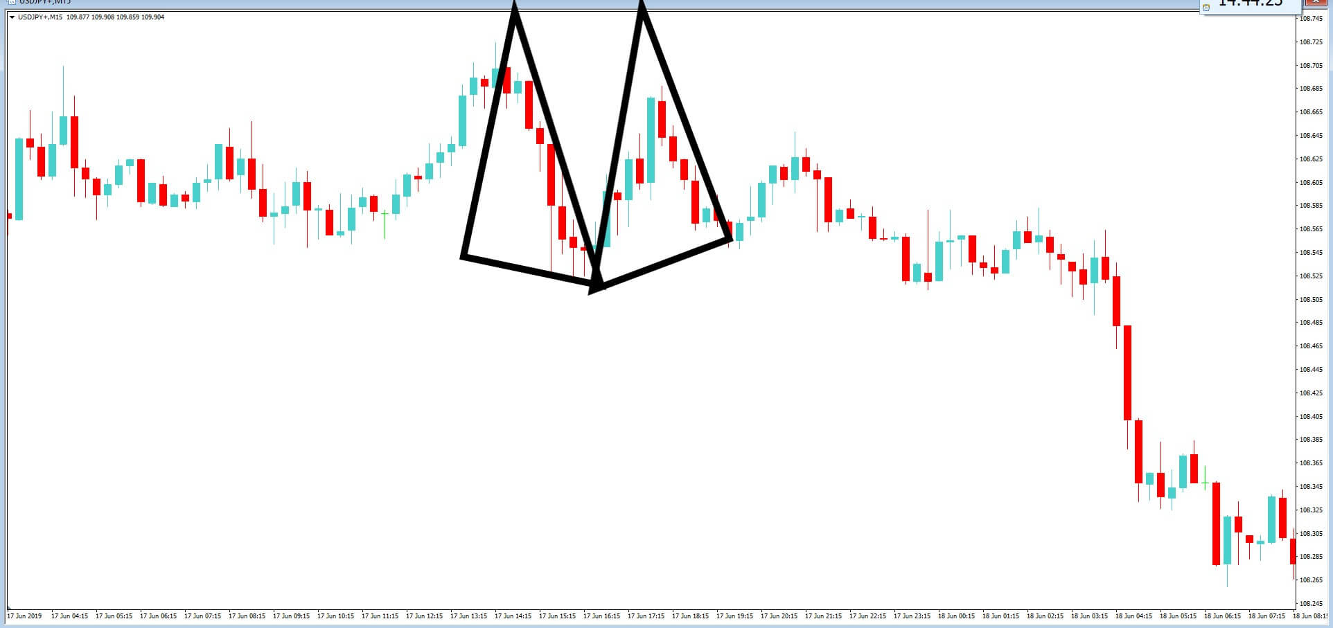
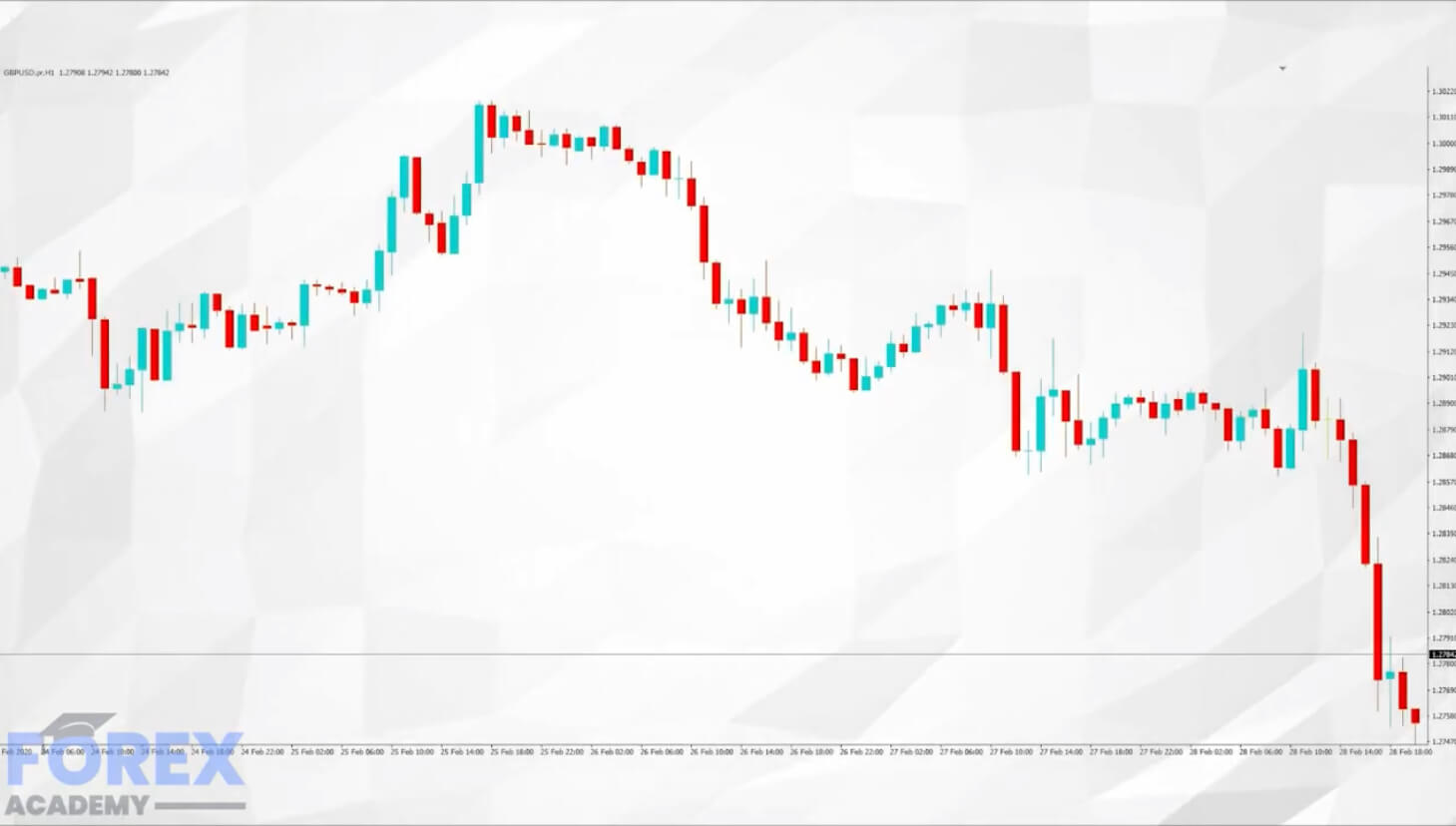
Hedging Strategy Via The Ascending Pennant Chart Pattern

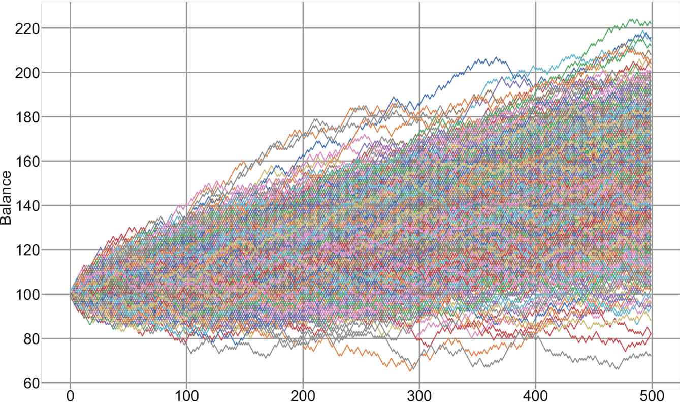
Today’s video is a follow on from our: Hedging – Making money no matter which way the market moves. So be sure and check that out if you missed it. The theory in this series is that we are looking to maximize successful trading opportunities from areas in price action that are likely to accelerate in either direction. And by covering both eventualities, we create a situation where we can capture the breakout in either direction, even if our initial trade goes against us.

There are various types of hedging, such as selling equities in favor of buying gold or buying one currency pair while simultaneously hedging the position by selling another pair, which might be seen as acting in confluence, in order to spread the risk.
But this is a different style of hedging, where we essentially set up two trades in the opposite direction, while incorporating tight stop losses and where trade one is based on a high probability of a correct move based on our technical analysis and where trade 2 acts as a backup trade, or insurance policy if the market reverses against our technical setup, which, unfortunately, can happen.
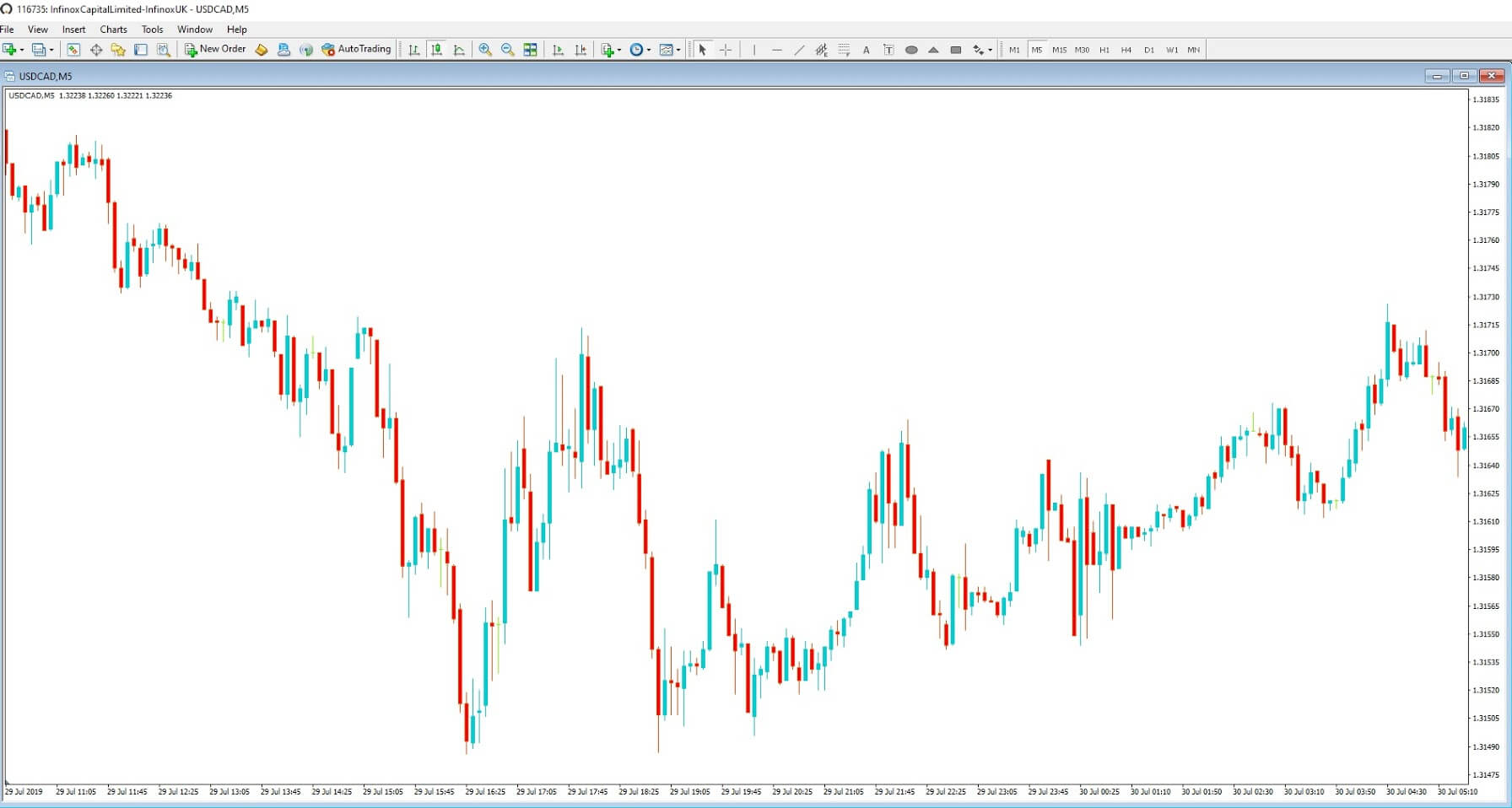
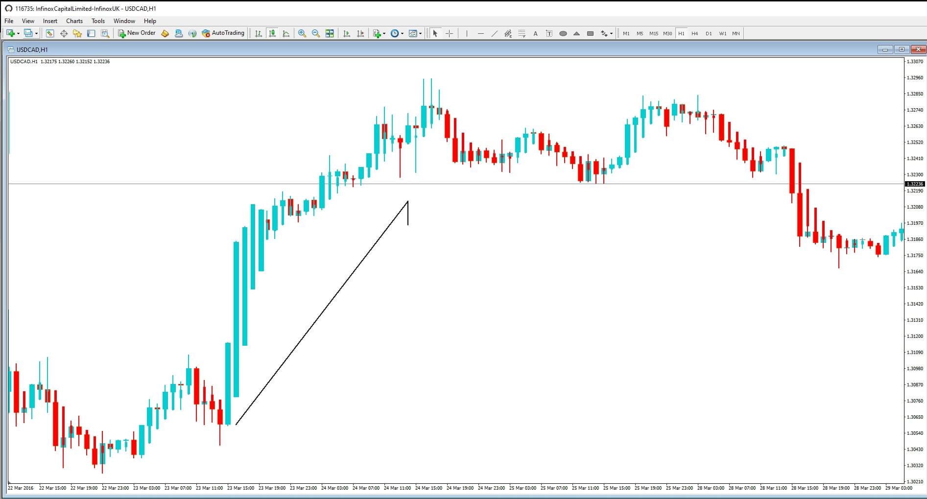
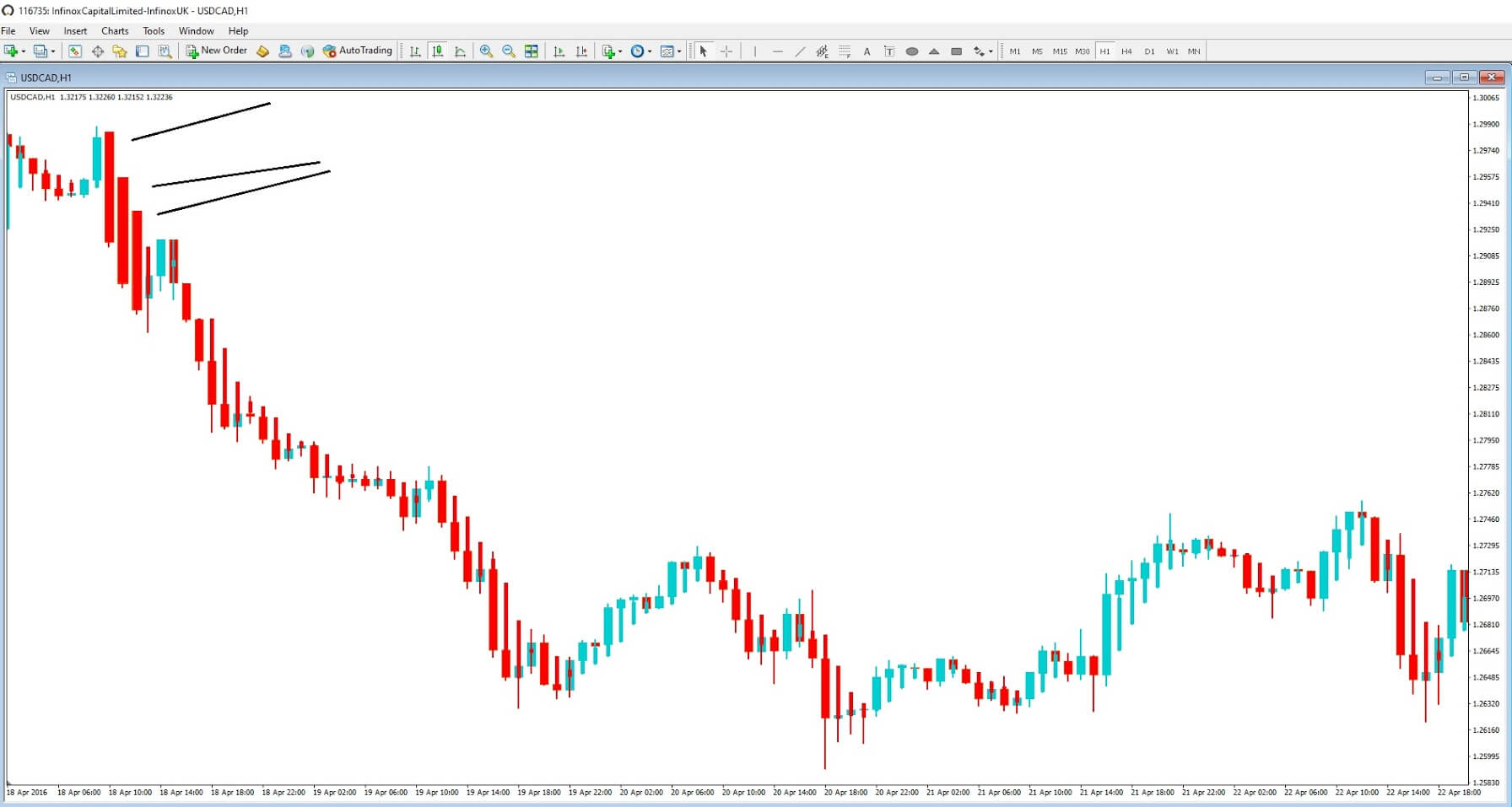
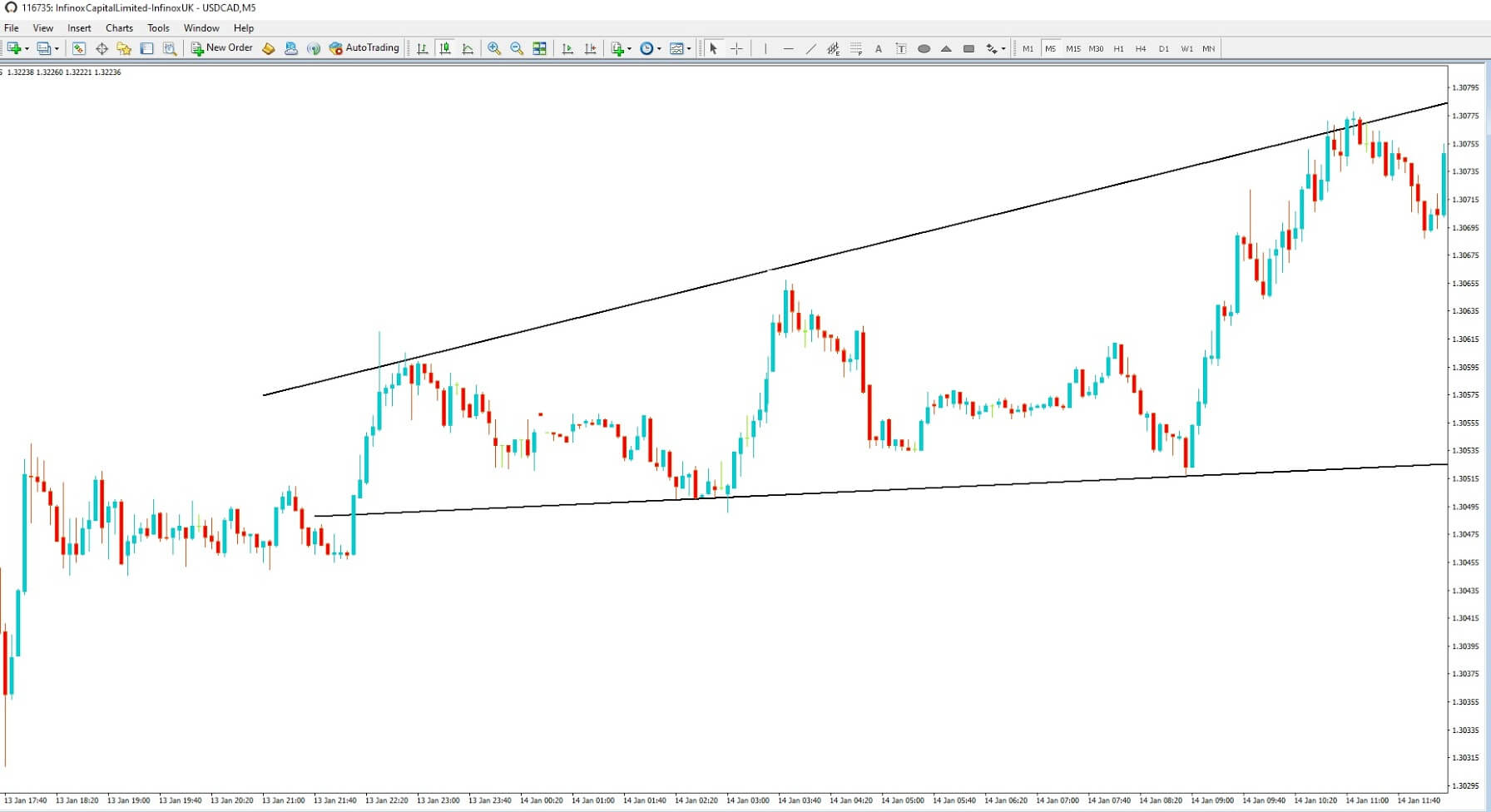
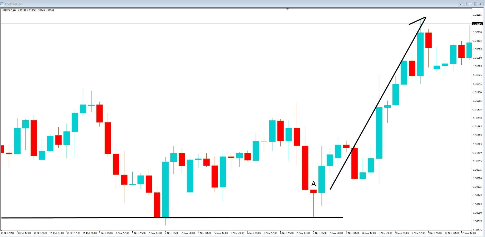
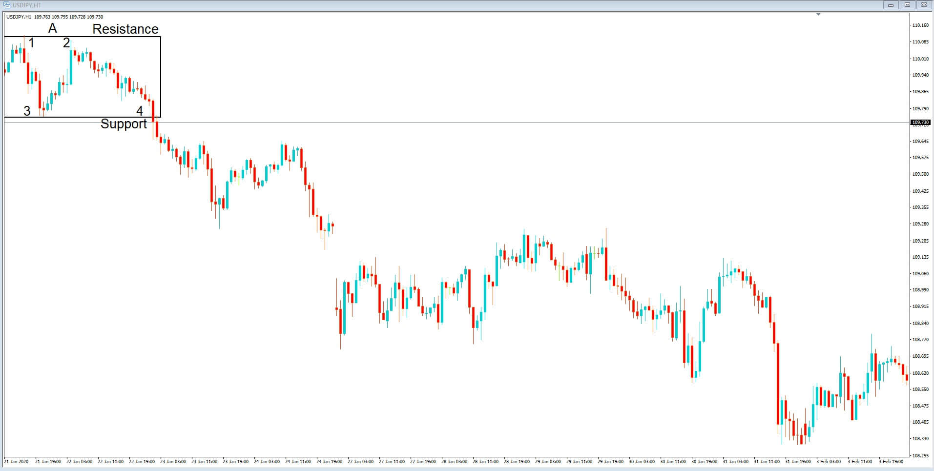
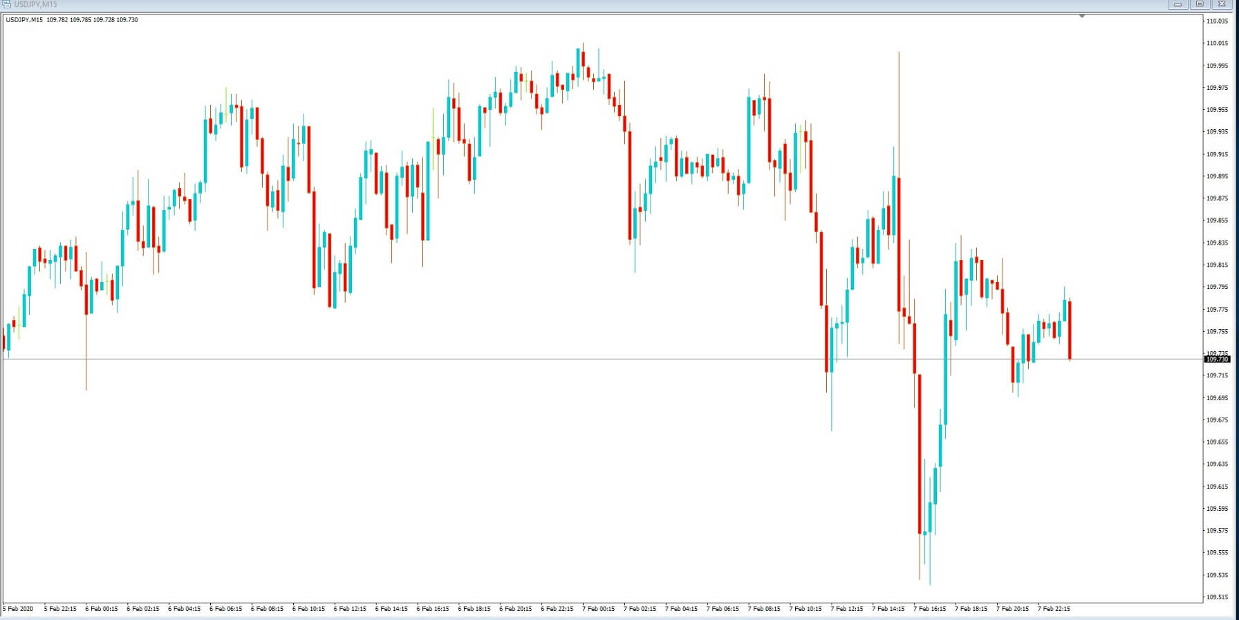
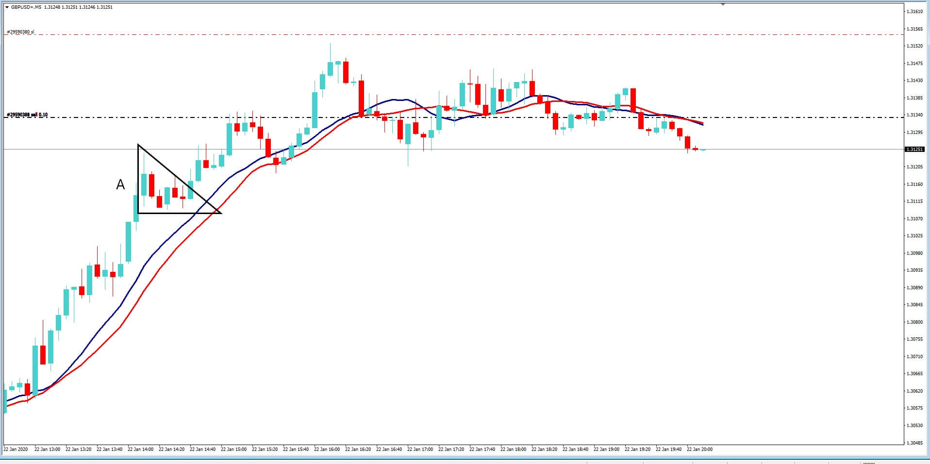
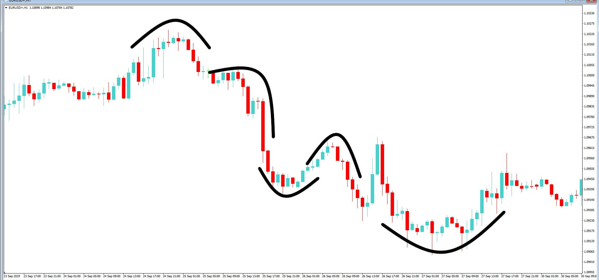
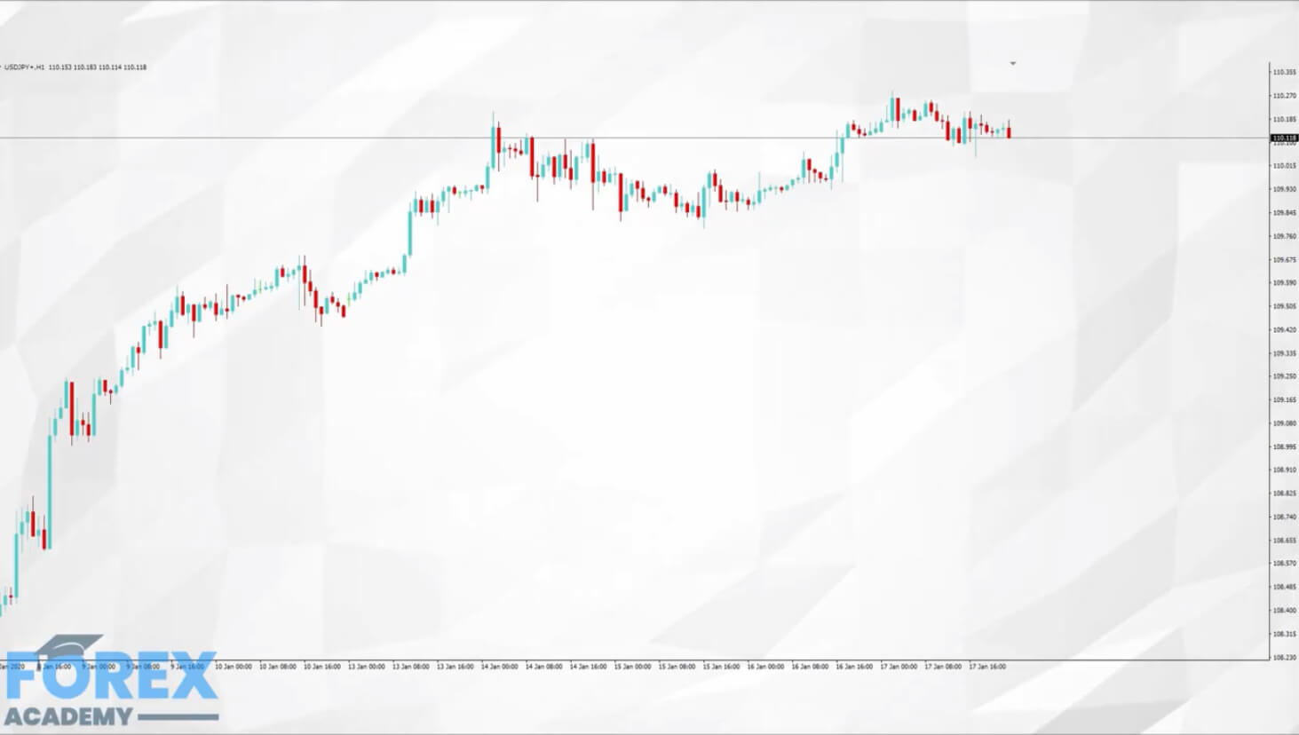
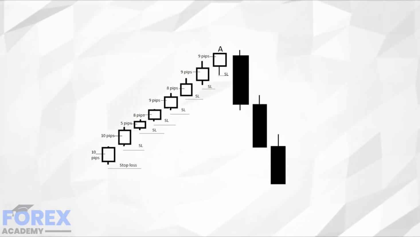
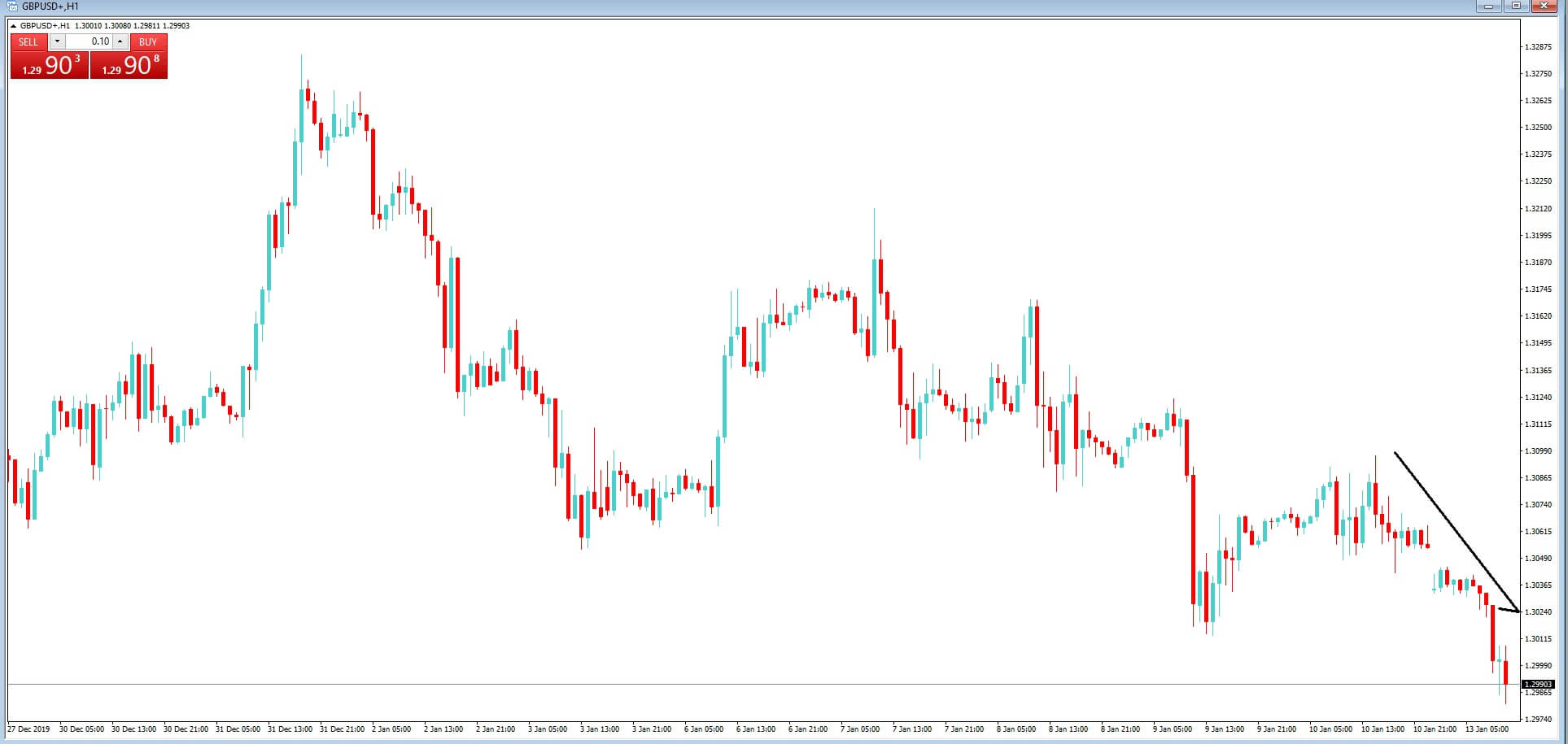
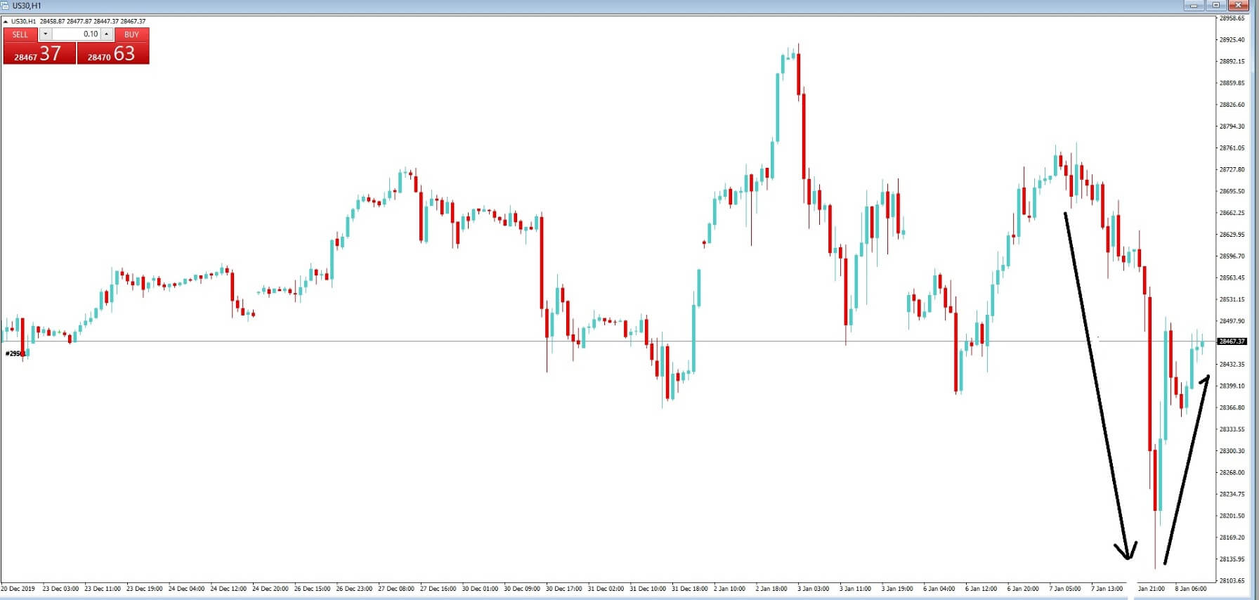
Example A


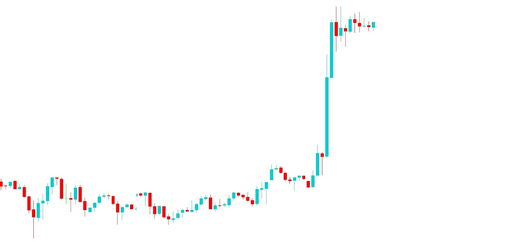
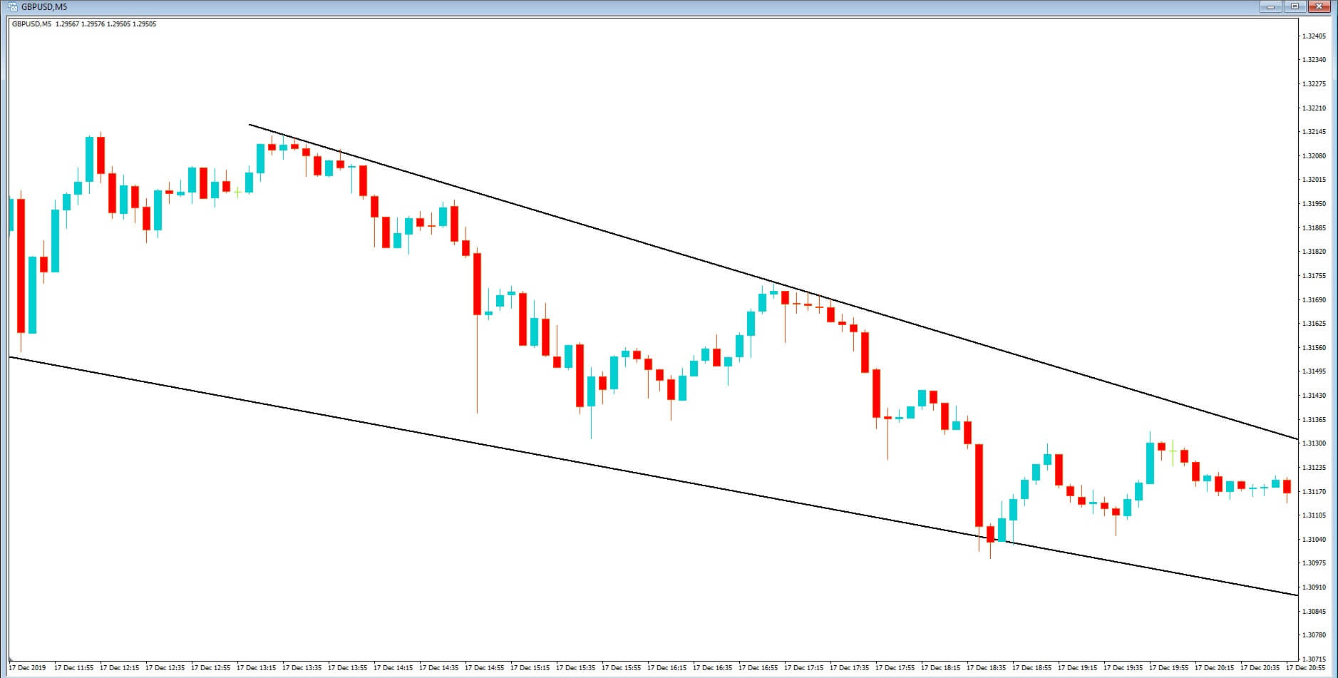
Let’s look at example A. This is the basic pattern you would expect to see on an ascending pennant pattern.
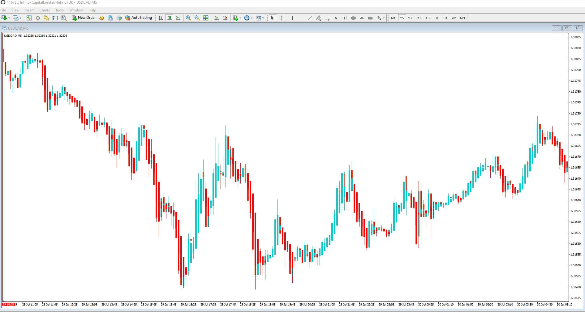
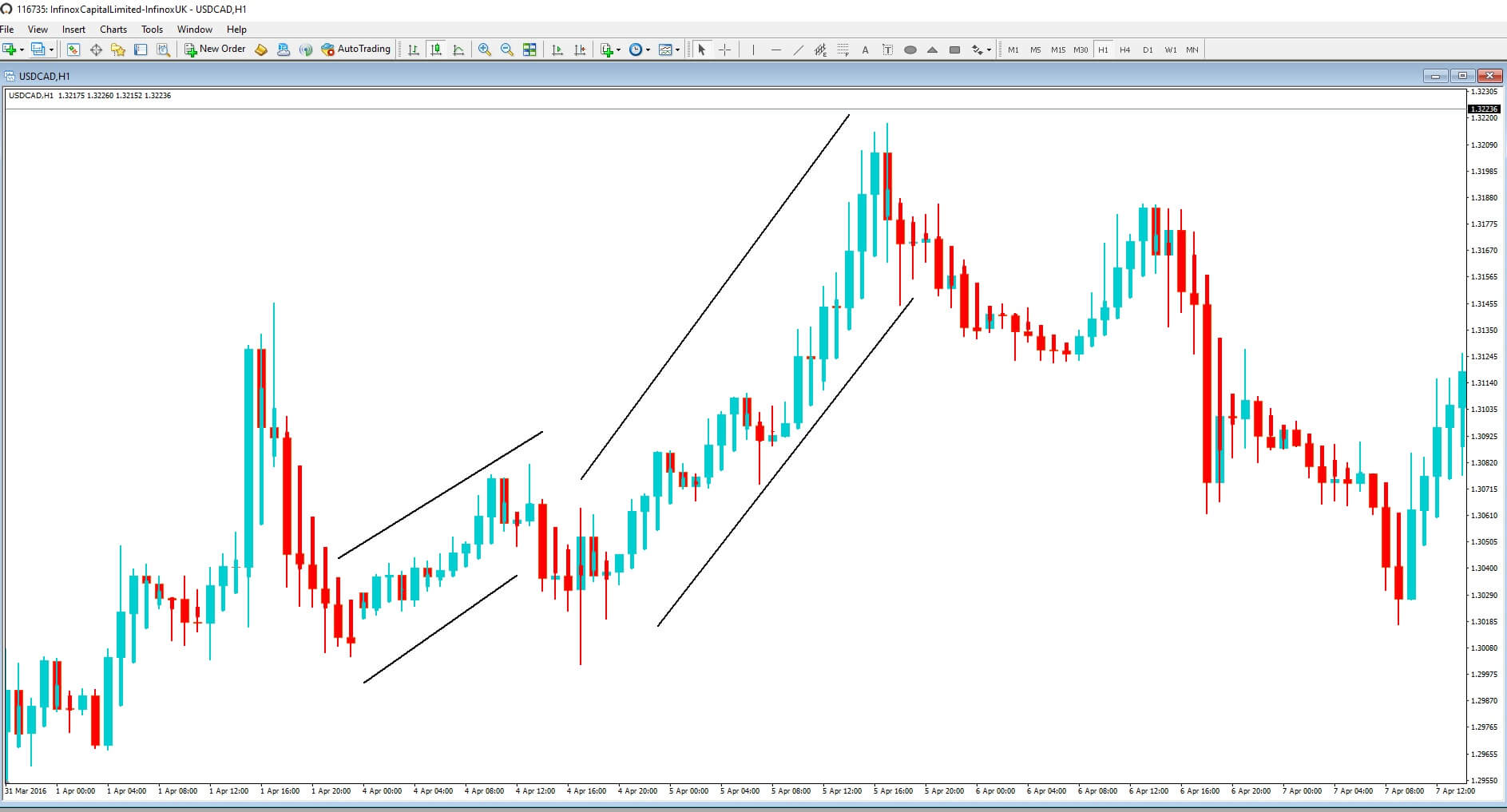
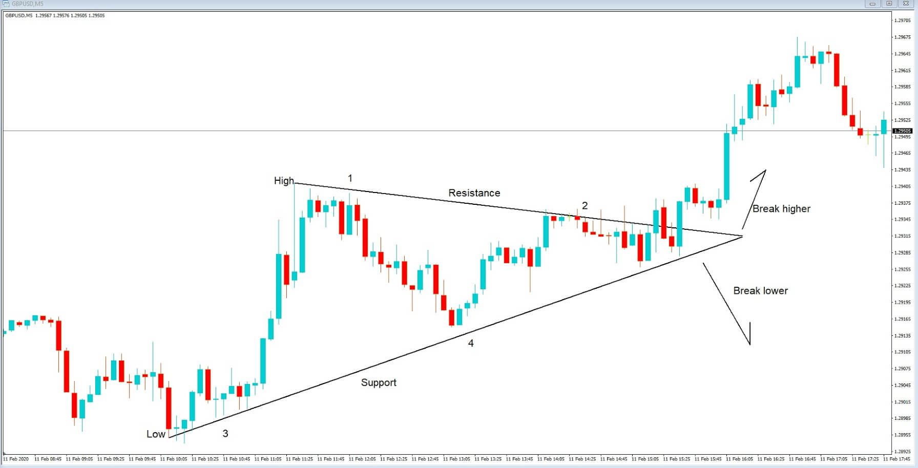
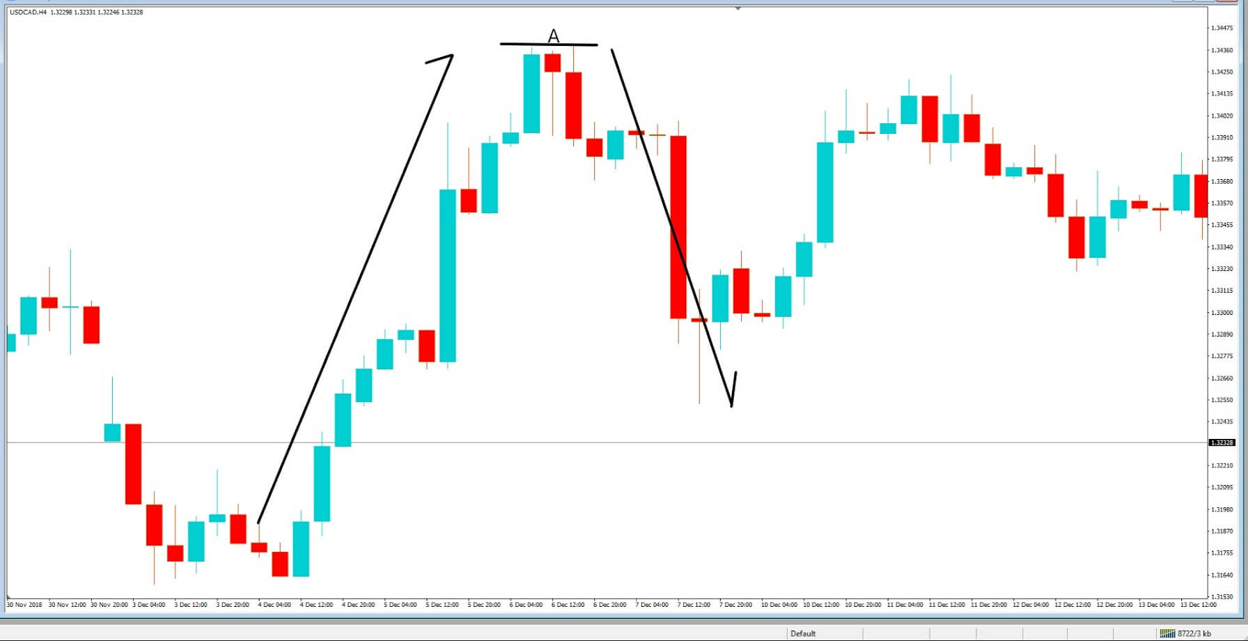
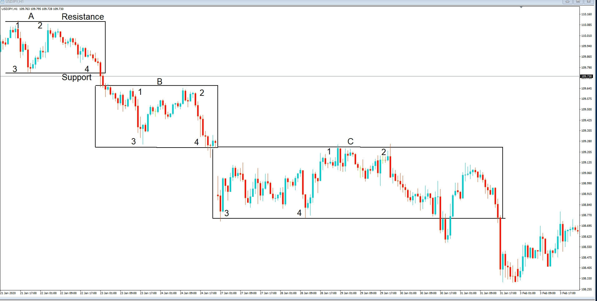
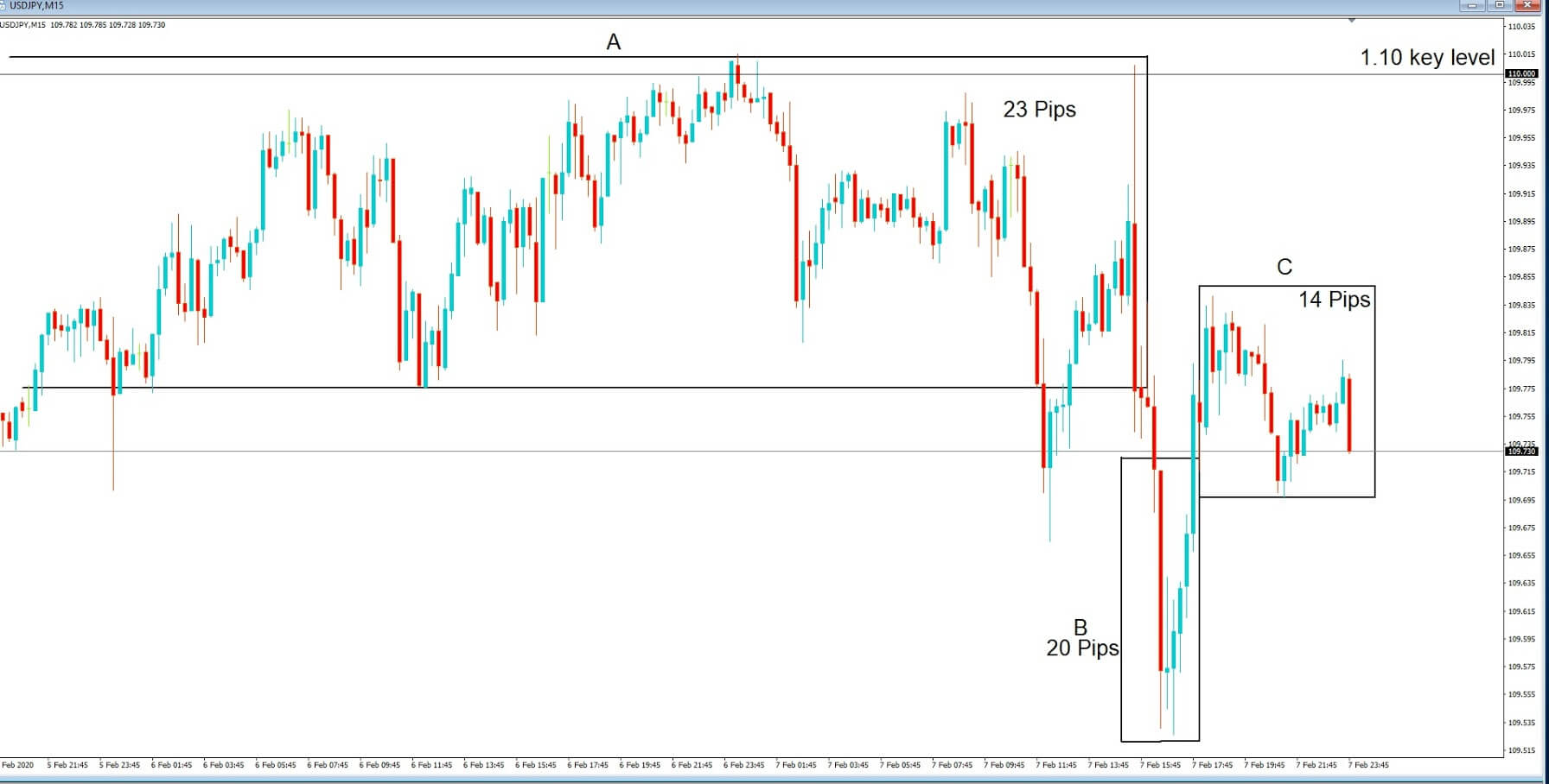
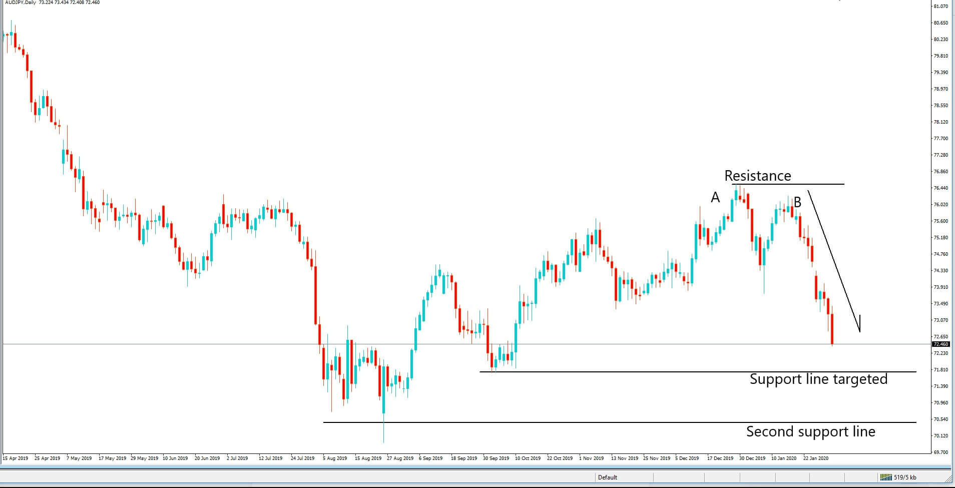
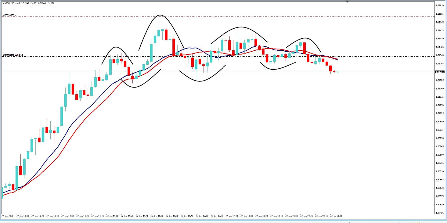
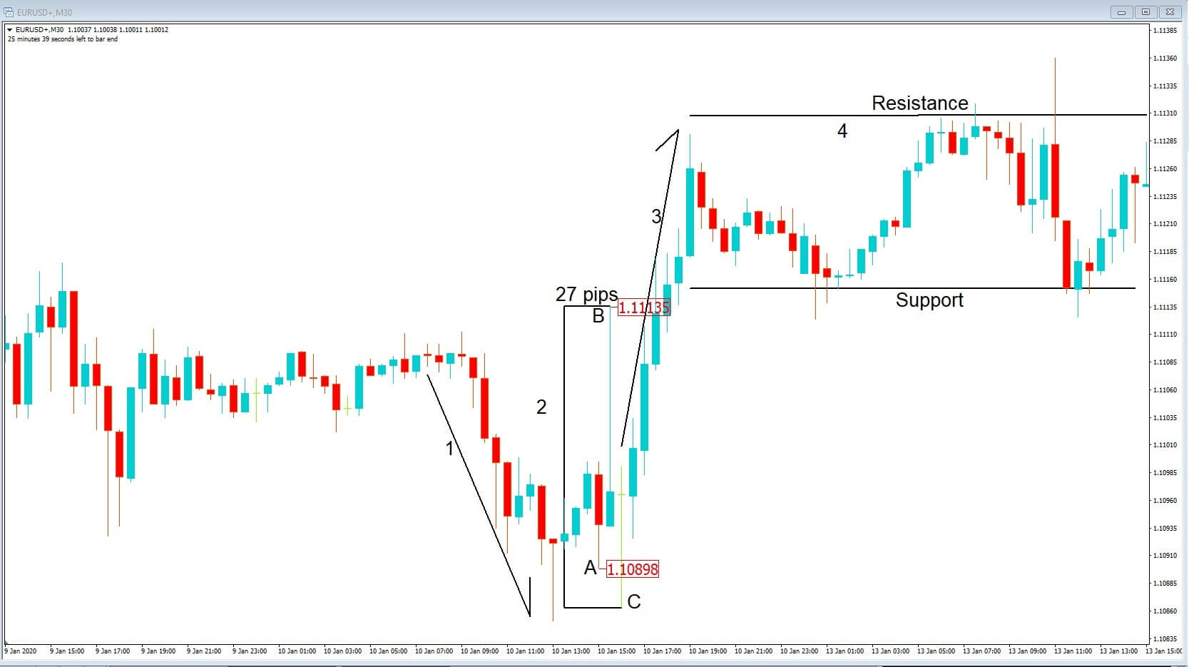
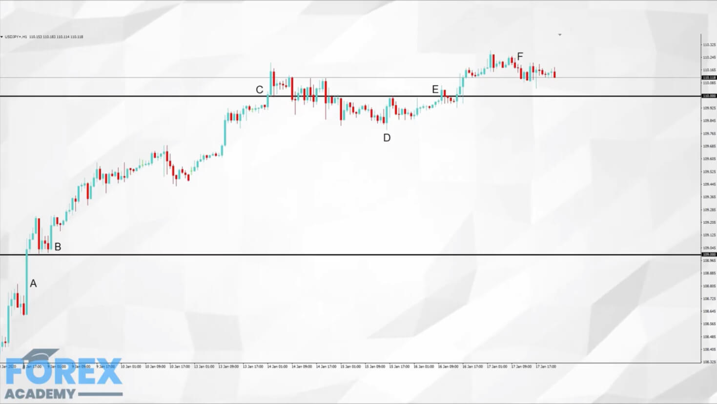
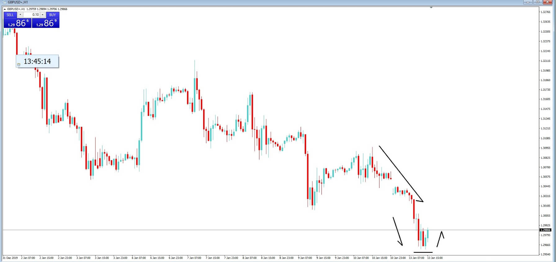
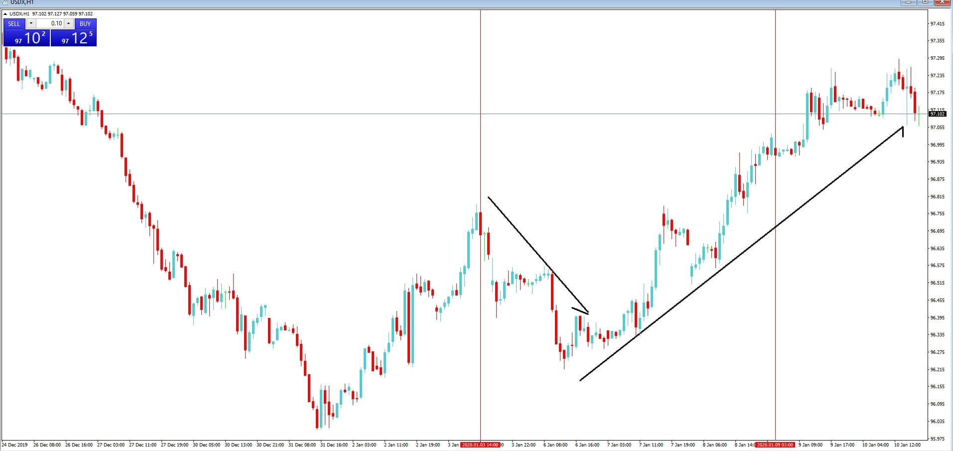
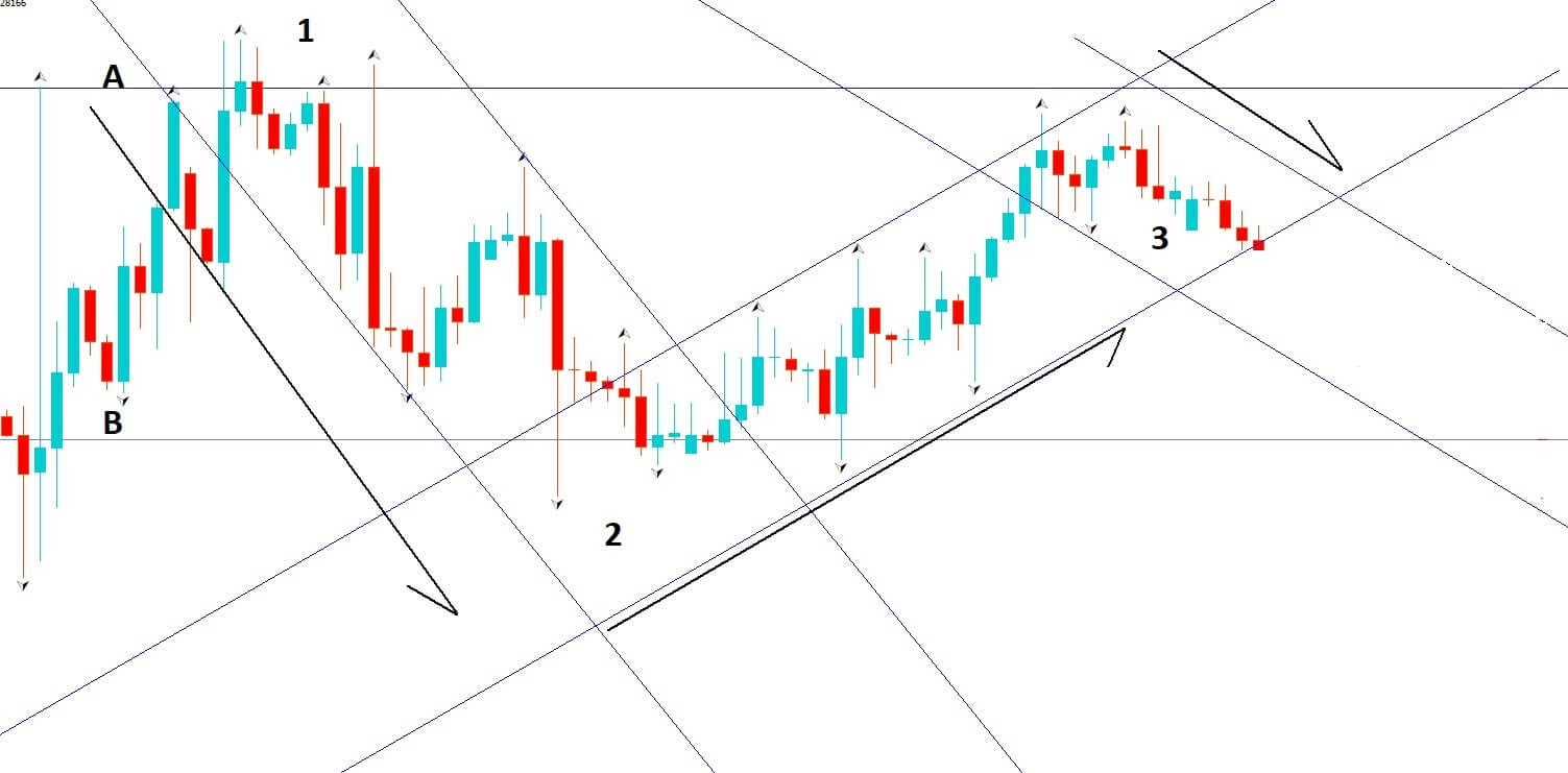
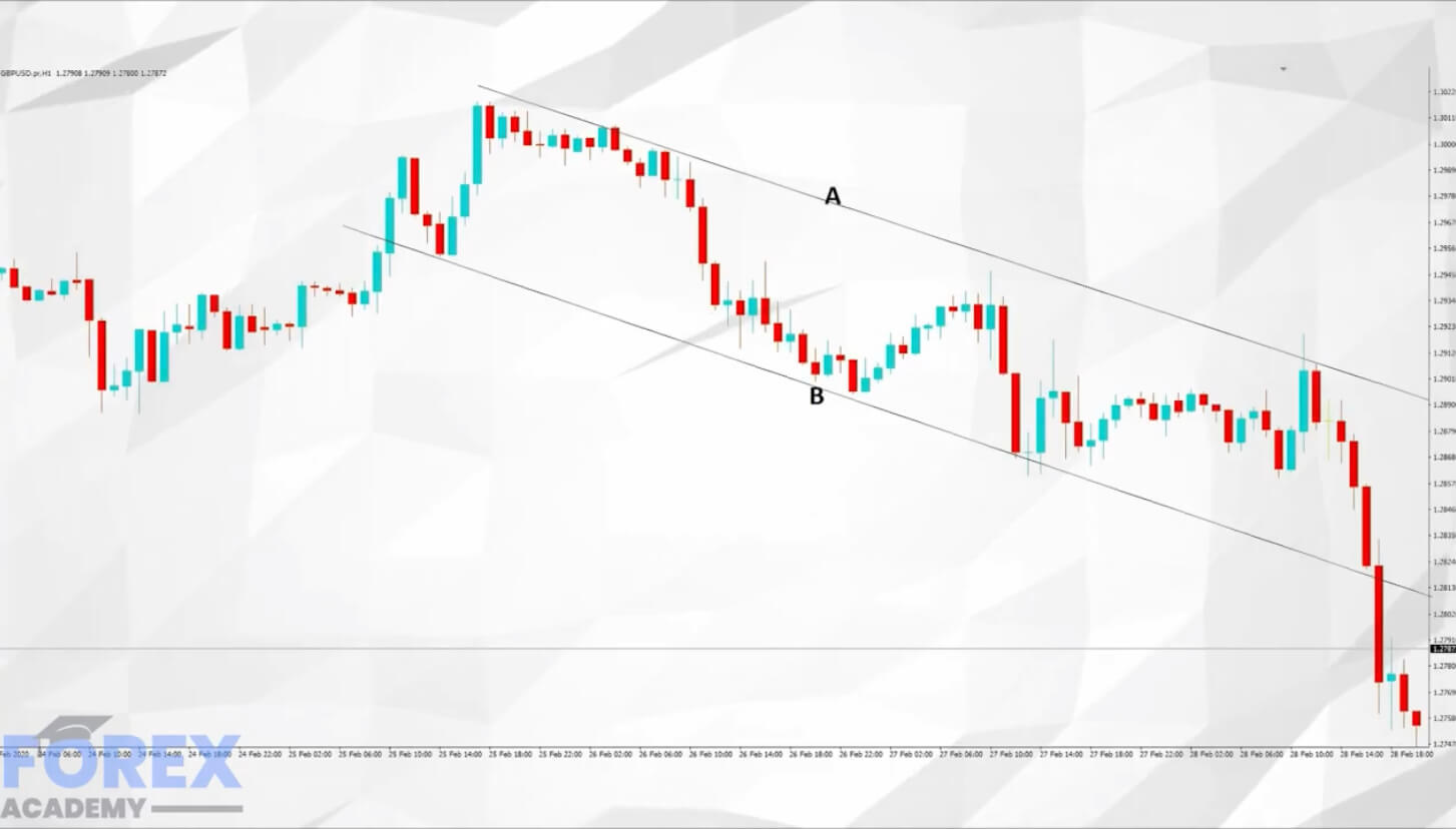
Example B


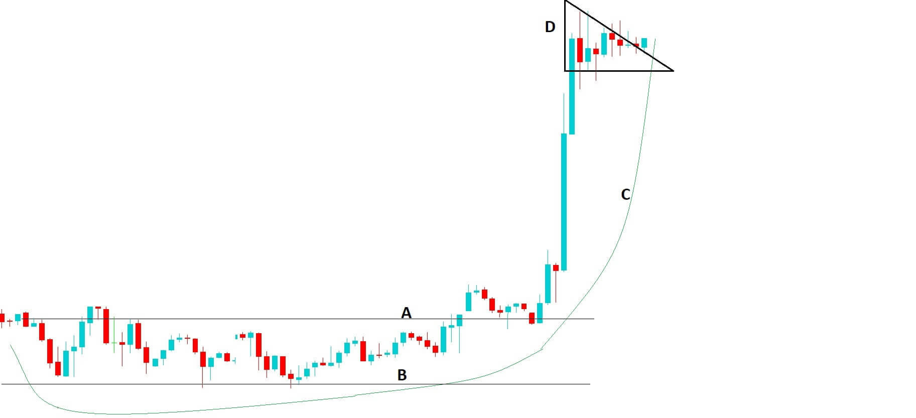
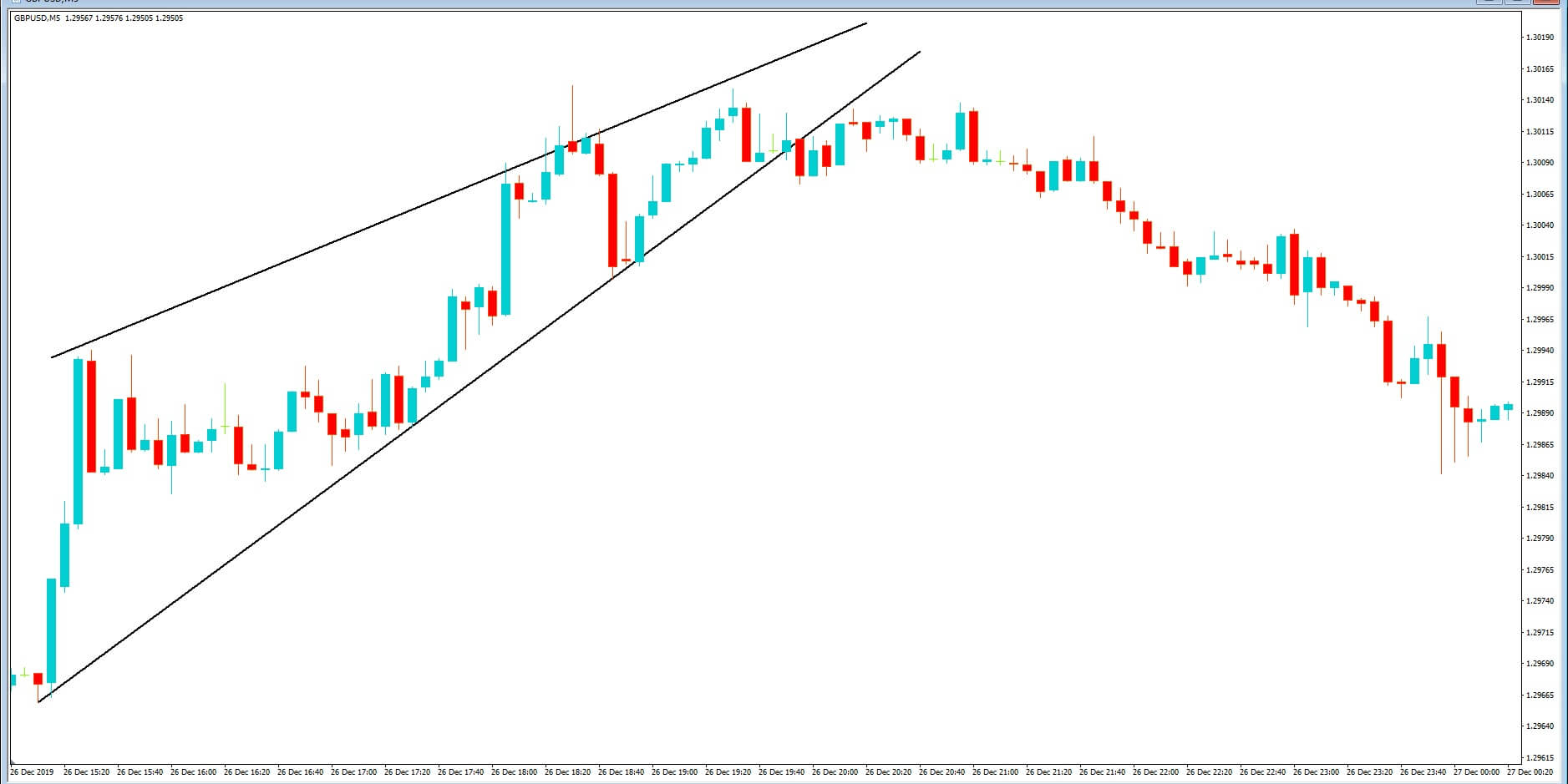
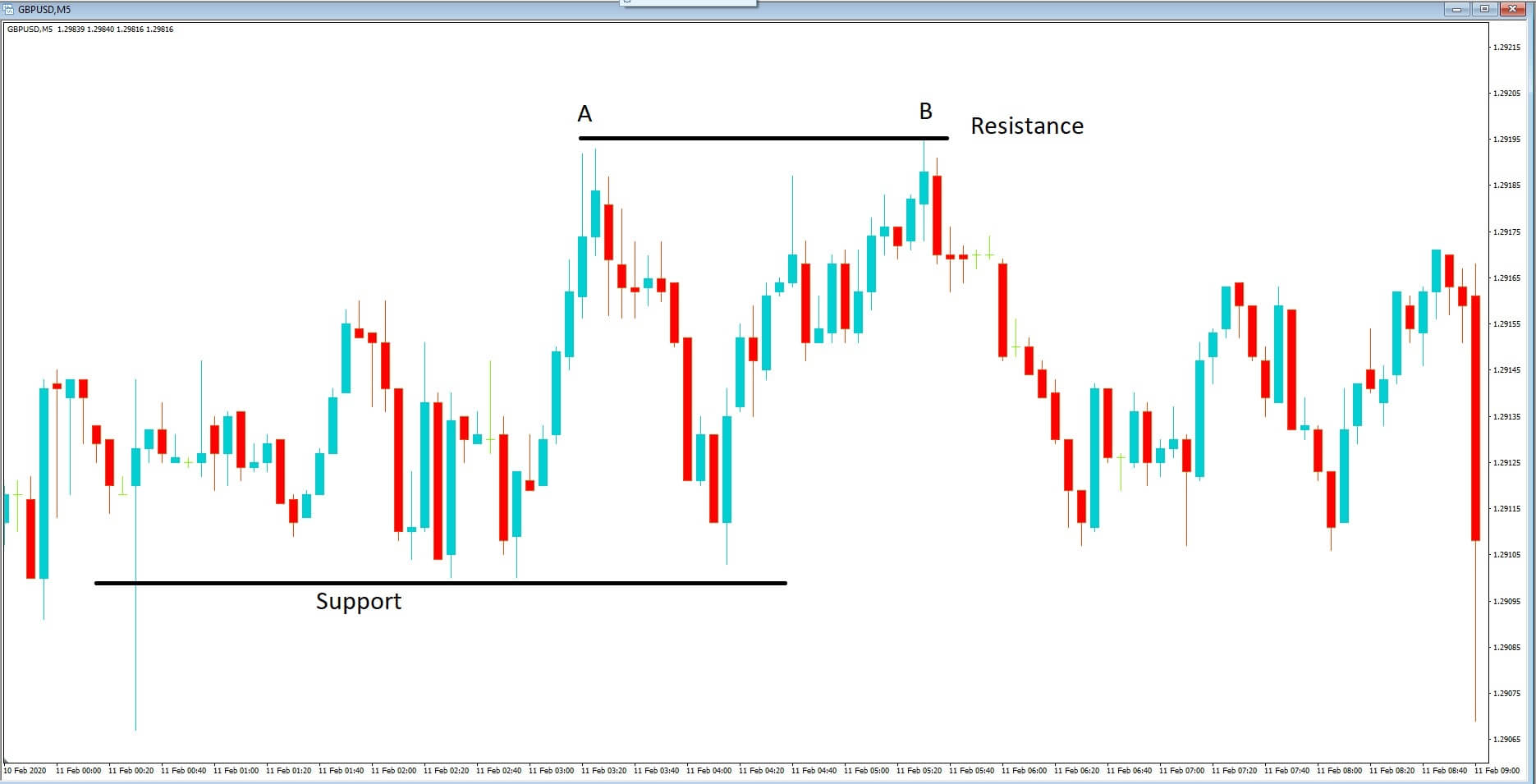
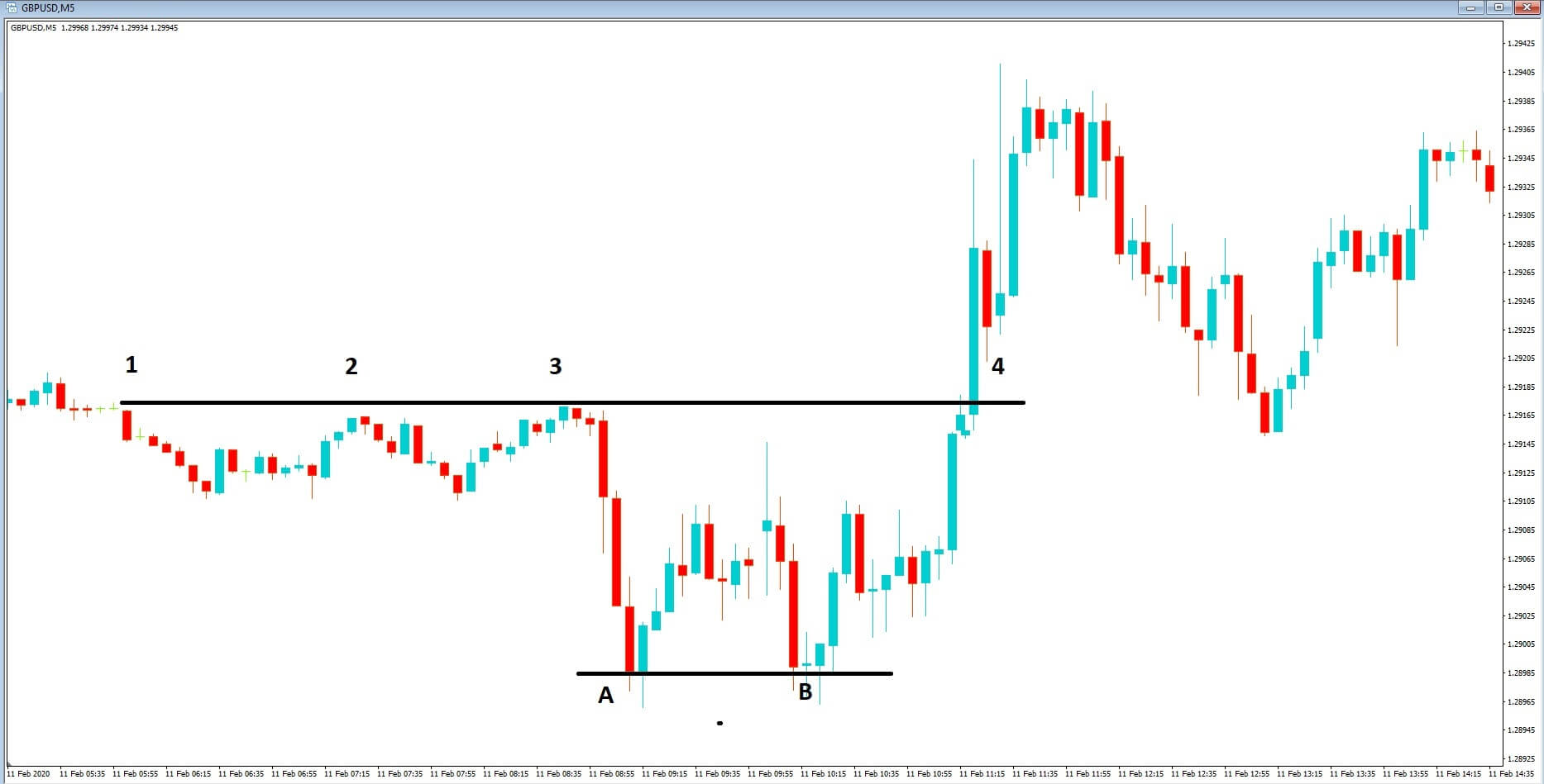
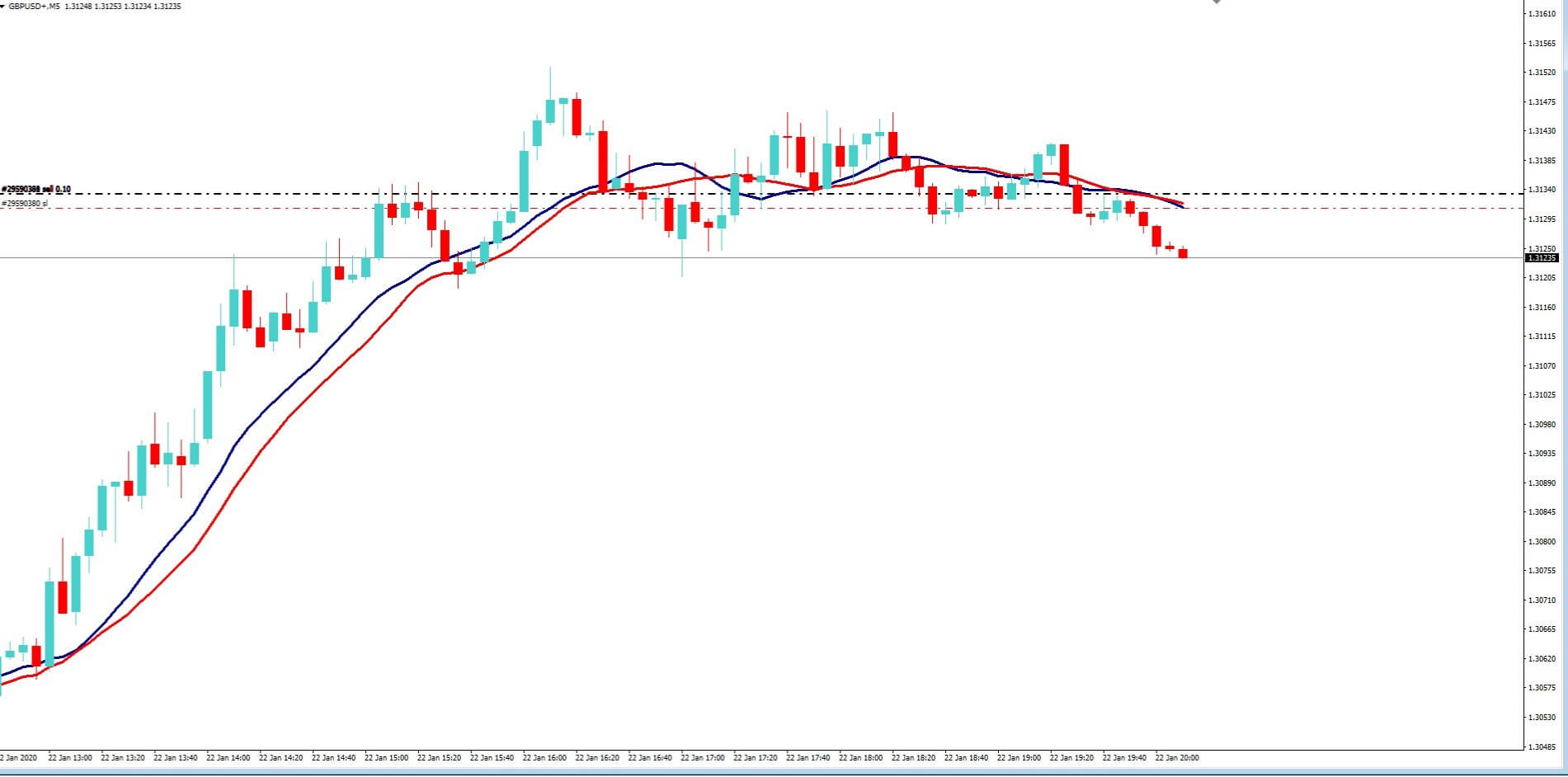
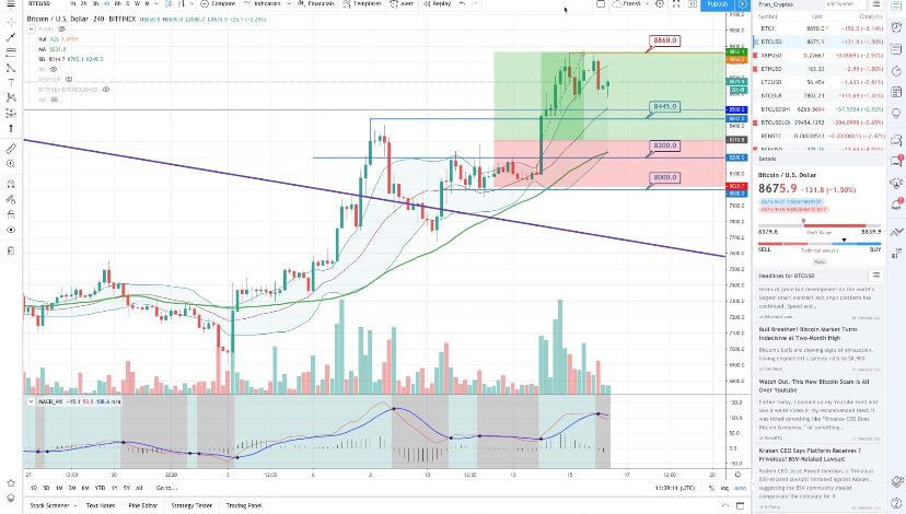
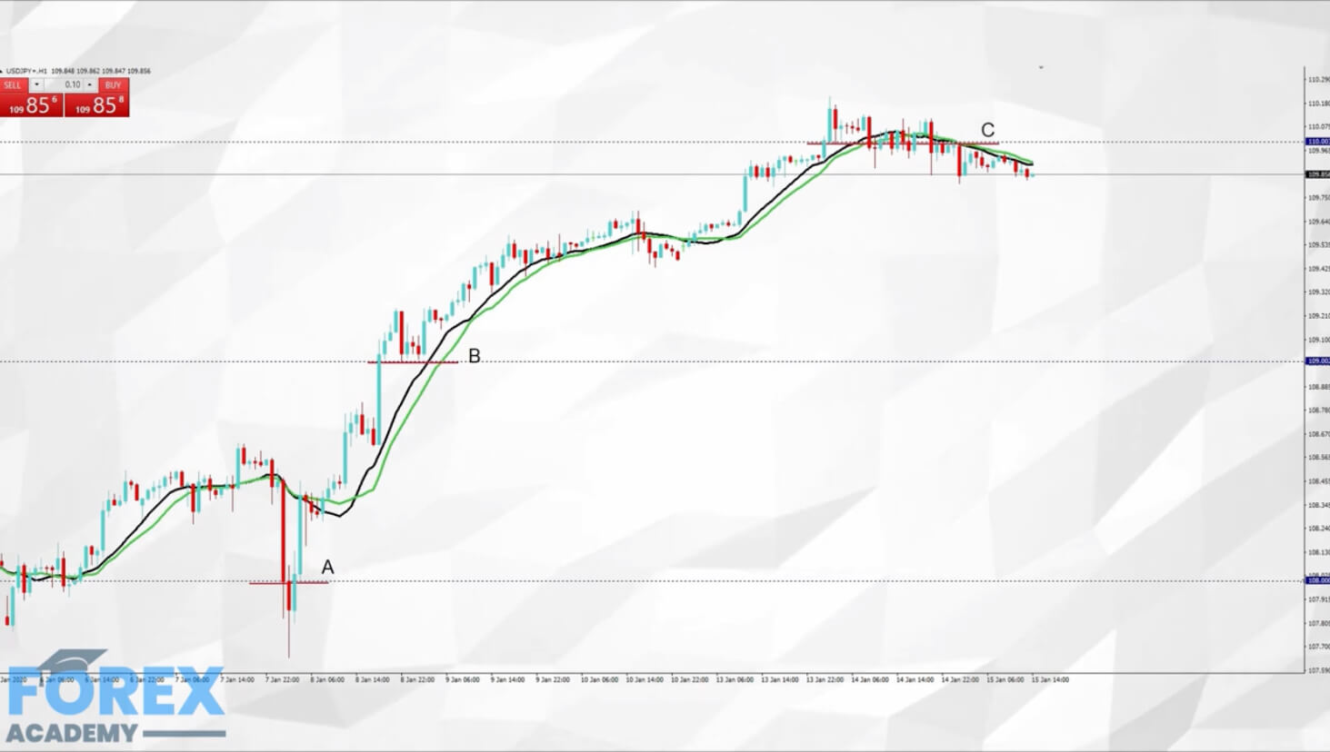
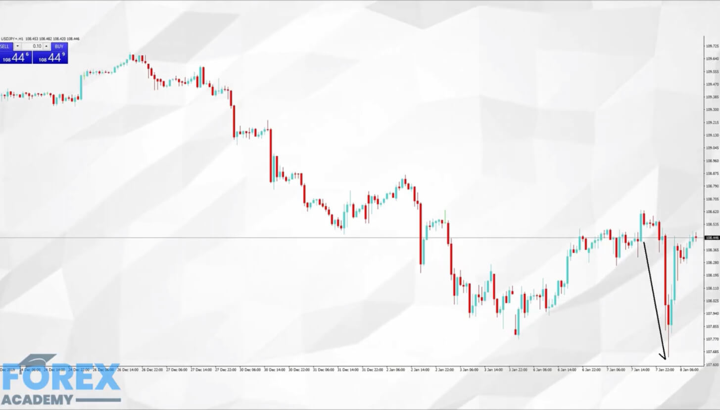
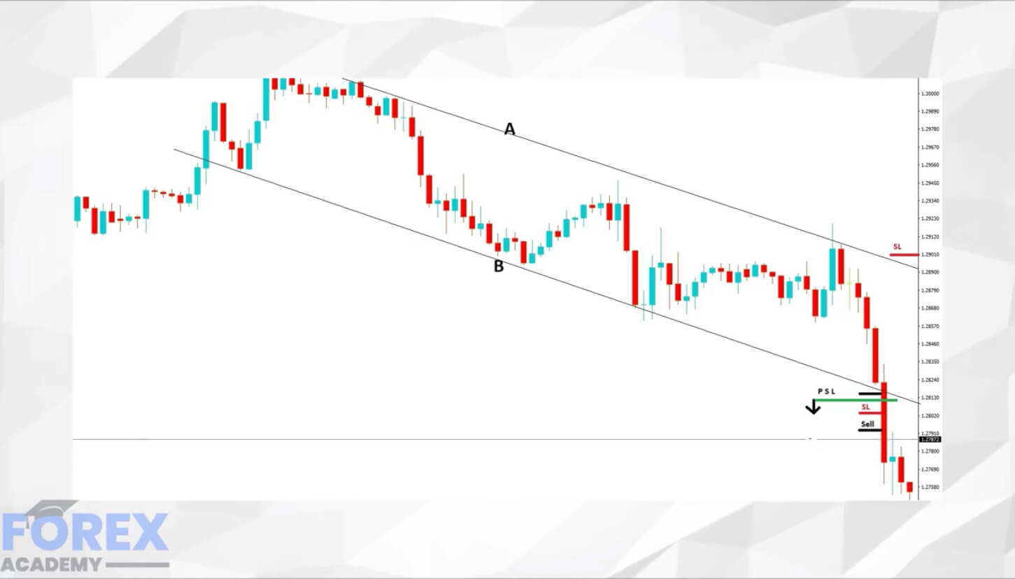
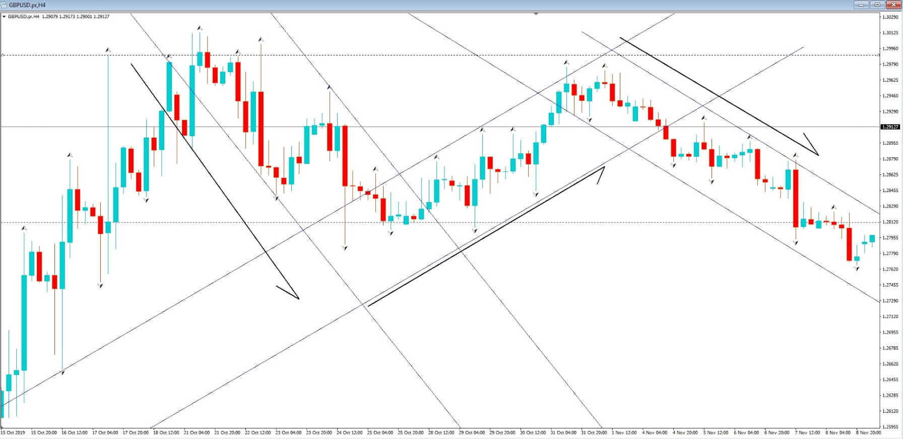
Now let’s take a look at this setup in a little more detail in example B. Initially we can see that there has been a period of consolidation, where price action is conforming to an area of support and resistance at positions A and B, and where price action remains above a key moving average, which is gradually moving higher, in line with price action, which eventually breaches the area of resistance at position A and a short while after finds support at that level, before continuing higher.
At the top of our charts, at position D, we have a wedge shape formation, which confirms our bullish Pennant chart pattern. Price action has consolidated within the wedge and is beginning to break out from it in an upward direction. From this setup, we would have very good technical grounds to believe that the buyers have got hold of this pair at the current time and that break from price consolidation within the D shaped wedge is likely to be higher, in continuation of the overall trend.
Had you not already been buying into the trend, this is the point at which you might want to seriously consider buying the potential continuation.
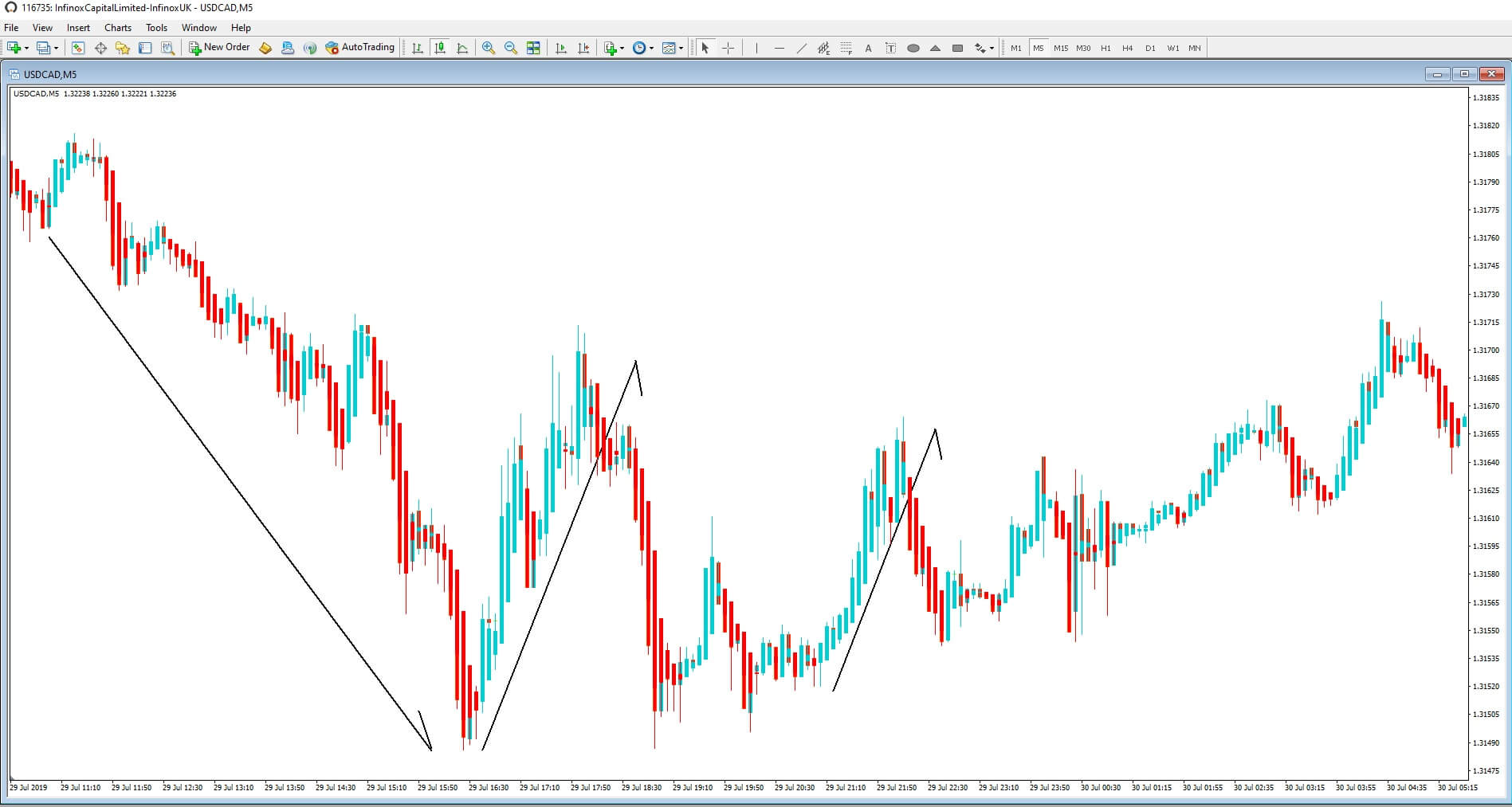
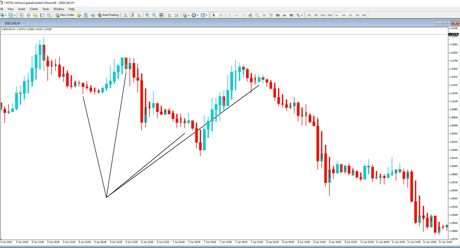
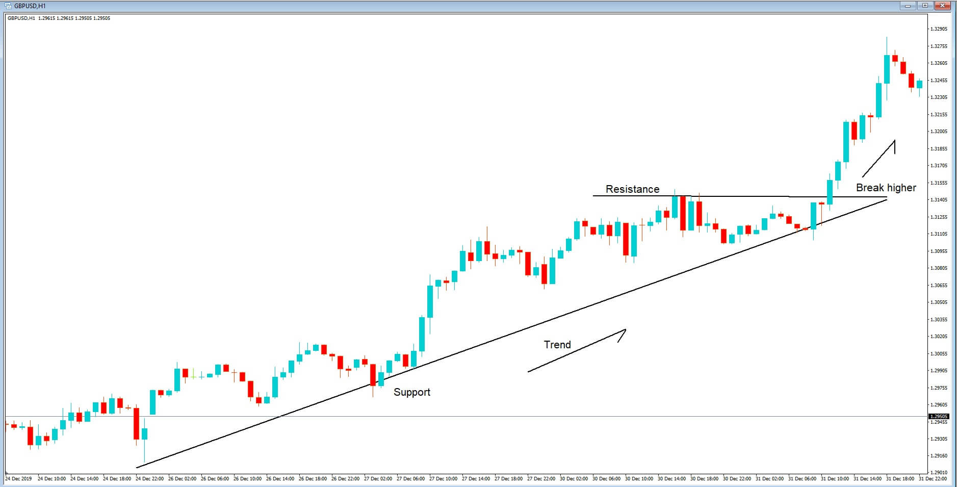
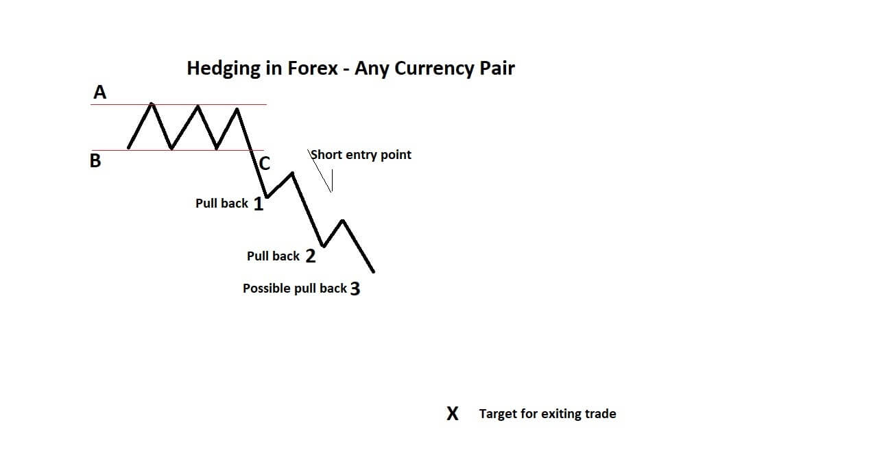
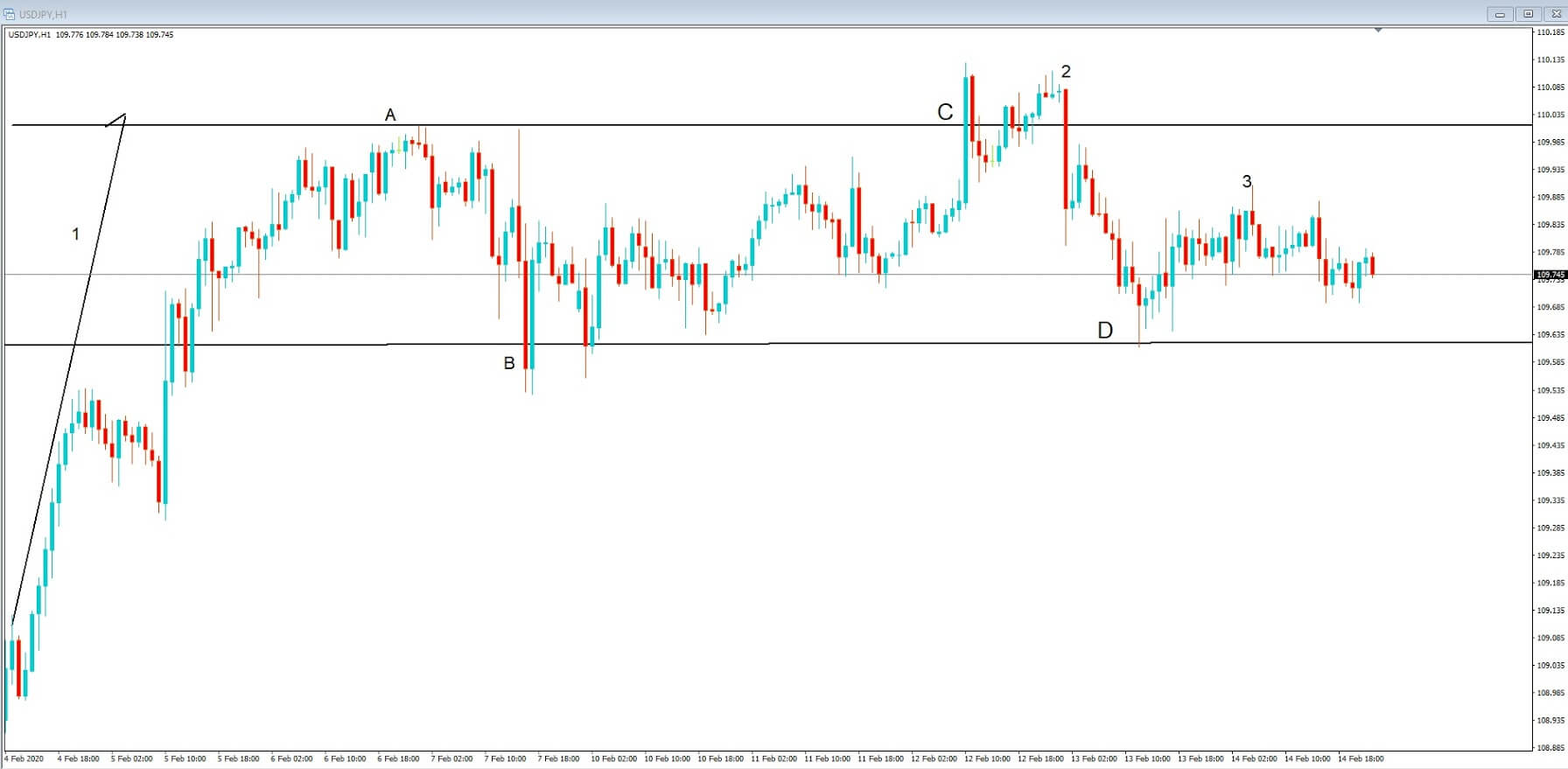
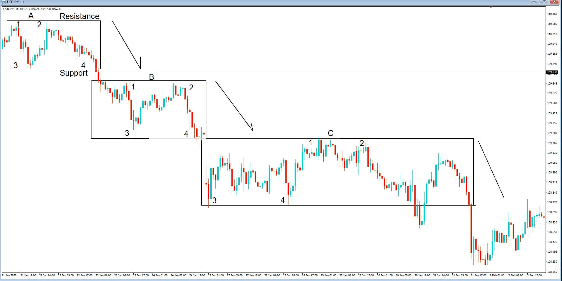
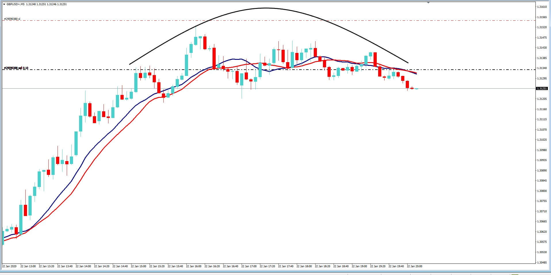
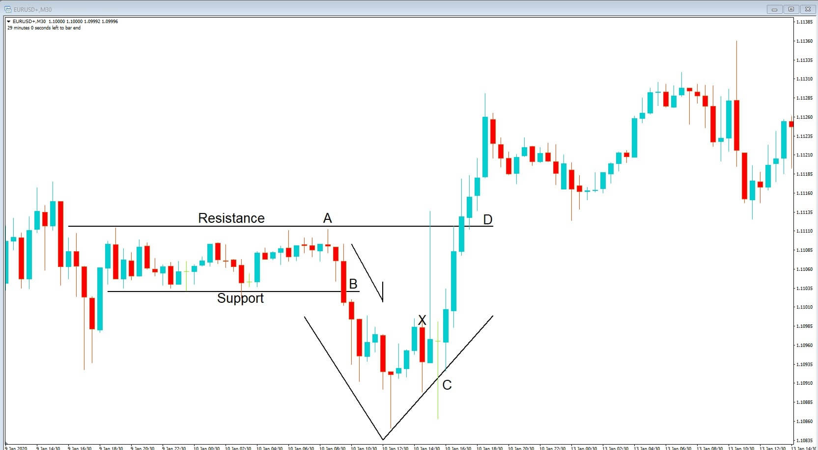
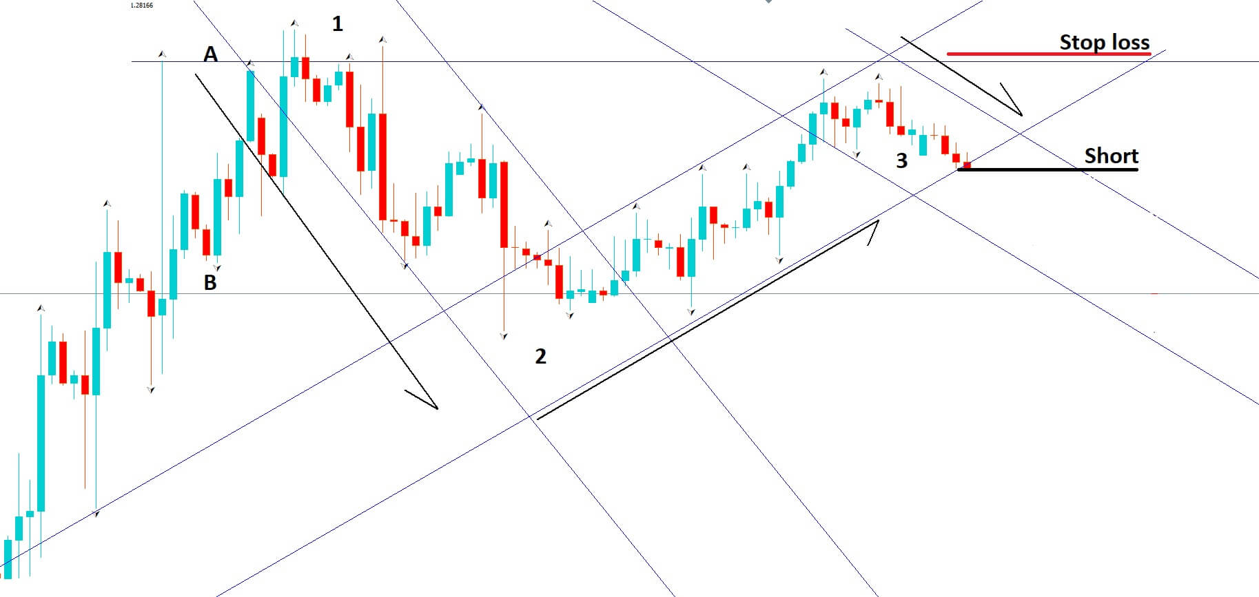
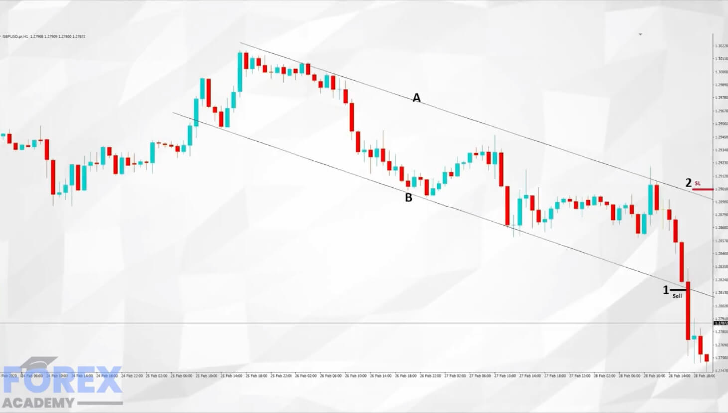
Example C


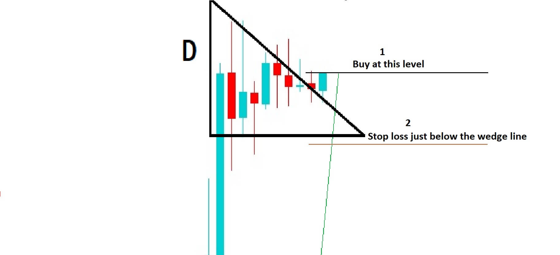
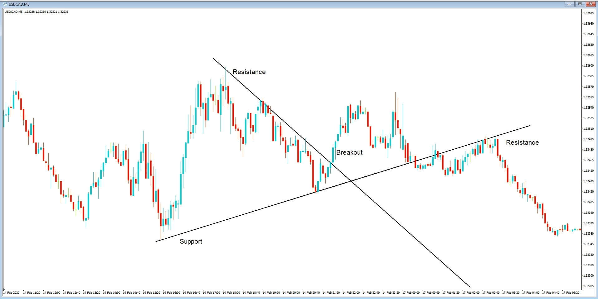
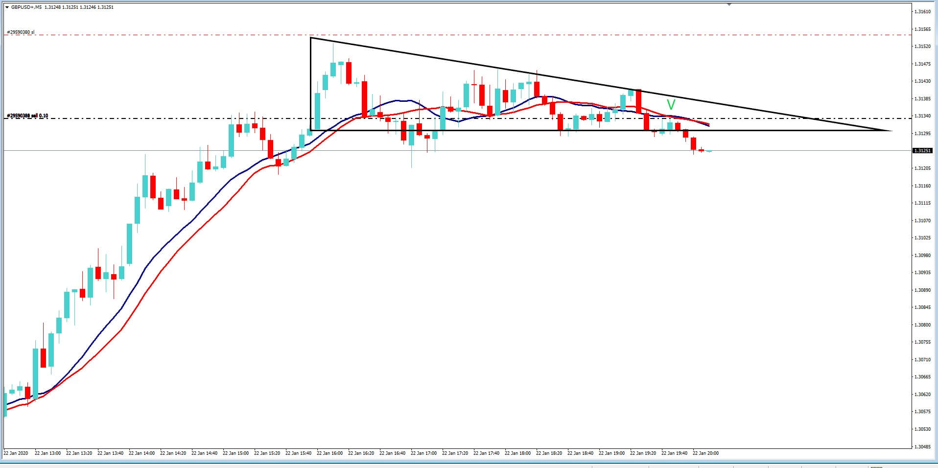
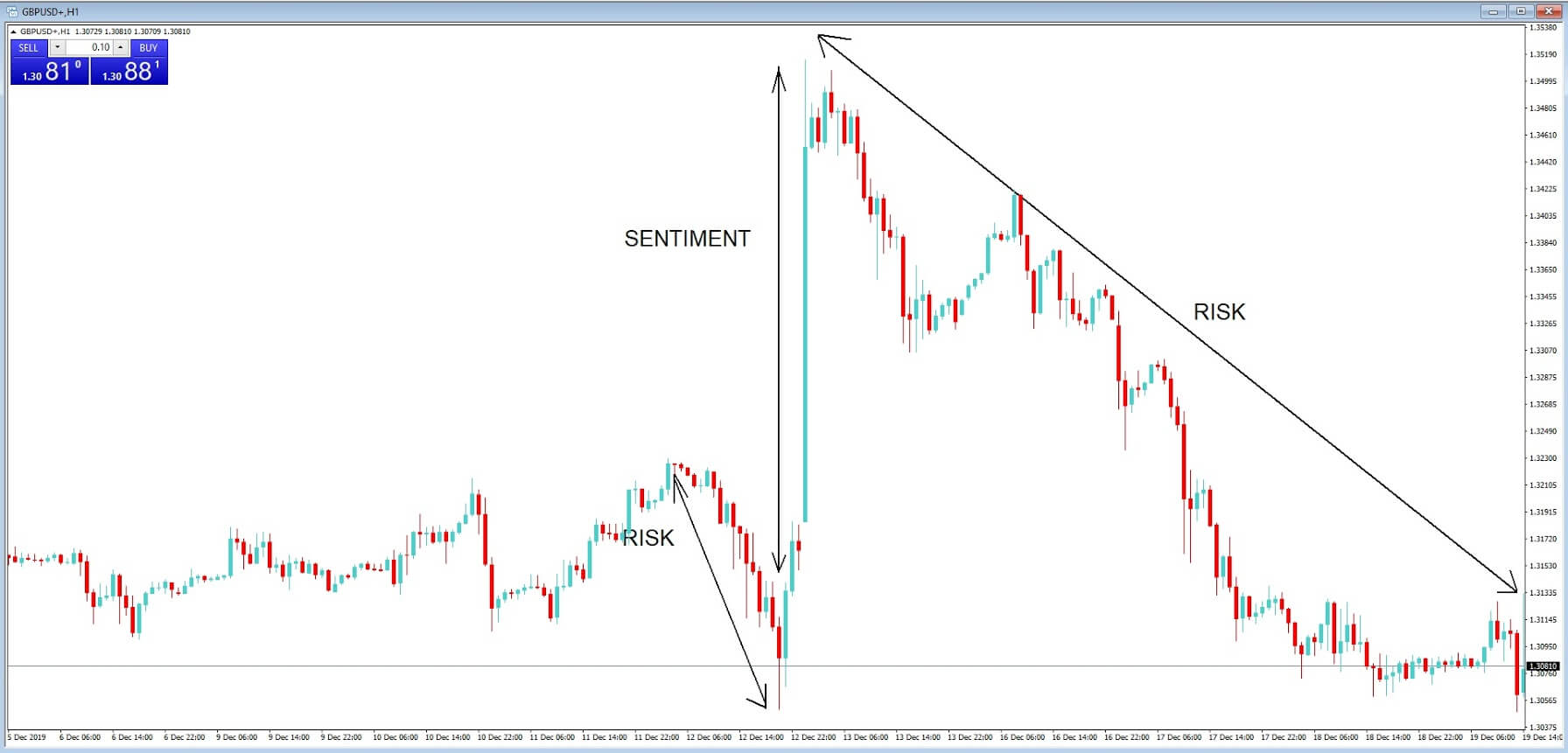
In Example C, we are going to implement our hedging strategy with an immediate buy order at position 1, and a stop loss at position 2.
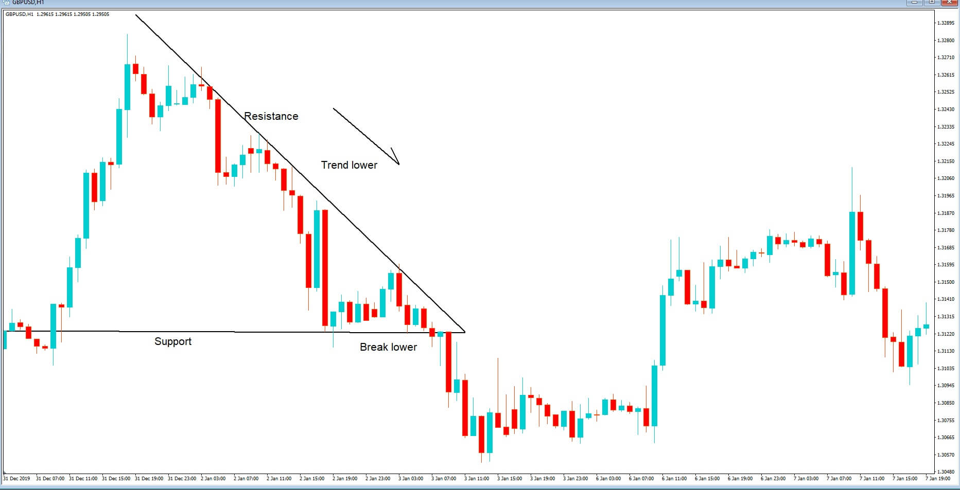
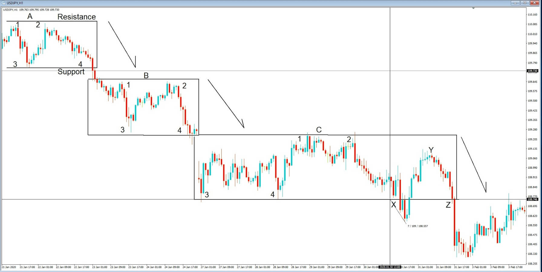
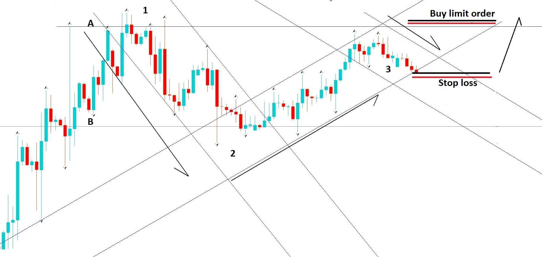
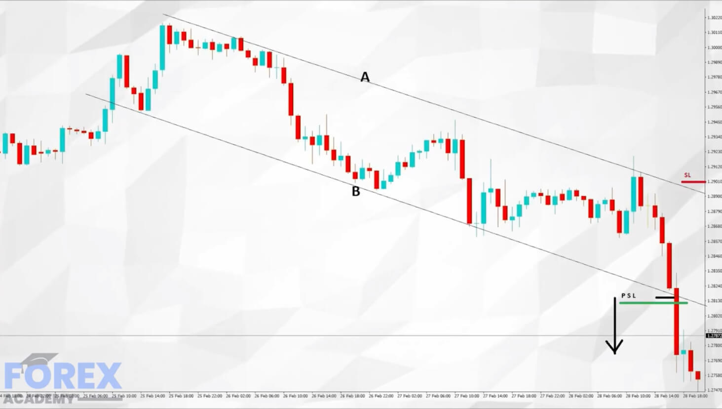
Example D


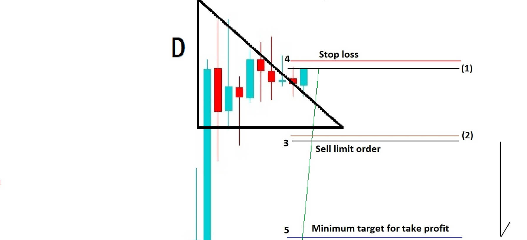
In example D, we are going to set up our backup trade in the event that our first trade reverses.
First of all, we are going to put a sell limit order just below the stop loss of our first trade at position 3, and we will place a stop loss for this second backup trade just above our entry of the first trade at position 4. We need to place a take profit at around the area or position 5, which would be equal to at least the amount that we lost in our first trade in order to rebalance our profit and loss. In this a hedging strategy, we have covered all the bases regarding strict observation of technical analysis, and we have carefully placed our orders in order to capture the breakout from this ascending

pennant set up. We have also carefully mitigated against the risk of a price reversal by incorporating a backup trade.

Categories
Forex Videos

Forex Hacking – Hedging Trades To Make Money No Matter Which Way The Market Moves

Hedging – Making money no matter which way the market moves


In this video, we are going to show you how to make money by using a hedging strategy that will take advantage of a breakout move in the market, no matter what direction. There are many different styles of hedging, and while some are implemented to protect profit and loss, The following strategy has been developed to maximize opportunities increase the chance of profitability know matter which way the market moves, and hence to create more money-making opportunities with your trading.
If used correctly you will be able to regularly make money using this strategy. Hedging sounds like a strategy that is too good to be true, however, we back up this strategy with a clear and precise methodology, while looking for breakout strategies that professional traders use every day in the Forex market.

Therefore the basis of this ageing strategy is that it should be implemented at such points that markets have consolidated, or has reached high or low peaks which are right for a reversal in price action. With the correct implication you will be able to make money even if you have a short position and the market goes against you, or if you have a long position and the market goes short.

This strategy consists of two parts, the initial trade and a backup trade.
First of all let’s look at a potential set up before we implement this strategy.

Example A

Example A is a pretty standard screenshot that you will see on any of the forex pairs. We have two key horizontal lines A&B and where they would typically be a big figure, or whole numbers, such as 1.2800, which you might see in cable currently, or 1.100, which you might see in EURUSD.
In our chart, we can see that price action has been moving between the two key levels in a series of channels. At position 1, price is rejected and moves lower to position 2 in a channel, and is rejected by the lower key level and moves higher in our second channel from position 2 to position 3.
Critically, price fails to reach the key level or line A. Secondly, we have a Fractal reversal signal suggesting price will move lower and we have what appears to be a third lower channel forming to the downside and where the line of support between move 2 to 3 has been breached by our last bearish candlestick on the chart.
We are going to implement our strategy at this point. The first and immediate thing that we need to do do is to enter a short position, as shown in example B.

Example B


We will need to put our stop loss a couple of pics above our key level, as defined by line A, which has proven to be an area of resistance.
So at this stage, we believe that we have done everything humanly possible to analyze the comings and goings of this trade, and we believe we have taken all necessary steps to pick the correct trade and gone short. However, as we know, anything is possible in the forex market. And that is why we intend two support our trade with a secondary back up or insurance policy trade if you will, and we can show you how that is set up now in example C.

Example C

Should price action reverse and trigger our stop loss we will enter a buy limit order, at, or slightly above the same point as our stop loss on the sell trade, in order to try and capture the reversal in price action and possible continuation upwards in the original trend line between position 2 and 3.

We will also enter a stop loss a couple of pips below our entry-level of the original short trade. Because if the price does move higher, our line of support between positions 2 and 3 will have been confirmed as a line of support. We must also place a take profit level with an aim to at the very least break even from our first losing trade.
No strategy is without risk. The forex market, like every other market, can turn direction in an instant, and never more so than in the current climate, where markets are tiptoeing nervously around the Coronavirus epidemic. As such, we suggest you try and adapt the methodology to your own trading style, or practice the above strategies on a demo account until you have honed your skills before trying it on a real money account.

Categories
Forex Videos

How To Achieve Free Trades & No Risk Double Up Trades In Forex

Free trade and a no-risk double up trade

In a perfect trading world, we would have no risk trades and be able to double up on those trades if we were 100% confident that price would continue in the direction that our technical charts said they should. Of course, there is no perfect world in trading, and absolutely anything can happen at any time, and we have to guard against those eventualities. However, with some careful preparation, we can protect winning trades from loss, and even double up on those trades, with little or no risk, if we prepare carefully.

Example A


Example A is a 1-hour chart of the GBPUSD the pair. On the face of it, it looks like price action reached a plateau in the middle of the chart and then gradually begins to fall. We are in a bearish descending channel.

Example B


Example B, backs up this theory with two simple descending trend lines. The trend lines A and B are acting as an area of resistance and support for price action and where lower highs and lower lows are clearly evident. Therefore a breach higher than trend line A would be considered a bullish move, and a more likely breach of trend line B would be considered as a bearish move.

Example C


In example C price action has breached trend line B, and this move is associated with bearish candlesticks just before the breach. We have chosen to sell at position 1 with a stop loss at position 2 in case price action reverts higher. Should it do so, we would need to adjust our stop loss lower along the descending line of resistance.

Example D


In example D, and in line with our free trade promise, price action has moved lower, and so we have put a protective stop (PSL) just below the entry point of this trade by a couple of pips. No matter what happens now, we cannot lose money on this trade. It is effectively a free trade.

Example E


In example E, price action has continued to fall. Let’s say by 20 pips from our original sell entry. We can sell this position again using the same amount of leverage as trade 1, with a stop loss of 10 pips; and by bringing our protective stop from trade 1 lower and placing it in the same position as our second trade stop-loss, we have effectively doubled up on this trade with no risk of loss. So if trade two is stopped out at minus 10 pips, it will be netted out by trade one which gained 10 pips, minus your spreads.

As price action continues to fall lower, we simply bring our protective stops lower in order to maximize our profit.

Categories
Forex Videos

Forex Fractals Can Spot Reversals So You Can Break The Brokers!

Fractals


Although, at times, the forex market seems to be unpredictable, candlesticks, as denoted by price action, and various technical indicators, create a series of patterns which repeat themselves time after time. And while to the untrained eye, these patterns may look completely confusing, by mastering technical analysis skills. Eventually these patterns tell you an awful lot about where the price is likely to go to in the future.

One such repeating indicator is called the fractal. The fractal indicator was invented by a trader called Bill Williams. It is calculated from a 5 bar reversal pattern and indicates a trend reversal.

Example A


Example A is a diagram of price action as shown by the Japanese candlesticks and whereby the arrows are fractal indicators denoting a potential reversal in price action. Confusingly the arrow points in one direction; it actually predicts a possible trend reversal in the opposite direction. So an up arrow denotes a bearish trend reversal, and a down arrow denotes a bullish trend reversal.

Example B


Example B: A fractal indicator consists of five or more price bars. And the set of rules which apply to them are as follows: A bearish pattern reversal point occurs when there is a bar with the highest high, set in the middle of two bars with lower highs on each side. A bullish fractal pattern reversal point occurs when there is a bar with the lowest low with two bars on either side with higher lows. The patterns shown here are typically what you would expect to see, with the fractal indicator printed above and below the middle bars.
Fractals tend to work better on higher time frames because on the lower time frames, they will throw up a lot of noise and be more confusing than they are worth.

Example C


Example C, However when used in combination with price action and also the key price action levels, such as whole round numbers such as the double 00’s, such as the 1.2800 or 1.2900 levels in our GBPUSD example, they help us to determine if price action is observing these key areas and therefore can be a second confirmation for entry and exit points, the first being price action itself.
Fractals are essentially a lagging indicator and provide us with a delayed signal to enter the market. However, Although it lags behind price action because it identifies trend reversals, it is particularly useful in longer time frames, especially above 15 minutes, where trends tend to continue for a period of time once the pattern has presented itself.
Find because the fractal indicator does tend to pop up on the chart quite often, it is best to use it in conjunction with other indicators as double confirmation.

Example D


In example D of a 4-hour chart of the GBPUSD pair, we can see the fractals are very often adhering to the resistance and support levels on our trend lines while price action is moving down, up and down again on the char, while also supporting the whole numbers.
Experiment with them on your particular trade setup, and we feel sure that you will find a useful way to incorporate them into your trading methodology.

Categories
Forex Videos

How To Trade Cryptocurrencies Using The MACD Indicator Part 2

Trading cryptocurrencies using the MACD indicator – part 2/2

MACD Overbought and Oversold conditions
The MACD indicator is great for identifying possible changes in a trend and spotting trend reversals. However, it can also identify overbought market conditions or oversold market conditions.
The overbought and oversold market conditions are presented on the indicator when the MACD line and the signal line are separated too far away from each other as well as from the zero-line.

BTC/USD Weekly Chart example


As can be seen in the picture, the MACD line started to stray noticeably far away from the indicator’s signal line in December 2017. On top of that, both the MACD line and Signal were well above the zero-line at that time.
The combination of the two warned careful investors that the price surge was causing the market to become overextended and that a pullback was becoming extremely likely.

Zero-line explained

The so-called zero line marks the midpoint of the MACD oscillator, splitting the value range in half. When the 12-period exponential moving average crosses above the 26-period EMA, the MACD will cross above the zero-line, therefore presenting a buy signal. On the other hand, when the 12-period EMA crosses below the 26-period EMA, the MACD will go below the zero-line and will present a sell signal.


The histogram, which are the pink bars shown on the oscillator, quantifies the distance that is currently between the MACD line and the signal line. The histogram will print a bar above the zero-line when the MACD line is above the signal line. On the other hand, it will print a bar below when the MACD line is below the signal line. The bigger the size of the bar, the larger the gap between the two lines is.
When the histogram reaches its highest level, it will show the MACD line at its farthest point above the signal line. This situation implies that the rally is becoming overstretched, as shown in the chart.

Conclusion
The MACD oscillator is a great tool for traders that like following trends and spotting trend reversals. It comes in handy to both beginners and professionals alike.

Categories
Forex Videos

Forex Psychological Whole Numbers! – One Method To Fit All Pairs

Psychological whole numbers

Psychological whole numbers in technical analysis plays a major role with professional traders. They offer key areas of support and resistance. If you have been studying technical analysis for any length of time you will no doubt have realised that price action has a tendency to react to whole numbers.

Example A

Let’s take a look at a 1-hour chart in example A, of the USDCAD pair. We can see that price action gravitated towards the 1.2900 whole number level on the left of our chart, and when it failed to reach it, price action fell back to the 1.2800 whole number. Subsequently price action rebounds to the 1.2900 number and eventually moves higher to the 1.300 whole the number which holds as a level of resistance, before price action toos and fros between the 1.3000 and 1.2900 levels. Institutional traders and commentators call these types of numbers Double Zeros, so you might hear them say 1.30 double zero, or 1.29 double zero or ‘1.29 The Figure’ or ‘1.30 the Figure’, and this pretty much applies to all double zero levels in all Forex pairs.

Example B


Now let’s take a look at example B, and the EURUSD pair on a 4 hour chart where we can quite clearly see that whole number 1.1000 held as a line of support, and where price action moved higher in the middle of the chart to the whole number 1.1100, which initially held as an area of resistance, and where price action goes on to punch through it, before falling back again to the 1.1100 whole number, which is then acted as an area of support and where price action subsequently moved higher to touch the 1.1200 whole number, which acted as an area of resistance.
So what does this tell us about the psychology of the whole numbers? We humans like to keep things simple, we like to use limit orders with round numbers, we like to trade with round numbers, and if we know that everybody has this psychological trait, it is not unusual that we can see why traders use these whole numbers as psychological areas of support and resistance in order to take their profits, and also to place stop losses, and limit orders, at these whole numbers when they trade.
This type of psychology is embedded in our everyday life, we don’t seem to say to people that we will meet them at 10:07, or 10:17, for example. We are much more likely to say 10:00 or 10:15 10:30.
You wouldn’t go out to a bar and deliberately think to take £30.82P. You would just automatically take the £30.00 with you.
You wouldn’t go out with the intention of buying a car for £15,872.20P. You would most likely round it up to £16,000 or down to £15,7500 or £15,500. This is just the way that our minds are geared, and the same applies in the financial markets.

Example C


Let’s return to our EURUSD chart, this time it’s example C, and where we have now included another key number, the five zero, or 50 level, or as per the 1.1050 and 1.1150 as shown. These five zero, or 50 levels are also of significance in trading forex can quite often lead to areas of support and resistance as we have highlighted on our chart.
Therefore we need to have these key levels of whole numbers and 50 levels in our trading mindset because, because of their significance in acting as support and resistance levels. And of course we must appreciate the in forex trading nothing is certain, and that these numbers will not hold true in every single circumstance. However, if we look at our charts objectively knowing that price action does, in most cases, gravitate to and from these whole and 50 number levels it should offer us an extra edge in our trading.

Categories
Forex Videos

Heikin Ashi – Forex Trading Like A Samurai Warrior!


Heikin Ashi – Forex Trading Like A Samurai Warrior!


The Heikin Ashi technical indicator means “average bar” in Japanese, by the people who invented the tool. Heikin Ashi is combined with the Japanese candlestick, with the basic principle being that when functioning together on a chart, they have the effect of smoothing out a lot of the noise you get in forex trading while making charts more readable and making trends easier to analyze.

The Heikin Ashi has the same four data points, open, low, high, and close and the ordinary candlestick, however, they have some unique maths behind them and differ from that of a normal candlestick.

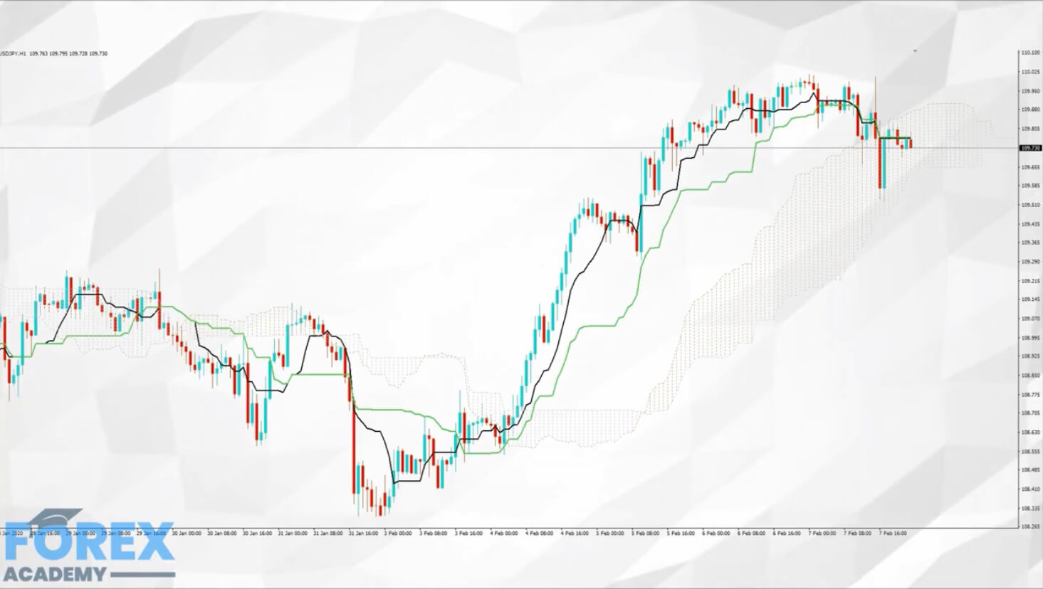
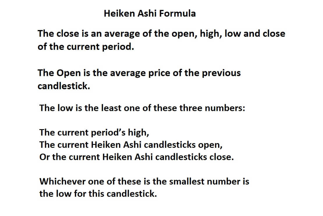
The close is an average of the open, high, low, and close of the current period. The Open is the average price of the previous candlestick.

The low is the least one of these three numbers: the current period’s high, the current Heiken Ashi candlesticks open, or the current Heiken Ashi candlesticks close. Whichever one of these is the smallest number is the low for this candlestick.
As traders, we can use the tool to show us more clearly when to hold on to a trade while also identifying when a trend may have run its course and thus showing us when to exit a trade.
As most profits are gained when markets are trending, it is important to have any tool available to help us more clearly identify those trends and thus help us to maximize our profits.


Example A

Example A is a 5-minute chart of the USDCAD pair using only Japanese candlesticks and where price action appears to be quite choppy.

Example B

In example B, we have added the Heiken – Ashi indicator while setting up the colors of our bars to match those of our candlesticks. We can already see that there is a noticeable difference and where we previously might have expected some price action reversals, the Heiken Ashi averaged out some possible turns and would have kept us in the trade.
Let’s go back to Example A in case you missed them.

Example C

Now let’s revisit our Heiken Ashi chart one more time as per example C, where we can see three areas that filtered out the noise and would have kept us in those trades a little longer in order to bag extra pips.
So when we look for a smoother Identification in trends, the Heiken Ashi will definitely help us to filter out some of the noise associated with standard candlesticks. That’s because normal candlesticks tend to alternate color even if the price action is predominantly moving in one direction. However, Heiken Ashi trend to stay blue in up trends and red in downtrends, or depending on how you have your candle colors setup.

Example D

Anything that gives us an edge is welcomed, and a lot of traders prefer Heiken Ashi over Japanese candlesticks, especially when they are as effective in Example D at identifying overall trends, in this case, a sell-off of the USDCAD pair on a one hour chart showing a 700 pip sell-off.

Let’s take a look at some simple rules when trading Heiken Ashi:

Example E

1: Example E, Blue candles with no wicks to identify strong upward trends. These offer strong bullish signals, so let them run

Example F

2: Example F: Blue candles identify an uptrend; you might want to add to your bull position and close out short positions.

Example G

3: Example G, Candles with short bodies and long wicks show market indecision and possibilities for price action reversals. You might want to close your positions and wait for confirmation of a new trend direction.


Example H

4: Example H, Red candles identify a downward trend. You might want to look for opportunities to add to your short position. And exit long positions.

Example I

5: Example I, Red candlesticks with no wick signify strong downward price action. You might want to exit your long trades and add to your short positions as price action moves lower. And stay in the trade until there is an indication of price action reversals.
Therefore the Heiken Ashi can be a great technical tool in your armory.

Categories
Forex Videos

We Told You So! Forex Black Swan Event – what Happens Next!

The Convid-19 Pandemic Black Swan Event

We hate to say I told you so, but we pretty much called this crisis out back in January, in our article about How to guard your financial assets against the Coronavirus Outbreak.
Those who heeded our warnings had a great opportunity to convert equities to cash, while stocks were at an all-time high, which would have safeguarded them against the biggest equities crash in market history. Other aspects pertaining to the crisis have been largely fluid, with the possibility of a virus outbreak in Japan, initially, USDJPY pair went to bid, targeting the 112.00 handle, and when that did not happen the yen currency reverted back to being a safe haven. And where just a day ago the pair found support at 110.0, it is now tumbling and currently trading at 108 70.


Similarly, the rhetoric from the Swiss National Bank that they were happy with negative interest rates and ready to intervene in the markets in support of a weaker Swiss franc, which has been ignored by the markets, while the USDCHF pair has moved lower and is currently training at 0.9650, flying in the face of the SNB’s threats.
Yesterday also saw the biggest daily move in almost seven months in an otherwise subdued performance of the EURUSD pair, which pushed 125 pips higher and where it hit a high of 1.1050. Amazing, bearing in mind that only yesterday, the German health minister warned of a high probability of the Convid-19 virus causing an epidemic in Germany.


This has led to the dollar coming off its highs above 99.00 on the dollar index to below 98.00 currently, while the market price in a 0.5% interest rate cut at next month’s Federal Reserve meeting. And of course, the possibility of supply chains being affected by the virus outbreak, and signs that the problem may cause more damage to the US and indeed the global economy than was previously predicted.

None of this has been helped by the fact that US equities, until last week, were at record highs, and one wonders why that was the case, especially as the levels were not supported by traditionally more modest earnings to value calculations. And the fact that the world may well have been fed false information from the Chinese Government regarding the contagiousness of the virus in the early days, and that they would get it under control. The proverbial stuff really hit the fan when the virus took hold in South Korea, Hong Kong, and Italy, and when that started to affect airlines, who restricted flight destinations and whose stocks suffered immediately, then the second contagion set in market panic selling.
So where do we go from here? The markets are going to be incredibly data-sensitive, and will also be focusing heavily on policymakers’ decisions with regard to what financial tools they will implement in the event of further escalation of the crisis. Overall, we expect further toing and froing of the dollar index, further flight to safe assets, including precious metals such as gold, yen, and Swiss franc. And further weakness in the Canadian loonie, which recently found resistance at 1:33 against the dollar, but which has now punched well above 1.34 area as oil prices continue to fall.


Cable is capped at the 1:3000 level due to its spat with the European Union and the continuing risk that it may not be able to complete a trade deal by December 2020, leaving the possibility of WTO trading rules needed to be applied and the obvious disarray confusion and the likelihood of a damaging fall out between the two sides. We expect the pair to find support at 1.2750.
AUDUSD and NZDUSD both remain southbound; such is their dependence on exporting to China.

Looking forward, canny traders and investors will be waiting on the sidelines for the virus to abate, supply Lines reinstated, and positive market data before confidently coming back into the equities space on a buying spree.
Until then, expect more market volatility, and thankfully, fewer tweets from President Trump, who has been noticeably quiet this week.

Categories
Forex Videos

Break The Brokers & Conquer The Forex Market By Trading Triangles!

Triangle Formations

Triangle formations are another key tool used by technical traders to gauge potential price action moves based on triangle patterns that form on their charts.

Such patterns regularly occur and where traders will draw the patterns on their screens themselves rather than using a technical tool to do the job for them. The triangles can then be used areas of support and resistance around these triangle formations in order to trade from.
So what is a triangle, or wedge as it is sometimes referred to as? It literally is what appears to be a triangle based on price action, where traders will identify these areas by drawing lines onto their screen charts, such as in example A.

Example A

Here we can see a low point and a high point, as marked on the chart, and where are we have drawn two lines which act as resistance and support, the rules of which require that price action must touch both lines on at least on two occasions, which they do at positions 1 and 2.3 and 4, and where price action goes through a period of consolidation and becomes wedged to a point that it must eventually break from, either lower or break higher. In this situation It breaks higher from the triangle, and where the previous area of resistance at its furthermost point goes on to become an area of support, from where bulls come in and drive price higher.

Example B


Example B is an ascending triangle formation. It offers bullish setups and where the main characteristics are price action moving higher, with a flat top, which is confirmed by at least two attempts of price action to move higher than the area of resistance. Here we can see that the price action trend is higher and where price action is largely following our support line until price action flattens off and where we see resistance forming at the furthest most point of the wedge. Traders will be looking for a break higher or a break lower from the wedge. In this situation, we have a break higher and a continuation with the overall upward trend.


Example C


Example C is a descending triangle. This shape offers bearish setups. Again we have at least two confirmed attempts to breach the area of support and at least two attempts to move higher than our area of resistance and where the overall trend is moving lower until price action eventually breaks lower from the furthermost point of our triangle shape.
Other shapes in this category include falling or descending wedge formations, where price action is contained within two narrowing lines and is identified by lower highs and lower lows such as, in example D.

Example D


Also, a rising or ascending wedge, where price action again is contained in two narrowing lines, but this time identified by higher highs and higher lows, such as in example E.

Example E


In both wedge-shapes, traders will be looking for a break out as the lines narrow and where the breaks usually prove to be good entry points for trading the opposite direction as the previous trends run out of steam.


Example F


Slightly more complex are the symmetrical triangle shapes as in example F, and where we would identify lower tops and higher bottoms with an almost flag-like appearance, and where we can see our confirmed area of support and resistance is breached and where price action eventually moves lower and where our initial area of support becomes an area of resistance.

We would usually look for our initial breakout from the first area of price action to reach the peak of the initial high. However, the shape is considered neutral with no real particular bias.
The next shape is a bullish Pennant and is defined by an initial upward trend with a triangle shape based on a slightly ascending support line with a confirmed area of resistance with lower highs and where we would expect a breach higher from this triangle shape formation such as in example G.


Example G


Our final shape in this series is the expanding wedge, which, as the name would suggest, is an area of price action that expands as it moves forward, as in example H. This might typically occur as extra volume enters the market after a period of tight consolidation.


Example H

Categories
Forex Videos

Forex Hedging Explained! Another Tool To Your Armoury!

Hedging

You have no doubt heard the phrase hedging your bets. So what does it mean in financial trading and how can it be applied? The basic principle of hedging your bets In financial trading is to reduce the risk of loss on a trade by counterbalancing the risk of loss by introducing a second or third trade in some way in order to offset risk. There are several ways that traders use hedging strategies to reduce risk.


In the vast majority of cases hedging is used by institutional size traders who have large portfolios and will quickly move in and out of an asset, dependent on risk, and on risk off factors, or they will offset some of the risk by hedging strategies. In current market conditions there has been until very recently Direct correlation between the the USDJPY pair, and the DOW 30, and where the USDJPY has been acting as somewhat of a barometer in the COVID-19 outbreak. So here we would find that when the pair is moving higher this will have been reflected in the DOW 30, and vice versa. In which case to offset risk some institutions might reduce the size of their investment in one of these assets and take a position in the other to reflect their risk appetite. This could be trading in the same direction, ie going long on both, or even going short on one, and long on the other. It is all about their perceived risk.


Another strategy would be where a swing trader had a medium term view of the u.s. dollar index or DXY, where they might be looking for a target of 100.00 and rather than just going short on GBPUSD they would prefer to hedge their bets by going short on two or three pairs, such as GBPUSD, EURUSD and then perhaps a long position such as buying USDCAD. All of these trades would favour a long position on the USD, and where a trader would not necessarily require all three to be in profit in order to make this an overall winning trade.

But a direct hedging strategy on a single pair yeah where is an entirely different strategy and is usually taken on by Traders with larger size portfolios, who prefer their drawdown or how much they are losing on their profit and loss, or who like to be liquid in a trade which means being long and short simultaneously on a trade which usually favours volatile markets.


Example A


Let’s look at example A, where such a strategy might be implemented. This setup applies to any currency pair. At position A and B on our charts, we have have a defined area of consolidation which is confirmed by at least two points of price rejection along the line at position A, which can be confirmed as a level of resistance, and at least two point of rejection at position B, which can then be qualified as a support line.

In this example, the pair has broken out of the range at position C, and where traders will have started going short. Now, as we know, price action does not move in a straight line, we see periods of pullbacks and further consolidations in the majority of trades. But in this example, traders will have gone short at position C and where he/she has an exit target at position X.
Knowing that will be pullbacks, some traders who like to adopt a hedging strategy might go long at position 1, 2 and 3 to to make some money on the pull backs, and if they are right they can get out before the price continues lower, and we’re at the very least if price action returns to the previous high they will have a net profit position which they can close out.
If price action does continue in the vein that we have described they will get subsequent profit from other pull backs. As a contingency they can set very tight stop losses on their long trades, even bringing their stop losses in front of their entry, which is allowed on some platforms – such as the Metatrader MT4, thus

making their long trade completely risk-free.
Traders will also go long and short at the same time on a pair during times of news and data releases. And even overnight. Although then swap rates begin to kick in and tend to work in the favour of the broker’s who set the fees for overnight lending.

Therefore, unless your trading is pinpoint accurate and you are extremely confident with your entry and exit points, hedging can complicate your trading, but if you have developed a system of accurate entry and exit points, with tight stop loss implementation, hedging strategies can be a great way of reducing risk of loss and maximizing profits.

Categories
Forex Daily Topic Forex Videos

Forex Black Swan Event Update! What Should You Be Trading & Avoiding

Black Swan event update!

If you missed our earlier article, a financial black swan event is usually a catastrophic event such as the Japanese earthquake and tsunami of March 2011, or virus breakout events such as the Sars epidemic in 2002/2003, Avian flu, or the Ebola breakout in West Africa in February 2014.
These events cannot be predicted and have the risk of severe consequences for the global economy. Black swan events are thankfully rare and have a severe market impact. They are also almost impossible to predict.


The latest COVID-19 breakout in China could turn out to be a major black swan event, with severe implications for the global economy.
While previous black swan events such as the 2003-2004 Sars epidemic wiped 14% off of the S&P 500 in as little as two months, it subsequently went on to recover its losses and gained from there. The avian flu crisis in 2006, the Ebola crisis in March 2014, both had similar effects, where the S&P slumped at the time only to recover and thrive after the events. It would, therefore, seem that stock indices, especially in the USA, such as the S&P 500 and DOW 30, have taken that onboard and, as yet, have suffered no real sustained selling pressure. And although both have recently hit record-breaking all-time highs, we might expect normal ebbing and flowing based on US fundamentals until the real global impact of the COVID- 19 can be seen in terms of hard data. And that won’t be available for several weeks. History tells us that the markets are prone to short jolts during such events, but they go on to recover, and in many cases, make further gains than were lost.
Another fairly typical scenario would be for investors and traders to bail out of riskier assets, such as equities, but that isn’t happening in the USA at the moment. And where safe-haven assets such as the Yen or Swiss Franc currencies get bought.


However, when the Japanese health expert who visited the Diamond Princess at the port in Yokohama said the situation on board was “completely chaotic” it left the market wondering if there could be an outbreak of the disease in mainland Japan, who earlier in the week said the virus could impact their GDP by 0.2%. This, coupled with weak data and the possibility of a spread of the infection in Japan, saw the USDJPY pair punch through the psychological 110.00 barrier this week. Should there be a breakout, it will prove catastrophic for the Japanese economy and where we might see the pair accelerate to 115.00 and beyond.


With the Yen failing to act as a safe haven we might see a continuation higher in USDCHF, where the Swiss National Bank has made it clear they are not happy with a strong Franc, and they will defend this stance by intervention, in which case we might see a return to the 0.1000.00 level.

The pound and Euro have their own problems with uncertainty regarding if the UK can reach a trade deal by the deadline of December 2020 and where the economic data coming from the Euro area looks bleak and where Germany is struggling to achieve growth. The COVID-19 virus will not help.


The Australian dollar is also on the back foot due to its dependence on trade with China as with New Zealand, and we might see AUDUSD hit 0.63 and NZDUSD test 0.60 in the short term if there is no immediate resolution in China, which looks highly unlikely.

Oil prices are at risk, and we would expect gold and precious metals to remain bid.
The Chinese government has committed to honoring the trade pact with the rest of their partners across the globe, but the longer this goes on, the more likely the markets will doubt if this is possible.

And so while the US economy remains strong and while economically and geographically it remains on peripheries of the virus event, and with its higher interest rates than the other safe-haven currencies, we should now see a further surge in the USD DXY which is approaching the psychological 100.00 level and which is now being seen by the markets as a safe haven currency and preferred investment choice.
Therefore, all scenarios are strictly data dependant and likely to be fluid and volatile as things unfold.

Categories
Forex Videos

Master Forex By Trading Double Tops and Double Bottoms

Double Tops and Double Bottoms

In mastering technical analysis, one of the key pattern formations is the double top and double bottom, and it is essential that you understand what this is, and that you develop your skills for identifying it, and implementing it in your trading because these patterns will recur time after time. It will provide you with invaluable information when it comes to trading around it.
Double tops and double bottoms will enhance your trading by showing you where potential reversals in price action may occur, whether or not they form the basis of technical support and resistance levels.


Example A


So what exactly is a double top? Let’s take a look at example A, which is a 5-minute chart of the GBPUSD and where only price action is shown on the chart.


Example B


Now, let’s drill down a little further on this chart as per example B, pair and where we have a high at position A and where we have had a pullback, followed by another push higher at position B, and where the price action stopped at the same level as position A, before selling off again.
So what is the rationale behind this double top? Traders read their charts from left to right, because they tell a story of how price action is unfolding as time goes on. Firstly we have the area of support which has seen price action fails to go lower on at least two occasions, which will have been observed by traders, and where price action moved higher from this line, and then ran out of steam at position A, before retreating, and whereby traders would again keenly observes the area of support and therefore started to close out their short positions when price failed to breach the support line while expecting a reversal. This does indeed happen and where we see price action move up to position B, and where traders would have noted the reversal at position A, and used that as a possible area of resistance, and therefore exited their long trades when price failed to move higher than position A, and thus leaving a double top formation.


Example C


In example C, we have the reverse, which is a double bottom formation, where we can see that price has failed to breach the resistance line at positions 1 2 and 3, before moving lower to position A, and where price action failed to move any lower and where it reversed before failing to reach the resistance line, and then has a second attempt to move lower to the support line at position B. Thus forming a double bottom formation.

Incidentally, we can see that eventually, price action does move higher and breaches the line of resistance at position 4, which then becomes a line of support for future price action.

Categories
Forex Videos

Master Forex By Trading Pin Bar Candlestick Formations

Pin Bar Candlestick Formations

Traders can potentially use price action alone to trade without the need to rely on other indicators. When doing this, they rely on Japanese candlestick patterns and formations, and one such pattern is the pin bar formation, which we will look at in great detail in this presentation. Traders try to identify reversal patterns, and pin bars are high on their list because they offer a high probability of success, and especially in volatile market conditions.

Example A


Example A is what you would expect to see when looking for bullish or bearish pin bar formations. The formation is dependent on one single candlestick, and will typically be larger than its immediate preceding candlesticks and represents a rejection of a move, followed by a sharp reversal. The pin bar reversal, as it is sometimes referred to, consists of a short body and a wick, or tail, which is at least three times the length of the body, thus making them easy to identify. The area of the pin bar’s wick defines the area of price action that was rejected. Traders would read the formation as identifying a reversal in price action and a continuation in the direction of the wick.


Example B


Example B looks at these shapes more closely and identifies the expected move of any subsequent price action.


Example C


Example C shows a bullish pin bar trading strategy in action on a real chart of the USDCAD pair on a 4-hour chart. Here we can see a bullish reversal pin bar at position A. The reason that we can be fairly confident that this is a potential set up to move higher is because we can see that the previous candlesticks have found a support area as defined by our line and where candlestick A has gone down and touched that support area, only for the majority of the price action to be reversed. Had we decided to take this trade on, we would have placed a stop loss just below the support line, and we can see that on this occasion, we would have been nicely rewarded with a push higher in price action.


Example D


In example D, we can see a bearish pin bar set up on the same pair at a later date. The pair has witnessed a move higher and where at candlestick A we can easily identify a bearish pin bar setup. The subsequent candlestick moves lower, and this enforces our belief that we are going to get a reversal in price action and that indeed happens. Had we taken on this trade and placed a fairly tight stop loss, we would have been nicely rewarded again.

A word of caution, trading pin bars is essentially gambling that price action will reverse in the opposite direction of which might have been a trend, and which is therefore almost counterintuitive. Trading pin bars might be a result of many factors including economic data releases, price action hitting key levels of support and resistance, or simply running out of steam, newsflow, policymaker speeches, or other unexpected events, and therefore we do not recommend that new traders use these setups to trade unless they are experienced.
However, pin bars can also offer a warning of when to exit a trade, rather than necessarily looking at it as an opportunity to trade in the opposite direction.

Categories
Forex Videos

Convid 19 – USDJPY Acting As A Barometer To Sentiment – What Happens Next In Forex!


Convid-19 USDJPY acting as a barometer to sentiment

The coronavirus, or to give it its technical name, Convid-19, is dominating the financial markets, which are broadly holding their nerves and apart from a few jitters, overall remaining steady at the moment. And this is because of a lack of information regarding the true economic impact of this breakout. This can only be analysed with data, and because we are in the early stages, there is no clearly defined economic basis to say how this has or will affect the global economy. In the past, events such as the Avian flu, Ebola, and Sars have all caused losses on global equities and where safe-haven currencies such as the Yen, and Swiss franc have been bought along with gold and precious metals and where oil has been sold off due to perceived risk to a global economic slowdown and flight to invest in less riskier assets.


But the markets have learned that on each of these occasions, the markets have subsequently turned around and rallied at some point close to, or after the event has passed. Although China now is a much greater power than at any time of these previous events and has a significantly higher percentage in terms of global gross domestic product which is estimated at nearly 20%, the Chinese government has said that it believes that the economic impact of the virus will be short-lived and that it will meet its trading obligations with its global partners.
While this has pacified the markets to a certain extent, one wonders about the reality of this virus which seems not to be coming under control as quickly as the Chinese government led us to believe, and where some analysts wonder if indeed the West has been given a true picture of what is going on in mainland China regarding the outbreak and the true extent of those infected and dying. And of course, if it does turn into a pandemic, the above sentiments will change in a heartbeat.

Until such time as the true economic statistics have been released by the Chinese government, the markets will be driven by snippets of information being released on daily statistics from China of those infected and dying and the number of incidences outside of China, and more importantly should any such incidents begin to spread in other countries will be of the utmost interest.
In order to trade cautiously at these times, and especially for those traders who may not have access to real-time news release information from entities such as Reuters or Bloomberg, One way to try and gauge their sentiments of the markets is to to keep a close watch on USDJPY pair, which has been acting a somewhat of a perimeter two news releases surrounding this event. Any sell-off in the spare air or short spikes either indirection will most likely be on the basis of a news of events regarding the virus and where traders and then go fishing to find out what that information is.

Example A


Let’s take a look at a couple of examples. First of all example A, is a 1-hour chart of the pair.


Example B


If we drill down in more detail at this chart as in example B, we can see that the Yen was losing ground against the dollar on the 4th of February at position 1 our charts, and this was because the Chinese government said it had the virus under control and that it would meet its trade obligations and that the impact to its growth would be minimal and short-lived, and market sentiment became more positive and drove price action up to a key area of 110.00.
However, jitters ensued as the virus continued to give bad news with cases breaking out in other countries, and the Yen became a safe haven currency again as the market moved from position A to position B, as the sentiment is again reversed. And by the 10th of February price action moves up again to test the 110.00 key area before spiking above it at position C,

However, the sentiment which drove the pair up initially during our uptrend at position 1 is reversed buy a hammer blow at position 2, when the market learnt of a massive increase in the number of deaths overnight on the 12th February, which amounted to 250 people, and which sent the pair back to position D. This A B C D formation confirms consolidation and with A and C acting as an area of resistance at the key 110.00 level, and where the B and D confirms a support line.

The move to position one coincides with improved sentiment around the crisis, whereas the move lower, from position 2, coincides with negative sentiment, and where at position 3, the price action has become muted and has not returned to the top line of resistance, which would strongly indicate the high probability of negative sentiment and the likelihood of a move lower to retest the support line and beyond as mood sentiment becomes soured.

Categories
Forex Videos

Make Money In Forex Using The Ichimoku Cloud indicator!

Simplifying the Ichimoku Cloud indicator for trading the Japanese Yen

The Ichimoku Cloud technical indicator was developed by Goichi Hosoda, a Japanese journalist, in the late 1960s. It is favoured by Japanese traders who use it to predict areas of support and resistance and it also shows momentum. It produces its data on historical price action and is therefore considered to be a lagging indicator.

All types of traders use the indicator for various currency pairs, however it is predominantly used for trading the yen. The Ichimoku Cloud is composed of 5 lines of calculations and where clouds form on charts along with moving averages and lines showing momentum.
The basic principle is that if price action is going on underneath the bottom section of the cloud, it is confirming an area of resistance is above and that a downtrend is likely or happening and if price action is going on above the top section of the cloud it is confirming that the cloud is supporting price action, or that an uptrend is in progress. Another key feature of the cloud is that it should ideal be moving in the direction of the trade that you wish to take.

Example A


Example A, is the cloud component only on a 1-hour chart of the USDJPY pair. We can see various clouds forming on the chart in areas 1, 2, 3 and 4.

Example B


Example B shows us that if we were trading this chart and waited patiently for the above methodology to kick in we have a downwards move on the cloud at position ‘A’ which is followed by subsequent price action to the downside producing 65 pips.
While later on, at position B we have an upward moving cloud and where price action is supported by this set up producing 62 pips. This is simply using the cloud only component of the indicator.

Example C


In example C we have added the moving average components and we are looking for the price action to be above the black MA, and where the black MA is above the green MA, and where our cloud must be ascending to support our buy side trade. Or we need price action to be underneath the the green moving average and where the green MA is below the black MA, and supported by a descending cloud to support our sell-side trade. It is important to note that the calculations for the MA’s in this chart are calculated differently than the usual simple moving averages. The cloud MA’s are based on highs and lows over a period, and then divided by two.

In order to keep things as simple as possible, we have elected not to use the final momentum part of the indicator, because it throws up an awful lot of noise on the chart. One of the biggest criticisms of this indicator is that there are too many components on the chart, thus making it difficult to read. The best way to identify trend is by analysing the shape and size of each candlestick. The larger the candlestick, the greater the momentum.
It is also important to point out that if the indicator is predominantly use for trading the yen currency and we would suggest that you stick to this if you decide to use the indicator because at the very least it shows you you what other yen traders are looking at on their charts. And the bottom line is we want to be trading the same way as the big guns in order to be successful.

Categories
Forex Videos

How To Make Profit Using The Box Trading Strategy – 144 Pips Made!

Simplified trading using boxes produces 144 pips

One of the biggest areas where new traders fall down is because they overload their screen charts with too many indicators. Many professional and institutional size traders will often use price action only to trade. Or may supplement their charts with a minimal amount of indicators, while many prefer draw lines in order to calculate areas where price action has consolidated into a sideways movement. They can then trade where the breakout will occur.

Example A


Example A is a one hour chart of the USDJPY pair, with only price action in the form of Japanese candlesticks. Blue for bullish, or up, and red for bearish, or down. On the face of it, although there seems to be a general bias to the downside, it would be fairly difficult to pinpoint where to enter as the hours roll by.
In order to confirm consolidation or sideways trading, a simple rule applies: price action must have touched at least two areas of resistance and at least two areas of support.
Traders will confirm this on the charts by simply adding a couple of horizontal lines, once they have identified this consolidation, as per the price action. They will then make the necessary trading decision based on the information they see.


Example B


Now let’s look at example B, we always read our charts from left to right, because they tell us a story, and at the beginning of the session in question we can see that at position A, we have a confined area of resistance and support, where we can see that both lines have been touched by price action on at least two occasions. In the example, we have closed off the end of the parallel lines, and thus, we can now identify this area as a box, And where we can see that at position price action punches through the support area, and traders will have gone short at this position.

Example C


If we move on during the course of the training session, we can identify another two boxes, in example C, firstly at position B, and then position C, we’re both have the minimum requirements of 2 touches of the support and resistance lines.

Example D


In example D, we can drill down a little bit more and identify that this pair is consolidating at position A, and then taking a move lower, then consolidating again at position B, before taking another step lower and then consolidating again at position C, and where traders will have picked up on the bias to the downside, and traded accordingly at breaks in the support lines.


Example E


Finally, in example E, let’s take a closer look at the false breakout to the downside at position X. There will always be times when traders are wondering if the market has topped or bottoms out, and this will cause breakouts from our boxes to be quickly reversed, and this happens at position X where we see a break of the support line and where the selling action has run out of steam, and the buyers have come in and reversed price action back into box C. However the move lover still produced 18 pips to the downside on this occasion, which is not an unreasonable amount.

But importantly, price action does not continue up to the area of resistance and begins stalls at position Y, before fading back to the support line and where the second breach at position Z is much more enhanced and producers 45 pips to the downside before price action looks to form the basis of another consolidation period.
The total move lower, just by using this simplified box trading, produced a total of 144 pips.

Categories
Forex Videos

Forex – How To Trade The USDJPY Right Now

What on earth is going on with the USDJPY pair and how to trade it?

The USDJPY pair is one of the most volatile major currency pairs. In the last 12-months, we have seen highs of 112.40 to lows of 105.00 and where current price action has become volatile, difficult to predict and therefore difficult to trade. Or has it?


Let’s look at a naked 15-minute chart of this pair, with only price action on our chart, as in example A. On the face of this, it seems exceptionally volatile, unpredictable, with wild swings and where no particular directional bias is evident. This is a typical time frame for an institutional trader to use when trading this pair..


Let’s drill down a little further and try and analyze what is really going on with this pair. In example B, we have broken down the trading exchange rate from the 5th to the 7th of February 2020, which includes two days of trading in the European and American sessions, which is where you would expect to see the most volume going through.

In section A, we can see the overall price action has been using the 1.10 as an area of resistance, while price action it was confined in a 23 pip sidewards moving consolidation period.
We can then see a drop in the form of a spike lower, in area B, which has a range of 20 pips, before price action is again pushed up into area C, and trades into a narrow range of only 14 pips.

Area B’s spike is attributed to the release of the US non-farm payrolls, which had an upbeat 225,000 jobs added to the US labor force, which caused some initial strength in the US dollar before price action consolidates in area C.
But the real elephant in the room with regard to this pair, and the reason for the spikes higher and lower, can be attributed to news flow, including rumors and speculation around the Coronavirus epidemic. The Japanese Yen is favored as a currency that gets bought in uncertain times due to its safe-haven reputation, and it is therefore very sensitive to any information, real or rumors, which are prevalent in the market at this time. The pair also runs in correlation with us stock indices, and as long as the virus situation continues, we can expect spikes in both directions during news alerts, and potential yen strength should be situation worsen.

Therefore trading this pair should take into account the sentiment around the virus crisis, and bias could form for further downside. And due to the extreme volatility and huge swings in the pair over the last 12- months, it should be treated with the utmost care while using tight stop losses.

Categories
Forex Videos

Forex – How To Trade The EURUSD Pair Right Now!

What on earth is going on with the EURUSD pair and how to trade it!

In 2011 the EURUSD was way ahead of other currency pairs being traded in the Forex market and was traded with almost 50% more in volume than that of the USDJPY and GBPUSD combined.
Indeed it was only a couple of years ago that you might expect the daily swing in the EURUSD pair to be well over 100 pips per day. And yet, in recent months, we have seen the daily price action of the pair restricted to around 25-30 pips on many occasions during the European and American trading sessions, when its volumes are at their peak.

Example A


Let’s take a quick look at example A which is a 15-minute time frame of the pair, where the two vertical lines indicate where the majority of the volume will have been traded. This time frame is a fairly typical choice for an institutional trader to use. So let’s take a more detailed look at what is going on in example B.

Example B


From the 5th of February 2020 through to the 7th, which contains two complete trading days, we can see that the total amount of pips traded is just 61, giving us our average of 30.5 pips per day. In terms of volume, it is almost nothing.


Example C


Let’s drill down further, in example C, to try and define what is going on. We have broken the time period down into three sections. Firstly, in section A we can see that where was sidewards trading, which was consolidating and restricted to only 21 pips and where price action was fluctuating very tightly around the key 1.10 exchange level.

Finally, traders threw in the towel with regard to expectations that the key 1.10 level would act as an area of support, and price action then falls lower to area B, again where it consolidates into a restrictive range of only 19 pips.
Again price action moves lower initially in area C, but again we see a fairly restrictive price action of only 33 pips including the most volatile session in the middle of this area which is associated with the release of the US nonfarm payrolls, and where the much better than expected 225,000 jobs were added to the labor force, and where previously one might have expected dollar strength to move this pair 100 pips to the downside with such a number, but it was relatively unaffected.

So what is happening, and how can we trade this pair? First and foremost, it was only a couple of months ago that big institutional players were suggesting that this pair could be heading for the 1.15 level, such is the belief in the strength of the Euro. Obviously, that has not happened, and this is largely due to a weakness in the Euro area and which is particularly affecting growth in the German economy, which some say is in borderline recession, and where the German economy is pretty much the backbone of the European Union.

We also have fallout from Great Britain formally leaving the European Union and where uncertainty will prevail with the European model, due to losing income from the UK and whereby no formal trade agreements have yet been set in place and where the restrictive timeline to implement this leaves many wondering whether it is achievable by the end of December 2020.
The Coronavirus is also keeping worries with regard to a potential contraction in growth and all of this can

only mean one thing the big institutional players are uncertain with regard to directional bias for this pair in the short to medium-term and are pretty much standing on the sidelines waiting for clear evidence of where the Euro is heading.
Therefore, should you be standing on the sidelines as well? This pretty much depends on your flavor for risk. You might be better off looking at other major currencies such as the USDJPY, the GBPUSD, if you want volatility. But if you want to trade the EURUSD pair, we suggest that you use simple add price action boxes such as we have drawn onto our charts and look for breakouts when they occur, or simply drop down to a lower time frame such as the 5-minutes chart in order to scalp the pair to try and make a few pips here and there throughout the day.

Categories
Forex Videos

Forex Black Swan! Look Out For The Signs Before It’s To Late!

Are we about to become embroiled in a Black Swan event?

A financial black swan event is usually a catastrophic event such as the Japanese earthquake and tsunami of March 2011, or events such as disease breakout, such as the Sars epidemic in 2002/2003, Avian flu, or the Ebola breakout in West Africa in February 2014, none of which can not be predicted, and which have potentially severe consequences for the global economy. Black swan events are characterized by their extreme rarity, and severe impact, and the overall failure of analysts to predict them.


But of course, we are now in the midst of the Coronavirus, or COVID-19 to use its formal name, and there is chatter going around that this could turn out to be a major black swan event, which could severely impact the global economy.
During the 2003-2004 Sars epidemic, the S&P tumbled 14% over the span of 2 months from mid-January to mid-March. While all of this was recovered in the subsequent two months. The avian flu crisis in 2006 wiped 11.66% off of the S&P 500, and again this was shortly recovered. The Ebola crisis in March 2014 saw a 5.33% knocked off the S&P 500, and again this was also shortly recovered after the epidemic.
And so history tells us that the markets are prone to short jolts during such events, but they go on to recover, and in many cases make further gains than were lost.


This leads us to the Coronavirus, which began in January 2020, and no sooner had the ink dried on the China and US phase 1 trade deal. Initially, there was a spike lower in global equities when the virus began to take hold, and where typically safe-haven currencies such as Yen and the Swiss franc were bought along with gold, and where oil was sold off due to a possible economic slowdown, as traders opted for risk-off.
However, traders have returned to the Equity markets, where the Dow Jones and other US indices have surged to record highs. They seemed to have shrugged this event off, or are looking at the long term picture. And while the yen is acting as somewhat of a barometer when good or bad news is coming out of China, the Swiss franc has generally been sold off, while the US dollar is surging in strength, such is the strength of the US economy.
While this particular virus still has many unknown aspects to it, and where any potential cure could be over a year away, we find ourselves in a situation where no economic data is yet available to confirm the impact of this virus on the Chinese economy and where nearly 20% of this makes up for global gross domestic product.


Also, the Chinese government has committed to honoring the trade pact with the rest of their partners across the globe, and where they tell us that their gross domestic product will only be very marginally affected, and they remain extremely proactive in trying to control the virus. All of this and where the US economy is much stronger than the previous epidemics, and where the Fed’s members maintain that any impact to the US economy would be restricted to around 0.3%, we can only determine that at the moment there is not enough information to cause a black Swan event. But we will look at this again in part 2 as things progress.

Categories
Forex Videos

How To Win More Forex Trades – Synchronised Indicators!

Synchronized indicators equal more winning trades

A little bit of care and patience will enhance your trading. One area where new traders fall down is because they have a system, but do not stick to it. And one of the most common traits is using indicators in a haphazard way, so as to set up a trade to fail.

Example 1

Let’s look at example 1, which is a one hour chart of the USDJPY pair for some examples. In this chart, we are using two commonly used indicators, the stochastic oscillator, and the moving average convergence and divergence or MACD indicator.
For a brief recap, the stochastic indicator tells us when an asset is overbought when the two moving averages cross above the 80 level and when they move beneath the 20 level the acid is considered to be oversold.
The MACD uses one or two moving averages – in our case we are using one, and when the MA is moving from a low and subsequently rising towards and then through and above the 0-axis it is considered to indicate that an asset should be moving higher, and especially if it is supported by and almost mirroring the histogram, which is the second component of the MACD the. The opposite action applies to a descending asset.


At position A, we have drawn a vertical line, which shows us that the stochastic is suggesting that this pair is overbought and due for a move lower. However, the MACD is moving higher and thus not working in unison with the Stochastic, and where the MACD’s moving average is going up above the 0-axis and the histogram is following suit, having come from underneath, to move above the 0-axis also. In this scenario price action has ignored the stochastic and moved higher. Here our indicators are at odds with each other. Selling this pair based only on the stochastic indicator would have resulted in a losing trade.


At position B, the stochastic is moving up, having been below the 20-line and on this occasion the MACD histogram is moving underneath its 0-axis and now higher, having pierced through its moving average, which is an indication that divergence is occurring and indeed the price action does move higher from this point. Here our indicators are synchronized, and the pay off is that buying the pair based on both of these indicators would have been rewarded with a positive winning outcome.
Position C, is similar to position A, in that our stochastic he is suggesting that the pair is overbought and due for a move lower and where the MACD histogram is starting move higher, quickly followed by the MA, and had we gone short at this point we would have entered a losing trade.
At position D, our stochastic is showing that the pair is oversold, and our Macd is showing that the pair is due to fall lower and where we see a slight move lower in price action, before a reversal. Again we have seen mixed messages from our indicators, and where we can see from our charts that when our indicators are working on a synchronized basis, they throw up more winning trades than losers.

Be patient and wait for your chart indicators to be synchronized and keep an eye on the price action, which is the most important indicator of all, and where all of your indicators are working together only then should you be thinking about pulling the trigger on a trade.

Categories
Forex Videos

Why You Will Never Make Money In Forex! Hard Facts!

What is it that successful traders have, that 75% of retail traders do not?

Regulated forex brokers are now required to advertise the percentage of losing accounts, and where this information can usually be found at the bottom of the broker’s website landing page.
If you have the time to flick through a few of these, you will notice that the average amount of retail traders who lose their funds trading CFDs or spread betting runs at well over 70%. So just what are these people doing wrong?
Well, there is no single formula for success in trading Forex, but most new traders do not appreciate that there is a steep learning curve before one can jump in and start trading. Many of them will see a couple of videos on YouTube about trading and think that they are off to the races. When, in fact, trading in the financial markets requires great skill and knowledge.


There is an old adage that: failing to prepare is preparing to fail, and never has that been more true than in the forex market. But let’s say that you have learned about fundamental analysis and how economic factors can affect the value of a currency, and whereby economic data releases can also cause extreme exchange rate fluctuations and where you have done your homework and learned about some technical indicators, and yet you have hit a brick wall and are not trading successfully. What are the professional traders doing that you are not?
Professional Traders are rigid in their approach to trading. They will have developed a trading methodology, and they stick to it like glue. And this is one of the biggest mistakes that new traders fall into: they chop and change their routine, they do not have a designated methodology, developed through trial and error and use many different technical indicators and timeframes, and flit from one currency to another and even one asset class to another such as turning from Forex to stock indices and oil, etc.


It is essential that you choose a time frame to suit yourself and your lifestyle. If you have a busy life and are looking to trade Forex as a supplemental income, do you really want to be trading on a long-term timeframe, such as daily, weekly or monthly charts, where positions could run against you for weeks at a time and cause you stress, worry and sleepless nights? If you do not have a problem with this, fine. But if you are looking for quick in and out trades, on an intraday basis, then you need to be looking at a 5-minute or 15-minute timeframe and certainly no longer than an hourly chart.

And therefore, psychology really does play an important factor in your trading. This is another key area that new traders do not take into consideration when they start their journey into Forex.


Professional traders have discipline, where new traders tend to be eager and haphazard in their approach to trading. A professional trader will be patient and wait until the price action reaches an area that he or she has defined as being the correct level to instigate a trade in order to maximize their profits. Professional traders will have tested their methodology and tuned it to perfection and stick to it without deviation. Therefore, what new traders must do is to find a trading formula that works for them, having first tested it on a demo account. Because if you cannot make money there, you will not be able to make it on a real money account. Once your methodology is working consistently, only then should you consider risking your real money trading Forex.

But the number one key feature that professional traders use consistently is risk control, by implementing stop losses. And the number one feature where new retail
traders lose their money is because of poor risk control, and where a lack of stop losses will see account balances wiped out

Categories
Forex Videos

How to trade the Swizz Franc! A Ruthless Safe Haven…

How to trade the Swizz Franc

The Swizz Franc, known among traders as the Swissie, is one of the major currencies, with the USDCHF being the sixth most traded currency pair. It is considered to be a safe haven currency, where investors will often buy the currency in times of Risk-off, or market uncertainty. The Swiss National Bank decided to artificially peg the Franc at 1.20 against the Euro in 2011 because the Swizz policymakers wanted to stop the Franc from being too strong because it was hurting its exports.

However, in January 2015, the SNB suddenly severed this artificial cap, without fair notice, which sent shock waves through the market and where the Franc currency spiked in value and where the EURCHF plunged from the artificial cap of 1.20 to 0.85. Many investors, traders, and institutions were caught out, with the broker Alpari going bankrupt and where some traders had their accounts blown and where they went into negative equity due to this unprecedented move.

Since then, the currency has stabilized and where the USDCHF pair is nowadays less volatile compared to other currency pairs, and this, of course, makes it difficult to trade from a technical standpoint. Things that affect this pair are decisions by the US Federal Reserve and the Swiss National Bank and their respective gross domestic product estimates, unemployment data, industrial growth figures, and national debt.
Despite previous turmoil with the currency, the bottom line is that investors continue to see the Swiss Franc as a safe haven currency, and this is being born out in the markets at this time because of the Coronavirus epidemic.
And while the risk associated with trading this currency, from a historical standpoint, would be that the SMB has proven to be ruthless and unsympathetic when setting policy decisions and clearly they do not want a strong currency, nevertheless the markets have decided to heavily buy the Swiss Franc which is at a 16 month high at the moment, where the USDCHF pair decreased 0.0060 or 0.62% to 0.9634 on Friday, January 31 from 0.9694 in the previous trading session.

Example A


In example A, which is a daily chart of the USDCHF going back to April 2019, the pair has, for the majority of this period, been stuck in a sideways action after rejecting the high of 1.02 at position 1. This keeps in line with our notion that this pair has been fairly steady throughout this period. We can see clear support and resistance at position 3 and position 4. However, when we come to position 5, there is no bounce higher from the support line back up to the resistance line. We simply see price action fairly muted and then having a second attempt to pierce through the support line at position 6, which was short-lived. But the bullish candlestick and more convincing pierce of this support line at position 7 falls into line with our theory that the Swiss Franc is being bought as a safe haven currency at this time. And therefore, traders should be looking to this support line, subsequently becoming an area of resistance and with a possible continuation to the downside perhaps to 0.95.


Example B


Example B is a daily chart of the EURCHF pair. Having looked at the previous chart, it is fairly straightforward to see what is going on with this pair. We have an overriding move lower with the pair at position 1, and where a support line has subsequently become a resistance line, with sideways price action at position 2, and where at position 3, price action has continued its move lower and reached the support line, which temporarily became an area of resistance before being breached and then moved lower.

Therefore this chart backs up our beliefs that we should be looking for opportunities to buy the Swiss Franc in the short to medium term. Perhaps during pullbacks, because we do not want to be entering trades, for example, the two pairs in question, which under any other circumstances than the current coronavirus outbreak, might be considered to be oversold.

Categories
Forex Videos

How To Trade The New Zealand Dollar Right Now! Corona Virus Continued

How to trade the New Zealand Dollar

New Zealand’s gross domestic product is largely derived from its international exports of milk powder, butter, cheese, meat, edible offal, and lamb as well as sales of beef, logs, and wood, crude oil, cereals, flour, and starch. It has an extremely efficient agricultural system. Its exports rose 4.8 percent over the previous year to NZD 5544 million in December 2019, after rising 7.3 percent in November. Exports to China rose by +5.8 percent and now running at 18% of its total exports. And while it is not as exposed to the same level as Australia to the Coronavirus crisis in China, it is seen as a perceived risk to the market and where the NZDUSD decreased 0.0025 or 0.39% to 0.6463 on Friday, January 31 from 0.6488 in the previous trading. The New Zealand dollar is one of the six major currencies. So let’s take a look at a daily chart of the NZDUSD pair, and try and find some directional bias.

Example A


In example A, we can see that daily price action has been largely contained within the resistance and support lines as noted on the chart, however, when price action failed to reach the resistance line at position A, we see a pullback lower in the pair and where price action has pushed below the support line at position B or 0.64870, and where this push lower coincides with sentiment and risk pertaining to the outbreak of the Coronavirus. It is highly unlikely that this outbreak will be contained any time soon and where no vaccine has yet been made. And therefore, we can presume that price action will be driven down to the 0.640 key level, and if breached, we may see a continuation down to our support line at position C and which should be considered a target.

Example B


To try and backup our Theory, we now turn our attention to example B, which is a daily chart of the New Zealand dollar against the Japanese yen. We have a similar situation in this chance where price action has been contained within an overall level of resistance and to periods of support that go back to May 2019. we are more interested in the recent activity as defined by position a price action failed to reach the resistance line at 73.40 on two separate occasions. Recently we can see that the New Zealand dollar has fallen against the Japanese yen and breached the support line at position C, and wear this price action coincides with a weakening in the New Zealand dollar due to its dependence on exporting to China coupled with the fact that is being bought because of its safe-haven status. Traders should be looking for opportunities to short this pair on their preferred time frame and where a target should be sought at around position the which is the 66.8 one support line held previously.

Traders should be looking out for New Zealand building permits and employment figures, which will be carefully analyzed for directional bias, but the key event to consider will be how the market responds to the Chinese markets opening after an extended Lunar New Year closure. This coincides with the Wuhan coronavirus outbreak. Trade balance and PMIs are due to be released.

Categories
Forex Videos

How To Trade The Australian Dollar – Is It Time To Sell?

How to trade the Australian Dollar

The Australian Dollar is one of the six major currencies traded against the USD and is also popular with cross pairs, such as against the British pound, Euro and Yen.
So far this year, the Australian Dollar has been one of the worst-performing assets among major currencies. A combination of domestic weakness and other external factors such as, more recently, the Coronavirus in China has heavily impacted on this currency.

While Australia’s gross domestic product growth has been recovering since and a low point in 2018, the only expanded very moderately in 2019, the international monetary fund has lowered its forecast in 2020 from 2.8% to 2.3. This may be further impacted the longer the coronavirus goes on because Australia’s gross domestic product is heavily influenced by its commodities exports to China: its largest trading partner with 29.2% of total exports in 2018.

If the virus is contained quickly, Australia can fall back on its low unemployment rate, which has been steady around 5% and it’s housing market which has been turning around since a drop in 2018, and where the more recent upturn is supported by rising house prices.
The Royal Bank of Australia has been doubled in its stance and hinted at depot rate cuts growth remain subdued. It is possible that the Central Bank could roll out extraordinary policies including negative interest rates and large-scale quantitative easing in order to stimulate the economy.

Therefore, the overall sentiment against the Australian Dollar should be considered dovish.
Let’s look at a couple of charts to try and determine the short to the medium-term direction for this currency.

Example A


Example A is the daily chart for the AUSUSD pair. After a rally to the key resistance line of 0.70 in December, the pair has been on the back foot and has declined to a key area of support at 0.6880 at the time of writing. We predict that because there does not seem to be any improvements with the Coronavirus situation and where 50 million people are in lockdown in China. And with no vaccine in sight, we see short to medium term problems for the Australian Dollar continuing. Especially where this major pair is concerned, we expect major stop losses to be breached at its current level and a continuation to the downside due to weakness in the Australian Dollar and strength in the US dollar.


Example B


Example B is a daily chart of a popular cross pair: the Euro against the Australian Dollar.
This pair has been fluctuating from two areas of support and resistance in this time frame at 1.5955 and its current position at 1.6577 since May 2019. The rather sharp uplift in this pair over the last two days from the 1.6227 level, confirms general weakness in the Australian Dollar. Again this is an area where we would predict stop losses to be triggered should it move above the 1.66 key level. In the short term, we believe that traders will recognize this is a major level of resistance and where we might expect a pullback in the short term. And whereby Fibonacci technical analysis may help to determine if the pair will continue moving higher. Remember that the euro area has its own problems in terms of growth slow down, which may curtail this move much higher.

Example C


In example C, we get even further clarification of a general weakness in the Australian Dollar with a daily chart of the Australian Dollar against the Japanese yen. After rejecting the resistance line at position A around the 76.50 level, traders failed to reach it again again at position B, and where we have seen an acceleration to the downside. Traders will now be targeting the support line at around 71.80 level, and if

this is breached, stops will be triggered and price action will drive the pair lower to their next target which is around the 70:50 level. The hypothesis is based again on the weakening Australian Dollar and the fact that the market is buying Yen as a safe haven currency, and therefore the emphasis and sentiment is that this pair is due to declining further.

Categories
Forex Videos

Forex Academy Education For Absolute Beginners Session Six – Advantages Of StartingA Forex Business

Forex for absolute beginners; The advantages of starting a Forex business

The foreign exchange market, also known as Forex or FX, is a decentralized global market where all the world’s currencies are exchanged and is the biggest business on the planet, with over $5 trillion dollars traded each day by banks, financial institutions, traders and investors and since the advent of the internet, retail traders who make up an ever-growing proportion with over 9 million retail traders currently getting involved every day.


Foreign exchange currency rates constantly fluctuate, and essentially, forex traders bet weather exchange rates will go up or down. If they bet a currency exchange rates will move up, and it does, they make money, while if It moves down, they will lose money. Traders can control how much they lose on a trade if they are wrong, but they cannot control how much they win because there is a great deal of skill involved in judging where to exit a trade and take a profit.
The advantage of trading in the forex market is that you can start with minimal investment with some retail brokers allowing you to commence trading with as little as $10, although, you would probably need at least a couple of thousand dollars to realistically make any kind of positive impact to your bank account. You can trade Forex full time, where the market operates 24-hours a day five days a week, or you can just commit to a few hours per day in order to supplement your income or to suit your lifestyle. All trading accounts have a stop loss software feature so you can stop your losses running out of control, and a designated take profit feature, which allows you the ability to not have to be sat at your PC screen all the time monitoring your trades.


Other benefits are that you do not have to buy stock; you do not need an office; you do not need to employ staff. All you need is a computer and a broadband connection. And what’s more, this industry is recession-proof. It simply keeps churning over, day after day. This makes it one of the lowest start-up costs in opening a new business and is one of the main reasons that retail traders have chosen to get involved. What’s more, if you are in the UK you don’t need to pay business rates for an office, you do not need to complete reams of new business start-up documentation or form a new company. All you need to do is trade Forex via a spread betting account, and any winnings are classed as gambling under the current laws and, therefore, not subject to income tax!


However, in order to succeed, there is a steep learning curve. And just like any other profession, you will only get out what you put in; in other words, you will need a Forex education. But do not be alarmed, because here at the Forex Academy we have all the educational tools at your disposal in order to teach you all you need to know about how this market works, and what you will need to do in order to be a consistent winner.

Categories
Forex Videos

Forex Real Money Trad Set Up – When To Pull The Trigger!

Real money trade set up

In our editorials from the section on Recurring shapes and patterns, part 1 and 2 we looked at how shapes and patterns offer up trading opportunities and where some of these patterns may seem subjective and others stand out like a sore thumb. But when we keep a close look out for them in our technical analysis we give ourselves an extra edge.
In this editorial piece we are going to put our methodology into practice and use some of this to set up and execute a real money trade on our own trading account and where we will be trading in a half of a standard lot, while incorporating a tight stop loss.

Example A


Example A is a 5-minute chart of the GBPUSD pair . After a push higher from the 1.3060 level, we observed certain shapes and patterns that led us to believe there might be a reversal. And where we subsequently took our real money short position of 5 x 0.10 shorts, which is equal to £5 per pip, as shown on the diagram.

Example B


First of all as per example B, we have set our stop loss a couple of pips above the highest point of the move. This is essential for tight money management purposes.

Example C


Example C, is a wedge formation where we have a high, but where the base acts as an area of support, and an eventual breakout above the descending side of the wedge leads us to believe there will be a continuation in price action. We could have gone long at this point but needed further clarification either way and it was not available at this stage.

Example D


Example D throws up 7 ‘wave’ formations, where price action is encompassed by patterns resembling half circles and which were strictly observed.

Example E


Example E, presents us with an overriding wave which is arch like, and which is mirrored by the 13 and 17 period moving averages, which price action is adhering too and which provides us with another signal that the overall move higher was flagging.

Example F


Example F, presents another wedge shape where the top of the move can be seen to be falling away as price action continues to decline, as shown by the resistance levels on our wedge and where the base is generally showing support. Our short entry is at the thin end of the wedge and when executed it goes straight into profit.

Example G


Example G, presented us with an opportunity to protect our trade by dragging our stop loss from a few pips above the closing high of this move to just underneath our entry which is permitted on the Metatrader mt4 platform, thus protecting our trade from loss. We have effectively got a free trade with some profit locked in just incase that price action does reverse and move higher.

Categories
Forex Videos

Forex Hacks – Recurring Shapes & Patterns Part 2 of 2

Recurring shapes and patterns Part 2 of 2


Continuing with our theme of looking for recurring shapes and patterns in technical analysis, we now turn our attention to example A, which is a one-hour chart of the GBPUSD pair.

Example A


Here we can see price action without technical indicators, but where we have drawn on two wedge shapes on to our chart.
The wedge-shaped pattern on the left began when price action was fairly muted but began to become more volatile throughout the period, with the bottom of the wedge holding firm as an area of support. Only when the ascending area of resistance in the wedge shape is pierced at the top, as volatility increases, do we see the pair come back down and breach through the area of support, offering a pullback for the bears.
To the right of the screen, we have the opposite effect where, after a period of volatility within the wedge shape, price action becomes more muted as it falls down to the area of support — this time when price action becomes contracted due to consolidation within the market. Price action rejects the support line and exits the wedge shape and where the bulls traders have hold of the action.

Example B

Example B is a 15-minute chart of the USDJPY pair. This is a classic head and shoulders shape. After a period of consolidation, which forms the basis of the left shoulder, price action is followed by a spike higher, which becomes the head, and where subsequent price action will consolidate by the right shoulder before traders look for a sell-off, which indeed does happen in this case, and is the basis of the right shoulder. Traders are particularly fond of this particular shape and closely look out for it.

Example C


Example C is of the USDJPY 15 minute chart, where we have another chart which is called the butterfly. In these circumstances, we have a sell-off where the price action consolidates at a very narrow section before we see the bulls come in and drive price action back to similar levels as previously.

Example D

And finally, Example D, which is a one hour chart of the EURUSD pair. And just to re-emphasize from part 1, price action does not move in straight lines. When studied on a chart, it is clear to see that price action will regularly move in waves or half circles.

Keep a look out for the shapes and patterns we have identified in part 1 and part 2, because they are a regularly recurring feature of price action when trading the forex market. When viewed like this, it is much easier to pick out how price action is evolving on your charts.

Use drawing tools that may be available on your chart software and Identify chart patterns and then use them to calculate support and resistance lines and where price action might possibly break out, stall and consolidate, or reverse.

Categories
Forex Videos

The Best Way To Trade The NFP

How to trade US Non-Farm payrolls like the professionals do

The United States Non-Farm payrolls provide a picture of the country’s labor market, and the report usually comes out on the first Friday of each month at 13:30 GMT.
The report measures the number of jobs gained during the previous month and which are not farm-related. The report includes the unemployment rate and average hourly earnings. It is one of the biggest market-moving events of each month. It tells policymakers in the United States if the country is close to maximum employment and will help to determine future interest rates. If job growth is close to the maximum, the Federal Reserve will typically look to raise interest rates, assuming that inflation is where they need it to be, and vice versa.


Example A


In example A, let’s look at a 30-minute chart of the EURUSD for the 10th of January, when the figures were released, and where 164K jobs were expected to be added to the US labor market.
Just prior to the release of the NFP, seller’s drove price action down at position 1. We can only determine that the market expectation was for a strong number, possibly above 164K. However, as marked on our chart at position 2, with the price adjacent to the 30-minute candle associated with the release at position A after the number came out, which was 145K, less than expected, the price action spiked higher to position B before being sold again to position C, an overall move of 27 pips during this period. Buyers then drove the price action higher at position 3, before price action consolidated between an area of support and resistance at position 4. Please note that the time on our chart is set 2 hours ahead of the actual time.

Example B


Let’s now look at example B, which is the same chart, but with some trading ideas. In the run-up to the release of the NFP, we can see that an area of resistance and support has formed at positions A and B and were a sell-off happened just before the release, probably because the market expected a strong number from the United States.
There was an opportunity to go short at position B when price action fell below the support line. A tight stop loss should have been implemented. On this occasion, 17 pips were available to the downside with the possibility of bagging some profit and closing the trade just before the data release.
However, we already know that the data was worse than expected and should have anticipated that the dollar would start to lose ground. We can also see tails developing on some of the candlesticks and a classic V formation, which occurs during this event.
The next trade opportunity is when price action moves higher, and above our previous areas of support at position B, and above our previous area of resistance at position A and where position D offers a buying opportunity, as price action takes out all of the previous highs.
This setup can also be applied in reverse, should the NFP data be better than expected.
If the data is + or – a few thousand as per the expected number, expect a muted response by the market.
Had the number been much better than the 164k, which was expected, we would have likely seen a further decline in the pair. Bear in mind that when this data is released, it is dependent on how the market assimilates it. Sometimes the data may be bad, but not as bad as expected, and sometimes it could be good, but not as good as expected, and often the NFP report is released simultaneously with

the Canadian unemployment release.
Therefore it is not wise to pull the trigger on a trade within a couple of minutes either side of this very important data release. The best way to trade Non-Farm payrolls is in the hour or so before the event or an hour or so after the event.
Keep out for this classic price action formation for each payroll event as it recurs an awful lot!

Categories
Forex Videos

How To Get An Edge In Forex Using Statistical Thinking – Trade Like A Forex Titan Part 6

Stats for Traders VI – Evidence-Based Trading

In our previous videos on stats for traders, we came to appreciate the power of the statistical methods to assess several aspects of the price action — ranges, volatility, swing-high, and swing-low lengths.


The use of the average and the standard deviation in combination with the statistical characteristics of the Normal Distribution


allows the knowledgeable trader to establish volatility evaluation, potential excursion lengths, profit targets, stop-loss optimization, and reward-to-risk ratios.

Also, not only can stats find valuable information about our trading system, but we can apply the same SQN formulas to market conditions.

TA Trading


When dealing with the decision about how to profit from the market, technical analysts learned to plan trades based on signals. Entries and exits based on rules. If X and Y conditions happen, then buy, with a stop below this bottom and a profit target at this level.” The rules decide, bar by bar, the estate of the trade. Traders using price action rely on short patterns, from one to four bars, aided by support/resistance levels to decide entry and exit points.

The Predictive Approach to Trading

A statistical model, on the other hand, uses predictive modeling, employing mathematically sophisticated algorithms to examine historically-derived indicators such as price, volatility, volume, trends, to identify repeatable patterns that show predictable potential. A predictable model could find relations between patterns and a forward-looking target variable.

This technique has multiple benefits


The patterns found won’t be evident to TA-based trading
The patterns discovered are not apparent to humans
It will include intricate patterns with a lot more statistical significance than a couple of bars
Predictive modeling is more friendly to advanced statistical analysis. If the logic is automated, highly sophisticated algorithms can be incorporated into the pattern-discovery process.

How does it work?
The predictive modeling also relies on patterns that repeat themselves. The model studies the historical market data and tries to discover repeatable and profitable patterns. Based on past observations, the model will be able to predict if the market could soon rise, drop, or stay quiet. In the case of a price movement, it attempts to find by how much.

Indicators and Targets
Predictive modeling usually does not work with raw market data. The raw data is transformed into two classes of new data: Indicators and targets. These new data sets are used to train the model.

Indicators

Indicators are data sets whose values describe only past information. When the system is operating in real-time, an indicator will be computable if there is sufficient historical data to satisfy its definition.
As an example, we could define an indicator called trend as the percent change of market price from close five bars ago to the present bar. If both prices are known, the “trend” indicator will have a value.

Targets

Targets are variables that only look at the future in time. It behaves as a regression model, which tries to predict a future point based on past points. Thus, targets manifest future price behavior of the market. For example, a variable called daily_return could be defined as the percent from the current open to the next day open. Using historical data, this variable could be computed for all but the last two bars.

The key concept
The key idea of predictive modeling is that indicators may exhibit information that can be applied to predict targets.
Key concept image
Example: Let’s consider two indicators: trend and volatility and one target: daily_return
If we provide the model with several years of data and ask it to learn how to predict good daily_return from trend and volatility, then we may use it in real-time to calculate from the current prices that trend =0.2240, volatility = 1.5890 and a model output of daily-return = 0.1650. Therefore, based on the current prediction, the market is likely to rise considerably (16.5%). Thus we should consider taking a long position.

From Predictions to Decisions
It seems logical to think that extreme predictions are more likely to occur than short ones. If the model predicts a 0.01 percent rise for tomorrow’s session, a rational person would be less likely to engage in a long trade than when the prediction is a 5 percent move up. This intuition is correct. Large predicted movements also have more likelihood to succeed than tiny projections.

The most common method to making trade decisions is to compare the predicted value to a fixed threshold, taking a long position only when the threshold is surpassed by the long threshold, and take a short position when the prediction is below the short threshold.
It seems evident that the magnitude of the threshold is a trade-off between the number of trades and the accuracy rate of the system. Thus by choosing the appropriate level of threshold, we can decide whether to have a system that trades often with lousy accuracy or a system with a few trades but highly accurate.

Takeaways
Takeaways

Of course, this methodology is only applicable through the use of algorithmic trading. It may be out of reach of the normal trader, but the lessons learned here can help us create a similar methodology using just the tools we have understood in previous videos.
Through the use of statistically based data such as Up_range, Down_range, stat-based intraday ranges, stops, and targets, applying signal-to-noise and SQN computations to the different markets. So now, we can make a consistent trading system that is backed by stats, and which is out of the radars of the market makers and institutional traders.


References: David Aronson, Timothy Masters – Statistically Sound Machin Learning for Algorithmic Trading of Financial instruments.

Categories
Forex Videos

How To Get An Edge In Forex Using Statistical Thinking – Trade Like A Forex Titan Part 5


Stats for Traders V – Assessing the Quality of the Forex Markets

In our previous video offering, we were presented with a way to assess the quality of a trading strategy or system. It was a modification of the T-

Test Called SQN. Essentially, the test is a measure of the signal-to-noise ratio of distribution. Being the mean of the distribution, m, the signal, and one-tenth of the standard deviation, the noise divisor. Therefore, the higher the SQN, the better the signal of the distribution. It means, also, its difference with a zero mean distribution (everything is noise) is larger.

Random Walks

Market prices, although not entirely normal-distributed, short-term, prices approach a Bell curve very much. The picture we see is the composite image of one thousand different games of a coin toss in which the player wins 1 dollar if heads and loses one dollar if tails.
The paths are the history of wins and losses over 500 coin tosses for each game.
We can see that, even it is counterintuitive, not all games end with zero gains. Some paths are luckier, whereas other paths suffer from bad luck.
The figure we see on the image is representative of what is called a diffusion process, with no drift. It is essentially saying it is a complete stochastic or random process with no trend involved.


A market depicting a potentially profitable component, usually a slightly positive trend would look like this. In this image we see that although there are some paths luckier than others, the average direction is positive, which is why the smoke cloud points slightly upwards.

Market prices can be described by a signal component mixed with noise, or random fluctuations.

Sometimes, the market shows a relatively high signal, whereas, on other occasions, it is just noise. To traders, it is essential to distinguish both market states, as it is impossible to profit long-term on a market with just noise.

SQN as a measure of the trading quality of a market

We can rank the markets offered by our forex brokers by their quality or signal to noise ratio, using SQN or a T-Test with less than 100 sample periods. We could apply this measure to our usual timeframes, using from 30 to 60 samples to obtain a quality map of our usual markets. Then we rank them by quality. This measure, together with the volatility stats and the rest of statistical information we already explained in previous videos, allows a savvy trader to choose the current best markets and discard the ones not showing adequate signal-to-noise characteristics.

Range Stats

Another interesting measurement that could help us assess potential reward to risk factors and also trim our targets properly is the intraday range measurements. We could set a 30-day, and also a 100-day and yearly stats, of what is normal market ranges percentwise for each asset in our basket. To do this measurement, we first mark the swing highs and lows and register the price differences. Then we apply the statistical measures to get the average and the SD values. A table could tell us what we could expect from the next move and set potential targets at the mean and also at the mean plus one SD.
We can also refine the information by splitting the table into swing high and swing low tables. That kind of information will give us valuable insight into the potential quality of the next trade, including the available range, its likely continuation, the possible reward-risk ratio, and the distance to targets.

Categories
Forex Videos

Naked Trading Forex – Don’t Get Caught With Your Pants Down!

Naked Trading – Is this all you really need for trading?

So what is naked trading? Well, it is certainly not sitting at your screen trading in your underwear! It has only really been since the advent of the internet that trading by technical analysis has really taken off. Before that, traders managed perfectly well without technical analysis, so how did they cope? Really good traders, including pit traders in the Futures markets,, knew where prices of certain assets should be in their head. They waited for levels where a Futures contract was oversold or overbought, and because they had a clear picture in their mind, from past experience, they knew when to buy or sell.

This was fairly similar in the early days of the forex market; currency exchange rates moved much more slowly than they do nowadays. Institutional forex brokers would squawk prices to the banks and institutional clients who, again, pretty much knew the levels in their heads. Some traders would simply write the exchange rate price changes on a piece of A5 paper, or a notebook, and they could then see by the changes if prices we’re moving up or down, and at what levels they had stalled, and would then trade accordingly.

Nowadays, price action in a volatile market can be so fast-moving it is almost difficult to keep up with it on a PC screen when using technical analysis. However, many profitable traders do not use lots of indicators on their charts. Some trade naked, relying only on the price action. Just like the days before the internet really took off, they take advantage of price movement on their screens only to tell them when a currency pair is overbought or oversold. Because essentially, this is what trading is all about, markets are pushed as high as they can possibly go in one direction, and when they run out of steam, because of a lack of buyers or sellers, they turn around and move in the opposite direction.

These moves can sometimes be limited to just a few pips, and sometimes the moves are much larger. This depends on the time of day and is also dependent on the number of market players; because the more traders are in the market simultaneously, the greater the liquidity in the market. And this also depends on things like fundamental reasons leading up to economic data releases, or market sentiment, and also forthcoming speeches by financial policymakers.

Example A

Let’s look at example A, and try and gauge how naked traders operate. This is a one-hour chart of the USDJPY pair, using only price action, in the form of Japanese candlesticks, to try and determine future price action. On its own, we can see that price is generally bid from the beginning of the chart, which we always read from left to right because it tells us a story.

Example B


Now let’s look at example B, where we have just added a couple of horizontal lines which help to give us a clearer picture of what is going on. Simply by adding two horizontal lines, we can now see the price action of this particular pair is centered around two levels: 109.00 and one 110.00.
Firstly at position A, we can see a bullish candle that takes the price to just above the 109.00 level, only for price action to come down and be supported at position B by the 109.00 level. And when Traders could not push the pair any lower, price action begins to move up to the next key level at position C, which is the 110.00 level. Something we see quite often in the market is price action floating around key levels, or round numbers, and that’s exactly what happened here. Price moves down to position D, but fades out because of a lack of sellers, and then moves up to position E, before pushing above the 110.00 key level to around 1:1030. Here the market runs out of buyers and price action would appear to be gravitating back down to the 110.00 level again.

Sometimes new traders rely on too many technical indicators, which means they spend too much time looking at them all and cannot see the wood for the trees. Price action is king when trading Forex. So let it be your number one priority during technical analysis.

Categories
Forex Videos

Poloniex In Depth Exchange Review Part 2

Poloniex in-depth exchange review – part 2/3
Account creation

Creating an account with Poloniex is pretty simple when compared to the account creation process of some other exchanges. As Poloniex is purely a crypto-to-crypto exchange, the lack of required regulations it must follow makes the signup process far easier. Users are allowed to make only one account, and exceeding this number can and will cause you to be suspended from the platform. After creating an account, traders get access to all the services that Poloniex supports. This includes access to their exchange, lending, as well as trading.


Even though Poloniex is not the most suited exchange for beginners as they cannot buy cryptocurrency with fiat directly on the exchange, its user interface is very intuitive for both beginners and experienced traders.

Account verification levels

Despite the lower fees that Poloniex offers to those who trade high volumes each day, traders should keep the withdrawal limitations. You are allowed to withdraw up to $2,000 per day with Poloniex if you passed only the first level of verification. This can prove to be quite an obstacle if you trade with high volumes. The first verification level requires only name, email, as well as your country of residence. Even this verification level provides access to every part of the platform.

However, the two-level verification is where the limits increase greatly. This level requires proof of residence, postal address, date of birth, a form of ID as well as your phone number. Once everything gets approved, your limits for both withdrawals and deposits will be increased to $25,000. A higher level of verification is available for traders who need an even higher limit. However, this level of verification requires you to contact support directly.

Trading on Poloniex

Trading on Poloniex is very simple and intuitive. After ensuring you have deposited enough funds into your account, the next phase may begin. Certain cryptocurrencies require a minimum deposit that can be checked before trading. Select the appropriate trading pair once you have enough funds deposited, and the trading may begin.


Once in the trading tab, you can choose whether you want to buy or sell simply by inputting the desired price plus and coin quantity. You can manually enter an amount, select the lowest ask price, or choose an order from the “order book.”


The order will either instantly be filled or go to the “order book” until a user that is willing to make the trade at set terms shows up. Once the order fills, you can view it in Trade History.

Poloniex margin trading

Poloniex is one of the industry leaders when it comes to margin trading. This platform feature is quite efficient to use as it utilizes peer-to-peer functionality for borrowing funds. You can use the trading platform to secure your trading funds as well as work with other traders by utilizing the lending features.

Check out our third and last part of Poloniex in-depth guide and learn more about the platform’s safety, fees, and customer service.

Categories
Forex Videos

Forex Stop Loss Hunting – Don’t Get Caught Out! Recognise The Signs!

Stop Loss Hunting

Often in a range-bound market – where traders seek direction, because of a lack of fundamental news flow, or a lack of market sentiment – we see price action which tends to drift in either direction and in small increments. That is to say, the size of the candlesticks are small, usually no more than 10-15 pips. Sometimes these types of trends present opportunities to traders who are looking to take advantage of triggering stop losses.

Professional traders, and in particular institutional size traders, who trade in large lot sizes, and who have the most to lose if the trade goes against them, tend to put their stop losses a couple of pips underneath the lowest point of the preceding candlestick when they buy a currency pair, or a couple of pips above the previous high of a candlestick if they intend to go short. Tight stops such as these minimize losses for traders who trade in large amounts.
And because professional and institutional traders tend to trade the same way overall, they know where stop losses are placed. It is important to add that professional and institutional size traders tend to use the 15 minute, 30 minute, and higher time frames for their technical analysis. This presents opportunities for all traders, including retail traders, to keep their eye out for stop-loss hunters.

Example A


Let’s take a look at example A, to see how this might play out in a real scenario. This is a fairly typical price action chart that you will see almost every day in the forex market. On the left-hand side of the screen, we can see eight small bull candlesticks of around 5 to 10 pips in size with small or no wicks, and where price action tends to just almost drift higher. Because the candlesticks are small in size, it means we have a series of 8 fairly closely situated stop losses, and we know that these stop losses are likely to be institutional size, because they are on a larger time frame, including or above 15 minutes.
Candlestick A, is a bearish reversal pattern, followed by an engulfing bear candle that will have triggered three stops in this example. The warning is pretty much written on the wall for other long traders who bought the upward move, and some will begin closing out trades while the rest are in danger of being stopped out.
When stop losses are triggered under these circumstances, they can create a void, and especially in a pair where there is a lack of overall bias, fundamental reasons, or sentiment, and this void may see an acceleration in counter price action direction.
Of course, this setup also works in the opposite direction. So look out for and be on your guard for similar setups.

Categories
Forex Videos

255 Pip Move! Can Trading The USDJPY Be As Easy As ABC

255 Pip Move! Can Trading The USDJPY Be As Easy As ABC

The USDJPY pair have been heavily correlated with the Dow Jones 30 index over the last few months as the US and China trade deal has rattled on.
However, it was only around ten months ago that this pair reached a high point of 112.40 before dropping to the 105.00 level. Big swings in a currency pair like this can catch institutions, investors, and traders completely offside and wondering where future direction might be. In situations such as this, it is obvious that many traders will have been caught out and lost money through stop losses or closing out positions that have gone against them and where they have suffered heavy losses. And when we see big swings like this in price action, it is difficult for traders to know how to value a currency pair’s exchange rate. Because traders at an institutional level tend to buy yen in times of high risk in the market, we can only presume that the yen is losing ground to the dollar-based on the fact that phase one of the US and China trade deal is complete.

Example A

Let’s turn to example A, which is an hourly chart of the USDJPY pair. We can see that since the 6th of January 2020, price action has been almost glued to two simple moving averages; the black 13 MA and the green 17 MA.
At position A, which is a key 108.00 level, we can see that price action strongly moved lower than the moving averages; however, price action was curtailed, probably because of the previous low at this level. Traders often use previous levels as targets because they are often areas of support and resistance, and especially at key-round-number levels.


Certainly, there was a lot of volatility during these few hours before price action then moves up and becomes almost inseparable from the moving averages to the key 109.00 level, where again we see some volatility at this position before price action again moves while almost sticking to those moving averages, and apart from a small dip the price action, continues all the way up to the key 110.00 area at position C.
Price action then moves underneath the moving averages, again sticking very closely to them, while drifting lower, as traders wonder where the next big move will be on this pair.
In times of uncertainty in the market, please remember that nobody knows where the price action will go to. And if in doubt, it is not unusual for the market to fall back on some very basic trading methodology: if price action is above the moving averages, which have crossed over, and are moving in an upward direction, they buy, and if the moving averages have crossed over and are moving in a downward direction they sell — keeping in mind the importance of those key round number levels.

Categories
Forex Daily Topic Forex Videos

Protect Your Assets During The Coronavirus outbreak – Whats About To Happen In Forex & Crypto


How to guard your financial assets against the Coronavirus outbreak

The ink is still dry on the United States and China phase one trade deal agreement, and already China’s commitment to purchase goods has been very unexpectedly hampered by the Coronavirus outbreak.


With 56 million people under lockdown in China, because isolation and quarantine is the best way to try and prevent the spread of the deadly virus, it poses difficulties for China to import and export goods, so long as their country is in a stranglehold situation.

Similar to the SARS virus, which also started in China and lasted from November 2002 to July 2003 and which caused 800 deaths while reaching over 30 countries, the Coronavirus is an unknown entity in terms of its potential mortality rate and therefore nobody knows how long this new contagion will continue to grow and accelerate in China. It is possible that it could cause a pandemic across the world. But at this stage, it is difficult to say how it will impact on global economics in the medium term. Certainly, the longer he goes on, the more of an impact it will have on the gross domestic product of China and all of the countries that it does business with.


It is important to say at this point, that the thoughts and prayers all of us here at Forex Academy go out to all of those people who are and will be affected by the virus. And the thought of trying to take advantage of this terrible situation and make money when people are suffering and dying is absolutely crass. However, those of you who are currently in trades that could be affected by this outbreak have a right to know how to protect yourself while this awful situation continues.
Firstly, as mentioned earlier, this will likely affect the gross domestic product of those countries who do business with China and, of course, China itself. Therefore we might expect that stock indices across the globe may come under continued selling pressure. Recent record highs of some are already well off their highs. And those countries which are heavily reliant on exporting goods and services to China will also be affected by their currency rates falling. But not in all cases!
So let’s take a look at what might happen the longer that this goes on. This is considered to be a Risk-off event, where investors will diversify from risky assets and move to ‘A’ rated bonds and Treasuries, gold, cash, and other safe-haven assets.


For example, Australia and New Zealand, whose GDP is heavily dependent on their exports into China, may find that their currencies come under selling pressure. While countries such as Japan and Switzerland find that their currencies’ grow stronger due to their safe-haven status, and although bitcoin is off its recent highs and is considered to be in a slight downward channel at the moment, investors might be sitting on the sidelines waiting for opportunities to buy this asset.

With the United Kingdom due to leave the European Union this week we might see the pound find volatile ground due to the uncertainty pertaining to the pressures of completing a trade deal within the next 10-months with the European Union or face the possibility of crashing out of the euro area with no deal after the transition period ends in December 2020. The virus situation could cause pressure on the pound as the market looks at the overall risk sentiment.

The Euro has also come under selling pressure recently mostly due to bad economic data and a dovish stance taken by Ms. Christine Legarde, president of the European Central Bank, whose recent comments put the Euro on the back foot.

All of this can only mean one thing for the US dollar: its directional bias will be to the upside.

Categories
Forex Videos

Forex Fundamental & Economic Indicators Part 3 – Mastering Macro Economics

Fundamental Analysis – Economic Indicators – Part 3

The study of a country’s economy is called macroeconomics. Financial policy makers within a country – and also a group of countries in the case of the European Union – look at areas such as price levels, rates of economic growth, gross domestic product, employment and inflation levels. Macroeconomics looks at how a country is performing overall, and whereby policymakers will make adjustments in areas such as interest rates and may use quantitative easing or asset purchasing, should an economy require some extra stimulus.


The areas within an economy broken down into sectors including, exchange rates, interest rates, gross domestic product, government debt., unemployment, balance of trade, gross national product, and rate of inflation. Policy makers, and traders and investors want to see if a country’s economy is growing or in recession. And this can be judged by its income as a whole – or gross domestic product, its spending, debt ratio and its output.

In all there are over 20 divisions where economic indicators are released on a weekly or monthly basis. The most important is gross domestic product. Other significant economic indicators include interest rate decisions, labour and inflation reports. One of the biggest monthly economic releases in the United States is the Non Farm Payrolls, which shows the state of employment outside of the farming sector and has a tendency to cause huge volatility in the Forex market when it is released on the first Friday of each month.


Traders and analysts also keep a close eye on on production indicators including consumer goods, construction and services. As well as commodity output for things such as crude petroleum and natural gas and motor vehicles within manufacturing.

And just as important it is to you and I to control our household economies, markets also keep a keen eye out for our earnings under Wages, our consumer prices under Producer Prices, in areas such as food and energy and Retail Sales, because these tell the markets about our spending habits and if we have more disposable income. Therefore this is also a measure of the health of an economy.


Therefore it is vital that retail traders have a reliable economic calendar to refer to on a daily basis and keep a close eye out for economic data releases pertaining to the particular currency pair which you are trading, or plan to trade, on that particular day. Remember that the non-farm payroll monthly release from the United States can cause an awful lot of volatility in the marketplace and therefore any particular currency pair that you are trading, especially if it is one of the major pairs, should only be traded with extreme caution upon the release of this data.

Please remember that the more you put into learning about the Forex market, and in particular economics, under fundamental analysis, the more you will understand how these markets moves and therefore become a more profitable trader. We have all your educational needs right here at Forex.Academy. And it is all freely available.

Categories
Forex Videos

Forex Fundamental & Economic Indicators Part 2 – How Institutional Traders Read Into News

Fundamental Analysis – Economic Indicators – Part 2

Professional traders plan ahead, and so should you too. Whether you are an institutional trader with a long-term view you or an intraday retail Forex trader looking to scalp a few pics here and there. It is absolutely necessary that you plan in advance by looking at your economic calendar in order that you do not inadvertently trade at times of potential increased volatility.

Example A


In example A, on Monday 13th January 2020, we can see from our economic calendar that there is a slew of data pertaining to the British economy, which due to be released into the market at 9:30 a.m. GMT. The data is considered to be low to medium in importance and covers things such as total business investment year on year, the trade balance and industrial production month on month, which is of medium important and gross domestic product, month on month, which is also of medium importance.

Example B


In example B, which is a 1-hour chart of the GBPUSD pair, we can see that there has been a sell-off in the pair in the run-up to these figures being released. This is somewhat due to the fact that in the last few days, the Bank of England has been quite dovish regarding future growth for the British economy this year, plus strong hints that they may reduce interest rates by a half a point by the end of the year. Therefore traders are on the back foot while expecting that the British economy will continue to slow down and they will be sensitive to any data releases that point too to a weakening in the economy, which will provide further ammunition for policymakers in the Bank of England to reduce interest rates in the United Kingdom.

Example C


In example C, of our economic calendar, just a moment after the data has been released, we can see that the figures across the board are largely worse than expected, with the most important figure; which is the gross domestic product – month-on-month – showing a worse than expected decline of – 0.3%.

Example D


In example D, we have returned to our 1-hour chart of the GBPUSD, and we can see that there was a further spike lower in the pair post announcement of the economic data release.
However, we often find in the forex market, that institutional traders will have anticipated that the market data may have been worse than expected. And in some circumstances, even though the economic data release is bad for the economy, it might be perceived by traders as not being as bad as expected.
If we stick with this example for one moment, we can see that the overall trend has been to the downside with this pair. Therefore, new traders should be on their guard, because the pair may have bottomed out, even though there was bad data, and set for a reversal in price action. And this is one of the dangers when it comes to trading around economic data releases.

Example E


In example E, we return just 4 hours later to our hourly chart of the GBPUSD pair, and we can see that indeed price action had bottomed out because traders had anticipated that all the bad news was already in the price, and they decided to buy the pair.

In part 3, we will be looking at different types of economic indicators and their importance to the financial markets.

Categories
Forex Daily Topic Forex Videos

How To Get An Edge In Forex Using Statistical Thinking – Trade Like A Forex Titan Part 4

Stats for Traders IV – Determine the quality of a trading system

To determine if something is good or just a product of randomness is not easy. The pharma industry spends years and costly double-blind studies to determine if a new chemical compound is better than a placebo (distilled water, or just a pill of sugar). This kind of evidence is needed because, as we have seen, almost nothing is sure in mother nature.

How to determine the goodness of data set


Taking the example of the pharma industry, to assess the properties of the new drug, scientists basically create two data sets. One dataset contains all the data measurements of the specimens taking the placebo and another dataset recording the same data of the specimens being administered the drug. So they end up with two groups, and, basically, they want to know if both groups belong to the same statistical distribution or from a different one. The statistical test to do this analysis is called the T-Test.

The T-Test

A T-test allows us to compare the average values of the two data sets and determine if they came from the same population. In the case of Pharma, the placebo group is the equivalent of a random sample with a zero mean, and scientists apply the T-Test to see if the average parameters of the group treated with the drug are similar or different from the placebo group. In the case of a trading system, we would like to know how far is the trading system away from a random trading system. The T-Test will answer not just the question of whether the system or strategy has the edge over a random pick, but it enables us to qualify and rank systems.

For a T-Test to be valid, we need to ensure several details! Scales of measurement must be standardized in both data sets. That means, the collection of the data should be standardized with one unit of trade, and preferably also using units of a standard Risk as a description of profits and losses.

The data collected is representative of the system. That means the data should be collected under all possible conditions the system will experience. The number of samples must be as large as feasible, and to comply with point 2 from a large historical database to account for every possible market situation: Bull, bear, sideways with low, mid and high volatility.
The standard deviation on both samples – random and strategy – should be similar. Making sure point 1 is guaranteed, point 4 is also insured.

The basic formula for when the size of both groups is equal:

t = (m1 — m2) / (σ / √N )

where m1 and m2 are the averages of the two groups and sigma σ is the standard deviation of the samples (assuming equal sigma on both)
if m2 is zero (random) the formula simplifies to:

Q = m / (σ / √N )
Where we have changed the t letter for Q, meaning quality, therefore knowing the average m and standard deviation sigma (σ) of a trading system, we can compute its quality Q.

We can look at m as the signal of our system

And σ / √N as the nose of the system.

Therefore, to maximize Q, we need to make m large and the denominator σ / √N as small as possible.

Qualifying trading systems.
From the Q equation, we can see that the denominator σ / √N is the ratio of the standard deviation and the square root of N, the number of trades. This makes it hard to compare systems with a different number of trades since it will make substantially better the same trade system as the number of samples grows.

SQN
Dr. Van K Tharp came with the idea of capping N the trade number to 100, even when the test is made with a large sample number. This way, we can compute m, the mean with all available data, but cut N to 100 to calculate the Q metric. That formula modification is called SQN, or System Quality Number.

SQN is
Q = m / (σ / √N ) when the sample size N is below 100 and
Q = m / (σ / 10 ) when the sample size N exceeds 100.

The SQN reveals if the system is worth trading. Systems below 1 are hard to trade because it presents a noise figure higher than the signal. That will create lots of doubts on a trader because, on multiple occasions, the system will underperform. An SQN of 1.5 is a very decent system, that can be traded with discipline. Systems beyond 2 are sound. If by chance, you end up with a system with SQN greater than 3, you’re a lucky fellow. Please call and share it with us.

The next release will explain how to make use of the SQN to assess the health of the markets.

Categories
Forex Videos

How To Get An Edge In Forex Using Statistical Thinking – Trade Like A Forex Titan Part 3

Stats for Traders III – Z-Scores, Market Strength and Market Signal to Noise

Z-Scores


Although all Normal distributions have the same shape, each one has different mean and standard deviations. We know that the area under de curve shows the probability of a new value falling within that area. For instance, we know that the likelihood of a value falling between the mean and +1 standard deviation (SD) of the mean is 34.1%.
So to have a proper picture of where a point is in the distribution, it is essential to standardize it.

A standardized Normal distribution is called a Z-Distribution. Every value in a Z-Distribution is called a Z-Score and represents the number of standard deviations that value is away from its mean. For example, if a EUR/USD price is +1.5 SD away, the z-score of that value is 1.5.
To compute the Z-Score of a value X, we simply subtract the mean from X and divide its result by SD.

Z = (X-m)/SD,

where m is the mean.

Evaluating the Market with Z -scores
The different currency pairs tend to move in long-term trends and short-term oscillations around their average. The first measure we can do to a currency pair to detect overextension is by a z-score using a short-term period such as 30 sessions. By taking the 30-session average and standard deviation, we can convert all the pair’s values into z-scores and assess how far the price is from the consensus price of the last 30 days.

Statistically Assessing the Strength of the Trend

A trend can be described by a price change. That is, prices making a slope. The slope of the trend shows the strength of the trend. The steeper, the stronger. If the slope is zero or very close to it, the market is ranging.
We can use simple periodic price subtractions, such as used by the Momentum indicator, or we can determine that slope using linear regression formulas and, from those lines, compute the gradients.
With a sizeable historical price database, it is possible to compute the typical slope and the standard deviation of the mean and its standard deviation.


To thoroughly assess a market, we could determine values for each timeframe of interest using 10, 30, and 100 periods. After having these values, we will be able to compare the current slope against its historical model, and the z-score will tell us how far it is from the mean if it is overextended and where on the map is against the other timeframes.

Signal to noise ratio of a market (S/N)

The concept of Signal-to-Noise is to determine how much of the price action is signal versus noise.
Signal is the component that gives a direction: The Close minus the open in absolute values

Signal = ABS( Close – Open)

Noise the range outside this. Thus we can compute the ratio of signal over the total range:

S/N Ratio = Signal/ range.

A day with a 100 percent signal and no noise will occur if the open and the close are at the extremes of the range. 0 percent signal will happen if Open =Close.


By keeping a record of each forex asset, we could easily evaluate which pairs show more trendiness and less nose. These will be more likely to produce gains. We can also classify S/N information using z-scores and to find where the current signal-to-noise of an asset compares against its average, to time the market in and detect the next wave of increasing signal to noise leg on the cyclic pattern.

Our next episode will deal with ways to evaluate the quality of a trading system and also apply this concept to the markets.

Categories
Forex Videos

Forex Fundamental & Economic Indicators Part 1 – How To Understand The Strength Of A Currency

Fundamental Analysis – Economic Indicators – Part 1

Trading any asset in the financial markets is complicated, and there are simply no shortcuts to becoming a successful trader, it all comes down to education. One of the biggest mistakes that new traders make is to learn about technical analysis without also learning about fundamental analysis, which is just as critical, if not more so. Fundamental analysis is the study of the macroeconomics pertaining to a particular country. It measures its wealth, and in the Forex market, a country’s wealth will determine what its currency exchange rate value is against other countries’ exchange rates.


Fundamental analysis is expressed in the markets by way of economic indicators, which are released by why governments, and non-profit organizations, which monitor economic activity within a country on a regular basis. Economic indicators are in levels of importance attached to each data point where risk rises from low, medium, to high. They can be leading indicators, which tend to precede trends, lagging, which might confirm trends, or coincident, which means the current state of an economy.
Leading indicators include consumer durables and share prices. Coincident indicators include GDP, employment levels, and retail sales. And lagging indicators include the gross national product (GNP), CPI, unemployment rates and interest rates, Once collated, and calculated, the economic information is released and is usually subject to a time embargo, and this typically happens once a month at a set time and day of the week. These are then updated each month, quarter, and each year. Economic indicators are segregated into groups. The higher the rise, the more the likelihood of increased market volatility post-release. More importantly, the release of such data allows traders and investors to understand the current and future economic position of a country and to plan in advance and adjust their portfolios or positions as appropriate.


Once economic indicators are updated, financial policymakers within a country can use the data on how to change policy. Therefore information which may suggest that an economy is overheating, or has as inflation which is below or above government targets, can be critical to policymakers may be forced to make adjustments and therefore perfect a currency exchange rate. Traders will be looking out for such data in order to try and predict if major policy decisions such as interest rate changes could be about to happen in order to adjust their portfolios accordingly. Traders are strongly advised to have access to a reliable economic calendar and refer to it on a regular basis in order to not to get caught out by events such as these. Decent calendars are freely available, and offer a breakdown of economic releases times and will also include things such as expected speeches from political and economic leaders. See example A.
In part 2, we will be looking at how professional traders plan ahead for forthcoming economic data releases.

Categories
Forex Videos

How To Trade Forex In Times Of War – Iran VS America

The brief USA and Iran conflict and how it played out in the market from the 3rd to the 9th of January 2020

It was the conflict that wasn’t. Thank God. So far, anyway. In normal times, the biggest market movers are interest rates. However, when it comes to war and conflicts, and especially where a leading country in the west is involved, nothing moves the markets more. Conflicts cause immense uncertainty in global economics. And that means one thing for investors: they will release cash by liquidating from investments such as stocks and put their money into safe-haven assets such as the Japanese yen or Swiss franc. Although these two currencies return less to the Investor due to their low-interest rates, they are seen as a safe and steady long term investments. Other safe-haven investments at such times are gold and even bitcoin in more recent times.

Indeed during this very short spat between the United States and Iran from the 3rd of January, when President Trump ordered the air-strike, which killed Iranian general Qasem Soleimani to the 7th January 2020. After Iran fired missiles at air bases in Iraq housing US soldiers, we saw a downside move in the major stock indices across the globe, and especially because President Donald Trump had threatened to target 52 sites of interest within Iran, should there be any reprisals. While the world waited with baited breath, extreme market jitters ran throughout the global markets. The US dollar also declined initially.

The oil market was affected during the initial phase because of the vast amount of oil passing through the Middle East region, en route to the rest of the globe, which would have been heavily affected by war in the region, thus sending the price of a barrel of oil to fresh highs. This move adversely affected the Canadian dollar, which moved lower against the USD and other major currencies.

Example A


Example A is of the Dow Jones 30 index, and we can see that the market initially collapsed when Iran fired the missiles to 2 US bases in Iraq, threatening an escalation of the war with the United States and Iran. However, because there was no collateral damage to American forces or their equipment, the Dow Jones quickly erased losses and indeed has subsequently rallied to record highs. This lift has been followed by global indices generally.

Example B

Example B shows a 1-hour chart of the EURUSD pair during the conflict, which, although declined during this period, heavy losses for the euro were pretty much contained in a very narrow sideways range and where the overall trend in the pair was lower prior to the event..

Example C


Example C is the US dollar index, where we can see that, after an initial slide when the Iranian general was killed, and the retaliation by Iran was not effective, and, also, the subsequent de-escalation of the tensions between Iran and the United States, investors have favored the US dollar which is broadly up against the other major currencies. The Yen also retraced its gains, and the USDJPY pair moved higher.
This event goes to show that geopolitics is as important as fundamental analysis when it comes to trading currencies. New traders are strongly advised to learn how all the markets are interwoven and how they react when major events such as wars take place.

Categories
Forex Daily Topic Forex Videos

How To Get An Edge In Forex Using Statistical Thinking – Trade Like A Forex Titan Part 2

Stats Applied To TradIng Part II

In our last episode, we discussed how to qualify turning points as a filter to validate TA signals based on the intrinsic statistical properties of the Normal Distribution.
In this video, we will continue developing ideas to improve the chances of success in Forex and Crypto trading.

Better Fibonacci Retracements and Extensions


Fibonacci retracement is a prevalent indicator to evaluate retracement entry points, and a Fibonacci extension is also a popular method to assess potential target levels. It is based in the golden ratio, coming from the Fibonacci number sequence. As you should know, the Fibonacci sequence starts by 1,1, and the following members come from the addition of the two previous numbers.


As the numbers grow, a Fibonacci number divided by its previous number in the series gives the golden ratio: 1.6180. The reciprocal, a Fibonacci number divided by the next number, provides the other golden ratio: 0.6180. 0.382 comes from the ratio of a Fibo number and the second next. 0.236 is the result of a Fibo number divide by its 3rd next. 0.1459 results from the division of four distanced Fibo numbers, and we could go on forever. To these ratios, trading software adds the 0.5 and 0.75 levels and the complimentary and extensions.

It is hardly useful to have a forecasting tool that tells you the next retracement could end at 14.6%, 23.8%, 38.2%, 50%, 61.8%, 75%, 85%, or 100% of the last top, but with no likelihood associated with each level.


What if we could classify the retracements and assign them the probability of occurrence? Well, we really can. We could keep a record of all the past retracement, organized for the bull and bear movements, and then bin them in chunks of 10 percent and create a histogram and, from there, assign a probability to each bin. Or, we could just take the average and the standard deviation of all retracements for bulls and bears, separated, and use the well known probabilistic profile of the Normal Distribution to assess probabilities.

That would also apply to extensions. By keeping track of every impulsive movement following a retracement, we can typify the behavior of the asset. We could create the average and standard deviation of the last 30-50-100 occurrences and create a statistical profile similar to the retracement case.

In the case of the retracements, we can see that the average plus 1SD would be very high probability entry points since only 16% of the cases the retracement went further down.
In the case of extensions, the average minus one SD would be a sweet spot for the first take profit level, being the second the average and the third the average plus one SD.

Stop Settings

Until now, we have discussed entry and exit points taken from a statistically minded perspective. What about setting stops in the same way instead of the obvious levels everybody notices, including institutional traders?

Setting stop levels can be rather straightforward if we know the distribution of the prices. If the entry point takes place at the average +1SD retracement level, the average plus 2SD is a good stop level, as the likelihood of the retracement to reach it would be just 5%.
We could, even, keep track of the history of stops, using John Sweeney’s Maximum Adverse Excursion concept. To summarize it, The MAE method is a stop-loss setting system that tries to place the stops at the historical optimal level based on past trades.

The method tracks the price paths during positive trades to see the maximum adverse excursion taken by the trades before moving in our favor. That way, we could detect the level beyond which there is a high probability that the trade will not be profitable. That is the optimal level for the stop-loss.

For more on Stop settings, please read:

Maximum Adverse Excursion

The Case for Average True Range-based Stop-loss Settings

Masteting Stop-Loss setting: How about using Kase Dev-Stops?

Categories
Forex Videos

How To Get An Edge In Forex Using Statistical Thinking – Trade Like A Forex Titan Part 1

How to get an Edge using Statistical Thinking I

Do you know the difference between institutional traders and the average retail trader?
Well, there are many obvious differences, including the capital available to them. Still, the most significant factor is that you blindly believe in technical analysis, whereas they use other higher-level techniques to be ahead of them, ahead of you.

The mathematician is highly paid in the financial markets for a reason: They make the real difference. The marketplace is a battlefield, and quant analysis is analogous to smart drone attacks, whereas trading using TA is like fighting with spears and arrows.

But I don’t have that software!

Of course, pros use large databases and sophisticated analytical software, machine learning, and so forth. If you are serious about trading, you should consider creating your custom analytical software. The use of high-level languages such as Python in combination with Pandas, a terrific statistical package, and a bit of code, would put you into the next level. Still, with patience, dedication, and a spreadsheet, you could collect your own information. Excel also included quite a decent statistical package.

Metatrader 4 to Excel

It is possible to automate your data capture from your MetaTrader 4. MetaTrader 4 has a DDE Link. It is straightforward to get it done.


You simply need to enable the MT4 DDE server and place a simple code in the corresponding Excel cells.


=MT4|BID!EURUSD
=MT4|ASK!EURUSD
=MT4|HIGH!EURUSD
=MT4|LOW!EURUSD
=MT4|TIME!EURUSD

Average Trading Ranges


Determine trading ranges can be accomplished using the Average True Range Indicator (ATR). There is no need to collect data to use it, and it will provide you the basic information to know a lot of things. Using a short-term value such as a 10-period ATR will tell you of the Forex pair you intend to trade is experiencing a period of low or high volatility, or if its current range can be considered as normal. This knowledge will show you several interesting facts that may decide if it is worth trading or not.
1.- The ATR is the average range for the period. Therefore, it tells you the expected movement of the timeframe of your chart. So it is at the same time, your risk and your potential profit per timeframe. It tells you several pieces of information:

Your stop loss pip distance divided by the current ATR will say to you the average time it will take the market to reach your stop. For example, in a 4-Hour chart, if your stop-loss is 10 pips away and your STR is 16 pips, you know the average time a bad trade will take to reach your target is 10/16 x 4hours = 2.5 hours.
Your profit distance divided by the current ATR will tell you the average time it will take your trade to reach your target.
Your trading costs, Spread+ Fee+ Slippage multiplied by the profit to ATR ratio computed above, divided by the ATR and multiplied by 100 will tell you the percentage of the projected profits are needed to break-even.
That value will help you to decide the best timeframe for your needs. If you’re aware of the overall cost of the operation, you may realize your mostly working for your broker and that a better timeframe is needed or that the current market ranges are not suitable for trading.

Determining turning points and the concept of range_stats

Now, if we collect the averages of trading ranges, we can get a lot of more exciting insights about the market.
What if we could get a real edge over the market, statistically relevant and profitable long term?
Going back to our previous video about the Normal Distribution, we talked about the Central Limit Theorem. This theorem says that the average value of a collection of samples will be normally distributed.
If we apply this concept to a collection of ranges, we will get a Bell-shaped curve, including its statistical properties.

UP and Down Ranges


If we have our data collected, we could compute the average range from the opening of our session to the low of the session. Let’s call this piece of data the Down_Range.

We can do the same for the gain data. That is the range from the opening to the high of the session. That will be called the UP_Range.
If we store the UP__Range and the Down_Range measurements, we can compute the average of the last 30, 50, or 100 days and its standard deviation (SD) and apply some statistical thinking on it.

In our previous lesson about the Normal Distribution statistical properties, we’ve learned that 68.2% of the data points belonging to a Normal distribution are located in the region between the average plus and minus one SD. That means only 31.8% of the data points are beyond that area. And looking to the right side, only 15.9% of the ranges are higher than the average plus one SD.
On this fact lies our trading edge: Our data collection of Up and Down ranges tells us how far, on average, the asset moves before turning in the opposite direction.
Thus, our TA signals will be much more statistically significant when the UP or Down typical range has been exceeded by 1SD, there is a high likelihood the currency pair is reversing.
Taking profits can also be aided by this type of strategic information, as we could compute the typical range the asset moves after turning in the opposite direction and apply it to our trade setting.

More on Statistical thinking in our next video.

Reference: Ken Long Tortoise Methods

Categories
Forex Videos

BitMEX Tutorial & In Depth Guide Part 2 – Borrowing Money To Trade Through Leverage

BitMEX in-depth guide (part 2/5) – contracts and fees

Part 2 of our in-depth guide will focus on explaining what BitMEX offers in terms of contracts, leverage, and how they structure their fees.

Futures and Swaps
A futures contract is, in a nutshell, an agreement to buy or sell an asset in the future. The price of this contract is predetermined. BitMEX allows users to leverage their funds up to 100x on certain futures contracts.
Perpetual swaps are very similar to futures contracts. The difference is that there is no expiry date, and therefore no settlement.
BitMEX also offers Binary series contracts. They are prediction-based contracts that can settle at either 0 or 100. These contracts are a much more complicated way of betting on a given event.

Bitmex Leverage


BitMEX allows its traders to use leverage in their positions. Leverage is the ability to virtually borrow money from the platform to place orders that exceed the users’ existing balance. This gives users bigger profits in comparison to placing an order that uses only their wallet balance. Trading, while using leverage, is called “Margin Trading.”

There are two types of Margin Trading:
Isolated – allows the user to select how much of their wallet balance should be used to hold their position when they place an order.
Cross-Margin – all of the users’ wallet balance can be used to hold their position. This type of margin trading should be treated with extreme caution.

The BitMEX platform allows its users to set their leverage by using a simple leverage slider. The platform offers maximum leverage of 1:100 on some assets, while others have lower maximum leverage.

BitMEX Fees


Traditional futures trading has a straightforward fee schedule on BitMEX. As previously noted, BitMEX offers up to 100x leverage, with the amount of leverage that varies from asset to asset.

There are, however, additional fees for hidden orders. A hidden order has to pay the taker fee up until the entire hidden quantity is fully executed. Only after that, the order will become regular, and the user will receive the rebate for the amount.

Deposits and Withdrawals
BitMEX deposits or withdrawals are free. However, the withdrawal fee is based on blockchain load, and the user has to pay only the network fee. The only costs of withdrawal are those of the banks and the cryptocurrency networks.


BitMEX accepts deposits only in Bitcoin. Bitcoin, therefore, serves as collateral on all trading contracts, regardless of whether the trade involves Bitcoin or not.
The minimum deposit on BitMEX is 0.001 BTC. There are no limits to the withdrawal size.

Deposits can be made at any time of the day and will be processed as fast as the network processes the payment. On the other hand, the withdrawals are processed manually once per day. The hand processed withdrawals are there to increase the security level of its users’ funds.
Supported Currencies
BitMEX can be defined as a crypto-to-crypto exchange that makes use of a Bitcoin-in and Bitcoin-out structure. The platform users are currently not able to use fiat currencies as any form of payment.
BitMEX currently supports the following cryptocurrencies:
Bitcoin;
Bitcoin Cash;
Cardano;
Ethereum;
EOS;
Litecoin;
Tron;
Ripple.
Make sure to watch the third part of our BitMEX in-depth guide, where we will look into BitMEX’s TT international partnership as well as its insurance fund.

Categories
Forex Videos

FOREX – Know Your Market – Safe Haven’s & Confluence

Know your market, know your levels

The financial market includes the forex market, derivatives, Bitcoin, commodities, gold, oil, stocks and indices, and bonds. They are all interconnected in many ways, with investors coming out of one aspect due to perceived risk and diverting some or all of their portfolio into another aspect of the financial market. This makes the financial markets more fluid and often more volatile.

A lot of new traders make the mistake of learning a little bit about the forex market, opening up a trading account, and then shortly after having a punt on another market such as gold or stocks and indices. Often with horrendous results.
While it is imperative that traders quickly try to comprehend how these markets are interwoven and what affects what, it is advised that in the early days of trading, new traders learn to stick to one aspect of the market at a time.

Example A

This shows a 1-hour chart of the Dow Jones 30 index. A black arrow marks an area where the market was heavily sold off during the Asian session.

Example B


If we now look at example B, we can see that the US dollar Japanese yen pair was simultaneously being sold off to lower levels. In actual fact, what was happening here was that due to the Dow Jones being sold off, traders were buying yen because this currency is perceived to be a safe haven currency.
This is just one example of how these markets are interwoven. But, it proves to be a very short and important lesson with regards to not understanding the risk of trading one asset, such as Forex, without focusing on potential risks of another asset, in this case, the DOW index.
Incidentally, if we now revert back to example A, we can see that after the sell-off of the Dow Jones, there was a bounce higher in the index, and If we also now revert to example B, we can see that US dollar-yen also reversed from its lows and moved higher.
This also shows that the Dow Jones and US dollar-yen pair are almost moving in unison; they are acting in a way that the market calls correlation.
One of the biggest mistakes that new traders make is to flit from one trading chart to another and from one currency pair to another, without appropriately evaluating the exchange rate levels.
The best way to understand these moves is to read charts from left to right because it tells a story. New traders must learn to understand why price action hits certain key levels and whether this is associated with fundamental or technical reasons. By getting a full grasp of the reasons for currency moves new

traders will more easily be able to identify trading levels and then, of course, adjust their trading around them.

Categories
Forex Videos

BitMEX Tutorial & In Depth Guide Part 1

BitMEX in-depth guide (part 1/5) – BitMEX explained

Bitcoin Mercantile Exchange, better known as BitMEX, is one of the biggest Bitcoin trading platforms currently operating. Its daily trading volume is often over 35,000 BTC monthly. It can also pride itself with over 540,000 monthly accesses, as well as with a trading volume of over $34 billion in Bitcoin since it started operating.

Unlike many other crypto trading platforms, BitMEX only accepts Bitcoin deposits. They can then be used to purchase a variety of cryptocurrencies. BitMEX specializes in advanced financial operations, such as margin trading. BitMEX is currently working without any regulation, much like many other exchanges.
It was founded by HDR Global Trading Limited in 2014 and registered in Seychelles. Its owners and creators are former bankers Arthur Hayes, Samuel Reed, and Ben Delo.

BitMEX’s team comprises of many people, including experienced developers, economists as well as high-frequency algorithm traders.

Signing up to BitMEX

To create an account on BitMEX, users have to register with the website. Registration is extremely quick, as it only requires an email address. The email address, however, must be a genuine address because users will receive a registration confirmation email in order to verify the account. Once registered, users have absolutely no trading limits. Traders must be at least 18 years old to sign up.

BitMEX, however, does not accept any US-based traders. The company will use IP checks to verify that their users are not in the US. While some US users manage to bypass this restriction with the use of a VPN, it is not exactly recommended for US individuals to sign up for the BitMEX platform.

How to Use BitMEX

BitMEX allows its users to trade various cryptocurrencies against various fiat currencies. Users can trade their cryptocurrency against the USD, the Japanese Yen as well as the Chinese Yuan. BitMEX allows its users to trade quite a bit of different cryptocurrencies:

Bitcoin
Bitcoin Cash
Cardano
Ethereum
EOS
Litecoin
Tron
Ripple

BitMEX trading platform is considered very intuitive and easy to use for users that are familiar with advanced trading platforms. However, a beginner may have a hard time following everything on the screen. The interface looks a little dated when compared to some of the newer exchanges such as Binance and Kucoin. Signed up and logged in, traders can click on Trade, where they will find all the trading instruments available.

Clicking on any of the instruments opens the order book, recent trades, as well as the order slip on the left. The order book will show three columns:

Bid value for the underlying asset!
Quantity of the order!
Total USD value of all orders. This includes both shorts and longs!

Trading widgets can be changed and customized according to the user’s viewing preferences. This allows users to have full and absolute control over what is displayed and how. On top of that, BitMEX provides its users with TradingView charting. This feature offers a wide range of charting tools provided by the TradingView platform.

Once a user enters a trade, they can see all orders in the trading platform interface. Tabs showing users their Active Orders, Stops that are in place, Orders Filled (in total or partially) as well as the trade history can be easily found on the main screen.

Even though BitMEX is optimized for mobile use, it only has an unofficial Android app. There are no iOS apps available at the moment. However, trading by using so many advanced features might require using a desktop or a laptop in order to comprehend everything happening on the screen.

Types of orders at BitMEX

Traders are not limited to only simple buying and selling on BitMEX. BitMEX offers various order types for users:

Limit Order (the order will be fulfilled only if the given price is achieved);

Market order (the order is executed instantly and at current market price);

Stop Limit Order (a form of a Stop Order; allows users to set the order price once the Stop Price triggers)

Stop Market Order (a Stop Order that that remains unseen from the order books until the market reaches the trigger price)

Trailing Stop Order (very similar to a Stop Market Order; users set a trailing value that is then used to place the Market Order)

Take Profit Limit Order (the opposite of a Stop Order, used to set a profit target)

Take Profit Market Order (almost the same as the previous type. However, this order will set the order triggered as a Market Order, not as a Limit Order).

Make sure to watch the second part of our BitMEX in-depth guide, where we will look into BitMEX’s futures and swaps, leveraged trades as well as fees!

Categories
Forex Videos

Can I Become A Forex Trader?

A New Traders Best Friend

So you want to be a financial trader in the foreign exchange market. Congratulations, you have taken the first step towards a rewarding career training the forex market. The absolute best advice that anybody could give you in your new venture is to first and foremost get an education. Because you would not strip a car engine down if you did not know what you were doing, and you would not set up a business as a house builder if you didn’t have the right knowledge skill set, and you certainly wouldn’t set yourself up has a vet if you had not been to veterinary school in the first place.


Trading the financial markets, and in particular with regard to Forex, is a professional arena, filled with institutional traders who have degrees in economics and spent time at university studying for relevant qualifications such as mathematics.

Whilst you do not need to be a mathematician to be a successful financial trader, you do need to understand what is going on in the market at all times, and you must understand the inherent risks associated with trading.


All of that starts with education, and here at Forex.Academy we have all the tools that you will need to give you the correct grounding in this arena where over $5 trillion changes hands a day.
Therefore, the best friends that you could have during the early stages of your forex trading development is a full education on technical and fundamental analysis and then a demo account to practice risk free during real market events. It is absolutely essential that you do not learn a couple of things about technical analysis and then think that you are good enough to bet your money trading. Because anything less than getting an education and putting your new found methodology and trading skills to good use with virtual trading funds in the first instance is tantamount to gambling.


A demo account will allow you to develop skills and then put your trading style into practice , as you learn, without risking your hard-earned cash. Only when you become proficient and are regularly making money on your demo account, while taking into account the risk to reward ratio that you will need to implement, will you be able to open a live account with real money.
Even then you should take into account the emotional impact of trading with real hard cash as opposed to a trading a demo account, where losses have no, or very little emotional impact on you.

Categories
Forex Daily Topic Forex Videos

The Basics Of Statistical Analysis In Forex Part 3 – Predicting The Future

Why you should Know The Normal Distribution

What is a Distribution

A Distribution comes from our need to measure and qualify objects or items when the potential number of elements is too large to evaluate one by one. It is hardly practical to have a record of all the heights, weights, races, clothes, and shoe sizes of every person. It is impossible to have a record of all possible stock or Forex pairs prices. Of course, we already have a historical record, but we cannot have a record of future prices. But we want and need information about these and other items.

Wouldn’t it be great to have valuable collective information about the properties of the data collection instead of an endless list of prices, heights, or weights?

Histograms

Let’s imagine that we are to record daily price changes from the current open to the previous day open. We could see that some days the price seldom moves while others there are larger and larger movements. Lets only plot ten possible ranges five on the positive side and five on the negative side, from zero to ±0.21, ± 0.2% – ±0.4%, and on toll ±0.8% -±1%. All changes bigger than 1% will be included in the ±0.8% – ±1% range.

We have made a histogram of price changes. It is a very coarse approach to prices, but it shows useful information. We see that it is more common small changes than large changes, for instance.
We could refine it using more bins. This is how it looks using 40 bins.

Using fewer bins, we can perceive the same distribution than using more bins. We lose information, but if we chose the bin distribution appropriately binning is quite convenient.

The Normal Distribution

Karl Friedrick Gauss was thought to discover the Normal Distribution, also called Gaussian Distribution, although 100 years earlier was described by Abraham d Moivre. Still, his discovery remained obscured until after Gauss published it. It is considered the most useful distribution in modeling due to the fact that many phenomena follow the Normal Distribution. Measures of height, weight, intelligence levels closely follow the normal distribution. Also, the Normal Distribution is the limiting form of other distribution types.

The Central Limit Theorem

One of the key statistical applications involving the Gaussian Distribution has to do with how the averages distribute. That is, if we take several random samples of a collection of data, the averages of the samples will approximate to a Normal Distribution, regardless of the distribution of the original data. This is very powerful because it allows us to generalize about future prices from the averages computed using samples of historical data.

Properties of the Normal Distribution

The Mean (M)
The most obvious measure of the Normal Distribution is its Average or Mean.
M = SUM ( All elements ) / N (the number of elements)
The mean tells us the most common value of the distribution. If the distribution were about prices, it would tell us the fair value of the asset.
The Standard Deviation (SD)
The other significative measure of the Normal Distribution is the Standard Deviation. Computing it is a bit more complicated than the average, but it is rather easy as well.
The standard deviation tells us how far from the center, on average, are its elements.

1.- We measure the distance of every individual component (dxi) from the mean
dxi = M – xi

2.- Since the differences may be positive or negative, we square this value to take away the sign, creating a collection of squared differences.
dxi2 = dxi^2

3.- We take the average of the squared differences. The result is called the variance (Var).

Var = SUM( dxi2)/ (N-1)

Wait? Why N-1? Well, that has to do with the fact we are dealing with samples, not the whole population. By dividing by N-1 will make the value less optimistic on short samples. As the sample size grows, the Sample Variance gets closer and closer to the population variance.

4.- We take the square root of the sample variance, and the result is the Standard Deviation

SD = √ Var

Normal Probabilities


 Normal distribution probabilities

Now that we have our data (prices, trade returns, and so forth), we can use the normal distribution to extract useful information.
If the distribution, for instance, were the returns of our strategy, we would arrive at two main values: The average profit and the standard Deviation of the profits. What can that tell us about what to expect from our future returns?
The Normal Distribution is well known, so we have how values are statistically distributed.
We know that 68.2% of the values lie within one SD from the mean, 95.4% of the values lie within 2SD, and 99.7% of them within 3SD.
Let’s say as an exercise that your mean gain is 100 dollars with an SD of 60. What can we expect from our future profits?

We can anticipate that
  • 64% of the time, our returns will lie between 40 and 160 dollars,
  • 13.6% of the time will be between -20 and +40 dollars,
  • 13.6% between 150 and 210 dollars.
  • 2.1% of the time your strategy will lose from 20 to 80 dollars
    but also,
  • 2.1% of the time, you will get from 210 to 270 dollars.

As a caveat, Usually, the distribution of gains and losses is not normally distributed. Therefore we should not expect the percentages shown here. As homework, google about the Chevyshev’s inequality for a more general probability scaling.

Categories
Forex Videos

Forex Risk VS Sentiment – Bad News For The Pound!

Risk versus Sentiment

Traders interpret technical analysis on their screen charts in many ways, such as price action. But they are always reading between the lines in terms of perceived risk and sentiment, which may have little bearing in the price of a currency pair before an important event.
One such event, as in Example A, is a screenshot of a one hour chart of the GBPUSD pair on the 6th of December 2019. The British people were voting this day on an election, which would have a strong bearing with regard to Britain’s possible exit from the European Union: Brexit.

In the example, we can see that just before exit poll information was released at 10 p.m. GMT, the pair began to fall, was being sold off. This was due to perceived risk That Boris Johnson’s conservative government would not win the election, and therefore allowing labor to potentially win and where their pledges of heavy government borrowing were perceived by the traders as being bad news for the pound.

However, the exit polls indicated that the conservative government would win with a major majority the pound surged to over 1.350. When the dust began to settle, and some profit-taking took place, risk began to unnerve traders, who perceived that although Brexit was likely to happen now, the government might not be able to get all of the necessary laws in place for this to happen within the designated time frame to complete all of these laws and to broker a new trade deal with the European Union by December 2020. Therefore the pound began to fall again.
As a trader, it is imperative that when you see a major political event unfold, such as this one, that you fully understand what is going on at the time of the event, and not just afterwards, because By fully understanding the risks that are involved in such an event it will create an opportunity for you to make money.


However, many traders, in fact, did lose money trading this event because they were not fully appreciative of the risks involved. Not only the GBPUSD pair but also to other currencies, for example, the strength and weakness of the US dollar at the time of the event and also other currencies such as the Yen, Swiss Franc and the Euro, which were also being traded against the pound at this time.

Therefore during technical analysis, while traders depend on technical tools such as the MACD Stochastics and price action, it is imperative that traders are also mindful, and especially when it comes to major political events, with regard to perceived risk and sentiment.

Categories
Forex Videos

The Basics Of Statistical Analysis In Forex Part 2 – Tip The Odds In Your Favour

Basic Probability Concepts II

In this video, we will continue to uncover the basic ideas about probability and the rules of summation and multiplication.

Probability

Probability is the term given for the measure of the likelihood of an event to occur. If we are entirely certain that the event will occur, the probability is one, or 100 percent. If an event can’t occur, the probability is zero. If the event is equally likely to occur or not, its probability is 0.5 or 50%. Thus, we see that the probability ranges between zero and one. No probability can be greater than one or less than zero.

Estimated probability

Usually, In science (and trading), there is no way to know the probability value in advance. In this case, the usual way to assess it is to do a finite number of trials and calculate the relative frequency of occurrence or the proportion of the event. This value is not the real probability, but an estimate of the probability. The larger the number of trials, the more accurate this estimate is.

The concept of estimated probability is really important because a lot of people think that the probability obtained using a sample is the real one when, in fact, it might be too optimistic or pessimistic. That is, the sample, by pure luck, can bee too good or too bad.

There are other cases, for example, the roulette, the roll of a die, or a fair coin toss, where the probability of occurrence is known in advance. In that case, it is quite easy to compute it.


The probability of an event happening is the number of ways that event can occur divided by the total number of cases. For example, the probability of obtaining a one in a die rolling is one divided by six, or 1/6. The probability of a seven to occur in a two dice rolling is six occurrences out of a total of 36 combinations. Thus one in six. The probability of a two-coin toss obtaining one head and one tail is two possible cases divided by four total combinations of head and tail, thus, 0.5 or 50%.

Fair odds

Fair odds is another quantity which gives information about the probability and comes from gambling. If a game is to be fair, each player should expect no advantage, no edge. Then, if the likelihood of the possible outcomes is different, the amounts to bet should be modified to compensate for this fact.

Let’s say the probability of one result is 2/3, then the probability of failure is 1 – 2/3 = 1/3. Thus, to make the game fair, for every dollar rewarded on the success, two dollars should be paid on the failure.

In general if P_success = p, then P_failure = 1-p, and the odds in favor are

p/(1-p) to 1.

Also, the odds against success are

(1-p)/p to 1.

Rules when Combining Probabilities

Addition Rule

Adding probabilities mean answering the OR question, such as “what are the odds of event A or B or C happening.”

For the addition rule, we have two cases.

Mutually exclusive events

With mutually exclusive events there is no overlap. If one event happens, the other events cannot occur. In this case, the probability of occurrence of A, or B, or C is the sum of the probabilities of each.
For example, what are the odds of getting an even number on a rolling die?
We know that there are three even numbers in a die: two, four, and six, each having 1/6th probability of occurrence. Thus the likelihood of getting an even number is 3 times 1/6 or 0.5.


Non-mutually exclusive events

If the events are not mutually exclusive, there can be overlap between them. This can be visualized in a Venn diagram. In that case, the probability of the overlap must be subtracted from the sum of separate events.
For Example, If one card is drawn from a 52-card deck, what is the likelihood the card is a Jack or Heart?

P_Jack = 4/52
P_Heart = 13/52
P_[Jack and heart] = 1/52
Then the answer is:
4/52 +13/52 – 1/52 = 16/52

The multiplication Rule

Multiplying probabilities answer the AND question, such as “what is the probability of A and B happening?
If the events are independent, then the occurrence of one event does not affect the appearance of the others. in this case, the odds of several events happening together is the product of their probabilities.
For example, what are the odds in a coin toss game of having two heads in a row?
We know the odds of each head is 0.5, then the odds of having two heads in a row is 0.5×0.5 = 0.25 or 25%.


To know the odds of an N losing streak of a trading strategy is rather easy: We just need to know the percent losers of a system, which is 1- Percent_winners, and multiply it by itself N times ( which is the exponential operator).
For example, which are the odds of obtaining eight losers in a row if the percent winners of my strategy are 45%?

Answer: If P_win = 0.45, then P_loss = 0.55.

P_8_Drawdown = 0.55^8 = 0.84%

If the events are not independent, we should use the conditional probability formula, but this is an advanced subject beyond the scope of this video.