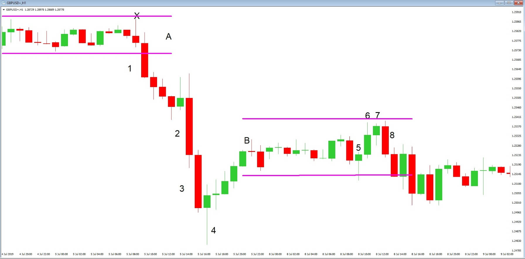
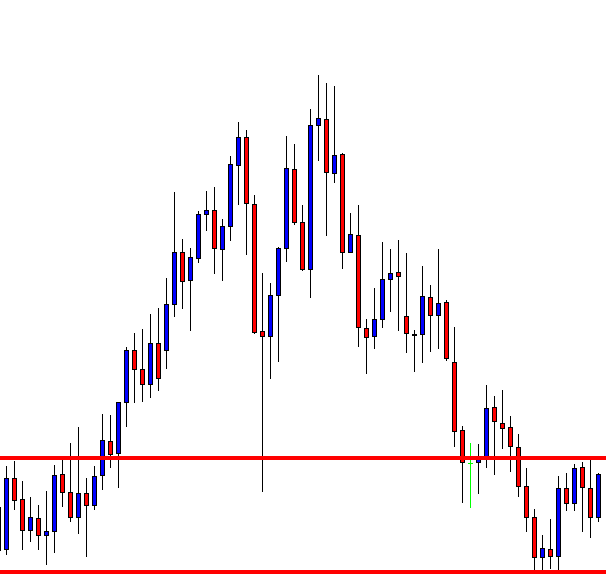
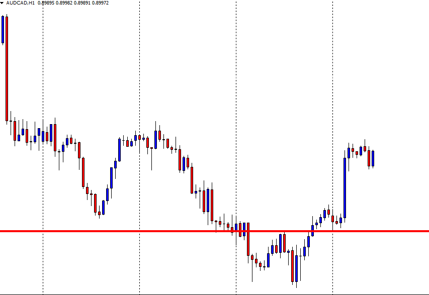
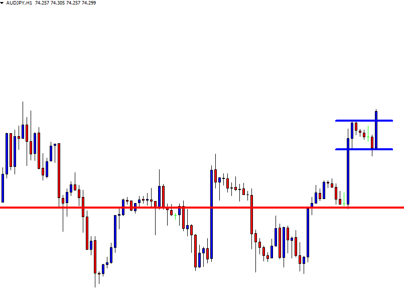
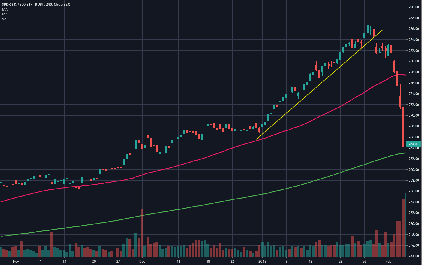
In today’s lesson, we are going to demonstrate an example of the H4 and the H1 chart combination for taking entries. Both are intraday charts. A large number of traders
In today’s lesson, we are going to demonstrate an example of the H4 and the H1 chart combination for taking entries. Both are intraday charts. A large number of traders
In today’s lesson, we are going to demonstrate an example of the H4 and the H1 chart combination for taking entries. Both are intraday charts. A large number of traders do the job using those two charts. Thus, it is an excellent combination to trade in the Forex market.
Let us get started.
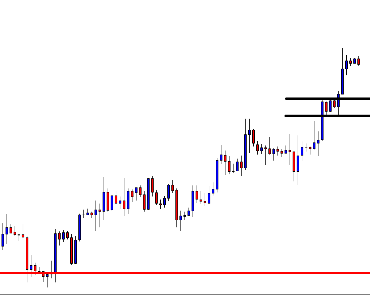
This is an H4 chart. The chart shows that the price heads towards the North. On its way, it made an upside breakout, which may play a vital role in pushing the price towards the North further. Despite having a long lower shadow, the last candle comes out as an Engulfing candle. The price may start its correction this time.
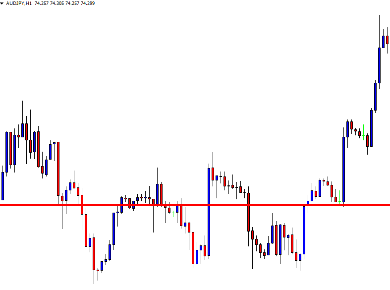
As expected, the price comes down to the flipped support and produces a bullish engulfing candle. The last swing high is far enough to offer a 1:1 risk-reward. However, we do not take an entry right after the candle H4 closes. We rather switch over to the H1 chart.
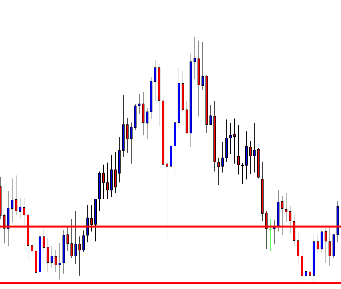
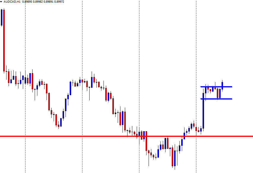
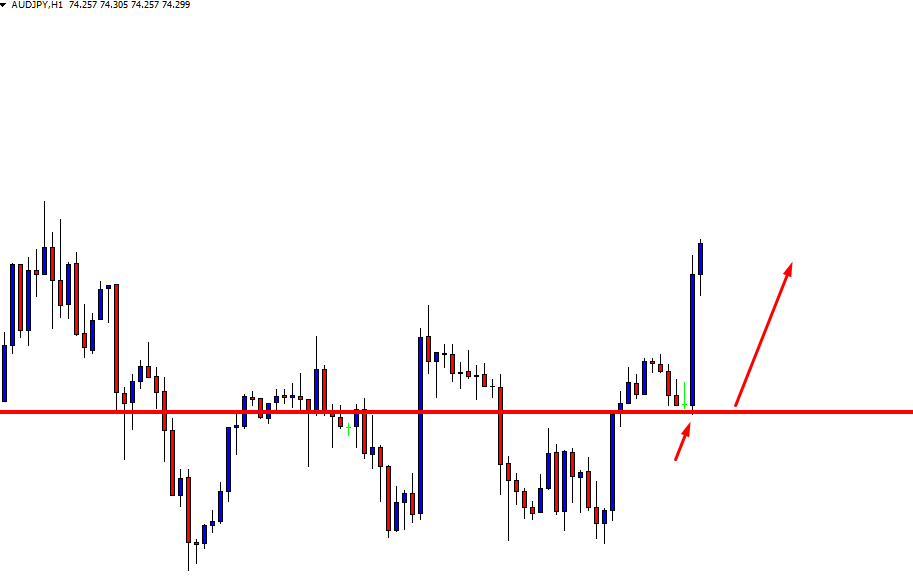
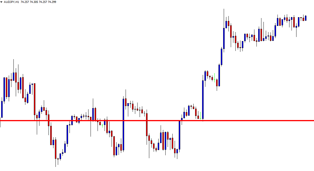
This is how the H1 chart looks. It shows that the price starts having correction by producing a Doji candle. An engulfing bullish candle closing above the Doji candle is the signal to go long here. Let us wait for a Marubozu bullish candle.
This is one good-looking Marubozu bullish candle. However, it closes right at the resistance zone. Risk-reward is 100:0 here. We must wait for an H1 consolidation and breakout towards the upside to take a long entry.
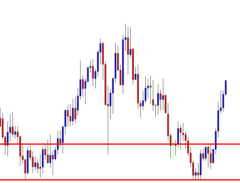
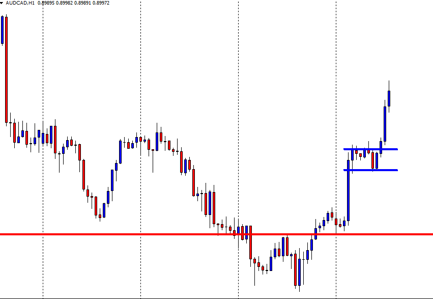
Here they come. The price consolidates and produces an H1 bullish candle, which closes above the resistance. Traders may trigger a long entry right after the candle closes by setting stop loss below the last support. The H1 chart does not show any resistance nearby. Thus, the price may head towards the North with good bullish momentum. It may get us 1:2 risk-reward or even more. Usually, the price reverses once 1:1 risk-reward is achieved. Let us find out what happens here.
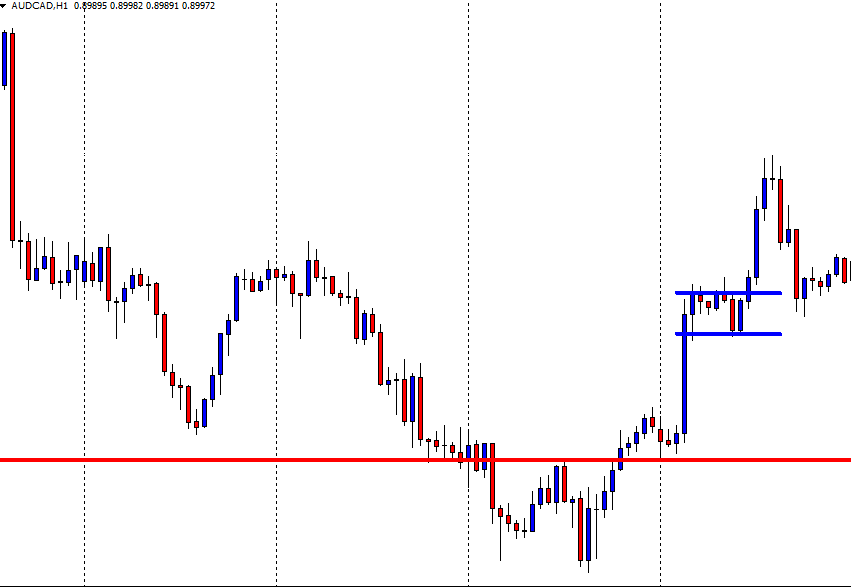
The price consolidates much earlier than our expectations. Our reward is not achieved. Thus, we keep holding our position. We are risking a loss here. However, we must keep our patience.
The price makes another upside breakout and heads towards the North. The wave gets us our expected reward and starts having a pullback. If we have not set our take profit, we may manually close it; or we may use a trailing stop loss. We will demonstrate some examples of using trailing stop loss in this combination in upcoming lessons.
The Bottom Line
The H4-H1 combination is an eventful combination. A Trader needs to have skill, expertise, experience, and patience to handle it. Once he learns it well, it may have his hands full in making money by trading.
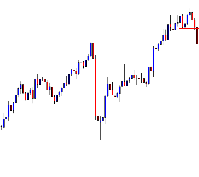
Price action traders use chart combinations such as Weekly-Daily, Daily-H4, H4-H1, and H1-15M, etc. Intraday minor charts’ traders such as the H1, 15M, 5M do not have an undeviating relation
Price action traders use chart combinations such as Weekly-Daily, Daily-H4, H4-H1, and H1-15M, etc. Intraday minor charts’ traders such as the H1, 15M, 5M do not have an undeviating relation
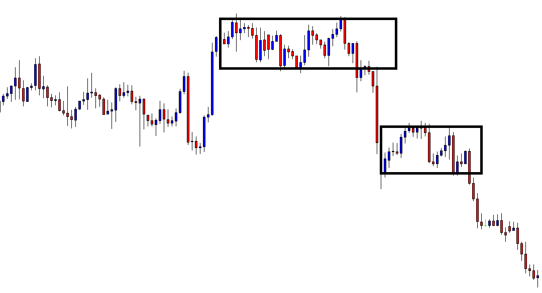
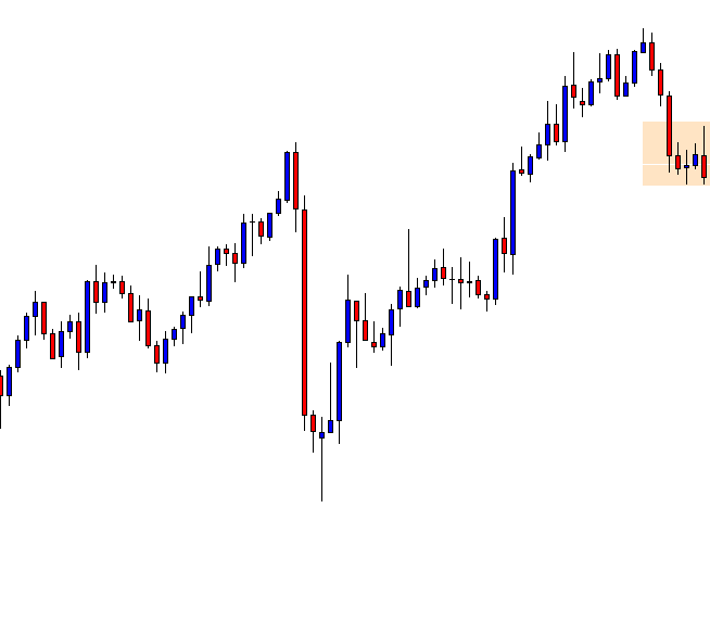
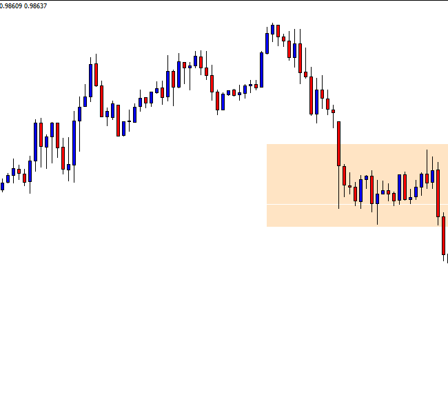
Price action traders use chart combinations such as Weekly-Daily, Daily-H4, H4-H1, and H1-15M, etc. Intraday minor charts’ traders such as the H1, 15M, 5M do not have an undeviating relation with the daily chart. However, it is often seen that if the daily price action is choppy, it gets tough to find out a good entry for the intraday traders. Notably, on a choppy daily chat, it gets extremely tough for the H4 traders to find an entry with good risk-reward. Thus, even a trade that gets us profit may not always be a good one. Let us demonstrate an example of that.
This is a daily chart, which shows that the price action has been choppy. It gets caught within a bullish rectangle. The daily traders are to wait for a breakout. However, the H4 traders know the range. Thus, they are to wait for a daily bearish reversal at the resistance zone and bullish reversal at the support zone. Let us see where it produces the next reversal.
The chart produces an Inverted Hammer right at the resistance. The H4 traders are to flip over the chart; wait for consolidation and bearish breakout to take a short entry. The risk-reward looks good here.
The H4 chart shows the last candle comes out as a bearish candle. If the price consolidates with the support of the candle’s lowest low, a bearish breakout will be the signal to go short.
The next candle comes out as another bearish candle. The candle has a bounce at H4 support, as well. If the price consolidates and makes a bearish breakout, the sellers may take a short entry. There is still space for the price to travel towards the downside.
The price consolidates and makes a breakout at the support. The breakout candle looks good. By setting Stop Loss at the consolidation resistance, a short entry may be triggered right after the last candle closes. Take Profit shall be placed at the red-marked level. Let us find out whether it hits Take Profit.
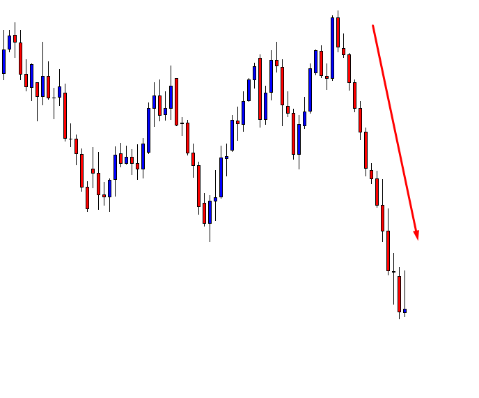
It does. It gets us profit. The question is whether it is a good trade or not. As far as risk-reward is concerned, it is not a good entry. It gets us less reward than the risk. Thus, traders shall skip taking that entry in the first place.
The Bottom Line
Price action traders may find many trade setups that match with all the norms for taking an entry. However, they must consider risk-reward on every single trade. If it offers less than 1:1 risk-reward, they shall avoid taking that entry. In most cases, an entry offering less than 1:1 risk-reward has less chance to be a winning trade as well. In this example, it is a winner. However, considering entire facts, it is not a good entry.
A losing trade hurts. Beginners find it tough to encounter losing trades. However, in the Forex market, losing is inevitable. The market is so action-packed that even an experienced trader
A losing trade hurts. Beginners find it tough to encounter losing trades. However, in the Forex market, losing is inevitable. The market is so action-packed that even an experienced trader
A losing trade hurts. Beginners find it tough to encounter losing trades. However, in the Forex market, losing is inevitable. The market is so action-packed that even an experienced trader often makes mistakes. Sometimes, even a good entry may not get us any profit. In today’s lesson, we are going to demonstrate an example of a good entry, which ends up being a losing trade in the end.
The price heads towards the North and makes a pullback. Traders are to wait for an upside breakout to take a long entry. A bullish Engulfing candle follows a Doji candle. As things stand, the buyers are to take the control soon upon an upside breakout.
Things are different now. The price comes down instead, by making a Double Top. It starts having the correction as well. Consolidation and bearish breakout shall attract the sellers to go short on the pair. Let us see the next chart.
The chart shows that the price is having a correction, where it had a bounce earlier. The equation is very simple here. A bullish reversal attracts the buyers, and a bearish breakout attracts the sellers to go short.
It makes a bearish breakout. The breakout candle looks good. As far as price action and candlestick pattern are concerned, this is an A+ short entry. Concentrate on the marked Stop Loss and Entry levels.
The next candle comes out as a bullish candle. The price may take out some of our entries because of the spread factor. With some brokers, traders pay more spread. Some of our trade (the same entry) may still survive. However, let us not get into this argument but proceed to the next chart. The following chart has an interesting scenario to present.
This should conclude the argument. The price hits the Stop Loss and heads towards the South again. The entry looks to be an A+ entry, but it has ended up bringing us a loss. As usual, beginners with average knowledge of price action may think that something must be wrong with his strategy.
This is not the case. An entry like this would bring us profit at least on 70% occasions. It hurts more since the candle, which hits our Stop Loss itself a strong bearish candle. This is how this market plays. We have to accept it. We must not let our losing trades occupy our thoughts. It is a game of probability of winning and losing. With knowledge, experience, and hard work, a trader can increase the likelihood of winning for sure.
After choosing a pair to trade, traders wait for the signal candle at the desired zone/level to take an entry. The attributes of the signal candle are important. Ideally, a
After choosing a pair to trade, traders wait for the signal candle at the desired zone/level to take an entry. The attributes of the signal candle are important. Ideally, a
After choosing a pair to trade, traders wait for the signal candle at the desired zone/level to take an entry. The attributes of the signal candle are important. Ideally, a signal candle is to be a Marubozu candle, barely having an upper or lower shadow, and longer than other candles around. In today’s lesson, we are going to show an example of how attributes of a signal candle affect the market. Let us proceed.
The price after being bearish finds its support. A long consolidation suggests that a breakout towards either side makes the chart lively again. An upside breakout and the confirmation offer good risk-reward considering the last swing high. A downside breakout seems even more rewarding. Let us find out which way the breakout takes place.
It is an upside breakout. The breakout candle looks fantastic. Buyers are to wait for consolidation and breakout at the highest high to go long on the pair. However, buyers shall calculate that the last swing high is not too far away now.
The price continues its bullish journey towards the last swing high, and it consolidates. Flipped support is to be adjusted here considering the Inside bar. However, an upper shadow at the previous swing high holds the price as well up to the Inside bar. The last candle comes out from the zone, though. Look at its attributes
Many of us may trigger an entry here by setting Stop Loss below the lowest low of the candle. Let us find out what happens next.
The price comes down again. It may have swept away many Stop Losses. Thus, the last entry gets the buyers loss. What do you think about the last candle?
It is a bullish engulfing candle
It breaches the resistance zone
It is a Bullish Marubozu candle and
It breaches the last swing high
Traders may want to trigger an entry here. Let us go to the next chart to see how it goes.
This time it works excellently well. A question may arise here: what the difference is between these two candles?. The only difference that can be observed is, “It breaches the last swing high.”
The Bottom Line
We have demonstrated an example today and learned a lesson. Traders are to be immaculate in making a decision, and they have to calculate every single aspect that is related to the trading decision.
Using a trailing stop is a way to lock a profit in trading, at least with some profit. A floating profit trade may not always hit its Take-Profit level. Thus
Using a trailing stop is a way to lock a profit in trading, at least with some profit. A floating profit trade may not always hit its Take-Profit level. Thus
Using a trailing stop is a way to lock a profit in trading, at least with some profit. A floating profit trade may not always hit its Take-Profit level. Thus, traders use Trailing Stop to lock-in some profits and let it run to hit the target. Otherwise, some trades may result in a loss instead.
In today’s lesson, we are going to demonstrate an example of that.
The price heads towards the North with good bullish momentum. The buyers are to wait for price correction and bullish reversal candle to go long on the pair. Let us proceed to the next chart to find more about the correction.
The correction looks very bearish. However, a flipped support level holds the price. Thus, it is going to be an interesting battle between the bull and the bear. Let us find out who wins. Does it make a downside breakout or a bullish reversal candle?
The chart produces a bullish reversal candle. We can see that this is an Inside Bar, which is the weakest reversal candle. A flipped support creates a bullish reversal candle but does not make any breakout. The buyers are to flip over to the trigger chart to get consolidation and breakout to go long on this. This is the daily chart. Let us flip over to the H4 chart.
The H4 chart looks suitable for the buyers. The level of support produces a bullish engulfing candle. It has started the price correction. An upside breakout from a good level of support is the signal to trigger a long entry.
The price goes upward and consolidates. Upon finding support, the last candle breaches the level of resistance. Setting Stop Loss below the level of support, an entry may be triggered right after the last candle closes. The Take Profit shall be placed at the highest high of the previous bearish wave.
The price continues to go towards the upside for a while. It has started having consolidation. The price has found its support. An upside breakout is to push the price towards the North further. On the other hand, a downside breakout may push the price towards the South and even change the whole equation. Thus, the buyers are to move their Stop Loss. Have a look at the chart below.
The buyers shall move their Stop Loss below the level of support and hope it makes another upside breakout to hit the Take Profit. Let us find out what happens next.
This is what Forex trading is all about. You never know what exactly happens next. The price comes down. It would hit the Stop-Loss, where it was set at the very outset. By using Trailing Stop, the buyers have made some profit. Otherwise, they would have to encounter some loss.
The Bottom Line
Using Trailing Stop is an art. It needs a lot of practice to be master at it. Without knowing how to use it properly, it may hurt a trader instead. Since it is an important trading feature to save us from encountering a loss with a profit trade, a trader must study/work hard on this.
The foundation of price action trading is based on the discipline of making all trading decisions based on chart analysis only.
Step Two - Check 4-hour chart.
https://youtu.be/MQEJS5d0Hak
Technical indicators V. Price Action
The foundation of price action trading is based on the discipline of making all trading decisions based on chart analysis only.
Technical indicators V. Price Action
The foundation of price action trading is based on the discipline of making all trading decisions based on chart analysis only. A chart, relating to a specific period of time, or time frame, reflects the beliefs of traders in the form of ‘price action.’
Technical traders believe that economic data and other global news events are the catalysts for price action movement. Technical trading assumes that we don’t need to fundamentally assess such data in order to trade the forex market successfully. The reason for this is because all economic data and related world news that causes price movement are ultimately reflected in the price seen on a chart.
Example A
In example ‘A’, the candlestick formation shows an elevated price action at the beginning of the charts on the left-hand side, and then falls lower and traders believe that the market news is ‘in the price’ and therefore they are safe to trade the charts on the basis that their technical indicators are telling them that the price action is overbought, or oversold, and that therefore their chart indicators have a greater probability of offering winning trade set-ups until the next release of economic including such things as unemployment, CPI and inflation, gross domestic product or GDP, interest rate changes and political events and conflicts.
Example B
How do we analyze the price action? Let’s look at the example ‘B.’ This is a 15-minute time frame chart of the EURUSD pair. Each of the Japanese candlesticks presents 15 minutes of price action. Traders always read their charts from left to right, and in the case of Japanese candlesticks trading, they try to decipher the meaning of each candlestick, either individually or as part of a trend.
Example C
In the example ‘C,’ we have highlighted some Gravestone Doji’s and Inverted Hammers, which traders look out for because they tend to occur at times of price action slowing just before a reversal.
Example D
In example ‘D’ this is made much clearer by the use of some technical lines to identify an A, B, C, D, price action, and where at position C, technical traders would be looking for a push lower to the ‘D’ position, purely based on the gravestone and inverted hammer candlestick formations.
Example E
Now let’s look at example E, we have now added a trend line at position 1, and we can see a clear trend which is moving to the upside, and where price action bounces off our trendline as it gradually pulls back from the lows of the previous A, B, C, D, price swing. However, price action begins to flatten out at position 2, and when the price breaks through our trend line at position 3, our bear traders will no doubt be wondering if there is going to be a continual push lower to add to the overall trend of this chart. But the push lower is short-lived, and price reverses during position 4, and where these three candlestick formation is known as three Bullish soldiers and typically denotes a strong bullish trend. Price action falters at position 5, and this becomes an area of resistance, or a ceiling because technical traders will have drawn a trendline, such as ours, and noted that price failed to go above this level on three previous occasions at position 2. Indeed price action begins to fall lower from position 5.
So, in these examples, we can see just how important price action alone, in the form of Japanese candlesticks, and a few lines drawn onto our charts can be so effective in analyzing the ‘clean’ price of an exchange rate. There is an abundance of information when we drill down and look for it. But this can only be truly established by learning about how Japanese candlesticks can define price movements, the stalling, and reversal of price movement, and the indisputable evidence they provide of support and resistance on the basis that these candlestick shapes and formations simply repeat themselves time after time. Price action is a leading indicator, whereas technical indicators, which are overlaid onto chats and follow a statistical measurement of price, are lagging indicators. While technical indicators are an extremely effective tool in technical analysis, they often throw up false signals, or simply leg behind price action so far as to be unreliable when used on their own and without factoring in price action.
Here at Forex.Academy we recommend that new traders learn about the significance of Japanese candlesticks, and study their charts, and read them from left to right, because they tell a story of where price action has been, and where it is likely to move to in the future, based on the fact that all the relevant fundamental data is already encapsulated in the exchange rate of a particular price action.
Timing is an essential factor in trading. Price action traders take entry on signal candle’s/bar’s attributes and support/resistance breakout. Many traders ignore the timing factor. However, it is an important
Timing is an essential factor in trading. Price action traders take entry on signal candle’s/bar’s attributes and support/resistance breakout. Many traders ignore the timing factor. However, it is an important
Timing is an essential factor in trading. Price action traders take entry on signal candle’s/bar’s attributes and support/resistance breakout. Many traders ignore the timing factor. However, it is an important factor when the signal candle is produced. In this article, we are going to demonstrate an example of the importance of timing in trading.
This is a daily chart. The price keeps going towards the South. Traders shall only look for selling opportunities in this chart on upward price correction/consolidation. Let us go to the next chart and find out what happens next.
The chart produces an engulfing bullish candle. It is a sign that the price may go towards the North. Intraday buyers such as 5M, 15M, H1 traders may look for long opportunities in this chart. The daily chart traders must wait for the correction/consolidation to get over upon a daily bearish reversal candle.
The price heads towards the North with good bullish momentum. The intraday buyers have made full use of the engulfing candle here. However, upper shadow and an Inside Bar suggest that a bearish reversal may come soon.
Here it is. A bearish engulfing candle suggests that it is time to look for short opportunities. It is a daily chart, so we shall flip over to the H4 chart to look for short opportunities.
The H4 chart shows that the price consolidates and makes a bearish move. However, support is still intact. The sellers must wait for a breakout at the support to go short on this chart. Let us draw the support line on the chart.
With an upward adjustment, the support lies at the black marked level. One of the H4 bearish candles is to breach the level for the sellers to get engaged in selling. Let us proceed to the next chart.
Concentrate on the chart. The chart has produced six candles since we have flipped over to the H4 chart. Six H4 candles mean a trading day is passed. Does it have any message to give us? We dig into the message later. Let us proceed to the next chart.
Wow! We have a breakout. Some traders may want to trigger an entry right after the candle closes. Let us find out what happens next.
The price starts heading towards the North. The price hits the Stop Loss. It even breaches the highest high of the wave. This is a different ball game now. If it were a technically right entry, we would not have talked about it. The thing is this one was a wrong entry, as the signal candle forms at the wrong time.
The signal candle does not form within the next trading day. It takes nine H4 candles to make the breakout. If the signal came within the first six candles, it would have been a valid trade. Since it comes at the ninth candle, it means the support has become daily support. Thus, an H4 breakout is not enough to drive the price towards the South. It goes towards the upside instead. The lesson we have learned here is, “A breakout is not a breakout if it does not take place at the right time.”
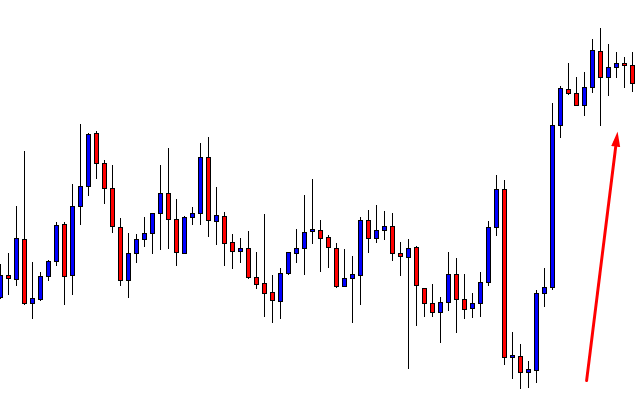
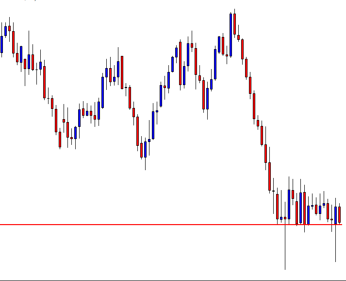
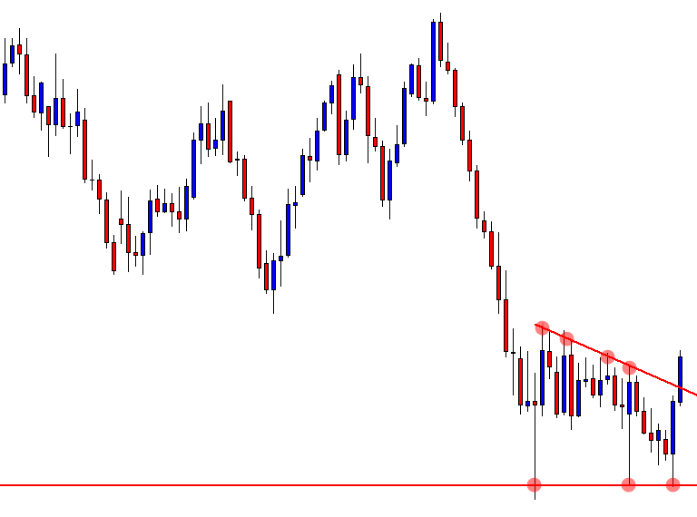
The market moves in three ways upward, downward, and sideways. In today’s lesson, we are going to demonstrate an example of a Rectangle breakout and an entry from a choppy
The market moves in three ways upward, downward, and sideways. In today’s lesson, we are going to demonstrate an example of a Rectangle breakout and an entry from a choppy
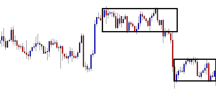
The market moves in three ways upward, downward, and sideways. In today’s lesson, we are going to demonstrate an example of a Rectangle breakout and an entry from a choppy price action. Let us have a look at the chart below.
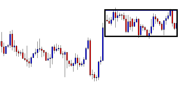
The price action is choppy in this chart. Typically, traders avoid this kind of price movement. However, if we want to take trading as a full-time business, we are to widen our eyes. An entry can be found even in this market. Concentrate on the rectangle drawn here. After all these bounces, rejections the price finds its support and resistance within the rectangle.
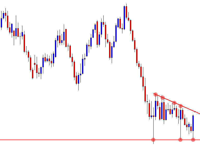
The chart produces a bearish engulfing candle right at the resistance of the rectangle. This is a sign that something may happen. Let us assume a bearish move may occur. The first candle of the bearish trend looks good. A downside breakout with good momentum is the second thing that the sellers may wait to get.
The next candle comes out as a bearish candle followed by an Inside Bar. Things are getting better for the sellers. A bearish engulfing candle closing below the support would be the signal to go short for the sellers.
Here it is. The breakout candle is a bearish Marubozu candle. We may trigger a short entry right after the candle closes. Let us find out where we will set our Stop Loss.
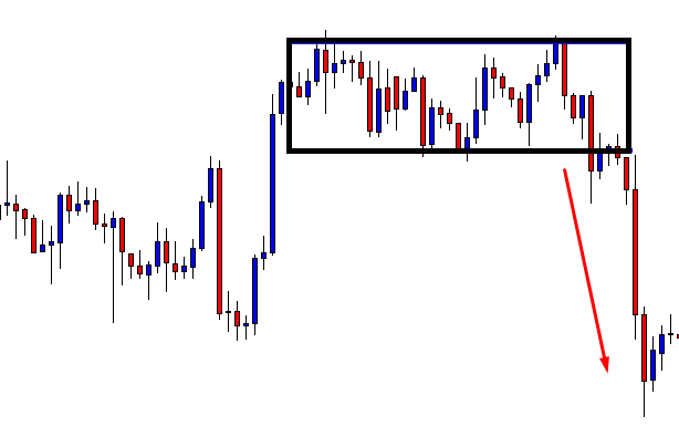
Many traders may suggest setting the Stop Loss above the resistance of the rectangle and setting the Take Profit with the same distance. This is a good idea. However, we may set our stop-loss just above the resistance of the last consolidation. The reason is the price consolidates before making the breakout at the support. If the price made a breakout without the consolidation, we would have set our Stop Loss differently. By setting Stop Loss above the last consolidation’s resistance, we are to keep an eye with our Take Profit level.
We may set our Take Profit all the way down at the last swing low. The price may have kept going towards the major support. Look at the chart above. What do you think? The price is still very bearish but it produces a bullish reversal. That is too with a gap. The price action traders do not like price gaps. Considering the fact that we have set our Stop Loss as close as it can get, thus it may be the time to close our trade and come out with the profit.
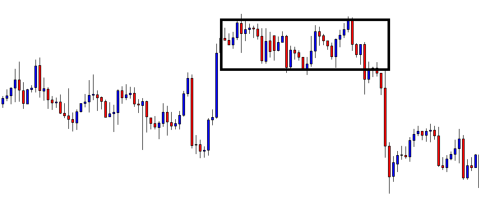
The Bottom Line
Even a choppy market ends up producing an excellent trading signal. Our first choice shall be trending markets to look for entries. However, if we can spot out some entries from the choppy market, it would surely make us be more profitable.
Setting Take Profit and Stop loss in the right areas are essential factors in trading. A trader does not survive in the market by placing Stop Loss and Take Profit
Setting Take Profit and Stop loss in the right areas are essential factors in trading. A trader does not survive in the market by placing Stop Loss and Take Profit
Setting Take Profit and Stop loss in the right areas are essential factors in trading. A trader does not survive in the market by placing Stop Loss and Take Profit at the wrong places. In today’s lesson, we are going to demonstrate an example of an entry with the level of Stop Loss and Take Profit.
This is a daily chart. The price heads towards the North with good bullish momentum. The buyers are to look for long opportunities at the pullback. Let us wait for the price to make a pullback.
The price starts having a downside correction with an Inside Bar. It produces two more candles that are bearish. After that, it forms a Spinning Top right at a flipped support. This is a bullish reversal candle but not a strong one. A breakout at the top of the Spinning Top attracts the minor charts’ buyers to go long on the pair. However, major charts’ traders may want to wait for a stronger daily bullish reversal candle.
The next candle comes out as an Engulfing candle. This reversal candle attracts more traders to look for long opportunities here. Since it has not made an upside breakout, thus, to take an entry, traders shall flip over to the H4 chart.
This is the H4 chart. The price has a rejection at the red marked level on the daily chart. Thus, this is the level where the price may find its resistance on the H4 chart. This shall be the level to count in setting Take Profit. The H4 chart shows that the price starts having a pullback. Things are getting better for the buyers.
Let us draw the resistance. If the price consolidates and makes a breakout at the black marked level, a long entry may be triggered. However, the buyers must wait to get the level of support.
Here it comes. A bullish reversal candle forms at a flipped support followed by a breakout candle. A long entry shall be triggered right after the last candle closes. Stop Loss may be placed right below the support where the price forms the bullish reversal candle. Many traders set their stop loss right below the breakout candle. In my experience, this offers a better risk-reward, but it often brings more losing trades.
Have you noticed that the price came back and then headed towards the North? If we had set our Stop Loss right below the breakout candle, our Stop Loss would have been hit. Rather than making some profit, we would make a loss here.
The Bottom Line
Setting Take Profit is important, but setting Stop Loss is more important. In my opinion, it is an art. It needs a lot of practice to be well acquainted with the art of setting Stop Loss as immaculate as it can get.
An Engulfing candle is a strong bearish reversal candlestick. This makes traders look for trading opportunities. In today’s lesson, we are going to demonstrate an example of how an Engulfing
An Engulfing candle is a strong bearish reversal candlestick. This makes traders look for trading opportunities. In today’s lesson, we are going to demonstrate an example of how an Engulfing
An Engulfing candle is a strong bearish reversal candlestick. This makes traders look for trading opportunities. In today’s lesson, we are going to demonstrate an example of how an Engulfing candle creates an entry. Let us proceed.
This is a daily chart. The price heads towards the downside with good bearish momentum. Traders shall wait for the price to have consolidation or an upside correction followed by a bearish reversal candle or pattern.
The price starts having the correction. It produces a bearish reversal candle after three consecutive bullish candles. The bearish reversal candle is an Inside Bar. This is not a strong bearish reversal candle. However, we still may flip over to the H4 chart (this is a daily chart) and wait for an entry. The H4 chart does not produce any bearish momentum. Thus, the price goes towards the upside instead. Have a look at the chart below.
This is one strong bullish candle. However, the candle closed within the level, which the price breached earlier. Traders must be patient here to find out what the price does around this level. Does it make an upside breakout or produce a bearish reversal pattern?
It produces a Doji candle right at the flipped resistance followed by an Engulfing candle. This surely attracts traders to keep an eye on the pair to look for short opportunities. The question is, how do we find out entries? When the price is at correction, if we have such a bearish reversal candle at the valuable area, we shall flip over to a minor chart. This is a daily chart. Thus, we shall flip over to the H4 chart. Let us flip over to the H4 chart and find out how that looks.
The H4 chart looks bearish. We are to wait for consolidation and a downside breakout to take a short entry. This is what comes out after a while.
The price produces two bearish candles followed by a bullish one. Any bearish reversal candle breaches the support of the consolidation is the signal to go short here.
This is it. A bearish engulfing candle breaches the support of consolidation. A short entry may be triggered right after the candle closes. Let us find out how the trade looks like in a nutshell.
We may set our Stop Loss above the resistance of consolidation. The Entry-level is very explicit, as it has been explained a bit earlier. We may set our Take Profit at the last lowest low where the price started its correction on the daily chart. Alternatively, we may wait for the price to produce a bullish reversal candle. In this chart, we may come out with our profit right after the last candle (bullish) closes. The choice is yours regarding ‘Take Profit.’ Both have merits and demerits.
The Bottom Line
In the above examples, we have learned what to wait for when to flip over a chart, and on what entry shall be triggered. It does look and sound easy. Trust me. It’s never as easy as it looks when you are to deal with the live market. However, having a lot of practice, and with experience, it surely becomes easier.
Financial traders need to be very alert and patient to deal with the market. These two components are vital for a trader to be successful in trading. In today’s lesson
Financial traders need to be very alert and patient to deal with the market. These two components are vital for a trader to be successful in trading. In today’s lesson
Financial traders need to be very alert and patient to deal with the market. These two components are vital for a trader to be successful in trading. In today’s lesson, we are going to demonstrate an example of alertness and patience. Let us get started.
The price heads towards the South. Ideally, a trader shall look for short opportunities in a chart like this. The last candle comes out as a bullish reversal candle. It is time for consolidation and waiting to get a downside breakout to take a short entry.
The price seems to go too far. It consolidates and produces a bearish engulfing candle. We may flip over to the H4 chart to find an entry since this is a daily chart. The support level looks strong since it created a long bullish move. The price may play around the level for a while.
As expected, the price stalls at the level of support. Things are different now. A downside breakout would make the pair bearish. A bullish reversal candle would make the traders look for long opportunities. This is where traders must be alert and never be rigid with their initial thought.
A bullish reversal candle forms right at the level of support. Traders may want to flip over to the H4 chart to look for long opportunities. We are not flipping over to the H4 chart this time since I know what happens afterward. Our trading lesson today is going to emphasizes something else.
The price heads towards the South instead. The H4 chart does not offer any entry after that daily bullish engulfing candle. Now, the price action is choppy. It seems that it is a chart to avoid for a while.
Not really, be alert. The price obeys a down-trending channel. Thus, any rejection at the upper band may create short opportunities. The price heads towards the resistance. Let us wait for a bearish reversal candle at the upper band (resistance of the channel).
The price makes a breakout at the upper band instead. It consolidates and produces a Spinning Top. Again, we are to change our trading direction. This time we are to go long.
The last candle breaches the horizontal resistance after consolidation. A long entry may be triggered right after the candle closes. Let us proceed to find out what happens next.
Two consecutive bullish candles form right after the breakout candle. Formation of a bearish reversal candle signals that it may be time to come out with a profit. At last, we make some green pips by going long.
The Bottom Line
This is an example of why we must not be rigid with our direction and how important it is to be alert with price patterns. Trading is never easy. As they say, “Trading is the hardest way to make the easiest money”. If we work hard in learning, only then we will be able to make money easily.
Mastering Price Action
Price action is the fluctuation in currency exchange rates, which are constantly moving up or down, relative to the exchange rate, and where these
https://youtu.be/CHB3qXad2N4
Mastering Price Action
Price action is the fluctuation in currency exchange rates, which are constantly moving up or down, relative to the exchange rate, and where these
Mastering Price Action
Price action is the fluctuation in currency exchange rates, which are constantly moving up or down, relative to the exchange rate, and where these movements form trends, which are typically called ‘bullish,’ where price action moves in an upwards direction, or bearish when price action moves in a downward direction.
However, currency exchange rates do not move in a straight continuous line. Therefore, Traders use technical analysis tools in order to decipher the direction of price action on their charts.
By carefully selecting technical analysis tools Traders are able to drill down further into the fluctuations of exchange rates and where it becomes much easier to identify when a particular price action move is about to stall and reverse direction.
Example A
Let’s look at the example ‘A.’ This is a 1-hour chart of the EURUSD pair. Always read your charts from left to right, because they tell a story of where price action has been, and where it is likely to go in the future. In the chart, we are using Japanese candlesticks, and where are the green candlesticks denote bullish price action, and where red candlesticks show a bearish price action.
Example B
Now let’s look at the example ‘B,’ which is the same 1-hour chart of the EURUSD pair. And like other professional technical analysis traders, we have added a few lines which highlight some interesting areas on the chart, and which would have led to several trading opportunities.
First of all, we note a strong bullish move at position 1, where we see predominantly bullish candlesticks. However, this price action trend to the upside fades, and where we have drawn in a ceiling, or level of resistance marked ‘A.’ The bulls have essentially thrown in the towel. Some traders would be taking a profit at this stage, and price action begins to fall lower. This is a period of consolidation. But it is not long until the bulls regain control again, and an overall trend forms to the upside, as per the arrow at position 2, until price reaches our resistance line marked ‘B.’ Importantly, this line is the 1.10 exchange rate, a key level.
Incidentally, note that our resistance A-line causes some confusion for traders until price action reaches the key 1.10 exchange rate. While some see the resistance continuing to hold, it eventually becomes the beginning of support line ‘B.’
The overall move from the beginning of position 1 to the top of position 2, which is our key 1.10 exchange rate, is around 100 pips, a fairly substantial move. Again, bull traders will be looking to cash in and take a profit at this level while assuming that there will be limit orders in place here to go short at this level and therefore drive the price action lower. And that is exactly what happens as per arrow number 3, where sellers take a hold, and price action moves lower to our secondary support level marked support ‘B.’
Price action then begins to fluctuate between our support level B, and our resistance level ‘B.’ During this phase, technical Traders will be wondering if price action can breach the key
resistance level at 1:10, and where that might become an area of support at which point bulls would be expected to come in and drive the market to the next level of resistance.
After three consecutive attempts to breach the key 1.10 resistance level, bull traders at position 5 fail to reach the 1.10 level and they begin to fear that price will again be rejected at the 110 level, and price action pulls back to support level B, which is then breached, until price action finally finds support at level ‘A’.
During the time frame of this chart, from the 2nd to the 9th of October, 2019, we are presented with clear buying and selling opportunities with the EURUSD pair, simply by the use of Japanese candlesticks and a few trend lines that we have added to our chart to identify support and resistance levels. We can see sideways price action where traders are uncertain if there will be a complete reversal in the upward trend, and there are clear lines of interest, such as the 1.10 exchange rate.
And so, support lines become lines of resistance, and these fluctuate throughout the day depending on the level of liquidity and also market sentiment and other factors based on fundamentals of the relevant currencies within the pair.
Simply by understanding that these lines exist and where traders are driving the market too, and fears of where reversals lurk will give you a better understanding of mastering price action.
The Forex market can be very unpredictable. It is a game of probability. With more experience and knowledge, a trader increases the chance to be right in making a trading
The Forex market can be very unpredictable. It is a game of probability. With more experience and knowledge, a trader increases the chance to be right in making a trading
The Forex market can be very unpredictable. It is a game of probability. With more experience and knowledge, a trader increases the chance to be right in making a trading decision. Having immaculate risk management is another aspect that keeps a trader safe with his investment. In today’s lesson, we are going to talk about the unpredictability of the market.
The price makes a bullish move and finds its resistance. After four daily candles, the daily chart produces a bullish engulfing daily candle. This is a powerful bullish reversal candle, which forms right at a flipped support. Have a look at the chart below.
The chart above shows that the bullish engulfing candle forms at the flipped support. This means buyers on this chart are to go long on a chart pattern called ‘ABC’ or ‘123’. This is a lucrative and consistent chart pattern, which price action traders love to trade. Let us find out what happens next.
The price stalls and has a rejection at the same level. The buyers would love to get a breakout here to go long and grab some green pips. However, the chart produces a bearish engulfing candle instead. What do you think a trader should do here?
He shall start looking for short opportunities. This is the daily chart. Thus, he shall flip over to the H4 chart to find out a short opportunity.
This is how the H4 chart looks. A very strong bearish candle followed by a little Inside Bar. The trader (the seller) is to wait for consolidation and a bearish reversal candle to go short.
The price consolidates more. It produces a good-looking bullish candle. Let us find out how the next candle comes out. Do not forget that the sellers are waiting to get a bearish reversal candle breaching the lowest low.
This is it. A bearish engulfing candle closes below the level of support. The sellers have been waiting to get a signal candle like this. A short entry may be triggered right after the last candle closes. Let us find out what happens next.
As expected, the price heads towards the South with good bearish momentum. We see the first H4 bullish reversal candle forming at the daily support as well. This may be time to take out the profit.
The Bottom Line
Do you notice how things change within a candle? Before that bearish engulfing daily candle, the pair looks extremely good for the buyers. An upside breakout would make them go long on the pair and push the price towards the North. However, that does not happen, but the price comes down instead. This is what I call “Twist in the tale.” Forex traders often get these twists.
https://youtu.be/-7oS9SphVkE
Trading Price Momentum
One of the biggest keys to understanding how trading in the forex market works is to know how momentum affects price action. Traders need to
https://youtu.be/-7oS9SphVkE
Trading Price Momentum
One of the biggest keys to understanding how trading in the forex market works is to know how momentum affects price action. Traders need to
Trading Price Momentum
One of the biggest keys to understanding how trading in the forex market works is to know how momentum affects price action. Traders need to gauge the market extremely carefully as price action can turn in direction, in a split second, based on a momentum occurrence, such as an economic data release, market rumours, and economic news commentary. It is essential that traders have contingency plans in place in the event of huge momentum moves. This could be by implementing stop losses, limit orders, hedging strategies, but importantly, being aware of market conditions and potential events that might cause huge liquidity and momentum shifts in price action.
Causes of trading price momentum are such things as government elections, war, OPEC meetings, and announcements pertaining to oil prices, commodity forecasts, government policy, currency devaluations, exchange rate pricing, debt defaults, market collapse, the US Federal Reserve, political referendums and economic data releases. During these events we will usually find a great deal of speculation due to market sentiment, risk-on and risk-off events, institutional investments including position-taking, and stop-loss activity.
The big players cause the big moves because of their size and liquidity, and they typically include hedge funds, sovereign wealth funds, governments, and their central banks. When these guys come to the market, it is not unusual for them to trade in sizes of over 100,000 US dollars per pip in the Forex market. This type of size causes market makers – that’s those who provide the bids and offers – to very quickly adjust their liquidity support in the market, which further adds to the momentum.
Example A
Let’s take a look at the example ‘A,’ this is a 1-hour chart of the USDJPY pair covering the last couple of days. At position 1, we note a huge spike higher in the pair with the 1-hour candlestick breaching the Bollinger bands, whilst spiking through an area of resistance caused by the sideways trading of this pair, and which reaches across, to the left of our chart. Even though the Federal Reserve cut their short-term interest rate by 25 basis points – the third cut this year – which caused this market reaction.
One might have thought that the US dollar would have lost ground against the Japanese Yen because of a lowering in interest rates, which, of course, is less than appealing to investors holding dollars. However, traders took into account that the subsequent forward guidance speech given by Federal Reserve Chairman, Powell, gave no indication that further interest rate cuts were imminent this year. Also, Federal Reserve governors voted 8 to 2 in favour of the cut. This shows that there is some conflict within the Federal Reserve regarding monetary policy.
Indeed the next hourly candlestick shows a pullback in this pair, thus negating the 30 or so pip move to the upside. This spike would have caused many institutions to suffer from a stop loss as price action moved above the key 109.00 level, while traders tried to decipher the implications of the rate cut, and what messages could be gained from Fed Powell’s speech.
Now let’s turn our attention to position 2, we can see a strong bearish candlestick just below position 2, which was a result of a news release stating that a Chinese official reported that the long-awaited part 1 of the Chinese & US trade agreement might not be signed next month as per market expectations. The Chinese official also stated that there was a risk that the deal may collapse due to what they said was a divisive attitude to the agreement by President Donald Trump.
These are just two examples of how price momentum can cause huge amounts of volume and volatility, and whereby in a relatively short time frame, we can see swings in the price action of over 100 pips in this example.
Example B
Let’s look at example B. This is a one-hour chart of the US DOW Jones 30. In position 1, we can see a surge in the price action to the upside after the announcement of the 25 basis points rate cut. This is important because US companies can borrow money more cheaply with lower interest rates. We subsequently see a slight pullback of price action inside the Bollinger bands and a consolidation to position 2. The bearish candlestick at this point takes out most of the previous day’s bull trend as soon as the rumour from the Chinese official that the US-China trade deal could collapse. The upshot of these two events was a 400 point swing in price action!
Here at Forex.Academy, we always advise traders to be aware of potential momentum moves in price action. This can only be achieved by having a good overall market awareness, and learning the art of expecting the unexpected, and by having contingency plans in place in the event of such events.
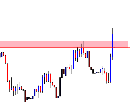
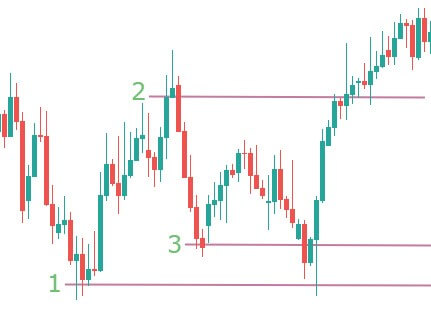
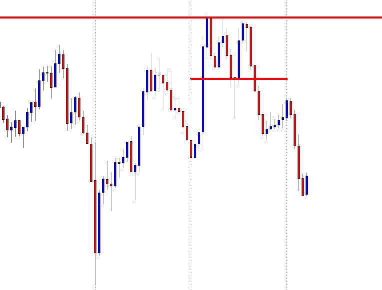
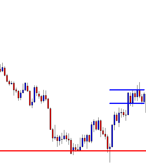
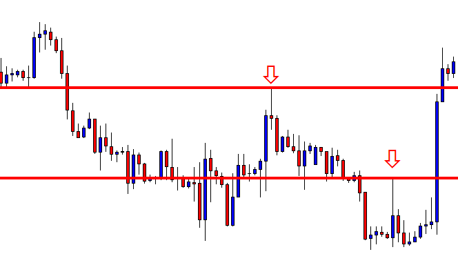
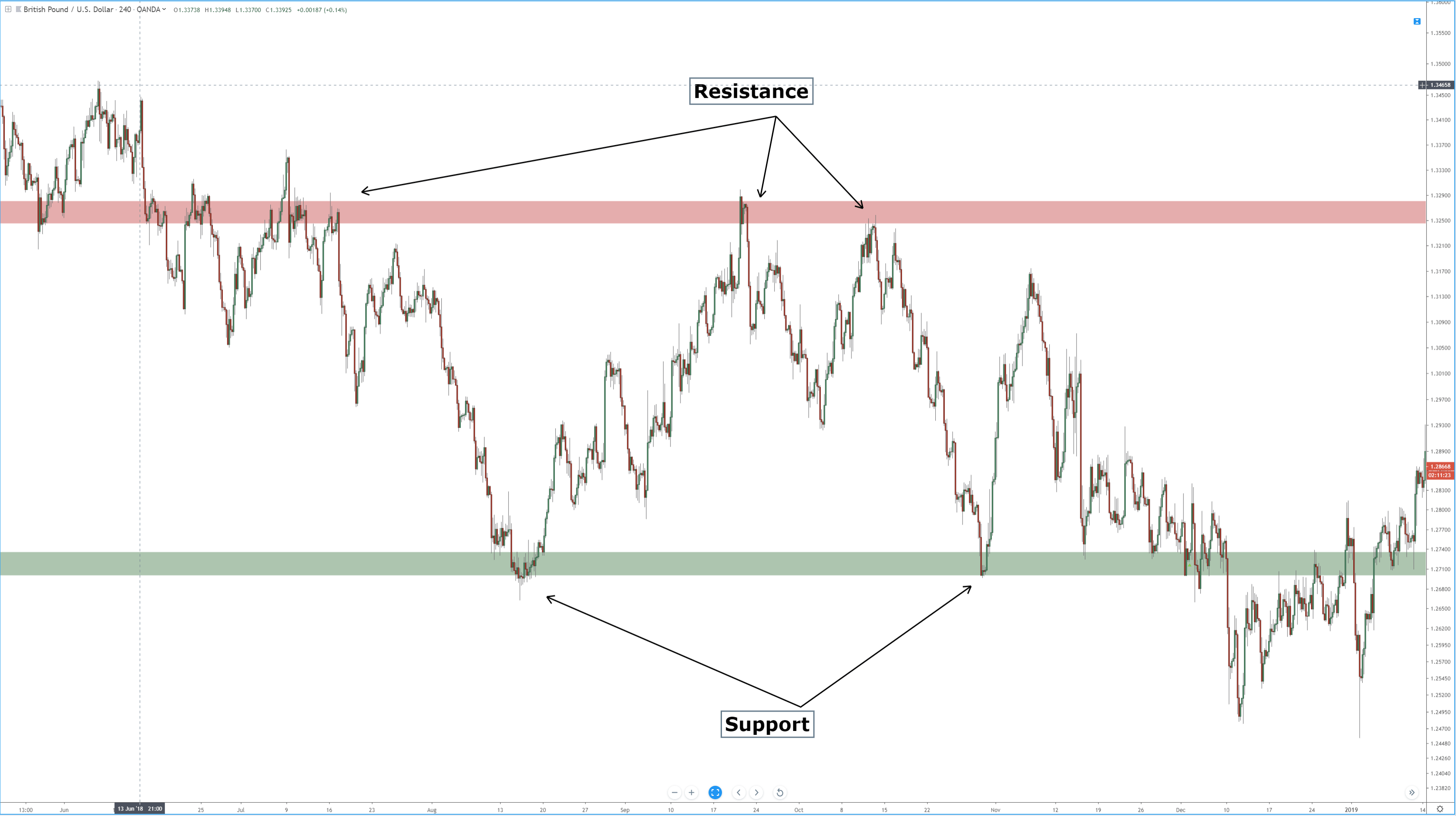
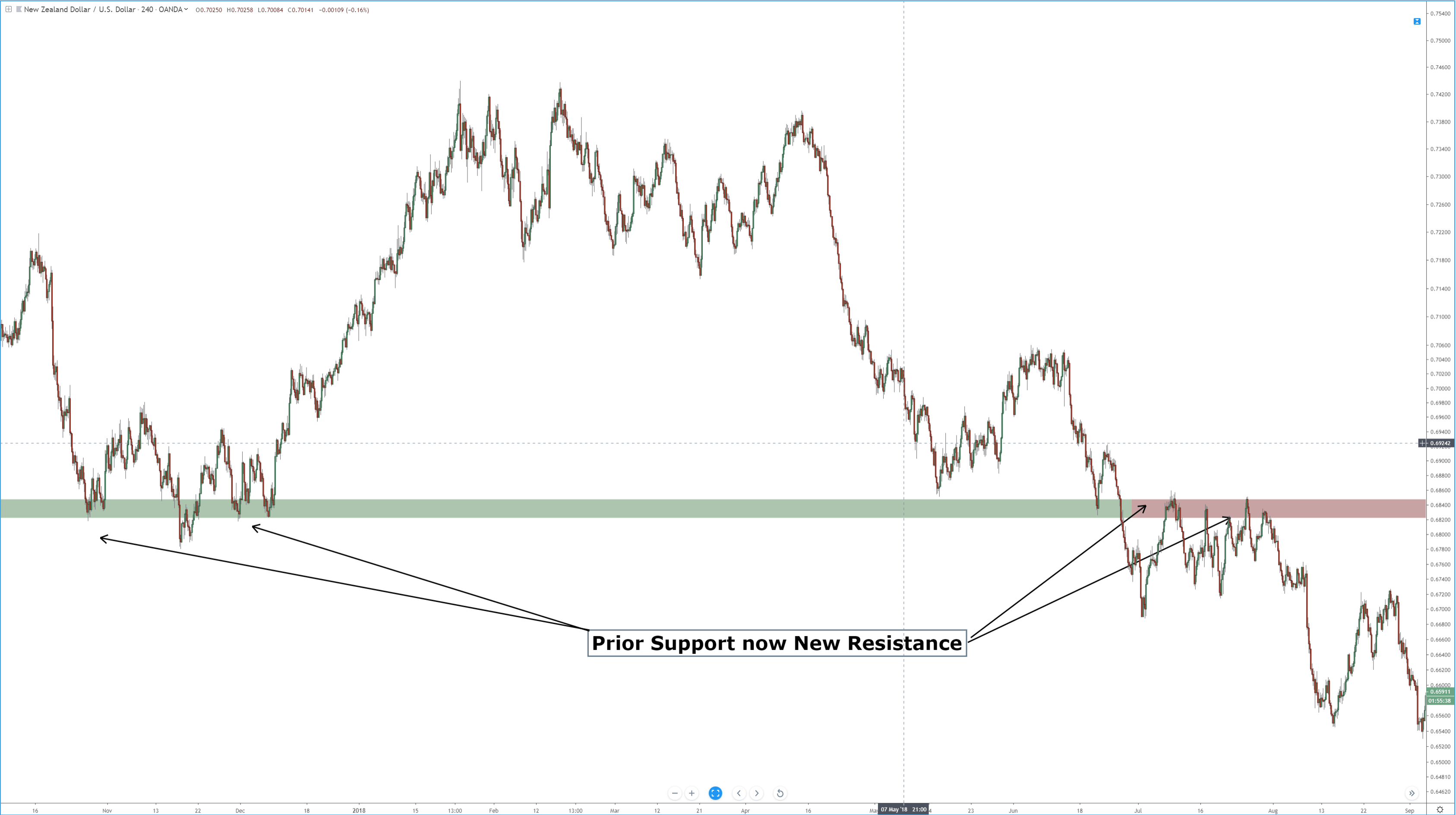
Support and Resistance, also known as Supply and Demand, have long been used in the financial markets. The most characteristic feature of support/resistance is a level of support becomes resistance
Support and Resistance, also known as Supply and Demand, have long been used in the financial markets. The most characteristic feature of support/resistance is a level of support becomes resistance
Support and Resistance, also known as Supply and Demand, have long been used in the financial markets. The most characteristic feature of support/resistance is a level of support becomes resistance, and a level of resistance becomes support. The price after making a breakout comes back to the level and makes a move towards the established trend. The price does not always confirm all the breakout levels, though. Traders do not know which broken level is going to produce a trading signal. In reality, they do not even have to know or guess. They have to make decisions according to the price movement or Price Action. Let us have a demonstration of this.
The price is up trending. Traders shall look for long opportunities. To be honest, the last candle on the chart is a buy signal. It was a week ending candle, which must have held the buyers back. Let us wait for a while to get more clues.
The last candle came out as a bearish engulfing candle. Such price action usually makes a pair choppy. The buyers may want to wait for an upside breakout to go long. However, a bearish engulfing candle may not let that happen.
A strong bullish candle closes within the resistance. It seems that the chart may produce a Double Top. Thus, the bear may come and dominate. Let us draw the Neck Line and resistance of the Double Top.
The equation is very simple here. A breakout at the neckline attracts the sellers, which is more likely. On the other hand, an upside breakout attracts buyers. Let us find out which way the price heads to.
The price makes a breakout at the Neckline. However, it does not consolidate around the Neckline after the breakout. Unfortunately, the sellers do not get an opportunity to go short here. It often happens with the traders. Traders’ life is never easy!
Here is a question. Do you see anything interesting? Has the price made another breakout?
It has made a breakout at the red-marked level. It goes back to the level to confirm the breakout, as well. Moreover, it has produced a bearish engulfing candle with a long upper shadow. Things look good for the sellers. A breakout at the lowest low would be the signal to go short.
Here comes the breakout. A bearish Marubozu candle breached the lowest low. The sellers may want to trigger a short entry right after the last candle closes. Let us find out how far down it goes before producing any bullish reversal candle.
Here comes the breakout. A bearish Marubozu candle breached the lowest low. The sellers may want to trigger a short entry right after the last candle closes. Let us find out how far down it goes before producing any bullish reversal candle.
The price heads toward the downside with good bearish momentum. It produces a Doji Candle. It may be time to come out with a profit.
The Bottom Line
The price does not confirm all the breakouts. That does not mean we should start pulling our hair. Concentrate hard and calculate well. The next opportunity is just around the corner.
Financial markets keep going up and down. Traders make money out of those moves. To take an entry, a trader is to do a lot of calculations, such as detecting
Financial markets keep going up and down. Traders make money out of those moves. To take an entry, a trader is to do a lot of calculations, such as detecting
Financial markets keep going up and down. Traders make money out of those moves. To take an entry, a trader is to do a lot of calculations, such as detecting a trend, waiting for the price to go to the right zone, market psychology, and signal candle, etc.
In trading, we often find ourselves in a situation in which we were waiting for a long entry from a support zone, all of a sudden the price makes a breakout at the support and heads towards the South instead. We feel deprived. However, this should not be like this. In trading, we are to get ready to sell and to buy since the market can go anywhere. We are to stick with the rules to take an entry.
Let us demonstrate an example.
The price heads towards the North with good buying pressure. It seems that the price finds its resistance as well. The buyers are to wait for a bullish reversal candle and a breakout at the resistance to go long again on the pair.
The price keeps being bearish. It seems that the price is going to have a long correction instead of consolidation. The price is at a flipped support. This is where a battle is going to take place between the bull and the bear. Traders are to wait for a downside breakout to sell the pair. On the other hand, a bullish reversal candle is going to attract them to keep an eye for an upside breakout and buy the pair.
The bull wins here. An engulfing bullish candle right at the flipped support means traders shall wait for an upside breakout to buy the pair. The momentum looks good. If the breakout takes place within the next candle, it will be an excellent buy signal. If it takes two candles to make the breakout, that will be a good buy signal as well. Let us proceed to find out what happens next.
The bull has lost the momentum. Traders are to wait for an upside breakout to go long. A good-looking bullish engulfing candle at the support area shall attract the buyers on the minor time frames to push the price towards the upside. That would eventually help the price make an upside breakout on this chart. Let us wait and find what happens next.
What do you see here? A bearish engulfing candle is right at the resistance level. This is a Double Top resistance level as well. If you have been waiting to go long, please change your mind. Get ready to look for short opportunities. This is how the market changes its complexion. You know what you have to do to deal with it. Yes, you must not be biased with your anticipation/calculation — Trade what you see, not what you think.
Candlestick formations – The display of price information
There are many different ways that a trader can have access to the price of an asset.
[embed]https://youtu.be/pCh8iSCS8kk[/embed]
Candlestick formations – The display of price information
There are many different ways that a trader can have access to the price of an asset.
Candlestick formations – The display of price information
There are many different ways that a trader can have access to the price of an asset. In the Forex market, the most common ways that traders monitor the movements of exchange rates are by using line graphs, bar charts, Renko charts, tick or ticker tape charts. And one of the most popular ways of deciphering price movements is the Japanese candlestick.
Let’s look at some examples of exchange rate price action via three commonly used technical analysis tools.
Example ‘A’ is a basic line graph of the daily time frame of the GBPUSD pair, as denoted in the top left-hand corner of our chart. Time frames are shown here too. At the bottom of the chart along a horizontal axis, we can see time and the date, and the exchange rate of this pair is shown in the vertical axis on the right-hand side of the chart.
The line graph converts the price action of a currency pair onto a continuous line on a chart. As you would expect, the line goes up and down and sideways. However, just by looking at the line graph alone, it would appear to be almost impossible to try and ascertain future movements by this tool.
Example ‘B’ is the same daily time frame of the GBPUSD pair, but this time we are looking at a bar chart. Each bar opens at the beginning of the given timeframe, and in this case, opens and closes every 24 hours. Each bar consists of three lines: A vertical line to the left of the horizontal line, which denotes the opening of the bar; the vertical line which tells the trader the up-and-down movement of price action during this time frame; and another horizontal line to the right of the vertical which tells the trader where price action finished.
Let’s now turn our attention to example ‘C’: The Japanese candlestick. Each candlestick opens and closes along a vertical line. Again, this is the daily time frame of the GBPUSD pair. The candlestick offers a much greater visual representation of the exchange rate and therefore presents many opportunities to a trader with regard to potential future trends. The Japanese candlestick is the most widely used technical tool used by traders across the globe.
Japanese candlesticks were invented in the early 15th century by the Japanese government of the time. They were used to record price movements on Japan’s rice exchange. At this time, rice was not only the primary dietary staple, but it was also a unit of exchange.
Example ‘D’ is a typical candlestick shape that traders see regularly on their charts. We have marked the points where the candlestick opened and closed. If the candlestick closes above the exchange rate at the point of which it opened, it is considered to be a bullish candlestick. If it closes below the exchange rate at the point of opening, it is considered to be bearish. Candlesticks can also open and close at the same exchange rate.
However, in this example of a bullish candlestick, we can see a wick at the top of the candlestick and also one at the bottom. Therefore, a trader can determine that after opening, price action initially falls before reversing and rising to the top of the time frame, before falling again back to the close. In this case, we have two wicks, one at the top and one at the bottom. A trader can tell the total exchange rate covered by the candlestick by measuring between the low and the high points and also see pullbacks and reversals. The same principle applies to a bearish candlestick where price action is measured over the whole length of the candlestick, but where traders easily identify the opening and closing of price action for each time frame.
Each candlestick will have a different sized body and wicks dependent on the amount of volume going through at any given time. The basic principle is that the longer the body and the shorter the wicks, the stronger the volume. Traders are able to read the many different types of candlesticks, which are all given names, in order to depict the strength of a trend and volume in the market at any given time, and these will help them to predict trend formations, reversals, and consolidation of the exchange rate of any particular pair.
Diagram ‘E’ provides us with a snap-shot of a 1-hour chart of the GBPUSD pair, where candlesticks are used to show price action. In section ‘A’ of the diagram, we can see that the price action is fairly flat and trading in a sideways motion. However, candlestick number 1 pushes below the trend line and forms the basis of a downward move. The candlestick is also bigger than those preceding it, and the wick at the bottom is small, denoting strong volume to the downside.
After a period of uncertainty, price action becomes stronger to the downside, as denoted by the large candlesticks numbered 2 and 3. Price action continues the downward trend, however buyers push up price action at number 4, which is called a reversal hammer, and where indeed price action reverses to section ‘B.’ We now have a series of smaller candlesticks which denotes a thinning in volume, and where we can see some candlesticks open and close at the same exchange rate, telling traders that neither the buyers or sellers are in control at this particular moment in time.
Candlestick number 5 tries to push the trend to the downside, but reverses and forms a reversal hammer shape, and where we subsequently see price action move to the upside as per candlestick number 6 and 7. But we then see a trend reversal in candlestick number 8, which becomes an engulfing candlestick because it is larger than both 6 and 7. The strength of this candlestick denotes a potential increase in price action to the downside by taking out the previous two candlesticks, and we see further movement to the downside before price rises again. Incidentally, we have another price reversal hammer in section A where we have placed an X.
Here at Forex.Academy, we strongly recommend that you learn as many candlestick formations as possible because they are very commonly used within the trading community, and therefore this will give you an edge in your trading.
Most traders use a horizontal line on their trading chart to mark support/resistance levels. Support and Resistance lines are the most basic trading tools, which traders use to make a
Most traders use a horizontal line on their trading chart to mark support/resistance levels. Support and Resistance lines are the most basic trading tools, which traders use to make a
Most traders use a horizontal line on their trading chart to mark support/resistance levels. Support and Resistance lines are the most basic trading tools, which traders use to make a trading decision. However, traders often find that the price does not react right at the drawn level. It is because of candles’ wicks and candles’ bodies. We may see that sometimes the price reacts at the level where the candles’ bodies are, and sometimes the price reacts where the wicks are. Thus, it is a good practice that we mark the support/resistance zone instead of marking the level only.
Let us demonstrate an example of that.
The price is being bullish after producing a Pin Bar. We know that a bullish Pin Bar has a long lower shadow. This means it reacts from a zone not only from a particular horizontal line.
The price is on the correction. Look at those Spinning Tops with long upper and lower wicks. Do you notice that one of the flipped support holds the bodies of the candles? However, those shadows often play an essential role, especially when the price is to confirm a breakout. We will reveal that soon.
The flipped support does not hold the price at last. The price comes towards the South further to find its support. The last bullish candle suggests it finds one strong support for sure. Do you notice that this is where the price has bounced earlier and produced spikes?
This time we have marked out the resistance zone. A bullish candle breaches the zone. The buyers need to wait for consolidation. The question is which level to hold the price as the level of support. Is it the level where the wicks are or where the bodies close or both?
Both levels hold the price as support. On this chart, the level, which is drawn on the wicks, holds the price as the support. On its smaller time frames, the level that is drawn on candles’ bodies holds the price as support. If we draw just one level here, we may get confused. Thus, we must mark out the support/resistance zone. Since the buyers are waiting for a bullish reversal candle to go long, it may be produced where the price is now. The price may as well come down at the lower level of the support zone and create a buy signal. Both are valid signals. Let us find out where the signal is produced.
The buyers may want to trigger a long entry right after the last candle closes. Assume only the red line was drawn here. Some buyers would have been confused that the signal did not come from the right level. Thus, drawing the support/resistance zone comes out handy for the traders. Support/Resistance zone helps traders take a better trading decision.
What is Range trading?
It is said that the market only trends for 30% of the time. So it becomes necessary to have a range trading strategy to take advantage
What is Range trading?
It is said that the market only trends for 30% of the time. So it becomes necessary to have a range trading strategy to take advantage
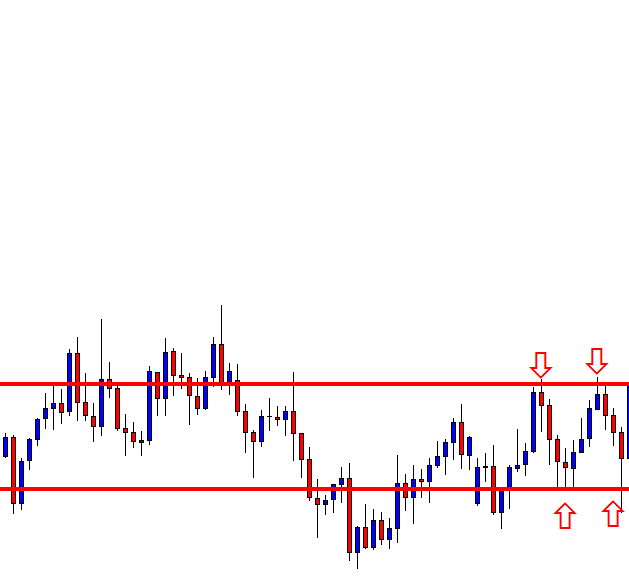
What is Range trading?
It is said that the market only trends for 30% of the time. So it becomes necessary to have a range trading strategy to take advantage of the other 70% of the time. Range trading is not difficult, but it requires discipline and determination to make most out of it. When a market is trending, it forms a pattern of higher highs and higher lows, in case of an uptrend. The move, in this case, is really strong and is known as an impulsive move. The other type of movement is known as the corrective move, which comes in the form of a pullback. Impulsive moves are stronger than corrective moves.
When the market is making any such moves, it finds itself stuck between a high or low and continues to oscillate between these two points. It means buyers and sellers are equally strong, and this creates a very choppy environment.
Traders now trade these extremes and continue to trade until price breaks out on either of the sides. These two points act as potential support and resistance points, used by traders to place their orders.
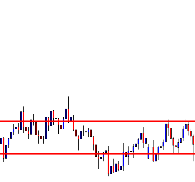
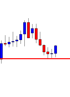
In the above chart, we have drawn a few lines from where the market bounced off. The price action in those areas creates many trading opportunities. The instrument in the chart first trends down and then puts up a low (marked by line 1). Initially, you might think it as a downtrend and expect the pattern of lower lows and lower highs to continue.
Then you see the market rally to line 2, from where the market falls back to line 3 but does not fall till line 1. This highlights the fact that the market is no more trending. The market instead could be stuck in a range between line 1 and line 2. These are not ‘defined’ prices. Always consider them as zones with a margin of error both outside and inside the range. A trader will look to position himself/herself at these zones of support and resistance that forms the range.
Why support and resistance?
The price that is stuck between these two extremes has a lot of significance. This is because, at this point, the price can either Stop, Reverse, or Breakout. When you have the right knowledge, it will stop you from simply pushing the buttons and will make you trade with a defined strategy.
Range = Consolidation
A range is nothing but a price consolidation of the overall trend move. It could either end the current trend or cause a reversal. The different price behavior pattern in the range creates many trading opportunities, which can be traded by all types of traders, depending on their risk appetite. Now let’s discuss some important trading strategies using support and resistance of ranges.
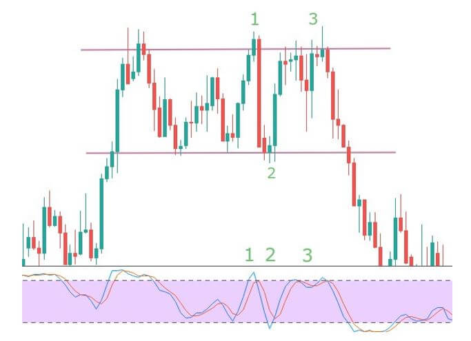
Strategy Using Technical Indicators
Using technical indicators to trade can aid your trading strategy. Especially while trading ranges, many indicators can be a part of your trading plan. Here, we have used the Stochastic Indicator as a tool to trade the ranges.
In the above image, the two lines represent the support and resistance of the range formed. When the price reaches the resistance at point 1, the Stochastic enters the overbought area, and the slowdown in momentum is the confirmation signal for a sell. The resistance pushes the price back to support (point 2), but this time the momentum is very strong, hence no entry. The stochastic also does not enter the oversold area clearly. Next time the price goes to resistance with greater momentum, and the Stochastic too does not give an entry signal as it is not in the overbought area. This means one shouldn’t be going short at this point.
Overall, there is only one risk-free trade available in the above chart, and that is at point 1 (short).
Strategy Recap
Firstly, we should be able to see the price at one of the extremes. When that happens, the indicator should show either be at overbought or oversold conditions. The momentum of the price should be an important factor that determines our entry. If we see reversal patterns, this could be the best entry with a good risk to reward ratio. Do not forget to place protective stops much below or above the support and resistance levels, respectively. This will always protect your trades from a false breakout.
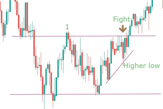
When not to buy at support and sell at resistance in ranges
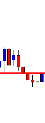
You must have probably heard traders saying that more time a level is tested, the stronger it becomes. This is not true in the case of our range break-out strategy. You need to start paying attention to the price patterns at these ends. If the price has made multiple touches, it could be getting ready for a breakout in the direction of the higher time frame.
The above chart is an example of such a scenario. It shows a range, and at point 1, you can see the strength in the candle as price pushes towards the resistance area. The next push makes the price to consolidate at the extreme. It appears to be a battle between the bulls and bears. It is also making higher lows as a part of the uptrend. Hence a breakout after this point is not surprising.
You don’t want to see the higher lows at the resistance extreme and lower highs at the support extreme.
The resistance could still work, and a reversal could happen, but this type of price action does not give much confidence for shorts. Only aggressive traders may find some entry in that consolidation, for a potential long. They can put a protective stop below the higher low that was formed before the accumulation.
We hope you find this strategy informative. Let us know if you have any questions in the comments below. Cheers!
We know using multiple time frames is an essential aspect of trading. Traders use the bigger time frame to find out the trend, breakout, vital support/resistance levels, and relatively smaller
We know using multiple time frames is an essential aspect of trading. Traders use the bigger time frame to find out the trend, breakout, vital support/resistance levels, and relatively smaller
We know using multiple time frames is an essential aspect of trading. Traders use the bigger time frame to find out the trend, breakout, vital support/resistance levels, and relatively smaller time frames to trigger an entry. In this lesson, we are going to learn how the trigger chart can be used as the analyzing chart to find out more entries.
This is a Daily chart, which is being used as the trigger chart. The weekly chart is used as the analyzing chart. It is a combination of Weekly-Daily. The price heads towards the North. Traders are to wait for the price to produce a bullish reversal candle.
A Spinning Top daily candle at a flipped support, the buyers have a lot to be optimistic here. One of the daily candles is to breach the daily resistance to go long on the pair. Let us draw the support and resistance on the chart to get a clearer picture.
This is how the chart looks like with support and resistance levels. If one of the daily candles breaches the resistance with good buying momentum, the daily traders are to trigger a long entry.
The next daily candle breaches the resistance. The buyer may take a long entry right after the breakout candle closes. An entry on the daily chart means that the trader shall leave the trade/chart for three to four trading days by setting Stop Loss and Take Profit.
However, if a trader uses the same daily chart as the trend-detecting chart and flips over to the H4 chart to find another entry, it surely would be more rewarding.
Let us flip over to the H4 chart.
Previously, the daily chart shows an upside breakout. Thus, the trend is bullish. The H4 chart shows that the price starts having consolidation. If the breakout level holds the H4 candles and makes an upside breakout, the H4 buyers are going to go long on the pair as well.
This is the H4 chart with the support and resistance of consolidation. The buyers must wait for an upside H4 breakout to go long on the pair. Let us proceed to the next chart.
Here it comes. An H4 bullish engulfing candle breaches the resistance. The H4 traders may want to trigger a long entry right after the candle closes.
The H4 chart shows the price may have consolidation again. The H4 buyers may want to cash in their profit. However, the entry, which is taken on the daily chart, traders are still to hold their positions until they get a bearish daily reversal candle.
At the end of the day, price action trading works very similarly on the Weekly, Daily, H4, and H1 chart. Today’s examples show that a Weekly-Daily combination offers an entry. After the daily breakout, the Daily-H4 combination offers an entry, as well. With a lot of practice, dedication, and hard work, a trader can trade both of them. This will surely beget more profit.
Price action traders consider the breakout as one of the most important factors. It is, once it is confirmed. However, momentum, overall psychology are essential aspects of breakout that less
Price action traders consider the breakout as one of the most important factors. It is, once it is confirmed. However, momentum, overall psychology are essential aspects of breakout that less
Price action traders consider the breakout as one of the most important factors. It is, once it is confirmed. However, momentum, overall psychology are essential aspects of breakout that less experienced traders often misapprehend. In this lesson, we are going to demonstrate an example of a breakout with less momentum. Let us get started.
The chart shows that the price is up trending with good buying pressure. The price makes a breakout at the last swing. This is an ideal chart for the buyers to look for buying opportunities. They are to buy the pair on the pullback. Let us proceed to the next scene.
The price starts having a correction and comes back up to the breakout level (the last swing high). It produces an engulfing candle, which is a strong sign that it may keep going towards the upside, makes a breakout, and offers a long entry.
The price does not find a strong buying momentum. It goes towards the upside and comes back again to the support. It seems the buyers may have to wait longer than they thought.
Things look a bit different now. Rather than making an upside breakout, it has a strong rejection at the resistance. The support is being tested again.
No downside breakout, but the support holds the price. The price gets caught within two horizontal levels. To be precise, the price gets caught within a rectangle. Ideally, both the sellers and the buyers love to keep this chart in their watch list; get a breakout at either side to take an entry.
Two consecutive bullish candles right at the support suggest that the buyers have the upper hand. The buying momentum looks good here. If it continues going towards the upside and makes a breakout, the buyers may dominate here. Let us see what happens next.
Oh no, the price heads towards the North with less buying pressure. The bullish move has much less speed than the last bearish move. This sort of price action usually makes the price have another bearish move and head towards the support. Let us find out what happens next.
An upside breakout this is! After the breakout, if the price consolidates and makes another bullish move from the breakout level, it would be a buying market again. However, the question is whether it makes the buyers interested in buying or not.
The last bullish wave does not have the drive.
The resistance level is strong
Let us find out what happens next.
It does not produce a bullish reversal after the breakout. Instead, it comes back in. The breakout is not valid anymore. What may have been a strong buying market has become a choppy market again.
The Bottom Line
The breakout may have offered us entry if it produces a bullish reversal candle at the breakout level. That does not happen. We cannot precisely tell why that happens here. However, the less momentum to begin the potential trend is one of the reasons among many. It represents that psychologically, the buyers are not confident about the breakout and continuation, which makes that a nullified breakout in the end.
Indicators are a useful tool that can aid in supporting the analysis process. In this educational article, we will review the Awesome Oscillator and how it can help us in
Indicators are a useful tool that can aid in supporting the analysis process. In this educational article, we will review the Awesome Oscillator and how it can help us in
Indicators are a useful tool that can aid in supporting the analysis process. In this educational article, we will review the Awesome Oscillator and how it can help us in an Elliott Wave study.
The basics
The Awesome Oscillator (AO) is also known as the Elliott Wave oscillator, was developed by Bill Williams. The AO measures the immediate momentum of the five previous periods, compared with the momentum of the last 34 periods.
The calculation is based on the simple moving average of the midpoint (HL / 2) of 34 periods minus the simple moving average of the midpoint of 5 periods.
Elliott Wave and the Awesome Oscillator
The following chart corresponds to the Johnson and Johnson (NYSE:JNJ) weekly chart. The bullish motive wave started with the August 2015 low at $128.51 per share. From this low, JNJ began to a bullish sequence, which drove it to reach the $148.32 level.
From the AO oscillator, we can recognize the following elements of the price action:
Trend bias: If the trend is bullish, the AO will be positive. If it is bearish, the oscillator will move on the negative side. For our example, the market direction of the range of time studied corresponds to a bullish trend.
Wave three: We can identify wave three with the most prominent distance of the AO. From the JNJ example, we distinguish a wave (3) of Intermediate degree labeled in black. At this point, the stock reached $125.90 per share. After this peak, JNJ started a corrective sequence, and the oscillator began to decrease, even moved in the negative side.
Wave five: In the same way as the third wave, we can recognize the fifth wave watching the AO because momentum follows the dominant trend. However, in this segment, the oscillator shows a divergence between the peaks of waves three and five. In our example, JNJ ended the wave (5) on the half of January 2018 at $148.32 per share. We can observe the bearish divergence between the price and the oscillator.
Corrective waves: We can use the AO to identify corrective waves watching how it decreases against the prevailing trend. From the JNJ chart, the oscillator turns negative when the price develops a retracement.
In summary, the Awesome Oscillator can be a useful tool to complement the EW analysis, especially in wave identification. A divergence involves the exhaustion of the movement, but the price is not compelled to reverse the trend.
Price action traders combine multiple time frames to trade. In most cases, they use a time frame to determine the trend and use the next one to trigger an entry.
Price action traders combine multiple time frames to trade. In most cases, they use a time frame to determine the trend and use the next one to trigger an entry.
Price action traders combine multiple time frames to trade. In most cases, they use a time frame to determine the trend and use the next one to trigger an entry. The most important factor in using multiple time frames is the combination. Usually, the combinations are Daily Chart with H4 Chart, H4 Chart with H1 Chart, H1 Chart with 15M Chart, and 15M Chart with 5M Chart. In today’s lesson, we are going to demonstrate an example of the combination of Daily and H4 Chart produces an entry.
This is a daily chart. In an uptrend, the price had a pullback. It produces a Doji candle followed by an engulfing candle (arrowed). The buyers may want to draw a support level here. Please note, it is not a Morning Star.
It is neither a Moring Star nor a Double Bottom. The price heads towards the North with good buying momentum. Many of us may think we miss an opportunity. The pair may have offered entries on minor time frames, but the daily chart does not provide anything yet.
Here we are. The price heads towards the support again. As far as the Daily chart is concerned, the price had a bounce at the level earlier. Thus, if the level produces a daily bullish reversal candle, the buyers are going to get themselves busy to look for long opportunities. Let us proceed to find out what happens next.
The last bearish candle closes within the marked level. This is a sign that the price may obey the support. However, we never know unless it produces a bullish daily reversal candle.
Here we are. The level produces an Inside Bar. It is not a robust bullish reversal candle. Nevertheless, it is a reversal candle. Do you know what the price action traders do next? They flip over to the H4 chart. Have a look at the H4 chart.
Since we are analyzing the daily chart, the trigger chart shall be the H4 chart. The H4 chart shows that the price is on consolidation. The buyers need to wait for bullish momentum.
The chart produces an H4 bullish reversal candle, although the resistance is still intact. Thus, the buyers need a breakout at that level. They must wait for it.
Here it comes. A Marubozu bullish candle breaches the resistance. The buyers may trigger a long entry right after the candle closes. Let us proceed to find out what the price does next.
As expected, the price heads toward the North with good buying momentum. There is enough space for the price to travel. It may go further North as well. Anyway, let us concentrate on what we have learned from these examples.
Using multiple time frames is one of the key components of price action trading.
The right combination of multiple time frames is essential.
We are going to learn more about using multiple time frames in our forthcoming lessons. Stay tuned.
The price after making a strong bullish or bearish move, it makes correction/ consolidation. The price consolidates within two horizontal lines. In the financial market, this is called Rectangle. In
The price after making a strong bullish or bearish move, it makes correction/ consolidation. The price consolidates within two horizontal lines. In the financial market, this is called Rectangle. In
The price after making a strong bullish or bearish move, it makes correction/ consolidation. The price consolidates within two horizontal lines. In the financial market, this is called Rectangle. In today’s lesson, we are going to demonstrate some examples of the bullish and bearish rectangle.
Let us start with a bullish rectangle.
The price heads towards the upside with good bullish momentum. At the top, the price seems to start having consolidation. A buyer may want to keep an eye for an upside breakout to go long from here. However, the price continues to consolidate.
The price consolidates within two horizontal lines. We can draw a rectangle here since the price produces the rectangle after a bullish move, so it is called ‘Bullish Rectangle.’ Traders are to wait for a breakout to take an entry. A downside breakout offers a short entry, and an upside breakout offers a long entry. Let us find out which way the next breakout takes place and the price heads to.
The price makes a downside breakout and heads towards the South. At rectangle breakout, the price usually travels at least the same distance of the consolidation length. It seems the price travels 1.5X distance of the consolidation length here. Let us concentrate on the next chart below.
The price consolidates getting trapped within horizontal support and resistance. Do you find anything interesting here? Yes, we find another rectangle. This time it is a bearish rectangle. Let us draw those two lines here.
Again, traders must wait for a breakout to find out its next direction. The price has several bounces and rejections within those two horizontal lines. It is a bearish rectangle, but we know a breakout can take place either way. There is no point in guessing. Let us wait and find out.
The price makes a downside breakout and heads toward the South with good enough selling momentum.
We have demonstrated two examples here. The first one is a bullish rectangle where the price makes a downside breakout. The second one is a bearish rectangle, on which the price makes a downside breakout as well. Breakout direction does not depend on the bullish or bearish rectangle. Trader’s job is to wait for the breakout and breakout confirmation. Entry is to be taken only when the breakout is confirmed. We can spot rectangles almost in all the time frames. However, it is often seen on the H1, H4, and Daily charts. Have some practice on the demo account or do some backtesting to get well acquainted with the pattern to make green pips.
Price action traders are to get clues from what the price has been doing. Horizontal Support/ Resistance, Trend Line Support/Resistance, Fibonacci Levels, Equidistant Channel along with Candlestick Pattern are price
Price action traders are to get clues from what the price has been doing. Horizontal Support/ Resistance, Trend Line Support/Resistance, Fibonacci Levels, Equidistant Channel along with Candlestick Pattern are price
Price action traders are to get clues from what the price has been doing. Horizontal Support/ Resistance, Trend Line Support/Resistance, Fibonacci Levels, Equidistant Channel along with Candlestick Pattern are price action trader’s main weapons. A trader must know how to use these tools as far as price action trading is concerned. Moreover, traders often need to adjust to marking levels, which are to be integrated with price action and market psychology. In today’s lesson, we are going to show an example of that.
The price has been heading towards the downside with strong bearish momentum. Ideally, traders are to look for short opportunities at upside pullback. See the first reversal candle. The candle closes within the support of the last bearish candle. Thus, the traders must wait to go short since the support holds the price. Let us see what happens next.
At the last candle, the price goes towards the downside but comes back within the support again. Equations are different now. Long lower shadow and proven support suggest that the traders may have to wait longer than they thought.
As expected, the price consolidates on choppy price action, which makes traders wait. Traders find horizontal support. Let us draw it.
The price obeys the support level several times. However, do not forget that the price had a strong rejection. This is where traders may need to make an adjustment.
The price has been heading towards the adjusted support. Risk-Reward does not look right here. It is better to wait for either a downside breakout or a bullish reversal to go long. Let us see what happens next.
We have a bullish reversal here. A bullish engulfing candle right at the support level suggests that the traders may have to look for long opportunities here. The question is, shall we take an entry right after the last candle closes or not. The answer is ‘No”. We have to wait for an upside breakout. Can you guess where the breakout level is? Think for a minute, and then proceed to the chart below.
The price has been obeying a down-trending Trend line producing a Descending Triangle. Thus, the breakout at the Trend line resistance is a signal to go long here. All the buyers need here a breakout by a bullish Marubozu candle.
Here comes the breakout that the price action traders shall wait for. The buyers may trigger a long entry right after the breakout candle closes. Stop Loss is to be set below the horizontal support. Let us find out how it proceeds.
The price heads towards the North and provides 1:1 Risk-Reward. So far here, it seems that it is having consolidation. Some traders may want to come out with their profit. Some may shift their Stop Loss at the breakeven and take some profit out targeting to go all the way towards the swing high. This depends on how a trader wants to manage his trade. With these above charts and examples, we have realized the importance of adjustment in marking support/resistance.
Price action traders’ main job is to watch the price action and find out the message out of it. The message comes from candles, various charts, momentum, as well as
Price action traders’ main job is to watch the price action and find out the message out of it. The message comes from candles, various charts, momentum, as well as
Price action traders’ main job is to watch the price action and find out the message out of it. The message comes from candles, various charts, momentum, as well as the attributes of breakouts. In this lesson, we are going to demonstrate an example of a breakout, which occurs with more than one candle. Let us find out whether a breakout with multiple candles gives us any message or not.
The price finds its support at the marked level and heads towards the North with good buying pressure. Price action traders start eyeing on the pair to go long on the pair. The first thing they would want is consolidation. Let us proceed to the next chart.
It seems that the price may have started having a pullback. The price is to come about 38% of the trend’s length to attract the buyers to watch for an upside breakout. Let us see what happens next.
The last candle seems to have covered a good distance. The buyers are going to be keen to get a bullish reversal candle on the chart now. If a reversal candle makes a breakout itself, it attracts traders more. Eventually, it pushes the price towards the trend’s direction at a good pace. Let us find out what happens here.
Here it comes. The bullish reversal candle is here. It is a ‘Track Rail,’ which is the second strongest reversal candle after the Engulfing candle. Traders are to wait for an important event. You know what that is, right?
‘The Breakout’!
The breakout occurs here by a Marubozu candle. Price action trader shall trigger a long entry right after the candle closes. Before triggering the entry, a trader must know where to set his Stop Loss and Take Profit. Stop Loss level is obvious here, which is below the support of the consolidation zone. Where the Take Profit level is to be set? Ideally, a 1:1 risk-reward ratio is the first target in any entry. However, there seems to be enough space for the price to travel. We may go for 1:2 risk-reward here. Does a trader go for a 1:3 risk-reward ratio or even more here? We get the answer later. Meanwhile, let us continue watching the drama.
The plan seems to be working amazingly well. The price heads towards the North with good buying momentum. 1:1 risk and reward ratio is easily achieved within the next candle. 1:2 risk-reward is achieved as well. Some may start splitting the hair for not setting the target with a 1:3 risk-reward ratio. Let us proceed.
The price has produced an Evening Star. This surely is not a good sign for the buyers. Those who set their Take Profit with a 1:3 risk-reward ratio must be in a pensive mood.
The price does not hit the Stop Loss, but there is no profit left for the buyers that are holding the positions. Targeting a 1:3 risk-reward ratio does not bring more pips. It rather makes them lose some pips that they could have earned.
Price Action breakout attributes suggest that if a breakout occurs with multiple candles, the trend often loses its impetus early. Thus, it is best to target 1:1 (in most cases), 1:2 (if there is enough space) risk-reward ratio when a breakout occurs by more than one candle.
Breakout is one of the most important factors in trading. Attributes of a breakout give clues with what traders can manage their opened position to make more profit. Price action
Breakout is one of the most important factors in trading. Attributes of a breakout give clues with what traders can manage their opened position to make more profit. Price action
Breakout is one of the most important factors in trading. Attributes of a breakout give clues with what traders can manage their opened position to make more profit. Price action traders, in particular, love to compute the attributes of a breakout to determine their take profit level.
In this section, we are going to demonstrate an example of a single candle breakout and its impact afterwards. Have a look at the chart below.
The price finds support at the red market level and heads towards the North. The price action suggests that the buyers are going to control the pair. A downward correction/consolidation followed by a bullish reversal candle at a value zone is what they need to wait for. Let us find out what happens next.
The price seems to have started having a pullback. The first corrective candle comes out as an Inside Bar, which is a good sign for the buyers. The buyers wait for the price to come back at a level of support with a reasonable distance from the resistance. Let us see how far it comes up to.
The price has crossed a good distance from resistance. The buyers are to wait for a bullish reversal candle. Ideally, a bullish engulfing candle is the first choice for the buyers. Other candles such as Inside bar, Spinning Top do the job as well, but an engulfing candle’s signal attracts more traders, and it brings more liquidity. Let us see what happens next.
Price action traders dream of such a reversal candle. This is not only a bullish engulfing candle but also an engulfing candle, which breaches the highest high of the last wave. Let us draw the consolidation zone on the chart.
The reversal candle makes the breakout with good momentum. A trader shall trigger a buy entry shall right after the candle closes. When a reversal candle itself makes a breakout, it makes the fore coming move go towards the trend’s direction with good momentum. Look at the chart below.
Look at the pace of the bullish move after the breakout. Here is another very important factor that traders must remember. A single candle breakout usually offers a 1:2 risk-reward ratio. This means traders shall add some extra pips with their profit target when they get such price action. The drama remains. Have a look at the chart below.
The price makes a correction and seems to have found support again. It suggests that the buyers are still in control. Smart buyers take their Partial profit and let the rest of the trade run to earn more pips.
As mentioned, breakout attributes give clues about the trend’s strength. Eventually, this helps traders manage their trade nicely and make more money out of trading.
Price Action traders are to look at a chart and make a trading decision according to that. They have to understand the language of it, which reflects the psychology of
Price Action traders are to look at a chart and make a trading decision according to that. They have to understand the language of it, which reflects the psychology of
Price Action traders are to look at a chart and make a trading decision according to that. They have to understand the language of it, which reflects the psychology of the market. In today’s lesson, we are going to demonstrate the importance of trading according to the chart’s price movement.
On 17.10.2019, the AUD did well against its counterparts in almost all the pairs. However, in AUDNZD, the AUD did not do well. It rather had a bad day against the NZD. On the day, the AUD was strong against other currencies, but why did it underperform against the NZD?
To start with, let us have a look at the H1-AUDUSD chart.
After finding the support at the red-marked line, the price heads towards the upside. It consolidates and continues the move towards the trend. The daily candle closes with a strong bullish tone, barely having an upper shadow. Let us have a closer look at the consolidation.
The first reversal candle is bearish. However, it closes within the wick of the last candle, which is a Spinning Top. The price finds support, and after producing an engulfing bullish candle breaching the resistance, it continues its bullish journey.
As mentioned earlier, the AUD was weak against the NZD. Let us now have a look at the H1-AUDNZD chart.
Look at the chart, the price heads towards the North (up arrowed) and comes down. You can assume how the daily candle would look like for that day. In the end, it makes a breakout at the support level and makes a new lower low. Things are completely different here with the AUD. Do you spot out the difference? Let us investigate on the chart.
The price heads towards the North as it does in other pairs. However, look at the first reversal candle (arrowed). This is a bearish engulfing candle. When the consolidation starts with such a candle, the minor time frames’ sellers shall keep their eyes to go short. This often makes a chart look choppy. Even after producing a good bullish reversal candle, the price does not make a breakout at the resistance. It rather comes down and gets choppy. After some hours, this is what happens.
A Double Top and breakout at the neckline drive the price towards the South. The consolidation followed by the breakout at the support makes the price bearish on the following day. We now understand the reason, despite having a good day, the AUD did not do well against the NZD.
To sum up, traders must understand the chart, price action, candlestick formation, and trade according to those to be consistent in making a profit.
In the financial market, there is a saying, “Trend is your friend.” When the price makes a strong move towards a direction breaching a significant level of support/resistance, traders start
In the financial market, there is a saying, “Trend is your friend.” When the price makes a strong move towards a direction breaching a significant level of support/resistance, traders start
In the financial market, there is a saying, “Trend is your friend.” When the price makes a strong move towards a direction breaching a significant level of support/resistance, traders start looking for opportunities to take entries. The word ‘opportunity’ signifies a lot. After making a strong move, the price usually makes a correction/consolidation. At the correction/consolidation, the price finds a level of support/resistance. This is what gives a good risk-reward ratio to traders. In the end, it brings more winning trades, as well. In this lesson, we are going to demonstrate how a retracement gives us an entry.
The price produces a Double Bottom and breaches the neckline level. The buyers are to look for opportunities to go long on the chart. Look at the last two bearish candles. The price seems to have started having a correction. The last candle closes within the support. We might as well get a buying opportunity here. A bullish reversal candle at this level shall attract the buyers to go long. Let us see what happens next.
A bullish engulfing candle is produced here, which is considered the most powerful reversal candle. We have been eyeing to buy. Make a decision. What shall you do? Are you going to click the “Buy” button? Hang on. You must consider an equation before going long here. Look at the chart below.
The bullish reversal candle is produced at a level of support where the price had its last bounce. This is consolidation where the price is caught in a range. Thus, until the price makes a breakout at the resistance, we must not buy. Let us look at the chart below to find out what happens next.
The price comes out from the consolidation zone by making a downside breakout. It seems that the price is going to have a long retracement. Honestly, it appears that the buyers may not get the opportunities to go long. The price has been heading towards the South by making an ABC pattern, and the bullish trend is about to collapse. A down-trending Trend Line works as a resistance as well. Then, this is what happens.
We have a massive bullish engulfing candle at the level where the price has had several bounces. This is the candle, you may click the “Buy” button, right after it closes. A question shall be raised here that we do not take the long entry at the first bullish engulfing candle, but we do it now. What is the reason behind that? Before answering the question, look at the chart below.
The signal candle this time makes a breakout at the down-trending Trend line. This means along with a strong bullish reversal candle, we get a breakout as well. This is what makes the price action traders click the “Buy’ button this time. Let us have a look at the chart how it looks after clicking the “Buy” button.
It looks good. The price heads towards the North with good buying pressure. This is what we love to see. However, this does not come as easy as it sounds. The first bullish engulfing candle does not offer us entry, but this one does. The reason is it makes a breakout. We need to have a lot of practice, study, and research to be well acquainted with consolidation, correction, reversal, and breakout. Stay tuned to get more lessons on these topics.
In today’s lesson, we are going to demonstrate an example of a breakout created by a gap or price adjustment. Usually, we get a gap at the start of a
In today’s lesson, we are going to demonstrate an example of a breakout created by a gap or price adjustment. Usually, we get a gap at the start of a
In today’s lesson, we are going to demonstrate an example of a breakout created by a gap or price adjustment. Usually, we get a gap at the start of a new week. Extremely high impact news events make charts have a gap too. Price action traders do not like the gap. Gap usually provides fewer clues which lead the market to be in a range. However, it sometimes may create opportunities by making a breakout. Today we are going to see how a gap makes a breakout at the support of an up-trending trend line and offers us an entry. Let us have a look at the chart below.
A strong uptrend is pushing the price towards the North. In this chart, traders shall look for opportunities to go long. Along with horizontal support, we shall draw an up-trending trend line here.
The buyers shall be more confident now. On the other hand, the sellers are to wait to get a downside breakout. In this case, the trendline has been a vital element. Thus, a trendline breakout may attract sellers to look for short opportunities. Have a look at how the breakout takes place here.
The breakout should have been done with a good-looking bearish candle. We do not see any here, but the price stays below the trendline. There has been an adjustment or price gap which has made the breakout. The question is do we consider it as a breakout?
The first sign of a downside breakout is the price goes past a support level. We have that here. Do you see that the price starts having an upward correction after the breakout? It closes within the flipped support of the trendline. This is the confirmation of a breakout. This means we have a confirmed breakout here which is done by a gap meaning the gap creates an opportunity here. Everything looks good so far. The price action traders are to wait for the final signal to go short. Can you guess how it may look like? Close your eyes for twenty seconds and think about the signal candle that you may want to have here. Open your eyes and have a look at the chart below.
See how strong the last candle looks. This is the signal candle that the price action traders always dream of. A short entry may be triggered right after the last candle closes.
Let’s now have a look at how the chart looks like after triggering the entry.
Looks good right. It does, but there has been an instantaneous upward correction. That may have created some butterflies in the sellers’ stomach. The price is held way above the signal candle’s resistance and in the end, the price heads towards the South with good selling pressure. The bottom line of the story “A breakout which is created by a gap helps the price action traders grab some green pips”.
The Double Bottom is one of the strongest bullish reversal patterns that price action traders wait for once they see the price may have found a support zone. On a
The Double Bottom is one of the strongest bullish reversal patterns that price action traders wait for once they see the price may have found a support zone. On a
The Double Bottom is one of the strongest bullish reversal patterns that price action traders wait for once they see the price may have found a support zone. On a strong downtrend, the first bounce does not attract the buyers to go long. On the second bounce, however, it attracts the buyers to start looking for long opportunities. In today’s lesson, we are going to demonstrate an example of how a Double Bottom offered us an entry.
What do you think about the price action here? A choppy price action where the price gets caught within a horizontal range. It is best to avoid taking entries when the price action is like this. You may have noticed that the price has several bounces on the support and rejections on the resistance. To get a clearer picture, look at the chart below.
The price has a rejection of the resistance and a bounce on the support. The price goes up again; it had a rejection and a bounce on the same level. This means we may get a Double Top or a Double Bottom here. The chances are the same. Thus, we must wait for the price to make the decision.
Here it goes. An upside breakout takes place here. A Double Bottom and Breached Neckline, a perfect buying meadow. Do we start buying from here? No, we must wait for a confirmation. A pullback and another bullish move are needed to go long. See what happens next.
It seems like we may not get an opportunity to trigger an entry here. The price continues to go towards the North. Do not get into a trap. Never jump into a running train. Keep patience. See what happens next.
Here it goes. Finally, the price starts having a correction. Look at the last H4 bearish candle closing obeying the level where the price on minor time frames has bounces. It is time to wait for a bullish reversal candle. Is it going to be the very next candle or do we have to wait longer?
It is the very next candle that signals us that it is the time to trigger a long entry. The candle closes above the consolidation resistance having a tiny upper shadow. A perfect signal candle that the buyers have been waiting for.
The price heads towards the North with good buying pressure. 1:1 Risk and reward is easily achieved here. Such a nice price action this is! I have a question to you though. Do you see any other potential buying opportunity here? If you do, write on the comment box what the price action would be like if it is to offer another long entry. I am looking forward to getting your comments.
In today’s lesson, we are going to demonstrate an example of how the price heads towards the direction of the trend upon a breakout. We know that it is not
In today’s lesson, we are going to demonstrate an example of how the price heads towards the direction of the trend upon a breakout. We know that it is not
In today’s lesson, we are going to demonstrate an example of how the price heads towards the direction of the trend upon a breakout. We know that it is not only the breakout that traders shall be looking at. There are other factors, such as consolidation or correction, breakout confirmation, and the signal candle. Let us have a look at what the price does before offering us an entry.
The price heads towards the North and has a rejection. Look at the candle at the top (arrowed candle). This is where the price has its first rejection and lands at the support zone. The price has another rejection at the level below (arrowed candle). However, it continues the consolidation. As a trader, you have to wait for a price to make a move either to make a breakout at the support of the consolidation or the resistance level. Let’s see what happens next.
Oh! Upside breakout! This is how a breakout candle should look like. It closes just below the second resistance. The first resistance is now a support. The price is to make a pullback to confirm the breakout. Let us see what happens next.
It rather continues its bullish journey and makes a breakout at the second level of resistance as well. Guess what shall we do here? Shall we wait for the price to come back to the first breakout level or the second breakout level? Have a look at the chart below.
The breakout level seems to be held and produces a bullish candle already. Shall we consider taking an entry here? The answer is no. The price does not come up to the breakout level. Let us see what happens next.
Look at the last candle. A bullish engulfing candle closes above the last highest high and confirms the breakout level by having a bounce on it. This is the signal candle price-action traders crave for. A buy entry may be triggered right after the candle closes by setting Stop Loss below the candle’s lowest low. In this case, the candle’s lowest low and breakout level are the same. If the signal candle had a bigger lower shadow below the breakout level, the Stop Loss should have been set below the candle’s lowest low.
About setting Take Profit level, there are several ways to determine it. To be very safe, you may have 1:1 risk and reward. This means the number of pips that we have set as our Stop Loss from the entry point; we shall set our Take Profit at a distance with the same amount of pips.
The price travels almost twice the distance than we have anticipated. Never regret, but keep studying to learn how to maximize your risk and reward ratio. We will write some articles on this. Stay tuned.
Support and Resistance
One of the fundamentals of Technical Analysis is the theory and methodology of support and resistance. In a odd turn of events, some of the most advanced
Support and Resistance
One of the fundamentals of Technical Analysis is the theory and methodology of support and resistance. In a odd turn of events, some of the most advanced
Support and Resistance
One of the fundamentals of Technical Analysis is the theory and methodology of support and resistance. In a odd turn of events, some of the most advanced methods of identifying support and resistance are not only relatively unknown, but they are some of the original Technical Analysis theories. Some of those methods include identifying support and resistance according to naturally squared numbers, numbers related to an angular nature in Gann’s tools, harmonic ratios, pivots, Fibonacci levels, and other more esoteric methods. For this article, though, the focus is on identifying support and resistance based on prior traded price levels and ranges**.
What are Support and Resistance?
When you hear the word’s support and resistance, the definitions of those words may be the first thing that comes to your mind. Support indicates that something will assist or strengthen while resistance indicates rejection. In Technical Analysis, support means a level that is below the price, and resistance is above price.
The image above shows resistance as a red band and support as a green band. It’s important to understand that support and resistance on a candlestick chart should never be viewed as a static and exact price level. With a chart style that has such dynamic time and price levels, like Japanese candlesticks, support and resistance are an area or range of value. Determining the support and resistance levels requires a ‘zoomed’ out view of the chart. When you get a broader view of the past price action, you can see price levels where price has moved lower and then reversed higher (support) as well as price levels where price move higher and then reversed lower (resistance). The most important levels are those that show past resistance becoming support and vice-a-versa.
Prior Support turned into Future Resistance
Use another chart style to find support and resistance
Renko Chart
While it may seem simple to find support and resistance on a candlestick chart, there are some alternatives. The length of the wicks and body of candlesticks can vary and can add to the confusion. Using a Renko (above) chart simplifies the process of finding support and resistance by reducing the noise on the chart and providing less ambiguity when looking for highs and lows. Take note of how these resistance and support levels are drawn on a price-action-only chart. With a price action only chart, I don’t draw a value area like I would on a candlestick chart. But if you are not comfortable using a price-action-only chart and want to stick to a candlestick chart, then another trick that might help is to remove the wicks from the candlesticks. Look at the side by side comparison below.
Wicks VS No Wicks
Both charts display a weekly chart of the CADCHF pair. On the left, we have a regular candlestick chart with wicks – wicks that are all over the place. The chart on the right is the same as on the left, but with no wicks displayed. You can see how much more clear the tops and bottoms are on the right. This can make it a little easier to spot support and resistance levels.
** It is the view of this author that past support and resistance levels are inefficient for today’s markets. However, the method discussed in this article is part of a foundation of learning that can be applied to future price level analysis.
Moving Average (MA) is the most widely used indicator which has long been used by the traders in the financial markets. It is a trend detecting indicator. Since detecting trends
Moving Average (MA) is the most widely used indicator which has long been used by the traders in the financial markets. It is a trend detecting indicator. Since detecting trends
Moving Average (MA) is the most widely used indicator which has long been used by the traders in the financial markets. It is a trend detecting indicator. Since detecting trends is one of the most important key components of trading, visual representation of a trend by Moving Average makes it be a favorite indicator among the financial traders.
There are multiple Moving Average strategies used by traders. In this lesson, we are going to learn a strategy called “Three SMAs”. It is a strategy with three Simple Moving Averages; these are Simple Moving Average 200, Simple Moving Average 100 and Simple Moving Average 50.
Let us now have a look at how a chart looks like with “Three SMAs”.
This is how the charts look like most of the time. The red one is 200-period Simple Moving Average, the yellow one is the 100-period SMA and the blue one is 50-period SMA. It is better to use different colors so that we can identify them easily.
In the chart above, we see that the price gets caught in between those Moving Averages to start with. The price comes further down, but the 50-SMA stays between the100-SMA and the 200-SMA. What does “Three SMAs” suggest to us here? It suggests that the price does not have a solid trend.
In the naked eyes, the price action suggests that the asset is down-trending. However, by having “Three SMAs”, we can identify solid down-trend has not been established yet. This is why many price action traders use “Three SMA’s” to be sanguine about the trend. Ideally, this is not a chart that we should look for entries.
The question is how a trading chart should look like with “Three SMAs” to look for entries. Let us have a look at the chart below.
The difference is very evident here. See how they have been lined up. Moving Average 200 stays on the top; Moving Average 100 stays in between; Moving Average 50 stays at the bottom. This is an ideal chart with “Three SAM’s” to look for short entries.
In the case of price is up-trending, this is how it looks like.
In a buying market, they are to be lined up just another way round than the selling market. Look at the chart above. The Moving Average 200 stays at the bottom, Moving Average 100 stays in between and Moving Average 50 stays at the top. In this chart, we shall look for long entries.
“Three SMAs” indicators work wonderfully well with intraday trading. In this lesson, we have used a 15-minute chart and three SMAs with periods of 50,100 and 200. If we want to use other charts such as H1 or H4, we have to change the values. However, the best combination for “Three SMAs” is Moving Averages of 50,100 and 200 on the 15M chart.
We now understand how “Three SMA’s” may help us understand the trend. Thus, “Three SMA’s” may be integrated with any other strategies for taking entries. Moreover, only “Three SMAs” itself offers us entries as well. In our next article, we will demonstrate how entries are to be taken based on “Three SMAs”. Stay tuned.
In this article, we are going to demonstrate how a Morning Star offered us an entry. We know Morning Star is a strong bullish reversal candle, which is a combination
In this article, we are going to demonstrate how a Morning Star offered us an entry. We know Morning Star is a strong bullish reversal candle, which is a combination
In this article, we are going to demonstrate how a Morning Star offered us an entry. We know Morning Star is a strong bullish reversal candle, which is a combination of three candlesticks. There are two types of Morning Star.
Morning Star
Morning Doji Star
Here is how Morning Star looks like
And this is how Morning Doji Star looks like
The example we are going to demonstrate is a Morning Doji Star. Let us get started.
The price was down-trending and produced a Doji Candle on a support level where the last bearish candle closed within. Look at the very last candle. It came out as a Bullish Marubozu Candle closing above the 2nd last candle’s open. This is a typical example of Moring Star upon which buyers shall start integrating other equations to go long.
Let us have a look at those equations.
At first, we have to draw a level of resistance here. Let us draw it.
We draw the resistance line right where the candle closes. Since we do not have any down-trending Trend Line or a Double Bottom’s neckline here, thus we must wait for a trigger candle to close above the bullish candle on the trading chart. We now have to flip over to the trigger chart. This is an H4 chart, so let’s flip over to the H1 chart to get correction/consolidation and breakout.
This is how the H1 chart looks. The first H1 candle came out as a bearish corrective candle, and the very next one closed above the bullish H4 candle’s close. A perfect trigger candle, we shall wait for. We sometimes may not get the corrective candle here. The very next H1 candle may breach the resistance line and offer us the entry.
In our previous article, we demonstrated an example of how a Bearish Engulfing Candle offered us an entry. Have you spotted out the difference between a single candlestick pattern and a combination of candlesticks pattern’s entry?
On a single candlestick entry, we had to wait for a neckline breakout (it may be trend line breakout), consolidation (on the trading chart), bearish reversal candle (on the trading chart), then the breakout (trigger chart). With Morning Star, we did not have to wait for consolidation on the trading chart. Once the combination pattern (Morning Star) was evident, we flipped over to the trigger chart; waited for a candle to make a new higher high to take an entry.
It may sound so many things to be remembered and integrated with candlesticks trading. However, once we practice and try to understand the market psychology that goes with those patterns, things will get as easy as you may like.
In Part 2, we learned how important a breakout is for taking an entry. Even the strongest reversal candle itself is not enough to create a new trend. In this
In Part 2, we learned how important a breakout is for taking an entry. Even the strongest reversal candle itself is not enough to create a new trend. In this
In Part 2, we learned how important a breakout is for taking an entry. Even the strongest reversal candle itself is not enough to create a new trend. In this article, we are going to learn other steps that we need to maintain for taking an entry in case of engulfing candlestick.
First two equations have been met. Shall we take the entry right now? The answer is “NO”. We must wait for an upward correction/consolidation. A correction/consolidation gives us another level of support/resistance (in this case resistance). It offers a better risk and reward ratio as well as a better winning percentage. Thus, correction/consolidation is considered one of the most vital components of trading.
Let us have a look at how consolidation took place here.
Pay attention to those candles after the breakout. The pair produced one more bearish candle. Many traders may think an opportunity missed here. Look at the very next candle. That came as a Doji Candle followed by a bullish one. Be very careful. The market often keeps having a correction and changes the trend even by making new higher highs. Thus, a bearish reversal candle we must wait for.
We got one and luckily, it was a bearish engulfing candle. Candle Stick Pattern is being used here again to show us selling sign. What do we have to do now?
We have to wait for another breakout. This time we have to flip over to our Trigger Chart. This is an H4 chart. Thus, our trigger chart is H1 Chart. Let us flip over to the H1 Chart.
The price came out with the last candle from the consolidation zone. A Marubozu Bearish Candle made the breakout. A less low spike indicates that the sellers are very confident. Look, Candle Stick Pattern is being used here again. Here we go. This is the point where we trigger out short (sell) entry.
Let us have a look at the chart below how our trade would play.
Wow, it played well. Though it had consolidation on the minor time frames later, however, this should not be our concern. We followed our trading chart’s trend, breakout, consolidation (H4) and the H1 breakout. By setting our Stop Loss and Take Profit, we shall forget the entry. This is another thing of trading called “Set and Forget” that need to be integrated.
In this article, we learned these are the things to be integrated as well.
Consolidation/ Correction on the trading chart.
Reversal candle to be formed on the trading chart.
Flipping over to the trigger chart and waiting for a breakout.
In the next article, we are going to demonstrate an example of how a Morning Star offered us entry with the integration of consolidation, breakout, and breakout candle with a Morning Star. Stay tuned.
Hello, and welcome to this latest edition of our course on demand which has been brought to you by Forex dot Academy. So, in
[embed]https://youtu.be/CRmp_Ntl9hg[/embed]
Hello, and welcome to this latest edition of our course on demand which has been brought to you by Forex dot Academy. So, in
Hello, and welcome to this latest edition of our course on demand which has been brought to you by Forex dot Academy. So, in this course, we will be discussing mastering price action trading. So, just before we get in, and explain what’s involved, please do take a quick moment to read through our disclaimer, and the information is there currently up on the screen. Do feel free to pause this recording, if you need additional time okay.
So, let’s start with a webinar outline, and we look at the principles behind price action we’ll have a look at, what you would need to consider. If you look to master these principles of price action, we look at the importance, and the role that Japanese candlesticks will actually play in that decision-making process we look at their price action patterns which are then created we’ll have a look at the role of technical analysis, and we’ll finish with just an approach in which you can look to master price action trading strategy itself okay. So, let’s start with price action principles. So, price action training is – a discipline of basing all of your trading related decision-making processes on historical price movements that are displayed on a particular price chart. So, price charts reflect the beliefs, and actions of all participants trading the markets during a specified period of time, and it’s these beliefs that are portrayed on a market price chart in the form of price action. So, whilst economic data, and of course other global news events are absolutely the catalysts for price movements in a market technical training assumes that we don’t need to analyze them in order to trade the market successfully. Now, the reason for this is a very simple one all economic data, and world news that causes price movements within a market can ultimately be reflected solely in the price action or the price on a particular market price chart. So, if we talk about the value of the US dollar or the gold market or the oil market for example then all of that information is taken into account, and that price will either move higher it’ll move lower or it will continue to stay roughly at the same level, and it’s this information that those that trade price action can use in a very useful manner it’s also important to take on board that due to the fact of recent technological advancements, and the development of Japanese candlestick charting you know a lot of that has been responsible for the popularity of price action trading today. So, it does allow traders to recognize when certain structures occur in the market, and it also gives them the information to understand, what they mean in terms of price change, and how likely price is to move in any particular direction which does to the upside to the downside or potentially continue to move sideways some, what you’ll often find is many good trading opportunities occur even when price action traders realize that price structures break down, and reject areas of interest, and we call these types of scenarios structural failures. So, when even when you see structural failures, and price does not behave, and act like you anticipate it to do it still presents some fantastic opportunities for those that trade price action. So, in order to master price action training traders must gain experience in seeing price action set up on numerous occasions. So, you can build up the confidence to trade these setups, and navigate through the financial markets. So, a good analogy to use when we talk about price action is to think of trading price action like reading a book.
So, the entire book, of course, tells us a story just like the market does on a daily basis. So, what you’ll find is overall themes develop with many into thing plots, and subplots throughout, and it’s the same for the financial market. So, so then when you go down into a bit more detail think of each individual page as perhaps resenting a trading day which can then be subdivided in the paragraphs are little subplots, and these can be seen as effectively different candlesticks or price patterns which could effectively be the words on the particular page, and all of this is really useful information. Now, the market will trade each, and every day just like reading a long story and. So, as the theme or the story begins to develop in a book. So, does the theme or price section in a market. So, it’s quite a useful analogy just to do just to explain that it is like reading a story when you’re looking at a price chart it gives you some very valuable information and, if you can read that price chart, it can give you some a significant edge when trading okay. So, just looking at the foundation of price action it’s important to note that, if we look along the x-axis, what you’ll see when you look at a price chart is the timeframe of the chart that you’re looking at, and along the y-axis you’ll experience the price and, what you’ll experience over this timeframe is how price moves during this particular period, and what’s important to note from just looking at the price section that we’re seeing on on-screen currently is that this market moves from bottom left okay does move sideways a little bit for a period of time but then starts to push higher, and it’s currently trading top right. So, in general, overall, this market is moving to the upside, and it just happens to be a eurodollar daily candlestick chart. So, we’re constantly experiencing a battleground, and a battleground is just it’s where buyers and sellers come to do battle buyers are looking to push prices higher, and of course, sellers are looking to push prices lower whoever wins out will see a chart move in that general direction. So, we can experience a consolidated market for a period of time followed by a little bit of bullish price action, and you could argue as well a little bit more consolidation which is often, what you get after some you know a big bit of price action pushing prices higher okay. So, that’s just touching upon the concept and the idea behind the battleground, and it’s important to note that all price action trading decisions are made here on this chart or on a chart should I say. So, deciding when to buy or sell is made purely on, what is happening to price of price action.
So, we can glean some very useful information from what we’re currently seeing that can give us an edge when we look to navigate these markets okay. So, moving on to mastering price action, there’s a number of things we need to understand, and the first one is to understand the principles behind Japanese candlesticks. We then need to recognise price patterns which is a collection of candlesticks, and technical structures which exist in the markets, and price moves from those structures but can also break down those structures as well. So, that’s important to acknowledge to master price action you need to develop a price action methodology, and that’s just a way in which you can look to enter and exit these markets, and of course you need to be in the market long enough to be able to gain the confidence necessary which will allow you to also eliminate hesitation because, hesitation can prevent you from actually getting into those trades, and try to gain that all-important experience by learning from each technical setup, and acknowledging how priced behaves in those situations on a number of occasions, and that that’s, what will give you the to be able to master price action okay. So, focusing upon Japanese candlesticks in more detail, to begin with, in order for price action traders to consistently profitable profit from trading they must find a way to effectively assess how prices are trading in the markets. Now, observing Japanese candlesticks is the best way to do this. So, these candlesticks describe the interaction between buyers and sellers, and they tell us who has more control over price directions. So, if we talk about that battleground are the buyers in control of that market are the sellers and, if you understand that, and Japanese can help us with that Japanese candlesticks can help us with that then you will give yourself a really good basis in which to navigate these markets, and also the sizes shape of each candlestick provides us with unique information such as the trading range of the market within each particular time period whatever that may be, and how much pressure there was on either pushing prices hot to the upside or like I said to the downside. So, this is, what this is how Japanese candlesticks and our understanding of these candlestick patterns can really assist us when we trade, and to just give you a good example of this, you know why are they are so important in deciding price direction, because, when you can blend them with easy to identify levels of support resistance, and you see price action interacting, and behaving with these markets and, if you can see these three candlesticks are very bearish, ie pushing prices to the downside but, what you can clearly see is price then have become supported at this particular level because it’s understood by the market as a level of support.
So, what you see is a little bit more indecision, and price action just becoming a little bit erratic but, what is also created beneath this low is actually an opportunity for certain types of price action traders and, what we will see at the point of this particular breakout which is prices breaking through the level of support, and pushing lower is that breakout traders will look to enter to the downside, and looking for a breakout to the downside, and looking for these prices to push lower. So, those would be your breakout traders that I dared to find its level of support, and said if we get a break of this level of support pushing lower. We would like to go with this market, but in reality that’s not effectively that’s not, what we see, what we see is actually a little bit of a rejection to the downside. So, this is. Now, a rejection candlestick. So, prices were pushed lower, and we got to a low price, and then we’ve started to push higher, and as you can see there’s a little bit of a rejection of prices pushing lower, and it actually creates a hammer candlestick pattern and. Now, that’s quite interesting because, it hammers out at the bottom of the market and, what that can do is present, if we talk about this battleground it can present opportunities to the Bulls to actually look to drive prices higher. So, as we roll on the next couple of days, and you can see a little bit of indecision kick in the day after, and then on the third day which is why you don’t want to necessarily make decisions based on one candlestick alone, and that you need a succession of candlesticks in order to make consistent decisions when you trade as the breakout traders are stopped out to the downside prices push higher and, what they do then is they take out stop-losses as prices push higher, and this results in giving Bulls the opportunity to actually look to take control of this market and, what we mean by that is the sellers are no longer in control this particular point so. Now, the Bulls are seeing this candlestick they’re identifying the rejection to the downside, and they’re. Now, looking for opportunities to buy this market, and as you can see we get that explosive move in this particular example, and you just got to be patient to wait for this type of setup to occur, and use your understanding of Japanese candlesticks to help us decide price direction, and that’s how price action traders use their understanding of Japanese candlesticks in that way, and look at the stack the odds in their favour. So, moving on to price action patterns a primary advantage to basing trading decisions purely on price action is that you can adopt the timeframe of the trade to the current price action patterns in the markets.
So, being able to navigate and negotiate different timeframes can really prove quite useful. Now, the analysis may point to a high probability trade where the trader may want to trade the market to a certain price. So, in mastering price action, it is important not to judge each technical price action setup by simply observing any one particular candlestick. So, it’s not about looking at the hammer candlestick in isolation it’s about looking at the information that gives us, and then looking at the reaction of the markets, and see, if those buyers actually do come into that particular market at which point you would then be looking to stack the odds in your favour, and have significant reasons to get into that particular market. So, this, of course, depends on the time of trade more frequently; however it is the arrangement of the Japanese candlesticks over a longer period of time, and that can indicate longer-term trends, and hence greater trading opportunities for price action traders. So, to give you a good practical example I want to draw your attention to three significant candlesticks on this chart as represent they’re within those circles, and in observing individual almost standalone candlesticks. We are able to find enough evidence of price direction. So, here we see three strong bullish candlesticks which indicate strong trend continuation to the upside. So, that is effectively all, what these candlesticks do but there’s a lot that happens just prior to this candlestick, and this is on each occasion, what we see in experience is a closed above previous resistance levels on each of these occasions, and we can see that the previous price action is quite bullish the price action that comes before these candlesticks in on each occasion is bullish and does push prices higher, and the decision-making process for a trader that uses price action is quite a straightforward one it’s looking to go with that particular market, and this price action, and volume pushing prices higher means that a part of your decision-making process is determined by whether you’re looking to buy or sell a market, and in this particular example you clearly see that you’d only be looking to buy this particular market, if you want your more high probability trade outcomes. So, of course, those traders that sell the highs, and they keep looking to do. So, but that’s a very risky low probability in terms of looking to see a successful outcome. So, so hopefully that helps just a little bit in terms of getting an understanding for price action patterns and, if you can identify significant levels, and you have a solid understanding of price action patterns, and then that can really look to stack the odds in your favour when you trade these markets okay. So, again looking at this other example you can clearly identify a significant level of support resistance, and it’s its support, and distance because, what we do is this level can provide resistance preventing prices pushing higher until we get that breakthrough where you would then be looking to buy this market, and then it provides support around these prices looking on multiple occasions to push these prices higher. So, that’s why they’re genuine levels of support resistance, and to just roll this on just a little bit, what we can see here just on the right-hand corner of the screen is a fairly well-developed a bit of price action pattern which can help you define your directional bias meaning are you looking to buy are you looking to sell this particular market.
Now, in this case, we’re going to propose the case for a short gold trade, and I want to do a little bit more understanding of technical analysis, and our understanding a prior section as well too to highlight these areas, and to suggest that in actual fact, what we’re experiencing here is a series of lower highs meaning that there is. Now, at this point, there is a downward pressure looking to push prices lower, but as you can see, this is also a level of support. So, prices are supported at this level which is important to see, and important to identify and, what I’ll do is I’ll actually move this along. So, you can see these pre-identified levels just working at these lows. So, considering this particular pattern, this particular structure, and traders can. Now, look at how price action reacts at very important price points in the market. So, how a price action trader can utilise this information we can create, what is called a descending triangle which again is more technical analysis where we have a downward price pressure looking to push prices lower in this particular example. So, a fairly straightforward approach would be, if we get a confirmed break beneath this level of support then that would mean a lot of these traders which are looking to buy these markets they’d have stop losses sitting in these areas they would turn the sell orders and, what you’re likely to do is to get an explosive break out of this descending triangle, and you’re very likely to get an explosive move around this kind of price action pushing prices lower. So, this is a sort of an isolated example in terms of how a trader can use their understanding of price action, and the patterns which exist in these markets to formulate a bit of a trade plan for a market such as the gold this gold trader okay. So, price action patterns. So, sticking with these just a little bit longer let’s. Now, look at a different pattern, and as you can see we’ve got a very easy to identify level of resistance in this market preventing prices from pushing higher consistently, and also clearly an easy to identify level of support preventing prices from pushing lower in this instance as well. Now, it’s always important to acknowledge that you need a methodology for looking to make trading decisions around these areas it’s not as straightforward as necessarily buying above this level, and selling below the level you need certain confirmations to be able to enter an exit which we’ll discuss very shortly but, what we mean by this is traders often observe a trade price pattern when they are trading even within a range. So, we have range-bound traders that look to buy the lows push prices higher, and then when price reaches a level of resistance they’re looking for sell, and drive market slower, and this sort of just occurs time after time off the time but these are very much your you’ll range-bound traders these are the trades that these traders look to look to trade. Now, all of these trades don’t necessarily need to be winning trades, and again even a range-bound sideways moving market like this can present fantastic opportunities for again you’ll breakout traders you know those that break below certain level could constitute a very interesting opportunity to either push this market lower or, if we trade with confirmation above these kinds of levels to look to push these prices higher accordingly.
So, again, you know different types of price action patterns can present different opportunities to a different style of traders as well okay. So, hopefully, that makes a little bit of sense. So, in a range-bound market meaning price are moving from lower range to higher range the best opportunities may actually lie in trading the price action at the range extremes by seeing how the price action reacts at these levels. So, we’re not suggesting for a second that, if you decide to buy above this high here, if you get a confirmed break above that level of resistance that of course that might constitute an opportunity to buy this market however as you can see subsequent price action would confirm that particular trade idea would be a losing trade in this particular example but there’s many other examples which would protect your capital by showing, and proving to you, if you wait for confirmation, and you wait for the close of these markets to reveal, what opportunity may or may not exist it can protect your capital more often than not, and that’s worth taking on board as well okay. So, moving on to the role. Now, of a technical list or the role of technical analysts, although pure price action traders will rely only on their skills in reading the structure but also the movement of Japanese candlesticks, most technical traders profit by devising a strategy which actually combines both price action, and their basic understanding of technical analysis. So, they actually work hand-in-hand with each other. So, this is because, technical analysis can help traders decide when it is most important to observe price action, and how significant the price action is at the market’s current level. So, when we talk about technical analysis, and this is the umbrella term for being able to trade markets technically, and then within that, you have the observation of focusing on price action, and the information that Japanese candlesticks can give us in order to make consistent decisions. So, as more and more traders have embraced this trading approach, price action volatility is often seen to increase when the market reaches these technical levels of interest. So, technical traders can. Now, look for more evidence to support trading decisions in, and around these technical levels. So, to present to you a good example to explain, what we mean in a little bit more detail the role of our technical analysts is quite it’s a very interesting one. So, important to acknowledge that gold is said to be a very technical market and. Now, the reasons for that is what you can see currently up on the screen. So, those that are your technical analysts will use a series of different potentially technical indicators whether they’re support resistance whether it is Fibonacci levels that you’re working with whatever kind of technical indicator is used, and people have different they prefer different indicators for different reasons it all forms part of the same picture, and the same ability to actually make trading decisions.
So, with this fib level, you can see that there are actually levels of support resistance as well, and they do stack up quite well. So, if we look at the thirty-eight percent retracement in this particular example it can provide you with some very interesting sell opportunities on numerous occasions, and also there the 50 percent retracement, and there 61.8% retracement there’s only a couple of examples in here just to show you that, if you apply technical analysis in a certain way, and then it can give you an opportunity to again look to stack the odds in your favour when you trade these markets. So, what we can identify as well is these genuine levels of support resistance, and price action trades uniquely around these technical levels. So, this is the important point to take, and again it’s really focusing on the confirmation that you need to actually make a trading decision with is, what will be all-important in terms of your ability to trade these levels consistently, and of course profitably okay. So, looking to master price action trading strategy itself. Now, a couple of pointers is that a good combination of technical analysis skills and price action strategy is the preferred methodology. So, looking to combine technical analysis using perhaps one or two indicators perhaps with your understanding of price action is, if you’re looking to master price action strategy it all works together very nicely you’ll need to have exit, and entry points which can be based both on the technical levels, and the structure of candlestick patterns and, if you do that you start to allow yourself to master price action, and build that all-important training strategy. So, it is important to note that confirmation is always required before entering these markets, and conformation, unfortunately, means different things to different people. So, it may just be the case that you’re looking to get a close above or below a significant level of importance before you actually make that trading decision and, what that will do it will reduce the potential for false breakouts even to the upside or to the downside. So, if you can protect yourself against those, and have a way to seek confirmation before you actually pull the trigger, and get into that trade, then that is all-important than something very much to be promoted. So, the technical setup itself of the trade can help determine the term of the trade. So, here we’re talking about the technical setup to identify perhaps range-bound trading for example, and finally the more price action patterns you observe in the markets, the more familiar you will become with that movement of price the easier it will be to trade that with significant confidence as well. So, all of these things are very important with regards to looking to master a price action trading strategy. So, working with this let’s have a look at how you can use price action trading to actually look to enter this market in a very consistent manner, and again we’re looking at price action on screen with a very clear easy to define level of support resistance as you can see up on screen which is blue dotted line. Now, it’s important too as well as we’re reading the book are reading this price chart, and seeing what’s unfolding it’s important to know that you know simply your breakout traders may be looking at this price action in this area, and they may decide to become buyers, if price action breaks the long term resistance levels. So, this is a level of resistance preventing prices from pushing higher and, if we get a breakout of this level then, what that might signify is an opportunity for buyers actually to get in, and certainly these are your breakout trainers they’ll be looking to get in as a, if you clearly see a breakout of this level but as you can see it becomes a fairly significant level of resistance over a significant period of time, and in fact the market bounces off that level before attacking it again and, if you move, if we move this along we can see the low of this market, and you can see that it actually starts behaving a little bit more consistently prior to getting to this level of resistance which prevents his prices pushing higher.
Now, traders have some interesting opportunities around this level of resistance. So, if the price breaks, and as you can see it breaks above it might give breakout traders an opportunity to go along this market but it also as you can see it pulls back over the next three or four days, and actually below the initial resistance level. Now, if you’re a technical trader, and you look at price action, and you can see that this is a pullback off the highs and, what we see from here is a pullback from the breakout high and, if we look at it in a bit more detail, what this can do is it can present another buying opportunity but at a specific place, and that would be potentially to buy above this particular candlestick high might constitute a great opportunity to start pushing this higher. So, when we get breaks to these levels that can provide opportunities for breakout traders to get into this market to push it higher but also you know those that trade pullback price action you can get multiple opportunities on the same bit of price action with the overall view to expect prices to push higher. Now, they don’t have to behave in that way, but you would expect them to do. So, and, if the market behaves as you expect it then that is very important and, if it doesn’t then that is the first question mark that should be placed in your head in terms of whether you continue to give this trade more room okay. So, that’s how you can use your understanding of looking to master price action in the form of a strategy, and hopefully, the challenge is to try and use that in a consistent manner over the medium, and long term. So, this effectively becomes your buy entry-level, and as you can see in this particular situation market continued to move to the upside quite aggressively over to coming over the next few days in this particular example okay. So, that is your entry strategy. So, sticking, and as you can see, you got that explosive move pushing higher so. Now, looking to use your understanding of price action trading in the form of an exit strategy, and we’re looking at a same buy entry, and again this is the same resistance level sitting in this market but. Now, that we have a buy entry, we can look to place a technical stop-loss, and potentially even look to place a profit target on in this particular trade. So, we know exactly where our buy entry was as we’ve just previously explained. Now, in observing the price structure of the price action, if we can use the last correct of low the question we would need to ask ourselves is can we use the last corrective low as a technical stop-loss, and thrust the example would be the market continued to break higher above that level. So, yes we can use that correct, if you because, if the market pushes higher, and it breaks back beneath this level then you do not really want to be in this market beneath this low anyway it doesn’t make any it doesn’t make for sound decision-making to actually be in this market beneath that level. So, you may as well use it as a very consistent place to place your stop-loss. So, that’s how you can use your understanding of price action in terms of an exit strategy, and you still see that explosive push to the upside.
So, a price moves to the upside, we can then assess the price action for potential reversal patterns, and potential profit targets as well. So, we can continue to use our understanding of price action to help us get out, and maybe even book in profit on a trade like this. So, in observing the structure of the price action we can use the last corrective low as a technical stop-loss, and that’s what’s all-important when we look to use or understanding price action in the form of a trading strategy to look to make sure we place, and we exit the market at a level that makes sense, and that can protect your capital, if the market moves against you okay. So, that just about concludes, and this particular webinar. So, we looked at some of the principles behind price action we looked at the concept of looking to to master price action, and some of the things that you would need to consider as a trader we looked at Japanese candlesticks, and the information that I can give price action traders, and then putting it together in terms of looking at price patterns, and again the way in which that can stacked the odds in favour of a technical trader, or a trader that trades price action consistent. We have a looked at the role that technical analysis can play, the use of potentially other indicators to formulate that strategy give you more confidence to provide you with more confirmation, to actually get into that particular trade, and we just finished upon looking at how we can use price action to actually formulate a trading strategy which can be based on objectivity and managing risk, and just looking for very clean opportunities to get in and navigate these markets accordingly. So, all that’s left for me to do. Now, is to thank you very much for joining us, and we do look forward to seeing you next time, so from everyone here. Bye for now!
The Morning Star is a bullish reversal pattern that occurs at the bottom of a downtrend. A Morning Star is a combination of three candlesticks: The first candle shows the
The Morning Star is a bullish reversal pattern that occurs at the bottom of a downtrend. A Morning Star is a combination of three candlesticks: The first candle shows the
The Morning Star is a bullish reversal pattern that occurs at the bottom of a downtrend. A Morning Star is a combination of three candlesticks: The first candle shows the continuation of the downtrend. The second candle shows the weakness, and the third candle shows the strength of the bull.
There are two types of Morning Star:
Morning Star
Morning Doji Star
Morning Star
The Morning Star starts with a strong bearish candle followed by a gap down. The star candle may have a little bullish or bearish body. However, the third candle is to be a strong bullish candle closes at the above of the first candle’s open.
Have a look at this.
See the first candle, which is a strong bearish candle. The next candle starts with a gap closing as a little bearish candle. This one may have a small bullish body in some cases. The third candle starts with another upside gap. It is to be a strong bullish candle closing at the above of the first candles’ open. This states that the bull has taken control of the bear.
Morning Doji Star
Let us have a look at the Morning Doji Star
In this case, the star candle comes out as a Doji candlestick. The first candle comes as usual as a strong bearish candle. The third candle opens right at the support level and finishes above the first candle’s open. It states that buyers have started dominating the market.
In both cases, the first and third candles’ attributes are the same. The second candle varies. However, both types explain the psychology of the market, showing that the existent downtrend has come to an end, and an uptrend has been formed.
The Morning star is a visual pattern that is spotted out by the traders easily. It is the preferred pattern among all kinds of traders from price action traders to traders based on indicators.
How Traders Based on Indicators/Price Action Use the Morning Star
Traders based on indicators may use the Morning Star when it is produced at the Supply/Support zone. Moving Average, RSI, Bollinger Band, Parabolic SAR indicate Supply/ Support zone. If a Morning Star is produced at the zone that is a supply/support zone of those indicators, an entry may be triggered at the close of the third candle.
The price action traders may use horizontal, Trend Line, Fibonacci Support/Supply zone to take en entry on the Morning Star. If a Morning Star is produced at the supply/support zone of a horizontal/Trend Line/ Fibonacci levels, an entry may be triggered right after the close of the third candle.
In this article, we are going to get acquainted with some of the Bullish Candlesticks that the financial markets produce. Let’s get started.
Bullish Trackrail
Bullish Trackrail candlestick indicates that the market has been dominated strongly by the buyers. It is a combination of two candlesticks. The second candle is to be bullish and the length is very similar to the first candle. Both candles are with a long and solid body having tiny spikes or no spike at all.
Image: Bullish Trackrail
Bullish Engulfing
Bullish Engulfing Candle is formed with a combination of two candles. The second candle is to engulf and close above the first candle to be considered as a Bullish Engulfing candle. Some analysts/traders do not want to take first candle’s wick into account. However, if the second candle closes above the first candle’s wick, that is one good Bullish Engulfing Candle. A Bullish Engulfing Candle is considered as the strongest bullish reversal candle.
Image: Bullish Engulfing
Bullish Hammer
Bullish Hammer Candle is created when a candle closes with a small body with a long lower shadow. The body has to be tiny and it can be bullish or bearish. However, a little bullish body instead of a bearish body is more preferable among the buyers.
Image: Bullish Hammer
Spinning Top
Spinning Top has a short body found in the middle with upper and lower wicks. The body can be bullish or bearish.
Image: Spinning Top
Bullish Pin Bar
Bullish Pin Bar is similar to Bullish Hammer. The only difference is a Bullish Pin Bar does not have any real body whereas a Bullish Hammer has a tiny body. Since a Pin Bar does not have a body, it has more rejection from the downside. Thus, Bullish Pin Bar is considered one of the most powerful bullish reversal candlesticks in the financial market.
Image: Bullish Pin Bar
Bullish Inside Bar
Bullish Inside Bar is produced with a combination of two candles. The second candle is to be bullish but shorter than the first candle. It is just the opposite of Bullish Engulfing Candlestick. A Bullish Inside Bar is considered the weakest bullish reversal candlestick.
Image: Bullish Inside Bar
Doji
A Doji Candle is formed where the price finishes very close to the same level. Thus, the candle has no body or a very tiny body. A Doji Candle itself is not a strong bullish reversal candle. However, if it is produced at a strong level of support, the market often reverses and goes towards the North.
Image: Doji
Bullish Spinning Top and Doji look very similar to the Bearish Spinning Top and Doji. The only difference between a Bullish Doji and Bearish Doji is a Bullish Doji is produced at a Support Level whereas a Bearish Doji is produced at a resistance level. The same goes for Spinning Top as well. All other bullish reversal candles’ are to be formed at a significant level of support as well. Their appearance is very different than the bearish reversal candles. Stay tuned with us to learn more about Candlestick.
The exposure of the historic meeting and agreement reached between the U.S. President Donald Trump and the North Korean leader Kim Jong Un for the “denuclearisation” of the Korean peninsula have already been discounted. However, currently, the uncertainty is being headed by the statements of IMF’s Director Christine Lagarde, who has said that the escalation in trade tensions are affecting the global economy, commenting that clouds over global economy are ‘getting darker by the day’ after the G7 summit.
World Trade Organization General Director, Roberto Azevedo, also echoed the comments made by Lagarde adding that the increase in commercial tensions that we are witnessing involves a high economic impact, which can undermine the strength of economic growth since the last financial crisis.”
Forex Technical Analysis Signals
EURUSD
EURUSD is consolidating, developing a pennant pattern bounded by the levels 1.173 and 1.184. A breakout of this pattern could lead the price to the 1.196 level. Invalidation level keeps in 1.1616.
GBPUSD
GBPUSD moves in a corrective structure as a flag pattern testing the blue box area as a support level. The breakout of the 1.342 level should lead to the pound to 1.359 resistance. The invalidation level of this scenario is 1.3254.
USDCHF
The structure of the Swiss currency looks like an Irregular Flat Elliott Wave. If this scenario is valid, and for inverse correlation with EURUSD, the USDCHF pair could reach 0.99 level before it drops again. Invalidation level is 0.9983.
EURCAD
EURCAD moves inside a pennant pattern; we expect a breakout of this structure to lead the price to new higher highs at least to 1.5533 level where we foresee the start of a new downward move for to build a new bearish leg.
EURAUD
In the same way as EURCAD and EURUSD, the EURAUD cross is consolidating, but in this case, the price is moving inside a pennant pattern. In the short-term, if EURAUD breaks above 1.5621, we expect fresh highs that should reach the 1.5761 level. Invalidation level for this scenario is 1.5282.
DAX 30
DAX 30 continues driving sideways, in the current session it has touched the blue box reaching the 12,948 pts level, rejecting to the downside. We maintain our scenario on which a price decline below 12,652 pts should activate a bearish second leg, with a target of 12,000 pts. Invalidation level is 13,102 pts.
FTSE 100
A lateral channel of 112 pts bounds the FTSE 100; our vision is that the British index should make a false bullish breakout before continuing its previous downward movement to complete the corrective structure. The potential target is 7,390 with an extension at the 7,073 level. The invalidation level of the bearish scenario is 7,903.5.
Trend Line Analysis: Indices in the early trading hours of the session opened lower breaking down its bullish trendlines. However, FTSE and DAX did not crumble below their invalidation levels. Likely, both indices could make a 1-2-3 pattern. Invalidation level in FTSE is at 7,753.3 points.
On the other hand, DAX has paid its bearish divergence in 12,958 points, as said in a previous Daily Update. Invalidation level of the bullish structure is at 12,918. We expect the German index to have a consolidation structure and reveal the new potential move.
Euro Group Close to Find a Short-Term Bottom
The Euro group, in general, is moving bearish. Currently it is consolidating and showing signals of a potential reversal; however, we expect a brief price recovery, to then see more downward moves long-term.
EURUSD continues its downtrend and has two new potential bearish targets in the short-term: 1.16734 and 1.15637. From this zone, the pair could create a new bullish connector. Invalidation level is moved at 1.18298.
EURAUD continues above the Control Level and is moving sideways. For the oceanic cross, we have two scenarios:
First scenario: the price breaks below the control level and finds new lower targets in 1.53074 or 1.52952.
Second scenario: the price breaks above the invalidation level at 1.56192 and sees new highs, the first resistance is 1.57233 level.
EURCAD is bouncing from the first bearish cycle target level at 1.50373. The invalidation level for this bearish cycle is 1.51385. If the price breaks above this level, the price could see the 1.5533 level again.
US Dollar Climbs Before Minutes Release
Trend Line Analysis: The US Dollar Index raises at the halfway point of the trading session while it waits for the Minutes of the FOMC. GBPUSD still moves at the potential reversal zone, where the price should make a new connector. Invalidation level of the bearish sequence is 1.34918.
In the same way, the USDCHF moves higher making a pullback to the breakdown zone. Probably, the pair will move higher as an ascending A-B-C pattern before to collapsing again, building a new leg long-term. Invalidation level of the bearish cycle is at 1.00561.
Indices continue soaring boosted by US-China negotiation progress.
UK Government seeks to pay its national debt.
The price action between EURUSD and USDCHF show
FINANCIAL MARKET UPDATE TODAY
Hot Topics:
Indices continue soaring boosted by US-China negotiation progress.
UK Government seeks to pay its national debt.
The price action between EURUSD and USDCHF show
FINANCIAL MARKET UPDATE TODAY
Hot Topics:
Indices continue soaring boosted by US-China negotiation progress.
UK Government seeks to pay its national debt.
The price action between EURUSD and USDCHF show divergences.
EURCAD and EURAUD are moving on critical zones.
Indices continue soaring boosted by U.S.-China negotiation progress
The advance in negotiations between the U.S. and China maintain the optimism in markets for the second consecutive session. The FTSE 100 consolidated in the record highs. Despite the fact that RSI shows a little bearish divergence, this does not mean a reversal sign of the trend. We keep our bullish vision for the FTSE in 8,000 pts as the next target.
DAX 30 adds to the market optimism by the progress between the U.S. and China negotiations. The index climbs near to the first target level proposed in previous updates (Daily Update – May 15th). The RSI oscillator does not show movement exhaustion signals.
– First target level 13,250.5.
– Second target level: 13,497.7.
– Invalidation level: 12,918.3
UK Government seeks to pay its national debt
The UK Government will appeal to the High Court for access to a National Fund untouched since 1928 to pay its National Debt. The “National Fund” was opened in 1928 by an anonymous donation of £500,000 with the condition that it must keep untouched until the U.K. have enough money to pay its national debt entirely. Currently, the fund ascends to £475 million, but the U.K. debt rises to £1.7 trillion.
The pound is moving sideways, in this session has tested the 1.348 resistance. RSI shows bullish divergences signals; we expect that the RSI moves above the 60 level for it to start to change the current bearish bias to bullish. Consider that the price action must confirm the new bias. For the moment we maintain neutral our position in GBPUSD.
The price action between EURUSD and USDCHF show divergences
USDCHF is moving bearish and has paid its bearish divergence falling to the 0.99203 level. It is likely that the price continues moving bearish to 0.9875 and start to bounce for it to make a new connector for a major degree bearish cycle. Invalidation level remains on 1.00561.
On the other hand, EURUSD keeps moving sideways. In the current session, the common currency has tested the resistance level at 1.18257 without success. However, RSI is showing reversal signals but it is necessary that the oscillator breaks above the 59.06 level and the price soar above the key resistance level 1.18257. Invalidation level is below 1.1717.
EURCAD and EURAUD are moving on critical zones
EURCAD has touched the first long-term bearish target level at 1.50373. The RSI oscillator shows bullish divergences as a bearish trend exhaustion signal. Now is the time to expect what the price action does, if the cross moves to the second long-term bearish target at 1.4866 or makes a reversal pattern. In this zone, our position turns from bearish to neutral.
Similarly to EURCAD, EURAUD moves below our second bearish long-term target placed in 1.5552 level. RSI shows bullish divergence as weakness in the bearish cycle. Now we are watching the control level in 1.54673, and waiting to see what will the price action will do. We have two scenarios:
– First scenario: The price breaks below the control level. In this case, it is likely that the cross continues its bearish momentum. For this scenario, the new bearish targets are placed at 1.5307 and 1.5195 levels. Invalidation level is 1.57279.
– Second scenario: The price makes a bullish reversal pattern, in this case, we have 1.5727 as the target.
Currencies against the Dollar could be completing internal cycles.
EURAUD – Closing partials and moving SL.
GBPNZD – More falls are expected.
Indices continue consolidating.
Currencies against the
Hot Topics:
Currencies against the Dollar could be completing internal cycles.
EURAUD – Closing partials and moving SL.
GBPNZD – More falls are expected.
Indices continue consolidating.
Currencies against the
Hot Topics:
Currencies against the Dollar could be completing internal cycles.
EURAUD – Closing partials and moving SL.
GBPNZD – More falls are expected.
Indices continue consolidating.
Currencies against the Dollar could be completing internal cycles.
Forex and Indices Market Update: EURUSD continues to move below 1.18 and bouncing within the potential reversal zone. However, it still shows no signs of changing the trend. It should be noted that the Dollar Index has completed an internal cycle which should begin to correct soon. For the pair, we maintain a neutral position.
In the same way, GBPUSD continues to move within a sideway range towards the zone of a potential reversal from where we expect it to begin to bounce.
Without significant changes, the Swiss Franc (USDCHF) continues moving sideways around the parity level; the current movement makes us speculate that there could be a limited upward move as a false breakout.
EURAUD – Closing partials and moving SL.
Forex and Indices Market Update: The EURAUD cross has reached the first level of the potential reversal zone at 1.57236, fulfilling the conditions of the completion of an internal cycle. Additionally, EURAUD has touched the long-term uptrend line and would be forming a bearish channel structure. The bearish bias persists, and the price could reach 1.5610. We still maintain our short positions and move the invalidation level to 1.5888. Now is time to make partial closes in open trades.
GBPNZD – More falls are expected.
Forex and Indices Market Update: The GBPNZD cross is moving within a consolidation structure with a bullish bias. Our outlook is that the price could make a new low in areas from 1.9388 to 1.93049, this area coincides with the long-term trend line. In case of breaking below 1.93, we could see more falls with a target at 1.905 level.
Indices continue consolidating.
Forex and Indices Market Update: The German DAX 30 index continues moving in a range between 12,918 and 13,034 points. We expect a new upward movement to complete the ascending wedge structure that could be in the form of a false breakout. The AO oscillator is showing a bearish divergence, which indicates a price exhaustion signal which could support our bullish target forecasted at 13,250 points.
The FTSE 100 shows the same situation; the British index is also consolidating in the upper part of the ascending wedge. For the moment we remain neutral in indices expecting a new trading opportunity.

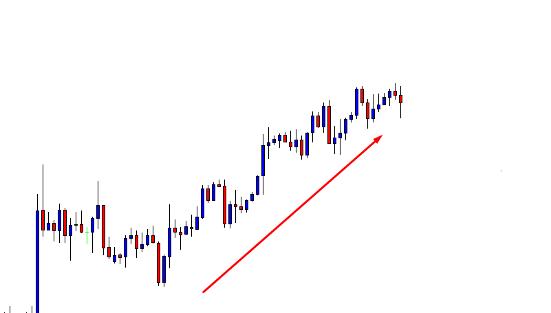
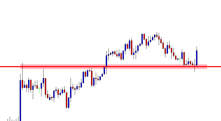
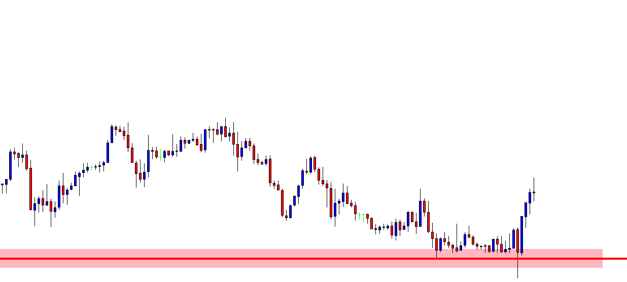
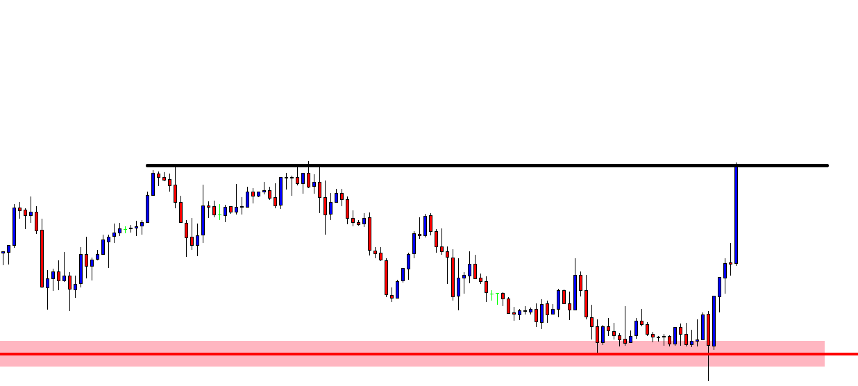
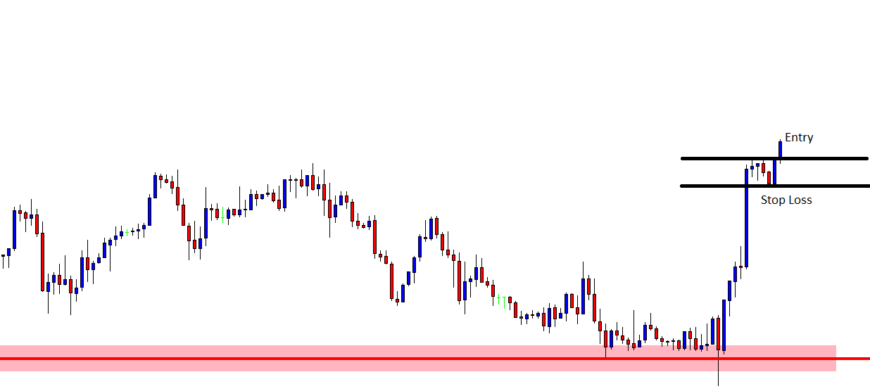
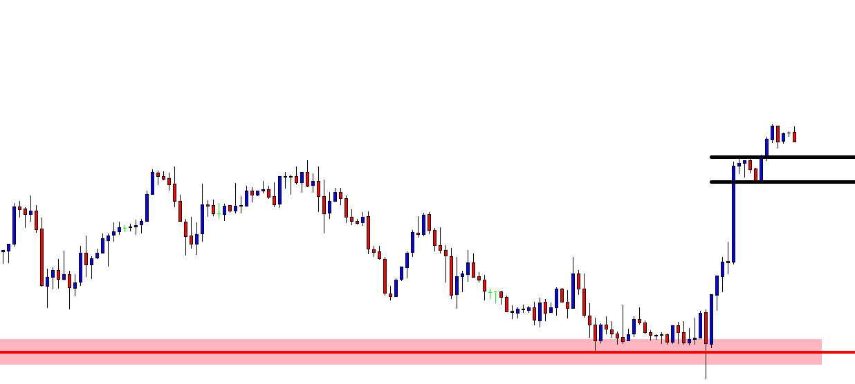
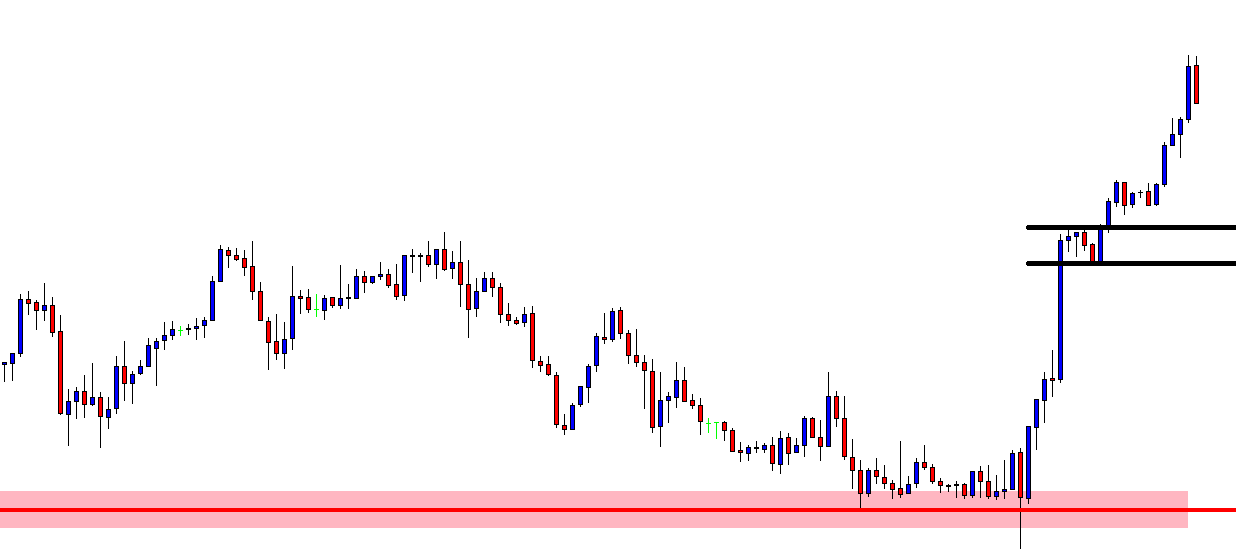

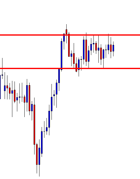

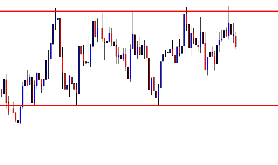
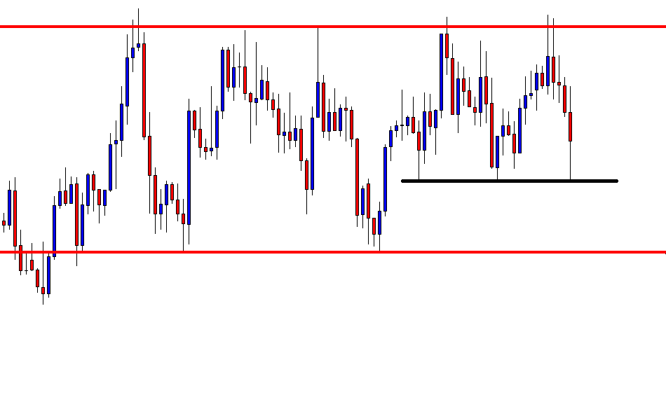
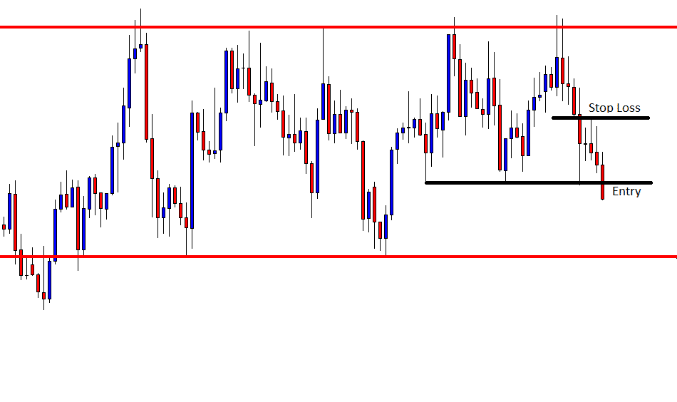
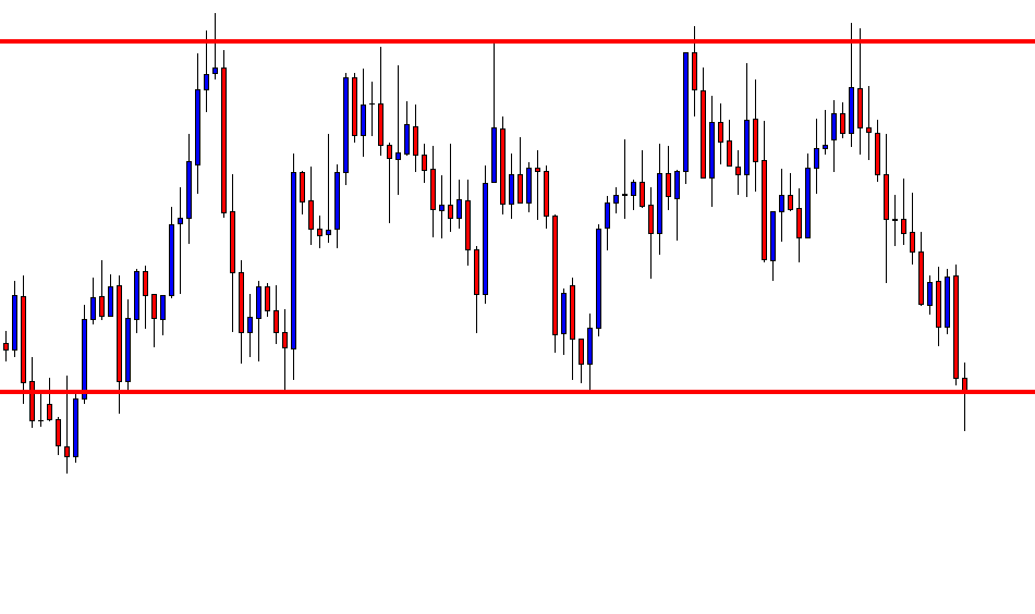


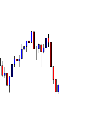
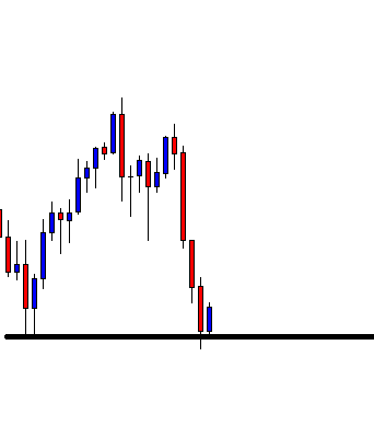
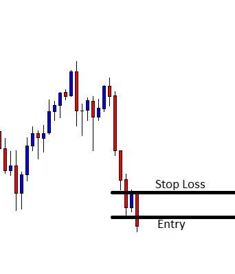
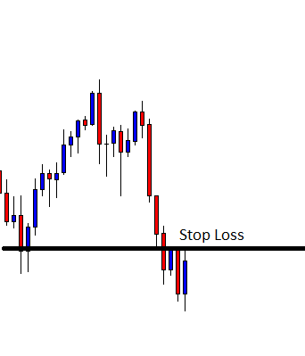
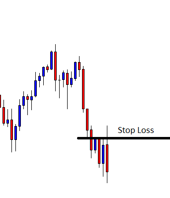

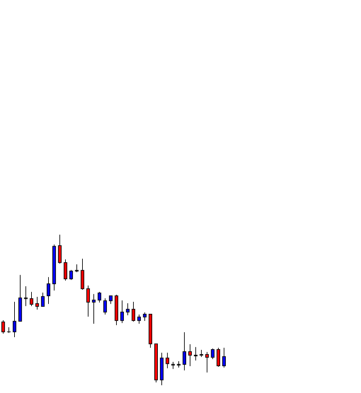
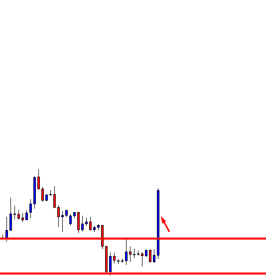
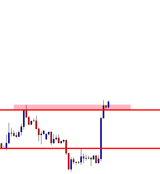
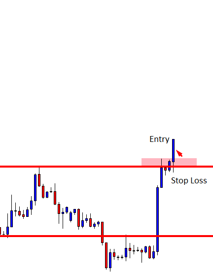
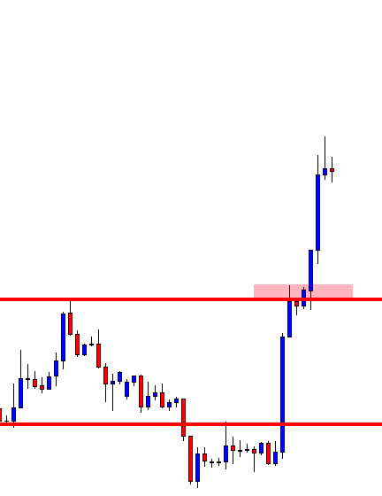


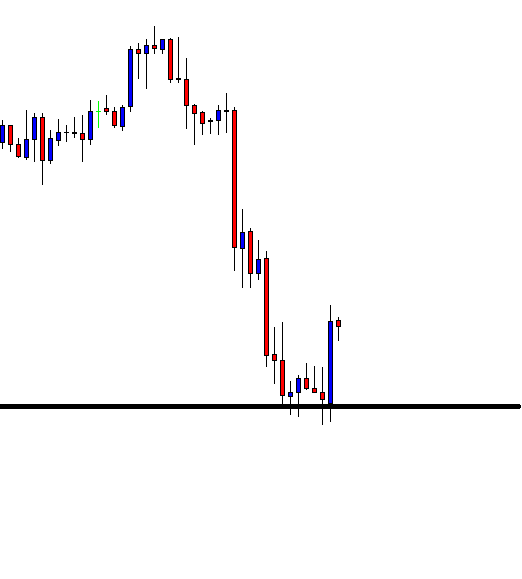
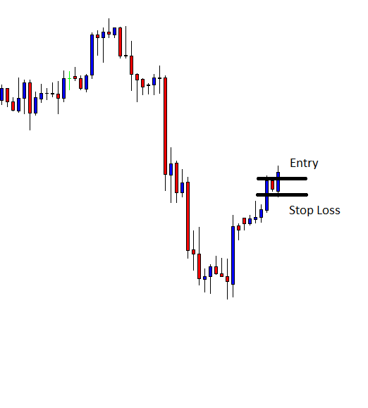
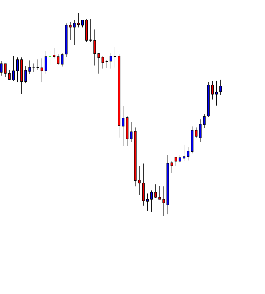
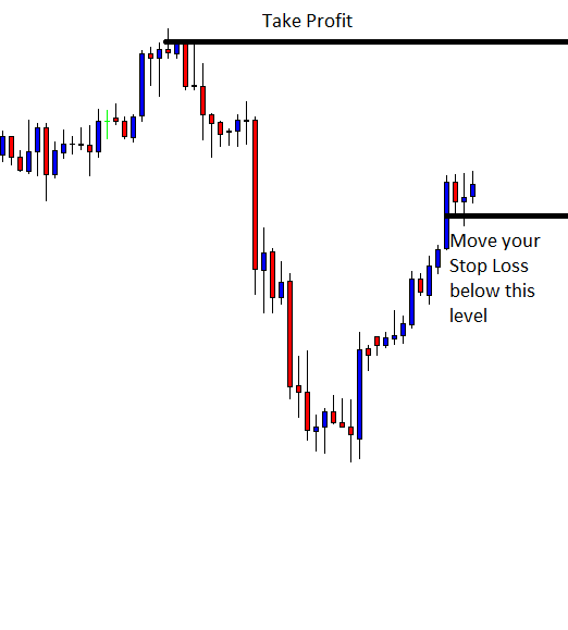
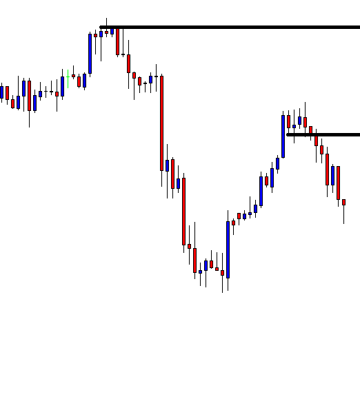
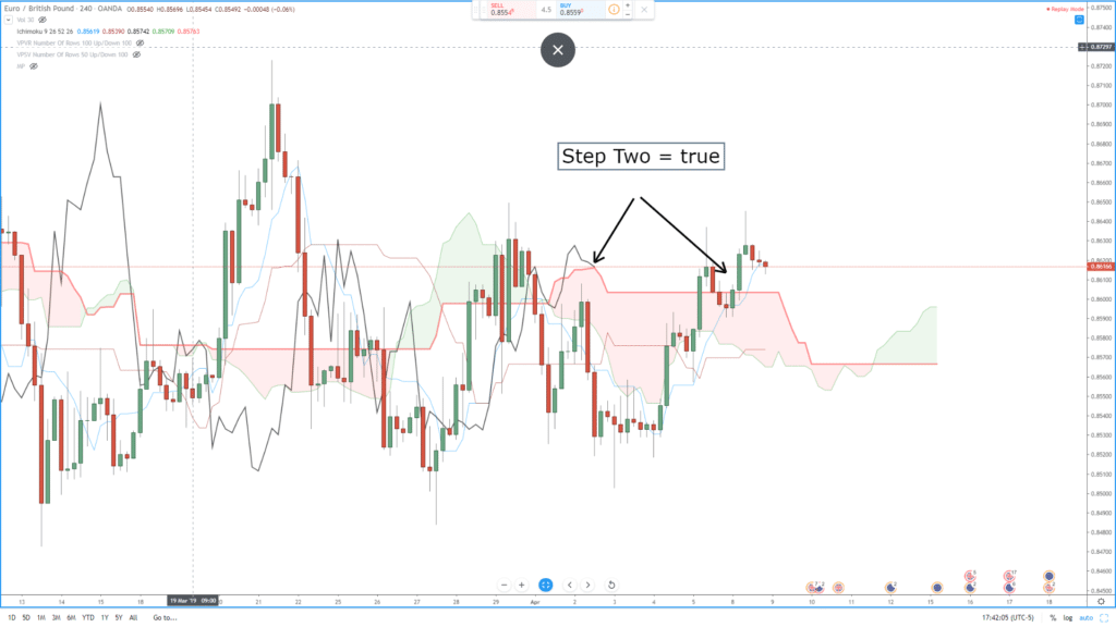
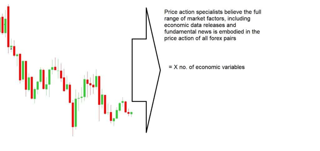
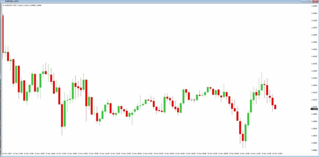
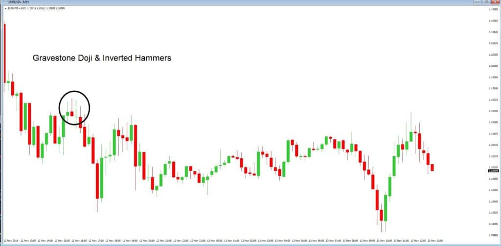
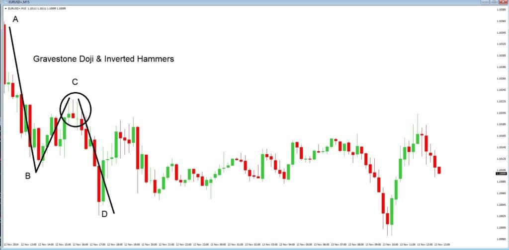
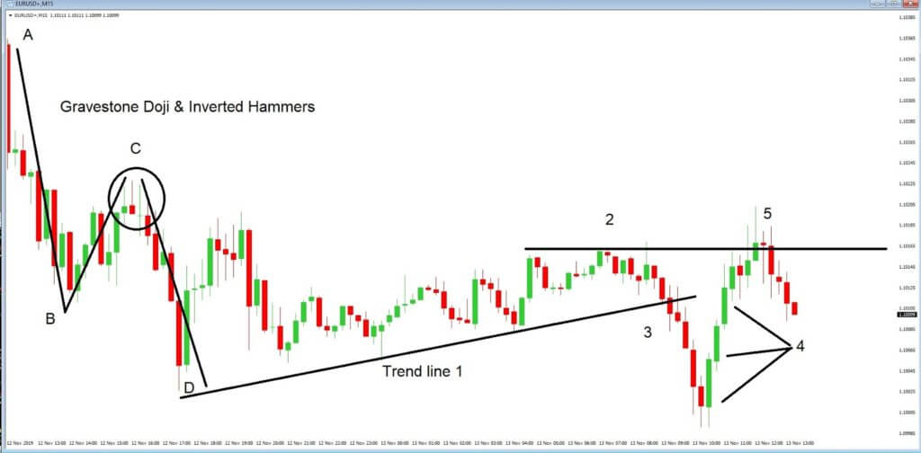

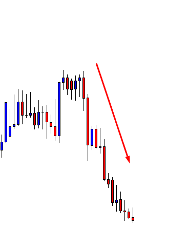

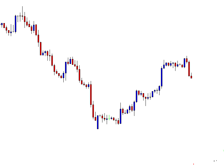
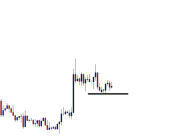
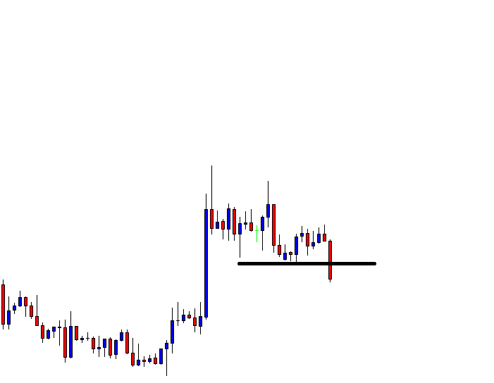

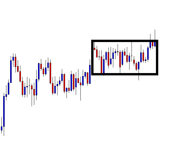

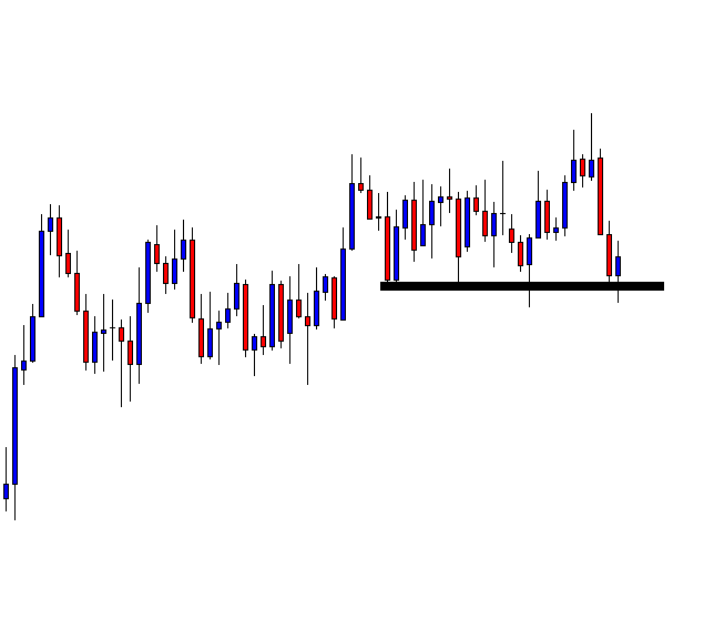
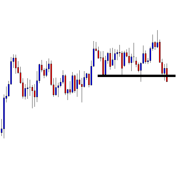

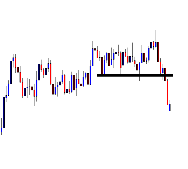

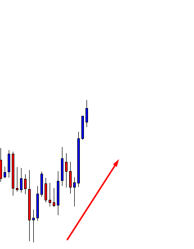

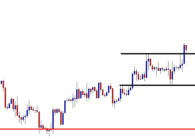
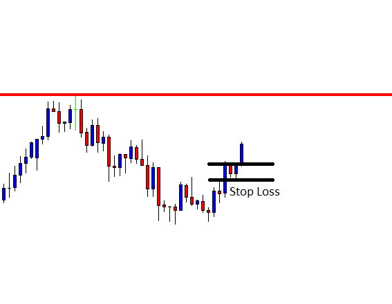
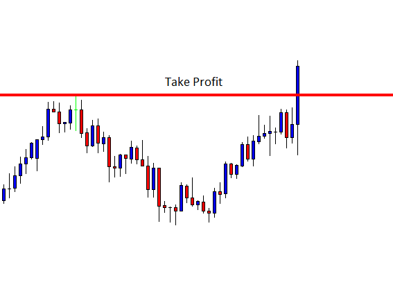

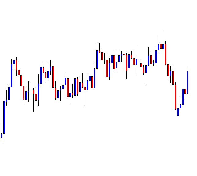
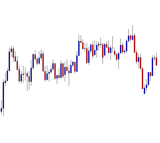

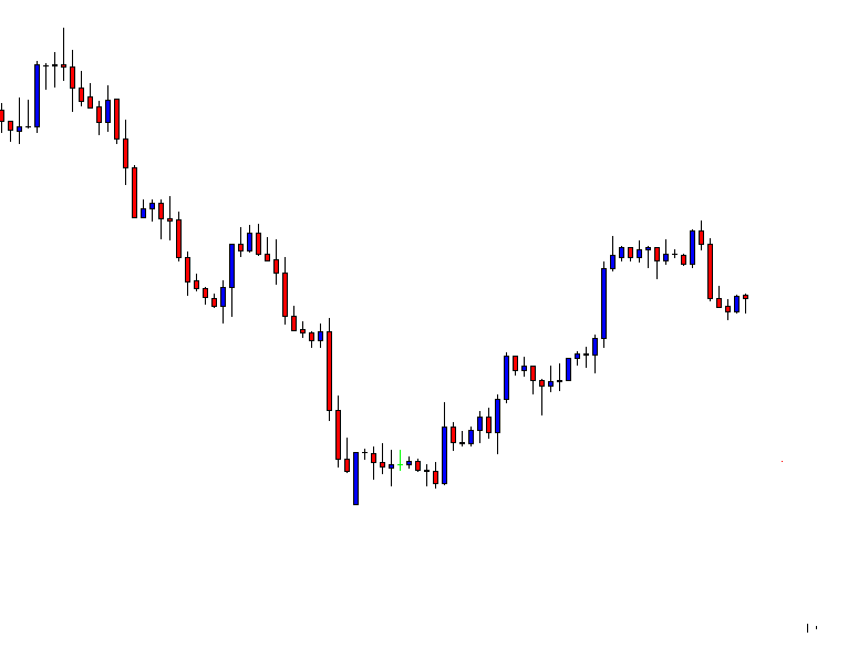
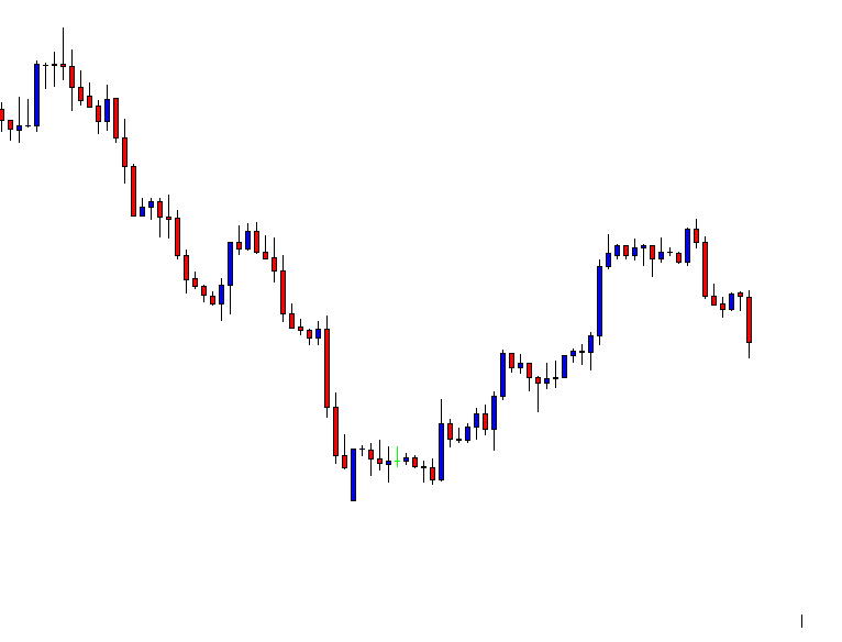

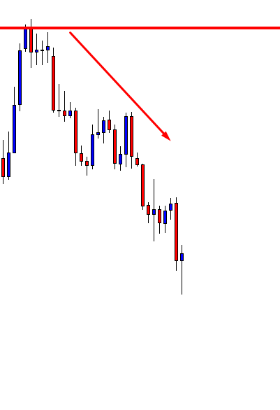

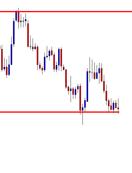
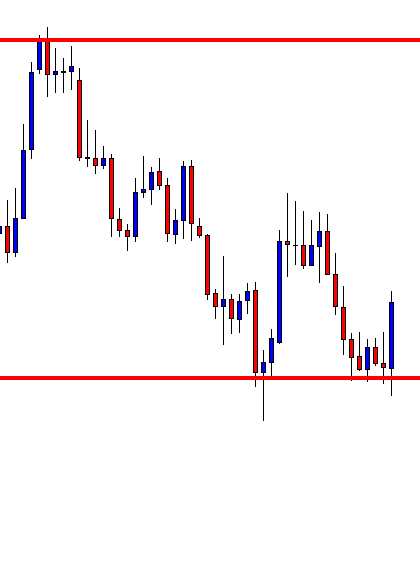
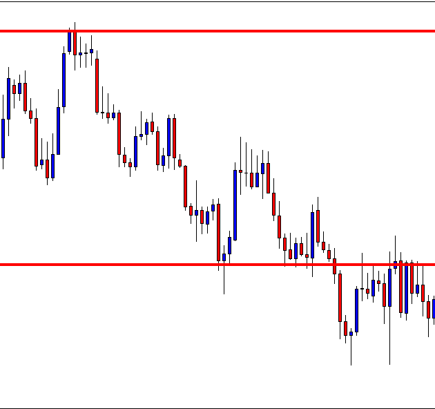
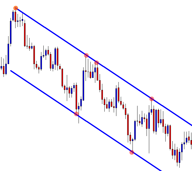
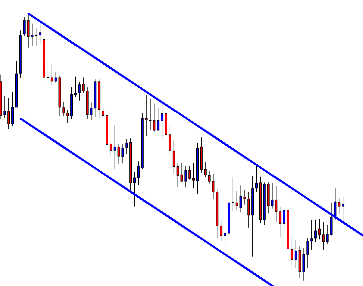
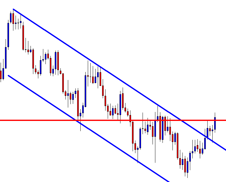
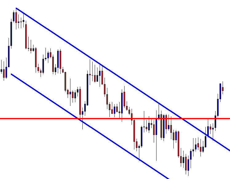
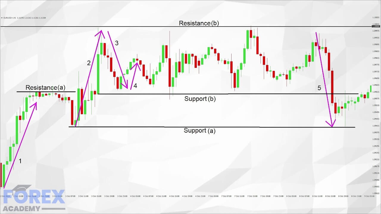

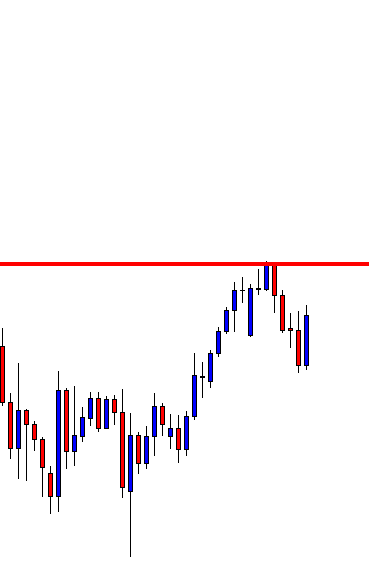
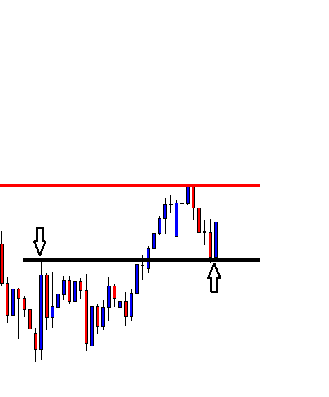
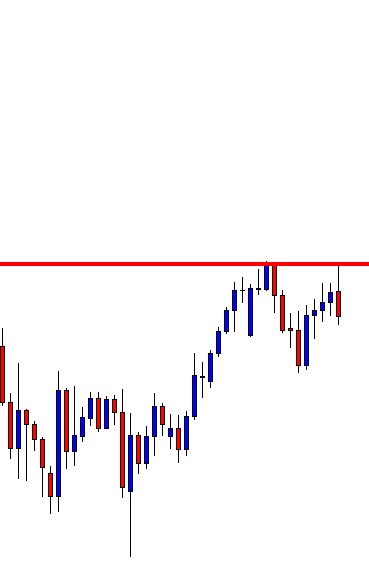

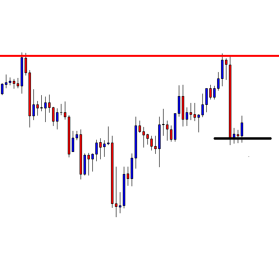

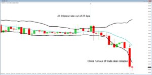
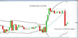

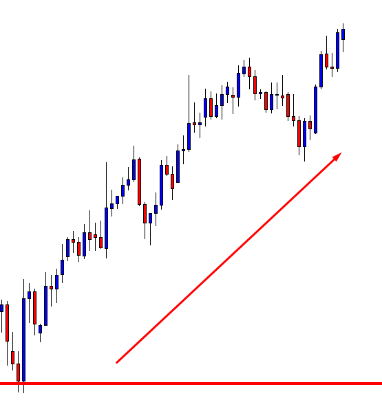
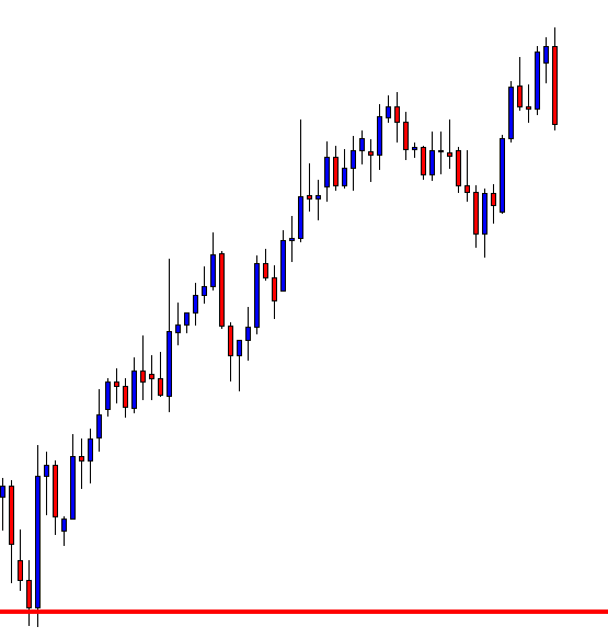
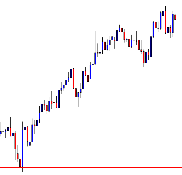
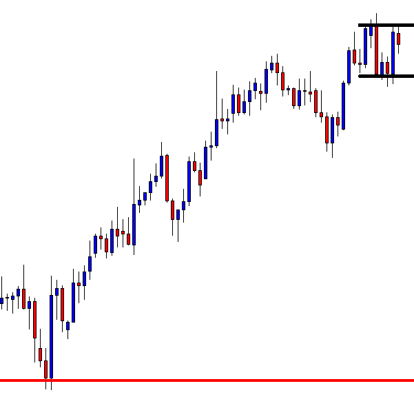
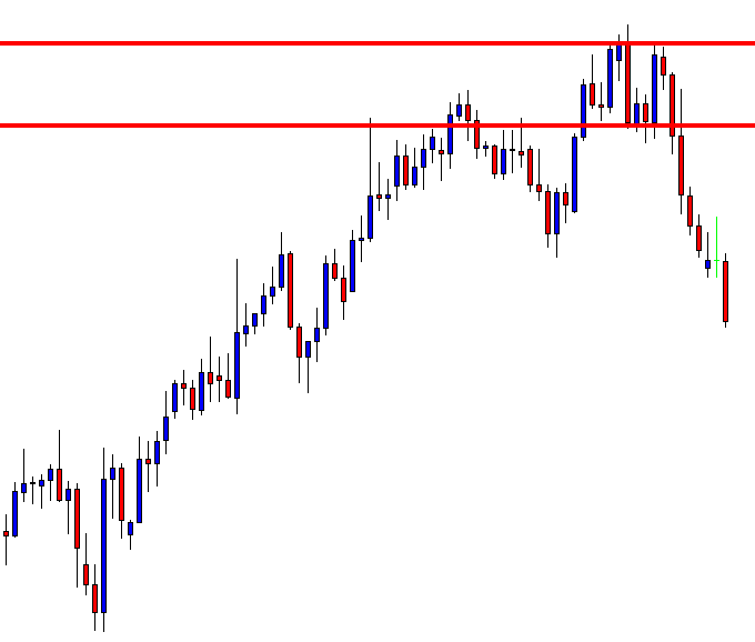
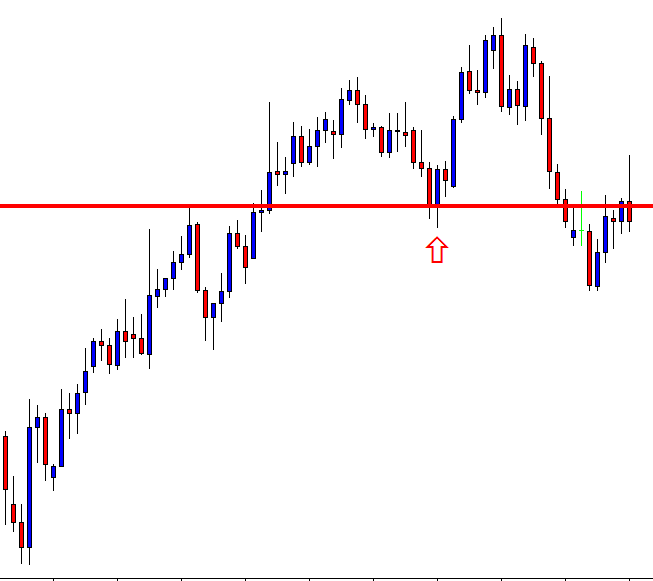

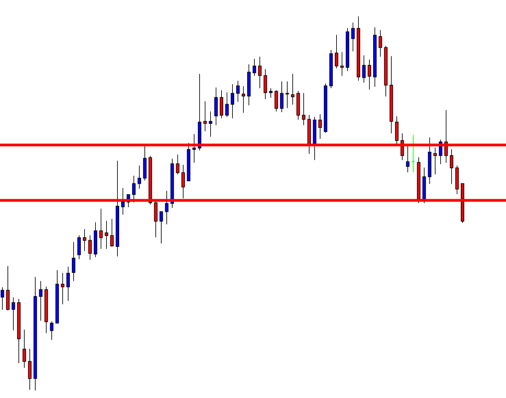
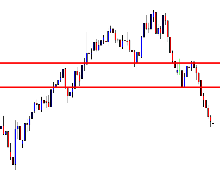

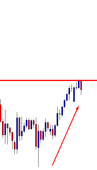
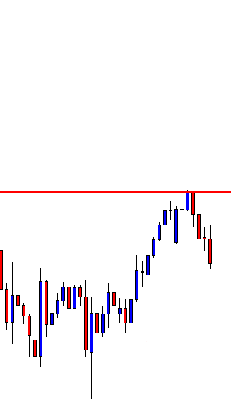
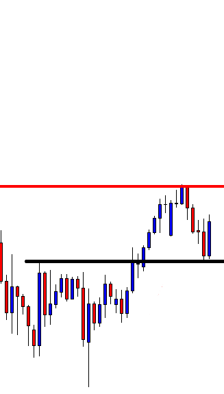


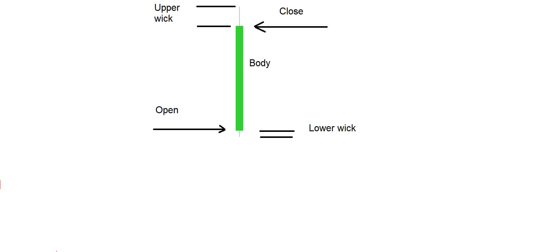
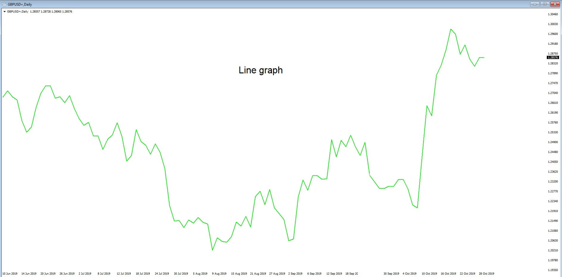
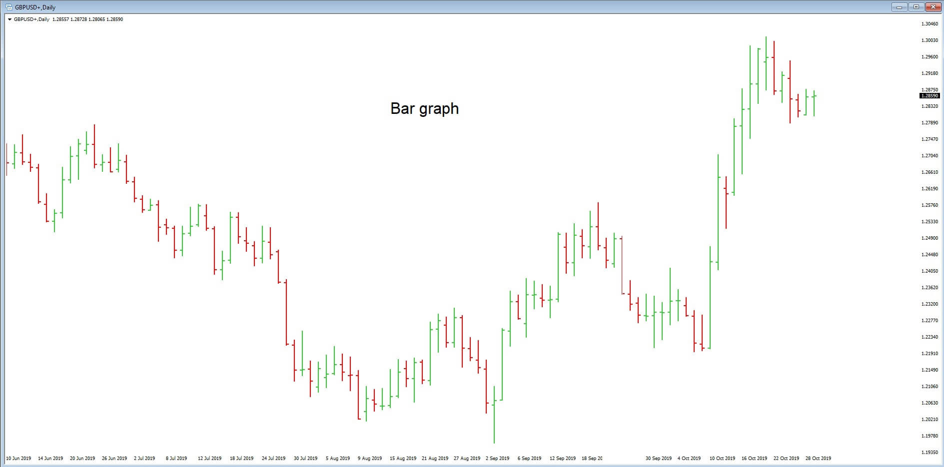
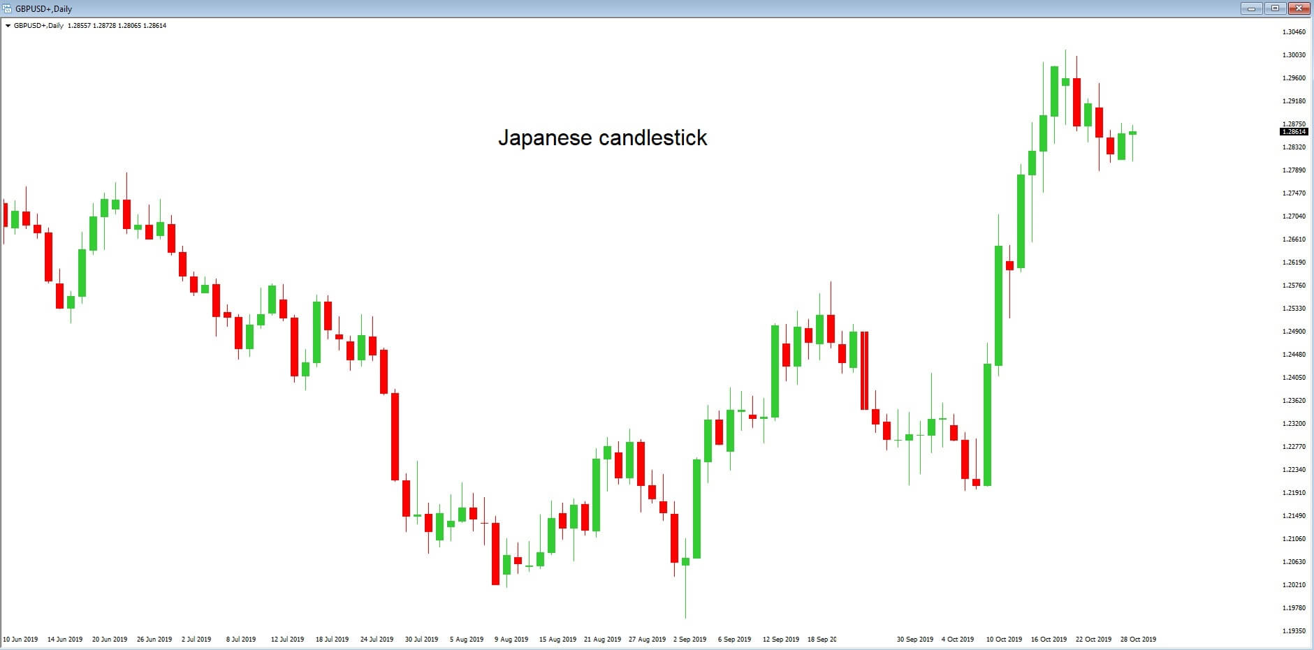
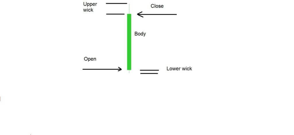 Example ‘D’ is a typical candlestick shape that traders see regularly on their charts. We have marked the points where the candlestick opened and closed. If the candlestick closes above the exchange rate at the point of which it opened, it is considered to be a bullish candlestick. If it closes below the exchange rate at the point of opening, it is considered to be bearish. Candlesticks can also open and close at the same exchange rate.