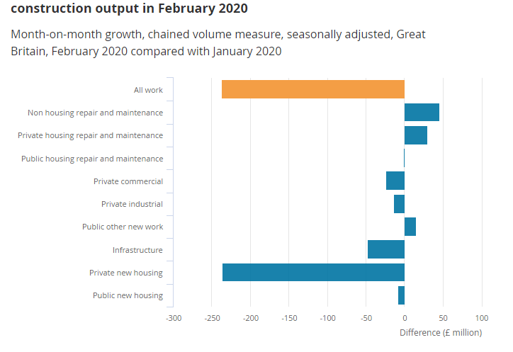
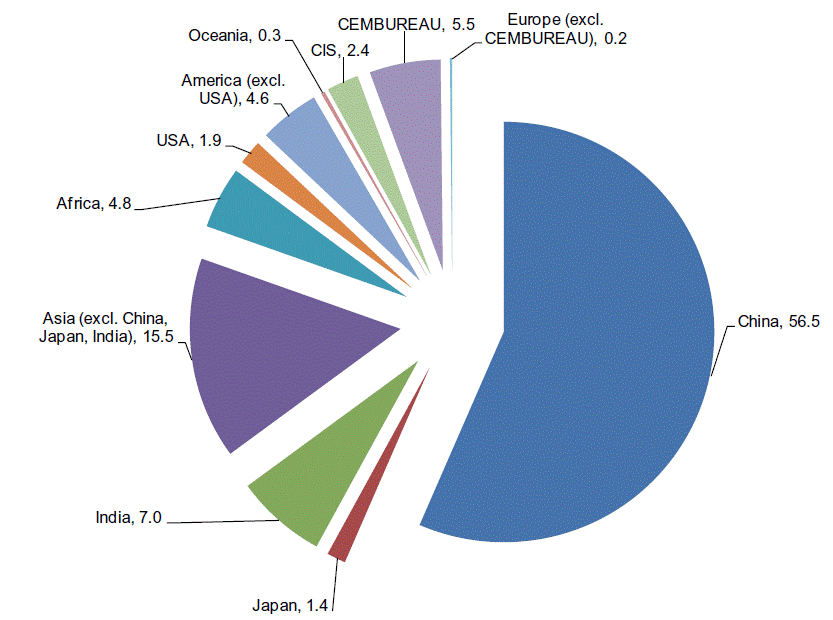
Introduction
The Services Purchasing Manager’s Index is an excellent leading or advanced macroeconomic indicator, which is used widely to predict economic expansion or contractions. It has various applications for economists, investors, and traders. This indicator predicts inflation, GDP, and the unemployment rate of an economy. Hence, understanding of Services PMI can be hugely beneficial for a trader’s fundamental analysis.
What is Services PMI?
The Services Purchasing Manager’s Index, also called the Non-Manufacturing Index (NMI), is a survey of about 400 largest non-manufacturers in the United States of America. The word non-manufacturing here implies that the study is associated with the industries that do not produce physical goods; instead, they provide services. Non-physical goods mean the services provided by the IT and software giants like Microsoft and Google etc. The services PMI has fewer survey questions than the manufacturing PMI as some questions, such as inventories, not being relevant to many service providers.
The Services PMI was born more out of a need to accommodate the changing world due to the technological advancements in the last few decades. For most developed nations like the United States, the Service sector contributes more than the Manufacturing industry due to which it had to be taken into account to predict economic trends more accurately.
Purchasing Managers in a company are the purchasing and supply executives associated with procuring the required goods and services that are necessary for running the company. For example, A software company’s Purchasing Manager would typically be in charge of contacting and getting the best internet service provider for the entire company at the lowest or best prices from the market.
They may also be responsible for tie-ups with fellow software companies to get the required software to run their operations. The purchasing Managers have a decent idea of what a company needs, and during what periods these requirements change.
How is the Services PMI calculated?
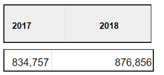
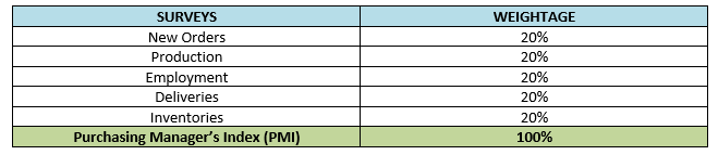
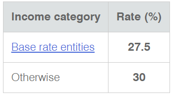
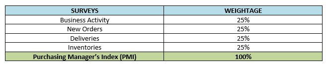
The Services PMI hence is a compilation of the survey answers given by the Purchasing Managers of the largest 400 non-manufacturing companies of about 60 sectors in the USA. The questions typically asked in the study are related to month-over-month changes in the Business Activity, New orders, Deliveries, and Inventories with equal weightage, as shown in the table below:
All the four categories, as seen when putting together, form the NMI. These four components are enough to ascertain a growth or contraction in the business activity of that company.
The rating of Services PMI range between 0-100. A score > 50 indicates an expansion of economic activity in the non-manufacturing sector. Likewise, a score < 50 indicates contraction.
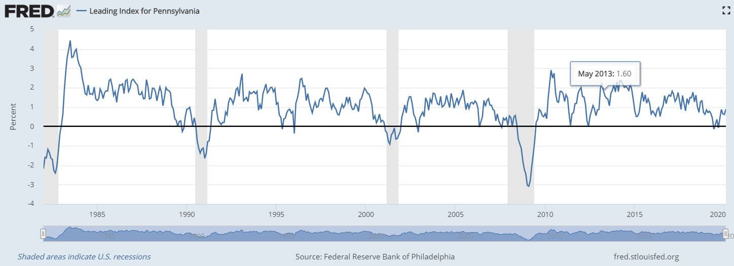
How can the Services PMI be Used for Analysis?
The data of ISM NMI Reports on Business goes back to 2008 due to which the levels of confidence in the data set may be lower than that of Manufacturing PMI; nonetheless, it is no less effective in ascertaining economic figures like GDP, inflation and employment, etc.
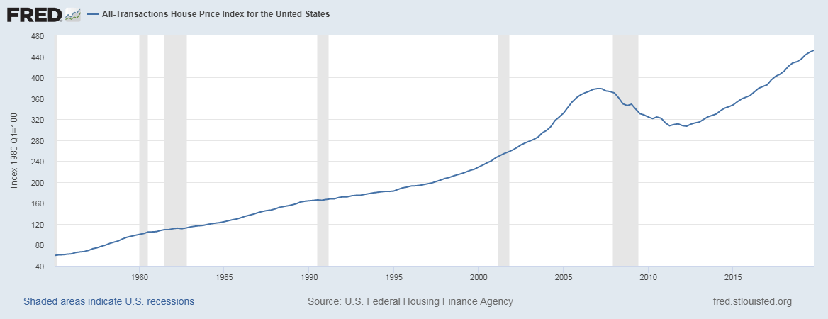
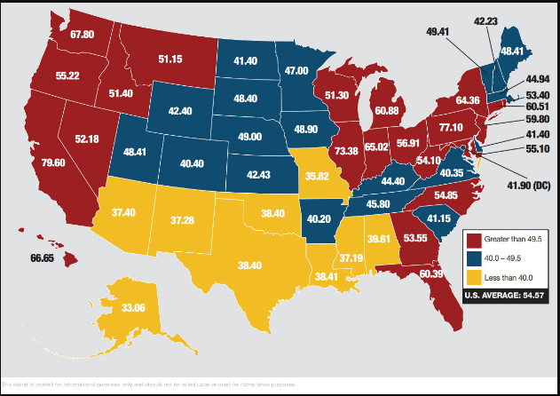
The Non-Manufacturing sector of the United States makes up 80% of the total GDP, and hence the Services PMI is a significant economic indicator in that regard. The Non-Manufacturing sector primarily drives the macroeconomic numbers like the GDP. Together the NMI and PMI cover more than 90% of the industrial sectors that contribute to GDP; hence Services PMI is a must for fundamental analysis.
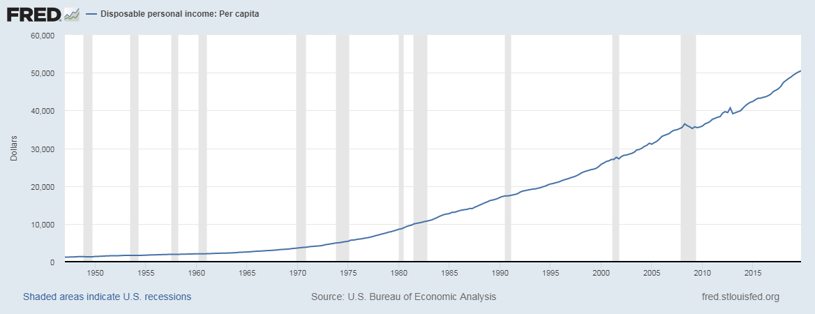
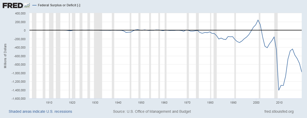
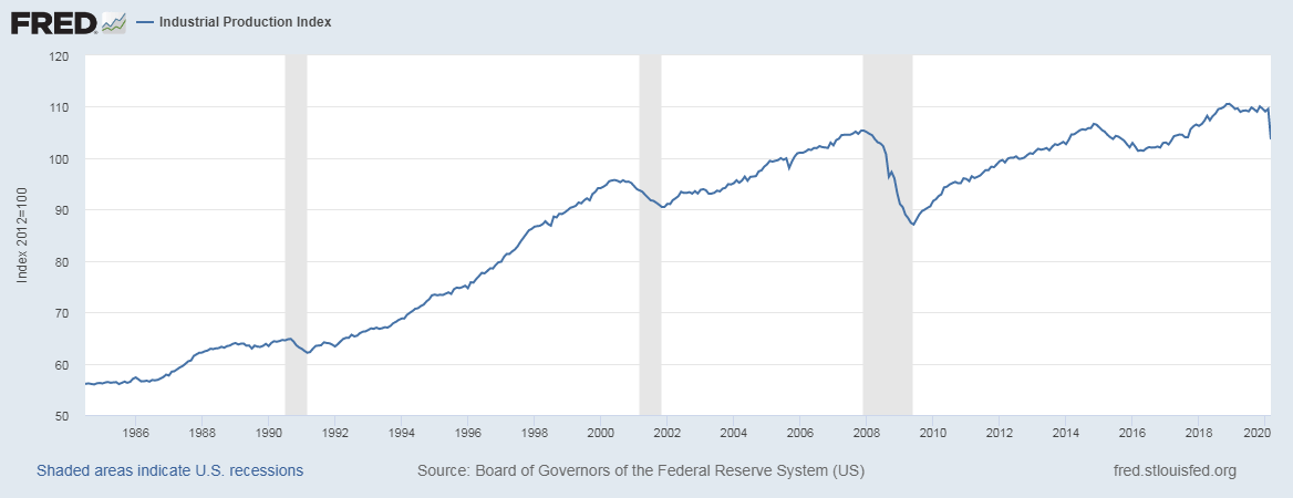
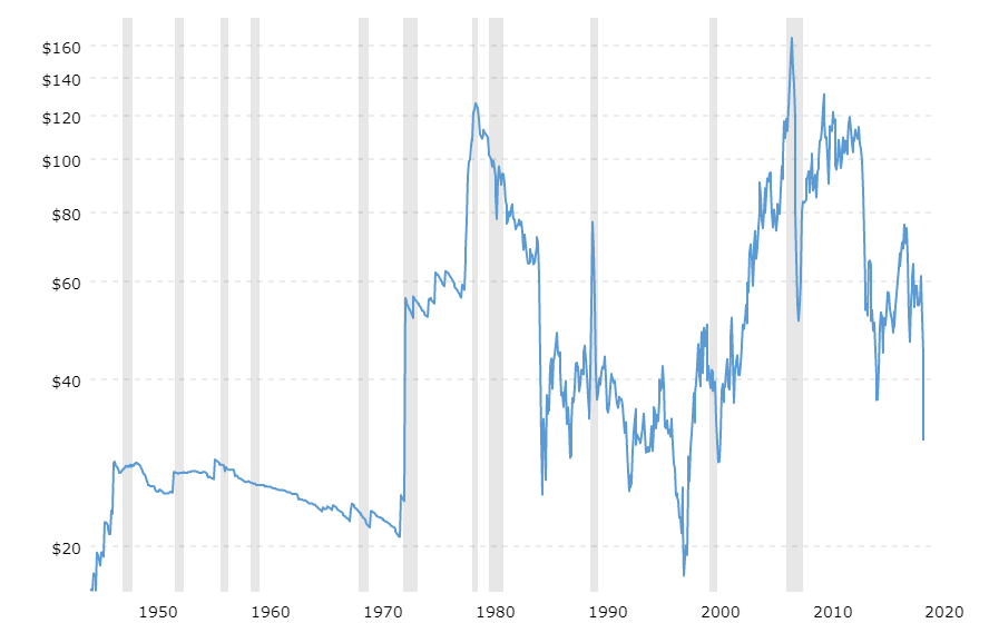
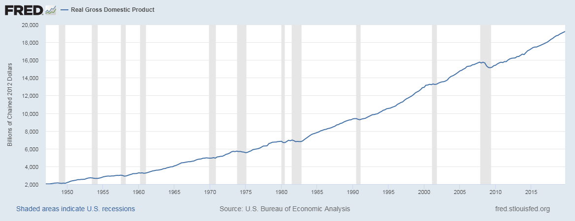
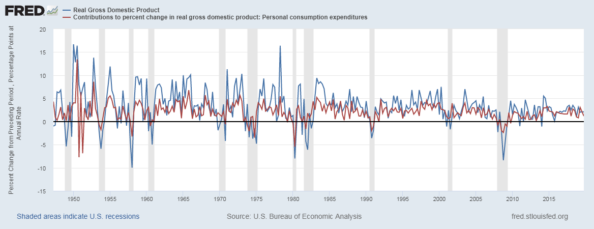
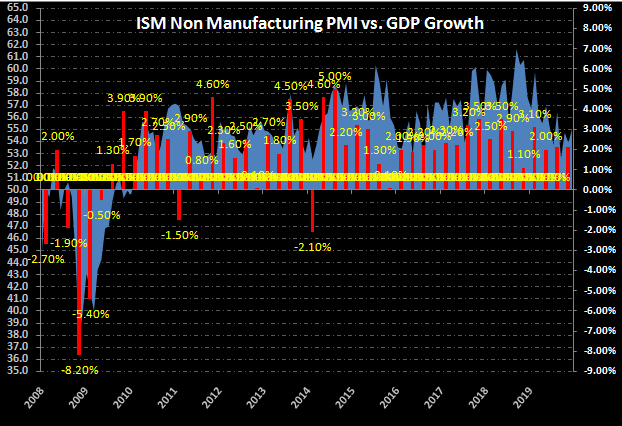
The correlation between the ISM NMI Data and real GDP is about 85%, which is pretty good. The main advantage of studying Services PMI is that it is an advanced economic indicator. It predicts the real GDP a year ahead, which is commendable.
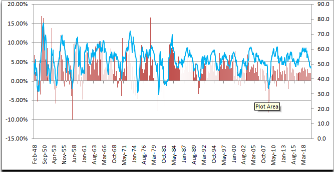
Below is a snapshot of Services PMI plotted against the real GDP growth rate historically, and we can see the strong correlation existing between them. This explains the importance of these leading indicators in the fundamental analysis of traders.
Impact on Currency
The impact of Services PMI on the currencies is as same as the impact of Manufacturing PMI. You can find this information here.
Sources of Services PMI Reports
We can monitor the NMI reports on the official website of the ISM official website. We can also go through the NMI of other countries from the IHS Markit official website on a subscription basis.
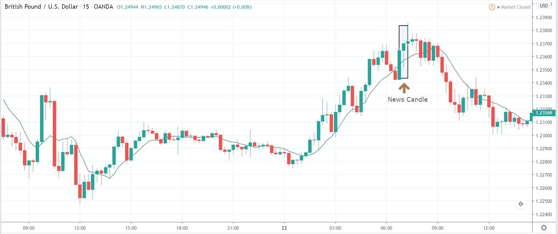
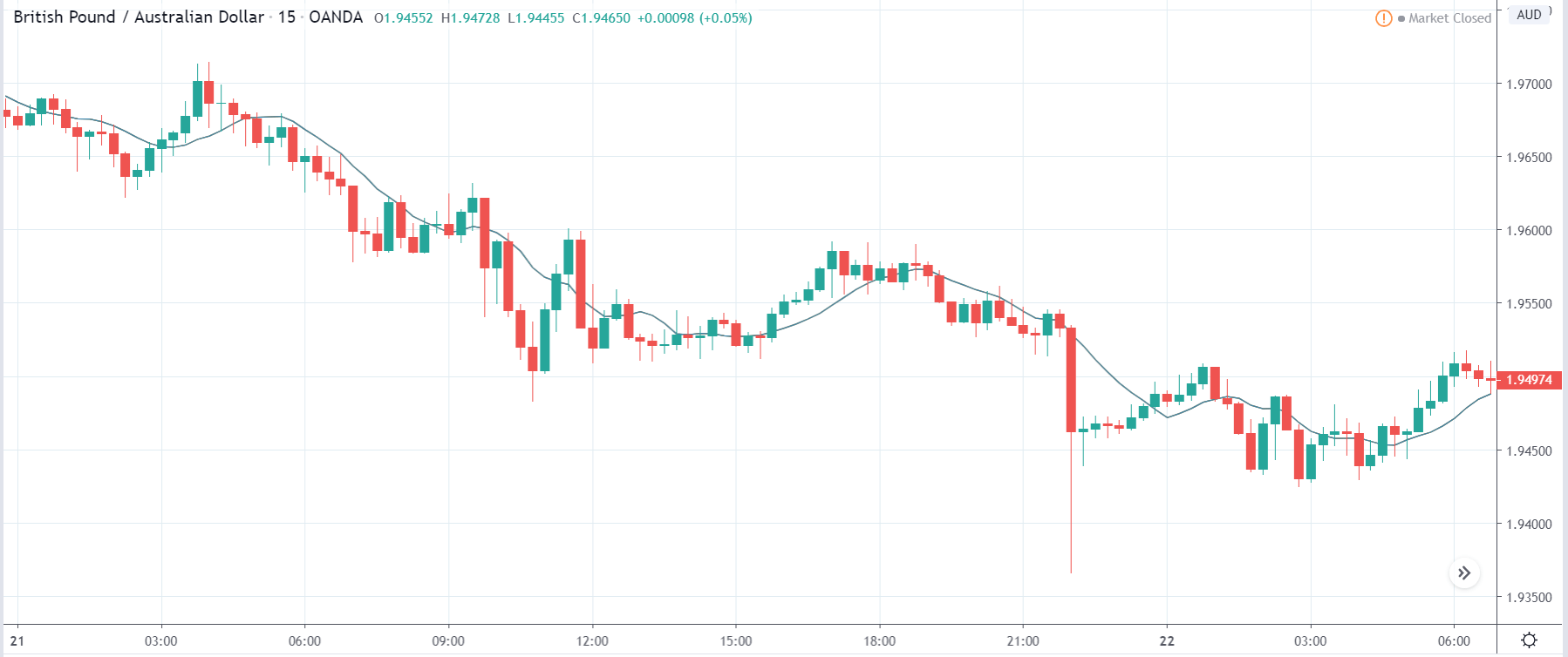
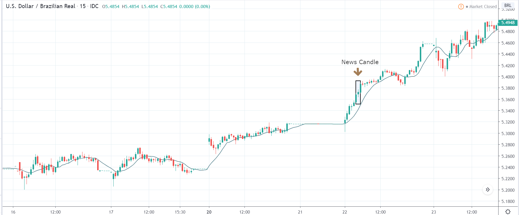
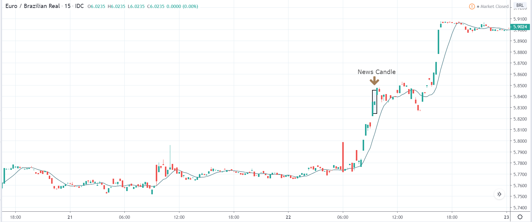
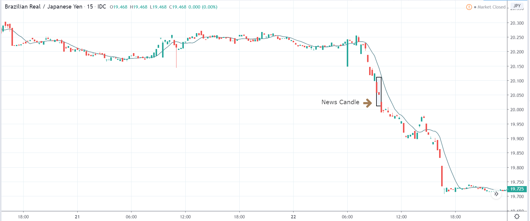
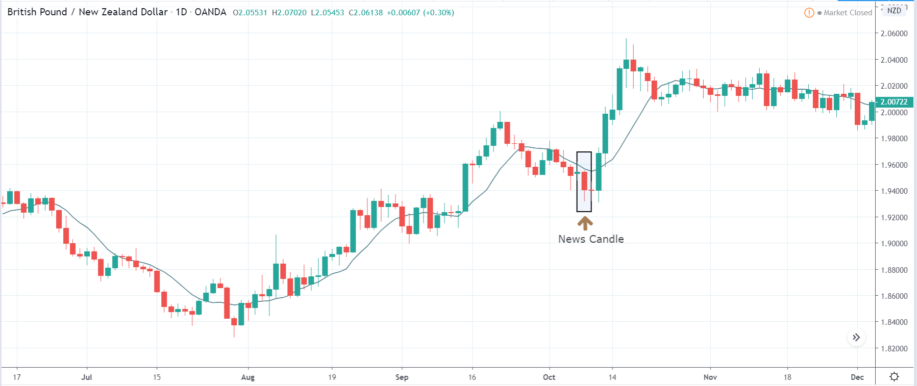
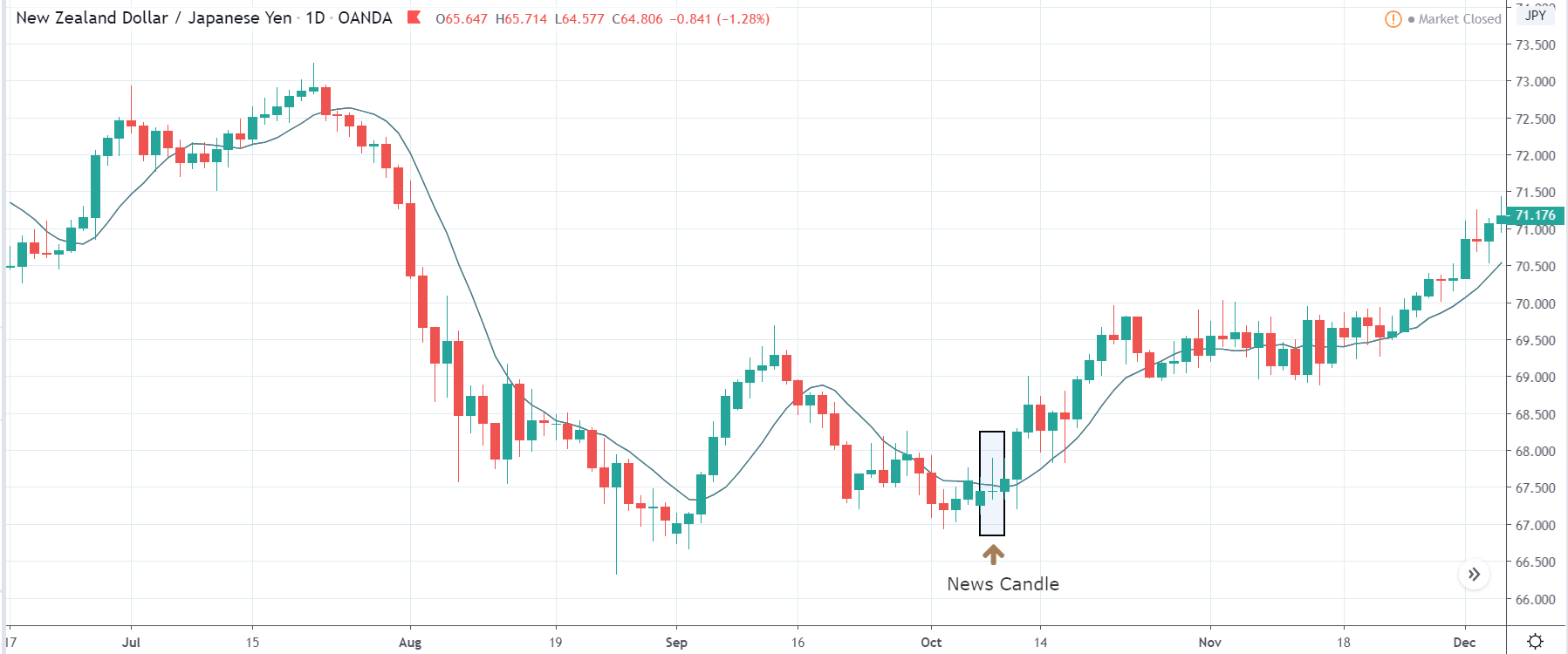
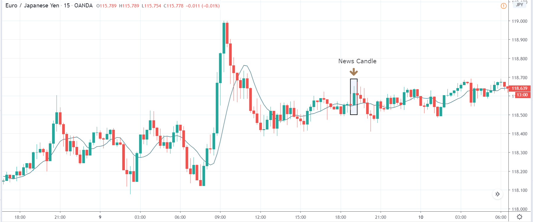
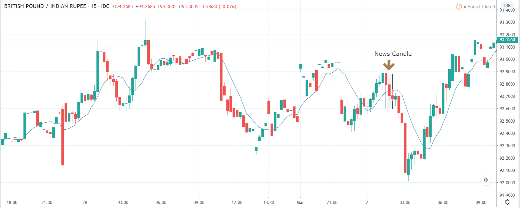
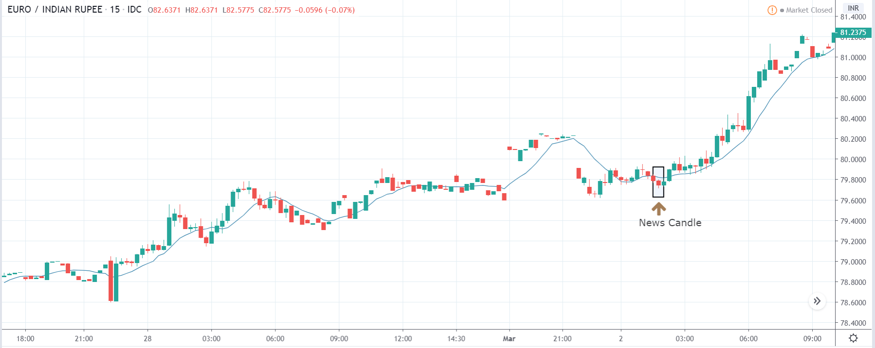
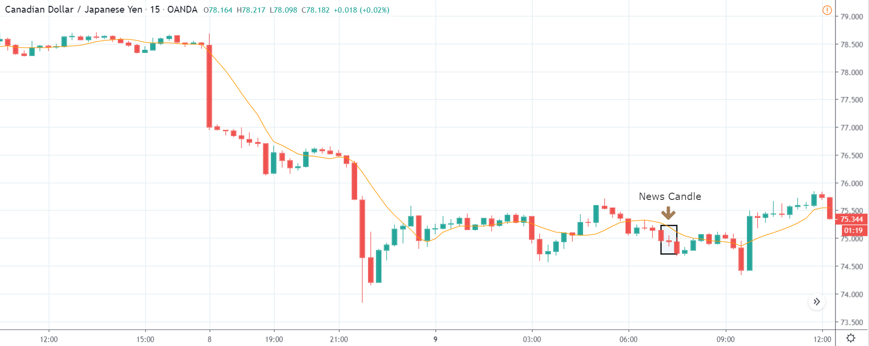
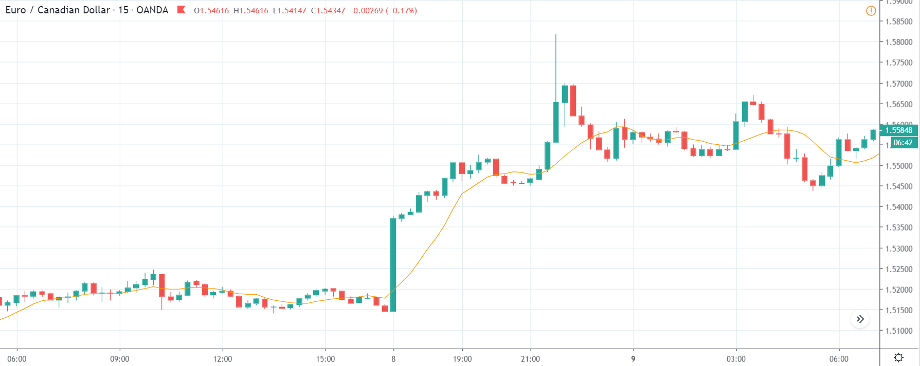
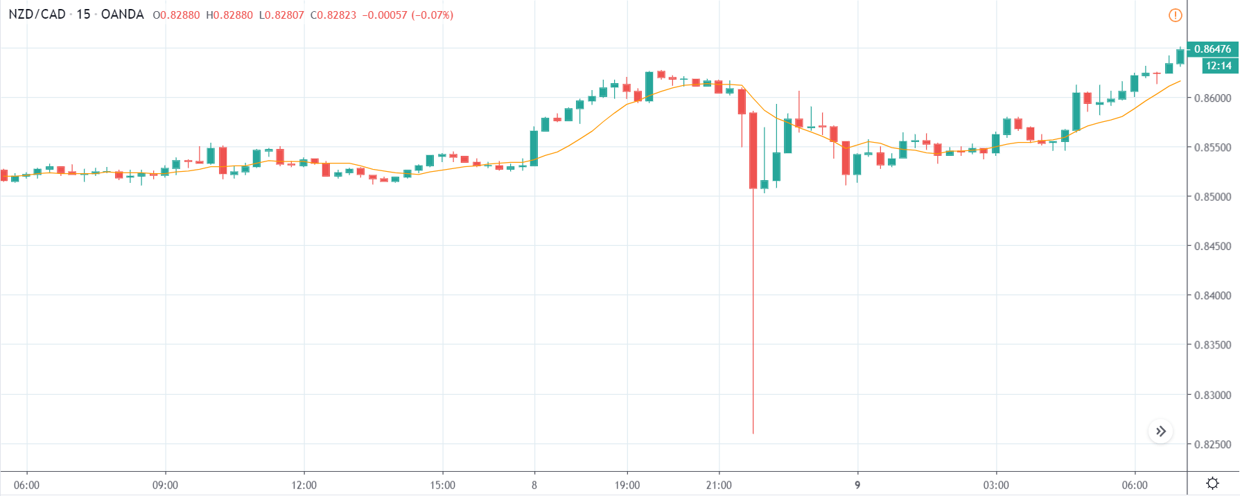
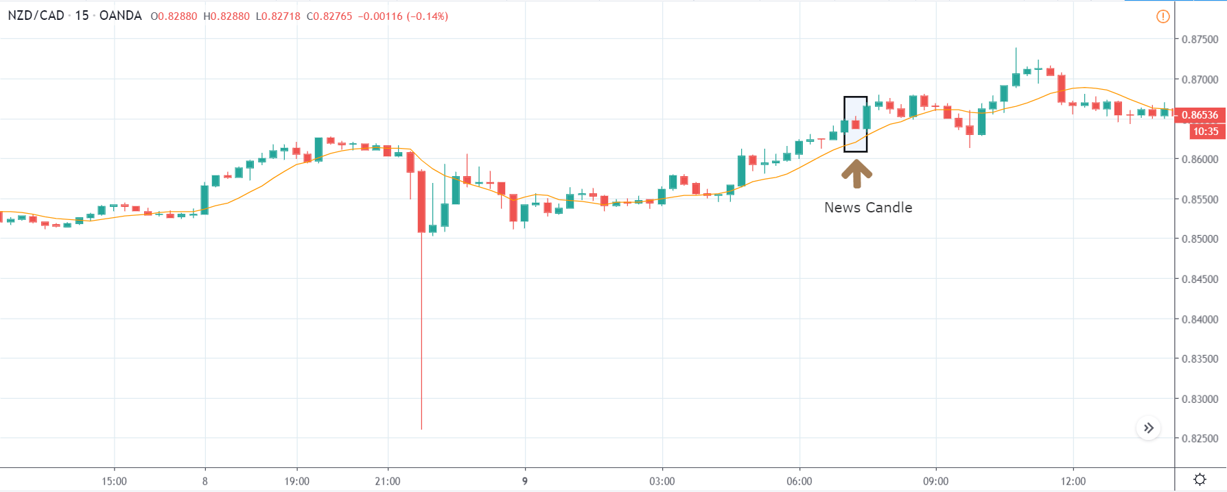
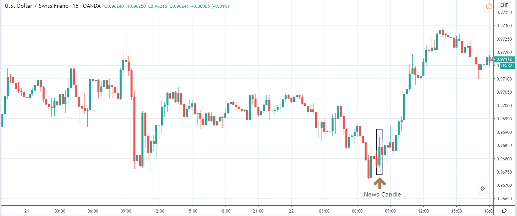
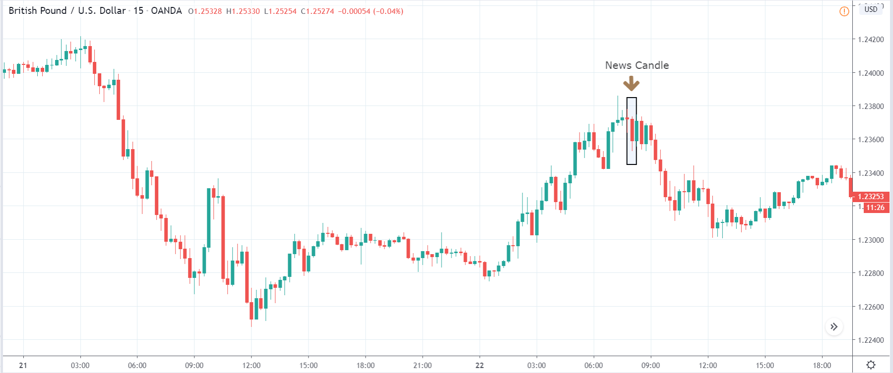
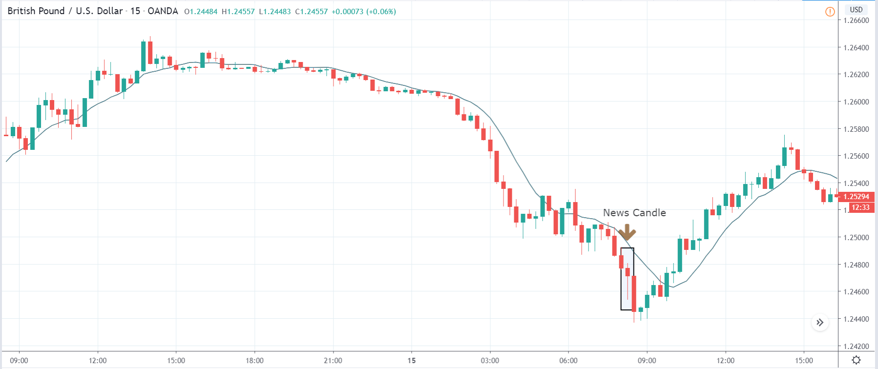
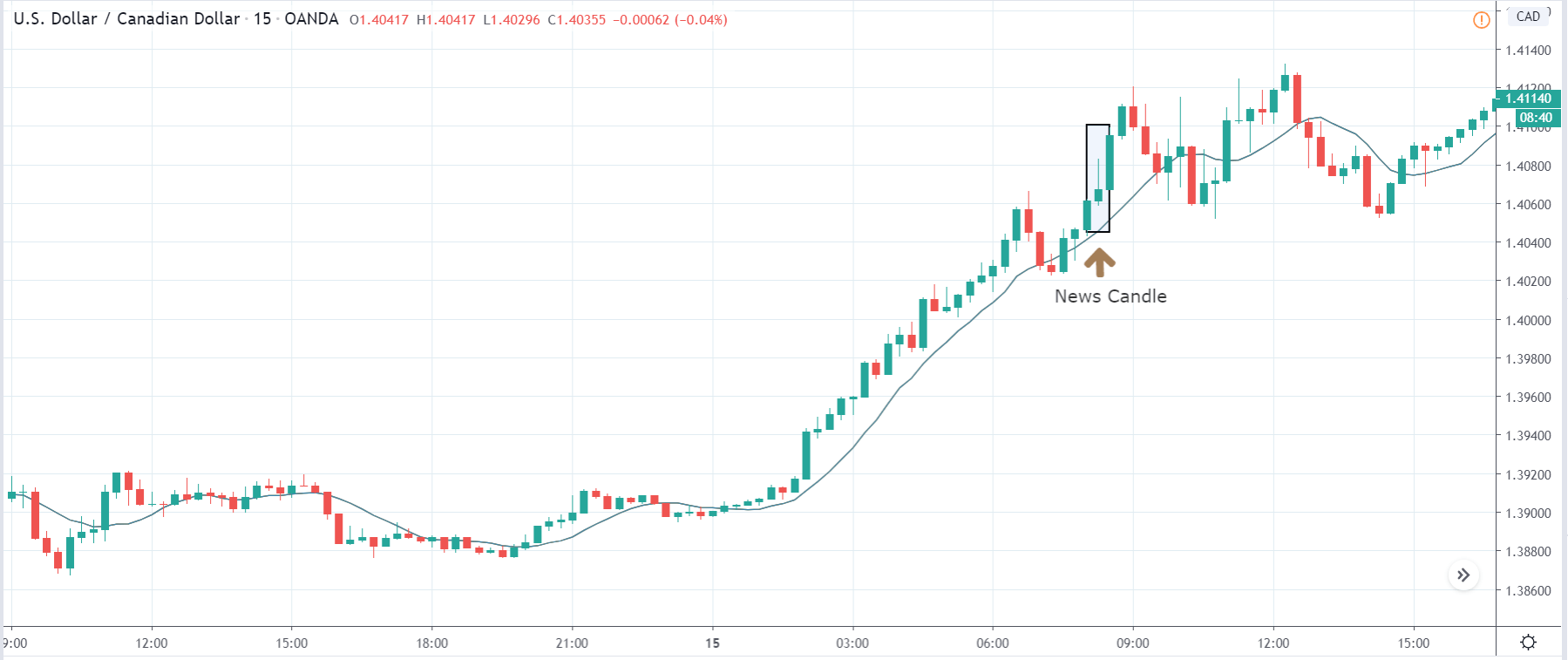
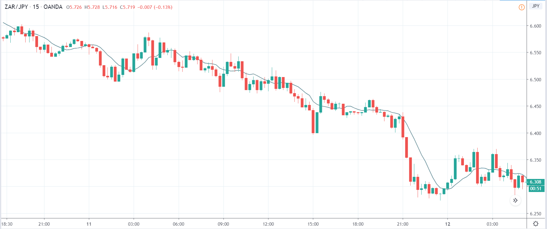
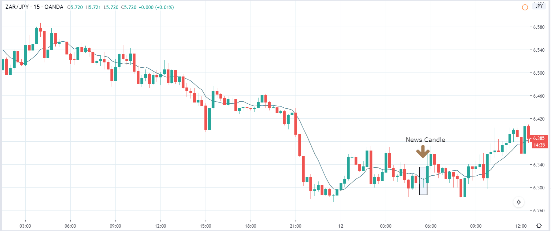
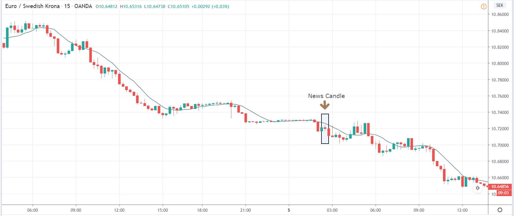
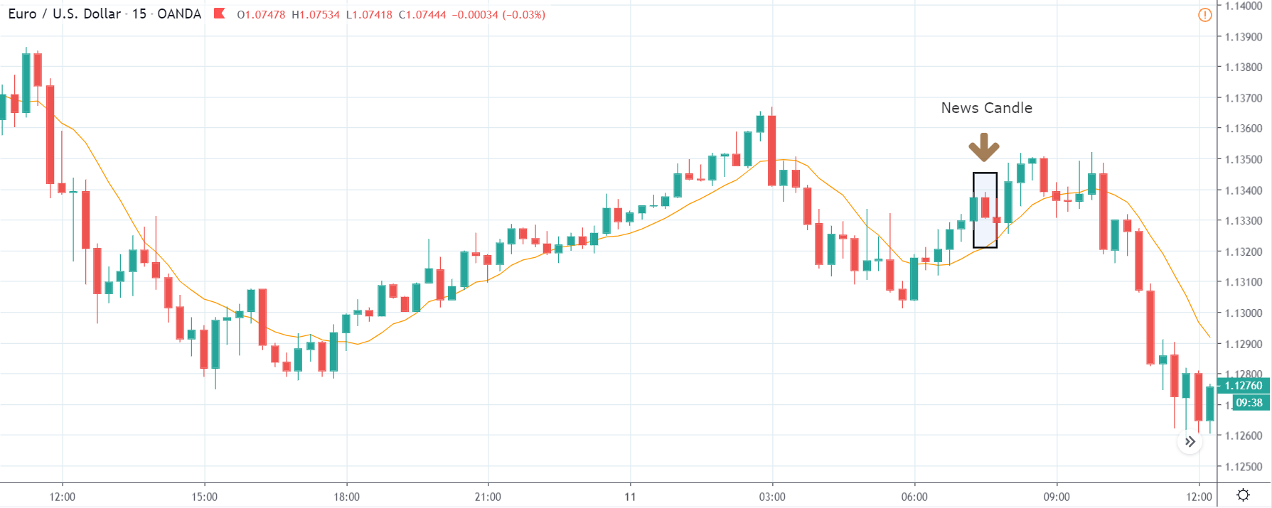
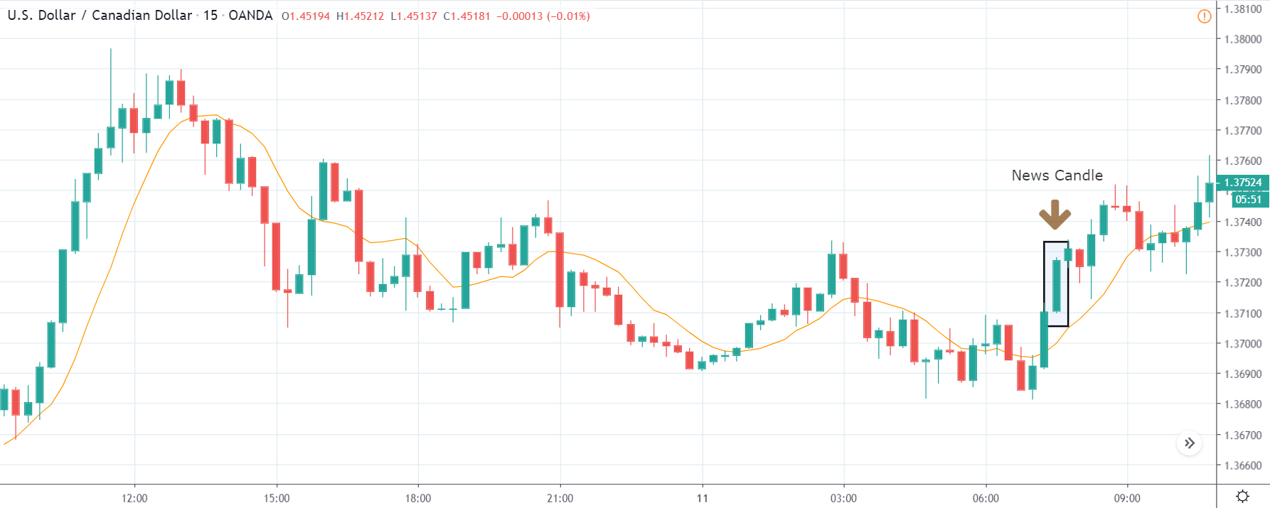
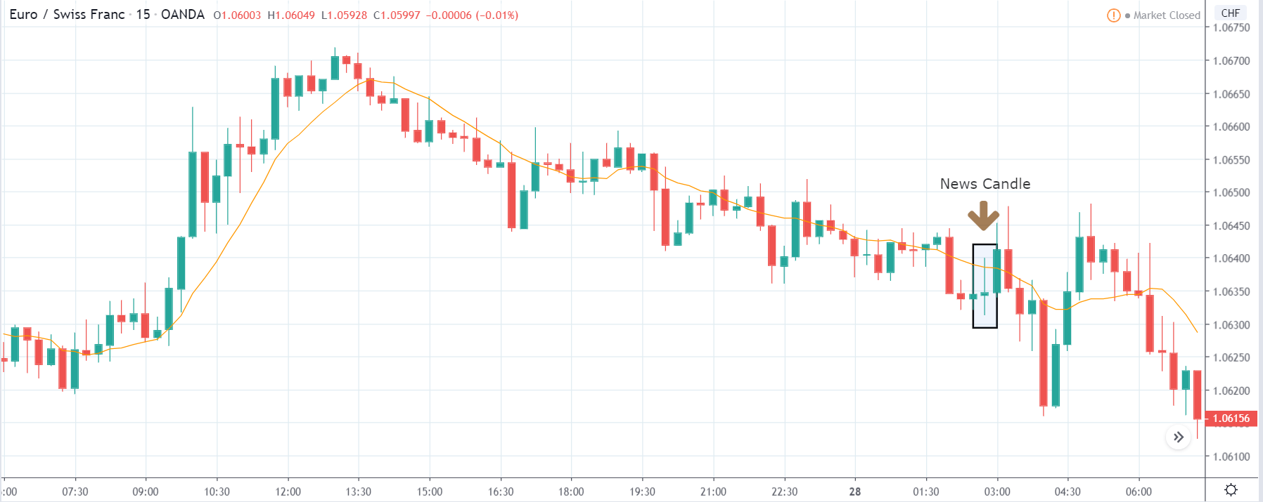
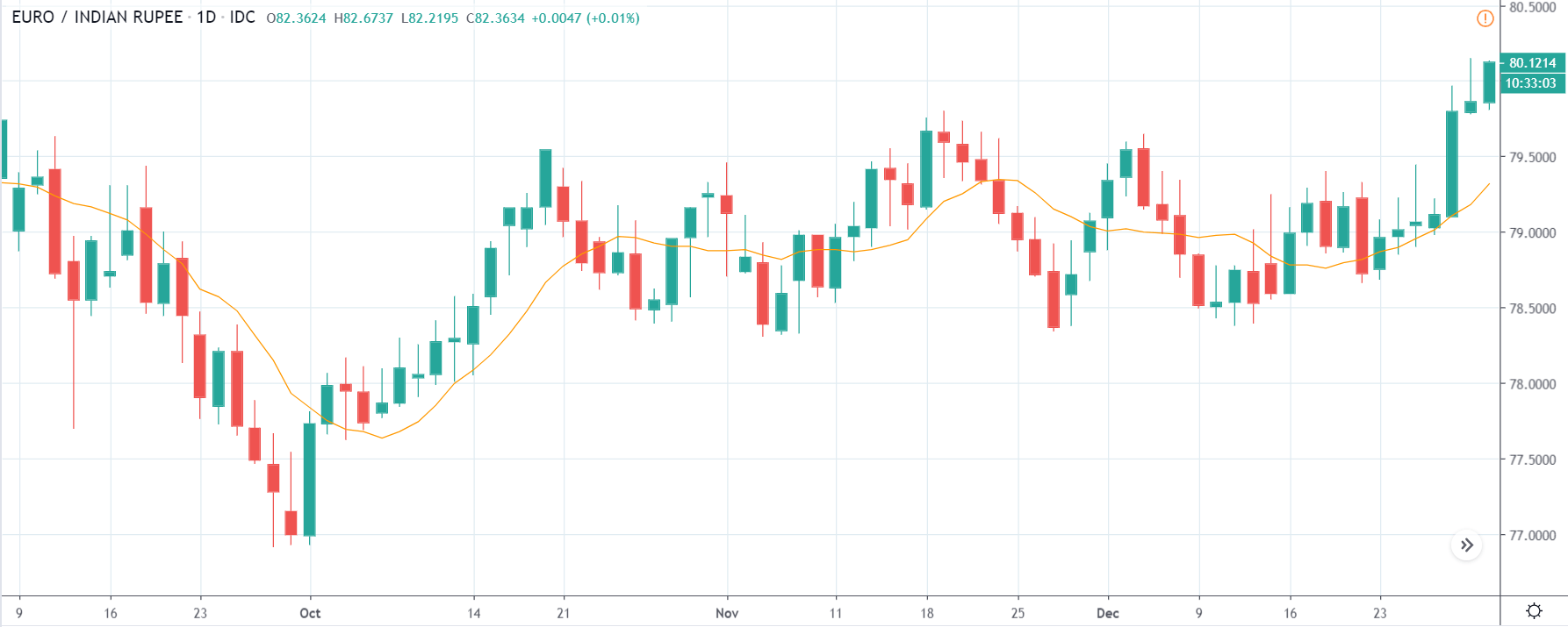
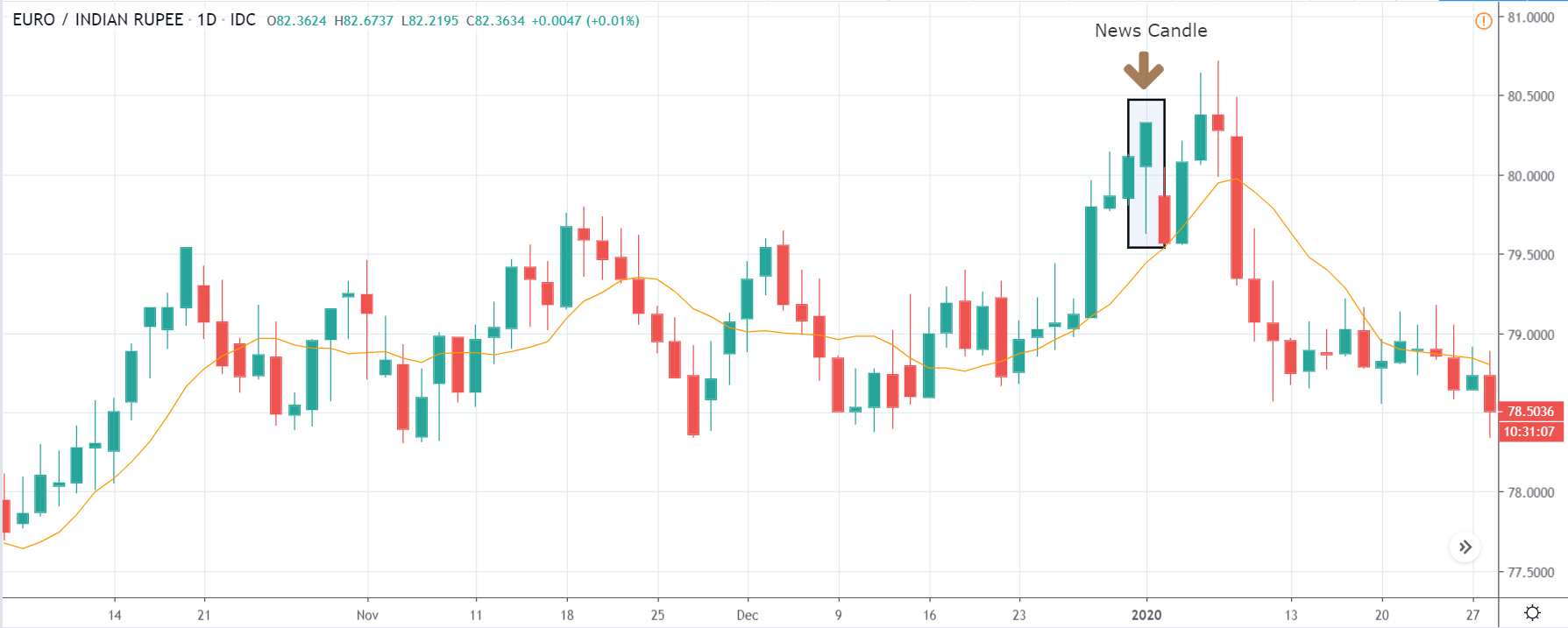
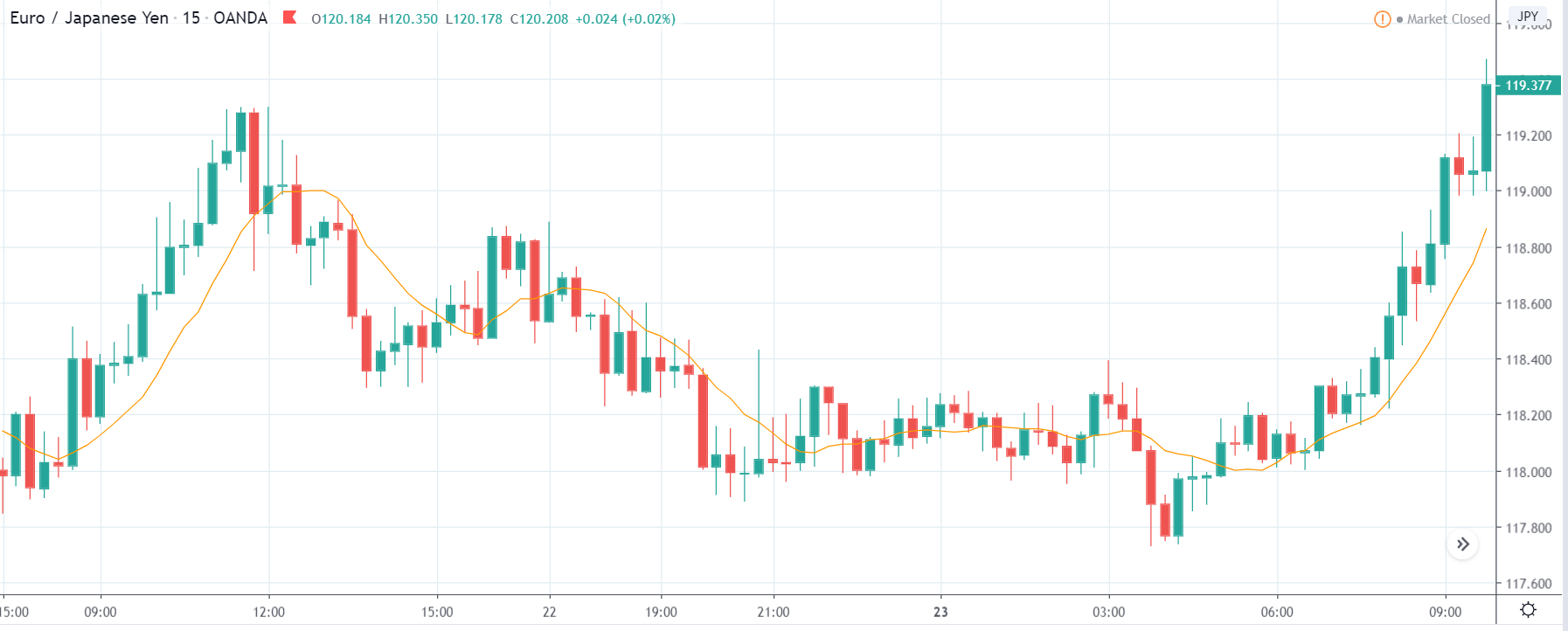
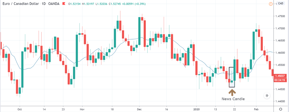
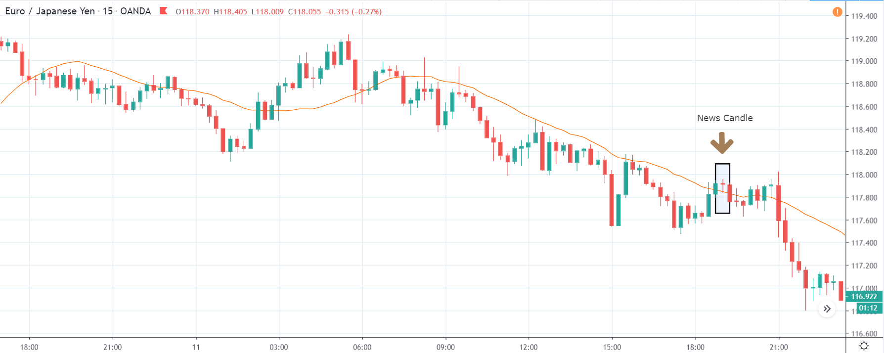
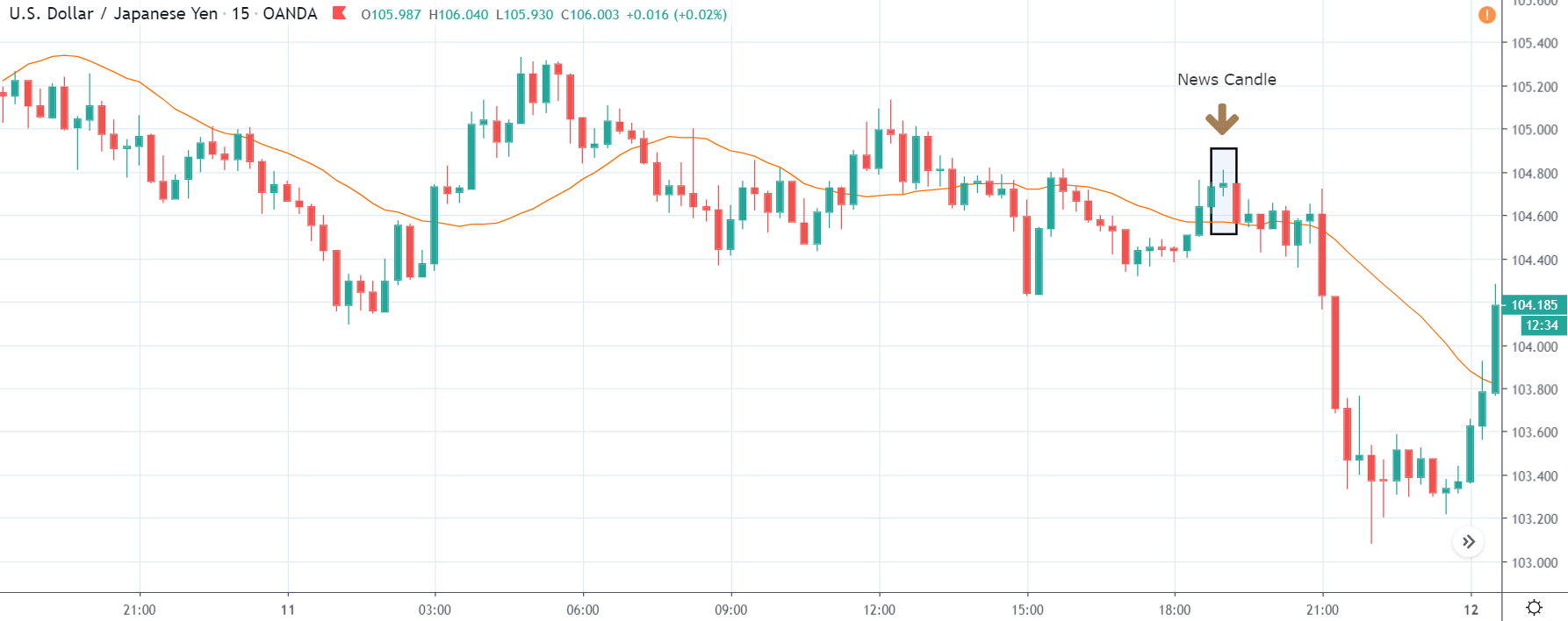
Impact of the ‘Services PMI’ news release on the price charts
The Flash PMI, like Manufacturing PMI, measures the activity level of purchasing managers but that in the services sector. This report is based on surveys taken by the officials covering 300 business executives in the private sector services companies. Traders keep a close watch on the services PMI data as the decisions of Purchasing managers give early access to data about the company’s overall performance, which in turn acts as an indicator of the economy.
Since the services PMI only gives an insight into the performance of the service sector, it does not directly affect the economy. Therefore, the impact of the data on currency is quite less. But traders, build and liquidate some positions in the market based on the PMI data.
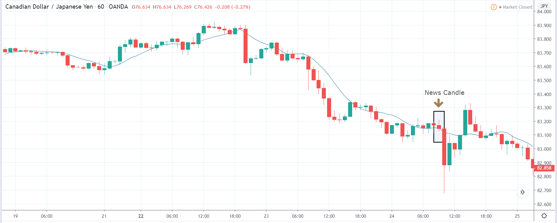
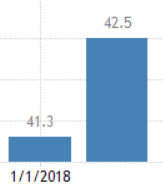
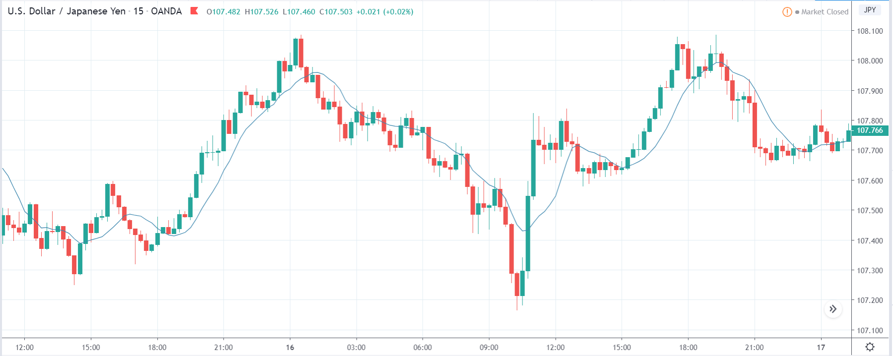
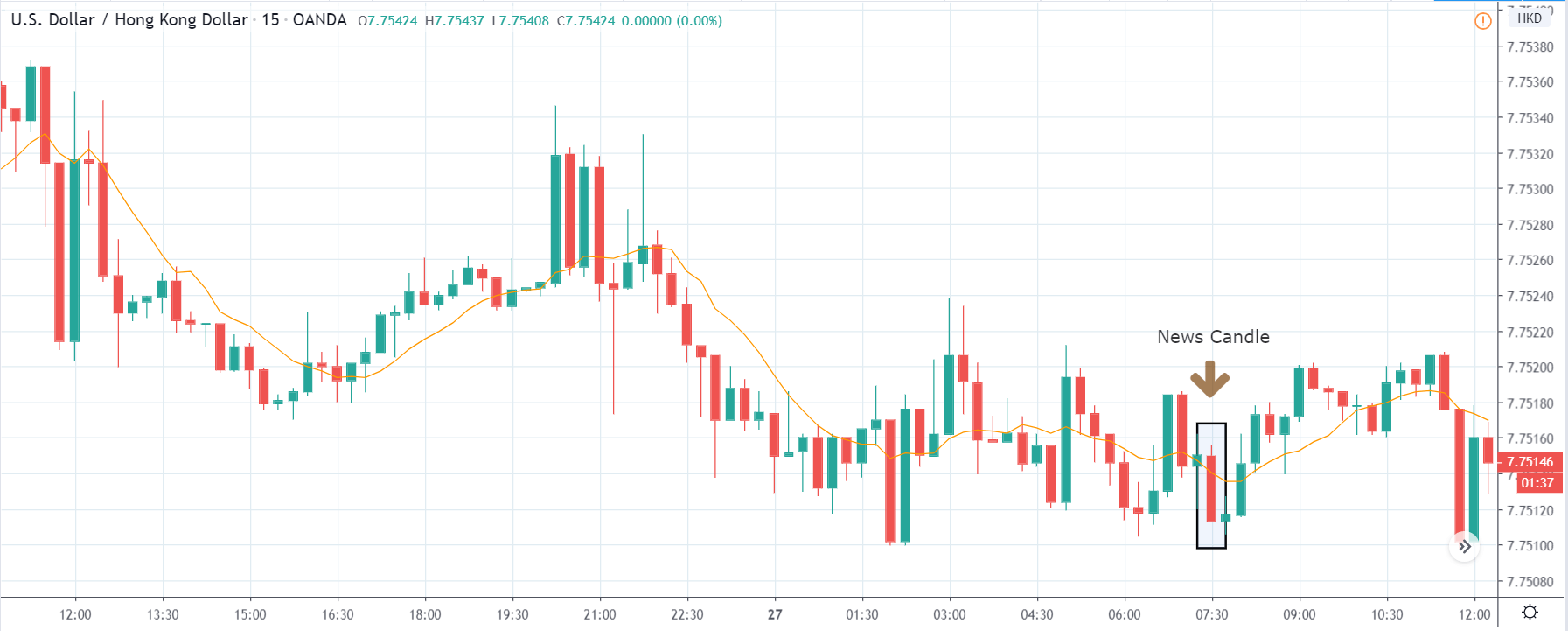
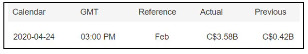
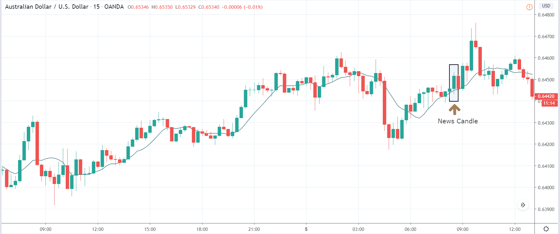
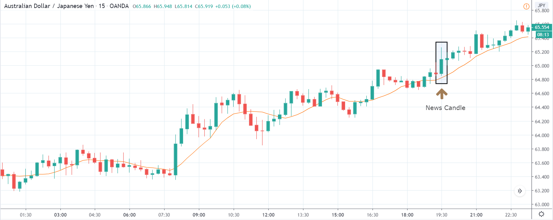
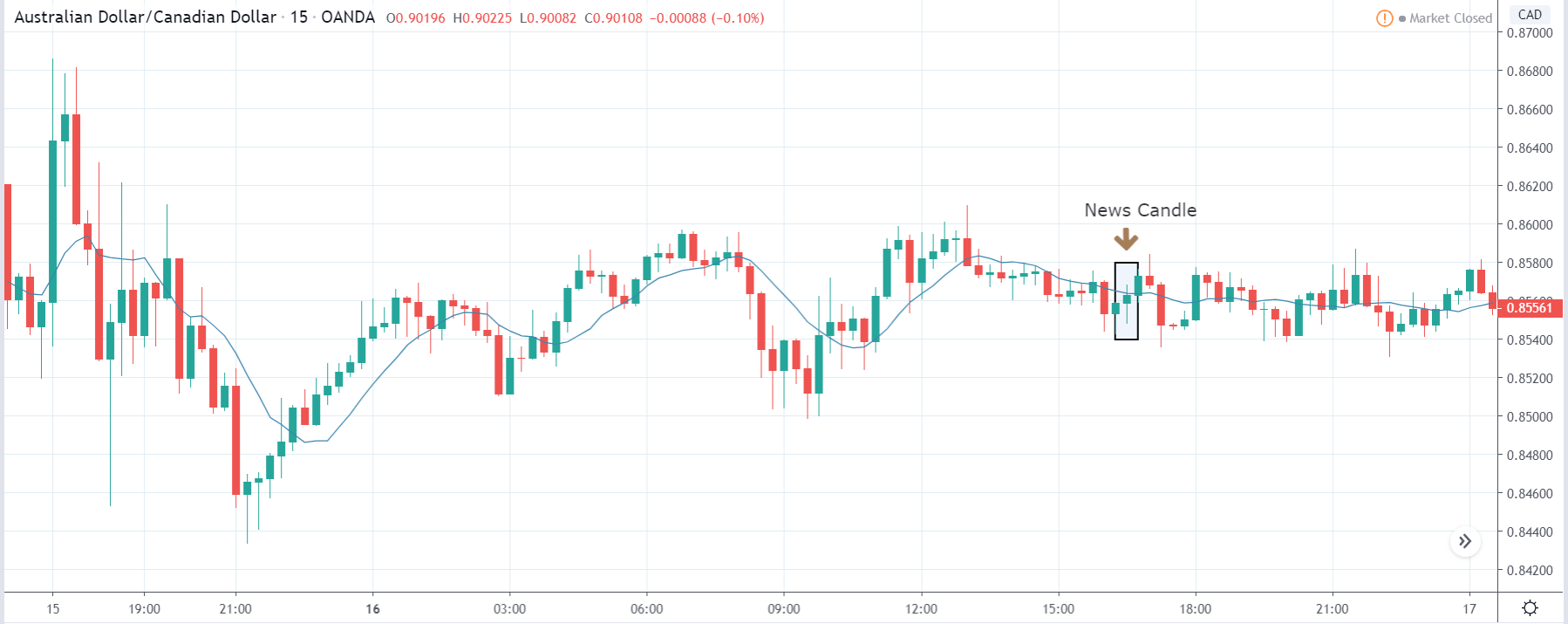
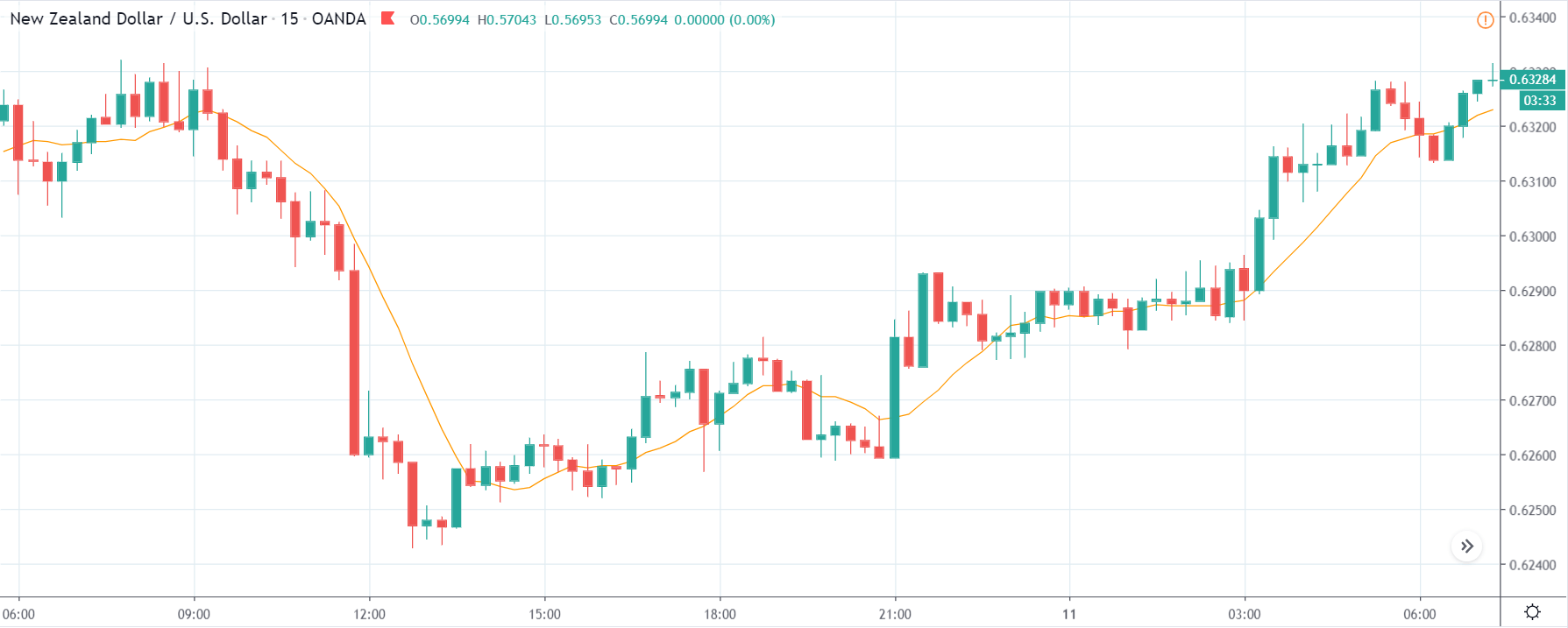
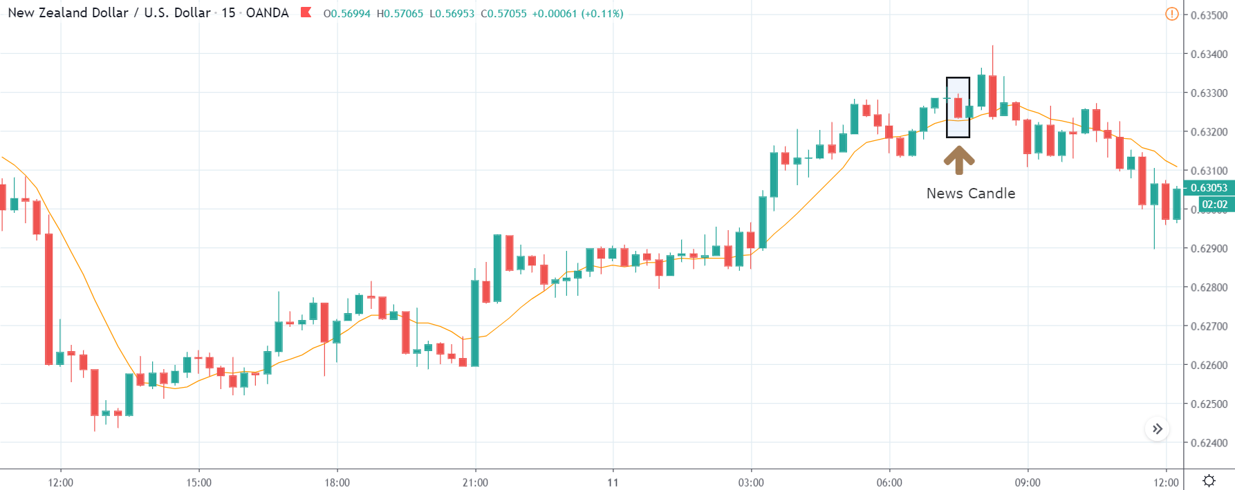
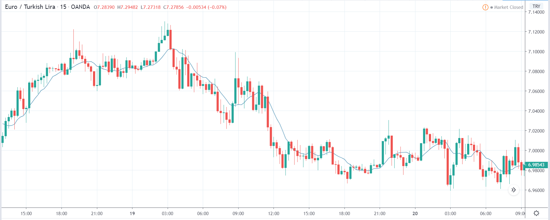
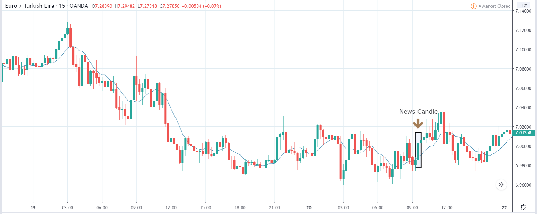
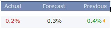
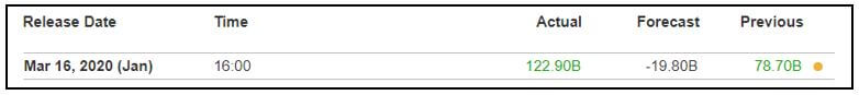
![]()
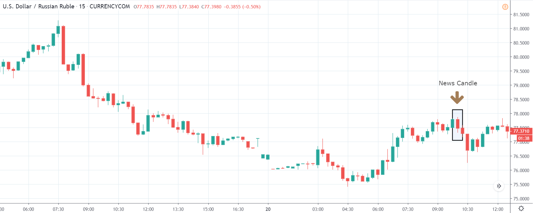
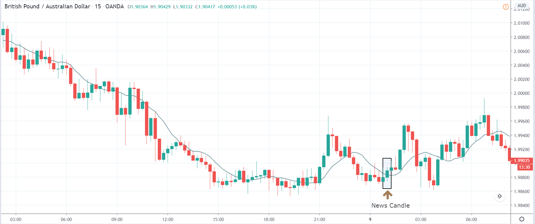
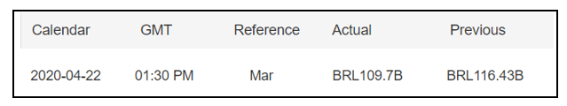
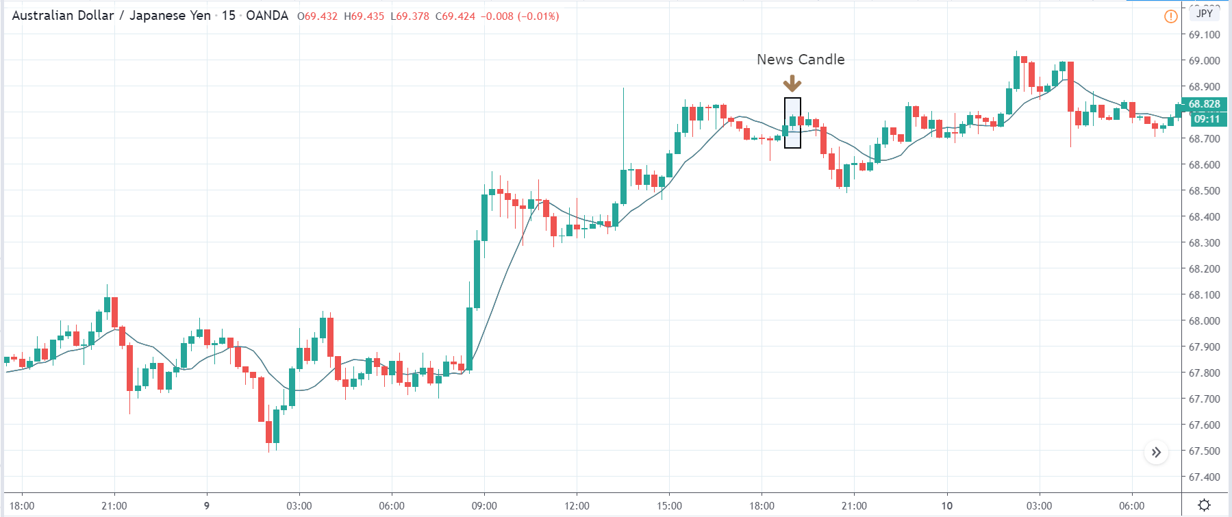
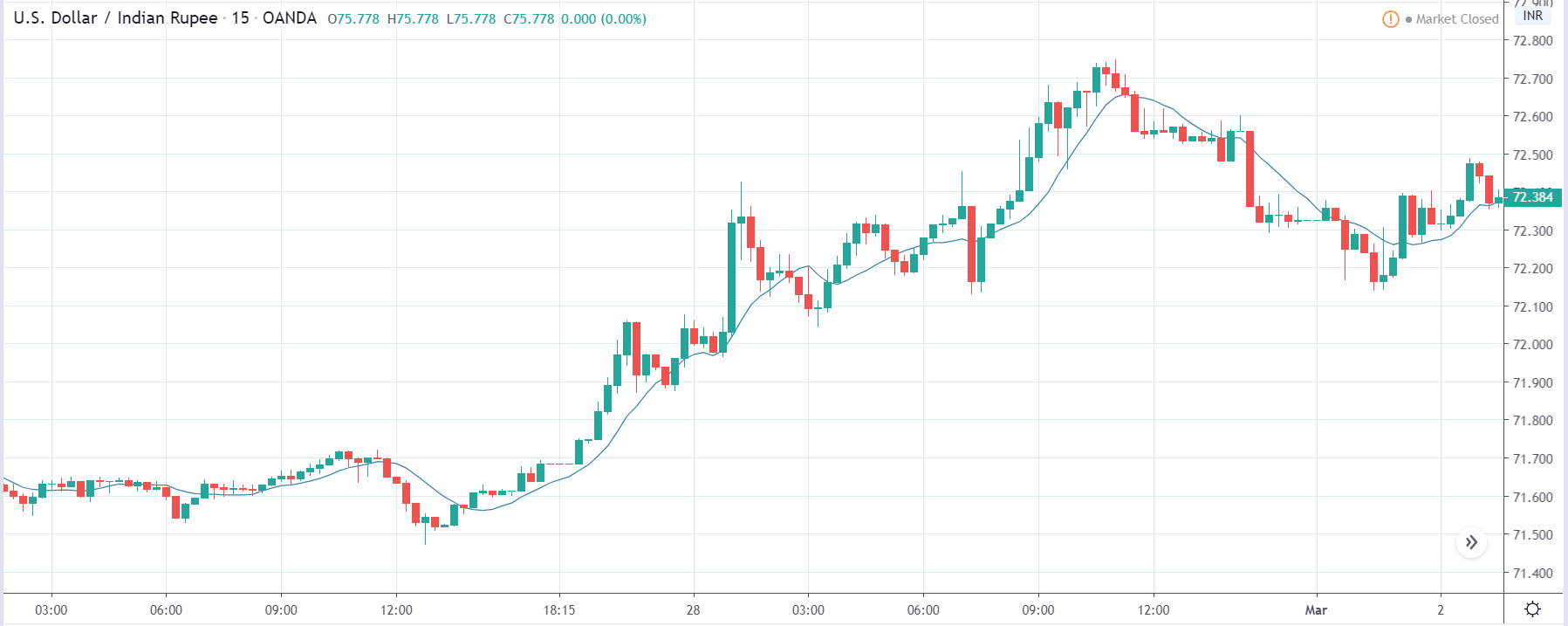
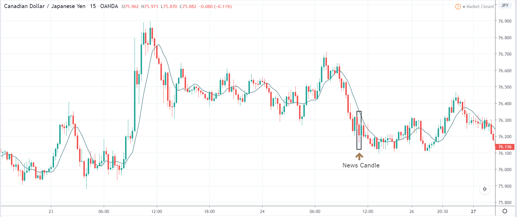
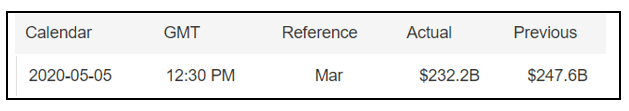
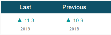
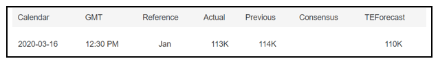
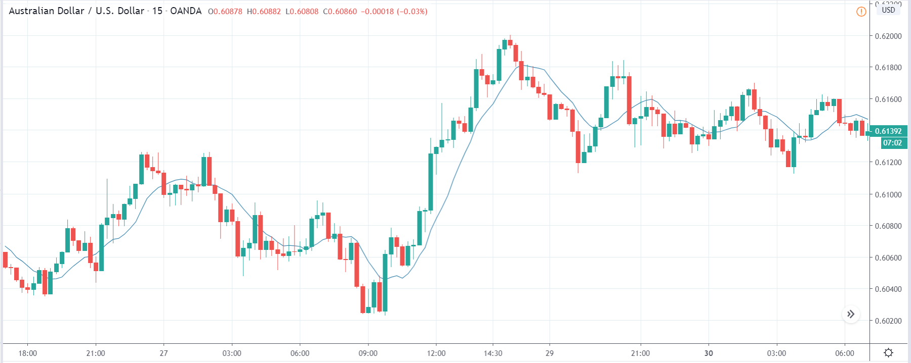
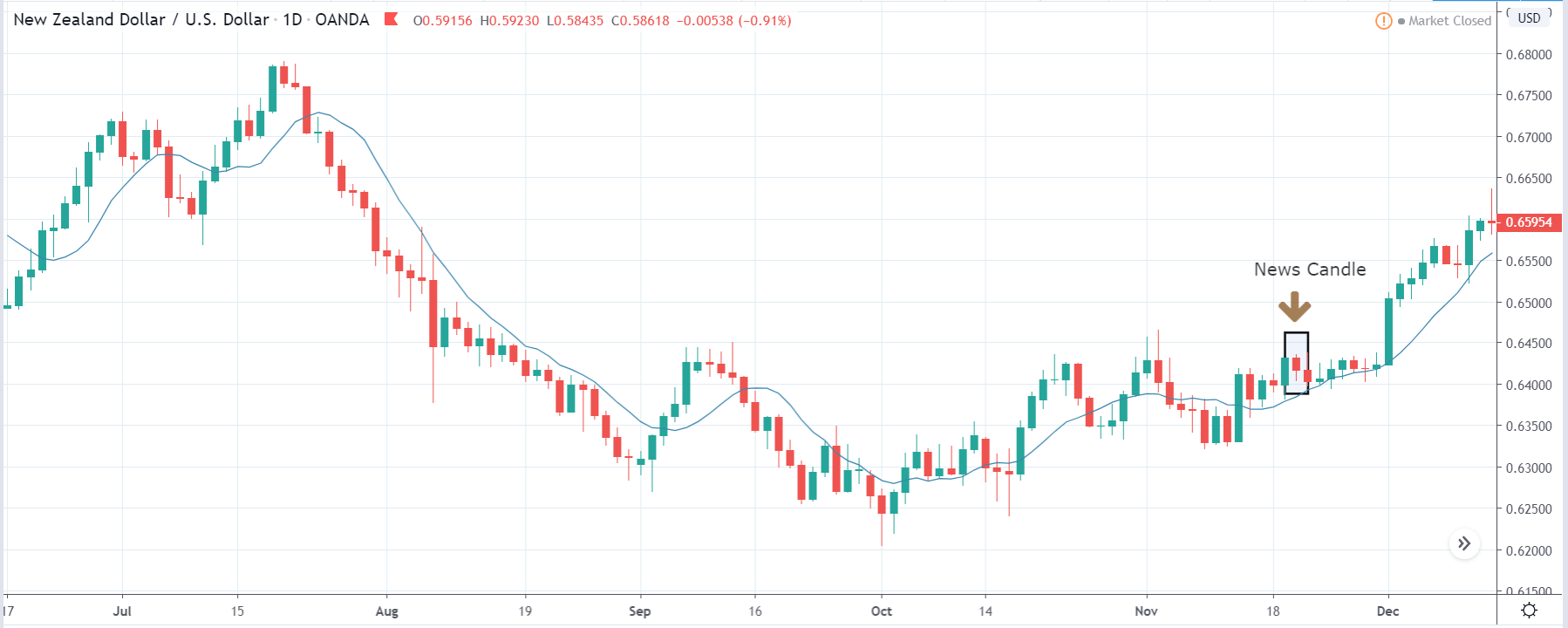
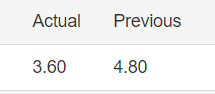
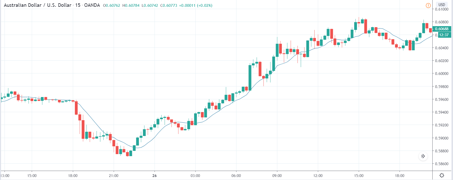
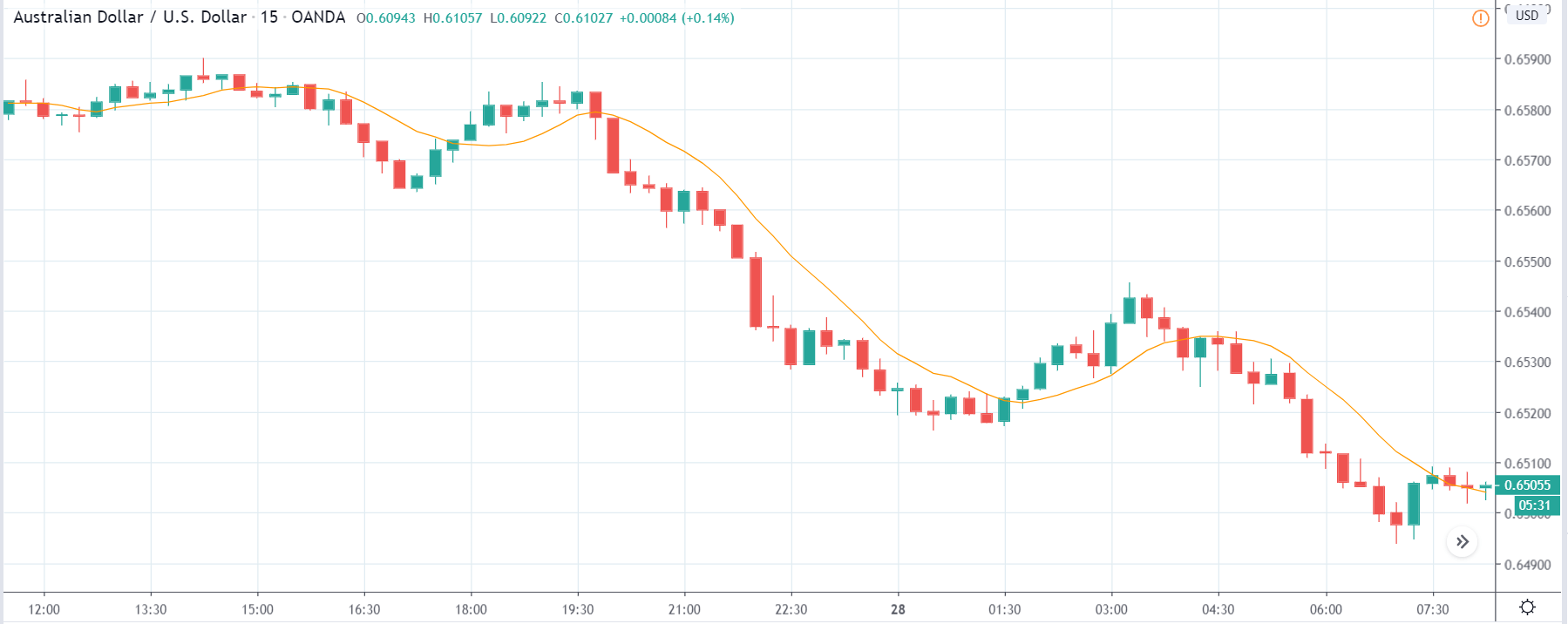
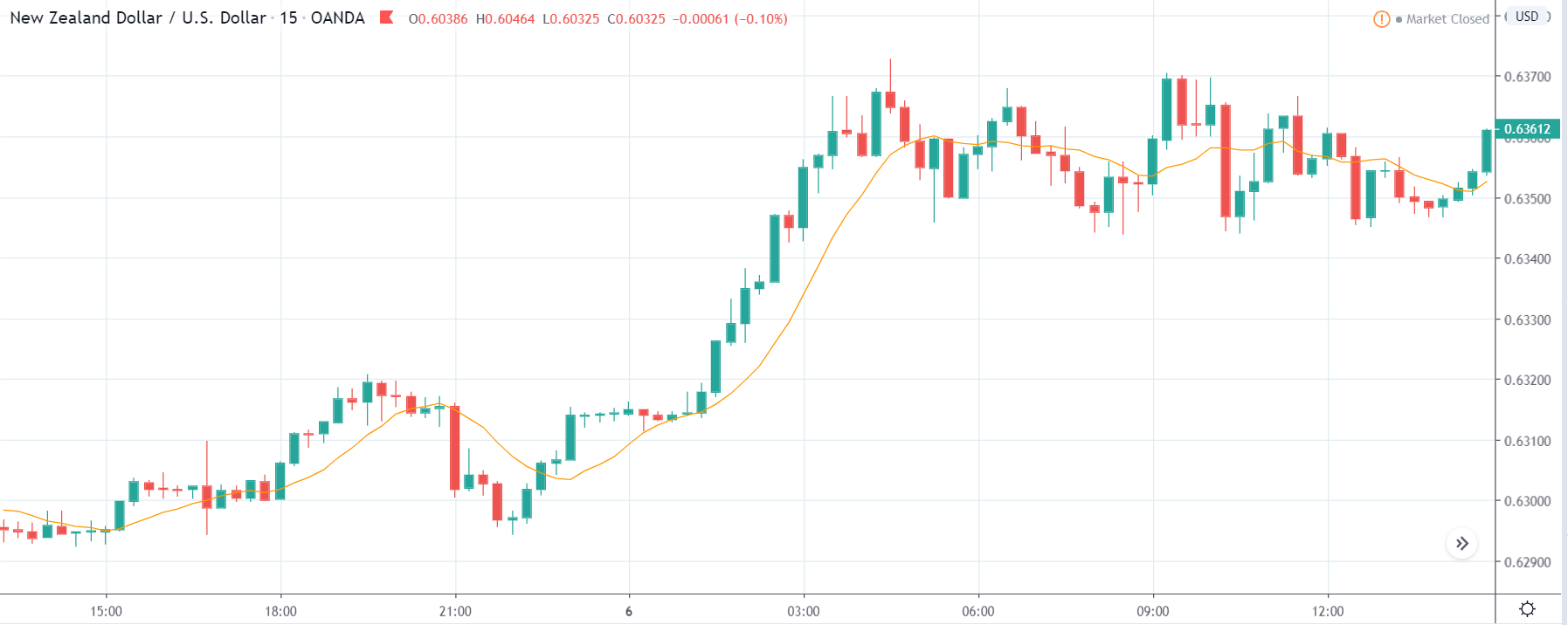
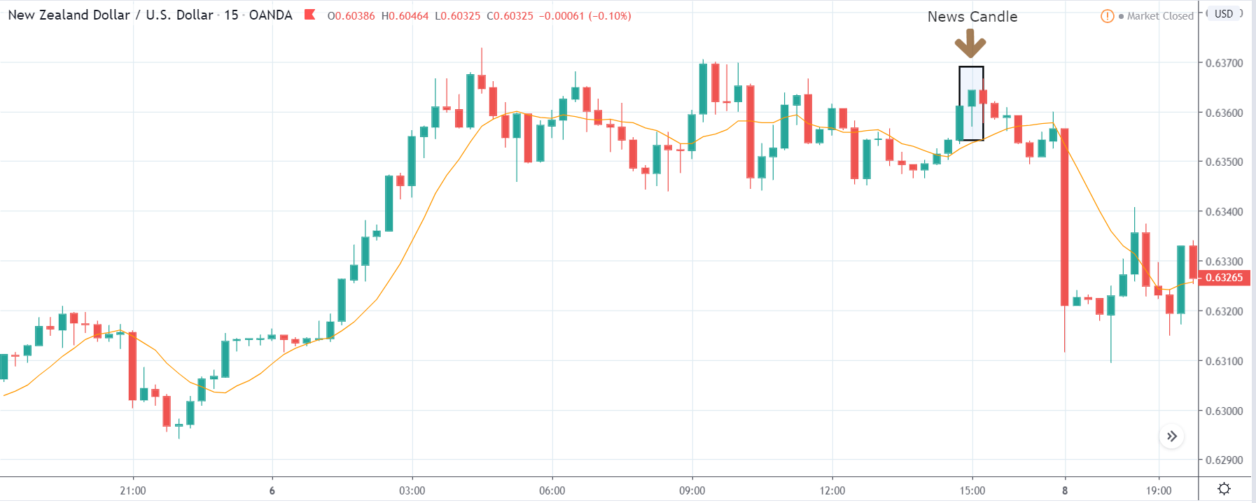
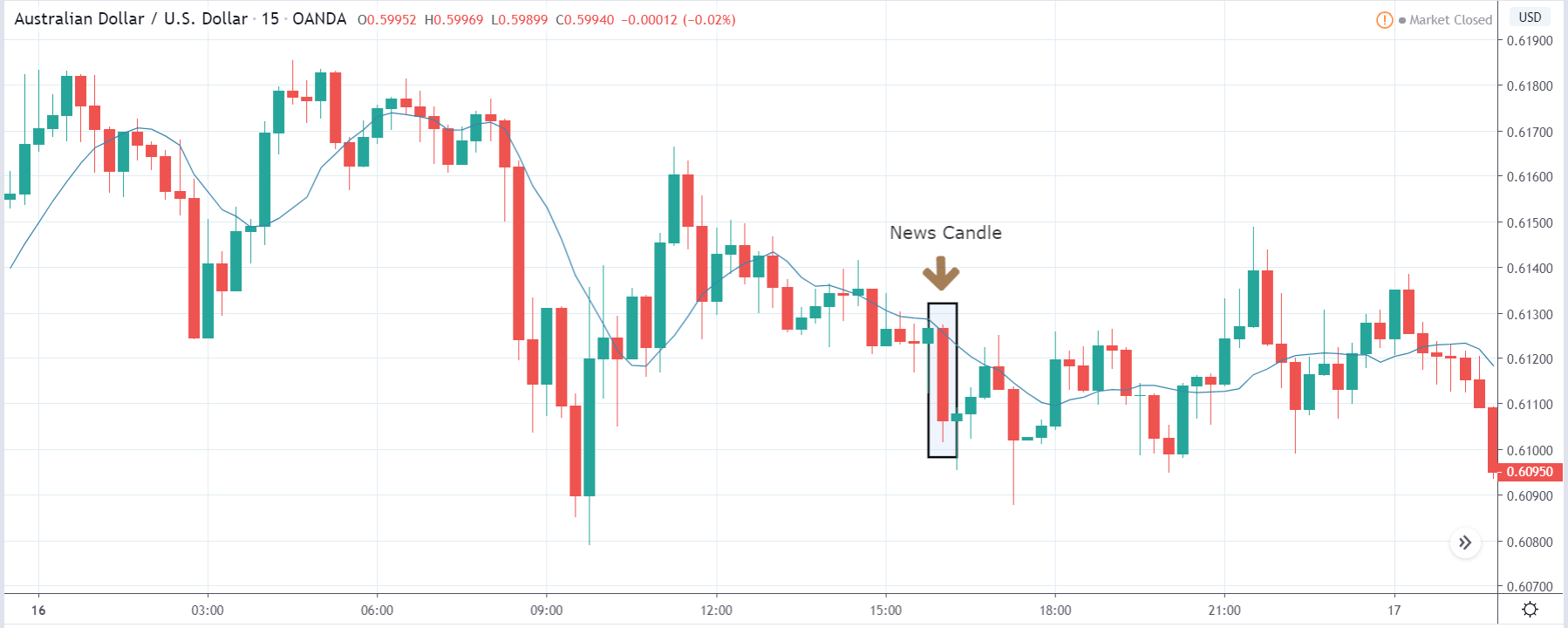
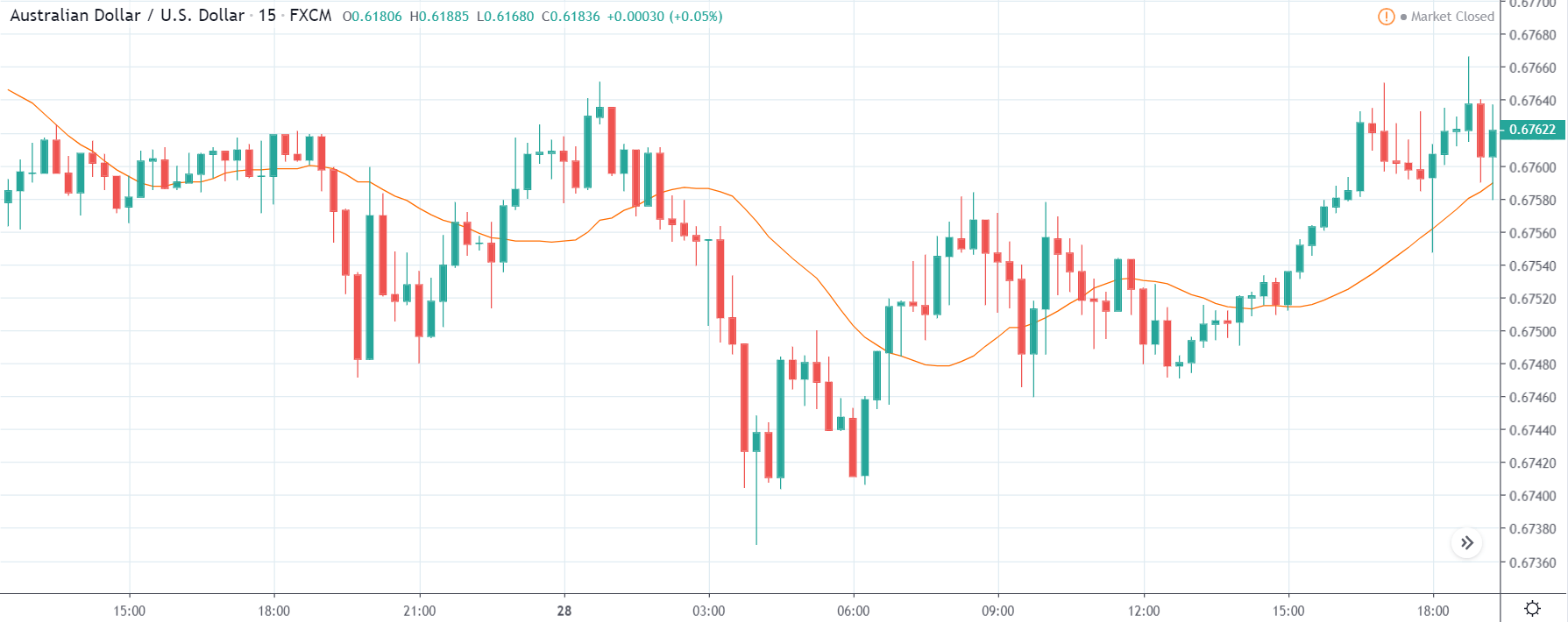
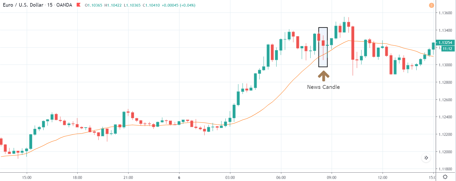
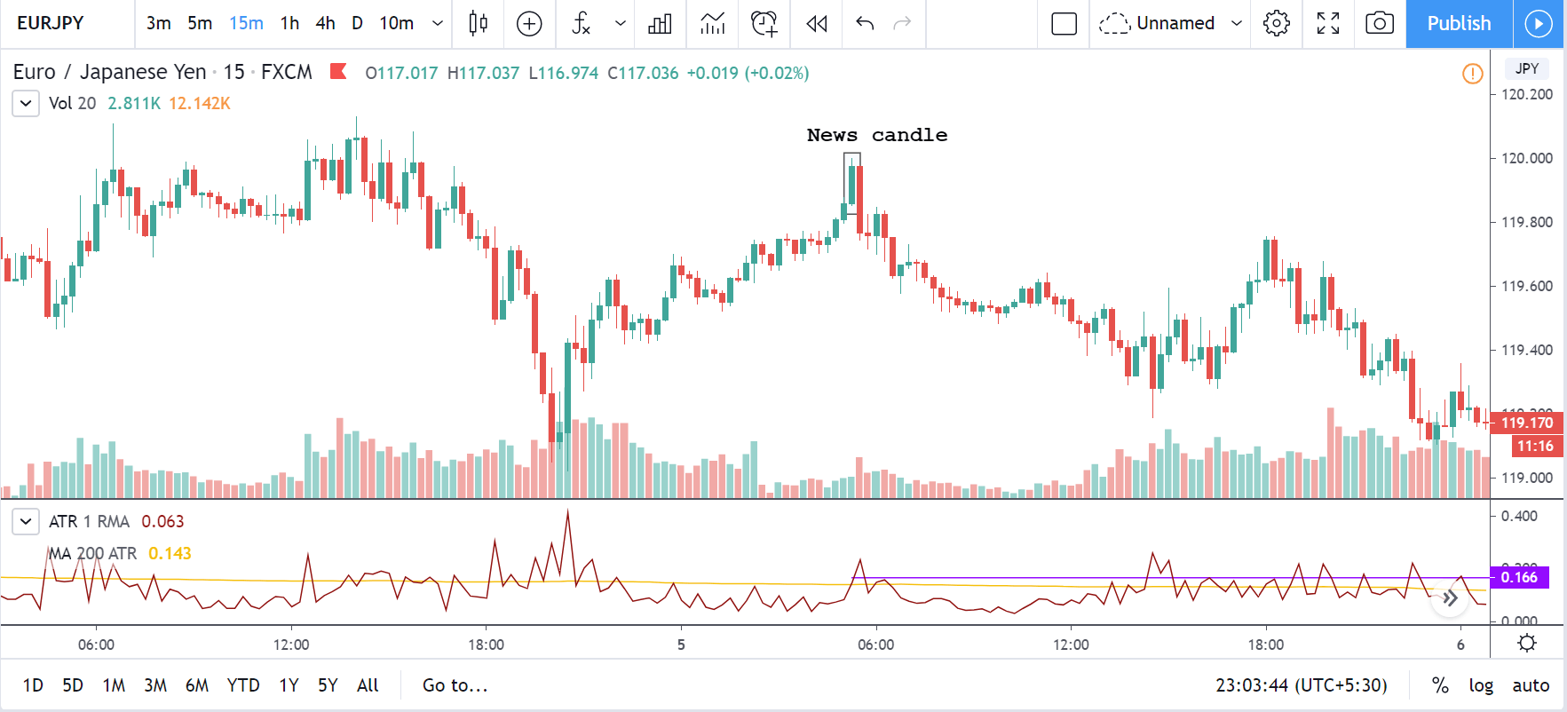
The below image shows the previous and latest Services PMI data of Australia, where we see a decrease in the value of the same for the month of February, and now we will analyze the impact it created on the Australian dollar. A higher reading than forecasted is considered to be bullish for the currency while a reading lower than what is forecasted must be considered negative.

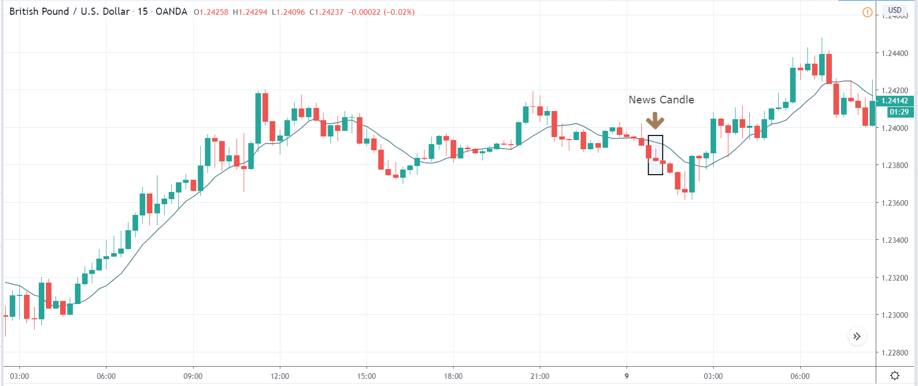
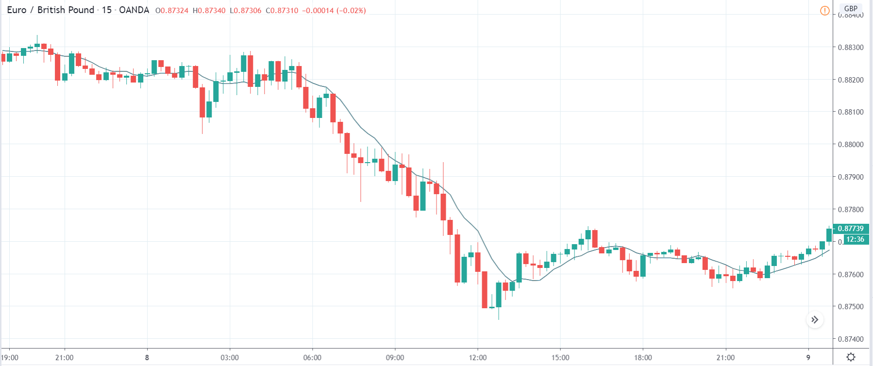
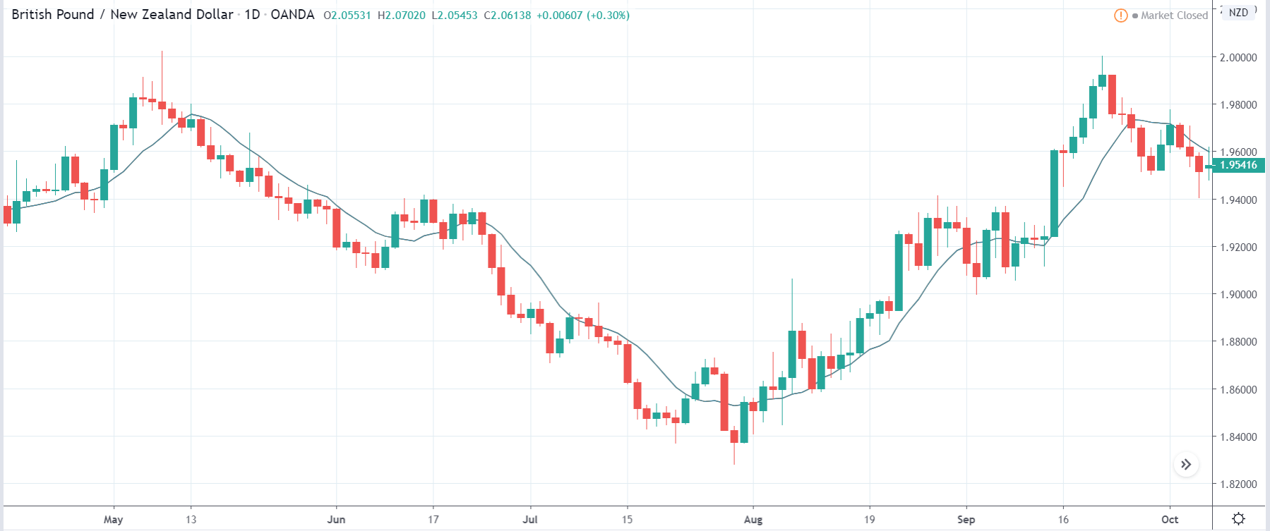
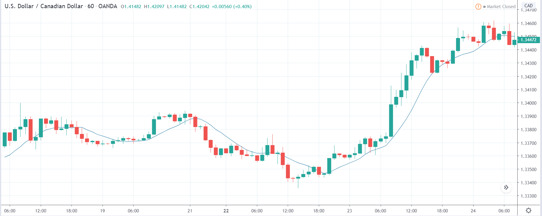
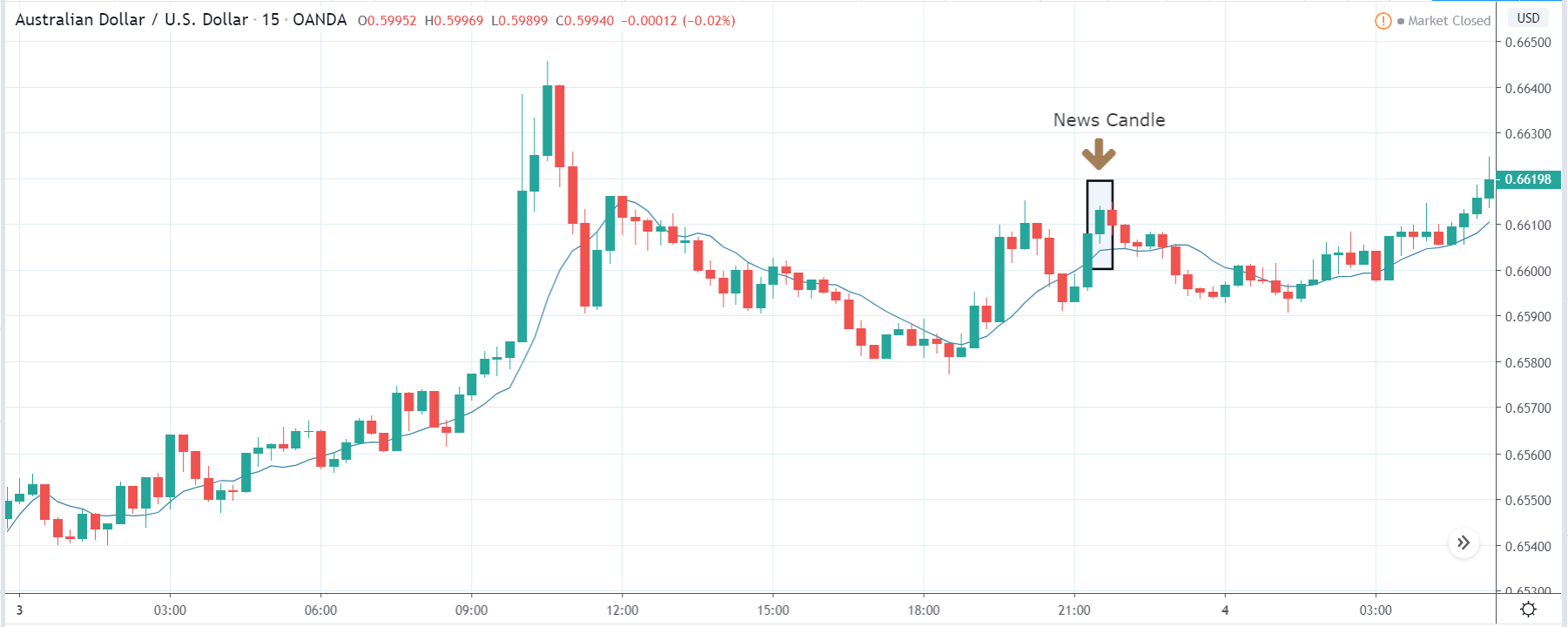
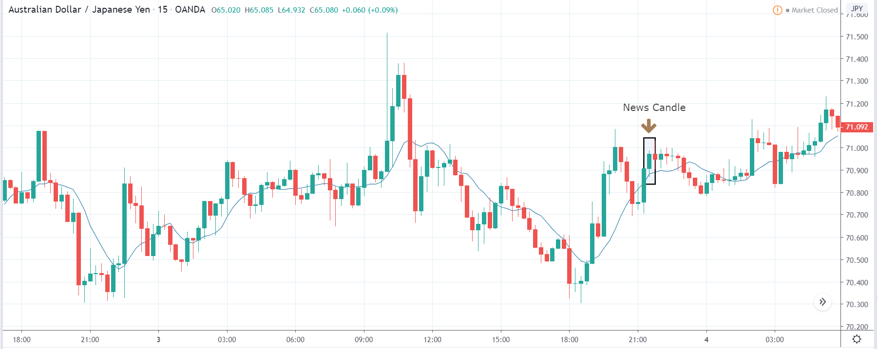
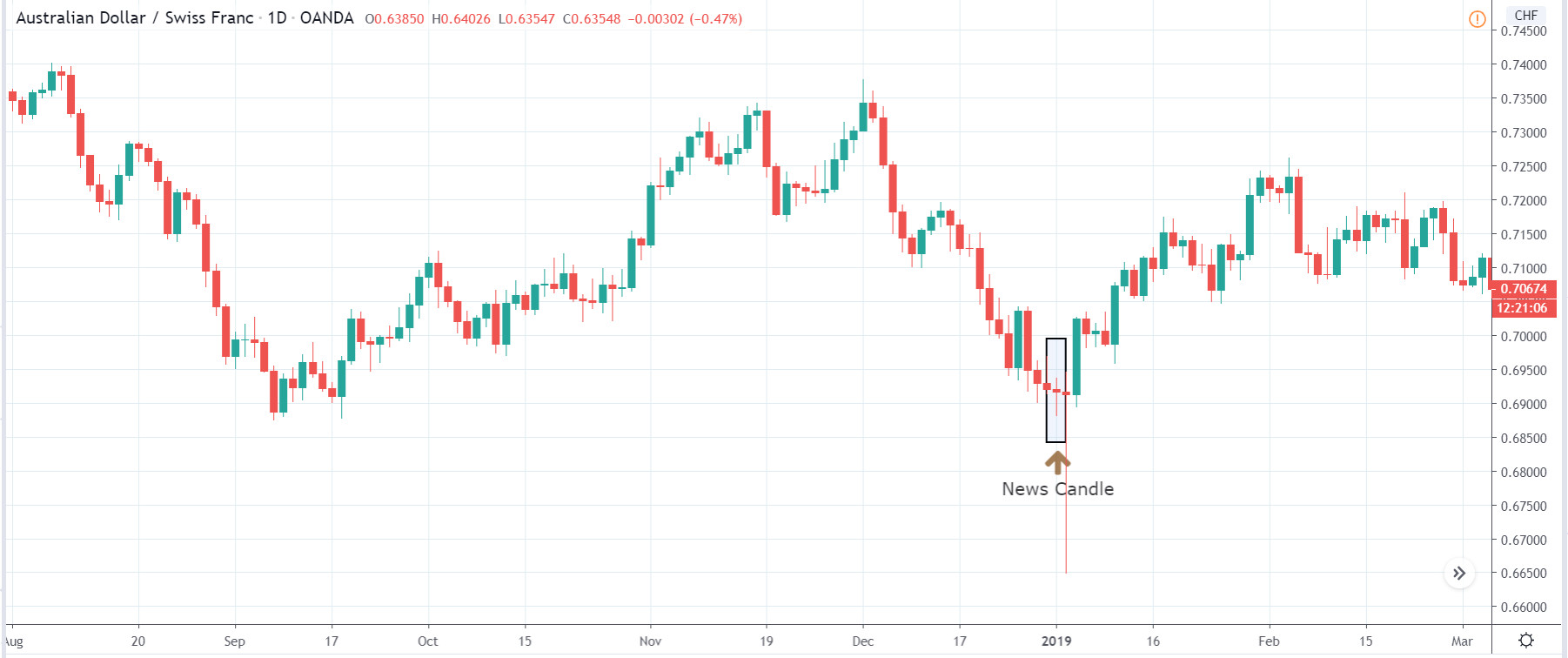
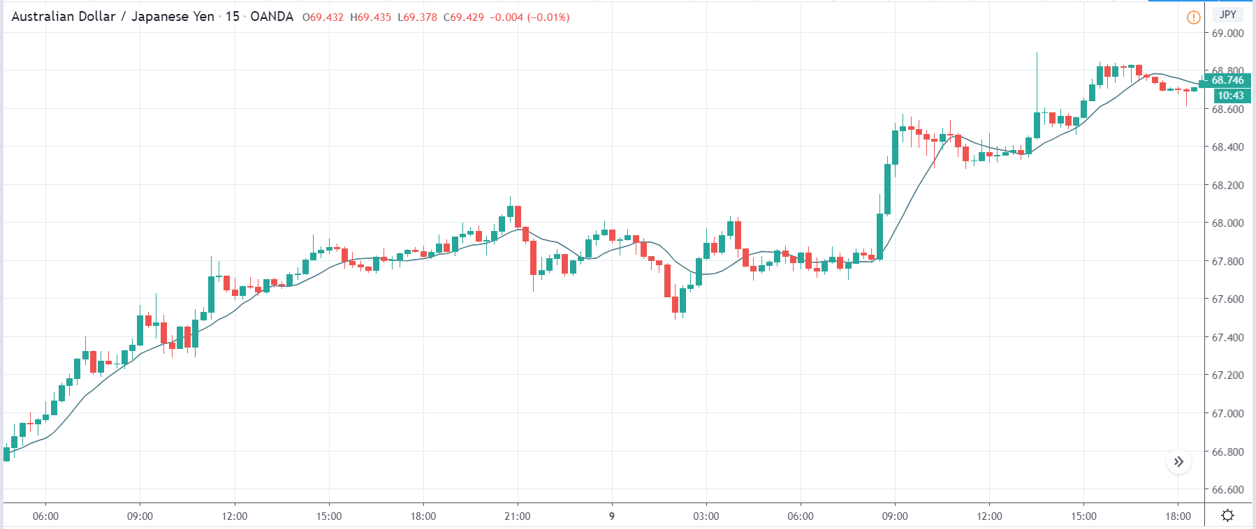
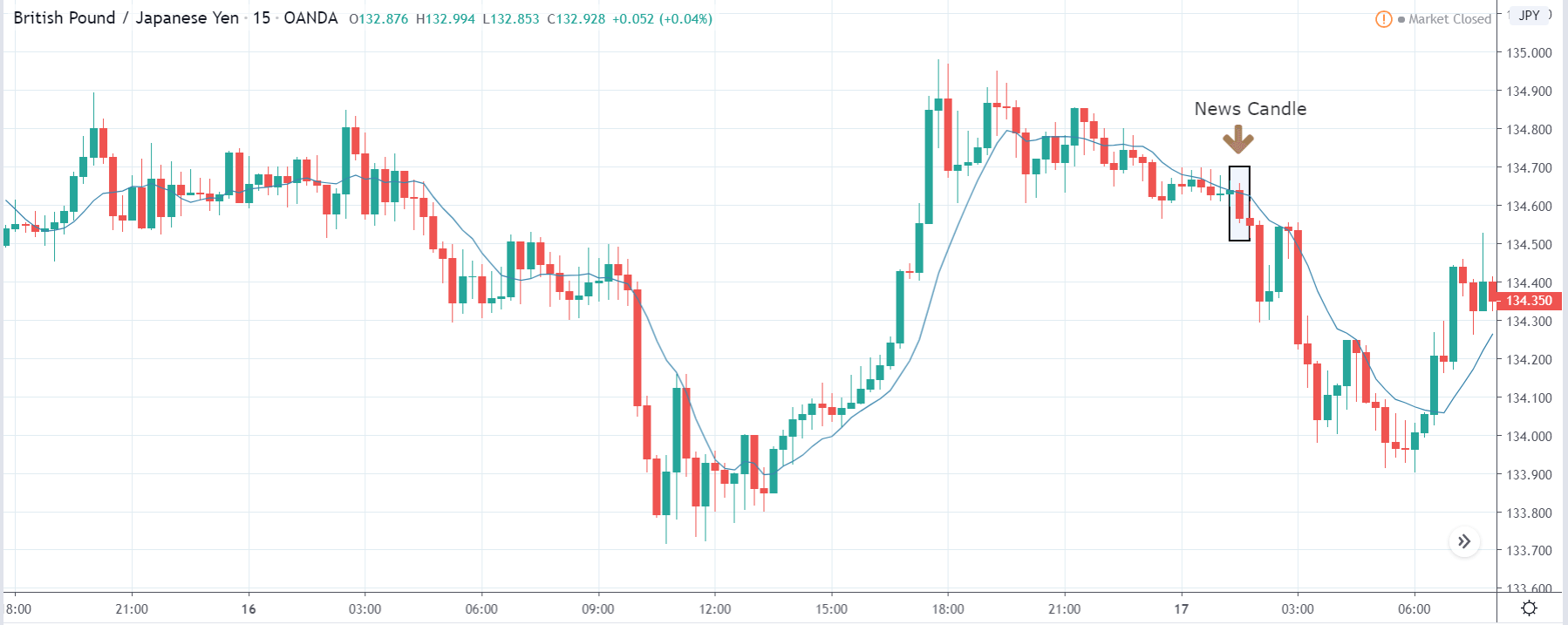
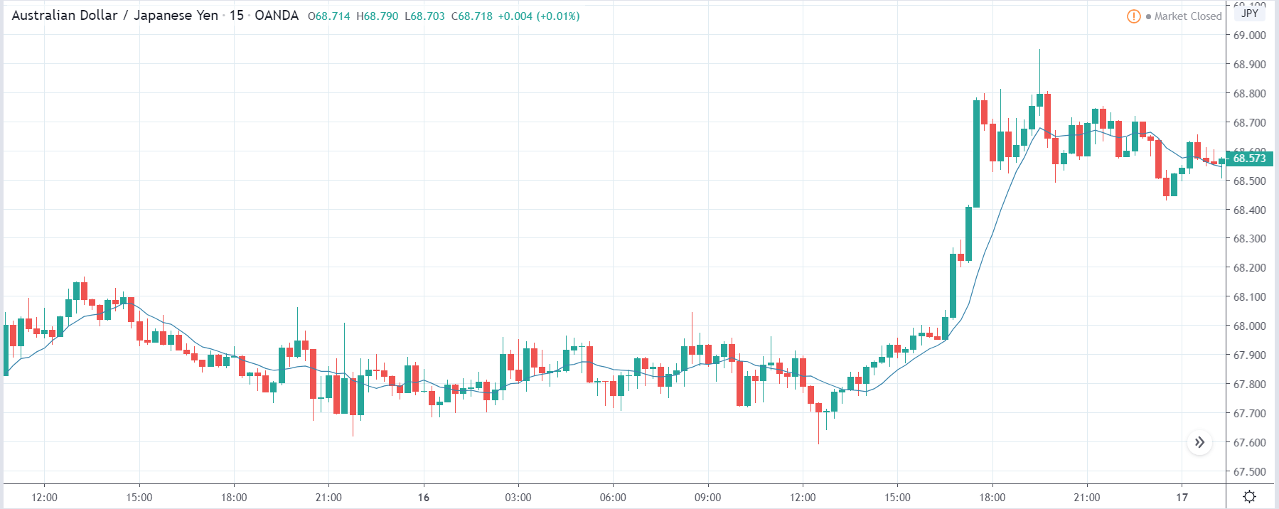
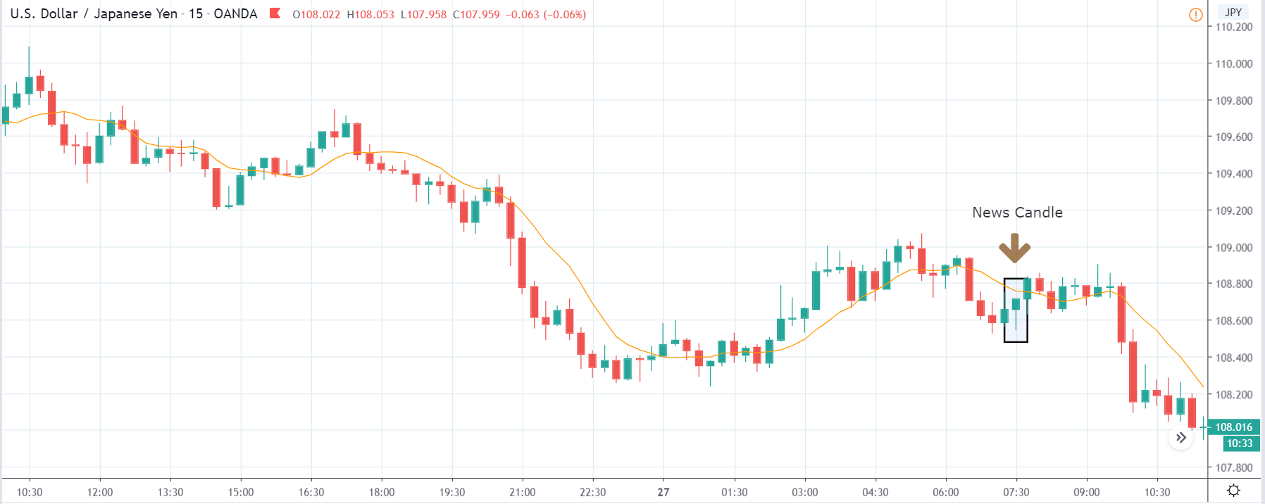
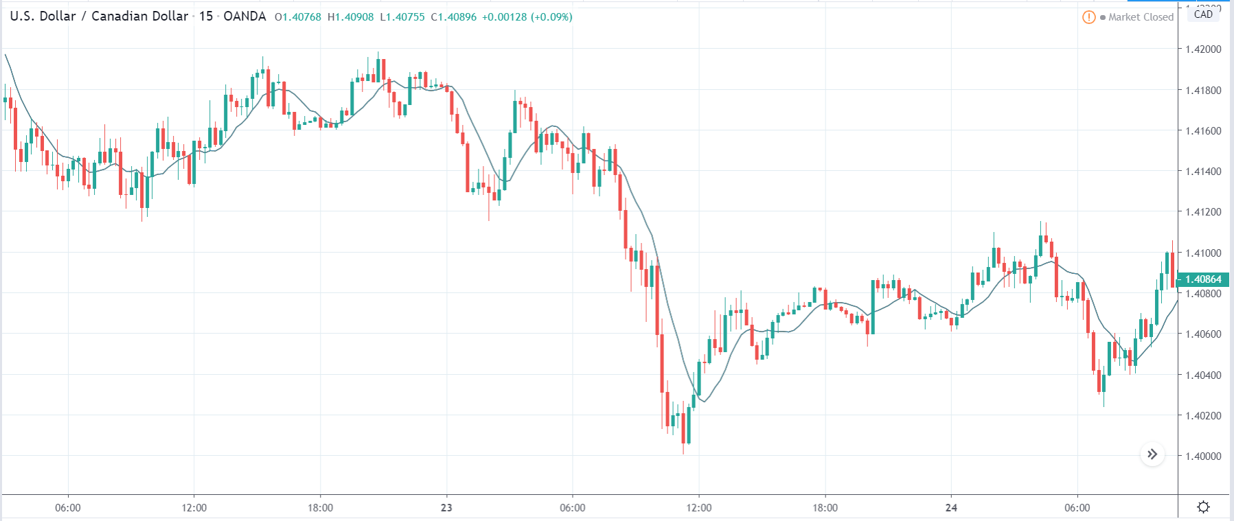
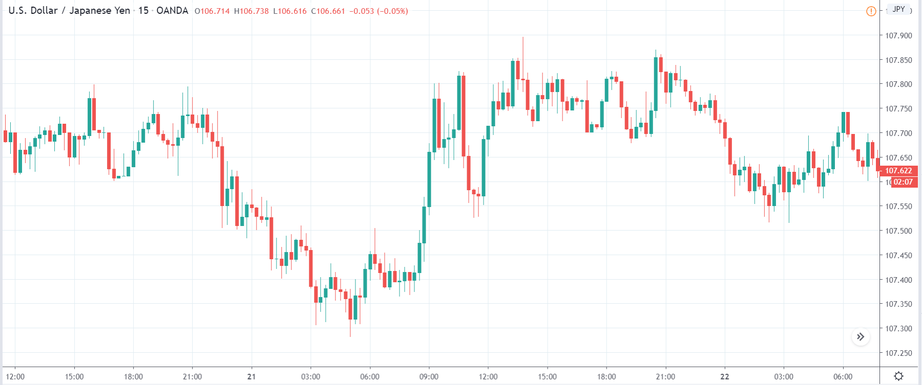
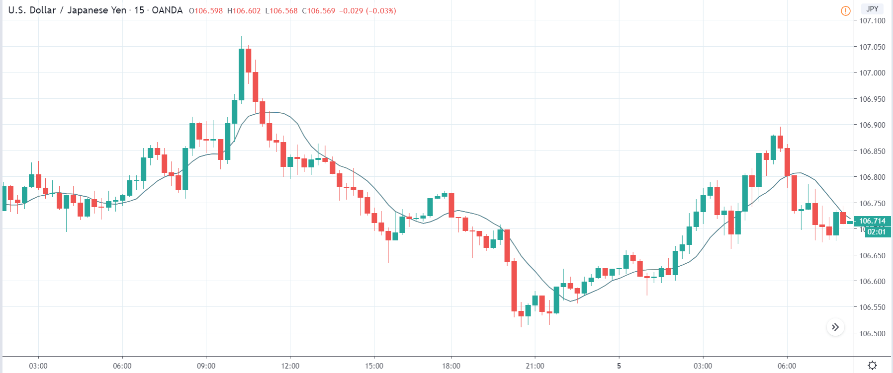
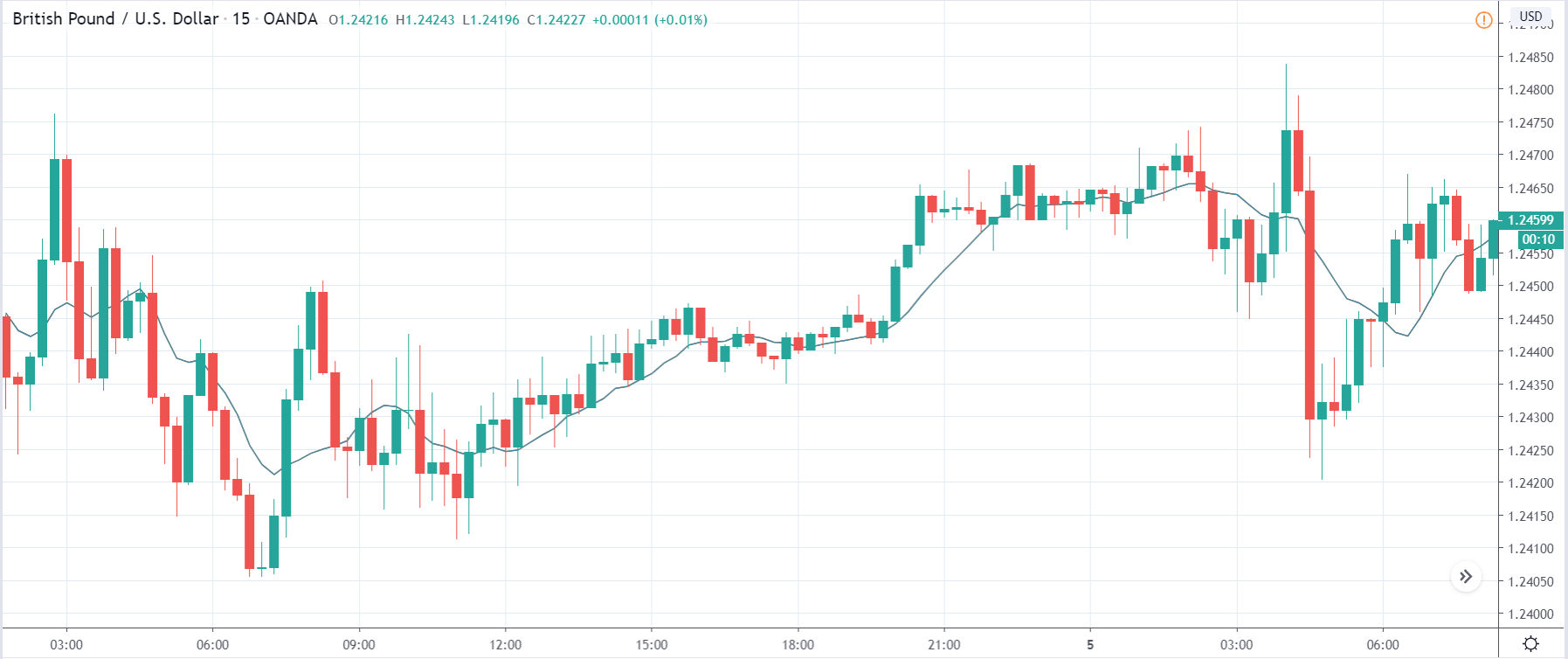
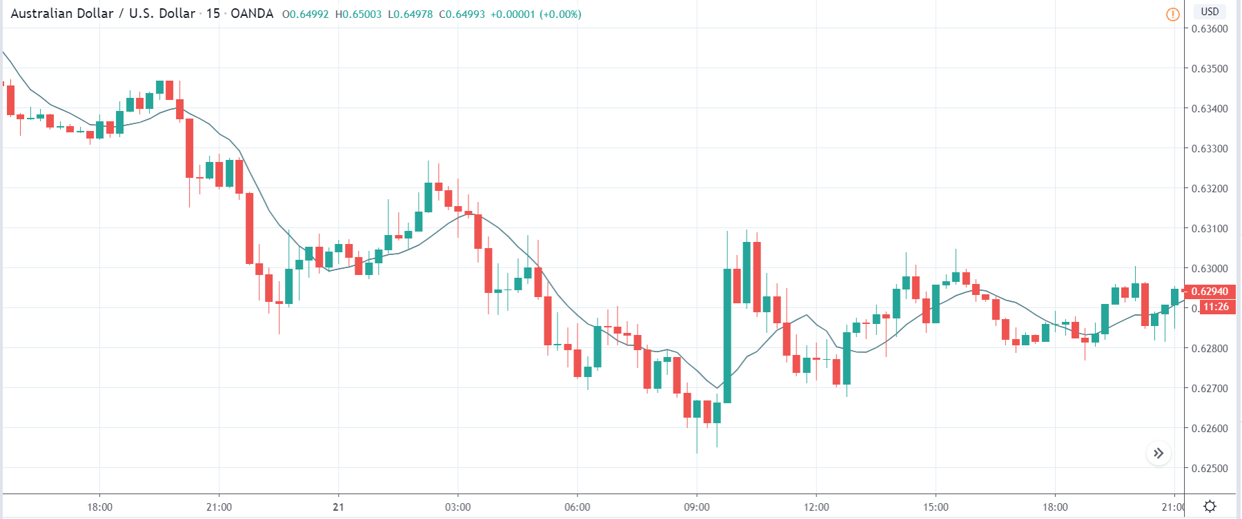
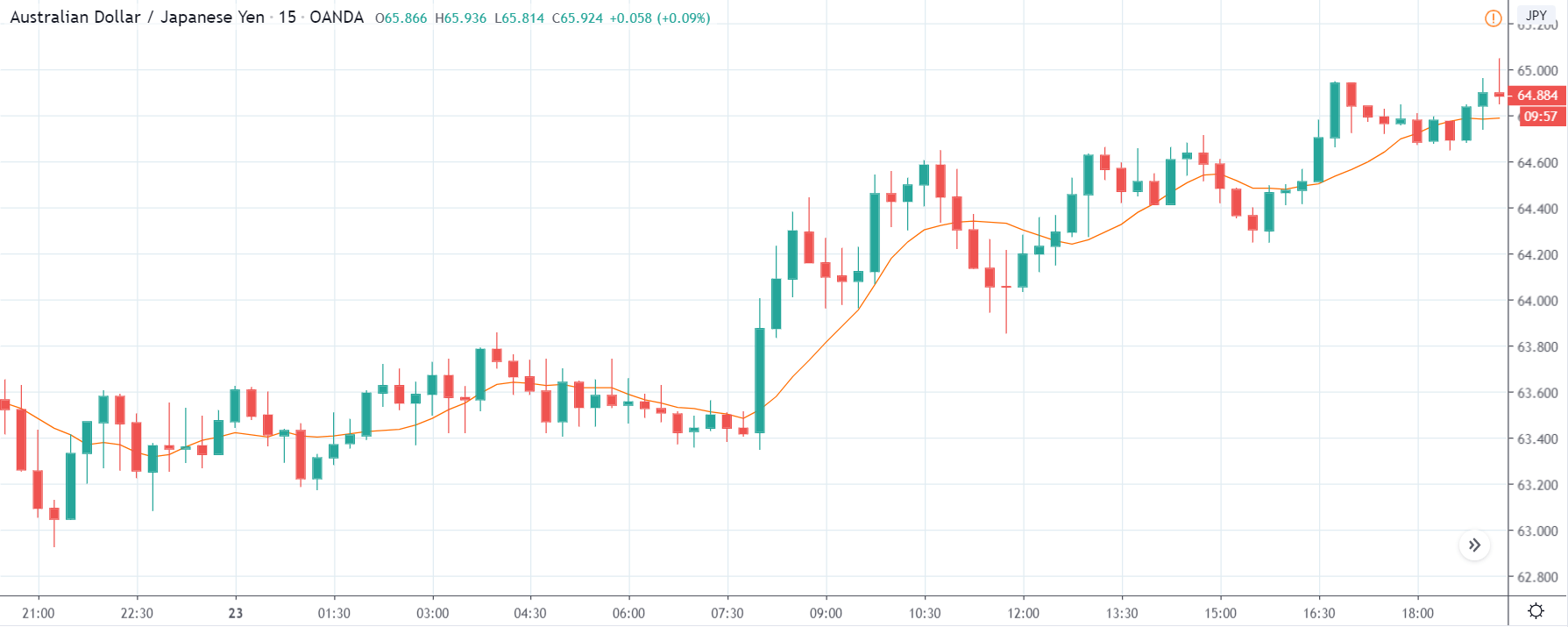
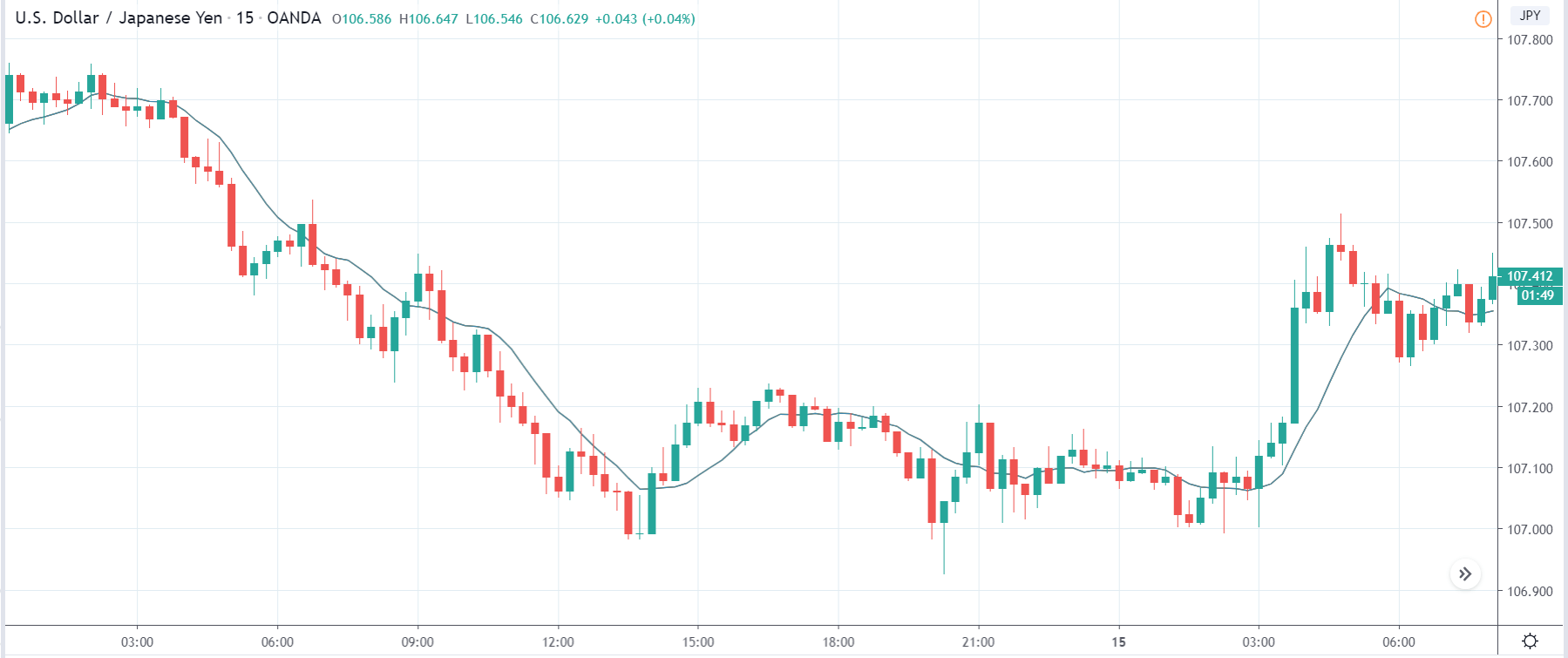
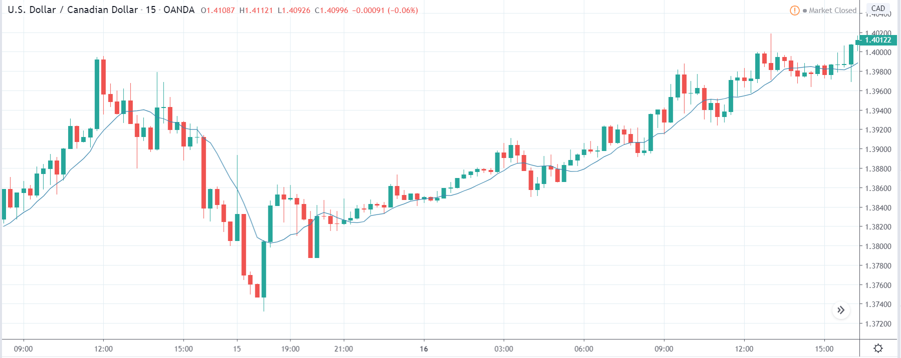
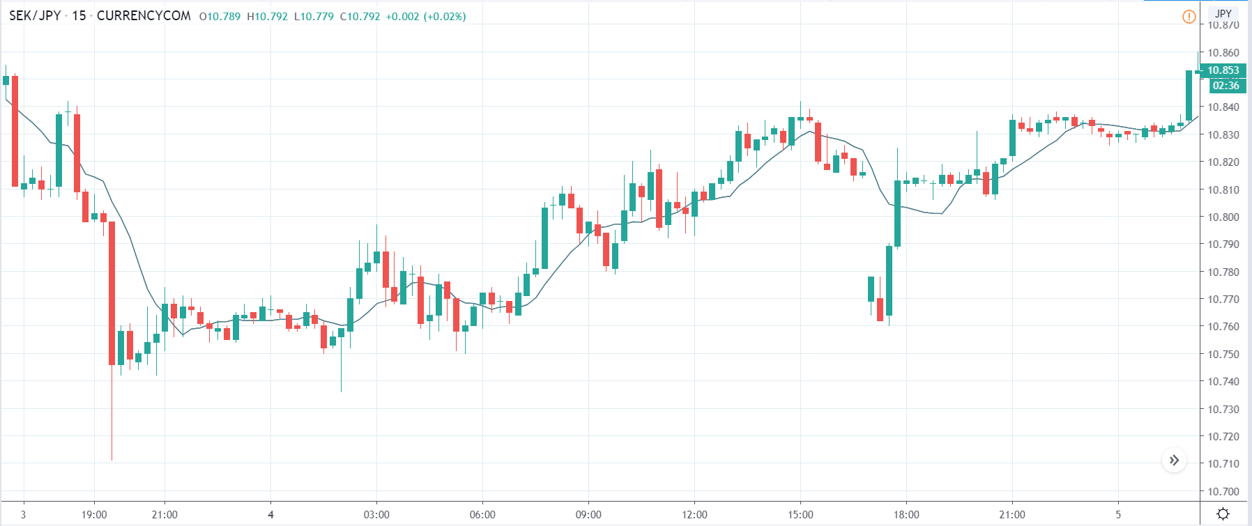
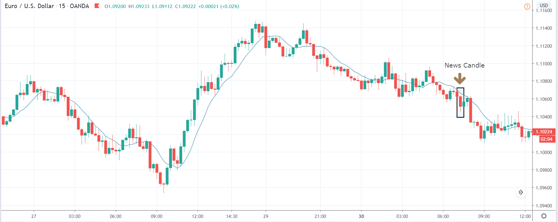
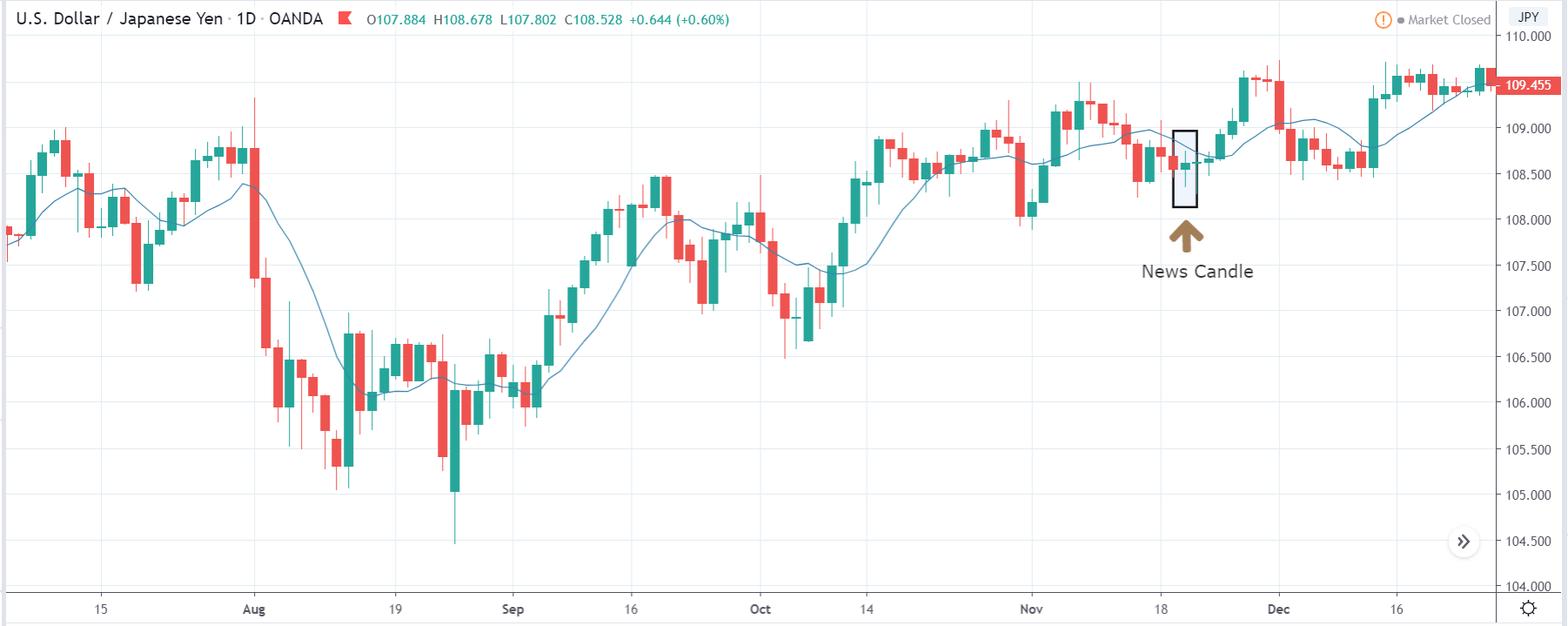
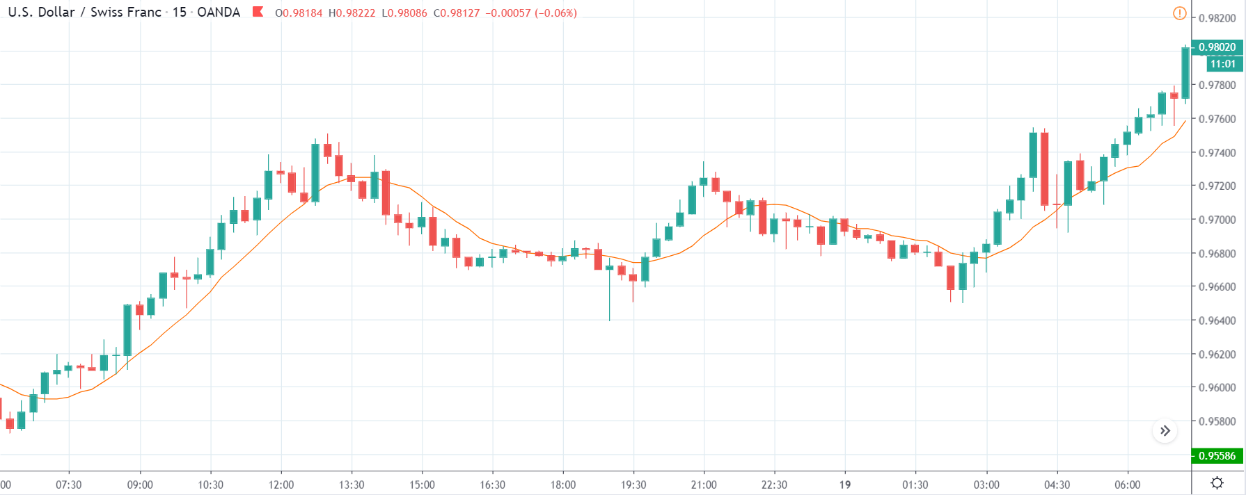
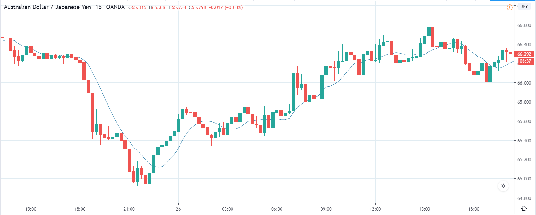
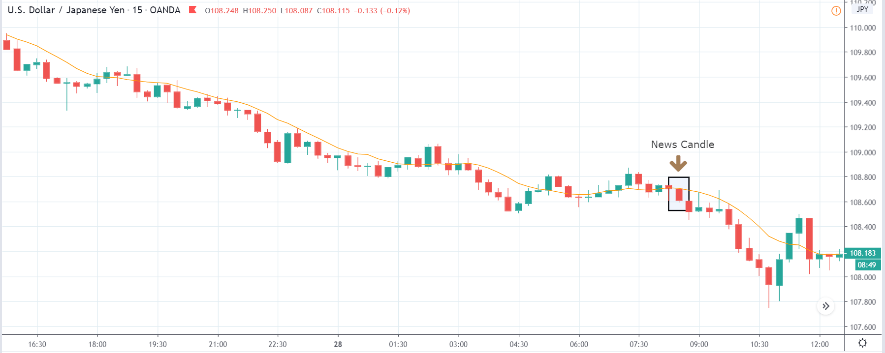
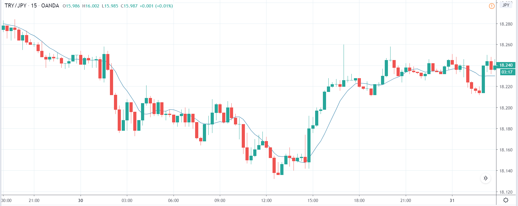
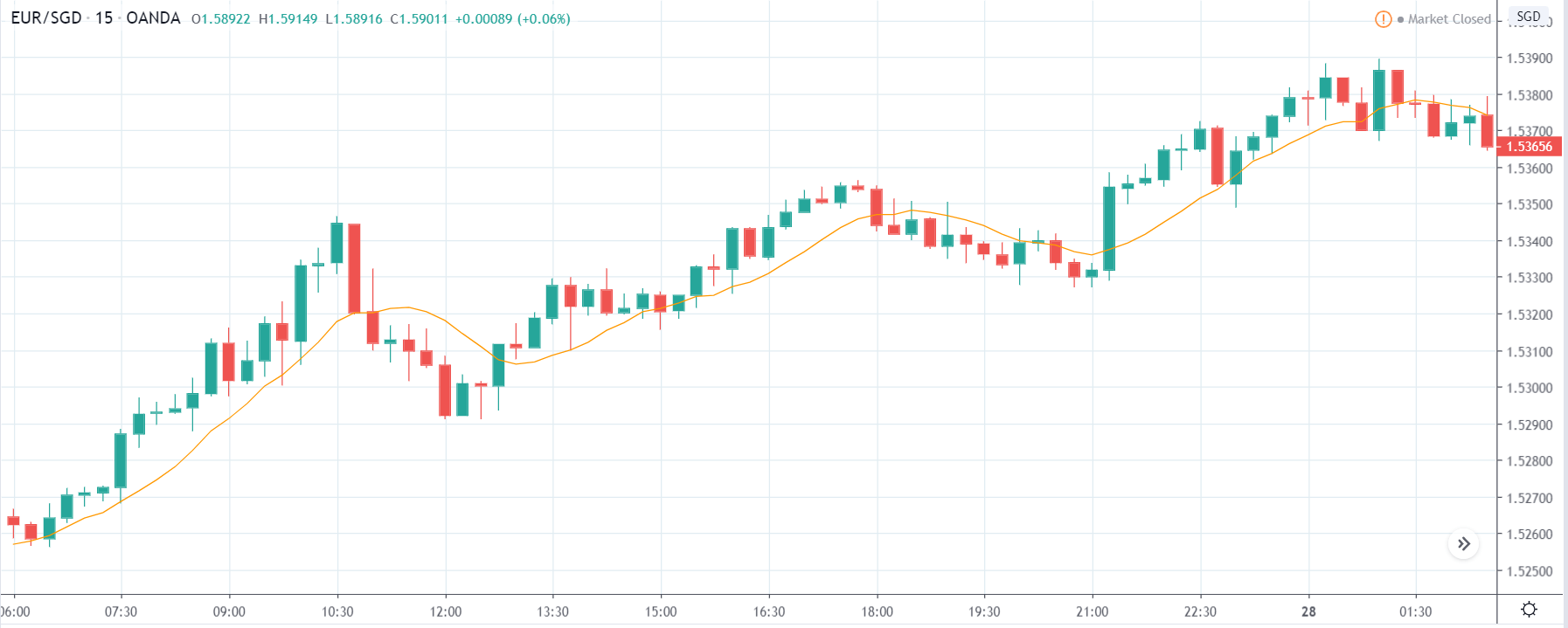
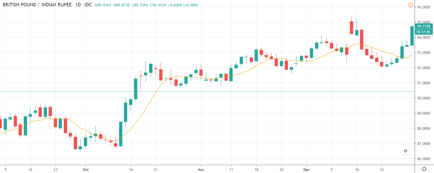
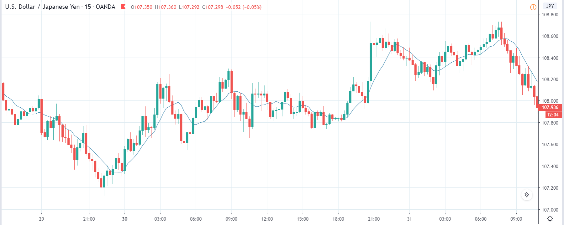
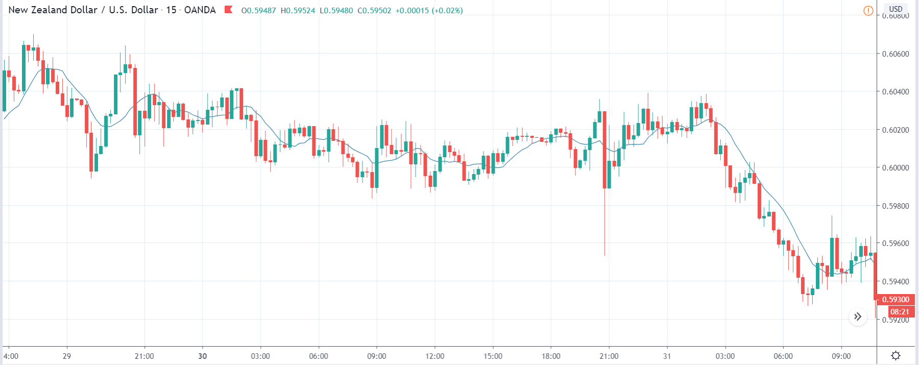
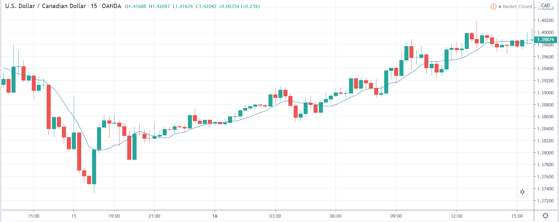
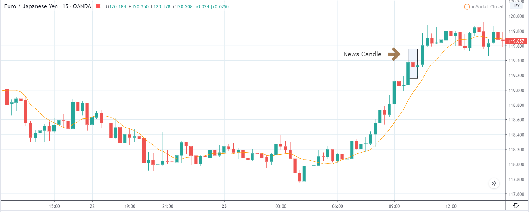
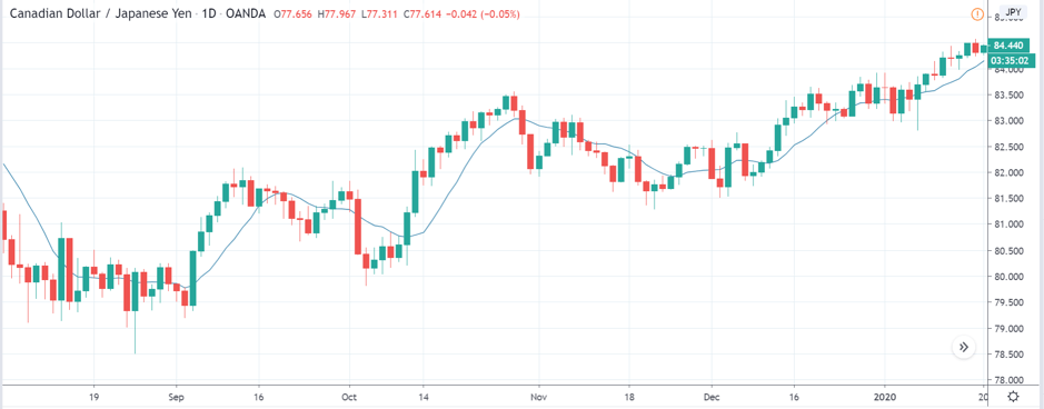
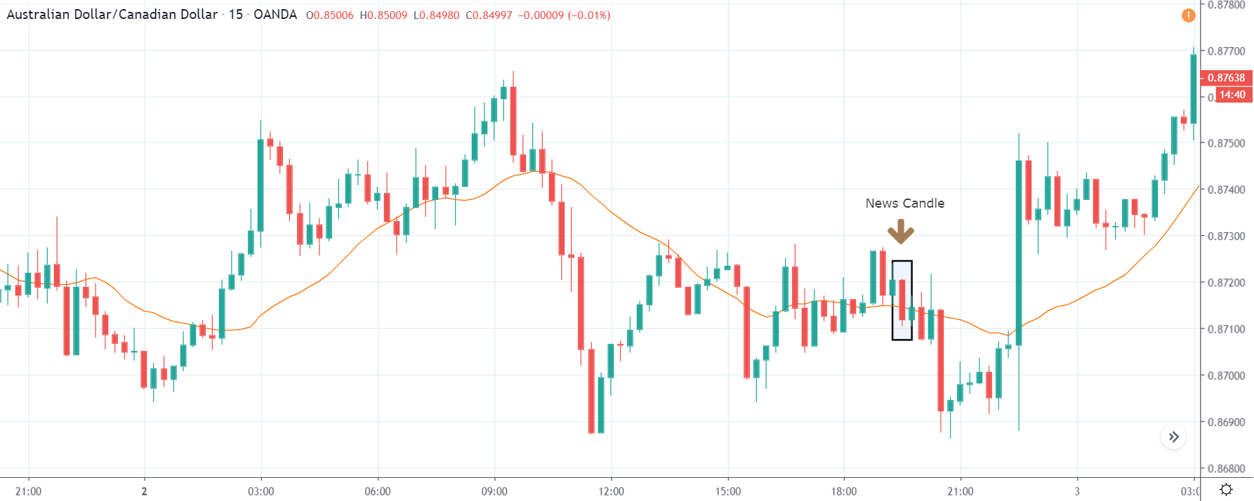
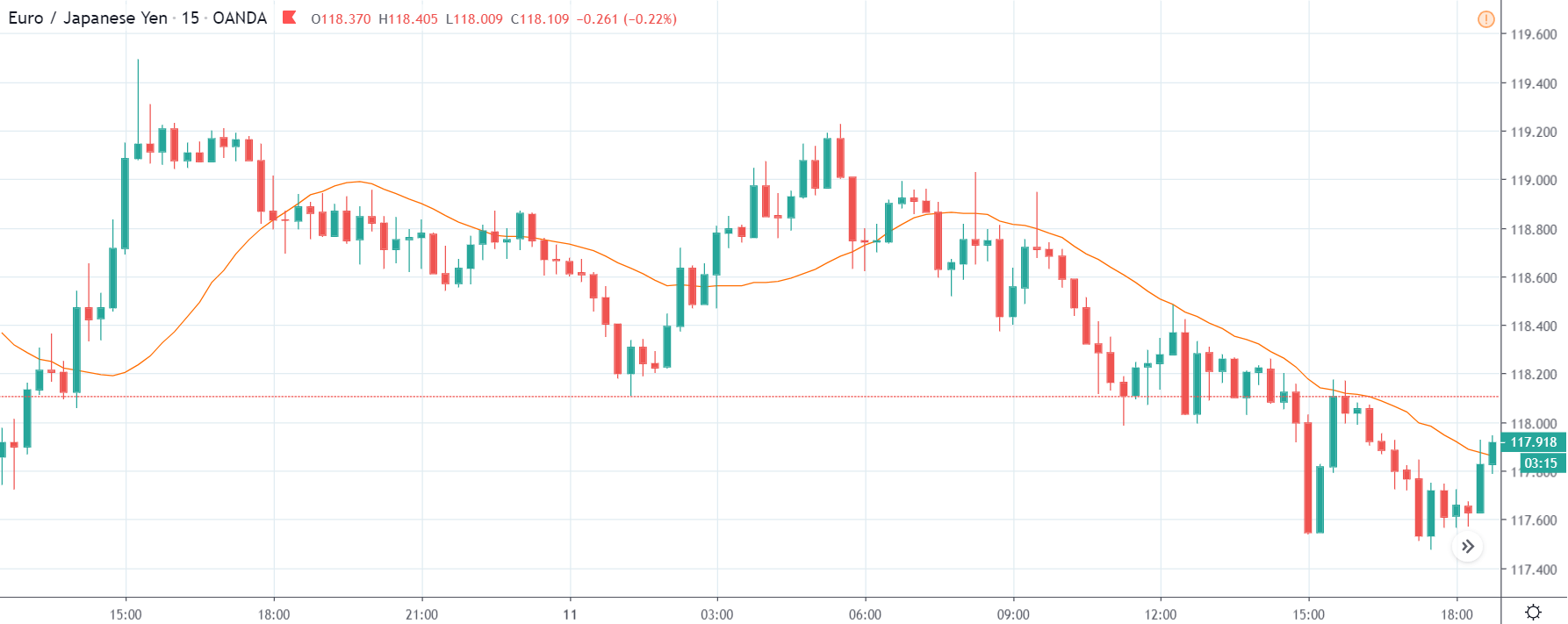
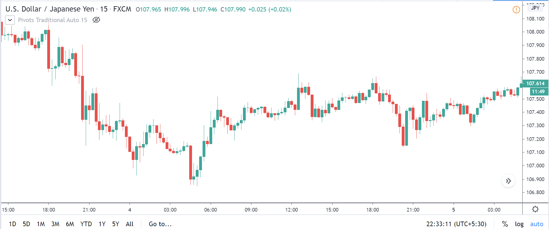
AUD/JPY | Before the announcement:
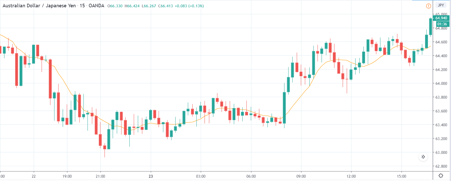
We begin with the AUD/JPY currency pair, where, in the above image, we see that pair is an uptrend before the news announcement. The volatility is high, and the price is making a new ‘higher high.’ As the impact of the PMI data is less, positive data should take the currency higher, and negative PMI data might result in a short-term downtrend. It is preferable to trade the above pair if we come to encounter the second situation as it could essentially result in a retracement of the uptrend, which can be used to join the trend.
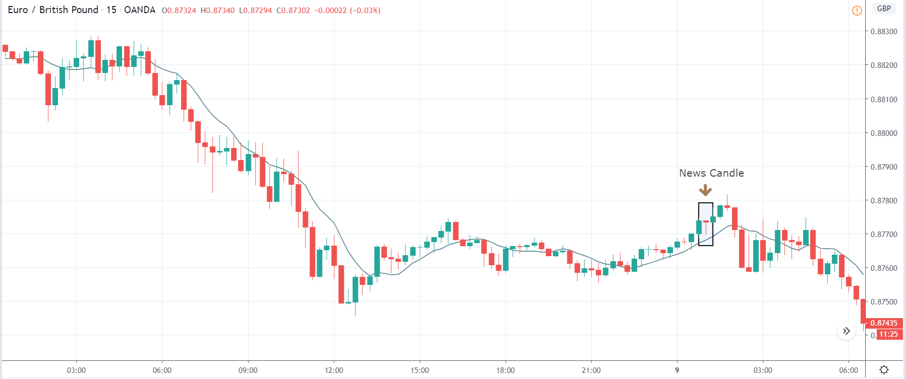
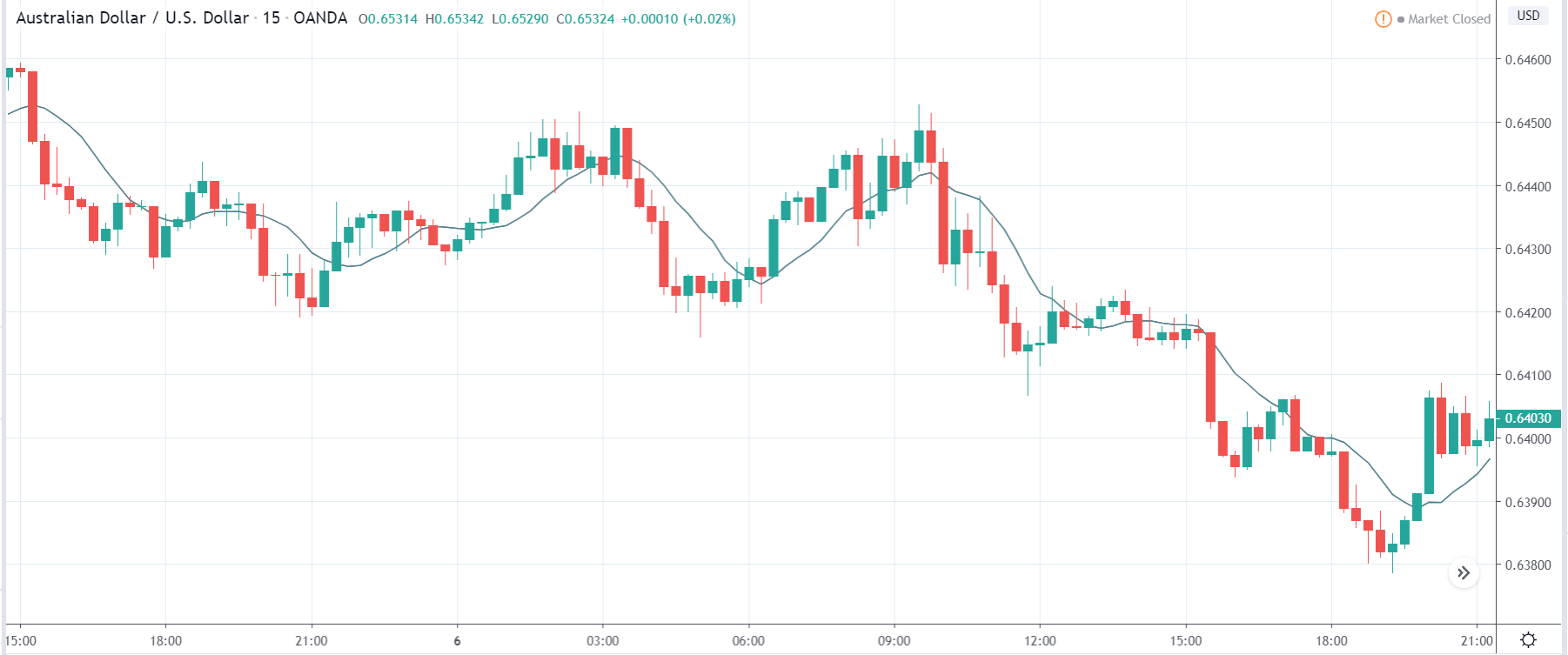
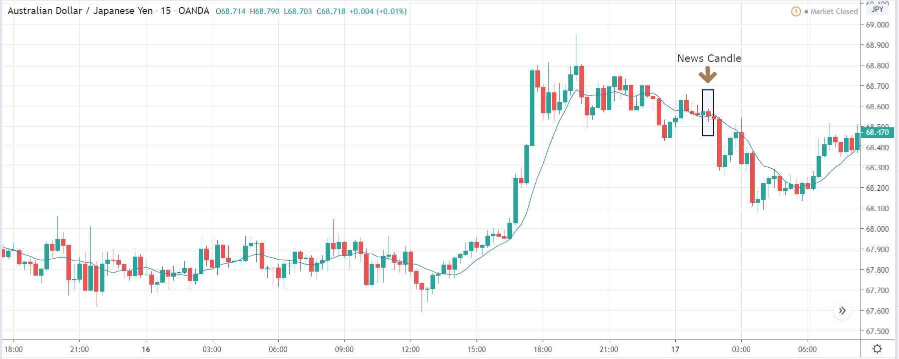
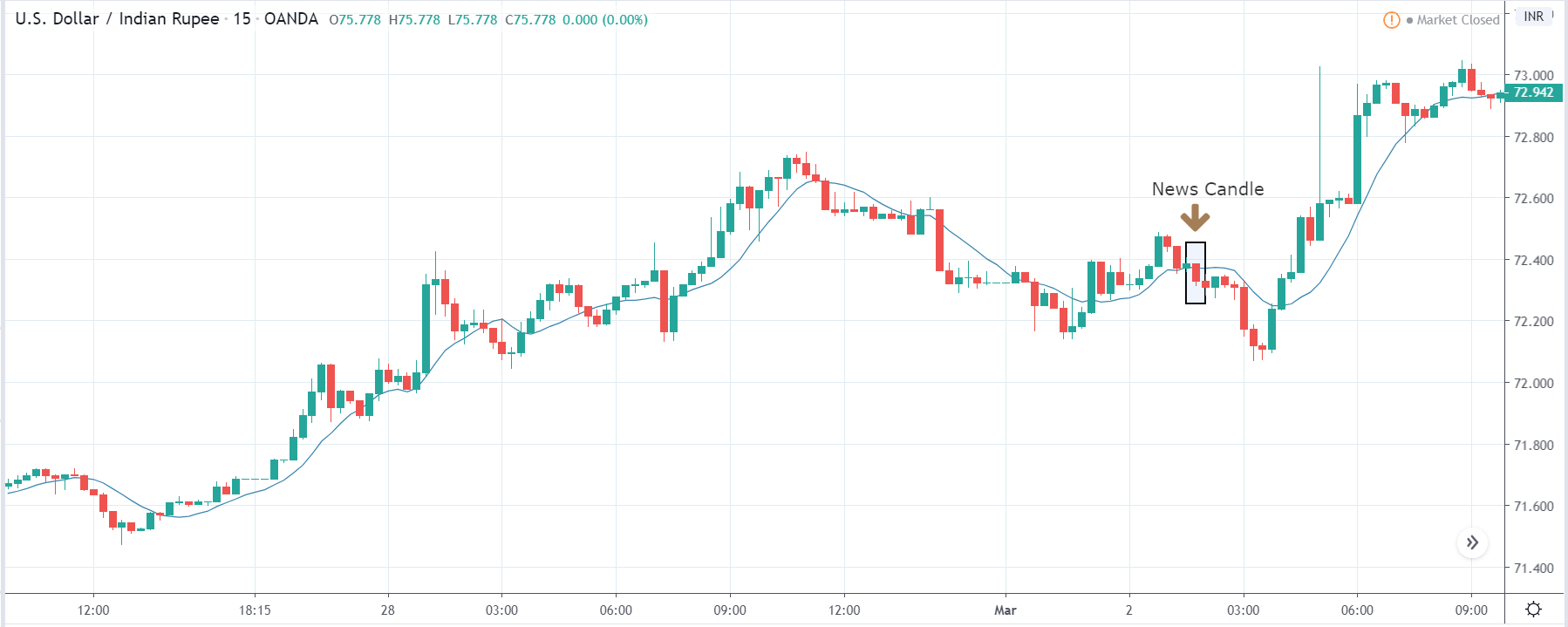
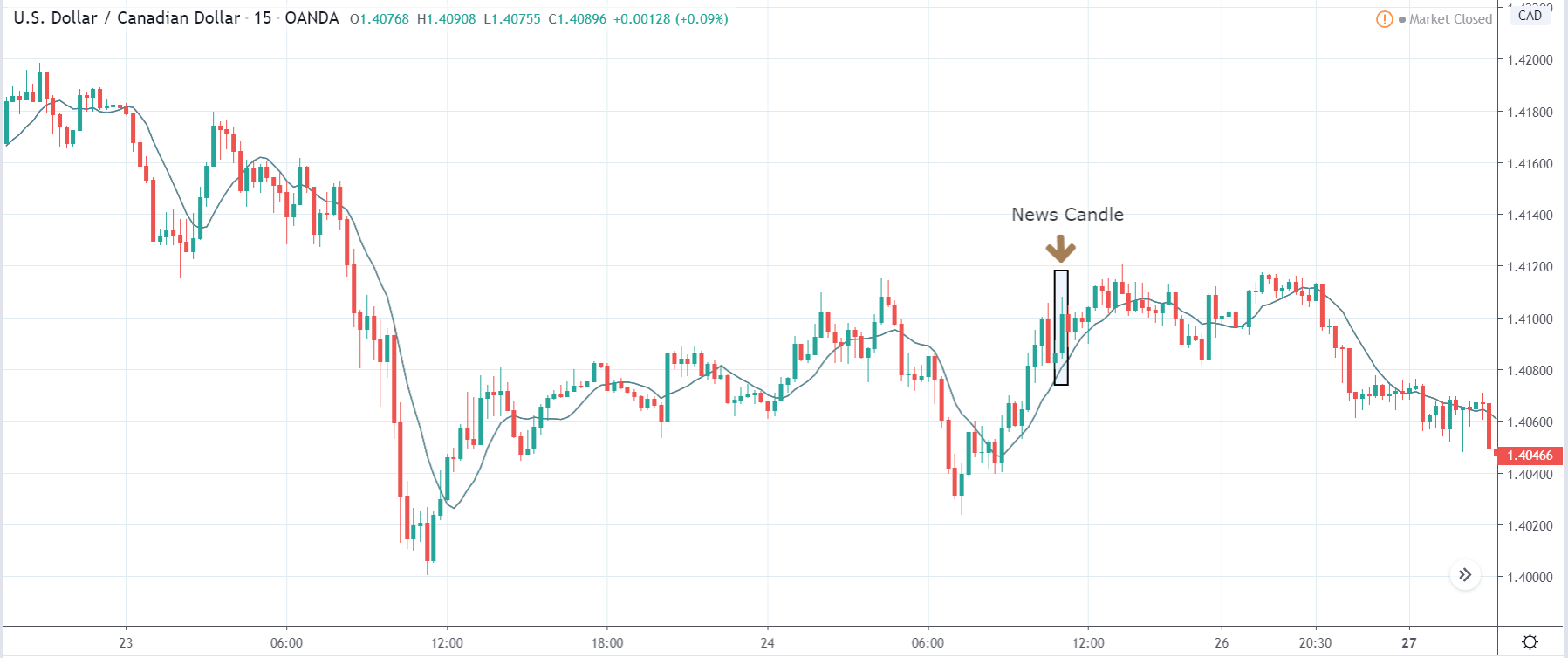
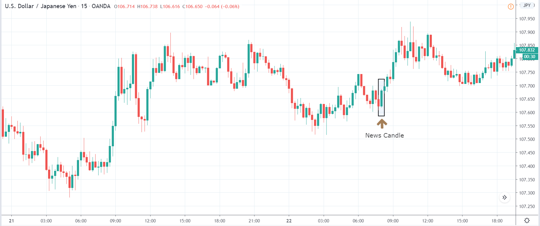
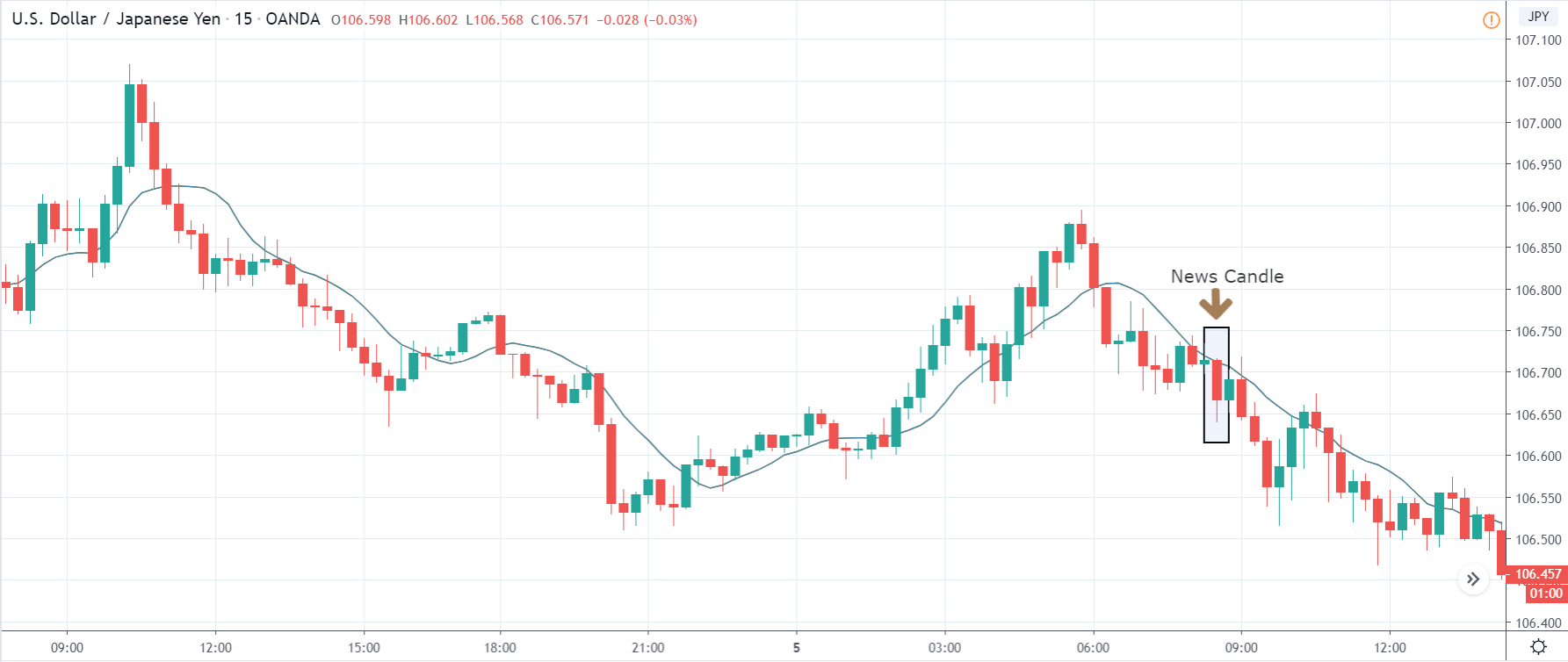
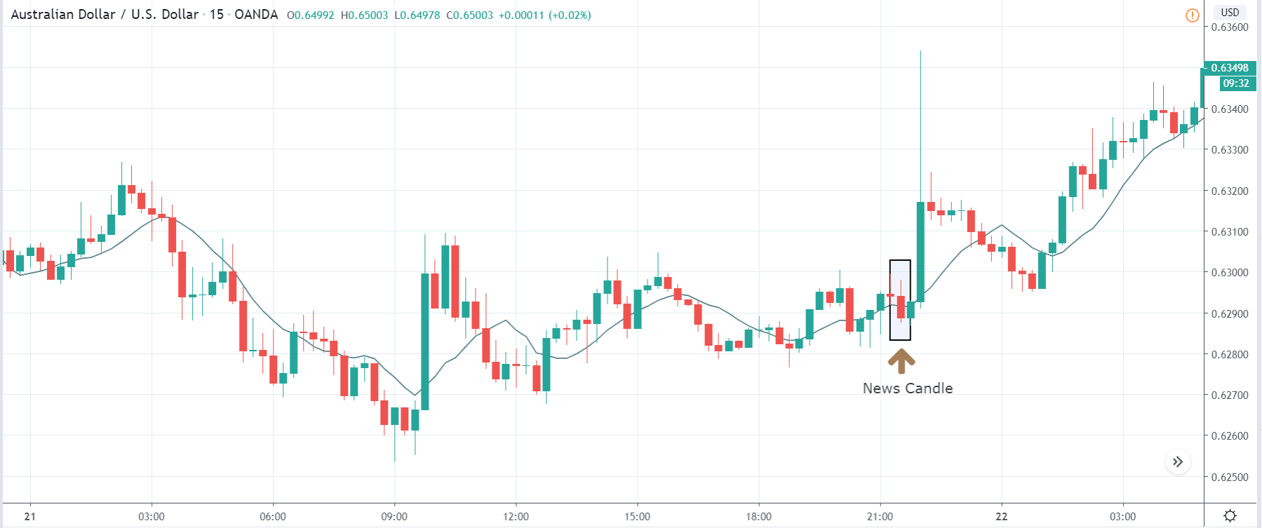
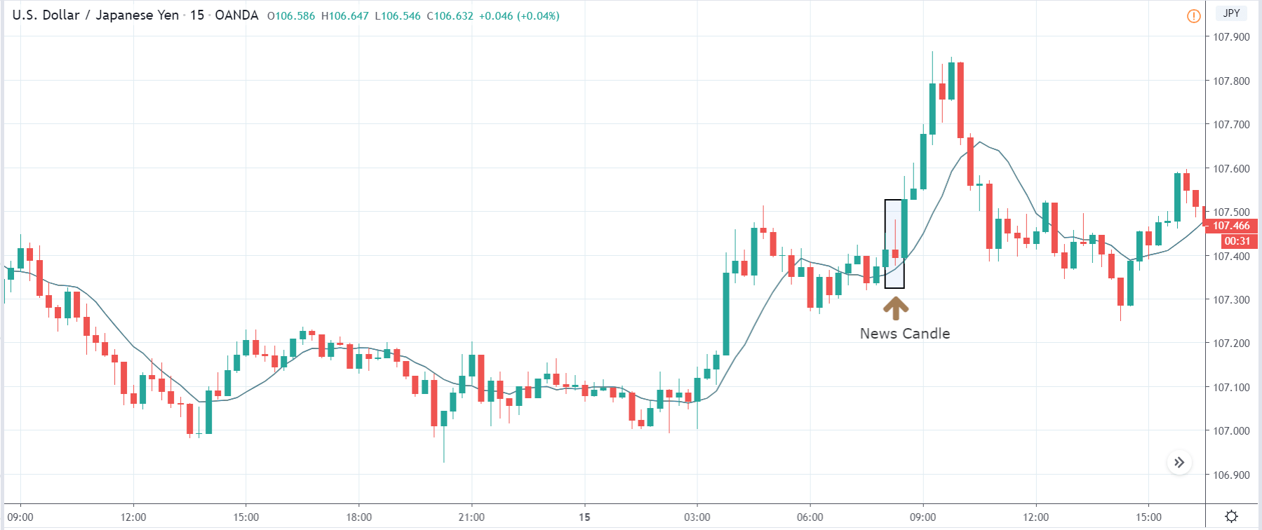
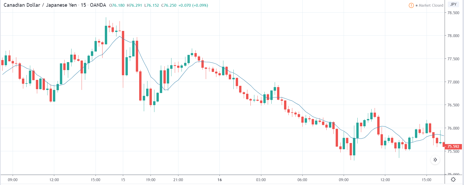
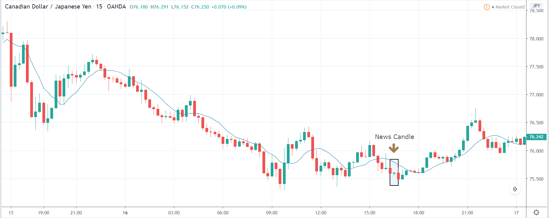
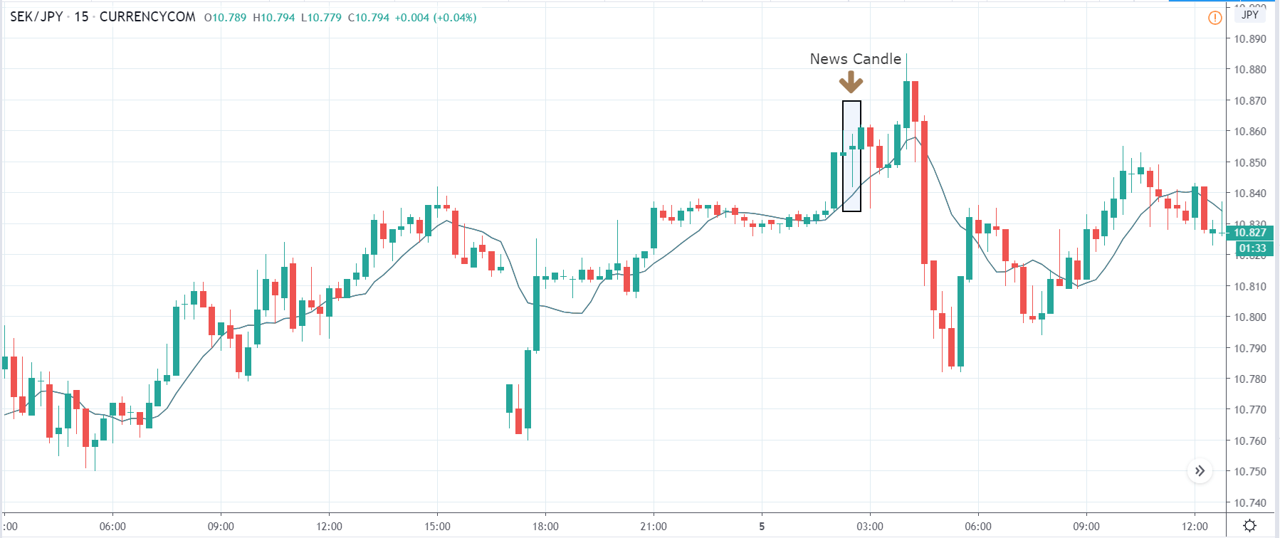
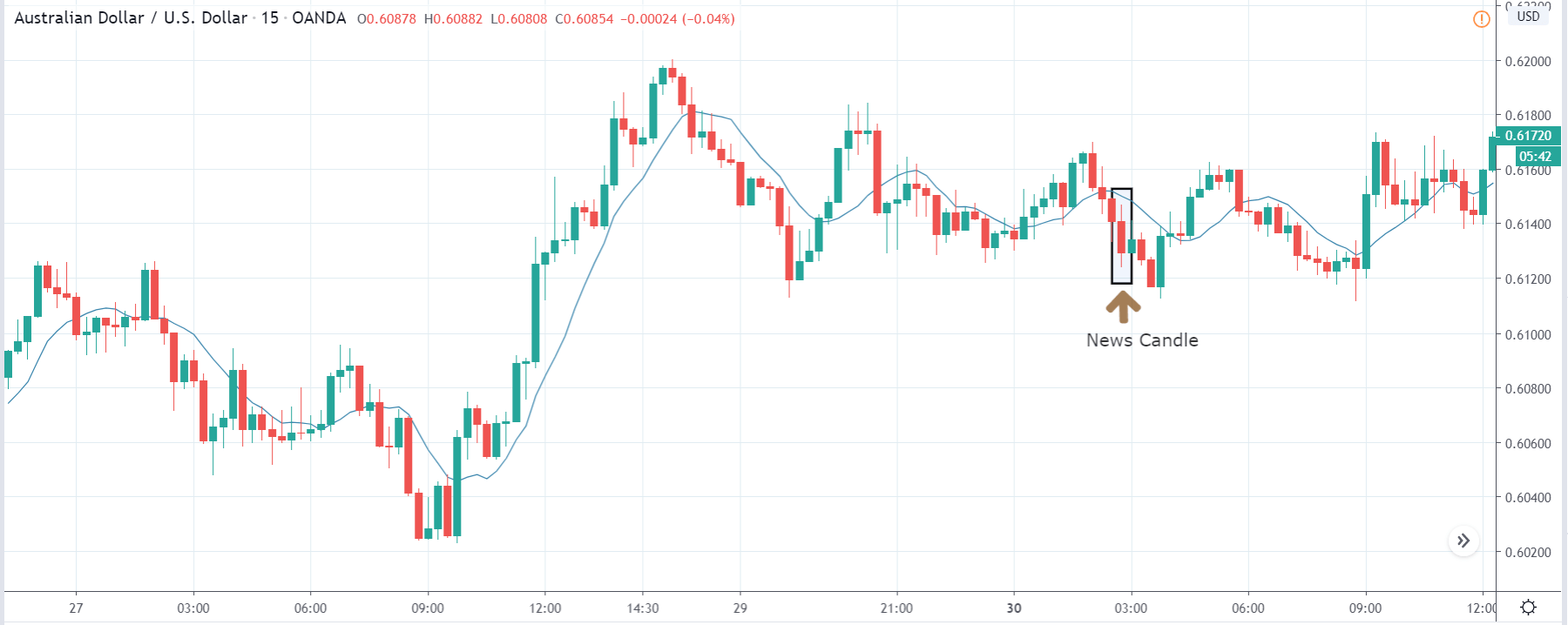
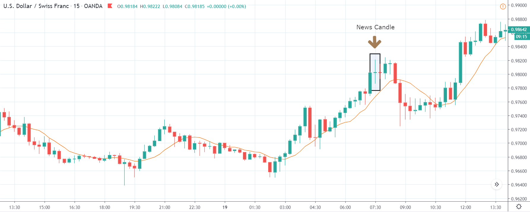
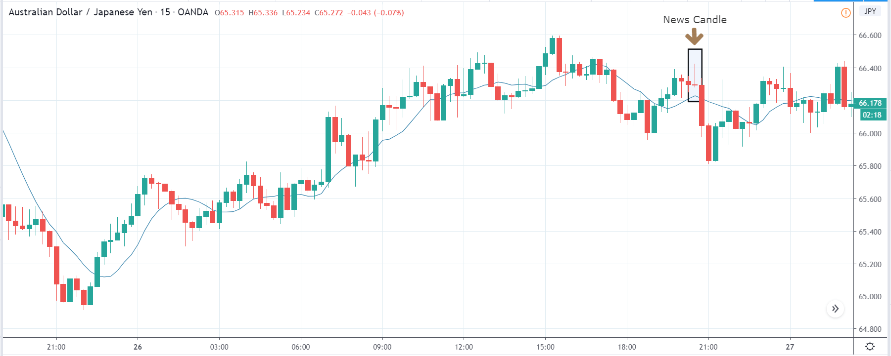
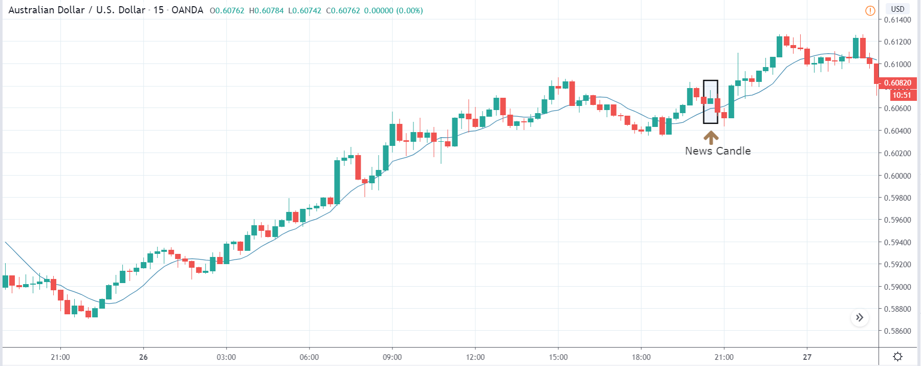
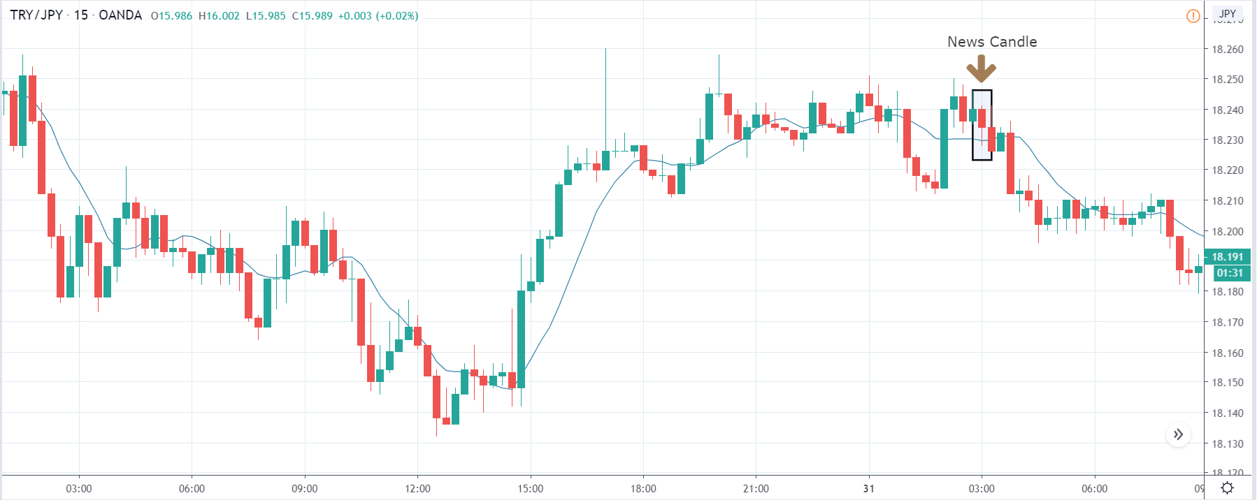
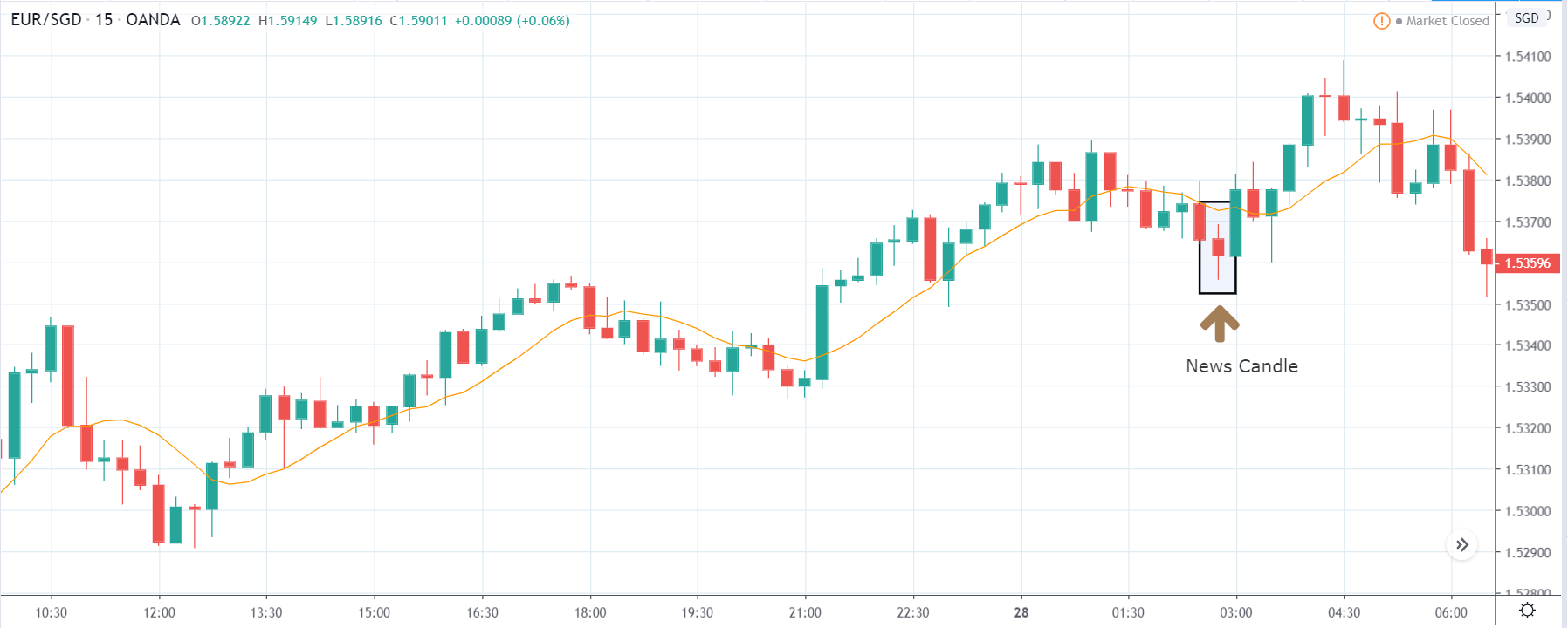
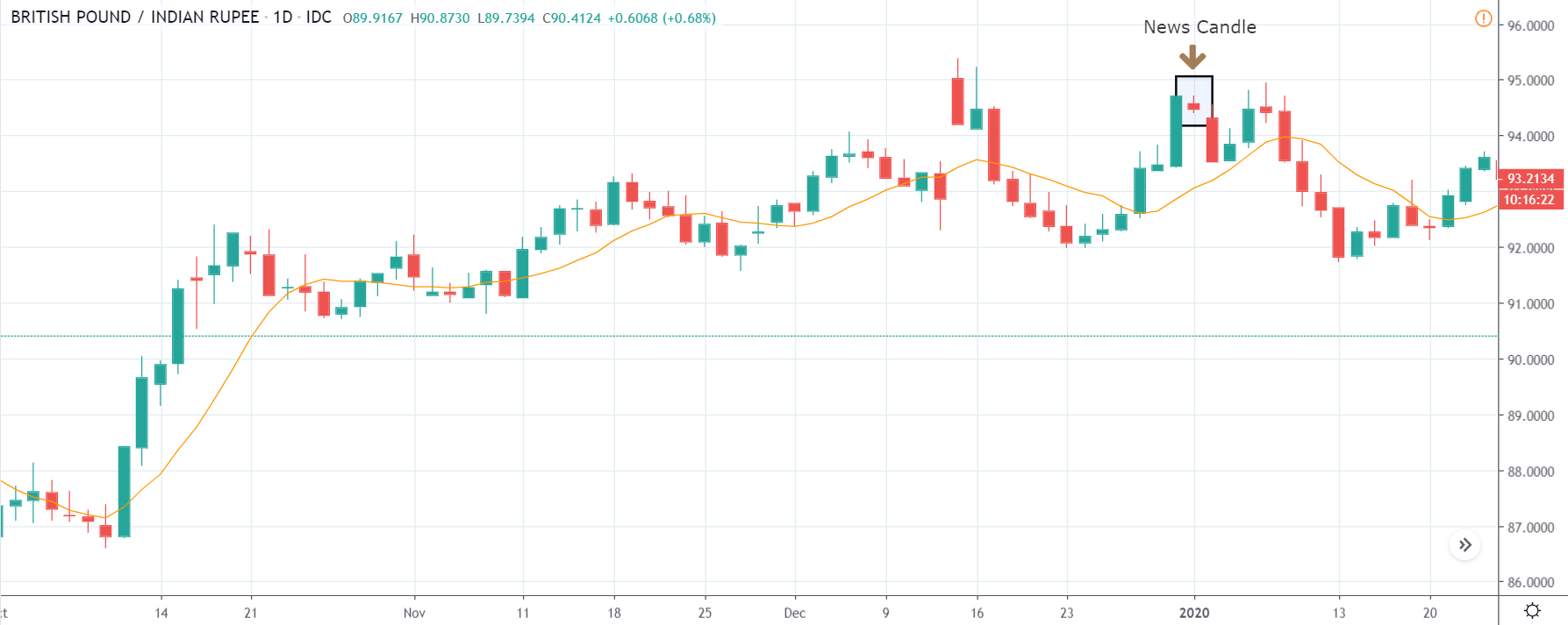
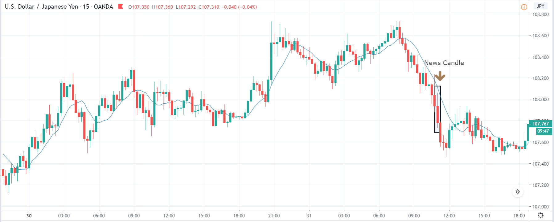
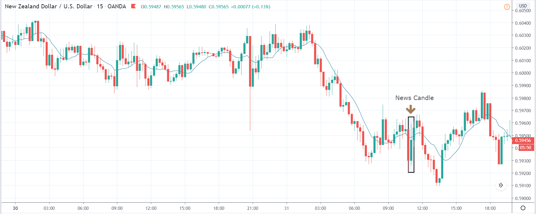
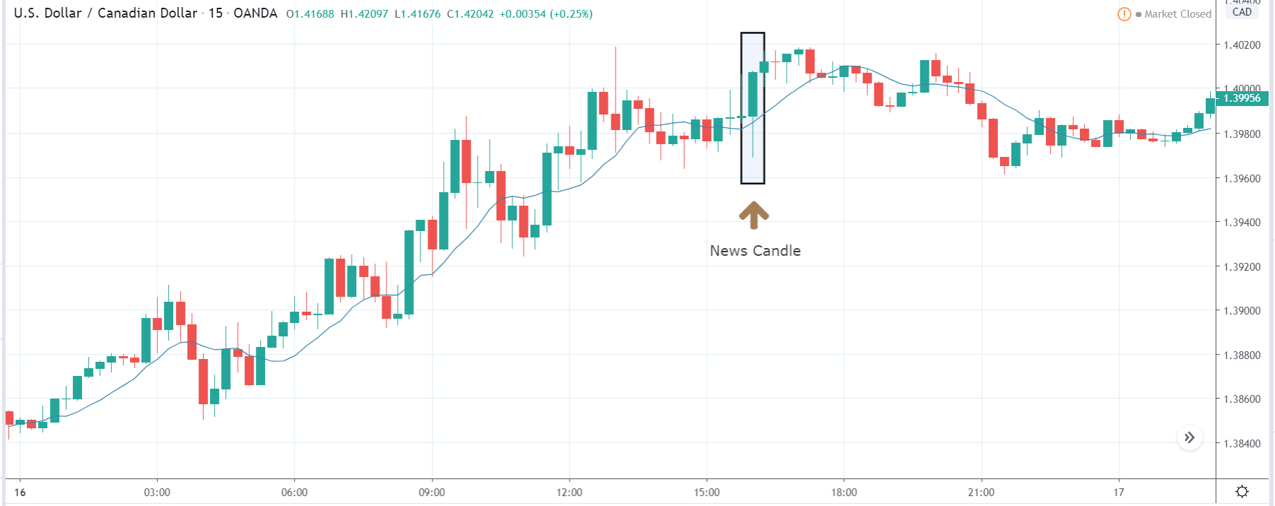
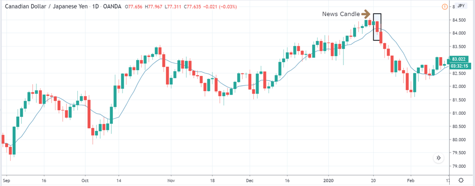
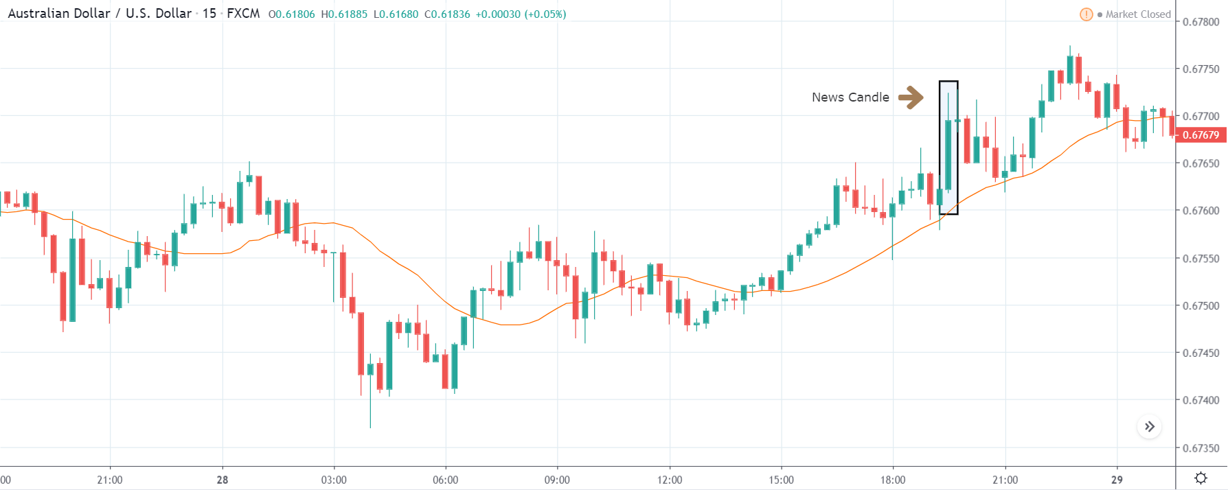
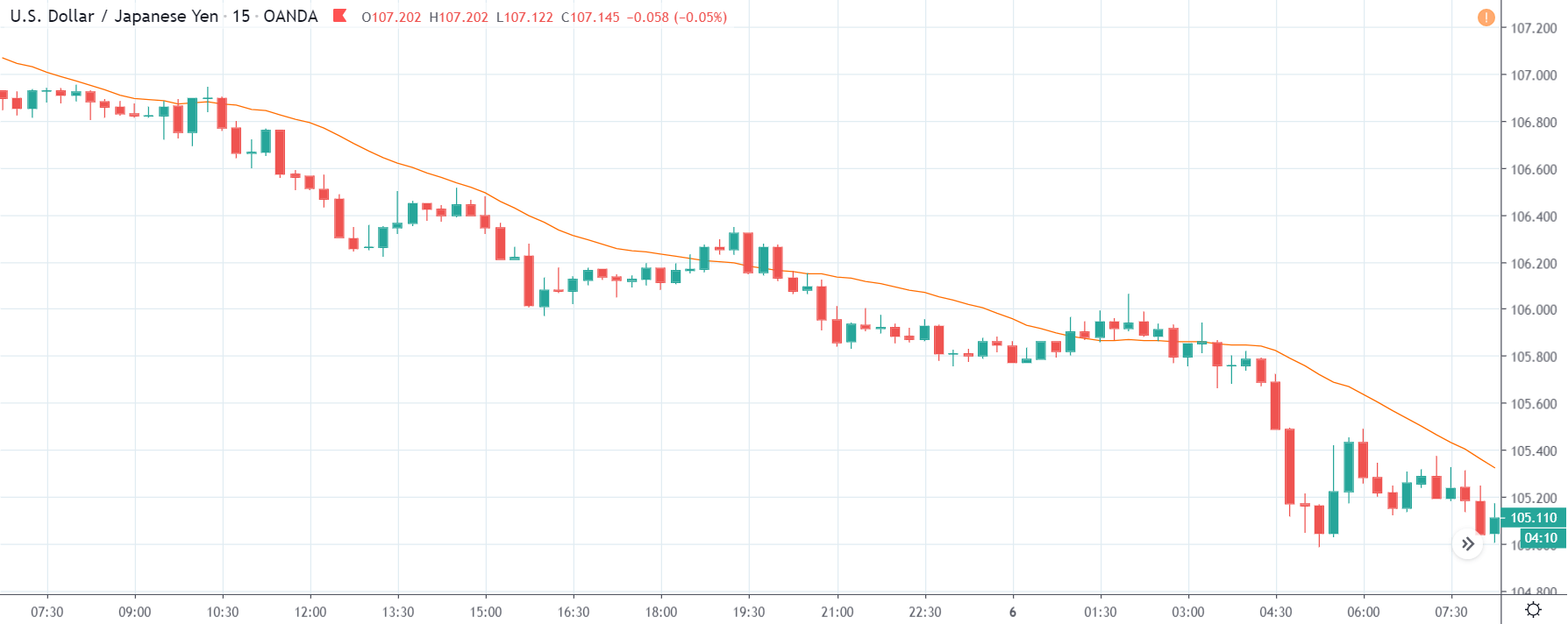
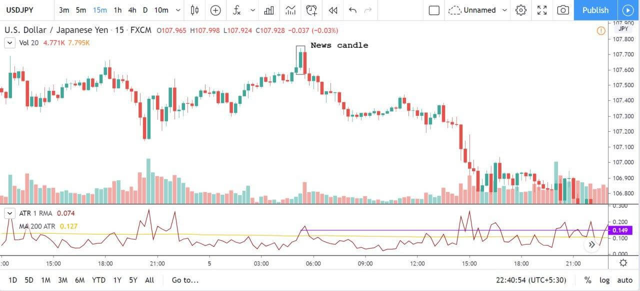
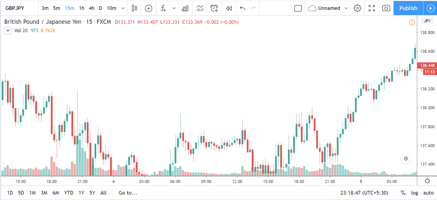
AUD/JPY | After the announcement:
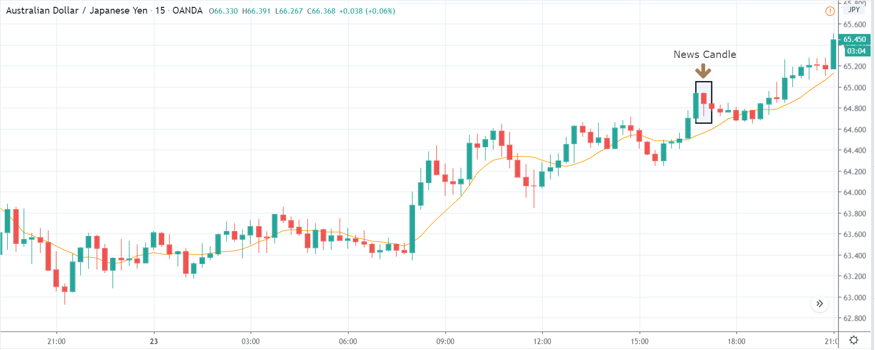
After the PMI data is released, owing to a decrease in the PMI number and this immediately is followed by some buying pressure. This is where we can understand the impact of the indicator on a currency where initially due to poor PMI data, the price falls, but it could not even go below the moving average. Thus, one can take this opportunity to join the major trend by trading the retracement, which was brought in due to the bad news. Since the uptrend is strong, one can hold on their trades as long as the market shows signs of reversal.
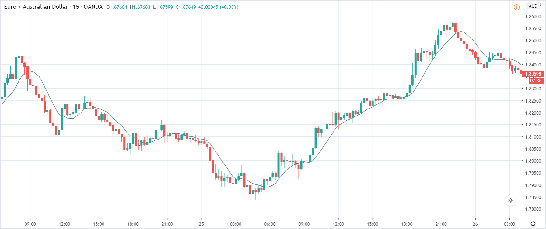
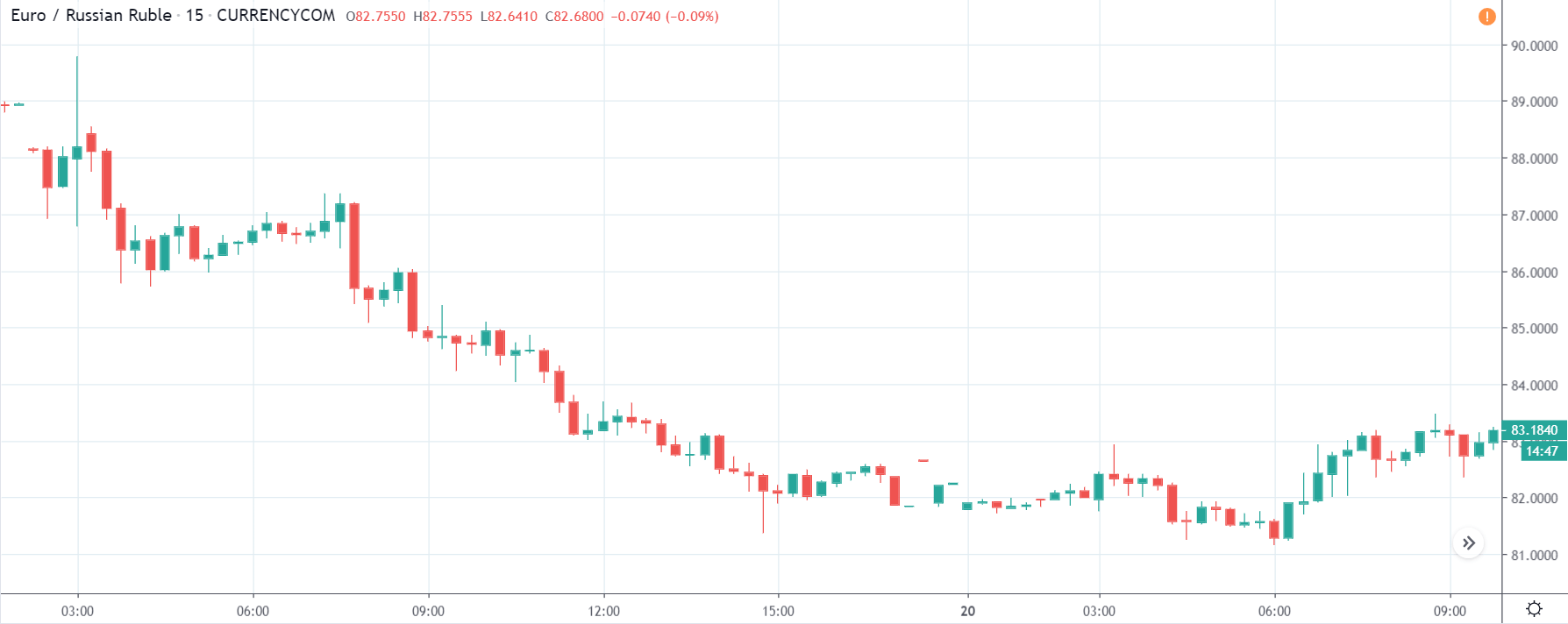
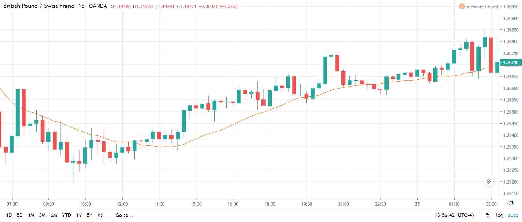
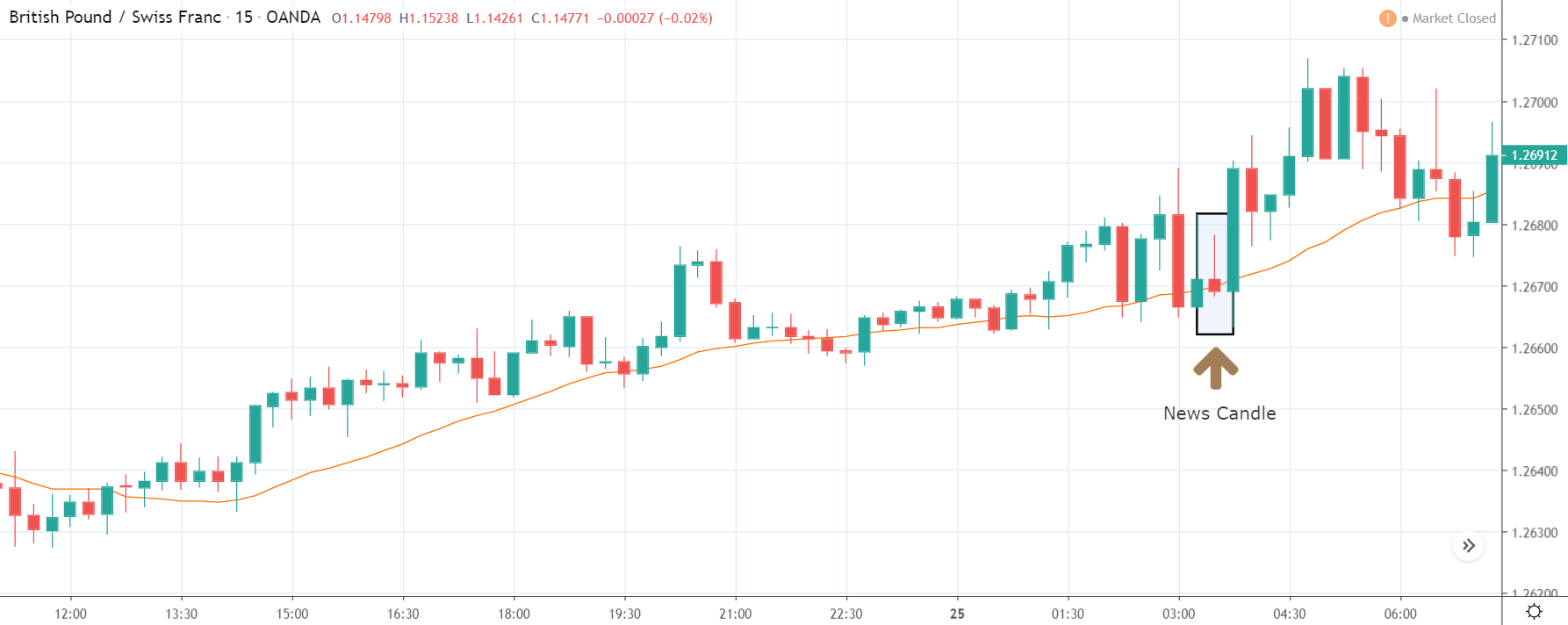
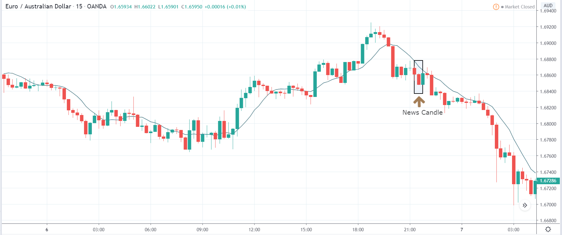
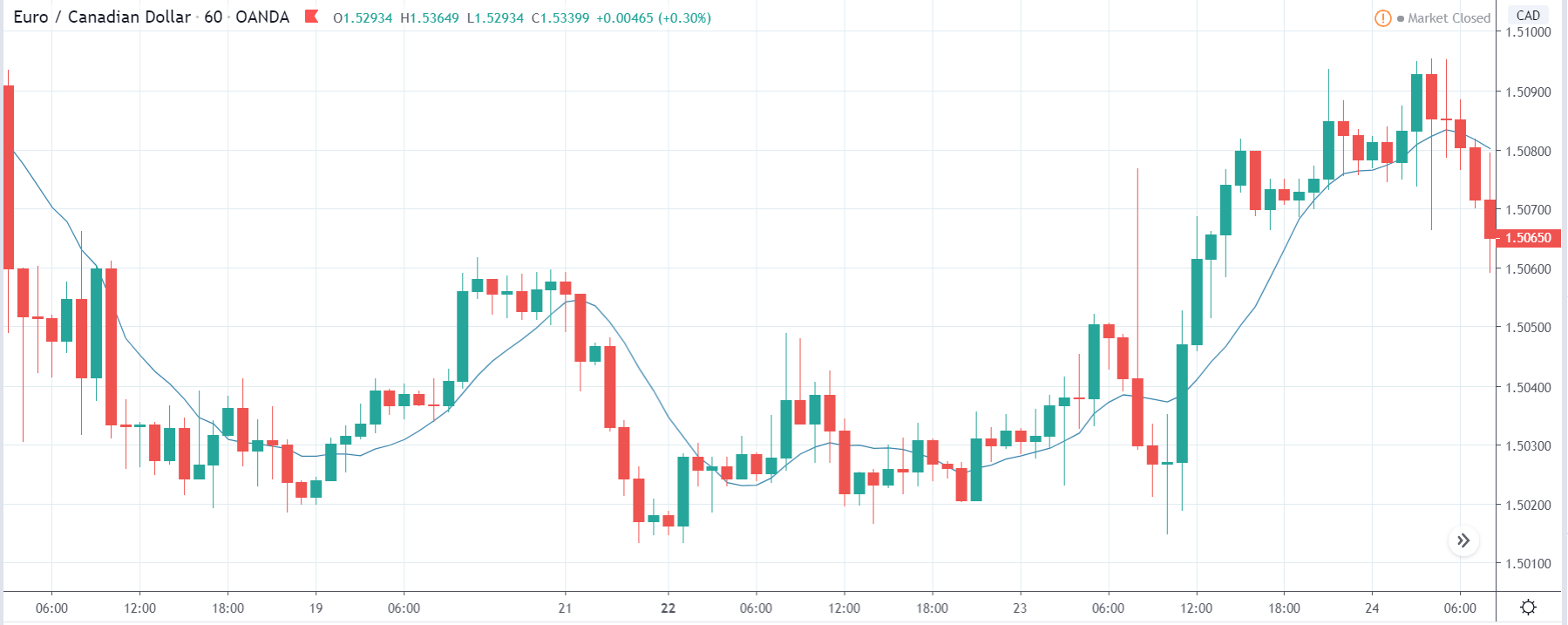
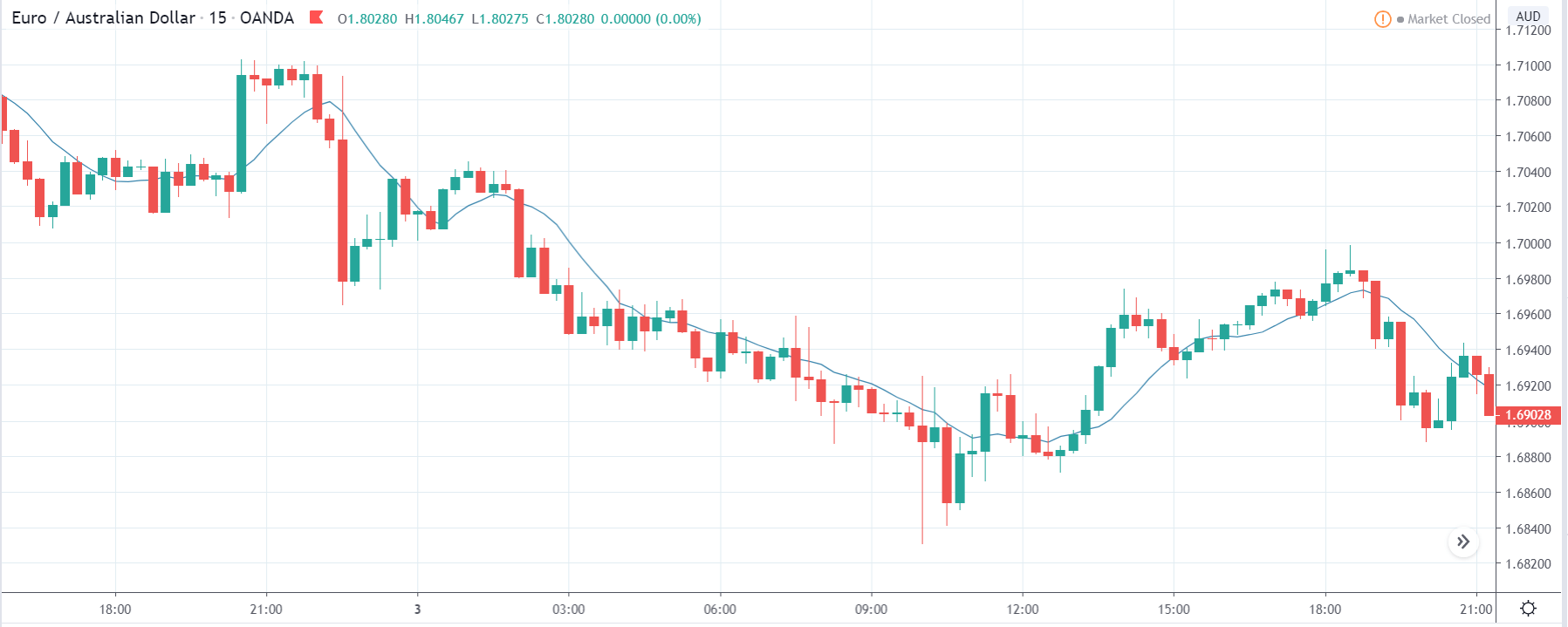
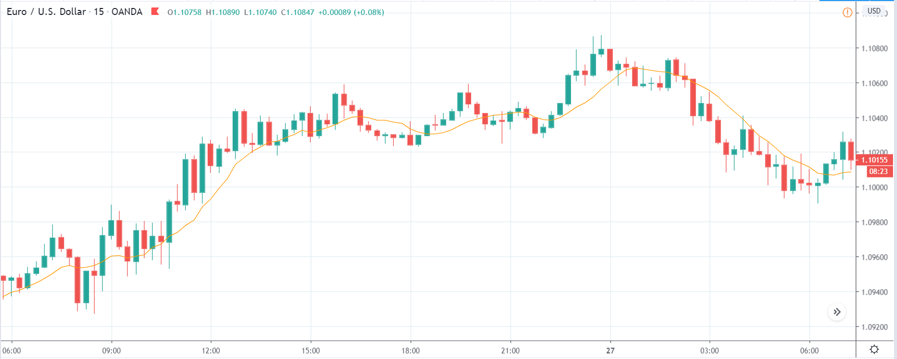
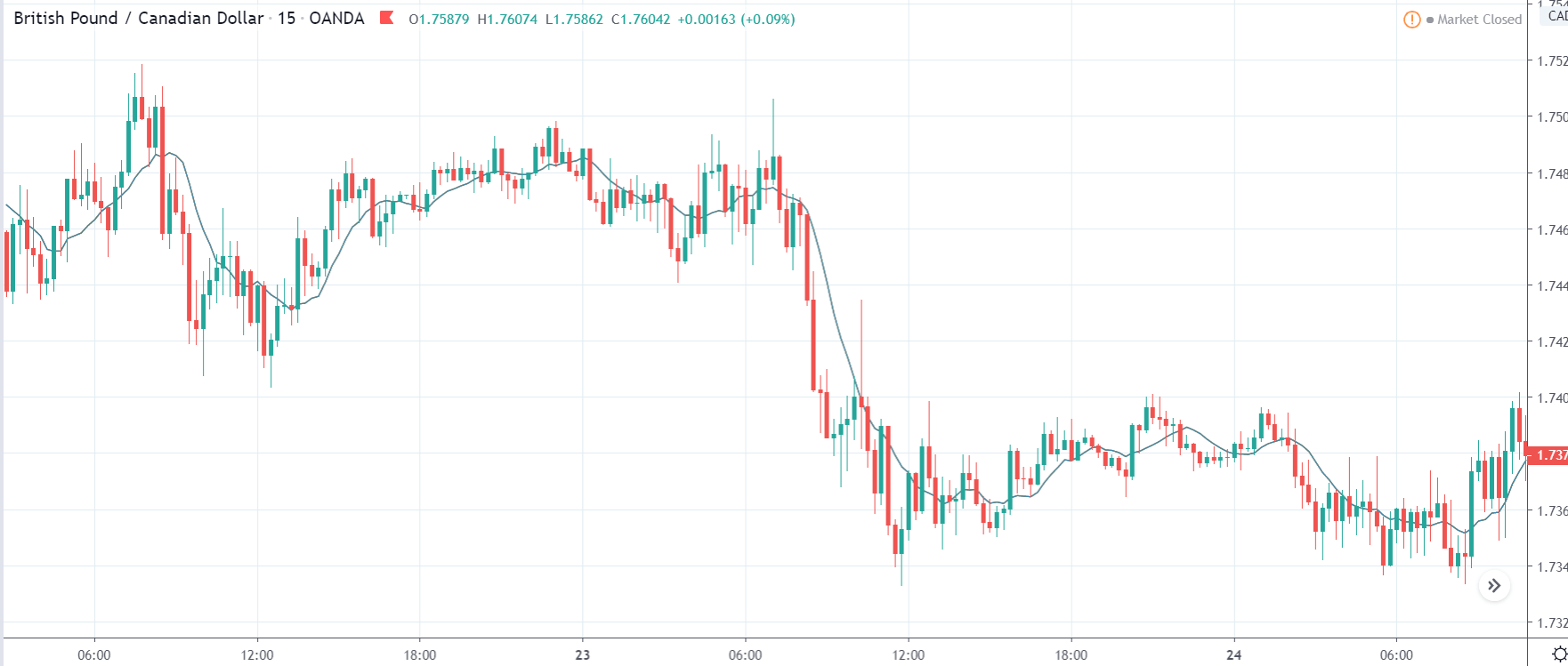
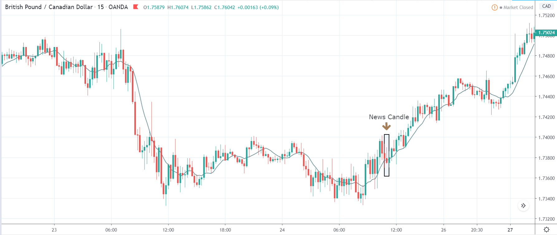
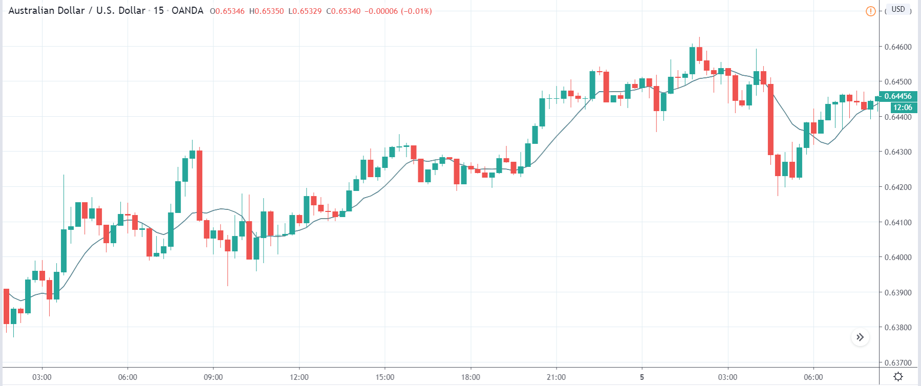
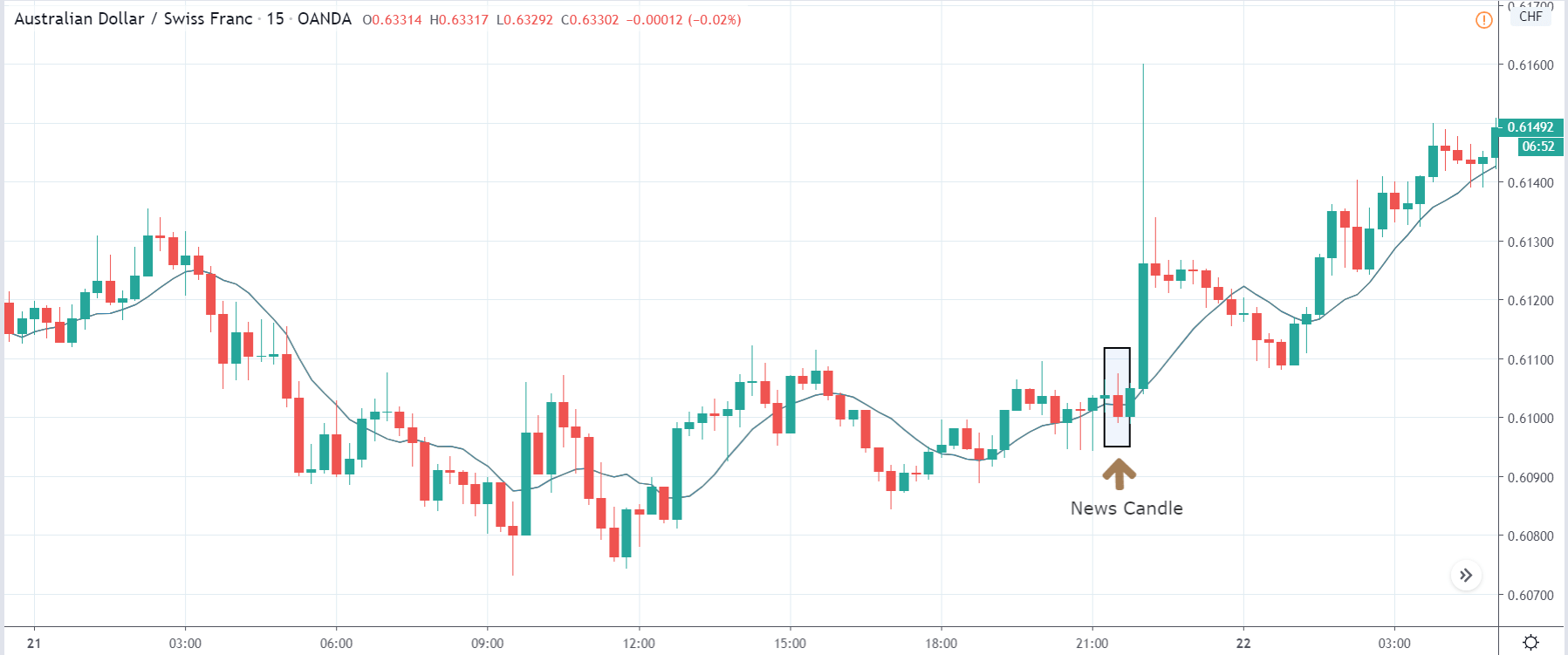
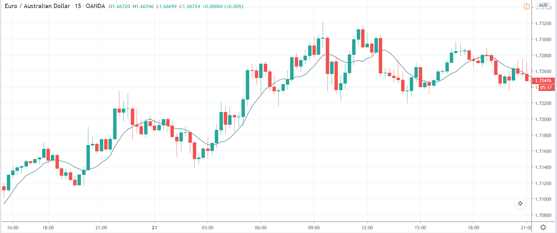
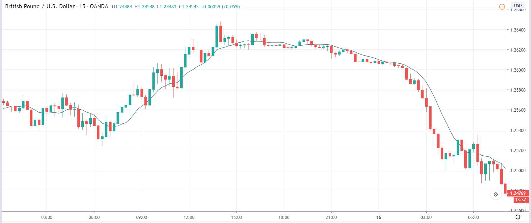
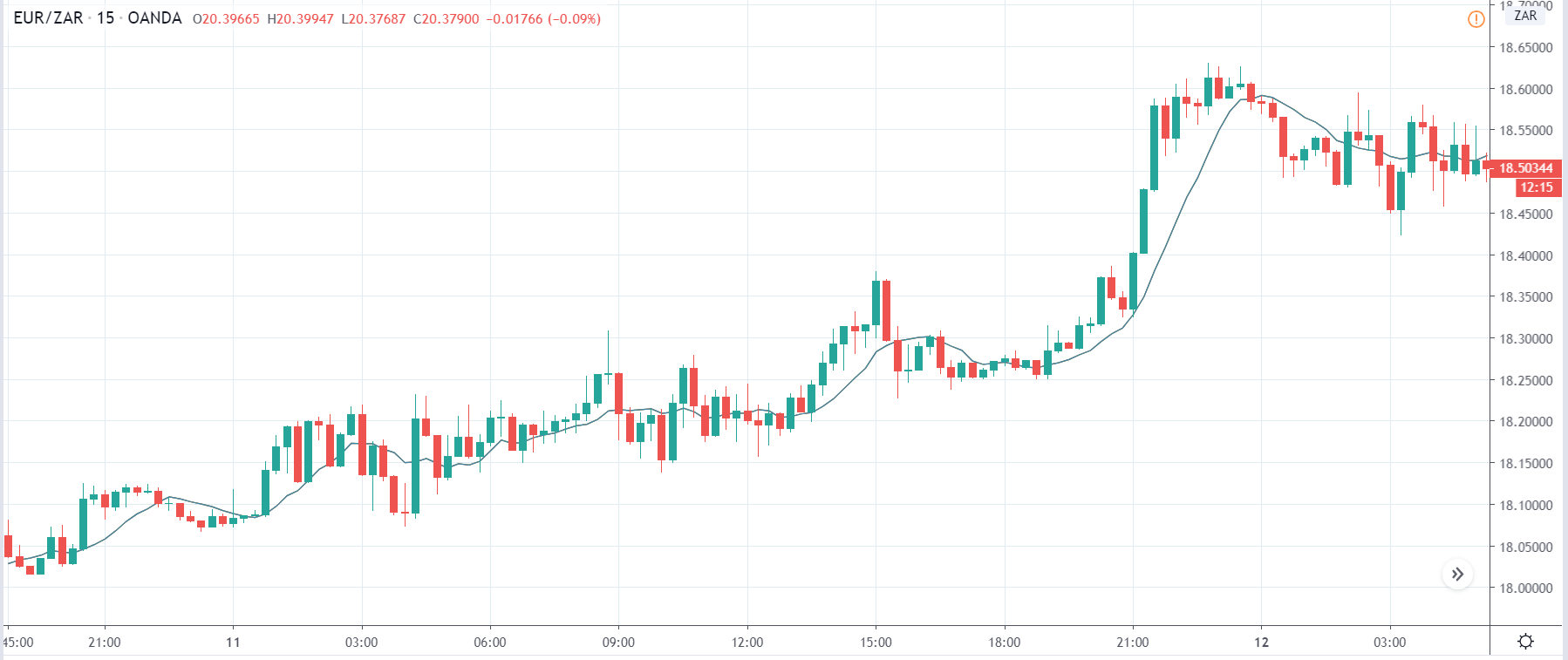
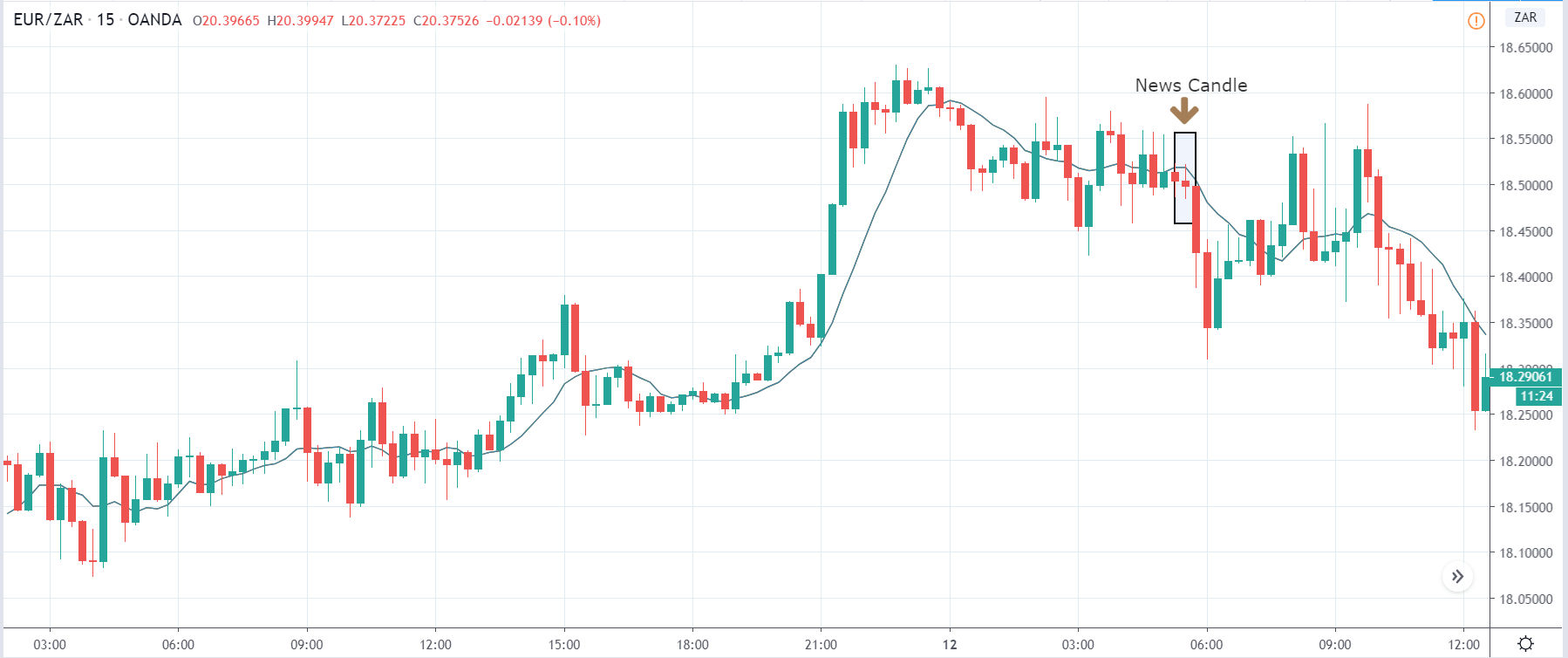
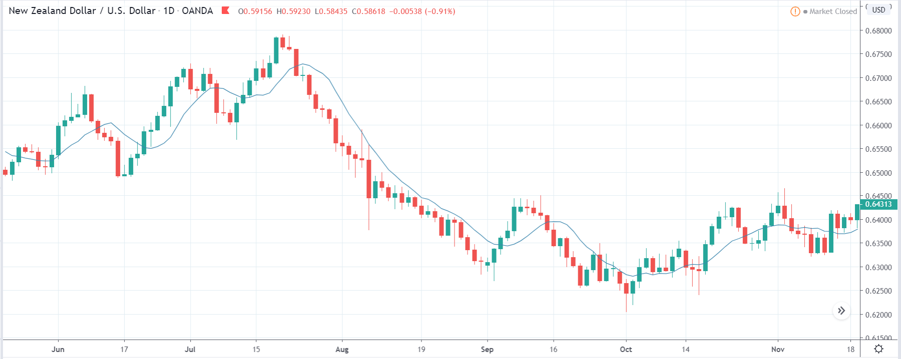
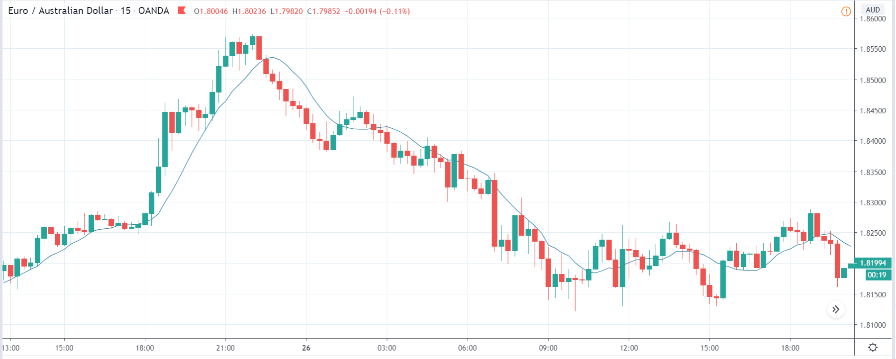
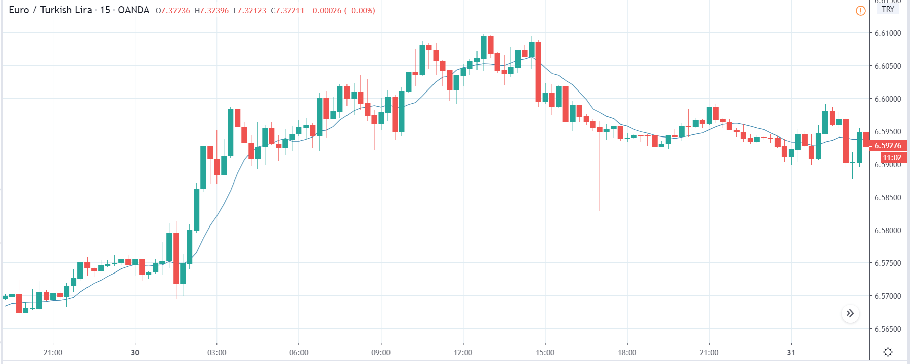
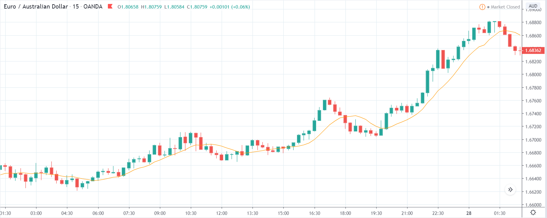
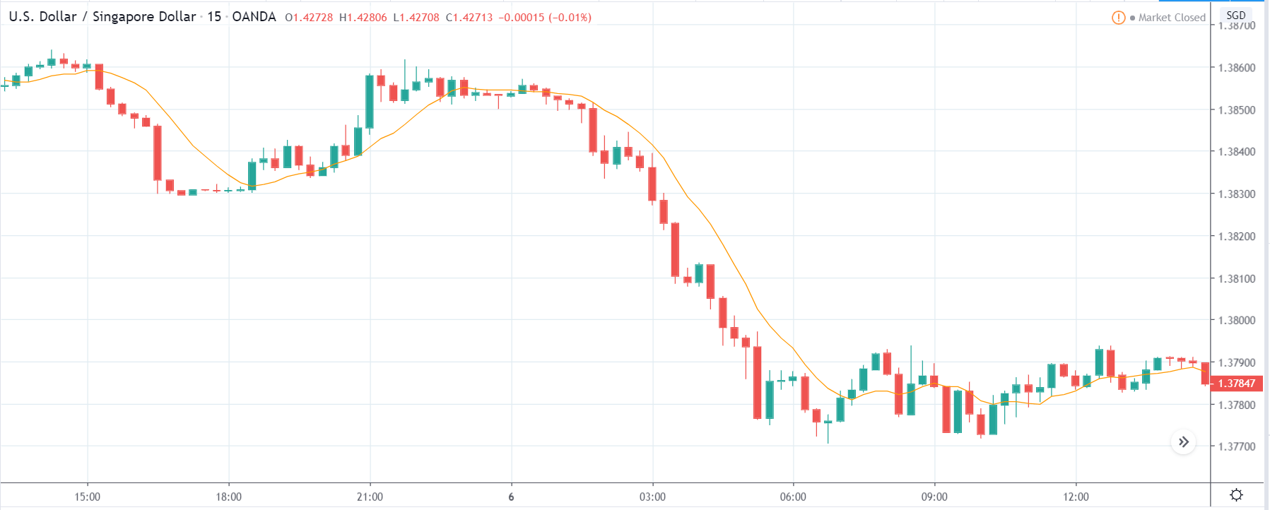
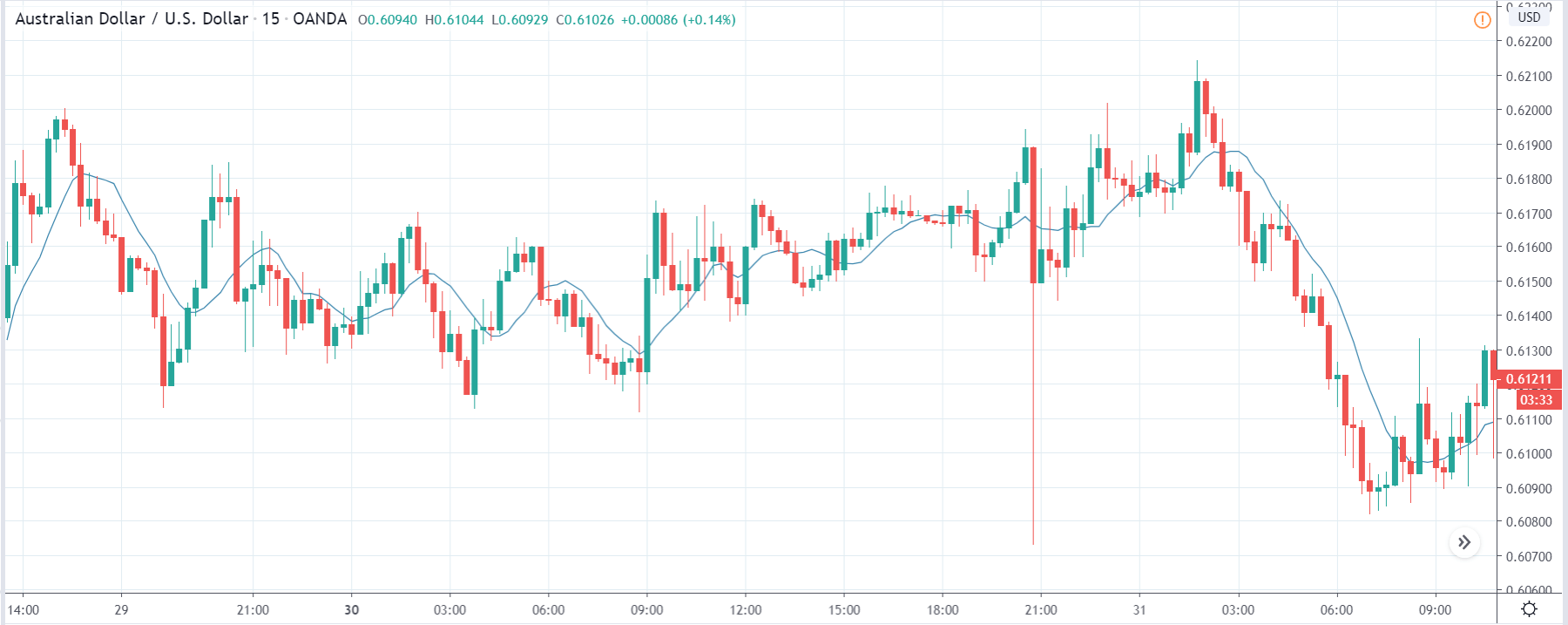
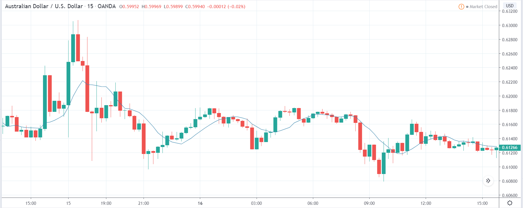
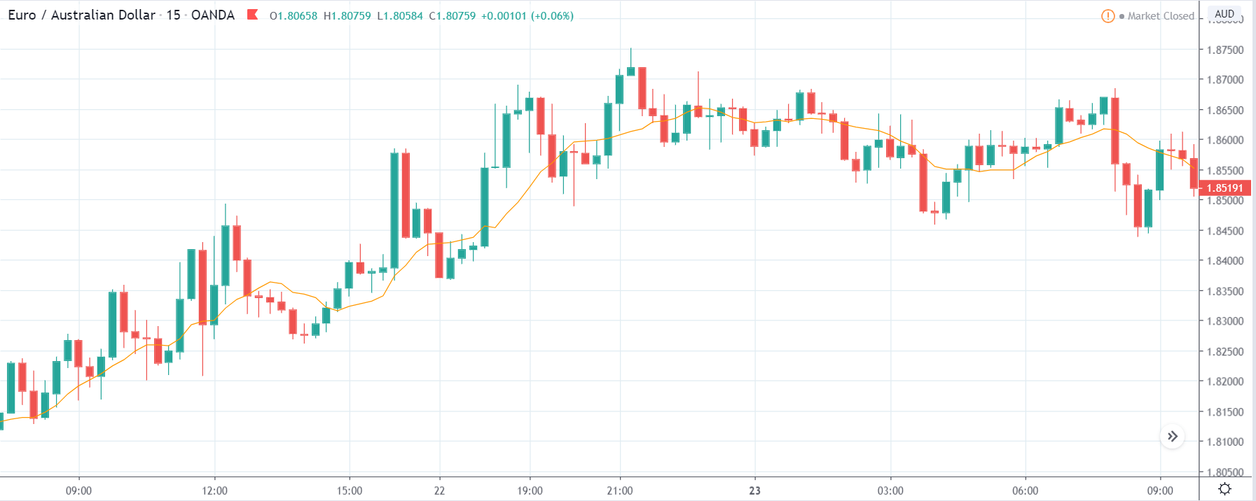
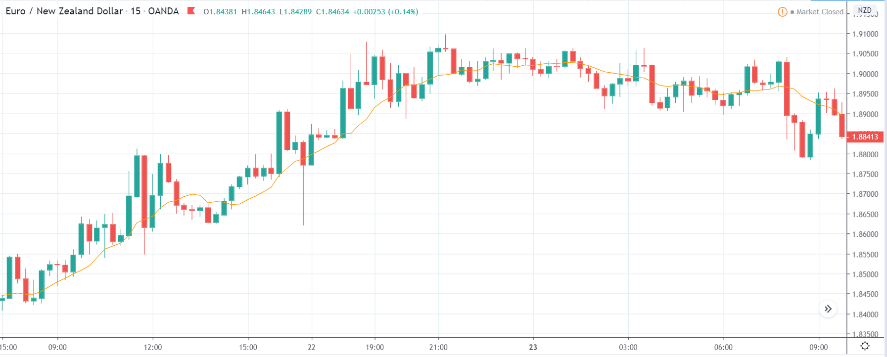
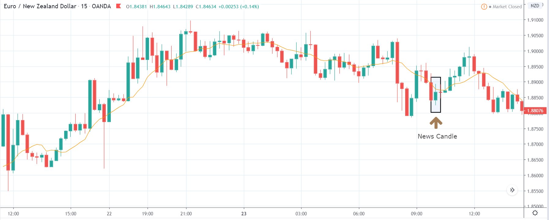
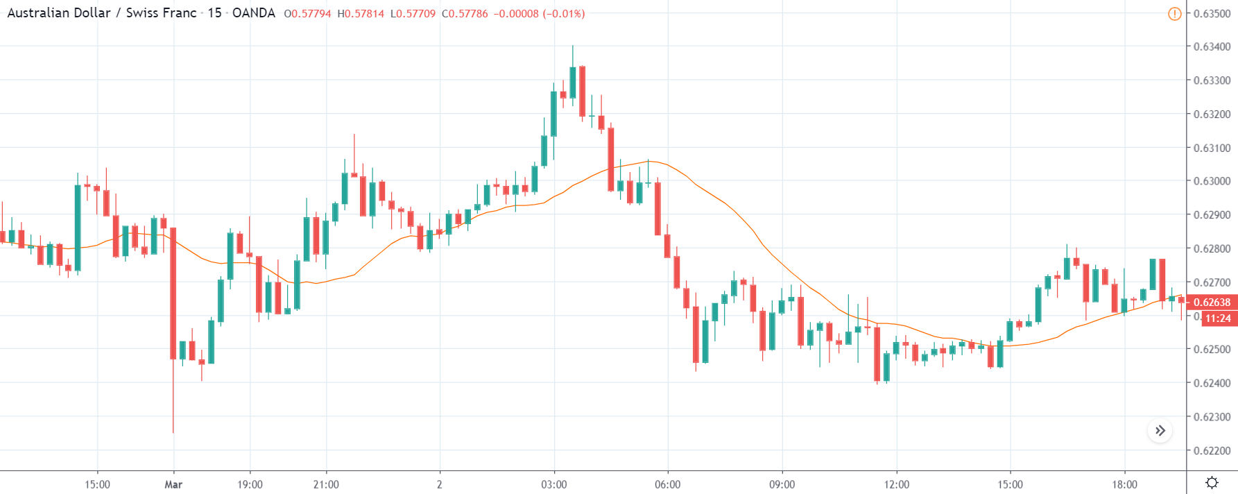
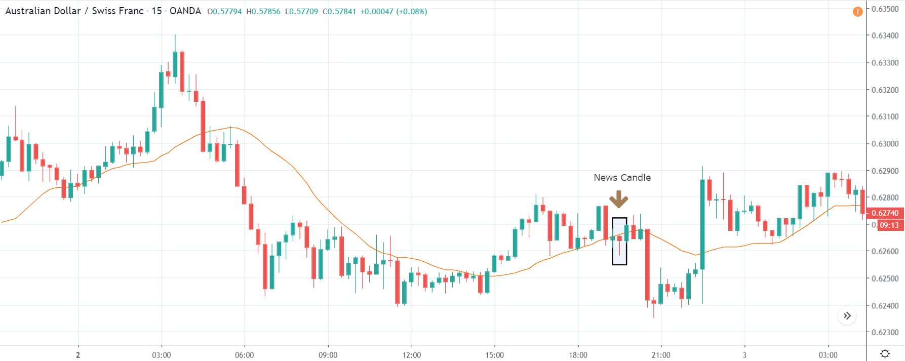
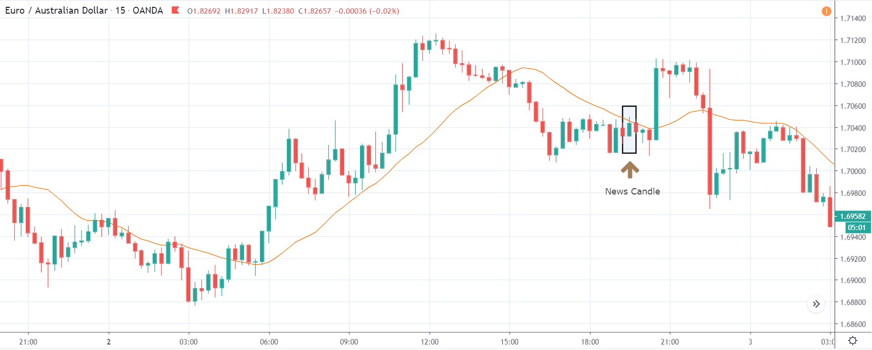
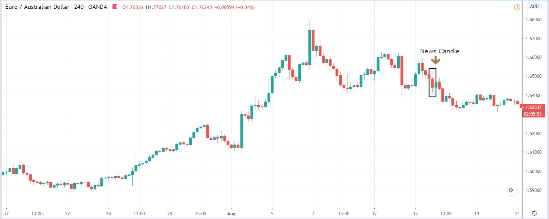
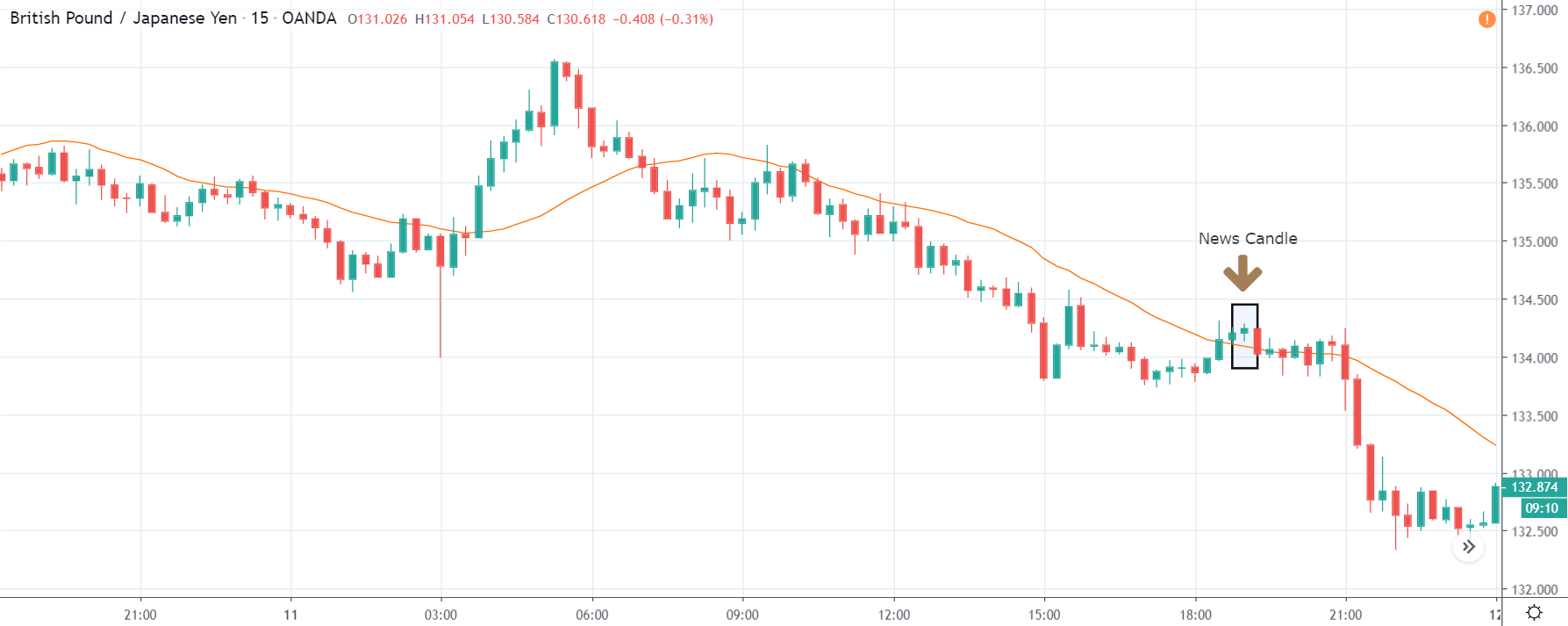
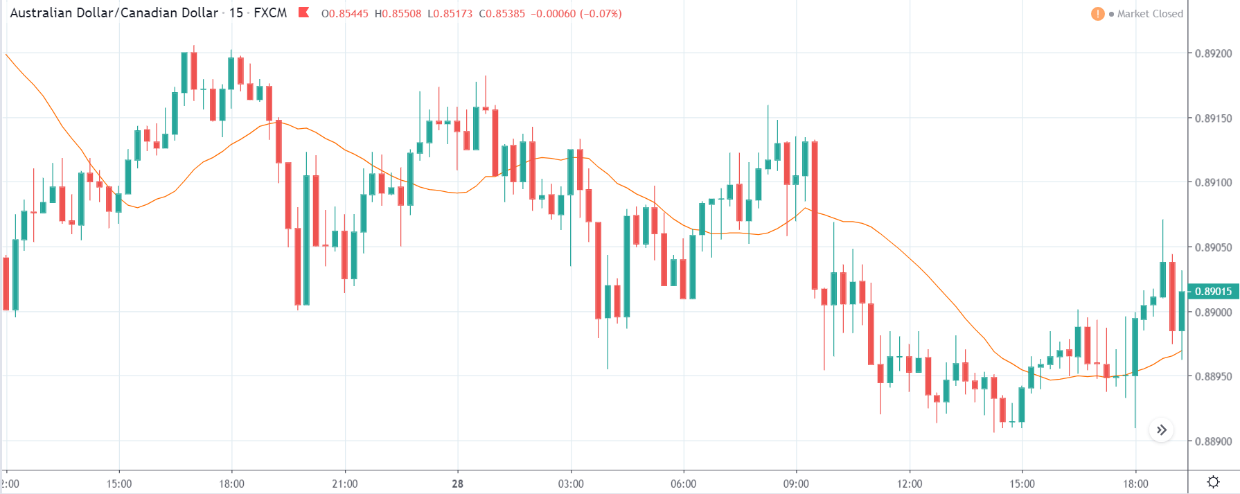
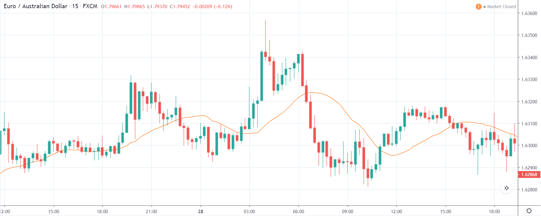
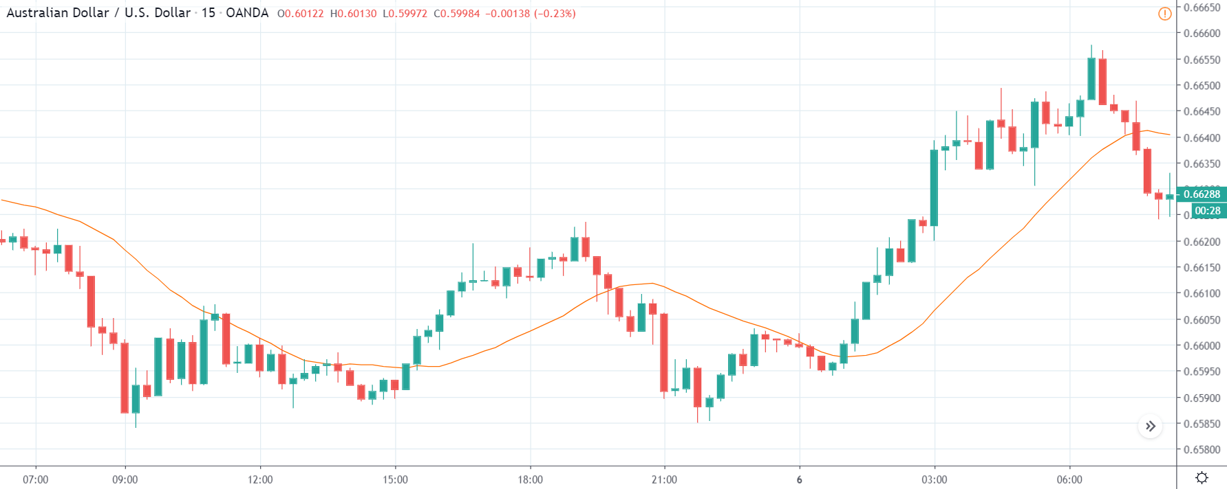
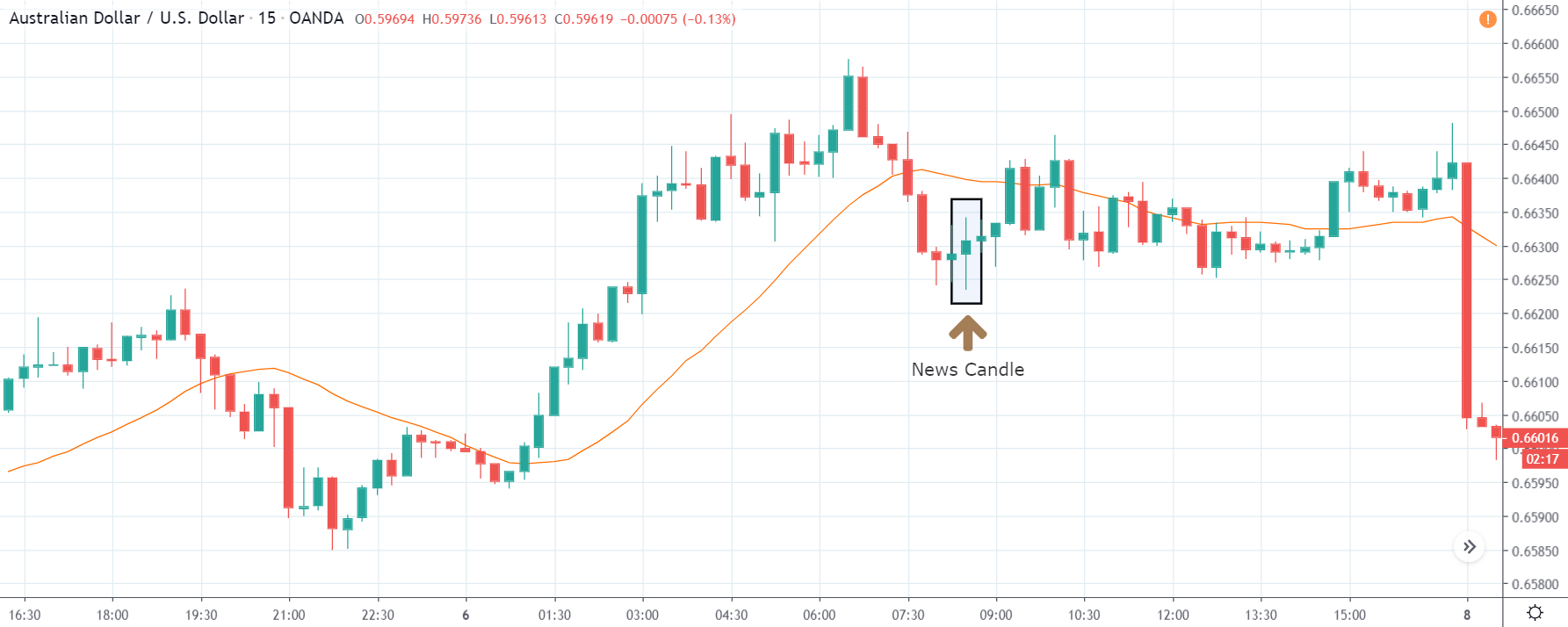
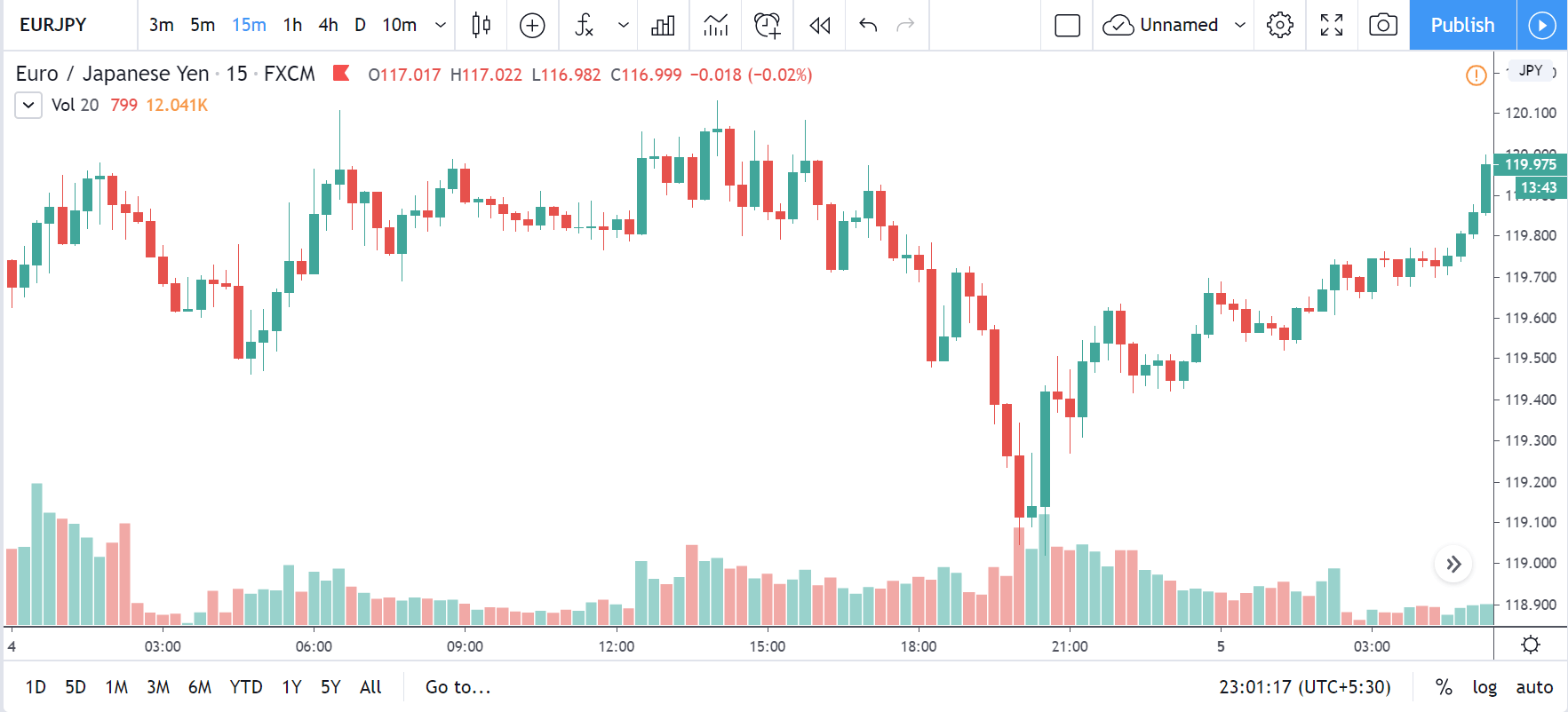
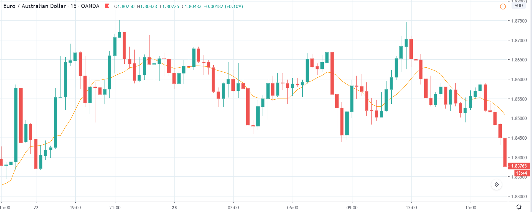
EUR/AUD | Before the announcement:
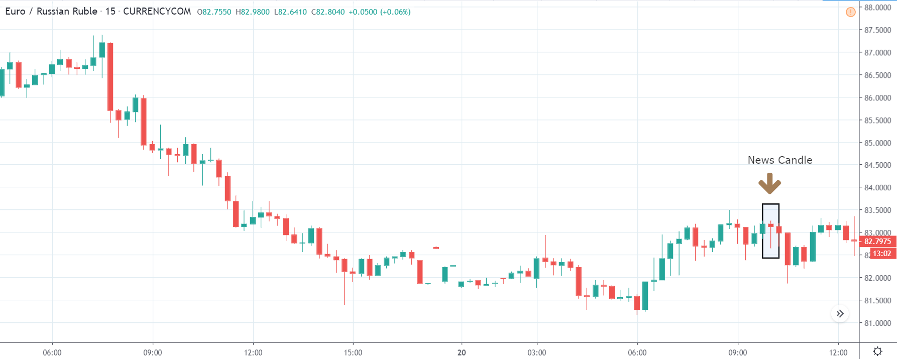
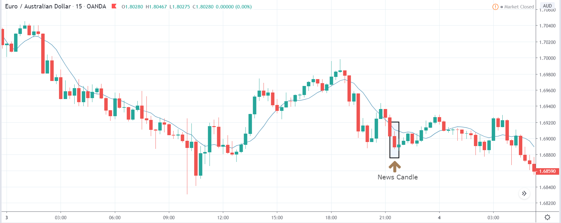
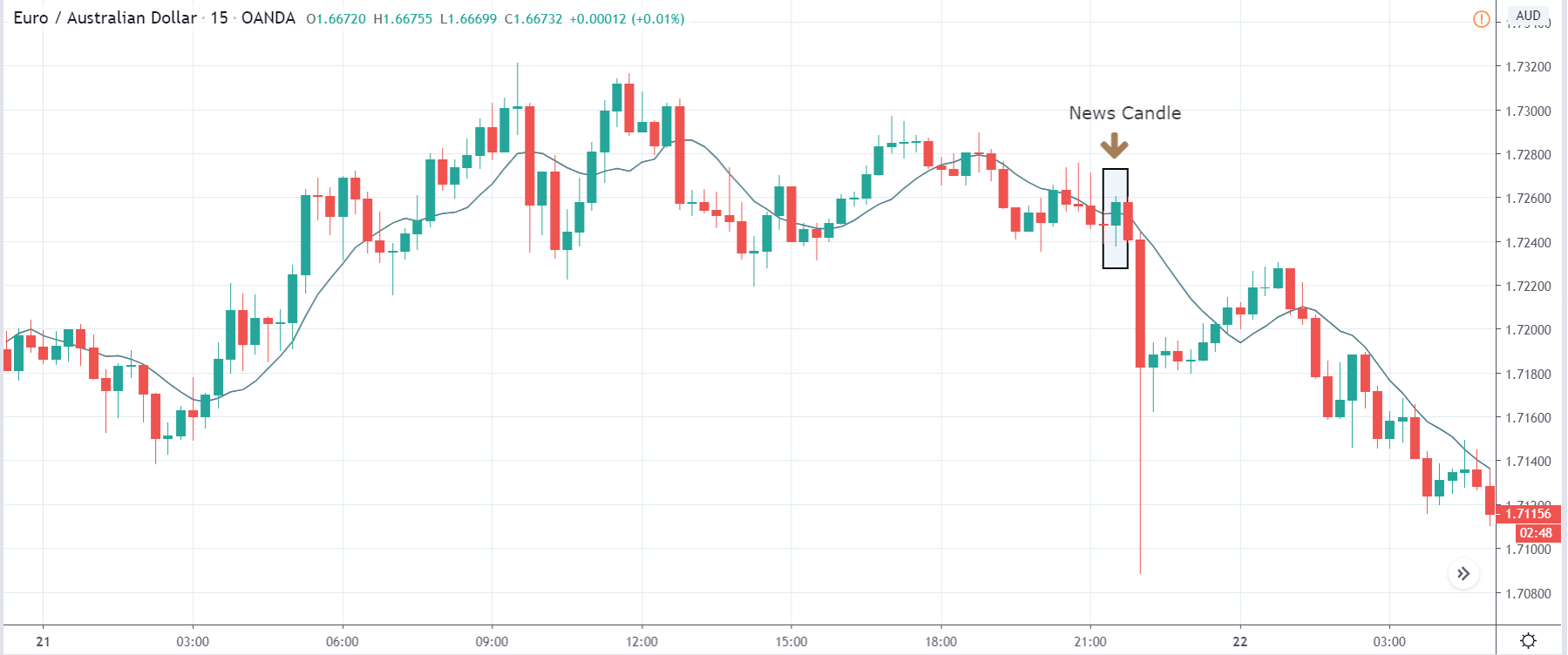
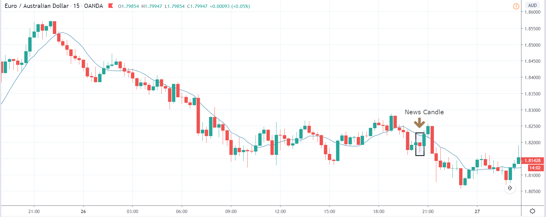
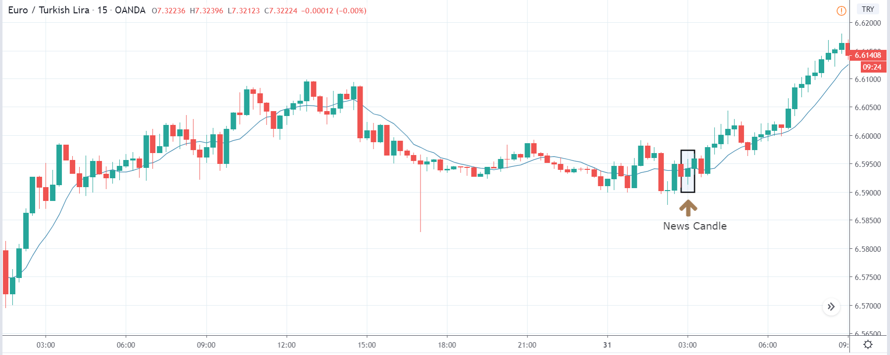
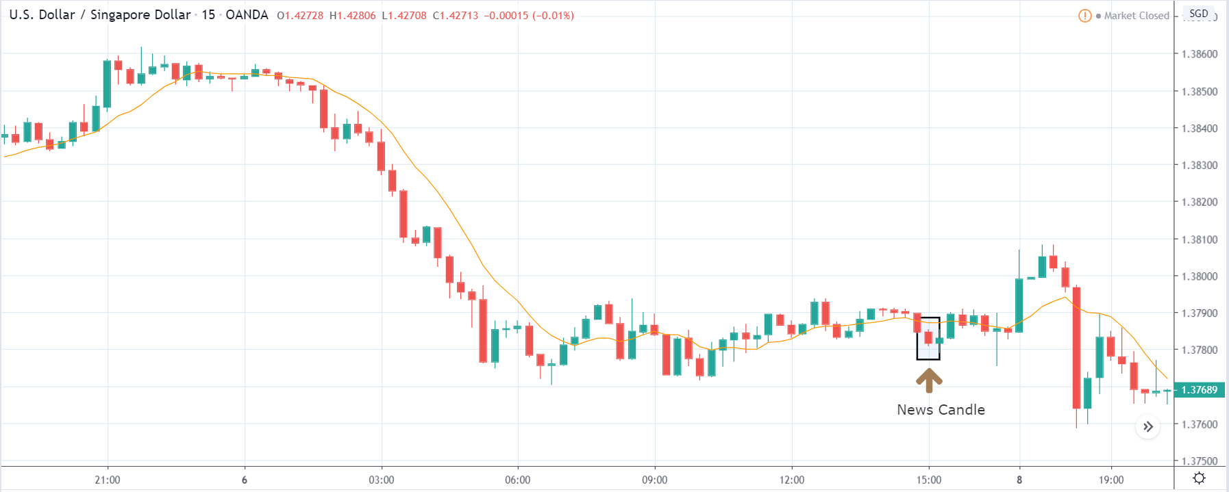
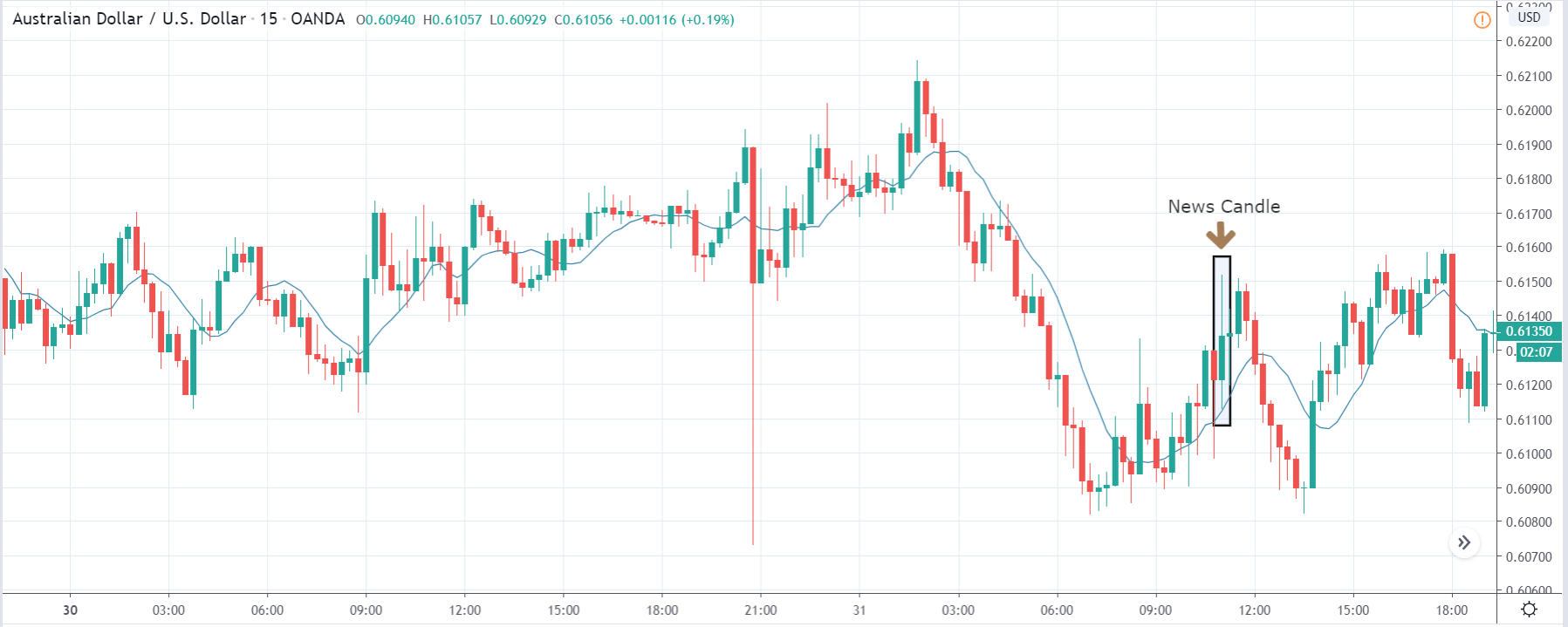
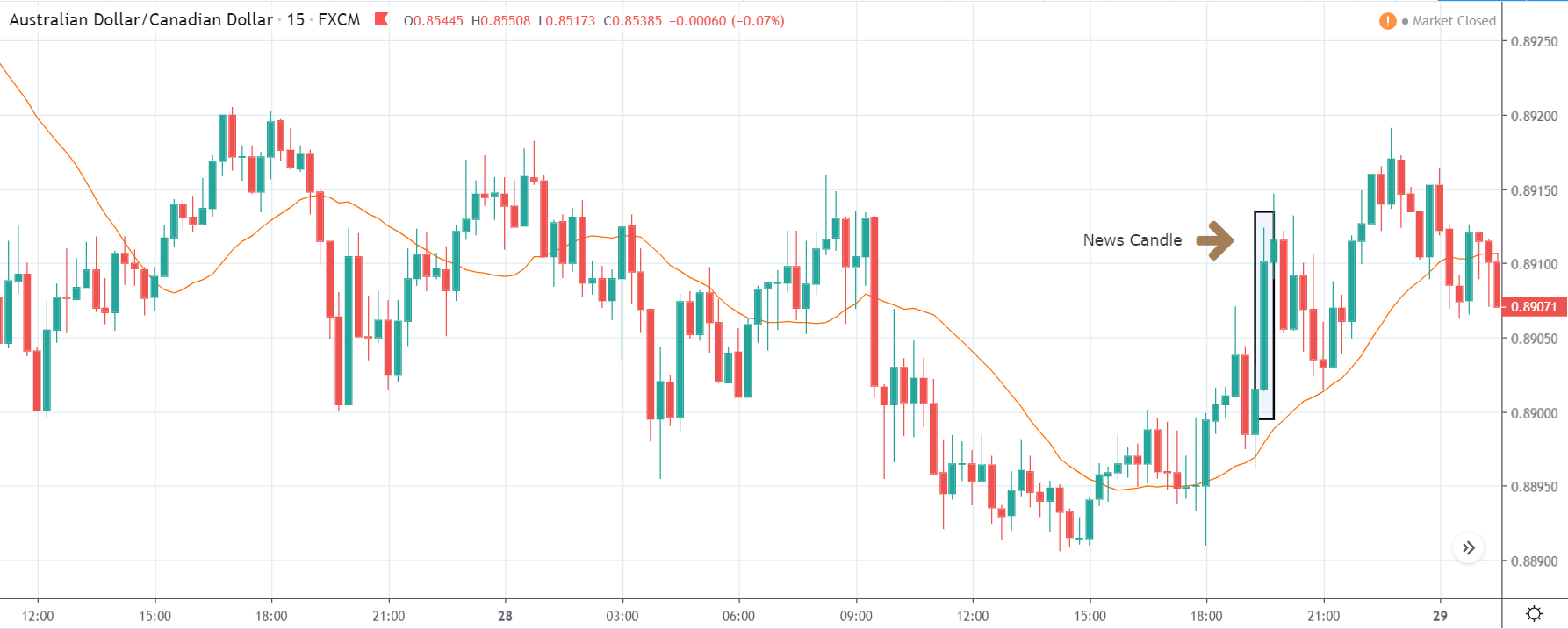
EUR/AUD | After the announcement:
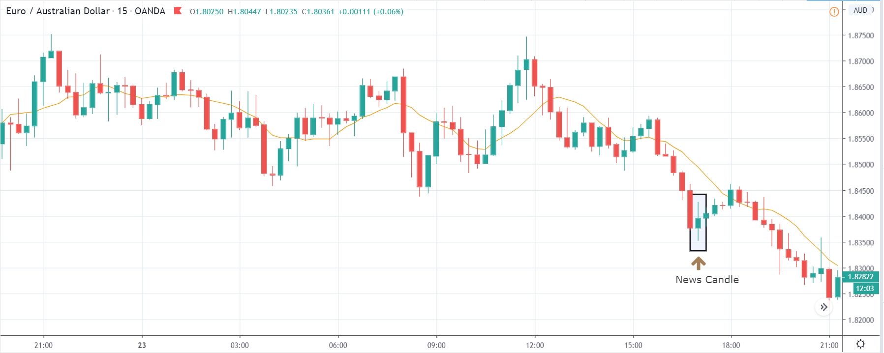
The above images represent the EUR/AUD currency pair, and the reason why the chart is going down is that the Australian dollar is on the right-hand side. The chart characteristics almost appear to be the same as in the above pair, but the volatility on the downside is more violent and strong, indicating more strength in the Australian dollar. The only way to trade the pair is the market pulls back and gives us an opportunity to enter, which is the typical way of trading a trend.
After the news release, volatility expands on the upside due to weak PMI data, and the market moves higher. This change in volatility can be used as an opportunity to enter for a ‘sell’ expecting a continuation of the downtrend. This is how the impact of the news can be used to our advantage.
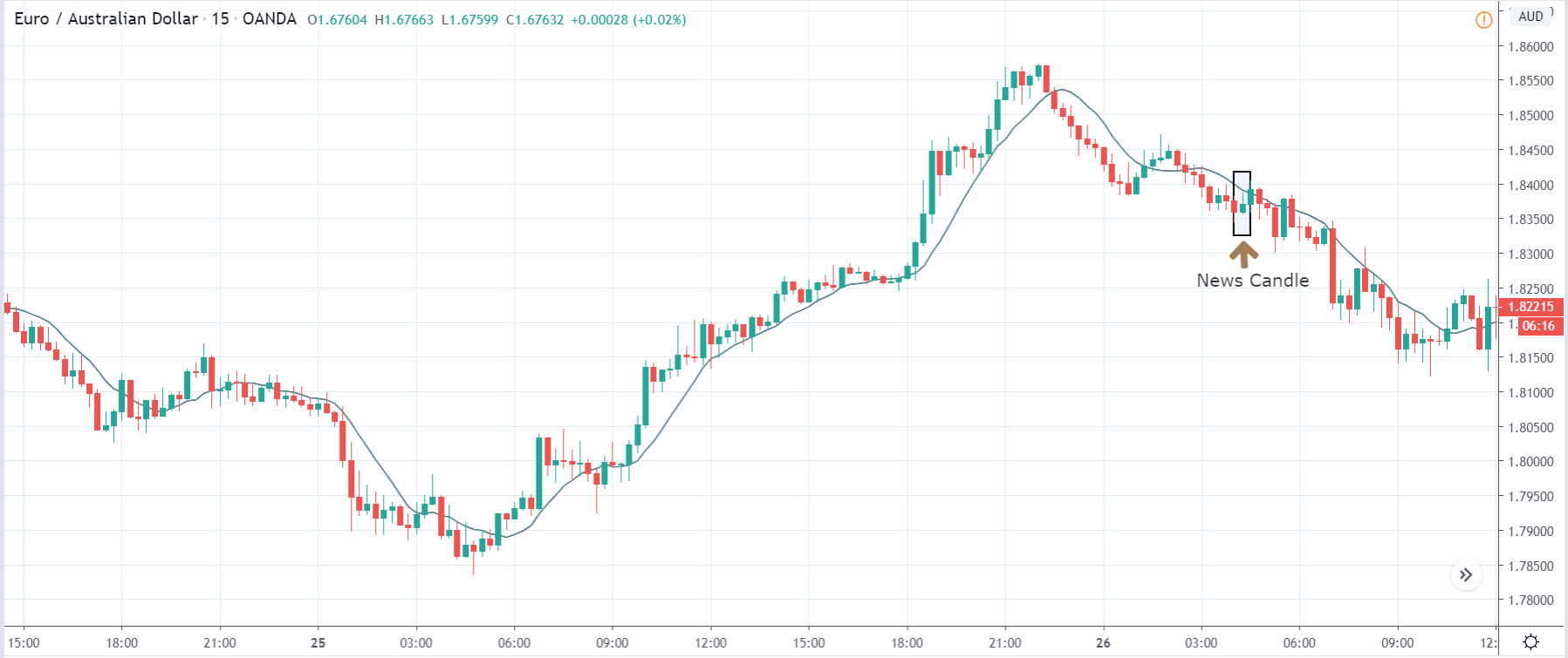
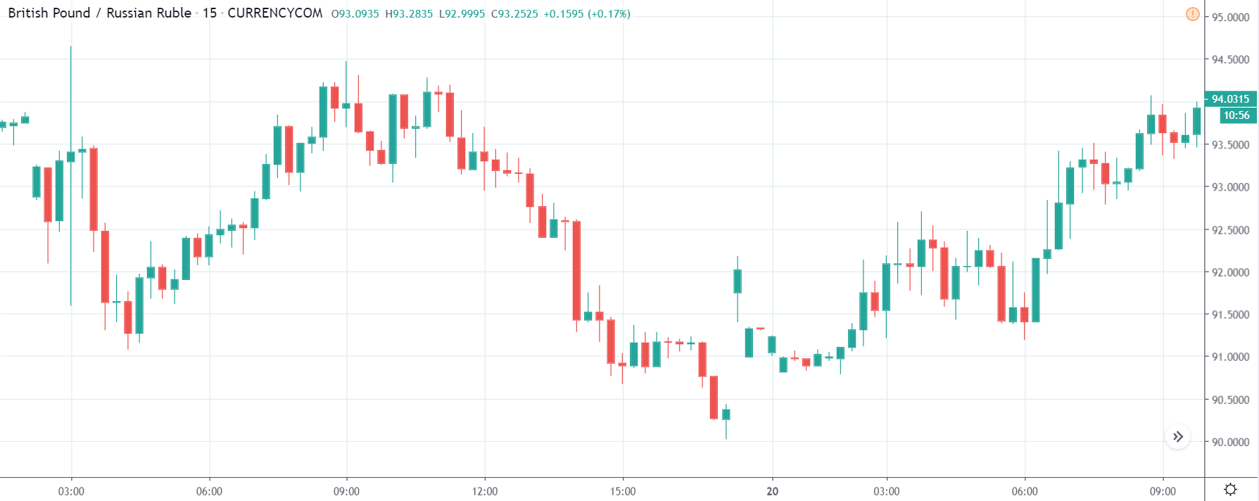
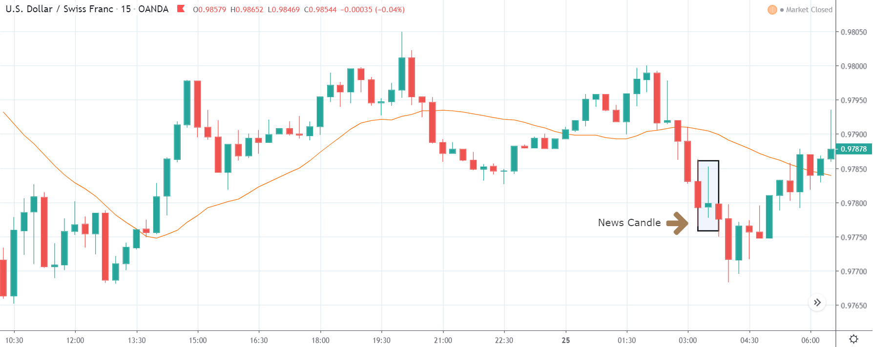
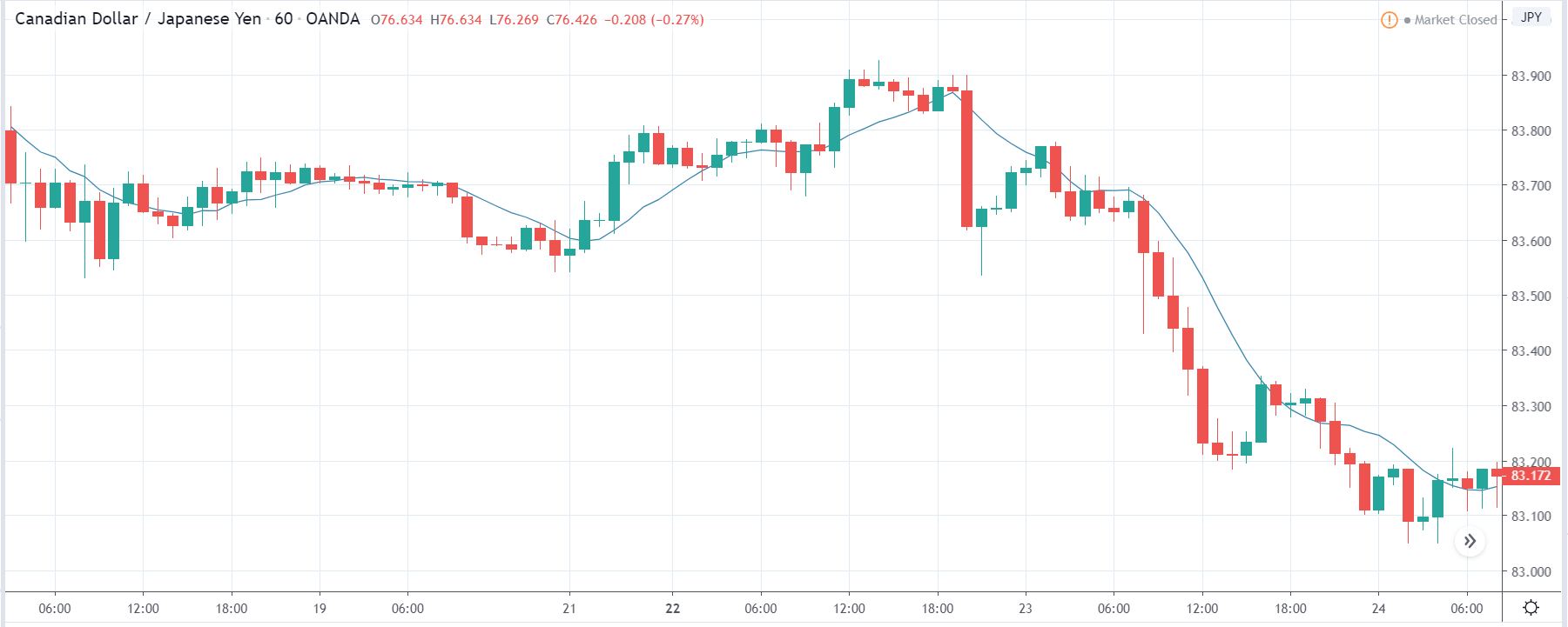
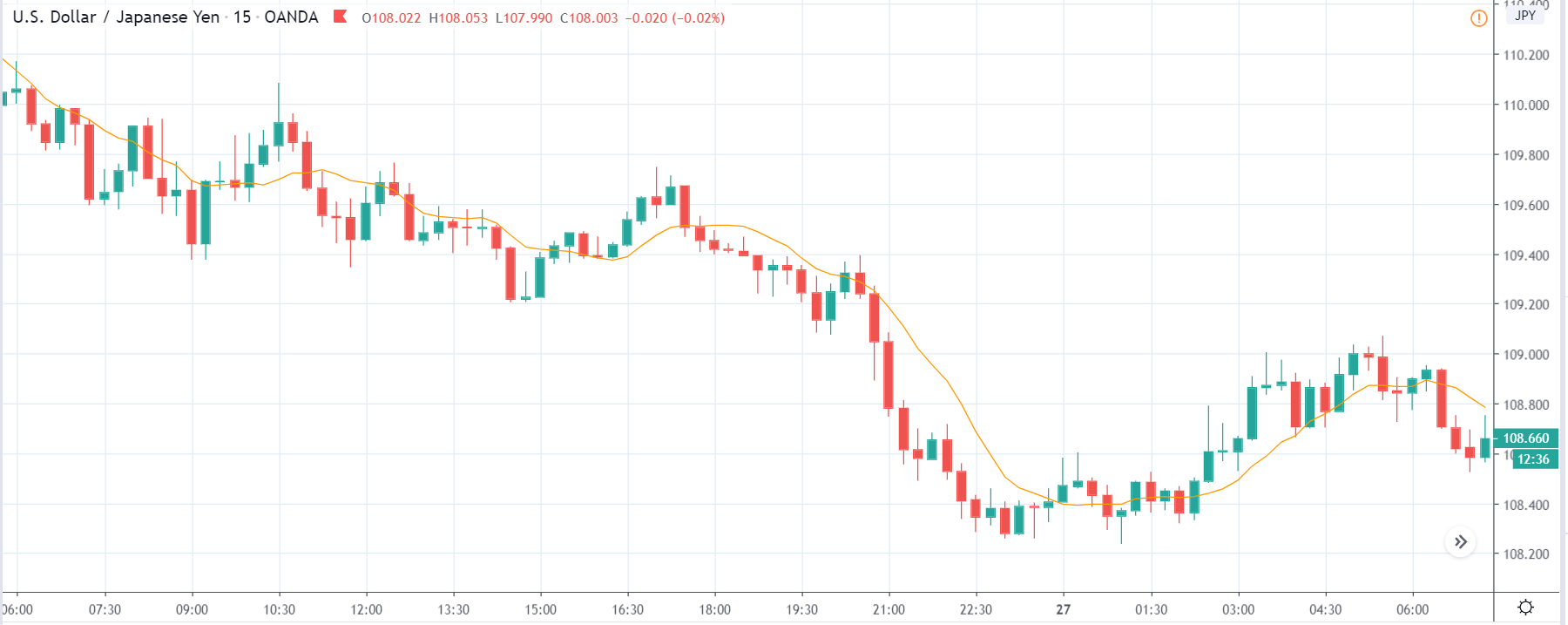
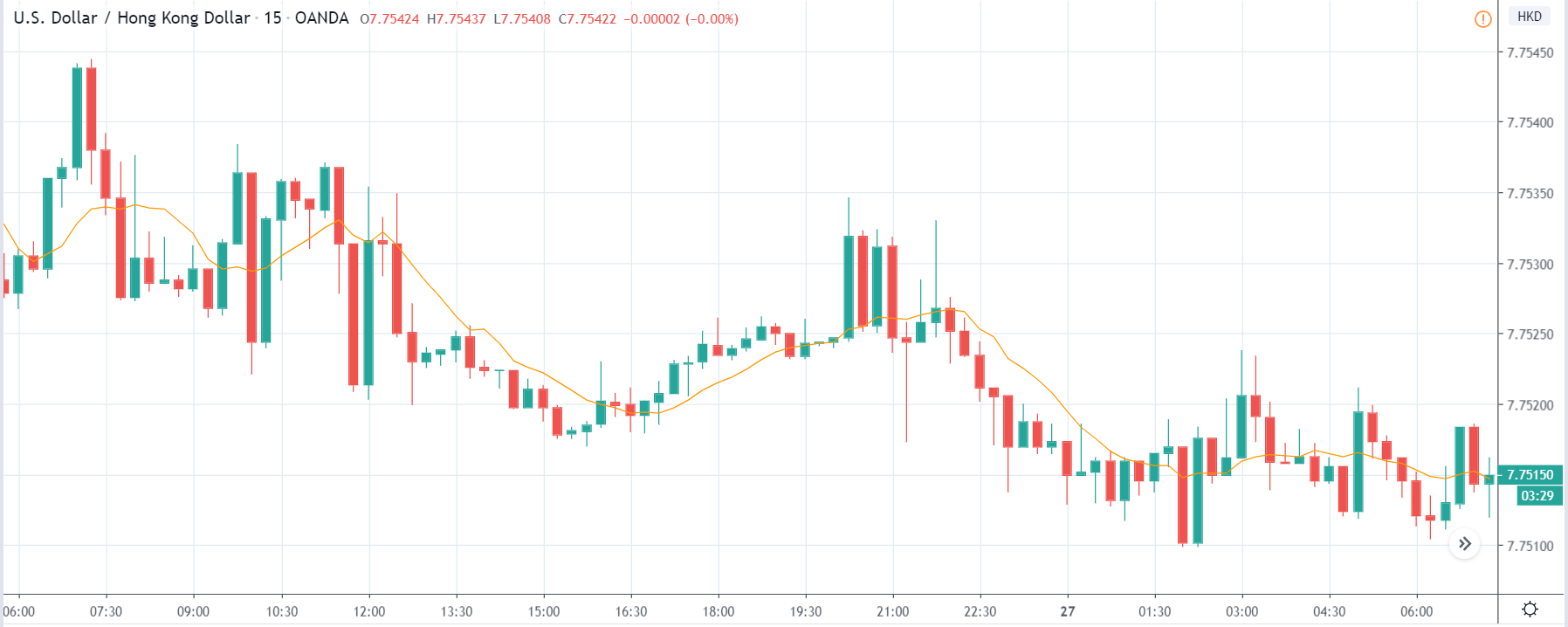
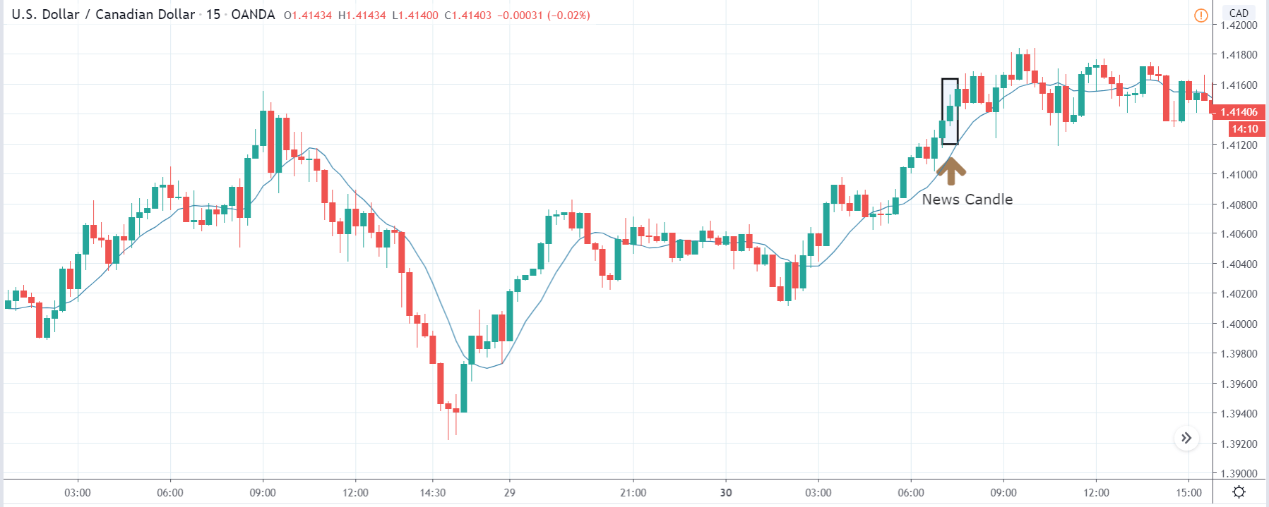
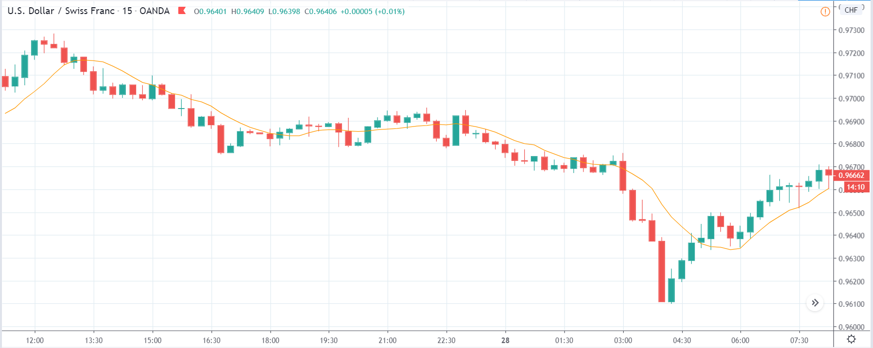
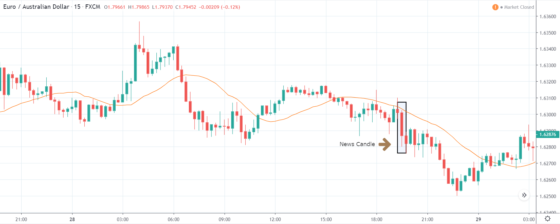
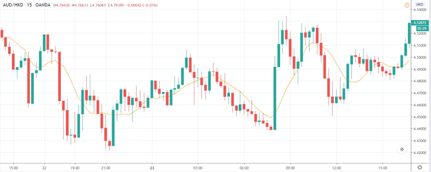
AUD/HKD | Before the announcement:
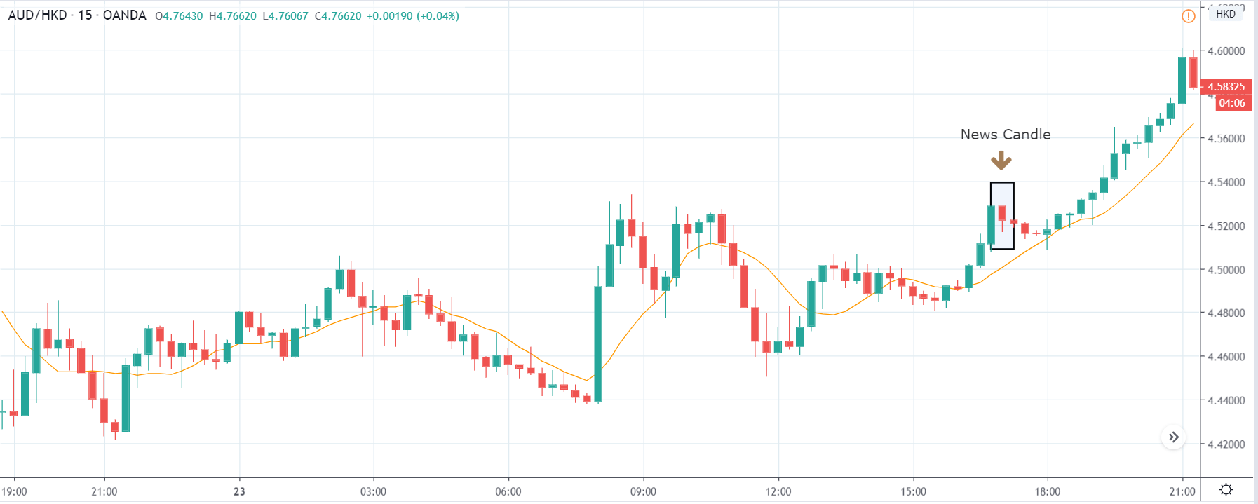
AUD/HKD | After the announcement:
The next currency pair we will be discussing is the AUD/HKD, and since the Australian dollar is on the left-hand side, the market should move up if the currency gets strong. But here the market is more range-bound, and there is no clear trend. Before the news announcement, price is exactly at the ‘resistance’ area, and soon after the outcome, the price could either try to break out or fall from the ‘resistance.’
After the news announcement, we see that volatility increases on the downside, and later it slows down. This low impact could be signing that traders may not sell at the ‘resistance,’ and thus, it can breakout. If you are an aggressive trader, consider going ‘long’ in the market with a tight stop loss below the recent ‘low.’
That’s about ‘Services PMI’ and the relative impact of its news release on the Forex market. Good luck!