Categories
Forex Basic Strategies

Trading The ‘Diamond Pattern’ Can Be Extremely Profitable If Traded Correctly

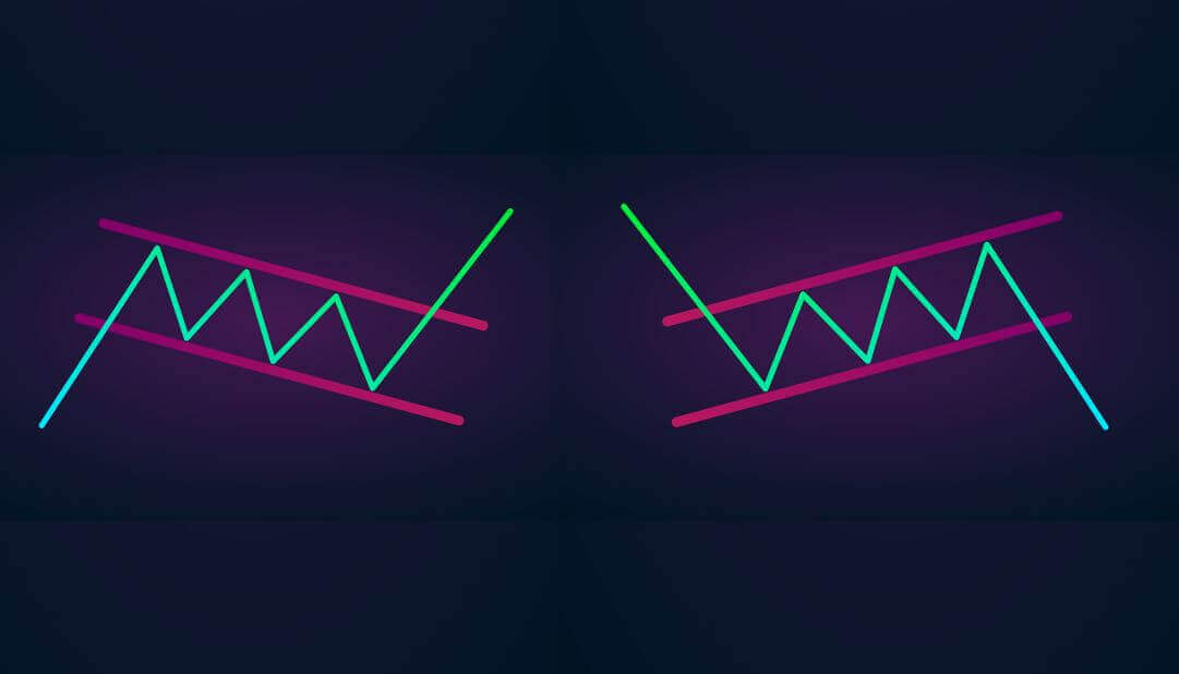
For the years traders and market technicians often used some of the common and basic technical tools to analyze the market. These are some basic indicators, some common formations such as pennants, double bottoms, double top, flags are often used in the currency market. Some advanced traders use different ways to analyze the market, they focus on price action, Elliott waves, and the Diamond pattern which is not widely used by retailers, but is a quite popular and secret tool in the professional trader world.

In this article, we will show you everything you need to know about the diamond pattern to capitalize on the various trading opportunities. There is two types of diamond pattern the Bullish and Bearish Diamond pattern. The bullish diamond occurs at the end of the downtrend which indicates the buying trade and the bearish diamond pattern occurs at the top of the uptrend which gives the buying opportunities. By reading the previous line you understood that diamond is the reversal pattern and it never offers the trend continuation trades, so always use this pattern to trade the reversals.

The forex market has higher liquidity as compared to the stock market, so it is easier for the traders to identify this pattern than in the stock market where gaps in price action frequently occur. The Diamond pattern occurs on every timeframe and it offers plenty of trading opportunities to every type of trader or investor.

Identifying The Diamond Pattern On The Price Charts

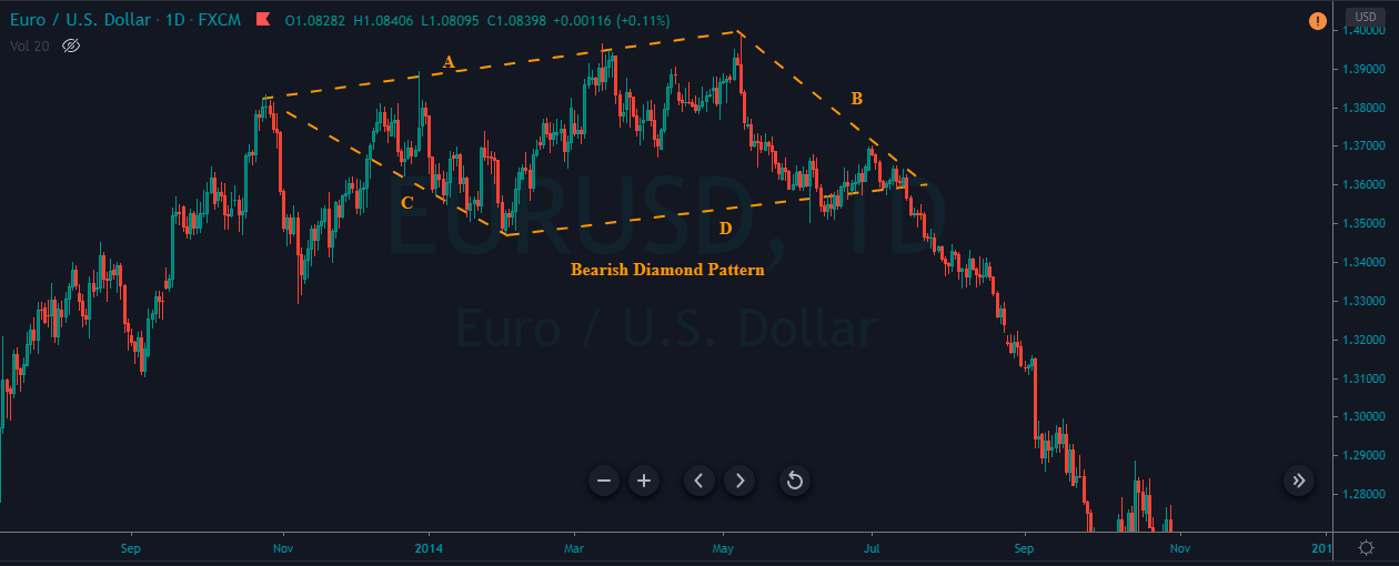
First of all, identify an off-shoulder head and shoulders formation on any asset chart. Next, we draw the resistance trend line from the left shoulder to the most recent higher high of the price action {line A}. Then from the higher high {head} to the right shoulder {line B} The price action should not break above the right shoulder trend line, if it is, then the pattern is invalid. To draw the lower trend line which is {line C} find out the most recent bottom tail and connect it to the left shoulder. Connect the right side support trend line from the bottom tail to the right shoulder line {line D.} Trading the diamond top pattern isn’t much harder than the other trading formations; here you only wait for the breakout to happen to take a trade. When price action breaks the pattern it indicates the buyers finally lost their control and sellers take over the whole show and they are ready to print the brand new lower low or higher high {according to the circumstances}.

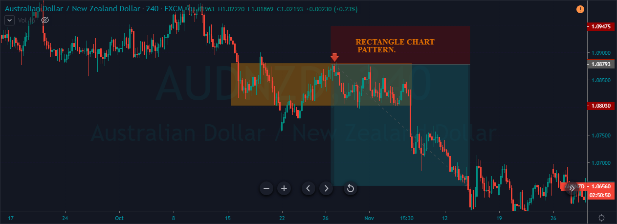
Diamond Pattern Trading Strategies

Trading The Bearish Diamond Pattern

The image below represents the Diamond pattern on the EURUSD daily chart.

The image below shows our entry and exit in the EURUSD forex chart. As you can see in the image below, when price action followed all the rules of the bearish diamond pattern, we took the sell entry in this pair. Price action blasts after the breakout and it prints the brand new lower low. The Diamond pattern is quite a powerful pattern in the market, and it holds the ability to completely reverse the direction of the trend, so don’t take this pattern lightly, follow all the rules and go for the bigger targets. Initially, we set the smaller take profit in this pair, but the stronger seller move, convince me to go for the bigger targets in this pair. When the market gives you the opportunity milk the market as much as you can and go big.

Trading The Bullish Diamond Pattern

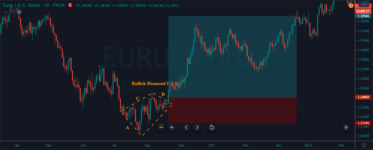
The image below represents the bullish diamond pattern on the EURUSD daily chart.

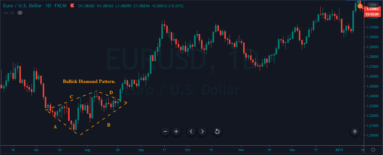
Before printing the diamond pattern, price action was in a strong downtrend, which is a good sign for us. What most of the traders do is they don’t like to follow all the rules and they sometimes trade the bullish diamond pattern in an uptrend and they end up losing in the trade. It’s not about the pattern only, the key to successfully trade all the pattern is to find out the pattern at the location where it makes the sense to trade.

As you can see in the below image when the diamond pattern appears and it fulfilled all our rules we took the buy entry in this pair. After our entry price action prints the brand new higher high but we choose to close our position at the major resistance zone. The stop-loss order was just below line D, because line D is a breakout line and it acts as a major support to price action.

Conclusion

The diamond patterns are very rare to find out on the price chart, but when this pattern appears it often gives a good risk to reward ratios trades. If you are a beginner at this pattern, then first of all train your eyes to find this pattern on the price chart. As you gain experience you will automatically start spotting this pattern on the price chart. First of all, form the top resistance line by connecting the left shoulder to the higher high of the price action {line A}. Then connect the higher high to the right shoulder {line B}. Next draw the support trend line from the left shoulder to the tail {line C} and the tail to the right shoulder {line D}. Wait for the price action to break below or above the pattern {according to the market circumstances} to take the trade. For identifying the better and more opportunities, it is suggestible to find out this pattern in a highly liquid pair. It doesn’t matter which timeframe you trade this pattern appears everywhere and in every market, just simply take the advantage of the pattern by following the rules.

Categories
Forex Basic Strategies

Best Way of Trading The ‘Rectangle Chart Pattern’

Introduction

The ‘Rectangle’ is a classical technical analysis pattern described by horizontal lines showing support and resistance levels on the price chart. This pattern resembles the concept of buying at A significant support level and selling at a predominant resistance level. The price can stay between the Rectangle pattern for a long time, or the pattern can be very small.

The appearance of this pattern implies that the supply and demand of the currency pair are in balance for an extended period. The price action finds resistance at the top of a rectangle and support at the bottom of a rectangle. The pattern can easily be recognized and confirmed after the formation of two highs and two lows. These highs and lows form two parallel lines above and below the price action. These lines act as a strong support and resistance levels to the price action.

Keep in mind that this pattern doesn’t have a bullish or bearish bias. It is a neutral pattern that shows both parties are holding an equal amount of power. Using this pattern, we can trade with the trend, or it can be used to trade the counter trend and reversals also. In short, the Rectangle chart pattern is both continuous and reversal as well. However, technical experts believe that using the Rectangle as a continuation pattern has higher odds of performing.

Trading The Rectangle Chart Pattern

Example 1

The Rectangle pattern can be easily found on the price charts, and it mostly appears on all the trading timeframes. The below chart indicates the formation of the Rectangle chart pattern on the AUD/NZD daily chart.

As discussed, there is no such thing as a bullish or bearish Rectangle pattern. When we find this pattern on any timeframe, all we need to do is to trade with the trend. We can also trade the Rectangle pattern, just like how we trade ranges.

The image below represents the same Rectangle chart pattern that is shown in the above figure but on the 240 Minutes timeframe. The orange box represents a couple of buy and sell opportunities, but we have decided only to trade this pattern with the trend. The green arrows represent our buying entry in the pair.

The below chart represents our entry and exit in the AUD/NZD Forex pair. The green arrow represents our entry in this pair, and the stop-loss is placed just below the orange box that represents the formation of this pattern. The placement of stop-loss depends on you. If you are an aggressive trader, place the stop-loss just below the entry, and the conservative traders must go for more profound stop-loss.

The take-profit placement is an art as we can exit our positions in many correct ways. You can make use of technical indicators to close the positions. When the trend loses its momentum, use the support, resistance area to close your positions. In the above example, we can see the reversed deeply as soon as we exited our position. This is because that is the place where the significant resistance line is.

Example 2.1

On the daily chart of the AUD/NZD, the below image represents the formation of two rectangle chart patterns in a downtrend.

The below image is the same rectangle pattern (1st) that is shown in the above chart but on a lower timeframe, which is 240 Minutes chart. Most of the time, we will find the Rectangle patterns in a trending market only. Also, this pattern represents the pullback phase of an ongoing trend. Another thing that a Rectangle pattern implies is that both of the parties hold equal power during the pullback phase. That is the reason for this pattern to form in the first place.

So be careful while trading this pattern because, in the consolidation phase, markets often throws a couple of spikes on the price chart. The safest way of trading this pattern is when the price action approaches at the upper area of the Rectangle. In the below chart, the Red arrow represents our selling trade in this pair.

The below chart represents our entry, exit, and risk management in this pair. The entry was at the top of the box. If you compare the stop-loss with take-profit, it clearly shows that we have opted for a smaller stop-loss, it was because the upper line of Rectangle acts as a primary resistance line. If the price action breaks the resistance line, the pattern by default gets invalid, and there is no need to hold our position. Around our take profit area, the price action started struggling, which indicates the power. Hence we decided to close our position.

Example 2.2

The below AUD/NZD Forex chart represents the formation of a Rectangle chart pattern on the 240 minutes chart. The pattern that you see below has appeared right after the previous trade that is discussed above. At times we will see these patterns consecutively, especially in a strong trending market. It is strongly recommended to go with the flow and trade them with confidence. The chart below shows that the price action spends some time in the rectangle box, and when it hits the bottom of the Rectangle, we activated our selling trade in this pair.

The chart below represents the entry, exit, and take-profit in this pair. As we can see, the entry was at the bottom of the Rectangle, and the stop-loss placement was above the Rectangle. For take-profit, we have waited for the sellers’ momentum to die out to close our trade.

Conclusion

For a Rectangle pattern to be valid, the price must have gone through at least two tops and two bottoms on the price chart. Always make sure to hold your trade till the market loses its momentum. You can also look for the formation of any candlestick patterns to exit the trades. If you activate your trade at the top of the Rectangle, make sure to place the stop-loss just above the Rectangle pattern. If the activation was after the breakout, place the stop-loss in the middle of the Rectangle range.

We hope you understood the trading of the Rectangle chart pattern. In case of any queries, let us know in the comments below. Cheers.