Categories
Forex Course

103. Analyzing The Power Of Oscillators

Introduction

In the previous lesson, we had an introduction to oscillator indicators and understood how they work. In this lesson, we shall put that into action by analyzing some of the most used oscillators.

Quick Revision

In general, Oscillator is any object that moves back and forth between two points. In simple terms, anything that moves between two points, 1&2, is said to be an oscillator.

The concept remains the same for trading as well. An oscillator is an indicator which moves within two bounds in a range. When trading using oscillators, our eye catches interest when it is around the peaks and troughs. These areas generate buy and sell signals. Precisely, it indicates the end of a trend or the beginning of a new trend.

Trading Oscillators

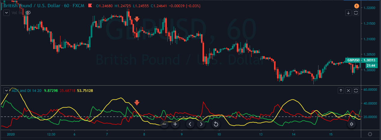
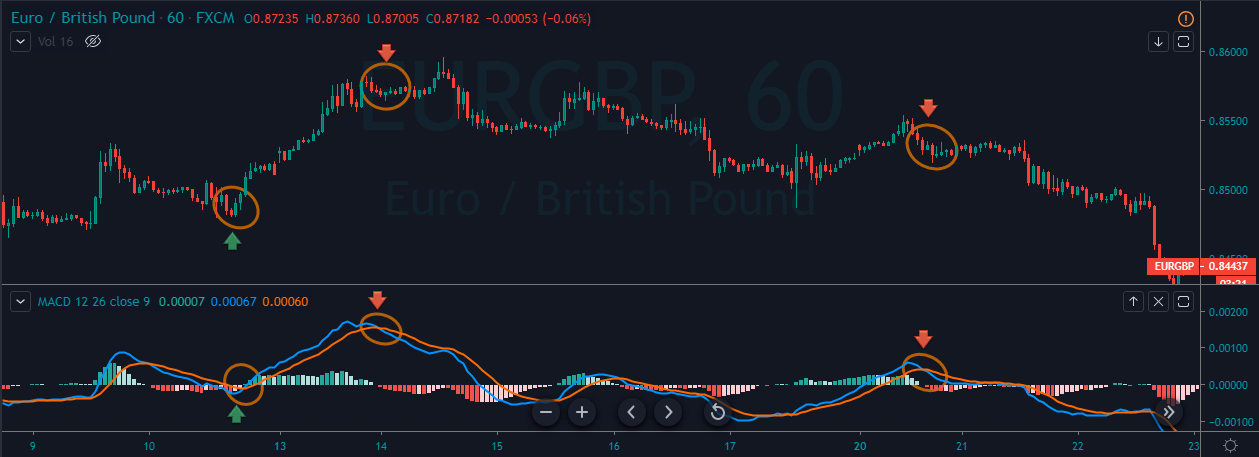
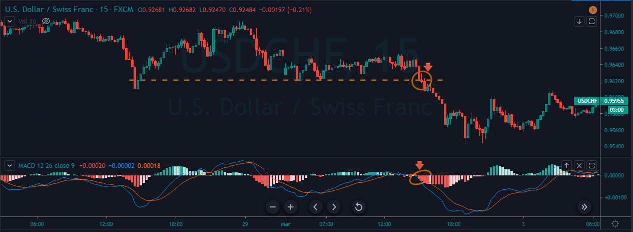
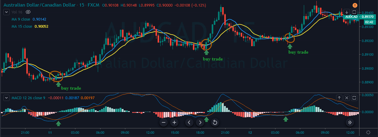
Stochastic, Relative Strength Index, and Parabolic SAR are the extensively used oscillators by traders.

All these indicators work under the premise that the rate of price change begins to slow; that is, the number of buyers or sellers have reduced at the current trading price. And this change in the momentum indicates a possible trend reversal because the other party is losing its gas. Such indications are given when the oscillators are at the overbought or oversold regions.

Stochastic Indicator

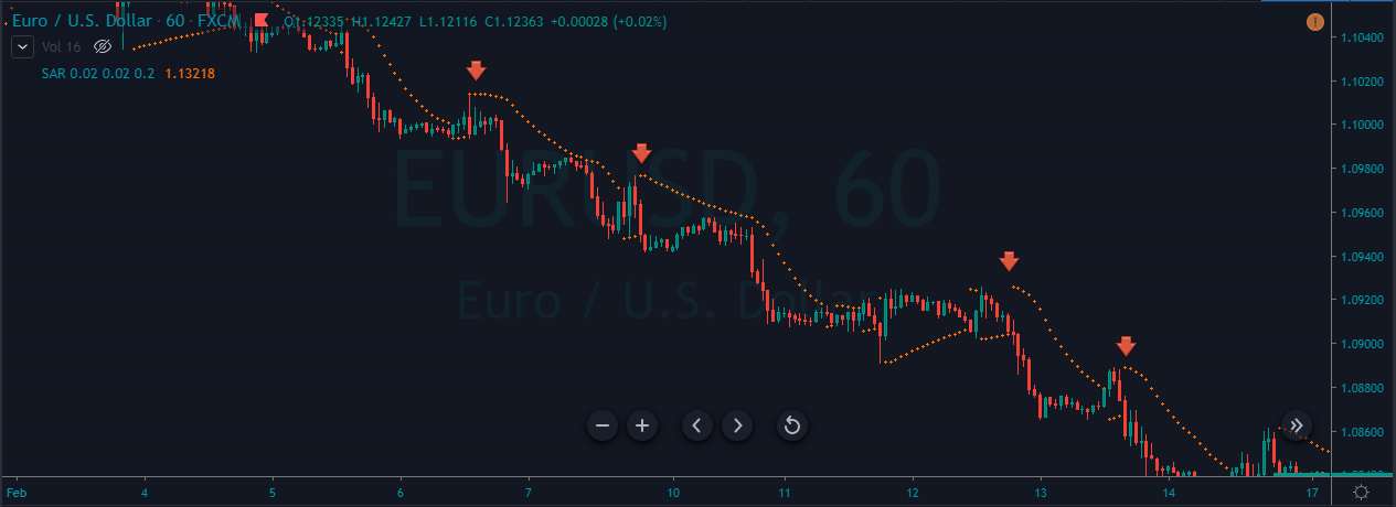
The stochastic indicator is an oscillator whose upper and lower bounds are 80 and 20, respectively. So, if the line moves 80, it enters into the overbought region, and if it drops below 20, it is said to be in the oversold region.

Calculating stochastic variables

There are two line on the stochastic oscillator, namely, %K and %D. Both the values are calculated as follows:

%K = 100 x (Price – L) / (H – L)

%D = (K1 + K2 + K3) / 3

Where, in %K, H and L represent the Low and High for the specified period. And %D represents the average of the most three recent values of the %K.

Note: In the given example, the period is chosen as 14 (last 14 days/candles).
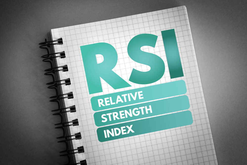
RSI Indicator

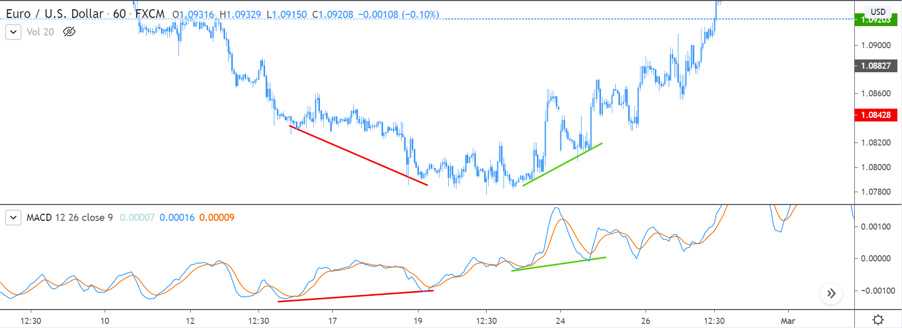
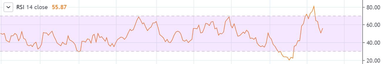
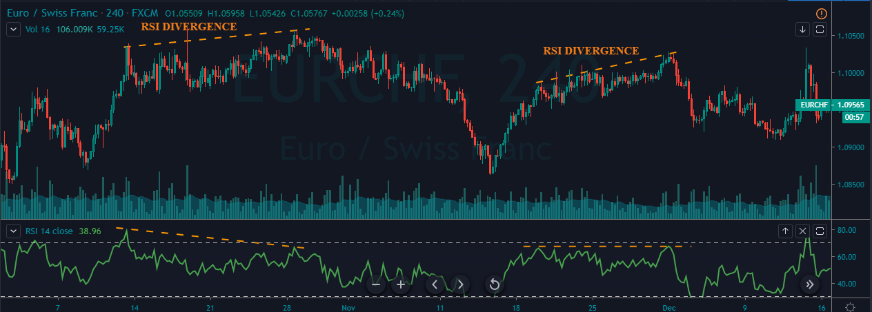
The Relative Strength Index (RSI) is a momentum oscillator that measures the rate of change of price and the magnitude of directional price movements. The RSI calculates the momentum as the ratio of higher close values and lower close values for a specified period. As it is an oscillator, it oscillates between the bounds 30 and 70. The interpretation for it is the same as that of other oscillators.

Interpretation Example

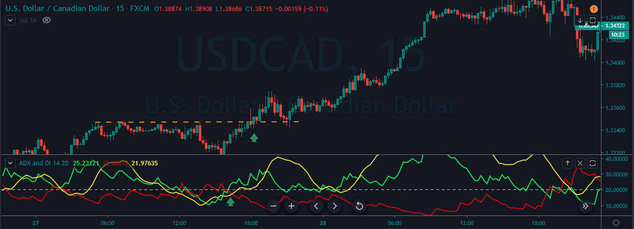
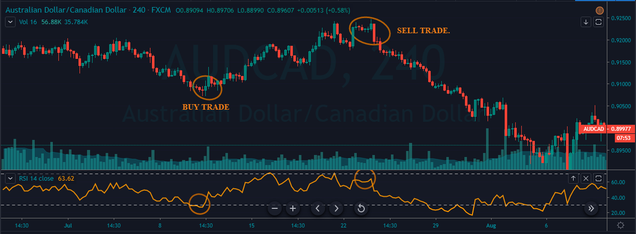
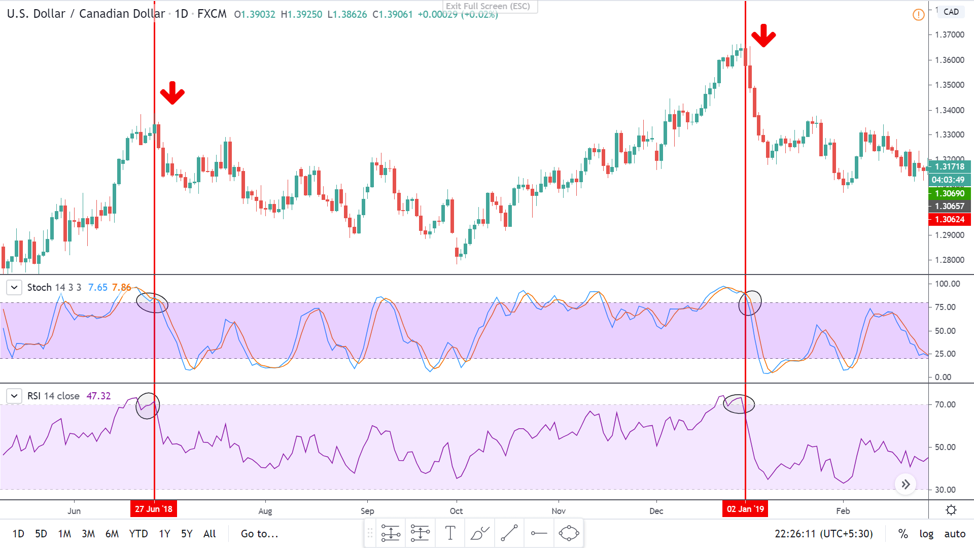
To illustrate the use of the oscillators, consider the given chart of USD/CAD on the 1D timeframe. To the price chart, the stochastic and the RSI oscillator has been applied.

At the vertical red lines, it can be seen that the market was overbought according to both the oscillators. This is an indication that the market which was in an uptrend priorly is not losing strength. Hence, in hindsight, the market falls as the oscillators start to make their way back into the range.

Bottom Line

Oscillators are great leading indicators that help in determining oversold and overbought conditions. It also gives traders an indication of the possibility of a market reversal. From the above example, it is seen that these indicators work like a charm. However, one must note that oscillators work in your favor, but not always. Sometimes, one oscillator indicates a buy while the other does not. These are the times when traders must avoid trading such instruments. As shown, oscillators must be used with other oscillators or technical tools to achieve the best out of it.

[wp_quiz id=”70760″]
Categories
Forex Course

102. Brief Introduction To Momentum Indicators

Introduction

Leading and lagging indicators are not the only categorizations of technical indicators. If we dig deeper, we can find more classifications and momentum indicators are one such classification in leading indicators. Before getting into momentum indicators, let’s first define the term momentum. Momentum, in general (physics), is the product of mass and velocity. The meaning of momentum is not different in trading too.

What are the Momentum Indicators?

Momentum indicators are a type of indicator that determines the velocity or the rate at which the price changes in security. Unlike moving averages, they don’t depict the direction of the market, only the rate of price change in any timeframe.

Calculating Momentum

The formula for the momentum indicators compares the most recent close price with the close price of a user-specified time frame. These indicators are displayed as a separate line and not on the price line or bar. Calculating momentum is simple. There are two variations to it but are quite similar. In both, momentum is obtained by the comparison between the latest closing price and a closing price ‘n’ periods from the past. The ‘n’ value must be set by the user.

1) Momentum = Current close price – ‘n’ period close price

2) Momentum = (Current close price / ‘n’ period close price) x 100

The first formula simply takes the difference between the closing prices while the second version calculates the rate of change in price and is expressed as a percentage.

When the market is moving upside or downside, the momentum indicator determines how strongly the move is happening. A positive number in the first version determines strength in the market towards the upside, while a negative number signifies bearish strength.

How are Momentum Indicators useful?

As mentioned, momentum indicators show/predict the strength of the movement in prices, regardless of the direction, be it up or down. Reversals are trades where one can make a massive killing with it. And momentum indicators help traders find spots where there is a possibility of the market to reverse. This is determined using a concept called divergence, which is discussed in the subsequent section.

Momentum indicators are specifically designed to show the relative strength of the buyers and sellers. If these indicators are combined with indicators that determine the direction of the market, it could turn out to be a complete strategy.

Concept of Divergence

Consider the chart of EUR/USD given below. The MACD indicator (momentum indicator) is plotted as well. From the price chart, the market was in a downtrend, but the divergence was moving upward. It means that the indicator has diverged from the price chart and is indicating that the sellers are losing strength.

In hindsight, the market reversed its direction and started to move upwards. Hence, the MACD predicted the reversal in the market. Moving forward, when the market laid its first higher low, the MACD too was inclined upwards, indicating that the buyers are strong, and the uptrend is real. And yet again, the MACD proved itself right.

This concludes the lesson on momentum indicators. In the coming lessons, let’s get more insights over this topic. Don’t forget to take the below quiz before you go.

[wp_quiz id=”70612″]
Categories
Forex Course

101. What Are Oscillators & How To Interpret Them?

Introduction

Technical Indicators are primarily used to confirm a price movement and the quality of a candlestick pattern, and also to create trading signals with them. Indicators are a great source of strength to confirm an existing analysis. Moreover, some indicators solely help in analyzing the trend, momentum, and volatility of the market.

As discussed previously discussed, there are two types of indicators, leading and lagging. And oscillators fall under the leading indicators. That is, they determine the trend of the market before-hand.

Indicator construction

There are two ways through which indicators are designed:

  1. Non-bounded
  2. Oscillators

Non-bounded, as the name suggests, they are the indicators that are not bound in a specific range. They usually display the strength and weaknesses, and to an extent, generates buy and sell signals.

Oscillators, on the other hand, are indicators that are bound within a range. For example, 0-100 is the range they oscillate between. However, based on the type of oscillator, the range varies.

Oscillators

Oscillators are technical indicators that are mainly used to determine the oversold and overbought conditions. These non-trending indicators are used when the market is not showing any certain trend in either direction. They are unlike the moving averages (MA), which determine the trend and overall direction of the market.

When security is under an overbought or oversold situation, the oscillators show its real value. It indicates that one of the parties is losing its strength, and the other is slowly starting to gain together.

Interpreting Oscillators

Oscillators are constructed with lower and upper bounds. And these bounds form a range. In the below oscillator, the purple region represents range-bound, where 30 is the lower bound, and 70 is the upper bound. The upper and lower bounds are also referred to as peaks and troughs. Typically, the peaks and troughs in the oscillator correspond to the peaks and troughs in the market as well.

Extreme Regions

The oversold and overbought regions are the extreme regions. That is, when the oscillator line shoots above the upper bound, the market is considered to be overbought. On the contrary, if the oscillator falls beneath the lower bound, the market is said to be overbought.

An overbought market means that the buying volume has diminished over a few trading days. So, there could be a possibility for investors to sell their positions. However, note that this interpretation holds true when the market was in a predominant uptrend and is currently consolidating.

An oversold market indicates that the selling volume, which was high in the past days, has now diminished. This could mean that the sellers are done selling with the security and might begin closing their positions. Hence, indicating a turn-around in the market.

Midpoint Line

A crossover at midpoint region of the range depicts the gain in strength of the buyer or sellers. From the oscillator given, 50 is the midpoint line. So, if the oscillators cross above the 50 mark, it indicates bullishness in the market. And if cuts below 50, it could indicate bearishness in the market.

This concludes the lesson oscillators. In the coming lessons, we shall discuss some strategies using a few oscillators. Stay tuned. Happy trading!

[wp_quiz id=”70529″]
Categories
Forex Course

100. Leading and Lagging Indicators: How are they different from one another?

Introduction

When getting started with trading, the first things people look out for are indicators. Indicators exist in both technical analysis and fundamental analysis. The difference between the two beings, fundamental indicators indicate or predict a long-term trend while technical indicators predict or confirm a short-term trend.

One of the best forms of analyzing the markets is by using indicators, as it helps interpret the trend in the market and also the opportunities available in them. Indicators are of two types, namely, leading indicators and lagging indicators. The former one is used to predict the future trend while the latter is used to confirm a trend.

What is a Leading Indicator?

It is a type of technical indicator that forecasts future prices in the market using past prices. That is, when the indicator makes its move, the prices follow a similar move. These indicators lead the price; hence they are called leading indicators.

However, never there is a 100 percent surety that the price will move in the direction as predicted by the indicator. Yet, traders can get their ideas from the indicators, see how the market unfolds, and then act accordingly.

What is a lagging indicator?

A Lagging indicator is also a technical indicator that uses past prices and confirms the trend of the market. It does not predict future price movements. Basically, it follows the change in the prices.

Classifying Indicators

There are five types of indicators in technical analysis. Let’s put these indicators in the right bag.

Trend indicators – It is a lagging indicator to analyze if the market is moving up or down.

Mean reversion indicators – A lagging indicator that measures the length of the price swing before it retraces back.

Relative strength indicators – It is an oscillator which is a leading indicator that measures the buying and selling pressure in the market.

Momentum indicators – This leading indicator evaluates the speed with which the price changes over time.

Volume indicators – could act as a leading or a lagging indicator that tallies up trades and quantify the buyers and sellers in the market.

Examples of leading indicators

The widely accepted and used leading indicators include:

  • Fibonacci Retracement
  • Donchian channel
  • Support and Resistance levels

Difference between Leading and Lagging Indicators 

Conclusion

All novice traders are in the hunt for the so-called “best indicator” in trading. But there is no such thing as ‘best’ indicator. Every indicator is a useful indicator if applied in the right way. For instance, we cannot use a trend indicator to predict the future of the market and then undermine that it does not work. Instead, one must understand the category under which an indicator falls and then use it accordingly.

I hope you were able to comprehend the types of indicators and the difference between them. In the next lesson, we shall apply some of the indicators into the real market and test them.

[wp_quiz id=”70435″]
Categories
Forex Course

97. Where Are The Pivot Point Levels Put To Use?

Introduction

In our previous two discussions, we enlightened you with different strategies for using the pivot points. If you noticed, there we focused only on the pivot support and resistance levels. We didn’t really touch base on the Pivot Point (P) level. So, in this chapter of pivot points, we shall understand how the pivot point level is useful.

The usefulness of Pivot Point

The pivot point is used to measure market sentiment. Yes, with pivot points, we can even gauge the sentiment of the market. In other words, the pivot point helps us determine the direction of the market. It tells us in which direction is the money flowing in the market. So, basically, it indicates the trend of the market. Now, let’s take a few examples to understand the use of pivot points.

What does a Pivot Point tell us?

We know that the pivot point determines the type of market we are in. Inferences are made when the price falls below or above the pivot point.

  • When the market breaks below the pivot point (P), it indicates a bearish market or a market where the sellers are under control.
  • When the market breaches above the pivot point (P), it indicates a bullish/buyer’s market.

Bearish Example

Consider the chart below representing the GBP/JPY on the 15min timeframe. The pivot points are indicated as shown. Initially, we can see that the market was holding above the Pivot Point (P). Later in the day, it broke below the pivot point and then continued to move south. Also, it didn’t even respect the support levels. From this, we can conclude that the support levels do not work every single time. It perfectly fine when it is combined with other tools of analysis. However, a breakout trader would’ve profited the most from it.

Most importantly, one must not use this pivot point level as a tool to enter a trade. It is only an indicator that determines the sentiment of the market. It only tells us if the buyers are showing interest in the currency pair or the sellers. And with information in hand, we use other trading techniques to time the market.

Bullish Example

In the below chart, we can see that the market was trading below the pivot point level. Then it shot up and broke the pivot level as shown. This marks the start of an uptrend. And it is clearly visible that the market headed north by breaking through R1 as well as R2. But at R3, it found resistance. Now since the market is trending up, one can look at the price drop from R2 as a discount and anticipate buying at the R2 level, which is ‘resistance turned support.’

Similarly, traders can determine the direction of the market using the pivot point level and time their entry based on other technical tools and ideas. We hope you found this lesson informative and interesting. Cheers!

[wp_quiz id=”69915″]
Categories
Forex Course

96. Trading Breakouts using Pivot Points

-Introduction

We know that pivot points are no different from the typical support and resistance levels. We also saw how these levels were respected when trading a ranging market. But, could it used to trade breakouts? Let’s find out in this lesson.

Just like your normal Support and Resistance, the pivot levels don’t hold forever. At one point or the other, the price breaks out from these levels. In our range strategy, we always hit buy at the support and sell at the resistance. But there are times the market breaks from these levels and stops us out. When such things happen, we can develop another plan ready for the same and take advantage of it.

In the trading community, there are two types of traders: aggressive traders and conservative traders. And the approach to trade breakouts is different for both. So, we made two strategies to benefit the aggressive as well as the conservative traders.

The Pivot Points Breakout Strategy

Doing it the Aggressive way

The aggressive approach to trade breakouts is very simple. The strategy for such traders is to trigger the trade when the price breaks above resistance or below the support. The logic to this is that the resistance/support which was supposed to hold is now not being respected. It means that the opposite party is showing more strength. Hence, we will also be following the stronger side.

Aggressive traders are the ones to catch the initial move of the breakout. But there is high risk involved in these types of entries.

Trade Example

Below is the chart of GBP/CHF on the 15min timeframe. The pivot points are marked as shown. Initially, we can see that the price broke below S1 support. Here, aggressive traders can get in for a sell after the close of the candle. Later, the price continued to fall down and ended up breaking the S2 support as well. This could be another entry for the aggressive breakout traders.

Placements

As aggressive traders, it is important to have good risk management on the trades. The most basic necessity is the placement of stop-loss and take-profit orders. For the above trades, traders can keep the stop-loss just above the level they entered the trade. However, it would be better to place the stop-loss much higher than that level because we can stay safe from spikes. And a typical TP would be the next Support level. Refer to the above chart to get better clarity on it.

Doing it the Conservative way

The conservative approach is more of a safe approach to trade breakouts. According to this strategy, look to enter the trade when the price retests the level after breaking through that level. In trading terms, this is called the ‘role reversal’ concept. This concept simply means the turning of ‘support into resistance’ and ‘resistance into support.’ For example, when the price breaks below the support level, it is not a ‘support’ anymore; but is now ‘resistance.’ Now, let’s put this into action.

Consider the same chart shown above. We shall be looking if there are opportunities for conservative traders in the same market. In the below chart, we can see that the market broke below the S1. So, now we treat S1 as the resistance and prepare to sell when the price retraces to the S1 level. Similarly, we can enter for a sell when the price breaks below S2 and retests back to S2.

When it comes to the placement of stop-loss and take-profit, one can follow the same approach, as explained in the aggressive traders’ placement.

This brings us to the end of this lesson. Note that the above strategy is only to get an understanding of how to trade breakouts using pivot points. It is highly recommended to apply other technical tools to have more odds in your favor. Cheers.

[wp_quiz id=”69720″]
Categories
Forex Course

95. Adding Pivot Points to Your Range Strategy

Introduction

In the previous two lessons, we completely understood the basics of pivot points as well as how to calculate and interpret them. And now, we can move on and start applying this indicator to our charts and find trading opportunities using it.

In this lesson, we shall use the pivots points in our range trading strategy. We will be giving you a complete guide on the trading range with the assistance of pivot points.

Incorporating Pivot Points into Ranges

The Basics

As we already learned, pivot point has S1, R1, S2, R2, etc. which represents Support and Resistance whose working principles are the same as the typical Support and Resistance. According to the definition, support is the area in which the market tends to hold and move up, and resistance is the area where the market holds and typically moves downwards.

Talking about a range, it is the state of the market which moves in a sideways direction and repeatedly bounces off from support and resistance level. So, we shall be testing the pivot points as the place where the market can hold and possibly reverse.

The Thumb Rule

When the market is at any of the upper Resistance levels, we look to go Short on the security. When the price is at any of the lower Support levels, we look to go Long on the security.

Live Chart Example

Below is the chart of GBP/CAD on 15min timeframe. We can see that currently, the market is in a range (as shown in the box). The market was ranging on the 16th of March. With these values of 16th March, we calculate the pivot points for the next day and find trading opportunities.

Now consider the same chart after we’ve determined the P, S1, R1, S2, R2 pivot levels. Following up range, we can see that the S1 level was formed exactly at the bottom of the range. Now, both S1 and the bottom of the range is indicating a Buy a signal. Hence, when the price touches the S1 level, we can go long on this pair.

From the chart, we can clearly see that we found two opportunities to hit the buy at the first Support level S1.

Placements

Having a predetermined take profit and stop loss is vital in trading. In this particular example, the take profit can be placed at the pivot point (P) and stop loss below the S1 such that the trade yields 1:1 Risk Reward. Note that there are times when the take profit can be placed at the R1 level as well. But this requires expertise in technical analysis as well as in pivot points.

The above example is the way for traders to get the hang of how to trade pivot points. To do it more professionally, one must use other technical analysis tools to have a confirmation on the pivot levels. For instance, if there appears a Doji candle at the S1 level and also the stochastic indicator is indicating that the market is in the oversold area, then there are more odds in our favor that the support will work in the direction we predicted.

So, to sum it up, one must use the pivot point levels by clubbing it with other technical tools to find optimum results. We hope you comprehended this lesson to the best of your ability. Cheers!

[wp_quiz id=”69435″]
Categories
Forex Course

93. Introduction to Pivot Points

What is a Pivot Point?

The pivot point is a technical indicator that shows the levels typically used to determine the overall trend of the market in different timeframes. These points are essentially used by professional traders to identify support and resistance levels. As a retail trader, one must keep an eye on these levels to identify potential buy/sell signals. To put in simple terms, the pivot points and its corresponding support and resistance levels are places at which markets can possibly change its direction.

The reason this indicator is very enticing is because of its objective. Unlike other technical indicators, there is no decision making involved. The Pivot Points are very similar to the Fibonacci levels. This is because these levels are pretty much self-fulfilling. However, there are some differences in some respects, which shall be discussed in the next section.

It is important to know that the pivot point indicator is mostly designed for short-term traders who wish to take advantage of small price movements. The technique to trade this is similar to that of trading support and resistance, where we participate in the market on a break or bounce from these levels.

The Difference between Pivot Points and Fibonacci Retracements

Though Pivot points and Fibonacci retracements are made by drawing horizontal lines to depict potential support and resistance levels, there vary in few aspects. In Fibonacci levels, there is subjectivity involved in picking the swing lows and highs. But, in pivot points, there is no discretion involved.

In Fib retracements, the levels can be constructed by connecting any price points on a chart. Once the levels are determined, the lines are then drawn at percentages of the selected price range. In the case of pivot points, fixed numbers are used instead of percentages. And the fixed values are the high, the low, and the close of the prior day.

Interpreting Pivot Points

Pivot points indicator is typically used by traders who trade the market using technical analysis. This indicator can be applied to the Stock, Forex, Commodity, Futures as well as the Cryptocurrency market. This indicator is unique from the other indicators because it doesn’t move with the price action.

It is static, and the levels drawn remain at the same prices throughout the day. This means that traders can plan their strategy much in advance. For example, in most of the approaches, if the price falls below the pivot point, traders will go short on the security. And similarly, if the price goes above the pivot point, they will look for buying opportunities.

How do Pivot Points look?

When the standard pivot points are applied to the charts, it will look something like this (as shown below).

In the above chart, P stands for Pivot Point | stands for Support | stands for Resistance

There are R1, S1, R2, S2, etc. as well, but it shall be explained in the upcoming lessons. Stay tuned!

[wp_quiz id=”69068″]
Categories
Forex Course

Introduction To Forex Course 4.0

Hello People,

As you all know, we have completed Course 3.0 successfully. Thanks a lot for the brilliant response and great job on the quizzes you all have taken. We have covered some of the most critical fundamentals pertaining to technical analysis in course 3.0. Please make sure to practice all the concepts we have discussed in a demo account. Without practice, it is impossible to ace the Forex Market using technical analysis. We have also made a quick navigation guide for Course 3.0 so that it’ll be easier for you to get a quick recap whenever required. You can find that guide in the link below.

Quick Navigation Guide – Forex Academy Course 3.0

With all these learnings in mind, we will be moving on to the Forex Academy Course 4.0. We have discussed most of the basics concerning technical trading in the previous course. Hence, we will be exploring some sophisticated strategies and intermediate to advanced concepts of technical analysis in Course 4.0. It is crucial to have acquired the knowledge of whatever we have studied in the previous course to catch up with these complex concepts. So it is highly recommended to finish the previous course before starting off with this one.

Topics that will be covered in Course 4.0

Forex Chart Patterns & Their Importance

Trading The Most Popular Chart Patterns

Oscillators

Momentum Indicators

Pivot Points & their importance

Each of these topics will have about 7 to 10 course articles with corresponding quizzes. The USP of this course are the writers who prepared TOC and the related content. They are professional technical & price action traders who have a combined experience of 20+ years in the Forex market. So make sure to follow all the concepts that are discussed in this course and practice them well to become a successful Technical Trader. Also, try to answer the quiz questions until you get all the questions right. We wish you all the luck. Cheers!

Categories
Forex Course Guides

Forex Course 3.0 – Complete Guide

Hello everyone,

Firstly, we want to thank you guys for following us throughout the course so well. We feel privileged that we are helping you guys in becoming better traders. Especially in Course 3.0, we have discussed some of the most crucial aspects of technical trading, which are essential for every aspiring technical trader to know. We have seen the quiz results for all the course articles that you guys have taken, and that gave us a gist of how well you’ll be following the topics discussed.

However, for the people who want to revisit a few topics, we would like to make their lives easier. So we are putting up a list of topics that we have discussed in this course. Also, this article will act as a quick revision guide for all the basics involved in Technical Analysis.

In this course, we have started by discussing the concept of Candlesticks and its fundamentals. Then we learned how to trade various candlestick patterns along with their importance. Introduction to Fibonacci trading has been done, and we also have paired the Fib levels with various indicators to generate accurate trading signals. We extended that discussion to Moving Averages and its types. Finally, we have learned the principles of indicator-based trading, where at least 10 of the most popular indicators have been discussed.

Below are the corresponding links for each of the topics that we have discussed in this course.

Candlestick Charts

Concept of CandlesticksIntroduction | Anatomy | Fundamentals

Trading Candlestick PatternsSingle Continuous | Single Reversal | Dual Continuous                                                   Dual Reversal | Triple Continuous | Triple Reversal

Deeper InsightCandlestick Patterns Cheat Sheet | Candlestick + S&R

Fibonacci Trading

Introduction | Entry Using Fib Levels | Challenges of using Fib levels | Fib + S&R Candlestick Patterns + Fib Levels | Fib + Trendlines | Fib for TP & Fib for SL | Summary

Moving Averages

Introduction | SMA | EMA | SMA vs. EMA | MAs to identify the trend | MA Crossover Strategy | MA + S&R | Summary 

Indicator-Based Trading

Introduction | Pros & Cons | Bollinger Bands | RSI | MACD | Donchain Channel | RVI | TSI | Stochastic | Ichimoku Cloud | Parabolic SAR | ADX | ATR 

With this, we have ended our Course 3.0, and soon we will be starting our Course 4.0, where we will be discussing some of the advanced topics in Technical Trading. So stay tuned and watch this space for more interesting and informative content. Cheers!

Categories
Forex Course

90. The ATR Indicator & Its Corresponding Trading Strategy

Introduction

ATR (Average True Range) is a popular volatility indicator in the market. It is used to find how much the instrument moves on an average over a given period of time. This indicator is introduced by J. Welles Wilder Jr. in his book, ‘New Concepts in Technical Trading Systems.’ Apart from ATR, this book also includes some of the most famous technical indicators such as RSI, ADX, and Parabolic SAR, etc.

The ATR indicator was originally developed to trade the commodities market, but it has been modified in such a way that it could be widely used for stocks, indices, and the Forex market as well. This indicator is not developed to indicate the price direction. Instead, it is used to measure the volatility of the instrument, which is caused by the gaps, up & down moves. ATR is a boundless indicator, unlike the other indicators we learned till now. Higher the ATR level, higher is the market volatility, and lower the ATR level, lower is the volatility of the underlying asset.

Below is an illustration of how this indicator looks on a price chart.

Trading With The ATR Indicator

The image below represents the ATR indicator on a GBP/AUD Forex chart. The orange box indicates the pullback phase, and at this phase, we can see the ATR indicator keeps going down. This means that there is currently low volatility in this pair. Conversely, the uptrend in the Green box indicates high ATR value. This means the big players are back in the business, and they are accumulating big chunks. As a result, the instrument is quite volatile. Furthermore, the yellow box again shows a decline in volatility.

Traders can use this indicator to get an idea of how far the price of an asset is expected to move on a daily basis. We suggest you use this way of trading only on higher timeframes such as daily, weekly, and monthly. If the last closed candle of a daily chart shows 50 ATR value, it means that the last candle has moved 50 pips, and we can expect the next day price movement to move similarly.

First of all, we must find out the ATR value of the last closing candle on the daily chart. Then we can look for buy/sell opportunities at the opening of a new day’s candle. The profit target should be based on the last day’s ATR value. Some traders also use double the value of the ATR indicator to place their take-profit orders. It all depends on what kind of trade you are. If the ATR value is 50, we can go for 50 pip target (conservative move), or you can even go for the 100 pip target (aggressive move)

We can also use the ATR indicator for placing Stop-loss orders. When the ATR gives us the value of the present day, we can use those values to place the stop-loss orders below or above our entry points. If the market hits the stop-loss, it means that the daily price range is moving in the opposite direction. Hence we must exit our positions as soon as we can. The major benefit of placing the stop-loss orders by using the ATR value is that we can avoid the ‘market noise.’ That is, the unusual up and down moves will not stop us out.

Changing the Settings of this Indicator affects its Sensitivity

The standard setting of this indicator is 14, which means the ATR indicator will measure the market based on the last 14 candles. If we use a setting lower than 14, it makes the indicator more sensitive, and it will show us a choppier ATR line. On the other hand, a setting above 14 makes the indicator less sensitive to the price action and shows smoother reading.

In short, most of the Traders use the ATR indicator to check the market volatility and to place the stop-loss & take-profit orders. The higher value of the indicator implies that we must go for deeper stops, and the low value means we must go for smaller stops.

That’s about the ATR indicator and its use cases. Try using this indicator to check the market volatility and place accurate stop-loss orders. There are traders who use this indicator to enter the market as well, but those are advanced strategies that we will be discussing in the future. Cheers.

[wp_quiz id=”68339″]
Categories
Forex Course

89. Identifying Trading Signals Using The ‘ADX’ Indicator

Introduction

The ADX indicator is created by a technical analysis legend, ‘J Welles Wilder.’ ADX (Average Directional Index) shows how strong the market is trending in any direction. This indicator doesn’t have a negative value, so it is not like the oscillators that may fluctuate above and below the price action. The indicator gives a reading that ranges between 0 and 50 levels. Higher the reading goes, stronger the trend is, and lower the reading goes, weaker the trend is.

The ADX Indicator Consists of Three Lines.

  1. The ADX Line.
  2. The DI+ Line. (Plus Directional Movement Index)
  3. The DI – Line. (Minus Directional Movement Index)

The chart above is the visualization of the ADX indicator. We can see the green line (DM+), the Red Line (DM-), and the Yellow Line. (ADX)

Trend Direction and Crossovers

Buy Example

To take a buy trade using this indicator, the first requirement is that the ADX line should be above the 20 level. This indicates that the market is in an uptrend. We go long when the DI+ crosses the DI- from above as it indicates a buy signal.

The chart below is the EUR/AUD Forex pair, where we have identified a buy trade using the ADX indicator. As we can see, the market was in an uptrend, and it is confirmed by the ADX line going above the 20 level. At the same time, we can also see the crossover happening between the DI+ and DI- lines of this indicator. This clearly indicates a buying trade in this pair.

The stop-loss placed below the close of the recent candle is good enough, and we must exit our position when the ADX line (yellow line) goes below the 25 level.

Sell Example

The first requirement to take a seeling position using the ADX indicator is that the ADX line must be below the 20 level. This indicates that the market is in a downtrend. We go short when the DI+ line crosses the DI- line from below as it indicates a sell signal.

The below chart of the GBP/USD Forex pair indicates a sell signal. In a downtrend, when the ADX line (yellow line) goes below the 20 level, it confirms the strength of the downtrend. At the same time, when the DI+ crosses the DI-  from below, it shows that the sellers are ready to resume the downtrend.

Breakout Trading Using The ADX Indicator

This strategy is similar to the crossover strategy that is discussed above. However, we are adding the price action breakout part to it. The idea is to go long when the ADX line is above the 20 level and when the DI+ crosses the DI- line from above. Also, the price action must break above the major resistance level to confirm the buying signal.

As we can see, in the below USD/CAD Forex chart, when the ADX line goes above the 20 level, it indicates that the uptrend is gaining strength. It also means that we can expect a break above the resistance line soon. When the price action broke above the resistance line, we can see the crossover on the ADX indicator. This clearly indicates a buy trade in this currency pair.

We can exit the trades when the opposite signal is triggered. Most of the time, breakout trades travel quite far. So if your goal is to ride longer moves, exit your position when the momentum of the uptrend starts to die or when the price action approaches the major resistance area.

That’s about the ADX indicator and related trading strategies using this indicator. If you have any questions, please let us know in the comments below. Cheers!

[wp_quiz id=”68035″]
Categories
Forex Course

88. Trading The Forex Market Using The Amazing ‘Parabolic SAR’ Indicator

Introduction

Parabolic SAR is a trend following indicator that was developed by ‘Welles Welder.’ The SAR in the name stands for the ‘Stop and Reverse.’ Welder introduced this indicator in his 1978 book “New Concepts in Technical Trading System.” In this book, he also introduced many of the revolutionary indicators like RSI, ATR, and Directional Movement Concept.

As the trend of the currency pair extends over time, this indicator trails the price action. If the indicator is below the price action, it means that the price of the currency is rising, and when it goes above the price, it indicates that the market is in a downtrend. In this regard, the Parabolic SAR stops and reverses when the trend of the instrument changes its direction.

During the volatile market, the gap between the price action and the indicator widens. In a choppy or consolidation market, the indicator interacts with the price quite frequently. Most of the technical indicators represent the overbought and oversold market conditions, whereas the Parabolic SAR visually provides us an insight on where to exit our position.

Parabolic SAR – Trading Strategy

The basic strategy while trading with this indicator is to go long when the dots move below the candlestick and go short when the dots go above the candlestick. It is advisable to use this way only in a strong trending market. If the trend is choppy or if the price action is continuously being pulled back, this indicator will continuously give us the buy-sell signal. All of these trading signals won’t be genuine and can produce many losses if we trade all of those signals generated.

As we can see in the below EUR/NZD price chart, the market was in an uptrend. But the momentum of the buying trend was quite weak. That’s the reason why this pair gives a lot of buying and selling opportunities in this pair. If we trade every opportunity, we will end up on the losing side. This is the reason always we must always find the pair which is in a strong uptrend or downtrend.

Buy Example

First of all, find a currency pair that is in a strong uptrend. While the price is in an uptrend wait for the indicator to go below the price action when the price pulls back. If this happens, we can take buy entry. We can expect a ~ 50+ pip movement if the market is trending. Place the stop-loss just below the dots of the Parabolic SAR.

As we can see in the above image of the EUR/USD Forex pair, the market was in a strong uptrend. We have identified two trading opportunities, and both the trades gave us 150+ pip profit. One crucial thing to remember is, in an uptrend, only go for the buying trades and ignore all the sell signals. Place the stop-loss just below the parabolic dots and book the profit when the market gives an opposite signal.

Sell Example

For identifying sell opportunities, we must first find out a strong downtrend. When the indicator goes above the price action, we can activate our sell trades.

In the below chart, we have identified a couple of selling opportunities in the EUR/USD Forex pair. We can see that each trade travels a significant amount of time before we see the next trading opportunity. This is because the sellers were super strong. Parabolic SAR provides amazing trading opportunities in strong trending markets only. This is the only way to use this indicator for buying and selling.

That’s about the Parabolic SAR indicator and how to use it to trade the markets. This indicator can be combined with others to find the accuracy of the trading signals generated. Try using this indicator and let us know if you have any questions in the comments below. Cheers.

[wp_quiz id=”67826″]
Categories
Forex Course

85. Learning To Trade By Using The ‘True Strength Index’ Indicator

Introduction

The True Strength Index (TSI) is a technical indicator used to analyze the financial markets. ‘William Blau’ developed the indicator in the mid of 1991. If you are interested to know more about William Blau and the technical tools developed by him, we suggest you read his book – ‘Momentum, Direction, and Divergence.’ The True Strength Index abounds between the +100 and -100 levels, and most of the values fall between +25 and -25.

Typically, the price action moves between these levels, and they are considered as overbought and oversold levels. This indicator also warns the weakening of a trend through the divergence and indicates a potential trend changes via centerline. When the indicator goes above the zero-level, it means the indicator is in positive territory, and the buying market is strong. But if the indicator goes below the zero-level, it means that the indicator is in negative territory, and the selling market is strong.

Below is how the price chart looks when the True Strength Index indicator is plotted on it.

True Strength Index Trading Strategies

Traditional Trading Strategy

Buy Example

We must look for buy trades when the crossover of the TSI lines happen at the oversold levels and hold it until the price action reaches the overbought level. The image below represents a buying entry in the AUD/JPY Forex pair. In an uptrend, when the market gives a decent pullback, the TSI indicator reached the oversold area, which means that the sellers are exhausted now and prepare for the buys. Soon after the exhaustion, the crossover happened on the TSI indicator, indicating a buy trade.

Sell Example

Look out for selling opportunities when the crossover happens at the overbought levels and hold it until the price action reaches the oversold level. The below chart represents the sell trade in the AUD/JPY Forex pair. The TSI indicator reached the overbought level when the price action gave enough pullback; the crossover indicates the failure of buyers to move price action higher, and as a result, reversal happened. We can exit our positions at any of the major support levels, or when the indicator gives an opposite signal.

TSI Breakout Strategy

Buy Example

The strategy is to identify a breakout on the price chart. Once the breakout happens, the TSI indicator must be above the zero-line to take the buy trade. We can see that in the below image when the breakout happened on the EUR/CAD Forex pair. After the breakout, we can see that the TSI indicator was also above the zero line, indicating a buy signal in this pair. We can exit our positions at the higher timeframe’s resistance area or exit when the TSI reaches the overbought area.

Sell Example

In a downtrend, find out a sell-side breakout. After the breakout, if the TSI indicator goes below the zero-line, it indicates a sell trade. As we can see in the image below, when the price action broke the trend line, the TSI indicator also breaks below the zero line, which shows that the sellers are ready to print a brand new lower low in this pair.

That’s about TSI and trading strategies related to this indicator. Make sure to try this indicator and these strategies and let us know hoe did your trades go in the comments below. Cheers.

[wp_quiz id=”67291″]
Categories
Forex Course

83. Learning To Trade The Donchain Channel Indicator

Introduction

The Donchain channel indicator is one of the quite popular technical indicators in the market. It is developed by Richard Donchian in the mid-twentieth century. This indicator consists of three moving average lines calculated by the highest high and lowest low of the last ‘n’ period. The upper Donchian band marks the highest price of the security over the ‘n’ period of time, whereas the lower band of the indicator marks the lowest price of a security over the “n” period of time. The area between the upper and lower band represents the Donchian channel.

If the price action is stable, the Donchian channel stays in a narrow range, and in volatile market conditions, the Donchian channel indicator will be wider. In this way, the Donchian channel is a wonderful indicator to assess the volatility of the market. The upper Donchian band indicates the extent of bullish energy, highlighting the price action achieved a new high in a particular period. Whereas the centerline of the indicator identifies the mean reversion price for a particular period. The bottom line identifies the extent of bearish energy, highlighting the lowest price achieved by the sellers in a fight with the buyers.

Below is how the price chart looks once the Donchain Channel indicator is plotted on to it.

Trading Strategies Using The Donchain Channel Indicator

Scalping Strategy

This strategy is made for traders who prefer to make quick bucks from the market. By following this strategy, we can get a couple of trades in a single trading session. The idea is to go long when the price action hits the lower band and go short when the price hit the upper band. The preferred time frame will be a 5- or 3-minute chart.

The image above represents a couple of buying and selling trading opportunities. Scalping is the easiest way to make quick bucks from the market. When we take a buy or sell trade, and if the price action goes five pip against your entry, we suggest you close the trade and wait for the price action to give another trading opportunity. Book the profit when price action hits the opposite band of the indicator.

Donchain Channel To Trade The Trending Market

If the market is in an uptrend, it is advisable to go only for the buy trades, and if it is in a downtrend, only go for sell trades. In this way, we can filter out false trading opportunities, and by following the trend, we can easily hold our position for longer targets.

Buy Trade

The below image represents two buying opportunities that we have identified in the EUR/NZD pair. We can see that the trend was up, and if we take any of those small sell trades, we will end up on the losing side. So on a higher timeframe, it is advisable to trade with the trend. We have captured the whole buying movement in this Forex pair. This is the easiest and safest way to trade the market using this indicator

Sell Trade

The below image represents a couple of selling opportunities in the CAD/JPY Forex pair. We can scale our positions when the market gives an opportunity to do so. Or, we can close our positions when the opposite signal is triggered. Always wait for the desired signal with patience to trade the market.

The advantage of trading with the trend is that whenever the market gives us the trading opportunity, we can easily hit the trade without worrying much. Another advantage of trading with the trend is that we can go with a smaller stop-loss as the price action spikes very less in a trending market.

These are only a few applications of the Donchain Channel Indicator. You can follow our strategy section to learn many advanced applications of this indicator. Stay tuned to learn many more technical indicators. Cheers!

[wp_quiz id=”67024″]
Categories
Forex Course

82. Using The MACD Indicator To Identify Potential Trading Signals

Introduction

The MACD indicator was developed by Gerald Appel in the late 1970s. It stands for Moving Average Convergence and Divergence. MACD is quite popular, and it can be considered as one of the safest and most effective momentum indicators in the market. As the name suggests, this indicator is all about the convergence and divergence of the two moving averages. When the moving average moves away from each other, the convergence occurs. Likewise, the divergence occurs when the moving average of the indicator moves towards each other.

MACD fluctuates above and below the zero lines, unlike the RSI indicator that we discussed yesterday. Also, since MACD is an unbound indicator, it is not useful to find out the overbought and oversold market conditions. Instead, traders can look for the signal line crossovers, centerline crossovers, and divergence to trade the market.

The image below represents the MACD indicator on the GBP/USD Forex chart.

How To Trade Using The MACD Indicator?

Signal Line Crossovers

The signal line crossover is one of the most popular trading strategies designed around the MACD indicator. A bullish crossover occurs when the indicator prints a crossover below the zero-line.  Contrarily, A bearish crossover occurs when the MACD prints a crossover above the zero-line.

If you are trading the lower timeframe, these crossovers last for a few hours. But if you are trading the higher timeframe, these crossovers can last a few days or even weeks. In the below chart, we can see a buy and sell signal generated by using the MACD indicator. In simple words, crossover below the zero-line indicates a buying trade, and the crossover above the zero-line indicates a selling trade.

Trade The Zero Line By Following The Trend

When the MACD line goes above the zero-line, it means that the trend of the instrument is gaining strength. When this happens, any buying anticipation will be a good idea. Conversely, when the indicator goes below the zero-line, it indicates a strong downtrend, and going short in the market is a good idea at that point.

If we plan to go long, it is advisable to trade with the trend. In a buy trend, if the MACD line indicates a selling signal, try to ignore that signal and wait for the buy signal. The same applies to the sell-side as well. If we find any breakout or breakdown supporting the MACD signal, that increases the probability of our trade performing in our desired direction.

The below image represents a sell signal by using the MACD indicator. In a downtrend, when the price action broke the major resistance line, we can see a crossover on the MACD indicator below the zero-line. This clearly indicates the gained momentum by the sellers,, and going short from here will be a good idea. Make sure to book the profit when the MACD indicator gives the crossover to the buying side.

MACD Indicator + Double Moving Average

We have learned what Moving Averages are and how to use them on the price charts. In this strategy, we are pairing the MACD indicator with 9-period and 15-period moving averages to identify potential trading signals.

The strategy is to go long when the MACD gives a crossover below the zero-line and the moving averages crossover below the price action. Conversely, go short when the MACD indicator gives the crossover above the zero-line and the moving averages crossover above the price action. It is advisable to use this strategy in healthy market conditions, and the lower period averages work fine for intraday trading only.

As you can see in the below chart, the market was in an uptrend. Using this strategy, we have identified three buying opportunities. All of these three trading opportunities have gives us 70+ pip profit in just two days. As we know that the moving averages act as dynamic support and resistance to price action, it is safe to put the stops just below the moving average indicator and exit our position when any of the indicators give an opposite signal.

That’s about the MACD indicator and how to trade the Forex market using this indicator. If you have any questions, let us know in the comments below. Stay tuned to learn about many more technical indicators in the upcoming sections.

[wp_quiz id=”66874″]
Categories
Forex Course

81. Learn To Trade Using The ‘RSI’ Indicator

Introduction

In our previous article, we have learned how to trade the markets using the Bollinger Bands. We hope you have used that indicator in a demo account and got a hang of it. Now, in this course lesson, let’s learn the identification of trading opportunities using a reliable indicator know as RSI.

RSI is one of the most famous indicators used in the Forex and the Stock market. It stands for the ‘Relative Strength Index’ and is developed by an American technical analyst – J. Welles Wilder. This momentum indicator measures the magnitude of the price change to identify the oversold and overbought market conditions.

The RSI indicator consists of a line graph that oscillates between zero and 100 levels. Traditionally, the market is considered overbought when the indicator goes above the 70-level. Likewise, the market is considered oversold when RSI goes below the 30-level. These traditional levels can be adjusted according to different market situations. But if you are a novice trader, it is advisable to go with the default setting of the RSI.

When the market is in an overbought condition, it indicates a sell signal in the currency pair. Likewise, if the market is in an oversold condition, we can expect a reversal to the buy-side. To confirm the buy and sell signals generated by the oversold and overbought market conditions, it is advisable to also look for centerline crossovers.

When the RSI line goes above the 50-level, it means that the strength of the uptrend is increasing, and it is safe to hold our positions up to the 70-level. When the centerline goes below the 50-level, it indicates the weakening in strength and any open sell position until the 30-level is good to hold.

RSI is one of those indicators which is not overlapped with the price action. It stays below the price charts. Below we can see the snippet of how the RSI would look on the charts. The highlighted light purple region marks the 70 and 30 levels, and the moving line in the middle is the RSI line.

How To Trade Using The RSI Indicator

There are various ways to use the RSI indicator to generate consistent signals from the market. You can use this indicator stand-alone, or you can pair it with other indicators and with candlestick patterns for additional confirmation. In this article, let’s learn the traditional way of using the RSI indicator along with RSI divergence and RSI trendline breakout strategies.

Traditional Overbought/Oversold Strategy

In the traditional way, we just hit the Buy when the RSI indicator gives sharp reversal at the oversold area. Contrarily, we go short when the RSI indicator reverses at the overbought area. The image below represents the Buy and Sell trade in the AUD/CAD Forex pair. We must close our positions when the market triggers the opposite signal. Stop-loss can be placed just below the close of the recent candle.

RSI Divergence Strategy

Divergence is when the price action moves into one direction, and the indicator moves in another direction. It essentially means that the indicator does not agree with the price move, and soon a reversal is expected. In other words, RSI divergence is known as a trend reversal indication.

In the below image, price action prints the RSI divergence twice, and both times the market reversed to the opposite side. When the market gives us a reversal, find any candlestick pattern or any reliable indicator to confirm the trading signal generated.

In the below image, we have identified the market divergence twice, and both the times the market reversed. If traded correctly, this strategy will result in high profitable trades.

Trendline Breakout Strategy

RSI trend line breaks out is a quite popular strategy as it is used by most of the professional traders. In the image below, when price action and the RSI indicator breaks the trend line, we can see the market blasting to the north.

Always remember to strictly go long in an uptrend, and go short in a downtrend while using this strategy. Buying must be done when the market is in an overbought condition, and the selling must be done when the market is in an oversold condition.

If you want to confirm the entry, wait for the price action to hold above the breakout line to know that the breakout is valid. Exit your positions when the RSI reaches the opposite market condition.

That’s about RSI and trading strategies using this indicator. Try using this indicator on a demo account today and experiment with the above-given strategies. Let us know if you have any questions in the comments below. Cheers!

[wp_quiz id=”66690″]
Categories
Forex Course

79. Is Indicator Based Trading For You or Not? (Pros & Cons)

Introduction

In the previous course article, we have briefly discussed the basics of indicator-based trading. We have also understood the different types of indicators. Before considering how to trade using these indicators, let’s see if indicator based trading is for you or not. For that, we will be listing down some of the significant pros and cons involved in indicator-based trading. After going through this article, we will know why we should be using indicators to trade the markets and what we should be cautious about while using these indicators.

Pros of using Technical Indicators

Simplification

As discussed in the previous course article, Indicators mainly present the existing price and volume data on the price charts. For novice traders who have less knowledge of reading this data, can take the help of indicators to understand the price charts in a more precise way. Also, indicators act as a great tool to identify market strength.

For instance, using the Moving Average indicator, the direction of the trend can be found. By using the stochastic indicator, overbought and oversold areas can be found. These cannot be easily identified by the novice traders if not for these indicators.

Swift Decision Making

Since you aren’t entirely aware of most of the indicators, we would like to give you an example of the indicators we have learned till now. If you remember trading Fibonacci levels, we have taken our entries right after the price bounces after touching the respective Fib levels. It is impossible to make such swift decisions in the absence of these indicators. Hence we can say that indicator based trading allows us to make quick decisions comparatively.

Confirmation Tool

Indicators act like an excellent confirmation tool for experienced traders as well. For example, a technical trader identifies a candlestick pattern and wants to take trades based on that pattern. To confirm if the signal provided by the pattern is accurate or not, he can take the help of any technical indicator like RSI or Stochastic. If the indicator supports the signal provided by the pattern, the trader can confidently make trades.

Combination Capability  

Indicators can be combined to understand the market more clearly. For instance, Moving Averages can be combined with Fibonacci levels, and Stochastic can be combined with many other reliable indicators to generate accurate signals. If we wish to, we can even add an end number of indicators, but these additions should able to simplify the price chart rather than making it more complex.

Cons of using Technical Indicators

Unawareness of the complete picture

Novice traders who get used to trading with these indicators can never get an entire background on what’s happening behind the charts. If they get used to this, they can never become a professional technical trader. Also, they won’t be able to identify if the signal generated by the indicator is accurate or not. Hence, it is always crucial to understand why the indicator is moving the way it is so that we can make better trading decisions.

Not for pure price action traders

Price action trading is also a part of technical trading. It is purely based on the price movements of the asset alone. So price action traders might find indicator based trading a bit redundant because they know why the price is moving the way it is moving. Hence we can say that indicators don’t add more value to pure price action traders.

Lag Issue

By now, we know that there are lagging indicators that portray what has already happened in the market. These indicators do add significant value to indicator based trading, but they can’t be completely used to take the trades.

Final Word

These are some of the pros and cons involved in using indicators for trading the markets. So the answer to the question ‘If the Indicator based trading is for you or not?’ is yes. It is for you. But we have to be cautious and understand the entire picture instead of blindly following the indicators. In the upcoming articles, we will start learning how to take trades using various reliable indicators in the market. Cheers!

Categories
Forex Course

78. Brief Introduction To Technical Indicators & Indicator Trading

Introduction

In the past two sections of this course, we have discussed two of the most important tools in Technical Analysis – Fibonacci & Moving Averages. These two are discussed in an elaborated way because you might be using them in conjunction with many of the other reliable indicators in the market. They can be used standalone not just to take trades but also for different other purposes. For instance, Moving Averages can be used to identify the direction of the trend. Likewise, Fibonacci Levels can be used to test the reliability of any support and resistance level.

Since we have completed learning these crucial tools, it’s time for us to extend our learning to understand specific technical tools known as indicators and oscillators. There are many indicators and oscillators in the market. Some are reliable, and some are not. So in the next few course lessons, we will be discussing some of the most credible and reliable indicators. In this lesson, let’s first understand what an Indicator basically is and why it is important to use them in technical analysis.

What is an Indicator?

An indicator is a tool that is used by technical traders and investors to understand the price charts and market conditions. The important purpose of any indicator is to interpret the existing data and accurately forecast the market direction. These indicators are built on various mathematical calculations by market experts.

These days, with the advent of technology, hundreds of indicators can easily be accessed. They are available on most of the charting platforms that we currently use, like MT4 & TradingView. Many of the reliable indicators we have today are a result of extensive research and back-testing. Any technical indicator considers a lot of important data like historical price and volume to predict the future price of an asset.

Indicators are an integral part of technical analysis, and the number of traders who just rely on indicators to take trades is pretty high. Typically, most of the indicators overlay on the price charts to predict the market trend. However, there are indicators that position themselves below the price chart to make users understand the overbought and oversold market conditions.

Oscillators are nothing but range-bound indicators. Which means, an oscillator can range from 0 to100 levels (0 being the floor and 100 being the roof). Essentially, if the price of an asset is at 0, it represents oversold conditions. Likewise, if the asset’s price is at 100, it represents overbought conditions.

Two Types of Indicators

Indicators are classified into two different types – Leading Indicators & Lagging Indicators. As the names pretty much suggest, leading indicators are those that predict the future price direction of any given currency pair. Essentially, these indicators precede the price action and predict the price.

Leading Indicator Examples: RSI (Relative Strength Index), Stochastic Indicator, & Williams %R.

Contrarily, lagging indicators act more like a confirmation tool. They follow the price action and help traders to understand the complex price charts better. One of the best use cases of a lagging indicator could be while testing the trend. We can confirm the trend along with its strength using a lagging indicator.

Lagging Indicator Examples: MACD (Moving Average Convergence & Divergence) & Bollinger Bands.

That’s about a brief introduction to Indicators and Indicator trading. In the next lesson, let’s understand the pros and cons involved in Indicator trading. Once that is done, we can start learning some of the most reliable indicators and how to trade the markets using them. Cheers.

[wp_quiz id=”66227″]

Categories
Forex Course

74. Using Moving Averages To Identify The Trend

Introduction

In the previous lessons, we have understood the two types of Moving Averages and the difference between them. We have also seen which Moving Average should be used in different market conditions and the one that must be preferred most of the time. From this crouse lesson, let’s explore the real-time applications of Moving Averages and how we can find accurate trades using this indicator.

One of the simplest, yet important use of Moving Average is to determine the direction of the trend. This can be done by plotting the indicator on the chart and then deciding the position of candlesticks with respect to the line of Moving Average.

The ideal way of identifying a trend using MA is this – If the price action tends to stay above the moving average line, it usually signals an uptrend. Likewise, if the price action remains below the moving average line, it indicates a downtrend.

This approach of establishing the trend is too simplistic and also has a significant drawback. Let us understand that with the help of an example.

Below is the EUR/USD price chart, and we have added a 10-period MA line to it. According to the rules of MA, since the price is above the MA, we should be going ‘long’ in this currency pair.

Due to a news event, price drops suddenly and closes below the MA (in the below chart). So, this changes our plan, which means now we should be thinking of going ‘short’ in the currency pair. But before we do that, let us see what happens to the price in the next few candles.

The below image shows that the price fakes out and does not continue its downward trend. Hence, if we would have gone short, that would have resulted in the price hitting our stop-loss resulting in a loss. Let’s understand the problem with this setup.

The strategy mentioned above is right, but the problem is that we are using a single period MA line stand-alone and not combining it with any other indicator. The best way to use MA for determining a trend is by plotting an extra Moving Average line on the charts instead of just one. It will give us a clearer idea if the pair is trending up or down depending on the sequence of the MAs.

The best way is to check if the ‘faster’ moving average is above the ‘slower’ moving average for an uptrend, and vice versa for a downtrend. In the below chart, we can see that the ‘faster’ SMA is above the ‘slower’ SMA, and this shows the strength of the uptrend. Also, the fake-outs that happen because of news releases will also have less impact on the indication given by the Moving Averages. Combining this knowledge with trendlines can help us decide if we have to go ‘long’ or ‘short’ in the currency pair.

Conclusion

Moving Averages can be useful for establishing the direction of a trend, but it should never be used stand-alone. If not other indicators, additional moving averages itself can be combined with an existing moving average to decide the direction of the trend. In the next article, we will be discussing how we can enter a trade using moving averages and profit from this indicator.

[wp_quiz id=”65733″]
Categories
Forex Basic Strategies

Identifying And Trading The Bullish & Bearish ‘Crab’ Pattern

Introduction

We have learned the importance of harmonic patterns in our recent Forex strategy articles. Also, we have understood how to identify and trade many of the famous harmonic patterns like Butterfly, Bat, Gartley, etc. In this article, let’s explore one last pattern in the harmonic group – the Crab pattern.

H.M Gartley introduced the Crab pattern in 2001, and Scott Carney added the respective Fib ratios to it. Just like the other harmonic patterns, the ‘Crab’ is also a reversal pattern that is used to identify when the trend of an asset is going to end and potentially reverse. There are both bullish and bearish Crab patterns, and they indicate bullish and bearish reversals in the market, respectively.

Each leg of the Crab pattern is denoted by a letter, and in total, there are five swing points – X, A, B, C, and D. Just like other harmonic patterns, there are different rules to trade the Crab pattern. Only trade this pattern and take positions if all of these rules get validated.

Crab Pattern Rules

XA – In its bearish version, the first leg of the pattern forms when the price of an underlying asset decline sharply from point X to point A. It can be any random bearish move. (vice-versa in the case of bullish)

AB – The AB leg is the counter-trend move to the previous leg and must retrace from the 38.2% to 61.8% of the distance covered by the first leg.

BC – Concerning the BC leg, price action changes its direction and goes down to 38.2% or 88.6% Fibs ratio of the AB leg.

CD – The CD move is the last and most important leg of the Crab pattern. So for printing this leg, the price action again changes its direction and goes to counter-trend to XA. The CD leg reverses between the 161.8% of the XA leg.

To identify the Crab pattern, one must follow all the above rules. Take a long or short position at point D as this is where the Crab pattern completes. Below is the pictographic representation of bullish and bearish crab patterns.

Crab Pattern – Trading Strategies 

Trading The Bullish Crab Pattern

The Crab pattern is quite popular in the market, so the respective tool with embedded Fib ratios is widely available in most of the trading platforms. The images we are using in this article are taken from the TradingView tool. If you are also someone who uses TradingView software, you can find this pattern’s charting tool on a toolbar on the left side.

So, first of all, select the Crab pattern charting tool and follow all the above rules to identify the pattern. Keep in mind that the Fibonacci ratios are incredibly crucial to trade the Crab pattern. If you recognize the pattern on a price chart and if you find the Fibs ratios not matching with the pattern rules, it means that the pattern is invalid. So do not trade that pattern.

Identifying The Pattern

The below image is a four-hour chart of the GBP/USD Forex pair. Overall the market was in a downtrend, but when all the rules of the Crab pattern are met, price action changes direction. As you can see below, XA is any random bullish move. The price action then retraces to 61.8% of the AB leg. Furthermore, the price action goes up again and retraces close to the 38.2% Fib level of the AB leg.

At this stage, price action confirms the three moves of the pattern following all the rules. In the end, the last move of the pattern clears that the Crab pattern was genuine. This move of the pattern is the longest one, and it has reached the 161.8% Fib level of the AB leg.

Entry, Stop-Loss & Take-Profit

As the price action confirms the pattern, we have immediately entered for a buy. If you are a conservative trader, make sure to wait for a couple of bullish confirmation candles to enter the trade.

We have four targets (X, B, C, A) to place the take-profit order in the crab pattern. In the beginning, we planned to book full profit at point A, but when the price crosses point B, the market turned sideways. So we have booked half of our profit at point B and then closed our full positions at point A.

We have seen most of the traders placing their stop-loss way below point D. However, that’s a wrong way to do it because they are risking more because of this simple logic – If the price action breaks point D, it automatically invalidates the pattern. Makes sense? In the above image, we can see that we have placed the stop-loss just below the D point, and overall, it was an 8R trade.

Trading The Bearish Crab Pattern

The below Daily chart represents the EUR/USD Forex pair. We have identified the bearish Crab pattern and plotted the Fib ratios on to the chart. As you can see, the market was in an uptrend. The first leg, which is XA, can be considered as a random bearish move. The AB bullish move reached close to the 38.2% of the XA leg. The third leg, BC, goes in the counter direction and retraces to the 88.6% Fib level of the AB move. The last leg is crucial because our decision making depends on this move alone. We can see the last candle reaching close to the 161.8% level of the AB leg, and this confirms the appearance of the bearish Crab pattern.

Entry, Stop-Loss & Take-Profit

We immediately went short in this Forex pair as soon as the final leg of the pattern closed. For some traders, it might be challenging to take a trade on the face of strong buyers. But when the market follows all the rules of the pattern, you can confidently pull the gun. Furthermore, the bearish candles increase the chance of trade working in our favor. Conservative traders can wait for these confirmations and then take the trade. In the end, price rolls over, and prints a brand new lower low.

We have followed the same rules of risk management as we have done with a bullish Crab pattern. However, we were being optimistic and placed the take-profit order at the higher timeframe’s major resistance area. If the market had started moving sideways, we would have booked our profits either at B or C or A. Stop-loss is placed just above point D, as discussed before.

Conclusion

The Crab patterns appear less frequently compared to other harmonic patterns in the market. But when it does, it often provides a high risk to reward ratio trades. If you are new to this pattern, you need a bit of experience and skill set to identify and trade this pattern on the price chart. Once you master this pattern, new trading opportunities will emerge, which can exponentially grow your trading account. In the end, trade the bearish Crab only when it appears in an uptrend, and trade the bullish Crab only when it appears in a downtrend. Only then the odds of your trades performing increase.

We hope you find this educational article informative. If you have any queries, please let us know in the comments below. Cheers.

Categories
Forex Course

70 – Introduction To Moving Averages

Introduction

After understanding various applications of the Fibonacci indicator, it’s time to learn about the next best indicator in technical analysis – Moving Average. MA is one of the most popular indicators in the technical trading community. This indicator, just like the Fibonacci Indicator, has a lot of applications and is commonly used by traders for different reasons.

A moving average smoothens the price movements and its fluctuations by eliminating the ‘noise’ in the market. By doing this, MAs shows us the actual underlying trend. A moving average is computed by taking the average closing price of a currency for the last ‘X’ number of candles. There are many moving averages depending on the number of periods (candles) considered.

Below is how a 5-Period Moving Average looks on the price chart.

One of the primary applications of the Moving Average indicator is to predict future price movements with high accuracy. As we can see in the above chart, the slope of the line determines the potential direction of the market. In this case, it is a clear uptrend.

Every Moving Average has its own level of smoothness. This essentially means how quickly the MA line reacts to the change in price. To make a Moving Average smoother, we can easily do so by choosing the average closing prices of many candles. In simpler words, higher the number of periods chosen, smoother is the Moving Average.

Selecting the appropriate ‘Length’ (Period) of a Moving Average

The ‘length’ of the Moving Average affects how this indicator would look on the chart. When we choose an MA with a shorter length, only a few data points will be included in the calculation of that MA. This results in the line overlapping with almost every candlestick.

The below chart gives a clear idea of a small ‘length’ Moving Average.

The advantage of a smaller length moving average is that every price will have an influence on the line. However, when a moving average of small ‘length’ is chosen, it reduces the usefulness of it, and one might not get an insight into the overall trend.

The longer the length of the moving average, the more data points it ll have. This means every single price movement will not have a significant effect on the MA line. The below chart gives a clear idea of a long ‘length’ moving average.

On the flip side, if too many data points are included, large and vital price fluctuations will never be considered making the MA too smooth. Hence we won’t be able to detect any kind of trend.

Both situations of choosing ‘lengths’ can make it difficult for users to predict the direction of the market in the near future. For this reason, it is crucial to choose the optimal ‘length’ of the Moving Average, and that should be based on our trading time frame and not any random number.

Conclusion

Moving Averages generate important trading signals and especially when two MAs are paired with each other. They give both trend continuation and reversal signals with risk-free trade entries. A simple way of reading the MA line is as follows – A rising MA indicates that the underlying currency pair is in an uptrend. Likewise, a declining MA means that the currency pair is in a downtrend.

In the next article, we will be learning two critical types of moving averages – Simple Moving Average and Exponential Moving Average, along with their applications on the charts. Stay Tuned!

[wp_quiz id=”65304″]
Categories
Forex Course

60. Introduction To Fibonacci Trading

Introduction

We have completed learning most of the basics related to candlesticks and its patters in the previous lessons. In the upcoming articles, let’s upgrade our technical trading skills by learning Fibonacci Trading. This field of study deals with trading the price charts using Fibonacci levels and ratios. In this article, we will briefly talk about what this Fibonacci trading is all about.

Fibonacci levels and ratios were devised by a famous Italian mathematician, ‘Leonardo Fibonacci.’ This Italian number theorist introduced various mathematical concepts that we use in the modern world, such as square roots, math word problems, and number sequencing.

Leonardo Pisano Fibonacci 

Picture Source – Thoughtco

He found out a series of numbers that created ratios. The ratios described the natural proportion of things in the universe. The ratios are derived from the following number series: 0, 1, 1, 2, 3, 5, 8, 13, 21, 34, 55, 89, 144. This number series always starts at 0 and then adding 0+1 to get 1, which is the third number. Then, adding, the second and third numbers to get 2, which is the fourth number and so on.

The Fibonacci ratios are generated by dividing a Fibonacci number to its succeeding Fibonacci number. For instance, both 34 & 55 are Fibonacci numbers, and when we divide 34 with 55, we get 0.618, which is a Fibonacci Ratio. We also call them as Fibonacci Retracements. If we calculate the ratios between two alternative numbers, we get Fibonacci Extensions. For example, when we divide 34 by 89, it will be equal to 0.382, which is a Fibonacci Extension. Below, we have mentioned a few Fibonacci Retracement and Extention values for your reference.

Fibonacci Retracements - 0.236, 0.382, 0.500, 0.618, 0.764 etc.

Fibonacci Extensions - 0, 0.382, 0.618, 1.000, 1.382, 1.618 etc.

Many theories say that once the market makes a big move in one direction, the price will retrace or return partly to the previous Fibonacci retracement levels before resuming in the original direction. Hence traders use Fibonacci retracement points as potential support and resistance levels.

Many traders watch for these levels and place buy and sell orders at these prices to enter or place stops. Traders also use Fibonacci extension levels as profit-taking zones. In order to apply Fibonacci levels on the charts, we need to identify Swing highs and Swing low points, which will be discussed in the upcoming articles.

Fibonacci trading is one of the major branches of Technical Analysis. So it becomes compulsory for every trader to learn what this is all about. In the 21st century, almost all of the brokers provide charting software where we can find Fibonacci tools like indicators and Fibonacci calculators, which makes this aspect of trading very simple and easy.

[wp_quiz id=”62566″]