On the news front, the focus will be on the FOMC and Fed policy decision which is expected to be 0.25%. Since no change in rate is expected, there’s is likely to be a neutral sentiment in the market. Besides, the investors will also focus on the Pending Home Sales from the U.S. which is expected to have dropped sharply. The dollar can stay weaker on this news.
Economic Events to Watch Today
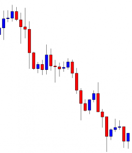
EUR/USD – Daily Analysis
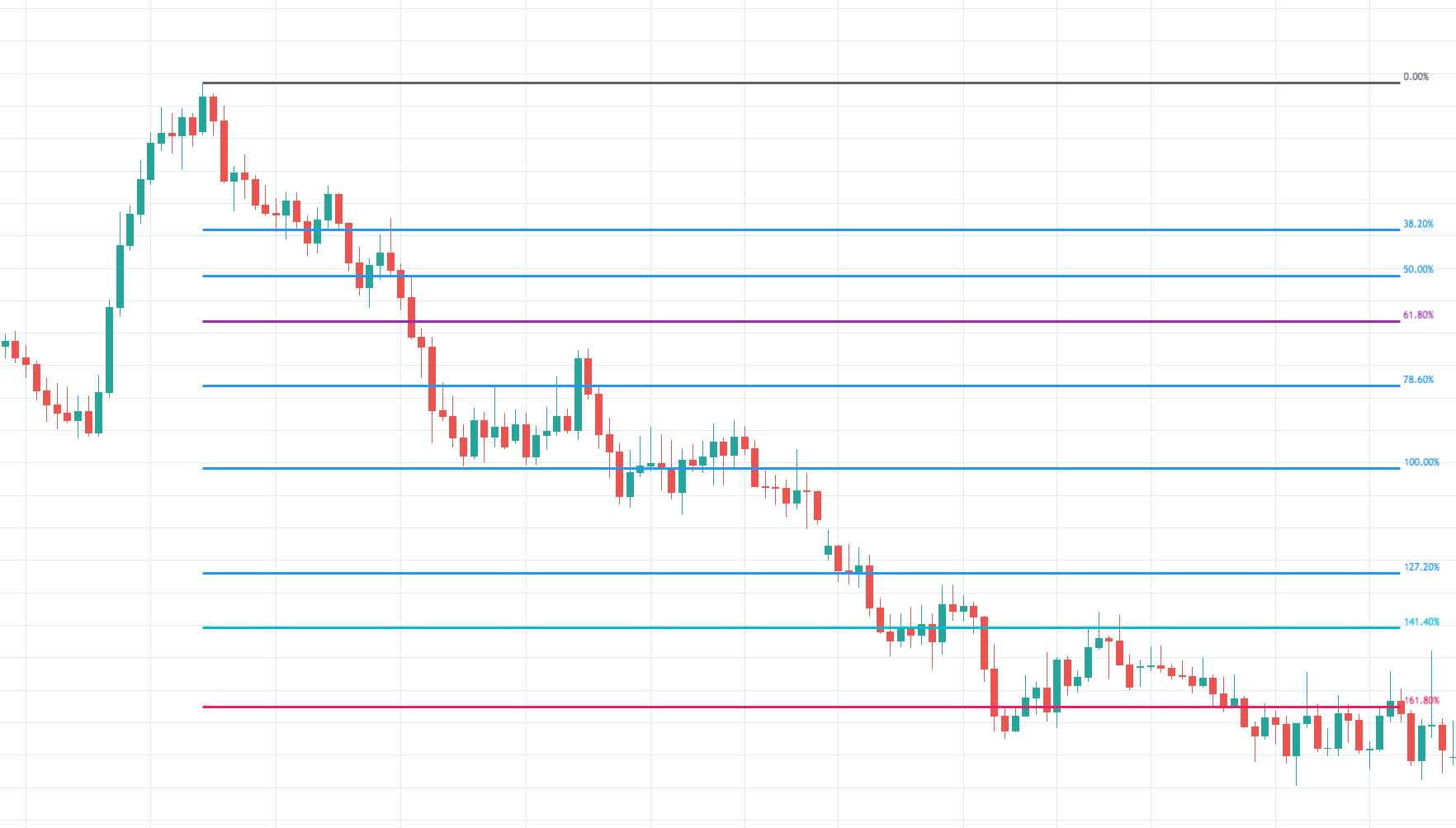
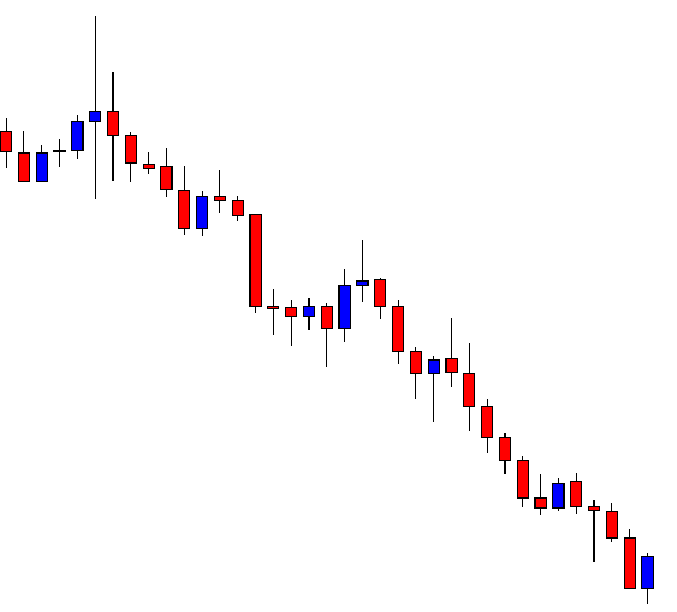
The EUR/USD pair was closed at 1.17166 after placing a high of 1.17734 and a low of 1.16984. Overall the movement of the EUR/USD pair remained bearish throughout the day.
After rising for eight consecutive days, the EUR/USD pair dropped on Tuesday and posted losses for the day as the U.S. dollar rose marginally across the board but remained under pressure ahead of the Fed meeting.
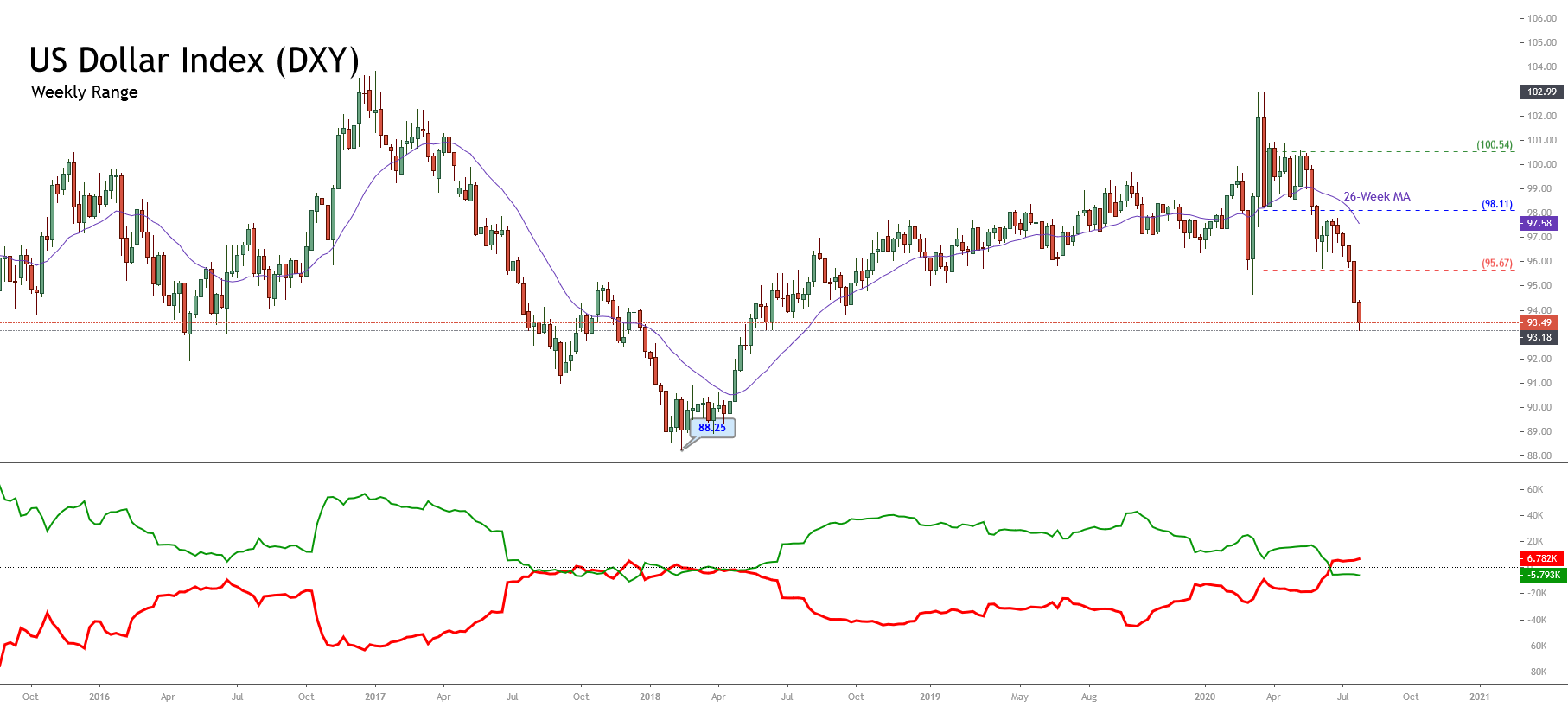
The U.S. Dollar Index was also up on Tuesday and posted a high of 94.0. The recovery in the greenback could be because of correction after losing ground significantly over a few days. Or the recovery could also be because of the rising hopes of the U.S. stimulus package and the economic recovery hopes associated with it.
The Republicans made a proposal on Monday for a stimulus package worth about $1 trillion. The Senate Republicans plan to issue another round of stimulus checks of $1200 while it also cut the emergency unemployment benefit from $600 to $200 per week.
More than 100 billion dollars were allocated to reopen schools in the presented proposal of coronavirus relief fund by Republicans. The proposal is yet to be approved by the Democrats. On the data front, the Spanish Unemployment Rate was decreased to 15.3% from the expected 16.6% and supported Euro. From the American side, at 18:00 GMT, the S&P/CS Composite-20 Housing Price Index for the year was also dropped to 3.7% from the expectations of 4.1%. At 19:00 GMT, the C.B. Consumer Confidence from America dropped to 92.6 in July from 94.0and weighed on the U.S. dollar.
However, the EUR traders ignored the macroeconomic data on Tuesday, and the pair EUR/USD continued to follow the improved U.S. dollar movements.
A two-day Federal Reserve meeting started on Tuesday, during which investors expected reaffirmation on the outlook. Though no monetary policy changes were expected, traders were speculating about a change in emphasis in the Fed’s forward guidance at the meeting.
On the other hand, the bearish correction in EUR/USD pair on Tuesday was due to the rise in its prices for eight consecutive days. The trend in the EUR/USD pair was still positive, and even a sharper slide could have been normal.
On the previous day, the pair EUR/USD posted the highest daily close since June 2018 near 1.1780 level, confirmed that both single currencies had a solid momentum. And despite falling and posting losses on Tuesday, the pair EUR/USD continued to hold just below 1.18 level, which shows that it has a key multi-year trend resistance.
Daily Technical Levels
| Support |
Pivot |
Resistance |
| 1.1686 |
1.1730 |
1.1762 |
| 1.1654 |
|
1.1806 |
| 1.1610 |
|
1.1837 |
EUR/USD– Trading Tip
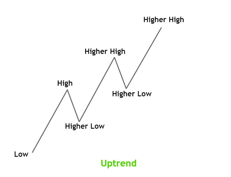
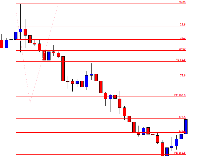
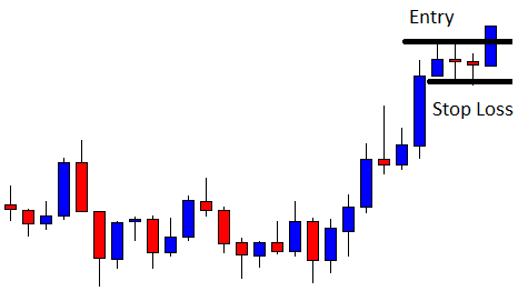
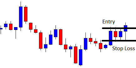
The EUR/USD is trading at 1.1728 level, holding above resistance to become a support level of 1.1715. On the hourly timeframe, the EUR/USD was previously forming highers high and highers low pattern, but now the recent cycle seems to change the trend. A bearish breakout of 1.1715 can drive more sales until the 1.1683 level. On the higher side, the resistance can stay at 1.1780.
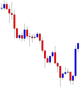
GBP/USD – Daily Analysis
The GBP/USD pair was closed at 1.29316 after placing a high of1.29526 and a low of 1.28379. Overall the movement of GBP/USD pair remained bullish throughout the day. The GBP/USD pair extended its previous day’s gains and maintained its bullish streak for the 8th consecutive day on Tuesday amid improved market mood on vaccine hopes. The U.S. Dollar struggled on Tuesday after hopes of a COVID-19 vaccine boosted the risk sentiment. As in result, the greenback suffered as markets inclined towards riskier assets. The positive news about vaccine development supported the risk sentiment.
The pharma firms worldwide are working on treatment and vaccine development that provides multiple routes to success. Companies like Moderna, Pfizer, and AstraZeneca were all pushing to get their vaccines across the line.
Meanwhile, the U.S. Dollar was also supported ahead of the 2-days Federal Reserve meeting that started on Tuesday. Though no change in interest rate is expected, the traders were cautious to know about the statement of meeting to find more clues about the U.S. economy.
However, the release of S&P/Case-Shiller Home Price Indices for May fell below the forecast of 3.9% to 3.7%. It is because investors have become concerned about America’s economic recovery from the coronavirus pandemic.
The Richmond Manufacturing Index was released at 18:59 GMT as 10 for July against the expectations of 5 and supported the U.S. dollar. However, the C.B. Consumer Confidence also dropped to 92.6 from the forecasted 94.0 and weighed on the U.S. dollar that eventually added in the currency pair gains.
From the GBP side, the Pound was benefited from a stronger than expected CBI Distributive Trades Survey that rose to 4% from the expected -37% and gave hopes to investors that the British economy could be on the road to recovery.
Meanwhile, the Sterling traders were cautious after Prime Minister Boris Johnson warned of the possible signs of the pandemic’s second wave in parts of Europe. This raised concerns that the U.K. could also suffer from a second wave of coronavirus in the month ahead. The London School of Economics has also reported that Brexit could prove a double-shock to the economy. As a result, GBP traders remained cautious as UK-EU post-Brexit trade talks continue despite a lack of progress.
The GBP/USD pair traders will look forward to the Fed’s interest rate decision and the statement of the meeting. If fed in notably downbeat in s monetary policy statement, the GBP/USD pair would edge higher as concerns about the global economy grow.
The Brexit developments will also drive the GBP/USD pair in the coming days of the week as there will be a lack of macroeconomic data until next week. If the talks between the E.U. & U.K. show any progress, then Sterling would rise.
Daily Technical Levels
| Support |
Pivot |
Resistance |
| 1.2863 |
1.2908 |
1.2978 |
| 1.2792 |
|
1.3024 |
| 1.2747 |
|
1.3094 |
GBP/USD– Trading Tip
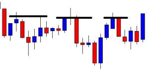
On the 4 hour chart, the GBP/USD has completed 23.6% retracement at 1.2927 level, and closing below this level has the potential to lead GBP/USD prices towards 1.2910, which marks 38.2% Fibonacci retracement level. On the lower side, the GBP/USD pair can find support at 1.2810 and 1.2765 level. Conversely, the resistance stays at 1.2975. Let’s consider taking buying trade over 1.2760 until 1.2860 level today.
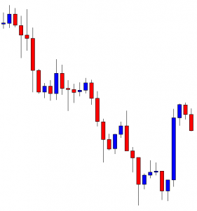
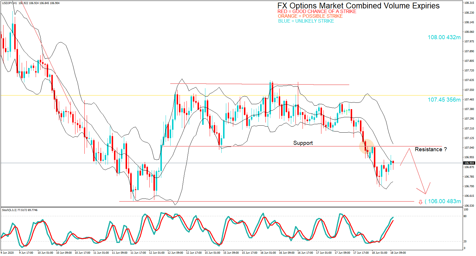
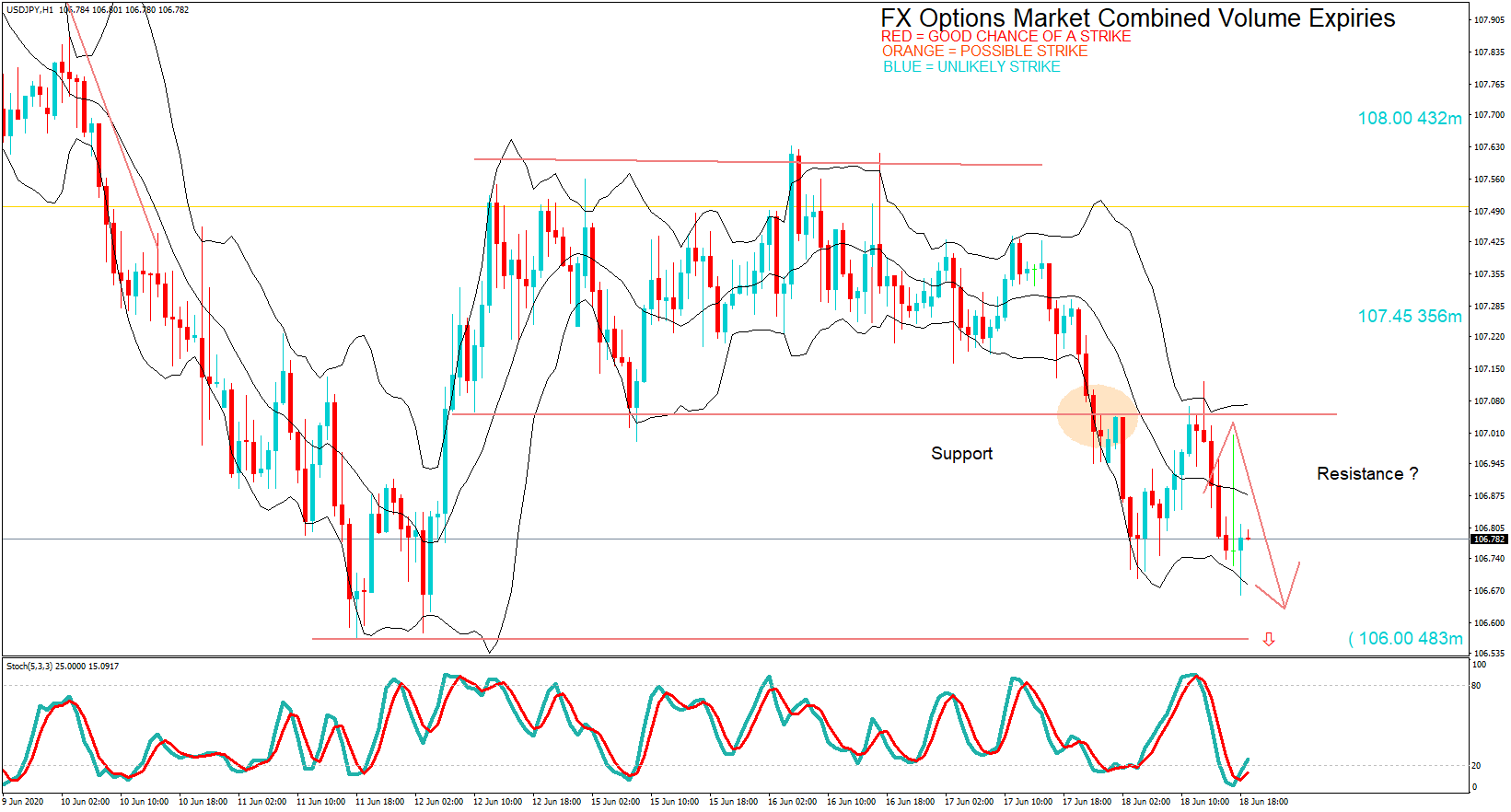
USD/JPY – Daily Analysis
The USD/JPY pair was closed at 105.073 after placing a high of 105.684 and a low of 104.954. Overall the movement of the USD/JPY pair remained bearish throughout the day. The USD/JPY pair extended its bearish trend and losses on Tuesday amid U.S. dollar weakness and struggled with 105 level. The haven was on the bid, which supported the Japanese Yen and caused a decline in the USD/JPY pair.
The rising numbers off coronavirus cases in the U.S. and the Federal Reserve Interest Rate decision event were the market’s dominating sentiment. Meanwhile, the U.S. stimulus negotiations and mixed earnings reports sent the investors to the sidelines.
The greenback managed to correct some of its oversold conditions during the past sessions; however, the USD/JPY pair remained still on the bearish path on Tuesday. The reason behind it was that background picture containing the concerns about the spread of coronavirus, and the ongoing US-China tensions did not change.
The U.S. Senate Republicans revealed the new coronavirus aid proposal that will need Democrats’ support. The package would include another round of $1200 in direct payments to individuals and a reduction in federal unemployment benefits from $600 to $200 per week and also more than $100 billion for reopening schools.
In remarks, Nancy Pelosi, a white house speaker, criticized it and called it a “pathetic” offer that was not enough to support the country.
On the data front, Japan published the June Corporate Service Price Index, which improved to 0.8% from 0.5% in May. On the U.S. side, the Richmond Manufacturing Index raised to 10 from the expected five and supported the U.S. dollar. The S&P/CS Composite-20 HPI dropped to 3.7% from the expected 4% and weighed on the U.S. dollar. The C.B. Consumer Confidence also dropped to 92.6 from the expected 94.0 and weighed on the U.S. dollar.
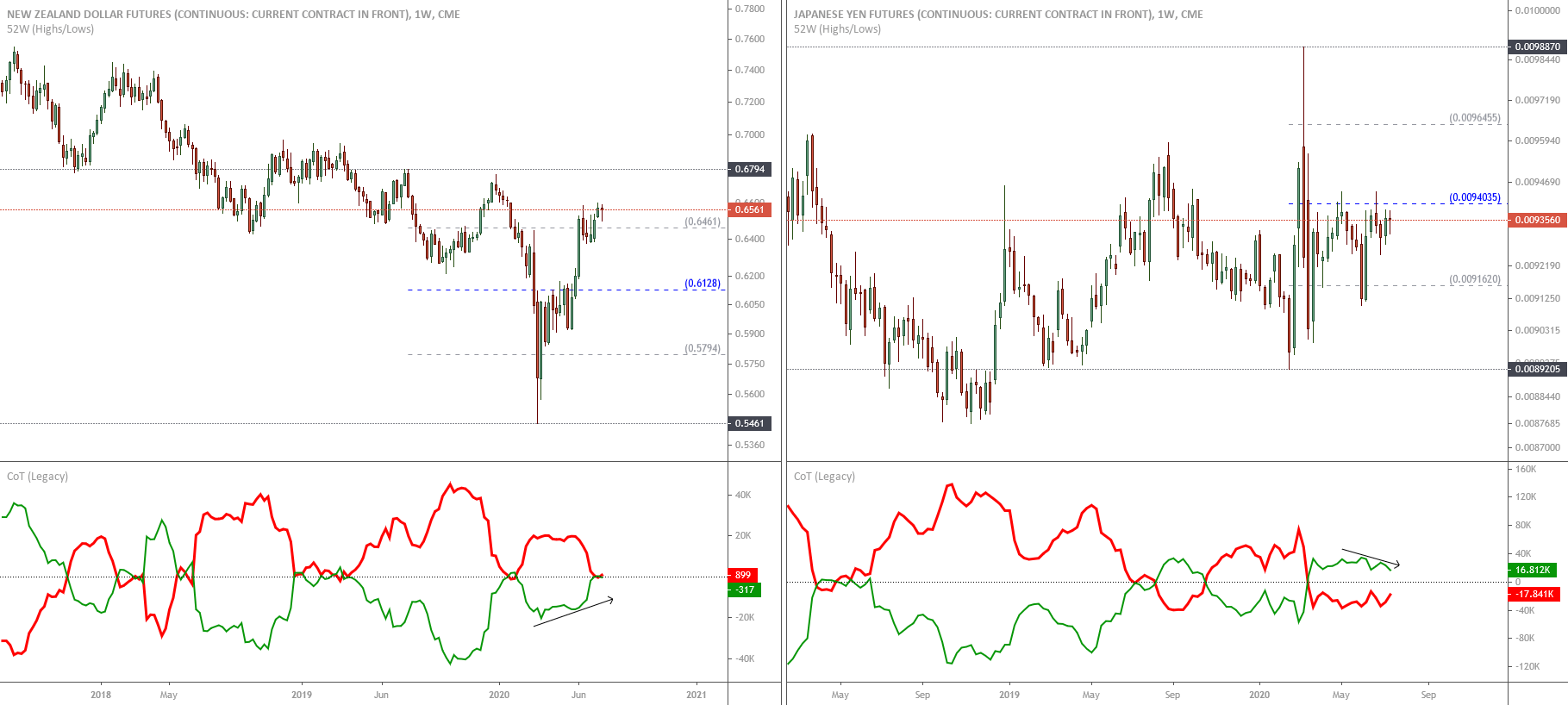
The poor than expected Consumer Confidence and HPI data added further losses in the USD/JPY pair on Tuesday. Furthermore, despite the prospects of a prolonged U.S. recession, the U.S. dollar will favor any breakdown in the market confidence due to its dominance in the global payment system. On JPY front, the currency is sensitive to geopolitical news in the Asian region, and with the ongoing conflict between U.S. & China, JPY is set to remain firm for the time being. JPY was the third worst-performing currency this month after the USD and Canadian Dollar.
Daily Technical Levels
| Support |
Pivot |
Resistance |
| 104.80 |
105.25 |
105.55 |
| 104.50 |
|
106.00 |
| 104.05 |
|
106.30 |
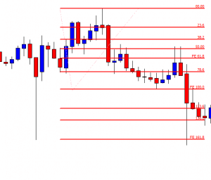
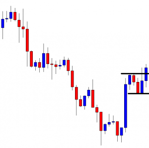
USD/JPY – Trading Tips
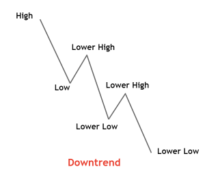
The USD/JPY trades with a selling bias around 105.526 level, trading within a downward channel that provides an immediate resistance at 106.120. On the lower side, the USD/JPY may find support at 105.375 level, and closing of candles below 105.375 can open further selling bias until 104.850. Overall the pair is forming lowers low and lowers high pattern, which signifies selling sentiment among traders. The RSI and MACD suggest selling signals; for instance, the RSI is holding below 50, and the MACD is staying below 0. Today, let’s look for buying trade above 105.200. Good luck!