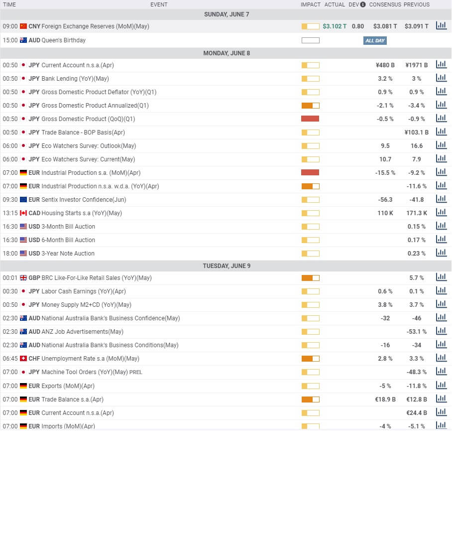
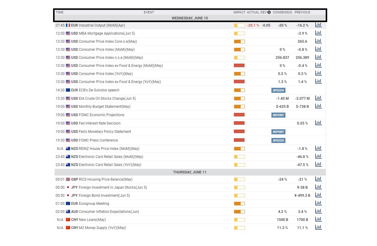
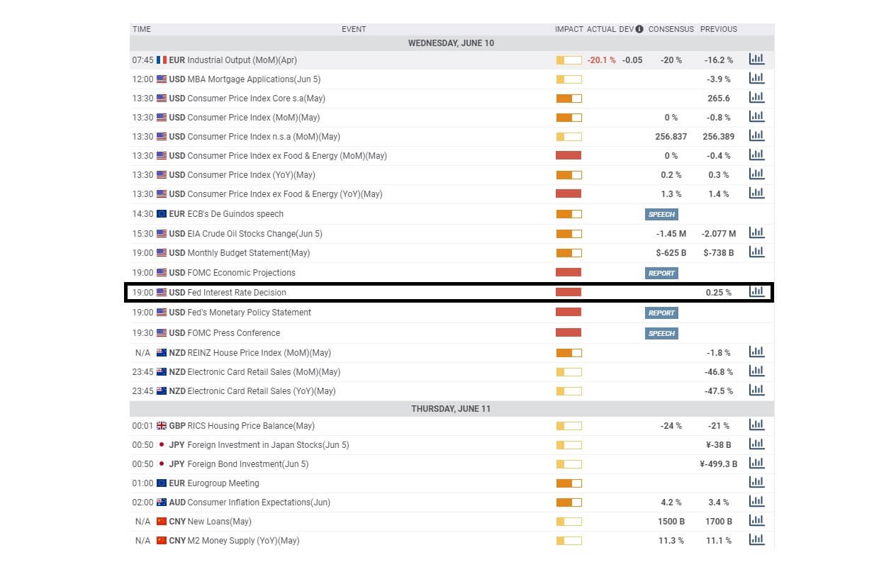
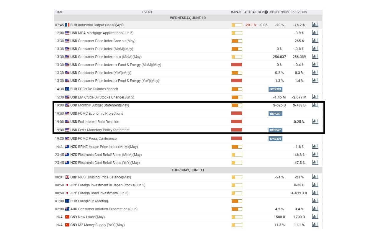
A day before, the U.S. dollar was also supported by the Philly Fed Manufacturing Index, which surged to 27.5 from the expected -23.0. The C.B. Leading Index for May also supported dollar when came in as 2.8% against the .4%. Today, the eyes will remain on the Canadian economic events and E.U. economic summit. Overall, the price action will be driven by the technical levels today.
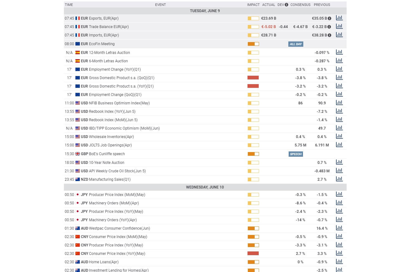
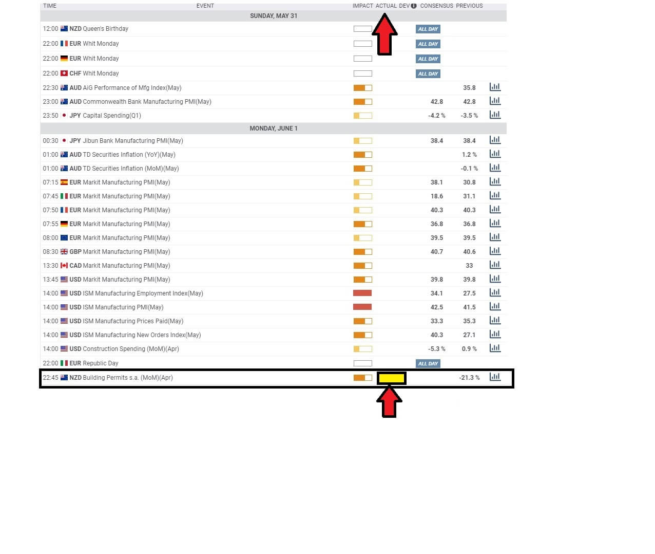
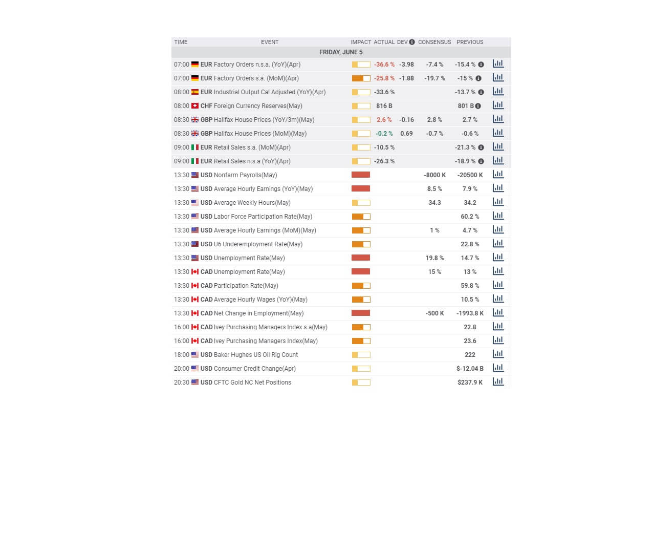
Economic Events to Watch Today
EUR/USD – Daily Analysis
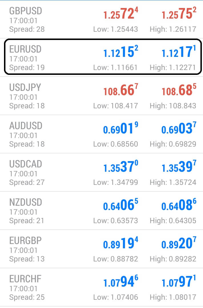
The EUR/USD pair was closed at 1.12045 after placing a high of 1.12611 and a low of 1.11854. Overall the movement of the EUR/USD pair remained bearish throughout the day. The EUR/USD pair followed its previous day’s trend and posted losses for 3rd consecutive day on Thursday amid risk-off market sentiment and bleak economic data. The pair extended its losses and dropped to its lowest level near 1.11800 since June 3.
The bearish trend of EUR/USD was supported by the increased demand for the U.S. dollar, which made it strong across the board. U.S. dollar was higher on Thursday amid its safe-haven status, which was buoyed by the multiple factors. The safe-haven market sentiment was supported by the increased fears of coronavirus second wave after the U.S. & China reported an increased number of infection cases from some parts of their country.
The U.S. dollar was also supported by the Philly Fed Manufacturing Index, which surged to 27.5 from the expected -23.0. The C.B. Leading Index for May also supported dollar when came in as 2.8% against the .4%.
However, the losses of EUR/USD were limited after the release of Unemployment Claims from the U.S. that surged to 1.508M against the 1.3M forecasts.
From the Eurozone side, at 13:03 GMT, the Italian Trade Balance in April showed a deficit of 1.16B against the expected surplus of 4.88B. Poor than expected Trade Balance from Italy weighed heavily on the single currency Euro as the difference between expected and actual value was very large.
Despite poor than expected jobless claims, the U.S. dollar index, which measures the U.S. value against a basket of six currencies, rose to 97.4 level. Increased dollar stressed the demand for EUR/USD, and hence, pair fell for 3rd consecutive day.
Furthermore, the European Central Bank issued another trillion million euros to strengthen the economies from the coronavirus pandemic. The offer made by the Central Bank to commercial banks of its ultra-cheap three years loan was taken up by 742 banks on Thursday. Bloomberg reported that a total of 1.31 trillion euros of offers were taken by the banks, which were in line with the predicted range of 1.2T – 1.5T euros.
These loans were carrying below zero interest rates, which means ECB was paying the lenders to lend to households and business people to bolster the economic recovery from the pandemic and cushion the losses.
Daily Support and Resistance
- R3 1.1462
- R2 1.1408
- R1 1.1336
Pivot Point 1.1282
- S1 1.1211
- S2 1.1156
- S3 1.1085
EUR/USD– Trading Tip
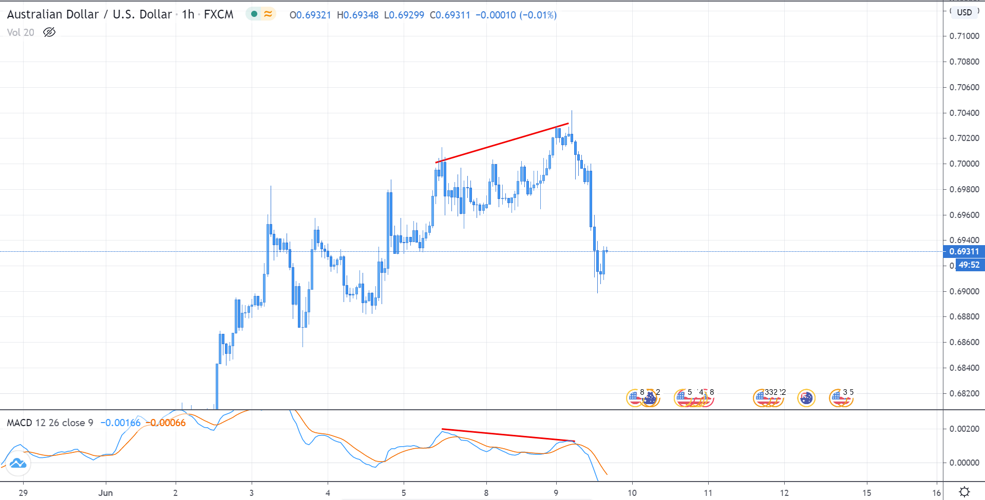
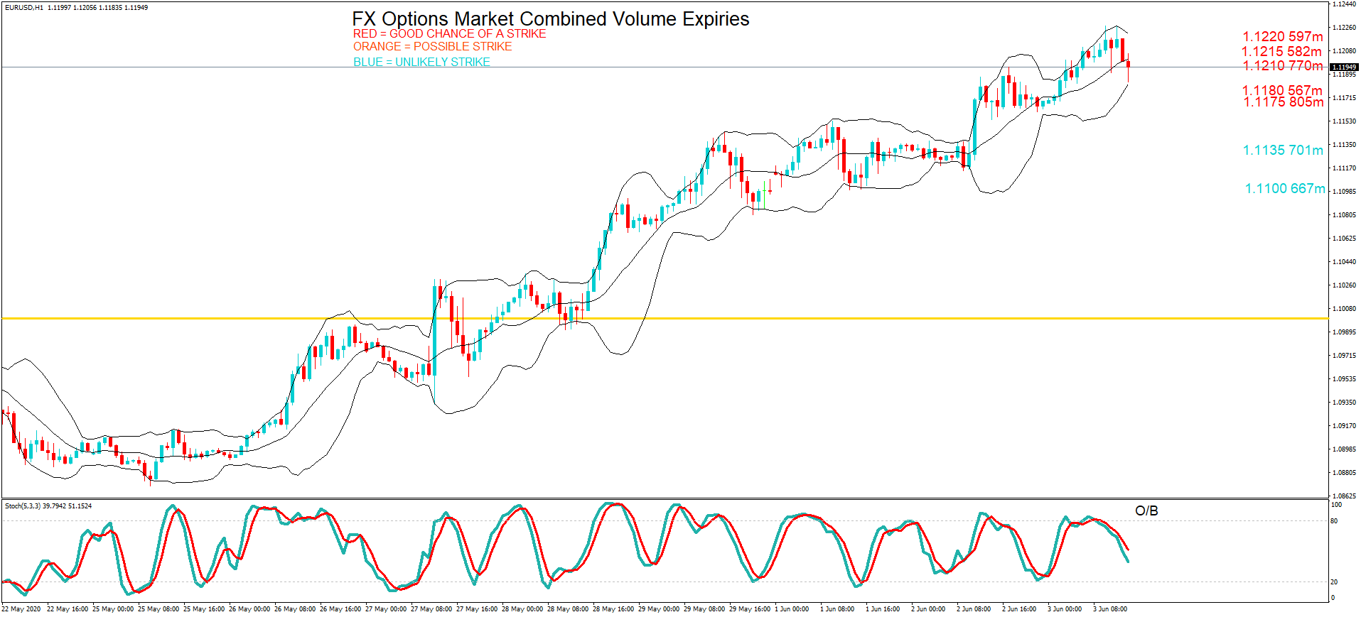
On Friday, the EUR/USD pair is trading with a bearish bias, holding below the descending triangle pattern, which can lead EUR/USD prices towards 1.1164 level. On the higher side, the pair may find resistance at 1.1219 level, which is extended by the downward trendline that can be seen on the hourly timeframe. Besides, the leading indicators are mixed; for example, the RSI is suggesting a selling bias, while the MACD is indicating a bullish bias. However, the 50 EMA is in support of selling. Therefore, we can look for selling trade below 1.1219 level today.
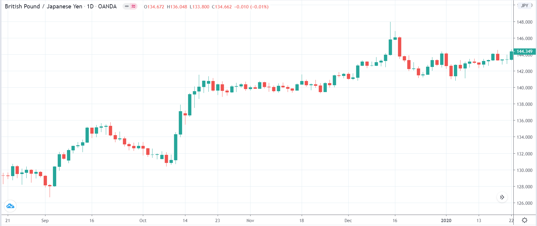
GBP/USD – Daily Analysis
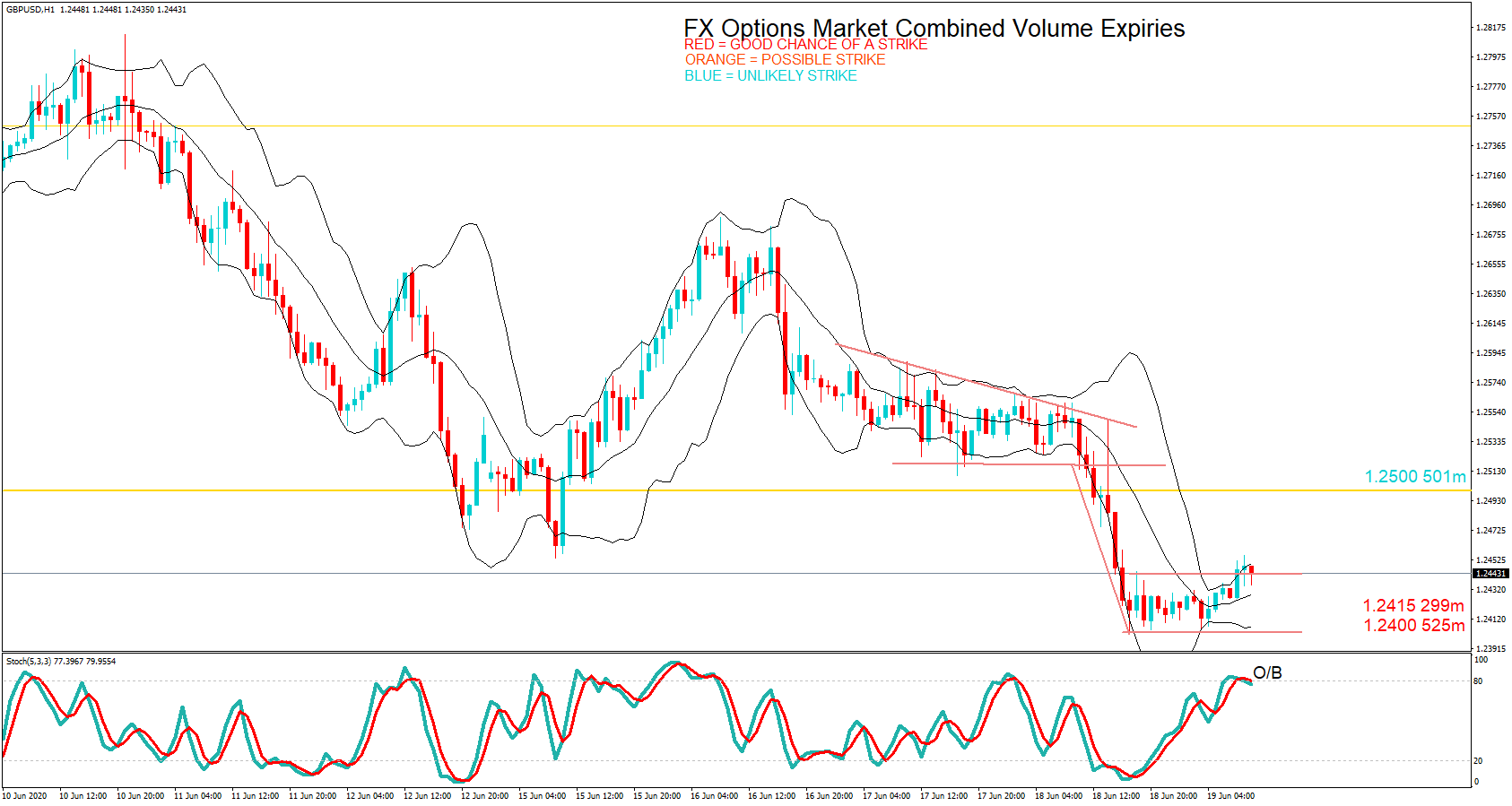
The GBP/USD pair was closed at 1.2407 after placing a high of 1.25667 and a low of 1.24014. Overall the movement of GBP/USD pair remained bearish throughout the day. The GBP/USD pair dropped on Thursday and extended its losses for 3rd consecutive day on the back of dovish commentary from BoE and Brexit uncertainties.
On Thursday, the BOE held its monetary policy meeting in which it left the rates unchanged at 0.10% but increased the Quantitative Easing package by100 Billion Pounds. Bank of England dropped its expectations for the U.K.’s economic contraction for Q1 and Q2. In its previous meeting, the Bank of England anticipated that the economy would shrink by 27% in Q1 and Q2. But in the latest meeting on Thursday, BoE issued its expectation for GDP to contract by 20% in the first half of 2020.
The Governor of BoE, Andrew Bailey, said on Thursday that Britain’s economy was recovering a bit faster than Bank thought in the previous month. It could be due to decreased lockdown measures; however, the labor market was mostly providing negative data.
Bailey told reporters that BoE announced an increase of 100 billion pounds around $124 billion in its bond-buying program, but it also slowed the pace of purchases. He added that BoE had plans to stretch its 745 billion pounds bond-buying program. Bailey repeated his previous comments on negative interest rates that they were an option for the Bank as the issue was complex, but given the situation, when banks could afford bond-buying and another stimulus, taking borrowing cost below zero was not going to happen.
The Bank of England also said that it would take further necessary actions to support the economy and boost inflation towards its 2% target.
On Brexit front, the European Union’s Chief executive, Ursula von der Leyen, said on late Wednesday that there would be no post-Brexit trade deal without a level playing field, including everything from state aid to labor to environmental interests. She said that the Bloc would do everything to secure a deal by the end of 2020, but it will not compromise its core values.
Daily Support and Resistance
- R3 1.2695
- R2 1.2632
- R1 1.2529
Pivot Point 1.2465
- S1 1.2362
- S2 1.2298
- S3 1.2195
GBP/USD– Trading Tip
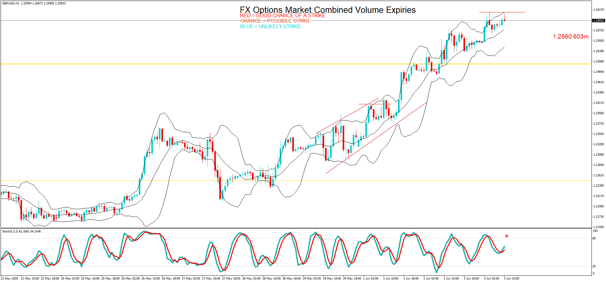
On Friday, the GBP/USD is trading at a level of 1.2430, holding right below support to become a resistance level of 1.2480. The pair is in the oversold zone now, and we may see a slight bullish correction until 1.2465 and 1.2485. But below this, the odds of selling will remain high, and it can lead Sterling lower towards the next support area of 1.2350 level. The RSI and 50 periods of EMA are suggesting a selling bias today. Let’s consider taking selling trades below 1.2450 today.
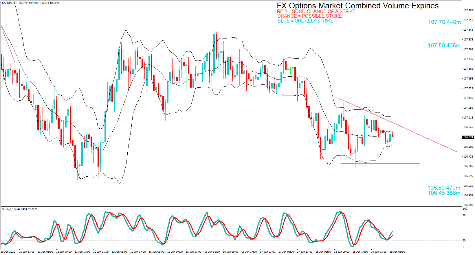
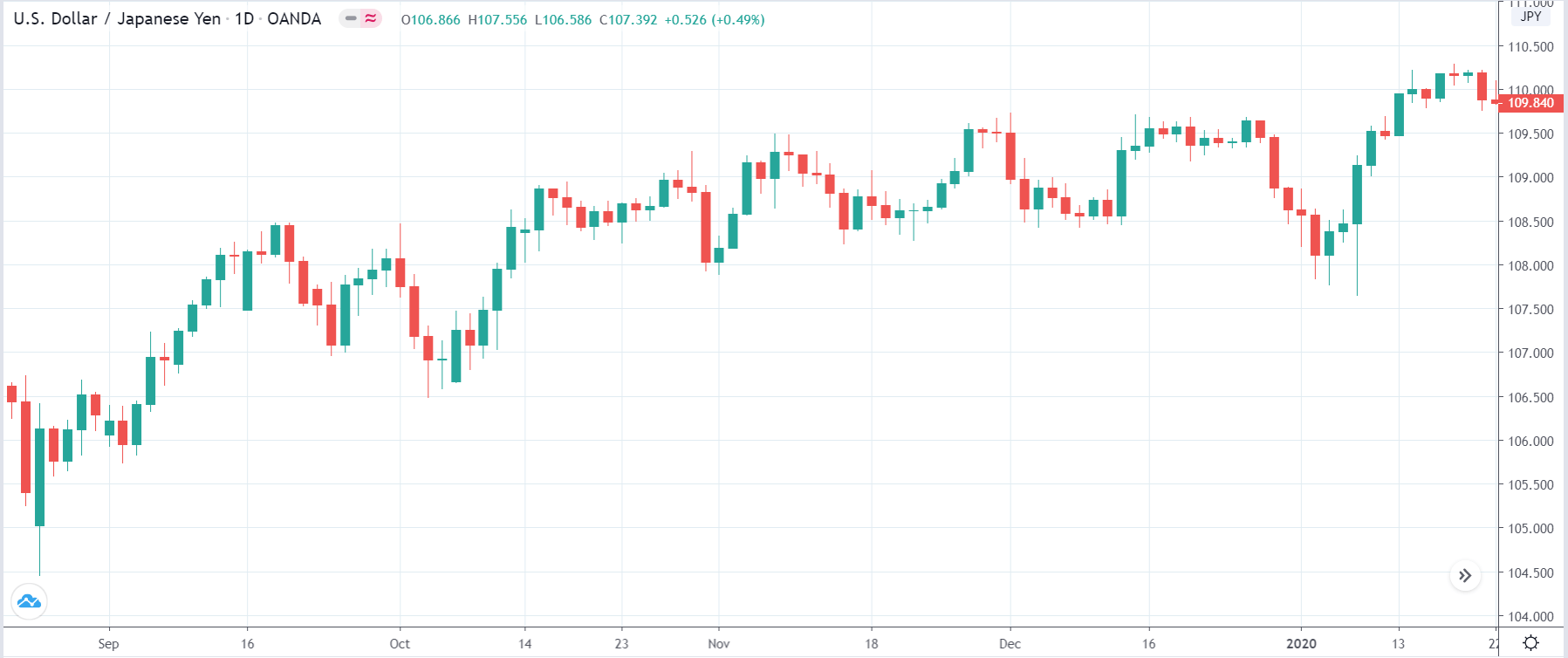
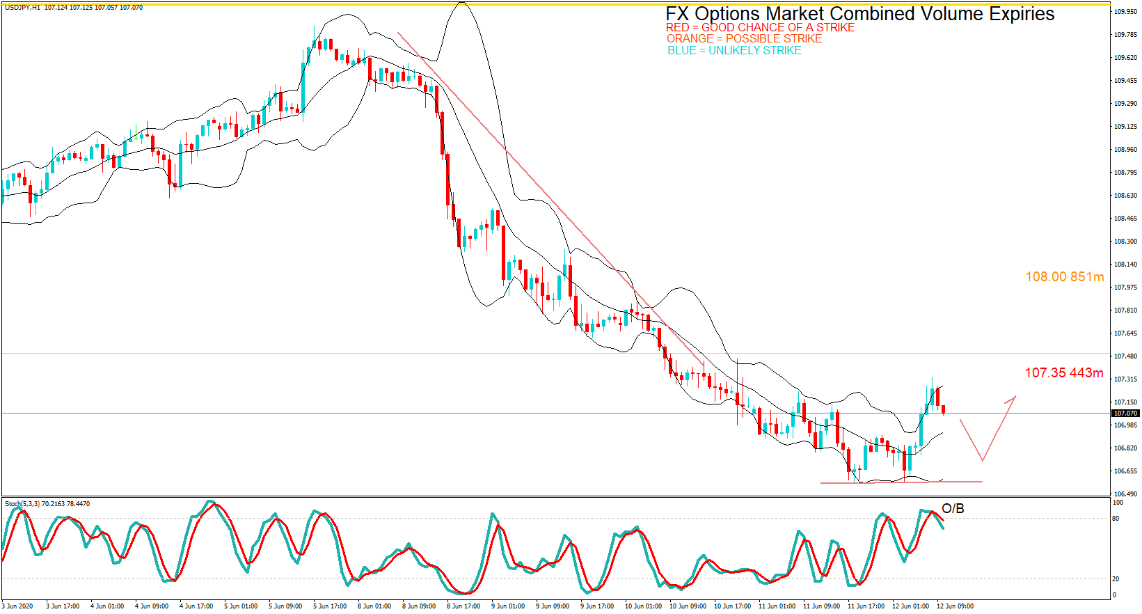
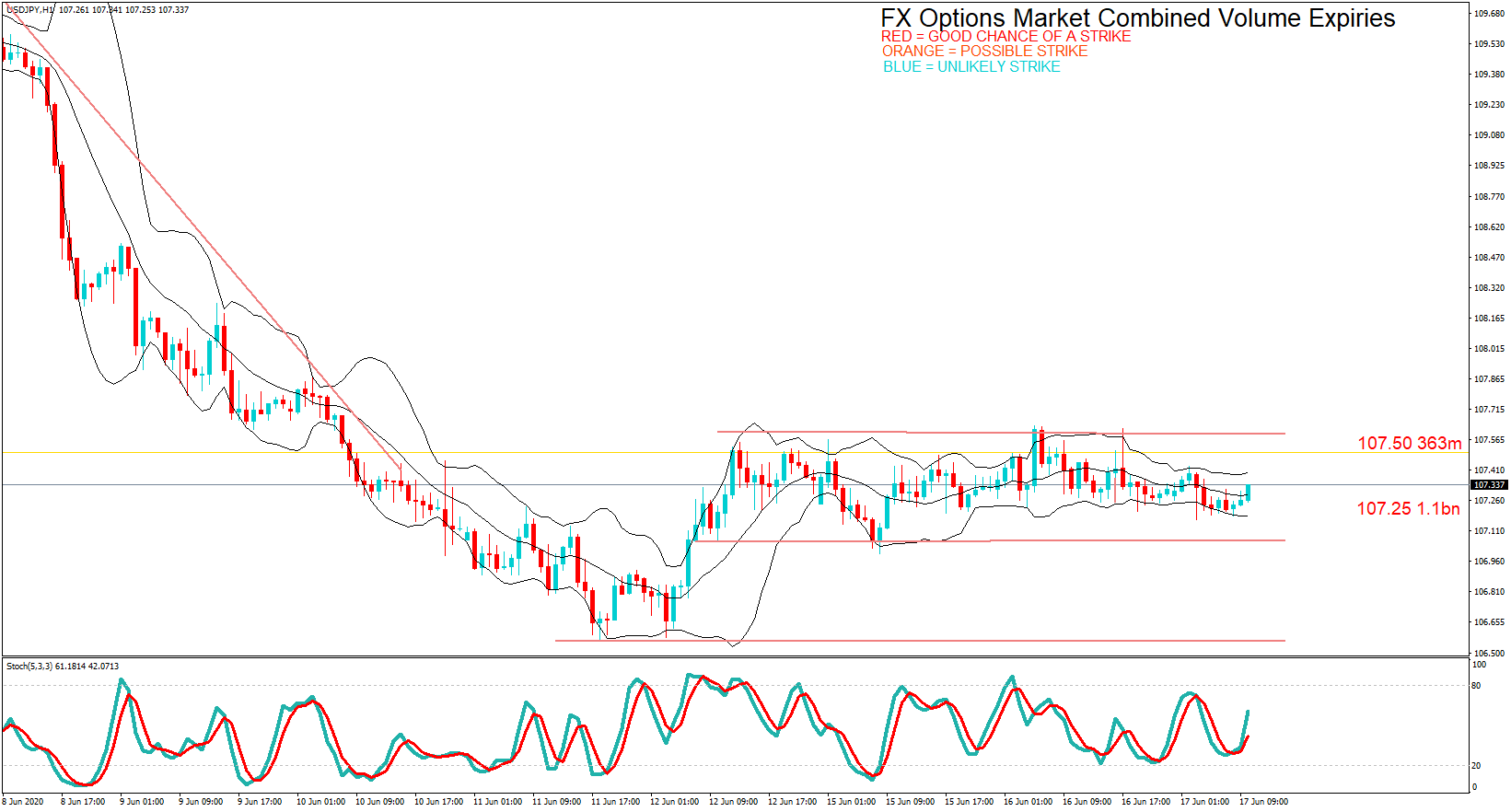
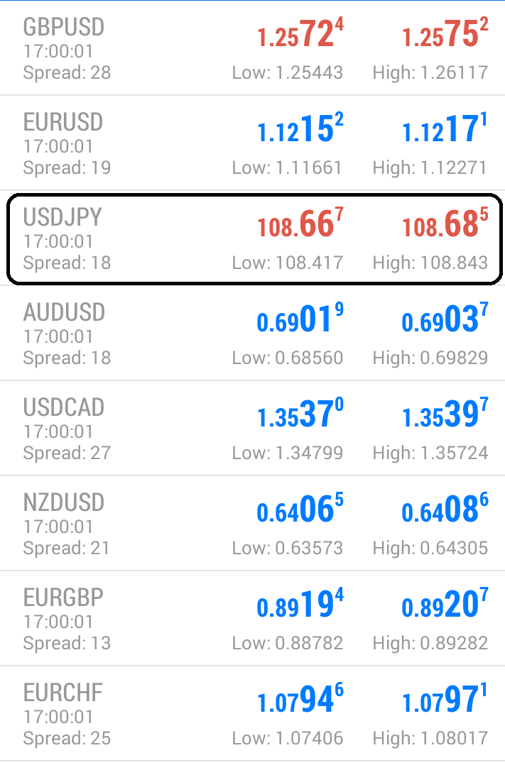
USD/JPY – Daily Analysis
The USD/JPY pair was closed at 106.969 after placing a high of 107.127 and a low of 106.655. Overall the movement of USD/JPY pair remained flat but slight bearish throughout the day. The USD/JPY painted a fresh three day low at 106.65 after a short-lived rise toward 107.1 in the beginning session. Japanese Ye was amongst the best performer currencies on Thursday on the back of lower U.S. yields and mixed sentiment.
The U.S. dollar data showed mixed results as jobless claims exceeded the expectations and weighed on the U.S. dollar, but the Philly Fed Manufacturing Index jumped and supported the U.S. dollar.
At 17:30 GMT, the Philly Fed Manufacturing Index for June reported as 27.5 against -23.0. The Unemployment Claims for last week were reported as 1.508M against the expected 1.3M. At 19:00 GMT, the C.B. Leading Index for May surged to 2.8% against the expected 2.4% and supported the U.S. dollar. The U.S. Dollar Index (DXY) surged above 97.44 level and posted weekly high. While U.S. stocks posted losses where Dow Jones was down by 0.15%, and S&P 500 was down by 0.27%.
An FOMC member Loretta Mester gave a speech on Thursday where she said that Fed and Fed longer than expected the road to economic recovery would have to provide additional and continuous support by being very easy on the monetary policy till 2023. The dovish comments exerted downside pressure on the U.S. dollar and ultimately to USD/JPY pair on Thursday.
Some reports suggested Beijing has succeeded in containing the virus after the renewed cases emerged due to ease of lockdown restrictions. Apart from Beijing, many states of America and other countries also send reports about rebuilt virus cases.
The hopes for V shape recovery for the global economy also faded away as the development of the vaccine was needed for that which only can increase the confidence of people against the virus spread.
However, the increased tensions between China & India and North & South Korea on their disputed borders also kept the USD/JPY pair under pressure.
Daily Support and Resistance
- R3 108
- R2 107.82
- R1 107.57
Pivot Point 107.39
- S1 107.14
- S2 106.96
- S3 106.71
USD/JPY – Trading Tips
The USD/JPY is trading at 106.914 level as it continues trading sideways in a wide trading range of 107.620 – 106.630. It failed to break above an immediate resistance level of 107.580. This level is working as resistance for USD/JPY, and the 50 periods EMA is also prolonging strong resistance at 107.580 zones while immediate support lingers nearby 106.600. The USDJPY bearish trend can trigger a sell-off unto the next support level of the 106.017 level today. Let’s wait for the USD/JPY to test the 107.650 level before entering a sell in the USD/JPY.
Good luck!


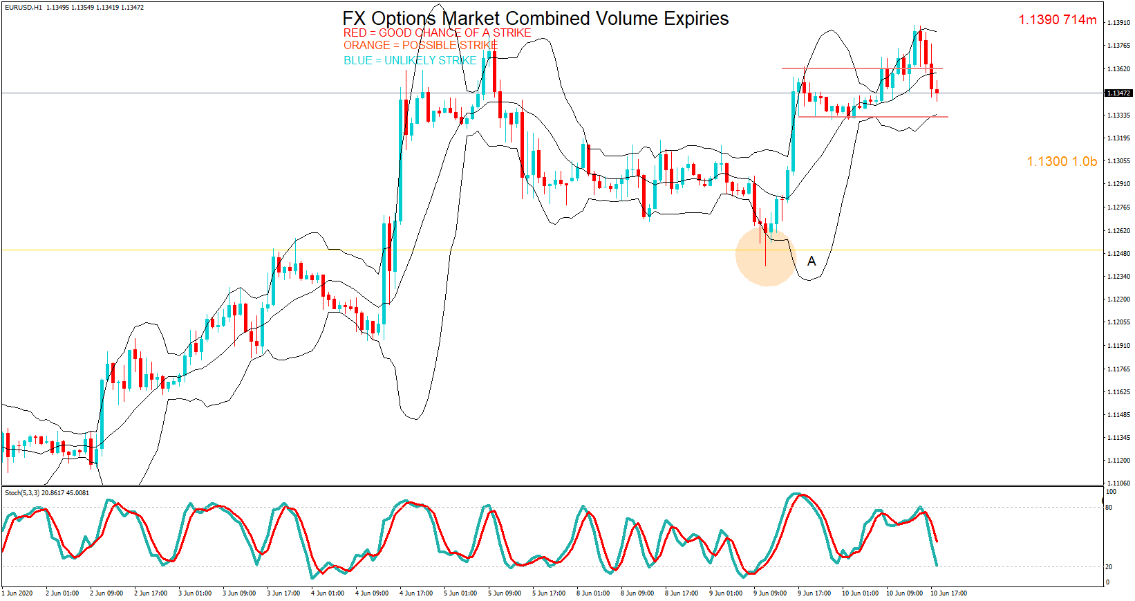
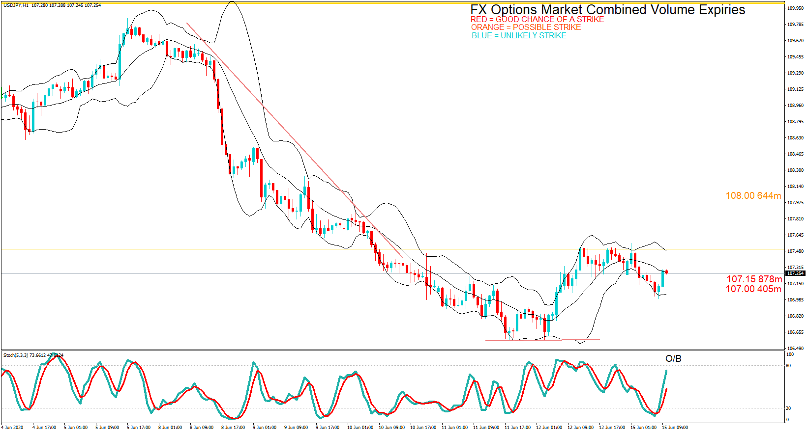
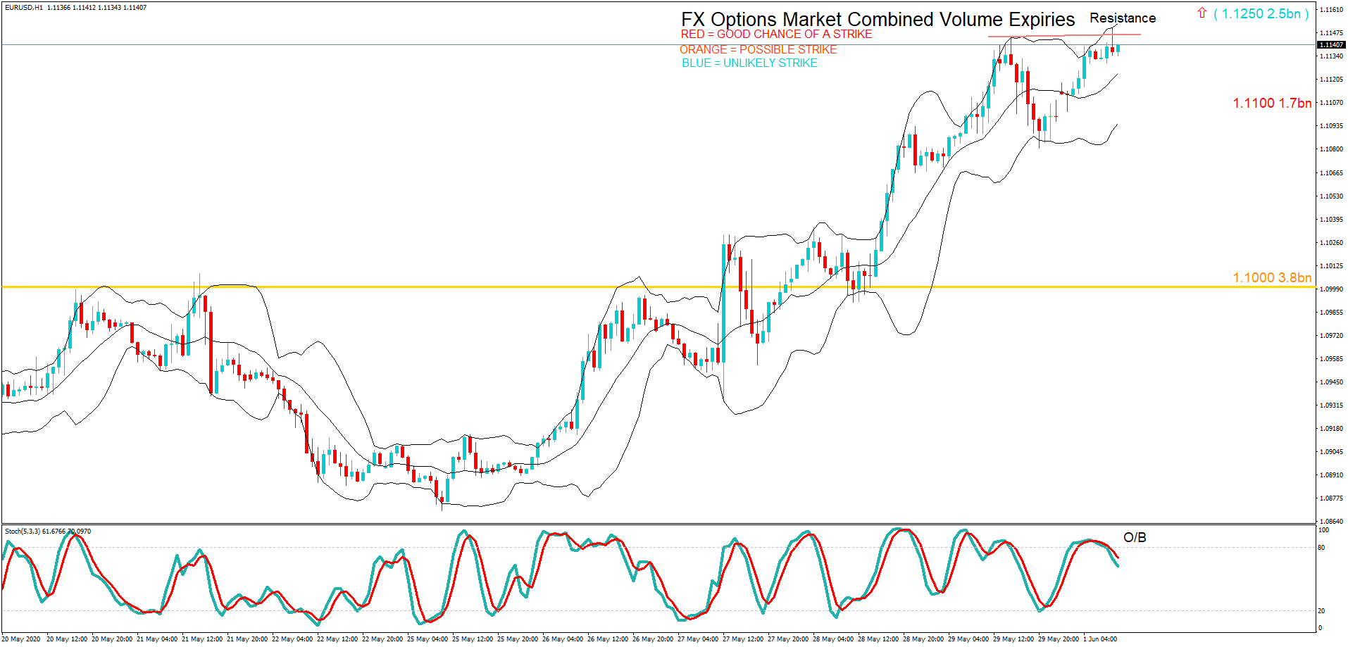
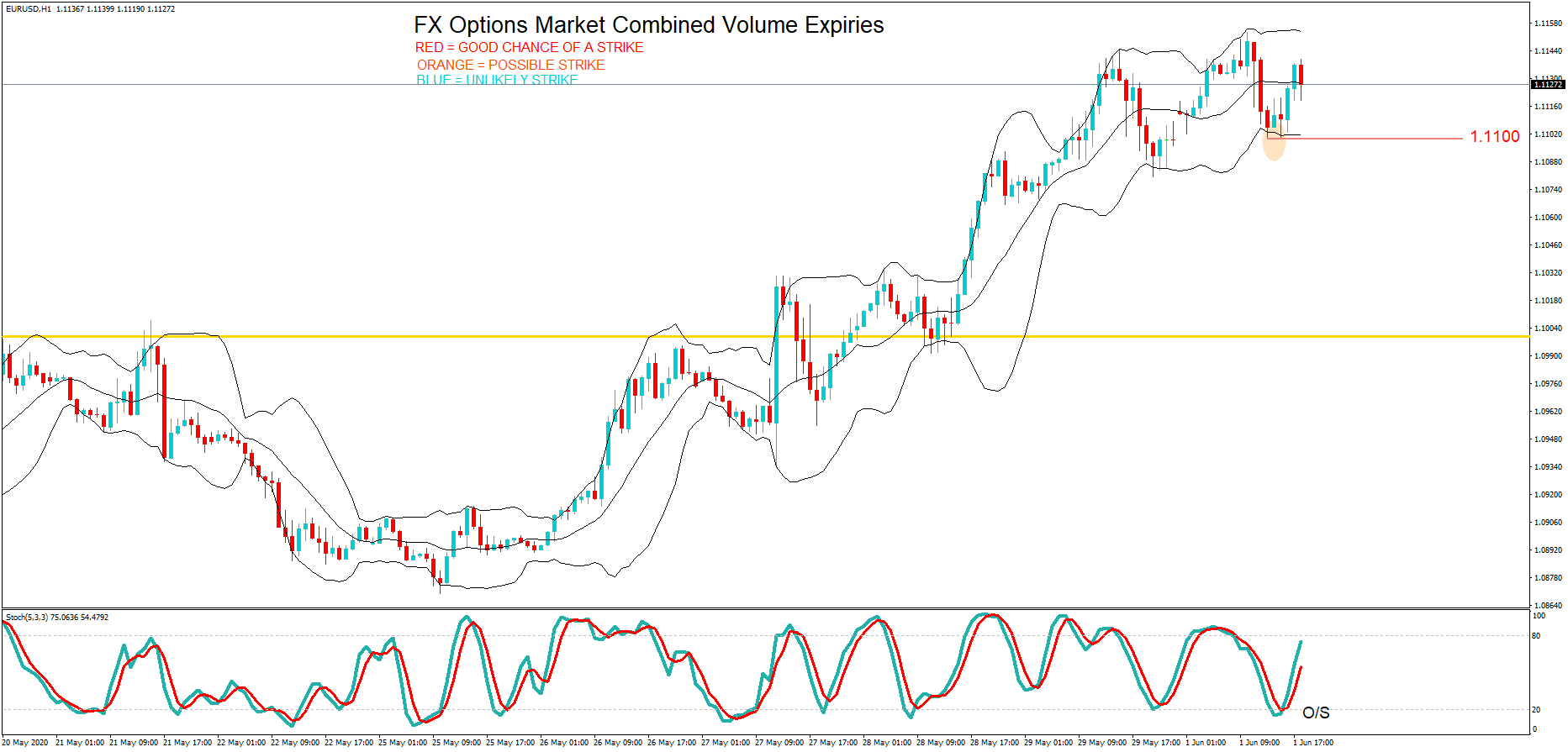
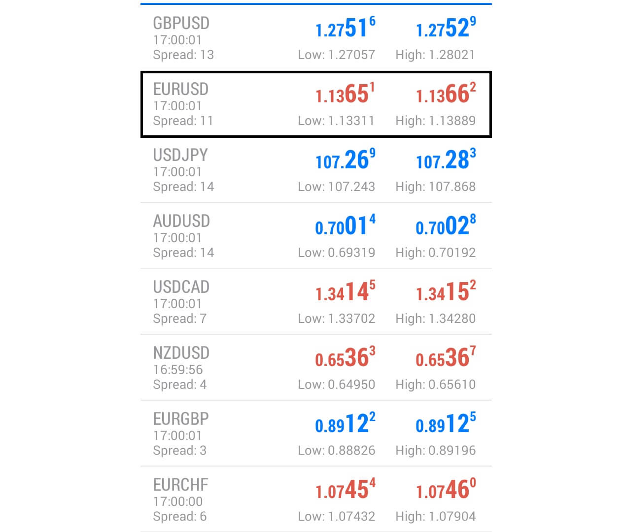 Here, we can see that the price action at the maturity was 1.1366, just 24 pips away.
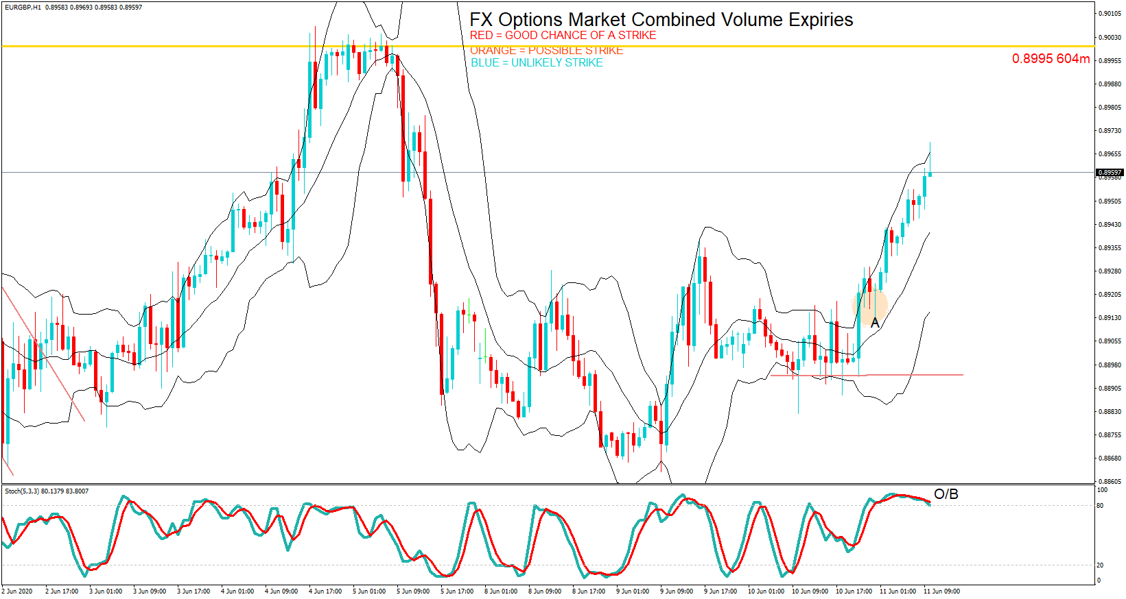
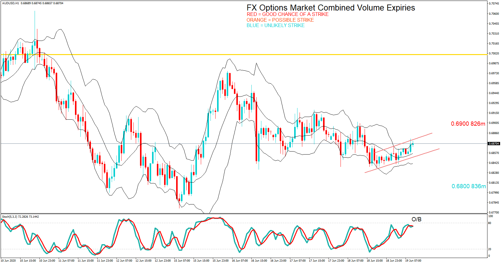
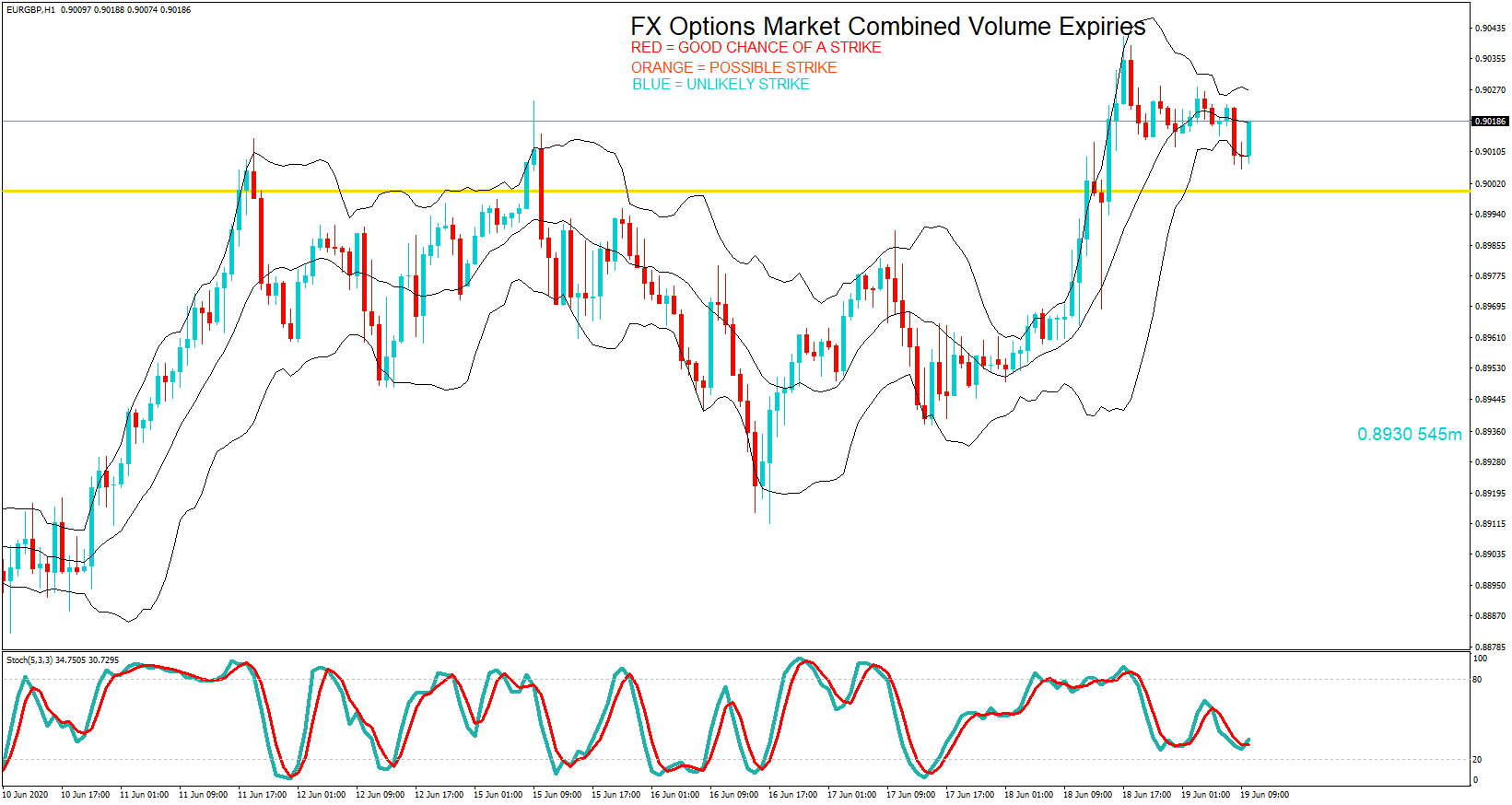
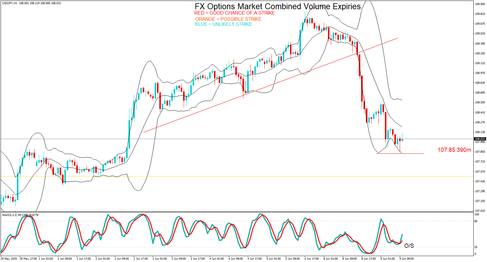
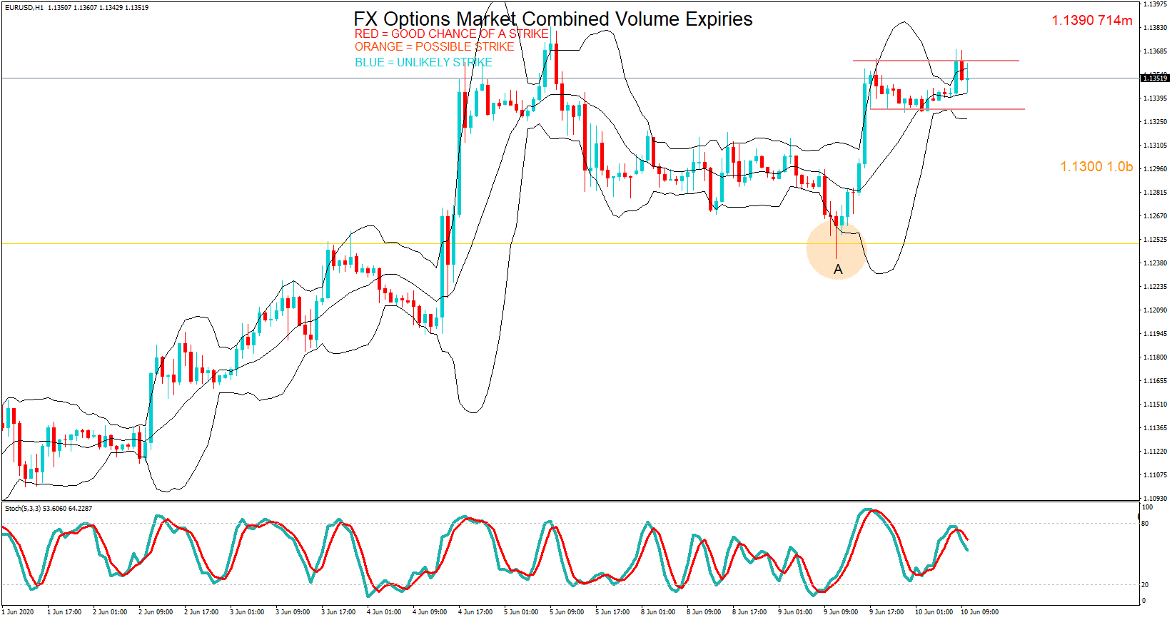
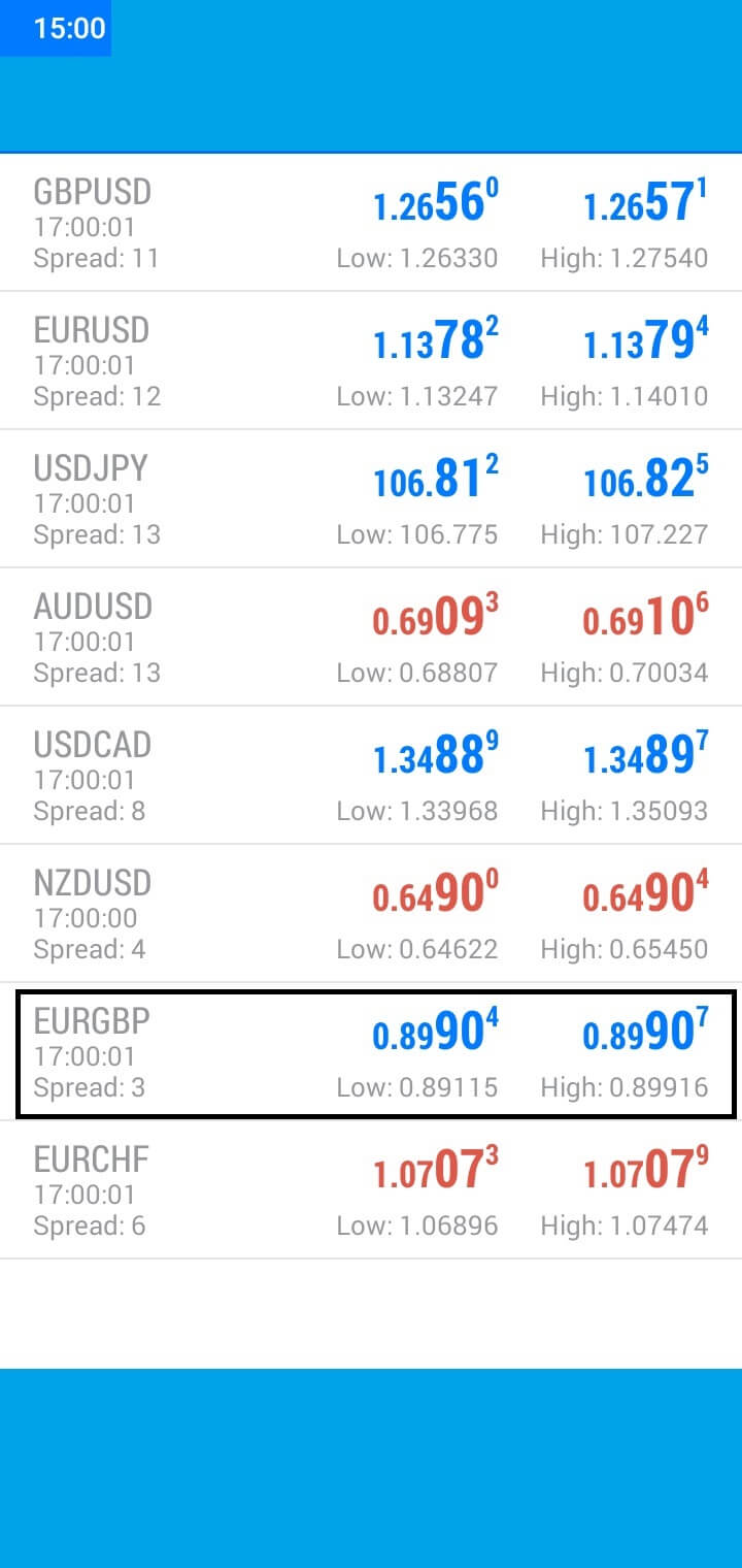 The pair continued to rally during the European session and hit 0.8990at the 10 AM Cut, just five pips away from the maturity.

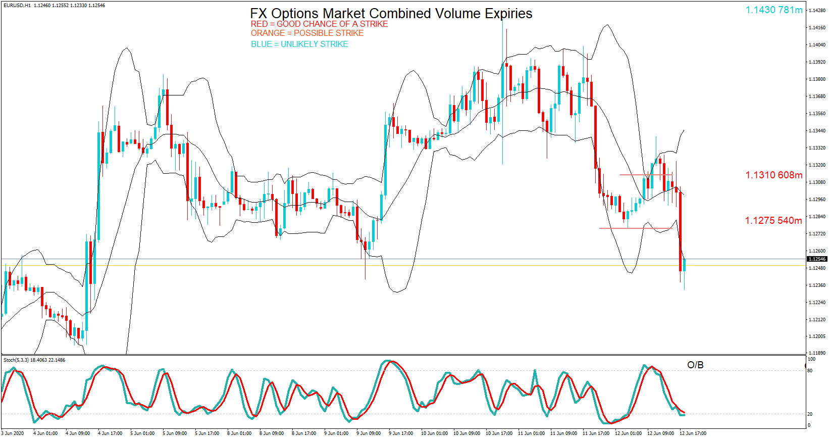


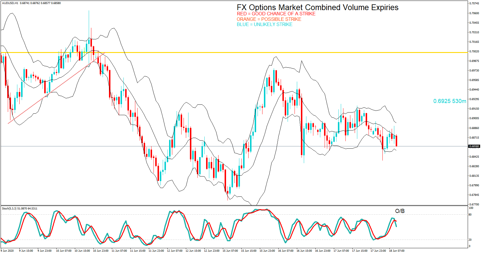


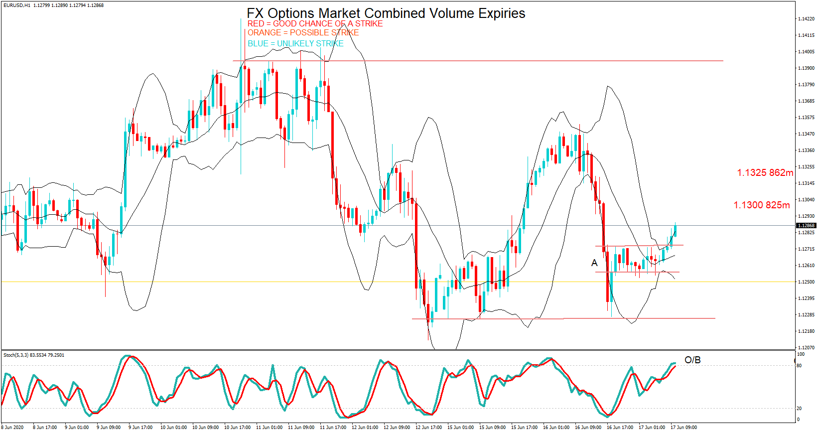


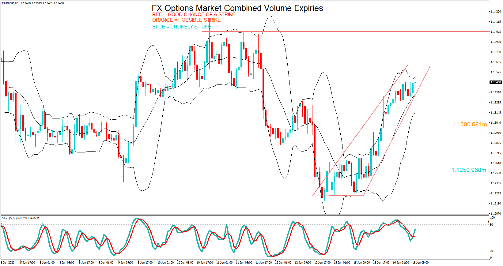


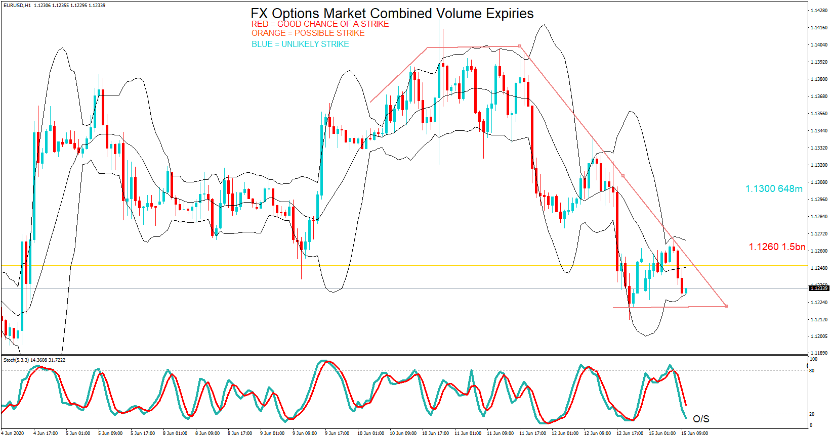
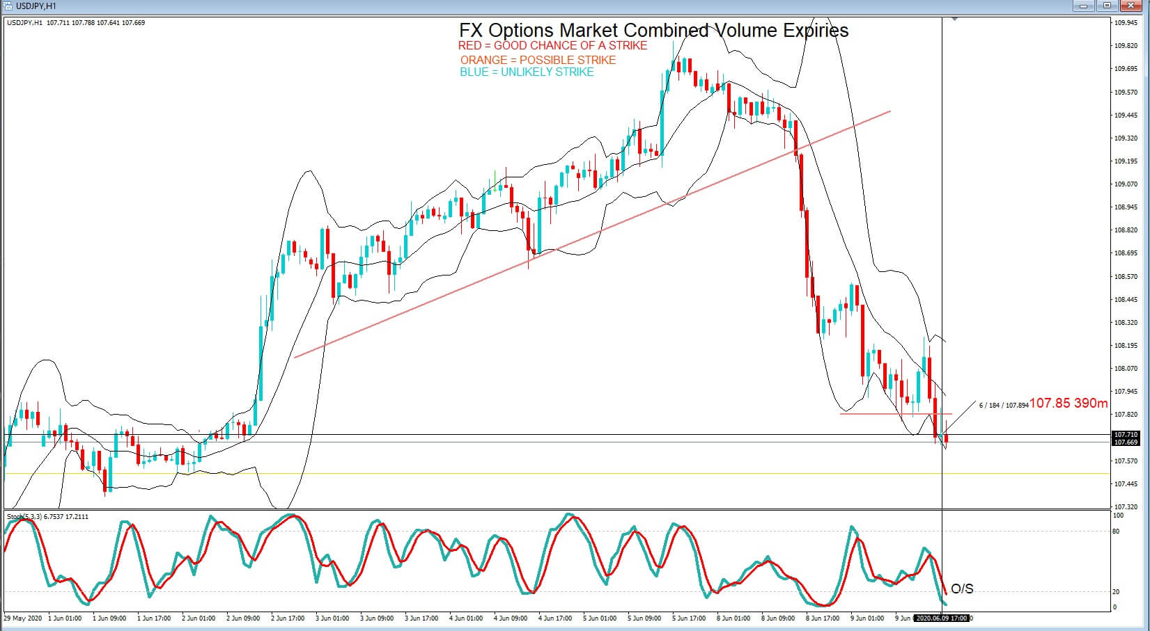
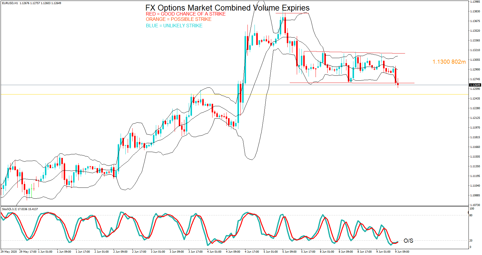
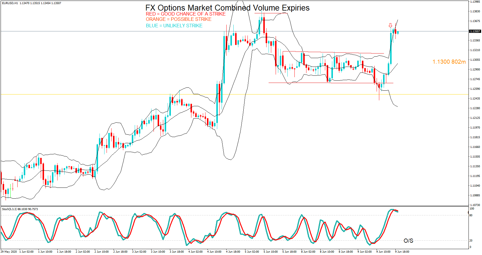
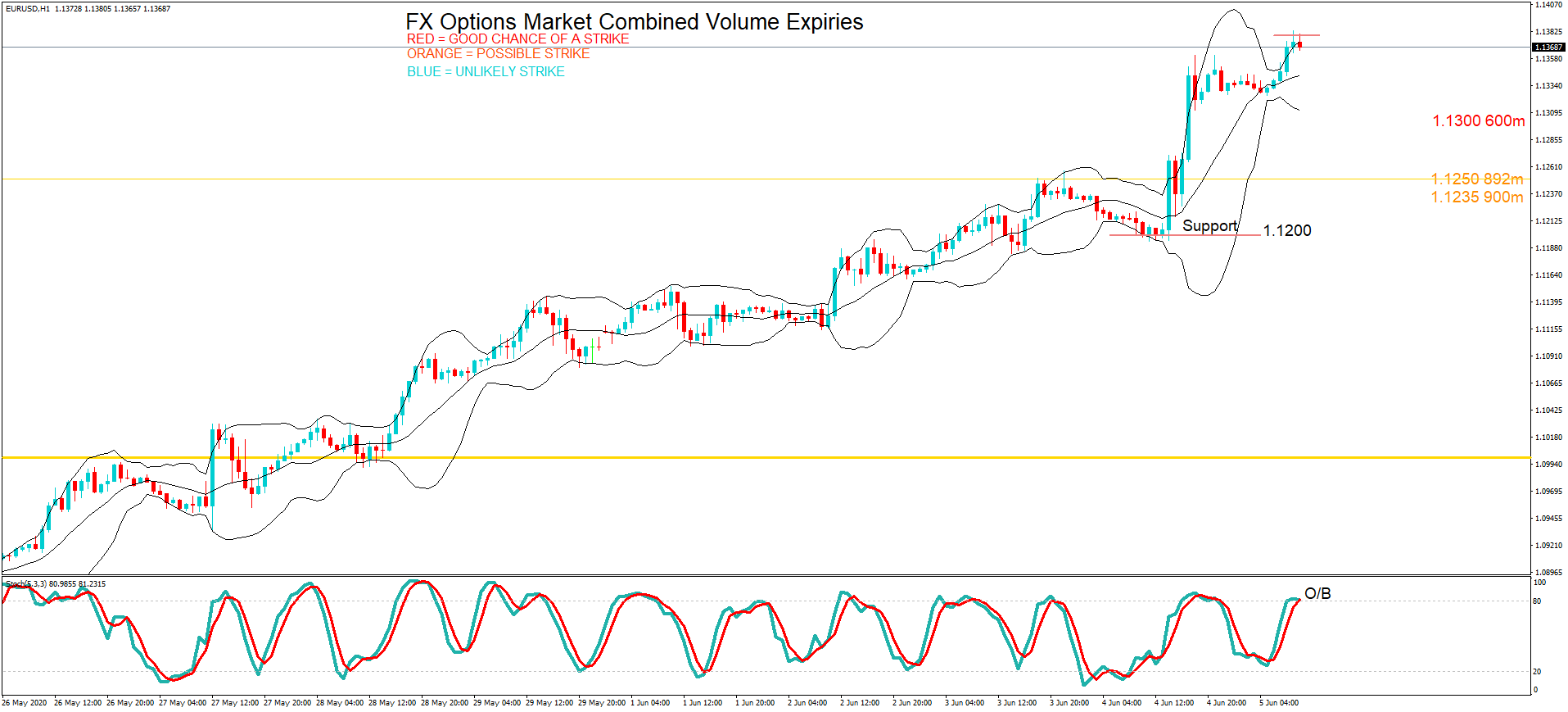 On Friday, we have the Euro us dollar pair in focus again with Kevin’s analysis suggesting the pair was overbought, and in fact, the pair did pull back in volatile trading.
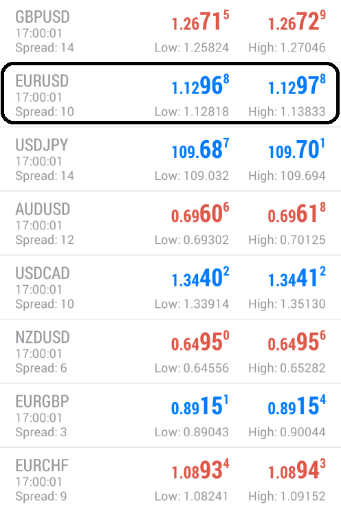 Price action for the pair hit 1.1297 at the cut. Just three pips below the option at 1.1300, which Kevin had labeled in red.