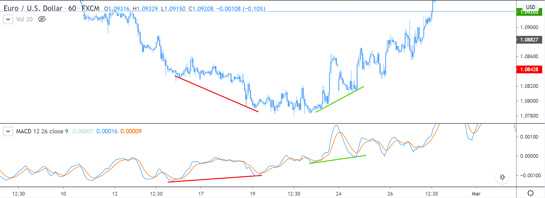
Introduction
‘Housing Starts’ Report is a widely used economic indicator by investors and traders to gauge the economic activity of a country. Construction of Houses affects many other dependent sectors like employment, raw material supplies, etc. Hence, we need to understand Housing Starts as part of our overall fundamental analysis.
What are Housing Starts?
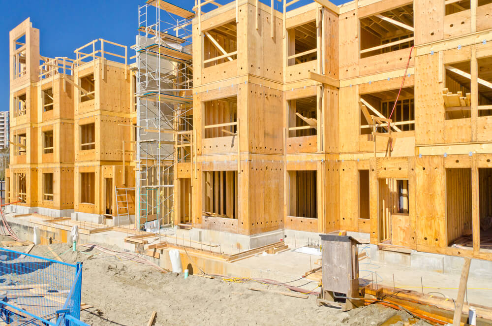
Housing Starts refers to those properties whose housing construction activity has started on the foundations. It means only those are counted for which the building activity has crossed beyond the beginning foundation or footing laying stage. Houses for which only pillars and foundations are laid and stopped are not counted in.
This report follows the Building Permits reports, and after this stage, we have a Housing Completion report. Here each of the survey reports signifies different stages of the housing construction activity.
An increase is first observed in Building Permits, which then translates to an increase in Housing Starts and later translates to Housing Completion reports accordingly as the construction activity goes from start to completion. In this regard, understanding which report follows which one and what they mean from an economic viewpoint is crucial, as we will see later in the analysis section.
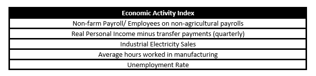
Housing Starts Report data is divided into the following three main categories:
Single-family homes: A single independent house constructed by a single-family is regarded as Single-family homes. This is the go-to type of home that people go for when they are financially secure and well off.
Townhomes and Condominiums (Condos): These are typically multi-storied or have multiple homes within a single structure that are independently owned. They differ from Apartments mainly in terms of ownership. Different owners own each independent unit.
Multi-family Structures: These would typically include Apartments or large townships which are owned by a single organization and made available on lease.
Economic Reports
The United States Census Bureau releases the Housing Starts reports under “New Residential Construction Survey Report” at 8:30 AM on the 12th working day of every month, which usually falls on 17-18 of every month, on their official website.
The survey is partially funded by The Department of Housing and Urban Development. The data is collected by Census field representatives using interviewing software through laptop computers.
In February, the annual estimates of New Residential Construction are finalized and released for the previous year. Initial estimates of single-family homes sold and for sale are also available every month in the New Residential Sales (NRS) press release as per the NRS Release Schedule. The housing numbers are seasonally adjusted to accommodate the weather dependency on the nature of the housing work to give more statistical accuracy.
How can the Housing Starts numbers be used for analysis?
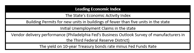
The Housing Starts number is confused and misinterpreted with its sibling reports, i.e., Building Permits and Housing Completion reports, all signify different stages of economic activity effects. In that sense, Housing Starts numbers are current economic indicators, which means it tells what is going on in the economy right now. Building permits then in relativity is a leading or advanced indicator, and housing completion would be a lagging indicator.
When the government injects money into the economy, loans are available easily, and businesses are stimulated. There would be an increase in employment, which would have resulted in better wages for many. Such an activity would have prompted a rise in building permits, and when the money does reach people, housing starts numbers would see an increase. In this sense, an increase in housing starts tells investors that the economy is moving in a positive direction.
The type of Houses that have seen increase can also tell us the sentiment of people towards the financial future of the economy. An increase in single-family homes would suggest that more people are wealthy enough to afford one and are confident towards mortgage repayment. This also indicates that banks are also giving higher loans to more people, and the economy has more liquid money injected into the system.
An increase in condos or multi-family structures with respect to single-family homes would suggest that people are not comfortable enough to go for expensive homes and would rather save and settle into cheaper alternatives. This is usually prevalent during weaker economic periods, and a significant difference in the numbers can indicate an oncoming recessionary period.
Impact on Currency
An increase in the Housing Starts is reflective of the present current economic conditions. A strong economy would have higher numbers in the housing reports relative to a weaker economy where people would shy away from purchasing single-family homes.
An increase in housing starts reports also implies that demand for construction materials, hiring of labor forces, loans, and other construction-related activities has risen, and the economy is actively generating revenue than before, which is good for the nation and its currency.
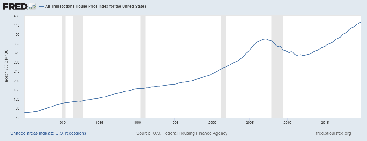
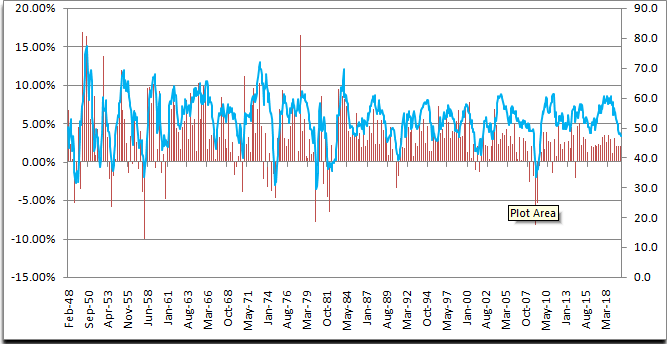
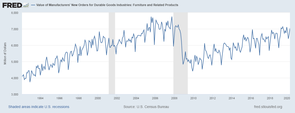
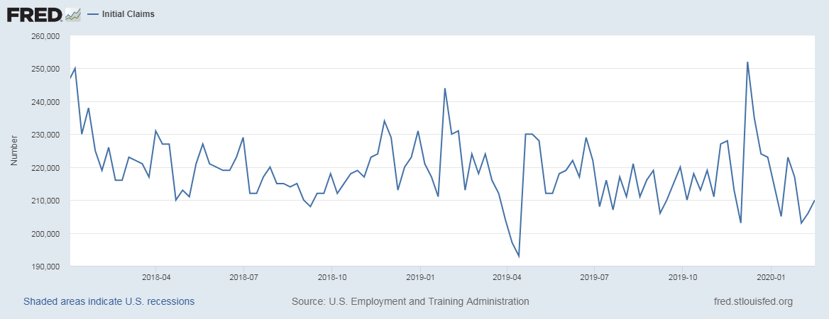
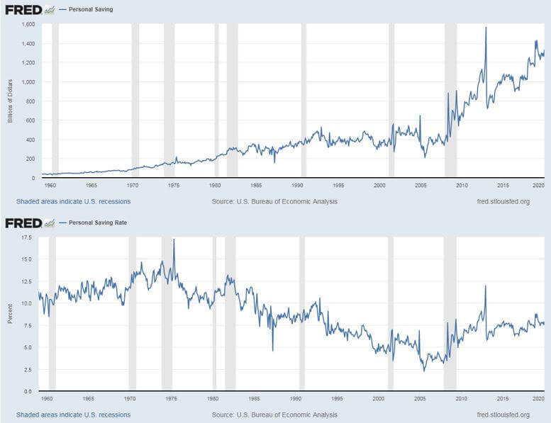
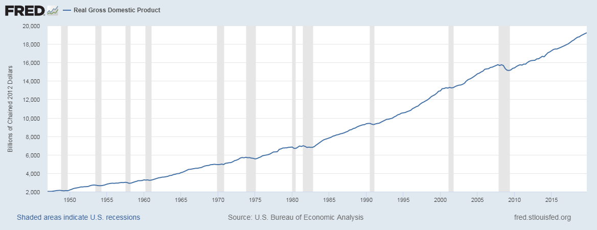
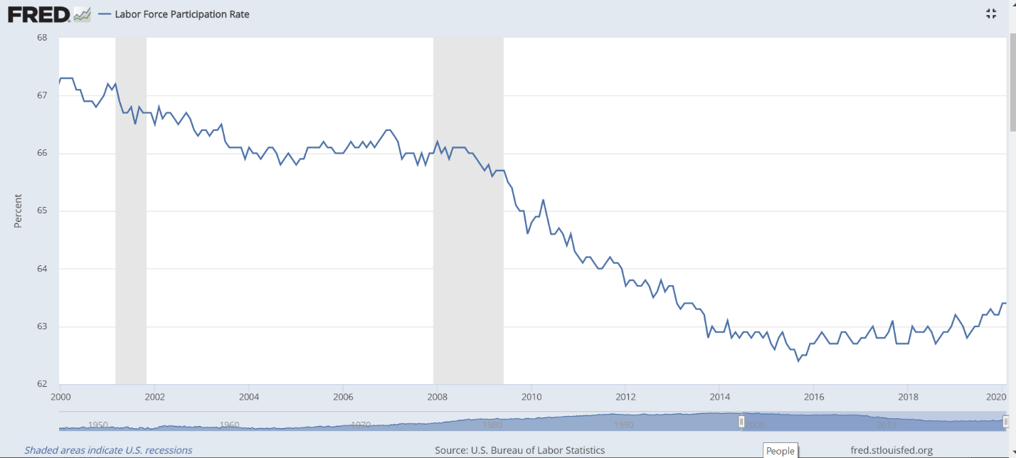
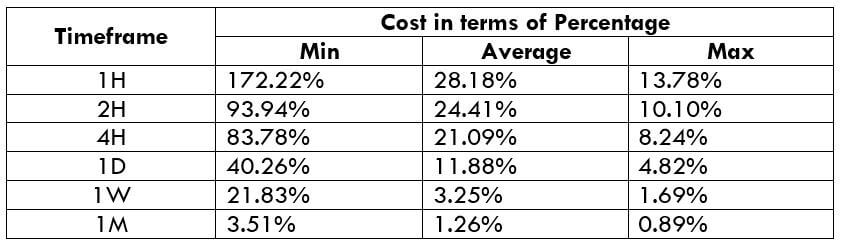
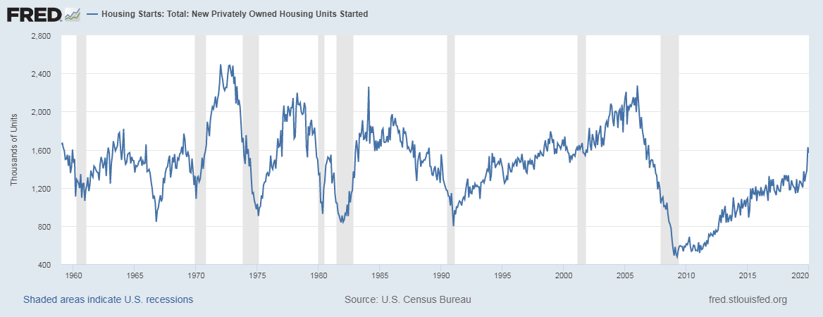
Below is a snapshot of the Housing Starts historical report taken from the FRED official website, which shows the economic indicator’s correlation with the national economy’s growth. During times of recession (shaded bars in the background), there have been significant plunges in the numbers and vice versa. The below graph proves the importance of Housing numbers as an indicator of the economy’s performance in our fundamental analysis.
Sources of Housing Starts Index
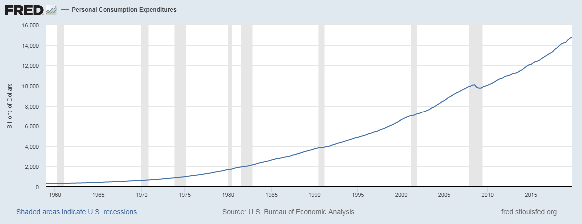
Given below is the latest Housing Starts report taken from the official website of the Census Bureau. Follow this link for reference. Here, you can find the data related to New Residential Constructions. The St. Louis FRED website has comprehensive data in graphical forms, which will be easier for our analysis. The Census Bureau also explores other related economic indicators related to Housing Activity within the United States.
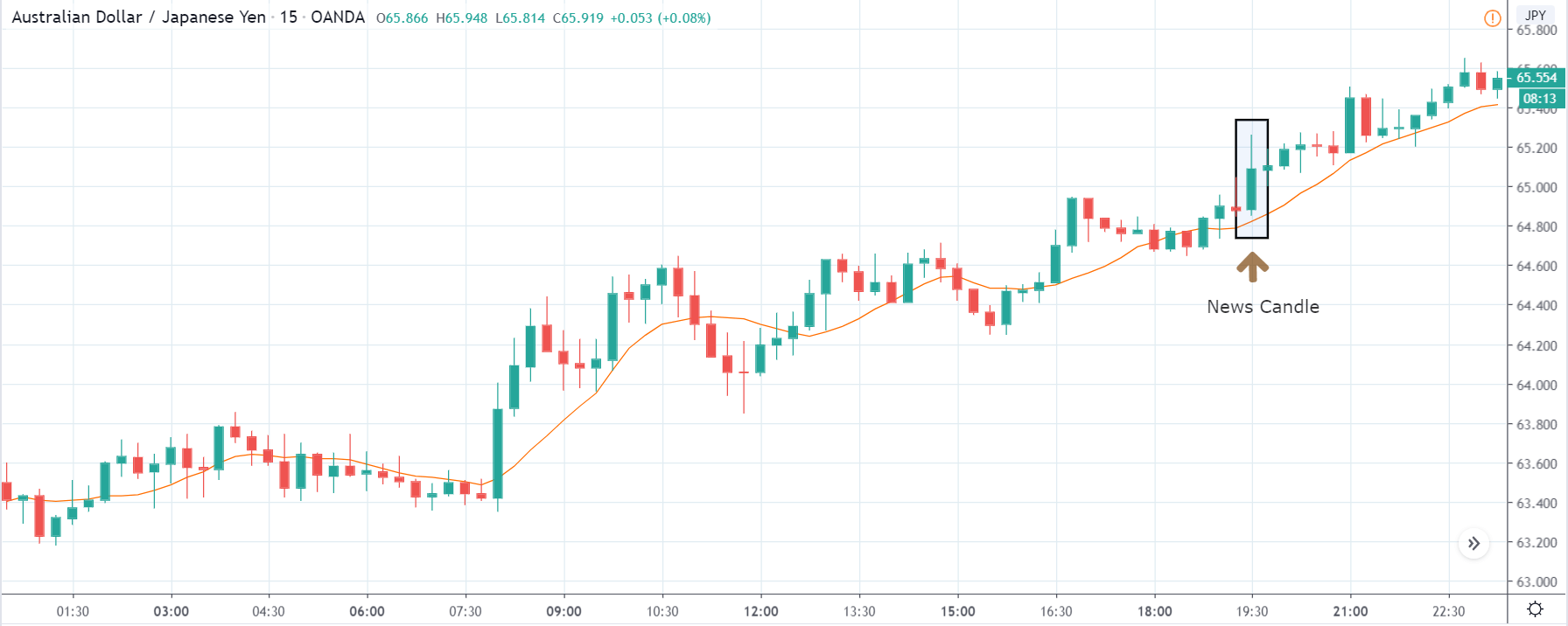
Impact of the ‘Housing Starts’ news release on the price charts
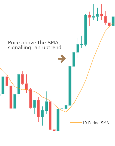
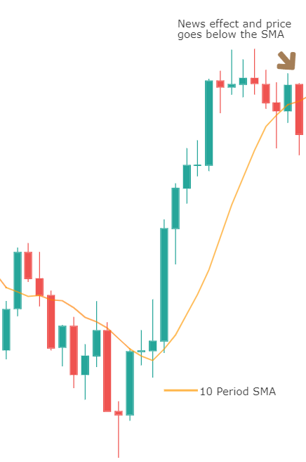
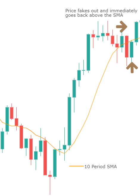
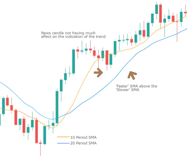
Housing Starts is one of the leading economic indicators which measures the strength of the housing sector. It shows the change in the number of new residential buildings that began construction during the reported month. The indicator, however, is not said to cause a major impact on the currency, and the volatility during news release will be ‘low.’ So, traders around the world do not pay much attention to this data. However, they do keep a watch on the trend to gauge the economy’s strength in the longer-term. Hence, based on the current data, they make some changes to their current position in the currency.
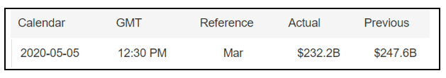
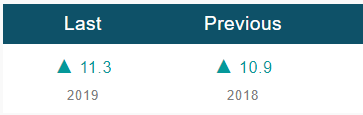
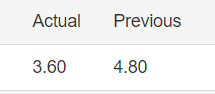
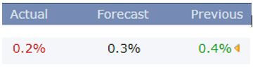
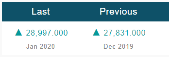
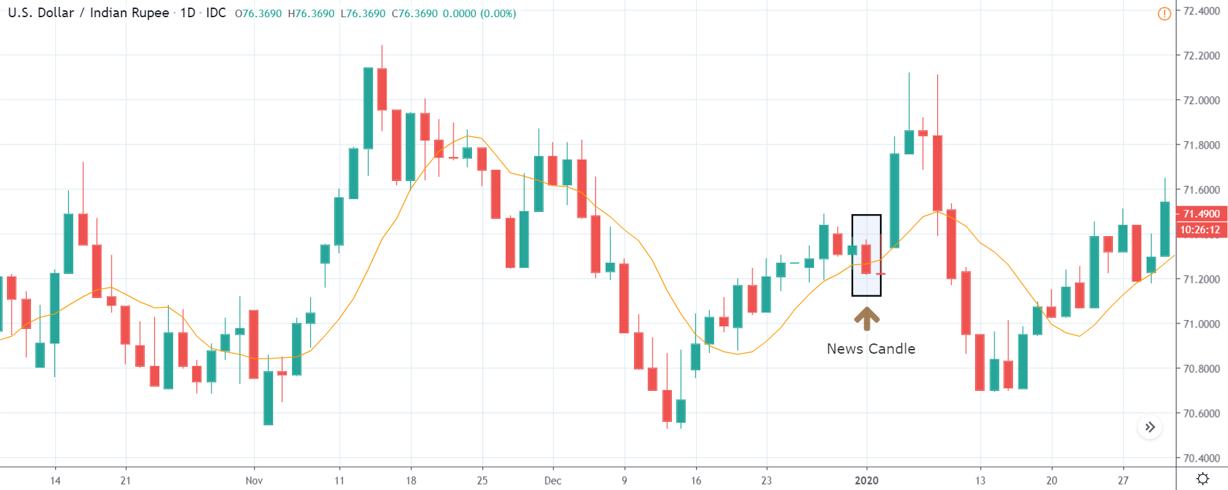
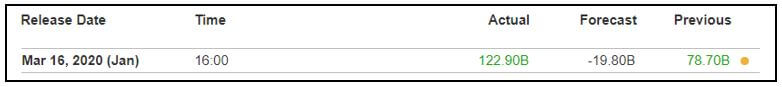
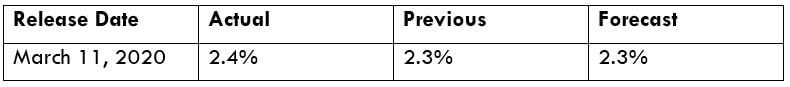
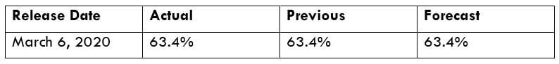
![]() Many of the countries release the housing starts data on a Monthly and Yearly basis, where today we will be analyzing the month-on-month numbers of Canada. The below image shows previous, forecasted, and actual Housing starts data of Canada, where we see an increase in the number of constructions in the month of February. The Canadian Mortgage and Housing Corporation release the housing starts data of Canada. A higher than forecasted reading is considered positive for the currency, while a lower than expected data is taken to be negative.
Many of the countries release the housing starts data on a Monthly and Yearly basis, where today we will be analyzing the month-on-month numbers of Canada. The below image shows previous, forecasted, and actual Housing starts data of Canada, where we see an increase in the number of constructions in the month of February. The Canadian Mortgage and Housing Corporation release the housing starts data of Canada. A higher than forecasted reading is considered positive for the currency, while a lower than expected data is taken to be negative.

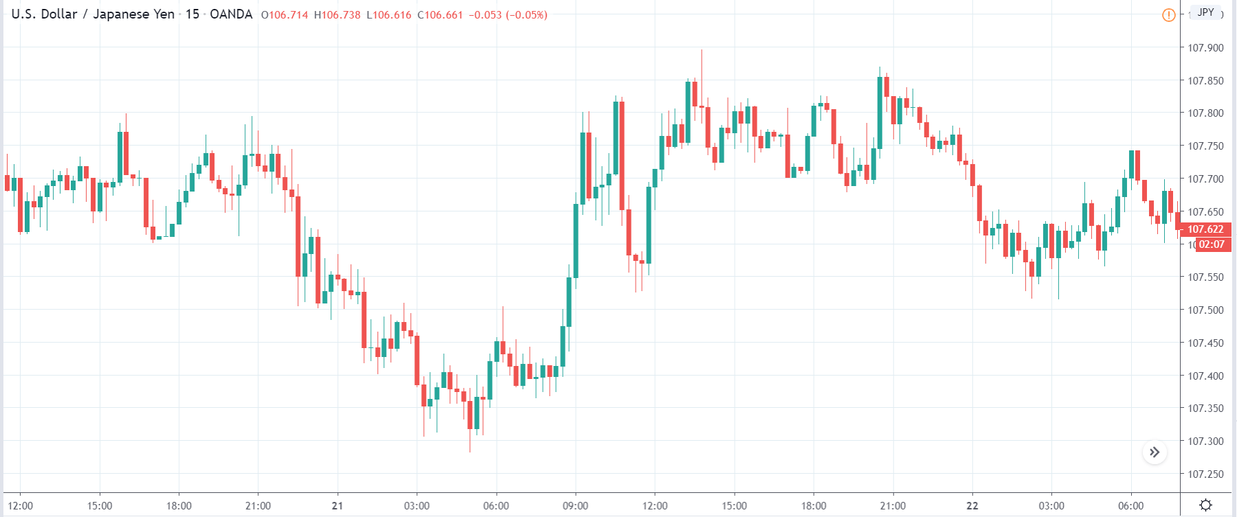
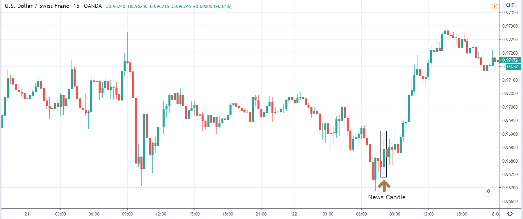
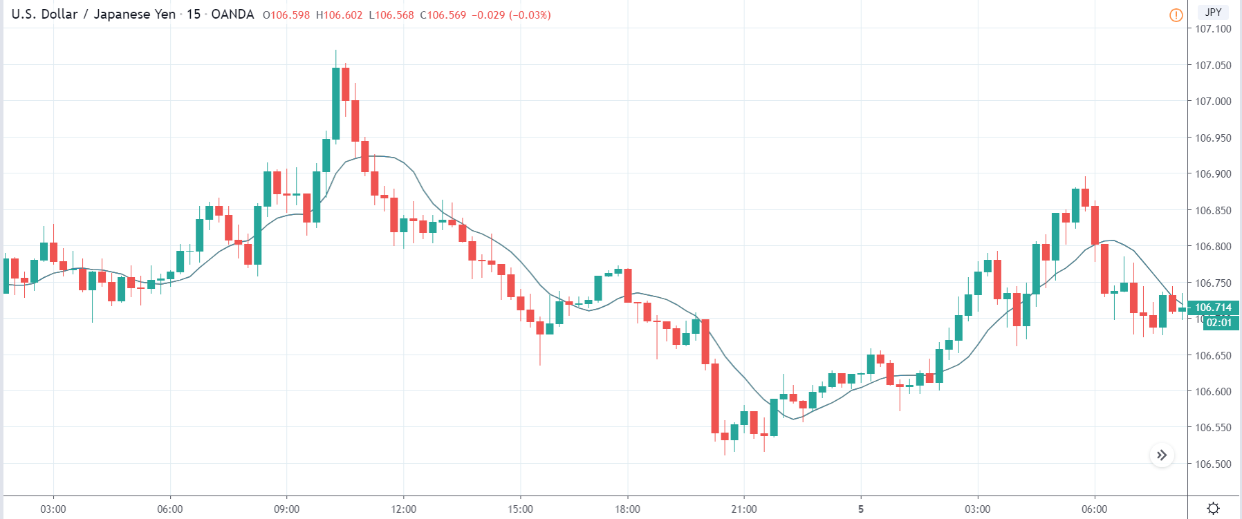
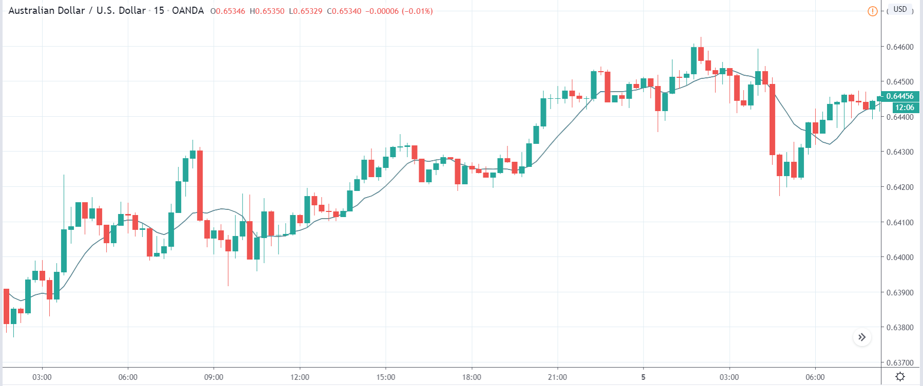
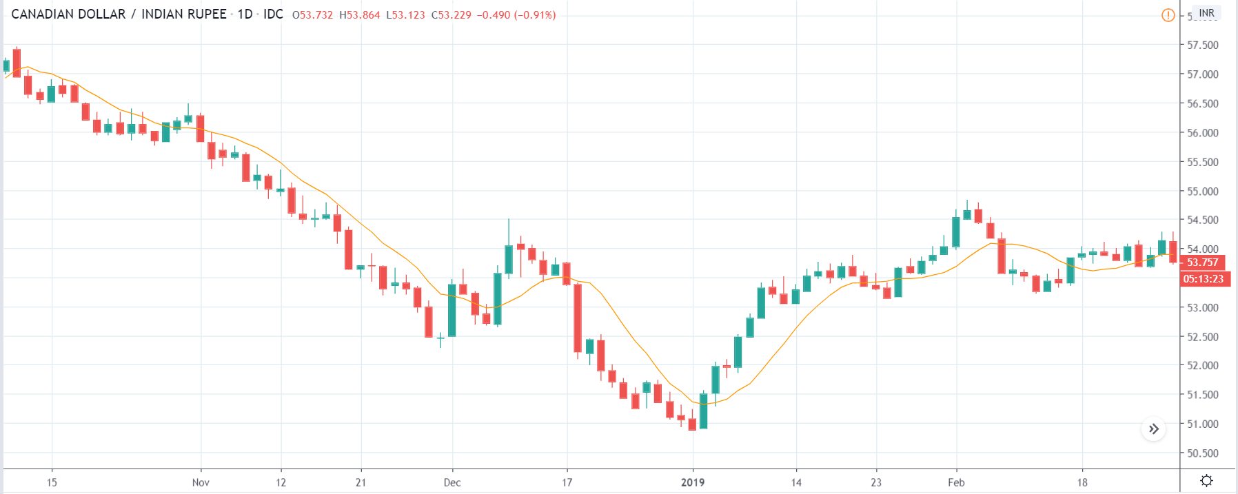
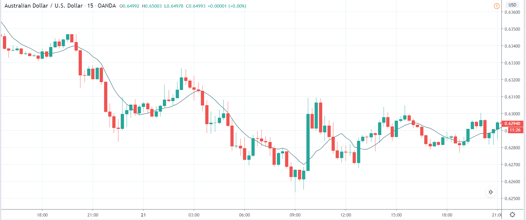
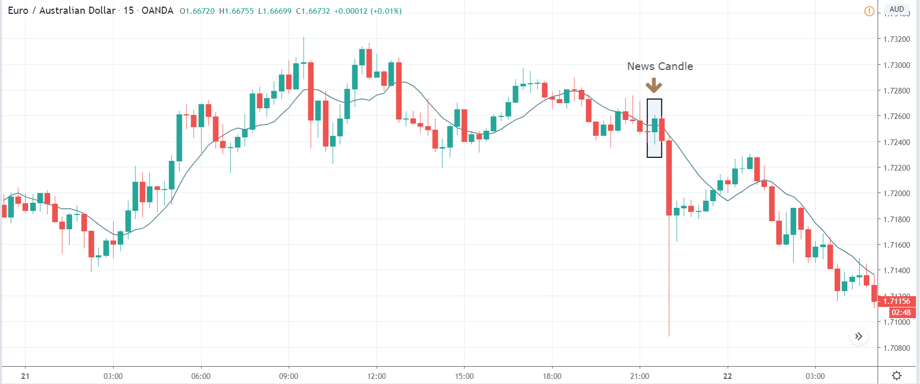
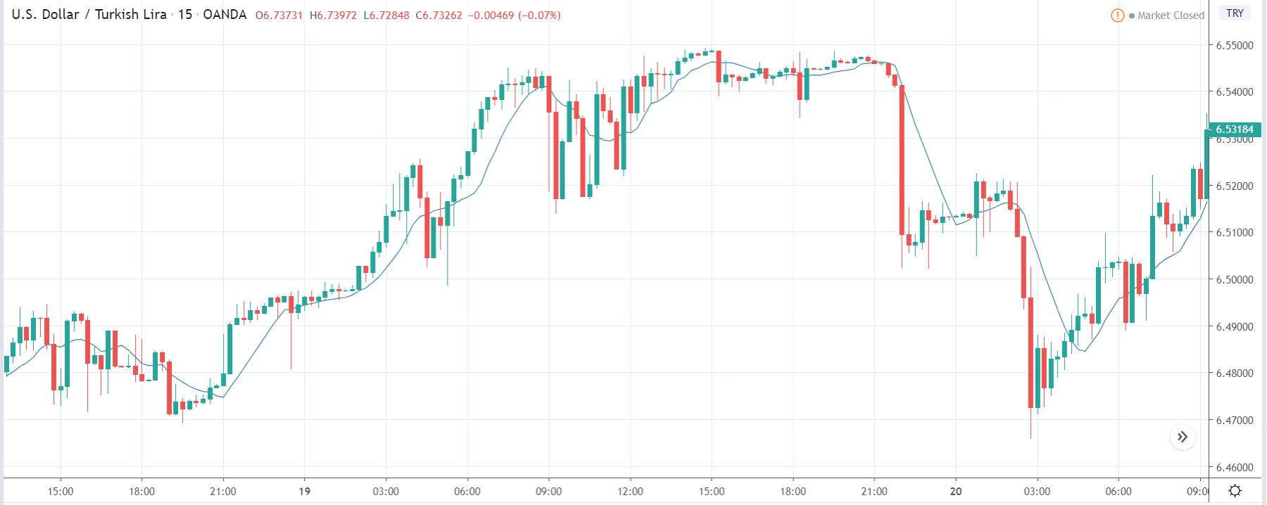
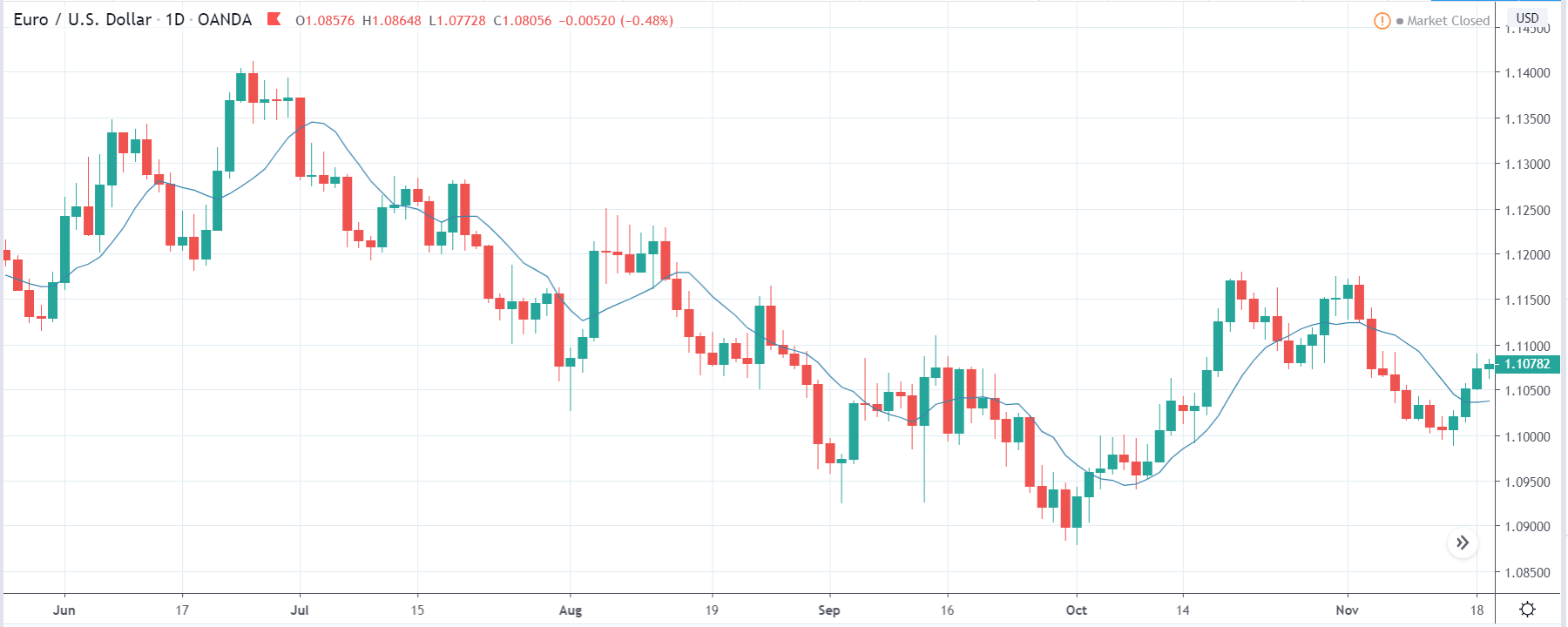
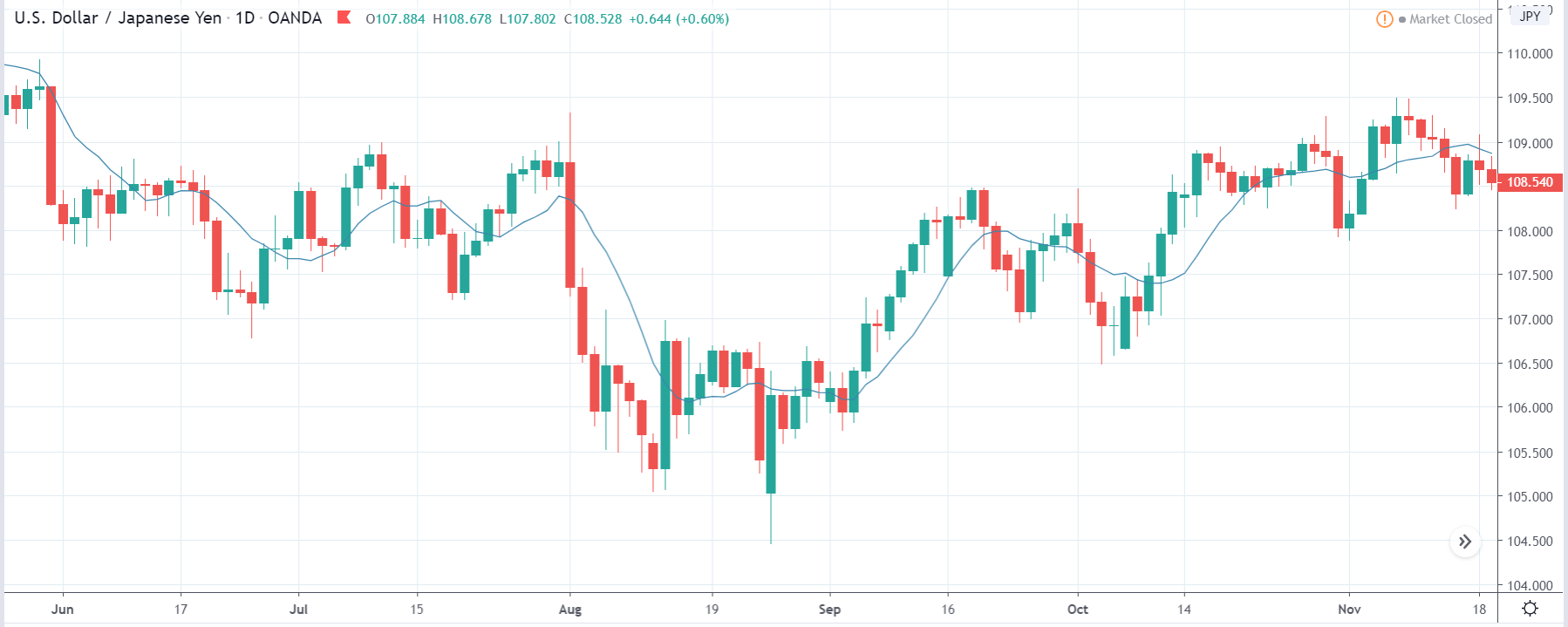
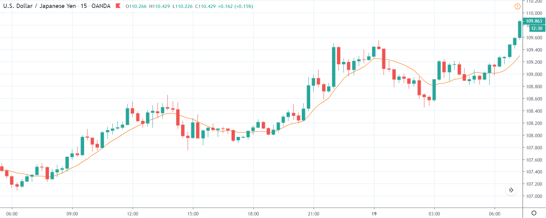
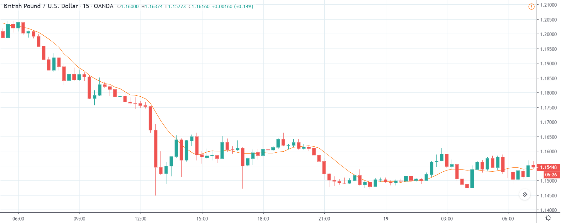
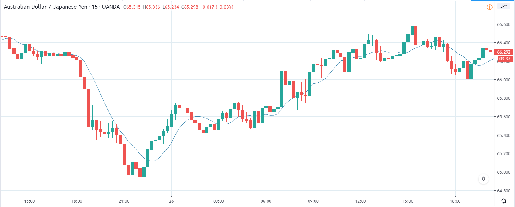
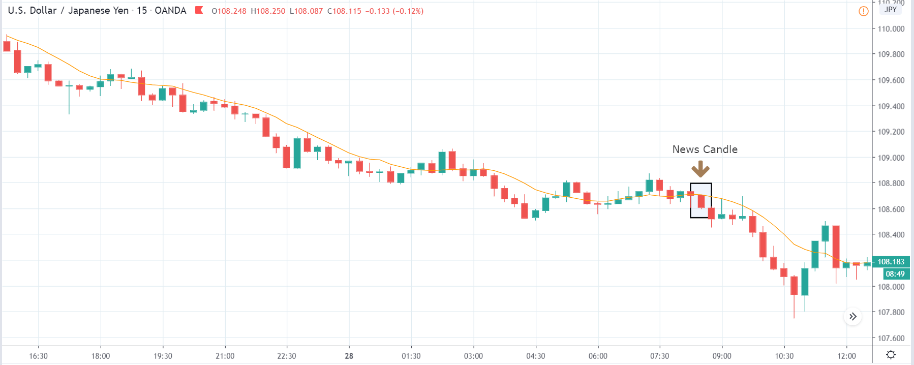
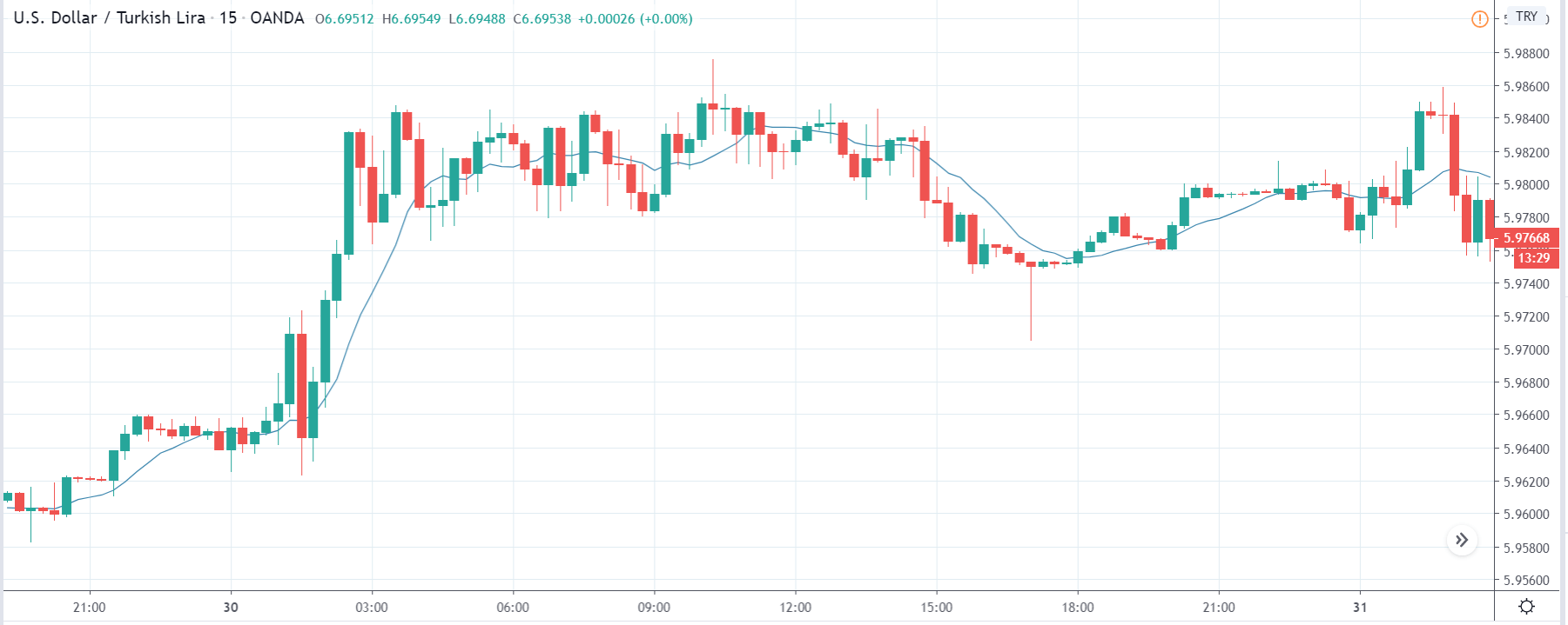
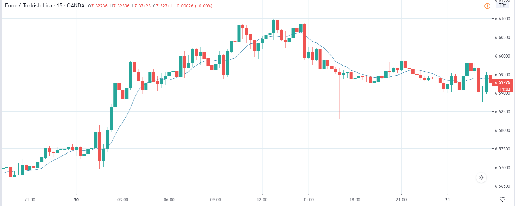
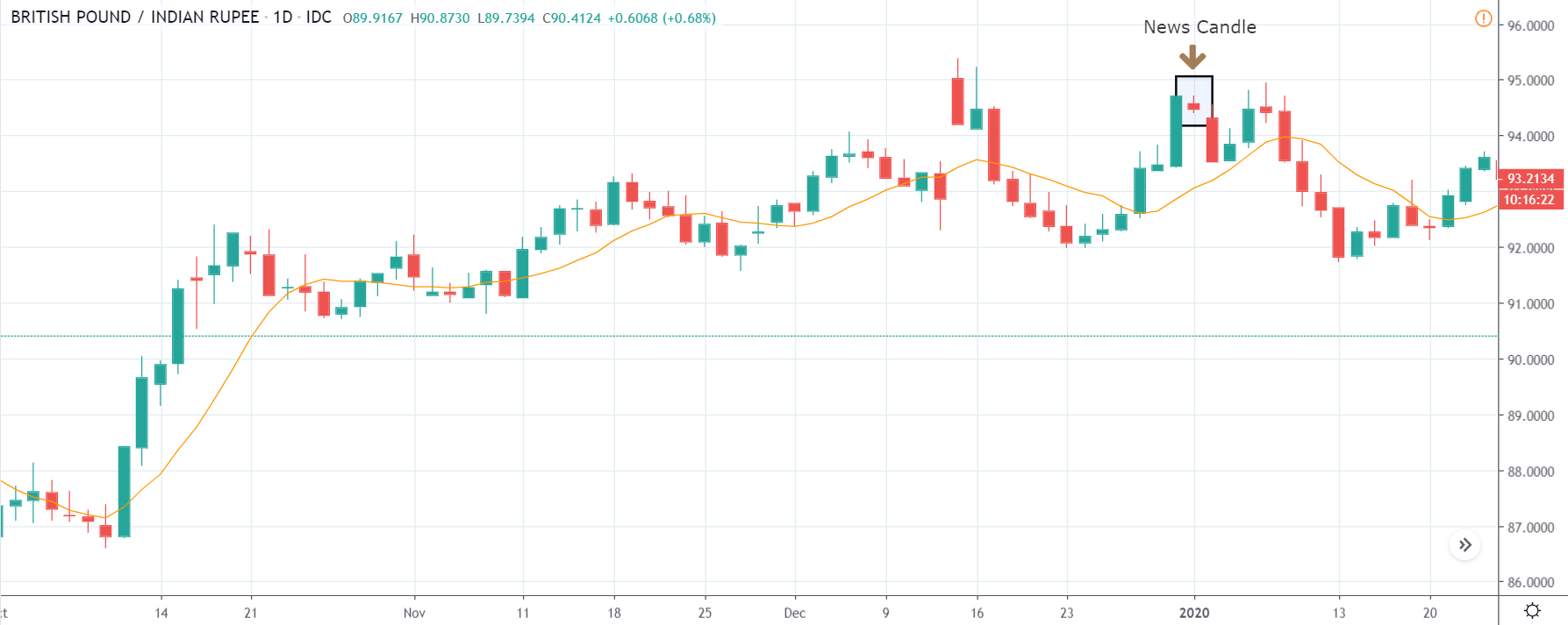
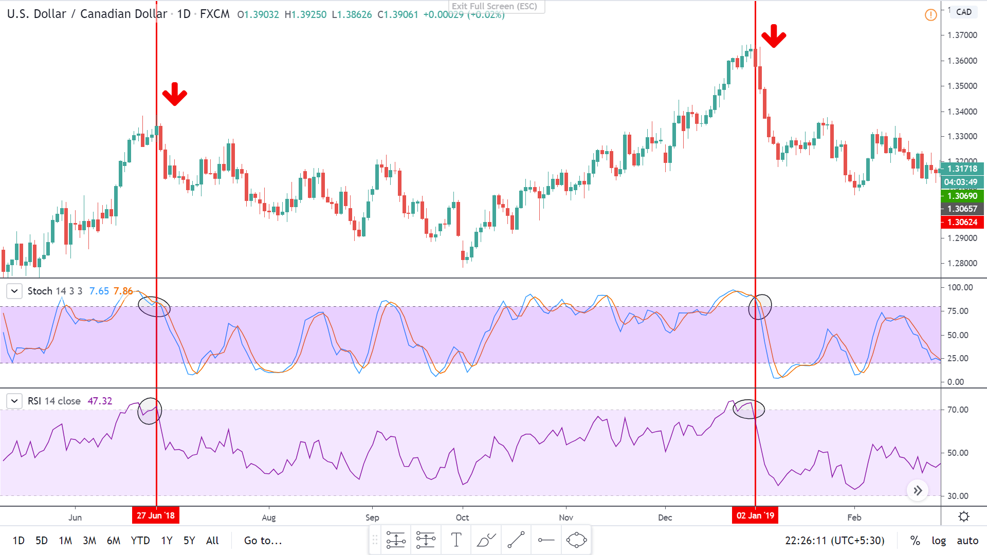
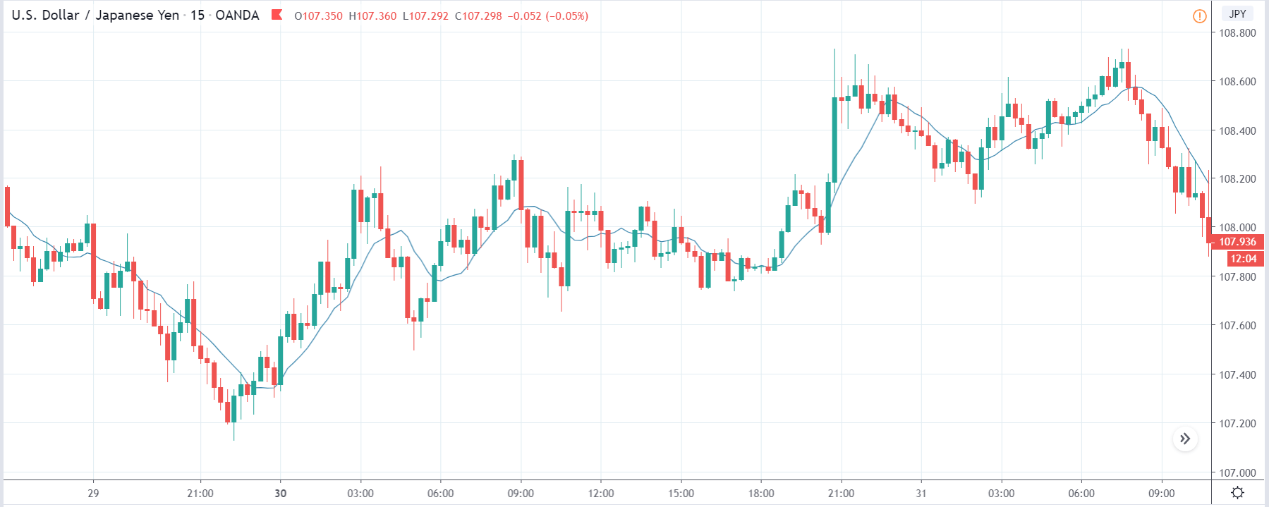
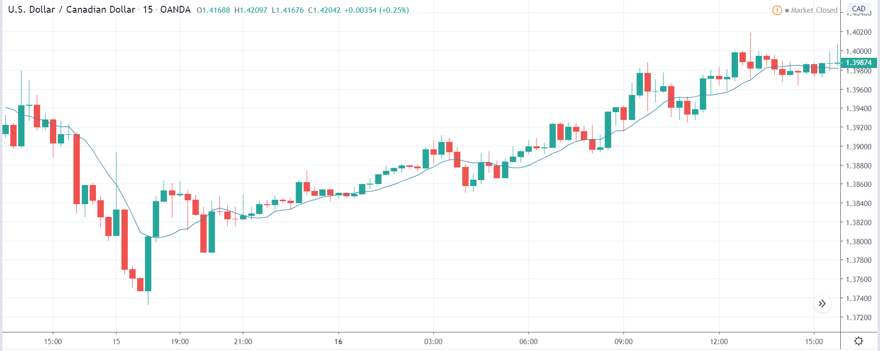
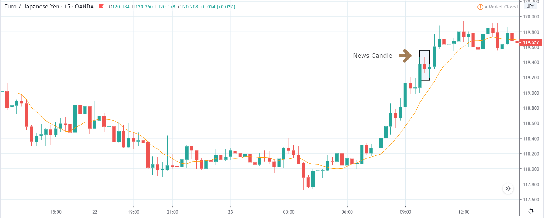
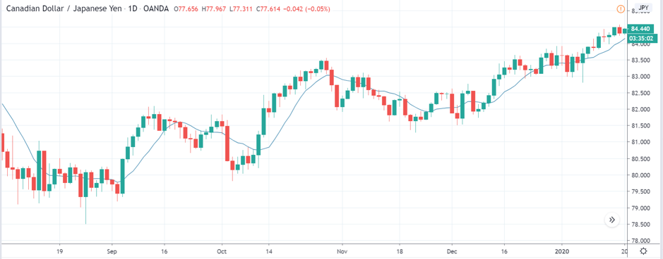
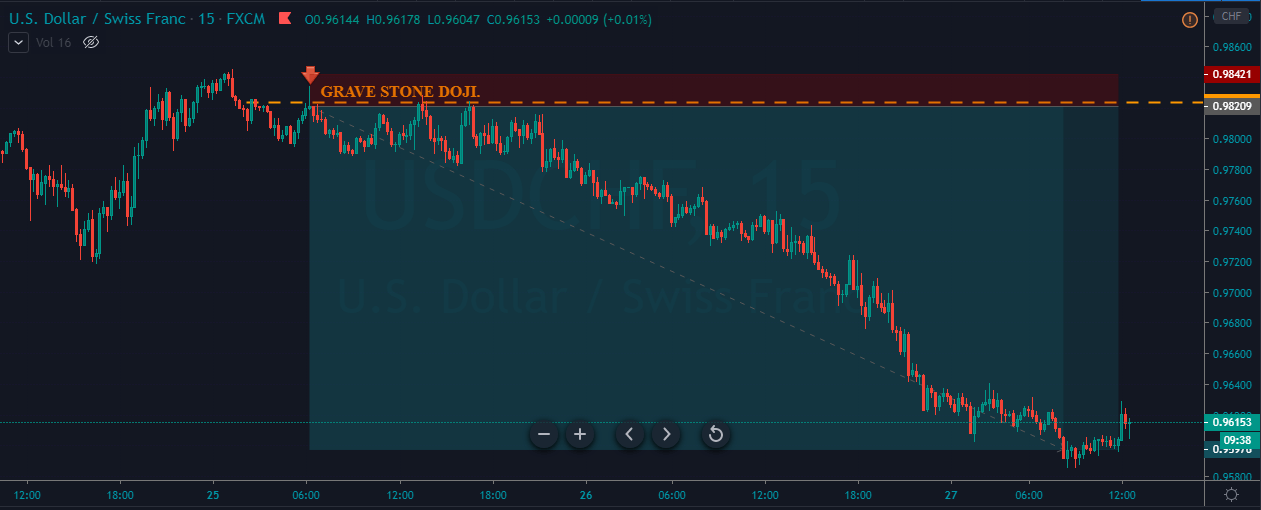
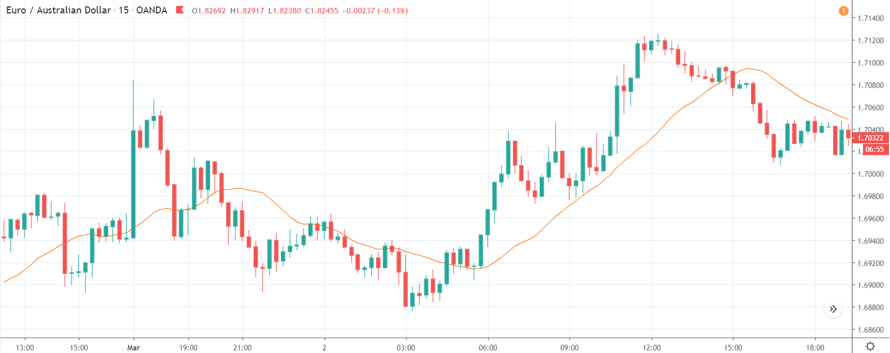
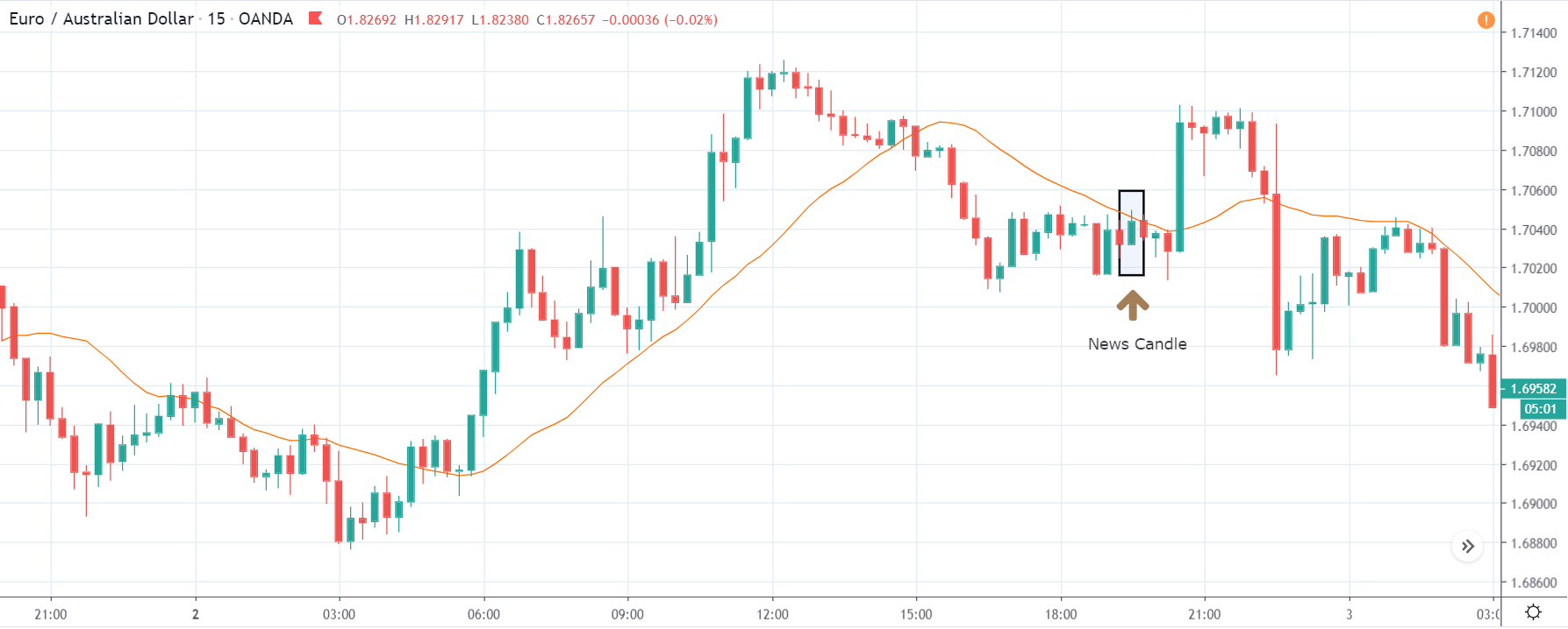
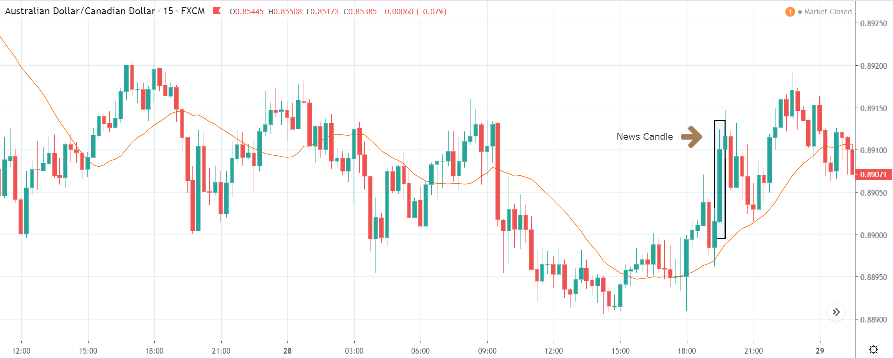
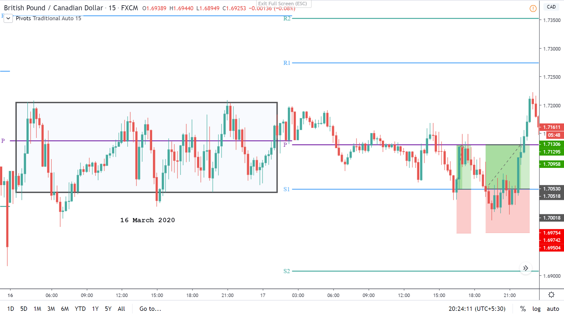
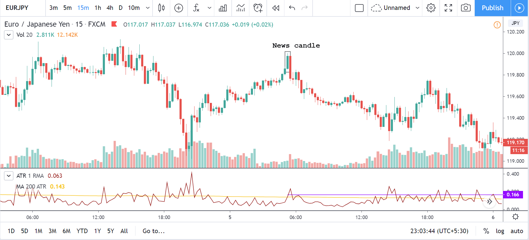
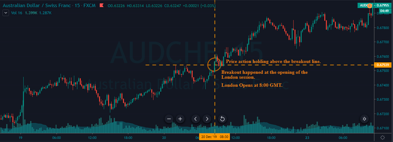
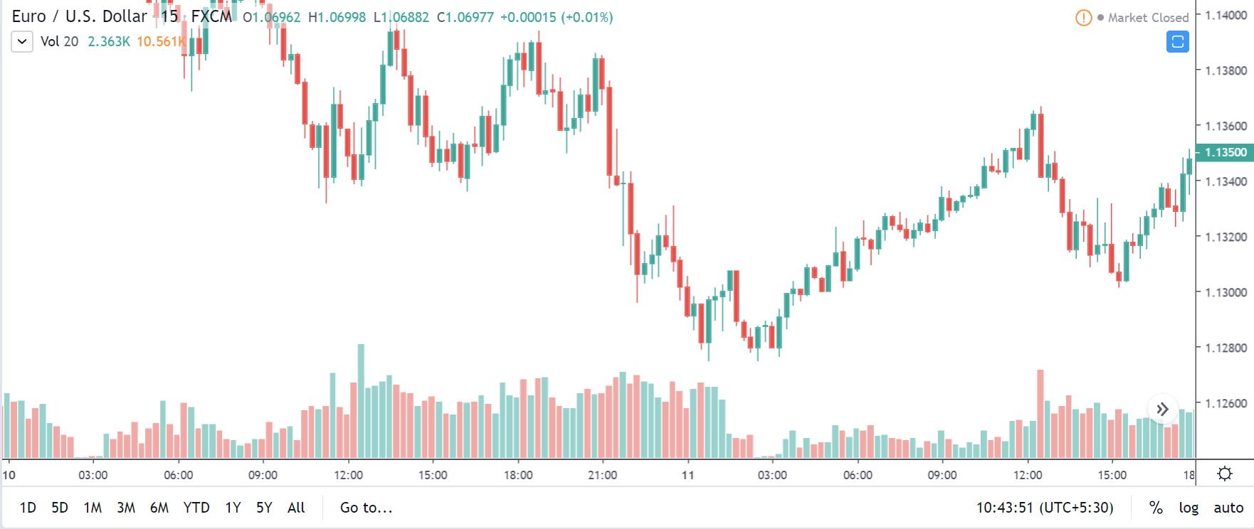
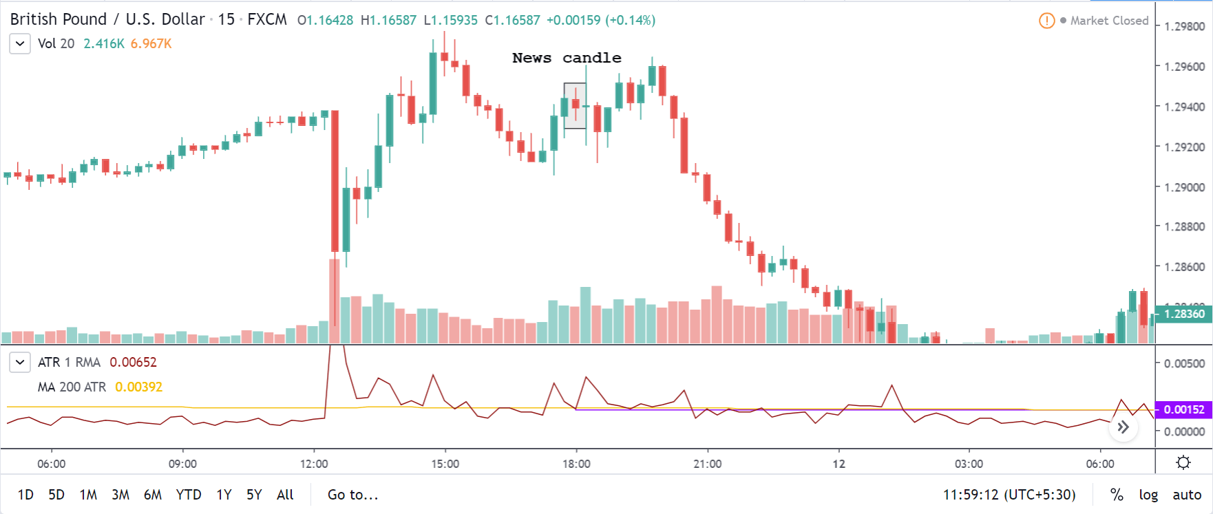
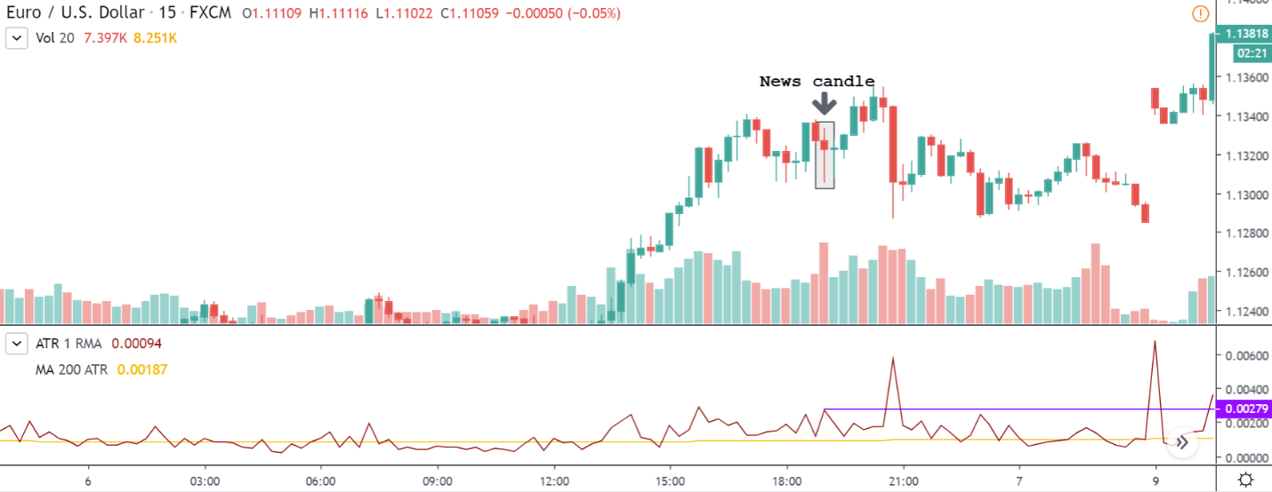
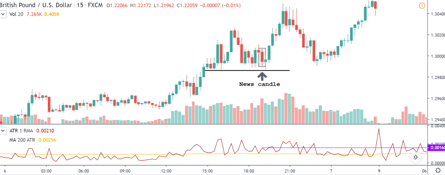
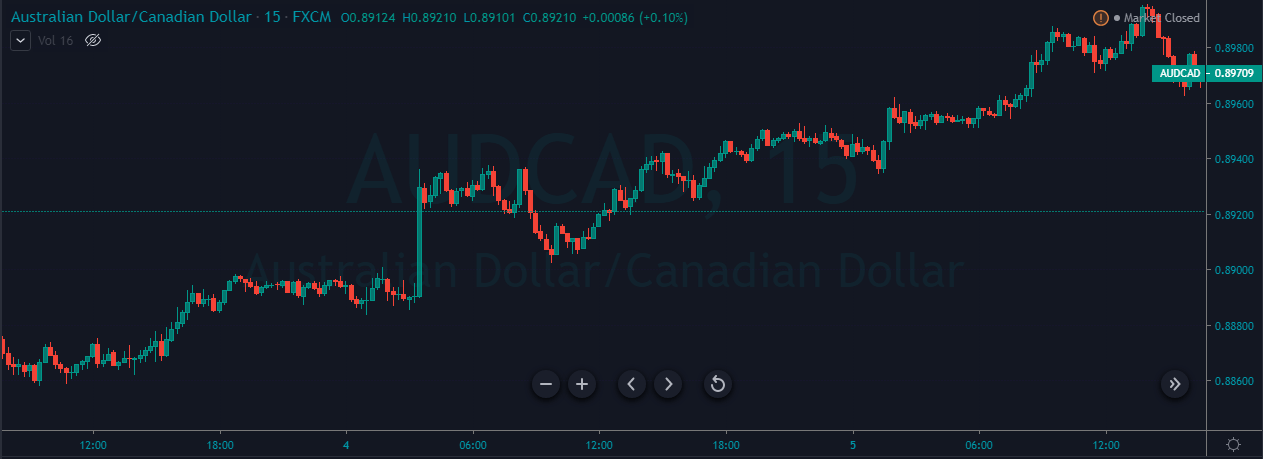
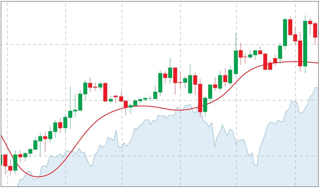
CAD/JPY | Before the announcement:

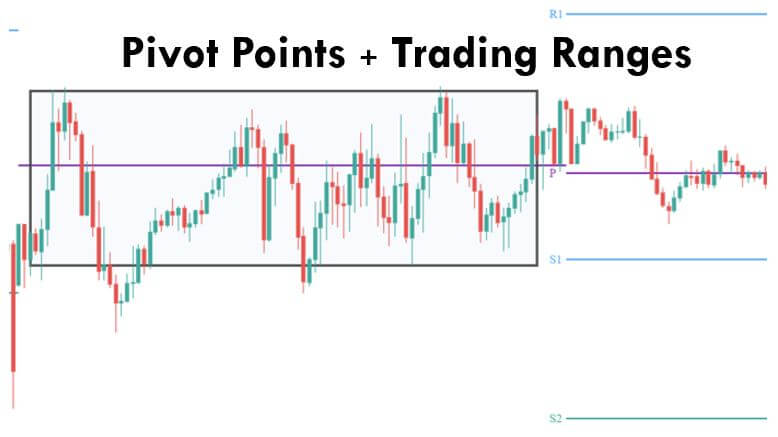
We start our analysis with CAD/JPY currency pair, and the above image shows the state of the pair before the news announcement. We see that the Canadian dollar is in a strong downtrend, and recently it has formed a range that has created areas of ‘support’ and ‘resistance.’ There is of pessimism in the market as the economists and institutional investors are expecting a lower ‘housing starts’ data than before, which is one of the reasons behind the price going lower. Since the market is at the ‘support’ area, it is risky to go ‘short’ in this pair, and thus we need some clarity of the ‘housing starts’ data before entering the market.
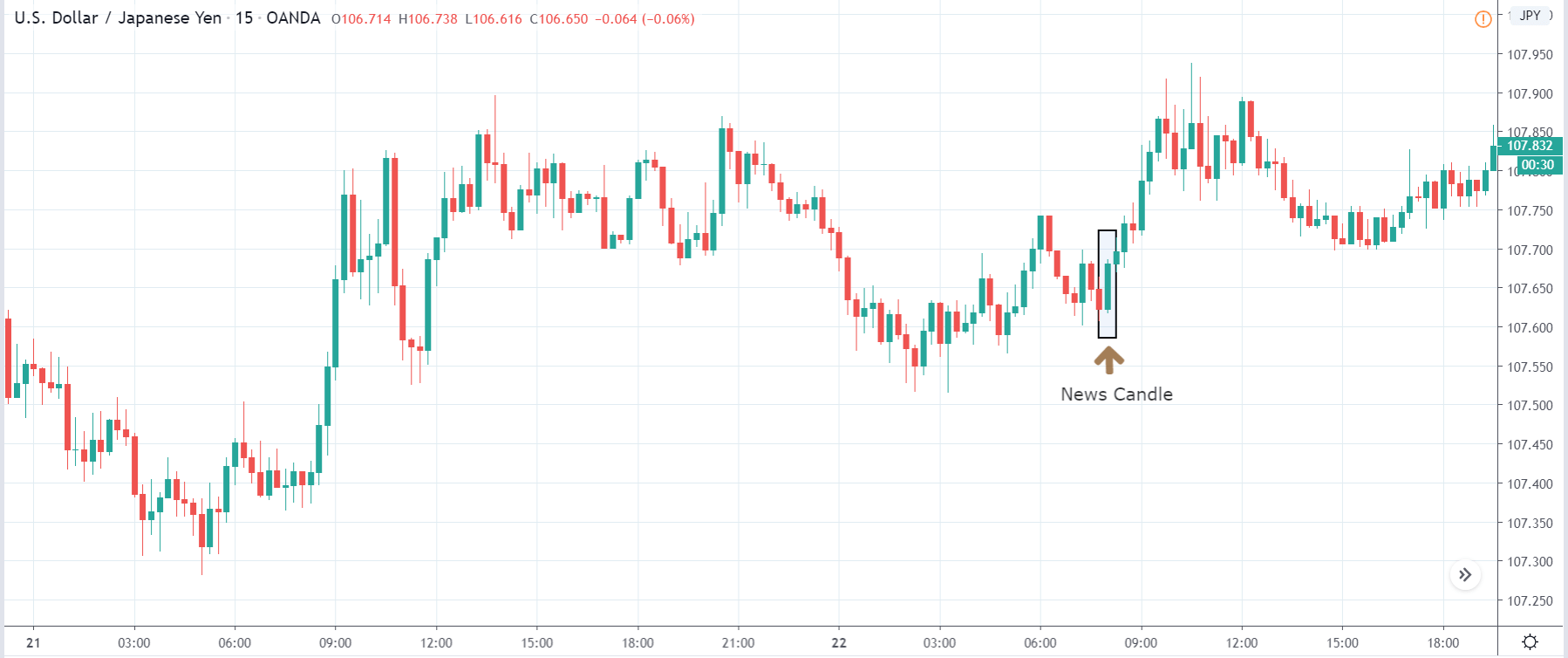
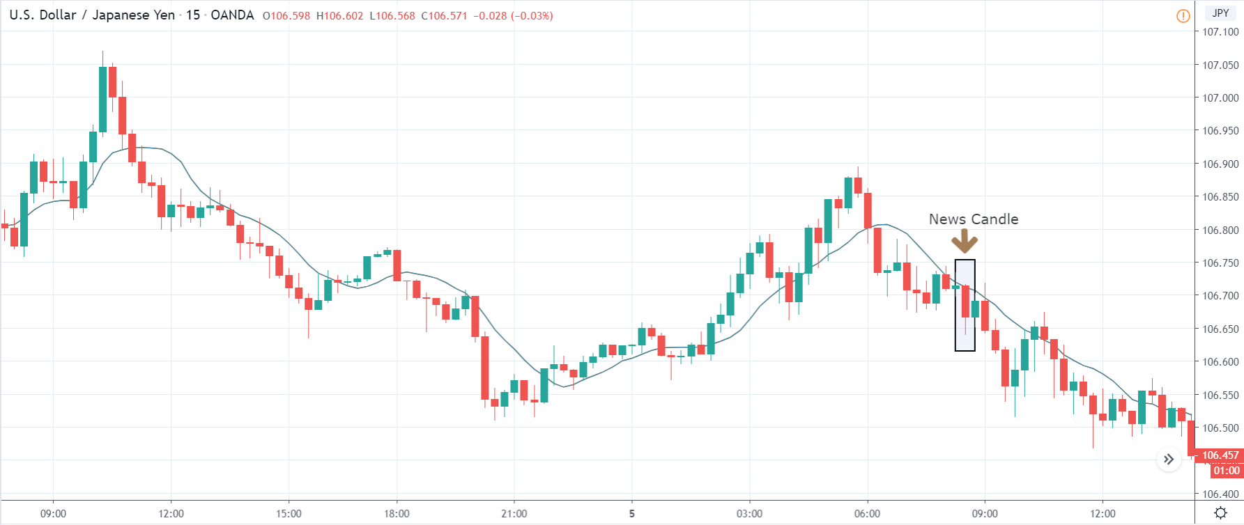
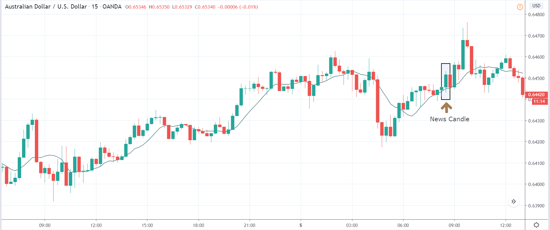
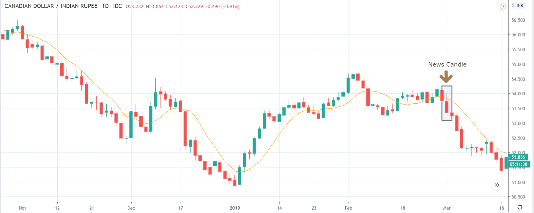
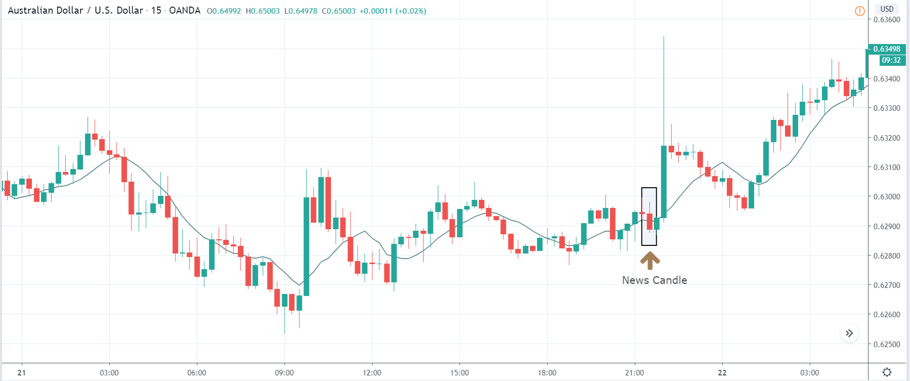
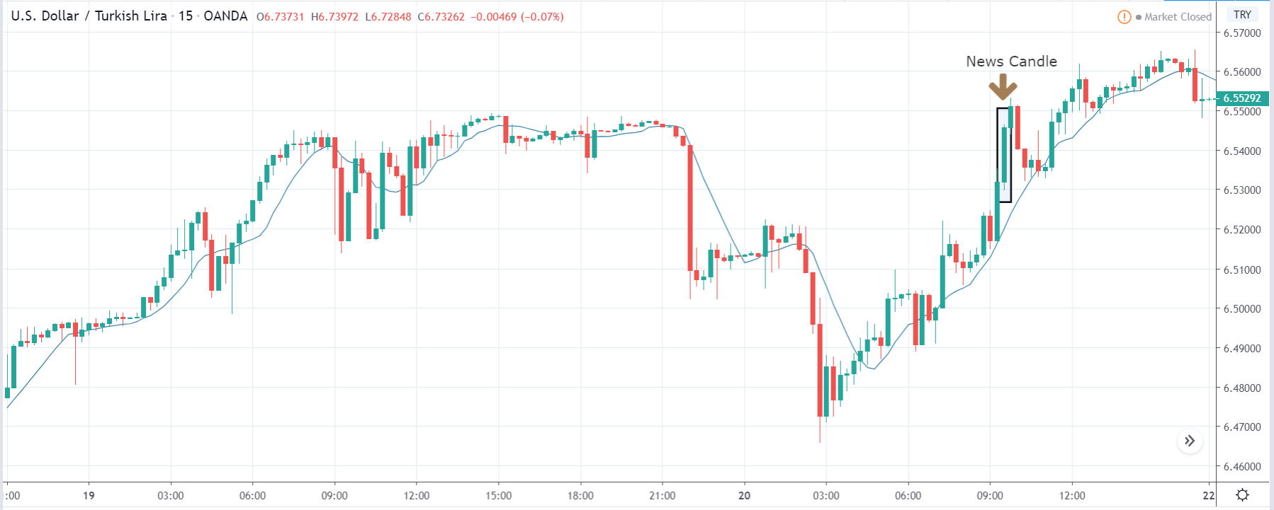
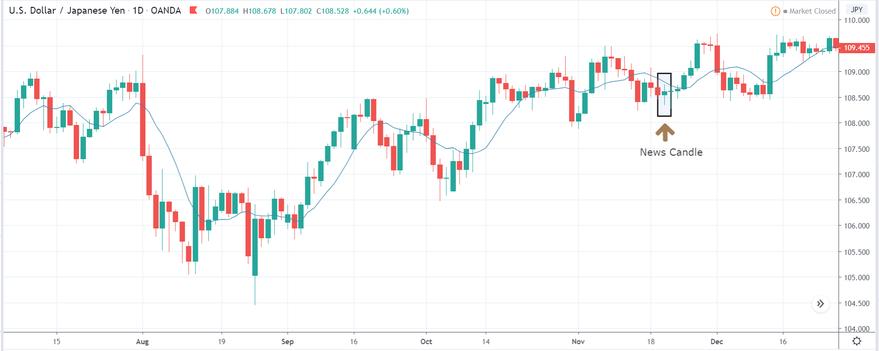
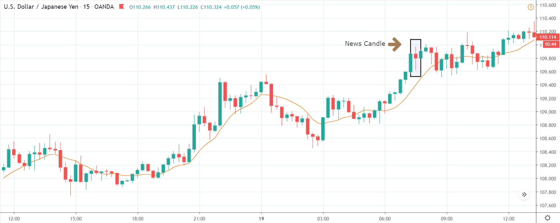
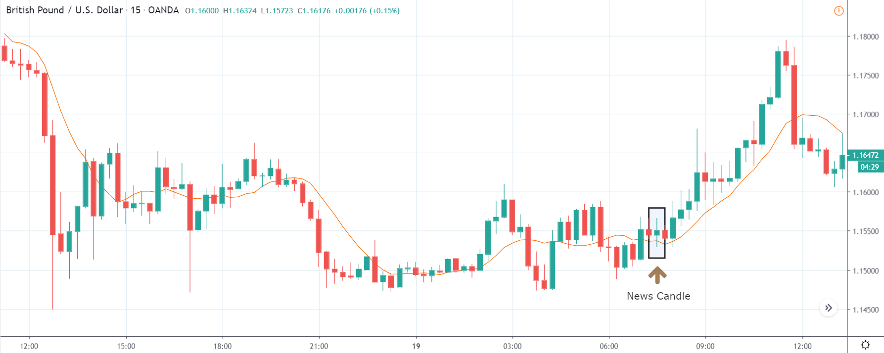
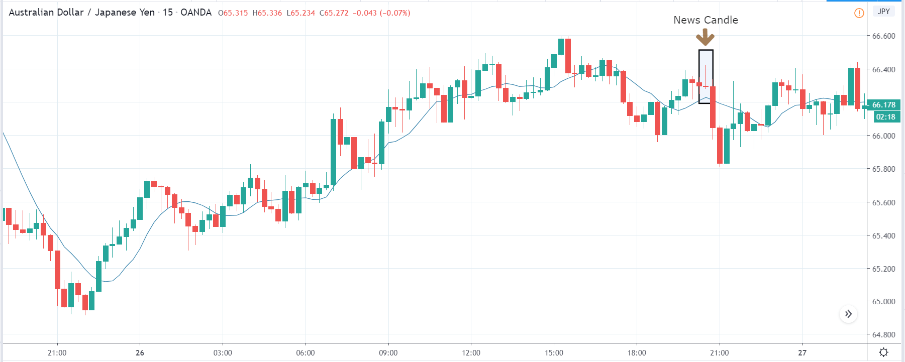
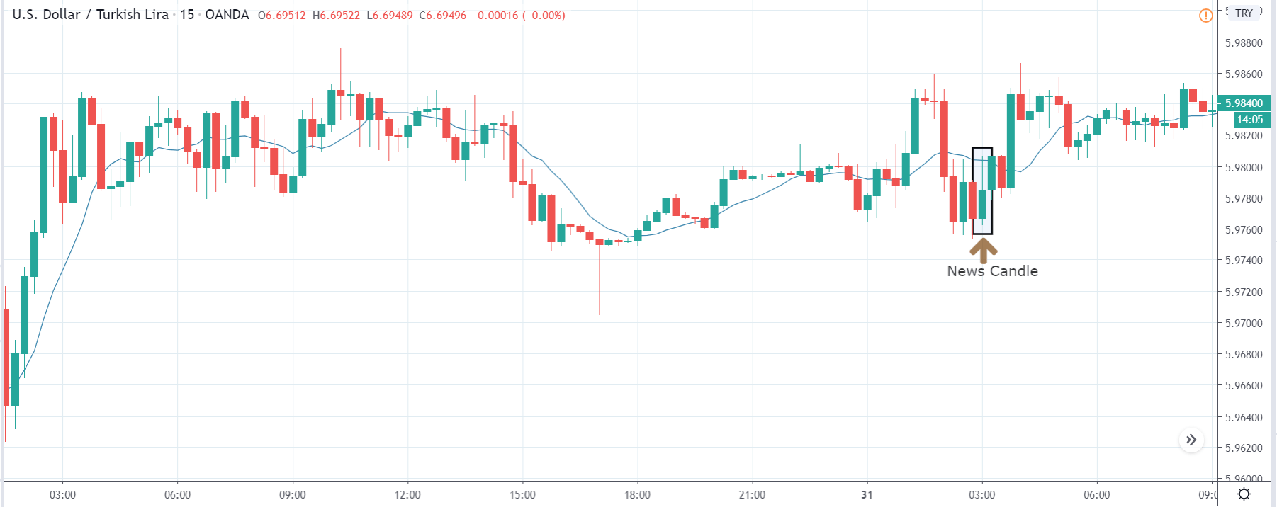
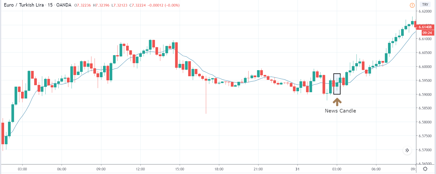
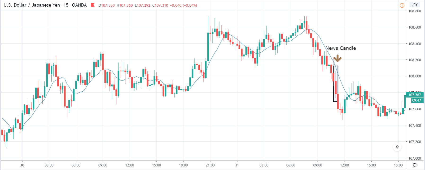
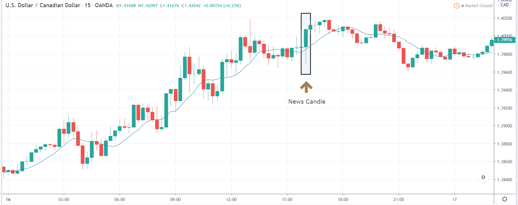
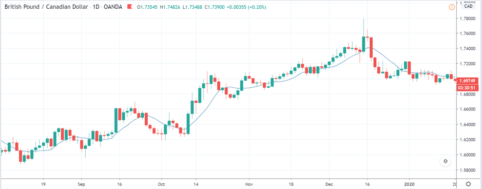
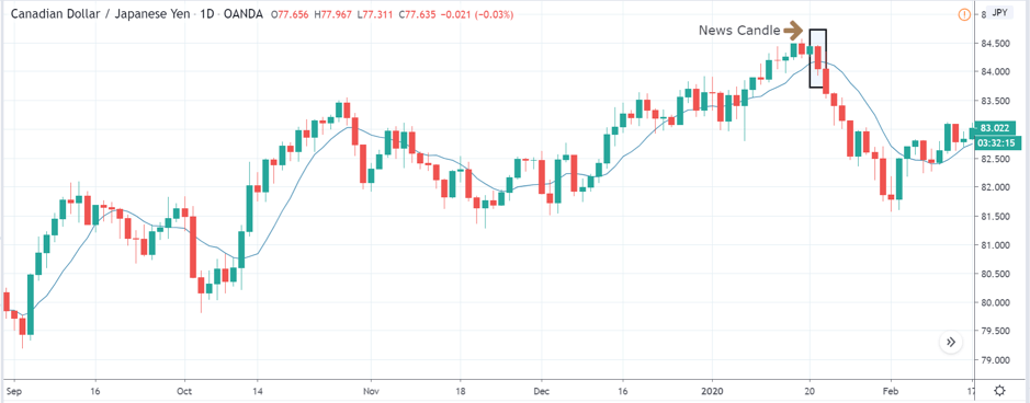
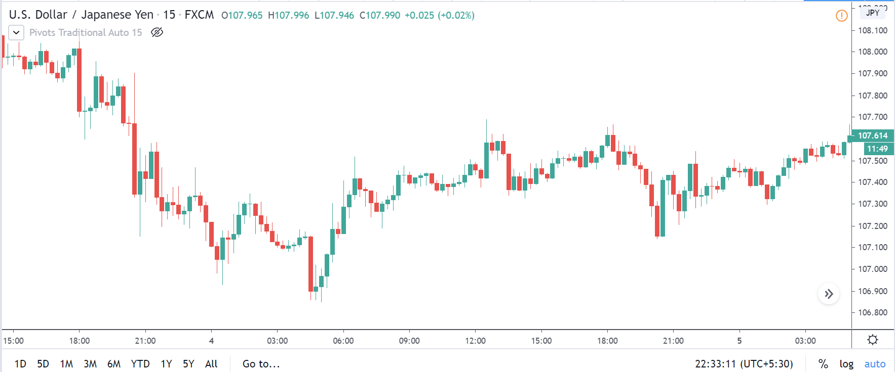
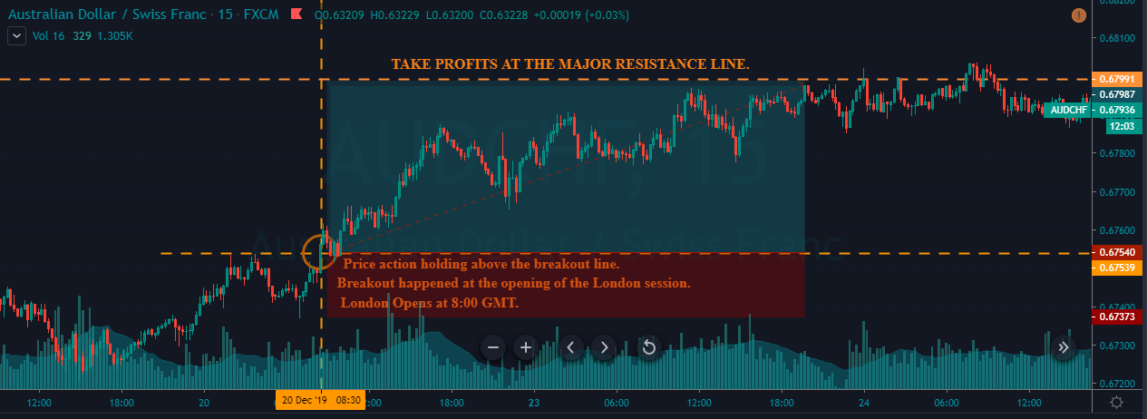
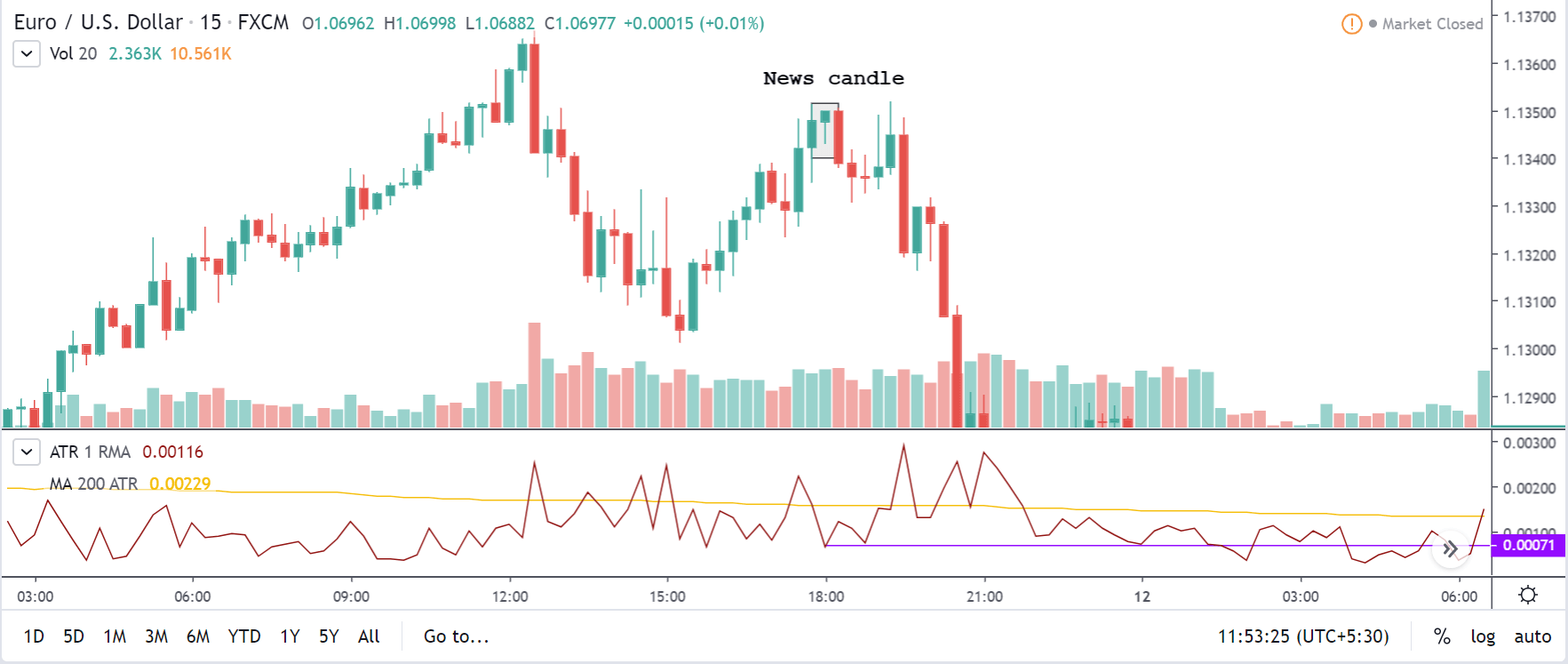
CAD/JPY | After the announcement:
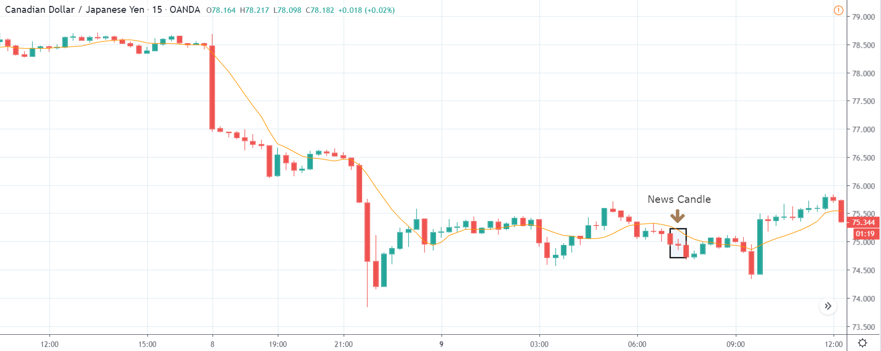
After the ‘housing starts’ numbers are out, there is very little change in volatility, which was expected as it is not a highly impactful event. The price initially goes up, which is a result of better than forecasted ‘housing starts’ data, but it gets immediately sold, and the candle closes at the opening price. The selling pressure is seen because even though the data was better than expected, it was still lesser than previous data, and this is negative for the currency. As the volatility is less and the price is at the ‘support’ area, we do not recommend a ‘short’ trade as the risk-to-reward ratio is unhealthy.
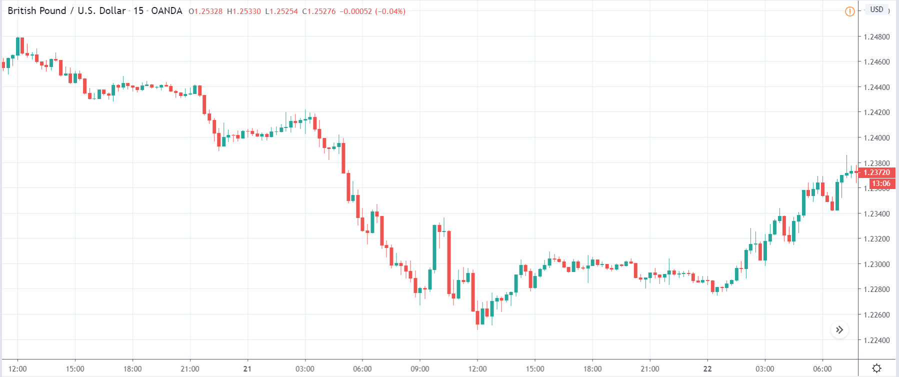
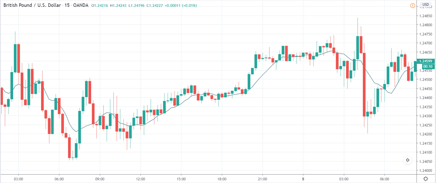
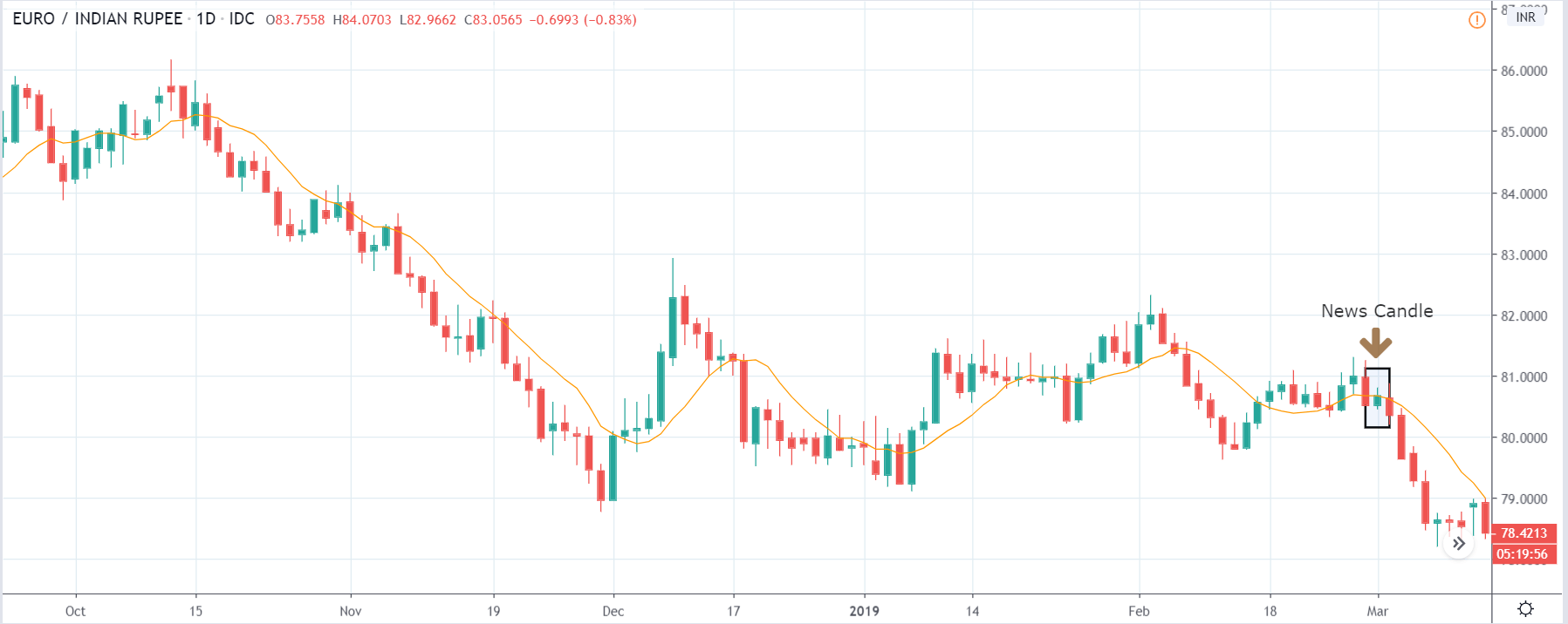
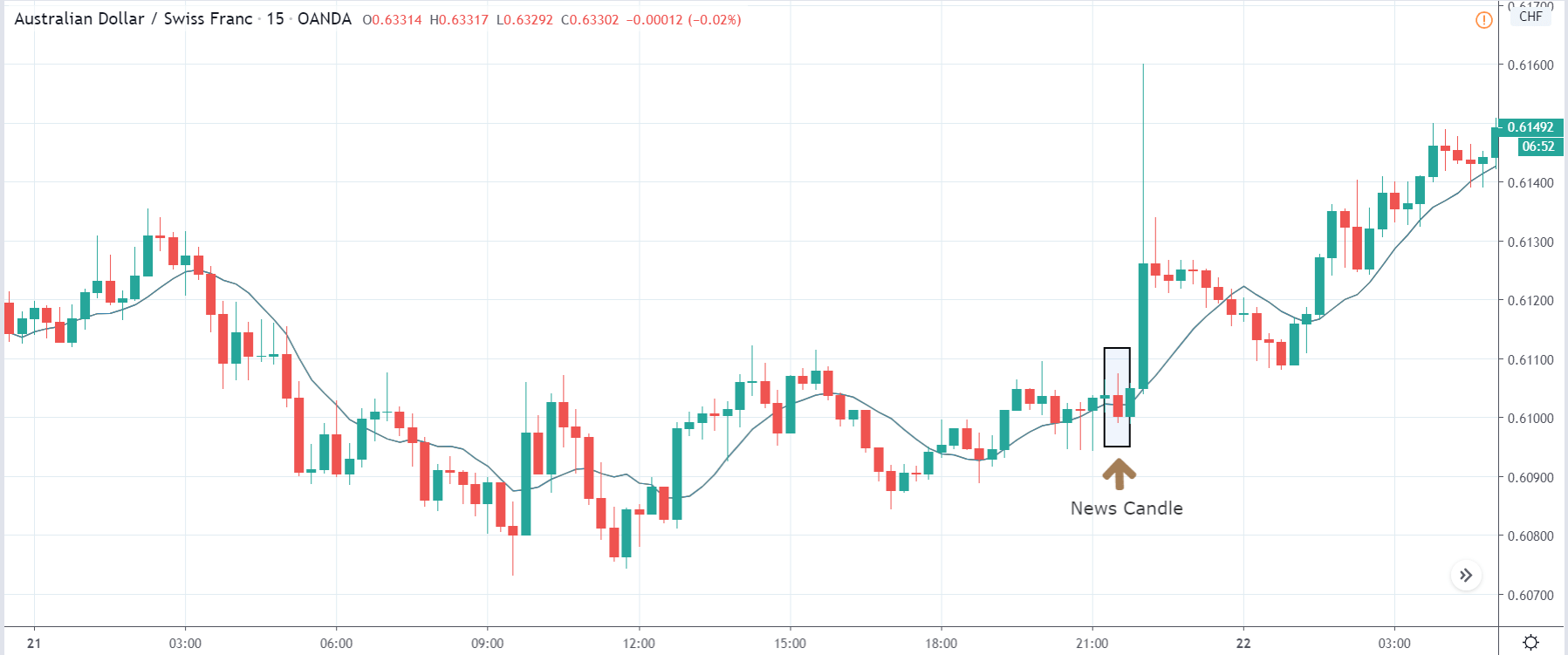
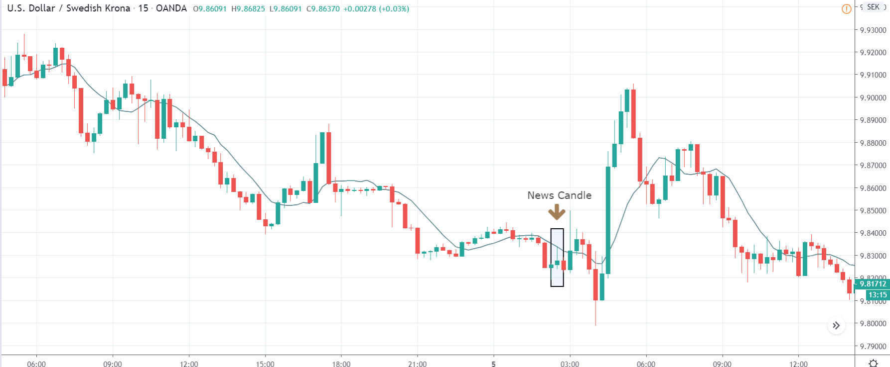
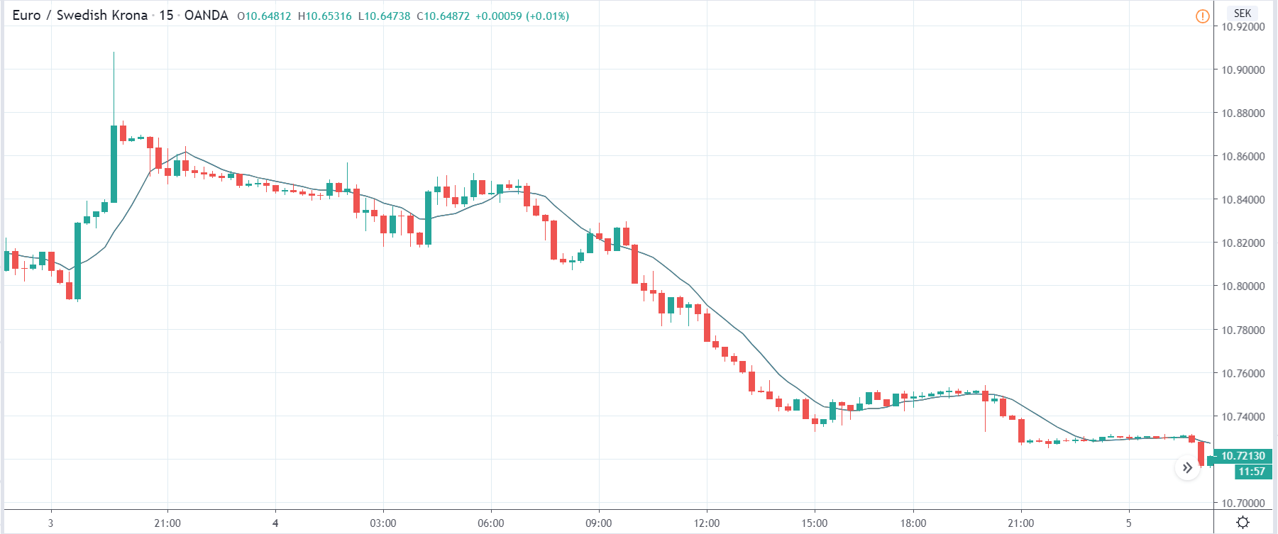
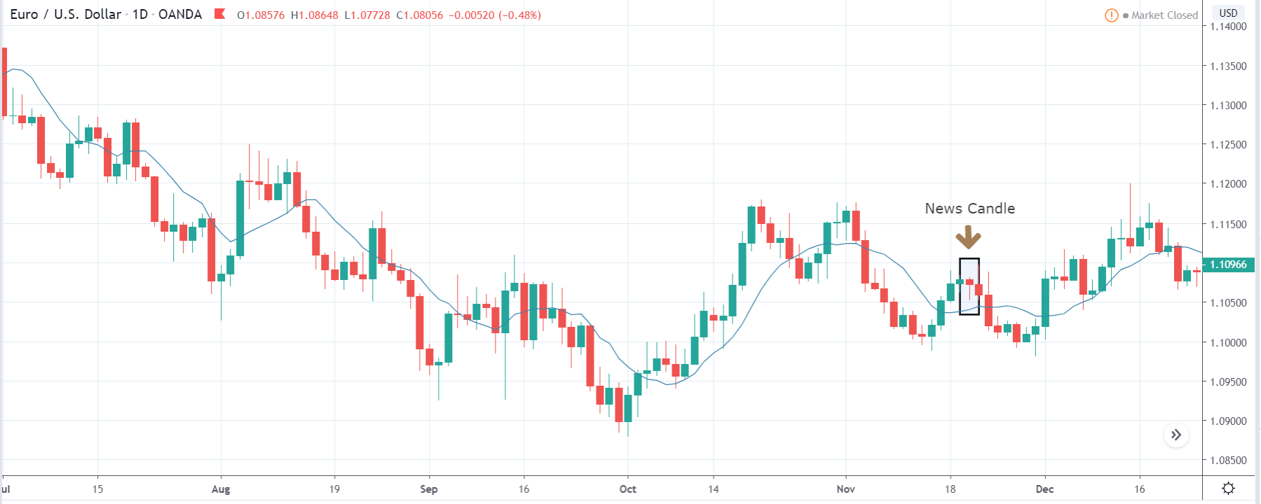
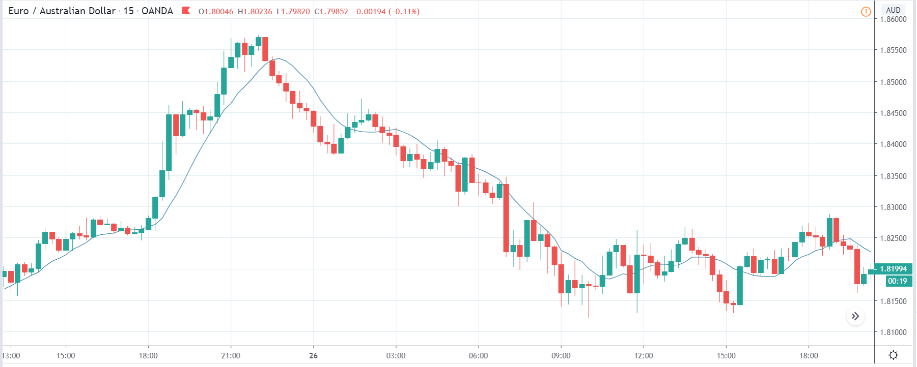
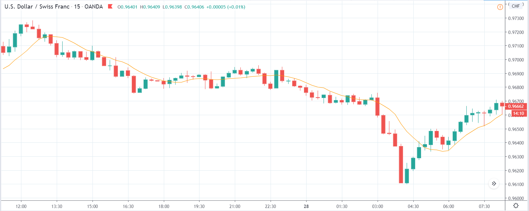
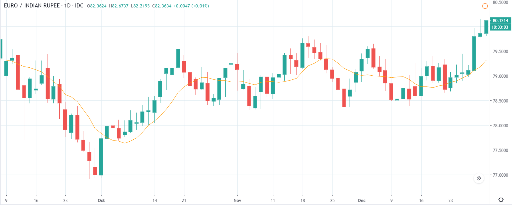
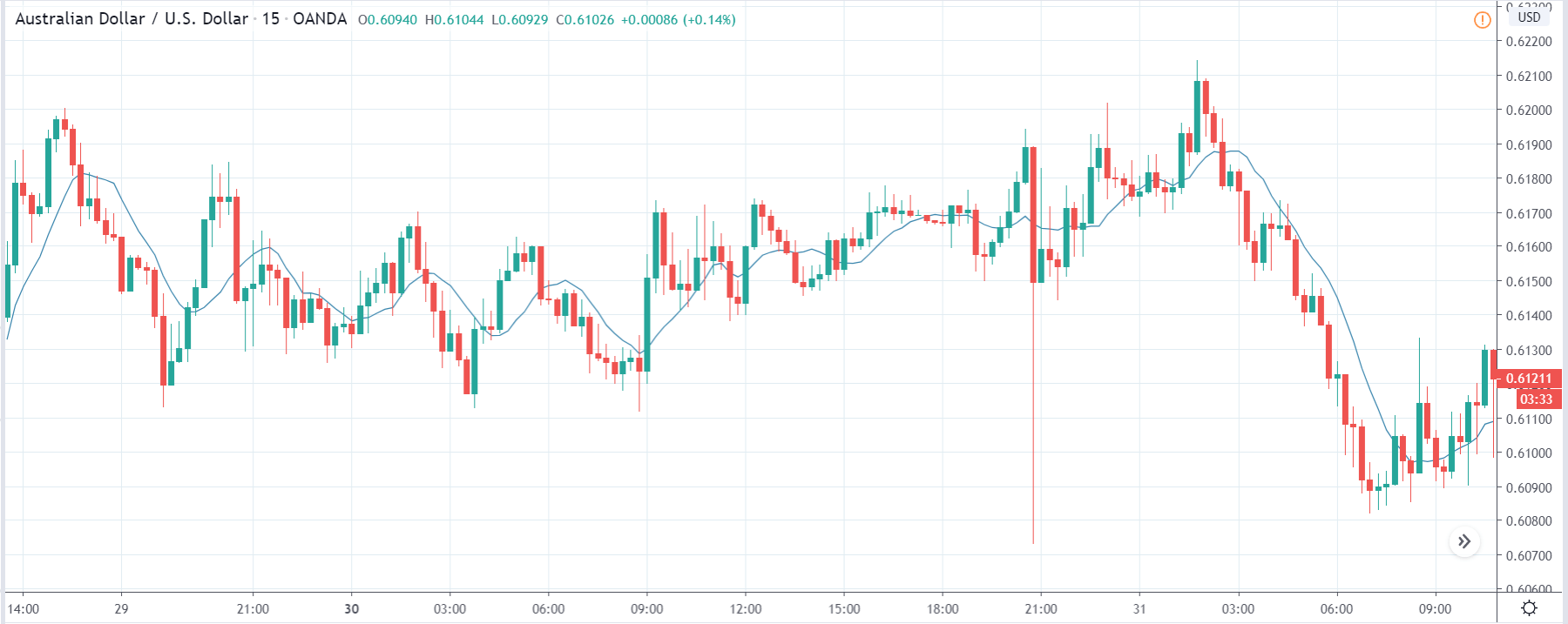
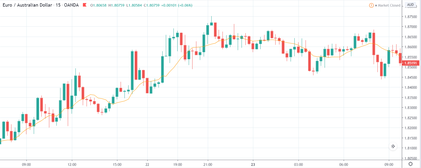
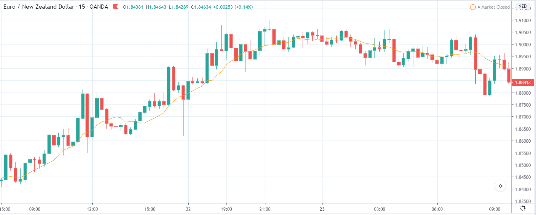
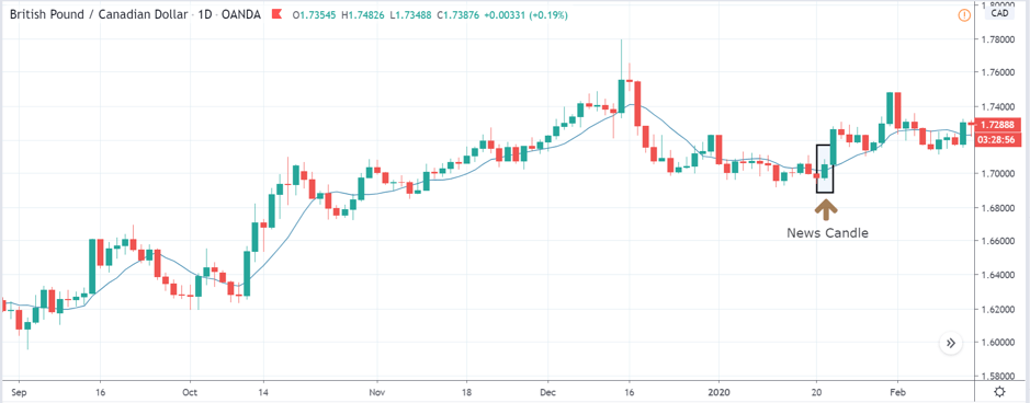
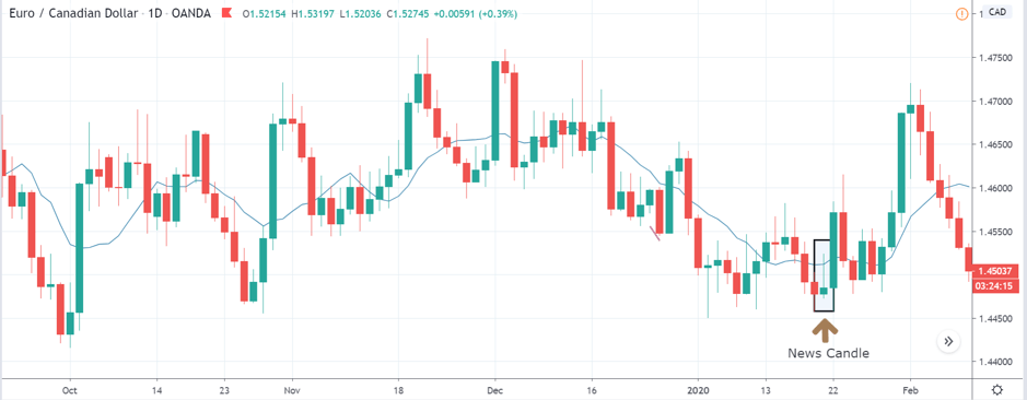
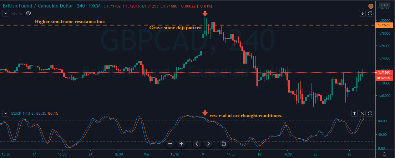
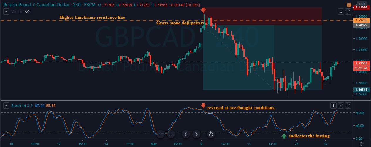
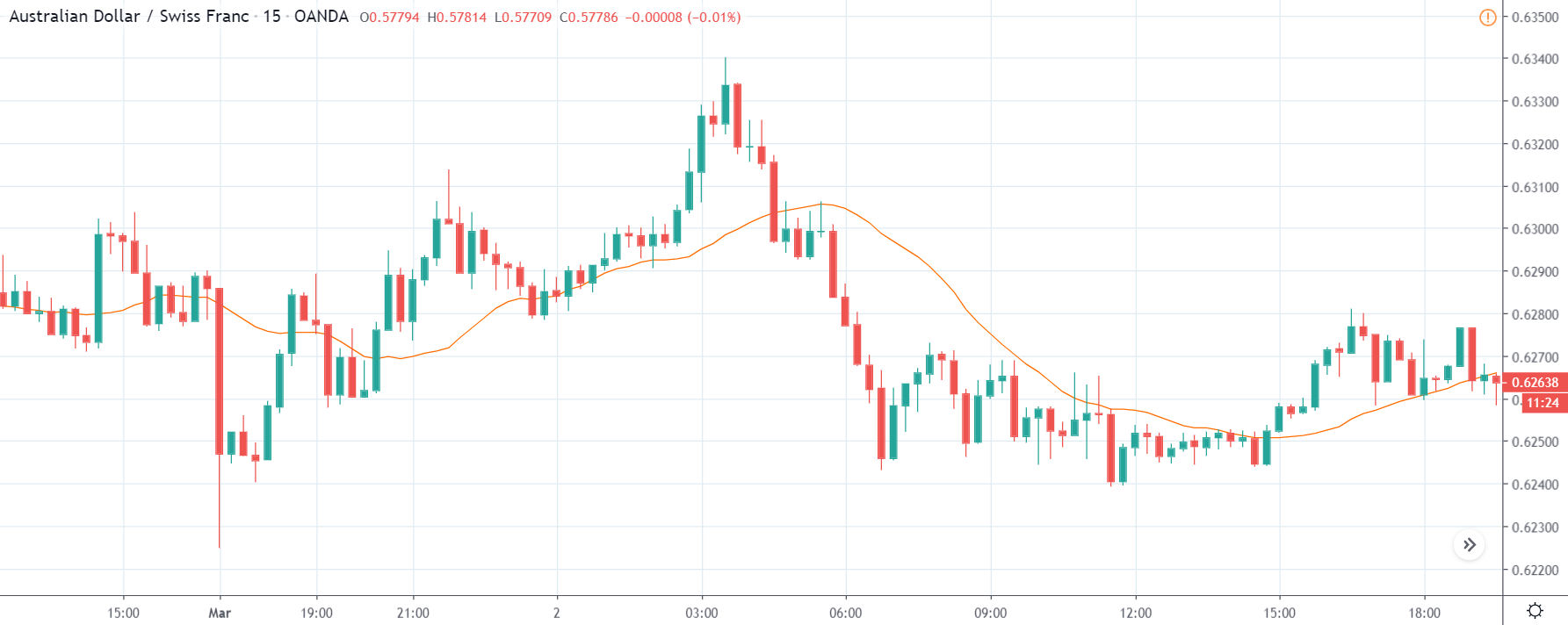
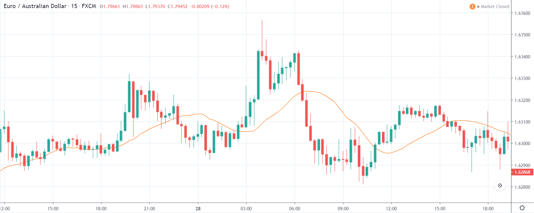
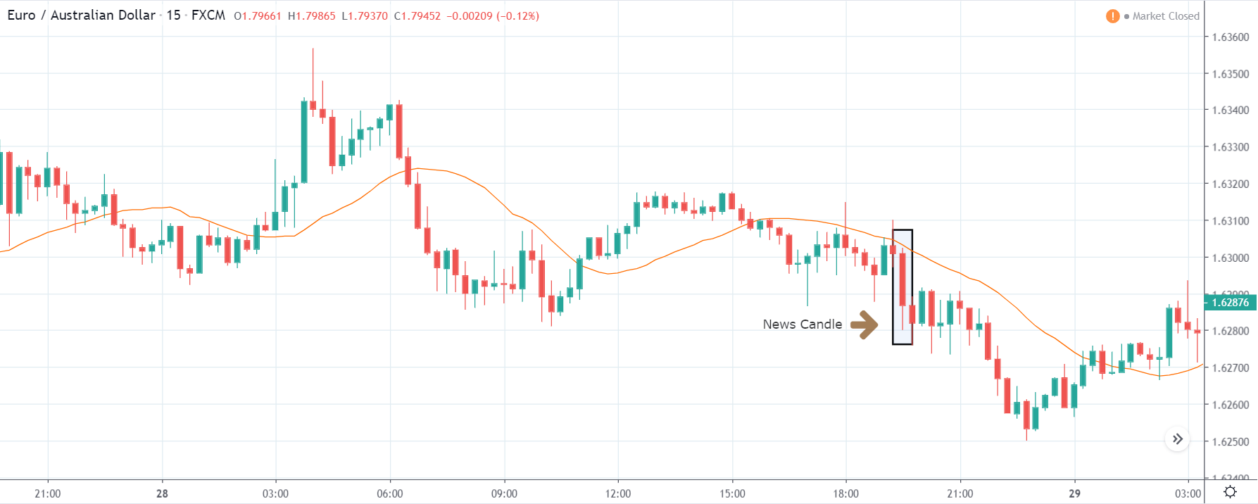
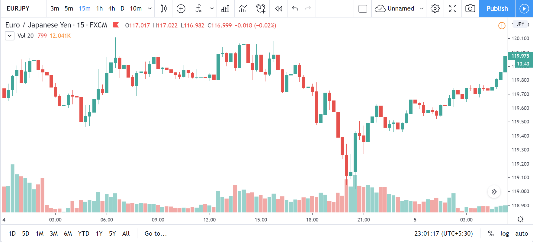
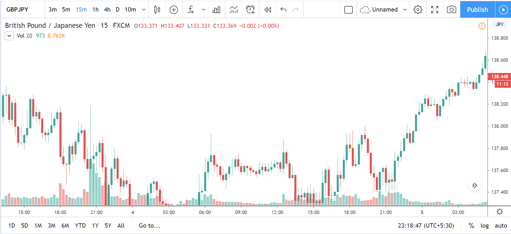
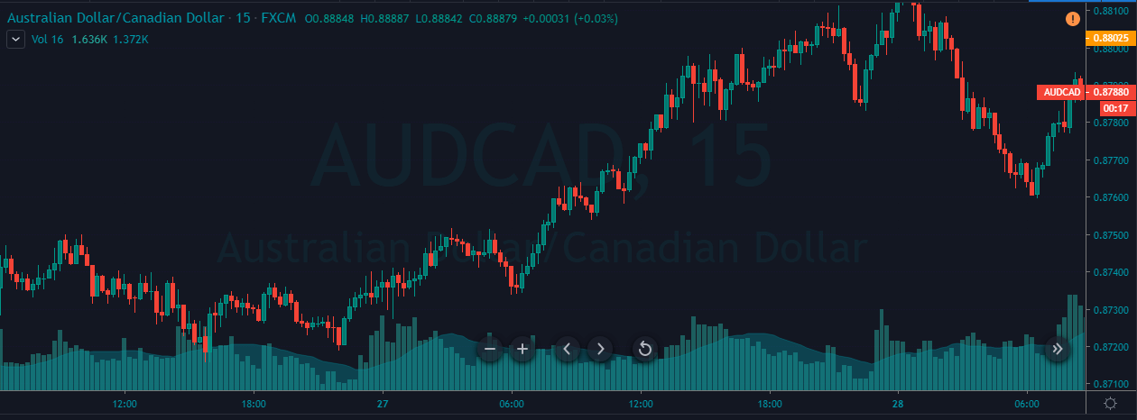
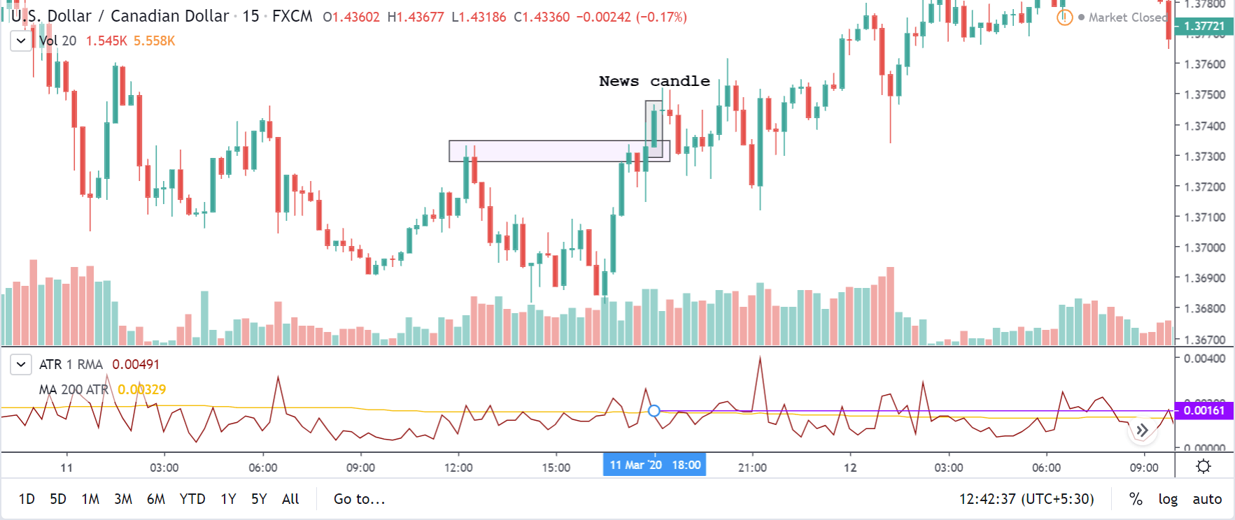
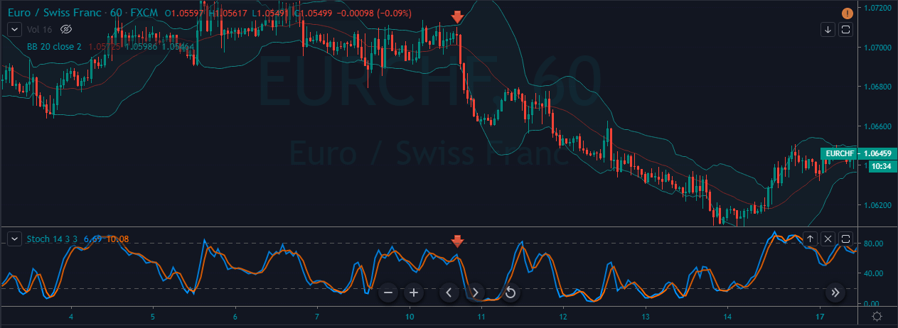
EUR/CAD | Before the announcement:
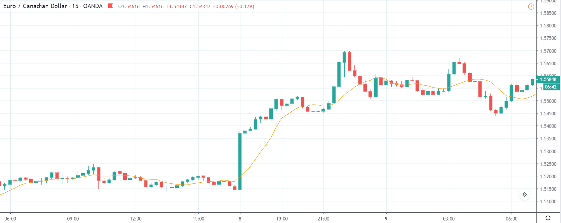
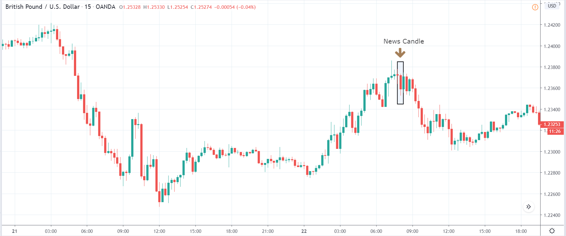
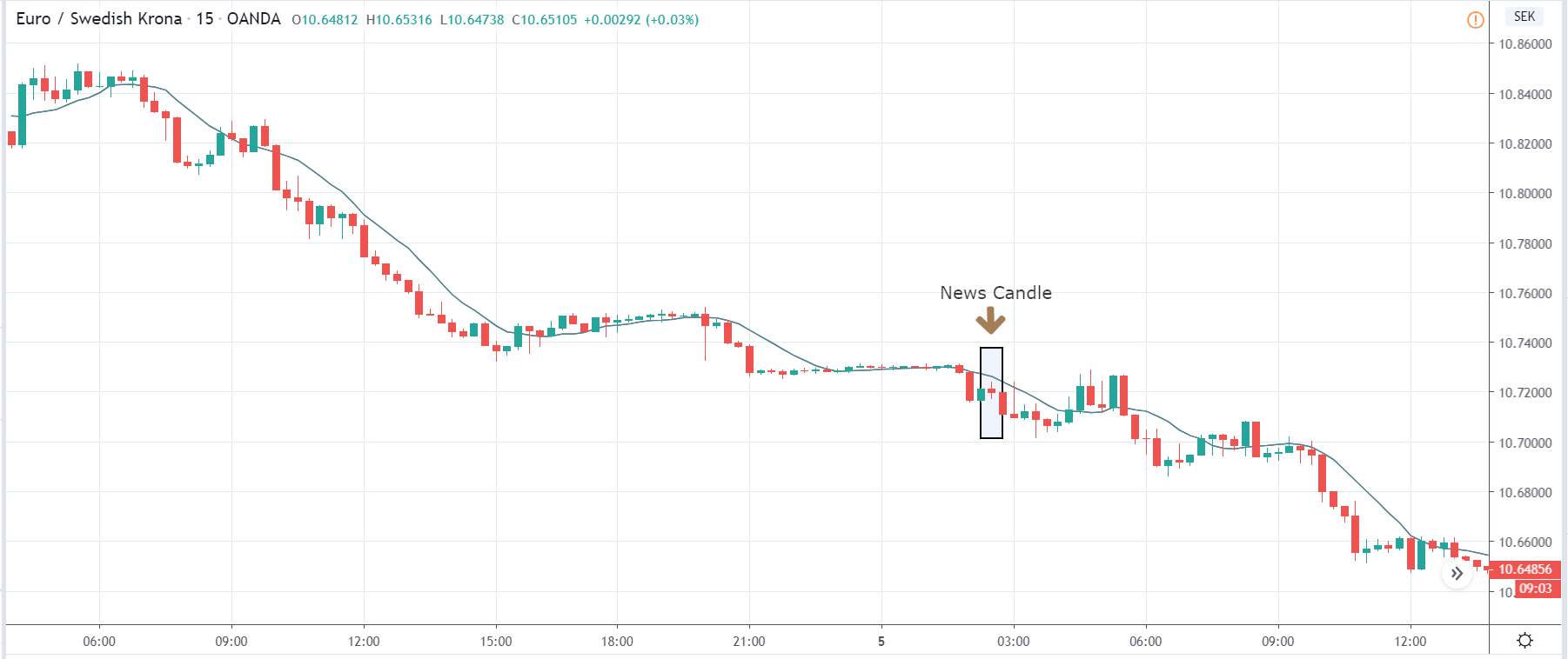
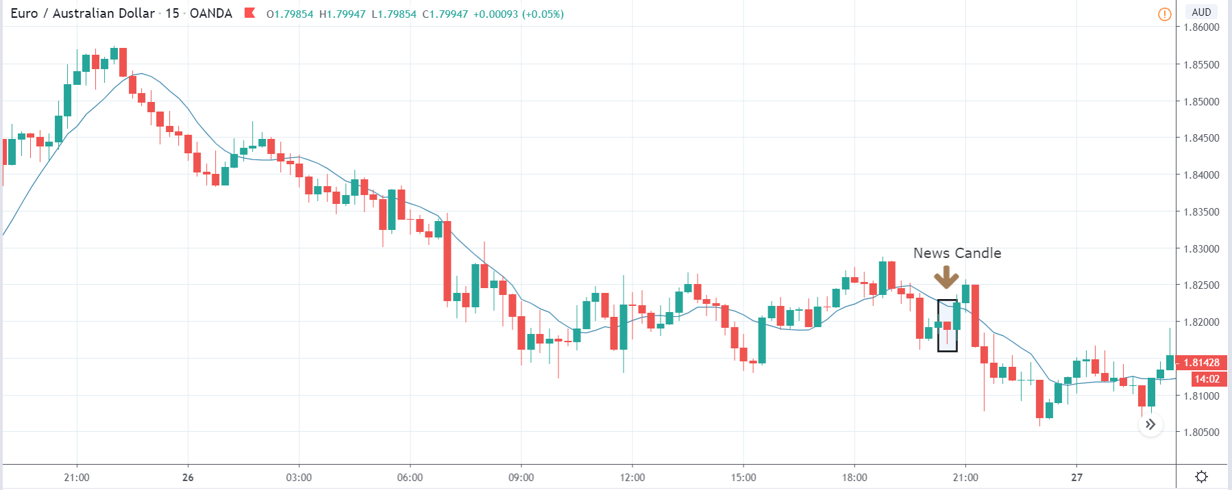
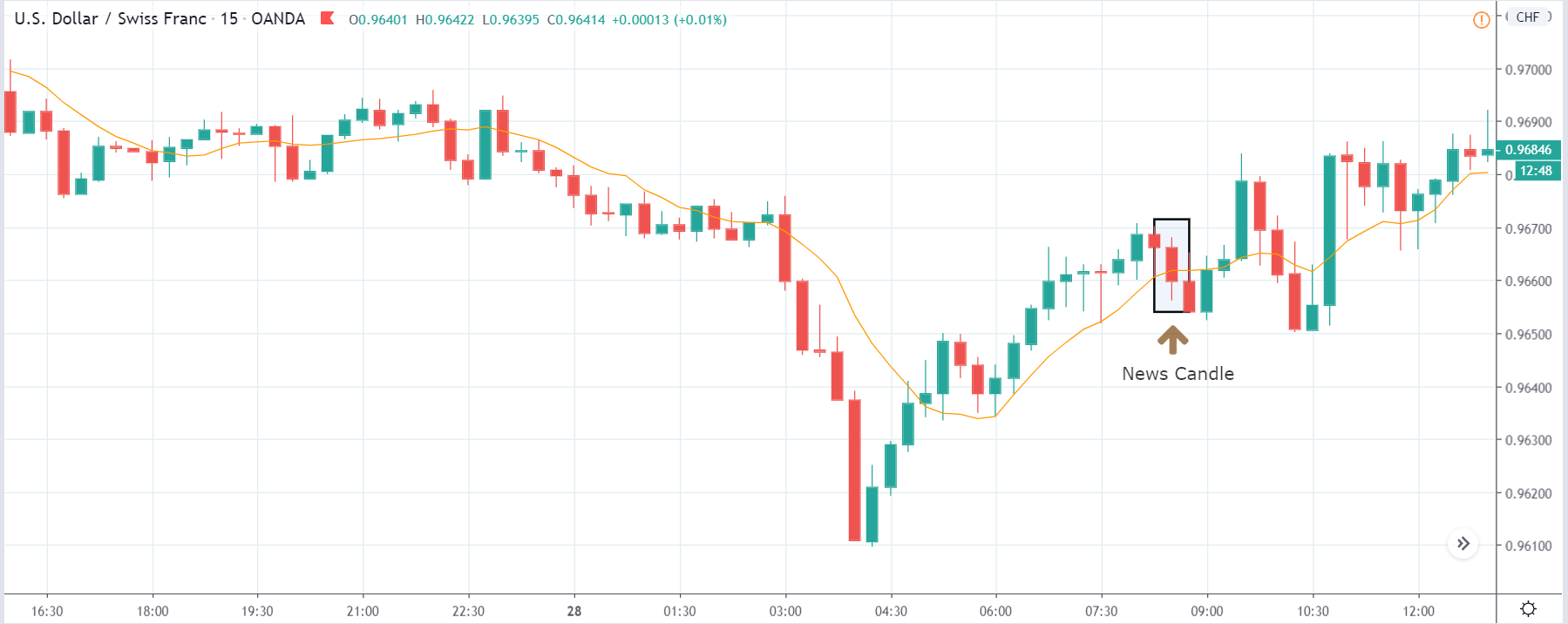
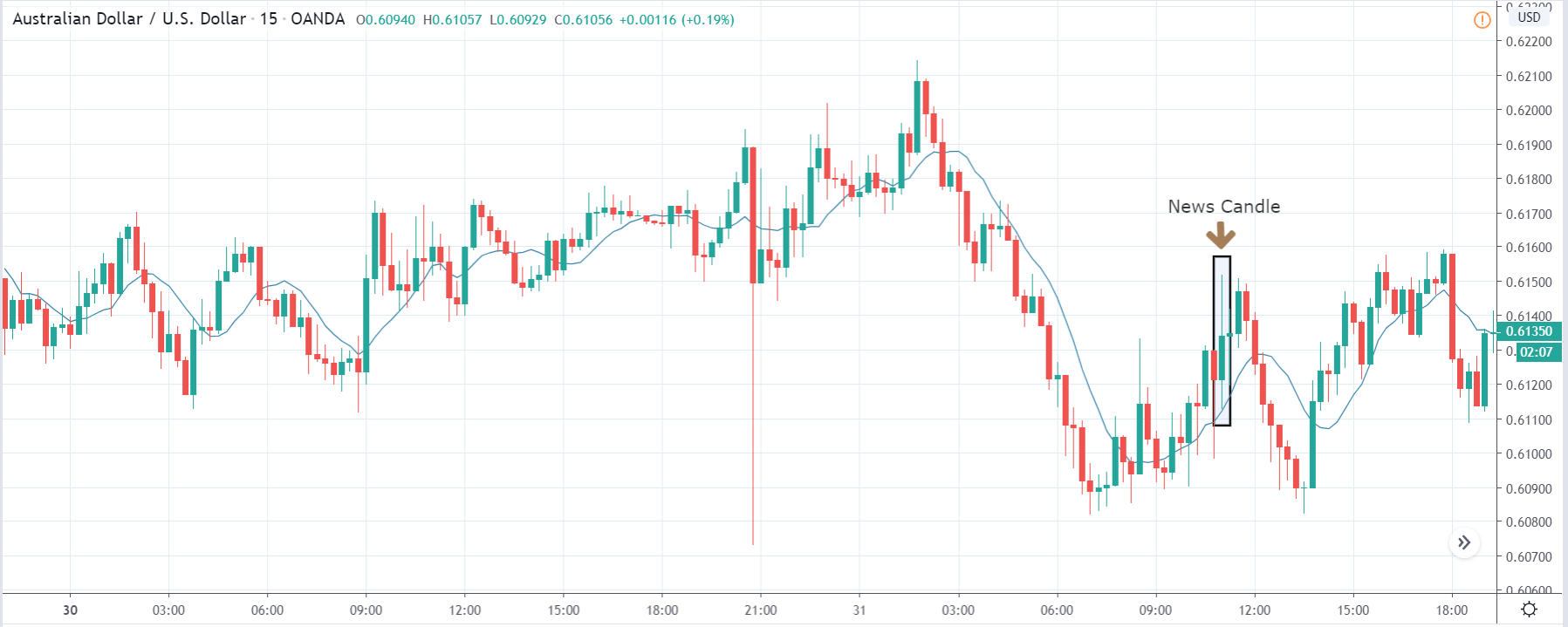
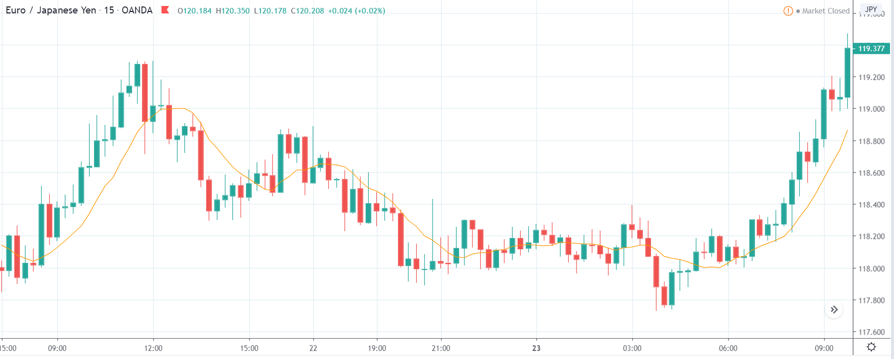
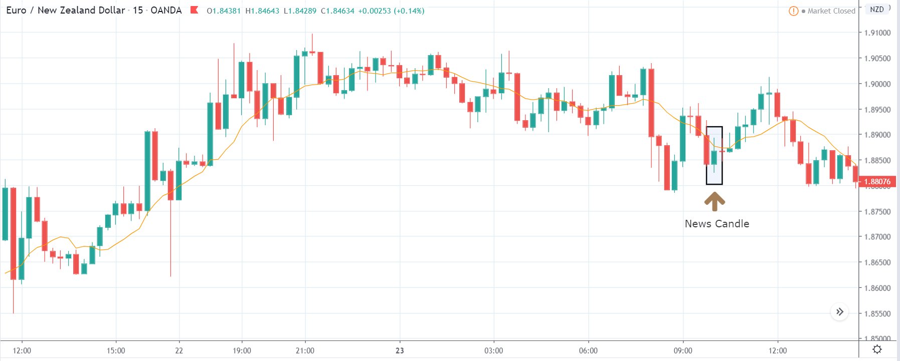
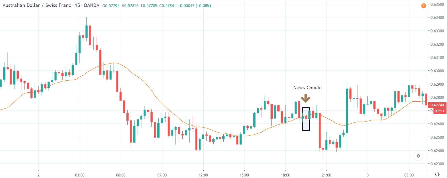
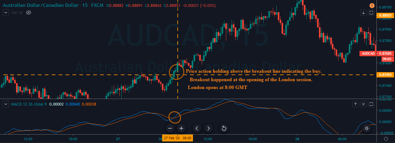
CAD/JPY | After the announcement:

The above images represent the EUR/CAD currency pair, and since the Canadian dollar is on the right-hand side, weakness in the Canadian dollar should take the currency higher, which is why the market is going up in the above pair. The ‘range’ before the news announcement seems to be much more established and clearer than in the previously discussed pair. Since price is close to the ‘resistance’ point, a positive ‘housing starts’ data can be an opportunity to go ‘short’ in the currency pair.
After the news release, we see that the candle closes with a wick on the top indicating strength in the Canadian dollar. Since the data was positive for the economy, one can take a ‘short’ trade expecting the volatility to expand on the downside. We should not forget that since the data does not have much impact, our ‘take-profit‘ for the trade should be the recent ‘support’ area.
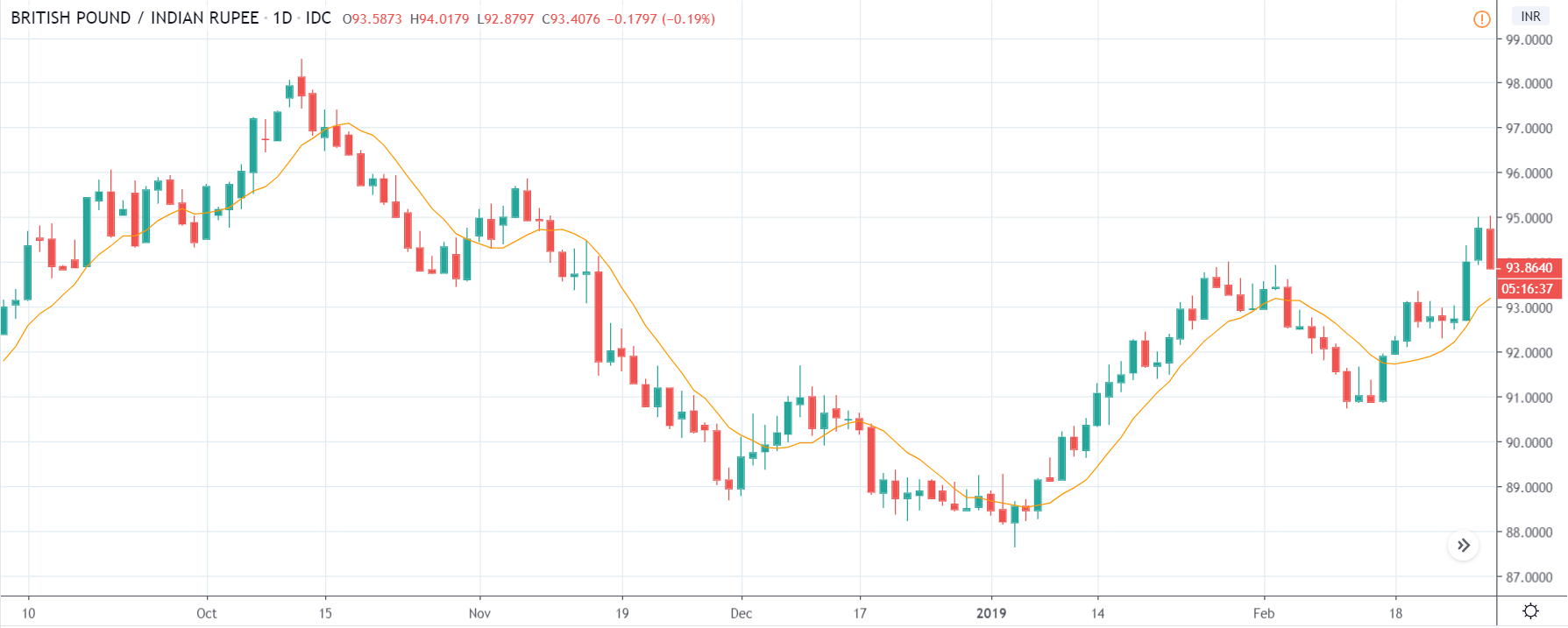
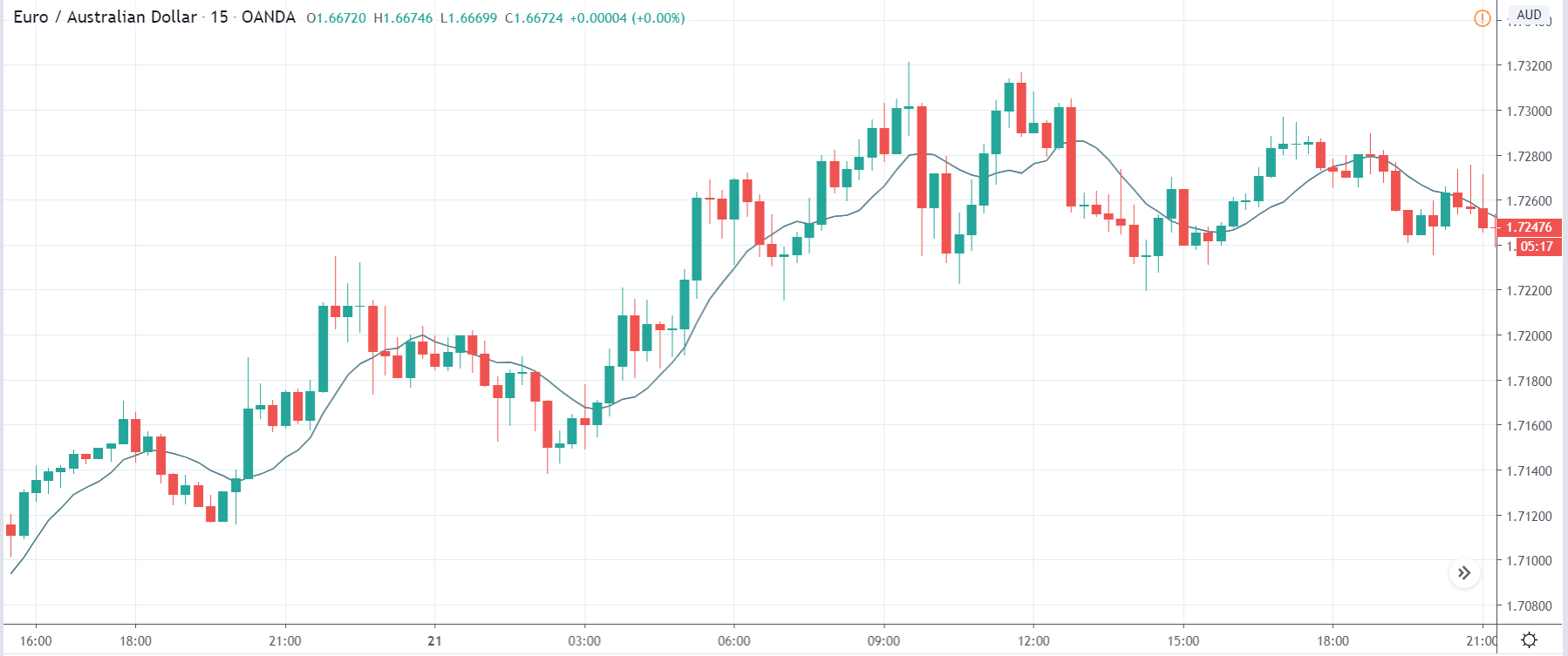
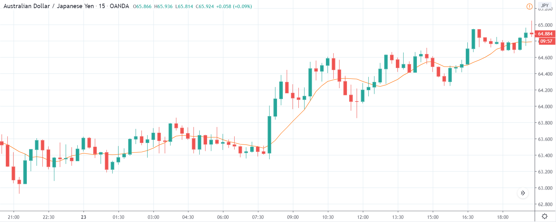
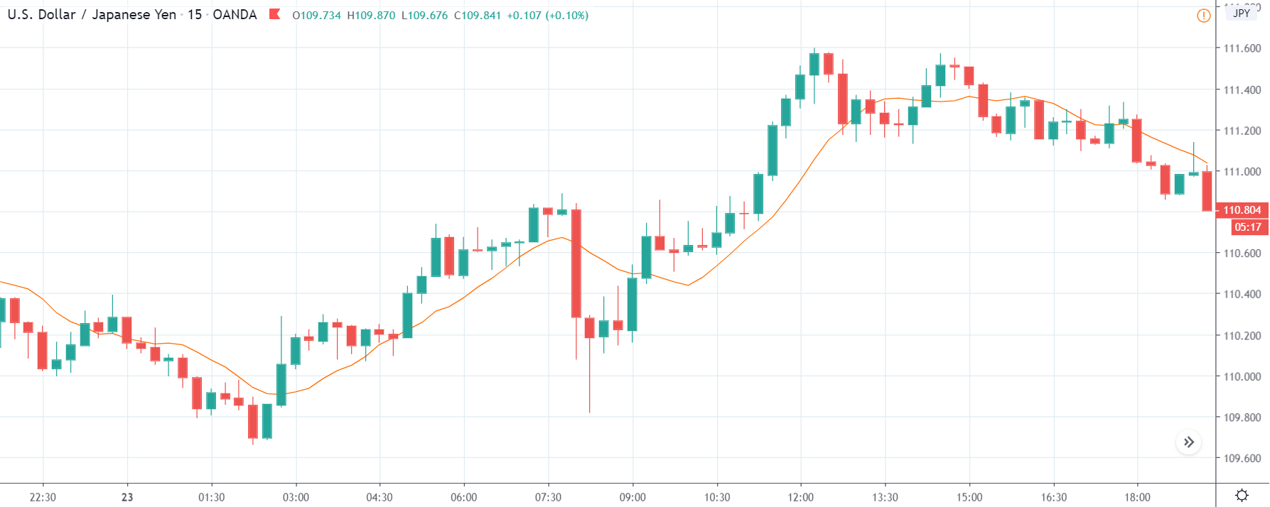
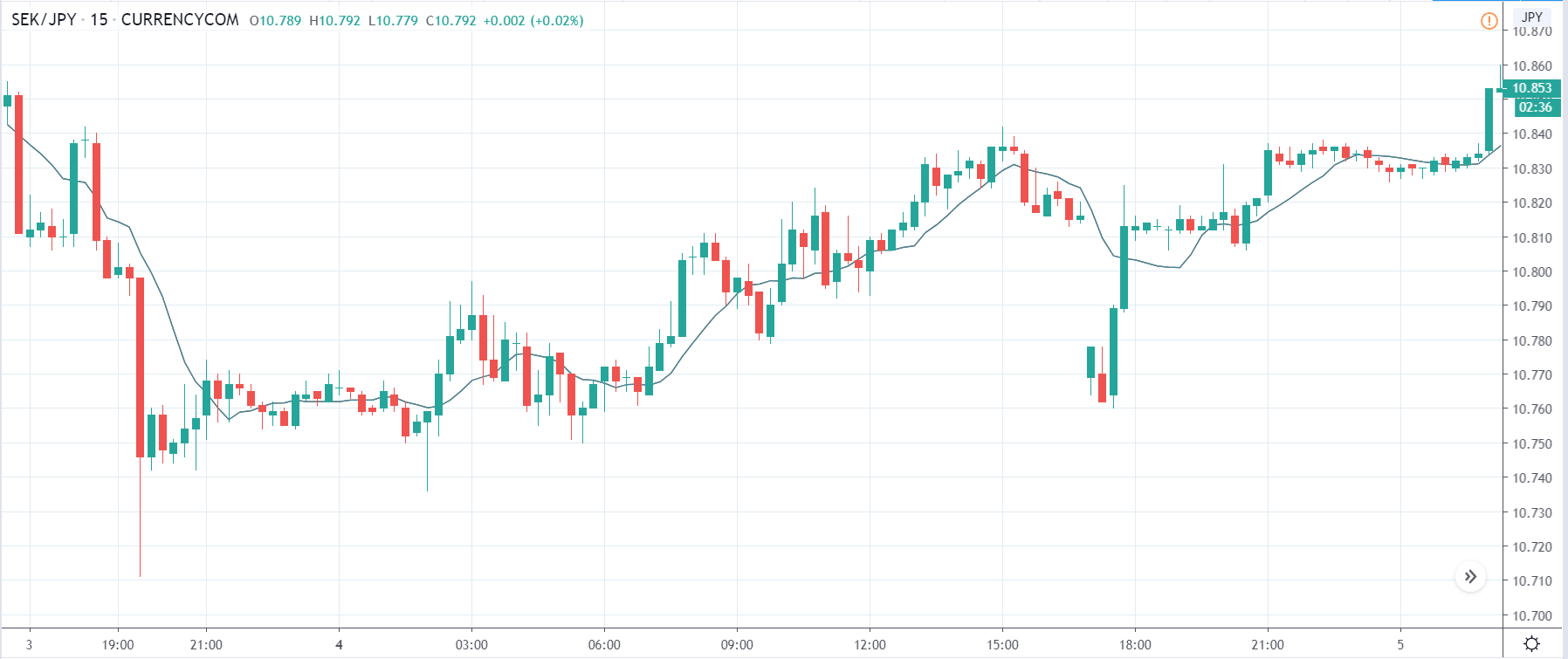
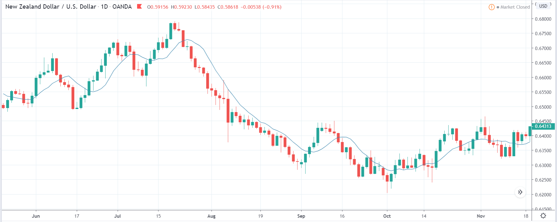
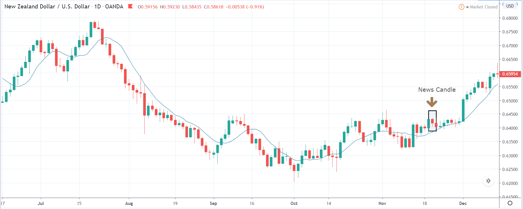
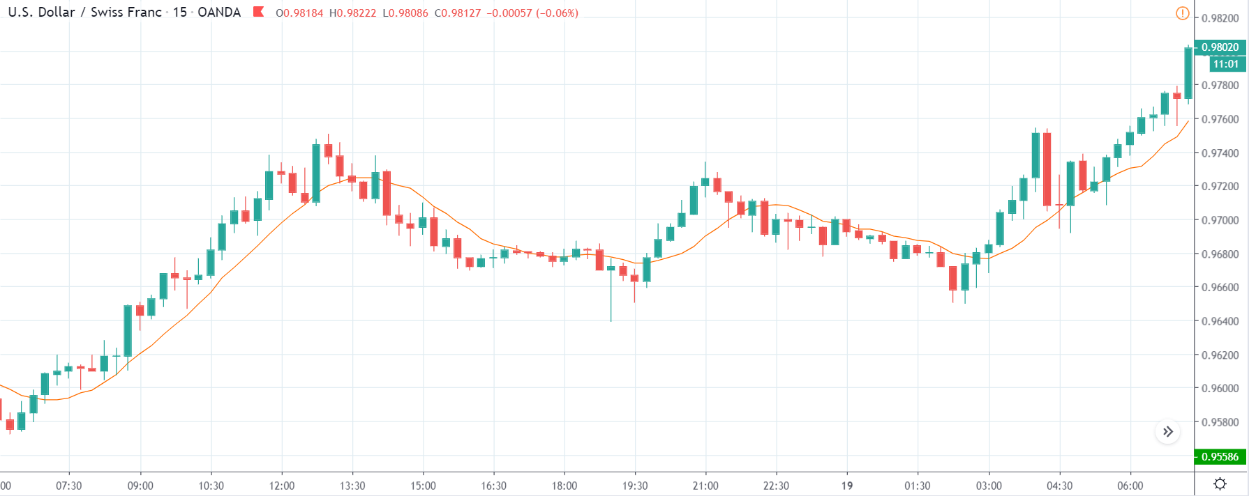
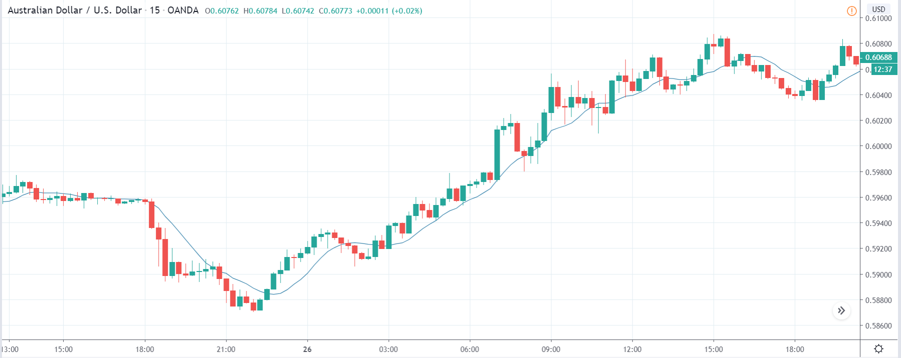
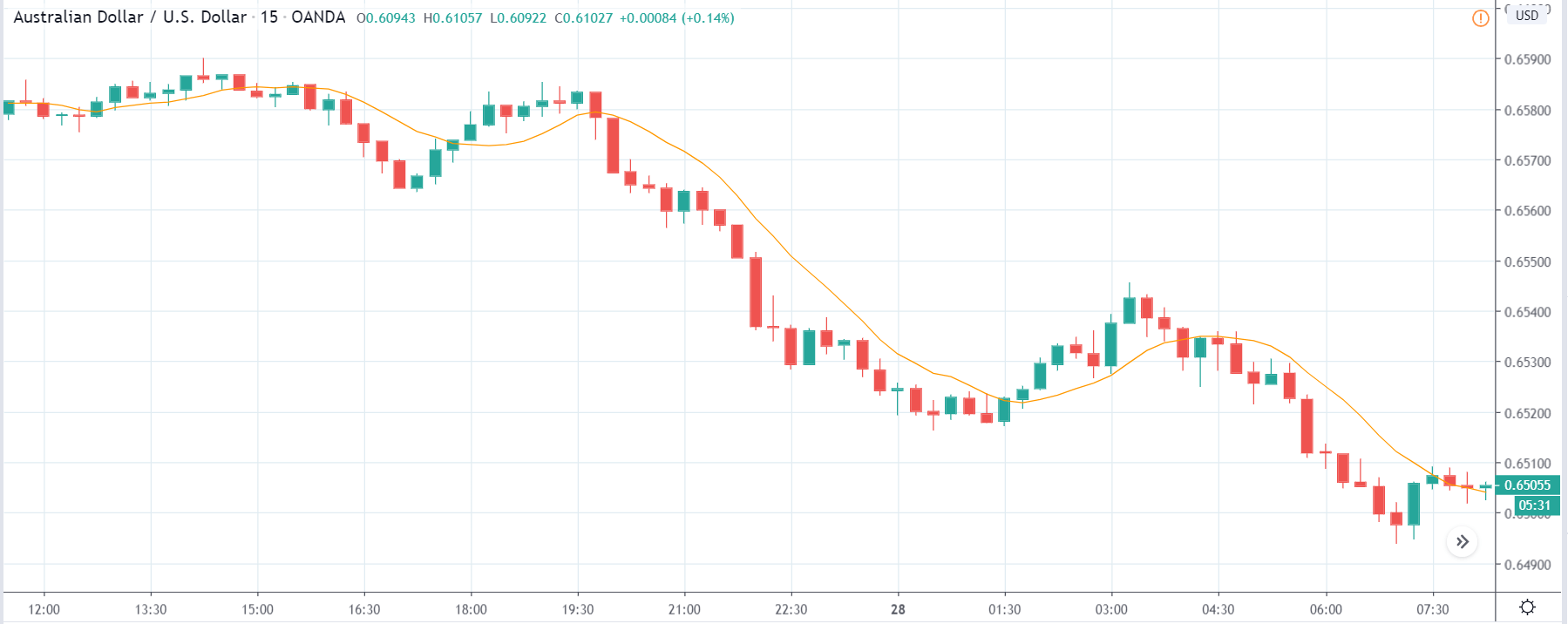
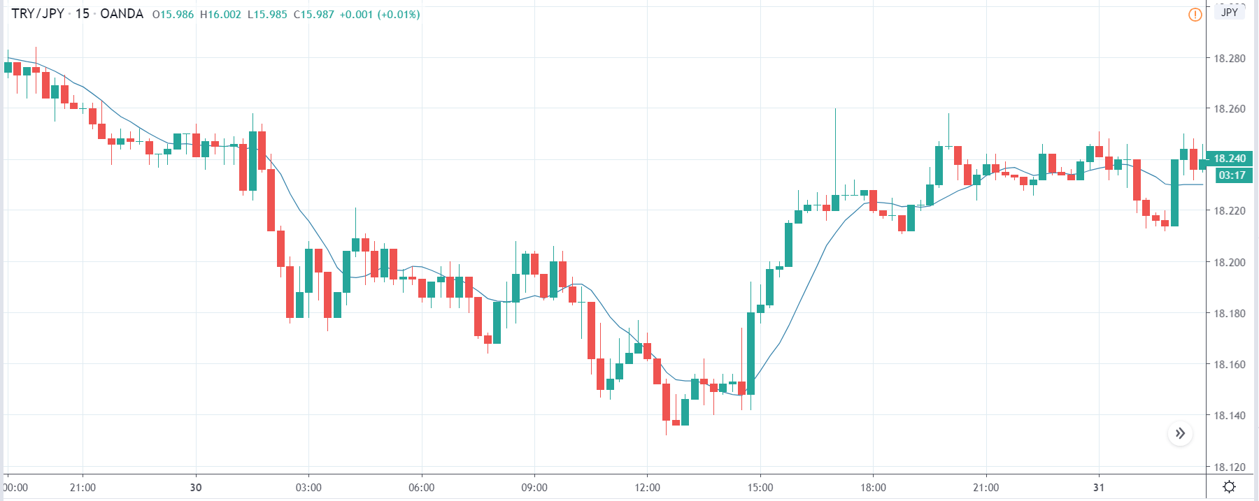
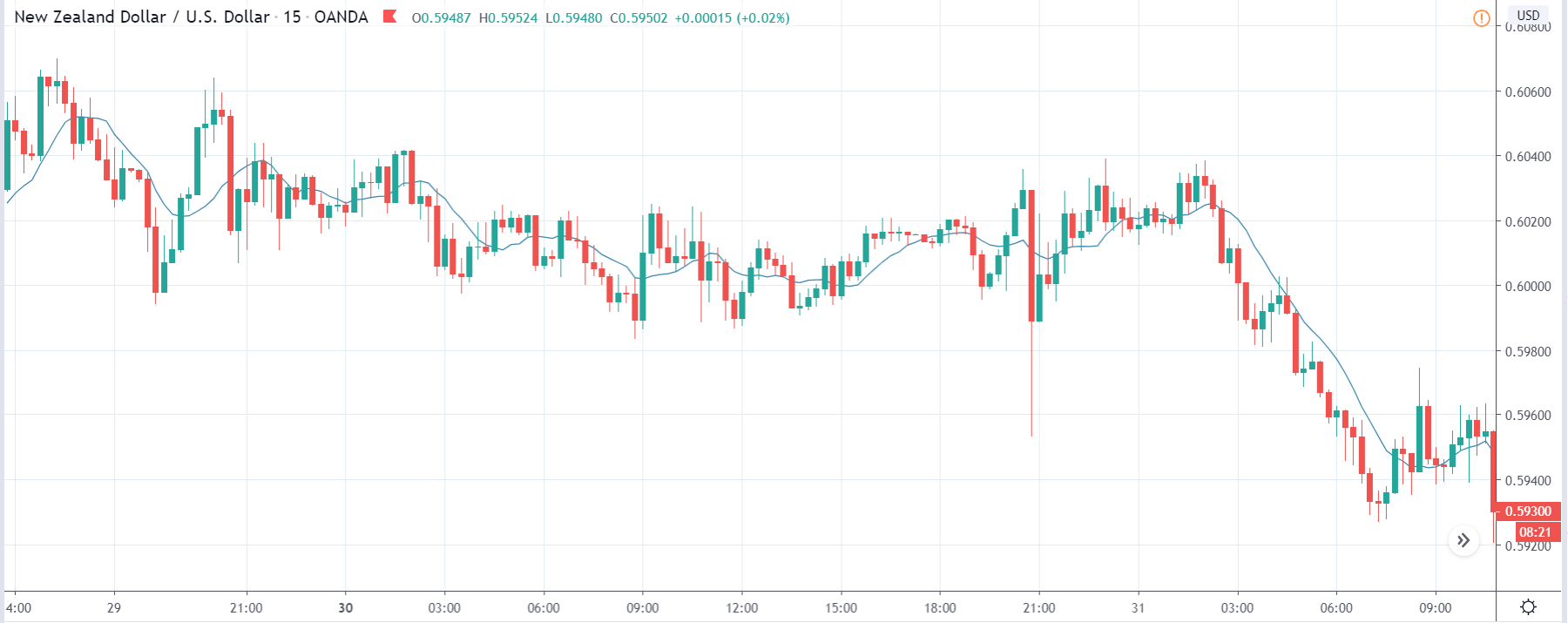
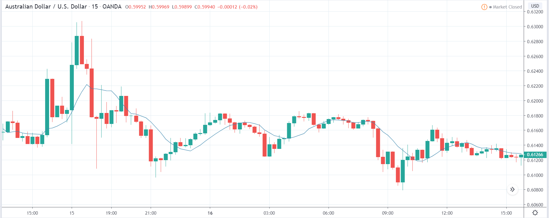
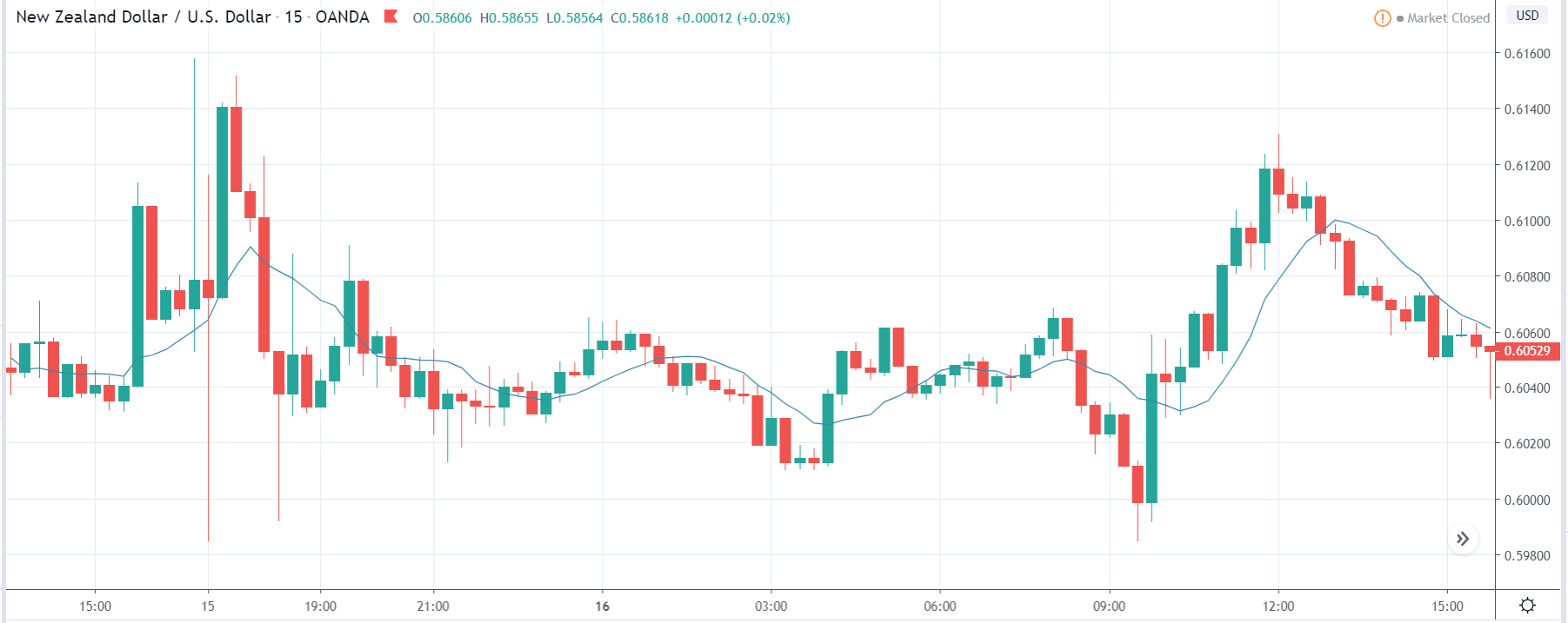
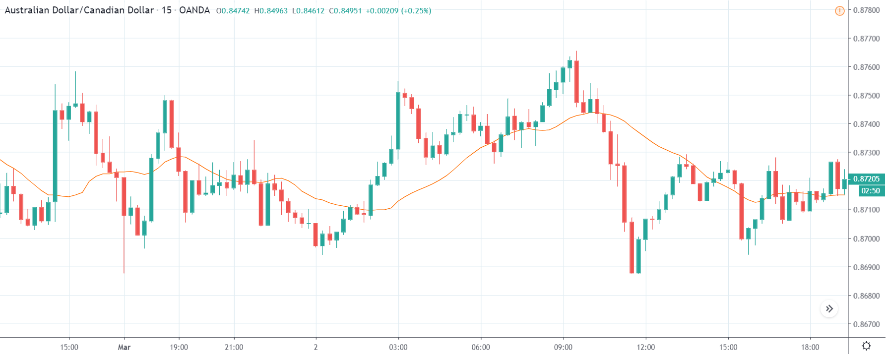
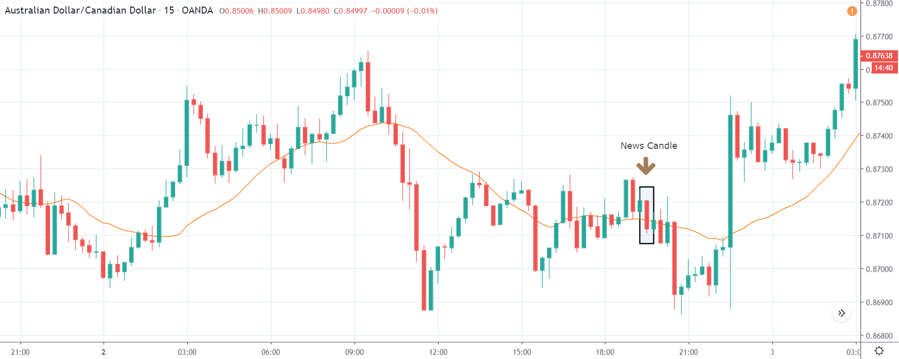
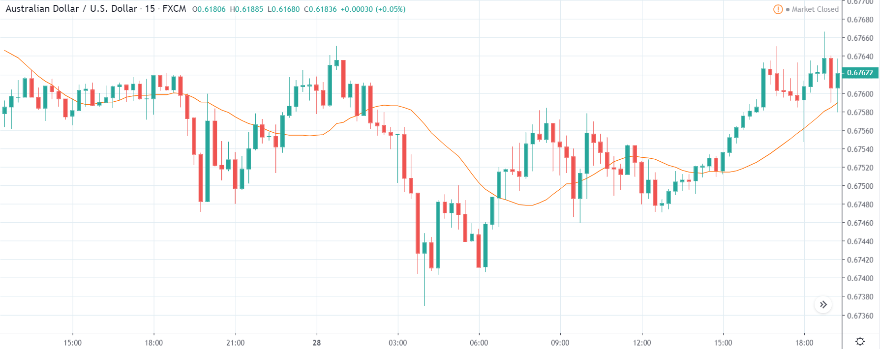
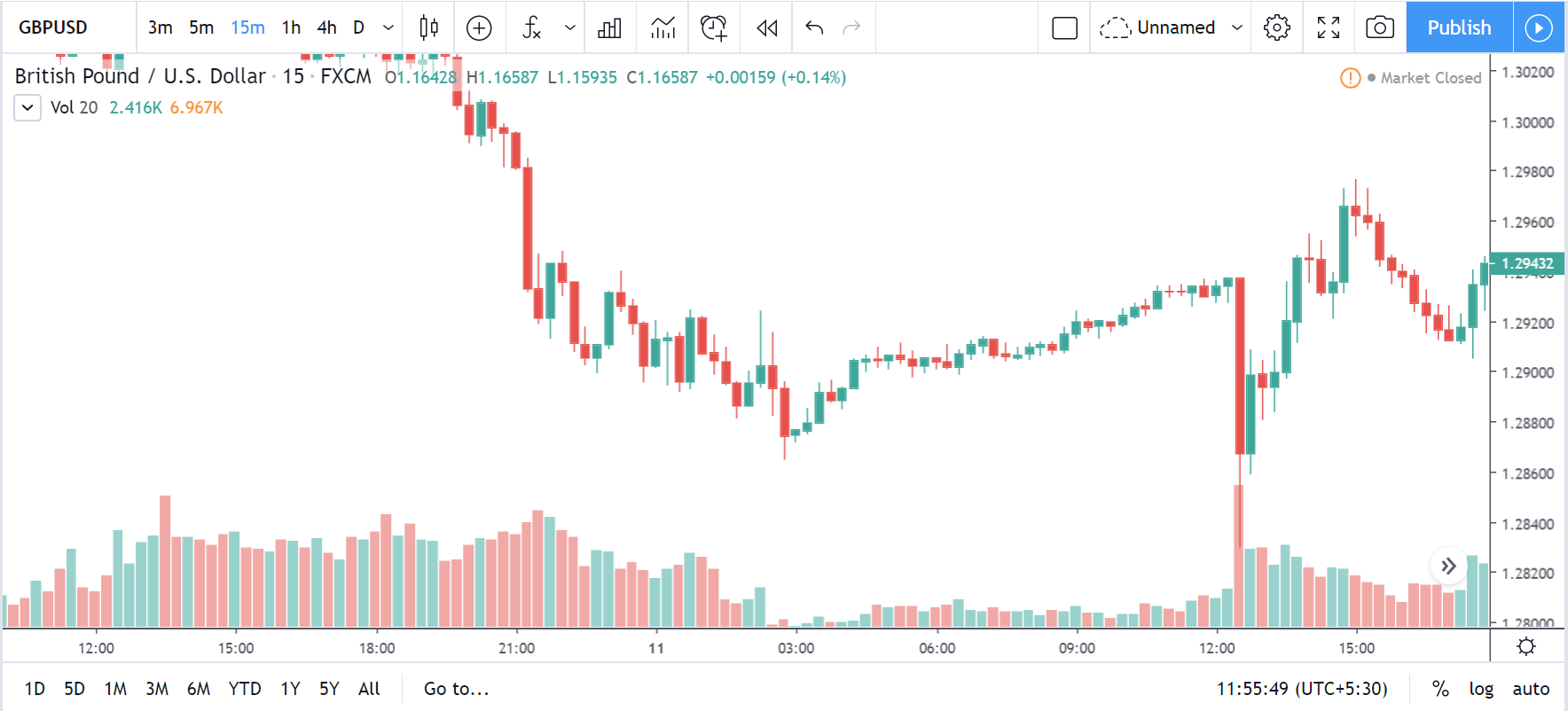
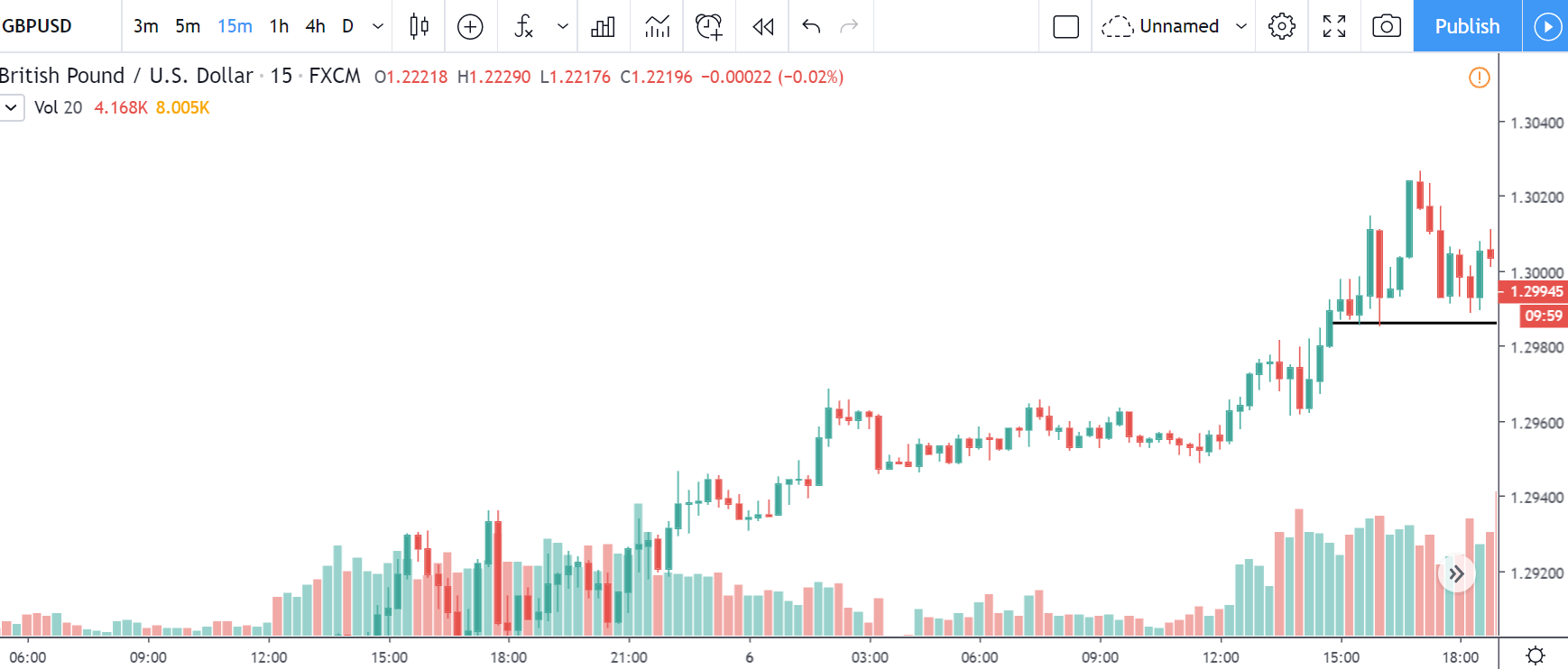
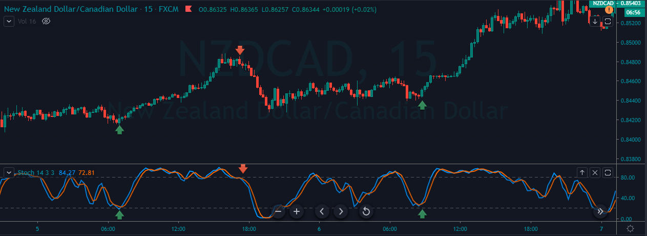
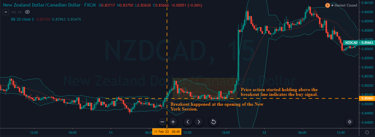
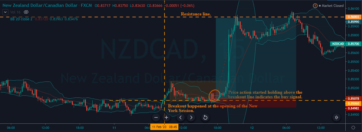
NZD/CAD | Before the announcement:
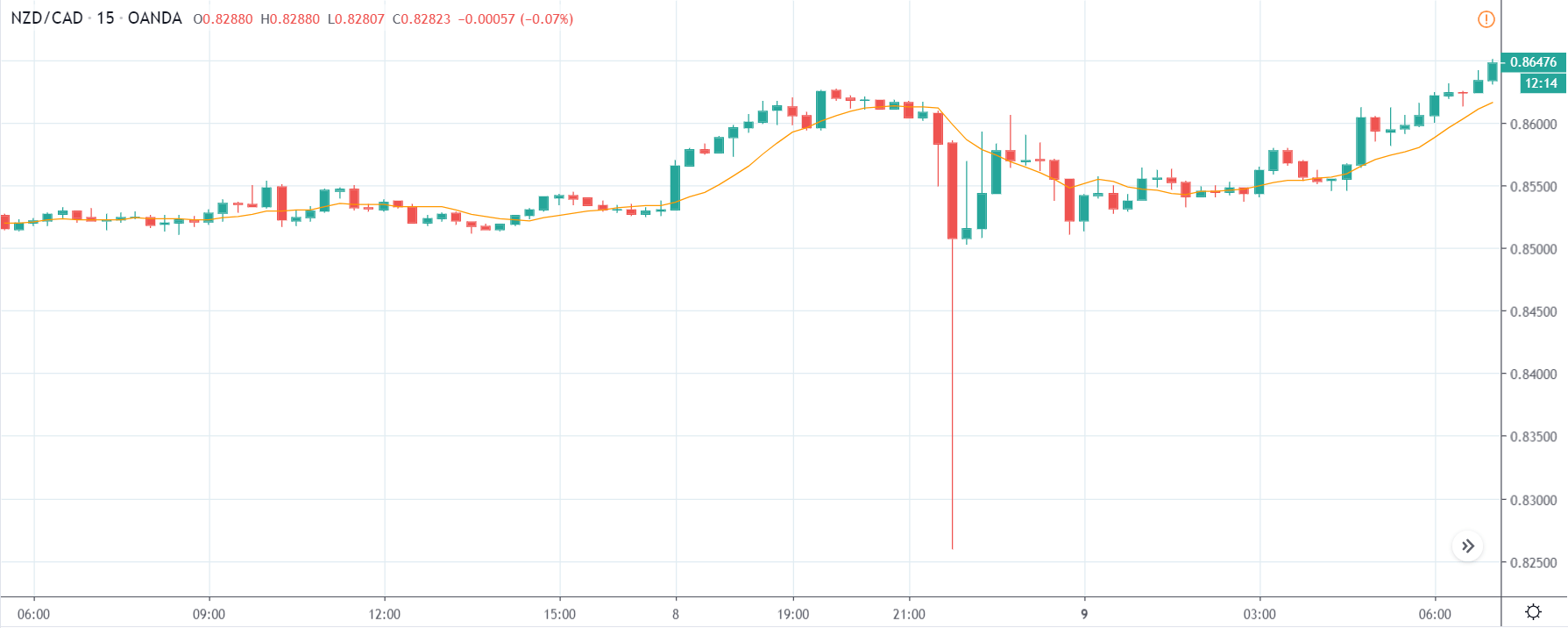
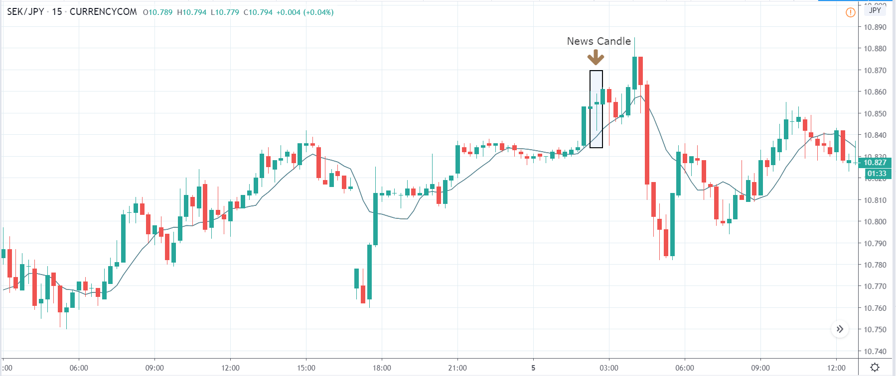
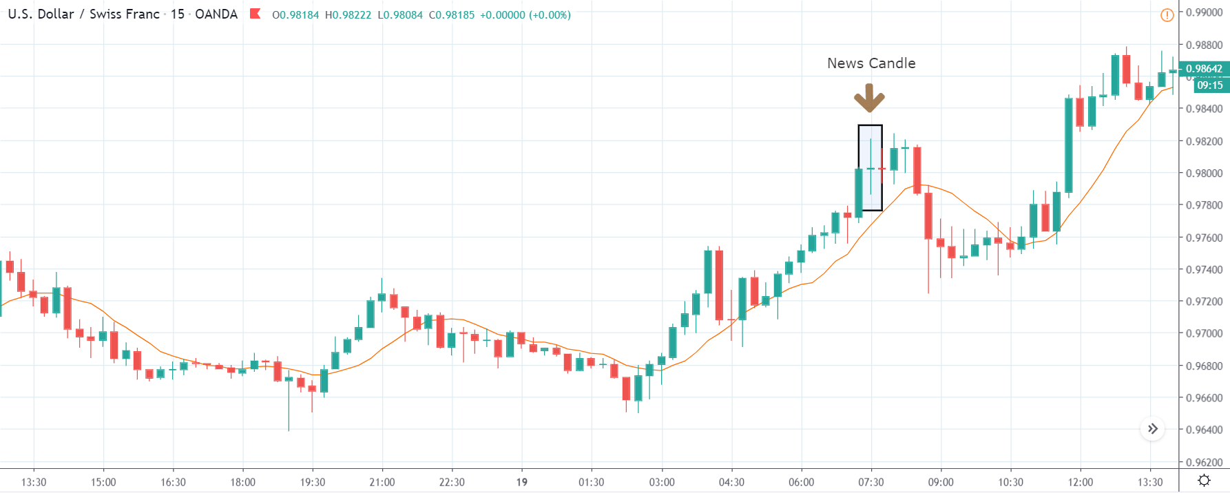
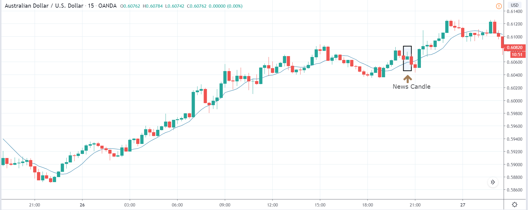
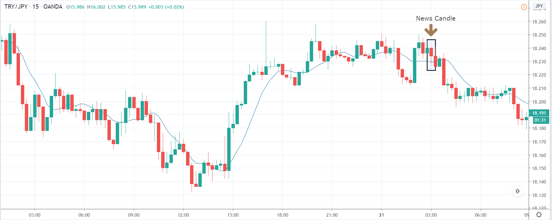
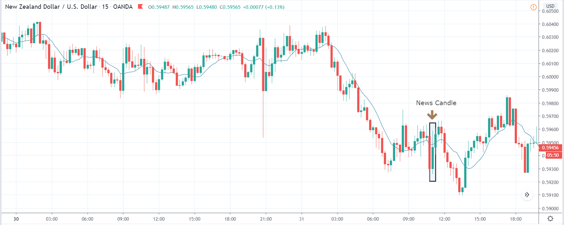
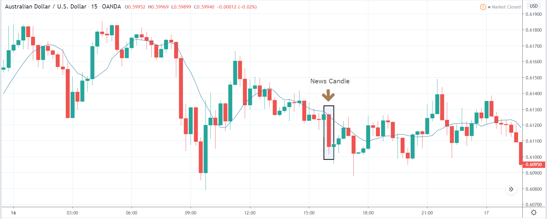
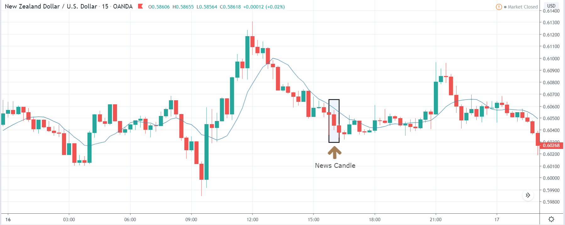
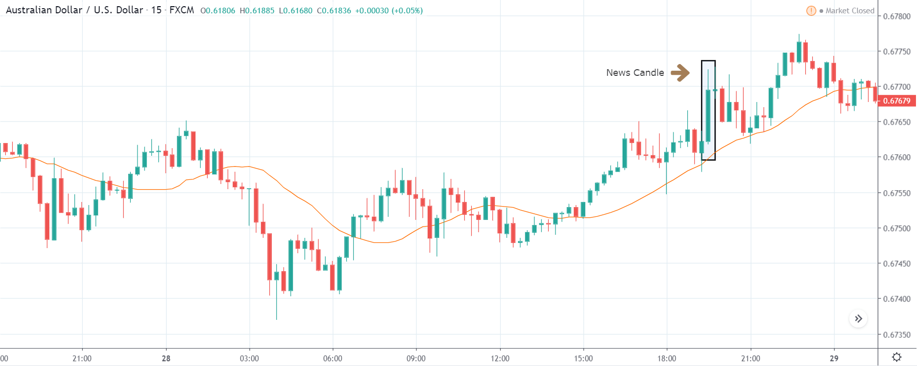
NZD/CAD | After the announcement:
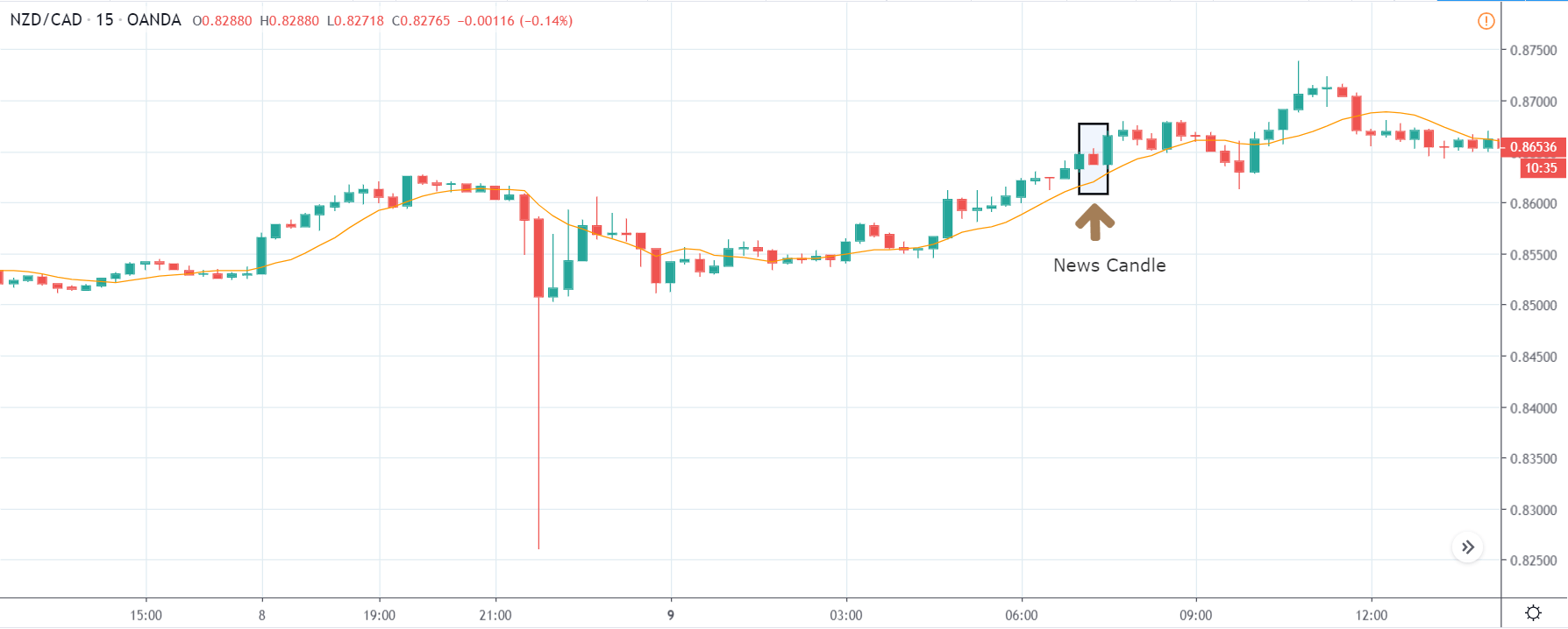
The next currency pair which we will be discussing is NZD/CAD, and in the first image, we see that the market is in an uptrend trying to make a new ‘higher high.’ This shows the amount of weakness in the Canadian dollar and the strength of the New Zealand dollar. As we have explained that the event does not cause much volatility in the pair, taking any position against the trend would be very risky.
After the news announcement, the Canadian dollar shows some strength owing to positive ‘housing starts’ data but not enough to take the price lower. This minimum volatility is a sign that once cannot go ‘short’ in the pair and instead look to join the trend.
That’s about ‘Housing Starts’ and its impact on the Forex market after its news release. If you have any questions, please let us know in the comments below. Good luck!