Categories
Forex Basic Strategies

Forex Trading Strategy – Trading The 123 Continuation Pattern

Introduction

In the previous article, we discussed the 123 patterns as a confirmation sign for the end of a trend. However, while the 123 top and bottom are a great entry method for taking reversal trades, it is observed that most of the time market moves in a trend that requires us to get into the trend in the middle of it. We have heard that ‘the trend is your friend,’ so now we will learn a method to get into a trend using the 123 trend continuation pattern.

The safest trades are the ones that we take in the direction of the major trend. In simple words, if the trend is up, we should be ‘long’ in the market, and if the trend is down, we should be ‘short.’ In fact, it is advised for new traders to always be with the trend and not go for trend reversal trades.

Sometimes, one might miss out on the start of a new trend, for which we need a method to enter the confirmed trend during its progress. In today’s strategy, we will discuss one such method of entering a trending market using the 123 patterns for trend continuation, also called internal 123.

Time Frame

An interesting feature of this strategy is that it can be used on all time frames. One needs to comprehend the strategy very well before trying out this on extremely small time frames, such as 5 minutes or 1 minute.

Indicators

No indicators shall be used in this strategy. However, the Simple Moving Average (SMA) can be used to identify the major market trend.

Currency Pairs

Since the strategy is based on the same 123 reversal pattern that we discussed earlier, the strategy’s parameters will remain the same here as well. Hence, the strategy is suitable for trading in all currency pairs, including major, minor, and few exotic pairs. However, it is advised to trade in the major and minor currency pairs only.

Strategy Concept

The strategy’s basic concept is the continuous identification of 123 points in the direction of the new trend. The initial 123 points are identified in the same way as was identified in the previous section, and subsequently, the same pattern is identified as the trend advances. In this strategy, we will be attempting to catch the trend at the second or third appearance of the pattern. Since we are joining the trend after the move has started and it is in the middle, we cannot expect a large risk to reward ratio. This means the risk to reward of trades using this strategy varies anywhere between 1 to 1.5.

One should be careful while using this strategy for trend trading since most traders end up taking late entries that result in a loss. The strategy cannot be applied when the trend is very much evident on the chart and has reached the end of it. The trader can gauge this through experience and practice. Let us understand the step by step procedure of the strategy with the help of an example.

Trade Setup

In order to explain the strategy, we have considered the GBP/CAD currency pair where will be analyzing the chart on the 4-hour time frame. In this example, we will be looking for ‘short’ trades by identifying a suitable 123 pattern in the currency pair, with the downtrend being our major trend.

Step 1

The first step of this strategy is only a recap of the previous strategy. It involves identifying the reversal of a trend by marking the 3 points and confirming the reversal of the trend. As we can see in the below image, we have marked all the points on the chart and identified the formation of the 123 patterns at the end of an uptrend.

Step 2

This is the crucial step of the strategy, where we only need to repeat the steps that were followed earlier to plot points 1, 2, and 3. The previous lower high or higher low becomes our point 1, the new support or resistance level from where the market reacts becomes 2nd point, and finally, the price that is between new point 2 and 3 from where the market starts moving in the direction of the new trend is the 3rd point.

If we carefully observe, point 3 of the previous step is our new point 1, labeled as 1′ in the below image. The new point 2 is labeled as 2′, and 3′ is our 3rd new point. In the example, we will be entering for a ‘short’ somewhere in the middle of the downtrend and not too late or too early.

Step 3

In this step, we enter the market with appropriate position size and risk evaluation. The entry is the simplest part of the strategy, where we enter the market right at the break of the support or resistance level. This level is nothing but our 2nd point.

Step 4

In this, we determine our take-profit and stop-loss levels for the strategy. As mentioned in the earlier section of the article, the risk to reward ratio will be lower as we are entering the middle of a trend. The stop loss is placed at the 3rd (3′) point, and the take-profit should be at the recent support or demand area that is a hurdle for the down move.

Strategy Roundup

This strategy is only an extension of the previous strategy, where we apply the same rules and steps once again. The difference is that the risk to reward ratio is lower, but we make sure that we are trading with the trend, which puts us in a safer position. Do not apply the strategy again on the same trend.

Categories
Forex Course

139. How Professionals Trade The Different Market States?

Introduction

In this series of different states of the market, we understood the terminology and the concepts involved. However, in the forex market, if we do not go practical, there is the least use to the concept. In other words, one must understand how to trade in the market, knowing its state. In this final lesson of the series, we shall dive deep into the topic and understand how to apply them in the market.

Trading a Trend

Trading a trending market is the simplest and safest way to trade in the market. This is because, in a trend, it is evident on which party is dominating the market. For example, in an uptrend, it is clear that the buyers are more powerful than sellers. And hence, we look for buying opportunities rather than selling.

In a trend, the market makes higher highs and higher lows. In other words, the market moves in one direction with temporary pullbacks in the opposite direction. These pullbacks (retracements) typically turn around to the original trend direction at the support and resistance levels. So, to trade a trend, we wait for the market to make a higher high / lower low and retrace to the S&R level, before triggering the buy or sell.

Consider the below chart of USD/CAD. The market is in a clear downtrend. The market made a new lower low by breaking below the grey ray. It then retraced back to the S&R area (grey ray) and is currently moving sideways. And this sideways movement in the market has high significance.

After the sellers made a new low, the buyers began to show up. They made it until the S&R level. And the market is currently in a range. As per the definition of a range, we know that there is strength from both the parties. In other words, the buyer who was temporarily dominating the market is slowing down as they are unable to make a higher high. And this price action is happening in the S&R area of the sellers. Therefore, we can conclude that the sellers are here to continue their downtrend.

One can enter when the price is at the top of the range (resistance) or when it starts to fall from the resistance. Placing the stop-loss few pips above the S&R level, and a take profit at the Low, is the safest approach to trade a trend.

Trading a Range

In a range, the market moves between levels – Support and Resistance. In this type of market, there is power from both buyers and sellers. Typically, the market shoots up from the support and drops from the resistance. However, randomly buying at support and selling from resistance is not the right way to trade a range like a professional. To trade a range with high odds in your favor, you must be aware of the overall trend. And you place your bets on the direction of the overall trend.

Consider the below chart of NZD/CAD. We can clearly see that the market is in a range. But, looking from the left, the market is in a strong uptrend, and the price is holding above the S&R level (grey ray). In the current market, we see that the price dropped below the bottom of the range, touched the S&R level, and shot right back up into the range. Thus, confirming that the big buyer is preparing to do the buys.

Since the price strongly reacted off from the S&R level and held above the support of the range, we can prepare to go long on the market. Stop-loss from this trade would be below the S&R level, while the target point would be at the top of the range. In hindsight, the buyers were able to push the market above than the resistance.

This brings us to the end of this series. We hope you found this lesson and the previous chapters interesting and informative. Stay tuned until we release our new set of lessons.

[wp_quiz id=”79656″]
Categories
Forex Brokers

Tier1FX Brokerage Review

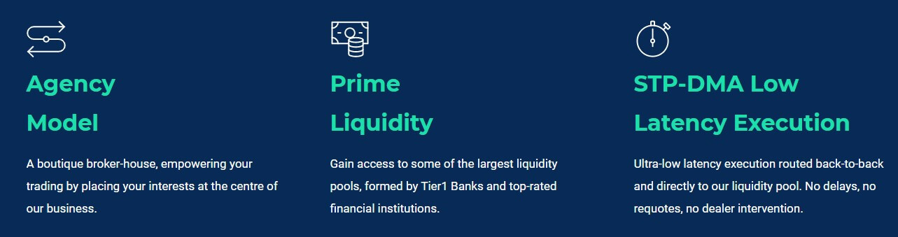
Tier1FX 2013 is a division of Hogg Capital Investments Ltd, which is an online brokerage-based company that is located in Malta and registered under the regulatory authority of the Malta Financial Services Authority (MFSA) with license number C18954. The company claims that its core values are based on fairness, trust, and integrity, while their regulatory status of a pure STP broker helps to ensure that their client’s needs are always aligned with theirs. Investment options include FX pairs, cash indices, and cryptocurrency CFDs, all of which can be traded from multiple platforms. If you’re considering this broker, you’ll want to stay with us to find out more about the conditions associated with their live account.

Account Types

Tier1FX features one main account type with STP/DMA execution that asks for an entry-level $1,000 USD deposit. Several of the account’s features can vary depending upon certain factors. For example, one’s access to a higher leverage cap would be based on retail or professional status. Retail clients can only trade with a 1:30 cap, while professionals can use a 1:100 cap and others could supposedly access a 1:200 cap. Commission charges also differ slightly, depending on whether the account is funded in USD, EUR, or GBP. GBP-based accounts pay the lowest charges, while USD-based accounts are charged the highest amount at $1 more round turn.

Average spreads start from a low 0.2 pips on EURUSD. One advantage to choosing this broker would be access to multiple trading platforms. Options include the familiar MetaTrader 4 platform and other options like Fix API, Fortex 6, etc. The account supports micro tradable lots and offers separate stop out levels based on retail or professional status. We’ve provided a quick overview of these details below.

Tier1FX Standard Account

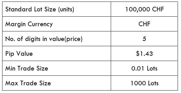
  • Minimum Deposit: $1,000 EUR/USD/GBP
  • Leverage: Up to 1:30 (retail), 1:100 (professional clients), 1:200 others
  • Spread: From 0.2 pips
  • Minimum Maximum Trade Size: 0.01/NA
  • Commission: $4.50 on FX pairs in GBP/$5 in EUR/$5.50 in USD

Platform

The broker provides traders with the ability to choose from multiple trading platforms, including our personal favorite, MetaTrader 4, in addition to JForex, Fortex 6, Fix API, and Fix API through MT4. All of the platforms are accessible via desktop download on Windows, Linux, and MAC, mobile (iOS & Android), and web-based versions. We’ve provided a more detailed list that explains some of the advantages associated with trading through each of the platforms.

MetaTrader 4 (MT4)

  • 30 pre-installed technical indicators, 3 chart styles, 9 timeframes
  • Customizable & navigable interface (multiple colors & layouts)
  • Support for EAs, one-click trading, 35+ languages, and more
  • Most available and preferred platform available among forex brokers

JForex

  • 180+ technical indicators
  • Advanced charting
  • Analytical tools
  • Multiple order features
  • Available in more than 20 languages

Fortex 6

  • Multiple order types, one-click trading, advanced charting and technical analysis
  • Available in multiple languages with a user-friendly interface
  • FIX API (also available through MT4)
  • Runs with a light setup that makes the program ultra-fast
  • Best for those with advanced programming knowledge and skills
  • Supports direct market access and EAs

Leverage

Tier1FX offers different leverage caps based on the client’s categorization. There are two tiers for retail clients, with the basic first-level tier offering a cap of 1:30 on majors as per ESMA standards, 1:20 on non-major currency pairs, 1:10 on commodities other than Gold, and non-major equity indices, and 1:2 on other CFDs. The second-tier offers leverage of 1:100 on all instruments (aside from CFDs on crypto pairs) for retail clients that are considered “professional”.

According to the broker’s website, a trader must possess the experience, knowledge, and expertise to make investment decisions in order to be considered professional. This status can apply to everyday traders, in addition to credit institutions, investment firms, and others. All other clients would be able to trade with a leverage of up to 1:200, but the website doesn’t mention who would actually fall into this category.

Overall, the broker’s leverage limitations are strict, and many other brokers would offer options of at least 1:100 without regarding one’s experience level at all, of course, some regulators force companies to employ the stricter policies. This could help less experienced clients to avoid the pitfall of trading with high leverage without being prepared, which could result in losing a significant amount of invested funds, however, it would be nice to see the broker’s 1:100 cap offered across the board.

Trade Sizes

The broker’s live account supports a minimum trade size of one micro lot (0.01). EAs, hedging, and scalping are supported. The stop out level is set at 50% margin level for retail clients and 100% for professional clients. The website isn’t indicative of maximum trade sizes or whether they differ based on one’s status as a retail or professional client.

Trading Costs

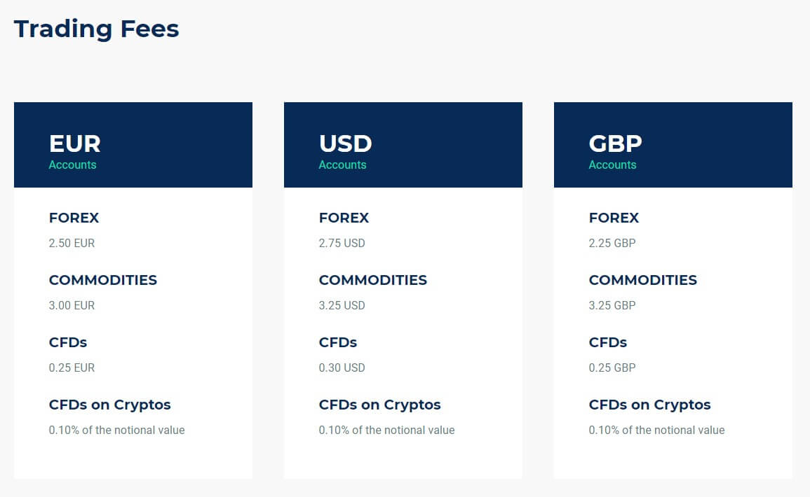
Tier1FX breaks its costs into two categories; basic trading fees, which include spreads, commission fees, and swap charges, and admin fees. The basic fee information that is provided on the website applies directly to retail clients. Institutional and Partner clients can contact the broker for their own tailor-made fee solution. The broker charges commission fees based on the account’s currency. EUR-based account holders would pay $5 (round turn) on FX options, $6 on commodities, and .50 on CFDs.

USD-based accounts would be charged the highest rates, at $5.50 on currency pairs, $6.50 on commodities, and .60 on CFDs. GBP-based accounts offer slightly lower charges of $4.50 on FX pairs, $6.50 on commodities, and .50 on CFDs. All account holders are charged commissions at a rate of 0.10% of the notational value for CFDs on cryptocurrencies.

Traders can view a weekly swaps calendar by navigating to the “Contract Specifications” page and choosing the option underneath the chart. General financing charges are tripled on Wednesdays and triple swaps on CFDs are applied on Fridays. Note that the day on which triple charges are applied or the exact financing amount may change based on National holidays and volatile market conditions.

Admin fees are charged as a $20 USD or 15 EUR/GBP fee on bank wire withdrawals, plus a currency conversion fee that is 500 points over the sport FX rate. Note that the website specifically mentions that admin fees do not include extra charges like a dormant account fee or a maintenance fee.

Assets

Tier1FX offers an impressive 60+ currency pairs, which certainly leaves room for an array of majors and minors, in addition to multiple exotic pairs. Traders will have access to instruments that aren’t always featured with other brokers, especially considering that some cut the number of available FX options in half. Popular metal options Gold and Silver are also offered. On the downside, this broker doesn’t offer much more variety-wise. Ten cash indices are available, with US & UK Oil being offered among those, alongside five cryptocurrency CFDs, including Bitcoin, Bitcoin Cash, Ethereum, Litecoin, and Ripple; however, this is the end of the list.

Traders will find that the variety of currency pairs plus the option to trade cryptocurrencies is ideal, although the fact that commodities, shares, bonds, and multiple other instrument categories are missing is a potential downside, depending on whether one typically trades those types of underlying assets.
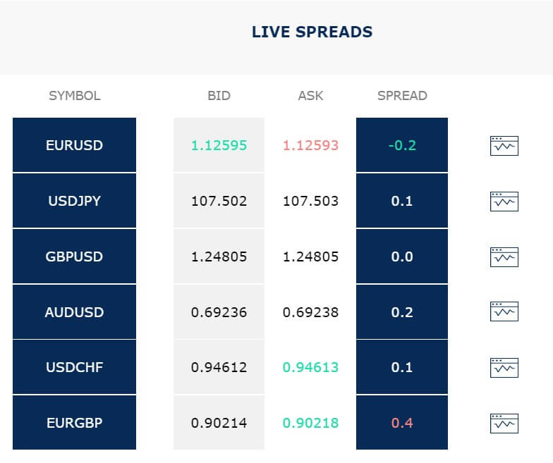
Spreads

Average spreads are advertised as being as low as 0.2 pips on the currency pair EURUSD. This is certainly a competitive offer, and we’re happy to report that Tier1FX does offer advantages based on their expensive initial deposit requirement. On the downside, the broker doesn’t provide us with a list or live spread prices, so it is impossible to compare options on the website. The advertised EUR/USD typically has the tightest spreads, so we’d like to know how much higher options can climb on other currency pairs and cash indices. If the broker is really offering such advantageous conditions, it’s odd that they don’t provide spreads for each instrument in order to support their claims.

Minimum Deposit

Tier1FX requires a $1,000 deposit in USD, EUR, or GBP, making it quite expensive to start up an account with them. Elsewhere, traders can find minimum deposit requirements of around $100 or below, and some brokers have even done away with the requirements altogether. If the broker would introduce a lower-status account, like a Mini, Micro, or Cent account with slightly higher spreads, then it may be possible to avoid forcing some of their potential clients to look for another broker based on affordability. Beginners, those that like to make smaller test deposits, or any trader that simply doesn’t have access to a larger amount of funds to begin investment will be affected negatively by the requirement.

Deposit Methods & Costs

Payment methods are limited to bank wire transfers and card deposits. Traders will not be able to fund through any extra e-wallets. Before the first deposit is made, the broker would require a color copy of the front and back of the client’s card. Card copies should be emailed to [email protected] in order to avoid any funding delays. Third-party deposits are not accepted. The broker does not apply fees on incoming deposits, although it is possible that fees may be charged from the issuing bank. Funds are credited to the trading account the same day that they are received.

Withdrawal Methods & Costs

All withdrawals are credited back to the same bank account or card that was used to make the deposit. Profits can only be withdrawn to bank wire due to anti-money laundering policies. Tier1FX applies the aforementioned $20 USD or 15 EUR/GBP charge from their side on outgoing wire transfers. This amount is charged on top of any banking fees, which are typically $20 – $50 USD, depending on the particular bank. The broker directs clients to visit the “Transfers” section within the Client Portal to view any applicable fees on card deposits. It’s a little disappointing that the website is less than transparent about those fees.

Withdrawal Processing & Wait Time

Withdrawal requests are processed by the company within 1 business day. Once funds have been sent, it may take several days for the amount to show up on the client’s card. In the case of non-SEPA bank transfers, it can take 5-8 business days for funds to be received in the bank account.

Bonuses & Promotions

The broker does not offer any bonuses or promotional opportunities. Traders shouldn’t hold out hope that these features will be added in the future since the company claims that they have decided not to pursue extra offers in lieu of investing in first-class liquidity, execution, and technology instead. This seems like a convenient excuse not to offer bonuses to their clients.

Educational & Trading Tools

Tier1FX only manages to offer demo accounts as their sole educational resource. Demo accounts could be considered the bare-minimum in education, so we aren’t impressed by the option considering that we would expect all forex brokers to provide them. As for trading tools, the website is even more barren of options. Granted, the broker’s supported trading platforms do come with some built-in tools, but even MT4 doesn’t come with an economic calendar or various trading calculators.

Demo Account

Demo accounts are available through the broker’s website for any trader that would like to use one. The broker imposes a 60-day time limit before a demo account will expire. This is better than the one-month expiration period implemented by many other brokers, but we always prefer to see unlimited demo accounts. Support is willing to consider requests to extend the life of the demo account, so long as one reaches out to support before the account expires, but this seems rather inconvenient when this should be available automatically. Fortunately, the account opening process is convenient and can be completed in less than five minutes. The broker also offers demo accounts on multiple platforms, which could be used to test out some of their available options.

Customer Service

The broker’s customer support team is in the office 24 hours a day Monday-Friday. Tier1FX explains that they try their best to respond to all inquiries within 10 minutes, whether the chosen contact method is LiveChat or email. There are also two direct phone lines available. The 10-minute timeframe is certainty advantageous, considering that some smaller brokers can take 1-2 business days to respond to email requests. All contact information has been listed below.
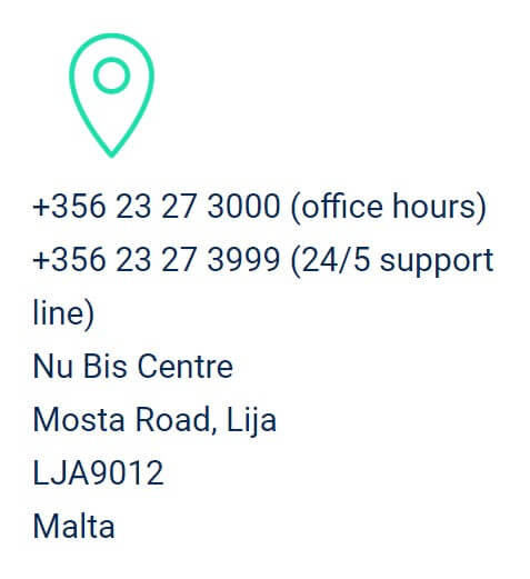
Phone
Office Hours: +356 23 27 3000
24/5 Support Line: +356 23 27 3999

Email
Sales: [email protected]
Support: [email protected]
Applications: [email protected]
General Info: [email protected]

Countries Accepted

Tier1FX does not offer services to clients from the USA, North Korea, Iran, Japan, and Spain. If one chooses any of those options on the sign-up list, a message will be displayed stating that service is not currently available to those clients. One possible away around this restriction would be to sign-up from the US Minor Outlying Islands for US clients, however, most of the restrictions are enforced. Tier1FX likely blacklists the aforementioned countries due to the fact that they are a more reliable regulated broker.

Conclusion

Tire1FX is a regulated forex exchange broker that offers 60+ currency pairs, metals, cash indices, oil, and CFDs on cryptocurrencies. The broker’s investment list may be missing some familiar options and leverage options are restricted to 1:30 for most retail clients. Multiple trading platforms are available, including the most popular MT4, in addition to several other options.

The broker features one live account with a steep $1,000 USD/EUR/GBP deposit requirement. On the upside, the account does offer low spreads from 0.2 pips, with commission charges being based on the type of the account’s currency. Funding options are limited to bank wire and card deposits. The broker charges a high 15 EUR/GBP or $20 USD fee on outgoing wire transfers on top of fees that are already charged from the bank’s side. The website isn’t transparent about fees on outgoing card deposits.

On the plus side, withdrawal requests are processed within one business day. The broker offers 24/5 customer service with an estimated 10-minute response time through LiveChat, email, or phone. As for promotional offers, trading tools, and educational resources, the website doesn’t have anything to offer, aside from demo accounts, which are expected. If one can afford the broker’s minimum deposit and finds the leverage options and tradable instruments to be sufficient, then there are certainly some advantageous trading conditions. Otherwise, it may be best to look for a broker with lower entry-level deposits and extra additional options.

Categories
Forex Daily Topic Forex Fundamental Analysis

Understanding ‘Retail Sales MoM’ Fundamental Forex Driver

Introduction

The Month-over-Month Retail Sales figures are one of the closely watched statistics in the financial markets and have a lot of volatility in the markets around these figures. An increase in sales is one of the earliest signs of growth for businesses that can imply a multitude of things for the economy. It is a closely watched high impact leading indicator. Hence, an understanding and analysis of Retail Sales are paramount for our fundamental analysis.

What is Retail Sales Month-over-Month?

Retail Sales

In the purest sense, it is just the dollar amount of purchase of goods and services made by end-consumers for a given period. Here, the period is MoM, which stands for Month-over-Month. It is the sale of durable and non-durable goods at the retail outlets to consumers.

It can also be defined as the purchase of finished goods and services by consumers and businesses. The goods and services have reached the end of the supply chain. The chain generally starts with the manufacturer or provider and ens up at the retailer where the general population or other businesses consume it.

The Retail Sales figures are often presented in two ways: including and excluding auto and gas sales. As the Auto (vehicle purchase) figures and Oil prices fluctuate frequently, the exclusion helps to identify the trends better once the volatile components are removed. The excluded version is called the Core Retail Sales report.

Retail Sales statistic covers the in-store (retail) sales, catalog sales, and out-of-store sales of durable (goods that last more than three years) and non-durable goods (that have short-life span). The major categories include:

Retail Stores have the following categories:

How can the Retail Sales MoM numbers be used for analysis?

The Retail Sales figures provide us a reliable measure of CURRENT economic activity. It is essential to an objective assessment of the need for and impact of a broad range of policy decisions. Hence, the policymakers use this statistic to keep a pulse-check on the economy’s health.

The Retail Sales figures are significant statistics for many as the Consumer Spending makes up 66% of the United States Gross Domestic Product. The remainder is from Government Spending, Business Spending, and Net Exports. It is also essential as it represents the end of the supply chain figures. All the statistics that precede the Retail Sales figures like Inventory Changes or Manufacturing Production figures all lead up to the Retail Sales, which confirms and triggers the next wave in the trend change in the other indicators, in a feedback loop.

In other terms, once Retail Sales figures improve, businesses see an increase in their revenue and correspondingly demand their products, which leads to an increase in their Manufacturing Production figures, and that would later translate to Change in Inventory statistics. So, we see how the Retail-Sales figure operates amongst the economic indicators in a feedback loop cyclical pattern.

Once Retail Sales figures improve, businesses see profits that encourage expansionary plans, that would increase investment in their business, employment, or even wage growth. It is necessary to understand, Sales improve business, once business improves, wage growth or employment increase is a possibility. Hence, the Retail Sales figure is an essential leading macroeconomic indicator for our fundamental analysis.

The US Bureau of Economic Analysis releases quarterly GDP statistics. If the Month-over-Month Retail Sales figures have been influential, then there is a good chance that the GDP print will be higher. The only downside to the Retail Sales figures that we need to be careful of is that it does not account for inflation, and the increase in the Retail Sales figures could also be a by-product of inflation.

To be noted: The Retail Sales figures are seasonal. It generally tends to increase around the holiday season. Hence, care must be taken during analysis that the decline in stats is due to a business slowdown or seasonal effects. In this case, the Retail Sales figures Year-over-Year is also another parameter that we can use to compare the current conditions with the preceding year to understand the growth trend better, as the GDP is also compared with the last year.

Although data is available in the seasonally adjusted format, to account for the seasonal patterns but it does not adjust for inflation. Hence, it is essential for users of the data to check for the seasonally adjusted figures.

Impact on Currency

Retail Sales is a leading macroeconomic high impact indicator. An increase in Retail Sales is the first sign of growth for businesses in monetary terms. Due to a multitude of economic factors that are affected by the Retail Sales figures, the volatility around the release of these figures is generally high.

It is a proportional indicator, meaning that a consistent or significant increase in the Retail Sales figures translates to increased profits for the businesses, indicates reasonable Consumer Confidence and Consumer Spending, and in turn it will also translate to increased employment, and wage growth. It is a cyclical effect that further promotes spending, and business booms and the economy prospers. It translates to higher GDP prints, which is appreciating for the currency.

Low Retail Sales figures are indicative of a slowdown of business, bearish Consumer Sentiment, where consumers are saving more and spending less. It stagnates the businesses, in the worst case, could lead to lay-offs, and ultimately recession. It will translate to lower GDP prints, which is depreciating for the currency.

Economic Reports

In the United States, the Census Bureau publishes monthly reports of the Retail Sales figures on its official website under the section “Monthly Retail Trade.” The report is released at 8:30 AM about two weeks after the reference month (13-15th day of the month). The schedule for the year is already posted on the website for the user’s convenience. The report details the total sales, percentage changes, and also YoY (Year-over-Year) changes.

Sources of Retail Sales MoM

  • The Month-over-Month Retail Sales statistics can be found here
  • Both advance estimates and Retail Sales figures are available in aggregated format in St. Louis FRED website here
  • We can find Retail Sales monthly figures for various countries here

Impact of the ‘Retail Sales – MoM’ news release on the Forex market

In the previous section of the article, we understood the Retail Sales economic indicator and its consequences on the economy. We will take this discussion forward in identifying the impact of Retail Sales on the value of the currency. Retail Sales is an important economic indicator because consumer spending drives much of our country.

When consumers spend more, the economy tends to hum along, whereas if consumers are uncertain about their financial future, they hold off their purchases that lead to the slow down of the economy. The release of Retail Sales numbers is said to have a large impact on the currency, as shown in the below image.

In this section, let’s analyze the Retail Sales data of the Unites States that was gathered in the month of March. The below image shows that there was a big drop in the Retail Sales compared to the previous month indicating a major disruption in the economy. Let’s see how the market reacts to this data.

USD/JPY | Before the announcement

We will start with the USD/JPY currency pair to witness the impact of the news announcement. The above image shows the state of the chart before the news announcement, where we see that the overall trend of the market is up, and currently, the price is on the verge of continuation of the trend. Depending on the impact of the news, we will position ourselves in the currency pair.

USD/JPY |  After the announcement

After the news announcement, there is a surge in the price, and volatility jumps to the upside. Even though the Retail Sales were very poor in the month, the market reaction was opposite to what was expected. After the news release, traders bought US dollars and strengthened the currency much more. The bullish ‘news candle’ shows the impact of the news on the currency. Since the market reacted very positively to the data, we should take a ‘buy’ trade only after a price retracement.

EUR/USD | Before the announcement

EUR/USD | After the announcement

The above images represent the EUR/USD currency pair, where we see that the market is in a significant downtrend indicating the great amount of strength in the US dollar. The price is currently is at its lowest point, which means we need a pullback in the market to join the trend. If the news announcement results in a retracement of the price, this could be taken as an opportunity for taking a ‘short’ trade.

After the news announcement, the market moves lower, and volatility increases to the downside. Although the Retail Sales data was weak, it did not result in weakening of the currency, but rather the US dollar strengthened. This means the news data was not bad enough to turn the markets to the upside. We will still be looking to enter the market only after a price retracement to a key technical level.

USD/CAD | Before the announcement

USD/CAD | After the announcement

The above price charts are of the USD/CAD currency pair, where we see that the market is aggressively moving up with almost no price retracement. This indicates the US Dollar is very strong, or the Canadian dollar is weak. In any case, we will join the trend only if the price retraces to a ‘support’ or ‘demand’ area.

After the news announcement, volatility expands on the upside, and the price closes, forming a bullish ‘news candle.’ Here too, the Retail Sales data has an opposite impact on the currency as the market reacts positively to the data even though the Retail Sales were largely lower in this quarter. It is advised not to chase the market after the news release since it against the rules of risk management.

We hope you understood Retail Sales MoM fundamental Forex driver and the relative impact of its news announcement on the Forex price charts. Cheers!

Categories
Forex Course

138. How to Identify Potential Market Reversals?

Introduction

In the previous lesson, we discussed the concept of retracement and reversal. We also understood how they are different from each other. However, just knowing if the terminology will not help in the forex market. Being able to predict if the price is retracing or reversing is the name of the game because this will significantly bring down your losing trades and increase the number of winning trades.

Retracement or Reversal?

In technical analysis, there are several ways to predict if the market is undergoing a retracement or a reversal. Here are some of the ways to differentiate between the two.

Fibonacci Retracement

Fibonacci retracements are very popular in technical analysis space. They are based on a sequence of key numbers identified by Leonardo Fibonacci, a mathematician.

In technical analysis (trading), Fibonacci retracement is drawn by taking two extreme points on a price chart, which results in different levels or ratios – 23.6%, 38.2%, 50%, 61.8%, and 100%. These Fibonacci ratios are used by traders to determine possible support and resistance levels in the market. Typically, these are the level where the price tends to hold and reverse from the current direction. Having that said, the price does not hold at every Fibonacci level. It holds perfectly only when it is combined with the price action on the charts.

Consider the below chart of EURCAD. In the recent chart, we see that the market is in an uptrend. The grey ray represents the support and resistance level. After making a higher high, the price has retraced to the S&R level.

Now the question arises if this retracement is a pullback to the uptrend or a potential reversal. To figure this out, we shall apply the Fibonacci retracement to the chart.

In the below chart, we have incorporated the Fibonacci retracement onto the price chart. If we look at the same S&R level, we see that the price is also holding at the 38% level. Hence, this gives us double confirmation that the market is preparing to head north. And in hindsight, the price does make a higher high.

Market Transition

Traders, especially Price Action traders, study the movement in the prices to determine if the market is preparing for a possible reversal. If a market is going for a reversal, the market gives simple yet effective hints and clues about it. The violation from the definition of a trend is the clue that the market is possibly going to turn around for a reversal.

Let us consider the example of a reversal to the upside. Initially, the market will be in a downtrend, making lower lows and lower highs. But, when it retraces and tries to make a new lower low, it leaves equal low. This becomes our first clue on a market reversal. From the point of the equal low, it rallies up but fails to make a lower high.

Instead, it makes an equal high. These two hints are an indication that the price is not moving according to the definition of a downtrend, and there could be a possible reversal. To confirm the same, we wait for the price to make a higher low. If it does make a higher low, instead of a lower low, we can predict that the market is preparing to head north.

Below is a self-explanatory illustration for the above explanation.

Take the below quiz to check if you have got the concepts correctly. Cheers!

[wp_quiz id=”79321″]
Categories
Forex Signals

Daily F.X. Analysis, July 01 – Top Trade Setups In Forex – ADP Non-farm In Highlights! 

On the news front, the primary focus will stay on the ADP non-farm payroll figures, which are expected to be positive. If the actual data also comes out positive, we are going to see sharp selling in gold. Conversely, the negative data can drive selling the dollar and buying in gold.

Economic Events to Watch Today 


EUR/USD – Daily Analysis

The EUR/USD closed at 1.12333 after placing a high of 1.12616 and a low of 1.11908. Overall the movement of the EUR/USD pair remained flat but slightly bearish throughout the day. The pair EUR/USD moved in sideways during Tuesday’s trading session and ended the day with some losses. The greenback was strong throughout the day ahead of Fed chair Jerome Powell’s speech and weighed on EUR/USD pair. However, after the speech, the U.S. dollar became weak, and the EUR/USD pair recovered some of its daily losses.

On the data front, at 11:45 GMT, the French Consumer Spending for the month of May increased to 36.6% from the expected 30.0% and supported Euro. The French Prelim CPI for the month of June dropped negative to -0.1% from the forecasted 0.4% and weighed on Euro, which ultimately dragged the EUR/USD pair with itself.

At 14:00 GMT, the CPI Flash Estimate for the year increased to 0.3% from the expected -0.1% and supported Euro. The Core CPI Flash Estimate for the year remained flat with the projected 0.8%. The Italian Prelim CPI also remained flat with the expectations of 0.1% in June.

On the other hand, from the United States, the S&P/CS Composite-20 HPI increased to 4.0% from the expected 3.8% and supported the U.S. dollar for the year. At 18:45 GMT, the Chicago PMI dropped to 36.6 from the anticipated 45.0 and weighed on the U.S. dollar. At 19:00 GMT, the C.B. Consumer Confidence rose to 98.1 from the expected 91.6 and supported the U.S. dollar added in the downfall of EUR/USD pair on Tuesday.

The U.S. Fed chairman, Jerome Powell, provided a gloomy and unexpectedly uncertain outlook for the biggest economy of the world, which weighed on the U.S. dollar and supported the EUR/USD currency pair.

The increased number of infected cases from many states of the U.S. raised alarming bells, and some states again started to shut down economic activity. The second outbreak forced people to stay in their homes once again and keep them away from the labor market after hurting their confidence level. According to Powell, full consumer confidence was vital to full economic recovery. Euro investors will be looking forward to the release of Germany’s Unemployment Rate figures for June on Wednesday for fresh impetus.

Daily Support and Resistance

  • R3 1.1241
  • R2 1.1235
  • R1 1.1229

Pivot Point 1.1223

  • S1 1.1217
  • S2 1.1211
  • S3 1.1205

EUR/USD– Trading Tip

The EUR/USD is trading below a strong resistance level of 1.1245 level, closing candles below this level, and suggesting chances of selling bias until the 1.1218 level. Continuation of selling trend under 1.1218 level can extend selling unto 1.1195 level today. Alternatively, a bullish breakout of the 1.1245 level can continue buying until 1.1289. Mixed sentiments play as investors are waiting for the U.S. ADP figures, which are due later today. 

GBP/USD – Daily Analysis

The GBP/USD pair was closed at 1.24002 after placing a high of 1.24016 and a low of 1.22574. Overall the movement of GBP/USD pair remained bullish throughout the day. The Pound raised against the dollar after clawing back early day losses on Tuesday amid the suggestion by Bank of England that the U.K. was on track for a stronger than expected rebound after the worst slump in more than 40 years in the first quarter of 2020.

At 11:00 GMT, the Current Account Balance from the United Kingdom showed a deficit of 21.1B against the expected deficit by 15.2B and weighed on British Pound. The Final GDP for the first quarter dropped to -2.2% against the forecasted -2.0% and weighed on British Pound. The Revised Business Investment for the quarter also came in as -0.3% from the 0.1% and weighed on British Pound.

In an earlier trading session on Tuesday, GBP/USD remained under pressure due to poor than expected data from Britain’s side. However, after the positive comments from the chief economist from the Bank of England, the pair GBP/USD gained traction.        

On Tuesday, Andy Haldane said that recent signs suggested that Britain was on course for V-shaped economic recovery from the coronavirus-induced lockdowns, but there was still a risk of high & persistent unemployment.    

According to Haldane, the risks of the economic outlook were considerable and two-sided. He added that the risks were more evenly balanced in June than in May and remained skewed.  

The views that the U.K. economy was on track for V-shaped recovery gave strength to the British Pound on Tuesday and pushed the GBP/USD pair on the upward track.

The strong rebound in the Pound could also be attributed to the little signs of progress on the latest post-Brexit talks. E.U. Negotiator Michel Barnier criticized Britain for choosing not to extend the deadline for the transition period that will end on Dec.31. He also said that Britain was trying to secure as many single markets as possible while showing little compromises on key sticking points, including the level playing field, security, and fisheries.

On the U.S. front, the dollar was weak across the board after the speech of Federal Reserve Chairman Jerome Powell, who provided an uncertain and gloomy outlook for the U.S. economy due to an increased number of infected cases in the U.S. that had forced the renewed lockdown measures in some states. The weak U.S. Dollar added in the gains of the GBP/USD currency pair on Tuesday.

Daily Support and Resistance

  • R3 1.2381
  • R2 1.2367
  • R1 1.2354

Pivot Point 1.234

  • S1 1.2327
  • S2 1.2313
  • S3 1.23

GBP/USD– Trading Tip

On Wednesday, the GBP/USD is trading with a bearish bias as the dollar is getting strong, perhaps due to the positive forecast of ADP figures. The GBP/USD is trading at 1.2375 level, and it’s finding immediate support at 1.2358 level. Closing of candles below 1.2404 level can open further room for selling until 38.2% Fibo level of 1.2340 level. But the bullish breakout of 1.2400 level can drive buying in Cable and can lead its prices towards the next target level of 1.2504 level. The RSI and MACD show diverse opinions as the MACD is in a selling zone, while the RSI is in a buying zone. Let’s consider taking a selling trades below 1.2400 level and buying above the same. 

USD/JPY – Daily Analysis

The USD/JPY was closed at 107.925 after placing a high of107.982 and a low of 107.519. At 4:30 GMT, the Unemployment Rate from Japan increased to 2.9% against the forecasted 2.8% in May and weighed on Japanese Yen that pushed USD/JPY pair higher. At 4:50 GMT, the Prelim Industrial Production was dropped by 8.4% in May against the expected drop of 5.6%, it weighed on Yen and supported USD/JPY pair.

The Japanese yen saw significant outflows into overseas investments towards the end of the month but could all come back on the risks of a second wave impact on U.S. stocks. Some states in the U.S. have reversed the reopening of economies and closed their businesses in the fears of the second wave of coronavirus. The U.S. Federal Reserve Chairman Jerome Powell warned on Tuesday that the second wave of coronavirus outbreak would damage consumer confidence and weaken the economy.

He was cautious that during the second outbreak, the government and people could withdraw again from the economic activity. He added that the worst part of the second wave would be the downward impact on public confidence, which could play a crucial role in getting back to economic activity.

In Republican Arizona, gyms bars, movies, and theaters and water parks were shut down for at least 30 days. These institutions were reopened in middle May, but after the rise in the infected cases across the country, the government announced to shut them down.

The health care professionals in Houston have urged residents to remain at home, wear masks, and cancel gatherings in the wake of intensified virus cases. The residents of Houston also received an emergency alert on their phones to stay home as virus infections have spiked in the town.

Daily Support and Resistance    

  • R3 107.39
  • R2 107.31
  • R1 107.27

Pivot Point 107.19

  • S1 107.14
  • S2 107.07
  • S3 107.02

USD/JPY – Trading Tips

On Wednesday, the USD/JPY is trading with a bearish bias of around 107.560. On the two-hourly charts, the USD/JPY is gaining bullish support from the regression channel. Channel is expected to support the USD/JPY pair around 107.420 while crossing below this level can open up further room for selling until 107 and 106.850 level. The 50 EMA will also be supporting the Japanese pair at 107.300 level. However, the MACD and RSI are suggesting selling bias. Let’s keep an eye on 107.400 level to buy above and sell below this level. Good luck! 

Categories
Forex Basic Strategies Forex Daily Topic

Stop Hunting – The Strategy That Is Used By Most Of The Investment Banks

Introduction

Currently, there is a strategy that is followed by most investment banks around the world, and that is known as Stop Hunting. It attempts to force some market participants out of their positions by driving an asset’s price to a level where many retail traders set their stop-loss orders. The triggering of many stop losses at once generally leads to high volatility, and this can present opportunities to some smart traders who seek to trade in such an environment.

The fact that the price of a currency pair can experience sharp moves when many stop losses are triggered is exactly why many traders engage in stop hunting. Traders who are aware of this fact and have observed this phenomenon of the market try to make of this opportunity by being patient and conservative. The strategy we will be discussing today takes advantage of this sudden rise in volatility due to what is known as ‘stop-hunting.’

Timeframe

The beauty of this strategy is that it can be employed on all timeframes. However, it is not recommended in extremely small timeframes as there is a lot of noise in those timeframes, which may lead to confusion and misunderstanding. Hence, if one wants to profit greatly from this strategy, he/she should trade in 15 minutes or a higher time frame.

Indicators

We will be using just one technical indicator, and that is ‘Simple Moving Average (SMA)’ with 5 or 10 as it’s period. No other indicators are used in this strategy.

Currency Pairs

The strategy is suitable for trading in all currency pairs, including major, minor, and some exotic pairs. However, illiquid currency pairs should be avoided as the price action patterns are not reliable in these pairs.

Strategy Concept

In this strategy, we will be using the concept of previous highs and lows instead of support and resistance to act as our reference points. This is easy to understand and easier to spot in a chart. We will then anticipate these highs and lows as our support and resistance areas, which could break out of. Lows on a price chart are points where the price found support and started to go up.

In other words, this is a price point where there were ready sellers. When price revisits that area, sell orders get triggered, and the price starts to fall. However, during a breakout scenario, the momentum of the price is so much that it breaks the previous high and continues moving south. The Opposite is true for the breakdown of previous lows.

At times it is seen that even when the previous high or low is broken, the price doesn’t always continue in the direction of the breakout or breakdown. The price immediately retreats and bounces off the high or low. We will call these scenarios as fake-out or ‘stop-loss hunt.’ When price retraces back immediately, there is a high chance that it will continue in the same direction, at least until the latest hurdle. Let us explore the steps of the strategy.

Trade Setup

To explain this strategy, we will consider the EUR/USD currency pair and find a trade that fulfills all the criteria of the strategy. In this example, we will be analyzing the 1-hour time frame chart and look for appropriate price action patterns in the pair.

Step 1

The first step of the strategy is to look for highs and lows from where the market has traveled a fair amount of distance. Spotting for such areas in the direction of the major trend is preferred as the risk is lower in such trade setups. For instance, look for buying opportunities at lows of an uptrend and selling opportunities at the highs of a downtrend. This step is very important from a risk aversion point of view. Thus, one should give a lot of importance to this step of the strategy.

Step 2

The next step is to look for a fake-out price action pattern at the low, marked in the previous step. This is the first confirmation that buyers or sellers have come back into the market, and the banks have cleared out all the strategies that were placed below the low and above the high.

The below image shows how the price goes slightly below the previous low clearing all the stops of retail traders, and the last candle closes with a great amount of bullishness.

Step 3

In this step, we see where we take an entry in the market. We take an entry right after the price starts moving higher or lower and closes above or below the simple moving average (SMA), respectively. Conservative traders can wait for the price to retrace to the SMA and then take an entry while aggressive traders can enter right at the close of the candle.

The arrow mark in the below image shows that the entry is made at the close of the second bullish candle after the fake-out.

Step 4

We have one take-profit and one stop-loss point for this strategy where we take profit at the high or low as we had marked in the first step of the strategy while stop loss is placed below or above the low and high, respectively. If one is trading in the direction of the major trend, he/she can take profits at new highs or lows. However, one needs to be conservative while taking counter-trend trades.

Strategy Roundup

Stop-loss hunts are becoming as common as breakouts. By including this strategy in our trading arsenal, we will have something that we could use when we notice such patterns in the market where other traders are looking for breakouts. In this strategy, we have put a significant amount of stress on price action, which makes this strategy very reliable and consistent. One can use trailing stop-loss to protect their profit even when the target isn’t reached. All the best!

Categories
Forex Basic Strategies

Have You Tried This ‘Power Ranger’ Forex Trading Strategy?

Introduction

The forex market either trends or moves in a range. The last strategy was dedicated to trading the range. The strategy we will be discussing today is also based on trading the range. Range strategies are either pure price action based or a combination of both. Oscillators are one of those indicators that are commonly used in range strategies. This is because oscillators indicate a possible range that the price swings back and forth from.

Some common oscillators are the stochastic and relative strength index (RSI). It has been observed that identifying and trading ranges poses more challenges to traders than identifying trends. After all, ranges become evident only after it is formed.

To make things worse, when a range is formed, and one starts applying the range strategy, price action causes the market to break out or break down of a range again. The power range strategy tries to fill this gap. Let us look at how this can be done through the use of a powerful oscillator.

Time Frame

The power ranger strategy works well with the hourly (H1) or 4-hourly (H4) chart. This means each candle on the chart represents 1 hour or 4 hours of price movement. However, using the strategy on the 15 minutes time frame requires a lot of experience and practice. Hence, all new traders should use the strategy on the recommended time frame only.

Indicators 

We use the Stochastic indicator for this strategy with the following specifications.

%K period = 10 | %D period = 3 | Smooth = 3 | Levels = 20 and 80

The stochastic indicator is an oscillator that measures overbought and oversold conditions in the market.

Currency Pairs

The strategy is suitable for all currency pairs listed on the broker’s platform. However, it is advised to deploy the strategy on major currency pairs as patterns clearly show in these currency pairs. One should avoid trading in exotic or illiquid pairs as apart from unclear patterns, there are other problems associated with trading such pairs.

Strategy Concept

The strategy is based on the concept that the market will form a range after a trend. We use the stochastic indicator to give us an indication of a possible range formation. The current market momentum will tell us if we will go ‘long’ or ‘short’ in the market. If the market moves in an uptrend, we look for buy opportunities in the range where the entry will be determined by the stochastic indicator’s oversold region.

If the market is moving in a downtrend, we look to go short in the range. In this case, the entry is determined by the overbought region of the stochastic. We use the most recent high and low to determine the possible resistance and support of the range. Two of the ‘take-profit’ levels are located within the range, and the third one is located beyond the range in anticipation of a breakout.

Trade Setup

To illustrate the strategy, we shall consider the USD/CAD currency pair and find an appropriate trade using the strategy. Here are the steps to follow to execute the power ranger strategy.

Step-1

The first step is to find a trending market. By trending market, we mean, to look for higher highs and higher lows in case of an uptrend and lower lows and lower highs in a downtrend. Plot a trend line that connects these lows and highs, so that the trend looks eminent. This is the simplest step of the strategy. The below image shows an uptrend visible on the 4-hour time frame chart of the currency pair. Let us understand the further steps of the strategy.

Step-2

The next step is to look for a price retracement to a support area or an area close to the trendline. By doing so, we ensure that we are not chasing the market, which is crucial. Once we find such a retracement, observe the stochastic indicator’s position, and determine %K and %D level of the indicator.

We should look for price retracements where the %K and %D lines cross above the 20 levels indicating the market’s oversold condition. In a downtrend, the lines should cross below the 80 levels, indicating the market’s overbought condition.  The below image shows the crossing of both the lines above the 20 level exactly near the support, indicated by the red dotted line.

Step-3

As the price starts moving higher after reacting from the support line and a rise in the oscillator, we take our entry expecting a higher high in the market. One can notice here that, we enter the market only after we get a confirmation and just based on indicator signal and price level. We can see below that we are executing our ‘long’ trade after confirmation from the market in the form of two green candles, indicated by the brown arrow mark.

Step-4

In this step of the strategy, we determine our take-profit and stop loss. Basically, this strategy has three profit points and a single stop loss. We shall take 50% of our profits at the 50% mark of the range, 40% of the profit at 90% mark of the range and remaining profits at the new ‘high.’ The stop loss for this strategy is placed below the support, which would result in a 1:1 risk to reward ratio.

After looking at the below image, one might think that the trade does not hit our final ‘take-profit,’ but this is just one of many trades that does not result in a breakout. However, in most cases, the market makes a higher high and results in a fully profitable trade. The risk management part of the strategy ensures that even though the price does not hit reach our final target, we can still come out of the trade with no or minimum loss.

Strategy Roundup

This is an amazing strategy that allows us to take a range of trade in the early stages of its formation. Always determine the momentum of the market before looking for support and resistance levels. Giving importance to momentum will put ourselves in an advantageous position and prevents us from blindly trading just based on the signal given by stochastic indicator. Cheers!

Categories
Forex Course

136. Learning To Trade The Ranging Market?

Introduction

A Range is a state of the market where the prices move back and forth between the upper bound and the lower bound. A ranging market is also referred to as a choppy, sideways, or a flat market. Unlike a trend, the prices do not move in one specific direction for a long time. A range on a time frame, when looked on a smaller time frame, the price trends in one direction for a while, reverses its direction, and trends in the opposite direction.

Understanding Support and Resistance

Knowing support and resistance is an essential concept to understand a range. These two terms form the basis of a range.

Support

In simple words, support is the level in the market where the prices tend to go up. It is the region where the buyers are interested to aggressively buy the security, causing the prices to shoot up. In other words, it is an area where there is a high demand for the currency pair. A level can be regarded as support when the price reacts multiple times (with power) from that area.

Resistance

Resistance is a level in the market where the prices tend to drop. It is the price where sellers are willing to sell or short sell the asset. They prevent the market from going higher from a specific level. Resistance is no different from that of supply.

Resistance can be understood in terms of buyers. It is an area in the market where the buyers are not interested in buying at that price as they find it expensive. Since there is no demand from the buyers, the prices drop. And when it drops to the support area, the buyers show up again. Thus, due to a higher demand than supply at the support region, the prices rise.

The combination of both support and resistance makes a range. For instance, let’s say the market drops to the $5 mark every time it touches the $10 price. Visually, the market is moving sideways, and such a market is referred to as a range. Here, the $5 price is the support level, and the $10 price is the resistance. A similar example of the same is illustrated below.

ADX indicator for ranging markets

The Average Directional Index indicator can be applied to determine if the market is trending or ranging. A value above 25 indicates that the market is in a strong trending state, while a value of less than 25 signifies that the market is in a consolidation (range) state.

Below is the live chart of AUD/CAD on the 4H time frame. Looking at the chart from a bird’s eye perspective, the market started as an uptrend, held for a while, continued with the same trend, and is currently ranging again. In this sequence, we can observe that the ADX was below the 25-mark line when the market was consolidating, and greater than 25 when it was trending upwards.

We hope you found this lesson on ranging markets interesting and informative. In the next lessons, we shall get into more detail and understand concepts like retracements and reversal. Happy learning!

[wp_quiz id=”78971″]
Categories
Forex Basic Strategies

Trading The Forex Market Using The ‘Pendulum Strategy’

Introduction

In the previous set of articles, we developed techniques and strategies using the most important technical analysis indicators. We also discussed how one could enter the market and make the most out of those strategies. In today’s strategy, we shall discuss a technique that will help us to anticipate a range and trade in the later stages of the range formation.

Time Frame

The suitable time frame for this strategy is the hourly (H1) or 4-hourly (H4) chart. This means each candle on the chart represents 1 hour or 4 hours of price movement, respectively. This does not mean one cannot use the strategy on the 15 minutes or daily time frame. The only difference is that it is difficult to spot trading opportunities on those time frames.

Indicators

We will not be using any indicators for this strategy. The strategy is more price action based.

Currency Pairs

One should note that this strategy is suitable for all currency pairs listed on the broker’s platform. However, it is recommended to trade only in the seven major currency pairs, as the patterns are clearer in these currency pairs.

Strategy Concept   

A pendulum in motion swings back and forth because gravity is pulling it back to the normal position every time it swings away from it. The pendulum reaches a maximum height before it starts to fall back. However, if the swinging force is a lot, the string holding the pendulum will be cut, and the pendulum will fly off.

A ranging market acts similarly to the pendulum. Every time prices pull away from the mid-point of the range towards the top or bottom end of the range, market forces pull it back towards the mid-point of the range. However, sometimes when the market gains enough momentum, prices will break the support and resistance of the range and move into a trend.

In this strategy, we wait for the pendulum to reach it’s optimal height and fall before entering the trade. We do this by executing a trade after the prices bounce back at the 10% market from either support or resistance. Our first target is set at 50% of the range, and the second target is set at the 90% mark of the range.

Trade Setup

We used the EUR/USD currency pair to illustrate the strategy, where we will be discussing a ‘long’ trade. Here are the steps to follow in order to execute the pendulum strategy.

Step 1

The first step of the strategy is to look for established levels of resistance turned support. By established, we mean the resistance which has now turned into support should be quite strong. It will be prominent if the breakout happens with strength, or essentially which happens after a news release.  After that, we need to mark our resistance, or ‘high’ from the market retraces to our support. These two important levels are marked in the below figure.

Step 2

The next step is to wait for the price to bounce off from the support area by 10% of the range that is created between the two lines marked. In the above example, the arrow mark points at the 10% value of the range, as shown in the below image. We will be entering the market for a ‘buy’ exactly after this 10% bounce. The stop loss for this strategy is placed somewhere at a price where the resultant risk to reward is 1.

Step 3

The best part of this strategy is that many emphases are put on trade management. In this step of the strategy, we remove 50% of our positions at the 50% mark of the range and 90% of the positions at the 90% mark of the range. In this, we ensure that even if the market reverses from the middle of the range and breaks below the support, we will still be profitable and would not any money even if the price hits our stop loss.

The points of the first and second targets are shown in the below figure, represented by brown dashed lines. One can also see the position of the Stop Loss marked by a brown dashed line.

We can see in the image below that the market finally breaks out and continues its upward momentum. When critical levels of resistance turned support and support turned resistance are found in an uptrend and downtrend respectively, traders can wait for the market to make new ‘highs’ or ‘lows’ and then book their profits.

Strategy Roundup

This strategy is applicable as long as the market is swinging back and forth in the form of a range. However, the main requirement of the strategy is to find strong levels of resistance turned support in an uptrend (preferably) and support turned resistance in a downtrend (preferably). If the breakout or breakdown does not occur with strength, the strategy might not yield the desired result, or the trade might work just a little bit. Although it looks like trading simple support and resistance strategy, establishing key levels at the beginning of the strategy and application of trade management is what makes this strategy different from trading traditional support and resistance.

Point of Caution

Previously, we mentioned to look out for key levels in trending markets, but at the same time, one needs to be cautious while determining these levels. One needs to check if the market is overbought, in case of an uptrend, or oversold, in case of a downtrend. An indicator that can help us determine the overbought and oversold conditions of the market is the Stochastic indicator.

Categories
Forex Fundamental Analysis

Did You Know That ‘Internet Speed’ Of A Nation Is Also Considered A Forex Fundamental Driver?

What is Internet Speed?

Internet Speed refers to the speed at which data, voice, and video travel long distances. This is achieved with the help of broadband. Broadband refers to the transmission technologies used to transmit the internet. The term is used to describe high-speed and high-bandwidth communication infrastructure. Without broadband, it is not possible to attain high-speed internet at any cost. The common medium of transmission technologies includes coaxial cable, fiber optic cable, and radio waves.

(Source: Statista.com)

Business and Internet Speed  

Companies accessing the internet is nothing new. In the 80s, banks and Wall Street began changing the way they dealt with information. Back then, internet-related tasks were accomplished with the help of a simple modem and dial-up connection. In today’s demand scenario, much faster and reliable systems of internet connection are required. Business owners and IT professionals have a lot to choose from.

High-speed internet leads to greater advantages for companies that rely on cloud-based apps and data. According to the study conducted by an international group, a city with high-speed internet, over a gigabit connection, has an overall healthier economy. The research was carried out by comparing 14 metropolitan areas where more than half the population has access to high-speed internet with that of 40 neighboring cities without high-speed internet.

It was reported that cities that had gigabit connections, like the fiber optics, can support a 1.1% higher gross domestic product than other “slower internet” cities. A 1.1% contribution might soundless, but when this is seen in the context of developed countries that grow a minimum of 1-2% every year, one can estimate how significantly it can impact economic growth. It could mean up to $1.5 billion in the local economy.

Importance of High-Speed Internet

On a global level, increasing internet speeds have the power to transform whole economies. During the keynote speech at Broadband World Forum, Johan Wiberg (Head of Business Unit Network, Ericsson) described that when more and more people begin to have access to high-speed internet and mobile broadband, people will find new ways to conduct the businesses.

High internet speed has the power to spur economic growth by creating efficient systems for businesses and consumers. It opens up opportunities for more advanced online services, smarter utility services, and telecommunication. In healthcare, for instance, innovative mobile applications will be used by nearly 800 million people.

But when it comes to high-speed internet, it is not easy to launch into an area overnight. It takes effort from companies and governments to introduce data and wi-fi connectivity in rural areas. Hence, the positive effects of these new technologies are hard to see right away. As more and more businesses get access to high-speed internet, whole verticals of the economy will transform.

With these effects sounding exciting, one shouldn’t expect higher income levels with the introduction of high-speed internet in our communities. When governments and policymakers fully comprehend the importance of digital highways, it is then we can find drastic changes in the economy in no time.

Countries with Fastest Internet around the World

Taiwan has the fastest internet with an average speed of 85Mbps, followed by Singapore, Jersey, Sweden, and Denmark. While Yemen has the slowest internet in the world with an average speed of just 0.38Mbps. Thirty-seven of the fifty fastest internet countries are located in Europe, with 10 in Asia, 2 in North America, and just 1 in Africa. The global internet speed is getting faster.

The previous year, global average internet speed was 9.1Mbps while this year, the global average is 11.03Mbps, a rise of more than 20%. Generally speaking, countries which have the fastest internet speeds are the ones which are small and developed. The larger & less developed a nation is, the slower will be the internet.

By looking at the present statistics, we can say that there is little change in development, availability, and rollout of faster infrastructure in the bottom half of the ranking compared to the top half.

Below is the avg Internet Speed of different countries in the world (In terms of MBPS)

(Source – Fastmetrics)

Impact on Currency 

Temporary internet shutdown in a high connectivity country is estimated to have a GDP impact per 10 million people per day of $23.5 million on average. The average impact in a medium connectivity country would be an estimated $6.5 million and $0.6 million of GDP, respectively. Therefore, Internet Speed does impact the value of the currency as well. But it does not an immediate impact, rather the effect is felt on a longer-term.

Sources of information on Internet Speed

There are many speed testing websites that calculate internet speed and keep them updated every few minutes. However, this information cannot be found on most of the economic websites as it is a very important economic indicator for traders. The website of telecommunication ministry is also a source of information on the internet and broadband.

Links to Internet Speed information sources

GBP (Sterling) – https://tradingeconomics.com/united-states/internet-speed

AUD – https://tradingeconomics.com/australia/internet-speed

USD – https://tradingeconomics.com/united-states/internet-speed

CAD – https://tradingeconomics.com/canada/internet-speed

JPY – https://tradingeconomics.com/japan/internet-speed

CHF – https://tradingeconomics.com/switzerland/internet-speed

Final Words

Broadband has created new sectors and redefined the old ones. The music industry, for example, after years of declining sales, is growing rapidly after the adoption of digital distribution models. All this is possible only with the help of fast internet. As broadband becomes abundant and faster, everything from retail to government services finds new ways to reinvent themselves, especially in knowledge-based sectors where such speed and efficiency can enhance competitiveness.

Digital infrastructure opens up possibilities for more advanced online services, smarter utility services, e-health, telecommunication, and telepresence. All are dependent on high-speed broadband networks. Hence Internet Speed of a nation pays a key role in determining how advanced the country is in terms of technology as well.

Having that said, the news release of Internet Speed figures for different countries doesn’t really affect the Forex price charts in any way. Hence, technical analysts can ignore this fundamental driver’s news announcements. Cheers!

Categories
Forex Assets

Everything About Trading The CHF/DKK Forex Asset Class

Introduction

The abbreviation of CHF/DKK is Swiss Franc, paired with the Danish Krone. Here CHF is the official currency of Switzerland and is also the fifth highly traded currency in the Forex market. In contrast, DKK stands for the Danish Krone, and it is the official currency of Denmark and the provinces of Greenland and the Faroe Islands.

Understanding CHF/DKK

In the Foreign exchange market, to ascertain the comparative value of one currency, we need an alternative currency to evaluate. Once when we buy a currency, which is identified as the base currency and simultaneously sell the quote currency. The market value of CHF/DKK helps us to comprehend the power of DKK against the CHF. So if the trade rate for the pair CHF/DKK is 6.9915, it means to buy 1 CHF, we need 6.9915 DKK.

CHF/DKK Specification

Spread

A spread is described as a distinction between the buying & offering price of a Forex pair. In other words, it is a distinction between the ask-bid price of an asset. Below is the spread charges for ECN and STP stock brokers for CHF/DKK pair.

ECN: 12 | STP: 17

Fees

A Fee is a cost that we traders pay to the broker for achieving a trade. The Fees differ on the type of broker (STP/ECN) we use.

Slippage

When we want to implement a trade at a specific market rate, but as a replacement for it, the trade gets implemented at a different rate, and that is because of the slippage. Slippage occurs when we deal with a volatile market, and when we execute a large order at the same time.

Trading Range in CHF/DKK

The trading range in the table below will ascertain the amount of money we will gain or lose in each timeframe. We have the interpretation of the minimum, average, and maximum pip movement in a currency pair in the below table. Now we will use the ATR indicator that demonstrates the price movement in a currency pair.

Below is a table demonstrating the minimum, average, and max volatility (pip movement) on numerous timeframes.

Procedure to assess Pip Ranges

  1. Add the ATR indicator to your chart
  2. Set the period to 1
  3. Add a 200-period SMA to this indicator
  4. Shrink the chart so you can assess a large time period
  5. Select your desired timeframe
  6. Measure the floor level and set this value as the min
  7. Measure the level of the 200-period SMA and set this as the average
  8. Measure the peak levels and set this as Max.

CHF/DKK Cost as a Percent of the Trading Range

The price of trade differs on the type of broker and fluctuates based on the volatility of the market. The aggregated cost of trade involves spread, fees, and occasionally slippage if the volatility is high. To reduce the cost of the trade, we can use limit orders as an alternative for market execution.

ECN Model Account

Spread = 12 | Slippage = 5 | Trading fee = 8

Total cost = Slippage + Spread + Trading Fee = 5 + 12 + 8= 25

STP Model Account

Spread = 17 | Slippage = 5 | Trading fee = 0

Total cost = Slippage + Spread + Trading Fee = 5 + 17 + 0 = 22

The Ideal way to trade the CHF/DKK

CHF/DKK is an exotic currency pair. Here, the average pip movement in 1hr timeframe is 99, which implies higher volatility. The greater the volatility, the greater is the risk and low cost of the trade and the other way around. Considering the above tables, we can see from the trading range that when the pip movement is lower, the proportion is high, and when the pip movement is elevated, the proportion is low.

The ratios are higher in the minimum column. This indicates the cost is high when the volatility of the market is lower. For example, on the 1H timeframe, when the volatility is 24 pips, the cost percentage is 104.17%. Meaning, one must accept high costs if they enter or exit trades when the volatility is around 24 pips. So, preferably, it is suggested to trade when the market volatility is higher than the average.

Categories
Forex Daily Topic Forex Fundamental Analysis

The Impact Of ‘Factory Orders’ News Release On The Forex Price Charts

What are Factory Orders?

Factory orders are the dollar value of all orders received by factories. The U.S. Department of Commerce reports the number of new orders every month. Factory orders are divided into four parts: new orders, unfilled orders, shipments, and inventories. It includes information about durable goods and non-durable goods. Factory orders data is often not very surprising because the report of durable goods orders comes out one or two weeks earlier.

Dividing Factory Orders        

The factory orders data is divided into four sections:

  • New orders, which indicate whether orders are increasing or decreasing
  • Unfilled orders, indicating a backlog in production
  • Shipments, which indicate produced and sold goods
  • Inventories, which indicate the strength of future production

The figures are mentioned in billions of dollars and also as a percent from the previous month and previous year. Factory orders data is often dull, mostly because the durable goods orders come out a couple of weeks earlier, and people have an idea of factory orders for the current month. However, the official factory orders data gives more detailed information on orders estimate and fulfillment.

The factory orders report includes information about both durable and non-durable goods. Durable goods have a life span of at least three years and often refer to items not purchased frequently, such as machines, garden equipment, motor vehicles, and electronics. In contrast, non-durable goods include fast-moving consumer goods such as food, clothes, footwear, medication, and cleaning items.

Investors get an insight into the growing trend of the economy with the help of factory orders report, which largely influences their investment decisions. Factory orders give an early indication of the growth in the economy, and its impact is felt on the equity market.

Analyzing the data

When it comes to the fundamental analysis of a currency pair, it is important to understand how factory orders are analyzed to make proper investment decisions. Factory orders are analyzed by comparing the previous and current readings, where, if we notice a consistent drop in the ‘orders,’ it could signal a slump in the overall demand.

These factory orders are not just used for analyzing one country but also for comparing the economic growth of any two countries. Investors shift their funds to countries where there is a growth in the factory orders, and demand is high. One needs to remember to compare countries with the same economic status. For example, factory orders of a developed country should not be compared with that of a developing nation.

The economic reports

Factory orders are released monthly by the Censuses Bureau of the U.S. Department of Commerce. The full name is “Full report on Manufacturers’ Shipments, Inventories and Orders” but is commonly referred to as Factory Orders. This report usually follows the Durable Goods Reports, which provides data on new orders received from more than 4,000 manufacturers of durable goods.

The factory orders report is more comprehensive than the durable goods report, where it examines the trend within industries. For example, the durable goods report may account for a broad category, such as industrial equipment. In contrast, the factory orders report will provide details about the hardware, software, semiconductors, and raw materials. This lack of information in a durable goods report is attributed to its release speed.

Impact on currency

Factory orders are an important economic indicator. When factory orders increase, the economy usually expands as consumers demand more goods and services. High demand, in turn, requires retailers and suppliers to order more things from factories. This is interpreted as positive for the economy by foreign investors who then invest in the country through the stock market or currency.

An increase in factory orders could also mean that inflation is just around the corner. When factory orders decrease, the economy is usually contracted, which means there is less demand for goods and services, so retailers will not place a lot of orders. When this is reflected in reports, investors tend to have a negative on the economy and think twice before investing in such economies.

Sources of information on Factory Orders 

The factory Orders data is closely watched by investors around the world, which is why the report is immediately available on most of the open-source economic websites and some of the broker’s websites. The official source of information is the U.S. Census Bureau, where it provides statistical information of all the information related to factory orders.

Links to ‘Factory Orders’ information sources

GBP (Sterling) – https://tradingeconomics.com/united-kingdom/factory-orders

USD – https://tradingeconomics.com/united-states/factory-orders

EUR – https://tradingeconomics.com/germany/factory-orders

Factory orders are a key economic indicator for investors and others monitoring the health of economies. It provides information on how busy factories may be in the future. Orders placed in the current month may provide work in factories for many months to come as they will have to work to fill the orders. Businesses and consumers generally place orders when they are confident about the economy.

An increase in factory orders signifies that the economy is trending upwards. It tells investors what to expect from the manufacturing sector, a major component of the economy. The factory orders data often tend to be volatile with revision in the methodology now and then. Hence, investors typically use several months of averages instead of relying too heavily on a single month’s data.

Impact of the ‘Factory Orders’ news release on the Forex market

In the previous section of the article, we understood the factory orders economic indicator and saw how important it is for foreign investors. As defined earlier, it is a report which shows the value of new factory orders for both durable goods and non-durable goods. The survey is usually released a week after durable goods orders report. The report tends to be predictable, with only non-durable goods appearing as the new component compared to the previous report. Thus, investors would have priced in most of the information even before the official release. Still, it causes some volatility in the currency pair during the news announcement.

In today’s lesson, we will analyze the impact of the factory orders news announcement on various currency pairs and witness the change in volatility due to the news release. The below image shows the latest factory orders data of the United States, where it can be seen that the orders were better than expectations but were lower than last time. A higher than expected reading is considered to be bullish for the currency, while a lower than expected reading is considered negative. But, let us find out how the market reacts to this data.

EUR/USD | Before the announcement

Let us start with the EUR/USD currency pair to observe the impact of factory orders on the U.S. dollar. The above image shows the 15 minutes time-frame chart of the currency pair where the market is in a strong uptrend before the news announcement. Recently the price has formed a ‘range,’ and the price is at the top of the ‘range’ at this moment. Technically, this is an ideal place for going ‘short’ in the market, but since a news announcement is due, it is advised not to take any portion before the announcement.

EUR/USD | After the announcement

After the news announcement, the price initially moves higher, but this is immediately sold, and the market erases all the gains. The ‘news candle’ finally closes at the price where it had opened. Therefore, the factory orders data brought about a great amount of volatility in the currency pair, which is evident from the wick on top of the ‘news candle.’ One should wait for the volatility to settle down before taking a position in the market.

USD/CAD | Before the announcement

USD/CAD | After the announcement

The above images represent the USD/CAD currency pair, where we see that the market is extremely volatile before the news announcement, and there is no clear direction of the market. As a point of a tip, it is not advisable to trade in currency pairs where the volatility is more than normal as there are a lot of risks associated with trading in trading such pairs.

After the news announcement, the currency pair gets exceedingly volatile where essentially the price drops greatly, but buyers pressure from the bottom takes the price back to its opening level. Therefore, the factory orders data had a major impact on the pair where the price continued to move lower a few minutes after the news release.

AUD/USD | Before the announcement

AUD/USD | After the announcement

The above images are that of the AUD/USD currency pair, where the price is retracing the overall uptrend of the market. In such market situations, we should be looking for trend continuation candlestick patterns to confirm that the market will continue moving up.

After the news announcement, the price sharply moves higher and leaves a wick on top of the ‘news candle.’ Since volatility is high on both sides of the market during the announcement, we cannot ascertain if the factory orders data was positive or negative for the currency. As the market continues to move higher after the close of the ‘news candle,’ one should look for going ‘long’ in the market a few hours after the news announcement.

This ends our discussion on the ‘Factory Orders’ Fundamental driver. It is crucial to know its impact on the Forex price charts before trading this market. Cheers!

Categories
Forex Daily Topic Forex Fundamental Analysis

Understanding ‘Industrial Production Index’ & Its Relative Impact On The Forex Market

What is the Industrial Production Index?

Industrial Production Index or IPI, as it is commonly called, is an index that tracks manufacturing activity in different sectors of the economy. The IPI number measures the industrial production for the period under consideration, usually a month. IPI is a key economic indicator of the manufacturing sector of the economy. It measures the real output in the mining, electric, and gas industries, relative to the base year.

How is IPI calculated? 

Industrial Production is expressed as an index relative to the base year, which is 2012. They do not express absolute production numbers or volume, but the percentage change in production relative to 2012. The parameter taken into account is often varied, including physical inputs and outputs such as tons of iron, or inflation-adjusted sales figures, and when these parameters are not available, hours logged in by production workers is considered. This data is obtained from industry associations and government agencies, and the index value figure is obtained after incorporating these numbers in the Fisher-Ideal formula.

Within the IPI index, several sub-indices provide a detailed look at the production levels of highly specific industries. One can find the monthly production data of residential gas sales, ice cream, carpet and rug mills, spring and wire products, audio and video equipment, and paper in these sub-indices. The indices are seasonally adjusted, and sometimes the format is unadjusted.

Limitations of the IPI

While GDP estimates show that the manufacturing sector has picked up, the IPI doesn’t. In such cases, the question arises, which of the two should we believe. The selection of items for measuring the production output has remained the same for many years. This will have implications on the index value. IPI growth will have a certain directional bias. The recommendation has always been to make it more dynamic. All they are saying is to revise it more frequently. But the officials have been only pushing the dates forward.

Another limitation is in the selection of the base year. The 2011-2012 base year series shows faster growth than the previous one, 2004-2005 base year. Therefore, it is suggested to use the old methodology alongside the new method.

Analyzing the IPI 

The IPI data is particularly useful for money managers and investors who are a part of the business. At the same time, the composite index is an important macroeconomic indicator for economists who analyze the impact of the numbers on the economy and industry. Fluctuations within the industrial sector account for variation in the overall economic growth. The monthly metric keep investors informed about the shifts in the production levels.

At the same time, IPI ignores the most popular economic output measure, the Gross Domestic Product (GDP). GDP calculates the price paid by the end-user, so it includes the value-added in the retail sector. This is ignored by IPI. Another observation is that the industrial sector is losing its share in the GDP of a country; for instance, it made up less than 20% of the GDP of the U.S. economy as of 2016.

Along with IPI, capacity utilization is another useful indicator that investors analyze to assess the demand scenario. Low capacity utilization or overcapacity, in other words, signals weak demand. Policymakers read it as a need for fiscal or monetary stimulus in the economy. Investors read it as a sign of coming downtrend for the currency and the stock market. High capacity utilization, on the other hand, acts as a warning signal that the economy is overheating, suggesting the risk of price hikes and asset bubbles. Policymakers react to such threats with interest rate hikes or fiscal austerity. There is also a possibility that this could ultimately result in a recession.

Impact on Currency

Industrial production figures are directly proportional to the value of a currency. When Industrial Production is high, it means economic activity is improving in the country that directly contributes to the GDP. A rate of GDP leads to an appreciation in the currency value. However, an effect on the overall economy is felt when industrial production is increasing each month. An improvement in the production output for one month has no impact on the currency; the average value of at least three months makes a difference. The IPI is an early indication of growth in the manufacturing sector, which is why it is closely watched by investors and traders.

Sources of information on Industrial Production Index

The Federal Reserve Board publishes the industrial production index (IPI) every month, which is released approximately in the 2nd week of the month. The revisions in the method of calculation, if any, are released at the end of every March. As it is an important indicator of growth in the manufacturing sector, most open-source economic websites keep track of their respective countries’ data.

GBP (Sterling) – https://tradingeconomics.com/united-kingdom/industrial-production

AUD – https://tradingeconomics.com/australia/industrial-production

USD – https://tradingeconomics.com/united-states/industrial-production

CAD – https://tradingeconomics.com/canada/industrial-production

EUR – https://tradingeconomics.com/european-union/industrial-production

JPY – https://tradingeconomics.com/japan/industrial-production

The Industrial Production Index (IPI) is an important economic indicator published by the Federal Reserve Board (FRB) of the United States that measures manufacturing, mining, and utilities’ real production output. The indices are computed mainly as fisher indices with more weightage on the annual estimates of value-added. The fisher methodology only preserves the growth information, which is why the value of the base year, i.e., 2012, is randomly set to 100. This index, along with other industrial output indexes and construction, accounts for the bulk of the total output variation throughout the business cycle.

Impact of the ‘Industrial Production Index’ news release on the Forex market

In the previous part of the article, we understood the significance of Industrial production fundamental indicators in an economy. Now let’s discuss the impact of the Industrial Production Index news announcement on the value of a currency and witness the change in volatility due to the news release. As discussed previously, Industrial Production measures the change in the total inflation-adjusted value of output produced by manufacturers, mines, and utilities.

For instance, Industrial Production measures the output of businesses in the industrial sector of the United States economy, where the manufacturing sector accounts for 78 percent of total production. Some of the biggest segments of this sector are Chemicals, food, drinks and tobacco, machinery, computer and electronics, motor vehicles, and others.

Now let’s analyze the Industrial Production data of the United States released in June. As we can see in the below image, Industrial Production in the United States increased to 1.4% percent in May, which was much higher than the previous month. The Industrial Production numbers in April and May are largely influenced by COVID-19. Let us find out the reaction of the market to this data.

EUR/USD | Before the announcement

Let us start with the EUR/USD currency pair witness the change in volatility due to the news announcement. The above image shows the state of the chart before the news announcement, where we see that the market was in an uptrend and recently has laid out signs of reversal.

EUR/USD | After the announcement

After the news announcement, the price moves higher, and volatility slightly increases to the upside. However, the price does not go much higher, and the major trend to the downside continues. Thus, it would be right to say that the news announcement had a positive impact on the U.S. dollar.

USD/JPY | Before the announcement

USD/JPY | After the announcement

The above images represent the USD/JPY currency pair, where we see that the market is moving within a ‘range’ before the news announcement. Just when the Industrial production numbers are to be released, the price is at the top of the ‘range,’ and volatility is high. Depending on the impact of the news release, we take a suitable position in the currency pair.

After the news announcement, the market moves lower by a couple of candles, as seen in the above image, and gets retraced by strong buyers who take the price above the ‘news candle.’ But since the price is again at resistance, it eventually moves lower and reaches the support. By this price action, we can say that the currency pair becomes highly volatile after the news announcement.

NZD/USD | Before the news announcement

NZD/USD | After the news announcement

The above price charts belong to NZD/USD currency pair, where we see that before the news announcement, the price was moving higher, and now it has displayed a strong reversal pattern in the market, indicating a reversal to the downside. If the news release does not change the underlying price action pattern, one can take a risk-free ‘short’ position in the currency pair. This is how technical analysis is used in conjunction with fundamental analysis.

After the news announcement, the price moves higher by a little, and ultimately the reversal pattern dominates the market, and price makes a ‘lower low.’ Therefore, the slight bullishness that was witnessed due to the news announcement was of significance, and the market crashed.

We hope you got the gist on what the ‘Industrial Production Index’ is and its impact on the Forex price charts after its news release. In case of any questions, let us know in the comments section below. Cheers!

Categories
Forex Course

130. How to Effectively Trade Regular Divergence?

Introduction

The occurrence of divergence is considered by all types of traders, including traders who do not analyze charts without indicators. This is because divergence gives an edge to their trading strategy. In the previous lessons, we interpreted the meaning of divergence and also its different types. In this lesson, we shall put this knowledge into action, where an effective strategy will be discussed.

Trading a regular divergence

To recap a real quick, regular divergence is a type of divergence which indicates a reversal in the market. If it indicates a reversal to the upside, it is referred to as bullish divergence and bearish divergence for a reversal to the downside.

Spotting regular divergence

  1. Find the overall trend of the market.
  2. Mark the lower lows for a downtrend and higher highs for an uptrend on the price charts.
  3. Draw the corresponding movement on your choice of oscillator indicator.
  4. Determine if both prices and indicators are making the same sequences. If they are moving apart from each other, then we conclude that divergence has occurred.

Trade Example

Consider the below chart of AUD/JPY on the 15mins time frame. We can see that the market is in a downtrend making lower lows. For the first lower low in the price, the MACD had a lower low as well. But, for the second lower low in price, the indicator made a higher low. Thus, showing divergence in the market.

Since this is a regular bullish divergence, it indicates a reversal in the market. But, note that divergence does not give a trading signal to buy the security. An indication of a reversal must be based on the strategy. Here are some compelling points to confirm the legitimacy of a divergence.

When divergence occurs in a pair, the first factor is to measure the length and momentum of the down pushes. Comparing the first down push to the second, it is observed that the latter is smaller in length and also took a greater number of candlesticks than the former. This is a considerable indication that the downtrend is weakening.

Secondly, observe what the price does when it reaches the Support & Resistance level (purple ray). We can see that the price touched the purple ray, tried to go below the recent low, but failed to do so. This is another indication of the sellers’ weakening.

Now that the sellers are losing strength, we wait for the other party (buyers) to kick in. In the below chart, we can see the entry of the buyers with one massive bullish candlestick. This becomes our first confirmation that the big buyers are in the market.

However, it is not ideal to buy right when the buyers show up because, at times, the sellers could take over and continue to make lower lows. Thus, to confirm the reversal, the buyers must hold above the S&R level (purple ray). In the below chart, we see that the price came down, tried to go lower the S&R, didn’t succeed, and held above it. Hence, this confirms that the market has prepared for a reversal, and we can go long when the candlestick closes above the purple ray, as shown by the black arrow.

As a result, we see that the market successfully reversed its direction and began to make higher highs.

[wp_quiz id=”77943″]
Categories
Forex Fundamental Analysis

Significance Of ‘Composite PMI’ As A Forex Fundamental Driver

Introduction

Composite Purchasing Manufacturing’s Index (PMI) is one of the major indicators of the country’s economic health. It is mainly concerned with the manufacturing and service sectors. The PMI provides information about the current business conditions from the data gathered from the company’s decision-makers, such as analysts and purchasing managers.

The PMI survey of each country consists of a questionnaire for the manufacturing or service sector, which collects the responses from the panel of senior purchasing executives at over 400 companies. The Composite PMI is basically a number that ranges between 0 to 100. The number above 50 represents an expansion compared to the previous reading. A PMI reading below 50 represents a contraction, and a reading at 50 indicates no change.

Calculation of the PMI

As mentioned in the above paragraph, the PMI is a number from 0 to 100, but we need to understand how one arrives at those numbers. The PMI is calculated using the below formula.

PMI = (P1 * 1) + (P2 * 0.5) + (P3 * 0)

Where:

P1 = percentage of answers stating an improvement

P2 = percentage of answers stating no change

P3 = percentage of answers stating a deterioration

The percentage stating deterioration has a zero multiplier; thus, it is always zero, but the larger the value of P3, the fewer the weight of the first two factors, thus lowering the total PMI value. in the case of P3=100% PMI = 0.

Use of Composite PMI

The PMI data is a critical decision-making tool for money managers that influences their investment across sectors to a great extent. Let us take the case of an automobile manufacturer, where the production decisions are based on the new orders it expects from the customers in future months. This will make them buy dozens of parts and raw materials, such as tires and plastics. The inventory rules also drive the amount of production the manufacturer needs to finish to fill new orders and to keep some inventory at the end of the month.

From the supplier’s point of view, the PMI data matter to him the most as well. The parts supplier to a manufacturing company will estimate the amount of demand it might get from these companies based on the PMI. Due to this, the suppliers charge more for their parts. The new orders data is closely related to the Composite PMI. For instance, if the new orders are growing, the manufacturing company may raise the prices of its products and accept the high cost of the parts. A company also uses the Composite PMI to plan its annual budget, supervise staffing levels, and manage cash flow.

The Economic Reports 

The Economic Reports of Composite PMI and related data are published monthly by the Institute for Supply Management (ISM) that is extremely useful for manufacturers and the investment managers. The ISM monitors changes in production levels from month to month and is at the core of the Manufacturing report. This is one of the earliest indicators of economic activity and that investors and economists get regularly. The institute also releases a Semi-annual report in May and December. When the number is rising, investors anticipate a bullish reaction from the market to the data that is seen in the currency and stock market.

Analyzing the data

The PMI data is very easy to analyze, where we only have to look at the number and compare it with the previous readings. A PMI reading above 50 indicates growth or expansion of the manufacturing sector. A reading of 50 indicates that the number of manufacturers reporting good business is equal to those stating business is not good. Another key number to look for is 43.2. If the PMI index has been above this number for a period of time, it indicates an expansion of the overall economy. Any number under 50 indicates a contraction in the manufacturing sector and that most businesses are not expecting good business in the near future.

Impact on the currency 

The composite PMI is closely watched by traders and investors around the world that greatly influences their investment decision. They mainly if the number is below or above the 50 levels, which shows potential contraction or expansion in the economy. If the number is greater than 50 over the last few quarters, it indicates growth in the economy, which drives the currency higher. If the number remains below the 50 mark, it means the economy has entered into a recession. Investors will not be interested in investing in countries where the economy is in a recession, which leads to a depreciation of the currency.

Sources of information on Composite PMI

Composite PMI is available on the official website of the Institute for Supply Management (ISM), which also provides a comprehensive analysis of the same. The data can also be found on some open-source economic websites and financial magazines.

Links to Composite PMI information sources

GBP (Sterling) – https://tradingeconomics.com/united-kingdom/composite-pmi

AUD – https://tradingeconomics.com/australia/composite-pmi

USD – https://tradingeconomics.com/united-states/composite-pmi

EUR – https://tradingeconomics.com/euro-area/composite-pmi

NZD – https://tradingeconomics.com/new-zealand/composite-pmi

JPY – https://tradingeconomics.com/japan/composite-pmi

The Composite PMI is a monthly survey sent to senior executives at more than 400 companies in 19 primary industries. The industries and companies are selected based on their contribution to the GDP and the sector, respectively. The surveys include questions about business conditions and any changes, whether it be improving, no change, or deteriorating. Hence, traders must keep an eye on this data and watch for its official releases.

Impact of the ‘Composite PMI’ news release on the Forex market 

Investors consider Composite PMI as a leading indicator of the economic health of a country. It is extremely for international investors looking to form an opinion on a country. The PMI is also a leading indicator of the growth in the gross domestic product (GDP). When formulating monetary policy, central banks use PMI surveys, which is reflected in the fixing of interest rates.

When it comes to predicting the GDP growth, a reading above 42 is considered a benchmark for economic expansion. In contrast, a reading below 42 indicates that the economy is heading into a recession. Since it is an important indicator for most of the people related to the economy and financial sector, it is bound to have a major impact on the value of a currency.

In today’s lesson, we will analyze the impact of composite PMI on different currency pairs and identify the change in volatility due to the news announcement. We will be looking at the PMI data in the Eurozone that was released in June (May as the reference month). The below image shows the previous, predicted, and latest PMI reading, where we see a big increase in the number compared to the previous month. Let us find out if the market receives the data positively or negatively.

EUR/USD | Before the announcement

Let us start with the EUR/USD currency pair to observe the change in volatility due to the news release. The above image shows the price’s behavior before the news announcement, where we see that the market is a strong uptrend. We will be looking to buy the currency pair after a price retracement to a support or demand level. At this point, we shouldn’t be taking any position in the currency pair.

EUR/USD | After the announcement

After the news announcement, volatility expands to the upside, and the market moves higher. As the PMI data was extremely positive for the economy, traders bought the currency and took the price higher. The PMI data had a positive impact on the currency pair, and the market makes new ‘high.’ One has to be cautious here by not jumping into the market for a ‘buy’ as it is against risk management rules.

EUR/JPY | Before the announcement

EUR/USD | After the announcement

The above images represent the EUR/JPY currency pair, where we see that the price is continuously moving higher with minimum retracements before the news announcement. It means the uptrend is very strong. From a ‘trade’ point of view, a similar approach will be followed here as well as we had in the previous currency pair, where we will be looking to buy the currency pair only a price retracement.

Right after the news is released, the price initially moves higher, but later selling pressure makes the ‘news candle’ to close near the opening. Therefore, we witness volatility in both the directions of the market in this currency pair. We can say that the PMI data did not have a major impact on the currency where the market remains sideways a few minutes after the news release as well.

EUR/AUD | Before the announcement

EUR/AUD | After the announcement

The above charts are that of the EUR/AUD currency pair, where the market shows a strong downtrend signifying a great amount of weakness in the Euro. Recently, the price has shown signs of retracement, and so we can expect a continuation of the down move after noticing trend continuation patterns. Until then, we will see what impact the PMI data makes on the currency pair.

After the news announcement, the price does not move adversely in any direction and remains almost at the same place as it was before. The PMI data has a neutral effect on the currency pair where ‘news candle’ forms a ‘Doji’ candlestick pattern. However, the Euro becomes bullish a few minutes after the news release and markets move higher, nearly reversing the downtrend.

This ends our discussion on ‘Composite PMI,’ and its relative impact on the Forex market post its news release. In case of any questions, please let us know in the comments below. All the best!

Categories
Forex Assets

Costs Involved While Trading The XBR/USD Asset Class

Introduction

BCO is an acronym for Brent Crude Oil, which is one of the two types of crude oil and is a benchmark for determining the price of oil, along with West Texas Intermediate (WTI) crude oil. BCO is also known by Brent Blend, Brent Oil, and London Brent. It is the benchmark for the majority of the crude oil from the Atlantic basin, which marks for two-thirds of the crude oil price traded internationally. In the market, it is traded with the ticker XBR/USD.

Understanding XBR/USD

Brent Crude is a commodity traded in barrels. The price of XBR/USD depicts the value of the US Dollar for 1 barrel of crude oil. It is quoted as 1 XBR per X USD. For example, if the market price of XBR/USD is 41.42, then it means that each barrel of crude oil is worth $41.42.

XBR/USD Specification

Spread

It is the basic difference between the bid price and the ask price. The spread on ECN and STP account model is as follows:

ECN: 11 | STP: 15

Fee

There is a fee (commission) for every position a trader opens. However, this fee is only on the ECN account, not the STP account.

Slippage

Slippage is the difference between the price intended by the trader and the price given by the broker. It occurs due to two factors:

  • Broker’s execution price
  • The volatility of the market

 Trading Range in XBR/USD

It is the representation of the volatility of the market in different time frames. The table values represent the minimum, average, and maximum pip movements in various time frames. 

Procedure to assess Pip Ranges

  1. Add the ATR indicator to your chart
  2. Set the period to 1
  3. Add a 200-period SMA to this indicator
  4. Shrink the chart so you can assess a large time period
  5. Select your desired timeframe
  6. Measure the floor level and set this value as the min
  7. Measure the level of the 200-period SMA and set this as the average
  8. Measure the peak levels and set this as Max.

XBR/USD Cost as a Percent of the Trading Range

The following are two tables that represent the variation in the fee in terms of a percentage for different time frames. The percentage values are calculated by finding the ratio between the total cost and the volatility values.

ECN Model Account

Spread = 11 | Slippage = 5 | Trading fee = 5

Total fee = Spread + Slippage + Trading fee

Total fee = 11 + 5 + 5 = 21 (pips)

STP Model Account

Spread = 15 | Slippage = 5 | Trading fee = 0

Total fee = Spread + Slippage + Trading fee

Total fee = 15 + 5 + 0 = 20 (pips)

Trading the XBR/USD

Crude oil is a commodity that is rigorously traded in the market. Its volatility and liquidity are comparable to major and minor currency pairs, providing good opportunities for traders to participate in the market. The crude oil prices are driven by various fundamental factors and its Demand and Supply. The reflection of the same is seen on the charts. Thus, traders can apply technical analysis as well to forecast the price movements.

There is a fee on every trade you take with a forex broker. This fee is the same irrespective of the time frame you trade on. So, traders must place themselves in a position that will have a reasonable cost for a sufficient P/L. The trading range and the cost percentage table are the tools for it.

The larger the percentage value, the higher is the relative fee on the trade and vice versa. For example, let’s there are two traders – 1D and 4H trading with the same lot size. The 1D trader places a take profit to 200 pips, while the 4H trader places it at 100 pips. But the fee paid by both the traders is the same. But, seeing the relative fee, the 4H trader pays a higher fee than the 1D trader because his take profit is only 100 pips. Thus, the percentage values are higher in the 1D time frame than the 4H time frame.

There is another scenario where the relative cost changes based on the volatility of the market. In simple terms, the relative fee can vary even if a trader trades in the same time frame. Precisely, the relative fee is higher when the volatility of the market is around the minimum values. Therefore, to balance between the total fee and the P/L, one must trade when the market volatility is above the average volatility, irrespective of the time frame traded.

Categories
Forex Fundamental Analysis

Ease of Doing Business – Comprehending This Macro-Economic Indicator

What is the ‘Ease of Doing Business Index?’

The ease of doing business index was created jointly by two leading economists, namely Simeon Djankov and Gerhard Pohl from the Central and Eastern sector of the World Bank Group. It is an aggregate number that includes different parameters that define the ease of doing business in a country. The ease of doing business (EODB) measures the country’s position in offering the best regulatory practices. Though the World Bank started publishing the reports in 2003, the ranking only started only in 2006.

The EODB study captures the experience of small and medium-sized companies in a country with their regulators and the relationship with their customers, by measuring time, costs, and red tape they deal with. The goal of the World Bank is to provide an objective basis for understanding and to improve the regulatory environment for businesses worldwide.

Methodology

The survey consists of a questionnaire made by a team of experts with the assistance of academic advisors. The questionnaire consists of feedback on business cases that cover topics such as business location, size, and nature of its operations. This survey’s motive is to collect information that is affecting their business and not to measure conditions such as the nation’s proximity to large markets, quality of infrastructure, interest rates, and inflation.

The next step of the data-gathering process involves over 12,500 expert contributors such as lawyers and accountants from 190 countries in the survey to interact with the Doing Business team in conference calls, written reviews, and visits by the global team. Respondents fill out the surveys and provide information relevant to laws, regulations, and different fees charged.

A nation’s ranking is decided after assessing the following factors:

  • Starting a business – idea, time, procedure, and capital required to open a new business
  • Construction permits – permissions, land, and cost to build a warehouse
  • Electricity access – procedure, time and cost needed to obtain an electricity connection from the electricity board
  • Property registration- procedure, time, and cost required to register the warehouse with the local government body
  • Getting credit and loan – the process involved in getting credit from banks, and depth of credit information index
  • Investor protection – the extent of disclosure, liability, and ease of shareholder suits
  • Payment of taxes – tax filing process, preparation of tax filing and number of taxes paid
  • Cross border trading – number of documents required, and cost for import and export
  • Enforcing contracts – procedure, time, and cost to impose debt contract
  • Insolvency process – time, cost and recovery rate under a bankruptcy proceeding

Based on the score obtained in the above sub-indices, a country is assigned a rank in the ease of doing business index. The ease of doing business report is a complete assessment of competitiveness or the business environment. Still, rather it should be considered as a proxy of the regulatory framework faced by the private sector before starting a new business.

The Economic Reports

The ease of doing business reports is an annual report published by a team led by Djankov in 2003. The report is then elaborated by the World Bank Group that basically measures the costs firm is incurring for business operations. The World Bank report is, in fact, an important knowledgeable product in the field of private sector development. It has also motivated the design of various regulatory reforms in developing countries. The study presents a detailed study of costs, time, and procedures that a private firm is subject to before opening the company. This then creates rankings for a country.

Impact on Currency

The Doing Business report is used by policymakers, politicians and development experts, journalists, and, most importantly, the fund managers to understand the easiness of starting a business in the country. More companies mean more jobs, and more jobs mean faster development. Growth in the economy is directly related to the companies’ performance and the opening of new businesses. Therefore, when regulations are eased for starting a business, it contributes to the GDP of the country longer and increases the value of the currency in the international market.

Sources of information on Ease of Doing Business 

The ease of doing business report is one of the most sought reports in the finance industry, so many financial institutions and economic websites give mention ranking of a country after collecting the data from official sources. However, the data published by the World Bank is the most reliable and factual.

Sources

GBP (Sterling) – https://tradingeconomics.com/united-kingdom/ease-of-doing-business

AUD – https://tradingeconomics.com/australia/ease-of-doing-business

USD – https://tradingeconomics.com/united-states/ease-of-doing-business

CAD – https://tradingeconomics.com/canada/ease-of-doing-business

CHF – https://tradingeconomics.com/switzerland/ease-of-doing-business

JPY – https://tradingeconomics.com/japan/ease-of-doing-business

NZD – https://tradingeconomics.com/new-zealand/ease-of-doing-business

Ease of Doing Business report is one of the most discussed issues around the world. The report that is issued by the World Bank gets a lot of attention from the government around the world. For country authorities, it sheds light on regulatory aspects of their business climate. For business representatives, it helps initiate debates and dialogue about reform.

The private sector creates pressure on the respective government to ensure required reforms to indirectly improve the country’s rank in the EODB index. Investors take the decision of investment in a country based on the ranking of that country in the ease of doing business report. From the World Bank’s point of view, it demonstrates an unconditional ability to provide knowledge and resource information. This exercise by the World Bank generates information that is useful and relevant.

Impact due to news release

In the previous section of the article, we understood the definition of ‘Ease of Doing Business’ and the methodology used for ranking a country. Now we will extend our discussion in identifying the impact of the news announcement on the value of a currency. Many case studies tell correlation exists between ease of doing business and FDI flows.

One study finds that judicial independence and labor market flexibility are significantly associated with FDI flows. The number of procedures required to start a business and strength of the arbitration regime both have a significant and robust effect on FDI. Due to these reasons, foreign investors always invest in an economy where business activities can be carried out without any obstructions.

In today’s lesson, we will analyze the impact of ‘Ease of Doing Business’ on different currencies and analyze the change in volatility due to its news release. The below image is a graphical representation of Switzerland’s rank in 2018 and 2019. We see that the country had shown improvement in it’s ranking by two places. Let us find out the reaction of the market to this announcement.

USD/CHF | Before the announcement

Let us start with the USD/CHF currency pair to analyze the impact of the ‘Ease of Doing Business’ announcement. The above image is the daily time frame chart of the currency pair, where we can see that the pair is moving within a ‘range.’ Presently, the price is at a resistance area, which means sellers can push the price lower anytime soon. Therefore, we should be cautious before taking a ‘buy’ trade in this pair.

USD/CHF | After the announcement

After the news announcement, a slight amount of volatility is witnessed, which takes the price higher that results in the formation of a bullish ‘news candle.’ Since the Swiss Franc is on the left-hand side of the pair, a bullish candle indicates bearishness for the currency, and that is becoming weak. We can say that the news announcement a slight negative on the currency.

CAD/CHF | Before the announcement

CAD/CHF | After the announcement

The above images represent the CAD/CHF currency pair, where it appears that the market is moving in a channel before the news announcement. We should be looking to sell the currency pair as the price is at the top of the channel. However, the news announcement shall give us a clear direction of the market. We will not be taking any position before the news release as the news release has a moderate to high impact on the currency pair.

After the news announcement, the price moves a little higher and closes with some amount of bullishness. As the ‘ease of doing business’ was not so encouraging for the economy, traders went ‘short’ in Swiss Franc right after the news release. However, the effect does not last long, and the market collapses a couple of days later.

CHF/JPY | Before the announcement

CHF/JPY | After the announcement

The above images are that of the CHF/JPY currency pair, where we see a strong move to the upside before the news announcement, and currently, the price is at the resistance turned support area. There is a high chance of buyers becoming active at this point; hence, sell trades should be avoided.

After the news announcement, we witness some volatility in the market that takes the price lower but not by a lot. The impact was not great on this currency pair as the country slipped below by two places in the ‘ease of doing business’ ranking. When the impact of news settles down, one should start analyzing the pair technically and take the position accordingly.

That’s about the ‘Ease of Doing Business’ as an economic indicator and its relative impact on the Foreign Exchange market. Cheers!

Categories
Forex Assets

Asset Analysis – Analyzing The XAG/USD Asset Class

Introduction

Silver is a precious metal standing after Gold. It is a vital asset to understand and forecast the potential movements in the commodity market. This is because buyers and sellers trade the silver market based on global macro trends. Moreover, Silver highly correlates with the Gold Spot prices. XAG/USD is the ticker for Silver against the US Dollar. XAG can be traded against other fiat currencies as well.

Understanding XAG/USD

Silver is a commodity that is traded in troy ounces (Oz), just like any other precious metal. The market price of XAG/USD represents the value of the US Dollar for 1 ounce (Oz) of Silver. It is quoted as 1 XAG per X USD. For example, if the market price of XAG/USD is 17.432, it signifies that each ounce of Gold is worth $17.432.

XAG/USD Specification

Spread

Spread is essentially the difference between the buying price and the selling price. The spread varies on the based account-model used.

ECN: 15 | STP: 21

Fee

A fee is basically the commission on the trade. It applies only to ECN accounts, not STP accounts.

Slippage

The arithmetic difference between the price asked by the trader and the price given by the Broker is referred to as slippage. It occurs due to two reasons: High market volatility & Broker’s execution speed

Trading Range in XAG/USD

The minimum, average, and maximum pip movement in different time frames is represented in the following table. It can be used to assess your risk on the trade.

Procedure to assess Pip Ranges

  1. Add the ATR indicator to your chart
  2. Set the period to 1
  3. Add a 200-period SMA to this indicator
  4. Shrink the chart so you can assess a large time period
  5. Select your desired timeframe
  6. Measure the floor level and set this value as the min
  7. Measure the level of the 200-period SMA and set this as the average
  8. Measure the peak levels and set this as Max.

XAG/USD Cost as a Percent of the Trading Range

Cost a percent of the trading range is the representation of the variation in fees on the trade-in different time frames for varying volatility.

ECN Model Account

Spread = 15 | Slippage = 5 | Trading fee = 5

Total fee = Spread + Slippage + Trading fee

Total fee = 15 + 5 + 5 = 25 (pips)

STP Model Account

Spread = 21 | Slippage = 5 | Trading fee = 0

Total fee = Spread + Slippage + Trading fee

Total fee = 21 + 5 + 0 = 26 (pips)

Trading the XAG/USD

Silver Spot is extensively traded in the commodity market, after Gold Spot. It offers enough volatility and liquidity for traders to participate in the market. Silver highly correlates to Gold. Traders can use it as a proxy to place their bets on Silver prices. The technical analysis can be used on Silver as applied to any other market. Even though there is enough volatility in this pair, it is not ideal for entering any time into the market. The reason for it can be accounted for through the cost percentage table.

The cost percentage table represents how expensive a trade is going to be based on the time frame and volatility. Note that, the absolute total cost will remain the same irrespective of the two factors but will vary relatively. For instance, a 1H trader must pay the same fee a 4H trader pays for their trade. But, there a catch; the 4H trader generates more P/L than a 1H trader.

Thus, to have a balance between the P/L and fee on the trade, one must trade when the market volatility at or above the average values. Trading in low volatility markets will cause hurdles in the market to reach your target. Hence, we will have to pay the same costs, even for a small P/L.

Categories
Forex Daily Topic Forex Fundamental Analysis

Understanding The Importance Of ‘Terms Of Trade’ As A Macro Economic Indicator

Introduction

Terms of Trade is a direct and useful measure of an economy’s International Trade health and gives us a good measure of how fast capital is moving in or out of the country. Terms of Trade make analyzing Balance Of Payments and, more specifically, Current Account Balance easier. Understanding of Terms of Trade can help us better analyze the current liquidity of the economy and its changes in a more crude way.

What are Terms Of Trade Indices?

Terms of Trade is the ratio of its Export Prices and Import Prices. It is the ratio of money received on exports to money spent on imports. If there is an individual’s analogy to be made, then it would be the ratio of an individual’s monthly income to his monthly expenses. Mathematically, it would be the number of export goods that can be purchased per unit of import.

Terms of Trade ratio expressed in percentages, and hence the ratio is multiplied by a hundred. A TOT figure above100 indicates that the country is receiving more on its exports than on its income and vice-versa.

When a country has a TOT figure of more than 100, it means that it is receiving more capital on exports compared to sending capital out on imports. Hence, on an overall basis, capital is flowing into the country. Higher the ratio, the faster the rate at which capital flows into the country. It ultimately translates to the pace at which a country is becoming wealthy and liquid.

When a country has a TOT figure less than 100, it means capital is flowing out of the economy, and its import expenses exceed that of its export revenue generated. Continued periods of TOT figures less than 100 will drive the economy to a vicious debt cycle from which recovery may be difficult. The ratio will tell us how fast the capital is depleting from the economy and is nearing a financial crisis. Countries prefer to have a ratio above 100.

The ratio tells us the rate at which the economy is accumulating capital. On the global market place and International Trade, the ratio will determine what portion of the world’s wealth goes to each country. In other words, based on the demand and supply on the international markets, the ratio will tell us how profits from international trade will be distributed amongst the participating countries.

How can the Terms Of Trade numbers be used for analysis?

Since TOT is a ratio change in TOT, figures can imply multiple things. An improvement in TOT figure could mean:

  1. Export prices have increased in contrast to Import prices being stagnant or dropped.
  2. Export prices would have dropped but not as sharply as import prices. Both dropped but not to the same degree.
  3. Export prices would have stayed the same while Import prices would have dropped.

All the above scenarios can lead to an improvement in the TOT figure. Hence, simple changes in TOT figures cannot be directly used to draw economic conclusions. It is crucial to understand the factors that have resulted in a change in TOT numbers. It is crucial to know whether the change is a consequence of a short-term shock or development or a consistent long-term trend that will persist throughout the coming periods.

TOT is susceptible to multiple economic factors, some of which are:

Exchange rate: A decrease in exchange rate adversely affects imports and benefits exports and vice versa. Imports become costly, and exports become cheap, adversely affecting TOT.

Inflation: The inflation rate across different economies and different sectors affect different economies having different export and import portfolios. For example, a sharp increase in Iron Ore prices can greatly benefit Australia, whose chief exports are Iron Ore, while it can affect importing countries like China and Japan adversely. So inflation across sectors have different impacts across economies and within the country amongst different sectors.

Demand and Supply: Increase in demand, coupled with the availability of those resources also affects TOT as exports and imports are a function of demand and supply. Scarcity increases prices and oversupply decreases the same.

Quality of Produce: Size and quality affect the pricing of products. A high-quality product is likely to cost more and benefit the exporter more. Hence, the portfolio of the country’s exports and imports determines the TOT fluctuations of different product grades.

Trade Tariffs: Protectionist strategies from Governments lead to putting trade barriers on imports. The political and trade ties between countries can also affect the long term trend of TOT figures for a given economy.

Portfolio of Exports and Imports: What types of Goods and Services a country exports and imports also matter. Countries that export goods and services that are more of primary importance (ex: food and energy) tend to always have high demand and TOT ratio more than 100 both within the economy and on the global economy.

Impact on Currency

When the TOT figure is above a hundred, it implies domestic currency is flowing into the country and creating a deficiency in the global market. Hence, higher TOT figures will increase its currency demand and thereby leading to currency appreciation. On the other hand, a continued TOT less than 100 indicates the world is being supplied with domestic currency and therefore leads to currency depreciation.

It is a coincident indicator and is more useful as a long-term trend indicator rather than short-term changes. The indicators affecting TOT would have been identified through Trade agreements or other media sources in general and hence, is a mild-impact indicator.

Economic Reports 

The Bureau of Economic Analysis publishes its TOT figures in the National Income and Product Accounts every quarter of the year on its official website. Below is a figure for an illustration of the same:

We can also find the aggregated TOT reports for the OECD countries on the official website. The World Bank also aggregates and maintains TOT data for most countries on its official website.

Sources of Terms Of Trade

For the US, we can find the Terms of Trade in their National Income and Product Accounts here:

BEA – National Income and Product Accounts

OECD – Terms Of Trade

World Bank – TOT

We can also find Terms of Trade Index for many countries categorized here.

Impact of the ‘Capacity Utilization’ news release on the price charts

In the previous section of the article, we learned the Terms of Trade economic indicator and understood its significance in an economy. The ToT Index measures the ratio of an export to the price of an import, per commodity. A country that heavily relies heavily on exports, this number gives an important hint of the nation’s growth. Even though the Terms of Trade is useful in determining the balance of trade in a country, it does not have a major influence on the GDP of the economy. Therefore, investors don’t give much importance to the data during the fundamental analysis of a currency.

Today, we will be analyzing the impact on Terms of Trade on different pairs and witness the change in volatility due to the news release. The below image shows the latest Terms of Trade data of New Zealand that indicates an increase in the value compared to the previous quarter. A higher than expected reading is considered to be positive for the currency while a lower than expected reading is considered as negative. Let’s see how the market reacted to this data.

NZD/USD | Before the announcement:

We shall start with the NZD/USD currency pair to examine the impact of Terms of Trade on the New Zealand dollar. In the above price chart, we see that the market is in a strong downtrend before the news announcement with increased volatility. Currently, the price is at a key technical area, which is known as the ‘demand’ area, and hence we can expect buyers to come in the market at any moment. Thus, once needs to be cautious before taking a ‘short’ trade.

NZD/USD | After the announcement:

After the news announcement, the market moves lower and volatility increases to the downside. The Terms of Trade data showed an increase in the total percentage, but this was not good enough for the market players who apparently took the price down and weakened the New Zealand dollar. Although the ‘News Candle’ closes in red at the time of release, it gets immediately taken over by a bullish candle, as this was a ‘demand’ area.

NZD/JPY | Before the announcement:

NZD/JPY | After the announcement:

The above images represent the NZD/JPY currency pair, where we see that the characteristics of the chart are similar to that of the above-discussed pair. Before the news announcement, here too, the market is in a strong downtrend, and the volatility appears to be high on the downside. One thing that is different in this pair is that the price is presently at its lowest point and seems to have made a ‘lower low.’ This means New Zealand is weaker in this pair.

After the news announcement, market crashes and the price drops sharply. The Terms of Trade has a similar impact on the pair, where we see a further increase in volatility to the downside. Again. the weakness does not sustain, and the price shows a large bullish candle after the ‘news candle.’

NZD/CAD  | Before the announcement:


NZD/CAD  | After the announcement:

Lastly, we shall discuss the impact on the NZD/CAD currency pair and observe the change in volatility. Here, we see that the market is continuously moving lower before the news announcement indicating a great amount of weakness in the New Zealand dollar. Just before the news release, the price seems to be approaching the ‘demand’ area, which can possibly change the trend for a while by initiating some bullishness in the pair.

The Terms of Trade news announcement gets lukewarm from the reaction where the price initially moves higher little and finally closes forming a ‘Doji’ candlestick pattern. The news release leads to further weakening of the currency where the volatility expands on the downside.

That’s about ‘Terms Of Trade’ and its impact on the Forex market after its news release. If you have any questions, please let us know in the comments below. Good luck!

Categories
Forex Course

124. Trading The Bullish & Bearish Butterfly Pattern

Introduction

Bryce Gilmore and Larry Pesavento are the ones to first discovered the Butterfly pattern. It is a harmonic reversal pattern, and it is composed of four legs. The trading of this pattern is similar to the trading of Gartley and Bat patterns that we have learned in previous lessons. The Butterfly pattern helps us in identifying the end of the current move so that we can take the trade. There are both bullish and bearish Butterfly patterns, and we must be going long if we find a bullish butterfly and vice-versa.

Four legs of the Butterfly Pattern

XA – In its bearish version, the first leg of the pattern forms when the price action drops from the point X to A.

AB – The AB leg reverses its direction and retraces to 78.6% Fib level of the distance covered by XA.

BC – In the BC leg, the price action changes its direction and moves back down. It then retraces between 38.2% and 88.6% Fib levels of the distance covered by AB.

CD – This is the final leg of the pattern, and if this leg goes wrong, we can consider the pattern formed till now as invalid. The CD leg must reach between 127% and 161.8% Fib extension of the AB leg. Take the sell trade at point D.

How To Trade The Butterfly Pattern?

Bullish Butterfly Pattern

We have identified the formation of the Butterfly pattern in the USD/JPY Forex pair. The first push ‘XA’ was a random leg on the price chart. The second leg is a countertrend move, and it retraces to the 78.6% Fib level of the XA leg. For the third leg, price action goes up, and the BC leg reaches 88.6% of the AB move. Finally, the CD leg enabled the price to the 161.8% level of BC move.

Since all the legs are formed according to the instructions, we can consider this a Bullish butterfly pattern. When price action completed the last leg, we activated our buy trade in this pair. The stops are placed below the trade, and the take profit was placed at point A.

Bearish Butterfly Pattern

The chart below represents the formation of a bearish butterfly in a downtrend. The first XA bearish leg was any random move in the market. The AB leg goes countertrend, and it retraces 78.6% of the XA leg. The BC move was bearish again, and it retraces to 38.2% of the AB move. Now that the three legs are completed, all we need is to confirm the last leg to ho short in this pair. For printing the last leg, price action again goes back up, and it reached the 161.8% of the BC move.

After all these legs, price action prints a bearish butterfly pattern, and the trade activation was at point D. The first take-profit was at point C, and the second take profit was at point A. We have placed the stop-loss order below the point D. The reason for shallow stops is that if the price goes above point D, the pattern itself becomes invalid.

Conclusion

Placing stop-loss and take-profit order is subjective. If you are an aggressive trader, place your take-profit at point C and for conservative targets place the take profit at point A. For your information, trading the Butterfly is almost as same as trading the Bat pattern. The only difference is the final CD leg. It makes a 127% Fib extension of the initial XA leg in this pattern, rather than the retracement of it. Cheers!
[wp_quiz id=”77249″]
Categories
Forex Fundamental Analysis

What Is ‘Services PMI’? How Important Is It In Assessing A Nation’s Economy?

Introduction

The Services Purchasing Manager’s Index is an excellent leading or advanced macroeconomic indicator, which is used widely to predict economic expansion or contractions. It has various applications for economists, investors, and traders. This indicator predicts inflation, GDP, and the unemployment rate of an economy. Hence, understanding of Services PMI can be hugely beneficial for a trader’s fundamental analysis. 

What is Services PMI?

The Services Purchasing Manager’s Index, also called the Non-Manufacturing Index (NMI), is a survey of about 400 largest non-manufacturers in the United States of America. The word non-manufacturing here implies that the study is associated with the industries that do not produce physical goods; instead, they provide services. Non-physical goods mean the services provided by the IT and software giants like Microsoft and Google etc. The services PMI has fewer survey questions than the manufacturing PMI as some questions, such as inventories, not being relevant to many service providers.

The Services PMI was born more out of a need to accommodate the changing world due to the technological advancements in the last few decades. For most developed nations like the United States, the Service sector contributes more than the Manufacturing industry due to which it had to be taken into account to predict economic trends more accurately.

Purchasing Managers in a company are the purchasing and supply executives associated with procuring the required goods and services that are necessary for running the company. For example, A software company’s Purchasing Manager would typically be in charge of contacting and getting the best internet service provider for the entire company at the lowest or best prices from the market.

They may also be responsible for tie-ups with fellow software companies to get the required software to run their operations. The purchasing Managers have a decent idea of what a company needs, and during what periods these requirements change.

How is the Services PMI calculated?

The Services PMI hence is a compilation of the survey answers given by the Purchasing Managers of the largest 400 non-manufacturing companies of about 60 sectors in the USA. The questions typically asked in the study are related to month-over-month changes in the Business Activity, New orders, Deliveries, and Inventories with equal weightage, as shown in the table below:

All the four categories, as seen when putting together, form the NMI. These four components are enough to ascertain a growth or contraction in the business activity of that company.

The rating of Services PMI range between 0-100. A score > 50 indicates an expansion of economic activity in the non-manufacturing sector. Likewise, a score < 50 indicates contraction.

How can the Services PMI be Used for Analysis?

The data of ISM NMI Reports on Business goes back to 2008 due to which the levels of confidence in the data set may be lower than that of Manufacturing PMI; nonetheless, it is no less effective in ascertaining economic figures like GDP, inflation and employment, etc.

The Non-Manufacturing sector of the United States makes up 80% of the total GDP, and hence the Services PMI is a significant economic indicator in that regard. The Non-Manufacturing sector primarily drives the macroeconomic numbers like the GDP. Together the NMI and PMI cover more than 90% of the industrial sectors that contribute to GDP; hence Services PMI is a must for fundamental analysis.

The correlation between the ISM NMI Data and real GDP is about 85%, which is pretty good. The main advantage of studying Services PMI is that it is an advanced economic indicator. It predicts the real GDP a year ahead, which is commendable.

Below is a snapshot of Services PMI plotted against the real GDP growth rate historically, and we can see the strong correlation existing between them. This explains the importance of these leading indicators in the fundamental analysis of traders.

Impact on Currency

The impact of Services PMI on the currencies is as same as the impact of Manufacturing PMI. You can find this information here.

Sources of Services PMI Reports

We can monitor the NMI reports on the official website of the ISM official website. We can also go through the NMI of other countries from the IHS Markit official website on a subscription basis.

Impact of the ‘Services PMI’ news release on the price charts

The Flash PMI, like Manufacturing PMI, measures the activity level of purchasing managers but that in the services sector. This report is based on surveys taken by the officials covering 300 business executives in the private sector services companies. Traders keep a close watch on the services PMI data as the decisions of Purchasing managers give early access to data about the company’s overall performance, which in turn acts as an indicator of the economy.

Since the services PMI only gives an insight into the performance of the service sector, it does not directly affect the economy. Therefore, the impact of the data on currency is quite less. But traders, build and liquidate some positions in the market based on the PMI data.

The below image shows the previous and latest Services PMI data of Australia, where we see a decrease in the value of the same for the month of February, and now we will analyze the impact it created on the Australian dollar. A higher reading than forecasted is considered to be bullish for the currency while a reading lower than what is forecasted must be considered negative.

AUD/JPY | Before the announcement:

We begin with the AUD/JPY currency pair, where, in the above image, we see that pair is an uptrend before the news announcement. The volatility is high, and the price is making a new ‘higher high.’ As the impact of the PMI data is less, positive data should take the currency higher, and negative PMI data might result in a short-term downtrend. It is preferable to trade the above pair if we come to encounter the second situation as it could essentially result in a retracement of the uptrend, which can be used to join the trend.

AUD/JPY | After the announcement:

After the PMI data is released, owing to a decrease in the PMI number and this immediately is followed by some buying pressure. This is where we can understand the impact of the indicator on a currency where initially due to poor PMI data, the price falls, but it could not even go below the moving average. Thus, one can take this opportunity to join the major trend by trading the retracement, which was brought in due to the bad news. Since the uptrend is strong, one can hold on their trades as long as the market shows signs of reversal.

EUR/AUD | Before the announcement:

EUR/AUD | After the announcement:

The above images represent the EUR/AUD currency pair, and the reason why the chart is going down is that the Australian dollar is on the right-hand side. The chart characteristics almost appear to be the same as in the above pair, but the volatility on the downside is more violent and strong, indicating more strength in the Australian dollar. The only way to trade the pair is the market pulls back and gives us an opportunity to enter, which is the typical way of trading a trend.

After the news release, volatility expands on the upside due to weak PMI data, and the market moves higher. This change in volatility can be used as an opportunity to enter for a ‘sell’ expecting a continuation of the downtrend. This is how the impact of the news can be used to our advantage.

AUD/HKD | Before the announcement:

AUD/HKD | After the announcement:

The next currency pair we will be discussing is the AUD/HKD, and since the Australian dollar is on the left-hand side, the market should move up if the currency gets strong. But here the market is more range-bound, and there is no clear trend. Before the news announcement, price is exactly at the ‘resistance’ area, and soon after the outcome, the price could either try to break out or fall from the ‘resistance.’

After the news announcement, we see that volatility increases on the downside, and later it slows down. This low impact could be signing that traders may not sell at the ‘resistance,’ and thus, it can breakout. If you are an aggressive trader, consider going ‘long’ in the market with a tight stop loss below the recent ‘low.’

That’s about ‘Services PMI’ and the relative impact of its news release on the Forex market. Good luck!

Categories
Forex Daily Topic Forex Fundamental Analysis

The Importance Of ‘Steel Production’ & Its Impact On The Forex Market

Introduction

Steel is a commodity of paramount importance in today’s international economy. Steel is a staple for the modern economy, and its wide range of usage from the tiniest needles to the largest bridges and tallest buildings makes it an essential commodity for economic prosperity.

Steel is no less critical than Food and Energy for today’s modern world. The far-reaching utility and demand thereof of Steel makes it a good economic indicator for us to understand its impact on exporting and importing economies.

What is Steel Production?

Iron and alloying elements like carbon, chromium, manganese, nickel, and vanadium are added to produce different types of Steel.  Steel industry began in the late 1850s before which it was an expensive commodity that was exclusively used for armors and cutleries primarily.

After the invention of the Bessemer and open-hearth process, Steel Production became easier. By the 1860-70s, the steel industry started to grow rapidly and continues to do so even today. Steel is the most sought after commodity for its durability and strength. It is used for building heavy machinery in the world, like in cars and engines. The natural abundance of Iron and Carbon makes it an affordable commodity for large scale production and supply.

Today Steel is mainly produced through techniques called basic oxygen steelmaking and Direct Reduced Iron (DRI) in an electric arc furnace. Steel’s unique magnetic properties make it an accessible material to recover from the waste for recycling. Steel retains its properties even after undergoing many recycling processes. Hence, it is reusable and economical.

How can the Steel Production numbers be used for analysis?

On a standalone basis, the steel industry directly contributes about 3.8% to the total global GDP as per 2017 research. The indirect impacts meaning the industries that depend on steel production, contribute 10.7% to the global GDP.

The importance of Steel Production apart from its utility is that the supply chain of Steel is very long. The number of dependent industries way more than any other industry. As per 2017’s research by Oxford Economics for every two jobs added in the steel sector, 13 additional jobs are supported through its worldwide supply chain. About 40 million people work in this supply chain of Steel. Indirectly it supported 259 million jobs worldwide and was worth 8.2 trillion dollars in 2017.

Steel is a critical input in the work of many other industrial sectors that produce items essential for the economy to function like hand tools, complex factory machines, Lorries, trains, railway tracks, and aircraft. It is apart from the countless items from day-to-day life like cutlery, tables, cars, bikes, etc. Hence, the economic activity goes beyond the steel-producing locations to multiple sectors across countries. Some of the primary industries that use Steel are Construction, Electronic, Transportation, Automotive, Mechanical Equipment, Energy Production and Distribution, Food and Water, Tools, and Machinery industries.

As the demand for Steel continues to rise, the exporting countries would be at a more significant advantage in terms of economic growth, as evident by below ongoing historical trend.

(Source – worldsteel.org)

Below are the rankings of major economies ranked in terms of exports and imports

(Source – worldsteel.org)

Hence, countries that are net exporters of Steel would be at a higher economic advantage in terms of its own consumption needs and revenue generation through exports. As economies continue to improve the standard of living of their population, the demand for Steel will continue to increase.

Developing economies like China and India have tapped into this market and increased their Steel production over the last decade to achieve export-led-growth. As evident from the above statistics, the developed economies like the United States and the European Union continue to be a net importer while developing economies China and Japan are the leading exporters of the same.

Significant changes in the Steel Production figures will, therefore, have adverse effects on the exporting and importing economy. Hence, Steel Production directly influences economic performance and, therefore, the currency value of that economy.

Impact on Currency 

Steel production is a proportional indicator. An increase in production is beneficial for the economy and thereby for the currency. Steel is a global commodity produced worldwide. Hence, Steel Production figures are useful in identifying the long term megatrends and newly developing Steel industries that will have long term impact.

The short-term fluctuations within the Steel Industry itself would be recorded through other more extensive indicators like Industrial Production (IP) Index in the United States. It is a low impact indicator and is more useful for making long-term sector-wise investment strategies.

Economic Reports

The World Steel Association represents about 85% of the total steel producers across the world. It aims to find global solutions to the environmental challenge to identify trends and bring together regional and national steel producers.

It publishes monthly and annual reports on steel production figures comparing economies in terms of exports, imports, contributions to global GDP on its official website. The monthly reports are usually published in the last week of a month for the previous month.

Sources of Steel Production

The WSA monthly press releases are available here. Statistical figures of global economies are available here and here. The worldwide statistical figures are also available here. The economic impact of Steel is also reported by the American Iron and Steel Institute here.

Impact of the ‘Steel Production’ news release on the Forex market

We saw how Steel Production plays a vital role in an economy with both economic and social impact. Steel is one of the essential materials for the construction of buildings and the manufacturing of many other materials. It creates opportunities in the innovation sector and in research & development projects around the world. Given such a wide range of applications, it is apparent that it has a fair amount of impact on the economy and on the currency. An in-depth analysis revealed that in 2017, the steel industry sold 2.5 trillion worth of products and created U.S. $500 billion value. The steel industry also supports and facilitates 96 million jobs globally.

In this article, we will be analyzing the impact of U.K. Steel Production on the British Pound and witness the change in volatility during the official news announcement. The below image shows the latest Steel Production data in the U.K. produced in the month of April. A higher than expected reading is taken to be bullish for the currency. Contrarily, a lower than expected reading is considered to be negative.

GBP/USD | Before the announcement:

We shall start with the GBP/USD currency pair for examining the impact on the British Pound. In the above price chart, it is clear that the overall trend of the market is down, but recently the price has pulled back quite deep. This is an indication that the downtrend may be coming to an end, and this could turn into a reversal. We will take a suitable position in the market based on the news release.

GBP/USD | After the announcement:

After the news announcement, volatility increases on the downside in the beginning, but later, the price reverses and closes in the green. The buyers push the price higher owing to positive Steel Production data, and the price forms a ‘hammer’ candlestick pattern. The Steel Production news release produced moderate volatility in the currency pair and, lastly, strengthened the British Pound. We need to be careful before taking a ‘buy’ trade as the major trend is down, and the impact of this news is not long-lasting.

GBP/AUD | Before the announcement:

GBP/AUD | After the announcement:

The above images represent the GBP/AUD currency pair. Before the news announcement, the market is in a strong downtrend, and recently the price has pulled back is very gradual in nature. The price action suggests that the market might continue its downtrend and so we will be looking to sell the currency pair after noticing some trend continuation patterns.

After the news announcement, the price reacts mildly to the news data where it nor sharply moves higher nor crashes below. The Steel Production has a slightly positive impact on the pair and lately the volatility to the upside. One should not forget that traders do not give much importance to this data, so one cannot expect the market to continue moving higher. As long as we don’t see trend reversal patterns in the market, an uptrend is far away.

GBP/CHF | Before the announcement:

GBP/CHF | After the announcement:

The above images are that of the GBP/CHF currency pair, where we see that the market is in a downtrend, and lately, the price is has retraced to the ‘resistance’ area. With this, the market has also shown some trend continuation patterns indicating that the downtrend will continue at any moment. If the news release does not change the structure of the chart, this can be an ideal chart pattern for taking a ‘short’ trade.

After the news announcement, the price initially falls lower, but buyers immediately take the price higher, and the candle closes with a wick on the bottom. Although the volatility is low after the announcement, the market is moving on both the directions and produces a neutral effect on the currency pair.

That’s about ‘Steel Production’ and its impact on the Forex market after its news release. If you have any questions, please let us know in the comments below. Good luck!

Categories
Forex Course

123. Trading The Bullish & Bearish Bat Pattern

Introduction

The BAT is a harmonic pattern that appears in both up and downtrend. This pattern occurs when the trend temporarily reverses its direction and before continuing on its original course. As soon as this pattern ends, the markets resume it’s original direction, giving us an opportunity to enter the trade.

The Characteristics of the BAT Pattern

X-A – In its bullish version, the first leg forms when the price rises sharply from the point X to point A.

A-B – The AB leg retraces back between the 38.2% and 50% Fibonacci levels to the distance covered by XA leg.

B-C  – For BC leg, price changes its direction again and retrace anything between the 38.2% and 88.6% of the distance covered by the AB leg.

C-D – The CD leg is the final and most important part of the pattern. If this leg goes wrong, then the pattern can be considered invalid. We can go long when the CD leg has achieved 88.6% retracement of the XA leg.

Below is how both Bearish and Bullish Harmonic Bat pattern would look like when Fib levels are applied to it.

Trading the Bullish Bat pattern

The below price chart represents the formation of a Bullish BAT pattern on the USD/CHF forex price chart.

The below image represents our entry and exit while trading the Bullish Bat pattern. At first, we can see the price action printing the XA leg on the chart. Followed by that, the counter-trend AB move has retraced to 38.2% Fib level of the XA move. The BC leg followed the trend and retraced back to 88.6% of the AB leg. The last leg was the CD leg, which reached the 88.6% Fib level of the XA move. The trade activation was at point D, and the stop-loss is placed little below the D point. To place the take-profit order, we chose point A, and we can see how that placement is respected.

Trading the Bearish Bat pattern

The image below represents the formation of a bearish bat pattern on the NZD/USD Forex price chart.

The formation of the pattern starts with the first leg at point X, and it ends at point A. The second leg AB was counter-trend, and it retraced back to 38.2% of the XA leg. The BC leg goes down, and even that retraced 38.2% of the AB leg. The last leg was the CD move, and if this leg doesn’t follow the rules, we shouldn’t consider the pattern valid. The CD leg goes up, and it retraces to 88.6% fib level. Hence, we can consider the pattern formed as valid. We have activated the trade at point D, and the stops were placed above point D. We have placed two take-profit orders – the first one was at point C, and the next one was at point A.

Conclusion

Bat is one of the most credible Harmonic patterns in the market. As the pattern ends at point D, our trade immediately resumes and often provides an excellent risk to reward ratio trades. Once you master trading the bullish pattern, the bearish one can easily be traded. The Bat is also considered one of the most reliable harmonic patterns; So whenever you identify this pattern, it is advisable to go big. Cheers!

[wp_quiz id=”77106″]
Categories
Forex Fundamental Analysis

How Does The ‘Private Sector Credit’ Data Impacts The Foreign Exchange Market?

Introduction

Changes in Private Sector Credit and the nominal values can be used to assess the recent economic stability and oncoming trend. It is an indicator of economic health and can be used as a broad metric to know the overall economy’s liquidity and rate of economic growth. Hence, Private Sector Credit can be utilized as an economic indicator for our fundamental analysis to double-check our current assessments and forecasts.

What is the Private Sector Credit?

As the name suggests, Private Sector Credit refers to the financial resources provided to the Private Industry in the form of loans, securities, or other forms of capital by the financial institutions like Commercial banks, finance companies, or other financial institutions, etc.

How can the Private Sector Credit numbers be used for analysis?

Private Sector Credit is affected by the following factors:

Interest Rates – Higher interest rates from financial institutions can discourage private business firms from taking credit. As the credit becomes “expensive,” it drives out the small businesses’ chances of obtaining credit. Only the top-tier institutions may be able to borrow the credit. The Interest Rates that are prevalent in the market is influenced by the Central Bank’s interest rates. In the United States, it is called the Fed Funds Rate. Hence, Central Authorities also play a key role in loan affordability for the private sector.

A loose monetary policy, where Central Banks inject money into the market through open market operations (purchasing bonds, securities), increases the liquidity of the banking sector, which slowly passes on to other sectors of the economy. It decreases the overall Bank Lending Rates and encourages people and businesses to avail credit. It is generally called a dovish approach.

In a tight monetary policy, Central Banks withdraw money from the economy by selling bonds, securities to decrease liquidity. It results in Banks increasing their short-term interest rates. It encourages people to deposit and save more than borrow and spend. It is generally called a hawkish approach.

Credit Rating – Every individual and corporation has a credit rating that tells the worthiness of the candidate for credit. It measures the risk associated with defaulting on the credit. A high credit rating indicates the risk of default is very less, and banks would be willing to lend more, and even in some cases, at a lower rate. A bad credit rating, in most cases, prevents banks from lending, while some institutions may prefer to lend less, or at a higher interest rate than the market rate for the risk associated.

The Credit Rating is backward-looking; it looks at the candidate’s credit history. The good performance of the business is possible in a healthy economy and vice-versa. Hence, past economic health also influences current credit scores. Economic health, business performance, and credit ratings are interlinked, in a feedback loop, one affects the other.

Property Prices – Since Credits are mostly backed by collateral in the form of assets like real estate, or houses, an increase in the property prices creates a wealth effect. It gives a positive sentiment for the financial institutions to lend resources to the private sector, be it consumers or business firms.

Government Backing – When businesses are backed by Government support, lending is also easy. It is more observable in developing economies, where Governments actively support private businesses to boost employment rates, wage growth, and overall economic growth. The government in developing economies may assist in land acquisition for business set up or disburse loans at cheaper rates to the corporate firms.

Increase in Private Sector Credit indicates the financial institutions are confident about the past and current economic conditions and predict that the economic stability shall continue for the near future, at least. When the confidence of financial institutions is deteriorated by inflation fluctuations, unstable markets, banks increase deposit rate interests, to promote saving, thereby increasing their liquidity, and refrain from lending to a significant extent.

Tight lending environments are symptoms of a weak economic growth rate. An increase in the real GDP growth rate has been observed to be followed by increased Private Sector Credit. In turn, this increased credit helps businesses to increase employee staff, improve productivity. It overall increases economic activity and further assists in the GDP growth rate. Hence, both feed-off each other. Slowdowns also feed-off each other, and it accelerates the stagnation or economic downturn. In such cases, the Government or Central Bank intervention is crucial to keep the economy going.

Impact on Currency

In the context of currency markets, Private Sector Credit figures would be a backward-looking indicator (lagging or coincident indicator) as credit is issued if past business performance and current economic conditions are favorable. Hence, Private Sector Credit is a coincident indicator reflective of the current economic conditions.

The Private Sector Credit is not market sensitive, changes in the figures build up over time, and hence, it is a low impact indicator for predicting short-term currency moves within a 1-2 month time horizon. It is useful for assessing a long-term economic trend, though.

Economic Reports

The World Bank maintains the Domestic Credit to Private Sectors in the form of an online database on its official website. Statistics are added once individual countries’ statistics are reported.

For the United States, a weekly report of the Assets and Liabilities of Commercial Banks in the United States is released by the Federal Reserve, from which we can derive the Private Sector Credit information. The report is released every Friday at 4:15 PM.

Sources of Private Sector Credit

For the United States, Private Sector Credit data is maintained by the St. Louis FRED, and that information can be found here. World Bank Private Sector data is available here.

We can find Private Sector Credit statistics for many countries in nominal terms and as percentages of GDP here.

Impact of the ‘Private Sector Credit’ news release on the price charts

Now that we have a clear understanding of the Private Sector Credit economic indicator, we will now watch the impact of the news announcement on various currency pairs and analyze the data. Private loans measure the change in the total value of new loans issued to consumers and businesses in the private sector. To an extent, the allowances will determine the growth of the private sector.

Thus, the higher the government and banks lend to companies, the greater will be the development. The investor considers this data to be an important parameter when making large investment decisions in a currency or in the stock market. However, when it comes to short term movement of the currency, traders don’t pay a lot of attention to the data.

In today’s example, we will be analyzing the Private Sector Credit in the Eurozone and examine the change in volatility in major Euro pairs due to the announcement. A higher than expected reading should be positive for the currency while a lower than expected reading should be negative for the currency.

EUR/USD | Before the announcement:

We shall begin with the EUR/USD currency pair and examine the impact on this pair. In the above image, we see that the pair is in an uptrend, and just before the news announcement, the price has is at its highest point. Depending on the reaction of the market to the Private Sector Credit news, we will be able to take a position in the market.

EUR/USD | After the announcement:

After the news announcement, we witness a lukewarm reaction from the market, and there is hardly any change in volatility. This is because the Private Sector Credit was nearly the same as before with an increase in a mere 0.1%. This cannot be considered as a major boost to the private sector as the government and banks did not increase lending of loans by a vast percentage. As the impact was least, one can trade the pair on the ‘long’ side by joining the uptrend.

EUR/AUD | Before the announcement:

EUR/AUD | After the announcement:

The above images represent the EUR/NZD currency pair, where we see that before the news announcement, the market has displayed reversal patterns, and there is a possibility that the market might turn into a downtrend. If the news announcement does not increase the volatility to the upside and price does not cross above the moving average, one can some ‘short’ positions expecting a further downward move.

After the news announcement, the price moves higher by a tad bit, and the ‘news candle’ displays little volatility. As the price remains below the moving average and impact was not great, one can take a risk-free ‘short’ trade in the market with a stop-loss above the recent ‘high.’

EUR/CHF | Before the announcement:

EUR/CHF | After the announcement:

Finally, we will discuss the impact on the EUR/CHF currency pair. Here, we see that the overall trend of the market is up and recently the price has started moving in a ‘range.’ Before the news announcement, the price is at the bottom of the range, and thus a buying pressure can come back into the market at any moment. As the impact of Private Sector Credit is less, aggressive traders can ‘long’ position in the market as the price is at the lower end of the range.

After the news release, volatility expands on the upside, and the price closes with a huge amount of bullishness. The Private Sector Credit data proved to be very positive for this pair, which resulted in a sharp rise in the price to the higher side. After the close of ‘news candle,’ traders can go ‘long’ with stop loss below the support and a ‘take-profit’ at the resistance of the range. We cannot have a much higher ‘take-profit’ as the impact will not last long.

That’s about ‘Private Sector Credit’ and its impact on the Forex market after its news release. If you have any questions, please let us know in the comments below. Good luck!

Categories
Forex Fundamental Analysis

Significance Of ‘Wage Growth’ As A Forex Fundamental Driver

Introduction

Wage Growth is an essential fundamental indicator that influences the GDP of a country, where the income of people of the country has a major say in the GDP calculation. So, even if Wage Growth does not directly affect the economy but shows its importance by affecting other economic indicators. In today’s article, we will understand how Wage Growth is measured and how it impacts the value of a currency indirectly.

What is Wage Growth?

Wage Growth is referred to the rise in wages of employees that is inflation-adjusted and is often expressed in percentage. It is a macroeconomic concept that determines the economic growth of a country in the longer-term, as it reflects the purchasing power of people in the economy and the living standards. A high wage growth implies price inflation in the economy, and low wage growth indicates deflation. A low wage growth scenario requires intervention from government agencies such as the Reserve Bank, which will stimulate the economy through changes in the fiscal policy.

One of the important ways of maximizing wage growth is through the re-skilling process and investing in the development of the skills of employees. When skilled workers are involved in the decision-making process, it leads to the growth of business and industry as a whole. Hence, more financial compensation can be given for skilled workers who not only lift wage growth but also stimulate competitiveness in the economy. This leads to higher productivity and, thus, GDP per worker.

Measuring Wage growth

The key drivers of Wage Growth are productivity and inflation expectations. Wage Growth that is relative to the increase in prices of commodities in the economy—also known as real wage growth—reflects labor productivity growth as well. However, there are several other factors in a business cycle that results in wage growth diverging from production growth.

There are two different ways of measuring real wages. One is from the producer perspective, while the other is from the consumer perspective. Producers fix their labor costs by calculating them relative to the price of their outputs. Consumers measure wage growth by comparing their income with the cost of goods and services they purchase. Thus, most countries examine real wage growth by adjusting it with the rate of inflation. In Australia, for example, real wage growth is determined by considering three parameters, including inflation, hourly wages, and the average number of working hours.

Factors affecting Wage Growth Rate

Today, wage payment is a crucial factor in influencing labor and management relations. Workers are worried about the annual rise in their wages as it affects their standard of living and purchasing power. Managements in some companies are not concerned about higher wages to their employees as they feel the cost of production will go up and their profits will decrease. Let us see some other factors that affect wage growth.

Demand and Supply

The labor market operates on the forces of demand and supply. When demand for a particular type of skilled workers is more, and there is less number of people skilled in that job, the wage growth rate will be high.

Government Regulation

In countries where the wages are very low, the government may pass legislation for fixing the minimum wages of workers. This will also ensure a minimum level of living. This is especially the case in underdeveloped countries where the bargaining power of laborers is weak.

Training and Development Cost

Before handing over the projects to employees, it is necessary to train them enough, so they are capable of doing the job with high skill. This process usually takes time and money, which the company has to bear. Hence this has an effect on the annual growth in wages of employees.

The Economic Reports

The Wage Growth Rate Reports are released annually and on a quarterly basis that covers the review of the data from the previous quarter to the current quarter. All the major economies of the world and some developing countries publish this data on a quarterly and yearly basis that money managers use for evaluating various performance metrics.

Analyzing the DATA

The Economic Data of Wage Growth is a major determiner of the GDP of a country and, thus, the economy. The GDP, as we know, is a key measure in determining the strength of a country’s economy and, thereby, the value of the currency. By comparing the year on year wage growth, we can predict the growth of the economy and improvements in the standard of living. One can also compare the Data of two countries and analyze why the country with higher Wage Growth has been able to achieve it. The monetary committee can note down the differences in the policies.

Impact on Currency

There is an indirect relation between Wage Growth and the value of a currency. When we see a growth in the wages of workers, this is said to increase industrial growth and overall productivity, which in turn improve the GDP of the country. Higher levels of GDP will generate a higher demand for the currency and will increase the economic activity of the country. However, when wages are stagnant and do not show any rise, this will decrease consumer spending and leads to lower living standards. Due to this, the GDP will be affected and will drive the currency lower.

Sources of information Wage Growth

Most countries release Wage Growth data on a quarterly and yearly basis, and countries like the United States and Australia provide a detailed analysis of the same. The reports are published by the respective governments on their ‘Treasury’ website, which includes the International comparison of wage growth rates, Trends in wage growth, and more. 

Links to Wage Growth Information Sources   

AUD- https://tradingeconomics.com/australia/wage-growth

CAD- https://tradingeconomics.com/canada/wage-growth

EUR- https://tradingeconomics.com/euro-area/wage-growth

JPY- https://tradingeconomics.com/japan/wage-growth

CHF- https://tradingeconomics.com/switzerland/wage-growth

GBP- https://tradingeconomics.com/united-kingdom/wage-growth

USD- https://tradingeconomics.com/united-states/wage-growth

The growth in demand for goods and services depends on the spending power and the income that flows to the population, a significant portion of which comes from wages. Companies and government need to understand that growth in wages is not just a cost of production but are also a source of spending and thus of revenue and profit for the business.

Impact of the ‘Wage Growth’ news release on the price charts

After understanding the significance of Wage Growth in an economy, we shall extend our discussion and find out the impact of Wage Growth data on currency pairs. From the below image, we can infer that the Wage Growth may not cause a drastic change in volatility of a forex pair as the level of importance assigned to it is very low. Wage Growth numbers are announced on both a monthly and yearly basis, but to estimate the degree of change in volatility, we will be analyzing the year-on-year numbers of the same. A reference currency that we have chosen for this purpose is the Russian Ruble (RUB).            

Below is an image showing the latest, estimated, and previous Wage Growth data of Russia, where we see that there has been a decrease in Wages by 0.4% from the previous year. A higher reading than before is said to be positive for the currency while a lower than before data can negatively impact the currency. The Wage Growth data is officially released by the ‘Russian Federation Federal State,’ which is responsible for maintaining the fundamental information of Russia. Since the impact of the Wage Growth news announcement is least, let us look at the reaction of the market.

USD/RUB | Before the announcement:

We shall first look at the USD/RUB currency pair and analyze the impact of Wage Growth on this pair. In the above chart, we see that the market is a strong downtrend and recently we see a retracement from the lowest point. Since economists have forecasted a much lower wage growth than before, it is not prudent to take ‘long’ positions in the market as, technically speaking, this would mean we are trading against the trend. Therefore, a risk-free approach would be to wait for the news announcement and then trade based on the change in volatility.

USD/RUB | After the announcement:

The above chart shows the market reaction to the Wage Growth news announcement where the data came was beyond expectations and mildly lower than the previous year’s numbers. Since the data was robust, the price goes down, and the Russian Ruble strengthens. As the difference between the forecasted to actual data was huge, the volatility increases a lot on the downside, and the market seems to continue its downtrend. After the clarification of Wage Growth data and confirmation signs from the market, we can enter the market by ‘shorting’ the currency pair with a stop loss above the ‘news candle.’

EUR/RUB | Before the announcement:

EUR/RUB | After the announcement:

The above images represent the EUR/RUB currency pair, which is similar to that of the USD/RUB pair in terms of price behavior. However, the downtrend here is more resilient and stronger than in the above pair. The pullback, too, has been very little, which shows the strength of the Russian Ruble. Therefore, an above-average Wage Growth data should take the currency much lower while below-average data can result in a rally for a small duration of time, but not a trend reversal.

After the news announcement, we see that the price falls and leaves a wick on the bottom. This wick is due to the reaction at the support area, but this shouldn’t scare us, and we can confidently take ‘short’ positions in the market with a compulsory stop loss.

GBP/RUB | Before the announcement:

GBP/RUB | After the announcement:

The above charts are that of the GBP/RUB currency pair, where we see that the characteristics of this pair are totally opposite to that of the above-discussed pairs. Before the news release, we witness a strong uptrend, and the price is currently at a resistance area. We have two options at this point in time, one, to ‘long’ in the market as Wage Growth data is expected to be very bad and second, to wait for the news announcement, and if the numbers are weak, go ‘short’ in the market.

After the release of Wage Growth data, the price initially goes down as the numbers were better than expectations, but later, the candle closes in green. The volatility increases on both sides, but the numbers were not good enough to strengthen the Russian Ruble. Therefore, the only way to trade this pair is to wait for a breakout above the resistance area and then trade the retracement of it -using the Fibonacci tool.

That’s about ‘Wage Growth’ and its impact on the Forex market after its news release. In case of any queries, let us know in the comments below. Good luck!

Categories
Forex Course

122. Harmonic Pattern Trading – Gartley Pattern

Introduction

The Gartley is one of the most traded harmonic patterns in the market. Just like the AB=CD pattern that we discussed in the previous course lesson, the identification and confirmation of the Gartley pattern are based on the Fibonacci levels. Technical traders use this pattern to trade the retracement and continuation that occurs when the trend temporarily reverses before continuing to move in its original direction. This pattern is also referred to as a Gartley222 because the inventor of this pattern, H.M Gartley, first described this pattern on page number 222 in his famous book ‘Profits in The Stock Market.’

Moves Involved In The Formation Of Gartley Pattern 

X-A – In the bullish version, the first leg forms when the price rises sharply from point X to point A.

A-B – The AB leg changes its direction and retraces to Fib level 61.8% of the XA leg.

B-C – In the BC leg, price action changes its direction and retraces from 38.2% to 88.6% of the distance that is covered by the AB leg.

C-D – This is the last leg of the pattern, and it reverses again to the downside. It must retrace to 78.6% of the XA leg.

Below is how the fully formed Bullish and Bearish Gartley Patterns look like:

Trading The Gartley Pattern

Bullish Gartley Pattern

The chart below represents the formation of a bullish Gartley pattern on the NZD/USD weekly chart.

In the below chart, the four swing highs and swing lows bind together to form the bullish Gartly pattern. It is crucial to validate the fibs ratios on the price chart. The first XA leg was the bullish move, and the successive AB leg was a bearish move. We can see that the AB move was close to the 61.8% level of the AB leg.

Furthermore, BC is a bullish move, and it is retracing close to the 88.6% fib level of the AB move. The last step was the CD leg, and if this one goes wrong, the whole pattern gets invalidated. However, the CD move was bearish, and it is close to the 161.8% fibs level of the BC leg. The trade activation was at point D, and we have placed the take profit order at Point A.

Bearish Gartley Pattern

The price chart below represents the formation of a bearish Gartley pattern on the EUR/USD 240 Forex pair.

We can observe that the first leg of this pattern was XA, which is a bearish move. It is followed by the reverse in trend printing the AB leg, which is close to the 61.8% extension of the XA leg. The third leg, BC move, was bearish again, and it is close to the 88.6% fibs of the AB move. The last leg is the CD move, and this leg is 161.8% fibs ratios of the BC. The activation was at Point D, and the stop-loss is placed above point D. For take-profit, we have gone for the Point A. You can also partially book your profit at point C and exit your positions at point A.

Conclusion

The confirmation of the Gartley pattern must be done using the fib ratios alone. In the beginning, it can be difficult for you to spot this pattern on the price chart, but you will eventually get used to it. Hence, in the beginning, try to identify & trade this pattern on a demo account. Once you master all the rules involved while trading this pattern, you can go ahead and trade it on the live markets. Cheers!

[wp_quiz id=”76837″]
Categories
Forex Basic Strategies

Pro Scalping Technique By Combining Stochastic With Bollinger Bands

Introduction

Scalping is a trading strategy that helps traders to take advantage of minor price movements on lower timeframes. It is one of the quite popular ways of trading the Forex market. There are many successful scalpers who make a lot of money by scalping the minor price moves. To be a scalper, we must be emotionally intelligent and have the ability to make quick decisions.

Scalpers place anywhere from 0 to a few hundred trades in a single day. Ideally, smaller movements in price are easier to catch compared to the longer moves. Typically while day trading, if the win/loss ratio is less than 50 percent, traders still make money. On the other hand, in scalping, it is critical to win most of the trades. Otherwise, we will end up on the losing side.

Stochastic Oscillator

Stochastic is a wonderful indicator developed by George C. Lane in late 1950. This indicator doesn’t follow the price or volume like other popular indicators in the market.  Instead, it follows the speed and momentum of the changes that occur in price before the trend formation. Stochastic is a range bounded indicator, and it oscillates between the 0 and 100 levels.

Typically, a reading above 80-level is referred to as the overbought signal, and a reading below the 20-level indicates an oversold signal. The Stochastic indicator consists of two lines, where one reflects the actual value of the indicator for each session, and another reflects its three-day simple moving average. The intersection of these lines indicates the reversal in price action.

Bollinger Bands

Bollinger Bands is a technical indicator developed by John Bollinger in the 1980s. It is a leading indicator, and it consists of two bands and a centerline. Out of the two bands, one stays above the price action, and the other stays below. Both of these bands contract and expand depending on the market’s volatility. When price action hits the lower band, it indicates a buy trade, and when it hits the upper band, it indicates a sell trade.

The Strategy

The strategy we are going to discuss is one of the most basic but effective scalping strategies ever used in the market. The idea is to apply both indicators (Bollinger Band & Stochastic) on the price chart. When the price action hits the lower Bollinger band, and the Stochastic is at the oversold area, it is an indication for us to go long. Conversely, when the price action hits the upper Bollinger band and if the Stochastic is at the overbought area, we can go short.

In the chart below, we can see that our strategy has generated a few buy/sell signals in the EUR/AUD Forex pair. The price action was in an overall uptrend. When both of the indicators gave us the signal, we took both buy and sell entries accordingly. In the chart below, the buy trades have given us some good profits, but in the sell trades, the profit was comparatively less. Always remember that these things are quite common in scalping. If you are an aggressive scalper, trade both buy sell signals. But if you are a trader who prefers to scalp the market with the trend, follow the next strategy.

Scalping The Market By Following The Trend

Buy Example

The chart below represents an uptrend in the EUR/AUD Forex pair. As you can see, by following our strategy, this pair has given us three buy signals, and all the trades were quite healthy and have performed well in the market. If you scalp the market by following the trend, it is easy to make big gains. For scalping, it is required to put smaller stops. Hence, always go for 4 to 5 pip stop-loss and 10 to 15 pip target. You can also exit your positions when the price hits the upper Bollinger band.

Sell Example

The below 3-minute chart of the GBP/JPY forex pair represents a couple of sell trades. As you can see, all the sell trades in this pair performed very well. We can also observe that every time the price action prints a brand new lower low. We took all the five selling trades on a single trading day, an all of them hit the take-profit range. So if we scalp the market by following the trend, it will be quite easy to make some profits from the market. The red arrows on the Stochastic and Bollinger Band indicators represent the sell signals.

Scalping The Ranges

Just like the trends, it is easy to scalp the ranges as well. In fact, the ranges are even easier to scalp than the trend because the support and resistance lines of the range offer extra signals for us. For ranges, all you need to do is to hit the sell when price action hits the top of the range and hit buy when prices hit the range bottom. If you add the Bollinger Bands and Stochastic indicator, the signals generated by the market will be stronger.

The chart below indicates a couple of buy/sell signals in the GBP/JPY 3-minute Forex chart. As you can see, we have gone long when prices hit the bottom of the range, combined with our strategy. The same applies to the sell-side. We have gone short when the price action hits the top of the range while respecting our strategy rules.

Conclusion

Scalping trading involves entering a trade for a shorter period of time to take advantage of small price fluctuations. When you enter a trade, it is advisable to risk lesser money and place as many trades as you can. We must have control over our inner greed and aim for smaller targets. In the beginning, it will be difficult for you to scalp the market as the smaller timeframes move way faster. You need to train your eyes a bit to understand the lower timeframes properly. Always try to scalp with a bigger trading account because the trading commissions can quickly eat up the smaller accounts.

Categories
Forex Market Analysis

Allianz Rejection to Signal a new Bearish Wave

Allianz (XETRA:ALV), a German-based financial company, sinks near 3% in the current week after having completed a zigzag pattern (5-3-5) when the price reached the level of €194.76 per share.

ALV exposes in its 2-hour chart the rejection in the zone of the upper line of the ascending channel that converges with the pause zone of the first downward sequence started on February 21ts when the price topped at €232.60 per share.

In the previous chart, we observe that ALV completed its first bearish three-wave sequence corresponding to wave A of Minor degree labeled in green. In this first leg, we distinguish that Allianz, in its last move, developed a terminal Elliott wave pattern corresponding to an ending diagonal that was completed on March 19th when the stock price found fresh buyers at €117.10.

Once the price jumped in a three-wave sequence, ALV raised until €163.74 per share, completing the wave (i) of the Minuette degree labeled in blue. This movement reveals an overlapped structural series that corresponds to a leading diagonal.

According to the Elliott wave principle, a leading diagonal tend to appear in waves 1 or A. Its internal structure follows a subdivision as 3-3-3-3-3. In the figure, we observe that the leading diagonal pattern ended at €177.40 per share, where the price found fresh sellers and completed its wave ((a)) of Minute degree labeled in black.

The breakdown of the intraday trendline that advances with wave (v) of ((a)) validated the end of wave ((a)) and the start of a new movement corresponding to wave ((b)). This new corrective move carried down to ALV to find support at €139.78 per share on May 14th, where the German financial company found the incorporation of fresh buyers, who moved the market in an upward five-wave sequence corresponding to wave ((c)) of Minuette degree in blue.

The third movement corresponding to wave ((c)) of Minute degree, which belongs to the corrective structure of upper-degree, developed its rally in a five-wave sequence until the level €194.76. This move shows its fifth internal wave as an extended move.

Following the Elliot Wave Theory, we can observe that the retracement that Allianz is starting to develop could drag to the stock price until the zone of the beginning of wave (v) in blue, where the price should find support.

In conclusion, our preferred positioning remains on the bearish side until the zone that marks the beginning of wave (v) of the Minuette degree.

Categories
Forex Daily Topic Forex Fundamental Analysis

Everything About ‘Exports’ & The Impact Of Its News Release On The Forex Market

Introduction

Exports make one half of a country’s International Trade Balance. In today’s modern economy, with many countries pursuing their economic growth through the main focus on their exports, we must understand Export and its implications on the domestic as well as the global economy. The big words that are thrown around in the media like “Currency Wars,” “Trade Wars,” etc. all revolve around the exports among countries. A thorough understanding of the International Trade and Balance of Payments of countries can help us gauge economic growth on a macroeconomic level very well.

What is Exports?

The sale of locally produced goods to foreign countries is called Exports. Goods and Services produced in one country only when sold to other countries it is called an Export. Countries generally export goods and services that they have a competitive advantage over other countries. For example, Germans export Cars, America export Capital Goods, China export electronic goods, Jamaica exports Coffee, etc.

The advent of Globalization led to an increase in international trade opening doors for domestic industries to tap into the global market. The journey has not been smooth, during the Great Depression, and the following World War II slowed down international trade where many countries closed off their doors to foreign goods as part of protectionist strategies.

Before the 1970s, countries were following an import substitution strategy for growth where countries believed in self-sustenance by producing their goods and services without relying on foreign countries. After the 1970s, the countries began to realize the failure of import substitution and started opting for Export-led growth strategy, and that has been the case to date.

In general, a trade surplus, i.e., a country’s exports, exceeds its imports, is good for the economy. Although, it may not always be necessary as countries may import more than their current exports to build future and long term projects that will assist them in their economic prospects in the long run. In today’s world, China, the United States, Germany, Japan, and the Netherlands are the biggest exporters in the world in terms of revenue.

How can the Exports numbers be used for analysis?

Exports are crucial for today’s modern economies because of the many-fold that it brings with it to the exporting country. The following are the benefits and impacts of exports on the economy:

Broader Market – Companies always want to sell more and increase their profits. By exposing them to a broader range of audience gives them a much better chance of making profits than with a limited audience. By tapping into foreign markets, the domestic companies have to evolve to meet the local demands of other nations and learn how to mix what they sell and what is required by the world well. All this makes the companies grow more robust and overall increases their size and revenue a lot faster than what they would have achieved through operating domestically.

Wealth – Exports increase demand and, consequently, profits. It ultimately leads to employment, increases in wages, and ultimately raises the standard of living. Governments actively promote and encourage exports by reducing tariffs and use protectionist strategies like import barriers to protect their domestic business.

Foreign Reserves – As the trade happens between two countries with different currency regimes, where the payment can be in the domestic or foreign currency, this increases the Central Bank’s currency reserves. With sufficient currency reserves, the Government can manipulate exchange rates to control inflation and deflation by increasing or decreasing currency volume in the global market whenever needed.  During times of substantial exports, countries intentionally peg their currency value lower to make their products appear cheaper and increase the returns on their exports. China has been accused of this low pegging their currency in their favor. Subsequently, other countries have retaliated by lowering their currencies as well. It is what is being called “Currency Wars.”

Trade Surplus – It is always better to be owed money than to owe money as an individual. The same, in general, applies to countries that want to be net creditors to the world than net debitors. Increasing trade deficits can pile up the country’s debt, which can multiply over the years and can be very difficult to overcome. A healthy level of exports, in general, brings more money into the country and keeps the economy going at a steady and healthy growth rate.

Impact on Currency

Today’s global currency markets are free-floating and self-adjusting. Any sudden surge in exports will be followed by a rise in the currency value to compensate for the increased demand on the global market for its currency. A decline in exports will be followed by decreased demand for the currency, and accordingly, the currency depreciates.

Although the market forces are self-adjusting, frequent Government interventions to speed up the correction process to keep the output of the business constant is common.

Economic Reports

Exports form part of a country’s Trade Balance, which is reported under the Current Account Section of the International Balance of Payments Report of the country. The Balance of Payments reports is released quarterly and annually for most countries. The Trade Balance reports are published every month, which consists of Exports and Imports figures.

For the United States, the Bureau of Economic Analysis publishes the monthly Trade Balance reports on their website in the 1st week of every month for the previous month.

Sources of Exports

Impact of the ‘Exports’ news release on the price charts

In the previous section of the article, we understood the importance of Exports in an economy and saw how it contributes to the growth of the country. Exports are nothing but goods and services that are sent to the rest of the world, including merchandise, transportation, tourism, communication, and financial services. A nation that has positive net exports experiences a trade surplus, while a negative net exports mean the nation has a trade deficit. Net exports may also be called the balance of trade. Economists believe that having a consistent trade deficit harms a nation’s economy, creating pressure on the nation’s currency and forcing lowering of interest rates.

In today’s lesson, we shall analyze the impact of Exports data on different currencies pairs and observe the change in volatility due to the news release. A higher than expected number should be taken as positive for the currency, while a lower than expected number as negative. The below image shows the total Exports of Australia during the month of March and April. It is evident that there was an increase in Exports in the current month by 20%. Let us look at the reaction of the market to this data.

AUD/USD | Before the announcement:

We shall begin with the AUD/USD currency pair to witness the impact of Exports on the Australian dollar. The above image shows the state of the chart before the news announcement, where we see that the market is in a downtrend, and recently the price has displayed a reversal pattern indicating a possible reversal to the upside. Based on the Exports data, we will look to position ourselves in the currency.

AUD/USD | After the announcement:

After the news announcement, the market moves higher and volatility increases to the upside. The sudden rise in the price is a result of the extremely positive Exports data where there was a rise in the value by 20% compared to the previous month. This brought cheer in the market, making traders to ‘buy’ Australian dollars and thus, strengthening the currency. One can go ‘long’ in the market after the news release with a stop loss below the recent ‘low.’

AUD/NZD | Before the announcement:

AUD/NZD | After the announcement:

The above images are that of AUD/NZD currency pair, where we see that the market is in a downtrend that began just a few hours ago, and recently the price has shown sharp reversal from its recent ‘low.’ Technically this is an ideal reversal pattern that signals a reversal of the trend. One can take a risk-free ‘long’ position if the news announcement does not change the dynamics of the chart.

After the news announcement, the price sharply rises and closes, forming a strong bullish candle. As the Exports were exceedingly high, traders bought Australian dollars and increased the volatility to the upside. This could be a confirmation sign of the trend reversal, where we can expect the market to move much higher.

EUR/AUD | Before the announcement:

EUR/AUD | After the announcement:

The above images represent the EUR/AUD currency pair, where the first image shows the state of the chart before the news announcement. From the chart, it is clear that the overall trend of the market is up, but recently the price has shown a strong reversal pattern to the downside. Looking at the price action, we will prefer taking a ‘sell’ trade depending on the impact of the news release.

After the news announcement, the price falls lower, with an increase in volatility to the downside. The bearish ‘news candle’ is a consequence of the upbeat Exports data, which came out to be exceptionally well for the economy. Since the Australian dollar is on the right-hand side of the pair, traders sold the currency pair in order to strengthen the Australian dollar. This is a perfect ‘sell’ for all.

That’s about ‘Exports’ and its impact on the Forex market after its news release. If you have any questions, please let us know in the comments below. Good luck!

Categories
Forex Fundamental Analysis

The Importance Of ‘Government Revenue’ As An Economic Indicator

Introduction

Government Revenue is one half of the Government Budget that will shape the economic growth for the fiscal year. It is closely watched statistic by traders and investors to analyze the policy maker’s behavioral trends, actions, and corresponding economic consequences for the current fiscal year.

What is Government Revenue?

Government revenue is the money received from tax receipts and other non-tax sources by a government that allows the Government to maintain the economy, finance its functions, and undertake government expenditures. The Federal Government receives income through a variety of sources which are as follows:

Taxes

Taxes are the most important source of Government revenue, with various forms of tax income coming to the Government. The personal individual income tax makes a significant part of the tax revenue of the Government. Other forms of tax like business or corporate tax, consumption tax, value-added land tax, tax on city maintenance and constructions, enterprise income tax, resource tax, etc. are other forms in which the Government collects taxes. Taxes are a compulsory payment from the consumers and businesses of the economy without any quid pro quo (i.e., getting nothing in return for tax payments from the Government).

Rates or Rental Incomes

These refer to local taxations. The rates are usually proportional to the rentable value of a business or domestic properties. It can take the form of Government-owned lands and buildings leased out for businesses or organizations.

Fees

These are the income the Government receives for its services. These could include services like public schools, insurance, etc.

License Fees

These are the payments received for authorizing permission or privilege. For example, issuing a building permit, or driving license, etc.

Public Sector Surplus

Revenue generated through sales of goods and services like water connection, electricity, postal services, etc.

Fines and Penalties

This is not intended to generate revenue but to make the public adhere to the law. Examples would include parking tickets or speeding tickets.

Gifts

These are the donations received from non-government members of the country and form a small portion of the Government’s revenue. These are usually received to help the Government during wars or emergencies.

Borrowing

This is the least preferred way to raise capital. The Government can borrow from investors in the form of bonds to finance its operations, and this method, although prevalent, is not preferable.

Below is a snapshot of the Federal Government’s Revenue from various sources:

(Picture Source – Fiscal Treasury)

How can the Government Revenues numbers be used for analysis?

The amount the Government receives in revenues determines how much it can spend. The revenue generated is directly correlated to the GDP. The GDP is directly influenced by how much the Government spends on the economy to spur growth. Both are linked in a feedback loop. By effectively drafting out the Federal Policy for a fiscal year, the Government can increase or decrease their tax revenues.

When the Government increases tax revenues, it may receive more than its fiscal expenditures, but that would burden the consumers and business. When taxes are increased, it leaves less money for people to spend, and people prefer to save than invest. It slows down the economy, and correspondingly a deflationary environment begins to start, and the economy risks going into a stagnation or worse a recession. During these times, the GDP will fall, and correspondingly the next fiscal year’s revenue would decline.

When the Government cuts back on taxes levied, the revenue decreases for the Government, but consumers and businesses would have more disposable income on their hand, which would encourage spending and thus stimulating the economy. It would keep the GDP growth positive and maintain a reasonable inflation rate. Consequently, this leaves little room for Government expenditures. When the expenditure is low, the stimulus is low, which results in a slowdown in the economic activity in the next business cycle.

Hence, Government Revenue and Government Expenditure both are two levers that have to be carefully adjusted to achieve an optimal balance for the healthy functioning of the economy. Too much spending with little revenue results in deficits that piles up debt burden in the long run. Too much revenue with little spending slows down the economy.

In recent times, most of the developed economies’ Governments have been failing to maintain steady growth without low tax and increased spending that has resulted in substantial deficits for the Government. Hence, monitoring Government revenue and its corresponding expenditures in the fiscal policy has become essential for traders and investors in the recent times, as the deficits increase Sovereign Credit Risk (defaulting on debt), or threaten the economy into a recession.

Impact on Currency

In an ideal situation, where a Government has zero debt and has a balanced budget (taxes and spending equal) would contribute to a steady and stable economy. An increase in tax revenues would indicate high GDP prints indicating a growing economy.

But in the real world, most of the Governments are debt-ridden, and an increase in tax revenues means the burden on the citizens and businesses,  which deflates the economy as it takes money out of the economy the currency appreciates and vice versa. Hence, Government revenue is a proportional indicator where decreased revenue deflates the economy and currency appreciate in the short-run (for the fiscal year) and vice versa.

More importantly, Government Revenue is half of the equation, what the Government spends on is the second half. It is, therefore, beneficial to keep both figures in consideration to assess economic growth in the near term.

Economic Reports

For the United States, the Treasury Department releases monthly and annual reports on its official website. The treasury statements detailing the Fiscal Policy containing Government revenue and expenditures are released at 2:00 PM on the 8th business day every month. The World Bank also maintains the annual Government Revenue and Spending data on its official website, which is easily accessible.

Sources of Government Revenues

United States Monthly Fiscal Policy statements can be found below.

Monthly Treasury Statement – United StatesGovernment Revenue as a percent of GDP

We can find Government Revenues for the OECD countries below.

Government Revenues – OECDWorld Bank – Government Revenue data

We can find the monthly Government Revenue statistics of world countries here –

Trading Economics – Government Revenues

Impact of the ‘Government Revenues’ news release on the price charts

After getting a clear understanding of the Government Revenue economic indicator, we will now extend our discussion and find the impact it makes on various currency pairs. The revenue of a government is used for multiple reasons, that directly or indirectly facilitates the growth of the country. Revenue is basically the amount of money that is brought into the Government’s kitty through various activities.

These revenues are received from taxation, fees, fines, inter-government grants or transfers, security sales, resource rights, as well as any other sales that are made. However, investors believe that the data does not have a major impact on the currency and is not of great value when it comes to fundamental analysis.

Today, we will be analyzing the impact of Government Revenue data of Brazil on the Brazilian Real. We can see in the snapshot below that the Brazilian Government received less revenue in the month of March compared to its previous month. A higher than expected reading should be taken as positive for the currency while a lower than expected reading is taken as negative. Let us find out the reaction of the market.

Note: The Brazilian Real is an illiquid currency, and hence there will be lesser price movement on charts.

USD/BRL | Before the announcement:

We shall start with the USD/BRL currency pair to examine the change in volatility due to the announcement. The above image shows the characteristics of the chart before the news announcement, where we see that the market is in a strong uptrend with gap ups every subsequent day. This means the Brazilian Real is extremely weak, and there is no price retracement until now. Technically, we will be looking to buy this currency pair after the price retraces to a key ‘support’ or ‘demand’ level.

USD/BRL | After the announcement:

After the news announcement, the market moves higher and volatility expands on the upside. The Brazilian Real weakened further as a result of weak Government Revenues data where there was a reduction in net revenues for the current month. Traders bought U.S. dollars after the news release, which took the price much higher. The bullish ‘news candle’ is an indication of the continuation of the trend, but still, we need to wait for a retracement to enter the market.

EUR/BRL | Before the announcement:

EUR/BRL | After the announcement:

The above images represent the EUR/BRL currency pair that shows the state of the chart before and after the announcement. In the first image, it is clear that the market is again in a strong uptrend, and the price has recently broken out of the ‘range.’ Since the market is violently moving up, we should wait for the price to pull back near a ‘support’ area so that we can join the trend. We should never be chasing the market.

After the news announcement, the market reacts positively to the news data, and the price closes as a bullish candle. The increase in the volatility to the upside is a consequence of the poor Government Revenue data, where the Government collected lesser revenue in that month. The news release has a fair amount of impact on the pair that essentially weakened the currency further.

BRL/JPY | Before the announcement:

BRL/JPY | After the announcement:

The above images are that of the BRL/JPY currency pair, where we see that the market is a strong downtrend before the news announcement and is currently at its lowest point. Since the Brazilian Real is on the left-hand side of the pair, a down-trending market signifies a great amount of weakness in the currency. We need to wait for the price retracement to a ‘resistance’ area so we can take a ‘short’ trade.

After the news announcement, the volatility expands on the downside, and the market moves further down. The ‘news candle’ closes with signs of bearishness, and later too, the price continues to move lower. This was the impact of the news on this pair. We should wait for the price to retrace to join the downtrend.

That’s about ‘Government Revenues’ and its impact on the Forex market after its news release. If you have any questions, please let us know in the comments below. Good luck!

Categories
Forex Basic Strategies Forex Daily Topic

How ‘External Debt’ Presents A More Clear Picture Of A Nation’s Economy

Introduction

External Debt, unlike regular Government Debt, is typically more objective oriented and is indicative of future development plans for which the loan was taken. In this sense, understanding the source and size of External Debt can help us deduce the upcoming economic developmental changes occurring in the borrowing nation and corresponding benefits that could be derived by the lending party, be it a foreign Government or Banks.

What is External Debt?

It is the part of a country’s Debt that was borrowed from a source outside the country. External Debts are usually taken from Foreign Governments, Banks, or International Financial Institutions. The External Debt must be paid back in the currency in which the loan was initially taken and usually corresponds to the currency of the Foreign Government’s local currency. It puts a de facto obligation on the borrower to either hold those currency reserves or generate revenue through exports to that specific country.

External Debt is sometimes also referred to as Foreign Debt and can be procured by institutions also apart from the Government. Typically External Debt is taken in the form of a tied loan, which means the loan taken must be utilized or spent back into the nation financing the Debt.

For example, if country A takes an External Debt from country B for developing a corn syrup factory, then it may purchase the raw materials required for construction and raw input like corn from the lender itself. It ensures that the lender benefits to a greater extent apart from the interest revenue on the lent money. Hence, in general, the External Debt, specifically tied loans, are transacted for specific purposes that are defined and agreed upon by both lending and borrowing countries.

How can the External Debt numbers be used for analysis?

External Debt takes precedence over Internal or Domestic Debts as agencies like the International Monetary Fund monitor the External Debts, and also, the World Bank publishes a quarterly report on External Debt.

Any default on External Debt can have ripple effects on the credibility of the nation. Internal Debts may be managed, but once Debt is External, it is public information, and defaulting affects the credit rating, and the country is said to be in a Sovereign Default.

When a country is either unable or refuses to pay the Debt back, then lenders will withhold future releases of assets that are essential for the borrowing country. When a country defaults on Debt, the liquidity of the Government and the nation is questioned. It leads to investors and speculators quickly lose confidence in the Government’s ability to manage the economy effectively and withdraw their investments, bringing the nation to a standstill. In the currency market, such situations lead to currency depreciations very quickly.

Once Debt levels cross a certain threshold (generally, it is 77-80% of the GDP) where default risk increases, it becomes a vicious cycle. The knock-on effects of Debt servicing to decreased spending to slowing the economy all result in a recession or a societal collapse in extreme cases.

Impact on Currency

Government Debt is usually taken to finance public spending and build future projects that can help boost the economy. External Debt, when taken, is inflationary for the economy internally and leads to currency depreciation as it floods the market with the domestic currency through its spending. Hence, optimal utilization of the Debt so that it pays off, in the long run, is essential. When a country takes on Foreign Debt and spends its currency depreciates in the short-run for the duration of spending and vice-versa.

Although, the size of the External Debt compared to the economy’s size and its revenue should also be taken into account as the size of the Debt is relative. Underdeveloped economies Debt Sizes are not comparable on a one-to-one basis with those of the developed economies. External Debt is also one of the parts of the total Government Debt and hence, is not a macro indicator when compared to the likes of Total Government Debt and Total Government Debt to GDP ratio in general.

Hence, External Debt is a low impact lagging indicator as it does not account for the complete economic picture. The reasons for taking on External Debt by organizations or Governments, in general, would have been announced months ahead through which economists and investors can make decisions accordingly. Also, the changes that the Government intends to bring through the Debt can be traced through other macroeconomic indicators better than External Debt as an indicator in isolation.

Economic Reports

The World Bank maintains the aggregate External Debt data for various countries on their official website and publishes quarterly reports.

For the United States, the Treasury Department publishes the Gross External Debt reports on its official website. It releases its reports at 4 PM in Washington D.C. on the last business day of March, June, and September, and at 1 PM on the last business day of December for the corresponding quarters.

Sources of External Debt

Below are some of the most credible sources for ‘External Debt.’

Impact of the ‘External Debt’ news release on the price charts 

In the previous section of the article, we understood the External Debt fundamental indicator, which essentially represents the amount a country (both public and private sector) owe to other countries. They involve outstanding loans to foreign private banks, international organizations like the IMF, and interest payments to other institutions. Growing levels of Debt reduce GDP because the monetary payments flow out of the country. It will discourage foreign and private investment because of the concerns that the Debt is becoming unsustainable. Therefore, a country’s External Debt should be at a very nominal level.

In today’s lesson, we will illustrate the impact of External Debt on various currency pairs and examine the change in volatility due to the news announcement. For that, we have collected the data of Sweden, where the below image shows External Debt of the country during the 4th quarter. The data shows a marginal increase in Debt compared to the previous quarter, which means it may not severely affect the currency. Let us find out the reaction of the market to this data.

USD/SEK | Before the announcement:

Firstly, we will look at the USD/SEK currency pair and analyze the impact of External Debt on the price. In the above image, we see that the price was in a downtrend, and recently the market has reversed to the upside, which could be a possible reversal. If the price breaks previous resistance, we can confidently say that the market has reversed to the upside. Looking at the impact of the news release, we will position ourselves accordingly.

USD/SEK | After the announcement:

After the news announcement, the price slightly goes higher and closes exactly at the resistance area. The price after the close of ‘news candle’ is at a very crucial level. Later, we see that the volatility continues to expand on the upside, signaling a change of the trend. As the External Debt data was slightly on the weaker side, traders bought the currency pair by selling Swedish Koruna. However, the price continues to move higher after the news release resulting in further weakening of the currency.

EUR/SEK | Before the announcement:

EUR/SEK | After the announcement:

The above images represent the EUR/CZK currency pair, where we see that market was in a downtrend, and now it has pulled back from the ‘low.’ This is an ideal place for taking a ‘short’ trade, but since the volatility is exceedingly less, we should be careful before entering the market. Low volatile pairs are not desirable for trading purposes as they carry additional costs such as high Slippage, above normal Spreads, and difficulty in order execution.

For these reasons, pairs like EUR/CZK should be avoided. After the news announcement, there is hardly any impact on the currency where the price remains at the same level during and after the announcement. Thus, we don’t witness any volatility in the market, and the External Debt data did not bring any change in the price of the currency.

AUD/SEK | Before the announcement:

AUD/SEK | After the announcement:

The above images are that of the AUD/CZK currency pair, where we see that the market is in a downtrend before the announcement, and recently the price has moved above the moving average, which could be a sign of reversal. Without having many assumptions, it is wise to wait for the news release, and depending on the impact of External debt news, we will take a suitable position.

After the news announcement, the price moves higher, reacting negatively to the External Debt data, which was slightly lower than last time. The volatility increases to the upside as traders go ‘short’ in Swedish Koruna. The price exactly bounces off from the moving average, indicating a possible reversal of the trend.

That’s about ‘External Debt’ and its impact on the Forex market after its news release. If you have any questions, please let us know in the comments below. Good luck!

Categories
Forex Basic Strategies

Best Way of Trading The ‘Rectangle Chart Pattern’

Introduction

The ‘Rectangle’ is a classical technical analysis pattern described by horizontal lines showing support and resistance levels on the price chart. This pattern resembles the concept of buying at A significant support level and selling at a predominant resistance level. The price can stay between the Rectangle pattern for a long time, or the pattern can be very small.

The appearance of this pattern implies that the supply and demand of the currency pair are in balance for an extended period. The price action finds resistance at the top of a rectangle and support at the bottom of a rectangle. The pattern can easily be recognized and confirmed after the formation of two highs and two lows. These highs and lows form two parallel lines above and below the price action. These lines act as a strong support and resistance levels to the price action.

Keep in mind that this pattern doesn’t have a bullish or bearish bias. It is a neutral pattern that shows both parties are holding an equal amount of power. Using this pattern, we can trade with the trend, or it can be used to trade the counter trend and reversals also. In short, the Rectangle chart pattern is both continuous and reversal as well. However, technical experts believe that using the Rectangle as a continuation pattern has higher odds of performing.

Trading The Rectangle Chart Pattern

Example 1

The Rectangle pattern can be easily found on the price charts, and it mostly appears on all the trading timeframes. The below chart indicates the formation of the Rectangle chart pattern on the AUD/NZD daily chart.

As discussed, there is no such thing as a bullish or bearish Rectangle pattern. When we find this pattern on any timeframe, all we need to do is to trade with the trend. We can also trade the Rectangle pattern, just like how we trade ranges.

The image below represents the same Rectangle chart pattern that is shown in the above figure but on the 240 Minutes timeframe. The orange box represents a couple of buy and sell opportunities, but we have decided only to trade this pattern with the trend. The green arrows represent our buying entry in the pair.

The below chart represents our entry and exit in the AUD/NZD Forex pair. The green arrow represents our entry in this pair, and the stop-loss is placed just below the orange box that represents the formation of this pattern. The placement of stop-loss depends on you. If you are an aggressive trader, place the stop-loss just below the entry, and the conservative traders must go for more profound stop-loss.

The take-profit placement is an art as we can exit our positions in many correct ways. You can make use of technical indicators to close the positions. When the trend loses its momentum, use the support, resistance area to close your positions. In the above example, we can see the reversed deeply as soon as we exited our position. This is because that is the place where the significant resistance line is.

Example 2.1

On the daily chart of the AUD/NZD, the below image represents the formation of two rectangle chart patterns in a downtrend.

The below image is the same rectangle pattern (1st) that is shown in the above chart but on a lower timeframe, which is 240 Minutes chart. Most of the time, we will find the Rectangle patterns in a trending market only. Also, this pattern represents the pullback phase of an ongoing trend. Another thing that a Rectangle pattern implies is that both of the parties hold equal power during the pullback phase. That is the reason for this pattern to form in the first place.

So be careful while trading this pattern because, in the consolidation phase, markets often throws a couple of spikes on the price chart. The safest way of trading this pattern is when the price action approaches at the upper area of the Rectangle. In the below chart, the Red arrow represents our selling trade in this pair.

The below chart represents our entry, exit, and risk management in this pair. The entry was at the top of the box. If you compare the stop-loss with take-profit, it clearly shows that we have opted for a smaller stop-loss, it was because the upper line of Rectangle acts as a primary resistance line. If the price action breaks the resistance line, the pattern by default gets invalid, and there is no need to hold our position. Around our take profit area, the price action started struggling, which indicates the power. Hence we decided to close our position.

Example 2.2

The below AUD/NZD Forex chart represents the formation of a Rectangle chart pattern on the 240 minutes chart. The pattern that you see below has appeared right after the previous trade that is discussed above. At times we will see these patterns consecutively, especially in a strong trending market. It is strongly recommended to go with the flow and trade them with confidence. The chart below shows that the price action spends some time in the rectangle box, and when it hits the bottom of the Rectangle, we activated our selling trade in this pair.

The chart below represents the entry, exit, and take-profit in this pair. As we can see, the entry was at the bottom of the Rectangle, and the stop-loss placement was above the Rectangle. For take-profit, we have waited for the sellers’ momentum to die out to close our trade.

Conclusion

For a Rectangle pattern to be valid, the price must have gone through at least two tops and two bottoms on the price chart. Always make sure to hold your trade till the market loses its momentum. You can also look for the formation of any candlestick patterns to exit the trades. If you activate your trade at the top of the Rectangle, make sure to place the stop-loss just above the Rectangle pattern. If the activation was after the breakout, place the stop-loss in the middle of the Rectangle range.

We hope you understood the trading of the Rectangle chart pattern. In case of any queries, let us know in the comments below. Cheers.

Categories
Forex Daily Topic Forex Fundamental Analysis

The Importance of ‘Fiscal Expenditure’ as a Macro Economic Indicator

Introduction

Fiscal Expenditure is one half of the Fiscal Policy that will shape the economic growth for the fiscal year. It is a closely watched statistic by traders and investors to analyze the policy maker’s behavioral trends, actions, and corresponding economic consequences for the current fiscal year.

What is Fiscal Expenditure?

Fiscal Policy

It is a strategy or scheme followed by the Government to manage its tax revenues and allocate those funds appropriately as Government spending to manage economic conditions for a fiscal year. Fiscal Policy is the action plan of a Government that decides how the inflow of the Government from tax revenue is channeled into different Government Spending programs. Fiscal Policy is analogous to Monetary Policy.

Monetary Policy is an economic lever used by the Central Bank of a nation using Money Supply and Interest Rates to influence the economy. Whereas, Fiscal Policy is an economic lever used by the Central Government of a nation using Taxation Policies and Public Spending to influence and manage the economy.

The revenue received through taxes is called Federal Receipts, and Government Spending is called Federal Outlays. The difference between the two is called the Federal Deficit or Surplus. When the spending exceeds the revenue, the Government is said to be running a deficit, and when the revenue exceeds the spending, it is said to be running a surplus.

It is preferable to balance out the spending and receipts for optimal growth. Excess revenue by holding down spending slows down the economy, and excess spending accumulates debt.

Fiscal Expenditure

It is a one-half component of the Fiscal Policy, and it refers to the outlays part of the Fiscal Policy. The proportion of revenues allocated to different sectors within the economy determines the amount of stimulus and support from the Government, helping them become profitable quickly. Fiscal Expenditure is public spending by the Government.

How can the Fiscal Expenditure numbers be used for analysis?

Apart from the mandatory spending like Medicare, Social Security, etc. the remainder of the revenue and the additional debt taken by the Government to invest in public spending to keep the economy vibrant determines the growth rate and GDP print for the year.

The Central Authorities can manipulate the taxation rules to increase its revenue, which generally puts the burden on the citizens. The second lever is the Fiscal Expenditure, where the Central Authorities may decide based on the economic situation to borrow money to finance its Public Spending programs.

When the Government Spending is increased, through forms like, for example, building a bridge. Such a project would increase employment, increase spending as more people are employed, pumping more money into the economy, and thereby making the economy stimulated. The Government can also implement tax cuts, as that leaves more money in the consumer’s hands and encourages spending and hence, stimulating the economy.

Tax Cuts and Fiscal Expenditure are both levers that the Government has to influence the economy. But these are no hard-and-fast guarantees of economic stimulation. The effectiveness of the Fiscal Expenditure lever depends on what the current economy is going through. It is useful for a stagnant economy that has slowed down. Spending acts as a fuel to the fire and rekindles the business environment in the economy, thus keeping the GDP print back on track. As shown below, during recent times, the Government has tried to increase its spending by creating deficits through increased Fiscal Expenditure.

On the other hand, Fiscal Expenditure can be reduced, coupled with increased tax cuts to curb inflation and faster than the normal growth rate. It is a cool down measure used by the Government when the economy is hyper-inflating, which leads to too much money in the economy, and goods and services prices inflate quickly beyond their value. The Government’s Debt also plays a vital role in Fiscal Expenditure. After the mandatory payments, the interest payments for the Debt and Debt itself are what takes a portion of the pie (Government revenue).

The higher the amount dedicated to service interest and debt payments, the lesser the spending for the economy. It leads to a slowdown in the economy, and deflationary conditions start to appear in the economy. When the interest rates are either low or kept low (by suppressing interest rates lower through Central Banks), it leaves a more significant room for spending on public welfare that gains favor amongst the citizens but piles up debt for the future.

In this way, the Government is stuck between a rock and a hard place. A slowing economy and piling debt. It is the case with most developed economies where their spending outstrips their revenue and thereby run large deficits running huge debts that have to be serviced in the future. As the Government keeps stimulating the economy by spending beyond its means, the Government and the country is slowly being cornered into a debt trap that can be avoided through only a massive surge in GDP prints.

The only way to manage debt is to increase revenue through GDP that has proven to be difficult in recent times for most mature economies. Hence, Fiscal Policy and mainly its components revenue and Fiscal Expenditure are being closely watched by investors today to predict economic growth and assess the risk of default by the Governments.

Impact on Currency

Fiscal Expenditure is an inverse leading indicator meaning that the currency appreciates when Fiscal Expenditure depreciates in the short-term. When money is infused into the economy in the form of Fiscal Expenditure, it stimulates the economy, prevents deflation (inflationary conditions), leading to currency depreciation in the short-term.

While the Government chooses to avoid deflation and keep the economy going by paying the price in terms of currency depreciation as people and economy take precedence over the currency.

Economic Reports

For the United States, the Treasury Department releases monthly and annual reports on its official website. The treasury statements detailing the Fiscal Policy containing receipts and outlays are released at 2:00 PM on the 8th business day every month.

Sources of Fiscal Expenditure

United States Monthly Fiscal Policy statements can be found in the below-mentioned sources – Monthly Treasury Statement – United StatesFederal Surplus or Deficit – St. Louis FRED

The monthly Fiscal Expenditure statistics of countries across the globe can be found here.

Impact of the ‘Fiscal Expenditure’ news release on the price charts

After getting a clear understanding of the Fiscal Expenditure fundamental indicator, we will now extend our discussion and discover the impact of the news release on different currency pairs.  Fiscal Expenditure refers to the sum of government expenses, including spending on goods, investment, and transfer payments like social security and unemployment benefits. This indicator is very useful in measuring the steps taken by the Government for the welfare of the country. Investors consider this data to be an important determinant of the growth of the economy.

In today’s lesson, we will be looking at the Fiscal Expenditure of New Zealand that was published on 8th October 2019 and analyze the impact on the New Zealand dollar. The below image shows an increase in government expenditure for the previous fiscal year. A higher than expected number is considered to be positive for the currency while a lower than expected data is considered as negative. Let us find out the reaction of the market to this data.

NZD/USD | Before the announcement:

We will start will the NZD/USD currency pair for examining the change in volatility due to the announcement. In the above chart, it is clear that the market is in a strong downtrend, and recently the price seems to have a retraced near the ‘resistance’ area. Technically, we will be looking to sell the currency pair after the appearance of suitable trend continuation patterns. However, it is possible that the news announcement can cause a reversal of the trend.

NZD/USD | After the announcement:

After the news announcement, the market initially reacts positively to the news data and shows some bullishness, but later the sellers take the price a little lower and close the ‘news candle’ with a wick on the top. The volatility is seen in both the directions of the market, but the price manages to close in ‘green.’ We still cannot say if the positive news outcome will cause as reversal as the price has not indicated any reversal patterns in the market. This is how technical analysis should be combined with fundamental analysis.

GBP/NZD | Before the announcement:

GBP/NZD | After the announcement:

The above images represent the GBP/NZD currency pair, where we see that before the news announcement, the market is in an uptrend, and recently, the price has pulled back to the ‘support’ area. There is a high chance that the price will bounce on the upside from here and continue the trend. Technically, this is an ideal place for joining the trend by going ‘long’ in the market, but depending on the news data, we will decide if we can do so.

After the news announcement, the price falls lower, and volatility increases to the downside, which is the consequence of positive Fiscal Expenditure data. Since the Fiscal Expenditure was increased in that month, traders sold the currency and bought New Zealand dollars, thereby strengthening the quote currency. Now that the price is exactly at the ‘demand’ area, one needs to be very careful before taking a ‘short’ trade.

NZD/JPY | Before the announcement:

NZD/JPY | After the announcement:

Lastly, we discuss the NZD/JPY currency pair and observe the change in volatility due to the announcement. From the first image, it is clear that the market is in a strong downtrend, and presently the price is at its lowest point. Since, at this point, buyers took the price higher last time, we can expect the buyers to activate again. Thus, aggressive traders can take a few ‘long’ positions with strict stop loss.

After the news announcement, the price goes higher in the beginning but immediately comes lower and closes near the opening price. We witness a fair amount of volatility on both sides of the market, and finally, the ‘news candle’ closes, forming a ‘Doji’ pattern. Since the news release did not have any major impact on the currency pair, one can go ‘long’ under such situations.

That’s about ‘Fiscal Expenditure’ and its impact on the Forex market after its news release. If you have any questions, please let us know in the comments below. Good luck!

Categories
Forex Fundamental Analysis

Significance of ‘Foreign Direct Investment’ In Determining A Country’s Economy

Introduction

With the advent of Globalization, nations started collaborating, and economies began to develop and grow at a faster pace. In today’s modern world, Foreign Direct Investment is one key result of Globalization. FDI is very helpful for boosting the pace of economic growth for emerging nations like India, China, and Japan, etc. Understanding this phenomenon and its long and short term impacts can help investors, economists, and traders predict long term economic trends and make critical investment decisions.

What is Foreign Direct Investment?

An individual or a corporation investing and owning at least ten percent of a foreign company is called Foreign Direct Investment. When a growing company decides to invest in a business outside of its own country for expansion or increasing revenue purposes, it is called FDI. If the investment is less than 10 %, then it is treated as a stock portfolio.

When an investor owns equal to or more than 10%, it does not give him a controlling interest but allows the investor to influence the company’s running operations. The investor’s proposals, views, and opinions are taken into account in the management’s actions and policies. For this reason, the governing bodies of the nation track the FDI in their country’s business.

FDI is implemented in one of two ways:

Greenfield Investment: This is a process when a company decides to expand its operations globally in the form of franchises. A typical example would be that of the McDonald’s franchise, and they expand their operations by taking care of building and operating the franchise from the ground-up.

Brownfield Investment: It occurs through mergers and acquisitions, where a company acquires or merges with an already established company in another country. A recent example would be that of Tata Motors of India bought the Ford’s Land Rover and Jaguar. FDI is also categorized as Horizontal and Vertical FDI. A horizontal FDI is when a company invests in the same business in another country.

In contrast, a vertical FDI is when a company invests in another company that supplements the existing business operations. For example, if a car manufacturing company acquires a transportation company for its manufactured car transports, it is a Vertical FDI.

How can the Foreign Direct Investment numbers be used for analysis?

FDI is beneficial for the investors as it helps them to diversify their portfolio, meaning that their income sources are varied. The advantage would be that if their country or any of their invested company’s country is facing a political tension or recessions, it does not cripple their income as the other sources of their investments make up for these losses. Investor’s golden rule: “Do not keep all eggs in one basket” is applicable here.

If the investor is a corporate company, they might choose to acquire or merge with another company to enhance and trade each other’s expertise. Emerging economies have open trade policies and loose tax rules compared to developed nations, which is very attractive for foreign investors as they get a higher yield on their investment. Lower wages and higher than average growth are key benefits of investing in emerging businesses.

Developed and mature companies offer their expertise, resources, and funds to emerging businesses to generate lasting interests and a long-term partnership. This adds to the revenue of the mature companies and boosts the growth of the developing economies as they experience increased fundings, support. This leads to improved standards of living in emerging economies.

A typical example would be the IT boom in India when the silicon-valley tech giants started expanding their operations onto the southern parts of India that gave a massive boost in employment and wage growth in India. Today, cities like Bangalore and Hyderabad have become Indian silicon-valleys with such rapid FDI.

The FDI is susceptible to trade laws, taxation rules, political situations, and ease-of-doing-business factors. For example, The recent decreasing trend in the global FDI is mainly due to President Donald Trump’s Tax cut that led to major companies to repatriate their foreign accumulated wealth back.

Impact on Currency 

In the initial stage, a definite rise in GDP is seen because of the FDI itself, but that is followed by a positive amplifying effect later, which is higher than the initial injected FDI. Increased jobs, productivity, and efficiency due to access to sophisticated technologies and management from the investing companies all promote growth. All this is appreciating for the economy and hence, the currency of the FDI receiving economy.

Developed economies may be resilient towards decreased FDI, but developing nation’s GDP rates fluctuate on a greater magnitude based on FDI changes. Emerging economies need the funding and expertise offered through FDI to boost their economy.

The FDI numbers are representative of long term growth, and the boost or slow down may be apparent only after certain months or years. The FDI trails news releases associated with trade agreements or press releases from companies and hence is a lagging or reactionary indicator for traders. It is more helpful for economists and analysts of the Governments to assess their economic growth.

Economic Reports

The following four significant organizations keep track of the Foreign Direct Investments:

  • The United Nations Conference on Trade and Development (UNCTAD): It publishes quarterly FDI aggregate reports for countries throughout the world and is available on its official website under the World Investment Reports category.
  • The Organization for Economic Cooperation and Development (OECD): It releases its quarterly FDI statistics that include both inflowing and outflowing FDI statistics in its reports but does not include FDIs between the emerging markets themselves.
  • The International Monetary Fund (IMF): It publishes annual reports of FDI Investment trends, data availability, concepts, and recording practices. It covers FDI reports of 72 countries and is made available as an online database.
  • The Bureau of Economic Analysis (BEA): It tracks the inflowing and outflowing FDI within the United States. It is an annual report released in July every year.

Sources of Foreign Direct Investment

The UNCTAD FDI reports are available here – UNCTAD – FDIUNCTAD – FDI – 2019

The OECD FDI statistics are available for analysis here – OECD – FDIOECD – FDI – OCTOBER -2019

The BEA FDI releases are available here – BEA – NEW FDI

Impact of the ‘Foreign Direct Investment’ news release on the price charts

The crucial factors in the economic growth of any country are the commercial transactions and Foreign Direct Investment (FDI). The FDIs increase the exporting capacity in the host country and lead to an increase in profit at the foreign exchange market. There is widespread belief among international institutions, researchers and, policymakers that FDI has a great impact on the economic growth of a country. Thus, every country puts out various measures and schemes to boost Foreign Direct Investment in the country and increase the buying pressure on the currency.

In this section of the article, we will study the impact of FDI announcement on the value of a currency and examine the change in volatility. For this, we will be analyzing the year-on-year FDI data of Canada, where the latest data available with us are the investments by foreign institutions in the year 2018. The below image shows that FDI rose by $42,099 million dollars in 2018 compared to the previous year. Let us find out the reaction of the market.

Note: It is worthwhile to mention here that the FDI news announcement was followed by another major news event, which has a significant impact on the currency. Therefore, during continuous news announcements, markets should be analyzed based on collective volatility and not just single data.

EUR/CAD  | Before the announcement:

Let us first look at the EUR/CAD currency pair, where, in the above chart, we see that the volatility has increased on the downside, which could possibly turn into a reversal. If the news announcement turns out to be negative for the Canadian economy, the price can shoot up, thereby ruling out the reversal of the trend. However, a positive news outcome is an ideal case for going ‘short’ in the pair. But we should not forget about another news announcement right after the FDI. However, the FDI release will always be not be accompanied by a news release, and thus the above explanation holds in such cases.

EUR/CAD  | After the announcement:

After the FDI data is released, we see that the market crashes below, and there is a sudden drop in price. This is the result of the positive FDI data for the current year, where there was an increase in Investments by foreign institutions. The bearish candle indicates that the FDI data was bullish for the Canadian dollar, and traders were delighted with the data. One should trade the pair after the volatility settles down after the continuous news announcements.

USD/CAD | Before the announcement:

USD/CAD | After the announcement:

The above images represent the USD/CAD currency pair. Before the announcement, the market is an uptrend indicating weakness in the Canadian dollar. As the uptrend is very strong, one should be cautious before taking a ‘short’ trade in the pair as there are high chances that the news announcement may result in a spike below and not a reversal of the trend.

After the news announcement, we see that there is a drop in price, but the market does not collapse. The possible reason for low volatility after the release is that the market was expecting better FDI data and also due to the prevailing uptrend. One should go ‘long’ in the pair after the market shows signs of trend continuation.

CAD/JPY | Before the announcement:

CAD/JPY | After the announcement:

Lastly, we discuss the impact of FDI on CAD/JPY currency pair, where, in the first image, we see that the market is in a strong downtrend, pointing towards weakness in the Canadian dollar. As the Canadian dollar is on the left-hand side of the pair, in order to buy the currency, one should go ‘long’ in the pair, unlike in the above pair. Only if the positive FDI data is able to cause a perfect reversal of the trend, one can buy the currency pair else should trade with the trend.

After the announcement, the market moves initially moves higher owing to upbeat FDI data but gets immediately sold into and closes as a bearish candle. Thus, we can say that the impact was least on the pair, and there was no considerable change in volatility.

That’s about ‘Foreign Direct Investment’ and its impact on the Forex market after its news release. If you have any questions, please let us know in the comments below. Good luck!

Categories
Forex Daily Topic Forex Fundamental Analysis

Importance Of ‘Government Spending’ & It’s Relative News Impact On The Forex Market

Introduction

Government Spending is an essential determinant of the economy’s growth. The portion of GDP that is allocated to Government Spending can primarily set the pace of economic growth. Increased Government Spending has been a critical lever to stimulate the economy during times of recession.

Government Spending numbers also determine whether the Government is elected by people next time or not. Hence, Government Spending numbers also can help or hurt the Government in elections. Thus, this can be considered a critical macroeconomic indicator for economists, analysts to predict upcoming trends.

What is Government Spending?

The Government Consumption Expenditures and Gross Investment are together, forming what is called Government Spending in general. Both of these are the final expenditures accounted for by the governing sector. Government Consumption Expenditures contains Spending by the governing body to produce and provide goods and services to the public. Expenditures would typically include National Defense and Public School Educations, etc.

Gross Investments includes the Spending by Government for fixed assets that directly benefit the general public. Investments can consist of road construction, public transports, or procuring military equipment. Hence, overall Government Spending refers to the money spent on the acquisition of goods and services such as education, health, social protection, and defense. When the Government procures products and services for current use to directly benefit an individual or collective requirements of the community, it is called Government final consumption spending. When the same is done for future use, it is classified as Government investment.

Government Spending assists businesses and people economically in many ways. Unemployment compensation, Child Nutrition, Student Loans, retirement and disability programs, etc. all are facilitated out of Government’s revenue. During the time of recession or economic contractions, the Government increases its Spending and decreasing tax rates to stimulate the economy and vice-versa.

There are four primary sources for Government Spending:

  • Tax Receipts
  • Indirect Taxes
  • Money borrowing from citizens (ex: government bonds)
  • Money borrowing from foreign (ex: Loans from World Bank)

How can the Government Spending numbers be used for analysis?

The main factors that affect Government Spending are:

Mandatory Programs: In the United States, necessary programs like Social Security, Medicaid, and Medicare make up about two-thirds of federal expenses. As more baby-boomers reach retirement age, the increase in all the above costs puts weight on Government that affects its spending capability. These kinds of payments where there is no exchange of goods and services in return are classified as Transfer Payments Spending.

National Debt and Interest bills: The United States currently has a record-high debt level of 22 trillion US dollars, which, when taken as a percentage of GDP, exceeds a hundred percent. What this means is that the National Debt is greater than the revenue it generates. Even if the entire GDP were allocated to service debt hypothetically, it would still not suffice. Such skyrocketed debt levels have put the country in between a rock and a hard place. The United States must keep the interest rates low to be able to continue paying its interests to avoid the risk of default.

Defaulting on the debt could be catastrophic for the nation and can lead to economic collapse. Increased deficit spending (Spending beyond budget) to stimulate the economy during times of recessions and bearing expenses of war and international contingency operations all have piled on the debt burden further.

Discretionary Spending: For the above two categories, the Government has no choice but to spend, but Discretionary Spending is for everything else. The Government decides how much money is to allocate to programs. Cutting back majorly on these can hurt the governing bodies in the next elections. Increased Discretionary Spendings can help in the short-run, but in the long run, all these will catch up, and consequences can be severe.

GDP: The revenue itself is an essential factor; decreased GDP rates can create deflationary situations that the Government tries to avoid in all conditions. Increased productivity and stimulations that result in higher prints in GDP can help service debts and still have enough resources to spend on economic activities freely. Increased taxes can help build up revenue for the Government but can lead to losing elections as the public might vote them out for imposing higher taxes. The Governments have increasingly relied on deficit spending to boost economic growth as indicative of the below graph.

Impact on Currency

By relative comparison with previous years, what policymakers have decided to spend on can determine many local level and national level economic impacts. Cutting back on certain sections can lead to slowdowns in that sector and vice-versa. Investors and Economists use this to predict economic trends.

In general, a relative increase in Government Spending is good for the economy. This indicator is typically expressed as a percentage of GDP, signifying how many portions of the total revenue Government has prioritized over debt servicing to stimulate growth. Government Spending for a given business cycle will decide the economy’s inflationary or deflationary conditions. When the economy is growing at a faster pace than the targeted rate, the Government can cut back on Spending and service their debts, or increase taxes to stabilize and vice-versa.

In this sense, Government Spending is a proportional indicator, the more, the better for the economy. It is a lagging indicator, as it is usually reactionary to situations in the marketplace and not an initiative effort. Government Spending is a lever used generally to fix an issue that already has happened (hyperinflation or deflation), hence has a lower impact on the long-term market volatility in the world of trading markets, although there may be some panic trading due to press releases.

Economic Reports

The Bureau of Economic Analysis releases quarterly reports on Government Receipts and Expenditures, which contains the Spending on different sectors, on their official website.

The Organisation for Economic Co-operation and Development also releases quarterly estimates of the associated countries on their official websites under the category of General Government Spending in two varieties: Government Spending per Capita and Government Spending as a percentage of its GDP.

Sources of Government Spending

The United States Bureau of Economic Analysis reports are available here:

The General Government Spending details are available for OECD countries on their official website here

Quarterly Government Spending reports of the United States Government can be found here categorically.

Below is a comparative index for countries – Government Spending as a percentage of GDP. Government Spending as a percentage of GDP – Trading Economics

Impact of the ‘Government Spending’ news release on the price charts

We understood in the previous section of the article that Government Spending refers to the money spent by the public sector for purchasing goods and providing essential services such as education, healthcare, social protection, and security. The two major categories of Spending include Current Spending and Capital Spending.

Government Spending ensures that the country is having basic facilities such as roads, bridges, hospitals, schools, and other allowances such as unemployment and disability benefits. Hence public sector spending plays a crucial part in the economic growth of a country. If Government Spending of a country is high, it also attracts foreign investment and other capital flows. Thus, the greater the Government spends, the greater will be the growth of the currency.

Today we will be discussing the impact of the news release on various currency pairs and examine the change in volatility before and after the release. For this, we have collected the latest Government Spending data of Australia, where the below image shows the quarter-on-quarter numbers of the same. The latest figures show an increase in Government Spending for the December quarter compared to the previous quarter.

AUD/USD | Before the announcement:

The first currency pair we will be discussing is the AUD/USD pair, where, in the above image, we see that the market is on the verge of continuing its uptrend after an appropriate retracement. At this point, if the Government Spending comes out to be positive for the Australian economy, we can expect the price to rise at least the recent ‘high.’ But if it were to be negative, we can expect a short-term reversal in the market.

AUD/USD | After the announcement:

Looking at the chart above, we can say that the market reacted positively to the news announcement and the price closed as a bullish candle. The bullishness in currency is due to the encouraging Government Spending data, which showed an increase in expenditure from the previous quarter. The upbeat data created cheer among traders, which made them go ‘long’ in the currency pair and buy more Australian dollars. One can ‘buy’ the currency pair after the news release after seeing that the data was better than last time.

EUR/AUD | Before the announcement:

EUR/AUD | After the announcement:

The above images represent the EUR/AUD currency pair, and as we can see, the overall trend and here too market seems to be continuing its downtrend after an appropriate retracement. Since the Australian dollar is on the right-hand side, a downtrend shows strength in the currency. Aggressive traders can take go ‘short’ in the currency pair before the news announcement as the trend shows an increase in the Government Spending from quarter-on-quarter. Remember that the stop loss should be kept higher than the recent ‘high’ due to increased volatility during the announcement.

After the numbers are released, volatility increases on the downside, and the price closes as a bearish candle, indicating selling pressure in the market. This is due to better than expected Government Spending data, which was higher than last time, and thus the market suddenly goes lower. One can go ‘short’ in the currency pair after analyzing the outcome of the data, with a stop loss above the recent ‘high.’

AUD/USD | Before the announcement:

AUD/USD | After the announcement:

Lastly, we find out the impact of the news on AUD/JPY currency pair, where we, in the first image we see that the market is range-bound and just before the announcement the price is at the ‘resistance’ of the range. This means we could expect sellers to become active at this point. However, the reaction depends on the Government Spending data, which can cause spikes on either side of the market. A ‘buy’ is also not recommended as the market is not in an uptrend.

After the news is announced, we witness a similar impact where the price goes higher and closes as a bullish candle. The positive news outcome and an increase in volatility to the upside is the ideal trade setup for going ‘long’ in the market. Thus, one can buy the currency pair with a stop loss below the support and a higher ‘take-profit.’

That’s about ‘Government Spending’ and its impact on the Forex market after its news release. If you have any questions, please let us know in the comments below. Good luck!

Categories
Forex Daily Topic Forex Fundamental Analysis

Everything About ‘Home Ownership Rate’ & Its Impact On The Forex Price Charts

Introduction

Home Ownership Rate is an economic indicator that is extensively used by both the public and private sector organizations to predict the demand for different types of Houses. It also forms a part of the index of leading economic indicators and thereby is used by the Federal Government and economists to forecast the economic health of the country. It is useful for investors from abroad also to gauge the standard of living or wealth per individual or financial health of a country.

 What is Home Ownership Rate?

Home Ownership Rate is the proportion of households that are owners. In simple terms, it is the ratio of the number of houses occupied by their owners to the total number of occupied houses in the region. The region can be country, state, or a metropolitical area.

Hence, the Home Ownership Rate is given by the following equation:

In the above equation, a housing unit can be a house, apartment, condo, or single room or group of rooms that are occupied or intended for occupancy as separate living quarters. In the United States, the Home Ownership Rate is provided by the United States Census Bureau for the entire U.S., states, regions, for the 75 largest Metropolitan Statistical Areas (MSAs).

The Census Bureau collects using a probability selected sample for about 72,000 housing units, both occupied and vacant. Households from all the 50 states and the District of Columbia are part of the survey for the four consecutive months.

How can the Home Ownership Rate numbers be used for analysis? 

The Home Ownership Rate tells us the number of householders that are owning a house. Owning a home signifies a lot of things. Firstly, owning a home means that either you are wealthy enough to own a home or at least have an income source (job or business) whose prospects you are confident about.

An individual or family decides to take home only when their financial prospects are looking confident, in most cases. When more people have their own homes, it indicates healthy liquidity of the economy, where enough people have had enough money to own a home, which is not cheap at all.

The below two graphs are the Quarterly Home Ownership rates and Real GDP growth rate. It is easily seen that when the economy is seeing improvement in Home Ownership rates, there is a correlating increase in GDP. During the downtrends also the same mirroring is observable in GDP and the Ownership rate. Hence, this becomes a leading economic indicator to predict a growing or contracting trend for the economy.

When the Home Ownership rate decreases, it indicates fewer and fewer people can afford to own a home, or more people are selling off their homes to secure their future. When the people of the country are not confident about their economic prospects, then they would prefer to save for a rainy day than take a risk with a big mortgage and own a house for which they may or may not be able to pay the bills consistently.

Decreasing Ownership rates are indicative of tight lending environments where higher interest rates discourage householders from procuring mortgages for homes. It is an indication that the government is pulling money out of the system to deflate the economy. Increasing Home Ownership Rates are indicative of the lending environment that is currently prevailing in the economy. An increase in the rates is indicative of loose monetary policy enabling the banks to lend out money at lower interest rates, thereby making it more affordable to the potential buying householders.

Loose monetary policy from the Central Authorities is intended to spur economic growth, which translates to such effects (increase in rates of ownership). Such a stimulus generally tends to keep the economy either going or growing in most cases, possibly avoiding any deflation.

Impact on Currency

The Home Ownership Rate is a leading proportional economic indicator. When the number of Households owned and occupied number increases, it is accompanied by signs of an expanding or growing economy, which is appreciating for the currency. An increase in the Home Ownership rate is appreciating for currency for the coming quarters and vice-versa.

The impact of the Home Ownership Rate is mild as more frequent reports like Building Permits overshadow it that indicates before houses are even built. Building Permits reports are monthly, and hence, the trends are spotted in advance before it is also confirmed by the Housing Starts, Housing Completion, and Home Ownership Rates.

Economic Reports

The Census Bureau publishes quarterly and annual reports on its official website for the United States along with other reports like Rental and Housing Vacancy rates. Homeownership Rates are also reported based on the age of the householder and also by family status.

The release dates for each quarterly report are already posted on its official website. It is typically released around 25-28th of the reporting month for the previous quarter at about 10:00 AM. Graphical statistics for the same are also available on its official website as illustrated below:

Sources of Home Ownership Rate

We can find the latest Home Ownership Rate report from the United States Census Bureau here – Home Ownership Rate – Census Bureau. The annual statistics for the same can be found here – Census Bureau – Quarterly and Annual. The same data is also available with comprehensive plotting tools on the St. Louis FRED website. Below is the reference for the same – Home Ownership Rate – FREDHousing, and Homeownership Rate. The Home Ownership Rate for various countries is available here for further analysis – Home Ownership Rate – Trading Economics.

Impact of the ‘Home Ownership Rate’ news release on the price charts

In the previous section of the article, we learned about the ‘House Ownership Rate’ fundamental indicator, which is nothing but the percentage of homes that are occupied by owners in a country. The Census Bureau releases this data, which includes info about the state of ownership overall, after the end of every year. Home Ownership is considered an important part of contributing to a productive society. The government promotes Home Ownership by offering tax deals and cheap loans as it creates an asset for people to invest and accumulate their wealth. It indirectly encourages the growth of a country, socially and financially.

The below image shows the graphical representation of the House Ownership Rate of Switzerland in 2017 and 2018. As we can, the rate increased to 42.5% percent in 2018 from 41.3% in 2017. A higher than expected data is considered to be positive for the currency while a lower than expected reading is taken as negative. Let us analyze the reaction of the market to this data and view the change in volatility due to the announcement.

GBP/CHF | Before the announcement:

We shall start with the GBP/CHF currency pair, where the above chart represents the ‘daily’ time frame chart of the pair. We see that the price is in a downtrend and is presently at its lowest point. Technical analysis suggests that until we have a price retracement, we cannot trade in the direction of the trend. Depending on the impact of the news announcement, we will be able to a suitable position in the market.

GBP/CHF | After the announcement:

After the news announcement, we see that market falls lower, and volatility increases to the downside. The market reaction can be explained by the fact that the House Ownership Rate came out to be positive for the economy, which made traders sell the currency pair and go ‘long’ in Swiss Franc. As the impact of this news event is less, we cannot expect the market to go lower and make ‘lower lows.’ Thus, one needs to cautious before taking a sell trade.

AUD/CHF | Before the announcement:

AUD/CHF | After the announcement:

The above images represent the AUD/CHF currency pair, where we see that before the news announcement, the market was in a strong downtrend indicating a great amount of strength in Swiss Franc. Currently, the price is at a place where the market had rallied earlier, also known as the ‘demand’ area. Thus, we can expect buyers to come back into the market at any moment. Aggressive traders at this stage can go buy the currency with a strict stop loss.

After the news announcement, the price initially goes lower but gets immediately bought, and the ‘news candle’ leaves a wick on the bottom. Volatility is witnessed on both sides of the market, and the price closes near its opening price. The news release did not have an adverse impact on the pair and cause any major change in the price chart. Once the price moves higher and gives an indication, traders can go ‘long’ in the currency pair with a stop loss below the ‘news candle.’

NZD/CHF | Before the announcement:

NZD/CHF | After the announcement:

The above images are that of the NZD/CHF currency pair where the overall trend appears to be up, and recently the price has retraced to a key technical level. Here, the Swiss Franc does not appear to very strong, and the New Zealand dollar is showing signs of strength. If the news release does not influence the currency pair strongly, this could be an ideal setup for going ‘long’ in the market.

After the news announcement, the market’s reaction to the news data was minimal, and we hardly see a change in volatility. An increase in volatility to the upside is a confirmation sign that the market will continue its uptrend, and a further move to the upside can be expected.

That’s about ‘House Ownership Rate’ and its impact on the Forex market after its news release. If you have any questions, please let us know in the comments below. Good luck!

Categories
Forex Options

FX Options Market Combined Volume Expiries for 22 May 2020

Thank you for visiting the Forex Academy FX Options market combined volume expiries section. Each day, where available, we will bring you notable maturities in FX Options of amounts of $100 million-plus, and where these large combined maturities at specified currency exchange rates often have a magnetic effect on price action, especially in the hours leading to their maturities, which happens daily at 10.00 AM Eastern time. This is because the big institutional players hedge their positions accordingly. Each option expiry should be considered ‘in-play’ with a good chance of a strike if labelled in red, still in play and a possible strike if labelled in orange and ‘out of play’ and an unlikely strike if labelled in blue, with regard to the likelihood of price action meeting the strike price at maturity.

…………………………………………………………………………………………………………………..

FX option expiries for May 22 NY cut at 10:00 Eastern Time, via DTCC, can be found below.

– EUR/USD: EUR amounts

  • 1.0855 2.0bn
  • 1.0860 590m
  • 1.0875 1.6bn
  • 1.0880 667m
  • 1.0885 520m
  • 1.0900 532m
  • 1.0950 747m
  • 1.1000 1.2bn
  • 1.1035 574m
  • 1.1040 775m

– GBP/USD: GBP amounts        

  • 1.2200 754m

– USD/JPY: USD amounts         

  • 106.75 1.1bn
  • 106.85 906m
  • 107.00 1.4bn
  • 107.45 440m
  • 107.50 910m
  • 107.75 410m

– NZD/USD: NZD amounts

  •  0.6100 380m


………………………………………………………………………………………………………………

As you can see on the charts we have also plotted the expiration levels at the various exchange rate maturities and we have also labelled in red, orange and blue. Therefore, if you see option expiry exchange rates labelled in red these should be considered in-play, because we believe there is a greater chance of the expiry maturing at these levels based on technical analysis at the time of writing. There is still a lesser possibility of a strike if they are in orange and so these are ‘in-play’ too. However, if we have labelled them in blue, they should be considered ‘not in-play’ and therefore price action would be unlikely to reach these levels, which are often referred to as Strikes, at the time of the 10 AM New York cut.

Our technical analysis is based on exchange rates which may be several hours earlier in the day and may not reflect price action at the time of the maturities. Also, we have not factored in economic data releases or keynote speeches by policymakers, or potential market volatility leading up to the cut.

Although we have added some technical analysis we suggest you take the levels and plot them onto your own trading charts and incorporate the information into your own trading methodology in order to use the information to your advantage.

Remember the higher the amount, the larger the gravitational pull towards the exchange rate maturity at 10:00 AM Eastern time.

If you want to learn how forex option expiries affect price action in the spot FX market see our educational article by clicking here: https://bit.ly/2VR2Nji

DISCLAIMER: Please note that this information is for educational purposes. Also, the maturities will look more or less likely to become a strike at 10 AM NY time due to exchange rate fluctuations resulting in a different perspective with regard to technical analysis, and also due to upcoming economic data releases for the associated pairs.

Categories
Forex Options

FX Options Market Combined Volume Expiries for 21 May 2020

Thank you for visiting the Forex Academy FX Options market combined volume expiries section. Each day, where available, we will bring you notable maturities in FX Options of amounts of $100 million-plus, and where these large combined maturities at specified currency exchange rates often have a magnetic effect on price action, especially in the hours leading to their maturities, which happens daily at 10.00 AM Eastern time. This is because the big institutional players hedge their positions accordingly. Each option expiry should be considered ‘in-play’ with a good chance of a strike if labelled in red, still in play and a possible strike if labelled in orange and ‘out of play’ and an unlikely strike if labelled in blue, with regard to the likelihood of price action meeting the strike price at maturity.

…………………………………………………………………………………………………………………..

FX option expiries for May 21 NY cut at 10:00 Eastern Time, via DTCC, can be found below.

– GBP/USD: GBP amounts        

  • 1.2275 389m

– USD/JPY: USD amounts         

  • 107.69 484m

………………………………………………………………………………………………………………

As you can see on the charts we have also plotted the expiration levels at the various exchange rate maturities and we have also labelled in red, orange and blue. Therefore, if you see option expiry exchange rates labelled in red these should be considered in-play, because we believe there is a greater chance of the expiry maturing at these levels based on technical analysis at the time of writing. There is still a lesser possibility of a strike if they are in orange and so these are ‘in-play’ too. However, if we have labelled them in blue, they should be considered ‘not in-play’ and therefore price action would be unlikely to reach these levels, which are often referred to as Strikes, at the time of the 10 AM New York cut.

Our technical analysis is based on exchange rates which may be several hours earlier in the day and may not reflect price action at the time of the maturities. Also, we have not factored in economic data releases or keynote speeches by policymakers, or potential market volatility leading up to the cut.

Although we have added some technical analysis we suggest you take the levels and plot them onto your own trading charts and incorporate the information into your own trading methodology in order to use the information to your advantage.

Remember the higher the amount, the larger the gravitational pull towards the exchange rate maturity at 10:00 AM Eastern time.

If you want to learn how forex option expiries affect price action in the spot FX market see our educational article by clicking here: https://bit.ly/2VR2Nji

DISCLAIMER: Please note that this information is for educational purposes. Also, the maturities will look more or less likely to become a strike at 10 AM NY time due to exchange rate fluctuations resulting in a different perspective with regard to technical analysis, and also due to upcoming economic data releases for the associated pairs.

Categories
Forex Service Review

Follow the Market Desire Indicator Review

Following can be found within the indicators section of the MQL5 marketplace, we have provided a link to tit below as there may be others with similar names. Vladimir Perervenko first uploaded the indicator on the 18th of August 2014, it was subsequently updated a number of times, the most recent was on the 29th of October 2015 and it is currently at version 1.20.

Overview

Following is an indicator for the MetaTrader 4 platform, the indicator has been designed to show the strength of the current market movement on the higher timeframes and can also indicate the current targets, identifies the resistance and support levels and will draw these lines onto the charts.

The way the description is written is a little confusing, almost as if it is written using Google Translate. As far as we can tell, the indicator will use trends and price action to show the direction of the market for you to follow.

There are a number of parameters that can be altered:

Bar – the number of rendered bars;
slow – double the current TF (increase twice), useful for small TFs;
TF_high – show support and resistance lines of a higher TF. The ends of lines of a higher TF are farther than those of the current one. Not updated in the tester;
Line – show support and resistance lines of the current TF;
zz – join the tops of the current TF using lines;
up, up_up, dn, dn_dn – colors of support and resistance lines (Sup1, Sup3, Res1, Res3).

Service Cost

The indicator can be purchased for $100 which will get you unlimited access to an unrestricted version. If you do not wish to purchase it outright, you are able to rent it, this will cost you $20 per month, $30 for three months or you can also rent it for six months which will cost you $50.

There is a free demo version available, but no indication as to what the limitations are, it is worth downloading to try but we are not sure what functions are actually working on the free version.

Conclusion

There is one review, but the user forgot to leave a rating, so currently, there are no user ratings for the indicator.

“GREAT INDICATOR. WILL BECOME SUPER GREAT WITH POP-UP ALERTS.”

There are quite a few comments, the majority are from the developer themselves, but any left by customers have been quickly answered by the developer which is good to see as it shows that they are still actively supporting the indicator. We would suggest trying out the free demo version due to there not being many reviews, this way you can make sure that it will do what you need it to before you make a purchase or rental.

This Forex Indicator is currently available in the MQL5 marketplace: https://www.mql5.com/en/market/product/5596

Categories
Forex Service Review

Griders Grid Expert Advisor Review

Griders was first uploaded to the MQL5 marketplace on the 29th of March 2020 by its creator Teuan Urusov, it has not received any updates since being uploaded to the marketplace so it is still at version 1.0 of the software.

Overview

Griders is an expert advisor that was created for use with the MetaTrader 4 trading platform, the EA will open up trades in both directions with a specific step between trades and with specific take profit levels. The EA uses a grid-based system that automatically adjusts itself when new orders are opened, it also provides an option for closing older trades as the lot sizes increase.

There are some parameters and settings that come with the EA, these include balance targets, grid step sizes, profit goals, slippage, magic numbers, and more.

Service Cost

The Girders EA can be purchased from the marketplace for $99, this is a one-off payment that will get you up to 25 activations of the software with no further limitations. If you would prefer, there is also the option to rent it for various amounts of time. For a monthly period, it will cost you $29 per month, for three months it will cost you $39, for six months it will cost you $49 and for a one year period, it will cost you $59 for the year.

A free demo version is also available, this is limited to only being used with the strategy tester within the MT4 platform rather than on a live account.

Conclusion

There are no user reviews or comments for the EA, meaning we do not know whether people are finding it profitable of it is doing what it is advertised to do. There is one comment from the developer who is adding some additional settings to use with the EA, this shows that it is still being supported which is a good sign to see.

This Forex Indicator is currently available in the MQL5 marketplace: https://www.mql5.com/en/market/product/47692

Categories
Forex Options

FX option expiries for May 15 New York cut

Thank you for visiting the Forex.Academy FX Options Expiries Section. Each day, where available, we will bring you notable maturities in FX Options of amounts of $100 million-plus, and where these large commutative maturities at specified currency exchange rates often have a magnetic effect on price action, especially in the hours leading to their maturities, which happens daily at 10.00 AM Eastern time. This is because the big institutional players hedge their positions accordingly. Each option expiry should be considered ‘in-play’ if labelled as Hot or Warm, or ‘out of play’ if labelled Cold with regard to the likelihood of price action meeting the strike price at maturity.

…………………………………………………………………………………………………………………..

FX option expiries for May 15 NY cut

FX option expiries for May 15 NY cut at 10:00 Eastern Time, via DTCC, can be found below.

– EUR/USD: EUR amounts

  • 1.0700 859m
  • 1.0800 569m
  • 1.0900 711m

– GBP/USD: GBP amounts        

  • 1.2085 209m
  • 1.2250 256m 


– USD/JPY: USD amounts         

  • 106.00 939m
  • 106.25 1.4bn
  • 106.50 1.3bn
  • 107.00 2.4bn
  • 107.50 2.2bn
  • 108.00 2.5bn

– AUD/USD: AUD amounts

  • 0.6400 534m 

– USD/CAD: USD amounts

  • 1.4085 756m 

………………………………………………………………………………………………………………

As you can see on the charts we have also plotted the expiration levels at the various exchange rate maturities and we have also labelled them as cold, warm or hot.

If you want to learn how forex option expiries affect price action in the spot FX market see our educational article by clicking here: https://bit.ly/2VR2Nji

DISCLAIMER: Please note that this information is for educational purposes. Also, heat levels may change throughout the day in line with the exchange rate fluctuations due to technical analysis trading and upcoming economic data releases of the associated pairs.

Categories
Forex Basic Strategies

Profiting From The Rounding Top & Rounding Bottom Forex Pattern.

Introduction

The Rounding Top and Rounding Bottom are two of the most famous trend reversal patterns in the Forex trading industry. These patterns are mostly used to catch the end of a trend in both bullish and bearish markets. These patterns are extremely reliable as they are back-tested rigorously by a number of professional technical traders. Learning the trading of these patterns introduces us to a lot of trading opportunities while riding a brand new trend. Always remember that the Rounding top pattern appears at the top of an uptrend, and the Rounding Bottom pattern appears at the bottom of a downtrend.

Rounding Top

The Rounding Top pattern appears to be in the form of an inverted ‘U’ shape. Hence it is also referred to as an ‘Inverse Saucer.’ This pattern resembles the Double Top chart pattern but a bit more complex than that. Most of the time, the Rounding Top appears at the major resistance level on a price chart. This pattern has three major components – A rounding shape where the price action fails to print a higher high, a taper off, and the beginning of the lower trend.

Rounding Bottom 

The Rounding Bottom is a bearish reversal chart pattern, and it appears at the end of a downtrend, indicating a long term reversal in the price action. This pattern resembles the Cup and Handle pattern, but it doesn’t go through the temporary downward trend of the handle portion. This pattern can be found at the major support area in any trading timeframe. Just like the Rounding Top, this pattern also has three major components –  The Rounding Shape, where the price action fails to print a brand new lower low, taper off, and the beginning of an uptrend.

Trading The Rounding Top Pattern

The below CAD/CHF charts represents the formation of a Rounding Top pattern in this Forex pair.

We had decided to go short as soon as the pattern is confirmed when the price reached the neckline. The bear candles on the price chart were stronger than the bull candles indicating the gaining strength of sellers in the market. The sell trade is activated when the price goes below the neckline. Stop-loss is placed just above the region where the pattern is formed.

After activating the trade, price action didn’t blast to the south immediately. Instead, it pulled back to buy-side, before eventually going down. In this kind of situation, most of the traders doubt their strategy and exit their positions because of fear. But since our analysis is strong enough, it is a good idea to hold our positions and wait for the price to move in our direction.

Trading The Rounding Bottom Pattern

The below EUR/USD, 240 Minutes chart, represents the formation of the Rounding Bottom pattern on the price chart. We can see the market being in a downtrend when the Rounding Bottom pattern is formed. This is a clear indication for us to understand that the bears are losing momentum, and bulls are about to take over the market. We took a buy-entry when the price went above the neckline. The take-profit was placed at the higher timeframe’s significant resistance area.

Rounding Top Pattern + RSI Indicator

In this strategy, we have paired the Rounding Top pattern with the RSI indicator to identify accurate trading signals. As we all know, the RSI is a momentum indicator that measures the magnitude of the price change. RSI stands for Relative Strength Index, and it is developed, J. Welles Welder.

This indicator oscillates between the 0 and 100 levels. When RSI reaches the 70 level, it indicates overbought market conditions, and we must expect a downside reversal. Likewise, when it reaches the 30 level, it indicates the oversold conditions, and we must expect a buy-side reversal.

The strategy is simple –  Identify the Rounding Top pattern and see if the price action is going below the neckline. If yes, check where the RSI indicator is. If it is in the overbought area, it is a clear indication for us to go short.

The below price chart represents the formation of the Rounding Top pattern on the EUR/CHF Forex pair.

In the below chart, we can see the price going below the neckline. At the same time, RSI gave a reversal at the overbought area, indicating us to go short in this pair. We have activated the trade at the neckline, and the stop-loss placement was above the most recent higher low. We had closed our positions when the price action started to struggle at the Bottom.

Rounding Bottom Pattern + RSI Indicator

The below chart represents the formation of the Rounding Bottom pattern on the NZD/CAD Forex pair.

We had gone long when the price broke the neckline, and the RSI gave a reversal at the oversold area. As you can see in the chart below, right after our buy activation, the price smoothly blasted to the north. We booked our whole profits when the price reached a significant resistance area. Stop-loss was just below our entry as the neckline acts as a strong support to the price action.

Conclusion

The Rounding Top and Bottom are bullish and bearish reversal patterns that are used to identify the end of an ongoing trend. You need to know that you must wait for the breakout of the neckline to take long or short positions according to the pattern formed. The stop-loss can be placed above the neckline when trading the Rounding Top and below the neckline when trading the Rounding Bottom pattern.

The take-profit must be equal to the size of the pattern formed, and if the trend is strong enough, consider going for deeper targets. Overall, these patterns are quite popular and easy to spot on the price chart. Practice trading these patterns using a trading simulator or a demo account before applying these strategies on live accounts.

We hope you find these strategies informative. If you have any questions, make sure to let us know in the comments below. Cheers.

Categories
Forex Options

FX option expiries for May 14 New York cut

Thank you for visiting the Forex.Academy FX Options Expiries Section. Each day, where available, we will bring you notable maturities in FX Options of amounts of $100 million-plus, and where these large commutative maturities at specified currency exchange rates often have a magnetic effect on price action, especially in the hours leading to their maturities, which happens daily at 10.00 AM Eastern time. This is because the big institutional players hedge their positions accordingly. Each option expiry should be considered ‘in-play’ if labelled as Hot or Warm, or ‘out of play’ if labelled Cold with regard to the likelihood of price action meeting the strike price at maturity.

…………………………………………………………………………………………………………………..

FX option expiries for May 14 NY cut

FX option expiries for May 14 NY cut at 10:00 Eastern Time, via DTCC, can be found below.

EUR/USD

  •  1.0700 918m EUR
  •  1.0750 1.8bn
  •  1.0800 1.2bn
  •  1.0870 655m
  •  1.0900 1.5bn
  •  1.0905 516m
  •  1.0915 718m
  •  1.0925 948m
  •  1.0930 609m

USD/JPY

  • 106.15 389m USD
  • 106.75 565m
  • 106.82 447m
  • 107.00 382m
  • 107.05 797m

 GBP/USD

  • 1.2260 239m GBP
  • 1.2280 280m

 AUD/USD

  • 0.6400 725m AUD
  • 0.6500 1.1bn

 EUR/GBP

  •  0.8750 542m EUR
  •  0.8800 851m  

………………………………………………………………………………………………………………

As you can see on the charts we have also plotted the expiration levels at the various exchange rate maturities and we have also labelled them as cold, warm or hot.

Therefore, if you see exchange rates labelled as warm or hot, these should be considered In-Play, because we believe there is a greater chance of the expiry maturing at these levels based on technical analysis at the time of writing. However, if we have labelled them as Cold, they should be considered Not In-Play and therefore price action would be unlikely to reach these levels, which are often referred to as Strikes, at the time of the New York cut. Please bear in mind that we have not factored in upcoming economic data releases, or policymaker speeches and that technical analysis may change in the hours leading up to the cut.

We suggest you take the levels and plot them onto your own trading charts and incorporate the information into your own trading methodology in order to use the information to your advantage.

Remember the higher the amount, the larger the gravitational pull towards the exchange rate maturity at 10:00 AM Eastern time.

If you want to learn how forex option expiries affect price action in the spot FX market see our educational article by clicking here: https://bit.ly/2VR2Nji

DISCLAIMER: Please note that this information is for educational purposes. Also, heat levels may change throughout the day in line with the exchange rate fluctuations due to technical analysis trading and upcoming economic data releases of the associated pairs.

Categories
Forex Course

117. How to Trade the ‘Head and Shoulders’ Forex Chart Pattern?

Introduction

The Head and Shoulders formation is a popular Forex chart pattern, which is pretty easy to recognize on the price charts. There are both bullish and bearish Head and Shoulders patterns, and both indicate potential market reversals. This pattern consists of three peaks, which is developed after a strong bullish trend. The first and third peaks are of the same height, and they are classified as shoulders. The second peak of the pattern is the highest and hence classified as the head.

There are both bullish and bearish Head and Shoulder patterns. The appearance of bullish Head and Shoulder pattern on the price chart indicates that the momentum is transferring from the sellers to buyers. Likewise, the appearance of the Bearish Head and Shoulder pattern indicates the momentum is transferring from the buyers to sellers. While trading the Bearish Head and Shoulders pattern, it is advisable to go short when the price breaks below the neckline. Contrarily, go long when the price goes above the neckline while trading the Bullish pattern.

How To Trade The Head And Shoulders Pattern?

It is advisable not to wait for the perfect pattern instead look for the good entry/exits when you spot the pattern on the price chart. Sometimes the left shoulder will be bigger than the right shoulder and vice-versa. Please do not focus on minute details. Instead, our focus must be on deciding if the pattern looks reliable enough to trade or not. If the answer is yes, only then take entries.

Trading The Bearish Head And Shoulders Pattern

The below chart represents the formation of the Head and Shoulder pattern on the NZD/JPY forex pair.

As you can see, in the below NZD/JPY chart, the formation of the pattern doesn’t look perfect, but the overall pattern looks reliable to trade. We went short as soon as the price action broke below the neckline. The stop-loss order was placed above the second shoulder. For TP, we went double the size of the pattern. We had exited the market when the price got consolidated, as it implies the opposite party is gaining strength.

Trading The Bullish Head And Shoulders Pattern

In the below chart, we have identified the Bullish Head and Shoulder pattern in the EUR/CHF Forex pair.

In a choppy downtrend, a bullish Head and Shoulder pattern is formed. When the price goes above the neckline, it is an indication for us to go long. The take-profit is again placed two times the size of the pattern, and the stop-loss is just below the second shoulder.

In the above chart, we can clearly see that the Bullish Head and Shoulder pattern is not perfect, like the ones we see in textbooks. But still, our trade worked beautifully. So it is crucial to bends our rules here and there; we will hardly find such kind of perfect patterns. If we just wait for them, we will hardly get to trade. Also, once you gain some experience in trading this pattern, you will automatically be able to decide which pattern works and which will not. Mastering any pattern requires tons of practice and patience.

That’s about identifying and trading the Head and Shoulders pattern. Advanced strategies related to this pattern can be found in our trading strategies section. Please feel free to explore. Cheers!

[wp_quiz id=”73064″]
Categories
Forex Course

119. Learning To Trade The Wedge Chart Pattern

Introduction

The Wedge is a technical chart pattern that is commonly used by the traders, market technicians and chartists to find the upcoming market trend. This pattern is always formed at the bottom/top of the trend, indicating a potential change in the market’s direction. In short, the Wedge is a trend reversal pattern. One key benefit of the Wedge pattern is they it is comparatively easy to identify on the price charts. This pattern is traded by most of the technical traders as it provides precise entries and exits.

There are two types of Wedge patterns – The Rising Wedge & the Falling Wedge.

The Rising Wedge

The Rising Wedge is a bearish reversal pattern, and it appears in an uptrend. This pattern seems to look wide at the bottom and contracts as the price move higher. To form a Rising Wedge pattern, two higher highs must touch the upper line; likewise, two reaction lows to the lower line. The point at which the upper and lower lines merge indicates the completion of the pattern.

The Falling Wedge

This pattern is just opposite to the Rising Wedge pattern. It appears in an ongoing downtrend, and it is a bullish reversal pattern. The appearance of these patterns is an indication for us to go long. This pattern begins wide at the top and contracts as the price moves lower. To form this pattern, the two lower lows must react with the support line, and the two higher lows must react with the resistance line. When both the lines converge, we can say that the pattern is complete.

Trading The Wedge Chart Pattern

The Rising Wedge 

The below chart represents the formation of a Rising Wedge chart pattern on the GBP/CAD Forex pair.

There are two ways to trade the Rising Wedge pattern. We can go short when the price hits the upper resistance line, and if the price breaks the below line, holding our positions for longer targets is a wise thing to do. The second and the conventional way is to wait for the price action to break below the support line and take the sell position only after the confirmation.

In the example below, we took sell entry when the price action broke the support line. Place the stop-loss just above the recent high and ride the markets for deeper targets. We had booked our profits when the price action started to struggle as it is an indication of a market reversal soon.

The Falling Wedge Pattern

The image chart represents the formation of the Falling Wedge pattern in the GBP/NZD Forex pair. We can see that both the parties were fighting in a downtrend and when the market prints a Falling Wedge pattern, it is an indication for us to go long.

At the beginning of March, the price broke above the Falling Wedge pattern, and we end up entering for a buy. The stop-loss was placed just below the support line, and the take profit was at the major resistance area.

That’s about Raising & Falling Wedge pattern and how to trade them. If you have any questions, please let us know in the comments below. Also, to learn advanced trading strategies related to this pattern, you can follow this link. Cheers.

[wp_quiz id=”74092″]
Categories
Forex Course

118. Using Rectangle Chart Patterns to Trade Breakouts

Introduction

The Rectangle is a technical chart pattern that is described by two horizontal lines acting like potential support and resistance levels on the price chart. Trading this pattern is similar to buying at the support and selling at the resistance level. Conventional traders can trade this pattern only after the appearance of the breakout.

The Rectangle represents a trading range, which indicates the fight between the two parties – buyers & sellers. As the price reaches the support level, buyers step in and push the price higher. And when the price reaches the resistance level, bears take over and force the price lower.

In this fight, one party will eventually get exhausted, and the winner will emerge when the price breaks out in any direction. So we can say that the Rectangle is a neutral pattern as either trend continuation or reversals may happen after the formation of this pattern.

Rectangle Chart Pattern – Trading Strategies

Buy Example

The below chart represents the formation of a Rectangle pattern in the GBP/CAD pair.

As we can see in the below chart, the market just started its uptrend, and during the pullback, it turned into the consolidation phase forming a range. This consolidation phase eventually forms the Rectangle pattern.

This pattern is very easy to spot and trade. We can wait for the pattern to break the range to enter the market. If you are an active trader, you can even take a couple of buy/sell trades in a lower timeframe. In the example shown below, we have decided to go long as soon as the price action broke the pattern from the upside. The stop-loss order is placed just below the Rectangle, and the take-profit is at the recent high.

Sell Example

The image below represents the formation of a Rectangle pattern in a downtrend.

The below chart represents the entry, exit, and the placement of stop-loss & take-profit orders in the GBP/NZD Forex pair. In an ongoing downtrend, when the prices reached the significant support zone, it started to hold. The sideways movement of the price shows that both the parties are super strong, and the breakout to any side will be a good trade.

After the battle, prices broke towards the downside, which is a clear indication for us to go short. The stop-loss order is placed just above the pattern. Because, in a downtrend, if the price breaks the Rectangle pattern’s resistance, it must be considered invalid. Hence there is no need to go for deeper stop-loss. We would always recommend placing the stops just above or at least at the same height as the pattern.

For booking profits, we didn’t choose any specific location. Instead, we were watching the price action keenly and chose to close our full positions when the sellers started to die. We can close our positions in different ways, depending on the market situation. For instance, we can exit the trade when prices approach the significant support area. We can even take the help of technical indicators to close our positions. Technical traders are also using price action techniques these days to exit their running positions.

That’s about the Rectangle chart pattern and how to trade it. If you have any queries, let us know in the comments below. Cheers.

[wp_quiz id=”73928″]
Categories
Forex Options

FX option expiries for May 12 New York cut

Thank you for visiting the Forex.Academy FX Options Expiries Section. Each day, where available, we will bring you notable maturities in FX Options of amounts of $100 million-plus, and where these large commutative maturities at specified currency exchange rates often have a magnetic effect on price action, especially in the hours leading to their maturities, which happens daily at 10.00 AM Eastern time. This is because the big institutional players hedge their positions accordingly. Each option expiry should be considered ‘in-play’ if labelled as Hot, or Warm, or ‘out of play’ if labelled Cold with regard to the likelihood of price action meeting the strike price at maturity.

………………………………………………………………………………………………………….

FX option expiries for May 12 NY cut

FX option expiries for May 12 NY cut at 10:00 Eastern Time, via DTCC, can be found below.

– EUR/USD: EUR amounts

  • 1.0800 892m
  • 1.0850 1.0bn


– USD/JPY: USD amounts         

  • 106.25 410m
  • 106.40 511m
  • 106.70 588m


– NZD/USD: NZD amounts

  • 0.6050 352m

………………………………………………………………………………………………………………

As you can see on the charts we have also plotted the expiration levels at the various exchange rate maturities and we have also labelled them as cold, warm or hot.

Therefore, if you see exchange rates labelled as warm or hot, these should be considered In-Play, because we believe there is a greater chance of the expiry maturing at these levels based on technical analysis at the time of writing. However, if we have labelled them as Cold, they should be considered Not In-Play and therefore price action would be unlikely to reach these levels, which are often referred to as Strikes, at the time of the New York cut. Please bear in mind that we have not factored in upcoming economic data releases, or policymaker speeches and that technical analysis may change in the hours leading up to the cut.

We suggest you take the levels and plot them onto your own trading charts and incorporate the information into your own trading methodology in order to use the information to your advantage.

Remember the higher the amount, the larger the gravitational pull towards the exchange rate maturity at 10:00 AM Eastern time.

If you want to learn how forex option expiries affect price action in the spot FX market see our educational article by clicking here: https://bit.ly/2VR2Nji

DISCLAIMER: Please note that this information is for educational purposes. Also, heat levels may change throughout the day in line with the exchange rate fluctuations due to technical analysis trading and upcoming economic data releases of the associated pairs.

Categories
Forex Fundamental Analysis

Bank Lending Rate – How Important Is It To Know This Fundamental Driver?

Introduction

Bank Lending Rate serves as a useful metric to assess the liquidity of the banking sector and the overall economy. Bank Lending Rate helps us to understand the ‘cost of money’ or how expensive the money is in the economy.

The Lending environment within the economy determines whether the consumer and business sentiment is bearish (save more spend less) or bullish (spend more save less), which will have a multitude of impacts in various sectors. Investors, Traders, Economists use these rates to assess the current ease of flow of money within the economy and its corresponding consequences.

What is Bank Lending Rate?

Bank Lending Rate, also called the Prime Rate, is the interest rate at which the commercial banks are willing to lend money to their most creditworthy customers. The most creditworthy customers would usually be the corporate companies that have an outstanding past credit record.

At the top of the lending, chain sits the Central Bank, which determines the rate at which banks lend each other money in the interbank market. In the United States, the Central Bank is the Federal Reserve, and it influences the interbank rate, also called the Fed Funds Rate, by purchasing or selling government securities.

When the Federal Reserve purchases bonds, it results in the injection of money into the system, thereby increasing the liquidity of the bank market, and correspondingly the overall economy. When the Banks have more money to lend, the banks will lend this newly injected money at a lower rate, as a result of competition, and excess reserves.

On the other hand, when the Federal Reserve sells the bonds, it takes money out of the system, where banks become less liquid and thereby increasing their interest rates to get the best price for their remaining funds.

Hence, the Fed Funds rate serves as the base for the Prime Rate or Bank Lending Rate. This Prime Rate serves as the basis for all other subsequent forms of loans like a personal, business, student, or even Mortgage loans. The below diagram is illustrative of the above points.

The below diagram summarizes the hierarchy of the rates. The lower cell type of interest rate derives its value from its upper cell interest rate.

How can the Bank Lending Rate numbers be used for analysis?

The Prime Rates change based on the Fed Funds Rate, which is decided by the Central Bank based on economic factors.

The remaining forms of loans are derived from the Prime Rate and a percentage spread that is charged by banks for lending the money. The spread (or profit) varies from bank to bank and also on the customer’s credit score. Hence, there is no single Prime Rate as the best customers of the banks vary, and hence, usually, the quoted Prime Rate is the rate published daily in the Wall Stree Journal.

The Prime Rate is seen as a benchmark for commercial loans. In most cases, that would be the lowest rate available to the general public and business corporations, and it is not a mandatory minimum. In the end, banks can tweak their rules in their favor. A decrease in Fed Funds rate does not necessarily guarantee that a subsequent drop in the Prime Rates, but due to competition amongst banks, the general trend is that the Prime Rate follows the Fed Funds Rate.

We must understand that a Bank’s primary motive is to make money out of money. They make their profit on the difference between the Lending Rate and the Deposit Rate, also called the Net Interest Margin. A variety of factors come into play before a loan is sanctioned. The risk associated with the borrower (credit score, income source, assets, and existing liabilities), fluctuating market and economy, general consumer and business sentiment, etc. all add to the decision-making process of setting the Prime Rate, or other loan forms derived from it.

The ease at which loans are available to the public determines the type of monetary policy. In a loose lending environment, the Bank Lending Rates are typically low, which encourages consumers to borrow more and spend more into the economy. On the contrary, when the Rates are high, it discourages consumers from borrowing and encourages saving more.

The Central Bank regulates money flow through its interbank operations to manage inflation and deflation. In developed economies, a loose lending environment promotes growth & avoids possible deflationary threats. The tight lending environment is a strategy to slow down or cool down an overinflating economy.

The affordability of loans determines how much money is in people’s hands to spend. Low Prime Rates ensure high spending environments that are good for businesses and promote growth and higher GDP prints and vice-versa.

The effectiveness of the Prime Rate changes is not immediate, as the changes in the Fed Funds Rates, Prime Rates take time to come into effect. There is generally a 4-12 months time lag before the intended changes start to play out, and yet there is no guarantee that these levers will work.

Impact on Currency

Higher Bank Lending Rates is deflationary for the economy, and currency appreciates. On the other hand, Low Bank Lending Rates are inflationary for the economy, and the currency depreciates in the short-run.

Although, the low rates are typically set to boost the economy, which will cancel out the depreciation effect on a longer time frame, the immediate effect is as stated above.

Economic Reports

For the United States, the Federal Reserve publishes daily Selected Interest Rates, which includes the Prime Rate figures also. Weekly average and monthly Prime Rate figures are also available. In general, weekly and monthly data are monitored by the market.

The data is posted from Monday to Friday at 4:15 PM every day for the Daily Selected Interest Rates.

Sources of Bank Lending Rate

Selected Interest Rates – Daily – Federal Reserve

Selected Interest Rates – Weekly Monthly – Federal Reserve

The St. Louis FRED also keeps track of Prime Rates, and it is available here

Bank Lending Rates for various countries are summarized together and available here

Impact of the ‘Bank Lending Rate’ news release on the price charts 

In the previous section of the article, we learned about the ‘Banks Lending Rate’ fundamental indicator, which talks about the change in the total value of outstanding bank loans issued to customers and businesses. A country that lends more to people and companies is said to encourage economic growth by giving more money in the hands of people. This directly stimulates consumer spending and promotes the overall development of the country. This is one of the key parameters, if not very important, which investors look at before taking a position in the currency.

In the following section of the article, we shall look at the impact of the Bank Lending Rate announcement on various currency pairs and examine the change in volatility due to the announcement. The below image shows the previous and latest data of Japan, where the rate was reduced from the previous month. Let us analyze the impact of the same on some major Japanese Yen pairs.

EUR/JPY | Before The Announcement

We shall start with the EUR/JPY currency pair for discovering the impact of the Bank Lending Rate on the currency. The above image shows the characteristics of the chart before the announcement was made, and we see that after a high volatile move, the price has developed a small ‘range.’ Currently, the price is at the ‘support’ where we can expect to pop up any time. Thus, the bias is on the ‘long’ side.

EUR/JPY | After The Announcement

After the news announcement, the price suddenly goes higher and closes as a bullish candle. The spike in volatility to the upside was a result of the negative Bank Lending Rate, which was slightly reduced as compared to the previous month. As the rate was not increased, traders bought the currency and sold the Japanese Yen. But since the data was largely poor, the ‘news candle’ was immediately retraced fully, and volatility increased on the downside. Thus, we need to wait for the volatility to subside in order to make a trade.

AUD/JPY | Before The Announcement


AUD/JPY | After The Announcement

The above images are that of the AUD/JPY currency pair, where we see that before the news announcement, the pair in a strong uptrend with nearly no retracement of any sort. This means the Japnese Yen is extremely weak, and irrespective of the news data, a ‘short’ trade is not recommended whatsoever.

After the news announcement, the price initially moves higher, but later volatility increases to the downside and goes below the moving average. This shows that the Bank Lending Rate news was not bad for the Japanese Yen, which is why traders bought the currency later on. We need to be careful by not taking a ‘short’ trade as the overall trend is up and that the impact is not long-lasting.

CHF/JPY | Before The Announcement

CHF/JPY | After The Announcement

The above images represent the CHF/JPY currency pair, where we see in the first image that the market is clearly ‘range’ bound and is not trending in any direction. Just before the announcement, the price is near the top of ‘range,’ which means we can expect sellers to get active any moment from now. We shall wait and see what the news release does to the currency pair and then take a suitable position in the market based on the data.

After the news announcement, the price moves higher, similarly as in the above currency pairs, but gets instantly retraced. The currency pair forms a ‘Rail-Road Track’ candlestick pattern, which indicates that the pair is going to continue its downward move. Hence traders can take ‘short’ after noticing such a pattern after a news announcement. Technically also the place is supportive of a ‘sell.’

That’s about ‘Bank Lending Rate’ and its impact on the Forex market after its news release. If you have any questions, please let us know in the comments below. Good luck!

Categories
Forex Fundamental Analysis

Do You Know That The ‘Car Production’ Data’s News Release Impacts The Forex Price Charts?

Introduction

Car Production figures are used by economists and investors as a measure of wealth per capita. Among all the Industrial Production figures, which covers different sectors, Automotive industry production figures’ implications are different from industries producing essential goods like (Food, daily needs goods). An increase in vehicle production is indicative of an increase in per capita income, and other economic conditions. Hence, individual analysis of Car Production figures can help investors, and economists to analyze economic health, and standard of living in the country.

What is Car Production?

Car Production is the total Auto output of Automative Industries in a given economic region for a specific period. The number of motor vehicles manufactured is assessed and categorized based on the type of vehicle. A typical automotive industry would generally have multiple classes of vehicle manufacturing ranging from 2-wheeler bikes to 18-wheeler trucks. Car Production statistic is the production of Cars (called Auto in the statistics) and excludes Trucks and two-wheeler bikes.

In this statistic, Car Production has a separate and special significance. Consumers make up 66% of the private sector, and businesses make up 34% in the United States. Owning a car is more important to people than owning a house. In today’s mobile world, with different modes of transportation available, the car is still an essential expense for the average public. 85% of the Americans own a car, which indicates its significance in day-to-day life. We cannot deny the importance of having a car for commuting as per our convenience.

How can the Car Production numbers be used for analysis?

In the developing economies like India, the number of households that own a car is just 11% as per a survey in 2016, which is a 200% increase from its previous survey in 2011, where it was only about 5%.

Hence, Car Production can be used to draw multiple conclusions, which are as follows:

Standard of living: As the standard of living increases, more and more people can afford luxury goods. While owning a car might not seem like a luxury, but for the developing economies, it does. Also, the range of cars today that are available for purchase, it mirrors the wealthiness of the economy.

Dependent Industries: A car production typically involves several parts that are obtained from other industries, like the car body requires steel, tires require rubber, etc. Hence, Steel Production figures are influenced by the demand from Car Production figures. One-fifth of American Steel Production and three-fifths of rubber manufactured goes to the Automotive Industry. Machine tools, petroleum refining technology industries, paint, plate-glass industries are all stimulated through the Automotive industry.

Indirect Dependent Industries: Increased Car Production signals more cars or vehicles are going to be on the road, or need to be delivered, which brings business for freight operators, and road construction firms. As traffic increases, Fiscal policymakers intervene and fund road projects to build a better network of highways to solve this issue.

Investors can look at Car Production figures and analyze the stimulus it brings on industries dependent directly or indirectly. For example, a general trend in the local production of Cars increase can signal that a construction company like L &T could obtain a contract for road betterment, or a tire company like MRF could see a spike in their business due to increased demand. The cause-effect analysis can help investors make the right stock decisions.

Car is a convenience and not essential like Food. But it has gained the status of an essential item in developed economies. While the developing economies are also getting there, economists can see the changes in Car Production figures. By doing this, they can understand the change in spending patterns of consumers from saving to purchasing Cars. If these numbers increase, it is an indication of an increase in consumer sentiment, business sentiment, employment, wage growth, an increase in disposable income, or improvement in the standard of living.

In the United States, the Car Production figures are part of the Industrial Production reports. The Industrial Production figures tell the overall macroeconomic picture, about how business production and capacity utilization is increasing but does not tell us what sectors growth are increasing or decreasing and its corresponding implications. Car Production figures, in this sense, paints a better picture.

For example, an increase in Coal production could only imply an increase in exports, which is good for the economy, but an increase in Car Production figures indicate more and more people are coming into the middle-class from lower sections and can afford cars. It implies that the overall standard-of-living is increasing.

Also, the automotive industry is a vital element in many industrialized economies like the United Kingdom, France, Germany, Japan, etc. where healthy amounts of Car Production is essential to maintain International Trade balances.

With more and more emerging economies like China, India, Japan, etc. improving their economic conditions aggressively through export-led growth in the international markets, the overall number of people above the poverty rate is increasing, which would ultimately translate into increasing Car Production and Steel Production figures in the upcoming times. The below plot justifies our conclusions above.

Impact on Currency

Car Production statistic is a proportional indicator; meaning increase or decrease in the statistic is followed by currency appreciation or depreciation, respectively. Although, it is essential to note that Car Production is a lagging indicator as the corresponding increase would have already been implicated through leading and coincident indicators like Consumer, business surveys, or improvement in the Disposable Income figures.

Hence, it is a low impact indicator. It is more useful in the long-term understanding of trends and can help investors with stock-portfolio decisions in the stock market having their stake in the dependent industries, which could be affected by the Car Production figures. It can overall act as a double-check for our fundamental analysis but not as a metric to predict future economic growth.

Economic Reports

The “Industrial Production and Capacity Utilization – G17” reports are published at 9:15 AM every around the middle of the month by the Federal Reserve in the United States on its official website. The reports are in the formats of estimates and revised estimates. Under this section, the report titled “Table 3 Motor Vehicle Assemblies” contains the Autos figures, which we are interested in our analysis.

The International Organization for Motor Vehicle Manufacturers also provides an aggregate summary of vehicles produced on its website.

Sources of Car Production

The monthly Car Production statistics are available on the official website of the Federal Reserve for the United States. The St. Louis FRED website provides a comprehensive list of Industry Production, and Capacity Utilization reports on its website with multiple graphical plots, which are available here. We can also find global Car Production figures for various countries in statistical formats here and here.

Impact of the ‘Car Production’ news release on the price charts

In the previous section of the article, we understood the Car Production economic indicator and saw how investors use it for analyzing the economic state of a country. Car Production numbers are a critical component of industrial growth, which highlights the state of the automation sector of the country. The auto industry contributes 3-3.5% to the overall Gross Domestic Product (GDP) and employs a large number of people across different divisions in the industry. Cars manufacturing is a major contributor to this sector, and thus investors give a reasonable amount of importance to this data.

In today’s example, we will be analyzing the impact of Car Production on British Pound, and the below image shows the percentage fall in total production as compared to the previous year. We see that Car Production dropped by 0.8%, which was slightly better than the previous reading. This may be mainly due to slower demand in the local and foreign markets. Let us look at the market’s reaction to this data.

GBP/USD | Before the announcement:

We will begin our evaluation by analyzing the GBP/INR currency pair. The above image shows the behavior of the pair before the announcement is made. We see that the market is resiliently going up with minimum retracement. This means the British Pound is very strong, or the U.S. dollar is really weak. At this point, we cannot take any position in the market as technically; this would mean chasing the market.

GBP/USD | After the announcement:

After the news announcement, the price rallies further, and volatility expands on the upside. The Car Production data was taken well by the market players who took the price higher and closed the ‘news candle’ with a decent amount of bullishness. As a result, the uptrend gets extended further due to the positive news data. In order to trade the pair, one needs to wait for the price to retrace to the nearest’ support’ and then analyze accordingly.

GBP/NZD | Before the announcement:

GBP/NZD | After the announcement:

The above images are that of GBP/NZD currency pair, where in the first image, we see that the market is in an uptrend, and recently the price has retraced to a ‘support’ area. Technically, this is an ideal place for going ‘long’ in the market with a small stop-loss loss. The volatility, before the announcement, appears to be on the higher side, so conservative traders need to be cautious while trading the currency pair.

After the news announcement, volatility surges, and the price significantly moves higher within no time. This reflects the positiveness in the Car Production data, which was better than last time. After this sharp reversal, traders can take ‘long’ positions with a stop loss below the ‘news candle.’

EUR/GBP | Before the announcement:

EUR/GBP | After the announcement:

Lastly, we shall analyze the impact on the EUR/GBP currency pair and see the change in volatility. Here, before the news announcement, the market is in a strong downtrend with almost no ‘pullback,’ indicating a remarkable amount of strength in the British Pound. Since we only see nothing but red candles, selling at any point would mean chasing the market. From a risk aversion perspective, we should always trade the retracement of a trend and not when the trend itself.

After the news announcement, the market falls further and reacts similarly to the above currency pairs. The positive Car Production data increased the volatility to the downside by further strengthening the British Pound. We will be able to take a sell trade only after the price retraces to the nearest’ resistance’ or ‘supply’ area.

That’s about ‘Car Production’ and its impact on the Forex market after its news release. If you have any questions, please let us know in the comments below. Good luck!