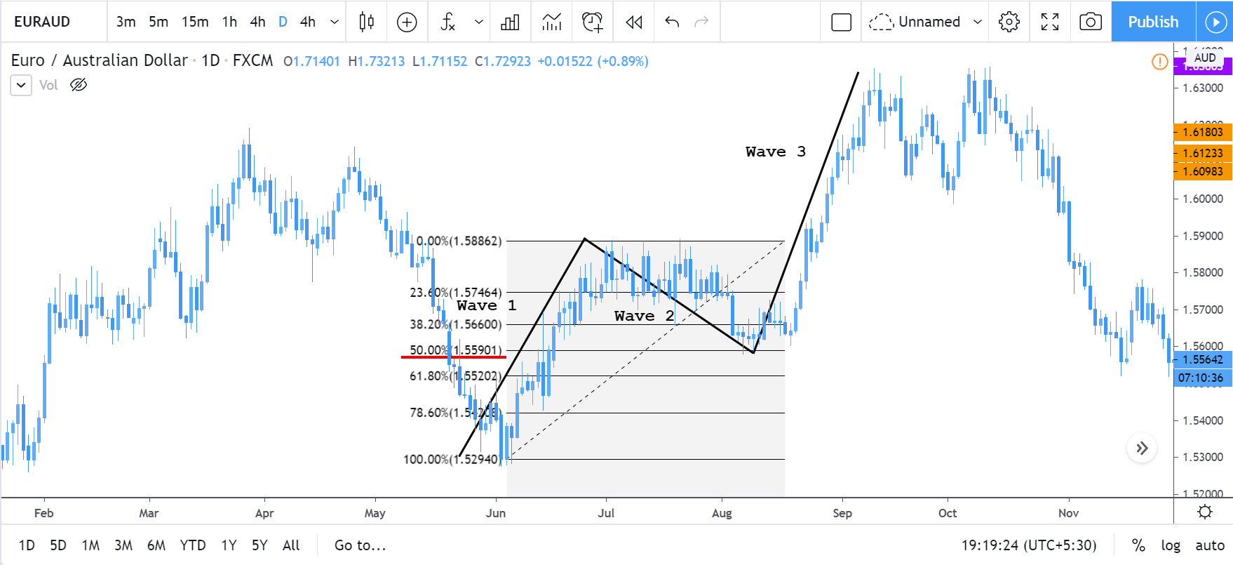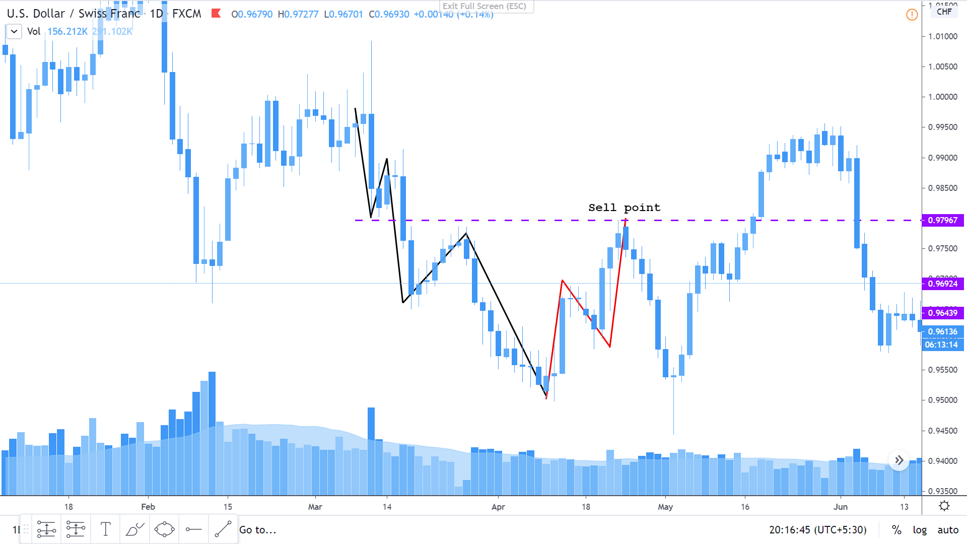
Introduction
Fundamental analysis is an integrated part of forex trading. It provides an exact logic and reason behind the movement of a currency pair. However, the fundamental analysis depends on several fundamental releases and news. Therefore, it is evident for a trader to know the source of this news.
What is Forex News and Market Data?
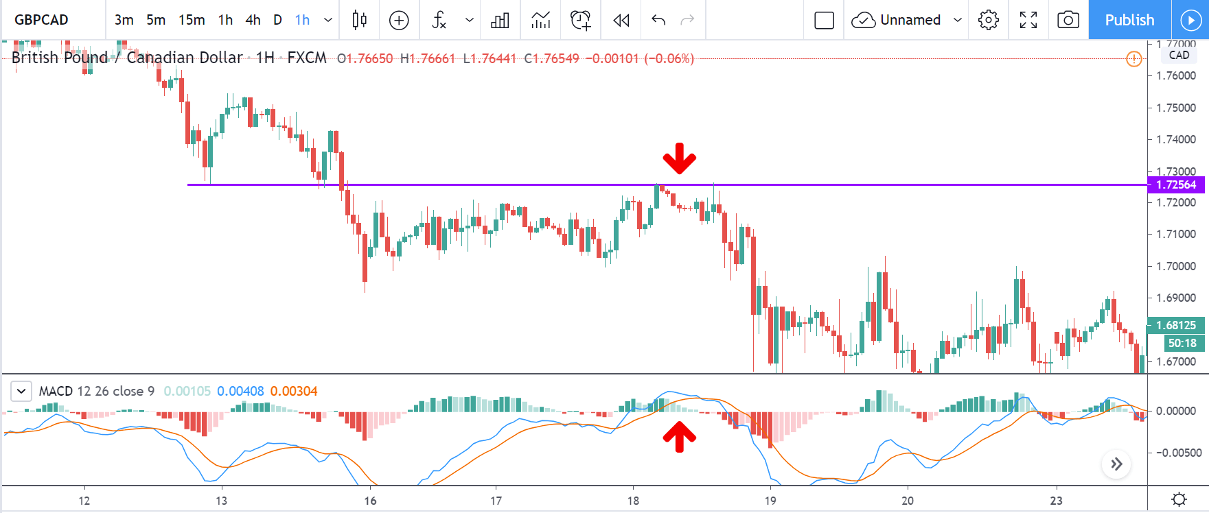
Forex news is economic, geopolitical, and financial news that may directly affect the price of a currency pair. Moreover, fundamental data are economic releases that show the current and upcoming economic conditions of a country.
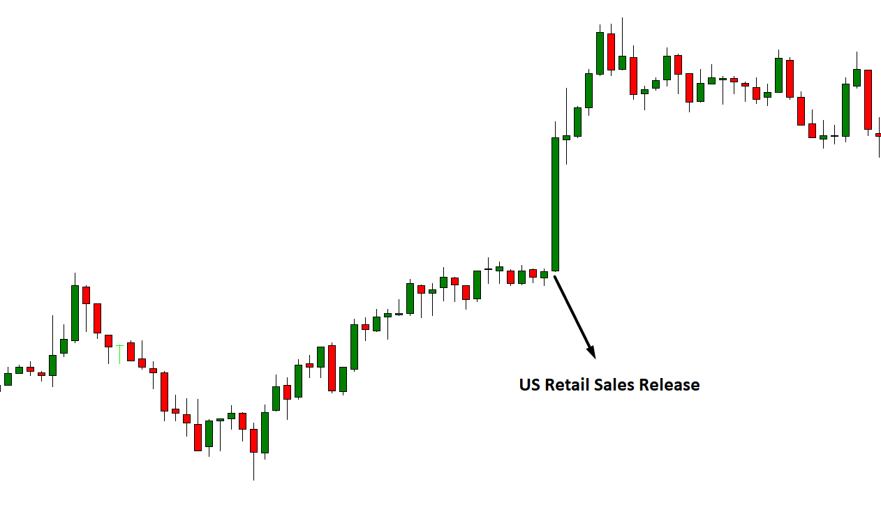
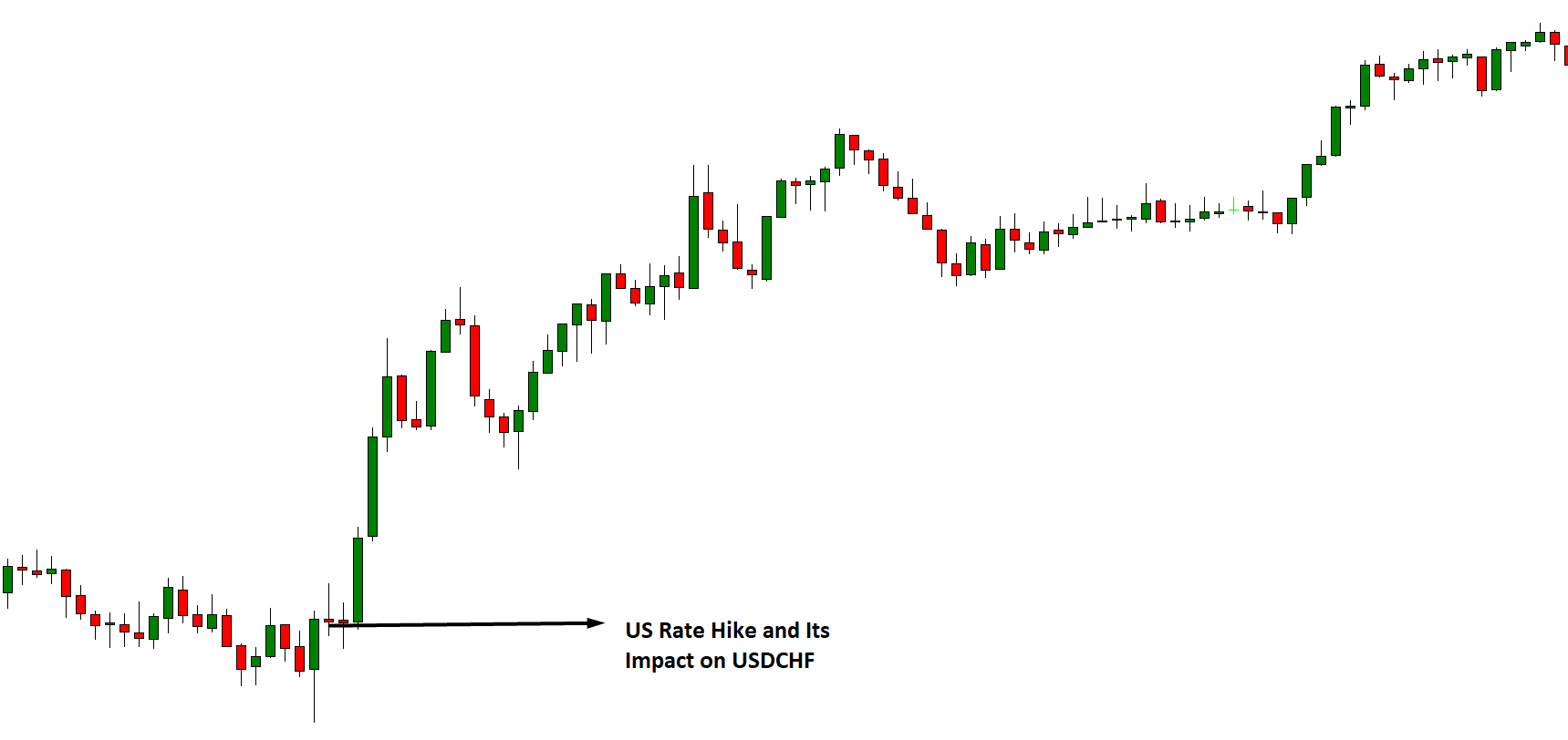
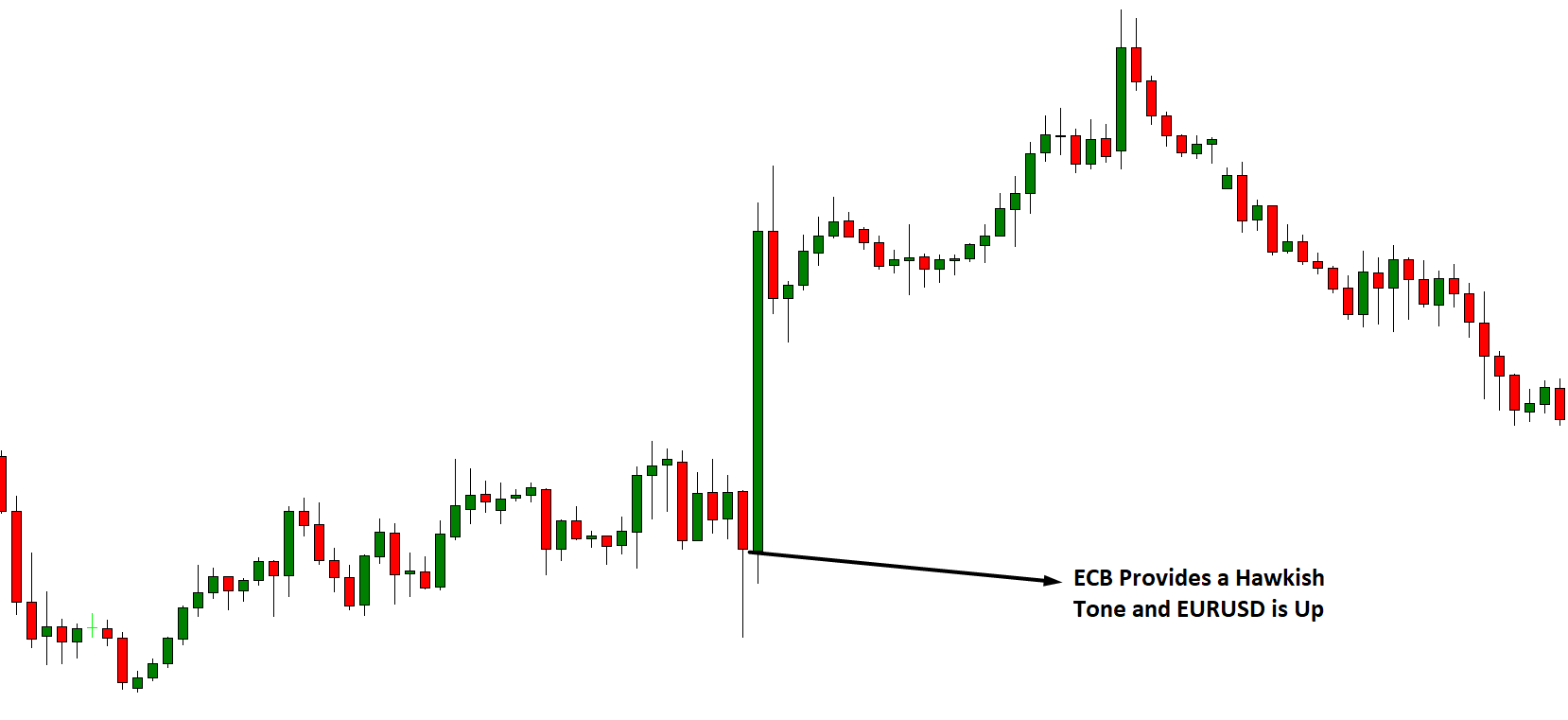
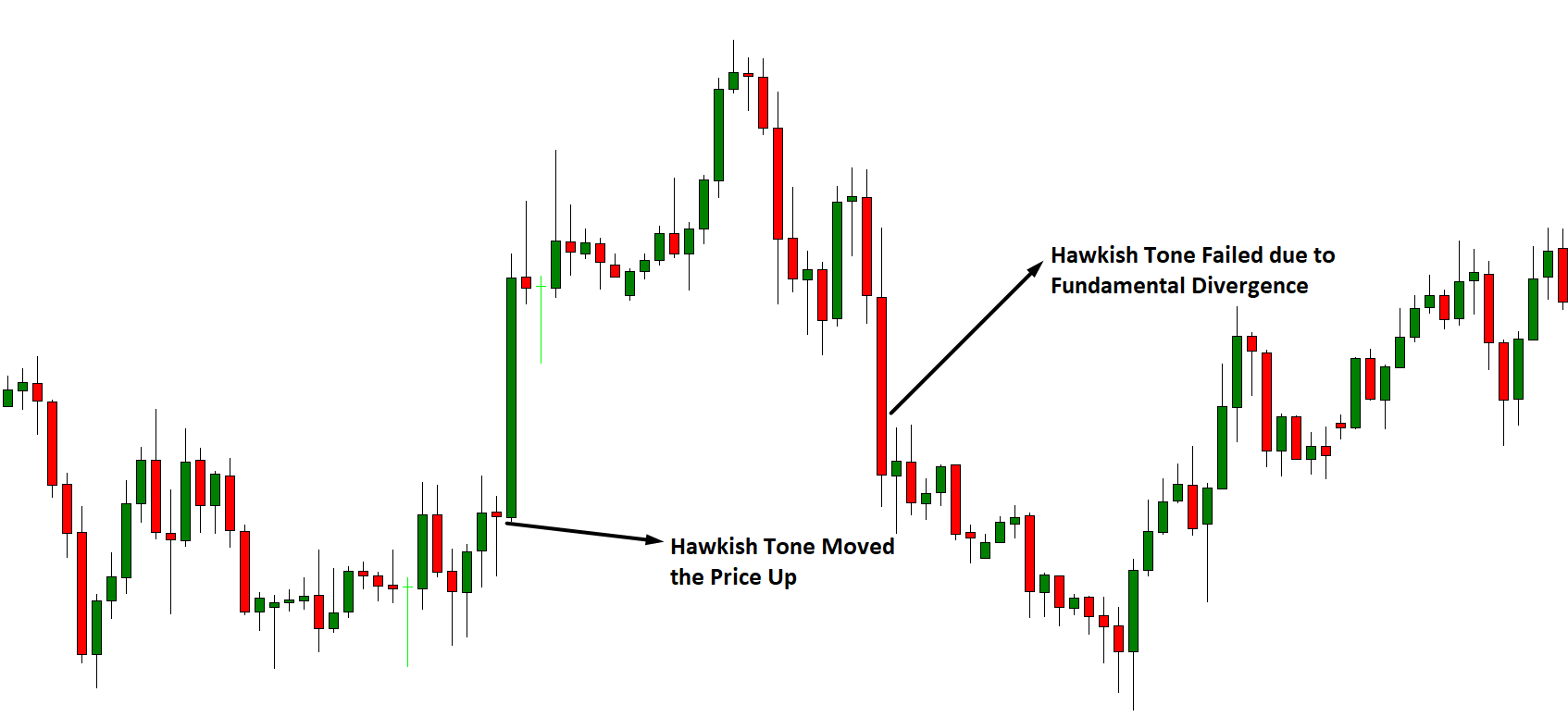
The price of currency pairs depends on many factors, and traders evaluate it to anticipate the market movement. For example, if a country achieved its targeted inflation rate, and the central bank raised the interest rate, it will indicate stronger economic conditions that may influence traders to take traders in a specific direction.
However, it is essential to find the source where the forex news and market data are available.
Where to Find Forex News and Market Data
Forex trading becomes very easy nowadays as most economic news and market data are available on the internet as soon as it releases. Therefore, forex trading becomes very attractive to retail traders as they can operate all their activities from home with a computer and a stable internet connection.
Let’s have a look where we can find this information:
Forex Brokers
Many forex brokers provide integrated market news and an economic calendar where the upcoming economic releases and events are scheduled. It will update as soon as the news comes and will provide historical data. Some brokers provide exclusive technical and fundamental analysis based on forex news and market data, which is also helpful for traders.
News Portal
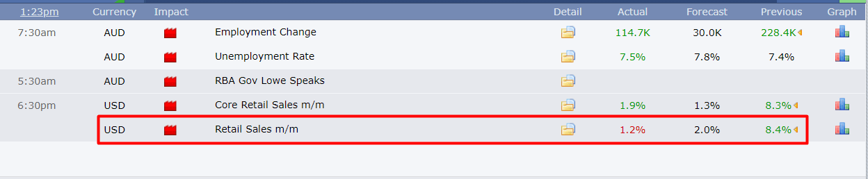
Besides the forex broker, there are many websites where forex economic calendar and events are released. It also provides technical and fundamental analysis based on the available information. However, some trading portals offer live charts with economic data.
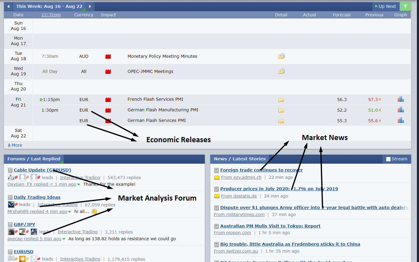
Image Source: www.forexfactory.com
Forex Indicator
Besides the MT4 and MT5 trading platform’s stock indicator, several custom-based indicators show the upcoming news in a box within the price chart. When the news comes, it shows the result immediately on the chart. On the other hand, MT4 and MT5 have a built-in economic and fundamental news service, which is very useful.
Conclusion
It is not very hard to find forex news and market data as it is available publicly, and anyone can access it. However, the challenging part is getting the news immediately after release. The news’s timing may differ based on the quality of the internet connection and execution speed of the news providing website.
[wp_quiz id=”86437″]