Categories
Forex Price Action

A Breakout-caused by a Gap – Anything to Offer to the Price Action Trader?

In today’s lesson, we are going to demonstrate an example of a breakout created by a gap or price adjustment. Usually, we get a gap at the start of a new week. Extremely high impact news events make charts have a gap too. Price action traders do not like the gap. Gap usually provides fewer clues which lead the market to be in a range. However, it sometimes may create opportunities by making a breakout. Today we are going to see how a gap makes a breakout at the support of an up-trending trend line and offers us an entry. Let us have a look at the chart below.

A strong uptrend is pushing the price towards the North. In this chart, traders shall look for opportunities to go long. Along with horizontal support, we shall draw an up-trending trend line here.

The buyers shall be more confident now. On the other hand, the sellers are to wait to get a downside breakout. In this case, the trendline has been a vital element. Thus, a trendline breakout may attract sellers to look for short opportunities. Have a look at how the breakout takes place here.

The breakout should have been done with a good-looking bearish candle. We do not see any here, but the price stays below the trendline. There has been an adjustment or price gap which has made the breakout. The question is do we consider it as a breakout?

The first sign of a downside breakout is the price goes past a support level. We have that here. Do you see that the price starts having an upward correction after the breakout? It closes within the flipped support of the trendline. This is the confirmation of a breakout. This means we have a confirmed breakout here which is done by a gap meaning the gap creates an opportunity here.  Everything looks good so far. The price action traders are to wait for the final signal to go short. Can you guess how it may look like? Close your eyes for twenty seconds and think about the signal candle that you may want to have here. Open your eyes and have a look at the chart below.

See how strong the last candle looks. This is the signal candle that the price action traders always dream of. A short entry may be triggered right after the last candle closes.

Let’s now have a look at how the chart looks like after triggering the entry.

Looks good right. It does, but there has been an instantaneous upward correction. That may have created some butterflies in the sellers’ stomach. The price is held way above the signal candle’s resistance and in the end, the price heads towards the South with good selling pressure. The bottom line of the story “A breakout which is created by a gap helps the price action traders grab some green pips”.


Categories
Forex Market

Everything You Need To Know About The Forex Currency Pairs

In the previous articles, we have discussed the overview of the Forex industry as a whole. In this article, let us understand in detail about the currency pairs which Forex is fundamentally about.

How does it work? 

A currency pair is a code representing the interaction of two different currencies. In that pair, the first currency is known as the Base currency, and the second one is called the Quote currency. When you are buying a currency pair, you are essentially buying the base currency and selling the quote currency. It is vice-versa for selling.

When you see a currency quoted as 1.32., it means you can exchange 1 unit of base currency for 1.32 units of the quote/counter currency. When the value of currency changes, it is always relative to another currency. If the value of GBP/USD changes from 1.26345 to 1.26460 the next day, it means that the Pound has appreciated relative to U.S. dollar or U.S. dollar has depreciated relative to Pound as it will cost more USD to purchase 1 Pound.

What are the major currency pairs?

The most liquid currency pairs are known as major currency pairs. These are the pairs where USD is involved either as a quote currency or base currency. Some of the most popular currency pairs include EUR/USD, USD/JPY, GBP/USD, USD/CHF, and USD/CAD. They represent some of the largest economies of the world and are traded in high volumes. These currencies also have low spreads, which is good for traders.

Minor or cross-currency pairs

Cross-currency pairs are nothing but the crosses of major currencies. They do not include the USD in them. Some of the popular cross-currency pairs include EUR/GBP, EUR/JPY, and EUR/CHF. Even though the trading volume of these pairs is significantly low compared to the major currency pairs, they do contribute with a large amount of volume to the Forex market. Let’s understand more about the volatilities and preferences of these minor currencies.

  • Predicting the EUR/GBP currency pair is most difficult compared to other currencies.
  • Traders prefer trading EUR/JPY as they believe it is easier to forecast, thus making it a popular cross-currency pair.
  • EUR/CHF is also popular because of the fact that the Franc is a safe-haven currency. It is traded during times of high volatility.

Here we have only discussed the EUR crosses. We recommend you to explore more cross-currency pairs and understand each of their volatilities. There is another type of currency pair known as Exotics. In this type of currency pairs, one currency is Major while the other an upcoming currency. Examples – USD/TRY & USD/MXN.

Commodity currencies

Australian dollar and New Zealand dollar are the currencies that are greatly influenced by commodity prices. The Australian dollar is greatly affected by mining commodities, beef, wool, and wheat. Aussie (AUD) is strongly influenced by China as these two countries are huge trading partners. USD/CAD is also one currency that is affected by commodities like oil, timber, and natural gas. The Canadian dollar price movement is strongly related to the U.S. economy. New Zealand, however, is heavily influenced by news release of agriculture and tourism. Along with commodities, the effect of central banks and reserve banks shouldn’t be underestimated. Changes in monetary policy from either of the country’s banks will lead to huge volatility.

The point we are trying to make here is that each of the currency pair’s price movements is influenced by some of the other external factors. As you start your journey in trading Forex markets, you will understand these influencing factors in detail.

What moves these currency pairs?

As discussed above, there a lot of independent factors that move the price of these currencies. But the fundamental factors are interest rates, economic data, and politics. Let’s understand these in detail.

Interest rates – Central banks raise or reduce interest rates to maintain financial stability. This increases demand for currencies whose interest rates are high, as investors get a higher yield on their investments.

Economic data – Economic releases are reports that give a glimpse of the nation’s economy. Relevant economic data include CPI, Non-farm payroll, GDP, Retail sales, and PMI. This data will have a positive or negative effect on that country’s currency.

Politics – Trade wars, elections, and changes in the ruling government introduce instability, which reflects in the Forex market. The decision the government’s take can boost or depreciate the economy.

Which currency pair should you trade? 

If you are new to forex, choose the currency pair which has the most liquidity. Always start with Major pairs before exploring the others. Analyze the fundamentals of a currency. If you know technical analysis, you can combine it with technical indicators to know and understand when to trade. Do not use leverage; even if you do, use appropriately so that you don’t wipe out your account. To learn more about Forex trading from the very basics, you can sign-up for our free Forex course here. Cheers!

Categories
Forex Price Action

An Entry Derived from a Double Bottom

The Double Bottom is one of the strongest bullish reversal patterns that price action traders wait for once they see the price may have found a support zone. On a strong downtrend, the first bounce does not attract the buyers to go long. On the second bounce, however, it attracts the buyers to start looking for long opportunities. In today’s lesson, we are going to demonstrate an example of how a Double Bottom offered us an entry.

What do you think about the price action here? A choppy price action where the price gets caught within a horizontal range. It is best to avoid taking entries when the price action is like this. You may have noticed that the price has several bounces on the support and rejections on the resistance. To get a clearer picture, look at the chart below.

The price has a rejection of the resistance and a bounce on the support. The price goes up again; it had a rejection and a bounce on the same level. This means we may get a Double Top or a Double Bottom here. The chances are the same. Thus, we must wait for the price to make the decision.


Here it goes. An upside breakout takes place here. A Double Bottom and  Breached Neckline, a perfect buying meadow. Do we start buying from here? No, we must wait for a confirmation. A pullback and another bullish move are needed to go long. See what happens next.

It seems like we may not get an opportunity to trigger an entry here. The price continues to go towards the North. Do not get into a trap. Never jump into a running train. Keep patience. See what happens next.

Here it goes. Finally, the price starts having a correction. Look at the last H4 bearish candle closing obeying the level where the price on minor time frames has bounces. It is time to wait for a bullish reversal candle. Is it going to be the very next candle or do we have to wait longer?

It is the very next candle that signals us that it is the time to trigger a long entry. The candle closes above the consolidation resistance having a tiny upper shadow. A perfect signal candle that the buyers have been waiting for.

The price heads towards the North with good buying pressure. 1:1 Risk and reward is easily achieved here. Such a nice price action this is! I have a question to you though. Do you see any other potential buying opportunity here? If you do, write on the comment box what the price action would be like if it is to offer another long entry. I am looking forward to getting your comments.

Categories
Forex Course

5. How Large & Liquid Is The Forex Market?

When compared to other markets like the stock and commodity market, the foreign exchange market is the largest in the world in terms of size and liquidity. In this lesson, we shall go over some insights on the size and liquidity of the forex market.

Where is the Forex market headquartered?

The stock markets across the world have different central exchanges where all the transactions are processed. But, in the case of the forex market, there is no central exchange (physical counter) where the transactions can be processed. In fact, this market runs electronically, connected by a network of banks. This, in short, is called an interbank market or an over-the-counter (OTC) market. Hence, this enables traders to trade in the forex market from anywhere in the world. Also, this is one of the reasons for its high volume of trading.

Forex market’s volume

The amount of money traded in the forex market is humongous. Being the most traded market, the value of it reaches up to $3 trillion. The number is made up of all the types of transactions performed in the market. The amount of different transactions is listed as follows:

$1,005 billion comes from spot transactions

$1,714 billion is added from forex swaps

$362 billion accounts for outright forwards

$129 billion for estimated gaps

Currency distribution in the Forex market

There are about seven currencies on which most transactions take place. Out of these currencies, the US Dollar dominates with around 85% of all the operations in the forex market. Next up in the line stands EUR, which is then followed by JPY and GBP. A graphical representation for the same is given below.

Here, the sum of all the variables totals to 200%, as currencies are traded in pairs.

What are the Foreign Exchange Reserves?

They are the assets that comprise banknotes, bonds, deposits, etc. The central bank of a country holds these with two primary purposes. One to maintain the balance payments of a country and the second is to control the confidence in financial markets. These reserves can be held in more than one currency.

According to the International Monetary Fund (IMF), 64% of the world’s forex reserves are made up of the US Dollar. And after USD comes GBP, JPY, and EUR comprising of 4%, 4%, and 2% of the world’s FX reserves, respectively.

Liquidity of the Forex market

Liquidity is simply the possibility to square off a position smooth and quick without causing the market to make a drastic move. In simple terms, liquidity is the level of supply and demand in the market. So, when there are large numbers of buyers and sellers in the market, we can call this market to be highly liquid.

With respect to the Forex market, it is the most liquid market in the world. This implies that the forex market constitutes a large number of participants (buyers and sellers). With high liquidity, one can liquidate their positions much faster and at their quoted price. Moreover, high liquidity causes the prices to move smoothly, gradually, and in small steps. Hence, this even leads to more consistency in the quoting of prices.

Below is the chart of EUR/USD on the 5-minute timeframe. We can see that the prices move smoothly in spite of being in a small timeframe.

Below is the chart of a small-cap stock in the US. Here, we can see that the prices are not moving in a flow, and there are gaps between the prices. And this is solely due to the lack of liquidity in the market.

That’s about the liquidity of the Forex market. We hope you had a good read. Check your learnings by answering the below quiz.

[wp_quiz id=”42489″]
Categories
Forex Daily Topic Forex Psychology

Know The Two Systems Operating inside Your Head

In the introduction of his book, “Thinking fast and slow,”  Daniel Kahneman presents a face with an expression similar to the following image as an example of your mind working in automatic mode. 

By looking at the image, you’ll experience what is called intuitive thinking. In a fraction of seconds, you’ll notice it is a brown-haired young woman (not an old one, not a man or any other animal or object), and you instantly know she is upset. You feel also she is going to start saying harsh words in a loud voice. All that came to your mind automatically and without effort. It merely happened without you intending to do that assessment.

This is an example of what Dr. Kahneman calls System One.

Now look at this: 

28 x 13

Looking at it, you knew it is a multiplication immediately, but the result does not come to your mind instantly. You know you can solve it with paper and pencil or in your head, but you need to make a conscious effort to do it, and the solution comes slowly. If you engage in the process of solving it, you’ll experience the slow thinking process as you follow the steps you’ve learned to solve a multiplication operation. Dr. Kahneman describes this process as “deliberate, effortful and orderly.”

This is what Dr. Daniel Kahneman calls System Two.

System One is in charge of automatic activities such as 

  • Detecting if an object is distant or near
  • Finding the source of a sound
  • Complete the phrase “piece of c..”
  • Change the facial expressions
  • detect a warning or a hostile voice
  • Read 
  • drive a car
  • understanding a language

System One includes innate abilities. We are “programmed” to interpret the reality that surrounds us, recognize objects, focus our attention, and avoid dangers. System One also learns by the association of ideas, and also learn skills such as reading, driving a car, or pattern recognition, such as a chess player or a trader do.

The operations of System Two have one common characteristic: they require deliberate attention, and the process can be disturbed by a loss of concentration.

Here are examples extracted from the book:

  • Focus on the voice of a single person in a noisy room
  • look for a woman with white hair
  • trying to identify a surprising sound
  • telling someone your phone number
  • Count the number of times a word appears in a page

The Interaction between both Systems 

The usual situation when we are awake is that System One and Two both are active. According to Kahneman’s book, System One runs automatically while System Two works in “low-effort” mode, in which almost no effort from its part is needed. System one sends summary information to system two, and System Two has the final word.

Under this scenario, System One continually creates “suggestions” for System Two: impulses, feelings, intuitions, impressions, and intentions. When confirmed by System Two, these impressions become beliefs, and impulses turn into voluntary actions.

It is usual, under normal circumstances, that everything moves placidly. Under these situations, System Two adopts the suggestions sent by System One with small modifications, if any. We usually believe in our impressions and act on our desires.

When System One finds something it cannot solve, it asks for the help of System Two, as in the process of multiplying 28×13. We can feel this whenever we are surprised. That’s the activation of System Two. Surprises activate and orient our attention. That can be lifesaving. A hole in the road, a tiger, appearing 100 meters from you.


System two has been taught by our evolution to trust System One, as he is generally quite good at what it does: modeling familiar situations, short-term predictions, and initial reactions to challenges and dangers.

The Conflict

One limitation of System One is it cannot be switched off. Therefore, sometimes, there is a conflict between System One’s automatic reaction and System Two’s intention of control. Under uncertainty situations, System one triggers primary reactions such as fear or greed that System Two is used to believe and act upon. Even when the case does not call for such an automatic response, as usually happens when trading the Forex markets, System Two has a hard time to take control of the situation.

Since System One works in automatic mode, it cannot be turned off at will. Therefore errors due to intuitive thinking are very difficult to prevent. Also, biases cannot be avoided because System two is not aware of them, and when these biases are known, only by a System Two’s deliberate effort can be overcome. In the trading world that translates into people selling at the bottom and buying at the top. These people are making decisions based on the impressions generated by System One. Thus, System Two is inadvertently dominated by System One’s beliefs.

Final Words

If you find yourself reflected by the above scenario, you should establish the steps to break the dominance of your System One. 

  • Define yourself as a Soldier when trading. A soldier only obeys, never thinks. That is the task of your other self: The Planner. Plans are rational and are to be done before the trade opens, not during a live trade. After the trade is open, a soldier executes the plan decided by the Planner.
  • Start trading using risk sizes that do not trigger your primary fears 
  • Make a rational plan and build the discipline to follow it. You’re a soldier.
  • Before the market opens, rehearse trade situations from beginning to end. Establish how you’re going to react based on your trading plan when taking losses or profits. Visualize it in your mind. Look at your mental monitor screen and see the price moving and you making the planned decisions.
  •  Write down your feelings during the open trades. Check for inner conflicts, explain to yourself why you do what you’re doing.
  • Create a log of trade results, also annotating the maximum adverse and also maximum favorable excursions.
  • Grade your trades from 0 to 5 or 10 based on the percentage of the total possible profit you obtained.
  •  After your trading session ended, analyze the performance of your system in regards to the entry point, stop-loss, and profit target placements, and modify these parameters for the next session. But never change them while trading.
  • Compute your system’s performance and analyze if it is still performing as planned or there is a deviation from its past performance.
Categories
Forex Elliott Wave

Trading the Elliott Wave Principle – Part 5

Triangles are the third fundamental Elliott wave corrective structure. In this educational article, we will review the guidelines to trade this pattern.

The basics

The triangle structure is a corrective formation with a 3-3-3-3-3 internal sequence. Triangles usually tend to appear in waves four and B.

In this formation, volume tends to decrease as the triangle progresses. Also, it characterizes by the balance between bull and bear traders.

The following figure illustrates the trading setup for a contracting triangle. The entry is triggered once the price action strikes and closes above the end of wave (D) labeled in black degree.


To place the potential targets, we can measure the Fibonacci projection from the origin of wave ((3)) or ((A)) labeled in red, and the lowest level of the triangle. The first target will be at 61.8%, and the second target at 100%.

The trading setup is invalid if the price pierces the wave (A) labeled in black degree.

Golden triangle

Gold, in its weekly chart, shows the guideline of an Elliott wave contracting triangle in progress. The bullish sequence starts on November 30, 2015, once the yellow metal found buyers at $1,046.54 per ounce.

The golden metal made the first rally until early July 2016 at $1,375.15 per ounce. After this move, Gold made an up and down sideways movement till late April 2019.

Now that we have identified the start of a price cycle, we have to face the question, “do I recognize an Elliott wave pattern?”

In this case, we start from the most straightforward formation, which could correspond to a Contracting Triangle.


Now that we have recognized a wave pattern, we advance to the second stage, which is to define our trading plan. Following the triangle setup guideline, we have to expect the breakout of wave (D) labeled in black at $1,346.75.

The theory says that the first profit target must be at 61.8% of the Fibonacci projection. However, this level is under the entry-level. In this case, we place the first profit target at the 100% level at $1,453.78. The second profit target will be at the 127.2% level at $1,543.80 per ounce.

The invalidation level is theoretically below the wave (A) labeled in the black degree at $1,122.10.

Now that we have defined the trading plan, the third stage is to manage the trade and risk. The first step is to reduce the risk. In this case, we move the protective stop from the theoretical invalidation level to the end of the wave (E) at $1,266.39, as shown in the next figure.


Once that we have reduced the risk and the trade advances, the trader must eradicate the risk. In this example, after Gold reached the first profit target at $1,453.78, we move the protective stop to the entry-level.

As an alternative to eliminate the risk, the protective stop could be placed considering the entry-level plus the trade costs, for example, commission costs and swap.


The last step of the trade management, before the trade reaches the final profit target, is to protect open profits. This last stage depends on the criteria of each trader.

Categories
Forex Market

What Should You Know About Forex Brokers?

Introduction

In the previous article, we have discussed an overview of the financial industry. Now we know that the entire Forex market is about buying and selling of currencies. The majority of these foreign exchange transactions are done by major financial institutions and global organizations. But where do the retail traders like you and I undertake Forex trading? We do it through independent companies called brokers. In this article, let’s understand what a Forex broker is and the different types of Forex brokers existing in the market.

What is a Forex broker?

In the Forex market, buyers and sellers can be thousands of miles apart. So there needs to be a mechanism that matches their interest. This is where a Forex broker comes into the picture. A Forex broker is a platform where the buyers and sellers get to buy and sell currencies. It acts as a middleman between a trader and the market. In simple words, to find a buyer or seller for a particular currency, the broker matches your order with the respective buyer or seller. These brokers are also known as ‘liquidity providers.’

Types of Forex brokers

Even though all brokers in the Forex industry provide the same basic service, there is a difference in their functionality and mechanism. The first thing to look for with every Forex broker is whether they have a ‘dealing desk’ or not. In brokerage firms, the dealing desk refers to a team of traders who manage the broker’s inventory and hedging operations. Nowadays, most of the dealing desks consist of hundreds of traders and analysts.

Brokers that work on dealing desk operate in a closed environment wherein they set their own price rates. They fill their client orders by matching the buy and sell orders of their clients. When a broker uses a dealing desk, they are called as Market Makers.

Brokers that don’t use a dealing desk get rates from the interbank market and process their client orders by linking them directly to institutions, hedge funds, mutual funds, and other brokers. When a broker does not use a dealing desk, they are either known as ECN (Electronic Communication broker) or an STP (Straight Through Processing) broker.

Market Makers

Market Makers (MM) are called ‘dealers’ in the interbank market. They charge a variable spread instead of commission, which is why most of the time, they are accused of manipulating the spread and prices of the currency pairs. Theoretically, the spread should widen or narrow during high liquidity conditions, but MM brokers offer a fixed spread and compete based on the spread.

Electronic Communications Network (ECN) Broker

ECN brokers make their profits from spreads they charge on buy and sell rates or from fixed trade commission. The transactions here are mostly interbank. Because the spreads in the interbank markets are dynamic, ECN brokers prefer charging commissions rather than fixed spreads. This is one of the easiest ways to trade, but this requires a much higher investment capital as clients in the interbank markets only trade large lots. Therefore, trading with ECN brokers requires a minimum account balance of $1000. In addition, there is no guarantee that you will find a buyer or seller in the interbank market at your quoted price. ECN brokers sometimes won’t be able to execute orders at that price, so they issue a re-quote or simply reject the order. These are some of the limitations of ECN brokers.

Straight Through Processing (STP) brokers

Like ECN brokers, STP brokers, too, don’t have a dealing desk. But they use some of the practices of Market Maker brokers to provide flexibility to their clients. They display rates similar to the interbank market rates, and their first priority is to process trades directly in the interbank market, like an ECN broker. If the counterparty is not found, they start acting like a Market maker and match the order with their own client. The initial capital required to trade with this type of broker is relatively lesser compared to ECN brokers.

These are the different types of brokers in the market. So when you are choosing a broker, make sure to select the one that suits your trading style and capital available to trade.

Trading Platforms 

The ‘Market Makers’ provide trading platforms like Act Trader and MetaTrader since their orders are executed at the dealing desk. However, non-dealing desk type of brokers uses direct access trading platforms. They display prices directly from different liquidity providers. The platforms which are best suited for this requirement include Currenex Viking software and Level II software. The trading platform should be chosen in such a way that it suits your trading objectives. We hope this article helped you in deciding that. Let us know if you have any questions in the comments below. Cheers!

Categories
Forex Price Action

How a Broken Resistance Offers Us an Entry

In today’s lesson, we are going to demonstrate an example of how the price heads towards the direction of the trend upon a breakout. We know that it is not only the breakout that traders shall be looking at. There are other factors, such as consolidation or correction, breakout confirmation, and the signal candle. Let us have a look at what the price does before offering us an entry.


The price heads towards the North and has a rejection. Look at the candle at the top (arrowed candle). This is where the price has its first rejection and lands at the support zone. The price has another rejection at the level below (arrowed candle). However, it continues the consolidation. As a trader, you have to wait for a price to make a move either to make a breakout at the support of the consolidation or the resistance level.  Let’s see what happens next.


Oh! Upside breakout! This is how a breakout candle should look like. It closes just below the second resistance. The first resistance is now a support. The price is to make a pullback to confirm the breakout. Let us see what happens next.


It rather continues its bullish journey and makes a breakout at the second level of resistance as well. Guess what shall we do here? Shall we wait for the price to come back to the first breakout level or the second breakout level? Have a look at the chart below.


The breakout level seems to be held and produces a bullish candle already. Shall we consider taking an entry here? The answer is no. The price does not come up to the breakout level. Let us see what happens next.


Look at the last candle. A bullish engulfing candle closes above the last highest high and confirms the breakout level by having a bounce on it. This is the signal candle price-action traders crave for. A buy entry may be triggered right after the candle closes by setting Stop Loss below the candle’s lowest low. In this case, the candle’s lowest low and breakout level are the same. If the signal candle had a bigger lower shadow below the breakout level, the Stop Loss should have been set below the candle’s lowest low.

About setting Take Profit level, there are several ways to determine it. To be very safe, you may have 1:1 risk and reward. This means the number of pips that we have set as our Stop Loss from the entry point; we shall set our Take Profit at a distance with the same amount of pips.

The price travels almost twice the distance than we have anticipated. Never regret, but keep studying to learn how to maximize your risk and reward ratio. We will write some articles on this. Stay tuned.

Categories
Forex Elliott Wave

Trading the Elliott Wave Principle – Part 4

The flat pattern is the second fundamental Elliott Wave corrective structure. In this educational article, we will review the guideline to trade the flat structure.

The basics

Flat pattern is an Elliott wave corrective structure built by three waves, and its internal sequence is 3-3-5. There exist a single model to trade a flat formation. The following chart shows the trading setup of a flat corrective structure.


From the basic model, the entry is given once price action breaks and closes above wave 4 labeled in blue, of wave (C) labeled in black. The profit target is placed in the same way as the zig-zag trade setup. It is at 100%, 127.2%, and 161.8% of the Fibonacci projection of waves ((1)) and ((2)) labeled in red. The invalidation level is under the end of the wave (C).

Trading the flat pattern

Before to define place an order, we must answer the question, “Do I see some Elliott wave pattern?”.

In the example, the IBM (NYSE:IBM) in its 8-hour chart shows a first five waves bearish sequence started on April 10, 2014. Once IBM founded buyers on January 29, 2015, at $149.52 per share, the price developed a three waves movement as a flat pattern, which ended at $176,25 on May 04, 2015.


If our hypothesis is correct, it is the Elliott wave pattern recognized is a flat structure, we can do our trading plan. The entry should be placed after the completion of the second wave (B) or (2) labeled in black degree.

The short position is triggered after the breakdown and close below the last swing at $168.75. The target is defined using the Fibonacci projection between (A) and (B) waves. In our example, IBM reached the first target at $126.53 on 100% of the Fibonacci projection.

The third part of the trade is to manage the risk of the trading plan. The first stage is to reduce the risk; for this stage, we set the invalidation level above the end of wave (B) or (2) at $176.25. Once IBM plummets, we eliminate the risk after the price drops into the 61.8% of Fibonacci projection at $145.60.

Finally, we have to protect the open profits, for example, each $5 of advance, we can move the protective stop each $5 of progress.

Categories
Forex Course

4 – Understanding The Mechanism In Buying And Selling Of Currency Pairs

Introduction

The mechanism of the forex market is quite different when compared with other markets like stocks and commodities. In the stock market, we essentially consider a company’s stock to trade. But in the foreign exchange market, we cannot trade a single currency. Instead, we must trade them in pairs.

In the previous lessons, we understood the meaning of base and quote currencies and also the right way to read the symbols. In this lesson, let’s explain how exactly this buying and selling happens in the Forex market.

The working principle

Before getting into the topic, let us understand a few common terms to grip the concept much better.

Long – It is a basic term in trading, which refers to the ‘buying of security.

Short Selling – This term refers to the ‘borrowing’ of security from the broker and selling it at the current market price. You can assume this to be the right opposite of long. Note that Shorting security and selling security are two different terms.

For example, let’s say you went long on a security, and now you wish to close it. To close it, you will have to ‘sell’ it. Here, you are ‘selling’ and not ‘shorting’ the security.

Now, with this on our back, let us get into the working of buying and selling currency pairs.

Going Long on a Currency Pair

When you go long on a currency pair, you actually buy the base currency, and short sell the quote currency. For example, if you go long 100,000 units on EUR/USD, you are buying 100,000 Euros and short selling 100,000 US Dollars.

Short Selling a Currency Pair

Short selling in the forex market is quite different from that of the stock market. In the forex market, when you short sell a currency pair, you will be selling the base currency and buying the quote currency. Hence, shorting in forex is the same as placing a regular sell order.

However, the main motive remains that the prices must decline from the point you executed the short position to generate a profit. For example, if you short 10,000 units of USD/CAD, you are actually selling 10,000 US Dollars and buying the same number of Canadian Dollars. Hence, here, you’re not borrowing a certain amount of currency to go short.

What next?

With the concept of the long and short sell, let us understand how to make a profit from it.

To profit from a long trade, you need the currency pair prices to increase.

To profit from a short trade, you need the currency pair prices to decline.

This also implies that, in a long trade, an increase in the base currency prices will put you in profit, and in a short trade, a decrease in the base currency prices will give you profits.

Example

Consider the current market price of USD/CHF to be 0.9850. Let’s say you went long on this currency pair. The buy/sell mechanism here is simple – you bought the USD (the base currency) and simultaneously short sold the CHF (the quote currency). Hence, to make a profit from this, you need currency pair prices to increase, which in turn means that you need the value of the base currency (USD) to increase or the value of the CHF to decrease because you’ve bought the USD.

This is how the buying and selling of currency pairs work internally. However, since all of this is managed by the broker, all you need to know is if the prices should rise or fall according to the position you took.

In the next article, we will be discussing the sheer size and liquidity of the Forex market along with the perks involved. For now, check if you can get the below questions right.

[wp_quiz id=”42315″]
Categories
Forex Basics

Supply, Demand and Liquidity as Drivers of Prices

Markets are “places” where people and institutions exchange assets. It may be stock shares, commodities, grain, livestock, or currencies, but all markets behave similarly. Buyers and sellers look for the best possible price. A buyer seeks to buy at the cheapest possible price, while the seller wants to sell at the highest price.

How prices move

If we order buyers and sellers by the price they are willing to accept, we could see some buyers are bidding an amount very close to the price sellers are asking, and from there, the distance grows in a kind funnel-like shape.

For a sell to occur, one of them must cross the bridge and accept the other side’s price. Also, when a seller moves and takes the ask price for the first time, the “Last price” moves down a little. If another seller does the same, there might be other buyers willing to buy at the same level or not. If there are more buyers at that level, the next seller who takes the ask does not create an additional downward movement. If all buyers disappear from this level, the seller should accept a worse price, moving the asset down, or hold until a buyer takes his bid.

Conversely, if a buyer takes a bid price for the first time, the price of the asset moves up. If other buyers get in and deplete this level from sellers, they should buy at higher prices or wait till a seller takes his ask price.

Supply and Demand

Demand

The demand for an asset decreases as the price increases. The rate of that decline depends on the need for the asset and also on the perceived future value of the asset.

Supply

The supply increases as the price increases. The rate of increment depends mostly on the sellers’ belief about the future price growth of the security.

Equilibrium

Supply and demand are what drives prices up and down. If there are an equal number of buyers and sellers, the price stays at one level and is said to be in equilibrium.

When there are more buyers than sellers, the price moves up until a new equilibrium is reached. Conversely, if the number of sellers is higher, the price moves down until sellers and buyers get the new equilibrium.

Fair Price

The equilibrium is the result of a consensus about the fair price of the security, but fair price changes with the passage of time. The change in fair price may come from technical factors ( overbought-oversold levels, pivot points, breakouts), economic reports such as interest rates, GDP, manufacturing, nonfarm Payrolls, and inflation, or unexpected news events. The new price does not manifest itself in a single and swift price movement because that price is not known at the time. That’s the reason for the appearance of trends.

Liquidity

Liquidity is the term used to define the number of buyers and sellers present in the market.

In a very liquid market, the number of buyers and sellers is vast. Large-sized orders do not affect the price much. Also, bid and ask prices get closer to each other because buyers and sellers compete among themselves to offer their best bid and ask prices. That means spread tightens.

A market with low liquidity shows a scarcity of buyers and sellers. The size and number of operations are tiny, and one small order can produce significant price variations up or down. Also, usually, spreads widen because there is less competition among participants. Low liquidity may cause market manipulations since it is easy to drive prices up or down.

Liquidity does not depend only on the market in question. It changes with the time of the day. For instance, the EURUSD shows less liquidity during the Tokyo session. Then it grows when the European exchanged opens, and it maximizes at the open of the US session. Finally, it fades after Europe closes its markets and traded volume declines further after the US closes.

Final words

  • Supply and demand drive the prices up or down until an equilibrium is reached.
  • The equilibrium breaks by a change in the perception of value by the parties trading it.
  • High liquidity is the key factor for tightening spreads and making markets flow without price manipulation.
Categories
Forex Indicators

The Truth About Moving Averages

Moving Averages

Of all the technical indicators that exist, moving averages are probably the most well known. Moving averages are also one of the only technical indicators ever used by market news broadcasters. Moving averages are generally one of the first types of indicators that new analysts and traders will learn about because they simple to calculate and simple to interpret. But are moving averages useful for trading? Are they appropriate for trading?

Dangers of Moving Averages

I want to preface any further commentary on moving averages by saying I am strictly opposed to their use. Outside of any singular purpose for their use, I will never advocate for their use of an analytical tool or a trading tool. The reasons for this opinion are my own trading experience, and the experience of teaching students – who have all (myself included) fell into the old trap of moving average crossover systems and the lies that are sold about their usefulness and profitability. That is not to say they are not helpful, useful, or profitable – but the temptation to believe in their positive expectancy and profitability is often too hard to avoid.


Moving Averages: A simple visual representation of data

20-period Simple Moving Average

The orange line on the chart above is a moving average — specifically, a Simple Moving Average (SMA). A Simple Moving Average is a line that is plotted, showing the average close of a defined number of periods. On the chart above, it is a 10-period moving average. Meaning it is taking the last ten candlestick closes, adding them up, dividing that number by ten, and then displaying it as a line. But a Simple Moving Average is just one type of average. There is an enormous amount of various moving averages, each with their specific calculations. The chart below shows only some of those different moving averages, all with a 10-period average.

Various moving averages

From the image above, you can probably say that, depending on the moving average used, some averages are more responsive to price changes than others. Some move a lot; some move just a little. There is a myriad of different reasons why one moving average would be used over another, and there are specific moving averages that to be used only with particular trading systems and methods. Now, after I’ve bashed moving averages, I think it’s essential that I do show some examples of moving averages positively. The first would be using a long period moving average on a higher time frame. For example, a standard method of determining whether a stock is bullish or bearish is to use a 200-period on a daily chart. If a stock is trading above the 200-day average, it is considered bullish; if it is trading below, it is bearish.

200-day Moving Average of S&P500

Another example of a trading system using moving averages effectively would be Goichi Hosada’s Ichimoku Kinko Hyo system. This system will be discussed in much greater detail in another article, but the Ichimoku system is based almost entirely on moving averages. There is a significant difference between Western moving averages and Japanese moving averages. The Tenkan-Sen and Kijun-Sen in the Ichimoku system are calculated using the mid-point of the default periods. The utilization of the mid-point is particular not to just the Ichimoku system but is indicative of a large amount of Japanese analysis, which focuses on ‘balance’ and ‘equilibrium.’ So while I do rail against the use of Western moving averages, the use of the Ichimoku system’s moving averages is undoubtedly a significant exception due to it being a full trading system and one of the few trading systems that are a proven and profitable system.

Ichimoku Kinko Hyo
Categories
Forex Course

3 – Reading & Understanding The Currency Pairs

Introduction 

From the previous lesson, we know that global currencies are traded in the Forex market. These currencies are exchanged in pairs. We also understood what Major, Minor, and Exotic pairs are. In this lesson, let’s discuss more characteristics of these currency pairs.

Out of the three types of currency pairs, the most traded type are Majors. These major pairs contribute more than 85% of the total Forex trading volume. Prices in these pairs move in tighter spreads, but they are a bit volatile during market opening hours. Major pairs are those who have USD in them. Some of the major pairs are EUR/USD, USD/JPY, GBP/USD, and USD/CHF. The other vital pairings which do not include the US dollar are known as ‘cross currencies.’ Some of these are GBP/EUR, EUR/CHF, EUR/JPY, etc.

Reading a Currency Pair

Since we are talking about currency pairs and the Forex market, it is essential to learn how to read them. Every currency has a three-letter symbol defined by the International Organization for Standardization(ISO), which is straight forward. Below is the terminology for some of the major currencies.

  • British Pound for GBP
  • US dollar for USD
  • Japanese Yen for JPY
  • Swiss Franc for CHF
  • Euro for EUR

To understand the reading of a currency pair, you need to know the meaning of base and quote currencies. The first currency in a Forex pair is called base currency, and the second one is called quote currency. As we know, trading the Forex market involves selling one currency to buy the other. For instance, we sell the base currency to buy the quote currency. Let’s say you are trading USD/CAD. USD is your base currency, and CAD is your quote currency. Here, when we are executing a sell trade on this pair, we are primarily selling USD to buy CAD. And vice-versa if you are placing a buy trade.

How much one unit of the base currency is worth against the quote currency defines the price of a pair. In the above example, if USD/CAD is trading at 1.32267, that means one US dollar is worth 1.32267 Canadian dollars.

Liquidity of Major Pairs

Liquidity in these pairs is the highest when compared to other pairs. The larger the import/export value between two nations, the more liquid the currency pair of these countries will become. EUR/USD is the most liquid pair in the world. Major currency pairs should not be confused as the best currency pairs to trade. Trading a particular currency pair depends more on strategy and market sessions. When we say ‘major,’ we mean the most actively-traded Forex pair. The six most actively-traded Forex pairs are:

  • EUR/USD
  • USD/JPY
  • GBP/USD
  • USD/CAD
  • USD/CHF
  • AUD/USD

One of the reasons behind these currencies being traded so extensively is the political and economic stability associated with these currencies. Big investors feel it is safe to park their money in such economies.

What Should You Trade?

If a currency pair has high liquidity, the volatility of that pair decreases. Currency pairs that are linked with the market openings should be our first choice. For example, it is recommended to trade the US dollar during New York open or trading the Australian dollar during Asia opening, as there will be good volatility during this time. Also, consider economic news releases, technical chart analysis, and other events while choosing the currency pair to trade. For people who have just begun their Forex trading journey, it is recommended to start trading major currency pairs before experimenting with minors and exotics. Now try answering the below questions.

[wp_quiz id=”41992″]
Categories
Forex Market

An Overview Of The Forex Trading Industry

Introduction

Some of the most relevant markets include the Stock market, Futures market, Options market, and Foreign Exchange market. All these markets provide vast trading opportunities, and out of these, Foreign Exchange AKA FOREX is one of the most popular ones. Forex is nothing but the exchange and trade of different country’s currencies. The first Forex trading market was established in Amsterdam nearly five centuries ago, and this explains the rich history of this market.

The Forex market is the largest yet most accessible market in the world. Largest because the daily trading volume of the Forex market is above $5 trillion. To put that in perspective, the average daily trading volume of the NYSE (largest stock market in the world) is just above $20 billion. By this, we can understand the enormous size of this market. Out of this $5 trillion, retail trader transactions contribute 5% to 6%, i.e., about $400 billion. The rest of the transaction volume is from large institutions and businesses.

We also mentioned accessibility because traders have thousands of retail brokers around the globe to choose from. They can start trading currencies in this market with investments starting from just $100. Forex trading is open 24 hours a day and five days a week. It doesn’t operate on weekends. On weekdays, the market doesn’t get closed at the end of each business day, like how the stock market does. Rather the trading shifts from one financial center to others. Some of the major financial centers include London, Sydney, New York, and Tokyo.

What affects the Forex market?

One of the critical factors that most of the experienced traders pay attention to is the macro-economic trend. The forex market reacts to macroeconomic data more than the stock or commodity market. In a stock market, we have companies that are affected by micro-dynamics, which are specific to that company. But that’s not the case in the Forex market. This market is affected and moderated by GDP, unemployment rates, and inflation. The currency could react positively or negatively depending on the data, but after reacting, the trend will be maintained for a long time. The significant pairs to watch during such news releases are EUR/USD, USD/JPY, GBP/USD, and USD/CHF. The rate hikes from the U.S. Federal Reserve is also closely watched by traders around the world.

The rise of algorithmic trading

Banks and financial institutions are adopting algorithmic trading systems powered by technological advancement. Technology is changing traders’ approach towards the market. There is a boom in engineered computer programs that offer new ways of creating orders with faster trade execution. The automated systems have improved speed and precision. This technology is expected to eliminate trading bias and human errors that increase the risk in a trade. Algorithmic trading improves trend analysis that greatly helps beginners in reducing losses. Due to this, traders are getting more time to analyze markets and trends.

Future of Forex market

The Forex is continuously growing. Trading currencies is still not a mainstream profession in many of the third world countries. There are still many people who aren’t aware of the fantastic opportunities this industry has to offer. One of the important goals of the brokerage firms is to get more and more people involved in pursuing trading as a serious profession.

  • Market volatility will rise as newer strategies are being released and used by traders.
  • Strict regulation in the forex market will also attract conservative traders. However, some traders search for unregulated brokers since they provide inexpensive trading services.
  • Paid systems and strategies will continue to grow among wealthy investors.
  • Trading Forex is getting easier and extremely accessible with the advent of smartphone trading applications.

Bottom line

The Forex industry has changed significantly over the years. Many efforts are being made to create a legitimate trading environment as the industry has become more dynamic and ever-changing. Major European regulators are taking serious steps to tighten control of the Forex market. Besides, they are also introducing new rules to forbid high leverage trading to protect investor’s funds.

A known fact about Forex trading is that most traders fail. It is estimated that 96% of the people end up losing. To be in the succeeding 4%, one should have a disciplined approach to the way they trade. Some of the practices include starting with low capital, managing risk, controlling emotions, and accepting failures. If you follow these rules, you are on track to becoming a successful trader.

Also, education plays an essential role for someone to succeed in their Forex trading journey. We at Forex Academy designed a course just for our readers. By taking up this free course, one can learn everything about Forex trading even if they have zero experience. You can find all of our course articles here.

Got any questions? Let us know in the comments below.

Categories
Forex Indicators

Let’s Trade Divergences!

Trading with Divergences

Almost all forms of technical analysis involve the use of lagging indicators – or lagging analysis. There are very few indicators that use any type of leading analysis. That is because we don’t know what will happen. All we can do is interpret what kind of future behavior may occur based on past events – this is the basis of all psychology and significant portions of medicine: we can only predict future behavior by analyzing past behavior. Now, just because most of the tools and theories used in technical analysis are lagging in nature – it doesn’t mean that there is no method of leading analysis.

Divergences are one method of turning lagging analysis into leading analysis – it’s not 100% accurate, but divergences can detect anomalies and differences in normal price behavior. Divergences are useful in identifying when a significant trend may be ending or when a pullback may continue in the prior trend direction. Let’s review some of those now.

Divergences are easily one of the most complex components to learn in technical analysis. First, they are challenging to identify when you are starting. Second, it can be confusing trying to remember which divergence is which and if you compare highs or lows. It is essential to know those divergences themselves are not sufficient to decide whether or not to take a trade – they help confirm trades.

When we look for divergences, we are looking for discrepancies between the directions of highs and lows in price against another indicator/oscillator. The RSI is the oscillator used for this lesson. We are going to review the four main types of divergences:

  1. Bullish Divergence
  2. Bearish Divergence
  3. Hidden Bullish Divergence
  4. Hidden Bearish Divergence

Bullish divergence

Bullish Divergence

A bullish divergence occurs, generally, at the end of a downtrend. In all forms of bullish divergences, we compare swing lows in price and the oscillator. For a bullish divergence to happen, we should observe price making new lower lows and the oscillator making new higher lows. When bullish divergence occurs, prices will usually rally or consolidate.

Bearish divergence

Bearish Divergence

A bearish divergence is the inverse of a bullish divergence. A bearish divergence occurs near the end of an uptrend and gives a warning that the trend may change. In all forms of bearish divergence, we compare swing highs in price and the oscillator. For a bearish divergence to happen, we should observe price making new higher highs and the oscillator making new lower highs.

Hidden divergences

The last two divergences are known as hidden divergences. Hidden does not mean that it is difficult to see or hard to find – rather, it shows where a short term change in direction is actually a continuation move. Think of it as a pullback or a throwback in a larger uptrend or downtrend. Hidden divergences tell you of a probable continuation of a trend, not a broad trend change. If you combine these with common pullback and throwback patterns such as flags and pennants, then the identification and strength of a hidden divergence can yield extremely positive results.

Hidden Bullish Divergence

Hidden Bullish Divergence

A hidden bullish divergence can appear in uptrends and downtrends but is only valid if there is an existing uptrend. It’s easier to think of hidden bullish divergences as pullbacks or continuation patterns. For hidden bullish divergences, we should observe price making new higher lows and the oscillator making new lower lows. The expected price behavior is a continuation of higher prices.

Hidden Bearish Divergence

Hidden Bearish Divergence

Our final divergence is hidden bearish divergence. Just like hidden bullish divergence, hidden bearish divergence can appear in both uptrends and downtrends but is only valid in an existing downtrend. Hidden bearish divergence is identified when price makes lower highs, and the oscillator makes new higher highs. We should observe a resumption in the prior downtrend when hidden bearish divergence is identified.

Key Points

Regular Bullish Divergence
  • End of a downtrend.
  • Often the second swing low.
  • Price makes new Lower Lows, but the oscillator makes Higher Lows.
  • Trend changes to the upside.
Regular Bearish Divergence
  • End of an uptrend.
  • Often the second swing high.
  • Price makes Higher Highs, but the oscillator makes Lower Highs.
  • Trend changes to the downside.
Hidden Bullish Divergence
  • Valid only during an uptrend.
  • Price makes Higher Lows, but the oscillator makes a Lower Low.
  • The trend should continue to the upside.
Hidden Bearish Divergence
  • Valid only during a downtrend.
  • Price makes Lower Highs, but the oscillator makes Higher Highs.
  • The trend should continue to the downside.

Final words

It may be confusing trying to remember which divergence is which and you’ll find yourself asking questions such as, “do I use highs on this divergence or lows?” It’s easier to think about measuring divergences like this:

All Bullish divergences are going to compare lows to lows – lows in price and lows in an oscillator.

All Bearish divergences are going to compare highs to highs – highs in price and highs in an oscillator.

Categories
Forex Elliott Wave

Trading the Elliott Wave Principle – Part 3

The zig-zag pattern is a corrective Elliott Wave structure developed by a 5-3-5 internal sequence. In this educational article, we will unfold two guidelines to trade this pattern.

Looking at the wave B

The first guideline is looking at wave B with the eyes placed in wave C progress. The following chart shows an idealization of this trading setup.


There are two different ways to set up the entry into the market. The first one is to wait for the retrace of wave (B) into the area between 38.2% and 61.5% of Fibonacci retracement. The second one settles once the price breaks and closes below wave B of wave (B). In the chart, wave B has a blue label, and wave (B) has a black degree.

The invalidation level is above wave 5, or the last swing. To set the profit target, we use the Fibonacci projection. The first target (conservative scenario) is at the 61.8% of waves (A) and (B). The second target is at 100%, and the last one is at 127.2%.

Following the trend

The second guideline is at the end of wave C. In this context; we seek to join the primary trend. The next chart explains the model for this setup.


The setup is as commented in the article “Trading the Elliott Wave Principle – Part 1.” In this case, from the previous chart, we enter the market after the breakout and close of wave 4 of wave (C).

The first profit target is at 100% of the Fibonacci projection of waves ((1)) and ((2)) labeled in red degree. Note that a conservative profit target could be at the 61.8% of the Fibonacci projection.

An alternative to placing the invalidation level is below the end of wave (C). A second option is under the origin of wave ((1)) labeled in red degree.

Trading the zig-zag pattern

The Bank of America Corp. (NYSE:BAC) 3-hour chart shows a zig-zag structure. The Elliott Wave formation started on December 31, 2014, when the price found sellers at $18.21 per share.


Sometimes, the line-chart can be helpful to unveil the internal structure. From the BAC line chart (left), we observe the 5-3-5 sequence started at the end of December 2014.

On the right side, we see the OHLC chart. In this figure, we observe the trading setup looking for trade the wave C.

From the example; the short position is active once BAC dropped and closed below $17.10.

The first profit target at $16.50 (61.8% Fib projection) is conservative. This level could allow us to move to breakeven and left the trade without risk. Finally, the BAC sell-off drove to the price to find the second target at $15.95 and the third target at $15.57.

Categories
Forex Price Action

Support and Resistance

Support and Resistance

One of the fundamentals of Technical Analysis is the theory and methodology of support and resistance. In a odd turn of events, some of the most advanced methods of identifying support and resistance are not only relatively unknown, but they are some of the original Technical Analysis theories. Some of those methods include identifying support and resistance according to naturally squared numbers, numbers related to an angular nature in Gann’s tools, harmonic ratios, pivots, Fibonacci levels, and other more esoteric methods. For this article, though, the focus is on identifying support and resistance based on prior traded price levels and ranges**.


What are Support and Resistance?

When you hear the word’s support and resistance, the definitions of those words may be the first thing that comes to your mind. Support indicates that something will assist or strengthen while resistance indicates rejection. In Technical Analysis, support means a level that is below the price, and resistance is above price.

The image above shows resistance as a red band and support as a green band. It’s important to understand that support and resistance on a candlestick chart should never be viewed as a static and exact price level. With a chart style that has such dynamic time and price levels, like Japanese candlesticks, support and resistance are an area or range of value. Determining the support and resistance levels requires a ‘zoomed’ out view of the chart. When you get a broader view of the past price action, you can see price levels where price has moved lower and then reversed higher (support) as well as price levels where price move higher and then reversed lower (resistance). The most important levels are those that show past resistance becoming support and vice-a-versa.

Prior Support turned into Future Resistance


Use another chart style to find support and resistance

Renko Chart

While it may seem simple to find support and resistance on a candlestick chart, there are some alternatives. The length of the wicks and body of candlesticks can vary and can add to the confusion. Using a Renko (above) chart simplifies the process of finding support and resistance by reducing the noise on the chart and providing less ambiguity when looking for highs and lows. Take note of how these resistance and support levels are drawn on a price-action-only chart. With a price action only chart, I don’t draw a value area like I would on a candlestick chart. But if you are not comfortable using a price-action-only chart and want to stick to a candlestick chart, then another trick that might help is to remove the wicks from the candlesticks. Look at the side by side comparison below.

Wicks VS No Wicks

Both charts display a weekly chart of the CADCHF pair. On the left, we have a regular candlestick chart with wicks – wicks that are all over the place. The chart on the right is the same as on the left, but with no wicks displayed. You can see how much more clear the tops and bottoms are on the right. This can make it a little easier to spot support and resistance levels.


** It is the view of this author that past support and resistance levels are inefficient for today’s markets. However, the method discussed in this article is part of a foundation of learning that can be applied to future price level analysis.

Categories
Forex Indicators

Bollinger Bands

Bollinger Bands

Bollinger Bands are a type of volatility oscillator created by the great technical analyst John Bollinger. If this is your first time seeing this indicator, it probably looks both daunting, confusing, and somewhat silly. But it is a powerful tool for trading and identifying when prices are contracting and then when they finally breakout. There are some critical components of Bollinger Bands.

  1. The middle line is just a moving average, by default, a 20 SMA.
  2. The lines above and below the middle line are the volatility bands, observe how the ‘bubble’ gets expands as price moves up or down in a significant fashion.
  3. Most important is what is called the ‘Squeeze’ or a ‘Bollinger Squeeze.’ The Squeeze signifies decreased volatility and is evident when the bubble gets smaller, and the lines become very close. Squeezes are extremely important to watch.

Let’s look at a chart and see these concepts.

  1. Notice the bands contracting, ‘squeezing’ into each other.
  2. Notice the release, price is continuously pushing higher against the bands, and the bubble is expanding.
  3. Again, notice how price begins to consolidate and form another squeeze.
  4. The release after the squeeze.


Top touches do not mean “sell”, and bottom touches do not mean “buy”

Too often, new traders view indicators and oscillators with certain upper and lower boundaries as conditions to trade to the contrary. Bollinger Bands are no exception. People often assume, incorrectly, that when prices touch the upper band, then the price is somehow ‘oversold,’ and then a short trade should be taken. The inverse is true with bottom band touches.

In reality, prices will often ‘walk’ the bands. You should look at any instrument and see how often prices will trend higher by piercing and riding the bands higher or lower. This frequently occurs after both the upper and lower bands converge closer together, and the space between them constricts. This pattern is known as ‘The Squeeze.’


The Squeeze

Mr. Bollinger himself wrote that The Squeeze was a condition that created more questions than any other component in his Bollinger Band system. At the beginning of this article, I mentioned that Bollinger Bands are a volatility indicator – that is precisely what the upper and lower bands represent. When volatility increases, the bands expand and move farther away from one another. When volatility decreases, that is when we see the bands constrict, forming The Squeeze. Squeezes always precede increased volatility, and squeezes always occur after a period of significant volatility – a classic chicken or the egg problem. Regardless of which happens first, The Squeeze should be recognized as an opportunity to identify when a future explosive move may occur.

One should observe the direction of the breakout almost with suspicion. You will often find many false breakouts occur where price begins to trade in one direction at the beginning of a squeeze, only to reverse and start trending in the opposite direction. There are many ways to filter and interpret which breakouts are genuine and which are false – but that is for a lesson for another time.

Key Points

  1. Bollinger Bands are a measure of volatility.
  2. Price touching the upper or lower bands does not mean an automatic inverse trading move.
  3. Price will often ride the bands in a trend.
  4. Squeezes present opportunities.
Categories
Forex Basic Strategies

Moving Average Strategies: Three Simple Moving Averages Part 2

In the article “Moving Average Strategies: Three Simple Moving Averages Part 1”, we have come to know how three simple moving averages on a chart help us detect a trend. In this article, we will demonstrate how and where to take entries with the help of ‘Three SMAs”.

A Moving Average is an indicator that shows trends as well as it acts as support/resistance. In a buying market, it acts as support whereas it serves as a resistance in a selling market. Let us have a look at how it works as resistance and offers us entries in a selling market.

We have inserted “Three SMAs” with the value of 200, 100 and 50 on this chart. The chart shows that the price has been down-trending nicely as far as “Three SMAs” rules are concerned. Please notice that every time the price goes back to the 50- Period Simple Moving Average, it comes down. However, in some cases, the price makes a bit bigger move than the others. We need to understand which one is to make a bigger move and offers us an entry. Can you spot out the differences?

Have a look at the same chart below.

Look at the arrowed candle. The price comes down with a better pace and travels more after those marked candles. There are several reasons for this.

  1. The price goes back to the 50- Period Simple Moving Average; touches (or very adjacent to it).
  2. The bearish reversal candles are engulfing candle.

In some cases, the price starts down-trending without touching the 50-Period Simple Moving Average, it does not travel a good distance towards the downside. It rather goes back again; touches it and then makes a bigger move.

At the very left, the first arrowed candle, the bearish engulfing candle does not touch the Moving Average, but one of the bullish candles has had rejection at the 50-Period Simple Moving Average, thus this is an entry. However, see the very next candle comes out as a corrective candle. This means the sellers are not that sanguine since the bearish reversal candle is not produced right at the 50-Period Simple Moving Average.

With the second and third arrowed candles, they are produced right at the 50-Period Simple Moving Average and both of them are bearish engulfing candles. Those two are perfect entries as far as ‘Three SMAs’ is concerned.

At the very right, the last arrowed candle is very adjacent to the 50-Period Simple Moving Average and produces a bearish engulfing candle.  Most likely, the price would head towards the South again. However, “Three SMAs” does not recommend that we shall take an entry here.

We will learn more strategies with Moving Average in our fore coming articles. Keep in touch.


Categories
Beginners Forex Education Forex Indicators

How to Properly Interpret Volume

Volume

Historically, and this is especially true in traditional equity markets, volume is often the most important indicator out there. Some people argue that volume is not overly reliable in forex markets. There is a significant debate on whether volume should be considered as important in forex markets as it is in equity markets due to the drastic differences in the amount of volume from one broker to another. Others believe that it is already (we can see volume from many of the exchanges). For the stock market and futures and almost any traded instrument, volume tells you what people are doing. And what they are not doing.

Volume helps you spot reversals and can tell you if the reversal candlestick is a ‘true’ candlestick. For example, in the image below, the hammer candlestick forms at or near the end of a downtrend. However, this candlestick (and those before it) should have increased and above-average volume. A hammer candlestick on high volume in a downtrend can be a great signal when you accompany it with another indicator, like the RSI.

Look at number one. The arrow is pointing to a very large hammer candlestick; the volume column is massive and definitely above the average volume (orange line average volume). If we look at the RSI, it is oversold. Those can be great conditions for going long!

Candlestick Principles with Volume

Volume is an extremely important component of any candlestick. A candlestick tells us what happened to move price in that period, but volume tells us how hard people fought for that movement and how much conviction was in that move. Here are some principles about candlesticks to keep in mind.

  1. The length of any wick, either the top or the bottom, is ALWAYS the first point of focus because it instantly reveals strength, weakness, indecision, and (more importantly) market sentiment.
  2. If no wick, then that signals strong market sentiment in the direction of the closing price.
  3. A narrow-body indicates weak sentiment. A wide-body represents strong sentiment.
  4. A candle of the same type will have a completely different meaning depending on where it appears in a price trend.
  5. Volume often validates price – Any candlestick that closes at or near an important high or low should be watched very closely for how much volume was involved.


High volume near highs and lows

Volume can give a clear, early warning that a current trend (long term or short term) may be coming to an end. If you observe price moving lower, but volume starts to increase and become greater than a 20 to 30-period average, then you may be looking at the bottom of a move. In other words, the market may reverse and become bullish. Observe the chart below:

  1. Price is declining as the price is dropping. That is a clear sign that no one is interested in buying or supporting higher prices.
  2. As prices have continued to make new lows, notice how the volume begins to spike higher – well above the most recent candlesticks volume.
  3. This increase in volume indicates more participation and is generally a combination of new entrants going long (buying), and those current traders who are short, have to cover and convert to long. That volume becomes a powerful variable that reverses the price action.

Key Points

  1. Look to see if the current chart is showing new and important highs or lows.
  2. If new highs or lows are present, observe the volume indicator. If it is rising, then that can mean the current price action may reverse.
Categories
Forex Indicators

MACD – Moving Average Convergence Divergence

The MACD

Fig 1- Chart with MACD. Click on it to enlarge

The Moving Average Convergence Divergence (MACD) is probably one of the most popular and well-known oscillator indicators in any market. It is one of our ‘modern’ indicators; created by Gerald Appel in the late 70s. It is essentially a two-part tool that traders can utilize.

  1. Provides a quick look to see the direction and trend of your market using two lines/moving averages: the MACD line and a signal line.
  2. It provides a divergence detection tool using a zero line and histogram.

The MACD line and the Signal Line

The first of these parts of the MACD is probably the one used most often, the MACD line and the signal line. General strategies related to the MACD is that you should consider taking a buy when the MACD line crosses above the signal line and sell when the MACD crosses below the signal line. Additionally, some strategies suggest more conservative entries based on when the MACD crosses the middle line (0-line).

The Histogram

The second part of the MACD, and perhaps the one that confuses many new traders, is the histogram with the 0-line. The histogram shows the difference between the MACD line and the signal line, basically, is showing the ‘gap’ between the two lines, as they grow and diverge away from one another, the histogram expands. However, the real strength of this is the ability to see divergences.

Pros and Cons

The downsides to the MACD indicator is that it is very notorious for causing whipsaws in traders. Whipsaws can be avoided by not using the MACD as your sole indicator of trade signals. The MACD is an excellent tool to help confirm your trades in a trending market, but it is not suitable for a ranging market. If you are a new trader, the MACD is a fantastic tool to help you train and learn about how indicators work. Spend some time watching markets live on smaller time frames and look at how the MACD works and moves with that market. You will notice things you like (i.e., identifying the trend and strength of that trend) and the things you don’t like (i.e., too many signals/crosses on short time frames).

A word of caution

I would caution against using the MACD in your trading. The MACD is an old indicator, and it is most useful as a tool for analysis on daily timeframes or weekly time frames. Because it is so well known and used so much by new traders, it is used against new traders. It is one of those indicators use to entice new traders into using – like bait. Just like moving averages, the MACD has several strategies that involve a crossover. A crossover strategy is simple to understand and easy to learn the strategy and so many new traders try to use this as one of their first strategies – but it doesn’t work. It may seem like it works, but it doesn’t. Again, the MACD is an indicator that is entirely lagging in nature. It is showing what has already happened, not what will happen. It’s most effective use will be a tool for detecting divergences – but even then, there are better indicators and oscillators out there for detecting divergences.

Categories
Forex Basic Strategies

Moving Average Strategies: Three Simple Moving Averages Part 1

Moving Average (MA) is the most widely used indicator which has long been used by the traders in the financial markets. It is a trend detecting indicator. Since detecting trends is one of the most important key components of trading, visual representation of a trend by Moving Average makes it be a favorite indicator among the financial traders.

There are multiple Moving Average strategies used by traders. In this lesson, we are going to learn a strategy called “Three SMAs”. It is a strategy with three Simple Moving Averages; these are Simple Moving Average 200, Simple Moving Average 100 and Simple Moving Average 50.

Let us now have a look at how a chart looks like with “Three SMAs”.

This is how the charts look like most of the time. The red one is 200-period Simple Moving Average, the yellow one is the 100-period SMA and the blue one is  50-period SMA. It is better to use different colors so that we can identify them easily.

In the chart above, we see that the price gets caught in between those Moving Averages to start with. The price comes further down, but the 50-SMA stays between the100-SMA and the 200-SMA. What does “Three SMAs” suggest to us here? It suggests that the price does not have a solid trend.

In the naked eyes, the price action suggests that the asset is down-trending. However, by having “Three SMAs”, we can identify solid down-trend has not been established yet. This is why many price action traders use “Three SMA’s” to be sanguine about the trend. Ideally, this is not a chart that we should look for entries.

The question is how a trading chart should look like with “Three SMAs” to look for entries. Let us have a look at the chart below.

The difference is very evident here. See how they have been lined up. Moving Average 200 stays on the top; Moving Average 100 stays in between; Moving Average 50 stays at the bottom. This is an ideal chart with “Three SAM’s” to look for short entries.

In the case of price is up-trending, this is how it looks like.

In a buying market, they are to be lined up just another way round than the selling market. Look at the chart above. The Moving Average 200 stays at the bottom, Moving Average 100 stays in between and Moving Average 50 stays at the top. In this chart, we shall look for long entries.

“Three SMAs” indicators work wonderfully well with intraday trading. In this lesson, we have used a 15-minute chart and three SMAs with periods of 50,100 and 200. If we want to use other charts such as H1 or H4, we have to change the values. However, the best combination for “Three SMAs” is Moving Averages of 50,100 and 200 on the 15M chart.

We now understand how “Three SMA’s” may help us understand the trend.  Thus, “Three SMA’s” may be integrated with any other strategies for taking entries. Moreover, only “Three SMAs” itself offers us entries as well. In our next article, we will demonstrate how entries are to be taken based on “Three SMAs”.  Stay tuned.

Categories
Forex Daily Topic Forex Risk Management

How Be Sure your Trading Strategy is a Winner?

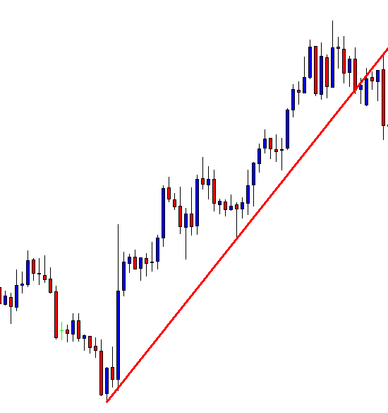
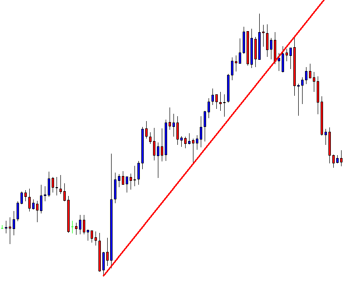
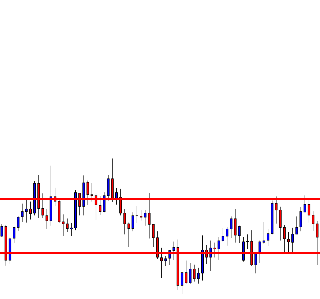
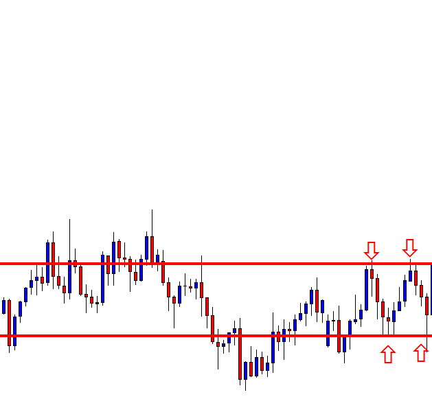
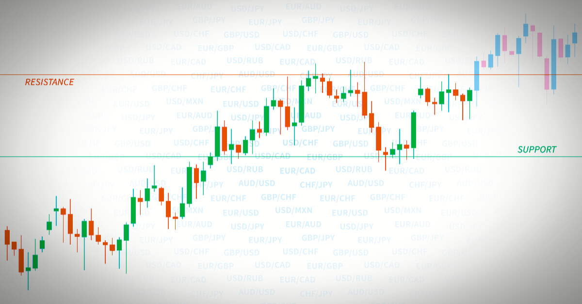
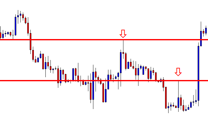
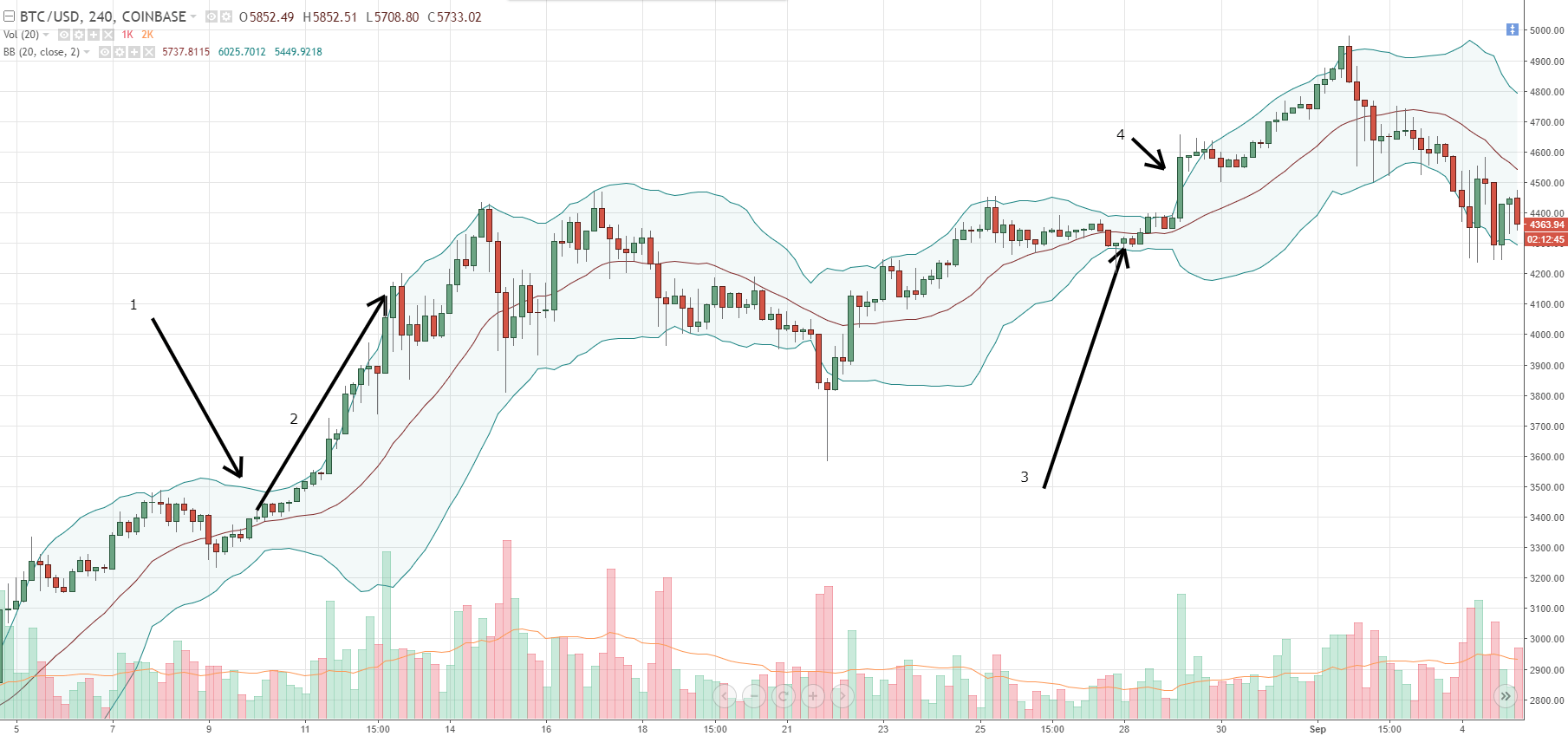
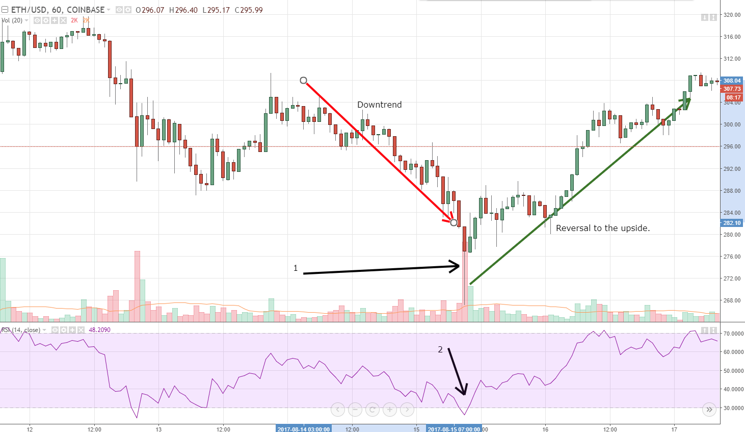
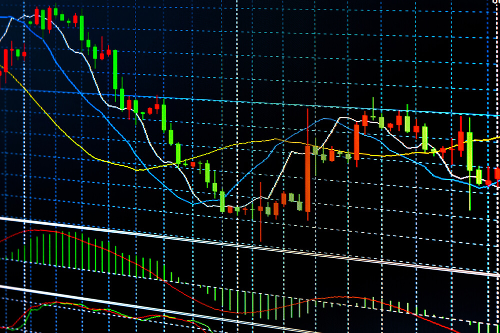
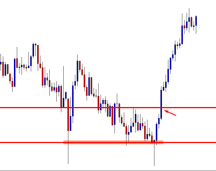
To evaluate, the quality of a strategy is an old quest, and its answer has to do with gambling theory, although it can apply to any process in which the probability of profits is less than 100%. Of course, the first measure to know if our system is winning is when the current portfolio balance is higher than in its initial state. But that does not give very much information.

A better way might be to record winners and losers, and have a count of both so that we could apply some stats. It would be interesting to know the percentage of winners we get and how much is won on average. That also applies to losers.

We could try to find out if our results are independent of each other or they are dependent.

Finally, we could devise a way to obtain its Mathematical expectancy, which would show how profitable the strategy is.

Outcomes and probability statements

No trader is able to know in advance the result of the next trade. However, we could estimate the probability of it to be positive.

A probability statement is a figure between zero and one specifying the odds of the event to happen. In simple terms,

Probability = odds+ / ( odds+  +  odds – )

On a fair coin toss game: odds of heads (against, to one) = 1:1

probability Fair coin toss = 1/(1+1)

= 0.5

Probability of getting a Six on a dice:

odds = 5:1 – five against to one

Probability of a Six = 1/( 1+5) = 0.16666

We can also convert the probability into odds (against, to one) of occurring:

Odds = (1/ Probability) -1

As an example, let’s take the coin-toss game:

Odds of a head = 1/0.5 -1 = 2-1 =1:1

That is very handy. Suppose you have a system on which the probability of a winner is 66 percent. What are the odds of a loser?

System winners= 0.66 so -> System losers = 0.34

loser odds = 1/0.34 – 1 = 2 -> about 2:1.

That means, on average, there is one loser for every two winners, which means one loser every three trades.

Independent vs. Dependent processes

There are two categories of random processes: Independent and dependent.

A process is independent when the outcome of the previous events do not condition the odds of the coming one. For example, a coin toss or a dice throwing are independent processes. The result of the next event does not depend on previous outcomes.

A dependent process is one where the next outcome’s probability is affected by prior events. For example, Blackjack is a dependent process, because when cards are played, the rest of the deck his modified, so it modifies the odds of the next card being taken out.

This seems a tedious matter, but it has a lot of implications for trading. Bear with me.

What if we acknowledge our trades are independent from each other?

If we consider that our trades are independent, then we should be aware that the previous results do not affect the next trade, since there is no influence between each trade.

What if we know our system shows dependency?

If we know that our system’s results are dependent, we could make decisions on the position size directed to improve its profitability.

As an example, let’s suppose there is a very high probability that our system gets a winner after a loser, and also a loser after a winner. Then we could increase our trade size every time we get a loser, and, also, reduce or just paper-trade after a win.

Proving there is dependency on a strategy or system is very difficult to achieve. The best course of action is to assume there is none.

Assuming there is no dependency, then it is not right to modify the trade size after a loser such as martingale systems do since there is no way to know when the losing streak will end. Also, there is no use in trading different sizes after a winning or losing trade. We must split the decision-making process from trade-size decisions.

Mathematical expectancy

The mathematical expectancy is also known as the player’s edge. For events that have a unique outcome

ME = (1+A)*P-1

where P is the probability of winning, and A is the amount won.

If there are several amounts and probabilities then

ME = Sum ( Pi * Ai)

The last formula is suitable to be applied to analytical software or spreadsheet, but for an approximation of what a system can deliver, the first basic formula will be ok. Simply set

A = average profit and

P = percent winners.

As an example, let’s compute the mathematical expectancy of a system that produces 40% winners and wins 2x its risk.

ME = (1+2)*0.4 -1

ME = 3*0.4 -1

ME = 0.2

That means the system can produce 20 cents for every dollar risked on average on every trade.

Setting Profit Goals and Risk

Using this information, we can set profit goals. For instance, if we know the strategy delivers a mean of 3 trades every day – 60 monthly trades- The trader can expect, on average, to earn (60 * 0.2)R, or  12* R, being R his average risk.

If the trader set a goal of earning $6,000 monthly he can compute R easily

12*R = $6,000

R= $6000/12 = $500.

That means if the trader wants a monthly average of $6,000, he should risk $500 on every trade.

Final Words

On this article, we have seen the power of simple math statements, used to help us define the basic properties of our trading system, and then use these properties to assess the potential profitability of the strategy and, finally, create a simple plan with monthly dollar goals and its associated trade risk.


Categories
Forex Course

2 – Preface To The Forex Market

Introduction

Forex AKA Foreign exchange is the largest market in the world where all the global currencies are traded. It can also be considered as a place where individuals, companies, and banks convert one currency into another. The entire Forex market is decentralized and is maintained by the banks across the globe. On average, the daily trading volume of the whole Forex market is more than $5 trillion. This explains the sheer size and liquidity of this market. Forex market is an essential part of the global economy and is active 24/5 (From Monday to Friday)

The Purpose

Typically, the exchange of goods and services happens for money, and this money is nothing but currency. The respective country’s governments determine the value of that currency. Hence the value of one country’s currency is never equal to that of another. This is the reason why we need foreign exchange to exchange one country’s currency to others. Forex market is essential for any of the global imports/exports to happen, for any employer who needs to pay salaries to their overseas employees, for a tourist who is traveling abroad, etc.

Forex trading

It refers to the buying and selling of currencies that belong to different countries. In Forex trading, the buying and selling of currencies happen at the same time. That is, if a trader is trading EURUSD pair, he/she is essentially selling the USD he has in order to buy Euros. Traders make a profit when they sell a currency at a higher price than the cost they paid to buy that particular currency. This entire process was complicated even a decade ago. But now, with the advent of technology, anyone can start trading by using a lot of online trading systems.

Currency Pairs

As discussed above, the buying and selling of currencies happen in pairs. There are three types of Forex currency pairs. They are Majors, Minors, and Exotics.

Major currency pairs are those where the USD is involved. These are the most frequently traded pairs in the market, and they make up to ~85% of the Forex transactions that happen in a day.

Examples: EUR/USD, USD/JPY, GBP/USD etc.

Minor currency pairs are those that don’t contain USD. They are also known as cross pairs. Euro, Pound, and Yen are the most popular currencies that make up the minor currency pairs.

Examples: EUR/CHF, AUD/JPY, GBP/CAD etc.

Exotic pairs are the ones where one is a major currency, and the other is a small or emerging currency.

Examples: USD/PLN, GBP/MXN, EUR/CZK etc.

Types of Forex markets

Spot market – The physical exchange of the currency pair takes place at the point of trade, i.e., as soon as the price is fixed between buyer and seller. The transaction is settled on the spot or at least within a short period of time.

Forward market – Here, a contract is made between the buyer and seller, where they agree upon a price to exchange the currency pair. This contract will be settled at a date in the future or within a range of future dates.

Futures market – Even in this type of market, a contract is fixed between the buyer and seller. A price is set on a future date delivery. The difference between Forward and Futures market is that in the latter, the contract is legally bonded between the parties.

That’s about the introduction to the Forex market. We hope you had a good read. In the next article, we will talk about some important Forex terms and phrases. Now, let’s see if you can get the below questions right.

[wp_quiz id=”41271″]
Categories
Forex Elliott Wave

Corrective Waves Construction – Part 5

Elliott defined a complex corrective wave as the combination of two or three simple corrective structures. In this educational article, we will review the main characteristics of this group of EW formations.

The basics

Elliott named the combination of corrective waves combination as “double three” and “triple three.” These formations could present zig-zag, flat, or triangle patterns.

The price action can be characterized by a sideways movement. Each end of a simple corrective wave, as labeled by Elliott as W, Y, and Z, and each reactionary wave as X.

The following chart exposes the basic model of a double three and a triple three.


Consider that the difference between a double three and a triangle pattern is its internal structure. A triangle follows a 3-3-3-3-3 sequence. Meanwhile, in a double three, its internal wave C follows a five-wave movement.


Alternation and complexity

R.N. Elliott identified the alternation in corrective waves. If the first correction is simple, the next corrective move will be complex and vice-versa.

In the same way, a corrective wave alternates its formation. For example, consider an A-B-C sequence; if wave A starts as a zig-zag, wave B will likely be a flat pattern. Remember that wave C always runs as five waves.

The next figure shows the alternation in a corrective wave construction. This alternation is analogous if wave A is a flat pattern.


Alternation in the real market

The below chart corresponds to the NASDAQ Biotechnology Index ETF (IBB) in the 3-hour timeframe. The Elliott wave movement shows a decline started on October 01, 2018, when the price action found sellers at $122.97.


The wave A of Minor degree is composed of a corrective move developed as a zig-zag pattern ending at 100.67 on October 29, 2018. Once completed this path, IBB formed a regular flat pattern ending in early December at $111.58.

Finally, wave C of Minor degree was realized as a five waves sequence on the Christmas low at $89.64.

Categories
Forex Elliott Wave

Corrective Waves Construction – Part 4

The third basic corrective formation is the triangle. This pattern follows a 3-3-3-3-3 sequence. In this educational article, we will unfold the main characteristics of this Elliott Wave pattern.

The basics

A triangle structure emerges when the two markets’ forces, buyers, and sellers, are in balance. When the triangle pattern is in progress, the volume and volatility tend to decrease over time.

The triangle pattern is the most common Elliott Wave structure. The main rule of construction is the composition of five segments, or internal waves, which are built by three waves each segment. The following chart shows the basic structure of a triangle pattern.


Triangle variations

There are four triangle variations; these are contracting, barrier, expanding, and running. The next chart exposes the different triangle variations.


A triangle pattern tends to appear before the end of a trend. For this reason, it is useful the study in recognition of this Elliott Wave structure.

The triangle pattern in action

The example corresponds to the weekly chart of Nikkei 225 futures (CME:NKD) in log scale. The Japanese index shows a motive wave of Cycle degree in progress. The bullish sequence started in March 2009, when the market found buyers at 6,950 pts.

Pay attention to the extension of the third wave of Cycle degree, which climbed over 16,000 pts. At the same time, the third wave of Primary degree soared 12,740 pts (154.42%).


From the chart, we observe two triangles formations. The first one is a barrier triangle and was developed on wave 3 of Primary degree. The Elliott Wave structure started in the second half of May 2013 and ended in the first half of October 2014.

The second one is an expanding triangle in progress. The EW structure belongs to the fourth wave of Cycle degree. Currently develops the segment C-D. Consider the possibility that the price action could not reach the previous high of 2018 at 24,515 pts.

For the current sequence, the most likely path is a marginal upside, giving way to a bearish move probably to the 18,000 pts. Once completed this corrective move, Nikkei should start a rally with the eyes placed at the 26,000 pts.

Categories
Forex Elliott Wave

Corrective Waves Construction – Part 3

The second basic corrective formation is the Flat Pattern. Although this structure has three waves, it is different from the zig-zag. In this article, we will describe the structure of the Flats.

The basics

A Flat structure is an irregular corrective formation that contains three segments and built by a 3-3-5 sequence. If the price action breaks a motive wave rule, and the structure does not correspond to a zig-zag pattern, we are likely facing a 3-3-5 formation.

In a flat pattern tends to retrace less of the last impulsive move. Also, this corrective formation tends to occur after a strong trend; it means when the major trend is strong. In the following figure, we observe the basic structure of the flat formation.


Flat pattern variations

There are three types of Flat patterns: regular, expanded, and running flat. In a regular flat correction, wave B moves between the 2/3 and 100% of wave A, and wave C could travel from the 100% to 1/3 beyond of wave A.

In an Expanded Flat, wave B moves over the origin of wave A, and wave C extends ahead of wave A.

The Running flat structure, unlike the Extended Flat, characterizes by the extension of wave C, which ends before the end of wave A.

In the next diagram, we can appreciate the different flat formations.


Channeling in flat formations

A useful tool to identify a flat pattern is the channel. The channeling process allows us to visualize the potential next movement of the market.

The channeling process starts by tracing a horizontal line from the origin of wave A. Once completed; it must project the base-line at the end of wave A.

The next figure shows the different variations of the flat pattern.


The flat pattern in action

The e-mini SP 500 future (CME:ES) on its daily chart shows a sell-off started on October 03, 2018, when the price reached at 2,944.75 pts. The first decline was developed in three waves. As says the canalization process for this structure, we trace a horizontal channel from the origin to the end of wave A.

After this movement, ES made a sideways move in another three waves. Finally, the e-mini began a second bearish leg developed in five internal waves until 2,316.75.


Categories
Forex Elliott Wave

Corrective Waves Construction – Part 2

R.N. Elliott, in his work “The Wave Principle” described the zig-zag structure as a corrective pattern. In this educational article, we will unfold the zig-zag formation.

The basics

The zig-zag pattern contains three waves in a higher degree, and follow a 5-3-5 sequence in its lower degree. This order means that the first leg (A) has five internal waves; the wave (B) has three segments. Finally, wave (C) is formed by five waves. The following picture shows the formation of a zig-zag pattern.


Zig-zag variations

A zig-zag pattern could develop some variations as a normal, truncated, and extended. The following chart represents the different variations of the zig-zag structure.

Consider as a key to classify what kind of zig-zag structure is running, each segment of the corrective wave must follow the 5-3-5- sequence, and the extension of wave C.


Zig-zag patterns: Channeling

Another tool to identify the type of zig-zag pattern is the use of channels. Channeling allows us to identify the potential movement of a zig-zag formation.

Channeling is developed in the same way as motive waves. In this case, we must connect the end of the last motive wave with the end of wave B and project the parallel line at the end of wave A.

In the next figure, we observe the difference between a normal and a truncated zig-zag not necessarily surpass the base-line of the channel. The main difference is that in a normal zig-zag, the wave C projection could be at least 2/3 of wave A.

In the truncated zig-zag, the wave C projection is between 1/3 and less than 2/3 of wave A.

On the extended zig-zag pattern case; the sequence could be indicative of a complex corrective sequence formation.


The S&P 500 weekly chart shows a zig-zag pattern. The bearish sequence started in October 2007 when the price reached at 1,576.1 pts. The corrective move ended on March 2009 at 666.8 pts. In some cases, the line chart could be helpful to visualize each segment of a wave. In this example, we observe in the line chart how the structure accomplishes the 5-3-5 sequence.


Categories
Forex Elliott Wave

Corrective Waves Construction – Part 1

Corrections are formations that occur after each impulse. As we have seen before, corrective waves have three segments. In this article, we will see the main characteristics of the corrective waves.

Nature of the corrective waves

Generally, corrective waves are more challenging to identify than impulsive waves due to their variations. Elliott spent a large part of his time describing the different types of corrections. The author, in his Treatise, explains that “a corrective wave in progress is complicated to predict accurately between its pattern and extent.

Corrections are characterized by having three waves, except triangles that have five internal segments. Some factors that can influence the form of correction are time, speed, the extent of the previous movement, etc.

In the following figure, we observe the formation of the basic corrective structures.


Corrective waves formation

If the price action does not allow all the rules of formation of an impulsive wave to be verified, then the market is developing a corrective structure.

The most straightforward corrective structures are:
– Zig-zag, this formation has a 5-3-5 sequence.
– Flat, whose internal structure has a 3-3-5 configuration.
– Triangles, these formations develop in a sequence 3-3-3-3-3.

There are also corrective structures that are a combination of two or three simple corrective patterns. These formations are known as double three and triple three.

Alternation in the corrective waves

Just as impulsive waves alternate, corrective waves do too. In simple terms, Elliott points out that if wave two is a simple structure, wave four will be complex and vice versa. In the following figure, we observe how the corrective waves alternate in complexity.


Corrective waves can also alternate in the strength level. That is, a correction can be ordinary or strong. In the following chart, we observe the ideal model of the strength level in a corrective structure.


Categories
Forex Candlesticks

Ideas that can be Blended with Candlestick to Trigger Entries-Part4

In this article, we are going to demonstrate how a Morning Star offered us an entry. We know Morning Star is a strong bullish reversal candle, which is a combination of three candlesticks. There are two types of Morning Star.

  1. Morning Star
  2. Morning Doji Star

Here is how Morning Star looks like

And this is how Morning Doji Star looks like

The example we are going to demonstrate is a Morning Doji Star. Let us get started.

The price was down-trending and produced a Doji Candle on a support level where the last bearish candle closed within. Look at the very last candle. It came out as a Bullish Marubozu Candle closing above the 2nd last candle’s open. This is a typical example of Moring Star upon which buyers shall start integrating other equations to go long.

Let us have a look at those equations.

At first, we have to draw a level of resistance here. Let us draw it.

We draw the resistance line right where the candle closes. Since we do not have any down-trending Trend Line or a Double Bottom’s neckline here, thus we must wait for a trigger candle to close above the bullish candle on the trading chart.  We now have to flip over to the trigger chart. This is an H4 chart, so let’s flip over to the H1 chart to get correction/consolidation and breakout.

This is how the H1 chart looks. The first H1 candle came out as a bearish corrective candle, and the very next one closed above the bullish H4 candle’s close. A perfect trigger candle, we shall wait for. We sometimes may not get the corrective candle here. The very next H1 candle may breach the resistance line and offer us the entry.

In our previous article, we demonstrated an example of how a Bearish Engulfing Candle offered us an entry. Have you spotted out the difference between a single candlestick pattern and a combination of candlesticks pattern’s entry?

On a single candlestick entry, we had to wait for a neckline breakout (it may be trend line breakout), consolidation (on the trading chart), bearish reversal candle (on the trading chart), then the breakout (trigger chart). With Morning Star, we did not have to wait for consolidation on the trading chart. Once the combination pattern (Morning Star) was evident, we flipped over to the trigger chart; waited for a candle to make a new higher high to take an entry.

It may sound so many things to be remembered and integrated with candlesticks trading. However, once we practice and try to understand the market psychology that goes with those patterns, things will get as easy as you may like.


Categories
Forex Chart Basics

Ideas that can be Blended with Candlestick to Trigger Entries-Part 3

In Part 2, we learned how important a breakout is for taking an entry. Even the strongest reversal candle itself is not enough to create a new trend. In this article, we are going to learn other steps that we need to maintain for taking an entry in case of engulfing candlestick.

Let us have a look at the chart below.

After producing the engulfing candle,

  1. The price breached through a support level.
  2. The breakout candle looks very strong.

First two equations have been met. Shall we take the entry right now? The answer is “NO”. We must wait for an upward correction/consolidation. A correction/consolidation gives us another level of support/resistance (in this case resistance). It offers a better risk and reward ratio as well as a better winning percentage. Thus, correction/consolidation is considered one of the most vital components of trading.

Let us have a look at how consolidation took place here.

Pay attention to those candles after the breakout. The pair produced one more bearish candle. Many traders may think an opportunity missed here. Look at the very next candle. That came as a Doji Candle followed by a bullish one. Be very careful. The market often keeps having a correction and changes the trend even by making new higher highs. Thus, a bearish reversal candle we must wait for.

We got one and luckily, it was a bearish engulfing candle. Candle Stick Pattern is being used here again to show us selling sign. What do we have to do now?

We have to wait for another breakout. This time we have to flip over to our Trigger Chart. This is an H4 chart. Thus, our trigger chart is H1 Chart. Let us flip over to the H1 Chart.

The price came out with the last candle from the consolidation zone. A Marubozu Bearish Candle made the breakout. A less low spike indicates that the sellers are very confident. Look, Candle Stick Pattern is being used here again. Here we go. This is the point where we trigger out short (sell) entry.

Let us have a look at the chart below how our trade would play.

Wow, it played well. Though it had consolidation on the minor time frames later, however, this should not be our concern. We followed our trading chart’s trend, breakout, consolidation (H4) and the H1 breakout. By setting our Stop Loss and Take Profit, we shall forget the entry. This is another thing of trading called “Set and Forget” that need to be integrated.

In this article, we learned these are the things to be integrated as well.

  1. Consolidation/ Correction on the trading chart.
  2. Reversal candle to be formed on the trading chart.
  3. Flipping over to the trigger chart and waiting for a breakout.

In the next article, we are going to demonstrate an example of how a Morning Star offered us entry with the integration of consolidation, breakout, and breakout candle with a Morning Star. Stay tuned.

Categories
Forex Elliott Wave

Trading the Elliott Wave Principle – Part 2

Wave five is the last movement in the direction of the trend. In this educational article, we will review two ways to trade the fifth wave.

Trend following

The first choice to trade the fifth wave is looking to join the primary trend. The following chart shows the trading setup.

There are two ways to place the order. The first option is following the retracement of a wave 4, which could extend from the Fibonacci levels 23.6% to 50%. The second option is to wait for the breakout and close above wave B of wave four.

For the invalidation level placement, we have to remember the Elliott Wave rule “wave four never end in the territory of wave one.”

To define the profit target levels, we use the Fibonacci projection from waves 3 and 4. In this case, the first target will be at 61.8%, the second at 78.6%, and the third target at 100%.

In some cases, if wave three is the extended wave, there is the possibility that wave five has the same extension that wave one.

Ending diagonal pattern

The second alternative to trade the fifth wave is when the price action builds an Ending diagonal pattern. In this case, we have two options to enter the market. The first one is to place the order after the breakdown of the lower trendline. The second one is after the close under the swing of wave 4.

The invalidation level is above the wave 5, and the profit target is at the end of wave 2.

The fifth wave in the real market

The next chart corresponds to PayPal Holdings (NYSE:PYPL) in its 8-hour timeframe. PYPL developed a rally from the Christmas 2018 low at $76.70 per share.

From the bullish cycle, we observe the wave three and the retracement developed by wave 4. PYPL retraced until the Fibonacci level 38.2%. In this sense, we can look for long positions from 23.6% until 50% of the Fibonacci retracement.

The price action drove to PYPL until 61.8% of the Fibonacci projection at $121.48 on July 16, 2019. As can be noted, PayPal Holdings started to decline once it reached the highest level of the year.

The invalidation level could be placed on two different levels. The first one is at the end of wave one at $94.59. The second alternative is at the 61.8% of the Fibonacci retracement at $97.34 per share.

The next weekly chart corresponds to the e-mini NASDAQ futures (CME:NQ). In this example, we observe an ending diagonal structure.

The sell position could be placed in two different ways, after the lower trendline, or once the price closes below the end of wave 4. Finally, NQ dropped until the bearish target at the end of wave 2 at 1,457.75 pts.

Categories
Forex Elliott Wave

Impulsive Waves Construction – Part 4

A diagonal is an impulsive pattern, but it is not an impulse. That is because Diagonals have the characteristics of corrective waves. In this article, we will explain the aspects of the diagonal formations.

Diagonal Pattern Structure

Diagonal patterns share rules of both impulsive and corrective waves. Even when, as a motive wave, wave 3 is never the shortest, in the diagonal pattern, wave 4 can enter the territory of wave 1. There are two main types of diagonals, leading diagonal and ending diagonal. The following figure shows these two cases.


Ending diagonal

This impulsive pattern develops mainly in a fifth wave, especially when the market has made a significant advance in time. The internal structure corresponds to a 3-3-3-3-3 sequence. In this formation, wave 1 and 4 may or may not overlap. However, this is not an exclusive requirement. It has also been observed that internal wave 3 is the most extended.

The following example corresponds to the mini NASDAQ index (NQ) futures on the weekly timeframe and semilog scale. The bullish motive sequence began in September 2002 until the end of October 2007. In the figure, we observe the progress made by the price over the upper line of the diagonal. Once the price surpassed it, NQ started a corrective movement that ended in October 2009.


Leading diagonal

This type of impulsive wave can appear in both a wave 1 and an A wave. Its internal structure can be 5-3-5-3-5 or 3-3-3-3-5. In the main diagonal, wave 1 and 4 can overlap. However, this is not a mandatory requirement. Also, there is a possibility that the diagonal formation is expansive rather than contractive.

In some cases, in the ending diagonal pattern, we can observe the truncation of wave five. The following Dollar Index (DXY) weekly chart shows a leading diagonal and an ending diagonal from where wave 5 is truncated.


Categories
Forex Elliott Wave

Elliott Wave Theory and Fibonacci

Leonardo da Pisa developed the Fibonacci sequence in the thirteen century. The series starts like this: 1-1-2-3-5-8, and so on. Elliott, in his work “Nature’s Law,” said Fibonacci provides the mathematical basis of the Wave Principle. In this educational article, we will review how to apply the Fibonacci sequence to the Elliott Wave Theory.

The Fibonacci ratios

The Fibonacci sequence has its origin in Leonardo da Pisa’s work, “Liber Abacci.” In his work, the mathematician responses to the question:

How many pairs of rabbits placed in an enclosed area can be produced in a single year from one pair of rabbits if each pair gives birth to a new pair each month starting with the second month?

The answer to this question resulted in the series calculated as follows: The first month, there will be zero plus one that results in one pair. The next month, the rabbits will reproduce, expanding to two pairs. In short, the sequence of rabbits is as follows, 0, 1, 1, 2, 3, 5. The series concludes that at the end of the year, there will be 144 pairs of rabbits.

From the Fibonacci series, we obtain the main ratios of this sequence; these are 0.618 and 1.618; this number is known as the Golden Ratio.

In the Elliott Wave Analysis, we use some specific level to evaluate the retrace and potential next movement of the market; these levels are as follows:

Retracement:

  • 0.09
  • 0.146
  • 0.236
  • 0.382
  • 0.5
  • 0.618
  • 0.764, some authors prefer to use the 0.786 level.
  • 0.854, some authors prefer to use the 0.886 level.

Expansion:

  • 0.618
  • 1
  • 1.272
  • 1.414
  • 1.618
  • 2
  • 2.272
  • 2.618

Use of Fibonacci tools in the financial markets

Until now, we used neither a mathematical method to determine price targets. Consider that the price action is not compelled to respect a Fibonacci level by itself. These tools provide a probability zone to a reaction.

The following chart corresponds to AT&T (NYSE:T) in its daily timeframe. The bullish cycle started on August 24, 2019, when T found buyers at $30.97 per share.


The first Elliott wave movement calls for a leading diagonal structure, which made the wave 1 of Intermediate degree. Using the Fibonacci retracement tool, we observe that wave (2) retraces near to 38.2% o wave (1).

The wave (3) accomplishes the rule that commands “wave 3 is the largest wave.” In wave (4), we observe that respect the alternation rule that says, “if wave two is simple, wave four will be complex, and vice-versa.” This wave retraces between 23.6% and 38.2% of wave (3).

Finally, from wave (5), the price action drove to strike over the upper-line of the ascending channel.

Categories
Forex Elliott Wave

Trading the Elliott Wave Principle – Part 1

The Elliott Wave Principle allows us to identify the primary trend and its correction. Also, it permits to recognize the maturity of the market, to determine price targets, and to provide a specific invalidation level. In this educational article, we will explain how to trade the Elliott Wave Principle.

Trading the waves

Before identifying a trading setup, we have to remember the basic structure of the cycle. Waves 1, 3, and 5 are motives and follow the principal trend direction. Waves 2, and 4 corrects the trend movement and moves in three internal waves. The following figure shows the basic structure of a cycle.


From the Elliott Wave cycle structure, we observe that waves 3, 5, A, and C, are tradeable. Waves 2, 4, 5, and B provide the retracement that generates the opportunities to entry following the direction of the trend.

Trading the wave three

Wave three characterizes by to be the best profitable movement of an entire Elliott Wave cycle. The following chart shows the way to trade wave three.


To place our entry, we have two options. The first alternative is following the retracement level, which could extend from 38.2% to 78.6%. The second alternative is to place the order after the wave B breakout.

The profit target is at least 100% of the Fibonacci projection from the origin, wave 1, and wave 2. Remember, the wave three rule “is not the shortest.” The second target is 127.2%, and the final corresponds to 161.8%.

The invalidation level is below the origin of wave 1; remember the rule “Wave 2 never moves below wave 1.” An alternative level is to set the invalidation below the end of wave C.

Wave three in action

Dow Jones Transportation (DJT), in its 8-hour chart, shows a bullish sequence that started on January 20, 2016, when the price found buyers at 640.33 pts. The first rally drove to DJT until 814.90 pts on April 20, 2016.


After this high, the price action retraced in three waves as an A-B-C sequence, piercing 61.8% of the Fibonacci retracement. From the chart, we observe the two possibilities to place the entry to the market. The first alternative is to go long between the 50% and 61.8%. The second one is to wait for a wave B breakout above 795.06 pts.

DJT reached the first target at 876.58 pts in the first half of November 2016. While the second target, located at 923.92 pts in early December 2016. However, DJT touched the third target at 984.21 pts on September 27, 2017.

Categories
Forex Candlesticks

Ideas that can be Blended with Candlestick to Trigger Entries – Part 2

Candlestick Patterns are widely used by traders to take entries and making money out of trading. We have come to know from Part 1 that relying on a candlestick formation only is not enough for a reliable entry signal. Other things need to be integrated with candlestick formation so that traders can trade accordingly. In this article, we are going to demonstrate an example of how an entry should be taken depending mainly on an engulfing candle as well as other equations that need to be maintained by traders.

Let us have a look at the chart below.

The chart above shows that the market is up-trending. At first glance, we shall look for buying opportunities here. However, look at the last candle. This is an engulfing candle which indicates that the sellers may take over. An engulfing candle is a strong sign of a trend reversal. However, we must not get carried away, but wait for other indications. In this case, we may wait for a breakout at the last swing low. Have a look at the chart.

Pay attention to the red line. This is the last swing low where the price had a bounce and moved towards the North. Then, after finding a resistance, it produced a bearish engulfing candle; kept going down on the next candle and made a breakout with a huge bearish candle. This is now an ideal chart for the sellers to look for selling opportunities. The trend starts with an engulfing bearish candle. Candlestick pattern suggests that the sellers may take over. It has. It is pretty simple, right? Not really. Just go three candles back. Look at the same chart below.

Pay attention to the arrowed candle. This is a bearish engulfing candle as well. That could have changed the trend and the price could have headed towards the South. However, that did not happen. The price kept going towards the North for three more candles then came down. Do you spot out the difference? The price did not make any downside breakout. In this case, if it had made a breakout at the nearest swing low, it might have come down from right there. Look at the chart below to get a better idea of which level I am talking about.

The drawn red level was the last swing low. If the price continued to go down and made a breakout at that level, it would have been a different ball game.

In this lesson, we have learned that Candlestick Pattern is a sign. In fact, is the first sign of a trend reversal. However, we need at least two more things to integrate with Candle Stick Pattern for taking an entry. These are:

  1. A Breakout at a significant level of support or resistance.
  2. The breakout is to have good momentum meaning the breakout candle is to be a good-looking bullish or bearish candle.


Stay tuned to get to know more about candlestick and integration in Part-3.

Categories
Forex Course

Introduction To The ‘Ultimate Forex Course’ By The Forex Academy!

At Forex Academy, we give utmost importance to education. To be successful, you need to learn before you Earn. So for that same purpose, we have designed a proprietory course helped by industry experts. This extensive course will cover almost everything one needs to know about the Forex market. All relevant aspects of the trading business will be discussed here, starting right from the fundaments to the advanced trading concepts. We will be publishing one article per day so that it will be a continuous learning process. And guess what? The curse is entirely free for our readers.

Introduction To The Course

In this one-of-a-kind course, we will explain everything you need to know about Forex trading. The Forex market has evolved rapidly in recent times. It is not the same that you would have seen or heard a decade ago. The fundamentals are changing, psychology is changing, and complexity has increased. Technology not available in the 90s has now become robust and is being used extensively by traders and banks. As retail traders, we should prepare as best as possible to meet these global changes.

We have created this course, keeping in mind the rapid changes happening in the forex market. You need to use a structural method of learning, which is what we have done. Education shouldn’t be in bits and pieces, this will only create confusion, and you cannot gain anything from that knowledge. You will gain an insight into fundamental and technical expertise and how you can use them together to make the best trades. We have compiled this information from the best sources. Most importantly, the course contents have been written based on the personal experience of the writers. Forex.Academy is the right place to start for any person looking to start his trading career.

Why should you take up this course?

If you want to achieve your investment goals, this course is for you. Trading is not an easy game. It requires a lot of hard work and dedication. This journey begins with learning, and learning starts here. This course is a complete package for all the aspiring traders. Also, experienced traders who are willing to expand their knowledge must try this course. The articles are more reader-friendly, where topics are explained in simple language. The most complex strategies are described in the easiest way possible. Without having the right knowledge, it is impossible to succeed in trading.

Structure of the course

The course is divided into 37 chapters which comprise of 350+ articles, where a wide range of topics are covered. The chronological order of topics is in such a manner that every chapter is linked to the next. We have made sure that it does not lead to confusion at any point. You will find information on fundamentals, technical analysis, and price action. Market psychology is one such topic, which has been written with a lot of attention. And you too, should follow these principles to gain control over your mind.

Keep track of your learning with the quizzes

At the end of each article, we have included a quiz that will test your understanding of the topic. To be confident about what you have read, try to answer all of them correctly. If you are unable to answer, that means you need to reread the article. Rereading the article will clear all your doubts and make you an expert. Once you got all the answers right, you are ready to go ahead to the next section.

What will you learn by the end of this course?

By the time you reach the end of the course, you will be halfway through your trading journey. The only thing left for you to do is to practice the trading strategies discussed along the course. You will have all the knowledge you need to be a successful trader. See you on the course.

All the best! Happy Learning!

Categories
Forex Candlesticks

Ideas that can be Blended with Candlestick to Trigger Entries-Part 1

Candlesticks are considered one of the strongest components to take an entry. However, this is not the only thing that a trader shall consider before taking an entry. An Engulfing Candle or a Pin Bar is a strong reversal candle. If the price is down-trending and we get a bullish engulfing candle, we may want to go long on the pair. No doubt, a bullish engulfing candle is a strong reversal candle, but there are other factors we must consider before taking an entry.

Let us find more about it from the charts below.

I have chosen a chart which was down-trending and produced a Bullish Pin Bar. The price then changed its direction and headed toward the North. Let us have a look at the chart.

The arrowed candle is one good-looking bullish Pin Bar. A Pin Bar like this attracts the buyers to go long. We see the consequence; the price headed towards the North with good buying pressure. Does this mean whenever we see a Bullish Pin Bar, we go long or vice versa? The answer is no. We must consider other factors such as Support/Resistance zone, Double Top/Bottom, Neckline Breakout, Trend Line breakout, Breakout Candle.

Let us have a look at the chart again.

See where the Pin Bar was formed. It was formed right at a zone where the price had several bounces. Ideally, this is a level where the sellers want to come out with their profit. Thus, a strong bullish reversal candle such as a Bullish Pin Bar shall attract the buyers to concentrate on the chart to go long. Now that we have found a strong support level what else to look for?

The price was down-trending by following a Trend Line. Can you spot that?

Have a look at this.

A down-trending Trend Line can be drawn. Buyers must wait for a breakout there. See the breakout candle. That was a strong bullish candle which was followed by another one. Moreover, the price came back and touched the Trend line after the breakout. Many buyers may have taken their entry there. This is not a bad idea. You may want to go long right after the second candle closes.

However, some buyers may want to go long at the neckline breakout. Have a look at the chart below.

To be very safe, some traders love to set a pending buy order and go long above the neckline level. It is a safer option for sure, but it has some disadvantages as well. We will talk about this later. Meanwhile, concentrate on what we have learned from this article.

  1. Candlestick or Candlestick pattern is to be formed at a value area.
  2. The existent trend is to be collapsed.
  3. Double Bottom or Double Top is to be evident.
  4. Breakout Candle is to be a strong commanding candle.


Categories
Forex Elliott Wave

Impulsive Waves Construction – Part 3

An extension is an essential feature of an impulsive movement. In this article, we will see what the characteristic of this type of movement is.

Extensions

An extension is a movement that characterizes the longest wave of an impulsive wave. This movement allows us to differentiate between an impulse and a correction. An extension may appear in waves 1, 3, or 5, but it will never appear in more than one wave. In the following figure, we see the extended wave of “blue” degree and the “black” grade wave corresponds to the upper degree structure.


Extensions of extensions

As in the previous case, extensions can have internal extensions. The rules for this scenario are the same as in the case of simple extensions.


The following figure corresponds to the Dow Jones Industrial Average (DJI) in the semilog scale. The chart shows the impulsive wave that begins with the October 1987 low at 1,616.2 pts., and concludes on October 2007 when DJI touched the 14,198.1 pts. The cycle ended when DJI made a new low in 2009, reaching the 6,470 pts.

Dow Jones chart shows that the third wave of blue degree is the extended wave. Additionally, the third wave of the black degree is the extension of the extension in the bullish cycle.


Categories
Forex Daily Topic Forex Risk Management

Basic Math Skills Traders Needs – Average and Chevyshev’s Inequality Explained!

Most of the people wanting to profit from the Financial Markets think that the secret to success lies in knowing the price turns to start a new trend and also detects when to get out of the trade. They might be right if there were a mathematical formula or crystal ball to show us the right timing. But the truth is the Financial Markets are chaotic and random. Thus, there is no sure way to be right.

The good news is that we don’t need to be right, but be profitable. That can be achieved by taking small losses when the trade goes against us and let profits run when the trade goes as we projected. And the key knowing if we are on the right track is measurements and analysis.

This article deals with how to extract information out of a set of results by computing an average. And also, by measuring the deviation from the norm extract wisdom hidden in the data collection.

Averages

Averages have the purpose of determining the typical value or center of a set. For instance, the mean profit achieved in a month or a year. We assume that the majority of the samples are located near the average, and, also, that the number of cases away from it decreases with the distance to the average.

The computation of an average is simple. We add all elements and divide them by the number of items in the set.

As an exercise, if we have a collection of trading results X, with elements x1 = $1, x2=$-1 and x3=$3 which is our average profit?

Average of X (M) = (x1+x2+x3 )/3 = (1+(-1) +3)/3 = 3/3 = 1 dollar.

The Sample Standard deviation (SD)

It is interesting also to measure how far could we expect the following trades to be away from this mean. There are several ways to measure errors, but the most used is the Standard Deviation. SD for short.

Computing the standard deviation is a bit more complicated than the average, but not much.

1.- We take the difference between the mean and every element, creating a new set of differences.

dxi = M-xi 

2.- Differences may be negative or positive, so we square them to get dxi^2, creating a set of squared differences.

dxi2 = dxi^2

3.- We add all elements of this last set and divide by its n-1, the number of items minus one. This result is called variance

Var = Sum(dxi2)/(n-1)

4.- Take the square root of the variance.

SD = √ Var

let’s do it with our example:

1.- dx1 = 1-1 =0;  dx2 = 1-(-1) =2; dx3 = 1-3 =-2

2.- dx1^2 = 0; dx2^2 =4; dx3^2 =4

3.- Var = (0+4+4)/(3-1) = 8/2 = 4

4.- SD = √4 = 2

After that, we can conclude that our system’s future performance will be one dollar plus or minus 2 dollars.

The Standard Deviation can be thought of as the average of the dispersion of the results.

Chebyshev’s Inequality

Once getting these results, we know a bit about our trading system. Chebyshev’s inequality gives us another handy piece of information. It addresses the question of how many of our samples will lie within a certain distance from its mean.

There are many classes of probability distributions. One of them is the Normal Distribution, with its typical Gauss or bell curve. The Normal distribution is very nice indeed, and many physical phenomena conform with it, such as the length of people or the distance from the target on a dart game. Unhappily, trading results do not conform to it.

The good news is that the Chebyshev’s inequality works with a wide variety of distributions, and guarantees that no more than a certain fraction of values can be farther away than a certain distance from the mean.

Specifically:

No more than 1/k^2 values can be farther away than k* SD

We can say it the other way around:

At least 1-1/k^2 of the values of a distribution are within k*SD from its mean. If we create a spreadsheet using these formulas we get:

Table 1 – Chebyshev’s Inequality

This table provides a lot of information.  We see, for instance, that only 11.11% of the trades are farther than 3 SD from its mean.

  • That means close to 90% of the profit on future trades in the above calculation will be between -5 and 7 dollars.
  • Also, 75% of them will lie within 2 SD – between -3 and 5 dollars.

Since it can be applied to most of the distributions, we could use it with prices. That way, we could determine how far a price is away of its mean and assess overbought and oversold conditions with statistically relevant tools.

Final words

  • Knowing how to compute averages and the standard deviation will help traders quantify and qualify their performance.
  • It is interesting to know how to find the odds for a value to be at a determined distance from the mean value of the distribution.


Categories
Forex Elliott Wave

Impulsive Waves Construction – Part 2

A useful tool for motive wave analysis is the use of channels. In this article, we will review how to use channels to identify motive waves.

Channeling process

A channel is a technical figure that is formed by three points. In Elliott wave theory, channels allow us to identify the potential objective of waves 3 and 5, with “dramatic precision.”

R.N. Elliott, in his work “The Wave Principle” tells us that a channel cannot be drawn if wave two has not ended. Once this wave is complete, we can trace the first channel by connecting a line from the origin of the first impulse to the end of the second wave. Then, a parallel line is projected at the end of the first wave. The following figure shows the process.


Once the third wave is completed, the same process is repeated, this time, we connect the end of wave 1 and 3, and we make the projection at the end of wave 2. This channel will give us an approximation of the end of wave 4. To estimate the end of the fourth wave, we must consider that it should never be more profound than wave 3. The following figure shows this channeling process.


Finally, once the fourth wave is finished, we draw the baseline of the channel linking the ends of waves 2 and 4 and project the parallel line at the end of the third wave. This channel will give us as a possible end of the fifth wave.


The following Silver daily chart shows that the precious metal is completed a sequence of three waves. Currently, the commodity is running in a wave 4 with a potential target at the $17.5 zone.


Categories
Forex Elliott Wave

Impulsive Waves Construction – Part 1

Previously we presented an ideal model of motive waves; however, the real market is not exactly perfect. In this educational article, we will develop the principles of impulsive waves.

The nature of impulsive waves

Before we begin to identify impulsive waves, we must consider the following rules that compose it:

  1. It must have five consecutive segments, or waves, that develop a trend.
  2. Three of these five waves must move in the same direction; this can be bullish or bearish.
  3. After the initial wave, a shorter sequence must be developed in the opposite direction of the first movement. This movement should never be greater than the advance of the first wave.
  4. The third wave must be larger than the second movement.
  5. After the third impulsive movement, a similar sequence to the second wave should be developed. However, the third segment trend must prevail over the fourth.
  6. The fifth wave, in most cases, will be more extense than the fourth movement. If the fifth wave is smaller than the fourth wave, this is called a “failure.”
  7. When comparing the lengths of waves 1, 3, and 5, the third wave does not necessarily have to be the longest. However, it should not be the shortest.

If one of these rules is not followed, then the movement is not an impulse, the structure corresponds to a corrective sequence.

The alternation principle

Elliott defines alternation as a law of nature, as the day and night alternates, the movements of a market also alternate. The alternation principle establishes that when two waves of the same degree are compared, they are different from each other.

We observe the alternation in:

  • The distance that price travels.
  • The duration of each wave.
  • The retracement of the depth of each impulse (waves 2 and 4).
  • The complexity of each wave, that is, the number of internal waves that compose it.

The following daily chart corresponds to the EURAUD cross. In the chart, we observe the alternation in price and time. The first bullish movement began on August 21, 1997, at 1.42014, this wave was developed on 118 days and increased 2,919 pips or 20.55%. Wave 3 surged on 131 days and reported an increase of 19.83% or 3,121.6 pips. Finally, the fifth wave grew in 81 days, advancing 3,059.5 pips, or 17.44%, reaching the high at 2,05983 on October 06, 1998.


In the following EURAUD daily chart, we recognize the alternation in the retracement. From wave 2, we observed that the retrace of wave 1, was developed for 44 days, and the cross plunged 8.05% or 1,377.9 pips. Finally, wave 4 fell 1,334.1 pips (7.07%) of wave 3 in 36 days.


Categories
Forex Candlesticks

Morning Star: A Strong Bullish Reversal Candlestick Pattern

The Morning Star is a bullish reversal pattern that occurs at the bottom of a downtrend. A Morning Star is a combination of three candlesticks: The first candle shows the continuation of the downtrend. The second candle shows the weakness, and the third candle shows the strength of the bull.

There are two types of Morning Star:

  1. Morning Star
  2. Morning Doji Star


Morning Star

The Morning Star starts with a strong bearish candle followed by a gap down. The star candle may have a little bullish or bearish body. However, the third candle is to be a strong bullish candle closes at the above of the first candle’s open.

Have a look at this.

See the first candle, which is a strong bearish candle. The next candle starts with a gap closing as a little bearish candle. This one may have a small bullish body in some cases. The third candle starts with another upside gap. It is to be a strong bullish candle closing at the above of the first candles’ open. This states that the bull has taken control of the bear.


Morning Doji Star


Let us have a look at the Morning Doji Star

In this case, the star candle comes out as a Doji candlestick. The first candle comes as usual as a strong bearish candle. The third candle opens right at the support level and finishes above the first candle’s open. It states that buyers have started dominating the market.


In both cases, the first and third candles’ attributes are the same. The second candle varies. However, both types explain the psychology of the market, showing that the existent downtrend has come to an end, and an uptrend has been formed.

The Morning star is a visual pattern that is spotted out by the traders easily. It is the preferred pattern among all kinds of traders from price action traders to traders based on indicators.

How Traders Based on Indicators/Price Action Use the Morning Star

Traders based on indicators may use the Morning Star when it is produced at the Supply/Support zone. Moving Average, RSI, Bollinger Band, Parabolic SAR indicate Supply/ Support zone. If a Morning Star is produced at the zone that is a supply/support zone of those indicators, an entry may be triggered at the close of the third candle.

The price action traders may use horizontal, Trend Line, Fibonacci Support/Supply zone to take en entry on the Morning Star. If a Morning Star is produced at the supply/support zone of a horizontal/Trend Line/ Fibonacci levels, an entry may be triggered right after the close of the third candle.


Categories
Forex Elliott Wave

Planning your First Wave Analysis – Part 2

In a previous post, we talked about the ideal structure of an impulsive and corrective wave. Also, we discuss the starting point of the study of a market. In this opportunity, we will deepen the steps to identify a wave.


Watching the waves


Before continuing, we must consider the concept of “wave.” A wave is a defined movement of the market, which is reflected in a price variation. Depending on the price action, the change may have a higher or slower speed, but it will never be perfectly horizontal or vertical.

Depending on the sequence of a group of waves, the market may develop an impulsive or a corrective wave structure. An “impulsive wave” is made up of five waves with a relationship of the same degree. On the other hand, a “corrective wave” is composed of a set of three waves. The following figure shows an ideal impulsive and corrective wave.


Wave proportionality

Once we define the start point and the timeframe of the market study, we must consider that waves should have specified “proportionality.” Consider that some Elliott structures could not be easily visible by simple observation. For this reason, we must be flexible in terms of the selection of the timeframe to analyze. Remember that the same timeframe will not necessarily useful to examine all markets. Elliott, in his “Treatise,” reminds us that in markets with low volatility, the weekly chart may be more fit than the daily chart.


Price and time relationship

In a sequential movement, the price action is developed following the relation between price and time. On the following chart, we observe the Financial Select Index ETF (AMEX: XLF) on a weekly timeframe. In the example, we note that the sequence starts in the March 2009 low at $ 4.47, and ends when XLF reached the February 2011 high at $ 13.90. After this top, XLF developed a retrace in February 2011, which led to a higher low at $ 10.02.


In this example, there is a similarity in the advance and retracement of the price with the time. In summary, the movement of two consecutive waves of the same degree cannot be less than one-third (1/3) of the greater in terms of price and time.

Categories
Forex Daily Topic Forex Range

Hidden Wisdom Behind Range Measures

People coming to the Forex markets usually learned new vocabulary. The first special words they learn maybe are, margin, profit, risk-reward, and candlestick. Perhaps, afterward, they learn new concepts such as Volatility. Also, along with other technical indicators, they get to know one study called Average True Range. However, later, they forget about it since they usually consider it unimportant.

The Average True Range (ATR) is one way to measure Volatility. Volatility is, as we know, a measure of risk. Therefore, ATR can be used as an estimate of our risk. This measurement is essential for us as traders, especially if we are trading on margin. And I’ll explain why.


What tells the Range?

A range is a measure of the price variation over a period of time. It is measured between the High and the Low of a bar or candlestick. For instance, the range of figure 1 below (a 4H chart) is 357.9 points. If each point/lot were worth $1, a short position started at the Low of the bar would have lost $357.9 in four hours on every lot traded. Conversely, a long position would get this amount of profit.

True Range

True range is similar to a normal Range, but it takes into consideration possible gaps between bars. That happens a lot in assets that do not trade all day. Not always the close of a session matches the open of the next one. A gap may form. A True range accounts for that by considering gaps as part of the range of the bar if the gap is not engulfed by the range.

Average True Range

As we can see, in the figure above, every bar’s range varies depending on the particular price action on the bar. Some bars are impulsive and move considerably. Other bars are corrective, and their range is short.

Therefore, to measure the average price range an average is taken, usually, the 14-period, although traders can change it. Below we show the 10-bar ATR of the Bitcoin.

On this figure, we see that the ATR gets quite high at some point on the left of the figure, and it slowly decreases in waves. That is normal. Assets move in a series of increasing and decreasing volatility waves, which describes the interests and power of buyers and sellers.

Average True Range and Risk.

Retail traders usually have small pockets. The first measure a retail trader should know is how much his account would endure in the event of an adverse excursion.

As an example, let’s examine the EURUSD daily chart. Observing the 10-ATR indicator in the chart below, we see that the maximum level on the chart is 0.01053 and the minimum value is 0.00664. Since we want to assess risk, we are only interested in the maximum value.

Let’s assume that we wanted to trade long one EURUSD contract at $1.1288 and that, on average, our trade takes one day to complete. How much can we assume the price would move in a single day?

If we take the 0.01053 as its daily range value and multiply it by the value of a lot ($100K) we see that the EURUSD price is expected to move about $1,053 per day. We don’t know if that will be in our favor or not, but from the risk perspective, we can see that to be on the safe side we would need at least $1,053 of available margin for every lot traded.

If the average trade, takes 4 or 8 hours instead, we should set the timframe to 4H or 8H and proceed as we did with the daily range.

For not standard durations, we could use the following rule: For each doubling in time, the average range grows by a factor of the square root of 2.

That is handy also to compute the right trade size. Maybe we do not have the required margin level, but just one fourth. Thus, if we still wanted to trade the asset, we should trim down our bet size to one-quarter of the lot.

How much time our stop-loss will endure?

Based on ATR figures, we could assess the validity of a stop-loss level. If the stop-loss size is too short compared to the ATR, it might be wrongly set.

What profits to expect?

We could assess that as well, on average, of course. If the dollar range of an asset is $1,000 in a 4-hour span, we can expect that amount on average in four hours, and $1.410 (√2 * $1,000) on an 8-hour lapse.

Deciding which asset to trade

We could use the True Range to assess which asset is best for trading. Let’s suppose, for instance, that you are undecided about trading Gold (XAU) and Platinum (XPT). So let’s examine them.

Gold:

Spread: 3.2

$Spread cost: $32

Digits: 2

contract size: 100

MAX Daily ATR: 16, $ATR: $1600

Spread cost as Percent of the daily range: 2%

Platinum:

Spread: 12.9

$Spread cost: $129

Digits:2

Contract Size: 100

Max Daily ATR: 22, $ATR $2,200

Spread cost as Percent of the daily range: 5.86%

After these calculations, we can see that it is much wiser to trade Gold, since the costs slice only 2% of the daily range, while Platinum takes almost 5% of the range as costs before break even.


Categories
Forex Candlesticks

Types of Bullish Candlesticks

In this article, we are going to get acquainted with some of the Bullish Candlesticks that the financial markets produce. Let’s get started.


Bullish Trackrail

Bullish Trackrail candlestick indicates that the market has been dominated strongly by the buyers. It is a combination of two candlesticks. The second candle is to be bullish and the length is very similar to the first candle. Both candles are with a long and solid body having tiny spikes or no spike at all.

Image: Bullish Trackrail

Bullish Engulfing

Bullish Engulfing Candle is formed with a combination of two candles. The second candle is to engulf and close above the first candle to be considered as a Bullish Engulfing candle. Some analysts/traders do not want to take first candle’s wick into account. However, if the second candle closes above the first candle’s wick, that is one good Bullish Engulfing Candle. A Bullish Engulfing Candle is considered as the strongest bullish reversal candle.


Image: Bullish Engulfing

Bullish Hammer

Bullish Hammer Candle is created when a candle closes with a small body with a long lower shadow. The body has to be tiny and it can be bullish or bearish. However, a little bullish body instead of a bearish body is more preferable among the buyers.

Image: Bullish Hammer

Spinning Top      

Spinning Top has a short body found in the middle with upper and lower wicks. The body can be bullish or bearish.

Image: Spinning Top

Bullish Pin Bar

Bullish Pin Bar is similar to Bullish Hammer. The only difference is a Bullish Pin Bar does not have any real body whereas a Bullish Hammer has a tiny body. Since a Pin Bar does not have a body, it has more rejection from the downside. Thus, Bullish Pin Bar is considered one of the most powerful bullish reversal candlesticks in the financial market.

Image: Bullish Pin Bar

Bullish Inside Bar

Bullish Inside Bar is produced with a combination of two candles. The second candle is to be bullish but shorter than the first candle. It is just the opposite of Bullish Engulfing Candlestick. A Bullish Inside Bar is considered the weakest bullish reversal candlestick.

Image: Bullish Inside Bar

Doji

A Doji Candle is formed where the price finishes very close to the same level. Thus, the candle has no body or a very tiny body. A Doji Candle itself is not a strong bullish reversal candle. However, if it is produced at a strong level of support, the market often reverses and goes towards the North.


Image: Doji

Bullish Spinning Top and Doji look very similar to the Bearish Spinning Top and Doji. The only difference between a Bullish Doji and Bearish Doji is a Bullish Doji is produced at a Support Level whereas a Bearish Doji is produced at a resistance level. The same goes for Spinning Top as well. All other bullish reversal candles’ are to be formed at a significant level of support as well. Their appearance is very different than the bearish reversal candles. Stay tuned with us to learn more about Candlestick.


Categories
Forex Elliott Wave

Planning the First Wave Analysis – Part 1

Before to start to analyze any market, it’s necessary to set-up the chart earlier to begin to identify motive and corrective waves. In this article, we will learn how to start to analyze the market applying the Elliott Wave Theory.


Setting-up the first chart

The first step consists of choosing the market to be studied, and then select a starting point for the analysis. Once we decided the market of interest and the inception point, in a monthly chart, we will identify the highs and lows of the asset in the order of appearance. After that, we must establish the relevant date and price of every segment.

As an example, the following chart corresponds to the DAX futures in a monthly timeframe. As you can notice, there are identified the “relevant” highs and lows from March 2000 until the present.

Once we defined the starting point,  we will begin the analysis by moving our timeframe from higher to lower. In means, from monthly to daily timeframe, and even to an hourly chart. However, this could demand you extra time to update the analysis.

The identification process

When the identification is complete, we must distinguish the start and end of each wave. From our example, we will start from the March 2009 low at 3,588.5 pts, until the January 2019 high at 13,181.5 pts.

The same process must be realized in the weekly and daily timeframe. As you can notice, we still do not begin to talk about motive and corrective waves. The reason is that the first step is to learn to recognize the movement under study.

As was discussed in the previous article, we will use labels to identify each wave. In our example of the FDAX monthly chart is as follows.


Summarizing, the monthly chart of the FDAX shows a bullish sequence which currently should be developing a wave ((5)). As we learned, waves ((1)), ((3)), and ((5)) moves in the bullish trend direction; it is a motive wave. The waves ((2)), and ((4)) retraces the main trend movement, or in other words, these waves are corrective of the principal trend.

Categories
Forex Candlesticks Forex Daily Topic

Three Facts about Candlesticks you Never Knew About

Candlesticks are great because it makes trends visual at first glance. But most candlestick users stay just with that trait and don’t go more in-depth.

Of course, everybody knows some candlestick patterns such as Morning and Evening Stars, Haramis, Dojis and Shooting stars, but what’ is hiding inside the candlestick?. How to extract market sentiment from its shape or pattern?

So, let’s begin!

1 – Unwrapping a Candlestick

A candlestick is condensed information of the price action within its timeframe. The corollary is that if we go to a shorter timeframe, the candlestick now is a pattern of several candlesticks.

In the chart here we see the unwrapping of a 4H candle into 30-min parts

Three Facts about Candlesticks you Never Knew About

Chart 1 – 4H Hammer Candlestick unwrapped into 30-min candles.


We notice that the candle has one segment dominated by sellers and the other part controlled by buyers.

Which sentiment dominates in sellers at the bottom?

  • To the first class belong those traders who could no longer hold the pain of being long and close their position.
  • The second class is made of those who came late to the trend and sold believing the trend will last forever, or quite so.

Which sentiment dominates in the way back up?

  • Late sellers realized that they were in the losing side, so they needed to close their shorts. That meant, they have to buy, adding to the bullish fuel
  • Longs that were taken out of their position see frustrated how the price moves up without them. Hence, some of them retake their longs, while others don’t dare, afraid this is going to be another bull squeeze.

2.- Impulse or correction?

There are only two stages in the market: Impulses and corrections of previous impulses. So how to spot the price is in an impulsive or corrective phase?

Three Facts about Candlesticks you Never Knew About II

Chart 2 – Candlesticks: impulses and corrections.

Impulses break resistances and move with a clear direction. Impulses are what make trends. Corrections move in ranges, lack direction, and usually retraces some or all the advances of the previous impulse.  People usually think in trends as composed by many candlesticks or bars, but we now know that a single candlestick is composed by many shorter-timeframe candlesticks. Therefore, we cannot be surprised if we state that a trend can be made of a single candlestick. That applies also to corrective movements. A corrective movement can be summarised in a single candlestick.

How to know if a candle is impulsive or corrective?

To spot an impulse look for a candlestick with a large body and almost no wicks or shadows. To spot a corrective movement look for small-bodied candles with or without wicks ( usually with wicks).  Sometimes we find both characteristics in a candlestick. That may mean it is a combination of impulse and correction. That is ok since there is no law that forbids the start of a correction or impulse in the middle of the timeframe of a candle. Sorry, the universe is not perfect!

3.- Who is in control?

Once we know facts 1 and 2, we are in the position to spot who controls the price action: buyers or sellers.

One clue is, of course how the candlestick closes, but the other clue is where are and how long are wicks. If we spot several candlesticks with large lower wicks we could reason that the buyers are pushing the price above the bottom of the candlesticks. If wicks happen on top we could deduct the opposite: Sellers selling the rally.

Three Facts about Candlesticks you Never Knew About III

Chart 3 – Candlesticks: Wicks show who controls the price action

A downward trend with a lot of lower wicks is weak. That applies to an upward trend with lots of upper wicks.  Therefore, we can detect the market sentiment by just observing the wick appearance on the candlesticks.


Final words

So now we know that there is much more than just fancy colors and trend visualization. We have to inspect and pay attention to body and wicks, also called shadows by Steve Nison. The information provided by a single or a group or candlesticks is worth the time spent.


Categories
Forex Elliott Wave

Fundamentals of Elliott Wave Theory – Part 3

Until now, we have defined two kinds of waves, motive and corrective. In this article, we will introduce the concept of “degree,” which will help us in the process of waves identification.

The concept of degree

Elliott defined a series of “degrees” to maintain a hierarchical waves order. This order is based mainly on the relationship that the wave develops over time. In other words, while higher is the time elapsed in the wave formation, greater will be the wave degree.

The term “degree” must be considered in relative terms about the price and time relationship. It should not be considered strictly according to the duration, for example, a day, a week, or a month.

The blue box shows a bullish impulsive wave developed over126 days which attained a 25.95% advance. This wave started from the low of December 26, 2018, when the price found support at 2,346.6 pts and ended on May 1, 2019, when it hit the top at 2,954.4 pts. If we remember the basic structure of a wave, we can see that the upward movement was developed in five waves.

In the red box, we observe a corrective wave sequence disclosed in three waves. This retracement began on May 1 and ended on June 3, 2019, when SPX plunged to 2,728.8 pts. The bearish move unfolded over 33 days and eased 7.67%.


R.N. Elliott, in his work “The Wave Principle” defined a series of degrees, with specific terminology and it’s as follows:

  • Grand Super Cycle.
  • Super Cycle.
  • Cycle.
  • Primary.
  • Intermediate.
  • Minor.
  • Minute.
  • Minuette.
  • Sub-Minuette.

However, Prechter & Frost, in “Elliott Wave Principle” added six degrees:

  • Supermillennium.
  • Millennium.
  • Submillennium.
  • Micro.
  • Submicro.
  • Miniscule.

Despite the wide-spread degrees, Hamilton Bolton says that the most common degrees used are Minor, Intermediate, and Primary.

Wave Labeling

Labels are useful to keep the order in the wave analysis. It’s necessary to assign a symbol on each wave of each wave that is studied. In the Elliott Wave Theory there is a set of labels for each degree as follows:

The wave labels are essential to understand the current market position and will allow us to respond to the question “where goes the market?”.

The following chart corresponds to the application of waves labeling. In this case, the SPX daily chart developed a complete cycle of Intermediate degree.


Categories
Forex Chart Basics

Candlestick Charts and Its Advantages in Financial Trading

With the advancement of technology, retail trading in the financial markets has become popular among investors. Since unnumbered traders from all over the world invest in the financial markets, they use so many of strategies, indicators, and EAs to make money out of trading. Also, many things with the financial markets have been changing as well. However, certain basic things have no, and they may never change. One of the things is the usage of Candlestick charts.

Before getting into this, lets us summarize the different types of charts available for traders. Typically, there are three types of charts that are mostly used in trading.

  • Line Chart
  • Bar Chart
  • Candle Stick Chart

Line Chart

Let us have a look at a line chart.

The line chart is generated by using the closing price of the bars. It does not represent the highest high, lowest low or the opening price. Thus, it gets tough for traders to find out the sentiment of other traders. The price may go towards the upside and has a strong rejection from a level of resistance. But the line chart does not show that rejection. Thus, a trader may think the market is bullish whereas the price has had a strong rejection and it may be time for the sellers to take over.

Let us flip over the same chart to a Bar Chart.

The Bar Chart is more informative than the Line Chart. It shows the opening price, closing price, highest high and lowest low of the period it has tracked. It certainly gives us a clearer picture than the Line chart. An experienced trader may not have any problem to find out the trend, rejections, market psychology by using the Bar Chart. However, we may have a better option. Do you know what that is? It is the Candle Stick Chart.

Here it comes.

A picture is worth a thousand words. Does not give us the clearest picture of market psychology? It does because it represents the market with color including closing price, opening price, the highest high and lowest low. Moreover, it shows us rejection or bounce (upper shadow/lower shadow) as well. Candlestick charting is one of the most important tools in modern days trading.

There are other things to be integrated with Candlestick Chart such as Support, Resistance, Fibonacci Levels, Pivot Points, Trend Line, and Channels, etc to be able to trade effectively. To be a long racehorse in trading, a trader must have a good understanding with all those. We will get more acquainted with Candlesticks, Candlestick Patterns and their usage, integration with other trading factors in our fore coming articles. Be with us. See you in our next article.