This section holds our Forex Educational library: Our trading library consists of a collection of the most excellent educational articles written by our top market experts. It is primarily focused on those subscribers who aim at initiating or consolidating a professional trading career; that is, for people who take trading seriously. It is our mission to continually enrich our library over time, as well to cover all sorts of useful topics, from foundational to the most advanced ones. We have separate sections for Advanced Forex Education, beginners Forex Education, A daily Forex Topic and a Complete Forex Course.
The triangle is one of the three basic corrective patterns along with the Flat structure, with more variations within Elliott’s Wave Theory. In this educational article, we will review the
The triangle is one of the three basic corrective patterns along with the Flat structure, with more variations within Elliott’s Wave Theory. In this educational article, we will review the
The triangle is one of the three basic corrective patterns along with the Flat structure, with more variations within Elliott’s Wave Theory. In this educational article, we will review the basic concepts of the triangle pattern and then apply it to the USDJPY pair.
The Fundamentals
Triangles are one of the three basic corrective formations described by R.N. Elliott. Five internal segments characterize them. The inner legs overlap and follow an internal sequence as 3-3-3-3-3.
The following figure shows the different types of triangles. By simplification, we omitted the internal structure of each segment that composes the triangle pattern.
We should consider the nature of the triangle, a balance between the buying and selling forces. In this context, and under a conservative approach to trading, it is not desirable to trade within this internal structure. However, the breakout of price action across the wave (D) can provide a reliable entry to the market with reduced risk.
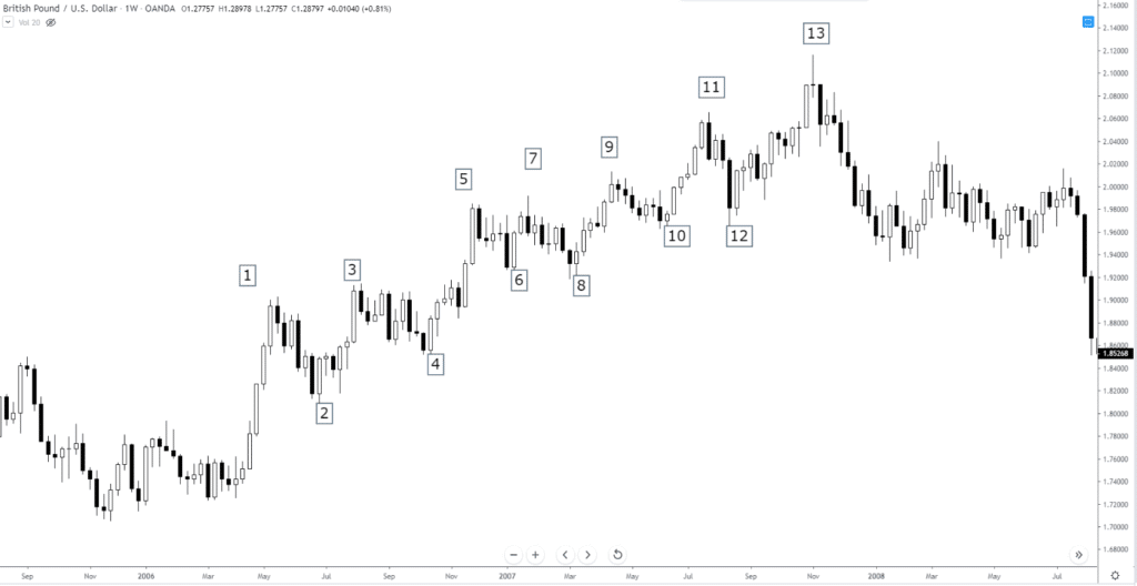
The 3-Year Triangle of USDJPY
The following chart corresponds to the USDJPY pair in its weekly timeframe, using a log scale. We observe the price action on the Japanese currency developing a Contracting Triangle structure that began at the end of 2016.
The next chart shows the USDJPY moving in a 12-hour timeframe. The pair shows the last internal segment corresponding to a wave (E) of Intermediate degree labeled in black.
At the same time, in the last figure, we can distinguish the price action developing an Expanding Triangle formation in a wave C of Minor degree labeled in blue. However, the RSI oscillator reveals in its progress the shape of a contractive triangle pattern.
It should be noted that when the price action develops an Expansive Triangle in a wave C, the pattern should correspond to an Expansive Diagonal formation. Remember that a diagonal pattern has five internal waves overlapped one with another. At the same time, each inner leg holds three segments.
Trading the USDJPY Triangle
The USDJPY pair in its 12-hour chart shows an incomplete expansive diagonal. Consequently, positioning on the long-side could still have endeavored with a short-term objective placed in the upper trendline of the diagonal. A likely target area would be between 109,716 and 110,551.
Considering that the invalidation level of the bullish segment is the bottom of the wave ((iv)) in green at 108,242, the breakdown and close of the price below this level could give us the first bearish scenario with a target at the end of the wave B labeled in blue located at 106,625.
Now, if the USDJPY price continues extending its falls below the end of wave C in blue and (D) in black located at 104,446, a major-degree bearish scenario would be activated. Under this context, the pair could see the psychological support of 100 yen per dollar.
Conclusions
Depending on the trader’s style and its risk aversion, the internal structure of the triangle pattern could be traded one timeframe shorter than the time frame in which the triangle has been identified.
We must remember that the internal structure of the triangle follows a sequence 3-3-3-3-3. Under this context, a three-wave corrective structure can be a Flat pattern (which has a subdivision 3-3-5); or it can also be a zigzag pattern (5-3-5). Therefore, an internal wave C could give a trading opportunity. However, knowing the nature of the triangle pattern, and considering it is formed by the struggle between buyers and sellers, the targets of the movements anticipated should be limited by the triangle formation.
Introduction
In the previous lesson, three terms related to margin was discussed. There is another term called used margin, which comes under the same roof of the margin requirement and
Introduction
In the previous lesson, three terms related to margin was discussed. There is another term called used margin, which comes under the same roof of the margin requirement and
Introduction
In the previous lesson, three terms related to margin was discussed. There is another term called used margin, which comes under the same roof of the margin requirement and required margin. And in the lesson, this term shall be discussed in detail. Apart from that, this lesson shall touch base on the concept of Equity in margin trading.
Before diving directly into the topic, let’s first brush up the previously discussed terms as they form the base for this lesson. To Start off with the Required Margin, it is basically the units of currency that is needed to open a position. Note that this is not the actual amount of the position size but the amount after applying the Margin Requirement to the required margin.
Used Margin
The Used margin is the term that is very similar to the required margin. In fact, the used margin is the required margin. However, there is a thin line difference between the two.
The Used margin is the amount that is blocked by the broker when positions are open on a trader’s account. This definition might seem the same as that of the required margin. The difference is that the required margin talks about one single trade, while the used margin considers the sum of the required margin of all the trades. This is the amount that is ‘used’ by the broker when the trade is open and cannot be utilized for taking new positions. However, once the positions are closed, this used margin is unblocked and returned to the account balance.
Example
Let’s say a trader has $1,000 in his account and wishes to open trades on EUR/USD and USD/CHF.
Let’s assume he is willing to go short 10,000 units on USD/CHF and long 1,000 units on EUR/USD. Let’s keep the margin requirement for USD/CHF and EUR/USD to 2%, respectively. Before going into the calculation of the used margin, the required margin is calculated as follows:
USD/CHF
Required margin = Notional Value x Margin Requirement = $10,000 x 0.02 = $200
EUR/USD
Required margin = Notional Value x Margin requirement = $1,000 x 0.02 = $20
Therefore, when positions on both trades are opened, the used margin turns out to be $220*.
*Used margin = $200 + $20 = $220
Equity
Equity is a variable term that represents the current value of the account balance. Equity constantly changes when traders have their positions running. This proves to be an important term because it determines how many more positions can be taken on this account.
Calculation of Equity
The calculation of Equity is simple. It is the algebraic sum of the account balance and the unrealized P/L. When there are no positions open, the Equity will be the same as the account balance as the unrealized P/L is 0. And when there are any running positions, the Equity will be determined by both account balance and unrealized P/L.
From this, it can be inferred that, when trades are running in the positive, the Equity rises, and when they’re in the negative, the Equity drops.
Thus, this completes the lesson on Used Margin and Equity. In the next lesson, some advanced term on margin shall be introduced. Don’t forget to take the below quiz before you move on.
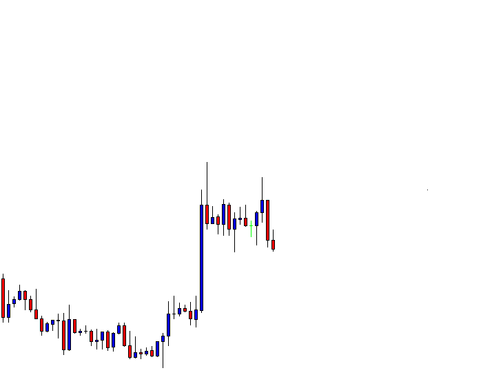
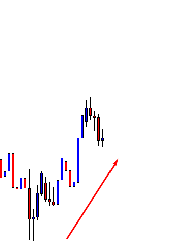
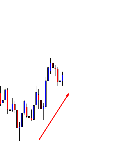
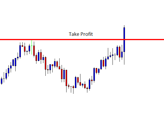
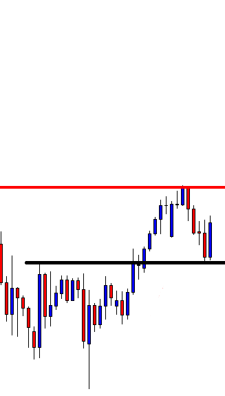
Risk-Reward is a factor, which every successful trader takes care of. Before choosing a chart to take an entry, the first thing that is to be considered is the trend
Risk-Reward is a factor, which every successful trader takes care of. Before choosing a chart to take an entry, the first thing that is to be considered is the trend
Risk-Reward is a factor, which every successful trader takes care of. Before choosing a chart to take an entry, the first thing that is to be considered is the trend, then the risk-reward factor. Once we have set our Take Profit and Stop Loss level, we shall leave the entry either to hit the Stop Loss or the Profit Target. However, today, we are going to demonstrate an example of an early exit.
This is an H4 chart. The chart shows that the price has found its support as well as a resistance zone. After having a final rejection, it makes a move towards the downside. Then, it heads towards the North now (see the next image). Another rejection and bearish reversal candle at the resistance zone may produce a short entry.
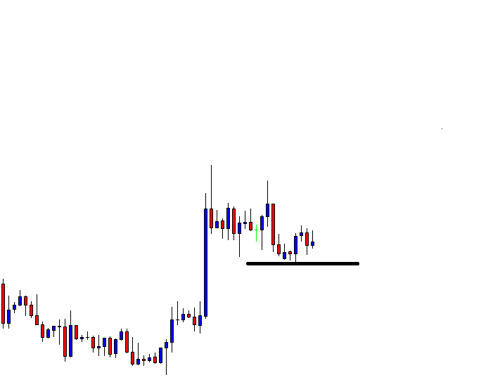
The last H4 candle is bullish. However, the candle closes within the resistance zone. It may go either way. The buyers may get an upside breakout; the sellers may get a bearish reversal. Let us proceed to find out what happens next.
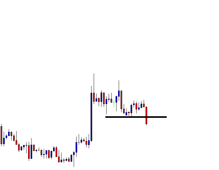
In the above chart, we can see one good-looking bearish Marubozu candle. The candle suggests that the sellers may wait for consolidation and downside breakout to take a short entry. The candle forms at a Double Top resistance as well. The price may consolidate around the neckline level.
As expected, the price starts having correction around the neckline level. It needs to find its resistance and produce an H4 bearish reversal candle along with a breakout at the neckline.
Here it comes. The last candle engulfs all the candles by closing below the neckline. An entry may be triggered right after the candle closes. The price has enough space to travel down to the red-marked line, which allows an excellent risk-reward. However, there is a support level in between, that may hold the price for a while.
The price heads towards that level with good bearish momentum. The way it has been going, it may hit the red-marked level within four/five H4 candles. This means one more trading day may be required to hit the original Take-Profit level.
The in-between level is a vital level, which produces the H4 bullish reversal candle. The price has reacted several times at that level earlier. Usually, we must stick with our original Profit-taking target. However, it is also legit to close our entry right after the last candle closes. A question may be raised “why do we close our entry here?”
Reasons for Early Exit
There are two reasons
The support level is significantly strong
The current bar is the last H4 Friday’s candle, which means the market closes once the candle is finished.
The Bottom Line
When using the Weekly and the Daily charts, traders are to let their opened positions to reach the target during the weekend. However, intraday traders should consider closing their floating trade before the week’s end. Mondays often start with a big gap, which may hurt intraday Stop Losses.
The stop-loss setting is a crucial component to the long-term success of a forex and crypto trader. The market forces cannot be adapted to the wishes of traders. Successful traders
The stop-loss setting is a crucial component to the long-term success of a forex and crypto trader. The market forces cannot be adapted to the wishes of traders. Successful traders
The stop-loss setting is a crucial component to the long-term success of a forex and crypto trader. The market forces cannot be adapted to the wishes of traders. Successful traders must accept that fact instead of fighting it for the sake of being right. “What cannot be cannot be, and, furthermore, it is impossible,” said some time ago, a well-known politician in a phrase that did not pretend to be comical. But it states a clear fact: Fight against the markets is like Don Quixote fighting Windmills.
Cynthia Kase is a well-known and successful futures trader, speaker, and author of several books on trading and technical analysis. She conceded high importance to stop settings. Cynthia says something undeniable to most of us, Technical literature has mostly focused on entries, and almost nothing on entries besides some words on stop-loss or trailing stops. She says that this is like teaching how to drive a car but without explaining where the brake pedal and how to press it.
In her book “Trading with the Odds,” she explains that this situation is mostly due to greed and fear. Traders don’t like to lose, and most of them don’t know when to get out of a trade. Also, she explains that fear of losing causes people to hang on their losses in the hope the market will turn and recover them. Another explanation for this situation is that the beginning of technical analysis was on the stock market, and no company wants its stock downgraded from buy to hold or, worse, to sell. As opposed to Forex, only a handful of people make money shorting stocks, so exits are much less critical on the stock market.
Stops based on fear and greed
Most traders want to squeeze out the most of a trade. Therefore, they decided to use the highest possible leverage. To reduce the dollar risk, they desire to put it as close as possible to the entry-level. But, as said earlier, using obvious levels of support/resistance and set the stop order just two or three pips below is absurd. Better send your money directly to the charity, since they will make much better use of it than the institution that is going to collect your hard-earned money for free.
Risk is imposed by the market
The critical point is not to impose our conditions on the market, but read what the market is telling us in terms of Risk. In trading, Risk is proportional to volatility. Your dollar risk is the amount the price can move against you in a given interval, times your position size.
Volatility is measured using the Range and also by the standard deviation of prices on an annualized basis. One standard deviation of the price holds 68$ of all the potential price movement if we assume prices are dispersed in a gaussian distribution. That means that a price that goes against a trade by one standard deviation it will encompass 34% of the observations (the other 34% would go in the direction of your trade). The problem with using volatility is that a yearly measurement of the price variations does not help with sudden short-term volatility changes. That’s the reason for using ATR instead.
The concept of the threshold of Uncertainty
A trade is a bet on a market trend. We think a particular trend is in place. Ideally, the direction is a straight line between one initial level and a final level. If we think of the short-term price wiggles as random noise, we adapt our trade by placing our stops far enough away from the trend mean to include noise. The magnitude of the noise means we don’t want to exit at the minimum turn against the trade. The trader needs to devise a way to follow the trend while getting out when it ends.
The Kase Dev Stops
Using a fixed multiplier for the True Range is an initial approximation. In our article of true range, we used a fixed 2X multiplier to set our stop order away from the market noise. Kase’s Dev Stop uses what she calls the skew of the volatility, the measure at which a range can spike in the opposite direction as a multiplier of the range measure. That makes the Dev-stop an adaptative trailing stop. Dev Stops is a well-known indicator in TradingView. Also, it is available for downloading at the MQL5.com site for your Metatrader workstation.
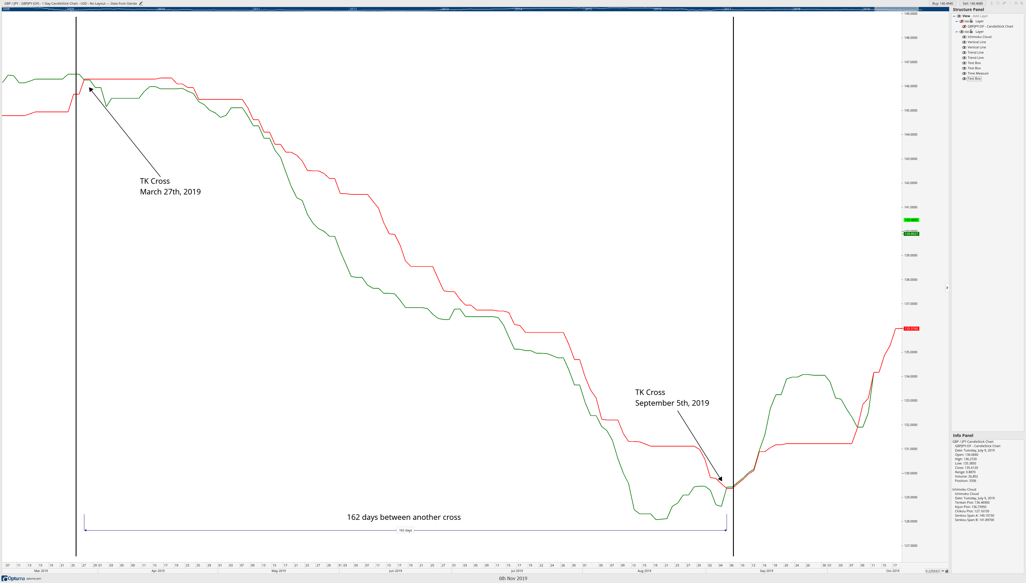
Chart 1 – Kase Dev-Stops in a GBPUSD 4H chart.
We can see in Chart 1 that four lines follow the price action. The first one is the mean line and the 1, 2, and 3 standard deviation (SD) lines of a two-bar reversal. As we can see, the 3rd standard deviation is seldom touched, being the 2-SD the conservative method, and the 1-SD the preferred aggressive method. In the case of using 1SD, it is advisable for a reentry plan, or create mental stops that would trigger if the close happens below the 1SD Dev-stop line.
As it should be the norm when learning a new method, it is strongly advisable to backtest it first to assess which SD line works better with your particular asset and objectives. Also, after backtesting your optimal solution, it is prudent to trade it using a demo account. There we could also assess the costs and benefits of the method by adding the brokerage costs.
Reference: Trading with the Odds, Cynthia A. Kase. 1996, The McGraw-Hill Companies Inc.
Price action traders use chart combinations such as Weekly-Daily, Daily-H4, H4-H1, and H1-15M, etc. Intraday minor charts’ traders such as the H1, 15M, 5M do not have an undeviating relation
Price action traders use chart combinations such as Weekly-Daily, Daily-H4, H4-H1, and H1-15M, etc. Intraday minor charts’ traders such as the H1, 15M, 5M do not have an undeviating relation
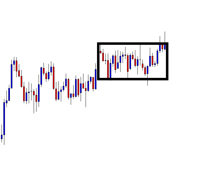
Price action traders use chart combinations such as Weekly-Daily, Daily-H4, H4-H1, and H1-15M, etc. Intraday minor charts’ traders such as the H1, 15M, 5M do not have an undeviating relation with the daily chart. However, it is often seen that if the daily price action is choppy, it gets tough to find out a good entry for the intraday traders. Notably, on a choppy daily chat, it gets extremely tough for the H4 traders to find an entry with good risk-reward. Thus, even a trade that gets us profit may not always be a good one. Let us demonstrate an example of that.
This is a daily chart, which shows that the price action has been choppy. It gets caught within a bullish rectangle. The daily traders are to wait for a breakout. However, the H4 traders know the range. Thus, they are to wait for a daily bearish reversal at the resistance zone and bullish reversal at the support zone. Let us see where it produces the next reversal.
The chart produces an Inverted Hammer right at the resistance. The H4 traders are to flip over the chart; wait for consolidation and bearish breakout to take a short entry. The risk-reward looks good here.
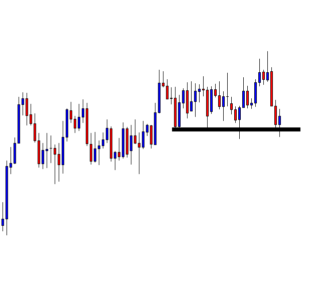
The H4 chart shows the last candle comes out as a bearish candle. If the price consolidates with the support of the candle’s lowest low, a bearish breakout will be the signal to go short.
The next candle comes out as another bearish candle. The candle has a bounce at H4 support, as well. If the price consolidates and makes a bearish breakout, the sellers may take a short entry. There is still space for the price to travel towards the downside.
The price consolidates and makes a breakout at the support. The breakout candle looks good. By setting Stop Loss at the consolidation resistance, a short entry may be triggered right after the last candle closes. Take Profit shall be placed at the red-marked level. Let us find out whether it hits Take Profit.
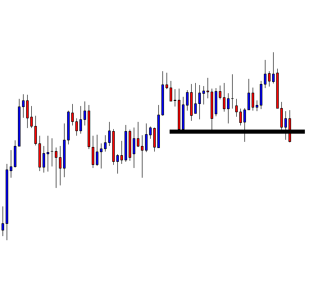
It does. It gets us profit. The question is whether it is a good trade or not. As far as risk-reward is concerned, it is not a good entry. It gets us less reward than the risk. Thus, traders shall skip taking that entry in the first place.
The Bottom Line
Price action traders may find many trade setups that match with all the norms for taking an entry. However, they must consider risk-reward on every single trade. If it offers less than 1:1 risk-reward, they shall avoid taking that entry. In most cases, an entry offering less than 1:1 risk-reward has less chance to be a winning trade as well. In this example, it is a winner. However, considering entire facts, it is not a good entry.
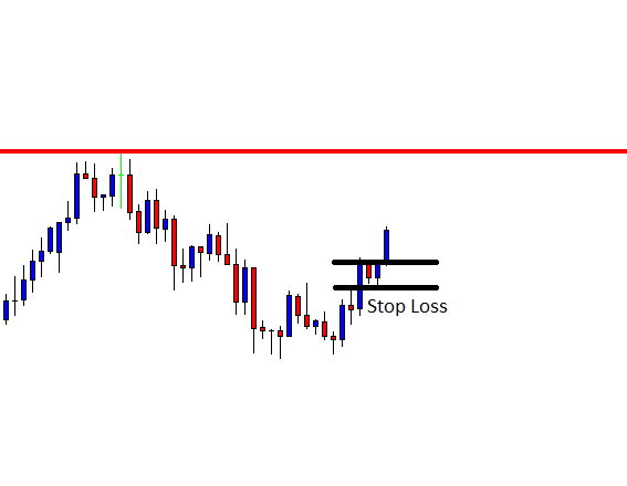
Most traders are taught to use stop-losses based on critical levels. The basic idea is to spot invalidation levels based on previous low or high. The assumption is that by
Most traders are taught to use stop-losses based on critical levels. The basic idea is to spot invalidation levels based on previous low or high. The assumption is that by
Most traders are taught to use stop-losses based on critical levels. The basic idea is to spot invalidation levels based on previous low or high. The assumption is that by putting the stop a few pips below or above a support/resistance level will be enough to ensure the right trade will not be stopped out and just bad trades will be taken away.
The problem with that is that all participants in the market, including institutional traders, can see these levels. Institutional traders have lots of cash to play with, so they can push the price down to take all the buy-stop (or sell-stop) orders they see in their price book.
Key-level-based Stops
In the following example, we see the EUR(USD making a breakout after failing to break the previous high, on high volume. A perfect setup for a short trade. We then see the price moving down and then retracing and heading up to our stop-loss. We have been cautious and set it above the last top made on the 6th of November.
Nevertheless, the price kept moving inexorably up until the stop was taken. This is market manipulation at the highest level by institutions. Institutions have advanced tools to observe the depth of the order book, so they know the place and amount of the stops. Also, they have the liquidity necessary to move up the market, take all the liquidity at excellent prices, then continue south.
If we look at the next chart, we see the same asset with the Average True Range indicator added. For this kind of stop-setting strategy, we need to detect the short term range. Therefore, we use a period of five for the ATR indicator. Next, we look at the peak set by the latest impulsive candlestick, which happened ten bars ago, 0.00168, which is about 17 pips. This figure gives us the expected 4-hour price movement for the current market volatility. The usual is to protect us against two times this figure, at least. In this case, we would need to move the stop-loss level 34 pips away from the entry point.
Chart 1 – EURUSD ATR-Based Stop-loss placement
It is wise to keep statistics of the ideal ATR multiplier, because as the number increases, it cuts our position size for the same dollar-risk amount, and also it reduces our Reward-to-risk ratio.
John Sweeney developed the general method of stop-loss placement. He called it the Maximum Adverse Execution method. The theory of it has been already described in our article Maximum Adverse Excursion, so we are not going to repeat ourselves here. Using MAE delivers statistical-significant and tamper-proof stops, but it is a bit cumbersome. The use of ATR Stops is a simpler and second-best option instead of the foreseeable key-level-based stops.
A losing trade hurts. Beginners find it tough to encounter losing trades. However, in the Forex market, losing is inevitable. The market is so action-packed that even an experienced trader
A losing trade hurts. Beginners find it tough to encounter losing trades. However, in the Forex market, losing is inevitable. The market is so action-packed that even an experienced trader
A losing trade hurts. Beginners find it tough to encounter losing trades. However, in the Forex market, losing is inevitable. The market is so action-packed that even an experienced trader often makes mistakes. Sometimes, even a good entry may not get us any profit. In today’s lesson, we are going to demonstrate an example of a good entry, which ends up being a losing trade in the end.
The price heads towards the North and makes a pullback. Traders are to wait for an upside breakout to take a long entry. A bullish Engulfing candle follows a Doji candle. As things stand, the buyers are to take the control soon upon an upside breakout.
Things are different now. The price comes down instead, by making a Double Top. It starts having the correction as well. Consolidation and bearish breakout shall attract the sellers to go short on the pair. Let us see the next chart.
The chart shows that the price is having a correction, where it had a bounce earlier. The equation is very simple here. A bullish reversal attracts the buyers, and a bearish breakout attracts the sellers to go short.
It makes a bearish breakout. The breakout candle looks good. As far as price action and candlestick pattern are concerned, this is an A+ short entry. Concentrate on the marked Stop Loss and Entry levels.
The next candle comes out as a bullish candle. The price may take out some of our entries because of the spread factor. With some brokers, traders pay more spread. Some of our trade (the same entry) may still survive. However, let us not get into this argument but proceed to the next chart. The following chart has an interesting scenario to present.
This should conclude the argument. The price hits the Stop Loss and heads towards the South again. The entry looks to be an A+ entry, but it has ended up bringing us a loss. As usual, beginners with average knowledge of price action may think that something must be wrong with his strategy.
This is not the case. An entry like this would bring us profit at least on 70% occasions. It hurts more since the candle, which hits our Stop Loss itself a strong bearish candle. This is how this market plays. We have to accept it. We must not let our losing trades occupy our thoughts. It is a game of probability of winning and losing. With knowledge, experience, and hard work, a trader can increase the likelihood of winning for sure.
Introduction
The forex market offers a lot of trading opportunities, but still, many traders find it difficult to make profits consistently. Emotions combined with undue risk and money management are
Introduction
The forex market offers a lot of trading opportunities, but still, many traders find it difficult to make profits consistently. Emotions combined with undue risk and money management are
Introduction
The forex market offers a lot of trading opportunities, but still, many traders find it difficult to make profits consistently. Emotions combined with undue risk and money management are often the main obstacles that new traders face.
In this article, we will discuss the hourly volatility in the forex market and the trading risks involved during these hours. Some traders trade the market based on its volatility. Few traders enjoy volatile markets, while others prefer trading in non-volatile conditions. So let’s get right into the topic.
The volatility of a major currency pair
Hourly volatility is relevant to short term forex traders but is not a significant factor for long term investors. The global trading sessions affect volatility within the 24 hours. A forex pair is typically most volatile when a major trading session opens, or two market sessions overlap with one another. For example, EUR/USD is the most volatile and active when London or New York is open because these markets are associated with the Euro and USD, respectively. The below figure depicts the volatility of EUR/USD in a day.
The average volatility of EUR/USD currency pair on a single day
The bar chart shown above represents the volatility of EUR/USD in a day. It depicts nothing but a candle with lower wick, body, and upper wick. One can see that during the Asia session, the price is not volatile. Whereas during the New York session, the price makes large movements shown by larger wick and body of the bar chart. Even without looking at candlestick charts on the trading platform, these bar charts are sufficient to decide at what time to trade during the day, which is much easier than analyzing candlestick charts.
Low volatile hours – Asia Session and Time b/w NY close & Asia Open
Traders have a misperception that “More risk equals more return.” There is no doubt that highly volatile pairs deliver impressive returns, but research and data have found that lower-volatility sessions generate risk-adjusted returns over time. This is the reason why traders include the ‘Low volatility factor’ in their portfolio.
Risk of trading in low volatile hours
In times of low volatility, there is increased slippage, which means a trader will hardly get the price they desire for. This would mean eating up of their profits, or even sometimes a complete drain of profits (when trading on a lower time frame). In this way, a trader will not be trading according to the rules of money management. Hence, to manage risk, there is a right way to trade during such times. Some of them are discussed below.
Why is it important?
There are several reasons why trading in lower volatility conditions has the potential to create a lot of money over the long term.
Leverage aversion– In money management theory, we had mentioned earlier that the more leverage a trader use, the more is the risk. In times of lower volatility, traders are restricted from using the leverage from their trading account. As a result, they buy and sell currency pairs that are less risky with good profit potential.
The lottery ticket– Many traders treat the forex market as a “lottery” where they buy and sell currency pairs like they are purchasing lottery tickets. This, in turn, raises the bid of high-risk pairs, which leads to the type of lottery effect and increases volatility. Here, we need to find pairs that are under no one’s attention and buy them (which will be least volatile).
High volatile hours – London & New York Sessions
Many traders live on volatility in the forex market, as volatility is what creates profitable trading opportunities.
Risk of trading in high volatile hours
High volatility hours also has its own disadvantages. During such times, one can see their stop-losses getting triggered frequently. This happens due to the tricks played by more significant players like stop-loss hunting. Another risk is the high leverage provided by forex brokers. So to manage these risks, high volatile hours should be traded in a certain way. Some of them are listed below.
Trend trading– One key opportunity in a volatile market is that trending currency pairs may see the rate of their trend increase. When we are trading with the trend, our risk drastically reduces, which is good for money management.
Short-term strategies– In volatile markets, strategies work the best by booking profits automatically than manually. In this way, we will be eliminating emotions in trading as everything will be done by the system, which is crucial for risk management. Strategies also make use of indicators like RSI and Bollinger bands, which help in identifying overbought and oversold zones.
Bottom line
Every trading session and hour has its own advantages and risks, which a trader needs to evaluate, based on his/her risk appetite. The right time to trade depends on the personality of the trader and style of trading. Volatility on an hourly basis is more complex than how much a forex pair moves each day on an average basis. We see volatility varies drastically across different hours of the day and days of the week. We need to monitor and adapt to these changes. Cheers!
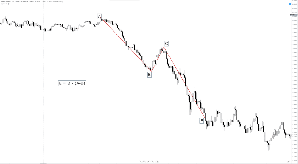
In our article “Impulsive Waves Construction – Part 1,” we introduced the concept of “alternation.” In this educational article, we’ll apply this concept to the Dollar Index Analysis.
The
In our article “Impulsive Waves Construction – Part 1,” we introduced the concept of “alternation.” In this educational article, we’ll apply this concept to the Dollar Index Analysis.
The
In our article “Impulsive Waves Construction – Part 1,” we introduced the concept of “alternation.” In this educational article, we’ll apply this concept to the Dollar Index Analysis.
The Alternation Principle
Just as the Wave Principle obeys a law, alternation is also the law of nature. We can observe this law both in the universe as human activities. Just as the seasons of the year or the phases of the Moon alternate, socio-economic activities also alternate.
There is probably no other activity that has devoted as many resources to its study as financial markets. An example where we can observe the principle of alternation is in the U.S. Dollar Index.
Application in the Dollar Index
The U.S. Dollar Index (DXY), in its daily chart, illustrates the bullish sequence he developed since it found buyers on February 16, 2018, and drove to the price from 88.25 until 99.67 on October 01, 2019.
From the chart, we can observe how DXY performed the rally in two stages. In each phase, we see how the advance alternates in both price and time. In particular, the first rally was run in 180 days and advanced by about 9.9%. The second tranche lasted 376 days and increased by 6.22 percent.
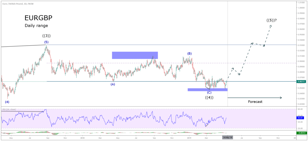
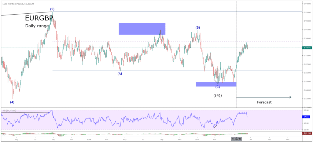
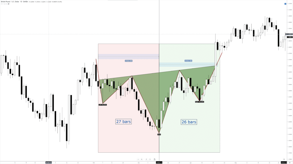
Looking at the second chart, our reader can appreciate how price and time alternate their relationship in the EURGBP cross.
Alternation and the Analysis Process
An approach to simplify the analysis process consists of identifying different parts of the movement developed by the market and analyze it part by part. The next DXY daily chart illustrates this process.
The following 4-hour chart exposes the advance developed by the Dollar Index once it found buyers at level 88.25.
From the chart, we observe a first impulsive upward movement labeled ((i)) in black, which developed five waves of a lesser degree. Once DXY completed the first wave, the price corrected by a wave ((ii)), which is divided into three internal segments labeled as (a), (b), and (c) in blue.
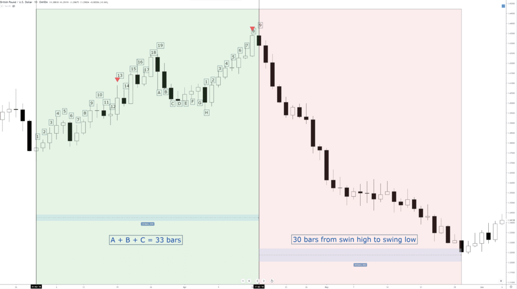
Within the corrective structure, alternation over time can be distinguished. For example, the wave (a) in blue ended in 23 bars, the wave (b), in turn, was developed in 57 bars. Finally, the wave (c) took 26 bars to finish. This time difference reflects the principle of alternation in terms of simplicity and complexity of each segment that composes the price movement.
The following chart shows how the action of the price alternates in the waves (ii) and (iv) in blue. In the wave (ii), the corrective movement of DXY developed in 43 bars, while the wave (iv) was completed in only 19 bars.
Conclusions
Based on the case studied, we can recognize how the principle of alternation is reflected in the financial markets and different temporalities. This application in different time frames allows us to identify the concept of “market fractality.”
On the other hand, we can observe how the market alternates not only in a price dimension but also in time. In other words, the progress of the market must be studied concerning both price and time.
Finally, if the range of a movement is narrow and has a relatively long duration, the next move will likely be broad in terms of price motion and shorter in length.
Introduction
In the previous two lessons, the basic terms in a margin account were discussed. And this lesson shall talk about the concept of Margin in detail. Precisely, this chapter
Introduction
In the previous two lessons, the basic terms in a margin account were discussed. And this lesson shall talk about the concept of Margin in detail. Precisely, this chapter
Introduction
In the previous two lessons, the basic terms in a margin account were discussed. And this lesson shall talk about the concept of Margin in detail. Precisely, this chapter of the course will deal with Margin, Margin Requirement, and Required Margin, as these three terms are very crucial when it comes to handling a margin account.
Margin, Margin Requirement, and Required Margin are closely related to each other. Margin, the used term in margin trading, is the amount one needs to possess to open a position. And Margin Requirement and Required Margin are terms which mean the same but differ in notation. Now, let’s dive right into the topic and understand each one of the terms in detail.
Margin Amount
It is the amount that is used up or blocked by the broker to open and maintain a position in the forex. An important point to be noted here is that capital blocked is usually not the same as the lot size traded. Hence, the Margin Amount can be related to deposit or collateral that is payable to be the broker. However, this amount differs based on the number of lots traded.
The margin amount is blocked from the account balance when a trade is opened and is freed to the account balance when the trade is closed.
Margin Requirement
Margin Requirement describes what percentage of the position size is required to open a position. For example, if the Margin Requirement for a trade is 3%, then 3% of the position size is to be produced by the trader to open the position. So, when brokers mention that Margin in terms of percentage, then they are referring to Margin Requirement.
Required Margin
Required Margin is simply the Margin Requirement expressed in terms of units of currency. For example, if the margin requirement is 1% to take a position worth $10,000, then the Required Margin for the same will be $100.
Calculation of Required Margin
Since Required Margin is closely related to the Margin Requirement, the Required Margin is the product of Margin Requirement and the Notional Value.
Required Margin = Margin Requirement x Notional Value
Summary
Let’s sum up all the terms by taking an example. Let’s say a trader has $1,000 in his trading account. This amount can be read as a balance, as well. Let’s say he wishes to go long 10,000 units on EURUSD. Also, let’s assume that 2% of the position size value is required to open a trade.
The Notional value, Margin Requirement, Required Margin can be calculated as follows:
Assuming an account dominated in the USD, the Notional value turns out to be $10,000. Similarly, the Margin Requirement will be 2%, and the Required Margin will be $200*.
*(Required Margin = $10,000 x 2%)
When the trade is placed, $200 is blocked by the broker as “margin.” And once the position is closed, the complete margin amount (deposit) will be added back to your account balance, given that the trader did not make a loss.
This brings us to the end of this lesson. Let’s see if you can get all the below questions right!
Introduction
The Risk to Reward Ratio is one of the most critical aspects of risk management in Forex trading. Traders with a clear understanding of what RRR is can improve
Introduction
The Risk to Reward Ratio is one of the most critical aspects of risk management in Forex trading. Traders with a clear understanding of what RRR is can improve
Introduction
The Risk to Reward Ratio is one of the most critical aspects of risk management in Forex trading. Traders with a clear understanding of what RRR is can improve his/her chances of making more profits. In this article, let’s discuss the fundamentals of Risk to Reward ratio with examples and also the ways through which it can be increased while taking your trades.
What is the Risk to Reward Ratio?
Before getting right into the topic, let’s define the meaning of ‘Risk’ here. Risk is the amount of money that a trader is willing to lose in a trade. If you have read our previous money management articles, we mentioned that a trader should not be risking more than 2-3% of their trading capital in each trade. It means when they find a trade setup, they should choose their position size in such a way that if the market hits their stop-loss, they lose a maximum of 2-3% of their trading capital.
Now, the Risk to Reward Ratio is simply the ratio between the size of your stop-loss to the size of your target profit. Let’s say your stop-loss is five pips away from your entry price and your target profit is ten pips away from the entry. In this case, your risk to reward ratio is 1:2 (5 Pips/ 10 Pips).
The larger the profit against the stop loss, the smaller the risk to reward ratio. Which means your risk is a lot smaller than your reward.
What is the recommended risk to reward ratio in the forex market?
Typically, a minimum of 1:1 or 1:2 RRR is recommended for novice traders. There are super conservative traders where they look for a minimum RRR of 1:5.
The risk to reward in every trade cannot be fixed as it varies depending on the market condition. For example, 1:3 or 1:5 RR ratio is achievable when the market is trending, and you enter the market at the right time. Whereas when the market is not very volatile, we should be happy with a risk to reward ratio of 1:1.
How to increase the risk to reward (RR) ratio?
🏳️ Raising target and putting stop-loss to breakeven
A trader can think of raising the target if the market moves to the initial take-profit quickly. This is because when the market moves so fast, it has the potential to move further, thereby increasing the profits.
🏳️ Finding trade setups from the larger time frame
Another way to increase the risk to reward (RR) ratio is by taking the strong trade setups from the higher time frames like daily, weekly, and monthly. We need to wait for such strong trade setups to form. Once formed, the price will move for hundreds of pips, and so we can have wide targets.
Final words
Higher the RRR, the better it is, and of course, higher RRRs are more challenging to achieve. So, do not forget to keep the expectations real and the risks appropriate. You do not have to avoid perfect trades just because the RRR is not as high as 1:5. Make sure to do proper risk management before placing a trade. Never trade with a risk to reward ratio that is too less and try to maximize it as much as possible. Cheers!
Introduction
In the previous lesson, the concept of balance was discussed. And in this lesson, two more terms shall be opened up, namely, unrealized P/L and realized P/L. First up
Introduction
In the previous lesson, the concept of balance was discussed. And in this lesson, two more terms shall be opened up, namely, unrealized P/L and realized P/L. First up
Introduction
In the previous lesson, the concept of balance was discussed. And in this lesson, two more terms shall be opened up, namely, unrealized P/L and realized P/L. First up, P/L is an abbreviation for Profit/Loss. Many assume that there is only one type of P/L, but this is not true. Not just in forex, in other markets as well, there exists both unrealized and realized P/L. Now, let’s begin with understanding each term with the help of examples.
Unrealized P/L
Unrealized P/L, as the name clearly suggests, is the profit or loss running in a trade that is not closed. The profit/loss in unrealized P/L constantly changes as the prices keep changing. Hence, this type of P/L is also referred to as Floating P/L.
The Unrealized P/L is calculated as follows:
❖ Unrealized P/L = Position size x (CMP – Entry price) [Long]
❖ Unrealized P/L = Position size x (Entry price – CMP) [Short]
(CMP – Currency Market Price)
This above formula gives the value in terms of pips. The value in terms of currency can be calculated by multiplying it with the pip value of the currency pair.
Example – Unrealized P/L or Floating P/L
Let’s assume a trader bought 10,000 units of EURUSD at 1.4100. After a while, the price rises to 1.5000. If the trade is still running, the floating P/L can be determined, as shown.
Since this is a long trade, the following formula is applied.
Unrealized P/L = Position size x (CMP – Entry price)
Hence, the trade is currently running at a profit of 1,100 pips.
Now, if the pip value for a mini lot for EURUSD is $1, the profit sums up to $1,100 (1,100 x $1).
Now, bringing the concept of balance into the picture, the balance for unrealized P/L will not get affected though the trade is in profit or loss. However, once the trade is closed, the balance does get updated.
Realized P/L
Realized P/L is the profit or loss in a trade when it closed. Realized P/L is more significant than the unrealized P/L because this is the one that brings a change to the account balance.
The realized P/L can be calculated using the below formula:
❖ Realized P/L = Position size x (Closing price – Entry price) [Long]
❖ Realized P/L = Position size x (Entry price – Closing price) [Short]
Example – Realized P/L
Let’s say a trader went long on EURUSD with 10,000 units at 1.1000. The price drops down to 1.0000. Since the current market price is lower than the entry price, it can be ascertained that the trade is running in a loss, i.e., the unrealized P/L would be negative. Later, the price jumps up to 1.2000. At this point, the trader closes the trade. Since the trade is now closed, the realized P/L can be calculated as follows.
Realized P/L = Position size x (Closing price – Entry price)
= 10,000 x (1.2000 – 1.1000)
Realized P/L = 1,000 pips
In terms of currency value, the realized P/L will be $1,000 (1,000 pips x $1). And this time, the balance will be updated as well.
Hence, this begins us to the end of this lesson. In the next lesson, another important margin terminology shall be discussed. Before you go, make sure to take the below quiz to know if you have got the concepts right.
Introduction
The Fibonacci tool was developed by Leonardo Pisano, who was born in 1175 AD in Italy. Pisano was one of the greatest mathematicians of the middle ages. He brought
Introduction
The Fibonacci tool was developed by Leonardo Pisano, who was born in 1175 AD in Italy. Pisano was one of the greatest mathematicians of the middle ages. He brought
Introduction
The Fibonacci tool was developed by Leonardo Pisano, who was born in 1175 AD in Italy. Pisano was one of the greatest mathematicians of the middle ages. He brought the current decimal system to the western world ( learned from Arab merchants on his trips to African lands). Before that, mathematicians were struggling with the awkward roman numerical system. That advancement was the basis for modern mathematics and calculus.
He also developed a series of numbers using which he created Fibonacci ratios describing the proportions. Traders have been using these ratios for many years, and market participants are still using it in their daily trading activities.
In today’s article, we will be sharing a simple Fibonacci Retracement Trading Strategy that uses Fibonacci extensions along with trend lines to find accurate trades. There are multiple ways of using the Fibonacci tool, but one of the best ways to trade with Fibonacci is by using trend lines.
With this Fibonacci trading strategy, a trader will find everything they need to know about the Fibonacci retracement tool. This tool can also be combined with other technical indicators to give confirmation signals for entries and exits. It also finds its use in different trading strategies.
Below is a picture of the different ratios that Leonardo created. We will get into details of these lines as we start explaining the strategy.
Strategy Prerequisites
Most of the charting software usually comes with these ratios, but a trader needs to know how to plot them on the chart. Many traders use this tool irrespective of the trading strategy, as they feel it is a powerful tool. The first thing we need to know is where to apply these fibs. They are placed on the swing high/swing low.
A swing high is a point where there are at least two lower highs to its right
A swing low is a point where there are at least two higher lows to its right
If you are uncertain of what the above definitions meant, have a look at the below chart.
Here’s how it would look after plotting Fibonacci retracement on the chart.
In an uptrend, it is drawn by dragging the Fibonacci level from the swing high all the way to swing low. In case of a downtrend, start with the swing high and drag the cursor down to the swing low. Let’s go ahead and find out how this strategy works.
The Strategy
This strategy can be used in any market, like stocks, options, futures, and of course, Forex as well. It works on all the time frames, as well. Since the Fibonacci tool is trend-following, we will be taking advantage of the retracements in the trend and profit from it. Traders look at Fibonacci levels as areas of support and resistance, which is why these levels could be a difference-maker to a trader’s success.
Below are the detailed steps involved in trading with this strategy
Step 1 – Find the long term (4H or daily time frame) trend of a currency pair
This is a very simple step but crucial, as well. Because we need to make sure if the market is either in an uptrend or a downtrend. For explanation purposes, we will be examining an uptrend. We will be looking for a retracement in the trend and take an entry based on our rules.
Step 2 – Draw a line connecting the higher lows. This line becomes our trendline.
The trend line acts as support and resistance levels for us. In this example, we will be using it as support.
Step 3 – Draw the Fibonacci from Swing low to Swing high
Use the Fibonacci retracement tool of your trading software and place it on swing low. Extend this line up to the swing high. Since it is an uptrend, we started with a 100% level at the swing low and ended with 0% at the swing high.
Step 4 – Wait for the price to hit the trend line between 38.2% and 61.8% Fibonacci levels.
In the below-given figure, we can see that the price is touching the trend line at two points (1 and 2). There is a significant difference between the two points. At point 1, the price touches the trend line between 78.6% and 100%, whereas, at point 2, the price touches the trend line between 38.2% and 61.8%.
The region between 38.2% and 61.8% is known as the Fibonacci Golden Ratio, which is critical to us. A trader should be buying only when the price retraces to the golden ratio, retracements to other levels should not be considered. Therefore, point 2 is where we will be looking for buying opportunities.
Step 5 – Entry and Stop-loss
Enter the market after price closes either above the 38.2% or 50% level. We need to wait until this happens, as the price may not move back up. However, it should not take long as the trend should continue upwards after hitting the support line.
For placing the stop loss, look at previous support or resistance from where the price broke out and put it below that. In this example, stop loss can be placed 50% and 61.8% Fibonacci level because if it breaks the 50% level, the uptrend would have become invalidated. The trade would look something like this.
Final words
The Fibonacci retracement tool is a prevalent tool used by many technical traders. It determines the support and resistance levels using a simple mathematical formula. Do not always rely only on Fibonacci ratios, as no indicator works perfectly alone. Use additional tools like technical analysis or other credible indicators to confirm the authenticity and accuracy of the generated trading signals. One more important point that shouldn’t be forgotten is not to use Fibonacci on very short-term charts as the market is volatile. Applying Fibonacci on longer time frames yield better results.
We hope you find this strategy informative. Try this strategy in daily trading activities and let us know if they helped you to trade better. Cheers!
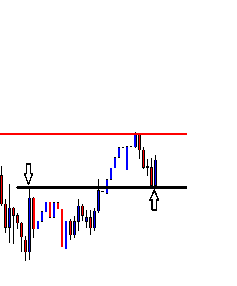
After choosing a pair to trade, traders wait for the signal candle at the desired zone/level to take an entry. The attributes of the signal candle are important. Ideally, a
After choosing a pair to trade, traders wait for the signal candle at the desired zone/level to take an entry. The attributes of the signal candle are important. Ideally, a
After choosing a pair to trade, traders wait for the signal candle at the desired zone/level to take an entry. The attributes of the signal candle are important. Ideally, a signal candle is to be a Marubozu candle, barely having an upper or lower shadow, and longer than other candles around. In today’s lesson, we are going to show an example of how attributes of a signal candle affect the market. Let us proceed.
The price after being bearish finds its support. A long consolidation suggests that a breakout towards either side makes the chart lively again. An upside breakout and the confirmation offer good risk-reward considering the last swing high. A downside breakout seems even more rewarding. Let us find out which way the breakout takes place.
It is an upside breakout. The breakout candle looks fantastic. Buyers are to wait for consolidation and breakout at the highest high to go long on the pair. However, buyers shall calculate that the last swing high is not too far away now.
The price continues its bullish journey towards the last swing high, and it consolidates. Flipped support is to be adjusted here considering the Inside bar. However, an upper shadow at the previous swing high holds the price as well up to the Inside bar. The last candle comes out from the zone, though. Look at its attributes
Many of us may trigger an entry here by setting Stop Loss below the lowest low of the candle. Let us find out what happens next.
The price comes down again. It may have swept away many Stop Losses. Thus, the last entry gets the buyers loss. What do you think about the last candle?
It is a bullish engulfing candle
It breaches the resistance zone
It is a Bullish Marubozu candle and
It breaches the last swing high
Traders may want to trigger an entry here. Let us go to the next chart to see how it goes.
This time it works excellently well. A question may arise here: what the difference is between these two candles?. The only difference that can be observed is, “It breaches the last swing high.”
The Bottom Line
We have demonstrated an example today and learned a lesson. Traders are to be immaculate in making a decision, and they have to calculate every single aspect that is related to the trading decision.
In the previous lesson, we have understood the fundamentals of margin/leverage trading. In this lesson and the following few lessons, we shall be discussing different terms related to margin and
In the previous lesson, we have understood the fundamentals of margin/leverage trading. In this lesson and the following few lessons, we shall be discussing different terms related to margin and
In the previous lesson, we have understood the fundamentals of margin/leverage trading. In this lesson and the following few lessons, we shall be discussing different terms related to margin and margin account. And in this lesson, we will primarily talk about balance and also a brief description of the concept of rollover in Forex.
What is Balance?
Balance is the most basic term used in any type of account. Be it a regular savings account, a Demat account, or a margin account. The meaning of balance remains the same in the margin account as well, just like other account types.
Balance in a margin trading account is the amount of capital deposited by the user to his/her trading account. For example, if a trader deposits $1,000 to their margin trading account, then their balance would be equal to $1,000. This is the amount used for taking positions in the market. Apart from that, it is used up for other stuff as well, which will be discussed in the next sections of this article.
Another vital point to note here is that the balance amount is not affected when a trader enters a trade or when a position is open. The balance gets updated only after the trade is closed (rollover fee is an exception).
When does the balance gets affected?
The balance in a margin account is affected in the following ways:
When cash is deposited to the margin account.
When an open position is squared off (closed).
When open positions are kept overnight, so, though positions are open, funds will be debited from or credited to the margin account. And this fee is referred to as the rollover fee.
What is Rollover in trading?
The concept of rollover is not a term that comes under a margin account. However, since this term is closely related to balance, it shall be discussed in this lesson.
As the name pretty much suggests, rollover is the process of shifting an open position from one trading day to another. This is a process that is done automatically by the brokers. As far as the internal working of rollover is concerned, the brokers close a position at the end of the trading day and simultaneously open a new position (at the closing price) the next trading day.
For this rollover to be done, brokers charge a fee called ‘swap.’ This is where the balance comes into the picture, as swap brings a change to the balance. Note that swap happens in both ways, i.e., it can be debited from as well as deposited to the user’s account balance. The interest rates of the currencies are the ones that determine if the swap is to be credited or debited. In simple words, If you are paid swap, the money will be credited to your account balance. Conversely, if you are charged swap, the money will be debited from your account balance.
This concludes the lesson on balance in a margin account. In the upcoming lesson, we shall be discussing two more terminologies related to Margin Trading. Don’t forget to take up the below quiz!
Using a trailing stop is a way to lock a profit in trading, at least with some profit. A floating profit trade may not always hit its Take-Profit level. Thus
Using a trailing stop is a way to lock a profit in trading, at least with some profit. A floating profit trade may not always hit its Take-Profit level. Thus
Using a trailing stop is a way to lock a profit in trading, at least with some profit. A floating profit trade may not always hit its Take-Profit level. Thus, traders use Trailing Stop to lock-in some profits and let it run to hit the target. Otherwise, some trades may result in a loss instead.
In today’s lesson, we are going to demonstrate an example of that.
The price heads towards the North with good bullish momentum. The buyers are to wait for price correction and bullish reversal candle to go long on the pair. Let us proceed to the next chart to find more about the correction.
The correction looks very bearish. However, a flipped support level holds the price. Thus, it is going to be an interesting battle between the bull and the bear. Let us find out who wins. Does it make a downside breakout or a bullish reversal candle?
The chart produces a bullish reversal candle. We can see that this is an Inside Bar, which is the weakest reversal candle. A flipped support creates a bullish reversal candle but does not make any breakout. The buyers are to flip over to the trigger chart to get consolidation and breakout to go long on this. This is the daily chart. Let us flip over to the H4 chart.
The H4 chart looks suitable for the buyers. The level of support produces a bullish engulfing candle. It has started the price correction. An upside breakout from a good level of support is the signal to trigger a long entry.
The price goes upward and consolidates. Upon finding support, the last candle breaches the level of resistance. Setting Stop Loss below the level of support, an entry may be triggered right after the last candle closes. The Take Profit shall be placed at the highest high of the previous bearish wave.
The price continues to go towards the upside for a while. It has started having consolidation. The price has found its support. An upside breakout is to push the price towards the North further. On the other hand, a downside breakout may push the price towards the South and even change the whole equation. Thus, the buyers are to move their Stop Loss. Have a look at the chart below.
The buyers shall move their Stop Loss below the level of support and hope it makes another upside breakout to hit the Take Profit. Let us find out what happens next.
This is what Forex trading is all about. You never know what exactly happens next. The price comes down. It would hit the Stop-Loss, where it was set at the very outset. By using Trailing Stop, the buyers have made some profit. Otherwise, they would have to encounter some loss.
The Bottom Line
Using Trailing Stop is an art. It needs a lot of practice to be master at it. Without knowing how to use it properly, it may hurt a trader instead. Since it is an important trading feature to save us from encountering a loss with a profit trade, a trader must study/work hard on this.
I’ve already stated my view that most wannabe traders put their focus in technical analysis of the market and on trading signals, mostly provided by others, hopefully, more knowledgeable than
I’ve already stated my view that most wannabe traders put their focus in technical analysis of the market and on trading signals, mostly provided by others, hopefully, more knowledgeable than
I’ve already stated my view that most wannabe traders put their focus in technical analysis of the market and on trading signals, mostly provided by others, hopefully, more knowledgeable than themselves.
The issue is that any advice, no matter how good it is, is worthless to most of the beginners because the problem is 10% of the success as a trader is entries, 20% exits, including stops and targets, and 70% is the rest of overlooked themes.
The overlooked themes, all of them has to do with the trader’s psychology:
Lack of a strategy
Overtrading
Not following the plan
Skipping entries or exits
let losses grow to wait for a reversal
cut profits short, afraid of a reversal…
Every one of these subjects is critical, but if you make me choose, I’d say that overtrading is the worst evil that happens to a novice trader. Improper position sizing kills the majority of the Forex trading accounts. This trait is also linked to the cut profits short, let losses run character flaw, so let’s do create a basic strategic plan to help traders with a basic trade management plan.
Emotional Risk
For the following plan to work, the trader needs to accept the risk. It is easy to say but challenging to do. Mark Douglas, in his book Trading in the Zone, explains that “To eliminate the emotional risk of trading, you have to neutralize your expectations about what the market will or will not do at any given moment or in any given situation.”
That is key. You cannot control the market. You can only control yourself. You need to think about probabilities. Create a state of mind that is in harmony with the probabilistic environment. According to Mark Douglas, a probabilistic mindset consists of accepting the following truths:
Anything can occur.
To make money, there is no need to know what will happen next
It is impossible to be 100% accurate. Therefore there is a win/loss distribution for any strategy with a trading edge.
An edge is just a higher probability of being right against a coin toss (if not, the coin toss would be a better strategy)
Every moment in the market is unique. Therefore
A chart pattern is just a very short-term approximation to a statistical feature, therefore less reliable than a larger data set pattern. We trade reliability for speed.
The idea is to create a relaxed state of mind, ultimately accepting the fact that the market will always be affected by unknown forces.
The Casino Analogy
Once that is understood and accepted, we can approach our trading job as if the trading business were casino bets. When viewed through the perspective of a probabilistic game, we can think that trading is like roulette or slot machines, where you, the trader, have a positive edge. At a micro level, trade by trade, you will encounter wins and loses but looked at a macro level, the edge puts the odds in your favor. Therefore, you know only need to manage the proper risk to optimize the growth of the trading account.
A plan to manage the trade
Lots of traders enter the Forex market with a rich-quick mentality. They open a trading account with less than 5,000 USD and think that due to leverage, they can double it week after week. This is not possible, of course, and they get burned within a month.
Our plan consists of three ideas
Profit the most on the winners, while let die the losers
let profit run, or even, pyramid on the gains.
Reach as soon as possible a break-even condition, for our mind to attain a zero-state as quickly as possible.
The Strategy and Exercise
Pick a forex pair.
Choose one actively traded pair. All major pairs fit this condition, but then choose the one that provides the best liquidity of your time zone.
Choose your favorite strategy, that you think it works and fits you.
The strategy must include the following components:
An Entry: The entry method should be precise. No subjective evaluations or decisions. If the market shows an entry, you have to take it. Of course, you can condition it with a reward-to-risk ratio filter, since this is an objective fact. Really, having a reward-to-risk ratio filter is quite advisable. A 3:1 ratio would be ideal, but 2:1, which is more realistic, can work as well.
A Stop-loss: Your methodology should define the level at which set your stop loss.
Timeframes: You need to choose a couple of timeframes: A short timeframe to create low-risk trades, and a longer timeframe to be aware of the underlying trend and filter out any signal that does not go with that trend.
Profit Targets: This is the tricky part. We will define at least three take profit points: One-third very-short, one-third defined bt the short-term timeframe, and the rest of the position specified using the longer-term timeframe.
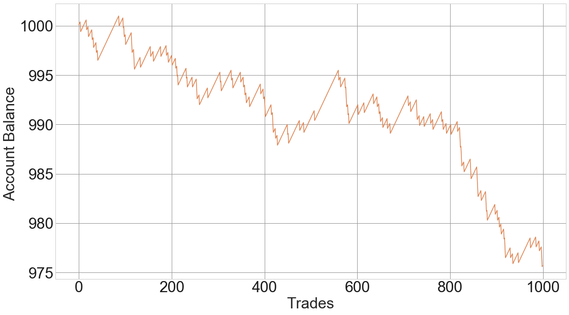
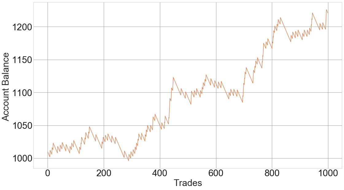
The trade size: Choose a total trade size such that the entire initial risk is no more than 2 percent of your account. So if your account is $3,000, the total risk of the trade will be $60.
Accepting the risk. The smaller dataset needed to get any statistical information is 30. Therefore, you should accept the loss equivalent of 30X the average loss per trade. Think that to analyze and decide about changing any parameter, you must move in chunks of 30 trades.
Measure the pip distance between entry and stop-loss.
Compute the value in dollars of that risk
Calculate how many mini or micro-lots fit in that amount.
2.- Trade that size and mentally divide it into three parts
3.- take profits of1/3 of the position as soon as you get 5-6 pips profit or 10% of your main profit target. This will help you tame the risk if the trade is a short-term gainer that, next, tanks.
4.- As soon as you get a profit equivalent to the size of your risk (1:1), move your stop-loss to Break-even.
5.- Take profits of the second third of the position when your second target is hit
6.- Let the remaining 1/3 run until your third target (from the longer timeframe) trailed by your stop loss. Use a parabolic approach to the stop loss, as the risk-reward diminishes when approaching the target.
7.- Alternatively, use the profits of the last winning trade and add it to the risk of the following trade. That way, on a combination of two trades, you can gain 4X with a risk of just one trade since the added risk was money taken from the market.
8.- The next trade should start with the basic dollar risk, but computed over the newly acquired funds.
Introduction
Margin, which allows for Leverage trading, is one of the crucial reasons why most of the traders prefer trading Forex. It is an aggressive form of trading where traders
Introduction
Margin, which allows for Leverage trading, is one of the crucial reasons why most of the traders prefer trading Forex. It is an aggressive form of trading where traders
Introduction
Margin, which allows for Leverage trading, is one of the crucial reasons why most of the traders prefer trading Forex. It is an aggressive form of trading where traders take more risk while expecting an additional reward. Here, traders increase their bet by borrowing funds usually from their brokers. Thereby leverage trading allows a trader to trade with more funds than they actually have in their account. Leverage trading exists in the stock market, as well. The internal working of margin in both the markets is not quite the same, but the overall concept is the same.
Leverages is typically represented in ratios or with an ”X” next to it. For instance, the notation of two times leverage would be 2:1 or 2x. There are several other terminologies such as balance, realized and unrealized P/L, used margin, equity, etc. which are involved in margin trading. And to trade in a margin account, having knowledge about these terms is vital. So, in this lesson, some basic concepts and working of the margin trading shall be discussed.
Margin Account
A margin account, also referred to as a leverage account, is a trading account offered by a forex broker, which lets their clients trade large quantities without investing the total required amount. In a margin account, the forex broker acts like a loan lender who lends cash to its customers for taking positions in the market.
How does margin trading work?
Let us assume that a trader has deposited some amount into his account. The broker sets a margin percentage for the client. This margin percentage typically is between 1-2%. In forex, it is not the case that this account balance is used for taking a position. But, it is used up by the brokers as security deposits. Here, if the broker sets a margin percentage to 1%, then 1% of the trade value is utilized by the broker as a security deposit. So, a trader takes a position worth $100,000, then only $1,000 is used up, and the broker lends the rest 99% of the amount. This is the basic working of a margin account. There are many other terms involved in it, which shall be discussed in the subsequent lessons.
Benefits and Shortcomings of Leverage Trading
Initially, margin trading might seem very beneficial. To an extent, this is true, but there are disadvantages to it as well. Below are some of the advantages and disadvantages of margin trading.
Advantages
🟢 Ability to multiply a trader’s trade size
With margin trading, minimal capital is no more an issue because one can take larger positions even with a smaller investment.
🟢 Significant short-term gains
As margin accounts allow traders to take bigger positions, one can grow their account balance exponentially, even in the short-term.
Disadvantages
🔴 High risk
The market has two directions. So, though a trader trades on a margin, it does not mean that the trade will perform in their forecasted direction. A trader can make high profits and can even lose a significant amount of money. Hence, trading with margin involves high risk. And it is not recommended for novice traders.
🔴 The requirement of the minimum account balance
Trading in a margin account requires the user to maintain the minimum balance specified by the broker. If a user fails to maintain the minimum balance, then the trader is forced to close their positions.
This concludes the introduction of margin trading. In the next lesson, the terminologies involved in margin trading shall be discussed.
Financial traders follow many charts, patterns, and trading strategies. Each one has its own advantages and disadvantages. Nevertheless, there is a saying, ‘the simpler, the better.’ In the financial markets
Financial traders follow many charts, patterns, and trading strategies. Each one has its own advantages and disadvantages. Nevertheless, there is a saying, ‘the simpler, the better.’ In the financial markets
Financial traders follow many charts, patterns, and trading strategies. Each one has its own advantages and disadvantages. Nevertheless, there is a saying, ‘the simpler, the better.’ In the financial markets, especially in the Forex market, a trader cannot deny this truth.
Let us demonstrate an example of this.
The price heads down with strong bearish momentum. The sellers are to wait for an upside correction and a breakout at the support to make it more bearish. Let us proceed with what happens next.
The price has an upside correction, but it did not make a breakout at the support. It instead produces a huge bullish engulfing candle at Double Bottom support. Things are different now. Traders are to look for a long opportunity on the chart.
The price is bullish, but it gets caught within an ascending channel. A breakout at either side attracts traders to trade in this chart. The chart shows that the price makes an explicit breakout towards the upside. Ideally, the buyers shall flip over to their trigger chart to find a long entry. Let us find out whether they find any on the next candle.
The price does not make a breakout at the highest high of the breakout candle. Thus, the traders do not find an entry on the triggered chart. However, see the second candle (bullish candle). It makes a breakout (horizontally) at the highest high of those two candles. The buyers are to flip over the trigger chart again to find an entry. Do they see an entry this time? Let us find out.
Yes, they do. The price heads towards the North with good bullish momentum, and it does not come down to the support of the breakout candle. By flipping over to the trigger chart for an upside breakout to trigger an entry, a trader makes some green pips.
In this chart, the price makes a breakout at ascending channel’s resistance just a candle earlier. That breakout does not create bullish momentum. However, when it makes a breakout at the horizontal resistance, it creates the momentum that the buyers look for. I am not saying a breakout at ascending channel’s support/resistance does not offer entry at all. It does. A breakout at horizontal support/resistance offers more entries than the channel’s support/resistance breakout. It is because; it is simple and easy to be noticed by most of the traders.
The Bottom Line
Does that mean we stop looking entries on a channel or other pattern breakout? No, we shall eye on those breakouts; flip over to the trigger chart and trigger an entry if the trigger candle makes a new higher high or lower low. It is just the probability that a breakout at horizontal support/resistance offers more than any other chart pattern. After all, it is simple, and we know “the simpler, the better’.
Introduction
The Stock market and the Forex market are the most widely traded markets in the world. Many traders who enter the universe of trading are often in a dilemma
Introduction
The Stock market and the Forex market are the most widely traded markets in the world. Many traders who enter the universe of trading are often in a dilemma
Introduction
The Stock market and the Forex market are the most widely traded markets in the world. Many traders who enter the universe of trading are often in a dilemma on which market to trade on. Though both markets involve trading instruments, there are many differences between these two. In this lesson, we shall get insights on the different features of both markets and then come to a conclusion on which is the market has got the upper hand.
Market timings
The forex market is open for 24/5. This proves to be a considerable advantage, as traders can trade anytime during the trading hours according to their schedule. While this is not the case with the stock market because they’re open only for 7-9 hours in a day. So, the stock market timings can be helpful only to full-time traders.
Facility to buy and sell short
As already discussed in the previous lesson, there is no directional bias in the forex market. The process and working for buying and selling is the same. Hence, a trader can participate during any condition of the market. In the case of the stock market, there are few restrictions on short selling a stock. Though the facility for short selling is available, the procedure is not as simple as buying a stock.
Leverage/Margin
Leverage is the facility provided by the brokers to take larger positions with smaller capital. Leverage is one of the reasons why small retail traders take part in the market. Now, comparing the leverage in the stock market with the forex market, the difference is quite significant. In the stock market, maximum leverage for a day trader is up to 4:1 and for a positional trader, it is up to 2:1. Coming to the forex market, the leverage is commonly around 100:1. In fact, in some brokerages, it goes up to 500:1 as well. However, it cannot be concluded that it is better to choose the forex market over the stock market. This is because, as the leverage increases, the risk involved in the trade also increases.
Dividends
Dividends are basically perks given by companies if an investor invests in their company. Investing in a stock that provides dividends to their customers can be considered as a risk-free business. This is because, even if the stock underperforms in the market, you are usually assured of dividend income. But, in the forex market, there is no concept of dividends as such. Hence, this market is for the ones who are willing to take the risk.
Diversification
Many traders look for diversifying their portfolio. In the US stock market, there are around 2,800 stocks listed on the NYSE and 3,100 on the NASDAQ. And these stocks are put into different sectors. The sectors have their specific features and perform differently from other sectors. Hence, the stock market is an ideal market for the ones looking to diversify their investments.
Conclusion
In considerations of the above features of the stock market and the forex market, it is quite hard to stay biased. In the initial features, the forex market proves to be a better market, and when it comes to dividends and diversification, the stock market is the clear winner. Hence, from this, we can conclude, ‘the best market’ is a variable factor. It all depends on the type of trader a person is.
Harmonic Pattern – Walkthrough
[caption id="attachment_48985" align="aligncenter" width="3682"] Bearish Butterfly Pattern against 180-degree Square of 9 angle.[/caption]
The chart above is the AUDJPY Forex pair on its 6-hour
Harmonic Pattern – Walkthrough
[caption id="attachment_48985" align="aligncenter" width="3682"] Bearish Butterfly Pattern against 180-degree Square of 9 angle.[/caption]
The chart above is the AUDJPY Forex pair on its 6-hour
Harmonic Pattern – Walkthrough
Bearish Butterfly Pattern against 180-degree Square of 9 angle.
The chart above is the AUDJPY Forex pair on its 6-hour chart. If you are unable to identify this pattern without referencing notes or the prior articles, you are not ready to use this form of technical analysis. Regardless, the pattern above is a Bearish Butterfly Pattern.
Harmonic Patterns are by there very nature indicative of imminent price reversals. The PRZ (Potential Reversal Zone) is, in my opinion, the most critical level when determining whether to utilize a Harmonic Pattern in my trading. A Harmonic Pattern itself is not a sufficient enough form of analysis to decide whether or not to take a trade. Harmonic Patterns, in my opinion, should not be used as a primary form of analysis, but rather a complementary or confirmatory form of analysis. The chart above is an excellent example of this.
The horizontal levels on AUDJPY’s chart are derived from W.D. Gann’s Square of 9 – natural number values that represent angles. The methods and theories in Gann Analysis are an entirely different topic and require years of study and research – but for this article, one component of his work will help make my point. The red horizontal line at the top is a 180-degree Square of 9 angle. The 180-degree Square of 9 angle is already a strong and naturally powerful level of resistance. When I see price is near the 180-degree Square of 9 angle, I know one thing is for sure:
There is a high probability that the AUDJPY will have difficulty crossing this level and a high probability of price, at least initially, being rejected from moving higher.
So I would naturally look to be taking a short trade if the market shows rejection at that level. That is where the presence of a Harmonic Pattern is desirable. The Bearish Butterfly Pattern is one of the most reliable and most powerful reversal patterns in all Scott Carney’s work. I know that the Butterfly Pattern typically shows up at the end of a swing – not necessarily a trend, but the end of a swing. If I see a Bearish Butterfly Pattern, I know one thing is for sure:
The Bearish Butterfly Pattern is a reversal pattern. I also understand that the Bearish Butterfly Pattern appears at the top of a swing, indicating an extended and overdone market.
After seeing price approach, the naturally strong reversal level of the 180-degree Square of 9 angle, and then the completion of a Bearish Butterfly Pattern, I believe that there is a sufficient amount of analysis to risk taking a short trade. A short trade is further validated by the completion of a bearish engulfing candlestick, as well as some lengthily bearish divergence on the RSI.
Harmonic Patterns are an advanced form of analysis and require more than a basic understanding of the technical analysis of financial markets. For those of
Bearish Butterfly Pattern against 180-degree Square of 9 angle.
Harmonic Patterns – Start Here
Harmonic Patterns are an advanced form of analysis and require more than a basic understanding of the technical analysis of financial markets. For those of
Harmonic Patterns – Start Here
Harmonic Patterns are an advanced form of analysis and require more than a basic understanding of the technical analysis of financial markets. For those of you who have familiarized yourself with the application of Fibonacci levels, Harmonic Pattern Analysis will, perhaps, be of use to you. The following is a list of the Harmonic Patterns available for learning here at Forex Academy. The suggested order of learning about these patterns is below.
The article above provides an example of how to use Harmonic Patterns in your own analysis and trading.
Sources: Carney, S. M. (2010). Harmonic trading. Upper Saddle River, NJ: Financial Times/Prentice Hall Gartley, H. M. (2008). Profits in the stock market. Pomeroy, WA: Lambert-Gann Pesavento, L., & Jouflas, L. (2008). Trade what you see: how to profit from pattern recognition. Hoboken: Wiley
In our previous article, we introduced the concept of “fast market.” Also, we commented about the importance of watching the big-picture to support the market’s general overview. In this educational
In our previous article, we introduced the concept of “fast market.” Also, we commented about the importance of watching the big-picture to support the market’s general overview. In this educational
In our previous article, we introduced the concept of “fast market.” Also, we commented about the importance of watching the big-picture to support the market’s general overview. In this educational article, we’ll review the analysis of the fast movement.
Disclosing the Speed
Once the market moved following our forecast, the price action developed its next sequence in a fast way. To aid in building our analysis in the EURGBP cross, we’ll use the RSI indicator to identify each swing.
From the EURGBP hourly chart, we observe the bullish sequence started on May 05. The RSI use, allows us to identify each swing of waves 2 and 4, and divergences the end of waves 3 and 5.
Until now, the movement developed by EURGBP corresponds to a 5-3 sequence; thus, the next path should develop in five waves. In consequence, our new hypothesis could be the next move a wave three or be the second leg of a zigzag pattern.
The second EURGBP chart exposes the progress in an ending diagonal pattern. This Elliott wave formation is a motive wave built by five internal legs that overlap each other.
On the other hand, the new big-picture structure observed on the EURGBP cross unveils a 5-3-5 sequence. Thus, according to the Elliott wave principle, this formation corresponds to a zigzag pattern.
Another observation comes from the alternation between the first and second bullish leg. Both segments moved on a different relationship price and time. In other words, while the first leg ascends in a fast step, the second one progress at a slower price/time relation.
Now, from the Elliott wave principle, the next path from the EURGBP should be a corrective move in three waves. If the price breaks below the invalidation level, the correction should be more profound.
On the following chart, we observe an incomplete corrective move developed in two internal waves labeled in black. In consequence, the next movement should be a wave ((c)) in black. The completion should complete a new wave A labeled in green.
Until this moment, the price action bounced above the invalidation level, which makes us observe two things:
The EURGBP cross is running in a complex corrective structure, likely a double three pattern. This Elliott wave structure is labeled as WXY, follows a 3-3-3 sequence, and develops seven swings.
Probably according to the alternation principle, the next corrective structure could be a flat pattern.
The following chart exposes the waves A and B labeled in green completion. As can be noted, wave A holds three internal legs, wave B retraces between 81% and 100% of A. Thus, the Elliott wave structure should correspond to a regular flat pattern.
Finally, the next EURGBP chart illustrates the end of the last segment of the wave C from the regular flat pattern, which is part of a complex corrective sequence, in this case, the formation corresponds to a double three structure.
As a learned lesson, the use of the RSI indicator is useful to support the wave identification process. Similarly, to apply the Elliott Wave Principle is essential to know the basic corrective patterns to follow any market. Finally, remember that the market has only two ways to move: it moves in three or five waves.
In today’s lesson, we are going to demonstrate an example of a failed entry. We usually explain winning trade setups in our lessons. It teaches us how to win a
In today’s lesson, we are going to demonstrate an example of a failed entry. We usually explain winning trade setups in our lessons. It teaches us how to win a
In today’s lesson, we are going to demonstrate an example of a failed entry. We usually explain winning trade setups in our lessons. It teaches us how to win a trade on a setup like that and gives us more confidence as well. We are going to talk about a failed entry, which may hurt our confidence. However, the lesson that it teaches that may help us be a batter trader.
The price heads towards the North with good bullish momentum. Ideally, we shall look for long opportunities here upon consolidation and at a breakout at resistance. Let us find out what happens next.
The price consolidates, but it does not make any breakout. The last candle looks very bearish. The door is open for both the bull and the bear. Traders shall go long on an upside breakout and go short on a downside breakout. Let us find out which way it makes its next breakout.
The price heads towards the downside after making a breakout at support. It is a different ball game now. Traders are to look for short opportunities upon consolidation and downside breakout. Let us proceed to the next chart to find out what happens next.
Here comes the corrective candle. It is an Inside Bar. Thus, to sum up, the whole equation, the price consolidates after being bullish, makes a breakout at the support, the trend continues, produces a corrective candle (an Inside Bar). A bearish engulfing candle closing below the lowest low is the signal to go short here.
This is what I have meant. A bearish engulfing candle forms right after the corrective candle. The candle closes below the support, where the price reacted three times recently. If we consider the momentum of the last bearish candle, that gets ten on ten as well. Let us trigger a short entry.
Oh! The price goes another way round than our expectations. It hits the Stop Loss. We are to encounter a loss here. The first thing we shall do after a losing trade, we shall write all the details about the trade in our journal. If there is anything that we have missed from our trading strategy, we must find that out and write it in our journal.
As far as I am concerned, there is not anything wrong with the entry. It is an entry; I would take ten times out of ten opportunities. I have been working with the strategy for a long time. Thus, I can assure you I would win at least six entries out of those 10. This is the faith that a trader needs to have. A trader must not lose his faith in his proven strategy.
The Bottom Line
Never lose your faith in yourself and in your proven strategy. Do not let a losing trade hurt you psychologically.
Forex market is appealing to the traders. It operates 24/5, and it is the most liquidate financial market. It offers numerous trading opportunities to traders of all sorts. Since it
Forex market is appealing to the traders. It operates 24/5, and it is the most liquidate financial market. It offers numerous trading opportunities to traders of all sorts. Since it
Forex market is appealing to the traders. It operates 24/5, and it is the most liquidate financial market. It offers numerous trading opportunities to traders of all sorts. Since it has so much to offer, investors love investing in the market. However, these benefits often work against traders. Statistics suggest that 95% of traders lose their money in the Forex market.
A question may be raised here why most of the investors are unsuccessful in this market. There are quite a few to mention. However, today, I am going to talk about a very common factor that makes many traders unsuccessful.
We know winning trade and losing trade go hand by hand in the financial market. In the Forex market, it goes more frequently than other financial markets. Ideally, if a trader wins his 60% trades even with a 1:1 risk-reward ratio, he is considered a good trader. At the end of the day, he is making profit matters. By losing 40% of trades, he is still able to make money. It is simple math. Let us now dig into this simple math and find out how it could make a trader unsuccessful.
Let us assume a trader has learned or found out a strategy that offers 1:1 risk-reward with a 60% winning rate. He takes six entries in a week, and all of them hit Take Profit. In the following week, he takes four entries, and all of them hit Stop Loss (For the sake of statistics). He starts thinking something must be wrong with his strategy. He forgets the whole picture. Psychologically, he is down. Thus, he would have more problems with the strategy. He abandons his proven approach and starts looking for a new one, though, there is not anything wrong with the strategy.
As far as statistics are concerned, if on average a trade strategy gets us 40% losers, it means that 16% of the time (one every three losing streaks) a trader will encounter two losers in a row, 7% of the time he will get 3 consecutive losers, 3% of the occasions he will experience four losers. Are you already pondering? Here is the last data to be presented in front of you; about 1 in 100 trades, he will encounter five losers in a row. A trader needs to accept the fact because it is inherent to the statistical properties of his game.
We know a trader needs to do a lot of back-testing, study, demo trading before using it in live trading. This process consumes time. Moreover, a good strategy does not mean that it would suit every single trader. The new one may not be his cup of tea. Assume what happens next. He starts looking for another one.
Meanwhile, he starts losing his faith in him and this market. The consequence is obvious. He becomes a member of that ‘95% Club’.
The Bottom Line
It does not matter how good a trader someone is; he is to accept losing trades. The entire result is to be calculated. A trader must not worry about one or two losing trades, but must have faith in his strategy (which he uses after hours of back-testing, study) as long as it brings him consistent profit.
Introduction
The foreign exchange market is, no doubt, the most popular market in the world. Though it is considered to be a very risky business, it can prove to be
Introduction
The foreign exchange market is, no doubt, the most popular market in the world. Though it is considered to be a very risky business, it can prove to be
Introduction
The foreign exchange market is, no doubt, the most popular market in the world. Though it is considered to be a very risky business, it can prove to be the best platform for trading and investing if things are done wisely. People often are in a dilemma to choose between the stock market, commodity market, and the forex market. Hence, it is important to know the benefits each market has to offer. So, in this lesson, we shall discuss some significant benefits the forex market has to offer.
Advantages of Trading Forex
Open 24/5
The forex market is traded throughout the day from Monday to Friday. And this got to be the biggest advantage for the part-time traders. Since there are quite a large number of people who are into 9-5 jobs, the forex market is an excellent option as one can trade anytime during the day. Hence, the forex market is the most flexible market when it comes to timings.
Great Liquidity
The forex market is the largest market in the world. It has a huge volume of orders coming in every single second. With high liquidity, trades are executed as soon as the order is placed. In fact, the forex market has the highest liquidity compared to any other market.
Margin Trading
In forex, the retail traders get the facility to trade with leverage. That is, with leverage trading, a trader can trade with quantities even if they do not possess the required amount. This is a great advantage as it paves the way for the small traders who are willing to participate in the market.
Nominal Commission and Transaction Costs
Another significant benefit to consider about the forex market is that the forex brokers don’t really charge any high fee, such as brokerage fees, exchange fees, or clearing fees. Having said that, they do charge commission, which is in the form of spreads. The bid/ask price, which is often referred to as the transaction cost, is typically around 1% when the market conditions are normal.
In forex, the brokers allow trading with as low as 0.001 lots. And traders can choose from 0.01 lots, 0.1 lots and 1 lot. Hence, there are variable lot sizes in this market. But, if you were to consider the futures market, the lot sizes are of one type and are determined by the exchanges.
Free Demo Trading
Demo trading is one of the best features the forex brokers have to offer. And the cherry to the cake is that demo trading accounts are free of cost. Demo trading can be very helpful to both novice and professional traders. Novice traders can use it to get the hang of placing orders and other features in the platform, while professional traders can use them to test the consistency of their strategies. Hence, we can consider demo trading to be a powerful risk-reducing tool.
Facility to Go long and Go Short
In the forex market, there is no directional bias. This is because currencies are traded in pairs. If a trader thinks the base currency would rise in value, they can go long, and if they think it will depreciate in value, they can go short. So, unlike the stock market, a trader need not borrow shares to sell short an instrument. Hence, traders can profit from both rising markets as well as falling markets without any complications.
Hence, these were some of the most significant features and advantages of the forex market. In the coming lesson, let us put up a comparison between different markets and see which market proves to be the best; for now, take the below quiz and see if you have understood this lesson correctly.
Ichimoku Kinko Hyo Guide – A walk through a trade.
I want to preface this guide with a screenshot of my account.
Trade History
The screenshot is a series of some of the trades I’ve made in early April 2019. I do this because this guide on trading with Ichimoku will target the trade that is highlighted. Additionally, I think it is important that if I am showing you an example of a trade for a guide, I should show that I had skin in the game. There are a great many guides and strategies that authors, analysts, and traders suggest, but few will share if they took the trade. The highlighted trade for the EURGBP is the trade I will be using for this guide. It is a great example of the trading methodology I use with the Ichimoku System.
Multiple Timeframe Analysis – Daily, 4-Hour, and 1-Hour
The Ichimoku Kinko Hyo system is most effective when utilizing multiple timeframes. It is the only way that I use the Ichimoku system. In my trading, I use the Daily, 4-hour, and 1-hour time frames. Multiple timeframes are extremely useful in filtering your trade entries and ensuring higher probability trade setups. The process below will go through the process I used to take the trade.
Step One – Daily Chart Check: Price greater than Kijun-Sen, NOT inside the Cloud.
Step One – Check Daily Cloud
The very first thing I check is the daily chart. If the price is inside the Cloud on the daily chart, I skip the chart. It’s dead to me. If the price is not inside the Cloud, I then look for where the price is in relation to the Kijun-Sen. The daily chart determines my trading direction. If the price is above the Kijun-Sen, I only take long trades. If the price is below the Kijun-Sen, I only take short trades.
Step Two – 4-Hour Chart Check: Price above the Cloud, Chikou Span above candlesticks.
Step Two – Check the 4-hour chart.
If the daily chart determines the direction of my trading, the 4-hour provides the filter for the entry chart (the 1-hour chart). The only things I am concerned about with the 4-hour chart is that the Chikou Span is above the candlesticks, and that price is above the Cloud. Preferably, the Chikou Span would also be in ‘open space’ – but I don’t use it as a hard rule. I have not found the open space to be as important during the change of a trend or corrective move.
(a note about ‘Open Space’ – Open Space is a condition where the Chikou Span won’t intercept any candlesticks over the next five to ten trading periods. When the Chikou Span is in open space, this represents ease of movement in the direction of the trend with little in the form of resistance (or support) ahead.)
The EURGBP trade we are analyzing is a good example of why, at the current position, I don’t consider the open space as strict as I would on the hourly. I want to refer you back to the daily chart. If, on the daily chart, both price and the Kijun-Sen are below the daily cloud, but price moves above the Kijun-Sen – I don’t consider the open space variable as important on the 4-hour chart.
Step Three – 1-Hour Chart Check
Step Three – 1-hour Entry
The 1-Hour chart is my entry chart. As long as Step One and Step Two are true, the 1-hour chart is where the bread and butter of the trading occurs. My entry rules are this:
Future Span A is greater than Future Span B.
Chikou Span above the candlesticks and in ‘open space’ – for five periods.
Price is greater than the Tenkan-Sen and Kijun-Sen.
I generally look for a profit target of 20-40 pips, depending on the FX pair. For example, on the NZDUSD, I would look for 20 pips, and on the GBPNZD, I would look for 40 pips. But there are some hard technical reasons to leave a trade before that profit target is hit. The list below represents my exit rules on the 1-hour Chart – I exit the trade if any of these conditions occur.
Exit if Chikou Span below candlesticks for more than three consecutive candlesticks.
Exit if price enters the 1-hour Cloud.
Exit if Tenkan-Sen below the Kijun-Sen for more than five candlesticks.
Step Four – Reentry Rules
Step Four – Reentry
Entry rules are fine, but the problem isn’t always finding the entry. One of the hardest problems is creating rules for re-entering a trade. Mine are as follows:
Tenkan-Sen and Kijun-Sen must be above the Cloud.
Chikou Span above the candlesticks.
Price greater than Kijun-Sen and Tenkan-Sen.
A quick summary of steps taken
Checked the daily chart, the price was above the daily Kijun-Sen. The trade direction is long/buy.
Check the 4-hour chart, the price was above the Cloud, and the Chikou Span was above the candlesticks.
All 1-hour rules confirmed an entry; profit taken at 40 pips.
Re-entered trade on 1-hour chart, exited when price entered the 1-hour Cloud.
Sources: Péloille, Karen. (2017). Trading with Ichimoku: a practical guide to low-risk Ichimoku strategies. Petersfield, Hampshire: Harriman House Ltd.
Patel, M. (2010). Trading with Ichimoku clouds: the essential guide to Ichimoku Kinko Hyo technical analysis. Hoboken, NJ: John Wiley & Sons.
Linton, D. (2010). Cloud charts: trading success with the Ichimoku Technique. London: Updata.
Elliot, N. (2012). Ichimoku charts: an introduction to Ichimoku Kinko Clouds. Petersfield, Hampshire: Harriman House Ltd.
The speed is a characteristic of nature; in the same way, some markets tend to be faster than others. The problem arises when a market moves sharply. In this educational
The speed is a characteristic of nature; in the same way, some markets tend to be faster than others. The problem arises when a market moves sharply. In this educational
The speed is a characteristic of nature; in the same way, some markets tend to be faster than others. The problem arises when a market moves sharply. In this educational article, we’ll introduce how to analyze a fast market using the Elliott Wave Principle.
Price and Speed
Both price and speed are individual characteristics of each market. Depending on specific factors, one market could be faster than another.
The problem arises when, in an active market, the price moves faster than usual. R.N. Elliott, in his Treatise “The Wave Principle,” wrote:
“In fast markets, it is essential to observe the daily as well as the weekly ranges; otherwise, characteristics of importance may be hidden.”
In other words, when the market studied in a specific timeframe doesn’t allow to identify any pattern. It is useful in these cases to observe the market in a higher time frame, for example, the daily or weekly timeframes.
The Case of Study
Consider the EURGBP cross in its 4-hour chart, which shows a rally developed from early May until the middle of August 2019. The remarkable observation is that the first part of the rally was faster than the second part of the range of study.
As a first step, let us observe the big-picture; in this case, we will study the EURGBP cross in a weekly timeframe. As can be noted, the EURGBP developed an extended Wave 3.
Both the RSI and the Awesome Oscillator display a bearish divergence, that helped us to identify waves (3) and (5).
In consequence, in view that the five-wave sequence has been completed, it is time for a corrective movement in three waves.
The next chart shows the possible recount of the EURGBP cross.
In the above figure, we observe that the cross could have fully completed a cycle that, as we know, includes a motive impulse and its corrective sequence. Thus, if our market hypothesis is that the EURGBP has completed a cycle, then our forecast should consider a new five-wave rally.
The following chart unveils the upward movement developed by the EURGBP from its bottom, established in early May.
In the next educational article, we will expand the analysis on how to decipher a fast market using the Elliott Wave Principle.
The Three Principles – Timespan Principle
In another correlation to Western analysis, Hosada’s Ichimoku Kinko Hyo system has a timing component within the system. The numbering system used in Ichimoku
Timepsan Principle - Combined Counts
The Three Principles – Timespan Principle
In another correlation to Western analysis, Hosada’s Ichimoku Kinko Hyo system has a timing component within the system. The numbering system used in Ichimoku
The Three Principles – Timespan Principle
In another correlation to Western analysis, Hosada’s Ichimoku Kinko Hyo system has a timing component within the system. The numbering system used in Ichimoku is unique when compared to Western analysis. The reason for the numbering and counts in Ichimoku is related to the cultural importance of some numbers in Japan versus others. Numbers that would be considered ‘lucky’ in Japan are the same numbers in the West and many other cultures – particularly 7 and 9. But those numbers themselves are not what is important. How, exactly, this numbering and count system came to be developed in the fashion that it was developed I do not know. The following is directly from Ichimoku Chats – An Introduction to Ichimoku Kinko Clouds by Nicole Elliot – I heavily suggest getting her book (the 2nd edition). The important numbers are:
9, 17, 26, 33, 42, 65, 76, 129, 172, 257
If you ever study the work of WD Gann, then these numbers are not only familiar but non-random.
Numbering
Numbering the candlesticks in a pattern is done with traditional Arabic numbers (1,2,3,4,5, etc.) and English letters (A, B, C, D, E, etc.). When counting how many candles are in a trend/wave, the last candle in an uptrend is counted as the first in the down wave and vice versa. See below:
Timespan Principle – Candle Counts
Notice that candle 19 is also A, candle H is also 1. Also, notice that the time counts (total number of candles) in this ‘N’ wave all represent essential numbers in the Ichimoku number system. 19 is close to 17, H is close to 9, and 8 is close to 9.
Kihon Suchi – ‘Day of the turn.’
Nicole Elliot’s work is fantastic – it’s refreshing to read an analyst and trader who updates her work and goes through the grueling process of keeping it relevant. Kijun Suchi (‘the day of the turn’). The Kihon Suchi is the Hosada’s Timespan Principle put into practice. It is very similar to the use of Gann’s cycles of the Inner Year or horizontal Point & Figure counts to identify turns in the markets. Let’s use the image above again as an example. Below, I’ve separated the ‘N’ wave into A, B, and C.
Timespan Principle – Combined Counts
When adding the number of bars in A, B, and C, we always subtract 1 from each wave after the first. For example, if we counted five waves and the total was 100 bars, we would subtract 4 from 100; 96. On the chart above, the total number of bars of A, B, and C is 33 bars. We subtract 2 from 33 to get 31. This is where the Timespan Principle using Kihon Suchi comes into play. We should be able to project the end of the down drive that will occur after wave C. Does it work? Let’s see.
Timespan Principle – A+B+C = D
Below is another example. In reality, the use of the Timespan Principle is a very simplified version of a phenomenon known as a foldback pattern. But Japanese analysis focuses on the quality of equilibrium, so it makes sense to see this kind of behavior from a method that focuses on balance in all things.
Timespan Principle – Symmetrical Inverse Head & Shoulder Pattern
Sources: Péloille, Karen. (2017). Trading with Ichimoku: a practical guide to low-risk Ichimoku strategies. Petersfield, Hampshire: Harriman House Ltd.
Patel, M. (2010). Trading with Ichimoku clouds: the essential guide to Ichimoku Kinko Hyo technical analysis. Hoboken, NJ: John Wiley & Sons.
Linton, D. (2010). Cloud charts: trading success with the Ichimoku Technique. London: Updata.
Elliot, N. (2012). Ichimoku charts: an introduction to Ichimoku Kinko Clouds. Petersfield, Hampshire: Harriman House Ltd.
The Three Principles – Price Principle
This will be the shortest article over the three principles, mainly because it is the same as many other Western styles of price projection.
Price Principle - N Price Target
The Three Principles – Price Principle
This will be the shortest article over the three principles, mainly because it is the same as many other Western styles of price projection.
The Three Principles – Price Principle
This will be the shortest article over the three principles, mainly because it is the same as many other Western styles of price projection. I do not need to go into any significant detail here. If you want further detail into this method, I would suggest Nicole Elliot’s book, Ichimoku Charts – An Introduction to Ichimoku Kinko Clouds (2nd Edition).
Elliot identified four price target methods from Hosada’s work: V, N, E, and NT. Elliot does mention that she (myself included) does not use this analysis and relies instead on traditional Western methods. However, she does cite that for investors and traders with short time horizons that this Japanese method of the Price Principle is superior to many techniques.
V Price Target
V = B + (B – C)
Inverse: B – (B+C)
Price Principle – V Price Target
N Price Target
N = C + (B – A)
Inverse: C – (B + A)
Price Principle – N Price Target
E Price Target
E = B – (A – B)
Inverse E: B + (A + B)
Price Principle – E Price Target
NT Price Target
NT = C + (C – A)
Inverse NT: C – (C – A)
Price Principle – NT Price Target
Sources: Péloille, Karen. (2017). Trading with Ichimoku: a practical guide to low-risk Ichimoku strategies. Petersfield, Hampshire: Harriman House Ltd.
Patel, M. (2010). Trading with Ichimoku clouds: the essential guide to Ichimoku Kinko Hyo technical analysis. Hoboken, NJ: John Wiley & Sons.
Linton, D. (2010). Cloud charts: trading success with the Ichimoku Technique. London: Updata.
Elliot, N. (2012). Ichimoku charts: an introduction to Ichimoku Kinko Clouds. Petersfield, Hampshire: Harriman House Ltd.
A man named Hidenobu Sasaki brought Hosada’s Ichimoku system and the three principles to contemporary times. He worked for Citigroup in Japan when he published his 1996 book, Ichimoku Studies.
A man named Hidenobu Sasaki brought Hosada’s Ichimoku system and the three principles to contemporary times. He worked for Citigroup in Japan when he published his 1996 book, Ichimoku Studies.
A man named Hidenobu Sasaki brought Hosada’s Ichimoku system and the three principles to contemporary times. He worked for Citigroup in Japan when he published his 1996 book, Ichimoku Studies.
These three principles have shared characteristics of many various styles and theories in Western technical analysis. A couple of examples of those would be Elliot Wave Theory and Tom DeMark’s Sequential. I would encourage all readers to pick up Nicole Elliots 2nd edition of Ichimoku Charts – An introduction to Ichimoku Kinko Clouds. It is my opinion that her work is the most in-depth on these three principles – even though she reports she does not use them. I also do not use any of these three principles. Nonetheless, they are a component of the entire Ichimoku system.
Principle One – The Wave Principle
The Wave Principle is an enigma. It is both singular in its nature when compared to Western analysis but also very complimentary. Ichimoku is a very dynamic form of analysis with broad interpretation and flexibility available for the analyst/trader. Elliot Wave Theory is a very static form of analysis with strict rules that must be adhered too.
Much of these patterns are going to be very much the same patterns that new traders and analysts first discover when learning Western-style technical analysis. One of the more interesting elements of the Wave Principle is the naming of each pattern. I am not sure if it was Sasaki or Hosada who used English letters to identify the shapes of these patterns. Many of these patterns are self-explanatory and familiar.
One Wave – ‘I’ Wave
Wave One – ‘I’ Wave
Called the ‘I’ Wave, it is a simple (probably overly simple) single wave. I would call it a trendline more than a wave, but that is what Hosada calls it.
Two Wave – ‘V’ Wave
Two Wave – ‘V’ Wave
The ‘V’ wave is one of the most common patterns in technical analysis, it’s one of the first patterns we learn, but it’s not a specific pattern that we learn by itself. The ‘V’ wave is part of the M or W structure that makes up the majority pattern theory in technical analysis.
Three Wave – ‘N’ Wave
Three Wave – ‘N’ Wave
Again, this is a common pattern that most of you are already familiar with. The ‘N’ wave pattern in Nicole Elliot’s book shows symmetrical waves – which is important because the ‘N’ wave is essentially an AB=CD pattern, one of the building blocks of Harmonic Patterns. It is also a perfect description of what an A-B-C corrective wave in Elliot Wave Theory looks like.
Five Wave – ‘P’ Wave and ‘Y’ Wave
Five Wave – ‘P’ Wave
The ‘P’ wave is essentially another name for a popular and powerful continuation pattern known as a pennant. ‘P’ waves can also represent ascending or descending triangles. You will also see them in Ending Diagonals in Elliot Wave Theory. The pattern should also be called a ‘b’ pattern because the inverse of the ‘P’ pattern, a bullish pennant, is a ‘b’ shaped pattern – a bearish pennant.
Five Wave – ‘Y’ Wave
The ‘Y’ wave is probably more commonly referred to as a megaphone pattern, broadening top or broadening bottom.
Combined Patterns
Combined Waves
Although it may not need to be said, charts will show multiple patterns at any given time. And due to the fractalized nature of technical analysis, patterns within patterns are normal.
Wave Counts
Wave Counts
So this part is the one where it will either make little sense or no sense. If you are new to technical analysis and/or never learned Elliot Wave Theory, the wave count component of the wave principle will make little sense. If you know the Elliot Wave Theory, then the wave count component will make no sense. Waves in Ichimoku are measured by time – a very Gann based approach. Trends are either Long-term or Short-term with no delineation between whether it is a bull market or bear market. There is no limit to the number of waves that can exist in a Long-term trend, but Short-term trends must be in single, double, or triple waves. The Ichimoku wave count is similar and very different from how we measure wave counts in the Elliot Wave Theory. In Elliot Wave Theory, moves occur in either three (corrective) or five (impulse) waves.
Sources: Péloille, Karen. (2017). Trading with Ichimoku: a practical guide to low-risk Ichimoku strategies. Petersfield, Hampshire: Harriman House Ltd.
Patel, M. (2010). Trading with Ichimoku clouds: the essential guide to Ichimoku Kinko Hyo technical analysis. Hoboken, NJ: John Wiley & Sons.
Linton, D. (2010). Cloud charts: trading success with the Ichimoku Technique. London: Updata.
Elliot, N. (2012). Ichimoku charts: an introduction to Ichimoku Kinko Clouds. Petersfield, Hampshire: Harriman House Ltd.
Timing is an essential factor in trading. Price action traders take entry on signal candle’s/bar’s attributes and support/resistance breakout. Many traders ignore the timing factor. However, it is an important
Timing is an essential factor in trading. Price action traders take entry on signal candle’s/bar’s attributes and support/resistance breakout. Many traders ignore the timing factor. However, it is an important
Timing is an essential factor in trading. Price action traders take entry on signal candle’s/bar’s attributes and support/resistance breakout. Many traders ignore the timing factor. However, it is an important factor when the signal candle is produced. In this article, we are going to demonstrate an example of the importance of timing in trading.
This is a daily chart. The price keeps going towards the South. Traders shall only look for selling opportunities in this chart on upward price correction/consolidation. Let us go to the next chart and find out what happens next.
The chart produces an engulfing bullish candle. It is a sign that the price may go towards the North. Intraday buyers such as 5M, 15M, H1 traders may look for long opportunities in this chart. The daily chart traders must wait for the correction/consolidation to get over upon a daily bearish reversal candle.
The price heads towards the North with good bullish momentum. The intraday buyers have made full use of the engulfing candle here. However, upper shadow and an Inside Bar suggest that a bearish reversal may come soon.
Here it is. A bearish engulfing candle suggests that it is time to look for short opportunities. It is a daily chart, so we shall flip over to the H4 chart to look for short opportunities.
The H4 chart shows that the price consolidates and makes a bearish move. However, support is still intact. The sellers must wait for a breakout at the support to go short on this chart. Let us draw the support line on the chart.
With an upward adjustment, the support lies at the black marked level. One of the H4 bearish candles is to breach the level for the sellers to get engaged in selling. Let us proceed to the next chart.
Concentrate on the chart. The chart has produced six candles since we have flipped over to the H4 chart. Six H4 candles mean a trading day is passed. Does it have any message to give us? We dig into the message later. Let us proceed to the next chart.
Wow! We have a breakout. Some traders may want to trigger an entry right after the candle closes. Let us find out what happens next.
The price starts heading towards the North. The price hits the Stop Loss. It even breaches the highest high of the wave. This is a different ball game now. If it were a technically right entry, we would not have talked about it. The thing is this one was a wrong entry, as the signal candle forms at the wrong time.
The signal candle does not form within the next trading day. It takes nine H4 candles to make the breakout. If the signal came within the first six candles, it would have been a valid trade. Since it comes at the ninth candle, it means the support has become daily support. Thus, an H4 breakout is not enough to drive the price towards the South. It goes towards the upside instead. The lesson we have learned here is, “A breakout is not a breakout if it does not take place at the right time.”
In our previous article, we have seen the mainstream chart types, out of which the candlestick charts are the most prevalent in the current markets. But traders devised other ways
In our previous article, we have seen the mainstream chart types, out of which the candlestick charts are the most prevalent in the current markets. But traders devised other ways
In our previous article, we have seen the mainstream chart types, out of which the candlestick charts are the most prevalent in the current markets. But traders devised other ways to represent the price action in their search to get an edge over the rest of the traders. In this article, we are going to describe two popular variations of the basic candlestick chart.
Tick Charts
Tick Charts look similar to a candlestick chart, and every bar indeed is a real candlestick. But a Tick Chart does not depict a linear time scale. Instead, the chart moves to another bar every time a determined number of ticks have been reached.
And what is a tick? A tick is defined as one trade. So a 100-tick chart changes to a new candle every 100 trades, no matter its size.
Advantages of Tick charts
The main advantage of tick charts is that it allows spotting bars mostly populated by non-pro trades. Since every bar is made of the same number of trades, it is easy to detect bars with low volume, caused mainly through retail accounts. That allows pros to fade them and collect their money.
Tick charts homogenize the potential volatility on every bar because all bars represent the same number of trades. Therefore, it compresses low liquidity time segments into a few or one candlestick and expands hyperactive times into several candles. That way, amoving averages, and other indicators are more accurate. Also, the price action can be better appreciated, breakouts appear earlier, and chart cycles show up better.
Range Charts
Range charts are a convenient kind of chart. It also gets rid of the temporal method to move to the next bar. The idea of a range chart is to switch to a new bar once the chart has covered the assigned range. On the example supplied, the EURUSD is drawn using a 10-point range. Every candlestick covers ten pips and moves to the next bar. If the instrument is stuck inside a tight range, that candle may last for hours, until volatility comes back and the price creates a breakout.
Advantages of Range Charts
A range chart acts as a filter for ranging periods if the range size is adequately set, so trades can more easily avoid choppy market action, and only act on trendy segments.
Range charts also homogenize volatility.
Trends can be spotted more quickly as a result, and the trader can act on breakouts sooner than with regular candlestick charts. As happens with tick charts, indicators such as moving averages, MACD, and Stochastics work better with range charts.
The key to a proper range setting is to see when a relevant range starts a trend. It is easy to experiment until the adequate range hides most of the sideways action and takes away these harmful periods of inactivity. Looking at the average true range indicator on the timeframe of reference can help with the decision. The style of the trade should be taken into account. A scalping trading style calls for shorter ranges than a 4-hour trader.
To trade using range charts, we can add trend lines, averages, and other indicators. Range charts, as said, are excellent charts for the early entry of breakouts. Finally, range charts are very handy to spot momentum, so trade strategies based on volatility work better using them.
Introduction
In the previous lesson, we discussed how the forex market is structured. Now, it is time to take this topic a little deeper. In this article, let’s understand the
Introduction
In the previous lesson, we discussed how the forex market is structured. Now, it is time to take this topic a little deeper. In this article, let’s understand the
Introduction
In the previous lesson, we discussed how the forex market is structured. Now, it is time to take this topic a little deeper. In this article, let’s understand the Forex market movers. The participants of the market during the late 20th century were quite less. But, as time passed by, the number of participants grew exponentially. The big players got bigger, and the small retail traders found their way into the market. And at present, the forex market is no less than an ocean.
The participants of the Forex market
The Forex is approximately a $5 trillion market. This kind of liquidity comes from several types of traders. Some of them come with large pockets, some with medium-sized capital and the rest to make a quick buck. Now, let’s get an insight into all of these participants.
Central Banks
Central Banks play a crucial role in the Forex market. The interest rate policies of the Central Banks influence the exchange rates to a large extent. They are also responsible for Forex fixing. They take action in the Forex market to stabilize and pump in the competitiveness of that country’s economy. Moreover, they participate in the currency exchange to manage the country’s foreign exchange reserves.
Commercial Banks
Many assume that commercial banks come under the central banks’ category. However, this isn’t true. The commercial banks are the most active participants in the FX market. They’ve got the biggest pockets out there and trade with considerably large quantities of lots. Due to this, they partially determine the exchange rates of the currencies as well. About 100 to 200 banks around the world assumed to ‘make’ the market. The commercial banks facilitate the services to the retail clients for conducting foreign commerce and making an international investment. The commercial banks include large, medium, and small-sized banks, and as a whole, these banks are referred to as the interbank market.
Foreign Exchange Brokers
Forex brokers also have their significance in the market. They are agents who facilitate trading between two parties. Note that these brokers are just matchmakers and are not really involved in determining the exchange rates of currencies. Brokers constantly keep an eye on the exchange rates and try matching the price of buyers and sellers to execute a trade.
Multi-National Companies
The MNCs are major participants in the FX markets, who do not come from the banking side. These companies usually participate in the forward or the futures markets. Their participation comes from the cash flow between different countries. MNCs typically set up contracts to pay or receive a fixed amount of foreign currency in the future date.
Retailers
The exponentially growing market in the Forex is the retail market. The retailers include smaller speculators and investors. Speculators, unlike the participants mentioned above, are not in genuine need of foreign currencies. Their motive from the market is simple. They buy or sell with a hope that the price will move in their favor and can end up with a profit. They get their orders placed by brokers who act as an intermediary between buyers and sellers. The power of retailers to move the market is minimal because their contribution to the volume traded in Forex is less than 6% of the total Forex volume.
These are the different participants who make up the entire Forex market. In the upcoming lesson, we shall open up more about the Forex brokers. Don’t forget to take the below quiz to check your learnings.
The market moves in three ways upward, downward, and sideways. In today’s lesson, we are going to demonstrate an example of a Rectangle breakout and an entry from a choppy
The market moves in three ways upward, downward, and sideways. In today’s lesson, we are going to demonstrate an example of a Rectangle breakout and an entry from a choppy
The market moves in three ways upward, downward, and sideways. In today’s lesson, we are going to demonstrate an example of a Rectangle breakout and an entry from a choppy price action. Let us have a look at the chart below.
The price action is choppy in this chart. Typically, traders avoid this kind of price movement. However, if we want to take trading as a full-time business, we are to widen our eyes. An entry can be found even in this market. Concentrate on the rectangle drawn here. After all these bounces, rejections the price finds its support and resistance within the rectangle.
The chart produces a bearish engulfing candle right at the resistance of the rectangle. This is a sign that something may happen. Let us assume a bearish move may occur. The first candle of the bearish trend looks good. A downside breakout with good momentum is the second thing that the sellers may wait to get.
The next candle comes out as a bearish candle followed by an Inside Bar. Things are getting better for the sellers. A bearish engulfing candle closing below the support would be the signal to go short for the sellers.
Here it is. The breakout candle is a bearish Marubozu candle. We may trigger a short entry right after the candle closes. Let us find out where we will set our Stop Loss.
Many traders may suggest setting the Stop Loss above the resistance of the rectangle and setting the Take Profit with the same distance. This is a good idea. However, we may set our stop-loss just above the resistance of the last consolidation. The reason is the price consolidates before making the breakout at the support. If the price made a breakout without the consolidation, we would have set our Stop Loss differently. By setting Stop Loss above the last consolidation’s resistance, we are to keep an eye with our Take Profit level.
We may set our Take Profit all the way down at the last swing low. The price may have kept going towards the major support. Look at the chart above. What do you think? The price is still very bearish but it produces a bullish reversal. That is too with a gap. The price action traders do not like price gaps. Considering the fact that we have set our Stop Loss as close as it can get, thus it may be the time to close our trade and come out with the profit.
The Bottom Line
Even a choppy market ends up producing an excellent trading signal. Our first choice shall be trending markets to look for entries. However, if we can spot out some entries from the choppy market, it would surely make us be more profitable.
Why Technical Analysis?
The expression “technical analysis” originated from the belief that price action is all that is required to make sound trading decisions. Fundamental analysts believe that fundamental or
Why Technical Analysis?
The expression “technical analysis” originated from the belief that price action is all that is required to make sound trading decisions. Fundamental analysts believe that fundamental or
Why Technical Analysis?
The expression “technical analysis” originated from the belief that price action is all that is required to make sound trading decisions. Fundamental analysts believe that fundamental or structural influences are already incorporated in the history of the price. The concept of price action analysis is credited to Charles Dow, the author of the Dow theory, around 1900.
Starting from there, TA began to rise in importance to traders. The idea that price movement discounts all new information seemed rational. Concepts such as price trending, price confirmation, support, resistance, divergence, and volume confirming price started to emerge.
TA practitioners believe that the current price represents the instantaneous consensus of value. It’s the cost at which someone is ready to buy and a different person to sell. That agreement depends on the different beliefs persons hold about the prevailing market situation. A potential seller believes that odds the price continuing moving up are minimal or that it will surely go down shortly. Opposing this view, a buyer, maybe trading in a different timeframe, might think it is the right place for the asset to start an uptrend. There’s a third category of people: Traders that are expecting to detect another price level to make a decision.
Charts
Traders using technical analysis record prices in charts. Since thousands of transactions happen every minute, chartists accumulate the market action in packets called timeframes. The x-axis registers the passing of time, while the Y-axis register the prices. Usually, volume bars are added at the bottom of the graph.
When traders and investors had to draw the charts on graphical paper, the usual was to use a daily timeframe and follow the daily closings. With the advent of personal computers and dedicated charting packages, we can find charts from sub-minute timeframes to hours, days, weeks, and months. Precisely, the MetaTrader 4 platform allows timeframes of 1 min, 5 min, 15 min, 30, min, 1 hour, 2, hours, 4 hours, one day, one week and one month.
Line charts
The most basic chart is the line chart. Line charts connect the ending price of every frame with a line.
Fig 1 – Line chart of the Bitcoin in a daily timeframe.
Bar charts
Line charts are useful to see trends but lack the information about how volatile was the session. To record this kind of information, chartists decided to draw vertical bars in every time segment, showing four critical elements: The open (O), the high (H), the Low (L), and the Close(C) prices of every segment of trading activity. That’s why sometimes they are called OHLC charts.
Fig 2 – The same Bitcoin segment of history in a daily bar chart.
As we already stated, every bar is composed of four prices. The Open price is shown as a horizontal mark on the left side of the bar. A close price is depicted as a horizontal mark on the right side of the bar. The high is the highest point of the bar, and the Low price is the lowest part of a bar. The Close is the most crucial level, followed in importance by the Open, and then the high and the low.
Fig 3 – Bar anatomy.
The most probable price path for the bar shown above is the price moving from Open to High, then descending to the Low and finally having the strength to close higher. But we don’t know for sure. It might have moved from open to low, from there to a high to descend to the closing level, finally. What we know for sure is that the sellers had the strength to drive down the price.
Candlestick charts
Candlesticks are a relatively new way to draw charts. They were introduced to the western world by the work of Steve Nison on the Japanse charting and trading methods.
They use the same four points, OHLC, but a body of the candle is formed between the Open and the Close. The rest of the price action, beyond that range, is left as a line called wick or shadow.
Fig 4 – The same Bitcoin segment of history in a daily candlestick chart
Traditionally a bullish candle was drawn hollow or white, while the bearish candle is drawn in black. Now we can assign any color to it. On figure 4, the upward candlesticks are depicted in turquoise, and the red candles denote descending prices.
Candlestick charts are much more graphical, and traders can see immediately if the trend is up or down. During the uptrend seen in fig 4, the turquoise color is prevalent, while the color shifted to red in the downtrend that followed.
Fig 5 – The candlestick Anatomy
On candlestick charts, the Open and close prices are deducted by the context. The ascending candlestick moves from a lower open to a higher close, while the descending one moves from a higher open to a lower close.
The next article will be dedicated to introducing other forms of charting, such as Renko, three-line break, and point and figure.
Brief History
The economy of all the nations after the end of World War II was at stake. Not a single country saw a growth in its economy during this
Brief History
The economy of all the nations after the end of World War II was at stake. Not a single country saw a growth in its economy during this
Brief History
The economy of all the nations after the end of World War II was at stake. Not a single country saw a growth in its economy during this period. So, there had to be someone to fix this all up. Hence, the major Western banks stepped in to strengthen and stabilize the economy on a global scale. They established the well-known Bretton Woods System, which got Gold into focus, as it got paired with/against the US dollar and other currencies. This system did bring the economy to balance to some extent but slowly started becoming inefficient and outdated as the major countries began to expand at a good rate.
With this under consideration, the system was abolished and was replaced by a much efficient system for the valuation of currencies. Precisely, this system was called the free-floating type system, where currency exchange rates were determined by supply and demand factors. During the final decade of the 20th century, the internet came into existence. This brought drastic changes in the way how trading in the markets works. With the facility of internet, the banks came up with their own trading platforms, and these platforms enabled traders to keep a watch on the live quotes of the currencies and also provided smooth and swift execution of trades.
Taking this forward, as the market began to grow substantially, the so-called ‘retail brokers’ made their entry to the market. With these brokerages, traders with small capital could also participate in the market. Moreover, retail brokers even offered great leverage for trading, which attracted more traders to take part in the market.
Retail Forex Brokers
Retail forex brokers are intermediaries who facilitate transactions between buyers and sellers. Based on how clients’ are fulfilled, brokers are of two types, namely, Market Makers and Electronic Communication Networks.
Market Makers
As the name pretty much suggests, these brokers ‘make’ the market. A market maker acts as a bookie who takes the opposite side of its customers’ trades. So, basically, the trades here are between a retail trader and the broker. Since the broker takes the opposite position of his customers, he is actually trading against them. In layman terms, market makers need losers to profit from. Trading with this kind of brokers, customers don’t really reach the real market, as they’re placing bets on the quotes provided by the broker.
Electronic Communication Network
Trading with an ECN broker is different from that of market makers. Here, the interest of the customer is aligned with that of the broker. An ECN broker passes on its customers’ orders through to liquidity providers or the interbank market. So, unlike the case of market makers, their trades are actually matched with the real market. And as far as revenue of these brokers is concerned, they always make a profit from the spreads (bid/ask price) or trading fees. Since they connect the clients to deal with the interbank market, they form the network where communication takes place electronically.
That’s about the introduction to Forex brokers. Take the below quiz to know if you have understood the lesson correctly.
Setting Take Profit and Stop loss in the right areas are essential factors in trading. A trader does not survive in the market by placing Stop Loss and Take Profit
Setting Take Profit and Stop loss in the right areas are essential factors in trading. A trader does not survive in the market by placing Stop Loss and Take Profit
Setting Take Profit and Stop loss in the right areas are essential factors in trading. A trader does not survive in the market by placing Stop Loss and Take Profit at the wrong places. In today’s lesson, we are going to demonstrate an example of an entry with the level of Stop Loss and Take Profit.
This is a daily chart. The price heads towards the North with good bullish momentum. The buyers are to look for long opportunities at the pullback. Let us wait for the price to make a pullback.
The price starts having a downside correction with an Inside Bar. It produces two more candles that are bearish. After that, it forms a Spinning Top right at a flipped support. This is a bullish reversal candle but not a strong one. A breakout at the top of the Spinning Top attracts the minor charts’ buyers to go long on the pair. However, major charts’ traders may want to wait for a stronger daily bullish reversal candle.
The next candle comes out as an Engulfing candle. This reversal candle attracts more traders to look for long opportunities here. Since it has not made an upside breakout, thus, to take an entry, traders shall flip over to the H4 chart.
This is the H4 chart. The price has a rejection at the red marked level on the daily chart. Thus, this is the level where the price may find its resistance on the H4 chart. This shall be the level to count in setting Take Profit. The H4 chart shows that the price starts having a pullback. Things are getting better for the buyers.
Let us draw the resistance. If the price consolidates and makes a breakout at the black marked level, a long entry may be triggered. However, the buyers must wait to get the level of support.
Here it comes. A bullish reversal candle forms at a flipped support followed by a breakout candle. A long entry shall be triggered right after the last candle closes. Stop Loss may be placed right below the support where the price forms the bullish reversal candle. Many traders set their stop loss right below the breakout candle. In my experience, this offers a better risk-reward, but it often brings more losing trades.
Have you noticed that the price came back and then headed towards the North? If we had set our Stop Loss right below the breakout candle, our Stop Loss would have been hit. Rather than making some profit, we would make a loss here.
The Bottom Line
Setting Take Profit is important, but setting Stop Loss is more important. In my opinion, it is an art. It needs a lot of practice to be well acquainted with the art of setting Stop Loss as immaculate as it can get.
The Two Clouds Discovery
In Manesh Patel’s book, Trading with Ichimoku Cloud – The Essential Guide to Ichimoku Kinko Hyo Technical Analysis, he made a fantastic discovery. When I first
The Two Clouds Discovery
In Manesh Patel’s book, Trading with Ichimoku Cloud – The Essential Guide to Ichimoku Kinko Hyo Technical Analysis, he made a fantastic discovery. When I first
The Two Clouds Discovery
In Manesh Patel’s book, Trading with Ichimoku Cloud – The Essential Guide to Ichimoku Kinko Hyo Technical Analysis, he made a fantastic discovery. When I first read his work, I almost missed it. Whether he knows it or not, Mr. Patel made a discovery and an observation that his peers have not written about in their work. I call this the ‘Two Clouds Discovery.’ It’s one of those moments where you know you’ve probably been aware of this phenomena, but no one put words to it. It’s one of those things where you go, ‘huh, why didn’t I think of that?’ or ‘I can’t believe no one else noticed this.’
Two Clouds
The Two Clouds discovery puts a label on the component we already know: the Kumo (Cloud). The names we are giving to these two components are the Current Cloud and the Future Cloud. The Current Cloud is where price action is currently trading. The Future Cloud is the further point of Senkou Span A and Senkou Span B – so Future Senkou Span A and Future Senkou Span B. It’s important to think of it this way:
The Current Cloud is the average of the Tenkan-Sen and Kijun-Sen from 26 periods ago.
The Future Cloud is the current average of the Tenkan-Sen and Kijun-Sen.
And here is the main point and of the Two Clouds Discovery: When a significant trend change occurs, the Future Cloud is thin with both the current Senkou Span and Senkou Span B pointing in the direction of the Future Cloud.
The image below is Gold’s daily chart. Using the market replay feature in TradingView, I have used November 20th, 2018, as the starting point for this article. It’s important to remember what we are looking for: Current Senkou Span A and Current Senkou Span B pointing in the direction of Future Senkou Span B and Future Senkou Span A.
First, we look to see if the Future Cloud is thin. The thickness or thinness of the Cloud is going to be very subjective, but I believe most people can determine whether something is thick or thin based on the instrument they trade and the timeframe they are trading in. For Gold, this is a thin cloud.
Thin Future Cloud
Next, we want to see if the Current Senkou Span A and Current Senkou Span B are pointing in the direction of the Future Cloud – they are.
Current Senkou Span A and Current Senkou Span B
Now, let’s see what happens when we populate the screen with the price action that occurred after November 20th, 2018. What we should see if a significant trend change is occurring when both the Current Senkou Span A and Current Senkou Span B are pointing in the direction of a thin Future Cloud.
Bull Move
Go through any Daily or Weekly chart and find a thin Cloud and then utilize the market replay – odds are you will see what I have discovered: a high positive expectancy rate of markets trending strongly when price is trading near where the current Senkou Span A and current Senkou Span B are pointing towards the direction of a thin Future Cloud.
Sources: Péloille, Karen. (2017). Trading with Ichimoku: a practical guide to low-risk Ichimoku strategies. Petersfield, Hampshire: Harriman House Ltd.
Patel, M. (2010). Trading with Ichimoku clouds: the essential guide to Ichimoku Kinko Hyo technical analysis. Hoboken, NJ: John Wiley & Sons.
Linton, D. (2010). Cloud charts: trading success with the Ichimoku Technique. London: Updata.
Elliot, N. (2012). Ichimoku charts: an introduction to Ichimoku Kinko Clouds. Petersfield, Hampshire: Harriman House Ltd.
The flat pattern is a corrective formation that runs in a 3-3-5 sequence. Also, compared with other Elliott wave patterns, it has the most extensive variations. In this educational article
The flat pattern is a corrective formation that runs in a 3-3-5 sequence. Also, compared with other Elliott wave patterns, it has the most extensive variations. In this educational article
The flat pattern is a corrective formation that runs in a 3-3-5 sequence. Also, compared with other Elliott wave patterns, it has the most extensive variations. In this educational article, we will review the characteristics of the flat correction and its varieties.
The Broad Concept
The flat structure is one of the three basic corrective patterns described by R.N. Elliott in his hork “The Wave Principle.” This formation has an internal 3-3-5 sequence. The next figure illustrates the basic concept.
The main characteristic of the flat pattern is that wave B tends to extend more than 61.8% of wave A.
Even wave B can surpass 100% of wave A. Depending on its extension, wave B will be weak, regular, or strong. As a summary,
Wave B is Weak if wave B retraces between 61.8% and 81% of wave A.
Wave B is Regular if wave B retraces between 81% and 100% of wave A.
Wave B is Strong if wave B retraces more than 100% of wave A.
On the other hand, wave C must be above or equal to 38.2% of wave A. Additionally, wave C tends to variate its extension depending on the wave B strength.
Strong Flat: If wave B retraces over 100% and less than 127.2% of wave A, likely, wave C completely retraces wave B.
In case that wave B retraces more than 127.2% of wave A, it is highly probable that wave C does not retraces completely wave B.
Regular flat: It occurs when wave B retraces between 81% and 100%. In this case, it is highly likely that wave C retrace completely wave B.
Weak flat: In case that wave B retraces between 61.8% and 81% of A, it is possible that wave C retrace over 100% of wave B.
Measuring the Flat Pattern
The Gasoline daily chart illustrates a flat structure. The measuring process of wave A makes us observe that wave B retraces between 618% and 81% of wave A.
In consequence, as said previously, the corrective pattern corresponds to a weak flat structure. Thus, we should expect a wave C that retraces over 100% of wave B, as shown in the following chart.
In summary, the measuring process of wave B of a flat pattern is a useful process that could allow you to identify the potential extension of wave C.
Introduction
It is a known fact that the forex market is the market for trading currencies, and the stock market is for trading shares of a company. This being the
Introduction
It is a known fact that the forex market is the market for trading currencies, and the stock market is for trading shares of a company. This being the
Introduction
It is a known fact that the forex market is the market for trading currencies, and the stock market is for trading shares of a company. This being the major difference between the two, there is another significant difference you must know. The stock market is fully centralized, while the forex market is decentralized. In this lesson, let us discuss how different a decentralized market is to a centralized one. Apart from that, let us also understand the structure of the forex market.
The Centralized Market
In a centralized market (stock market), there exists an intermediary between the buyer and seller to trade in the market. There is an entity called the central exchange, which facilitates the transactions between the two parties. In the present day, ECNs on stock markets have brought this to an end as they connect both the parties directly, which ensures the bid and ask prices are unified. Also, the competition between ECNs and direct traders tighten spreads and increments the available volume, making harder the manipulation of the prices.
The Decentralized Market
In a decentralized market, there is no concept of centralized exchanges. With the absence of a central intermediary, there is direct trading between buyers and sellers among top institutions. However, by default, retail traders will have to approach a broker to facilitate their transactions. Depending on the liquidity provider, the quotes of the currencies typically vary from broker to broker. That makes accounts open on non-ECN brokers suitable for price and spread manipulation. There is a possibility that a retail trader won’t be guaranteed the real bid and ask prices in the market. However, though there is manipulation, the volume of traders in the forex market is much higher when compared to the stock market. This could be due to the fact that the leverage in the forex market is considerably higher than the stock market.
Hierarchy of the forex market
Banks and retail traders are not the only ones who contribute to the Forex Market. In fact, there is a linear organization in the contributors to the forex. The hierarchy for the same is given below based on their significance in the market.
Major Banks ( Central banks + Top Commercial Banks)
Hedge funds and commercial companies | retail ECNs
Retail traders
From the above hierarchy, it is clear that the major banks are the largest contributors in the market. Major Banks consist of the largest banks around the world. The uniqueness of the major banks is that they trade directly with each other or via the EBSs or the Reuters dealing. Hence, it is also referred to as the interbank market. And this interbank market includes the medium-sized banks as well as the small-sized banks.
Next up in the line come the hedge funds, commercial companies, and retail ECNs. These sets of traders don’t make the transactions with the interbank market, but, instead, they get it done via commercial banks. Typically, the quotes offered here are much higher than that of the interbank market.
Finally, last up in the line stand the retail traders. Retail traders are the ones who place their trades via forex brokers. The number of traders in this hierarchy is extremely high. However, when it comes to the volume they trade, it is significantly lesser when compared to banks and hedge funds. Back in the day, it was not possible for small retail traders to enter the market. But, nowadays, anyone can trade the Forex market by depositing as low as $100 into their account.
Hence, this completes the lesson on the forex market hierarchy. In the following lesson, we shall take this topic forward by as we’ll be covering the different types of players in the forex market in detail.
In his book More than you know, Michael J. Mauboussin tells the story of a portfolio manager working in an investment company of roughly twenty additional managers. After assessing the
In his book More than you know, Michael J. Mauboussin tells the story of a portfolio manager working in an investment company of roughly twenty additional managers. After assessing the
In his book More than you know, Michael J. Mauboussin tells the story of a portfolio manager working in an investment company of roughly twenty additional managers. After assessing the poor performance of the group, the company’s treasurer decided to evaluate each manager’s decision methods. So he measured how many of the assets under each manager outperformed the market, as he thought that a simple dart-throwing choice would produce 50% outperformers. This portfolio manager was in a shocking position because he was one of the best performers of the group while keeping the worst percent of outperforming stocks.
When asked why was such a discrepancy between his excellent results and his bad average of outperformers, he answered with a beautiful lesson in probability: The frequency of correctness does not matter; it is the magnitude of correctness that matters.
Transposed to the trading profession, The frequency of the winners does not matter. What matters is the reward-to-risk ratio of the winners.
Expected-Value A bull Versus Bear Case.
Since a combination of both parameters will produce our results, how should we evaluate a trade situation?
Mauboussin recalls an anecdote taken from Nassim Taleb’s Fooled by Randomness, where Nassim was asked about his views of the markets. He said there was a 70% chance the market had a slight upward movement in the coming week. Someone noted that he was short on a significant position in S&P futures. That was the opposite of what he was telling was his view of the market. So, Taleb explained his position in the expected-value form:
Market events
Probability
Magnitude
Expected Value
Market moves up
70%
1%
0.700%
Market moves down
30%
-10%
-3.000%
Total
100%
-2.300%
As we see, the most probable outcome is the market goes up, but the expected value of a long bet is negative, the reason being, their magnitude is asymmetric.
Now, consider the change in perception about the market if we start trading using this kind of decision methodology. On the one hand, we would start looking at both sides of the market. The trader will use a more objective methodology, taking out most of the personal biases from the trading decision. On the other hand, trading will be more focused on the size of the reward than on the frequency of small ego satisfactions.
The use of a system based on the expected value of a move will have another useful side-effect. The system will be much less dependent on the frequency of success and more focused on the potential rewards for its risk.
We Assign to much value to the frequency of success
Consider the following equity graph:
Fig 1 – Game with 90% winners where the player pays 10 dollars on losers and gains 1 dollar on gainers
This is a simulation of a game with 90% winners but with a reward-to-risk ratio of 0.1. Which means a loss wipes the value of ten previous winners.
Then, consider the next equity graph:
Fig 1 – Game with 10% winners where the player pays 1 dollar on losers and gains 10 dollars on gainers
A couple of interesting conclusions from the above graphs. One is that being right is unimportant, and two, that we don’t need to predict to be profitable. What we need is a proper method to assess the odds, and most importantly, define the reward-to-risk situation of the trade, utilizing the Expected Value concept,
By focusing on rewards instead of frequency of gainers, our strategy is protected against a momentary drop in the percent of winners.
The profitability rule
P > 1 / (1+ R) [1]
The equation above that tells the minimum percent winners needed for a strategy to be profitable if its average reward-to-risk ratio is R.
Of course, using [1], we could solve the problem of the minimum reward-to-risk ratio Rrequired for a system with percent winners P.
R > (1-P)/P [2]
We can apply one of these formulas to a spreadsheet and get the following table, which shows the break-even points for reward-to-risk scenarios against the percent winners.
We can see that a high reward-to-risk factor is a terrific way to protect us against a losing streak. The higher the R, the better. Let’s suppose that R = 5xr where r is the risk. Under this scenario, we can be wrong four times for every winner and still be profitable.
Final words
It is tough to keep profitable a low reward-to-risk strategy because it is unlikely to maintain high rates of success over a long period.
If we can create strategies focused on reward-to-risk ratios beyond 2.5, forecasting is not an issue, as it only needs to be right more than 28.6% of the time.
We can build trading systems with Reward ratios as our main parameter, while the rest of them could just be considered improvements.
It is much more sound to build an analysis methodology that weighs both sides of the trade using the Expected value formula.
The real focus of a trader is to search and find low-risk opportunities, with low cost and high reward (showing positive Expected value).
Appendix: The Jupyter Notebook of the Game Simulator
%pylab inline
Populating the interactive namespace from numpy and matplotlib
%%cythonimportnumpyasnpfrommatplotlibimportpyplotasplt
# the computation of the account history. We use cython for faster results
# in the case of thousands of histories it matters.
# win: the amount gained per successful result ,
# Loss: the amount lost on failed results
# a game with reward to risk of 2 would result in win = 2, loss=1.
defpathplay(intnn,doublewin,doubleloss,doublecapital=100,doublep=0.5):cdefdoubletemp=capitala=np.random.binomial(1,p,nn)cdefinti=0rut=[]fornina:iftemp>capital/4:# definition of ruin as losing 75% of the initial capital.ifn:temp=temp+winelse:temp=temp-lossrut.append(temp)returnrut
# The main algorithm.
arr=[]numpaths=1# Nr of historiesmynn=1000# Number of trades/betscapital=1000# Initial capital
# Creating the game path or paths in the case of several histories
forninrange(0,numpaths):pat= pathplay(mynn, win= 1,loss =11, capital= cap, p = 90/100)
arr.append(pat)
#Code to print the chart
withplt.style.context('seaborn-whitegrid'):fig,ax=plt.subplots(1,1,figsize=(18,10))plt.grid(b=True,which='major',color='0.6',linestyle='-')plt.xticks(color='k',size=30)plt.yticks(color='k',size=30)plt.ylabel('Account Balance ',fontsize=30)plt.xlabel('Trades',fontsize=30)line,=ax.plot([],[],lw=2)forpatinarr:plt.plot(range(0,mynn),pat)plt.show()
The Forex market can be very unpredictable. It is a game of probability. With more experience and knowledge, a trader increases the chance to be right in making a trading
The Forex market can be very unpredictable. It is a game of probability. With more experience and knowledge, a trader increases the chance to be right in making a trading
The Forex market can be very unpredictable. It is a game of probability. With more experience and knowledge, a trader increases the chance to be right in making a trading decision. Having immaculate risk management is another aspect that keeps a trader safe with his investment. In today’s lesson, we are going to talk about the unpredictability of the market.
The price makes a bullish move and finds its resistance. After four daily candles, the daily chart produces a bullish engulfing daily candle. This is a powerful bullish reversal candle, which forms right at a flipped support. Have a look at the chart below.
The chart above shows that the bullish engulfing candle forms at the flipped support. This means buyers on this chart are to go long on a chart pattern called ‘ABC’ or ‘123’. This is a lucrative and consistent chart pattern, which price action traders love to trade. Let us find out what happens next.
The price stalls and has a rejection at the same level. The buyers would love to get a breakout here to go long and grab some green pips. However, the chart produces a bearish engulfing candle instead. What do you think a trader should do here?
He shall start looking for short opportunities. This is the daily chart. Thus, he shall flip over to the H4 chart to find out a short opportunity.
This is how the H4 chart looks. A very strong bearish candle followed by a little Inside Bar. The trader (the seller) is to wait for consolidation and a bearish reversal candle to go short.
The price consolidates more. It produces a good-looking bullish candle. Let us find out how the next candle comes out. Do not forget that the sellers are waiting to get a bearish reversal candle breaching the lowest low.
This is it. A bearish engulfing candle closes below the level of support. The sellers have been waiting to get a signal candle like this. A short entry may be triggered right after the last candle closes. Let us find out what happens next.
As expected, the price heads towards the South with good bearish momentum. We see the first H4 bullish reversal candle forming at the daily support as well. This may be time to take out the profit.
The Bottom Line
Do you notice how things change within a candle? Before that bearish engulfing daily candle, the pair looks extremely good for the buyers. An upside breakout would make them go long on the pair and push the price towards the North. However, that does not happen, but the price comes down instead. This is what I call “Twist in the tale.” Forex traders often get these twists.
What is Leverage?
Leverage trading, AKA Margin trading involves borrowing extra funds to increase a trader’s bet while they trade. In this aggressive mode of trading, traders take more risk
What is Leverage?
Leverage trading, AKA Margin trading involves borrowing extra funds to increase a trader’s bet while they trade. In this aggressive mode of trading, traders take more risk
What is Leverage?
Leverage trading, AKA Margin trading involves borrowing extra funds to increase a trader’s bet while they trade. In this aggressive mode of trading, traders take more risk while expecting for additional rewards. This is done by the traders only when they think the odds are in their favor. Leverages is basically represented as a ratio or with an ‘X’ next to the times of leverage. For instance, to take a trade what is double the size of the amount you want to risk, you are essentially taking leverage of 2:1 or 2x.
The main leveraged products available today for Forex traders are spread betting and contract for difference (CFDs). Other products include options, futures, and some exchange-traded funds (ETFs). Before using leverage, a trader needs to understand the risk associated with it. Controlling risk means having money management principles that can be used on a daily basis. Since leverage trading can be risky, as losses can exceed your initial investment, there are appropriate money management tools that can be used to reduce your potential losses. Now let’s look at a few of these tools.
Money management rules
Using stops
Putting a stop-loss to your position can restrict your losses if the price moves against you. As mentioned in previous articles, markets move quickly, and certain conditions may result in your stop-loss not being triggered at the price you’ve set. Do not forget to trail your stop-loss after you get in a profitable position. By trailing your stop-loss, you will be able to lock in the profits you have made on your trade. There is no need to monitor your position nor the need to adjust your stop-loss manually.
The risk to reward ratio can be calculated by taking the total potential profit and then dividing it by the potential loss. You need to calculate risk based on your trading capital (risking not more than 2% of trading capital) and the leverage that you use to trade, as the leverage can alter your stop-loss.
Choosing the right leverage level
It is hard to determine the right margin level for a trader as it depends on trading strategy and the overall market volatility. But from a risk perspective, there is a maximum level of margin that one should use in order not to overexpose themselves to the market. It is seen that scalpers and breakout traders use high leverage when compared to positional traders, who often trade with low leverage. Irrespective of the type of trader you are, you should choose the level of leverage that makes you most comfortable. Since forex brokers provide a maximum leverage of 1:500, newcomers find it attractive and start trading with that amount of leverage, which is very dangerous.
If you are a novice trader, the optimal leverage to use in Forex should be below 10X. But if you are an experienced trader and are extremely sure about the trade you are about to take, the maximum you can go up to is 50X. But as discussed, Forex brokers offer a maximum leverage of 500X and some time more too. But it is advisable not to go that far until and unless you have the appetite to take that risk. By using less leverage, you can still trade even after having a series of losses in the market as you are taking a calculated risk.
Bottom line
A simple rule to keep in mind is that you shouldn’t be risking more than you can afford in the market. You can open a special type of account with a forex broker known as limited-risk accounts, which ensures that all your positions have a guaranteed stop. They decide your account type and leverage based on the information you give them while opening an account. Hence, leverage can be used successfully and profitably with proper money management techniques.
The Ideal Ichimoku Strategy is the first strategy in my series over Ichimoku Kinko Hyo. There are two sides to a trade, and so there will be two different setups
Bearish Ideal Ichimoku Strategy Entry
The Ideal Ichimoku Strategy is the first strategy in my series over Ichimoku Kinko Hyo. There are two sides to a trade, and so there will be two different setups
The Ideal Ichimoku Strategy is the first strategy in my series over Ichimoku Kinko Hyo. There are two sides to a trade, and so there will be two different setups for long and short setups. This strategy comes from the phenomenal work of Manesh Patel in his book, Trading with Ichimoku Clouds: The essential guide to Ichimoku Kinko Hyo technical analysis. Buy it, don’t pirate.
Patel identified this strategy as the foundational strategy. Because it uses all of the components of the Ichimoku system, I believe that this is the strategy that people should be able to know so well, that they can glance at a chart and understand what is happening. You should see this strategy and be ready to trade it profitably before you transition into trying other Ichimoku strategy. If you don’t, you can run the risk of being disenfranchised with the system and believe that it is another trading system that doesn’t work.
Moving on to the other strategies without mastering this strategy first is very dangerous to your trading development and your understanding of the Ichimoku Kinko Hyo system.
Tenkan-Sen, Kijun-Sen, and Chikou Span should not be in a thick Cloud.
Bullish Ideal Ichimoku Strategy Entry
Ideal Ichimoku Bearish Rules
Price below the Cloud.
Tenkan-Sen below Kijun-Sen.
Chikou Span below the candlesticks.
The Future Cloud is ‘red’ – Future Senkou Span A is below Future Senkou Span B.
Price is not far from the Tenkan-Sen or Kijun-Sen.
Tenkan-Sen, Kijun-Sen, and Chikou Span should not be in a thick Cloud.
Bearish Ideal Ichimoku Strategy Entry
Sources: Péloille, Karen. (2017). Trading with Ichimoku: a practical guide to low-risk Ichimoku strategies. Petersfield, Hampshire: Harriman House Ltd.
Patel, M. (2010). Trading with Ichimoku clouds: the essential guide to Ichimoku Kinko Hyo technical analysis. Hoboken, NJ: John Wiley & Sons.
Linton, D. (2010). Cloud charts: trading success with the Ichimoku Technique. London: Updata.
Elliot, N. (2012). Ichimoku charts: an introduction to Ichimoku Kinko Clouds. Petersfield, Hampshire: Harriman House Ltd.
The Kijun-Sen Crossover (Crossunder) Strategy is the second in my series over Ichimoku Kinko Hyo. There are two trades setups provided for the long and short side of a market.
K-Cross Strategy Bearish Entry
The Kijun-Sen Crossover (Crossunder) Strategy is the second in my series over Ichimoku Kinko Hyo. There are two trades setups provided for the long and short side of a market.
The Kijun-Sen Crossover (Crossunder) Strategy is the second in my series over Ichimoku Kinko Hyo. There are two trades setups provided for the long and short side of a market. This strategy also comes from Manesh Patel’s book, Trading with Ichimoku Clouds: The essential guide to Ichimoku Kinko Hyo technical analysis.
Patel called this the day-trading strategy. He warned that this trading strategy has the lowest risk factor out of all of his strategies. The positive expectancy rate is lower, and so being stopped out of trades is a normal consequence of this strategy. He also indicated that the win/loss ratio could be extremely high.
If Future Senkou Span A is less than Future Senkou Span B, then Future Senkou Span A must be pointing up.
Price, Tenkan-Sen, Kijun-Sen, and Chikou Span should not be in the Cloud. If they are, it should be a thick cloud.
Price not far from the Tenkan-Sen or Kijun-Sen
Optional: Future Cloud is not thick.
K-Cross Strategy Bullish Entry
Kijun-Sen Cross Bearish Rules
Prices cross below the Kijun-Sen.
Tenkan-Sen less than the Kijun-Sen.
If the Tenkan-Sen is less than the Kijun-Sen, then the Tenkan-Sen should be pointing up while the Kijun-Sen is flat.
Chikou Span in open space.
Future Senkou Span B is flat for pointing down.
If Future Senkou Span A is greater than Future Senkou Span B, then Future Senkou Span A must be pointing down.
Price, Tenkan-Sen, Kijun-Sen, and Chikou Span should not be in the Cloud. If they are, it should be a thick Cloud.
Price not far from the Tenkan-Sen or Kijun-Sen
Optional: Future Cloud is not thick.
K-Cross Strategy Bearish Entry
Sources: Péloille Karen. (2017). Trading with Ichimoku: a practical guide to low-risk Ichimoku strategies. Petersfield, Hampshire: Harriman House Ltd.
Patel, M. (2010). Trading with Ichimoku clouds: the essential guide to Ichimoku Kinko Hyo technical analysis. Hoboken, NJ: John Wiley & Sons.
Linton, D. (2010). Cloud charts: trading success with the Ichimoku Technique. London: Updata.
Elliot, N. (2012). Ichimoku charts: an introduction to Ichimoku Kinko Clouds. Petersfield, Hampshire: Harriman House Ltd.
The Ichimoku Kinko Hyo System
When I use the Ichimoku Kinko System in my trading, I can look at a chart and immediately know whether a trade can be taken
Ichimoku Kinko Hyo system
The Ichimoku Kinko Hyo System
When I use the Ichimoku Kinko System in my trading, I can look at a chart and immediately know whether a trade can be taken
The Ichimoku Kinko Hyo System
When I use the Ichimoku Kinko System in my trading, I can look at a chart and immediately know whether a trade can be taken in less than a minute. Ichimoku means, at a glance. Use this system enough, and you will be able to glance at a market and know if a trade is viable or not. What is singularly fascinating about this trading system more than any other is that it encompasses nearly every element of Japanese and Technical Analysis in a single system with just five components. The system measures momentum, volatility, breadth, depth, and even incorporates things we associate with the later part of the 20th century Western analysts like ATR (average true range) and the Bollinger Squeeze (see Bollinger Bands by John Bollinger).
This lesson will be an introduction to the components of the Ichimoku Kinko Hyo system. While Ichimoku is often listed as an indicator in much charting software, it is not an indicator. It is a trading system. It is a trading system made up of 5 indicators.
Books you should own
I loathe the illegal dissemination and downloading of technical analysis literature. One of the significant deterrents for expert traders and analysts in our field from publishing their work is that it is to easily copied and pirated. Additionally, there is a substantial amount of incorrect, incomplete, and false information regarding the Ichimoku system. I am recommending that the books below be on your trading bookshelf. The authors are experts in the field of technical analysis and traders themselves. I am very grateful that they have risked the fruit of their labors from being stolen so that they can share their knowledge for a fair price in a medium that will last for many, many years.
Trading with Ichimoku: a practical guide to low-risk Ichimoku strategies. – Karen Peliolle
Trading with Ichimoku Cloud: the essential guide to Ichimoku Kinko Hyo technical analysis – Manesh Patel
Cloud Charts: trading success with the Ichimoku technique – David Linton
Ichimoku Charts: An introduction to Ichimoku Kinko Cloud – Nicole Elliot
The 5 Components that make up the Ichimoku system
Ichimoku Kinko Hyo system
You will more than likely observe that the system appears to made up of several moving averages. And you would be correct. While I a staunch opponent of the use of any moving average based trading system, the Ichimoku system is an exception. If you remember the first article in this series, I ended it by pointing out the importance of ‘balance’ and ‘equilibrium’ in Japanese technical analysis. This system is a pure form of equilibrium in a market. The moving averages that you will first learn about are the Tenkan-Sen and Kijun-Sen. These are not moving averages calculated using the close of a candlestick. Instead, these moving averages are calculated by determining the highest high and lowest low of a period and then dividing that number by two. The moving average then plots the average of that line. Equilibrium, balance, and the mean is a consistent behavior in this system.
A quick note regarding the nomenclature of this system: Depending on the charting software you are using, the labels for the components will be in Japanese or your native language. For traders utilizing the beginners trading software of TradingView, TradingView utilizes the non-Japanese labels. I will be using the Japanese names. I believe it is essential that you learn to use the Japanese titles for these five components.
The first component of the Ichimoku Kinko system is the Tenkan-Sen. The Tenkan-Sen is the fastest and weakest line of the Ichimoku system. It is a 9-period moving average that is plotted by adding the highest high and lowest low of the last 9-periods and then dividing that number by two.
Key Points
Price should not be very far away from the Tenkan-Sen.
If price and the Tenkan-Sen are both moving close together (up or down), then this means there is little volatility, and the move may be very persistent. Do not trade against an instrument that is displaying this behavior.
Kijun-Sen (Base Line)
Kijun-Sen
The second component of the Ichimoku Kinko Hyo system is the Kijun-Sen. The Kijun-Sen represents medium-term movement and equilibrium. It is a 26-period moving average that is plotted by adding the highest high and lowest low of the last 26-periods and then dividing that number by two.
Key Points
Many entry and exit signals are derived from the Kijun-Sen (Peliolle).
Price should not be very far away from the Kijun-Sen
Use an ATR x2 to gauge how far is ‘too far.’ (Patel)
Ichimoku trader Jon Morgan suggests identifying what calls ‘max mean.’ This is done by recording the last 17 major highs and lows away from the Kijun-Sen, adding those values together, and then divide by 17. If price gets close to that number of pips/ticks/points away from the Kijun-Sen, it will more than likely snap back to the Kijun-Sen or range until the averages catch up. (Morgan)
The T-K Cross and the relationship of the Tenkan-Sen with the Kijun-Sen
The Tenkan-Sen and Kijun-Sen represent the market’s pulse. The Tenkan-Sen indicates price volatility and the strength of a given movement through its slope. The Kijun-Sen establishes levels upon which equilibrium occurs, calling back prices when a state of disequilibrium can no longer sustain itself. (Peliolle)
Key Points
Crosses of the Tenkan-Sen and Kijun-Sen are not a signal.
In Forex markets, Morgan suggests that crosses may be an essential signal but only on daily and higher charts (3-day, Weekly, Monthly, etc.). This is especially true if there has been a significant amount of time since the last T-K Cross occurred. It can be an early warning sign of an impending corrective move or trend change. (Morgan)
TKCross
The chart above is the hourly chart for GBPJPY. The black vertical lines delineate a test period that records when the Tenkan-Sen crosses the Kijun-Sen. You can see how many whipsaws and trades you would have taken (136 to be exact). Compare that to the daily chart below and how important T-K crosses are when there is a significant gap between the last cross.
Daily TK Cross
You can see that the difference in time between these two crosses is significant. From the Tenkan-Sen crossing below the Kijun-Sen on March 27th, 2019, it took 162 calendar days before the Tenkan-Sen crossed above the Kijun-Sen on September 6th, 2019.
The Kumo (Cloud) – Senkou Span A and Senkou Span B
The Cloud – Senkou Span A and Senkou Span B
The Kumo (Cloud) is made up of the third and fourth components of the Ichimoku Kinko Hyo system, Senkou Span A and Senkou Span B. The ‘Cloud’ is the most distinguishing feature of the Ichimoku system. This ‘blob’ of color on the screen is perhaps one of the most ingenious applications of technical analysis theory in all of Technical Analysis. I say this because it is one of the very few forms of Technical Analysis that actively projects non-trend line-based data into the future – essentially turning lagging analysis into leading analysis. The Cloud is nothing more than the space between the two averages of Senkou Span A and Senkou Span B. Most software will then shade the area between these zones to correlate to the position of Senkou Span A to Senkou Span B. If Senkou Span A is above Senkou Span B, space is shaded green. If Senkou Span A is below Senkou Span B, the area is shaded red. The Cloud’s construction and interpretation is one that can cause significant confusion for someone new to this system, so I am going to break it down for each level.
Senkou Span A is the ‘faster’ line and is a measure of market balance and past volatility. (Peliolle) Senkou Span A is plotted by taking the average of the Tenkan-Sen and Kijun-Sen (Tenkan-Sen + Kijun-Sen) and dividing that number by two. It is then projected forward 26 periods.
Senkou Span B is the most powerful support and resistance level in the Ichimoku Kinko Hyo system. Senkou Span B is plotted by taking adding the highest high and lowest low of the last 52-periods, dividing that number by two, and then projecting it forward 26 periods.
Key Points
A flat Senkou Span B represents strength.
Thick Clouds equal strength. Thick Clouds also represent consolidation. (Linton)
Thick Clouds tell us when not to trade. If you see price inside the Cloud, move on to another chart! (Morgan)
Kumo Twists (Senkou Span A crossing Senkou Span B) are indicative of likely changes. Sometimes a Kumo Twist is the most immediately visible sign of a trend change. (Linton)
The Cloud represents volatility.
The First Question You Should Ask Yourself
Price inside the Cloud
When using the Ichimoku Kinko Hyo system, the first question you should ask yourself is this: Is price inside the Cloud? If the answer is yes, then ignore that chart. Leave it alone. Find something else to do, find another chart to look at. That chart is dead to you if the price is inside the Cloud.
The Chikou Span (Lagging Span)
The fifth and final component of the Ichimoku Kinko Hyo system is the Chikou Span. I believe that this is the secret weapon of the entire system. If you have taken any classes or watched videos of the Ichimoku system anywhere else, the author or presenter may have removed the Chikou Span. I’ve read and observed a shocking number of people disregard the Chikou Span and treat it like it’s some pointless component that is not needed. People treat like it’s the gallbladder and just cut it out and think everything’s going to be just fine. That is a horrible idea.
This is my favorite tool in the entire system. It is very, very simple, and requires no averaging. It is merely the current price action shifted back 26 periods. It’s like a mirror image of the current price action. Even though it is simple to understand, visualizing this line can be hard. Look at the image below.
Chikou Span
The image above shows the Chikou Span on a Japanese Candlestick chart. If you are new to this trading system, you still may have a hard time ‘visualizing’ what the Chikou Span looks like. I think the easiest way for people to finally get it and experience the ‘ah-ha’ moment is to change the chart from a candlestick chart to a line chart. See below.
Candlesticks to Line Chart
When we change from a candlestick chart to a line chart, it is much easier to grasp and visualize what the Chikou Span is – because it is straightforward. The Chikou Span is just our current price shifted back 26 periods.
The Chikou Span represents the market’s memory. (Peliolle) It represents momentum. (Patel) David Linton identified what I consider one of the most crucial signals that can be generated on an Ichimoku chart. He wrote: When the Chikou Span crosses above or below the Cloud, it is THE confirmation signal in Ichimoku Analysis. (Linton)
Key Points
Look for when the Chikou Span is in ‘Open Space.’ Manesh Patel identified Open Space as a condition when the Chikou Span won’t intercept any candlesticks over the next 5 to 10 periods. This indicates a much easier move for the price with almost no supportive/resistive structure to stop price.
If the Chikou Span is trading ‘inside’ the candlesticks, the market is beginning to consolidate.
The Chikou Span responds to the same support and resistance levels as the price does. (Peliolle)
Why 9, 26, and 52?
One of the biggest questions people will ask is, why does the Ichimoku system utilize the periods of 9, 26, and 52? Much of this has to do with history and Japan’s normal trading week. A trading week in Japan was six days, so 9 is 1.5 weeks. (Elliot). There are roughly 26 trading sessions in a month. (Elliot) 52 is approximately two full trading months. Do not change these values.
Let me repeat that.
Do. Not. Change. Those. Values.
You can change your timeframes all you want but never change the base Ichimoku settings. You will read people give reasons why you should do it for this market and that market. You will read reasons why using Western values is useful for Western traders. You will hear a myriad of reasons why you should change the base values. Don’t. The Ichimoku Kinko Hyo system is a time tested, proven profitable, and robust trading system. Don’t muck it up by introducing variables that are not a part of the system.
The following articles in the Ichimoku series will detail advanced Ichimoku concepts such as Hidenobu Sasaki’s Three Principles as well as trading strategies utilizing the Ichimoku system.
Sources: Péloille Karen. (2017). Trading with Ichimoku: a practical guide to low-risk Ichimoku strategies. Petersfield, Hampshire: Harriman House Ltd.
Patel, M. (2010). Trading with Ichimoku clouds: the essential guide to Ichimoku Kinko Hyo technical analysis. Hoboken, NJ: John Wiley & Sons.
Linton, D. (2010). Cloud charts: trading success with the Ichimoku technique. London: Updata.
Elliot, N. (2012). Ichimoku charts: an introduction to Ichimoku Kinko Clouds. Petersfield, Hampshire: Harriman House Ltd.
Introduction
After the Asian and the London session, the big fishes enter into the market, i.e., the New York market. When London’s session is halfway through its trading, the New
Introduction
After the Asian and the London session, the big fishes enter into the market, i.e., the New York market. When London’s session is halfway through its trading, the New
Introduction
After the Asian and the London session, the big fishes enter into the market, i.e., the New York market. When London’s session is halfway through its trading, the New York markets make an entry into the market. Precisely, the New York session begins at 8:00 AM EST. This session is also referred to as the North American session. The liquidity during this session is pretty high.
As we have discussed the average pip movement in the Tokyo session and the London session, let us compare the pip movement by considering all the three sessions. The London session tops the table, which is then followed by the New York session and, finally, the Tokyo session.
Now, let us see the average pip movement for some of the extensively traded currencies in the market.
How to trade the New York session
The New York session opens at 8:00 AM EST, which is during the London session. That is, there is an overlap between the two sessions. Since the world’s two largest markets are trading in the forex market, one can expect a high volume of orders flowing into the markets. Hence, this is an ideal time to enter the market as the spreads are quite low during this phase of time.
During the New York session, the economic news begins to drop. And as a matter of fact, 85% of the news is related to the US Dollar. So, news traders can keep a close watch on all the US Dollar pairs as the news typically moves the market drastically.
During the market open, the liquidity of the market is excellent, but as the noon approaches, it begins to drop. That is, during lunch hours, the market goes into a consolidation phase.
Another interesting fact to consider is, the market loses its momentum on Friday afternoon as the weekend begins for the Asian and the European markets. Hence, it is not a good idea to trade on Friday afternoons. Apart from momentum, it is possible for the markets to reverse its direction as the traders might look to square their positions off.
Which pairs should you have on your watchlist
The liquidity during the start of the session is excellent, as the London markets are open as well. So, during this time, you can choose to trade any pair. However, it is recommended to concentrate more on the major and minor currency pairs.
Several news events come in during this session. So, a news trader can take advantage of them, although a novice trader should stay away from pairs affected by such events, as it requires abilities unrelated to technical analysis.
Therefore, all in all, the New York session is a session that can be profitable for all types of traders. The volatility of the market during this session stands in between the London session and the Asian session. Hence, if you’re a novice trader, it is a good idea to start off with the New York session.
We have completed this short tutorial in the New York session. And in the next lesson, we shall go more precisely into when exactly to trade the Forex market. Let’s see if you have understood this lesson correctly by answering the questions below.
Financial markets keep going up and down. Traders make money out of those moves. To take an entry, a trader is to do a lot of calculations, such as detecting
Financial markets keep going up and down. Traders make money out of those moves. To take an entry, a trader is to do a lot of calculations, such as detecting
Financial markets keep going up and down. Traders make money out of those moves. To take an entry, a trader is to do a lot of calculations, such as detecting a trend, waiting for the price to go to the right zone, market psychology, and signal candle, etc.
In trading, we often find ourselves in a situation in which we were waiting for a long entry from a support zone, all of a sudden the price makes a breakout at the support and heads towards the South instead. We feel deprived. However, this should not be like this. In trading, we are to get ready to sell and to buy since the market can go anywhere. We are to stick with the rules to take an entry.
Let us demonstrate an example.
The price heads towards the North with good buying pressure. It seems that the price finds its resistance as well. The buyers are to wait for a bullish reversal candle and a breakout at the resistance to go long again on the pair.
The price keeps being bearish. It seems that the price is going to have a long correction instead of consolidation. The price is at a flipped support. This is where a battle is going to take place between the bull and the bear. Traders are to wait for a downside breakout to sell the pair. On the other hand, a bullish reversal candle is going to attract them to keep an eye for an upside breakout and buy the pair.
The bull wins here. An engulfing bullish candle right at the flipped support means traders shall wait for an upside breakout to buy the pair. The momentum looks good. If the breakout takes place within the next candle, it will be an excellent buy signal. If it takes two candles to make the breakout, that will be a good buy signal as well. Let us proceed to find out what happens next.
The bull has lost the momentum. Traders are to wait for an upside breakout to go long. A good-looking bullish engulfing candle at the support area shall attract the buyers on the minor time frames to push the price towards the upside. That would eventually help the price make an upside breakout on this chart. Let us wait and find what happens next.
What do you see here? A bearish engulfing candle is right at the resistance level. This is a Double Top resistance level as well. If you have been waiting to go long, please change your mind. Get ready to look for short opportunities. This is how the market changes its complexion. You know what you have to do to deal with it. Yes, you must not be biased with your anticipation/calculation — Trade what you see, not what you think.
Ichimoku is not an indicator (many platforms incorrectly label it an indicator) – it is a trading system. Ichimoku Kinko Hyo is, in my opinion, the
Ichimoku Kinko Hyo
Ichimoku is not an indicator (many platforms incorrectly label it an indicator) – it is a trading system. Ichimoku Kinko Hyo is, in my opinion, the
Ichimoku Kinko Hyo
Ichimoku is not an indicator (many platforms incorrectly label it an indicator) – it is a trading system. Ichimoku Kinko Hyo is, in my opinion, the most effective trading system to use with Japanese Candlesticks.
The reasons for this require a deep dive into the fundamentals behind the differences of Japanese VS Western analysis – but that is for another article. The Ichimoku system – and it is a system, not an indicator – is perhaps the most complimentary system that you could ever use with Japanese candlesticks. The reasons for this are rooted in history.
History of Japan: Edo, Meiji, and Candlesticks
One of the most important and famous economists in history, Milton Freidman, often used a specific point in Japan’s history to show how powerful free markets are. This period was known as the Meiji Restoration. If you are unaware of this period of history, you should do a little reading. It’s an astounding story. The period we are most interested in is the period after the end of the Tokugawa Shogunate (Edo Period) and the beginning of the Meiji Period.
It’s important to understand that before the Restoration, Japan was militantly xenophobic. For over a quarter of millennia, no foreigners were allowed in Japan, and no Japanese were allowed to leave. This policy ended almost literally overnight when the Emperor opened the doors of Japan to foreign capital, industry, and ideas. In just a couple of decades, the Japanese went from mostly medieval technology to fast-forwarding their technology ahead almost 350 years. I mean, think about it. In 80 years, the people went from medieval plowshares to aircraft carriers. It’s truly fascinating. But the major transition wasn’t just the technological leap; it was the capital and market-based leap as well.
Believe it or not, Japan created the first futures exchange. The Dojima Rice Exchange was created in 1697 by samurai. Samurai were not just masterful warriors, but they had various duties throughout their existence – one of which was collecting taxes. Rice was the de facto currency in Japan for centuries – it’s how people paid taxes. Rice coupons were issued and used as the first futures contracts.
Fast forward to the end part of the Edo period; we have the first instance of what we now know as Japanese Candlesticks coming to use. Munehisa Homma (nicknamed Sakata) is credited with creating Japanese Candlesticks. It is important to note that Japanese Candlesticks (the mid-1700s) were used well before the invention of American Bar Charts (1880s). More on the history of Japanese Candlesticks and Mr. Homma’s invention will be discussed in another article.
Ichimoku Kinko Hyo History
The man who created Ichimoku is Goichi Hosada. David Linton’s book, Cloud Charts – Trading Success with the Ichimoku Technique and Nicole Elliot’s book, Ichimoku Charts –An Introduction to Ichimoku Kinko Clouds provide an excellent history of both Japanese candlesticks and Goichi Hosada’s time spent creating Ichimoku. Both of those books should be on your shelves!
The translation for Ichimoku Kinko Hyo is this: At a glance (Ichimoku), Balance (Kinko), and Bar Chart (Hyo). The most important word here, Kinko, for balance. Experienced traders in Japanese theory and pedagogy will know that one of the most important characteristics in Japanese technical analysis is the focus of balance and equilibrium. This trait is constant in the Ichimoku system. The focus of equilibrium and balance is constant in various Japanese chart forms as well (Heiken-Ashi and Renko). The concept of balance will make more sense when you learn the Ichimoku system in the next article.
Sources: Péloille Karen. (2017). Trading with Ichimoku: a practical guide to low-risk Ichimoku strategies. Petersfield, Hampshire: Harriman House Ltd.
Patel, M. (2010). Trading with Ichimoku clouds: the essential guide to Ichimoku Kinko Hyo technical analysis. Hoboken, NJ: John Wiley & Sons.
Linton, D. (2010). Cloud charts: trading success with the Ichimoku technique. London: Updata.
Elliot, N. (2012). Ichimoku charts: an introduction to Ichimoku Kinko Clouds. Petersfield, Hampshire: Harriman House Ltd.


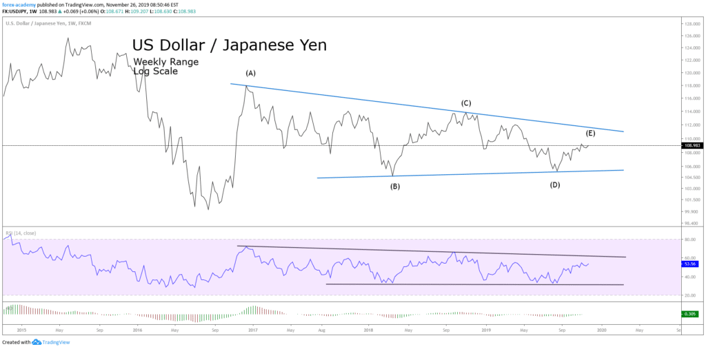
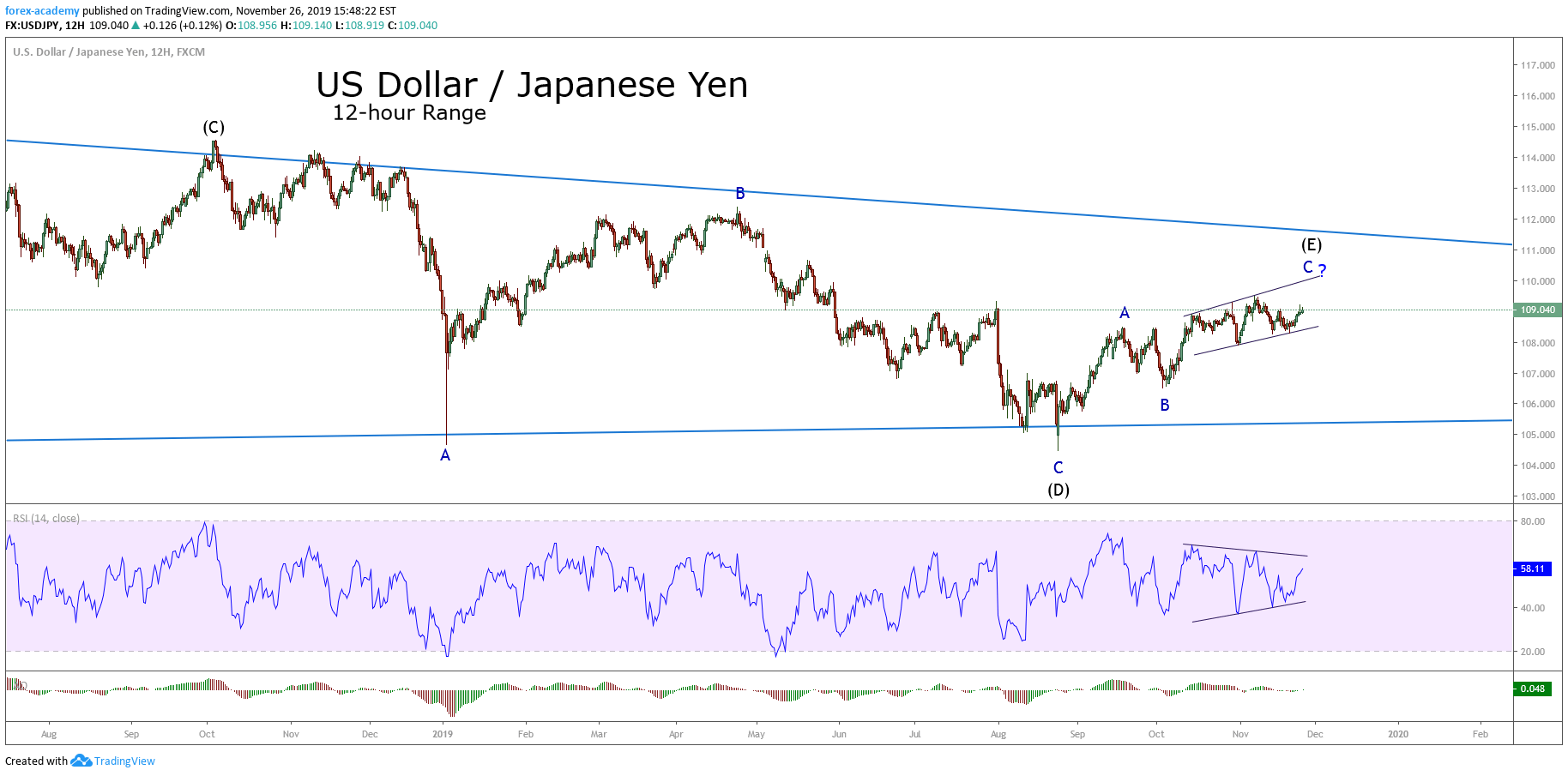
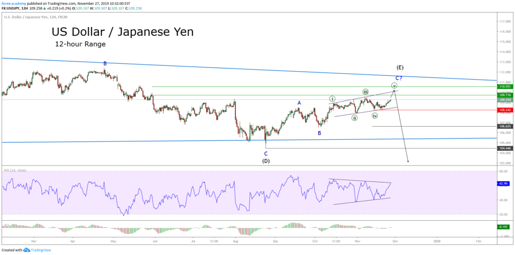


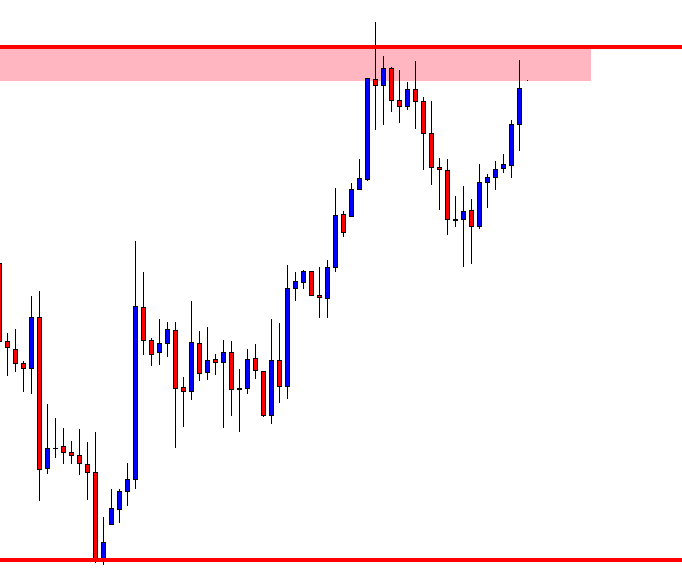
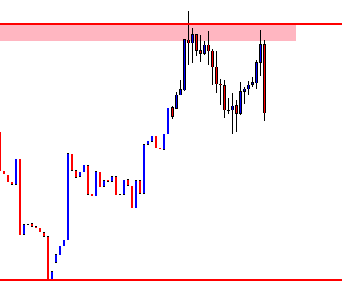
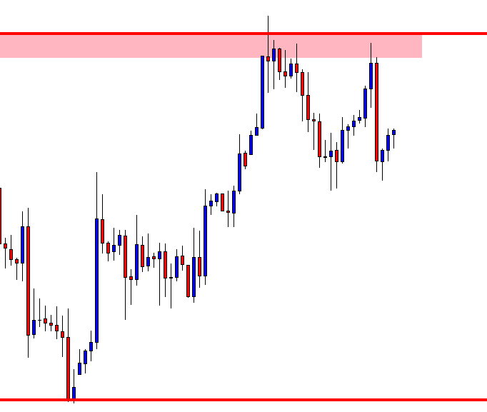
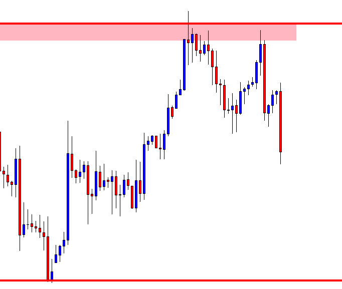
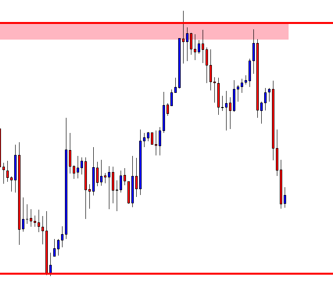
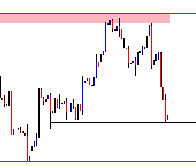
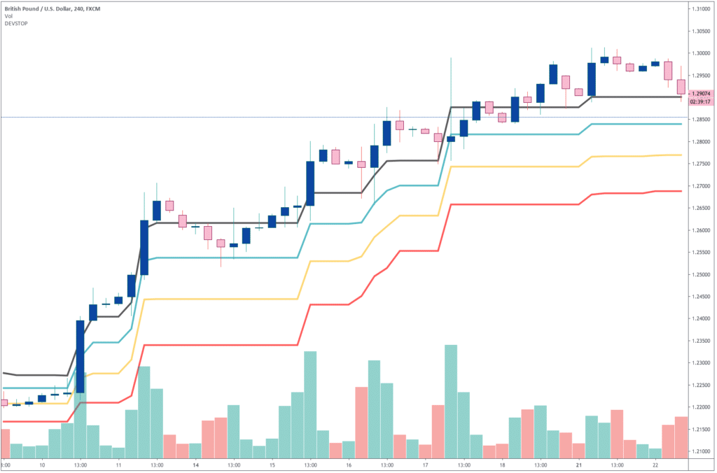
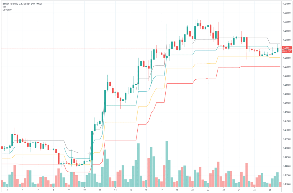

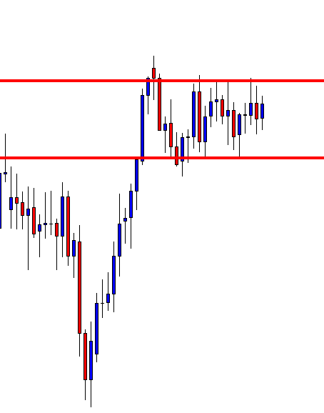

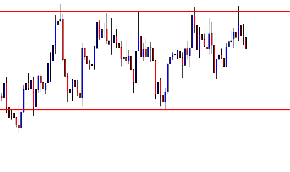
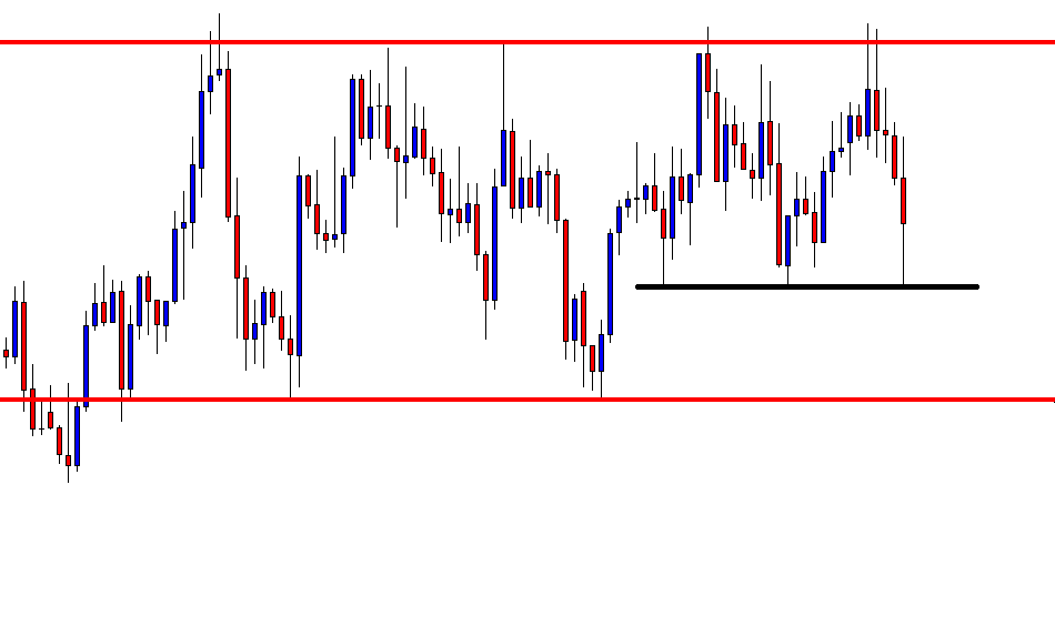
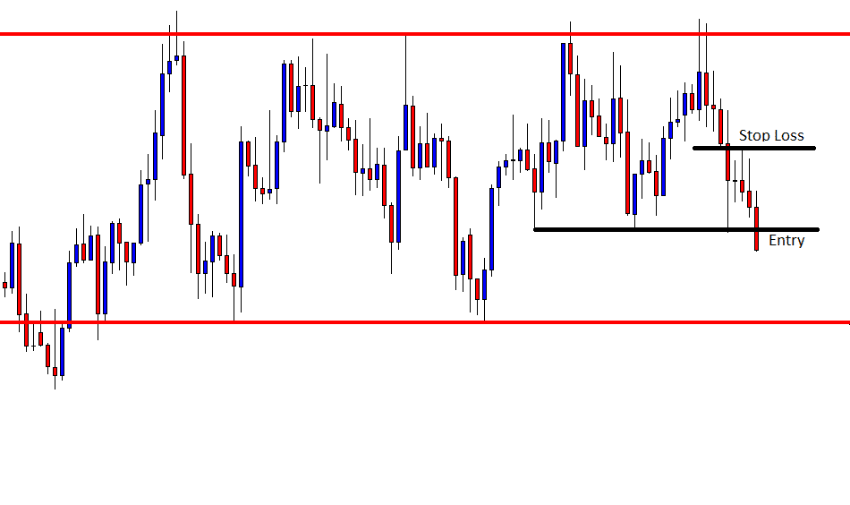
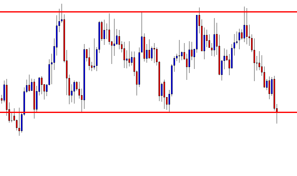
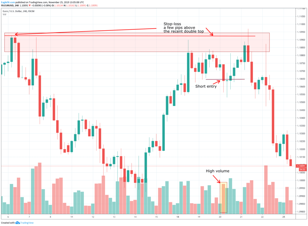
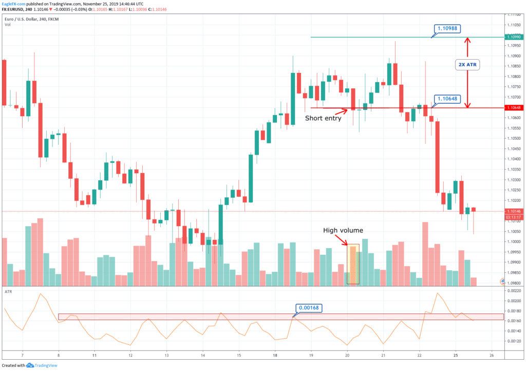


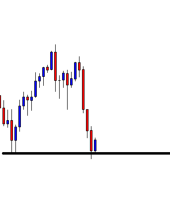
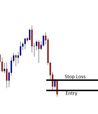
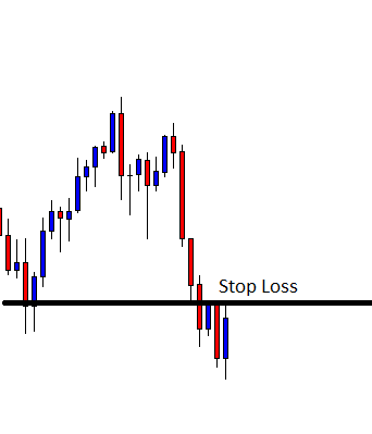
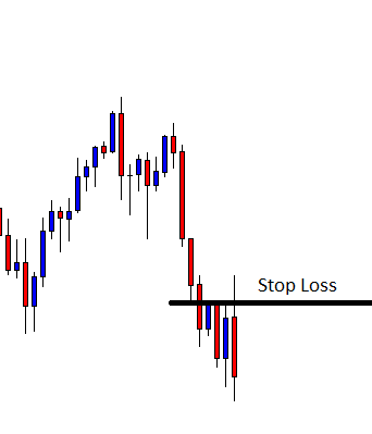
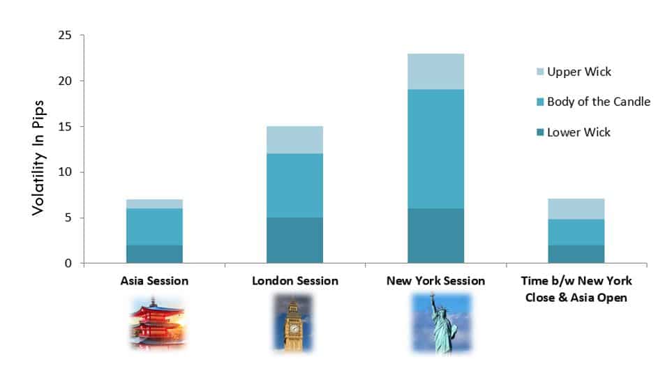

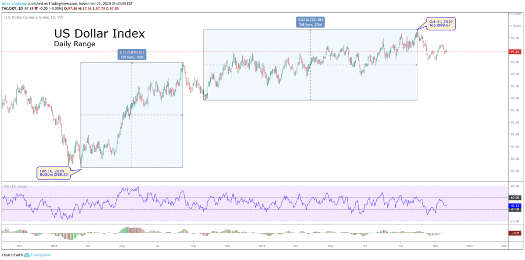
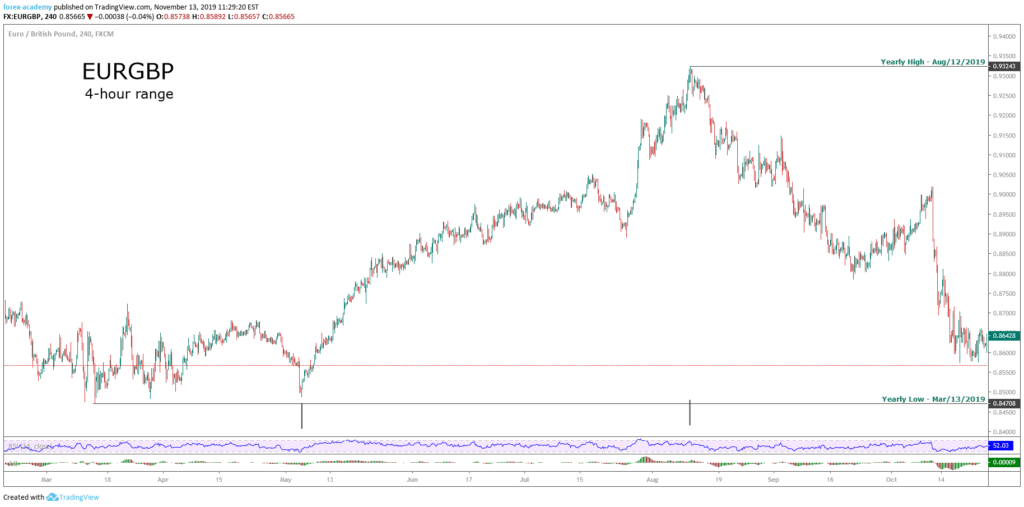
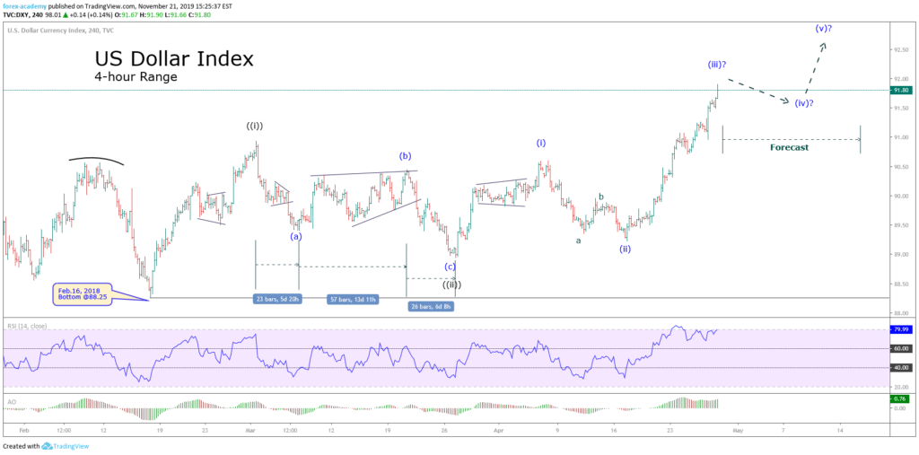
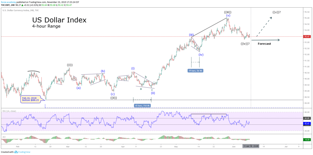


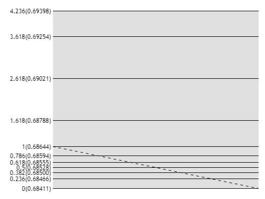
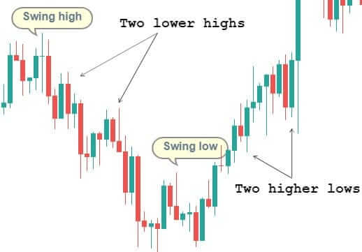
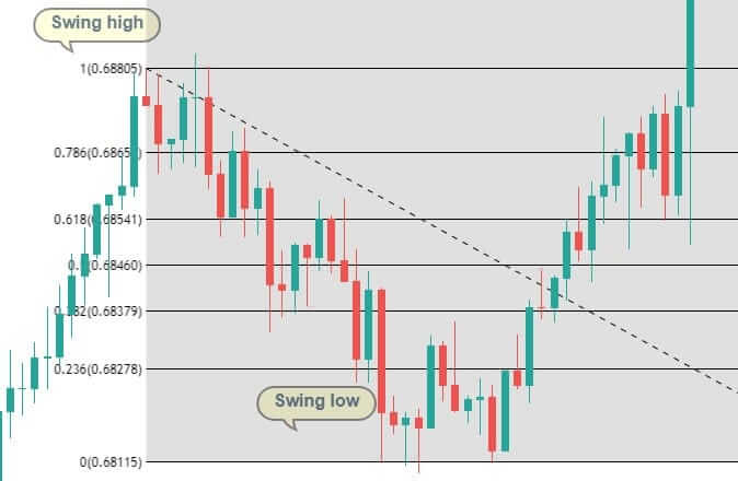
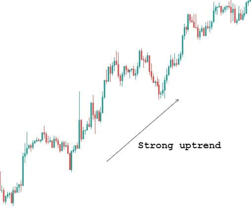
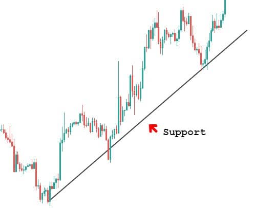
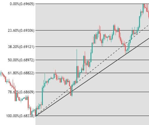

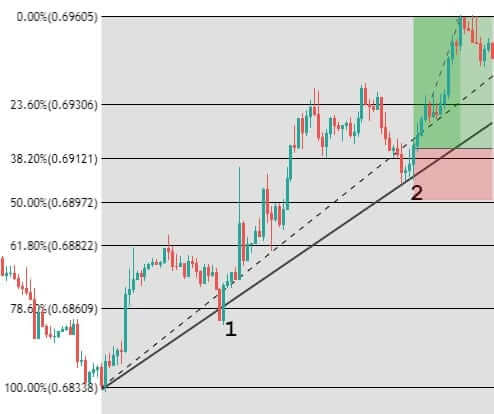

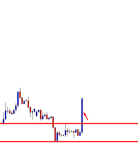
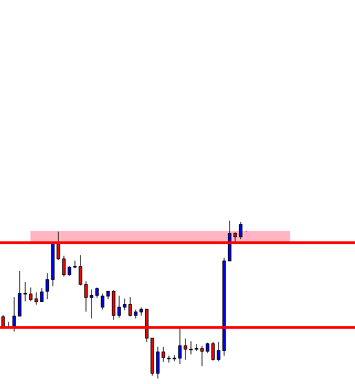
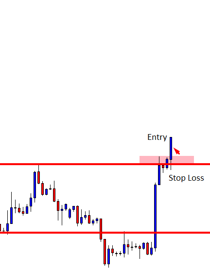
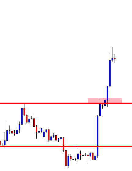


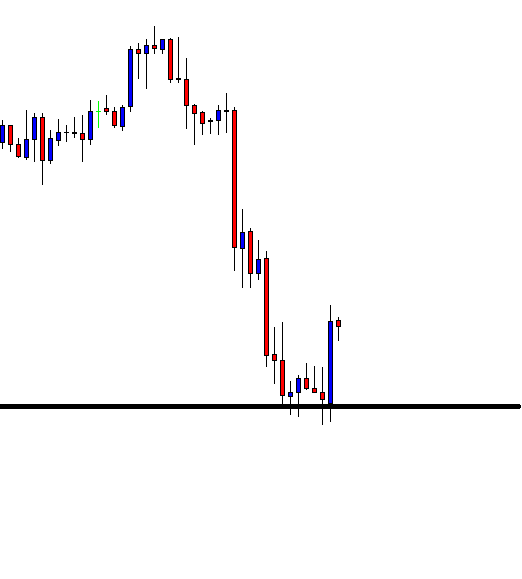
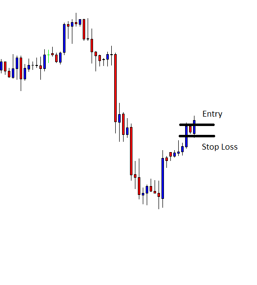
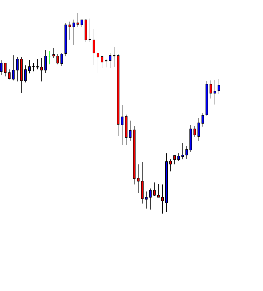
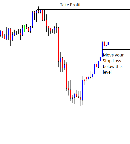
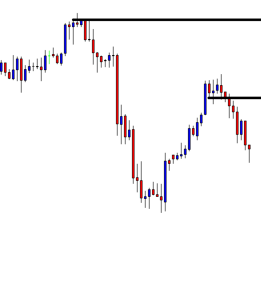


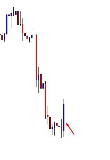
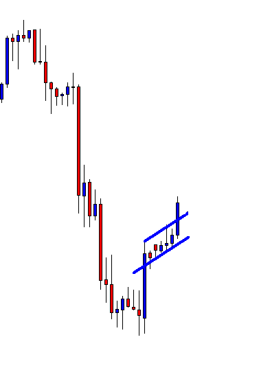
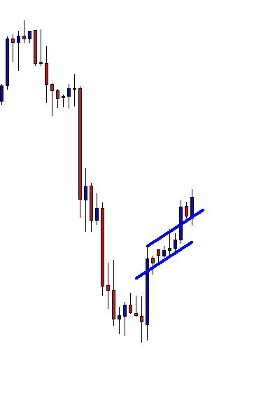
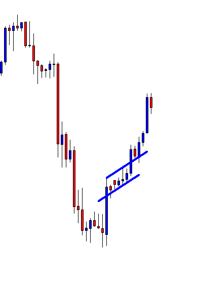


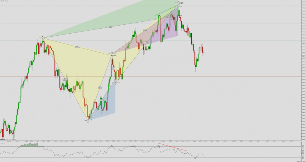

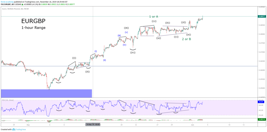
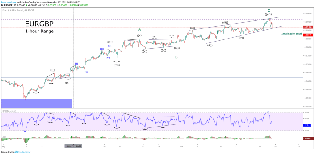
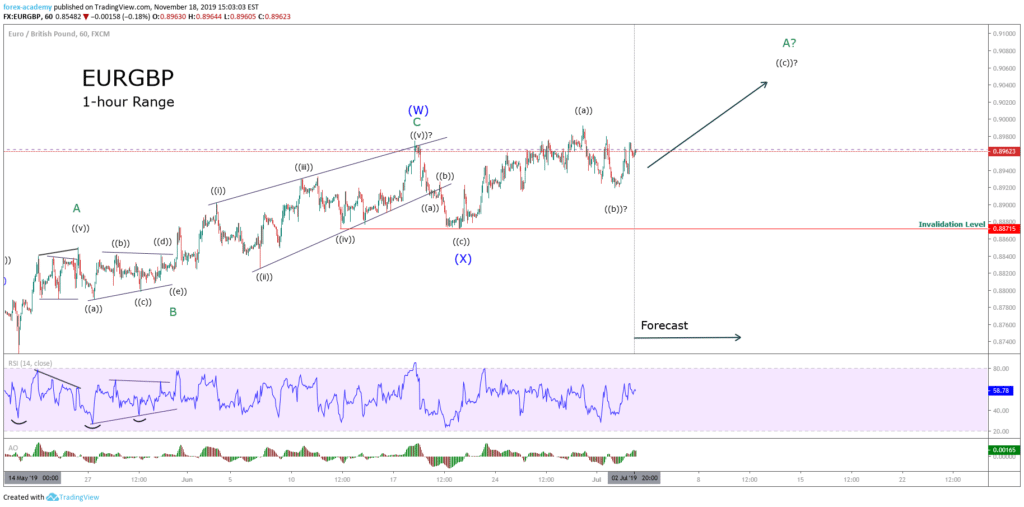
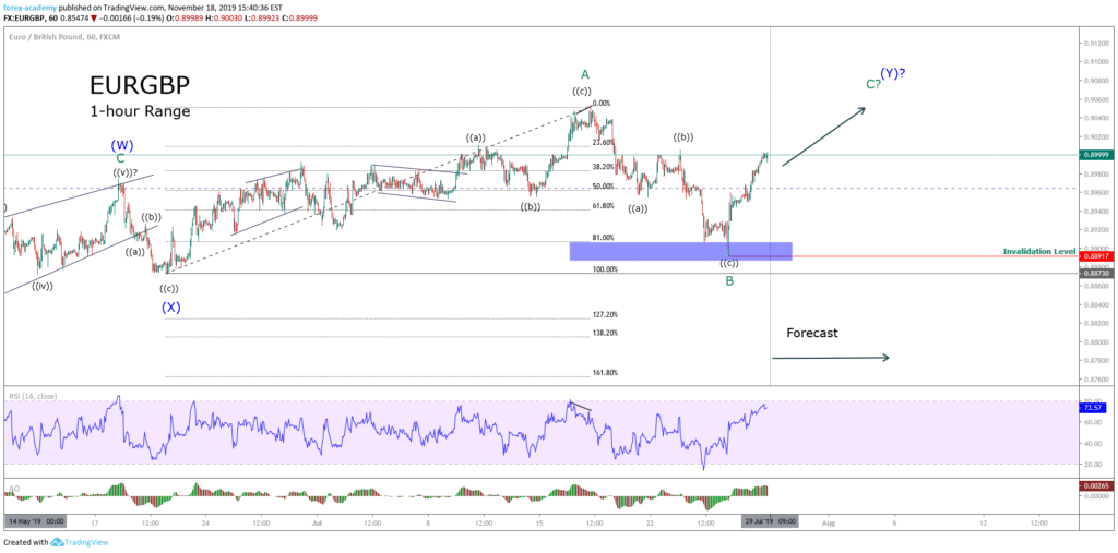
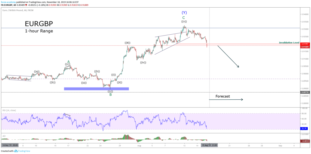


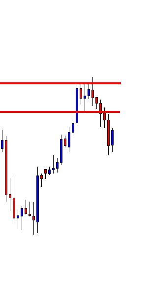
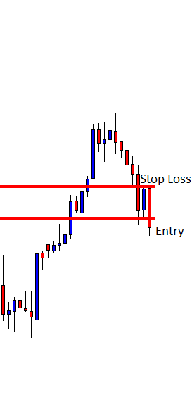
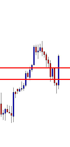


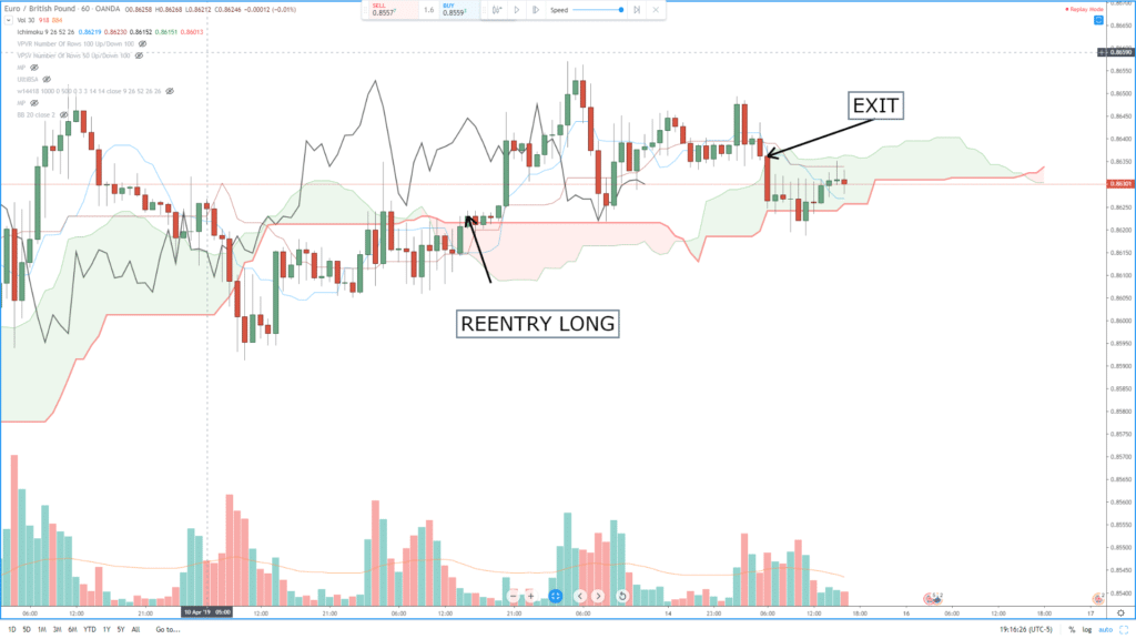
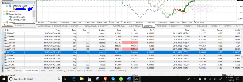
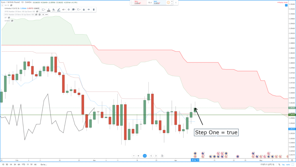
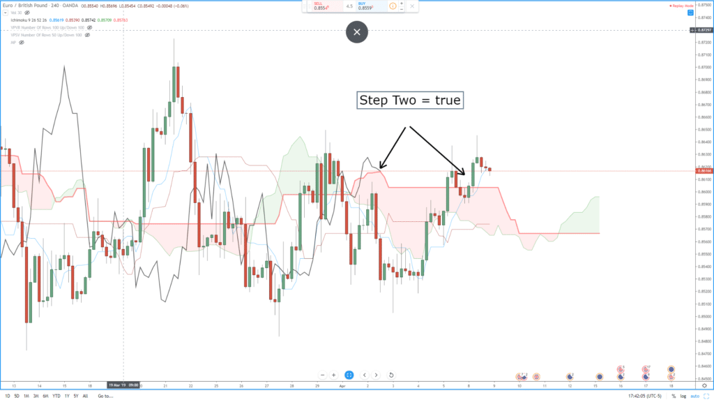
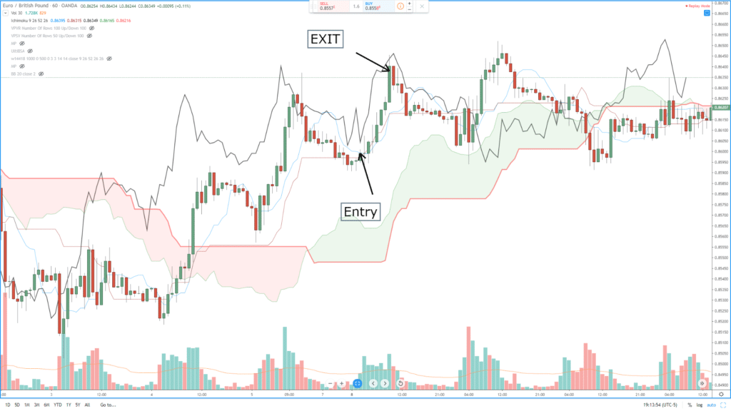

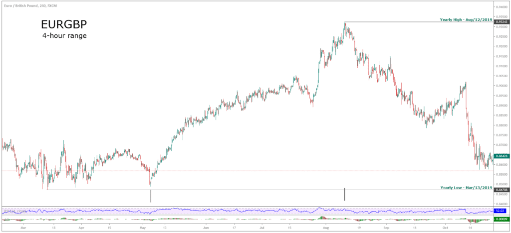
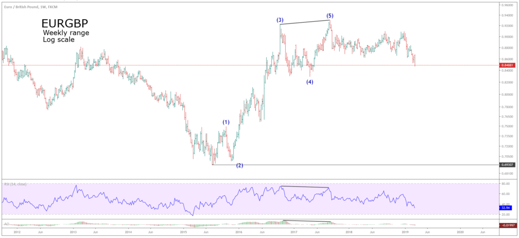 Both the RSI and the Awesome Oscillator display a bearish divergence, that helped us to identify waves (3) and (5).