I’ve already stated my view that most wannabe traders put their focus in technical analysis of the market and on trading signals, mostly provided by others, hopefully, more knowledgeable than themselves.
The issue is that any advice, no matter how good it is, is worthless to most of the beginners because the problem is 10% of the success as a trader is entries, 20% exits, including stops and targets, and 70% is the rest of overlooked themes.
The overlooked themes, all of them has to do with the trader’s psychology:
- Lack of a strategy
- Overtrading
- Not following the plan
- Skipping entries or exits
- let losses grow to wait for a reversal
- cut profits short, afraid of a reversal…
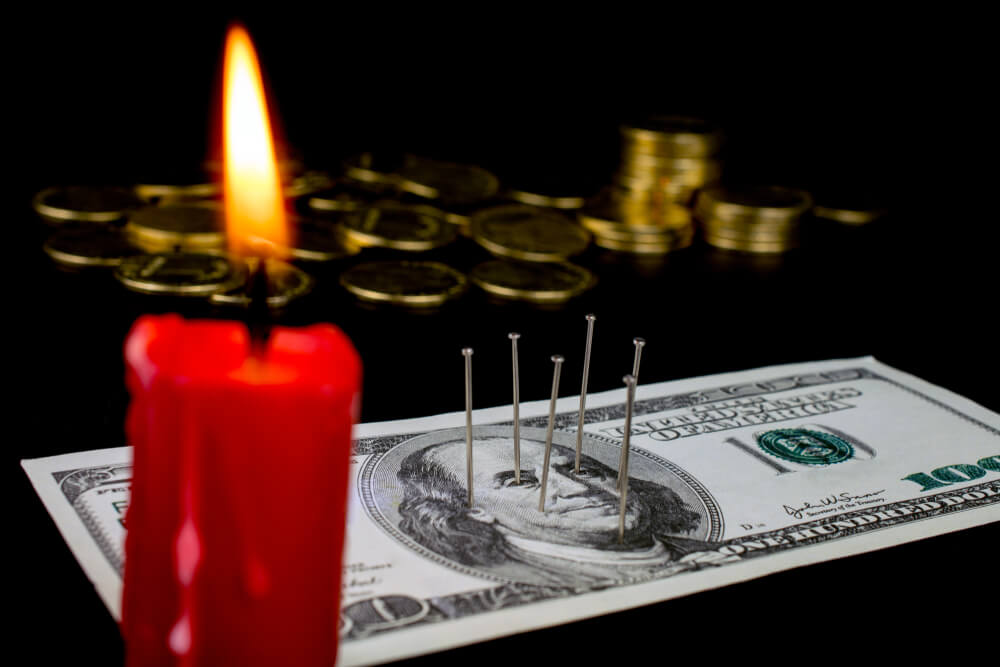
Every one of these subjects is critical, but if you make me choose, I’d say that overtrading is the worst evil that happens to a novice trader. Improper position sizing kills the majority of the Forex trading accounts. This trait is also linked to the cut profits short, let losses run character flaw, so let’s do create a basic strategic plan to help traders with a basic trade management plan.
Emotional Risk
For the following plan to work, the trader needs to accept the risk. It is easy to say but challenging to do. Mark Douglas, in his book Trading in the Zone, explains that “To eliminate the emotional risk of trading, you have to neutralize your expectations about what the market will or will not do at any given moment or in any given situation.”
That is key. You cannot control the market. You can only control yourself. You need to think about probabilities. Create a state of mind that is in harmony with the probabilistic environment. According to Mark Douglas, a probabilistic mindset consists of accepting the following truths:
- Anything can occur.
- To make money, there is no need to know what will happen next
- It is impossible to be 100% accurate. Therefore there is a win/loss distribution for any strategy with a trading edge.
- An edge is just a higher probability of being right against a coin toss (if not, the coin toss would be a better strategy)
- Every moment in the market is unique. Therefore
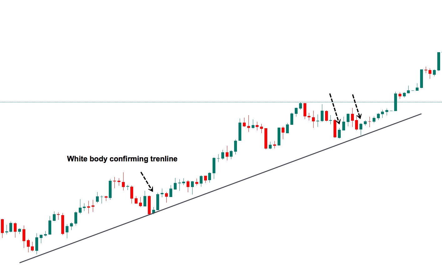
- A chart pattern is just a very short-term approximation to a statistical feature, therefore less reliable than a larger data set pattern. We trade reliability for speed.
The idea is to create a relaxed state of mind, ultimately accepting the fact that the market will always be affected by unknown forces.
The Casino Analogy
Once that is understood and accepted, we can approach our trading job as if the trading business were casino bets. When viewed through the perspective of a probabilistic game, we can think that trading is like roulette or slot machines, where you, the trader, have a positive edge. At a micro level, trade by trade, you will encounter wins and loses but looked at a macro level, the edge puts the odds in your favor. Therefore, you know only need to manage the proper risk to optimize the growth of the trading account.
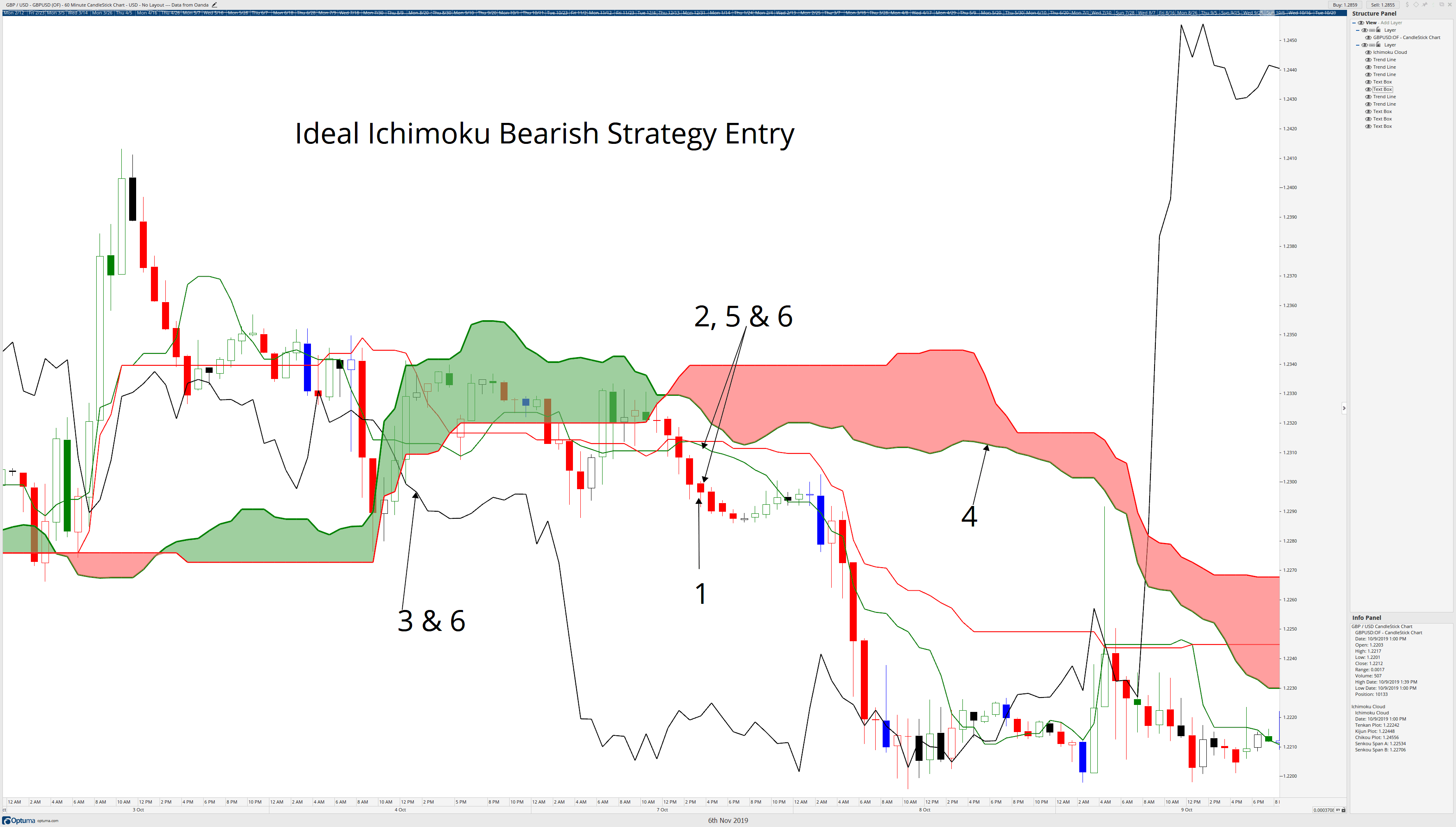
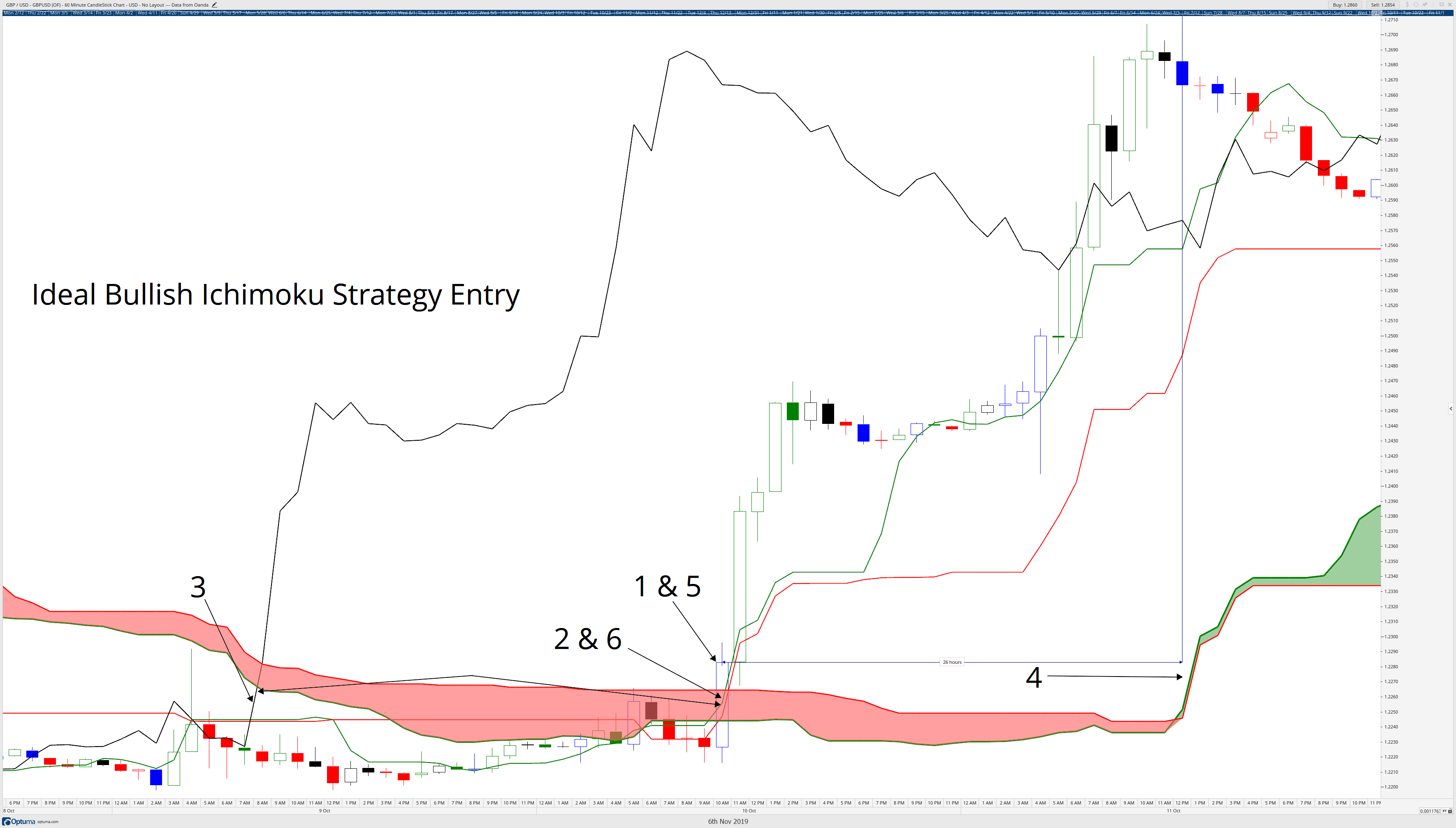
A plan to manage the trade
Lots of traders enter the Forex market with a rich-quick mentality. They open a trading account with less than 5,000 USD and think that due to leverage, they can double it week after week. This is not possible, of course, and they get burned within a month.
Our plan consists of three ideas
- Profit the most on the winners, while let die the losers
- let profit run, or even, pyramid on the gains.
- Reach as soon as possible a break-even condition, for our mind to attain a zero-state as quickly as possible.
The Strategy and Exercise
Pick a forex pair.
Choose one actively traded pair. All major pairs fit this condition, but then choose the one that provides the best liquidity of your time zone.
Choose your favorite strategy, that you think it works and fits you.
The strategy must include the following components:
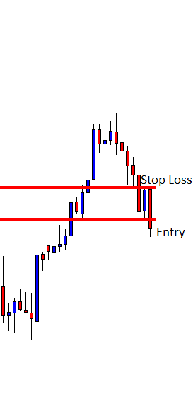
An Entry: The entry method should be precise. No subjective evaluations or decisions. If the market shows an entry, you have to take it. Of course, you can condition it with a reward-to-risk ratio filter, since this is an objective fact. Really, having a reward-to-risk ratio filter is quite advisable. A 3:1 ratio would be ideal, but 2:1, which is more realistic, can work as well.
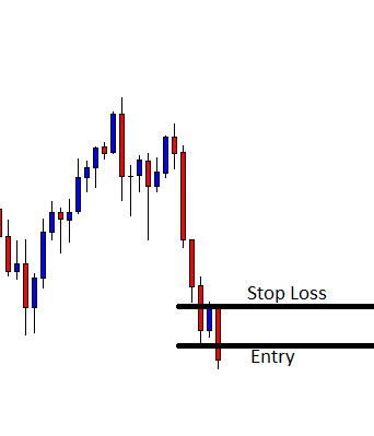
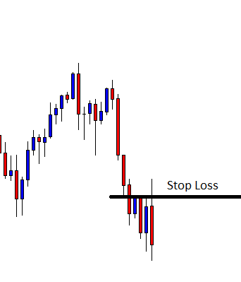
A Stop-loss: Your methodology should define the level at which set your stop loss.
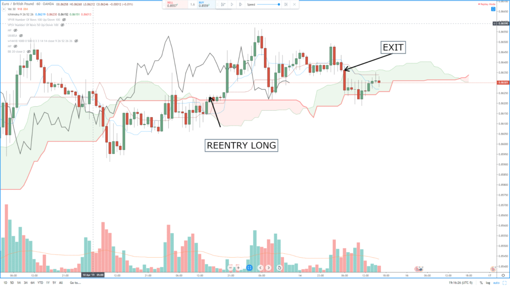
Timeframes: You need to choose a couple of timeframes: A short timeframe to create low-risk trades, and a longer timeframe to be aware of the underlying trend and filter out any signal that does not go with that trend.
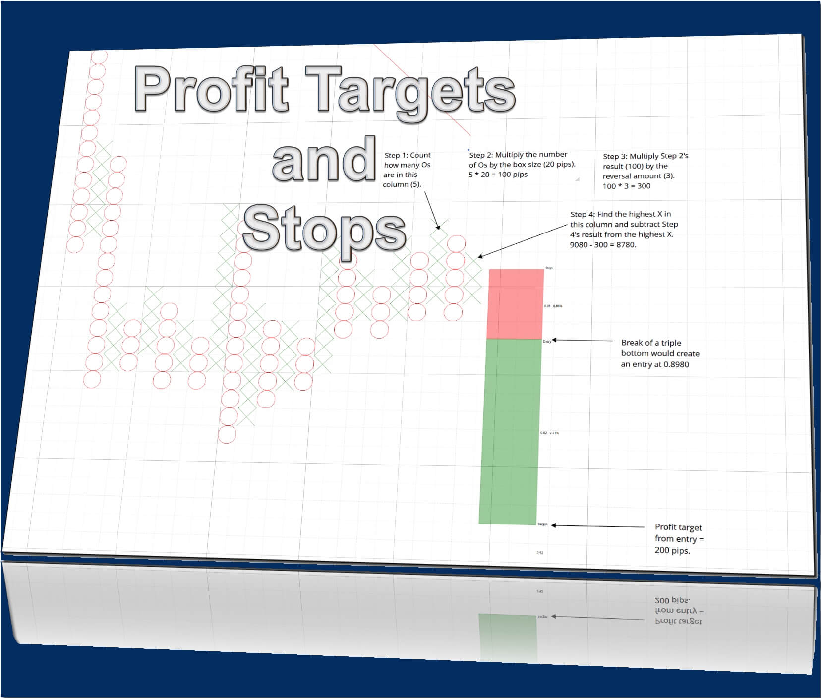
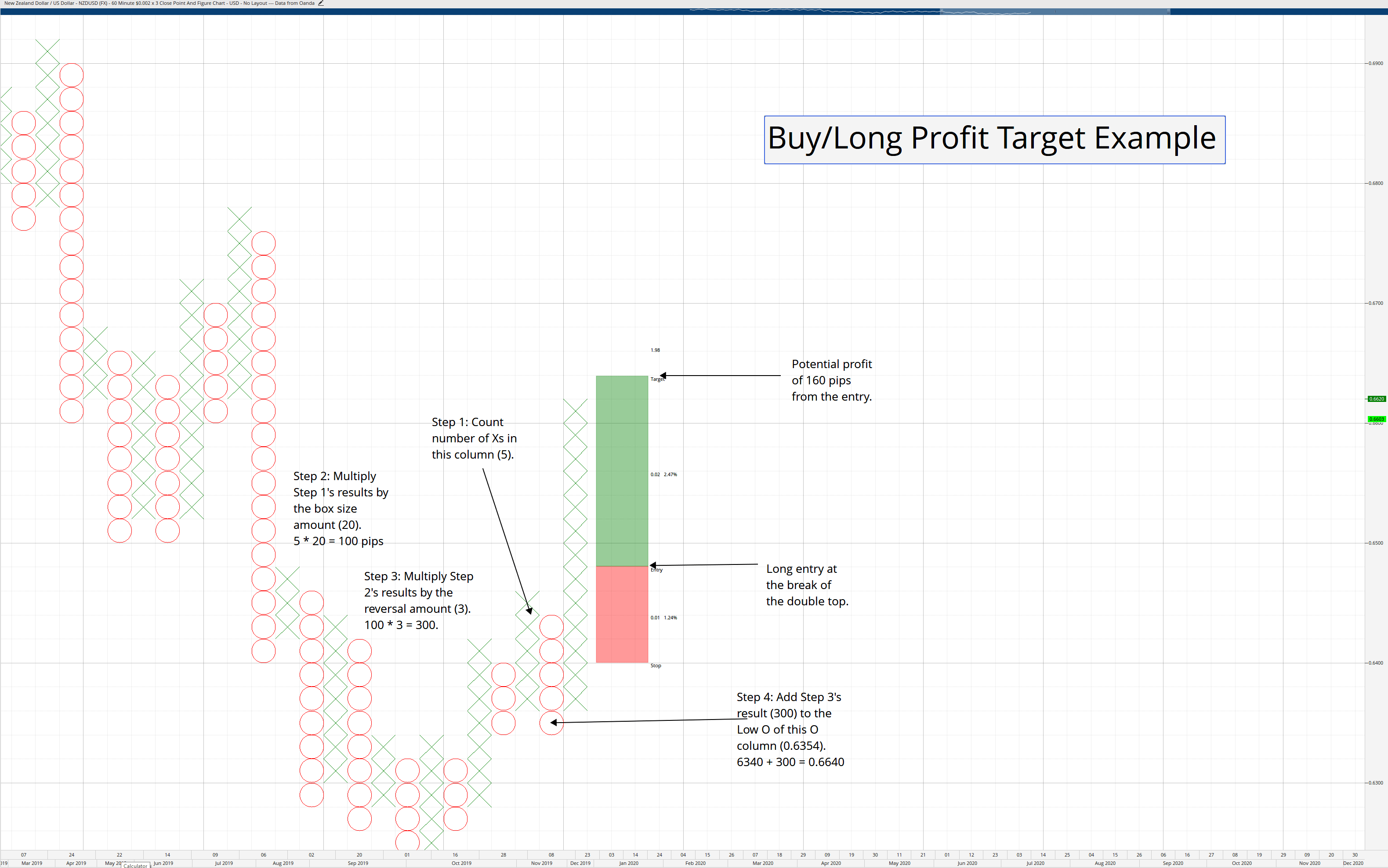
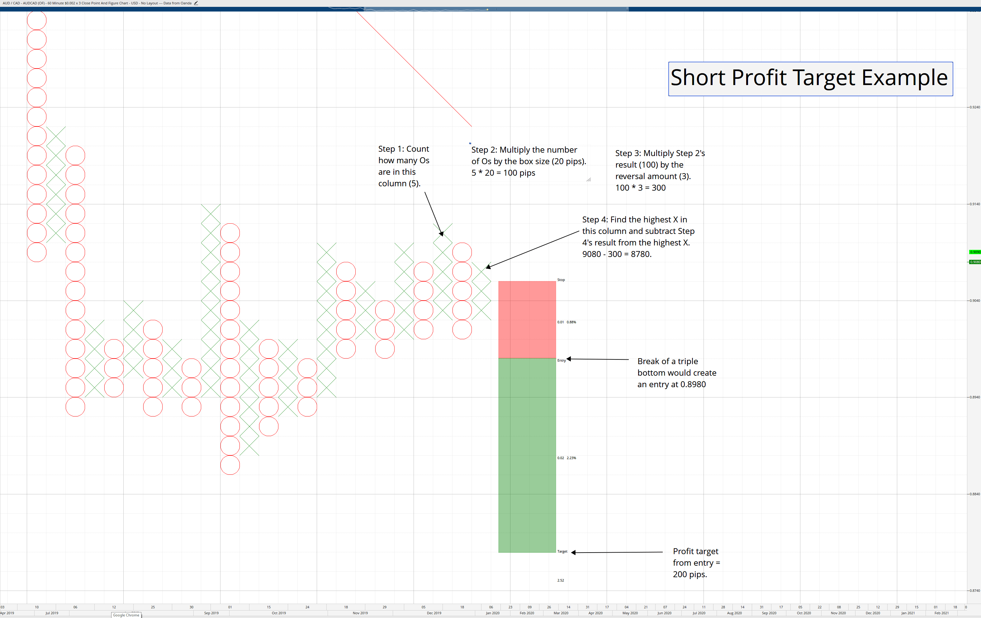
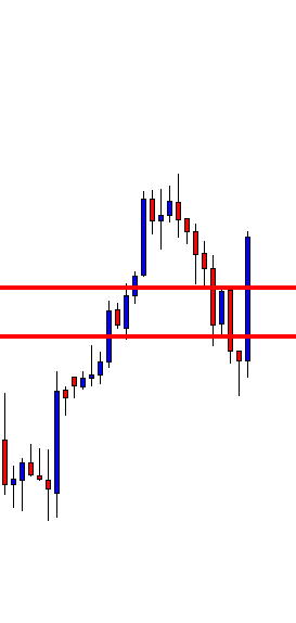
Profit Targets: This is the tricky part. We will define at least three take profit points: One-third very-short, one-third defined bt the short-term timeframe, and the rest of the position specified using the longer-term timeframe.
The trade size: Choose a total trade size such that the entire initial risk is no more than 2 percent of your account. So if your account is $3,000, the total risk of the trade will be $60.
Accepting the risk. The smaller dataset needed to get any statistical information is 30. Therefore, you should accept the loss equivalent of 30X the average loss per trade. Think that to analyze and decide about changing any parameter, you must move in chunks of 30 trades.
How it works
1.- Compute the trading size
-
-
- Measure the pip distance between entry and stop-loss.
- Compute the value in dollars of that risk
- Calculate how many mini or micro-lots fit in that amount.
2.- Trade that size and mentally divide it into three parts
3.- take profits of1/3 of the position as soon as you get 5-6 pips profit or 10% of your main profit target. This will help you tame the risk if the trade is a short-term gainer that, next, tanks.
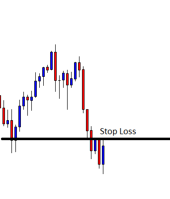
4.- As soon as you get a profit equivalent to the size of your risk (1:1), move your stop-loss to Break-even.
5.- Take profits of the second third of the position when your second target is hit
6.- Let the remaining 1/3 run until your third target (from the longer timeframe) trailed by your stop loss. Use a parabolic approach to the stop loss, as the risk-reward diminishes when approaching the target.
7.- Alternatively, use the profits of the last winning trade and add it to the risk of the following trade. That way, on a combination of two trades, you can gain 4X with a risk of just one trade since the added risk was money taken from the market.
8.- The next trade should start with the basic dollar risk, but computed over the newly acquired funds.
Reference: Trading in the Zone by Mark Douglas.


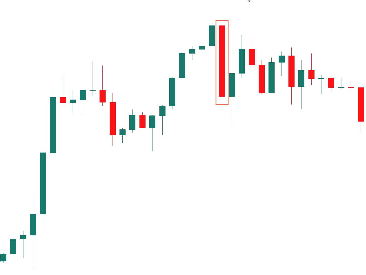
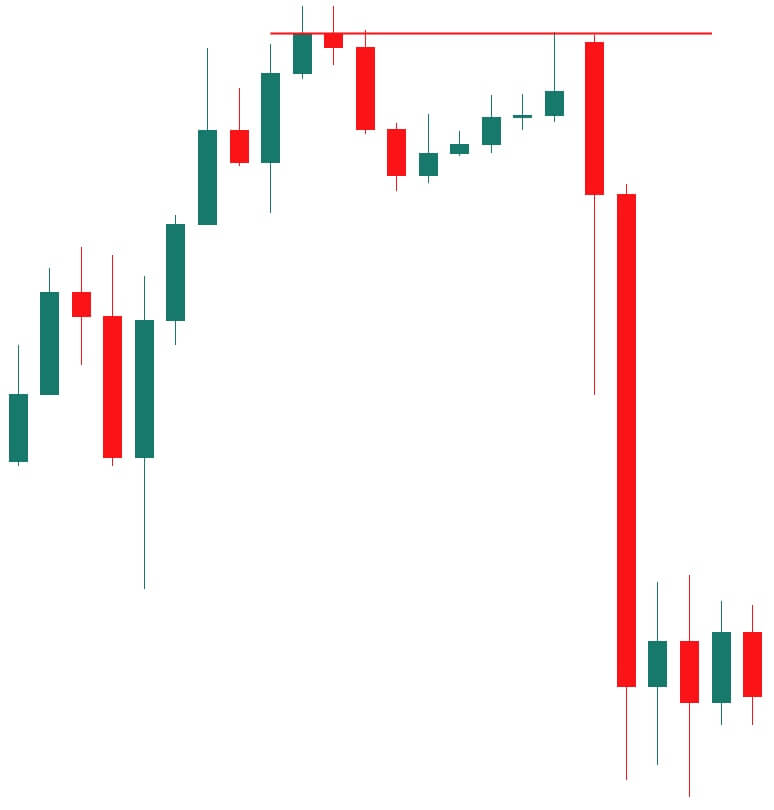


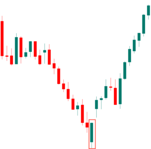
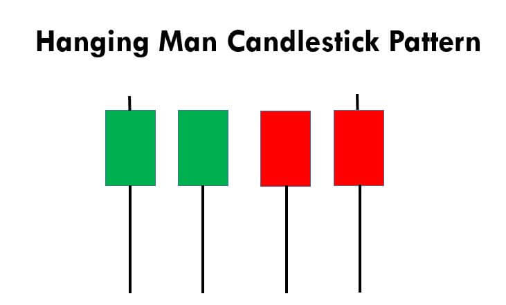
 This pattern is not confirmed unless the price falls shortly after the Hanging Man. If the next candle closes above the high of the Hanging Man, this pattern is not valid. After the pattern, if the very next candlestick falls, then it’s a clear indication of the reversal. Now, if you see a Hanging Man candlestick and the above-discussed rules apply, you can go ahead and take the trade. But since it is crucial to have an extra confirmation, let’s pair this pattern with a technical indicator.
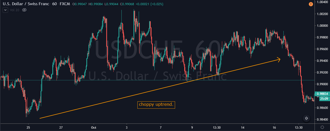
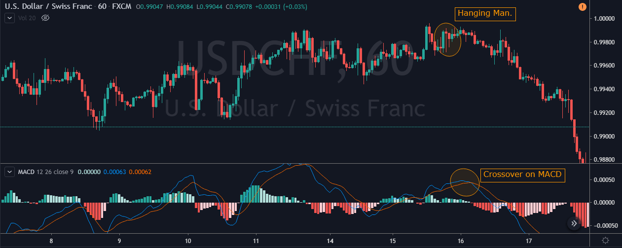
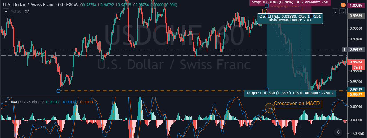


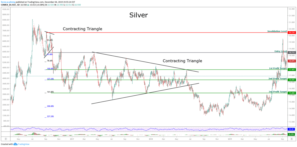

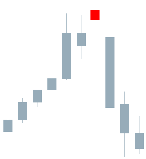

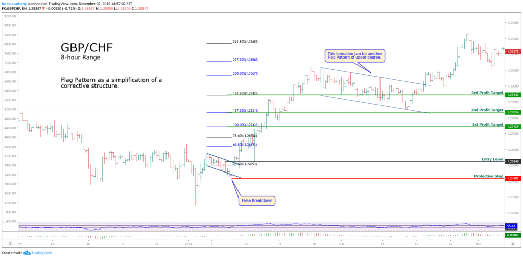


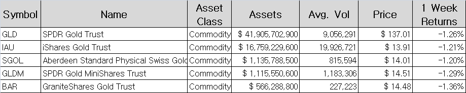 Table 1 – ETFs Based on Gold
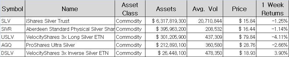 Table 2 – ETFs Based on Silver


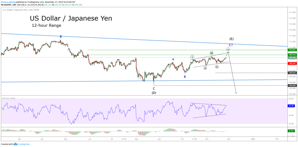


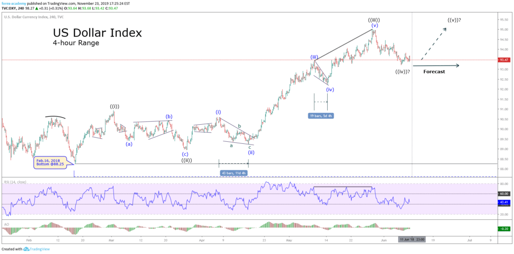


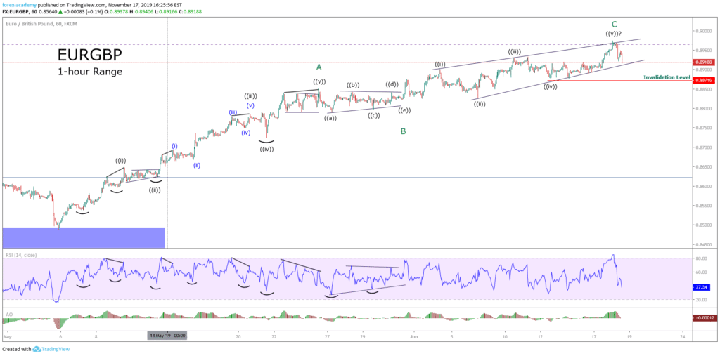
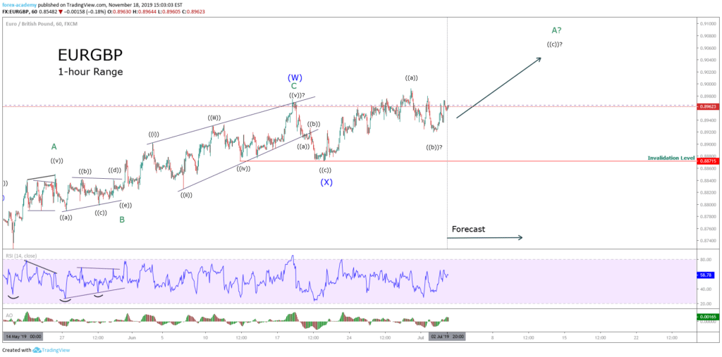
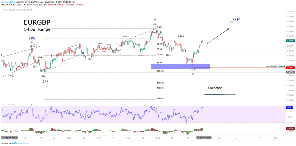
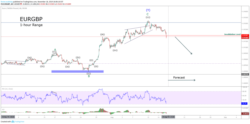


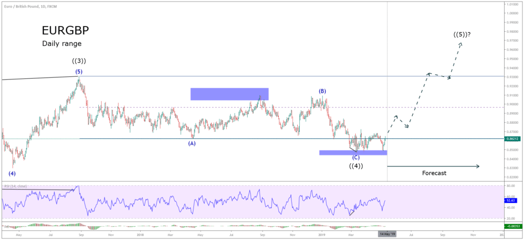
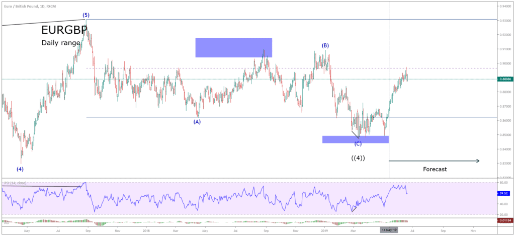
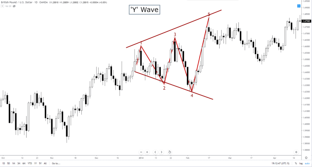
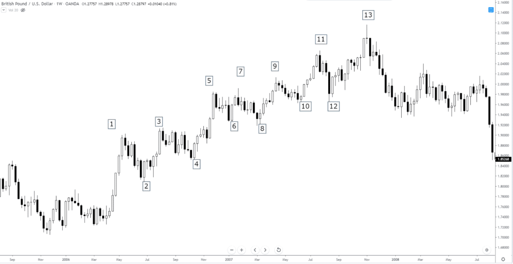
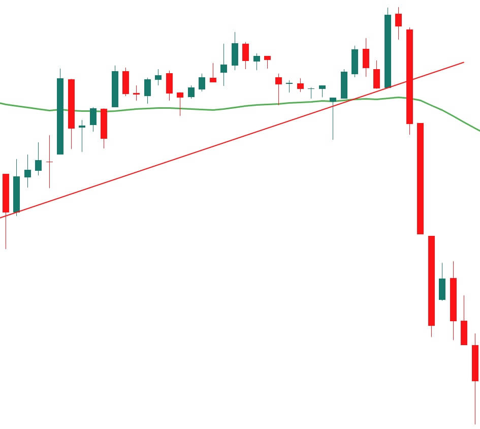
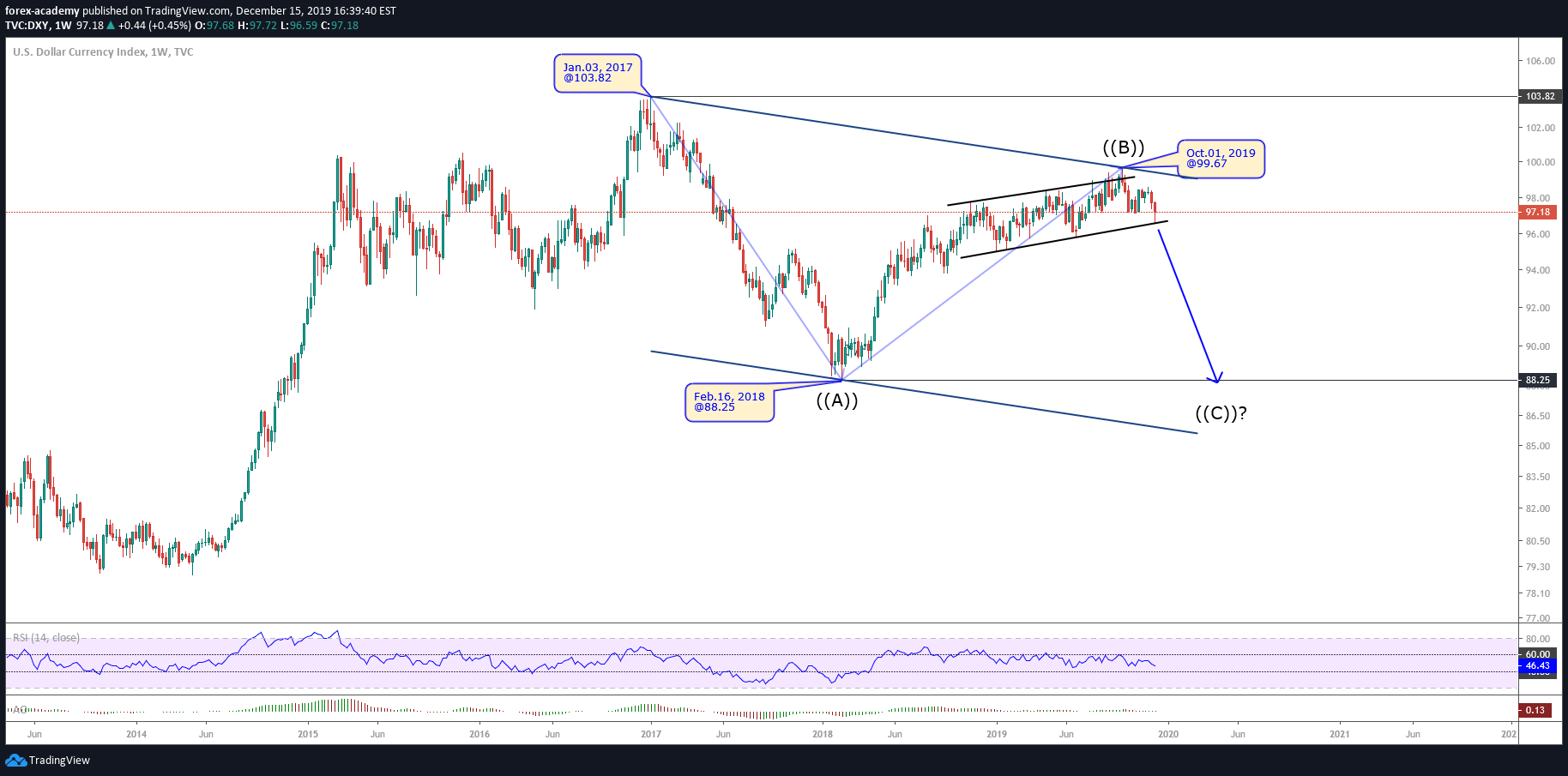
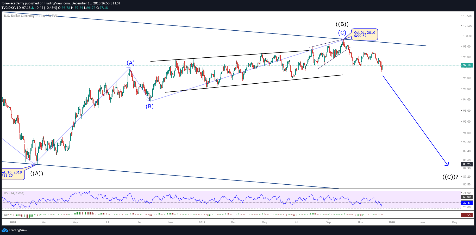
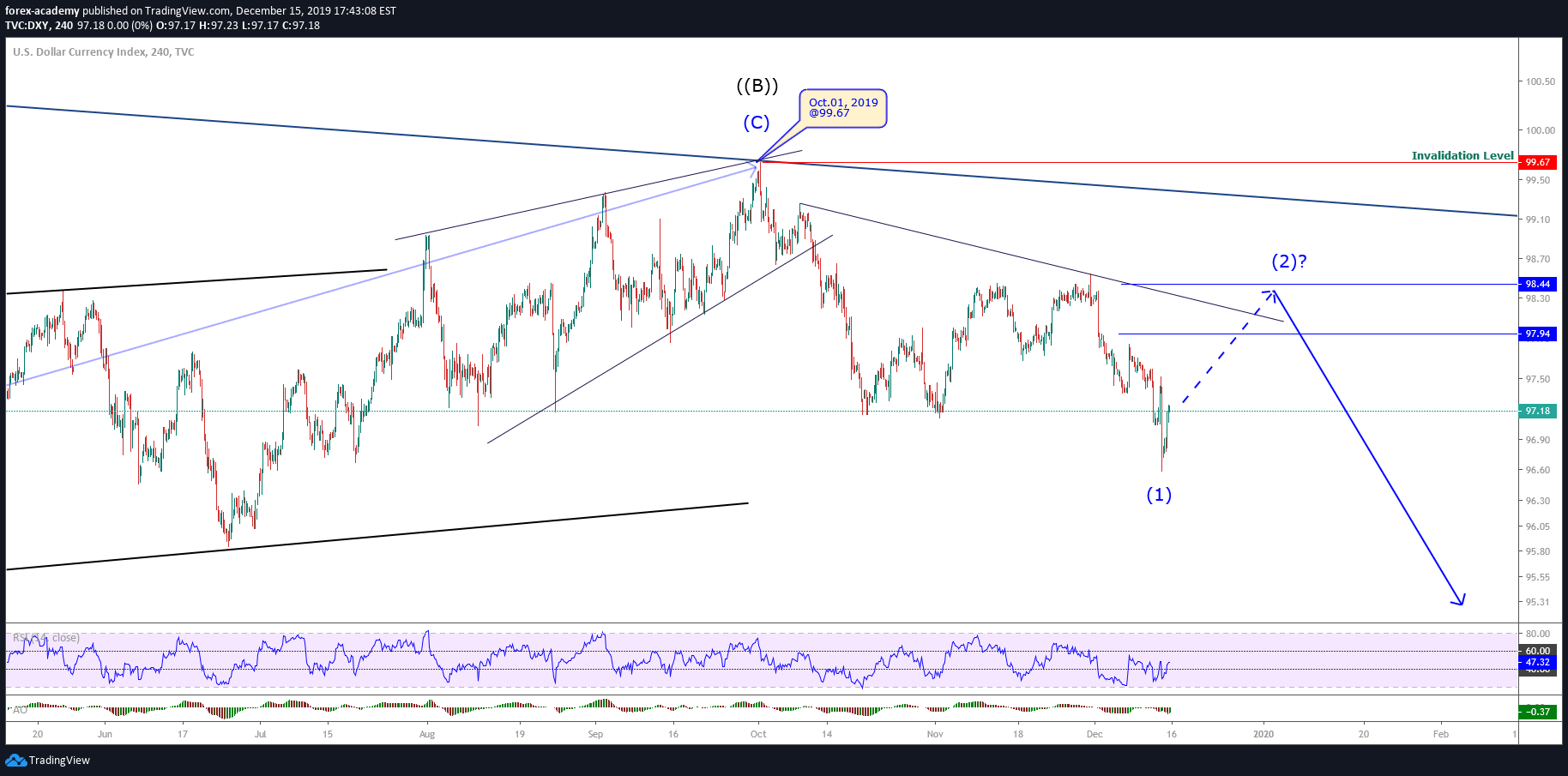
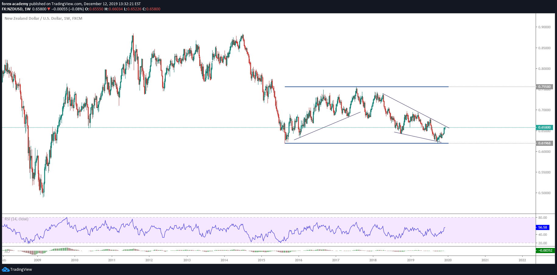
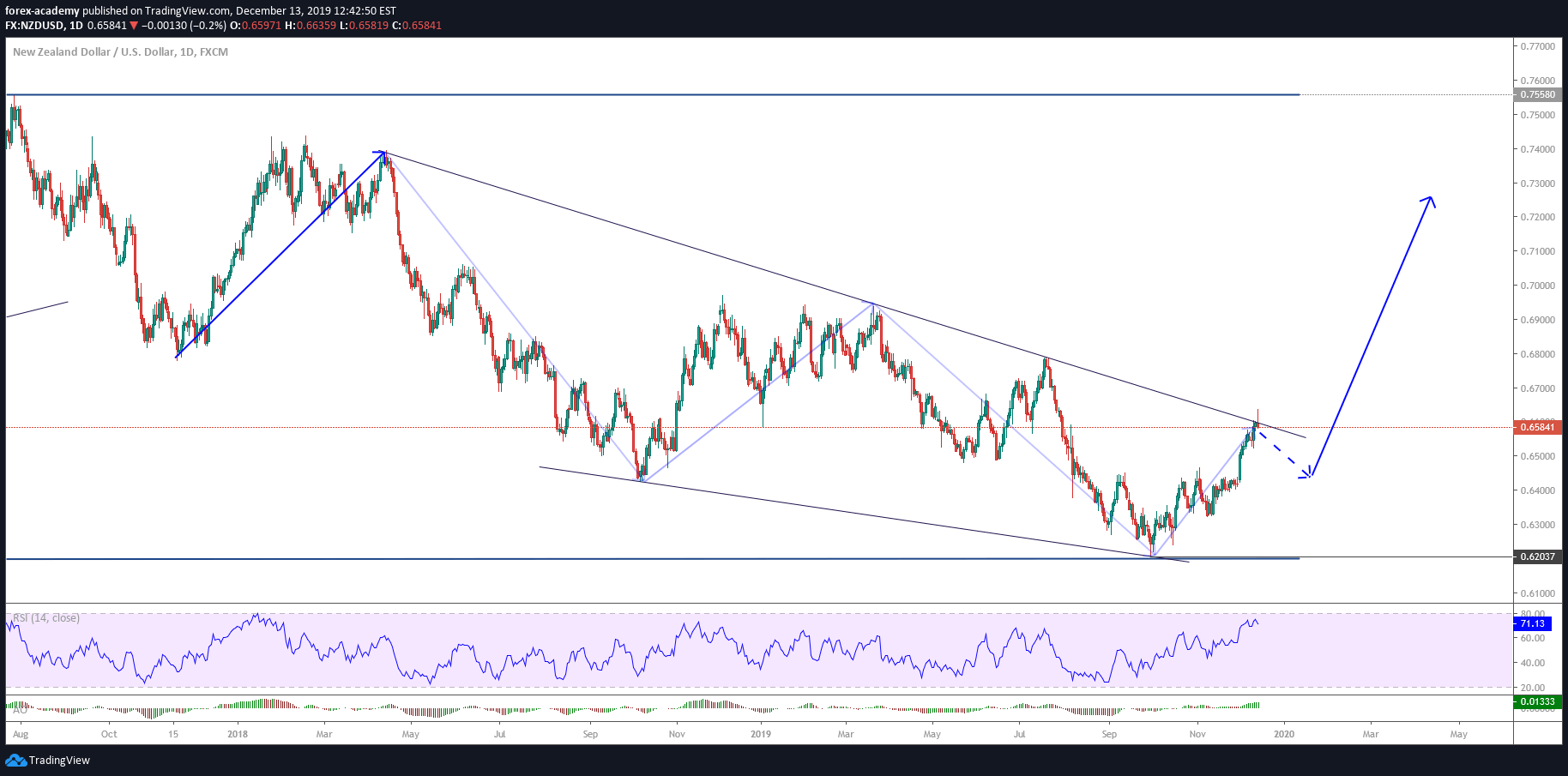
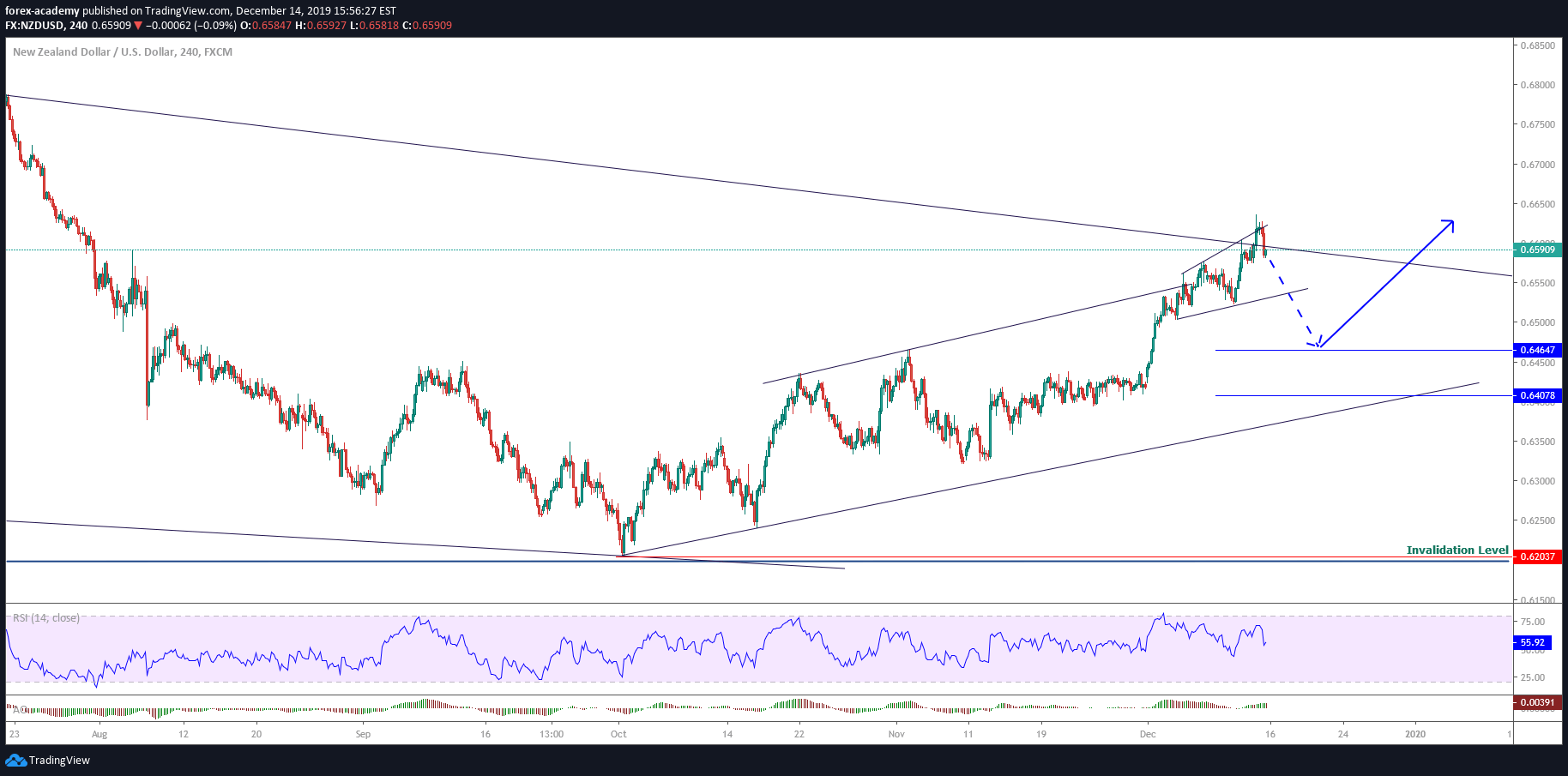
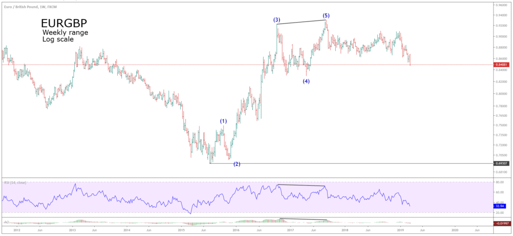 Both the RSI and the Awesome Oscillator display a bearish divergence, that helped us to identify waves (3) and (5).