Introduction
In chapter 1, we’ve set the foundations of market classification, what a trend is about, and the dissection of a trend in its several phases. Then we talked about its two dissimilar wave parts: an impulsive wave, followed by a corrective wave. We dealt with support, resistance, and breakouts. Finally, we talked about channel contractions.
In this second chapter, we’ll learn the methods available in the early discovery of trends: Trendlines, moving averages, and Bollinger band channels.
Trendlines
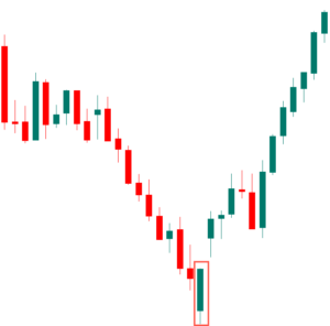
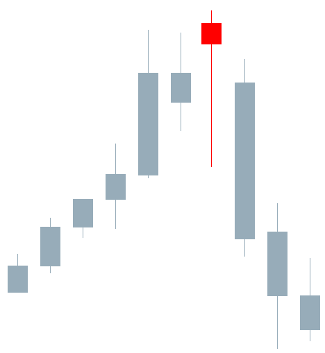
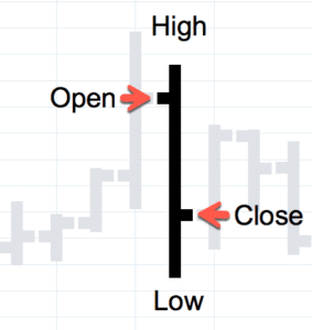
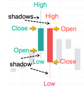
A trendline is a line drawn touching two or more lows or highs of a bar or candlestick chart. The convention is to draw the line touching the lows if it’s an uptrend and the tops on a downtrend. Sometimes both are drawn to form a channel where the majority of prices fit.
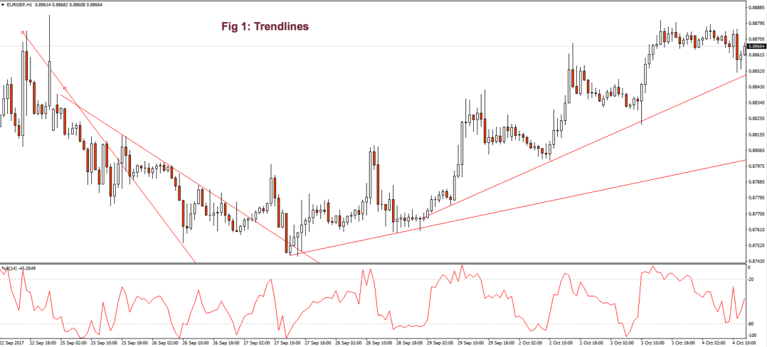
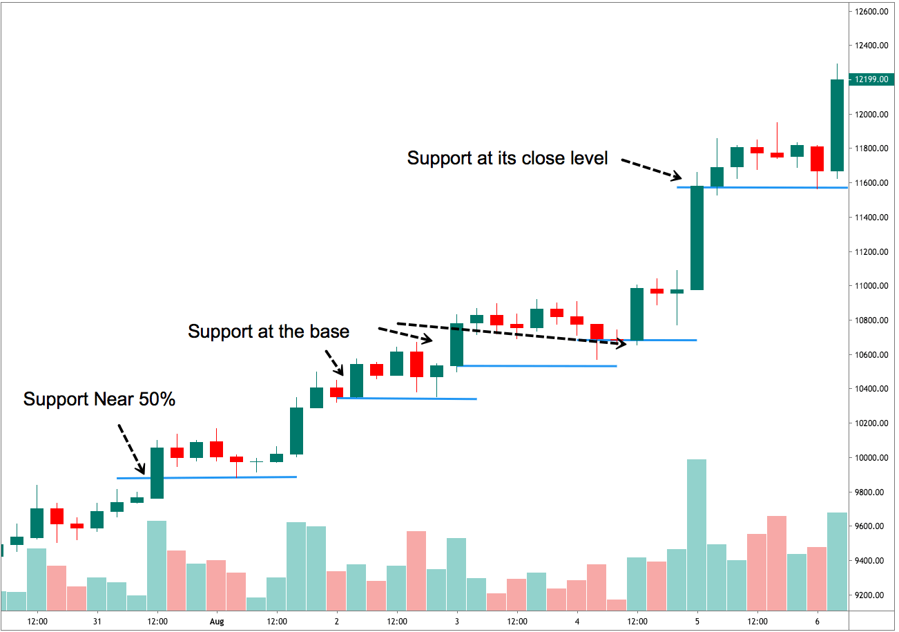
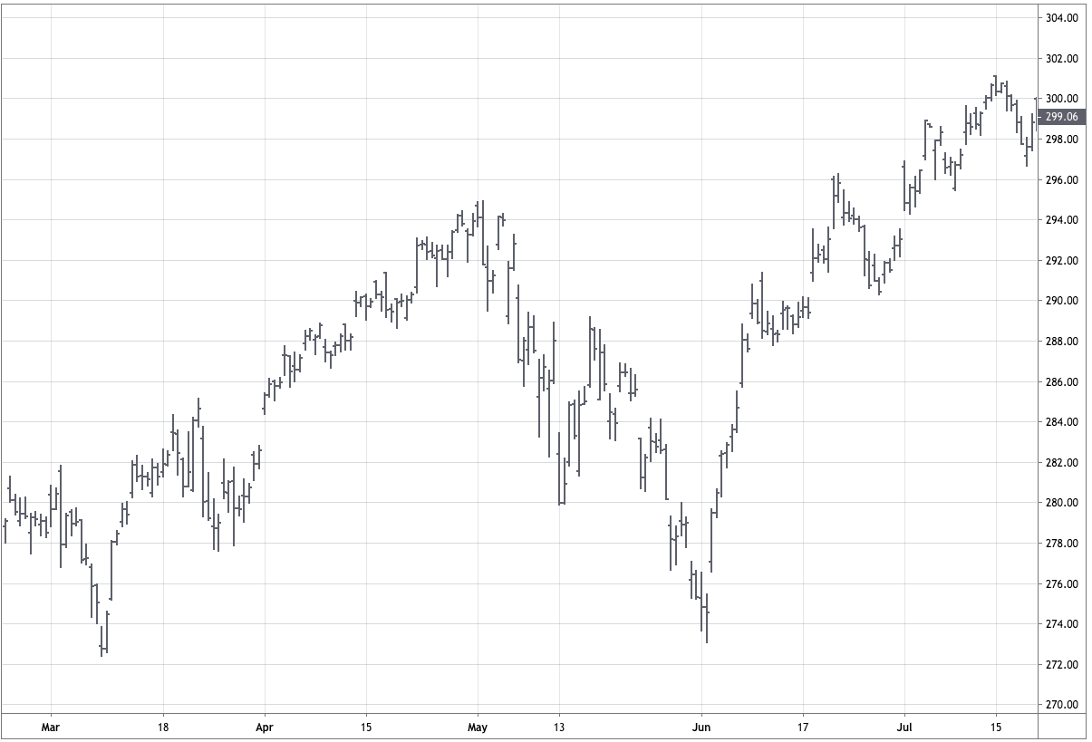
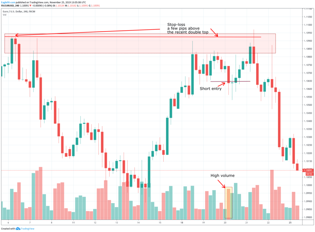
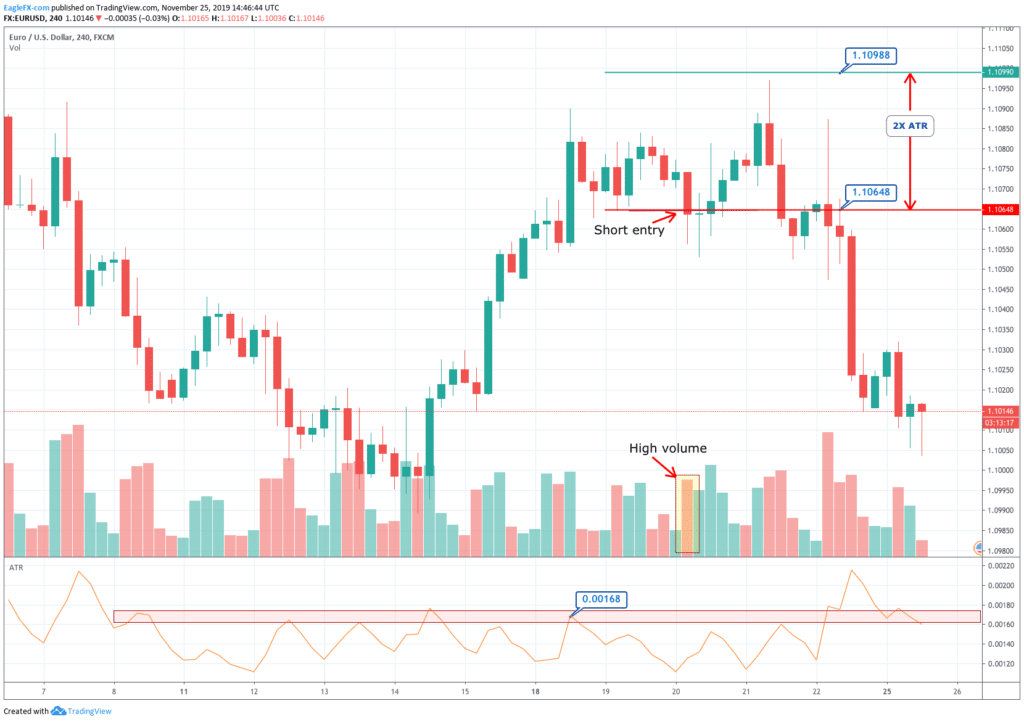
As we see in Fig. 1 the trendline tends to draw resistance levels or supports where the price finds it difficult to cross, bouncing from there, although not always this happens. In Fig. 1 the first trendline has been crossed over by the price, and during the following bars, the slope of the downtrend diminished. We saw, then, that the first trendline switched its role and now is acting as price support.
When the second trendline was crossed over by the price, a bottom has been created, and a new uptrend started. After a while trending up, we might note that we needed a second trend line to more accurately follow the new bottoms because the uptrend has sped up, and the first trendline is no longer able to track them.
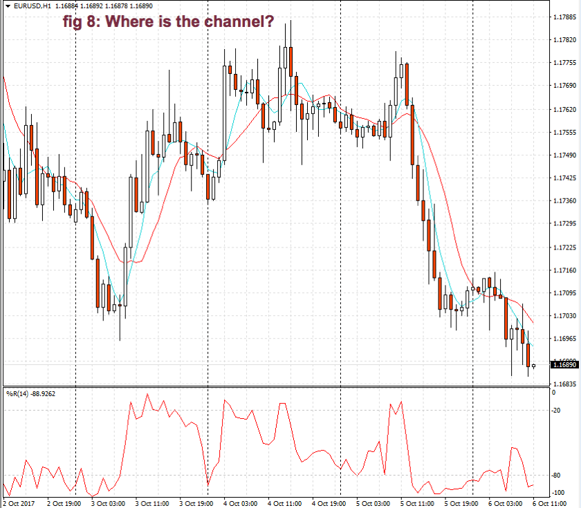
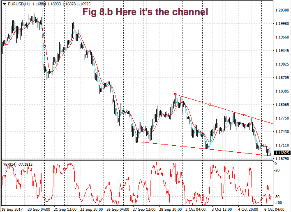
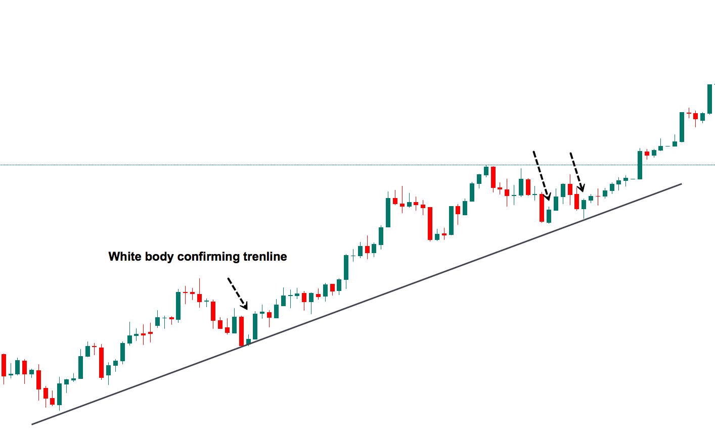
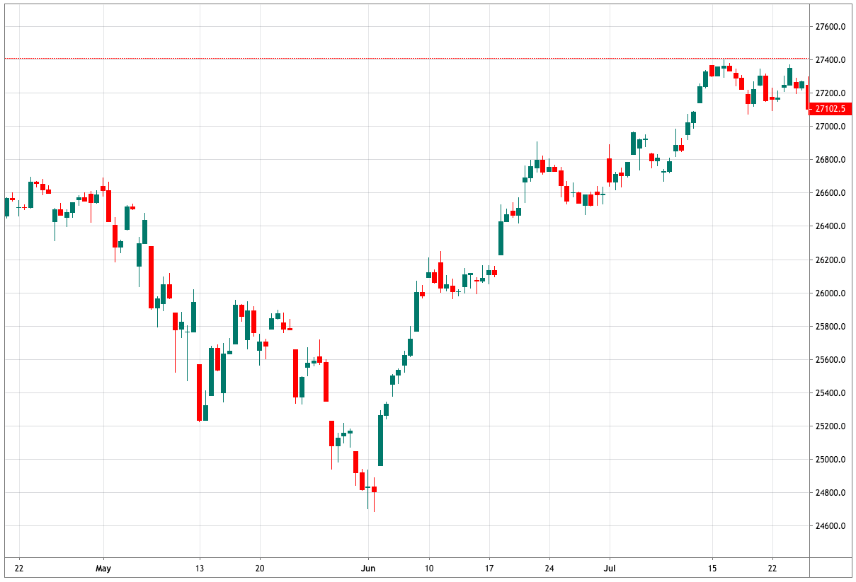
Fig. 2 shows two channels made of trendlines, one descending and the other ascending. The trendline allows us to watch the volatility of the trend and the potential profit within the channel. The trend, as is depicted, has been drawn after it has been developing for a long lapse. Therefore, it’s drawn after the fact. If we look at the descending channel, we observe that during the middle of the trend, the upper trendline doesn’t touch the price highs. So, this channel would look different at that stage of the chart.
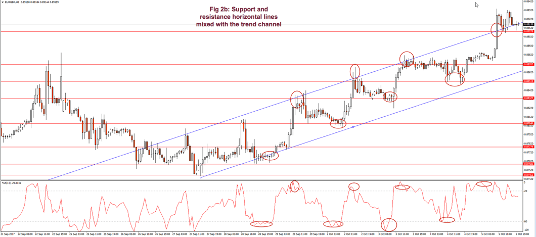
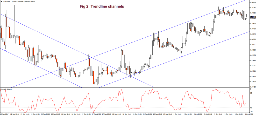 I find more reliable the use of horizontal lines at support and resistance levels and breakouts/breakdowns at the end of a corrective wave. But, if we get a well-behaved trend, such as the second leg in fig 2, a channel might help us assess the channel profitability and assign better targets to our trades. If we use horizontal trendlines together with the trend channel (see Fig 2.b) it’s possible to better visualize profitable entry points and its targets, and, then, compute its reward to risk ratio. The use of the Williams %R indicator (bottom graph) confirms entry and exit points.
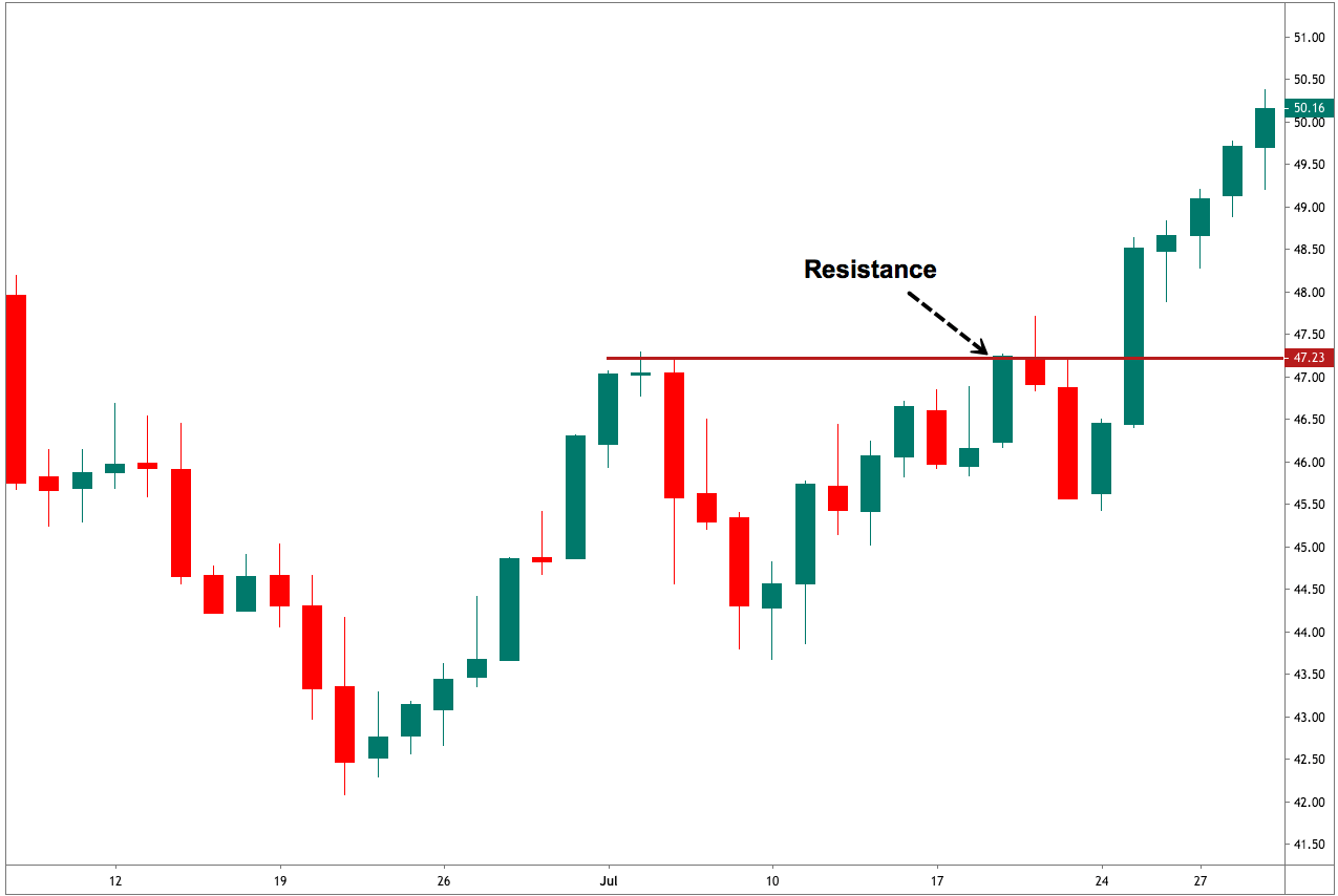
Fig. 2b graph’s horizontal red lines show how resistance becomes the support in the next leg of a trend.

 As a summary:
- A trendline points at the direction of the trend and acts as a support or as a resistance, depending on the price trend direction.
- If a second trendline is needed, we should pay attention if it shows acceleration or deceleration of the price movement.
- If the price crosses over or crosses under the trendline, it may show a bottom or a top, and a trend change.
- A trendline channel helps us assess the potential profitability and assign proper targets to our next trade.
Moving Averages (MA)
Note: At the end of this document, an Appendix discusses some basic statistical definitions, that may help with the formulas presented in this section, although reading it isn’t needed to understand this section.
Some centuries back, Karl Friedrich Gauss demonstrated that an average is the best estimator of random series.
Moving averages are used to smooth the price action. It acts as a low-pass filter, removing most of the fast changes in price, considered as noise. How smooth this pass filter behaves, is defined by its period. A moving average of 3 periods smoothens just three periods, while a 200-period moving average smoothens over the last 200 price values.
Usually, a Moving Average is calculated using the close of every bar, but there can be any other of the price points of a bar, or a weighted average of all price points.
Moving averages are computationally friendly. Thus, it’s easier to build a computerized algorithm using moving average crossovers than using trendlines.
Most Popular types of moving averages
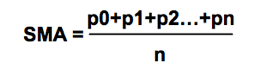
Simple Moving Average(SMA):
The simple moving average is computed as the sum of all prices on the period and divided by the period.
 The main issue with the SMA is its sudden change in value if a significant price movement is dropped off, especially if a short period has been chosen.
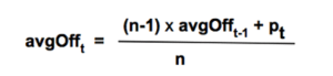
Average-modified method (AvgOff)
To avoid the drop-off problem of the SMA, the computation of an avgOff MA is made using and average-modified method:
 Weighted moving average
The weighted moving average adds a different weight to every price point in the period of calculation before performing the summation. If all weights are 1, then we get the Simple Moving Average.
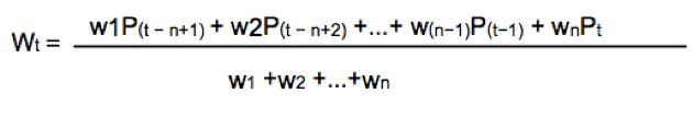
 Since we divide by the sum of weights, they don’t need to add up to 1.
A usual form of weight distribution is such that recent prices receive more weight than former prices, so price importance is reduced as it becomes old.
w1 < w2 < w3… < wn
Weights may take any form, most popular being Triangular and exponential weighting.
To implement triangular weighting on a window of n periods, the weights increase linearly from 1 the central element (n/2), then decrease to the last element n.
Exponential weighting is an easy implementation:
EMAt = EMAt-1 + a x (pt – Et-1)
Where a, the smoothing constant, is in the interval 0< a < 1
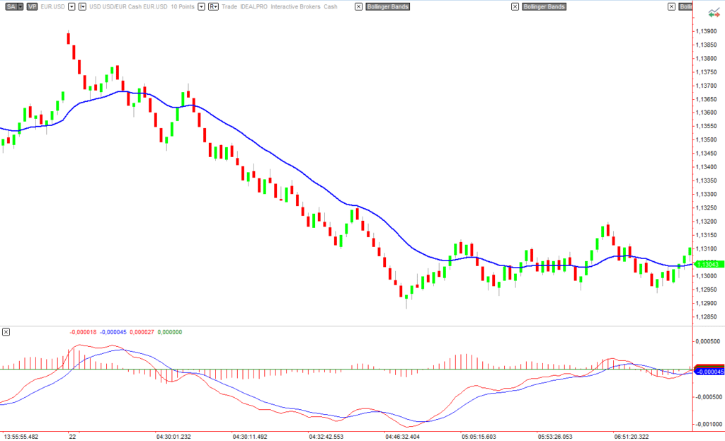
The smoothing property comes at a price: MA’s lags price, the longer the period, the higher the lag of the average. The use of weighting factors helps reducing it. That’s the reason traders prefer exponential and weighted moving averages: Reducing the lag of the average is thought to improve the edge of entries and exits.
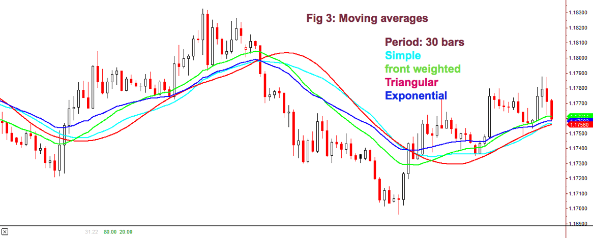
Fig 3 shows how the different flavors of a 30-period MA behave on a chart. We may observe that the front-weighted MA is the one with a slope very close to prices, Exponential MA is faster following price, but Triangular MA is the one with less fake price crosses, along with simple MA: The catch is: We need to test which fits better in our strategy. The experience tells that, sometimes, the simpler, the better.
Detecting the trend using a moving average is simple. We select the average period to be about half the period of the market cycle. Usually, a 30 day/bar MA is adequate for short-term swings.
One method to decide the trend direction is to consider it a bull leg if the bar close is above the moving average; and a bear leg if the close is below the average.
Another method is to watch the slope of the moving average as if it were a trendline. If it bends up, then it’s a bull trend, and if it turns down, it’s a bear trend.
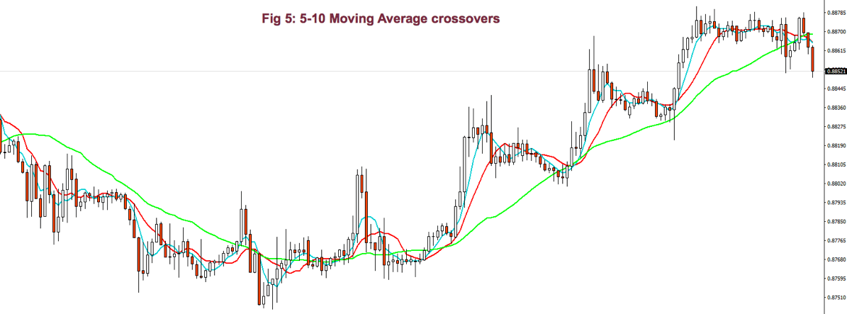
A third method is to use two moving averages: Fast-Slow (Fast -> smaller period).
In this case, there are two variations:
- Moving average crossovers
- All the averages are pointing in the same direction.
As with the case of a single MA, a price retracement that touches the slower average is an opportunity to add to the position.
For example, using a 30-10 MA crossover: If the fast MA crosses over the slow MA, we consider it bullish; if it crosses under, bearish.
Using the method of both MA’s pointing in the same direction, we avoid false signals when the fast MA crosses the slow one, but the slow MA keeps pointing up.
 When using MA crossovers, we are forbidden to take short trades if the fast MA is above the slow MA, but we’re allowed to add to the position at price pullbacks. Likewise, we’re not allowed to trade on the buy side if the fast MA is below the slow MA.
Using smaller periods, for instance, 5-10 MA, it’s possible to enter and exit the impulsive legs of a trend. Then, the 10-30MA crossovers are used to allow just one type of trade, depending on the trend direction, and the 5-10 MA crossover is actually used as signal entry and exit (if we don’t use targets). In bull trends, for example, we may enter with the 5MA crossing over the 10MA, and we exit when it crosses under.

Bollinger Band Channel
We already touched channels that were made of two trendlines. There is another computationally friendly channel type that allows early trend detection and trading.
One of my favorite channel types is using Bollinger Bands as a framework to guide me.
A Bollinger Band is a volatility channel and was developed by John Bollinger, which popularized the 20-period, 2 standard deviations (SD) band.
This standard Bollinger band has a centerline that is a simple moving average of the 20-period MA. Then an upper band is drawn that is 2 standard deviations from the mean and a lower band that’s 2 standard deviations below it.
I tend to use two or three 30-period Bollinger bands. The first band is one SD wide, and the second one is two SD apart from the mean. A third band using 3 standard deviations might be, also, useful.
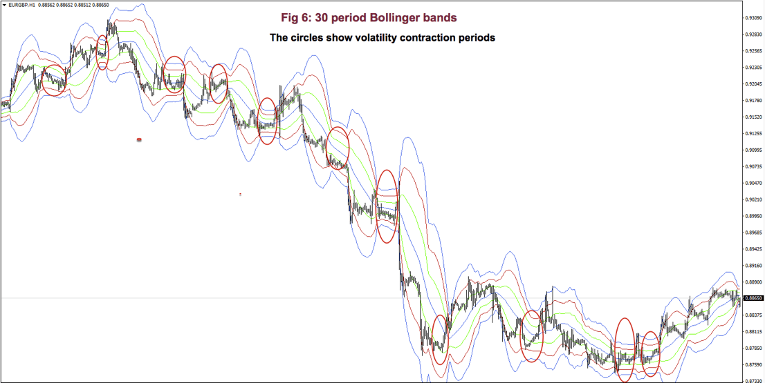
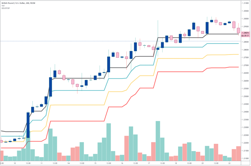
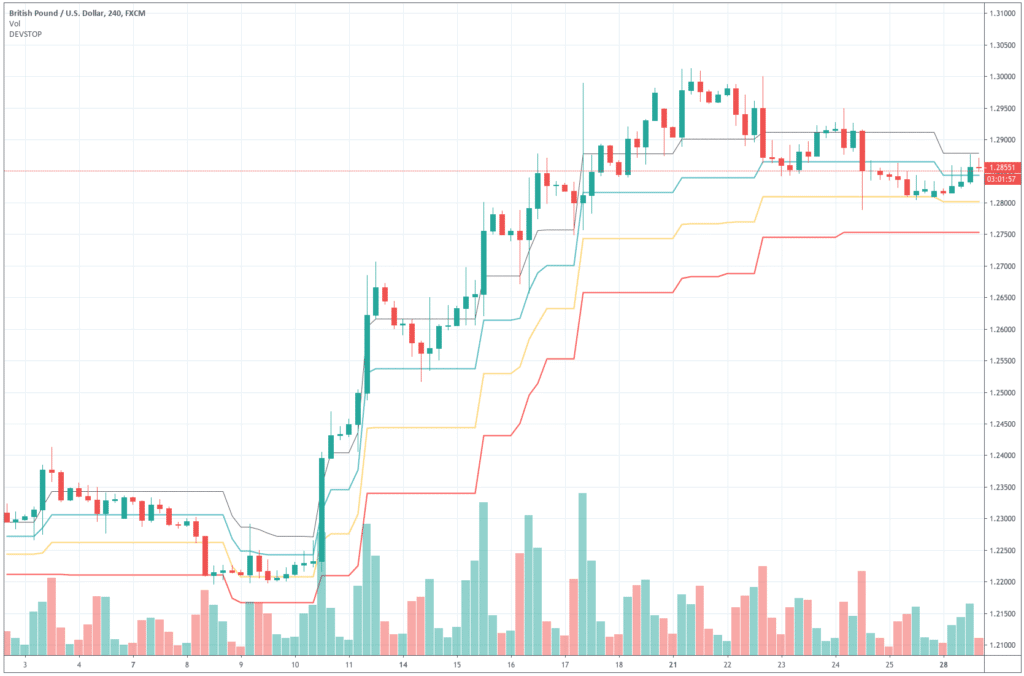
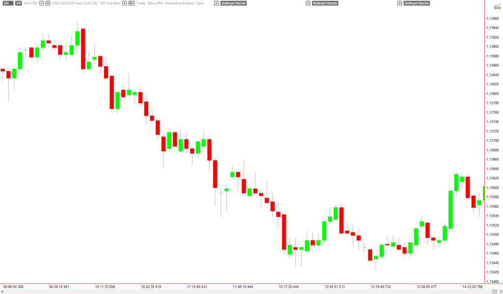
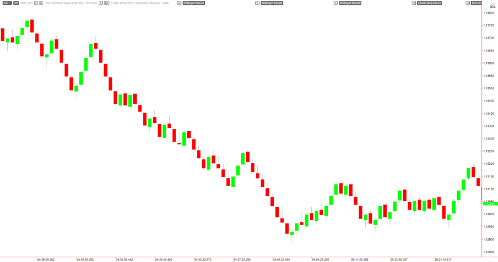
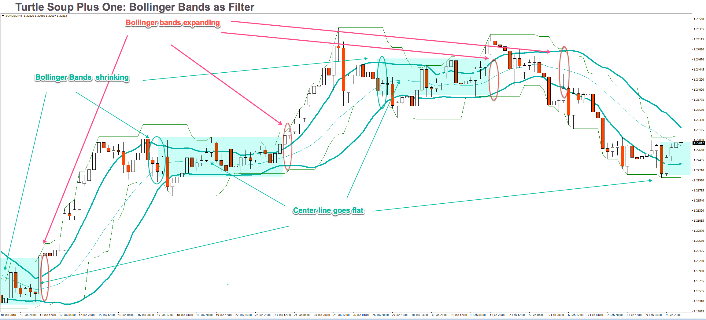
Fig 6 shows a very contracted chart with 3 Bollinger bands to show how it looks and distinguishing periods of low volatility.
During bull trends, the price moves above the mean of the Bollinger band. During bear markets, the price is below the average line of the bands.
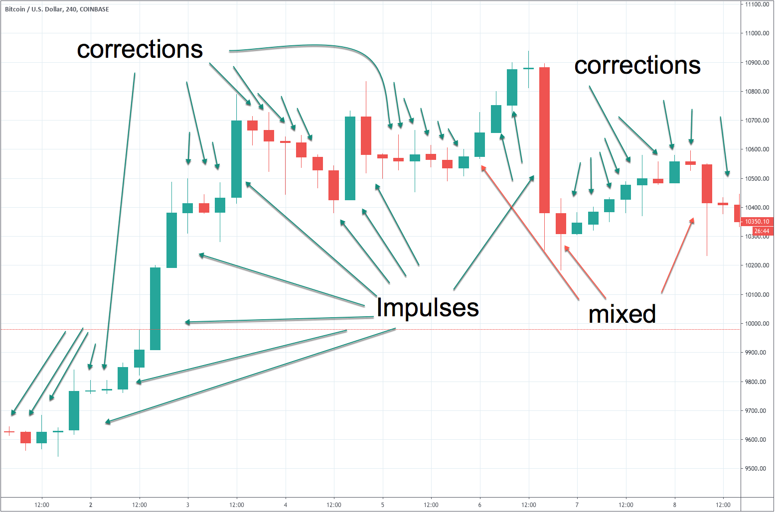
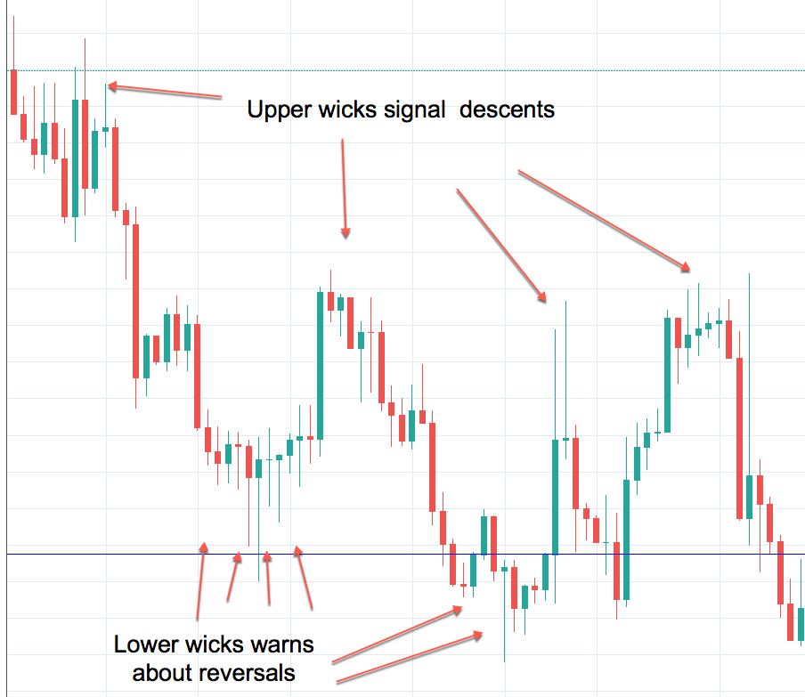
On impulsive legs of a trend, the price goes above 1-SD (or below on downtrends), and it continues moving until it crosses the 2-SD line, sometimes it even crosses the third 3-SD line. Price beyond 2 SDs is a clear sign of overbought or oversold. On corrective legs, the price goes back to the mean. During those phases volatility contracts, and is an excellent place to enter at breakouts or breakdowns of the trading range.
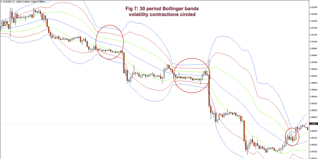
Below Fig. 7 shows an amplified segment of Fig 6, with volatility contractions circled. We may observe, also, how price moves to the mean, after crossing the 2 and 3 std lines.
Grading your performance
According to Dr. Alexander Elder, the market is testing us every day. Only most traders don’t bother looking at their grades.
Channels help us grade the quality of our trades. To do it, you may use two trendlines or some other measure of the channel. If you don’t see one, expand the view of the chart.
 When entering a trade, we should measure the height of the channel from the bottom to its top. Let’s say it’s 100 pips. Suppose you buy at ¾ of the upper bound and sell 10 pips later. If you take 10 pips out of 100 pips, your trade quality is 10/100 or 1/10. How does this qualify?
 According to Elder’s classification, any trade that takes 30% or more of a channel is credited with an A. If you make between 20 and 30%, your grade will be B. Between 10 and 20% you’re given a C and a D if you make less than 10%. So, in this case, your grade is C.
Good traders record their performance. Dr. Elder recommends adding a column for the height of the channel and another column for the percentage your trade took out of the channel.
Monitor your trades to see if your performance improves or deteriorated. Check if it’s steady or erratic. The information, together with the autopsy of your past trades, helps you spot where are your failures: Entries too late? Are you exiting too soon? Too much time on a losing or an underperforming trade? A trade against the prevailing trend?
The next chapter will be dedicated to chart patterns.
Appendix: Statistics Overview
Statistics is a branch of mathematics that gives us information about a data set. Usually, the data set cannot be described by an analytical equation because they come from unpredictable or random events. As traders, we need basic knowledge, at least, of statistics for our job.
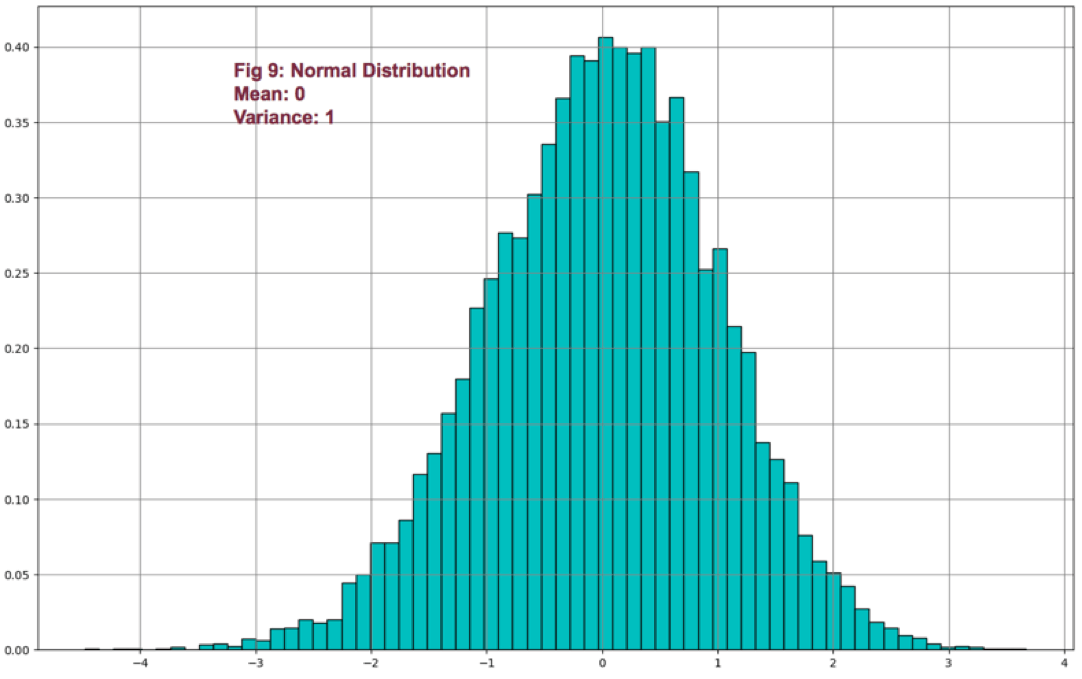
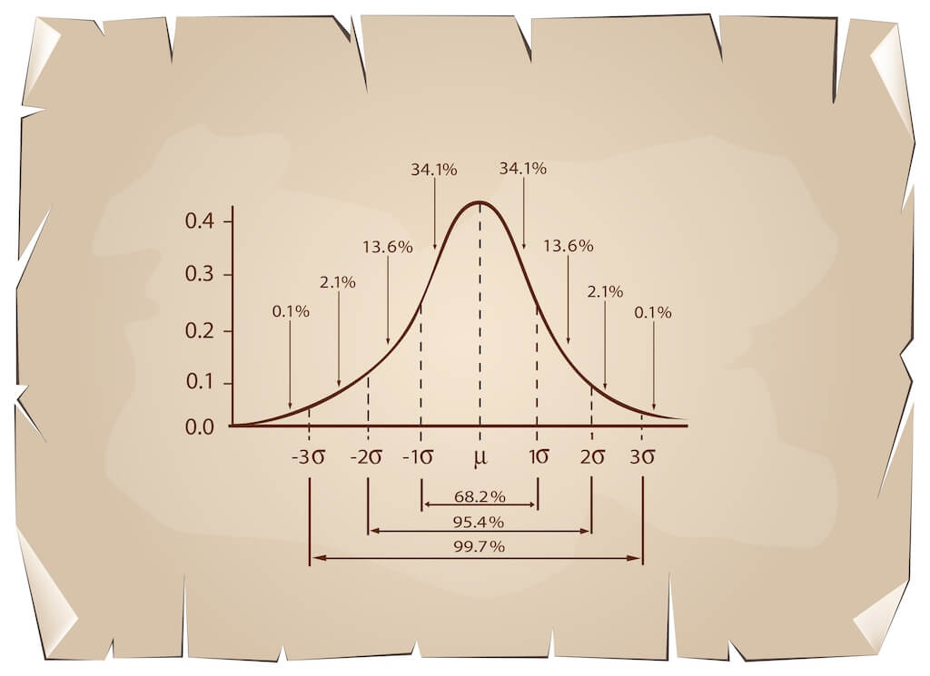
We can express statistical data numerically and graphically. Abraham de Moivre, back in the XVII century, observed that as the number of events (coin flips) increased, the shape of the binomial distribution approached a very smooth curve. De Moivre thought that if he could find the mathematical formula for this curve, he could solve problems such as the probability of 60 or more heads out of 100 coin flips. This he did, and the curve is called Normal distribution.

This distribution plays a significant role because of the fact that many natural events follow normal distribution shapes. One of the first applications of this distribution was the error analysis of measurements made in astronomical observations, errors due to imperfect measuring instruments.
The same distribution was also discovered by Laplace in 1778 when he derived the central limit theorem. Laplace showed the central limit theorem holds even when the distribution is not normal and that the larger the sample, the closer its mean would be to the normal distribution.
It was Kark Friedrich Gauss, who derived the actual mathematical formula for the normal distribution. Therefore, now, Normal distribution is also named as Gaussian distribution.
Although prices don’t follow a normal distribution, it’s is used in finance to extract information from prices and trading statistics.
There are two main measures we use routinely: The center of our observations and the variability of the points in our data set from that mean.
There’s one main way to compute the center of a set: the mean. But it’s handy to know also the median if the distribution isn’t symmetrical.
Mean: It’s the average of a set of data. It’s computed adding all the elements of a set and divide by the number of elements:
Mean = Sum(p1-Pn)/n
Median: The median is the value located in the middle of a set after the set has been placed in ascending order. If the set has a symmetrical distribution, the median and the mean are the same or very close to it.
The variability of a data set may be calculated using different methods. Two main ways are used in financial markets:
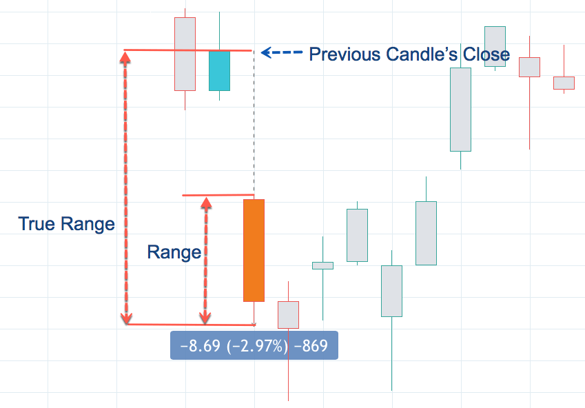
Range: The easiest way to measure the variability. The range is the difference between the highest and lowest data of a set. On financial data, usually, a variant of the range is calculated: Average true range, which gives the average range over a time interval of the movement of prices.
Sample Variance(Var): Variance is a measure of the mean distance of the data points around its mean. It’s computed by first subtracting the average from all points: (xi-mean) and squaring this value. Then added together and dividing by n-1.
Var = 𝝈2 =∑ (x-mean)2 / (n-1),
where ∑ is the symbol for the sum of all members of the set
By squaring (xi-mean), it takes out the negative sign from points smaller than the mean, so all errors add-up. The division by n-1 instead of n helps us not to be too much optimistic about the error. This measure increments the error measure on small samples, but as the samples increase, its result is closer and closer to a division by n.
If we take the square root of the variance, we obtain the standard deviation (𝝈 – sigma).
Volatility: Volatility over a time period of a price series is computed by taking the annualized standard deviation of the logarithm of price returns multiplied by the square root of time expressed in days.
𝝈T = 𝝈annually √T
References:
New Systems and Methods 5th edition, Perry Kaufman
Trading with the Odds, Cynthia Kase
Come into my Trading Room, Alexander Elder
History of the Gaussian distribution http://onlinestatbook.com/2/normal_distribution/history_normal.html
https://en.wikipedia.org/wiki/Volatility_(finance)
Further readings:
Profitable Trading – Chapter 1: Market Anatomy
Profitable Trading Chapter III: Chart patterns
Profitable Trading – Computerised Studies I: DMI and ADX
Profitable Trading – Computerized Studies II: MACD
https://www.forex.academy/profitable-trading-computerized-studies-iii-psar/
Profitable Trading (VII) – Computerized Studies: Bands & Envelopes
Profitable Trading VIII – Computerized Studies V: Oscillators


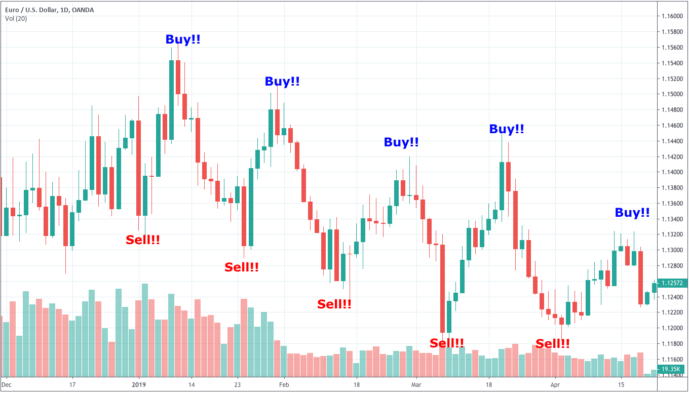


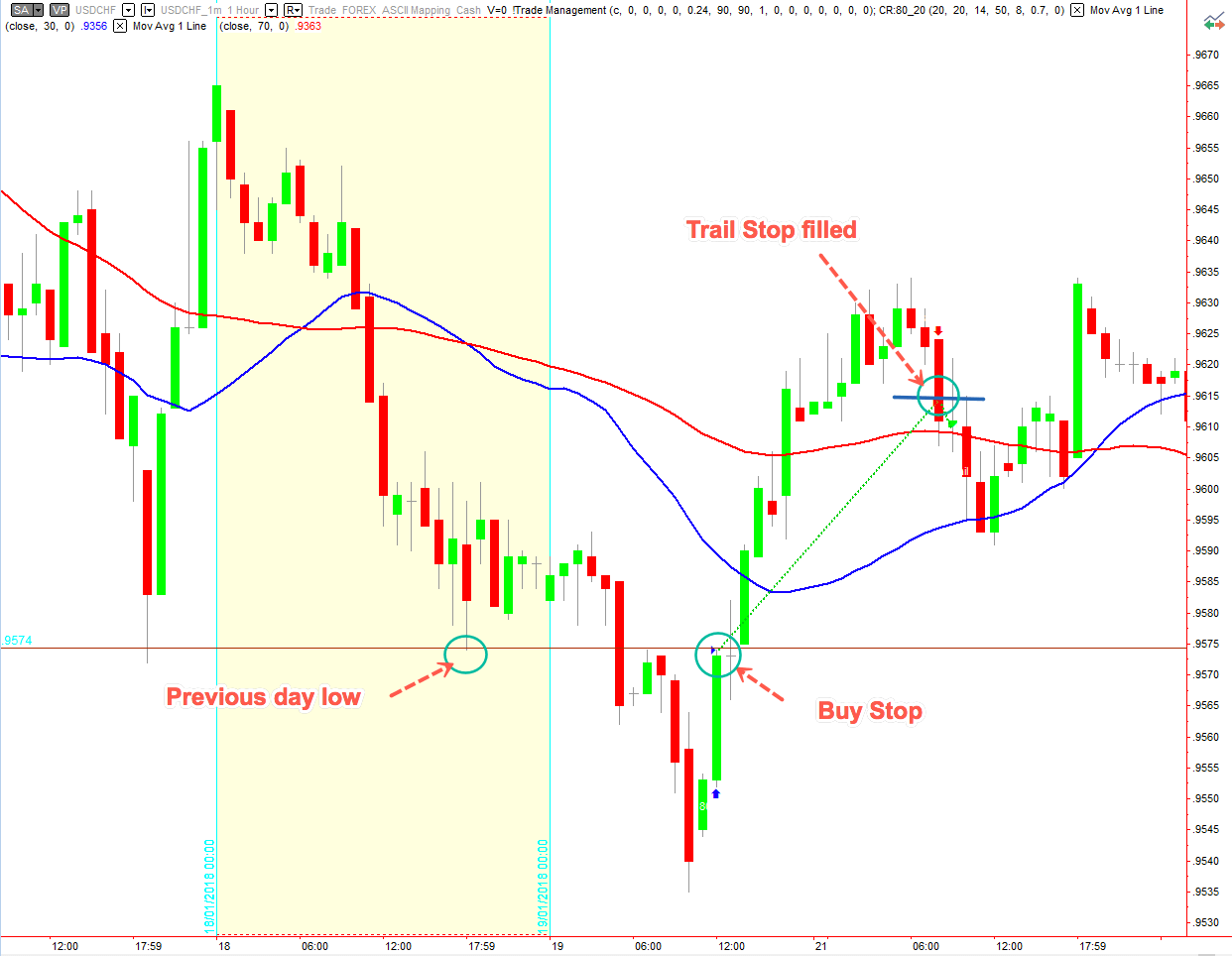

 And, finally, we get the desired channel surrounding prices:
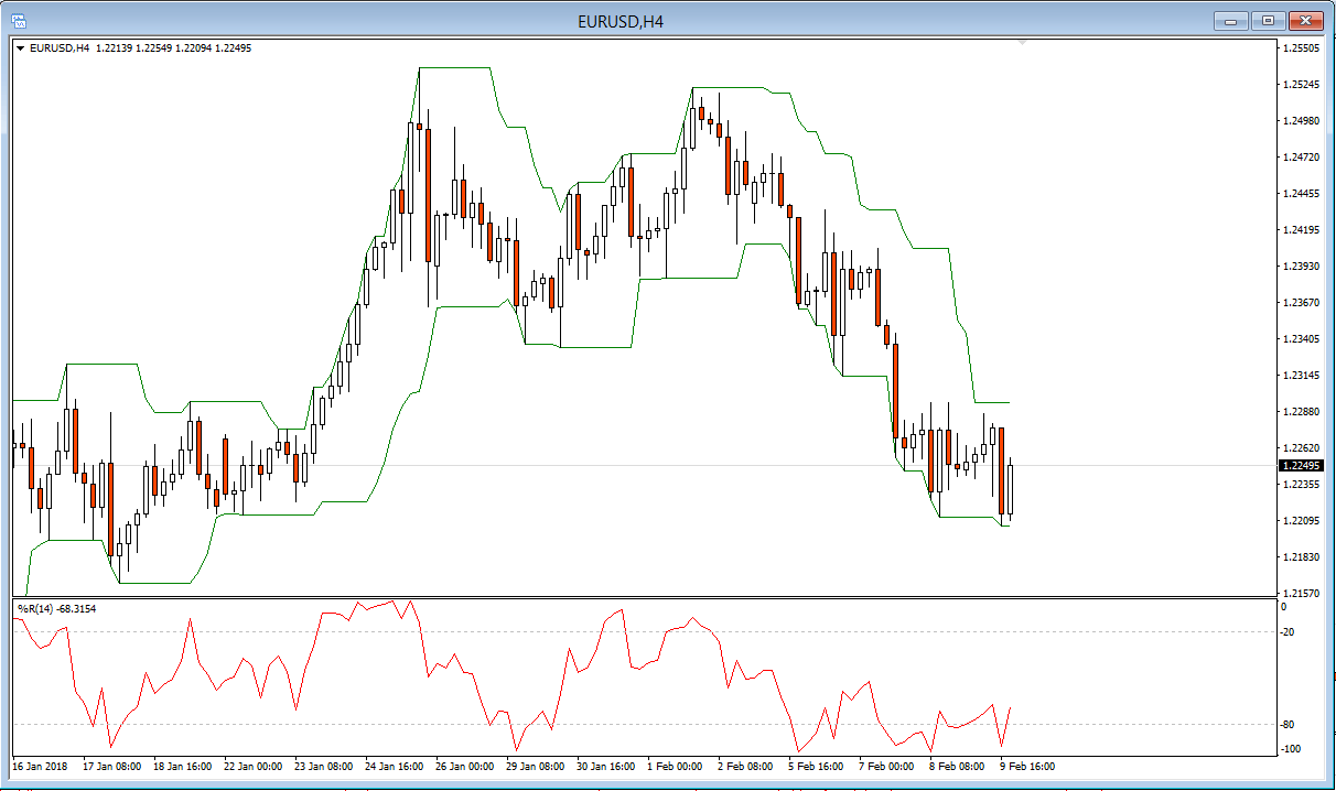 A sell signal happens at the candle following a close price breaking the channel’s current upper border. A buy signal occurs at the candle following a closing price below the line of the current lower edge of the channel. See figure below three consecutive winners on a flat channel signaled by a Bollinger band contraction.
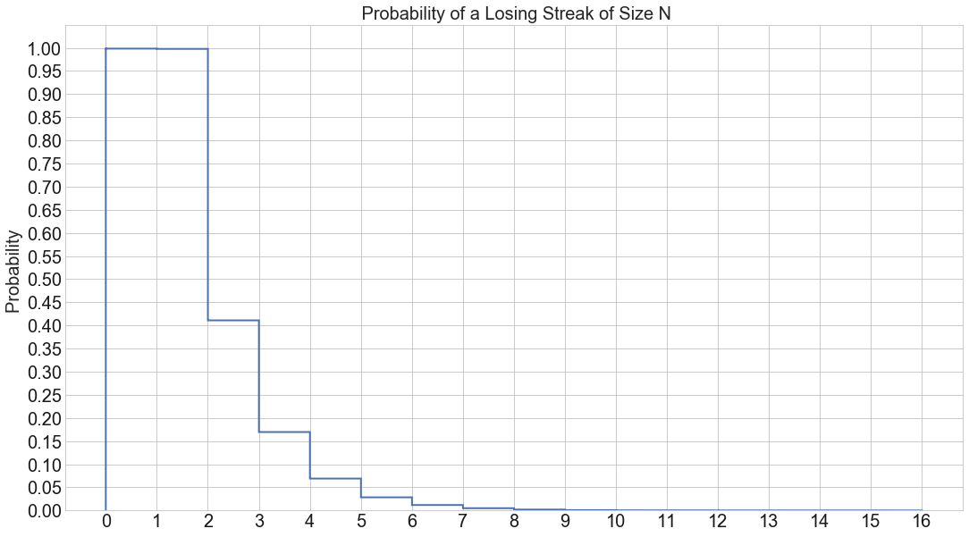
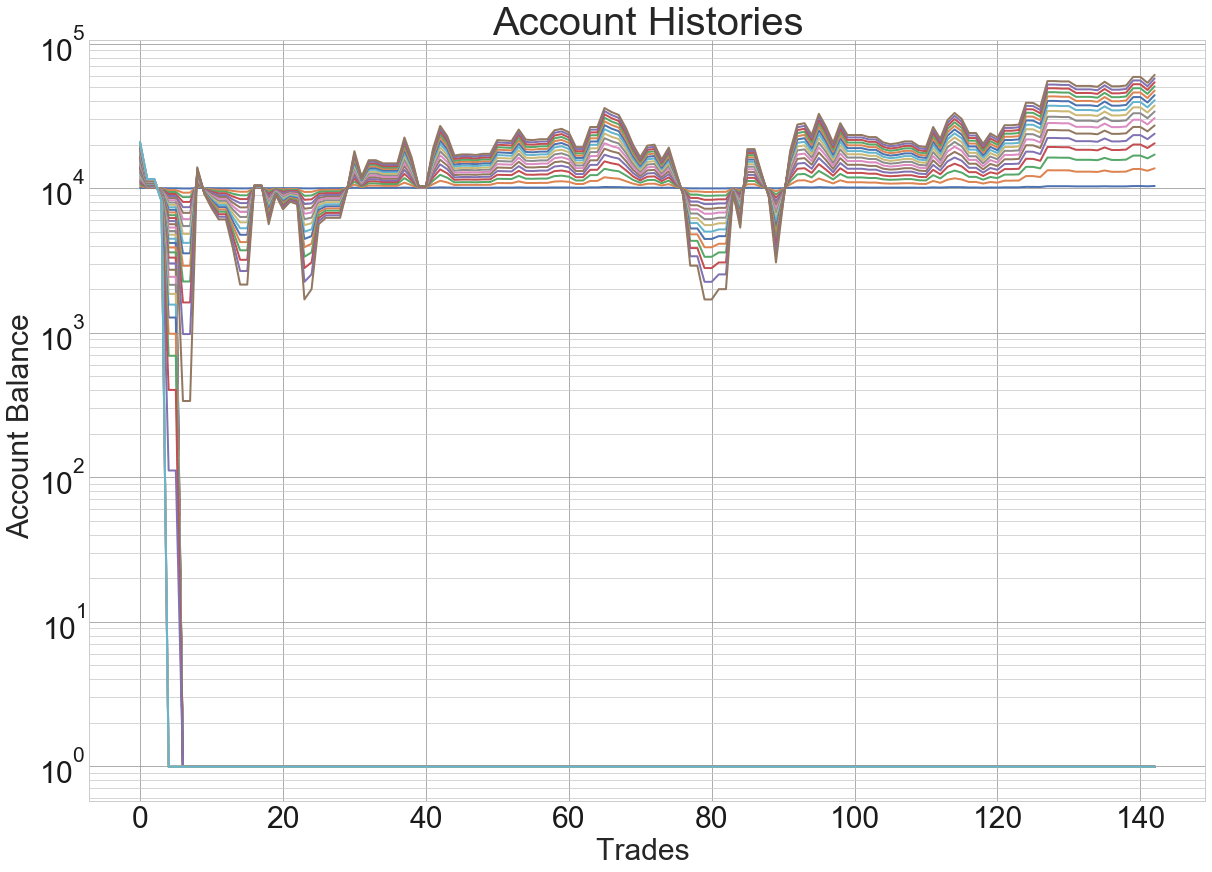
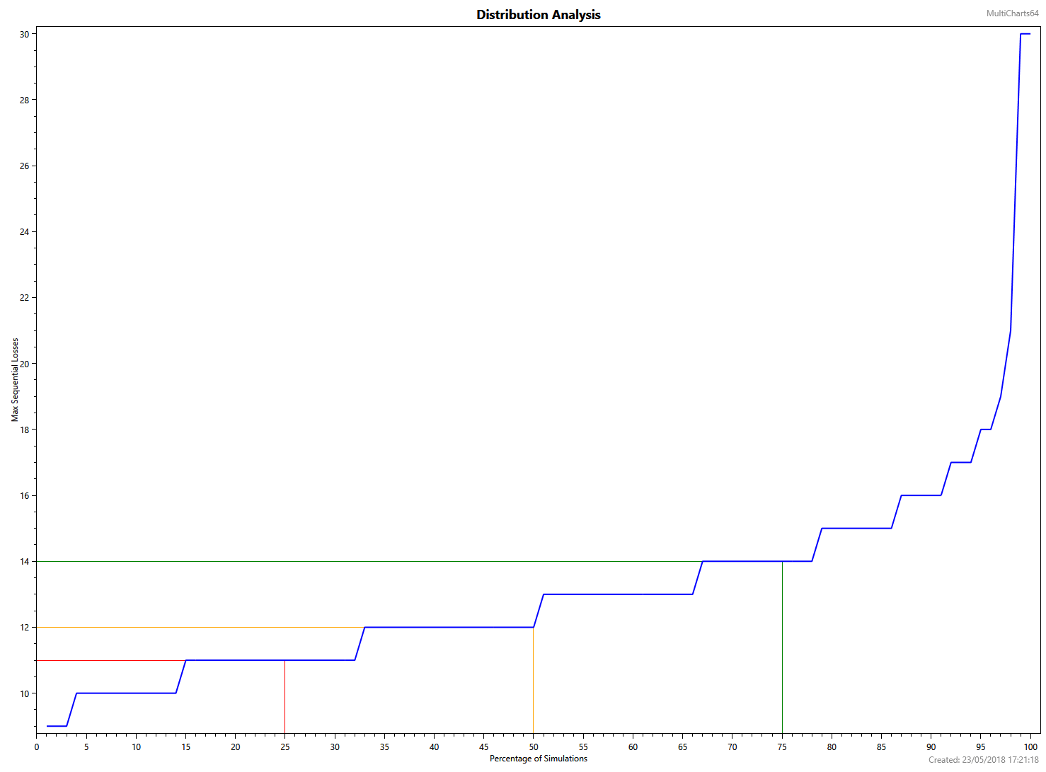
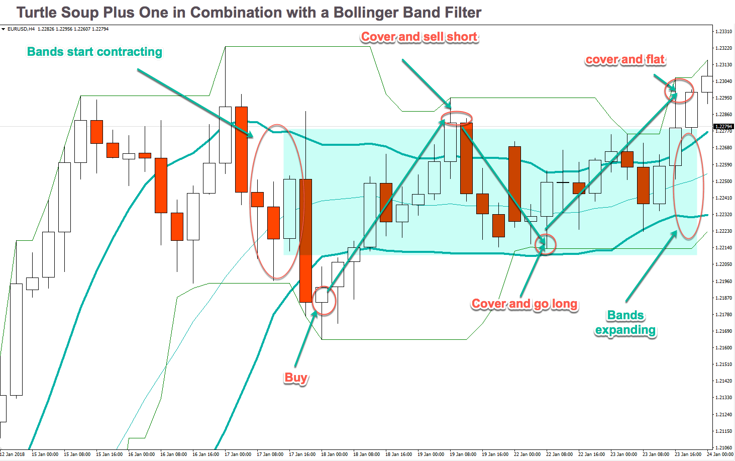 It’s not usual, but, from time to time, we can expect a streak of up to 10 losing trades. Thus, we have to apply adequate money management rules.