Categories
Forex System Design

Introduction to Walk-Forward Analysis – Part 2

Introduction

In the previous part, we introduced the walk-forward analysis concept, its objectives, and its advantages. This educational article will continue discovering the benefits of using the WFA and how to set it up.

Walk-Forward Analysis and Market Impacts

The walk-forward analysis provides information about the impact of changes in trends, volatility, and market liquidity on the performance of the trading strategy or system. Generally,  when these changes occur, they arrive at a fast pace, heavily degrading the trading performance.

The WFA may extend its study in a wide range of time; however, analyses and evaluates the trading performance by separate windows. The broad range of results obtained by the study could provide the developer with a piece of useful information about the market changes impact the trading strategy performance.

Parameters Selection

As a robust optimization system, the WFA can provide the most appropriate parameters for real-time trading.

Simultaneously, the walk-forward analysis provides the strategy developer with the duration of the optimal period of time in which the set of parameters will consistently produce real-time benefits before the deterioration in trading system performance occurs.

Statistical Rigor in the Walk-Forward Analysis

As mentioned above, a large amount of data provides greater confidence in any phenomenon’s statistical study. This concept is also valid in the walk-forward analysis.

In this context, the walk-forward analysis must be large enough to produce several trades such that a large amount of data can be generated for the study. According to Pardo, in his work, he says that a WFA must be as long as possible, usually at least 10 to 20 years, whenever possible. Finally, he adds that these multiple walk-forwards combined performance will often be sufficient to produce the statistical rigor required in the analysis.

As a result, WFA’s multiple optimization windows will be able to give the developer a better idea of how the trading strategy will behave in the face of market changes.

Developing the Walk-Forward Analysis

A walk-forward analysis consists of two stages. In the first section, traditional backtest optimization is developed. The parameters of the trading strategy are analyzed using a sample established according to the developer’s objectives.

The second stage, which is the one that characterizes a walk-forward analysis, evaluates the performance of the parameters using an additional sample that was not used during the previous optimization stage.

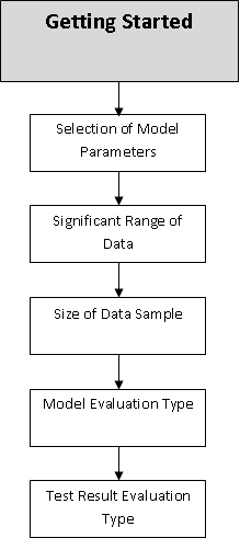
The walk-forward analysis process requires the following elements to be set:

  1. Scan range for variables to optimize. The developer must define the time frame in which the trading strategy’s optimization should be performed. The developer should consider that the scan range uses a computational resources level that it will use to evaluate and weight the parameter to be optimized. In this regard, an exploration in a small number of historical simulations will consume less computational resources than a more extensive optimization.
  2. Identify a target or a search function. The developer must define what the purpose of the optimization study is.  A usual target can be a mix of the normalized average trade return (the reward/risk factor), the standard deviation of this figure, and the percentage of winning trades. These three factors will define the quality of any trading system. A fourth key factor is the number of monthly trades delivered by the system.
  3. Size of the optimization window. Generally, this optimization range can vary from 3 to 6 years. This duration depends on different factors such as, for example, the market, the type of trading strategy, the confidence level required by the developer in the optimization results, among other factors determined by the developer.
  4. Size of the walk-forward out-of-sample window. This period is defined based on the optimization window. In most cases, this window can be between 25% and 35% of the optimization time.

The length of the optimization window is determined by:

  1. Availability of data. Depending on the type of market and accessibility of the data to perform the analysis, the developer might find a restriction on the amount of historical data needed to perform strategy optimization.
  2. Trading strategy style. A short-term trading strategy should require a smaller optimization window than a long-term strategy.
  3. The pace of trading strategy. The pace of strategy is highly variable and tends to vary from strategy to strategy. For example, a long-term strategy, such as swing trading, will slower than a short-term trading strategy, which will require less time to produce the same number of trades.
  4. The relevance of data. The relevant data depends on a large number of factors that could empirically be determined. However, Pardo proposes a basic guideline stating that a short-term strategy can be tested using one or two years of data, whereas an intermediate-term strategy would require two to four years, and a long-term strategy four to eight years of data.
  5. The validity of the strategy’s parameters. The developer expects the parameters employed will generate benefits in the historical simulation. Furthermore, it also requires a trading strategy to produce profits in real-time market trading.

Finally, the walk-forward analysis is a post-optimization method, highly effective and revealing when it comes to discriminating a trading system’s robustness. Regarding that, the market is dynamic and changes periodically; the trading system should be re-optimized with a certain periodicity.

For example, a properly optimized short-term strategy could be re-optimized between three and six months of real-time trading. While the long-term between one and two years.

Conclusions

In this second and final part, we reviewed the basics of walk-forward analysis, characterized by providing the trading system developer with a powerful tool for testing, validation, and measuring trading strategy. Among the benefits that this stage of the development of a trading system provides we can mention:

  1. Measurement of robustness.
  2. Reduction of overfitting.
  3. Assessment of market changes in the trading strategy.
  4. Selection of optimal parameters for the strategy.
  5. Statistical reliability, when correctly applied.

Finally, despite the benefits provided by this analysis methodology, the strategy developer should consider that the trading system may need to be re-optimized with a certain periodicity.

Suggested Readings

  • Jaekle, U., Tomasini, E.; Trading Systems: A New Approach to System Development and Portfolio Optimisation; Harriman House Ltd.; 1st Edition (2009).
  • Pardo, R.; The Evaluation and Optimization of Trading Strategies; John Wiley & Sons; 2nd Edition (2008).


Categories
Forex Signals

AUDUSD Breaks Down an Ascending Wedge

Description

The AUDUSD pair, in its hourly chart, exposes a downward sequence after surpassed the psychological barrier of 0.74 on the Tuesday trading session. In the same way, the re-test and bounce of the U.S. Dollar index at 91.75, the lowest level since mid-May 2018, lead us to expect further movement in favor of the Greenback for the following trading sessions.

From the next chart, we observe a downward movement after the breakdown of an ascending wedge pattern. The consolidation below the last relevant swing at 0.7365(blue box) and the RSI oscillator moving below level 40 confirms the intraday bearish bias that should lead the coming sessions.

The movement below the level 0.7365 carries us to weight bearish positions expecting intraday profits at 0.7310, which corresponds to the last consolidation level of August 28th.

Our invalidation level is located at 0.7392, which corresponds to the first congestion zone after the first drop of the ascending wedge pattern.

Chart

Trading Plan Summary

Check out the latest trading signals on the Forex Academy App for your mobile phone from the Android and iOS App Store.

Categories
Forex System Design

Introduction to Walk-Forward Analysis – Part 1

Introduction

Once completed the optimization process of a trading system, the developer could develop an advanced strategy optimization method, the walk-forward analysis. In this educational article, we will introduce the basic concepts of this methodology.

What is Walk-Forward Analysis?

The Walk-Forward Analysis (WFA) is an advanced method for testing, validating, and optimizing a trading strategy, by measuring its performance using out-of-sample results. The WFA attempts to achieve the three objectives identified as follows.

  1. Determine if the trading strategy continues being profitable using unseen or out-of-sample price history.
  2. Find out the optimal values of the parameters to be used in real-time trading.
  3. Delimit the optimization window size and the period at which the system should be reoptimized.

Measuring the Robustness of a Trading System

A robust trading system is profitable, even when the actual market conditions change. These profits tend to be consistent, with the results obtained in the historical simulation stage. In other words, a walk-forward analysis allows the system’s developer to determine if the trading strategy can produce real-time profits.

The system’s developer is able to compute the robustness of a trading strategy using a statistical criterion called Walk-Forward Efficiency (WFE) ratio, which measures the current optimization process’s quality.

The WFE ratio is computed by the out-of-sample annualized rates of return divided by the in-sample returns. A robust trading strategy should achieve reliable performance, both in-sample and out-of-sample data. A 100% ratio would indicate that the out-of-sample figures match exactly the returns obtained with the backtests. That would indicate the system is sound and reliable.  Pardo, in his book The Evaluation and Optimization of Trading Strategies, comments that “robust trading strategies have WFEs greater than 50 or 60 percent and in the case of extremely robust strategies, even higher.”  A WFE ratio below 50% would indicate poor performance. Finally, ratios over 100% are suspicious, and the system should be analyzed to discover the reason for this behavior.

WFA and Overfitting

Overfitting is a condition resulting from an excessive readjustment of the strategy’s parameters aimed at artificially improve its performance. An overfitted strategy is likely to lose money in real-time trading, even when a historical simulation would present terrific gains.

By its nature, a walk-forward analysis is a cure for overfitting abuse. This edge comes from the fact that the WFA evaluates the strategy’s performance using data not belonging to the optimization process.

By using WFA, the developer is certain about the robustness of a trading strategy. In other words, a not too robust trading strategy would not pass a walk-forward analysis.

Considering that a large number of samples increase the statistical validity and confidence, it is unlikely that an unprofitable trading strategy would make significant profits using a large number of samples. Consequently, a poor trading strategy delivering gains could be the product of chance.

Conclusions

The Walk-Forward Analysis (WFA) is a powerful tool for testing, validating, and measure the quality of a trading strategy, which is characterized by the use of out-of-sample data to evaluate its performance. In this educational article, we have presented the advantages of using WFA to evaluate the strategy’s robustness and how WFA can help the developer avoid overfitting, increasing confidence through an objective statistical measure.

In the next educational post, we will continue reviewing the benefits of using the walk-forward analysis and setting up the walk-forward analysis.

Suggested Readings

  • Jaekle, U., Tomasini, E.; Trading Systems: A New Approach to System Development and Portfolio Optimisation; Harriman House Ltd.; 1st Edition (2009).
  • Pardo, R.; The Evaluation and Optimization of Trading Strategies; John Wiley & Sons; 2nd Edition (2008).
Categories
Forex Market Analysis

Aussie Moves Looking at 0.74 Barrier

Overview

The AUDUSD pair continues advancing toward the psychological barrier at 0.7400, which corresponds to its highest level since mid-August 2018. Currently, the Aussie exposes an extreme bullish sentiment, which rises near 5% (YTD) during this year. Nevertheless, the Australian currency could complete its third extended wave soon.

Market Sentiment Overview

During this year, the Australian currency has gained near 5%(YTD) recovering from the losses reported in the first quarter, dragged by the massive sell-off on the stock market between mid- February until mid-March 2020.

On the following chart, we observe the AUDUSD pair advancing in the 52-week high and low range’s extreme bullish sentiment. At the same time, we distinguish the price action toward the highest level reached by the Aussie on December 03rd, 2018, when the price topped at 0.74935.

The advance of the AUDUSD pair above the 60-day moving average confirms the up-up-up sentiment prevailing on the market participants.

Until now, we observe continuation signals of the current uptrend, which began on March 19th, when the price find a bottom at 0.55063. Since this level, the Aussie advanced over 33% to date.

Elliott Wave Outlook

On its 8-hour chart and log scale, the Australian currency exposes a bullish impulsive advance developed since the March 19th low at 0.55063, which remains intact after the biggest decline that carried it to lose over 21% in the first quarter of the year.

The AUDUSD pair rallies in an incomplete third wave of Minute degree, identified in black, which began once the Aussie bounced developing a leading diagonal pattern. According to the Elliott Wave Theory, the leading diagonal pattern tends to appear in waves 1 or A. At the same time, from the previous figure, we distinguish the price action progressing in an extended wave.

The incomplete third wave of Minute degree seems to advance in its fifth wave of Minuette degree labeled in blue, which at the same time, moves in its fifth wave of Sunminuette degree identified in green. This upward move could reach the 0.7495 level, where the Aussie could find selling pressure.

Once the third wave of Minute degree completes, the AUDUSD pair should start to develop a corrective sequence identified as Wave ((iv)). According to the Alternation principle and considering that the third wave is the extended movement, the fourth wave should be a triangle pattern or a complex corrective formation.

As for a potential target, the next decline could retrace to the level of 0.7065, which corresponds with the top of the third wave of Minuette degree in blue.

Categories
Forex Market Analysis

Gold Still Controlled by the Bull

Overview

The Gold price continues developing a sideways movement, which corresponds to an incomplete corrective structure that is still incomplete. Although there is an extreme bullish sentiment among market participants, the price of the golden metal could be poised to a decline in the following trading sessions.

Market Sentiment Overview

Gold prices continue moving sideways, consolidating above the psychological barrier of $1,900. The precious metal gains of over 28% (YTD) were boosted by the US Dollar weakness, which has dropped 5.47% (YTD) so far.

Gold, in its weekly timeframe, illustrates the market sentiment of the precious metal exposed by its 52-week high and low range. In the chart, we currently distinguish the market action moving mostly sideways, on the extreme bullish sentiment zone. The indecision candle that the yellow metal developed leads us to observe a state of equilibrium between the market participants.

On the other hand, looking at the volatility of the precious metal (GVZ) exposed in its daily chart, we observe the price action is consolidating in a flag pattern in the bearish sentiment zone. At the same time, we highlight the bounce GVZ developed from the extreme bearish sentiment zone toward the bearish zone in which currently is consolidating. We see that GVZ, moving above its 60-day moving average, shows an improvement in the investors’ sentiment.

The current market context observed in the Gold Volatility Index, which is consolidating creating a flag formation, added to Gold’s retesting of  $1,917.81 per ounce, corresponding to the support of the extreme bullish sentiment zone, leads us to expect a new decline in the price of the yellow metal.

Elliott Wave Outlook

The short-term outlook under the Elliott wave perspective and illustrated in its 2-hour chart exposes the sideways movement evolving an incomplete corrective structure, after the yellow metal touched its all-time high at $2,075.14 per ounce, reached on August 06th.

Once the precious metal topped at $2,075.15 per ounce, Gold completed its fifth wave of Minuette degree, and it is drawing a corrective sequence that remains incomplete. In the previous figure, we distinguish the aggressively developed first downward leg. This fast movement drove the yellow metal to ease over 10%, finding a bottom at $1,862.32 per ounce. That gave the pass to the wave (b), identified in blue, which remains in development.

The second leg of the incomplete three-wave sequence completed its first wave of a lesser degree at $2,015.65 per ounce, starting to retrace with a lower momentum. This decelerated movement observed in the wave b of Subminuette degree, identified in green, drives us to verify the alternation principle stating that a fast move should alternate with a slow movement.

For the coming trading sessions, we expect an upward movement that would complete the wave c of Subminuette degree, in green, which at the same time would end the wave (b) in blue. Once this wave ends, the price should start to decline in a five-wave sequence corresponding to wave (c) of Minuette degree, labeled in blue. This downward scenario agrees with the potential upside observed in the Gold Volatility Index chart.

Categories
Forex Elliott Wave Forex Market Analysis

Dow Jones: Still no New Record High Confirmation

Overview

The Dow Jones Industrial Average continues its advances toward the green side. During this year, it is still easing 1.08% (YTD). The DJIA index, which groups to the 30 largest capitalized U.S. companies, move in the extreme bullish sentiment zone unveiling the probability of new record highs in the U.S. stock market. Likely, it could find resistance at the 30,000 pts as a psychological barrier confirming the all-time highs observed both S&P 500 and NASDAQ 100.

Market Sentiment Overview

During this year, the Dow Jones Industrial Average eases 1.08% (YTD), returning from the bear market to bull market side. The recovery experienced by the Industrial Average, carried it to jump from the lowest level of the year at 18,213.5 pts to 28,287 pts gaining over 55%. 

The following figure compares the advance of Dow Jones and the S&P 500 in its weekly timeframe. In these two charts, we observe that both indexes move in the extreme bullish sentiment zone. However, although surprising, the recovery observed in the U.S. stock market, the Industrial Average still doesn’t confirm the all-time high of the S&P 500, reached on the latest trading sessions

If we look at the Dow Jones’ volatility (VXD), it is running below the 60-day moving average, which confirms that the market sentiment continues being in favor of fresh upsides on the Industrial Average.

Finally, considering that both NASDAQ 100 and S&P 500 reached fresh all-time highs in the latest sessions, the Dow Jones should follow the same path in the coming trading sessions.

Elliott Wave Outlook

The mid-term outlook for the Industrial Average provided by the Elliott Wave Analysis reveals the bullish continuation of the incomplete wave B of Minor degree labeled in green, which could push it toward new all-time highs.

The next 4-hour chart illustrates the price running in an uptrend that began on March 23rd when the U.S. Blue Chip index found fresh buyers at 18,213.5 pts, developing a corrective structural sequence that remains incomplete.

Once the Industrial Average broke upward the (b)-(d) upper-line of the triangle drawn by the wave ((b)) of Minor degree, the price activated its progression as wave ((c)), which is characterized by the inclusion of five internal waves. 

Currently, Dow Jones continues its development in an incomplete wave (iii) of the Minuette degree labeled in blue. Simultaneously, the bullish trendline looks intact, which leads us to conclude that the uptrend remains sound, calling for more upsides in the following trading sessions.

Finally, considering that both the S&P 500 and NASDAQ 100 reached new record highs, we expect further upsides and record highs on Dow Jones. A potential target could be at 30,000 pts as this psychological barrier will be a natural profit-taking level.

Categories
Forex System Design

Creating Your First Trading System – Part 1

Introduction

In our previous articles, we presented the introductory concepts to design, create, test, optimize, and evaluate a trading system. In this section, we will be using a practical example of the development process of a trading system.

Starting to Build the Trading System

In his work, Robert Pardo exposes a seven-step methodology that must be followed to develop a trading system. These steps are as follows:

  1. Formulate the trading strategy.
  2. Write the rules in a precise form.
  3. Test the trading strategy.
  4. Optimize the trading strategy.
  5. Trade the strategy.
  6. Monitor the trading performance and compare it to test performance.
  7. Improve and refine the trading strategy.

Picking a Trading Strategy

A trading system starts with an investment idea that could arise from a publication in a specialized trading site or another related source. In our case under study, we are going to develop a trading strategy based on the Turtle Traders. 

Our reader must consider that the process applies to any other strategy.

The Turtle Trading System Rules

The Turtle System uses the following set of rules:

  • Timeframe: Daily range.
  • Entry:
  • Richard Dennis defined two systems; the first one corresponds to a short-term strategy considering the 20-day breakout. In parallel, He added a long-term system using the 55-day breakout. In our system, we will be conservative and use the long-term strategy based on the 55-day breakout.
  • Stop Loss: The stop loss should be placed a the distance corresponding to one time the Average True Range (ATR) of the 20 days.
  • Exit: The system developed by Richard Dennis doesn’t consider a specific take-profit level as it happens with some chartist patterns. Instead, Dennis defines the exit criterion after the price moves against the position for a 10-day and a 20-day breakout. For long positions, the exit will be a 20-day low, and for short positions will correspond to 20-day high. However, to simplify our system, we will consider a profit target level at one  20-day Average True Range distance (1 20-ATR).
  • Position Size: The size will correspond to 1% of the capital available in the trading account.
  • Adding Positions: For educational purposes, we will not consider increasing the positioning criterion.

Charting the Turtle Trading System

As a way to visualize what our first version of the trading system should do, we will illustrate the strategy on a chart for both long and short positions.

In the previous figure, we can observe the set of rules for the entry, stop-loss, and profit-target.  The rule of position sizing will correspond to 1% of capital in the trading account.

Conclusions

In this first part, we identified a trading strategy and specified a set of rules corresponding to what the system should do. In the next educational article, we will start to transform the ideas into a set of instructions.

Suggested Readings

  • Jaekle, U., Tomasini, E.; Trading Systems: A New Approach to System Development and Portfolio Optimisation; Harriman House Ltd.; 1st Edition (2009).
  • Pardo, R.; Design, Testing, and Optimization of Trading Systems; John Wiley & Sons; 1st Edition (1992).
  • Faith, C. M.; Way of the Turtle. New York: McGraw-Hill; 1st Edition (2007).


Conclusions


Suggested Readings

  • Jaekle, U., Tomasini, E.; Trading Systems: A New Approach to System Development and Portfolio Optimisation; Harriman House Ltd.; 1st Edition (2009).
Categories
Forex Daily Topic Forex System Design

Introduction to the Evaluation of Trading Systems

Introduction

Once the trading system has been tested and optimized, the developer must achieve its evaluation with a pre-defined set of criteria, which would allow him to decide if the strategy is viable to use or not. To develop this stage, the developer needs to identify which criteria he should use to perform this process.

Why Evaluate a Trading System?

The evaluation of the trading system is the step that the system developer uses to decide if the strategy performance fits the investor’s objectives or if it would be necessary to further optimize the strategy.

Criteria to Evaluate a Trading System

There is a broad range of indicators to evaluate a trading system and compared it with itself or with other strategies. However, the most common indicators are listed below.

Net Profit 

Net Profit is a widely used indicator in the finance world and plays an important place in financial analysis. It measures how much money returns the strategy during the test period. The Net Profit is the result of the sum of all trade results.

Net Profit = SUM ( res(i))

where res(i) are the individual results

The use of this parameter could drive the system developer toward making a biased decision without a risk level consideration, especially when comparing different trading systems. Net Profit is dependent on many factors, such as the frequency of trades and position size; therefore, this figure by itself says nothing about the system except that it is profitable.

Average Trade

The average trade measures the trading system goodness of how much money could return or lose per trade the strategy. Its calculation is the result of Net Profit divided by the number of trades N.

Average Trade = Net Profit/ N

Net Profit should also consider the slippage and commissions spent during the test period.

Percentage of Profitable Trades

This indicator shows the number of winning trades over the total trades. The developer should understand that a trend following system could produce a low percentage of profitable trades and still be a feasible system. However, the developer should weigh how the system is balanced with the average winning trade/average losing trade ratio.

The percentage of profitable trades is computed, as

Percent Profitable = 100 x(Nr of wins/ N) where N is the total number of trades.

Profit Factor

The profit factor is an indicator that measures the gross Profit in relation to gross loss. This ratio is ideal for comparing different systems or the same system compared with different markets. According to Jaekle and Tomasini, a good trading system should have a profit factor higher or better than 1.5.

The profit factor is computed as

Profit Factor = Gross Profit/ Gross loss

where Gross Profit is the total Profit of the profitable trades, and Gross Loss is the total loss of the losing trades.

Drawdown

This popular indicator measures the largest loss or capital decline of a trading system. In other words, the drawdown is the reduction of the equity level. Jaekle and Tomasini, in their work, exposes three types of drawdown identifies as follows:

  1. End trade drawdown measures how much of the open Profit the trader give back before the exit from a specific trade.
  2. Close trade drawdown corresponds to the difference between the entry and exit price without considering what is going on within the trade.
  3. Start trade drawdown tells how much the trade went against the position side after the entry and before it started to go in the direction of the trade.

For simplicity, Jaekle and Tomasini propose closing trade drawdown because they consider it the “most significant.” At the same time, the developer should be careful to use this measure because it is dependent on the trade size

The average drawdown accepted by professional traders and money managers vary from 20% to 30%. Although 10% is considered an ideal drawdown, looking for too small drawdowns may limit the growth of a trading system.

Time Averages

Time averages measure the average time spent in all completed trades during a specific test period of the strategy. The developer should weight the average time elapsed for each trade and the risk taken on each position.

Proposed Preliminary Step

To perform the evaluation properly, a fundamental step is to normalize the trade record, by transforming it to trade only one unit per trade, and also by computing the results in terms of Profit versus risk. Once this is done, the results of a trading system can be properly compared to other similarly normalized systems or its previous variations.

Conclusions

In this educational article, we presented a group of indicators that could allow the system developer to decide with objective evidence what could be the best configuration to apply in the trading strategy or if the system is unviable.

At the same time, the evaluation process must weigh the potential profits with the risk involved during its execution and not make decisions based on a unique criterion, such as the Net Profit or the drawdown.

Suggested Readings

  • Jaekle, U., Tomasini, E.; Trading Systems: A New Approach to System Development and Portfolio Optimisation; Harriman House Ltd.; 1st Edition (2009).
Categories
Forex Market Analysis

Russell 2000 in Consolidation, Expecting for More Upsides

Overview

The Russell 2000 Index raised over 64% off its lowest level of the year, advancing from the extreme bearish to the extreme bullish sentiment zone. The incomplete complex corrective structure, still in progress, calls for more upsides in the coming trading sessions.

Market Sentiment Overview

This year, the Russell 2000 index is underperforming by 6.24% (YTD); however, it continues its recovery from the first quarter massive sell-off, when the U.S. index plummeted until its lowest level of the year at 953.77 pts, currently advancing 64.38% off its lows. 

The Russell 2000’s daily chart shows it’s moving inside the 52-week high-low range, exposing the development of a consolidation formation in the extreme bullish sentiment zone. Simultaneously, the 71-point reading observed in the fear and greed index reveals a bullish bias, helping support the upward bias that now prevails on the Russell 2000 Index. 

On the other hand, Russell 2000’s volatility index shows it’s moving in the extreme bearish sentiment zone, which increases the bullish perspective for the U.S index grouping the 2,000 small-cap U.S. companies.

Consequently, both the market structure consolidating in the extreme bullish sentiment zone and the decreasing volatility observed, lead us to expect further upsides for the following trading sessions, which could make it advance till its opening level of the year, at 1,672 pts.

Elliott Wave Outlook

The short-term overview under the Elliott wave perspective is shown in its 4-hour chart, which reveals the structure of a bullish sequence that remains intact since March 23rd when Russell 2000 found fresh buyers at 963.62 pts.

In the previous chart, we distinguish Russell 2000’s upward progression, moving in a complex corrective formation identified as a double three pattern (3-3-3) of Minute degree, marked in black, which belongs to a wave B of Minor degree labeled in green. 

The complexity level in the corrective sequence could be understood under the alternation principle context. Observing the first chart and considering the aggressive sell-off, lasting about in one month (since mid-February till mid-March), the alternation principle states that after a high-momentum level movement, a reduced-momentum move comes next, and vice versa.

Currently, Russell 2000 advances in wave (c) of Minuette degree, which began on July 10th when the U.S. index ended the wave e of the triangle pattern corresponding to wave (b) in blue. Once wave (b) was completed, the market participants pushed prices higher, carrying it till the 1,608 level on August 11th after the Russell 2000 Index found stiff resistance, which ended wave iii of Subminuette degree identified in green.

Consequently, we expect a limited sideways movement during the following trading sessions before continuing its advance toward fresh highs. Russell’s next upward movement could boost it to the 1,702.17 level, to test last February’s highs.

Categories
Forex Market Analysis

NIFTY 50 Rallies with Extreme Bullish Sentiment

Overview

The Indian benchmark NIFTY50 index that groups the 50 largest capitalized companies of the Indian stock market loses over 6.6% during 2020. However, since March’s low at 7,511.10 pts, NIFTY 50 recovers over 51% and could visit the 12,000 pts in the following trading sessions.

Market Sentiment Overview

The Indian stock market led by the NIFTY 50 index underperforms 6.69% (YTD), recovering its losses from the massive sell-off starting last February, which dragged it to lose over 38% mid-March when the price found support at 7,511.10 pts. Once the Indian index found support, the price began to recover from its declines advancing over 51% to date.

The following chart exposes to NIFTY 50 in its daily timeframe moving above the 11,200.65 pts corresponding to the zone of extreme bullish sentiment. At the same time, from the figure, we distinguish the Indian benchmark moving above the 200-day and 60-day moving average, confirming us the bullish bias of NIFTY 50.

Considering that the extreme bullish sentiment prevails in the NIFTY 50 index, the price could advance toward the 12,000 pts as a psychological barrier, which coincides with a previous consolidation zone.

Elliott Wave Outlook

The big picture of NIFTY 50 under the Elliott wave perspective unveiled in the 2-week chart and log scale, exposes the advance of the Indian stock market in the fourth wave of Primary degree labeled in black. Once the price reached its all-time high at 12,430.50 pts in January 2020, completing its wave ((3)) of Primary degree began.

From the chart, we observe some extended waves developed by NIFTY 50 in each impulsive movement identified with ellipses. In the first wave of Primary degree, in its internal structure, the third wave corresponds to the extended wave. While in the third wave of Primary degree, watching inside of the fifth wave of Minor degree labeled in green, which belongs to the third wave of Intermediate degree in blue, corresponds to the extended wave. 

Finally, in the fifth wave of Intermediate degree, we recognize the first wave of Minor degree as the extended wave. In this context, the fifth wave of Intermediate degree could be confused with an ending diagonal pattern. Although the ending diagonal pattern tends to appear in a fifth wave or wave c, this case does not correspond to an ending diagonal pattern.

On the other hand, considering the previous corrective formations that look like a three-wave structural sequence, the current fourth wave of Primary degree could be a complex formation as a triangle pattern, which holds a 3-3-3-3-3 series. Under this scenario, our short-term outlook for the Indian benchmark foresees the bullish continuation, which could surpass the last all-time high at 12,430.50 pts. 

Once the price completes its wave (B) of Intermediate degree in blue, the Indian stock market could develop a sideways movement forming a potential triangle pattern. Once the corrective formation in progress ended, NIFTY 50 could resume its advances developing a wave ((5)) in black, which could see fresh all-time highs.


Categories
Forex System Design

Introduction to Optimization of a Trading System

Introduction

Once the system developer tested and validated the trading system, the next stage corresponds to the optimization process. The developer will estimate different values for the key model parameters.
This educational article will introduce the basic concepts in the optimization process of a trading system.

The Optimization Process

Before getting started into the optimization process, the developer must weigh and adjust the investor’s interests with the purpose of the optimization and limitations both the strategy and reality. In this regard, the optimization must align with realistic objectives. For example, the drawdown should not exceed 10% of the trading account, or to obtain a yearly net profit of 15% from the invested capital.

The optimization of a trading system is the stage that seeks the best or most effective use, which allows investors to obtain the highest performance of the trading system. In this context, the optimization could be the search of what inputs could maximize the profits or accomplish the investor’s requirements to minimize the drawdown. To achieve this, the developer must evaluate the variables that conform to the rules and formulas that define and models the system’s structure.

The system developer must consider that an incorrect optimization can drive to obtain serious errors. For this reason, the optimization process is a critical stage in trading system development.

What is the Optimization of Trading Systems?

In general terms, the optimization process is a mathematical method oriented to improve or find an “optimal” solution to a specific problem. In the trading system development, the optimization corresponds to the best parameter selection that allows the strategy to obtain the peak performance in the real market.

Getting Started

Once the system developer tested the trading strategy’s capability to catch market movements, the steps to start the optimization are as follows:

  1. Selection of the model parameters that have the most significant impact on the system’s performance; if a model’s variable is not relevant, it could be fixed.
  2. Selection of a significant range of data needed to test the parameter to be optimized. This range must generate a significative sample to study the model. For example, the amount of data required to evaluate a 20-day moving average is lower than the one needed to assess a 200-day moving average.
  3. Selecting the data sample size. It must be representative enough to ensure the statistical validity to make estimations. The size also must be representative of the market as a whole.
  4. Selection of the model evaluation type, this stage will depend on the evaluation type, objective, or test criteria; this selection will change depending on the kind of trading model.
  5. Selection of the test result evaluation type, this stage must evaluate the results of the optimization process with a statistical significance, meaning the results are not due to chanve. For example, a P-value below 5% would be statistically “significant,” and below 1% would be “highly significant.” Additionally, the average and the standard deviation of the results must be evaluated. As a final note, profit spikes should be considered as abnormal and be discarded.

The figure summarizes the five selections that the system developer must take before to start the optimization process.

Conclusions

The optimization process is a critical stage that comes after the testing process. In this stage, the system developer seeks to determine the appropriate value for the most robust trading strategy implementation. 

Nevertheless, before starting with the optimization, the developer must take a set of decisions, such as which the objective of the optimization? Is it realistic?

Once defined the target of the optimization, the developer must select which parameters to optimize, the range of data to be used in the analysis, how much data will require the sample, which will be the evaluation type of the model, and the evaluation criteria of the test results.

Finally, when all these five steps have been completed, the system developer is ready to start to perform the optimization.

Suggested Readings

  • Jaekle, U., Tomasini, E.; Trading Systems: A New Approach to System Development and Portfolio Optimisation; Harriman House Ltd.; 1st Edition (2009).
  • Pardo, R.; Design, Testing, and Optimization of Trading Systems; John Wiley & Sons; 1st Edition (1992).
Categories
Forex Market Analysis

CAC 40 Advances in a 20-Year Triangle

Overview

The French index CAC 40 develops an incomplete triangle pattern that began in late August 2000. This year, CAC 40 underperforms 17.51% (YTD), recovering from the losses that dragged it to plunge until 3,632.1 pts, losing over 39.6%. The long-term outlook leads us to foresee a potential limited upside before to resume its drops corresponding to the incomplete bearish sequence in progress.

Market Sentiment Overview

The CAC 40 index, in its daily chart, unveils the advance mostly sideways since the price found resistance in the June’s high located at 5,213.7 pts. The current trading zone coincides with the mid-region of the 52-week high and low range, which leads us to observe that the market sentiment remains with a weak bullish sentiment. At the same time, we distinguish the French Index moving between the 60-day and 200-day moving average, which confirms the consolidation sequence that the French index remains in progress.

Nevertheless, considering that CAC 40 underperforms 17.51% (YTD), we observe that the Fresh index remains under bearish pressure, on the other the consolidation above the 4,871.7 pts., that corresponds to the 50% of the 52-week high and low range, the sideways formation could drive to CAC 40 to develop a limited upside before to resume a new decline.

Elliott Wave Outlook

The French stock market tracked by the CAC 40 index moves in a triangle pattern that began in late August 2000 when the market participants carried up the price until its record high at 6,944.8 pts. Once the price found resistance below the 7,000 pts, the French index started to move sideways, developing a triangle formation that remains incomplete.

The next figure illustrates to CAC 40, in its 2-week chart and log scale, under the Elliott wave perspective. The French index develops an incomplete triangle pattern (3-3-3-3-3), which moves in wave ((4)) of Primary degree identified in black.

The corrective structural series that remains in progress since the French index topped at 6,944.8 pts in late August 2020, currently develops its wave (E) of Intermediate degree identified in blue. Simultaneously, according to the Elliott wave theory, wave (E) must have three internal segments. In this context, from the figure, we distinguish that the price action completed the first bearish leg corresponding to wave A of Minor degree identified in green, which found a bottom at 3,632.1 pts on last March from where the price started to bounce, developing the wave B that remains in progress.

Currently, CAC 40 advances in its wave B of Minor degree labeled in green. Once completed this internal leg, the French index should resume its declines, with a possible support level located at 3,600 pts, even if it could extend until 2,957 pts.

Finally, once completed the long-term corrective sequence corresponding to wave ((4)), CAC 40 should start a new long-term rally corresponding to the fifth wave of Primary degree.

Categories
Forex Market Analysis

Ibex 35 Remains Under Bearish Pressure

Overview

The Spanish index Ibex 35 during this year underperforms over 25% (YTD). This negative performance observed during 2020 added to the price action moving below the 200-day moving average, leads us to see to Ibex 35 in a bear market. The bearish market sentiment is confirmed by the technical outlook that drives us to foresee more declines.

Market Sentiment Overview

In 2020, the Ibex 35 index moves mainly bearish after toped at 10,100.20 pts in mid-February, where the Spanish stock market began to decline in a massive sell-off that led it to lose over 42% in mid-March when the price found a bottom at 5,814.50 pts. Until now, Ibex 35 accumulates a loss that reaches 25.78 % (YTD), locating it into the bear market category.

On the other hand, the Ibex 35 prices, in its daily chart, exposes the price action moving mostly sideways below the 200-day and 60-day moving average. This market context, added to the consolidation movement below the 50% of the 52-week high and low range, leads us to observe that the Spanish stock market maintains its bearish pressure.

Summarizing, while the price action continues moving below the 200-day moving average and below 7,957.35 pts, the market sentiment of Ibex 35 will remain on the bearish side.

Technical Analysis Outlook

The long-term overview of Ibex 35 illustrated in its 2-week chart and log-scale, reveals a bearish sequence that began in early November 2007 when the Spanish index toped in its all-time high and found fresh sellers at 16,040.40 pts remains intact. 

The descending channel observed in the previous chart and the price action consolidating below the pivot level at 7,992.7 pts, leads us to maintain our bearish bias for the Spanish index. At the same time, the pierce below March 2020 low located at 5,814.50 pts could drive to Ibex 35 toward new lows. The potential declines could find support at 5,266.90 pts and even could extend from to 3,980.50 pts until 3,669.40 pts; this range coincides with the base-line of the descending channel and the reaction levels observed on January 1994 and August 1996.

The next figure illustrates to Ibex 35 under the Elliott wave perspective. The Spanish index moves sideways developing an incomplete triangle pattern (3-3-3-3-3) corresponding to wave ((B)) of Primary degree labeled in black of a wave II of Cycle degree that maintains in progress since Ibex 35 found sellers at 16,040.40 pts on early November 2007.

The potential next decline corresponding to wave ((C)) of Primary degree could drive the price to fresh lows, which has identified three possible support levels. These levels extend from 5,266.90 pts, following until 4,291.40, and could extend toward 3,669.40 pts. 

Finally, once completed the pending bearish five-wave sequence, Ibex 35 should finalize the wave II of Cycle degree, and in consequence, the Spanish stock market should start a new long-term rally of the same degree


Categories
Forex System Design

Testing Process of a Trading System

Introduction

Upon completion of the first steps of the process to build the trading system, the developer must validate the model with a defined confidence level. This evaluation should provide specific metrics to assess the model’s capability to generate profits and the risk of using it.
In this educational article, we will discuss the testing process of a trading system, including the evaluation and optimization process.

Testing Process

The testing process is a critical stage in the trading system development; in this phase, the developer must validate the system’s behavior in a simulated market context with real data. This process leads the developer toward deciding how much data will be needed to verify the model. 

The data size should be significant enough to provide results with a confidence level, such as in statistical terms, a 95% confidence. Considering that volatility and market dynamics changed in the last 40 years, the consideration of 40 years of data could not be adequate to evaluate the model. In this regard, 5 to 15 years of market data could be enough for the right estimation of the system’s performance.

In the first step, the system developer should realize a back-test evaluating the system’s construction logic and the performance with historical data. The results must be studied with an objective quantitative method as the statistical inference. This process’s results could drive the system’s developer to discover some optimization model based on the market’s synchronicity. 

After this optimization, the next step in the testing process is in terms of Jaekle and Tomasini, the walk-forward analysis. A walk-forward analysis is a series of multiple and successive out-of-sample test over different chunks of the data series. The data used in the walk-forward tests should be unused portions of the historical data.

Once verified the trading system capability to generate profits with an acceptable risk level, the system could be tested using real-time data and paper money to evaluate its performance in front of new market conditions. In this context, the time to run the system should be flexible and dependent on the developer’s experience.

A Question of Samples

A sample is just a portion of the whole phenomenon under study; in a trading system, the event under analysis corresponds to the results from a trading entry series. In this context, the final result corresponds to the profit/loss level generated on each trade. In other words, a sample with one trading signal could not represent the trading system’s capability to generate profits. Therefore, the trading signals generated by the system should be significatively bigger to evaluate its performance, and in consequence, the sample used should be representative of the whole series.

The result from the sample evaluation will be an average of the potential returns of the trading system. Considering the variability of the results, the trading system developer will have to analyze the degree of variation of the returns with respect to the average return. In statistical words, the developer will have to study the standard deviation of the trading system.

An example of this analysis could be the return average of the trading system is $100 per trade with a standard deviation of $15 per trade, this means that the trading system may show returns between $85 to $115 per trade 68 percent of the time. 

Is it Necessary to Optimize the System?

The optimization process is a way to adjust some variables oriented not only to maximize the profits but also to reduce the risk taken on each trade and improve the trailing stop methodology. It could also have to target the reduction of false trade signals, for example, to avoid the market entries when the price action realizes a false breakout. However, according to Jaekle and Tomasini, there exist the possibility of incurring an over-optimization, which could reduce the system’s performance.

Conclusions

The testing process is a step intended to evaluate the trading system’s ability to generate profits and identify the variability level of its results with a confidence level. In this way, the system developer must analyze the system’s performance, using both historical and real-time market data. At the same time, the period required to study the system’s performance in real-time will depend on the developer’s experience. 

The requirement of optimization will depend on the variable to need to be improved. This process could carry the trading system to reduce its efficiency in its capability to generate trading signals. 

Finally, in our next educational article, we will expand the optimization process and some metrics to evaluate the trading system performance.

Suggested Readings

– Jaekle, U., Tomasini, E.; Trading Systems: A New Approach to System Development and Portfolio Optimisation; Harriman House Ltd.; 1st Edition (2009).

Categories
Forex Signals

EURAUD – Consolidation Suggests More Upsides

Description

The EURAUD cross, in its 4-hour chart, shows sideways sequence, which found a bottom at 1.6033 on last early June from where the price started to bounce, finding resistance in the psychological barrier at 1.6500 level.

On July 22nd, once the price found fresh buyers at 1.6102, the cross started to advance in an upward sequence that looks like an impulsive structure that remains in progress. This bullish movement found resistance at 1.6558 in early August, where the price started to develop a consolidation formation as an expanding triangle pattern, which remains testing the psychological barrier of 1.65. This movement leads us to foresee more upsides in the following trading sessions.

On the other hand, the RSI oscillator moves above level 60. This context leads us to support the upward bias. A bullish position will trigger at 1.6503 with a potential profit target at 1.6638.

The invalidation level of the bullish scenario locates at 1.6438 that coincides with the recent August 12th low.

Chart

Trading Plan Summary

  • Entry Level: 1.65032
  • Protective Stop: 1.64382
  • Profit Target: 1.66482
  • Risk/Reward Ratio: 2.23
  • Position Size: 0.01 lot per $1,000 in trading account.

Check out the latest trading signals on the Forex Academy App for your mobile phone from the Android and iOS App Store.

Categories
Forex Signals

GBPCHF Consolidates in a Triangle Pattern

Description

The GBPCHF cross in its 4-hour chart exposes an ascending sequence that began on June 29th when the price found a bottom at 1.16307. The consolidation formation as a triangle pattern could be indicative of more upsides in the following trading sessions.

The price action seems like an expanding formation, which leads us to foresee increasing volatility in the following trading sessions. At the same time, the current consolidation pattern as a triangle pattern that the GBPCHF cross develops since early August makes us expect the cross’s bullish continuation.

On the other hand, both the RSI and the MACD oscillator confirms the bullish bias that the GBPCHF cross maintains.

A bullish position will trigger if the price surpasses the 1.1990 level, with a potential profit target in the level 1.2090, which coincides with the last consolidation zone of June 10th. The bullish scenario will invalidate if the price breaks below 1.1920.

Chart

Trading Plan Summary

  • Entry Level: 1.1990
  • Protective Stop: 1.1920
  • Profit Target: 1.2090
  • Risk/Reward Ratio: 1.43
  • Position Size: 0.01 lot per $1,000 in trading account.

Check out the latest trading signals on the Forex Academy App for your mobile phone from the Android and iOS App Store.

Categories
Forex Education

Starting to Build a Trading System

Introduction

A trading system is a set of rules to enter and exit a financial market without human intervention. It could also generate entry signals even when the discretionary trader could not enter the market. However, what should be the first step to create and design a trading system? In this educational post, we will review how to start to create a trading system.

Getting Started

Similarly to any business project, a trading system starts with an idea. This idea could arise from different sources, such as seminars, forum conversations, or specialized magazines, among other sources. 

Once the idea is defined, the developer should create a conceptual model of the trading system, where the developer should describe the basic criteria the system should include. After this process, the programming task must incorporate the following rules:

  • An entry method, 
  • The exit criteria, and
  • The money management formula.

The exit criteria must contain rules corresponding to “risk management” as the initial stop loss level, the final stop or a trailing stop rule, the exit profit target level, and how much money will risk in each trade. Also, they must contain “money management” rules as the position size on each trade. In other words, the system developer must consider that a viable trading system should provide an adequate risk and money management criterion.

The next question to address is, what timeframe should be traded? In general, retail traders tend to think that intraday trading involves less risk than swing trading. However, as the Dow Theory states, the primary trend tends to prevail over the secondary and minor trends. In this context, an intraday trading system might require more monitoring than a swing trading system.

Once a timeframe to trade is chosen, the next decision is what market to trade? The market to trade should be determined in terms of its liquidity and volatility. The systematic investor should consider which liquidity and volatility fit best the trading system so that orders sent to the market hold the needed volatility to ensure a movement in an adequate time lapse.

The Importance of Data Provider

Once the systematic investor chose the market to trade, the developer must define which market data provider will be used by the system to perform market analysis/testing and trade execution. 

A market data provider without a trustable price data could drive the system investor toward problems in the trading system execution, such as in the orders execution process. For instance, Jaekle and Tomasini, in their work, comment that the most popular commodities data providers are CSI (www.csidata.com) and Pinnacle (www.pinnacledata.com); however, both the trading system investor and system developer must evaluate which data provider is best for the market to be traded.

Conclusions

In this educational article, we presented the firsts steps to build a trading system, which, as any business project, starts with an innovative idea or is the result of the investor’s creativity. Once the conceptual model is developed and the programming tasks completed, the trading developer must evaluate and validate the trading system, through back and forward tests analysis, before using real money. This stage will be presented in the next educational article.

 Finally, the following figure summarizes the process of developing a trading system.

Suggested Readings

  • Jaekle, U., Tomasini, E.; Trading Systems: A New Approach to System Development and Portfolio Optimisation; Harriman House Ltd.; 1st Edition (2009).
Categories
Forex Signals

GBPJPY Moves Below an Ascending Wedge

Description

The GBPJPY cross in its hourly chart exposes the price action moving below an ascending wedge that found resistance in the zone of level 139 from where the cross started to retrace.

In this context, the pierce and close below the level 138.3 could represent a short-term resistance from where the price could confirm potential bearish incorporations. On the other hand, the RSI oscillator moves below level 40, which leads us to confirm the intraday bearish bias.

We expect a limited recovery toward the zone of 138.25 from where the price could find fresh sellers, which could drag the cross until the level 136.6, which corresponds to last July 23rd high.

Finally, the invalidation level of our bearish scenario locates at 138.83.

Chart

Trading Plan Summary

Check out the latest trading signals on the Forex Academy App for your mobile phone from the Android and iOS App Store.

Categories
Forex Signals

AUDUSD Breaks its Intraday Support

Description

The AUDUSD pair broke below the 0.72 intraday support on Friday session supported by the U.S. employment data release that boosted the U.S. Dollar Index from yearly lows levels.
The breakdown below the short-term ascending trendline added to the piercing under the intraday support at the level 0.72, leads us to expect more declines for the Aussie in the following sessions.

The pullback toward the previous intraday support zone located at 0.7195 could represent an opportunity to incorporate us into the intraday bearish trend with a potential profit target placed at 0.7150.

The invalidation level of our bearish scenario locates above the last swing at 0.7225.

Chart

Trading Plan Summary

  • Entry Level: 0.7195
  • Protective Stop: 0.7225
  • Profit Target: 0.7150
  • Risk/Reward Ratio: 1.5
  • Position Size: 0.01 lot per $1,000 in trading account.

Check out the latest trading signals on the Forex Academy App for your mobile phone from the Android and iOS App Store.

Categories
Forex Market Analysis

Dow Jones – Long-Term Technical Overview

This year, The Dow Jones Industrial Average performance went down more than 36% during the first quarter collapse that dragged to the global stock market. Although the recovery experienced by the Industrial Average after March 23th keeps its performance on the negative side, the DJ-30 index could still reach a new all-time high.

Market Sentiment Overview

During the first quarter of 2020, the Coronavirus spread attained the status of a global pandemic, which triggered an economic crisis, originated from a worldwide lockdown. The economic context took down the stock markets. In particular, the U.S. stock market led the Industrial Average to plummet until the 18,213.5 pts, its worst level since November 2016. 

Once Dow Jones found support in its lowest level of the year, after losing over 36%, the Industrial Average began to recover partially from of its losses, advancing near 49% from its March’s low to date.

Under this context, the upper figure illustrates the Dow Jones moving in the 52-week high and low range’s strong bullish sentiment zone. At the same time, we distinguish its price moving above the 26-week moving average, which leads us to anticipate more advances in the short-term.

On the other hand, the Institutional Net Positions (green curve) informed in the latest CFTC report unveils that the speculative bull traders increased their positioning on the long side. However, the institutional sentiment remains on the bearish side.

In summary, the short-term sentiment remains on the long side. In this context, a potential recovery could make it advance toward the 28,595.2 pts, which corresponds to the opening price of 2020. On the other hand, if the Dow Jones Industrial Average develops a new bearish movement, the next key supports are located at 26,749.9 pts and 23,904.4 pts.

Elliott Wave Outlook

Under an Elliott Wave perspective, the big picture of the Dow Jones Industrial Average reveals its advance on an incomplete fourth wave of Primary degree identified in black.

The current bull market began in early March 2009, when the Industrial Average found fresh buyers at 6,466.6 pts. In the next figure, we distinguish that the third wave corresponds to an extended movement, which ended in early February when the Blue Chip U.S. stock market index found resistance at 29,595.3 pts.

Currently, the Dow Jones index advances in its fourth wave of Primary degree, which progress on its wave (B) of Intermediate degree identified in blue. On the other hand, we noticed that the second wave (identified in black on the left of the chart) developed a simple correction in a brief lapse of time. In this context, and considering the alternation principle, the fourth wave should be a complex correction that should take longer than the second wave,  for instance, in the form of a triangle formation, or a double three pattern. After this corrective wave formation, the price action should continue the bullish trend developing a fifth wave of Primary degree with a potential target at the psychological barrier of 30,000 pts.

Finally, with the completion of the five-wave upward sequence of Primary degree, the Industrial Average would complete a motive wave of Cycle degree. Hence, the end of the current bull market will give way to a downward corrective sequence in three waves of Primary degree.


Categories
Forex Signals

Gold Hits the $2,000 per ounce

Description

The gold price reached a new record high on Tuesday trading session climbing until $2,000 per ounce. The strike of the psychological barrier and the breakout of the ending diagonal pattern (read more) supposes an opportunity to sell against the new all-time high reached by the precious metal.

The current movement breaking the upper guideline of the ending diagonal pattern could correspond to a false breakout. The bearish target of the potential sell setup is located at $1,986.67 per ounce, which corresponds to the half of daily advance. The stop-loss level of our countertrend scenario is placed above the daily high at $2,000.67 per ounce.

Chart

Trading Plan Summary

  • Entry Level: $1,996.67 per ounce
  • Protective Stop: $2,000.87 per ounce
  • Profit Target: $1,986.67 per ounce
  • Risk/Reward Ratio: 2.5
  • Position Size: 0.01 lot per $1,000 in trading account.

Check out the latest trading signals on the Forex Academy App for your mobile phone from the Android and iOS App Store.

Categories
Forex Market Analysis

Gold Hits a New Record High

The Gold price opened the current trading week to reach a new all-time high at $1,987.95 per ounce, approaching the psychological barrier of $2,000 per ounce. 

Market Sentiment Overview

During this year, the precious metal reports an advance over 31% (YTD), boosted by global recession concerns. The safe-haven metal has increased its value at a similar pace of the descents on the worldwide growth rate. A fact that reduces the possibility of an economic recovery in the near term.

In its weekly chart, the yellow metal exposes the bullish momentum that sent the price over September’s 2011 high at $1,920.24 per ounce, climbing to $1,987.95 per ounce this week.


On the first chart, we distinguish the price moving in the strong bullish sentiment zone of the 52-week high and low range, where we observe the precious metal reaching fresh highs. Simultaneously, the price action continues moving above the 26-week moving average, showing that the bullish bias remains intact. The separation between the moving average and price leads us to conclude that Gold is in an overbought stage. This condition may carry the precious metal to begin a corrective movement.

On the other hand, the Institutional Net Positioning – green curve at the bottom of the previous image- shown by its latest CFTC report, reveals a decrease in the speculative positioning,  decreasing by 11.12% (WoW) compared with the previous reading. This decrease exposed in the following figure illustrates the institutional net positioning moving bellow the 13-week moving average. 

Summarizing, although the price action continues reaching fresh all-time highs, the big participants’ actions reveal a take-profit activity on their long-side positioning, which could be being helped by an extreme bullish sentiment on news media.

Elliott Wave Outlook

The short-term Elliott wave  Gold’s perspective unveiled in its 2-hour chart reveals the price moving in a terminal structural series corresponding to an ending diagonal pattern. This technical formation comes after the price rallied, developing a third extended wave of Minuette degree identified in blue.

The bullish cycle that remains intact began on June 05th when the yellow metal found fresh buyers at $1,668.30 per ounce. The impulsive sequence observed in the previous chart, reveals its advance in a third extended wave, which topped at $1981.20 per ounce on July 28th, where the price retraced from, completing its wave (iv) of Minuette degree identified in blue. 

Once the fourth wave in blue was completed, the price of Gold advanced in the current fifth wave of Minuette degree, showing an internal structure that looks like an ending diagonal pattern. This Elliott wave formation warns us about the potential reversion of the bullish trend. Although it will likely decline short-term, Gold’s bias remains on the bullish side as long as the price stays above $1,907.20. However, if the price breaks and closes below the base-line ii-iv of the ending diagonal, the yellow metal could visit the $1,907 level as its first relevant support.

Categories
Forex System Design

First Steps to Build a Trading System

Introduction

A trading system can be defined as a specific set of rules that automatically determine what to buy or sell without human intervention. What to buy or sell? Where entry and exit of the market? How many positions will place on the market?
In this educational article, we’ll review the first steps to build a trading system.

Difference Between Trading Systems and Trading Strategy

In general terms, a trading system is a precise set of rules which automatically and without any external kind of human intervention, will place an order into the market, including the entry and exit levels. In consequence, since the trading system does not need any human intervention, the results can be verified objectively. 

trading strategy typically features components such as a money management rule, and a portfolio rule that will define when entry and exit from the market.

The money management rule should not be confused with risk management because risk management considers where to place the stop loss and the profit target level. Conversely, money management answers the “how much” question; it determines the position size on a particular trade entry. 

Now, when the developer of a trading system includes a set of rules for portfolio construction, using non-correlated assets, this process corresponds to the portfolio management section of that system, which should target the maximization of its returns relative to the risk incurred.

The First Steps to Build a Trading System

As we commented, a trading system is a set of rules that defines, under certain market conditions, an entry order to buy or sell, which must include predefined stop loss and take profit levels. In this context, an example of pseudo-code of a trading system could be:

  • If the price(close) is higher than the price(high) of 10 days, then buy 0.1 lots.
  • If the price(close) is lower than the price(low) of 10 days, then sell 0.1 lots.
  • Set a stop-order at 1.5*AverageTrueRange(14)
  • Set a take-profit at 2.0*AverageTrueRange(14)

Our example is a basic idea for a trading system that will buy when the price surpasses the highest level of 10 previous days, and sell when the price pierces below the lowest level of 10 previous days. In both cases, the position size will be 0.1 lots, assuming that the system developer risks 1% of its trading account. Our model of the trading system proposed will place a stop-loss at 1.5 times the Average True Range (ATR) of 14 days, and the take profit will locate at 2.0 times the ATR of 14 days. This example did not consider a portfolio management rule. Until now, we assume the trader will work on a single market.

Considering that a trading system can be validated objectively using statistical methods, a system developer should consider these five steps to building a trading system:

  1. Observation of the financial market activity to discover a relationship between a group of variables.
  2. Hypothesis definition originating from the relationship between variables that causes some effect in the market.
  3. A Forecast arising from the potential effect of the interaction of the variables under study.
  4. Verification of the model employing real market data, using statistical methods.
  5. Conclusion based on the results obtained on the verification process and considering a determined confidence level. 

Conclusions

A trading system is a specific set of rules oriented to take market entries, including stop-loss and take profit levels, without human intervention.

The development process of a trading system requires a systematic methodology before placing it to work into the real market. The steps that the developer should have in consideration are as follows:

  1. Observation.
  2. Hypothesis.
  3. Forecast.
  4. Verification.
  5. Conclusion.

Suggested Readings

Jaekle, U., Tomasini, E.; Trading Systems: A New Approach to System Development and Portfolio Optimisation; Harriman House Ltd.; 1st Edition (2009).

Categories
Forex Market Analysis

US Dollar Index – Technical Overview

The US Dollar Index (DXY) jumps on Thursday trading session after the FED’s policymakers decided to keep unchanged the rate at 0.25%

Market Sentiment Overview

In its weekly chart, the US Dollar Index exposes a downward movement with an accelerated bearish momentum that brought it to decline for the sixth week in a row, falling to its lowest level since mid-June 2018 when the DXY found support at 93.19.


The price action observed in the 52-week high and low range places DXY in the strong bearish zone. This market context leads us to expect more declines in the long-term. Simultaneously, in the short-term, we could see a limited recovery, which could find resistance at the 95.67 zone.

From an institutional activity perspective, the net positioning informed by the COT report released by the CFTC last Friday, reveals that speculative traders (green line) continue favoring a bearish-side positioning. 

In consequence, the long-term market sentiment for the US Dollar index remains bearish. At the same time, a short-term recovery could signify only a retracement of the primary bearish trend.

Elliott Wave Outlook

The short-term Elliott wave perspective for DXY illustrated in its 4-hour chart reveals the advance in a bearish trend that began on the last March 19th high at 102.99. Once the Greenback found fresh sellers, the bearish market participants took the price down in an incomplete descending sequence.

In the figure, we observe the US Dollar index moving in an incomplete wave ((c)) or ((iii)) of Minute degree labeled in black. At the same time, the price advances in its wave iii of Subminuette degree identified in green, this move belongs to the fifth wave of Minuette degree labeled in blue, which began on June 30th when the price made a lower high at 97.80.

Although the third wave in green touched the bearish target area located in the blue box and started to bounce, there is no evidence to support the end of the bearish cycle. Neither does the bullish divergence observed on the RSI oscillator bring us a signal of exhaustion or reversal trend. On the other hand, considering the alternation principle and that the current bearish movement has strong downward momentum, the fourth wave in green should likely evolve as a sideways sequence, possibly as a triangle pattern. This technical formation could find resistance at 94.65, corresponding to the last March 09th low. Even, the move could extend until the 95.72 level, where the price might reverse towards the primary bearish trend.

In summary, the US Dollar index currently runs in a bearish five-wave sequence, which seems incomplete. There exist a possibility that the Greenback starts to develop its fourth wave of Subminuette degree identified in green, which could find resistance in the area between 94.65 and 95.72. The current bearish scenario will be valid as long as the price stays moving below 96.37.


Categories
Forex Education

Improving a Trading Strategy Based on Fibonacci Retracement

Introduction

In our latest educational article, we discussed how a trading strategy based on a unique criterion as the 61.8% level of the Fibonacci retracement could increase the strategy’s risk.

In this article, we will extend and propose alternatives that could help the technical trader improve its strategy performance.

Recognizing the Risk of the 61.8% Level as a Unique Criterion

In his work, Fischer and Fischer discovered excessive risk, obtaining significative losses in a trading strategy based on a unique entry-criterion. Fischer and Fischer defined the 61.8% level of the Fibonacci retracement as the right level to place an order. When the price retraces and touches the 61.8%, an entry order is activated. The stop loss of this entry setup should be located below the recent low.

To illustrate this entry setup, consider the following chart exposing the GBPNZD cross in its hourly timeframe.

From the figure, we observe the price surpassing the recent previous highs, which could lead us to expect a new rally. Considering the 61.8% criterion, we should place a buy limit order at 1.92675 and the stop-loss at 1.91390. The retracement observed after the impulsive upward movement could lead us to increase our confidence in the pending buy limit order.

The following figure shows the descending continuation of the GBPNZD cross, which activated the buy limit order. Although the price didn’t bounce from the 61.8% level, the trade setup remains valid.

The next chart shows the price piercing down the stop loss level placed at 1.91390, as defined by the trade setup rule.

This situation leads us to observe that the entry setup could be improved through the use of an entry filter to reduce the false entry risk.

Tools to Filter Entries

In previous articles, we presented different trade setups that the technical trader can generally find in the real market. An example of potential filters for trade entries are listed as follows.

Engulfing Pattern

Morning / Evening Star

Three Ascending Valleys / Descending Peaks

The technical trader should consider that this list is not exhaustive or mandatory to optimize its trading entry criterion.

Example

The following figure corresponding to the GBPNZD in its hourly chart illustrates a retracement after the cross developed a rally once the upward breakout of a double bottom pattern, is confirmed. According to the 61.8% criterion, the technical trader should place a buy limit at 1.91141.

The chart below reveals that the corrective movement didn’t pierce the 61.8%, either the 38.2% zone, which leads us to observe that the technical trader could have missed a trade opportunity if the entry criterion were only the Fibonacci ratio level. However, the incorporation of a filter could aid the entry setup and reduce the risk in the trade.

In the chart, we distinguish a three-ascending valley formation marked with circles in yellow and a bullish engulfing pattern. When putting all this together the arguments for a long-side position increase.

Conclusions

In this educational article, we discussed how the incorporation of filters as chart or candle patterns could improve and reduce the risk of a trade setup based on a unique criterion. In this context, the technical trader should practice pattern recognition before applying it in the real market.

Finally, the incorporation of a statistical study of the backtest could increase confidence in the trading strategy developed by the technical trade.

Suggested Readings

  • Fischer, R., Fischer J.; Candlesticks, Fibonacci, and Chart Patterns Trading Tools; John Wiley & Sons; 1st Edition (2003).
Categories
Forex Market Analysis

Russell 2000 Technical Overview

The U.S. stock index Russell 2,000 and the S&P 500 shows a divergence in its long-term trend. While the S&P 500 reaches fresh highs recovering from its 2020’s losses, the Russell 2000 index remains negative.

As the previous chart illustrates, Russell 2000 continues moving below its 24-month moving average while the S&P 500 already moves on the bullish side. This market context could lead Russell 2000 to see more declines in the coming weeks, although, currently the short-term bias is still hinting to further advances.

Market Sentiment Overview

This year, the index that groups the 2,000 most prominent small-cap U.S. companies sheds near 11.5% (YTD), dragged by the pandemic lockdown.

The following chart exposes to Russell 2000 in its daily timeframe. On the figure, we distinguish the price moving above the 60-day moving average, which leads us to conclude that the short-term bias still remains on the bullish side.

At the same time, from the 52-week high and low range, we note the price action continues moving bellow the 1,523.65 pts, which makes us hold our bullish bias. In this context, the possibility of a strike over the 1,523.65 pts could reveal an extreme bullish sentiment on the Russell 2000 index.

On the other hand, the absence of a bearish reversal pattern discards, for now, the probability of a plummet in the U.S. stock market.

Elliott Wave Outlook

The short-term Elliott wave perspective of the Russell 2000 index exposed in its 4-hour chart reveals the recovery experienced by the U.S. stock market from last March 23rd when the price found fresh buyers at 963.62 pts.

In the previous chart, we observe a first five-wave structural sequence corresponding to a leading diagonal pattern identified as wave ((a)) of Minute degree labeled in black. The first five-wave sequence topped at 1,376.52 pts where the price started to develop a corrective move in three waves corresponding to wave ((b)) in black, which found support at 1,177.26 pts on May 14th.

Once the second wave ended, the price began a new rally, which remains in progress. After the third wave of Minuette degree labeled in blue, Russell 2000 developed a correction identified as a triangle pattern. After the breakout of the upper guideline b-d, the U.S. index resumed its short-term upward trend.

Currently, the price action remains consolidating in a wave ii of Subminuette degree identified in green. In this context, the RSI oscillator continues moving above the 40-level, which leads us to confirm the retracement and the bullish bias of Russell 2000.

Finally, the upward continuation could drive to Russell 2000 toward 1,590.42 and even extend its gains until 1,702.17 pts. On the other hand, the bullish scenario will remain valid while the price continues above 1,377.25 pts.

Categories
Forex Market Analysis

DAX Could Resume its Advances

Commentary from our Previous Analysis

Last July 06th, we commented in our mid-term technical analysis that the German index DAX 30 showed an incomplete upward corrective structure corresponding to a potential zigzag pattern.

The following figure illustrates our previous analysis released on July 06th, in which the structural sequence reveals an incomplete wave ((c)) of Minute degree identified in black. This observation led us to expect more upsides for the German index.

Market Sentiment Overview

DAX 30, in its daily chart, unveils the recovery developed from the mid-March, which took it from an extreme bearish sentiment until the strong bullish sentiment zone. 

On the previous chart, we observe that the price action found resistance in the opening 2020 zone, at 13,126.5 pts, where the German index developed a limited retrace in the past week. 

On the other hand, DAX 30 continues moving above the 60-day moving average, which leads us to conclude that the mid-term bias remains on the bullish side. In this context, the price action doesn’t show a reversal signal nor a highly volatile trading session. That leads us to observe a change in the sentiment of the traders, driving the price toward the 52-week high located at 13,828.8 pts.

Elliott Wave Outlook

The mid-term Elliott wave perspective for the DAX 30 index illustrated in its 4-hour chart reveals the market action is running in an ascending channel that remains intact, suggesting more upsides for the following trading sessions.

In terms of its Elliott wave sequence, the previous chart presents the German index advancing in its wave iv of Subminuette degree labeled in green, which seems to develop its first internal segment. In this context, according to wave theory, considering that the price advances in a corrective structure, the DAX 30 index should complete two additional internal legs before resuming its next rally, corresponding to wave v in green.

The next upward movement should complete its wave (v) of the Minuette degree, labeled in blue, Which began on June 29th at the low of 11,949.6 pts. At the same time, after its fifth wave ends, DAX 30 would complete its wave ((c)) of Minute degree, in black, which belongs to the wave B of Minor degree identified in green. This movement could extend its gains to 13,544.3 pts and even surpass the psychological barrier at 14,000 pts. In this context, once the German index completes its current bullish cycle, it could start a new bearish movement, corresponding to wave C of Minor degree.

Finally, the RSI oscillator seems to have found support above level 40, which leads us to confirm that the bullish bias remains intact. In consequence, further upward movement on the German index is a high probability event.

Categories
Forex Education

Improving a Trading Strategy using Fibonacci Retracements

Introduction

In previous educational articles, we presented a wide variety of trading setups that tell us what market to trade, the trade’s invalidation level, and where we will take profits. However, the question that arises is how we can improve its performance? 

Considering that price action produces a vast quantity of false signals, how we could enhance the entry timing toward the market? This educational article will review how the integration of Fibonacci tools with chart patterns and candle formations could improve the trading strategy.

The Fibonacci Level 61.8% Problem 

In a previous article, we discussed using the 61.8% Fibonacci as a criterion to set the market entry. However, considering that the price momentum does not always retrace until 61.8, and with this situation, the technical trader could not catch potential trades, “leaving money on the table.

On the other hand, there exist two Fibonacci ratios that tend to be used by traders; these ratios are 38.2% and 50%. However, the use of those ratios as potential entry levels could reduce the risk to reward ratio.

The following figure illustrates the GBPUSD pair in its 4-hour chart, from where, we distinguished that once the price competed for each advance, the retracement developed in three of our five observations the Cable retraced until 61.8%. In the other two cases, the price didn’t surpass 50% of the previous movement.

This situation leads us to observe that the technical trader could miss two opportunities. At the same time, it is essential to consider that the technical trader should practice and backtest the trading strategy before putting in action with real money. 

In this context, Fischer and Fischer developed a simulation using this entry maker criterion. The study’s results revealed that seven out of nine trades using the 61.8% of entry criterion resulted in a loss. 

Improving the 61.8% Entry Rule

To face the poor performance of the trading strategy based entries after the price reaches the 61.8% level, Fischer and Fischer propose using a filter to reduce the risk of loss. This additional criterion is based on candlestick patterns and three-point formations. 

In their work, Fischer and Fischer determined that the incorporation of candlestick patterns and three-point formations as an additional entry criterion allowed reducing the entries and increasing the percentage of winning trades.

Conclusions

 In this educational article, we presented how the incorporation of an additional rule in the market entry as the candlestick formation or a three-point pattern can represent a confirmation signal, which at the same time, reduces the possibility of a bad trade

Although the promising results are obtained by introducing the improvements presented by Fischer and Fischer, the technical trader should practice and evaluate the accuracy of these criteria before jumping into the market.

Finally, traders must remember that there is no trading strategy without losses. In this regard, it is critical to use a stop-loss to manage the risk.

Suggested Readings

  • Fischer, R., Fischer J.; Candlesticks, Fibonacci, and Chart Patterns Trading Tools; John Wiley & Sons; 1st Edition (2003).
Categories
Forex Basic Strategies Forex Daily Topic

Trading Three-Point Reversal and Continuation Patterns

Introduction

The fundamental question that any technical investor asks it is where a trend begins and ends? The final aspiration of the analyst is to identify the start of a new market direction as early as possible, enter the market, and make money with the trend.

A technical tool that could aid in the reversal trend identification process is the reversal chart patterns, which we will review in this educational article.

Three-Point Patterns

Three-point patterns are chart formations that can be broken into two categories, identified as reversal and continuation patterns. But, in this regard, the technical trader should consider that sometimes reversal chart formations may act as continuation patterns.

Stop-Loss Setting: In general terms, the stop-loss level should be located above (or below) of the nearest peak or valley of the entry-level of the chart formation.

Take Profit Setting: There is a broad range of methods available to the technical trader to establish a profit target level. Some of the options to establish this level are:

  • A Fibonacci ratio projection.
  • Parallel trend lines defining a trend channel.
  • An equivalent length to the previous impulsive wave.
  • A range extent similar to the previous move.

Trailing Stop Use: A trailing stop is an added method to protect profits. The trail stop advances as the move progresses in favor of the trade, but the stop level holds during retracements.  This method not always improve the results, although it is an excellent psychological anchor. The downside of using trailing stops, however, is that it could generate a premature closure of the trade, thus not allowing a trade to mature properly while the current trend is still progressing.

Classical Three-Point Patterns

In the technical analysis literature, there exists a wide variety of chart patterns. However, both Thomas Bulkowski, as Fischer and Fischer, agree on a reduced group of trend reversal patterns as the best indicators of a reversal. These are identified as follows.

Head and Shoulder Pattern: The H&S pattern is the most popular trend reversal pattern. H&S tends to appear regularly in the financial charts. However, in some cases, the H&S formation fails, and the market action continues developing with its previous trend. An ideal Head and Shoulder pattern should have the right shoulder at the same level as the right shoulder.

A market entry might be taken once the price action breaks and confirms the close below (or above) the neckline. The stop-loss should be placed above the second shoulder. The profit target level is assumed to be placed at an equivalent distance taken from the head to neckline, and projected from the breakout level.

Triple Top and Bottom: These formations rarely appear in financial markets. However, when they do, they tend to be profitable. 

The entry signal is to be set once the price breaks and closes above (or below) the top (or the low) price range. The stop-loss level should be placed below (or above) the triple top (or bottom) range. As a profit target, it is recommended a range equivalent to the length of the high and low, projected from the breakout level.

Rectangle Pattern:  In this formation, the price moves between two parallel trend-lines that progress horizontally. A trade signal will trigger after the price breaks and closes above (or below) the rectangle range. 

A conservative way to confirm the entry signal consists of waiting for the closeout of the rectangle formation range. The stop-loss and profit target levels hold the same arrangement as in a triple top and bottom pattern.

Key-Reversal Days: Although a Hammer Candlestick pattern offers poor performance, it tends to increase when the price action develops a hammer in a third peak or valley at the end of a fast market.

This pattern does not have any specific entry setup; however, Fischer and Fischer considers that for the pattern to be considered, the shadow’s length of the hammer should be at least three times its body.

The stop-loss should stay below (or above) the low of the key-reversal day. The profit target level may be set at the same distance as the previous trading range.

Three Ascending Valleys and Three Descending Peaks: These formations are usually the most reliable three-point patterns.

The essence of these formations, higher (or lower) highs and lows, indicate the continuation of the trend. Generally, a long position signal will trigger if the price rises above the highest peak and a short position when the price settles below the lowest valley.

The stop-loss should be located above (or below) the recent peak (or valley.) Finally, the profit-target level should be set at the equivalent distance of the previous range projected from the entry-level.

Triangles: Triangle patterns shows three basic variations, symmetric, descending, and ascending. The symmetric triangle could be both a reversal and a continuation formation; however, the ascending and descending triangles usually are continuation patterns.

The entry signal happens when the price breaks the triangle base-line. A stop-loss order may be located above the triangle top. In the opposite case, the protective stop should be placed below the triangle.

As profit-target level, a range from the highest to the lowest level of the triangle can be projected from the breakout level.

Conclusions

The identification of the beginning of a new trend and how to make money from it has been the primary investor’s quest since Charles Dow’s era. Three-point patterns are useful tools not only to identify trend reversals but also to recognize continuation patterns.

In this context, Bulkowski’s work cited by Fischer and Fischer provides a useful statistical study, illustrating the failure rate of a broad range of chart formations. For example, the rectangle top pattern when the price breaks up has a 2% failure rate. On the other hand, the top key-reversal pattern has a 24% failure rate.

Lastly, Bulkowski’s ranking study could be a powerful tool for the technical trader, seeking ways to reduce the risk of his market entries. In this regard, identifying the patterns and their execution requires practice and confidence when placing the order on a breakout.

Suggested Readings

  • Fischer, R., Fischer J.; Candlesticks, Fibonacci, and Chart Patterns Trading Tools; John Wiley & Sons; 1st Edition (2003).
  • Bulkowski, T.; Encyclopedia of Chart Patterns; John Wiley & Sons; 2nd Edition (2005).
Categories
Forex Market Analysis

NZDJPY Shows Long-Term Bullish Signals

The NZDJPY cross continues its recovery after the massive sell-off that made it lose over 18.6% in the first quarter of the year when it plummeted until 59.49. From this yearly low, NZDJPY raised near to 17.9% to date.

Market Sentiment Overview

The market sentiment of NZDJPY exposed in its weekly chart reveals the market action showing bullish reversal signals after surpass and consolidate above the 26-week moving average. 

At the same time, we observe that, last week, the price closed in the upper zone of its 52-week range. This context leads us to conclude that the market participants might continue pushing the price higher.

The following figure shows the net positioning of the New Zealand Dollar and Japanese Yen futures. In the chart, we observe that institutional participants maintain a bullish pressure on the kiwi. At the same time, big participants on the Japanese currency continue having a net positioning to the long-side under 50% of the 52-week high and low range.

Consequently, considering the market sentiment on both the NZ Dollar and Japanese Yen futures, we could expect more upsides for the NZDJPY cross.

The Elliott Wave Outlook

The long-term Elliott wave perspective of the NZDJPY cross illustrated in the following chart shows a bullish structural series in progress. The upward sequence began on March 18th when the cross found fresh buyers at 59.49, where the price action developed a V-turn bounce movement.

Once the NZDJPY cross started its bounce movement, the price began to develop an impulsive sequence subdivided into five internal segments of the Minuette degree identified in blue. According to the Elliott wave theory, the structural series drawn by the NZDJPY cross corresponds to a leading diagonal formation, which tends to appear in the first wave of an impulsive sequence or corrective structure. This pattern usually follows an internal structure subdivided into 3-3-3-3-3 or 5-3-5-3-5.

After the leading diagonal completion on April 30th, high at 66.103, when the cross ended its wave ((i)) of Minute degree identified in black, the price made a higher low at 63.46 on May 17th corresponding to its wave ((ii)). Once this second wave ended, the NZDJPY cross began to rally on the wave ((iii)), which remains incomplete.

Currently, the NZDJPY cross advances in its wave (iv) of Minuette degree in blue of the incomplete third wave of Minute degree.

Our outlook for the NZDJPY cross, based on the Elliott Wave perspective, anticipates a limited decline into five waves, which could complete the wave (iv) of the Minuette degree in blue. Once this sequence ends, the market action should find fresh buyers expecting to continue pushing the cross higher. This way, the NZDJPY cross should complete the wave ((iii)) of Minute degree.

Considering that the next movement will correspond to wave ((iv)) of Minute degree, we could expect the price moving mostly sideways before starts climbing on its fifth wave of Minute degree.

Finally, considering that the market sentiment reveals an increasing bullish momentum for the New Zealand Dollar, and the Japanese Yen exposes a neutral bias that seems to start turning bearish, long-term, NZDJPY could experience more rallies.

In consequence, our preferred positioning for the NZDJPY cross still remains on the bullish side. Any time the price drops could be an opportunity to join the long side.

Categories
Forex Market Analysis

GBPCHF Could Start a New Bullish Cycle

The GBPCHF cross during this year underperforms over 7.3% YTD easing over 940 pips. Although the market action made it decline until lower levels since 2011, the cross could experience a recovery that could propel it toward fresh highs.

The Market Sentiment

The GBPCHF cross in its weekly chart illustrates the price moving below 50% of the 52-week high and low range, which reveals that market participants maintain its bearish bias for the cross. At the same time, we distinguish the 26-week moving average acting as dynamic resistance at 1.19298.

On the previous chart, we distinguish a bearish sequence that began in mid-November 2016 when the price topped at 1.5572 and looked ended on last March 19th, when the cross found support at 1.1113. Once the GBPCHF dropped until the lowest level since August 2011, the price bounced, finding a short-term resistance in the zone of 1.2212, which coincides with 50% of the 52-week high and low range.

During the previous two weeks until now, the market action moved it down, finding resistance at the 26-week moving average, which leads us to conclude that bear traders still maintains the market control.

Consequently, while the GBPCHF keeps moving below the 26-week moving average, the market sentiment bias continues being bearish.

The Elliott Wave Outlook

The GBPCHF cross under the long-term Elliott wave perspective exposes a broadening diagonal formation that began on April 17th, 2018, when the price found fresh sellers at 1.3855.

In the previous figure, we distinguish an expanding sequence that follows a 3-3-3-3-3 internal subdivision of Minuette degree identified in blue. This structural series could have its fifth wave of Minute degree (labeled in black) concluded on March 19th, when the price found support at 1.1113.

After the market participants took down the price to the lowest level of the year, the pair reacted mostly upward, developing a bounce in a five-wave sequence. This bullish movement may correspond to a wave (i) of the Minuette degree, which ended last June 05th, from where the GBPCHF cross started to develop an incomplete corrective corresponding to wave (ii) in blue, which remains in progress.

On the other hand, the RSI oscillator, which moves below the level-60, confirms the short-term bearish bias that GBPCHF maintains.

However, considering that the price action advances in an incomplete bearish wave (ii), our preferred near-term positioning remains neutral until the current bearish structure completion expects the potential rally corresponding to wave (iii), which could raise until 1.28 area.

Categories
Forex Market Analysis

Silver: Sustained Bullish Pressure

Silver advances over 3.14% this week, increasing its gains by the sixth week in a row. The precious metal could visit the $20 per ounce, the highest level since September 2016.

The Market Sentiment

Silver, in its weekly chart, reveals that institutional participants hold a bullish sentiment. The speculative positioning identified in green, taken from the Commitment of Traders report (CoT) issued each Friday by the CFTC, confirms that institutional traders hold its long positions expecting new higher highs. At the same time, both the COT report as the price action doesn’t reveal signals of a reversal trend.

On the other hand, the strong upward momentum that can be seen on the precious metal is driving it near its 52-week high located at $19.65 per ounce. This market context leads us to expect an increment in volatility on the metal sector, which could hit new highs.

The following daily chart reveals that Silver volume remains above the 250 trading sessions average. The relatively high volume level along with its price advancement confirms that the current uptrend remains intact.

The Elliott Wave Outlook

The Elliott wave perspective sketched in the following 12-hour chart exposes an incomplete bullish five-wave sequence, which could drive prices to exceed the $20 per ounce.

The precious metal started an incomplete bullish sequence last March 18th when the price found fresh buyers at $11.64 per ounce. Once Silver started its recovery, the market participants sent it into an internal five-wave rally to $15.84 per ounce, where it completed wave ((a)) of Minute degree labeled in black.

In the previous chart, we observe a narrow-range corrective sequence developed into a three-wave structural series that failed to achieve a new lower low. This market context warns us about the potential strong upward momentum that could drive Silver toward new higher highs. In fact, the price action reveals an incomplete fifth wave of Minuette degree labeled in blue, which remains in progress.

The RSI oscillator reveals a bearish divergence, which leads us to confirm that Silver currently moves in its fifth wave, possibly belonging to a wave ((c)) of Minute degree. In an alternative count sequence, Silver could be advancing in a wave ((3)) of Minute degree.

Considering the Elliott Wave rule of extensions, the current fifth wave could be the extended wave of the entire upward sequence. On the other hand, the Fibonacci projection suggests that the precious metal could extend its gains in a range from $20.04 to $21.66 per ounce.

Finally, as long as the price action continues advancing above the $18.47, the short-term trend will continue being led by the bull traders.

Categories
Candlestick patterns

Trading with Confidence Using Candlestick Patterns

Introduction

Previously, we had discussed how a group of different candlestick formations provides the necessary information to comprehend the market sentiment and evaluate the probability of a trend reversal, which could help traders in joining the start of the new trend. 

In this educational article, we’ll review how candlestick formations can be used to establish a trading strategy and which patterns could bring more confidence in the trading setups.

The Candlestick Patterns’ Usefulness

Candlestick patterns arise as a result of the price action at a determined range of time. Independently of the timeframe under visualization, e.g., weekly, daily, hourly, or even minute timeframe, the price never is a lagging indicator.  Furthermore, candlestick patterns tend to appear in every market and timeframe.

Trading Signals with Candlesticks Patterns

There exist a set of candlestick patterns that frequently appears in the financial markets across time, although the technical trader must consider the market context before consider if the candlestick represents a continuation or a reversion of the trend.

Hammer and Hanging Man

The hammer characterizes itself by presenting a large shadow and a small body located near the high of the day. When this pattern appears at the end of a bearish trend, it tends to be a bullish reversal signal.

When a hammer pattern shows up after a substantial descent, the technical trader may place a buy position on the next trading bar above the high of that hammer, placing its stop-loss below the low of the last day.

On the opposite side, the hanging man pattern arises when an uptrend ends. The sell setup will take place in the next session candle using the low of the hanging man candle as entry level, with a stop-loss above its high.

Engulfing Candlestick Pattern

The engulfing pattern is a formation constituted by two candles. The bullish engulfing pattern will occur at the end of a downtrend. During the trading session, the action takes place in a wide range. The price opens near the low of the day and closes near the high of the day, erasing the losses of previous trading session or sessions.

A bullish position will take place at the high of the previous day, with a stop-loss located below the low of the last trading session. A bearish position will occur at the low of the previous trading session, with a stop-loss order placed above the highest level of the engulfing candle.

Harami Pattern

The harami pattern tends to indicate the change of the trend only when it appears at the end of a bull or bear leg. The Harami is the weakest form of a reversal pattern. 

A buy position will trigger if the price breaks and closes above the high of the day of the narrow range candle during the next trading session, the stop loss is to be placed below the low of the session in progress.

A sell position will occur if the price breaks and closes below the narrow range candle, and its stop-loss may be located above the highest level of the harami candle.

Morning Star and Evening Star Pattern

Both the morning star as the evening star pattern are formations that hold three candlesticks for its configuration.

The Morning star pattern is a bullish trend formation, which will activate a buy position above the high of the last trading session, with its stop-loss below the low of the previous day or candle.

The evening star pattern is a bearish formation, which will trigger a sell position below the third candle of the pattern, its stop-loss placed above the high of the last trading session.

Conclusions

In this educational article, we presented a group of candlestick patterns, which could increase the confidence in an entry setup. However, although the formation provides an entry-level and stop-loss, these formations don’t identify a profit target level. This context could not ensure the technical trader a risk to reward ratio at least one to one, reducing the profitability of any candlestick pattern.

To reduce this variability on the expected results, we remark the Fischer and Fischer conclusions; they unveil the advantage of the use of candlestick formations compared to bar charts, stating that candlesticks are easier to understand and most useful for short-term traders.

Finally, they conclude that the most reliable candlestick formations are the engulfing pattern, hammer, and hanging man. In this context, the technical trader should consider that before ramping up a trading strategy based on candlestick formations, it’s recommended to evaluate its performance, developing a statistical backtest before jumping in the real-market.

Suggested Readings

  • Fischer, R., Fischer J.; Candlesticks, Fibonacci, and Chart Patterns Trading Tools; John Wiley & Sons; 1st Edition (2003).
Categories
Forex Signals

GBPAUD Activates a Double Bottom Pattern

Description

The GBPAUD cross in its 4-hour chart illustrates the double bottom pattern’s throwback, which activated once the price action surpassed the 1.8090 level.

The chartist formation characterized by having two valleys and one peak found its first valley at 1.7868 on June 30th, where developed a bounce that carried it until 1.8090 on July 02nd. The following valley that found support at 1.7882 created a bearish failure, from where the price action started to develop a bullish move. This intraday rally drove GBPAUD to reach a new short-term higher high, reflecting its movement on the RSI oscillator, which surpassed the level-70, giving an additional signal of potential recovery.

The current retracement, which corresponds to a throwback, lead us to conclude that the price action could develop a new rally with a potential profit target located at 1.8345. 

Our invalidation level locates at 1.7981, which corresponds to 50% of the bottom formation range. 

Chart

Trading Plan Summary

  • Entry Level: 1.8096
  • Protective Stop: 1.7981
  • Profit Target: 1.8345
  • Risk/Reward Ratio: 1.9
  • Position Size: 0.01 lot per $1,000 in trading account.

Check out the latest trading signals on the Forex Academy App for your mobile phone from the Android and iOS App Store.

Categories
Forex Daily Topic Forex Fibonacci Forex Price-Action Strategies

Generating Trading Signals Using Fibonacci Tools

Introduction

In our previous educational article, we reviewed how the identification of double top and double bottom formations could provide a trading setup, which, according to its technical configuration, returns a risk to reward ratio equivalent to 1:1.

In this educational article, we’ll review the use of Fibonacci retracements and extensions to generate trading signals.

Trading the Market Corrections

Trading based on corrective movements has its origin in the idea that when the price action makes an impulsive move, the market develops a corrective movement before continuing to develop a new motive move.

This method’s risk derives from the possibility of false breakouts, which, depending on the primary trend, could be a “bearish trap” or “bullish trap.”

Considering that there is a broad range of Fibonacci ratios, Fischer & Fischer propose filtering the trading volume using the 61.8% level as a conservative level. The use of 61.8% provides the technical trader the possibility to invest risking a reduced part of its capital.

As a second entry filter criteria, traders could use the swing size average of the asset under analysis. Considering that every financial asset holds a different personality and volatility, this filter demands the technical trader to develop statistical backtesting to understand the asset’s inherent volatility under study.

Trade Setup

Entry Setup: Considering that the entry rule requires a unique Fibonacci level, the entry will occur once the price touches and closes above (or below) the level 61.8%. This criterion could help shield the technical investor against a potential false breakout.

Stop-Loss: The trade invalidation level will be set above/below the last peak/valley preceding the entry-level. The benefit of trading using the 61.8% level as the point of market entry is the reduced risk compared with other typical Fibonacci levels, such as 38.2% or 50%.

Trailing Stop as Profit Protector: This method by itself doesn’t make the use of a profit target level. As an alternative, the use of a trailing stop could help protect profits with a trailing criterion of the last peak or valley. The disadvantage of this method is that, constrained by the volatility observed in the real market, it is unlikely that the resulting risk to reward ratio goes beyond a mere 1:1.

Trading the Market Progress

As the Elliott Wave Theory states, the price tends to advance in three or five waves. This method uses Fibonacci extensions to define target levels.

In general, when the price action develops a price movement on strong momentum and, then, its correction doesn’t violate the starting level of the initial move, it means the market is not building a bullish or bearish trap; thus, it is likely the action will continue progressing in the direction of the first move.

Entry Rule:  In the same way as in the case of a price correction setup, the entry should be set when the price retraces and closes, starting a new impulsive move. This condition doesn’t require that the price retraces to the 61.8% level of the initial movement.

Stop-Loss: The invalidation level of the trade setup should be located below the last peak or valley preceding the entry-level.

Profit Target (Three Movements Case): When the price evolves following a three-move sequence, the profit target should be set at 161.8% of the projection of the first sequence, as illustrated in the next figure.

Profit Target (Five Movements Case): This scenario considers two options. The first one is when the progress happens in the third segment and the second one when the price action has completed the third move and could be initiating its fifth movement. These scenarios are illustrated in the following figure.

Conclusions

In this educational article, we reviewed two cases in which to use as Fibonacci retracements as the extensions tool. Both methods presented in this article offer specific risks. The use of the corrections method provides a reduced risk to the technical trader, due to the trailing stop use criterion, this doesn’t mean that it could deliver a risk to reward ratio of over 1:1.

On the other hand, the use of the Fibonacci extensions, according to Fischer & Fischer, always means to invest against the trend. However, a combination of both methods could provide an opportunity to enter in favor of the market direction.

To reduce the noise and risk in the investment process, the technical trader must evaluate the performance strategy developing statistical backtesting with historical data before risking real money.

Suggested Readings

  • Fischer, R., Fischer J.; Candlesticks, Fibonacci, and Chart Patterns Trading Tools; John Wiley & Sons; 1st Edition (2003).


Categories
Forex Market Analysis

US Dollar Index Analysis – Is Preparing for a New Decline?

The US Dollar index (DXY) seems to be turning its market sentiment from bullish to bearish. The currency basket index against the US Dollar exposes bearish signals that lead us to anticipate a bearish outlook for the mid-term.

The Big Picture and Market Sentiment

The big picture of DXY in its weekly chart unveils that the price action continues moving by the sixth consecutive week below 50% of the 52-week high and low range, which carries us to suspect that big market participants could keep pushing lower the Greenback. During this year, the US Dollar index reports an advance of 0.16% (YTD),  dropping from 6.72% reached on March 19th when DXY reached its yearly high at 102.99.

In the previous chart, we distinguish the net positions between institutional traders (or speculative positions) in green, versus the net positions of commercial traders in red. The net positioning reveals that speculative traders are turning their bias to the bearish side; however, this doesn’t imply that DXY will plunge in the short-term.

Elliott Wave Outlook

The mid-term Elliott wave perspective for the US Dollar Index exposed in its 8-hour chart illustrates an incomplete bearish cycle that began on March 19th once the index found fresh sellers at 102.99.

In the above chart, we observe the first bearish movement identified as wave ((a)) or ((i)) of Minor degree labeled in black reveals a strong bearish momentum, which leads us to suspect that it could correspond to the first movement of a zigzag pattern or an impulsive sequence.

Once DXY had completed its first downward movement, it started a corrective sequence that at a first stage looked like a triangle formation (subdivided into 3-3-3-3-3 internal segments); however, the corrective structure corresponds to a regular flat pattern (divided into 3-3-5). This correction ended on April 24th when the price topped at 100.87 pts and give way to a new downward move corresponding to wave ((c)) or ((iii)), which remains in progress.

The third bearish structural series, which remains in progress, reveals that the price action currently develops an expanding triangle pattern. This formation follows an internal sequence subdivided into 3-3-3-3-3.

On the other hand, in the last chart, we observe the RSI oscillator moving below the 60-level, which confirms the bearish bias that the US Dollar index maintains and, in consequence, doesn’t exists any trend reversal signal so far.

Our outlook for the coming weeks for the US Dollar index foresees a limited upward movement, which could surpass the end of wave c slightly, labeled in green, at 97.80. The end of the wave e could coincide with the descending trendline. Considering the expanding triangle nature, we could expect a volatile movement in the current upside, which could imply the development of a bullish trap. Once completed this upside, the Greenback should resume its downtrend falling into a five-wave sequence.

Categories
Forex Chart Basics Forex Daily Topic

Trading the Double Top and Double Bottom Pattern

Introduction

In our previous articles, we had reviewed several technical formations that render signals for potential market-entry setups in a trend reversal context or trend continuation.

In this educational article, we will review the characteristics of the double top and double bottom pattern.

The Nature of Double Top and Bottom

The double top and double top formations are the most popular trend reversal technical patterns in financial markets. These patterns characterize themselves by developing an internal “M” and “W” structures on double tops and double bottoms respectively.

Considering the fractal nature of financial markets, the technical trader can detect these formations in any timeframe, from intraday chart to monthly range. 

The double top formation tends to be tough to identify, especially if the second peak is higher than the first one. This situation occurs because the technical trader could be waiting for the uptrend continuation or a bullish trap.

The Setup Rules

The price action will generate an entry signal if the price breaks and closes below (or above) the swing between both peaks (or valleys), as shown in the following figure.

The stop-loss order will take place above the last high (or low); this distance between the entry-level and the previous top (or bottom) is known as the swing size, as illustrated in the last figure. 

The double top/bottom pattern holds an easy way to identify the profit target level. The technical rule says that if the swing size is 50 pips, the profit target will locate at 50 pips from the entry-level.

The Behavior of the Double Top and Bottom Formation

Thomas Bulkowski, in his “Encyclopedia of Chart Patterns,” described the performance of double top and bottom considering some shape variations as a rounded peak or a spike. 

In general, Bulkowski reveals that on average, the break-even and failure rate of the double top pattern is 11.5%, while the percentage of break-even and failure of double bottom is 6.5%. However, the double top formation tends to reach its price target 71.5%, while the double bottom tends to strike its target 51.25% of times.

Bulkowski summarizes its finds stating that some variations of double top and bottom patterns with a narrow range perform better than those that show a wide one.

Conclusions

In this educational article, we reviewed the essential reversal formation known as the double top and double bottom pattern. The setup studied provides the technical trader a one to tone risk to reward ratio, which could be increased as the trade advances in favor of the trend.

In the next article, we’ll review the use of Fibonacci tools as retracements and extensions to identify trade opportunities.

Suggested Readings

  • Fischer, R., Fischer J.; Candlesticks, Fibonacci, and Chart Patterns Trading Tools; John Wiley & Sons; 1st Edition (2003).
  • Bulkowski, T.; Encyclopedia of Chart Patterns; John Wiley & Sons; 2nd Edition (2005).
Categories
Forex Signals

NZDUSD Breaks an Ascending Wedge Pattern

Description

The NZDUSD pair in its 4-hour chart reveals the breakdown of an ascending wedge pattern in progress, suggesting the possibility of further declines for the following trading sessions.

The oceanic currency against the US Dollar started to develop a rally from 0.5920 on May 15th, which took a breath once topped at 0.6584 on June 10th, beginning to move mostly sideways. Once the price action tested by the third time the baseline of the consolidation sequence, the price action began to advance on a terminal pattern identified as an ascending wedge formation.

On the other hand, the RSI oscillator illustrates a bearish divergence exposing the mid-term uptrend’s exhaustion. Simultaneously, the breakdown of the ascending trendline and the perforation of the previous intraday lows at 0.6564r lead us to expect further declines in the coming trading sessions. This breakdown could drag the price at least until level 0.6444.

The invalidation level of the bearish outlook locates at 0.6614.

Chart

Trading Plan Summary

Check out the latest trading signals on the Forex Academy App for your mobile phone from the Android and iOS App Store.

Categories
Forex Signals

NZDJPY Could Resume its Declines

Description

The NZDJPY cross in its 4-hour chart exposes the advance in a sideways structural series that corresponds to a potential regular flat pattern, which shows signals of finalization of its wave ((b)) giving way to its wave ((c)) of Minute degree labeled in black.

The mid-term picture illustrates the last upward sequence that began on May 15th at 63.463. This ascending movement, which seems to be an impulsive sequence, corresponds to an aggressive corrective formation, which ended on June 07th at 71.667. 

Once the price completed its wave ((c)), the price action started a massive sell-off win three moves until 68.156 reached June 21st from where NZDJPY cross began to advance in its wave ((b)) developing a narrow range. The lower volatility revealed on the wave ((b)) progress shows us the alternation principle, which calls for a further decline corresponding to wave ((c)).

On the other hand, the RSI oscillator illustrates the decreasing momentum of the wave ((b)). In this context, the breakdown below the previous lows at 70.36 could allow us to incorporate us to the next wave ((c)), which could drop until the zone of 68.66.

The invalidation level of our bearish scenario locates at 71.114.

Chart

Trading Plan Summary

Check out the latest trading signals on the Forex Academy App for your mobile phone for Android and iOS.

Categories
Forex Signals

AUDUSD Breaks a Terminal EW Formation

Description

The AUDUSD pair in its hourly chart reveals a breakdown of an ascending diagonal pattern triggered by the RBA rate decision realized on the overnight trading session. 

The breakdown experienced by the Aussie exposes in the RSI oscillator the penetration below the level-40, which makes us conclude that the market bias changed from the bullish to bearish. 

Currently, in the hourly chart, we observe a recovery that could bring us the opportunity to incorporate us into the next bearish movement with a potential profit target in the area of the mid-term ascending trendline at 0.6857.

The invalidation level of our bearish outlook locates at 0.6992.

Chart

Trading Plan Summary

Categories
Forex Signals

EURAUD Tests the Mid-Term Bullish Trendline

Description

The EURAUD cross in its hourly chart illustrates the bounce developed by the price after the breakout of the previous intraday resistance at 1.6223. This upward movement makes us expect more raises in the following trading sessions.

The short-term picture exposes the price action developed by the cross, which reacted mostly bullish from the ascending mid-term trendline surpassing the high of the July 05th session at 1.6223. This bullish movement leads us to observe strength signals which could support the price until the upper line of the mid-term descending trendline.

The reflecting candle left by the EURAUD cross over the pivot level at 1.6223 confirms the possibility of upsides on the current trading session. In this context, a potential rally could drive the price action until the 1.6332 level, which coincides with the June 30th intraday support.

The invalidation level of our bullish outlook locates at 1.6172, which corresponds to the lowest level of the trading session.

Chart

Trading Plan Summary

Categories
Forex Signals

GBPJPY Expects Further Upsides

Description

The GBPJPY cross in its hourly chart exposes a short-term upward sequence, which started on June 22nd when the price found fresh buyers at 131.78.

The price actions show a structural series that exposes a higher high and lower high sequence, which leads us to expect further upsides in the coming trading sessions.

On the other hand, the hourly chart shows the breakout developed by the price action, which consolidated over a resistance range between 133.66 and 133.86. This breakout leads us to support the possibility of a short-term bullish continuation. The RSI oscillator moving above the level-60 and the price action re-testing the previous highs of early July at 134.59, reveals the possibility of more upsides.

Our bullish outlook foresees upsides until 135.60 level, which coincides with the mid-June highs zone. The invalidation level of our scenario locates at 133.90 that corresponds to the lowest level of the current trading week.

Chart

Trading Plan Summary

Categories
Forex Elliott Wave Forex Market Analysis

DAX Remains Bullish

The German index DAX 30 advances in an upward Elliott wave sequence that suggests more upsides in the following trading sessions.

DAX, in its mid-term Elliott wave outlook illustrated in the 4-hour chart, reveals the recovery that the German index develops in an incomplete zigzag pattern, which corresponds to wave B of Minor degree.

According to the Elliott Wave theory, a zigzag pattern is a corrective formation subdivided into a five-three-five sequence (5-3-5)

Once DAX 30 price had topped at its all-time high of 13,828.8 pts, it began a sharp selloff that ended on the March 19th low at 7,957.6 pts. Then, the German index began to show recovery signals, developing a bullish sequence into five waves of Minuette degree labeled in blue, which ended on April 30th at 11,340.1 pts. This movement led the DAX 30 to complete wave ((a)) of Minute degree labeled in black.

On the other hand, as the price advanced in the first part of the corrective wave, on the RSI oscillator, we observe that the leading indicator surpassed the 60 level and found support at 40, confirming the bullish bias of the corrective structure. At the same time, the progress in the wave ((b)) of Minute degree labeled in black pierced bellow the 40 level, leading us to confirm the end of the three-wave movement.

Once the German index completed its wave ((b)), the market participants kept pushing the price upwards, increasing the bullish momentum of wave (iii) of Minuette degree which jumped up to 12,398 pts on June 08th, reaching its highest level since February 26th. After this high, DAX 30 started to develop its wave (iv) that elapsed until June 29th when the price began to advance in a new upward sequence, which currently looks incomplete.

In the 4-hour chart, we distinguish the DAX30 moving in an incomplete bullish sequence, which could be advancing in its wave iii of Subminuette degree labeled in green. On the other hand, the bullish breakout and consolidation observed in the RSI oscillator over the 60-level lead us to maintain our outlook for further upsides on the German index for the following trading sessions.

The projection made using the Fibonacci extension from the wave ((a)) lead us to foresee a rally continuation that could find resistance at 13,544.3 pts, which coincides with the 100% of Fibonacci extension. In other words, this bullish continuation could complete the 100% of equal waves between waves ((a)) and ((c)). There exists a possibility that the German index continues advancing further to 14,464.3 pts, corresponding to 127.2% of the Fibonacci extension.

In conclusion, our main outlook foresees more upsides for the following trading sessions. Furthermore, the bullish outlook will be valid while the German index remains above 12,085.5 pts, which coincides with the end of wave ii of Subminuette degree identified in green. If this scenario happens, it would be indicative that the wave (iv) is incomplete, and DAX 30 will continue consolidating, as the bullish pressure would decrease over time.

Categories
Forex Chart Basics

How to Establish a Trading Strategy Using Trend Lines and Channels

Introduction

On financial markets, the price moves basically in three types of trends identified as bullish, bearish, and sideways. Both trend lines as channels allow the “trend following” investor to recognize if the market’s direction changed or if the price action accelerated.

In this educational article, we’ll review how trend lines and channels can help establish a trading strategy.

Trend Lines and Trend Channels

In a price chart, the trend can be described as a price variation across time in a specific and identifiable direction. A trend is said to be bullish when the price creates a succession of higher peaks and higher valleys. On the contrary, in a bear trend, the price action tends to create a sequence of lower peaks and lower valleys. If the market runs in a consolidation stage, developing an overlapped structure, the price moves in a sideways or lateral trend.

When the price action develops an uptrend, the chart analyst projects the trend line connecting the lower highs sequence. In a bearish trend, it is customary that the projection links the lower highs sequence. The following figure illustrates how to trace a trend line. 

In the above figure, the 1-2-3 sequence represents the movement developed by the price action in an uptrend (left) and downtrend (right). When price breaks below (or above) of the trend line, as shown in (4), the price action reveals the potential change in the primary trend. The confirmation of this change comes determined by the retracement that experiences the price, which here tests the trend line and continues in the new trend’s direction, making a higher high.

Trend channels could be considered as a dynamic price range that follows the rhythm of a trend; this technical formation could be bullish or bearish. To draw a trend channel, it’s necessary three points, in an uptrend, two lows and one peak. The channel baseline is the trend line that connects the origin of the movement with the second low. The upper line will be the projection of the baseline traced from the peak between two lows as exposes the following figure.

In an uptrend, the breakout after the second low completion (see figure 01) provides a confirmation signal of the bullish trend continuation. This entry setup for the third movement has its potential target located at the upper line of the channel, acting as a dynamic resistance.

Phi-Channels

Phi-channels is a different type of channel and varies from the trend channel. The main difference with trend channels is that on Phi-channels, the guideline connects the extremes from the origin of the movement with the top of the move identified as 3. Then, parallel lines are projected, creating the channel, using point 2 to trace the channel’s parallel line, as shown in the next figure. 

The resulting projection provides potential turning points, which could offer entry setups combined with other technical tools.

Conclusions

In this educational article, we have seen the use of trend lines and channels that can help establish a trading strategy based on tracking the trend.

In general, the use of trend lines and channels is aimed at seeking to take advantage of the continuity of the trend over the turn of the market’s direction. In this sense, it is convenient to recall the Dow Theory principle, which states that a trend will remain in effect until there is confirmation of its change.

In this context, the use of Phi-channels provides potential areas where the price could react to continue the course of the primary trend, although its use should be supported with other analysis tools.

In the next article, we will look at how to apply the analysis tools to create trading signals.

Suggested Readings

  • Fischer, R., Fischer J.; Candlesticks, Fibonacci, and Chart Patterns Trading Tools; John Wiley & Sons; 1st Edition (2003).
Categories
Forex Signals

EURAUD Shows Intraday Recovery Signals

Description

The EURAUD cross reveals intraday recovery signals on Wednesday, suggesting the possibility of bullish movements in the following trading sessions.

The EURAUD big picture exposed in the 12-hour chart (left side) illustrates an upward sequence that began on June 02nd when the price found fresh buyers at 1.6033. 

Currently, the price moves sideways, developing a triangle pattern, where the price action tests the base-line of the chart structure. On the other hand, the EURAUD cross reveals the formation of a reflecting candle suggesting the exhaustion of the short-term bearish sequence.

The right side chart corresponds to the EURAUD hourly chart. We observe the intraday bullish reaction as a bearish trap, suggesting the possibility of further upsides in the following trading sessions.

Our outlook for the EURAUD in the coming sessions foresees an upward move from the current area towards the upper line of the triangle pattern in progress with a potential profit target at 1.6393.

Chart

Trading Plan Summary

  • Entry Level: 1.6278
  • Protective Stop: 1.6228
  • Profit Target: 1.6393
  • Risk/Reward Ratio: 2.3
  • Position Size: 0.01 lot per $1,000 in trading account.
Categories
Forex Signals

GBPCHF Shows Bullish Signals

Description

The GBPCHF cross in its 4-hour chart exposes a bearish sequence that shows bullish reversion signals and could pop-up in the following trading sessions. 

The cross started its short-term downtrend on June 05th, when the price action topped at 1.2259 and confirmed the bearish bias of market participants on June 08th when the price action declined developing an engulfing formation. Once the cross bottomed at 1.1630 on June 29th, the price bounced until the previous highs zone reaching an intraday advance to 1.1712. The subsequent drop above the last lower low and the following bounce observed on the June 30th session, which reached a new higher high lead us to expect further upside.

The retrace toward 1.1714 could provide an opportunity to incorporate on the long side with a short-term target placed at 1.1837. This level coincides with the previous swing highs where the price should find resistance before to confirm a rally continuation.

On the other hand, the breakout over the descending trendline observed both the price chart and the RSI oscillator lead us to confirm the possibility of our bullish scenario.

The invalidation level of our trade setup locates at 1.1649.

Chart

Trading Plan Summary

Categories
Chart Patterns

How to Use Continuation Chart Patterns to Set a Trading Strategy

Introduction

In our previous educational article, we presented a set of trend reversal patterns, which allowed the investor to participate from the beginning of a new trend. Sometimes, however, for various reasons, the investor doesn’t join the latest trend. When this situation occurs, a continuation pattern may present an opportunity for the investor to join and make an entry to the trend in progress.

In this educational article, we’ll present a set of continuation patterns that help traders to time new trades in the direction of the established trend.

Triangles

There are three basic types of triangles: symmetrical, ascending, and descending. A triangle pattern must contain at least two peaks and two valleys; however, considering the odds of a false breakout, in conservative trading, the investor should wait for the third peak (or valley) to complete and be able to recognize two valleys (or peaks) in the pattern.

The symmetrical triangle is characterized by having two converging trend lines. In a bull market, a buy-side position will trigger once the price breaks and closes above the upper trend line. The confirmation of this setup is given by a close above the last peak preceding the breakout.

On the ascending triangle, the upper trendline is horizontal and represents a short-term resistance, while the baseline is an ascending dynamic support. A market entry will be activated once the price breaks and closes above the horizontal guideline.

The descending triangle is a bearish continuation pattern in which the base guideline is short-term support, and the descending upper trendline acts as a dynamic resistance. A sell-side signal will rise once the price break and closes below the horizontal guideline.

The initial profit target corresponds to the range of the bigger height of the triangle pattern projected from the breakout level in the trend direction.

Rectangle Pattern

The rectangle formation generally acts as a continuation pattern; however, it can sometimes act as a reversal pattern when the price action develops a triple top or bottom structure. The next figure represents the rectangle pattern breakout.

A buy-side signal will arise if the price breaks and closes above the resistance, in a bear market, a sell-side signal will trigger once the price breaks and closes below the support of the sideways formation. An initial profit target level will be the amplitude of the rectangle pattern. Investors should be alert for false breakouts and set propper stop-loss levels and breakout confirmation rules.

Broadening Formation

The broadening pattern is a complex formation difficult to trade due to its divergent guidelines expands across time as an expanding triangle. The following figure illustrates the broadening pattern.

In a conservative market positioning, the investor should consider that this formation tends to appear at the end of a trend. On the other hand, investors should also wait for the completion of three peaks or valleys, and then the breakout and close above or below the previous high or low. Reward/risk ratios are a handicap in these formations, as the invalidation level tends to be far away from the entry levels.

Flag and Pennant Pattern

The flag pattern is a technical formation that goes against the prevailing trend that tends to retrace up to fifty percent of the previous movement. To trade this formation, the investor should wait for the flag structure to complete its three peaks or valleys depending on the last move.

A buy-side position will trigger once the price breaks and closes above the descending dynamic resistance. The initial profit target will be the price range of the previous upward move. A sell-side position will show up when the price completes three peaks and breaks and closes below the lower line of the flag.

The pennant pattern looks similar to a symmetrical triangle, but the pennant takes less time than a symmetrical triangle. A bullish position will be valid if the price completes three valleys and then breaks and closes above the pennant’s upper guideline. Similarly, a bearish trade will emerge once the price breaks and closes below the lower trendline of the pennant formation.

Wedge Pattern

The wedge pattern is a technical formation that looks like a symmetrical triangle moving with the primary trend, but whose outcome is mostly against it. In consequence, an ascending wedge is a bearish formation, and a descending wedge is bullish.

In a bullish wedge formation, the investor should wait for the three peaks to be completed before deciding a short position entry. The initial profit target will be defined by the range of the broadest side of the wedge (between the upper and lower guideline).

In a bear market, the entry setup requires that the technical formation completes three valleys before a buy-side order could be established.

Conclusions

In this educational article, we presented a set of chart patterns that could provide to the chart patterns’ investor a group of strategies to entry and exit setups from the market.

Trend-follower traders should remember that in financial markets, trends show up merely about 30%. In this context, continuation patterns provide opportunities to join the trend when it is already in progress.

In the following article, we’ll present a set of guidelines to use trendlines and trend channels to create a trading strategy.

Suggested Readings

  • Fischer, R., Fischer J.; Candlesticks, Fibonacci, and Chart Patterns Trading Tools; John Wiley & Sons; 1st Edition (2003).
Categories
Forex Signals

GBPAUD Shows a Bearish Failure

Description

The GBPAUD cross in its 2-hour chart exposes an upward advance after the price developed a new lower low in the Tuesday 23rd trading session. The price found an intraday bottom at 1.79997 from where the price recovered erasing the Tuesday losses climbing until level 1.80910.

The price action suggests the structure as a bearish failure, which is confirmed by the bullish breakout observed in the RSI oscillator. On the other hand, the RSI illustrates a sequence on lower highs while the price developed a lower lows series, which corresponds to a bullish divergence. This divergence leads us to conclude that the downtrend developed by the GBPAUD is in an exhaustion stage, and a bullish reversal is imminent.

The breakout over the recent swing high at 1.8066 makes us foresee further upsides until the zone of 1.8236. The invalidation level of our bullish scenario locates at 1.8015.

Chart

Trading Plan Summary

Categories
Forex Education

How to Use Reversal Patterns to Create a Trading Strategy

Introduction

The basic premise of technical analysis is to identify the dominant trend in the financial market and make money trading in its direction. Likewise, when the trend changes, the market analyst should recognize that the previous trend has ended and that it is time to join the new trend.

In this context, the chart pattern analysis offers a wide range of technical formations that reveals the reversion or continuation of a trend. These formations repeat themselves again and again in financial markets. 

This educational article will review a set of chart patterns of reversal and continuation of the trend.

Reversal Chart Patterns

Reversal patterns tend to appear after a prolonged uptrend or downtrend and is usually accompanied by higher volatility. Likewise, the size of the chart formation is indicative of the future movement, as the next move usually experiences advances or declines of similar proportions.

Double Top and Bottom

The double top and bottom is the most common reversal formation that appears in a chart. The following figure illustrates a double top and a double bottom formation.

In a double top, the price reaches a determined top level twice, and it will be confirmed once the price breaks and closes below the valley between the two highs. In the double bottom case, the price moves up, then retraces but cannot break through the previous support level. The pattern is confirmed once the price rises and closes above the minor top between the two lows.

The profit target of this structure can be set to a distance similar to the range between the top and the valley that conforms to the double top/bottom pattern. The invalidation level is located above (or below) the top (or bottom) of the reversal formation.

Triple Top and Bottom

The triple top and bottom formation arise from the same market factors of a double pattern, the next figure shows the setup of this formation. The stop-loss and profit target calculations are similar to those of a double top/bottom pattern. 

In technical terms, the triple top and bottom pattern will be completed when the price action advances a distance similar to the range between the top and the valley that conforms to the triple pattern.

Head and Shoulder Pattern

The head and shoulder pattern is by far the best-known formation warning of the end of a trend. This reversal pattern looks similar to the triple top and bottom structure. The second high (identified as 3 in the following figure) is higher than the tops preceding and following the central high.

The formation is said to be completed once the price breaks and closes below the neckline. The target will correspond to the length between the head and the neckline when projected from the neckline. A possible choice for the stop-loss level is to place it above the second shoulder (5). An alternative to this placement is to put it above the top level of the head (3).

Three Falling Peaks or Three Rising Valleys

The three falling peaks or rising valleys are seldom spotted, although its technical structure is clear. The following figure illustrates both cases.

The three falling peaks will generate a sell-side position if the price breaks and closes below the second valley. In the three rising valleys case, a buy-side position will be activated if the price climbs and closes above the second peak. 

A potential zone of profit target would correspond to the length from the top (or bottom) to the second valley (or peak) and projected from the breakout zone. The stop-loss level could be set above the second peak or valley.

Key-Reversal Day

The key-reversal formation requires that the price action moves in a volatile trading session triggered by high impact news, leading to an extreme euphoric or panicked sentiment on investors. 

These movements could also cause the market to develop false moves, especially when the price moves in an extreme zone. This pattern could be combined with one of the previous formations reviewed previously.

Conclusions

Chart patterns are technical configurations, which, based on its internal structure, provides a clue of the likely market’s next movement. In this context, there are two main groups of chart patterns: reversal and continuation formations.

In this educational article, we reviewed five trend-reversal patterns that can be the basis of a trading strategy that, hopefully, triggers its entries in the early stages of a new trend. Moreover, the chart analyst should consider that each entry setup must have a stop-loss and a profit target identified before jumping into the market.

In the next article, we’ll present continuation chart patterns that can help enter the market when the price moves in a prolongued trend.

Suggested Readings

  • Fischer, R., Fischer J.; Candlesticks, Fibonacci, and Chart Patterns Trading Tools; John Wiley & Sons; 1st Edition (2003).
Categories
Forex Signals

CADJPY Structure Suggests Bearish Continuation

Description

The CADJPY cross in its 2-hour chart moves in a mid-term sideways structure identified as a contracting triangle pattern. The technical formation suggests the bearish continuation of the bearish sequence started on June 05th, when the price topped at 81.905.

Both the bearish trendline as the RSI oscillator confirms that the bearish trend remains intact. In this context, the RSI reveals a breakdown that suggests the possibility of a bearish movement. At the same time, the re-test of the base-line of the contracting triangle leads us to expect a new decline in the CADJPY cross.

An intraday bearish movement could drag the price from the current zone until the consolidation zone developed on May 29th at 77.955. The invalidation level of our bearish scenario locates at 79.058.

Chart

Trading Plan Summary